Transcripts
1. Introduction: Welcome to the oil painting
for beginners chorus. I am so happy to have you
here today in Messy Studio. My name is Kristin Chronic. I am a professional artist who fell in love with oil
painting in 2014. I painted nearly every day
since then and over the years, I have shown my work in
solo shows and museums, sold my art online and through galleries and paint
weddings live at the event. I did not go to art school
to learn how to paint, but learn because of willing
artists showing me the way. That's what I want
to be for you. Maybe you have big dreams of showing and selling your art. Or perhaps you just want to relax and have fun
learning a new skill. Whatever you hope to
do with painting, I'm here to help you get there. If you are here, then you may or may not have taken
many art classes, but you are curious about
learning how to oil paint. You may have felt overwhelmed and intimidated by
it in the past. You are excited at
the possibility of painting beautiful
landscapes, florals, or any painting
full of color and light. The goal for this class
is to equip you with the basic fundamentals you
need to start oil painting. You will leave this class with a practical understanding of
the medium of oil paint and how it was designed
to be painted with the basic fundamentals,
value and color. And a step by step
process you can follow to continue your
journey of old painting. You start the beginning
in this class and you'll learn the bones
of making a painting. You will learn these things
through a variety of lessons, exercises, and demonstrations
you can follow along with. I want to help you achieve
what you desire in your art. If you just want to cultivate
a new hobby perfect. If you aspire to paint realism, I can point you in
the right direction. If abstracts are your thing, I want to help you get there. Are you ready to get started? Continue to the next video to learn how to use this course.
2. Class Project: The class project for this skillshare
course is going to be to share one of the
paintings that you make. This is a foundational
course that will give you a
lot of information about paint mixing and
color theory and values. It's up to you which
one you want to share. There will be a full demo that
you can follow along with both in a black and white image as well as a full color image. Once you have your
favorite piece done, go ahead and share
it with the class. I cannot wait to see your work.
3. Supplies: Before you start
painting, you're definitely going to
need your materials. This is one thing
that can make it hard to even start if
you don't have them. There are so many
options out there and if you already have some
supplies on hand, great. I made a mini
course that I would highly recommend you
watch before moving on, so that we can meet a few of
the supplies you will need. However, I will cover
the bare basics. In summary, you're going
to need oil paint. Oil solvent brushes, palettes, something to paint on
a canvas or a panel. And then just various
studio needs like space, lighting jars, and paper towels. I have a star next
to the solvent. Because some artists prefer
to work solvent free, it's possible to
do that and just make it harder to
clean your brushes. I do use solvents when I paint. I will be teaching
using solvents as well. Again, you can keep on listening
if you want to hear more about I go into more
detail in the mini course. But at a minimum, for oil paint, you will need a red, a yellow, a blue and a white for paint. And also maybe a black
early on if you would like. For so many reasons. My favorite brand is Gamblins. I'll be using their
products to teach from Gamblins comes in student grade and
professional grade. The student grade paint with
Gamblins is called 1980. If professional grade
is in your budget, I'd recommend it only
because it lasts longer. However, if you prefer to invest in student
grade at starting off, it will be completely fine, especially while you're
just practicing. I will be painting
everything actually from the introductory
set by Gamblins. They offer the set in both professional and
student grade paint. I love it because it gives you a little bit of a
curated palette, but a few more color options and just plain red,
yellow, and blue. In addition to the student set, I may be adding a few colors
such as burnt sienna, manganese blue, and
cadmium yellow medium, as well as well
as radiant white. Don't worry about taking
notes for all this right now. You will be able to download an ebook after this lesson with everything
written down in it, including direct links to purchase in case you
need to put that. The purpose of mediums
is to thin down paint, to help the paint dry faster,
and to clean your brushes. Since paint is usually stiff
coming out of the tube, you need mediums to help
it just be more workable. The two basic categories of
mediums are solvents and oil. First, we'll talk about oil. Oil is the most obvious
because that's what your pigment is suspended
in, in your paint tubes. The purpose of oil
is to both thin down your paint and speed
up the drying time. Gambling, safflower oil is
the one that I use the most, but other great options
include linseed oil, walnut oil, poppy
oil, and liquid. Honestly, I have been painting
since 2014 in oil and I have not found really anyone to be better or
worse than the other. It's just a matter of what you have and just getting
used to what you've got. I will be painting again
with safflower oil, but if you happen
to have something different on hand,
that's perfectly fine. Solvent is the next medium
we're going to talk about. Solvent also thins paint
and helps it dry faster. It's also necessary for
cleaning it brushes. Here is where some
people prefer not to use solvents because it
can have health hazards. I will be using Gamblins. Gamsol, again, this
is linked in the PDF. After this lesson, Gamsol
is virtually odor, odorless, does not
really evaporate, and is extremely safe
for being a solvent. However, it still is
that you'll want to store it in a sealed container
when you're not using it, and definitely keep it
away from your kids. Solvent also dries faster than oil and it's something that
you can use in your painting. I will teach you more in a little bit about
when and why you might want to use it other than just cleaning your brushes. Also, I would highly recommend avoiding commercial
grade turpentine and, and mineral spirits as they
have associated health risks, and they can
compromise on quality. Finally, with mediums you're
going to want to store them. You can buy some really
cool brush washers. And I absolutely love mine. However, they're expensive. If you're just starting off just plain mason jars in your
kitchen are perfectly fine. I would recommend
getting three jars. The first one is
for your solvent, the second one is for your oil. Then the third one is if
your solvent gets dirty, you can dump it in
there and just let it rest for a couple
of days to weeks. And the paint will start to sit on the bottom and the
solvent will rise to the top and you can pour it off the top into your clean jar and get back to work without having
to get rid of anything. That's one cool little
trick about solvents. Just remember, three
jars to store it in. The next thing we're going to
talk about now is brushes. When you're picking up
brushes look for ones with long handles and bristles
that are stiffer, such as hog bristle or
a synthetic version. There are a lot of types of
brushes out there and I go over a few of them
in the mini course. However, my favorite ones that I prefer are rounds and flats. And if you're going
to get them, be sure to get a range of small, medium, and at least
one large brush. You're definitely
going to want a large one whenever you paint. Honestly, just like
everything else brushes comes down to
artist preference. The more you can practice and play with
things, the better. You're also going to want
to get a palette knife. A palette knife is really
helpful for mixing. You don't have to use it for mixing if you only have brushes. However, it makes
it so much easier. And I will be showing
you how to use it. Next thing we're going to talk about is surfaces to paint tie. There are so many options
to dive into and I will share more of them in
depth in the mini course. However, for this course, I will be using oil paper
for all my demonstrations. If you do not already
have canvases or panels. Canvases are usually wrapped and they take up more
space in your studios. If you're tight on space, I'd recommend avoiding canvases. However, the positive
thing about canvas is you don't have to frame
them, which is pretty cool. You'd have to frame
oil paper or panels. However, right now,
I just want you to focus on doing
the exercises and practicing and just
getting familiar with your paint that can feel so much less precious when
you're just using oil paper. I'll be using arches oil paper. I think there's about
30 sheets or so. It's just a more affordable
way of practicing. Next we're going to
talk about palettes. Now starting off, if you have absolutely nothing and you
want to save a couple dollar, you can totally just tape
wax paper to something hard. That's a super
affordable way to start. However, if you want to
get something special, my favorite is gray
palette paper. The gray tone is really helpful whenever
you're mixing colors, because white can make things look much darker than
they actually are. The ease of clean up using palette paper is
totally worth it. So many times, my studio time is limited to what
my kids let me do, or I'm an entrepreneur
and I may only have half an hour palette paper, lets me mix paint
in one session, come back a day later if I end up needing an extra day or two and some of the paint
dries, it's not a hassle. I don't have to worry
about cleaning it. I can just scrape off the
paint that's still good. Rip and then throw away the bad paper and then
just get back to work. Other palettes, you
do have to maintain a little bit by cleaning them.
They're great to work on. However, if you
don't have a lot of extra time or your time
is very unpredictable, I would recommend looking
into palette paper, other options you can use. Our wooden palettes.
Glass palettes, make sure that they're tempered and they're meant
to be palettes. If you just take a
piece of glass and start painting on,
it'll probably crack. You can also go to
the hard wood store and get marble palettes as well. I've never actually
painted with marble, but I've done the other
two and they work great. As long as you're
fine cleaning them. You can find all these
recommendations again in the ebook that is next after this lesson in the E book will be everything spelled out as well as direct
links to purchase. If you're curious, you can watch the free mini horse on
the supplies as well. It's about 30 minutes long and it goes into a little
bit more detail. But really thing is just get a little bit of everything
that I talked about here, everything you need and start to figure out what you like
and what works for you. It's really not a rule and
there's nothing that is absolutely required other than obviously something
to paint with and on. All right, I'll see
in the next lesson.
4. Why Oil Paint?: Why oil painting? Maybe
you are here and you have loved experimenting with mediums such as watercolor and acrylic. And find yourself just
curious about will paint. Or maybe you have
tried to figure out will painting on your own but feel stuck because it
just is not been intuitive. Or maybe you haven't
painted at all, but you have admired paintings
done from oil in a far. Want to give it a try yourself? Whatever your story. You're welcome here
and this is for you. I cannot wait to share with you the basics of oil paintings. You can start your
journey exploring them. Before we dive in, I'm going to share with you some
reasons why I love it. First, it's so forgiving. Will paint is known for
being extremely slow to dry. While this can cause a mess, if you're not careful, it is
such a wonderful quality. As you build a painting,
change your mind, no problem. You can just wipe it
out and start all over. Unlike most mediums
where the work you do is dry within minutes will paint affords you a much longer
period of time to work with allowing space
to combine layers, blend or not, and make a painting that looks
so fresh and inviting. Number two, you enjoy a depth
of color and transparency. Well, paint dry is
exactly the same color, it comes out of the tube. If you've ever
worked with acrylic, you may have noticed
that it will dry just a little bit darker over time. You can get used
to that for sure, But it's so fun to work
with color as you can believe that when they come out of the tube we
will stay that way. Oil paint also comes in a wide variety of opaque
and transparent color. Well, painting is classically used by building up
layers over time. This method gives all paintings this particular luminous glow
that's absolutely stunning, allowing you to see
through the painting, light bouncing off the canvas
and coming back through. Other mediums, such as acrylic only reflect light
on the surface. They just do not have the
same luminosity as oil paint. The possibilities are
endless and it's so fun to play with them on that note, you can paint in layers over time or you can paint
all in one sitting. This method of oil
painting is pioneered by the impressionist
starting in the 1860s. And it's called
all prima painting or direct painting,
wet into wet. This is the type of painting I will be teaching
you in this class. Theoretically, you can finish a painting in one
sitting painting directly while enjoying
the luminous colors and slow dry time of oil paint. These are just three
reasons I cannot wait to share with you the
basics of oil painting. Keep on listening to our
brief rundown on how to use this class. See you
in the next lesson.
5. Exercise: How to Hold Your Brush: In this video, you're
going to learn three different tips on
how to hold your brush. I know this can seem a
little bit detailed. However, this can
make a big impact on how the paint
sits on your canvas. I recommend practicing this. It can take a little bit of
practice to get used to, but it's a good habit to have. It can help problem solve in some of the
paintings that you do. If you've ever tried
painting before, when you're putting
one color on top of another baby and it
gets soupy and messy, chances are you can fix that
by how you hold your brush. It will help you lay paint down more gently and can overall just make your paintings appear cleaner and
more painterly. Before I start this lesson on holding your paint
brush near the end, I want to point out that this
may not always make sense. Sometimes you do need a
little more leverage. You do need to hold a brush
closer if you're trying to, maybe cover a large area or scrub something in on
some of your earlier layers. However, holding it near the end as much as you
can when you're drawing, when you're laying paint down, when you're putting
in the final touches. This is sometimes
just what you need to get a really lovely, painfully mark expression
in your paintings. Go ahead and grab a brush if you have one in front of you, hopefully you have a
long handle brush. These are ideal for oil
painting and in my opinion, for all painting, long um of brushes are meant to be held close to the end like this. It's really easy to find
your hands sneaking towards the bristles
as you paint back. Grit makes you feel
much more in control, but try not to let that happen. Having less control will make it less likely that you will
overwork your painting. It will also help as you lay wet paint on top of wet paint. When you're holding your brush, you can hold it a
couple different ways. You can hold it like you would
a pencil brush like this. You can also hold it over hand. I really like holding
it over hand whenever I need to get less control
and make more paint. Tria strokes also,
when you paint, try to paint from your
shoulder and not your wrist. Try not to paint like this. See how I'm painting a circle? I see a lot of artists do this. They use the wrist to
make all the motions. Instead, paint from
your shoulder. See how my wrist is
staying completely still. Whenever you paint
from your shoulder, you actually have
a lot more control and your shirts will look a lot more competent than if you're trying
to use your wrist. The next lesson, we're
going to do an exercise together to practice doing this.
6. Exercise: Painting From The Shoulder: In this lesson, you're
going to do an exercise to practice drawing from your shoulder instead
of your wrist. For this exercise, all you'll
need is a sheet or two of computer paper and any writing instrument that
you have laying around. I'm just going to use
a pencil from my desk. On your computer paper, just draw a line
down the middle. That's just to help
you separate it. Right wrist on top, shoulder on the bottom. This is a really simple one, practice making
motion for the wrist, make a line of circles, make a line of squares, then do straight lines. And off her shoulder
do the same. Want you draw circles, square. See how my arm is actually
off the table right here, My wrist isn't on there at all. And then straight lines, you may notice that
the straight lines especially appear a lot more confident if you go fast enough. The outcome really isn't
here to assess how it looks. It's just to get the feeling of what the differences between your wrist and your shoulder. This can be a hard
thing to get used to. It's something you'll need
to remind yourself of often. However, with a little
bit of practice, you'll start to feel
much more comfortable.
7. Lesson: The "Rules" Of Oil Painting: In this lesson,
you're going to learn about some of the
rules of oil painting. I use quotes because honestly, rules can certainly be broken
and adapted and changed. However, in this case, they
are pretty helpful, honestly. If there's one thing to
know about me as a teacher, I do have very little
interest in rules. These, however, are
worth mentioning because they do contribute
to your painting. Staying healthy, if
that makes sense. You'll see why in a few minutes. For everything else,
I encourage you to push the rules and push the
limits as much as you want. However, for this, you will want to do your
best to follow these, because your paintings can
easily be ruined if you don't. These can certainly be a
lot to remember at first, But I'm making a
cheat sheet that you can download at the end of this lesson to help
you remember them. I will also remind you each
and every time I paint, what I'm doing and why to help it become second
nature to you two. Are you ready to dive in?
Okay, let's get started. The overall gist of all of these rules is the paint that drives faster
will go on first. The paint that drives
slower will go on last. That's basically
the heart behind everything that we're
going to talk about today. It's just a matter of learning what drives faster and
what drives slower. Hopefully it makes
sense. If something drives faster and
it goes on top, something that drives slower. And it's very possible
that whatever's on top could crack or flake off
and you don't want that. The whole point
of all this is to make sure the things
that go on first will be drying or on
their way to drying, before you put something on
top that dries Super slow. What dry slow and
what dries fast? I made a little
illustration for you. I have the tortoise
and the hair. I guess that may
not totally work because at the end, the
tortoise beat the hair. You know what I mean?
This isn't a race. This is just slow and fast. Basically, the
slowest drying paint of all is the paint coming
straight out of the tube. This has the least amount of fillers in it and
additives in it. Especially if it's super thick, it will just take
a while to dry. Next is paint thin by oil. Whenever you take the oil, the linseed oil, the walnut oil, whatever it is you're using, and you mix it to the paint to make it a little
bit more brushable. That will be the
next slowest to dry. Then finally, our bunny
over here is paint thin by solvent that
would be your gram. There are some mediums
that have solvent in it. I wouldn't advise turpentine, but turpentine is
one of those things. Those types of
solvents will make the paint dry the fastest you'd want to put
those on first. So here is just a little diagram of what slow and
fast actually means. An oil painting, your
tortoise, your slow guy, that will take days to weeks, and sometimes months, depending on how thick that you're
applying the paint. The fastest oil
painting dries is typically in about an hour
or a couple of hours. If you have it really, really thin and you're using
gesture solvent, you may notice this is different than a
watercolor and acrylic. That is one of the biggest
differences between oil and acrylic is that it takes
much longer to dry. And in my opinion,
that's what makes it so fun to play with because
you have a lot of grace. You can wipe things out,
you can start over, and you're not ruining your
entire piece by doing it. These rules only
matter, actually, because I will be teaching you in this class, direct painting. It's also known as
all prima, or wet. And to wet, basically, you're going to be learning a method of painting that allows you to finish one in
just one sitting. Theoretically assuming that you have enough time to finish. The rules that I'm
about to share with you are much less important when
you're painting like this. Because if you find
them confusing, don't worry too much about it. It won't be quite as important than if you're painting
a different way. And I again, will guide
you step by step. However, it is
important that you are somewhat familiar with
them because they can help you understand well painting and
also the methods for why you're painting a certain way even if you're
painting wet into wet. These rules mostly come from the traditional form of painting where paintings are made really, really slowly, one layer at
a time, over many weeks. So they would do a
layer, let it dry, do a layer, let it
dry. It's beautiful. It's kind of the method
of classical realism. But we're not going to
be painting like that. Instead we're going to be
painting much more direct. All right, Next we're
going to cover the rules. Here they are, I
know you're excited. The first one is
thick over thin. So this sketch here is basically like
pretend you're looking at your canvas and you're
a fly maybe or an ant. You're cutting it in half and your canvas is on the bottom and the layers of
paint are on top. We're looking at a
cross section of a painting right now with
your canvas in the bottom. You're going to want
the thin paint to go on first and the thick
paint to go on top. What makes oil paint
thin and what makes it Thick paint that comes out of the tube is very
thick and stiff. If you thin down the
paint with oil solvent, those should be what you used to do most of your
early preparations of the canvas you're drawing
in your earlier layers. You're going to want to
keep your really thick, stiff paint only for the
end of your painting. Not only does this make
a healthier painting, it also it will avoid that
really big, goopy mess. If you've ever tried
painting really thick, the first time you put something down and then you went over it, it probably got messy
and clumpy and goopy, which can totally work, And sometimes artists
do that on purpose. However, in this sense,
we're going to try to keep that under control
just a little bit, and we're going to do
that by making sure it's a thinner
consistency at first, and then saving the
thick stuff for the very end if you
want to use it at all. Here's just another
visual of how this works. Because it oil
paint dries slowly. It actually dries
through oxidation. So it's a very slow process. It's not evaporation,
the thinner layers will dry faster than
the thicker layer. Just going back to
this basic rule, things that dry fast, go
first, things that dry, slow, go Second, Start
your painting with things that dry faster and end with the things
that dry slower. Thin paint dries faster
than thick paint. If you're looking at
a blank canvas and you're wanting to use paint
straight out of the tube. Stop and add something
to make it thinner, either solvent or oil. The next rule is
called fat over lean. This is the most art speak
you'll probably hear today. And I am going to use it
because you will hear this. If you ever paint
with other painters, this is something you
probably will hear. This basically means that the earliest layers of your paint should be a lean and then the
ones on top should be fat. This also is more important if you're
working in thinner layers. However, whenever you're still painting a la prima
or wet into wet, you'll still probably
end up coming back in on top and
adding some things. You still want to practice this. What makes the painting
lean and what makes it fat? Lean paint has a lean
medium added to it, This is usually a solvent.
There are also others. I will not be teaching
about those here, but if you hear something
called a Gal solvent version, a leaner version of paint, paint is easy to remember
because oil is fat. If the paint is straight
out of the tube or oil has been used
to make it more fluid, then it would be
fatter than anything that's had solvent added to it. Once again, let's go
back to the basic rule. You start with paint
that dries faster, Solvent dries faster than oil, and you end with paint
that dries slower. Oil dries slower than solvent Paint straight out of the tube takes
the longest to dry, save any finishing touches using the really thick paint
for the very, very end. This is a third rule ish, but it's more of something that I just want you to be aware of. You do not need to
remember these, but just know that
this is a thing. Some paint colors will actually dry faster than others as well. This is getting to be pretty advanced and unnecessary
to think about early on, but it's worth mentioning
just to be aware of typically earthy
colors such as numbers and siennas dry the fastest and bright
colors dry more slowly. You do not need to
memorize this, however. It's just something
that you will come to recognize
the more you paint. Because sometimes the piles will simply last longer on
your palette than others. You will just start to get an intuitive sense for
this over time. In summary, if you are
looking at a blank canvas, you will first need to start with paint that dries faster. The fastest drawing options are very thin down earth
colors with solvent. After that use only
paint that drive slower. An easy way to do this
is only use solvent at the very beginning and use
oil the rest of the time. You don't really need to
worry about these too much. I will be reminding you of them. And the main thing I want
you to take away is that these rules just
exist over time. They will be second nature, and you can always refer back to this module if you
ever need a refresher. Also, don't forget to download the cheat sheet that
I have included in this lesson as a way to remind you
when you're painting, you can print it off
and tape it up in the space that you're working or keep it
with your studio. Things as a reminder, now that
you know the basic rules, it's time to move on
to the next lesson.
8. Exercise: Playing with Consistency: In this exercise,
you're going to explore consistency
in oil paint. This is important
because not only for the rules of oil
painting, fat over lean, thick over thin,
it's just helpful to understand what those
feel like on your brush. You'll be comparing
the consistency of paint straight out of the tube to the consistency of the paint thinned by a
solvent and also by oil. At the end of this exercise, you'll have a good
understanding of the right consistency you
should use to start with, especially since I'm going to be teaching you how to
paint wet into wet. Starting with right
consistency on the earliest layers is really key to laying wet paint on top. At the end this exercise, we're going to explore
the consistency of paint. For this practice, you will
need one color oil paint, preferably a darker color, like black, blue or red. I'm going to be using Gamblins 1980 oil color in ultran blue. A brush, a pow to mix on oil, paper or canvas, a
rag or paper towels your oil and your solvent. I'm using Sapphire
oil and Gamsol. The first thing you're
going to do is open up your paint and squeeze just about a pea sized
amount on your palette. You don't need too much.
That might be more than a. Okay? So the first thing
we're going to play with is the consistency of
paint with solvent. Okay? Get a little bit of
solvent on your brush and just mix it on your palate like this. And bring in some paint. I want you to make
it super soupy. See how this almost
looks like watercolor? It's so liquid.
What's happening when you're mixing solvent is you're
breaking down the paint. This can be very unstable. Okay? Use your extremely soupy version and just make a
mark on your paper. I look at that. It actually does look just like watercolor. Tilt it up, I'm
going to tilt see. You can see it actually
start to drip. That's a little bit too runny. It's going to be extremely
hard to work with this later because it'll be unstable. It might start to crack and
like show water streaks. It also will just
take too long to dry. If you're going to use solve
it in your earliest layers, you want to add a little
bit more paint to it. It's hard to mix a
little bit there. Now, take that pure paint from the tube and then just
a little bit of solve it. I'm just using the
pile right here. You can cut when I'm mixing it. You can see there, make
sure you can see that. There you go. You can see the brush strokes
of the mixing it, then scrub it in there. You might need to
scrub it a little bit. See, whenever I twist
it up and down, it actually doesn't anything. If you want it to
be a little bit thinner, get in between. You can see how
that's a little bit lighter than the darker one, but it also still
staying intact. This is about the finish. You would probably want it if it gets to be too thin and you want to
stop some of it up, all you have to do
is just wipe it out. That actually is a
really nice way. I'll teach you this in a little
bit when we are preparing our canvas to get an initial
layer to tone it down. Then you wipe it
out, that's solvent. Now, wipe off your brush, clean your brush
in your solvent, and we're going to practice oil. Now, obviously, I just made this solvent dirty and you'll
notice this happens to you. Get your sediment or the paint gets in the
solvent like this. Let it sit for a couple of days and it'll start to separate. And this is what that
third jar is for. When you have your third
jar and it does separate, you can just pour that clean stuff back
into your clean jar. When you're done
painting for the day, pour it back into the dirty jar, let it separate until
you're ready to go. I'll teach you that a
little bit more later too. You don't need to worry
about that right now. All right. The next thing
we're going to look at is oil. I have cleaned my brush.
I'm wiping it off. I'm using cheese
cloth to wipe it off. You can also use paper towels. I found I like cheese cloth because it doesn't
shed too much. We're going to do the
same thing. Get some of this paint that
came straight from the tube if you want to, before we move on, make a little mark of the paint
straight from the tube. See how dry that
is? Totally fine. This is the thicker
paint. This is the paint. It's going to take
longer to dry, it's just harder to work with. And it's not something
you want to use too soon. I'm going to get a clean
spot on my palette. Probably over here I
can get some paint. I'm going to do it. And oil, like a lot
of oil in your brush, make it super soupy. This is going to be
way too much oil. Way too much, but we're going
to just practice using it. Once again, make a bar from
the super soupy oil on here. Again, see how it's like
translucent. It looks gooey. It may not be oily
enough up there it is a, it'll start to drip if I let it. This is too much oil. This is going to take forever to dry. You're knocking on top of it. Wipe some of that
off. Maybe just get a little bit of
oil. Just like that. Dab it, pick up some more paint. Play with that consistency. See now. Again, it
holds its shape, it's not a goopy mess. That might, that's actually
a really nice consistency right there for filling in
some of those earlier layers. See how it actually
is dry on the side. If you want to get a little
bit more oil practice in finding the spectrum, this one's a little bit wetter. See how you can see the edges and how it's a
little bit lighter. But this one is about right, I would say, for the solvent. Both of these are about right. When you're maybe using your
brush to lay down a color, you're wanting it to be the least amount of medium is possible to make it workable,
especially at first. But if it's too much, it's going to be really
hard to paint on top. Yeah, let's try that now.
We can practice that. Get some of that thicker
paint that's still from but you haven't
really mixed up yet. I'm actually add a little bit
more just to make a point. Get some of that
thicker paint on there. Don't add anything to, this isn't something you're
going to do very often. You pretty much always
add something to it. But get it on your brush, Feel how stiff it is in your brush. And then practice laying
it on top of each one. I already wipe that off, so it's not going
to work as well. But you know what I mean?
Practice laying it on top. Notice some of it stays
on top in the solvent. This one doesn't count since
I already wiped it off. But notice how on this one the brush marks the
resting on top. I'm holding my brush too. It's like it's very gentle. I'm just laying it down. Laying it down on
top and see how it's resting on top when we're
painting in one session. All primaria, again,
it's French for wet and to the idea of finishing painting sitting you will be painting in layers. Layers aren't having
time to dry between. The trick to doing
that is making those layers much consistency
that can handle it. If I was trying to
paint on top of a super goopy thick one, it just goes right into it. Then with the oil, you can paint on top of this and I
am painting on top of it. But also notice how it absorbs it more
versus laying on top. You can use oil in the earliest layers, you probably will. But it does look different when you're
laying something on top. The point of this is
just to get a feel for what this feels
and looks like, it's something to refer back to. It's something that
when you do make a painting and you
need to troubleshoot, it could be one issue is that the consistency of
your earliest layers, It's just too slippery and you need to get it to be
a little bit thicker. Another good thing to point out is that this
thick paint here, when you try to start
painting on top of it, it's hard to tell
right now because it's all using the same color. But it's going to be
really hard to lay things on top of this paint because it's already so thick. If you're doing your
earliest layers here on the other pencil, your earliest
layers are probably going to have solvent
if you're using it. And that would be this
consistency if you're using oil. Probably about this
consistency in general, this is, this is too much, it should be a little bit dry and you could be able
to scrape it off easily, sing on top as if you're painting super thick
at the very beginning. You can do that. I'm
not going to say that I love breaking the
rules. You absolutely can. However, it's just
going to get really hard if you make a
mistake or if you want to add some color on top
of that initial area, it's just going to be
really hard to do. Try to keep your paint
thin at the beginning and not too wet, All right? Now to clean up, wipe the paint off your
brush as best you can. This will just help, honestly. It helps keep all the dirt and
stuff out of your solvent. Then clean your
brush really well in the solvent if you're using it. If you're not using solvent, you can clean it in your oil and then you'll definitely want
to use a soap afterwards. It doesn't work quite as great. The solvent does a
pretty good job. See how it runs clear
here, I'll show you. It runs clear, the solvent
dirty, that's why it's blue. But it runs clear
from the brush. Rub it out of the brush again. I will probably clean this
off with soap later today. All right, there you have it. There's your exercising
consistency. I'll see in the next lesson.
9. Lesson: How to Make a Painting: In this lesson, I'm
going to share with you the structure and the overview
of how to make a painting. You can return to this process every single time you paint. At some point, it may become so second nature
that you'll want to try something new,
that's awesome. You can use this as a guide
to follow or to break it. It's worth noting that this
is not the only way to paint. I will show you just one way, and I chose this process
because I believe it's a simple and logical approach
and it's still one that I use most of the time when I'm making a
representational painting, remember that's a
painting that looks like the object that it is. I will give you an
overview of each and then break them down individually throughout the rest
of the course. Are you ready to
dive in the process of making an oil painting
goes as follows. First, celebrate your
courage to start. Second, decide on what
you want to paint. Third, gather supplies. Prepare your surface with a thin paint in a smaller brush. Next, you're going to draw
in your major shapes, including the major
shadows and light. You're going to paint in the dark shadows
with a bigger brush. Then you're going to
fill in the light and middle tones
with a bigger brush. Finally, refine with the brightest lights
and ending details. Usually your thickest paint and sometimes with smaller brush. Do you have all that? That's it. If you follow that process, you can paint anything. It's just a matter of getting
practice with your subject, getting familiar with value and color and composition
in your materials. It's the approach I take
for almost everything from a quick sketch to
a full commission or a live wedding painting. Within that structure, there is so much room for your
individual voice to come out. This process is like a recipe. The earliest steps are
like making the base. You will heat up the pan, saute your onion and
garlic and peppers, and your oil, and then
you'll build your dish from there as that guy. Use this as the framework. Using this framework, you
can make it your own. You can make your
paintings tight or loose. You can use bright colors
or total or few ones. You can paint realism. You can
even push the abstraction. You can break the rules. You can make them your
own. It's art after all. However, if you are here
to learn oil painting, I highly encourage you
to learn the process. Before you break the process, you may have noticed
the first thing on this list was to celebrate. While the rest of this
course is designed to break down these steps in
the bite sized chunks, I want to go ahead and address
tax number one right now. Celebrate the courage to
step up to your canvas. I remember when I
was just starting, I felt so many things
before I painted. I remember thinking I wasn't
good enough being afraid or just overwhelmed
at everything there was to learn at the time, those fears and emotions
felt like disqualifiers. Real artists couldn't
possibly feel those things. I couldn't be a real artist. I have a secret for you. Those feelings are
not disqualifiers. In fact, they're part of
practicing your creativity. They're part of the
journey I have painted nearly every day for years and
I still feel those things. I've talked and listened to many artists interviews
and they do too. There have been books
written about this concept, which I'll include in the text below if you'd like to
read more about it. Over time, I've come to realize that maybe these feelings, a passage of being artists, there is no such
thing as good enough. Your courage to simply start
is what's worth celebrating. Each and every painting
should teach you something. If you have a hard painting
or if you think you fail, that's the best one to celebrate because you have
learned something huge. Each of these steps that I
outlined is a learned skill. Depending on what you've
already practiced with, some steps may take longer to get down than
others. That's okay. Celebrate each and
every time you try a common answer
to the question, how do I get good at painting
is simply miles of canvas. It just takes time and truly
the journey never ends. There's always
something new to try. The sooner you can learn to just appreciate the journey
of the year on, the more you will love painting. I want to take a minute to
point out a few places where a lot of beginners
get tripped up and that do tend
to take more time. For example, when you're
drawing in the major shapes, there's a lot that's
being assumed. You may or may not have an
understanding of perspective, which is not something I'm going to be including in this class. Also, it just takes some
time to learn things like the figure and faces and flowers and all those things,
just take practice. Also, when it comes to filling in the shadows
and the lights, you are going to over time, develop an eye for color
and for light and dark. That's just something that
we're going to practice and that is something I'll
be covering in this class. I'm going to start at
the very beginning. Congratulations you are here. You are willing to
try, willing to learn, and to practice something you
may have never done before. It is my hope that you enjoy
the process of learning how to see things a little bit different than
you have before. Practicing conveying
with your hands and celebrating the
lessons that you learn. The rest of the class
is meant to break down each and every step as
simply as possible. Giving you an intro
lesson for some of the more complex
topics within each. There's plenty
more to dive into. My goal is to introduce
it to you and keep it step by step
at the beginning.
10. Lesson: How to choose your subject: What do you want to paint?
That is the question. And you may remember lamenting
this open ended answer. As a kid, the
possibilities are endless. And my best advice to you
is to not overthink it, and especially at first,
to keep it simple. Remember, right now you were
learning a new language. You were practicing the
outfit, writing out verbs, sting together sentences
when you're new to anything, crawl before you walk and run. If it's been a while or
if this is the first time you have encountered a blank
canvas and a paintbrush, an object around your
house, that is simple. A piece of fruit works great. I am going to be painting this green apple I'm choosing because it
is a simple shape. It's not see through and it's about one solid color look for those things when you're
searching for a subject. This will make it easy for me to see lights and darks clearly. To get the color
right and to not get distracted by
a hard drawing. Start simple As you learn
and try new things. You will want to break down each subject into its
most simple shapes. Eventually, you will feel confident trying
complex subjects, just flowers,
landscapes, and faces. For this course,
you're going to learn how to paint a very
simple still life. But I will teach you
some tools you can use to see more complex
subjects, simply. At the end of this course,
you will also get to watch a demonstration of a
landscape painting where I put all these
ideas together. You can try it yourself. I recommend slowly build
into more complex subjects. If you are just getting
started and are able to, I would highly recommend
practice painting from life, which basically means
painting something that is in front of you
and not from a photo. There are great benefits to starting with an object that
you have in front of you. However, I will say this as
much as you need to hear it. What's most important to
me is that you just paint. If a photo is all you have to work with, that's totally okay. In no time you will get to paint all the things that
you're interested in. Landscapes, florals,
nature, people, they are all complex versions of this concept that
I'm teaching you. The reasons I'll
be starting with painting from a simple
object from life. You will get to observe
with your eyes, developing that hand eye coordination is
really important. I am not against photographs, and if that's all you
have, that's totally okay. However, the process of truly
observing something from life will teach
you so much about how to see details
with your eyes. If you stare at an apple long enough, you'll
notice color. That a camera just
cannot replicate. Like I said before,
it is simple and it can be reduced to very
recognizable shapes. Once you can grasp this
idea on something simple, then you can start to
build more complex scenes also made of simple shapes. I will show you more
about this later. Maybe you love the
idea of painting, what you see, that's called
representational painting. Or maybe you aspire to make
dynamic abstract work. The root of all of this is the ability to observe
and create in response. After all abstract work came after realism, it's
part of our history. If you want to make
representational art, then you will use these
skills every time you paint. If you want to make
interesting abstract art, then it's very important to understand where
abstraction comes from. You are abstracting something, sometimes it's visual and sometimes it's not
like an emotion. However, the ability to make in response to
what you observe, will make your abstract
paintings much stronger. These principles will
benefit any kind of painter. Now it's time to choose
your first subject. When you search for an object, try to find something simple. Preferably a piece of
fruit, maybe a ball, a simple shell, or an egg,
or anything that looks like. It would be easy to see. I would recommend
avoiding flowers, metal and glass at first. These can be a
little bit tricky. I want you to
practice the basics on something that's a
little bit more clean and easy to see if you are
unable to paint from life. I will have this photo of an available to download and
paint from if you would like. Now hit pause and go
find something in your house you'd like to
use as your first subject. I'll meet you when you get back.
11. Lesson: Painting From Life (If you can!): In this lesson, you will learn
how to set up a scene to paint from life using everyday
objects around your house. I understand this can feel
like an extra step given the availability of photographs,
and technically it is. However, there is
some value to it. In short, photographs
flatten the subject. A camera will make decisions for you grouping
lights and darks together and losing a lot of the subtle color shifts that
your natural eye can see. If you take the time to
practice painting from life, you will see this over time. Beautiful tones in your subject that disappear when
taking a photo. However, I'm a firm believer in painting within
your limitations. It's more important to
me that you just put brush to canvas than to have
the perfect circumstances. Simply understanding
that cameras alter the image slightly
is half the battle. If you're not able
to paint from life, practice observing an object
and then observing a photo. You take of the object and take mental notes
of the differences. Learning to observe
and paint from life is the number one thing I recommend if you want to grow
in your painting. Once you are able to learn
and translate what you see, you will experience
so much freedom. You will start to
recognize where a photograph is flattening the value and
changing the color. And you will also be
able to improvise and have fun while
conveying these ideas. Here's an example of some
of the ways that I play. These paintings are using
acrylic and pastel, not oil. However, they convey the point I used a photo when
painting them, you can see the ones that
are off to the right side. After practice, I know
enough about light to make up some of the details that
are lost when taking a photo. But taking the time to
observe these differences, you can start to play and have fun with them in your
own painting too. However, ultimately, the
most important thing to me is that you
do start to paint. If you're unable for any reason to set up something like
this in your house, I will be including
some reference photos you can use instead. However, if you do have these
objects around your house, I would highly recommend taking this extra step and
start practicing. If you decide to use a photo of mine, that's completely fine. But I would still urge
you to practice observing the parts of the shadow that you learned about the value lesson. Physically practicing them,
even just one or two times, will help cement the concept. It gives your hand a bit of a visual memory that you'll be able to return
to again and again. So here's an example
in my own living room of how you could possibly set up a scene with
everyday objects. I'm using a TV tray, an Amazon box with one side cut out and a reading lamp
to highlight my subject. The purpose of the box is to
filter out residual light. And since there are
windows that can compete with my
single light source, remember here we're
trying to stick to one light source so we can clearly see
parts of the shadow. You can also use a window. If you happen to have a
lamp with a daytime bulb, which will look bluer than most indoor lights,
I'd recommend it. However, in this
example, I'm using a typical warm reading lamp,
and it works just fine. It's worth noting that
I took this photo in the daytime and I have overhead
lights off in my house. There is enough ambient
light to paint from if you're working
during the daytime with decent natural light. Turning off the overhead lights may help you get a
clean light source. If you're painting after
the sun has gone down, be careful about how many
lights are on in your space. It can help to place the
object in the lamp in a dark corner to help filter out the light in the room that
you're painting from. So go ahead and set
up your still life. It's time to start painting if you're unable to set up
a still life right now. But you would like to
practice from a photo. You can download this image
at the end of this lesson.
12. Lesson: Values (Creating The 3D Illusion): In this lesson,
you're going to learn about the one thing
you can practice to make your paintings look
more real, that is value. Even if you are more interested
in making abstract art, understanding how
value can carry your painting will make your abstract paintings
stronger and more interesting. If you're interested in
representational painting, or making paintings that look like the thing you're painting, then you definitely
would want to pay attention because
this is really important. If you have taken
art classes before, you have probably
heard of value. And you might even be
tempted to skip this lesson. I encourage you not to, because getting the
values right is truly the backbone
of making paintings. Often, if something looks off on the canvas because of
value, what is it? Value is simply how light
or dark something is. Value defines the
shape of something. It shows you where the
shadows in the lit areas are. It's worth practicing
often as if you would practice scales
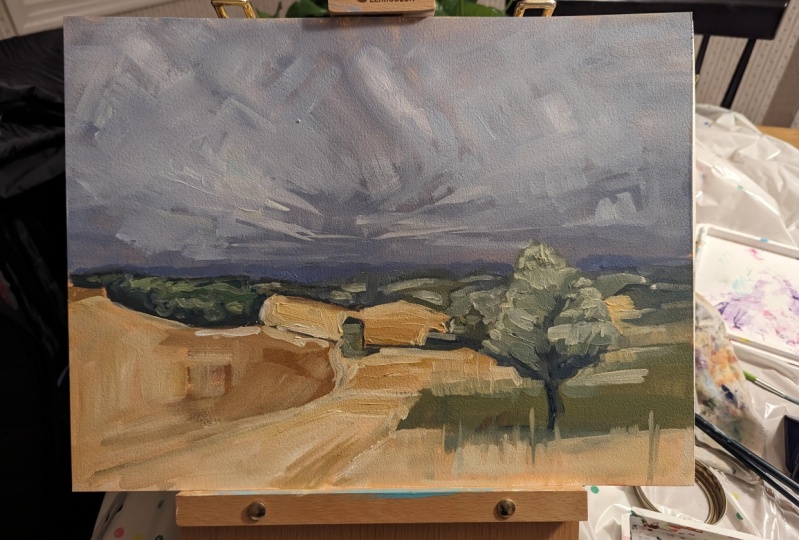
like you're a musician. Here I made a painting of
mine in black and white. Just so you can see
on one end you can see the lit side of the tree and then the
dark side of the tree. You can also see the bright
sky behind it and how the foliage in the distance is still pretty light
in this painting. Value carries the
painting I just wanted to show in black and white so you can get a visual. What we're talking about,
a typical value scale has ten steps between pure
white and absolute black. Each step is numbered
and you can purchase really affordable value
meters that can help you identify how light
or dark your subject is. A very complex painting, can incorporate
perfect value changes around the subject
and describe it. Sometimes these are so tonal and so nuanced that they
can be hard to see. However, it can also
be really simplified. This is a painting by
Peggy Roll Roberts. I love this series
of hers where she takes little sketches
of people at the beach. If you look at the
one on the left, it's in full color where you can see some really
subtle color differences. But if you look at
it on the right, where it's been simplified
into black and white, she's basically dividing up these people into a dark
side and the light side. And that's it, and
there's no extra details and you understand what
you're looking at. This is an example
where value is communicating the
story of the painting. In the next lesson, you're
going to learn two things. How to mix paint and also how to make your
own value meter. Which you can use again
and again when you paint. But before you learn
how to do that, I want to teach you
exactly how value makes a shape look Three D by showing you the
anatomy of a shadow. Take this picture of a
white styrofoam ball. This is sitting on a
shadow box that I have. It's with a white background. I know the background
looks gray, but that's because
the brightness of the ball is the only thing
that's pure white here. Everything else is in
shadow in some way. I know if you have taken
beginner art classes before, you may have seen
this and you may not be super excited to see the prototypical
white ball under a light. But don't worry, I'm not
going to make you draw this, but I am going to use this
to show you the anatomy of a shadow and then incorporate that into things you
actually want to paint. Understanding these parts
of the shadow will help your paintings instantly
look more realistic. Taking this image
of a well lit ball, it should be pretty easy to see the difference between the
major light and dark shapes. On one side you have the light notated by the cartini sunshine. And then on the other
side you have the shadow. I'm going to talk about
the light side first. Within each shape, there
are more parts to observe. The light area will act
to be mostly one value. It's pretty subtle actually. It's the result of direct
light on the object. The arrow in this illustration is showing you where the
light is coming from. On the light side,
you're going to see two spots that are
brighter than the others. The first is the direct light. The direct light is part of the object which is closest
to the light source. This is going to be technically the absolute color or
whatever it is you're doing. In this sense it would be white. But if you're doing a tennis
ball or something that's closest what the actual color
is of the actual object. The second light is a
highlighted reflection, and it typically occurs in the
fullest part of the shape. See how the high
light is circled. And it's about in the center of the drawn light area that I
have on the illustration. This is probably a little bit more than you
need to know right now. However, it's worth noting that the highlight is
actually a factor. Where you are is a viewer and less about
where the light is. It's impacted by the
light of course, but it will move
based off of where. It's called a specular highlight on objects that are shiny. Like say a bottle,
a dark bottle. It'll be really bright
compared to the Lit side. And on objects that
are more matt, say a tennis ball or a banana, that highlight will
not be as pronounced. That's a little
bit more advanced, but I just wanted to point
that out and look for it. Whenever you observe things as objects start to turn away from the light, you
get the mid tones. This is a pretty
short transition. It's a common thing in beginners to make
this part too much. It's actually a pretty fast transition from light to dark. Don't spend too much time here, but just know that
the mid tones is where the light starts to
turn into the dark side. The darker side of the object
is a lot more going on. This is really where I
want you to observe. The first part of the shadow
is the core shadow and it's a dark band that will occur
right after the light area. It's darker because the
other part of the form is getting some reflected light off the surrounding environment. This is the part of
the shadow least impacted by the environment and the reflected
light around it. That leads us to the next part, which is the reflected
part of the shadow. Reflected light comes
from the surroundings. If the object is on
a white surface, that reflected
light will be a lot stronger than if it
were on a dark surface. Here in this picture, you can see how this is illustrated. I have the same white ball
in the same shadow box. The first one is on
a white background, the second one's on
a black background. And I didn't change any of
the settings in my camera. The highlights are
the same value. You can see that the
reflected light portions of each ball are impacted by the
light that's around them. The one in the white
background is just a little bit lighter than the
one of the dark background. Again, this might be a
little bit more complex. And you need to know right
now if you're brand new, if this is brand new to you and you're already saturated
with new knowledge, you don't have to pay
attention to this. However, if you've been
introduced to value before, you may find this little
part interesting. The cache shadow is next. And this is the shadow that
extends on the surface and it's a result of the
direction of the light. You can find the general
shape of the cache shadow by tracing the light from the light source to the edge
of the object. An object lit overhead will have a very
small cache shadow. An object lit from the side will have a much longer cache shadow. Now if you were making
things perfectly exact, you would probably want to
pay close attention to this. However, a lot of
times when I paint, I'm either making
stuff up or I am generalizing and basically
make the shadow makes sense. Most people aren't
going to go around with a ruler and know exactly
where the light source was. That's just not realistic, but it's just something
that's good to know. Basically the direction
of the light impacts, how long the cache shadow will be also closer to the object. You're going to have
a much more hard line between the cache shadow
and your surface. If you see my arrow, that's a, it's hard, crisp edge. But it's definitely harder than whenever the
shadow gets closer to the end of it where it's much fuzzier and
softer just again, It's just something that
helps to sometimes, I think when we're observing so many things that
we're looking at and we don't know to look
for certain things. Just being aware of
these little details can help you know what to look for whenever
you're painting. I also wanted to bring back for a second the idea
of taking pictures. I will mention this again later, but notice how dark
the background is. Your camera has a tendency to overcompensate
and over correct. I will talk about this again, but if this is your first time, if you feel ready to
paint from observation, I would really
recommend that you do that and not use a
camera at first. The camera will flatten things, they will make some of
these shadows go away. And it can be really hard
to see them if you're not looking at the image or the object right
in front of you. Over time, you will start to learn these
things and you'll be able to compensate for the camera, and
that's totally fine. I'm not someone that's
against pictures at all. But there's a huge benefit
to training your eye to observe and just
understanding that the camera will wash some
of these details out. Your eye can see much more
than a camera will show you. The final part of the cache shadow is
the occlusion shadow. This is typically
the very dark part right underneath the object. It's also typically one of the darkest parts
of the painting in general as it's lease affected by reflected
light everywhere else. Because this can
help your object feel like it's sitting
on the ground, that gravity is working. Sometimes if something
doesn't feel quite right, you don't really understand why the object looks
like it's floating. There's a chance that the area right underneath it just may need to be a
little bit darker. There is a lot to remember here, if this is new to you,
a bit overwhelming. Just taken the bare minimum. Put simply, when
it comes to value on an object with a
clear light source, one source of light,
would that be a lamp? Or maybe direct overhead
sun with nothing else. There's going to be
a light side and a dark side which she
may have already known. Inside the dark, there
will be a tiny spot that's a little bit less dark which
is your reflected light. Then there will be a cache
shadow underneath the object, with the darkest part being
right underneath the object. And the cache shadow will be longer or shorter depending on if the light source is directly overhead
or off to the side. When it comes to this practice, observing this with your eyes. You don't even need to
paint it quite yet. When just place something
underneath a solo light source, be careful because you can have other lights that are on in your house which could make
it hard to see as outside, there can be some impacts
of reflection as well. Maybe put an object
underneath a lamp whenever it's nighttime and
observe this with your eyes, then practice painting it. This is where a lot of really
classical detailed realism can depart from more
impressionistic work or work. Whenever you're
working up realism, you're capturing every minute
detail in this process. And It's a very huge exercise of your observational skills
and hand eye coordination. If that's not something
that interests you, make educated
simplifications. Just going back to Peggy
Row Roberts speech scenes, she doesn't necessarily
include all of these details. She's got a light in a dark and a shadow and they're all one color and that's
totally fine. It's important to
understand that there are some details that you
are choosing to leave out. Here's an image of one
of my paintings where I take this idea and I simplify
it for the most part. This is a pretty complex object. It's a tree and there's
multiple forms wrapping around the value of each individual branch
and the trunk itself. It's almost too zoomed
in to see those details, but on this particular
tree on the left, you can see branch on the left, you can see where the high
light and the core shadow and the reflected light describe the circular form of this tree. In this painting, I keep it
very brushy, very loose. That was what I was going for. It makes this branch
look three dimensional. I just wanted to
show you an example. There is a lot to remember here. I'm going to add one more thing. This is brand new
to you. You come back and watch this later. If you are a value expert and you're ready to
receive this part, I will encourage you to
listen up before you move on. Understand that
the darkest light is never darker than
the lightest dark. It can go the other
way around as well. The lightest dark will never be lighter than
the darkest light. Here are two examples
where I show you this as the ball on the left hand side starts to turn towards
the shadow that's at. It's almost a mid tone, but it's still in
the light side. I pulled down the
swatch to show you what that color actually
is with my ipad, Then I pulled out a swatch
from the reflected light. It looks much darker on the white background because
the white is very bright. But trust me, I pulled it out digitally. That
way would be perfect. You can see that even though that reflected light looks
light on the picture, it's still much darker than the darkest light
on the light side. Again, on this tree example, on the highlight of the branch, you can see that light
side is this medium gray. That's that's the value of it based off of what I
pulled away from my ipad. And then on the shadow side, the reflected light looks
pretty light in this image, but it's still a
solid shade or two darker than the darker
part of the highlights. This is another thing. If you're finding that your paintings
are looking flat, even though you're
incorporating shadow, be careful that your reflected
light isn't too light. Because if it is too light, it will make the shadow side, it'll be confusing
and you won't be able to understand the
values between them. Understanding these
elements and putting them into practice is the
foundation for all painting. It's what you will come
back to again and again, and it's not something
you master in a day. The best thing you can
do right now is to just let your mind
be blown seriously. I remember when someone taught
me this and it's so cool, and then start to practice observing this in everyday life. Keep in mind that
things get a lot more complex once you start looking at objects
in normal settings, as light sources can come
from a variety of directions, and the objects
themselves become much more complicated
than a simple sphere. When you see something lit,
simply practice identifying the parts of the shadow and observing the slight
variations in value. Being able to see this with your eyes is the first
step to be able to, being able to translate
it with your hand. In the upcoming lesson, you're going to
practice value and you'll learn how to mix
paint at the same time. This exercise will
be the foundation for the first two paintings
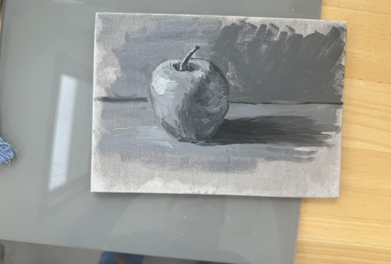
you make in this class. The first painting will be
a black and white painting. Or if you don't have black, another dark color such as blue, the second one will
be in full color. But it's really important
to paint in black and white before you add
the color. All right. If you have any
questions, leave them in the comment section and I will
do my best to answer them. I hope this helps you understand how value makes your
painting look. Three D
13. Value Exercise: How to Mix Paint: This exercise, we're
going to do two things. We're going to learn
how to mix paint, and we're also going to
create a value scale. For this exercise. You're going to need a
piece of your oil paper, a straight edge of some sort. I'm just using a
palette from my studio. A pencil, a palette
knife, a paint brush. A white and then a dark color. I'm using black, I'm using
Gamblin ivory, black. You can use blue if
you don't have that. Or maybe a lizard and
crimson if you have that. Trying to do. Why block? If you can help it actually definitely be black,
you could help it. We just have to lesson on value. And you learned that there
is ten steps to value. We're going to actually
do five step values. We're going to have
five different colors from dark to light. And we're going to
use this later on, whatever you make
today, save it. The first thing
we're going to do at the edge of your paper, is use your straight
edge to draw a line, maybe an inch and a
half or 2 " down. Then I want you
to divide that by five into five equal segments. We five segments, they don't
need to be perfectly equal. But the only thing that's
important is that you make sure that it goes off
the end of your paper. I'm just going to
eyeball it myself. That's way off. I'm going
to draw these right here. It does not make me perfect. If you are the type that
likes to measure by means, pause me and go
do it real quick. So I've got five boxes,
they're pretty close. The next thing we're
going to do now is squeeze out both white and
black on your palette. I am going to put white on this end and make about
a quarter size amount. You might need some more. I'm eyeballing this and you're
black on the other side. Okay, so the first thing we're
going to do here is mix. And I'm going to
teach you how to mix. And then we're going to
give out each chart. I'm using professional
grade paint. I know by using both professional grade paint that they're about the
same density of pigment. I don't need to
compensate too much. If you're using a
professional grade and aren't in a student grade, then you may need to
add a little bit more. But this is something that
we can just eyeball for now. The first thing you do is take
about half of the paint of the white your pal, knife and scoop up, say
another piece size amount. Wipe off your knife. Take about the same amount of the black. That looks about right. It doesn't have to
be too perfect. How to mix is you
scoop it up together. Then you just use your knife to smooth
it into the surface. All right, this is interesting. I know that the Pal paper that
I'm using is middle gray. I'm going to use a
little bit extra white because see how this is
darker than the Pal paper. I'm going to use a little
more white to even it out. Now what I'm having you made
right now is a value chart. This is something that you can buy for like
a couple dollar. It's really not that expensive. If it's something that you
think that would be helpful, I would recommend doing it. Yeah, this is still a
little bit too dark. See how it snooze out like this? I'm going to just some out
here, got a lot of black. I don't want to keep
pace with paint. I'm going to add
a little bit more white until it's
pretty close to this, to the actual value
of this paper. The color is different now. Yeah, you will notice this color looks a little bit more
blue than the paper. That's fine because, well, we'll get into that
in a different class. That's totally fine.
What I'm looking for is that it's
about the same value. I need a little more white. We're getting pretty
close, a lot of white. I'm doing this at an angle, so it's a little bit hard
for me to see it. Let's just save some paint. Obviously that black
is more potent than I realized. There we go. Okay, see how it's
really close to the same color or
the same value. Then you're going to
put it in the middle. In between the two, you'll
notice it's a white. It's a gray. It's a black. Now we're going to do half
steps in between each. I need to get a little
bit more white. You're going to do the
same thing this time, but take a little bit
of this middle color, like you can see it,
just a little bead. Take about the same amount of white and mix that the same
way that you just did. This is something you're going to have to
eyeball a little bit, but this should appear about halfway between
these two values. It looks too white bids you
to use your best judgment. I think that's about
right. I think I got it right the first time. Yeah, it looks really good. This is your middle tone. Your middle light
tone. I'm sorry, I'm wiping off my mind. I did the same thing from the middle pile that you the
first thing that you mix, it's that half halfway
between white and black. And put it on your
palette paper, get a little bit of black and mix something that I
think this is good too. About halfway between
that middle gray and black. I think
that's perfect. This right here, you need
to pause me catch up. I would recommend doing
that. This right here will represent your
five value chart. A little bit more black to that. It seems slightly, slightly. We think that
something in between, maybe a little bit less,
may be about right. There we go, That's good. Okay, there we go. So we've got five steps. I'm wiping off and palette now. I'm going to take my little
value chart that I made. If you want to pull out
some oil just to make it a little bit easy to work
with, you absolutely can. So I'm going to get
a little bit of oil. I'm going to, one by one, start filling in my chart. The first one is white,
might be a good amount. I'm just filling in the gaps. Now you can make the value of
your paint change two ways. You can add white to it or
yellow, that's my puppy. Or you can actually
make it thinner. Like you can add oil and
the value will change because of the white
paper behind it or the white canvas behind
it if you're using white. But for now, we're going to focus on making sure
that's advanced. Right now, we're just going
to focus on making sure the color that we're mixing
on our palette is correct. In the materials list, I send out a recommendation
on palettes. I love using color paper because it's so
easy to clean up. But this is the reason why I really like the
gray is because it's so helpful in seeing
value in between each. Be sure to clean your
brush pretty well. I guess you'll be.
Mine is still blue from our painting exercise
that we did with consistency. So I'm just going to get
a little bit of it out. It doesn't need to be completely cleaned as you're just
picking up this paint. Now we do that middle
town, different oil, pick up that middle
town and paint in that square burd. To keep doing this
until we get to block here, your middle gray. Notice how much
darker these look on the white paper,
isn't that interesting? It's white paper. That
white surface can make. It can be kind of misleading to see what the actual
value of something is. Okay, Clean up that edge. We, the clean your brush. Get some oil pick at
that middle. Dark gray. I'm making this a
little bit thick, just it make sure we get
a good paint color in. This May take a little bit
of time to dry. That's okay. If you make this and you
have kids or pets around, just make sure you
keep it out of reach because it takes
a long time to dry. If a cat walks on it
or kids get into it, it'll likely still be wet in a couple of days
that get everywhere. Paint has this tendency to
travel and move around. Okay. Last one. Now I'm
going to pick up this black, strict black. Now if you read about
this elsewhere, you'll see that there
are numbering systems for values and some people will make a value of
white and black ten, and then other times
it'll be the opposite. I have noticed this often
I've read about value. What? Honestly, it
doesn't really matter as long as it's actually
the right value. The number doesn't
matter as long, however you decide to number, this is 05 or the other
way around, one of five. Take your pencil again and write down the
numbers underneath. I'm going to start,
I'm just going to go one to five because it makes sense going in this direction, 12345. There you have it. Right now you've got a
value chart with a white, a light gray, a middle gray, a dark gray, and a black. You also learned how to mix on your palette
with your pale. Be sure to save
this value chart. We're going to use
it later whenever we make our painting and
we talk about color. One more thing. You can
actually save this paint. I don't ever like to waste oil paint because
it is expensive. The first painting you'll do, you'll be doing it only
in black and white, or in a dark color and white
if you don't have black. In the meantime, you can
stick this in the freezer. I would recommend
if you don't have a palette that has
a sealable lid to maybe put it in
a cardboard box or anything with a
thin raised edge. You can keep it in the freezer
to help it last longer. That way it's pre mixed and ready to go when
you are ready to paint. All right. I'll see you
in the next lesson.
14. Lesson: Seeing Your Subject Simply: In this lesson, you will
learn a simple way to apply the principles of
value by seeing your objects as a
series of shapes. Earlier you learned
how different parts of the shadow can make
an object appear. You also learned
that you can make educated simplifications. Choosing to condense these more complex value changes
into something simple like a dark and light
and maybe a dab of reflected light or
high light in between. There are a range
of options between hyper realistic
and super simple. But the most
important thing is to understand how a shadow tells you its shape
to begin with. That lets you make
an educated decision and gives you a lot of freedom whenever
you're making art. Everything is a shape. Something tells me
you're not very inspired to paint
white styrofoam balls, let's tell you, okay, and I'm not going to
make you do that. What I want to do is
empower you to start to see what does inspire you
as simplified shapes. Start very basic at first, and practice simplifying
every object in your mind. You can use value to
communicate these shapes. And you'll start to
notice the form is starting to look like
the object itself. I'll illustrate this furs with a pretty straightforward
example. Our apple. This is clearly not
a perfect sphere, but in general, it
takes the shape of something round
like a sphere. Knowing this and knowing the way a sphere reacts with light should help you as you start to imagine the major light
and dark shadows. These major shapes are important because
the first marks you will make in your painting are those broad, overarching shapes. Focusing on the
details too early can result in mistakes
that are hard to fix. But keeping the broad
early on will keep your paintings looking more together from the
very beginning, especially with wet and
to wet oil painting. Here's an example of flower, flowers are actually
very complex. I would recommend starting
with something a little more simple before you attempt to wet it. This is your first time. However, I want to
include as an example, you can see how they
really are just overall like half a sphere,
maybe a bell shape. Depending on how the flower
is shaped on the inside, it could actually
look you in like a cup with the
hollowed out inside. It's really easy to get distracted with all the
petals and beautiful leaves. Keeping your flower in more of a simple shape will help
keep its shape overall. Here's an example of
a Tuscan landscape. In its essence, a landscape
is just a flat plane. Maybe a hilly plane
like in this sense. But think of that
plane, just like the cardboard box of
the apples resting on with spheres and cubes and half spheres
that are resting on top. The foliage can represent a cube or a sphere
or a half sphere. This photo was actually
taken on a cloudy day. That does make it hard to
see where the shadows are. However, in general with
landscape painting, the sun has to be overhead
in some capacity. Unless it's a sunset
or a sunrise, you do have a little bit of liberty to make up the shadows, choosing to place darker values
underneath the shapes or maybe off to the
side in the case of the cube of
trees on the left. All right, this is more
of an intermediate topic, but I just wanted to throw it in there just in case
you're interested. When you're painting
the landscape, you may not be aware there's an additional flat plane and
that's the plane of the sky. If you think of the
sky as a flat plane, just like you would think
of the ground as one, then you'll see the
clouds as if they were half spheres or cubes as well. Except instead of
looking at the top of them like you would
trees and bushes, in this image, you're looking
at the bottom of them. I drew in a few pretend clouds
to illustrate this point. Once again, this is a little
bit more intermediate and the converging lines
represent perspective, which I'm not going to
cover in this class. However, just I want you to
understand that a landscape is even the clouds can be simplified into simple
shapes, all right? This is my puppy, isn't he? Sweet. He's a doberman shepherd. Okay. Anyway, so this is an
example of how you can take a more complex subject like an animal or person
and simplify it. So I didn't include
every part of him. Obviously, I left out some of
his legs and feet and ears. But I just wanted to show you by some bigger examples
what it looks like. In this example,
there are spheres and cylinders and even
a cube with his mouth. Again, this picture
is of a cate day, so it's kind of hard to see
some of those dark shadows. However, if you look at the
image on the right with the pink shapes that are
making up his, his body. You can actually start to
see the form of a dog coming out by just including
shadows underneath. So while I wouldn't
necessarily advise starting off using a picture from a cloudy day because
it is harder to see, you can see how the shapes
are showing themselves. You can use this to help
understand where you may put those simplified shadows
Just like value. This is not something that
you can learn overnight. It might just take
a little bit of practice to get the hang of it. The most important thing I want you to take away from this is that by mentally breaking down your subject
into simple shapes, you can make a
stronger painting with as much or a little
detail as you'd like. I'd also like to
emphasize it's not necessary to draw this
out ahead of time, although it can be a really
helpful exercise to do. The idea is more showing you the inside forms which make
up the more complex subjects. These are clearly very
simplified shapes. If you're interested in
those more complex subjects, you can take classes
and even Google Search, just how some of those more minute planes are broken down. In this lesson, you have learned various ways you can see a
subject by simple shapes. You will be able to take this
idea into the next step. As you start your
first well painting, the first thing you will
do in your painting after setting up is drawing
in the major shapes. Take a look at your subject
and try to identify the shapes that you see before moving on to the next video.
15. Paint: Palette Set Up : In this lesson, I'm
going to show you how to start and complete
your first painting. This will be a full
length demo which you can follow along and
pause when you need to, or you can just watch
it and try to do it after getting started. I have white and black paint. If you don't have just
anything that's darker, such as a lizard, crimson
or ultraine blue, it's really not a big
deal if it's not black. I've got three
different brushes. Two flats probably maybe
besides six or four, and then I have a
round size two. Both of all of these
are Princeton Catalyst. I recommend these brand because they're really
nice for oil painting. They have a stiff bristle, but they're not as expensive when you're just starting off. So I love using this brand. I have a pallet knife for mixing even though I've
actually already mixed, and this is from earlier with the value exercise we did. So I'm going
to leave it here. I've got a paper towel, I've got my solvent,
and I have my oil. I am working on palette
paper right now. It's super easy to clean up. And then I've got well paper
in front of me as well, so make sure you have
everything you need. And hit Pause if you need to, And then come back and
find me in a few seconds.
16. Paint: Surface Prep and Drawing in Shapes: Before we get started,
I wanted to share with you a little bit about
setting up your easel. I have a full size
a frame easel. This wasn't very expensive. It's probably $90
on line, maybe 60. The important thing if
you are standing up, which I'd recommend
because it's more comfortable and you can
move around much better, is to have your paintings
square in front of you. You should be able
to comfortably stand and look straight ahead, and it would be
staring back at you whenever you're
craning over to look. That is sometimes where
it's hard to see. It's hard to capture
the right perspective once we start working on that. But it's also just not as
great as your posture. That's one thing to consider.
If you are painting on a kitchen table or a
desk, that's totally fine. You may want to consider
getting a desk easel for help. You look at it
straight ahead or you can look over on your
table looking down. That's totally fine to do. If you end up really enjoying this and you want to
invest in an easel, that's what I would recommend. Okay? To get started, I'm using wool paper right here. I do this with canvas too, but I definitely
especially do it with wool paper because light
absorbs, it's just funky. In order to prepare the surface, I like to both saturate
the fiber so it will receive the paint
better and kill the white. Personally, I find it
distracting to fight. I am going to do that by
taking the paper towel. Can also use a rag
or cheese cloth. I'm going to get mostly solvent. Remember what we
talked about earlier with the rules over thin? Lean over lean. This is going to
be mostly solvent, it's going to be
more lean and thin. And I'm actually just going
to pick up some black. I'm not going to use any white. All I'm trying to do is just
pick up some pigment on my paper towel and
see how thin that is. And then I'm going
to now prepare my surface with my really
saturated paper towel. I'm going to cover
it, see how it's just killing off all the white. This is just a way to keep it. It's hard to take this down. This is making it more of
a middle grade distract. I'm to wipe all that
out base there. But what I'm doing right
now, I'm saturating it. I am killing off all the white. I'm making it just
easier to work, from going to make it sideways. Okay. If you want to take the edges
so it's nice and clean, that's kind of fun to do too. All right. I'm going to take a dry
paper towel now and kind of get some of that excess little excess
solvent paint off selene Snoop. Earlier in the
consistency exercise, we made a pretty loose wash
and then we wiped it off. This should be familiar and
all this is doing is paper do when you're starting a painting, I always like to start
with the big shapes first. We're going to do a
sketch. I'm taking my round brush right here. I'm going to get it in
some oil and a little bit of solvent thin mixture. I already have my
five values made. I don't necessarily
pre mix all the time, but I am this time. It's going to be a easier
if you need to pause me and mix your paint to catch
up, go ahead and do that. What we're going to do
first is start the drawing. I'm going to use probably
my middle dark value for this because I'm going to be
laying in the darks first. And that middle dark value, I'm looking at my
reference image. In the middle dark value, I'm looking at the apple. I'm thinking that's about the right value for
the shadow side. I'm going to go ahead
and do this drawing. I have a thin, I'm just
laying in the big shapes. Remember what we talked about simplifying the
apple in a sphere? I'm holding my brush
close to the end. I like to start with
really broad marks. This is going to be
the top of the apple. This is the bottom of the apple. Then the sides. Luckily, it's an apple, it
does not need to be perfect. Then start building
it from there. We already know this is
going to be a sphere. We already know how light
reacts to a sphere. Getting used to drawing from site is definitely a challenge. But flatten this a little bit. I like to do, sometimes I like to be loose
with my painting, but I like to clean up
the edges a little bit. I'm choosing an apple
because it is so simple. I really want to show you
kind of these principles. Way we've got the little stem, then this is where
it gets interesting. The light is coming
from this direction, The shadow wraps around
like this because the top flat and more of
the apples and light. I'm looking at my reference
and I'm going to do my best to copy the major
shadow lines that I see. This is what I'm seeing. We've got that little
shadow in there. That's about right.
Then I'm going to draw in cast shadow. Now, lights coming from here. Honestly, I'm going
to do a line. This is going to show me about
how far out there it is. That's about how far
it's going to go. I'm just drawing
basically what I see. Finally, this is going
to occupy space. I probably should have done
this first, but it's fine. Here's my horizon line. I'm not showing you rules
of composition yet, but in general, you don't want your horizon line
in the dead center. I like to just
take my paintbrush and make sure that it's
not in the center. And also this is a really
great way to measure. This is about high tall. My reference, I'm sorry, horizon line is I will use
that to make some marks and then connect them again. See, I'm drawing
from my shoulder, making that straight line.
This need to be straight. Then I see a little
shadow back here. It's very subtle.
But I'm going to draw it in there
to remind myself. Because my lights coming
from this direction, it would make sense that
there is a shadow back there. There's also a shadow up here. Getting lost in that
edge. That's okay. All right. There you
have it. That is the blocking in the major shapes of your painting in
black and white. In the next section, we
will fill in the shadows.
17. What to Do When You Make a Mistake: In this lesson, you will learn two options you have when you think you have
made a mistake. What I love about oil
painting is that mistakes are so easy to recover from because the paint
is so slow to dry. It allows you a lot of wiggle
room to work things out. I'm sharing this lesson in the middle of the
demonstration because I want you to pay
particular attention at this stage, the
drawing stage. You still have just the drawing. It is so much easier to make adjustments than before
you really start painting. Before I share your two options, I want to emphasize just how much you can avoid
at this stage. The drawing part of making a paint does not have
to be super precise. And I can speak from experience because I don't
particularly enjoy drawing. I usually do not make
mine extremely precise. However, I try to
make it accurate. The more time you
spend in this phase, the easier it is to
make adjustments and avoid issues
later down the line. My first piece of advice
is to simply stay in the drawing phase a little bit longer than you
think you need to. Don't be afraid to take
your rag or paper towel and wipe out sections
to redraw them. That leads me to
the first option. You can wipe out any part of
your painting at any time. I would say about
50% of the time, I wipe out at least a
part of a painting, the drawing or a small section. Sometimes I still have to wipe out the entire
thing and start over. It's okay. Trust
yourself to do this. If you could do it once, you
can do it again and you can probably do it better
because you've already tried some things
that did not work. The second option is to
just paint through it. It's important to know that the middle part of a
painting never looks great. I've heard this referred
to as the ugly middle. When you're in this state, recognize that
this is the phase. And to keep going, if you're careful about
your paint consistency, you can also paint over work
that you've already done. If the adjustments are minor, this can easily get messy. So it may be worth
just wiping out a section when
you're in the stage. Trust the process. Know that if you're following
along this stage, you're making sure your
drawing is fairly accurate. You're covering your darks and then your middles and
then your lights. Trust that it'll look okay. Don't overthink it.
Trust the process. Sometimes you might just
need to keep painting. If you think you've
made a mistake, try not to get
frustrated and instead celebrate the fact that you
are challenging yourself. That is brave and
you are learning. One of my favorite
pieces of art is Michael Angelo's T
in Milan, Italy. This is not the famous statute that he completed
when he was 25, but rather an unfinished one that he did near the
end of his life. In this statue there's
an extra limb which some think he abandoned
because he changed his mind. Taking the sculpture in another direction
halfway through. I think that's amazing. Michael Angelo is
arguably one of the most skilled artists making his famous David statue
at the age of 26. The unfinished PHS statue was made when he was
nearing the age of 90. If Michael Angelo can change his mind and maybe
even mess up and start again after the lifetime of accomplishments he
demonstrated, then so can we.
18. Paint: Shadows and Darks: In this section, we are going to fill in the major shadows. And so I am using my somewhat
larger flat brush for this. I'm going to pick up some more oil and a
little bit of solvent. Because again, just
still the base layers, that middle value that we mix at middle dark value is going to be a lot right for
these shadows. I'm not going to
use straight black, but I like that value. I'm looking at my reference
and that's about right. I'm going to use this. I'm getting a good
amount of my brush. I'm going to now hold
close to the end and just lay in
those major shapes. I obviously, I should probably be using
a bigger brush than this. I'll pick up some more paint. Pre mixing can really help. You may notice that there is a reflected light a little bit in this part of
the shadow on the apple. In the reference, I will
include that later. That's a little bit
different, that's actually reflecting from the ground. I see this is a little shadow there that shadows in there. And then the cast shadow, this is going to be
your inclusion shadow. I'm going to go ahead and actually just fill
in this entire area. I like it brushy. We're calm this down
a little bit later. I like this, this is
your middle ground. I'm also going to add in
probably using my round brush, a little bit darker for
some pretty dark areas. Right here, I see
one right there. I see the occlusion
shadow right here. Blood that make a mark for it. Yeah, there we go.
Then the last shadow I'm going to cover is
actually back here. This is going to be more
of a middle ground plane, but this shadow back
here is fairly dark. Not quite as dark as the apple. For this, I'm picking up
both solvent and oil. Again, I'm actually going to pick up more of
that middle ground, but I'm going to mix it into what I already have, a darker, it won't be quite as light as the middle but
it's still pretty. Just capture that background. I'm not going to ness cover
it all the way out here. I'm just going to suggest it. I'm going to let uh, works be nice edge, here we go. That is the shadows
and middle round, keep that you see the shape
of an apple lady starting, we're going to keep
these really broad. In the next section I'm going to fill in the medium tones and
the light tones as well.
19. Paint: Midtones: All right, in this section I'm going to fill in
the medium tones. In the light tones,
and you should start to see the
apple come to life. Looking at my reference, I'm actually going to do the
light tones at the very end. And I'm going to do the
medium to medium light. I'm picking up in between
these two on my brush. That's about right, actually,
making more medium. Remember, there's ambiguity
here and there's ways also you can just
make decisions. You can see that there is not necessarily the
perfect answer. You can consolidate since
we only have five values. I'm going to use that to fill in just a little bit
of the background. I'm going to go around the stem, see the very subtle
difference, but it's there. Okay. Well, you know that it's there. I also see that same medium tone echoed on the other
side of the apple, a round where this
is intersected. It's a little bit light for a second because there's
light coming through. Now I'm going to get
some of this off and just make that edge
a little bit softer. Look at me, I'm holding brush
a little bit too close. I'm not too worried about
filling in all of these things. I also see pretty light to
medium light tone value, sorry, in front of the apples. This is not necessarily
normal to do it this way, but there's going to
be some opportunities, I'm actually going to
get right up into it. And it's a fairly light
contrast right here. Again, make that soft angle. I'm using both oil
and solvent here. I can't really tell you like my formula for when I
use it, when I don't. But basically I try my best to. This initial blocking is
pretty much the only time I'll I'll use the solvent, then I'll just use oil here. And now I just like that
earlier layers to be this way. I'm actually going to pick up at this dark again or this
medium dark again, Fill it in to bring
up the value. Just bring down the value. Just fill in some of these areas right at
the end of the shadow. It actually gets to get softer as you get further
away from the light. I'm going to do that by bringing the shadow value
down a little bit. Bringing the background and
the shadow closer together, we're starting to get pretty
close to it over here. My eye is not liking that
this is not complete, so I'm going to at least
finish off the horizon, but maybe fill in this area. But I personally like
leaving some of this here. It's interesting, it
doesn't always work. Okay, now we're going
to fill in the light, medium, light tones of the
apple itself, of the form. At this point, I'm going to get some of this off my brush. I want something
in between this, the white and that medium light. Because I'm looking
at my reference. Could be okay, but I'm going
to be tiny bit lighter. This is something that
I need to eyeball somewhat quickly because
I've done a lot, It takes you a little bit more time to get the hang of it. That's totally okay. I just remember I've had
a lot of time doing this. I'm going to fill
in these medium white areas of the apple. Fresh likes to sneak up there. I'm seeing the lit area. This is, you'll see the base color of the
apple in the lit area. But usually the base color will come up right and starts
to intersect with the dark. Since since we're
not using color yet, we will not be seeing
that in terms of color. But the value as well, what's the actual value of the apple? Not with the light, but I'm going to fill in
just very simply, I'm not including
all the details yet. At some point, this part here is going to
get lightened up. It shouldn't be blending into the background
the way it is, but that's because I'm not going to worry about that
until the end. But I do like that I'm getting a little bit of a
disappearing edge right now. The disappearing edge, whenever those two values are the same, it can be really nice to
use in your painting. I always look for
them, especially when painting still lights outdoors. If the values will be the same, it's pretty fun to see them
come together like that. Here in this area,
you're seeing the light from the lamp that's illuminating the apple
bounce back up into here. I'm actually going to go ahead and capture that right now. I'm going to get some of
this light off my brush, pick up this medium, and add, see how is that value. It's close. I'm actually going to add a bit of that
medium dark in there just to darken it just a little bit but not as dark
as the whole thing. This is that shadow I see. The shadow that's about where this core
shadow is as well. All see is about a patch. It's not too big but it's there. Lighten up just a
tiny bit too big. But it's there, there's a little bit of reflection
happening in there that I see. Okay. And at the same time
also the apple turns down. Actually, I'll do that too. The lightest dark is
never lighter than the darkest light where this apple starts to
turn down a little bit. And even in the core,
this will not be as light, as dark as this is. We already know that color is, we just make sure about right. Okay. As long as it's darker or lighter than
this color, it'll be okay. Let's see. Yeah, there
we go. That's lighter. I can totally use
that medium to do it. I'm picking up a
little bit of oil now. I want to turn this
down just a little bit. Also, it's going to work
into that wet paint. It won't be as dark either. A little bit too much paint
on my brush. Here we go. Sometimes that can happen. There we go. Then I'm going to go ahead
also and take a mix of those two light
colors and use that to clean up the edges
of the core shadow. This is the mid tones where
those things go together. I should have a bigger
brush right now, but that's what I pulled out. So this is what we got. Kind of put that in a nice shot back here too. All right, At this point, it's starting to look
quite a bit like an apple. But I want to bring up some
of these highlights too. If he's kind of coming through the paper
there, that's okay. I'm also in this
opportunity going to take the opportunity to put in the reflected light here. I'm looking at it even
though we know it does this. I'm looking at it and it's actually reflecting
more up here. It's similar to that. I'm just going to keep it
pretty simple, honestly. I would like to maybe
round this out, just the drawing itself and then to emphasize that
core shadow one more time, I'm taking that medium dark
and I'm actually going to get tiny bit darker because I know
that is the darkest spot. I'm going to use that
to emphasize it. Just laying it on the consistency exercise
and talked about that how lay it very gently on see like I'm not putting a
lot of pressure onto it. It's actually a little bit of
one down here. There we go. Okay, now I'm going
to start refining. I'm going to bring up the light in the lit
area of the apple. I'm going to start
using most of the oil. Now this is wet into wet. At this point, what I have down, I wanted to do too much
more than what I'm doing. I would probably need to let
it dry just a little bit, maybe an hour or two, but we are going to leave it
very fresh and wet into wet. Which means you
have to be careful with how thin it is at
the very beginning. You're also going to want to Yeah, we be careful in at the beginning and try to
get the values right. The first time I'm
seeing around this area, it starts to get lighter. This is a little
bit thicker paint, you can tell the video
it's slightly thicker, slightly less solvent solvent. Just using oil, I'm
going to kind of build that shape that grounds
out the apple right here. And we're going to add in the highlights next,
which is the fun part. I'm taking my small
round brush and picking up again some
of that middle light. I see a really nice
high light over here. See how delicate got
some dark on there. I want that. See how
delicately I'm holding this, I'm holding right here
and jamming it in. I'm like holding it near the end and just
laying it in there. It's going to give you
more painterly, Mark. You're not going to
have much control over everything but it's a
painting, it's not a photo. We're okay with that? All right, I'm going to give the rim a
little bit of a tension here. Let me go back to my
slightly smaller one, smaller flat brush I'm using. What's going on here is my help. Before I do that, I'm going
to put it in the dark stem. I'm going to pick up my black. I think this is about the
darkest it's going to be. Maybe a little bit of. Yeah, it's pretty
close, obviously. The stem is pretty dark. Picking up a pretty
good amount of rush. I'm going to lay in a
see, I'm holding it. This is not overly overhand. It's over, I'm overhand, and my arm is just upside down, and I see the stem here. I'm going to just pull it up. Just lay it down really gently. What's happening
right now is like the top of the apples
turning inward. I want to communicate that turn. Part of what I need to do still, is bring down the shadow, just
a little bit of this edge. Again, the small brush,
I'm just laying it down. This part right here
is a bit of a rim. I'm going to communicate
that by actually bring this value just a
tiny bit darker. It's very subtle,
but it will make a difference a little
darker than that. We're trying to turn away
from the light over here. And then it gets started,
it gets lighter again. Okay, see that again, The dark. I'm going to kind of
paint in that turn. I'm going to show that
form as it turns over, then again up a
little bit more dark.
20. Paint: Finishing Touches (Highlights): I'm going to pick up a
little bit more dark, just allow this to turn into
the inside of the apple. There you go. There's a lot going on
over here actually, I don't really like how what I'm seeing is actually like half and half that to
me is very confusing. I'm going to take a liberty, fear of little artistic liberty, and extend some of this lighter area past the stem in a way that it's not necessarily doing
it, that I can see. But it's going to help
it read a little bit. I don't like how it's
just half and half see that. See how
I'm doing that. You just use my thicker
brush to pull that down. Okay. I'm happy with that. Also pick up some of
that midtown and as this gets rounder up here to turn
in, I'm happy with that. At this point, we're going to add in the final touches
and the highlights. The squint, the brightest
part of the apple is the reflected light on the middle of the fullest
part of the apple. That's going to be the
lightest thing that I do. I'm going to be
wiping off my brush. I see that since this
is a waxy apple, it is going to be a
pretty strong light picking up a little
bit of the dark here. Just a tiny bit of oil. This is going to be
a thicker bit of paint brush here.
I like that thick. Already brought up
the light in there. I'm just going to
overhand my brush. I'm holding it close because
I don't want to slip. I'm just going to lay it down. Lay down. Then there's another highlight
from the light over here. Once again, down gets
light around here. This is a slightly darker
version of that light. I want to bring up this
highlight a little bit more without it being
the highlight itself. I'll keep going
through a little bit. The see I'm looking at, I want to lighten up the ground or the cardboard
that's on just a tiny bit. Emphasize this because the light is pretty strong down there. I'm squinting.
These two value are pretty close. It's fleeting. But there is a moment where that value is a
little bit lighter. So I'm going to go
ahead and do that too. Now, another detail I want to make sure
that I emphasize and add is that inclusion shadow did it before but I can see
it lost it a little bit. Right now I'm mixing a darker version of
that, medium dark. I'm going to lay it back
in because it actually extends right at the edge of that shadow that goes
down too far away. There we go, that's
looking better. This is the darkest
part of the shadow and typically the darkest
part of the painting as well, when you're doing a still life and that's looking really
good, liking this. Okay. The last thing I'm going to do is
highlight the stem. This isn't going to
be quite as light as, as the highlight on the apple. I'm going to pick up that white, but then mix it more
with the middle gray. I know this because the apple itself waxy
and the stem is not even though it looks really
strong contrast because that dark is dark
on the stem itself. I know it's not
just like before. Just like before. Highlight
on top, a little guy there. And then this, we'll do that. And then hold onto
your brush this time. Just very gently pull
it up. See that? There you have it, Your
apple in black and white.
21. Lesson: And Intro to Color as Value: It's time to talk about color. Now that you have an
understanding of how value affects the appearance
of the shape of an object, you are ready to
learn about color. In this lesson, you will learn about the basics
of color as value. It will be a beginning
level introduction. I absolutely adore
nerding out over color as much as I want to tell you everything I know right now, I recognize you
need to understand it one step at a time
for the goal for this lesson is that
you understand how to use color as it
relates to value. The first thing that you need to know is that color has value. Color can be light, dark, and anywhere in between. And understanding that will help you as you
build a painting. And color, to be honest, you can completely
mix up the colors. If the value is correct, your subject will
still read like this wonderful portrait by
Falvius painter Andre Derain. Pretty cool, huh? Each color in its purest form has a value. This is something that
you're going to practice in an exercise
following this lesson. It's important to know
because the color of your subject and the color out
of the tube may both look, say, red in the
case of this apple. But since red coming
out of the tube is typically a darker value color, you may need to add
something to it to make it match the value of the
light area of the object. You can use any color of
lighter value to make that red lighter white
is the usual choice. Sometimes you would
add yellow as well. Red. Adding white will make it look a little
bit more pink, and adding yellow will
make it look more orange. Adding a little white and a little yellow may
be a good balance. If the subject is not
either one of those colors, this is getting into much
more advanced color. But if after you add white, it still doesn't
look quite right. Sometimes you might need to add a different color,
like green or blue. But I'm not going to cover
that in detail in this class. The simplest way to make color lighter or darker is to
add black and white. If you are brand new to
the idea of color theory, I'd really recommend
starting here. The colors will look a
little bit dull if you using only black and only
white to lighten, darken them. But it's okay. I would much rather you have
the colors maybe off. But the value is
right at this stage. It's much more important to
me that you can understand color as light and dark,
or somewhere in between. And that also just
understand there are many ways for you to
lighten and darken it. As a side note, this
photo is silly. One day in the studio,
I had a white and black next to each other and it looked like they were
getting married. I took this photo, this was a few years ago and I thought it would
make you laugh. I shared it here too. Use your white and black.
It's totally okay. However, if you'd like to
explore color a little bit, you can totally play with adding colors that are
darker and lighter to adjust the value instead of
just adding white and black. Actually, on second thought, using white is still my primary
way to lighten the color. But sometimes I do
add yellow or even blue or red to that white
depending on the color. But again, that's getting
a little bit complicated. You don't need to know
all that right now. If you are interested in
exploring color a little bit, I'd encourage you to practice mixing to match a
color that you see. It's totally normal. If when you're practicing it's a complete mess
and train wreck, that is very typical and that means that you're
learning. It's okay. In this chart, I list
some common colors. If they tend to be light, medium, or dark coming
out of the tube. This will vary base off of the type of
colors you're using. But I wanted to give you
a general grouping of values of fairly common pigments that you might see
in oil painting. Your lightest colors tend
to be white, naples yellow. And your cadmium yellow
light is pretty white too. Also cad yellow medium
is on the edge. Medium value colors
include yellow ochre, cadmium red light, manganese
blue hue, and raw sienna. Your darker colors
will be ivory, black, ultramarine blue, quinacridone,
magenta, Alizarin, crimson, probably
vorridian green, burnt umber, burnt sienna, some of those
darker earth tones. In theory, you can
use any color from a different value to change the value of the color at hand. It is easy to get
a color you didn't intend to get by using
something too different. In the next slide, I will share with you some basic color theory to hopefully help you take
a look at this color wheel, the colors opposite
from each other. The red and that bluish green are the most different and will have the biggest
impact on color. If you mix colors
closer to each other, the result will be more subtle, which means just
the initial color will be less different
than it was if you, it was something that
was completely opposite. You can see this with
the color yellow. Adding purple will make
it appear more brown. But adding a reddish purple will even to be a
little bit more orange. If it's more of a blue color, the yellow will look
slightly more green. Funny, you bring
that up, Kristen. I want to make dark yellow. Remember, yellow has value and
it can't be anything else. Yellow coming out of the
tube is extremely light. This is where yellow in
particular is a challenge. What that means though,
is that in real life, dark yellow is also maybe
not what you think it is. It can be a darker brown, a gray, an orange, or a green. It's a brownish color in
this picture of the banana. Seeing this with your naked eye can take a bit of practice. It is definitely a bit more of an intermediate and
advanced skill. The only thing I
really want you to take away right now
is that you can use a color wheel to help you
choose a color to change. If you want to change
the value with color, know that using
the opposite color will change the color the most. In this lesson, you learn
about the value of color. And then you can
affect the value of color by adding white and black, but also by adding other colors. In this lesson, we talked about sticking just
to light and black. For now, if you are brand new, if you'd like to venture out into experimenting with color, you now know that you can use
color to change the value. And that the color that you
choose may have a big or a subtle impact on the
resulting color that you get.
22. Exercise: Identifying Value in your Colors: In this lesson, you
will need oil, paper, a paintbrush, oil insolvent
a rag or paper towel. Your value meter from the How to Make a painting overview module. And then about five to seven
colors, not white or black. In this exercise,
you're going to learn about how color has value. The reason why I had you start with black
and white painting first is because the values
truly carry the painting. Once you add color, it can be so easy to get distracted by the beautiful color options on your palette and forget the
fact that they had value. In this exercise,
we're going to take the value chart that we
made back in that exercise. We're going to practice identifying the value
of certain colors. Now as you can see here
and talked about before, this only has five options. And the range in between white and black is
practically infinite. There's so many different values that can exist
within these steps. That leads you to
the point where, as an artist, your
job is to simplify. Your job is to recognize the ambiguity and to make
a decision yourself. This is an exercise in
that you're going to lay out some color
and we're going to choose the number that
it's closest to use. That is just a practice to recognize how darker
light something is. This is actually much
easier said than done. If you find that this is
a frustrating experience for you, it's okay. This is something that it
takes a lot of practice. The first thing
you're going to do, I have a couple of different colors that I'm using from the introductory kit. I have Alizarin, crimson, cadmium red, light yellow, ocher, cadmium
yellow, light ult, blue, and titanium white. I just chose these
because there's a really nice range
of value here. And also it's red,
yellow, and blue. But two different yells
and two different reds, take your palette and
squeeze out the paint. I like to do it personally
in rainbow order. I think it makes
more sense to me. Squeeze out just a tiny
amount of your pal, you're really not going
to need too much here, like half a pea. I think they keep
using a analogy. What I just a little bit. I don't want you to waste too much paint because this is going to be
just an exercise. Some Cad, red,
light, yellow ocher. Yellow ocher is an earthy color. It comes from the ground. It dries faster. It dries a little bit
choppier than other colors. Cavium yellow, light, they do. I mentioned this before. Cam,
yellow light, cavium red. These are part of heavy
metals I trust gambling. They have a really safe
process and I use them. But if you are looking
for alternatives, you can use nap fall
for cadmium red light, and hands of yellow for
cadium yellow light. I, my opinion, not
quite as potent. I don't prefer them, but they will work this time. Okay. I just have a little bit
of each color on here. Now. I'm going to, in the brush, in the solvent, just to make it a little bit
thinner. And then some oil. This is how I usually do it. I do a little mixture of
both and then just mix it in a pile on here
that lizarin crimson. And just make a mark
on your oil paper. We going to do some tests. Notice how if it's thin, it's a little bit transparent. If you want to make it
a little bit darker, we'd add a little bit more. See what it looks
like. You're saying there's your lizard and
crimson thing that brush. Same thing for the
next couple of colors. Got some solve it and some oil. Pick up some of that
cadmium red light. Mix it till it's
buttery and smooth. Just going to mark it down. Same thing. Pick up some
of that yellow ocher. Mark it down a little bit more. A little more oil. This is a skill that a lot of practice. It's something that I want to
go into a little bit later. There's something called
the Munsell Color System, and they have a
really awesome book that you can practice this with. And they give you a kind of color chips you
get to organize. That probably doesn't
sound that fun, but I think it's fun. Yellow and that
squeeze that white. But I'm going to use where
we already know that we Okay, and then we get some blue. Here are just some of the
colors that we have now, either color chart
and we're going to identify what the value is. Now remember, like I said, there's an infinite number
of values in 1-5 But since it's going to
force us to choose the one that's closest
to this is arbitrary, your eyes can be a
little bit different. But basically, when you hold the color chart
up to that color, you're looking for the
color that's the least. Obviously a lizard, crimson is not a one
or two, or three. I think the debate is 4-5
between the two of these. It's definitely in the middle, I'm going to call it five. I think that's the least
amount of difference. How I'm doing is I'm
actually closing one eye and squinting and it will
start to fade into it. I'm going to call this in five
writes down for cavum red. I could tell this is
more in the middle. It's definitely not five, I would say it's 3-4 I'm going to call it four. I think it's close to a four. All right. Next we
have yellow ocher. I'm looking at this,
it's definitely on four. It's pretty close to a three
or two going back and forth. I see the least
difference as a three. I'm going to call this a three. This was not planned but it is going in order that is handy. All right. For cabin ye light,
it's definitely on one. I'm going to call it two. Then for your Ultramon blue
4-5 I'm calling it a five. What this means is that your
five are your darker colors. And then they go
down from there. Being able to identify
the value of your color will help so much as you
learn to build a painting. However, this does
take practice, just be easy on yourself. In the next section
of this exercise, we're going to look
at what happens when we combine colors. In theory, it will
land somewhere in between the two values if
they are of different values. However, sometimes oil pigments react differently
whenever mixed. I'm going to show you an example where that happens as well. The important thing is that you just practice and get
to know what you have. It's not necessarily
something you need to memorize as much as it's something that
you should enjoy just exploring and learning. And you will develop a bit of a visual memory
just by practicing. The next thing we're
going to talk about is the way if you mix
two colors together, they will typically come up with a value
somewhere in between. I'm going to pick, I'm
going to pick either a 5.3 or 4.2 I'm going to go 4.2 because these are really strong colors.
Show you this. If I mix a 4.2 the result will not be darker than a
four, or lighter than a two. I'm going to pick up
some of the Cad red light and mix it in with my yellow light
till about halfway. I don't know, maybe
more yellow And see it did not a palm mix here. It wasn't, since we're
using such a small amount, it wasn't really
necessary to do that. Here's a mixture
of red light and yellow light value chart here. It's definitely not a four, I don't think the two either. That's pretty dark, I would
say it's closest to a three. When you add these two together, they do always add up to the middle color depending
on how much you use. However, it's just
something to be aware of. We can do this a couple
more times just to see what happens off my brush. Maybe we'll try some of the Cad yellow light with a little bit
of ultra roon blue. So we're going to
make it green here. You can make a dark
green light green. I'm going to make green
about half and half. Okay, here is cave yellow
light plus ultra blue. Here's that pretty
green that it makes. Now let's see what
the value of this is. Ultron blue is
closest to a five. This is definitely out of five. Cabular light was to a two. I would say it's
not a two either, but that means it's somewhere 3-4 I think this is a three. This is the closest to three. Finally, let's do it one more
time with the Ultron blue and we already know O
Prinsons dark. It will be. Let's do it. Ultron
blue plus Cad, red light and see what happens. This is going to make,
yeah, a purple color. The right here, they're
really dark pole. That's interesting,
let's check that out. I would say obviously
at five in this case, the ultramarine blue
stayed really dark. Whenever you added a
different color that is a characteristic of a
lot of darker colors, that it takes quite a bit
to make them lighter. Sometimes it's
worth playing with your gain colors to see what happens, you just don't know. I hope you found this helpful in identifying the way
that color has value. It's something
that when we start painting with color next, it's important to remember and to refer to
if you need help.
23. Choosing Your Palette: Choosing your palette can
be such a fun experience. In this lesson,
you're going to learn a few pointers on selecting a palette of colors
to choose from. Let this be a discovery
process and have fun with it. There's no right or wrong, and if you only have
a couple of off the wall colors to
work from, go with it. When you paint with color, it's more about how the colors relate to each other on the canvas than how close they
are to real life. It's completely okay if
the best color you can mix is not match
real life over time, you can learn to
rely on the colors around it to help
and make sense. Overall, simple is better. Using less colors will
give you more control and keep your paintings looking
together and cohesive. I could seriously spend
days talking about color theory and color
psychology and palettes to use. It's so much fun with oil paint, it gets even more
exciting because you have opaque and translucent colors and interact with each other. It's really so cool.
However, that's a bit much that's not within
the scope of this class, especially when
you're just starting. Try to keep your palette
as simple as you can. Typically, three to
six colors plus white. There are plenty of artists, including myself, who
typically work that limited. Once you learn how
to mix between them, you can really start to enjoy the possibilities within a
limited palette of color. When you start with
a limited palette, you can mix within
them and enjoy a lovely range of colors
that work together. Keep in mind that with
a limited palette, you are limited to the
colors that are formed within the boundaries of
the colors you've chosen, but that color is relative. In the example below, there is not even a blue
included in the palette. The best green is more
of a brown color. It may not be as bright up a green as you see in real life, but as long as the
value is correct, it can read okay, compared to the other colors
for your palette. Granted, sometimes it's best to choose a palette based off of
what you want to highlight. If you're really inspired
by some true greens, I probably wouldn't recommend using this kind of
palette for that. This is typically
portrait palette. However, I just wanted
to prove the point. This is a bit of an
advanced concept. If you find that you're a little confused, it's totally okay. The main point to take away is that you can make
nearly any color, makes sense within the
boundaries of a limited palette. Keep on listening for a few suggestions that you may enjoy. Here's a great limited
palette to start with. Cadmium red light,
cadmium yellow light, ultramarine blue and white. Included in this photo is a little index card of color
possibilities between them. I didn't do this super strict, I just wanted to show you what can be done within those colors. You can see the highest potency of the pure color and
how bright they are. But also you can see some of the lovely supporting grays
and tones in between. You can do so much just
these three colors. If you want to expand that, I would recommend adding Alizarin, crimson, cadmium yellow medium, and manganese blue hue. Those six colors plus white gave you a warm and cool
version of each color, expanding your color
potential greatly. If you've never heard of warm
and cool versions of color, no worries at all. I
don't expect you to. And it's not something I'm going to explain in this class. All you need to
know is that with this recommended palette, you get a pretty complete range
of color options that you will probably enjoy if you want to have a
more earthy palette. Try Alizarin, crimson,
yellow ochre, and ultramarine blue and white. You can also add
any earth tones, such as your umbers and siennas. These will give you some subtle colors that echo the palte of the old masters before the
more bright colors existed. I love how muted
this palette is, and it can be really lovely. Finally, if you love a
pop of modern color, try this combination of pigments unique to
the 20th century. These didn't exist
prior to Quinacridum, magenta, thalo blue, cadmium
yellow, light and white. You can see from these
ideas that the palette you choose can affect the
mood and the outcome. There's no wrong answer here. Just use one of my suggestions, or choose your own and
just have fun with it. We're going to get to
painting very soon.
24. Painting: Full Color Demonstration: It's now time to incorporate
color into our painting. In this lesson, I'm going to do a full length demo
showing you start to finish how I approach color when painting something
simple, like an apple. What I'm using today is the same three paint
brushes I used in the previous demo,
solvent and oil. I have a Palet knife and the
colors I'm using a white, cadmium yellow
light yellow ochre, ling blue and cadmium red light. To start, I'm going to lay
out the paint on my canvas. Sorry, on my palette, I'm going to go in rainbow
order from light to dark. I'm going about
quarter size amount. That's kind of a lot of
paint, but it's okay. I don't know if I'm going
to use yellow ochre, but with all these
greens in here, I wanted, I wanted to make a
green in two different ways. And having a yellow ochre might make a different
kind of green, the darkest you cut next. This is not required at all. However, it can really help keep your colors look cohesive. I'm going to mix some of these main values in colors that I see paying
attention to value. I have my value
meter right here. First I'm going to mix,
just like we did before. The first thing we painted in was the dark side of the apple. I'm going to mix that
green and then we know that green is close
to this value. It's not too hard with the blue to get somewhat close to that. You do not need to mix
ahead of time because I find it more efficient
to mix it ahead of time. I'm going to lay out
some blue, maybe half of that it off. Then I'm going to pick up, I'm going to think
yellow, ocher, ants. I have a pretty good
sense for colors. I'm going to do both of these and see what green it gets me. It's not going to be perfect, but I think it's going
to be about right. And what I like about this apple here is that it's a
really clean color. I didn't do a red
apple with a bunch of yellow sometimes
make it hard to see. The nice thing about using
yellow to make the green, is it actually lighten the value as well? See the difference? It's a bit lighter. Actually see it's about perfect there. I'm going to hold it up. I actually really
like this color. It's not necessarily perfect. I really like it for what it is. I'm going to go, I'll
probably just put that here. The next color I'm going to
mix is a background color. You'll notice I'm not
using black on here. I don't really use
a lot of black. There's nothing
wrong with black. I'm not going in
temperature right now, but it's not always. You can just somehow
make your colors look a little chalky or muddy
and something like that. I'm looking at this
background box, honestly, you can
have fever you want. But I'm going to go ahead and I like how it's the
opposite color of green. It's more of a orangey red. That's the opposite of green, like how it's going
to stand out. I'm going to, I'm
using yellow ocher, caving red light to
mix a base orange. And then go from there and
see what we're going to do. I'm holding this up, I
actually really like this. And value wise, it needs to be a little
bit lighter than that. It is. However, it's a
little bit too bright. Your eye, you may be seeing it this bright whenever
you're painting. However, I don't want to cause
so much attention to it. I'm actually going to add,
this is an orange color. And the opposite of
orange is blue on the color wheel,
but blue is darker. And I know it's going to
make it a little bit, a little bit darker
than I want it to be. I'm can get just a tiny amount of blue, maybe even
less than that. Go and see how this goes first. To do it down a little bit,
it's not going to be much, but it's going to be enough to just bring down the
intensity just a little bit. I like that actually. I think, I like the darker one. We're going to have some
darkers in there as well. Actually, I'm going to
do the same thing again, pick up some of this red, some of the yellow ochre,
make that middle orange. I know that this box gets a
little bit light at times. Again, I'm going
to mix in the blue to bring that intensity down
and see the difference. See how that's, that's a little bit just
duller than this one. That's about blue. Did you're getting a little bit of color
theory right now. Again, a tiny amount of blue. Let's just bring that
intensity down a little bit. I want you to look at the
apple, not at the background. The background should be
supporting the apple here. We are very similar
to the other one, but I actually want
to lighten it now. White may make it look a little bit more blue,
and that's okay. If it doesn't look good,
I'll just a little yellow. But I think actually it's
going to be about right. Yeah, we may need to lighten
it a value even more. Okay, so this is going to be what I use for the
lighter areas of the box. You're going to be painting
already. You do it this way. This can take a little
bit discipline to start. It's so good to do. Okay. The next thing I'm going to make is
just that middle tone green of the apple. I'm actually going
to take my rag and remember this should be
about medium, medium, white. Yet there you go, that's
actually dark. Which is good. That, okay, the apple itself
was more on this two value. So I'm going to pick up some yellow and a
little bit of blue. That blue is dark off the
blue is very powerful. I just know this
from doing a lot. I don't want too much. Let's start with that
and see where we are. Okay. Actually kind of like that actually pretty
good the way it is. I'm going to leave
that one there. Nice mid tone. And then I might go ahead and mix
a light tone as well. Doing the same thing,
I've got some yellow, a tiny bit of blue. I'm on a little table
so you can see it. It's not my normal
way of painting. Go get take up a tiny bit of white because I want it to be a lighter, lighter green. I like that a lot. Yeah, I
think that's going to be nice. Okay, we've got it here. This is going to be
the main color of our painting this time. I actually want to
see what happens, but I don't prepare the
surface Sometimes it's fun to play with
that and it'll be a little bit harder to scrub into. This paper can sometimes
absorb differently and I don't like the way
it's absorbing right now. I'm going to go ahead
and not prepare the surface with anything like we did last time
just to see what happens. If we don't like it, it's okay. The first thing
that we do remember is we are going to draw
into major shapes. Again, I'm going to use oil and a little bit of solvent just a little bit in the
earlier layers. I'm actually going to pick up that darker tone of the apple. I like that. And now I'm
going to start drawing. Actually, before we didn't
do the horizon first, let's do the horizon first. Make sure that this
is not halfway go. It's definitely not halfway. See, I'll just make that line. That might be a little bit too dark for now,
but that's okay. I'm just going to
just suggest it. I use the marker later. Okay. So now for the apple going to cut, do the boundaries. It's a I'm just eyeballing this and
luckily it's an apple, so no one's going
to sit here and measure and tell
me that I was off. And if they do their
means, they say you paint. People do that sometimes, okay? That's our building in
the shape of the apple, just like before.
Same thing just now. I'm using green,
kind of like this. It's still, we know we
open last time that we liked the way that light
kind of poured over the side. Let's stem there. Picking up both oil and solvent is running,
but that's okay. It's because this
paper is really absorbent and if
you're using a canvas, you may not be eating
quite so much. Okay, I'm going to do this. I'm drawing in that shadow. Remember, here's where I know the shadow
actually does this. I'm going to go
ahead and finish it, but we know that
there's a little bit of a light area in here and if you want to just draw that
in as a reminder. Totally can. I'll draw that. In's a little bit
of a light patch, that's going to be the
shape of the shadow. And then I'm going
to clean my brush, pick that medium
dark of the box. This is actually going
to be not the shadow of the box but the
medium of the box. I'm going to make it darker by picking up just a little bit of this core color on my brush. Sorry, the sun's in
there a little bit. I have a sheet over the window trying to make it not do that. Then I am going to darken it by adding both yellow,
red, and blue. I don't want to add
just blue. I know that. I don't want to be
quite so purply, but that's about right. It's going to get yeah, it needs to be the
four to five range. That's about right. Using this darker color
going to include where the occlusion shadow is
going to be suggest the Shadow. Remember gets
faith fuzzy over here. And then there we are actually, you know
what else is going to do? That stem is a very similar
color occlusion shadow. So I'm actually going to go over the stem as well,
just like that. Next we're going to fill
in the major shapes. The next step in this painting is to fill in the major shapes. I'm going to start, just
like we did before, with the darkest
green of the apple. I'm going to use oil and a
little bit of solvent here. I'm going to pick up a
good amount of that green. A lovely green that we mixed
with the yellow ochre. And the altering blue, yellow ocher is an earth color, meaning it comes straight
from your earth. It gets a really nice
subtle color too. I just love it. Think it's a
beautiful color. All right. I'm going to use the end of my brush and just lay this in. This is like the opportunity
to be so painterly. I'm going to scrub it in. Maybe the consistency right in your brush can be a little bit tricky falling around
that shadow on the back, but it will help a lot. And getting it too thick, it's not going to
help you too much. So keeping it thinner, especially at the
beginning, is helpful. Okay, I'll quickly pull this in. I'm not paying attention
to perfection here. I'm just trying to
get the major shape. When you squint,
you see an apple. Next, I actually, I'm only going to wipe
the green off my brush. I'm not going to
get too much out of it because I like
picking up some of this same darker
color that we mixed before you use that
middle gray box and then we added a little bit of red and a little bit of blue. I'm going to make a
little bit more of that and fill this in for the cache. Shadow needs to be a
little bit darker. I'm not in blue.
I'm balancing that red in there because
I don't want the blue to make it too purple. It's still dark enough with
that color in my brush. Now, I'm going to actually, this is going to be the
darkest shadow right here. But I'll be able to adjust
this in there later. Remember, I did not
prep the surface. It's a little bit
drier this time. I want to see what happens a little bit more
medium to get thinner. There we go. Yeah, there we go. All right, we have that. I'm going to go ahead and fill in the background
a little bit more. I like to do the background interchangeably
with the foreground because it makes some
interesting lines. Again, I'm picking
up a little oil, a little solvent, making this
more buttery to paint with. I know this more middle
value is in the back. This is where I think
mixing ahead of time can be really
helpful because you're not having
to spend all of your time observing and getting into the zone of
paintings a little thick. Already thought through
the analytical side of things and now you
just got to paint. It's already there,
right in front of you. That's really helpful. I'm so you how we need
to mix more of this. I think whenever
you're constantly going in and out,
remember what I use? Think it was just yellow
over a little more of that. You're constantly
having to go in and out of the brain you're using when you're
mixing paint is so much different than the brain you're using when
you're painting. I just like to have a little
bit of balance there. And mixing, doing
some of this is taking me out of the flow of the concentration
of what I'm doing. Give us a little bit more blue. Okay, that's getting
pretty close. Probably mix too much,
but that's okay. Get that nice and buttery, you get mixable tiny bit because we don't have any
solvent on the back for now. Okay. That's good. Nice. And a lot of pain too. And actually that lighter color, I already know that this shadow
gets lighter at the end, so I'm going to go
ahead and fill that in. Now I'm using the
biggest press I have, which is to be honest,
feels a little bit small, but I will be fine actually. It's hard to see but behind the apple because
like the base is hit, sitting on the ground like this, this is actually
some space where there's actually light
peeping through. So I'm going to go ahead
and put that in there. See that in my. Okay. I'm going to fill in
the rest of the box by combining the light and
medium colors is like. Has that. It goes together. I am selling brush a too close, it has a tendency
to sneak up there. If you ever see we
do it, call me out. I'm seeing right now the values. This is soaking up
a lot of paint that will paper is why
I keep going back. Just different, blend
it in, scrub this in. There's a spot here
where these get lighter and I see that I'm going to go ahead and block it in with
this main color first. I want to come back
and later do it. What I can also do
to make it lighters, it's just wipe it
out a little bit. This is the balance of pain. You have that option
necessarily want to add light to everything that it will
just happen as it goes. You'll figure out ways to
work the more you practice. I like kept the horizon line and send it out
probably better way. Let's just scrub that in. That's rattling.
It's annoying. Huh? Again, it's starting
to get lighter. As you get towards the front, I'm picking up more and more of that lighter color down here
that blend a little bit. Then over here, it's again between the light
and the medium of that orangey color just suggests where I really like the fact that this is
red, like a reddy orange. It's fun. Be careful
around the step. I'm not going to
cover up what I did, but I'm also not being exact. You can just lay
it on top really gently and I like there's
a little bit of edge here, so I'm going to basically
say that line without saying that line by allowing there
to be a subtle value change. And that's it, filling
the space just a little bit. It's definitely drier. Now, I'm going to use this, we've crossed over into
filling in the lights. This is a light section, I'm not going to separate. But yeah, this is just if you don't like the white
background either, but you don't want to
tone it with a black. You can, you can choose
a different color to tone it with this one, actually, toning it in this
like peachy red color. It could be a fun thing
to do, really actually. There are rules and you'll hear people
say it all the time. Hey, aren't you supposed to? They say that. I'm just like, I don't really want to hear it. You have to say next. We're
just painting over here. We're just trying things.
We're having fun. We were enjoying ourselves. We are practicing our
observational skills. In that sense, I think painting makes us better people, right? You can observe operating
to that light here. Okay. I probably won't do too
much for more background. This is just a study anyways. Cover that in. Pretty as distracting. Sometimes I like this
thing soking through, but sometimes I can
get distracting. So we don't want that. All right, we have the
background and now we're going to fill in the
middle tones of the apple. The part of the apple, like the part that is
illuminated by the light, not the total highlights. I'm going to bring that darker
version of our green onto my brush and just a
tiny bit of soltanuse. This is still that
first layer and it might just need a
little bit thinned up. I'm going to lay in
that nice green. I love it. I love green.
It's the color of life. Okay, notice I haven't
changed my brush once yet. This brush is actually
getting a little bit dirty. I don't want that right
on there right now. Okay, I'm getting a little
bit close because I don't really want to go. I am going to be careful
of these edges right now. However I really like a good, I'm going to do something
I really want to try. I'm going to have to
wipe it off in between. I'm just softening this edge. I really like it, but I don't want to bring the
C. I don't want to do that. I'll bring it right in
there, try to get that out. That's okay. It's just nice sometimes to have
some interesting edges. I'm going to bring
that down here. Again, we're going to keep
this all the same color, we will worry about the
details at the very end. I'm holding the brush closer
to the end right now. Mostly going to
need to leverage. It's stiff, the paper being so dry sometimes then
you see that Yeah, I I don't like that line. I like to keep my
edges a little bit softer. Wipe off my brush. A lot of this honestly is just getting a feel for
just doing it. And you will over time,
learn these things. I can tell you what the
consistency should be. But here we go, actually remember how we have that reflected
light in there. I'm going to go ahead
and include that. But it's not just that green, it's a bit of that green, but it's also the
red from the box. This is where we can start
to play with color and this is where premixing
can really help. I'm going to pull in
some of that red, start to mix it into
the shadow here. Whenever it's
reflecting the light. It's not just
straight white light, also the color
surrounding colors. If you look at my palette here, I'm bringing in some
of these reds into this little section where we know there is a bit of
reflection from the ground. See that actually probably need to lighten up that
value just a little bit. I'm a tiny bit of white. Just tiny bit. There we
go. Lay that in there. Okay, I'm going to bring
back some of that darker green because this is
where we're getting into that inclusion area
where it's very dark. I want to make sure that's okay. There we go. Okay,
I'm happy with that. Oops, I forgot to
continue with that cree. Here I am, I'm running
out of a pretty greens. I even mix a bit
more with my brush. I remember this one
was pretty simple. I just jested blue
and add red to it, so it's pretty strong. But I'm going to
just bring in color. We'll do the same
as we did before. We will connect the
details at the very end, but I just want to fill in kind of the gaps. So I left myself. All right, where in my
round brush, there it is. Okay. Again, I'm mixing just a little bit of
this color on my brush. Just you can mix any rush. We're happy with the Pow knife, but it can get
challenging sometimes. You know, you end up getting too much paint on your brush
and then it's all gluey. Pallet knife can mix can
really help save big messes. I'm going to use the smaller
brush to connect that edge. Then we're going to
add to the details. All right, now we're going to start playing with
some of these fun details. I'm going to start with that reflected
light in the shadows, cleaning up and
cleaning up its edges. And at the very end,
we'll do the highlights. Let me give that just
a few minutes to dry. First, I'm actually going to clean up some of these edges. My brush is pretty dry. I just wiped it off
with my rag like this. I am not someone that prefers
to do a lot of blending. However, sometimes if a
mark looks distracting, I will try to cover that up. And actually what's cool here, anything my brush,
there's already a little bit of this
darker color on my brush. I'm going to use that to put some color into
the reflected light. Maybe just add a tiny bit of that lighter green.
Just a tiny bit. That's going to be
a reflected light, which I can see is
along the edge here. I'm also going to want to
pick up a darker green again. Actually, maybe make
it a little bit darker by adding some blue, maybe a little bit of that red. Using those premix
colors can help add some color harmony
because they're all starting to filter
into each other. Isn't that Pre networks? I'm going to use darker bit just to show where that
core shadow is. Since I am focusing on
this apple right here, I don't want to ignore
the core shadow. Actually get this brush
is a little bit cleaner. Sometimes brushes can splay the have to like
separate like that. It's fine for some work but
not always fine for others. These are affordable
cleaning brushes, but they're still not
the highest quality. I have found these splay
a little bit quicker than other brands that
are more expensive, but they're really good for practice and they're
wonderful penalty lines. I'm going to take some
darker, clean up this edge. I actually, I don't
know if you notice, added a tiny bit of that
cadmium red in there as well to make the value
slightly darker. And also we mostly
for that reason, it also kind of dolls down
the green a little bit too. Okay, I'm going to take that smaller
brush that I have, it's a little bit splayed, clean it a little
bit with my rag. Now I'm going to take
this lighter green. Now I'm going to add
just a tiny bit of will. I don't want it to become so soft that it doesn't
want to stick. I'm going to start
filling in some of these lighter areas basically. I see this form right here. I'm going to be really gentle. This is actually the past, the trick to painting a
keeping the earlier layer is a bit thinner and not super wet but also being very
gentle when you lay on top. And the way to do that
is to hold your brush over hand like this and
just lay it on top. Slay it down. See this? Then there's a bit
of a highlight. This is where we played
with this last time to brought that bowl shape. I'm actually going to take my smaller rush and
pick in between our mid toad in
our dark and just communicate this curve over
the side, that midtone. Yeah, that's probably why
it's not making sense. Then I'm going to bring it around here to
midtone, around here. If you find yourself having
questions about color, please drop them in
the comment section. I'll do my best to answer them. I can, yeah, bring this around. Okay. And then also, this M right here
around the apple, I just made that lighter green. A little bit lighter.
And I'm going to just show how it's a
very subtly, We see that. Then also, I want to
make this more gradual. I'm taking my time here. I would really recommend you practice this as
much as you want, but honestly do speed pings, time yourself for
like 20 minutes and see how far you can get in the wipe it out
and do it again. It's really fun exercise. I'm cleaning up, I don't like
that wipe poking through. Okay. I'm really
liking what this is. A couple of things that, before we had the highlights
I want to point out. I'm going to fix that
blood that a little bit. It's not that sharp of an edge. Okay. This shadow
is completely red. But in reality,
there's going to be a reflection of the apple
into the shadow as well. In order to do that, I'm
going to take that darker red mixed and add
some green to it. It doesn't look like much, but it will have to bring in those colors and unify
them a little bit. Just a little bit. I'm also going to continue with that reflected
light in the bottom here. Get some of that
richer green or red. Add it to your green. See again. See how nice it is to have
these colors already mixed. I'm like evangelizing for that right now. It does help though. It really does like lets
you stay in the zone, I'd like to get that
darker green again, I'm going to have to
mix some of my brush. Pretty blue, tiny,
tiny, tiny oil. I don't want too much at
this point because this is in the rules of oil
painting thick over thin. This is the thicker paint. Like I said, we're not
doing the super long. I'm happy with that. Maybe clean up this little edge here. Keep forgetting to clean.
My brush is in between. It makes it hard. There we go. Okay. Now, finally,
we're going to add those highlights in to make sure my brush
is pretty clean. For this part, I'm going to do the highlight on the stem
first using my small round. We know this stem is this color, so I'm actually going to
start with this color. I'm going to X on
my cold over here. Then I'm going to add some
white to make it white. And I'll be light. I want to actually add a little
bit yellow and yellow. Okori'm just looking at this. I know that this is not
completely white and adding a little bit of
color will help give it, it'll look more realistic
like it's actually a stick, not just a white edge. Those little subtle details, you'll touch nose over time and they make a huge difference. Just like before I have a
good amount of this light, it's almost like a
Beijing orange color. I'm going to dab the
top of the stem. You get a little bit more.
I'll hold on at this time. It's like gently lay it down. Pull it up. See that if you have a smaller, I'm actually going to
use y bigger brush here and pull in some
more of that red. Because I like that. I actually allow it to blend a little bit,
a little more red. It's subtle, you
guys. So subtle. Okay. Now we're going to do, kind of want to light it up just a tiny bit. Now
I'm looking at it. Remember this is a painting, it's not a photograph. It's okay that we show
our brush strokes. Okay, here once again, I'm going to start
that green actually, I'm not going to
make this pure white because there is
a color to that. But I'm going to get a little bit that
lightest green that we had mixed and add, make sure you can see add
in white at this point. It's getting to be a little
bit thicker and that's okay because you can see the
brush marks so well, if you can see it, this is
where you can lay it on top. The brightest, brightest highlight is
right in the center, In the center of the
fullest part of the light. Also in the center of
this subtle lit space. Here, I'm just going to lay
on top, it's pretty wet. This is one time where it's all prima you ever want to go back in and make it darker or make it
lights? Totally. Okay. Okay. You got a pretty
strong high light and that's because
the apple is shiny. If the apple wasn't shiny, it didn't have the wax on it, it wouldn't necessarily
need such a strong right. But I'm actually, I just mix a slightly lighter version or darker version of
that with that green. I'm actually going to allow to have a little bit
of halo around it. There's also, again,
I'm going to pick up, I'm going to use that
into the weeds here. Meteor tone green, just
like we did before. Bring out the highlights
on these sides. Then there's another
small highlight. I think this might
be from my do, but it's a little bit blue. I'm adding a tiny
bit of that blue into that white on
this edge here. I'm just going to lay it down. It's so subtle. A tiny
bit more so social. But it's there. I see it. So I'm going to play paint it. I would love to know.
Have you noticed anything more Now that you've been looking for the
shadows and light and form, have you started to see
things differently? I remember when I
was first learning, I would like go to
the grocery store and observe and mix
paint in my head. Like how would I make this
color with what I have, with what I know about
pigment? And it just practice. I'm actually going to bring up these middle tones
or this transition area just a little bit. I don't like how probably bring up the highlight
surrounding. And as well with
this lighter color, there we go, Beautiful love. This turns around. The longer you stare at it, the more you're going to see. It's so easy to keep going. You can go as long as
you want. If you keep seeing things you
want to try to do it, just try to keep those initial
values around the same. There's a big, nice,
lovely white spot. So I'm going to add that at the very end can be a tiny bit more white up
here. Just a tiny bit. I'm mixing another
bit of that dark because I keep losing this line. I don't want to lose
this line at this point. I'm only using oil and I
have a bit on my brush. I'm just going to, this is a little bit tighter
than only paint, but I wanted to show you how
I guess that makes sense. You bring in just
a little bit of that shadow on this
side because it's there. I'm pretty
happy with that. There you have it, a
demo in full color. I can't wait to see what you do. If you feel so inclined, go ahead and host it in the comment section
so we can see it. Actually, before I do that,
I need to lighten up. You're finding a few things
now that reflected light in that shadow is just not
quite dark, light enough. So I'm going to mix a
little bit of there. There you go. See it now. Very hot. You're
painting in full color.
25. Painting: Tuscan Landscape Demo: In this video, I wanted
to share with you a demo of this image from a Tuscan landscape that
you saw earlier in the shapes video as just a
way to put it all together. You know, I'm sure you're not inspired to paint
apples and oranges, but I know many people
want to paint a landscape. And so I just wanted to use these principles of simplifying, simplifying shadow, and using color and
putting it all together. I included this video just to, to kind of help you
as you start painting subjects you're interested in and how you can simplify it. This is a fairly fast demo
without a lot of detail. I kept it pretty simple
'cause I just wanted to show you what it could look
like. All right, enjoy. So I'm using one of the
pictures that you saw, and this is actually my palette
from the color painting. You can totally do this.
I'm using a panel today. It's a nine x 12 centurion
oil prime deluxe linen panel. These are my favorite
panels to paint with. They are really smooth, but they are oil primed and
they are linens. They're more expensive. What I'm going to do is actually
just pick up some of this extra paint on my paper towel with a little bit of solvent and a
little bit of oil. I'm now going to prep my
panel with it like this. I like this warmer color. A lot of artists, when they
do landscape paintings, will do burnt sienna or
umber because both of those, the burnt color is a
little bit redder. So it's actually a
little bit too wet. So I'm actually going
to wipe some of that off and do it again. It's already on there. Okay. I know from experience it's going to be a little
bit too slippery. I leave it that way. This is where today I'm not using cheese
cloth but you can see if you look paper towel starting to slip a little bit. Once again, wipe up some of this paint to get
some of that red. A little more paint on there.
There we go. That's better. I'm going to press this
panel. Kill the white. The white is still
showing through. You look really close, but
I like that red color. I'm just turning in
a different color. In the meantime, I'm
going to speed up this video and pre my palette. Everything is the same
in terms of palette as the last painting
I do of the apple. The only thing I'm
doing for this one is I'm adding two larger brushes. I really like painting with bigger brushes at
first, especially, so I really would like
to do that in order to get the broader strokes down. So I'm not using these small
ones till the very end. I'm putting these up
at the side for now. All right? Just like before,
actually I scratch that. I'm going to use my small round
to establish the horizon. I mix this blue for the sky. It's going to be about
this color of the sky, not so much the horizon. I'm just going to use it to
establish in this painting, the horizon is a little
bit less than halfway. I'm eyeball it, there's a lot of really
lovely sky in there. Eyeball it and make a mark and then
connect it from there. There we go. That under layer, it's still a little bit too wet. You know what I'm going to
do? I'm just going to pick some more up with my brush
or with my paper towel. It's had enough
time now to wear, it, still is getting
the effect, I mean. How is all gross, but
it's not. There you go. It's still killing the white and it's making the surface
a little bit more slick, but it's not going
to be too slick. I don't want to be coming
through the sky this much. You can always lose
ahead of time if you like or whatever. That's about right. Okay, So the first thing
I'm going to do here is actually
probably the sky. I'm going to take this blue in my bigger brush with this
lovely blue, that's too much. Make some more of that
you got too, so it's fun. All right. I ended up making
some more off camera. I'm going to go ahead and
sweep up some of this in my wider rush. A tiny bit of oil just
lay in this lovely sky. I love that blue.
It's so beautiful. Using the bile marks. Not worry too much. As I mentioned earlier,
this is a plan. This is a plane that's
coming towards you. The atmosphere is at play here. When you're painting landscape, you are dealing with atmosphere. This is not, the purpose of this class is to
talk about this. But I just wanted
to reference it. You know, I think
what I'm going to do, go ahead and like, I don't want to
do the sky first, I want to do the
sky first today. At least part of it, I'm
just adding some white here. A little bit more oil
and more just like bringing in that light.
Sorry, I realize I didn't finish talking. I might do some
other things later, but I'm going to at least
lay down something, maybe a little extra white. I'll have to clean
that up later. I'll let that dry a little bit. Okay. I decided I'm going to work I'm going to do a little bit of drawing first. And then actually I'm I'm
cleaning my brush over here in a different bigger pot. This is a bigger
brush, so I just need a little bgger pot
in my little jar. I'm going to use all
of the sage green. And I'm going to use
this to draw out. Now what I see there's like this lovely blue often
distance from all those trees. This cube of trees right here. Remember we talked
about that it's a cube. I'm drawing this three V cube. We're not going to go into perspective
here in this class, but that's what I'm thinking of right now is the way
these are going in, This is not a flat
plane, this is a hill. I know that this
plane goes down. Just drawing, actually almost spell out for me in the roads and
I'm using this green. It's not actually
green but it's okay. This is just the drawing. I'm going to thin that
down a little bit. Got really nice trees over here. I'm actually not really intentionally, I'll
just do it here. I'm just going to go ahead
and put in the shadows. Now there, I don't really need to wait
for them for too much. I see bushel of trees
and leaves over here. I'm going to generalize this. I'm not going to put
too much into that. I, this is putting
it all together. I'm seeing these as big shapes. Using the value and color. I already have to
make this painting now I am not going to
include all these details. It's the beauty of landscape painting as you have
that of freedom. Then there's this really nice pick up for that darker color, like the grasses that
intersect in the foreground. And I really like
them. I'm going to go ahead and paint those in. At least remind myself
that they're there. And then there's this tree. This tree has shaped like this. But we know in general trees are maybe would
be shaped a cone. Right? I'll just fill that in, since I've lost
that a little bit. Some people like to draw
out things meticulously. I think of painting so
much more as sculpting and things come and go almost
like I'm working with clay. This tree right here,
see how it's a cone? And then there's the
shadow underneath like that's the broad
shape of the tree. Then there's this. Okay. The next
thing I want to do, I'm debating if I want
to do the background first or kind of some
of these details. I think I did the background. I'm going to pull in one
of these smaller brushes. I'm going to take this
blue that I already mixed, except this is what the sky is. Remember I added to
the blue and white. I added red and
yellow to do it down. To bring back the blue, I'm adding just a tiny bit of blue, maybe a little bit of red. This is where I wish I
had a different red, because this red has a bit of yellow in it,
so it does dole down. But I am making it darker,
which it does need to be. But I'm also bringing the blue, the intensity of
the blue back up again, this blue to light. But by starting with
that base color, it's going to make sense within the context of a painting. I think that's
sometimes what I see beginners do a lot
is they make the, these strong colors and
they don't make sense. I want this to just be a
relationship to this color. I'm already made
already in the sky with this brush to be very careful and just lay in that horizon as, as atmosphere affects
the distance, it starts to lose your yellow. I think your yellows first, then you're red and then
all that's left is blue. That's why when you
look at a horizon, you do oftentimes see blue. That's what's going on, what's happening
with the horizon. And it's also, things
get closer in value to. Okay, I'm going to
leave that there. I think that's about
right. This is an impression, is
painting, remember? I am not keeping in
all the details. But that being
said, I'm going to continue that conversation
about the horizon. I already have to my darkest
darks and my major shapes. And now I'm going to start filling in the mid
tones in the lights. This green, there's
a lot of green, if you can see in the
reference image there, a lot of green that
it was in here. And it's essentially
the same green, but because it's affected
by the atmosphere, it gets lighter over time
and a little bit bluer. Into that same blue
that I painted, I'm adding a little bit of white and some of that green,
maybe a little bit of both. I'm going to make
this pret simple. I'm going to do this in steps. I'm just going to make
it a pretty simple. All up, almost like a one time needs be a little
bit darker to make sense because the value is darker than the
mountain range. And communicate how
those darker greens are fading into the
distance, you see that? Okay. And if I want to get a
little lighter, that's okay. Because there are some spots where it's a little bit lighter, but I'm not going
to do too much. Hold the brush a little bit low. Okay. Ironically, it's actually that
same atmospheric condition is the same color as the
reds in the foreground. I want to make those
reds pop though. I'm actually going to bring up their intensity sun by adding in a little
bit of extra yellow, yellow ocher as well. The picture that I'm
using flattens it, but I know that it probably is a little bit
brighter in real life. In this picture, the sun, it's obviously not
there in the storm. I'm to cover that. I'll go over the, the
trunk again later. Okay. That's a little bit warmer. The next thing I want to
do is bring up darker, or lay down the shadows in
the darker parts of the land. For this, I mix this burnt color and I'm going to add a little bit of red and a little
bit of green. Just because red and green
neutralize each other. It's basically be basically, I'm adding red,
yellow, and blue. Just the green has
already been made. To bring up a
little darker area, I'm going to capture
this plane right here is also to show the shadows. If you've noticed not adding
a ton of oil at this point, I'm liking it being a little
bit more brushy and dry. I like the way it's looking by these trees in the picture also because I have the sun
coming from this direction. Even though it's a light sun, there is a shadow over here. So I'm going to go
ahead and lay them in. I'll use whatever my brush plus a little bit of that
green to bring up that. Then I forgot I get
these things in here. Bring us in the
dark green again. See when you mix it already to look how consistent
my values are. They're not all over the
place and confusing. They are consistent and making sense within the
painting, actually. On that note, I need to rate that value a little bit darker because the tree is
in the foreground and I want to bring it up some. If this is a little bit over your head, that's totally okay. I'm just going to keep talking. Think so much you can learn from a demo and just
watching someone. I'm going to bring down the value of that
tree a little bit. Also, the tree is a cone, but there's shapes within it. These are three D, I don't know, amorphous
shapes of foliage. Which means that those
have volume two. You can make them
up like pretend like there's some shapes in there and you can see
it in the picture too. That's what I'm doing
right now. I'm reading down those values now. I've got those darker shapes in, I'll continue adding in. It's a texture down here you can't really
see it, I think. But I'm going to
fill in the lights. I did the darks, I did some
of the planes of the sky, which I need to continue with. But then I'm going to
do the lights now and I'm going clean my
brush up a little bit, probably a bigger one. Take this light green that
I made and add light, this is a dirty light
now, but that's fine. I'll add a little
more though now. We're going to start
adding the highlights to the trees and to the land. Let's be a little B. Okay. I'm going to keep
the simple box shape that I was showing you earlier. Right? I'm not going to
add the details yet. That's something
I can add later, but I just want to
communicate that again. These trees here, these are all very similar
and value in color. It just works. So
just let it go. I'm not getting rid of
those little shadows, I'm letting the
shadows poke through. Yeah, here we go. Mm, yummy. I just
love it so much. Okay. I was waiting to bring
in some of these because this tree is
actually kind of blue. It's beautiful. And so I'm going to actually
use some of those blue from the sky into the
lighter areas of the tree. I don't want to, I need
a little one blue. I really want to honor that
because I like it a lot. So I'm just kind of making
these rounded forms of like I'm plating some of those rounded forms of those
areas of foliage here. Hop. What drew me to this image was just
how these colors were. They were lovely sometimes
I love peeing bright, sometimes I love ping neutral. I just really like
painting here. I'm actually adding even more white and making this
really light blue. I'm a little bit
ahead of myself here, but I'm so excited to do this tree that I'm doing it anyway, so this would be my
brightest brights. This is where the highlight
maybe is of the painting. This tree, I think
is the focal point. Get these little guys
in there. There we go. I'm going to use again that
lighter green and this grass, there's a couple of
highlights in there. I actually need to bring down
that dark again because I lost the tree stem in here. It looks like the grass
actually I forgot about, I didn't miss that first, the grass actually comes
in front of the trees. This is actually
another dark spot. This is an
impressionist painting. It's not supposed to look
exactly like a picture. There's room for
interpretation and that's what's so
fun about painting. Okay, I'm going to
clean my brush. I'm adding in some of the
light areas of the landscape. I already mix kind
of this base color that I'm using to adapt. So this is just a T, can you still see that there? Hopefully they can
see that this is just some lighter areas that I'm going to move
into these planes, keeping the colors
pretty neutral, natural. I'm going to go very lightly
over this dark area. I'm going to take this medium. Color and kind of just go
over the foreground as well. But this is a really light area. And so I'm actually
going to go back over this a little bit
with some light. I'm keeping my oil
very my paint, It's pretty thick at this point. Oh, never mind. Look
at me just doing it. Anyways, here we go. I'll probably go over it again. I get this bright
foreground in here bringing some of
my smaller rushes to kind of get, I don't know, I love using a big old rush, but not whenever it's
going to go over too much. What I just did at this stage, it's okay to start
making it smaller. I'm actually just kind
of filling in this area. It's a hill that's
kind of lighter on top and then it goes down all rain, getting kind of close you guys now, I'm going to take the
opportunity now to start adding in just a
little bit more detail. And I'm probably going to
stick to my smallest brush. I'm liking that now to bring
up some more highlights. We have these roads. I'm making an impressionist
painting and I'm okay. I like the fact that
this paint is juicy. If I was doing maybe a
different type of painting, I might want to rain
it in a little bit. But this is a landscape painting that just refer some of that romance. I'm
going to leave it in. There's a nice grassy area
over here, it's lighter green. I'm actually going
to include some of those details in the trees. These are like individual forms. Now, I'm just allowing them
to be individual forms. Bringing that down,
bringing some of those highlights into
it a little bit. See how when you started
off as shapes and then you start adding the details at the very end, it comes together. Your eye can still connect it. There you go. All right. I'm starting to
get pretty happy with this. I think it's a texture there. What I want to do is actually let's lighten
up over here too. I want to brighten up the sky. I really like that early layer
that I included, but it's, I have no clouds in there and I want to kind of see
what happens when I do that. Lighten up these
you going forever? I would encourage you to stop though before you
think you need to, because remember, this is a
painting, it's not a picture. If you want to, the picture,
we already have that. Okay? I'm going to
clean the green out of my brush really well, because at this point, actually, you know
what I'm going to do. Instead I'm going to use
my round brush instead. This big round brush, this is just a little bit
easier actually. Still have some of this
blue on my pallet knife which is perfect. And then
I don't want to use that. It because it's, I'm not the best about
cleaning in between. I know some people are really
good about doing that, but I personally found it doesn't really
bother me too much. But it bothers you, make sure
you're cleaning in between. Okay. So I'm just making a
lighter version of this. Blue for the sky. I don't want a ton of oil. I'm seeing enough oil to
make it stick on my brush. This is a pretty
thick round brush, just a little more white. Oh, a hack. Screw it. Okay. I really like, I'm just going to kind
of, you know what, that's a little bit too stiff. There we go. Use
this one again now. There's too much P
oil on it, okay? I haven't taught you
perspective yet. You're not following, you're not sure what linear perspective is. That's totally okay. But what's happening with the sky is that it's going to a focal point. Clouds will look smaller
and closer together, Closer to the horizon and
bigger as they get up top. I am allowing some
of these guys to, I find these clouds off to
the side here, distracting. So I'm probably not going to
include them in that sense. I just want to keep it simple, but maybe include some
opportunities for cloud coverage. I'm just using white here. I might add a little
bit of gold once you get closer it is reflecting
what's on the ground. What's happening now is
this is pretty thick paint. I'm probably going
to do is let this dry a little bit and then
come back in with white. Later I do that, I will show you the result. We're recon, just trying
it now. We'll see. We'll see if it's
thick enough that sometimes all prima painting
you don't give it enough. There we go. It's sell,
that's coming through. I got It's because the bottom layer is pretty thick and that's okay if I don't like it. You can always just go back over it later when it dries or wipe it out there. You have a Tuscan landscape. I hope that this has been helpful to kind of see
how you can put it all together by looking at a subject such as the
landscape in shape. And I hope that this has empowered you to paint the things that you
would like to paint.
26. Conclusion: Congratulations on
finishing this class. You have the tools you need
to get started painting. Just like gardening or working
out or yoga is a practice, you get better from showing up, taking small steps that over time lead to an
exciting improvement. You now understand the basics
of oil painting supplies. You know the order of how
to use them on your canvas. How to mix them to make the
right consistency and color. You also know how to hold your brush and set
up your easel. You learn how to identify
value in your subject, even when it may be a
little bit arbitrary. You can mix up value
in black and white. And you also understand
that color has value. And you are learning how to
make color the right value. You understand how to make something three D
by using value. And that you can simplify any object in the simple shapes. You also know that you can make a painting by starting
with a pad in the back, a broad drawing blocking
in your shadows, and then filling
the light spaces. You can apply this
method to anything from a still life to a
landscape, to a portrait. Anything that inspires you the ability to do this
does take some practice. This is where this
class leads you. You have the tools to start, try new subjects
that interests you, practice in black and white. Try and color and
enjoy the process. I will include some
further resources in the next lesson that can help you in the next steps
of your journey. As well as a survey that
you can use to share your feedback on
what you still have questions on and what you
would like to learn next. Thank you so much for taking the jump to learn oil
painting with me. I'm so happy to have you and I can wait to see what you make.
 Kristin Cronic, paint with curiosity