Transcripts
1. Introduction: Have you ever been
to an art museum or art gallery and seen
a painting that has really caught your
attention either because of the vibrant colors or
the dynamic brushwork. And then said to yourself, I wish I could paint like that. Well, I believe I
can teach you how to see like an artist
and paint like 12. I'm Andrew, an
impressionist oil painter located in Little
Rock, Arkansas. Oil painting has brought
a tremendous amount of joy in my life and I'd like
to share that joy with you. Although I've painted most of
my life about 12 years ago, I started dedicating
more and more of my free time to oil painting, both indoors and outdoors. And I'm happy to say that
today it's my full time job. I've taken workshops and
received mentoring from well known artists such as Laurie Putnam and
an Blair Brown. And I'd like to
share with you what I've learned on my
journey so far. I love creating
paintings that allow people to see the
extraordinary in the ordinary. Confident, I can teach
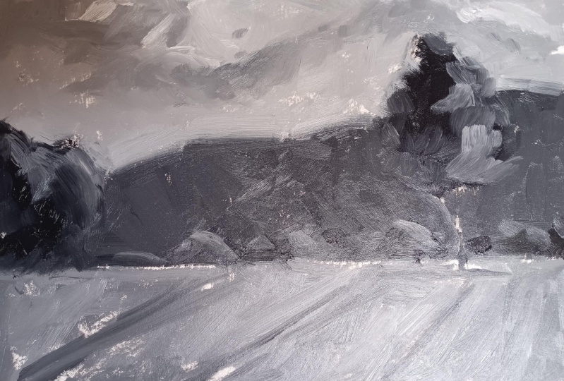
you to do the same. For this class project, you'll create a painting using different tones or values
of black and white. That will allow you to
understand the importance of the concept of values and
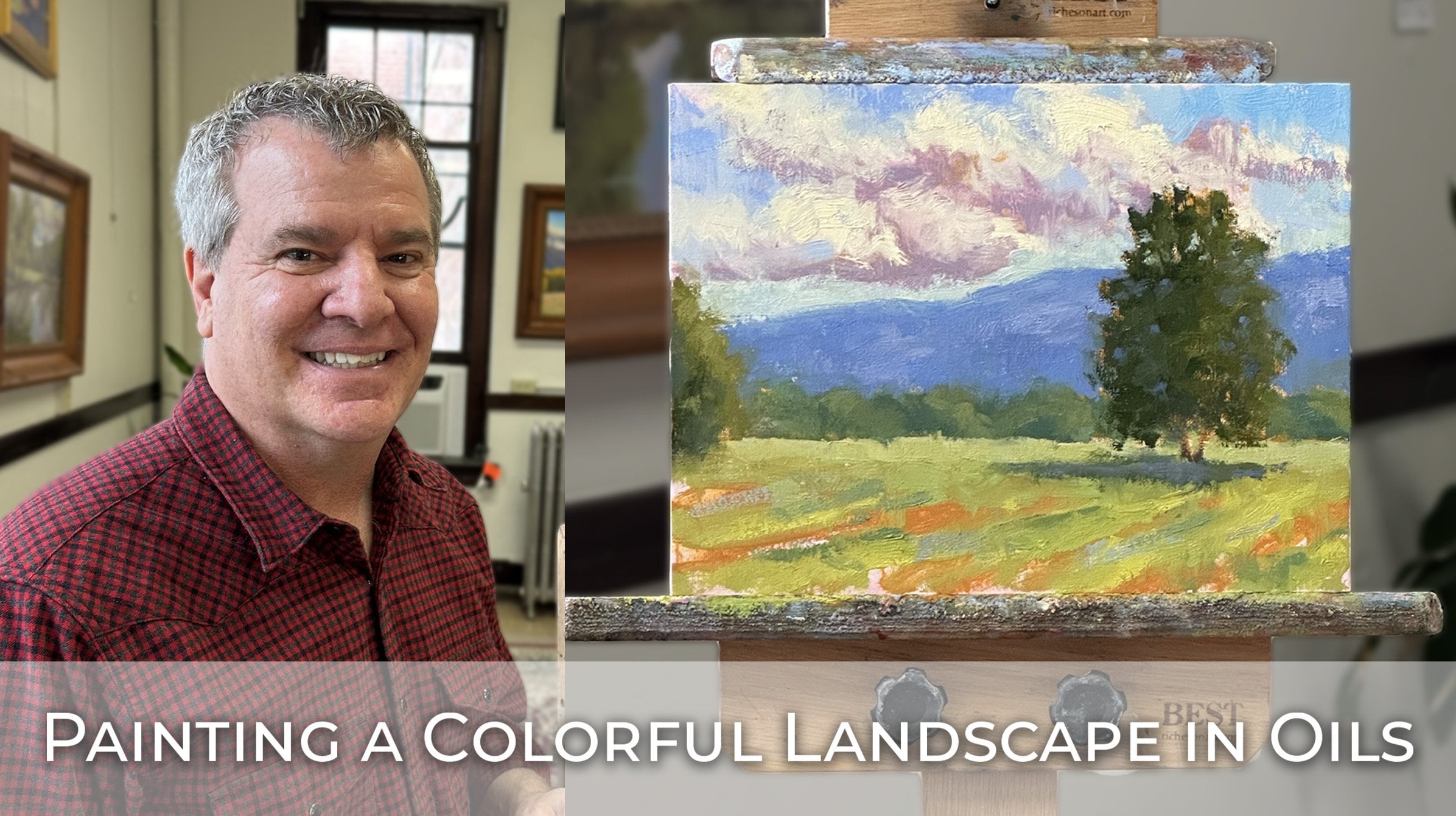
prepare you for my next class. Creating a colorful landscape.
2. A Space to Paint: To begin your journey
in oil painting, you'll need a space
in which to paint. And you'll want to consider these two things while deciding on which space
is right for you. First, is the source
of lighting adequate? Second, is that a
relatively quiet space where when you're painting, you won't bother others and
others won't bother you. This is my studio now, but my first studio was the living room of my
one bedroom apartment. And when I wanted to paint, I rearranged some furniture and threw some
tarps on the floor, and I was ready to paint. I mentioned this because if
the space you have chosen has adequate lighting and is a relatively quiet space,
you're good to go.
3. Materials 1: Sketchpad, Pencils, Eraser, Pencil Sharpener: Now let's talk about the
materials you'll need to start your journey in oil painting and to complete
your class project. To get started, you'll need a small sketch pad
such as this one, to make a thumbnail drawing of your subject matter.
Any brand will do. But I do like the spiral
bound sketch books because they open so easily and lie flat when placed
on a surface. I always make a
thumbnail sketch of the scene I'm going to
paint to determine whether or not I have a solid
composition or if there are any composition or design
issues I need to work out. You'll also need a couple
of number two pencils, a good eraser and a
pencil sharpener. I prefer a white eraser
such as this one, since the red erasers
on the end of a standard number two pencil tend to leave smudge
marks on your paper.
4. Materials 2: Brushes: There are a lot of good natural and synthetic brushes out there. But to get you started, I'm going to recommend the brand that I use, Rosemary
and Company. You can purchase either their natural hog hair
bristle brushes, referred to as classic brushes, or synthetic brushes referred
to as ivory brushes. You'll find them online and the following sizes are the
ones that you should buy. For this class and my
subsequent classes, you'll need a number
eight classic long flat. The flat brushes are
my go to brushes. I like a wide surface area. At the end of the brush,
you can scoop up a lot of paint and make nice
impasto brush strokes. Also, the white surface
allows you to mass in large objects in the initial
stages of your painting. You can also turn it sideways and make
narrower brush strokes. It's a fairly versatile brush. You also want to buy a number
eight classic Filbert. The Filbert brushes
have a rounded edge. They make brush
strokes that are, look different from those
of the flat paint brushes. A lot of times I'll use a large filbert to
mass in tree shapes. In a landscape painting in the initial stages
of the painting, you'll need a number
six classic long flat, a number six classic filer, a number four classic long flat, and a number four,
a classic filbert. Finally, you'll need a number
zero ivory long filbert. Again, the ivory brushes
are the synthetic brushes. I have found that the
synthetic brushes in the smaller sizes are more durable than the
hog hair brushes. This brush, I use it
to make tree branches. It's also good, for example, making grasses in the foreground of a painting of a
landscape painting. You'll also need a
zero ivory filbert. I use this brush to make
my initial sketch outline of the subject matter at the very beginning
of my painting. To reiterate, this
combination of brushes will allow you to lay down
thin or thick layers of paint, create a variety
of brush strokes, and make an initial sketch
of your subject matter. You can purchase these online. They may be a bit more expensive
than the other brushes, but if you take care of them, they'll last a long time. If for any reason you can't buy the rosemary company brushes, you'll be able to find a comparable set of
brushes online.
5. Materials 3: Palette, Canvas, Easel: For your palette. I recommend a plastic palette box
such as this one. The box measures 12 " by 16 ", and you'll need to
buy a pad of 12 by 16 canvas paper to place
inside the palette box. Then you place and mix your
paints on the palette paper. These plastic palette
boxes are wonderful for beginner oil painters who don't have a permanent
studio space. When you're finished
for one session, you can place the lid on the box and tighten it to keep
your paints fresh. In fact, if you place your covered and sealed
box in the refrigerator, the paints will
keep even longer, sometimes up to a week or more. There are basically
two types of canvases. There is what is referred to as stretched canvas,
which looks like this. The canvas has been primed with acrylic gesso and is stretched
over a wooden frame. There is also what is referred
to as a canvas panel, which consists of a hard panel with acrylic prime esso canvas, either cotton or linen
glued to the panel. I prefer the canvas panels because they're easier to carry. The wooden frame of
stretched canvas can become warped or the canvas, since it's stretched over, a frame can become
indented or even tear. Canvas panels are good for painting both indoors
and outdoors. For your class project, you'll need a nine by 12
canvas panel such as this one. Finally, you'll need an easel
to place your canvas on. I recommend the brand best easel manufactured by
Richardson easels. The Richardson Dulce easel, which you see in front of you, is one of their most
economical easels. And it's stable, durable, and holds a large variety of canvas sizes from
small to large. Also, this easel can
be easily folded up and placed against a wall or
in a closet when not in use. I've had this easel for over 12 years and it's held
up wonderfully over time. I believe I've only
had to replace a couple parts and I
still use it today.
6. Materials 4: Paints, Palette Knives, Mineral Spirits, Mediums, Latex Gloves, Paper Towels: Since your project for
this class is painting a landscape in tones
of black and white, you'll only need
to buy a tube of titanium white and
one of ivory black. Also, since you'll
be using titanium white in my other
classes and in general, you use this color
more than any other. I recommend that you buy
150 milliliter tube. For ivory black, you can
purchase a 37 milliliter tube. There are other types of
black and white out there. Be sure to buy ivory
black and titanium white, both of which you can find
at your local art store. I'll talk more about the
paints and type of palette I use in my next class when you
paint a landscaping color. You'll also need a couple
of palette knives, a small one and a
medium sized one. Like these two palette knives
have multiple applications. But for now, you'll be
using these two to mix your paint and scrape off
paint from your canvas. You can purchase
palette knives at your local art store or online. I use mineral spirits
to clean my brushes, But you can also use this
product to thin your paint. When massing in shapes, at the initial stage
of your painting, I recommend gamblings odorless
mineral spirits because this product does a great job of cleaning your brushes and it really is virtually odorless
compared to other brands. This is the one gallon or 3.76 liter container that I
use, since I paint a lot. But you can buy the one
liter bottle for now. You'll also need a canister in which to place the mineral
spirits or solvents. This canister has
latches on the top and you just them up to unseal
and take the lid off. As you can see, there is
a smaller canister within the larger one and it has
holes in the bottom of it. You fill the canister about an inch from the top
full of mineral spirits, and then you can dip your
brush and swirl it around and run it across the holes at the bottom of
the inner canister. And the paint from the bristles will settle to the
bottom of the canister. Then you just have to
clean out the canister. I usually clean it about
once every two months. You may be able to go
three or four months depending on how
often you paint. Painting mediums are
used to thin your paint, give it a buttery consistency, make it flow more easily, or make your painting dry
more quickly or slowly. I use gambling solvent free gel mainly to thin my paint and maintain its
buttery consistency, especially when I'm painting
outdoors in the hot sun. As with brushes and canvases, there are many different
kinds of mediums. But to get started, I
recommend the gambling brand. You can purchase this product at your local art store or online. You will also need some
latex gloves such as these. It's always a good
idea to put on latex gloves before you begin painting some of the paints. Oil paints have toxins, and those toxins could penetrate your skin and
get into your bloodstream. Let's say you had a cut on your hand and
weren't aware of it. Those toxins could get
into your bloodstream. It's best just to
put on a pair of gloves before you
paint each time. You'll also need
some paper towels. I recommend the Viva brand. They have these sheets that are perforated at the halfway mark, so you can tear off half of
the sheet and use it and I fold it multiple times just
to get more use out of it.
7. The Four Value Planes of a Landscape: Welcome back and let's get started with
your final project. To better understand why
I want you to complete your first oil painting in
tones of black and white. Allow me to revisit
the concept of values as it relates
to painting. In his well known
book, Carlson's Guide, The Landscape
Painting, John Carlson identifies four planes
that make up a landscape. And he assigns each plane
a particular value. In the image, you see a black and white photo of a landscape in central Arkansas. We can clearly identify the four planes of
which Carlson speaks. Carlson identifies the
sky plane as having the lightest value because
it contains the sun, the source of light
in the natural world, no matter where the sun
is located in the sky, it fills it with light. He then identifies
the ground plane as the second lightest value, because it lies
directly below the sky and reflects much of the
light coming from the sky. Carlson identifies the third
plane as any slanted object, such as ridges or
mountains in the distance. The value of this plane will
be darker than both the sky and the ground because of the angle with which
it faces the sun. The slanted angle
does not reflect as much sun as the flat
plane of the ground. Finally, he identifies upright objects as
the fourth plane. Typically, trees will be the upright objects
of a landscape, and he assigns them
the darkest value because of their
angle to the sun. Trees are basically at a 90
degree angle to the sun, which makes it
more difficult for them to reflect
light from the sky. You can imagine a large tree
with a lot of foliage with dark shadows in the center where the sunlight
cannot fully penetrate. Before I get started
with the demo, I did want to address one
thing you may have noticed. You may have noticed,
for example, that there's more
than one value in the sky plane when I'm
doing the initial washing. And when I say washing, that's just using a
thin coat of paint to mass in the major planes and
major objects of a painting. When you start off washing in the four different planes and the objects that
make up those planes, you want to use a thinner paint that has a little more of
some mineral spirits in it. I predominantly use the value assigned to that aspect
of the landscape. For example, when I
washed in the sky, I was using value number one, the lightest value
to show the sky, and then the same with the ground plane
and then the ridge, and then the darkest value
for the upright trees. But as I progress
in the painting, I have to start incorporating some of the other values into a single plane in order to give the objects in
that plane form. For example, I put some
clouds in the sky. In order to give them form, I had to put a darker value. This value looks like it was maybe the number two
value that I used for the ground on the underside of the clouds to give them form and to show that
there's a lit side, the top sides of the clouds and a shaded or a side of the
cloud that's in shadow. Now let's create the
four values Carlson assigns to the planes he
identifies in a landscape. And you'll use these
four values to complete a landscape
similar to this one.
8. Class Project Step 1: Mixing Your Four Gray-Tone Values: Okay, let's get started mixing those values that you'll
use for your landscape. For this exercise,
remember that you'll need a small 37 milliliter tube of ivory black of
the gambling brand. You'll also need a large
150 milliliter tube of titanium white, also of the gambling brand. You also need a
plastic palette box. You'll need some palette paper that you'll insert
into the pallet box. You also need a medium sized pallet knife
such as this one. You'll want a roll
of paper towels. Again, I use via paper towels because
they're so absorbent. You will also need your
canister of gambling Gamsol, odorless mineral spirits to clean your brushes as you paint. You'll also need the solvents or mineral spirits to apply
a thin coat of paint. What I refer to as the wash in during the initial
stages of your painting. I'm going to start by squeezing out a healthy portion of black on the right
hand side of my palette. You never want to on paint. If you skimp on paint, your painting will likely have an impoverished look to it. Don't be afraid to
use too much paint. Now I'm going to squeeze
out pile of titanium white on the left side
of the pellet box. Okay, the first pile
of paint is going to be on the darker side of the spectrum of the values
scale that we're creating. Remember, we're going
to make a value that's not quite pure black. It's going to have a
little bit of white in it, so it's going to be a dark gray. And then we're going to go one step down and create
another value that is a bit lighter than the
pile you mix to the right. Then on the left side
of the spectrum, these are going to be lighter
values. This is a tip. When I mix in the darker values, I always want to start
with the black and then fold in a bit of white. And it'll be much easier
to mix the paint that way. If I started with white and then tried to mix in a lot of
black to get a dark value, I'm going to have to
work really hard. Start with the dominant color, and then if you need
to add another color, just fold in that other color, little by little,
until you achieve the color you want or
the value you want. In this case, we'll have
two values over here. I'll take some white and
a little bit of black. I'll take more white and
mix in even less black. Come up with a
value that is close to pure white, but
not pure white. Let's go ahead and get started. I'm going to put the values
right here and we'll be able to use those piles of paint to complete the landscape. I may have to put out a
little more black later. Go ahead and grab
my paper towel. Remember we want to wipe off your pet knife each time you dip into the pure black
or pure white so that you don't
contaminate them. I'm going to start with
a little bit of white. I'll mix that in. I'm going to add just a tiny
bit more white. So this will be
my darkest value. This will be value
number four that I'm going to use for
upright objects, namely trees, in the landscape. Okay, now I'm still on the
dark side of the scale, so I'm going to
grab a little less black and a little more white. I'm going to mix this up. It looks a little
bit light to me, A little too much white, so I'm going to add in some
more black. I try to get. As much as I can out
of a paper towel because you can
find yourself going through paper towels
fairly quickly. Okay, I think that's
a good step down. A lighter value from this
value that we just mixed. Okay, so now I'm moving over to the light
side of the value scale. So I'm going to
begin with white. You can see that I still
had a little bit of gray paint left on
my palette knife. That happens, but it's okay. I've got my pile of white, I'll take a little more white. I'm going to mix
in a bit of black. This value should be one step lighter than the value I
just mixed up to the right. I think it is pretty
satisfied with that value. Now I'm going to take a
good amount of white, maybe a little bit more. I'm going to grab
another paper towel and I'm going to fold in a
little bit of black. And then I'm going to compare my four piles to see if I
need to make any adjustments. Okay, I think these two
are two close together. And so I'm going to
darken this pile just a bit at a little bit of black just to create a little more difference. I'm going to use
the rest of this white and fold it
into this pile. Now I think I have
four clear values. Okay? Okay, so what I'm
going to do now is I'm going to grab a marker and let's just quickly identify
these four values. Again, this is going to
be value number one. This is the value
that I'll use for the sky in the
landscape painting. This is value number two. This is the second
lightest value. This is the value that
I'll use to paint the ground plane
in the landscape. This is value number three. This is the value that I'll use to paint the ridge
in the distance. This is value number four. This is the value,
the darkest value that I'll use for
upright objects, namely the trees
in the landscape. I want to make a
minor adjustment to our four values before we
get started looking at them. They look like maybe they're a bit darker than I want them. I'm going to add a little
bit of white to each pile. I'm going to add just a tiny
bit of white to this pile. This is value number four, the value that we'll be
using for the upright trees. Remember to clean your
palette knife off. Each time you go back and
dip into the pure paint, I'll take a little more white
and mix it into this pile, and a bit more of
white for this pile. And finally, I'm going to
actually use more white here, just so that we
have a difference between value number two and value number one
a little bit more. Okay, I think that looks better.
9. Class Project Step 2: Thumbnail Sketch: Okay, I'm going to go
ahead and get started with the drawing for the demo. And I've got my materials
for the drawing. Just an HB or number two pencil and an eraser and my sketch pad. I almost always make a thumbnail sketch of the
scene that I'm going to paint. I try not to use the frame of the notebook paper
frame within it. Well, this is a square, and most of the time you're
going to be painting either with a
landscape orientation or a portrait orientation. Um, so vertical or horizontal, and this is a square. I'm going to go ahead
and put in what would roughly be equivalent
to a nine by 12 canvas, 912. This is the photograph
that I'll be working from. You'll see this on your screen. The image you see may be
a little bit lighter. Nonetheless, this is the scene that I'll
be sketching here. Going back to principles of
good design and composition, we never want to put our
horizon line in the center. As a matter of fact, you never
want to put your object of interest directly in the
center of your painting. Every once in a while
an artist will do it, but they have to really
know what they're doing in order for it to work. You want to avoid putting your horizon line in the middle. Why? Because that
divides the scene into two equal halves and it's just not very dynamic
or interesting. You're also dividing
your attention here and half here you want. Lead your viewers
into the painting and have them rest on
your focal point. Typically, in a landscape, you'll put the horizon line in the lower third or the upper
third of the painting. Let's just take a quick
look at this again, you can easily see that our horizon line is in the
lower third of the painting. Let's go ahead and establish our horizon line doesn't need
to be perfectly straight. The next thing I'll
put in is the ridge. It's a fairly large mass. I'll turn my camera
and show you this. In order to get the
angle of the ridge, what I'm going to do is hold
my arm out straight and hold my pencil up to a
line with the top of the ridge and get
the proper angle. I continue holding my arm
straight out and then I just bring that down to the paper and that gives
me the proper angle. I'm going to put the ridge in, put them down here, and I'm going to leave
a little space for that tree that sticks
out over the ridge. I don't want to make
my ridge too uniform. Okay. There's a tree here and
we can see two tree trunks. I'm going to go ahead and put
those two tree trunks in, one going out toward the right and another going
toward the left. I won't show all of those
trunks once I start painting, but I want to get them in there to establish
where they are. I'm going to go ahead and
try to get the gesture of the tree with my drawing
again. Out over the ridge. You want to put the
ridge a little bit higher? Go ahead and do that. I can just erase what I
had drawn originally. The drawing doesn't
need to be perfect, just giving us an idea. Working out the composition. We have a grouping of
trees on the left side too. Went down too far. Okay, I'm going to start here. I'm just have a
grouping of trees here. Again, I don't want to make the top line of the
trees too uniform. And then finally we have a group of trees at
the base of the ridge. I'm going to put those in
trying not to be too uniform. I'm going to do a little
bit of shading just to indicate where my
shadow areas are. This tree is almost entirely in a shadow to indicate
that there are some shadows on the trees
in the distance with just a little bit of light hitting the right
sides of those trees. But let me go ahead and
get my shadows in then. This grouping of
trees here also have some pretty dark shadows at
the base of the grouping. And some of those extend upward. Then we also have
these trunks come down just a little bit
below the horizon line. We have a little bit of
a shadow for the tree. I'm going to put in a couple more things when I look at the photo and you
may be able to see this, this, these lines may have been caused by the
way they mow the grass. I don't know. But there are some lines in the field
and they're a diagonal. I'm going to go
ahead and put those in just because it'll be a good device to lead
viewers into the painting. Ideally, viewers are
going to be led into the painting with these
lines in the foreground. They're going to go
up to this tree, then they're going
to be led across the painting to the
left with the ridge, but they're not
going to sail off the edge of the painting. They'll stay within
the painting because we have this grouping
of trees here. A couple other things
that I want to know about the composition is
we have a strong diagonal. That's one element, one
character of a good composition. Then as I said before, we've got some lines bringing the viewers in
and leading them across, horizontally across the
painting and stopping here. The viewer's eye should
rest right in this area.
10. Class Project Step 3: Painting Sketch: In addition to my canvas board, I am going to place
my reference photo on top of my easel, just so that I have that
handy and I can look right up here and see
my photo reference. I'm also going to place my initial thumbnail sketch
on the top of my easel. I want to make sure that I'm referring back to
my initial sketch, because it's here
where I went through the mental process of the
composition of the landscape. I want to remember some
of what I was thinking. For example, these lines. I want to make sure
that I incorporate them into my final painting. Okay, for the drawing,
I'm going to use this zero rosemary
company, Ivory Filbert, and I'm going to dip
in value number three, which is the value that
we'll use for the ridge. In order to do my drawing, I just want to have it
dark enough so that I can clearly see my drawing. Again, going back to principles of good
design and composition, you don't want to place your horizon line right
in the middle. You want to either put it in the lower third or the upper third. I'm going to go ahead and put
it in the lower third here. The line doesn't have to
be perfectly straight. There it is. Okay. The next large thing that
I'm going to put in, just as I did with my
drawing, is the ridge. Again, I'm going
to extend my arm. I'm going to align
my paint brush with the top of the
ridge to get the angle. And then I just bring
it down to my paper. It's coming down about
like this to indicate this tree here that's sticking out over the ridge,
just the top of it. And then I'm going to
continue with my ridge line. I don't want to make my
ridge line too uniform, I'm trying to not
use a straight line. Then we have a grouping of trees here give an
indication of those. Again, I don't want
to make the tops of these trees to round
or too uniform. I'm going to cut into them and then this hump will
be a little bit higher. I also want to just indicate where some of the shadows are, I don't forget about those. We've got some shadows at the base of this
grouping of trees. Now I'll go ahead and I'll
sketch in the rest of my tree. I'm just trying to get
the gesture of the tree. The basic shape outline is
down to about right here. And I'm going to go ahead and
put those tree trunks in. I do the same thing as
I did with the ridge. I just want to a
line my paint brush. This one is just at a little
bit of an angle going this way and then the other one comes out at an angle
going to the left. Okay. There is a little bit
of a shadow under the tree, so I'm going to give
an indication of it. The sun is coming
from this direction. Now, I went ahead and put those lines in
that I mentioned earlier. I'm going to go ahead and put
them in this demo painting. Also, I'm going to
extend my arm out, align my paint brush with
the lines as I see them. We have one going like this, The angle is not
going to be so sharp. As we move to the left, they flatten out a little bit. I could even put one here. These lines are going to help the viewer lead the
viewer into the painting, Come up to the
tree and then move across horizontally to the left. But not be taken off of the canvas because we have
this grouping of trees here, you can probably
see that there's an indication of some
clouds in the sky. That's a pretty large portion of the painting, is the sky. In order to make that look
a little more dynamic, I'm going to go ahead
and put some clouds in. I'll just put an indication
of the bottom of a cloud to maybe there's
another smaller cloud here and maybe even
a small cloud here. It's always good to group
things in odd numbers, three, in this case, the clouds. Okay, so here I have my drawing. Now I'm going to do what
is called a wash wash. When I'm just washing in the major shapes of the painting with the four
values that I have created. Let's review those values again. We're going to use value
number one for the sky. That's the lightest value. The second lightest value
is the ground plane. We'll use value
number two for it. And then moving over
toward the darker side of the gamut of values, I'll use value number three, which is a, It's darker than
both the sky and the ground. Then finally, I'll use
the darkest value number four for these trees. Again, wash in is
just as it sounds, I'll be using a bit of
solvent with the paint, so it will be a thin
layer of paint. When you're in, for example, I'll start with my
darkest starks. When you're putting in
your darkest starks, you want that paint to
be somewhat translucent. You don't want it to be
opaque and really thick. Typically, in an oil painting, you want your darker colors to be thinner and your lighter
colors to be thicker. But if I put too much paint
on without any solvent, it would be very opaque and it would just become a dead
spot in the painting.
11. Class Project Step 4: Wash-in with Thin Coat of Paint: Okay, I've zoomed
in on the canvas. You can no longer see the
reference photo in my sketch. That's fine. From time to time, you'll see that image
on your screen. Let me go ahead and
start washing in the major components
of the painting. In order to do that, I'm
going to use number six, Rosemary Company
Classic Long Flat. I'm going to start with
the darkest darks. Those are my upright trees. I want a variety
of breaststrokes. I'm trying to use some
brat strokes that are at a diagonal that are horizontal,
some that are vertical. Just you want a variety. Again, this is a fairly
thin layer of paint, going to come down a
little bit further on the tree trunks,
there's that tree. Now I'm going to accidentally
went into this pile, I meant to reach for
value number four. I'm going to go ahead
and put in these trees, They've got some sad, dark shadows at the base, as I indicated before. And then some of those shadows extend all the way to the top. Let's just get those in there. I'm going to leave
some of the canvas showing through here. I'll go back and put a
lighter value later. Okay, I'm wiping off my
paint brush between strokes. Each time I get more paint, I try to clean off
my brush and I just dip it into the solvent
and wipe it clean. Okay, that was
value number four. Now I'm going to go to the second darkest
value which is the ridge. That is value number three. So let me grab some of it. Again, I want to try to use
a variety of brush strokes. I'm doing some horizontal, primarily horizontal or
at a diagonal because that is the way
angle of the ridge. But I do want to include
some vertical, horizontal. You just want to mix it
up and I can cut into this tree to make it look
a part of the landscape. Going to let a little bit
of the canvas show through. That always adds a
little bit of interest, especially if with a painting
in color and you've got a little bit of a color from the tone that you initially put on the canvas showing through. Okay, Again, trying to use a variety
of breast strokes. Okay, now I've used my
two darkest values. Now I'm going to switch
over to the lighter side of the spectrum of
values that we're using. I'm going to save
the sky for last. I'm going to go ahead
and put in the ground. I'm using value number two, which is our second
lightest value. Again, I'm putting some
solvent in the paint. Let's put some of that in here. And again, I'm going to allow some of the canvas
to show through. I don't want to completely cover this area with a
variety of brushes. At this point in the painting, you're basically
just scrubbing in. You're scrubbing in your paint because you're trying
to cover large areas. The paint is fairly thin and I'm not
putting in any detail. You see how I'm
holding my brush? I'm holding my brush
with the but my hand that I'm not
holding it up here, I'm holding it way back here
so that I have control. But not as much control as I would if I were holding it here. This would show
too much control. Too much detail, the painting would end up being too tight. By holding the paint
brush way back here with the butt of the paint
brush in the palm of my hand, My brush strokes are going
to look much more painterly. Okay, so there's
the ground plane now I'm going to go ahead
and put in the sky, remember that I put an
indication of some clouds. So I'm going to work around those clouds with
value number one, the value that we're
going to use for the sky. There's a little portion
here that I didn't complete. Okay, I grab another
paper towel. This is our lightest value. This is the value that
I'm using for the sky. For this portion,
I'm going to use this larger brush since
it's such a large area. This is the number
eight classic, long flat Again, I'm
going to paint around the clouds that I've put in and I can cut into the tree, just as I did with the ridge. I'll follow this
ridge line again. I'm going for a variety
of breast strokes, Some horizontal, some vertical. Okay. I've got quite a
bit of solvent there. I'm going to try to
take some of that out. Okay, This is the washing, this is just washing in
those four basic values, each of which corresponds with a different aspect
of the landscape. The lightest value
is in the sky. It contains the sun,
the source of light. Second lightest value
is on the ground. It's directly below the sky. All of that light, all of
the light from the sky is hitting the surface
of the ground. Then we have the ridge. It's at a slant, it doesn't
reflect as much light, therefore, it's a
little bit darker. And finally, we have trees
that are pretty much at a 90 degree angle with the sky and it's
difficult for sunlight, for example, to penetrate
the middle of a tree. And they're going to
have the darkest values. Now I'm going to use
a bit thicker paint. At this stage of the painting, what I'll need to do is actually incorporate multiple
values within one plane. If I just leaving it like this, we've already created some
distance and some form. But in order to create more form with the objects that I
have in my landscape, I'll have to use multiple V.
12. Class Project Step 5: Completing Painting with Thicker Coat of Paint: Okay, you can
probably see a sheen, that's just some of the
solvent showing on the canvas. But now I'm going to go
ahead and use thicker paint. I won't be using
as much solvent, so I'm going to go
ahead and start with the darkest darks again and
apply some thicker paint. I'll be using my number
six Rosemary Company, classic long flat Y, because the trees don't cover
a large area of the canvas. So I want a little
smaller brush this time. I'm not even dipping into the solvent I just
dipped into the paint. And I'm going to put
some brush strokes on. That's enough paint for now. I want to go over here. I'm applying just paint without any solvent
at this point. Okay. So those were my
two groupings of trees. I forgot about that line
of trees along the ridge. So let's go ahead and
put those in now. There are some shadows at the base of the ridge
where those trees are. That's what I'm putting in now. Some of those shadows go
all the way to the top. Okay, so we've got our
line of trees at the base of, at the base of the ridge. Let's go ahead and put a little thicker paint on the ridge. So this is value number three. I'm not afraid to let a little bit of the
canvas show through. And you saw where I came
down into those trees. I may have to re,
establish that shadow. Okay, I've got a little thicker
paint on the ridge now. Now, I'm going to
move to the plane. Remember I put those lines in, they almost have
disappeared at this point. I'm going to put
thicker paint in. It's a lighter value. I can put even thicker paint than I have for the
ridge in the trees. Once I get that value put in, I'm also going to put
in a darker value. I'll probably put in,
this is number two. I'll put in the value of the ridge so that we
see those lines again. Let me go ahead and I'm
grabbing just a tiny bit of solvent and I want
some thicker paint. With these brush strokes, I'm with my brush strokes, I'm following those lines that I indicated earlier
as I said before. Now I'm going to put
those dark lines in. I'm going to use value number three that we use for the
ridge to indicate those. Okay. So we have one
here, another one there. And then I had one that
extended out here. We had one here
that flattens out. The angle is not so sharp. These lines allow lead the viewer into the painting up to the tree across the ridge. But we don't go sailing off of the painting because we're
stopped by these trees. So it keeps our
interest in this area, will go back across and our
eyes will rest in this area. Now I'm going to go up
to the sky plane again, as I mentioned before, in order to give
form to the sky, I'm going to have to include
more than one value. Otherwise it'll come
off as just flat. I'm going to stick
with this brush, the number six rosemary to put in the bottoms
of the clouds, which are going to be of
a darker value because the sunlight is hitting
the top of the clouds, but cannot fully
penetrate the cloud. And therefore we have
a darker value at the. On the bottom of the clouds. I think I'm going to
use value number two, the same value I used
for the ground plane. For the bottoms of the clouds, we've got a smaller cloud over here and a larger cloud here. I want my strokes
to be fairly loose, otherwise it'll look
like the clouds have just been pasted
on the painting. Trying to be fairly
loose there may be going to give
an indication of another cloud that's here just to bring all the way across. Okay, I've got the
bottoms of the clouds in. Loosen those lines
up a little bit. Okay. The lightest value I have is here
behind the clouds. I'm actually going to
go into my pure white. I'm just going to
use my pure white and my pure black sparingly. The pure white will be
some accent strokes on the tops of the
clouds to indicate the light shining on
the tops of the clouds. I'll use maybe a stroke or two. In the trees show the darkest parts of the tree where the sunlight
cannot penetrate at all. Put in just a tiny stroke
of pure black in the field. In a tiny stroke of pure white. The pure white representing
maybe some grass that is reflecting the
light from the sky. I've got pure white here. I can make it my brush
strokes fairly thick. I may have to put out
a little more white. See, I want to dip down into the shaded part because otherwise the division between the lower
part of the cloud and the upper part too sharp and the lines on a cloud are
just not that rigid. Okay, I am going to have to
grab a little more white, grab a new paper towel and let's dip into that
white. I'm saying that, okay. I still think the
bottom of those clouds that contrast a little too much with the sky
that's underneath them. So I want to go ahead and loosen that line
up a little bit. Okay, I've given
an indication of some clouds now I'm
going to go back down to the ground plane
and I'm going to incorporate value number
one that I use for the sky just to show that
some of the ground is reflecting maybe than
other parts of the ground. I'm just trying to give
a little more form to the ground plane. I'll go in and re, establish some of those
lines that I put in. Okay, And I'm going back
to value number two that I originally used for
the ground plane just to cover a little
more of this canvas. And we can see I want to
dip into value number two, that the field
extends back here. The tree trunks
actually come down below the ridge, the
bottom of the ridge. Okay, I erase that
shadow under the tree, so I'm going to grab
this number four long flat and I'm going to re
establish that shadow. I'm using value number three, the same one I used for the ridge just to
indicate that shadow. I went a little too high. Broke like that. Okay, one more thing
that I want to do. I want to put a
little bit of light now on the right
sides of these trees. That's my darkest value. In order to indicate the light, I'm actually going to start
off with value number two. We'll just see if that works. I think that it's mixing
in with the black. It's a little darker
than it would be. Some of that light will extend
over into the shaded part, so I'm going to continue using that same value number two for the lit parts of these trees at the base of the ridge can re, establish some of those shadows. Okay, and I don't want to forget about this group of
trees on the left. I'm dipping into
value number two. The same value that I used for the ground to indicate the
lit portions of these trees. And I'll use value number four to reestablish some of
these shadows. There we go. Okay, one more
thing I want to do is I want to soften
the edge of the top of the ridge just because
it's in the distance and lines become fuzzier the further back in
distance they go. I feel like that line on
the top of the ridge is a little too much of a hard line. I'm going to dip in the value number one
that I used for the sky and just lightly go over
the top of the ridge. This is going to help place that ridge more in
the background. I mentioned this earlier. I'm going to grab
some of that white, pure white just as a
high light indicating where the strongest points in the grass where it's reflecting
the light from the sky. Okay, I'm going to make a
few more adjustments here. On the bottom of the cloud, I'm going to grab a little more of pure white just
to put that up here. And again, with your
lighter values, you can use more of an
imposti brush stroke. I'm going to do one more thing. This ridge right here
a little bit, okay?
13. Review: I'm very pleased
with this painting in the sense that
it clearly shows us the four different
values that Carlson associates with the four
parts of a landscape. For the sky, I used
value number one, That was our lightest value. Now of course, in the clouds, I used multiple values
to give them form. For the ground plane, I used value number two. That was our second
lightest value. But again, I incorporated different values into
the ground plane to show the furrows in the ground and to make it more
dynamic looking, I used value number three for the ridge or
the slanted plane. For the most part, I used
value number three throughout. There are a couple spots
that are darker than others. Then finally, I used
value number four, our darkest value for the upright objects,
namely the trees. But as I progressed
in the painting, I incorporated
value number two on the right sides of the
trees to show that they were being lit
from the right side, the sun being located
off to the right. By using Carlson's four
values in a landscape, we not only gave
form to the objects that make up the different
parts of a landscape, but we also created the
illusion of distance. In other words, we made a one dimensional
plane picture plane into a three dimensional plane.
14. Conclusion: Congratulations on
completing the class and I can't wait to see your class projects and have the opportunity to provide you with constructive feedback. Now that you know
the important role of values in oil painting, you're ready to complete
a painting in color. I hope you'll join me
for my next class. Painting a colorful landscape.
 Andrew Deiser