Transcripts
1. Introduction: Would you like to
be able to paint a colorful landscape
such as this one? Well, I'm going to
show you a step by step process in this class
to be able to do so. Hi, I'm Andrew Ser and welcome to Painting a
colorful landscape. In this class, I'll
review what materials are necessary for completing
your class project. A landscape like this one. The role of the concept of
values as it relates to color, the type of palette I used to
achieve colorful paintings, and a step by step process for completing your
class project.
2. Materials: For this class,
you'll need a small sketch pad such as this one. I recommend this spiral
bound sketch pads because they open so easily and they also lie flat on most surfaces. You'll need an H B or number two pencil,
they're the same thing. You'll need a white eraser. I prefer the white
ones to the red ones. I find that the red ones leave smudge marks on your paper, and you'll need a
pencil sharpener. You'll also need a plastic
palette box such as this one. You can find a plastic
palette box like this one at your local
art store or online. This box measures 12 " on its short side by 16
" on its long side. In addition, you'll need
to purchase a pad of palette paper of the same
size that fits into the box. And this becomes your Palett, where you're going
to mix your colors. When you're finished
with a sheet, you just pull up the corner, tear out the sheet, and throw it away. It's very convenient. However, if you don't finish using all of your
paints in one sitting, one painting session, or
you have some mixtures left over that you want to go back to and finish your painting. These plastic pop boxes are wonderful for preserving
paint. They come with a lid. When you're finished, you
just place the lid on top, you seal it. Place the box in
your refrigerator. And your paints will keep
for up to a week or two. When you're ready to
use your paints again, take the box out of
the refrigerator, allow the paints to come
up to room temperature, and you should be good to go. You will also need
a set of brushes. I recommend the brand
Rosemarying company brushes. You can find these
brushes on line. They're very well made
and they're very durable. They'll last you a long time. If you take care of them, you will need a rosemary company. Classic Long Flat. A rosemarying company,
Classic Filber. One, each of each of
the following sizes. Size eight, size six, size four. Now, in addition to
these six brushes, you will need a number two
rosemary company ivory rigger, and a number zero rosemarying
company, Ivory Filbert. Now with this brand,
those brushes that are referred to as classic
brushes are made of hog hair. Those brushes that
are referred to as ivory brushes are synthetic. I find that the
synthetic brushes hold up longer and
the smaller sizes. That's why I get the synthetic brushes
and the smallest sizes. However, I have found that the hog hair brushes hold up better with the
large brushes. Now this long flat brush
is my go to brush. I like the wide flat surface
at the end of the brush. It allows me to scoop
up quite a bit of paint at the beginning
of my painting. Allows me to cover large
areas of the painting in a short amount of
time when I'm just massing in the different
areas of the painting. That large flat surface
also allows me to pick up quite a bit of paint to make
nice impasto brush strokes. Can also turn the paint brush on its side and make
narrow brush strokes. It's a very versatile brush, It's my go to brush. In contrast to the long flats, the Filbert brush
has a rounded edge. I use it for areas of my painting that need
softer brush strokes, such as the sky or
edges of my clouds. I may use it for the foliage of a group of
trees in the distance. Now the ivory rigger brush, the bristles are very
long and narrow. I use this brush for
painting tree branches. I may use it for painting
grasses in the foreground of at the number zero
ivory filbert. This is the brush that I use for making the
drawing on my canvas. You will also need a
set of paints and I recommend gambling
artist oil colors. This is a well
established brand. The colors have a
lot of pigment, so they're very
saturated colors. And also the paint has a very buttery
consistency, which I like. You'll need to buy 150 milliliter
tube of titanium white. I ask you to buy
the large tube of white because it's the color
that you'll use the most. You'll need to buy two reds. A 37 milliliter tube
of cadmium red light, and a 37 milliliter tube of a lizard, Crimson, two yellows. A 37 milliliter tube of
cadmium yellow deep, and a 37 milliliter tube
of cadmium yellow light. Now some other brands this
color and other brands, they may refer to it as
cadmium yellow medium. If you're using another brand, make sure that you
get the color that is a yellowish orange color, two blues, a 37
milliliter tube of ultramarine blue and a 37
milliliter tube of thalo blue. If you're an established
painter or you see yourself painting
well into the future, go ahead and buy 150
milliliter tubes of paint over the long run. You're going to save money
and you won't have to make as many trips back to the art store to
buy tubes of paint. You'll also need a medium. I recommend gambling
solvent free gel mediums help your paint
flow more easily. Say on a cold day, your paints may become a
bit stiffer than usual. And if you'll put a little bit of solvent free gel in them, it will loosen them up. This also has the effect of helping your paints dry
more quickly if you want. That effect comes in a tube, it's very convenient to use. You just squeeze it out on
your palette a little bit, will go a long ways. You'll also need a couple
of palette knives. I recommend a medium
sized palette knife and a small palette knife. I primarily use the palette
knives to mix paints. However, from time to time, I'll use a palette knife to create a certain
effect in my painting. I may use a palette knife
to create the grasses, paint grasses in the
foreground of a painting. And I've used a
small palette knife to paint a telephone wire, which requires a delicate touch and a very thin brush stroke. You will also need
mineral spirits. I use Gamblin, Gamsol. Odorless mineral spirits. They really are odorless. They keep the fumes to
an absolute minimum. I don't even notice them. Great mineral spirits to use. Maybe in a small
space where you don't have a lot of ventilation. Now the idea is that you place the mineral spirits in a
canister such as this one. You'll need to buy a
canister like this. You can find this at your
local art store or online. These canisters have an inner
canister that comes out, you can see that it has
holes in the bottom. The idea is the following,
I'll show you this. I'm going to put a little
bit of paint on my brush and I'll show you how you clean
your brushes with that, I'm just going to
pull a little bit of cad yellow light on my
brush. You can see it there. So I'm going to put my
brush in the canister, swirl it over those holes, wipe the excess
mineral spirits from my brush on the edge
of the canister, and then I'll squeeze the
bristles in paper towel, and you can see that it's taken out most of that yellow paint. You will also need paper towels. I recommend the Vivo brand. These are very absorbent
paper towels also. They come with sheets that
are perforated in the middle. You're actually getting
two sheets in one. Oftentimes, I'll take that half sheet and
tear it in half, and so I'm getting four
sheets out of just one. You'll also need a canvas, a nine x 12 canvas
such as this one. And you can purchase this at your local art store or online. And finally, I would
buy some latex gloves. You don't absolutely
have to wear clothes. The gambling brand of paints
do not contain toxins. However, if you don't
wear a pair of gloves, you're going to get paint
all over your hands and it can be difficult
to get the paint out.
3. The Concept of Values: In his well known book, Carlson's Guide the
Landscape Painting, John Carlson identifies the four major planes
of a landscape, and he assigns each
plane a value. First, there is the sky plane, which has the lightest value because it contains the
Sun, the source of light. Second, there is
the ground plane, which is the second
lightest value because it directly reflects all of the light from the sky. Third, if there are
any slanted objects, such as a ridge or
mountains in the distance, they will be of a
darker value than both the sky and the ground because of
their angle to the sun. Then finally, there's a
plane with upright objects. And those upright objects
will have the darkest value. That plane will contain
the darkest values because of those objects
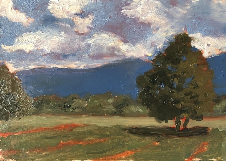
angle to the sun. In my previous class, students and I identified Carlson's four major planes in this reference photo of a landscape from
Central Arkansas. Then students as
their class project focusing on getting the
correct value for each plane, painted the scene in
tones of black and white, with the sky having
the lightest value, the ground having the
second lightest value. The ridge having a value that is darker than both
the sky and the ground. Then of course, the plane
with the upright objects, namely trees, in this case, having the darkest value. In this class, we'll be
doing something similar. However, we'll be painting the same scene from the
reference photo in color. In addition to
focusing on getting the correct value for each of
the four different planes, we'll also consider our color choices and
the values that we associate or give to the different color
choices that we make. If you recall in
my previous class I mentioned that if you can
get the different values, the overall value correct, for each of the four planes
that Carlton speaks of, then you're going to
have much more freedom with respect to color choice. And why is that true? It's true because the values are the underlying
structure of your painting. And you can think of color as
kind of icing on the cake. Once you've established
the different values and you've got them correct for
the four different planes, then you can really
make the painting sing with your color choices.
4. Using a Limited Split Palette: I use a limited split
palette because it offers me a broad range of warm and cool variations of
the three primary colors, red, yellow, and blue, as well as a broad range
of the secondary colors, orange, green, and violet. I live in central Arkansas, a part of the United States that experiences all four seasons. So it's important to me to be able to mix a range of greens, some of which I use for spring
vegetation and foliage, and others for summer, fall, and even winter
vegetation and foliage. I also like to paint the contrast between light
and shadow in my paintings. I need to be able to mix a broad range of warm
colors that depict light, as well as a broad range of cool colors that depict shadow. The impressionist found that by juxtaposing warm and cool
colors in a painting, they created a certain
color vibration. I strive to create that same color vibration
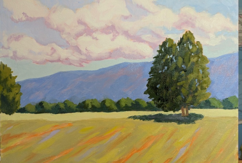
in my paintings. For example, in this painting, you can see that
the foreground is made up primarily
of warm colors, these warm earth tones, and these warm yellows
and yellow greens. However, I've also placed some brushstrokes of
violet in the foreground. And it's that juxtaposition of the warm and cool
colors that allowed the impressionist to create that color vibration
in their paintings. And it's that same
color vibration that will capture the
viewer's attention, excite the viewer's eye, and lead the viewer
into your painting.
5. Layout for Limited Split Palette: To show you a sample
of the variety of colors I can mix with a
limited split palette, I'm going to do a quick
color mixing exercise. As I mentioned before, a
limited split palette consists of a warm and cool version
of the three primary colors, red, yellow, and blue. These warm and cool
colors allow me to mix a broad range of
secondary colors, orange, green, and violet. For my warm red, I use
cadmium red light, which is warm because it has
some yellow orange in it. For my cool red, I use a lizard. And crimson, which is cool because it has
some blue in it. I use titanium white
for my warm yellow. I use cadmium yellow deep. It's warm because it
has some red in it. For my cool yellow, I use cadmium yellow light. It's cool because it
has some green in it. Finally, for my warm blue, I use ultramarine blue, which is warm because
it has some red in it. For my cool blue, I use thalo blue, which is cool because it
has some green in it. You'll also notice that I put a little bit of solvent free gel my medium off here
to the side just in case I need it to loosen
up any of the colors.
6. Mixing Greens: Now let's look at the range of saturated and muted
secondary colors I can mix with this palette. To mix a range of vibrant
and muted greens, I use my warm and cool blue
in combination with my warm and cool yellow to mix
a vibrant spring green, for example, I use a
bit of thalo blue. I can just use a bit because
it's a very strong color. So just a bit goes a long way. I mix it and it already
has some green in it. And I mix it with my
cadmium yellow light, which also has some green in it, and I get a nice,
vibrant spring green. You can see here,
I'm going to put just a little bit of
white in with it, so you can see the color better. I might use this vibrant green for spring foliage or
even for summer foliage. If on the other hand I want
to mix a more subdued, warmer green, I'll
mix ultramarine blue, which is my warm blue. It's warm because it
has some red in it with my warm yellow,
cadmium yellow deep. And it's warm because
it has some red in it. And I get a nice
olive color green. And it's much more subdued
and muted than the green I mixed up previously,
the spring green, and I'll use this green
for late summer foliage, when the leaves start to turn kind of an olive color
and into the early fall.
7. Mixing Oranges: Let's also take a look at
some oranges I can mix with this palette by mixing
cadmium red light, my warm red with cadmium yellow. Deep my warm yellow, I create a vibrant, warm orange. So I'm going to take a
little bit of red light. This is my warm red because it has some yellow orange in it. And I'm going to mix it
with cadmium yellow deep. It's my warm yellow because
it has some red in it. And I'm going to come up
with a very vibrant orange. I'll put just a
little bit of white in it so that we
can see the color. I might use this color for trees whose leaves have turned a
bright orange in the fall. Likewise, I can mix
a Lisarin crimson, my cool red with
cad yellow light, my cool yellow to achieve
a more muted orange. So I'm going to take
just a little bit of a Lisarin crimson
will do you. It's a very strong color, just like thalo blue. So I'm going to take it
and I'm going to mix in a bit of my cool yellow,
cadmium yellow light. You can see that I come
up with an orange. That's a much more muted orange. Okay, And I could add maybe a little bit of a lizard and crimson back in a
little bit more. And this gives me a nice
reddish orange color. Kind of an auburn color, that I might want to use for, say, the color, the
auburn color of a barn.
8. Mixing Violets: Finally, let's take a
look at the violets. I can mix with this
palette by mixing ultamarine blue and
alizarin crimson, both of which contain
blue and red. I get a very vibrant violet. So I'm going to take
some ulta marine blue and crimson red again, Crimson red is very strong. A little bit will
go a long ways. Now this color is really dark. So in order to see it better, I'm going to fold in some white. And you can see that we
get a nice vibrant violet. May need just a little
bit more red. Here we go. If I want a more immuted violet, I mix my thalo blue, just a bit of my thalo blue, which is my cool blue because it has a
bit of green in it. I mix that with my warm
red cadmium red light. The green in the
thalo blue green is the complement of red
is going to mute the red. I'm going to end up with
a very muted violet. Now, this is a dark color,
you can't see it that well. I'm going to add some
white to it so we can see the true color. But you can see that this violet is much more muted
than this one.
9. Muting Colors: In fact, if you want to mute any color mix in its
complementary color, for example, the complement
of green is red. If I want to mute my
spring green mixture, I fold in a bit of
Cad, red light, which desaturates
and mutes the green. Let's go ahead and do that. Here I have my spring green mix. I'm just going to take a
little bit of Cad red light. Immediately, you can see that the color
becomes less vibrant, less saturated, and more muted.
10. Tinting Colors: You can also tint any
color with white. Tinting any color
with white makes the color paler and cooler. Because white has a
little bit of blue in it and it also lightens
a colors value. Let's just take a little bit of white and we'll mix it
in with the muted green. And you can see that that green becomes more of a
sage colored green. I'll take some white
and I'll mix it in with the muted spring green, and that becomes
cooler and paler. Let me go ahead and mix in some white with the other colors so that you can see them. This was our muted orange. It becomes paler with white. This was the auburn
color that we mixed up and it becomes paler
and lighter in value. I'll add some white to
our vibrant orange. It becomes paler, and then I'll do the
same with our violet. And finally, with
our muted violet. You can see that by tinting these colors, they become paler. A little bit cooler, you
can continue adding white. You don't want to add
too much white because it'll take on a chalky color. But you can always tint
a color several times with white to make it paler
and lighten its value.
11. Limited Split Palette Summary: In sum, a limited
split palette allows you to mix a broad range
of cool and warm colors, Both primary and
secondary colors. The variety of warm and cool
colors you're able to mix will allow you to more accurately depict
light and shadow, as well as the contrast
between the two. And by using a limited
number of colors, you'll more easily achieve color harmony in your paintings. Because you're not introducing
colors outside of those. You can mix with
the primary colors. Also with a wide variety
of warm and cool colors. At your disposal, you'll
be able to create the same color vibration
as did the impressionist. Finally, by limiting the
colors on your palette, you gain the confidence of being able to mix any color you want from your warm and cool
primary colors to boot. Over time, a limited split
palette will save you money.
12. Thumbnail Sketch: I always start my
painting process with a thumbnail sketch
since that allows me to work out any
composition or design issues before I begin painting. Also, I never use the edge of the sketchpad paper
as my picture frame, since a clearly defined
frame for your drawing will help you with the placement of the major shapes and
objects of your scene. Additionally, this sketch pad is a square and the shape of my paintings are usually a rectangle in a landscape
or portrait orientation. So it wouldn't make sense to
use a square shape to frame my drawing unless I were using a square
shaped canvas panel. Since we'll be using a
nine by 12 canvas panel, the ratio for which
is three to four, we'll want to make a
picture frame that is 3 " in height by 4 " across. This doesn't have to be perfect, the lines don't have to
be perfectly straight. But I do want to come
close to that dimension. This is the picture frame
that I'll use for my sketch. I'll start by placing my horizon line in
my picture frame. As a rule of thumb,
you don't want to place your horizon line in
the middle of your drawing, whether it has a
vertical orientation or a horizontal orientation. In fact, you never want
to place your object of interest or your focal
point in the middle of your drawing because
it makes it too symmetrical and quite
frankly, a bit boring. If you place the horizon line in the middle of your drawing, you'll be splitting your
viewers attention between the top portion of your painting
and the bottom portion, making it difficult for
him or her to be drawn to a particular area of interest outside of the
center of your painting. What we're looking for in a composition is
asymmetrical symmetry. In other words, we want balance, but in an uneven way. Normally, you'll place
your horizon line in either the upper third of your picture frame or the lower third of
your picture frame, regardless of whether
your painting has a horizontal or
vertical orientation. Looking at my reference photo, which is the color version of the same black and
white reference photo I showed you earlier, I can clearly see my horizon line is in the bottom third of
the picture frame. So I'll go ahead and
draw it accordingly. For my design, I'll
be using what is referred to as a steel
yard composition, where you place a
large heavy object along a horizontal axis, which in this case is
my horizon line that is counterbalanced by a smaller
lighter object opposite it. On the right side, I have
this large tree that is counterbalanced by this
smaller tree on the left side, which is a more
pleasing composition to the eye than two
evenly spaced trees. Now this reference
photo naturally lends itself to a steel
yard composition. However, if I needed to re, arrange some of the trees from a different reference photo to create a steel
yard composition, that would not be a problem. So now that I've shown you what a steel yard composition is, let me go ahead and
redraw the trees. I just want to get the
gesture of the trees. So here's my horizon line and looking at the grip of
trees on the right hand side, I can see that there
are two tree trunks that are visible and they
go below the horizon line. So I'm just going to give
an indication of them and I won't show all of these
tree trunks the painting, but I just want to get them in here to establish
where they are. Let me go ahead and
just get the gesture of the tree just to try
to get the basic shape. It's actually two
different trees, but I'm going to make
it look like it's just one tree and the
foliage will come down here. Then to my left, I've got this group of trees that's ticking
out from the side. The line of this tree goes
below the horizon, line two, not quite as far
down as this one. Then you'll also notice, let me make this a little darker so you can see it better. You also notice that
there is a line of trees on the horizon line at
the base of the ridge. So I'm going to indicate them. I don't want to make
my line straight, I want to make it uneven, which will make it
more interesting. Here I have my large tree, group of smaller trees on the left hand side and this line of trees
in the background. I'm going to go ahead and take the opportunity to just
do a little bit of shading to indicate where the shadows are,
so I don't forget. Actually this tree
is mostly in shadow. The sun, the sunlight is
coming from this direction. I see a few shadows at the
base of this group of trees, and then some of
them that come up. Then with the trees along
the base of the ridge, there are also
some shadow lines. Again, I just want to make them uneven to give an indication that the sun is coming from this direction and shining
some light on these trees. But there are also some shadows now to get the proper angle
of the top of the ridge, I extend my arm out
straight and I align my pencil with the top of the ridge and maintaining
that same angle, I bring my arm back to the sketch pad where I
will draw the ridge line. The ridge comes up to about
right here at this angle. A little bit of a dip here. Then it comes up, there's
another dip here. It comes up a little bit, and then there's
yet another dip. I do I want to avoid
making a straight line. I want the ridge line to
have some character to it. You may have noticed
that there is a shadow under the tree, which I failed to
indicate when I was doing some shading earlier. So I'm going to go
ahead and put that in. You may have also noticed
that that shadow line appears to go all the way across the painting. It doesn't. That's just a road back there of a darker color and it
coincides with the shadow. It appears that the shadow
goes all the way across, but it doesn't I don't want
it to go all the way across because I want to reinforce the fact that the sun is
coming from this side. You may also noticed
that there are some diagonal lines in the
grass, in the foreground. Those, I believe are there just because of the angle at
which they cut the grass. But I'm going to use those
lines and take advantage of those lines and act as if
they were furrows in a field. Why? Because they serve as a really nice device
to lead viewers into the painting to get the proper angle of
the diagonal lines. I hold my arm out straight, I align my pencil with the lines and maintaining
that same angle, I bring my pencil back to the paper and to the sketch pad. So I'm going to go ahead and
put just a few of those in. And as we move to the right, the angles are not as
sharp, quite as sharp. But these will serve as a really nice device to lead the viewer
into the painting, up this tree, and then along the top of the
ridge and to the left. However, the viewer
won't be taken off the edge of the painting
because we have the small group of trees here
to stop the viewer's eye so the viewer's gaze will
rest somewhere in this area, which is where we want it to be. We want it to be off center. Finally, I'll make
some indications of the clouds in the sky. We want to avoid making our clouds the same
shape and size. And remember that clouds
in the distance will appear at the bottom of the
sky or near the horizon line, or in this case just
above the ridge, and will be smaller
and flatter than clouds that are nearer to
us and higher in the sky. Looking at the reference photo, I see some clouds here,
some smaller clouds. Again, I'm just giving
an indication of them. Then there are some larger
clouds here higher in the sky. I also see some over here. I see a smaller cloud here. Then there are also
some clouds here. Okay, so this is our
thumbnail sketch. We'll want to
continue to look at our thumbnail sketch as
we complete our painting, because I've made choices here with respect to the composition and design of the painting. And I want to stick to those choices as I
complete the painting.
13. Toning Your Canvas: This is an example of a
nine by 12 canvas panel toned with a lizard and crimson. But I'll use a clean panel and just a bit to
show you the process. I almost always tone my canvas before I begin
the painting process. Toning your canvas places a thin layer of paint
and mineral spirits on your canvas that will
make the surface a bit smoother and thus easier
to apply paint to. And it provides a
background color that can peek through parts of your
painting and add interest. I live in the state
of Arkansas where there is plenty of green
foliage year round. So oftentimes I'll
tone my canvas with just a little bit of a lizard
crimson or permanent rose, both of which are shades of red and therefore the
complement of green. The parts of the canvas
that end up having the pinkish tone show
through serve as a nice complement to all
the different shades of green and is
pleasing to the eye. I can show you the effect of which I'm speaking by zooming in on the Demova painting
I completed earlier, which is the same landscape that you'll be completing
for your class project. You can see the pink tone of the canvas showing through the
grasses in the foreground. And as I make my way
up into the painting, you can see that same pink tone showing through
parts of the sky, parts of the large
tree on the right. And even in the lower right
hand corner of the painting. Now those pinks are part
of the family of reds. Red is the complimentary
color of green. Everywhere you see
that pink tone showing through the
final painting. It's serving as a complement to all the shades of green that you see throughout
the painting. Now, you may have also
noticed that there's some orange peeking through
parts of the painting. Like with the trees in the
distance on the top of the ridge and even through
the large tree on the right. That orange is the color that I used for the drawing,
for the painting. And remember that orange is the complimentary color of blue. It's serving as a
really nice complement to the blue of the ridge and the blues in the sky and adding a lot of interest
to the painting. Overall, I'll take just a bit of Alizarin Crimson from the dab that I put
in the corner. And I'll spread it on my palette paper so that
I have a thin layer. I'll take my paper towel and dip it in my
mineral spirits, and I'll swirl it around
in the Alizarin Crimson. And this is what I'll
use to tone my canvas. This is enough. As it is. I'll be able to cover
the entire canvas with this paper til with a little bit of
Alizarin Crimson on it. And I'll fold my paper towel over to take some of that
off because I've got too much on to take just a
little bit more off. I'll grab a clean paper towel and I'll dip it in
the mineral spirits. And I'll continue to wipe it. And it will take off some of the Alizarin Crimson that's
already on the canvas panel. Let me wipe it. It doesn't
have to be perfectly even, but I usually try
to get it to be just a faint tone, pinkish tone. There you have it. Here
is our toned canvas.
14. Drawing and Placement of Horizon Line: So as you can see, I have placed my reference
photo on top of my easel so that
I can constantly look at it while I'm
sketching and painting. You'll also notice that I put my thumbnail sketch and
taped it to the easel. Remember, I made
certain decisions when drawing my
thumbnail sketch. And I want to remind myself of those decisions so that
I incorporate them into the painting to get the color that I normally
use for my sketch. I take yellow deep
about that amount. I'm going to put it in the
lower right hand corner of my palette because I'll need the rest of the room
for mixing the other paints. And then I grab a little
bit of Cad red light. If you will recall, by mixing these two
colors together, we get a pretty vibrant orange. So vibrant that I'm going to have to mute
it a little bit. And remember that
the way that you can mute a colors by using
its complimentary color, the complimentary color
of orange is blue. I'm going to take
a little bit of ultramarine blue and I probably
need a little bit more. I'm also going to add
a little bit more of Cad yellow deep into it. It's gotten a little too much of a red tint to it.
Okay. I like that. And so now I'll just need to put in a tiny bit more
of ultramarine blue. And I think I will
have my color, tiny bit more of
ultramarine blue. You'll notice that I'm
cleaning my palette knife trying to avoid contaminating
my piles of paint. Okay, this is the
color that I want, so I will put it in a nice little pile and
I'll begin my sketch. The first thing I want
to do is put a mark at the halfway point between the top and the bottom on the right hand
side of my canvas. Just so that I'm marking
the midway mark, it's about 4.5 ", falls about right here. And I'm doing this
just so that I can better gauge where to
put the horizon line. And remember we decided
that our horizon line will go in the bottom third
of the painting and why? Because that's what the
reference photo calls for. Also just going back to good principles of
composition and design, you never want to put your
horizon line in the middle of your canvas because it will equally divide the
viewer's attention. We want to lead the
viewer in and around the painting and
have the viewer's gaze rest on a focal point. There is my midway mark. I'm going to put the horizon
line in the lower third. I'm going to place
it about right here. And I will try to make as
straight a line as I can, but it doesn't need
to be perfect there. I have my horizon line now. I will get started with
the tree on the right.
15. Drawing the Tree Plane: For the tree on the
right, remember we're starting with the plane
with upright objects. For this painting,
those are trees. And remember that
this is the plane of which Carlson speaks that
will have the darkest values. I'm starting with this tree, large tree on the
right hand side. The first thing I want to
do is put in the trunks, it has a split
trunk at its base. It's actually three trees, but I think I
mentioned this before. I'm not going to show
this one shooting off to the left because it would
just distract viewers. I'm going to make it
look like one tree, but I will put the split
trunk at the base. I have one trunk that's below the horizon
line, comes out like this. The other trunk is also below the horizon line and
comes out this way. Now, I won't show all of the trunks that we have
here in the final painting, but I do want to establish their position for
now to continue on. The foliage comes to
about right here. There's a little
field in the back, dips down, just trying to
get the gesture of the tree. As we get higher in the tree, you'll notice that
the tree thins out. I'll try to show that the tree comes out a
little bit over here. Then some of the
foliage actually almost comes down to the ground. You bring us out a
little bit more. Now, I'm just taking
a look at the tree, making sure it's got
a decent balance and some irregularity maybe
this can come out, may need to give it a little
more volume over here, but I think that's a good start. I'm satisfied with this tree
as it stands right now. Now I will move over to
the left hand side of the canvas and I will put in the tree
on the left hand side, I want to see where
the top of that tree comes up on the
tree on the right. I'm holding my brush
up to align them. I can see that this comes
to about right here. I just want to make
this shape irregular. I'll bring it below
the horizon line. Now to complete the plane
with the upright objects, I want to put the row
of trees in the back. I'll go ahead and do that. What I want to keep
in mind again, is just keeping the
shape irregular. It's got some humps, it may flatten out in parts
and then it may dip down, But we just want to make
things somewhat irregular. I'm going to take the
opportunity to do some shading. And I'm doing this just to remind myself of where
the shadows are. The left side of this tree is almost completely in shadow. So I'm going to indicate that. Remember that with
our brush work, we want a variety
of brushstrokes, some horizontal, some
vertical, and some diagonal. Just for the sake of variation, you'll note that the tree thins out. I mentioned
that before. I'll let some of that
background colors show through at the top of the tree, then it comes down here. Okay, I think that's good
enough for this tree. Now, I will do a little shading
on the tree on the left. I'm squinting my eyes and
I see a nice shadow here. It's a little one here. I think that's good enough. I'll bring this
down to the base. Now. I want to put
the shadows in on the row of trees at
the base of the ridge. The sunlight is coming
from this direction. I want to show that the
row of trees at the base of the ridge is being lit by the sun on the
right hand side. Some of those spaces, I'll just let the background
tone color show through. And then later I'll put a
warm color there to show that the light is hitting the
right sides of these trees, some of them are shaded. I'm just trying to make this as irregular as possible. Okay. And at the same time,
showing that some of the right sides of these trees
are being hit by sunlight. That is my midway mark, so don't get distracted by that. That's not part
of the tree line. Okay. So I have one
more thing to do. I want to put that
shadow under the tree, if you will recall. And if you look at
the reference photo, it looks as if the shadow of
the tree goes all the way across and out of the
left of the canvas. It doesn't. That's a paved
road and it's a dark color. So it just looks like
the shadow carries over. So I'm just going
to put the shadow here and carry it
over to about here, and I think that
will be good enough. Okay. So we have
completed the plane with upright objects,
namely the trees. And so now I want to move on to the plane that has the
second darkest values, and that is the ridge plane.
16. Drawing the Ridge Plane: I'm going to start here. The ridge comes up to
about here on the tree. I'm looking at the angle again. Then we have a little
bit of a hump here. It dips down a little bit, and then we have another hump. And then it straightens out
at an angle going down there. We have our ridge plane. Now I will be moving on
to the ground plane. And remember the ground plane has the second lightest values.
17. Drawing the Ground Plane: If you recall, When I was
drawing my thumbnail sketch, I decided that those lines
that I saw in the grass that just looked to be there because of the angle at
which they cut the grass, could be viewed as thin
furrows in a field. By putting them in the painting, it would be a nice
device to lead viewers into the painting up this
tree across the ridge. But they wouldn't
go off the painting because we have this tree stopping their view from
going off the side of the page. That's
what we want to do. We want to keep viewers
engaged in the painting. Just as I did with the ridge. I'm going to align my brush with the lines
that I see in the field, and I see one right here. And I'm going to go
ahead and draw them in. Align my brush with the line, and then I bring it down to
the canvas. There's one. I see one above it. Let me go ahead and put that one into that ones at
above this angle. And I see a couple
more over here. Let me go ahead
and get those in. See one roughly about here. And let's see, just
one more roughly here. Okay, well, be a little
bit more like that. Okay, so that is a ground plane. So now I will move
on to the sky plane.
18. Drawing the Sky Plane: With the sky plane,
I primarily want to just give an indication
of where my clouds are. Remember with clouds that clouds that are closer
to the horizon, in this case closer to the
top of the ridge will be smaller and flatter
on their bottoms. Those are the clouds
that are further away from us, farther away. Then clouds that are
closer to us and higher in the sky will be a
little more amorphous. You can see that
there's a blue sky peeking through a
lot of these clouds. Let me go ahead and get just an indication of
some of the clouds. I'm squinting my eyes, I see that nice dark bottom to a shadow that runs
from about here, goes up a little bit and it
comes to about right here. So I just want to now put a
little bit of that shadow in and just get the top of that cloud
just being very loose, has a little top here and
then trails off up here. Okay, I'm just grabbing a little more paint from my palette and I'm taking
a look at the sky. I see where there's
another mass of clouds here and the dip down like this at
the bottom of it. And then we have a little bit of sky peeking through here. This line carries across. We have a little bit of
the top of a cloud here. Again, some more sky
showing through here. And I'm going to jump over to the right side of the canvas. Got a small cloud here that I just want to
get an indication of. And then you can see
faintly some clouds here, but we also have some
sky peeking through. And there's some sky
peeking through here too. Again, I just want to give myself an indication of
where the clouds are. That is good enough
for the sky plane. For now, this is our sketch. And now I will be moving on to what is referred
to as the wash in where I'm going to paint the major shapes in the
four different planes. And I'll be using a little bit of mineral spirits
with my paint to do that. Because I want to
cover a fair amount of canvas in a short
amount of time. Also with each plane, I'll probably be using
just two colors. I just want to get
the basic colors and even more so I want to get the correct value for each
of the planes before I go back in and use less mineral
spirits and more paint. And then also start
to add colors and multiple values
in each plane.
19. Pre-Mixing Colors for Wash-in: I don't always pre
mix my colors. But I'm going to go
ahead and do so for this demo because I
think it'll be very helpful for you to listen to my thought process as I'm mixing the colors for the
four different planes. So we're going to start with the plane with upright objects. Those are the trees and they
have our darkest values. Just as I did with a sketch. I'll begin with a
tree on the right. And when I look at that tree, I see a lot of dark blue and
an aisle of color with it. So I'm going to start with
my ulti, marine blue. Remember that if you're
mixing up a dark color, start with the
predominant color. And for this color, the predominant color
is this dark blue. I'm starting with it
and then I'm going to grab some Cad yellow deep. That may have been too much and I'm going to mix it in and this will be the shadow side of that tree.
That's pretty dark. I think this is about right. That tree also has a lit side, so I'm going to take
just a little bit of this mixture and put it up here. And I'll fold more Cad
yellow deep into it. May add a little more
cad yellow deep. But this will be the lit side
of that tree on the right. Okay. So those are the
two colors for that tree. When I look at the
tree on the left, I see more of an olive color. So this time I will start
with my Cad Yellow deep, and I'll fold in just a little
bit of ultramarine blue. I may even use a little bit of white to bring the value down. I'm going to put in just
a tiny bit of white. Okay, I think that's a nice color for that tree on the left. Now we have the row of trees
at the base of the ridge. And that row of trees will need to be cooler
in temperature. And it'll need to be lighter in value to show that
it's in the distance. By cooler in temperature, I mean that it's going to
have a little more blue in it and it's going to be a
lighter color value wise. To get the shadow color of the trees at the
base of the ridge, I'm going to start
with ultramarine blue. And just to give myself more room on my paletteI'm
going to put it up here and I'll grab some
Cad yellow light that is definitely looking
like a cooler green. It's pretty intense. So what
I need to do now is put a little bit of Cad red light in order to mute your greens. You can always fold in
a little bit of red, the complimentary
color of green. Okay, I'm making sure that I
wipe my palette knife off. I'm going to grab
a little bit of white to bring the
value down on that. That may have been too
much, I think it's fine. Then we have the lit sides of those trees and I'm going to take off just a little
bit of the pile that I mix for the shadow
side and I will take some cadulolight and mix that
in that may be too warm, but let me put some white in it. Okay. Maybe a little
too warm, I mean. Okay, I think that's
it. So you can see that these two colors are
cooler than these colors. These trees are more
in the foreground. They need to be a warmer color. These trees, they're the row of trees at the
base of the ridge. They need to be a cooler color. So now I want to mix up
the color for the ridge, that is the plane with
the second darkest value. If you look at the reference
photo and squint your eyes, I think you can see
some of the blue that I will be mixing up
here in just a minute. You will likely also see
some tones of green, but I may put just a little bit of
bluish green in the ridge. But I'm going to stick
primarily to blue because it's going to help push it back into the distance. And if I painted the
ridge and tones of green, there would just be an awful lot of green in the painting. And I want more variation. I want a more colorful
painting to get the blue. I'm going to take some
ulti, marine blue. Again, this is the
dominant color. That's why I'm starting
with ulta marine blue. I'm going to add just
a little bit of d, red light to dole it down. The complimentary color
of blue is orange. But I can also use red because it's got some
yellowy orange in it to knock this color
down. To mute it a bit. Okay, I may need to mute
it a little bit more. We'll find out this
color is very dark. You can't really see it
without putting white into it. Let me take part of this, because it's so
dark and so strong. And I'll start folding
white into it, and we'll see what color we get. So that's too dark, may
still be too intense. Let me add some more white. Okay, I think this is
about the right value. May need to be just
a tiny bit darker. Okay. I'm going to add
just a little more blue and I'm going to add
just a tiny bit more cad, red light to do it
down a bit more. I do want to vibrant painting, so I don't want to dole
it down too much there. I think that's the right value. And it's muted just enough. Okay, so this is the
color that I'll be using for the ridge later
in the painting. I may incorporate a
couple other colors into the ridge for the
sake of variation. But for this stage
of the painting, the wash in this is the color that I'm going to
use for the ridge. So now we need to move
on to the ground plane, which if you will recall, has the second
lightest values and so the greens that I'm going to
mix up for the ground plane, actually I'm just
going to mix up one green and then the
color of the furrow, the red Earth color. But the green will
have to be much warmer and much lighter
than these greens. Why? Because it's
in the foreground and it's in the ground plane. That's the second lightest
value of the painting. It's receiving all that
sunlight from the sky. So this time to get my green, I'm going to start
with Cad yellow light. That's my cool green. I'm sorry, my cool yellow. And I'm going to take a little bit of thalo
blue, just a tiny bit. That's my cool blue. And that's going to
give me a really nice vibrant green.
It's pretty intense. So I'm going to have
to dole it down a bit with some Cad red light. Remember the complimentary
color of green is red. I can always dole down my
green by folding in some red. Let me go ahead and do that. I'm putting a bit of white
in to bring the value down, but I also need to put in a
little bit of Cad, red light. Okay, the ground plane is covers quite a
bit of the canvas, so I'm probably
going to have to mix up a little bit more
than I have here. I'll put in a little more
of the yellow light, a little more white again, you can see that the
value of this green is much lighter than the value of these greens that I'm using. For the plane that has
the darkest values, this plane, the ground plane, needs to have a lighter value. Okay, that is the green. I may have to fold in a cadmium yellow light
or a little more white. We'll see once I get
the paint up there. But I have my green
for the ground plane. Now let me mix up some of that nice earth tone that
has a red tint to it. I'm going to start
with Cad, yellow deep. Then I'll fold in
some red light. That may be a little too much. In order to get this to turn
to more of an earth color, a brownish, reddish color, I'm going to fold in
ultramarine blue. Remember, you can always doll down orange by folding in blue. The complimentary color
of orange is blue. Let me grab a little bit of ultramarine blue that
dolls it down quite a bit. I've lost the red
Earth tone to it, so I'm going to grab a
little more red light. I want a little
bit more of that. Okay, I think I've
got enough red in it, but now the value is
a little too dark. I don't quite want it that maybe just a portion
of it that dark. I'll leave a bit of
the pile behind, but I'm going to
grab a little bit of white and mix that in. I think that's about
the value that I want. If I need to tweak that,
I can tweak that later. Okay, so now we move on to the sky plane and it has
our lightest values. Now that's not to say that there won't be any darker
values in the sky. We have a lot of
clouds in our sky and the undersides of those
clouds are in shadow. So we will have to mix a color that indicates that
the bottom portion of the clouds are in shadow. In order to do that, I'm going to start with
my Alizarin Crimson. I'm going to make
the shadow color of those clouds a little bit. More on the lavender side rather than like a gray
or bluish Again, because I want to
push the colors, I want to really
colorful landscape. I'll fold in just a little
bit of ultramarine blue. Maybe a little bit more. I'll grab a little
more Alizarin crimson and just a little bit
more of ultramarine blue. Now, again, when I mix this up with just
these two colors, you can hardly tell
what the color is. Let me put some white in
and we'll see where we are. Okay, this is pretty red. I want it to be more
of a lavender color, so I'm going to have to put more ultramarine blue on cleaning
off my palette knife. And maybe a little bit more blue and even a little more blue yet I haven't quite gotten
to where I want it. I think this might work for me, but the value is
really too dark, so I'm going to have
to fold in some white. So let me fold in some white. Okay, that's still too dark. I'm going to have to fold
in a little more white. I think that's about the value
I want, About the value. It may need to be a
little bit lighter. I'm going to take part of this pile and put a
little more white in. But if I need to go darker, I can fold in that darker value that I've got to the right here. Okay, I'm going to go
a little bit lighter. In theory, this should be about the same value as the ridge or maybe even
a little bit lighter. The other color that I have for the clouds is the
lip portion for it, I want to use a
really warm color. I'm going to start
with titanium white. I'm going to grab from a pile that doesn't have any
pain in it at all. And I'm just going to fold in
a bit of Cad yellow, deep. Sometimes you'll
have paint left on your palette knife and I
don't want to waste that. I'm going to take
my other palette knife and scrape it off. I want to grab just a little
bit of cad yellow deep. That may have been too much. I'll take some of that off. That's a nice color
for the tops of the clouds that are
being lit by the sun, but I want to make more
of that color again. I'll just grab a little
bit of Cad, yellow, deep. Let's make just a little bit
more of this color because there are quite a few clouds that are being lit from the top. So I don't have much room left. But I do need to mix a couple
more, three more colors. And these are sky colors, so where the sky
meets the horizon, or in this case where
the sky meets the ridge, the sky tends to be warmer. In order to get that warmer
kind of bluish color, what I do is I take some
titanium white and I'm going to put it right here and I'll fold in just a tiny bit
of ultamarine blue. That may have been too
much. Let me okay, I think that's the right amount. May need a little bit
more ulta marine blue. But let me see first now.
This is pretty cool. It's lighter than
a baby blue color. So to warm it up, I'm going to grab just a tiny
bit of cad yellow light. That may have been too much, it's going to turn it
kind of a greenish color. But this is the color that we want at the base of our sky. Because on a sunny day, even a cloudy day with a
lot of sun on those clouds, the sky tends to be
warmer at the horizon. This will be the
color that I use for the sky just
above the ridge. Now I want to mix up a
couple of blue colors. The blue that is showing
through the clouds. For the sake of variation, one color of blue will have
ulta marine blue in it. And the other, I'm going to
clean this up a little bit. The other will have thalo
blue and that'll give me a nice variation in
the blue that I'm using for my blue sky color. Okay, so I think that's a nice blue color for just
above the warm color. I may have to put a little more Alta Marine blue in there. When I get to that part
of the sky, we'll see. But now let me do the same
thing with thalo blue, but I probably don't
need as much thalo blue. It's stronger than
aultamarine blue. So just let me use
that amount and I see how strong that is. It's a darker value than the Altamarine blue
and white that I mix. So I'm going to take
just a little bit of that and I'm going to
mix more white into it. I'm trying to get the same value as this color right here. I'll tell you what
I'm going to do. I'm going to take a
little bit of this. I feel like this value is
just a tiny bit darker. And I'm going to
make that other pile of blue with
ultramarine blue in it. A little bit darker too. I'm going to grab
just a little bit of ultramarine blue
and fold that in. Let me grab a little bit more. Okay, now I think they're
about the same value. Let me mix this up
a little bit more. You have to be careful
when you're going back and forth between these
blues to make sure that you're cleaning
off your palette knife or you'll contaminate
them fairly easily. Okay, so these are all
the basic colors that I need in order to
complete the washing.
20. Wash-in for Tree Plane: Okay, to complete the
majority of the wash in, I'm going to use my
number eight Rosemary and Company Classic Long flat. Again, the wide surface
of this brush allows me to cover quite a bit of canvas
in a short amount of time. And that's what I want to do during this phase
of the painting. Let's start with the plane
with the upright objects. I'm just dipping the
corner of my brush into the mineral spirits and I'm may dab it a bit
on a paper towel. I want to start with that plane
with the upright objects. And I'm going to start with
the tree on the right. And let me put in the
shadow color again. I'm going to dip the corner of my brush in the
mineral spirits. So let me start with
the shadow color. And remember that just
as I said before, we want a variety of brush
rukes that is pretty dark. I'm probably going to have to
lighten that a little bit. Let me take just a
little bit of this. That's the color
that I mixed up for the lighter side of the tree
and folded into this color. And I think that is enough just to bring this
value up a little bit. So let me wipe off my brush. Make sure that you're cleaning your brush between
brush strokes, especially if you're going from one color to another color. So again, I'm just dipping
the corner of my brush into the mineral spirits just to make the paint full
a little bit more. Okay, let's try this. Still pretty dark, but I'm going to go ahead
and go with it. Can always go back and lighten. It's easier to lighten
something than to have something light and want
to make it darker again. We want a variety
of breasts strokes, some horizontal vertical. This portion of the tree
sticking out a little bit. Some of this foliage comes as
I make my way up the tree. As I said before, the
tree becomes lighter and I want to indicate that with the amount
of paint that I put on, Some of that dark value
carries over to the right. Okay. So now let me grab the warmer and lighter color that I will use for
the lit side of that tree. That's this color. It just looks like I need
to add a little more cad. Yellow, deep to that color, I may need to use just a
tiny, tiny bit of white. Let me use this color
and see how that looks. Again, dipping the corner of my brush into the
mineral spirits. If you feel like
you have too much mineral spirits
on your bristles, either dab them on a paper tile or you can slide this
across the edge of, of the container to take out the mineral spirits at
the edge of the canister. That's what I meant to say. Okay, that's still pretty dark. I want to be, I
wanted to read it as being lit by the sunlight, so let's put a little more yellow and a little more white. Didn't want to do that, I'm going to have to put
out some more white. I'm getting low on white. Okay, let's try this. Okay, I think that's about what I want. I'm just trying to make this really loose, some irregularity. There's a part that
comes out here. Okay. So that's all
the paint that I'm going to use on the
tree on the right. Now, I'll move over to
this tree on the left, and I already have my
pile of paint mixed up. It is a warmer and
lighter version of the greens that I've been
using for that. The right. Okay. So I'm just dipping the corner of my
brush in the mineral spirits. Okay. Again, I want to gauge how far up this goes
about right here. I just want to make this
shape irregular and I want to make it come down
below the horizon line. Now this tree also
has some shadow. I'm going to go ahead and I'm going to use the
color that I used for, for the lit side
of this tree and see if it works as my shadow. It's not dark
enough. I'm actually going to have to go
into the shadow, the color that I use for the
shadow side of this tree. It's got a little bit of
the lighter color mix in. I think it'll work
for my shadow. It does. I'll bring this down and there's a
little shadow up here. Okay, so those are my two
trees in the foreground. Now I will paint the trees in the background at the
base of the ridge. And remember that, that
row of trees do use a green that is cooler and lighter to show that
it's in the distance. So let's see how the color
that I mixed up will work. So this will be
the shadow color. And it looks pretty
intense on my brush. I may have to, I
kind of like it. So this is the shadow. Remember, the trees are
being lit on the right side. But I just need to put some
indications of shadows in. And I'll come back later
with a lighter color, the color that I mixed up. And I'll try to indicate
the lit portions of these trees. Okay? The shadow here. Okay? So let me now grab a lighter color that I mixed up to show that the right sides of
those trees are being lit by the sun coming
from this direction. I may have to go in
and put a little bit of that shadow color there. I want to leave some of that
orange showing through. It will serve as a
really nice complement to the blue color of the ridge. Now, I want an
impressionistic look to this. I'm being fairly loose
with my brush work. It looks like I'm going to
have to go back in and re, establish some of the
shadows because I've taken some of those out with the lighter green
that I just used. Let me go ahead and do that and I'll put some of those
shadows indicate some of that. Now, I'll have to re
establish the trunk, but I can do that later. Again, I just want this to
be as irregular as possible. Okay. I'm satisfied with that. Breaking this down
just a little bit. Okay. I may have to
cut up into this. I may have brought
that down too far, but I think I like what I see that this 123
looks too uniform. I'm just going to
break that up a bit. You always want to
break something up that looks too uniform. Okay, so this is the plane with the upright
objects, the trees. I may need to cool this
down a little bit more. Go ahead and do that right now. For the shadow side, I've got some bluish green
left over on my palette knife. But I can use this and I may want to make it a
little bit cooler than it is, and I'll add just a little
bit of white to it. I want to make sure that
that row of trees at the base of the ridge reads
as being in the distance. Okay, there we go. This warm color that I used may be just a
little too warm. I may need to cool it down with a little bit of
ultramarine blue. And then I'll just
take the value down. I want to, don't warm
it up just a tiny bit. Those values are pretty close. I'm going to grab some of this darker color and
mix it into this. Now I'm going to use a smaller brush because I want a little more control
for this section. Now that I'm going back into it, I will use my number
six Rosemary company, Classic Long flat again. I just dipped the tip of the brush in that
mineral spirits. Okay, I'm just going back in re establishing
some of the shadows. It still looks a
little too warm to me, so I'm going to have to put
a little bit of thalo blue in and then I'm going to need
to lighten this with white. Okay, I think this is more of the color that I was looking for because this is going
to read as in the distance, it has more blue in it. Okay, let me grab some of this. Let's just see what
that looks like. Yeah, has a little
more blue in it. It pushes that row of trees
back a little bit further. So let me go ahead and finish this out. The
row to the left. Okay. Now, let me put the
lip portions back on, and this time my color should be a little bit
cooler than it was before. Let's see if it's cool
enough. I think it is. Okay. I'm going to warm it
up just a little bit more. Let's see, a little bit of
that here, a little bit here. And I can cut into this tree and make it look a
little more organic. Okay? I think now
this row of trees is the colors cool enough and pale enough that they read
in the distance.
21. Wash-in for Ridge Plane: Now we are moving on
to our ridge plane. I'm going to use my number
eight Marin company, Classic Long Flat. I want to make sure
that it's clean. You'll notice that
there's a little bit of a green tint to the
mineral spirits. That's okay. It's still
clean enough to use. I want to dip the corner of my brush into the
mineral spirits. I want to get a little more
on the tip of my brush. Let's put this blue up here
and see how this works. It may be a little too dark, maybe a little too intense. We'll see, I think I like
it, it's pretty intense. But I want a colorful landscape. So I'm going to go ahead and go with the
intensity for right now. Remember, you want a variety
of work brush strokes. Some will be horizontal,
will be vertical. I can carve into
this tree a little bit to give it a little bit
more of an organic shape. I'm just continuing to
fill out the ridge plane. The majority of my brush
strokes will be at a slant because that is the
direction of the ridge. But again, you want to try to use a variety
to break things up. I may even want to dip down into this tree line a bit,
which I've just done. You may want to
dip into the tree. I'm also going to put some
sky holes. Sky holes. We refer to sky holes as the holes or the
gaps that you may see at the top of the
tree with the sky showing through or in the case of
the middle part of the tree, a little bit of the
ridge showing through. If we can allow some of
the ridge to show through, it just gives the painting a little more of an
airy look to it, a bit more of an
impressionistic look. Let me complete the
ridge over here. I have a little bit more
of the ridge to put in. I ended up using most of the color that I mixed
up for the ridge. I thought I might have
some left over. Okay. And I can cut into this
tree on the left again. It just gives it a little
more of an organic feel. A couple spots that
I need to go over. I just a tiny bit of the pink undertone
show through in parts. Let me take a smaller brush
and you can see where there's one spot where the blue came up. I'll just wipe that out
with my paper towel. So this is a good
teaching moment. If you need to wipe
a section out, just dip your paper towel
into the mineral spirits. Just make sure you have
a hold of the canvas. I want to use my right
hand to do this. I can just swipe that across
and that takes that out. Okay. So I said that
I wanted to show some sky holes in the tree. I'll have to wait to put
the actual sky holes in, but the areas where I can show
the ridge peeking through, I can go ahead and do that now. Typically a sky hole will be just a little bit
darker than the color, the rest of the color
that it comes from. See if this is too dark. So I just want to judicially, I have to go thing with
sky holes is you have to go back and them look
a little more organic. Okay. Now let me clean
some of that blue out and just make a
few marks like this. But I think you get the idea, I may eliminate one
or two of these, but it just gives more of
an airy feel to that tree. The color of the sky hole tends to be a little bit
darker than the color around it because the color is coming through the trees and it's
got shadows affecting it. Typically, your sky holes
will be a little bit darker than the actual sky
color that it represents. Okay, so that is the
plane with the ridge, now we're going to move
on to the ground plane.
22. Wash-in for Ground Plane: Okay for the ground plane. I'll go back over that shadow
with a lavender color, but I want to put down
some of the local color. The local color is
basically just the color that is there and it's grass, so it's going to be a
darker green color. The shadow would
be a darker green color that's a little too dark. I'll have to add a little
bit of white into that. I'm going to have to clean up my white and put a
little more white out. Let me grab a white and put this color up
and see how that works. Okay, I think that's better. Again, I'll incorporate
some lavender into that color primarily, just so that it complements the lavender
color that I'll have up in the sky as the bottom
shaded side of the clouds. Okay. The first thing
I want to do with the ground plane is I want
to put those furrows in. I'm going to use my number six Rosemary and
Company Classic Filbert. I'm going to start
with this value. I don't want to make
these super thick, I want to make them
somewhat irregular. I'll go back and put a green in. They won't be quite as thick
as they look right now, but I also want
this color to be, to represent Earth showing
through the grass. It's not just the furrow, some earth tones
showing through here. Okay, Now I want to put in the green color that represents either
some type of growth, green growth between the
furrows or even grass. Okay, let me clean my brush out. I'll use my same brush. The number six, Rosemaring
Company, Classic Filbert. I'm not sure about this green. I think it's the right value. It may be a little intense, I think I like it may
be a little intense. I'm going to just fold in a tiny bit of red and that will take some
of the intensity out. And I'm going to add just
a little bit of white. Okay, let's see what
this looks like. I'm going to clean my brush and I'm going
to switch brushes. I want a little more
of a harder edge, so I'm going to go back to my number eight Rosemary
Company, Classic Long flat. I'm dipping the, just the
corner in the mineral spirits. Sometimes I'll flip my
brush over just to get the side that's not
contaminated because some of that green is
running into the Earth tone. I'm cleaning off my brush, I'm going to grab a little
bit of our solvent free gel. Remember, we want a
variety of brush strokes. Those furrows are still a
little bit, a little bit thick. I don't want them to
stand out that much, but I do want them
to show through. I'm letting a little
bit of this canvas show through an area of interest. Okay, let me bring this up. I see the shadow
may be a too dark, but I will deal with that later. Now, there is this strip
of another field that lies behind the foreground and I want to make sure
that I get that in. It's a lighter color than I used here and
it's a duller color. I thought maybe I had mixed some of that up, but maybe not. So let me go ahead and
mix some of that up. I'm just going to use some of the greens that I already have. It needs to read as green, but it needs to be pretty dull. And I think I have
that color right here. That's about what I want.
I think I'm going to lighten the value just
a little bit more. I think I'll use a
little smaller brush just to get a little
more control. I'll use my number six
Rosemary Company, Classic. Long flat. I'm just
dipping the brush, the corner of the brush
into the mineral spirits. Let's see how this looks. I think it needs to be
of a lighter value. Just so that it reads that it's completely in the distance, I'm going to squeeze
out just a little bit more of my titanium white. Before I do that, I'm
just going to clean that area up just a tiny bit. I'll wipe that area
clean and then I'll put down my white again. I just want lines, there we go. Let me put a little
more white into that. Bring the value down,
yet a little bit more. And I'll hold my palette knife
up to the canvas to see. Sometimes that's a good way to check if you have the
right value or not. And I think it's about
the right value. I'm going to add just
a tiny bit more white. So let me clean my brush. Okay, let's give this a try. Okay, I think that's
light enough. I can even go up into
the bottom of the trees. I think that is the right
value because it's reading as a field that's in the
distance being lit by the sun. But it value is much lighter. It's, it's not as warm,
it's a cooler color. I see a little bit that
I have to put in here. I'll just put a little dab there between the two tree trunks
and I'll go back and re, establish those tree
trunks in just a second. Okay, so there is the
ground plane for now. So now I will move
on to the sky plane.
23. Ground Plane Adjustment: It's always a good
thing to take. A few steps back
from your painting, you may see something. I notice this line probably
needs to be brought down. It comes up to about here and it should be a
little less prominent. I'm going to eliminate
some of that right now. I may need to do more later. The furrows in the grass are
still a little bit thick, but they won't be as thick. By the time I finish with the second phase of
the painting, however, I'm going to have
to mix up some of that ground color again.
How did I get that? I took Cad, Ello light
and a little bit of thalo blue and then I mixed in some white to
bring the value down. I want to make sure that I'm
cleaning my palette knife. I think that's about the color. I think I doled it down a
tiny bit with red light. Let's see what that looks like. That looks pretty close. It's a little lighter, but I think it'll serve the purpose for
what I want to do. Okay, I've cleaned my brush. I'm dipping the corner
in the mineral spirits. I'm just going to bring
this back a little bit and indicate that
there's some field here. Then I can bring the top of this one
back a little bit too.
24. Wash-in for Sky Plane: For this plane, I'm going to use my number eight Rosemary
company, Classic Long Flat. And I've been using it
quite a bit with my green. So I want to make sure that
I have it cleaned out. Well, in order to do that, I swirl it around in
the canister and then I apply quite a bit of pressure and squeeze out as
much green as I can. I think I've got
it pretty clean. When you squeeze and you're not getting much green
on your paper towel, then you know that
your brush is clean. Okay, let's put that
lavender color up there. It may be too intense, it may be too dark. But we will find out. Again, I'm squinting my eyes looking at that line
that goes across. I like the color. I don't
think it's too dark. I'm just getting
that shadow line And that shadow comes up here. It's a little bit here and there's a line going
across this way. Remember I said that
the clouds that are closer to the horizon will have flatter bottoms and we'll have more
shape to them. I see a little bit
of shadow here, some shadow here, and a little shadow on the
bottom of this large cloud. Maybe a shadow or two here. Now, since I put this lavender color in
for the undersides, I wouldn't want to just put it over here on the left hand side. I need to have a
little bit of it throughout the painting. Okay. And you can see that it's
really thin coat of paint. You can probably see a
sheen on the canvas. Okay, So I just wanted to indicate some of the shadow
portions of the cloud. Now let me indicate the lit portions of those
clouds, the top parts. Since I was using this brush to paint those shadow colors, I want to make sure
that it's cleaned out. Again, I'm applying quite
a bit of pressure and just getting the paint
out of those bristles. I want to be just as loose with the top portions of the clouds as I was with the
bottom portions. I'm just giving an indication
of the clouds here. We can see that this
one's being lit on top. Remember I said that sometimes
I just flip my brush over. It gives me a little
portion of the brush. Let me go ahead and
continue with this. See a little a lip color
carrying over here. And I could even dip down
into the shadow portion. I see where this is
almost connected, some more lit portion up here. Let me scoop this up. I'm getting as much as I need. I may need to mix up a
little bit more of this. This white with
Cad, yellow, deep, that's indicating the
top of the clouds here. And then we have Lit portion. I'll use just a little bit more. Again, I want to indicate
this little cloud over here a little bit here. I can cut into the
tree just to make it look a little more
organic looking. And then we have a little
bit of this lit part coming down here and I can
make it cut into the tree. Okay, I think I have
enough of the lit portion. Now, I want to put
that warm color that I mentioned earlier where the sky meets the
top of the ridge. So let me get my brush
cleaned out as well as I can. Just dipping the corner of the brush into
the mineral spirits. And this is the color, the warm color that I mixed
up to be at the horizon. I eat just a little more
mineral spirits and you'll see when I apply it
that it's just a light, almost borders on
a greenish color. And this is a nice
opportunity for me to cut into the top of
that ridge a little less uniform and just not to have as hard an edge because things in the distance, their edges get soft. Let me continue
working with that. There's a little dip here, then it comes up again, and then it dips
down again here. Let me go to the
right side again. I'll do this later too, but sometimes it is glide
my paint brush where the sky meets like a ridge just to soften
that edge of the ridge. Okay, Maybe that helps. Okay. Now I want to put in some of the other blues
that are peaking through. I'm going to use the same brush and my brush work will
be light and fast, just giving an impression of
the clouds that are there. I'm going to start with
my ultramarine blue. I'm squinty, my eyes, this blue hair looks
a little bit warmer. So I'll go ahead and use some of this ultramarine blue to indicate the sky
peeking through here, and there's a little bit
peeking through here. Okay, let me continue
to look and see if there are any other sections
where I need this blue. And I think got quite a bit
of mineral spirits in it. And then above the lip
portions of these clouds, we've got a little bit of the blue that will
need to be darker. I'll darken that in the
last phase of the painting. Let's see if there are
any other parts here. The more I can allow some of that blue to show
through the arerier, the sky is going to look and the better it's
going to look. Now I'm taking similar color. It's blue, but its
base is thalo blue. And I have a feeling it's going to be a
little bit darker. It is, that's fine. I see some of that thalo
blue up in this corner. Let's just take a look
and see if I can see it anywhere else, primarily here. Okay, Now what I want to do now is this is always
kind of a push and pull. I'm going to mix up some more of that warm color that represents
the tops of the skies, I'm sorry, the tops
of the clouds. And I'm going to put a little
bit more of that color on. Okay, there I have
some more mixed up. I'm going to clean my brush
out because I was using both of those blues with
ultramarine blue and thalo blue. I want to make sure I can get my brush as clean
as it needs to be. I'm dipping the corner
into the mineral spirits. Taking a step back and I can see where there is
some of this here, it trails off over here. Let's take a look and see if
there are any other places. There's just a
little bit of this. It's a little lighter
color, lighter touch. I don't want the lines in my
clouds to be really hard. This line right here
is a little too hard. You can cut into that
tree as I did before. Okay. I think I'm satisfied with the way that looks for now. I even have some of
the pink showing through and some of the
drawing of the clouds, that orange peeking through. And that is just fine. The orange serves as a nice complement to the blue
of the ridge and the red, pinkish color serves as a
nice complement to the green, all the tones of green
in the painting.
25. Modeling Stage Intro: We've reached the final
stage of our painting, the so called modeling stage. Modeling just means
that we're giving further shape and form to
the objects of our painting. One by using thicker paint, which will create more
texture in the painting. And we may be able to include
some impostobrushtrokes, which always enhances the
texture of a painting. Two, by adjusting our values, and that entails using multiple values within
a single plane, and lightening and darkening
some values as needed. Three, by tweaking our colors. And that may include making some colors warmer
in temperature, some cooler in temperature, some darker in value, some lighter in value, and some colors more intense, and others more
muted, all as needed. And finally, by juxtaposing
some warm and cool colors in certain areas of the
painting to create that color vibration I
mentioned previously. Now allow me to explain
how I'll make some of the adjustments of which I
just spoke to this painting. So starting with the plane with the upright objects,
those are our trees. And remember this is the plane
with the darkest values. And with oil painting, we
always want to start with our darkest values and move
toward our lightest values. I see where I've placed some of the sky holes too close to
the center of the tree. Realistically
speaking, that's where the foliage is thickest
and where the trunk is. So the sky holes are going to be concentrated more on the
outer edges of the tree. Also, the color of the sky holes is too similar
to the color of the ridge. Typically speaking, the color of sky holes is going to be a bit darker and a bit more muted than the color
it represents, in this case, the
blue of the ridge. Why? Because as that blue is passing through the
holes of the tree, it's being affected by
all of the shadows and by all of the different shades of green of the
leaves of the tree. So I may make an adjustment or two to the row of trees
at the base of the ridge. Temperature wise and value wise, I'll definitely warm
up the right side of this tree just to further underscore that the sunlight is coming from this direction. Moving on to the ridge plane, I really like the nice saturated blue color
that I have for the ridge, but it is a bit monochromatic. I may include a brush
stroke or two of violet just for the sake
of color variation. You can also see
where the clouds have created some shadows on the
left side of the ridge. And the right side of the ridge is being
lit by the sunlight. I may try to warm up
this side of the ridge, the blue of this side of the
ridge just to indicate that. But we'll see, moving
on to the ground plane, you can see that the green of the grasses and the reddish
brown of the earth color. They're about the
same value I will to enhance the notion that
this is the foreground. I'm going to warm up some
of these grasses with more yellow and maybe
lighten their value. But I'm also going to include some cool greens to juxtapose the cool greens with
the warm greens to create that color vibration that I've been speaking about. In addition, I will
include some strokes of violet among the grasses and also in the
shadow of the tree. And that's going to do
a couple of things. It's going to further enhance the color vibration because
of the cool nature of the violet color and the
warm nature of the green, yellow color of the grasses. And then also, it's going to enhance the color
harmony of the painting. Why? Because those violets among the grasses are
going to pick up on the violet in the
shadow of the tree. It's also going to pick up
on the violet in the ridge. And finally, it's
going to pick up on the violet in the shadow. Portions of the
undersides of the clouds. That color or similar colors
are going to be spread throughout the painting,
creating color harmony. Now finally, moving
on to the sky plane, I'll make three
main adjustments. I'll probably use
a little more of this violet shadow color on the undersides of some
clouds here and here. I'll also include some in
pasto brush strokes on the tops of the
clouds as highlights. And then I'll also darken the value of the blue at the
top of the sky just a bit. Typically where the sky meets
the ground on a sunny day and you're going to see that the sky where it
meets the ground, or in this case the
top of a ridge, it's warmer and lighter
than the rest of the sky. As you move up in the sky, the blue of the sky becomes darker and cooler
where you live. If you went out and
you took a look at where the sky meets
the ground plane, you're going to see
that that portion of the sky is lighter and
warmer than the rest of it. And if you tilt your head up, you're going to see
the blue as you move toward the top of the sky
is going to become cooler and darker. And if you tilt
your head all the way back, you're going to see a very deep and dark blue at
the top of the sky. So what we're doing is
we're trying to incorporate all of that variation
that you see in nature, in a sky, into a thin band that represents
the sky on our oil painting. But if we're able to do that, that's what makes the
sky of an oil painting so beautiful and so lively. Without further ado, let's get started on the final
stage of our painting.
26. Pre-Mixing Colors for Modeling Stage: For this final stage
of the painting, I decided to use a
clean palette so that you can see the color
mixing process again. Now, many of these
colors that I mix up will be similar to the ones
that I use for the wash in. But I will be mixing up some new colors and I want
you to see that process. Also, I'll be relying more
on my solvent free gel, my medium, rather than mineral spirits to
loosen the pain. If I need to loosen
the paint at all, the paint that I apply in
this stage of the painting will be thicker than the paint that I
applied in the wash, in just as I did
with the wash. And I'll be starting with the plane
with the upright objects, the trees, and remember that is the plane that has
the darkest values. Let's go ahead and start
mixing up those colors. I'm going to mix up a color
very similar to the one that I used for the shadow
side of the tree on the right. To get that color, I
used ultramarine blue and I used a little bit
of cadmium yellow deep. And I'll just use a
little bit to start with. If I need more, I
will grab more. I think that looks pretty
much like the color I want. What I'm going to
do is I'm going to mix up a mid tone
just in case I feel like I need something a little bit warmer than the shadow
color that I mixed up. Okay. So I like this color. And now I will make a color for the right side of the tree that is
being lit by the sun. The sun is behind it. It's not casting a lot of
light on that right side, but it is casting some light. And I want to indicate that. So let me try to
mix up that color. And what I'll do
is I'll just add a little bit of white
to this mixture. Okay, I think I like that color. It may be a little bit light, I may need to fold in just a little bit of
the darker colors. I think that's about the
right value for that. Okay, so these are the
colors that I will use on the large
tree to the right. Now let me mix up a
color that is going to show that the light is hitting the right side of
the tree on the far left. So this time I want to start with my Cad
meu yellow, Deep. Remember when you're
mixing colors, start with the dominant color. The dominant color here is
going to be olive green. So I want to make sure that I start with my Cad yellow deep. If I started with my blue, the color would take on too
much of a blue tint to it. Too much of a blue hue. Okay, I'm going to
add a little bit more of the cadmium
yellow medium. And I think I'm just going
to add a tiny bit of white. And I should have the
color that I want. Okay. I can tweak any of
these colors as needed. Okay. There I have my color for the lit side of
the tree on the left. Now let me mix up
some greens for the row of trees at
the base of the ridge. And if you remember,
we used thalo blue. I'm going to try to
economize and use as much space as I
can on my palette. So I'm going to mix up
some of the shadow side. I may have used Cad
yellow light last time. This time I'm going to
use Cad yellow medium. That's pretty dark.
I'll have to lighten it a little bit, it's
pretty intense. I'm going to mute
it just a tiny bit by folding in a little
bit of red light. As I said before, it's
a little bit dark. Let me lighten the value with
just a little bit of white. Now I will mix up a
color that will read as a green that is
being lit by the sun. A part of the tree is
being lit by the sun. Let me start with my cad. Yellow, deep and I'll fold in just a tiny bit of a lizard. I'm sorry, thalo blue. I remember thalo
blue is very strong. And I think this is
probably about what I want. Again, it's pretty intense. So I'm going to mute it
just a bit with some red. Okay, I think that's
the color I want. Again, if I need to
make any adjustments, I can do that along the way. So that covers the trees of the plane with
the upright objects. Let's move on to
the ridge plane. And if you will recall
to mix that blue. I used quite a bit
of ultramarine blue. I'll grab a little
bit more and I muted it with just a little
bit of D, red light. Let me put just a tiny
bit more of red light. And then I'll mix in
some white and we'll get a good indication of exactly
what color we have here. At this stage, it's a little bit dark and difficult to see, that's too dark, so I'll
need to continue to fold in some white. I think this is going
to be about it, but the blue still
looks pretty intense. I'll have to fold
in just a tiny bit more of I'm sorry,
of Cad red light. Let me do that. I think it needs to be
lightened just a bit. Actually, I'll set some
of this aside and I can, since this is darker, I'll
use that for my sky holes. I'll add a little
more white to this. I think that's about the
value I want for the ridge. Remember I said
that I was going to add a couple of
strokes of violet. What I'm going to do is I'm going to take some
of this ridge color. I'm going to add just a little
bit of Alizarin Crimson. Hopefully we'll just get
a shade of violet that I can put on the
ridge that will be just different enough from the original color that I had on it that it will allow for
some color variation. So I'm just going to put a
little more Alizarin Crimson. You can see where
this value may have gotten a little bit
darker than this one, the value of this pile of paint. So I'm going to go ahead and put in a little bit of white. Need to be careful
not to use too much, and I think this is
the color that I want for the variation
of the ridge. Okay, now let's move on to the ground
plane and I'll begin by mixing a green
that is a little bit lighter and a little
bit warmer than the green I already have there. I want to start with
my Cad yellow light. I want this to be a summer green and the predominant
color will be yellow. So that's why I'm starting
with my Cad yellow light. I'm going to fold in a
bit of ultramarine blue. Let me see where this gets me. I have a feeling I
like this color. I'll probably fold in
a little more Cad, yellow light to warm
it up just a bit. And then I'll bring the value down with a little bit of white. Let me add a little more cad. Yellow light and a little white. Okay, I think I'm going
to need a little more white just in case this color
is a little too intense. It may be too intense. When I get it up on the palette, I'm going to fold in just a
tiny bit of Cad red light. And that will mute
it just a tiny bit. Okay, When I put in
that Cad red light, it seemed to darken the
value just a tiny bit. So I'm going to go ahead and
put some more white back in. Okay, If I need to adjust this color, I'll go
ahead and do so. You'll also recall that I said that I was going to
put a couple strokes of violet in the grass that will read as shadows
among the grasses. I'll start with ulta, marine blue, and I'll fold
in some Alizaring Crimson. Remember a lizard?
Crimson is really strong. I'm probably going to have
to mute this quite a bit, and this color is really dark. So I'll have to
add some white to it to see exactly what we have. Okay, that's a really
nice violet color. The value is too
dark at this point. I'm going to have to lighten it. I want to mute it.
If you will recall, the way that we mute violet is by adding a
little bit of yellow. It's complimentary color. Let me do that. I'm going to
grab my cad. Yellow light. Okay. Well, I hope I didn't
dull it down too much. I'm going to fold in a little
more ultramarine blue. Going to fold in
Alizarin crimson. And the value has gotten quite dark because I folded
in those two colors. So I'm going to have
to lighten that. So let me go back to my white. Okay, a lot of this color
mixing is by trial and air. And it may even look
too dark or too light. When I get it up on the canvas, I may have to make
further adjustments later on down the line. Okay. I think I'm pretty satisfied with that
color and I'll probably use the same color to incorporate into the
shadow under the tree. Now, I also mentioned that I would put some cool greens in the foreground just to juxtapose them with
the warm greens. So actually I should start
with my ultramarine blue, because that's going to
be the dominant color. I want it to be a cool green. So let me fold in just a little
bit of cad, yellow light. I'll probably need to
fold in some more. I have a feeling that this
color will be pretty intense. I'm probably going to
have to add some red to it to mute it
just a little bit. Let me go ahead and
fold in some white. And you can see where this is, a very blue green. I'm going to add some
more yellow to it. I think I'll add a little
bit of Cad yellow light. And Cad yellow deep. Now I'll fold in some white. We'll see just how
cool this looks. I like it, it looks pretty cool. But I'm going to have
to lighten the value. Let me go ahead and put
a little more white in. Okay, I think that's
close to this value. So we're going to have
that juxtaposition of the warm and cool greens. And I may need to lighten these. We'll see when I put them up. Now just in case I need to re establish some of
those earth tones, I'm going to mix
some of them up. I'm going to try to
leave the ones that I have there intact. But again, if I need to re
establish some of them, I'll have the color already
mixed up to mix that color. I started with Cad yellow. Deep, folded it in a little
bit of cadmium red light. Now I'll fold in
just a little bit of ultramarine blue and that's
going to give it that brown. I think I need to fold in
a little more red light. I think my value of the Earth tone in the
painting is a little bit lighter than what I have
here is I'm going to fold in a little bit of white there. I think I have that
color if I need it. Okay. I want to mix up one
more color in case I need it. And that is the
bluish green color that is just in
front of the row of trees at the bottom
of the ridge. I'm going to start with
my ultramarine blue. I want it to be a
fairly cool green. I'm going to use my I'm Cad yellow light which
already has some green in it. I'll fold in a little bit more. It needs to be
muted quite a bit. Remember that colors
become more muted as they recede in the
distance in a landscape. Let me fold in a little
bit of cad, red light. Now I need to lighten the
value of this quite a bit. Fold in some white to lighten the value that may be a little too light
and a little too blue and needs a little
more warmth in it. I'm going to take a
little bit of my cad Yellow deep and warm
that up just a tiny bit, but I think this is about
the color that I want. It's pretty muted. May need to add just
a bit of white. I will try this out. I can see that it needs to be lightened
a little bit more. And it may need a little
bit of Cad, yellow, light. Okay? Think this is about
the color that I need. May need to lighten it just
a little bit more the value, because it is in the distance, so it needs to read as
being in the distance. And colors become more muted and lighter in value as they
recede in the distance, they also become bluer. Okay, so now let's
turn to the sky plane. And I said that I would use a little bit more of
the shadow color under the clouds to reinforce some of the shadows
under the clouds. So let me start with
my Alizarin crimson. I may have used too
much there because the violet that I mixed
up for the shadows on the undersides of
the clouds have a little more violet in them than these violets
that I just mixed up. So I'm going to add
ult marine blue. Let me put some white in there right away to
see what we have. Okay, I think that's a pretty similar color
to what I have. It's pretty intense, though. I'll have to mute
it a little bit. Remember, we mute violet by folding in a little bit of its complimentary
color, which is yellow. I'm going to mute that. The
value is still too dark. Let me lighten the value
by adding some white. Can also refer to this as
tinting the color. Okay? Still a little bit dark. I'm going to add a
little more white. Okay, I think
that's about right. And I'm even going
to take some of this aside and lighten the
value a little bit, so let me grab a
little more white. I want to bring the
value down even further. I think that's about right. This value may be too dark, may have to adjust it when
I put it up on the canvas. Okay, The last two
colors I want to mix are for the sky plane also. And those are the blues that I want to use at
the top of the sky. So I'll start with my sky color that has ultramarine blue in it. It's going to be a little bit of a darker, Ulti marine blue. I'm going to start
with Ulti marine blue. And I'll start folding
in a little bit of white until I get it to
the value that I want. This is still pretty dark, too dark, so I'm
going to have to lighten the value
with more white. I think this is about
the value I want. Again, when I put it
up on the canvas, I may need to make
some adjustments, but I'm pretty satisfied
with it for now. Now I want to mix the
same value of this color, but I want the base
to be thalo blue. Remember I would
put it down here, but I don't have much room. I'll have to put it up here. Just a little bit of thalo
blue goes a long way. This value, this is
a little too dark. I'll have to fold in
a little more white. Okay, there we go. Um, I'm gonna fold in just a
little bit more white. Still looks a little too dark. Okay. Okay. I also need to make the warm color
on the tops of the clouds. And for that color, I
used primarily white. And I'll mix that up here, try to be careful not to get into the colors on
each side of it. And I used a little bit
of Cad Yellow deep. This time I want it to
be more of a highlight. So I'm going to
fold in more white. And I think that's about
what I want right there. If I need to adjust it,
I can adjust it later. Okay. So I'm kind of going through the
painting in my mind and I'm asking myself if I
need to mix any other colors. Okay. I thought of one more
color I would like to mix up. And that's that warm
color of the sky, just where the sky meets
the top of the ridge. I feel like the color that I have up there
right now may be a little bit too
light and not warm enough to get that color. I'm going to start with the dominant color,
which is white. And I'll have to
put it down here, and I'm going to fold in just a tiny bit of
ultramarine blue. I'm going to fold in
a little more white. Now I'll fold in just a little
bit of Cad yellow light. And that's what's
going to warm this up. Let me a little bit of Cad
yellow light into this. May have put too much
Cad, yellow light. Let me put a little more
ultramarine blue back in there. And then I'll have to lighten
the value with white. Okay, let me put some white in here and see what
that looks like. I may need to make some
further adjustments. Okay? It needs a
little bit of Cad, yellow, light, and
it needs more white. Okay? Now I've got the
color that I want. Okay? All right. So I think I have all of the colors that I
want to start with.
27. Modeling Stage: Tree Plane: Okay, so let's go
ahead and get started the plane with the
upright objects and the darkest values. I'm just going to dip my brush into the mineral
spirits to wipe it out. To make sure I've got any of the excess paint
in it wiped out, I'm going to grab a paper
towel this time around. Like I said before, I will rely more on my solvent
free gel as my medium. So let me grab a little bit
of this in parts of the tree. Remember I said
that I was going to eliminate some of the
sky holes in the middle. I will do that. That
value is pretty dark. I think I'm going to dip into this mid tone that I mixed up. And I said that I mix this up just in case that
value is too dark. And indeed it was.
I think it needs a little bit of
cadmium yellow deep. And it may need to be
muted just a little bit, so I'm going to add a little
bit of cadmium red light. So let me clean my brush off and I'll use a little
bit of solvent free gel. And let's put some of this up. Okay? Some of these sky holes toward the middle of the tree
need to be eliminated. Okay, I want to bring this tree out just
a little bit down here. I cut into it before and that lost a little
bit of its shape, and some of the foliage almost
dipped down to the ground. Let me bring this out
just a little bit down here and fill some of
this in down here. I want to bring that down
just a little bit further. The foliage on the left side, because some of the
branches looked like they were dipping all
the way down. Okay. All right. The top of the tree is still
a little bit dark. I feel like I need to
fold in a little more cadmium yellow deep to lighten that up just at the
tree is going to be a little bit lighter on top because it's
receiving more sunlight. Let me put a little bit of this up there and see
what that looks like. Okay. I like that color. Okay. Now, let me grab some of
the color that I mixed up for the lip part of the
right side of the tree. And it looks like I may
need to add a little bit more of cadmium yellow deep to warm it up
a little bit more. I'm going to grab some of this paint and see
what it looks like. Okay, I like that. If you will recall, I said that I was going to
push some of the darker color, the shadow side of the tree over into the lit side
and vice versa. So let me do some of that now. I'm going to take a step
back, take a look at that. Okay, I think I'm
satisfied with that. Now, I'm going to warm up the right side of that
tree on the left. This is the color that
I mixed up for that. I'll go ahead and get a
little bit of medium. I'm just going to the right
side of this tree now. That is pretty similar to
the color that I have there, so I'm going to have
to warm it up a little bit more cad,
yellow, medium. I'm going to lighten its value. I think this should
do the trick. This should read is warm enough to show that it's being
hit by the sunlight there. I'm going to try to make the shape a little
bit irregular. I think I need to re
establish that shadow. I'll go ahead and do that now. Let me clean my brush out Again, to clean the brush out, I swirl it around and over
the holes in the canister. Wipe off the excess
mineral spirits, and then apply some pressure and squeeze the paint
out of the brush. Okay, let's do this. It's a nice shadow color. Let me get a little bit
darker shadow color. I'll bring that down. Okay. I think I'm
satisfied with that. Now, I'm going to make some minor adjustments to the row of trees at
the base of the ridge. And to do so, I'm going
to use my smaller brush. This is my number eight
Rosemary Company classic. Long flat. For
this row of trees, I'm going to use my number six Rosemary Company
classic Long flat. So let me grab a little bit of thalo blue and I'll grab a little bit
of yellow deep. And that's pretty dark. I'm going to add a little bit
of white a little bit more. It should be cleaning
off my palette knife. Okay, let's try
this color again. You know, a lot of this
is trial and error. You have to keep
tweaking your colors until you get them right. So let's try this.
Okay? I think that is cool enough and
I think it's dark, may need to be a
little bit darker. I'm going to grab some
of the shadow color and mix that in. A lot of times I'll use colors that are of the same hue but
may be of a different value. For example, this shadow color, I've gone ahead and used some of it by using paint that
I've already mixed up. It helps with color
harmony because you're not introducing new colors
into the painting. Okay, I'm just putting some of those shadows and I think the
value is dark enough now. So over here. Okay, Now let me go
over the portion. Going to have to cool it down
with a bit of thalo blue. That was quite a bit there. Let me lighten the value again. Remember, these trees need to read as being in the distance. They need to be fairly cool. I think I've got
this fairly cool. I'm just going to add a
little bit of warmth to it. Okay. I think that's
about what I want. So let me go ahead
and clean my brush. Let me add this color and see. Okay. I think
that's about right. So I'm just adding some
highlights showing that some portions of this tree are being
lit by the sunlight. Remember, the sun is coming
from this direction. It's coming from this direction, so I want to indicate that. I think that's good enough.
28. Modeling Stage: Ridge Plane: Okay, for the ridge plane, I said that I was going to
add a bit of violet color. I'm going to use large brush. My number eight rosemary
company, Classic Long Flat. I may also use my number six, but I'm going to start
with my number eight. I'm cleaning out the bristles to make sure that they're clean. And I'm going to
grab a little bit of this violet color
that I mixed up. And let's just put some
of that up and see. Okay, it's a little
bit lighter than, it's a little bit lighter
than the ridge color. But I'm okay with that cut
into the tree a little bit. I'm just going to
put a few strokes there for the sake
of color variation. Now if I feel like I need
to go back and change that, I can go ahead and do so. But I'm pretty happy with
that the way it is now. I do want to work
a little bit on the top of the ridge
where it meets the sky. I feel like I lost a
little bit of that. Let me use a little
bit of this color that I've mixed up some
of the ridge color. I'm going to clean my brush out, grab a little bit of this color and just
come up a little bit. I feel like the ridge is actually a little bit
higher than I have it. Remember there's kind
of this hump here. And I can soften the
edge of the ridge. It needs to be softened. Okay. And I can cut into
this tree a little bit. Re, establish some of
the blue of the ridge. Okay, I'm going to put
just a little bit here re, establish that blue
color of the ridge. Okay, so I think those are the adjustments
that I'm going to make to the ridge plane for now. So let's move on to
the ground plane.
29. Modeling Stage: Ground Plane: Okay for the ground plane. I said that I wanted
to put in this color, which should be a little bit
lighter than the green I have up there now and
a little bit warmer. But when I hold my palette knife up to the green that's there, it looks pretty similar. I'm going to warm
it up a little bit. I'll start with yellow light, but I think I'm
also going to mix in just a little bit
of Cad yellow medium. Then I will lighten the value. So let me go ahead and
lighten the value. Now let me hold my palette
knife and I'm going to switch back to my
small palette knife because I don't have a
whole lot of room here. And it's easier to work
with a smaller pallet knife when I don't have a whole
lot of room on my palette. Okay, that's different
enough that it's going to make a difference
when I put it up there. So let me go ahead and put
a few strokes of this up. I'm going to clean my brush because the last color that
was in it was that violet. So I want to make sure that
I've got that cleaned out. Okay. And I'm going to grab
a little bit of medium. I want to be judicious with
my placement of these. I don't want to overdo anything. Okay? And I want the warmer
colors toward the front. It could stand to be
a little bit warmer. It's too close to the warmth of the green
that I already have there. And it's really too
close in value. I'm adding both Cad
yellow light and Cad yellow deep and
I'll add some white. I think this is going
to be different enough that they'll
serve as highlights. Let me wash some of
that green color that I mixed up previously from
the bristles of my brush. I'll grab a little bit of medium and let's see how
this looks there. Okay, that's all I'm
going to do for now. Now let me go back and
work on that color, this field that is
right in front of that row of trees at
the base of the ridge. And looking at the
color that I mixed up, it looks like it may need
to be a little bit lighter. But let me put some on my
palette knife and hold it up. I do think it's going to
be a little bit lighter. It may need to be a bit warmer. It is in the distance, but that field is also
being lit by the sun. It has to have a little
bit of warmth in it. I grab some Cad, yellow light. Now let me put my
palette knife up there. I'm going to fold in just a tiny bit more of Cad, yellow light. And I'm going to lighten
the value just a little bit more white. Okay, let's put some of this up and see what it looks like. Again, I want to make sure
that I'm cleaning my brush and I think I'm going to
move to my number six, Rosemary and Company Classic. Long flat, just because the field is pretty narrow And I want to use a
little smaller brush. I grab some medium. Let's see how this, okay, it's about the same color. I'm going to warm it
up just a tiny bit. Let's put a little
bit of Cad Yellow deep in a tiny bit of
Cad yellow medium. I'm going to put a little
more of Cad yellow light. And let me hold my brush up. I'm going to add a little
more Cad yellow light. I think in addition, I will add a little
bit of white. Okay, and this should work. Let me clean my brush out. You always want to
clean your brush out between brush strokes, because if you
leave the color in your bristles that
you used before, you want to use a new color, it's going to create problems. Okay. Still needs to be a
little bit warmer. Let me put it in a
little. There we go. I think this should do it again. I'll clean out my brush. Let me grab some of this. Think there's enough mineral
spirits and medium in the bristles that I don't
have to put anymore. Okay, I think I like
that I'll need to re establish those tree
trunks but Okay. Now the shadow under the tree, I'm pretty much out of my shadow color for
the right side, the left side of the tree. So I'm going to mix up a
little bit more and it looks like I'll need to grab a little more ultramarine blue. So let me put a little more ultramarine
blue on my palette. Okay, and I'm going to grab
some Cad yellow medium. A little more Cad yellow medium. And I'll have to lighten this. The shadow under
the tree isn't as dark as the shadow on the
left side of the tree. I think that's about
the right value. So I'm going to put a
little bit of this up, but then I'm also
going to incorporate a couple strokes
of a violet color. Okay, I'm going to bring it out here. I feel like that color
needs a little more blue, the shadow color. Okay, there. And I'm just going to
bring it out here. Now. I'm going to fold in a little bit of
a lavender color. And this is the
color that I mixed up for the shadow
under the tree. Let's see if this okay. I'll like that there. Okay. I'm going to
let that go for now. I am going to eliminate that
dark bit of paint there. Okay? I like that. Okay. I felt like maybe I need to blend this field into
this just a little bit. The line is a little too sharp at points there.
I like that better. Okay. The only thing I have left is to put in a couple strokes of lavender in the ground plane. Let me take a look at the lavender that I want
to put in the ground. I'm going to go back to this lavender that
I put in the ridge. I'm just going to put
it in a couple spots. I may take a little
bit of this and add just a little bit
of Alizarin Crimson. I want it to be a little
more on the red violet side. Let me grab a little
more Alizarin Crimson. Now let me hold that up there. Okay, I'm going to
use my number six, Rosemary and Company.
Classic. Long flat. I don't want these breast
strokes to be really wide and I don't want
them to be very big. I'm just going to, we may be here. Okay. I'm going to let
that go at that for now. So moving on from
the ground plane, we will now go to the sky plane.
30. Modeling Stage: Sky Plane: Okay. Those two strokes of
lavender that I put in, I felt like they were too dark, and so I've lightened the value
of that mixture of paint. And I'm just going
to reestablish them and I'm going to put a little more grain here. Okay? All right. So let's move on
to the sky plane. I'm going to start with that warm light color
just above the ridge. So let me go ahead and
clean my brush and I'll use my number six Rosemary
Company Classic Long Flat. I'm going to grab a
little bit of medium. This should look a
little bit, and it does. I feel like it needs a
bit of yellow light, which I'm going to mix in. And then a little bit of white. Okay, let me grab
some of this color. I can also take this opportunity to soften
the edge of the ridge, which I'm trying to do,
comes up a little bit here. I can cut into this
tree a little bit, put a little bit
on the right side. Okay. And I'm going to take this color and I'm going
to try to darken it just a little bit
to see if I can get a sky hole or
two with this color. The sky holes that I put in previously were more
of a bluish color. I'm going to grab a
little bit of this color. Let's see. Okay, I like that. I may just tweak the
sky hole a little bit. Okay. I'm satisfied
with that. All right. So now I said that I would re establish some of
the shadows under the clouds. I could probably just use some of this color that I lightened. I may need to separate more, enlighten it even further. So let me try some of this. See, Uh, okay, I think that is enough. And I put a little bit of
that lavender color in the warm light color that I
have just above the ridge. So I want to go ahead
and take that out. Okay. I also said
that I was going to reinforce some of the highlights and put some highlights on
the tops of the clouds. So I'm going to switch
back to my large brush by number eight Rosemary
Company, classic Long flat. I'll grab a little bit
of medium and I'll put quite a bit of
paint on my brush, and just in a couple
spots I want to, here and here maybe carry that over a little
bit and a little bit there. I think that's probably enough. I'm taking a step back
and I'm looking at my painting to see if I need to make any more adjustments. I see where I forgot to put in the cool greens that
I spoke of earlier, so let me go ahead and do that. I can see that this
green that I mixed up, this cool green,
is going to be too dark. I'll need to light it. I'm lightening the value. And I'll hold my
palette knife up to the canvas to see if
that's going to work. I think that's going
to work really. I just want to incorporate
a couple brush strokes of this cool green in the hopes of creating some of that color vibration
that I spoke of. Okay, now this may be
a little too form. I have a line here, line
here, and a line here. Oftentimes we'll do that. I'm going to go back
to my number six brush without realizing it. And I just realized I did that. So let me break those
up a little bit. Okay? And I'm just going to try something.
Okay, there. I broke that up a little bit. I'm still looking
at the paint and I feel like this needs to
be a little bit lighter. The lip portion of that tree, I'm going to go back
to the color that I'm mixed up for it. I'm going to add a little
bit of yellow deep, and I'm going to add a
little bit of white. I think this will work. Let me put a little bit
of this color on again. I'm going to clean my brush. Always make sure
that you're clean. Your brush between
brush strokes, I'll grab a little
bit of medium. It's just a little
lighter in value. I think it's going
to better read as sunlight hitting this
side of that tree. I'll bring it down
to the bottom here. Okay? And just
eliminate that there. Okay. I'm still looking
at the painting. Seeing, looking to see if I
need any further adjustments. I feel like I may
need to warm up the lip part of the row of trees at the base of the ridge. So I think I used all
of that paint up. I'm going to take
some of the greens that I've already been using, and that helps
with color harmony because I've already
used these greens. And I'm just going to be
tweaking them a little bit. And in doing so, again, that's going to create color
harmony because I'm not introducing a bunch of new
colors into the painting. Okay, I think that's going to
read as a green that shows that the trees are
being lit from the sun coming from
the right side. Let's just see what
that looks like. Yeah, it's a warmer. I just don't want things to be uniform so
I don't want to come up. Okay. I think that
helped. Still looking. I want to soften the
edge of that ridge so I'm going to use
that color that I up for the sky color that I mixed up that went right
over the top of the ridge. Going to see if I can
bring some of that down into the ridge
to soften that line. So I want to clean out my brush, grab some of that color. This comes down a little bit, then it comes back up, and then it comes down a little bit more,
soften that edge. Okay, maybe bring a little
bit of this into here. Now I have one final thing. I forgot about the blue
at the top of the sky, that I was going to
make that a little bit darker right now, looking at the blues
that I mixed up, I can see that they're too dark. I'm going to have
to put a little bit of white in with them. And I'll hold my
palette knife up. I think that's about
the value I want. I'll have to lighten the pile of ultramarine blue with white. I'm just trying to
match values here. Okay, so this pile needs
to become a little bit lighter. A
little bit lighter. Okay, I think I've got
about the same values now. Just let me put in a couple
brush strokes of this and I think I will use my number six Rosemary
Company Classic. Long flat. So let me clean it out. Okay, I'm going to grab
a little bit of medium. I'm going to start with the
thalo blue up in this corner. I may have lightened
the value a little too much because it's not
showing up as darker, but I think this will show
up as a little bit darker. Let me clean my brush, grab a medium there that's
a little bit darker. Now, let me clean my brush and I'll grab a little bit of the
ultramarine blue and white. A little bit of medium,
that's definitely, that may have been
a little too dark. Let me fold in a bit of white. I'll go back over. That. Still may be a little too dark, so I'm going to put in
a little more white. Bring the value down. Now let me try this and
I'll clean my brush. Okay? Those two middle passages still seem like they're
a little too dark, so I'm going to lighten the value and put
that color back up. Okay. And I think what
I'm going to do is just grab some of the warmth, color and move it back up into the blue just so the blue
doesn't stand out so much. And I'll do that
with my number six. Remember I put this high on. I'll just re, establish
that a little bit so that blue will
be less pronounced. I'll just bring this
down a little bit. Okay. So again, I'm
stepping back and taking a look and I think I'm pretty satisfied with the way the painting has turned out.
31. Modeling Stage: Final Adjustments: Okay, I'm going to
grab a little bit of this rich color that I
mixed up previously. I'm going to hold
my palette knife up and that is about
the right color. Let me make sure I get
a nice pile of it. To do this, I'm using my number six Rosemarying
company, Classic Long Flat. Let me get some paint on there. Now. This is a light touch. I tend to hold my
brush like this. I just want a very light touch. Go into that a little bit. I'm going to try to re,
establish this little hump that is here, comes down. There's another little
hump here that I have. Okay, let me take a step
back and look at that. I can see one thing, this. I want a little more
of that hump to show. Start a little higher, come
down a little bit more, make that a little
more pronounced. Okay, a little higher yet. I'm looking at the reference
photo and I can see that the ridge line comes up a little bit
higher over here. I'm going to indicate
that it's going to carry over here and come down here. Okay, there we go. I like that addition. I think I'm going to
add a sky hole or two. Let me grab the color that
I used for sky holes. I just want to make
sure that they've got any color on this brush that I had on it previously
cleaned from the brush. Let's put a sky hole here and I just see a
little corner here. I want to. Okay, so this roach comes down and then it comes up just a little bit here
again and then it comes down. Okay. I like that shape
better and I just want to put cation of the
tree here. Okay? Okay. I see one more thing. I see the highlights
on the trees, the row of trees at
the base of the ridge. The highlights may need to be a bit warmer and a bit lighter. I've mixed up a color for it and I'm going to
put it on basically, I just use some of
the greens that I already had mixed up, and I added a little
more cadet light and a little bit of white. You can see that it's a little
bit lighter and warmer. All right, and I'm just going to add a little bit of right there. Okay. Again, looking
at the painting, a couple more things that I see. It's always good to take several steps back
from your painting. You're looking at it
over and you're seeing, are there any final touches
that will make a difference? I do see that. I feel like this warm
color of this green. I need a couple more
strokes in this area here. Maybe there, and maybe there. Okay, I want to bring this
shadow over a little bit more. The shape of it
looks a little odd. I've got that green that
I've already mixed up. I'm adding a little bit of
blue to it, a little bit more. I'll put that up. Let's just push that
a little bit Okay. And include a little
bit of shadow here. Okay, I'm just looking
the painting over. I see one more thing that
I probably need to do and that is to re establish
the trunks of the trees. And I've got some of this
warm earth color mixed up, but it's a little
too light in value, so I'll need to fold
in ultramarine blue. I'll need to fold in
ultramarine blue. And Cad red light
and that's going to give me a dark brown. Let me go ahead and
do that. I'll use my number zero,
Rosemaring Company brush. My number zero, Ivory Filbert. I'm grabbing a paper towel. Okay. So I'm holding
my brush like this. It's just going to be a
light tube going up there. And I can see now that really there's
exposed canvas behind it. So I'm going to go
ahead and fill that in. And I'll need to use this color that I mixed up for
that field in the back. Just a couple brush
strokes there. Okay, so I think that is.
32. Conclusion: Before closing, I'd like to review some of the major
points of this class. If you will recall, this is referred to as a steel yard composition
where you have one large mass on one side of your canvas that is counterbalanced by a smaller
mass on the other side. This is a tried and
true composition and very pleasing to the eyes. You'll also recall that
we were working with Carlson's theory of the four different
planes of a landscape. And the values he associates
with each of those planes. For our tree plane, because of the upright position
of the trees to the sun, they receive the least
amount of light. So the tree plane will
have the darkest values. Then moving on to
our rich plane, because of its
position to the sun, its slanted position, it has the second darkest
values of a landscape. And then moving over toward the lighter values
of the spectrum, we have our ground plane. And it receives all of
the light from the sky. So it has the second lightest
values of a landscape. And finally, we
have our sky plane, which contains the sun, the
source of light outdoors. And so it will have
our lightest values. Now, you may have
noticed that I did use some darker values of this violet color on the
undersides of the clouds. I did so to give
them shape and form, but if you averaged
out the value of all of these different
colors in the sky, you would find that the sky
contains the lightest value. So if you have your
values correct, then you can have
a lot more freedom with respect to color choice. I feel like my color choices for this painting were pretty
bold in some respects. For example, this blue violet color that I used for the ridge. And then in my ground plane, I have some pretty vibrant and saturated green yellow colors and also these earth tones. And then in the sky, of course, I've got some blues using thalo blue and
ultramarine blue, and then also the violet of
the undersides of the clouds. Why was I able to do that? Why was I able to be
bold in my color choice? Because I understood the values of a landscape and had
those in the right place. So remember that if you have your values in the right place, you're going to have
a lot more freedom with respect to color choice. Well, I hope you've enjoyed
this class as much as I have. And please watch the videos
as many times as you need to complete
your class project in a step by step fashion. And if you have any
questions along the way, please don't hesitate to
reach out and ask me. I really look forward to
seeing your class projects and being able to provide you with some constructive feedback. So I hope to hear from you soon.
 Andrew Deiser