Transcripts
1. Welcome: [MUSIC] Hey, I'm Denise Love and I want to welcome
you to class. Let me show you what
we'll be doing. In this class, we're going to be making
dreamy little landscapes. I really love how a lot
of these turned out. Look how beautiful that is. I'm going to be using
oil and cold wax during this process because I
love how it layers on, it's almost like
painting with frosting. It's such a nice consistency and you get the yummy layers. You can work on wet paint and get the entire painting
done in one day. You can work wet on dry, you can let paintings dry
in-between your layers and add more cold wax
medium to the top of that. It just looks so
beautiful and textural and you get the depth that you sometimes don't get
with other paint mediums. I truly love working on these fun little pieces in this class. Look how pretty that is. I hope you're going
to love hopping into oil and cold wax medium with me. If you've never worked
with this medium at all, it's definitely going to be
a fun adventure for you. I have the intro
to cold wax class that you could check out if you want to dive
deeper into this medium. But what I like about doing small landscapes is
they're not so big, it's not super overwhelming, and you get pretty
little pieces of art when you're done that
you can give away, you could sell, you
could use as cards, you could use as gift tags. There's lots of fun
things that you could do. You could frame them up and hang them in
a little gallery, you could do a 100-day project
for something like this and create a different
landscape every day. That's super fun. I really hope you're
going to enjoy creating a few of these. I do think doing landscapes
in the cold wax medium is one of my favorite
way to make a landscape. I hope you're going to
enjoy this technique and I'll see you
in class. [MUSIC]
2. Supplies: [MUSIC] Let's take a look
at our supplies that we use with cold
wax and oil paint. First of all, you're going
to need some oil paint. I'd recommend if you're
just starting out, to stick within a brand
that you can afford because there's 15 or
20 different brands out there and they range
from anything from student grade all the
way to super fine, high-quality handmade
artist paints. If you're just getting started and you're going
to buy your basics, I would pick a line
that is within what you can afford and buy either some of the basic
colors where you can mix your colors yourself or maybe pick out a range of your favorite colors for whatever project it is
that we're working on. With landscapes, I'm probably
thinking more muted colors, things that are like I'm looking through fog in the morning, at daybreak that
look like they have that lower muted
colors with fog. I may not be choosing the
brightest pink I can find, but at the same time, I can mix in some color with this pink to
make it more muted or use it as a dab somewhere on there as just a tiny
bit of accent color. If some of the brighter
colors appeal to you, like I think sometimes orange looks really nice
layer to under blue because it changes the tonality a little bit and makes
it more exciting, especially in a landscape, so if you've got a good orange
to use as an undercoat, that would be fine, but you're just going to have
to experiment with some of these and maybe consider doing some color
mixing as you go on. There are several lines
like I was talking about, and academic level or student
grade is one of the lines. Some of the main
differences there in the quality is the amount
that they refine it, the amount of pigment
that's in there, the amount of fillers that
are included in that mixture. The lower the line, the more fillers and less pigment you're
normally going to have. Then as you move up the line and they get finer and paints, then you're going to
have more handmade, more refined, more pigment, they're going to
be ultra smooth. You're going to pay
for those differences in the cost of that
manufacturing of that color. These are Artist's
Loft by Michaels. I just got these because
I like the silver and the gold and I thought that's
fun for accents on things. I do have a few student grade, but I tend to stick in the ones that I can
find at the art store. I've got Rembrandt,
Grumbacher, Winsor and Newton. Those are not the
most expensive. Price-wise, not the most
expensive. I got him. Graham, Sennelier. Sennelier is going to be
a little more expensive and Charvin is a
little more expensive. Then I've got Old Holland. This is Whole and Gamblin. Gamblin are not the
most expensive either. It's more medium price range. I like having a big white and I like having
a big titanium buff. But we can make our
own titanium buff with yellow ocher and white, so you don't necessarily
have to have a big one. Each of these are just due because years ago I got them
and I'm still using them. The problem with
keeping oil paints for years and coming
back to them and working with them after
several months of not working with them
is sometimes you can't get the lids back off. Now I'm more careful when I
take those lids off to make sure that it's clean
in the screw area, there as I screw them back on so that the next time I
come back to these, I can actually get the
lid off again because I've had to throw out tubes of paint that I couldn't get
the top off or that got completely hard for some reason like this one I've let get hard. Some of them I've cut the bottom off and scooped pain out from the bottom just to make
sure I didn't waste whatever was still in
there that was good. Oil paints, I'd buy, if you're just getting started, a selection of maybe a few of your favorite colors
and colors that you're wanting to represent
in a landscape. Some colors for the sky and a few colors for our land part, which as we're going
through class, you might watch the
color sampler videos and see a lot like those
and maybe go for colors in those shades before
you go out buying just to not buy lots of random colors that
you end up not liking. But it just depends on when
you want to go art shopping. Every time I film an
art class like this, I definitely take it
as an opportunity to go to the art store
and buy more stuff. [LAUGHTER] It's not like
I need them at all, but I did take the
opportunity to go and say, what new colors might I need? I love buying art supplies. More so, sometimes
than making the art, I think that's a separate hobby. [LAUGHTER] The other thing
that we're definitely going to have to have in addition to oil paints is the
cold wax medium. There's a couple of
brands that you can get that are fairly popular
and easy to combine. You can get them on
Amazon if you don't have a art store near you. But the Gamblin cold wax medium is what I'll be
using in this class. This is a 16-ounce can
and it goes pretty far for especially if we're going to be
doing landscapes, samplers, and things like that. One can will go a long way. I keep this for a while. Then I have a backup
can in case I think I might need
more than I got. If you're really excited and love working in
cold wax and oil paint, which I do actually
really love this medium, it's one of my very
favorite personally, then they sell bigger
quantities that you can get. But I don't think I'd start out with a big quantity until you know you love it that much and
you'll really be using it. I'm using the Gamblin
cold wax medium. There's also the
Dorland's Wax medium, which is just a slightly
different formulation, but a very good one
to work with too. If you have access to the Dorland's instead
of the Gambling, that's just as fine. The Galkyd Lite is an additive that Gamblin makes that you can add to your cold wax medium, because when you mix
cold wax with oil paint, it becomes a very matte surface. It's not shiny at all.
It's super matte. Adding a little
bit of Galkyd Lite will work a little bit
with the dry time. It'll speed the dry time up. This already drives pretty fast. It'll dry to the
touch overnight. But this Galkyd Lite
aids in the dry time and will give your paint
a more satiny finish. If you don't want it as matte as it comes out when
you're painting, then know that if
you add a drop of Galkyd Lite in each of
your paint mixtures, that will give you a
more of a satin finish. That's a nice finish too. But nothing's really
going to take it back to the full shine of the oil paint because you've just lost that once you
started working with wax. You can get up to a satiny
finish with the Galkyd. I also have odorless
mineral spirits or Gamsol. Gamsol is odorless mineral
spirits by Gamblin. I have that in a little
brush jar so that anything that I happen
to use for a brush, I'll have that
cleaner available. When you use this, you don't have to
take this cleaner out and do anything with
it for years really. You could just keep on
using it over and over. Anything that you clean in there and it muddies
up the water, it just settles
to the bottom and just becomes
sediment down there. At some point far in the future, when you feel like you really
need to change it out, then that sediment
can then be wiped out and thrown in the
trash rather than put into your sink or any plumbing like that because a lot of
these oil paints, some of them are toxic
and you don't want to put toxic materials down the sink and into
your water supply. Maybe get a jar with
some spirits in it. Odorless mineral
spirits is what I use, but you could use
the Gamsol too. I wouldn't use turpentine or
traditional paint cleaners because they stink and
you might react to fumes. I just like having less
toxic items around. Then just like that color
settle to the bottom, you don't have to
worry about changing that liquid out super
frequently at all. Another thing that we're
going to be using in class is a variety of palette knives. I have so many of these, it's ridiculous if you see
my little palette knife jar. I really like plastic
palette knives for mixing and
scraping, sometimes. I like this one with a
square head for painting, so I might have that one out. I like a bigger one if we're doing a larger abstract-y thing. The bigger your knife, the bigger swash of color
that you can get from it. I also have a couple
of catalysts blades. I'll set those right there. But there's a variety of
knives and they each have a different head tooling
and a different use maybe. I'd be experimenting with
the heads that you got, but for this class, I like the square head one, and then I like some of these
smaller pie-shaped ones, that's what I'll be using. I also have a little
mark-making tool. This is a clay tool
that you get over there for working with clay
in the art department. You don't have to have all
the little clay tools, but I do like this one
that does mark-making. But you don't even have to
have that if you don't want to invest in anything like that. You could just use some wood skewers for some nice mark-making
that has a nice tip, and this came from
the grocery store. There are a lot of
different things there, I do a little bit
less mark-making in these yummy landscapes than I do regular abstracts
and things like that, so I do keep those
tools to a minimum. I'm also going to be
using some fan brushes. I have a variety here
just to experiment with, this is a sable art fan brush, this one is a red sable, this one so old, it's sticky and I'm not
sure what it was, but it's more of a thicker, rough one, this is an old, rich. But I'm going to be
experimenting with my little color
studies and stuff, do I want the softer fan? Do I want the harder fan? We'll talk about what works and what doesn't as we're going if I'm using the
soft one and I'm like, oh, that doesn't work
at all, then you'll know not to get that one. I could just tell you about it and then you might
not remember it, but if we're actually
doing it in class and I'm talking about it as
you're watching me do it, then you might think, I remember that and
that's not the one I want and I have a feeling this one's
going to be too soft, this one's a little bit stiffer, but maybe not too soft but maybe not too hard
and then these are definitely thicker and I
think they're going to make definite lines in
our paint as we're going, so I've got a few to just experiment with and
that way you'll know what you want to
buy when you go to the store based on the
experiments that we do. Over here, I also have
some catalysts brushes, and a silicone bowl scraper and this is Messermeister
is the one I've got, there are a couple
of brands out there, if you look up silicone
bowl scraper on Amazon, lots of choices come
up and there are a couple of brands I've
seen that do the shape, but this is the most popular
one and it runs $18-20, and it comes in a
couple of colors, I like the orange
because I can find it, [LAUGHTER] if it were
a more subtle color, I might lose it because I had things for myself
in my art room. This is my favorite scraper, it comes to a point here, it's not super thick, it's nice and thin, it's got a hard piece in it, so it's pliable at the end, but not the whole thing, which I really like and
it comes to a point and it's just got different
surfaces that I could use to do paint on, and even though I've let
paint get right here, as I'm going I wipe
paint off this surface, I could just take a
little bit of oil, I got some vegetable
oil or olive oil, I could just oil that up a little bit and
wipe it right off, silicone tools are
really easy to clean and this is my
favorite scraper, I'll definitely
be using it and I got a new one a while
back because I thought one day this is going to wear
out and I'm going to need a new one but it's still hadn't worn
out and so I hadn't taken this one out of the
package is not that funny. The other scrapers
that you'll find at the art store is
the catalyst brand. Again, I thought I
was going to wear that at some point but I hadn't, so I have a backup,
their silicone, they don't quite
have the same feel as this and they don't
come to a sharp point, so I don't use this one as much, but I do have it
and I have used it, you can see how much paint
there that I've got on it's because I'll pull it
out and experiment with it. But these are the
ones that you'll find at the art store, so if that's all you
can get your hand on, it's still a great
scraper and that's my catalyst and they also
have some cutouts on it. You need a smooth
one at the minimum, and then if you want to do marks and things and your pieces later then some of the ones with the cutouts are
fun to play with. Then there's also
this bowl scraper that I'd found on Amazon; It's silicone too and it's
not a specific brand, I don't think, but I don't
love it and I don't use it. If you only get one,
get the orange, get this one, just
choices that I have, and then I have some catalyst rubber brushes and they come in different shapes and
they're fun to play with also their are silicone
different sizes, and then this is
Master's Touch and it's like a paintbrush, but it's a silicone paintbrush. I do have some of
those to play with, I doubt if I'll be using
them in this project, but I do have them available, this will be probably
my main tool that I'm using in these projects, but they are just an option, so when you're out
looking at least you've seen them and know
what they are. I also have several
different mark making tools that I might consider using in a lot of my cold wax pieces, but maybe less so today, but I just want to bring
them up because you may find a reason to use them as you go and I like corrugated cardboard, so these are just torn
off of a box that I had a package delivered
in and so are these, this has such a fun shape that it came wrapped around
something that was packaged. I'm definitely keeping that, look at that yummy
shape that has, this was the most
exciting thing in my package after I unwrapped it. If you get fun shaped cardboard in any of your packaging that you
get delivered, save it, super fun for mark-making and lines and things
in your work, and I usually use these
in my abstract pieces, but just be on the lookout
for fun things like that. These are my favorite
mark-making pieces which I doubt I'll use
in the landscapes set, maybe this one and it's got really tiny thin ribbed lines there and these are foam stamps, these came from the
children's department at Michaels one day when I
was hunting the store for anything that looked
like I might want it for my cold wax paintings
and funny enough, I've not really
seen any recently, so that might be harder to find, but these are foam stamp
pieces and I use these a ton, these are the ones
I've put back to save, this is my favorite
one and you can see. That right there is so yummy, I almost want to frame it, but this is my
favorite one right here and then I
also like the dots, so I have somewhat dots
that I use over and over. Fine, just keep your eyes open when you're out
shopping and looking. [MUSIC]
3. A Few More Supplies: The next thing I
like having around is deli paper or wax paper. This comes out of the kitchen. I have it in a box of squares that I got
at the Sam's Club. This is dry wax
paper that they sell and it's just a box I
keep here in my studio. I got it at Sam's
and it wasn't very expensive and I like it
because it's in sheets, but you can also get deli paper or wax paper from
the grocery store in rolls and you can just cut a piece off the roll
as you need it. This is really good because
with the cold wax medium, you're spreading paint on like it's frosting,
it's really thick. It's not like a
traditional paint that you're putting on with
a paintbrush normally, and so the layers
can sit on top of each other and then you can take a brayer on top of your piece and smoosh those colors in together and it's not going
to blend them. It's actually going to
make all the colors sink down to the same layer
but still be separated. That's fun because we may be doing that on
some of our pieces. Smooshing those down
to the same layer and fanning and
spreading and softening, rather than having
all the layers sit on top of each other. Just as an experiment to see what difference
that gives us. I do have wax paper
and a brayer handy over here in my cart
of art supplies. Now, I have little
carts of art supplies. I have this big
table that I sit at, one of those folding
tables that's two-by-four, and I like
it because my studio got lots of different
things that I do in it with photography
and stuff like that and so I can pick it up and put it out
of the way if I needed to, if I needed the space for
something and then I have these rolling carts where
the supplies sit on it, sitting over here to my left
so that as I need something, I can grab that and
put it on the table. Whereas if everything was
in the cabinet over here, I'd be getting up
trying to go to the cabinet every few minutes and it's so much easier
to have the things I need most right over here. As I said that, I
just remembered tape. We're going to be using special
paper for a lot of these and so I also want to
have available tape, to tape off my papers. I have a couple of
options that I use. This is artist's tape that
you get from the art store and it's good because it's made hopefully not
to tear your paper. But I think it's a little
more pricey generally than painter's tape that you
get from the hardware store. So the blue painters tape
is my very favorite and I like this one inch
size or 3/4 inch. It says 3/4, I think. No, this is one inch. This one inch is
my favorite size. I also found on my last
trip to the paint store, this purple tape right over there beside
the painter's tape, and it is supposed to be a
delicate surfaces paint tape. Our paper is a delicate surface. If you use masking tape on it, later when you go to
peel that tape off, you're going to tear
parts of your paper off and so you want to use tape that's not going
to be so sticky, it tears your paper when
you try to remove it. Either one of these has
worked out really well. I've used this on several pieces and been very happy
with how it works. But the blue painters tape
is the one I use the most. Just some choices on tape there, just don't use masking tape or scotch tape or
anything like that. Now, for a lot of my painting, I use a ceramic palette because it's more eco-friendly and I've got a couple of
them because why not? They're eco-friendly and you can scrape the paint off and throw it away rather than
washing paint down your sink. Because I am a big believer in not washing
paints down the sink because some of them are
toxic and they get in your water supply and you're
just not supposed to do it. This is a better way
to dispose of paint, scraping the paint off and throw it away after it gets dry. But with oil paint, you can definitely use something
that's eco-friendly. Also, you can use a glass tile that's made for
doing something like this and then use your paints and
then you would let those dry a bit and scrape them off
with a little hand scraper. But for this class, I'm going to be using
disposable paper palettes. I like the gray. They come in gray and they come in white. Then I also like, because right here on the
very top of it, it just gives you a few
color basics and talks about the shades and the tints and the color and
complimentary colors and gives you some
ideas on color. But I like the gray because
it's supposed to be more true for you when you're looking at it to
view your colors, you're supposed to get
a more true idea what those colors will be compared to being on white paper palette. But I have white
paper palettes too. Whatever you can
get your hands on. The paper palette is
easier to use with this because we're going to be mixing a lot of paints
and it's oil paint. It's not like acrylic paints, so it doesn't completely dry very quickly
and I don't know, I've just gotten
to where this is easier for the oil painting and my nice little
pallets are easier for acrylic painting so
that's the way I go. Then when I'm painting,
I try to have a trash piece of paper or trash cradle board around and I call it trash because I'm
figuring it's going to be the piece that I put all the leftover paint on because even if I have
a lot of paint left, I don't just want to waste
it and throw it away. Paint's expensive. I want something sitting around that I could then at
the very end if I'm like, I'm done but I don't want
to throw this pain away. It's not really going
to be good tomorrow. I want to be able to
scrape that paint off and put it on
something that can then be the underpainting of a
future painting probably. We're trying not to
waste paint if we can. I mean, once you go buy
some of this paint, you'll understand
that concept too. I've got a couple of
different surfaces that we can paint on during class
and for the most part, I like painting on paper
because I can easily store it. They don't take up
a lot of space. I discovered over the years with the different art classes that I have done that if I do a bunch of pieces on
cradle board or on canvas, what do I do with those? I ran out of wall space. Do I give them away,
do I try to sell them? They get in the way. For some of the stuff that I do, I want to be able
to pull them back out later and look at them, or use them for samples or
go have them framed and so a lot of times, I
like to work on paper, especially if you're
doing samplers and color studies and
things like that. They're easy to store and I can just put them in
a cabinet that I have over here for paper pieces. I love working on paper. I'm using for this
class, Arches Oil Paper. It comes in a couple of different sizes and it
comes in big sheets. I've got the 9 by 12 pad and
I have the 12 by 16 pad. I just keep a couple of
these pads around because the oil painting
in the cold wax is my favorite thing to
come in and play with. I like having the paper
available rather than thinking, oh no, I don't have any paper
and I can't do this today. You can also use
watercolor paper, but you must prime that watercolor paper or
whatever surface you choose. But I'd recommend at least
140 pound watercolor paper. This is 140 pound oil paper. These are already
primed for oil paint. It's a technique that they put in the pulp as they're
making the paper so it's infused into
all the fibers of the paper and it is already
prepared ready for oil paint. If you try to paint on watercolor paper or
mixed media paper or sketch paper or
anything like that, it's not prepped for oil paint. What it will do is very
absorbent and it will leach the oil out of
the oil paint and it will make a greasy ring around any oil paint that
you've got on there. I discovered that
when I was making little color palettes for
little pieces that I was doing and I'd have a color palette
on some watercolor paper of whatever piece I happen to
have done so that I could save that and refer back to
it later and then a year on, all of those little paints have ugly little
rings around them. Here's an example of that. These were some color
studies that I did with some different colorways and just playing to see
what I could do. I saved my color samples here on a piece of
just scrap paper. I think this is just
mixed media paper. But look how the oil leeched out and leached
through to the back. At some point too, that
paint could separate from that paper
because I don't know, it just leaches through and then isn't a really
good adhesion. At that point when
it's doing that, the paper's oily and everything. Even for the color
palette pieces now, I'm probably going to cut up
a piece of Arches oil for that and save them on that
instead of trying to save it on some other paper because this is what you end up with, with the oil paint. If you do try to use some
paint that you have, if you have some gesso, like the Liquitex gesso or whatever brand it
is that you're using, you can coat the paper in
several coats of gesso. One coat is not enough,
so you do a coat, let that dry, do a coat the other direction,
let that dry. Some artists use up
to four coats of gesso on pieces that they're
making that are serious, that they're going to put
up for sale and stuff but if you're going
to use watercolor paper or some other paper, you do need to
prime it with gesso or it will not work
for you very well. The Arches oil is
what I'm using. Then you can also
use cradle boards. I have several pieces. I went to the Dick
Blick and just got a super pack to play with. It comes in different sizes. If I'm doing play
pieces like this, then I don't mind
the thinner side. Then if we use these, these are unfinished
wood so we do have to coat this in
gesso before we can use it because it will
also leach the oil back out into the wood. It just doesn't work very well either so we have to gesso that. We would take the sides
and then we'll paint the sides with any color that we want to
finish our piece. It doesn't have to
be with oil paint. I usually paint the sides
with an acrylic paint and a color that complements so that this is then ready to hang up. But if I'm doing really
serious pieces that I want to make a statement, then I actually like the
really deep sides and so I might get
inch and a half on the side panel if I've got some pieces that I've really been practicing
and I thought, I'm ready to do
some serious pieces for a gallery or to sell
or give away as gifts. Then I think when you do the
one-and-a-half-inch side, it looks so rich, and when you hang it on the wall, it just makes
such a statement. If you get real serious
about it and you're using cradle boards and you want
it to look really rich, get the deep-sided
cradle board for that. One last thing I
meant to mention, because so many oil paints have toxic ingredients possibly
that you might be using, definitely make sure
you think about safety and use some gloves. The blue gloves are nitrile. If you get the latex, or I know there's another
type glove out there, those are fine too, they're the
creamy-colored gloves. The nitrile is nice if you
are allergic to latex. Then this just happens to
be the box that I found. When I was out looking for a box of gloves, that's the one I got. But definitely consider wearing gloves every time
you do these because you're going to get
so much oil paint and stickiness on your hands from
the way that we do this. Because when we're pulling
paint off of these and your hands will
just get all blocked up and sticky and
you don't want to have all those sitting on your skin so definitely
get the gloves. I also keep handy
some shop towels to be wiping things off my silicone pieces
and stuff like that. These come from the paint
store and I like them because they're thicker and
they're really heavy-duty. You can use paper
towels if you want. I also have plenty of
paper towels handy. These are also really
nice for buffing your piece when you're
finished because they don't have all the fibers and stuff that would stick to your
piece when you're buffing. I love having the shop
towels available. That's what you'll see me using, but you can also
use paper towels. If you're going to be using any powdered pigments
in your paint, which I'm not doing, but you certainly can mix powdered pigment
in with your oil, wax medium, and create
a paint that way, then make sure you're wearing a mask so that
you're not breathing in all the little
particles of the pigment. I just wanted to
throw out there, a word about safety there. The oil paint and the
odorless mineral spirits, even though it's odorless, they still have a fume that they're putting
off. So if you're fume reactive or fume sensitive, then consider working with an
air purifier in your room, maybe the window open
and a fan going. Just consider some
of these things. If you're ever working with art supplies and
you get a headache, you are reacting to something
and you need to have more air circulation in the
room than you currently have. At the minimum, maybe turn your fan on if you've
got a ceiling fan. I actually have some
window fans that go in my window and pull air
out because I like to work with several
different mediums that need a lot more ventilation
than others. So consider different
types of ventilation if you're starting to work
with this particular medium or odorless mineral spirits
or what have you and you start feeling like you're reacting or you're
getting a headache, you need some more
airflow in the room. I just wanted to mention a
little bit about safety there. Just keep those things in mind,
and I'll see you in class.
4. Saving some ideas for reference: One of the things that I've done that I want you to do too, is collect inspiring,
atmospheric, moody landscapes. I have gone on Pinterest
and I was just searching moody landscapes, fog, atmospheric landscapes and I went through and I just saved inspiring pictures so that I
would get an idea of color, composition, different horizon lines
that we could consider. I just wanted a bunch of
ideas and even though these don't look exactly like animal paintings
are going to look, it does give me an idea of some colors that
I could consider. Just a high horizon, we could have a high
horizon with lake or water. We could consider
other colors in our piece rather
than just gray fog. So I was just collecting some
to just get ideas that I might consider in a moody
atmospheric landscape. I want you to look
around on Pinterest and in magazines or go out on a foggy morning
and take a few of these photos
yourself of the fog. Because this right here is the perfect little landscape
for what we're doing. It's moody, it's
got a horizon line, a little bit of a tree line, a moody sky there. Same with this one, with the ocean where it's got a lower horizon and a
moody skyline up there, this one where I
really love that, it's moody all
around and we've got the center horizon coming in on the lake and this one
right here will be very inspirational for me
in one of my pieces. Again, very moody, we're on some water. We can see our trade line
going up and down super fun. I want you to be
looking around and even consider going
out on a morning at the fog and you want to go early in the day
when the fog is still there because after
the sun gets up and it gets warm and
the fog burns off, you've missed your opportunity. Then of course, look
here on Pinterest for some good ideas that you might just be able to
refer back to later. Something fun that I like to do that I just wanted
to mention there, collect inspiration
for your pieces.
5. Horizon lines: [MUSIC] In this
video, let's talk a little bit about
horizon lines. This is just a sketch
book that I'm using here, it's nothing special for oil paint because I'm not
going to be painting in it, but it's just a mixed media pad. But, I want to talk about
different horizon lines that we might consider
in our color studies. I'm just going to
draw some squares on here that look like what our color studies
might look like, [NOISE] and talk about different horizon lines
that we might consider. I like to think in the
rule of thirds personally, here you don't normally want something right
across the center, it's a lot less interesting. I wouldn't do 50-50 personally, that just is not my favorite. I would either do
lower thirds or upper thirds so that you have a little bit of land
and a whole lot of sky, or a little bit of sky
and a whole lot of land. That would be probably
my first choice. Next choice might
be lower thirds, but maybe we have a tree
line or some hills. That would be really fun. Another thing that might be fun is lower thirds or upper thirds, maybe we're doing that
sky and lake scene, and they're all
blending together, the sky is reflecting
into the water. Maybe, I want to
have some type of land come into my scene, but not necessarily
all the way across. I could have that in
the upper third too, it doesn't have to just
be that lower third. I can do that in either way. That's a couple of ideas there of horizon lines
that we might consider. When you're looking at
landscape inspiration, I want you to look at what is the horizon line in the photo
that you're looking at. Why did you like
that photo so much? What are the colors? What's inspiring about
that inspirational piece that you saved for
whatever reason? Keep in mind some of the
different horizon lines that you might consider for a
peace that you're painting. These are some of the
more popular ones that I'm going to consider. I definitely don't
want a 50-50 line right across the panel because
it's not very interesting. I'm going to be thinking personally probably
lower thirds, lower thirds with maybe a
tree line or a hill bump. Then I really like when
the landscape comes in, but maybe not all the way over and I like that lower
and upper third. Find find the great
big splotch of land with a little bit of sky, that looks good too. It really depends on how you do it as to how that works out. I'm probably going to
stick with lower third, lower third with a tree line and maybe some of
these coming in, but just different
things to experiment. If you would study some of
the pictures that you love, maybe draw out a square and
draw out a horizon line that matches that picture to save for yourself for ideas later. I like having ideas to refer
to so that when I'm looking at a piece of paper and I'm thinking what
am I going to do? I can refer back to
something and be like, "Oh, I think I'm going to
do this one and I get excited rather than
just sitting there with a blank mind [LAUGHTER]. Consider horizon lines, and make yourself a
little cheat sheet of some ideas as we're
going. [MUSIC]
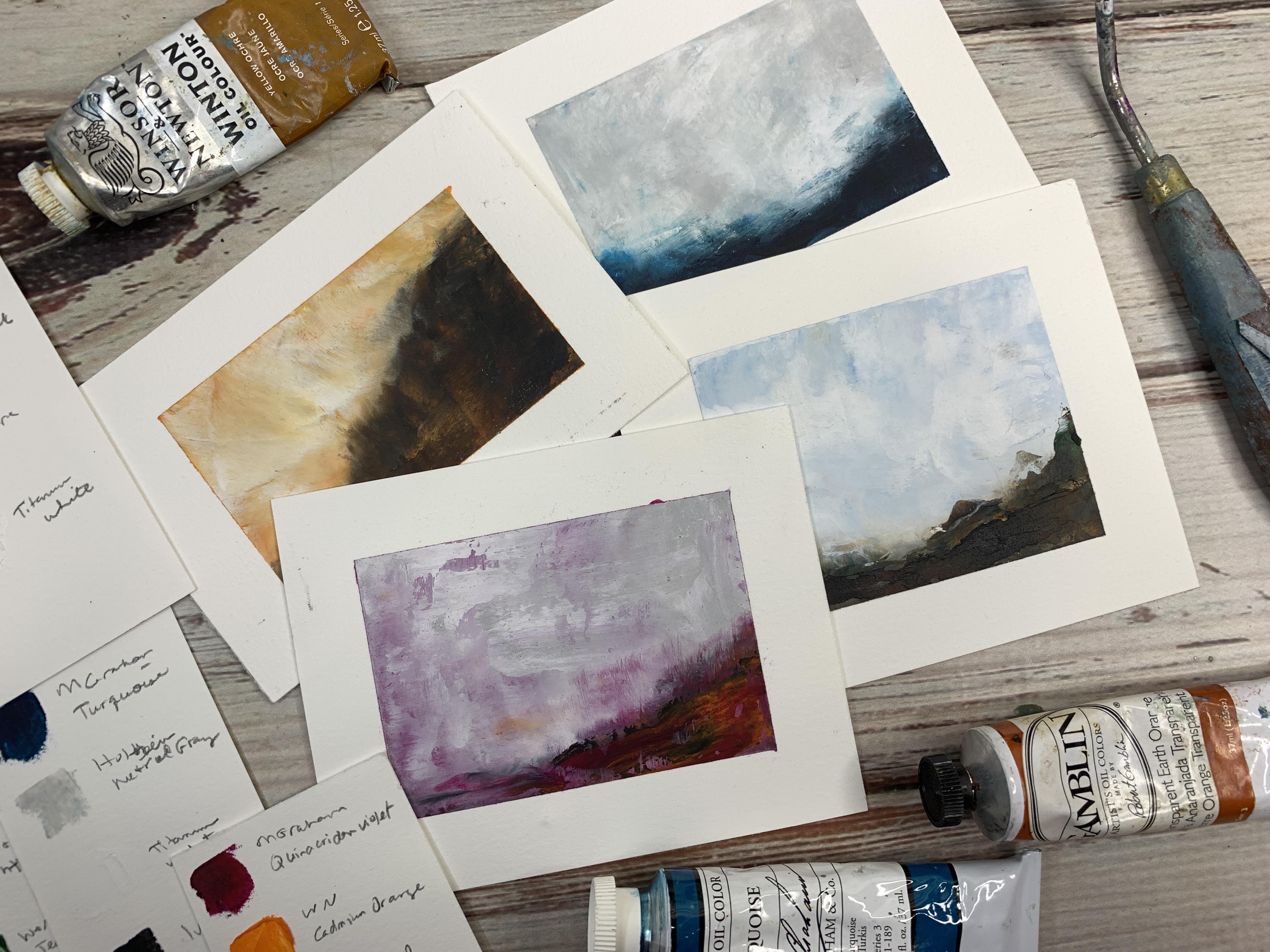
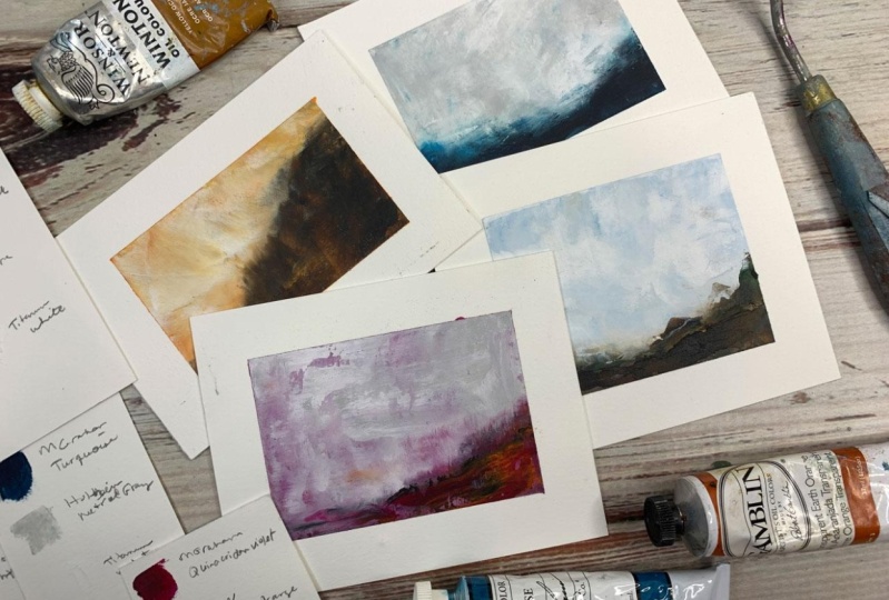
6. Mixing paints: [MUSIC] In this video, let's talk about mixing our paints. You'll notice in the
very first color study, the little landscape that we do, that I'm starting out with some colors that I
already had mixed up on a pallet and said
I'd been playing and I was already
working with the colors. That was this little landscape where I used yellow ocher sepia, transparent, earth
orange, fallow blue, terre verte, and titanium white. But apparently,
when I was mixing the colors to show
you how I mix colors, I didn't hit record. In that first video, you're going to see
me working with some colors that I
forgot to record. In this video, [LAUGHTER] I'm going to show
you how I mix the paints. But it's going to be a different set than I
had originally started with just because I don't
want to duplicate that. I want to make another
little landscape in a few different colors. I always use a little
bit of titanium white. I went ahead and put the
titanium white out here. Then I thought maybe I
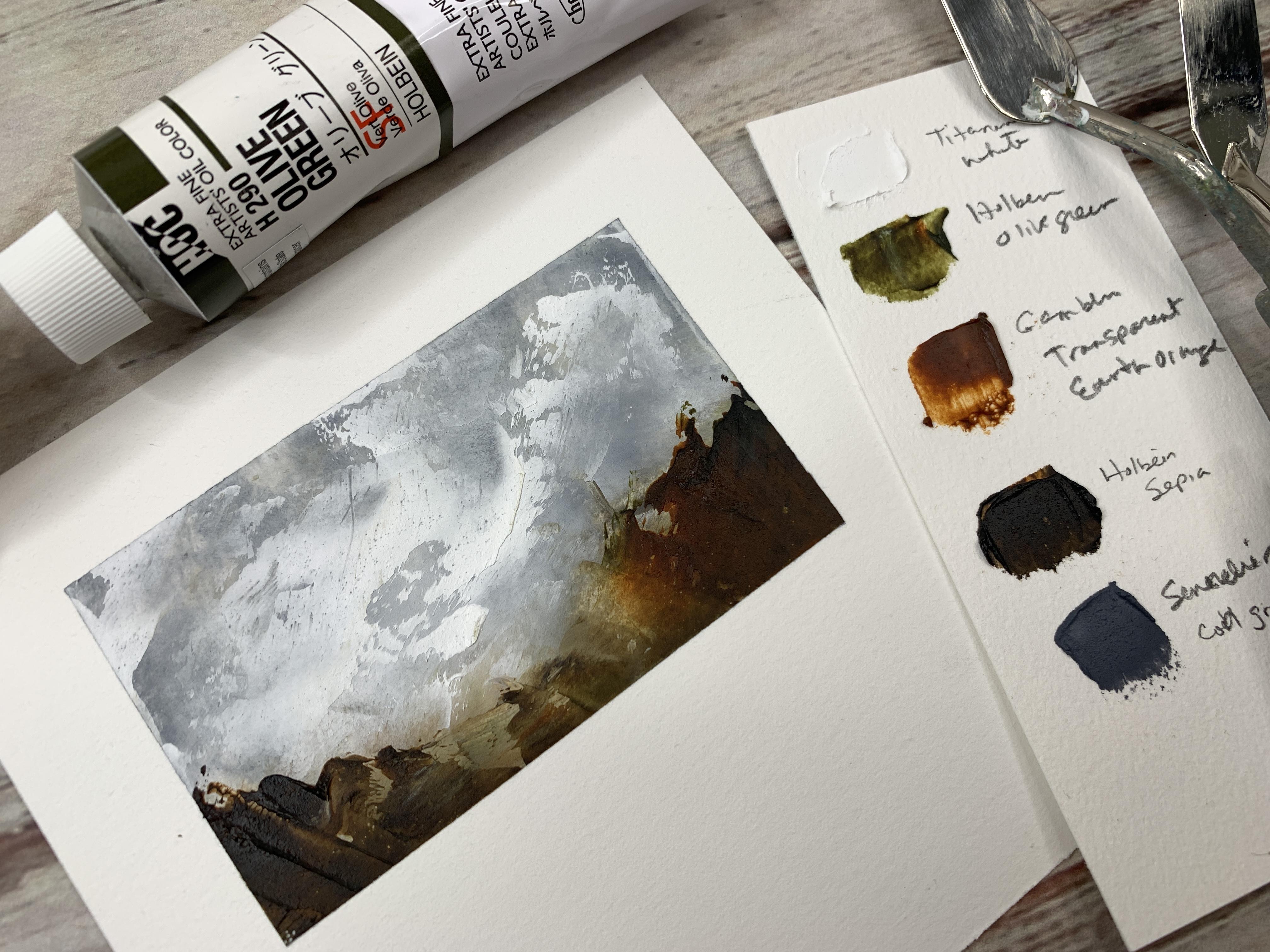
could test out olive green, which is a color that I just
got and this is whole bean. I thought this would
be fun to play with. I have realized that
when you're getting your paint out of
your container, if you leave any paint
up here that can then squish down when
you squish the lid down, it basically glues your lid shut for the next time
you're coming to get paint. If you will do that where you flatten it out and don't
get extra paint on the side and even
consider taking your extra towels or whatever and cleaning the top of that off before you put your lid on, you will not glue your lid shut. Because let me tell
you, that becomes a problem after a while and then you just
can't get anything open when they're glued shut. You just have to be real
careful about that. I'm actually going
to be a lot more careful now than I
have been in the past. I'm also going to try the sepia. This is also a whole bean color. I like the sepia because it's
a really nice deep brown, similar to Van **** brown almost but a
little bit different shade and maybe a little
tiny bit of the thalo blue. Put a little bit
of that out there. Let me tell you, this
blue is intense. If you get it on anything, it just keeps on going. [LAUGHTER] Then maybe
transparent earth orange because I really like
this orangey tone. Then I thought maybe I'd try
this [inaudible] cool gray. The landscapes, I'm trying
to limit my color palette. I'm looking at my inspiration
photos that I collected on Pinterest and just seeing
what colors are in that, what can I do with that? I put a little bit of
the cold wax down and I put a bit of the
oil paint down. I'm aiming to mix the cold
wax medium with the paint, and I want to do
it at about a 50, 50 paint to wax ratio. You don't want to really go over 50 percent wax because it starts to break down the
consistency of stuff over time. You can do as little as say, 30 percent wax to paint if you want to do less
wax because the more wax, it does feel waxier when
you're using these paints. The paints themselves
feel waxier. Then I always seal my
little container back up immediately just so
it doesn't dry out. I do all that first. That way I'm not
mixing paint and sticking my dirty palette knife back into my paint bucket
and contaminating my wax. Then I will come
and mix everything. It's at this moment right
here where you can then, if you want to try
the Galerkin light, and this is an oil
paint medium additive. What it does is it ages the drying time and this stuff
already dries pretty fast. You'll hope it'll be dry
to the touch in 24 hours. But this will also give
it a little bit of a sheen and you just
want a dropper too, not hardly any at all, just a tiny amount, and Gamon says up to
one-third if you have to, but just a very tiny amount. I think I'll put it in my color palette this time
because I don't put it in the color palettes of any of the other ones that you're
watching that I do. It just might be fun
to experiment with. I don't normally use this. This actually makes it
a little more creamier, like it's, I don't know how to explain it
until you're mixing it, but it's a little
less waxy feeling even though it's
full of the wax, so it does change your
consistency a little bit. It will give our
final landscape, so it'll give a little bit of a satin sheen rather than
being completely flat. That'll be interesting for you to just experiment
and play with, consistencies but
quite a bit different, actually mixing them in. If you mix a few with
just the wax and then mix one or so with
that additive, you can really feel
the difference. It's a lot creamier in
the way that it feels. I'm just getting everything
ready before I even move on to doing a piece. Now that we've got all
our paints mixed up, we are ready to start. I always put on a pair of gloves when I'm working
in the oil paints, which I should have had
it on mixing those, but I was actually very careful not to get it on
my skin because, lots of oil paints have toxic materials in
it and you don't want to get this on your skin. I definitely recommend wearing some gloves when you're working
with this and painting. Then I'm also going
to show you in the next video how we prep our paper and then
we'll get started. [MUSIC]
7. Prepping your paper: [MUSIC] In this video, let's
prep our papers. I have cut out some
five-by-five squares just because that gives me an option on how
big I want these. I was playing around and
seeing did I want it larger, did I want it smaller. You'll see even in some of the landscapes that we
paint that I'm testing out, how do I really want to do this? [LAUGHTER] I'm actually going backwards and now coming
back to record this. I need to move the paint out of my way because I just stuck my tape in the paint and I have a habit of sticking
my arm in paint. I'm right-handed, so I
put it on the right side, but then everything
is sitting in paint. [LAUGHTER] I've caught
five-by-five sheets. If you're using the
arches oil paper, I used the largest pad
and decided to cut it into smaller pieces because I got a bunch of
pieces out of that. It's already prepped
for oil paints, so I don't have to prime it. If you're using like
140-pound watercolor paper, you do have to prime
that before you can paint it because it's just
not prepped for oil paint. The oil will leach
out over time and then the paint will flake off. It's just not prepped
for oil paints. You want to do 2-3 coats of gesso on your watercolor paper. This is Liquitex gesso,
it's what I use. If you're using
something other than paper that's prepped
for oil paint, you need to prime it
with 2-3 coats of that. Then you can paint on top
of it with oil paint. I'm just using painter's tape that we get from the
hardware store because that's usually the most
economical way and it's less likely to tear our
paper when we peel it. I've decided I want to
do little landscapes that are landscape in format. We'll be making several
that are in this format. Then I trim the paper off at the bottom when
I'm done because I was painting on the bottom
of these accidentally. I want to do a
little landscapes. I want to tape it off
about the shape that I want and then it gives me
enough paper to trim later. That's how I'm going to be doing my little landscapes
during this workshop. [MUSIC]
8. Big Sky Landscape: [MUSIC] In this project, I'm
going to be using some of those colors
that we mixed up. I've already been out
here experimenting a bit. Getting paint on my table. [LAUGHTER] It's really
good if you cover any surface you're
going to be working on with some type of surface, you don't mind getting dirty. Then I've taped a
piece of paper. I've cut up a bunch of five-by-five pieces of
paper out of a big piece of paper just to play on because here's an older
one, so don't judge. But I've tried it like
this where I've taped off several days and
just went back and played and to see
what I could get and then I found that if I did them all wet and I went
one after another, I was putting my hand at them. I've decided that I find it easier to work on
one little piece of paper and I can move it around and then I can
set it to the side. I've just taped this smaller than the five-by-five
because I thought I want these to be a little fun or abstracts that
aren't too big. They're just easy to accomplish doesn't
take all day to do. I have taped it to just the back of a mixed
media pad that I had. The very last page is that thick cardboard thing and I thought I'm
going to save these and let be able to use those as my surface for some of this. Part of what makes an atmospheric landscape to me is like maybe we're
at the lake and we're looking were
there early in the morning and we're
looking through the fog and so everything's
misty and blending together and so I want
my piece to do that too. I want to have a
horizon line in there, so I'm just going
to start laying some color in a little bit. We can go light color on top of dark color with this
technique because we're working with such
thick paint medium that we can layer right on
top of it without a problem. I think I'm going to
take a little tiny bit of blue and make a really light bluish color and maybe a little
bit of this sepia, that was more than a little and try to get a blue-gray like just a real soft blue-gray
color to start off up here. Maybe I want a little bit
of this white with some of that sepia and create just a warm grayish
tone in there too because I almost want this to be like I'm
there early in the morning. Part of what makes
these atmospheric to me is that the paint gets real soft and
smudgy and blended. That very first layer, I'm going to work on
some of that softness, and then the layer I
put on top of that will add in some details and stuff. But I really want it
to just start off real blended and soft,
smudgy like that. Then we can start
working a bit on some upper layers and
stuff because then I might come back and add
some more detail for this light cloud
area and I can add a little more detail for
our bottom landscape area. You can see how, to begin with, working small
definitely going to be much easier and save your sanity than starting
with a big piece. It lets you experiment
and play with colors, which I really like to do, and then trying to
be when I do this real soft with my palette knife, I don't want to do the
palette knife so heavy that I am smudging what
I've already put on there and digging into the
wax that I've already done. I'm going to zoom in some and let that focus a little bit on what we're actually
painting maybe. Then as you work your colors, I'm going to do
several times where I blend and add color and
come back and blend. Just to give it depth
as we're working to give it a definition
to add to the interests. I don't want to spend days and days on little
pieces like this, but I do want to spend some time working each
piece a little bit. This is my fan brush and I have discovered that the
softer the paint, the softer the brush
is better because the real heavy thick brush tends to just dig way too
much into the paints. But I'm just here maybe giving a little moodiness
to the clouds and stuff, I want to be real
careful not to pick up that bottom color so I
am doing the wipe off of the brush like I do
with the wipe off of the soft silicone scraper. Then two, be real careful not to do this right
in the middle like I just did because you'll get
weird lines in the middle. Might be easier if you start
at the edges and swipe from there and then build and
grow your piece from that. I find it fun to mix
the colors here on my knife too because
then I can have some interest and
some differences going in that layer that maybe
we didn't have otherwise. I do like mixing and
doing that, that's fun. Maybe adding some marks into our landscape and then smoothing over some of those
and leaving some of them. I know we might come on
back up here to our top. Might do a little bit of blue and umber in
that top part again. Get a little interest
going in our sky. I did pull it down into
that part that I just did, but I might just layer right
back on top of it because I wanted the sky to really
come to that horizon, not sit above it. I didn't want it
to look like they were separated as I felt
like I just had them. Then maybe one more sushi
here of what we're adding in. Just mixing a few colors
on my brushes to instantly add some other depth in
there without extra layers. Maybe I'll come back with a
little bit of a cloud cover. Now that we've got it
where I want it there. Then I'm just being real
careful to lightly smooth that in so that I have an interesting stormy
little sky there going. It's not really stormy, but more interesting
cloud movement, I guess we could say. I might just tack
a little tiny bit more into the bottom here. Maybe with the brown and
the green, not brown, but this is that
orange earth ocher and that terraverty just
because I think it's fun. I like those colors. I might do a little bit of
the sepia in there just for extra bit of darkness. That's beautiful.
I'm loving that. Let's just see what we got. I would normally wait
overnight to peel that open, but I want to work a
little faster on these. I don't want to spend so
much time on it that I work and work and rework it. I just want to play with color, get my swishiness go in with
my silicone scraper there, and see what I can get. Look at that. As soon
as you peel the tape, it instantly gets way more fun. Look how pretty that
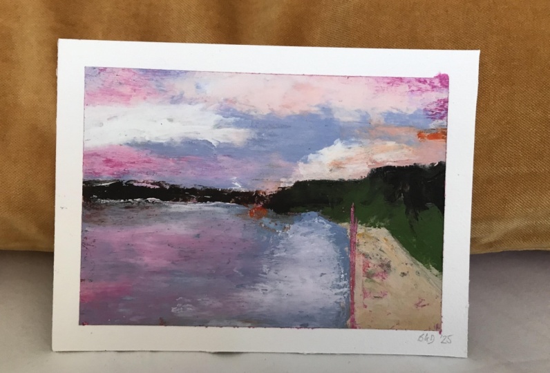
is. I love that. I'm going to call this one like looking out at the mountains on a clear day because
that ended up really pretty and rather
than overwork it, I think I'm going
to stop that one there and maybe play
on a color study with some different colors
because that's very pretty, I'm very happy with that. I hope you enjoyed this
quick little painting and in atmospheric feel getting
those first smudgy layers in there to really make
that atmosphere for you. Then adding on just bits of color above
that, some clouds, and some landscaping, and seeing what you
can come up with. I think I'll do some more
color studies with you in this same vein
because they're fun, and it lets you see some other
colorways that you might want to experiment
with. Let's get to it. [MUSIC]
9. Warm red and purple Landscape: So I've gone ahead and take down another sample
or piece here. I've added some more
colors to my palette. I've added this green
earth by Old Holland, which is another
oil paint brand. I just randomly thought
that's a pretty color. When I was at the Dick Blick, I've added in a ivory black
by that Old Holland company. I've added in a whole lean, neutral gray, which is this one, that's the green,
that's the black. This is an M. Graham
& Co, turquoise. I've also added in
some Winsor & Newton cadmium orange, and
quinacridone violet, just because I want
to experiment with more little color studies and I don't want to
keep going back and forth mixing color because
it just slows you down. So if I want to
experiment with, say, a sunrise that
looks all pink and magenta with those
light misty colors, I want to have a little bit
of that color available. So I'm going to go ahead and
get that first layer started. Probably with the brown. Maybe a little bit of
this orange earth. Maybe not. Maybe I'm going
to just rethink this. Hang on. So maybe
I actually want that underlayer to
be the magenta. Let's go ahead and do that magenta feel that I was
just talking about. Then that'll just
be the undercoat. That won't be my final piece. But it might be interesting to see what that does
as we're going. Let me just see if I can
spread that out on here. Again, I've just
taped to the paper to a shape that I like. I don't want it square. I want it to look a little
more landscape-y in the shape. I've just taken that little
bit larger piece that I had cut and just made a larger, just fill it in larger, just because I wanted to. I'm just scraping some of that extra paint off and we'll
just save that over there. Then we can come in now with
maybe some lighter colors, maybe white and gray at the top. Then let's just see
as we blend this. Because I want it foggy. I want that slight
undertone of some color. I'm going to start by
just getting the paint on here and then we'll smooth it out with our silicone
bowl scraper. Then once I smooth it, then I'll add in some landscaping and
then clouds and stuff. But I want to get these first, initial soft layers going. I like that. I almost want to have the landscape come
in, but not all the way, like maybe we're at the lake and it's a gray, misty morning. I'm just going to start
adding in some of these layers and I'm going to zoom in a little bit for you, so that you can just see
what I'm doing here. I'm just mixing the white and the
gray for the moment. There we go. I like some
of that movement there. We could come in with our
brush and we could add some movement in here too that because as we go back
and smooth that out, we'll have a little
extra movement in here. I'm going to add a
tiny bit of that. Maroon in with the white, but, white is a bright color. It's just a tiny bit, we could add in and then
maybe we'll get some of that in our swipe-y clouds too. We'll be careful not
to set your piece right down in the middle
because it'll make lines that you're
not happy with. Let's actually go in and maybe add in
some landscape here. I think I'm going to do in the maroon color but also
mixed with some brown. Maybe some of this orange earth come back in and lay
in a horizon here. I like it having the
maroon in it because our overall picture is maroon. I like having some
of that in there. I wanted that point
to be a little steeper, but that's okay. Let's see if we smooth
in some of this. If it's not doing
exactly what you want, you can do exactly
what I just did and swoop some of
this paint back off. We can come back and add more to the sky because that wasn't
quite where I wanted it. Maybe I get this a little
swooshier with the sky. Pull this back in
a little tighter. I want a tighter in there, so let's work this in
a little bit more. I'm just coming in
with that sepia, that magenta color, and
a little bit of orange. Then I just tacked in a
little bit of that black. Because I want a little
bit of the darkness. Not so overwhelming. I want some of these other
colors to shine through but did want some
of that in there. I might come smooth this out
and then we'll see if we're ready to be at our final layers. Because I still want it to be very dreamy smooshy like we're looking through the
mist on a foggy morning. So I want this bottom
layer to give me that impression and
that top layer. Then a layer on top
of that to give me my definition in my texture. Now, I'm just being
real super light here with what
I've got going on, barely skimming the surface
to give myself some interest. Somewhere, I picked
up some orange, which I don't necessarily
want there on that layer. One of one oranges in
there a little bit, just not overwhelmingly
everywhere. Just mixing in the gray and
the white here on this layer. I might do a little bit
of smoothing in here. I didn't come in with my thin brush for a little
bit of movement here. Very softly. I like that movement
down, there so we'll work the sky
a little bit more. I'm just mixing too that little tiny bit of paint
mixture that we had, the white and the
gray over here. I'm just mixing those a little
bit with my palette knife. Just to give some
differences there in the colors that we're seeing as I rubbed those on.
That's pretty. Then I'm going to pick up
with my paint and I can zoom out if you want to see
a little bit of that. I'm thinking I'm
going to pick up again this magenta, a
little bit of orange, a little bit of sepia, and a little bit of black. Then just come back in here
and add that layer in there. I love that. Super
happy with that. I could continue to try
to really smoosh that out for the really
smooth atmospheric. But I really think on this one, I like that little bit of
texture that we've got going. As you pull back
from an abstract, that's when you really
start to see the colors, mesh and blend. So I'm going to take
my gloves off and pull the tape off and
just see what it is that we got on this one and then I will set
this to the side to dry. I had my gloves off in between
and I touched something that was blue and I
got blue everywhere. I think it was that fallow
blue that did that. You got to be really careful
with touching your paper. That's why I made these
a little bigger so that I can come and
trim these later. Because I know I'm going
to get that paper dirty. Look how beautiful that one is. Oh, my goodness. That's really
beautiful. Loving that one. I'm going to make sure
real quick that I saved my color palette on this
one, then will be set. I did that on that first one, but I didn't show you
that I was doing it. Let me just do a color
palette real quick with you on how I'm doing these. I just have the little pieces of leftover Arches paper because I used to do this on
mixed media paper. But they get that little
weird oil halo in it. This is what I was
doing when I got the paint all over my hands. But they get that
really weird oil halo lighter and then
the paint starts blinking off because it's not
really securely on there. I'm just going to take
my palette knife here. I'll create a little
square of each color. Like with the first one, this
is what that ends up with. I create a little
square of each color, I'll write down the brand and the color that I used and then I store that away with
that piece of art. That later, I wonder, how did I get that? Now, I know. I used a
little bit of sepia. There we go. Then what I'll do is I'll just go
ahead with my pencil, and I will go ahead and write quinacridone violet. Then Winsor & Newton
cadmium orange. Then I've got the Old
Holland hybrid black, I got titanium white, and
I've got a neutral gray. By this one's a Holbein. This one was the sepia. So that is Holbein sepia. Then I will set this up on
the back of my table to dry. I'm going to set this
right with it so that I remember later, this is what colors
I used to get this pretty
atmospheric-looking landscape. I could revisit
that color palette again if I really
really love it. I'm going to set
that one up to dry. Then I'll probably do
another color study because the color studies really are the most important
feature for learning how to work with your paints and seeing how the wax mixes and trying to get different
composition ideas and color ideas and just seeing
how things work together. Really, you should just
do hundreds of these. I'm going to try
another color palette. I'll see you back in class.
10. Blue Landscape: I'm ready with
another color study. I've got my piece taped down and I have the same colors here on my palette that I
was working with, but I thought what
if we did one that was mostly blues, and white, and misty like I'm out in the ocean and then
it's foggy out there? I'm going to work with maybe the white and the gray,
this Phthalo blue. Not Phthalo blue,
this turquoise. This is M. Graham turquoise, that's the neutral
gray and the white. Neutral gray is this one by
holding blue and the white. I better clean that up before I get paint on everything
which I have a tendency to do,
I'm a messy painter. Then I'm going to maybe
add in a little black. This is that ivory black that I've got out by Old Holland. [inaudible] I think pretty
common from every brand, but some of these other colors. They do change from
brand to brand. That ocher changes quite a
bit from brand to brand, but I think what I might
do is go ahead and come for white and
gray top here; sky, and maybe have the blue
coming around but not be as dominant on the
whole composition. I want it to leaf in
from the bottom there. I might even mix a little bit of this white and touch of that
gray in with that blue. There's a lot of blue
going on in there, I don't want it to be so vivid. Well, the lighter I get, the more teal it gets. Look how pretty that is. I might go ahead and lay a little bit of
this color up here. I was thinking dreary day but as I lay that teal up there, it's less dreary
and more cheery. Let's go ahead and get that soft and squishy. I do that with my bowl scraper. Just get it real
soft mushy there. I really want this one to blend way more than some of
the other ones have blended. I want it to just be
very atmospheric. I will come in with
some of our turquoise. Look at that color
and almost want it to just be a sweep at the bottom. I don't want it to be
overwhelming to the whole piece. It almost looks like
sea there, didn't it? We'll come and start getting some of this to be more wispy. I'm wiping my thing every
time otherwise we're going to end up with weird paint streaks but I'm trying to avoid
weird paint streaks. [inaudible]. Let's see. Let's go back here what
this gray and white shade. I might even want a little bit of the black
in with that turquoise. We don't want
turquoise up there, let's pull that back out. Let's be real careful. What you have on your
knife when you go to pick up your paint so that you don't have tons of other wrong color mixed
on top of the white. Just like I did right there. I might take my fan brush
to pull some of that down. Little textury layer in there. Whip some of my clouds around maybe and then I'm going to come and smooth
back some of that texture. I'm leaving some of it
but very soft amount there then we'll come back with a little
bit of blue and maybe a little bit of black. Just pull my landscape a
little and see what that does. I almost put a little more
of that gray in the sky. I might take a
little bit of white mixed in with just a tiny bit
of black and make a gray, or I could mix some more of
that neutral gray but I might want some stormy gray out here. I'm just working
that a little bit. Real soft here with the
gray and the white in the clouds here and then I might push that
back a little bit. I'm liking where this is. Let's add a little movement
here with our fan brush. I might just go ahead
and push that back a tiny bit and we'll see where we're at, we might be there. For some of these, I'd
like you to try doing something like this where
you don't overwork it. We get a little bit of sky, a little bit of
movement in the sky, soften out your pieces, and then call that
a day and just see where you're at with that piece because some of
these we can way overwork it. That almost looks like
it needs more though, it's thin right through here. If we way overwork it then I'll know it's
almost too much, but I do want it to
actually have enough paint on there not to just look like an underpainting. Maybe some extra details right in there.
Well, I love that. I was just mixing a little
tiny bit of that blue and that black and then I'm
just softening it. I don't want it to be
super-duper textural. Coming in real soft, getting some of those details
softened right here at the horizon super-duper soft. That was not as soft as
I intended. Hang on. I love that. We can add a little more texture
right up here to the sky and I think I'm
going to go with this. Look that, yeah. Super-duper soft. I'll pull this back just a tiny bit to make
sure this is clean. Just wipe at each swipe. Yeah, I think that's beautiful. I think before I
overwork this 20 times well maybe I'll add a tiny bit of textural element
right in here, but for the most part I'm
going to go ahead and call this one done. Like that. We'll
wipe off my tools, peel this and see what
we got before I'm tempted to keep on adding to it. This was the teal and
gray and black basically. There's not lots of color
in this one. Look at that. Exactly why I should have
gone ahead and taped this down here but I plan on trimming these
up, so that's okay. Look how pretty that is. Just one tiny piece right
here, I hope I don't ruin it. There's a blue speck.
Yeah, right there. That's driving me a
little tiny bit crazy. There we go. Don't
touch it again. Don't touch it. There we go. That's what we've got
with a little bit of teal and gray, so I'm loving that one. Before I forget let's just make our little color palette here. I used this turquoise
and I used this gray and I used white and then I do believe I used a
smidge of this black. There we go. Then
when it's dry I will trim that up so that we don't have a splash
of color down there. Now I will write next to all
my colors what they were, so this was M. Graham
turquoise and this was Holbein neutral gray, a tiny white, ivory black, and
then I will just set these back there to
see what we get. I'll let it dry and
so I love that one. I'm happy camper with that, so let's just keep on working in color studies and I will
see you back in class.
11. Orange & Brown Landscape: [MUSIC] I've got
another one taped off. This time I taped off the
bottom so I don't paint on it with my random
movements [LAUGHTER]. Still got my color palette over here and I thought maybe I could experiment with the ocher. Again, I like the yellow ocher. I like that to be more
dominant in this piece. I'm just going to
grab my palette knife and I think here,
I think I might do a bottom layer of orange, which a lot of people
do orange under blue. It's really fun. I'm
going do the orange. Really good here under this. Really just smooth it out pretty good so
that it's not [NOISE]. There we go. [inaudible] left. I think I'm going to come
back on top of this with some ocher and white. Just experimenting
with some color here. I want you to get creative and think of colorways
that you might not normally have thought
and see what can we get. I think I'm going
to do this one with the landscape swooping
in from the side, or I could do it more
landscape, less sky. That might be interesting too. Now that I've thought of that, let's do something
completely different than what we've already played with. I might want to go ahead and swoosh in some of
these colors and get it with my nice little dreamy
background going here. Yeah, look at that. Oh, so pretty. Maybe we want more foreground and less sky just
to see what we get. [LAUGHTER] I don't have as
much brown mixed up though. I've got a little bit of
the sepia and this brown, but let's just
come in like this. Oh, look like we have
a cliff right here. Let's start like
we have, oh, yeah. [LAUGHTER] I get so
excited when I put something down on paper
and then I'm like that's exactly what I was
imagining in my mind. Got something catching
paint there. Let's see. Now I think I'm going
to need some more of that sepia mixed up though because I'm going to need that
to continue adding layers. But look at that. Let's go
ahead and smush this down some. Oh, yeah. I love it. Well, I didn't mean to do that. I wanted to get a
little texture but not quite pull the paint off. Let's smooth that back out. [LAUGHTER] Let me zoom in for you a little bit
while we're painting. I actually am going to
need some more sepia. Let's pull the sepia
out and I will mix up a little more of the sepia
with wax while we're going. I've already mixed up
some sepia for us, so I am ready to go. I think I'm going to
blend it, the sepia, this transparent, earth orange and maybe some black. I get different shades as I'm lightly putting
that into my foreground. I like how they do
their own blending with the wax as you've got some other colors
going in there. Oh, look at that. Didn't mean to do
that. There we go. I want it to still be dreamy, so let me see if I can
pull that back a little. I'm just going to continue
adding some layers here as I'm working this. I could come in
with my fan brush for a little bit of texture. We can just see if
we like it or not. Oh, yeah, look at that. Adds a little bit of excitement
up there in that sky. Very softly, barely touching, pulling some of that
back a little bit. Then I might come back here with my yellow ocher and
some white mixed together and create a little
more interest in our sky. Be real careful
that you don't get a weird color of paint on your palette knife
as you're working. I just touched that down into that maroon and then
that's a bright color. I don't know that I
want that maroon in this painting so I got
to be real careful about setting that palette knife down where I did not intend. Just getting some smushy
paint go on here. A little more of the black and orange there. I might come back up
here a little bit to give me some
interest up here. At the wrong angle, so I'm scraping my painting, so don't be afraid to turn
your painting as you're working because I'm at the wrong angle and I'm scraping paint off that I
don't intend to. There we go. I might smooth this in some. I don't mind if I
have a little bit of that orange background
peeking through. I just don't want it to
be so stunningly obvious. Look at that. Oh yeah. [NOISE] Just super-duper light here, just as light as I
can possibly do it. There we go. I want a little brown and orange
here at the bottom. Oh, yeah, I love that. Oh my goodness. Go ahead
and smooth that tiny bit. For some reason, I have this stubborn piece of
orange hanging out up here. I'm happy with the whole thing, but that one piece of orange. [LAUGHTER] I like
the orange under it. I just don't want there
to be a whole splotch of orange that looked weird. There we go. As I pull
out some more orange. I got that weird
magenta on my scraper. Here we go. Let's push
that back a tiny bit. There we go. I think I'm going to call this
one good to go. I like that. Let's go ahead
and pull the tape off. [NOISE] This time I was smart and taped
the bottom part there. Even though I'm probably
going to trim it, I do like it when the
whole paper is clean. [NOISE] Look at that when we peel it off. Look how pretty that is. I'm liking that. Now that I see it though, I almost wish I had pulled
that a little further in. Very interesting
little experiment there on what we've got going. I almost wish I pulled
that in a little and there was a little dip, but I think
I'm going to go with it. I don't want you to think
too hard about these. I want you to just get
some under your belt, get some wins, gets some color palettes
going and some texture. Just see what it is
that you can create. Let's just go ahead
and mark our colors on here, add some ocher. I do like this color
palette quite a bit, and then that white. I'm going to go ahead and
write our colors next to that one and set it to
the back and let it dry. Then I might play
some more [MUSIC].
12. Stormy Sky Landscape: I'm back to my
color palette that we did in the mixing
video because the original mixing video I
apparently didn't record. I've already got my
paints mixed up with the paint and the
oil, the cold wax, and a little bit of the gal kit, which is our paint additive, that's going to
make this dry even a little bit faster
than it already does, and it's going to give us a tiny bit of sheen
to our painting rather than completely flat and mat like just using
the wax would. It's fun to experiment both ways and let me tell you this gal
kit goes a long way, so don't go to the paint
store and buy a gigantic one, buy the smallest quantity
you can possibly fine, because if you
keep it long enough, it dries up and it goes bad. So tiny, tiny bit of this is
all you're going to use per mixture and buy the
smallest container of it that you can find. Then if you decide you love it and you need
something bigger, you can always add
to it later but I've already ruined one of those
where I didn't use it at all, but it was open and so
that gal kit just dried up to a real hard liquid that
didn't pour out anymore. I'm just using transparent
earth orange, phthalo blue, I've got some sepia out here, I've got some olive green. I've got that cool gray,
and titanium white. I'm just going to play
around with these. These two were by
Whole [inaudible] , this blue is a Winsor
Newton, this is Gamblin. You can see this is Sennelier, I'm not really stuck to
one particular brand, I just go buy the ones that I
think are something I might like and then I just end
up with a lot of stuff. I'm thinking that maybe we might want to do a grassy morning on a gray morning day or
something, I don't know. Let me try out this cool
gray, maybe some white. I'm just going to start throwing some paint down because
on this first layer, we're doing our under painting here and let's just
see what we get. I love to experiment, maybe I'll just go ahead
the hallway with that. I'm laying thin layers. I don't want to lay a super
heavy layer to begin with, because then I'm digging
right down in that when I start laying some
of these others. Let's do some of this orange and maybe a little
bit of this green. Maybe we'll start
with some cloud cover up here. I like that already. Maybe a little bit of the sepia. In the landscape part, I love really blending
those colors in good. I'm going to zoom
in so that you can really see better what
I got going on here. I'm going to start
my smushy layer. I loved the first
layer to just be smushy and dreamy,
and get you started. You're laying the colors, you're giving the foundation. I don't want it to be personally really heavy.
You won't get that. I don't want it to
be super heavy, I want it to be real
smushy and dreamy on that first layer.
Just my preference. Definitely, start getting the paint things going and see
what really works for you. Let's go back with
this gray and white. Maybe I want to come down
a little further into that landscape. That's fine. Then I'm going to put a
little bit of the orange and the green, and the sepia all on my paint at the same time because I like it to just blend even as I'm
putting them on. I like that just natural
blending that it does. Two, we might take one of our fan brushes and as I've discovered,
the softer the paint, the softer the brush
needs to be but I like the real soft sable one and then this real soft orange one. The real stiff one, when the paint is this wet, this real stiff one just digs right down into it
and I don't love it. If I'm working on wet paint, I have discovered that I really prefer these two fan
brushes, the softer one, this is a fan
satellite by Ulrich, and this is a red sable
scholastic blick brush, this is a four,
and this is a six, and these are some good sizes. We're going to use
this one I think, and just pull some
texture into here, and then I'll lay it on again. I like the different layers, that's why I go ahead and paint it and then
layer it, and then paint on top of it some more
and I like those under layers in there to just
add to the interest. Then I love to smooth
them back out, and just build until I get a final look that I'm
just super excited about. It's not all about getting one layer and being done for me. Be real careful, as you're
putting stuff on with the palette knife that
you're not straight on, you're at a slight angle
because if you go straight on, you pick up paint just like
that and you're wanting to avoid just randomly accidentally
picking up some paint. When we can also use our brush, I want to do this last I think, so let me come back up here to the clouds and work that
sky a tiny bit more. I love that when you get that random paint
spread like that, it just looks like a
wispy cloud out there. I'm going to come down. Oh, look at that. I just like smushing the
paint around really. This is the most fun, just like you're playing
with cake frosting on. Yeah, let me get that
really yummy smushiness in there. Oh, yeah. I know you think I'm
doing the same thing and I am doing the same
thing over and over, but I want the
underlayer in there, I want the light in the
color variations that those layers add to something so that then when we do finally come up
with our final layer, we have that depth and
interest to our piece. Back with the orange, the green, and the sepia, and then this might be the final little layer
here, let's see. I'm just going up and down
and smashing it on and given that impression of many layers
in there when really it was one that we did
here with our knife. Look how pretty bad that
is, oh, my goodness. This will be the fastest one. The more of these you
do, the faster they get. I think I might just
stop right there. That is so pretty. Look how pretty that is. Because the more you do, the faster you'll get
in your little rhythm, you'll figure out what colors you love and what do you
want to shine through and if you decide to
do something like 100 day project and do a little bitty
landscape every day. If you look at the picture
you got from Day 1 to the picture you
got at Day 100, it'll be drastically different. You've honed in your skill, you've honed in your technique. Let's peel this tape off. Let me just peel this tape off and see what this looks like because that I know it was the fastest one I painted for you. Look how pretty that is. Oh, my goodness, this might be my favorite. Say that every time I paint something because
they're all my favorite, but I just like so many
things and whatever I do last is my most
favorite at the moment. Oh, yeah, look at that. It's
like beautiful mountains. Totally not what I had planned, I'd planned on doing grassy, but look how beautiful
that is, oh my goodness. Before I forget, definitely want to save
our color palette, so I'm just going
to take a piece of paper because I'm not sure where I stuck my little scraps. Let me set this out of
the way before I ruin it. I want you to always
save your color palette because you're going to
love looking back at these and seeing what
color did you use. I know I had the phthalo blue on my original paint
palette over here, but you know what, I
didn't even use it. I use the white
paper towel here. I go through a bunch
of towels, so if you want to just pick up several
rolls of cheap towels, you're going to be
using them so just have them available and handy. I love that. Let me
use this orange. I want to do another one with
the same color palette but maybe focus on something
else and the sky. I might do another one. I don't ever like to and
then we've got the gray. Then make sure you
write what those are, you're not going to
remember that later. We're definitely got
titanium white and then I use the Holbein sepia, I used the Holbein olive green, and then I did not use
the blue but I did use the Gamblin Earth orange, and I used Sennelier cool gray. Then I will set this with this as part of my future reference
and as part of my, just can't wait to go back and revisit this color palette. I love saving color
palettes so I'm going to set this
one to the side. Look how beautiful
that turned out. I may use this exact
same set of colors because this is a lot
of paint leftover and I don't want to waste it. Don't waste your paint. Paint is expensive
once you start buying these nicer brands. You want to have a trash
palate or something sitting to the side or a few more pieces of landscapes ready
to go so that you don't waste the paint
that you had there. Don't just throw that out. Keep some extra things to
the side and experiment. All right, I will see
you back in class.
13. Orange & Brown Cliff Landscape: I've got another piece prepared and ready to do
another little landscape. I'm doing another one
because I had some paint left over from our last project. I've moved them over on my
color palette over here. I'm still going to use them, but I also thought it might
be fun to play with a pink. This is called blush
tint matte sennelier. You can easily probably
get that pink with one of these raw sienna
or raw umbers with a little bit of pink
and a little bit of white probably mixed in. You don't have to get one of these expensive ones
if you don't want. But I do like the
sennelier colors, but I thought wouldn't it be
fun to have maybe some pink in that sky rather than gray or blue like it was a sunset and the sky was lit up with the
pink and stuff like that. I thought that would be
fun to maybe have that as my undertone and have pink in the sky just to mix
it up a little bit. I think it's fun to
explore other colors. You might try orange in the sky, some type of ocher, yellow, just all those colors. Now go out one day at sunset
when it's particularly colorful and just see what colors are shining
in that sunset. I'm just going to get
that laid down on here, and then I'm going to
lay some sky here. I did mix these also with
that gao kid because on that last one that we did which is still
sitting back your wet, so I'll try not to mess it up, I did actually like
how creamy that made the paint mixture and I
enjoyed using that gao kid. I've been doing
the cold wax stuff for quite a long time and
I'll be honest and say, I've just been in my mind why don't use the gao
kid all that much. Let's mix some of this
and let's just go crazy. This is that transparent
earth oxide. But after using it on that last painting
and here on this one, I like how creamy it is and how yummy it's making this paint. Let's just start layers. I'm just starting that
first layer and getting it smushed in there because
I like that smushyness. I'm going to come back
with some of this pink, maybe some more
yummy cloud cover. Maybe I want to be in
the mountains and I want to make this a
cliff and calm down. Maybe similar to that
ocher one that I did earlier in class
that I wished I had a little bit better
orientation of my clips. I believe I had talked
about in there. Let's just go back for that composition and see
what can we get this time. But I think I want to
get my sky pretty much laid in here the way I want it before I lay that
cliff in there. Let me just zoom in for us. That way, you can better
see what we got going on. I like how you're using
that fan brush gives you some movement in that color and changes things
just a little bit. Then I might smooth some
of that movement out, but it hasn't taken away. As I get lighter and lighter, I'm layering light in there. When you're all done and you get that almost light effect
as it's coming out, I like the layers underneath it. Because then you
start to rarely see beautiful designs behind
the stuff. I love that. I'm trying to be
really careful not to start quarter-inch
down from the edge there because you don't
want it to look like all your cloud Cover
started at a weird place, so I want it to go off into, but not so often
to it that I get a weird white line
at the top either. But I want the top to still
be part of the painting, I don't want to tear the
tape off and then think, well, what did I do at
the very top there? Why did it do that? Because I've done
that before too. I really love what
the sky is doing, let's just get our sky down pat, and then we will do yummy smushy two or three colors
in that cliff part. Rather than
overworking it because that first sampler I did
earlier with the ocher, I have it over here, let
me see if I can get it with this one right here. I feel like I'm
overworked at early on. This one, let's get the sky set, let's come back and add
in our cliffs maybe, and just see if we
can get some mixing. The orange, the green, the olive green, the transparent earth
orange, and the CP. I'm mixing that on my knife
again altogether so that as I start to do my little
squishy landscape marks here, they just naturally
blend as I'm going. We'll just see what
we can get at. I wanted maybe more of like
there's a mountain over here maybe or I might end up
regretting that I did that, but we are just going
to see what we can get. I really like it. I'm not sure I like what I did
right there with that little swoopy part.
But maybe I like it. I'm just continuing to mix
those colors on my knife here and then just
work in it here. Because it's almost
like I'm getting to where I really like
doing the sky, getting it where
exactly where I want it and then filling
in the foreground. As you go in, that might end up being the
technique that you like. I like that. It's almost like we have a little bit of
sky that's coming through. Maybe that's some water that's
reflecting from the sky. I like that. I might not
even clear that out. You want to work on
a little bit of your mark-making when
you're doing this, maybe you're going to have some tree line and
maybe you want some a little extra
mark in there. You just want to experiment.
I really liked that now. I did that actually it gave me that extra little bit of blending and
movement, that was nice. That's got some fun
stuff going on there. Just a little bit of the
mixing of the three again, just coming back, maybe
some final touches here. Then we just might peel this
tape and see what we got. Because you don't want to
overwork. I like that. You don't want to
overwork it, but you definitely want to get it to a place
that you love it. I just totally did
not mean to do that. There we go, but put some
pain but I get there. I don't think too hard. You get to a point
where like, I think I love that and then go with it. We'll add few lines
in here, I love that. Just very softly with the tip, I'm just adding in
a little tiny bit of some lines and texture there. That's fine. I do love that. Maybe I want tiny more
texture with the clouds. Again, this will just be a yummy layer on top of
everything we've got going. I love those layers and that
you see through the layers. I love that. Let's call
this one and heal a tape. Let's just see what we got. Then don't forget to of course, save your color palette. I love when you
finally peel the tape, you reveal everything that's
not covered in. Oh, see. I like that when it gives
you that crisp line and you don't have that paint
outside that, I love that. Look how pretty that is with the tape peeled. Super pretty. I'm really happy
with that one too. That would have
been fine too if we did maybe streaks of color. Get creative with your colors and maybe just throw a horizon in the front with
some nice dark shades, but be creative with what
you do up there in that sky. How fun is that? This one I use the pink, just to make sure you get
your color palette in. I used this earth orange, I used this olive green. I still have a ton
of paint over here, so I should definitely
and I use this brown and I used titanium white. Totally different look, using a very similar color
palette as the last one. But I love what we
have going on there. I'm going to write my
colors on my color palette and set this one to the
side and let it dry. I hope you enjoyed this little painting and I will see you back in class.
14. Grassy Landscape: I'll do another little painting. I thought since I was
already going to do it, I might as well film it. I had planned on not
filming another one, but I still got paint leftover and I just hate to waste it. All I'm doing, I've got the same color
palette that we had out from the past
couple of paintings. I'm taking this Phthalo blue and this blush tint and mixing it together for a
rather pinkish, grayish, dulled-down color here that I thought might be really interesting
in the sky. Just see what we can get. I just love these
little landscapes. Even if you just get into
one little rhythm and you do the same landscape over
and over changing the colors, they end up so different
each time you do them that it's definitely worth just playing and
practicing in there. I come back with some
white now up here. I'll go ahead and do my little get-it-flowing and
blending here. It's real soft getting
that underlayer, getting some movement in there. I can zoom in so that you
can see what I'm doing. I hate when I zoom in that you can't see the color palette
at the same time, but I want you to really be able to see the
painting itself, not so little that you're
like, what are you doing? I might take my fan brush here and get some of that color
movement, going in there. Rather than that
being a white cloud, maybe I want that to be more
of a slightly gray clouds. Maybe over here on
my color palette, I can mix up a little bit of this cool gray with some white and maybe
not have a white-white, maybe have a slightly
grayish-white cloud, something like that maybe so
that it's not white-white. Then start smoothing some
of that up here for some of that cloud cover so
that it's not so stark. Consider that too. Your clouds
don't have to be white. If you look up in the sky, clouds are all different
shades of white and gray. Get some movement here with this. Look at that. I love what all the layers adds to our painting so that
we really get that depth. I'm just barely skimming over the surface
there so that I get that paint to give me this yummy texture
that we get in there. Just the tiniest bit
of paint here on my palette knife
when I do that too. That's some fine movement now
in that cloud and that sky. I'm just laying a little
more paint on here, just really getting
some depth in the sky. Don't be afraid to
spend some time. Once you've got a
direction that you like, go and spend a little
time perfecting that little area before we
come in with that foreground. I didn't mean to do that unless you want to
be real careful not to gouge the paint back out. Let's come back over with
one little skim here. We're going to dive
this depth and color. I think I'm going to go ahead
and smush it in so that I can do it again. Not do it again on purpose
but because I lost some of the definition I
wanted and some of that. Some of those clouds, I lost a little bit of the
definition I wanted up there. I might come back with the white because that'll actually give me a little bit color
tone difference from that grayish white
that I've been using. However, the subtleness
that I have in the sky now, look how beautiful this is, that subtleness that we've
got going on in there. I love that. You can tell too that it's been
layer after layer, it's not just one layer
on there. I love that. I think I do want this to maybe
be a little more with the green and the sepia.
I don't know. Maybe we'll throw in a touch of this pink, this flesh color. Yes, look at that, and build our horizon
line right here. Just to snap of
an unusual color, then maybe it implies there's
flowers on the field. Maybe that's what I
was feeling here. Maybe they've got some
flowers out there. That little bit of
pink gives me that. I like it when there's movement in the ground, not
just straight. I do really like it when I've got some movement down there. Maybe some scrapes, maybe some little taps and we'll get a little
more movement. Maybe we've got some lines in there that we can scrape
in with our knife and then tap back over those just to get some
color variations. I like there to be
some interest in there so you're not
just looking at just a plain line
for your horizon. Look at that color
with that green. Green is yummy, isn't it? I like there to be a couple of spots that are dark and I like some light so that it implies there are
some depth in there. Maybe a little more of this. Throw in some pink flowers. I'm going to work this one for just a minute till I get
it right where I want it. I'm just going back for a little bit of the
green or the sepia. Now the paint is awful thick. I might have made it too thick. You can work on your landscapes, and over a couple of
days too if you want to work dry on dry
paint rather than work wet paint like I'm doing, you could let each layer dry and come back to it
tomorrow and just see what it feels like to work each layer when the
layer under it's dry. That's fun. Don't do that. I'm just going to
put some hash marks, Some mark-making in
here with these. I like that grassy look
that we just created. I might come back with my silicone tool and soften that out just
a little here and there. We might even come back and do something that
we've not done before. Maybe tap our fan into one of our paint colors
and see if we can tap a tiny bit of color
in our landscape, like it's a field of flowers and those are
little flower beds. Think of some of that too
like maybe you want to tap in some flowers here
and there and just get something
completely different. This could be something
where you're doing it on a dry layer. Maybe you come back tomorrow and tap a little bit of that into a dry layer to really
get it defined. We'll come back on
here and smooth it a little bit. That's fine. It might smooth a
little bit of it. I just want some depth and
interest going in there. Just see what can we create? Maybe switch our brush
around some, that's pretty. I like in the little
swishy brush marks here till you overdo it. Yeah, that's real pretty there. Let's just tap a few flowers in here. Very pretty. I
might go with that. Let's just take a look here. I've got a little bit
of movement there. I've got tiny
flowers brushed in. Let's just go ahead, peel the tape and
see what we got. Now that I've said that
I might come back with just a tiny bit of
the green and brown and give myself a
little tiny bit of darkness that I
worked back out of here. Then I promise I
think I'll be done. I don't want to stay on
the foreground forever. I just want to make
beautiful little pallets and then just see what I got for the day. See,
now I like that. I think that did it for me. That little bit of extra with the dark movement
in their, very pretty. Let's take the tape off. Let's peel the gloves
off and see what we got. Then I will save
my color palette on my little piece
of extra paper. See the peeling the tape is really one completes it. A lot of times I'm not happy
with what I've painted, and until I peel the tape
off and then I'm like, look what I ended up with, and I get so excited. But that's what brings me
back again. That excitement. That magicness of
peeling that tape off. Look how pretty that ended up. Now that we've peeled a bunch
of the tape, there we go. Look how beautiful that is. I liked the little bit of pink bits that we've
got in there because it made it we're looking at a field with some flowers in it. Super happy with that one. Then save your color palette. I'm going to go ahead and
cut off a little piece of, I might just cut this one off, but I think I'll cut
a little piece of the arches and saved
my color palette. Then I will see
you back in class.
15. Finishing your pieces: [MUSIC] Let's talk about
finishing our pieces. Once you have painted
one of these pieces, how do you finish it off? Everybody wants to know how
to finish the painting. With our traditional oil paint, they take so long to
dry that you can't put anything on top of them
for about six months. You got to let that fully cure before you then add
something like a varnish. With these, they dry to the
touch the very next day. But you don't want to
be adding anything on top of that as a
finish at this point. You want to let those cure
for several weeks, at least, before you consider
anything else. But do you even
need anything else? To be honest, this is a
finish just like it is. You don't have to do
anything else to it. If it's a paper piece, then you can frame them. If it's a piece that you
have done on cradle board, they're ready to hang, paint the sides in a color
that matches your landscape and then the finished sides
and it's ready to hang. If you do want to add
something else on top just to make sure that
it's really protected, then what they recommend is a clear coat of your
cold wax medium, just a real thin layer of that and then you let that dry for
many days up to a week or so and then you can come back
with a soft lint free brush and buff that surface. Then that's done, you've got
your clear coat on there. You want to not be buffing
it before it's fully cured because it'll pick up
the lint of your towel, even though it's lint free, it'll still pick up a texture
of the cloth you're using. You want to make sure it's dry way before you try to buff it. But you can add a clear
coat right on top of it. Let that sit for a while
and then come back and buff and that could be
your finish coat. Some people also want to know
if you can varnish these. The answer is yes and no. If you contact Gamblin
and you ask them about their Gamvar Varnish
for oil paints and stuff, they will tell you
if you're using a mixture of paint and wax, the wax has to be less than
30 percent of that mixture for you to be able to use
the varnish on top of it. If you use just a
tiny bit of wax, less than 30 percent,
and 70 percent is paint, you've done your painting
and you want to varnish it, Gamblin says the Gamvar
works great with that. If you use a mixture
like I'm using, which is more
fifty-fifty waxed paint, you cannot varnish it. The varnish has solvents
and things in it that actually start
to break down the wax and stuff in your painting, and it will actually
ruin your piece. You don't want to varnish it if you have a fifty-fifty
paint mixture. In that case, leave it just
like it is or later go back with a clear layer of the
wax and then call that done. You can frame these like
a regular painting. I'd mad it so that there's
space in-between the glass or a space filler so that this is not directly
on the glass. You don't want this
touching the glass. If you're painting on
the cradle boards, you can just paint the sides
and they're ready to hang. There's couple of
different options there. I would definitely
mad it and frame it, and just see how beautiful
some of your pieces are. Pick a piece that you love
and see what you can do. I particularly love this one. I really love this one. I really loved this one. There's some really good ones that we've done here in class that I'm really pleased
with and happy. I even like quite a bit my
flower fields that I created. I like that. So several that I have just
fallen in love with and actually might want to
hang in my art room here as inspiration for later for days that I'm
feeling discouraged, because nothing works out because there's
plenty of those days. [LAUGHTER] I hope that
gives you a good idea how you finish it. You can only varnish it if it has less than
30 percent of wax or it will break down your
painting and ruin it. At the least, leave
it just like it is. You don't have to
do anything to it. At the most, clear coat, let that cure, and then you can buff it to a little sheen
after it's cured. I will see you back
in class. [MUSIC]
 DENISE LOVE, Artist & Creative Educator