Transcripts
1. Introduction to this Next Level InDesign Course: Hi, my name is Tim Wilson. I'm the senior trainer
at retro-rockets studio. I would love to
help you to create beautiful and professional
looking documents in Adobe InDesign. Now, not only have I trained for some of the
world's leading companies, including BBC, Nisan,
Disney, Adobe. But I've also spent
many years as a university lecturer
in Graphic Design. If you want to learn
Adobe InDesign, this is the course for you. This course takes you on to more advanced features.
Speed up your workflow. I'll be showing you tons of pro tips and tricks
throughout the course, giving you all the
skills you need to make beautiful
InDesign documents. I'll take you to
everything step-by-step. You're not left on your
own with this course. I'll be there to help you. Throughout the course. I've put together projects for you. And these will help you to
practice what you've learned and cement all the
information into your memory. You can of course, use these projects for
your own portfolios. Here's some of the
real-world projects that will be working through. Multi-page documents,
Interactive documents, as well as using InDesign
to create icons and logos. Right through to
complex infographics. Start right now, I can't wait to help you to learn
Adobe InDesign
2. Introduction to Customize InDesign: Into the more advanced
parts of InDesign. And we're going to start
looking at customization. We're going to customize
your interface. We're going to look at how you can set up your
own Shortcuts. And we're gonna go into the
preferences as well a bit, basically making InDesign
how you wanted to be, not what the
Essentials gives you
3. Custom Workspaces: Let's have a look at getting InDesign to look how
you want to look, and we will customize it. The first thing
we're going to do is to look at the layouts. So there's nothing wrong with the layout
that they give you. We've been working with
the Essentials Layout. And that's great because
that's got properties, has got pages, it's got the
libraries in there as well. But maybe there's some
other things that you want to have up all the time. So I'm going to go along
to the Window menu. And for example, I
might want to always have my Pathfinder
app Over there. And maybe the Pathfinder I want to put in with
something else. I'll, I'll go to the
libraries and I'm going to drag the Pathfinder
and I'm going to drop it in with the
libraries now I'm going to just go above
that over there. So you can see I
can place it in. Obviously, if I go to pages and properties that's still in
there at the same time. Let me put my alignments
in there as well. So I'm just going to once again take them in and I'm going to drop them right at
the top over there. You can move things
around as you want. Now, maybe I also prefer to have my tools
in a different way. I'd like to have the
tools like that. And I want to put them
up the top over there. Now that I've got this layout, I can go to the Window
menu down to workspace, and I can go then and
make a new workspace. I'll just call
this. Tim's weird. Because it is a
bit strange space. You can call it
anything you like. But you'll notice here that it actually gives
you or captures the panel locations and any menu customization
we're going to come to menu customization later on. So remember any menu
customizations you can have specifically
in a workspace, because you can have
different menu setups with different workspaces. I'm going to click Okay, so now how does this work? Well, let's say, for example, that I went back to my
essentials workspace and I'm just going to reset
it over there. And I've moved around a little bit like that
and they suddenly think, oh, I'll use the
other workspace. Well, I can go to
Windows workspace. There it is, right at the
top, Tim's weird workspace. And it will just take it to how I had it or how I saved it. But of course, if I start moving things around in this workspace, I can still go back to window
workspace and I can reset, in my case, Tim's weird space, back to how I saved it. Now I did make that into
quite a weird space. So I'm going to go along to my essentials and just
reset essentials in there. You can always
delete workspaces. So if you go to the
Window menu workspace, you can go down here
to delete workspace, choose the one you
want to get rid of, and click delete, and it's gone. To try that out,
have a bit of a go, and make a workspace
that works for you.
4. Custom Shortcuts: Let's have a look at
what we can do with the menus and the Shortcuts. I'm going to go along
to the Edit menu. And I'm going all
the way down to the bottom two
keyboard shortcuts. Now, mine is just
off the screen, but it is called the
keyboard shortcuts. When you go to look at yours, I'm going to choose that. And then what we have, our different sets of
keyboard shortcuts. So for example, if you're, Shortcuts are in a
different language, you could then or your keyboards
in different language, you could choose different
Shortcuts in here. You could, even for example, if you are coming from
the Quark Express stable, you could use Quark
Express Shortcuts in there or pacemaker. Now I'm on defaulted the moment. And in here I can see
all the Shortcuts. Now I have to go to the area. So this is, for example,
the application menu. But let's say that
I was trying to change something in
the Object menu. I would just in the top here, go down to the Object menu. And then I can see all my
shortcuts in the Object menu. So down here, I could then go into something
like Arrange and bring forward or send
to back that you can't change the
default set that urine. It just won't allow you to. What you have to do is you
have to make a new set. So I'm going to just change
my shortcut in here, but I'm going to do that
by making a new set. So I'll click the New
Set button over here. I need to give it a name, so I'm going to call
it Tim's new set, Tim's test that we go,
Let's go with test. And I'm basing it
on my default set. So I'll click Okay, and I'm now in Tim's test. And all of the settings are still the same
as the default, but it now allows
me to make changes. So if I go to the application
menu or the product area, shall I say, I'm going to go down over here to
the Object menu. And I'm going to go and change, bring forward over there. Now, you can see that the default shortcut is Command Plus the
right square bracket. Now, I can keep that as, as I liked or I could
change to something else. Now, if you're on a
Mac, sorry, on a PC, that'll be control and
the square bracket. But if I want to change
it, Let's say for example, that command and square bracket, I want to do Shift
Command a square bracket. I can click on that. I can remove it. And then down here, I can put in my new shortcut. So I'll use Command Shift and right square bracket in there. You can see it says
it's currently assigned to arrange Bring
to Front over there. So it's actually assigned
to that one already. So then I'd have to think, okay, well, I can't do that. Let's try something else. So if I just assigned
it over there, and then winter this one. And once can you can
see now that I've gone to bring to front
or bring forward. So bring forwards
is Shift Command. And that one, Bring to Front doesn't have
anything assigned. Send backwards is Command
and left square bracket. Send to back is Shift
Command and square bracket. What I'm getting at
here is you can assign whatever you like
in the Shortcuts. But do bear in mind that a lot of them will
have been taken up already. And if you use one of those, you will then delete the one that is being used at the time. Now, if you've done this
and you then think, oh, I want to get rid of that
set that I've created because I've made
a complete mess. What I can do is I can go
along here to just delete set. And that'll just delete
that Shortcuts set. I would just click.
Okay, I'm going back to my default set in there. Have been of a play
with that, but do make a new set that you can
just mess around with. Dried out
5. Customize Menu: Let's go back to the Edit menu and I'm going to go all
the way to the bottom. And once again, I'm very
aware that you cannot see the item that I've gone too, because my screen is just not
recording the whole thing, but it's the word Menu at
the bottom of the edit menu. So I'm going to go to menus. And what this does is it allows me to change my
menus along the top. So first of all, I'm in the default set in here, so the InDesign
defaults over there. Let's just make sure
that we are actually in that set there. So I mean, InDesign
defaults in there. And over here I've
got the category, and I've got the
application menus or I've got the context
and Panel Menus. So as the, as you
open up your panels, you get a little Menu
drop-downs in there. And then this is my main menu
that you see along the top. So I wanted to change
some of these things. So I'm going to go along
to the Object menu. And let's say, for example, that in a range, and I'll click on a range, I don't use bring forward or send backwards very much at all. So what I can do is I
can hide those two. Just that I've got
bring to the front and send send to the back available. Now to make it even
more interesting, I think I'd like to highlight sent to the back because
maybe I use that quite a lot. So I'll click in the color. I can then give it a color. Let me give that red over there. Let me do another one over here. So I'm going to just close that one down a little
bit over there. Go to Object. And I'm going to
go along to File. And I'm going to highlight save. So I'm going to have
save in a color. And it's make that blue in
there so I can see it very, very quickly. I'll click Okay. And now you'll see
that if I go to the Object menu and arrange, you'll see I've only got
bring to the front and center the back and sent to the
back is this pinkish color. But if you want to
see all the items particular the ones
that I've hidden, you can say show all menu items. And it'll go back to
how it is normally. You'll also see now if I go to file that I've got Save in blue. So this is quite nice feature because the things
you use quite a lot, you can just give them
a color so it's easy to find them very, very quickly. And then of course, you can hide the things that you barely use at all and customize
your whole menu system. Try that out. Once you've had a bit of
a go with that, remember, you can always go
back in to the menus. And if you don't like it, you can just go back to your
InDesign defaults in there. So I've just gone back
to my InDesign defaults. Click Okay, and you can see if I go to Object and Arrange, it's back to normal
and once again, save. It doesn't have the
blue on it anymore. Remember, when we
were actually making new Workspaces in here, and I'm just going to go
to New Workspace there. One of the options was, do you want to include
the Menu customization? And that's what we've just done.
6. Preferences: Let's look at the preferences. Now. If you go up, if you're on a Mac, you'll preferences will be in the InDesign Menu and
you'll find them there. If you're on a PC,
you'll go to Edit and your preferences
will be at the bottom. I'm on a Mac, so I'm
going to go to file a to the InDesign drop-down and
choose preferences there. Let's have a look at a
few of the preferences. There are so many
of them in here. It honestly doesn't matter
which one of these you choose, because you'll still
be able to get to them on the left-hand
side over there. Now, I'm going to go to the interface because that's
what we're looking at. We're customizing the interface. And you can see that
I can then choose different colors for
the themes in here. And I'm going to
keep mine on this of darkish gray because I
find that's easier for me, but it's entirely up to you. What do you want to do? You can just work
your way through all of these options and have a look and see what is there. For example, in the
interface and scaling, I could change my
interface size over here, so that might tools and
everything were, were bigger. Likewise, I can have the anchor
points bigger or smaller. Some of them which are quite useful, units and increments. And you can see that the rulers, in my case, in millimeters, if you find that
your zones some, something else that
you don't get on with, just change them
into millimeters. The Stroke in my
cases in points. But if you prefer millimeters, feel free to change that. We've got grids
in here and we've got something called
the baseline Grid. Now, we're gonna be
covering the baseline Grid later on in this course. But there's also a Document
Grid in here as well. Now, once again, try
changing the colors. Switch on your, on your grid and see if
you like it or not. There's no right or wrong here. These are your own
personal preferences. So plenty more down here
for you to have a look at. Just check them out. We will be coming back into here as we go
through the course. But try to few which are obvious
7. Introduction to Document Changes: An important part of
creating Document is to be able to re-size it
for different uses. For example, you might
create an A3 document, and then all of a sudden
you needed to be a five, but you want to be
landscape and not portrait. So I'm going to show you
how you can go about that and also about creating
alternative Layouts. So we've got quite a
few things in here, and it's a fairly short section.
8. Resize Document: Let's have a look at changing the size of an
existing document. So this is a very simple
one-page document, which is portrait. And I want to make it landscape. Now, if I go to my Properties, I could go over here and just click on the
landscape button. But what that does, it changes
the page, not the content. So by clicking that, I'm just changing my pages size or orientation to landscape. Likewise, I could go
in here and choose A3. And you'll see exactly
the same thing. It's made it a three in there. Now I'm going to undo
those two because that doesn't really
do much for me. So what I'd like to do now is instead of actually using
the properties here, I wanted to go to
File and down to not the document setup because the document setup
is the same as what we've just
done in properties. But to adjust layout. Now, when we get to
adjust layout, over here, I've got things are
like the page size, which in my case is set to A4. And I want to make that a five, so it's going to
be much smaller. Now, I also want to change
the orientation to landscape. And then I'm going
to go down here. I'm going to leave the
bleed exactly the same, but I'm going to adjust
the font sizes as well. So when, because we're
scaling this down, obviously the font
only to fit in, so we're scaling them down. But this is an important thing. If you switch on set font size
limit, you can say, well, my fonts are gonna get smaller, but I don't want anything to go down to smaller than six points. So if you imagine you've
got a A4 document, you are having the size
by going down to a five. If you've got ten
point type on there, all of a sudden that type
could become five points. So this will make sure that nothing gets smaller
than six points because it's almost what's
very difficult to read anything smaller
than six points. So I'm going to
click Okay on there. And you can see how to
just change my document and everything has been set up. So it looks correct. Let me do that again.
I'm going to undo that Control Z or Command Z to undo. And once again File
down to adjust layout. And this time I'm going
to go the other way. So instead of A4, I'm going to go to
a three and I'll keep it the same orientation. Adjust font size. I definitely want I will switch this on,
although to be honest, I don't need it for this
because everything is actually just getting bigger. And I'll make sure that I adjust not locked content as well, just in case I've
locked anything, I want to make sure it
gets it gets adjusted to. I'll click Okay. And we'll zoom out a
little bit over here. And you can see now
I'm on an A3 document. If I just select a
bit of text here, you can see that my type
size is 20.2 points. Whereas if I undo this and go back to the A4
document and click in there, my type size was 14
points in there. So try this out. This is unbelievably useful. Being able to just adjust
the size and the format of a document and still have
things looking reasonable. Now, just to warn you, it doesn't work
every single time. There are some times where
you might still have to go in and juggled things
around a little bit. But it gets you most
of the way there. Try it out.
9. Page Tool & Liquid Layout Basics: Another way to
change the size of a page is to use something
called Liquid Layout. And the page Tool. If I go up to the
page Tool now that is 123 down on the left-hand
side and click it. You'll see I get a little
handles around my page. I can actually just pull out that page to change the size. What's really strange
when you first do this as you pull
it out and you go, I want a page exactly
that size and you let go and it just snaps back
to the original document. If you wanted to stay
over there, hold down. On the Mac, it's the
Option key on the PC, it's the Alt key
before you let go, and that will then
stay at that size. Now, I'm going to undo
that because you can see the problem is that nothing
is happening to my content. Well, if we go along
to Layout menu, we've got an option here
called Liquid Layout. And at the moment, this says controlled by Parent. What I'm going to do is I'm
going to go over to scale. And now you'll see
when I do this, the content will actually scale around on
the page as well. Once again, let
go, it will snap. I could also do another one
here called object-based, and you'll see if I pull this
one out now how the objects themselves will just move
around at the same time. Hold down the Alt or
the Option key if you want to keep them
exactly where they are. Dried out
10. Alternative Layouts: What about if I wanted to
have two different layouts? So I wanted to have a vertical
and horizontal version of this document. Well, if I go along to the
Pages panel over here, you can see I've got one version which is my vertical version. I can then go across to my layout and I can create
an alternative layout. And this one here is going
to be my horizontal version. I'm going to click on
Horizontal in there, keeping the page the same size. Then what do I want to
do with the lout of that page where I can either use Scale or I can use in my case, guide based or object-based re, ordering of the objects. And I'm going to click Okay, so now I've got to Layouts. So we have got this layout here, and I've got this Layout which is down the bottom over
then you can see how it's pulled the
page around still needs a little bit
of work to fix it. So I might have to then
start to move these things around and get them sort of looking as I would
like them to look. Now, once I've done that and I've just got
everything as I wanted. I'm going to just move that
across there. I think. And this picture can go
in the corner there. I think my texts
might need to move across a little bit as well. It's not ideal, but with
a little bit of work, I could get that looking. Okay. Let's just take that picture, pop it in there, and
I'm going to scale it. So right, So if I'd done that and I
thought, Okay, that's great. I'm happy with what
I've got in here. It's just that one
little red orange line that I think needs to
move across as well. Now, I then realize on my main layout that
this shouldn't be called architectural news. It should be called
Architectural Digest or something else. I can change this one over here. This is the Parent Layout. I, if I change this one
to architect digest, so I'll just use DIG. There. Now look what happens down here. You can see this still
says architectural news, but there's a big
warning symbol there. If I click on the
warning symbol, it will just update the text
on the other one as well.
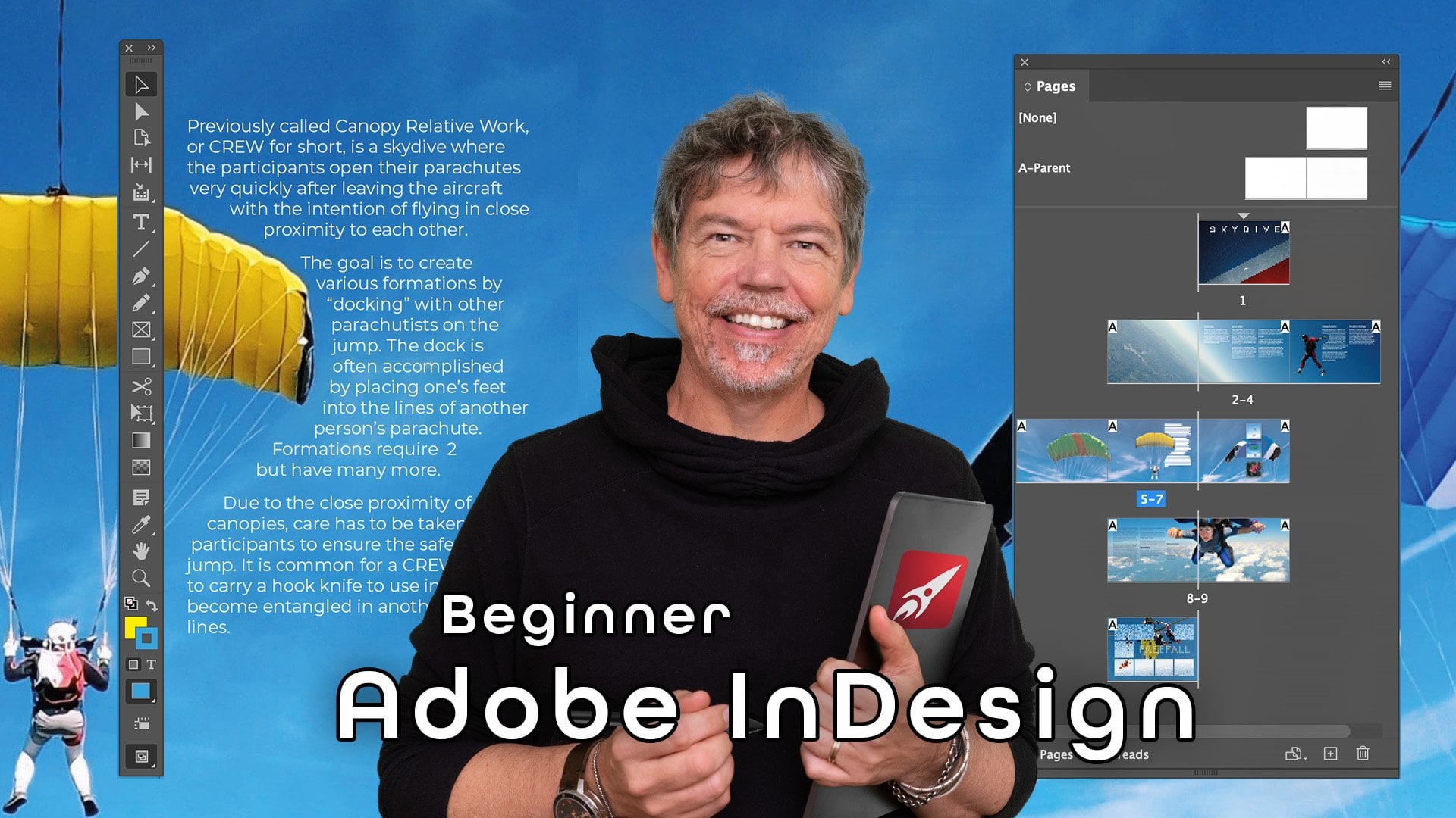
11. Page Shuffle & Create a Tri-Fold Document: I'd like to create a Brochure
which has got folds in it. Now, there are two ways
I could go about this. I could create an A4
document was to Pages. And I'm going to switch
facing pages off. And ever here, this is
going to be landscape. So what will happen now is
I've got two pages like this. And then the document
is going to be printed and then folded
into three sections. So I could try and then
for my own Layout, figure out exactly which bit of these I want for
which folded section. And I'll probably
do that by taking a guide from the ruler here. Now, I've worked out that
this is 297 over there. So I could then take
this up and get it exactly as I needed. So one-third there, the
next third over here. I've got quite good,
quite in the right place, but you get the general idea. So I can just divide this
into three sections. Then the next problem is
that I need margins that would go over there and there
to help with my design. You can see this as
getting to be a lot of fiddling around
in a lot of work. So there's a much better way to create a document like this. I'm going to close that down and I'm not going to save it. And I'm going to go to New File. And I'm going to
create the document to the right size for just
one of those folds. So in here, I'm going
to take this out and I'm going to
make this over here. That's Chapter nine to 6 mm. I'm going to make
this the size for DL, the width for deal. Now, it depends on the printers. You might have to
look into that to see exactly what it's going to be. But I'm going to
put in 99 for now. And it's got a height of 210. And I just wanted to one page. And I'm going to go
portrait for that. I'm going to click on Create. And there's my first page. Now I want to bring in
some more Pages and I want these pages to be
next to each other. Now, if you were to
bring in a page in the Pages panel, Over here, we drag a page in and I drop it, and I try and drop it
next to that page. You'll see a kind of
goes next to the page and just dropped
down over there. So the first thing
we need to do is to make sure that we have got our Allow Document Pages
to Shuffle, switched off. And then when I drag this in and put it next to that page, you can see how this a
little icon just appearing. I can actually drop that
page next to that one. I can do the same with this one. Over here. I've got three pages
next to each other. And I can do the next page
down here and just do 12.3. So just be careful where you're
dropping those is again, to make a new document or not, because we've got to allow
Pages to Shuffle switched off. These won't be a problem. You can just drag and drop
them next to each other. And this is the same technique
that would used if we were doing a document with a
Fold-out page in the middle. So now I can just Design
on individual pages here or put an image
all the way across. All of them. Send it out to the printer and tell them
exactly what I want. And obviously it's going to be printed and folded accordingly.
12. Introduction to Next Level Typography: Earlier on in the course, we looked at simple text. We're now going to delve
into the deep bits. Haven't you look at a lot of the settings which we
glossed over before. So hopefully this will take you a Text stuff to a whole
new and deep level.
13. The Character Panel: Let's bring in some
texts and have a look at the Character panel. Now, I'm going to go and get some text from a Word document. So I've just copied
some text here. And I'm going to
use my Type tool, just the standard one. There. You'll see this two of them. And click and drag a text frame in here and
paste my text straight in. So we're going to go and look at the Character panel in the
properties first of all. And if you can't
find it in here, you'll find that if you
go to the Window menu, you can also go down to Type and Tables and you can find the
same character Panel there. Or you can go to the Type menu and you'll find this a
Character panel here as well, and they pretty
much look the same. Now, you'll notice
that there's a few more things in this one here. And that's only because
in here they're hidden. Click on those three dots
to show all of the options. The options that we've got
down the bottom here can be gotten in this little
panel by going to the top. And that's where I can
choose things alike, caps, small caps,
all caps, etcetera. Now I'm going to go to
the title over here, select that title
and I'm going to increase the size of the Fonts. I'm going to go
with 36 points and I'll just center
it in the middle. So tracking is all
about changing the distances between
a whole bunch of characters like that. So I can just increase the
distance or I can decrease the distance in here and
we can just go to false, a negative figure like that. I'm just going to take it up. So I'm going to go with
the hundred in there. I quite like it for titles it gives things are very cinematic, important type of feel
for larger titles. You probably wouldn't
want to do it on your body texts
because when you do, and let's just say for
example, we made that 200. It just becomes so very difficult to read as
you can see over here. I'm going to undo that.
Just go back to there. So just be careful with that. Now, there are other
uses for it as well. So for example, I've got
a paragraph over here. And you can see the
word saying is just sitting all by
itself over there. And I want to make
this a bit cleaners. I want either to have
more words on that line. So maybe and day sailing. Or I just want to absorb that word into these
three lines here. So I can very subtly change
the tracking to do that, you can see as I increase the
tracking just a little bit, I can actually get more
words on that line. Or I could go the other way
and decrease it just a little bit until the word
sailing goes into there. But you don't want to do too much because otherwise
you're going to find that the text
will look a bit strange. But just occasionally
like this, you can do it. You often find that people
talk about widows and orphans where you have little
words or by themselves. And this is one way to
get around that problem. To the left of that
we have the kerning. Kerning is the distances
between individual characters. If I go and I'm
going to zoom into this little bit at
the bottom where it says from Wikipedia, that's where this bit
of text comes from. Creative Commons. Zoom right
into that. Sorry about this. The text is going
all over the place. I can change the distances
between individual characters. So over here I can go
between the high and the K. Just put my cursor
between those two. And then I can go over
here to my Kerning. And I can either increase that distance or I can
decrease that distance. In there. You can
see it's a very, very fine and subtle distance. Now we're going
to use that later on when we bring in things like copyright symbols
and we do fractions, we'll use that to manipulate how our characters are sitting. Below that we've
got two options, horizontal and vertical scaling. That's these ones over here. If I took the word Wikipedia, I could actually
scale it vertically. Parking fact that I
forgot to do the a, and I can also scale it horizontally as well so I
can make it tall and narrow. Remember with these two here, you're actually changing
the shape of the type. And you might end up make it look really bad because it
wasn't designed at that shape. To start off with two
more options down here. One of which is
incredibly useful. If I take a word like that or I could do it on
individual characters as well. I'm going to take
the word commons. I can use this. This is called the baseline shift and I can actually move it above or below the baseline. Then to the right of that we've
got shearing where we can actually Angle things
around a bit like italic. But you can go either way, so I can do a negative on there
to get it to go that way. Lastly, for the moment, we've got the spell checker
language down here. We'll come to some of
these other bits shortly, but have a bit of
a look at those. Try them out, make it a bit of a mess of your text
doesn't really matter. You can always bring it in
again and make sure that you feel comfortable with what
those things are doing.
14. Character Panel & Glyphs: Let's have a look at
some more options. I'm going to go up
to the word sailing. And I'm just going
to select it over there in the Character
panel down the bottom, we've got something where
we can make everything, all capitals, or we can go
with smaller Caps as well. So the main capital
is a bigger Caps, and then the rest are
smaller Caps in there. We've also got superscript
and subscript. So for example here, if I wanted to trademark the word sailing
and if I had TM, After that, I could select that. And I could use a superscript
to make it small and go up, or subscript to make
it small and go down. Lastly, I'll just
get rid of that. We've also got the
ability to underline in here or strike
through the middle. Now you might find that some of these things in here
seem a little bit, well, not that delicate. And you're going to
find that there's more options than we're
showing at the moment. And when we go into the styles, we'll be looking at more of
these options in here so you can do a lot more
with the characters. But for now, let's move over to a special character,
or special characters. Let's say, for example, that I wanted to find
a word over here. And maybe the, a head, two little dots on the top. Sorry, I said word,
I'm in a letter. I've got sailing and there's two little dots right
at the top there. How do I find that
particular letter? Well, what do you can
do is you can go up to the Type menu and
find Glyphs there. Or you can go to
the Window menu and go down to Type and Tables and you can
find Glyphs in there. Either way, it's
exactly the same thing. So what we have in here is all of the characters for
the font that you're into. I'm in Montserrat at the moment. And this shows me
every single option for months rat in there. If you were in times
that which are you all the options for times. And then I can just
go and look for that particular
character over there. So I want an a over here. So we've got some A's
at some shapes on them. I think I might need to
find the lowercase ones. There we go. There's an a
with a two little dots. That's what I want. I've highlighted the as I
could just double-click and it will replace it for me. So this is a fast
way of working. It's also great when
you're looking for things which otherwise are
more difficult to find. For example, if I was looking
for a registration mark, you know, the little
are in a circle. Well, once again, I can
go in here and I can find the R or registration
mark there it is over there. Double-click and
it brings it in. Now of course that's
too big so I can select it over here, go over to my character Options, and then choose superscript
to make it small. And go up. Don't forget when
you get your you think, oh, that's a little
bit to a bit low. I could actually still go
in here and I could use my baseline shift to
force it up even further. I can click between
those two characters. And I could use my
kerning to move it closer together so I can
just move it in like that. Now, in here we've got so
many different options and it really depends on the font that you're actually
in. A monster. It's got lots of
options in here. It's, for example, if I need something like a
simple fraction, there are Simple
fractions in there. But what about if I wanted to
create something which was maybe not quite so simple
in terms of fractions. So I'm going to go down here. And after Creative Commons, I'm going to put in
a little fractions. I'm going to click down
here and zoom right in. And we move across
a little bit there. I'm going to click
after Creative Commons. And I'm going to put
in five-sevenths. I don't know why, but I have so what I can
do is I can take the five and I can go
to my superscript, and I can take the seven, and I can go to my subscript. Now, that's not a very
nice-looking fraction that the five maybe could do
with going up a little bit. The seven could definitely
come up a little bit more. But of course, at this stage, I can just go in,
select the seven. And I'm going to zoom in a bit. Difficult to select these
things when you are far out. So I'm going to go to the
seven and select the seven. And I can use my
baseline shift to just move it up a bit into
the right position. Once again, the five, if I needed to move that, I could select that,
maybe up just a fraction. Then I could take the
five and click between the five and the
forward slash and use something like kerning
to move them closer together. Maybe with a seven. I'll put that in just
a little bit as well. Do have a bit of
a play with this. Try out these little buttons. They're pretty obvious. But the thing that's
less obvious, but far, far more useful sometimes, is going to Type
and finding Glyphs. And this will show you all of the characters for the
font that you're in. I'm in Montserrat, so it show me all the characters for
the font that I'm in. When you want to use one, you can either click and drag over the character that you want to replete, Replace. You just double-click
the one that you want. Or you can click
between characters. Once again, double-click
in here to get that character dropping
in the right place. And if you find that you're not seeing what you want in
this particular typeface. Well, let me just
click over there. And I can just go and change to a different typeface
completely. I'll go to movie. I'm seeing all of Boolean here. Once again, I can just choose
one of those characters. Have a play with those,
get used to them. And especially
nowhere Glyphs are
15. Paragraph Panel Align & Indent Text: Let's look at some of
the paragraph options. I'm going to select
all the text in here, and I'm going to go
down to paragraph. Now, once again, you might
not see all of these options, but if you press the
little button with the three dots that will
show you all of them. Or you can get it from the Window menu or
from the Type menu, like we did with the characters. Now, what do we have here? Along the top are
the alignments. So I don't want to
select the title. I just want to select all
of this text in here. And with my alignments, I've got Align, Left, central line, right align,
or pretty straightforward. Then we've got all
lines justified. So what it's doing is it's
taking all the lines here and making sure they all go right way across on both sides, except for the final line. Now let me show to you on one paragraph.
Select that again. Over there so you can see the
final line over here from a moving vessel is
aligned over to the left. If I do this one, it's
aligned to the middle. If I do that one, it's aligned to the right. Or we can use this one here, which aligns up all of them. So all the lines are lined up. But unfortunately what
it's done is it moved the text around so it's
no longer very readable. You'll see if I just undo that. If I were to undo
that and then select all the text and zoom in a little bit over here
and use this one. Sometimes you get very big
gaps between the text. Sometimes it's really
close together as well. So you need to be very careful if you're
going to use this one. Because it can look a
little bit strange. But of course, it's
entirely up to you. Now moving down a little bit, the next thing that we have is the ability to Indent
the paragraphs. And once again, this works on a paragraph by paragraph basis. So if I were to just select
this paragraph here, you can see I can go
along and I can Indent that paragraph from the left or I could indented
from the right. Indent from the right
makes more sense if you're aligned to the right. But it can be done
from both ways. Let me just reset
that back to zero. The other thing we
can do below that is to Indent just the first line. So over here, I can Indent that, but if text in there, now I'll just take
that back again. I'm going to take
that back to zero. So one of the ways that
people differentiate between paragraphs is by having
the first line indented. So you, as you're
reading through, you can see, oh, it's indented, it's a new paragraph. Once again, some people like
that, some people don't. The other thing
we can do though, is we can Indent
the text and leave the first-line set
next to the margin. So let me just select all
this text again over there. And I'm just going to go
here and type in zero again. So what I can do is I
can Indent the text, all the text in there. I'm going to go with 8 mm. But then I can go back to the first-line and I
can put in minus eight. So it will move the first-line
back to the beginning. You can't go further than
the edge of your Text Frame. You'll see if I go one more. So I go to minus nine. Remember, my Indent is eight. If I try and go minus nine, it just comes up with invalid
Indent value over there. Once again, we can also Indent
the last line over there. Try those out, see
how you get on, make sure that you understand what they are actually doing. And then we'll move on to
the other option down here.
16. Paragraph Panel: Space Before, Space After, Drop Caps, Border & Shade, Hyphenate: My paragraphs are
really close together. So in the paragraph options, I'm going to move down. And I've got a space above
or a space below option. And if I increase
the space above, what it does is it increases the space above all
of the paragraphs. Now, I'm happy with
what I've got there, but I never want
to go and change the title of this
heading over here. So I can then go
across to the right, which increases the space. After. Now, could I move that bit of texts down by
increasing the space before? No, I couldn't because
it won't actually change the spacing unless
this text above it. So these two options are really
useful for just adjusting your text and the distances
between your paragraphs. Let's go into this
first paragraph here. Moving down a little bit
in the paragraph options, just going to scroll down here. And this little option
here is called Drop Caps. Now it's set to
zero at the moment. And because I've got my cursor
in this first paragraph, if I choose one,
nothing will happen. I haven't actually told
you what it does yet, but when I do too, you'll see straight away, it's going to take
the first letter there and make it two lines. Hi. If I go to three, that first it will become
three lines hi for, and I can just keep
going like that. Now, not one queen change the
height of those Drop Caps, but we can also choose how many characters
we want to effect. So I could actually have the
whole word sailing in there, maybe make that three lines. Hi, I think that looks awful. I'm going to go back
to one letter in there and just make it two
or three lines highlights. So no right or wrong. Just do what you think
works for your Document. We can also, if I clicked
in this paragraph here, put some shading
around a paragraph. We can go along to paragraph and we could put a
border around it. And you'll find in
here you can change the colors of those two. Lastly, down the bottom,
we have hyphenation. Now there's a lot more to hyphenation than just switching
it on and switching off. And we'll be looking at
this when we do our Styles. But for now, if I
just select all of my Text and I'm going to go
and switch hyphenation off. There's no hyphenation
on my document at all. It's a personal thing
as to whether you want hyphenation or not. As I said later, we'll be looking at how we
can actually change it. So we only Hyphenate very
long words. If you wish. Try these ones out there.
17. Baseline Grid: I've just brought
that Text and again, and I've got it to
go from flowing from one column into the
next over there. Now, the issue that you can see is the second column here. It doesn't, the text
doesn't quite line up with the text on the left. Now, I could sit here
for a long time and try and get it absolute exact. Or I could just use an
option which is a grid. I'm going to select all
of my texts in here. And I'm going to go along to the paragraph and switch
on this little grid here. It's called the base line Grid. And when I switch it on,
you'll see that the texts will just immediately jump down. Now, if I start to move this up a little bit and I'm just going
to do this one here. You can see the text tries to remain perfectly aligned
to the other bit of text. Now this seems absolutely fine and really nice and easy to do. The problem is, if
I then go in here, select all my text. I'm just going to select
all my text in there. And I change my, the size of my text from
ten points to 12 points. Look at that. The type has just jumped and we've got big
gaps between it. So I think, Okay, no problem, I know what to do. I'll go over here
to my distances between the text
called the letting. And I'll just reduce it. And it's called reduces, but it's a bit too
close because that's 12 point text with
11-point letting, that doesn't really work.
Let's try that again. 12 points, not so good. 14 Points and it jumps again. So what's actually happening
in here with the text? Well, what we need to do
is we need to look and see the baseline Grid itself so that you can see where that Grid is. And I'm going to go
to the View menu. I'm going down to my
guides and grids, and I'm going to show
the baseline Grid. And there it is in then
you can see the text is going to every
second line in there. So the reason it's
jumping is because of the size of this baseline Grid. So we can change
the baseline Grid. And I'm going to do that by
going to my preferences. Now I'm going up to
InDesign Preferences. If you're on a PC, you would go to Edit
and Preferences. I'm going to go down
over here to my grids. This is where I can change the size of that baseline Grid. So remember, at the moment that baseline Grid
is set to 12 points. So when I've got 12
point text in there, and I've set my distances
between the lines, the lending to 14. Well, it goes well, there's not enough
room, so it just goes to every second line. If I were to
increase this to 14, technically it should be 14.4
because that's 20 per cent on 12. But I'm just
going to say 14. Click. Okay. And you can see now that the, we select all the text again. The type is 12 and
the lettering is 14. So it'll all work
absolutely fine. Of course, if I increase this to 14 and change this to 18, it will just jump to every
second line once again. So just be aware of that. This is just the tip
of the iceberg when it comes to using the
baseline Grid, I just wanted to give you
an idea of how it works. So the baseline Grid is this invisible or
visible, but it does, it just doesn't print non-printing Grid where
your text will jump to. And you can change the size
of the grid by going into your preferences,
into the grids. And you can change your
baseline Grid in there. Try it out and see how it
works with different sizes of texts and different
letting settings.
18. Spell Check; Find & Replace Fonts: The first thing we're introduced
to go to the View menu, down to guides and grids. And I'm just going to
hide my baseline Grid. Then I'm going to
select all the text. Just keep clicking until
I've selected all of it. And down in the
paragraph options, I'm going to switch
off the baseline Grid. And lastly, so this is
all on one, a frame. I'm going to click on
this frame deleted and pull my text across. I've just gone back to the standard text that I
had in the first place. Let's get in that
last line over there. Now, if you've got some
text in your document, obviously, one of the things you want to do is spell checking. And we had a look at the little option down
here in the Character, which allowed you to choose the language for
your spell checker. So how do you switch
your spell checking on, off auto spelling, all
of that good stuff. Well, all you do is you go up to the Edit menu and
we're going to go down and find the spelling, which is about
three-quarters the way down. So there's dynamic spelling
and when you switch that on, you'll see it'll
just show you words that it thinks are misspelled. Now, maybe that
one is misspelled. I don't know, but
definitely kite surfer is I'm sure one word. Anyway. We've also got, if
I go back to edit, to spelling and autocorrect, now that will correct things
as you're going along. Be careful with that one. It can be quite dangerous
and you can end up having all sorts of weird
words spelled out. There's also a Check
Spelling option here. So you can go through your
document or your story. If you have a look
right at the bottom, it says, what do
you want to search? Do you want to
search the story or the Document or all
the open documents? And it will just go through
and Replace words for you. So for example, sailboat
it's found and I can just replace it with two
words, sale and boat. And I can change that
in there once again. So for I'll make that well, actually I'll I'll hyphenated I think and changed that didn't
go through once it's done. It's done. And that's done your
entire document. Now, the other thing
that we can do is we can also change the text. So I know what you're thinking. We've just done that Tim
in the Character panel. But if there's a whole
document and you're not sure, maybe a few words are
different typefaces. So this word over here,
I'll just select it. Maybe that's something else. Maybe that is merely
and this one over here. Maybe that is Montserrat. So what I can do is rather
than looking for them, I know there's a movie in
there and a monster yet. I can go along to Type. And I can say, change the font or Find and
Replace the font. In here it says, Are, they say Minion Pro
is Montserrat and is merely that I
really only want to have Minion Pro in there. So if I click on Montserrat, I can then change
that to Minion Pro. And I'll just say change.
Now watch what happens. It's over here. I do change. Actually it was the
other one down there. Let's do really
bowled over there. Once again, we'll
change that to pro. I can change all in there. So it just allows you to find various typefaces
and change them. You could change your
entire document. So over here, although
that's Minion Pro, I could choose choose to change
at all to Monster ahead. And once again, we just change all and the whole
Document Changes. Have a look at those options. They're nowhere the
spell checker is. And in the Type menu, know where you can change or
Find and Replace your Fonts.
19. Find & Change: Now one of the things
you might want to do with your document is to change things throughout
all of the text. I'm going to change some words. So you might Document are
referred to this as sailing. But maybe I want
to say wind power. So whenever I come
across the word sailing, I want to replace
it with wind power. And we could do that
really easily by going to the Edit menu and going
down to find slash Change. All I'm going to do is tell
it what to find and I'll do sailing and tell it
what to change it to. And I'm going to
have wind power. So then where's it going to do? Is it going to search
the entire document or just a story or to the end of the story or all the documents. I'm going to just do
this document over here. There's a number of other
options that we've got in here for finding
and changing as well. But this is probably one of the most useful ones
to get started with. I'm just going to
say change all. And you can see it's searched, found 14. I click Okay. And when I choose Done. Now that says wind
power at the top. When pound ploys the
wind, wind power, warships, it's all
change to wind power. Have a go with that. It's edit. It's down to find slash Change. Put in what you're looking for, putting what you want
to change it to, and decide in here
what you want to do, which area you want
to search to replace. Tried out
20. Vertical Justification & Ignore Wrap: I've got a little bit
of text over here. And what I want to
do is to look at some Text Box Options. So this bit of text, it's black text in
there and I want to put the text in the
middle of the box. Now, that's pretty obvious
because I can go along to paragraph and I can move it
to the middle like that. But what about moving
it down in this box? You see, it's all very
well to move this around, but maybe my text frame
has got a color to it. If I go along to my
appearance in here, and I chose a blue, the text is still
sitting at the top. So what do we can do
is we can go along to the Object menu and we go
down to a Text Frame Options. And in the Text Frame Options, one of the options we've got
is vertical Justification. So rather than going left and right, this
goes up and down. And you can see my alignment
at the moment is to the top. I've got centre
bottom and justify. If I go to center, that will then put my text
in the middle of that box. I've got my text to my box. And let's say that I've
brought it in over here. And I want to do what
we did before in the course where we got the text to wrap
around the photo. And I want this bit of text
to wrap around this box. Over here you can see I can
still change the oxide. The texts will always
sit in the middle. So to do that, we need to get our
text Wrap open. So I'm going to go to Window, I'm going down to Text Wrap. And I'm going to choose
this option here. And this option will push the
text away from the shape. And I can then just
increase that. The distance away, left,
right, up and down. I think I'll do the left
side a little bit like so. So now I can move
that around and the text we'll just
wrap around it. So one of the options
we have is under Object, Text Frame Options. And you can choose where you want your vertical
alignment to be. Now sometimes you might do
things slightly differently. You might take a shape like
this. You've got a circle. And I'm going to go
to the Object menu, sorry, the Window menu. I'm going down to my text Wrap. And I'm going to
force the text to go away from that circle shape. So I'll use this one over here. There we go. That's
looking good. But then I want to put a bit of text in the middle of this. So I'll make my text over here and let's just getting
quick bit of text in there. Wind power. I want to put that
little bit of text right in the middle
of that circle. So I do that, I move it across
and we'll just disappears. Let's move that out again. It's back and it
disappears and black, you can see the problem. So why is that disappearing? Well, it's because this
bit of text here is also being affected
by the Shapes saying, push text away from itself. So how can we work with that? Well, if I've got a
object like that, that I want to not get
affected by the text wrap. I can go to the Object menu. I go down to my
Text Frame Options. And there's an option in here which says
Ignore Text Wrap. Click it on switch. Okay? Now when I've
put it in there, you'll see the texts will
be there, quite happy. I'll just press W so you can see the effect that I'm
going for there where I can have a little word in the middle and
text wraps around it. If you've done it like this, where the textbox is actually the object, you
don't need to worry. But if you used another shape
and then brought text in, you might need to stop
it from being affected by the text Wrap.
Do try that out. There's two options in there. It's the Text Frame Options. So one is looking at the
vertical Justification, the other one is looking
at ignoring text Wrap
21. Column Rules & Balance: I'm going to get rid
of this little bit of texts in here and the shape and that
one over there. Now I'm going to go
back to the Object, Text Frame Options and have
a look at some other things. If you remember that we could actually go down to the
bottom of the properties and we could change
things like the number of columns will you could
do that in here as well. So I could change this into, for example, three columns, black and also forced the
columns to balance over there, so they're all balanced
along the bottom. Now, the other thing we can
do is we can insert spacing. So over here I can
just insert spacing. And that's inserting
it all the way round. This Text Frame you can see
it's pulled it in like so. Once again, this is useful. If you've got Text, we've actually changed
the color of the frame. And you want the text
just inside that frame. Like so. I'm going to go to object. Once again Text Frame Options. And I also want to now move
over to the column Rules. Now, that's Rules is not, you can do this and
you can't do that. What it means, it's rulers. So if I go to Column Rules, I'm going to insert
column Rules. And you can see it just puts these rulers or lines
between the columns. I can adjust things like Length, horizontal position, the width, the color of those lines. I'll click Okay, as I increase the number of columns in here and I'll just
go down to the bottom. To do that. You see it will just continue
to keep my rulers in their. Incidentally, if you go to this Text Frame Options and we did look at it in
the first course. I'm going to move across
to the Options here. And that opens up the Text
Frame Options anyway, so I can just go in and
change things in there. You don't have to go
to your main Object menu to try that out.
22. Text on a Path: Now this next bit is in
exciting one because this is where you can get to
put Text onto paths. To do it. I'm going to start
with a little pencil now. You can't see the pencil. It's well, it's about a
quarter the way down. If you right-click,
it could be in with the smoothing tool
or the Erase tool. I'm just going to take my
pencil and I'm going to draw a little Curve like that. Now you can see my
curve has got a fill. So I don't want to Fill. I'm going to choose none
for my fill and Stroke. I'm going to give it a color so that we can see it easily. I'm going to make it black. Now I'm going to go across
to the Type Tool and I'm going to right-click
and I'm going to choose the type on a Path Tool. If I move over to the shape, you'll see when I
go over the shape, a little plus appears, and I can click on that line. Now, here's the little
flashing I-beam, and I can just put in my text. Now I've got the text on a Path, but maybe I want
to move it around. So if I go up to the
black arrow tool, that's the Selection
tool at the top. You can see there's
a little line and I'm going to zoom in. You can see this a
little bit better. There's a little line over here. And there's another
line in the middle. And there's one on
the right-hand side. Those are your left, center and right
alignment margins. So if I were to go
into my Text tool, click on my Text, and I went along to
my paragraph options. You could see I can left. I could write a line
or I could center align the text on the path. Now, I can continue to type
on there at any time I can go in and change it. I can also select
my text and use pretty much all of the options
that I had in here before. Whether it's changing
the typeface, whether it's adjusting the size, maybe even moving it using
the baseline shift and move it above or below the path. But what about if I
wanted to actually move it along the path? Well, what I need to
do is I'd need to move my left margin in a little bit. Now, I need to make sure
that select just the margin. I'll pull it in.
And you can see how the text is kinda
moved to the center. Then I can move the
right margin over here and move that
one in as well. Now as I'm moving these in, I'm all I'm doing is
moving the left and, or the right margin. And I can then get
the text to align either to the left or the right. I'm going to go back, select the text again
and just align it left, center, or right in there. You can also move the text using the little
centre line over there, So that's left, right
and center alignments. You can see there's
just little line there. And if I click on that, I can
actually move the central along and move my text
anywhere along the path. Now, it is a little
bit delicate to try and grab it, but you can do it. You can move once
you get hold of it. If I drag that little line, that little center line
underneath the line ventral put by text on the
other side, the path. So grabbing that
and just putting it to one side or the other. Have a little bit
of a go with that. So remember, you just make
it a little shape like that. Put your text in by
clicking on a Path. And then you can move
the left, right, or center alignments using
the black arrow tool. To be fair, even the
white arrow tool will do the same thing as
well. Dried out
23. Text on an Object: Don't do the same with shapes, so I can go along and I
could get an ellipse, drawing an ellipse in there. It's got a fill, but
that's absolutely fine. I'll get my text on a path tool. So type on a path, click on my shape
and put in my text. And then same again, I can use the selection tool. And now you can see that there's two lines together in there. So this one over here
on the right-hand side, that's actually my left margin. If we went all way around, that would be my right margin. And my center option
is over here. So if I were to take this left
margin and drag it around, you can see that's
the left align. I will just go long, select the text or
clicking the text. And then down here, I could choose right align or central line to get
to go to the bottom. And it's exactly as before. You can also drag it by the little line if you
can see it in there. Said it's always a pain to
try and get hold of it. I often prefer to use the white arrow tool
because I find it easier to grab that little line in there and pull
the text around. Let's move that around as well. All right, so now what about the text color and
all the rest of that? Well, if I select the text, I can go into the
appearance and I can change the
color of the text. And all the rest
of those options. If I'm on the selection tool
and I click on the shape, now I'm dealing with the shape. So if I didn't want anything, a shape there, I could just
choose none. Over there. I can go to the stroke
and I can either choose a stroke color or none as well. I'll just press W
and you can see the text is still going round
that shape. Try it out.
24. Introduction to Project: Fold-out Brochure: We've got a really cool
project to do now, this skydiving
brochure, and you can see a few of the
pages over here. We're going to work through that and I'm going to show you how to do different layouts in there. How are we going to use
a lot of other things that we've done already, but a lot of new stuff as well. Let's get going. It's
gonna be brilliant
25. Create Document with Fold-out Pages: As always, let's
set up a document. I'm going to create a new file. And I'm going to
go over to print. And I'm going to choose A4. This time I'm going to go
with a landscape option. And I'm going to put
in my pages in here. I'm going to do eight pages with facing pages switched on. Now, as far as the columns go, I'm just going to leave
them on the default, but I am going to go and add in. My bleed has always. I'm going to click on Create. Let's zoom out a
little bit over here. Now with this
particular document, what I want to do is I
want to have a page which is an extra page which folds out in the middle
of the document. So I've got the front cover. Then you open up the document
and you see these two, but you then open this page
and it folds over to there. You see three pages together. And then when you go
back to this page here, if that page was still open, it would come out over here. If it's closed, you would
just see those two in there. So first of all, I'm
going to set this up. I'm going to go to
my Pages panel. And right at the top, I'm going to go down and
I'm going to switch off, Allow Document Pages to Shuffle. When I add my new pages in, I can drop them next
to the other pages. Over here. I'm going
to add another page. I'm going to drag it in. And rather than putting it
to the right of that page, I'm going to put it
right up against it. You can see if I
go up against at my little cursor
changes and then allows me to add that
picture in on the right. I need to do the same
on the left as well. So going here and just add in that little page on
the left-hand side. So now this is my cover. I then open the document. Here is the spine
down the middle. Open my document
at the left page, is there, the right pages there. And you can open
that up to this. And then when you
go to the next page so you turn those pages over, if that Pages still left open, it would be a
three-page like this. If it's closed, it would just
be to two pages in there. Have a go set that up with 3.3. So it's 1,332.1. And then we'll come back, we'll put some content on this
26. Bring in Photos: Let's bring in some pictures. I'm going to zoom in
to my first page. And in fact, I'll use the Pages panel to just
double-click to go into it. There. I'm going to make
the frame and it's going to go from bleed
edge to bleed edge. And I'll then go and do the
same with the next page here. So onto the next page
and just bring that in. Zoom out a little
bit for that one. Now, I'm having a
little bit problem trying to get everything in. I'm going to press tab on the keyboard so I can
actually see the full-screen now go from one side of the bleed to the other
side of the bleed because that's going to be one huge
picture across three pages. The same here. I'm
going to take this one here and drag it across. I get one large picture
over the three pages, the Fold-out down to here. And the last one, there
seems to be a picture. They already I'm
going to press Tab. I must have mistaken you
brought it in before. I'm going to once
again go and put in a frame across all of that. Now, let's go back to seeing
the whole document here. So now can bring in my pictures. I'm going to go to File and
Place and find this one here. I'm going to use that one. I think I need
something like this. And that, and maybe this one. Click on open this image first. I'm going to put that down here. This one, I'm going
to put in that one. So it's gonna go across three. I think this one is going
to go across all of those. That's going to
go at the bottom. And this would be
my cover picture. And then working through the properties into
the Properties, I'll just use Frame
Fitting to very quickly go in and get them to
fit those frames. That one there. And lastly, this one here. Zoom in a bit and make sure everything is
in the right position. So I'm going to
hover over it and move things around
until they work. I think I just want those
to outside canopies and then the chap in the middle of the
person in the middle. This one, there's just a pair of legs dangling from space. So I'm going to click and hold. And once again, drag that down until I see the whole
of that skydiver. So they're in there. And this one is perfect. We've got the little
canopy over there and the plane in the background
bringing some pictures. They don't have to be the
same ones that I've used. Do whatever you like for this. And then we'll move on
and start with some text. But can I suggest that when
you get to this stage, because you've done
quite a lot of working good of File and Save. I'm just going to use
Save As over here. We'll call the skydive. And I'm going to
save it somewhere. And also so that I don't move things by mistake
or put a picture in that I didn't
intend like you. So I Done then I'm going to
lock things down as I go. Now the shortcut for locking is either control or command L, depending on with
your PC or Mac. So I can just go through
the pictures very quickly and lock
them into position. Like so
27. Set-up Fold-out Pages: Now this is going to look
fantastic when that folds out with those three pages,
this huge panoramic. But what would it
look like before people fold this section out? Well, they'll see
that page there. And they'll see the back
of this page there. The back of this page is
actually this page there. So the C that and
that over there, that will look a
little bit strange. So we're gonna do something
really exciting here. We're going to take
some of this image, put it over there and
blended into this one. So when people see this page before they've
even folded out, they'll actually be
seeing what looks like these two pages here. Let me show you how
we're going to do that. What I'm going to do is
I'm going to just unlock. So on here, I'm on this
page at the moment. And the first thing you'll
probably says, Tim, how do you know
which page you're on when you're seeing
all four of them, will look over here
at the rulers. You can see when you click
on a page that one of the appropriate numbers
just goes brighter. So I can actually
see if I click on that page, them on
that one there, some on this page here, I'm going to go to object
and unlock all on spread. So it unlocks them just
on the spread them out on these ones here
are still locked. I'm going to copy this. So I'm gonna hold
down the Alt key. And I'm just going to
drag a copy over to here. Now, this page still
remains the same. And in fact I'm going
to lock it again. And let's move down
now to this page here. I'm going to move this picture here because at the moment you can see
those two are identical. That one's, whoops. This one here is actually
on top of that one there, but there are identical. So what about if I were to
move this one across to there? So in fact, this page
here over there, that little bit
there is the same as that a little bit there. And I want to get rid of
now the bit at the end, so I'll just pull that in. You don't have to do
that, that statement. Now you can see that that would actually match
that page there. Now of course, we've
still got the problem of this suddenly going to that picture there that
doesn't look very nice. So we're going to use little tool here called
the gradient Feather Tool. And with a gradient Feather, if I were to click
and drag over here, I can just get
things, no fade outs. I'm going to do something
like that to just get those two to fade across. So when the document
when you've opened it to this page here and
this section is closed, you will see that page there. Plus this one here. You might see a little bit
of the sky in there as well. I'm UQ can just keep going in other directions if you want
to make it more interesting. Then when you open it up, you will see those. When you turn over
to the next page, you will then see this as your folded out section
because that folds back onto, onto that page there. Or you can have it
open like this. So have a bit of a go, I noticed, seems a
little bit fiddly. What do you could try to do if you're having
problems with this? And I've done this before, is actually cut it out of paper
and do a rough drawing of each little piece like that
and put it together and see how it works so that when one
page goes over the other, you can see what will,
what will appear. Or of course just print out on an office printer and then have a go manually with that
as well. Try it out.
28. Color Overlay & Track Type: I've zoomed into the front page and I'm going to put
in some graphics. It's very simple, little
squares and some text as well. So I'm going to go
along to the shapes and I'm just using the
rectangular tool. And I'll just draw in a
little rectangle over there. And I'm going to
fill it with color. Another color I want to use is something which will look
really good with a blue. And I'm going to go for
this bright red over here. Now, I know what
you're thinking. It's a little bit over the top, but do bear with me. Because I'm going to
take the Move tool over here and I'm going to move this across and I'm
going to angle it, I'm going to rotate it. And I'm looking to rotate it
kind of at the same angle as the planes trail, the aircraft trail there. I'll do something like that. I'm going to put it up a
little bit and across. I'm actually going to
take it over that shape. Maybe down to about the corner of the page somewhere like that. And put it out. I'm covering this top half
of the page over there. Then I'm going to
make a copy of that. So I'm going to hold
down the Alt key, make a copy of that, and put it down to them. Now, I've pulled it too far, so it's actually gone on
to this document here. Let me put it up again
and drop it in there. Just make sure I move it. If you happen to
drag over that area, it'll move it from
one to the next. So I'm happy with that. I might make this a
little bit bigger. Now that's very bright
red in that one, something a little bit darker. But I also want to be able
to maybe see a bit of the sky in the
plane behind this. If I go to my opacity
and change the opacity, you can get some of
it coming through, but I don't know that the red, so it looks a little
bit washed out. So instead, I'm going to click
on the word opacity here. I'm going to go to
normal and I'm going to choose a multiply that, multiplies the red
with the photo below. Let me do it on
this one as well. So once again, Opacity,
Normal and multiply. Let's have a look at
that. If I press W over, then you can see
we've got this really nice, strong, deep red. A little bit sort of replicating
what we see in there. I'm going to bring some text in. So I'm going to
use the text tool. Click and drag a text frame over here and put in a skydive. I'm going to select
the text and then go across and increase the
size so I can see it. I'm going to change the
typeface to something else and I'm going to choose
movie in there. You can use whichever you like. I'm going to make
it paper or white. And I think also in
this character area, clicking on the three little
dots to maybe change this. So I get small caps in there. I'm going to move it across. Then just place it along
the top somewhere. Now, I want something which is a little bit more exciting, a little bit more cinematic, rather than just the
text over there. So I'm going to zoom into it. I'm going to select
the text again. I'm going to experiment
with this option here. This is called your tracking, and I can track it
so I get further apart or closer together. Now, I'm not really happy
with this small caps. I did it to show you
about small caps. So I'm going to go into
full caps in them. And I'm going to
use my tracking to pull the characters
further apart. So I get something which is maybe a little bit
more cinematic. Let's have a look
at that skydive. There we go in huge
letters in there. I think I'll place it
right near the top. Like so. Let's press W to have a look. I think it can move, maybe I'll move it up just
a little bit like that. You can always play
with this, change, the tracking if you want to
increase it or decrease it. I'll try a little bit more. There we go. And that's
looking a whole lot better. Have a go, try it out,
putting some color and change the the type as well makes something which looks interesting or that you enjoy
29. Change Color & Create Paragraph Style: Now the great thing about
these overlays is that you can always click on them and then just go and
change the color. So if I wanted to
experiment with blue, I could try it out or the
blue and red together. I quite like that
option actually, but it's nothing set in
stone because later on I could always change my mind
and maybe go for full blue. I'm going to keep that on
red down the bottom for now. Now, the next thing
is we're going to make some styles for our text. We want a body style, we want a heading style. So I'm going to go
to the Window menu. I'm going to go down to
Styles and Paragraph Styles. And I'm going to make a new
paragraph style down here. So I'm going to click
on Paragraph Styles, Paragraph Style one. And in now I'm going
to double-click it and give it a name. I'm going to call this body. Then over to my basic
character formats, I can choose the font or
the font-family in them. And if, if I go to the latter, I think that's what I'm after. I want a lighter
version of that. Then onto my size, I'm going to leave that
at 12 at the moment, I might have got a
little bit smaller depending on how much
Text I bring in. The tracking is going
to remain the same. You don't really want to
do some tracking with your body text because it can
be very difficult to read. Then to the advanced
Character Formats. I'm going to check that my
language for my spellchecker is set to the country that I'm in or the language
that I'm speaking. I'm going to go to
indents and spacing. And my alignment is set
to the left in there. If you wanted to be to the
right, that's absolutely fine. And then we can go down and have a look at
some of the other options. I'm going to go down into
hyphenation for now. And I don't like hyphenation, so I could switch it off. But rather than switching off, maybe instead, I could say, I only want a Hyphenate
really long words. So I can have words which are
at least nine letters long. Anything shorter than
that won't Hyphenate. Moving down. I'm
going to go into the Character Color and
I'm going to choose paper because this is
going to be text on the white background.
And then click. Okay. Now for my next Style, which is gonna be the header, I'm going to click
again, double-click. And I'm gonna make
sure that this is actually based on the body. So it'll pick up all those
Body things that we've got. Once again in here, I'm going to give it a
name, Head or header. And exactly the same. I'm going to work
my way through, but because this is the header, I'm going to make sure
that it's slightly bigger. And instead of light, I'm going to choose
a bold for it. Colors going to be
exactly the same. It's going to pick
up the color from the last one, hyphenation. Well, we really don't want
a Hyphenate any headers. I'm going to switch that off. Click Okay, and that's done. Now can start
bringing in my text. So you can bring in
any text you like. But I've got a Word document, and the Word document has got some stuff to
do with skydiving. This comes from Wiki. And so I'm going to bring in a little bit of text
here and I'm going to take this bit of text about the, first of all bad the, the artistic events and the
accuracy of landing. And I'm going to take those in. So I'm copying that. I can then go into here, use my Text tool to click
and drag a text frame. Now, I am going to go into
standard Mode in the moment, but I'm just going
to paste that in because I want to paste
in with the body. I'll click in Body. And when I pasted, it will bring in all those
Body options in there. As I said, I'm
going to press w's that I can actually see where my individual margins are. Those margins are
they really are far too small for the document
that I want to use. I'm going to go over here to the properties and I can increase the margin size on
my entire document. So I'm going to look
at something more like that and that will
look a hollow better. Now, the problem
here, of course, is that this is a long bit of text to read all
the way through. So I will go in to my
paragraph options. Good, add to my frame. I'm going to pop that into
two or three columns. I'm also going to click
on the Options button. This is the same as going to Object and Text Frame Options. Click on Options
and I'm going to get my text to balance out. So I'll use Balance
columns in there. Now remember that some
of these, for example, these headers over here, if I click on them, they need to be headers that's
ahead of their. And there was another one. I think it was the
accuracy landing in there. Once I've done that, I can then go back in
and change various bits because obviously the paragraphs themselves are too
close together. So I might deselect that, go back into Body, go over to my
indents and spacing and use these Space
Before Space After. If I just change
that a little bit, you can see how it's moving the distances between the
paragraphs further apart. I'll click Okay. Now, of course,
maybe the headers, I want more of a gap between
the headers and the body. So I could go to the header, go into the, once again, the same thing,
indents and spacing. And I could say Space After. And to just change the
gap after the header. Bringing your Text, try it out, press W to see how
it's going to look. We're going to have to deal
with this little bit of texts which we can't see very shortly. Tried out
30. Format Text: Let's fix this text. The first thing I wanted to
do is this accuracy landing. I'd like to move that
little paragraph there in the header
over to that side. So I'm going to put my cursor just in front of
accuracy landing. I'm going to go to the Type menu down to insert Break Character. And I'm going to put
in a column break, which will force it to
go to the next column. You can see it's
sitting up there. Now. The next issue that
we have over here is that some of these things
don't look quite right. Look at the lines. You can see those lines there
are lined up perfectly, but this line here, but it's a little bit all
over the place ready, so you've got a line there and then it goes up to that bit. So what I want to do is I
want to make sure that all of my text sits on the same line. And to do that, we're going
to use a baseline Grid. Now, I'm going to go
to the View menu. I'm going to go down
to guides and grids, and I'm going to switch
on the baseline Grid. So I'm gonna say
show baseline Grid. And we'll zoom in a bit over
there to try and see it. Now you can't see
the baseline Grid. I'm going to go to the
Window menu, find Layers. And in my layers, I'm going to hide the picture. And now you can see the
baseline Grid is over there. But this is a bit of problem because if I have
the picture on, then I can't see
the baseline Grid. If I switch it off, then I can, but I can't see my Type. On the other hand though,
if I select all my type, then you will see
where it, where it is. So I want to make sure that you can see
exactly what I'm doing. So I'm going to just change my type color into
black temporarily. So I'll hide that. I'm going to go to my
header, sorry my body. Double-click the body and change the color down here to black. And of course, because the
head is based on the body, it does the same as well. Now this is just a temporary
measure since you can see what happens with
the baseline Grid. By the way, if you
zoom out far enough, the baseline Grid
will disappear. You need to make sure
you've zoomed in and you can see it's
all over the place, the baseline, the
baseline of the text. So I'm going to go
along to the body, double-click on the
body Paragraph Style. And I'm going to go to
the advanced Character. Sorry, Let's try
that sentence again. I'm going to go to the
indents and spacing. And I'm going to say
align the text Grid. I'm gonna choose all lines here. So now my type has
aligned to the grid. But the issue is that, okay, it's Line to the grid,
but it's actually jumping to every second line. Now, the reason for
that is to do with the size of the text and the size of the
distances between the text, which is called her letting. You can see my type here is 12 points and the
letting is 14.4. So that's the distances
between them. So the issue is
that this Grid is actually smaller than the letting. I'll show
you what I mean. I'm going to go to, to
InDesign Preferences. Now, if you're on
a Mac, on a PC, sorry, you will go to
Edit and Preferences. And I'm gonna go
along and find grids. In here. You can see my baseline Grid has got an increment
every 12 points. So although this is setup
to be 12 point text, the distances between
them is 14.4 points. So what I need to do
is to change this. If I change this to
14.4 and click Okay. Now you'll see that my
baseline Grid is 14.4, so the lines will work
in there perfectly and everything just lines itself
up exactly as it should. There is one more option, one more thing that I
want to do in here, and that is the bit of texts
that comes right to the top. I'm going to click in
there and I want to move that text down manually. Now, if I were to do it with a return and clicked on
there to do a return. You can see it jumps with
two lines at a time. If you use shift and return, this is known as a soft returns, so it doesn't change, it doesn't make it
into a new paragraph. We could do a soft
return there and another soft return over there to get into
the right position. What all of those
things absolutely fine. I'm going to go back to my body and just change the color of my text back to white
and click Okay. And then I can go in, find my layers and switch
on my picture. And that text looks a whole lot better than it looked before. I'll just press W
so we can see it without all the bits
and pieces around it.
31. Text Format Again: I like to put some lines
between the columns. So I'm going to select the text. And by that I'm in the frame. I'm going to go to Object
Text Frame Options. And we've got an option
here called column Rules. And I'm going to
insert column Rules. Now, initially it's just putting these black Rules
down the middle. I'm going to go along
and Change this. I'm going to change
the rule Length. And you can see how I
can either decrease the rule Length or
I can increase it. We've got to start and
end option in there. Because they're linked
together, they're both to it at the same time. So I think the start, I might take this
down a little bit. Let's try the other way. Over there. I'll unlink it and the end. We'll take that along
a little bit as well. Then over here we've
got an offset so I can actually offset it to the
left or to the right. I'd like to change
the color of that. So I'm going to try red
in there and click Okay. Another thing that
we've got with a Text is this little
word over here, which is the winner, winner, which is just
sitting on its own. And what I'd like to do is
I'd like to change that. So I'm actually going to
override the Paragraph Style. I'm going to go in
to this area here. This is our tracking. And I can either increase
the tracking. There we go. You can see what you just
a tiny ten in there. It's increased in tracking, move some of those
characters around. Or I could try decreasing the
tracking until it's right. I'm actually going
to keep it and just increase the
tracking just a tiny bit to make sure that I've got a few more words on that line. Do try that out. Have a look at this subtle Column Rules
that you can put in. And if you have got any of these little things that
just sit all on their own, this called widows and orphans. If they just sit
all by themselves, we can just change the tracking to make sure that you've got
a few more words in there. Try it out
32. Text Wrap: I'm going to be bringing some
more texts into this page. So I'm going to press
W so that I can see the guides in there. I'm going to bring
my text in now. So I'm going to
take the Type tool, click and drag a Text Frame. I'm going to paste my text in. I've just taken some
more texts from this little document in here. So paste my text in. Now, when I pasted it, I'm going to make
sure that I'm using the Paragraph Styles and I've got the body Style Selected. When it comes in, it
comes in the body Style. This is then going
to be a header. That's going to be a header. And I'd like to take
my text and get it to go over two columns over here. Now, because this bit of text is setup to go over these columns, three columns in there. I'm going to do the
same thing here. I'm going to go down
to the bottom and choose two columns,
three columns. And then I want to force the
text out of this column. So just goes in those
two columns over there. Might need to pull it
down a little bit. So I'm going to
zoom into the text. Put my cursor in front
of the sea for canopy. I'm going to go along
to the Type menu down to insert break character
and put in a column break. And that'll just
force the Text into the second column over here. Now, I'd like to then
get the text to actually float around that
person's hand over there. So I'm going to draw
a little shape. Now for ease of use, I'm going to use the pencil. I'm going to double-click
my pencil and set my smoothness to
about 50 per cent. Then I'll draw a shape
around the skydiver. There, maybe around
his foot as well. Don't need to be too
accurate about this. We're just doing a
rough shape around the bit that we want to
get the text to avoid. And then I can make sure that this new shapes that
I've drawn is selected. And I can go in to my properties down to Text Wrap and choose
the third option around, which will then force the
text away from that shape. You can of course,
move it further with this little amount
here if you wish. I'm pretty happy with
where it is at the moment. Of course, I've got my
formation skydiving in here. So I think what I'd
like to do is to move that across to
the next column. So I'm going to go
to Type inserts, Breaks, Space, break characters, shall I say Column Break, force it to go up to here. I think most of the
text looks okay. Once again, is the word
more all by itself. So I'm going to select
that and maybe change the tracking just a little bit to get a few more
bits of texts on there. You can barely see the
difference between the tracking on this and on that. Have a go with some more texts, try it out and see
how you get on
33. Create an Override: This bit of text is
quite difficult to read, so I'm going to
change it to black. Now, what I'm going to do is I'm going to select all the text, so I'm just clicking a few times in here to select it all, and then I'm going to change
my fill color to black. I'm not changing it in the
style because obviously, that will affect all the rest of the text in the
whole document. But look what happens over here to the body in the
header when I do that. I'm going to change
that to black there. Now, if I were to click on this text over there or
select a little bit, you'll see that there's a
little plus that comes up. And if I do it to the heading, once again, there's
a little plus that's come up there as well. That's known as an override. It's where we've
actually overridden the style with
something else in here. And it just shows you when
you click on little plus, that there's something
which has been overridden. Now, it's quite useful
because sometimes you might want to go
back to the style. So even if I'm
clicking India and it tells me I'm on
the body style. I want to change it back again. So what I can do is I can
select all the text again, and to remove the style, we have a little
button at the bottom. So this one here, we can just click on that
and that gets rid of the override and takes us
back to the style here. Now, sometimes you might have an override and not
even realize it. So for example here, Maybe without realizing it, I've gone from light
to thin with the text. You can see there's
an override on there, and if I click on there,
there's an override. Now, looking at the text, I can't really see
that very easily. So how can I see if there's
any overrides on my text? Well, there's a little
button at the top over here, if I click on that button, it shows where there are
overrides on your text. So it means that
I can then go to this little bit of
text here and then clear any overrides that were on it. That's
what this does. It just shows you that
there are overrides. By the way, you won't see that if you are in preview mode, you must be in the
normal working mode. Anyway, for my document,
I'm going to select it all, and I'm going to go over here to fill and just choose Black. As my fill color, you can
see my overrides come on. I'll just switch
that off for now. Try that out and do an
override on your text.
34. Add Text on a Path: Let's get a bit more
text on this page. I want to have a word over here, just a really large word, something like
freedom or flight. So I'm going to
use my Text tool. I'm going to click and drag
a text frame and pop it in. I'm just putting
the word freedom. I'm going to select it. And I've got bold in there. I could keep making
it bigger like that. But I'm actually going to go
to the corner. Hold down. Now, if you're on a Mac,
it is Command and Shift. If you're on a PC, it's
Control and Shift. And I can click and
drag that corner out to just resize the text very fast. So Command and Shift
or Control and Shift to bring out like so. Now I'm going to put that
I think across the middle. And we'll just move it manually. I'm using the arrows on
my keyboard to move it into the correct
position where I wanted. If it looks too
large, once again, I'll do the same thing
and just take it down just a little bit. Now when you using the
arrows on the keyboard, if you hold down Shift, it will move in
larger increments. Then if you just use the arrows, what I'm gonna do with this
is I'm going to go across to my appearance and
down to the opacity. And MGS can change the opacity
so you can barely see it. It's almost like a watermark. So you've got the freedom
watermark in the sky. What I'd like to do is to put some text over the
top of the canopy. So I'm going to use
the Pencil Tool. And I'm going to give myself
a bit of a Stroke on here. So I'm going to my
properties and it just changing the pencil
to a Stroke color. Now, when I look over
here at the properties, I can't actually see the Stroke Options come up
when I'm on the pencil. So how do I change it? One of the ways I can do it
is to just go to Window down to Color and Swatches and
find the Swatches in there. And that's where I can
then pop in my color. I'll just use black
for the moment. I'm going to change it later. I'm going to zoom in
a bit over there. Let's move some of these
things out the way. And I will just click
and drag along there. Now not clicking
and dragging yet, because I'm going to
double-click on the pencil, make sure my smoothness
is pretty high. Doesn't have to be
100%, but pretty high. And then I can draw that
line in over there. Now, if you're working
on a track pad like IM, it can be a little bit wonky, but hopefully the smoothing, you can see the smoothing,
smoothing it out. Of course, I can still use
the white arrow tool to click on the points and
move them around if I need. So I'm going to just
move that point there and this point over here. And it's moved that one
into the right position. And that one down a bit, it
doesn't have to be perfect, we're just getting
it roughly correct. Now, if I select this shape, I can then go to my Text
tool, Type on a Path. I'm going to click on the
path and put in the text. So the only way to fly in case you're wondering, I have never
parachuted in my life. I think I'd done yeah. I don't think it's something
I could do anyway. But I like the, I
liked the idea. So I'm going to select the text, go along to the Character. And although we've
got a Style on that, I'm going to override that
Style and increase it in. Then just keep going
along like that. Now, I want to get
rid of the little black line underneath that. So as long as I select the
text with a black arrow tool, I can go down to my Stroke and I can just choose none
for the stroke. If you want to move the
text away from the line, you can then go along and
look at things alike. Baseline shift. If I select all my text
in my character option, I can use the baseline
shift here and just move the text slightly
further away from the line. Or if I wanted on
the actual canopy, I can move it back to there. I'm just going to try and
get it so it's sitting just on the edge of the canopy. It's have a look at what
that page looks like. Once again, I might even go
in and change the opacity. So it's not so over the top. No pun intended. Anyway.
Have a little bit of look and try some
more text in there.
35. Add Image to Multiple Boxes: I'm going to go to
my last page and add some pictures over
the top or a picture, shall I say not some
pictures, but a picture? I'm going to use my little
rectangular frame tool. And I'm going to click and draw a rectangle over the picture. I want to split
this up into parts. So I'm going to press the
up arrow twice and the right arrow three times. So by doing this, what I'm actually doing is
breaking up that shape. I also still holding
down the mouse button. Don't let go the mouse button or this little arrow
thing won't work. I'm happy with that. Then I'm going to go
in and say, well, some of these I don't want I
don't want that one there. That one. That one or that one. I want to just have these ones over here so I can put
a picture in these. But then still see that some
of that picture underneath, It's a really nice effect. Now what I'm going to
do is I'm going to select all of those. So click and drag over them. I hadn't selected the picture in the background
because that's locked. If you haven't locked it, you might find that
you'll need to deselect that one
if you selected. That way. I'm now going to bring in the picture that
before I do that, if I'm bringing
the picture, it'll try and just put it into one of those little frames. So I have to go along
to the Window menu, down to object and Layout
and the pathfinder. And I need to unite all
those into one shape. And you can see over here, this little thing says combined select objects
into one shape. They're not touching,
but they're all one shape is a cross
through the middle of them. Now when I go in and find the picture that I want
to place in there, and I'm just going to go
and pick a different one. And I can then just resize it and maybe move it across
a little bit. Try it out. And the trick here is to make sure that you use the pathfinder first instantly
if you don't like the picture or doesn't go
quite and drag position, you can't move it
like I've done. Just go in, find another
one to drop in there. So I have got another
picture that I'd like to use in there. And it's gonna be that
if I click and hold, I can then move my people around wherever I
need them. Anyway. But if experiment
tried out until you get the right picture
for you in there
36. Package & Export: Now, if I'm finished
with my document, what I'm going to do is
I'm going to go to File and I'm going to be
exporting as a PDF. But firstly, I need to
save it, which I've done. I also want to make sure
that I'm archiving it. So I'm going to go along
down to my package. Now you don't have to do
this just for archiving. You could do this if you're going to send it
to somebody else. But I'm going to go to package. And by packaging it, I'll have a folder with not
just the editable file, but all the pictures and any fonts that we used
in there as well. I'm going to go over here
and click on package. And this then brings
up this window. It says, whatever the name of
your file is, plus folder. In here, it's going
to copy all the fonts except for Activated
fonts from Adobe. So it won't do those Fonts which come as part
of your cc package. It also copy Graphics. Links are linked
graphics and pictures. And it also actually
makes you a PDF and you can choose which type
of PDF you want in there. I'm going to click on package. And the warning pops up. This warning is saying that Fonts are actually
copyrighted items. And if you pass this
onto somebody else, they should buy in
those Fonts themselves. They shouldn't, you
shouldn't just be able to pass them over to other people. So we'll just click Okay. And that's done. I'm going to go and
find where I saved it and I've got it over there. There's my skydive folder. If I open that up, I've got my skydive in D, D far the InDesign file. I have got the IDML file, which is for older versions if I passed onto somebody else and I've got any links
that I've used in here. Now the fonts that
are used with part of the Adobe CC set. So it actually hasn't made a folder with Fonts
and if unused, a weird and wonderful font that maybe I'd found
on the Internet or wasn't part of the cc, sweet. Then there'd be another
folder in here which said Fonts and would have those
fonts in there as well. Lastly, you can see there's
a little PDF in there. Now I'm going to go
back to InDesign. And finally I'm
going to go to File. I'm going to export this. I'm exporting this for print. So I'm just gonna put
onto the desktop. I'm doing PDF for
print in there. Click on Save. Now in the pages
option over here, I'm going to choose All Pages. And do I want them as
individual Pages or spreads? Well, I'm going to send
this to the printer, so I'm going to choose spreads. Then I'm going to go down
over here to compression. Now we haven't looked
a compression at all, but I just want to mention
one or two things here. If you've got really
huge Images that you found some way or
somebody has given to you and you've used
them quite small. In InDesign. What can happen is that the resolution of
those images could be something like 1,000 or
2000 pixels per inch. So this little compression, rather than using those huge
Images in the PDF document, allows us to reduce them. And you can see where
it says color images. It says any image which is
above 450 pixels per inch, just downsample it to 300. So it'll just make
sure that all of those huge files are
a reasonable size. You can of course, reduce
that number if you wish. Good of marks and bleeds
and I'm putting on all the marks and
bleeds for Printing, I'm going to go to Output. And in here I'm going to
convert to destination. And as we've done in the course, I'm going to use my
working CMYK over there. I'm also going to click on the ink manager and
just make sure that I don't have any pantone style
used by mistake in here. So the Printing will
be done with cyan, magenta, yellow and
black ink in here. Isn't option here to change any spot colors
that you've used. A pen tones, for example, into process colors
into CMYK as well. If you've got them.
Let's click Okay, and I'll export that out. And that should give
me my PDF file. A quick look at that. I'm going to just zoom out
a little bit over there. So when I flip
through the pages, I can see all of these
pages already for Printing. Have a go. Don't forget to
package your document. If it's something
you're going to be using later on, it's, it makes sense because that way, if you've changed the Images
or you've lost the images, you end up new
problems when you open the document later on. Try those out.
37. Introduction to Advanced Vector Shapes: In the course, we looked at simple Vector Shapes and I explained the difference
between vectors and bitmaps. Now I want to take your
Vector knowledge so much further and we're going to look at how to create
custom Vector Shapes. We're going to use things
like the Pen tool. We're going to mix shapes
together and really enable you to create the absolute
perfect shape that you need.
38. Fill and Stroke Options: In this section
we're going to be looking at Vector Shapes. But before we actually
get onto the shapes, Let's look at what
makes up a shape. I've gone over to one
of the shape tools. I've just used an ellipse. And I'm going to click and drag. And the shape itself is made up of a fill color which
goes in the middle, and the stroke, which is the
line around the outside. Now, you've obviously
come across this already, but if you go to the
Appearance panel, you can change the
fill color in here. And we'll just go down and
pick a different color. And you can go to the Stroke. Now, I'm clicking
on the little icon, the word that's quite important, click on the icon and
choose my stroke color. If I then move across, I've got the width, or it's often called the
weight of the stroke. In there. It isn't points, but if you selected over here and we'll
get rid of that 13 points, I can type in
whatever I want with the appropriate value extension. So for example, I could
go and type in here 8 mm and just press Enter and it will convert
it to Points. For me, it's like that
throughout InDesign, if you just type in with
the appropriate value, it will convert it. And then over on the
right-hand side, we've then got the types
of line over here from sort of solid lines through two dotted
lines through to well, all sorts of things including
wavy lines as well. I'm just going to take that
back to the solid line. And let's have a look
Stroke option here. Now, first of all, we repeat the weight. The weight is there as well, and the type of line
is in here too. But then we've got some
other options down here. Now, some of these
won't work on a circle. But I'm going to go
to the one that will, which is the Align Stroke. And I can either align the stroke on the
middle of the line. Now, to do that, I'm going to just change
the color of my stroke to yellows that you can
see the blue line there. I can align on the middle, I can align it on the inside, or I can put it on
the outside of that. Now, if you have as shape same for example,
I've used the pencil, I've just done a
little upset sought to pencil. Let's try that again. So if I use the pencil tool, I just do a little
line lack of that. And once again, I'll
increase the stroke weight. Put on a fill over there
and go to the stroke. We can then align that on the inside of the outside
or one side or the other. Now, let me get rid of these to look at some more
options in there. So I'll just remove those
two and I'm pressing Backspace or Delete on the
keyboard to remove them. What I'm going to do this
time is used the pencil again and just draw a
little pencil line in them. Increase the stroke weight. Let's make it
pretty, pretty big. And I'll just make it a
bright color that we can see properly and we'll
zoom in a bit onto that. So going down to the
Stroke, we've got Caps. And these are the
two ends over here. So I could have them rounded
off or I could have them extended, extended,
extended Caps. I like those ones there, but it just extends it the same distance as half
the width over there. I'm going to take the
Pen tool over here. And I'm just going to go click, pick and click to make three
little points. In there. We're going to be
doing the Pen tool and a lot more detail later on. And I want to now go
over to the stroke. I'm going to increase the
weight of the stroke over here. And I'm going to take it to something that which
is quite thick. And what we have here is
something called a miter limit. Now, sometimes you'll find, if you click and you
do a point-like that, you get a really
nice corner point. Sometimes it cuts
it off like that. Well, this is to do
with the miter limit. If I go back in there, if I increase the miter
limit number in there, you'll see it just
snaps into a corner. So why have they done that? Well, if I take a shape
like this and I go there, there and then make quite a, quite a sharp or an acute angle. I'm going to increase
the stroke on that. So over here, just increase
the stroke write-up. And let's say that there
wasn't a miter limit. If I increase that number. Keeps going for awhile. You can see how
that shape actually whizzes right off of my page. And this can cover
up other options. So the default is when you have an angle which is
actually quite acute, like that, it cuts it
off automatically. You will see if I were
to take this shape here, click on there and actually make that more acute in there. It will just cut it off. But you can always get
around that by going to Stroke and changing
the miter limit. On there. I'm going to just delete
those two shapes by pressing Backspace or the Delete
key. Let's move on. Now, if I've got little shape and over here I'm going to go over to my shapes and
use the Rectangle tool. Click and drag a rectangle
in there back to the Stroke and will
increase the stroke width. Then in here we've
got the joins. So we've got cornered
joins, rounded joins. Or the last one, which is the beveled edge, which just almost like
it cuts it off as well. Now, After that, we then got start and end and these
are our arrowheads. Let's get rid of what
we've got on the page. I'll just remove that. If I took a little
line over here, the Line tool and
clicked and dragged. And I went along once
again into my stroke, increase the stroke
weight value. And then down here I've
got the start and the end. So I clicked and dragged
from there up to there. So if I go to the start and
put a little shape on here, I'll just use little arrow. It will come on the start point. If I go to the other side, I could then put a
different arrow on there. That's the end point over there. I'm going to change the color
of this is that you can see exactly what I mean
by the next thing. And if I've selected this
subtle line over there, you can see the arrows or
stop at the edge of the line. And that's another option we can change because you can
go into here and you can choose to get your Arrows
to extend from the over the edge of the line or stop at the end of the line
depending on what you want. We can also increase the
scale of the arrows. And that's based on the
line width that you've got. So we can increase the scale
on the start or the end one. We've got a gap color down here. Now, if I go over and I choose one of these dashed lines
are the dots in there. I could then go long and
I could put in a color. Finally, I can tint the gap color so we can
lighten it absolutely. Just about gets
some color coming through Halford of
a play with those. There's a lot of
options in there. And just make sure that you feel confident with all of those
39. Pathfinder Tool: Let's start to make
some interesting shapes using the Shapes Tools. Now, this only a rectangle, an ellipse, and a polygon
that we've got here. But we can make so
many different shapes out of those three basic ones. I'm going to start
off with a rectangle. If I click and drag
with a rectangle, I'm going to go over here and just give this a fill color, ready to make it
easier for you to see. I'll just choose an orange fill. And my stroke, I'm going to
make a little bit thicker. Once again to that you
can see what I'm doing. Now. I've got this shape here. And if I were to put another
shape in there as well, once again, different
color on that, maybe a different stroke width. I can get these two shapes to either Unite or cut
one from the other. The way I do that is using
the black arrow at the top, which is the Selection tool. Now with the Selection tool, obviously we can move
these shapes around. But if I were to click and drag, to touch both of them so
that they're both selected. I can now go down and
find my Pathfinder. Now the pathfinder you'll
actually see is down here. But what we're going to do
is we're going to go to the Window menu,
object and Layout. And we're actually
going to choose it from the Window menu. So there's a few more options
that we have in here. But as you can see,
these ones are the same as those ones. So using the button on
the left-hand side, if I click on that,
what he does, it combines those two
shapes into one shape. I'm just going to undo that. So it's controls it on a
PC Command Z on a Mac. You can see it
takes the color of the front Object and combines
them both into one shape. Let's undo that. The second button takes the front object and it cuts
it from the back Object. Now, this second button is the opposite of
the fifth button. Along here, this one
cuts at the other way. So it takes the back object, which it cuts from
the front one. So this one cuts the back
object from the front. This one cuts the front
object from the back. The next one that
we have over here, which is the third button, intersects and we're
not click on that. It just leaves that
overlapping area in there. And this is the last one
which actually gets rid of that overlapping area and just leaves the other
two colors in there. You can see it's taken on the
color of the front object. When I've done that,
40. Pathfinder Tool Example: How could these pathfinder
Shapes be really useful? Well, you could use them to make custom shapes for
pictures or for text. For example. I could take a little
shape like this. And I'm just going to
do a shape like that. And I'm going to fill
this with orange. So I'm gonna go and find
my orange in there. Not a very bright orange. I'm going to double-click
on the orange and just make a little bit more brighter. Really, because I want to have, make this into an orange. Then I might just have
some leaves at the top. So I'm going to take a
little circle, like so. I'm going to Make a
copy of this circle. So to make a copy, I go to the very middle, hold down the Alt key
and drag a copy over. So the reason I'm
going to the middle is because this shape
doesn't have a fill. You'll see if I click over here, it won't actually select, so I'm clicking in there. But if you are on the line, on the middle, then you
can move things around. So I've made those two shapes. Now I'm going to
select them both. And I'm going to go to
my pathfinder tool, and I'm going to have the
overlapping shape leftover. So that leaves this
little shape over here. So there's my one leaf for
the orange. Make it green. And I'm going to
rotate it round. So go to the edge, just off the edge, click
and drag to rotate it. And there's my leaf there. I'm going to hold down
the Alt key and drag another copy and rotate
that one around as well. And just scale it down to make
it a bit smaller in there. And there's my second,
it'll leaf in there. So we can do quick
graphics like that. And then I can use my text tool. Over here, go into
the Type tool, click inside this shape. And this is where
I can put my text. So now I just want to put
in some placeholder text. So I'm going to go
to the Type menu and fill with placeholder
text in there. I don't have to keep
the stroke on there. I could go to the
Stroke and just remove the stroke from that. And we can also go to the Object menu down to
the Text Frame Options. And I could actually change
at the inset spacing. So it'll push the text further inside that shape, like so. So we can use the Pathfinder to generate all different
types of shapes. And I'm going to be showing you more of these
in the projects. We're going to be doing
some really cool projects with some exciting
shapes in those. But have a quick, quick of a simple example
using the Pathfinder tool. Now
41. Direct Selection Tool & Beziers: There is another way
to change shapes, and that's using the
white arrow tool. I'm going to go along
to my rectangle, click and drag a rectangle. Remember the black
arrow tool at the top. This Selection tool allows me
to scale the shape around. I can also rotate it
around if I want as well. By the way, if you
hold down the Shift key when you rotate and rotates in 45 degree increments. The white arrow tool, which is known as the
direct selection tool, allows me to select
individual points. So I can click and drag
over a point like that. And I can then move
that point around. Let me do that again. I'm going to click and drag
over those two points. Now you'll notice that
those two points are solid and those ones are empty. So now I can actually move those two points around and we can adjust
the shape like that. Now, it doesn't just
work with square shapes. I can do that on any shapes I could take an ellipse like so. Once again, go up to
my selection tool, which is the direct
Selection Tool. I will click and drag
to select that point. I can then move that
point around like that. But what about these
little handles? Well, when you have a
curve like this, a vector, this is known as a Bezier curve, I believe was named
after Bezier who invented the maths behind it. So when you have a little
point like this, by the way, some people call them nodes, but Adobe called them Points. Same thing. They
have handles out. And you can take a
handle and you can drag the handler round to
adjust the curve. And what it's doing
is it's keeping that as a nice
smooth line there. Says I'm dragging
this one around. It keeps that as a smooth
curve going around. I can still move the middle
point around wherever I want. The last thing that
we can do with these handles is to actually
pull them out individually. You can see, if I pull
this one further, I'm smoothing out
that line in there. If I went to this one,
I could pull it out. Once again to really get a
nice sharp curve on that. So you can pull them in
and out independently. But by default, when you twist
them, they twist together. Let's have one last look
at a different shape. So I'm going to take a poly, click and drag a polymorph. Poly happens to be
a triangle still, if you don't remember that, you can go along to your
polygon tool. Just click once. It will allow you to
choose the number of sides and a star inset. Using the direct Selection Tool, I can select the
individual point over there and move it around
wherever I wanted. By the way, there is this little blue box
which appears as well. And now we're gonna be
looking at this later on, but this allows us to anchored
objects to other things. So we'll get to that
later to try that out using this Direct
Selection Tool and changing a few shapes
42. Direct Selection & Pathfinder to Make Car Shape for Photo: Let's look at it. A little example of
using combination of the pathfinder and the
Direct Selection Tool. I'm going to make a little
shape to put a photo in. And I'm going to do a
little very simple, almost cartoony Car Shape. I'm going to take
an ellipse and draw a little elliptical
shape over there. And this is going to be the
front and the back of my car. Then I'm going to take
another shape over here, which is the rectangle. Click and drag a
rectangle over there. And I'm going to select both of those using the pathfinder Tool. I'm going to subtract
the front object from the back object. So this is the body of the car. Now I need the top
with a Windows go. So I'm going to take a rectangle and draw
my rectangle out. But as you can see, the
windows are two upright. So I could use the direct
Selection Tool to select this point here and pull it out to more of a sudden
angled window shape. And maybe the back angle
that around as well. Or I could take this
one and pull it in. So once I'm happy with that
shape, I can put that. So they sort of
overlap in there. Select them both, then
unite them together using the pathfinder Tool again
into overall Car Shape. Now, we need some
wheels in here, so I'm going to take an ellipse. I'm holding down
the Shift key when I draw the shape in there, and that gives me
a perfect circle. Don't forget when you do this. Always let go of your
mouse before you let go of the key on the keyboard, which is otherwise, things just snap back to how they were
before you held down the key. Now I want two of those. I'm going to hold
down the Alt key or the Option key and make a copy. So that one's going to go there. And this one get the line
is going to go there. I'm going to select all
three of those Objects. Now we haven't done this yet, so I've got three
objects selected. What will happen if I use this cutting tool
where it will take all the front objects
and cut them from the back object and the
wheels or the front objects. So it cuts all of
them out like that. And then over here, I'm going to use my
Shift key to make another little wheel in there. Pop that over there, hold down the Alt key to make a copy and drag my
second we'll the back. Now, these ones here, I'm going to fill
those with black. And this one here, I'm going
to fill it black as well. And let's zoom into that a bit. And then I can take
this one and I can put my picture in assam going
to go to File and place. Over there. I've just used the
shortcut, by the way, it's Control and D on the PC
or Command and D on the Mac. To just very quickly
put a jump into place. I have got some pictures
of cars over here. So I'll just use that
car in there and use my Frame Fitting
to fit it straight in. That doesn't work too well. So I'm going to undo it. So Control Z or Command Z
to undo and do it again, you can multiple undo. And if you then have
this little thing which is attached your cursor, you can just use Escape
to get out of it. Let me do that again. I'm going to use this
picture of a tree. Over here is I've got this
green car, if you like. Now, look what's happened. This image looks a
little bit fuzzy. If I go back to
my Frame Fitting, I can click on that button to
get it to fit in perfectly. If you find that pictures
not as good a quality as you'd expect them to be. You will need to go
to the View menu, display performance, and check your on high-quality display. Bit of a play with that. Use some pathfinder, use
the white arrow tool, combine the two of them. Once you've done
that, you can always go onto the shape itself, grabbed points, and you can actually start
moving them around, as well as you can
adjust the shape as you need like that, and then just refit the
image into the shape. If it's missing, try it out.
43. Place Photo into Multiple Frames with Unite: Now what about if
you said to me, can we put this picture in not just a car but into the
wheels at the same time? Yes, we can. But what we're gonna do
is we're just going to remove the photo first. Now to remove the picture. If you just click
on the picture in a frame and you were to
press Delete or Backspace, it would remove both the
picture and the frame. What do we have to do is we
have to get to the picture. The easiest way to do that
is to either double-click. And you can now see
I've got this of brown frame over there
That's from the picture. Or you can use the
white arrow tool, the direct Selection Tool, and click on the
picture to Selected. Now the picture
selected, I can press, Delete or Backspace and it
will keep the frame there. What we're going to
do is we're going to select all three of those items. So I've used the
Selection Tool again, the black arrow tool
again, select all of them. I'm going to use the
Pathfinder tool to unite them all into one shape. So now they're all actually
one shape in there. I know they're not
touching, but there are a single shape. If I now go to Place and I find that picture
and place it in, it will place it in all three
of those shapes at once. So once again, I'll go to my Frame Fitting and
just fit it in there. And I'm going to get
rid of that stroke. I don't like the stroke
around the outside, so we'll just choose
none for the stroke. So it's one picture
in all of them. If I click in here and
move the picture around, you'll see it'll move it
in all of those shapes. Now this is quite
useful technique, not just for silly
cars like this. If I got rid of that,
let's say for example, I was doing a document and I wanted to have one picture
over a number of shapes. And I'll just use my
rectangular frame tool. I'm going to just draw a
little shape over there. Go up to my Selection Tool, hold down the Alt
key and make a copy. Alt key, make another
copy of their old Key, make another copy down there. If I selected all
three of those, I could then unite them
altogether using the Pathfinder. You can see now the crosses
through all of them. Then once again, when I place, it will place it one image into all three of those shapes. Like so. Now there is a slightly shorter
way of doing what I've, what I did then. And that is if you use a shape, any shape or Tool, if you click and drag, don't leave Curve the
mouse, whatever you do, do not have gov the mouse
until you're finished. Use the up arrow
on the keyboard. You can split things up. So I can split that into
four separate shapes. And if I use the right arrow, I can split it that way
so I can just keep going. I've now got four across
and 123455 down over there. So 20 little shapes in there. Now, if I tried to put one
picture in the moment, it would only go into
one of those shapes. But if I unite them together,
use the Pathfinder. Now when I place into there, it will put them
into all the shapes. And I get that sort
of effect over there. It doesn't just work
with squares either. I could use an ellipse. So I'll go to my
elliptical shape tool. I'm going to draw one
big ellipse over there. I haven't let go off the mouse. That's really important. Press the up arrow
to split it one way, the right arrow to
split it the other way. And then let go,
united into one. And then use your place to place one picture into
Multiple Frames. Tried out
44. Pen Tool & Convert Direction Point Tool: We're going to have a
look at the Pen tool. Now, if you can't
see the Pen tool, it's in with the add
anchor point tool, the Delete Anchor Point Tool and Convert Direction Point Tool. We're going to start
off with this tool. This tool is all about
creating custom shapes. So I've gone down to
my fill and Stroke. This is the same as the Fill and Stroke that we
get on the right-hand side. I'm going to click on the fill and make sure
I'm on none there, that little red
line through there. And the stroke, I'm going to
have black in there as well. So now what I can do
with this tool is I can just click point to point. By the way, you can still
change it over here point-to-point to
create a little shape. And you don't have
to finish the shape or you can leave it like that. You'll see if I were
to put in a Fill. It just fills it up
in a Stroke goes around the bits that
you've been clicking. That's okay, but we need a
bit more detail on this, so let's get rid of that. So one of the things we can do is if I click with this tool, we'll just go round a little
bit like this over here. And back that point there. Firstly, I can use the
direct Selection Tool to move the points around if they're not quite
in the right place. But I can also go in with the Pen tool to the Convert
Direction Point Tools. Bit of a mouthful, isn't it? Convert Direction Point Tool. This allows me to go to any
point and click and drag it into a curve in
create Curves like that. Now sometimes when
you click and drag, you might find that it
twists the whole thing up. Don't let go the mouse
just untwisted. Like so. Let me make little simple
flower using this technique. I'll use the Pen tool. And I'm just going
to click and do this star shape over here. You could of course do this
with the Star tool as well. Up to there. Oh, I missed. Now I'm going to use Command Z or Control Z to just undo that one and redo
that point back to their. Then I can go across, I'm right-clicking on the Tool. I can go to my Convert
Direction tool and I can click and drag
to make my Curves. If you click and drag and
things go wrong, don't worry. Just keep holding down
and twist it around. If you find that you clicked and dragged new and
oh my goodness, I've made a mistake over there. If you happen to grab
that point again, what will happen is it'll
it'll get even worse because it just breaks
those points up. We're going to be
looking at that shortly. So I'm going to suggest
if you do make mistake, just use Command Z to go back to your initial sharp point. And then, well, once again, I've done it the wrong way and then twisted around
until it's correct. Lastly, if you are twisting things around a life
than you think, oh my goodness, I've
made a mistake. You can click back on
point and that'll take you back to a point again
and you can redraw it. So this tool does to think
well three things. Actually. One is it makes
curves like this. Secondly, if there is a curve, you can click on the curve
to go back to a point. So it's sort of toggles things
between Curves and Points. And lastly, it allows you
to break those curves so you can actually change
the shape of that corner. Let's do that on existing shape. I'm going to take a
little ellipse, like so. And I'd like to make this
ellipse into an eye shape. So I'm going to go across to my Convert Direction
Point Tool and just click there and
click there to get that. I shape, if you like. I know it's not exciting
it but bear with me. We'll get, we'll get to making more interesting
things shortly. You can see I can just
keep going with those until eventually
become a rectangle. I can click and drag to
get it back to a curve. Same again, I can take a
rectangle and I can use that tool to just make
things into Curves. Should I need, once again, just try dragging one way or the other until you
get what you want. Have a bit of a goat that start
to get used to that Tool. And also using the Pen
tool to just click, It's just pointer points,
click, click, click, click, click around, like that. Tried out
45. Create a Fish Text Frame: Let's use the pen to create
a very simple shape. And I always like doing Fish
with this shape because, well, any weird shaped
can be called a Fish. If you try hard enough, I'm going to go click, click, click to make
the head of the fish. This bit here is going
to be the top fin. The body, the fishes
going to go down there. This the top of the Fish
and then the tail up there. I'm just doing this all with clicks, point-to-point
over there. One more there, and
back to the beginning. So I've got this
very it looks like it's been done by a
five-year-old type of fish. And I'm going to now go over to my Convert
Direction Point Tool. And I can then go to these
bits I wanted to round off and I can just click
and drag to round them off. Now I don't need a round
of one over there. This one here are
round that off. This one I'm going to
round off and I'm going to go to the runway by
mistakes, I'll go, oops, wrong way and
just pull it around. So this one can be rounded
off to smooth that off, this needs to be smoothed off, obviously the middle bit
on the tail as well. And I can just work my
way around here now, if things don't look exactly
as you want them to look, don't worry about it at this stage because
you can always go back to your direct,
direct Selection Tool. And we can then go and click
on any of those points, move them around, and
adjust the handles. So once again over here, I can pull that in a little bit. Maybe I'm thinking the
head looks a bit funny. Over there. I can just pull that down a bit. In the move things around. Nothing is set in stone. You can just adjust it
as you want it to look. I'm going to pull that
out a little bit. Remember, once
you've created this, you can put text in there. You could put pictures in there. So for example, here, if I had an article about fish, I could actually just go in, use my type tool, click inside the shape. And I'm just going to use
placeholder text in there. And let's make that
text a lot smaller. So I'll just select it all. Make that text very small, should look a little bit
better in that shape. Then just copy and paste it in a few times over there and then I can get rid of the
stroke around the outside. So once again, I select the
Fish and remove the stroke. Then that just gives us text. That happens to be in
the shape of a Fish. Not very readable. I know, but it can be done. Or you could put a
picture in there as well. Anyway, do try that out
using the Pen tool around, make the rough shape
and you don't have to do a Fish if you've got
something else in mind. And then use the Convert
Direction Point tool to smooth things out. And then you can use the
white arrow over here, the Direct Selection
tool to go and move things around
as you want them. And remember with that
white arrow tool, you can always go
back to her shape, click on it and adjusted if it isn't quite right in there, even if you've got text or
a photo inside the shape
46. Create Curves with the Pen: Now one of the things
with the Pen tool is that it's not just about
straight lines. If you click once
and then move over, move the pen along without
holding down the mouse button, and then just click
down and drag. So it's one movement, clicked down and drag. You'll see what it does
is it makes these little handles and it changes
the curve there. If I do it again, so click down and
drag to make a curve, down and drag to make a curve. Rather than just
having the points. I can click and drag all
the time to make Curves. Of course, at any
stage, if I just click, it'll go back to
those points there. So click down and drag and
don't take over the mouse. You can just move that handle around wherever you
want to make the curve. So going back to our
fish for a moment, I could click over here. Then I could click down
and drag to do the head. And then click there at
the base of the fin. I can click it down and drag
and then click up here. So what I'm doing radius, cutting out the middleman
clicked down and drag, click, click down and drag. Click. This, by the way, is exactly how Illustrator
works with its Pen tool. So if you learned in InDesign, you'll be well ahead if
you go into Illustrator. And yes, I do course in
Illustrator and yes, you do draw a Fish
in that course. Of course, there's a lot
more to it than just that. But I always like
fish because there's such an easy way to get
started with this tool. And honestly, you can
take any shape and go, yep, that looks like a Fish to me and nobody can
argue with you. So what I've done really is
just cut out the middleman. Now, is there any right
or wrong to this? No, not at all. Doing this way is just a little
bit faster with the Pen. Try that out. So it's click and then
click drag over there. And you can continue to
click drag as you go along. Or you can just click
drag and then click, click drag and then click. Remember that flower that
we did a bit earlier? Well, I could have
done it the same way using this Pen tool. So using the pen, I can click, click, drag, click, click, drag, click, all the way round. To make the flower.
One last one, click drag, and back to the
middle again. Try it out
47. More Pen Curve Techniques: We can actually take
this a lot further, because if you click and
then you click and drag, there are two handles over here. And obviously the
next time I click, it will try to follow this line over there of
the handle wherever I go. So if I click
there, it will give me a smooth curve
going that way. If I click down here to give me a smooth curve going that way. But what about if I didn't
want a smooth curve, if I just want a straight
line from there. Well, what I can do is I'd
go back to the last point and click it and you see that
remove that second handle. So now I get a straight line. Let me do that again. If I click and drag, and I don't want this to
follow the curve round. I can click to get rid
of that second handle. And now I can go
straight over there. So I can click and drag, get rid of the second handle. I can actually click and
drag again and just keep getting rid of this
second handle in there. So back to the fish exercise. Again, I'm sorry, this is
the last Fish, I promise. For now. I'm going to go to the Pen tool. I'm going to click,
go up to the fin, click and drag, and get
rid of that handle. Click and drag, get
rid of that handle. And I'm just gonna
go all the way around the fish again by clicking and dragging and then getting rid of that handle. You can see how much faster this is than the first method. It does take a bit
of getting used to. I will say that, but
once you are into it, it'll set you up for
all sorts of tools. I mentioned illustrator because
it uses the same process. But then again, sodas Photoshop. There is a Pen tool in
Photoshop and it uses exactly the same principles of using the Pen tool and
clicking and dragging. Now I've got to my
last point over here, and I'm just going to pull that down to get to the
bottom of the fish. By the way, InDesign
illustrators, Pen tools are almost identical. Photoshop is ever so slightly
different in the Geoff to hold down a key
when you click to break handles and things. But that's another
story. Do try that out. So let's click, click, drag, go back to last point and remove that handle and keep going. Like so
48. Add & Delete Points: If we have created a
shape using the Pen tool, and I'll just put a
little curve there. Or any of these
other tools in here. We can always add and
subtract points from them. I'll just do a little
rectangle over here as well. So if I go over to the Pen, I've got an Add Anchor
Point Tool over here. I could just add another point in there and another
point in there. I could do the same
with the rectangle, and I could do the same with this curve to add
in more Points. You can see if I use my
Direct Selection Tool, I can then adjust
those individually. Like so. Now it's
exactly the same. If I can get hold of
it, I could adjust it. Let's try that again.
So select and move. It's exactly the
same with deleting. Use the Delete
Anchor Point tool, and you can just
go in and get rid of any points that
you don't want. Remove that. And this one here, I'll click on and
remove as well. Try that out nice
and easy this time
49. Add Points to a Text Frame: I've got a bit of text
over here and I've just used some baseline shift, if you remember that to move that overlap and
the other one down. I'm gonna move this
text over here. So what I want to do is I
want the text is stop where that bottom always and always have bit of a
gap where the wires. So what I can do is I
can use the pen with a plus on it over there
to just put some Points. Since I've put a point
there, point there, and a point over here, I'm going to do some
more over here, 1111. I've just done them. There's that you can
see what I was doing. And if I move that up a
little bit like that, now can use the
direct Selection Tool and click on this point. So I only want to select
just that one over there and just pull it downward. Just make sure I'm
on the right Tool. So click on that one
and pull it downward. And the texts love course, have to move around it. Same over here. This one can move down to there. That point can go to there. And this one could move
across a little bit in there. So that's another use
for the pen with a plus, you can just add Points to
your text frames as well. I'll just press the W on the keyboard so you
can see how it's working. And maybe I'll move
that up a little bit if I want to get that
other line to come across. So don't forget, it's not just about doing graphical shapes. You can use the plus, minus and the other Tool, the little Direct Selection
Tool on text as well.
50. Pencil: Smooth & Erase: A lot of people just
don't get on with the Pen tool and they
prefer the pencil. If I click on the
pencil tool up here, this is a free hand
version of the Pen. It still creates
your vector lines, Bezier curves, and you
can still edit them. But it does it in a
more free hand way. It's great if you've
got something like a webcam tablet or who he on tablets, the drawing tablets. If you have never used
a webcam tablet before, just to warn you
when you buy it. This about two or three days, you want to just throw
it out the window. They do take a bit
of getting used to, but once you use to them, they are so, so good. Now, using the pencil tool, as I said, it's all free hand. You just click and you
just draw your line in and you can see
it's smooth it out. So even if my line is a
little bit wonky like that, it just smooths it out for me. I can still use the direct Selection Tool to
select any of those points and move them around
and they are handles on there to adjust as well. Now, you'll find that even if your line is not that smooth, you can still go in
because there is a smoothing tool with the
pencil tool and you can smooth out those lines as
well as I can just click and drag over those lines
there to smooth them out. I'm just clicking and
dragging like that. Lastly, we have an Erase tool. So I can just erase
out the line. If I've gone too far as well. Sometimes it's easier
than deleting Points. Try those out. And if you find
that your pencil is not smoothing as
much as mine is, double-click on the
pencil tool and you'll find you can change
the smoothness in here. So I'm going to take my
smoothness down to zero. Draw a little line over there with a few
little funny kinks in it. And you can see it's pretty
much done what I drew compared to taking the smoothness
right up, click, Okay? And then when I draw
the same sort of line with a few little
funny kinks in it. You can see how just
smooths it out. So much better. Try that out and I'll show
you how you can edit lines
51. Add to Selected Line: I've got some text in here. It's just placeholder text. And I want to adjust this line here now
I showed you before how you could do it with
the add anchor point tool, but you could also do it
by using the pencil tool. As long as this is selected, I can start on the line. And if I go down the line
like that next to it, then I can move all
over the place. Once again, finish running
parallel on that line. And you'll see how it will
just affect the shape. And you can do that to
any shape you like. I could take even a shape like this little ellipse over there. Once again, use my pencil
as long as that's selected, start on the line and move
along parallel with the line. And then you can go and
do whatever you want. And then Finish once again
parallel to the line. If you start and you cross the line and you carry on
and just leave it like that. You might end up
either, in my case, deleting it or getting
some funny shapes. Have a go with that one.
52. Scissors Tool: Let's look at cutting
shapes up now. I'm going to take little shape. And by the way, this process is the same whether it's
a shape or Frame. And I'm going to
use the scissors. If I go to the scissors, I can click on the shape, on the edge and on
the other side. And that will convert
this into two shapes. You'll see if I use my
black selection tool that's now to shapes in there, I can do exactly the
same with the frame. I could take one of these
rectangles exactly the same. Go into the scissors. Click at the top,
click at the bottom. And I've now got
two separate shapes
53. Introduction to Project: Create Icons: Another project, and this is
also one of my favorites. We're going to be
creating these to Icons. Over here. One looks 3D, but it's
not actually true 3D. It's just drawn that
when I'm going to show you how to, how to do that. And don't forget at the end, save these to Icons
because we're going to be using them in another
project later on.
54. Create Body & Head: I'm going to start off by
creating a little circle. That's a good start,
that's a square. Let's try that again. I'm going to go down
to the Ellipse tool and click and drag
to make a circle. I'm holding down the Shift key so that as I'm creating it, I'm getting a perfect circle. I'd like to give it some color. Any color, it doesn't matter, we can change it later on. Then what I want to do is
to move it so it sits in the middle of my document
across that way. So if I grab it and move, I'm just going to
wait until you see that little pink line
that appears in there. If you move something, when it gets to the middle, the pink line will appear. If I go down this
way, I can get it exactly in the middle
if I wanted to. It doesn't matter
with up and down, but left and right is
important for this. Let me make another
little circle here. This little circle. Once again, I'm going to
drag that to the middle. And then I'm just going
to go down a bit. Today. I'm going to use the
top circle to cut from the bottom circle using the
Pathfinder, this option here. And we've got a number,
a little buttons, but the second one along cuts the front object from
the back Object. I'm going to put
in the head now. So I'll use the circular
Tool, the elliptical tool, draw my circle
whilst holding down the Shift key and move
that to the middle. I can just pull it
down a little bit. Or if you want, you can use the arrows
on your keyboard. I'm going to give that
some color now as well. So same again,
filled with color. And then the last part over here is to chop the
bottom of the body. I'm going to do that
with a rectangle. Click and drag across like so. Select both of those
objects and then use the Pathfinder second button along to cut the front
of the back one. So there's the body in the head and we still
need to do a telephone. But if you'd like to
get up to that stage and then I'll show
you how we can make the telephone and then cut that away from the
shape as well.
55. Make the Phone: I'm going to make a telephone
using some circles. So I'll go to ellipse tool, draw a little circle here. I'm going to give it some color and it's find a color there. And then I'm going to
Make a copy of that. So back to my selection tool. Down to the shape, hold down
the Alt or the Option key, and drag to make a copy. And you can see I can
make sure that it's right in line with that one. Now I've got these two. I want to then put the handle
of the Phone over there. I noticed circle. I'll
deal with that shortly. So I'm going to get
another circle, draw another circle here, but mine's more an
elliptical shape. So it's gonna kinda
go over there. I'm gonna hold down the Alt
key to make a copy of that. You can see I've got
these two copies now. I'm going to select them both. And let me move this
out. Yes, that you can see exactly what I'm doing. Select them both and subtract
the front from the back, which just leaves this nice
little shape in there. And I can then go and put
that back onto the Phone. I'm gonna give it some color. Let's go with that
petrel blue again, select both those objects. I might need to move
along a little bit. I've realized it's not
quite in the middle. Select those three objects and unite them into one
using that button. On the left-hand side. I'm going to continue to cut out these parts
using the lips. I'll make my little, little,
little elliptical shape. I'm getting tongue-tied there. And I'm going to
just drag it up. And this is going to
be the thing that's going to cut the shapes out. So drag it up to about there. Select both those
shapes and then use the second button long to subtract the front
from the back. Here's my little telephone. And I'm going to drag it around. And it's going to go up there somewhere next to the person
56. Add a Stroke to the Phone: To give the effect
of a cutout here, I'm going to go to the telephone and I'm going to
go to the stroke. I'm going to put a paper
stroke on it and just increase the stroke weight until it
gets to the size that I want. Move that across. Now you can see the problem. The stroke has made the
Phone much, much thinner. So I'm going to go
to the Window menu, down to the Stroke panel. Over here we put some options. I'll just make sure the
furnace Selected first. But you can see the align
stroke allows me to align the stroke to the
middle on the inside, or this is the one I
want, the outside. So the full Phone shape is there with a line
going out from there. And I can then just
adjust the width of that Stroke to
anything that I like. Have a go and make some
exciting different people. Not just with phones
but with hats or anything else
which is appropriate.
57. Create a 3D Look Box: I'm going to go to File
New Document as before. I'm just picking a very
blank document like so. I'm going to bring in a picture. So I'm going to go to File and
Place and find this image. Now, I have given you
this in your resources. If you want to find
a different one, that's absolutely fine. So this is the box that
I'm going to create. I'm going to go along first
of all and lock this down. So going to my layers, if I can see them, I
can go down to Layers. And in here, I will just click on the little
padlock there, or where the padlock
will go next to the eye. Now, I'm going to zoom in that
and I'm going to draw this using the Pen tool and I'm just using the standard Pen
tool, the pen on its own. I'm going to go through
this little shapes here. So I'm going to start there and just go click, click, click, click all the way round
to make that shape. And let's fill
that with a color. I'll come back and fix
these colors later on. Then we're going
to do another one. Now, if I were to go
over here and start my next shape there,
you'll see what it does. It just actually removes one of those points from there because the two changes as you go over something which is selected, let me
show you that again. If I've selected this, go back to my Pen tool and
then move over that point. It becomes a little minus. So it can actually just
remove that point like so. Now we don't want that. So I'm going to start the
next shape over here. And then I can go click, click. It doesn't matter if I
touch that shape again. That point against,
let's say we are, Let's give that a
different color. I'll do this one here. Now. Look at that. Why did that one disappear? It was because I clicked here, but it didn't do a proper click. So I must make sure
I click properly. Oh, to that point. Same again. Up to them. Give that some color. Same again with this one. But if color for that. And then these ones at the
back, the ones tobacco, I'm actually going to go from
that point there to there. I'm just going to go
down here across and up. And I'm going to fill
that with color. Then I'm going to go
to the Object menu. Or I can do it in
my Layers panel and just move that below the others. I can take that
object and move it behind the others much
faster to do it that way. Same over here, few little
clicks around, back to there, and then color it in here. Just take that object and
move it behind the others. Now we're nearly there. You can see how simple this is. I'm going to get
rid of the picture. So I'm just going
to drag the picture and drop it into the bin. And then we need some
colors for this. So I'm going to be
using shades of blue. I'll go into,
select one of them. Down here. I'm gonna go in and find the blue
that I want to use. I'm using this sort
of petrol blue. And if I go onto this one here, let me click on
that shape there. Once again, choose
the petrol blue. You can see that the same color. But what about if I
went to one of them? I changed the tint tint this to lighten that
up a little bit. And let's make that a
little bit lighter there. In fact, what I'll do for speed is I'm going to
select all of those, change them all to blue, and then just go through them to lighten and darken the map. So these to hear that kind of seeing a lot of the
light coming down. So I will lighten them up using the tint quite a fair amount. And these ones
over here gonna be darker because they're
facing downwards. This one here, maybe that's going to be a
little bit lighter. You can just experiment to get different results as you want. We'll zoom out a bit on that. You see there's my little box. I want to keep it all together. So I'm going to select
the whole thing and go to the Object menu And a lock to lock it down. That's fine if I don't
want to move it. But if I do want to move it, it's unlocked it I would
go to Object and Group. And that way it's
grouped together, but I can move the whole thing around. I'm going
to scale it up. So grab a corner and
just scared it up. A Mode down the Shift
key by the way. Like so. Unlike a bit of a shadow
underneath this box. And what I'm going to do
his cheat a little bit. I'm going to take the Pen tool. I'm going to draw in a
little shape over there. And I'll fill that shape
with a color so that you can see what it's
going to, going to do. I'm not going to keep
that color, don't worry. And then I'm going to go
along to the Effects. Now the easiest way to
find the effect is in the appearance panel
here, click on Effects. And I've got different of shadows and glows and
all sorts of things. I'm going to go
with a drop shadow. From that. I'm going to move this up and I'm then going to
move that down. So I'm going to move
the Drop Shadow down a bit over there and increase the size of it so
it's gonna be really soft. The reason I'm doing
it on this shape here is I don't want it to affect, I don't want the drop
shadow to be affected by these to have a sort of a shadow coming out the side there. All I have to do now
to take that and move it underneath my group. And that gives us the
little shadow in there. Now, if that shadow
is a bit too harsh, you could always go into your drop shadow settings
and change it. We can also change the
opacity to affected as well. I think that'll look a
whole lot better. That way. While we're here, we Merge
will put it a little bit of text on here. So I'm just going to click
and drag putting the word go. And I'm going to select that. Find an interesting typeface. I'm going to make it
a whole lot bigger. Let's grab a corner
and pull that out. Then. Place that on the box where
I where I wanted to go. And I'm going to change
the color to white. So I'm going from
frame to Text and then to paper in there. And lastly, to give it
a little bit of depth, I'm also going to go and add
an effect to this as well. Now, we just select that again over to
Effects Drop Shadow, but this time a very, very, very subtle shadow in there
where you can barely see it. Like that. Have been. If we go sometimes with
shapes like this, Boxes, squares, rectangles, it's easy to do with
them with the Pen tool. Just make sure that
once you've done them, you change the colors
appropriately and I use the tint to get different
tinted colors in there. Give it a go.
58. Introduction to Blends, Effects & Align: This is going to be quite short, but really important section. We're going to do
things like creating Blends with objects. We're going to add
effects to the objects. And we're going to look at
how we can align things. So just making sure
that all the bits and pieces that you're doing
are looking really good.
59. Effects: Let's have a look
at the effects. Starting off with a
simple shape like this. If you want to add an effect, you can do it in two ways. You can either go to
the Appearance panel and you'll see the effects. Are there. The effects are there. Or you can go to the
Object menu and I can go down to effects and
choose them from here. It's pretty much the
same thing either way. Now, a lot of these effects are very similar in
the way they work. Let's start off with
a very simple one, which is just the Drop Shadow. So as you can see, the drop shadows appeared
and if you can't see, it makes sure that you've got the preview option switched
on in this little window. Now I'm on the drop shadow
there, it's ticked. And these are the options
for the Drop Shadow. So for example, in here, I could go along
and I could affect the distance and move the distance further
away from the shape. I can go to the offset as well, and I can do it vertically
and horizontally. I can go to the size and
change the size of that. And I can go to the opacity and adjust the opacity
of that Drop Shadow. Now, if you are going to
use some of these effects, try to be well gentle with them. They can look really
over-the-top very quickly. And the rest of them work
pretty much the same. This drop shadow there, There's an inner
shadow which puts on the inside glows in a glows bevels and embossed
with beveled edges on items, and a few others. I'm not going to go
through all of them. I've just want to
show you where they are and when you choose one, as long as you click on
the word in a shadow, for example, these are
the inner shadow Options. If you just click the tick, although it applies it, it doesn't show you the options. You have to click the
word to see the options. But this is another way to apply an effect and this is one
of my favorite effects. It's gradient Feather
effect down there. If you want to apply
a gradient Feather, the easiest way to do it, it's got to the
gradient Feather tool. There's a specific
tool for this effect. It's down here, it's called
the gradient Feather tool. Don't get confused with the Gradient Swatch tool and it's an easy mistake to make. Then all I have to do
is to click and drag to make something fade-out. And that's what it's doing. It's actually fading out. Now you can't really
see that unless I had a second object on top. If I go and put a second
object on top of that, and I will fill that
with a different color. Use the gradient Feather. And I can then click and drag. Let's try that with
the right Tool again tracked over there,
click and drag. And you can see how it
will just fade out. Or I can click and drag in this direction to
fade it in and out. You can go up, down,
left and right. You can also actually go to the gradient Feather Options in the gradient Feather area. So you can see it shows that the gradient
Feather switched on. And in here, I've also
got some more options. So I can change the angle in here rather than
using the tool. I can go with a linear
gradient or a radial gradient. And in here you can even move the gradient and make it smaller
so I can pull it closer. Like so. Try that out and then we'll do it on some Photos now show you how we can or the effects
that we can get from that
60. Gradient Feather: I'm going to bring in
a picture over here. So I'm going to
use my Frame Tool. And I'm just going
to put the picture over my entire page. Then find the pictures I'm
going to go to File and place. These pictures are actually
in your resources. Although you can
use any pictures that you like for this example, just going to find this picture here and fitted into the frame. Now let's say, for example, that this image was a
cover of a brochure. Or maybe this was a something like a social media posts
that I was trying to do. What I could do is
directly on the picture, I could use the
gradient Feather tool. And I can just click and drag on the gradient Feather
tool to get that image to fade out the further app I start more of a
gradient I can get. So I'm just taking
out like that. So I can then put my
text and the bottom. I'm going to undo that. But with a dark
picture like this, it would probably look better
if I faded it too dark. So instead, maybe I
could use a shape, put a shape over
the top of that, the bottom part of that picture. Give it a color here. And I'm just going to choose
a darkish color from here. But okay, that color doesn't
look great in there. What about if I chose a
color from the photo? Well, I can do that
by going along to the eyedropper tool and
clicking on the photo. So I'll use the eyedropper tool. Click on the photo
and you'll see it's picked up the color
directly from the photo. Do bear in mind though
that that color, because the photo is RGB, that color is RGB as well. If you're in a CMYK document, you've used an RGB color
inside your CMYK document. Now I'm going to go along
to my Feather Tool and just click and drag up a little bit to get
it to fade out. I think I'll start it from
there and stop over here. And I can always
change this color as well if I didn't like it. Back to my eye dropper tool, find a much darker brown that probably looks
a lot better. And I can then put my white
text over the bottom. But let's take that
one step further. Instead of having a
photo at the bottom, I'd like to Blend another
picture on top of this one. I'm going to lock
this picture first, so I'm going to click on it. I'm going to go to
object and lock. So I've locked it's
I can't move it. I'm then going to use the
rectangular frame tool, draw another frame on
top of that picture, and place my next
picture in there. So I've got some coffee
beans over here. And I'll just get them to
fill that frame up like so. Now I'm on the top
picture so I can use my gradient Feather and
just click and drag on that top picture and it will
make the top picture goes semi-transparent
so I can blend the two of them together like that. Or if I went along to the
gradient Feather options, I could change
that to be radial. Now, that's the wrong way round. It's going from the middle out. But up here you'll see this little button
which actually allows us to flip it around. So now I've got the
bottom picture in. They're going out
to the top picture. I could just keep dragging
to the area that I want. I'm interested in what he's doing and a little
bit of his face, I think I'm going to
blend it like so. There's no end to what
you can do with these. I could then add
another picture on top and Blend and a third
or fourth or fifth, how if Menu want,
blend them together. But I would suggest locking
the pictures. As you go. Remember, Command Z or
Control Z is your friend. If you've made a mistake,
just go back again. Like that. I'm happy with that. Try it out.
61. Blending Modes: Now for this example, I'm going to do a new file. I'm going to go over to web, and I'm going to
create a web post. So in here I'm going to
make mine 1080 pixels. By 1080 pixels. I can get that one selected. 1080 pixels square. So this is ideal for
Instagram at the moment. All these things change. So in six months, Instagram might just
change the sizes. But at the moment, that
is perfect for Instagram. I'm going to click on Create. And then I'm going to bring
in that various to picture. So I'm going to use the little
rectangular frame tool. And I'm going to pop that maybe up to about the halfway
mark over there. I'm going to place
the picture in there, so File and Place bringing the picture and
fit it to the frame. Now, the problem here is that
he's looking the wrong way. He's looking out of
the picture and he really should look
into the picture. It's just would work
so much better. So there's a little button
up here in the properties. If you click that button, it will flick a picture round. Do be careful though, because it does
mean that his son, his tattoo is the
wrong way around. Maybe I'd need to actually
make him a little bit bigger to cut
off that tattoo. I could do that by using
the white arrow tool, the direct Selection Tool. I can click on the
picture, go to the bottom, hold down the Shift key, and just scale that
picture up a little bit. Like so. And I think that's I think that would would
work over there. So nobody Hopefully
now can tell that he's the wrong way round. Now, I would like to make
this picture black and white. So I'm going to use a little rectangle and put the rectangle over the
top of the picture. I'm going to make that
rectangle white or paper. So if I click off of it, you shouldn't be Eclipse. If I click off, you
shouldn't be able to see anything over there. Now, I'm going to click
on the rectangle, the Overlay, which is white. And I'm going to go just
above the effects to opacity. If I change the opacity on here, you'll see how it adjusts it. So you can see through the white becomes
semi-transparent. I want to show you that, but that's actually not
what I wanted to do. I want to go to the
opacity and I want to change the setting in
here which says normal. These are our blending modes. If you've used Photoshop, you'll probably be
failure, failure. These blending modes because
they do the same thing. Illustrator has some very
similar Blend Modes and most graphical
packages do as well. I'm going to click in
there and I'm going to go to the 1 s from
the bottom called color and see what that does is it just
knocks the color out. If I were to take the shape and just pull it in a
little bit like that. You'll see where
the Overlay isn't. It's just still the color image. So it's just this little
shape here that is blending that the two of them together to make
them black and white. Let me do another one over here. So I'm going to
take another shape and I'll just put
another shape down here. Let's go over that subsection. Just up to them. Quite
like that orange actually. And if I then do
the same with that, go to Opacity Normal Color Mode. You can see how it colorizes
it up with that orange. Let's get another one in here. So I'm going to go and
make a copy of this. I'm holding down the
Alt key to make a copy, will make that one
a bit smaller. Bring that in and change
that to a different color. Again as well. Looks quite good when
you press W in there. Do try that out. The Blend Mode that we're
using is Color Mode. And you get to it by going to opacity and from normal,
go down to color. When we do a project. Later on, you'll find
that we'll experiment with some of the other ones
like multiplying screen. And I'll show you what
they do in our project
62. Align & Distribute: I'm going to take
some shapes and put a few shapes over here. I'm going to have that one
there, another one there, another one here, and
one more down there. Now, we can align shapes using the alignment options very
quickly by going to Window, object and Layout and Align. And if I select those shapes, I'll just pull them
into the middle here. You can see that I can align
them either to their left, the center, or the right. Now obviously if I had
them horizontally, I could use these ones
to do the same thing. Then we've also
got distribution, so I can distribute
things based on the tops centers
or their bottoms. Now this seems really
strange because they're not actually distributing
them out really. It's using the middle
of the objects, in the bottom of the objects. So the other thing
we can do is to distribute things
based on space. So I can distribute
with space in there. And that'll make sure that
I get the same amount of space between the objects. Now I'm going to increase
the spacing in here. And let's go with say 50 and
then distribute with space. And you can see how I get
more spacing between them. I'm gonna get rid of those. And I'm going to do another
little shape over here. So I'm going to make a quick shape and I'm
going to make some copies. I'm holding down the Alt
or the Option key to copy this a few times. In there. I wanted to distribute these objects down on the
right-hand side here, starting at the top in the margin and going
down to the bottom. I'm going to select
all of them in here. I'm going to line them
up, which is fine. But then to distribute them, I'm going to change my
Align to click in there. I'm going to align
it to the margins. So now when I use Distribute, it will actually
look at the top and the bottom margin and
distribute them evenly. That way. I could also then go
over here and say, well, let's make sure
that all lined up across the page over there. So it's kind of distributing
them with both margins.
63. Align to Key Object: We could have few different
options in the aligned to, Align to Selection means it will just look
at the Selection, look at all of them, and
average the position out. Align to margins as you've seen, will align to the margins. We can align to page, the edge of the page. Or we can align to a spread
which is two pages together. But what about the
align to Key Object? Well, let's say that some
of these had moved around, and this one was over there
and that one was maybe there. This one had moved
to that position. And I wanted to
align all of these. But I want to align them to
this one which is over here. So how do I do that? Well, if I select all those
objects, making sure to make, to make sure that my photo
is not selected as well. You'll see if I were to
align them to the Selection. And I'll just choose
central line or left align. They just align
up to each other. But if I decided to go
to Align to Key Object, I can choose any one of these objects and say
align to that object. So here, for example, acts I want to align to this object and they're all
align to that one there. Or I can click on
this one and say align to that object over there. Make sure that when you're
using your Align tools, that you know what you
are aligning them to. Are they looking at the
objects themselves? Are you actually choosing which object you
want to align to or are you aligning
them to the page of the margins or the spread?
64. Introduction to Project: Build an Infographic: Another really
brilliant Project. This is an infographic that
we're going to create. As you can see,
we're using some of the icons that we created
in the last project. And it looks really impressive. And it doesn't take as long
as you'd think it would. And once you can
do one like this, gone Google have a look at all the infographics that
are out there and you'll see how easy it is to create
what looks really complex. So let's jump straight into it.
65. Create Swatch Colors: I've got a document up here now, mine is in RGB. So when I went to file a new, I chose from the web option. But if you want to
do something for print, that's absolutely fine. You can choose the
CMYK print option. What I'm going to do
now is I'm going to go along to the Window menu
and make some colors. So I'll go to Colors. I'm going to go to Swatches. And I've just got the
default Swatch in here. Now, what I want to do is
to make some colors up. And I can do this in a few ways. If for example, I'm doing an infographic which is
going to be with an image. I might want to take
Colors from that image. So for example, here, if I went to File and
Place and found an image, and I've just picked a
bright image over here. I could pick the
colors from that. I'll just zoom in a
little bit over there. So I could go into my
eyedropper tool and say, well, we want some
sort of red in there. You can see that pink, I can
just drag that in like so. I can then go back again and
find another color in there. We've got a lime in and I can work our way
through the Colors. And then of course,
I can always go to the colors themselves, double-click them,
and darken them down. Now as you can see,
it's quite difficult to dark and when you actually
just working in RGB. So I like to change to HSB. That means that I've got
a slider for brightness. I can actually dark and things down like that really easily. I can either intensify the
color or knock the color back. Like so. Be careful if you're picking a color and you've done
that and you're in CMYK. This little warning
sign here says that this color won't work in CMYK. It will be that color for
this particular green, he won't notice any difference. The other way that you can make a color is to just
click over there. Ignore the fact that you've
got a picture up and double-click your copy and
make your color up in here. Or using HSB, I'm not gonna be prescriptive about the
colors that we're going to use. I've created some
already, so i'm, I will bring those in while
you make up some colors. Have a go. Oh, by the way, make
sure your colors aren't too bright or light. We want to be able to solve
dark and enlighten the color. So a medium color
would be quite good.
66. Create Rectangles & Scale to Middle: I've made myself for darkish colors over here
and I've named them. So if I double-click
on one of them, you can just change
the name in there. If it doesn't allow to do that, just untick the name
with color value button. So those are the colors
that I'm going to be using. And I'm going to have lighter
versions of those as well. Now, what I want to do is
I want to start off by creating a little rectangle. I like that. And I'm going to make that
rectangle a reasonable size. We're going to have
four of them in here. I want to move this
rectangle down. So I want four of those, one below each other. So one of the ways
I could do it, this is not overly accurate, but it's good to hold
down the Alt key and drag down until it just
touches the one below. You're going to be
quite accurate to make sure it's absolutely perfect. Another way to do it is to go along and you can choose
to Step and Repeat. So there's an option here called Step and Repeat and duplicate. And what Step and Repeat does
is it allows you to make a number of different copies. I will just switch on
preview over there. And I want three
copies of that one. You can see here the vertical, I can actually offset that
until they're all spot on. I can do them
horizontally as well. I don't want to, but you
can do them horizontally. And if you've got
create Grid on, you can go horizontally
and vertically. I'm just going to
keep mine on Repeat. Three of those has three
copies of the first ones. I have four altogether. I'm going to take this
down to zero and just make sure that these are
just touching like so. Click Okay, I'm going, I've got for exact
copies all the way down. Now we're getting to
just color those. So I will just give these
some different colors in here that'll reveal purple. I'll make that one orange, and that will be my petrol blue. At the bottom. I'm going
to select those four. So I've just clicked
and dragged over them. Hold down the Alt key
and make another copy. Over here. We've got to these
lines of objects. Then these ones are going
to be made smaller. So I'm going to go along and
grab end and pull it in. Now you can see when
I'm pulling this in, it's kind of offsetting
them from those ones. Then I want them to actually
to be scaled to the middle. So if you hold down the
Alt key when you do that, you can actually
scale things down to them centre point.
I'll do that again. So without the Alt key, it just scales down like that. With the Alt key, you're not clicking
on the object. Otherwise, I will think
you're trying to make a copy. But if you just go
to the top there, hold down the Alt key and drag. That will then make
a scaled version, but it scales from
its Middle out. And once again, I'll just
scale this one up over here. If you'd like to get that
to that point there. Don't forget Step and Repeat
or just copy them down. You want four down there. You want a copy
them across another four and you want to scale
those to the middle. There's four of them, so
Scale It's to the middle. So those to line up in there. Try it out.
67. Make Different Length Arrows: I'd like to make
these into arrows, so I'm just going
to go along and change the length
of them slightly. Before I do that, I'm going to have
some shorter ones. And some longer ones. I think I'll make
this one actually but shorter still there. Maybe this one. So now to make
these into arrows, I'm going to use the
pen with a plus on it. It's the add anchor point tool. Just going to go right in very, very accurately on the
middle of that line there. As you'll see, just guessing
where the middle is. I'm not working
it out perfectly. Once again, on there,
click on the line. Now, sometimes if
it's a pain to click, you might want to just deselect the other one and then
just go and select it. And you can then click on it. A lot easier. But it still doesn't mean that
it's gonna be perfect. Or very often, I
zoom in to try and get onto that line and click it. There we go. Took a few girls to do that one. You
shouldn't have to. But sometimes it's just easier to zoom right
in and click the Line. Here we go. Let's do that one. And we'll do this one as well. Good. And now that
I've got all of those with extra points in, I'm going to select the points. I'm going to use my
white arrow tool, that is the direct
Selection Tool over them to select that one, hold down the Shift key and
select this one Shift key and select that one
shift key and select that when I'm just
clicking and dragging over them to select them. Then on my keyboard
I'm going to hold down Shift and then press
the arrow key. If you don't hold down shift, you do it in very,
very small increments. So I'm just using
Shift with you, the arrows on the
keyboard. And that's it. I've got those all done. I'm happy with that. Try those out, get
some arrows going?
68. Draw Middle with Pen: I'm going to be
using the Pen tool. I'm just going to go from zero pointer points are startup, then do click, click over there. They're there. And back to that one again. And then I can move
on to the next one. Now, I'm not going to
click on that point there because you can see
as I go over it, it thinks I want to
delete that one. If I start here, 12, then it gives me a new line. You might want to zoom in
a little bit for this, if you find that it's
a bit more difficult. Once again, I'm
going to start here. One, it doesn't
matter whether you go clockwise or counterclockwise
when you're going round. And the last one over here, they're join that, join that. You can start to see this
slowly taking shape. And now I can go onto my colors. So before I do that, I think I'll just put in
the appropriate fields, so that's gonna be purple. This one is going to be orange. Nope, wrong one. Let's make
sure I select that one first. That's going to be orange. And the last one over here
is going to be my teal. I think I've got it as
petrol blue there we are. Now some of these I want
to be lighter than others, and I think I'm going
to do these ones here. So I'm going to hold,
click on that one, hold down the Shift key to
select both the outer two, not the inner ones there. Then I can just
change the tint on that and lighten them
up a little bit. Now, I find it's
easier to actually have the swatches
open all the time. So I can just go up here
very, very quickly. So I'm going to click on there, click there, and then
change the tint on that. Doesn't have to be too
much. It's just enough. The impression that that's 3D. Last one over here, that one there, one there. And change the tint on
that. Go with that. And drawing those shapes
using the Pen tool. And then just ever so
slightly tint these lighter. So those ones are darker. Or if you've got very
light ones anyway, you might want to go into
the individual colors. You can actually make
a copy of the color, double-click the copy,
and then you can change it in here using HSB. And I could actually darken
it down if I wanted to. Black. So with this
as a separate colors, actually find it's
entirely up to you
69. Adjust with Direct Selection Tool: If you want to adjust the
length on any of these items, used, the white arrow tool, I know it sounds a bit strange. But if you use the black arrow
tool, the selection tool, what it'll do is it
actually Scale the objects themselves you'll find to
Arrows get longer as well, and they might not get longer
proportionately as well. So I tend to use the white one. Over here. I could go into any of these
arrows and I can select, say for example, those
three points there. And then use the arrows on
the keyboard to make that longer or shorter cycles
adjust the distances. I'm going to take
these three here and once again, just adjust them. Now, look what's
happened. By doing that. I've unfortunately select
that line as well. So I'm going to undo
that. I'm using Command or Control
Z to undo that. So when you are selecting this, try to be accurate about
getting those points exact. Sometimes you can drag around, sometimes you may
need to be a bit more exact like I'm there and now I can move that one around
without affecting the others. So let's try moving it up a little bit there.
I'm happy with that. If I want to make
this bigger here, I can select just the
points at the end, once again using
the white arrow. And I can move them
around that way. If I wanted to move
this distance here, this middle, I could select
all of those points. So it selected four points there plus two points from that. And then once again, using the arrows
on the keyboard, I can move that closer or further apart depending
on what I wanted. I'm think I'm happy with that. I could even maybe try
these middle ones here, move them in a little bit if
I needed a bit more room. Now, now that I've got that, I'm going to select the whole thing and
I'm going to go to Object and group to
group it together. And I can now move that
around wherever I wanted. By the way, if you want to have your Infographic like
this, that's great. But if you want to,
you can also go to the corner and you
can rotate it around, hold down the Shift key, and rotate it into an infographic,
which is that way up. It's entirely up to you. The last thing I'm going to
do is just make sure that I've centered it roughly in the middle of the document
over there where I want the final result to go and I
will go to lock it as well. Just that I contacted by mistake
70. Paste in Icons and Re-color: Icons, and I'm going
to select the box, copy it, go back in here, and paste it in. I'm gonna make it a bit smaller, so I'm just holding
down the Shift key and scaling it down. That's probably a
little bit large side, my text is disappeared,
but that's fine. I don't want that in there. I'm just going to scale it
down a little bit more. Taxa. I think that's about
the right size. Yeah, That's perfect. But now I want to change the
colors on this box as well. So it'll look a little
bit better against the darker backgrounds
because you can barely see it on some of those. So what I'm going
to do is I'm going to ungroup it because it's
probably grouped together. We did group ID in
the last project. I'm going to ungroup it if yours isn't, it doesn't matter. And then I'm going to go into my if I can find them
into my swatches. And I'm going to start to
change some of the colors. So this is these two here. I think I've probably going
to be the darkest ones. So I'm gonna make them black. But I'm actually going to
tint it right way through. So they're almost white, so I'm gonna make
them slight gray. This one, once again, I'm going to make it black
and I'm going to tint that, so it becomes a lighter gray. This one here, same again, using my black and tinting it to a slightly
different shade of gray. And these two here,
which at the back, once again into black and I can make them
lighter color there. Maybe this one here needs
to be lighter still. You just play with these
until you get what you want from them. Right? There's my box. My shadow has disappeared. I'm not quite sure
where it's gone. I've probably lost it
somewhere along the line, but I'm going to select the box over here and group it together. I'll just move it
out as the RDAs, my shadow over there, you can't really see the
shadow from it at all. Probably because
I scaled it down. So I might need to go
to the Drop Shadow. Let me just put it back. Just that I can see it for now. I might need to go to my
Effects and go along and have a look at the drop
shadow. Over here. Maybe I've made the size too
big. Let's try that again. Drop Shadow and change the size. You can see it's sort of
come in at the bottom. Over there. I can change the
distance as well, and I'll move that up a little
bit underneath the box. So we've still got that little drop shadow sitting under there. And I can select them both. And once again,
group them together. Now, once you've got
your first box in there, I'll just play setting
the right position. All I need to do is to make
some copies going up or down. Now I find it's easiest to
go from the top downwards. You can hold down,
your old can do it, or you can go to Edit. Remember this Step and Repeat. And over here, I'm just going to repeat those, not horizontally. You can see my boxes
are going horizontally. I want zero in there,
but vertically. And I can then just
keep going until they fit in perfectly. And I know that they're all
the perfect distance apart. Like okay. If you want to do
something with your icon, the little character there, once again, copy
that, bring it in. And maybe I just wanted to have a Phone icon on the end here. Well, I'm gonna paste it in. You can see we've got
the outline over there. I'm going to go along
and I'm going to remove the fill from
that whole thing. So I'm going to choose none
for the fill and the stroke. I'm going to have as paper, I'm going to increase the width on there just a little bit. And I'm going to
scale that down. Now if we move that up there, you can see how thick
that Stroke is. So I'd have to actually
probably go in and adjusted to something which looks
a little bit better. I've done something
weird to my phone. Not quite sure what
I've done there must have clicked and dragged. A bit funny, I really
should actually do this again to, to fix it. There we go. It looks a bit better and we'll just
move the Phone up to the ear. That same again. Once you've found, once
you've got it right, just select all
those parts and go along to object and
group them together. You'll notice that this one, the Phone goes on the outside, those are on the line itself. I could adjust those using
the Stroke panel if I wished. I'm going to leave
mine like that though
71. Add Background and Numbers: Let's put in a
darker background. I'm going to make
a shape over here. I'm going to start from the sand in there and create a shape. I'm taking it up to where the bottom of those
little lines go. And I'm going to make
this a very dark gray. So I'm going to go
to black and change my tint to get a
dark gray on there. Then I'm going to make
another copy of this. So hold down the Alt key. Make another copy, which That's right up
to that one there. But make it a lot narrower. So it also goes up to
the next area of the infographic and hold down the Alt key and make
one more over here, which goes to the
end of the document. This middle one, who's going to be a slightly darker gray. And this will give
us once again, a bit more 3D effect. Now, if I select
those three items, I'm going to go to object, arrange and send to the back and that'll move it underneath
all of those shapes. And you can see it's almost like these arrows are dropping down an area before
continuing on. You don't have to do this, but if you want, it gives you quite
an interesting look. And then I can take my
little telephone man. I'll put person and
put it over there. Now we need some numbering
on here as well. Before I go any further,
I'm going to select those three shapes
and a lock them down. So I contacted them by mistake. I'm going to go over here
and do some numbers. And once again,
use the Text tool. Now I've got to be very careful. You see how when I go over
that shape with a Text tool, it thinks I want to use
the shape as a Text Frame. I'd probably end
up doing it here. This is why you need to make
sure your background is locked and put in my number. Let's have one over there, which I'm going to select. Choose a typeface that
will work on here. I'm going with something
fairly, fairly thick. Marvin's maybe a bit too small. I think I need something
really chunky for this. So it's very difficult to
see what your typeface looks like when
you're actually using just the number one in there. Let's try last. However there and I'm
going to make it bigger. I think it's quite a quite
a nice chunky shape. And I'll move it
across onto the box. I could try making
it white because the box is not quite
white and this will be very, very subtle. So I'm going to my
text, choose white, and you can just about
see the white in there. If this front of the box was slightly darker,
that would work. But at the moment it isn't. Um, you could also try. It may be using one of your colors like that
you've used on your shape. So in this case that
was funky green. That'll probably work. I'm gonna hold down the Alt key and just make another copy. Halt and copy. Holton copy. Or you could use that Step and Repeat process that
I showed you before. So this one here is
going to be number two. And same again, I
will just pick, make sure we selected. I'm going to pick the funky
purple, groovy purple. There's a number three. And that's going
to be the orange. And number four. Number four is what
is number four? Number four is petrol blue. Press W to see how it's
going to look at the moment. And that's, I think that's
looking pretty good there. We've got a lot of
depth to this document. And then over here we're
going to use this light Tim somewhere and put in a
bit of text as well. Anyway, if you'd like
to get on and do those backgrounds
and the numbers. And then we'll continue on.
72. Use an Object Style Shadow: I like to put a little
drop shadow under these arrows just to lift them away from the background
a little bit. So we're going to use a
slightly different techniques. Do that though. What I'm gonna do is
I'm going to first of all unlock everything
so I can get to them. So Object, Unlock All on spread. These objects here are
all grouped together. So I'm going to go to Object and Ungroup or so I can go to
the individual objects. Now I'm going to move this page along a little bit so I
can see what I'm doing. What I want to do is
I want to actually create a style for
the drop shadow. So I don't have to
do four of them and try and remember
the settings. I'm just going to do one. I'm going to go to my
Styles, Object Style. And in here I can
make a new style. Now I'm just going to
select this object first. I'm going to click
on the plus to make a new Object Style. Double-click it to go into it. Let's call this Drop Shadow. And down here, I'm going to
switch on the Drop Shadow. So I've clicked on
the word Drop Shadow. You can see there's
a Drop Shadow. Now I'm going to move the
angular round a little bit, so it's going more
in that direction. There to the right. I'm going to change
the size of it, so it's pretty big. And I'm going to reduce the opacity in here to
make it a lot more subtle, you find is not quite right. You can just still angle
some of these around. Maybe change the distance
a little bit if you want to move it further
away from the shape. Once you've done that,
also makes sure because we don't want to pick
up the green there. So you want to untick the fill over there so we don't want anything on that fill. And in fact, we don't
want anything on transparency with
Fold-out shouldn't actually make any difference. You really don't
need any of those. I'm going to click Okay? And here's my Drop Shadow. Now, all I need to
do is to click on the next shape and then add
the drop shadow effect, that one there,
add a drop shadow. And this one here to add
the drop shadow in like so. I've now got the little shadows
all the way underneath. If you find that
the background is still making this look
a little bit bland, you can always go in and either lighten or darken depending
on what you like. I'm going to try mind
going a little bit darker. I think they show up against
a darker background. And the middle one here, I'm going to go
even darker still. So once again, darker on that. No right or wrong. You
just try as you want. Remember to keep
pressing W to see how it's going to look
with the final result.
73. Add Text and Drone Logo: Now, as you can see, I've added some texts in, and it is very simple. I'm not going to go through
it with you because all I've done is taken some
text, pop the text in. I went over here
to the character. And I used this option here. Instead of having all caps, I use small caps in there. And then I took that bit
of texts and copied it down a few more times
and changed it. And then exactly the same text I used over here with
a little icon. And up the top over
there as well. And below it, It's
the same text, just changing the
size of the font. As I went this bit
of text over here, I drew a textbox and I went to the Type menu and
I filled it with placeholder text so that when I'm ready or store
the company is ready. They can put in their own
text in there. These numbers. I copied from those
numbers there. And then I made them white. So let's do one
more thing in here. I'm going to go up to the
little deliver X at the top. And because this is a
drone delivery service, I want to make the x into a
little almost a drone icon. Very, very simple,
not too many details. So I'm going to zoom
right in over to there. The first thing I want
to do with this X is to move it slightly away
from the word deliver. So I'm going to do
that by going over to my kerning option and just
changing the kerning. In this, I've clicked between
those two characters. And then I can then adjust the kerning in there and get
the distance exactly where I wanted to make it into a drone while I'm going to do
is put some circles on the end so it looks
like the propellers. I'll go over here, get an ellipse, drawing a
little elliptical shape. Hold down the Shift key so I get a perfect circle, not too big. I'm going to get rid
of the fill and I'm going to choose a non fulfill. And then the stroke, I'm
going to choose paper. And I'll make it a
little bit thicker over there so it matches the
weight of the text. I'm going to go along
and get my arrow tool, my selection tool, and move
that across to that point. And I'm going to
hold down sorry, I bumped the microphone there. I'm going to hold down the
Shift and the Alt key or the Option key and make
another copy over there. And another one over here. And another one over there to
get that to a drone, look. Once again, it might be
a little bit too close. I might have to click
between the R and the x and move it across. So once again, I would
use my kerning to just adjust that
across a little bit. And then I'd have to select
the wing, the propellers. Once again holding down the
Shift key to select all four and use the arrows on my keyboard to move that
into the right position. Now, this has done. What I'm going to do is make
sure that I've saved it and we should be saving
as we, as we go along. So I'm going to call this drone infographic saving it as a InDesign document. Then because this
is going to go onto a website about the
drone delivery, I'm going to go to
File and Export. I'm exporting it as a JPEG file. So J peg down there. Click on Save. I want quite a high resolution of this because it's going
to be quite big on the page. And I'll let the word developers sort out the final size later. But I'm going to increase
the size over here to 150. So rather than the 72 default, I'm also going to
make sure the quality is set to maximum so we get the best quality
out of this JPEG. That's it. Click on Export. And your document is done.
74. Introduction to Export, Publish & Booklet Printing: We're going to save our
document now in this section, but we're going to be doing
it to Online publishing. This is something that we
really haven't gotten into yet. But this is really great
way to share your work with colleagues or to
send it to a client by just having a little URL
link that they can click on. Because some other
bits and pieces in there that would
go through as well to do with saving and
packaging your Document?
75. Preflight and Package: I'm going to save my documents. So I'm going to go
to File and Save As and I'm going to
call it classic car. Savings isn't InDesign document. Now, before I start
to send this out to the printers or PDF thing
it or anything like that. I want to check my document for errors and I can actually
see some onscreen. But that's because I'm
only looking at one page. If there were 50 pages, I wouldn't want to go through every single page to check to
see if there was an issue. So what we've got down here is a little option
called preflight in. Mine says there are
two errors on my page. I'm going to click on the drop-down menu
next to preflight ING. And over here I'm going to
choose preflight panel. Now what this does
is it brings up a Panel and shows me exactly
what the problems are. You can see, first of all, text, it says there's overset
text on page number one. So it says there's a
Text Frame problem there. And I can see that. And if I go there,
pull that down, that's fixed, that
problem has disappeared. The second thing it says
is a link image problem. It says there's a missing link. Once again, over here tells me which image is missing and
it's on page number one. So what I'm going to do
is I'm going to go along, There's the missing image there. And I'm just going to click
and go and find that image. Now, I know that it was in
one of these folders here. So it's Where's the
little preview? It's that one. Over there. I'll
just click it again. Click Open, and it
just updates that. You can see there's no
more errors in there. So I'm gonna give this
another Save once again. So always check your
document for errors. Now, I want to save this so that I can
always come back to it. And the problem is that
I've got images over here, four of them, which are
linked to external files. And you saw that I'd
actually managed to lose one of them a moment ago. So if I save my document, it doesn't save the images
with the document they are wherever I've left them on
whatever drive I've linked to. So this could be a problem, especially if I go and
delete one of those images. So what do you can do is you can do something
called packaging, which takes you Document and
it packages it up and makes copies of all the
important things that you need for your document. Now I'm going to go
to File and Package. By the way, you need to
save this document first. I'll go down to
Package over there. And in here, we're just gonna go down to the bottom
part and say Package. Now it's going to create a folder and it's going to
call a classic car folder. You can call it
anything you like. It's also when we do it, it's going to make a PDF
file so you can choose what quality of PDF file
you would prefer in here. And I'm going to click
on Package down there. Now this little
warning is saying that although it's saving
the Fonts for you, if you're passing this
onto somebody else, they need to buy the
Fonts themselves because Fonts are copyright items. So I'll just click Okay on that. And now what I've got, let's have a look at it is
this little folder over here. I'm going to open it up. And inside that folder
we've got a few things. First of all, we've got the in D D far that's the
InDesign document file. That's the same as the
other one that I saved. There's another one in
here called the IDML file. And this is for
people who aren't older versions of InDesign. I've got a PDF of that document. Although we're going
to be PDF thing separately and goes
through our own settings. I have got Document Fonts. If I open that up, you see, you can see this two fonts in there that I used
in my document, protect that big
castle on over there, which is what all the text was. Then lastly, over here we've got the links folder
and these are copies of all of the images that I've used in the
document. I just copies. It hasn't moved the originals. So they're still exactly
where I left them. That way I've got a folder
with everything I need. I could archive that
and come back to it in six months time and
everything is still there
76. Publish Online: I've added a few
pages to my document. And you can do that
by either go into the Pages panel and dragging
a page in like that. Or you can go to the layout Pages and
add a page in there. Now, all my pages, what I did was I put in
some text over here. I put in a little shape. Now this shape is actually
filled with black, but I've changed
the opacity so we can see some of
the car behind it, but it's also dark enough so the white text
shows up properly. And then I've got
little shape over here. I've put the shape
in the same place on all these photos by copying it. And then go into the next page. And using edit. Whoops, If I can find edit and paste in place
and that paste it in the same place there was
copied from on the new page. So I've got my full
pages in here. I've just used the color from the car for this shape by using the eyedropper tool and sampling the color directly
from the picture. Now, I'm going to save that. What we're going to do
now, something special, we're going to go along to File and we're going to
publish this Online. Now this is really cool
and I love this feature. So by using Publish Online, we publish this to your
space on the Cloud. And then when you want to
share it with somebody, you don't need to send
them to Document. You just send them a link to this and they can see
it on their browser. And if you set it up correctly, they can also download it
as a PDF on their end. So I'm going to choose
Publish Online. You won't believe how
easy this is to do. In here, we're publishing a new document I've called
mine classic car four page. That's it. We've
got the option for either single page or spreads. And we've also got the option to allow the viewer to download the document as a PDF for print. Now, there's general settings. There are some more advanced
settings in here as well with the quality
that you can change. But I'm just going
to click on Publish. And that really is
all there is to it. You can see what it's doing
now is it's uploading my document to the Cloud. And once it's done that,
it will give me a link. So here's my link over here, and I can just copy
that link in there. And I'll close that. Now if I send that
link to somebody else, or they have to do is
to put into a browser. And I will just paste mine into a browser over
there. Press Enter. And you'll see that this
is now live on the Cloud. So how do we get to
the other pages? Well, you just use your left and right little
buttons over here. And you can then flick through the document to
the various pages. Like so. Now, we're going to be
looking more into this later on because we're going to be using some interaction. And you can use this
for interacting. Say for example, you've
created buttons in there, or you've brought in
video and you can play video in there as well, but it is ready, very easy to do. Now, the problem lies in the, once you've done
that, you think, oh my goodness, I
really liked that, but I've lost the link. All you have to do
is to go to File, go down to publish
Online Dashboard. And there is a little
dashboard that you go to. I'm logged into my
account over here. And you can see any
other bits that I've published
recently down here, and there is my document. So of course, if
they don't like it, I can delete it from here, this little drop-down menu at
the end to LA to delete it. I can also just click on it, go back to it, and
then copy that link. Once again in their
to send to people. Such a nice way of working and being sent
and allowing you to send stuff out to clients or people that you just want
to check the document with. You can be very quick with it. Finally, if I then people
come back and say, Oh, that was great Tim, but we just don't like that car. Will all I've gotta
do an InDesign is to change it and I'll just replace
it with something else. What happened? I used yet, I don't think I've used
that one over there. And then I'll just
do a quick Save. I'm going to go to
File Publish Online. And I can then just say
either published as a new document or I can the
existing document over there. So click on Publish and
it's going to update, update the last link in there. Once that's updated, we will just have a
quick look at it. Now, what do I copied
the link in there? That's what I could
get the link, you can just click View
Document over here. Here's the updated version. And there it is. There was the new
picture in there. Do try it out. It is a fantastic
feature in InDesign
77. Booklet Printing: I'm on this four-page documents and if I wanted to
print it out well, it's the same as printing. Anything else you
can go to File, go down to print. And you've got all your
print settings in here, including adding marks and
bleeds, should you want. But what about if you want
to print out a Booklet? Well, if I go over to another document now I've done the same thing that I had there. I've just put in some
pictures in here. But this particular document
is made up of spreads, so we've got two
pages at a time. Here's the cover
of the document. When you open it up, you get
this double-page in here. Then you go to the next page. You get the double-page there, double-page and the last or
the back Page over there. Now obviously this
is eight pages, so it's gonna be printed on four pieces of paper,
front and back. Well, actually it's actually
going to be two piece of paper because we're
going to be Printing front and back on them. So our eight pages in here, we'll go into two
pieces of paper, which will be then folded
or stapled down the middle. Now, this process is
known as saddle stitch. So you print, in this case, this is an A5 Document. You printed onto an
A4 piece of paper. So you get to these
per piece of paper. And then once you've done that, it gets folded in the middle and stitched down the middle. But of course you
can't just print it up as it stands like this, because otherwise
you'd be Printing, well, just these on
individual bits of paper. So what we can do is
we can go to File and we choose print
booklet under print. Now, in print booklet, we've got a few options in here. Not depends on what you want
and which Printing setup is. But I'm going to choose the Booklet Type being
a two up Saddle Stitch. That's where you've got this
stitching down the middle. That although it says stitch that most of the time
it's actually stapled. There are some other
options in there as well. Now I'm going to click on Preview so that we
can see what it is. But before I do that, I'll just mention the
print settings in here. Remember, I'm going to be
printing this on an A4 printer, on A4 piece of paper. And so I'd set up
my printer to have a four pages and
Printing both sides. I'm going to click on Preview, and this is how it
will print out. You can see on one side of
the first piece of paper, it prints the cover
and then the back Page next to it because that's
gonna be folded together. Then we look at the
next page there. So then we open the
document and we've got page two in there. But because there's
gonna be another piece of paper folded inside that we don't actually have
page three over there. This page will actually have
the second page in there. So the idea behind this
is that when we put this whole thing together
into a document, everything will just work properly so you
can print it out, put it together, stapler
down the middle, folded in half, and the whole thing will
work as a booklet. You might need to go back, change your print
settings in here, setup the perfect
piece of paper for it. You might need to change
it from landscape to portrait in the
print settings. But if you've got a printer
and you'd like to try it out, have a go start
with a tube saddle stitch and work on from there. But always check out your
preview to make sure that things are looking
as they should.
78. Introduction to Nested & Object Styles: In this section,
we're going to take our styles onto a
whole new level. So what we're gonna
do is we're going to look at things like
nesting your Styles. So you can have one
style within another, will always have a look at
me called object Styles and I'll show you why they
can be quite useful.
79. Nested Paragraph Styles: I brought some text in here
and we're going to look at taking the Styles
so much further. And we're going to be using
a paragraph style with this. Now, we've done
this earlier on in the fundamentals
part of the course. But when we did it that way, what I did was I
got you to actually make the sauce Style up your text first and then you can make this Paragraph
Style afterwards. We're gonna do it the
other way round this time. I'm not going to style
the text at all. I'm just going to make the
Paragraph Style first. Then we're going to
nest some other Styles inside the main Style and
show you what happens. We're going to go
to the Window menu. I'm going down over
here to styles. We're going to go to
paragraph styles. Once again, I'll pull it out. So it's right in the
middle of the area. Now I'm going to make
a new paragraph style. By the way, I have
clicked off of this. So this is not
actually selected. You can of course do it with its selected and that way you
will see what you're doing. But for now, we're gonna do it blind. I'm going to go down. I'm going to make a
new paragraph style by clicking the Create New
Style button at the bottom. And here's my new style. I'm going to start at the
bottom with the body text. So I'm going to double-click
this and I'm going to call this style the body Style. Now for the body Style, I'm going to go over to the basic characteristic
paragraph format. I'm going to choose the
typeface that I want to use. Now, you can choose
whatever you like. I'm gonna go with Montserrat. And because this is going
to be readable size text, I want to keep the
font style on regular and the size I'm
going to keep at 12th points there
so it's readable. It's not too big to small. And once again, the
lending is at 14.4, which is 12 points plus
20 per cent in there. Look, we've got it to auto. Tracking is set to zero as well. The case is normal. Everything in here is
pretty much the default, apart from me changing the font. If we work through over here, you've got some advanced
Character Formats. What I'm doing here is I'm checking that the
language is set to whatever language I want the
spell checker to check in, and you can choose
whatever you like. I'm in the UK, so I'm
going to stick with UK. We can move down
again and we've got indents and spacing
for the moment. We're going to keep all of
this set to the default. However, if you are
using baseline grids, you can then switch
on your baseline Grid in here to
either lineup with the first-line or all lines
on the baseline Grid. If you can't remember
the baseline Grid or you're not sure about
the baseline Grid. Going to have a look at the
lesson on the baseline grids. And when we go
down to the color, I'm gonna keep this
as black for now. Now remember, I can always
change this as we go along. There's one more thing
I want to do and to check from my body
texts and that's go along to hyphenation in here because I don't want small
words to be hyphenated. I want to make sure that it's only really big words
that get hyphenated. You could switch
it off completely if you didn't want
any hyphenation. But I'm going to go with
word started at least Well, I think sort of 88 or nine
letters long of this, that's a reasonably
long, long word. Anything less won't
get hyphenated. So you can customize your whole
hyphenation area in here. And I'm going to click Okay, so there is my first Style. Now I've got the body Style. I'm going to also
do a header style. So I'm going to go
down to the bottom. Click on the header, click
on the new Style button. Here's my new style. I'm going to double-click it. I'm going to call it header or head or anything
you like really. But I want you to notice
in this general area that we're actually basing
it on the body Style. Now what this means initially
is that when I go in here, it will have picked up
Montserrat automatically. I can say, well for the header, I want to use Montserrat, but I want to use
bowled over there. I'd also like to make
it a bit bigger. So I'm going to
increase the size over there to maybe 16 points. And you can see because
this is set to auto, it automatically sorts
out my living for me. Now for the case over here, I want to make sure
that my headers are in small caps or all caps or
normal, it doesn't matter. I'm going to use
small caps there. So the first letter
will be capitalised, big, and the other ones
will be capitalised, but there'll be smaller. You can choose to underline
things strikethrough as well. Once again, in my
advanced character Format all of these, I'm going to leave
on the default. Once again, checking
on my language, it should still be the same
because I've based this on the other Style,
indents and spacing. We're going to come
back and have a look at this over here shortly. Once we've applied
it to the text. Moving down,
hyphenation should be nine because that was
what I said before. If I go down here to
my character color, that's still on black. Now let me click. Okay, I've
got my two styles in there. I can now start applying them. Now what I'm going to do
is I'm going to click on the Text Frame and apply
the body to everything. Now, then I can go through to the individual
paragraphs and just apply the header to
those paragraphs. In there. I've done it this way because
it's just slightly faster than doing it the other way and applying it to
each individual paragraph. Let's have that one
there as the header. So this all works pretty well. But what about if I then thought I need to
change something? If I go back to my body Style and I'm going
to make sure by the way, that I've clicked off of this. Otherwise it'll
change everything. I'm going to double-click
on my body style over here. And I'm going to go into my Character Format and I'm
going to change the font, the font family to
be more precise. And I'm going to take that down. I'm going to try
something very different. I'm going to go into, let's try Times New Roman. I'm going to do Times
New Roman Over there. Remember I'm changing
the body Style. You can see the moment
that I did that, because the headers
are based on the body, it automatically updates
the headers as well. If I went to the body Style and I went to the
Character Color, and I changed that. It would automatically
update the headers as well. Now I don't want that,
I want to keep that as black because it's
all about classics. I'm going to go with the
classic font family, like Times New Roman. I'm going to click Okay. But what about if I
went to the header? We'll go into the header. The header is based on the body. So if I go in here and I
changed something in here, it will only change the header. I'm going to go to
the Character Color, and I'm going to choose a
different color for my header. So let me go with that. Red, your darker
red. Over there. I can even go along to
the Character Formats. And although that's bold, I could change that
to bold italic. And you can see it doesn't
do anything to the body. So anything I'd change in the header only
affects the header, not the body, but anything in the body will affect the header. I'd like to make my headers a
little bit larger in there. So I've got my headers
and my buddy in there. Now, what I'm thinking
here is that there's some, some sort of gaps
where we've got a paragraph and then the next
bit of in the next header. But I want to change those. I'm going to do that
from the header. So I'm going to go
into the header. In here. I'm going to change
the paragraph options. Before I do that. I'm just going to cancel this. I'm just going to put in
another paragraph in this one. So let's just go back
onto there and just make sure that that is a
paragraph in this, there's actually two paragraphs, is this one here and
this, this one there. Right? Let's go and do that now. So I go along to my Body, sorry to my header.
Look what I did. Honestly, that was
a genuine mistake. I'm going to cancel
that and undo it. I had this still selected
when I hit the header, it obviously changes everything. So make sure you
de-selected first. I'm now going to go to
the header and I'm going to go to the indents
and spacing, and I'm going to change the
spacing after the header. So I've got Space Before. I'm going to go to Space
After and just adjust the distances after
that header over there. I think I'll also
changed before as well, so I can move that
down a little bit. You notice it
doesn't do anything. I've mentioned this
before, it doesn't do anything at the very top. But what about if I wanted to
adjust the spacing between these two paragraphs
here or if I've got another paragraph
over there as well. Well, in that case, I'd go to the body, double-click on the body, and go to my indents
and spacing. And same thing again over here. So if I adjust the distances
here, look what happens. You adjust in the body. It does adjust the body, but unfortunately
it's also adjusting. My head is as well. You have to be very
careful what you're doing in what order
you're doing things in. So in this case, what I might have to do is to
actually just go back. Let's reset that to zero again. Go back to my header. Let's reset this one to zero and start at the bottom. So we'll start at
the body first. Do my adjustments on the body down into
indents and spacing. I will just do a
space before and I'm just looking at the
spaces over here. And the spaces, they're
getting them right. I'm happy with that. Click. Okay. Now I can go to my header
and I can then adjust my header individually after
that or I lifted onto, I didn't realize.
I'm happy with that. I will click OK. Last one. Last thing that I wanted to
do here is I want to change the columns into two columns. So I'm going to go over to the properties down
to the bottom, make two columns in there. I want those columns
to be balanced. So I'm going to go to
Object Text Frame Options. By the way, you can also
click the options over there. And I'm going to say
Balance columns and click. Okay? Do be careful though
with things like this, where you have
single lines which sit all by themselves
at the very top. Now, we'll talk about
that later on how to adjust those little bits. We can put in certain features to stop that from happening. Haven't bit of a
go with the body and the header in there. If you want to make
another style as well, you can have a main header, which is then based
on your header, or you can based on your body. Try it out.
80. Bullet Points: Let's look at doing
some bullet points. I've got a bit
more text in here. And this is going to be my bullet points
over here so that over 15 years the
removal fenders, high emissions, few
safety features. I want that to be
the bullet points. And this is gonna be the header. So I'll click on there and
I'll choose Head for that. Now, these bits
here I'm going to make into bullet points. So let me create
some bullet points. Once again, I'm going
to go into here and I'm going to add a new
Paragraph Style, double-click it, and you
can call it bullet points. You can call it
anything you like. I will call mine be Points. I'm going to go
down to Bullets and Numbering and switch
on Bullets in here. You've got Numbers and you've
got bullet points in there. And I'll just click Okay. Now let me go and apply that. So I'm going to select those three different
paragraphs and apply my bullet points to
that. Look what's happened. It's just gone
really, really mad. I'm going to go and double-click on my bullet points again. And the reason that
happened is because this was based on the header. There. If I'd based on the body, then you can see it uses the body's Style as the base
for those bullet points. They're not very pretty. So what else could
I do with these? Well, I'm going to go over
to my bullet points again. I have deselected everything. Double-click on
my bullet points. I'm going to go down to
Bullets and Numbering. And the first thing that I've, I'm thinking here
is that I need to move the bullet points
in a little bit and Align all the text
up properly as well. We do that using our
indents over here. Now, everything is
aligned to the left, which is perfect
for what I'm doing. But I'm looking at
the left indent and the first-line indent. By the way, this is the same as if you go to indents
and spacing. Then you could do lift Indent and your first-line
indent there as well. It pretty much does
the same thing. So if I used my first-line
indent over here, you can see I can
push the Bullets in. If I used my left Indent,
it moves everything. So I'm going to
move everything in. But I'm actually
going to go back with my first-line indent. Like so. I've gone in ten and minus five. So this line here
has gone in ten, and the first line is
minus five from that ten. That way, That's looking better. But I'd still like to change the little bullet points
into something else. So to change your bullet point, what you do is you go along to the bullet character
here and you click Add. Now this is going to
take us into the Glyphs. You remember the
Glyphs from earlier? Those are all the characters
from all the typefaces. And I can go down
here and try and find something else which
looked interesting. Now, in Times New Roman, I'm not going to find matching
the way of bullet points. I can choose from a
different font family. And I'm actually
going to go down to font-family called web dings. And there's all sorts of
different interesting shapes in there that I could use. Now, I'm just going
to go down and find something very simple. Over here, like these
little warning symbol. Click Okay, to add it in. All you do is you click it
and it will update in there. Now I don't like that, so I'm
going to go and add again. So let's go back
into here again. Instead of Wingdings, I'm sorry, instead of web dings, I'm
going to get a win Wingdings. Oh my goodness. I'm getting so tongue tied
with all these things. In here. I'm just going to
find a little shape like that. Maybe it's a larger square. Click, Okay, you have to click it in there
to get it to work. That might be a
little bit too much. So once again, back into
last time, I promise. I'll go to Wingdings and I'm
going do the same thing, but something a little
bit more delicate, like that one there. That'll, that'll work. We'll click Okay. Have a bit of a go with that. Try them out. You can always go back
when you look at this, you think that actually looks like tick boxes and
I don't want that. You can just go, double-click, go back in and change it to something else that
looks a little bit more interesting.
Have a go with that.
81. Color Your Bullets: How do we change the
bullet points color? Well, if I go back
into my bullet points and I'm going to go to the Character Color and
choose a different color. You'll see what it does. It
changes the bullet point, but it also affects all of
the text at the same time. So we don't want to do that. I'm going to click OK
or Cancel this window. The way we do it is we
make a Character Style. I'm going to go to the
Window menu, down to Styles. And I'm going to choose
Character Style. And in the Character Styles, I'm going to make a new style. By the way, I've got
nothing selected in here. Gonna make a new Style,
double-click the Style, and I'm going to
call it BP Color. And I'm going to change the character color
to something else. And let's go with this
lime green click. Okay? Now, obviously that
doesn't do anything yet. But if I go back in here and
back to my bullet points, when I go into my bullet points and Bullets and
Numbering in there, I'm just going to
choose a larger shapes that you can see what happens. Down here it is. What Character Style do you want to use
for your bullet points? Well, I want to use my BP color and that will just change
the bullet points in there. Click Okay. So to change the bullet points, you can go in or the color, you can make a Character Style, and then you pick up
that character style for your bullet points. Try it out.
82. Number Points: I've changed the
texture slightly so the second part says
removable features. And then I want to list
fenders, headlights, vertical grill, underneath
removable features. Now I could just do that
with another bullet point, but I want to use number
points in States. I want these to be numbered. And then I want fenders, headlights and vertical
Grill to be ABC in there. Let's have a look
at what we can do. So the first time we're
going to do is just change the bullet points over here from Bullets to Numbers and
you can see automatically just picks it up and Numbers
them down like that. But I want to then have a second level of numbers which will be
alphabetical actually, which go down 4 ft
for headlights, fenders, headlights
and vertical grill. So how am I going to do that? Well, what I do is I'm
going to Make a copy of this bullet point and make
those bullet points Level two. You see if I look at
these bullet points here, they're actually Level
one in there and the numbers Style on
numbers in there. So if I made a copy of
this bullet Points and I'm going to drag it down onto the new button there that
makes a copy of that style. This style here. I want to apply to those areas. So I'm just going
to deselect that. First of all, I'm going to
double-click this and I'm going to call this VP level two. In reality, I should, shouldn't
be calling bullet points, I should be called
at number points. So I'm going to go into
my Bullets and Numbering. And this one is
going to be numbers, but it's going to be
level two in there. And the format I'm going to
change from Numbers into a, B, C. Click. Okay. Now let me go and apply this
saga removable features. I'm going to do a
return over here. Let's try that again. Removable features. Make sure my cursor is
and the right place. Do return at the moment. That says fenders. And let's do headlights
and vertical grill. You see how it's just remembered
those this one here for some weird reason is
picked up that so I'm just going to go back
to my bullet points. So now I can go to fenders, make that Level two headlights, Level two, vertical grill, Level two as well. Of course, those might
need to be indented a bit. So I can always
double-click over here, go into my Bullets
and Numbering. And I'm just going to indent them in a little bit like so. I think that's seems to work out quite,
quite nicely there. Let's click. Okay
83. Object Styles: I'd like to create
a Object Style, and I'm going to do
that on a new page. I've just added a new page. Remember you can do
that by going to the Layout menu Pages
and add pages in there. For this Object Style, I want to have a little
shape like this. And I want to have it
filled with a color. I'm just going to choose the
color that I want to use. I'm going to use this
dark teal color. And maybe I want to
round off the corners. So I'm going to go
to the Object menu down to corner Options. And I'm going to make
sure those are unlinked. And I'm going to round
off two of the corners. So I'm actually, I'll do the
ones on this side, I think. So we'll go to this side
here, round that off. And this one will
be rounded as well. I want to be slightly
more rounded, so ten on there. And ten on there. I'm
going to click Okay. And maybe with the shape. I also want to always have
a little drop shadows. I'm going to go to
Effects Drop Shadow to put a very subtle
drop shadow on this. So my distance, I'm going
to move back just a little bit and then reduce the opacity on the Drop Shadow
so you can barely see it. It's just enough to
lifted off the ground. So here's my little shape. Now, this might be
a shape that I'm using quite a lot
in my document. So I'm just going
to make it a little bit shorter over there. So it could be that
it's constantly coming in all over the place. So I'm going to make
this shape into a style so I can always
use it whenever I need. What don't need to do is I'm going to go up to
the Window menu, down to Styles, and I'm going
to make an Object Style. In here. We've got a few more objects, are few more basic than we
had with the paragraphs. But that doesn't matter. I'm just going to click on the little plus button over here. Here's my new Object Style. I'm going to double-click
it and I'm going to call this teal round rectangle. I'm going to click
Okay, in there. So what happens now if I
go and make another shape? So if I do a little shape
over there and click, you can see it makes it teal. And it does round
off the corners, but it doesn't keep
that shape there. It's just doing rounded
corners, Drop Shadow, teal color for whatever
shape I'm choosing. Which might be just
what you need. But to be honest, I always wanted to be this
exact size and shape. We can then go back into here. So I'm gonna be using that one. I'm going to
double-click over here. And then we've got so
many options that we can change for the
actual shape itself. I'm going to go to
size and position Options and the size. I'm going to choose width and
height or height and width. And put in my width
and height in there. Click Okay. Now this means that when
I use this Object Style, if I clicked on an Object, you can see they've
all jumped to the same shape in there. If I were to do this. You see it's just going
to make that style there. Let me go back to a sort of
a standard shape like that. Once again, every
time I do this, it's going to jump to
that particular Style unless I choose none on there. And then I can make
my own shapes. The moment I attached that, I will get my news new shape up. So it is a really useful feature if there are certain things
that you have to do, time and time again, you can just make an
Object Style out of it. Don't forget with a style. If you don't like the style, you can go back and
you can delete it. Or if somebody comes along says, great, we love your document. But all of those
little so funny lines and you got sticking out there, there really aren't too dark. Well, you can always go back
in here again and you can change any of the
options in here. I could knock off the Drop
Shadow if I didn't like that. Take out any transparency. By the way, when
you're doing this, I always suggest switching
on preview that you can see exactly what you're
getting in here. Moving over to the
size and position, I'm thinking it's too big
so I can just take it down. It will affect absolutely
everything in there. I'm going to go to the fill
and change the color to gold. Click. Okay, it updates everything throughout
my document. Really useful feature, tried out
84. Paragraph & Column Rules: I've got my body text here, and I've got my
header text in there. I've got paragraph
styles for both of them. What I'd like to do though, is I'd like to underline
certain things in the header. So I'm going to go
over to the header, double-click the
header, and I'm going to use Paragraph Rules. Now, when you think
of Paragraph Rules, you think, well,
you shouldn't do this and you should do that. What this actually means is
it's a ruler, it's Align. And I can put a line
above or below an item. So I'm gonna do rule below
and click the ruler on. And you can see now how
these have now got. The ruler is just
coming underneath them. You can change the color
to anything you like. I'm going to just go and pick
up maybe a red for that. If I then wanted a
real above as well, I can go to rule
above and switch that on at the same time. Now, I'm going to
go through below. We've got the weight here,
we've got the color. But down here I can choose the width of the ruler or rule. If I click in there,
it's the column width. At the moment, I could choose to just be the width of the text. I'm actually going
to go with the width of the column in there. Then we can indented as well. So I can actually
indented a little bit. I'm going to move this down
a bit so that you can see, I'm going to go over
here to the left indent. And you can see I could
indented from the left side. That doesn't really work
very well for this. But the right side
might say if I go to a right Indent and just push it in a
little, a little bit. Really doesn't go
all the way across. And then I can also offset this. So I can actually move it
down a little bit as well. So there's a bit of a
gap underneath the text. Do have a look at that. It's just going to the
Paragraph Rules and make sure you switch it
on before you try it out. I'm going to move that
up and click Okay. If of course you want
lines between the columns, we did have very quick
look at this before. You can go along to your
Object Text Frame Options. And this is where
you can actually go in to the column Rules and insert column Rules
between the, It's if Text. Once again, you can
change the colors and the weight,
etcetera in there. So when I press the W key, that's how my text
is going to look. To try those out. They are
really useful and makes the text look a lot better because it's in
little sections now
85. Anchored Objects: I'd like to have some different shapes ready
for my bullet points. And I actually want to use
a little logo over here. Instead. I'm going to
go and find the Logo. Now I've got an
Illustrator logo. I'm going to do a little Frame. There. I'm going to go to File and Place find the
Illustrator logo. And this has been
included in your assets. And I'll just get that to fit. I'm going to use the
second back into make sure that all fits in there. And that's going to
be my little icon. Ready for the the bullet points. It's a little bit
on the large side. I'm going to zoom
in a bit over here. And there's a little
trick if you want to actually change the size of the object inside a frame, you can just hold
down if you're on a Mac Command and Shift, or Control and Shift on a PC. And you can just drag it
automatically like that, that works with Text,
works on anything. I'm going to bring that and
move it across to here. So I've got this Next to my bit of text in there and I could copy it then I
could copy it there, which would be okay. Unless I then move my
text around and then these bits would be totally
in the wrong position. So what I can do instead is I can take this
little character and I'm going to move up to the little blue
square root, the top. All I need to do is to
take that and drag it, Drop it next to the texts that I wanted to be attached
to or anchored to. It really is a Simple as that. And that means now that if
I went back and I thought, you know what, I need
another bit of text in here. So I can just do a return
put in Menu bit of text and you see how that
moves down with the text. I'm just going to do that again. I'm going to go back here. And I'm going to take
that down to this. I'm gonna put one there. I think that'll go
just over there. Hold down the Alt or
the Option key and make a copy for the next one. Alter option for this one here. And then I'm going to
go through them one to time and click on them, get the blue box and drag it onto the
beginning of the text. Same with this one over here. Let's just make sure
we click on it. Blue box, drag it onto
that bit of text. This one blue box dragging out to that
but of texts there. So now it means that if I've got some more text in
here and I go to, and the usual vertical
grilled treatment, say. And let's make sure that's
in the right place. And also older tires. You can see this
bit of texts would automatically move down as will the object which is linked
to it or anchored to it. Try that one out. It's great for putting little either Photos or
logos in as bullet points.
86. TOC, Index, Sections & Layers: In this section we're
going to be looking at Table of Contents and indexes all those
things that give you a document that really
professional look. And then we'll also
go into layers. And we'll start
working with layers and you can see
why you need them. Well, why it's really
useful to work with them. You have to use layers
in your document, but it's certainly makes
your life so much easier
87. Column and Page Breaks: I've got some text in a frame. You've seen this text before. It's the modelling
classic car text. I want to sort this
out a bit and get some texts to go onto different
pages and different frames. Now, obviously you
can do that by just going down and
making a new frame. And I'm going to do that here. So let's say, for example, I want that bit of
text on the next page. I can click on that little plus. And I'm going to click and
drag the frame in there. That works absolutely fine. But let's take this a
little bit further. Because what I'd like
to do is I would like to This go onto two columns. Now, we've done this before. I'm going to go down
to the bottom to my text frame and put in
two columns in there. Now for this particular example, I've got the text, modern classics going
down to the CC CA, I want that to be
in this column. And then I want fraud to
start on the next column. So how can I do that? Well, if I put my
cursor after CCC, a bit of a mouthful, isn't it? I can go up to the Type menu. I can go down to an
insert Break Character. These are different
Breaks that you can actually force in your text. And I'm going to force the text to go onto
the next column. So I'm going to use the
column break in there. You can now see that the
fraud starts over there, Effects I'm going to
get rid of that space. So the word fraud is
right at the top. Then when we get
down here to safety, I want this to go
to the next page. So I'm going to click
in front of safety. I'm going to go to Type,
Insert Break Character. And I'm going to do a
page break in there, which will force that to go
into the following page. That a little bit of
text that appeared, there was just
something weird on my, on my screen. You'll see that. Move that up and down, so clear. Now all the text is going
onto this page. Over here. I'm going to do the
same here once again, this bit of texts, I'm going
to put over two columns. And I want to force this, the classics at a glance
onto the next column. So I'll click next to it. And I'm going to go to Type,
Insert, Break Character. And then once again, I can use the column
break in there. You'll see that
there's a number of different Breaks that you can actually bring to your document. I'll just put in the
Column Break, like so. Try that out on a bit
of texts that can be very, very useful.
88. Table of Contents: I've opened the document which is included
in your course. It's called the classic
car eight page for TOC. Of course, you can make your
own if you if you wish. And this document has got well, a number of pages in here,
including page numbers. It doesn't have
any Styles at all. Well, apart from the basic ones, I'm going to go to Styles
and Paragraph Styles. As you can see, we just got the basic
paragraph style there. Now, before we do a TOC, which is the Table of Contents, we need to have some
Paragraph Styles Setup. I'm going to set up
a paragraph style for the headings here. You can see on this page
three, we've got classic. On that page, we've
got one called fins, where it's on page four, and there's a few
others in here. And that's what I
want to pick up with the style with the
Table of Contents. So I'm gonna make a style thing. I'm just going to take
this a little bit of texts which I have Style using the character
and paragraph options. I'm going to make a
new paragraph style. I'm gonna double-click it
and I'm going to call it my header or Head. And I'm going to
click Okay on that. Then maybe we need
another paragraph style over here for the body text. So I'll select this
bit of text over here. I'm going to pretty much use
everything that's in there. I'm happy with that. I'm going to make a new
paragraph style for that. Once again, double-click
that and call that the body. And I'm not basing this on
any Paragraph Style at all. So it's just based on no
paragraph style in there. I've got those two
bits of texts. I'll just go through
my document and you could do the same
on yours and just apply the text or apply
the style to the text. So I skipped all that text in there and apply
the body to that. Same again over here. This one is going
to be the header. And that will be the body. Just make sure that might be different. Paragraphs in this. I bet a Selected all and
apply the body to that. I think that's all, it's not quite one more here. Apply the header to that, and all of that will have
the body Style on it, the body cells less important. But I thought while we're here, we may as we'll put
that in as well. Now, I'm going to
close down my stars. You can see there's a body in
the header style in there. I'm just going to close
that down for a moment. We're going to go to
this page up here, which is page at number two. Now, if you're wondering
how I've managed to get my page numbers on top of the background pictures in here. When we get to the area
where we do Layers, you'll see that I've actually
create a second layer. So the page numbers are on a different layer and in front of the basic pictures. But we'll get to
that when we have a look at the Layers option. I've got a white shape on top of the photo and I've
just locked it down so I won't do anything
to that by mistake. Why don't need to do
now is I'm going to take my Table of Contents Tool. So that's in, up
here in the menu. So I'm going to go
along to Layout, down to Table of Contents. And this opens up the
Table of Contents window. Now, it does look a little bit complicated when
you first go in, but I'll take you
through the Options. So first of all, this
the title over here, this is what will be at the top. Contents or page Contents or you call it
whatever you like, really classic Contents,
maybe I could call it, but I'm going to
leave it like that. And the style for the Contents, we can choose any style
that we like. From in here. We've got the basic
Paragraph, got the body, you've got the header and one
that you haven't seen yet, which is the TOC title in there. So we'll have a look at some
of those Styles shortly. I'm just going to keep it as
no paragraph style for now. Then. The most important
part is this little area here where I'm including
the Paragraph Style. So this is saying, which style do you want to
use to pick up the Pages? I'm going to be using
my header style, and I'll just add
that in over there. Once again down here, we've got the Style of the head and we can
change that as well. Now I'm going to change this
to the TOC Body text style. Once again, this will all
become clear when you see it. I'm going to click Okay, we'll
come back to this shortly. Now you can see it attaches it to the curse and
I'm going to click and drag to make my
table of contents. Now there it is, the little table of Contents. And if we zoom right in, you can see it's picked up classic fins Chrome
and the new vintage. And of course, that we've got two page numbers
in there as well. Now before we start to make this look a little bit more
interesting and exciting, what would happen if
I change something? Let's say for example, on here. If I change the fins to, I'm going to just
change it to modern. I've got modern fins in there. And I'm going to
actually move all of this across instead
of page four, I'm going to move it
over to page five, so I'll place it in there. So what happens now to this where you can see it's still
says fins on page four, it doesn't update automatically. You can update it
by going to Layout, going down and just choosing
Update Table of Contents. And that'll just
updated for you. It's this, it's been
updated successfully. And you can see now we've got modern fins on page
five in there. At any point we can still
go back again over there. So we've got the contents up there in which is
used the white Style. I'm going to go to Layout
Table of Contents. I had that selected first. And Over here I could choose
a different style in there. Let's just use the
body Style on that. Click. Okay, and you can
see now it's picked up the body Style in there. So all of these are
based on Styles. Before we go any further and
make this look exciting, have a bit of a go on your
document or on this one. And getting that
Style in there and just learn to go backwards and forwards between
Table of Contents. Changing a few things. In there, I'll go back to
the header style for that. And also updating it. Try it out. And then we'll make
this look a little bit more interesting shortly.
89. Add Styles to TOC: Let's have a look
at the styles now. So at the moment we've
got this one here and I'm going to go to the
Window menu down to Styles. And I'm going to find
the paragraph style in. You can see now I've
got my body, my header. I've got a TOC Body text
style in there as well. That's for this area here. And if I select that, you can see it highlights
the body text style. What about the top one? Will
the top one is actually a header style which
I'm using over here. But I'd like to change that
header style because, well, this is set up to be
on a black background, whereas I've got a white
background here and I'd like to use a different color
for the contents. So I'm going to go back again. So I'll just make
sure I select this. I'm going to go to Layout
down to my table of contents. And over here in the styles, I'm going to choose TOC title. Click Okay, and Okay again, and once you see now
is it actually makes a new TOC title header
for me or style. And that of course, I can then change so I can
double-click on there. I can go in. I'll leave it called TOC title because that
makes perfect sense. But look what I've done. I've made a horrible,
horrible mistake. I'm going to cancel this because you can see how
it's actually done. All of those at the same time. I'm going to undo this. So I'm using Command Z
to undo or Control Z. And what I did and honesty, this was a genuine mistake. I'm not just doing
it to show you the the issue is I actually had this box selected when
I clicked on the TOC Title. I should have had
nothing selected. That really was a genuine error. I'm going to go back to TOC
Title, double-click it. And I'm now going to go in and change the sum of
these options in here. And I'm changing this
one to the, well, the style that I've got, which is this last style that I'm using in the
rest of the document. If we preview that, you'll
see it'll update it in there. And maybe that's a
little bit large, so I might take the size down. And then I can do all the
usual bits and pieces. In here. We can go through
all of these settings. I'm going to go to
indents and spacing. I'm just going to align
it to the left-hand side. And I can go down to my character
color as well and maybe pick a different color that I'm using in the
document like that. Color there. We'll click Okay. Now what about this
little area here? Well, this is the TOC body texts are once again making sure
that nothing is selected. I'm going to double-click
on TOC body text. And this is where
I can then go and change it because
although I'm using the same body text style that I started with with
the rest of the document. I'd like it to be a bit bigger. It's a bit smaller for a title, so I'm gonna make it a
little bit larger in there. The next thing though is I
want to get these numbers across to the lined up
on the right-hand side. So I'm going to
move down two tabs. Tabs will allow me to
actually move the numbers. Now in tabs, we've got all of these little
arrows over here. And this is just
how things align. So are they aligned to the left, to the center, to the right? Or are they based
on a decimal point? I'm going to use the
one on the right. And I can just go over here and I can just click in there. And you can see how
to automatically move the numbers across. You'll find you can actually
move that around to move the numbers about a bit. The second thing is unlike
maybe some dots going along so I can see which is modern fins in which is Chrome. So I can go to the
leader in here. I'm going to put in a dot or
a point and just say repeat. And it repeats it all
the way along, like so. Once again, I'll
click Okay in there. So do have a bit
of a go with that. Check out those TOC styles. If you want the title style app, you'll need to go back to Table of Contents
and makes sure that the style for the title you
choose TOC title for that. Have a go with that.
90. Numbering & Sections: Now the numbers are a
bit strange on here because I've got this page here, which is actually
technically page one, then page two, and page three. Now what I would like
to do is I think to actually start at
my page one over here. I could take an
unpaid and I could drop that onto page two, which gets rid of the page number because it's
in the Parent, but that's still
start at page three. So instead I'm going to
double-click on page three. Over here in the Pages panel. I'm going to go along to Layout. I'm going to choose
numbering and section options in here
because I'm on page three, I'm going to say start at
the page numbering at one. On page three. Click Okay. And now you'll see that my
page numberings actually start from page 123 correctly. What isn't correct though? Here's my table of contents. So all I have to do
is to go along to the Layout menu down to update table of
contents and updated. So you can see my
numbers are correct. In fact, I've lost
my style for that. I'll need to go
and put that back. That was just because I
undid something when I was recording this video
and I ended too much, yours should be there
exactly as it was before. Try it out.
91. Add an Index: Now the table of contents
because right at the beginning. But we've also got an Index
which goes at the very end. And that'll show us
where certain words are on certain pages
or certain topics. So I'm going to create an index with this extra texts
that I've put in. Now I'm using the classic
car for Index file, which is included
with your course. And I'd like to
Index a few words. Let me start off by finding one of the words
I want to Index. And I'm going to use
the word Classics. I'm going to just select
the word classics in here. And I'm going to go
to the Window menu. I'm going down to
my Type and Tables, and I'm going to go and find the index Panel than
the index panel, we're going to
stay in reference. And because I've
got that selected, I'm going to click
the little plus at the bottom over here. So in here it says, well, the word that I've put in, which is Classics, It's
just pick that up. And then over here we've got the area that it's
looking at at the moment, it's looking at
the current page. You can see we can choose from the current page to the end of the selection to the
end of the document. This sermon, different
options in here. I'm going to leave it on
current page for now. And then I'm going to say Add. Now. If I just add it in, what it will do is
it'll just add in that instance of the document, sorry, of the word. If I click add all, it will find all those instances and I'm just going
to choose Done now. You can see in my index now, if I go to see,
it's got classics. And it shows me that on page
seven, There's two versions. We're on page seven. At the moment. Let me go to classic. Again. That was classics.
This is classic. I'm going to click the
little plus down there. Once again, classic in there. And down here, I'm going to
say to the end of the story. Once again, add them
all in and choose Done. Now you'll see over
here, under classic, it shows me the whole of the document over there wherever the word
classic has been used. So you can either do page, you can do the entire story, you could do the whole document. There's so many
options in there. Let me go and find another word. I'm going to use American. Once again, click on
the plus in there. And I'm going to use to the
end of the story over there, add all the instances of
that, and click Done. Once again, when I go
back there to the a, you will see American. I've got all of those pages where there is an
instance of that word. Now, how do we
actually apply this? So that's the easy
part because I'm just going to scroll down
here to a blank area. Over there. I'm going to go along
to the little button at the bottom which says generate
Index. Click on that. And OVR can give it
any name I like. I'm going to call it index. And you can see there's
an Index Title style that's been generated. Let's click. Okay. And I'm going to click and
drag my Index in there. And there we go. It's showing all the pages where
I've got those options. So classics is just
on page seven. Classic is on all of
those pages there. Do try it out
92. Story Editor: Sometimes when
you're editing text, can be quite difficult
to see the whole story. Because it might
go from one page to the next to the next. You never really
sure whether all of your text is in there as well. So what InDesign gives you something called
the story Editor. I'm going to go along
to the Edit menu and just say edit
in story Editor. So just click on the text, makes sure it's the
frame is selected and go to Edit and editing
story Editor. You can see my whole
document is come up here. What I'm going to do that
I can see both of these are the same time is
I'm just going to move my text in InDesign across a little
bit to that side there. And I'm going to get this
little window up over here. And we can put it
across if we like. So now I can actually
edit directly in this Editor window rather
than editing on the document, and it will update
automatically. So for example here
where I've got 15 to 25 years and the
ranging 15-25 years. If I change the 25 to 30, you'll see straight
away that it just updates on my document. And once again over here, if I went into what we
need a bit more space, I can put another
return in there. And there we are. And it took awhile, but it got there. Now it also shows me which
stars I'm using the header, the body Style in here. And one more thing
which is quite interesting is if I
go to the bottom, I can actually see that I've got some overset text in here. I'm going to go
into my document. There we go. You
can see there is some texts missing in there. So I can click on
this and drag it out. Or we can just go to this text frame and double-click
on that middle one, and that'll bring it back in. You can see the overset text
has now updated in here. So you can work in
either one or the other. You don't have to
work in story mode is just a helpful thing
that some people prefer
93. Understanding the Layers: In this section of layers, the first thing we're
going to do is to go to the Window menu and go and
find the Layers panel. So as you can see, it's about halfway down. Now, if you are
used to Photoshop, then I'm afraid is the
Layers are going to be very, very different for you. If you used to Illustrator, that's great because
they're almost identical to
illustrators layers. Let's have a look. I've got a four
page document here, so just for simple Pages. And what I'm going to do
is bring in some pictures. So I'm going to
start off by making little frame over here. And there's my first frame. And I'm going to place an
image into that frame. So you can use any pictures
that you like for this, I've just downloaded
a few breakfast at Type pictures and I'm going
to fit that into the frame. Is units breakfast,
I don't know. Anyway, you'll see in
the Layers panel now, when I click on the little dropdown that
it shows that picture, the linked file in the document, and I can show and hide it with the little eye over there. But that's fine for this page. But what about when
I go to this page here and I click on this page, you can see that
object disappears. If I go back to here
and click the page, it comes back again. The Layers are working
on a page by page basis, so you won't see anything
which is on a different page. Let me zoom out a
bit and I'm going to go and get some more
pictures in here. So I'm just going to go and do a little picture
frame over there. I'm going to copy it. Go to this page, pasted in place on
that page as well. By the way, we could do
this with a Parent Pages. Well, but I'm doing it a
slightly longer way round. So I'm going to use edit
and paste in place on that page and then click on
that page and do the same. Again, paste in place. And now I can very easily go and find the three
pictures that I want. So mother breakfast pictures, is that one there? And we can never see what you're looking for when you look
for it in a hurry. So I've used that one and I seem to have lost my
other breakfast pictures. Well, I'll change
them in a moment. So I'm just going to go with this one here and
that one there. And I'll click on Open. So now I can actually
just go in and click, click in there, click in there. And of course, I can
just select them and use my Frame Fitting very
quickly over there. So why am I putting
in four in there? What I want you to see how when I click on the various pages, it just changes to show
the page in there. Let me bring in some texts. I'm going to go to
this page over here. I'm going to lock
the picture down. Now. Up until now we've gone
to the Object menu. We've chosen lock in there, but now you don't even
have to select it. You just go next to
the eye and click Network padlock that
little image in place. I can then go and put
in my text over here. Just got the word breakfast in, then I'm going to
make it a bit larger. In here, I'll just choose
a different typeface. And let's increase the
size of that a bit. So once again, you can
see over here that I've got the layer, it's come up. And then we go and
put one more thing and that's gonna
be a little shape. So I'm going to go in here
and I'm going to put in ellipse on the side over there. And I'm going to put in a
picture into that ellipse. Now you can see I
didn't use my frame, I just used a normal shape
because I wanted to show you. You can of course,
always just add pictures straight in
to any shape you like. Once again, select
that and I can move her around maybe into
the middle. Like so. So that's going
to go down there. And of course you can see
that's popped up over there. Now. I can lock layers and I
can unlock them in here. I can also show and hide them. I can select them in here. And this is where, particularly
for your photoshop uses, things are gonna
get a bit weird. I'm afraid. If you go in here and
you click on one of these layers or one of these objects because it's
actually inside a layer. It's not a layer by itself. We have this layer here. It doesn't select it. You can see I've got, I've
clicked on breakfast there, but if I clicked
here, I can move this around and breakfast
still stay selected. So how do we select
things in here? When you go along to
the right-hand side where these, these
little squares. And if you click on the square, that will select
the object for you. So you can use the clicks to click and select those
particular Layers. I'm going to select
the word breakfast and just move it across
over to there. Now it's underneath
the other layer. So I can move it up and
down, above or below. Sorry, I keep saying layers, but I mean objects were
only in one layer. If I take that breakfast and drag it above
the other object, you can see we can
move it around. So I still, I can click
on these objects, move them around, and I
haven't lost that selection. So that's one of the reasons
why it's done in that way. If you want to lock down
everything on that layer, I'm getting the word
right this time Layer, you click next to the layer and everything on that in that
layer will be locked. If I go over to
this picture here now and click on this page, you can see that page is locked as well because I
locked the entire layer. It locks everything down
on the whole document. If I unlock it, it unlocked everything
on all the pages. So if I want to lock
specific items, go in and do that, to lock just on that page. Make it Document, bring in a
few pictures and some text, and just have a bit of a play with the Layers panel
to get used to it. Knocking things,
unlocking things. Remember, everything is in
layer one at the moment, these are objects in Layer one. So try not to think
of them as layers, especially if you're
a Photoshop user, because it will confuse things otherwise. And don't forget. You can show and
hide and you can select from those little buttons
on the right. Try it out
94. Creating Your Own Layers: I've got my first page
over here and there's a picture in the background
as you can see over there. There's the word
healthy up there and the word
lifestyle over here. And Layers make perfect sense
for this because I've got one layer and three
objects in the layer. It's easy to work with. No problem at all.
Let's go down to the second page over here,
slightly more complex. When I click, you will see
this quite lot going on here. I've got the background photo, which is this one here. I've got all of these pictures. Then I've got a
rectangle over there. And then I've got
some text over here, three lots of text. Now, it will be a lot
easier from a managing my Document point of view if these, when
different layers. So I'm going to do
that now I'm going to start and I'm going
to have three layers. One for the pictures, one for the shapes,
and one for the text. Now I'm going to
start off by renaming this particular layer here.
It's called layer one. I'm going to
double-click it and I'm going to call this Photos. Now we're going to go
back to this page here. You'll see my layer is
also called photos. The names remain the same. So I've got my photos layer. I'm going to make a
new layer by clicking on the New Layer
button down here. And this one I'm going to
call graphics or Shapes. I'm going to do one more over here and I'm going
to call this Text. Now can start moving
these objects around. So I'm going to go
to my rectangle, which is this one here. If I selected, I can
move that rectangle by dragging it and dropping it into the Shapes layer in there. And you can now see It's
in the Shapes layer. The other giveaway is that
when I select these objects, you'll see the blue ones are in the blue layer, which is photos, the red ones with the red
surround on the red layer. Now I also want to move these bits of text
up there as well. So if I've got a lot
of objects in here, and we've closed those
down rather than trying to go in and figure
out what's going on in there. I can actually select
them in here so I can click on the
text to Selected. And I'm going to hold
down my Shift key and select that but of Text. And now this is problem to try and select
this bit of texts, but I can just about
get it over there. And you can see in
the Photos Layer, they're all selected. Instead of actually going
in and dragging them up, I can drag this
little blue dots here and move that into
the text layer. And now that's moved all of
those into that layer there. Do the same over here. I'll go over to here. I'm going to select
lifestyle and healthy. And I'm just going to drag it up into the text layer over there. So now those two are
in the text layer and my photos on that
layer over there. So you can make new layers, you can rename layers. You can hide entire layers. Down here. I could just
hide all of my text. Or if I wanted to see what this looks like
without the shapes, I could hide the
shapes in there. Remember to press the W key
so that you can see what the final printed
results would look like when you're showing
and hiding in here. Try that out and make some, some different layers
on a document. Put some text and pictures, some graphics in there as well. And then put them onto
appropriate layers and show and hide them and get a
feel for the Layers panel
95. Layers & Parent Pages: Now when we start working
with Parent Pages, layers are actually
very important. I'm going to go to my
Pages panel over here. And I'm going to
double-click on the Parent. And you can see
it takes me in to this area here and there's nothing on any of
those layers in there. Now, if it was on
the Photos layer, and I then decided
that on the Parent, I would like to have a color. On the back of the page. What I can do is I can go in here and I can
draw in the color. So just a little box like that. I'm going to fill the
box with a color. So we want something
nice and fresh and Orangi, that's perfect. And you can see that's
on the Pages itself. When I go back to my document, that will be on every
single page over there. So even though I put it into the Pages panel comes
in right at the back because in the Parent
or the master page, depending on which
version you're on. Firstly, I was on
the Photos Layer. When I put it in there. It by default comes under everything all those
pictures that are there. So how could I do this? If I wanted to
have page numbers? You see the problem's
going to be if I put in a Text Frame like that and
I put in my page numbers, so that's gonna be Type. I'm going to go down to my
insert special character. I'm going to Markers and
Current page number. I'm just going to select it and make it a whole lot bigger. So it's easy to see. And it's used something
fairly large for that. I'm going to center
it and I'm going to change the typeface
to something else. I like that I was using. I'll use this muffin typeface. And I'm going to
keep it as black. Now because it's down there. When we go back to the Pages, you can't actually see it
because to actually underneath all the pictures on
every single page. So what about if I went to the Pages and I moved
it here it is here. And I dragged it from
there onto the text layer. So now it's on the text layer. When I go back
again to my pages, you can see all the
page numbers in there apart from these
ones because it's black text on a
black background. But that's not a problem, will change the color
a little bit here. So I'm going to go
back to my Parent. I'm going to select it. And I can do that in
there very quickly. Change the color. And let's use a slightly brighter
color this time. But something that can
be seen on both will go with a lime color. And I might even move
this down a little bit because I noticed
it was a bit high app. I'm using the arrows on
the keyboard plus shift. So what that does is it moves
it in greater increments. Back to my Pages. And here all my pages, I'm going to press
W so that you can see them a little bit better. Over there. There's my page
numbers on there. So using the Pages panel, you can make sure that you're on the Layers and you
can then get things to come above or below other objects which
are not in the Pages. Master or the Parent tried out. It is really very helpful when you start
working with parents.
96. Introduction to Tables: When I first started InDesign, I hated Tables, I really did. I struggled with them.
But once I learned how they actually work and
what all the options do, I'm really into them now, using them for Well, whenever I can to be honest. And there are some different
styles that you can make once you understand
how the table works
97. Create a Simple Table: To make a Table, we go to the Table menu at the top
and choose Create Table. Now, this opens up a
little window here which asks you how many
rows and columns you want. You can change this
later if you wish. We also have a header row and a footer row in the All Rows. And I'll show you
how they work later. And then we can
choose Table styles. These styles are very similar
to the stars and we have for things like paragraph
styles and character styles. It's the same principle. Now I'm just going to
leave that on my default, which is four by four and K. And what happens is
we have the cursor changes to show a little
mini table there. And all we do is we click and drag out the window
for the table. Now, this is the table here, and you can see the cursor is
flashing in the top corner. It's because I'm still
on the Type Tool and I can then start to type in anything that I want put
in January there, FEB, etc. as we would do do with
the normal table. Now. So you don't have to watch me put all those details in. I'm going to delete that. And here's one I
created earlier. So very simple. Just four-by-four. And we've got some
text in there. Now, the first thing
is that if you're using the selection tool, you will find that you've got a little box around the
outside of your table. Now, this is kind of
like a combination of a Text Frame and an image frame. You'll see what I mean by this. You see if I pull this
out, nothing happens. This doesn't
automatically scale. If I pull it in. Now this
is where things get weird. The table is still stays
that sticks out on the side. Now, what about if I pull it up? Well, if I pull it up, you see that it just disappears. So it just cuts off the table, like texts websites just
straighten up a bit. So I can just cut off
the table like text. Like so. So why is this happening? Well, the reason
that that happens is because sometimes
we want to have a really big table and we
want to continue the table, not just in the
winter that it's in, but in another window
or another page. So for example here, if I pull this up, we've got
now got January in there. You can see like texts, we've got the little
plus on the side. I can click on that
and I can continue the Table down there. And like text with
the way it flows. If I pull this out, you can see how the table just flows between the
frames that it's in. If I delete this one, obviously it just all flows into their and I can pull that back. But this here doesn't
actually do anything. It doesn't crop anything off. On that side. Trotted out, make yourself
a Simple Table like that and get to know
how that works.
98. Header & Footer Rows: Now let's have a look at the other option when
you're creating a table, the header rows and
the Footer Rows. Well, I'm not going to
recreate this again, but if you create a header row, what happens is that, well, the top row over here
will repeat itself when you make a second
frame for your texts. Let me show you what I mean. You don't have to
actually go back again and recreate this. All you do is you can
select the road, the top. You can go to table, and you can actually converted
to a header in there. And it's exactly
the same as making it as a header
right at the start. Now, nothing, nothing
seems different at all. But the difference is
when I pull this up, if I then go and do another
frame for my table, you'll see the road, the top will always be right at the top. And I can continue on over
there, another one over here. And they'll always be a header right at the top of my table. So the footer is
exactly the same, but it's the last
row in your table. At the bottom. You can convert things
from headers to, to body texts or from footers to Body by just going
to Table, convert Rows. And I'm going to
convert that back to a body again. Tried out
99. Centre Text and Color Cells & Type: Let's have a look at
changing the colors of the text and the table itself. What I'm going to
do is I'm going to select various Frame. Now you've seen me
do it very quickly. I used the Text tool
and I clicked and dragged over the
individual cells. So we can click
and drag that way. We can click and drag downwards. Or you can actually just move your cursor to the very edge and you'll see a little arrow. Then if I do that, I can click. If I move it this way,
I can click there, or if I go to the
top left corner, you've got to get right in
the corner there and clicking it will select your whole table, all of the cells. Now I want to change the
text in here a little bit. So I'm going to move across
to the Character Options. By the way, if you've
got Paragraph Set-up, Paragraph Style setup, you could use those in here as well. I'm just going to change
this to something else. And I'm just gonna go with
Montserrat in there and maybe make them a
little bit larger. And then I'm going to go to
my paragraph options and I want to center some
of these objects. So I think I'm going to
center these ones here. So I'm going to just
choose that, that, and that you see,
I've just clicked and dragged across like that. I can then centre all
those in the middle. Now, that's all very well
by centering them that way. But what about centering
them in the middle of the cell itself because they're not
there right at the top. Well, if I select
all those objects, I'm going to go up
to the Table menu. And down here we've
got quite a lot of options for Table Options. For cell Options. I'm going to go to
the cell Options. Now it Grid doesn't matter
which one of these you choose. They all take you
to the same place. I'll just start with
the text in there. And you can then see I can
get from text to graphics Stroke all those options
that we saw back there. And then I'm going to go down to the vertical Justification. And instead of a
lining into the top, I'm going to align the
text to the center. Let's just switch on Preview
so that you can see what it's doing. I'm happy with that. I'll click Okay. And up to the top, we're going to change
the color now. Now, when I go into the
Appearance and click over there, you can see it says none. And that's because
that's the fill color for the Cells or choose
a different color. Let's go really wild
here and choose yellow. I know that's gone blue there, but because it's
selected so it's showing the opposite color. Now I want to change
the color of the text. So instead of applying
this to the frame, I'm going to apply
it to the text. And now you can see
my text is black, so I'm going to choose
a red for the text. If I click off of this, you'll
now see I've got red text on a yellow or yellow frames. So when you're selecting items, and we can do this just on single Rows or single
columns are single cells. You go along there.
You can choose, first of all, the Frame color. Let's do blue on there. Then you can go up here, you can go to the
text and you can change the text color as well. So I'm going to
change that to white. I think I'm going to go into my character and make that bold. Try that out. Have they have a go
with those colors and just get used
to going in here, selecting all of the cells are the rows or
columns that you want. If you do want to do a
single word, by all means, just select the word
and then you can change it like you would with normal
text in there as well. Try that out.
100. Add & Delete Cells and Merge: Now you'll find
this little table. It's called fruit salad.in D, D, in with your course assets, if you want to open that up
or you can make your own. So I've got some
months down here. And then over here I've got
the products, the oranges, the apples and pears, and then I can go and fill
in the amounts in there. But before I do that, I would like to actually add a nother cell at the
top to say Fruit sales. And I also want to put
in August at the bottom. To do that, what I can
do is I can go along to the Table menu and
we can insert rows. Now, why is that grayed out? Well, you need to actually be
in the text tool over here. And I'll just select that particular row
over to Table insert. And then I can insert
a row or column, but I'm just going to say a row. And I wanted to be above
the one that I'm in, and I just want to
put in one in there. So it's exactly the
same at the bottom. I can go to the bottom. And once again,
Table insert row. And this one's
going to be below. So I can then put
in my next month and it's pulled that down. Here we have August. But I'd also like to take
this, whoops, wrong one, this row, this row here, and just make it into one. I want to merge all of
those cells into one cell. I'm going to go to table. And then down here
we've got Merge cells. How could just merge
them altogether into a single cell
and its fruit? Sales? In and of course, don't forget, you can use all of
your editing areas for character and paragraphs to
make this look as you wish. So we can add Cells, we can Delete Cells, we can Merge cells together. You can merge a number of them. I could take all of
these, for example, maybe January,
February and March. There were no pair sales. So I can select all of those, go up to Table and
merge them together and just put in none in there. And then of course I'd want that none to be
right in the middle. So as long as I'm Selected
that little cell there, I could a Table cell
Options over to the text and just align that
to the center of that box. Like so. Of course we can always align
things this way as well. Try that out, add some cells, Delete some Cells, and
Merge themselves together
101. Alternating Color: I'm going to select these cells over here that
I've got the content in them. Once again, Well, I
haven't put in my content, but that's where
it's going to go. And then I'm going to go
up to the Table menu. And I'm going to go
to the table options. And these are all options
which will affect multiple cells at the same time. And I want to go down
to alternating fills. So rather than just using a
standard Fill color here, I'm going to choose
alternating fills. You can see once again, I can get to all of
these options in here. But I'm going to go to
Fill and I'm going to then do alternating
every other row. And any, I'm going to choose
the colors that I want. So I want us to go from, let's say, a blue like that. And maybe I'll, I will tinted. But just a little
bit, I'm going to say 50 per cent blue in there. And then over here, I'm going to choose
a different color. And let's go with a
yellow over there. Once again. I'm
going to then tint that is a paler yellow
as well and click Okay, you can see what's happened
is because I went to the table and table Options even not just
affected these ones here, it affected every single
row in that table. So once again, if I
select some of the table, I'm going to go to table, table options and the
alternating fills. And I'm going to take
that and say none. You can see it affect the
whole table in there. What about if I did
want to have the top two rows a different color? Well, I can override those alternating fills by selecting the two
rows that I want. Going onto my Appearance, clicking on the fill, and then choosing
a color in here. I'm just going to pick
on that red for now.
102. Custom Fill & Stroke: I've added some numbers in
here, just arbitrary numbers. And I've changed the
text a little bit, made that bold, centered
it in the middle. Now, I've got to be honest, my table looks like it's been created by a five-year-old
with the new pack of crayons. So what I'm going to do is
just remove all those colors. I'm going to select it
by going to the corner. Select everything. And I'm going up
here to the table, down to table options and
the alternating fills. And I'm just going to
choose none on there. Then I'm going to go
to my appearance, and I'm going to choose
none for the fill color. Let's have a look now
at what we can do about the lines are the strokes around the outside of the
individual cells. Well, I'm gonna select
all of these Cells and I'm going to go to
table cell Options. And in here we've got
strokes and fills. Now there's a funny
little shape over here. This is a representation
of the table itself with the line around the outside
representing the line that goes around
the outside here. Then the vertical and
horizontal lines are the vertical and
horizontal lines in there. So maybe I don't want any
of the vertical lines. So if I tick some of these
other lines here, now, the way that you do it
as you click on them, and you can switch them
on and switch them off. So now I've just got those
three lines active in there. I'm going to keep
them black, but I'm going to make them a
little bit thicker. You can see how they've got
slightly thicker over there. And maybe I don't
want them at all. So I could go over here
and I could choose to make them none. And that
would get rid of them. So I can just be left with
those lines in there. Let's just click Okay and have a look at that for the moment. Now, to see this properly, I'm going to press
W, so you can see how the final result would look. In fact, having those three like that doesn't really look very good when you've
got all three together. So what I might actually do is to select those three cells. Go back again to the table Menu and unmerged the Cells over there and that'll
put them back. Then I can then put
in my zeros in there. Try those out, have a go, and experiment with selecting individual cells
or multiple cells. For example, here I could
go along to this cell. In there, got up to
table cell Options, down to my strokes and fills. And just for this one, I could say, I'm not
going to select that one. That one and that one. Those are the ones around the left or right
and the bottom, but just the top one. And I'm going to
take that to none. So when I click OK, that'll get rid of the line along the top. And you can of course,
select individual ones and increase the size on those. Now, once you've had a
bit of a go with that, Make a copy of your table. And the easiest way to do that
is to hold down the Alt or the Option key and drag
it to make a copy. Then you can try something
different with this one. So once again, using
the same technique, I'm going to go in there. I'm going to go to Tables, down to cell Options,
Stroke and fills. And for this one, I think I'm going to
select all of those. And I'm going to make
them white or paper. As though they're
all gonna be paper. And I'm going to increase
the size to make them a reasonable size in them. And then I will go down to the self Fill Color and
I'll give them a fill. So you'll see what
I'll get this time. It's kinda reverse, so I'll have the the fills but no strokes. Try those out
103. Import Excel Spreadsheet: Now we're in Excel
at the moment. I wanted to show you
how you can bring in an Excel spreadsheet. We've got a
spreadsheet over here. It's called daily
sales and there's just some very simple
numbers in there. Now, once you to notice a one or two things
here, first of all, we've got Delhi sales,
which is on one line there. And the numbers are
all aligned are formatted over to
the right-hand side. So just bear that in mind
when we go into InDesign. The other thing is I haven't got any calculations in here because InDesign doesn't
support calculations unless you get an
extra plug-in for it. So that's been saved out as
a normal Excel document. And I'll go back
into InDesign now. I'm going to bring it in. Now we're going to use File
and place to place it. The important thing
here is to show input options down here. So if I choose Show
Import Options, when I click Open, it'll open up the input
Options over here. And we're interested
in the formatting. So I'm going to go to
the Formatting and you can see we've got
formatted table and formatted table and
unformatted tabbed text. So if I bought in this
unformatted tabbed text and click TO K and
brought it in like so. What this has done is
it just brought in as text with tabs between it. If I were to click on this, you can see it behaves just like text would know Cells in there. Let me bring that in again. So I'm going to go
to File and Place. This time I'm going
to bring it in. Let's just select it again. And I'm going to use
unformatted Table. Click OK. Bring it in once again. You can see it comes in. Remember daily sales
was all on one word and the numbers were all formatted over to
the right-hand side. So this is an unformatted table. Lastly, I could bring it in. Let's just place it. Same again. You'll find this file is in your course assets
if you want to use that or you can
make, make your own. Click. Okay? And this
time I'm going to use a formatted table. Click OK, bring that in again, and you can see it'll
be formatted exactly as it was in Excel. But both of these are
just like a normal table. You can select the
individual cells and you can format it using all
the things that we've looked at for the Tables done directly from
InDesign, tried out
104. Add Images into Cells: Not only can we add
Text to Tables, but we can also add pictures. Let me show you why
that's quite important. I'm going to make a
little table over here. And this table,
I'm going to have six rows and three columns. I'm going to click Okay, and we're going to
drag this down. Now what I can do is I can bring a picture in here and then I can put some
text next to it. So why have I actually
put a row in between? Well, this little row here is gonna be the gap between them. So I'm just going to move
that in like that and pull this one out to their so how
do we bring the text in? Well, that's sorry,
the pictures in. That's really easy. You just go to File. Choose place, find the pictures. I've put some pictures
in the course for you. I'm going to select
all of those pictures. I don't want to show
any input options. With this. Let's click Open. That goes in there,
that goes in there. And you can see how
fast this is to add Images into my table. And then if you wish, you can still go along to
the individual images, click on them and move
them around in the table, is to move her head down
a little bit like so. She can also move a bit in
there as well, down to him. Well, he's a bit small. So using the white arrow tool, if you click like
you would any other picture in a Frame,
click on there. You can grab a corner, hold down the Shift key, and just scale it up
a little bit like so. Move him into the
right position. Over there. He looks a little
bit on the large side, although unfortunately, I think I haven't got
much room on the edge. So he'll just have to move down. And this one will just also
have to move down as well. Then over here, of course I
can go in and I can put in any texts that I want
about those people. Pop a bit more text in here. Now, that looks
okay if I press W, you've got the lines
around the outside. But of course, if
I select the table and I'm just going to go back
to my text tool over here. Go to the corner. I could do
exactly what we did before. Going to table down to cell
Options, Stroke and fills. Select all of the strokes. And I'm going to just
choose none for those. That'll give us something
which looks like that. Try it out. It's really good for Images
105. Introduction to Project: Café Menu: Project again, what we're gonna do now is we're
going to create this Menu. And with this menu, we're going to be putting in, you guessed it, a Table. And you won't even notice
that it's a Table. It could have been
done with just text, but it's so much easier to
control when it's a Table. And then all sorts of other
things like Images into circles and change the color and get colors from the
document, etcetera. But let's get started with it.
106. Create Grey Background: We're going to make
a small Menu now. We're going to do it for print. So I'm going to click on Print. I'm going to view all presets
and choose a five in there. Now the facing pages are gonna be switched
off because there's only going to be two
pages and I'm going to pop in my two pages here. And then I'm going to go down and just put in some columns. I'm gonna put in four
columns in there. Not that we're going to have
four columns worth of texts, but it'll just help me
with my overall design. We need to make sure that
we've got our three millimeter bleed in for the document
and click on Create, and we're now ready to go. The first thing I
want to do is to put a background color
onto my document, and I want that to
go on both pages. So the fastest ways for me
to go to my Parent Page, double-click the Parent Page
and put the color in here. I'm going to use
a rectangle drawn from bleed edge to
bleed edge, like so. I'm going to fill
that with black, but in fact, I don't
want this to be black. I want this to be
a sort of a dark, maybe it's of a
slightly greenie black. So I'll make a copy of black. Double-click the copy. And this is where I can then
go in and adjust the colors. I'm going to add just a
little bit of green to that and then make it
really quite dark. So I can always change this later on by going
back to my parents, back into my main
pages and I'm ready to start adding some pictures.
107. Add Photos: I've got two pictures
to go into the menu. This is going to go
on to the main page. And what I want to do is I
want to put the photo into a circle so the circle cutout just the plate and get rid
of all the background. And then the other one
that I want to do, he's going to be on the second page and it's gonna be this one and just kind of fade
out into the background. So let me start off with
the first page here. I'm going to just zoom into it. I'm going to go along
and again to get lips. And I'm going to draw a
large ellipse on my page. I'm holding down the Shift key so I can get
a perfect circle. Then I'm going to go to place. I'm using the
shortcut, by the way, which is Control
D on a, on a PC, command D on a Mac to place, find the image that I want. And this one here. Now, I'm going to
actually get it to fit into the frame by clicking on the Frame
Fitting button. But you can see it's still
not quite the right size. So I'm going to use the
white arrow tool to click on it and then grab a corner and start to scale it around until It's the
roughly the right size one, move that into that
position there. I'm going to scale a bit more. I'm holding down the Shift
key while I'm scaling it, by the way, to make sure
that it's absolutely fine. I'm using the arrows
on my keyboard now to just move it around
into the right place. And I think that looks
really good now. But I do want to lift it from the background
a little bit. So I'm going to click on
there and I'm going to add a bit of a Drop Shadow. And this is going to be
a subtle ish Shadow. I'm going to make
the size get bigger. And over here in the opacity, I'm just going to take
the opacity down a bit like so let's press W so that you
can see how it looks. It actually looks
like the plate is on my Grey Background. The second page over here is going to have
the other image. So I'm going to once again
draw in a rectangular frame. And remember to go from your bleed edge to
your bleed edge. If you've got a bleed
on your document. And then I'm going to go and bring that
picture in, place. This one over here. Once again, change
the Frame Fitting. I'm also going to scale
this up a little bit. So using the white arrow, the direct Selection Tool, I'm going to click on
their scale it up using my Shift key to make
sure I constrain it. I think something like that. Over there. I can
use the arrows on my keyboard to move it around. This quite a lot of sort
of a fork in there, although it does
help to lead the in. And then going back to
the Selection tool, I'm going to use the gradient
Feather and just click and drag upwards to just blend the picture out
into the background. Try those out and get
your pictures in there.
108. Add Branding: Let's bring in the main Title. The Cafe itself
is called a byte, and it's gonna be the
quick bite of Cafe. So I'm going to
use my text tool. Click and drag a
text frame up here. I'm going to put
in the word bite. I'm going all caps for this. I'm going to go and find, once I've made it a bit bigger, a well at typeface which is big and chunky and
I'm actually using Lato. And I'm going to go
down to latter black. So it's going to be quite
a heavy duty type face. You can use anything you like. You don't have to use the same. I'm going to change
the color to paper, so it becomes white in there. Now I want to Customize
this text a little bit. So I'm going to go
to the Type menu. I'm going down to
Create Outlines, which makes it into outlines. Now I can grab the
corner and just scale it up to whatever size. I wanted to be. Just going to slightly centered
that in the middle. But I want to, as I
said, customize this. I want to take the E and
pull the E out a little bit. So I'm going to use the
direct Selection Tool, the white arrow, and click and drag to select just
those two points. And that can use the arrows on my keyboard to move them out. Like so. Now we just need
a little bit more Text. I'm going to have
quick at the top there and Cafe over here. So once again, small
amount of texts quick. And I will also choose the
same typeface for that, but maybe not quite so. Begin bold. Let's just go with bold
rather than black. I'm gonna pull this out a
bit so we can see the text. I'm going to move to
the right position and give it some color. Now, I can also experiment with either full Caps or small caps. In there. I'm gonna go with a small caps. I quite like that as you've
probably noticed already. And I might choose
something like a red or sampler color
directly from the document. But if you do that, be careful that you have got
the CMYK version, not the RGB version
of that color. So I'm happy with that. I'm going to hold down the
Alt key and make a copy of that over here. And this is going to say Cafe. We'll just move that
into right position. Down there. Once
you've done that, select it all and copy it. Go to your other page. And use edit and paste
in place to paste it in exactly the same place
that you had already. Try that out.
109. Add Text & Glyphs: As you can see, I've
made a few changes. I've put in some
more text over here. I didn't want you to have to
watch me putting in text, you know how to do texts, easy. I've also changed the colors of my text along the top just
to match the text down here. And I'm really looking
at the Colors. I'm looking at the
color in here. So this piece of
quiche, I think it is, I've taken the orange
from that bit in there. I've found that the reds
I was thinking of red from the tomatoes
would look good, but it didn't look really
as good as the orange, which really brings
out the text. Now, right at the bottom, I've got the telephone number. Let's scroll down to it. And what I want to do
is instead of writing the word TEFL or telephone, or phone or something
like that in there. I wanted to put in a
little telephone icon. I'm going to go up to the
Type menu, down to Glyphs. And I'm going to find a
telephone icon in here. Now. I know that there is one, and it's not in the
latter typeface. But if you go in there, most people have got
this on their machine. If you go down to
near the bottom, something called a web dings. In here, this a little
telephone somewhere. Usually down the
bottom somewhere. It's always difficult to find. But there's definitely
one in here. There it is. Over there. I'm just going
to double-click it and it'll pop it straight
in over there. I can then maybe put
a space between it. I can select it and
adjusted in younger, actually going to
adjust its scaling a little bit to make it slightly taller and thinner because I
think look better like so. Anyway, do have a
go with your text, pop some text in any
texture like and also don't forget to try out using a
glyph in your document.
110. Create a Table: I'm going to use a
table in here to put the menu and I'm
going to go to Object. Now I'm not, I'm
going to go to table, create table, and I'm going
to do minus seven by six. You can obviously use more
or less columns in there. And I'm going to click Okay, and draw my table in. Exact size. Doesn't matter yet. But what I want to do
is I want to start off putting some
information in here. And I'm not going to
get you to watch me do the whole thing because otherwise you'd just
be watching me type. So once you've got
your column in, you can then start
populating yours as well. So make your, make
your table and then come back and you can see
exactly what I've put in mine.
111. Put Text into Table: As you can see, I've populated my table a little bit over here, so I've got breakfast
and brunch, and under breakfast I've got the various meals and
then prices in here. And obviously I've just put the same price in all of them. I will adjust those later on once I hear from the client
how much things cost. What I'm going to
do now is to change the width of some of these
columns that these are in. I'm going to start off with
the breakfast column here, so I'm just going to
select all of those. And then I'm going to go and find a place to change the size. Now, one of the
easiest ways to do it, although you can go to the Table menu and you can go to your table in
your cell Options. I'm going to go to
the Window menu. And I'm going to go and find something that
we don't really use very much anymore
because we've got the Properties panel app. So I'm going to get to
do is I'm going to find, and in the Essentials Classic, it's the easiest
way to get to it. It's this little
bar along the top. This little Options bar changes, like the Properties
panel changes. What it's doing is it's
showing me some of the text options over here. Once again, similar to
the text options there. But over here we've got
options for the table, and there's more options
than you actually get down the bottom in the table
options over there. So what I'm after
actually is this option over here which
allows me to change the width of the cells. And you'll see because
I've selected those cells, I can then go in and increase them to whatever size I want. So I think I liked
them to be 38. And then obviously
this one here would also need to match that
needs to be 38 as well. Then I can go into
the pricing columns. I'm going to change that. That's gonna be 14. This
one here is gonna be 14. These middle ones over here, the gap between them. I'm going to take that
down quite a lot as well. So I've taken that to 14. I might even go a little
bit less on those. Now we could do the same thing
with the height as well. So for example here
I can take all of these and I can
go to the height, which is that the top here. Instead of saying, at least, I can say I wanted to
be exactly and I choose the height of the
cells in there. I'm just going to
move them in a bit. I'm going with 10 mm in there. Now, don't forget
with your text, you can then left
or right align it. I'm going to write a line, the numbers over there and left align the titles of the dishes. We can also move the texts
into the center as well. So if I selected all, I can then get up
to the top here and I can central line it or
bottom align it over there. So it's top, middle or bottom. I think with the
breakfast and brunch, I'm going to leave them where
they are. A bit of a go. Put in your menu items in
there, give them some color. I made mine white and, and the orangey yellow color. But have a bit of a go
of selecting the Cells. And then using this little
bar along the top here, you can go and change
the width of the cell. And then if you've got
them selected, that way, you can go along
and you can change the height of the cell
instead of saying at least go to exactly
and then put in the height of that
you want in there. You can get to this
easily by going into the Window menu and going down to workspace and choosing the Essentials,
Classic workspace
112. Format Cells: Let's just go back
to workspace and the essentials workspace
and that gets rid of that control option
bar along the top. You can still bring it
up in this workspace. It is called control. If you go to the Window
menu and you can find control in there so you can
have the best of both worlds. Now, what I'm going to do
is to do some color or, or get rid of some
color, shall I say, on my table, I press W.
You can see it's all surrounded by black in on
those particular cells. So I'm going to select
all of the table. And the easy way to do that is good the very corner
until you see that arrow turn to
going diagonally, click and that selects
everything in your table. Along the top, we've
got an option here. Now this is the same option
that you see when you go to the Table menu
in the cell Options, I can switch everything on
in here or switch it off. I find sometimes that it can
be a little bit annoying. It's very difficult
to get to everything. But now if I go in
there and I'm going to choose zero for
my stroke width. You'll see now
that if I press W, It gets rid of those
strokes on all the cells. But I want to do a little
bit more with this. I'd like to have the breakfast
and brunch underlined. So I'm going to do it
in this mode here. I'm going to select breakfast
cell and the next cell. And then I can go along
to once again over here, switch everything off except the cell that at the
bottom of that cell. Then in here, I
could choose to have a Stroke and I could pick
the color of my strokes. I'm just kinda go
down to that orange. I've got over there. You can see there, it's there, it is little line in there. Once again, I'll do
the same width branch. I'm going to select Brunch
cell and the cell next to it. Go up to the top, make sure I've only got the
bottom one selected. I'll do that one point and
choose the orange in here. Now, don't forget,
of course, you can always move these
things up and down. If they're too far away. I'm going to go over
to the middle Cells. And that was why ahead. Whoops. I had so many Middle cells here. And select all these Cells. And I'm going to switch off
everything except the center. And then do the same
thing again over here. So I'm going to put in one point which is down the middle. And I'm going to make
that orange as well. There's no right or wrong here. I just want to show
you how you can use these cells in different
and interesting ways. It doesn't look like
a Table per say, it just looks like
a list of items. Anyway, have a bit
of a go with that on your table and see if you
can get that sorted out. Just move it around as you need
113. Imbed Photos & Export with Preset: Before we do our final save, there are only two pictures in here and I'm going to go to the Window menu
down to the links. Because when I save this,
I don't want to have to package the whole thing
up only for two pictures. I'm going to select the two
pictures that are in here. You can shift select
them if you wish. Right-click them and just
embed them into the document. So now, even if I open this
up in three months time, the pictures are imbedded
straight into the document. The rest of it is
exactly the same. File Save, File Export. And we can just export this as a PDF for print because it's
going to go to the printers. I'm going to come on Menu. I'm going to click on Save. There are going to be
two pages over there. We don't want to miss
spreads, they're just individual Pages. And then I'm going to go to my compression and just check that my
compression is correct. So anything which
is over 450 pixels per inch will be taken down to 300 marks and bleeds for all
of the printers Options. The output, I'm going to go to convert to destination
and working CMYK. And if I then want, I can actually save this as a preset because I'm gonna
be using it quite a lot. So I'm going to say PDF, print with marks. Click. Okay, so now I've actually
got a Preset in InDesign, which has got
everything in there. Don't forget to check
the ink manager and make sure that there are no Pen tones or spot colors
that you didn't want. Click on Export,
and you're done.
114. Introduction to Project: Interactive Gallery Feedback Form: Onto our last project. Now I've got something
special here. We're going to create an
interactive user experience. So when people go
to this document, they can click on different buttons to
jump to different pages. And based on where they jump, you can then give them
other pages to go to. So you'll see this
document and I've got here is all about Feedback
for a Gallery. And if we click on
some of the buttons, they'll go to certain pages. If you click on other
Buttons, I go to other pages. So depending on
whether the person chooses where they've had
a good or bad experience. You can click the
appropriate or take them to the appropriate page.
Let's get started. And it'll become clear as we go
115. Setup Parent Pages: Let's start a new Simple file. This is going to be for web. So I'm going to click on Web. And I'm going to put
in a file size here, which is HD size. So that's going to be
1920 by 1080 pixels. It's going to be landscape.
I'm not worried too much about any of
these options here. Margins, I'm going to
put in two columns, just so that I've got
something in the middle of my document that I can work
from the center if I need. And Pages I'm going to
put in seven pages. Now I know that's an odd number. If you're going to
do this for print, you probably
wouldn't want to use seven pages if you
are going to be stapling the documents
down the middle. But because this is
digital and this is going to be an
interactive presentation, seven is where I'll need. I'm going to click Create. And here's my documents. Sorry, here's my pages. In the Pages panel,
the Parent Panel, I'm going to double-click
on the Parent, making sure that
I'm in the Parent. I'm checking down here
that I'm in the Parent. I'm going to put a frame
in all the way across. So this is a photo or picture
frame to go all the way across the document that I can very quickly
put the pictures in. Each page is also going
to have a white area. I'm just going to draw a
little white shape in there. Now you can see it's not
quite lined up in the middle, so I'm going to move it across. That was why I put
in some columns. I could see where the
middle was easily. I'm going to fill
that with white. You'll see why. He later on. When we do that. I'm also going to
change the opacity down to about 70%
or thereabouts. We can change this later. Let's put in the
Branding in here. So I'm going to go
and do a character. So over here I'm just
going to do a capital G, which I'm going to select, That's the name of the Gallery. I'm going to make
it a lot larger. And I'm going to go up to Type and Create Outlines
out of that shape. I can put it out. So I've got my big G there. That's going to coat the
bottom left-hand corner. I'm gonna give it a color. Of course, we can always
change this later on. So let me go with this of
a funky green for that. And I can then change
the shape as well. So I can use my white arrow tool to click on any of those
points and change them. So I'm going to select
those two points there. And I'm using the arrows on
my keyboard to just move them out like that. Then I'm going to
once again gets more text in here and do Gallery for the people. So it is quite small. But I'm going to scale
it up a little bit. I'm gonna tell want this to
appear on every single page. And I'm going to make
that slightly bigger, the texts slightly
bigger in here. I'm also going to increase the tracking so
the characters are slightly further apart
to give more importance. I think it might have to be a little bit bigger
ones go all the way to of the GI, right? I've set up my basic
page and then I can go into the Pages and bring in the pictures, will do that next. But setup your basic
page in there. Don't forget you
want a photo frame in the background. Over here. You want a white box, which you change the
opacity of and then make yourself some form of logo. Down the bottom there
116. Place Images & Change Layer Order: I've come back to my main pages, so I've double-clicked
and check that was on one of these pages over here. Then I'm going to zoom out a bit and bring in
my pictures quickly. So I'm going to go to File, Place or use your
shortcut if you note, find the image is now on
seven images in here. So I'm just holding down Command
on the Mac or Control on PC to select the
ones that I want. Unfortunately, I selected five and then double-clicked
without realizing it. But that's okay. I can
just pop them in here. Now, makes sure that
when you're doing this, you are putting them onto
that background shape. Right? How many you got left? Two more left over there. So I'm just going to
find the last two, that one and that one. Click on Open. That goes in there.
That goes in there. So be careful you don't
put them on anything else. Now that we've got those
pictures in there, you can see the problem
that we've got. And that is that in the Parent, although the G is
in front of that, when I've put the pictures in, they go in front of anything
which is on the Parent. So let's sort that
out by going into the Window menu down to Layers. And in here, I'm going to choose the rectangle and also
the G over there. I don't, I don't want that sort of background picture things. So the G and the rectangle, I'm going to make a new layer. This layer here is
going to contain the, the Branding and white square. I'm looking at the keyboard, not actually what I'm typing. Anyway. You get the idea with that. And then I can move that from there by just clicking on that
little blue dots. You can see this
is all selected on the blue dot and moving
it up onto that layer. So the Branding and the
white square on now on the top layer and layer
one has the pictures on. Want to get back to my document, you'll see now that
it all just works and the white square is in
front of all the pictures. Now the reason for that
white square is that we can put text on there. And if I zoom in a bit, you should still be able
to see a little bit of the photo in the
background over there, but it's enough so that the text will show
up really nicely. If you find that it's
not quite right, go back to your Parent, click on there and change
the opacity in there. Just make it a little
bit more white. Back to my picture again. There we go, and that's a
little bit less transparent. Have a go with that.
Brings some pictures in
117. Understand the Q&A Setup: The way this is going to work, is this going to
be some questions for the people who
visited this Gallery? And on the first page it'll say How was your visit to
the gallery today? There'll be two buttons, a
good button and a bad button. Now, if they click
on the good Buttons, It's going to take us
to page which says, can we contact you for a review? If there's same bad, then it's going to take
us to page which says, what can we do to improve? Now, if they've said good and they've gone to the can we
contact you for a review page? If the answer is yes, we can contact you for a review. Then we'll take them
to this page here, which is please go to our trust padded
page and they'll click on that and go
to trust palette. If you've said No, we don't want to contact
you for a review. Then they'll go to
the page which says, thank you for your
visit. Maybe next time. It's not as bad as it seems when I'm going through
this, I promise. So going back here to this way, if they said the visit was bad, and then we'll say, what
can we do to improve? Do you want better
exhibits or a bigger Cafe? If they choose better exhibits, we'll say, we'll be adding
to our collection sun. And they can see the Online
plants here and they click on that button to take them to the website which
shows the plans. If they decided that it was the cafe, that was the problem. You want a bigger Cafe? We text them to a
page which has, we will be extending
the Cafe next year. Now I know it seems very, very complicated when I
go through it like that. But hopefully it'll make
sense as we get into it. Now, I've given you all of these texts so you can
copy and paste it in. But you need to make sure
that the answers are Buttons. So good needs to be a
bit of texts by itself, Bad needs to be a bit
of text by itself. Yes and no, once again, bit of texts by itself. Now rather than you watching me, I've put it all together
in mine over here, and I have done this on a new layer over
here called text. I've locked down my
other layers and I've done this as a new
layer called Text. Just that I don't end
up putting things underneath the white
and it makes it easy for me to show and
hide other things as well. So here's my first page. How is your visit to the
gallery today, good or bad? And that's a Text Frame? That's a Text Frame.
Same over here. Can we contact you for a review? Yes. No. Please go to her transplanted
Page. Trust palette. Once again is a Text
Frame on its own. Thank you for you
visit maybe next time. Text over here once again, we've got three lots of texts. One for can we,
what can we do to improve best exhibits
is a Text Frame. Bigger Cafe is a Text Frame. You getting the idea here. That's Text Frame there. This is a Text Frame over here. Text Frame in there. So if you'd like to go
and do all of that, if you go to the Word
document that I've provided, all of this is kind of in order of the pages that you'd
want to put them in. If you get them out of order, it really doesn't
matter as long as you know what the order should be. And do make sure that
the answers Over here are individual text frames, not just one great big
text-box, including everything. Popping the Text. And then I'll show
you how we can set the Buttons up so
it'll actually work
118. Setup Buttons: Let's get on and
Set-up these buttons. I'm going to go to
the Window menu, and I'm going to go down
to the Interactive. I want to find
buttons and forms. So let me start
with a good button. So if people click on the
good button over here, How was your visit the gallery? Good. I'm going to
make it into a button. And then I'm going to go
over to the actions here. And I'm going to say
if that is true, then I want to go
to a specific page. I can then choose which
page I wanted to go to. Now, I want them to go. Page number two. Can
we contact you for a review because they
like the Gallery. So that's going to go to
page number two in there. That's done. Let me do bad. So if they have they if they
didn't like the visit, we go to the button, we add
an action to go to a page. And if they didn't
like the visit, we want them to go to
this page over here. What can we do to improve? Now that's actually
page number five. You can see it over there. So that's going to go
to page number five. Just make sure that I'm still on that page number five in there. So this one here
takes us to page two, that takes us to
page number five. Let's move down a
little bit. Can we contact you for a review? Yes, we can. Once again, the button. If we can contact them
through for for a review, they're going to go to the
page about trust palette. So they're going to go
to page number three. Will have page number
three going in there. If we don't want to contact them or they don't want
us to contact them for review. We'll
take the button. We're going we're going to go
to page and we're going to send them to thank you for
you visit maybe next time. Which Over here is
page number four? So that's going to
be page number four. In there. Over here. We're going to
come back and click on the trust Pilot and
sort that out soon. But let's get back to the top. So let's say, for example, that the bad if they, if they didn't like the
Gallery and it was bad, then we're sending them to this page here to say what
can we do to improve? Well, better exhibits. We're gonna put a
button on that. And that's going to go to a page over here which we'll
say we're going to be adding to our collection. That is page number six. I'm finding these
by just looking at the previews on the
right-hand side. If they wanted a bigger Cafe. Well, once again,
I'm going to go to the page and that's going to send them to will be
extending the Cafe next year, which is page number seven. Now, you one other
buttons that we've already got to do or
this one over here. So trust trust pilot. If they click on that, I'm going to go to the button. I'm going to add a link in here. I'm going to say go to URL. And then I can type
in the URL in here. Now that I'm make
sure I get it right, I'm just going to go onto the web and do a
new document here. Trust pilot.com. So back into here again. Trust palette.com in there. What else have we
got? What we've got one more thing here. And that is Cl
Online plans here. And so maybe they going to go to some sort of on our website, we've got some plans for it. I'm actually just
going to take them to a big Gallery for now because I don't have a
website setup for this. So I'll do the same thing again. I'm just going to
find a large site. I'm going to go to File
new window over here. And I'll put in the British
Gallery, National Gallery. And there it is over there,
the National Gallery. I'm going to just highlight the top copy that
go back in here. This is going to be
the same thing again. I'm going to click a button. I'm going to go to, go to URL. And I'm going to just remove
that and paste it in. That's already to
go if you'd like to put in all of those
links in there. And then we can do
a test drive on it.
119. Test & Restart Buttons: I'm going to go to
File and I'm going to use Publish Online
to publish it. Online really. I'm just going to
click on Publish. And this shouldn't
take too long. It uploads the document. If you've got video in your
document and of course you put in Video at the same way
you put it in a picture. It might take a little longer. And in here I'm just
going to either click Copy or view the document, which then puts that
URL into my browser. So let's have a look. If how was your visit
to the gallery today? Good. Carried contact
you for a review? Yes. Please go to our
trust pilot Page, trust palette, and it takes
us to trust palette in there. So you can see it is working. The only thing is if they get to this stage and so I
want to do it again. Do you have to go back
all the way through those Buttons? We'll fix that. If they said it was bad, what can we do to improve
will better exhibits? And we can see that
Online plans over here. And that takes us to, in my case, I put in
the National Gallery. What do we need is a button
that will allow them to jump back to the beginning
page all the way through. I'm going to do that
over here by just taking let's just close
that little window down. By taking a bit of text. I'll just take this
bit of texture, hold down the Alt key and
change it to Restart. I'm going to place it in
the corner somewhere. Now. I need to get rid of that. Make this a little bit smaller. I would have Restart
up the top there. Now, Restart is going to take
us always back to page one. I know I'm on page
one at the moment, but we'll fix that. So I'm gonna say
down here button, I'm going to go to Actions, and I'm going to go down to
go to page one in there. Now. I don't need on page one because I'm already
on page once. I'm going to cut it. So I'm going to go
to Edit and cut. I'm going to go along
to page two now. And then just start
pasting it in. So Edit Paste in Place.
Go to page three. Edit paste in place all the
way through the document. And the the actions
on it will go, will be copied as well. So edit, paste in place. Edit paste in place. And then onto the
last page over here. Edit and paste in place. Okay, quick check to
see how it's working. Publish Online. Now we can just update
the existing document. I'll click Publish. All right, There it is. View the document.
So if they said bad, I can go to restart again. Any of these. I can always restart back
to the first page. Once again. Try that out.
120. Roll Over State: Let's create a
rollover with this. And what I'm doing this, I want to show you
something else when you go to your actions, the actions were using, which is animation, go
to page, go to state, or these actions over here, awful Publish Online only. If you're doing
something for PDF, then you can use the
ones at the top. And you could use these
ones down here as well. But just be careful that these ones here when
you're using them, therefore, ePub and
Publish Online only. So the one that we've just
done here wouldn't really work for a PDF document. There are other
ways that you can actually get around that
for a PDF document, although we've got
FirstPage and last page, you've got to go to destination. There's ways to set it up. You can jump to specific pages, although we're not going
to be covering that here. Now, I've just clicked back
on my good button here. What I want to do is I want to change the color when
people roll over it. So it goes blue. And then when they
roll Over the bad one, I want the bad text to go red. So we add an appearance
in the rollover state. So over here where
it says appearance, remember I'm still
on that button. I've got the go-to
page two there. I click on rollover, and that then puts
another state in there. I'm going to click a few
times to select my text. I'm still in the rollover stage. And this is where I can change the color of the text
to something else. I'm going to change that too. Funky green. Let's go
back in there again. You can see if I'm
on the normal state, it's black, the role of estate. It's green. Do the same with bad. I'm going to add
a relevant state by just clicking in there. Make sure I'm on the
role of estate Selected. Go and change the color
and just make that a read. That's done. And once again, it's
normally black, but it'll go read when
we wrote over it. Let's test this out again. So File Export, Publish Online. And I'm going to just update
the existing Document. Right? So there's good
if I hover over it, you can see it goes blue. If I hover over
bad, it goes red. So those are our
overstates. Once again. Try roll Over State
121. Thank You & Well Done!: Well done. You've got to the
end of the course. I bet you're creating
amazing stuff now. Don't forget to look
at our other courses. And especially if you've
enjoyed InDesign, have a look at Illustrator. There's a lot of things which
are very, very similar. I'll see you in the next one.
 Tim Wilson, Adobe Certified Instructor and Expert