Transcripts
1. Course Overview: Hi, my name is Tim Wilson
from Red Rocket studio. I'm a graphics instructor
and a university lecture. I would love to
help you to create amazing publications
using Affinity Publisher. If you can feel worried. Affinity Publisher looks too complicated or you've
never even looked at it. You want to create your
own amazing publications, or you just want to
create a few graphics for social media, you're in the right place. I'll take you through
it step-by-step, easily, small pieces at a time. By the end, you'll be
creating incredible graphics. This course is
designed for you in such a way that you
will first cover a series of lectures and then usually a project
or two to work on. These projects allow you to put the knowledge
you have learned in the lectures into
real-world examples. From brochures, two posters,
social media posts. You will have a body of work
you'll be really proud of. I can't wait to help you to
learn Affinity Publisher.
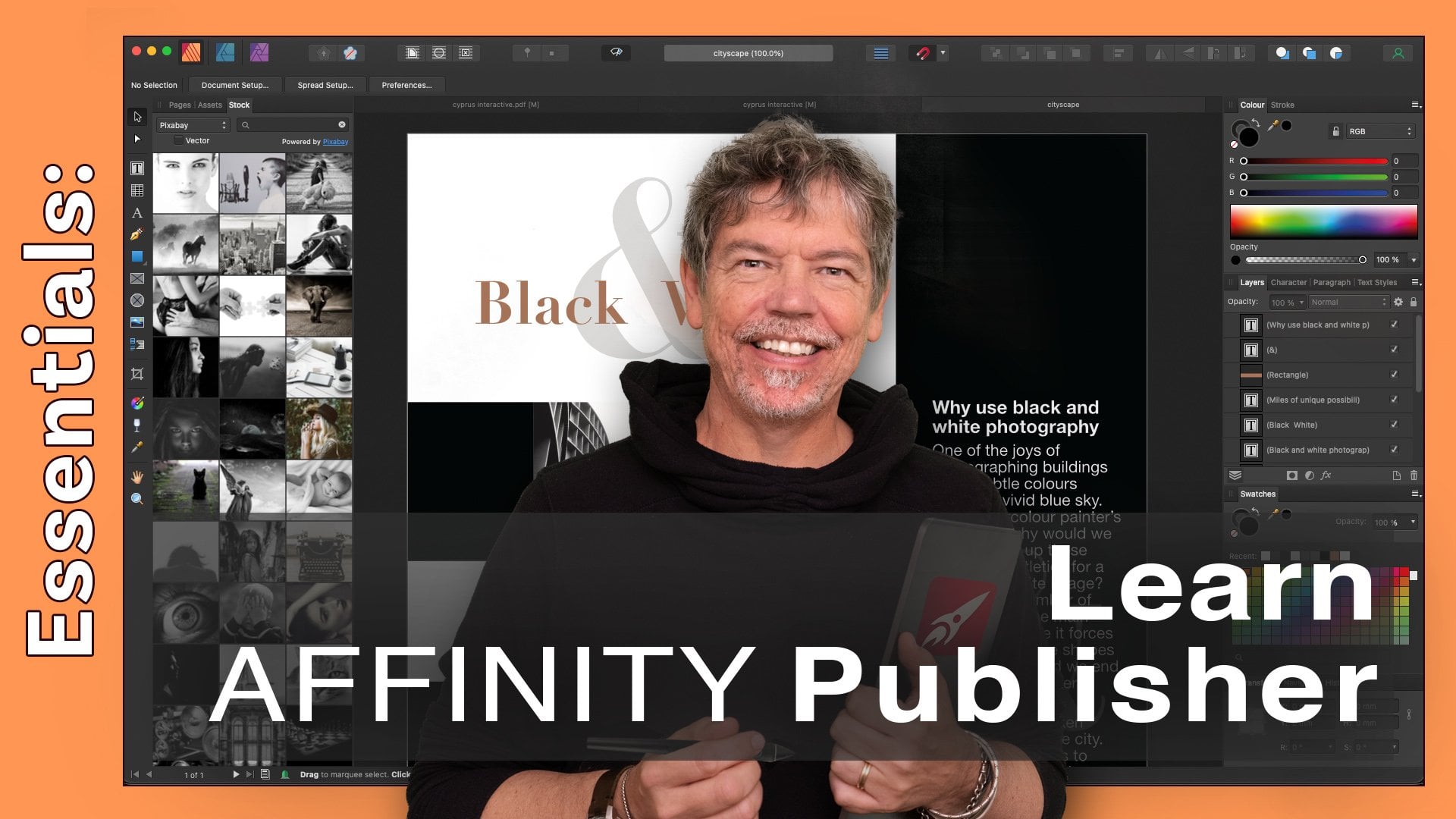
2. What Does Publisher Do: Welcome to the course of
Affinity Publisher on the iPad. Before we actually get going
and get into the software, Let's have a look at what Affinity Publisher
actually does. Now I know a lot of you
will already know this, but for those who
are not sure, well, the first thing it does
is it allows you to publish the clue's in the name. But you can publish
things in PDF form. You can publish them for
printing using a PDF as well. And that could be
commercial printing or it could be printing on the desktop machine or
in the office printer. But we can also
publish things like jpegs and other files, which once again, you could use on the Internet
or for social media. There's so many things you
can do with Publisher. Publisher brings in the pictures and it allows you to work
with your text and graphics. So what most people end up
doing is doing their pictures, sorting out their pictures in Affinity Photo and the graphics they do in Affinity Designer. And then they bring the whole
lot together in Publisher. But if cos, that's three
different programs, and although you might have
bought only one of them, you can do a lot of stuff
just in Publisher by itself. The other great thing is within
publisher you can access if you've bought both
designer and photo, you can access them both
from within publisher. So you actually can work directly on the images
in your document. Anyway, that's enough awful. Let's jump straight
in and get started.
3. The Home Screen Interface: Let's have a look
around the interface. When you first
open up publisher, very often it might look
something like this. And all of what you're
seeing here are samples that affinity provides. You can open them,
you can download them and have a look and see
how they've made them. If you go on the left-hand side, right at the top, you can see we're in samples at the moment. But if we go right to the top, we've got a live
document and this is anything that you're actually
working on at the time. So if I want to see a
document that I'm working on, I can just click
on that and open it back into publisher itself. Will click on that
little button right at the top left-hand corner
to come out of that again. But what we're gonna be
doing is we are going to be creating documents
from absolute scratch. So we're going to be using
the new button over there. We can also open up other files. You can go along and find
templates that you've got. There's a very, very good
help system in here. If you click on Help, it will take you into this area. If you've lost anything,
you can't find anything. You can just go in and
find it over there, click on it and read
up to help in there. Let's close that down again. And then down the bottom, we've got the account, which is obviously this is my account. And then preferences over there, and this gives you
some preferences for publisher will come
into those later on. But right now, we're going
to click on the New button. I'm going to go down
here and just click. Okay, I'm not worried
about the settings at all. All I want to do is to open
up a blank document so you can have a look
at the interface.
4. The Interface: So what have we got with
all of the settings here? Well, first of all, on the left-hand side,
we've got the toolbar. And these are the tools
that we'll be working on. Then the lung, the top, we've got some more
options over here and you'll see that a lot of them actually gives you drop-downs. So we can click on this
little buttons to dropdowns. You'll find there's another little one here that's gives you sort of shortcut buttons or little buttons into
various areas. And another one which is more
like a menu that you can go down that you'd get on
a normal PC or Mac. On the right-hand side, we've got our
panels, our studios. And if you click on those, they will just open up in here so I can click
on these and go down. Now you're going to find
with some of these panels, it's not just what
you see over here. There are a lot
of hidden things. If you look, there's
a little arrow on the right-hand side. So e.g. I'm on the
Text option here. And if I was looking at the paragraph options
as these ones in there, once again, don't
worry about this. I'm gonna be showing you all
of this in detail later. But if I click on
the little arrow, it'll take me in
and show me all of the justification
and float options. The paragraph in there, and then you just click
on that little arrow to come back out again. So once again, if I went
into the lending options, I click in there and see more
lending options over there. And the same goes with some of the other panels that we
have in here as well. So I'll just keep flicking down. You can see we've got
things like stock. These are this Pixabay and there is another
library called Pexels. And these are all stock
libraries which have royalty-free images that
you can actually use. When you do go and search
for royalty-free image, it'll probably just
ask you to click the terms and conditions button. But otherwise you can just
work straight from those. There's some effects
in here as well. And just moving down, we've got hollered of other
panels that we can bring up. Then right at the bottom, there's these three
little dots and there's more options in here as well. Now, that seems like
quite a lot of stuff and it's easy to forget
where things are, especially when you've
just got an icon. So there is a little
question mark at the bottom. If I hold on that question mark, it didn't actually shows me exactly what all of
these things do. So I'll just hold it with
that hand over there. And I can then see exactly
what the tools are over here, what the panels are. Then we've got this area
over here in the middle, which shows us more stuff, e.g. the toggle preview mode. You can see that little icon
is actually this little one up the top over there. So hopefully with all of those, you don't have to worry about exactly what these
little icons do. Now, there's still more
options that we have. And this is a, well, it's a little heads-up
display that appears. And to get to it, you can either click and hold
for a second and let go. And it will appear like that. Or you can use three
fingers and drag downwards. And you can then get to those
options that way as well. The last one that we have is at the bottom
left hand corner. And we'll be talking about
this as we go through. But if I go to that
little circle over there, it brings up another circle. Now, this circle here. If I click on it, you can see it's actually got shortcuts, the keyboard shortcuts that
you would normally have, we'll be working
with those later on. There's some really, really
good stuff in there, particularly when
it comes to making copies that I really enjoy. Have a little look
around around those, go into the panels over here, check out what's in the panel. Click a little bit further in. Remember you can
always go back again. So if you've gone to
something like swatches, e.g. here and you're looking
at your swatch and you go, How do I get back? Just click at the top
to come back in again. And then don't
forget, there's also the ones along the top here. And finally, there's one that you might touch
and you think, Oh my goodness,
what have I done? It's a little button right
at the very top in there. And then just hides all
of your panels and you can click it to bring
them all back again. Have a play with that,
get a feel for it. And then we'll get going.
5. Studio Link: Now to show you the
last little icon, I've actually opened up a
document from the samples. If I go to the samples, I use this architectural
document over there, just takes a little
while to download, and then I've opened it up. So it's now in my
live documents area. I'll click on that. The last button that I want to show you is this one
right at the top. It's the little
icon of publishing. If you click on that and you
have designer and photo, or you've bought them and
they are on your iPad, you'll be able to get to
those within publisher. So how does this actually work? Well, e.g. it might be
that I'm working in Publisher and I've got my
document virtually finished. I'm looking at a picture
like this, I think. Oh, I'd like to use
one of those tools from photo to maybe darken
down part of this image. Now, in other bits of software, you might find that
if you do that, you would then have
to actually go out to the other
piece of software, do what you want, and then just link it back
into the image, into the document again. But in here, all you
do is you change. So I'm going to be doing
something to this photo here. I changed to the photo persona. And I'm now seeing the
photo tools on the side, but I'm still in the
document itself. So this means now that I can go along and I can pick the
one that I want to use. I'm going to use a little tool over here called Burn tool. I'll just find a brush
which is fairly large. And I can then just
go in and darken down the sky on that
image a little bit. When I'm happy with it, I can then go back again to publisher and then carry
on working in Publisher. It's exactly the
same with graphics. If you want to do some
sort of shape, maybe, although you can do a lot of the shapes in publisher itself, maybe you want a little bit
more finesse with the shape. You can go into Designer. And then you can use all of
the designer tools here to design your new shape
and work with that. Once again, when you're
happy with that, you just click back
to publish her again. It's a brilliant way of working. Now, if you don't have the other two pieces of software and you've
only got publisher, Don't worry, 99.9%
of what we do in this course is going to
be in publisher itself. So you won't miss
out on anything.
6. New Document Intro: In this section, we're
going to be looking at creating a new document. So we'll start with
the document settings. And then we're going to
be moving in to bring in some photos and some text. Let's get started.
7. Document Setup: Now I'm in the
live document area and I'm just going to close
down these documents. I'll click on that and I'll
close them without saving. So if I've made any changes, that changes won't be saved. We'll talk about saving
and exporting and how and why we do all
the things we do. But for the moment,
I'm just going to get rid of the ones over there. I want to create a new
document from scratch. So I'm going to click
the New button and it opens up the New Document
window over here. Now, what you're going to see
on the left-hand side are some presets with
different sizes in them. So e.g. over here we've
got the print preset. So if you're doing something, it's gonna be printed
on the office printer or something like that. And you want an A4,
you can go in there and pick your A4 size. If you're doing something
which is for press. So you're going to be sending out for commercial printing. We've got a press option
over here as well. And you can see all
the different sizes. We're doing something
which is gonna be printed on a photo printer. We've got photo sizes. And then down here we've
got the web sizes as well. And finally, if we keep
going for long enough, then we've got the devices. Architectural sizes, architectural sizes being
pretty large sizes. Now we're going to be
working with the website and we're going to
be working with the print side in this course. But the thing is that
when you go in here, you might look at this and go, Actually they don't have
the size that I want. That doesn't matter. What these presets do, is they just put in the size in here automatically for you. So you can of course
go in there and change those sizes to
anything you like. You can also choose from
landscape and portrait. Along the top there with those two little, little buttons. I'm going to go with portrait. In here. We've got some the
dimension settings. So as I said, we've
got the width and height in there in millimeters. And you can choose
inches or anything else that you want,
yards, feet, etc. I'm just going to click
on there and go back to my millimeters because that
makes more sense to me. And down here we've got
how our images are placed. Do we prefer to have them embedded or do we prefer
them to be linked? We'll talk about
that in the course. On the right-hand side, we've got some more settings. We'll be looking
at these later on. We'll be talking about Facing
pages and color modes. I'm in there. But this is all done in the general options. If you click on
margins and bleeds, we've got more options
here for the margins and those are just help
her guides if you like. And then bleeds that
we'll talk about later on and why you might
you might not need them. Once you clicked. Okay, your
document will then open up within publisher like so. Have a little look at that. So it's just new checkout, the settings on the left, the presets in
there, by all means, go and have a look at
some of these other ones and see what you get with them. You can always change any
of the settings in here. And e.g. It's millimeters or pick, or pixels, or yards or inches. Whatever you like. Click Okay, Have a
look at the document. Remember when it opens up. And you then think you've closed did you
haven't closed it? It's still a live document. It's sitting over here. If you want to get rid
of a totally click the little X over there
and close without saving. So I'm just going to
get rid of those two. Yet ward have tons of
open documents tried out.
8. Facing Pages, Multiple Pages, Zoom & Pan: I wanted to show you
multiple pages now. So I've gone to the print setting in the New
Document Setup. And across here, I have got first of all an option
called Facing pages, which you can click
on and switch off. Again. Now I'm going to leave it off. For this example, you can see the number
of pages I put in. There are eight. I'll click okay,
and that'll open up my document with
a pages in it. Now to zoom around and
move around the document, you can use a pinch. And the, and pinch. I'm sure it's
another name for it. So to zoom in and zoom out. Likewise, if you want to
move around your document, not one finger, but two fingers, two fingers will allow you
to move about the document. Now, the other way that
we can move around our document is by going across and finding out pages panel in the studio
on the right-hand side. Now if you're not
sure which one it is, because these
little things here, it looks so similar. Press the question mark
at the bottom right. And now I can see that it's
over on the side there. There's my pages panel there. So I'm going to click on that. And in here, I can then
scroll up and down. I can double-click
to jump to page. I know it doesn't
really show my check, so we've got a content on it. Once again, I can double-click
in there as well. And it shows me my pages
in the usual word way, one below the other. Now, let's get rid of that. I'm going to go and do
a new document again. This time, I'm going
to switch facing pages on using eight
pages in there. And click Okay, when
you first come in, you might think it's
exactly the same, but when you scroll or zoom out and you scroll up and down, you'll see that your pages are sitting next to each other. It's just click on this little windscreen
wipers at the top. And that will just take you out of preview mode
so you can see the margins around the outside. It's exactly the same. When I go along here
to the pages panel, I can see my first page there, then all my inner pages
in my back page of that. So this is a setup for a multi-page document where
you might have content that runs across the two
pages and you want to design across double
pages like that. Don't forget when you're
doing a new document in here, makes sure that, you know, if you've got Facing Pages
switched on or switched off, depending on what
you want to do. The arrangement that we've
got here is horizontal, but you can change that
to vertical as well. Click Okay, and it's
the same thing again. If we zoom out a
little bit like that, you see my pages are kind
of going across that way, so double-page spreads, but going vertically rather
than horizontally. The last thing in
there is the end. We're going to go
horizontally this time. The first page is, does it start on the
right or the left? Traditionally, do. Your first page starts
on the right-hand side, but you can choose the left. Should you wish to have a little look at those
and see how you get on.
9. RGB & CMYK: The next option that we have is down the bottom over here, and that is the color. Now, if you click on the color, you'll see this quite a few
different options in here. And the one that we're going
to be working in most of the time or the two
that we're gonna be working most of the
time, shall I say, is RGB slash eight and the
CMYK slash eight as well. So let's have a look at
what these are all about. Because when you go to
different preset over here, e.g. I'm in print. The default is RGB. So these prints setups here are fine if you're
making a document, maybe you're printing
it on a local printer. I'm in the office. Maybe you're printing it to a photographic type of printer, home printer, those
sort of things. We'd use RGB and there was, if you're creating
something which is going to go for
commercial printing. When I click on that, you'll see that it
defaults to CMYK. And once again, if I go down
here using the first ones, it'll go back to RGB web, we'll go back to RGB as well. So what is the difference
between RGB and CMYK? Well, I've got an example
to show you here. So let's have a
look first at RGB. Rgb, which stands for
red, green, and blue. The way that devices work. And by devices, it's an
iPad or a computer monitor, a television, a smart phone
that they all work with. Rgb, red, green, and blue light. Everything that you see on
your screen is made up of red, green, and blue little pixels. Now, if you don't have any light on your screen, It's black. If you want white. It's a combination
of red, green, and blue at 100% that
gives you pure white. On the other hand, if you're sending something for
commercial printing, commercial printers
print with cyan, magenta and yellow,
that's sort of blue, pink and yellow there. And then they have
black as well. So that's why we have
CMY or K, K for black. Well, it's because
it's the key color. If you don't have
any ink, it's white. If you have 100 per
cent of those inks, then you get black. But we also have an
extra black in here because it'd be a waste
of ink if you had to print all your black text using
cyan, magenta and yellow. So we have an extra
black in there as well.
10. Bleeds: Let's go over to the margins and bleeds area and have
a quick look here. Now, the margins are pretty
self-explanatory, ready? It puts in a margin for you. It's a design guide. It helps you with your design. It's got nothing
to do with whether that area will print
or not at all. The bleed, on the other
hand, is really important. And this is something
that we use quite a lot when sending workout for
commercial printing. If I go across to
the press ready in and say e.g. choose A4. You can see it automatically
puts a bleed in here. So what a bleed? Well, first of all, let's have
a look at it and then I'll explain exactly what it
is and what it does. This is the bleed. It's the little extra
area around the outside. It's a guide around the outside. So why is it there? Well, let's have a
look at a magazine. So there's a copy of Vogue. And on the cover of Vogue, we've got a photograph
which goes right the way to the edge
of the document. Now when this gets printed up or any commercial printing
gets printed up, what we do is we print not
on a piece of paper that, which is this size,
but we print on a large roll of paper. So the cover and the back page would be
printed next to each other. And then on the other side
of that paper would be the inner page and
the inner back page. And once again, it probably
another one next to that, maybe another one
next to that as well. On this large roll of paper, then a guillotine would
come along and it would cut these bits of paper
to the right size. Now, imagine if you had
designed the cover of Vogue and the picture you'd put right way to the edge
of the document, being absolutely
perfect about it. Then the guillotine came
along once it had printed, and the guillotine was half a millimeter out
at tiny fraction. What could happen is if the
guillotine is slightly out, you might end up with a little
bit of white running down the edge of your page where
the printing hasn't come. So this is where a bleed
comes into its own. Because what happens
is we actually print these documents
slightly bigger, so we put a bit more ink on them then than the size of the page. So when the guillotine
comes along and cuts into that printed area
and you don't have any little white bits
leftover on the edge. Let me show you what I mean by going back to a
document with a bleed. So with this document here, if I had put in a
picture on the documents and I'm just going to place
any file here at all. I'm just looking for a quick
quick picture to put in. And the trouble is there's
never one when you wanted. And I will just place
my picture in there. When we put it
onto the document, we don't put it to the edge
of the page. We move it. So it goes to the
bleed mark there. And then this gets printed up. And then the guillotine
will come and cut off that last little
bit over there. So whether it's on the
left, right, top, bottom, or going over your
entire page like that. Anything which goes to the edge of the page which
is going to have Inc whether it's a photo
or whether it is a shape, needs to go to the bleed, not the edge of the page. Now, do you need a bleed for stuff that's going
to go on social media? Not at all. Because there's no guillotine
cutting off the document. Do you need a bleed
for something which you're going to PDF and
email around to people? Once again, usually
the answer is no because there are
gonna be seeing it onscreen and there's no
guillotine to cut it off. Have a little bit
of a look at that. When you go into a new
document in there, go over to margins and bleed and look at the
bleed setting in here. The industry standard for
bleeds is usually 3 mm. Occasionally or printer might ask you for a
five-minute meter bleed. Very rarely do we go over
five millimetres if in doubt, put in a three millimeter bleed. Lastly, what would happen if you put an a bleed and
you didn't need it? Nothing at all. It's absolutely fine. But of course, if
you do need a bleed and you haven't put one in
or you can put one in later, but it's a good idea to start
right at the beginning.
11. Copy & Paste Text in to Text Frame: I'm going to bring in some text. Before I do this, a little windscreen wiper here. If you switch it on and off, you'll see it will hide
and show the margins. You'll find that if you
click to the right of that, you've got a number
of other things that you can hide
and show as well. We get more into those later on. But if you're
wondering why I've got margins up and maybe you don't. It could be that that little
button there is switched on. It takes you into preview mode. I'm going to go along
to the type tool. Now, you'll notice there
are two type tools here. I'm going to start with
this one over here. It's called frame text. I'm going to click and
drag a frame to put my text in your notes. I
haven't been accurate. I haven't put it
up to the margin. I've just put it
straight in the middle. Now I'm going to go
and find my text. So I'm going to go across
Let's try that again. I'm I'm just dragging with four fingers as a fourth finger didn't
seem to want to go down. And I found a bit
of text in here. I've gone to a website and I've just looked for a little
bit of text in there. And I'm going to
select the text its choose a different
bit of text in here. And I'm going to take
this pre-history all way down to get hold of it. It's easier to use your
fingers sometimes on the web. I'm going to copy
that bit of text and I'm going to go back
along to my document. Incidentally, there's something
funny going on there. If you see these
little funny things, just select them with the black arrow tool and
you can delete them. I'll show you how to
do this later on, but you use three fingers down
and you can choose Delete. Anyway, I've clicked over there and I want
to put my text in. I've double-clicked
in it and you can see the little flashing
I-beam over there. It brings up my
keyboard on here, and I can then use
my paste option. If you are working on a,
on a normal keyboard, by all means, just use
the normal shortcuts. Command, V to paste or
Command and C to copy. I'm going to go over there
and just paste the text in. And you can see it's brought
it in with the formatting. You can see we've got the bold areas over there and the rest of
the formatting is in, even down to these little bits
in here which are in blue. Now I'm going to go
up to my move tool that is the black arrow
right at the very top. And this allows me to move the text around anywhere I want. And I can place it
wherever I want. I don't have to go with margins. But if you do go
next to the margins, you'll see it'll just snap
to those margins as well. If I want to change
the size of this box, I can grab the corner. Now, have a look down here. There's a little circle
there on the corner, and there's one further out. I'm going to grab the inner one. And this allows me to change
the shape of the text frame. You can do that from any of
these corners over here. Once again, from
those corners there. So what is this outer one? What if you grab the outer one? Now you're actually scaling the text and the
frame the same time. So the inner one allows you
to do the frame itself. The outer one is for
scaling the whole thing. I can move that around
where I wanted. I can pull the text app and I can get some
of the text to hide. Incidentally, if
you want to see it, There's a little I
there, it's in red. If you click on that,
that'll show you the text which is missing from there. Lastly, the little lollipop for want of a better word
that's sticking out the top. This allows you to rotate. If you click on there,
you'll be able to rotate your text around
wherever you want it. And if you hold a finger down, you'll find it will snap to increments so you can rotate
it Exactly 245 degrees. Once again, I'll
click over there on the outside and I can
scale it up if I wished. Now, I've made a bit
of a mess there, so I want to undo it. So to undo is just two fingers. Keep undoing two fingers until I get back to
where I want to be. Have a go with that, bring
in some text, copy it. You can copy it from the web. You can copy from a Word
document or anywhere else and pasted into a frame using
that little text tool.
12. Live Prefilght: Now, while I'm moving
the text around, I'm keeping an eye on one
of my little panels here, and that's this little one with the green tick next to it. Let me go and get the
move tool once again. This is called pre flighting. And what it does is it shows you any issues that are happening
on your document. So e.g. if I move this up over
there and let go, it checks the document and
goes out or there's a problem. And it gives me this
little red button with a cross through the middle. If I pull that down again, now I can see all the text. It's checked it
again. What about if I had a spelling mistake? So I'm just going to select
that and maybe change it to something like that, which you hopefully
doesn't recognize what it recognizes the word L's. Let's try a different one. So in other words, over there, you can see my
spellcheckers come up. And over here once again, it shows me that
there's an error. If I pull this up again, checking my document and
there's another error there. So how do we know
what the error is? If you click on that panel, it will tell you exactly
what that error is there. So it says there's
a spelling mistake and it tells me
which word it is. And over here there's
overflowing text. So that basically means there's more texts than the text frame. When I pull this down, checks the document,
and that's disappeared. If I were to change
the text over here to something else, it understood. Once again, that's disappeared. So we've got this
live pre-flight. It's always a good idea
to keep an eye on that.
13. Change Text & Text Frame Colors: Let's have a look at
the color of the text. Now, before I do that, I'm going to just move the
text over so you can see that my text has got text in there, but it's on a white
background as well that the words are against
a white background. Now, this bit of text has got a style applied
which had copied and copied something from the
website that I copied it from. Now I want to get rid of that. So I'm going to go along
and I'm going to go and find my text panel. You can click on the
little question mark and you can see over
there it's text. That's the one there
in the text panel. I'm going to go in
to where it says style in here or no style. I'm going to click on that. And I'm just going to choose a body style that
will just remove anything which is
on that and get rid of the style that
had been applied. You'll see now if
I choose no style, there's no style on that at all. Now we'll be talking
about style in a lot more detail later on. But this is just at the moment, a quick way to get rid of the
white from the background. Now, let's just go back into
the text option in here. So the first thing
is if you are in the text option over here, you can change the
background color of the box that you're in. Let's make it a
little bit smaller. And that's done down here
using the Text Frame Options. If I click on that little circle with a line through
it, By the way, that's circled line
through it means that it is absolutely transparent. I can then choose
the color that I want for the background, and I can choose anything
that I like in here. Now, when I click on that, I get this color wheel up. If I prefer. I can go through to the
color wheel and I could choose from the
various options there. From HSL stands for hue saturation and
luminosity sliders, RGB sliders, RGB hex sliders. These are the numbers. There's six numbers and letters, the makeup, hex, hex code, grayscale sliders, and back
to the color wheel again, I happen to like
the color wheel, but it's entirely up to you which one of those that
you would like to use. Or you can click on swatches
and you can see we've got a number of
swatches in here. We'll be looking at these
in more detail later on, but I can just pick on a color. Oh, that's very violent.
That color there. My background. I'm going to just go
back to color and choose something a little bit
less over the top. But what about the
color of the text? Well, if I go up
to the top here, this is the little
circle at the top. This is your color panel. And same thing again, we have a color wheel in there. You can choose the type of color that you'd
like to see it with its lab gray,
HSL, RGBA, etc. You can choose the
color from the outside. And then you can choose
the lightness and darkness and saturation
in this area here. So if you want black, you
go to that top corner. If you want to watch you go
to the bottom corner there. Otherwise, this gives
you full saturation of any color that you choose
around the outside. Once again, we have some recent colors that
we've used in there. And if you click on swatches, you can go into your
swatches in here as well. As I said, more on
this color later on. If you go along and you
want to just change a certain word or
sentence or paragraph. You can just select it
and exactly the same, go in and adjusted the
color area over there. Have a bit of a play with that. So don't forget this color up
here is to do without text. You can do it on the
whole text if you use your move tool and select the
texture does all the text. Otherwise you can just select
the area that you want to adjust and
change it in there. If you want to change the
box at the text is in, go down to the type
panel, the text panel. And you'll find this a
text frame option in there and you can change
the color in here. Let's go with black text, black box for the background. Tried out. Have you
ever played with that?
14. Fonts & Size: Now my text looks pretty awful. I'm going to use two
fingers to just undo all those changes that I made until I get back to
my standard text. So let's look at a few other
options in here as well. I'm going to go down to the text options,
the Texts Panel. Click on that. And we'll
look at styles later on. But I'm going to click on the font or the typeface
that we have in here. Because I've used my
move tool and I've selected the text frame, I can very quickly just change
the typeface for all of that text that's
in there by just picking any of those options. Well, as you can see, there's
tons of them down here. Let's go back to Avenue. Then. Under that, we then
got things like italic, bold, very light. All of the styles. And to the right of that
is our size in points. And I can just choose
different sizes in here. By the way, if you're not sure
about how big points are, there are on a computer, 72 points in an inch. So it kind of gives you an idea. If you're trying to do a
large title for a poster, if you made your type
72 points to text would be an inch high. Very quickly. Check that out.
15. Add Some Images: Let's start bringing
in some pictures. Now. I'm going to use my move tool. And in fact, I'm
going to just leave that right at the
top over there and click off of it to de-select it and we're close that
little panel down. Now I'm going to go in my tools about two-thirds the way down to the little photo
and click on that. And this is my place
or import option. I'm going to say
place from files. And over there this
little folder, or if you've got anything
in your library, your picture library on your
machine, you can use that. But I'm going to go
to Place from files. And the pictures that I'm using are the pictures that you've
got as part of this course. But if you want to find your own pictures,
that's absolutely fine. If you want to go to I use unsplash.com as the picture
library to get the pictures. All these ones in
the course come from there because
they're all royalty-free. But otherwise, these images are part of your course and you can just go to the
assets to get them. So I'm going to go
along over here to this images to use folder. And there's a number of
different pictures in here. And as you can see,
they've all popped up. I'm just going to choose
one and it's going to get this cat over here. Now. It says Place Image. And all I have to do is
to click and drag to place my image into the page. Once I've placed it, I can then go along and move it around using
the Move tool. Once again, I can rotate it
exactly as we do with text. If you use a finger on there, you can get it to
rotate in increments. And I can change the size by grabbing the corner, like so. So let me get rid of that. I'm going to use
three fingers drag down and choose
Delete to delete it. Let me do that again. So I'm going to go and get
another picture. Click on the little
picture icon. Place from files. Find the picture that
I want over here. And I then just wait for
that place to come up, click and drag to bring
the picture right in. Now, once I've got the picture
and the text in there, if you click on this
little windscreen wiper, this is a preview area. It will show you how this
image would print out. Even in this mode, you can
still move things around. But we can click it
off to go back to the normal editing
area to see that. I'm margins and any other
guides that we've got. A bit of a go bringing some
pictures, move them around. You will find that it's easy to squish them if you grab them
from the side or the top. So grab from the
bottom or the edge, shall I say corner, corner. Grab it from the
corner to bring it in. And you can bring as many
of these as you'd like. Just go back into their
choose the picture that you want and bring that in. And then you just click and drag to bring it straight
in and preview it. At the top. Have a go.
16. Create a Simple Shape & Change Fill & Stroke Color: I'm going to get rid
of some of these. So I'm going to use
my move tool and just click and drag over them. Now you'll notice when
I clicked and dragged, I get it to touch
the dog and the cat. But if you look at the top, it's not actually covering the
whole of that cat picture. So when I selected, it's
only selected this one. So if you click and drag, make sure that you cover all the ones that
you want to select. And once you've done that, you can then do
exactly as before, three fingers down
and choose Delete. It will do the same
with this three fingers down and delete. Now, lastly, let's
have a look at creating some graphics,
some simple shapes. And if you go up to your toolbar and across
about halfway down, you'll find if you click and hold on the little square there, not the one with a
cross through it, the one just above it. There's a number of pre-made
shapes that we have in here. I'll start with a rectangle. And I can then click and drag
to make a rectangle shape. Now, you'll notice
that the shape is, well, it is a rectangle. But if I wanted to
be a perfect square, I put a finger down and that will make a perfect
square for me. Now that we've got the shape. If we want to change the color, if I got to my color over here, I can then choose any
color that I like. For that shape. You'll
notice that it's filling the fill of that shape, not the line around the outside. The line around the outside
is often called a stroke. And you'll see that there are actually two little
shapes up the top, the circle, which is
filled is the fill color. And if I click on that one, this is the stroke
color over here. Now, the stroke color
can be changed. If you click on
that, you can then change the stroke color as well. So I'll make that
a bright green. Now, the stroke is very, very narrow at the moment. I'll be showing you how you
can change that shortly. But you need to
know that am I on the fill or am I on the stroke? Incidentally, it's very easy to actually flip those
around so you can just drag across them if
you want to change the fill to the stroke color. Now to change the
width of the stroke, you go along just below the
fill to the little line. And over here you'll
see I can actually adjust the stroke with. So I'll just adjust
that a little bit. Let's go back to the fill color. And I can then change the color of the stroke to
anything I like. I can click on the
fill and change that to anything
that I like as well. Obviously there's more to the stroke than I've
just shown you. But do have a little
bit of a go with that, just using a basic shape. And then I'll show you
how to use some of the other shapes and the options that you
get for them as well.
17. Simple Shape Controls: I want to get rid of this shape. So three fingers down, Delete. And I'm going to go across
and click on there. And you can see we've got so
many other shapes in here. Now, a lot of these
shapes have got options. So let's have a look, e.g. at the star shape. If I click and drag out
the star over here, It's got, well, five points. But you'll notice that there are little red dots on there. If either this top dot, I can actually change that
from corner to round. If I go to these ones here, I can adjust the
inner shape as well. You'll find that with
a lot of these tools, we can actually just adjust
them in various ways. Kind of like that
as a, as a shape. Let's use the Move
tool and just move that up and just scale
it down a little bit. So I'm going to go
in there again. And by the way, if you can't get these
things to appear, you just click and hold. So just clicked
down and hold on. I'm gonna do that again. Click down and hold. I'm going to go down
to the doughnut. And I'm going to click and
drag a doughnut shape out. You can see it's
remembered my colors, when to change the fill color to something else. Let's
go with yellow. And the stroke I will make blue. Now on this one, there are
two little red things, and this inner one allows me
to change the inner area. This one here allows
me to break it up so I could do shapes like that. And I can still go back to
that one and move it around. By the way, I'm still
on the Shapes tool. When you go over
to the Move Tool, those little things
will disappear.
18. Project: Creating a Brochure / Newsletter Intro: It's project time, my favorite. I love doing projects and
I hope you will as well. This first project,
we're going to create a single page brochure
or newsletter. Now, subject matter, you can decide to do what ever
you want with it. There are some pictures
that you can use, but you do what you,
what interests you. So we're going to
put in a number of pictures on the page. We're also going
to get some texts going on there as well. So let's just jump
straight in. Can't wait.
19. Project: Make New 1-Page Document: Onto our first project, I'm going to click the
New button over here. And what we're going to do
is we're going to create a simple one-page newsletter. Now, although we're going
to use the print setting, this is the type of newsletter
that will be emailed around so people can print
it off if they want. But generally we're just
going to be e-mailing out. So I'm going to go
to A4 over there. I've got my A4 sizes. I'm making sure that I'm
using portrait rather than landscape facing pages. I want that to be switched off, and I only want
one page in there. The color format is
going to be RGB because people are going to be
viewing this on their screen. If we go into margins. I don't really need
a bleed for this because it's just going
to be for screen use. But the margins, I'm going
to change and I'm just going to change them down now going
to switch on little link. So when I change one,
they'll all change. I'm just going to
make them 15 in there because I think
that 25 is a bit too big. Once I've done that, I'm
going to click Okay, and my document is all
ready for us to start. So have a go with that. Get your document ready. And then we'll start to
put some content in.
20. Put a Photo Into a Picture Frame: Now my newsletter is going to be about a surf and yoga school. You could do yours about
whatever subject you like, although the pictures are
surf and yoga pictures. But if you want to
go to something like unsplash.com or one of the
free picture libraries. You can just download any
picture that you want to use. Now, when I showed you before that you could
bring in a picture. We just brought it straight in, but this time I'm actually
going to use a picture frame. So there's a little square
picture frame there. I'm going to drag the picture frame into
the area that I want. You could see as I'm
dragging it to the middle, it tells me I've got to
the middle over there, which is absolutely perfect. Now I'm going to
bring my picture in. So now I'm going to
go up to the toolbar. I'm going to choose
the picture icon placed from files and find the picture
that I want to use. So I want something, I think maybe like this one
over here with the waves. And you can see it's popped
it straight into that area. So how would this
be any different if I didn't make that a
little frame first, what if I just went
straight in and brought in that picture and
clicked and dragged. You can see it brings
it in as a whole, whereas this one is
actually inside a frame. Now, I know we haven't
got two layers yet, but you can see the difference
over here in the layers. This one, this picture, he has got little arrow. And if I click on the arrow, there's actually a frame
that I can use and I can see the frame and the
picture separately. If I click on this one, the picture is by itself. So we want to make
sure that we've got one in a picture frame so that we can adjust the
picture frame as well. Now I'm going to use
three fingers down. Let's try that again,
three fingers down and choose Delete to get
rid of that picture. Now that I've got this
picture in a frame, the first thing I
want to be able to do is to scale the picture around. And as you click on the picture, you'll notice that it'll
scaling option appears over here so I can scale it
up to the right size. I can also go separately to
the picture frame itself, and I can adjust the
picture frame around. Now, if you try to do that using just the picture
without the frame, you'd actually end up messing up the proportions
of your image. Lastly, with a picture
frame, light, text, you've got an extra
little circle at the end. Then if you do
that, you can scale the whole thing proportionately. So try that, bring in a shape, put your picture into the shape, and then we'll do a little
bit more of this shortly.
21. Draw a Graphic & Sample Color on Main Photo: Now let's bring in something
else on this side here. And I'm going to make a shape just using the
normal shape tool. Over there. I'm going
to go to the rectangle. I'm going to draw in a rectangle
from here or way down. Now, you've got to be
careful like that. I've clicked on it
and I'm going to use two fingers to undo it. It's very easy even if you're on the one tool to select
something else. Very often I drove from the
other side to get my shaping. And I can then
just go and get it right up to their Zoom in. And using the move tool, just move it into
the right position. Like so. I'm going to have this
as a particular color. I'm going to go across
to my colors over here. But I want to sample a
color from this picture. So rather than just kind of guessing the colors in here
and hoping for the best. I'm going to go along to the
little eyedropper over here. I'm going to drag
the eye dropper on top of this picture and you can see it's sort
of finding those colors. When I get to the
color that I want, I wanted to kind of
a darkish green. I can let go. And then you click
the little color next to the eye dropper. So it's now used that color
in here. Let me do it again. I'll pick a slightly
different color. So drag the eyedropper over, going to find a sub,
a lighter green, and then click the little color over there to get that
color to go across. Have a go with that,
make another shape, and use the eyedropper
tool to sample a color off of
your main picture.
22. Add a Second Photo & Scale it Up: I want to bring in
another picture. So I'm going to do
the same thing again. I'm going to go and
get my picture frame. I'm going to draw in the frame. Once I want something, maybe just down the
bottom over here. And I'm doing all this
by I haven't set up any guides at all at the moment. And then I'm going to
go and find the picture that I want to use in here. I like that one over there, the stretching before surfing. So I'm going to
bring that one in. A pretty happy with that, but I'd like to zoom
in a bit on that. So using the Move tool, I can use my zoom option and
scale that up a little bit. So let's just go
down a bit there. We want to be able to see
the board behind him, that's y's over to the left. So bringing another picture.
23. Add Artistic Text & Duplicate it Twice: What I'm going to do now
is to bring in some text at the very top of my document. So I'm going to go along
not to the Text Frame tool, but to the Artistic Text tool. That's the fifth little icon. Down on the side. With that tool I
can click and drag. And you can see it
brings in this large a, it's actually not an
edge just showing me the size, the type will come in. And I'm now going to
type in what I want. So this will be surf. It's a bit on the large side. But the easiest thing to do with this is to go back
to your Move tool. You can grab a corner
and just scale it down. Like so. I want surf and then an ampersand
and yoga at the bottom. So what I'm going to do is
I'm going to get this to the right size and choose
the right typeface. I'll go onto my text over here, go into my typeface and decide what sort of typeface
I want for this. So I'm thinking of
something quite, quite delicate, if you like. Which might be, might reflect
on the way that Yoga is. Or it could be
something really bold. You want the bold
from the crashing of the waves, whatever you need. It honestly doesn't matter what you what you do as long
as it works for you. I think I will go with
my bold italic in there. Now, the next thing is I want to make a copy of what I've done. I'm going to do that by using either three fingers down or just click on the
desktop like that one, the page like that,
and choose Duplicate. Now I've got two of them. If I move this one down, I think got a second
one in there. I can select that and go in and change that to
my new bit of text. I've got the word
yogurt in there. Let's use the Move tool and move that into
the right position. And then I'd like to have an
ampersand between these two. I'm gonna do this one more time. Click on that. Click, Get up this
little heads-up display. Duplicate that again. Move that up. And I'm going to select that
and do the ampersand there. Now I don't like that ampersand. I think i'd, I'd like to actually change the
typeface on there. So I'm going to go in
here and change to something a little
bit more interesting. We say. So let me just make
sure that that is selected. Sometimes a few clicks and, or click and drag will get it. I'm going to go over
here and I'm going to change the typeface to Dido. And I'm going to make that bold. Then I'm going to make
this a lot bigger. So I'm going to pull this
right out over here, moved across, this is going
to go between those two. And I want to then start
to change the colors. Now, get your text in first
and then we'll do the colors and we'll send things
to the back and bring them to the front as well.
24. Use Move to Back to Change Stacking Order: So I want to change
the colors on here. I'm going to go to my surf, got to my colors, and use a color that I've had
already in my recent colors. I've got that green. Now there might be too much
of that green in my document. So I think I might just
darken it down a little bit. Over there. Once again, you can
see my new dark greens gone into my recent colors. So when I go to yoga, I can then pick that
color up very quickly. Now, the ampersand symbol, I'm going to do exactly
the same thing. Use the same color, but pull this up so
it becomes quite light in the
background over there. Now that's in front
of the surf and Yoga. I'd like to move it behind. Couldn't make it just a
little bit bigger for that. And then along the top
we've got some options. And this option
here allows me to move things to the
back or move back one. So it could be one
object back or could be moved right to the
backup all the objects. I'm going to say
move to the back. You can see it's moved
behind my text now. I'm moving into position
where it will look the best. And even at this stage, if you don't like what you've
done, well, change it. E.g. if I thought that typeface
just doesn't work at all, what I would do here
is I would select this one with my move
tool over there. Just go into delete, delete that, change this. I'm going to go in
there into my typeface, change that to something else. Let's try a different
word in there. There we go. That's looking
quite interesting. And do the same thing again. So click and hold. Duplicate that and
change that to yoga. There's no right or wrong here. Just have a little bit of a
play and see what you can do with the text as well. You can always change the
sizes as you're going along. Try it out.
25. Add Some Frame Text: Now I want to bring some
texts in on this side here, and I've got some text
in a Word documents, so I'm just going to go into this Word document and select the text
that I want to use. So I want this a
little bit over here, and that's a little
bit in there. You can take your texts
from where ever you wanted, whether it's from
a Word document or wherever you
can copy it from. You can just copy that. And then once again, go back into publisher and
we can bring it straight in. So I'd like to now
the text in there. So I'm going to use
my text tool and I'm going back to the
frame text tool. And I'm going to draw in a little frame over
here for my text. Make sure I've clicked
in it and then I can paste my text straight in there. Now my text I want to format
slightly because i'd, I'd like to be a
little bit bigger than that so we can select it all. And if you just keep clicking, you'll find that you
can select it quickly. I'm on the Text option here, which is your text panel. I can then maybe just change
the size up a little bit. Like so. Bringing
your text, have a go.
26. Add More Text & Change to White: Now I went to a website
and I've copied some text and I've popped it
into this area over here. And you can see I can
move it around and do the usual things with
it. Two problems. First of all, sudden
my text is missing. There's the last little word. It's popped up. Secondly, it's got a white background on it. So I'm going to go
across to my type. And in the styles here, I'm just going to choose
a body style for that. So that'll get rid of
the white background. As I said, more of
these stars will look at them in detail later. But I'm gonna go back now because I'd like
white text on there. So I'm going to go and choose
the color for my text. And just next to the font in there,
there's a little circle. If I click on that, I can go and change the color of
my text in there. You don't always
have to go back to this little icon to
change your type color. So I'm going to just drag it out to make
it a little bit larger. But if you want to match
the text over here, normally we would use a style and set up
a style for this. But for the moment, I'm going to do this the
long way around. I'm going to select the text. I'm going to go over here and I'm going to
have a look that's 15 points, ariel in there. I'm going to double-click on this and select all the text. Once again go and change that
to 15 points so it matches. Now we can still use
the move tool to pull the text in a
little bit, like so. I'm just gonna get the text
running down over here. Remember if some of
your text is missing, you'll see a little eye there. You'll also get a warning
on the right-hand side. So I'm just going to pull
that right down to there.
27. Add More Artistic Text, Lock Layers & Change to White: Now before I put my
next bit of text in, which is going to be
the title over here. What I'm going to
do is just lock this text at the top so I
can't move it by mistake. It's really easy to
select by mistake. If I select all those
items in there, you can see from just click and drag over them to select them. When I go along to
the layers area. Now, to get two
layers, once again, just use the little
question mark there and you can see
which one is your layers. You can see I've got these
different layers in here. So I'm going to go to
the yoga, yoga object. And I'm going to click on the three little
buttons at the top. And this gives me more options for that particular object. I'm going to choose to lock it. Let's go back in there again. I'll do the same with surf, lock that and once again down to the ampersand and lock
that one as well. So that means that
I can't by mistake, select things and move them. And I could do the same
with the green background. If I click on the
green background, I can see there it is there. And I will just go in
and lock that as well. It's a really useful
feature to build, to just lock things
as you go along. Now I'm going to use
my Artistic Text tool and click and drag to
put in my text in here. And I'm going to have
yoga guru in there. The color of my text was
the last color I've chosen. You can change that if you want. And then let's
move this a little bit of texts down a bit. And I want the same thing
here saying surf guru. But it'll be much
easier if I take that. I'll use my click finger method and use duplicate or remember, it could be three-finger
drag as well. I've duplicated that. I'm going to pop that
over there and that text, I'm just going to
use a darker green. Match or offset it. If you want to bring
in any more pictures, by all means, do so. Just go and get a picture frame and you can bring your picture. I'm going to just pop one
at the bottom over here, go in and place my
image in there. So I want something which is sort of a nice background
type of scene, I suppose. And I've got my image in there. You can see if I pull this out, I could see the
whole image there. We can also scale
it around as well. So you can use the scale option to just scale
that as much as you want. Now, I'm just looking
for sort of a little bit of the edge of the water there. So something along
that line down there. Now I do want to
see my document to see how it will look
when it's printed up. So I'm going up to the
little windscreen wiper, the Preview button. I'm sure they don't want us calling it the windscreen wiper, but the Preview
button over there. And that will show me how
my document will look when it is finished and PDF. Have a go, add some
more text in ads, more pictures if you wish. If you want to add in anymore shaped by all means, go for it. Just adding the shapes. They're choose a
different color. I'm just going to put
another little shape at the top here and just pick a different color over there to kind of match what
I've got down there. Always check it with the
preview to see if it works.
28. Save as Editable File & Export as PDF: Now I'm about to
export this out, but I want to show
you something else because when you've been
working on these documents, I said I liked the bottom
of that, those waves. But if I change my mind, how do I get the little
person down there? How do I move the
image inside the box? Will, if you open up
your Layers panel. And I'm going to go down
to the picture over there. And with the picture
you can see there's a little arrow on
the left-hand side. So if I click on that arrow, it then shows me the
picture inside the frame. So this is actually the picture, and that is the frame. And I can choose
one or the other. If I click on the picture. Now I can move it down over there and get the person
in the bottom as well. If I clicked on the frame, then I'd be moving
the picture and the frame around
at the same time. So I'm happy with what I've got. And I now want to save
this out or exported. Firstly, if I just closed
it down like that, it's still a live document. It's over here as a
live document in there. If I were to close that,
I don't want to do that, but if I were to click
on that and close it, my document would be gone. You'll see if you click
on the right-hand side, there's a little drop-down
menu over there. I can choose to save as I'm saving this as
an a if pub document. So this is my editable
document that I'm saving. So I'll need to give that
her a bit of a name. And let's call this
surf and yoga. And I'm going to click
on save over there. So it's asking me where
to save it and I'm going to put mine in my
documents on iCloud, but you can put it
wherever you want. Got a one after that, I'm going to leave
that. Click on Save. So now if I did close
this live document down, I can still get to it. But it's going to
because we want to PDF this so we can start
emailing this around. So I'm going to go over to the
drop-down menu at the top. And at the very top
we've got export. If I click on Export, you can see these are all
the different ways that I can export this
from PNG files, jpegs, gifts, tiffs,
the whole lot. The one I'm interested in is
the PDF document over there. So we've got the PDF document and the preset is
just a PDF for print. I've got in there and we'll come and have a look
at some of these later on. But I'm going to leave them
on their default for now. And just click on. Okay. Once again it says where
do you want to save this? And I can place it
wherever I wanted to go. Let's click on move in there. I've got into my files. There is my surf and yoga PDF. I'm just going to click on that. And here is my final
document, final PDF document.
29. Text Intro: In this section we're going
to be looking at text. So we'll start off with a character options,
that paragraph options. But we'll also go into taking
text and flowing texts from one frame into another frame and you
can see how that works. One of my favorite
parts is to get text to flow around a picture. So we'll be using
text wrap for that. So let's just jump
in and get started.
30. Controlling Text Flow Between Text Frames: I'm going to create
a new document, just a quick A4. Nothing special in here. One-page facing
pages switched off. Let's click. Okay. So I'm
going to bring in some text. Now. I'm going to switch off the
little windscreen wiper, the preview mode, and go
along to the text tool. And I'm using the
Text Frame Tool and just draw in a frame like so. I'm going to paste
my text into there. You can see I've got quite
a fair amount of texts. I took this from
a Word document, but you can get texts
from wherever you want. Now, I'm going back to my
move tool and I can move this around and you can see at a glance that I've got
text which is missing, both because in the preflight and also the little
red eyes, the bottom. So if I've pulled this down, I can see the extra text
if I take it up like that. If I want to keep
this box this size, but I still want to
see the extra text. You click on the eye to
see it outside the box. But what else can we
do with this text? Well, what I'm
going to do now is just move this box up a
little bit like that. And I'm going to click on the little red arrow on
the right hand side. So just click on that. And you can see now we've got this little arrow over here. So if I were to click
and drag again, my text will now flow from
this box into this one. Have a look at what
happens if I go to this box and I make it smaller. The text flows into that one. If I increase the size, it flows out of that one. So I'm just going to put
this one down here and maybe make that the full width. And this one, I'm going to do half the width in the
end, as you can see, I can just move it up
and move it down into flow from one into the other. But what about if
this one is still too small and I'd done
something like that, will exactly the same. Again, you click on the
little red arrow and you just click and drag to
bring in more text. Once again, I'll click on the
little red arrow and I can bring the rest of my
text in over there. Just make sure that those are
the same height, like so. Now what's going to happen? I start to delete
some of these boxes. So if I went to the one at
the top here and I delete it. So I'm just going
to use the press down with my finger
method and choose Delete. Now you'll see that my texts actually flowed into this one. Let's use two fingers
to undo that. You can see that the text says, surfing is a surface water
sport in which an individual. So if I get rid of that now, surfing is the surface waters sport in
which an individual, so the text is just moved down
into that one over there. And you can move
any of these round. You can delete them as well. So I'm selecting
that middle one. And I'm going to once again, just choose to delete it. Make sure I've
selected it first. And honesty, we'll
get, we'll get there. Using that Move tool. I need to select it again. And then I'll use my three
finger down method and delete. The text will just flow from
that one into that one. And once again, we can
just pull this around. So with text flow, we just go from one
box into another one. Now, if I've got some texts
top and bottom there, and I thought I also want
the story to flow from there into another smaller box here and then onto that one. Will. All I've gotta do is to select the textbox, all
the texts frame. Sometimes I call it a box, sometimes they're
called a frame, but it's the same thing. Click on the little
arrow over here, and then draw in my
next text frame. And you can now see
it flows from there into that one and into that one. So it really is just a measure
of its move that around. Clicking on the little
arrow there and drawing it in and flowing
from there to there to there.
31. Convert Shapes to Text Frames: What about putting text
into different shapes? Well, I'm going to go
over here to my shapes. And I'm going to choose one of these shapes
to put some text in. I think I'll pick this triangle and we're going to
draw my triangle out. Like so. Now, if I want to
put text in there, what I can do is I can use my text tool or my
text frame tool. And if I just click
inside there, it will convert it
into a text frame. You can see the little arrows have come up on either side. So that is now a text frame. And then I can go and
I can add my text in. So I'll just go
along my text tool, click inside there,
and I can then paste text straight into that. But what about if I wanted
to get text to flow from a box like that
into a shape like this. Well, let's have a look
because unfortunately, when you do it, it
immediately doesn't work. There's something else that
you've got to add in as well. So I'm gonna get rid of that. I'm going to make my
shape over there. Now, if I go along to this text frame and
I click on there, and I go and click on that
box, nothing happens. It won't get the text to
flow into that box there. So what I need to do is
I need to take this box, this frame, this triangle, and go up to the top. And we're going to
use conversion, and we're going to convert
it to a text frame. You can see over here we've
got a few options in there. We can convert things
to picture frames, we can convert things
to text frames. And we can also
convert to text parts, but more of that later. I'll say Convert to Text Frame. This is now a text frame. And then if I go back, once again, I'm
using my move tool, clicking on that
little arrow and then I can click into there, and it will now flow
into that shape as well. As you can see if I
change this a little bit and just adjust the size. We adjust the size over here. It flows straight in. So do try that out and
remember with shapes in here, you can change them into
what if you want them to be? I could take a star shape there. If I want to make
that a text frame, you can use your text tool and just double-click in there. Or you can go up to the top and you can use
Convert to Text Frame. And likewise, you can convert
it to a picture frame as well as you can put an
image inside there. Have a go.
32. Custom Text Frame: What about if you want to put your text into a custom shape? So one of the ways you can do
it is you can use the pen. So I'm going to go to the
little pen tool over here. And the easiest way to
get started with a pen is to just click
point-to-point like that. Back to the beginning again. And now I can put my
text into that shape. So I'll go along to the Type
Tool or the frame text tool, shall I say, click on there. And if I double-click, it brings in a little
flashing I-beam in here. And I can then just
go and paste all of my texts straight
into that shape. Now of course, we have got
a line around the outside. If I go to my move tool and have a look at
the text options. So that's this little
one over here. Down here we've got frame, text or text frame. Let's do that the
other way round. And in here I can choose the
background color or none. It's the same with the line around the outside
of the stroke. This is the stroke here. I can click on that and
I can either choose a color for it or I
could choose none, which then makes it invisible. And you'll see when we go to this little preview
area at the top, I'll click on that and
that just disappears. So you can use that
to make any sort of shape that you
like for your text. You can still scale it
up as you would do. Normally. Try it out.
33. Bold, Italic, Underline Strikethrough, Tracking, All Caps, Small Caps: Let's have a look at
some more type options. Now, I've gone over to the
little type panel option. So you click on the little
a with a twelv below it. The first thing that you get
two in here is your styles. Now we'll be getting
to styles later on. So if you click on it, just go back using that
little back arrow. We've got the font
or the typeface. And to the left of that, we have got the style, regular, italic, bold, or whatever that particular typeface
has to offer. And to the right of that, we then got our size. In my case, it's 12 points. So regular body text is
usually ten or 12 points. Remember, if you're not
sure how big your text is, there are 72 points in an inch. Now moving down from that, we come to some little
buttons over here. If I click to the right of those buttons,
takes me into them. I've got things
like bold, italic. Below that we've got
underline and strikethrough. So let's go and select
some text in here. And you can see if
I can underline it, I can double
underline it or I can strike through or double
strike through in there. Now, moving down a little bit, we've got these options here, which is all caps. So I can force things to become capitalist or I can
use small caps. So if I were to select all
of this text, smoke caps, you can see it makes the capitals larger caps and everything else becomes
smaller caps in there. Let's move down a little bit
over here to positioning. And positioning gives you a
number of options in here. So I'm going to start off With the most important one I
feel, which is tracking. Tracking changes the distances between the various
characters. So e.g. here, if I just put in a title, I'm just going to make my
title a little bit bigger. I'll select it and go back in here and increase the
size a little bit. So I'll have to keep going back until I can get to my size. I might central line it. But to give it more. But to make it look
a little bit more exciting, to be honest, what I could do is I
could actually go in and make that small
caps like so. And then I'm going
to go down to my positioning and I'm going to use tracking to move those
characters further apart. And you can see how
we can just get that almost cinematic look where the characters
are further apart. Now you can do that on regular
text as well, body text. But it's really not that advisable because it becomes
quite difficult to read. I use it sometimes to change
the flow of the text. If e.g. I. Have things
like widows and orphans, this is just when you
have a little word at the end of a bit of
text or one at the top, which just sits by itself. And you can then use
tracking to adjust the distances between
all of your characters to force that little
word to go back into the rest of the,
of the paragraph.
34. Superscript, Subscript & Shear: The other thing I'd
like to show you in this positioning area is something called
superscript subscript. So if e.g. afterwards surfing, I put, I wanted to
trademark that and I put in t m over there. I could select the TM, like so. I can go long to
superscript or subscript. And if I change the superscript, it makes it smaller and go up. If I change the subscript, it makes it small and go down. No, that's great. But I don't want the
underlining in there. I'll just go back over here
and go back to normal. So the TM is not underlined. That is going to positioning in here and using superscript
and subscript. The TM, I might also
want to share a bit. So rather than
just using italic, I can go into sharing in
here and I can actually adjust the angle of that. In fact, I'm going to
make it more upright. Haven't had lived for
go with that one.
35. Glyphs, Kerning & Baseline Shift: I'd like to put a copyright
registration mark on my text as well. So this is quite
a common thing to do with them, copyrighted items. So I'm going to go in
and I'm going to say the word waves has
been copyrighted. So I click on the waves. Now, I need to find
a copyright symbol. If you are in your
main text panel, you can go all the
way to the bottom. And we've got two options. One says decorations,
we'll come to that later. But the one I'm interested
in is the glyphs, browser. Glyphs are all of
the characters, numbers, all sorts of
things to do with text. You'll see when I click on it, it shows me that I'm in
Arial and it gives me all of the possible characters
and numbers and well, glyphs rarely you can think of it as coming from
the word hieroglyphs. Now, I want to have a copyright or
registration mark there. I'm just going to
go down in here. There's a copywriting. You'll see this even
a little trademark. If I just double-click
on the sea, it will place it
in there for me. Then I can select it. And we'll just
select it like so. And I'm going to go
out back again to the same settings that I was
before into my positioning. And I'm going to use
the baseline shift. This is the baseline here. And the baseline is the line that's
underneath all the text. So if I shifted, I can actually shift that little c and move it up or down. So I'm just going to make it
up a little bit like that. In fact, I'm gonna
go back here to my main character area and
take the size of that down. So you can see it's doing a very similar thing to what
we did with superscript, but this is far
more customizable. If I, once again go
into here again, go over to my positioning, I can then be a lot
more accurate about that baseline and just move it into the exact position
that I wanted. Why we're in here. I'm
also going to click between the waves and
the copyright symbol. And at the very top we've got
something called kerning. And I can then just
adjust the kerning. That's the distances between those two characters and I can move them closer together
or further apart.
36. Paragraph & Bullet Number Points: Let's have a look at some more
options in the text area. Now, I'm going to go across to the second lot
of buttons down. And these buttons are
our paragraph options. So if I click anywhere
in this paragraph, I just put my cursor in
there after the word other. Then these little buttons would affect the entire
paragraph that I'm in. So what we can do is
we can also click on the little arrow on
the right and go into more options for this. So once again, we've got a few more options over here and some more
options down the bottom. Now, we're not
going to be getting into all of these
options because otherwise you'll be here forever
and a day with a course. So let's just come out again. So those are your paragraph
options, left, center, and right alignment,
or fully justified, where it goes all the way
across from edge to edge. You choose which you want. And as I said, click on that
to get to the more options. Now moving down, we've then got some more options which are put at points, a number points. So if I wanted to put in some
bullet points over here, all I have to do is to
select the paragraph that I want to affect and
click on bullet points. And you can see it's then popped in a bullet point
for this paragraph. If I do it over
here, once again, bullet point for that paragraph and for the next one as well. I'm going to just select
all of the texts in here and just switch
bullet points off. We've also got number
points in there. So you can do the
same thing again. Once again, you've got
numbers and you can go into the Settings and go further
with your bullet points, the type of numbers in there. There's just so many
options to all of this. So have a look at those two. Over there. You've got the alignments in
there and justifications, and then you've got
your bullet points are your number points. Over here.
37. Paragraph & First Line Indenting: Below that, we've
got some indents. Now the first thing
is that you've got a little number over here. And if I increase the number, you can see how it
will actually increase my indent in from the left. If you go to the little
buttons over here, this just does it in increments. So you can just click
in increments to go either in or back out again. If I click on that, you'll see
that's 6.4, 12.7 in there. But we can of course, click on the right-hand
side of that again, has always to get
to more options. And here e.g. I. Could just go to the first-line
indent and that gets out. Only want to indent the
first line of a paragraph. Let's just take that
back in there again. So do have a bit of a look at the indents in there.
Very, very useful. And also go into the options and check out
that first-line indent.
38. Leading & Drop Caps: I've got some text selected
to show you the next thing. And this is letting. Letting is the distances
between the lines. So I can just go and increase, oops, let's try that again. I can just go and increase the distances between the
lines or decrease them. Once again, we can
click on there to go to more options in here as well. That's a very quick one. So let's go into the next one. Drop Caps. Drop caps takes the
first letter and moves it down a line or two. So you'll see what I mean
when I switch it on. It's just taking that
first letter and dropped that capital down. If we go into the
options in here, then we can choose
how many lines we want to actually
drop it down. I can just keep
going over there. So do check out
those two options. The leading, which is
the distances between the lines, and the drop caps, which drops the first letter down as many lines
as you wanted to do.
39. Columns & Vertical Text Alignment: I've got my text in there. I've got a title on the top. Now for my texts,
I want the text to columns rather than doing
what we did before, which was moving this across, getting the little arrow, drawing another column in there. I can just go in the text options down to
columns and just choose to split this particular
column into two or three. And you'll see as
I'm pulling it up now the texts will just flow from one into the next one. Let me just take it like that. The next thing I want to
do is to go to my title. Now my title is a
separate piece. You'll see if I move it around. It's absolutely
separate in there. And I'm going to align that to the middle of that
shape over them. And then I'm also going to go down here below the columns. And I can either
align it to the top, the middle, or the bottom
of that particular shape. Now, that seems a
bit pointless to some degree if you've just
got to plain background. But where it comes in useful is if I put that into the middle. And then maybe on my frame, I could go into the frame and I could choose a
color for the frame. So I've now got the text
right in the middle, just users of a bluish color. Once again, I could just
select my text and go and change the color of that text up here,
I'll make that white. Alright, so remember
you can always see your document by going up
to the little preview, switching on the preview, and that's how it would look. The great thing about doing this is that when
I move this in, it will always sit right
in the middle of that box. So two things, using
columns over there. And secondly, getting your text to go top, middle, or bottom. If you've got more
than one line of text, you can use the
one on the right, which then gets it
to go top, bottom, and middle, and it just
spreads it all the way out. I'm gonna go with that
middle one down there.
40. Decorations: Lastly, let's have a
look at decorations. If I select this piece of text and go into my decorations, you can see I can do things like putting lines on the left, while the top or the
right or bottom. And that gives me a
little line over there. Now, if I go down over here, It's just selected again. I can then say it's relative to, and I can move that line around. Once again, I could
do the same with top, bottom, or left or right. Over here. I've also
got a color options. I can click on that and then
fill the area with a color. Once again, it looks okay. I'm going to remove
that so I can just unclick it in there. Now, what about the color
that we're filling it with? If I were to choose that, I can go down to the
fill over here and I can choose any color that
I like for my text. So I'm going to go with
a pale blue in there. That last one out.
41. Text On a Path: On the left hand side, I'm going to go down
into my artistic text. So the artistic text, you click and drag and
then you start typing in. You can see my text is coming
with this blue background. And that's because
in my decorations, I've still got those
little options selected. So I'm going to select
that and untick those. I think I'm going to
take off that left option in there as well. I think those are all
switched off now. We've still got a little
bit gray behind that. So once again, I'm
just going to go down and find that option. And I will move
down over here to my declarations and
switch that off. So where's the blue coming from? Well, if I go back here, it's because I've got blue
set as my text frame. Let's just take that either
to white or none in there. So watch out when you
are working with type, you'll often find that something
that you've done earlier then also comes onto
that text as well. But there's something
else I really wanted to show you here. And that is how to get
text to follow a path. And we're going to use the
artistic type for that. I'm going to go along
and I'm going to use my pen tool and generate
a path or draw a path. Now, this does tend
to be a little bit difficult to master when you first start
out with the pen tool. And we'll be looking at it
in a lot of detail later. But for now, I'm just going
to do one click there. And then I'm going
to click, drag, click and drag holding
one movement and you'll see it pulls out
these little handles. And then over here I'm
gonna click and drag again. So it's just click,
drag one movement. Click drag one
movement over there. And then gives me
a little curve. I'm going to use two fingers to undo it and I'll do
it again for you. So pen tool, one click
to start off with. Then it's click drag, click drag, and click drag. Now I want to put some
text onto that path. So I'm going to
just move it down a little bit over here and
maybe scale it up a bit. I go along and I get
my Artistic Text Tool. And I just click where I
want that text to start. So I'm just going to click over there while you can
see it's really big. So if I go to my
settings in here, I'll take it down to a
slightly smaller size. Maybe smaller than
that again as well. So I can now start to type. And you can see I can just
keep typing and it will just flow along that shape. If I want to adjust it, I can use my selections didn't
normally select things. Just double-clicking
in there to select it. And I'm going to go in there. I'm going to reduce the size
a little bit like that. I can also choose to central
line or right align it. Over here. You'll
see that there's a little green arrow on that side and a red
arrow on that side. If I grab that green arrow, I can actually manually
move it around on the path. You'll find with
something like this, sometimes the characters
get a little bit too close together over there. So we can go and we can
use some of our settings. I'll go to these settings
at the top here, into my positioning and
maybe into my tracking. I'll just track those across a little bit to have
a bit more gap in there. In fact, I really
should just do this on the RNN rather than
on the word waves, but we can adjust that later. So finally, how do we get rid of the line that the text is on? Well, once again, in
your text options, just go back to the main area. It's this little
stroke over here. Click on that and choose
none to get rid of it. If you want to view it without
any obstacles in the way, use your preview in there. Have a bit of a go with that. Use the pen tool to
generate the shape, and then use your
artistic text tool. Click on that path that you've created and typing
what you want. And then just adjust
the text using the options that we've
looked at so far.
42. Convert Text to Curves: Let's get a bit
more text. In here. I'm going to use
my artistic text and just click and drag to the size I want and put pop
in my next block of text. Now, this is editable text and you can always come back
to it and re-edited again. Sometimes though, you might find if you're sending
out a document, the printers might
ask you to change your text into outlines. What they mean by that
is you are converting editable text into shapes, vector shapes, which
means that the printers, if you've sent them
the editable file, don't need to have the font. So how do we make
something into outlines? Will all you have to do is go up to the little
menu at the top, those three little
dots over there. And you can see it says
convert to curves. And if I click on that, what it's done is it's
converted my text, although it still
looks like text, but it's converted
it into shapes. So what else can we
do with these shapes? Well, we're going to be
looking at this later on. But if you use this node tool, the white arrow, you
can actually go in and you can select the
individual letters. Now you'll see if
I click on that, it shows me all the nodes
that make up the letter. And I can just pull them out and adjust the letter and maybe do something a little bit groovy
like that with the curves. You can click on them
and you can adjust the curves as well. But that's what the convert to curves will allow
you to do a text, text, text and just
makes it into shapes.
43. Footnotes, Sidenotes & Endnotes: I'd like to insert a footnote
over here because I've got something which says other types of surf
include knee boarding. And I just want to have a little reference
down the bottom, say, beware of knee injuries. So if I put my cursor in there, you can see it's flashing
after the word boarding. And I use my three fingers down method to bring up
this little display. I've got three options in here. One is Insert Footnote, which I'm going to show you. Insert side note, which
is the same thing, but it goes on the
side and n node, which goes to the very end. So if I insert a footnote, you can see the little
one is appeared in there. There's a one at the bottom. And I can just type
in what I want. So at anytime I can just go in, place my cursor where I want. And once again, just use
my three fingers down and insert a footnote and
side note or an endnote. And I've got another
one in here. And just put in, they're fun.
44. Wrap Your Text Around a Photograph: I've brought in some fresh text to show you text wrapping. What I want to do is I
want to put a picture into a picture frame. So I'm going to go to the frame, drawing my frame over there. Let's move it along
a little bit. And I'm going to go
and get my picture. So I'll use my picture and place option and just go and find one of those pictures
that I had before. Placed it right in there. Now, I want to be able to move
this picture round and I want the text to
flow around the shape. So what I'm going to
do is I'm going to go down on the right-hand side to the three little buttons right at the bottom
of these panels. And click on that.
And that gives us more panels in here as well. The one I'm interested
in is actually the text wrapping over here. I could then choose
to get the text to start above the picture
and carry on underneath. And let's just pull that
down a little bit like that. So if I were to move the
picture around the text, we'll just stop above it
and continue Android. If I go to the next one, then the texts will
actually wrap around all sides of the picture
as I'm moving to round. Now, when you're doing this, you'll often find that
the text is very, very close to your picture
and it doesn't look so good. So what you can do is you can go down to distance from
texts over here. And I can increase
these distances. So I'm just going to
increase the left side, the top a little bit, and the bottom a
little bit as well. So now there'll
be a bit of a gap around where my text is. Obviously, you don't want
to make that too thin because it's very difficult
to read down there. But something like
that might be okay. It's a preview that document. That's not too bad. But what about if
we brought the text in a different shape? So I'm going to get rid of this. So use my three fingers
down and delete incentive while we're
in here because we're on a picture rather than text, we don't see the
footnote options. We see things like convert to text frame and add
hyperlinks instead. This changes depending on
what you're actually doing. So I'm just going to use Delete. That's pretty much
there all the time. And this time I'm going to
use a circular picture frame. So I'll click and
drag my circle in. She can do it quite large. Then I'm going to
go up to my place, place the picture that I want. That. That's not bad except I want to move the yoga person
in a little bit. So I'm going to go
over to my layers. Click on the little arrow
underneath the layer, and click on the picture
that's just down here. And this way, I can then move, move the picture around. I'll just use the move
tool again and move the picture around inside there. This is the area that I want. Once again, I will select the frame in there
rather than the picture. We can just close
that up. I'm going to go down to the bottom, to the three little dots
and use text wrapping. And if I keep going along here, you can see we've
got the start above. Wrap on both sides, but it goes around
the square box. This one over here
will then allow to wrap around the shape itself
so I can move that around. And the texts, we'll just
wrap around that shape. But obviously, if
you go too far in, you'll get really weird text, you won't be able to read it. So I'm going to keep this
on the side like that. And same again in here. I can then just go into
just these distances away from the picture where
my text is going to go. Do something along that line and check it out using
that Preview button. At the top. Try that out. You find text wrapping in those little three
dots over there.
45. Project: Banner, SM Post, PowerPoint Slide Intro: For this project, we're going to be creating three projects. The first one is going to be a banner and
we're going to set that up for printing so you can send off for
commercial printing. We'll put in all
the printers marks. The second one is going to
be a social media post. And the third one is going to be a slide for something
like PowerPoint. They're all going
to be different and all use techniques that
we've looked at so far, plus a few little
ones that we haven't. So let's start.
46. Make a Print Poster in CMYK: Right onto one of the
most exciting parts and that's the project. What I'm going to do is I'm going to start with
a new document. And what we're doing here
is we're creating a banner. So although we're going
to use print in here, we're actually going to
change the sizes over here. So I'm going to go
into my sizes and just adjust the height because
I want to be A4 wide, but I wanted to be a
lot higher than that. So I'm going to
change this to 600. So it's going to be
long and narrow. Now, this is going to
go to the printers. So we're going to go to the
color format over here, and we're gonna
change this to CMYK. That's what the
printers would require. Now when it comes
to the profile, the profile will depend
on the printer Israeli. And generally, you
find that in states, you tend to use the
web coated swap. And in the UK, we tend to work with something
called photographer 39. But the best thing to do, and especially if you
somewhere else in the world, is to actually ask the
printer what sort of profile you should be using or have just put the
wrong one in there again. So let me just click
on that again and make sure select the
correct profile. So I'll use the fabric 39. Now, the other thing
that we'd want to do is we want to put a bleed on here. So I'm going to
go to Margins and bleed and I'm going
to put in my bleed. Now, January 3 millimeters is absolutely perfect for
most printed work. Sometimes you'll
find with a poster, particularly the
printers require slightly bigger bleed and if
so, you can put it in there. Now of course what you're
probably thinking, why didn't I just go down to the press ready options
in here and use them. Well, yes, I could have, but I wanted you to
see what we'd be setting up for a
printed document. I think I've got
everything that I want. I'm going to click Okay, and make my poster. You can see it's long and thin, like that negative print
out a few of these which I can then have put around the garden center because this is going to
be for a garden center. Anyway, to try it out yourself, get that setup, and
then we'll move on and add some content.
47. Add a Large Artistic Text Character: Now what I want to do
here is I want a big G. The place that I'm
going to do this for is going to be called
the garden center. Not very creative. I know.
I'm sorry about that. You can call yours
whatever you like. But I'm going to have
a very big G in there. And then now we haven't actually done this
as part of the course yet. We're going to put a picture, a photo into that
big piece of text. I'm going to show
you how to do that. So let's start off with
the large piece of text. I'm going to zoom
right in over here. And I'm going to use
my Artistic Text tool. I'm going to just
click and drag to make a very large character. And then I'll type in
the G that I want. I want a capital G in there. The thing is though, I don't want to use this
particular typeface. Now so far what we've
been doing is we've been, when we've been selecting texts, I've been telling you to go
up to the side over here and have a look at the
text options in there. What you might have noticed is this some quick shortcut ways of getting in there across the top. So rather than
having to open that up and go through
all those settings, you can just go to the top. So in my case, I'm
going to click on the fonts and just go and find the type of
font that I want. So once again, I'm looking
for something interesting. Maybe try that one, but I'm going to make it bold. There we go. That's
quite, quite nice. In there. You can
do what ever you want with your character. Now, let me use my move
tool and I'll just move it into the right position. Let's have a look at that. So there'll be the
sort of very large G somewhere around there. You'll notice when I'm
moving this around as well, it snaps to the middle
and it shows me that green line down the
middle, have a look. So when I do that, I know it's exactly in
the middle of the page. Put in your very
large character.
48. Add an image From the Stock Library: Let's go and find a picture
to put into our letter. What I'm going to
do is I'm going to click on the little icon here, which is the stock icon. Remember you can always
use the question mark if you can't find it. And we've got two
different stock libraries, pixels and Pixabay. These stock libraries give you access to
royalty-free images. You might have to click
on a little window that pops up just to give
you some fine print. But otherwise you can
use them directly. What I'm going to do is I'm
going to search for an image. I've gone to pixabay and I'm
going to type in flowers. And it's showing you a whole lot of royalty-free flower images. Now, I can just
scroll up and down until I find the
one that I want. I'm going to use the
sunflower image over here. Now to use the image. You click and hold on
the image until it, you can move it around
and you can drag and drop it into your document. Sometimes it takes a moment to download, sometimes
it's instantaneous. The only issue here is that sometimes when you drop
it, it doesn't appear. If that is the case, you might find it's dropped it down somewhere
else and you're in here and you can't see
where it's dropped it. So what I do is if I've dropped a picture in and I can't see it, I just zoom right out. I use my move tool and
then just click and drag a big box over everything. And there you can see
where it is down here. So now if I just click
and drag over that area, I can select it and move it up. So I'm going to pop that on top of the G. Have a
go, find an image, try and find one which
doesn't have too much white in it because you want something which will
show up the character. And white on a white background is not gonna be too helpful. Try it out.
49. Put the Photo Inside the Character: So I've got my picture in here and I'm just going to
close down the stock library. We're going to go now
to the Layers panel, that's this little panel here. Once again, if you
can't see which it is, use the little question mark. And the photo is
above the character. You can see I've got G, then
I've got the image above it. Now what I can do is I can
just take this layer and drag and drop it on
top of the G layer. That'll just place the image
in there straight away. Now, sometimes you'll find
if you drag too far on this, or if you don't drag enough, you end up sort of pushing it elsewhere and you think
awareness is gone. If something strange
happens in here, just use two fingers to undo. But otherwise, try dragging it until you get on top of that. And it'll just drop
it in and Mascot. Now, can we still
move things around? Absolutely. If I'm on the image, I can use my move tool and I can move the image
around in there. If I click on the
G, I can then move the g with the image in it. Have a go.
50. Add a Drop Shadow: I want to add something to this, which is going to help to get the G to come forward and
lifted above the background. I'm going to use a drop shadow. And over here on the right-hand side we've
got various effects. So if I press the fx
button down here, I've got an outer shadow and I'm going to
just switch it on. Now when you switch
it on, you think, well, nothing seems
to have happened. If I click on the
word outer shadow. Now I can actually
go in and I've got some settings here
that I can change. So let's try changing
some of these settings. I'll just change that blur over there and just add
some more blur to it. And over here I can adjust it to move it around if I want. I don't want to do too much, but quite a lot of blur. And then finally at
the top over here, I can then adjust how
much of the shed I see. Now that is a little
bit too much. So I'm going to take it down. All I really want is a very subtle little
shadow that you can barely see just enough to
lift it off the background. So I'm going to blow in there. Now, if we switch this off, you can see I can
get rid of it or I can switch it back on again. So we can switch on
and off in there. If we go back to the
layers over here, I can then still go in. Even while I've got
my effect on, sorry, it is just make sure it's
switched on over here. And I can see that it's on
because there's an FX next to the layer and I can still
adjust things in here. Try that out.
51. Add Some Artistic Text: I'm going to put some
text in the middle, so I'm going to zoom
right in over here. This is going to say
the garden center. So I'm going to go because
this is just individual words. And I'm going to use my
artistic tool, Text Tool. And I'm going to click and drag down here to put in some text. So this will be garden. And I'm happy with that. But maybe it's a little
bit on the large side, so I might just scale it down a little and move that
right to the middle. Like so. I then want words and
center over here, and I'll do exactly the same. I'm going to use the
Artistic Text tool. I'm going to click and drag, put in the and once again, I can move that into the
right position over there. The top and center down here. So same again. Now, I don't know how big that is and I want to send
it to be exactly the same. So rather than struggling with this and then
trying to figure out by looking at my sizes
if there are any different. What I'm going to do is
get rid of this show. It's not there. I'm going to make a copy of the three fingers down
and I'll duplicate it. I've got two of them so I
can move that one down. Just double-click on
this size is fine, and then put in the
center in there. So we can move this around
into the right position. So pop your text in and
then we'll do some color.
52. Sample the Image Color: I wanted to change the
color on my texts. I want to use colors
from the image here. I want the word garden
to be in green and then the center to be
in a sort of an orange, dark orange color
taken from the photo. So I'm going to use
this little color area. I'm going to take the
eyedropper and I'm going to move it over my picture and I'm going to go and find
a dark green in here. So I'm going for
something like that. In fact, that's a bit too light. Let me go and try it again
and find a darker green. That that's better. Now, if I select this bit of texts,
I'll just click on it. There's that green, It's
in that holding area. I can click it and I've now
got my green in my text. I can do the same thing again, but I'm going to use an orange. So I'm going to go and
find an orange here. And move tool. Select the text,
choose the orange. Over there, click on it. I've just picked up
colors and it just helps tie the picture and
the text together.
53. Bullets & Tracking: We're going to have some
more texts at the bottom. So I'm going to use the
standard text tool, the top of the frame text tool, and just click over here and then pop in my new bit of text. Now you can see that
the cursor is flashing. It is very, very small. And I'm gonna change
that shortly. But it's popping the new text, so new areas for you to discover. And after that I'm going to
then have some bullet points. So what I'm going to
say before I put in those bullet points in
here is I'm going to just get this text to the right
size, so I'll select it. Once again, I can either go to my text options here or
I can go to the top. I'm going to keep this typeface to something
very simple, like Ariel. And in here I'm then going to just click in there and change the size to something a
little bit larger like that. Now that's probably a
little bit too big. So I can actually use
the little minuses, jessica back until it
fits in perfectly. Now, my box is not
quite in the middle. I'll need to use my move
tool to just move it around until I can center that as well. I then wanted to have
some bullet points, but before I use
the bullet points, I'm going to just
add in the text. So there is the tool area, the flow area, and the run out of areas and
their gardening very well. So total area, flower area. And indoors. You can add as many of
those in as you like. It gets some text
in there and then we'll put in some bullet points. Okay, So these three lines here are going to
be bullet points. I'm just going to select them. Go over to my text options
and find the bullet points. Now, you can go through here and you can
find your bullet points. And then you've got all
the little buttons there, my bullet points
buttons in here. But you'll notice you've got exactly the same quick
buttons, the top. But of course, if you
use these bullet points, you might then want to
go into the settings in here and adjust some
of the settings. So don't always think
about just using those. Know that you can
find them in here and you can then
adjust them further. The other thing while I'm here that I'd
like to do is take this bit of text in here
and just make it bold. So I'm going to use this
forced bold of them. Now, look what's happened
when I've done that forced bold has gone onto two lines. I can either go back to the size and adjust
the size slightly. I can go into my
settings in here, and I can change some
of these settings. I'm going to go down
to positioning. And we've got tracking in
there and you can see I can just track those
closer together. If I keep going. Eventually it'll just
pop straight in there. So you'll find that if you
want to just adjust your text ever so slightly,
because it won't fit. You don't have to use the size. You can use the tracking to move the characters closer together. Once can drive it out.
54. Save As & Export With & Without Printers Marks: I've just popped
a little bit of, bit more texts in there
to say open all week. I'm thinking that this is
all a little bit too small. So if I click on it, remember this is a text frame. So if I change the frame, it will adjust how
that frameworks. But if you go just
outside the frame, you can use that little
button right on the edge. And this will allow
you to actually manually change the size. So I'm going to just
drop that in there. I think that'll be perfect. Now that you've got
your poster all done. If I close it, it's exists over here, but this is not saved. Remember if you close that down and delete that,
it's gone forever. So what do we can do is
we can click on that little drop-down over
there and say Save As, and then give it a name
and save it somewhere. So I'm going to call
mine garden poster. And I'm going to click on save over there and ask
me where to save it. I'm putting into my
documents garden poster, gotten personal one
as it appears to be. Let's just take out the one. And I'll click on Save in there, and that's done,
That's now saved. So if I do close this
down, It's fine. I can always go
and open up again. But we also want to save this out for sending
off to our client. And they can then
use their printer indoors to print it out. One of the things that you
might be thinking of is, but hang on, Tim, didn't we do this for commercial printing? We put a bleed in there. Yep. You're absolutely right. We did and we can send
it to the client. Do they can print
on their printer, we can also send it for
commercial printing. But what I'm gonna do is I'm going to go
up to the top here, and I'm going to
choose to export. So this is what's going
to go up to our client. And we're going to use
PDF for print over there. Or some clients might say, Oh, can you just send
us a big J peg? We just want to have
a look at that. Once again, I could
go to JPEG in there. I'll go with a PDF. All of these settings, I'm going to keep on
the default setting. You can see it's picked up
the garden poster over there. Then we're going to click. Okay. And I can then save it out. Like so. Now, although I put
in a bleed in here, do I really need a bleed? Let's just go out of
preview mode and you can see there's a little
bleed out the side there. Well, technically I
don't need a bleed because it's white all
the way to the edge. But even so, some printers
will say, give me a bleed, even though it doesn't
actually need the bleed, they want the bleed
in their system. So if of course I've put
something on the background, maybe I'll put a
color in like that. Maybe over here I had a shape. I just put an a shape down here. I changed the color
that shape to yellow that you could see. I would make sure that that went all the way out to the bleed. If you don't see the bleed line, make sure that you've
switched your preview off so you can see all the objects and
what's going on in there. So I want to send this to a external printer who needs to bleed now going to
printed commercially for me. So I'm going to go
to File and Export. I'm also sending
this out as a PDF, but in my settings
here by the word, but to give it another
name, otherwise I'll be saving over my last one. This poster Pro. Make sure that you switch on the bleed marks in there
so it includes the bleeds. And most printers will actually like it if
you could actually switch on all the printers
marks for them as well. I'm just going to click, Okay, do the same thing again
and save that PDF. That's it. It's all done and ready to go. So if I go to the garden poster, this is the one that
we've just emailed around to the client to say, what do you think you
can see over there? It's just a straight poster. If I go to the that I'm sending
for commercial printing, you can see it's got the
little marks on the side. And if I go down to the
bottom, once again, we've got more of these
registration marks in there, some colors over here. And you can see where the crop marks will
be for the bleed. So the guillotine or
cut it off there and there and the same
at the top as well.
55. New Document & Add Photo: For our second
project. Now, let's make a social media post. I'm going to go to New. I'm going to go in here to my web option because I'm
in the print over there, but I'm going to go down to web and just pick one
of these options. Over here. I can then go
and change the pixel size. So I'd like to do
something for Instagram. I'm going to put in
the Instagram size or the Instagram square, which is 1080 pixels
by 1080 pixels. So of course, these things
change all the time. So do check with
whichever social media platform you're
designing for. This is going to go full screen. So we're going to keep the
color format at RGB eight. And the color profile
we're going to use what is actually the
lowest common denominator, denominator profile,
which is SRGB. And we're using that because almost every single browser should be able to
recognize the sRGB. If you go with some
of the more ones that have hold more color, you might find that the
browser doesn't recognize it. So we're going with
this one here, SRGB or standard RGB. And we'll click Okay. So here's my square page, ready for some content. And we're gonna get
some content now, we're going to go along to
the stock library as before. And I'm going to
search for a dog. And hopefully we'll get
lots of them coming up. So for this project, what I want to do is I want to have a picture of the dog
in the middle and then get some texts to go over
the top and then some text at the very
bottom over here. Now as before, if you
can't find what you're looking for in the
one, try the other. So if I go from
Pixabay into pixels, it keeps my search. And I can then go and
find when I'm after. That's sort of the
thing that I'd like. I'm going to take this and
I'm going to drag this. Sure. I can select it, drag it and drop
it onto my page. And when it comes in, it might actually be
a little bit big, so we might have to
scale it down as well. Now as you can see, the dog is coming
absolutely huge. I'm going to zoom
right out there. You can see the edges. And I'm going to pull them in like that to just make the dog a whole lot smaller until it
fits where I want it to be. I'm going to zoom
right in and get my dog to the right size. So I'm done with the library. So I'll just close
down the library. And I'm gonna go
into preview mode. In there.
56. Add Text On a Path: Now let's put some text
over the top of the dog. And we're going to do this
by using the Pen tool. With the pen tool, I'm going to click next to the
dog here, one-click. Then I'm going to move just
above it and click drag. So click down and
keep holding and drag out to get a
little curve going on. You can see the curve
that's created. I think go down here and
just one-click in there. So you click, click, drag, and then click. And now I can get my
Artistic Text tool. Click on the line and put
in the text that I want. So this is going to
be friends for life. Now, I want to move the
text around, by the way, if you can't see the text for any reason, just
have a look for it. It might be really,
really small in there. And you can just
double-click to select it and change the color in
here to anything you like. I'm choosing white for that. Likewise, you can change
the size in there as well. But I want to move this
bit of text around. So I'm still on
my artistic tool. I'm going to grab that little green arrow and just pull it along like that until it's
in the right position. We can now still use the
Move tool to move it around. And if you find that, when you look into preview mode, you've still got a line there. You might have to go to the Text Frame Options
and remove the stroke. So there's the stroke there. If I e.g. pink, you can
just about see it in there. But we'll just go and
choose none over there. Hello, go get some
text in there. Use the pen tool to make
an interesting curve.
57. Add a Glyph & Save & Export: As you can see, I've added
some more text at the bottom, just using Artistic Text tool. And I've changed the font on that to something a
little bit more friendly. I thought that
area was a bit too harsh for something like this. But what I want to do now
is I want to go along and put a trademark or
registration mark afterward, pet photo because
the client could have had that as a
registered trademark. So I'll go into my Type tool. I'm going to click next
to the 0 on photo. And I'm going to go
to my glyph browser and then see if I can
find what I'm after here. There's the little copyright
symbol that I want to use. I can double-click on
it to bring it in. And now I'm going to
make it a lot smaller, so I'm going to just select
it. Let's try that again. Select it like so. And in here, I can go and do
either one of two things. I can either use superscript
to make it smaller and go up or and I want
to do this manually. I can actually go in and
adjust my size in here. So I'm going to make
it quite small. Maybe 800s, a little
bit too small because I can't even
see it. Let's try 36. And then to move it up, we're going to go along and
we're going to be using in this area
here, the positioning. And I'm going to use baseline. So I'm going to shift it up
using my baseline shifts so I can move it right up
into the right position. Like so. Now that
I've done that, I want to save it out. As before. It's it's not permanent
when it's there. We need to actually go to
the top and choose Save as. And I'll give it a name in here. Let's just have something
appropriate pet photo. I think I seem to have
an extra.in there. Let's get rid of that. And I'll choose Save,
save it somewhere. And then lastly, I'm going
to go back into there again. And I want to export this for the social media
platform of my choice. So I'm going to go in there. I'm going to choose Export, and I'm going to
export it as a JPEG. So the sizes are all
correct in there. I'm going with the best
quality over here, and I'll click okay. And then once again, just save that out
or export that out. Have a go. Once you've tried one, have a go at some
different ones as well.
58. Create a New Document for PowerPoint & Add a Photo: Our last project in this section is going to be for PowerPoint. We're going to do a
PowerPoint slide. So I'm going to click on New. And I'm also going to use
the web option in here. I'm going to use this one
which is 1920 by 1080. It's quite a nice
size for PowerPoint. Once again, you might have
different sizes setup. We're going to stay
with RGB in there and sRGB as the color profile. Now, do we need a
margin and bleed for this module might be helpful,
but we don't need it. Bleed. Absolutely not, because there's no guillotine
to cut this paper. We can just go
straight to the edge. I'm going to click Okay, and my page has appeared. Then I'm going to go and find the image that I want
for the backgrounds. I want a background image here and I'm going
to be bringing in some text onto the picture. I'll go along and find
in the stock libraries. And whether I'm choosing
pixels or Pixabay, I'm going to look for fruit. Obviously, you can do
whatever subject you like. With this. We've got quite
a lot of fruit in here. Let's get it as
you're going down. If you don't like what you see, you can just go to the other one that I'm actually looking for, some apples don't want to use. I'll go to pixabay and have a
look at the apples in here. Of course, I could do a search which is a little
bit more accurate and find something which
works a bit better. I'm going to drag that over, drop that in, and zoom out. Let's see if we can find that. There we go. That's what I wanted to
do. And I want to then get some text coming in over here. So get your size up and then
go and add in your picture.
59. Add Text & Wrap It Around an Invisible Shape: I'm going to use my
Frame Text tool and draw a frame in there and then
paste my text straight in. So I'm just going to
click inside there. Go along and paste, I copy the text from
a Wikipedia page. Now you can see it's
coming to the background is all sorts of
formatting on there. I'm going to select
all this text. And then I'm going to go
over to my text option here. And I will just use a standard
simple style in here, which is just the body style. And that just cleans it all up and gets
rid of everything. Once again, we'll
look at styles later. Now that I've got
the text in there, I want to increase the size. I don't have to stay
in here, of course. I can always just go and use
the options along the top. So I'm going to
select all the text. And in here, I will adjust
the size accordingly. Let's try something
a whole lot bigger. That's pretty much what I
was what I was hoping for. Maybe a touch bigger than that. I'm going to change the
color of the text to white. Now, what I'd like to
do is I would like my text to actually
flow over here. But I don't want it to touch the apple and
I don't want to do this because it
just looks a bit ugly. I wanted to actually flow really nicely around the
edge of the apple. Now to do that, what I'm actually going
to do is I'm going to use an invisible shape. Well, it won't be invisible
to start off with. I'm going to take one of
these little picture frames. I'm just going to draw a circle, roughly the size of the apple, maybe just a little bit bigger. And you'll find that
with your shape. You might have some sort of line around the outside
stroke around the outside. You can just go in here and
you can just choose none, so it becomes invisible. Now the next thing that we're
going to do is I'm going to take this shape, this
invisible shape. I'm going to go to the bottom, three little dots
right at the bottom. And in here I'm going to
find my text wrapping. I'm going to switch on the text wrapping around a shape like so. Now, if I then start
to move this around, you can see how it will just
push that text out the way. I just move it up to there. In fact, my text could do with
being a little bit bigger. And then we've got the type wrapping around an
invisible shape. So you don't always have to
think of how you're going to get your your text to look. If you don't have something
in a circle or a square, you can use an invisible shape
on top of various parts. All I want to do is put one more piece of text in it and I'm going to use the Artistic
Text tool for that. I'm going to click over
here and then put in my text saying Apple's. It's really, really small. But because it's Artistic Text, I can grab a corner and just
scale it up really quickly. Let's move it over there. I will close this down so I can actually see
what I'm doing. I'm going to have that
bit of text like so. I think that text
ready should be white. So I will just change
that to white in there. That's already, you can save it and then you can export it. So if you're exporting
once you've done the Save, I won't force you to
sit through that. Once you've done the Save, you can export it. And for PowerPoint,
you can either use JPEG or you can use
PNG PowerPoints. Happy with either of those two. Anyway, have a go, try it out and see what
you can come up with.
60. Images Intro: In this section we're going
to be looking at pictures. And I want to show you
how to put pictures, not just into frames, but into other shapes as well. We'll also use a lovely
technique in publisher, where you can take a bunch
of pictures to put them into a number of frames
really quickly at once. There's also some other
stuff to go as well. So let's start.
61. Linked vs Embedded Files: Let's have a look
at the differences between linked and
embedded files. I'm going to go
to the New button and this new document here, I'm interested in the
image placement method. So I'm going to choose
imbedded for this first one. So the image will be embedded into the document and
I'll click, okay. What I'm going to do now is I'm going to go and find an image. And I'm going to choose this one here and I'm going
to click and drag. And I'm going to
embed this one into the document now so that
we can see which ones which I'm just going
to get some text over here, over there. And I'll just put in EM, in big letters there. So I'm done with this one. I'm going to close this down. I'm going to do another one now. So that's the embedded one. I'm going to do a new one here. And this time I'm going
to say prefer linked. Click OK. Same again, I'm going to go and find exactly the same picture. And I'm going to
click and drag it in. And this one over here, I'll just get a piece of
artistic text in there. And this is going to be linked. So I'm just going to click in there and type in LI for linked. So what is the difference
between these two over here? Well, at the moment
it appears nothing. But in reality, this is the embedded file,
that's the linked file. This one, this document
has the image inside it. This one has the picture
linked to an external file. Now, when you're actually
inside the document, e.g. I'm in the embedded document. If I go on the right-hand side down to the resources manager. That's second from
the bottom over here. And it shows me any images that are in the document or any
resources that I have. If I click and hold on there, you can see it says, do you want to make this linked because it's an
embedded document. Let's look at the other one. So I'll go to the link to one. Same again to the
Resources Manager. Click Hold on there and it says, do you want to embed
the documents? So I can then just go between those two linked to
linkage or embedded. But the real question is, what happens to files? You have linked images if
that image disappears. So let's go and try that out. What I'm actually
going to do now is I'm just going to
come out of there. I'm going to go along to my files and I'm going to
go and find that file. So what happens if I decide
to delete that file? Well, I'm going to
do exactly that. I'm going to delete it. And I'm even going to
go as far as going into the recent
deleted and just make sure that it is totally deleted from my machine so it doesn't
exist anywhere at all. Now, let's go back and
have a look at these two. If I go to the
embedded document, everything looks
absolutely fine. But if I go to this
one over here, which is the linked file, first thing that
comes up and says there's a missing resource. Do you want to go
and find it again? So if I if I do, I can click Yes and I can
go and find the image because I might just moved
into a different folder. Or I can go to the Resources Manager and have
a look in there. I'm going to choose know. And you can see that that image, it's there, but the
quality is way down. So we can't really
work with this image. So if you think that you
might be moving your pictures around quite a lot and you don't have a very large document, then go for the
embedded version. But on the other hand,
if you'll work on a very large file and you've got lots
and lots of pictures. And you might find that
you've got so many pictures that when you're
working on your pages, it slows down your
machine a little bit. Then in that case,
you might want to go for the linked option.
62. Place in Frame vs Not in Frame: Let's have a look
at working with pictures and picture frames. So I'm going to go over
here to my Image button. I'm going to save
place from files. And I'm going to go and find an image that I want
to bring it up, bring in this little girl. And I'm gonna click
and drag in like that. Now, the second way
that I can bring a picture in is I
can make a frame. So I'm going to go over
to the Frame Tool here. And I'm going to click and drag a little framing like that. And then I'm going to
go along and use the same I'm button to
place the file, find the same picture, and it places it in there. So what is the difference
between these two? Well, let's go up
to our move tool. And if I click on this one
and I grab a corner and I can scale the picture up
and down like that. And we go to this picture over
here and grab the corner. And I can scale it. But you can see as I'm
changing the scaling, scaling disproportionately
if I wanted to. Whereas with this one here, it keeps the or constraints,
the proportion. If I go to the side
and pull it in, I will miss scale that picture. This one. If I go to this side, I'm just putting it in. So what is the difference here? Well, this is the picture
directly on the page. This one is in a little frame. Let's have a look
to clarify this. In the layers panel. You will see that
this picture here, this is this one over here, just comes in as the
picture by itself. Whereas this one is this
little drop-down button. If I click on that, it shows
that I can actually click on the picture and I can move the picture around
inside the frame. Or I can click on
the frame and I can adjust the frame in there. So I'm just going to
adjust the frame size. I can go to the picture
and I can change the picture inside
that frame as well. Was this one here, the picture
is just directly in there. And if I'm changing it, I'm just changing the scaling. I'm not cropping it down. Do try that out a little
bit of a go with those two. You'll also find that
when you're on a picture, you do have a little
button over here. So you can zoom in
and zoom out to change the size or scale
it exactly as you do. Down here. Have a go and then
I'll show you how we can put pictures into frames after we've already
placed them onto the page.
63. Place in Frame Manually: Let's go and bring in
a standard picture by just clicking on the button. Go to Place and find
the image that we want. Now, I would like to put
this picture into a frame. So I'm going to go along
and find a frame over here. And I'm just going to use this
little rectangular frame. And I'm going to
draw a little frame over the area that
I want to crop. Now what we do is we go
to the Layers panel. If you can't find it, don't forget the little button
down the bottom there to see everything in there. Go along, find the layers. And you can see I've got the picture frame
above the picture. What I'm going to do is I'm
going to drag my picture and drop it into the
picture frame of this. I'm dragging it up and
dropping it into the frame. You can see how
it's in the frame. Now, if I click on the
little drop-down arrow, I can then click on the picture using my move tool and I can move the picture
around in there. I can scale the
picture with using little scale option
as well if we want. And just do that again. So I can scale the picture
just inside the frame. In there. I can move it around
separately as well. But not only that, I can also use different shapes. So let me get rid of these. I'm going to just
click and drag over there three fingers
down and choose Delete. So once again this time
I'm going to go in here. I'm going to use the place tool to place
the same picture. I'm going to draw a
circle over here, so I'll use a little stem, the elliptical tool, draw in the shape that
I want over there. And in fact, I'm going
to put my finger down so I get a perfect circle. Then I go over here and I drag
my picture into the frame. It's as simple as that. And this also gets
around a large problem. A lot of people have with the pictures that come
from the library. So if I go along to the picture library over
here and I've just done, so you don't have
to watch me do it. I've just done a quick search
for kids using Pixabay. And I want to bring
in a picture. So let's go along over here
and I'm going to click and hold and drag and
drop it onto my page. Now, when it comes in, you can see it pretty
large in there. So I'm going to just scale the whole thing down a
little bit like that. I think that was the
picture that I chose. I chose a different one, which wasn't black and
white, doesn't matter. Then I can do exactly the
same thing over here. But let's just have a
look at the layers. First image is just there, but I can then take my
frame, draw in my frame, drag the picture, drop
it inside the frame, and we're away and we can
work with either of those. Do try that out so
you can see how you can put things into a frame.
64. Use the Pen to Make a Shape for the Photo: Let's make a little custom shape over here and bring
the image in. So I could use the pen tool. Now, I'm going to
just click with a pen like this to make a shape. There's no right or
wrong at this shape. I'm just creating
little shape like that. So there's my shape. If I go onto my place tool, click Place from the file,
bringing the picture. Once again, it still
asks me to place it. Now. I've got the picture there. I've got that shape
or Cove below it. All I have to do is drag
my picture onto the curve, is placed in an
exactly as before. I can change the picture in here and adjust
the size in there. I can adjust the shape
itself that it's in. Try that one out.
65. Place in Custom Frame: Let's have a look at putting the image into some
custom shapes. I'm going to go
along to the shapes. I'm going to click
and hold over here. And that gives me all of these different shapes
that I can use. Now I'm going to pick one
of the shapes over there. I've just chosen a little hot
and I'm going to click and drag that shape out like so. Now the first thing that
you'll notice is while I'm still in that tool, there is a little
red dot over there. If I click on that, it
will allow me to adjust the shape of this
particular shape. So it kind of customizes
that shape for you. So let's see about bringing
a picture into that. So what I'm going to
do is I'm going to go over to my place, find the picture that
I want over here, and bring it in. I brought it in by just clicking rather than
clicking and dragging. And I did that so that
you can see sometimes you have an image which is
really, really big. I always zoom out and I can then grab a corner
to scale it down. But don't forget,
you can also use this if you need to
scale it as well. Sometimes when you get,
when you get there, it's not quite small enough, so you can just keep
going down like so I'm going to place
it where I wanted. And then exactly as
we've done before, just take the little layer, drag it, and drop it on top of the shape to
place it in there.
66. Place in a Word: Let's have a look at how to
bring a picture into text. I'm going to go over to my text, my Artistic Text Tool. And I'm just going
to click and drag a little text box,
type in what I want. And I'm pretty much happy with
that bit of text in there. I might pull it out to make
it a little bit larger. Over there. You can see my
margins around the outside. Remember, if you don't see them, you can switch them on, switch the morph up the top there. So I want to now I'll bring a picture into this bit of text. So easy, we just go to place. So over here I choose
placed from file. Now, look at that.
It's all grayed out. Why is that? Well,
it's because I've still got this text
frame selected. If I de-select it. And once again go in there. And there we go. Everything is
selected perfectly. I'm going to use
this picture here, and I'm going to click and
drag the picture across. I reckon you've guessed
what I'm going to do now. I'm going to take
the picture and I'm going to drag it on top of my text in there and it will
just pop it straight in. Of course, I can always
use my move tool. Select the text, adjust
the text with the picture, go to the picture and adjust
the picture inside the text. I think I'll have
something like that. Now I want to delete this. So watch out when you've got a picture and a frame,
which one you're on. If I'm on the text in this case, which is actually the frame, and I use my three
fingers and say Delete. It will delete both the
picture and the frame, two fingers to undo. Of course, if I'm on the picture rather
than on the frame. And then once
again, do the same. Whoops. Let's try that again. And then do the same
thing and choose delete. It, just deletes the picture
from within the frame, and I'd have to delete
that separately. Another way to delete it, just go in here and I just flick over and choose
Delete from there.
67. Working with Multiple Photos: Let's have a look at
bringing multiple pictures. I'm going to go to
the place button, click on Place from file. And I've got four
images in here and I want to bring them
all in at once. So I'm going to click on select right at the
top right-hand corner. And then I can select
the ones I want. Like so. And then once again, I'll go up here
and just say Open. Now it's brought them in but hasn't bought them
onto the page. It puts them into this
little place area over here. Now I want to start
with this picture here, so I'll click on
it and you can see the little tick has appeared. And then I can bring that one in and say Place that there. Then I want to
bring in this one. And I'm going to place
that along the bottom. I think. Let's move this one across. Now in doing so and
changing the tool, you can see my place
has just disappeared. So let's try that one again. I'm going to select
all of these. I'm going to use my three
fingers down and delete them. So same again over
here to place. I'm going to bring them all in. So I choose, Select,
click on Open. And exactly the same thing. When I go to them,
I can place it. I can place it.
Place. And place. The moment you change tools, that little area will just automatically slide
out of the way. Have a bit of a
go with that one. It's a nice way of bringing
multiple pictures at once.
68. Placing Multiple Photos into Multiple Frames: Let me bring in some
pictures into some frames. So once again, I'll
go over there. I'm going to choose place. Same thing. Go to my select option, get the full picture that
I want, and open them. Exactly the same
thing over here. I can then just
click on that one. This one is going
to go into that. That one's going
to go into that, and that one, He's
going to go in there. Now made a bit of
mistake because I was in such a hurry that I clicked and dragged without
realizing it, came in really small the systems and that can happen sometimes. So two fingers to undo and I'd actually have to go and manually
get that picture again. So just watch when you click
down that you don't like. I just did click and drag
slightly by mistake. But try this one out as well. This is lovely when
you've got a document set up and you've got all
your picture frames in there. It's very fast to just
go and bring them in and place them in
the appropriate areas.
69. Multiple Photos into Multiple Frames in One Go: I've made four frames in here. Just use the little frame
tool and duplicated one. I use little duplicate
button right up the top over there to duplicate them and
then move them along. Now what I'd like to do is to bring in pictures into there, but I want to do it as
quickly as possible. So I'm going to go into Select. I'm going to go and find
the formulas that I want. Open them up. And they appear on here and
down here on the right. Now, at the moment, when I click on one of those
pictures, what it does, it just selects that one
so I can take that one and click into a frame
to put in that frame. Now, for four of those, it wouldn't take me too
long to go 1234 across. But if you've got 20 of them or a whole page or gallery
page of 60 pictures, you can do them in one
go very, very fast. If you look at the top
of this place area here, there's little button on
the top left-hand side. If you switch that on, that will then
allow you to select multiple pictures in there. And now that I've
got those selected, I can just go along to the
first one of these frames. Click on that and to automatically put the
rest of them in there. I can then still go
into these images that exactly as we
did before and edit them because they are in their own little
frames over here. So I'll click on that
picture and I'm just going to move that
one along a bit. So we've got the child
coming through there. Such a lovely feature, it's very fast if
you've got to do large documents with lots and
lots of pictures in them. Try it out.
70. Using the FX: Last lesson in this section, we're going to look very
quickly at the effects option. So I've got a picture
which I've got selected. I'm going to go down to effects. So click on FX and you can
see over here we've got a number of different
effects that we can use. One of those effects is
going to be a shadow. And I'm going to just
switch on the outer shadow. Now, by clicking on that, I've brought up the
controls over here, but it hasn't applied
it to my picture. I'll need to switch it on. So click on that little
button to switch it on. And then I can start to
make my changes over here. And we can just adjust
these settings. You'll see as I'm
start to pull them up, it affects the shadow. If you don't see
it straightaway, just make sure that switched on and then you can start
to make changes. So over here I can
change the distance that the shadow is
away from the picture. Over here. I can change the
hardness of the shadow. I'm going to go to
the very soft one. And in here, we can then make it would
change the opacity, shall I say of that? I'm going to go very
subtle over there. Maybe make it a
little bit harder and change the distance over there so you can barely see it. Be careful with drop shadows. They can look very, very dated, but it's
really easy to do. You can just bring them in
and switch them on in here. So you just choose
the one you want. Over there. Let's do the 3D, click on the little
button and then go across and play with
the settings in here. Not really, not really a
fan of that 3D effect, but it shows it up. Lastly, when you go
back to your layers, you'll see this little
effects on there. So you can actually
see that that is how has got an effect on it. And you can always
go back and make any changes that
you like in there. I'll just change my
shadow a little bit. Like so. Try those out a bit
of fun with them. Be gentle with
them. They can look so tacky if you go over the top.
71. Project: 4-Page Brochure Intro: In this project, we're
going to be creating a multi-page PDF document. The type of thing that
you could email to friends or colleagues
or clients. And we're going to be
using mostly photos. We're gonna be using
the type of things that we looked at in the
previous classes. Now, although we're going
to be mostly pictures, we are going to add in
little bits of text as well. So let's just get
on and start now.
72. Make Front Page: For this project, what we're gonna be doing is
we're going to be creating a four-page
document that can be emailed around and people can print it
off if they wish, on their office printer
or their home printer. So we're going to be doing all the settings
with that in mind. I'm going to go to New and I'm creating an A4 print document. But I've gone to
print rather than down to press ready because
we're going to be doing this. Let's go to A4 using RGB. So the colors will
be really bright for this because it's going to be
displayed mostly on screen. If people want to print it out, they can print it themselves. But we're going to make
sure that at the top here that we are in portrait
rather than landscape. Down here, I'm going
to prefer Embedded. We're not going to have
too many pictures in here. There'll be a fair number,
but I'm going to embed those pictures in
there facing pages. I'm going to switch off, so we just have single pages, 1 below the other. Now over to the
margins and bleeds. I'm going to keep my
margins on 25 mm. The bleed I'm not going
to put on because we're not doing this for
commercial printing. So once I've got all
of that in there, and I'll just go back and
put in my fault pages. I've got four pages in there. I'm going to click Okay, and here is my document. If I zoom out a bit,
you can see I've got four pages in there. And I'm going to go
to the top over here. And we're going to just preview it so we can see the margins. Now starting with
this first page, I'm going to bring in a
picture and I'm going to use it like a watermark. I'm going to go and get a
picture and I'm going to use one of these frames. And I'm going to put
a frame over here. You'll notice that sometimes
I make my frames that slightly bigger
than the picture. Partially. It's because I'm used to actually doing things
to bleed partially. It's because that way I'm
sure that it actually goes to the edge rather than sometimes just
going to the edge. Then even if Snap
is not switched on, you might not get
quite to the edge. So I'm just going a little
bit over like that. You don't have to do that. That's just my own
personal way of working. I'm going to bring in a picture, so I'm going to go
to my place button. They're going to place from
files and find the pictures. Now, one of your folders with the download pictures that you can use is full of
images over here. And the images that I've got
all boats, sailing boats. So if you don't like the
ones that I'm using in here, feel free to go
and find your own. You could either use them, do them from the picture library within the application itself. Or if you go onto the website, onto a website I
use unsplash.com, you can find your pictures in there as well,
also royalty-free. So what I'm going to
do is I'm going to use this picture here
as my background. But I want it to be quite light. So I'm going to go over
to the Layers panel. I'm on this layer here. And I'm going to go up to the
little three buttons there, which takes me to
the picture frame. And I can change the opacity. As I said, I just want
this to be a very light sort of a feeling of a
knot in the background. While I'm here, I'm going
to lock it down as well. So I'll click on the lock
to make sure it's locked. I can't move it by mistake. The next thing we're
going to do is we've, we've done this before, is we're going to
bring in a later. I'm going to use an S or large capital S in there and
put a picture inside it. And then we'll add a
drop shadow to that. So I will use my Artistic Text. I'm going to click and drag
a large letter in there. And I'm going to do
a capital S. Now, my letter over here, I want to actually change
at the typeface or font. So I'm going to go
over to the side here, choose my text options and
minds come in as Arial. I'm going to change that
to Dido over there. And I think I'll make it
bold, so it's quite heavy. You can do whatever you
want with this as well. Find a weird and wonderful font, whatever, whatever
works for you. Then we're going to put
a picture inside here. Now you remember how this works. We go along to the layers. Now I'm not seeing
my layers because I'm still in the options. So I click that little
arrow to go back again. I'm going to bring in a
picture on top of that. So I will go to
my place, button. Click Place, find the
picture that I want. I'm going to click and
drag it in above that. So reasonable size. I'll move that into
the right position. And then remember
we can just drag the picture onto
that bit of text, which will then place
it inside the text. I can still click on
the picture and move it around to try and get the best feeling that
I want to from that. So I'm looking for something. I think that will work really nice nicely with the
votes in the middle. Lastly, with the S. I'm then going to make
sure I'm on the S. I'm going to go along to
the effects, the fx button. And I'm going to
put in a shadow, so I'm going to use
an outer shadow. Over there. You're going to have to change your settings in
here so that you can see what it is
that you're doing. I just want to very, very subtle shadow
just behind it, just to kind of lifted
away from the background. But not enough that you
can really see it as a shadow. I'm happy with that. Last little bit. We're going to have a
bit of texts underneath. And I'm going to
call this the sale, this publication that I'm doing. So I'm going to go across
to the Artistic Text tool. Now, if I start to
click and drag, you can see what it's
doing is it's selecting the S over there every
time I get close to it. So I'm going to suggest that
before you go any further, go back to your Layers. Go to the S there, got up to the options and
a locket down in here. So that's just clicking on the little S or what
have you whatever letter you've used and lock it so you can't
touch it by mistake. Now when you go back
to your Type Tool, you can click and drag and you won't select
that by mistake. I'm just going to put
in the sale in there. And I'm going to
use that typeface. I think I'm just going
to change it so it's the same width as that
little character. You can move these around, you can change them and you can do whatever you want with them. Let's have a look at how that looks on the final document by clicking on the little
windscreen wiper to preview it. Over there. If I don't like the size, I can unlock that I can
change them around as well. It's up to you. Anyway,
if you'd like to build that first page and then come back for the next lesson and we'll start on the next one.
73. Add Multiple Image Frames with Power Duplicate: What I'm going to do now on the second page is I'm going
to add in a lot of pictures. So I'm going to go and I'm
going to get my picture frame, the rectangular picture frame. I'm going to start at
the top and I'm going to draw in shaved down what, eight pictures I'm going to draw until I see that
the line in the middle, that helpful line over there. I'm not worried
about the height. It really is just about getting this to
the halfway point. Now I'm going to
take this one and go up to the three little dots
at the very top there. And we're going to duplicate it. Now, makes sure I just
lost my selection. Make sure that is
selected first. And then when you go up there, you can choose Duplicate, which makes a copy. And I can then just
pull that copy across. There you can see where
things go red and green. Then you notes in
the right position. Now I'm going to select these and I'm going to
do the same thing again. I'll actually make them
a little bit narrower. I'm going to select them,
do the same thing again. So I'll select them like so. Go up here and go to Duplicate. And then I'm going
to move them down. They just snap into position. But instead of doing the
whole process again, I can now just go to duplicate and will copy them down again. This is called power duplicating where you
can just keep going. Now that I've got
eight boxes in there, I can select them all, grab the ones at the bottom, and just pull them
down a little bit. It's a nice quick way of duplicating items using this
power duplicate option. Now of course I want
eight pictures in here. Now I'm going to go up to the little plus
button Place tool. I suppose it's actually called choose the ones that I want. So I'm going to click on Select. And I want to have 12345678. I think those ones will do. In fact, I don't want that one. I'm going to put in
that one instead. Once again, we'll click on
Open and it brings them in to the little area
on the right hand side. And I can then switch
that button on and go and select all these
pictures. Down here. Go to the top-left hand, one, one-click in there and it'll
populate the rest of them. And then because these
are pictures in frames, I can go to any of them, go up to my Layers, open it up and
select the picture. And this way I can
actually move the picture around inside of that frame. Nice, easy 11 that one. But just try out that
power duplicate, particularly because
it really is quite nicely just redoes the
last thing that you've done.
74. Add More Images on Pages 3 & 4: Now, before I move
on to my third page, I want you to notice the layers over here because
I'm on this page, so it's showing me the
layers for this page. When I move on to this page
here and click on that page, it shows me the
layers for this page. Now, this one's going to be very similar in a lot of ways. It's just gonna be
two pictures in here, but I'll do them using
the same process. So kinda go halfway across. I'm going to make
a copy of that, or should I say duplicated and then just
move it across like so. Select those. Same thing again,
duplicate them, and just move them down. Select all of those, and I'll pull them down like so. Now, all I really want here are actually two
opposite each other. But this is a nice
quick way of doing it. So I can actually take
that and delete it. And this one and
delete that as well. Let's try that again. Like that. Then we're going to put some
text over here as well. So I'm going to
use my Text tool. I'm going to click
and drag a text box. Now, I've just gone to
the wrong text tool, the number of times I'll
do that cannot tell you how I'm going to just
use two fingers to undo. Let's make sure I'm
actually on my text frame and drawing my little
text frame over there. Now I'm only going
to do one of them because at this stage we haven't really looked at actually doing styles and creating
styles for texts. So the way that I'm
going to do it is by putting in text and in
a certain style there, and then copying that across
to there and then changing the text so I can keep
the same style in there. But for now, very quickly, two pictures in here. So I will just do the
same thing again. Go and find the pictures
that I want to use. So I want that,
whoops, wrong one. Let me undo that. Let's try it again. Over there. I want that one and that one. And I'm going to use select
to select both of those. And of course I can say this one here is
going to go there, and that one is
going to go there. And we'll bring in
some text shortly. But if you'd like
to have a bit of a go, get that one running. And once you've done that, go on to the third page, this is going to be
a nice, easy one. We'll just use one
of these shapes again. Click over here. I'm going to put this
to roughly about the halfway point in there and just place an image into that
for this last page. And I'll use this, pay this image over there. Try it out.
75. Add in the Text: I want to add some text
into these boxes over here. And I have got a little bit of text that you can use
it as a Word document. It's with those pictures. And if I just scroll
through to word, It's this little bit of texture. It's just, it comes
from Wikipedia. So if you want to go and get
your own text, feel free. I'm just going to
take a little bit of texts are like that. Over here. We're down to that
one there. I think. I'm going to copy it and I'm going to go back
again over here. Now that big bit of texts actually want to go
on this page here. My pages, as you can see, are out of order, but I want to show you how
we can fix those later. So I'm going to use my text frame tool and just
draw a little frame in there. Click inside the frame and
paste the text straight in. I'm going to move this down. Over here. There's no right or
wrong with this. I think just something like
that will work really well. Also. I wanted to take this the sale and put it
down there as well. So if I use my three
finger method, I can actually copy that. And I can go along to
this page over here. And once again,
use three fingers. And I can paste it in over here. And I'm just going to
change the size a little bit there and pop that
right in the middle. Just seen I've got little space in there that I didn't want. I might have to get rid of that. And then you can add your
next bit of text in there. And if you need to change
the size and the fonts, etc, you can do that and you can
copy it down to there and then add some more texts in
that little box as well. I wouldn't bore you by
going through all of that. You know how to add
text into, into a box. So it gets some text in there, come back and we'll
look at the next area.
76. Reorder Your Document Pages: Hopefully all your
texts is looking great. I've noticed in mind this
little red areas there. And also if I go across
here to the preflight area, it tells me that there is a spelling mistake on
page three and page four. It actually gives me
the word over there, so I don't need to even
go to a spell check. I don't need to zoom in. I
can see them at a glance. Now. I think that those
are actually correct. So I'm going to leave
them like that. The next problem that we have is that these pages
are in the wrong order. Now I did them deliberately
so that I could show you how to
change them around. But this is our front cover. This is our last page. That's the second
page and the sorry, the second page and then
the third page over there. So let's have a
look at how we can actually reorder these pages. What I'm going to do is
I'm going to go along on the right-hand side
to the pages panel. Now if you're not sure
which one of those you click on the
little question mark. You know that by now,
I'm going to click on the little icon
to show the pages. And down the bottom
it says Manage Pages. Over here. I can then go on to the
pages and I can click and hold and I can
move the order of the pages around and you
just drag and drop them as you want so that one is
going to go over there. I think that's the correct
order that I want them in. And I can just go back and
you'll see my document is now updated to the correct
order. Try it out.
77. Save & Package Your Document: Now we want to save
this document out. And remember, if
I close it down, it's just only open in here. So I've got to be
very careful that I don't then go and delete it. If I click on the top
right-hand corner there, I can choose to save As, and I can save this somewhere where it'll
be a little bit. Well, what, how should
we say more stable? So just in case I
deleted by mistake, I have done that in the past. I'm going to call
the sale over there. Let's try that with
an S cell one. And I will just click
on save and then choose where to save it on my iPad. So I'm going to save
it into my documents folder over there. Now I want to save
the version that's going to be emailed around. So I'm just going to open
it up again. Over here. I'm going to go to
the dropdown menu, and I'm going to choose Export. And in this export area, these are all the export
options that we've had. We've looked at some
of them already. I'm going to go to
the PDF option. But before I click on, Okay, a few things that I
want to change in here. The first one is down here. I want to draw your attention
to this JPEG quality. You see if you're
going to be emailing, emailing this around, what you might find
is the father it creates is really
very, very big. So you can actually change the quality in
here and you can just drag the quality of the
images down a little bit. Likewise, over here, you can see it says downsample
images above. So if an image is
above a certain size, I can just reduce it
and say down-sampling. If it's got a higher DPI, then that I would like. So I'll just take that
down a little bit over there to 300 in there. So it's just saying downsample
in any images above 299. Now, as I'm doing this, it's taken a while
to do its thing. Once it's done, I'll click Okay and export it out as a PDF. Let's click Okay, there. Asked me where to save it, and I will do that. I'm just going to click
on move over there. When I've saved this document, what happens is it
saves the document and any embedded images will
become part of the saved file. But if you've got linked
images, they won't be. And if you delete them, you pretty stuck really. So in this particular
document that I've got, what I did was I made
a few of those images, linked images, and the
rest of them are imbedded. Just so that I can show you
what, what could happen. So how I can fix
it, shall we say? So when I save this, after I've gone
and done my save, I would actually go to Package. Now with packaging,
what happens is it will save the document plus, it will save the font
separately, plus any images. And you can see in
here which images are actually imbedded over here. And then some of them
says present in here. So it won't save copies
of the embedded images, but it will save the
other ones which aren't. So I'm going to choose package. And then to say where do you
want to package this will, I'm going to put it
into my desktop folder. I've got a folder
there called sailing, and I'm going to choose
done over there. So let's have a look
at that folder now. So I'm just going to
go in and find it. Here's my sailing folder. There is the document itself. I didn't say title it. I should have done, but
it's called untitled. Here are the fonts that
we used on that document. And there are the images that aren't embedded
into the document. This way. I know
that everything that folder is part of the document and I wouldn't be
called short by accidentally deleting
something that I shouldn't.
78. Color Intro: Color is such an
important part of design. In this section,
we're going to look at not just RGB and CMYK, but we'll also touch on
profiles as well so I can explain what profiles are and why they're
important for you. Will be going into
color areas alike, the panels with the swatches. We'll be looking
at global colors. We'll be looking at gradients and transparent
gradients as well. So we'll start right now.
79. RGB & CMYK & Why We Use Them: Let's have a look at color. And I'd like to start off by looking at the two
main color modes. One is RGB, which stands
for red, green, and blue. The other is CMYK, which stands for cyan, magenta, yellow
and black are now, but I hear you say it's k. What about what black in there? Well, very often it's
known as the key color. So cyan, magenta, yellow, and the key color,
which is black. So one of these, the one on the left hand side, CMYK is predominantly for print, and the one on the
right-hand side is predominantly screen use. So let's have a look
at how these work. We'll start off with
doing things for print. Now, the way that most print works is that you
have a white page, and then you print onto
that white page using cyan, which is the blue, magenta, pink and yellow
cyan magenta, yellow. And then the key
color, black as well. Now, if you mix together
cyan, magenta, and yellow, you actually get
something which is, well, it's almost black. It's a very, very
dark, dark gray. By mixing those together,
you can get black. Don't have any ink, you have white and that's
how printf works. So why do we have
this extra black? Well, if you imagine that most printing actually is black, it's, it's text on pages. You don't want to have
to make up all of your text colors using cyan, magenta and yellow ink. It would be inefficient, it would cost too much in inks. So instead we just use
a black ink in there. You can also mix
the black ink with percentages of the other colors to create what is
called a rich black, which is a really good,
solid looking black. Now, if you're doing anything
for screen by screen, we don't just mean the Internet. It's anything which goes on a device that could be an iPad, or a smartphone, or an Apple
Watch or a television. Anything which is a
device, works in RGB. So what we have here is if we're on a device and there is no light from the device, even if it's switched off, then we're going to have black. But then we have cyan magenta, cyan magenta and yellow. We have a red, green, and blue. And those three colors
of light makeup, all of the colors that
you see on your device. If you're looking at
this amazing color, It's made up of those
three colors in there. If you have 100 per
cent of red, green, and blue, it gives
you pure white. So if there's no
light, it's black. If there's 100 per cent of those three colors, it's white. Can see a pattern here. If there is no ink, it's white. If there is 100 per cent of
those three colors there, then it's almost black and we add an extra black
in there as well. So these two are actually
opposites of each other. You might have noticed
as well that if you have written blue and
you mix together written blue, you get magenta. If you mix together
red and green, light, you get yellow. And once again green
and blue, you get cyan. And then of course over here we've got magenta and yellow, which gives us red, cyan
and magenta gives us blue. And we can get the last color by mixing those two
together as well, which would be green. So they are opposites
of each other. But if you're doing
anything for screen use, we almost always tend
to work with RGB. If you're doing
anything for print, commercial printing, we
tend to work in CMYK. Now what about if you're
printing on the office printer? Well, if you haven't
looked at the office printer or your home printer, you'll find that it's probably
also got cyan magenta, yellow, and black
cartridges in it. Some home printers, especially
photographic printers, use those colors, but they have some extra colors as well. Some of them have extra magenta, some of them have
bright oranges. Some of them even have a
bit of blue and extra blue in there as well to get
the really bright colors. So what is the difference in
reality between these two? Apart from the fact
that this is for screen and that is for printing RGB colors because
they are all about light, are much brighter
and you can get much more vivid
colors using RGB. This green head is no way that
I would be able to create that vivid green by
mixing together cyan, magenta and yellow, it
just wouldn't happen. And likewise, to create this blue that I've got over here, if we
mix together cyan, magenta, I just can't
create that same blue, same bright blue in there. Read to some degree as well, although not as
much as those two. So if you're creating
something in RGB and you're going to
go and print it out. Just be aware if
you've used very, very bright and vivid colors, particularly the blues and
particularly the greens. You might find that it's not quite as vivid
when you print it out because of the colors and the inks that
direction working from. So when you're creating
a new document and we go over here to new
document over there. That's why we choose the
color format over here, RGB or CMYK in there, depending on whether
we're going for print or for screen use. Have a little look
at that one over there and just change
that color over. Don't spend too long on it. Come back for the next lesson.
80. What Are Color Profiles & Color Management: Now underneath the
color format in there, we've got the color profile. And this tells the computer
how to display the colors. Now, RGB, it's telling my iPad how it should
display the colors. So it starts off usually
on the digital camera. And then that information, that profile gets passed
on to the devices. So I can see exactly
as the camera saw, the image on here. And then when I pass
this on to somebody else who's looking at
it on a desktop PC, let's say it will still
look exactly the same. So we use a color profile
and there's a number of different color profiles
that we have in here. Now, if you're not sure
which color profile to use, I'm going to suggest that
you go over and you use a color profile
called a standard color profile or
an sRGB profile. Now, if we go down over here, we can find the sRGB profile
right at the bottom. Why am I suggesting
that profile? Well, this profile is, for want of a better word. It's the lowest
common denominator. And most browsers should be able to read
that profile there. If you use some of the
other profiles in here, you might find that the
browser can't read it. So if you're unsure, go over to sRGB. And that way what you see on your device should
look very similar to what everybody
else is seeing on their Macs and PCs
on the desktop. Now, it's the same
with printing. If we go over here to the
print area, we choose CMYK. Then once again, we also have a number of different
profiles in here. Now what I'm going to suggest, because this course obviously
goes all over the world. And different countries
and different areas have different
printing requirements, is that you talk to
your printer about what profile they would suggest
you use on your document. Generally, if you're
in the States, people tend to work with
the web coated swaps. Certainly in the UK here, which is where I am, we tend to work with
photography 39. But the most important
thing is talk to your printer and see
which one they recommend. Now, I'm just going to
cancel that for a moment. And I'd like to take
you to the help in here in this area, there's a little
help button there. And I'm going to go
over to the color help and over to Color management. So this just helps show
what these profiles do. So if you imagine that
you take a photograph, so looking at this
top one over here, we take a photograph
on our camera. It goes onto the screen. Maybe it looks
slightly different. We see it on and that's on a desktop and then
we sit on laptop, nasa different color in
there. And you print it out. And once again, the color is totally different down there. So this is if something
is not colored managed, it doesn't have a
profile with it. Whereas if you use a
profile and what should happen is that when you take a picture on
your digital camera, that profile, when it
goes to a computer, it will show those
colors exactly the same. You put onto a laptop. And once again, the profile goes with it to show
those colors the same. You send it out for printing. And once again, in
an ideal world, it should print out
exactly the same. So this is non-color managed. This is killer managed
using a profile.
81. E3 the color panel: Now I've just got a
rectangle over there, which I got from my shapes. And I'd like to go over here, click on the little color area and talk about some of these. The first thing is how
we choose the color. And we've got two
options at the top, there's the fill color there, which is the fill in there. And there's the stroke. If I click on the stroke,
it brings out to the front, which is the color
around the outside. Now, if I just adjust
the color here, what I'm doing is I'm just
adjusting the stroke color. If I click on that one, I'm adjusting the
fill color in there. If you want to flick
those two around, you can actually just slide your finger over left to right. They will flick from one to the other side of the
stroke becomes the film, the field becomes
the stroke as well. Then moving down, we have different ways
of seeing how color. And if I click at the top here, you'll see I could
choose from RGB sliders, red, green, and blue
sliders over there. And this is quite useful
if I'm trying to get an exact color and the color
numbers that I've got. I can then just put
put them in there. If I go over to CMYK, once again, I can actually
change the colors in here and we've got our color
percentages over there. Sorry, I was trying
not to do that, but if you click on them, you can actually type that
those percentages directly in part from those two, those are the two
main ones over here. Let's just go back to it again. We also have a number of other
ways of seeing our colors. Now, one of the ways
that I quite like to work is using the HSL slider. And that stands for hue, which is the color on
the color spectrum. Saturation from gray through to the full-blown color
and luminance, which is light to dark in there. Once again, that's HSL. And the colors that you
get in here, by the way, are these RGB colors in there, as opposed to your CMYK colors. Now, you can choose whichever
way you want to work. Very often, I will go
to the color wheel, which is this one over here. So that way I can go
around the outside, so the hue is
around the outside. And then I can choose
my saturation and luminance in there as well by dragging around in
that little triangle. You work with the
way that you want to work with these colors. Now, you can see if
we go down here, I've got recent colors, so it's just showing me
anything that I've been working on recently in my swatches.
82. Sample Color From the Photo: If you have an
image and you want to choose colors from the image, you go along to the little
eyedropper over here. And I'm just going to
drag onto the image and you can see it's
showing me the colors. Over here. It's a little dot right
in the middle over there, which is the color that
I'm actually getting. So I would like that really
nice turquoise there. Here's my turquoise. And if I've got a shape now, you can see it doesn't
pick up the turquoise, that's still the green. I'd actually have to click on the turquoise there
to choose that color. I can still go in
here and adjust the color if I wanted
to change that as well. So let me just do
that once more. We're going to pick
that blue from the yacht down the bottom. So I'm going to use
this little tool here. I'll just click and
drag it onto there, go into the blue that
I want to choose. And then I can just click that to add it onto my document. We've mentioned this
before during the course, but I thought I'd run
through it again for you. Try it out.
83. Working With Swatches & Creating Your Own: Let's have a look
at the Swatches. I'm going to click the word
swatches at the bottom. And this takes me
into the swatch area. Now, I've got a gray
swatch up here. But if I click on
the word grays, you can see we've got all
sorts of other swatches. So I've got two colors
swatch in there. I've also got a gradient
swatch in here, and then the gray swatch
and some pan tones. After that. I can also go to my recent colors in here and you can see that the same
as at the bottom. Now when we're looking
at these colors, you can either view
them like this. Or if you click on the little icon just to
the right of its name, you can then choose to
view them where you're actually seeing more of the
information about the color. So in this instance, e.g. I'm seeing the hue,
the saturation, the luminance values in there. If I go to another swatch, I'll just pick a
pen tone for now. So you can actually
see the Pantone colors and the exact numbers in there. Once again, you can just switch
between those two views. Let's just get back. I'll just click over here
to the colors in there. So those are the
default swatches that come with your document, but you can make
your own swatches. What you do is you click on
the little menu at the top. And over here, I can
add a new palette, which is either an
application palette or a document palette. The document palette for
the swatches is going to be just available on the
document you're working on. The application palette. If you add something to that, will be a palette which
is available on all of the documents that you go to. If you do a new document
after this one, you'd find it would
still appear with the document palette would
only work with this one here. You can also rename pellets
and duplicate them as well. Delete them and import pallets and export palettes down here. But let me go and add a
document palette in there. And then asks me for a name. So I'm just going
to get rid of that. And I'll call this
new color for design. And I'll click Okay. And now I've got a new
palette over there, or a new swatch called new
color for design in there. And we can then start to
add some colors to those. And this was a
document level swatch, which means that if I then
go in to a new document, I'll go back to my
colors, appear, over to my colors, down to
swatches and click in there, that one won't appear. But if I do go back
to the same one again that I was working on, obviously, you get the idea. Let's try that again. That will be in there. So two types of pallets, either document level palette
or an application which is for all of your documents.
Have a look at those.
84. Add Colors & Globals to Palette: I've got a new color
in here and I want to add that to my new
colorful design swatch. So we can just go to
the top and we can add the current fill
to the palette. Now, if I've got some shapes and I'm
using this color here, and I've got another shape over there also with that color. I then went and
changed this color. I can do that by
clicking and holding. And over here, I
can go into edit, and I can change that color
to a different color. And we'll go back again. And you can see
it's updated that. And then I would have to update that shape and go to this
one and update that one. And all the way along until I've got all of my
shapes the same color. So this is using
just a normal color. If we use a global color though, what we can do is we can
update everything at once. So I'll just show you
how I can do this. Just get my page back to work
to where I want it to go. And I'll just use my three
fingers down and deleting. So I'm going to make a
new color over there. And I'm just going to go
to my back to my colors. And I'll make this light purple. Now, I want to add
this color in, so I'm going to add
it into my swatch. Now, when I click over here, I can't add it to the swatch. I only get the option
to make that a square or a triangle. So I need to go
back to Swatches, and then I can go to
the menu and just say add the current
fill as a global. Now, this is in the new
colorful design area. You can see it's got all
of these colors in here. I think this is actually InDesign being a little
bit buggy because if I go to another one
of those is looking, looking absolutely fine now. So just watch out with that. Sometimes it needs to update itself and you think you've
got all these colors, but you might not have them. So we're going to
make some shapes now. So I'm just going to get rid
of that little shape there. And I'll do a few
more shapes of here. Let's use something else. So it's going to be
that color there. And it's that purple and that
purple. And that purple. So now that I've got
those colors in, if I went into here, into the global and
I clicked on Edit, and I changed the color in here. Let's just make sure I'm
on the right slider. You can see as I'm
changing the color, it's updating all
of those colors. Only one of them was selected and even that didn't
need to be selected. So a global color. If you change the color on that, it will change wherever it's
been used in your document. It's really useful because if you've used the
wrong color somewhere, you can go back,
change the original, and the whole document
will automatically update.
85. What Are Spot & Pantone Colors: Now, when you are sending
something to print, sometimes when you
choose a color, it doesn't print exactly
as you want it. So e.g. when it goes for
commercial printing, they might print your
design onto a brochure. And then the same thing would
be printed onto a banner. And you might actually
see a difference in the colors ever so slightly
between those two. This is the problem
with printing with CMYK when you're printing onto different types of
paper and substances, the colors don't always
remain exactly the same. So what we can do if you're going for
commercial printing is if you have to have
something a specific color and this is usually
things like logos, then what you do is you get the printed a mix
up and exact ink so that you know that that color
will be absolutely perfect. These ink colors are
called spot colors. So when the printer prints, they will print
with cyan, magenta, yellow, and black,
plus a spot color. And the spot colors, if I go over here, when you go into your swatches, these are the spot colors. Over here. They are made by pen tone, but there are other brands of
spot colors around as well. Pantone is just one of
the biggest brands. So if you look at your
brand guidelines, you might find that you've got a specific Pantone color that you have to
use on a design. In which case you
can go in here. And I'm going to use
one of these solid coated or solid
uncoated options. Kosher means glassy,
uncoated means matt. I'll just go to solid coated. And I can then see all
of my pen tones in here. Now, if I click on that
little button there, I can then see them with the numbers on as well so I can find the exact one
that I want and say, well that's the exact
pattern then I need to use. And I can then draw on my new shape with that
particular pattern. Now, this sounds like a
great idea and it is, except it is very expensive
when you go for printing. Because the printers
got to use cyan, magenta, yellow and black ink. Plus they have to mix
up this exact color, which obviously they're getting, getting the inks from Pantone, you will find that the price of printing goes very, very high. So just be aware of that. If cost is not affected, this is great
because you can make sure that particularly logos look absolutely spot on as they should have when
they were designed.
86. Working With Gradients & Adding Your Own Colors: I'm going to make
it a little shape. So I'm going to go
along to the Star Tool. And I'm going to click
and drag a star in there. And I will just give it one
of these colors over here. And I think I actually want to change the shape of the star. So I'm going to go
back to the star tool. And that gives me the red areas. So I can maybe just
round that off a little bit like that. Maybe this one will
pull in a bit like so. Now what I'd like to
do is I'd like to have a gradient on this shape. So if I go to my move tool, let's move that in a
little bit like so. I'm going to go down to the
gradient tool down here. If I click on the gradient, it says gradient fill
or the fill tool, I can actually click and
drag across my document. Or the shape, shall I say? Now, how do I change the colors? While if you go to these
little spots here, I can then select that spot. And I can change the
color to something else. I'm going to click
on this spot here. And once again, let's go back and choose a different
color for that. You can eat them,
click in the middle and add a new spots in there. And you can choose colors from your recent colors
or your swatches. We can choose the color in here. I'll pick that blue in there. Now, if you don't like
a color over here, you see if I've selected it, I can't get rid of it
by just clicking on it. Like so. What I could do though, is use three fingers
and choose Delete. To delete that little
spot in there. Click over there, choose your new color for that
little spot there. Add as many as you want. If you want to
delete one of them, just use your three
finger gesture. Choose delete, and
you can get rid of the color really quickly. Of course, I've gone from
one side to the other. But using that same
using that same tool, I can just drag
in any direction. Like small drag for
smaller gradient, longer drag for a
bigger gradient.
87. E9 fade out a shape with the transparency tool: I've got a picture
in the background, and I'm just going to go
over here and lock it. Then I'm going to
bring in a shape. So I will just use one
of my normal shapes like a rectangle over here and put the rectangle
along the bottom. Now, if I want to
fade shape out, you then go to the
tool just below. The fill tool is called
the transparency tool. And I can actually click and
drag to do a fade on there. It doesn't have to be
a gradient either. I could actually just have this selected or filled
with a standard color. And in fact, I could choose
a color like the sky, fill it with the same
color as the sky. And you can then say, I can
just fade that in and out. I'm going to go back
to the transparency. Click and drag. You can go left,
you can go write whatever you want from that. So it could be in this instance that I
put that over the top. Over there. I can use my transparency
tool to just fade that in a little
bit. On that side. Let's go over to there, I think. And then I could put
my text up the side on that document and
it will look pretty good because I've used the
same color from the sky. Try that out.
88. Project: Create 3 Different Social Media Posts: We're onto our last project now. For this project,
we're going to create three social media posts. Now, we're doing them
in one document, but each post will be different. And we're gonna be using a lot of stuff that we've done through the course for these three, including things like using
overlays and having a look at multiply and color
modes on the images. Anyway, enough of me. Let's just get
started with this.
89. Create a New Document for Social Media: Let's start on a project. We're going to go and
create a new document. And this time we're going to be using a social media size. Now you can choose any social
media size that you like. I'm going to go down to
the web over here and just click on one of
them to get started. So I'll just choose one
of these ones in here. Then I can go and put in
my pixel size that I want. Now, I'm going to
be using Instagram because that's the social
media platform that I use. But you can do it for
anything that you like. Now, if you're not
sure on the size, the best thing to do
is to just Google it. So e.g. if you wanted to
put Dewey LinkedIn picture, you could then just Google
LinkedIn image resolution. And usually one of the first
results that come up is going to be the size in
pixels, width and height. So I'm going to go in and
I'm going to put in my size, which is going to be 1080
pixels by 1080 pixels. As I said, this
is for Instagram. At the moment, things
change all the time. So I've done that. I'm in pixels over here. I'm going to be embedded my
pictures into the document. Don't want Facing pages and no, I don't because
we're just going to be working on individual pages. The number of pages in here. Well, at the moment I'm just
going to start off with one, but we will add
some more later on. Down here to the color format. This is going to be
RGB rather than CMYK. And lastly, the color profile, we are going to be
choosing RGB over there. So it will work on most devices
and look absolutely fine. Into margins and bleeds. We don't need a bleed. There's gonna be no
printing going on. So you don't need
a bleed at all. And the margins,
you can put it in the margin any size
that you like. It really doesn't matter. I'm not even going to
bother with the margin. I don't need one. So once I've done that, I'm going to click Okay, and my document is now ready
for me to start designing. So set your page up to whatever social media
platform you want to do. Or if it's a website, just find out the pixel size, get the document ready,
and then we'll start putting some content in shortly.
90. Add an Image as a Background: Now for this particular post, I want to do this
for a cake company. And I want to show
that their cake will go with any
different type of tea. I'm going to have one of their
cakes in the background. By the way, I found all of
these pictures on Unsplash. But if you prefer, you can actually go along
to the library here and you can get your images from Pixabay or from Pexels as well. It pretty much the
same as Unsplash. I'll just close that down. I'm going to go
to my place tool. Click on the folder,
find the images. These are also in your assets
for as part of the course. And we're going to find
my background picture, which is going to be
this cake over here. Now I'm going to click and
drag to bring the cake in. Let's try that again. Like so. And I want it to
be pretty large, so I'm going to
just extend it out. I'm looking at something,
maybe like that over there. Now, I could leave the cake exactly like that
if I wanted to. When we just preview it, you'll see that's
how it's going to be in the final result. But if you prefer, you could go and you could
get one of your frames. You could put a frame in there and you could drop
the picture into the frame if all the sort of excess around the outside was
really bothering you. I'm going to leave mine
exactly like that, but I am going to go
along to the layers and I'm going to lock
this layer down. So click on there, click on the three
little dots and lock it so I can't move
it by mistake. So choose a background
picture and bring that in.
91. Add 4 Frames & Align Before Adding Photos: We're going to bring
in some pictures along the bottom and
I want four of them. And I want to do for
little frames for them. So I'm going to go onto my Frame Tool,
picture frame tool. And I'm going to draw
one of those frames. Now, I want this to
be a perfect square. So I haven't actually got
my little helper app, but even so I can just
put my finger down and just drag that until
I get a perfect square. If you want to use that, you can obviously do that as well. And you can click on
there and go up to the shift options around here. So I've got my first shape. Oops, my first shape in there. I'm going to go back
to my move tool and I'm going to
make some copies. So I'm just going
to go over here, choose to duplicate
it over there. Move that across a
little bit, like so. Duplicate again,
you can check out my next one. Duplicate again. So we had a power duplicating
going on in there. Now, this one I want to move. So it's just in a little bit,
so there's a bit of a gap. Remember on mine, that white line around there is actually the
edge of my document. If I just preview, you can see there it is there. So I want to make
sure that that's just moved in a
little bit like that. And then this one
over this side, I'm going to move in as well. Now just move these
out of the way. So we can just work
with these two. And you can see
that one's there. If I'm moving this one around, it shows me when I'm
actually lined up, like so, so I can just
line them up in there. And of course I've got this
one here and this one. Now, I want to select
those four shapes. And I'm going to go up
to the top over here. And I'm going to
choose to align them. So when I'm aligning them, I'm going to align their bottoms so they all align up like that. But now you can see there's
different gaps between them. So I'll go to my line. I'm going to say
space horizontally. It'll just even out the
space between them. The next bit, you know, I'm sure pretty well by now, we're going to go along
to the place tool. And I'm going to find four
pictures to go in there. So these are gonna be
the different types of t's that will go with my cake. So I'm going to
choose this one here. Now. I always do that.
I click by mistake and it comes in and I have
to click to put it in. So don't forget when
you go back to place, goes straight up to Select, and then you can choose
the ones that you want. So 123.4. And once again, I'm going
to choose to open them. And those are all coming in. And they should come in just
down the side over here. Remember, I want to bring
them all in very quickly. So I can go along, click on this little
button just under place. I can choose all of them. Then I can just say, I want them to start there and it'll pop them
all in really quickly. Now, go my pictures in there. I need to adjust them slightly. So let's start off with
this one over here. I click on there. I can use this little button to
zoom in and zoom out. But to move the picture around, I'm going to go to my layers. I'm going to make sure
I'm on my layers. Click on that little
drop-down and click the picture inside there, and then I can move it into
the right position, like so. I'll do the same with the
other ones. Really quickly. Select that, change the size, and I will just move
it into the middle. This one's not too
bad at all size-wise, but I will move it around. Now. I did that by mistake. I'm going to use two
fingers to undo and make sure that I click on the
drop-down, click in there. I can move the picture
around inside there. In fact, I will scale it
up just a little bit. And last picture in
here, once again, click on the picture,
scale it up a little bit, and move it to the
right position. Once you've got all those done, you might want to, if you've got a
light background, particularly put
a bit of a shadow behind or some sort of
effect if you want. And just to remind you, I'm going to select
those items over there. And then we can go
along to our effects. And you can put in any of
these effects that you want. So if I was going
to do something on a white background or
a lighter background, I'd probably go
with something like an outer shadow in there and just adjust
my settings slightly. You can see a bit of
a shadow going on, but I'm going to soften it right down and
reduce its intensity. Just lifts them off, very, very slightly off
of that background. You can hardly see
it on the dark, but it does help a
little bit on the light. I tried it out. Get your
pictures looking good. Add a bit of an effect
if you want one, and you feel free to use
any of the other effects. If you think it might look
interesting on your document.
92. Add Text & Sample Color: I've put in a little bit of text in here to say
that our cake goes with any T. And now
that I've done that, I'm going to go along
to the text options in here and find a
different typeface. Choose anything you like. Particularly something that
would go with this type of feel or whatever
you're actually doing, whatever type of failure,
what you're doing. And I quite like that. I'm going to go over here and change the
color of my text. If I wanted to, I could use this little tool over here, the
little eyedropper. And I can drag onto
my document and find a color I thought would be
rather nice for the text. Let's try something like
this, light brown in. It also goes very nicely
with the color of the cake. And see how that works. Now, that's not too bad at all. I am going to make this
text a little bit smaller. And then also want to
adjust the text further. But how big of a goat
bring in some text? Color it up, and then
we'll have a look at some of the other
options if you wish, while you're trying that out, to try it some things
like left, center, right alignment by
all means, do so. But choose your, your typeface, change the color, sampler
color, and see how you get on.
93. Add a Glyph: Cake over here. These actually, for
my purposes or brand. So I've got this
brand called cake, although it's not
actually spelled CAK E. On the end of the e, There's some little
dots over there. So what I'm going to do
is I'm going to select the E here and then find an E that's got
two dots on top of it. I'm making this up by the way, so you can do anything
you like on yours. But I'm going to go down
to the glyphs browser. And this will then
show me all of the options that I've got for
that particular E in there. So I just need to make sure
that I'm actually in Bodoni, which is what I'm using in here. And I think it was Bodoni book. There we go. You can see all the Bodoni
book options in here. I'm going to go down and find the E that I want over there. So it's one of
these little ones. That's the one there. So
I can just double-click it and it'll pop
it in over there. So remember, if you do need any characters that you can't immediately find
on your keyboard, you go along and you use the glyphs browser down the
bottom of the text options. Have a go, make
up a new brand or a new word with some little
dots or anything on top. Or if you want to
use any other glyph, by all means, have
a go with that.
94. Add Some Shapes: I've only got the one page up here and I'd like to
add a second one. So I'm going to go
to the Pages panel over here on the
right-hand side Studio. I'm going to go and
find my pages panel. Here it is, here it shows
me a while, my one-page. I'm going to click the
little plus there to add a second page into my document. I'm going to bring in a background picture
for this one as well. But this time I'm
going to actually use a picture frame so it stays exactly where it should be in that
little box area. We don't have any extra around the side
like I did before. It just keeps it nice and neat. And also allows me to move
it around inside that frame. So I'm going to go
and find the picture. So over here I'm going to go
along to the place button. I'm going to choose the
picture that I want. So I'm after this one here. And I'm going to
Just say no to that. That little button
just came up to say, would you like to link it? Because you're getting
quite a few pictures in there and your
documents getting big. So there's my picture once
again into the layers. I'm going to lock it down so
we can't do anything to it. And this is part of
the same campaign. So this is going to be
a cup of tea over here. And I want a bit of text
along the bottom to say what goes well with your tea or something
along that line. Now, what I'm going to do is I'm actually going to
put it onto a shape. So I'm going to go over
here to the rectangle tool. I'm going to put a
rectangle down here. And then going back
to my layers again, I can then just reduce the
opacity of this layer. So I'm going to click on
the three little buttons there and reduce the opacity so I can see some
of the tea cup underneath. Now. That's okay. But I want to move the tee up. So remember, I can
always go back here. I can unlock. And then you can
actually do it by clicking on the
little padlock there. You can unlock it. If you can get to it.
It's unlocked over there. And I'm going to
then click inside here and just move my T up. Use my move tool and
drag it upwards. I'm just going to put my finger there to make sure that it actually goes straight up
rather than as, as funny angle. So there's my first cup of tea. I want to make a
copy of this shape. Now. I'm going to go over to
this little helper again. Click it and I want to
use the tool is going to appear unfortunate
is going to be right under my under my fingers. So if I just show it to
you, it's that one there. So I'm going to use that one
and also the one at the top. So this one here is going
to make a copy of that. And this one is going
to make sure that it actually moves
exactly vertically. So the bottom one, which is the Alt key, makes the copy and
then shift holds it. So it'll run vertically
and I'm just going to move that down a little bit. Like so. Once I'm happy with those two, I will also lock them. It's a good idea to
get into the habit of locking items as you go along. Because, well, it went means that you won't move
them by mistake. Try that one out and see
how you get on with that. And do try using this, the Alt key to make a copy.
95. Using Blend Modes: I've unlocked my two shapes
over there because I don't like the white
color that we've got. What I'd like to do is
have a darker color more in keeping with
the cup of tea. And then I'm going to put
some white text on top. So I'm going to
select these two. And I'm going to, first
of all go up to the top. And I'm going to just change the opacity back to pure white. And I'm going to choose a color. So I'll go to the
Eyedropper color area, drag it onto the picture and
find the color that I want. I want us to a very dark brown. And once again, you
can see there it is. I'll click on it to bring it in. Now it would help actually, if I select these first, before I click the
button, there we go. It's brought it straight in. The next thing I want to
do is I want to be able to mix this color with the
picture in the background. And I'm going to
go to my layers. And instead of actually using a passive t to kind of get some of the picture
coming through. I'm going to change
the mode over here. So it's this blend mode
here which says normal. I'll click on Normal. When I start to scroll, you can see it shows
different ways of actually seeing the picture or blending those two together. Color is quite an
interesting one because it just
changes the color of the image to tints of the color
of your overlapping area. The one that I'm
actually looking for in here is to use Multiply. And there we go. There's multiply over there, which is quite a
dark mix of the two. And I might even change
the opacity just slightly. So we can still see some of
the background t in there. Of course you could do
these individually, so I could go to that
one and maybe lighten it up even more to start
bring it in slowly. Once I've got them sorted, I'm going to select them both. And then as always, just go back into
here and a lock them down so I can't
do anything with them. The last thing is very simple. It's just bring in
your bit of text. So I will use my
Artistic Text tool. I'm going to just pop
in my frame, my text. I beam over there and
I'll just say any t. Once again, you can
just adjust this, change the size and
move it around. I'm just centering it
right in the middle. Over here. Of course, you can always
selected if you want, and then go up to your colors. And I could change that
to maybe even a white. There we go. That
looks a lot better. So I've now got two different
projects over here. Well, they're actually all part of the same one to be honest, because it's all part of
the same cake company. Social media posts that
I'm going to be doing. Let's have a look without all the lines
around the outside. I'm happy with that. We've got one more to do. So. We will bring
in another page. So we're going to go down
here to the pages panel. I'm going to click on the plus. So I've then got one
more at the bottom. And we'll start to add
something else in after that, but have a bit of a
go with those shapes in there using the blends.
96. Add Blend Modes & Text: The last one over
here is going to be more of a people
type of picture. So this could be
something to do with the management of
this tea company who I want to introduce. So I'm going to do as before, make a little text
frame over here, over the top of everything. It's slightly too big, so I'm going to put
it in a bit like so. And I'm going to go
to my place tool and place the picture that
I want to use in there. So here's the
management picture. More hard at work. I'm going to go
over to my layers. And I'm going to click on the dropdown and
make sure I'm on the picture and then I
can move them across. Like so. In fact, I'm going to just scale them
up a little bit like that. Now, this is not a great picture because they're not
looking towards ketamine. I'm sure it's a great picture, but as far as I'm concerned, I don't have eye
contact with them, so this is more of a
background picture. The other thing that I have
a problem with is that it's also a lot of little colors
in here which draw my ion. So e.g. my eye is drawn to
the little red areas on her. I'm not sure with their pencil
skirt or whatever it is and the blue bits on the side there rather than
to their faces. I think this image
will look much better if it was in
black and white. So that's what I'm going to do. I'm going to lock the picture down before I go any further. I'm going to put a
shape over the top. And the shape, I'm
going to make white. So we've now got a white
shape over the top of that. And the white shape, I'm going to go into
the options over here, and I'm going to
change it blend mode. So down here, I'm
going to choose color as the blend mode that
I want to use for this. So let's go down to
color and you can see how it changes that
to black and white. If that was any other color. You can see tinted. Let me do it over here. So I could just tinted with
any color that I liked. But I'm going to use white or black because it will make
the image black and white. The second thing I want
to do is maybe just to bring in some shapes over here, some color on as well. So I'm going to use
another rectangle. And I'm going to
draw in a shape. Once again, this one,
I'm going to use my brand color for my t, which is probably one of
these colors in here. Let's go with more
of a red. I think. I'd like to rotate this
shape around a little bit, so I'm going to
grab it by the top. That little lollipop
sticks out the top there will allow me
to rotate it round. And if you hold down your shift, you can get it to increment in small increments like that. So that's what I want in there. Once again, I'm going
to take that and I'm going to go up to my layers. I'm going to change
the blend mode from normal once again to color. I'll then have this. Let's try that again. That'll just give me color. In there. You can see if I go to Preview
mode, That's what I have. And I'm thinking to take this, I'm going to go and use the little button over here which allows
me to make a copy. That's the one at the bottom. I'm going to move a copy
across up to there. So this one, let's make
that a little bit bigger. That one just a little
bit bigger like that. And if we preview that, you'll see you get the sort
of the two colors on there. Now these top ones, if you want something a little bit darker, you could actually change them into something like multiply. Sometimes you'll
find it's actually easier to use your
finger than the pencil. I'm trying to use
the pencil to keep my hand out the ways that
you can see what I'm doing. But let's see if I go in and
find multiply this time. You can see it still keeps
jumping back to color. It will work in the end. You've just got to be
patient with that. Now as you can see, I've got
mine to work in the end. But what I had to do
is actually just use the little left and
right buttons to flick through until I got it. Just right. I want to
bring in some text. I want the same text
that I've got there. So I'm going to
select this text. I'm going to go down to
the little button on left-hand side and find the Alt and just drag a copy of that down
into this document. And I can then
change this because I've got the right
text on there. So let's just select
that and we'll change that to the team. We could just make
it a little bit smaller and pop it
down the bottom. Do have a little bit ago
just add some text in. I've done something very simple. You can add more
text in as you like. And remember, even with texts, you can still grab
that little lollipop and rotate it around if you want something slightly
different like that. Try it out.
97. Save & Export: Now that I've got
my three posts, what I'm going to
do is to save them. Now remember, when
we save things, we went out here because
this is not stable in here. Well, it's stable but it's
not a permanent safe. So you can go to the
top drop-down and just choose to save As
and give it a name. So I'm going to just
call mine over here. Cake. And once again, I'll click on Save. It will ask me where to save it. And I'm going to
go and save it on my desktop of my MIR Cloud. So I'll click on Save in there. Now, I also want to actually
send this out as jpegs. So I'm going to go to the top. I'm going to choose Export. And I'm going to
choose JPEG in there. I've got my sizes which
are correct over here. And all I need to do now is
to click the Okay button. Once again, I'm
going to put it into the same desktop folder over here and just choose
move in there. So that should now give me
my three different jpegs. Let's go and have a look. I'm in my Desktop folder and there are my
jpegs over here, this cake one, take
1.2 and cake 1.3. Those are the jpegs. This is the Affinity
Publisher file, the working file itself. Those are the jpegs that
I've been saved out. Anyway. Do save that
out, have a go with it. Try some different pictures in there and use some
different blend modes to get some interesting effects.
98. Conclusion & Well Done!: Well done. You've made it
to the end of the course. I hope you enjoyed
the course as much as I enjoyed
creating it for you. Thank you so much for doing it. If you want to take publisher
onto the next level, there's another course
coming really soon, which takes you from
here right away onwards. I hope to see you in that one.
 Tim Wilson, Adobe Certified Instructor and Expert