Transcripts
1. Intro: Welcome back to another
awesome elemental class with me can better. It's always a pleasure
to have you here and I'm very excited
to introduce to you a brand new class
on how to build a beautiful landing pages
and websites with Elementor. As usual, whether you're
a business owner, a freelancer, or just someone looking to enhance your
web design skills. This class will teach you
everything you need to know to create stunning
websites with ease. Elementor is a WordPress
page builder that has revolutionized the way
websites are built. And now with their new
container-based workflow, creating professional looking
websites that look great on all devices has never been
easier. In this course. I'll be walking you through
the step-by-step process of building a landing page
for a fitness website. Using Elementor is latest
features and techniques. And we'll do it from scratch. You don't need to have any
experience get started. Throughout the course, you
will learn how to design and customize every aspect of your landing page
using elementary, intuitive drag-and-drop
interface with a focus on utilizing
the container workflow. We'll be looking at
the containers in detail and by the time
we finished the class, you will have a
thorough understanding of how to work with the elemental
containers to build a fully working landing page. The fictional fitness
website I've just mentioned, from selecting the
perfect color scheme, to customizing the font and creating
eye-catching graphics, to adding and resizing images, to creating cool backgrounds
and motion effects. I'll guide you through the
entire process so you can create a landing page
that not only looks good, but also helps your
business stand out online. And as usual, we will be
using the free version of Elementor and other
amazing free tools. Therefore, you want me
to spend any money on premium plugins to create
these beautiful landing page. All I need from you is deep
desire to learn Elementor. If this is your first
time seeing me, my name is Ken and I've been
using elementary to build websites for myself and customers for the
last five years. I've also been teaching elementary to
thousands of students, just like you right
here or Skillshare on YouTube and other
online platforms for the last
two-and-a-half years. So if you're ready to take your web design skills to the
next level and learn how to build beautiful websites with a new elemental
containers feature. Join me in this
exciting new class, and let's build an awesome
landing page together. So let's get started.
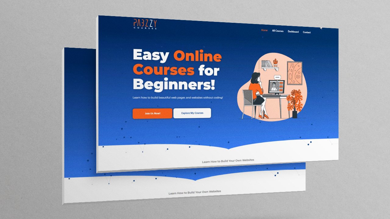
2. Project Overview: Now the best way to
grasp a new concept or reinforce a skill is
to build a project. So throughout this class,
as I've mentioned, we'll be working on a fully working
real-world landing page for a fictional fitness website. So let's have a quick
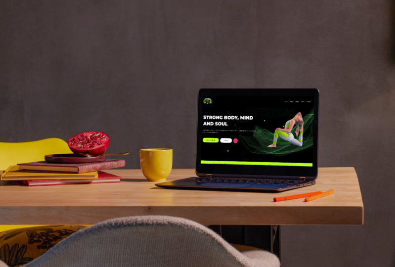
overview of the landing page. So here we are. This
is the landing page will be building with Elementor. And before we have
a quick look at it, I need to mention that I went
ahead and created this as a reference landing page
while preparing the class. And the good thing about having a reference landing page or reference website is that it allows you to see
what we are creating. So when it's time to
create this part, at least I can show you that we're creating
something like this. So together we will go through this page and rebuild
it from scratch. So let's have a quick scroll
from the top to the bottom. As you can see, let me
first of all refresh it. So let me reload that page. Now as you can see, we have these animations on
the hero section. And the animations are all
across the landing page, not just from the hero section. As you can see, we have
this video player here. And when you click that, you can have a video
here telling the visitor what this landing page is all about or what your
website is all about. And when they click play, there'll be able
to view a video. Click outside. So as we scroll, we have different
sections here where you can list your
services and the user can click the Learn
More button to be taken to the page as obscene. We have that animation. So scrolling downwards. And this and this testimonials is supposed to be right
here in the middle. I must have forgotten
to align it to the center right here. But of course, in the
final page we're building, it will be well aligned. Going down to the
footer, That's a folder. And if I hit Control Shift, I to mimic different devices. If I click this icon right here, as you can see, the landing page also
looks awesome on a tablet. This is the iPad Air. Lets me make an iPhone 12s pro. So that's what the
landing page will look like on an iPhone 12s pro. And of course, the menu
here is a burger menu. And when we're in tablet mode, it's still a burger menu. So let's scroll down all
the way to the bottom. And that's how it
looks on a smartphone. So basically, as you can see, the landing page looks
awesome on all devices. It's responsive and we'll see how to make it
responsive as well. So in a nutshell, I created this as a
reference landing page. The good thing about creating the reference landing page is that when it's time to
create this section, at least I can show you beforehand what we're
about to create, rather than just winging it and telling you to follow along without you knowing
what we're building. So that's just a quick
overview of what we'll be working on by the
time we finished, you will have this
landing page fully working and ready to
be used on a website. So that's what
we'll be designing. And to achieve
this landing page, we will need to use
several elemental features and tweak a lot of
settings which will equip you with the skills necessary
to confidently build your own web pages with
Elementor in the future. And to help you follow along in this class and reproduce
the same landing page. I've prepared all the
images for you and I'll provide them in a
folder called assets. Simply download it from the Projects tab right
below this video player. Now that you've seen what
we'll be working on, I have a feeling you're super
excited to get started. So without any further delay, let's go see you in class.
3. Install Astra Theme: And here we are. As you can see, this is a brand new installation
of WordPress. This is WordPress version 6.2. And the first thing I always
do when I'm working on any WordPress project is to
install a WordPress theme. So without wasting any time, let's go to Appearance Themes. Now, of course,
because we're in 2023, the active theme by
default is 2023. Last year it was 2022, and the year before
that it was 2021. But we're not going to use these default WordPress themes. We're going to say Add New. And we'll install one
of the best themes on the marketplace by
the name Astra. So I'll click Install. Astra is one of the best themes in the WordPress marketplace. Alright, so I'll go
ahead and hit Activate. And now Astra is
the active theme. As you can see, we
have these thank-you for installing
Astra notification. So let me just close that down. And that's how to install
a WordPress theme. In the next lesson,
Let's install elementor. I'll see you shortly.
4. Install Elementor: We're back. So now that we have
our theme installed, it's time to install Elementor before we can start
building our page. So let's go directly to plugins. We can click Add new,
but first of all, I just want to click
plugins so we can go to the install plugins list. And these are the
plugins that came by default when I
installed WordPress. So I just want to get
rid of all of them. Before I can do
that, I'll select these two and deactivate them. Select the activate from
this drop-down menu. And then let's say Apply. You might have different
default plugins from me. I suggest you just
delete all of them. Now that they're
all deactivated, I'll go ahead and select all of them by clicking this checkbox. Then in here I'll go
to Delete, apply. Okay? Alright, so now
if I refresh the page, we don't have any
plug-in installed. So I'll go ahead and say Add New and will be redirected to the WordPress
plugin directory. So I'll go ahead and search for Elementor in here, Elementor. And be the first results
in the list of results by elementary.com with 5 million
plus active installations. Click Install. Now, this is how to install every
plugin in WordPress. Alright, so let's go ahead and
hit Activate. There we go. So Elementor is now activated. Now, before we move on, sometimes if it's a very
first-time installing Elementor, you might be redirected to
a setup wizard where you need to go through several
steps to set up your website. Because I had already installed Elementor on this
particular domain. I have not been redirected
to that wizard. And just in case
you've been redirected to that setup wizard, where you have to go
through those steps. The next few minutes will
be a step-by-step process. I had pre-recorded
for a different class where I show you how to go
through all those steps. So here we go. So I'll hit installed, right? So when I click Activate will be redirected to the
Elementor setup wizard. So let's hit Activate. And this is the
wizard right here. So let me zoom out a little bit so you can see everything. As you can see right now, we have about five steps to set up everything before we
can start using Elementor. And the first step here is
to create an account with elementor.com if you want
to enjoy these benefits, but you don't have to have an elementary accounts
to use Elementor. So I'll go ahead
and skip this part. So the second step here is to decide whether
you want to use the hello theme that's developed and maintained
by the elementary team. But you also have
the option to skip this step if you have another
team that you want to use, I like using Astra. Astra Theme is one of the lightest and
fastest and most SEO friendly themes in
the marketplace. So I'll go ahead
and skip this part. The third step here is to
give your website a name. And by default, the name that
shows up in this field is the name you gave your website when you were
installing WordPress. So this is the name
I gave my website. I'm not going to change it. So I'll just keep
I'll just hit Escape. Then if you have a logo, you have an opportunity to
upload it at this moment, but this is something you
can always do later while you build your website so
we can go ahead and skip. And then finally, we
can go directly to edit a blank canvas and start building a web
page from scratch. Or we can browse
from hundreds of templates created by
Elementor that are within the Elementor
workspace or import our own element of templates
that we might have bought or created
ourselves previously. I'll go ahead and skip that. And by default,
when you hit Skip, it takes you directly to a blank canvas where you can
start building your webpage. So to exit from this place, click this burger menu, and Exit to Dashboard. So we're taken to the back
end of the editor for that specific blank
canvas we just left. But what we want to do is
click this to be taken the actual dashboard where we have all the Wordpress settings. And now if you look on
the left menu here, you'll notice we have
Elementor and templates. Both of these show up after
installing Elementor. And if we click Elementor, we can play around with
all the settings here. But usually you
won't need to make any changes to the default
settings of the plugin. You will just go directly to start building your webpages. But of course, feel
free to check out what all these other
settings are for. If you open up a template here, this is where you'll
find a list of all elementary
templates you might have uploaded or built. If you want to build a
new template that you can keep reusing
in your project. You can add new. If you want to import a template
that you had downloaded, you can import it from here. Alright, so now that
we've installed astro, the theme and Elementor, we're now ready to start
building the landing page. And we start with
the hero section. That's the top part of any landing page
that the customer sees when they get to the page. So in the next lesson, let's start building
the hero section. I'll see you shortly.
5. Elementor Workspace Overview: Welcome back. So now it's time to
build the hero section. And to do that,
let's first of all have a look at what
the hero section is. So jumping over to this reference landing page I created in preparation
for this class. This here is the hero section. It holds the main H1 or
heading of the landing page, which is a brief description of what the landing
page is all about. Some call to action buttons. We have this Video button here. Then we have this lady. This video button here brings up a video player from YouTube. You can showcase what your
website is all about. And visitors can play and
see what. Let me close that. So let's see how
to create these. So jumping back
inside our dashboard, go straight to pages. And because this is a brand new installation
of WordPress, we have default
pages that come with every new installation
of WordPress. So I'll select both of them
by checking that box there. And in this drop-down menu, move them to trash and apply. So now we don't have any pages. I'll say Add New. And because this is
our landing page, I will assume it's the homepage. So I'll say home, That's the name of the page. And now up here we have
a couple of settings. These are the
Wordpress settings, and these are the
Astro settings. If you've not installed Astra, you won't have these
settings here because they come with a theme
and we need them. So first of all, let's go
ahead and change the template here to Elementor full width. Just like that, because
we want it to run from the left to the right or
from the right to the left. So Elementor full width. And that's all we need from
the WordPress settings. Now let's switch
the Astro settings. And here we have
several drop-down menus here that we need to open up. First of all, we want to
say full width stretched. That's what the content
layout should be like. Of course, these are the
options are also usable, but I like using full
width stretched. Let's go to sidebar. We don't want a website or landing page to have a sidebar. So I'll go with no sidebar. We can always change
these settings on the page itself while
building it using Elementor. And I'll show you where
we can change that. And then finally, let's
go to disable elements. We don't want the
default Astra header or footer because we're
going to build our own with Elementor. So with those settings set, I'll say Publish, click
Publish once again. And now our page is published. Now let's click edit with Elementor and will
be redirected to the front end builder where we can start building our page. Now, if this is your very
first time using Elementor, the latest version of Elementor introduces what we
call containers. Before the introduction
of containers, we were using
sections and columns. And that's the workflow you will find in all my previous
elemental classes. And that workflow is
still very relevant. You can choose to
work with sections and columns if that's what
you're comfortable with. But now elementor gives us
the option to use containers, and this is what we're
going to learn today. So I want to activate the container functionality.
So I'll click that. It will open a new tab
that will take us to the settings where we can
activate Flexbox container. So just go to Flexbox container. This is inside features and
the Elementor settings. Drop-down menu activate. And then let's scroll
downwards and save changes. Alright, so with those changes, Let's go back to the
page. Here we are. And of course, before
we refresh the page, the UI of the editor
here looks like the old UI that had the
sections and column workflow. But now when we refresh this page to reflect
the activation of the flexbox container will now
this will change slightly. Notice now we have container
and the columns are gone. So now the first thing
we need to do is have a quick overview of how
the containers work. So I'll just drag a
container in here. And now we have this container here runs from the
left to the right. And this is what we'll
hold our hero section. And inside this container we can drop more containers that we hold different
types of content. So to reveal the
draggable elements, once again, we can click
this icon up here. And that will reveal
the elements. Once again, if I can collapse all these panels right here. These are different
elements that we can drag onto our page
to create content. So e.g. we have the pro area. These are the elements
that are only available with Elementor Pro. You have to pay to
use Elementor Pro. But now we have the basic
elements like the heading, image text editor and all that. Then we also have
general elements. These are still free. Pro elements have a small
lock icon on the top right. Like in here. We can drag this and
put it up there. We can drag this and
drop it in there. Let me just undo that control Z. So basically this
is where we will be getting our elements and dropping them in here and
then making changes to them. So going back to our basic
panel and expanding layout, the layout panel holds
the container element. And as we get started, there's one very important
setting we need to change. And I'll show you what that is. Whenever you hover
over any container, you can select it by going to one of these
corners. So if e.g. I. Go in here and drag
a heading in there, I can select it by going
to this corner right here. And now these
changes to heading. If I want to select
the container itself that's holding
these contents, I can select it
by clicking this. And now it's elected
these container. And if I wanted to select
this outer container, I can click this. And these changes
to contain a steel. So now when we hover over
these selector right here, we can reveal some quick
shortcuts that will save us a few steps in our workflow. So if I go inside
this burger menu, user preferences and change this and switch
editing handles on. Now, if I hover over
any of these corners, we have this duplicate
shortcut and delete shortcut. Rather than going to this. If I switch this off, rather than going here, right-clicking and
then duplicating. When this is on. All I need to do is hover
over these and then duplicate over the Delete. Now, going back inside
this burger menu, we also have more settings. So if I click this
site settings, we have global colors
and we will see how to work with global
colors, global fonts. We can change the behavior of all the phones on the
website right here, and all these other settings. But we won't need to
touch these for now. You usually need to touch these when you're working on
the entire website. But right now we're focusing
on the landing page. So let me close down
these settings. And now that's a quick overview of the elemental workspace. In the next lesson, we'll now start
actually working with containers to build
the hero section. So I'll see you shortly.
6. Understanding Containers: Hey there, welcome back. So now that we've
had a quick overview of the elemental workspace, it's time to start understanding
how containers work. So let me just go
ahead and delete that. And then instead of dragging
this container here, let me click this
plus icon here. Now, here are pretty build
structures of a container. Dragging and dropping it in here is the same as adding
any of these containers. But now these
containers that have divisions inside of them are containers that have
other containers in them as templates. These two don't have
any containers in them. And they are the
same as dragging and dropping it in there because it doesn't have any container. If we add this here, as you can see,
it's a container. You can see by the border. And it has this container. And this container. If we add maybe this one here. As you can see,
it's the container, and then it has six
other containers inside. And now, if I delete this, let's have a quick look at this. Now because this outer container contains two containers
inside of it. If we select it and
display it settings, you will notice we have
these items section down here under layout items, and we have the
direction setting. And what these directions
setting means is simply how the containers inside another
container are arranged. So row, horizontal means they are arranged from the
left to the right. Because now currently that's
what we have left to right. If we want these containers to be stacked on
top of each other, that is from top to bottom. We can choose this vertical
setting like that. And now this is on top of base. Just to help us understand
visually what we're doing. Let me drop a heading
there and go back in here and maybe drop
a button in there. So now remember these
are still containers. And each container now
contains an element. So this contains
a button element and this contains
a text element. So now going back and selecting this outer container here, we're now back to eat settings. Remember, we went
from left to right. Let me select left to right, left to right, then
to top to bottom. But before I click
this top to bottom, we can reverse it. And that means the container
on the left now be put on the right and the one on the right
will be put on the left. So let's see that reverse
and now they are reversed. And now let's stack them
from the top to the bottom. That means the first
container will now be on top and the second
one will be on the bottom. And the opposite is from
the bottom to the top. And now there will be reversed. So that's how a container works. And of course, it doesn't matter how many
containers we have. What really matters is what
direction you've selected for that outer container that's holding the other
containers inside of it. So if we go back in here and
add a container in here, Let's drop it inside there. And now we have
three containers. And if we arrange
them from the left to the right, select this. If we arrange them from
the left to the right. Now we have three containers. And if we add some, maybe let's add a, let's add an icon there. So now selecting the
outer container, we can reverse them. And the middle one
doesn't change because when we reverse them, it will still remain
in the middle. So now, as we build the different parts
of the landing page, you will get to see these
containers in action. And they allow us a
lot of flexibility in how different elements
flow on our webpage. And that's just a quick
overview of containers. In the next lesson, let's get more practical
and see how to put them to work to produce a
beautiful hero section. That's the only way
you'll be able to understand how to
really use them. So I'll see you shortly. Piece.
7. The Hero Section - Adding the Hero Elements: Welcome back. So now let's put the theoretical
knowledge we've learned about containers to work. So let's go ahead and delete
everything from here. And now let's observe these
section for a second. We have this
container here that's holding the text and buttons. And we have another container
holding the hero image. So let's add a double container. Container. In other words, a container that has two
containers already. There we go. So now in this container, let's go ahead and add an image element.
In this container. Let's add a heading. Let's go back in here. Text editor, in other
words, a paragraph. Drop it as soon as that
indicator appears. And then let's drop
a button element. Alright, so let me first
of all hit Update. And let's preview the changes. So that's what we have. Very basic. So now let's first of all
add an image right here, an actual image of this lady. Remember I mentioned,
are provided all these images in a
folder called assets. Right below this image, just look at the projects
tab below this image. So going back in here, I'll select the
image element and this will change to edit image. So these are settings
of this element. I'll select that box in there. For now. I don't have any images
yet in the media library, so I'll go to upload
files, select. And now this folder
is in my desktop. I'll just click that.
It's called assets. You can download it in the projects tab.
So let me open it. This is the lady open. And it's now uploaded. So let me say select. There we go. So
there's the lady. Second thing we need
to do is change the font and font color. So going back in here, if we change the font to white, you won't be visible. Which brings us
to the next step, which is changing the
background of our website. So going inside
this burger menu, Let's go to Site Settings. That will reveal all these
settings right here. And we want to go to
Background, background type. And let's select this color
and turn it to black. I update that back to editor. Now we can change
this font right here. We want to use a font
called Montserrat. So to change these texts, we select the heading element, and this will change
to edit heading. And we can go inside style. Change this to white. First of all, click anywhere in here in the editor to
get rid of that box. And then let's go
inside topography. And in this drop-down
menu, type, Montserrat, select months, Iraq, and as you can see, it's
changed to monitor rack. Next thing we wanna do is
change the font weight. I like using black. That means a very
bold text because this is our main heading
on that landing page. I'll just go ahead
and copy this. You will need to type it. Go ahead and copy that. And while this is
still selected, go inside content, inside the
title, paste it in there. Strong body, mind and soul. I'll select these texts. Going insights, tile text, color, change that to white. Click anywhere in here
to get rid of that. And then of course, you will notice that
this is Roboto. Elemental comes
with default fonts, and mainly for the
paragraphs, it's Roboto. And that means every time we add a brand new text editor element, it will always be Roboto
unless we change it manually. Now, to avoid having to change
it manually every time, we can go inside
the burger menu, once again, site settings. And this is where now
we change global fonts. Primary, that means
the headings. We already changed these
specific one to Montserrat. But notice that it's Roboto. That means every time
we add a heading, it will always be robots. So unless we
specifically say we want it to be Montserrat and
we want it to be black. Let's go to secondary. Let's change that to Montserrat. Let's go to texts. Now. That's the paragraph texts. Change that to Montserrat. Let's go to accent. Change that to Montero. Update that back to editor. Now, for some reason
this hasn't changed, but we can always
change it manually. I'll find out why. So let's go in here. Inside, while this is selected, text editor topography,
Montserrat. Update that. Let's review
the changes. There we go.
8. The Hero Section - Styling the Hero Elements: So now we want to change the button to have
these rounded corners. And at the same time, we need to give it this green. And I have that green
color code right here. Let me just pick it
from my other screen. Going inside here. Select that. I'll also provide these specific green color code just
in case you want to go with that with the
green color code selected, I'll select this
button, coincide style. The button. We have topography. We've already changed
to Montserrat, but we also have color. Select that, paste
that in there. And you'll notice the
button color has changed. Now for the text color, Let's change that to
black, and now it's black. On hover. We want it
to be white color. Now when we hover, it's white in color. We want the text
to remain black. Let's also now go
to the padding. We want to add the
spacing between the edge of the button and the
content, the text. The spacing right here. As you can see, it's
slightly bigger here. So go to padding,
break that link. To edit the individual sides. Without breaking the link. It means whenever you make a change to one
of the cells here, it affects all sides. Want to edit individual sides. So uncheck that. Select the left, give it 50 there, right? 50. The top and bottom can be 20. And now for the border
radius, Let's give it 50. To give it that rounded corner
smaller than number here, the less rounded it is. So if we give it maybe 20, you see it changes
to less rounded. If we give it ten, it's much less rounded. If we give it zero, It's not rounded. So
let's give it 15. If you break this
link like that, you can have one side without the rounded corner. Update that. Let's preview the
changes like that. Fact I'll leave it like that. Now, one thing you'll notice
is that we have two buttons. So how do we add the
second button here? If we drag a new button here, it will come below this
button right here. And that's because the buttons, the text editor and the heading are all inside one container. So if I select the container, if we look at the direction, they are all arranged from
the top to the bottom. So all elements are going
from the top to the bottom. If you want them to
go from the left to the right and select
row horizontal. Everything including
the tax will be rearranged from the
left to the right. But we don't want that. We only want the buttons
to be arranged from the left to the
right, not the text. So going back to
this setting here, top to bottom, what do we do? We can use a container in here, drag a container and
drop it in there. Then let's drag this
button in there. And let's also drag
these other buttons inside that container when
that indicator appears. And now they are both
inside the container. And now when we select this
specific container here, we can change the direction
to be from left to right. That's the power of containers. So now select this button,
right-click, Copy. Select this button, paste style. And now it's inherited all the styles of
these other button. But now we want it to
be white in color. So while it's still selected, I'll go inside style. Color. Change that to white. And on hover. On hover, or does it change to changes to some light gray? On Hobo, we also want it to Bob. So while it's still
selected on hover, wanting to be that
light green like that. And while hover is selected, you will see hover animation. In this drop-down menu. You can select any
animation you want. I like Bob and Bob,
Just like that. Let's select this. Under hover, hover
animation. Bob. All right, so let's
go ahead and update that and preview the changes. Alright, now going back in here, let me select this heading. Go to style typography. And let's change the size
to maybe somewhere there. Update that. And let's
preview the changes. Alright, so now you
will notice that they are not aligned
well vertically. The text and the
button seem to be slightly more elevated
than the girl. Because if we draw an
imaginary line here, these should be slightly lower. So now the best way to do
that is to use justification. So if we select this main container
and go to align items, this is where these are
the settings come in. If we say center. Now, everything in reference to the outer container will
be vertically on the center. That is the spacing from here. And spacing here will be equal. Just like that. Update that. And let's preview the changes. There we go. But now notice that this content is
pushed all the way, almost to the edge and
ours is pushed inwards. So going back in here, select the main container and content width in this drop-down
menu, select full week. And now we have a full width
container update that. Let's review the changes. There we go. But now we don't want it to touch the
edges completely. So going back in here, while this is still selected, we can say maybe 80%. So 80%. And now it's occupying 80
per cent of the screens. Weep. Let's update that and
preview the changes. There we go. Now, the next thing we want
to do is add this background, these waves that adds some aesthetic value
to them. Landing page. So going back in here, while this is still selected, I want to go inside style,
background, background type. I'll select Classic. And now we have this
image space here. Click that image
because we want to add those waves as
an image background. So I'll go to upload and you'll still find
that wave in here. This is the neon
background hero section. I already created it in
Adobe Illustrator for you. And now we've uploaded it. So select. And there we have it. But now you will notice that
it's cut off right here. So one thing we wanna do is go inside position and
say center, right? Like that. And we also want to say
no repeat, no repeat. Update that. And let's
preview the changes. There we go. So now this brings up a
small challenge here. As you can see, it's cut
off because the edge of this section goes up to 80 per cent of the
width of the page. And what we want
is to have it go all the way to the
very end like this. So we need to get creative here. Remember this, this container
holds two main containers. It holds the textblock container and the hero section container. And the settings are running
from the left to the right. And so if we want to
add a container here, we need to add it right there. So now we have three containers, but we want to put
this container, these two containers
inside the new container. So I'll drag that in there. And then that in there. And now we have
this container that contains those two containers. But by default, everything is
running from top to bottom. So we need to tell it to run
from the left to the right. And now these two containers
are inside this container, that is inside this
outer container. And if we make this outer
container full width, now the background runs from the left to the
right, edge to edge. Let me update that. And let's preview the changes. Alright, so now the inner
container that's holding these two containers
is still boxed. We want it to be full width, but now we want it
to be 80 per cent. And we want to select
the outer container to push this inner
container to the center. So we want it to be center. Update that. And let's
preview the changes. There we go. And so now at least we're starting
to get somewhere. This text is slightly bigger, so let's select the heading, going site topography,
make it bigger like that. Update, preview
changes like that. And now let's align everything
to the center vertically. Within this container. Just like that, update. Preview changes. Now everything is
aligned properly. So that's how to build
the hero section. But now you might be wondering, that's a beautiful
Heber section, but we don't have
a navigation bar. Where is the menu bar? Where is the logo? Don't worry, that's
what we'll be doing. In the next lesson. Let's see how to add the navbar, which holds the
menu and the logo. Just like this. The logo and the many. So I'll see you shortly.
9. The Nav Bar - Install ElementsKit: Welcome back. So now we've already worked
on the hero section. Of course, I know
we've not added this video button right here, but we'll do that, don't worry. But what we wanna do
is create the napa. So going back inside our editor, this is the landing page, but this is not where we
will create the napa. So I just want to
exit from here. We'll be back here to build
the rest of the page, all these other parts. But for now, let's
leave this page. So I'll click this burger menu. And at the bottom
here, there is exit. When you kick it
for the first time, it'll give you a drop-down menu to select where you want to always be redirected every
time you click Exit. So I'll choose WP dashboard. That means every time you
click exit right here, you will always be
redirected to the dashboard. This only happens once, so I'll select WP
dashboard, then apply. First of all, let me
cancel and update the changes are right. Since I've already selected where I want to be redirected, if I click Exit, You won't bring up that pop up. It'll just take me
to the dashboard. So now that we already
know this is version 6.2, let me dismiss that. And now to create these navbar, we will need to install
another plugin, which is an extension
of Elementor by the name elements keep light plugin. So let's go back
inside our dashboard. Plugins, add new. And in here I want to
search for Elementor. Elementor. And now you will
notice, of course, in addition to Elementor, there are many other
Elementor based plug-ins. These are plugins created by third-party developers to extend the power and features
of Elementor. Elementor is developed
by elementary outcome, but essential add-ons for Elementor is developed
by WP developer, premium add-ons by leap 13. And what we need
is elements keep elemental add-ons by WP met. So I'll click Install Now. We will also need the sticky header
effects for Elementor, and I'll show you
where it will be used. For. Now, let's note install it. We will install it
when we need it. So now that elements kit is installed, let's
click Activate. There we go. Now we have elements
key light installed, and here it is in our sidebar. So select elements kit will be redirected to the
step-by-step wizard where we can set up the
plugin or add-on. The first step here is to select any of these three options here. Basically what these
options mean is, depending on which
option you select here. Some of the widgets and
features here will not be active and available to you in the front-end while
you're using Elementor. So e.g. if I select
Advanced here, look at what happens to
some of these widgets. E.g. the widget builder has now been activated by default. That means when I'm
using Elementor in the front-end to build to build a page that we did build a will be available
to me in the front end. And so will other several
features down here. So I like using advanced. So let's click next step. Next step. Next step, share some
nonsensitive diagnostic data. Next, max, save changes. Now elements kit is now
ready for us to use. Let me get rid of that.
10. The Nav Bar - Add the Navbar Elements: And now you will notice
under Elements kit, we have what we call
header and footer. This is where we want to go, click Header and Footer. And this is where we can create different headers and
footers that will show up on different pages
depending on our settings. So I'll go ahead and add new. Let's call it header. The type is header. We can only have a
header or footer. Conditions is that I want it visible on the entire website. Now, if you buy the Pro
version of this plugin, you can decide you want this
particular header to be available or visible
only on specific pages. So I want it to be visible on the anterior side and I
want it activated when you're doing some maintenance
and you don't want this navbar to be visible while you're
doing that maintenance. You can deactivate it. So save changes because
I want it to be visible. I will leave it as
activated and save changes. And there we go. So now it's active. Let's say edit. Edit content will be redirected to the front-end where we
can now build it visually. Here we are. Now you will notice we don't have the hero section
we already created. And that's because we left that part where we were
editing the hero section. Now this is the part where
we're editing the navbar. So let's go ahead and add a
double container, container. The structure, this
will hold the logo. So click this Plus at image because our logo
is essentially an image. And while that's selected, this will change to edit image. Going here, upload
files, select files. Fitness. That's the logo I created for
this project. There we go. Select that. The next thing we wanna
do is add our menu. So let's go in
here and say plus. And in here, Let's type nav. Now, you will notice that
we have to nav elements. We have the nav by elements kid, and then now by Elementor Pro. And we can't use these Elementor Pro nav element because it has this
lock icon here. It's a pro element. So let me drag and
drop this in here. And now when you drop it there, while it's still active, it's of course, edit
elements get Nav Menu. These are its settings. And you will notice the first
thing here is select menu, a menu like this. And this menu is made
up of menu items. And these menu items
are actually pages, web pages, the about page, Videos page, the sharp page, and the Contact page. That means we need to
have a bunch of web pages created to be our menu items. So going back in here, I'll just hit Update. And then let's
preview the changes. And of course we don't
have a menu here. So going back in here, I want to go back to the
dashboard, so I'll exit. And let's go inside pages
to create a few pages. We already have the homepage. So I'll right-click this
and open link in new tab. I'll do that again and again. So now going to those
tabs, Let's change this. Let's call that about. We're not really concerned with these changes for now published. We just want to have some
menu items that's published. Let's go on to the
next videos published. Let's move on to the shop. Publish. Lots also have
the contact published. So now going back in here, if I refresh the dashboard, now we have all these pages. Now the next thing
we need to do is go inside appearance menus. And this is where we
create the menu that has all those pages
as menu items. And you will notice right here
on the left that this part is faded out because we've
not yet created a menu. Create your first menu below. So I'll call it fitness menu. And I'll make it
the primary menu. Then Create menu. Now that it's created, we can add menu items from
the left column, right here. And if I collapse this, menu items can be pages, which is what we're
going to use. But they can also be
posts like blog posts. It can be custom links. We can expand this and have
a specific link right here. And then the link texts
maybe learn more. And we can say Add menu, or we need to provide a link, I'll just put a hash. So now we've added that there. Or they can also be categories. But right now we want the
menu items to be pages. And if we expand that, here are all our pages. So let me select all
and add to menu. Let's remove these. Learn more custom link
because we don't need it. And let's drag in, rearrange these menu items. Home. Contact because it's on
the furthest right side. Home about videos sharp. Home about videos sharp. And now we're in that's done. Save Menu. So our
fitness menu is saved. It has been updated
with these menu items. So now going back inside
elements kit header folder, header, edit with Elementor because we already
started working on it. If we select the
nav item that we added to this half and
go to Select menu. Now we have the fitness
menu available to us. If we select that. Our menu has been added.
11. The Nav Bar - Styling the Elements: But by default
everything is black, so we need to, while it's
still selected, go to style. Let me first collapse
the menu wrapper panel. Go inside. Menu, item style,
item, text color. Let's make it
white. There we go. Let's go back inside content and say horizontal menu
position, right? That will push it
to the right side. Let's go back inside style. On however we want
it to be this green. So let me just pull
that green color. Copy that. While this is still selected, I want to collapse menu wrapper, menu item style, itemsets color, however, we want it
to be that green. And when it's active, we still want it
to be that green. I'll say Update. And let's preview the changes. There we go. But now of
course this logo is too big. Let me close down these tabs. So going back in here, select the outer container
and let's make it full width. Update that. Let's
preview the changes. And now it seems to be off. So what's the solution here? The same solution we used for the hero section when we put these two containers inside a container that was inside
the outer container. Let's see how to do that. So going in here, Let's drag a
container right here. Because remember the
outer container has everything stacked from
the left to the right. And now let's drag the logo inside here side
these new container. And let's also drag these container inside
these other container. That means it should
be below the logo. Just like that. Alright,
so now let's select it. While it's still selected. Let's select left to right
arrangements like that. While it's still selected, let's make it full width. And let's select
the logo container and make it 20 per
cent in width. Like that. Fact, let's make
it 1010 per cent in width. And now you will notice
we have this space here because we haven't given a
specific percentage to this. And it should be 90 because
this is ten per cent. The logo container
is ten per cent, so they should occupy the
remaining 90%, 90% like that. Update. And let's preview the changes. So there we go. But now on our
reference website here, they were not very
close to the edges. So going back in here, we can make this inner container that's holding these
two containers. Full width, but 90%. Now of course, it starting
from the left to the right. So selecting the
outer container, we can put everything
in it in the center. Just like that. Now it's smack in
the middle. Update. And let's preview the changes. Just like that. So now that's
how to create the nav menu. Going back in here, because we are done
with the Navbar. Let's exit to the dashboard. Go inside pages. Homepage because we had started editing it
with Elementor. It has this option. If you haven't edited a
page with Elementor before, you won't have that option. So edit with Elementor.
And there we go. So now notice this part is
editable, the hero section. And the Napa is visible on our hero section or our landing
page on the entire page. But it's not editable. And that's because this is
not where we were editing or this is not where we
created the nav menu. So let me just
preview the changes. There we go. Of course we
can push these outward. So let me first close this down. While we're here, we can just, we can select this inner
container and make it 90%. Just like the navbar. Update that. And let's preview the
changes. And there we go. So now looking at these
and comparing it with our reference landing
page, almost looks. Identical. So now let's add
this video player before we call it a wrap. So going back in here, I'll open up the elements
and then search for video. Video. And the one we want
is this one by elements kit. So drag and drop it in there. We want to drop it right there. And then drag it all the
way to n. Update that. Preview the changes.
And there we go. So on however, this
one turns green. But by default on however, the one we've added will
not even change colors. So let's sort that out
while this is selected. Let's go to style. Where is it? Button style, glow color. Let's first of all give
it that green color. Background type. On hover. Let's make it green.
Just like that. Update. Preview the changes. We want this icon to
turn black on hover. That's the text color on hover. Let's make it black, even in its normal state. Let's make it black. Update, preview the changes. Now it's black on hover. In fact, they don't like that. Green and pink. I don
t think they rhyme. So let me just change the glow
color back to pink Update. And the reason I
chose to go with bad pink default color is
because it makes it stand out. Almost everything else
is white and green, but this is pink, so it really stands out. And that glow wave also pulls the viewer's attention and just makes them
want to click it. And if you click it, of
course now it has that video. While it's still selected, you can add a URL
to your video here. So if you have a YouTube video, this is where you can add it. And when people click it, it'll play that video. And that's how to
add the nav menu. In the next video, let's see how to start creating the rest of these sections. So I'll see you shortly.
12. Body Section 1 - Part 1: We're back. So now that we're done with the hero section and the navbar, it's time to start building these different sections that make up the body of
the landing page. So let's get started with
this street right here. So going back inside our
landing page editor, right below our hero section, let's add a container. Just like that. And inside this container, of course, let's add a text. I want to add a text editor, not a heading, just like that. Now, let me, let me just
grab these texts right here, of course now you will type
whatever text you want. So copy that green back in here. I'll paste it in there. But I don't want to paste
it with its formatting, so I'll undo that. And then Control Shift V that paste the text inside these editor without
any former team. Alright, so now while
it's still selected, I'll go inside style, change it to black. And I'll change this background of the outer container
to that green. So let me select this
button, coincide style. Select this green. Copy that, and go back
to this container here. Style, background
type, classic color. I'll paste it in here. So now it's that green. The next thing I want to do is, of course, first of all,
select these texts. As you can see, it has some padding or margin
that comes by default. So while the text is
selected, go to Advanced. Remove, break that link. And that link as well. I want to first of all go inside style and
centralize it like that. And then typography. Let's increase the
size up to that point. Maybe go inside advanced while it's still selected
for the bottom padding, for the bottom margin. Let's reduce it just like that. And I'll see it's spaced out. So while it's still selected
ongoing sites though, topography, letter spacing,
Let's space it out like that. And don't worry
that it's wrapping. All we need to do is
go select the outer, select the outer container. Under Layout, let's
make it full width. Just like that. Let's increase the top margin. Now let's reduce
the bottom margin further up to somewhere
there. Update that. Of course we'll need
to add some margin between the hero
section in this strip. So selecting the
outer container, advanced margin, remove that link so we can edit just one cell,
the top cell. Let's give it maybe 15150
is too much. Hundred. Update that preview the changes. There we go. So we
have that strip. And of course we can
increase as much, we can give it as
much padding as we want on the outer
container itself. So outer container
padding, Let's break that. And let's give it a top
and bottom padding, maybe 20, bottom,
20 top like that. Update. Alright, so there it is. Let me just preview
changes. There it is. But now you will notice that this background is
a little bit cut off by the border of the container holding
everything in here. This one right here, as you can see, it's
cutting off part of that. So let's select these container. And under the height,
minimum height, Let's choose viewport
height. Update that. And let's preview the changes. Alright, That doesn't change it. So we can just say 100%. Let's try that. That's trying to make
it 100% of the screen. So with that, let's just
reduce the margin at the top. But at the bottom, we've actually, we've
gotten rid of that cart. Let's try maybe 80% of
the viewport height. Preview the changes. I think that's much better, but we can do much better. Let's try 70 per
cent. Update that. Let's preview the changes. Preview the changes. There we go. So now
selecting this, we could actually reduce
the top margin to maybe 50. Update that. It's all about playing
around with these numbers until it looks good
in your opinion? Yeah. So because we want
it because I wanted it to be visible when you're
on the landing page. So that's that. So basically that's how
to create that strip. In the next lesson, let's go ahead and create
this section right here. And if I refresh this page, let me just refresh it. You'll see these animations. This guy bounces in
together with the texts, will see how to do all that. So I'll see you in
the next lesson.
13. Body Section 1 - Part 2: We're back. So now it's
time to see how to create this guy right here together
with this textblock. One thing you will
notice is that the background isn't moving. As we scroll, these waves
remain fixed in one spot. So how do we achieve
that result? Let's do that first before
we start creating this guy. So going back in
here, when we scroll, you will notice our waves are
moving with the container. So selecting the container that has these waves as
the background. And going inside style, we have attachment and
it's set to default. We can make it
fixed in one place. And now when we scroll, It's fixed in that spot. Update that. Let's
preview the changes. Now if we scroll up, we don't have enough content
below these to scroll. This is the last
content we have here. So let's add a section. So I'll go down here and
click the plus sign. And let's add, once again, I just want to add a
container less container. So just like that. And now let's add the first container that
should hold the image. Let me just add some
dummy text there. And now let's add yet
another container. So I'll drag and drop it outside the container
we've just created. So now we have two containers, but I want this container
that's holding the text to be after the image container. So let me drag this image container before the texts container,
just like that. Now that we have them
stacks like that, Let's go to the container
that's holding them. This outer container. And let's change the
direction to left to right, like that. So in here, let's add
an image element. Well that's active. I had uploaded this
image with this guy, so I'll just select it. There we go. And in here, we want to
say get stronger faster. So I'll just grab that, select that under
contents title. Paste it in there. And notice that when
we add headings, they are Montserrat black, that is very strong, bold, and this is what we set as our global font
for the headings. So while it's still
selected, say style, text color, white,
slightly bigger. This is a text
editor, dummy text, so I'll just say
add a text editor, Lorem Ipsum by default. While it's still active, let's go to style text color. Change it to white. Just like that. And we have these
lists right here. So going back in here, select the elements list
and it's an icon list. So I'll drag the icon
list below that. And if I click the first item, I can change it to
whatever I want. What is this? Heavy lifting. So heavy lifting, endurance training, bodybuilding, building, bodybuilding techniques. And you can also make
the changes right here instead of here. So leased item number
three listed two num three can just
select that text. Endurance training. And of course now you will notice we can change
the icons here. So if I select this,
Let's type check. Because I wanted to
check box, that's okay. Insert, Checkbox, collapse that, expand that, go inside the icon. Check. Insert. And finally,
heavy lifting. Check. You can start that. And there we go. Now
let's go and do. And you can add, as you can, add more
items here if you want. So below here we have add item, maybe yoga sessions. It's also say check. Insert and now we
have yoga sessions. Now to change the colors
would go inside style icon. Let's change it to this green. I think they're
white or are green. So selecting these, selecting these container
going inside style, select the color, copy. Select the list style. Icon. Color. On hover. Color should be white.
Just like that. Now, let's also do
something about the texts. On normal state. We want it to be white. And on hover we want
it to be green. Just like that. Update. And now of course, just like on the hero section, we want everything balanced
vertically so that we have the same spacing
down here as up here. These texts seems
to be elevated to the top and we want it in
the middle somewhere here. So we select the
container that's holding these two containers. Go to items, Align and align them in the center
vertically just like that. And now, of course, now you will notice
this image is larger and it's
almost at the edge. And that means that container
itself is full width. So let's make this
container full width selected for width
just like that. And now let's add
its background. So going inside style, classic, I think I had already
uploaded these background. It's this background right here. Neon background left. I had already uploaded it. So bring insight media
library. Here it is. Select. And now there we go. Update, preview the changes. Scrolling downwards.
There we go. And notice that the pattern is repeating and we
don't want that. That's what happens by default. So repeat defaults, no. No repeat. Update that. Preview the changes. Scroll downwards. And now it's not repeating. There we go. Wait,
and I've just noticed we somehow lost
the video editor. I don't know what
happened to it. So of course it's very
easy to add it once again. So just give me a moment. Video. He kids. Right there. I won't even work on it because you already
know what to do. So let me just update that. And then let's preview
the changes. There we go. So scrolling downwards. Now this container is
too close to the stream. We want them to be separated. So let's select the
container itself. Advanced. Break that link. Let's give it 150. Top margin. So that's spaces
it out completely. And I feel like there's
too much space up here. I feel like we need to push these elements
upwards a little bit. So selecting this
container that's holding everything advanced,
margin, top, Let's reduce that
spacing like that, maybe negative 85, depending
on your preferences. And let's preview the
changes. There we go. I think now that's
very well-positioned. So scrolling downwards. Now, let's make this background fixed before we call it a wrap. So selecting that container
style attachment fixed. Just like that, update. Preview the changes. Scrolling downwards. There we go. So now, of course, it's
very easy to add. We forgot to add the button. And the button has an icon, so we forgot to add that icon. So selecting this button
under Content icon, we can select from
the icon library. I want this arrow insert. And we can put it after. So I can position
after, just like that. And they say, join us
today, view classes. So while this is
selected and the text's content text, join us today. And this should say
courses or classes. Let's do. Now. Let's duplicate this. So I'll just duplicate
that button dragging. Now I'll drop it right there. And of course you'll
notice we have too much spacing up here. So I'll select this text
advanced margin bottom. Let's reduce it up to
that, up to that point, and then select list, list, advanced, break
that margin bottom. Let's increase that to separate
the button. Update that. And let's preview the changes. Scrolling downwards.
There we go. So that section is now complete. As you can see, the principles remain the same. The same things we did
on the hero section, or the same tips
and tricks we're using to create these
other sections. Now of course, let's go on and create this next section here, we'll use the same principles, but the image will be
on this other side. Let's do that in
the next lesson. See you shortly.
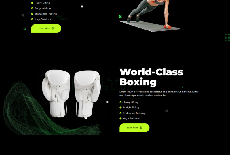
14. Body Section 2 & 3: All right, So let's
get back to business. So now we've just finished
creating this part. Let's move on to create
this section right here. So going back to our editor. So let's go ahead and add a
double container like that. And in here, in fact, we can just drag, we can just duplicate this
container here like that. Then drag it in here on the side of that
other container there. Let's get rid of this. And we can also duplicate this. And drag mixed bag
just like that. So let's get rid of that. That's how elemental makes
things easy for you. You can just simply duplicate
and reuse elements. So of course now selecting
the outer container advanced. Let's add some top margin
of 150 for uniformity. And while this is
still selected, let's go inside layout and align everything to the
center, vertically. Select this image going
here so we can replace it. I'll go to upload
this lady right here. Open. There we go. So there's our girl. Does she have a background? Of course, she does, but this is a
simpler background. So going in here and selecting outer container
style background, classic, let's select that
background upload files. This is the BG elements. That's the background we
created for that section. There we go, selects and now we have that nice
background over there. Of course, we can
increase the padding, the spacing between
the edge here and the contents at the
top and the bottom. So selecting the
outer container. Let's go to padding, break that. At the top, let's make it
50 and at the bottom, 50. So now we have that nice
spacing over there. While it's still selected. Go back inside layout. Now let's go inside
style attachment, fixed. Now while we're scrolling, looks like one single
background update there. Let's preview the changes. There we go. So let's start scrolling.
Just like that. And there we go. But of course, let me change
these texts slightly and the text size is larger
than what we have on ours. So selecting that,
go into content, paste that in there a man, Let's make the text bigger by going inside style. Typography. Think that's the perfect
size for the perfect body. Then while this is
still selected, right-click Copy, select this
right-click paste style. So it makes it the
same size as this. If it was maybe a
different color, this would also be that color. Alright, so let's update that. And of course now in the next lesson we would
have created these. But rather than wait
till the next lesson, we're just going
to duplicate this. Let's duplicate that
container there, like that. Now we have to drag this
below that container. Now it's here and it's
still the copy is here. Select this image. We need those gloves. So I'll go here. Selected gloves. Select. There we go. World-class boxing. Copy that. Select that. Then in here on the title,
world-class boxing. Now of course, you can change all these content at
your own discretion. Customize it to your
own specific needs. Were just looking
at how to lay out every single element
on the landing page. Alright, so now we
have these services, and that's what we're
going to be working on in the next lesson. So first of all, let me say this update. Let's see what do we
have in the yeah, the background here is still the same as the background on this. Just like that. So let's
preview the changes. Scroll downwards. And there we go. So in the next lesson, Let's see how to create these. Let's see how to create
these features or services before we get
to the testimonials. So I'll see you shortly.
15. Services Section: Hey, welcome back. So now it's time to create these services section
or features section. And this part is a little bit more complex than
the previous parts because it involves containers within containers,
within containers. And so let's see how to do that. So going back in here, let's first of all create the container that's
holding everything. So there's a container that's
holding all these items. So let's first of
all create that. And I just want to start from a blank container like that. Let's go inside advanced. Break that link. Top margin
of 150, just like that. And let's update that.
And while it's updating, let me just go
ahead and duplicate that heading because we'll
need a heading in there. And also these brief description dropping below the heading. And while this is
still selected, I'll go inside style, align it to the center. While this is selected out, go inside content
alignment center. Let me first of
all change that to our features while this
is selected title. That will remain like that. Update. So now
going back in here, this here is a container
and these are two elements. And they are arranged within the outer container that's
holding all of them. And they are arranged
from top to bottom. So let me illustrate
that very quickly. Let me just zoom out
slightly so we can view everything up to there. Let me now pick
the snipping tool. So now, here we go. So assume this is a container. All of these is a container. And that container we
have this element. And this element. And this here is a
container as well. So those are three
elements and they are arranged from top to bottom. So going back in here,
they are arranged. Let me select this
outer container. This outer container is
this outer container, the black container here. And it has three
elements, the heading, the description, and a
container inside of it. And it's arranged
from top to bottom, just like this. Alright? So that means we need to have a container right below
these two elements. So let's add a
container in here. So this container is what will hold these other containers. Alright? So, but now looking at this
heading and this description, these are two elements
arranged within a container from top to
bottom, just like here. So a heading and its description
within a container arranged from top to bottom. And then this container
in this image are inside another container arranged from the
left to the right. And this here is a column, contains this here is
a container that is a column with three
containers like this, arranged from top to bottom. Alright, so now that's what
we're trying to achieve. I hope you've understood that. I hope you've understood
these drawings, although they look like doodles, at least you've followed and understood how the containers
relate to each other. So now we're working on. So now let's first start by
creating this container here, CrossFit and its description. So let's go in here
and duplicate this. And then duplicate that. So now let's draw this. In the container and
this right below it. So they are both
inside a container. That is this container here
arranged from top to bottom. So if we select this container, it's arranged from top to
bottom, just like that. Now, let's create this
outer container that has the image in this container. So that means we're
adding a container. Let's add a container in there. In this container. Let's drop these
other container. Just like that. In this outer container. This outer container. Let's drop the image. So let me add an image in there. So now we have this
container that's inside with the text
and its description. And the second
element is the image. So now it's time to
select this container. And it needs to go from the left to the right,
just like that. So now we have this
container here. Next thing we want
to do is create these container that's holding, that's like a row with
three services, 123. Now let's drag another
container in here, right below the text. And let's drag this
container in there. Now. That's a service in there. Let's duplicate the service. Let's duplicate it once again. There we go. So now we've
just created these column. But now remember we
also have two columns. So those two columns are
inside another container. And they are arranged from
the left to the right. So we need to have another container and
duplicate this column. So now let's add
another container. And let's drag this container
in there. So there we go. So now this container is
holding three services. It's inside this container. So now let's duplicate it. But of course, by default, this container that's
holding the two columns now is arranged from
the top to the bottom. And if we scroll, we have that column up to
there with three services. And then this second
duplicated column. So what we wanna do is go and
select this column or this. I'm using the word
column because that was the previous
workflow in element. So selecting this
outer container here that has these two columns. Selecting it. Let's change it
from the left to the right. Now we have two columns. That's that. Now that we have that, what else do we need? I think we have
everything covered. So now it's just creating the content that's
needed in here. Selecting this image. What do we need, this girl? So let's go inside
and upload files. This girl. Open. All right, So select that. So we have that image. Let's first of all reduce
the size of the heading. Need to reduce it drastically
up to somewhere there. And we want it to
be left aligned. So content left
align, like that. Then I want to select
these texts and remove most of it because that's just
a brief description. And while it's still
selected, style, left align. Now I'll select this
copy. Select it. Right-click, copy. Select this right-click
paste style. Select this right-click
paste style. Select. Paste style. Select, right-click Paste. Select, right-click paste style. Select this. Align left, like this style, line left. Of course now this
will be replaced with your specific content. I wanted to reduce
this once again. Use that, use, that, use that like that. Update. And now the headings
are green in color, and in fact they're not even any fact that
note that bold. So I wouldn't go too. 700. Yeah, I think
that's the right. Boldness, texts, color. Let's give it that green. So select that button. Style. Copy that. Go in here. Under style heading. I should've done everything
I needed on this and then pasted it. So right-click Copy, Paste. I'll do that for every
other heading here. Paste style like that. Let me select this image, cardio based. And then while this is
selected, I'll go in here. Select the cardio image. Select. Go ahead
and select this. This is CrossFit. Select that CrossFit, endurance, weight loss. And finally strength. So put that there. And let me just
quickly these images. So elementary will automatically resize them for you
to be same size. Although in reality the images do not have the same dimensions. And finally, let's add
the weight loss image. There we go, so that
this is what I mean. So if we select that, as you can see, elemental
has resized it. So now let's select this image, go inside style, border-radius. Let's give it 20 to give
it a rounded corners. Give it rounded corners. Let's repeat the
same for the rest. 20 in here, style, style. It's running style. Ronnie. Finally, style training. So update that. And now remember, what would
the about the alignment of texts that seems to be elevated upwards
within a container. Or we need to do is select
the container itself, this container, and align everything center
just like that. So let's repeat that
for all the services. Center. Select that center,
select that center. Select that center, and
finally select that center. Update. And let's preview the changes. So scrolling downward. There we go. Our services are now done. If you want, you can make
these container full width. So select the container
itself. Let's see. Yeah, select this
container for width. Update. And let's preview the changes. Scrolling downwards. So the container
that's holding them should also not be boxed. So let's select this. As you can see, it's still
boxed, so full width, but let's make it
maybe 70 per cent. Now, let's say 80%, 80%. And let's select the container that's holding these container. That's the outer container. And align everything
center just like that. Update. And let's preview the changes. So scrolling downwards, It's a little bit
more spaced out. And that's how to create
these features section. In the next lesson, right before we go on
to create the folder, let's create the testimonials. So I'll see you shortly.
16. Testimonials Section: Welcome back. So now it's time to create the testimonial section right before we go on to
create the footer. So without wasting
any more time, Let's jump right in. So going back inside Elementor, right below our
services section, Let's click this plus
sign and we just want a simple empty
or blank container. And then in here, let's add a testimonial. Now we have the default
elementor testimonial element and we have a elements,
kit elements. So let's use the elements, keep one because it's
very, it's much better. And as always, let's give
it a margin at the top. So select the outer container, advanced, rate that link. One-fifth. Nice
spacing up there. The next thing we
want to do is select the testimonial itself,
the testimonial element. While it's selected, we have
different formats here. The one I like is this or this. So let's go with this one. And there we go. Let's
go inside settings. And we can show two
slides at a time. So let me just say two. Now we have to, right before we
do anything else, let's make, let's
go inside style. And for the border-radius, let's give it 20. Just like that. So let's go ahead and change
the background color. Under Layout. Under layout, we have the background
type, classic. Let's give it maybe a dark gray so that we separate it
from the black background. Just like that. Click anywhere in here
to get rid of that. And then let's collapse that
for a second because we want to go and change
the description. Before we change
the description, Let's go to the
content testimonial. Testimonial one. I just want to grab
these testimonials here. So that's Emily Chan. Okay, I can't grab that. Can I? I can't drag that. So I'll just have to use
some of these texts. So let's say this is Julia Roberts designation, maybe marketer. Now let's paste that
testimonial in there. I'll duplicate it again. And now we have some substantial
amounts of texts there. So going back inside, style collapse that go
inside description, change color to white. Now that our testimonial collapsed that Let's
go to the rating. You can change it to that green. So let me select this style. Copy that. Select the testimonial elements, collapse Layout, go
to rating, color, change it to green, and now we have some nice consistent green
collapsed rating. Let's go to the client. First of all,
client's name color. We can make it that same. Green. Expand clients again. So go to discreet clients
designation marketer. So the color should be white. Like that. What else? What's down here? Client image, we don't need
to charge the client image. I think it looks okay. Or we need to do is added. So now let me just
collapse client. Go inside the
quotes, quote icon. You can also make it
green in color like that. And then maybe reduce the opacity after somewhere there so that it's
not screaming. On hover. We can just make it white
or reduce the opacity. Once again, just like that. Maybe like that. We can copy that active. Let it also be that same color. Although these activities
irrelevant here, because you can't click
and make it active. So on however, it's
just that color. Let's go back inside
content settings. And now we can also enable loop. That will mean it's not going from the left to
the right, left to right. It's just going in one
direction in a loop. Show dots. We can show the dots so someone knows Which testimonial
you're viewing now. Yeah. Leave that just like that. Then let's go inside.
Testimonial. Testimonial one, Julia Roberts, clients, avatar. Let's go and upload files. These are the three clients. I'll upload the three
of them. Select. So that's Julia. There we go. Let me collapse that. Second one. Maybe team hooks. Maybe. Jim mast. Let's copy some block of text. Copy that. Let's
paste it in there. And then he's image. That's him. Let me collapse team. Let's expand. Maybe. Moniker. Their wings. The wings
call, designation. Musician who likes
health and fitness. Let's also paste some
of the texts in there. Of course, Let's pick her image. Let's update that. So now we have
three testimonials and I've just
noticed we forgot to peak the heading and
its description. Testimonials still
undecided, this is what our customers had to say. So we can just simply duplicate this and drag it downwards. Drop it in there above. This container. Go here as duplicate that. Dragging. Drop it in there. So update that. And let's preview the
changes while it's updating. Let's change this to
test two monomials. Update. Once again. Let's preview it.
Scrolling downwards. There we go. So our testimonial
is now looking awesome. We're almost done with the landing page and I
liked the results so far. But the most important
thing is not to get the perfect website or landing page at this moment is for you to learn
the workflow. I'm pretty sure you
can do much better and produce a much better
landing page with time. So take your time, improve on these skills. And this is just the
tip of the iceberg. There are many more things, many more tips and tricks
that you can learn. All right, So now that's how to create the
testimonials section. In the next lesson. Let's go ahead and
create the folder. Read before we make the website or landing page responsive on different
device screens. So I'll see you shortly.
17. The Footer: Welcome back. So now it's time to
create the footer. So without wasting
any more time, Let's jump right here
onto our landing page. And of course, just like the
napa or the nav section, we're not going to be building
the folder right here. This is where we
build the body of the page for the
footer and header, we build them separately. So now all I need
to do is exit from here will be redirected
to the dashboard. And we can go inside elements
kit, header and footer. And we can say Add New. So let's call it folder,
select footer here. That's the tag we wanted
on the entire side. And we want it to be active. So say changes. There we go. So because it's not
edited it with Elementor, it doesn't have these option. Click Edit. Edit contents will be redirected
to the front-end where we can now
build it visually. Let's do that. Alright, so now let's start
with a blank container. There we go. And now we
want to start with this. We want to start with
this container here. It has the local and the brief description and everything is arranged
from top to bottom. We've already now gotten
used to those containers. I hope. So. Let's drag a
container in there. And let's add an image element and a text editor
right below the image. Just like that. It's just one container
with two elements. Select the image elements, and let's choose the logo. Just like that. Select
the description. I want to copy this. Copy that. And I'll select all this control Shift V to paste it without
any formatting. And while it's still selected, I'll go inside style. The color needs to be white. Update that. There we go. Now, the next thing we want
to do is create this part. And now just like we did
with the snipping tool here, I want to show you how we're
going to go about this. So once again, this is a
container that has an image. And these texts. Then here we have a container that has two
elements to Icon lists. And they are arranged from
the left to the right. And then this here is
a heading element. Together with this
container here. They are inside a container and they are arranged from
the top to the bottom. So we have the text and then
the container in right here. Ignore this. Right here we have this icon,
this social icons. And we have these sign-up form. These are two elements
inside this container, and they are arranged
from top to bottom. And then all of
them are arranged inside a container from
the left to the right. So we've already created this container that's
holding these two. And that is this
container right here. So what we want to do is create this outer container before
we create these other two. So let's add a container in. They're going in here. Drag and draw up a container outside this inner container. No, I won't eat outside. All right. Let me drop
it there for now. Alright, so, yeah, so it's
outside this container. So now we want to drag
this container in there. And let's duplicate it. One. Two. So now that we have
three columns, those are like these
three columns. Let's pick the container
that's holding all of them. And for the direction, let's change it
to three columns. Now in here, what we need is, remember this was
also a container. So let's drag a
container in here. Let's drop it in there. Get rid of that. Let me add an icon box, icon list in there. And because it's a container, if I duplicate that,
there'll be stacked. But if I select the container, we can go to the
directions and change them to two columns, just like here. Now, we need this text. That text will come here
because select a heading. Drop it up above this container. Let's get rid of this image. Update that. Then in here, let's get rid of that. And let's get rid
of that. Plus sign. Let's say social icons. I'll go with the elements,
kids social icons. And that's how they
look by default, you can't see them because
the background is black. But while this is
still selected, of course, by default, we have Facebook,
Twitter, LinkedIn, and you can add as many as you want if you want Pinterest, Instagram and all that. So first of all, even before we go any further, let's open up Facebook. And let's go to color. By default, it's that gray, but we want it to be green. Do I still have that green? No, I don't. So let me just grab it
from this other side. Copy that in here. Let's paste it. And
now it's green. And in fact, I wanted
the background to be green, not the icon. So paste it in there
and they should be black in color,
just like that. So on hover, we want it
to be a white background. Just like that. Let's repeat the
same for Twitter. Color. That's the text color,
black, background color. Paste it green. And then on hover, we want the background
to be white. Let's do the same for LinkedIn. Text color, black,
background color green. On hover. We want
this to be white. Alright. There we go. We can also align all of them to the right or left
or center. Like that. If we go inside style, we can also reduce or
increase the icon size. Update that. I wanted
to select this text. And what does it say? Quick Links. So I'll copy that. While this is selected. Go inside. Quick Links. Style, white typography. Let's make it font-weight
700, just like that. Now, notice that
this is spaced out. So that means this
is full width. Let's first of all make the
outer container full width. It's now full width. But now we also have the inner container that's
holding all of them. Also needs to be full width. But we needed to be 90%. So it goes all the
way up to here. Let's put it in the middle, selecting the outer container. Let's put everything in the
center, just like that. Select this logo. Let's go insights tile width. Let's push it, may be up to 30%. And let's align it to
the left. Like that. Let's select the icon
list going in here. Can change that to
check, Check, Insert. One about classes at item, let's say contact. It's also changed the icons. Check. Let's change these to check. Finally, this one
to check. Insert. In. There we go. So let's do
before we duplicate it, while it's still selected, let's go inside style icon. Let's change it to dark green. Do I still have that green? No. Let me select it from here. Content. Facebook copy that. Select these style icon. Need it to be green
like that on hover, we need it to be white. Then for the text, typography, color needs
to be white in color. And on hover needs to
be green in color. Just like that. Let's duplicate the
icon list. Delete that. And now for this, Let's change the
items to privacy, policy, terms of service, and maybe licensing. Let's close that down. Update. Let's
preview the changes. And that's what we have. So now notice here we have some more spacing
between these two. And we have these sign-up form, which is very important. Going back in here. Select a container that's
holding everything in here. This container advanced. Let's break these
padding right here. And for the padding left, that is the spacing
from the edge. Let's make it maybe 50, or let's make it one-fifth know, 100, 100. Update. Let's preview the
changes just like that. But now what we need to do
is create that sign-up form, and that's what we wanna
do in the next lesson. So I'll see you shortly.
18. Create the Signup Form: Hey, welcome back. So now we've already
created the folder, but what's missing is the
sign-up form right here, on the right here on the
right side of the photo. So how do we do that? We need to install
a form plugin. There are several
form plug-ins in the WordPress
plugins repository, but I love forming later. So we'll need to install
for a minute or so. Let's exit from
here for now. Exit. And the reason I love
formulator is because nominator is very powerful
and it's free for you to use. And some of the most
important features that it provides you for free are actually paid
for in other form plugin. So you have to pay for those features when you
use other form plugins. Use formulator and you
get them for free. So let's go inside
Plugins and Add New. And I'll just type
four-minute are here. For terminator. The terminator. And here we are. So it's by WP MU Deb. So installed now. Right now it's installed. So let's activated. And here we go. And it's right here are almost at the bottom of the side menu. So let's go to formulator. You can click for me later
or go directly to forms, but I want us to go to
the formulator dashboard. So here we are. This is the home of the four monitor plugin
within WordPress. So as you can see, we
have different options. We can create a form or a poll. Right now we're
interested in a form. So create. And we have templates
here we can choose from that are already pre-built. So we want a newsletter sign-up. So let's go ahead and say
newsletter sign-up, continue. Sign up. Let's just call
it sign up or right. So now it's created. And now we have two fields. First name, email, and
then a subscribe button. And if you want to preview it, you can just say preview. So we have first name, email and subscribe,
firstName, e-mail, subscribe. And we can drag and
rearrange these fields. E.g. we can put the fear, we can put them side by side like that in the
free preview them. Now they're side-by-side. So I don't want to
include the first name, so I'll just delete it. And now we're left with
the email address. Just like that. Close that down. And now we want to give that
button this green color. So let me just grab that
green from this side. Once again. Copy. Going back in here. I wanted to go
inside appearance. And this is a preview of
the changes you're making. So if you go to flat, I like it flat without
that hard border. Can also go bold
material or none. I like that flat. And you can also
adjust the colors, which is what we want to do. So click costume. This reveals every single
part of an existing form. As you can see at the bottom, we have the Submit button. If I click that, we can change its color by
clicking background color. Select that, I'll paste
that green in there. Click outside. Then for the texts, Let's make it black. On hover. I want the button to be white. And on focus, I want
it to be white. Let's preview that. On hover. Alright, so on hover, Let's make the
text white, black. Unfocused. The text should be black on
hover and should also be black preview that
just like that. Publish. And when we probably sheet, we're given a short code. A short code is just basically
a tiny code like this, and I've copied it. It's a tiny code that you paste
anywhere on your website. And this form will show up. This tiny code
represents a form. These 243 is the number
or is the ID of the form. If you have like ten
forming native forms, you've created four
different pages. Maybe the contact page has its own form that
has more fields. It might have a
different number. Each form has its own
unique number so that each short code displays
a different form. So let me copy that. Shortcut has been
copied successfully. Close that. Now, going back
inside our dashboard, I want to open up our footer. So fitness portal, let's
go inside the dashboard. I still have this page open, but I'm opening up
the dashboard on a different tab so we can
go inside elements kids, header, footer, edit
with Elementor. And now in this container
we want to drop a short code element,
short code element. So let's drag and
drop it in there. And this is just basically a field to enter our shortcodes. So let's paste that in there. And now, as you can see, the form is now
appearing on our folder. If we drag this short code
elements to any other part, the form will appear
in that part. So update that. And let's preview the changes. And there we go. So this edit form is just
a link to our editor. If I click, it
will be redirected to the dashboard To
continue editing it. But when you're not editing it, if you're a visitor or a
customer to their website, you won't see these. Only the Admin can
see these because they are actively
editing the website. Alright, so there we go. There is our footer. Now, if we go inside
the dashboard, dashboard pages, all pages. And let's view the homepage. Scrolling downwards.
There we go. Our folder is now ready. But one thing I want to
do is increase the margin between the testimonials and the footer because we need
some nice spacing there. So while we're here on the page, we can go to Edit
with Elementor. We can click header to edit the header folder
to edit the folder. Or just click edit
with Elementor to edit the page content itself. So now we're editing the page. Let's scroll all the
way to the bottom. Select the
testimonials container advanced for the bottom margin. Let's give it 100. Update that. And let's preview the changes. Scrolling all the
way to the bottom. We don't yet have
enough spacing. So while it's still
selected, let's give it one. Update that and let's
preview the changes. Scrolling downwards. Yeah, so now we have that 150. Maybe we can give it
200. Let's say 250. Update that. Let's
preview the changes. Scrolling all the
way to the bottom. Yeah, so now that's some good
spacing between the two. And notice we need some
more spacing here. So going back to our
folder, select these two. If we select the
container that's holding these two
and go in here, we have justified content. We can center the content. We can justify from Start, which is what we had originally. We can push them to the end. We can have space
between like that. We can have space around
or we can space even. So I think space
evenly looks okay. But now this is misaligned
with the heading. So another thing we can do is
just make these start from the very start and select
this element itself Advanced. Let's go to margin, margin left. Let's make it 20, or
let's make it 50. Up to that point. Update that. Let's preview the changes. There we go. So now if we go
to our page and refresh it, scrolling all the
way to the bottom. Now we have some nice spacing. We also have our sign
up for and all that. Remember we can also
make this logo a link. So going back inside our editor, if we select this image, we can turn it into a link, maybe a custom URL. And now you can maybe say your website.com,
That's the homepage. And if you want this link
to open in a new tab, click this cogwheel and
select Open in a new window. Preview the changes. If we now click this, it will open up in a new tab. But of course that
website doesn't exist. Your website.com. This is where it
leads us to host. These are domain sellers. So basically that's how to
build your landing page. We're almost done. In the next coming lessons, we're going to make
this landing page responsive on smartphones and tablets because it already
looks awesome on desktop. I hope you enjoyed the class. If you are, this is
a good moment to take a minute and
leave a review. Let other students know what
you think about the class. How have you benefited from it? What do you like
about the class? That will be very helpful? Now, let's get back to work. See you in the next lesson.
19. Make the Navbar Sticky: So right now we want
to work on the navbar. We want to make
some improvement. And to be more specific, we want to make it
sticky at the top. You will notice right
now if we start scrolling, the
navbar disappears. And if you want to access
other pages on the website, we will have to scroll
back to the top to access the menu. That's not very
user-friendly and our goal is to make the website as
user-friendly as possible. So let's go inside
our dashboard. And I want to go inside
Plugins, Add New, because we want to add
a plugin that will enable us to make the
navbar sticky at the top. So in here, let's type sticky. I hope he brings that. Oh, yes. So it's sticky header
effects for Elementor. So just like elements, heat, sticky header effects
for Elementor is another plugin created as
an add-on for Elementor. So let's install it now. Activate. And there we go. And it seems I need to update
the elements, get light. Let me just click Update. Now. It's always good to
keep your plugins updated. Alright, so now that we have sticky header effects installed, let's go back to the page. And now I want to hover
over edit with Elementor. But because we want to edit the header, I'll click header. And here we are. So first of all, let me
close down these navigator. And now, well this
container is selected. I want to go to Advanced
Collapse layout and expand sticky
header effects enabled. Let's update that. Let's
review the changes. Alright, so what we're
previewing is the navbar. But what we want to see is
a sticky effect in action. So let me click home to
go to the landing page. But now we've already
made the navbar sticky. So let's start scrolling. And now you will notice it's remaining at the top
even as we scroll. So we still have
access to the menu no matter what part of
the website where at. But there's one little problem. Notice if we scroll to
some text here, e.g. these texts, we
can't read the menu because there's some
texts in the background. So what do we do that we can introduce a background
on the navbar. So going back in the editor, you will notice we
have settings down here under sticky header effect. So scrolling downward. Background color, choose what color to change the background to
after scrolling. So i'll, I'll switch that on and then I'll
change that to black. Let's update that. Let's
preview the changes. As usual, let's go to the homepage so we're
able to scroll a. Now, if we start scrolling, you will notice the background
on the menu is black. And that allows us to still read the menu content regardless
of what's in the background. And that's how to make the
navbar sticky to allow the user to access the menu no matter what part
of the website they're at. And this gives them a
good user experience. It's all about UI UX. In the next lesson, Let's add some motion effects to the different elements
we have on the page. So I'll see you shortly.
20. Add Motion Effects: It's time now to add some
of those motion effects we saw on the reference website. So let me just jump over
to the reference website. You will notice that
different elements are animated and
that just basically add some cool effects to the website and makes the
website more memorable. Just like that. So
some dramatic entrance of the different
elements we have. So let's see how to do that. So going back to our editor, now, this is the
page we're creating. I'll go to Edit with
Elementor and click that. So we can start editing
the elements on the page. And here we are. So the page is now editable. So the first thing we need to do is select the container that's holding the textContent
together with the buttons. This container here go inside
Advanced Collapse layout. And we have motion effects. We have several. So click this drop-down menu. E.g. on the reference website, I have bouncing left. On this. Of course, I can
use bouncing right. Go, select it. Go inside Advanced Collapse layout, expand motion Effects, drop-down menu,
balancing, rights. Just like that. Update. Let's
preview the changes. And there we go. So now basically we'll
just use different effects on the different
elements on this page and you can get as
creative as you want. So going back in
here, let's see. You can even animate
these if you want, but I'll just jump that. It's up to you. Let me select the container that's
holding this image. Going say Advanced
Collapse layout. Once again, motion effects. Let's just say I'm
zooming left or right. Let's select this outer
container Advanced. I'll see zooming right. Update that. Let's preview the changes. First, the hero section,
scrolling downwards. As you've seen,
they've zoomed in left and right as
we've set them. So basically just go ahead and do the rest of the
motion effects. Add the rest of the
motion effects. Every single element you add
it can have a motion effect. So get creative. Let's see what you'll be
able to come up with. And before we
finish this lesson, I just remembered,
I did not show you how to set the homepage. And it's very
crucial because you want the roots
domain two points to your homepage so that it's not your root domain.com slash home. It's just your root domain.com so that
if it's fitness.com, it points to this homepage. It's not fitness.com
slash home fitness.com. So how do we set that? Going back inside our dashboard? I'll go inside
Settings, Reading. And here we have your
homepage displays, and then we have options. So choose a static page
and for the homepage, select home save changes. And now if I right-click this
and open link in new tab, if we go to that, you
notice now we're on the homepage and it's
the root domain. And basically that's how to add the motion effects
and set the homepage. In the next lesson,
Let's see how to make the landing page responsive on tablets
and mobile phones. I'll see you shortly.
21. Responsive Header: So right now we want to make
this website responsive, or rather our landing
page responsive. And we want to start
with the header, in other words, the Napa. Let's see how to make
the navbar responsive. So first of all,
let me close down all these tabs we had opened. And now we're left
with a landing page. So let me hover over this
and then click header. Because we're working
on the header. Now we want to make
it responsive. So I'll go ahead and click
this responsive mode button. And that will show
these settings up here. And what we're really
interested in, these three icons here, as you can tell,
this is the desktop. The landing page already
looks good on desktop. So let's work on the tablet version by clicking
that I from up there. And now here we are. So immediately we
switch to tablet mode. You will notice the menu
has disappeared and that's because it's changed
to a burger menu. If I hover over here is a
burger menu and by default, in its inactive state, it's black and on
hover it's blue. So we can change
it to our green. So what I wanna do is
select the menu itself. Go inside style because we want to change the
burger menu styling. Let's collapse the menu wrapper and open up the hamburger style. And let's go to the
background type. Let's change. I want to paste
in the green color here. Just like that. I'll click anywhere in
here to get rid of that. And we don't really
need to change the whole bird settings because when you're using a tablet, you don't hover your finger over your tablet to click
something, you just touch. So the hover effects won't
really have any effect. Now, when we expand this
menu by clicking it, it will bring up the side menu. So we need to change
this background. So going inside
the menu wrapper, which is the first item, background type, Let's
change that to black. Now of course, it's
black in color and it inherits the colors
we set for the desktop. And I think I will
leave it at that. But now we also have
these toggle icon here. We can change its color by
collapsing the menu wrapper. Going inside hamburger style. If I'm not wrong. And down here we
have closed toggle. So scrolling downwards we
have the background type. Select the color here, and paste that green in there. And now it's green in color. And I think I like that. Well, the menu is
still selected. We can also go to the content
and mobile menu settings. We can add logo here. Select that, select. And now when we touch this icon, it will bring up the logo, but it looks distorted. So going inside style, we can go inside mobile
menu logo and work on the weep 100% and battled k. We can also
work on the margin. Let's expand that. Push it in from the left. So margin-left update that. Now let's preview the changes. Now, we can use the dev
tools that come with every browser to mimic
different devices. So if I click on my
Chrome control shift, I, it will bring up
the Chrome DevTools. And if you click this
responsive mode icon here, we can toggle between
different devices. So right now this
is the pixel five. If you click the drop-down menu, we have different devices
here because we're working on the tablet version. Let's click iPad Air. And that's how it
looks on an iPad Air. So going back in
here, we want to make the logo slightly bigger. And what we wanna
do is work with percentages of these container that's holding the
logo and the menu, selecting the logo itself. Let's change these
units to percentages. And let's also select
these container that's holding the menu and
change that to percentage. And now let's make
these may be 20%. And I think that's a
good size update there. Now if we preview the changes, I think that's a better
size than we had before. Going back in here, Let's reach the mobile version. So clicking that, now you will notice the logo and
the menu are stacked, but we want them side-by-side. So right now it's just
playing with the percentages. We can give the logo maybe 50% of the width
of that outer container. And of course, gives these
other container 50 per cent. What about 149 per cent? I think maybe let's
give the logo 30%. And this lets give it 70%. Let's reduce the
percentage up to somewhere there. Update that. And let's preview the changes. And let's switch to any
mobile phone we want here, maybe the pixel five. That's how it looks
on a pixel five. Let's look at the iPhone
Pro, iPhone 12s pro. That's how it looks
on an iPhone 12. We expand that. That's how it looks.
These are setting icons. The logo is visible
on an actual phone. And basically we're done with the responsive mode
settings for the header. In the next lesson, Let's see how to make the main body of the
landing page responsive. So I'll see you shortly.
22. Responsive Body Sections: So right now we've just
finished working on the responsiveness of the
header or the navbar, and we're done with that. Next, we want to work on the responsiveness
of the body itself. So if I go inside the menu
and click home so we can, so we open the homepage. This is how it looks currently
before we do anything. So as you can see, we don't really have a lot
of work to do on the page. Fact it's going to take
just a few minutes. So let me toggle away from the responsive mode settings and closing down the dev tools. Now let's go to Edit
with Elementor. Now we're editing the
page just like that. So let me get in here
where we were editing the header and actually
just close that down. So we're left with this. And then as always, click the responsive
mode icon up here. And let's switch to tablet mode. So that's how it
looks on tablet. Let's begin by selecting
the container that's holding the textblock and image. And I think this is it. I'm unable to select it. So I'll go to Control I to
bring up the navigator. And now this container here is the topmost hero
section container. And inside it, it has the
container we're looking for. This container. And inside that container
we have the two containers. This one holds the textblock and this one holds the image. So select this container. Now it's selected. Let's go inside advanced. Let's break first of all this margin to
push it down that. And let me select these texts. And let's reduce the size by going inside style typography. I think that's a good size. For the buttons. I
think we can have them stacked on top
of one another. So I'll select the container
holding the buttons. Then for the direction, I'll change to column
vertical, like that. And then let's align
them to the start. To the start. Just like that. Update. Now, we have, I think we have
too much margin or padding around this
inner container. So selecting it. What are the settings here? About the outer
container? Weight? We need to select this. And in the layout. Let's make it 100%, 100% not beat cells. I think that's a good size. 90%. Update that. And I like it like that. But of course, if you want
to make the image bigger, you can also decide to make them stacks instead of having
them side-by-side. So you can select this outer container holding the image container and
the texts container. And for the direction,
switch to that. Then select this container. Switch to 100%, 100% like that. And for the image, also, change that to percentage,
100% like that. So it's all about how
creative you want to get and different people will have different settings
for their landing pages. I think that looks good already. But of course, if you want
to make changes to it, you can just select the
text editor itself. Go to style. E.g. I want to edit the
topography, line-height. Think they're too
close to one another. Like that. I think this already looks good, but we can reduce the
size of this heading. Style typography. Let's reduce it to maybe 45. And everything else looks good. Going inside here. You can also select this style typography in the text size 45, like the other one. And because it's too
close to the edge, I'll, I'll select
the outer container. Advanced padding. For the left. That's the right. We can give it 20. And for the left, 20. So that will push everything
inwards from the edge. I think this looks good as well. You can select this
style typography. Size 45 is okay. We can also work on the padding like we've done with
this other one. Now. Here the solution
is very simple. Simply let's go inside each service container
like this service, and stack everything from
top to bottom like that. And then let's select
the text here. Align it center, description,
style, aligning center. Let's repeat the same for
these other services. So here's a container direction, top to bottom, center,
aligned center. Select the service direction. Almost done. Direction top to bottom,
center, style center. And finally, direction top to bottom, center, center. Awesome. And now this text is too
close to the edges as well. So going back in here, select the container that's
holding everything advanced. And let's go and change the padding on the
left and on the right. So now we have some
nice spacing there. Well, we can also reduce
the size of this heading. 245 for uniformity. Testimonials, 45 as well. Select a container
that's holding them. Advanced padding for
any left, 20, right? That looks good. And basically that's it. Oh, we can select this
hero section header and also put it on the
center. Just like that. Then the text style center. And we can also
select the buttons, container and push
everything to the center, align items to the center,
like that. Update. And let's preview the changes. So now Control Shift. I then told her this. Let's switch to iPad Air, and that's how it
looks on an iPad Air. Think everything is
looking awesome. If we switch to a mobile
phone. Let's go to the more. Let's go to the iPhone 12. I think it already I
think it already looks good even if we have
not touched it. And I will leave that
to you so you can make any changes or improvements you feel are necessary for
the mobile version. But I think it
already looks good. It's inherited the settings
we've set for the tablet. So of course now if we
scroll to the folder, you will notice we have
some misalignment, and that's what we'll be
working on in the next lesson. So I'll see you shortly.
23. Responsive Footer: Right now we're right
here on the folder. We just need to make
a few adjustments and we're done with a footer. So without wasting any time, let's toggle this
icon right here, and let's close
down the DevTools. And then of course, hover over these and click Folder to edit the food itself. And this is where we were
editing the main contents. So let's close that down because
we've saved the changes. Now, this is where we're
editing the folder. Click the responsive
mode icon once again. And let's switch to
tablet. Right off the bat. That's how it looks. If we select this
container that's holding the quick links and
go inside advanced, you will notice we're
inheriting this 100 left padding from the desktop mode. Just like that. So going
back inside tablet, Let's break these grabbing. That resets everything
and we can set the values we want for
the tablet version. But if we go back
to desktop mode, it still has its hundred. So let's go back inside tablet. So let's see what
we can do here. If I select this
container that's holding the links and go to the direction and make everything start
from the beginning. We had some padding
or margin on this. So selecting that advanced, Yeah, we had left margin of 50. If we remove that, we have those two sets of links. I think now it
looks much better. Actually. If I select the
logo itself, go inside, style, can increase the width
up to that point update. And let's preview the changes. Of course we need to control Shift I and
then toggle this. That's how it looks
on mobile phones. But what about iPad Air? That's how it looks on iPad Air, I think it already looks good. Let's switch to iPhone Pro. I think it also looks awesome on iPhone or mobile screens. So we don't really need to make any changes as far
as I'm concerned. But just in case
you want to make changes to the mobile version, all you need to do is
click this icon here. And e.g. if you want to
centralize everything. So let's select this image. Content, align it to the center. Select this text style,
align it center. Select this container here. Layout. Let's align everything
to the center. This is also another container. Align everything to the centre. Select this container here. Align everything to the center. And now you have a
different setting. But I will go inside this history and go back to
where we were a moment ago. I think it was right there. I like that setting. This is where you
can have a look at all the moves you've made
since you started editing. Content on the page
or on any editor. And as you can see, this is the earliest, this is editing started and this is the latest
change we've made. We can go back in time and restore the way things
looked a moment ago. I wanted to hear update that. Let's preview the changes. And that's how it looks. So of course, you
can do much more. This is just a workflow
for you to get started. The more you use elementary, the more creative you would get, the more you will discover different ways of achieving
the same results. So it's up to you
to keep practicing and getting better
and understanding how to use all the features
of this awesome tool. So let's get away
from this area. I'll just over that
and close that. Going back to our editor. In fact, let me exit from
here because we are now good. Or let's preview changes
and then click home. Well, let me just
remove that and go to the homepage Control Shift. I toggle that so we can have a look at it
from the top to the bottom. First of all, before we scroll, It's open the menu. That's how he looks. Escape. Scroll downwards. And there we go. So let's switch to
tablet mode, iPad Air. That's how the food
looks on iPad. Scrolling upwards. Now exiting there to look at
it from the desktop version. So basically that's how to
build this landing page, as mentioned towards the class, my intention was to
show you how to use the containers to build a
beautiful landing page. The containers are
the brand new way of building web pages
using Elementor. You can always use the sections
and columns workflow that I've been teaching in all my
previous elemental classes, which you can check out
by visiting my profile. Now, before we wrap things up, I have a few more important tips I want to share with you. And then we call it a wrap. So I'll see you in the outro.
24. Final Thoughts: Congratulations, you've finally reached
the end of the class, which means you finish
building your landing page. I just want to take a moment and thank you for joining me in this course on building
landing pages with Elementor. And I sincerely hope that
you found the content helpful and informative and that you've gained valuable
skills that you can apply to your own web
development projects. Now that you've
learned how to build a beautiful landing page with
Elementor and by extension, beautiful website
with Elementor. It's important for you to
ensure that it's SEO friendly. There are several
things you need to do to make your
landing pages and websites visible to search engines because that's
how you get discovered. E.g. you must have noticed
when we were uploading images from our computer to
the WordPress media library, we had text fills that we
did not bother to fill. But these texts fields are
very crucial for your SEO. You must provide details such as the alt text to make the
images more accessible, making the page
more SEO friendly. Another example is that we used headings on
our landing page, but we did not set a
hierarchy for them. Starting from one
all the way to H6. It's very important for you to understand how to use headings in a hierarchical fashion
for better page structure, which improves your SEO. And this is just the tip of the iceberg when it
comes to the actions and steps necessary for
search engine visibility. If you're interested in learning more about WordPress SEO, I have a full step-by-step class available for you on
my profile right here. And I highly
recommend you take it immediately after
this class so you can understand the things
you need to do in your future websites to
make them more visible. And finally, if you
found this class useful, I would highly appreciate
your feedback. Please take a minute to
leave a review about the class to help other
prospective students know what to expect from me and also helped me improve
my future classes. What did you like
about the class? How are the lessons? Was the teacher engaging? To leave your review, simply click the Review tab
below this video player, and it will take you less
than a minute to do so. Once again, thank you for
taking the class and I hope to see you in my other elements
of classes very soon. Until next time. Have a good one piece.
 Ken Mbesa, Web Designer | 3D Artist