Transcripts
1. Class Introduction: Well, hello, there. Are you ready to learn how
to build your own websites with Elementor from scratch
without any coding skills. I want to show you
how to do just that. If you stick with me to the end, by the time we finish, you will have the
skills to build any type of website you want. Anytime you want. My name is Ken and
I've been using Elementor for the
last five years. I've been using WordPress
for the last six years. And I've been building
websites for paying clients for the last 4.5 years. When I'm not building
websites for clients, I'm building elemental templates and selling them on
Creative Market. So I'm making money from
paying clients and also from selling digital products that I've created
with Elementor. And in this class, I want to show you
exactly how to do that. By the time we're finished, you will have understood
how to work with sections, columns, spacing, texts, and
topography, images, colors. And those skills will
allow you to put together any type of website idea
you have at any given time. Because right now you might
have one website idea. The next week you might have
a different website idea. And you can't keep
paying web designers to build websites for you every
time you have a new idea. So I want to show you how
to be independent and build websites for
yourself anytime you want. I've been able to build my own websites and
generate income from them. I've been creating classes, especially for beginners, and this class is not any different. My assumption is
that you've never used WordPress or
elemental before. So I Want to Hold Your Hand
and make sure you understand exactly what you need to do
from the very first step, from installing WordPress to
installing WordPress themes, to installing WordPress plugins, creating every single element of your website from
the top to the bottom, from one page to another page, linking them together
and all that. We will actually be working
on a real-world project where we will be building a
roofing companies website. So it's a hypothetical
roofing company that has approached us and asked us
to build a website for them. We have all the
content and we will see how to approach
such a project. This specific type of website
was actually requested by one of my students,
Alex Rodriguez. And it's an honor and pleasure to finally deliver
what I promised. I would deliver.
So Alex Rodriguez, I want to send a
shout out to you. And remember, if you
have any other ideas for a specific type of
website you want us to build, drop it in the discussion below, and I'll be sure to
create such a class. So I'm very excited to have you here and I can't
wait to get started. So without wasting
any more time, I'll see you in
the first lesson.
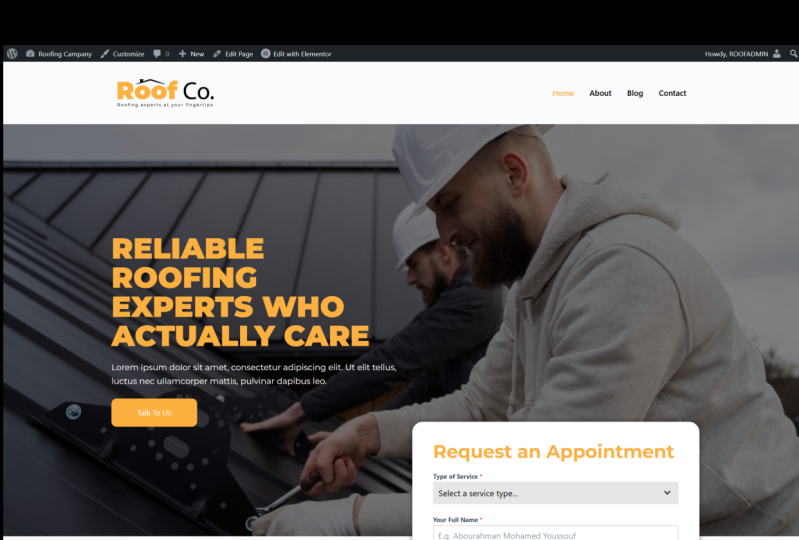
2. The Class Project: And welcome. As I've mentioned in
the introduction, this class was specifically requested by one of my students, Alex Rodriguez, shadow
to Alex Rodriguez. And he wanted us to build
a roofing company website. And he specifically
wanted it to have an appointment form or an
appointment booking wizard. And as you can see right here. So this is the hero section. We have four pages and
when we start scrolling, as you can see, the header
remains sticky at the top. He doesn't disappear with
the rest of the content. And that allows the
user to have access to the navigation bar regardless of where they are
on the website. If you look at this
appointment booking form, it has a drop-down menu, all the different
types of services that we can book an
appointment for. E.g. if you want a solar
roof, we can provide that. Then provide our name, email address, telephone number, and additional
information that we want the company to know as
we book the appointment, then we can send the message. The company we receive
the request for an appointment and
get back to me. Of course, now as we
scroll downwards, we have this nice
blue section here. We'll see how to do that. Because this is the homepage
and it's a landing page. It has Several call to
action buttons like this. Here's another one. It's always good to tell users
what you want them to do. So in this instance, we want them to talk to us. We have different services here showcased and we
can click to learn more. We have this nice
before and after image. So this is before the
roof was completed, and this is after the
roof was completed. And it just starts moving. As soon as the mouse
cursor is above the image. We'll see how to do that. Then we have this nice
little simple section. Hello homepage or a landing
page should always have a testimonial section
to add as social proof. Then we have this
emergency C-section. Then these beautiful folder
going inside the about page. We have the About Us page. It has a nice hero section,
very simple, minimalistic. We have our vision and
mission, our story. Then we have what we offer. A nice pictorial section here
with an image background. Then we have these
countdown section. If I refresh this page
because scrolling downwards, Yep, we have that nice counter and we'll see how
to do all that. Then jumping inside the blog. This is the place
where we display the latest articles that we've
published as a web site. And we'll see how
to create that. So this is a sneak preview
of what we'll be working on as we go through
all these pages, creating every single
element you've seen, you will gain the
skills you need to be able to put together
your future websites. And one more thing, I like encouraging
my students to get as creative as they can. You don't necessarily have to do it exactly as I'm doing it. You have the freedom of ideas, freedom of creativity
to come up with your own version of
the roofing website. Once you've done that, we would like to see what you've created. So take a screenshot of
your favorite web pages, the ones you've
created and share it with us right here
below this video. And get some feedback from fellow students and from myself. And let's keep the
fires burning. Let's move on to
lesson number one. I'll see you shortly.
3. Installing WordPress in cPanel: Welcome back. Now that you've bought web
hosting for your website, it's time to install
WordPress through the cPanel. Now, I'm right here on
my cPanel login page. I'll go ahead and login. I suggest you do the same. And now we're logged in. Now your cPanel might look a little bit different than mine, but these settings
and features are pretty much the same
regardless of the web host. So what we want to look for is an app installer called soft
calculus apps installer. And one of the apps
we can install through calculus is
WordPress, as you can see. So I'll go ahead and click Wordpress and will be
redirected to solve calculus. And this is where we
will install WordPress. So as you can see, we have a brief description
of WordPress. We have the option to
install WordPress now. And right below this area, we have the current
installations. So if you have several
WordPress installations, they will be listed here. As you can see, I have
one installation already. So I'll go ahead and
hit Install Now. And that will open up
the place where we can input the details
of our website. To start things off, let's choose a prefix or
protocol for our URL. I like using https,
www.ourdomain.com. So I'll select HTTPS. And you can only
have HTTPS if you have an SSL certificate
for security. So if I click outside, it will look for my
SSL certificate and it now confirm that I do
have an SSL certificate. And we're good to go. If you don't have
an SSL certificate, it will tell you you don't have a valid SSL certificate
and you cannot use HTTPS. You can use HTTP, but this is not recommended. Alright, so I want to
remove that directory. We don't want to put our website inside a folder called WP. We want it to be in the root
directory of our server. Next, let's choose our
WordPress version. I want to use the latest, so I'll select that. Let's give our website a name. So in this context, the website is called roof call, roof company and a
short description. On the planet. This
is where you input the login credentials of
your WordPress website. When you log out of WordPress. To log back in, you will need to
use these details. So let's change this from admin to something
like your username. My username, and let's
put a strong password. Just leave this e-mail intact. Now let's move on
to the next part. This is where we
can choose to have these three plugins
pre-installed, but we don't want them
pre-installed because there are better options for
these types of plugins. So lead that, and you don't
need to change anything else. The next part is just add
an email like your Gmail. This is where a
notification will be sent once your WordPress
has been installed. So I'll go ahead
and install now. Scroll upwards and do not leave this page until the progress
bar reaches 100 per cent. So let's give it a few minutes. All right, So we've
installed it successfully. Here's the URL to the website, and this is the URL
to the dashboard. So what we want to do
is click this to go to the WordPress dashboard where we can start building
our website. And here we have it. Let me just zoom out a
little bit right there. So that's how to install
WordPress through the C panel. In the next lesson, let's install a WordPress theme. I'll see you shortly.
4. Installing the Astra Theme: Welcome back. So now that we've installed
WordPress through the cPanel, it's time to install
our WordPress theme. And without wasting any time, let's go inside
appearance themes. And by default we
have the 2023 Theme installed because right now
we're in November 2022. So it's just one
month before 2023. For the longest part of 2022, we've had the 2022 theme
installed by default, but we're not using any
of these default themes. Want to use a special
thing called Astra, which in my opinion is the best WordPress theme
in the marketplace. So here we are. It's almost at the top, but if you scroll downwards, we have thousands of
themes that you can use. I'll click Install on Astra. If you can't see it, you can
do a quick search up here. And let's go ahead and activate. So click Activate. And there we have it. So thank you for
installing Astros. Let me just close
down that pop-up. And now Astra is
the active theme, and that's how to install
a WordPress theme. In the next lesson, we want to install a WordPress plugin because we'll be using a few
WordPress plugins. Let's see how to install one. And because we're
building a website with Elementor, let's
install elementor. I'll see you in the next lesson.
5. Installing a WordPress Plugin: Welcome back. With the Astra Theme installed, it's time to install Elementor. So let's go inside
plugins. Add new. But before we say add new, let's go to Installed plugins. Alright, so we have some
pre-installed plug-ins. Depending on who
your web host is. Sometimes you might find
you have pre-installed plug-ins that you
do not want to use. So in this instance, I don't want to use
any of these plugins, so I'll just deactivate
and remove them. So now that they are
all deactivated, I can select all of them
by checking that box. And then delete. In this drop-down
menu, then apply. Okay? Alright, so now
we've removed all of them. If I refresh this page. Now, we don't have plug-ins
currently available. So let's go ahead and click
add new here or right here will be redirected to the WordPress
plugin directory. This is where there
are thousands of plugins that you can
install for any purpose. That's why we're
pressed, is awesome. So I'll go ahead and search for Elementor in here. Elementor. And here we are. As you can see, it has more than 5 million
active installations. And it's created by
elements are.com. Click Install. Now. Let's go ahead and click
activate. Activate. So now we have Elementor
installed and activated. Now previously, whenever
you install elementor, you would be taken to a
setup wizard where you would configure several
settings before you can start using Elementor. I haven't seen that
setup wizard and just in case you've been
redirected to that setup wizard, I have a pre-recorded
video where I show you how to set everything
up in that setup wizard. So let me play it
for you right now, just in case you've been presented with
that setup wizard. So here we go. So I'll hit installed, right? So when I click Activate will be redirected to the
Elementor setup wizard. So let's hit Activate. And this is the
wizard right here. So let me zoom out a little bit so you can see everything. As you can see right now, we have about five steps to set up everything before we
can start using Elementor. And the first step here is
to create an account with elementor.com if you want
to enjoy these benefits, but you don't have to have an elementary accounts
to use Elementor. So I'll go ahead
and skip this part. So the second step here is to decide whether
you want to use the hello theme that's developed and maintained
by the elementary team. But you also have
the option to skip this step if you have another
thing that you want to use, I like using Astra. Astra Theme is one of the lightest and
fastest and most SEO friendly themes in
the marketplace. So I'll go ahead
and skip this part. The third step here is to
give your website a name. And by default, the name that
shows up in this field is the name you gave your website when you were
installing WordPress. So this is the name
I gave my website. I'm not going to change it, so I'll just keep
I'll just hit Escape. Then if you have a logo, you have an opportunity to
upload it at this moment, but this is something you
can always do later while you build your website so
we can go ahead and skip. And then finally, we
can go directly to edit a blank canvas and start building a web
page from scratch. Or we can browse
from hundreds of templates created by
Elementor that are within the Elementor
workspace or import our own element of
templates that we might have bought or created
ourselves previously. But I'll go ahead and skip that. And by default, when you heat, it takes you directly to a blank canvas where you can start building
your web page. So to exit from this place, click this burger menu, and Exit to Dashboard. So we're taken to the back
end of the editor for that specific blank
canvas we just left. But what we want to do is
click this to be taken to the actual dashboard where we have all the Wordpress settings. And now if you look on
the left menu here, you'll notice we have
Elementor and templates. Both of these show up after
installing Elementor. And if we click Elementor, we can play around with
all the settings here. But usually you
won't need to make any changes to the default
settings of the plugin. You will just go directly to start building your webpages. And there we go. So that's how to complete
that setup wizard, just in case you came across
a setup wizard yourself. And basically that's how to
install a WordPress plugin. Now, 99% of WordPress plugins don't have a setup
wizard with that said, that's how to install
elementor on your website. From the next lesson, Let's see how to start building a website in the frontend.
I'll see you shortly.
6. Create the Header - Install ElementsKit Plugin: Welcome back. So now that we have
elementary installed, we're ready to start
building the website. And as I mentioned
in this lesson, we'll be building the header. The header is this
area right here. It holds the logo and the
navigation bar or the nav bar. So let's see how to build. They're going back
inside the dashboard. And to build the header will
be using another plugin called elements keep light
add-ons for Elementor. So let's go inside
Plugins, Add New. Let's search for Elementor. And of course,
Elementor is active, but you will notice that we have several other plug-ins here
that bear the name Elementor. And these are third-party
plug-ins developed by independent developers
to add on to Elementor. Elementor, the free version
of Elementor has limitations. And so these third-party
developers decided, hey, let's increase or boost the
power of the free version of Elementor by providing
free add-on to elementor. And I'll show you how that works when we are
building the website. And so one of those Add-ons is elements
hit Elementor adults. So let's install. Now. While it's installing,
Let's scroll downwards. And you will notice we have several of them
elemental costume, skin, sticky header
effects for Elementor. This is another plugin
we will need and I will show you which
role it will play. You have several
options to build any type of website you
want with the free version of Elementor because of all these extra add-ons that are provided
to you for free. So now that elements kit is
installed, let's activate. So I'll click Activate. And now it's been installed. But to use it, if I
click elements get, it will redirect us to a setup wizard so we can
finish preparing everything. So as you can see, we have
a few steps to go through. Now, these are the
configurations we can choose for the different features
that we want activated. Now that e.g. it's the basic configuration
that is selected here. Some settings here are
automatically off. We have to manually
switch them on. But if we click Advanced, watch some of these
settings change. So if we click Advanced, as you can see, we did
builder has been switched on. And that is the same case with some of these
settings here. Some of them were off
when it was basic. But now that we've
selected advanced, they are automatically own. And that means when we need to use the plugin in the front end, they will be
automatically available. So let's click the next step. Next step, next, next, next, and then save changes. And there we have it. So elements kid
is now installed, activated and ready to be
used to build the header. So in the next lesson, Let's get started with the
head. I'll see you shortly.
7. Create the Header - The Logo: Welcome back. So now that we have
elements Kit installed, we're ready to start
building the header. First of all, let me get rid of all these advertisements.
You don't need them. And then you will notice on the elements keep we
have header footer. So click Header Footer. And because we don't have any
header or footer created, we don't have
anything listed here. So I'll click Add New, and this pop-up will come up. Let's keep our header, a name, our header across, give it an appropriate name. And the type is header. When we were
building the footer, we'll give it the footer type and we want it to be
visible on the entire site. Let's switch this
On to make sure it's active and visible
on the website. And then let's save changes. Alright, so now as you can see, we've started building a list of different headers
and footers, and you can build as
many as you want. With this created,
let's click Edit. The pop-up will appear again. And now this time
let's click edit content will be taken to the front-end where
we can start visually building it with the
Elementor tools. And here we are. Now, as you can see, let me just switch
back to this place. You will notice the
header section is divided into two columns, logo column and the
nav bar column. So let's go ahead
and add our logo. So going back to our website, clicking this will open up the different structures
we can start with quickly. And we want a double column. This will hold the logo, and this will hold the Napa. And we can resize
it accordingly. So let's pull that
towards the left. So the next thing
we want to do is click this plus sign here, and that will reveal the different elements that
are available for us to drag into the page and use
them to build their webpage. So let me first collapsed
these panels here. So we can have a quick look at the different panels we have because we
installed elements. Keeps. Notice right now,
it's listed here. Before we installed it, it wasn't listed here. We only had the
default WooCommerce and WordPress and
Elementor panels. But every time we install an add-on that was created
specifically for Elementor, it will be listed here and we have access to those
different elements. Remember when we select it
advanced instead of basic, while we were setting
up elements kit, We were activating these
elements to make them available to us right now while we're
building the website. So let me collapse that because we're not using
any of those for now. Who want to go inside
the basic panel. And of course, as I mentioned, this is an elemental panel. The free version, if I collapse that we also have
the pro version, we can't have access
to these elements. We can't drag them
if you try to. This pop-up appears
prompting you to upgrade. So let me collapse that, expand the basic tab. And now we can drag our
image inside there. And the momentary
drop it because it is the active elements
right now on the page. The settings here
have automatically changed the settings of the image and you can tell
by this text up here. So if I want to reveal
those elements again, I can click this
icon right here. It will reveal those
elements again. And if I drag e.g. this heading, so these are the columns to
this other column. Notice the settings
have changed to edit heading because it's the
element of just dropped. So that means it's the element
that is currently active. If I select the image, the settings have
changed to edit image. If I select the section, settings have changed
to edit section and these are settings
for this section. So let me delete this. We don't need that heading too, because that's where
we will have in Napa. And selecting the image, this tinges to edit image. And if I select that, we can go ahead and
upload our logo. So I'll go to upload
files, select files. And I want to go inside this
folder that I had prepared. You will find it in
the description below. You can download
all these assets, roofing website, acids. Here's the logo. And within that folder
you will also find all the images will be
using for the website. So we also have
this ReadMe texts. If I open it, it has the
colors that I've used just in case you want to use this specific colors I've used. Let me close that. So if I double-click that logo, we know it's uploaded. Click Insert media,
and there we go. So now our logo has been
uploaded and it's ready. I'll click Update. And we can preview the
changes. There we go. That's how to add the logo to your website with elements kids. In the next lesson, I want to show you how
to add the nav bar. So let's see how to
do that shortly.
8. Create the Header - The Nav Menu: Welcome back. So now it's time to
build the navbar. So the next thing
we need to do is click this plus sign here. And that will reveal the
elements once again. And in here, Let's go ahead
and type nav and a V. And that will reveal the
different nav elements. As you can see,
we have nav menu, which has a small
lock icon up here. This is available
with Elementor Pro. But because we don't
have Elementor Pro, we're using the free
version of Elementor. We can use the
elements hit nav menu, which is also as powerful as the one that's available
with Elementor Pro. So first of all, before we select that, let me close that. Collapsed the basic panel
and expand the Pro panel. As you can see, this is where the nav menu is
under the Pro panel. So we can't use it. Collapsing that and expanding elements kids header footer. As you can see, we
have the elements kidnap menu down here. But of course to get too
specific elements quickly, you can just quickly
type them nav. So that's how we got here. Dragging this in there. Now we've dropped the napa. Let me first click Update. Of course, because the NAV is the active element
at the moment, this says Edit elements
keep Nav Menu. And one of the menu items
here is a drop-down menu. And this is supposed
to be a list of different menus that we've created in the WordPress
backend with menu items. And when I say menu items, I mean like home
about Blog contact. So as mentioned this,
this drop-down menu is supposed to have a menu or several menus
that have menu items. And we can select
it to display it. So we need to go back to the
backend of WordPress and create a menu that has the different menu items
we want to display. So now that the page is saved, I want to click this burger
menu and click Exit. And if it's your first
time clicking that, you'll be given these options. Where do you want to exit too? I want to exit to the WP
dashboard and apply that. Before we leave, I
need to click Update. Now, let's exit. Alright, so now let's go
inside appearance menus. And now we can create our menu. As mentioned, this is a menu. That's what we're
creating in here. Create your first menu below. So let's give it a name. My menu. That's alright. Let's click Create menu. And I forgot to say it's
supposed to be the primary menu. Create menu. And after
saving their menu, this area becomes active. So now notice these
texts that says Add menu items from the
column on the left, this column right here. So what we need to do is create menu items and they
will be displayed here. And the menu items we want
to display our pages. The menu items can also be
blog post or WordPress posts. They can be custom links. They can be categories
you've created, but we want to create
web pages as menu items. So to add menu items to
these pages list here, we need to create web pages. Let's go inside pages. And by default we have these two menu items that come with every new
installation of WordPress. I'll select the two
of them and then move to trash. Apply. No pages found. So I want
to create a new page. Let's give it a name. About this is our about page. Don't worry about
all these settings. We will configure them while working on the individual pages. Right now what we want to do is publish because
we're just creating menu items that's published. Let's go back. Now
it's listed here. Let's add another one. Blog, publish. Let's go back in here. Add another one for contact. The contact page. Go back in here. And finally, let's tap. And finally let's
add a homepage. So home published that. Let's go back in here. Now, if we go back
inside appearance menus, notice that we now
have menu items that we can add to our main menu. So if I select all of them
and add to menu gear, they are, we can drag
to rearrange them. I want to drop that one there and contact should be the last. And then click save menu. Now our menu has been updated. Now going back inside
elements, heat, Header, Footer, click,
Edit, edit content. Remember we had dropped the elements kids Nav
Menu elements right here. So now if we click
this drop-down menu, my menu will appear, the menu we just created. And there we go. It's displaying the different menu items
we created as pages. Now, we want to push
these items to the right. So I'll click horizontal
menu position. Right. There we go. Then click Update. Let's preview the
changes. And there we go. That's our header. And basically that's
how to create a header. Of course, this is
a work in progress. We've not finished
editing the header. We will refine it once
we add the heterosexual. So in the next lesson, Let's see how to create the hero section.
I'll see you shortly.
9. Create the Hero Section - Page Setup: Welcome back. So now it's time to
create the hero section. So switching back
to our reference, this is a hero section and it
holds the background image, the H1 and the call to action. So let's see how to
build that going back inside our editor. Now, this is the part where
we were editing our header. This is not the same place. We will edit our hero section. If I could switch
here very quickly. We created this header using the elements keeps
light plug-in. We had to go inside
elements kit header folder and create the header. And we'll do that
for the footer. But now to create
these hero section, we're not going to
use the elements. He'd had a folder plugin, will just use Elementor. So going back in here, we cannot still continue
editing these from here. So what we need to do is exit
and then go inside pages. And of course, because
this is our homepage, we're going to
edit the homepage. That's where we'll
build our hero section. So I'll click Edit. Now, remember I mentioned we will talk about these
configurations here. So that's the time. So this is the time to do that. In the previous
version of elemental, this template setting
looked different. So if you were using Elementor and haven't seen
this new version, this is how it looks. So I'll click this
default template and switch it to
Elementor full width. Because we want the hero
section to run from the edge of the screen to the
other edge of the screen. And now with
Elementor full width selected. Let's close that. The next thing we
want to do is go inside the astro saving. These are the
Wordpress settings. Let's go inside Astro. Want to select full width
stretched under content layout, we have boxed content, box, full width contained,
and full-width stressed. We want full weight stretched. Then for the sidebar, we don't want the website or the webpage to have a sidebar. So we have right-side bar, left sidebar, and no sidebar. I'll select no sidebar. Then for these elements, Let's disable the header and footer.com by default
with the Astra Theme. Because we're building our own, remember we've built
our own header, will also build
our own food or so where disabling needs
to update that. Now it's updated. The next thing we need to do is click edit with Elementor, and that will redirect us to the front end where
we can build up page.
10. Create the Hero Section - The Background Image: And now that we're in here, notice we can't edit
the header because this is not the area where
we can edit the header. We need to go inside the elements heat header
area to edit the header. So of course, the
first thing we need to do is select a structure. We need a double column
structure like that. Then for this image
in the background, we're adding it as the
background of this section. So I'll click this section. This will change
to edit section. And before we move on, I've just remembered
a very handy tool that I forgot to activate. So when you hover over
this or over the columns, were supposed to notice
a few more options pop up from this corner
as shortcuts. To get that, Let's click that burger menu,
user preferences. Editing handles. Let's activate that. And now when we hover
over this area, this is what I was
talking about. Alright, so clicking
that section, Let's go inside style,
background, background type. Select that. We have the option
to give it a color, but we're not giving it a color. So this is just an example
to undo. Let's click that. We want to give it an image. So I'll click inside this image. Now, let's go ahead and
upload that background image. So inside the roofing
website assets folder, Let's look for that image. I think this was it. Open. There we go. Insert media. Now you notice we can't see it. And that's because
they don't have any content inside the section. The height of the section is determined by the
content inside. And let me show you what I mean. So click this Plus. Let's place our
heading in there. Let's also add some texts. Text editor. As you can see, the height of the section is now increasing
as we add more elements. Let's also add a button. Drop it when you
see that blue line. Alright, so as you can see, the height is increasing. But what we can increase with the settings of the section
is the margin at the top, bottom, and the sides. So if you go inside advanced while we're editing
this section, and also the padding. So let's increase the padding. The padding is the space
between the edge of the section and the content
inside the section. So let's delinked these values so we can edit each
bag you individually. If we make the top
padding or 100. As you can see, the space
between them aged and the content at the
top has increased. Let's also do that
at the bottom. 100. So now we have 100 data. But let's make it 200, 200. And for the top
200 update there, Let's preview the changes. So there we go. But we
want it to look like this. So how do we do that? So going back in here, first of all, let's change
the position of this image. Still selecting
the section again, go inside style for the
position. Let's give it. Let's try center,
center, and there we go. So that's where it's supposed
to be. For the size. Let's choose cover, and
let's see how it looks. So let's say that update. Now the image is covering
the entire Here section. So if we go back in here and choose Default and update that, let me show you how it looks. Let's preview the changes. In. Now this is the problem we have. Leave some whitespace, so
make sure we have this set to cover so it can cover the
entire background. Update that. Once again, let's preview the
changes. And there we go. So that's how to prepare the hero sections
background image. In the next lesson, let's continue working on the textblock and
everything else. So I'll see you shortly.
11. Create the Hero Section - The Text Block: I'll just grab this, copy, this. Go in here, select
this contents. I'll paste it in here.
But of course now you need to type your own texting. They're reliable
roofing experts. Then let's go inside style and change the color
to maybe that yellow. Update them. So let me switch this file here and
grab this yellow color. And in here, I'll
paste the yellow in there and update the page. There we go. But
now you will notice that this heading doesn't
look like what we have here. This seems to have a gradient. So how do we achieve that with another plugin that is an
extension of Elementor. So let's go back in here. And I don't want to
leave this page. So let me just switch to a new tab and go
to the dashboard. Let's go to Plugins, Add New. And the plugin is called pi out net add-ons for elementary. Next, buyout, net
add-ons for Elementor. It's an extension of elemental, just like elements keeps light. Let's activate it.
They've settings. Now, as you can see, it also has many elements, just like elements, kids. So if we go back in here
and refresh it's Control R, and select this text. If we go inside. First of all, you will
notice now we have these PAF net add-ons
for Elementor. It means now it's available. And if we select this and
collapse all these panels, as you can see here it is. So selecting these texts, Let's go inside style. And you will notice we have
parfait gradient text. So we can activate that. And now we can select the
two colors we want to use as our default colors. So let me switch here and pick this as one of the
colors, this yellow. Let me put it there. For this. Let's make it that color. As you can see now we're
starting to get these effects. The only thing we need to
do is change this text. And to do that, let's go
inside Tidal typography. Let's change the font family
to monitoring mom Sarah. And let's increase the weight
to something like 900. There we go. Let's also
increase the size. Reliable roofing
experts update that. Let's change the color of
this text by selecting it. That changes to edit
text, editor style, color, white. Update that. Let's preview the changes. There we go. So it's now
already starting to take shape. The only thing we need to
do in work on the button. But before that, let's see how to change this font family. Going back in here, while
this is still selected, let's go inside type of style,
typography, Montserrat. Montserrat. Update that. So
there we have it. And to change the
color of the button, first of all, select the button. These changes to edit button. We can change what the
button says to us. And we can change the URL. So when they click this button, they should be redirected to
the page we specify here. So e.g. www.google.com. So first of all,
let's update that. And let's preview the changes. Alright, so when we
hover over these, as you can see down here, the URL is google.com. And when we click that, goes to google.com,
let's go back. If you want it to
open in a new tab, you can click this cogwheel here and then open a new window. This will open the
page in a new tab. So preview that if
we click talk to us, it will open up in a new tab
and our pages built into. Now, let's go while the
button is still selected, let's go inside style. As you can see, this
is the color button collapsing that reveals that we only have two options here. For the color background type. We can change that to. We can change that
to this yellow. Let me copy that yellow. Click anywhere in this area
to get rid of this pop-up. There we go. And on hover, we want it to be white. So in its normal
state, it's yellow. On hover color. We want it to be white. So let me click here. On hover, it's white. But while still under over, the text should change to black. Just like that. Alright, so let's also change
the border radius to ten. And that makes it a little
bit rounder on the corners. We should also
increase the size of the button by
increasing the padding. Padding, Let's collapse that, that will collapse the button. But now for the left, Let's give it 50 for the ride, 50 for the top. Let's give it maybe
20, bottom 20. So that makes the button
much bigger, r Theta. And let's preview the changes. So there we go. On
hover, it changes to y. And if we click it, it opens
up the URL and providers. So that's how to create
the hero section. In the next lesson, Let's see how to create
these requests and appointment wizard.
I'll see you shortly.
12. Make the Header Sticky: Welcome back. So now it's
time to start working on that book, an
appointment wizard. So switching back
to our reference, this request, an
appointment wizard. But before we do that, I've just remembered there's one important thing
we forgot to do. So notice when he
starts crawling, as I had mentioned, the header stays at the top. That's what we call
a sticky header. It allows the user to have
access to the menu no matter what part of the website
or webpage they're at. So that's very important
for user experience, UI UX. So let's see how
to make the header sticky and also add these hover effects because I think we forgot to do that. Yeah, we did. So clicking this
burger menu exit. Let's go back inside
elements kit header footer. Let's click edit with Elementor to go directly to
edit it in the front end. And there we have it. So now first of all,
let's go ahead and click this Nav Menu and
go inside style. I want to collapse the menu wrapper and open
up a menu item style. And now you'll notice
under typography we have normal state hover and active. In its normal state, it's supposed to be black, but on hover, it's gray and
we want it to be yellow. So let me switch back to this. Copy that yellow color. Select items like Scholar, paste that in there. Now when we hover
over it, it's yellow. That ensures consistency
in the brand colors. And when it's active, we also
want it to be that yellow. So I'll paste that in
there. Update that. Let's review the
changes. There we go. Another thing wants to
do is make our logo a link to the homepage so that when someone
clicks the logo, they are taken back
to the homepage. So let me just grab
my homepage link. Copy that. Select
the image itself. And right here under Content
link, select custom URL. And I'll paste my homepage link there because that's my URL. So if I could just drag this
browser downwards like this. My homepage link is
www.mydomain.com. So make sure it's
your domain.com. Let me just drag this
upwards again, like that. So now that we
have it like that, let's update that.
Preview the changes. Now when you hover over
the image, as you can see, it's changing to a hand icon to show that you can click them. So right now when we click
this link will not be taken to the homepage that we
selected to be our homepage. We'll be taken to
the default homepage set by WordPress because we've not set a specific homepage to be the homepage it and
let me show you what I mean. So if I click that were taken to the default
HelloWorld homepage, but we want to be taken
to this homepage. Let me click this home. We want to be taken here. So how do we set the homepage? Going back inside our dashboard? Let me just go here. Dashboard settings, reading the homepage displays. So what we want to do is select a static page and then
homepage, select home. That's our page. This is a list of all
the pages we have. Then save changes. Now if we go to the front end and let's say we're
inside the About page. If we click, the logo, will be taken out. The homepage you selected
because they URL points there. But as you can see, our header is still not sticky. So how do we make it sticky? Just like on our
reference page here. Now, to make the head of sticky, we will need to use that plugin I showed you
a little bit earlier, which is also an extension
of Elementor and it's called sticky header
effects for Elementor. So going inside our dashboard and we just click dashboard. Let's go to Plugins. Add New and type sticky header. This is it sticky header effects
for Elementor installed. Now, let's activate it. Alright, and now it's installed. Right? Now going back where we
were editing the header. If I hit Control R
to refresh the page, or just right-click and reload. Now, if we select
the header and go inside or advanced,
as you can see, sticky header effects for
Elementor is showing up, so now expanded and
then let's enable it. Now of course it will reveal
several settings here, but the only setting
we need is to change the header background
once we start scrolling. So before we do that, let me show you what I mean. Let's update that before we
enable this background color. Now that it's enabled, let me just switch
to the front end. If we start scrolling. We don't yet have enough
content to scroll to down there for me to show
you what I want to show you. So first of all, let me quickly edit this page to add some
extra content below it. So let me just add
a section here. Let me give it a very huge
margin at the top, like 200. Let me add maybe
some texts there. Update that. You can actually already see
what I want to show you. So let's preview that page. Now. If we scroll, as you can see, the header is now sticky, but it doesn't
have a background. And that's what we want to
sort out because you can't see the logo while the
background is transparent. So what we want to do
is go back to where we're editing the
header that's here. And while we're still under advanced sticky header
effects goes to background-color
enabled that choose what color to change the
background to after scrolling. And we want it to be white. So update that. Let's preview that. Now. If it goes to the
homepage and scroll, as you can see,
the background is white and everything on
the header is visible. So basically that's how to
make the header sticking. In the next lesson, Let's see how to
create their book. An appointment with,
I'll see you shortly.
13. Create the Appointment Wizard - Install Forminator: Hi there, Welcome back. So now it's time to
create the request, an appointment with
this result right here. And to do that, we
will need to install a form plugin called terminator. Now there are several
other form plug-ins out there in the marketplace. But I just love for Me
neither because most of the awesome features
that it offers for free or premium or paid for with other foreign plug-ins
without wasting any time. Let's go inside the dashboard. I just want to go to roof COE. Dashboard. Plugins, add new. Let's search for forming it. And there we go.
It's by WP MU dev. It has more than 300,000 installations and
as you can see, it has more than 1,000
five-star rating. Install. Now, let's go ahead
and activate. And there we have it. Taken out this menu
right here on the left. For many they should
be towards the bottom. So here we are. So if I just click for me, neither will be redirected
to this part where you have a summary of all your
form submissions, quiz of missions and all that.
14. Create the Appointment Wizard - Create a Form: And we also have
these shortcuts to create a form or create a poll. But what we're interested in
for now is creating a form. So I'll create, we have different pre-made forms that we can quickly start with. But because ours is custom, Let's click Blank and continue.
Let's give it a name. Appointments. Let's create. And now here we can start inserting the different fields we
want to have on our form. These are the different fields. So let's start with service. What service do we need? What service does
the customer need? So of course, now that's
a drop-down menu. Going back in here. Let's insert field. And the drop-down menu option is called select, as
you can see here. I'll choose that
insert fields and it will bring up the settings for that specific type
of form field. Of course it's not
called a latch. We'll we'll call it service. Type of service. That's the placeholder, that's the label or the form field, like this service up here
to label these Brownfield. It's also go here and
prepare the options. So roof repairs, That's the first option
in the drop-down menu. Roof replacement. And I think for now,
let's go with that. But of course now you will input that specific services you have. Then if you want to make
this field required, we can go inside settings. For now, it's optional, but we can set it as
required and then set the message that the people will see if they don't feel it. So type of survey is required
with an exclamation mark. Alright, let's go
back to labels. Let's add a placeholder. The service time. Now we can click Apply. Now if we preview it, it has that drop-down
menu type of service. Select a service type, and then the list of
options we've prepared. Alright, let's close that. And then let's
publish this form. Now that we published it, this pop-up will appear
with a short code. And this is the short
code we will paste on our page to display the form. So let's copy that. We've got bidding successfully. And just in case
you had close this, you can always get the
short code from here by going while still
editing the form. Request appointments, click this cogwheel,
copy short code. Short code copied
success for me. Now, if I right-click
this open link in new tab and then go
to that new tab. So we can open the page and then click Edit
with Elementor. So we can start editing
the page with Elementor. If I scroll downwards, first of all, first of all, let me get rid of this. I can add a new double
column section. And in this part,
click this Plus. And then right here type
short code or just short. It will show short code. Drag this short code
and drop it in there. And while it's still active, this reads as edit trod code. Now we can paste the short
code in here that we just copied from formulator.
There we go. This short code pasted in there. And as you can see now, it's displayed in the front end. All we need to do right now
is create these other fields. And we will have our form
and then style our form. Going back in here.
Let's update that. Let's preview the changes. So scrolling downwards,
there it is. Don't worry. Shortly you
will be looking like this.
15. Create the Appointment Wizard - Add all the Form Fields: And welcome back. So now that we've displayed
our form in the frontend, it's time to add the rest
of the fields of the form. So going back inside
our dashboard, let's click Insert field, and now we can select
a couple of them. So what we need is
the name of the user, their email address,
phone, text area. I think that's enough. So Insert Field, and
there we have it. Even before we make any
customization, Let's preview it. And there we go. So that's
how it should look. They'll they'll select the
type of service they need. They'll provide their
name, e-mail address, their phone number so we
can reach out to them and any additional information they would like us to have in mind. And then once they request an appointment with
all these details, we can get back to them on phone or email and schedule
the appointment. So with that in mind, let's close that and then update that will
commit these changes. Alright, so now it's saved. Let's preview the changes
in the front-end. If I refresh this page and
then preview the changes. Yeah, so there we have it. So the next thing we
want to do is update the appearance of the form that is coherent or consistent with the branding of the
website, the brand colors. Right now, when we hover
over it, it's blue, and those are the default colors that come with forming later. We also need to change some of these details here
because you might want to use your
own country code for the phone number
and all that. So let's go back inside
here in the dashboard. Let's click the name. So we can change
this to your name, and then this can be Alex Cross. We can also make it
a required field. Name is required. And then let's apply that. Let's preview that for now. This is a required field. This is also a required field, but these are not
required and you can tell by this asterisk. So now if we say Send message, you will notice we're getting these customized
messages that we typed. Name is required, type
of services required. But these do not
flag any issues. So to make it consistent, let's change that
to an apostrophe. The e-mail address
is also required. Legs at company.com. It's also make it required. Your email is required. Telephone number
can be optional. Apply that. And then for the text area. First of all, let's change. It's labeled two
additional information. And for the placeholder, meet you. Alright, so let's preview that. As you can see,
additional information, what else would you
like us to keep in mind as we prepare to meet you? Telephone number. All these details are
customized by us. Alright, so let's update that. And now the changes
have been saved. So going back to the front-end on the page where
we're editing it. Selecting anywhere inside
the short code element. We can refresh the
page or just click apply to apply those changes
we've made in the backend. Now it's updated. Let's preview the changes. Alright, and there we have it. So basically that's how to add all the fields for
the appointment form. In the next lesson, Let's see how to
customize its appearance, its colors, so that it's coherent with the
rest of the website. So I'll see you shortly.
16. Create the Appointment Wizard - The Form’s Apppearnace: Welcome back. So as you can see, when I hover over these fields, they are blue in color. And that's not what we
want because that's not consistent with
our brand colors. So going back inside here, what we wanna do is while we're still editing the request
appointment form, go to the Appearance field. And if I could go
back to the fields, field, if we go down here, we also have this
button here that will take us to the next place, which is this part. So if I click appearance, you notice now we have
this part highlighted. If I scroll down
towards the bottom, you'll notice we have behavior here and here we
also have behavior. So basically, we're
going through these steps to complete
setting up our form. Now that we're
inside appearance, we first of all want to change. This is a preview of our form. This is a preview of how
the form will appear. So if I select flags that gets rid of
the borders on the field, if I select Bold, that makes this line bold. Default is quite pain. Bold. This is the one I like. In fact, then we also
have material and none. So I'll go with bold. We can select the one you want. Now. That's for
the design style. Right here. We also have the
option to change the colors. So right now we're using the default colors
that come with, for me neither, but I
want to select costume. And that will reveal more
settings here that we can play around with to make the formula exactly
how we want it to. So let's start with
a submit button. So right now before
we change anything, the submit button is blue in color and hover color
here is also that blue. So let's close that. Oh wait, if we preview this, notice our form is now bold. It has bold border colors. So let's go to the
submit button. Expand that. And the background
color is blue. So if I could switch here
and pick this yellow color, click this to reveal this part, double-click that and
paste it in there. If we preview it. Now, yellow in color, but on hover it's blue. So I want to change that. This is default over wanting
to be maybe that color. So now if we preview
that on hover, eats a dark color, or better yet, let's use the actual colors
that we wanted to use. So I'll make it that very dark blue that looks
like black. Update that. We don't really need to change the focus color but
for consistency. Alright, so now
let's preview there. Awesome. So I like how it looks. Let's close that and update because you have
unpublished changes. Now it's saved. Alright, so the next thing
we want to do is work on that hover color
of the fields. So closing that, remember
this drop-down menu, this field, the type of
this field is select field. Going back inside fields. Remember we went to
insert failed and the drop-down menu was
a select type of input. So going back in here,
appearance, costume. We have the select
type of input here. And the default border
color is this dark gray. So if I open that dark gray in the default state
on hover, it's blue. So what I want is
to make it lighter. So click that and then let's
make it this light gray. Preview that. Now as you can see, the gray is lighter than this other gray. I still want I'll
still I still want to make it lighter than
it is right now. So let me push that our
board preview that, and I liked that level of grade. Alright, so now on hover. Let's change the border
color to that yellow. Paste it in there. And let's preview that. On whoever eats that yellow. On focus, we also want
it to be that yellow. But you can make it
any color you want. Remember that? Then for the icon color, we want to make it
that yellow as well. But you can make it let's make
it that dark black color. Yep. Like that. On hover. It needs to be this
dark color. Even. And also on default, this is the icon we
were talking about. On however, it's still black. Wanna keep that same column. Alright, so what else? Texts color, text
color looks okay. Now let's work on this
drop-down menu color. So we're done with
select drop-down list. Container needs to
be container border. Let's make it this dark. Slightly darker gray. Yeah, that's slightly
darker gray. And I think everything else
should remain the way it is. So let's close that. First of all, let me update
that so we can save changes. That's saved. Next, let's work on the
rest of the fields. So I first of all want
to copy this light gray all through to the
rest of the fields. Let's go back in here. Inside select. It was triple C, E. Instead of copying that. Let's go to Input and text area. Those other types of
fields are inputs. And this is the text area. These three are inputs. So default border color
should be triple C E, C B, C E C, D. Let me copy that. No need to copy it. Now they all have that color, but now we want to make
them yellow on hover. So I'll copy that yellow clothes
that on hover. On focus. We also want it to be that
yellow for the error. Let's leave it at
the default color because error messages are
just typically red in color. So let's preview that. Now. Here we go. So on focus. Its golden in color,
yellow in color, so that it stands
out and the user is able to see where
they are typing. So once we have that updated, Let's go to the front-end. Let's select the
form anywhere within the short code that
reveals these applied. Now let's preview the changes. Right scrolling downwards.
As you can see, the forms appearance is
now updated as desired. Now, that's how to create and customize the form
using formulator. In the next lesson,
Let's see how to change the layout and push it upwards so that it appears in the stylistic manner
on the hero section. And at the same time
we will be working on this roofing
redefined section. So now we're officially
editing the body section. I'll see you shortly.
17. Create the Body Section - Roofing Redefined: Hey, welcome back. So now that we're done
with the appointment form, it's time to start
populating the body section and we'll start with this area here, with
this text block. We want to make
something like this. So what I wanna do is
actually just grab this. Let's go inside here. This is where we're
editing the landing page. And in here, of course this
is a double column section. So we have this column. If I go in here, I can just grab a heading. And now because it's the
active element here, this says edit heading, and I can go ahead and select, Delete, then paste
that in there. I also want to go back in
here and grab this text. Now, I'm copying this tax, but of course you
will need to use your own customized text. This was just text
I came up with as I was creating the
reference website. Alright, so go back in
here and I want to click this icon up here to bring
in a text editor element. Drop it when that
blue line appears, and then click inside here
and paste that text in there. Or now, for your case, you will type whatever you
want to type in there. Now, let's update that. And before we move on, you will notice that we were
changing the font family of each text or typography elements up
here in the hero section. And we don't want to keep changing the topography
individually. For every single element, we can just set a
global font that every new texts will adopt
every time we add new texts. So we do that by going
inside this burger menu, site settings, global font. So let's make the primary font or the heading
fonts, Montserrat. And now you'll notice this
has changed to Montserrat. Click anywhere in
here to get rid of that secondary monitor AX. Click anywhere in there. For the texts, That's the
body texts like this one, we also want it
to be Montserrat. This has changed a Montserrat
and for the accent as well. Update that. We can also predetermine
the font weight we want for our headings. So I wanted to add 800. 800 is okay. Update that. So now every time we add any type of text
on the web pages, it will be more
interact by default. So if I close that, go back. Let me just close that. So now if I drag a heading in here, it's Montserrat by default. That's what we wanted. So now we don't
need to keep going back to the settings to change. What phone to tease. With that done,
let's first of all increase the padding at
the top of the text, the spacing between the text and the edge of this
column at the top. So I'll select the
column advanced padding. Let's push it downwards. We're just increasing
the spacing above it. Let's reduce it a
little bit up to 90. Let's also increased
the left padding. Maybe after that point. Alright, like that. Now to push this
upwards will actually be pushing the column upwards. So let's select this
column advanced. Let's break the
margin and then top. Let's push it upwards like that. Up to this part we want. So let's go up to maybe
20, two-thirds like that. And then while we're still here, let's go to style. While this column
is still selected, style, background, I want
to make it white in color. There we go. We also want
to go back inside advanced. And let's give it a
padding of 20 all around. Let's say 30 or 40. Push everything
inside like that. And then let's give
it a border radius. Border radius of 20. That gives it this
rounded corner all round. And then let's update the page. Preview the changes. And there we go. So that's how it looks. Let's do something about this. Or does it look here? Has these colors. So going back in here,
select that style. Let me go and grab
this dark color. Be that while this is still
selected style text color, paste that in there. And let's go to typography,
increase the size. I think I want it to be 900, like that. Alright, update that. Let's preview the
changes just like that. So there we go. So that's how to create the
roofing redefined section. I think I like how it looks. The next thing we want to do is create these wide
chooses section. So let's see how to do
that in the next lesson. See you soon.
18. Create the Body Section - Why Choose Us: Welcome back. So now it's time to create the y chooses section. This section. So let's go back
inside our editor. And let's add a new section. And of course, it's a
single column section. Yes, it's a single
column section. So single column. And now of course, notice
that the background is this dark black, is this dark navy. So I'll just grab that. Copy. Select this section, go inside style, background type, color. Now, paste that in there. Now it's that land. Remember, the height
of a section is determined by the content
inside a section. So let's add some content. And you will notice that we
have this intersection here that's white in color
and it has two columns. So let's see how to add
an intersection first. So going back in here, I'll click Plus and then
we have intersection. So I'll drop it in there. By default it has two columns. And that's exactly
what we need because there is this textblock
and there's the image. But before we work on that part, Let's also grab that. Why chooses to move faster? We can just duplicate
this heading. So I'll hover over there and then click these two duplicate. And then I'll drag this and drop it above the intersection. Because it's the same
color as the background. You can see it. So I'll select it. While it's still selected, as you can see,
it's edit heading. Let me grab that yellow color. Bobby that Let's go inside
style. Paste it in there. Let's go back inside
contents and let's align it to the center meal. So grab this text. Probably that can
also duplicate that, duplicate that text body. And then double-click that, paste that in there. Go inside style, change that to white and align
it to the center. Now of course, we need to increase the padding at
the top of the text. The spacing between the edge of the section and the content
inside of it at the top. So I'll select the section
advanced padding top. Let's push things
downwards a little bit. And at the bottom as well, below the inner section, we need to have some padding. So let's also do that.
I'll give you the 50. We're still under the section. Now, let's go ahead and
select the intersection. Change, go to style, background. Change the color to white. Just like that. I've just remembered that we
did not set this as an H1. It's supposed to be an H1. Every landing page should have one H1 and not two or
three. Just one H1. And H1 is a statement or
sentence that tells the user, in a nutshell what that
page is all about. It's the unique
selling proposition of that page or
of your business. And I go into detail about
that in my SEO class, which you can check out by visiting my profile
here on Skillshare. Alright, so now that's an H1. We can have as many H2, H3, H4, H5 as we want. This is an H2 as well. And that's okay. Alright, so the next thing we want to
do is add this inner text. So we care about your needs. Copy that. Let's
duplicate this as well. Drag it and drop it
inside that column. Let's duplicate that. Drag and drop it below that. So I'll select this. And because I had
copied the text, you care about your needs, but we need to make
it slightly smaller. So go insights tile. And then for these texts, grabbed P that select that. Paste it. Alright, let me just add an image in here
so I'll click that image. Image. Is this. Alright? So while the image is actually
we have these settings. Let me upload it. Here it is, open. Insert media, and there we go. So we can make it smaller. We can also duplicate
the button. Drag it while the
left mouse button is still under pressure from your fingers scroll downwards
using using the wheel. Drive them button right there. And now here we
have an icon list. So let's go back in here. Click that icon list. Drag and drop the icon
list right there. The margin right here below
the text is too much, so I'll select the text. Advanced margin. Reduce the margin at the bottom. Let me copy that. Select this. And then let's
expand list item number one. I'll double-click that,
paste it in there. Go back in here, grab
this copy that collapse, that, expand that double-click,
paste it in there. And finally, copy that. Elapsed that, expand that double-click in there, paste it. Now. Of course now we need to change the icons,
we can change them. I also want to increase
the space between these two so I can
select the button, advanced, margin, top,
push it down a bit. And then on hover, I've noticed it's white. I want it to be that dark blue. So first of all,
let me select that. Go inside style. Copy that from the section. Select the button. On hover. It needs to be black color and the text needs to be white. Or we can make it that yellow. So let me just be that
yellow like that. Let's go back in here
and change these colors. Under the icon list item. Let's go to icon color. Let's make it that yellow. And on hover. Let's make it this dark blue. Just like that. Update. Let's
review the changes. So scrolling downwards. There we go. So now we need
to increase the padding all around the inner side of
this double column section. So I'll go back in here, select the double column
section, advanced padding. And because this is linked, we can give it maybe 30. And then go inside style border. Let's give it a try. I need to give it that
rounded corner effect. Let's also select the image
style, border-radius. Let's reduce the size like
that so that it's balanced. Update. And let's
preview the changes. There we go. So now I've just noticed we pushed this
one inside from the left. We shouldn't have done that. So let's go back in here. Select this and then left zero. Update that. Review the changes. Scroll downwards. So now it's properly aligned to the text on the pure section. Of course, you should take
your time to refine what we've been able
to create so far. This is just a guidance, but I would expect that
you will take time to make sure everything looks awesome
once you gain the skills. So basically that's how
to create that section. In the next lesson,
Let's see how to create this other part. As we progress. I'll see you shortly.
19. Create the Body Section - Skilled Technicians: Welcome back. Now, let's move on to create the skilled technicians section. So this is what we're creating. Without wasting any time, let's jump in here. So let's go ahead and add
a single column section. Like that. Let's go ahead
and duplicate these heading. I'll drag it in there. And before we move
on, first of all, let's select this
section advanced. Let's go to margin and increase the spacing between this
section and the previous one. So margin top 50, let's say 100, like that. So now the next thing
we wanna do is add this text that is below it. Let's duplicate that. Let's paste that in there. And now notice that this text
right here is more compact. It has enough space on
the right and left. So let's go in here. While this is still selected, I want to go inside
margin, left. Let's keep it to maybe 200. And on the right, 200. And of course let's go to style, centralize it like that. Alright, so the next thing
we wanna do is select this. Then right-click Copy. Select this right-click
paste style. Now that's a way
to copy and paste the styles applied
to another text. But now, of course
this is left aligned. So that's why these have
been pushed to the left. We need to select it and make sure it's aligned to the center. Alright, so now while, because this is a
single column section, we can go in here and drag a, an intersection right
below the text. Now it has two columns because we want to create
these three columns. And in each column we
will have an image box. This is an image box. So I'll click that,
go back in here. Plus, and I'll type image box. The one we want is this
one by elements kit. So let's drag and
drop it in there. And of course, let's
select an image. I had already uploaded
these images. So you can go ahead
and do that to avoid going back to the
computer to upload them, I'll just select one
of the images here. Insert media. And there we go. So the next thing
we're gonna do is go inside style to start
styling the colors in here. Body. I think the color of
the body tags is okay. But for the title, Let's
change the color to yellow. Yellow, and on hover, we can give it this
dark color. Yep. Alright, for the button, let's make it that dark color. Background. That dark color. And on hover, Let's change
it to back, yellow. Just like that. Alright, so we can also increase the
size of the heading. So collapsed that expand that topography
title, typography. Maybe somewhere there. Let's update that. It's also go to the image
border radius of 20, like that. And now what we need to do, now that we're satisfied
with how it looks is duplicate this column twice. So over, over these columns 12. And then let's get
rid of this last one. So there we go. And we need some spacing between these texts and
the inner section. So let's select the intersection
advanced margin top. Just like that. Update that. Before we go on, let's
change the text here. So selecting this content body, we can change this
to roof repairs. Change these two. Garden fixing. And let's also change the image. So select that. I just select a
random image here. Insert media. Let's go inside this, make that image maybe
that insert media. And let's change the heading. Roof replacement. And let's update
that. With that done, let's preview the changes. So scrolling downwards. There we go. That's how to create
that section. In the next lesson, Let's see how to create these
before and after effect. So I'll see you shortly.
20. Create the Body Section - Before and After: Welcome back. It's
time now to create these before and after section, which I think is very cool. It gives the user
a sneak preview of the before and
after of a project. So before, then, after. Without wasting any time. Let's go back in our editor. And as usual, let's go ahead and add a double column section
because as you can see, we have this
textblock and then we have the before and after image. So I'll go back in here. Add a double column section. While it's still selected. This section, go to Advanced. Let's give it a no, another thousand,
100 top margin. You can give it any margin
you feel comfortable with. Then I'll drag this here. And of course this
is the text area. So we provide lasting solutions. Copy that, go back in here. Let me duplicate that. And then drag this right there. And as you can see,
its center aligned, I want it to be left aligned. Go back in here, duplicate that, drag it
and drop it in there. And it still has that padding that we set
for the left and right. So while it's still selected, I'll go to Advanced and
then remove this padding, this margin like that. Go inside style, left aligned. Now, to add that before and
after image, I'll click that. And in here I'll type
before and after or before. This is by Pi ordinate
add-ons for Elementor. So I'll just drag that
in there. There we go. So let's add the first
image. Where is it? There? We have it. In the after image. There we go. Now, let's update that. And let's preview
the changes first. So scrolling downwards. So as you can see, it looks a little bit different
from what we have here, because here it's
just the moment your mouse cursor
is on the image, it automatically starts
moving this setting around. So that's one of the
settings going back in here. Let's preview this. We need to first select this and
then drag it around. But it's not moving as we move the mouse cursor like
it's doing here. So to change that,
go back in here. Well, this is still selected. Options. Move slider
on mouse hover. So when we select that, the moment the mouse is above
the image, that happens. And I like it like that. So let's update that.
And we can make the image slightly smaller
or bigger as we want. But at the same time, I want to push these
textblock downwards just for uniformity. Let me select the padding. Padding at the top. I want it to be towards the center of the
image vertically. Like that. Let's update that. Let's
preview the changes. So scrolling downwards. There we go. So that's our before and after image,
which I think is cool. Now, that's it for this lesson. In the next lesson, Let's see how to create. Well, this is very
easy to create, but let's create this
in the next lesson. So I'll see you shortly.
21. Create the Body Section - Experienced Roofers: Hey, welcome back. So now it's time to create
these very simple section. We're actually almost at
the bottom of the page. And as you might have
already guessed, this is a double column section. So going back in
here in our editor, I'll just click this plus
double column section. Let's select the
section advanced. Let's add a margin at the top. It's always good to keep a uniform margin at the
top of every section. So I'll give it 100. There we go. Of course
this is an image. I want to click plus
drop the image in there. And because it's vertical, that's why I've made it a
little bit narrow. Click that. Let's look for that image. Where is it? Yep, that's
it. Insert media. And let's give it
some rounded corners. So while it's still selected, let's go inside style. Border radius 20,
just like that. And now of course,
let's duplicate this text buried and
put it in there. And we forgot to
change this text. So let me just change this
to skilled technicians. Let me go back and copy this. Lasting solutions. Select that, paste
that in there. And now for this, copy that paste that in there. Let's duplicate this text. 40 right below the heading. And I want to push this
heading downwards, right? Let's increase the
height of the image. Let's push, Let's select this column and push
everything downwards by going inside advanced
padding, top padding. You can just type
in the numbers. So let's say 110. And let's update that. So let's review the changes. Scrolling downwards. Right now you'll notice that these two are too
close together. So going back in here and that's one of the
reasons is because we removed the padding
that was here by default. But we can also select
the section itself. And because it's made
up of two columns, we can control the spacing
between the two columns. So while this is selected, go to Layout columns gap. Let's choose wider. Now, if we preview that, you'll notice the
gap is much bigger, so let's scroll outward. And there we go. That's how
to create that section. Oh wait, we haven't
added this button. So let's duplicate this button. And let's drag it all the way to the section. Drop it there. Now that means we need
to reduce this padding. So select the column, reduce it until it's balanced. Just eyeball it. Update there. I think I need to reduce it
a little further. I like it at that point. All right, let's
preview the changes. Scrolling downwards. And there we have it. So that's how to
create that section. In the next lesson, once again, let's see how to create
the testimonials section. I'll see you shortly.
22. Create the Body Section - Testimonials: And we're back. So now it's time to create
the testimonial section. As you can see, it looks almost exactly like the white
chooses section. So let's go ahead and
duplicate that section. Going back in here. Duplicate this, and this is why Elementor is so cool to use. So we've basically duplicate it. So I'll drag this all the way to the bottom and drop it as soon
as that blue line appears. And let's also give
it some margin at the top of yeah, 100. These has some proper margin. But let's not be
deceived. Let me see. Let's give it some
more padding up here. Right below the form bonds
margin. Let's give it an 80. Alright, so now going
back to the bottom here, Let's select what
our customers say. Go in here, select that,
paste that in there. Be that Ford it in there. But we need to add some
margin on the right and left. So while it's still selected, advanced margin left, two on it. To run. Update that. Let's
go back in here. So these are the
testimonials now. So going back in here, we need to get rid of
this intersection. Now, select that and
type testimonial. Testimonial, we have the default testimonial that comes with
Elementor, the free version. And we have elements kids. The one we want is the
one by elements kid. Drag and drop it when
you see that blue line. And by default we have these
different options here. I like using this one here, but you can experiment
with the rest. So right now at the moment, we are showing only
one testimonial. We can go inside settings. Let's see slides to show. We can say two slides to scroll, of course, that's how many, by how many slides
should It's scroll. Now, let's go ahead and
work on the appearance. Go back inside layout. Now let's go to testimonial. Here we have a list of
the three testimonials. Testimonials number one, this is where the client's
name is supposed to come. Alright, designation,
Marketing Manager. At which company? So now we need some
texts for review. Let me just grab alright, I can't grab that text. Let me just grab this text. Basically, we don't
have time to try and type an actual testimonial. Alright, so that's what
Alex Brandon said. Let's go ahead and play
around with the colors. Style. If we've collapsed the layout. As you can see, we have
wrapper contents style, we have the description, rating, pulled icon,
and the clients. So let's start with a client. Client's name color. Let's keep it that yellow. Paste that in there
and now it's yellow. On hover, we can make
it white like that. We can also play around with the topography or
size of the name. So I'll just go back to default. Alright, then
clients designation. Let's give it a white color. On hover, we can give it
the yellow color so light. It's like an inverse. So there we go. Client's image, you can play around
with a client image. I just like it at the default
settings for the image. Let's go to the description. The color is, obviously okay. But you can change it
to any color you want. So I'll just leave it at black. Then we also have
this quote up here. We can change the color to
whatever color you want. I just like it as a
faint colored quotes. And there we have it. So going back inside content, testimonial, Brandon,
let's expand that. We can change the client avatar. And I had provided some images for the
testimonial. Here we go. That's Brandon. I'll collapse. Alex,
expand that. Lisa smiling. New art media. And maybe let's, let's find
some other texts to providing there P that let me put her so that's
what she said. Right there. Lisa Smiley. Oh, wait, let's add her avatar. That's Lisa. No, This is Lisa. Smile. And let's collapse Lisa and
add a third person, Nord VPN. Then let's provide
their testimonial here. There we go, and their avatar. So we can also determine the rating they gave
to the website. So maybe this guy gave us a for a rating of
four out of five. Update that. So as you can see, this is a four out of five. So let's go back inside style. Inside layout. We want to give this
a rounded corner. So 20, just like that. Update that Let's
preview the changes. Scrolling downwards all
the way to the bottom. And that's what we have. So that's how to create
the testimonial section. As we conclude this page, Let's go ahead and create this emergency hotline section before we create the folder. So I'll see you in
the next lesson.
23. Create the Body Section - Emergency Number: Hey, welcome back. So now it's time to create the hotline section right
here below the testimonials. So here we are. Going back in here. Let's create a section, single column section,
just like that. And now we have one column
inside that section. So let's change the color of
the column itself to yellow. So I'll select the column style. Let me just go and
grab this yellow. While this is still selected, I'll go to style, background, color like that. Now, let's duplicate this text. I want to duplicate this
because I don't want to have to change the color in there. So let's copy that. Select that. Here. Let's
edit that center aligned. Then we can duplicate this. While this is still selected. Let's go to style. Change the color to white. Typography, make
the font smaller. And let's select the
column and then advanced. Let's go to the margin. And margin left, maybe something
like 100. Margin-right. Hundred. Let's go to style border radius. Let's work on the padding. Padding top. Let's just
push while we eyeball it. Maybe 35, bottom 35 as well. I think that's okay. So let's
copy this text over here. Paste that while
this is selected. And now it's time to push
this yellow part upwards. So select the column itself, margin top needs to
be a negative up to somewhere there. Update that. And let's preview the changes. So scrolling downwards all
the way to the bottom. And there we have it. So that's how to
create that section. In the next lesson, let's work on that folder. So I'll see you shortly.
24. Create the Footer Section: Welcome back. So now that we're done
with the body section, it's time to work on
the footer section. And just like we did
with the header section, we're going to build
the folder separately, not right here where we're
editing the body section. So it's time to exit
from this part. So I'll click this burger menu. Then exit will be
redirected to the backend. And from here we can go to
Elements kids header folder. And now we can say Add new. Remember we first
created the header. Now it's time to
create the photo. Let's give it a name. And of course the type is now
the folder we need it. We made it visible
on the entire site. And it needs to be active. When you have several
folders or headers, you can activate some, and that means they will not
be visible on the website. Alright, so let's
go ahead and save changes. And there we go. So let's edit. And then click edit contents will be redirected
to the front end. And from there we
can build it the same way we build the header. So here we are. As you can
see in our reference website, it has three columns. So let's go ahead and add a triple column
section. There we go. Remember you can always
just resize these columns. They're not rigid. So let's start by adding an image here so
we can add a logo. Select that, select the
logo, insert image. Next thing we need to do is add this text, a short description. So going in here, now, the good thing about
Elementor is that if e.g. I'm editing this page right
here among the editing page, or let's say I'm on the editor. I can copy an element with
its content from one area. Click anywhere in
this text copy. Go to another page
or area that you are using Elementor own
within that same website. Click and then paste. It says easy as that. I just wanted to show you that, but let me delete that. Let's add a text editor. The next thing we
need to do is create. Let's create these quick links. So I'll click that, Add a text heading. And then let's go right
here and grab this color. Copy. While this is selected, style. Change the color. And then quick links. Then let's click that. Add Page list. Page list, drag it below
the Quick Links heading. Now we can add an item. So basically we're adding
pages as list items here. So for the first
item, expand that. Let's call it home. Home. Now, from this drop-down
menu, select the homepage. Prolapsed that Item. You can call this about. So basically you can add any page as a menu
item right here. So select this, select
the about page. Let's add one more
contact, contact page. And that's how it looks. So going inside style, if we collapse the list itself, as you can see, we have icons. I don't need icons. We have the text so we can
edit the text. Texts color. Let's give it that dark blue. And on poverty, on hover, Let's give it that
yellow. Just like that. And the spacing here
is rather small. So let me just select the
section itself. Columns gap. I want it to be wider.
Just like that. I want to increase
that because there's too much space here that
we're not using. Update that. Let's preview the changes first. Alright, so now you will
notice that there's a lot of padding on this
image on the logo. So going back in here,
select the logo, remove the margin and reduce the left margin up to that point so that it's
aligned to the text. Let's update that. Perfect. Now, you might want to have
two columns here of links. In case you have many
links you want to share. So you can go in here and choose an intersection.
Drop it in there. And because it has two columns, pick this element and
drop it in there. And you can duplicate that. Removed the last one. And now here you can have
more page links. So e.g. if you have a copyright page, if you have a Terms
and Conditions page, you can have it on this column. So of course now
this is selected. We can edit these two
terms and conditions. Licensing, maybe privacy policy. And you can resize
it accordingly. And now you have two columns. So let's update that. And let's preview the changes. And there we have it. The next thing we need to do is create these sign-up form. Let me just copy this. Duplicate that, drag
and drop it in there. Select that, paste
that in there. Go to style typography,
resize it accordingly. Go in here, select that text. Duplicate that. Drag that in there. So I can drag that. And then of course finally, we need to add this form. And as you might have
already guessed, this is a formulator form. So we go to the
backend to create it. So first of all,
let me say that. Preview the changes.
There we go. So let's go inside
our dashboard. Here we are still on
the formula later. Let's click Forms. And now you can go to Create. I'll just use this newsletter
pre-made sign-up form. Continue. Sign-up form, Create. And there we go. So it needs
first name and e-mail. So let's preview that. And of course it has
a default colors and settings. Close that. Let's go to Appearance,
bold, costume. Let's go to the submit button. Of course we need it.
Yellow. Copy that, paste that in there on hover. We want it to be this color. It's always good to have a consistent set
of brand colors. Preview that. There we go. Now let's work on the field. Input. The border color. I want it to be,
it was triple CE, CE, the ECE, like that. On hover. We can make it that
yellow color. On focus. It can also be
that yellow color. Publish. Let's copy
that short code. Go back to our page here, our editor. Here's the editor. Let's add a short code element. Here we go. Drag and
drop it in there. Here we go. So I'll paste that short code in
here. And there we go. So this margin is a
little bit too big, so I'll select the text
advanced margin, bottom. Reduce it a little bit. And let's also add some
social media icons. Social media icons. Let's drop them in there. And that brings this balance
here to cover this space up, Let's push these social
media icons to the left, just like that update. And let's preview the changes. So there we go. We can make
this a link to the homepage. So let's quickly do that. Select this image as usual, go to Content, link, custom URL. Let me just pick the home
URL. Just like that. Update. Preview. Now,
if I click this, it will take us to the homepage. And if we scroll all
the way to the bottom, Let's see if we have the folder. There we go. But now we need some spacing between these two. So let me click Edit with Elementor so we can
edit the page itself, the body section, scrolling
all the way to the bottom. All we need to do is select this section that's
holding the emergency. Go to Advanced margin bottom. Let's give it 100. I paid that. Preview. The changes. Scroll all the way
to the bottom. And there we go. So we have
some nice spacing here. You can increase or
reduce it if you want. So now with that, That's how to create the
landing page or the homepage. In the next lesson, Let's see how to create
the rest of the website. So we'll continue shortly.
25. Build the About Us Page - The Hero Section: We're back. So now that we're done
with the homepage, it's time to move on to the About Us page
or the about page. And I'm right here
in my dashboard. But before we start building it, Let's have a look at
the reference website. Or right, so scrolling
downwards. There we go. So this is what we're building
without wasting any time. Let's go back to our dashboard. Let's go inside pages. Remember we already
created the pages. So now the only thing
we need to do is go inside about Eddie. And here we are. So let's go
ahead and set up the page as we did with the
homepage for the template, Let's choose full width,
Elementor, full width. Let's go inside the
Astro settings. Choose full width, stretched
sidebar, no sidebar. Then let's disable the
header and footer. Update that. And now it's updated. Let's click edit
with Elementor so we can go to the front-end and
start building it visually. And here we are. Of course, remember now we can't
edit this photo or header from here because this is
not where we created it. But they're visible
because we already created them and they're
visible on all pages. So now the first
thing we need to create this hero section. So going back in here, it's a single column
section. There we go. And we first need to add
the background image. So select, while this
section is still selected, let's go inside
style background. Let's select an image. I think this is the
image, insert media. And of course let's drop
in these blocks of text. So what we wanna do is
click this icon here, then drag a text block there. Go back here, drag
some text there. And then we need to
increase the padding at the top and the bottom
of this section. So we can have this room
up here and down here. So let's go back in here. Select a section, advanced
padding at the top. Let's try 100,
something of that sort. While it's still selected. Go inside style,
position, center, center. I think I like that. We don't want it
to repeat across. And for the size, choose cover, as usual, that will mean it will
run from the edge of the screen to the other
edge of the screen. There will be no whitespace
on the sides as we did with the homepage.
So there we go. Let me copy this once again. And now it's time
to paste it here. Let's put it in the middle. Remember you have to use your
own texts because this was just me coming up with
some placeholder text. Push it to the center.
Just like that. Now selecting this
section once again, let's add a background overlay, a background, and then we
have a background overlay. And we can use a black color. So let's choose black. That makes sure the text above
the image stands out more. As you can see right
now, it stands out. Let's select the text. Go inside style, then
let's give it a gradient. I'll go back and choose
this yellow color. Copy that for the bottom color. And then for the top
color, of course, it has to be some whitish color. While we're still here. Collapse gradients,
expand title. Let's go inside typography
to increase the size a little bit about us. Let's select this to
change it to white. Update that. Let's preview the
changes. There we have it. So the hero section is
done in the next lesson. Let's see how to
create our story, this section right here. So I'll see you shortly.
26. Build the About Us Page - Our Story: Hi there. Welcome back. Let's continue working
on the About Us page. The next thing we
wanna do is create this part right here, our story. And it has these two
dark backgrounds on these two columns,
mission and vision. So going back in here, let's select a double
column section, because as you can see, this is a double column, one textblock column
and the image column. And this textblock column has an intersection
with double column. So going back in here, first of all, let's
add an image. Click this plus sign, then drag an image in there. And let's select it. So I think this was the image. Insert media. Of course, we can
drag this to make the image smaller and
create room for the text. This icon right here to
drag and drop a heading. I forgot to make this an H1. So select About Us. Make it an H1. This is an H2. That's okay. Let's
change it to our story. Going back in here. While this is selected,
paste that in there. Alright, let me copy
this. Copy that. Click this icon. Drag the
text editor to that point. Double-click in here,
paste that text in there. And you will notice
that the text is very close to the image. So let's select the section. And under Columns gap, Let's select wider
increases that spacing. Now let's work on the
color of our story. Should be this dark color. Copy that while it's
still selected, style. Paste that color in there. Click anywhere in here to
get rid of that topography. Let's increase the
size up to that spot. Give it a weight of 900. Just like that. Now, to add the double column, Let's go back in here. Intersection has
these two columns. Of course, let's go in
here and grab our vision. Copy that. Let's duplicate this. Drag it in there. Let it change it to our vision. Let's reduce the size. Maybe 35. Going site content
and put it in the center. Let's make it an H3.
Because this is an H2. H3, we're following
the hierarchy in the headings according
to HTML guidelines. Next thing we want to
do is pick the mission. Duplicate that, drag
it below our vision. Double-click that and
paste that in there. Style would it in the middle. Alright, so now
what we wanna do is select this column that's
holding these textblock. Go inside style. We need to give it a background. So background color. So let me pick that color, copy that, paste it in there. Now we need these yellow copy
that select the heading. Style. Paste that in there. Right? The next
thing we want to do, ease while the column is still selected, right-click and copy. Then select this column. Right-click paste style. Alright, so now the
style is pasted. Let's duplicate that. Put it in there.
Duplicate the text. Drag that in there. Now let's change this body
of text to white. Select this, change it to white. Next thing, of course,
select this column. Border. Let's give it a
border radius of 20. Same case applies to this. Select the column
style border training. Now we need to create some spacing between
the two columns. So while this column
is still selected, go inside advanced margin. Remove that link so we can
edit individual cells. And we want to increase
the left margin, this left margin to
something like ten. That pushes this margin
inwards from the left side. We want to do the
same for this column. So while it's selected,
go to margin. Remove that. Then increase
the right margin up to ten. Just like that. And now notice we need to have some padding right
here at the top. So while it's still
selected, break that. And then let's increase
the top margin at the top. The top padding, something
like 25 for the side. 2020. And the margin on the tax is already creating
room right here. As you can see, this blue box
is pushing down this part. But we can select the text, go to Advanced margin, bottom. Reduce that margin. And then while this
column is still selected, let's increase the
bottom padding to 25. So now the top and bottom
have a uniform padding. And let's repeat the
same for this column. So padding, 25, 25 and training. And now let's select this text and reduce its bottom margin. Just like that. Update. Its changes to mention Michelle. Hey, that we forgot to get
this image or rounded corners. So select this image style
border radius. Just like that. Then we can drag this a little bit to make the image bigger. Update that. Let's
preview the changes. Alright, so there we have it. But now notice that this text is too close to
the hero section, so we can push it
downwards a little bit. We can actually push
down the whole section. So going back in here,
select the section. Advanced margin at
the top, maybe 50. Update that. Preview changes. Yeah, So right now
I like where it is. And that's how to
create that section. In the next lesson, Let's see how to
create what we offer. And as you can see, we have
this nice hover effect. Let's see how to create this section shortly.
I'll see you soon.
27. Build the About Us Page - What We Offer: What we offer, let's go
ahead and create this part. So going back to our editor, I'll add a single column. Yep, it's a single column
section like that. And this single column section has an intersection
with three columns, as you can see right here. So we're adding an intersection like we did with this section. So going back in here, first of all, let's
duplicate this. Drag and drop it in here. It's also duplicate that. And drag and drop it
below the heading. As you can see, these two
are too close together. So let's push down
this lower section. Select the section,
coincide at best. Remove that link. And of course let's
give it maybe 100. Just like that. Now let's
push this to the center selected under Content Center. And this under
style center align. Let's go back in here. I want to grab these
what we offered text. Select that face did in their Trollope that select this content. Paste it in there. And now it's time to add
our triple column section. So click that icon,
Insert an intersection. Right now it has two columns. Don't worry, let's work on just one column and
duplicated across twice. So going inside here. In fact, what we
can do is duplicate this and drag it right
below these texts. And we can edit this
instead of working on these new intersection. So time to reverse the colors. The background
needs to be yellow. So let me select that text. Pick that color. Then select the column
itself, style, background. Give me that yellow color. Now, go to this column
style, this color. Copy that, select this text
style, basic color there. So now we've
reversed everything. The text is black, so alright, so there we go. The next thing we need to
do is duplicate this twice. And I want to remove
this last one. Just like that update. But now remember we've
duplicated this column that was on the left and it
had a right margins. So that means all of these have right margins and
as you can see, it's not touching the edge. We need to have the margin for this one on the left,
not on the right. So selecting this one and
going inside advanced. This right margin
needs to be zero and observed this. So it's zero. And for the left, ten. So now that applies to the left. And now for this one, it already has a
margin on the right. Let's also give it a
margin on the left of ten. So now it's balanced. Let's pick some of these texts. 25 years serving customers. Let's pick this where
certified experts content. Finally, we offer warranty. Alright, so now the only thing remaining are the hover effects. So selecting any of the columns on however we
want it to be white in color. Yep. Remember the text
was supposed to be black or a dark gray. So I'll copy that text style. Select this text. Paste style. Select this text, then right-click paste style. Now on hover, this
is changing to white and the text
is still visible. We need to do the same for this. So select this column style
on hover, color, white. And finally for this one, style on hover, color
background style. Why? Update that? And let's
preview the changes. Right, so scrolling downwards. There we go. So that's how
to create this section. In the next lesson, Let's see how to
create this section. I'll see you shortly.
28. Build the About Us Page - Our Customers: And welcome back. So now it's time to
create this section. And as you might have guessed, we will just copy some of
these elements to the section itself because that's one of the main powers
of elementary. It allows you to copy elements to other section
that you're building. So let's click plus. It's a double column section. While this section
is still selected, let's give it a
top margin of 100. Just like that. Now, let's
give it a background image. Yeah, let's give it
a background image. While it's selected. Style background, click
the plus sign right there. And I'll go ahead
and pick this image. Of course now we need to add
an image within this column. This image. Click this plus, drop the image element in there, and that expands the section. So going back to the section, Let's go to the position. Let's try center. Center. No, that's not what we want. Bottom center. Yup.
That's what we want. Collapsed the
background, give it a background overlay of black. So select that and then black. Click anywhere here.
To get rid of that. Then let's increase the power of that background overlay
up to that point. So let's select this
to change the image. So this is the image. And let's give it
a rounded corner. So while it's still selected
style border radius of 20, Let's also increase the padding at the top and the bottom. So while this
section is selected, advanced routing,
50 at the bottom, 50 at the top. Now let's duplicate this text. Drought that there. I think
it's yellow in color. Yeah, it's yellow. So I'll just pick
this under style. Copy this color. Select this
style. Paste it in there. Let's duplicate the text block. Drop it in there, and
it's white in color. So while it's still selected, go to style, text color, white. Jersey tab a call to
action. Yes, it does. So let's go in here
and say select this button. The
button in there. And while it's still selected, let's change the text
to talk. Talk to us. Of course, you will
provide the link in here. Then if you want it to open in a new tab, click this cogwheel. Select open in new tab. So put a link that you want
this button to redirect people to write here
going inside style, want to remove this
padding, left padding. Let's give it a 50.
Right 50, top 20. Just like that. For the
border-radius, Let's try 15. 15 is okay. We can also have a squared
button if you want. You can also have a sharp corner if you want
by removing all these. Now as you can see,
the color is green. So let's select this text. Copy that. Select the button. Paste it there. On hover. We want it to be white. So on over background
color should be white. And the texts while still
under Hover should be black. Just like that. Update that. And let's preview the changes. All right, so there we have it. That's how to create
that section. We're almost done actually. In the next lesson, Let's see how to
create these numbers. They are animated. So if I could refresh this page, I want to refresh it
while we are at the top. And when we're scroll downwards, those numbers are supposed
to be animated like that. So let's see how
to create that in the next lesson. I'll
see you shortly.
29. Build the About Us Page Let’s Talk Numbers (Updated): And welcome back. So this is the
last section on this page. So let's see how to create it. Going back to our editor. Right below this section, let's add a single
column section. There we go. Let's give
it a top margin. By selecting a
top margin of 100. Give it that room up there. Then click the plus sign and
let's add an inner section. And actually above
the inner section. We need to add a heading. Sooo, it's this darker color. So I'm gonna duplicate this, then drag and drop
it above the inner section. So it's inside the section. But above this inner section. All right, so what should it say? Let's talk numbers. So select that. Replace that with the right text
And in here, click this plus sign. And let's choose counter, counter. So here we go drag and
drop it in there. And as you can see, it's
already animated. So the only thing we need
to do is provide the specific numbers the specific numbers we want
to use. So completed project... So what we want is this text,
copy that while this is still selected, click anywhere within it. This is where we change that text.
And of course what we wanna do Is change the background
color to yellow. So select the column itself,
style, background-color. I'll copy this yellow.
Paste it in there. Let's change this
number color. So click anywhere in here
to get rid of that that then select
this counter, element. Now it's counter...
Go inside Style > Number. Let's copy this dark color. Paste it in there, there we have it...
Also... Give the title that
same dark color. So it's a little bit
more conspicuous. And with that, what we need to do is duplicate this
twice or thrice, or as many times as you
want, depending on
the number you want to display. And let's update that. I'll select this column. Go to Advanced > Margin on the left, I want to give it 5 or 10. And on the right I
want to give it 10. I'll select it, copy. Select this one. Paste Style. Alright, so now let's select this column, Advanced, Margin
On the right. We want to give it 10,
Click this one, Advanced, Margin, 10. So now this space
is even all across. The next thing we wanna do
is give it a rounded corner. As usual, select the
column, Style, Border, 20. Select this, Style, Border. Select this, Style, Border. Select that, Style, Border, and we're done. And now, let's just play around
with these numbers. So the second title here
is Happy Customers. So while this is selected,
Paste that in there Team Members, select that, Team Members, they are 53
in number Happy Customers. Maybe we have... select this. We have 3,000 plus 3,000. Let's give it a suffix of plus. Thousand plus customers. Or we can also say, 3K+
Select this, go inside
Content, 320 projects. And finally, what does the last one say? Countrywide Offices
selecting the last one, 15 offices So let's... before we preview
the changes, okay. Let's preview the changes. There's something I want to show you So scrolling downwards... There we go. So what I
wanted to show you is that we've not added a
margin below it, so it's touching the footer,
So let's go back in here. Select the section itself. Margin, Bottom. Let's give it 100, update that. Let's preview the changes. Scrolling downwards. There we go, so we have some nice spacing,
At the footer... So that's how to
create this page. And basically, as
you've noticed, we've used the same principles
that we used on the homepage. That means if you want
to create more pages, maybe you have a services
page or you want to create a special landing page selling a particular
product at a discount, All you need to do is
apply the same principles. of dragging and dropping elements here, as provided by Elementor
And of course to create a new page In order to be able to use Elementor on it
You need to go to Pages and Add New. to Pages and Add New
When you add it, it will be listed right here, and you can click Edit and then start editing it. Now in the next lesson, let's see
how to create the Blog page.
So, see you shortly...
30. Create the Blog Page - Page Setup: And welcome back. So now it's time to
work on the blog page. So how the blog page
works is if I could just right-click on view open link in new tab so we can go to the front end
and look at it. So this is the blog page. The blog page works by
pulling the blog posts that you've posted or published and displaying
them right here. So whenever you publish
a brand new blog posts, it will automatically
be displayed here. So we need to tell WordPress,
Hey, you know what, every time I publish a new blog post
displayed right here. So how do we do that? Let's go back inside
our dashboard. And let's click Edit. So as usual, let's start with a template wanting
to be full width. Let's go inside Astro
settings or width stretched. Sidebar. No sidebar. Let's able these header
and footer our data. And while it's Update,
now it's already updated. But let me switch
to this other tab here that we've just looked at. As you can see, this is the
header and this is the folder that we've disabled that
are provided by Astra. So if we don't disable them, your pages will always have
this header and this folder. And we already created a folder
here. We don't need this. That's why we've been
able these two now on this page because
with this table that if I refresh the page, now they're not visible. That's what we want. So we can have free space to actually build the page
with Elementor visually. Alright, so now
that that's done, I'll close this page. Now. On this page, I'll click edit with
Elementor so we can start working on it with Elementor. And here we go.
So now of course, first things first, let's
add a full width section. And while the section
is still selected, go inside style background. Of course we need an image. And I'll still use
this insert media. And now, because I want
it to look exactly like the hero section we
used on the about page. There's another way to
create templates that you might want to reuse
every time on many pages. So if we could quickly switch
back to the dashboard. Go inside pages. On the about page, let's click edit with Elementor. So now that we're here on the
editor of the about page, and it has elements we might
want to use on other pages. All we need to do is go
right here to this menu. Save as template. And let's give it a name. Page, web page template. Of course you would give it a specific name that you like. Click Save. And now it's available
to be used or inserted. Now, I'll exit from here. So we can leave that on the
dashboard and I'll switching back to where we were
editing the blog page. Let me remove that. And now if we click this
folder icon right here, elemental, we load
its own templates, but we want my templates. Those are the templates
you've saved. It's templates you
created earlier. And now we have the webpage
template we created, click, Insert, and apply. And here we are. As you can see, we have the same exact content and layout we had
for the About page. But of course we can
keep only what we want. So I'll just get rid of these other sections because we're only interested
in having that. They're, so I'll click Update. And let's edit this to blog. Let's go here to our reference. Let me just click blog. Read the latest articles from our editors team, copy that, go back in here, select this, paste it
in there, update that. And now to display
the blocks this way. So as you can see here, we have four blog posts. These are blogposts I had created for this sample website. And WordPress is
basically pulling them from the dashboard and
displaying them right here. So let's go back in here. Click this plus sign. Let's select a single
column section. While it's still selected. Go inside advanced
margin top 100. And now in here, Let's add blog. Blog post by elements keeps
drag and drop it in there. And right now it's displaying the default blog posts
that comes with WordPress. And I'll show it to you. So as you can see, HelloWorld,
welcome to WordPress. This is your first post. Update that. And let's preview changes. So remember we've not actually created any blog
post on this page. So as I've mentioned, it's pulling this content
from the back-end. So now we need to go
back to the backend and create a couple
of blog posts, published them, and they
will start showing up here.
31. Create the Blog Page - The Blog Posts: Let's go back inside
the dashboard. And up here we have posts. We had pages here, here we have posts. So click posts. This is where you find the
list of posts you have. As you can see, here's
the hello world post. If I quickly view
it in a new tab. This is how it looks. Let me close that down. So I want to select that
and move it to trash. Apply. Let me close this down. Now. I want to say Add New. So let's add a new post.
Let's give it a name. E.g. roofing ideas
for home owners. So that's the name
of our blog post. Let's choose a default template. Elementor, full width. Now, the image you can see
here is a featured image. So while we're still
under these settings, we have featured image,
select featured image. And let's select this image set featured
image. There we go. Going back in here, Let's go to the astral settings. We can make it full
width stretch as well. No sidebar. This table, these as
usual, publish, publish. Now, if we go back here to our page where we were
editing the blog page, the blog archive, and
refresh the page. You can see now it's displaying
the blog post we created. Going back in here. What we want to do, as you can see right here, we have some texts, some little bit of text. So going back in here, what we need to do is populate the blog post with its contents. This is the blogposts, remember, so Edit with Elementor. Here we can just add a
single column section. Maybe let's add an image. Insert media, and
right below it. Let's add a text block. Of course now this would
be the content of your, of your blog posts. Piece would be where
you are talking about this specific topic the
blog post is all about. Let me see if I can grab
some Lorem Ipsum text. So let me click, read article, copy this Lorem Ipsum, as you can see, this
is a blog posts. Assume that the visitor
has come to the blog post, they can read about what you
wanted them to read about. So going back in here, select this text block
content based that in there. There we go, update that. And let's preview the changes. So there we go. Of course you would
need to add some margin at the bottom. 100. Preview the changes. And now
we have some nice spacing. Of course, now this
class is to give you guidance on
how to do things. But of course, you would
take time to make sure your blog post is
very well laid out. And it looks awesome
while the clients, while their visitors
are reading it. So now that we have that
blog post published, Let's go back inside the
dashboard. Let's go to posts. And now here it is, weight 0. When we, when I pasted this heading from
this other website here, it came with some settings. I need to remove this
and type it myself. So what happened was when I copied this heading right
here, let me go back. When I copied it from here
and paste it in here. I pasted it together with its formatting
from the other website. That's why you can
see that HTML code. So now if I update
it and go back, it has the proper
name because this is not preformatted text that I've picked from a
different website. So what I wanna do is create
a second blog posts at noon. How to clean your room, e.g. then right here inside these settings,
Elementor full width. Let's set a featured image. Let's say that set
featured image. And let's go inside the Astro settings
for wheat stretched. No sidebar. Disable those. Publish. Let's edit with Elementor. Alright, let's add a
single column section. Click that to add an image. Set the image. And it can do. So. Insert media in
right below that. Maybe a Heading. Put it in the center. And this needs to be an H1. Remember every page
needs to have an H1. Then let's drag this
text below their style. Push it in the middle. And
then let's just go back to this reference website and copy the body of texts of this, this Lorem Ipsum text. Copy that. Go back in here. Select this, paste it in there. Let's change the color of this. This dark color. This, while this is selected, style. Paste it in there. Maybe let's do while
it's still selected. Let's give it a
try margin of 50. Update that. That's
previewing. There we go. So now let me just close that. And right here, now that we've finished creating
these blog posts, the second one, click
the burger menu exit. Now let's go back to
the page where we were editing our blog archive
page. So here we are. If I refresh it again. And as you can see now, WordPress is pulling
some of that text from the content of the blog
posts to act as the exit or the short introduction
so that someone has an idea of what they will read more about when they
open the blog post. So now that it looks like
this in the next lesson, Let's see how to structure it. Just like this. Just like this in grid style. So I'll see you in
the next lesson.
32. Create the Blog Page - Customize Appearance: Hi there, Welcome back. So now it's time to work on the appearance of
the blog posts. Currently they look like this, but we want them
to be in a grid. So let's see how to do that. Selecting anywhere
inside the whole element brings up these settings. Now the first thing
we wanna do is choose this drop-down menu
and select breed with thumb. There we go. So as you can see, it's already
starting to take shape, but we need to work
on the colors. Alright, so let's go ahead and change the background color. I'll go inside style. And if we collapse
this for a moment, we have these six options. We have these six panels. So now opening up the
wrapper background. Let's choose a white
or grayish color. I want a slightly gray colors
so that they stand out. And then let's choose Let's
collapse that and go inside. Tidal. Want to make it black. So typography, Let's go ahead
and choose this dark color. Let's paste it in there. On hover. We're
wanting to be this yellow. So I'll copy that. Color, paste it in there. So now it's turning yellow
when we hover over. We can also work
on the topography. Font-family. Let's change
that to Montserrat. Let's go back in here and
let's put it in the center, just like that center align. We can also increase the font weight to something
like 800. Like that. Let's go inside content. That's where we will
edit this text. So color, we also want it to be this dark color, just like that. And now notice we have too
much texts right here. We want it to be all the
way up to somewhere here, not all of these texts. So let's go back inside content. And we have crop
content by word. So let's say 20 words. We only want to show 20
words as the excerpt. And I think that's
a good number. So going back inside style, let's increase the
spacing between the button and this text. So collapsing the wrapper
and going to the content. We can increase the margin at
the bottom by first of all, Breaking Bad and then
increase the bottom margin. And let's centralize the text. Just like that. Let's go inside the button. Let's
change the color. So texts color, Let's leave
it at white background. Let's go and pick
this dark color. Paste that in there. And on hover. Or maybe we can make
it yellow in color. So let's select
this yellow color. On hover. We want it
to be that dark color. Copy that, paste it in there. Just like that. Alright,
so now notice the button is on the left side
so we can align it in the center by going
back under content. Read More button.
Let's push it to the center like that
and update that. Of course, this element
has many more settings that you can play around with
until you love the results. So basically that's how
to create the grid. I suggest you go on and
keep experimenting with all these different
settings and see the best way to present
your blog post. So let's preview the changes. And that's our blog
page or weight. So we need to add a
margin at the bottom of this element before
we conclude this part. So select the section green side advanced, bottom margin, 100. Update that really changes. Let's scroll downwards
and it looks good. So basically that's how to
create the blog archive page. The more the blog post you have, the more you will
have displayed here. And one more thing I wanted
to mention is now you will notice if we go back inside contents collapse layout, we have the query part. This is where we're pressed, is pulling the data from. Wordpress is now
displaying blog posts that are in the
uncategorized category. Update that first. If we go inside the dashboard, you will notice that we
have these two blog posts, and they are in the
uncategorized category. We can create different
categories and tell WordPress to only display blog post from that
specific category. So let's say e.g. and a post, Let's create a category. So I'll select category
and I can give it a name. Roof repairs. I'll just hit Enter. It will automatically
create a slug for us. So if we say quick edit, this is the slug as you can see. You can also take
this leg here if you want it to be
different or in here. Alright? Alright, so now
let's go back to all posts. And let's change any of
these categories on e.g. this one. Let's go to, we can edit the
category right here. We can quick edit and change
their category right here. Uncheck that and check
that, then update. And now it's in the
roof repairs category. We can also go inside edit. And right here under
the Wordpress settings, we can scroll downwards
and find categories. Right now because we've
chosen the roof repairs, as you can see,
it's roof repair. So if we have
several categories, we can select any from here. And this blog post will
be in that category. So now going back
to the front-end. Inside this query
content, while this is, this element is selected,
go inside query. Let's close down those options and let's select
roof repairs only. So now as you can see, WordPress is only displaying the blog post that belongs to
the roof repairs category. We can also say, if we remove that and
choose uncategorized. It now displays the
only blog posts in the uncategorized category. Remember here, it's
only one blog post that's in the
uncategorized category. If you want to display
the two of them, we only need to add the roof repairs
category here as well. You can add as many
categories as you want and they will be
displayed in here. So our data. And let's
preview the changes. And there we go. So that's how to beautify or customize the layout of
the blog archive page. It's time now to
make your website responsive to different
screen sizes. That's mobile screens, tablets, and it's already looking
good on desktop. So let's work on
those other two. So I'll see you shortly.
33. Make the Website Responsive - The Header (Updated): Hey, welcome back. So now we're almost
done with a website, but we need to make it responsive on mobile
screens and tablets. So before we start
working on that, Let's see how it looks
by me in those devices. Keyboard, Control Shift I. And that will open
up the DevTools. Don't worry about all this code. Don't need to touch that. The only thing
we're interested in are these devices right here. Every browser has a way to mimic different screen sizes to help developers will see
how their website, once it's ready to start using the different
device size options, Let's click this tiny
icon right here. And now that will
expose these settings. How it looks on an iPad Air. If I go to Samsung Galaxy, has how the website looks
known as Samsung Galaxy. Some of the elements are
already well aligned, but we'll have to do
something about the header. As you can see here is
the menu that nav bar, the footer. We don't work. Let's see how we can move
on Surface Pro seven. That's how it looks. Now that we see how it looks
on different screen sizes. Let's remove that and
close the Neptune's. Now have over over
edit with Elementor. Then click our header that
will take us to the place. And QBR, as you can see,
the header editable. I'll select that section and then I'll click
this responsive mode. I can write here as a
folder that will bring up the settings that
we're interested in are, Let's start with
a mobile screen. I'll click that. And of course, as you
can already tell, this is another place where we can see our website looks I just wanted us to see without
these editing options. So while the second
is still selected. So now the first
thing we need to understand why
we're making these responsive is that if we can
go back to the desktop mode, these are two columns inside. One, such that runs from
the left to the right. From the left to
the right is 100%. So this is occupying
a percentage. Nice Now button brands. So going back in here, when this is small, the columns are labs and become stacked on
top of each other. And they occupy
100% of the week. So right now, this
column holding the logo is occupying 100% of the width from
the left there, right. We can make it 50 per cent. So while it's selected, let's make it on the column. 50%. Just like that. Now the navbar is still 100%. That's why it's stacked below. If we select it, we can also make 50%. And now they're both buying 50%. Seems you also need to
push down the menu. Nicole too close to the edge. It's all selected. Let's go to Advanced margin. That's great. That margin top. Raise it up to ten,
then margin right. Up to ten. Update that. Let's review the change
and that's how it looks. But of course we need
to hit Control Shift I and then go into that Item, then change to one of the
small devices like iPhone SE. And that's how it looks. Alright, so going back in here, Let's use to tablet mode. And there's a small bottle of Elementor that affects people were likely small
means like mine. Mine is about 7 m. And
the small bug is that in order to see the reflection
of the changes we're making while we're working
on the tablet mode. We will need to drag this a
little bit, just like that. It needs to expand
it a little bit. And I don't know why
that happens, but If you don't drag this
out and make it wider, you won't see the
changes you're making. Now. As you can see, we can see
the changes we've made. Well, we're mobile screen mode. And now going back
to tablet mode, as you can see, this is
what I'm talking about. So if e.g. I. Select this and choose 50%, you will not see any change. But if I drag it out a bit, now you can see
it's occupying 50%. So be aware of that. If I select that and
give it 50 per cent. Now, of course, we need to
make this much smaller. So selecting just maybe
something like 30%. Now this means occupy 75%. For right. Now, let me select the menu. Break the margin out there. And if you can't see
those handles here, just roll upwards to increase
the value up to ten. Or the up and down arrow keys
on your computer keyboard. I'll also increase
the right margin. Update that. So
preview the changes. If we switch to iPad Air, this is our legs. Going back in here. If we select the menu, it will bring up actual navbar
and we can add over here. So going back inside
Context, Menu, Settings, menu logo,
like this, insert media. Now if we open up the menu, this is our glutes, right? Another thing you might have noticed is this overview effect. We want to change that. Let's see how the
menu looks good, but let's go inside style
collapsed the menu wrapper. We can work on little
hamburger style. This is the hamburger style. So e.g. for the
background color, you can give it
any color we want. But of course I want to
speak that yellow color. Copy that. Paste it in there. And now it's back color. Update that. And of course, even on mobile screens, it will still be
that yellow because color affects all screen sizes. So that's how to
edit the header. Now it's responsive
on all screen sizes. It looks awesome. In the next lesson, Let's see how to make a
folder responses as well. So I'll see you shortly.
34. Make the Website Responsive - The Footer: And we're back. So to make the photo responsive, we'll follow the
same principles that we've followed right
here on the header. So first of all, let's
preview this changes. And what I wanna do is
exit from the dev tools. And I want to select
the homepage. Now let's go to hover over this. Then select folder. This is a shortcut to
different editors. Alright, so here we are. Let's select this icon right
here, responsive mode. Let's switch to tablet mode. And of course, let's pull
this outwards a little bit. And now this is a
true reflection of what we currently have. We need to make some
minor changes right here. Like let's reduce the size
of this font so that it's in one line. Up to that point. It's also reduced bad. Join our newsletter. Alright, so we can push
this inwards a little bit. I see it's much closer to
the edge than the texts. So while it's selected,
advanced, break that. And then let's,
let's decrease in just a little bit up to
that point. Update that. Alright, so now let's
switch to smartphones. So that's how it
looks on smartphones. First thing I wanna do is
select this body of text. Align center, select
these social icons, align them to the center. Select this text. I will align it to
the center as well. So content. Now remember these two columns are stacked on top
of each other. We can just divide
them into two. Select this and give you
the 50 per cent wheat. Same as this feature present. And now they're
both side-by-side. Next thing, let's put
this in the center. Center align and
sign up for form. Just looks awesome. We're worried ease. So update that. Let's preview the changes. So if we hit control shift I, so that's how it
looks on a tablet. And if we switch to
maybe Samsung Galaxy S8, this is how it looks
on a Samsung Galaxy. Think I like it like that. And that's how to make the photo responsive to different
screen sizes. In the next and final lesson, let's make the body sections
of the different pages responsive on all screen sizes. I'll see you shortly.
35. Make the Website Responsive - The Home Page: Welcome back. So now we're done with the
header and footer. The both responsive. Let's work on the body
sections of the pages. So going back home,
I'll select that. Now we're back home. So now let's start
with the homepage. So I'll select that so we can go directly to
start editing it. And here we are. So of course, the first
thing to do is click the responsive mode icon and that will reveal
the settings. Let's switch to tablet mode. And of course let's
expand it a little bit. If you have a widescreen, I don't think this
will be a problem. You will just see everything
working correctly. Now with that, we want to push this text
inwards a little bit. As you can see, our
header looks awesome, and if I scroll all
the way to the bottom, our photo looks awesome. So we just need to make some minor tweaks on the
content of the body. So selecting this column, go inside advanced
margin on the left. Let's increase it a little bit. Just like that. And I
think that's a nice spot. And it's readable. Scroll downwards. I still like where
this is located, so I won't touch it. Let's do the same
for this column. Select the column
advanced padding. This was 90. But on the left, let's increase it up to
training just like that. Let's select this column. Advanced padding on the left. Let's give it 20 on the
right. Just like that. This looks awesome. Let's repeat what we did. Select that advanced. This is 126 at the top. So let's just give you 120. Let's make this 100%. So yeah, let's make it
100%. Just like that. Let me remove this padding for this column with the image. Let's also make it 100%. And now let's give it a
padding of 20 on the right. So any on the left, 50 on the top. Same case applies this serine. And a cool trick we can do
is we can bring this image before these texts
on tablet screens, but keep it exactly where it is on the tab on the
desktop screens. So we have this feature in
elemental where if I select that and go to this spot, I can select this section that's holding
these two columns. And going inside
advanced responsive, we can reverse
columns on tablet. And that will bring the
column that was below, above the one that was first. So there we go. Let's also
push this to the center. Same case applies that. Let's push it to the center. And it seems to have some
weird margin at the bottom. So let's select this text. Advanced. Break that. And now we've reset it. Let's preview the
changes so far. Before we previewed it changes. Let's work. Let's expand this
image a little bit. Selecting that
column, maybe 35%, so that this becomes
65 per cent. And right now we have too
much margin at the top. So I'll select that, go inside advanced and
break that he'd had AT we can increase it just a
little bit up to that point. Now it's balanced. I think the testimonials
section looks good. But we had some margin on
the left and right of this. So advanced. Remove that. And as you can see, we can tell that it will look
like that on this device, but not on other devices. So these are only settings
that will apply to the tablet. So scrolling downwards. This had some, I think, I think this looks good, but let's make this text a
little bit smaller because, because it's too close
to the edge there, we can also reduce the
size of that text. Someone there, I think
that looks better. Let's updated. Preview the
changes. Control Shift. I. Let's switch to
tablet mode, iPad Air. And let's start scrolling. Alright, so we have
that problem there. I think we need to break the default settings we
had from our desktop. So I'll break this, I'll select this column. Go to Advanced. Remove that, and remove that. Now, let's set it up once again. Margin top. I'm pressing the down
arrow on my keyboard. That's a nice spot
for the padding. Let's give it something like 30. That's okay. Update that. And there we go. So now it looks good. Scrolling downwards.
There we go. So the page looks awesome. And that's how to make the body section responsive
to different screen sizes. Let's see how to do
that on the about page. Before we conclude.
I'll see you shortly.
36. Make the Website Mobile Responsive - About Page: So right now we're just about to work on the About Us page. But I thought I should give you an exercise to do before
the end of the class. So let's go to the About page. And as you can see, this is
how it looks on tablets. And if we switch
to mobile screens, this is how it looks, right? I think this is a good exercise
for you to familiarize yourself with making
pages responsive. We have not touched on how to make sections like
these responsive. So take a moment and make your page look awesome on
mobile screens and tablets. Then again, switching
over to the blog page, Let's see how it looks. So scrolling downwards. By default, the blog
page looks awesome. So not much work in here. But if you want to make some few changes to make it look more presentable on
a different screen sizes. Go ahead and do that. But having said that, you will have
noticed that we did not touch on the contact page, but that was deliberate. So the contact page
is also part of your exercise as you
conclude this class, go ahead and build a
beautiful contact page. Apply the same principles we applied when we were
creating this form. Just create the form
in Terminator and displayed in the front end on the contact page
using a short code. Be creative, look at other
websites and see how their contact pages look and try to recreate
something like that. And having said that, I have a few more
final thoughts. So I'll see you in the
final lesson of this class. See you shortly.
37. Final Thoughts: Congratulations. If you've made it this far, it means you are a finisher. A lot of people are able
to start something, but not everyone is
able to finish it. Some people get distracted, others just give up on the way. But you have made it this far. That speaks a lot about the
kind of person you are. From the bottom of my heart. I just wanted to say, thank you for coming this far, and congratulations on
finishing this class. You now have the skills to
build any type of website you want from scratch using
WordPress and Elementor. It's always a pleasure
to have you here. And as I conclude, I just have one quick
favor to ask you. Would you take just 1
min of your time and leave a review of this class
right below this video. And the reason I'm asking
for a review is for you to help other students
discover this class. The more the reviews
the class has, the more other students who are looking for this type
of class will be able to find it because the
Skillshare algorithm pushes the class upwards and makes it more discoverable
by more students. So take just 1 min
of your time and let other students know what
you found about this class. How do you feel? What did
you like about the class? Would you recommend
it to beginners or intermediate level learners that will really go a long way. And it will be a great way to make Skillshare a better place. Once again, I want to say congratulations for
completing the class. And that's all from me for now. Until next time. Stay creative, stay productive, and don't forget
to follow me to be notified when I
post a new class. I'll see you later. Piece.
 Ken Mbesa, Web Designer | 3D Artist