Transcripts
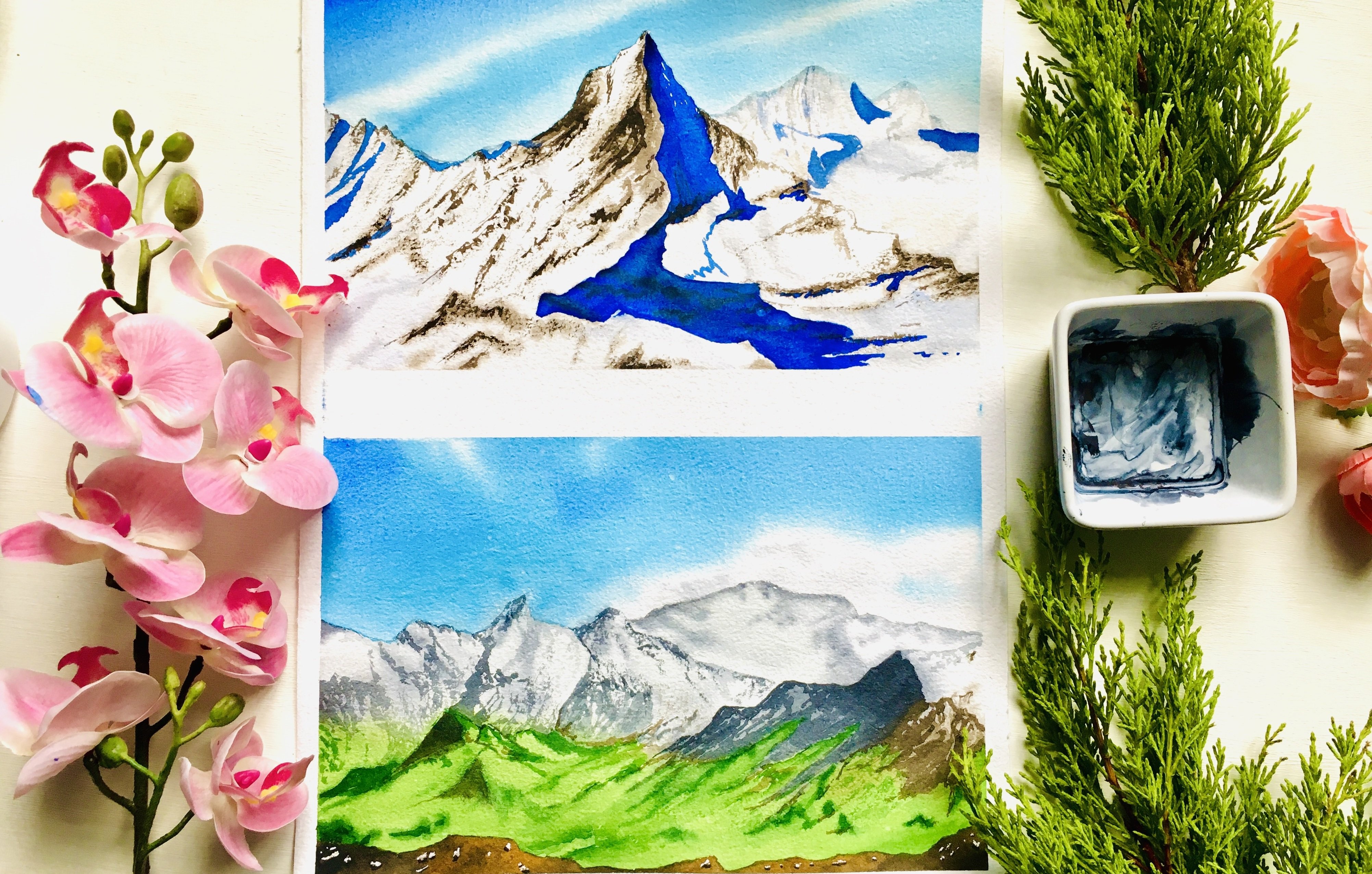
1. Welcome to the Class!: You know, those days when you want to paint
something beautiful, but nothing really
sparks your inspiration. So you're sitting
with your brushes, you paint, and flipping
through different ideas, but everything feels either too complicated or too repetitive
or maybe too simple, and maybe you just want
to find a moment unwind. You know, to lose yourself in colors and create
something really peaceful. Without overthinking every step. And I completely get it. Sometimes, all we
need is simple, joyful painting
sessions, you know, one where we can let go, enjoy the process,
and create something beautiful and watch it
come alive on the paper. And that is what this
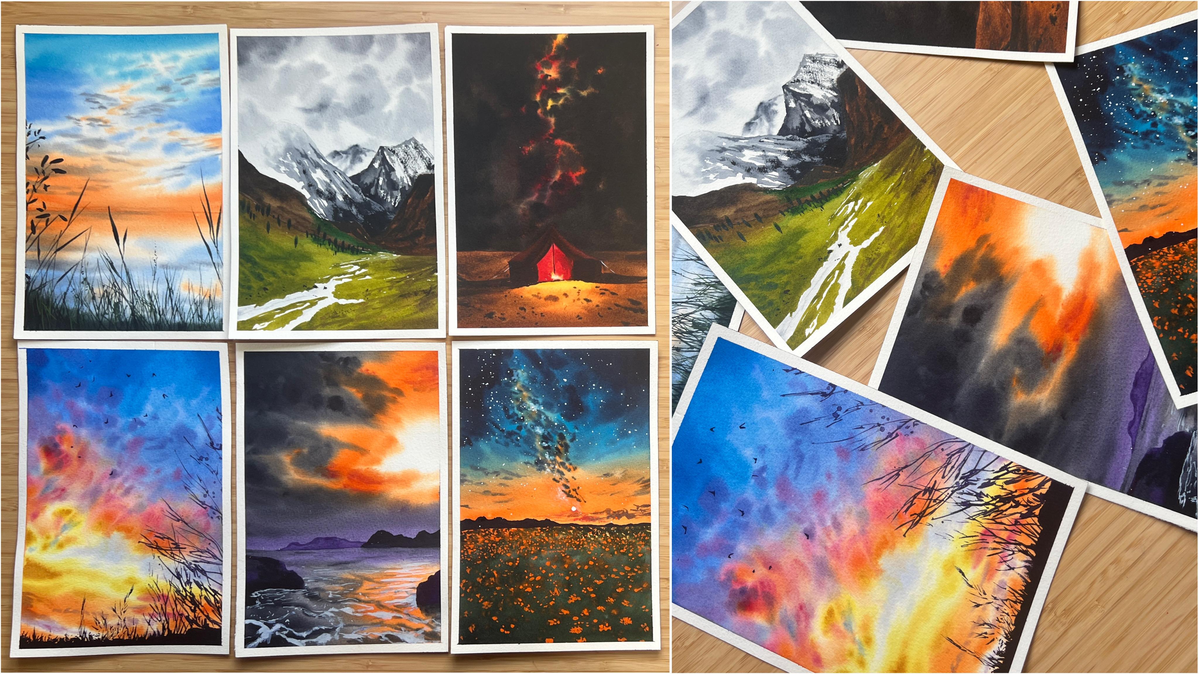
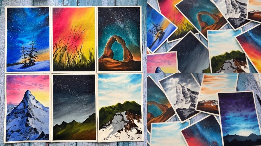
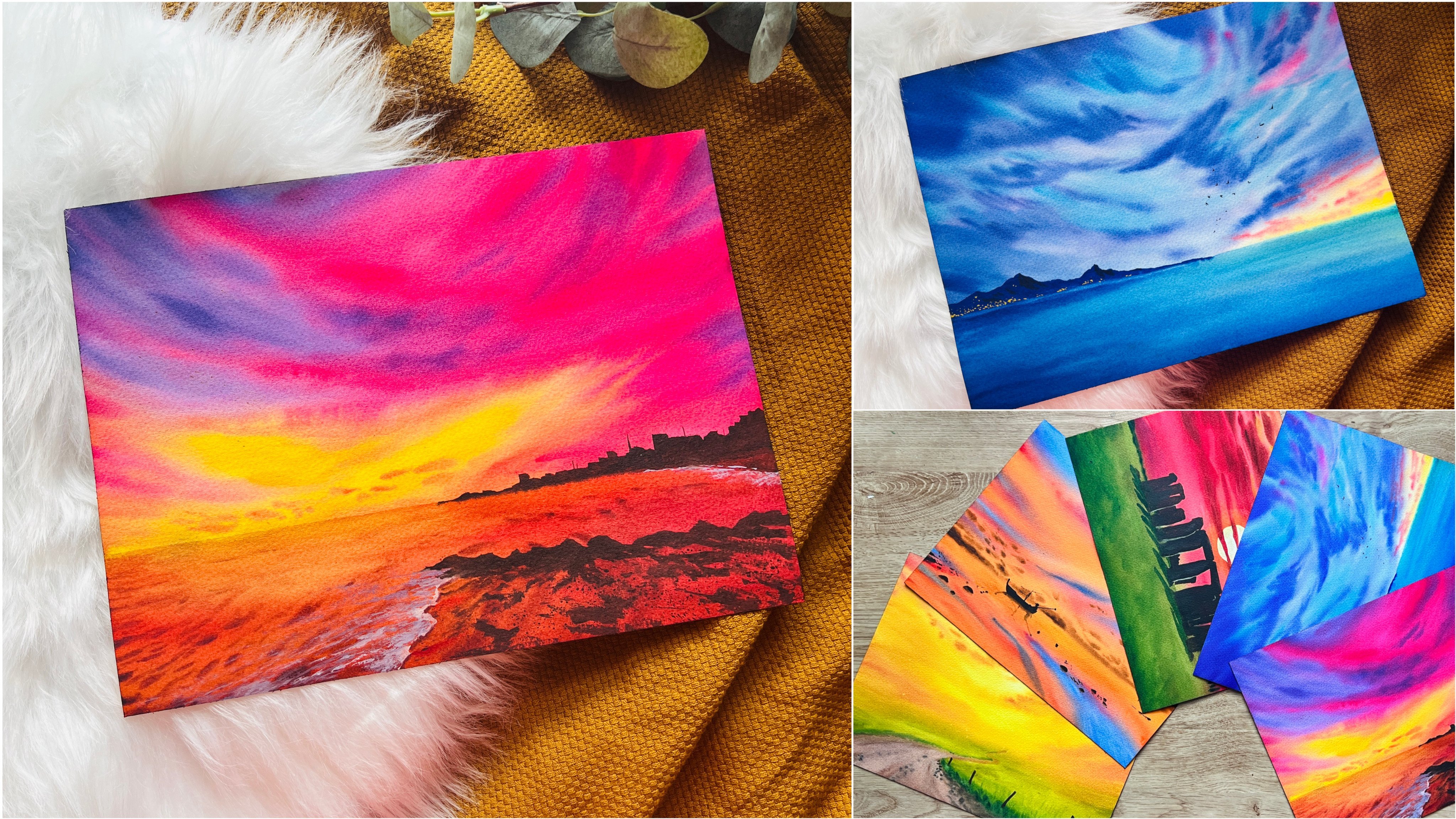
class is all about. So welcome to Nature's palette, 12 stunning scenes
in watercolor. In this class, we will explore a collection of 12
breathtaking landscapes, each capturing a different
mood and moment in nature, from golden sunlit meadows
to towering mountains, glowing sunsets to
vast starry skies. Every painting is designed to
bring you a fresh burst of creativity and a relaxing escape into the world of watercolors. I'm Githu. I'm an
artist, an engineer, a mom to a toddler, and a passionate watercolor
enthusiast, just like you. I also wear a few other hats
like a mixed media artist, a civil Rush educator, white Knights ambassador, and a Cedar arm
Stationers partner. But what I love most is sharing my creative
journey with you all. If you follow my Instagram,
Cal for Mystique, you've probably seen
glimpses of my paintings, my process, and my love
for all things watercolor. So in this class, I will be guiding you through
each scene step by step, making it easy to follow
along while giving you space to bring in your
own artistic touch. So whether you're looking
to fill your sketchbook, beautiful landscapes, or simply enjoy a calming
painting session. This class is here
to bring more joy, color, and inspiration
into your creative time. So go ahead, grab your
brushes and paint, and let's settle in and
paint some magic together.
2. Art Supplies You Need: Alright, so let
us have a look at all the art supplies that
we need for this class. So first of alle, we need what color paper, which is really important. So this size is the
paper that I'm using. So it's actually from
the Saunders Waterford, 300 GSM cold pressed
paper that I'm using. So it's like a 12 by 9 ", which I cut into two. So this is nine by 6 " paper. Uh, so make sure that the
paper that you're using is 300 SM and cold pressed
or rough surface, that would be the best and
also 100% cotton paper. That's really, really
important that we use paper of that size. Then obviously, the
next thing that we need is watercolors. So this is a set of
watercolors that I have, but this is for
demonstration purposes only, because what I'm actually using are from a curated
palette of mine, which is from different
several different brands. So I will leave PDF that shows all the
colors in my palette. So if you want to get the same, you can use that, as well. But obviously, we
need watercolors preferably in
tubes, I would say, rather than their pants or
the little C. So here you go. Watercolors. Then we
obviously need some brushes. So some watercolor brushes, which I would highly recommend. The one I'm using
are from silver, the black velvet series. So I have a large flat brush to apply water to a
larger surface area, and a medium size brush, which is a size eight and also a size six
and smaller sizes, the two and four
for the details. You can also use a liner
brush which would give you very crisp and
clear lines as it's got very thin
elongated, bristles. Alright. So that will be
the brushes stuff we need. So those are the main things. Then the additional
stuff that we need for painting is basically, first of all, I would recommend having a board for
your painting. Board because it's easy when you have a surface to
tape your paper onto, then you can lift it, you can move it around. You
can play with water. You can give the effect of
gravity onto your paper. So rather than sticking
it onto the table, it's best if you have
a board like this, but you don't need
a wooden board. This is just a
plywood that I have. You don't need the
exact same thing. You can go for, like, a magazine or like a
cardboard or something, whatever that you
can grab on, okay? Any basic thing would do a surf is for you to tape
your paper onto. And having said
that, definitely, we've covered paper
and the board. So what are you taping it with? Tape. So you need
a masking tape. So this is called
Painter's masking tape. There are several different
brands out there. And honestly, from
my experience, I've seen that if
you're facing an issue where your tape is
tearing off the paper, it's mostly because
of the paper, which means paper is the
culprit than the tape. But having said
that, if you'd like a very good brand that
I literally like, it's empty empty washi tape. So it's called empty washi tape, and this one is that I use. I keep getting the same one because I really love
it and it works. It doesn't, you know, destroy your paper, and
it also repels paint, which means that there's
no way that it's going to seep underneath because of the papery texture of the tape. All right. Then next thing, obviously, what we need
is drawing materials, which would be a
ruler, a compass, and probably an eraser as well if you tend
to making mistakes. So I'm just using
the tip of this one, which is more than
enough for the uh, you know, erasing cart. And also, we need a compass. And I already mentioned ler. Okay. So those are the
things that we need. Then make sure that you
also have a cloth or a tissue to wipe excess water, dry your brushes and several
uses that you're gonna have. So I used a cloth.
You can also just use any normal tissue
for that purpose. Then we also need white quash. Alright. So white
gouache is really, really important in this
because it's very, very opaque. So there are times
where we want to paint, like, really opaque things. So, for example, like
stars in the sky, and that would be
with the white paint. So this is Windsor Newton, designers gouache
permanent white. You can also get
titanium white gouache, which is also really opaque. I would not recommend using white watercolors because it's still got that
transparency effect. And you would see this coming
in my lessons as well, because this is
the little palette that I use for my
white paint because just don't want
to put it into my main palette cause it could just get dirty very soon enough. And that reminds me that I had not mentioned one
most important thing, which was my palette. So you also need a palette
to mix your paints in. So this is my palette
and you would probably see this in almost most
of my classes, in fact, and it's got a
curated set of colors which I've added after, several months and years
of experimentation, perhaps, and chosen these. So these are from
various brands. So this is what I said
I will leave as a PDF. All of the colors, but you essentially don't need
all of the colors. We only need some main colors. Like, you know, go
for the primaries plus mixes of those
secondaries, and that's it. But some things that I
would recommend having because of the projects are
like the cadmium colors. That's because they are opaque. And sometimes to get that
opaque effect on new paper, you need the cadmium colors. So that would be
the cadmium yellow, cadmium orange, cadmium red. Those are the most
important ones that I use. And also, I don't use
black in my palette. Instead, I have something
called paints gray, which in its darkest
form looks like black, and in its lightest form
is a subtle gray color. And that's exactly the
reason why I use paint gray. So just in general, like all the colors I mentioned, so you can have a
reference to that. And lastly, because we're
painting with watercolors, the most important
thing is water. So here you go. I've got this brand new What do
you call this water cup? This is from the brand silver. This is their newly released
series where they've just launched several
of these water cups for washing your
brushes and also, like, lots of brush
cleaners and such. So this is what I'm
using for this class. It's really helpful because
it's got two slots. It's both wet now because I've actually used just for this, but this is exactly what
I wanted to show you, and that's the reason
why I didn't wash it. So, this, you can see,
it's really, really, really dark in color because
I've washed a lot of paint, and it's got all those
pigments in that water. So when you want to apply
fresh water onto your paper, you want another set of, you know, a little bit
of water that's clean. So that would be your other job. This is a little
bit contaminated, but I assure you, towards the end of the painting, even both is going
to get contaminated. But one of it would be
really contaminated, which makes it really
pointless to use that one. Because imagine if you
were to dip your brush into that one and then
grabbing fresh paint, you're picking up
essentially dirty water. And then picking up paint again, which then makes this color to mix in with that dirty water, which is something that we
absolutely do not want, right? So that is why we need
two jars of water. You can use two separate jars or just something like this. I'm just showing you.
So, there you go. Those were all the materials
that we need for this class. Also, I would like to
point out one thing, one last final thing,
which is a hair dryer. So I have this
always on my table. It's a hair wire, but this
is something that I use for my painting purposes now to
dry my paintings quickly. That's only because I just record everything in
one go and I want to, you know, have my
paintings dry quickly, and you can see I've
already painted and stuff. So, a hair wire or you
can use a heat gun as well in order to
dry your paintings really quick because for
painting with watercolors, it takes a little
bit of time to dry. Um, depends on your
paper as well. Yes. Okay. So, now that you know all the materials that
we need for the class, let's go ahead to the techniques and have a little brush up of all the
watercolor techniques.
3. Watercolour Techniques: Hey, so in this video, I'm going to give you a brush up of all the basic
watercolor techniques, which we will be using in all of the projects
in this class. But if you're a
complete beginner, then I would highly advise you
to go ahead and, you know, watch my ultimate guide to watercolors class,
which is, like, a detailed class which describes each of the
techniques in detail. There are several beginner
friendly projects as well, which she can follow. But having said that, but I will still give a very, very brief overview here so that we understand
what we're talking about. Right? So first of all, the thing that I'm
going to cover is wet on wet technique. So wet on wet means it's wet paint on your
brush on wet paper. So this means that you need
to have your paper wet. So we'll just grab empty water. It's just a large
brush that I'm using. And then you wet the paper. So when you wet the paper,
the paper is now wet. And then when you pick up paint, obviously, the paint
will be wet paint. So when you pick up paint, that is now wet paint
onto wet paper, okay? And in order to show
you the wet paper, have a look at the paper, the sheen on the paper. Can you see, you can see the nice wetness on the paper indicating
that the paper is wet. And what happens when
you apply wet paint on wet paper is it kind of spreads.
See how that's happened. And to put you into perspective, I'm going to do the
same dot here and see it doesn't spread because there's no water in that region. So wet paint is movable when the paper is wet
and it spreads out nicely, and you can even
create gradients. So how I created
gradients right now is I took a dense pigment, started at the top, and then I brought down the paint and the
brush was finished. So then it becomes lighter and lighter towards the bottom, and that's how you
create a gradient. Okay. And you will
also be able to create gradients by mixing
two colors together. As in a gradient of two colors. Let's say, for example, if
I were to grab a yellow, and then I start at the bottom, and then I go up
towards the top, you can see it
blends up together, and now that's a gradient
between two colors. Okay? So that was wet on wet. Now, there is a lot about
water control as well. So again, if you're
an ultimate beginner, then I would suggest
going through my water control class because I explain a lot about the timing, brush movement, the basic rules to control the amount of water
on your paper and so much. So that would be really helpful. It's not a long class, just
take it so that you know the basic rules and you know
how to work on your paper. So I even cover things
like, for example, when you're right handed and
left handed and all of that. Okay? Next thing
is because we've just painted on that
surface, it's still wet. So it takes a bit of time to dry because you're
working on it. So so long as you keep working
on it, things stay wet. Now, you will be able to
add more things on the top. So you can add stuff
on the top again. So I will just say that
the basic one oh one rule of watercolors is to have lesser water on your brush than there is
already on the paper. So to show that in perspective, I'm just going to
apply a little bit of water here as well
onto this side, okay? To show you what I
mean. All right. And I've got some
blue paint here, and I'm just going to apply
that towards the bottom. And here again, I've created that beautiful gradient,
grabbing denser paint. And as I go towards
the top, I apply that. And then as I come
towards the bottom, my paint is getting
finished on my brush. So then it becomes less
dense and the particles disperse more in the water
creating that gradient effect. Now, what happens when you have a large amount of water
on your brush? Okay? What happens is you drop it and you immediately
see the effect. See? It spreads the water, okay? I mean, the paint. And this is what is known as a bloom or a cauliflower effect. It happens because there's just too much water
on your brush. So what do you do
if you want to add some nice strokes on the top without introducing
too much water? Then you need to have
a cloth or a tissue, make sure your brush is
nice and dry and pick up literally dry paint because this region has already
started to dry. And as I apply over the top, I get the nice wet on wet
stroke without a drying. So this is already started to dry because we
painted that first. But now, if I were to show
you and I know how to adjust this watery
mistake that we just did, if you just grab in more paint and mix it
along, that goes away. So now this entire
region is still wet. And if you want to paint
in nice dark clouds on it, so I'm just going to grab a
little bit of indigo here. But observe the
consistency on my brush, and to show you in perspective, see, when I mix
it on my palette, it's that tense.
It's not watery. So this dense paint as
I apply over the top, it doesn't spread out too much, but also it has a
very softer edge. So this is still wet on wet, or you could call this
particular stroke as dry on wet because your
paint is effectively dry, but your paper is wet, so
you're applying dry on wet. See, the dry on wet
gave such softer, softer clouds over the top. Okay? So that would be the wet on wet and the dry
on wet which we've covered. The next thing is wet on dry, which is basically very simple. You're applying just dry onto
dry paper, but wet paint. Okay? So that's
literally wet paint. But here's the thing
about wet on dry as well. You just applied that stroke. So that stroke that
you applied is wet. And while a wet, there is a lot that you can do. You can control it as in
before this edge dries up, if you grab more
paint and then you go ahead and join along, see, you are literally just connecting it and it's
still wet on wet. Sorry, it's still
wet on dry because you're applying onto dry paper. Let's try and create the
same ingredient that we did. It would not be
the same. But see, I'm going to grab
that same yellow and I'm just putting it onto there. Okay? So you can clearly
see the separation there. But case both regions
are still wet, if you do that process, and then you just go back up and maybe come
back down again. You get almost the
same gradient, but it is difficult. It's very hard to do this way. I only follow this
process when I have, like, a particular reason
to follow this process, like something that needs
covered entire one color or you will observe that in various projects that
we're doing. Alright. Then the next thing is, let's say that we want to
do the wet on dry itself. So here I'm just
gonna grab my indigo. So I've got a very
wet paint now. My paint brush is loaded
with water and paint. And then I start and I apply
the in olive green paint. And then as I start coming down, you can see that the paint and the water on my brush decreases, but there's
still more paint. So then when I
continue applying it, it becomes really dry because the water on my brush
is, like, finished. So then I start getting
these dry strokes. See? It's wet on wet. Stipa matinee. See, it's wet on
dry and then moved on to a very dry dry stroke. So this is a continuous wet on dry to dry brush
technique, okay? And that brings us to
the dry brush technique. So the dry brush technique is where your brush
is literally dry. So grab your plute, dry your entire brush, and then grab the paint. Okay? And because
that paint now, I had just applied
water on it, it's wet. So I got to make sure
that my brush is dry. So here I'm drying my brush. Really nicely. When I apply, I get the dry brush
technique. See, it's dry. So the dry brush
technique in particular, will only work if your
paper has a surface to it as a texture to it,
surface texture to it. So this is 300 GSM
cold pressed paper. You will not get
this technique on hot press paper
because the texture on hot press paper
is really less. The best to go for
this technique is cold press paper and
a rough surfaced paper. This is because
watercolor paper, if you look closely, has these textured surfaces. And when your paint is dry and you're doing the dry
brush technique essentially, you're only covering the top surface except for the ridges. So the ridges of the paper
are not getting the paint. And that's why it only
stays on the top, and you get these
such beautiful, nice dry brush strokes. And then let's say that you've got those dry brush strokes. You can then just use plain
water to kind of blend it, and you still get
like a dry brush. But then with a lot
of variety in its, that dry brush
still stays there, but then you've got
a very lighter tone of dark color there. Okay? That's one
technique, again, so now we've covered wet on wet, wet on dry, dry on wet, and the dry brush technique. So those are the
basic techniques, and we've also covered
a bit of the gradient. Alright. The next thing
that I want to show you is basically the
softening technique. So I'm just going
to grab some paint, and here I have applied. A little bit of a green stroke. Okay? Now, what I'm going to do is I'm going to soften the edge. So remember where I said
that while it's still wet, you can continue along. So the same way,
while it's still wet, you will be able to
soften the edge. So clean your brush, remove all paint from it, and just use water. If you just use water
and bring it down, do not use too much water because that can
create back runs. Okay? So if you've
got too much water, just go ahead and, you know, run that along,
but there you go. I've softened that
particular edge. So I had a little bit
of excess water there. Let me show you what it would be to do when there is
no excess water. So here, this is my stroke, and I want to soften it. So in order to soften it, the ideal way would
be to have your brush nice and not dry, but just damp. So remove excess
water from it, okay? Nice and damp. And then if you
run along the edge, there. So that edge is now softened. Okay? So this is the
softening technique. Then we also have the
splattering technique. Okay? So I'm just
applying a little bit of water over this
side with my brush, and we're gonna first do
the wet on wet splatters. So wet on wet, as
the name suggests a paper is wet and you're
gonna splatter onto. So for splattering, there are several ways to
do the splatters. My personal preference is
just a one hand method, so I hold the brush like
this. Observe closely. It's holding with
the two fingers, the thumb and the index finger. Okay? And then the rest of
the fingers are free to move. Okay? I start holding like that. It's hard to explain
this one, you know? So I start holding like
that, but then I shift to the other three fingers
and hold it like that. And then this index
finger becomes free. So basically, using
my index finger, I tap onto the brush. So slow tapping
wouldn't be enough. You need to tap
nicely. You see that? And because it's
onto a wet surface, it spreads and create these gorgeous gorgeous
gorges, splatters. There is also the
wet on dry splatter, which is basically splattering
onto a dry surface. So here, that was wet, but these regions are now dry, so I'm just going to
do the dry splatter and see the paint stays there. It doesn't move. It's
just tiny little dots that form on the surface. Okay, so that was that, I think we've covered
most of the techniques. So we've got dry brush, we've got softening and all
of it. So that would be it. The other techniques,
anything left would be covered in each of
the class projects. So like I said, if you're
an ultimate beginner, head over to my ultimate guide to begin this class. Alright. So I will see you in the
first class project.
4. Taping the Paper: In this lesson, I am
going to teach you how to tape the
paper really well so that our paint does not sweep
towards the edges or we do not get uneven edges
in our painting. So the tape that I'm using
is empty washi tape. We've already discussed this
in the art supplies section, but just telling you in
case. So here you go. You want to take the tape and
make sure that you stick it to at least 0.5
centimeters coverage. You could also do more if
that is your preference. I prefer to have like half a centimeter edge
for my paintings. So I make sure that I get that. I do not do any
measurements or any kind, but I just rather eyeball it
and just stick it through. It's because this tape is slightly transparent
so I can actually see where it's coming off and see through
the inside there, and then you want to make sure
that you stick it firmly. So you do the same for
all the four sides, and then you want to make
sure that it's stuck firmly. So let me go ahead
and make sure that I fix all the four edges. There you go. Once all
the four edges are done, you want to make sure to take
a ruler or something that's got a flat edge which you can use to push along the
edge of the tape. I'm using this ruler
and first of all, I'm just going to make
sure that there's this gap between the
paper and the board. So that is eventually going to this air to come towards the inside of the paper or
towards the other side. But if it's to the other side, it doesn't matter,
but if it comes towards the inside of the paper, which means that the tape
is going to slightly lift and your paint is
going to seep inside. So just making sure to
flatten that area first. Basically, the aim is to remove all a gaps. So here you go. Done for the four edges. Now the additional part. You want to use
the flat edge and just sweep across on the tape, and as I do it, I can actually see the air
gap moving across. So you can see it's there now, and I need to just keep pushing at it and take it towards the
outside. See, that's gone. So you little line
that was there, that's now gone, which
means that air gap is gone. So we need to do the same
for all the four edges. This will make
sure that you have clean and crisp edges
for your painting. Just do it for all
the four sides. And there you go. We are done. So this is how you would
be taping the paper. So I hope that now all your paintings will
have clean and crisp edges, and I will see you
in the next lesson.
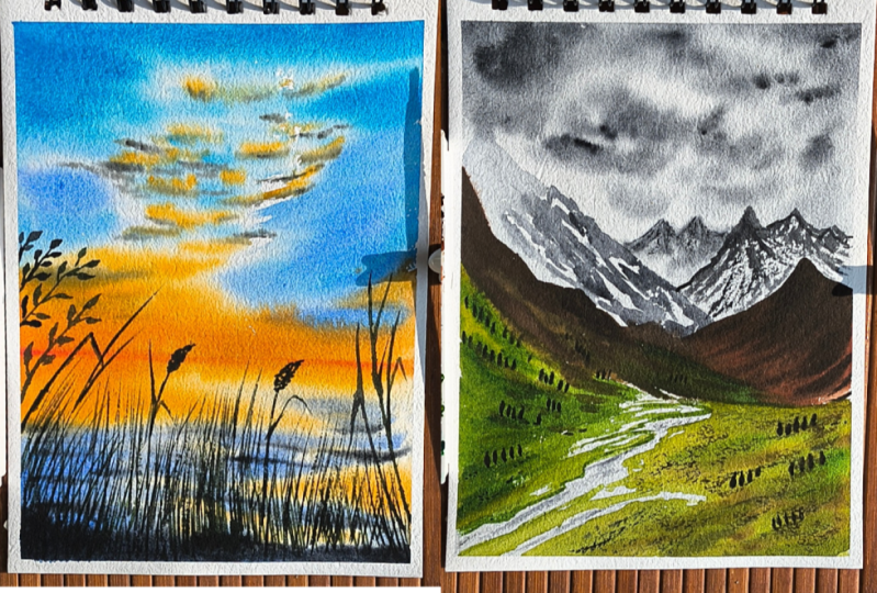
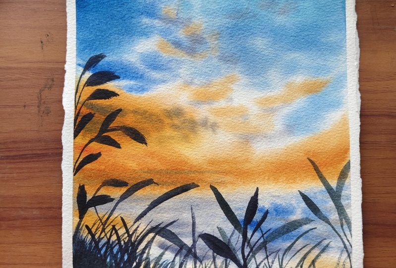
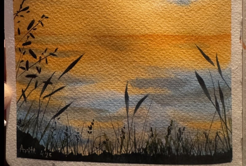
5. Class Project 1 - Calm Hues: Hey hey hey he so welcome
to the first class project. This painting that
you see right here is what we are going
to paint today. It's a gorgeous blue orange sky with some nice
foliage in the front. There's a lot of tricky
bits to painting this foreground and
the sky, as well. There's a lot of tips
and techniques involved. So I really hope that
you will enjoy it. So let's have a look
at the colours here. So we need halo
blue, cobalt blue, transparent orange, pink grey, a little bit of dark green. And actually a teeny, tiny little bit of
cadmium yellow, but you can totally skip that. It's okay if you
don't have that. The other colors are what we
actually need. All right? If you're ready with your colors and the
paper all taped in, let's get started with this one. All right, so let us
start with the painting. In this painting, there
isn't a huge pencil sketch. So we'll just sketch out
the first basic thing, which is going to
be a horizon line. So all you need is
kind of like a ruler, and we're going to
make the horizon line. So we want it towards the bottom part of the
half side of the paper. So around this point
is where the half of the paper is and you want to
go a little bit more down, okay, because that's
the best way for composition rather than creating mirror images on the
top and the bottom. Always stick to around one
by third is the most ideal. So ideally, you
should be placing your horizon line
around one by third. But here I'm just deviating a little bit and taking
it a little upwards, but not towards the
middle of the paper. So there you go, and
you want to draw the horizon line ever so lightly because you do
not want your pencil sketch to be visible at
the end. So there you go. That's my horizon line. And that's basically the
sketch for today's painting. And we're going to just start. So I'm going to just start by applying water to the
whole of the paper. I'm using my flat brush to cover a large surface area here. So just use the larger size
brush that you have and go ahead and apply water to
the whole of your paper. Take your time to do
this because it's really important that your paper is
nicely soaked in the water. Otherwise, your paper
could dry quickly, and you will not get wet on wet effect that we want to
achieve on this painting. So make sure run around
nicely and evenly all across, making sure that
all the areas of the paper is covered in water. We will also take
out the sex of water later on because this
can then sweep back into the paper and create blooms or the cauliflower
effect, which we do not want. But for now, just sweep across
to get that even coverage. There you go. I got
that even coverage. This is the reason why I use board all the time
because you can tilt the board and make use of gravity for the water
to flow on your paper. So here, I'm just giving
it a slight angle and making sure that my water can flow down so
that it doesn't form any large pools because as soon as you start applying
water to the paper, the paper starts to bend
a little, that's okay. And you just want to
prevent water from accumulating in that
bend like pools, okay? So, keep going. You might want to do
this multiple times, especially if you're not using
100% cotton, 300 SM paper. The cotton is the most
important factor here, because if it's not
a cotton paper, it's not going to retain water for so long and it'll
dry out quickly. If you're not using a paper that can withstand the
water for a long time, you need to do this
process multiple times. Now the next step for
me is to go ahead and just quickly wipe out the edges, making sure that I absorb the
excess water on the sides. Can you see there the water
accumulated on the sides? That's what I'm going to absorb. Okay? Right. There you go. Done the pot. Okay. And now we can get
to the painting process. If you want and you feel that your paper is starting
to dry at any point, just go ahead and apply
water and make sure that all of the areas stays wet. Okay. The easiest
part to do is to have a tilt on your board
so that always work from the top to the bottom
so that anytime you see that the bottom
part is starting to dry because you've already
worked on the top, you can go ahead and re
wet the bottom part. Okay. All right. There you go. I have applied the water nicely. Now, I'm going to grab
my size eight brush for uneven coverage
and get some nice, cloudy forms into the sky. Okay. I am going to start
with a nice thalo blue color. All right. So this
is Tosin and blue. Okay, and you can see, it's a gorgeous gorgeous blue color. It's called bright
blue in white nights, and we want to start
at the very top. There you go. And then, as I approach
towards the bottom, I am going to decrease and just start to make
like some cloudy forms. So I'm just using the
tip of my brush and look at also where I'm
holding the brush. That's very important.
Okay. There you go. Just keep going bit by bit, some little strokes,
and that's it. And now go ahead, wash
your brush nicely, and we're going to grab
the second blue color, which is going to be
Kobalsblue, right? So they're grabbing
Kobalsblue now. And now that is what
I'm going to apply towards the base of
that region, okay? There and the same. We're going to blend that
cobalt blue into the sky. So observe the way that
I'm holding the brush. That's very important. As
I'm doing this top side, I'm builting and painting
from the top side. So you want to do
the same, okay, and start creating
these little shapes, and you can see how I've
blended that blue in together. Okay? You can have
some mixes random there as well so that there is a cohesive look to that blue, and it does not
look separated out from the halo blue
that we just applied. Okay, there you go. Then now continuing on towards
the bottom, okay? We want to make some teeny,
tiny, cloudy shapes. So here, I'm going for small, small shapes as I
approach this side, and I'm going to stop
right there, okay? No more over to that side, maybe a little more on
this side, just like that. And that's it for
me on that side. Now we're going to go
back towards the bottom. And for that, I am going to grab my beautiful
transparent orange shade, okay? Just cleaning that up. I think it's got a wash of some white paint from a
painting that I did previously. Okay, there you go.
That's clean now. And that is my
beautiful cadmium. Did I say cadmium? Oops,
transparent orange. Alright. So grabbing that. And we're gonna come down now. And there you can clearly see you're gonna put
that transparent orange, but you're not gonna touch
any of the blue areas. Okay? Promise me that you're not gonna
touch the blue areas. Alright? There you
go, keep going. And there between the edges and anywhere that you can fit your brush in any gap that
you can fit your brush in. That's where you
want to add that. I could fit my brush
in those areas. I did. Then towards the base there, we want it nice and even you go. You can pick up then color as
you go towards the bottom, you can already
see my bottom part has actually started to dry, but that's okay because we're
still working over the top and we can reapply
towards the bottom part. Okay? There you go. Apply the orange nicely. But in order to make
the orange look pretty, we have some more things to do. So grab the orange again. But this time, make
sure that your brush is not too wet because the top part has already
started to dry. And then we also need to
make sure that you do not have too much
orange in your brush because we're going to add
this orange into some gaps, those white caps, but
without touching the blue. Okay? Very, very
important that you try not to touch any of
those blue areas, okay? And also to make sure that
your brush is not too wet. So observe the pain consistency
on my palette as well. It's not too wet because
you always need to look at water control when you're doing
this process, okay? See, teeny tiny bits into
some of those white areas. Not all. Okay. The
next color that we're going to grab is paints gray. Okay. But I need it to be
a little bit more dry. So I'm just drying my
brush a teeny, tiny bit. Okay? And then you
want to grab that, and that is what we will
add and some points where your blue and
your orange is meting. That's going to give
us a little bit of gray clouds over there. Okay? And you can add some
on areas like this, okay? And anywhere that
you think you've ruined it because your orange
has met with the blue, those are the areas that
you can go ahead and put these nice gorgeous gray
cloudy forms, okay? Always remember the
consistency of the water needs to be lesser than that's what's there
on your paper. Very important.
And we're going to go upwards and also fill in. Do not fill all of the
white areas, teeny, tiny bit at random places, with the gray tone,
very, very subtle. And then grabbing the
gray again this time now I'm going over my orange, teeny, tiny bit over
to the left side. Okay? See? It creates a
very subtle brown color, which is exactly what we want. All right. There you go. We're done with the sky part. Now we need to paint
the bottom part, but my bottom has
actually dried up. So what I'm going to do is I
am going to tilt my paper, pick up fresh water. Remember, fresh water, not the water that you've
been washing off, the blues and the green, the oranges and the paint gray, and then go ahead and
reapply water to the bottom. But as you apply, do not touch your orange. Leave gap where you're
reapplying the water. That's very, very, very
important because you can always connect those two
areas with your brush, but not with the water. Okay? With the brush with paint, I mean, because otherwise, this water can then
sweep back and it'll create bloomy edges there,
which we do not want. Okay? So first
things first here, let us go ahead and repeat
what's there at the top, okay? Careful now. Have a
tilt to your board. And if accidentally
you've touched any of the orange that you already
had there, that's okay. You can always clean
up the mess by just running through and
connecting areas together. Eh, you go. Okay. So we've made that. Next thing is we're going
to come down again. We're going to create the
reflective shape, okay? So don't have to bother too much about it
because we're still going to cover this whole
thing up with a lot of plants. I mean, you've seen
the final picture, so you know what's there. But still we need to do
some random strokes, okay? So just let's do the orange first this
time, okay? There you go. But these are all just
gonna go, I believe. I'm just um doing some
random strokes, okay? Then getting back to the other. So we're going reverse now. So we're doing the next color, which was the Cobalt blue
that we dealt with, right? So remember, no touching of
the orange and the blues. So leave the white
spaces, keep going. Keep at it. Keep going. And adding So
towards the bottom, I am not going to add the
halo blue there, okay? That's because we want
the bottom to have, like, a nice foliage area, and we want the
foliage area to be having cool color because this is actually the foreground. It's like, the first
thing in front of us. So there's no point
adding cool color such as the thalo
blue over on there, 'cause we're anyways going
to cover up that area. Even this, I just
brushed the orange and the blue together
because there's no point, literally no point. Okay? Now, grabbing pink gray. That's the next color, isn't it? Yep, then just going. Okay. But this is water. So you need to actually depict some nice watery strokes here. This is why I said that
you don't have to make sure that the clouds are exactly there. It's
not still water. I'd like to add
some ripple effect. So just going, just making
some lines on my water. See, go ahead and
create these lines. So the paper is still
wet from the stroke that I just applied, okay? And you're just going to make
these line kind of shape. Okay? At some point you
can have strong lines. All right. So nice,
strong lines added. And you can have a bit of
a line applied towards where the horizon
is so that it just like marks the part
of the horizon there. Okay. And then I'm also going
to use a very dry brush. This is a brush that I
haven't used before. Can you see the
water has spread out there because the
orange that we apply towards the bottom is kind
of creating an edge there. So I'm just going
to soften that out with my completely dry brush. And there, that uneven
effect is gone. Now I've got a wash dish Brush, and that's useless as in, I can't use it for
the same technique. Anyways, this is totally and completely
the background work that I wanted to do. A right now we've
got to wait for this thing to dry up so that we can put in a nice foliage. Wheat. I just thought before
this actually dries up, let's put in a little bit of a wet on wet
foreground at first, which then we'll
cover on the top. Okay. So this wet
on wet foreground, I'm saying let's go
with a darker green. I start with my say, pains gray, and then I'm going
to grab my darker green. Okay? So if you're
actually mixing the darker green with the
green and pain gray, then make sure that
you mix in more of the paint's gray
this time because this is the color that we want. It's almost like a
perylene black color. So I've got this there's perylene black. I think
it's perylene green. Anyway, this perylene
green color. That's what I'm
trying to make here. Okay. And just along the edge. So your foliage area, I mean, this bottom part, may be wet, maybe dry, doesn't matter. Whether it's really dry or not
absolutely doesn't matter. So do not worry at
this point that, Oh, my paint is not spreading
or that it's dry. Okay? Your painting is going to be unique
in your own sense, so nothing to worry about, okay? So I'm just applying
a little bit of that nice thick foliage that
could go at the bottom. So I'm just giving
a little bit of a color and a thing
like a little bit of a shape like that that could mimic the
look of the foliage. We will anyways
cover this up, okay? This is just a start.
And there you go. That's the first part done. So now we have to wait for this entire sky
region to dry up. Alright. There you go. It's completely dried up now. Now, all we got to do is finish off with
some nice foliage, as in four ground foliage
on there, and we've done. So I'm shifting to my size four, or you could also
use size two brush. You know what? Let's
go with the size two. So here you go. This is the size two brush
that I'm gonna be using. And we're going to basically
use the same mixture that is the slight hint of
green with the paint gray. There you go, having
the green and a slight hint of green.
That's what we want. We want it to be
mostly blackish, but if you look closely, it's green. That kind. Okay, that's what we
want. So there you go. There is a per green
kind of color. And we're going to start. So I'm going to start way
over to the last side, and I'm just going to put, like, lots of just do what
comes naturally to you, a lot of little lines
and things, okay? I'm just going to have
a few uh, branch here, and this one is a little extra special because I'm
just going to create, like, a plant there. So let me show you
how I'm doing that. So first of all, I did, draw a line and then placed it. So let's do another one,
and I'll show you, okay? So here, I'm going to draw a branch like that
out to it first. Then I'm going to use the
entire length of my brush. That's why I said, let's
go with the size two, and then I'm going to press down the brush once and
then lift it up. When you press down the
brush, and if your brush, the whole of the brush
has got the paint, then it's going to
apply in that way. So you're going to do the same. Let's do it in different
directions, like that. Let me see. I'll have
another one facing downward, maybe another that way. Okay. So go ahead and put in a lot and then make sure to
connect some of these, okay? See? Just some
random connection. And as soon as you connect, it doesn't have to be perfect. That's the thing. Don't think that you've got to go ahead
and connect each one. So see the absurd randomness
that I put it there. That's actually good because
it gives a sense of depth and a sense of a different feeling to how your brain perceives
the paintings. Okay? And that's why we do not want things to connect always. Just go with absolute
randomness, okay? See? At the very edge. See how I can connect that one? Just a random line. I
think that should do. See? Okay. That part is done. Gonna go over and maybe, like, you know, parts
of a little dot there. Then let's see coming down, and then I want to
create like a fern kind. So when I'm drawing these lines, I'm using the tip of the brush, and then when I want to
press it down, I shift. So it's always a
matter of, you know, moving your brush in different
manner in your hands. Okay, there you go.
Just go to draw. Then made a larger one. So this one, I will
show that you again. So here, just drawing a line. Okay, let me do another one. I'm going to draw
another line like that, and then maybe from here
is where I'll start. Okay, let's do on this side. So I'm going to start from
that side, and then as I go, I press my brush
lightly and then lift off again and see how
that was created. I will show it to you again. Let's do one more, press my
brush, and then lift off. So go ahead and try to do that
press and lift off. Okay. So go ahead, try that
in different manner. Okay? We want to create a lot, a lot, lot lot of
depth on this area. So that's why I said, No
worry if it's spread out or not because
we're anyways going to cover it up like that. It's a lot of foliage on that
region. Did you see that? Okay? So let me go ahead
and cover this up. So you can also use a liner
brush for this purpose. Let me demonstrate that. Okay? Just grabbing the color. Need a little bit of
green. Okay, there you go. My liner brush is
loaded with the brush, and the use of the liner brush is that you don't have to worry about just focusing on the tip because the liner brush
does the work for you. See? Lots. You can just do this, and you don't have
to focus on just using the tip because otherwise, you'd have to be extra
careful that Oh, my God, oh, my God,
just a tip, just a tip. So don't worry about such
things with the liner brush. And do not think about
making anything perfect. And also, I would
highly recommend that your strokes go from the bottom towards
the upward region. Okay? Just because otherwise, let me show you what's
going to happen. If you start from the
top and the bottom, you're gonna have a thicker edge at the top, which
we do not want. Okay? So that's why it's
always best to, like, start from the bottom and go towards the
upward region, okay? I'm just creating like
a dense push there. I honestly don't mind what is going it's like a criss
crossed dense push there. That's it, right? And we
want to do the same, right? Grabbing my brush again. I'm just going to put,
like, that long fer thing that I had, okay? The long stroke, okay? And I'm just gonna do See, a few larger ones.
I absolutely love. This one, probably
you could start at the top as well
and go down, see? But I still prefer the
other way, you know, where you start at the bottom. And don't think that
you have to refrain to you can have little u dot one. So that's kind of like a
different plant, okay? This is why I said, not
bother if there's, like, extreme tox or anything
that's forming. Just just have fun at this stage and try and manipulate your
brush in different ways. So this is, like, a
good exercise to lose control and learn a
lot of brush strokes. Okay? Do with all of that, now I'm going to
put a little bit of a green on the front side, like the very front foliage. So I'm going to grab a
little bit of a green now. See, go green on there, and I'm going to
use just the green and put it in the front. Okay, so it's not going to
be much visible because the underlying color is dark
and we're using watercolors. We're not using wash paint,
which will appear on the top. So in order to make
it appear on the top, what you can use is grab a
little bit of camiin green, or you could use the tho
green light from Snelar which is a really good option because it is an opaque color, although it says
transparent on it, I've always used as
an opaque color, and it literally just
works perfectly. So here, grabbing a little
bit of a green, okay? Now, this you don't
want to put too much. Okay? You just want to
make sure that like some random strokes at the front are a little bit
on the green side, see? A little, little, little subtle. So these are for the viewers. When they come closely and
look at your painting, you always want to
have some subtleties, which makes them wonder that, Wow, this is amazing. And my clock here says 29
minutes and 40 seconds. Which, after being
edited will be lesser. So that's literally
half an hour. I mean, under half an hour
I've completed the same thing. So wait done. Let me quickly try
this bottom part up, and then I will remove
the tape. There you go. It's all dried up, and now I am going to remove
the tape and see. That is literally
the cleanest edge. So now, let me just quickly also show you how to
peel off the tape. When you're peeling
off the tape, start from one of the edges, and you want to make
sure that you're pulling it away from the paper. Do not pull it towards the top. Do not pull it
towards this side. You want to with an
angle like that, a 90 degree, and you want to
pull gently outward, okay? And see gently outward. That way, even if your
paper is being torn, it will be torn towards the outside part and not towards the inside
of your painting. Okay? And from my experience, I have always seen that if there's a tape that's
actually tearing your paper, the culprit is the paper
itself and not the tape. Okay. But having said that, this empty washi tape brand
is really, really good. And look, because
I've stuck strongly. This is even taking
so hard to come out, but still gives me
the cleanest edge. Look at that. And there you go. That's the gorgeous gorgeous
gorgeous gorgeous painting that we've done today. So I hope you enjoyed
this very first lesson, and I will see you
on the next day.
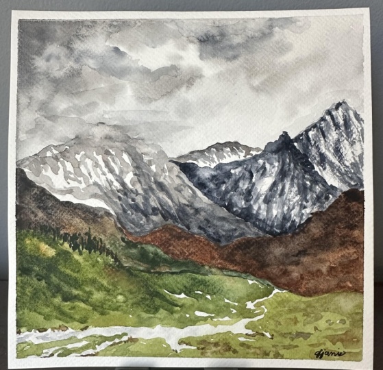
6. Class Project 2 - Towering Mountain: Hey, hey, hey. Welcome to
the second class project, day two of this class. And this beautiful painting here is what we're going
to be painting today. So don't panic yet. This is not as tough
as it looks because you don't need a lot
of wet on wet strokes. This is literally almost
entirely painted in wet on dry. So it doesn't matter if
your paper dries up. You can absolutely go ahead
and do the swing thing. So first of all, let's have a look at the
colours that we need. We have a lot of
colors in this one, so get ready to
grab your paints. First of all, we
need paint grey, transparent brown, and
sienna, yellow ochre. Olive green, dark
green, and sap green. So those are all the colors
that we need for this one. And if you're ready, let's get started
with this painting. Alright. Let us start. So we're just going
to quickly trace the shape of the mountains
in our painting. So we're just going to
start on the left side, and let's have a mountain shape, that goes curving
down like that. Then the next layer
of the mountain, okay, you can have
its shape changed. And then this one would
go somewhere like that. Then again, another. Okay. So I'm just drawing very, very, very lightly because, you know, obviously, okay, I think this one should go a little bit towards
the higher side. There you go. Then
another mountain here, something like that, and a
very vague one at the back. Okay. So here you go. That's our base entel sketch. So if you want to see
closely, here you go. Alright. You can pause right
there and make that sketch. It doesn't need to be perfect. It's just got to have
something similar to this one. So you go with whatever
sketch that you do, and you would be able to
paint the same painting, but in a unique way to yours. Okay. So shall we start
with the painting then? So what we are going to
do is we're going to start by wetting the sky
and coming downwards. Alright? So I'm going to
grab my larger size brush, right, dip it in water. While I make it nice and wet, and we're going
to wet the paper. Okay? So just the whole
of the paper, it's okay. Not a lot of wet on
wet to work here, so it's okay that probably
one or two layers would do. So there I've just
wet the paper. But like I always say, you need to make sure to go
ahead and wipe the edges. You see all those
excess water there that is gonna see
dug into your paper, along with paint when you brush, 'cause your brush's
gonna touch that area, and then that paint
is gonna come back to the to the paper,
not the canvas. Well, you could say the paper
is your canvas, isn't it? Well, here you go. Let's just com. So, now that's done. Switching to my size
eight brush, okay? And we're going to start.
So we're just going to paint the sky a little
bit of a gray color now. So grabbing my
paints gray color. I just gonna put random shapes. Okay. So I like to make
sure that the you know, the edges of my painting
are always painted. So this is why I've picked up a very, very,
very light tone. And the reason why I make sure
that the edges are painted are because once you
peel off the tape, otherwise, there will be no clear distinction between
where the painting is, so this is the reason
why I do that. So here, that's a very, very, very wet paint, okay? You can see the consistency of the water here and the paint. So always, when you're painting, have a look at this area. Wherever I'm picking
the paint from on my palette and see how much of wetness I am applying so
that you get a better idea. Okay, so there you go. I've just wet the whole thing, and then I'm just
also going to wet, a little bit of
this bottom region. And you can clearly see this is, like, uh, not at all, even gray, and this is even not going to be prominent when we add
in the foreground colors. I mean, you've already seen
the final picture, you bride. So here just picked up a
little bit more of the paint. But now we're going to
add some cloudy shapes. So we've already done,
like a background. This doesn't need a lot of
wet and wet, so don't worry. Now, observe the consistency. It's lesser than what
was there before. And so always remember
the number one room. The paint on your
brush should be lesser than what's there
already on your paper. On my paper, there's more water
now and I'm just grabbing some more paint and adding these beautiful,
cloudy shapes. Now, this region has already
started to dry properly, so I'll grab in more paint. Then it's a little bit
more denser consistency, just so that it doesn't
form blooms on my paper. So that's when it forms blooms. Blooms are the cauliflower
effect where your paint spreads because you've
got uneven consistency, uneven in the sense that
you've got more water on your brush than what is
there on the paper, okay? Sometimes you could use it to your advantage to move
the paints around. And let me just show
that to you quickly. So this is just water on my brush and I'm
going to drop it there. So that literally
spreads the paint. Can you see what's
happening there? It's a bit spread the paint. I know how to fix that, as
in I can just always grab some more paint with a denser
consistency and add it. I'll be fine. Okay?
So there you go. Added. So nice,
cloudy shapes, okay? I just want to make sure that
it looks nicer in the sky. So there you go. That is
our background sketch. But before the paper dries out, or if it's already
started drying out, that's also absolutely fine. I just want to give
that background mountain a nice look, okay? So this is, again, observe the paint consistency. You can see by the way, the
brush moves on my palette. It's a little bit more denser. The pigment consistency, that
is the tone may be lesser, but it's still dry,
almost dry, see that? So we're going to put
almost dry on wet here. Okay? So what you're going to do is you can see that my
paper is still wet, so I'm just going to grab and go over that
mountain at the back. Okay? This is why you need a little bit more denser than those clouds,
okay? So you see. But you want it to be softer, and that is why we're
painting it wet on wet. Okay, not a lot. I'm leaving the edges
as it is, okay? You can see now when we paint this mountain in the foreground, that will push it backwards. Alright, so there you go. That's the first layer done. Now, we'll wait for
this to dry out, or you can use a hair dryer or a heat gun to dry this out. Alright, here you go. It's
completely dry up now. So now we're going to start with the next layer of the mountains, and we're gonna
keep coming down. So we're going to
paint this mountain, but we also want the top part of that mountain to be covered
in a little bit of snow. Uh, not snow. I said wrong. So to be covered in a little
bit of a misty appearance. So it's kind of
like the clouds are overlapping on that mountain. That's what we want to achieve. Okay. So here again, but now we're going to go
with mostly wet on dry. Okay? Wet on dry
means you are using the wet paint to go
over on the dry paper. But then we're also going
to quickly work things up. So have another brush
ready in your hand, okay? Just keep it close, okay? So observe what we are
going to do right now. So here I am starting to, like, create some random shapes, okay? And I've gone over to
that region, okay? Now quickly grab the other brush and soften that part, okay? Okay, it's just a matter of applying a little
bit of water, but also don't leave
the water line there. That's going to clearly show. So just blend your water line
in to the cloudy region. Dry your brush while
you're blending, so the water line just blends. Then now because that region is wet when you apply
your dry stroke, it's going to create like a somewhat misty
appearance. See that? Okay. Now, let's continue along
over to the right side. Okay, and create random shapes. So this is just
absolutely random. I'm using the tip of my brush. Sometimes I'm pressing along and creating lots of random shapes. But then as I come
towards the bottom, I'm going to fill it up more. Okay? Use the bottom side, there isn't much of the snow at the bottom of
the valley there. So we'll cover it up
the entire thing. We'll get back to this mountain after this layer has dried. So let's go ahead and paint
this region right now. Okay? So there you go. That part of the
mountain is done. Now we want to get a little
bit more tonal value on our painting. So I've picked up more paints
gray and I've increased the tone in there as in
the tonal value, okay? So I've already
explained this in the techniques lesson.
So there you go. Now I'm adding a bit more tone and adding it over the top. So darker consistency is what
I want towards this rich, this part where it's joining. This ridge gets a nice
darker consistency. And any sort of abstract
lines and stuff, you can add over to the top. There you go. Now,
can you see how that mountain kind goes into the dense,
cloudy region there? Okay. Then we've got to
paint this one as well. So let's just wait for
this region to try out. But while it does that, we could go ahead
and paint this one because it's not touching
any part of this mountain. We've left a gap there. Okay? So what I'm going to do is gonna grab a little
bit of brown. Okay? So that is
transparent brown. This one is particularly from sanelar transparent brown, okay? And I'm gonna mix a teeny, tiny amount of black
to it so that, I mean, black is in paints
gray in my palette. And it kind of becomes
like a color like sepia. Okay, so if you've got a
color that's called sepia, you can almost use that as well. So here you go. Let me just mix that
up a little bit more, and I will start
at the very edge. So this mountain is obviously
not covered in any mist, and you can see that. Okay? So I start at the
very edge in a very, very dark sepia consistency. I'm going to bring
that sepia consistency over to this region. Okay? Start bringing down. But you want to be
quick at this point. Wash the paint of your brush. Now grab just the brown. You're going to blend in little of brown now so that
it gets slightly lighter. Okay. Wash that off. You're going to bring
in a little bit of yellow ochre. Okay.
There you go. Now a bit of yellow ochre and see how that's like
lightened up in that area. So a little bit of yellow
ochre as you come down. Washing that off quickly. Now going to grab back the brown and going to blend along. Okay, need the brown
to be denser than the yellow denser as in darker than the
yellow ochre shade. Okay, there you go.
It's gone down. But as you approach
towards the bottom, just leave it like that there. We're going to wash off the
paint again and this time, we're going to grab
a darker green. So this is dark green
from white knights. Okay. So here you go. Gonna grab that darker green. N more water because
it's wet on dry, so it'll literally be dry, and there you go. So just gonna grab
that darker green and put it along there. Okay, so it's a little
bit greener on the side. Okay, no white areas in
this particular mountain. Now, that's done. I guess it's almost
dry on that region. So I'm going to
grab burnt sienna. We're using up a lot
of colors on this one, so grabbing a little
bit of burnt sienna, but we also want to mix it up with the transparent
brown. Okay. So there you go.
Transparent brown and burn sienna mixed together. That is what is
going to go over to this art in the front. Okay? So here, just
grabbing that. First, I will apply
this color here. Okay? This base
color that we added, and then we'll add other
colours over the top. So you don't want any
white regis any of the white region on this
mountain here, and it's okay. If it goes and mixes up with
the green, absolutely fine. Okay? So just grabbing
the burnt sienna. So this was the wrong line. Just go to take it upwards. This is the original
line of the mountain. The other line was
wrong, remember? Okay. I knew that I would be able to
cover it up with paint, which is why I did
not rub it off. Okay. So here, bagging
that upwards and kidding. So now, applying a nice
wet wet wet paint there. Okay. But then going
to go ahead and grab my darker darker brown
and add over to the top, especially towards the edges. So you can see how much of a
darker paint I'm grabbing. So that transparent brown, even though it's transparent, it's got that literally a
very darker appearance. If you want it to
be dark, lighter, if you want it to
be lighter, but that's how transparent
paints work, isn't it? So here, just putting the transparent brown
over the top like that, and we're just going to use that to paint over this region. Okay, and create
the darker areas. You want it to be more dark. I'm just going to grab a
little bit of pains gray at this point and now put it along
at only some regions now. It's like varying
levels of darkness. First, you have the
transparent, sorry, the burn sienna, then you
have the transparent brown. And then you have the
dark black color. Okay? There we go. We're
done with that part. Now, we'll paint this
again when this is dry, but this region is now dry, so we can go ahead and
paint the foreground first, and then we get back to
this mountain over here. Okay? It's just painting
these things in layers, and it's totally
wet on dry so you don't actually have to worry about your paper
drying out quickly. But that's a good
thing, isn't it? So, starting with olive green.
So this is where we start. And to my olive
green, literally, I'm just going to blend
in my transparent brown. And you can see you
get, like, a very, very, very brownish green color. That is what we are
going to start with. Need more olive green. Okay, 'cause it should not match the color that's
there at the back. You should be able to literally differentiate the
foreground. Okay? There you go. That is coming. Let me wash that
off because I need more olive green color now. Okay? And I also need it
to be a bit more greenish. So I've grabbed the
sap green color. So it's just a lot
of colors together. And here you go. And I grab the
darker green, okay? Towards this region. Was that edge. It's gonna go over
to darker green. But as you reach
towards the edge, um, let it be. I mean, let it have that
darker, darker appearance. Okay? So what we're going
to do now is we're going to create that olive green
foreground, okay? So I'm grabbing my olive green. I'm just letting it mix
with whatever colors there, maybe a little bit of brown
to make it olive green. And then we're going
to start there, and then we are literally going to paint
and add the foreground. Okay, there you go. So
now this one I will blend into whatever is already
there on the paper, okay? There you go. But then
leave some white spaces, if you know what
I mean? Okay, si. As I do that, it's creating
some automatic white spaces, and I'm going to
leave those as is. And you will see
why in a moment. So here again, I'm just
leaving some white spaces, but towards the very end as
you leave these white spaces, just make sure that they're
very, very, very small. Okay. So here you go. Wrapping the olive green, okay? Let's come down
over to this side. So now I'm just only
grabbing olive green, but, of course, we will add colors and
not to worry about it. So here you can see how I've added and landed that
olive green color in. And then I'm just gonna grab
my olive green again and create some nice random shapes. Okay? And those white
spaces that you see there, you're gonna leave as is. Okay, so here See? Let me fill this part, okay? So those white spaces
will act like the rivers. Can you see already how it looks like some kind of river
is flowing there? And these are like, little splits between the river. But now let's paint and make sure that the
foreground makes sense. Okay? So I'm just gonna
grab my daka green, and we're gonna put
it over the top. Did I say daka green Sagreen. And I'm just gonna make
sure to add it over the top to just give this
part of the mountain. Nice look, so it's going
to you're going to make that angle there, okay? So as you come
towards the bottom, stop right there
because this is flat. So it's like the mountains
come and turned over. Okay? So you want to make sure that your angles are correct. Always, okay? Now, towards the right side. Towards the right
side, I want to bring in a little bit of maybe, um, some rocky appearance. So here, I'm just going to grab my sienna, and
we're going to put, like, dots and maybe, you know, maybe even
darker brown, okay? You don't have to be
perfect with this. It's wet on wet, wet on dry. Doesn't actually matter, okay? If you want to go wet on
wet, go ahead, by all means. If you want to go wet
on dry, go do it. So this is why I said
this is gonna be totally unique to the way
you do it, okay? CC, a little nice touch there. Adding props and complete
random objects here and there. Okay. So you can see, we're already almost
done with that part. Now this region is
dry so we can go ahead and paint that
background mountain. Okay? Back to the paint's gray. And I'm taking a
little bit denser, although it's at the
back, but that's okay. We'll add a little bit of details onto that
mountain, okay? So just want to add. There you go. I think it's a little bit on the denser side. So just reduce the color a bit. We'll be able to
spread it out, see? What we need is a little bit of a separate darker color
along that ridge there, the ridge of this mountain, just so that there's
actually that separation. The go. Okay? Then I'm going to honestly make sure that this mountain is kind
of, like, separate. So just making a mix
of dry and wet stroke. So I pick up a
little bit of paint. And as I do this,
I get these dry, semi dry strokes,
and I let it be. That's how you
would do it, okay? So if your brush is too wet, you will not get these
semi dry strokes, and I'm going to do the
same towards the top, but towards the top, I
want it to be more dry. So I've just taken my brush to my clothes and
dried it up and, you know, removed
the excess water. And it's almost just dry
paint at this point, and just gonna create, like see that? We made that
background mountain, okay. But like I said, I want
this bottom part to be a little bit on the darker side just so
that line is not visible. Can you see, there's a line there which doesn't
look that good, but you can get rid
of that line if you actually grab a little
bit of a darker paint, okay, and apply over that line. So only at that line area is where you want
it to be darker. So I've just applied
that, and then now I'm going up and then just creating absolutely
random strokes, okay? See? They're just
totally random. Line here as well,
I guess, okay? And now, grabbing
the darker paint, you can have darker
abstract details at random places as well. So this is, again,
you can see it's almost like a dry
brushing state, okay? And there, that background
mountain is done. But then this looks a bit more detailed than
this one, isn't it? So we need to fix that. And
how are we going to do it? Just grab extremely
darker paint, but make sure that
tu brush is set forth what I say wet
for dry brushing, and then you're going
to do the dry brushing. Over on the top, remember not to go over to that
region because that is where we have set it up to be having that misty
appearance, remember. So here, just going to go ahead and give
that a nice depth. But still, I've just created that little
separation there, 'cause I did not want it to
look cluttered together, creating there you go. So now that's a
bit more details. But what to do? This is a very taller mountain, and it's got the misty look. The mist is descending
down onto this one. It's not descending
onto that one. There's nothing to do, isn't it? So we're almost done
with this painting. The only thing I
want to do is now, we did add a background layer
of the paint gray here. I want to make it a
little bit having, like, a watery texture. So we're just going
to tip of my brush, gonna grab a little a te tiny
amount of paint gray, okay? And you can see, I'm just
like adding some lines there. But I've washed my brush, and I'm just going to immediately
try to spread it out. Grabbing a very lighter tone, maybe and spread it out. Now you can see it looks better towards the
further end, it's fine. But when you come closer, as you come closer
to the bottom, that's where it's getting
closer to the viewer. So then there's got to
be a bit more details, a bit more visibility
onto what's happening. So this is where we're
seeing. Ah, it's a river. It's like, it's flowing, so it's got to have some level of detail. Okay, there you go. Now, you could
work a lot more on this in the sense that I'm just going to show you what additional
thing that you can do. I'm only going to
do a few of it. Em running out of time here. I want to stop this at
the half an hour mark. So there you go. I've just grabbed a size, a toothbrush, and I'm
going to grab my size. I'm just repeating
myself, aren't I. So just gonna grab green. That's what I meant to
say. So, there you go. What we're going to do
is you can go ahead and create some make sure you do an upward stroke
like that, okay? See? So now that becomes a
tree there on that heart. Like, you could do that, okay? So it's basically. The reason why I do that is let me try the other way around. Mm. The other way around also works. But this gives me more control. So do whatever way in which brush gives you
more control, Okay? So just, like, preshing
that down so that it looks like a pine tree or something of that
sort on that mountain. But as it's very further away, you are not able to
see it in detail. So you could just put
a lot of it there. As it dries up, you'll
be able to see it. Just lot, lot, lot of there. Okay, so this is where I said, you could just go crazy
and add a lot more, you know, if it makes sense. So it's totally up to you. You could also put, like,
random small details, like little ebbles. So maybe grab a little bit
of brown and, you know, some details, maybe, like, a rocky edge there, maybe another little rocky
edge in the water there. Oh, that's so
amazing. I love it. Like, and maybe over
on this side as well. Okay. And then maybe a bit of wet on dry and dry on wet
strokes on here as well. Okay, so it's totally up to
you how you want to do it. But honestly, here you go. We've completed the painting, and I really, really hope
that you enjoy painting this. So I'm gonna go ahead and peel off the tape
because we have not painted anything along the
edges for a really long time. So here you go. And there it's done.
So here you go. Have a look at it. Oh, my God. I just love the way
this hair trned out. I am a huge fan of, you know, paintings like
this, where there's, like, a lot of what do you say, abstractness, I would say, but it's still not abstract. It looks very real to me, but I know that I did a lot of abstract strokes.
So here you go. Here's the final painting, and I hope you really enjoyed
painting this with me, and thank you so much
for joining me today.
7. Class Project 3 - Nightfall: Hey, hey, hey, welcome
to the Project three. And this beautiful
fairy night sky is what we're going
to be painting today. So I hope you do
really enjoy this. Let's have a look at
the colours of it. So we need quinacridone gold, which is easy to mix if you have a little bit of
Alizarin crimson, transparent yellow, and
a little bit of brown, then alizarin crimson, transparent orange,
transparent brown, bunt amber, paints
gray, and cadmium red. And burn Sienna. And, of course, lastly, a little
bit of whitewash. So those are the colors
that I have used. And if you're ready, let's
get started with this one. Alright, let us start. So today, we are going to work on a lot of
wet on wet techniques. Alright. So first of all, we'll draw in the horizon line. You can use a scale
that's alright, a ruler. Okay. So here you go. And I'm just drawing a line, but I'm not completing the line because I'm going to leave a light ga there in the middle
for our tend to fit in. Okay? There you go. And then, obviously, we'll have the tent that tend do not
make straight lines, okay? The tents are usually, you know, when they're like,
kept on their pegs, they tend to be a little bit bent and
they're not perfect. Okay? So we don't want
that to be perfect. And then a little bit of a
surface towards the bottom. And then there you go. That's the front side. But then now we need to mark the inside part where
it's lit, okay? So just something like that. Again, there is the
front part. Okay? It's like, almost like a
small house or something, isn't it, okay? There you go. And then if you want,
you can also mark the position where the shadow
of the tent is going to be. And then also it's
going to have its, you know, I don't
know the terms, honestly, but, you
know, the lines that hold the pegs together. Okay? So here it's going to have a dark shadowy bit on this side and a dark shadowy bit on
that side, okay? All right. The reason being, it's just
an entirety of shadow, and there's a whole lot of light going inside of the tent, which is why we're
having multiple shadows. Okay? So let's go
ahead and paint the background first
and then we'll come down over to the bottom. So what we're gonna do is we're going to paint this in sections. The top section, which
includes the top like everything area above
the top of the tent, and then the bottom part. Okay? So you're gonna have to apply
water now onto your paper. Okay, so just go
ahead, apply water. But as you reach towards
the tent region, you want to slow it down
and you want to take the water right just up
to the top of the tent. See how I'm doing that? Okay. To make it easier,
you can also have a lift a tilt to your boat in the other direction so
that everything can just flow out and
give you a nice, nice, nice, nice, uh, gradient, with the water or an
angle with the water on your paper so that it can
flow with the aid of gravity. Okay. There you go. This brush is literally
angry with me. It's been shedding
a lot of hairs. Okay, there you go. So now, repeating the same process. We want to make sure that
we do this multiple times, 'cause there's a lot of wet
on wet and we did not want our brush to dry out, do we? No, of course not.
So there you go. Just keep going, keep going. Okay, add it literally a lot, and you can see all the water flowing towards the other side. Okay? And then now I've got to absorb the
excess water, right? So here, I'm just going
to grab my cloth again. Just go to absorb
all the excess water from the side. Stay go. And a little on my table, and then it'll be on
this side as well. Okay, there you go. That's
a lot of the water gone, and my paper looks good enough, okay? No water accumulation. Ooh, the water was actually accumulating at the bottom
side of that paper, which now I've pushed
it towards the outside. And absorbed with this cloth. So there you go. That's it. Now we will start painting. So I'm going to grab
my size eight brush and going to grab my
quinacridone gold. Okay? So it's a nice,
nice golden shade. You can easily mix the
quinacridone gold. So don't worry about that. You can just mix a little bit of a yellow and Alizarin crimson. There is a bit of red together. And in order to get
that golden touch, maybe add in a slight amount of burnt sienna or burnt umber. And that should
also really work. Okay, so there you go. You want your mixture to be a bit on the watery
side because this is the first layer and we want
the wet on wet to appear. So if you actually put a
dry paint onto your paper, then it's going to dry
out really quickly. So you want the brush stroke to be reinforcing the
water on the paper. And then as you come down, you want to decrease
your stroth. So you see, it's kind of like something fiery going on
towards the top, right? So I want to take it there. And maybe a little over
to this side as well. Okay, making it a little denser. There you go. That's done. Then we'll pick up
the next color. And for me, in that case, is going to be Alazar
and crimson now, okay? So if you've been
mixing up the color, then go ahead and just pick up the pure red pigment right now, and that is what
we're going to paint. Okay? So you're
going to put that over the top of this, okay? So we definitely do not
want any white areas. You have to make
sure that all of the white areas
are covered. Okay? So here, just rubbing the
nice gorgeous red paint, and we're just going to
make sure that it's all over and on top of
the yellow regions, as well as the white, no white should be
seen, but just leave some random yellow
spots here and there. That's basically
what we're doing. My Azaren needs to be
a little bit more wet. Oops, I dropped a
little bit of paint, but that's okay because we are making this
tucker, isn't it? So you've seen the
final picture, so you probably
already know that that's not going to
affect us, isn't it? Okay. So here, just
added some nice strokes. Make sure that none
of the white is seen. Yellow can be seen, but not
white. Okay. There you go. Then next color. I want a little bit of
orange on the areas where there is the
yellowish golden color. So I'm just grabbing
a little bit of the transparent orange, and I'm just going
to add it, okay? Uh, just in some of the areas. There you go. It's right
next to the red areas. That's where I am
adding the orange. Okay? Okay, there you go. I think that should be enough. And now is the point where we are going
to make this darker. But in order to
make stuff darker, especially because I'm using
paints gray as my black, we need to have a base color. I always always always say this. That base color is going to help in getting the black
to look like black. Even if you're using
pure pigment black and not something
like paint gray, it's still not going
to look that dark if you do not have a base
color. I will lighten up. Eventually. So in order
to make it darker, pick up a very darker color, something like dark brown. In this case here, I am using the transparent
brown, as you can see. Then all the colors
that we do not need, forget it, just go over. I only need a little
line in the middle. So that's why I'm
just going over all of these with my brown observe
the paint consistency. As soon as I note
that my brush is like the water consistency of my brush is decreasing,
I add more water. Okay. Very, very,
very important. But then this is too much water. See that pool forming there. So then now I've got to take denser pigment and make sure
that that's dense enough. And then here I will come along the edge and along the edge
of our horizon line as well. Denser pigment. And remember, this is just a
base we're adding. So, okay, that's
absolutely fine, isn't it? Okay. See, that's a lot
of water recognition. Get out, get out,
get out of my paper. So I'm not picking up anymore
from there because I can see that my paper
has a lot of water, which is really dense, so I don't want to
be using that, okay? So there you go. Okay, then coming Oh,
the way to the bottom. Okay? So in the areas where it's already red,
it's absolutely fine. I mean, that base colour
can act as that itself. Okay? Now, time for
the blacks. All right. So here, I'm just going
to grab the black, black, black, black black. It's not black in my palette
It's actually paint gray, but I'm going to go ahead
and add it over the top. Okay? So now, make sure that
you take a nice amount, you wet the whole thing. The denser the pigment, the much better to
get that darkness. Okay? So that brown
that we added was actually the base layer. Remember, we talked about Okay, now we want to go
ahead over on top. Let's actually paint the area
on top of the red, okay? And the yellow
region. The reason being that's the one
that we painted first. So that's the one that's gonna quickly dry out even before the, the brown one, okay? So you want to make
sure that you go, you add in your stroke. Okay, it's okay. Just go ahead. Put it on the top top like that. We only need some random
reddish and yellow areas. It's just a dreamy
magical night painting where you are able to
see a fiery night sky. Okay? That's clearly the
aim of this painting. So go ahead and even
though there's, like, um, very little of the red and the yellow being
seen, absolutely fine. Okay? So just making sure
that area is covered. The first because that's the
one that we painted first, so it's most likely to
be getting dry soon. Okay? There. Now that's covered. Now, I think it's time
for us to go over to the other areas and make it darker and you might have
to do this multiple times. Okay? So I am just now
grabbing paint and you can see I'm putting it
over to the sky. Okay. So imagine if that base
layer was not there, the base layer of the brawn. This wouldn't look that nice. It wouldn't look
this black as it is now because that
layer doesn't exist. Okay? So again, you
go need to make sure. Same over on this side. Coming up to the very,
very edge there. Okay, that's one pass done
through the whole thing, and you can see how we've got that fury thing in
that night sky. Now, if you want, you
can go ahead and pick up more dense colour and
make sure that everything is nice and black in all
of the areas that you see. Because trust to me this
color that you see now, it's completely going
to lighten up, okay? Watercolor tries lighter.
Believe me on that, it's gonna dry one or two shades lighter at least not
at most, at least. So it's definitely going to be lighter than
what you see here. So you've got to make sure
that you pick up very, very, very dense pigment and
you put that on your paper. Okay? So that's what
I'm doing right now, making sure that
the pigment density is very, very dense, okay? Especially towards the top. That's where we want it
to be nice and dense. And from the reflection of
the light in my studio, you can actually see that my paper is indeed still wet because I'm
still working on it, and that's how you
keep your paper wet. Okay? So you can see
there's a little bit of excess water at
the bottom here, which I will move over and fill up with some nice
black paint, paint gray paint. Okay, there you go. Alright. Now, what we're going to do is we need to paint
the bottom part so we're going to wait
for this top region to dry. Alright, here you go. It's completely dry now, and you can clearly
see what I meant when I said that it's
going to dry out lighter because you can see where the azarin and the
brown is being seen through. It's not entirely black. But that's okay. That's
the variation in the sky. But you see the top part
where I had applied all of that black color is
indeed truly I mean, almost, you can
qualify and I mean, qualify as black color, right? So now time for us to
paint the bottom part. Okay? So again, I said
we'd slit it into two, but I guess we need to probably into three layers because we a gonna paint the tint later on. Okay? So here you go, go ahead and apply
water to the bottom. This is a very small area,
so you don't have to paint or apply water
multiple times. We're only applying water
because we'd like a nice wet on wet touch right.
So there you go. We just want to blend
things together, but you can also do the
wet on dry blending, like we did on the previous
day on Project two, okay? So here you go. Okay, something of that sort. I've wet all of that region,
and we'll start again. So this time, a little
bit of a lighter shade. I guess I thought I was
going to grab that yellow, but that's a little
bit mixed with green, and I do not want green there. So I think I'll go ahead with my quinacridone gold itself. Okay? So that should give us
the absolute lighter shade. Yeah. It's giving
me yellowish tones. So here you go. Gonna put that yellow there, white across. So this is where it's bright. Okay, because of the
light they have, they've lit inside, okay? Then gonna grab the next color, which is orange,
in my case, okay? And here you go just
grabbing the orange nicely. And now this is where we
want to achieve the blend. I'm going to start
with the orange there, then I want to make sure
that I leave a nice area of yellow at that
top there, okay? So that area you can see, it's got a nice yellow region now towards the bottom part. I want to add in
more of the orange. Okay? There you go. It's lit, anyways, we
will darken it up, but let's just cover that. Okay, so that's a
teeny, tiny area. And if you've accidentally
put orange on it, just go ahead, lift
off a little bit of the orange and that should
reveal back your yellow. Okay? In fact, that's what I'm going to do because I think I've put a little too much
of the orange there, okay? And I want to reveal back a little bit
more of the yellow. So I'm just running my brush along and
maybe at this point, I will grab the yellow, yellow, yellow color, not
the inacroton gold, but just the pure yellow color and apply that at that
point. Okay, there we go. We've done with the yellow. Okay? Just lightening
it up a little bit more 'cause I feel now it's
starting to get darker. Okay, now, that is pretty
much what I had in mind. Okay, now we're going
to darken up the areas. So starting with,
uh burn Sienna. Okay? Start to
darken up the edges. So here you go. You need dense, dense pigment while
you're doing that. Okay? At the bottom, starting to darken up
and this dark color, this burn CNA color is what
you can actually start applying towards
the back side as well because we
need to apply it. So this area that we applied, the water might have started
to dry up, but that's okay. So long as you just
go ahead and make sure that the stroke
that you apply there touches with the wet on wet stroke so that it just
unifies that whole thing. See? It's dry here, but I had connected this part. Of my orange yellow. Now I just make
sure that the rest of it is connected
together as well. So so long as I do
not let the edges of my strokes to dry out,
that's what's important. Do not let the edges dry out. So I just painted that stroke,
and if I leave it there, then that edge just going
to dry out and it will look good when I add
paint over the top again. But that edge is still wet
because I just painted it. And if I go over that
one, then there you go. I have a clear lens. See that? Now, we want to make sure that the color is
more appropriate. Then let's go ahead, grab an even more darker shade
that in our case is brown. Okay? Dark brown in my case, and I'm just going to go
ahead and apply. All right. So that dark brown, we are going to apply
at the very back. We did not apply the base color as the brown because we still
want an underlying color. We do not want it
to look lighter, especially because I'm
using transparent brown. That is the reason why
we're doing that way. Okay, so here you go.
Taking that brown. So that will give an
undertone of, like, a golden brown color
because it's burnt sienna, which is almost like I
feel it's almost like a golden color when we
use burnt sienna, okay? But there you go. So just blending along
that bottom part, okay, making sure that my colors look harmonious together,
okay? Okay, there. So now we can clearly see how that front area is nicely lit. The front area of our
end is nicely lit. Okay. Then now what we're going
to do is we can probably go in and add in the shadow or you could do that wet on wet. But the thing that I'm going
to do wet on wet is to basically add in
some random details. And for that, you can become pain screy because it's
going to be darker. So just going to use a
very dark faint gray, and I'm just going to create dots at random places,
C, something like that. And it's just
details in the sand, and Details as in, it might be where the sand is lifted so then the light
doesn't reach there. That creates a very edge. It could be anything
of that sort. So we don't know, and we don't need to know. Here lots of smaller ones. But all these smaller ones, make sure that you add
to only the brown areas. Be towards the orange areas,
we're going to add it, but we're going to use
a color mixed with burnt sienna and your burnt umber or transparent
brown together. You're gonna mix
that up together, and that's what we're
going to use, okay? So it'll be slightly
golden brown, see? Okay. Something of that sort. And that's brown in color. See that? All right. So we're almost almost almost
done with that part. Now, let's just finish the
inside part of our tint. And we might you might want to shift to a smaller
size brush while painting the inside part because we're going to paint really some of the
things teeny, tiny. So you might want to
start with a nice fire. Here I'm just rubbing my yellow. Okay, we're going to
do this wet on dry. So just here, there's a fire, so I'm just doing a negative negative as in you're going to
paint around the fire. This is around the white region. Okay? I know it's a
very bad decision. You're not supposed to
the fire inside, right? But dreamy, dreamy, you
can dream anything. You can wish for
whatever you want. Okay? Maybe it's a tent made
of non fireproof material. Who knows? I don't know. Okay. So here, just
that fire part. Don't care, then I'm
going to grab my red, and I'm going to paint
the inside part. So the inside part of my
tent is actually red. The tent is red, but you only see it
in the inside because the rest of it is drowned
out in the night. Okay? There you go. Or you are going to literally say me change my decision life now, which is, let's put
that light source as some kind of light
source inside, it could be a tube,
a yellow light, I don't know, some
kind of light source. I am literally just adding a yellowish light
like that. Okay. That's me. Hanging from a fire. I know, I gave a lot of speech about fire and fireproof
material for the tent, and here I am changing it. Right? There you go, so again, going towards the inside and painting the inside
part of the tent. Okay. I am probably
going to have to push a little pigment
over here because I can see that the light area which I intended has been
covered by the red. So I'll just push it
across. There you go. And now there's that
mysterious, light look there. Okay? Now, we need to paint
the outer part of the tent. At that probably I'd have
to wait for this to try. So while that region dries up, we can probably add in
the shadow right now. So here, just grabbing
my paint gray. Okay. And I'm going
to add in the shadow. So a mixture of brown
and paint gray, literally almost black in
color, and that's what we want. Alright. So over starting
from the left side, going something like this. Okay, there you go.
Taking it over to there, and then it's going to go ahead
and join, like the front. And maybe like that. And then again, come
over to this side. Okay? You need to
touch the tent. The shadow part, need to
touch the tent, okay? So this is a slightly
bit more bent, so that's why I'm going to
try and straighten it out. So I don't like the way it
was bent. Okay. There you go. I did not like the way that shadow looked,
so I've corrected it. There you go. Now that looks actually better to me.
Okay, there you go. And now I think that other
region has dried out, but we need to be making
the tint area darker because it's somewhere
where the light has gone. So here, I've mixed up my red, which is my cadmium red Ops I forgot to mention it earlier
so that my cadmium red, and that is what we're going
to be using over on there. Okay? I think it needs
to be a bit more reddish so that you can see it
through the night sky there, dark cadmium red mixed
with paints gray. That's what we're using. And you can use the same for
the top region. Fill it up. We're almost finished
with this painting. Okay? Uh, fill up
with the color first, the color where you've
mixed up the paint gray and the Black together. Black. I mean, paint grey
and cadmium wrote together. I'm just focusing on
filling up the details, which is why I mess up my words. There you go. And on this side as well. There, that's done. But this doesn't look nice yet because now we need to
add in the shadowy bits. Now, mixing more of paint gray. We're going to put in lines, and make it seem like
the fold on the tint. These lines it's okay if it's
wet on wet or wet on dry. Absolutely doesn't
matter, but towards the bottom of this region
needs to be darker. Okay. Because that's where the light source is right there. So that's where it's going to
have more darkness as well, because the light is inside and the top ocean is actually
lit by this fiery region. Okay? That's what's
actually happening there. So this is lit and you can see because our paint hadn't
dried completely there, it's spread out into that
region, but I can fix it. I can just pass a little
bit of red in that region, and that will be fixed. But with my watercolors, I like subtle nuances like this because that's what makes watercolors
so special. Don't you think so?
So the last bit, which I want to do is to go ahead and add in the tent
poles. You know what I mean? Little tent poles,
and then we're finished. So, here you go. I've got my usual white palette, which is really, really dry. I should have poured
water onto it earlier, but I only needed to
be very, very light. Start by not picking
up fresh meint. So this is a line of
brush that I am using. Literally, what
we're going to do is from the top or the side, just add, like, a
very small line. Okay? I will become feeble. I will not be this
dominant, white. Okay, just make sure it's not
too dominant, maybe, okay? There you go. And then some of it, you can also add with Pains gray so that
it looks believable. Okay? So here is the
one with pains gray. Let's see. One that
goes over to the edge. And I think I'm
going to have, like, a hole in the middle, as well. Pole in the middle of the tent. Okay. I think
that's good enough. I love the way this
has turned out. So now I'm going to try
this thing completely, and then we can remove the tape. Alright. Here you go. It's all done, and it looks
looking so pretty, right. In fact, you see
that little mistake that actually happened
there on my paper. It feels as though, for me, there's a person sitting there right by the light that
is facing that side. I mean, there's this
teeny, tiny figure there. So, you see, it worked
out for the best. That was completely not on
purpose. It just happened. So even if there's no person
on yours is completely fine. Okay. So let's go ahead
and remove the tape. But at least it tore towards
the outside because I'm always careful to
make sure that I peel it off towards the outside. And here you go. Here's the firy magical
painting that we did today. So I really hope that you
enjoyed painting this with me, and thank you so much
for joining me today.
8. Class Project 4 - Colours of Sunset: Hey, hey, hey. Welcome to
the next class project, the project number four, and I really hope that you
enjoy painting this one. So first of all, let's have a look at the
colors that we need. A lot of colors in this one and a lot of white and
wet techniques, so keep an eye out for
and also listen to some of the tips and tricks and also some challenges that I'm talking through in this one. If only you want to do
it, there's no pressure. Okay? So we start with a nice transparent yellow,
quinacrodon gold, transparent orange,
quinacrodon rose, cobalt blue violet,
Taloblue and paints gray. Okay. So those are the
colors we need for this one. So if you're ready, let's get started with this one. Alright. Let us start. So no pencil sketch today, but unfortunately,
a lot of wet wet. So let's go ahead and grab a large size brush and apply a lot of water
onto our paper. So today, you're going to
have to apply the water multiple times to make
sure that your paper stays wet longer,
longer and longer. Okay? So now it's
back to a lot of Btonge wet practice again.
That's what we're going to do. So take your time, let
the water sink in. So something that
I like to do is to basically apply the
water onto your paper. There you go, and then hold on, like wait for around
three to 4 minutes until you see that the paper has soaked up the water and
the water's gone in. So what actually happens
at that point is that? So you know that the paper's
got some thickness, right? Because we're using
300 GSM paper. See, it's a bit thick. So what actually happens
when you wait like that is the water goes into
the fibers of the paper. So it goes through
the thickness. It settles inside and goes to the fibers in the
middle of the paper. And then, like the top portion of the paper has
started to dry out, so we apply the
water again. Okay. So what happens is now
the middle layers, that is the middle fibers
of the paper are still wet. And then when you reapply again, going to take a
little bit longer for it to dry because there is no space for it
to penetrate deep down because it's still
already wet inside. So that's how your
paper stays wet longer. So if actually you're not using 100% cotton paper or you're
in a place with, you know, a lot of dry arid conditions, okay, then you might want to definitely do
this multiple times. Okay? So you can see,
my papers, like, started to dry in as
in dry out on the top, but the waters actually
sinking in, okay? So if I go over the
top again and again, making sure that my paper is
really, really wet, okay? So I'm going to wait again. You're not going to see the
waiting time. Don't worry. I'm just going to wait
for it to dry not dry, but the water to go
into the fibers, and then I will reapply the
water because we literally have some nice wet on
wet techniques to do. Alright. There you go. It's
been around 4 minutes now. So you can see
it's almost tried, but it's not, though. So let me show that
sheen on my paper, which shows that it's still wet. It's got still some water in it. So now we are going to
apply over it again. Here you go. Grabbing my brush and applying the water
nice and evenly. Okay? I know this needs a
little bit of patience. So if your paper like you've observed from your
past paintings that your paper starts
to dry out quickly, then you definitely
definitely probably, you know, need to wait. Okay? So there you go. I've applied the water nicely. Now I'm going to have to absorb
the excess water, right? So here you go, just grabbing
your tissue at the moment, just whatever I got in my hand and absorbing all the excess
water from the sides, breaking up any excess water
there, and there you go, absorbing all that excess
moisture from the vapor, then from the top
regions as well. Okay. There you go. Okay. Then, holding
my paper at an angle, I'll probably run
along just the middle. I did do a mistake
at the beginning where I touched the
edge and the tape, so that's now left a
little bit of water. Okay, now, I think that's
at a very good level, and we will start painting. So the trick part today is basically we're going to
use a smaller size brush, a smaller size brush to get those smaller,
smaller strokes. Okay? So that's what we
are basically going to do. So let us start, how are you? So I do want to paint
at the bottom here, but as I'm looking at my paper, I can see that it's a bit more watery than how I would like
to paint the bottom part. So you can actually
remove some of the water by running
a brush along and absorbing any excess water so long as you have a
tissue or something of that sort to absorb the excess moisture that you're picking back, from the paper. Okay, so there you go. I've
absorbed the excess moisture. Absorbing the moisture
from the top of the paper does not mean that
it's making your paper dry, but rather is just you're picking up excess water
from the surface. Now that we've done
that, let's go ahead and start the
painting process. So here I'm going to grab a nice yellow color.
That's what we need. This is transparent yellow. Transparent yellow is
the best color to use in this case because it
just gives a beautiful, glowy look and it's transparent, so it actually looks beautiful. So we want the bottom
part is where our land, the foreground is
going to be, so we want to start
somewhere on there. And this is the reason why
we're using a smaller brush. So we're going to
make small teeny, tiny clouds and
teeny tiny lines. Okay. See how we are doing that. Okay. There you go. Then over as we come to the top, you're going to drop in teeny tiny amounts of paint again. Okay? And then again at the top. Literally teeny, tiny. Here, I'm just going to have
some paints flow like that. We are creating absolute
beautiful shapes for our clouds. That's what we're trying
to aim here. There you go. That is done. Now we'll go on to
the next color, which is basically going to be a little bit of
quinacrodon gold. Here you go, just
grabbing my quin gold, and now you're going to
put that quin gold over on top of the yellow region that we just applied. Not
on all the areas. Again, just some random. Now the yellow will
be the dominant color and you're just
going to place at random towards
almost the center, maybe some of the
color strokes, see? Okay, now we've done that. Now, let's grab on to
the next color, okay, which is basically
transparent orange. And we're going to put that transparent orange
at random places as well. Okay? So we want a nice
orange at the base. So this is where we
want to make sure that our paper is still wet. So we're going to blend
in some of the areas, especially towards the
bottom here where we want it to be a bit more
nice orange shade. Okay, so but leave a nice
gap of the orange there, and then come down, leave that white space,
okay, do not cover it up. Very, very important, okay. So then again, this here at the right side is okay.
You can cover it up. Just leave that space there. Then again, coming back to
here, picking up the orange, start from the yellowy
region as well and then just go inward and create
these random strokes. Okay? So then again, just going to create a
lot of these smaller, smaller strokes. There you go. Then maybe some ones here. Then now as we approach
towards the top, we're going to
create some random but smaller clouds
over to this region. Okay, see, lots of
smaller clouds there. Maybe even to this area, we can put a lot of
smaller clouds. Okay. Then let's get to
quinacrodon rose now. My quinacrodone rose is mixed
with a little bit of white, so I need to clean
that up first. Okay? Because I need
it to be transparent. If I don't use the
transparent color, it'll, you know, have a denser
pigment, okay? So that's why. So there grabbing the pink now, and I'm going to put it
onto the areas in between. You know, the white areas somewhere in between
the oranges. So that's where I'm going to put my quinacrodon rose, okay? Just at random in
some of the areas. Definitely, it's
going to mix up with maybe the yellow to create an Azarin or a red
dish color. That's okay. Nothing to panic about.
Let it do that, okay? But here's the shade where
we're just mixing it up, okay? So we want to make sure
that you put the pings more towards the areas
where there are orange because when we're
applying the blue later on, we do not want our blue to
be touching the orange. This is how we're
going to distinguish our blues in the sky,
with the orange. Okay. So there you go. That's a lot of
drama there already. Okay. So now we're going to go ahead and grab
the blue quick. And this time, what we're
going to use is cobalt blue. The reason for cobalt blue is that it's not going to mix up easily with the yellow to
create a very denser green. It would still make green. Okay. Do not misunderstand that. It would still make green, but it would be very subtle, but you don't know
want it to touch any of the yellow areas, but rather take a very, very light pigment of the blue. See? It's a very watery mixture
right here that I'm using and this is what we're going to put onto those regions, okay? So maybe towards the center, you can actually
put in the blue, but as you go closer
to the yellow regions, you want to make sure
that it's lighter, okay? Because then otherwise it's going to make green
on your paper, which we do not want, okay? So, see, just in
the areas, okay, that is probably a little bit on the green side. That's okay. Okay, but still see where
I am able to just grab my cobalt blue, and apply. So over to the pink, you
can apply on the top. It's just going to make a
little bit of a purple shade, which should be okay. Okay. Then again, if you've
picked up denser pigment, go ahead, apply it to the top. Then once the color on your
brush is lightened up, then apply onto the other areas. Okay. See that? Okay,
let's grab more now. So we're starting to pick
up more tens of pigment. Maybe if you want, when you reach towards the top, you can actually switch your brush to a
larger one because the top areas are mostly going to be covered
in this blue paint. So you could actually shift
to a larger one, okay? That I just wanted
to challenge myself, and I swore that for
this entire painting, I'm only going to use
this one brush, okay? So it's going to
be a challenge for the four grounds as
well, while we paint. Watch out. So this is
a size four, okay? Sometimes it's good to
challenge ourselves as in, Okay, I will only use
a single rush or, like, one kind of brush strokes or some sort of challenges, which will make you better. But you only need to reach
up to that challenge, state if you're confident
with all the other works. Like, for example, for
me, I know that I'm very, very confident with my
white and red strokes, which is why I'm able
to challenge myself. But if you're not confident yet, you don't have to go through
this challenge, okay? So that's why you don't have
to do exactly as I'm saying, to go ahead and use
just single one rush. You can use more than one rush. It's absolutely fine. Okay. So see now all the drama we've created in
the sky over there. So we can go back with any of the other
colors that you want. Like here, I'm grabbing a
little bit of the pink shade. And then, you know, just adding. So as you add it along to the bluish regions is actually going to make a
little bit of the violet tone. Okay? That's okay. We love it. We the violet, let it turn into
the violet shade because that's also something
that we want in our sky. Okay? Then see. What I'm
going to do right now is I've created some violet strokes so that I know in my brush
that it's violet, okay? It's a dull violet,
but it's still there. So now what I'm going
to do is I'm just going to grab my violet, which I picked from here. And I'm going to put
it onto this region. Okay? Over onto the
orange, as well. So then that would make it
a little bit of a brown. So see, at this bottom here, we're getting a little
bit of a brown stroke, which was actually
made from a violet. So we're not mixing any brown, but see how that's
turned out and see how back when I painted
on the white region, it's got that beautiful
red purple, violet touch. Oh, from a single pink
shade that we started with. And then we painted on the blue, and then it's picked up and
made into a violet no brush. And then as I apply, see, it's coming as purple. So this is the magic
of watercolors. So I know this is a
little bit tough. Seems a bit tough,
probably, but it's okay. Your painting doesn't have to look exactly
the same as mine. So feel free to, like, you know, change
stuff if you want. Okay? Then I'm also going to go for a teeny tiny
amount of violet. You go. That's a teeny
tiny amount of violet. I want to put that violet over onto some of
the areas here. Because I can see that
my pink and orange has blended and see how it's very lightened
up in that region. You could also, instead
of the violet just grab a little bit of the
cobalts blue and add that. See? Okay, see, adding
a bit of the cobalt. But now I'm not done yet. I want to make this more
vibrant towards the top. So here, now I'm
grabbing my thalo blue, and I will put the thalo
blue over to the top and make like little cloudy
shapes on the top, okay, with the thalo blue, but only towards the
top regions, okay? There you go just at the top, grabbing that dense color and adding but do not
bring this cool blue. Halo blue is a very cool blue. Do not bring this over
to the bottom region. We do not want it there. Okay? We only want
it to burst the top. Then I think now I'm also
going to grab in a little bit more of my violet for some
of the upper regions, ok? There you go. And then I'm going to
mix it with cobalt blue, so that's like a bluish
violet color, see that. And that I'm going to
apply over the top. So on top of the to blue, it turns into a dark
blue color. Okay? That's okay. But as
you come down with it, it turns into an
ice purple shade, Okay, which is
exactly what we want. Okay, so just go ahead, blend some of that in there. But here, Okay. See? I'm creating nice random
shapes and everything. Okay? So if you feel that
some of your color has gone, you can go ahead and put
it back onto the paper. But just make sure that
your brush is dry now. You need to paint
with dry and wet. So here I'm drying
my brush, okay? And then picking up the pink because I know that
my paper has dried out. But then when I'm
applying dry and wet, the color stays and it
blends along nicely because there's no water on my paper that I'm reintroducing
back onto the paper. Okay? I mean, no
water on my brush? Did I say water on my paper? Oops. See? Okay. So nice strokes
a little bit denser there. Mix that up. And there you go. That is our background,
very, very, very, very dramatic,
dramatic sky, indeed. Okay? So in order to
make this exciting, the one thing that
we can do is to have a background that's on
wet on wet as well, but we don't need to do that. Let's not do it. I will
do the wet on dry. So what we'll do now
is we'll wait for this to dry out so that we can
put in the foreground. Alright. There you go. It's completely dried up now. So now we'll go ahead, grab the same brush because
of my challenge. You can go with whatever
brush you want. Alright, and we'll paint
the foreground, okay? Foreground, pretty simple here. What we're going to
do is we're gonna grab in because this
is a sunset scene, we need to make sure that
it shows a sunset touch. So I'm just going to mix in
paints gray and let together. The reason being Sunset, the colors are not really black. It needs to reflect
what's there in the sky. So it is darker, but it also reflect
the colors in the sky, which is why I'm
grabbing violet. I'm mixing it up
with my paint gray, so that it's like a
black violet shade. Can you see the color when it goes to a lighter tone?
What color is it? But at the denser state, it looks like black, but
it's not because it's see. That's what we're
going to be using This denser color at the base. Go ahead. But in nice foliage, don't have to make
any details, okay? Wrap the color, just
put something random. There you go. Then I think
towards the right side, I'm just going to
increase the height, a teeny tiny bit. Then sir, also, make
sure that the color that you pick up
is very dense over to the bottom so that
begs what colors dry lighter or always
always remember that point. Then obviously,
what I need to do is kind of create the
effect of the foliage. I'm going to have to
create a variation. So I'm just like
you just creating vertical strokes
like that to mimic, like, grass and some plants. I don't know whatever, but just go ahead and create, like, a denser foliage. Don't do the same things. So go with whatever you want. Okay? Like, see,
I'm just putting. So when I'm doing these upward, larger strokes, I'm using
the tip of my brush. And then as I come
towards the bottom, I again might press it down. So just bring a variety
of strokes, okay? I'm doing this only because
it's the challenge you could go opt for a small size brush. Please don't be pressurized
to use the same brush like I in voluntarily choosing here. Okay? And nobody is
forcing you to do that. It's just a personal
challenge for me. Okay. And to make my paintings
look absolutely haphazard, I would say, okay? And I do really enjoy when my paintings
have that random look. See that, okay? It's
completely random. I didn't even plan it. It just came naturally out of the
brush, but I love it. So some things like that, okay? So here just gonna do. Okay. And then as I
approach towards the right, is where I'm going to
increase the heights of my plants that I'm adding, okay? But observe here
that I don't always connect all my plants because
I leave that for the eyes. I leave that connection
part for the brain. I mean, I enjoy it. But if you would rather, you
know, have, like, perfect realism,
absolute realism, then by all means, go ahead and draw perfect lines. But I believe that
with watercolors, this looks much more
attractive and it makes it pleasing for the eyes
to see when you've got, like, you know, such absolute
randomness going on, okay? It's just personal preference, again, and it's personal
perception as well. So don't believe
everything that I say. It may not be true for others. Okay? So again, only
over to this side. So just gonna put like denser
branches and, foliage. Again, using this brush, okay? See? Okay. It's just random branches of a tree, I suppose. Okay? That's extending outward. M. Okay, see? It's just the tree
branches probably here. I mean, the main trunk
is probably here, and this is where it's
extending outward. See that? So that's just absolute
random detail. You don't have to put
anything perfectly. You can even go for,
like, you know, some random splatters, maybe, but you need something
to cover on this side because you don't want
all the splatters to be on that side. Let me see if I do with my hand. Yeah, maybe. That does
work a little, see? A little bit of a
splatters on that side. Actually, that's
the reason why I like to do the
splatters with my hand like that because it would
only appear on one side. Okay? So there you go. That's our painting. But in order to make
this a little beautiful, one thing that you could do
is to add in birds, okay? Something that I really love
to do is to add in birds. So in order to add birds,
you need to know how. So what I usually do is so
observe the tip of my brush, and then I do a little
bit press on one side, and then on that
same starting point, I press a bit onto the
other side and see, that's created like a bird. Okay, so now I'm going
to do it on the paper, which is basically
something like that, okay? And then you're
going to do it at the same thing in
different directions. So here, resting along this way, and then another
towards the other side. So that means the bird
is kind of flying, okay? So this is how you would
add different birds. See that? Okay. You
could also add them in different sizes.
So there you go. See, a lot of birds. So you could totally skip the birds if you want,
but that's okay. Anyways, here you go. Here's the finished painting. Let me go ahead and
quickly dry this up so that we can remove
the tape. Here you go. It's all dried up, so
let me remove the tape. And here you go. Here's the final painting. So I really hope that you
enjoyed painting this with me. I honestly did, and look at that subtle violet color peeking in through
after it's dried up. When it was painted,
it looked black, but now it's picking up
a little bit violet, and it's gorgeous, isn't it? Alright. So here you go. I will see you in the
next class project.
9. Class Project 5 - Moonglow: Hey, hey, hey. Welcome to project number five. And this one here, this magical, beautiful night sky
with the meadow in the front is what we're
going to be painting today. So let's have a look at the colors that we
need for this one. So we need to start with quacrodon gold,
transparent brown, paint gray, a little
bit of dark green, and most importantly,
cadmium red and lavender. And of course, a little
bit of whitewash. So here you go. If you're ready, let's get started with this one. Alright, let us start. So we're going to sketch
out the horizon line and go for around one by
third down on the paper. So here's my compass
with my pencil attached. I'm using that for the sketch right
now because we're going to need the
compass later on, so have it ready, right? And here you go. Roughly that's what is the horizon line going to be I'm just drawing it
very, very lightly, as you can see, and for now, that is our pencil sketch, and we're going to
paint the sky parts. All right. So let's go ahead and apply water to the
whole of our paper. Here you go apply water
nicely and evenly. But for now, you can either apply just to the
top of our painting. Okay, or you can just
apply to the whole part. It's not going to affect much considering
that the color at the bottom is also going to
be a darker color. Okay. So here you go. Let's go ahead and apply water to the paper and
the whole of the paper. Okay, I am doing that. If you
want, you can split it up. It's absolutely fine, okay? It's not going to affect
your painting at oh, honestly, so just go ahead and apply water
nicely and evenly. And now this is
the point where we want to make sure
that the water is even and not forming any large pools of water
anywhere. So here you go. I'vetilted my board
slightly so that all the excess water
can flow down and nothing will stay on the
top of the paper. Okay? So let's see, just making
sure that my paper has nice consistency
of the water. Okay. So I think that's more
than good enough. So now I'm going to just
grab my cloth and absorb the excess water from the
sides like we always do. So here you go. That's my
excess water from the sides and also breaking up the excess water at this bottom so that
I can absorb it all. And the same from the
top region as well. Alright. There you go. That's all the excess
water absorbed, and now our paper
is ready to go. So let's go ahead
and start painting. So here I'm grabbing
my size six. Oh, you can even go with a size eight brush.
You know what? Let's go one size larger because it will cover
a larger surface area. And that's what we want,
isn't it? So, here you go. Gonna grab my brush, and we are going to start
painting. So here I am. Gonna start with a nice
quinacrodon colour, okay, quinacrodone gold, which is already here on my palette so I'm just going to mix in that
same area. Okay? Making sure that it's a nice
watery paint because this is the first time that we are actually painting
on our paper. Okay? So here, just dropping
the color at random, okay? You want to create
some nice streaks, maybe not too dense color. It just needs to
be a little bit of a golden yellow
color. That's it. Okay? Nothing towards
that top region, maybe more to this bottom area. Now I want it to be a
little bit more golden. So here, I'm grabbing
the golden color and adding an extra layer over the top of what
we've already done. Not towards the top just at that bottom region
and also here maybe because I want it
to be a little bit more denser golden color. See how that's donned out.
The same here at the bottom. Okay? There you go. That's more than enough. Now we're going to quickly grab our paints gray we need the
whole thing to be dark. But remember what I've always used to say about paints gray, where if you just add
one layer of paint gray, it's not going to
be dark enough. So what we are now going to
do is we're going to grab the dark brown color instead, and we're going to apply this. Also, because this
brown color does not have a green pigment or any
blue pigment inside it. It will not mix with the
yellow to create any green. Whereas if you directly
apply the pains gray, the pains gray actually has a green component
in it and it can, you know, literally
create, Sorry. Did I say green component, I meant blue component in it because it's a little
bit on the gray side, and that can create a lot
of greens on our paper. Okay, so we don't want that. What we need is just a nice black color and
a nice, fiery night sky. Okay, so here you go. What we're going to do is we
are going to apply water, make sure that you are
taking nice dense, dense, dense pigment and go ahead and mix it up like that. Fill up the areas of
the gaps in between, see how we're doing that. Okay, so anywhere
closer to the yellow, we're going to apply
this round color, okay, use will give the dense
dense sky nice color when we actually apply the
black on the top. All right? So towards the bottom, you can lighten up the thorn, but not absolutely necessary. But here you go, just
blending the whole thing, making sure that I have
enough color down there. And see, we reached up
to the horizon line. Okay? So you can paint
towards the bottom, but I'd rather not
paint with the brown, but with the paint
gray instead when I am painting towards
the bottom. Okay. So now I'm just reinforcing
the brown color. In all of those areas. There you go. Fit
that one nicely. Now time for paint
gray. There you go. Grabbing paints gray and
starting over the top, making darker areas where it's supposed to be
really nice and dark. I want this region to be dark. But now with your paints gray, you are not going to go to
any of the black areas. Sorry, the yellow areas. Here you go along the edge. That brown is going to stay
and you're not going to touch the yellow areas. Okay? So here, just only on top of the brown is where you're going to
apply your path gray. So you can pick up nice
dense pigment while you do this because it's
very important that we get and cover up our sky. So you can see, see not
going to my yellow, just over the brown. So that black area is
actually going to have like a touch of brown towards
the edges of it, and then the rest of the areas
will be covered in black. That's what we want to aim here. Here, going with the
black and here again, that's going to be a
little bit cloudy. There. And as I come down, now, it's just pure paints gray, which we're going to
apply towards the bottom. And you will see here
exactly what I mean by not having an undertone because see the
color difference, this is going to literally
lighten up a lot. And you will see the
entire difference of what I am talking about and how this changes the look on your painting because
this is very, very light. And because of the
brown undertone there, it's very light, in fact, okay? And that's what we
want, isn't it? Okay. So what I want to do
is I'm just going to grab a little bit more of
that golden color. I want to make
sure that my paper stays wet in the areas that it should and the color
mixes out nicely. Okay? But if your paper
has started to dry out, do not do this process. Also, now I've just
washed my brush. What I'm going to do
is can you see where the gray has not blended in with the
brown over this region? Like, here's a harsh line. I want to get rid
of that harsh line. So what I'm just going to
do is I'm just going to use my brush to blend in slowly. Just make sure you
blend in nicely. Now, grabbing the
paints gray where I can go over to the edges. Okay. This is where I want
it to be nice and dark. Now, just going to grab my paste cray again
and I am going to paint more of the
bottom region now. But still, this
paint is going to literally lighten up and that's the reason
why I'm painting. It's not going to turn out
as black as the top region. So you're free to go ahead and still add the paint
in this manner, as you can see,
and there you go. I have added the paint. Okay. And it all looks
black right now, but trust me, when
this dries up, you are going to see
the color pop up. Okay. So there you go. Let's go ahead and
wait for this to dry because this is
our first first layer. Alright, here you go.
Here's how it looks after it's completely
dried and see what I mean, see the darkness here and see how it has lightened
up over this region. So this is exactly
what I said, isn't it? Beck is it's the nature of
water colors they turn out one shade lighter
and for the reason why I'm using a paint gray. So it's a gray, so it's going to turn out gray. Only in its densest combination would it become black like this? I don't like to use
black in my palette, so I always shift
to paint gray and then manipulate that paints
gray in different ways. As if I need to get black,
I give it an undertone, and I also would take a very, very dark tone tonal
value of that paint. And if I needed a lighter, I would go for a lighter shade. That is a lighter tone. So it helps me to control the way the gray paint
moves on my paper. So now that we've done that, my horizon line is
somewhere over there, and that's where I am
going to paint right now. Okay? So here, what I'm going to do now is I'm going to
grab a green color, and I want a dark green color. So here, I'm mixing
paint gray with that. So this is like a
color, almost like, I believe, Perlin black,
if you have that. That's this color. So we want it to be a
nice, almost dark color. Okay? So now, I need to
figure out what my line is. It's almost not visible. So what you can actually
do is if you want, you can go ahead and make
that line over again. It's absolutely fine. Not going to affect, but now I can actually
see my line there. I know it's not visible probably in the camera, but
then I can see it, and that's more than enough
for me to trace my line. To get that horizon line. Then you can see it's this greenish color and you also want to paint
quick because you don't want your
strokes to dry out. Here I am just putting
the color paints green, but I'm also mixing
and using a lot of water so that I am able
to bring my paint down. Because towards the bottom, I want it to be more grayish and a little bit of
the dark at the top. This is where it's
very tricky by understanding what
um, perspective is. So I always say your darker tones to what
should be at the bottom, but that's only during the
day, during the night. Darker tones are towards the top because as you come
closer to the viewer, you are able to see more
details of what's happening. Did you understand?
So those details would what is be here, which means it's
going to be more lighter there because that's
closer to the viewer. So here you go a little bit more on the darker side there. So we've kind of painted that. Now let's put in a
bit more dark there. I've just grabbed
my paints gray in a very dark consistency, and I'm going to place it
there so that it's more dark, just like we've talked. And then as I come down, it's getting lighter and lighter and I will not paint
towards the bottom there. Here you go, add it and just blending along to the bottom so that it's a nice
gradient down there. Now, this is the
second layer tan and we are going to dry
this up. Here you go. It's done and the
color was almost not visible when we were
painting because it was wet, but now after it dried up, you can clearly see what I've done there and what
I've tried to achieve. So now what we're gonna do is we're gonna grab
the same color, the green and the paint
cream mixture. Okay. And we're going to
create like maybe like a background mountain
or something just to depict that this is
not actually some water body, but rather, I don't
know, like a field, but that will be
obvious as soon as we add in those flowers, but I still wanted
to give, like, you know, a bushy effect or something there
at the very end. Okay, maybe finish off there. Okay, so that's done there. Grab in a bit of dark paint so that it's
actually visible there. Alright, now that part is done. And now the next thing is to probably add in
some streaks again. But this time with the
wet on dry method. So here I'm just
grabbing my paint again and I'm just going to
add in some random, streaky lines on the top. This is not water. This
is just random detailing I'll make absolute sense
as we add in the flour. It's just some shadow
elements, probably, you know, so it's just go ahead and
create lines like that. Okay. And then once that is done, let us grab in a smallest brush. So here, I'm just grabbing
my size two brush, and now this is where
it gets tricky. For this to work, you
would need cadmium red. And if you don't have
cadmium red, that's okay. And if you have, like, acrylic colors or gauche colors in fat gauche would
work perfectly. If you have that,
you can substitute for this color that
I'm adding right now. So this is cadmium red, very dense, very vibrant, and it is opaque, which means you can even paint
this on a dark background, which is what exactly going
we're going to do right now. But before we proceed with that, we need to again discuss
what we just talked about, but towards the back, it's
going to be a bit darker. Here, I'm just grabbing
my pink grey and I've mixed it into my red. That's probably not enough,
let me grab more red. It'll be a little bit more
darker than the color that's going to be there,
towards the front. Here that is the color, and I'm just going to do
is we're going to drop in a lot of smaller dots. Remember, towards the back, it should be smaller. Teeny tiny ones. Okay, picks perspective again. So based on perspective, your flowers, they're
gonna be smaller. So you're going to
make these teeny tiny dots towards
the back. Okay. See how we're making a
lot of teeny tiny dots. And clearly, you can see they are not at
all visible, okay? As in, because they
are at the back, but the color is opaque, so it's coming over on the top. See that? So we want
to repeat the process. So this is what's
actually going to take us more time to do, but so worth the effort
where we're adding. So you can go ahead and add, like, clusters of flowers. Okay, so just lot together,
clustered together. So this is why we need to use
the pointed dip off brush. As soon as we've added this, you can clearly see that it's become the fields that we were just talking
about, isn't it? Where it's these beautiful
flowers scattered everywhere. So let me just make a
lot more over here. And then I'm going
to slowly come down. Okay. What we're going
to do is let's grab the paint and then just
make these larger ones. So here, just making these. They're poppy flowers,
so you need to try and make the shape
of a poppy flower, okay? But it may not be that
perfectly visible, so don't be too tensed about it. So, as you come
towards the bottom, we need to make sure
that they are a bit more bigger and
nicely visible, okay? It's towards the back that they actually get very, very dark. So I'm using the same paint
right now because we will paint over the ones that we've painted towards
the front, okay? So this will also give it an
additional layer of death, which is exactly what we want. Okay, then I'm also
probably going to add in a little bit of splattering 'cause we're
not done splattering yet, isn't it? So, here you go. I've just grabbed the paper, and we'll put in the splatters. The paper is to
cover the top region so that our splatters don't fall on unnecessary areas, okay? Okay, there you go. That's
a lot of splatters, and I need to clean my table, I hate the splatters on it. Okay, there you go. Alright, now you can see it's become really, really, really
dark, and it's kind of settling into the
paper. That's okay. Now is the point where we're
going to paint over it. And reveal the lightness. Here grabbing just fresh fresh fresh fresh
camim red paint. Now we're going to go over it, but not on all the
areas just randomly. This would give it that
well tone appearance where there are some of the
lighter flowers and there are also some of these
bright flowers casting itself as lit
because of the moonlight. That gives a very dense dense
dense look to painting. All of those ones in the front, make sure you cover
them up nicely. Let's see that one. That
needs to be very dense. Towards the front, okay? And can you see how
gorgeous that's looking? You want to make sure
that you're picking up dense paint while
you're doing this, else this process won't work? Because this could also
eventually light up if you are grabbing a paint
that is full of water. That's why I'm not even
mixing on my palette. I'm going directly from that slot there and
applying onto my paper. Very important that you do that. Oh, there. Oh,
they are gorgeous. I just love the way
this has turned out. Okay, there we go. Then let's see. That's almost done. Now let's put in a teeny, tiny amount of lavender flowers. Okay? So lavender is
again opaque color. So here I'm just gonna mix it
up on this right side here. Okay? Here I'm mixing up on the white side because
I just took out fresh paint, so that's, like, really,
really wet. That's okay. So again, we're
going to put these. We don't want to
put a lot of these, and these lavender flowers
are actually really small. So that's why we're even
just giving smaller dots, even if it is to the bottom. And towards the further end, we won't even add them because of the size of these flowers. They're not visible to
us to the naked eye, although they might be
there at that further end. Okay, so you want to put
these at random in between. So just maybe a few tiny
specks towards the top, but you want to make sure
that they're absolutely tiny. Okay? See? So just that. So those lavender
specks actually make the painting look beautiful when you look from over the top. So we're almost done
with this painting. Now is a point where we go
ahead and add in our moon. So here, I'm just
grabbing my compass, and we're going to add
that nice large size boon. Okay? So you want
to draw a circle. Let's draw it in
that black region. Okay, so there you go. I'm going to draw in
my large moon, okay? This is going to help me as a guide to create that
moon structure, okay? So I'm going to grab in my
white uh to paint that moon. Okay? So here just squeezing that on to my little
palette here. And let's start, okay? So basically, how we're going to paint this is we're going
to wet that region. But when you're wetting
it, make sure that you wet it in one circle. Do not go over it too much because then you
would be disturbing the underlying layer
of black paint, okay, which we do not want. And the reason why I'm painting this wet on wet is
because we want to get some smooth edges to
the moon region, okay? So, also, do not take too
much water because then it'll just spread unevenly, okay? Let me just move this out
because I want to make sure that my hand works out, not don't I do too much
of a stroke strokes. Okay, don't not too much. Just enough. Get that white in there, without disturbing
the underlying black. Alright. There you go. I'm going to switch to
a medium size brush, probably a size six, so that it's easier
and comes out better. Okay? So here we need
to make sure that we grab densest of
the dense white. So I'm just making sure that
my brush is devoid of water. Don't want too much water, and then grabbing in the
white. And here you go. So start along the
edge at the top edge. And because we've applied water, it'll start to
spread out a little. That's okay. And every
time you do this, you're going to pick up some
of the black paint from underneath because you've just actually disturbed the layer. So you might want
to wash your brush, even though there's paint in it, if you're going to
pick up fresh paint, otherwise, you're going to put that back into your palette, and that's going to
create a gray color, which is not great
because we're trying to create a better white
version here, isn't it? Then now I will come back and then go into the
center and here again, just going to apply that
off because like I said, again, that's picked
up a lot of gray bag, which I really do not want. And then here just
going to go ahead and make that nice circle. I start there and maybe, you know, some s or dents or strokes as though it's
the moon's craters. Probably we want to create
some shapes like that. I think that's more than enough. For now, I'm just
washing my brush now, completely again and going
to pick up dense white. We've done the runaround. Now what we want to
do is we want to drop in more of the white
shades because this, trust me, is going
to lie dry lighter. Because there's that
gray underneath, okay? So we don't want
it to dry lighter, so I want to make sure that
it stays white itself, okay, rather than
drying lighter. So here, I'm just adding more and more white
over on the top, okay, to make sure that we get the desired consistency, okay? And let's see. We
probably want to wait for it to dry a little bit, just a teeny, tiny little bed so that we can add
in more white. Now, it's still too wet, okay? There. I can see that it is started a little
bit dry out now, so I'm just going
to grab more white. Okay. And can you see how
it's lightened up at the top? So I want the top to
be nice and Oops. You can see it's actually
started to dry out. But I guess that's okay. I can still work it out. Okay? This this bottom part is wet and the top
part has dried. That's okay. Let me show you
how to fix daras droeda. So you can see that top part
is dried, but that's okay. As soon as I just take
in a little bit of my wet brush and
start to blend along, it's worked out fine. See? It's just blended it. You just want to make sure
that you blend your stroke. That's it. Okay, I think
that's good enough now, and I just love the way
this has turned out. If you want, um, you know what? Not
just if you want. Let's just finish off with that beautiful part because I just love it, and I think
I'm just gonna do it. Just go to add,
like, a branch here, which I think will make this
painting look beautiful. So you want to
make sure that you pick up a very, very dense, dense black color, and you want to take that
black color upwards. Okay, something like that. I go. I've painted the bak. Okay. See that? Added the paint. You want to make sure that
your paint is nice and dense, very, very important. And then once you've done that, I think I'm going to shift
to a smaller size brush because then we would be
able to add in smaller, smaller, smaller,
smaller branches. Okay? See that? Okay, we want a lot of smaller
branches, right? So let's go ahead and
add plenty as well. Just adding a lot, okay? You don't need to have
everything connected. A lot of it being
disconnected is actually beautiful when it
comes to watercolor paintings. This is something that
I've learned over time. Things looking perfect is maybe too realism,
which is not my style. But then maybe having, you know, lots of disconnected
elements and letting your brain complete the scene.
See how that's done out. I just absolutely love it, okay? So this is probably why you need to make sure
that you have a lot, lot, lot, lot of
smaller branches, okay? See, just adding a lot, especially towards the edges is where you want to make sure that it's got a lot of connections because those
will be like teeny, tiny branches which are stretching out and
you want to make sure that your branches coming outward from the
tree very important. I think that's more than enough. So we're almost done. I just love the
way it stand out. I honestly would have waited for this moon to dry out and then have maybe one branch growing
over the moon, as well. That would make it so
pretty. But that's okay. So here you go. I'm
gonna dry this up, and then we can remove the tape. Here you go. It's
completely dried out. So now I am gonna
remove the tape. And here you go. Here's the final painting. So I hope you enjoyed
painting this with me. And thank you so much
for joining me today.
10. Class Project 6 - Night Vibe: Hey, hey, hey.
Welcome to Day six. And this gorgeous thing here is the painting that we are
going to be doing today. So it's a beautiful
ocean sea kind of painting with a
nice, most amazing sky. I love the combination of orange and paints
gray, you know? So let's have a look at the colours that we
need for this one. So obviously,
transparent orange, Paints grey, alzar and crimson, violet, and white quash, those colors, and you
can create this beauty. Alright, are you ready?
Let's get started. Alright. Let us start. So we'll first quickly make
the pencil sketch. The pencil sketch is
going to be around one by third of the paper. So my pencil again, don't worry. We don't need a
compass for this one. It's just that. It's attached to the compass, and I was very lazy enough to take out the pencil
from that one. Okay. So there you go.
That's our line. Maybe today because our
paintings are darker, you can have a denser line. Alright? So that is literally the horizon
line for our painting. But while we're painting, we don't need to
be bothered about the horizon line
in the beginning, we're just going to
go and, you know, wet the whole of the paper, even the foreground region. So just go ahead and really apply water to
the whole of the paper. My brush, I really need
to change this one. It's like shedding so much hair. Okay, so anyways, go ahead, apply water multiple times. Remember the trick I
mentioned the previous day where you have to make sure that your paper stay is wet longer. By applying the water, then letting it sink in and
then reapplying the water. You might want to do
the strick if you find it really helpful and you live in an area
where it is prone to having the paper
dry out quickly. So here, I've grabbed
my clothes and I'm going to absorb all the
excess water from the paper. There you go. That's all
the excess water absorbed. And now we'll start
painting the beautiful sky. Okay? So the first gol that
we are basically going to need and use is
transparent orange, but we won't need
it to be denser. So pre wet your
palette if you need. I'm just running my brush along. Uh, nicely, and I'm
not going to mix on my palette because that just reduces the color
according to me. So if ever I want a dense color, I usually pick up
like that. Okay? And here, this is how we're
going to be starting. So they're just applying, and then we're going to
come down over to here. Then as we come down, now we start to leave areas of white over
to that right side. So here, just coming down. Then again, now I'll have my
strokes go over like that. That's it for that part of the orange do not
come below that. Then again here. Okay. Now on to getting
our orange mow denser. Here you go just grabbing
that and adding nicely. Okay. And maybe a little along that side
as well. All right. Then now the next thing is we obviously need to
create shadow areas. So go ahead and put in a lot of the orange
strokes to the bottom, as well. Just upward enough. You don't need to mimic
the exact same shapes, but a deadly with a
little bit of a line. That's not necessary, though. The reason being it's water, so it's bound to move, it's bound to play around,
and it's absolutely fine. Okay. Then obviously, the
next color is faint gray. So you're going to have to
go with the paint gray. Okay, and you're
going to touch uh, start at the very edge. This is what I mean by when
the paint cray gets lighter because we do not have an
under painting color there, but that's okay for
today because we don't want it to be
extremely black, just a teeny, tiny amount. Okay? And then this is what
we're going to be adding. So some of the areas, which is coinciding
with the orange we definitely turn
into a brown shade, but make sure you pick
up dense dense black. Okay, that brown shade will have a tint of green to it if
you do not make it denser. So we do not want a green
tint in our sky either way. No, absolutely not.
So here, again, now we're going for the wet on wet technique and grabbing. The paint gray and going to add all of the gray over
to that side. Okay? We need to remove all the
whites towards the left side. Did I say removing
all the grays. Anyways, removing all the
whites to the left side. Okay. Cover it up completely. Okay. Nicely. Cover
the whole thing up. There you go. I've covered up the whole thing over to
that left side, okay? Nicely done. Right. Now, as
we come towards the bottom, we're just going to grab
a little bit of purple. Okay? Just a teeny, tiny bit of that purple, and this is what we're going
to be mixing along there. Again, the purple shade will mix with the orange
to create, like, a brownish shade so that it's not a problem
over there, okay? But we're not going to be
leaving it as distense purple. I'm just starting with it, okay? So here at the base where the land is joined by the
water, it'll be purple. Then we need to go
back with paints gray, but over on the water, you can have a lighter tone of pain scray but
you don't need to. There that's a lighter
tone of paints gray, maybe a bit more. And then also onto
the purple region. Remember, I said that
I didn't want it to be dense purple color, but rather prefer it to be
a very tone down version. Now, we've covered up the sky. We've covered
up everything. This is going to lighten
up very, very much. That's why we need to now
create the effect of clouds. So grabbing more
of my paints gray. I'm going to drop in the
color and I'm going to create the shape of
some nice cloud, like going to paint
along the edges. Create some dense,
dense, dense clouds. You go again over on
this side as well. So these will dry up and the clouds will
start to show up. So see the area here oops I touched it, and
I picked up paint. Okay, see the area here. That is going to
lighten up, and this is going to slightly darken over there. Okay? Then I'm just going
to grab a little bit of Azar and crimson
because, you know, some of the edges of the orange, I would like to give a
very dense approach, so that's why I just teeny
tiny bit of the alizarin. You do not want too
much, just little. And if your paper has dried, then by all means, do not
paint with the alizarin. I think that's what
it is. If it's dried, don't with the alizarin, okay? My paper is somewhat still wet, which is why I'm
taking the alizarin. But then also, I do not like the dense alizarin
that's popped up there. So I'm just grabbing my orange, but I'm making sure
that my brush is in a dry uh zone as in dry stroke. We want it to be making sure
that it's dry on wet stroke, otherwise, you're going
to ruin your painting. Okay? So see, just mixed it up. And now that red
is really subtle. It's there, but very subtle. Okay. So that's what we've done. And also over to this side, as well, we've lightened it up. Now we need to create the
bottom part is still wet. So now we need to create
the shape of waves. Okay? So here, in order to
create the shape of waves, grab in the pink grey and
start to create like that. Okay? So what I just did is, I pressed my brush, and then I did,
like a wavy motion. Okay, and we want to do
this in multiple ways. So here, just go to drum. Join that region together. And it's okay. You can go over to the
orange areas as well, okay? It's not gonna make
much of a sense now. And as you go further away, you want your lines
to be smaller. So start using only the tip
of your brush and also not to smaller because of
perspective there'll be more straight, okay? Adding some nice strokes
onto this one as well. So this will make sense when
we actually add in the form. Okay? So now just go with
the flow and just add a lot of abstract
kind of shapes there. And there you go. That's our background
kind of done. Okay? I'm just moving my paint here because I see a little
bit of a drop there. Can you see it in the camera? So I'm just softening that and flattening that out.
I think it looks good. Now, all we need is to kind of dry this up so that we can
move on to the next layer. Alright. There you go. It's completely dried up.
And you see what I mean? When I say it's going to
dry up and become lighter. Look at this. It's
not black anymore. When it's wet, it looks black. That is actually and
unfortunately the property of watercolor where
if it dries up, then it dries one or
two shades lighter. So what do you see
when it's wet is actually not the color that it's gonna be when it dries up, okay? So that's a little bit
of an unfortunate case. Okay? Alright. So now let's go ahead and put some things
in the background. And in order to do that, I'm going to pick
up the same violet that we used for the background, in fact, because now I have
the horizon line there. I can see it on my paper, and I suppose you can see as well, see this line there. That's the line that
I drew with a pencil. So then I'm just going to
put in some mountain shape. Okay, so just something random, then going to draw on the
very top of the horizon line. I turn my hand because
I am comfortable to draw the line in that manner. That's why. So here you go. Okay, there you go. And then
and now to just fill it up. I mean, ideally, you should be drawing
the mountain like that, but because it's a flat line
that I wanted to cover, that's why I painted it in the most absurd way
that you can think of, which is really and
honestly not ideal. Idally you should be painting mountains, using
your whole brush, like just like that, you know, using
the entire brush. We did not do that.
Okay, there you go. That's that mountain done. Now, over to this side here, I want to paint, like, a dark rock there. So I'm just going to
grab a little bit. I guess I'm going to do with
the violet itself cause the sky's got a lot of
those colors, okay? So this grabbing violet,
and I want to put, like, a large rocky surface there. So that part of the
white is a bit covered. I didn't intend to have
that white there at all, so that's why I removed it. Now, because of the
light sources there, which means we need to
have a shadow here. So the shadow, I'm going
to add it with pains gray. So here, just grabbing
my pains grey, make sure you touch the
shadow with the rock as well. And then here, I've just
softened out the edges. Very important that you soften out the edges
of your shadows, okay? So see, just ring it and then soften out the
edge of the shadow. Okay? Okay, just want to make the shadow denser
at the very bottom, but then it gets softer
towards the bottom, right? Now, that rock is done. Let's add just another. So another totally
background mountain there, because it's background,
but it's, like, in front of the other one, give it a dull level. Now I'm grabbing pains grey
and observe closely. Okay? So grabbing pains grey here, just go to put like
another rocky surface or a mountain here. Then go to bend on top of
my horizon line again. Okay, where's my horizon line? That is absolutely
not my horizon line. That is my horizon line. Okay? Let me cover that up because it's
paint gray, and see. Now I'm using wet on dry method and how the
paint gray looks like black because the paper
is dry and it's still the paper is dry
and the paint is dense. It's only when there's water on the paper where the
pigment spreads out more, so the particles disperse and
it becomes lighter again. So now, this is like, two levels of
mountain, isn't it? There's one at the back
and there's one at the front at the level
of the horizon, right? So that's that. Let's put in another kind of rocky
area here, I would say. Then I'm going to create like a cliff edge to it,
perhaps. Okay, there. And I'm going to paint that in, but I'm
also going to, like, do a mixture, grabbing a
little bit of paint create, little bit of
violet. The violet. So now, this thing has a dull color effect.
Do you see that? Right. Okay, dull color
effect on that one. And then that also
probably I would need to, like, create front
edge for that. It's like a land
area right there. So you can grab your
dense dense paints gray while you're doing
this. Almost done. Now, the only thing
left to do is to, like, kind of darken out the
bottom part of water. So just adding water. Then I mean, I've just
added paints gray, and then I'm softening
out the base, okay, so that it looks
like the water, okay? So I'm bringing some
of the paint down. It's absolutely fine, okay? I think that's much
better, how it looks? Okay, 'cause it's got
that dark eth in there. Just spreading the paint
to make sure that it's not too bad. Okay, there you go. Maybe we can grab
in a little bit, paste gray and, you know, kind of add it towards
that very end. Lots of lines and a little
bit of a shadow effect again. Okay. So that gives it a
little bit more shadow, especially to this
land area there. Okay. There you go. So now
let's dry this up, and then we can finish off
with the white strokes. Okay? Alright. There you
go. It's dried up. I know that it was
not visible earlier, but now can you
see the dull tone of the violet and the black here and the violet over here and how
it's looking so nice? Alright. So now we're gonna go ahead and paint in the form. So in order to paint the foam, we're gonna use white paint. Okay, not entirely
white paint, though. We're gonna mix it
with some other color. And you probably guessed
it because you know already the list
of colors that we are going to use
for this painting. So here, just go to grab that and then a little
bit of lavender. So it's white, mixed with
lavender. Of course. What else could it
be? Right? Then here, we're going to just create
some dry strokes and we're going to create the
shape of the foaming region. Basically what I'm doing is I'm just pressing my brush
along and, you know, dragging it along the
paper so that it creates like a random shapes. See that? Okay. And we want
to do it in all of the areas. I think towards the right side, you can use more of the
white, in case it's very, very light there and it's got
uh lightest region there. And if you feel that
there's too much water, just do it on and I mean, dry your brush, okay? So we want it to be
like a semi dry strop. This is not completely
the dry brush technique, but it's also not
the wet from wet. So it's like I'm
drying my brush, okay? And then I'm going to use to create the foamy effect,
if you know what I mean? Okay? So we want to definitely create a
lot of form here where it's actually going and
hitting the cliff region, but then you want it to be
smaller because the cliff is a little bit further away
than these waves over here. So you want to
make them smaller, and then here, just, like, probably hitting that
little region there. So, see, teeny tiny strokes
towards that region. Okay, a lot of
teeny tiny reging. I've added a layer
of lavender fist, and then over the
top, adding yellow. So that should I
say yellow, white. So that gives the fam a sense of dull nature
as in see that. So then the lavender
actually looks like the shadow
part of the form. Does that make any sense?
It's really good, isn't it? 'Cause you wouldn't expect, but then it looks
like the shadow part of the form itself. And then here let's add
in some nice foam again. So that's next to the water. I mean, next to
the rocky region. And then again, as you
would go further away, you would see lesser
and lesser of the foam, so then stop and do
not add too much, decrease it as much as you can. Okay? And then come back down where we will add more of it. Okay? So here So the thing with this form is that
even this white paint, it's going to dry out
into a lighter color because it's on a
gray background, so that's not going to be really visible much, but that's okay. We want it to be lighter.
It's a night sky, so it's not going to
be that absolute white in color that you
would expect, okay? So let it go. We don't want it to be
that dense, either. Okay, so here again, just go to give it sense
of do well, color here. Okay, they're all gonna
try up, so don't worry. There. Anyways, that's a lot. You can even add, lots of small dots, I guess. Okay? Because it's
not just lines. They will be dotted. You could even splatter, but I think the dots are
more than fine, okay? And they're going
to be a lot of Now, I need to wash my brush
because I need to get rid of the lavender on it. Okay? Completely get rid
of the lavender on it, and then I'm going to
just grab the pure white. But let me also clean up the palette because
as I was mixing, I dropped lavender into there, so I'm cleaning that as well because I need pure
white at this moment. Okay? I need the pure,
pure, pure white. You can also grab fresh
from your tube if you want. Okay? Be now we're
just going to, like, ad in some nice white areas
under there straight, but these would be the reflection part of the white region that
we added into the sky. Okay? We could
essentially have left the area white rather than do
this, but then that's okay. This is more fun, I would say. Okay. So there you go. That, many of the
things are almost done. I'm just trying to see
if I can bring a bit more vibrant you to the white because I felt that
it, like, really faded. So that's the problem
with lavender. It can fade a bit
really quickly. Okay, so there you
go. That's more. And I think that dense
white didn't work, so I probably need to grab
extra fresh white to do this process because the other
white is almost dried up. So I would need the good consistency to
do this process. Okay, I think that should do. Okay, I think that's enough. I'm more than happy with the
way that has turned out. So now I um, don't
need to dry up. I was gonna say I'm
gonna dry this up, but it's already dry, 'cause Edges, there's just a few white
strokes that we added. So let's go ahead
and remove the tank. I just absolutely
love the sky, though, that orange and the paints gray. The combination is just amazing, wouldn't you say? Okay. And here you go. Here's
the finished painting. Look at that sky. Oh, my God. So, here you go. It's amazing, isn't it? So, I hope you enjoyed
painting this with me, and thank you so much
for joining me today.
11. Class Project 7 - Milky Way: Hey, so welcome
to Project seven. And this one this painting here is probably going
to be painting today. See that gorgeous effect
in the sky and the meadow. Oh, my God. So, let's have a look at the colors that we're gonna be
using for this one. So we start with
transparent yellow. Hello blue, indigo, paint
gray, alizarin crimson, a little bit of violet, then dark green, cadmium orange. And lastly, my gosh, as always. So, if you're ready, let's get started
with this painting. Alright, let us start. So we're going to mark
the horizon line, which would be around one
by third of our paper. So somewhere along there, and I'm not going to make
it straight perfectly. Okay, so just going to, like, make random,
but it's okay. It absolutely doesn't matter. It won't be even visible whether it's gonna be straight or not. So just a line,
make sure that it's not in an angle or any way. So I can see it's almost
straight, isn't it? Okay. There you go. So this is what we're going
to be starting with. Nothing else. Alright, and let's just get
started, shall we. So we're going to apply water now to the whole of the paper. Yes, go ahead and apply to the whole of the paper because it absolutely doesn't matter, even if your horizon line is gone and that you apply over it. So just go ahead, apply
water multiple times. We need to make sure that
our paper stays wet. I know I say this
absolutely every day, but that's because
it's really important when we're painting with
the wet format technique. Okay, so go ahead and
keep your paper wet. I'm going to give my
paper a little bit of an angle because I can see
some pools of water forming, which now I'm going to get rid of by making
use of gravity. So here using gravity to have
the water come down, okay. And then going to use my clothes to absorb the excess
water. So here you go. Grabbing my clothes and all that excess
water is absorbed, along the other edges. A amount of excess water is
definitely dangerous because it can flow back into
our paper and create, you know, what is known as
blooms or cauliflower effect, which we do not want, okay? At this point, and can also use your brush to
absorb the excess water. So that would be make sure to dry your brush the run along. That would also absorb
the excess water. And I think I like
the way it looks now, so we are going to start. Okay? The first color is
obviously transparent orange. So it's a beautiful orange shade that we're going
to have right now. Okay. And let's go ahead, grab it nicely, and
then we're going to put that at the horizon
line. There you go. I just absolutely love
this orange, you know. So here, we're going
to put that orange, start with it, make it
as vibrant as possible. There you go. Then we're
going to start slowly, stop somewhere around there, and then we're going to take it upward and just, you know, some random strokes
they may be visible, may not be visible in the end. That's okay. But
whatever peeps through, that would be enough for us. Okay. Then here you go. The next color that
we're going to be grabbing is thalo blue. So here, just grabbing my poblue and now we're going
to paint along the edges. So make sure your brush is nice and wet because this
is the first layer, and we have a lot
of layers to drew. So when you add that watery
paint onto your paper, you're actually
essentially making sure that your paper
stays wet more, whereas if you add
in a dry paint, also means that you're absorbing excess water back
from the paper, which we do not want, obviously. So again, while you're
doing this process, get rid of all the
whites at this point. That's what we're
trying to do. Okay? So you go trying, trying. And then, obviously,
some of the orange is only going to remain because
those areas where it meets, it's also going to form like
a slightly greenish color. It's okay. Absolutely okay. Okay. So here you go. I've brought it down
up until the orange. Now we're going to mix the same, in order to do that mixture, you've brought it
out until there. So now you're just going to use whatever's there on the paper to kind of mix it and get
that slightly greenish hue. You do not want to introduce more of the blue over
to that region and, you know, ruin our orange. Because if you bring
in a lot of that blue, then the entire thing is going to turn into
a greenish sheet, which we do not want, okay? Maybe a little bit de tiny bit because you don't want it to
be too lightened, as well. Like, this one, I know
that when it's dried, it is watercolor is dry lighter, it's gonna be very, very light. Okay? And also, we're gonna be covering it up
with something else. So it's nothing to worry about. There you go. That's done. Now time for the next part. Which is, we're gonna grab
a little bit of indigo, and we're going to
go over the top now to create that
galaxy effect, okay? So now, again, only a little bit of the thalo blue is
gonna be popping up. So the reason why we
add that halo blue first is it's kind of like
the underpainting, okay? So they're again
bringing that across. But now, careful,
you do not want the indigo to go below the
halo blue range at all. Okay? So all the denser
colors towards the bottom, and then as you come
towards the bottom, sorry. I said wrong, all the denser
colors towards the top, and as you come
towards the bottom, you want it to be lighter. Said the ego. It's absolutely
light at that point. Okay? So again, here, dense, dense, dense
colors to the top. Okay. And then also we want
to grab in the indigo, and then you're
going to put, like, these doted stuff right there. Can you see? Like, it's as if you're like,
faming the galaxy, and then these dotted
stuff that you're doing, you can actually
bring it down over to some areas of the orange. See that, okay? Just
a teeny tiny bit. But again, this process
that we're doing, we're going to be using the
pointed tip of our brush. Here, I'm just bringing
that down at random. Okay, something of
that sort. All right. Then you can see all of that color is still
popping through, and then make it like
as though there is some kind of explosion of the
galaxy effect in the sky. Alright? So here that's
gorgeous, isn't it? Now we're going to
grab in paint scrape before things die dry up, okay? So I'm gonna grab
the paint scrape, but I'm first grabbing it in a wet or dry manner
because I want to put in do some cloudy shapes here, and I know that my orange and the region has started to dry pick I haven't worked
on it for a long time. So in order for me to make
sure that it's not dried up, I'm picking up a very, very
dry amount of the pens grave. So always look at your paper before you
start working on anything. If you observe areas that
are starting to dry out, that's why we need
to work first. Okay? So, see, adding a teeny, tiny amount of clouds
into that region. And I think that's enough
for that cloudy part. Now we're going to grab in the denser amount
of paint gray again, and we're going to
put it along towards the edges on top of the indigo. So again, it's not going
to be much visible. It looks dark now, but when it dries up, that will be visible. That area will be darker. Okay? So here, just
grabbing paints gray. So that area has actually got three layers of
colors, isn't it? It's got palo blue,
then it's got indigo, and then it's got the pink gray, but it's going to be darker. Now we need to put
in some more clouds. So what we're going to do is we want to let me just switch my brush because this is still
a bit of a larger brush. So probably let me grab
my size two brush. Okay, 'cause we're
going to put in some clouds onto
the bottom part. And for that, we're
going to grab inviolet, but I know this paint
is very, very wet. So let me dry my brush and
just grab only the wet paint. Okay. Then we're going to
put some nice clouds there. So it's gonna turn into, like, a brownish shade, and
that's okay, okay? So, see? And probably it's
going to be a little bit wet. On dry as well. That's okay. But try and mimic the shape of some clouds as
much as you can. Then maybe a bit of Azarin as well as you
approach over to this side. So it's a bit reddish clouds that we want over to this ide. See how we've got that
nice reddish touch quick because it's approaching towards the center where
there is more light. So you want to give it a little bit of the
lighter clouds. Then as you go
towards the right, maybe go with the let. Okay. So it's like a
blend of those two there, uh, some nice,
beautiful strokes. Okay. So see, even if you applied water
towards the bottom, we were not working on there, and it turned out
absolutely well. Let's also just put some
white strokes in there. So what I'm going to
do is I'm going to grab white paint directly from the tube itself because that is what is
going to be the densest. Okay? So just gonna run
my brush along inside. There itself, okay? I'll make sure that
the paint that I have is the most densest. Then you're going to put that in there and you can
see your paper is still wet and it's going
to pop out somehow, some places because I think my brush is actually
extras water as well. But then this is
what I talked about, you know, little bit of
the cauliflower effect, but that's okay at this point
because we're just getting some nice lighter strokes. Okay? So bright strokes
into that galaxy part. That's what we've achieved. Now, we will add more
towards the bottom. I guess maybe let's add a little bit to the bottom
now, a teeny, tiny bit. Want to make sure that
my rush is dry and then just grabbing that
paint, and I want to put, like, little bit
there so you can see my stroke is actually
literally dry at this point, okay, but I'm not bothered. Alright. There you go. And
that's just our galaxy, the background layer done. So all we got to
do now is, like, we're gonna completely dry this up so if we can paint
the foreground. Alright. There you go.
It's dried up now. So before we proceed
to the bottom part, what we're going to quickly
do is we're going to add in a little bit of mountain
at that region. And for that, we're going
to just grab indigo, okay? So it's just a very
dense amount of indigo. The only reason is, I do not want it to be
looking like black, although when you apply that much dense indigo,
it might look black. But then there is still that possibility that
when it dries up, it might not have
that black effect, which is why I'm
using this indigo. Okay? So it very dense amount
over on top of that orange. Okay? See, I can already see
it looks a little bit on the bluish side than
the entire black. So it's okay. And there you go. Rubbing. And then as we
come towards the right, I want it to be, like,
very, very short. Okay? So that's why. And
then maybe, you know, just some perforations
towards the top there. I think that's much better. I've got the land every year. I mean, the background
mountain area done now. So now we're going to
paint bottom part. In order to paint
the bottom part, I'm just going to quickly wet that not up until the very top. You only need a
little bit of wet. You can always connect
both areas together. So I've wet that region, and now wrapping my
larger brush Again, I'm going to paint
that bottom part. So in order to paint
that bottom part, okay, what I am going to do is I'm going to grab in the
orange itself, okay? Because it's not
water or anything, but it's where the
denser flowers are creating that dense
color at the back. We will also fill it up, okay, but that's not to worry. Okay, there you go. Just, filled in with the
orange to start with. Then I'm going to
come down and add in a mixture of my dark
green and faint gray. So very, very dark, dense color. Okay. There you go.
That's how I'm starting. Now, indigo. Ss. Dark green and
paint's gray, not indigo. Sorry. So here, what
you could also do is, like, paint with the
darker green first. Okay? So just grabbing
my darker green. So this is actually
my darker green. You can see that it's
very, very dense. And then I am going to paint
and mix that up together. Okay, let me grab
it. Nice and dense. Then now gonna grab the paint's gray so that
it'll be over the top. I'll make that green darker, which is exactly what I want. Now, my brush has got
this dark green color. What I'm going to
do is, you know, the area where we actually painted and separated
the orange out. It's not meant to be separated. So what we're gonna do
is we're going to, like, add in, like, drops, okay, little drops so that the areas excluding the drop would
actually look like flowers. Okay, so this is like the
negative painting effect. This is what is cars
negative painting. So all those areas which
are not the orange, okay, will look
like, flowers, okay? So, also, we did not want
it to be extremely flat, like a flat brush stroke. So I'm just making sure I get rid of that flatneess
in my brush stroke, okay? That's why. And then here, just gonna go ahead
and add these dots. And you also want to make sure that the areas
where the orange is actually visible
needs to be lesser than the greenish,
actually, okay? So this is I just wanted
to cover this technique, which is why I brought
this in, okay? I go. This area is a little bit rough, and
I think that's okay. So I'm not bothered as to how big my brush strokes
are because we only want a very little of the orange to be visible
because those are like, really far off flowers. Okay, be peeking
through the orange. And they also need to
be absolutely smaller. So go ahead and fit in. You see? So, that area is done, but, you know, the
area where this is actually very lighter there. Let me get rid of that lighter. Region, okay? So those
flowers there are, like, very, very light. Now we need to add flowers
to the bottom part. So what we're going to do
is we are going to crap cadmium orange at this point and add some background
ones in there, then we'll add it
later on as well. Okay? So here, I've
got some spare paper, so I'm just going to
grab my cadmium orange. I want to make sure that it's
nice and wet on my paper. Then I'm going to drop in. Like that and see how it spreads the paint and
comes on top of the paper. And this is because
cadmium orange is opaque. So you can also use a
gouache paint instead, if that works for you, okay? So you want to make
it appear closer, you know, those areas as well. So it's like a very dense and beautiful field
that we've got here. Okay, see how gorgeous
it already looks. Alright. So now we're
going to dry this up so that we can add in more
flowers over the top. Okay. All right. Here you go. Here it is after it's
completely dried out. And you see all
that magic that was there while the paper was
still wet is already gone. Even for the white region, see how very light it
has become and see how all of it has just
gone into the background. But I can still see it, and
I can see that it's very, very lighter in here. So now we're going to
make those denser, not those exact ones. So those exact ones are the ones that are going
to be under the shadow. We are going to add
some fresh nice ones. So go ahead, grab
in your orange, the cadmium orange and go
ahead and fit in a lot. So we're going to put in a
lot, not on the same ones. Okay, let the background
ones be right there and make sure that the ones towards
the back that you add, okay? Oh those ones to the back, we want to make
it lighter, okay? Or smaller, as well. Okay, so being small is
very, very important. So we'll make them smaller. And then as we come towards the bottom is we're going
to make the really, really larger ones, okay? So, see, a lot of
flowers already there. And then to give you
into perspective, when I speak larger, I mean, this, it's really large, and this is where you can actually and probably, you know, go ahead and make the shape
of a petal, perhaps, okay? So see, you don't need
to make it perfectly, but just mimicking the shape of the petal would
actually do, okay? See? So those are now like bigger flowers, bigger
flower clusters. You don't want to do it
over the top and cover all of the work that we did
with the splatters okay? Just go Okay. This is where you can actually get lost in
the painting and, you know, go on forever
and ever, honestly, because there's just a lot and lot of flaws that
you can add and, you know, possibly never stop. But we've got to stop somehow. So just fill in as much
as you can, you know, make it as beautiful as you can. That's interesting. Okay, there you go. Now, in order to make this attractive, I'm going to place a lot
more of the smaller ones. So smaller ones means very, very smaller dots
towards the back. Okay? So see extremely smaller
ones to the back. So the part where I added
that orange at the back was actually me trying to make this process of adding
the dots easier. Otherwise, if that
orange was not there, then we would have
spent a lot of time adding these dots to the back because at
that back point there, you need a lot of dots
because it's further. So the flowers actually look
denser, although it's not, and that when it's coming
closer to the viewer, that's when it because
of perspective, how it would look, you know, scattered and more spaced apart. So towards the further end, it should actually look
really dense together. See, that's why I'm adding a
lot more of the dense ones. Probably we should have brought that orange more towards
the bottom, isn't it? But then that means
we would have added those green dots more. Mm. Anyway, this
process is just, I would say, really,
really, really calming. For me, at least I
don't know about you. Okay, there you
go. That's a lot, lot, lot, lot of
flowers. Added, okay? Go ahead and add, like, some really big ones
and probably create, like, the shape or the
petal of a flower. See? Some of them has
been done that way. And you can also go ahead and put in some
wet on dry splatters. So that would be us grabbing
the color again and then just literally
putting those platters. And it's better if you can add in a lot of splatters
towards the back as well, make sure that you close off
the edge of the paper there. Okay, see if it's
a lot of flour, and I still got a little bit on the indigo region
that we added. So to get rid of that, probably grab in
a little bit more indigo and, you
know, absorb that. So now we're almost done. Now the best thing is to add in a little bit
of white strokes now. So I'm going to grab
in my white paint. The splattering process
is always tricky. My hand Clot in orange. Always, always, always, always. There you go. We're going to grab the white paint
now, first of alle. And what we're going to
do is we're gonna put in a little sun in our painting. Okay? So it would go right there just above that little
Alizarin stroke that we did. And make a teeny tiny
circle. Okay? That's it. Very, very teeny, tiny circle. And this is probably
what's actually creating that light effect
over there, okay? And in order to bring that light effect
in to a nice look, we're going to grab
some white paint, but we want to make sure
that it's nice and watery. Okay, uh, just a
teeny, tiny amount, and then we're going to put
some more white strokes. So these are going to dry up, like the ones before as well. But then there will
still be some light. So whenever somebody looks
at your painting closely, that's when they're
all gonna see like these beautiful details in your painting. Like,
oh, look at that. So I'm also just
softening up the edges. So you see, it's a very, very nice white stroke
that's appeared over there, but then I'm softening
out the edges. Okay? We can do the same at
some of the other places. So I'm putting a little
bit of a white there, a little bit of white there, maybe, you know, just go ahead, add in some white to
some of the areas where we added the wet
on wet white, okay? And then only to some of
them, you need to mix. I'm not going to mix the
ones towards the top. Mix as in soften the edge. So I just soften the edge of these ones.
Okay? There you go. Alright. So that would
be the sky part. And now for the last and
final thing in our painting, the white, starry slatters. So here we're just
grabbing my white paint. And just like we discussed
in the techniques, I am going to do the splatters, but this time, cover
up the bottom. We don't want stars
in the meadow, right? So there There you go. Lots of stars added. And we're actually done. So anything to as the edges? Nope, nothing. So safe to remove the tape, clad
in the movement. And here you go. Here's the final painting. So I hope you enjoyed
painting this with me, and thank you so much
for joining me today.
12. Class Project 8 - Lightning Strike: He he he welcome to
Class Project eight, and this is the one that we're
gonna be painting today. Can you imagine there's only three colors in
this, but hey, come on. I know it's too
obvious, isn't it? So, the colors are
Quinacratn rose, violet and paint's gray. Literally those three colors. Plus, obviously, white
gouache, that is, you know, goes without saying
you suppose. But okay. So just three colors, and we can make this gorgeous
one, especially. You see that glitter
on the water there. That's my favorite
in this painting. Okay. So if you're ready, let's get
started with this one. Alright, let us start. So we'll first start
with a pencil sketch. So for the pencil sketch, mark the position where the
horizon line is going to be, which is somewhere along the
one by third of the paper. But we don't need the
horizon line to be perfect. What we need is to mark in
the river area, actually. There you go. The
rivers kind of, like, having a bend over there, and there comes
over to that side, and then again, there is the land area going
over to that side. So that would be the basics
of our pencil sketch. So have a look at it. Here you go closely the pencil sketch that we
need for today's painting. Okay. So again, we're going to start with the Biton
white technique as usual. So we will go ahead and apply water to the whole of the paper. Okay? Again, we need to work on a lot of
wet on wet technique. So go ahead and apply water
and wet the paper nicely. Make sure to have an
even consistency of water and do it multiple
times if needed, without forming
any large pools on the water on the paper, okay? Large pools on the paper.
None of it should be there. So just go, make sure that
it's nice and wet. Okay. And then now I've done that, and I'm just going to absorb the excess water from along
the edges of my paper. We go all of the excess water, and now, let us go ahead and
start with our painting. So I'm going to start
with my size eight brush, right, and I'm going to go with a queen nacrodonRose shade. So I think we haven't
used this queen rose in this class
yet, or have we? I can't honestly remember. But anyways, here you go. I'll grab my
queenose and observe also where I'm holding the
brush to the very end. And then I'm going to go with
a very, very loose stroke. Okay, see? And then, like, we want to do some
brush dancing. So just keep rubbing the pink, and let's add some
over to that center, then maybe a little bit
over to that region, and then I'm going to
come down into that area, okay, into that water region. So again, don't bother about the land area right
now because we're going to anyways paint
it with a darker paint, so it won't be that visible. So we're free to go ahead. And create these random
shapes. Okay, so there you go. That's the main part of the
sky that we want to capture, and I want to capture, like,
some areas here as well. Okay, there you go. Now, time for our next cada. So you've heard the
colors already, so it's gonna be now the violet. Okay. So, starting
with the violet paint, we're going to start
along the edge and start building it inwards
and on top of the pink. So when it goes on
top of the pink, it's gonna create, like, a beautiful, red
purple shade, like, a very subtle red purple shade, which is nice and
gorgeous, in my words. Okay? So here, just grabbing
the paint and adding, okay. And we're gonna come
over to the middle and, you know, kind of blend
that in the same way here. Let's blend that inwards, okay? In some areas, let it be white. You don't essentially need to
cover up the entire thing. Okay? So here, just adding. I have a little bit
of a white there. I don't know how much is
going to remain once I'm done with adding more
strokes, but that's okay. So here, again, grab
the violet paint, and going to add probably maybe leave a little bit of a
white violet there as well. And then let's just, you know, keep adding. So then as you come
towards the bottom, you do not want to
go mimic the sky, but then you want to go and
try and do, like, water. So maybe, like, you know, from the edges towards the middle
is where you want to add in. Okay? So you go from the edges, but I think that's
too less watery. I want to introduce a
little bit more water and try and mix it up. So there you go from the
edges towards the inside. Okay? So leave these areas. I mean, it doesn't matter
how we paint it, okay? So there you go,
towards the inside, the same wing
towards the inside. Okay. These ones are anyways
gonna be the land region. Okay? Now, we've applied
all of the strokes. Now we need to start
forming clouds or, like, you know, the
big, big shapes. So I'm now picking up my very, very dense violet shade, okay? And then here you go. Using that dense violet shade, I am going to, like,
create shapes, okay? Now, biggies the paper is still wet from what
we just painted. It's gonna come and, you know, create these soft wet on
wet clouds for us, okay? Same along the edge here. Just go to create
like these denser, very, very denser shapes. Okay, gonna come
down and add, like, some small cloudy shapes
over here as well. So how they are
looking. See that. And then I going to need, like a very dense
cloud here. Okay. I think I want this area to have I want that bottom
part to have that white, but then I want a very
denser cloud here as well. So here, just taking that
denser cloud over to that pink and then
adding on the top. Okay, so here there goes
the tenser cloud. Alright. And then gonna pick up a little bit more of the dark violet and go to take it towards the bottom part
here at the very, very bottom part, okay? Here you go. And just blending. Again, at the bottom,
where you're blending, you want to make sure
that you blend in a very horizontal manner because
that's the water region. Okay? So anytime you pick
up dense colour, go ahead, put it on top of the cloudy regions that
you've added, okay? Okay. I think that's really
good manner right now. So you can already see
how this thing is, like, gorgeously turned out. But there's one more thing
that we want to add. You know, those
clouds, so we add it. We want to give it
a nice bright glow. So in order to do that, go
ahead and pick up lavender. So that's my lavender, but I'm just cleaning it
up because it had a little bit of white
on the top from a previous pent
wet in this class. So here you go. I'm
picking up lavender, nice and fresh in my brush, and your paper needs to be still wet while we're doing
this process, okay? And what we're going to
do is we're going to grab that lavender and
you're just going to literally drop it to some of the areas on
the cloud over the top. So it's denser. The lavender is, honestly, much denser than the transparent pigment
that we're adding. So then it, you know, kind of visible on the top, see
what's happened there. So that's exactly the kind of
stroke that we need, okay? But do not leave the lavender
floating over the top. You want a little
bit of the violet. And try and blend that in. As in, it shouldn't be the lavender that's floating over the top, but
rather the violet. Just a teeny tiny bit of
lavender on the edges. Trust me, it's going
to lighten up so much, but it's only going to be truly visible when somebody looks
at you painting up toes. Okay. So the next thing I'm
going to do is I'm going to grab a little
bit of paint gray. Which is my
substitute for black. I mean, you know that by now. Okay, I was gonna
add the paint scrap, but I think I'm too late,
'cause my papers dried up. While I was doing
that lavender thing, my papers dried up, and I do not want
to go paint wet, try to paint, wet on wet. Okay, so I'm going to ditch
the paint gray on this layer. That's honestly not possible, so I'm honestly
gonna just ditch. Now it's time for us to go
ahead and dry this up so that we can add in the
foreground. Alright. Here you go. Here's a thing how it looks after it's
completely dried up. And now we will go ahead and
start. Foreground, okay? So that fkground
that we want to add, we are going to do it with a
nice amount of paint gray. Okay? That's our foreground. But let's mix it
with a little bit of violet so that we have a little undertone
of the color that we've actually painted
the background with. So we've already
got a little bit of violet here on my side here, and I'm going to reuse
that sing thing. Okay? So that was violet,
and then mixing up in scret away so
that it becomes a very, very dark violet color. Okay, that's what we
want. There you go. And then this is the
color that we're going to grab to add in the foreground. Okay? So now we've got to
look at a pencil skirt. So my river turns here, and that is where I had added
in my horizon line, okay? So I don't need to
mark my horizon line, but what rather I need
to mark is the position where I said the
river was coming in. So there you go.
It goes like that. Then it turns that way, okay? And then we have again the
river coming down like that and going like that. Okay. So everything above that
is the land region. Okay? So this is where I need
to cover up inside. Okay? There you go. I'm just
covering up the inside part. So you need to mix that
and pain spray together. So let's go and densely cover
that up along the inside. Okay, then stop where you
reach along the horizon line. Not exactly to stop, we're going to have to
build some foliage. So I'm just going to this line, okay, let me show that to
you to put into perspective. That is where my
horizon line was, okay? So what I'm going to do
now is I'm going to bring, like, a little bit of a foliage
here at the horizon line. Okay? So here, just go to
take it a little bit upward. And then now I've
got to make my tree, my trees and any random shapes. Okay, so that's
what I got to do. So here, just adding like
random dots and I don't know, maybe it's pine trees and stuff, you know, whatever it could be. Okay, see how we've
made that area. Now, the same way across. So this area here, the river just
vanishes inward there. So which means I've got to do and add some
foliage here as well. So let me take that inward. Again, this entire thing. That's where my land is
gonna cover that up. Knead the pins
color, okay, there. After the horizon line
is now done, okay? And you can already see how it's like now the river is
coming into picture, but we have a lot of
things to do. Okay. So again, let me just make, like, maybe the shape
of a tree or something. There you go. That's like
the shape of a tree. Nice and gorgeous, maybe
some more along here. Okay, I think this tree should
go a little bit more up. Okay? Okay, I don't
want to cover up that white that we added
because that was, like, plain, upright, gorgeous there to have
that white visible. Alright, there. That is, like, a long free slash, some foliage there as well.
So we're doing the same. Okay, there that is it. So now we've added a foliage
where it actually meets up with the land and spread
out the river as well. Now the next thing for us
to do is to go ahead and add in plenty of
details in the river. Okay, so a lot of
reflections again. But this time, what we're gonna be doing is you need it, like, a watery paint so that
it's very subtle. You do not need it to be
very dark paint gray. So the land here is not
perfectly lined like that. So there's gonna be
lots of areas where, like, inside the water, there's just I don't
know what they are. Like they're probably
some, you know, maybe seaweed or some
dirt stretching. So when there's dirt, they
do not reflect light. So that's why they are not
going to be visible, okay? So you're going to add, like, several lines and stuff. Okay? So here, I'm just
going to add some. And this is, again, not going to be perfectly
stretched out. Go again, coming over to this side and then
taking a knot. And then as I come
over to this side, I want as I come towards
that center region, okay? I want my brush to
start drying up. So let me pick up the
dense paint, okay? And then here, I'm starting
with the dense dense paint, and I will apply all of those dense paint
at the bottom and along the edges until
it finishes over, okay? And then once I notice
that it's finished over, I'm going to pull it up
towards the middle so that I start getting
these dry brush stroke. See that? Okay? Not
in all the places, but just up until
that bottom region. And we want to blend those up. Okay. See. Now that's something
I call amazing, okay? And again, I have to
add a bit more there because this edge was still
looking pretty course to me, which I didn't want. And the same along here. Alright. Now the waters looking gorgeous, I would say, I
really love the way. It's looking at
the bottom there. And now the main thing for
us to do is go ahead and add in our lightning
lightning stroke. So for that, I am going to
grab my liner brush, okay? Very important. My liner brush, which will give me the
beautiful stroke. Okay. So here you go. That
is my erminent white. And then I'm just grabbing
freshh because it's, it's actually better if you
have your paint nice and, wet. The nice gorgeous. Okay. And then you
want to pass it along the pink areas
over to the white areas. Okay? Anyway there's white, you want to pass it along there. So actually, let's start. This white area is where
the lightning is max, okay? So then you want to go as
if you've got some problem. You want to shake
up your hand, okay? So here I'm just shaking. Just keep shaking your hand and see needs to
go through that. Okay. And then let's
also kind of create like a spet and take this
upward to that region. Okay. And probably do
this white region. Okay. And now, from those ones, you can create like
several smaller branches. But remember that
these smaller branches has to be always,
always, always, always smaller and thinner
than the main branches, okay? Okay. So you've got
to essentially make your middle branch
really nice and thick. Okay? That's what is the main
source of the lightning. The others are just like a continuation or what do you say? The others are just the part the small parts of
the lightning, okay? Like seeing little subtle parts. Okay? So that's
why I'm just using the liner brush.
Okay, there you go. Love the way that one
turned out, okay? Now, the only thing
is for us to go ahead and add in some white
spots in the water. So it's not gonna be
a perfect reflection, but then there's
gonna be lots of dot doty reflection
where the lightning is. So it's turning this way. So bring down your reflection over to the left, as well, okay? It doesn't need to be perfect, some random dots would do. Okay? So it could
be forming these really sharp, what
do we call it? The glisters? Nos that even
more than the glister? Oh, that's funny. So glitter. Kind of like glitter
on the water, you know, that's what
this is being formed. See that? Okay? So I think
that would look really good. So if you want to add more,
you can do that as well. Okay, so I want to add in a lot around these areas
because that's what's actually the lightning is creating that glitter on
the water region. Okay? Now it's actually looking perfectly like the water, right? So these glittery branches could be the branches of
the lightning itself. It could be anything, okay, but it's actually
the reflection of the lightning itself, okay? And anytime you notice that your lightning is getting lighter or you can
just go around it. I mean, go on top of
it multiple times. It's absolutely fine,
okay? There you go. And I think that's
pretty much it. I just love the way
this has turned out. So, this one, actually, we've finished this
pretty quickly, isn't it? With a lot of time
remaining on the clock. That's awesome. And I love the way
this has turned out. So I've got to dry the edges because I can see that
this area is still wet, so I'm just going to dry
it up and then we're going to move
Alright, here you go. It's completely dried
up. And you know what? While I was drying it up, I was looking at this,
and look at this. Does this kind of look
like a unicorn to you? I mean, I think
I've been talking about unicorns way too
much 'cause of my son. And this is now looking
like that for me. Anyways, let's go ahead
and remove the tape. Okay. There you go. So, here you go. Here's a
finished painting. I love it. Do you guys love it.
Alright. So thank you so much for
joining me today, and I'll see you
in the next day.
13. Class Project 9 - Orange Ocean: Hey, hey, hey, welcome
to project number nine. And this is what we're
going to be painting today. Isn't that gorgeous. Alright, so let us have
a look at the colors. There isn't a lot again. So it's just starting with transparent yellow,
transparent orange, transparent brown, paint gray, cobalt blue, and literally
some white guash. That's it. You can a little bit of cabby
melow if you want, but that's completely optional. So if you're ready, let's get started with
this one. All right. Let us start. So we'll first
start with the horizon line. So again, around one by third, just below the halfway point. So the halfway point is here and the one by third is here. So I want it somewhere
in between those two, okay, but not exactly
at the halfway point. So there you go. That's where
my horizon line will be. And we will start thing. Okay. So we're going to apply water to the whole
of our paper again. So make sure that you apply water to the whole of the
paper nicely because again, we have a nice wet on wet technique to
add onto our paper. Okay. So here you go applying
to the whole of the paper. Make sure you cover it up nicely and evenly on the whole giving an angle on my paper to make sure that
it's nice and even. Okay? There you go. Now I
will absorb the excess water. All the excess water
from the edges. All right. And now we
can start painting. So here, just grabbing
my size eight brush, and I will start with a nice,
transparent yellow shade. I'm going to put it right
there in that middle region. So this is where my
son is going to be. So that's why I'm
putting it down there, and then we'll
have some colours. Over at that region as well. Then maybe a little bit of the queen gold
because it'll give us that gold and glow, as well. But honestly, if you paint
it as a very lighter tone, it's going to look
like yellow itself. So that's why I
sometimes refer to use the queen gold rather
than any other colors. Okay, there you go.
That's yellow bit added. Now we'll go with orange. So that's going to
be a nice amount of transparent orange.
And there you go. I pick up that orange, and I'm going to go apply
it at the part where it's the horizon line
joining onto the yellow. So at this bottom region, I'm going to get rid
of all the white, okay? Only at the bottom. Um, honestly speaking, I
think in this painting, we don't need much of
the white strokes, so there you go but
leave that yellow there because that's where
our sun is going to be, okay? So wrapping my orange, now I'm gonna stuff
it into the areas in between my yellow to reveal out, I mean, to take out all of
those white strokes, okay? There you go. Got here as well. And over on this side. Okay? Now we've taken out all of the nice white strokes, okay? But we actually need
to soften it out a little bit because we're going to start applying blue there. Okay? And the blue that we're
gonna be using Kobatblue. And why we've discussed
this a lot of times because Copal doesn't mix, I mean, to form intense greens. That's how I like
to call it, okay? So if your paper has
started to dry off, make sure you just
go and wet them. So see, this region had
started to dry off, but I didn't want it to dry off, and I also didn't want
color over that region. So instead, I just
applied a teeny, tiny amount of water. See that? So just start blending and
adding random strokes, okay? See? So this is where you want. I want some nice, denser
strokes here towards the top. Alright. Now, there's a
clear separation in the sky, but that doesn't
look good, does it? So we need to take out
that clear separation, and what we're gonna
do is we're going to grab some paint gray, but make sure that your brush
doesn't have too much water now because your sky has
started to dry off, okay? So now I'm just going
to put my paints gray. And you will notice that
as you put your paints gray over on top of the orange, it starts to form like a
brown shade, which is okay. And when you take it upward, it's a very, very
different gray tone. It's the beauty, and that's the reason why instead
of using black, I actually use paint gray. Okay? So just gonna
drop in some nice, small, small, cloudy shapes
over to the left here. Okay? And this is
where also you can add it to the areas where
you have the joint. Okay. And here we left
some nice white regions, and I want to have the
clouds over there as well, and a bit over to the side. So make sure that your brush does not have too much water, especially if your paper
is starting to dry out. That's very, very important. Like I always say, okay? And you can clearly see how we're getting
nice, nice strokes now. Just making a lot of
clouds into the sky there. Okay. There you go.
That's done now. And now the next part is I want to add in a little
bit more of denser clouds. So for that, I'm grabbing
my transparent brown, and I'm going to mix it up with the transparent orange that we did earlier so that we get, like, more of a golden
brown shade. Okay. And we're going to
use that to create some denser clouds towards
this bottom region, okay? And I can see that my paper is, like, literally
started to dry up. But then it's still
got that softness. It is coming as soft
because I'm using very, very dry brush for this purpose. If your brush even has
a little bit of water, then it's going to spread and
create plumes on the paper. But if it doesn't, then you
will get these nice clouds. Okay? There you go. That's some nice clouds. Extend some of these
clouds over to here. Ah, that's perfect. Still that golden shade, and I also don't
have too much water. If you have too much water, then this technique won't work, but now you can see, we've got that nice
gorgeous sky in there, and that's our background layer. Honestly speaking, we could continue painting
towards the bottom, but Vicki's I want to create a separation there at the part where it's
joining the horizon. I will dry this up.
Alright, here you go. It's completely dried up. And here, at this point, I
want to show you something. So see how there's a little bit of um pigment spread over there. I think there might have
been some excess water over here on the tape, and it just run back into
the paper and created this. So this is what I usually call as back run cauliflower effect. In this painting,
though, however, it looks like a cloud, and we can pass it
over Rosa Cloud, so it's not much damage, but this is what could
happen potentially. Just remember, just
imagine if that were to happen somewhere here on
another part of your painting. It wouldn't be nice, isn't it? And that's the reason why
I say that probably you have to always
make sure that you remove the excess
water from the edges. And I don't know I did, but I think there was still
some left behind. Noh did you there. Okay. So now I'm going to apply
towards the bottom part. So I'm just giving
an angle on my paper just to make sure that
it doesn't flow back up. Okay, so that's why
I've lifted my boat, and I'm going to apply water
right up to that horizon. Line. Okay. And now anything excess water will
always flow down. I will make sure
this time to absorb that excess water from
the bottom, okay? There you go. I've absorbed that excess water
from the bottom, and now we can start again. Alright. In this time, okay, very, very careful. So just going to go with an orange shade because that's what we've got
at the sky over there, but our bottom part orange
can be denser, okay? There. So just I've lifted the board again so
that when I apply my orange, it literally flows down. Nice orange. So what
we are going to do for the bottom part here
is we're going to apply orange to the whole
of the bottom part. So if you have a very
large flat brush that could easily cover up that, it would be really helpful
at this point, I guess. Okay. So go ahead,
grab your orange very densely and just cover it up because this
is the water area. We don't want any light
strokes or the blue. We're not creating, like, a perfect reflection.
It's absolutely fine. We're just going to
create some waves. We have not covered waves in detail in
this class over yet. So, I thought, why not? Let's do a little bit
of a waves in this one. Okay? So there you go. That's a very flat wash, flat orange wash. And now
it's time for the waves. So what I'm going to
do is I'm going to grab my size six brush at light the waves at the top to be a bit
smaller. So there you go. That's my size six brush. And you need your paper to be wet if you're going to
be doing the waves, okay? So we'll start with the larger ones first
because it's okay, even if they spread out,
but the smaller ones, they shouldn't spread out a lot. And when I mean spread out,
your paper is not too wet, so you do not want that to
spread out a lot, a lot a lot. So this is the reason why you can do the
larger ones first. So the larger ones are the
ones that are very, very base. Okay? So I'm starting
with paint gray, and I am applying
over at the base, but see how that's turned into a little bit of a brown
when it lightens up, okay? So we need to create
that at an angle. Now as we approach
towards the top, that's why we're trying
to create the waves, you're going to have
to press your brush, use the entire length of your
brush and you're going to do Just press your brush at random. That's how we create waves. Then as you go towards the top, you want to decrease the Length. Okay. Let's do it over
to this side as well. And I'm just going to create some few lines now as I
approach towards the top. So this is why I say that
I want my paper to be less wet towards when I start
painting this top region, okay? Now over to the top, I will paint again, but then I'm just drawing
some random lines, okay? Be towards the top, you'll only see lines and not the waves in detail as such, Okay? Okay. See? That's a lot of nice
waves added, isn't it? Okay, there you go.
I'm already loving the way it has done out nicely. So if you see a lot of back runs or if it's
spreading out too much, just grab the orange
again and go in between. See? Okay? So I'm just grabbing the orange
because I would like to add a denser orange to the bottom part there and
to the bottom part there. Okay? So those lines that we added at the further end is gone because I think
my paper was, like, still too wet for that purpose, so maybe I should go
ahead and add them again. There you go. Some nice strokes added. I mean, we could
possibly also do some wet on dry strokes. Let's see. So now
I'm going to do Ads. I'm going to dry this up so
that we can finish off soon. Okay. Alright. There you go. It's dried now. And like I said, maybe a little bit of some wet on dry strokes
might also do. So I'm just grabbing
my Beans gray. Just going to add
some larger ones towards not larger,
but, you know, like, wet on dry ones over
to the back there, so just a little bit. Just a few lines. Do
not add too much. Okay, else it will
not look good. Okay. Is making sure that some of the edges
are coloured nicely, and there you go.
That's actually done. So now the only thing
left for us to do is to actually paint that
little sun, okay? So grabbing my white to
put that sun there, okay? And also go for
fresh gouache white. This is dried up paint, but Hans don't mind. They go, and then a teeny, tiny circle there at the bottom. Okay? And then what you're going to do is
we're going to make that circle and the
reflection come down a bit. So I'm just mixing it
up with a little bit of yellow because we've got some nice yellow
strokes there. So first, we need to capture
the yellow. Not too much. S, a teeny, tiny amount. And just gonna wrap
the white again. I want that white to
have little teeny, tiny touch of yellow.
That's why I added that. Also, you do not need
too much of the white or a lot of jokes because the sun is literally
so tiny here, okay? So we don't need much. Okay, and do not add to
any of the black areas. Okay, only to the orange areas. And the tax ducks more than enough for
what we want to capture. And now we can finish off
with the birds and the birds. They're easy, right? We've
done this so many times. Yes, but today's birds, we're going to actually create
pattern in those birds. You know, like how the birds
fly in different patterns. Okay? And that's what
we're going to do, okay? So I'm going to start
at the horizon. So those birds at the horizon, they need to be really teeny, tiny as they move away
from the horizon, and that's when
they become bigger. Okay? So there at the
horizon, teeny tiny. You can't even see I literally
put a speck there. Okay? I'm just adding they're
starting at the horizon. All right. And then you're
going to go ahead and create and in the way they fly. Okay? No, they're starting to get bigger. You can see that. Getting bigger,
bigger, and they're in a pattern and this
pattern is going to flow towards that side. Okay? That's what
I'm going to do. And as you come closer
towards the horizon, you can also increase
the gap between them. They don't need to be as
close and clustered together. Getting bigger. Can see that. So now we've added the pattern, but now we need some
stress. Always happens. There will always be
some birds which, you know, wanders off
from the pattern. Okay, there you go. Okay, I just like to make that pattern a bit more evident, seeing that I've got
lots of time left, so I'm just making
that more better. What are they even doing
flying from the sun? It's actually not
flying from the sun. They're probably just, you know, they were just like that coming
off on top of the water, and then they just turned. Possibly, that's just
what's happened. Okay. I think that's
more than enough. We've covered a lot
and added in the bids. And honestly speaking,
there you go. That's all to this painting. It's done. That was
really quick, isn't it? So let's go ahead
and remove the tape. And there you go. Here's a finished painting
and how it looks after it's been completely dried
up. Isn't that gorgeous? I think I'm in love with
this, you know, orange, blue, and paint cream
combination always. I also love how the yellow is peeping out at
certain places. Okay, so here you go. And I will see you
in the next day. Thank you so much for
joining me today.
14. Class Project 10 - Winter Scene: Hey hey hey, welcome to Day ten. And this here is a painting that we're gonna be doing today. So it's a gorgeous winter scene because this is nature, again. So let's have a look at the colours that we
need for this one, which start with a
transparent yellow, transparent orange, cobalt blue, paints gray, to blue,
transparent brown, a little bit of lavender, and, obviously,
lastly, white guash. Alright. So if you're ready, let's get started with this one. Alright, so let us start
with the horizon line. We will draw it around one by third position or just
below the halfway point. We don't want it exactly
at the halfway point, but just below the
halfway point, and there you go. All right. And then we're going
to draw in the leg. So you start at the right side. You're going to come
over like that, and then you're going to
probably do like, you know, some random haphazard manner, and then you're going to come
over to this side. Okay? That is your pencil sketch.
Can you see closely? Okay, so there you go. And now, this is
what we will paint. Alright. So grab your
large flat brush, and we're going to apply water. Now, just only to the top
portion, not the bottom part. So you can lift your board
and give gravity towards the other sides because
we're only going to paint above the horizon
line at this point, okay? The other area is
for a separate type. And there you go. That's done nicely. I will absorb the
excess water from the paper using my cloth
now all along the edges. Can you see all of
this excess water? I showed you what
a background was. Even if I do, there might be
still some which, you know, literally escapes the cloth
and just skips through. Okay. There you go. That's done. Now it's time for the
painting part, okay? Wait, I just saw that my uh, vapor had already started to
dry out while I'm trying. My goodness. Okay,
so I'm just gonna do this, only apply water. Towards the inside of it. Okay. There you go, like that. And then I am going to start. So what I am
typically going to do is so starting with a nice, transparent yellow shade, okay? And we want that nice, transparent yellow over
in that sky region. There you go, nice stroke, lots and lots, leave a lot of white caps, absolutely fine. And then coming down here, and then going to
have a bit of a line. Liney liny stroke here at an angle, something
of that sort. Okay. There you go. Then next thing is I'm
going to grab a teeny, tiny amount of cobalt blue and start with that cobalt blue
at the very, very top. Okay? There you go. That's the top portion where I'm starting
with the cobalt blue, coming down slowly, bringing
down into some Randomness. Okay, then. I'm going to grab in a little
bit of halo blue, okay? So halo blue, actually, but do not let your halo
blue mix in with yellow. It's gonna make a very, very vibrant green, which is not our intention for
this painting, okay? But it's a very vibrant
and beautiful color for adding to the sky. So that is the reason
why we're adding this, okay? And you can see. And in some places
you can blend along Yoco balls blue with
the yellow blue, especially at the top where
we just added it and see, we've blended that along. Now we're going to grab
a transparent orange. Okay, orange is what we're going to start with
at the horizon. So in painting from the
bottom Biggitat area, we have not touched it yet, so it's very prone to drying. See how that tip edge
is already dried up. So I've got to paint
that real quick, okay? So here rubbing the paint, and adding no white area
towards that bottom part. And you can also, paint some of the areas orange
towards this point, but leave those
white areas there. It's good to have. Um, it's just a little bit of,
on a lighter side. Then we're also going to add
in the orange into some of the areas in between the Blues. Not all. Okay,
some of the areas. Alright. There you go. I've just added to some area
that didn't turn out soft, so I'm just going to soften
it out a little bit. Then we're also going
to crab in a teeny, tiny amount of paints gray to start adding some cloudy shapes. So I can see that my paper has already started
to dry out and I'm not getting the
perfect wet on wet stroke. So then I'm going with a very, very lighter shade and also a completely and almost dry stroke at
this point, okay? Only then would be able to get these random smaller
clouds in the sky. Here just adding Alright, I think that's enough. I can't work anymore
on it, okay? But now I want to add
in a little bit of a wet on wet stroke at
the background there. So just grabbing my brown
and adding it to that point. And you can see it
spreads towards the top, which is exactly our intention. We want a soft touch for that background
region, right over there. Okay, so that's the
reason why I'm using a very soft stroke and
the same for this side. Okay. I can come decreasing over at that region, and there. So this region has
almost started to dry, but then I'm
decreasing the stroke. Okay. So reason why it gets less dense over there is because
that's where the sun is. So in order to depict
the sun, go ahead, grab in a little bit of
Aesarin and a little bit of orange mixture and that is
what's going to be there. So the bushes are reflecting the dense color of the sun at
that point, see? All right. So that's basically it for sky. We don't need to wait for that one to try because
we can go ahead and painting the lake
considering that there's only a very small joint there. Alright? So that's
essentially okay. So what I'm going to do is I'm
going to start by applying water inside that region, okay? I inside the lake sketch that
we did inside that part. Okay, there you go. And then we're going to go with the same colors that we added. So here, start with
a nice yellow shade. Okay? Let's go start with a nice yellow shade.
Okay, there you go. Then we definitely
need orange as we approach towards the bottom in this case of
the lake, the top. Okay? Because it's reflection, so it's reversed. Remember that. Okay, then teeny tiny
lines at random. And then we also need
the part of the foliage. So only a teeny, tiny amount visible here and
more over on this region. There now we can clearly see the nice reflection in the lake. Here, it's getting less dense because there's a separation of the land area as
well in between. And also only a little bit of the orange Alizarin should be visible over
to this side, okay? Because there is actually
that land area in between. So there we've
captured the lake. Now we need to go ahead
and add in the snowy part. Again, I am just
randomly applying water, but I'm not going to touch
anywhere that we just painted, and I just realized I didn't actually paint
this region here, which was meant for the blues. So that's going to be
the little amount of bolt blue and halo blue
that we needed to add. For the sky region, don't need to add
it entirely and also only need it in a
lighter consistency. The reflection of that color
need not be that evident. So there. Now back
to applying water. The snow areas that
is outside the lake. This is where my paper is, like, starting to dry out,
but it's okay there. I've just applied the water. And what we're going to do
is B is a lot of yellows. The reflection, that is the snowy areas would
have violet color, and that's why we're
using Lavender. Okay. But again, mind you, we are using lavender, but then it will
definitely still have a reflection of all
those not reflection. But yeah, but maybe reflection is possibly the right
word reflection of all those oranges and those
lights, lighter shades. So we definitely do
need to depict that into the and as well. Okay. There you go. That's nicely done. Then let me just grab
more of the lavender, and I'm just adding to
the edge of the lake. So this is where,
like, the snow is probably thickened up and creating like
surface or an edge. That's why there is
very dense edge. And you can also use it for
places where you want to show some dense areas of
the snow. See that? Okay, now that's, like, clearly evident that it is a
snowy region, isn't it? So now we're done with
the entire thing. All we need to do is add
in a lot of branches. So let's go ahead and dry
this up. There you go. It's entirely dried up, and now it's time for us to go ahead and add in a lot
of those branches. Okay, so we can start
with a transparent brown, and I am just going to start. Okay. So the first
of its branches, it's going to go like
in a horizontal manner. So it's probably just a branch that's been um what do you say? Like end? And we can have its branches
going that way. And then a lot of other branches coming over
to that side as well. Okay, I think I'm adding
the main ones now. The smaller ones I
will definitely add with a liner brush because
it makes it easier. Okay? So I want another one, another denser one
coming along this way. And then it goes like
that. And goes like that. Okay? So those are my
denser denser ones. And then I want. Okay, nice dense ones added. Think I can go for
another dense one here. Enough of the dense ones. These dense ones
that we've added, we can actually split it up
and create a large variety. Okay? So this is where this
painting is gonna take time. I mean, you can just go on
and on and on and on and keep adding as many
as you want, okay? So it's up to you how many of these
punches you want to add. You can just go on
and on forever. So, here we go. Adding,
going on, adding. So that, you know, most of that area starts to be in between these
dense branches. So it's not those branches
are actually laying there, but it's like we're seeing this view of the lake
through a dense, land, dense tree, bushy area. I don't know how do
you describe that. Maybe like through the
woods or something, okay? It's like this is like you're
walking through the woods, and then you start to see the lake and
then there's, like, Oh, my God, so many branches
right there in front of you. So that's what
this is. So you're only just beginning to see a
lake and you want to walk, you're walking
towards that lake, but then you start you
open up your phone, you take a picture.
This is that. A Okay, I think that it's looking
really great now. We don't want to, you know, completely This area is the clearing that I'm
trying to achieve, okay? I think that's good. Now, the only thing
left is to add in a little bit of a
snow effect, okay? And that we're going to do it with the help of
lavender and white. So we start with,
obviously lavender, and we're going to
go ahead and place it over the horizontal area. So this one is a horizontal area in which
the snow can actually settle. So that's why we're adding the lavender
over to that region. Then probably a
little bit of there. So any of the horizontal areas, we don't need to
add to all of them. Some of them are too small for the snow to
actually settle on, so that means you don't
need to add them. Okay, so see some of those ones. Now, we've added
the lavender ones. Now all we need to do is to
add the white ones. Okay? So here I'm just
grabbing the white, reactivating the dead quash. Here. N a bit of a brush
dance on top of him. Okay, there. So just sticking right over the
top of the lavender. Okay? It's going to spread out a little bit
with the lavender. That's exactly what
we want, okay? Because otherwise, then you're not going to get
that shadow effect. Towards some of the other
areas where it's horizontal, you can just add
in white as well. Okay. So there you go. We've marked the nice
clearing some of the area, some of the horizontal ones, do not add it to know really those thin thin ones
because it's not gonna settle at
that point, okay? A little there. And then we also need lavender added sase. Okay, I think that
you really do, and we're actually
done with the mating. So let's just try the edges so that we can remove the tape. Alright, here you go.
It's dried up now, and we can remove the tape. And here you go. Here's the finished painting. So I hope you enjoyed
painting this with me. Thank you so much for
joining me today.
15. Class Project 11 - Flowery Meadow: Hey hey hey. Welcome
to Project 11. And this is what we're
going to be painting today. So look at that cloud. Look at the depth, and then look at the
depth in the fields. This is my favorite
part in this painting. So let us have a look at the colours that we
need for this one. So we start with
transparent orange, cobalt blue, paint gray, violet, olive green, sap green, dark green, and then
CadmRd and cadmium yellow. So if you're ready, let's get started with
this one. Alright. Let us start. So today, the horizon line is
going to be around one by third at the
top region. Okay? So let's go ahead and add
in that horizon line. That is around one by
third on the paper, and now we will start. So we'll start with the sky first and then head downwards. Okay? So here, I'm applying
water to the sky region. So we're again going
to split this up. Do not need to continue
on both areas. So just apply water. To the sky region, and then we can start
painting the sky. I'm grabbing my Si six brush, and now we're going
to paint the sky. Starting with a nice gorgeous
transparent orange color, and this is what we will
put right above the horizon line all the way
over to that right side. So there you go, take
it and let it go. The way over to the right side, and that's it. Okay. Then let's also add in
some nice cloud shapes. I'm trying to create
like, you know, some cloudy shapes like that, which we will fill up later
on with some paints gray. I mean, you've seen
the final image, so you clearly know how
this is going to turn out. All right. So at the base region here is where we want it
to be nice and orange. Then before this
entire thing dries up, a little bit of copalt blue, and that's what's going
to go over there, but do not touch the orange. Okay, very, very important. And then here, again, over
to this side as well. Nice copalt blue, but make
it in directional like that. The strokes needs to
be directional, okay? So that it's clearly visible. These strokes,
that's what we want. So as if it's coming over
to that Cloud over there. That's how we want
it. Okay? Now, next going and grabbing my
paints gray right now. We're going to add in the
clouds as we discussed. But we need to make sure
that my brush is not too much watery and there, we're going to add in the
paints gray clouds now. So some amount of
lighter colors are okay. And here as in white
areas are okay. So here I'm just grabbing my
paints gray and I'm putting it over on top of the
orange strokes that we did. It's somewhat going to turn into a slight brownish soak, perhaps. That's fine. Then some of the
clouds over on that side. And then let's come over to
this side and start again. And we're going to create like layer of pains gray
clouds over to this side. Okay. So here this would go
on top of the orange areas. Okay. So always observe closely as well how I'm
holding my brush that is absolutely important
if you want to get some nice
strokes, obviously. Okay. So now we've added
those cloudy shapes there. I'm grabbing a little
bit more of my orange, and now I'm going to go
over the paints gray. So that would then
make it turn into a slightly brownish
color at that region. So only over the areas
where you're actually pushing in the paints gray
would be turning into brown. Then I've washed my brush, and then I'm going to go
with my orange again, and only touch to the orange areas and not onto the gray area
that I just painted. I'm just trying to unify that whole thing so
that it feels like a continuous cloudy so
see what I've done there. So it's it feels natural. Feels like a slight, continuous phase for that, uh, amount of cloud
there, isn't it? That's what we want
to try and do. If you want, you can also do some nice lifting inside and, you know, create some
lighter strokes. See? I've just created
lifted my paint here. Lifting basically is lifting
using the brush like that. Now you've got the paint in your brush and you
want to wipe off. You want to wash your brush, and then you want to
wipe it off again, so that you're not putting that paint back on
to your paper, ok? And see that lifting
process has revealed as though this looks like it's
given volume to that cloud. That's how we describe it. Okay. Now, once that is done, I'm just going to
grab a little bit of violet and we're going to
put in a ground there. Okay? So just over some
mountain shapes or anything, it can be wet on dry. It can be wet on wet. If
your paper is too wet, don't bother if your paper
is dry. That's also fine. So do not be panicking
at this point if it's spreading too much or you know,
your strokes are dry out. So towards this left side,
it was slightly wet, but now over to this right side, I can see that it's completely
dry and I'm getting a wet or dry stroke.
I'm not bothered. It's okay, okay? Some nice
background strokes added, and that is it for our
ultimate sky there. Okay, now the next thing, we're going to paint the bottom part. So here again, I'm
going to apply water to my bottom part. I'm not going to touch
anywhere at the top, so I'm just going to give a
slight angle so that my water would flow down instead of
going over to the top side. And, no, that looks
amazing, isn't it? So then let me go ahead
and grab the excess water from along the edges. Right. There you go. Just
a little bit more. I saw some excess water there. I wanted to take that off. That's why I've done that again. Now I'll grab my size eight brush 'cause we've
got a lot of ground cover. That's the reason why I'm
grabbing that size eight brush. Okay? And then here I start
with my olive green color. The reason being the sky there is very warm
with the orange hues. So at the back side there
over to the horizon, it needs to have those colors. Here I'm just grabbing my
olive green and I'm going to go apply that right
below the horizon. Okay, so if your
horizon is too wet, it might have some paint
flow down to the bottom. I would say that's
absolutely fine, okay? I just I love watercolor
techniques that way. Okay? So it's absolutely fine. If it actually flows
down, let it do so. Alright. So now,
we've done that much. Now, I'm just going to grab a little bit of a green color. Okay, my dark green, and then I'm going
to mix it up with my brown because I want to create an olive green shade
that's like almost darker, but I want it to be
warmer and brownish, and that's the reason why I'm
mixing it with brown. Okay? And then using that,
we're going to create some bushyness to
that pack area. It's maybe some dense forest or some kind of bushiness exist. Okay, that's done. Now I'm going to go back
with my olive green. We'll add more. Don't worry. Now when you're grabbing paint, make sure it's nice
and watery see the amount of watery
paint that I put in, because we want our
paper to stay wet and also observe the
angle that I have. I'm holding my
paper literally at an angle so that it would
flow down. There you go. I'm rubbing that, and then I'm just going ahead and applying. So we'll apply the olive green all the way to the bottom, okay? First, all the way
to the bottom, and then we'll try and add in
other colors over the top. So then applying really,
really wet paint. We want to make
sure that dye paper stays wet at this point. You can also go ahead
and bite your paper multiple times if your paper
is really prone to drying. Now I'm going to go back with
that mixture that we did, ok and try and create that
foliage region once more. Okay? I want the color
to be more dense, so I'm picking it up
in a denser manner. Also, remember, wet on wet
roof where we're trying to do wet on wet but our
paper might start to dry, so you need to
pick up dry paint. So look at the consistency
of the paint. There. Okay. And then go ahead and add. So here, I'm just adding and
I'm trying to create like mimic the shape of some
pushy hedges and as such. So maybe this is like a
pushy hedge area there. Now we want to bring in
some nice gorgeous color. So I'm just grabbing
my sap green, and I'm applying that
over my olive green. Again, you can apply nice
wet paint at this point. Then using my sap green, I'm just going to create
these upward strokes which would then mimic
the grassy structure. Look at my brush, how
it's going upward. So there you go. Then grabbing darker green now. I'm going to do the same
with my darker green, but again, upward,
upward strokes. So we want to try and
mimic the shape of a grassy texture at that bottom region.
Okay. There you go. Okay, so decrease as I
come towards this bottom, you want it to be at probably
like an angle or something. Okay? Okay. Then the next thing that I want to do is
because we applied the olive green in flat stroke, that's gonna look
flat, but here I am. I'm just going to
grab my olive green, and then I'm going
to create, like, vertical strokes
down there as well, so that that olive green would look and feel
like a cross itself. See? Okay, now, I've
laid my paper down flat. Okay? I want my sap green. And then going
with darker green, we're trying to
create a dense field here and those are the
regions further away. Next thing we'll grab is probably a little bit
of paint gray as well. In order to create depth and the depth areas go
over to here, okay? So the more cut, can you see how dense and
depth that area has now? Okay, that's the reason because
we are adding a lot of, uh, light to dark contrast here. And that's exactly what we
want to bring over here, okay? Light to dark contrast. Literally, it's a
nice contrast, okay? So here, just grabbing
my sap green. Okay. So as I go towards the top, also observe that I'm
decreasing the height, okay? Like I'm not drawing
a larger one. As I go towards the very top, I'm creating smaller, literally,
smaller, smaller ones. Okay? That's exactly
how you want to do it. Perspective, bring it smaller towards that top region, okay? So that part is now done. We've got some nice
coverage in the front. Okay. And then let's add in
some nice flowers now, okay? So the easiest way to
add those flowers is, first of all, using the
wet on wet splatters. So here, I'm just gonna grab in a nice amount
of my cadmium red, but I only want the
flowers to the front. So here I'm just gonna grab and, you know, mask out that region. And here, Okay. So nice flowers added. You can also go ahead and make some larger drops if that helps. There you go. See that. We'll
also add some with yellow. So here, I'm going to grab
my cadmium yellow, okay? For that, that will also give us make sure your paint is denser when you're
doing this process. Okay? There you go. Really
want some nice dense flowers. Ah, look at that. Okay. Got some nice, dense
flowers in that region. I'm just going to grab my
olive green and mask out any areas where it's got flowers where it's
not meant to be, okay? Only in these areas is
where we want the flowers. Alright. So I honestly
and personally like to keep the background and
everything lighter this way. I mean, the splatters
this way and not actually paint
foreground flower. But if you prefer, you can go with that
method as well. But for me, this
painting is almost done. Let me completely dry this up, and I will see if we need any
foreground strokes, okay? That decision is
actually going to come after I've finished with
this. I mean, drying this up. There you go. It's
dried up now. Okay? So I am really cool with it, although if you want, you
can go ahead and, you know, make the centers of some
of those red platters more evident by just putting in tiny dots there
if it's kind of, you know, pierced into
your paper, otherwise, leave it as it is because I honestly love the
way it's turned out. And uh, just these
yellow flowers though, they've become very lighter and the reason why that's
become lighter is our undergrow color color
there is olive green. Then that green mixes
with the yellow. As in mixes, as in, you know, there's a possibility of that yellow getting lighter
because of the color. See the yellow is there, but it's not seeing because
there's no contrast. Contrast. That's the word that I was meaning
to tell you about. Okay? So because there's no contrast between the yellow
and the underlying color, you can go ahead and put in
some nice yellow flowers, that would be absolutely okay. There you go. And
we're totally done. I absolutely love how
this one has turned out. Okay, so since the
edge is so dry, let's go ahead and
remove the tape. I think the sky here
is my favorite part and also these
splatters and flowers. Alright. So here you go. Here's the final painting. This one was really
quick, right? So I hope you enjoyed
painting this with me, and thank you so much
for joining me today.
16. Class Project 12 - Pink Path: He he he welcome
to the Project 12, and this is what we're
going to be painting today. Look at that gorgeousness. And you can also see obviously
it's a little bit too wet. But let's have a look at
the colors for this one, and that's the best
part about this because there's only
literally two colors. And that is Queen Acron Rose and paint's gray. That's all. Only two colors, and we get this beautiful
gorgeous painting. Okay, so if you're ready, let's get started with this one. Alright, let us start.
You see some dots here. This is actually from
the splatters from the previous painting
this piper was lying on the side and the splatter has even reached
up to that point, you know, so it's okay. I know it's gonna spread
out a little, see that. I might be able to salvage that. If I just run my brush along multiple times,
it's watercolors. It just gets reactivated and
it goes away. That's it. Sisi. I don't mind
the pink because, you know, this paint
thing is entirely pink. It's only the yellow,
but that's gone. Now it's not even
visible. That's okay. So here you go applying
water nicely and evenly. Make sure you take
your time to do this. Apply all the way. Then let me now absorb
the excess water. We go absorbing the excess water from the edges of
my vapor. Okay. And now it's time for
us to actually paint. Okay, so I'm going to start
with a nice pink shade. Okay? So here is the pink shade, and we want to create
a bright sun region. So that is the right sunny area. The rest of the areas we
are going to paint pink. Okay. But we want some
areas to be lighter, we want some areas to be darker, so we need to be
controlling that. Okay? So here we just applying using
water here because there's already a lot of paint in my brush and also whatever
that we applied there. That is what we're
trying to bring down. Okay? So see,
bringing that down, let's give a very
lighter wash at first. Okay, very lighter wash
of the pink at first. Now, at least we've got the entire paper with
that very lighter wash. Okay, you could
actually stop here and paint the rest of the
things in the next layer, but we're just going to
continue over on this one. Okay. So here, just having a little bit of some
pink shades there. And then there's the road. Okay. And we're going to
do that with our pink. Okay. So go ahead and create that nice
shape for the road. See that? Then again for the next part, remember perspective always. See the frat comes and then
as it comes closer to us, this region at the
bottom has to get bigger and we're doing
this now with our brushes. Here comes down there again
and that needs to get bigger. You can see it goes and vanishes
into that region. Okay? All right, so now we've
managed to put that road reach in and now it's time
for us to go ahead and paint a lot of background. Okay. So like I said, only two entirely two
colors in this painting. So the next color
basically just paint gray. Okay? So just grabbing a teeny
tiny amount of paint gray, okay and we're
going to put those paint gray, apply it closer. Okay, to the road area. So there. Okay. That again, can you see how
the paint is spreading? That's because I'm applying it with a little bit of water, and I'm letting it spread
into that background. Okay? I don't want it there, then we'll add some nice trees. So go ahead create those
vertically upward strokes. Okay. Then some of
the trees, okay? So dense foliage going
towards the top. But this, again, as you can see, it's wet on wet. Okay? So it'll dry up
with a softer edge, which is exactly what we
are looking for, isn't it? Okay? So here, added that, okay? The road literally
just vanishes. Now we want to paint the
center of the road, okay? So the center of the road, grabbing the paints gray, and then you can see, making it grow bigger as I
came towards the bottom. And there that's
how it gets bigger. And the road gets bigger. But we don't want to
leave the road that way. Okay? So again, over
to this side as well, we want to have the
nice strokes, okay? Depicting the foliage. You can see how
this is dried up. I'm just going to go ahead and
make that tree bark again. It was just because it
was a bit too watery, so it's spread out a little, but nothing stopping you from going ahead and
adding that again. Okay? So the same thing
here. Right, there you go. And we want to create
a denser region here. So grabbing paint gray, making it nice and dense. And some of the pink
can be visible there. Okay, a little bit.
And then again, coming over to this side. Now, over on the road. You don't want the road to be you don't want this
to be looking like a aurora on the road. Rather, have some It's
a dirt track, perhaps. So go with these small
horizontal strokes, okay, trying to get rid of that line that we
actually did, okay? Because we want to
make sure that it looks like a dirt track, okay? There you go. Some of it. Rest of it, we can also add on the wet on dry method, okay? Now, we're going to bring that over to the left, as well, okay? Only up till towards the edges. Okay. You can already see how this is actually
looking gorgeous now. Now, you don't want to go ahead
and touch anywhere around those areas because we haven't worked there for a
really long time, and that is, like,
completely dried up now. Okay? So here again. Making sure my road
is a nice reflection. There you go. That road already looks
really nice, isn't it? Okay, so I want to
make sure that my road is tapered and thinner
towards that region. So that is now our
background layer. Okay. Once this is
completely dry, we will work on the foreground. We realized my color
there has lightened up, so I'm just darkening it
up a little bit more and adding some nice darker paint
gray strokes over there. Okay? Just want it to be darker. Okay, I think that
should do. All right. Now let's go ahead and
completely dry this up. Alright. So here our
painting is now, like, almost dried up. There's a little
bit here and there that needs to dry
up, but that's okay. I figured we can still
work on it, right? So I'm just slightly
turning this because I want to create like a
vertically upward stroke, and this is how my hand works
to get that perfect stroke. Okay? So starting around
somewhere there, Okay. Grabbing a denser
pin scray now and going and creating a
nice vertical stroke. See, it's a little
bit softer there towards that bottom, and denser. This one needs to be softer, the other side not yet, so we'll wait for
that area to dry up. While that dries up, we can go ahead and paint
over to the left side here. Here I'm applying denser strokes over to this left side now, this denser strokes,
like I said, you can have some of it
over to the road like that. Just creating some nice lines. Okay. That's how
you want to add it. You can see it's almost
like a dried up stroke, but also not entirely dry. You want to make sure that you're not covering the
entire part of the road. Very, very important. Okay. And then as you approach
towards that left region, where the road actually turns, let that turn away. We're going to create
foliage here, okay? So here, you're going to create like brranches and some foliage. See how I created
that and see how the road just goes
over to that side. Okay, and we want
to do the same. So you can actually
grab in a smaller brush or even a liner brush now to
get that foliage in. Okay? So here is my beach gray. C. Just adding some dense
and nice foliage. Okay. Then we can also have some let me draw
in some branches. See how that is
coming off, okay? And then now we will fill
in to this branch, okay? I think I'm going to
shift to my size four, which will give me some
nice smaller strokes. Or you could even
go for a size two, I guess, that would be
even smaller, isn't it? Maybe size two is much better. Okay, so there you go. So this is, I think the branch, the branch of pine tree, perhaps, looks like it. Here as well. You
want to make sure. See how that we've converted
that foreground area. Now this region. So let that branch remain. I'm just bringing it downwards. To create a bit of a depth
and dense there. Okay. So let me see that area
is a bit still wet. So let's go ahead and paint
over to this side, okay? The dry strokes that
I was talking about. So go ahead, grab
in the paint gray again and we're just going to do some random wet on dry and wet on wet
stroke mix together. Okay, like that. So
I've got my strokes, but then I will
also make sure that some of the underlying
things are visible, some of it is going
towards the road. Okay, see that. That
is what we want. Then we also want to create
a dense foliage here, and then let's create the base. You also don't want to
blend it all This towards the left side should be
somewhat blurred and lighter. So then this is visible. Okay? You only want to put in the foliage over to
this side. Okay? The denser parts
towards the right side. Let that areas towards the left here to be
in a misty region. And you can already see how when I'm putting these strokes, the misty region is
coming into play, right? See? Okay? That mist already
looks nice, isn't it? Okay. So we have that
foreground to paint. I'm just waiting to see
if this is dry yet. Okay? And if it's dry, then we got to start with
a pink shed. Okay? Pink is the area where the
sun is bright and shining. The branch will
have pinkish touch. So we start. Okay? There you go. It was nice. It was dried. So I start with the pink, and then we want to grab
in paint's gray, okay? And create that branch
over to the bottom. Okay, in the same
way over to the top. So it's depicting that
pinkish vibes there. When we're painting towards
the right, it doesn't matter. I mean, when it's not over that sun region,
it doesn't matter. You can go ahead
and add this way. Now, time for a lot of branches. Okay. So go ahead. This region, like I said, it's a little bit misty
over to this side. That's the reason why
we add it, right? Okay? So these lots
of small branches. But then as we go
over to the top, it was lighter, okay? Lots of strokes like
that, and see. Okay. And the same way
over to the right. Okay. Now, as we come over
to the right, careful now. Again, we're going
over the sun region, so you want to grab pink. Okay. Wait, grabbing pink. Okay, see that needs to depict pink. Very,
very important. And then as you go out again, you can go ahead and
add in different color. So try and create the shape of some dense foliage
here like that. Okay? See? That's really
working out, isn't it? And then the same over
the bottom. Okay? Let's draw the branches for these other ones these
other trees as well, okay? So going over to this side,
we over to this side. So it's just a lot of end
branches there. Okay? Again, coming up over
to the pink area. Okay. Lots of pink
at it, then back. Okay. Then remember the little
branch sticking out there. I want to give, like, a little bit of a binary effect. Like, it's like the branches
are stooping down. See that? Nothing has to be perfect in
this thing, so don't worry. It's a lot of dry strokes. But see how the painting already looks amazing.
It's got a lot of depth. Trees in the background, that light poking through, and all of that. It's because of the
the whole thing, the best thing about
it is it's just literally two colors that
we've used for this, isn't it? And you see how gorgeously we've been able to
manage and create that depth in our painting because of the way
we've painted it. I absolutely love the
way this is stand out. I think this is my favorite
painting in our whole thing. So let's wait for
this to dry out, and then we can remove the tape. Alright, it's dried up now. Let's go ahead and
remove the tape. Here is the finished painting. I think this is
my most favorite, especially because
the way that we painted this with
only two colors, it's absolutely
fascinating, I suppose. Don't you think so? All right. So here you go. And thank you so
much for joining me in this painting lesson.
 Geethu Chandramohan, Colourfulmystique - Top Teacher, Artist