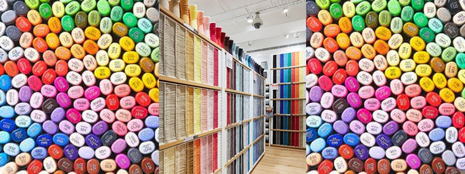
Transcripts
1. Intro & tools: Do you love watching the sunset? Or maybe you see a color in nature and
you just wondering, wow, nature, how
did you do that? This class is all
about color mixing and specifically mixing colors that we see in the natural world. My name is Jenna Lo. I'm
a watercolor landscape, nature artist and
outdoors enthusiast. If you want more classes, please go to my profile. You will be able to see
all the classes that I've put out on
watercolor and sketching. Thank you for following
me and supporting me. This is designed for all
levels. For beginners, we will start with
color mixing 101. and making the color wheel. Then there will be a few demos where I get out there and show you how I made a
swatch card like this. I will take you through
my thought process as I am mixing the various colors. It's a really quick
way to get snapshot of the surroundings. For
the more advanced levels. I hope this gives you
a refresher or perhaps inspire you to do something
different with color. There will be worksheets and templates all in
the project files. For those of you
who are watching on your phone or through the app, you cannot upload your project unless you're on a desktop. So I really urge you to enjoy this class
have fun watching it. And when you're ready to
take your class project, hop onto your computer, download the project files
and upload your project. I'm really excited. Let's get into the class.
2. Sketchbook and layout: In this video, we're
going to go over making the swatch cards and how to
lay out the information. The first thing is,
as you can see, this is obviously
self-made notebook. You do not have to do this. I just like to make my own
sketchbooks sometimes, but the important thing is that it's small and
compact and it can fit into a purse or
a small little bag. That's something
that's going to be very useful because
you don't want to carry something really
big and clunky around. Now let's go over the layout so there are different
ways you can do it, but these squares are
one inch by one inch. You could have a row
of four and just have four, or eight, which is also
a pretty good number. Or you perhaps you could do the three by three to make six. Depends on you. It depends on how
many colors you want, how much time you have, you can even just do four
something like that. So usually what I would
do is the top row is for this sky and the bottom
row is for the ground. And if you're feeling
a bit more adventurous than you could do
three rows of four. So the top row would be the sky. The second row could
be the middle ground, and then perhaps in row
could be the foreground. So some of the colors that you see really,
really close to you. But for now the reason I
have made for is really just because it fits very
nicely in this notebook. And then I can add a
little bit of texts. On the bottom, there
will be some ideas for templates that you can
download in the project files.
3. Color mixing: This video is going to be a quick overview
of color mixing, your color mixing
cheat sheet that will be available for download
in the project files. So if you ever forget something, just revert back to
this video. First up, we have our primary colors, which are the source
of all colors. You cannot make these colors by mixing other cards together. They are yellow, red, and blue. When we mix two primary
colors together, we get our secondary colors, orange, violet, and green. By mixing two primaries, we get our secondaries, yellow and red make orange, red and blue make violet, and blue and yellow make green. Now, let's talk about
our tertiary colors. We get these colors by mixing one primary and one
secondary color. In total, there are
six colors and it starts with the primary first
and the secondary second. So for example, yellow,
orange, red orange. And what this does is gives you this really beautiful
variation on that orange, a sort of warmer orange or
a cooler orange, a warmer purple or
a cooler purple. So what is warm or cool? Well, the colors on
the color wheel are divided into two sections. Warm and cool. Warm colors being yellow, orange, red, and cool being
violet, blue, green. Warm colors are colors that make you feel all warm
and fuzzy inside. They remind you of the
sun or flowers in spring. Next we have the cool colors. These colors remind me you of the ocean or the forest
in the cool weather. Now let's talk about
neutral colors. These are those that are
not on the color wheel, but we see them every day. For example, gray,
black, brown, and white. So how do we neutralize a color? We would meet a cool
and a warm neutral means that the color is
not warm or cool, it is just neutral. For example, we can
mix green and red to make brown or purple and
yellow to make gray. There's going to be
a whole video on how to mix blacks and browns. Now let's quickly
talk about intensity. I'm not gonna go
too much into it, but just a quick overview. The intensity is how
saturated or how transparent the
watercolor paint is. In watercolor, it would be transparent if you take it
directly out of the tube, it would be the
highest intensity. And as you start
to add more water, as you can see in
this demo here, the intensity starts to go down and it starts to become
more transparent. This is me swatching out the three primary colors that we'll be using in this video. Here are some templates that you can use to make these charts. I really encourage you to take the time to make the chart after each video as they will be
your guide and moving forward.
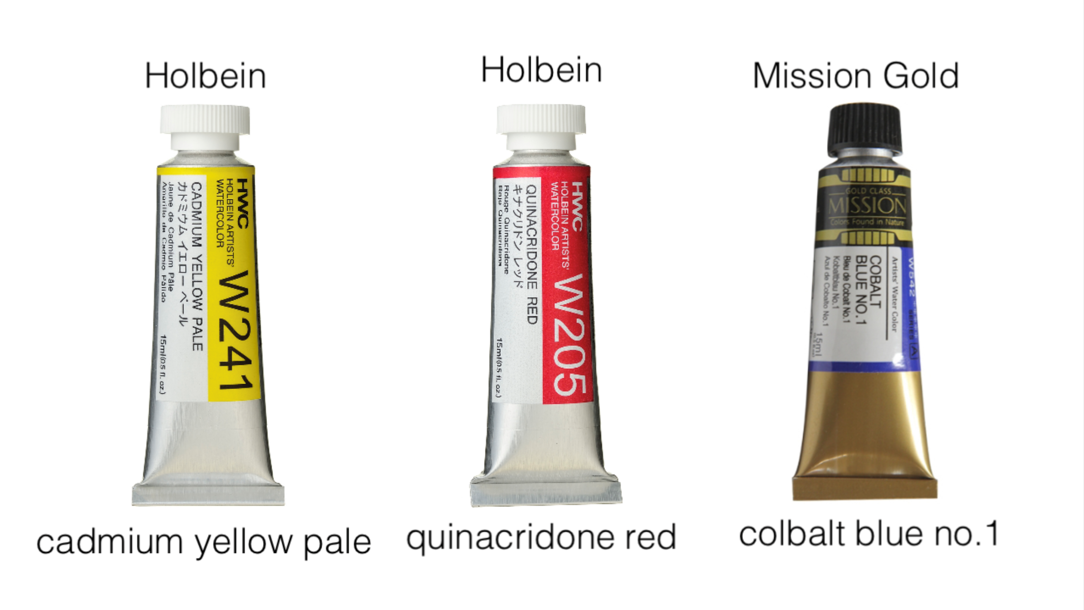
4. Color wheel: In this video, we're going to
be making the color wheel. So get your three
primary colors. Cadmium yellow pale, quinacridone
red, and cobalt blue. We need a plate to
use as a template. And then we're going to break
that circle into 12 parts. I'm just winging it here, but there will be a graphic that you can use as a template. Once we have it broken into 12 parts then we
need to label them, starting with the top, we put down yellow,
red, and blue. These should each be
three sections apart. Going in a clockwise direction. In the middle of the primaries
we have our secondaries, orange, violet, and green, also go in a
clockwise direction. So in-between our
primary and secondary, we have our tertiary colors. The primary goes first and
the secondary seconds. So for example, yellow- orange red-orange, red- -violet, blue-violet, blue-green,
and yellow-green. If you'd like, you
can pause the video now to draw out your template. I'm starting with
the primary colors, using them directly out of the tube because I want
them to be the most saturated and the most
intense that I could get the color to be. So,
in the same order, going clockwise around, I put down the three
primary colors, yellow, red, and blue. Now moving on to our
secondary colors. The secondary color orange is yellow and red mixed
together exactly 5050. Here I have a mixing plate. And now I'm just trying
to get enough paint to really fill up
that entire slice. Next we have violet too, which is a mix of blue
and red together. This mix turned out to
be a little bit harder to make sure that you
have that 50/50 mix. Next up we have green, which is a mix between
yellow and blue. For this mix, you might have
to have a bit more yellow. And that is because blue is
a lot darker than yellow and it takes a lot more yellow
to create even mix. I'm moving on to our
tertiary colors. What I did was I had
left the orange that I had and I'm making
yellow-orange. So I'm just taking yellow directly out of the
tube and putting it in trying to make a color that is in-between the yellow and the orange
that we have done. And then putting
more red back in to make that red-orange. You may have to go back and forth to try to
make sure that you get a nice color that
is really in-between. Next is red-violet. So that means that this is a very warm violet and
more on the red side. It took a few tries
to get the mix right. Now, putting blue back in
to make that blue-violet. For this last one, instead of going in the
clockwise order, I, for some reason, I decided
to make yellow-green first. Here you need to add a lot
more yellow than blue, nor did to get
that yellow-green. Then putting blue back
in to make blue-green. There are our six
tertiary colors. So I really encourage you to take the time to make
it this color wheel. It is the basic introduction
to color mixing. And it's going to be a really
great template that you can use to go back and check, maybe you forgot how to
mix a certain color, or you're wondering where to
start with a certain color, you can always revert
back to the color wheel.
5. Mixing blacks and browns: In this video, we're going to be mixing blacks and browns. The first way to mix black is by mixing all three primary
colors together. The three colors cancel each
other out, creating a black. Now just to note that
these colors are still quite light
and transparent. So the black that you will
get is not going to be as concentrated or as saturated. Next, let's see
what happens if we mix opposites on
the color wheel. Starting with purple and yellow. Mixing these two together
will give you a sort of gray. Now let's mix orange and blue. Mixing these two together
will definitely give you a darker gray brown color. Green and red together give
you quite a dark brown. This is what it looks like. Dry. As an added bonus. Here is what it
looks like if you mix a tertiary color
with a primary color. Just notice the slight variation of color that you can get.
6. Warm vs cool: In this video, I'm gonna
show you how to make a color warm or cool,
starting with yellow. And then mixing red and yellow together just a little bit
to make it a warm yellow. Now, mixing blue with yellow
to make it cool yellow. Mixing in yellow with red. We're gonna make it a warm red. Mixing blue with red. We're going to make
it a cool red. So making a mistake that
beginners might make, I add red with blue, thinking that red is warm
and so it would create a warm color however
you can see that it creates a sort of
dark blue violet, which is actually cool. Now, mixing yellow with blue, we'd get this nice blue green, which is actually warm. On the far left side, we have the original color. Then the middle is warm
and the far right is cool, with the exception of blue.
9. Before getting out there: The first question is probably, how do you choose color? The top row is usually for the sky and some
of the background, and then the bottom is for the ground and some of
them more earthy colors. But the truth is,
it's up to you. You can choose cool colors. The top row being cool and
the bottom color be warm. Or perhaps you could choose specific things like all
trees and all flowers. This really depends on you. The next thing is what to wear. Now this may be kind of silly, but you're going to be sitting outside facing the
elements for awhile. I would suggest
checking the weather before you go out
and always bring a light jacket or a scarf also because sometimes it will be a little bit
dirty where you are. So I can sit on the scarf or on the jacket and then when
it gets cold, I put it on. If it's very hot, make sure that you
bring enough water to drink and something
to protect your face, maybe a hat or sunglasses or tried to find a
shaded area to sit. The last thing is noise. Now, I have been recording this outside and I'm sure you can hear all
the ambient sounds. They're always going to be
things going on around you. At first, this can be a
little bit distracting. A lot of times people would come up to you and start
talking to you, or looking over your
shoulder and this can be a little bit
nerve wracking. If you don't want
people to bother you, perhaps you could put on some headphones or you
could just ignore them. You know, people are interested. They just want to see and they always have
nice things to say. Eventually they'll walk
away once they see how focused you
are on your work, they will realize
and not disturb you. Now you know what to
do when you get out there and take in all
those natural colors.
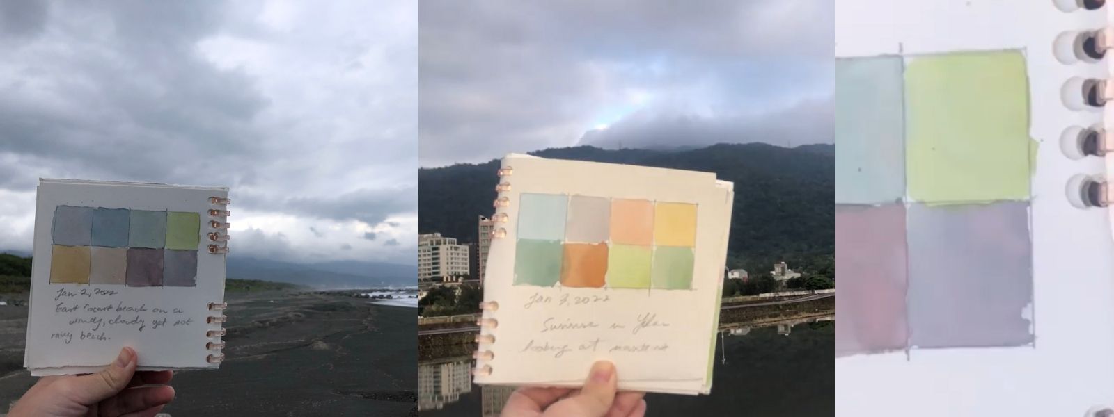
10. Demo at the beach: So I'm at the ocean right now and it's
quite cloudy today. I have palate the water. I've made a grid already. Have some tissue
paper this time. I'm just going to start by kind of neutralizing this blue, a bit of yellow. I wanted to turn it
to a sort of gray. To start with the
greatness of the clouds. There we go. This is going to be the
gray, gloomy clouds. Just wanted to
make it a bit more saturated that
it's not so night. Then from this mix, I can make a bunch
of different shades. Dark it now. Okay,
Then mountains in the background
a little bit blue. Blue gray. Just come in. Dropping some blue
into that gray. Make it a bit more bluish. That looks really nice. I'm trying to clean
this up a little bit. I don't want them
to bleed together. That's why I've left
this space there. But it's probably a dryer now, so you can fill that in. Then as we started
coming towards foreground, the middle ground, the mountains are like
this bluish green. I know that yellow and blue makes green and so just
dab in a bit of yellow. There we go. Gray, blue, green for that to dry a little bit
and then drops them in so that they
don't bleed as much. Then the last thing I wanted
to do is make that bright green that I see
right up close to us. Because it's mixed
with grades very dull. Have to grab a bit more yellow. There we go. Just brighten the
whole thing up a bit. That's the green,
the foreground. Now let's move to the sand
and the brown of the grass. Let's start with some
of the grass first. This color is also part
of some of the grass. But if we look at some
of the grass lower, closer to us to have the silver grass and then
we have sort of orangey, mossy kind of grass. In this one. Just going to mix red. Make brown, little bit golden. Now I'm going to put
some yellow back in. Like a warm golden color. No. I'm gonna start over here. I guess it's moss on the ground and then will go
for some of the silver grass. The silver grass is also
sort of neutralized brown. Grab a little bit of blue. If I didn't neutralize
it a little bit. There we go. Suppose some of the darker parts of
the silver grass. Then let's try to
do the do the sand. The sand is like a
very ground gray. That's why I decided to put
a bunch of yellow in there. Because I know that
it needs to be a very saturated mix
to put red back in. Some blue back. There we go. Now we almost
have the color of the sand, but it's a little bit cooler
than this. A bit more blue. Nice, there we go. We have the color of the sand. And then let's get the wet sand, the color of the wet sand, which is like this. Glistening gray blue. It is reflecting the sky. Wait for that to dry so
it doesn't bleed into each other. That's right. Something about it. Today is the second day of 2022. East Coast beach on windy, cloudy, yet not grainy. There we go. That's how we do. Cute little swatch card. Will snapshot of my
time here at the beach.
11. Demo at sunrise: For this demo, the time
of day is at sunrise, so our colors are
not going to look muddy like some of
the previous demos. First step, I'm making the color of the sky taken
blue and then adding a little bit of water
to sort of tone it down and make it not so intense. Then from here, I
add yellow and red, the three colors together to
make a grave for the clouds. Then red mixed with
yellow to make orange. We have this sort
of red orange that represents the
sunrise in the sky. I'm taking yellow
and mixing it with that orange to make a
yellow orange for the sun. These are the colors of the sky. There was a little bit of
yellow off camera on the side, so just grabbed
it and put it in. And I'm noticing that the
sky colors are very pale. So this particular Brown, I purposefully
decided to make it a bit more saturated
to make it pop. Although this is not
the color that I see specifically
on the mountains. Putting in blue into that Brown. I know that the brown is yellow enough that if
I mix enough blue, I'll make this sort of
in Dole blue-green. And that's the color of the mountains that we
see far away from us. Now I have to put in
a bit more yellow. I'm going to make some
of those greens that we see a lot closer to us. That's the green
of the mountain, that's a lot closer to us. Putting in a bit more yellow and red to warm that green up. I'm making the darker green that you can see in some of the
shadows of the mountain. Of course, once it's done, add the date, a little sentence
to sum up on the scene.
12. Final thoughts: I really hope that gave you a comprehensive look
on how to mix colors. Please don't forget to
hop onto the computer and download the project files and
upload your class project. I look forward to seeing them. If you have any questions, just pop them in the
discussion section. And thank you so
much for joining me.
 Jenna, Watercolor + Sketching + Nature