Transcripts
1. Intro & Tools: Hi, welcome to this class,
watercolor, basic shapes. In this class, I
want to teach you all about watercolor
and then use the basic shapes
to understand how to use the tools and
techniques. My name is Jenna. Hello, and I'm a watercolor
landscape nature artists and sketch it in this class, we're only going to be using one paintbrush and one color. We are going to be doing
monochromatic painting so that we can understand
how to build up the paint without thinking about what color
should I use out? Let me show you the
tools that I'll be using in this class. Okay.
2. Types of paper: So I've decided to do a whole video just on paper. Now here are some of my paintings over the years. I have experimented with them all. Here we have two paintings made on cheap Canson paper. The one thing that I've noticed with the cheaper papers is that sometimes the color just ends up doling or the paint doesn't really blend well together. So yes, it's cheap, but the colors are not blending the way you want them to. Or the color is not as vibrant as some of the other paintings that you've seen from some of your favorite painters to next step here is cheap multimedia paper. As you can see, the blends are not, they don't look so good. And the color is very doll. You're just not going to get those beautiful, vibrant colors that you're looking for and you're going to have a really hard time blending the colors together. Okay, so onto called crest. These are two different brands, Fabriano and arches. And as you can see, there's a bit of texture because the paper is quite thin. You don't have as much drying time, so you can still see some of those edges. This paper is still nice to work with. Next up, this is Arches. And as you can see, because it's a bit thicker paper, the drying times a little bit longer. You can get slightly more smooth blends. And the texture doesn't really show up when you're painting something quite bright. This is Arches hot pressed paper. And see there's absolutely no texture. It's very smooth. You can make this really beautiful smooth blends. And some of the texture that you're getting is from the granulation in the paint, not the paper itself. So here you can see it a little bit of streakiness, but it's still quite smooth. And even though you can see some of the sharper edges here, It's still blends really nicely. You can see the difference in the streakiness and the edges between the cheaper paper, not 100% cotton paper and the 100% cotton paper.
3. Watercolor washes & techniques: Watercolor washes and techniques. A wash refers to the peak while it's white. And the most common type of wash, it's a flat wash. That just means a flat wash of color all flew out. So you can practice this by making a square or a bar is I've done and just try putting down a flat wash. Here we have a graded wash. As you can see, I'm moving that bead of water slowly down the bar. Do not take your wet brush and put it back into the area that has already settled. This will just ruined your wash. It. Once I moved that bead of water down, I clean off my brush and I start using clear water to fade that wash out to the white of the paper. Every time you need to clean your brush off and go back in. And here I'm using a damp brush to pick up any excess paint. Next step we have a variegated wash, and that just means the color is very crowded. And I can go back and forth and put down different colors and mix them all together on the paper. Here's some ideas for different shapes you can make to practice doing these washes. Now let's talk about application. There are two main types of application for all mediums and that is wet on dry, which means that your brush is wet and your paper is dry. The next one is wet on wet, where you will use clear water or some paint to wet the surface and then drop in another color. Let's drop in some paint. Here you can see I've wet the surface and now I'm dropping in more paint. And this is called wet on wet. Your brush is wet and your paper is white. Once your paint is down, you can lift up some, depending on the type of paint and the paper. Usually most watercolors can lift, although some are better than others. And we use lifting to lighten some areas or to clean up the mistakes. Is it a little bit like erasing? Another very common technique is glazing, where you are basically layering either two layers of the same color or two layers of different colors to build up the contrast. As you can see with this little house, I painted one layer, let it dry. And now I'm painting this side of the house to make it look darker. And the most common that you'll find in watercolor is preserving white. And that is because there is no white in watercolor paintings. So oftentimes we will have to leave out that white section, usually using the white of the paper. So as you can see, I'm painting around the part. I want to keep white.
4. Brush control: Let's talk about brush control. So first, here are three different types of grips. Easy grip is most common. It's similar to holding a pencil. Next we have the loose grip. We'll use this grip when you want to cover large spaces and have the most freedom to move your arm around. Next up we have a tight grip, hold it really close to the edge and keep it quite straight. This is when you want to paint in those tiny details. So here are some exercises you can use to understand your brush better. Paint lines using different amounts of pressure. This is where you can see the range of your brush. How thick can I get this line? How thin can I get this line? As you can see, my wrist is not really moving. I'm mainly holding it and moving my arm as the line it gets thinner. I need to hold it a little bit tighter. Now that you understand the different types of pressure. Practice going back and forth between thin lines and thick lines by loosening up the pressure or putting down more pressure. Now this one is pretty straightforward. Painting a few consistent lines in different directions can help you to build up consistency in your lines. Sometimes you'll need to practice painting a flat wash. That's where you can paint different flat shapes.
5. Water ratios & transparency: Okay, Let's talk about water ratios and transparency. Do not skip this class because this is the most crucial class to teach you how to control the amount of water on your brush, paper and mixing the paint. So first step we have a milky, very saturated wash. Look at the consistency of the paint. Is almost dry, doesn't move as well on wet on dry and wet on wet. It moves but just barely. This is good for painting tiny details. Just dropping in a little bit of extra contrast. Next step, this is where most of your consistency will live. To call this buttery or mid-tone. And you can see wet on dry, it applies really beautifully. And wet on wet. It moves a lot faster, but not too much. Last we have very watery or transparent. Usually use this for the first wash. As you can see, it just moves so nicely wet on dry and wet on wet. It almost moves too fast. Okay, so let's make a transparency chart. Now what you're gonna do is use the paint almost as dark as it comes out of the tube. Just paint a little box and then dropping a little bit of water and start to see how transparent you can get your paint to be. Normally with other paints you would mixing white, but with watercolor, you would mix in water. And that's what makes the paint become lighter and lighter. Let's look at the water on the brush. We have a very soft brush, and then we have a wet brush, will use a wet brush. The most often. Damp brush is where you're still a little bit of water on it. So I'm lifting. It will be done with a damp brush. And finally we have a dry brush. This exercise will teach you how to control the water, both on the paper and on your brush. It totally changed the way that I viewed watercolor because I finally felt in control. The first thing you wanna do is break your watercolor paper into three sections. I've done this by using paper tape. What I'm gonna do for this exercise is paint a house. So first we're going to use wet on dry. That means we're using dry paper and a wet brush. So first step, I'm doing wet on dry with a soft brush. But as you can tell, the consistency is more along the saturated side. So even though my brushes soaked, the paint is quite thick and it does not necessarily move as smoothly as you would assume. Next up, I'm using a wet brush and the consistency of the pain is more along the lines of buttery mid-tone. So it moves quite quickly and quite easily along the paper's surface. Next up, I have a dry brush. As you can see, immediately, the brush starts to break up. It's not very easy to cover the entire space, and it takes a few tries before I can finally fill up the entire box. So what I want you to do is do this exercise and start to notice the differences, putting down different types of consistency. Notice how much easier or how much more difficult it is when you're using a soft brush or a dry brush. Okay, next step we're going to be using wet paper. I'm painting all three boxes. And we're going to let the paint dry at different stages. The first stage, we have soaked paper with a soap toothbrush because my surface is flat, the paint is not really moving around, but after sometime it just blends in with the background and it's gone. You cannot see what I've tried to put down. Next, we're going to use wet paper. I've let the water settle in just a little bit. As you can see, I don't have these pools of water as on the soap to paper. And the brush I'm putting in is going to be a wet brush. Consistency is buttery to midtone, putting down the first layer, it was not really dark enough though I put down a second layer, but using the same type of brush. Just watch how the paint moves. It doesn't move as much and it will retain its shape because there's less water on the paper for the paint to move around. Next step, we have damp paper. It is stamped to touch, but it is not glistening and shiny like the other two section. And for this exercise, I'm going to use a very soft brush and paint the same shape. And immediately you can see the paint start to travel outside of the shape that I want to watch at how quickly pain travels on the paper. The longer I live it, the more it's going to travel outwards.
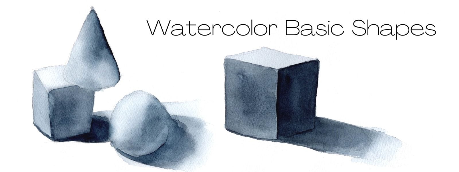
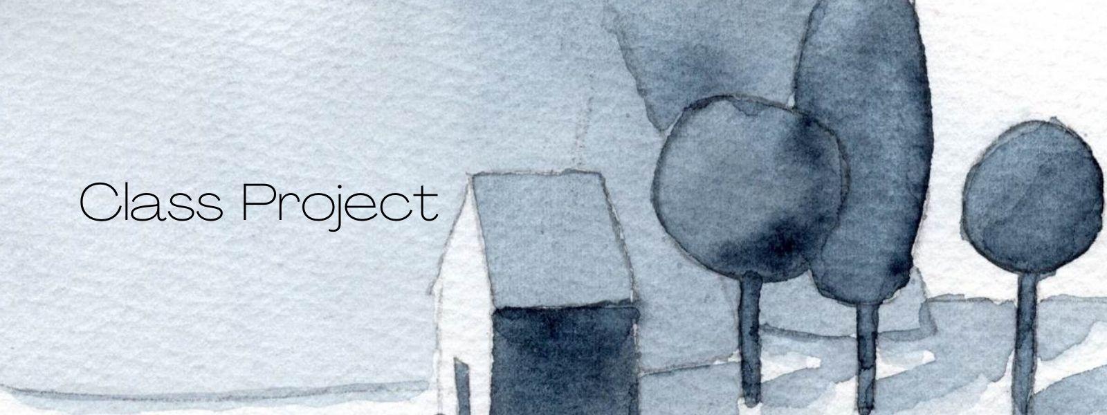
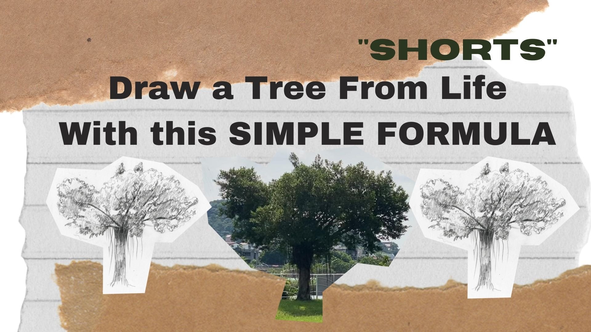
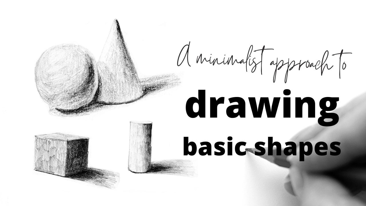
6. Class Project: In this class we are going to be painting four basic shapes. And I'm using the four basic shapes that are a part of my previous class. [ Drawings Basic Shapes ] So if you're unfamiliar with these shapes, how would suggest going back to watch that class before taking this class, as I'm also using the same reference photos from that class. So once we paint the basic shapes and learn how to use the techniques to build up color. For the class project, I would like you to create a simple shapes landscape. And there's going to be a demo where you can watch how I paint this using all the different types of techniques. But it would be really fun and cool to see your own interpretation of a basic shapes landscape.
7. Cube: Okay, we're starting off with the cube because it will consist of only flat washes. We're doing wet on dry. As you can see, I have an extra paper next to me. And this is what I will use to make sure that I'm getting the right transparency in my paint. I'm using very watery paint to cover the entire surface of the cube. Doing a flat wash. As you can see towards the left, the paint has started to settle into the paper. So I will not use my brush to go back and touch that area. Now cleaning off my brush, I just do a graded wash and fade that out to the white of the paper. Now, once that has dried and move on to the second layer, now, I've made a mistake here and you'll be able to see it later. But I'm using a darker wash. And once again, just painting in a flat wash on the two sides, the left and right sides. And leaving out the top part because that is the lightest part of our cube. So I decided to drop in a little bit of color because I thought this side was too light. And now you can see my mistake starting form. I have to resist the urge to go back and fix it because I already know that it's settling into the paper and if I put my brush there, I'm going to mess it up. Okay, so here's the mistake. As you can see, one side is darker than the other. And that's because in that particular area, I had too much paint on my brush and not enough water. So what I decided to do is take a damp brush and kind of scrub this around. I'm scrubbing with clear water to try to even that out. So it's not so obvious. But I'm doing this after it has dried. Okay, So now moving on to the right side of the cube, as you can see, because both sides are wet, they will bleed into each other, but it's okay because some bleeding will look nice, as long as it's not too much. And also another thing you will notice is that the saturation of my paint gets darker and darker as we start building up the layers. But the consistency is still buttery and it's still easy to move around. There's a little bit of excess paint here, so just use a damp brush to sort of lift it up. Okay, so now that that's dry, you can see that the both sides look a bit more consistent. But I realize that the third layer was not dark enough. So I'm gonna go in again and paint over the third layer on the right side. Using a clean brush, just fade out those edges. A good rule is that if it's not shiny anymore than it has already started to dry, do not put your brush back into that part of the wash. And here I'm painting the contact shadow, but it wasn't really dark enough. So I go in one more time with a slightly darker wash. And then once that is dry, the last layer is really to go back and put that contact shadow on the right side. Just a tiny amount of paint. And then use clear water to sort of faded out, make it not so obvious.
8. Cone: So moving on to the tone. I'm doing a flat wash, flat transparent wash covering the entire surface. Mainly doing wet on dry, although some times I will drop in. Use the pressure of your brush to cover the surface. Now using a damp brush, just picking up any excess paint, using a graded wash to fade it out to the white of the paper. Here we are on the second layer. After the first layer has dried, I'm using a slightly darker mix, but it's still water me so that I can move it around the paper. So you can see I left that edge there because I want to use clear water to go into to the edge of the cone. Now moving on to the shadow, the cast shadow. Use one stroke to smooth out these edges. I'm putting in the contact shadow. So now that's dry. Moving on to the third layer, this is the darkest layer. As you can see, I'm using quite saturated mix, but there is still enough water to once again move things around. But when the pain becomes so saturated, you need to be very careful because every time you put your brush down you're going to pick up some paint? I keep going back and forth between cleaning off my brush, picking up some pain and moving around, using clean water to do a graded wash and smooth it out to the edge of the cone. I'm just doing some cleanup with a damp brush.
9. Cylinder: Yeah, I'm just swatching out to try to get the right darkness with the right consistency. And I'm going to be doing mixed techniques. So I'm gonna start by doing a flat wash, wet, on dry. And as you can see at the very most left side, I have left that for now because I want that to be the lightest side. Now clean off my brush and sort of pick up any excess paint during a graded wash. But this part, I have cleaned my brush and I'm using a damp brush to smooth out that edge. And then clean off my brush. Use a damp or dry brush to lift that paint out. Want the left side to be the lightest side. Here also lifting at the top because the top is also the lightest side. Now I'm going in wet on wet brush and not be wetter than the paper. This is the most important. So I'm just swatching out to make sure that consistency is correct. As you can see, it's getting darker but it's still too watery, so I need to put in some more. I'm still a little bit too watery, so just grab some more paint. As you can see, the consistency is changing. Now is this is more what I'm looking for. So I strive to drop the paint wet on wet. As you can see, once I drop into the paint, it all automatically looks lighter. And that is because there is water on the paper. And that water on the paper is also mixing in with the paint on your brush and more water, more transparency. So here I'm taking a damp brush and just doing some editing. As you can see, there is some colleagues wiring effect. I'm using a damp brush to just pull that out or smooth it out. And then once again going over the top just in case any paint moved into that area. So that is our first layer done. Now, I'm going back wet on dry, doing a slightly darker wash here. And then using a damp brush, just start to do a graded wash and phased out to the white square, the last layer. And I will always take some clean water and paint to the edge just in case there's a water line that shows up that I don't like dropping in some more paint down here. Wet on wet. And then painting into shadow, which is wet on dry. Clean off my brush using a damp brush, just spit that out to the white of the paper. Use clear stroke. Makes it look a lot more smooth. And just using clear water to paint to the edge just in case I get a water line that I don't like. Okay. So we're on to the last layer. Once it has dried, I'm just going to bump up all the contrast, starting with the contact shadow. And then just a little bit on the right side. Clean off my brush and start doing a graded wash. Use the pressure of your brush to pull the paint down. And every time you do this, you're going to pick up some paint. I decided to use that excess paint to paint further down. And here I am using clear water to paint to the edge. But then I started to notice that it looked a little bit strange that there was just a triangle on the top. So I took more paint and just dropped it in on the very right, clean off my brush, and then smooth it out.
10. Sphere: Moving on to our last shape is a sphere. Now as you can see, I'm taping it down and you can do that sometimes, but you don't have to. So first we're going to do wet on dry. Every layer is going to be wet on dry. And we're gonna sort of for some of these stages because you've kind of seen them before. And by now you should start to know the formula. First, put down a flat wash. Use a clean brush to lift off some of that paint because that is the highlight. Let it dry. Make sure the consistency is correct before moving on and start to paint the shadow. Now, I made a mistake here, and it's already starting to dry. And you can see an edge is starting to form. So when I tried to do a graded wash, you can still see that line a little bit. And now we have an unwanted edge going to show you how I edit that in later layers. So smooth it out. And then paint to the pencil line. So while it's still wet, I'm trying to drop in some paint to cover that a little bit. But once it's dry, realize that the mistake is still quite obvious. So I'm using a darker but still watery wash to glaze over and cover up that edge. Now use clear water to do a graded wash and smooth out that edge. So as you can see, the difference here is that the top part is still glistening. That means it's wet enough and it hasn't really settled into the paper. So I'm able to cover up that edge just a little bit. And then use clear water to paint to the pencil line. Do the same thing at the bottom with the cast a shadow. So now we're gonna go ahead and do the darkest layer. I only pay a little bit because I know I'm going to do a graded wash and then I'm going to bring that paint down. Here. I am just trying to smooth out that edge. Using clear water. I'm painting the core shadow of the sphere. The same thing, only painting a little bit. And I want to be the darkest. And then using a gradient wash to blend it out. And then once again, just using clear water to pay to the pencil line. So I realized that I didn't really paint the cast shadow and the right place. So I'm just doing a quick place to try to cover them at stake. It's still wet now. As you can see, it's starting to bleed. And I use so I just use a damp brush to pick up a little bit. So once it's dry, I felt was not dark enough. And if you feel that something is not dark enough, you can always go over and do another glaze. That's the great thing about watercolor is that you can usually paint over, but unfortunately you can't erase or take something back as easily, so you need to be a little bit careful. Sometimes we can always go darker, but you can't go. Yeah. Hi. Hello.
11. 3 shapes: I'm sure that by now you have figured out what the formula is going to be. Flat wash over all the shapes. I want to make sure that it is consistent. So if I put some paint, put in some water, then I'll mix a little bit on the paper. Here. I'm lifting out with the left side of the column. Lifting out the top part of the sphere and the top part of the cube. So I'm using the wet on wet. I'm dropping in some darker paint into the cone and a sphere, a cube, and also the shadow of the cube. Now it's important to move quickly because each part is drying and you don't want it to dry too much time using a damp brush to lift out and sort of blend some of those things together. And blending this part as well. It's okay if Saudis little bit darker. So that's the first player. Now, moving on to the second layer, I need to be a bit more careful. And I'm using wet on dry using graded wash to fade that out. A damp brush with clear water. Just bringing that line up to the top. And for the cube, I'm going to be using just a flat wash and move on to the shadow. But I know that the sphere is white, so I have to be very careful that these two sides don't touch it. I don't want any bleeding to happen. Now I'm doing wet on dry on the cone. And then trust smoothing out this part here, using a damp brush to fade out that edge. Then this part is dry. I'm using it to paint a contact shadow and maybe make the shadow a little bit darker. Then painting in the cast shadow is still wet. But I decided to go in and make this part a little bit darker and lifting out any areas that I don't want to bleed. Now that's dry. This is what it looks like dry. I'm going to go in into the last layer, starting off with the cast shadow of the sphere. Paint in a little bit for the core shadow that I want to be the darkest. And then doing the graded wash. I would say that is the sphere done. Moving on to the cone, I am using wet on dry because I want to make sure that I'm getting the shadows really precise. And then I'm doing a graded wash on the cone. Sure. I'm using clear water to paint around it. And this left side was a little bit too light, so I used a transparent wash to glaze over. And here is our three shapes.
12. Class project demo: Hi. Hi. This is hi. Hello. Hello.
 Jenna, Watercolor + Sketching + Nature