Transcripts
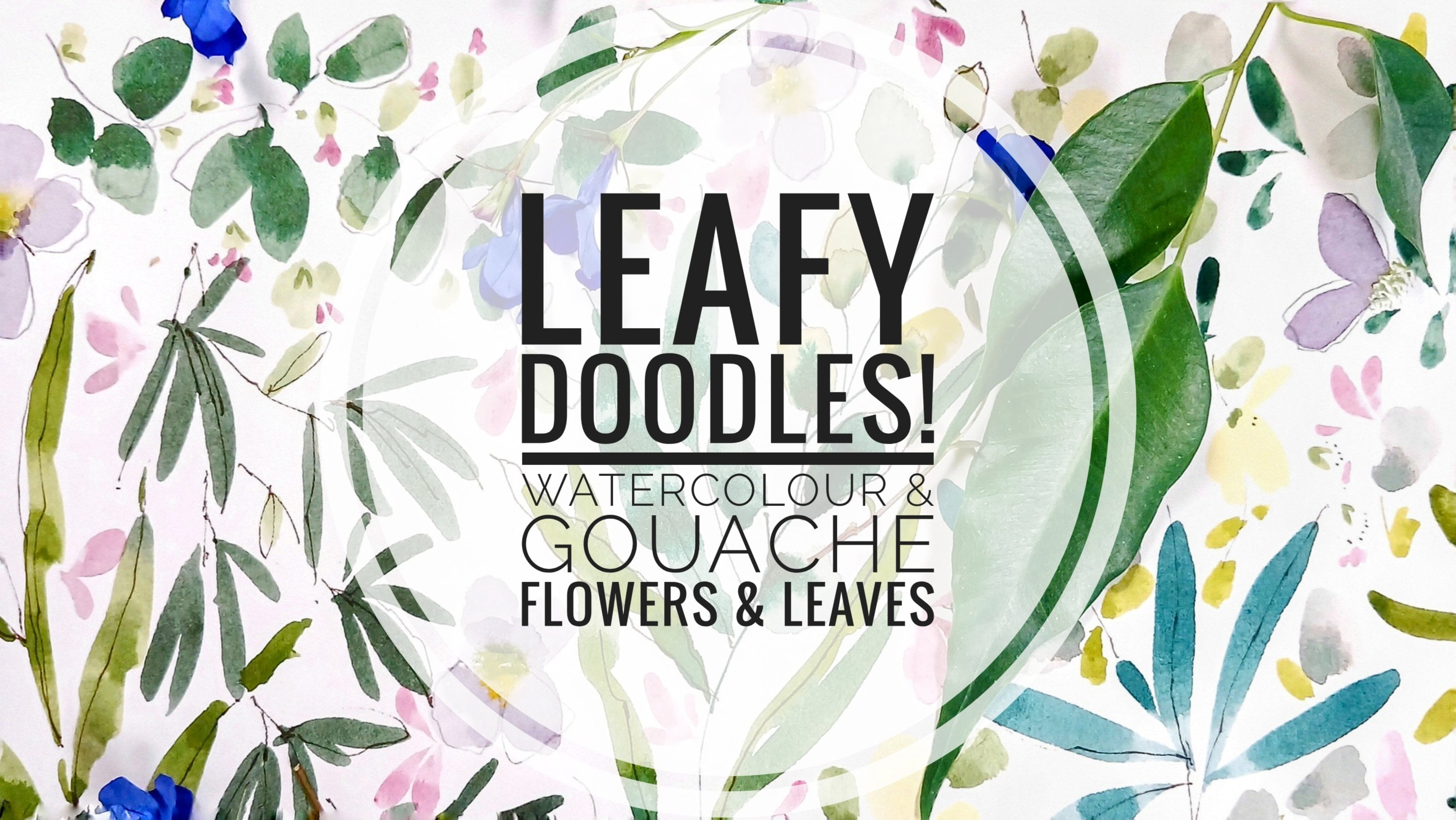
1. Welcome!: Hi, there. I'm Holly and a huge welcome to
my new followers. For those of you who have been supporting me for a while, hi. It's so nice to see you again. I've got something
to share with you today that I'm hoping you're
going to really enjoy. I've ascribed this as a
suitable for all category, as I do cover some
gouache fundamentals with plenty of
preliminary practice, but it's also suited to intermediate level students who can just choose to
do the project part. Of for seasoned
artists who fancy trying something different
to their usual style. So we'll be grabbing
our brightest colors for this riot of
naive style florals. I'll be taking you
through materials. How to use watercolor
instead of gouache. Practice runs with
our florals before bringing all of our
favorite flowers into our class project. I've designed this
class for those of you who may need regular breaks. Because of the
style of painting, we can leave at any
point and come back to it when you're ready
to add more motifs. Or you can come
along with me for the whole class all in one go. It's also great for gathering floral motifs you to
embrace as your own. And for those of you who want to transition from
watercolor to gouache, as you can use either of these mediums to
create your florals, or you could use both. So we're working with balance today using the
placement of color, size, shape, and depth. For example, we'll be using
a pastel wash background, then layers of bright flowers. We'll also be using flat layers. Then as we go along, begin
to use thicker paint. Other balancing component will be our use of
complimentary colors, primary blue, yellow and red with secondary orange,
violet, and green. Placing complimentary colors in a relaxed way can heighten each color's vibrancy
and presence. And once we've placed all
our lovely florals down, we're going to have
a doodle session. And my aim, as always, is to provide classes which are informative, relaxing, and fun. So before we move on, let me show you how you can
share your class project. Underneath the class, you'll see an area called Projects
and Resources. And on the right,
submit project. It's a lovely way of
feeling connected, accessing like minded people, showcasing your work, getting
feedback and sharing tips. For my deaf and hard
of hearing students, you can access subtitles. Next, do the volume
button under each lesson. So when you're
ready, let's delve into our world of
color and doodles.
2. Materials: Let me walk you
through materials. I'm starting with
Shin han gouache, and I have moss green 044, blue green 068, and
cobalt violet hue, 113. It's the first time
I'm using Shinhan, so I'm going to interchange
them with other makes. This is cobalt teal
blue by Daniel Smith, one of my favorites, Opera Pink, ultramarine blue. That's a lovely, gorgeous
blue for mixing. You can't see underneath
all of the paint, but this is handsy yellow deep. And Pyl red. That's the Daniel Smith. And then I've just bought in
some Winsor Newton gouache, and I'm using the white there. But I also tried out the
Shinhan gouache 162. Then we have primary
yellow, Windsor Newton. This is also a
lovely mixing color. And then Bengal Rose, which I've not used before, and I've fallen in love with it. I think it's gorgeous.
So that's paints. Let's have a look at brushes. Now, I use this size zero raven by Jackson's just for
the initial wash layer. Any soft brush that
you prefer for that. And then for the
actual painting, I'm using size five. This is a memory point, and it's a pointed round brush. I then have two filberts. This is a size two, and it's from that very
inexpensive set that I bought and I've mentioned
before, by Master Touch. And then I have a size eight, and this is Royal and
Langnickel, a filbert. Now, for pens, I have my
pigma micron 01 in sepia. And I use Sepia
probably, as you know, 'cause it's slightly more
subtle than a black. And then a Signo white gel pen. I also picked up a couple of big pens in turquoise and pink. I wasn't sure about them
really once I used them. I think they're colorful, but I probably wouldn't use them for a project like this again, but you probably have
lots of different pens in your art supplies that you are used to using and know
will be great for this. Here's my mechanical pencil, 0.7 by Faber Castle. And then I use two tombo pens. The first one is p757
and it's port red. That's a gorgeous color. And then we have 027 dark ochre. And again, I use the fiber tip end and last
but not least the paper. And I used Hanamula harmony. Hanamul harmony, as
you probably know, has a very silky surface. It's very hot pressed, is what I would describe it as. But you could use any of your
normal watercolor paper. It could be cold pressed. You could decide to do
this in a sketchbook. This class really
suits any paper. It's size 21 by
29.7 centimeters, and it's 140 pounds.
3. Can I Use Watercolour?: So, can we use watercolor
for this class? And I'm going to show you
just how we can do that. So I'm going to use
green gold, watercolor, and then bring in the gouache that I'm going to
be using in class. And it says the
Shinhan moss green. Then into the
Shinhan moss green, I'm going to add Windsor
New turn titanium white. And in the watercolor well, I'm going to add some
titanium white watercolor. So I'm mixing this up with
my size five round brush. And that's the gouache, adding a little bit of water. And then I'm just going to paint very quickly a clover leaf. That's the guase. And then let's mix
up the watercolors. This is the green gold
with titanium white. So mixing our watercolors
with titanium white, which is designed to be opaque, leads us closer
to a Guache look. And you see there's not
much in it, really. And for this class,
it's perfect. So let me show you with
another color now. And I'm going to start off
with these little scribbles. These are very cute
flowers that we're going to be doing
in our project. And then I have pyrole red, and that's the gouache. And then I don't have
Pyle red in watercolor. So I'm just going
to use Perlein. So that's Perlene red. And let's do the same as we did with the green and add firstly, our white gouache and then
our white watercolor. I don't want to add too
much white to this because we want to maintain
a lovely ruby red. So there we have the
Pyl red gouache. And let's see what
that looks like. So let's do some now in the
Perylene red watercolor. Mm hmm. So adding just
touches of water. And you can see just in
the well how there's not an incredible difference here between the guise
and watercolur. And then let's do
that same movement and see if we can see any difference
between the two reds. Now, of course, they're
slightly different in hue, just because one is pylin
and the other is Pyl. But with small
flowers like this, I think you really would be hard pressed to say which was which. So there's the watercolor. And let me just lay down
the gouache next to that, when I had to paint there a little bit, so it's
a bit runnier. So that's the gouache. So I'm just going to mix
up now an orangy colour. And in the gouache, I
have primary yellow, and I'm actually
adding Bengal rose. Both of these
interneutan colors. Any yellow and pink or red, and you'll get a lovely
luscious orange. So that's cadmium
yellow, watercolor. And then I have opera pink. All that lovely paint. I don't want it to go to waste. The watercolor might
need a little bit of work getting going because
it's a little drier. Let's start off
with our gouache. So that's bengal rose
and primary yellow. And I just wanted to add
a little bit more yellow. Lush. That's a gorgeous color. And that's gone to way, so I'm just going
to add a little bit more of the opera pink. So once again, this
is the watercolor. So that's white gouache
and then white watercolor. Adding a touch of white
to the watercolor. A little touch of water. And then I'm going to show
you a very simple motif, which is a rose. And then here's the watercolor. It's going down beautifully, and it's certainly opaque. So let me just add a tiny
touch of white because I want to get closer to that lighter color that I've
just done in the watercolor, just to allow you to see the difference if
you feel there is any. So there we are next
to the watercolor. Minuscule amount of difference. So laying them side
by side there, and you can see not
much difference at all. So I hope this has been helpful, not just for this
class or my classes, but for other gouache
classes on Skillshare. I hope it opens up quite a few classes that
you would like to do, knowing that you can now
do it in watercolor.
4. Practise | Pinnate & Clover Leaves | Peach Flowers: Let's practice our
brush strokes, and I'm just going to run
through the main ones and leave all the finishing
touches to our project. So let's start off
with this dark teal, which is blue green shin hand. I'm using my size eight fiilbet and I'm just
going to use the neat paint, adding a touch of water to it. With these initial layers, we don't want the
paint to be too thick. So I'm going to use
this on its side, and we have done this
move before in classes. So almost start the movement before we put the paint
brush down to the page. Let's do it nice
and slowly pushing down the brush and
lifting to a tip. We can change direction a little bit and also vary the size. I so that's a quick and
easy little leaf and motif. And now let's add some green. This is the moss green in hand. I'm going to add
some primary yellow. I'm not going to
focus too much on the paints because this is
about the brush strokes, and I'll be taking you through different color mixes as
we get on to our project. I'm now using my size
five round brush. There's quite a lot
of paint on my brush. It's quite clogged, so I'm just taking the main
bits of paint off. And then I just want to claim back a little
bit of control. We go in with a clogged brush
when we're doing gouache, we can start to get furry edges, and it's not very precise. So I either wipe or
I wash my brush, and then I go back
into the paint. And all we're going
to do here is create some simple
triangular leaves. You can round the
sides a little bit. I like this way of
just working really slowly and mapping out the leaf shapes. It's
kind of freeing. And, of course, I'm going
to do a four leafed clover. And let's do a slightly
smaller one over here. So just painting the outlines
and then filling it in. That's a little bit too rounded, but I can go back
in and correct. I mean, this is the beautiful
thing about gouache. After using watercolor for
most of my painting life, it's quite freeing
to use gouache, especially for things
like this where it's not about expressive
movements per se. It's more about developing
these lovely graphic, naive paintings of
flowers and leaves. So just a couple of leaves
for that one, I think. Got some lovely details that we can go back in and
do on these leaves, so I can't wait to
share that with you. My paint is quite tacky there, so when you notice that you have these kind of rough edges, it just means you maybe just
need a tiny drop of water. So I have my opera pink
or any choice of pink, and let's mix a
yellow in with it. I'm using primary yellow, any pink, any yellow. And let's go back
to our Filbert, give this a quick mix around. And you get this
lovely bright orange and a touch of white. And you get this
lovely peachy color. I really love peach
at the moment. So with this move, we are actually going to
use the shape of the brush. So we're going to place
it down on the paper, spread it out, and
then bring it up. And of course, it won't be a
tip because it's a filbert. We'll get a blunt edge
there in the middle. So let's try that again
and just keep doing these around the page just to warm up. I do like filberts for petals. So let's try a flower now. Doing a little wiggle, as well, bringing it
up into the center. Turn your page
round, if you want. I'm going to do a
five petaled flower. That's one. They have these little
characters all of their own. You could do a half opened
flour with the full brush in the middle and going up on the side of the brush
for the two side petals. Although we're going
through the brush strokes, it's also about a
muscle warm up as well.
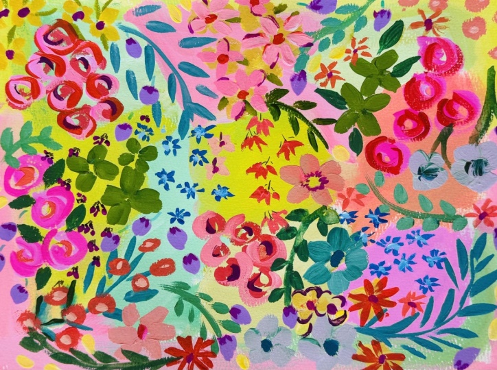
5. Practise | Roses & Retro Nasturtiums: One of my favorites now, very simple stylized roses. And I'm using Bengal rose, which is winter and Newton
mixed with the peach, which we've just used. So I'm just going
to make sure I've not got too much
paint on my brush, get the excess off. And then let's do
some sea curves. So like a comma. And then we start just beyond the top of that and
bring that round. And then down again, just above that one and
bring it round again. That is it. You can
always just add tiny little lines which make it look a little
bit more graphic. I used to overdo roses, and now I realize these anyway, are very, very simple. So two little commas. And then we're starting where that top one started off and
pulling round another one. Tip, flare, and then
bring it round, tip, flare and bring round. Let's just keep
practicing those until we feel they're
becoming more fluid. I just love doing
them like this. And we can also add
some detail to them, which will really
bring them to life. They're just so
pleasing to paint. I can always add a little
circle in the center. So let's speed up a little bit and not care how they look. This is more just about
the muscle memory. Let's do this really slowly. So starting just above
the previous petal. Okay, let's speed up and
do them really swiftly. So I'm not worrying
about the shape here. Just encouraging
a muscle memory. Another really quick one. I'm doing another
very slow one here, and this is a rose bud, like yin and yang, two commas. So we're placing one
scurf comma down, and then above the tip of
that one starting another. And you can leave
a little bit of white space or you can close it. We're going to be adding
a bit of doodling detail, so we want to keep our motifs fairly simple and
here very slowly. Spent way too long on the roses. That's just I enjoy
them so much. Let's put some yellow down. And this time, let's
mix it with red. So this is Pyrrole red
and primary yellow. And that gives us a very different orange to the one with opera
pink and primary yellow. I think it's gone
a little too red, so I'm just going to
add a bit more yellow. Luscious. I love these flowers. I'm so excited to share this. These are what I call
my bobby flowers. I've seen this representation
of this flower, which I see as
nosturtium quite often, I think it has a
very 1950s vibe, and it's perfect
for this project. So sticking with my
round brush and just really making a doughnut shape by wiggling the brush round, I like them to be
slightly off center. To me, that's kind of
part of their charm. I want to just see
what they look like with a little
bit more yellow. More nsttiam. Yeah, I like that
color. That's lovely. Very, very sweet little flowers. The easiest flower to paint, I think, and they look so cute. So my paint's getting a
little bit tacky there, so you can see the edges
are a little rough. So just gonna make sure that everything's
flowing a bit better. Painting as many as you like, seeing what shape you
like, what color. This color just
really warms my eyes. I just love looking at it.
6. Practise | Turquoise Flowers & Small Leaves: I so I'm going back to
my cobalt teal blue. Such a lovely bright blue. And I'm going to just make that into a tint
by adding white. Back to my size eight Philbert. Giving that a thorough wash. Delicious color.
Delicious color. And we're going to do flowers
just like the peachy ones. But I'm going to do a two stroke petal using the side
of the fiilbet. Just moving my page around. You can, of course, do this with a round brush. And that's that. Y. So let's just practice that two stroke
brush stroke again. Makes these lovely
rounded petals. Let's do another flower. And we can always just do
half open flowers as well. And and let's try it more slowly. The side of the fillbot allowing it to flare
out completely. Lovely. I don't want these
to be too perfect, so just want a bit of character, then we're going to add
lots of details to them. So while we've got this out, let's add some more white. To make a very opaque tint. What we need to
bear in mind is we want simple shapes
at this stage, so it can go on to add a
few layers and details. I've got my size
to feel bit here, and that's more white
than the cobalt teal. Lovely. There's a slight
touch of green from my brush. It is quite easy for color
to get kind of muddied, and I have two pots of water, and I'm trying to keep my
brush clean between colors. So the side of the brush, and we can go over
some of our motifs now to practice how we
will do our class project. So all I'm doing there
is placing the brush down and pulling it out a little bit more and
then lifting it up. And the detail that
we're going to do over that will
really show up nicely, and it will balance
the warm colors. So these leaves
you might want to place close to warmer
colors like these flowers. So trusting your brush here, place it down on the paper, pull it through
slowly and then up. These are basic
brush strokes which we actually take through
other classes as well. So I try to do that
so that we have a glossary of leaf
and floral motifs. This color is so pretty. And doesn't that look nice
next to that reddy pink? I'm just showing you a
rocking movement, really. So starting the brush stroke
before you hit the page. You can have them coming
in more horizontally, and you can vary the size.
7. Practise | Forget-me-nots & Creamy Yellow Flowers: Okay, so back to
ultramarine blue. I'm a little bit in love with
ultramarine at the moment. It's such a true blue. And then we're
adding some purple. The ultramarine is Daniel Smith and this purple is Shinhan. And this is such
a lovely contrast to the turquoise leaves. And adding a little
bit of purple just gives us some variation because we're going to be
doing some forget me nots. So I just want to
kind of make some mix some subtle blues purples so that we can vary
some of the petals. So I know I keep saying that
every motif is my favorite, but these are actually my
favorites. I love these. Very simple little strokes
with our size five round. So I bring the top one
in, the second one in. The third one I tend to pull
out as with the fourth. And the last one goes up
as a little side sweep. That's just how I do, though. You probably have
your own style for these little five
petaled flowers. So don't feel you have to
do exactly the same as me. Trusting the shape of the brush. For this last stroke, I tend to do a side sweep. So tip to the brush and then sideways a little
bit with the brush. That's a bit faster one. The faster ones tend to
have more character. The slower ones are a little bit more considered and
formed beautifully. I like a little bit of a mix between the
two, to be honest. I quite like little
brush strokes and the way that the
flowers come out, so they don't look as if
they're directly facing you, but all sorts of
different directions. So into this little purply mix, another trick with these
flowers is just to place down a few petals at a time in the color that
you have on your brush. I never can go back in and complete those flowers
with the darker blue. It's just a little tip so you
don't have to keep washing your brush or wiping a
brush between each color. And another version of this
is to place the flowers down, and then once that's dried, go in and add little
highlights or shadows. We can do larger ones. Tiny little bud like flowers like they've just
exploded into the world today. And practice, as you go along, going over some of the motifs underneath 'cause that's what we'll be doing in
our class project. I like the randomness
of these, as well. I think it's nice that they just go off on little tangents. These are our little
V shaped buds, which we've done before as
well in various classes. It's such a tiny
detail, but to me, just brings it alive
and look as if they're growing wild
in some meadow. I want to bring in some nice
creamy yellow flowers now. And this is a mix we
used in briar rose. And it's my favorite yellow. It's a very well, it's
almost an orange. This is hands yellow deep. Use any of your warm yellows. You could use new gamboge. And then adding
some white to that. So the handsy yellow deep is Daniel Smith and the
white Windsor Newton. If you've done some
of my other classes, you'll know that
some sort of magic happens when you add white
to handsy yellow deep. I'll probably go on about this again in the
class because I just absolutely love how adding white makes it
even more vibrant. Usually white kind of, you know, not rubs something, but takes
a little of the color away. But for some reason with
handsy yellow deep, it's gonna shine through, no matter what you do to it. And this is such a simple
buttery yellow mix. Just going to shape my
brush a little bit. I do have a lot of
penta my brush, but because I'm doing
slightly larger flowers, I'm okay with that. So what we're doing here is just a larger version
of the forget me nots. Exactly the same movement. So practising going over
the turquoise flower there, pulling my brush
through for a little longer to make these
slightly larger flowers. If you find it easier
with these flowers, you could draw a
circle, just with some pencil and then bring
in the flowers to that. We'll be covering
the centers anyway, so it's not going to show up. So again, just seeing
how this color looks and lies on top
of that turquoise. I this is very thick gouache now because as we start
to move through layers, we're going to slightly
thicken our paint. If we're going with it
slightly too watery, the underneath layers will
show through topping up my paint there and wanting
to try a deeper yellow. So you could do a mix
of these two yellows and then just two little strokes denoting half open flowers. And that's our hands
yellow deep flowers. A
8. Practise | Bell Flowers, Lime Leaves, Red Flowers & Doodles: Let's start to think
about some purple. So I'm going to mix
ultramarine blue with a purple hue
using our round brush. Just going to mix
those two colors together to form a purply blue. These are little
bell shaped flowers, and I feel this is the
easiest way to paint them. They're quite complex shapes. So these could be hairbells
or even blue bells. And all we're doing is
these three little strokes. You can maybe curve up the
edge of one of the petals. So ultra simple. And do another one
just down here. And then all I do is I paint little domes on the top of them. I think this is the easiest way. Very simple method. And because we've not mixed a
tint with these two colors, this is going to lay on top
of the previous layers. It's a nice bright color, which brings it
forward even more. So seeing as we have
this yellow down, why don't we add
some green to that? Make a nice bright green. This is just the moss green with the handsome
yellow deep and white. So I'm just preparing my brush because it was quite clogged and rolling my brush round so
the tip is nice and sharp. And then I thought it
might be nice to do some leaves very similar
to the rose petals. Just two movements. I think it's also nice
because we have the neat moss green for the clover leaves and then this lighter tint. And you can shape the
direction of these, have them curving around one of the corners or in between motifs once we
get to our project. I'm also just trying out what they look like
over the other layers. Just practicing the
paint to water ratio. Super easy to do a completely different shape to any of the other
leaves that we have. So pyrol red, and this
is a cute little doodle. I've been doing
for the past year, really, just on and off. Super simple, super
cute, little scribbles. You can make them into loops or just little scribbly lines in a V shape that can get larger to the bottom and smaller as we
go up the little grouping. So I'm going back to
my size two Philbert. I might just add
a touch of white. Only a little really, just to make it sit with the
rest of the painting. And then using a
side of the filbert, we just pull in these
tiny little florets. And I suppose I imagine when I'm painting them that they're
scarlet pimpernels. So just to show you slowly, very similar to the leaf
shapes and the Micoms daisies. And then quickly practice
doing more scribbly ones. And I prefer these where I'm not really thinking
about each petal. I'm just going in and doing a Just like a little
impressionistic flower. And the reason why I
like these so much is they're very small and easy to just dot around within the other
flowers and leaves. And that's it. So pretty. So if we swap back for a minute, we might as well use
this red to add details to some of the flowers that
we already have painted. So I'm just adding
some inner petals to that yellow flower. You might want to just add
some shadow to your rosebuds. So I've got my Cigna gel pen. You could use a posca pen or
any white pen that you have, and just go to add
little details, and then we can add
some little white lines to these leaves. So I've left them simple
for this reason, really, knowing that we can go back in and add these
little highlights. These are quite subtle details. But I like that we're going
to have a variety of doodles, lines, circles, highlights, low lights, and pencil details. So just showing you closer up. I think I will add
some stems in pencil. We need to bear in
mind that it's going to be quite a busy
class project, so not everything
needs to shine, and some of these details can
be quite simple and modest. If I used pen for these stems, I think it would take over
the page a little too much. And I'm doing some little
bow shapes at the base of some of these leaves. A
9. Practise | Gel Pen Doodles, Flower Centres: So I want to show you now a really cute detail
on the clover leaves, and we're just going to go
back to our white gel pen. And we can start to put in the little detail
that clover leaves have, namely this white scribbly line. So you can do this by just
moving up and down in a scribble or dot them in
with singular movements. We're going to do a lot of
the centers in our project, so that I'm not taking you
through absolutely every step, the most important
brush strokes. But whilst I have the
yellow flowers there, let's just mix up a
lovely deep teal green. And put some centers in here. Sometimes I like to
switch it up a little, I put a full circle, sometimes just a sea curve. And then I also want to
show you an alternative. This is a tomboPen
brush pen end, and just making these
tiny little dots. They really do suddenly bring those little
flowers to life. And I love this deep red
color next to the yellow. I so two alternatives there that we can
use in our project. I really want to show you this little center detail
with our white pen. And I'll do it on this one here. It's the sweetest little detail, and we'll just stand
out a little bit like the clover leaves and just scribble all the
way round the center. Now, of course, we can
then go on to drop in some color in the
middle of that flower, but I just wanted to show you this white gel pen
detail. Isn't that sweet? We could do it on some of
our blobbing strums, too. Might tap in a bit of color. Gonna also just try it on
the yellow flowers that you've done and some
of the orange flowers. I'm just going to do some
leaves around the nasturtiums. So back to my moss green and
my number five round brush. So I'm adding just like one drop really just
to get it moving. It's quite thick,
and I want to get the majority of the
paint off my brush. And then let me show
you over here first. We've done this move
quite a few times, and it's like a side sweep. So we put the point down. Rather than bringing it in
the direction of the brush, we're going to take it out
to the left or downwards. For me, it's one of the loveliest ways of
creating a leaf shape. There's just something
really organic about it. We can move upwards with
that movement as well. So you can see the
difference there. Up and down, gorgeous movement. And you can do
them more quickly. So rather than it being
a tip, flare tip, kind of straight leaf shape, it's just slightly
more irregular, and I love that about this move. I always find once I've
done a few leaves that my brush point is usually in a good condition to
do small details. I also know this
brush very well, and it has a slight kind
of lean to one side. So I know that if I
turn my brush round, I'm going to get a finer line
on one side than the other. So we can create some stems just by practicing using
the tip of the brush only. I like to do stems quickly
because I have shaky hands. So I just try those in
different directions, and then we can add
leaves to them. You could also lay
down the leaves first. I was preparing my brush there by making sure
it was in a point, want a nice, fine point
and then add the stem. So, how about if we add
those to our main et now? Just adding a touch of water
to liven up the green, starting with the stem and
then adding our leaves. So a mixture of the side
sweep, two strokes. And I'm varying the size. I used to struggle
a lot with stocks, and an alternative
would be to use a dip pen or even one of your
fiber tips or pigma micron. Let me just show you. This
is a very old crusty nib. That's how I had
paint my dip pen. By the way, I'd kind of tend to just do it that way,
so I have control. I know how much
paint I've put in. It's not going to
overflow and blot. So just to show
you very quickly, the alternative to doing these
stems. Quite enjoyed that. I think I might do my stems
with a dip pen again. And then I'm just adding
these tiny little leaves in places over the flowers, just so they all seem
to gel together. And I'm just showing you again the two strokes that
I tend to use a lot. And then I sometimes like
to put a leaf in that way so that it's not
just a stem with leaves either side
in a regimented way. I
10. Practise | Daisy/Bell Flower Centres & Rose Highlights: Let's go back to our
Michael miss daisies. Putting down some
primary yellow. This is a semi
transparent gouache, and I probably ideally
would have added a little white to it or used
a more opaque yellow. But I did want it to lie flat as well as I want to add
a little pen detail. So this is pretty
much neat yellow. And now we're going to
add little circles. And you can see that it's semi transparent because you can also note there the
blue coming through. But that's okay because you can always put one layer down, wait for it to dry, you
know, do something else, come back to it, add a few
more dots, let that dry. Then we're going to do a
little pen.in the middle of that just as you would find in Michelms daisies in the
wild. Forgot one there. There we go. You're
not forgotten. And then leave those, and
we'll come back to them. I like jumping around from
one thing to another. It kind of suits my brain
and the way it works. So I think you'll
enjoy that, too. You know, we can lay
down a flower or leaf, let it dry whilst we do something else and
then come back to it. A little more ultramarine blue. And we could go in just add some little detail tiny shadows. Or you could go
in with just some white and do highlights or both. It suddenly brings those
forward, though, doesn't it, adding that bright detail
neat paint without the white. Back to my gel pen, and this is the minutest amount of pen on these little
bell shaped flowers. But suddenly makes
them more three D, rather than just being
flat petals on a page. Suddenly, they look like bells. Tiny little scribbles or
even dots, and they're done. So I'm putting some
more opera pink down with white to make
a nice light tint. I love opera pink for mixing because it also seems
to retain its vibrancy. So opera pink and
white is a winner. So shaping my brush, taking the excess paint off, just so we have that control. And then I'm going to go in and add some little
details to our roses. Now, this second layer is a
lot easier because we're just following the flow of the petals underneath on
the inside edge of them. And three or four strokes with this color is all that's needed. So large sea curves and trying to keep it
as fluid as possible. Added a pink center
to that one. So one. Two, three, and
four for that one. And again, by adding this layer, they start to move
towards us more, so stand out from the page. That's what we're
looking for now at this stage in our painting. It's incredible how sweet
these little roses are and how much they capture the essence of a rose without too much detail, without trying to
capture it in terms of correctness or
botanical accuracy, elevating it to this
graphic, naive painting. I love them, and I really enjoy painting
this style of rose. And then for the buds, two tiny little sea curves. And that's it. You can move
very quickly through those. To deep in the center of these, we could.in some of the tombo pen or any similar
pen that you have in, like, a deep pink or a red
or this Burgundigl Nice. These buds are looking
a little lonely. So I think I might just add some sepals and a few
leaves back to the green. And I won't take ages over this because we will be doing
all of this in our project. So all I'm going to
do really is like a V shape underneath
these rose buds. Little curved green fronds
sometimes over the bud. And then just tying them
up with some stems. I always think it's nice
when the leaves kind of just gently eclipse the flowers. So it gives you an
idea of what we can do in our project
with these roses. Love pink and green together. And, of course, there had to
be roses in this project. I think they are my
favorite flower. So you can see just
how beautiful these look once we have given
them some foliage. Although we have
a great variety, really of flowers and leaves, a lot of them share the
same brushstroke structure.
11. Practise | Doodles in Pen & Pencil, Blue Berries & Tiny Red Flowers: I so now let's pick up
our 01 pigma micron. And then we're
just going to do a little.in the center
of the yellow, and suddenly we have our forget
me nots. Isn't that cute? And yes, forgot my yellow there, but never mind. So pretty. I just wanted to show you
these details that we can add to our orange
bobby flowers. We'll probably add
centers in our project, but I just want to focus
on the pencil detail. This really kind of brings
out the 1950s vibe, I think. And I've had it in mind
to do these flowers. Probably for a couple
of years, actually. I love kind of just
simplifying flower shapes. Just looking over to share
some final details with you. And this move, you will have seen me do quite a few times. And I'm moving to my Windsor
Newton cool gray pen, and we can add these details to our light turquoise leaves. So it's either a line pulled
down or a line going out. And I tend to put a
little dot on the end. So just joining them all up now. And I don't feel the need to
do details on every leaf. It's just cute to just tie
them up with a little stem. And bring them together. I'd like to do some outlines on some of these
petals with pencil. And again, I've chosen pencil because I don't want these
flowers to take over now. We're trying to keep a harmony between all of the leaves
and the different elements. So just gently going round, not pressing too hard
and not on every petal. Just loosening up
really with my pencil. I'm just going to wake up
this ultramarine blue tint. I think there's just enough
left for what I want to do. And again, we've done
these before as well. Pretty sure we did this
in winter doodles, and they're just vary shapes, sometimes the full circle, sometimes with a little
white space in the middle. And also, you'll know that
blue is very balancing, and I use it a lot
as a way of just adding one more final
cohesive element throughout the painting. So just adding these
around scattered, overlapping or just
sitting by elements. It's just a lovely way
of allowing the eye to move around unimpeded
in a very flow state. I either use this color or I use green as
this balancing color. I just think adding
tiny details like this, as well, it's very much my MO, as you know, but
I also think that smaller details really allow the larger elements
to come forward. I'm just adding another layer of white around the
turquoise flowers there. Just seeing what
the white gel pen looks like over that
dark turquoise. I think because we only have
this element in the red, talking about those tiny
little scattering elements, I'd love to just do some
very small red flowers here that we can.in amongst our elements to tie in with what I see as
scarlet pimpernels. Brightening that up
with a little yellow. That's more of an
orange red. But neat. There's no white in it. And then we'll be really
loosened up by now, so we can start to
just scribble in little flowers,
scribbles and dots. That's all they are. This was a lesson that I learnt
from looking at other artists' work who did tiny organic elements like this, and I realized how
simple they were. And I was just trying
too hard in the past. And now I realized that a few scribbles and
some pen Dytail in the middle can be more
effective actually than spending ages over
perfecting something. These flowers also
are very balancing. I'm just doing one slowly here so you can see what I'm doing. I do tend to do
these very swiftly. And I encourage you to
really try to do that, too. They have a very
different quality when we do them
quickly and scribbly. And then I'm just going
to.in some 01 pigma micron. Little dots, little scribbles, and that's it. How
quick are these? So sometimes the easiest flowers to paint are the most effective. I really enjoy doing
these as well. The berries, the finishing
touches my favorite. Maybe a couple of loops
on some of those. And I think it's time now to
move on to our main project. We've done a lot there, and we've certainly
warmed up there, I think, and have a good idea of which flowers we'd
like to include. I
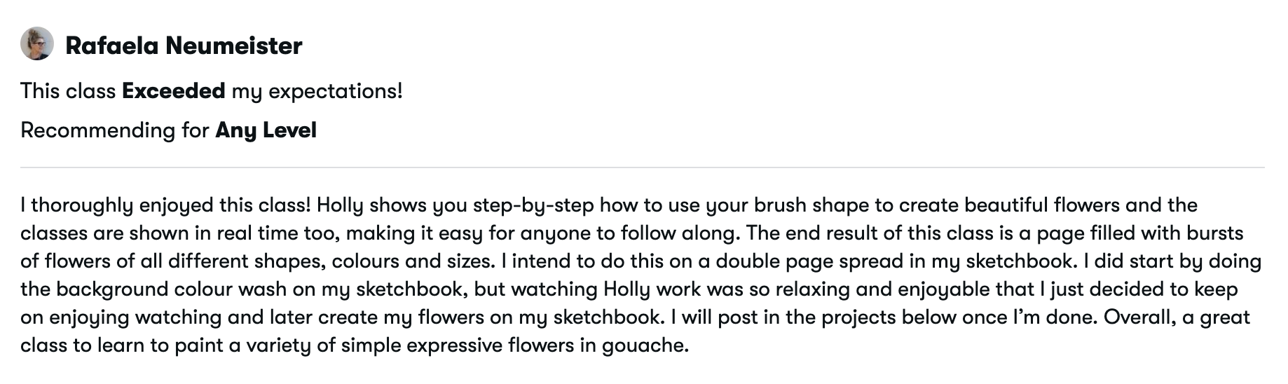
12. Class | Pastel Background: So I'm getting my
small mop brush ready. And this is the Bengal Rose. I have primary yellow, Windsor and Newton white. I'm going to put a few
dubs of white down. We're going to be using
quite a lot of it. Shinhan moss green. Ultramarine blue,
which is Daniel Smith. One of my favs,
Cobalt's teal blue. So we start with the Bengal rose and mix some
white into that. We're going to be doing a wash, so we want more water down at
this stage, down later on. We don't want it too
watery because we want that relationship
between the layer on top and the background. So you can see, it's probably
60% pigment to 40 water. We want it to lay flat to give us a nice surface
to paint on top, so not too pigmented so that
we avoid any brush marks, but just enough for
it to show through. That's a very simple one there, which is primary yellow, a little bit of white,
and the pink mix. Taking some white over
to the moss green. And this makes a
lovely greeny tint. The foundation is
pretty important. So what we're going for
here is a flatter feel. So just as I've mentioned, more watered down
than you would use for mos gouache paintings. But we're also utilizing pastel paints because pastels will stay in the background, and then the bright colours
that we're going to be using will come
forward even more. A little bit of yellow
and a little bit of the white with tiny
touch of the green. I'm just really
experimenting at this stage and coming up with
different tints. You could go with any
color that you like. Back to the Bengal Rose
with a bit of white in it. And so we'll merge a little
bit if they're still wet. And that's okay.
Little bit of yellow, little bit of pink,
and some white. And then we reach the
peachy side of pink. Ultramarine with a
little primary yellow. And that's our background.
13. Class | Pinnate, Clover Leaves & Roses: Oh I'm going in with this gorgeous teal color which
is the Shinhan blue green. So we'll just start
off with a one color. I'm using the side
of the filbert, and these are those swift
movements that we practiced. And we've done in
previous classes. Very simple once you've got
the hang of it, I would say. Very swift and easy to do. They look very even
as well because we're not shaping them and taking
loads of time over them. We're allowing the brush
to create the shape. I absolutely adore this color. Isn't that gorgeous? Now, this is the Shinhan, and it's good for this
because we're still trying to achieve a fairly
flat surface, not a massively thick area here. We're using the brush with enough water to
get the gouache moving, but certainly not loaded down
with paint on the brush. Some moss green, and I'm
adding primary yellow. Give that a quick mix. It's just to brighten
up that green. You could use any other
green that you fancy. I chose this green, I think because it's a
fairly grounding color, and we've got a lot of
bright colours coming up. I just felt this green would balance things nicely for us. So I'm painting in
a clover leaf here, very different to techniques
that we've done in the past. It's almost like painting
like a child again. Very gentle, restful, easy, and just taking on time. I thought these
large green leaves would be lovely as a kind
of a lush burst layer. You can reshape, which is an advantage
with gouache, of course. And I'm going to do a slightly smaller
one just over here. I'm taking the green
right into the center. And again, I'm wanting to echo this green because I think it's going to
be quite balancing. So creating another
clover leaf over here. And, of course, I want them
to be four leaf clovers. For look. Slightly
smaller one there. I've got a lovely effect
that we can add to this a little bit later
with our white gel pen. I've picked up the
opera pink now, adding a little bit of
the primary yellow. I want to mix a
lovely orangy colour. I've switched over to
my size eight filbert, and that's a lovely deep orange. Getting the excess paint off my brush just so I
have lots of control. And this is fairly thick, so I would say, 90%
pigment, ten water. So just enough water
for it to move around. It does take a little bit of practice with gouache to
get the right consistency. And I'm adding some white to that just to really
brighten that up. So we're using some paints neat, and others we're mixing. And this is also where the
secondary colors come in. We've got the secondary
color of green, and now we're going
for the orange. All of these are so easy to do, so we are relying
on the brush shape. For this flower rather than shaping it with a smaller brush. So we're placing the brush down, applying pressure and
allowing it to fan out. Slight wiggle
movement, if you want, and then into the center. I definitely want to echo this. So I'm mixing in just a
little bit more white, and I'm using the
brush on its side now a little bit of a wiggle and then into
the center and lift. So we still get
the orangey color, but it allows for
slight variations, which is what will make this
look like a wild kind of flurry bunder that will also fall back into the
background with it being quite opaque and quite
a lot of white in that. So some of these motifs will stay quite prominent,
others will fall back. So just to bring in
a different tint, I've added the Bengal
rose to the orange mix. I'm just considering where I want to place
these next flowers, and I want them near
this dark teal. When I was doing practice runs, this was one thing that I really loved doing these
very simple roses. Roses this way, are far
simpler than we think. I realized I kept doing sea curves for ages
after I needed to, and they lost shape and appeal. So what we're doing here is
the two little comma moves, larger sea curves around
the edges, and that's it. So it's like six strokes
just as we practiced. And then we can add tiny
little details if we want. So let's do some more
small sea curve, one cradling that one. And all we're doing
is just starting out with the edge
of the last stroke. I don't know why these
stumped me for so long. I think I was
expecting them to be far more complicated
than they actually are. So just the tip,
flare and up again. So I'm just going
to do one up here, and it's going to be a bud. Buds are very simple, the two sea curves
that we practiced. And some buds here, a sea curve on one starting
above it and curving round. And we can add some
little details to those as we go along. Okay, so what next? I'm putting down some more
opera pink and some white. I'm fast running out of my
winter Newton white here, but let's see how we go. I kind of did that orange pink, and I liked them, but I really wanted to bring in
some pink ones. So I'm going to
embrace the opera pink and just do some next
to this lovely moss green, and I really do love this
color with these roses. Just upper pink and white.
Can't go wrong, really. See curves, outer petals, sloping right down
here so you can see again how we do these
very simple strokes. I'm glad I did this
pink now and some buds. I think I might do one here kind of spilling over
the edge of the background. Love, love, love this color. Run out of color
there, topping up. That's a little
bit more vibrant. I'm happy with that,
though. That's better. And rosebuds. We're making headway now.
14. Class | Retro Nasturtiums & Turquoise Flowers: And I am putting down
more primary yellow. And this time, I'm
going to make an orange with primary yellow
and Pyle red. So we're kind of
playing around with slightly different mixes in the secondary colours here,
a little bit of white. And that's kind
of lush, as well, just as our opera pink and yellow mix was different,
and I like that. I'm continuing to use my
size five round brush, and these are the
simplest flowers that you could possibly
ever paint I love them. We are just wiggling round in
a kind of a wiggly circle, and that's all there is to them. I got some lovely
details to share with you as we go
along on these, brightening it up a little
bit with more yellow. I love this color next
to that dark teal. Now, we want to make
sure that our paint is thick enough to go
over that dark color. If it's not, and you can see the blue poking
through, that's okay. Just allow it to dry, and then you can just add a
little second layer to it. These remind me of 1950s motifs. I really love them. So cute. Creating a scattering of them. I love those two
colors together. We're really starting
to mix things up now and putting bright
color extra bright color. Back to my cobaltiel blue and my fast disappearing
M's renewa white. I'm going back to my size eight Philbert mixing up
a tint with the white. I still want it to
retain its deep color, though, so maybe a
little bit more white, but not too much,
cause I want these to be now sitting on top
of the background. And then I'm just creating little brush strokes with
the side of the filbert. I thought it might be nice just to add a little bit of texture, adding a lighter
blue over the top. And it was okay, but I actually preferred it not as white. So that's slightly better. I just wanted a little
bit of texture, but not for it to become
too attention grabby. I love this vibrant
color in my paintings. We've used it before in classes. So just tidying up
that flower now. It was covering over the
white. I wasn't keen on that. Down to my size two Filbert, creating a whiter tint and adding some lovely
pale leaves here. I've done this on purpose
because we can then go in and do some little
details over the top. It gives us lots of scope. And I think I'll put
another front over here using the side of
the size two Philbert. So we're still working very
much with composition here. Well, I've got this
color on my brush, I'm going to go round and see if I want it somewhere else, and I really wanted it
in that orange flower. Think orange and teal
together gorgeous. So opera pink again,
back to the pink. Just putting a little sea
curve in that orange flower.
15. Class | Forget-me-nots & Yellow Flowers: Okay, so I'm adding a little bit more ultramarine
blue and some white, and this is Shinhan
white squash, just to give you an idea of how they look the
different makes. I have a purple hue here, Shinhan, and I'm going to
mix those two together. Take a little bit over there. I want to mix a slight
variety of blues. So I've got a more purply blue. I've got the mid blue, and I'm just going
to add some white there and mix in the blue
that I just have on my brush. So we can dip in
between the three just to create a
little more character with our forget me nots. So I'm starting with the
ultramarine and white mix. I'm doing those little five petaled flowers
that we practiced. The way that I do
these is I draw in some petals and some the
other way inside to out. I just find that much easier, and I don't have to
move my page around. And then maybe just a few tiny little
petals on their own. Picking up some of
the lighter blue. Just applying that over
some of the petals. I'm trying to keep it random, so they just look like
a natural cluster. And remember, we're
doing fantasy flowers, so they don't need to look exactly like the
flowers in real life. We're just taking them and
creating the essence of them. These will look absolutely gorgeous once they
have their centers. So that's one grouping, and I'd like to do
some more over here. I don't want to get too neat. And by that, I mean, I want this to be like a riot of color and not as placed as the ditzis
that we've done before. A little three petaled one. And we can, even at
this early stage, start to think about layering. So just taking that little two petal flower
over the green clover. There's only a little bit
of difference between these three mixes of blue. It's quite subtle,
but I really like it. Overall, we're just
aiming to keep these first layers quite simple because we're going to
be adding a lot of detail. So just bringing that
one over the rose, bringing in a little
bit more white. And I'm going to add some
highlights and paint some petals in in this
brighter white blue tint. And sometimes the way that I do that is just to paint a couple of petals and then go back
in with a different color. It saves you having to wash your brush and pick
up different paint, tidying the ones up that
I've just done there. I love doing little vis, just suggesting little
petals on the wind. So over here. So up
in this green area, let's do some warmer colour, daisy shapes, I suppose, and I'm using my
handsy yellow deep. A little bit of white.
That's the Shin han. Now, when you mix handsy
yellow deep with white, some sort of miracle
happens because it goes so luscious and bright. So it keeps its deep quality, but it's also very
joyful and vibrant. So I often use this mix, as you've probably
seen in the past. It just makes a lovely, bright, creamy yellow, and it's
as simple as that. If you don't have
handsy yellow deep, you could try new gamboge. So here, what we're doing,
as we've practiced, is a larger version, really, of the forget me not. And I'm just shaping it
with my round brush. This class is very much a slower process than ones
we've done before together. Very relaxing and just taking our time to
shape each flower. It's kind of the opposite
to expressive strokes. It's very considered. What I wanted to share with
you here is that I did notice a big difference between the
Shinhan and Windsor Newton. So, I found the Shinhan
white, quite thin, and I didn't feel
I could rely on it to make more opaque flowers. So that might be something
you want to consider too. I do think it's worth buying either Daniel Smith or
Windsor Newton White Guash. Both are very reliable. So I'm just going
over there so that I can reach the opacity
that I was looking for. I think for sure,
the Shinhan is good for practice runs
or to mix with wax, which I'm going to try, like the last class that
we did together, the cold wax and guash. So just doing some little
throwaway flowers up here, allowing them to taper up. Some over here just to echo
that lovely buttery yellow. I love this yellow near that teal white blue
and the dark teal. This is all about placing colors next to each
other that are going to sing more because
of their neighbors. I'm really enjoying that
about this painting. So purposely now, just going over some of the
motifs underneath. Building up some
very gentle layers. I do adore this mix. And this yellow brightens
up that section there, where it's a fairly metered
tint underneath that, which I'm not overly keen on, but once it's got some flowers
on it, it will look great. So I just wanted to bring
in a larger flower here. I think I want to have
various sizes of flour, just to daub little areas of
this gorgeous yellow around. And another three
petaled flower here. It's already looking
really delightful.
16. Class | Bell Flowers, Lime Leaves & Wee Red Flowers: So I've had a little break. And now I'm adding the purple. I want to add some purple here before it gets a
little too crowded. So ultramarine blue and purple. And I want to do these little
hairbell shaped flowers. And all we're going to do is just three small brushstrokes. Again, kind of a very
simple approach to painting these flowers which
are quite complex in shape. I also haven't added
white to this because I want some darker elements,
more prominent elements. And because this is going
over motifs, as well, we can use it quite
thickly and more neatly, so not adding white to it. You can choose as you go
along whether you want to go over a motif or under. So under, you would
just truncate the brushstroke and
just hide it behind. I want to just put some little throwaway flowers
as well with this, keep it nice and
loose and random, but still in a grouping. And then these little
dome shapes on the top. They're so hard to paint, I think, anyway.
Bluebells, hairbells. So this is how I'm
doing them today, and it just makes it so
much more enjoyable. I will keep these in my
glossary of flower shapes. Some little throwaway shapes, as we've done in other classes. And then later on,
we can add details. Rule of thumb for this really is anytime you have a
color on your brush, always good to cast around
and see if you want to add it to any other motif
before you wash your brush. So I thought I might just add some details to the
forget me nuts. The tiniest of details. And maybe over here too. Just the inside of
the petals in places. That kind of brings
them forward, as well. So what's bringing forward the flowers is the
brightness of hue, but also the detail. More green. And I'm adding Cancellow
deep just again to ring the changes a little
bit between the greens. I still want it a
tiny bit lighter. And trying to squeeze out
the last of the white. That's better. That's
what I wanted. So mixing slightly
more muted colors with bright colours is a tactic that a lot
of artists use, and it's another vehicle, really to showcase some
of the brighter colors. It's there as a supporting act. So I'm just going to do
these little curvy V shapes. So thinking about composition, we've got these
muted green areas. The ones we've just done and are two areas of clover green. So I'm happy to bring this in because it is supporting
the brighter colors. And we can also add
some rose leaves. So I'm back with my round brush, but using it like
we did to Filbert. A little bit of a stem there. This time pulling out,
placing the brush down, fanning the brush out, and
bringing it up to a tip. To stroke leaves. They really showcase these
bright roses really nicely. Things are starting
to happen now where we are now connecting the background to
the layers on top. And this screen is
very balancing. And definitely going
over motifs now, really embracing those layers. And again, you can
take your time, and the beauty of gouache is that you can correct mistakes, although there are no mistakes, but maybe places that you'd like to just
jog up a little bit. I like going over the flower
with some of these leaves. I just looks a little
bit more organic and some little sepuls
around the buds. And then in between
flowers here, I think it would look nice. I'm turning my page around. I'm doing that a lot,
actually, with this. It does make sure that your flowers aren't kind of going too far in one direction. It's very easy with paintings like this to get
squashed flowers, so that's something
just to watch out for. I wasn't happy with a couple of my flowers
because I felt like they were more laterally
biased than vertically, if that makes sense,
a little bit squat. Okay, a little pause. I can see some spaces here, which I'd like to fill. And there's three
areas in particular. So pyrol red, we
need to be bold. I love these little flowers
that I'm going to show you. We're just going to use a pen. It can be any pen. Could be pigma micron, a brush pen, pencil, whatever works for you. I'm going to do these
little scribbles that we practiced and put them in amongst the flowers
here in this space. So I'm grouping them so there's a larger
grouping at the bottom, and then they taper up into
the center of the painting, and they're slightly smaller. Again, very, very simple
flowers like the orange, round, blobby flowers and incredibly
effective and easy to do. So I just slightly
off screen there, but all I'm doing is adding a touch of white
to the pyrol red. And then just adding
a tiny touch of the ultramarine blue and purple
mix that we did earlier. Just deepens it a little bit, makes it more interesting. And then we're going
to just dab in color. I'm using a side of
my size too filbert. The more kind of abstract
and simple these are, the more effective they are. Just little throwaway
brush marks. I'm really enjoying this class because I do a lot of doodling, but I tend to doodle while
I'm watching things on my laptop and they're just in bits of paper
that are on my desk. It's nice now to bring these to a class because I've
been doodling for years, and these are little things
that I've learned along the way or that I've
kind of created. So we've got an opportunity
here when we're thinking of color theory between
the green and red. So because green is opposite
red on the color wheel, we can really utilize
this red here. This primary red and secondary green are going
to just zing off each other and really start
to add some vibrancy. I think my eyes are
dancing at the moment. And loving this red between that green and the dark
teal, that's lovely. Aren't these sweet? Oder Slope can't wait to see yours and to see how you use this in the future as well in
your work, these flowers? That's my hope from
this class that you can adopt certain styles
or color combinations, or the actual florals themselves and make it
a part of your work. I Love that red,
love, love, love. Okay, what next? So a little space here. I think we could
perhaps do some here. And maybe over this kind of green here because I'm not
keen on that background color. It's very dull. So I think doing some red over
here would be really nice, given that the
background's very opaque. It's very hard not to
favor certain flowers. I want to keep it
nice and loose and have an abundant choice of
different florals and colors. But I love these red flowers. I can't stop painting them. I think because you can't
really go far wrong, it's literally a
scribble and a few dots of color. They look so fab. And that's really brightened up. What was a fairly,
I'd say boring, but certainly not scintillating area there with the background,
so I'm really pleased. Lovely. Okay. Do
I want any more? Oh, while I'm here,
I've got the red. I'm just going to
add another layer to that orange flower there. It's all about placing
color netra color, not thinking about it too much. If you wanted to bring
in color theory, just thinking about
the primaries and their complimentary color.
17. Class | Doodles & Small Turquoise Flowers: Cobalt teal blue. And I want a little white. And I want to add some
turquoise flowers over here in the corner. If we look at the whole, you can see that we've got
turquoise dotted around, and I wanted to place it in this particular setting,
so it will add balance. I think you're gonna like
these little flowers. So I'm thinking
about the placement of warm and cool colors. So we have warm, cool, warm and fairly warm green here and the yellow,
little red flowers. So I think it might be good
to add a cooler color here. And you can see
how they showcase each other. It's really lovely. Not forgetting my corner there. And I think also this would look nice next to
the warm yellow flowers. One up here, maybe another one. These are going to look so cute. So I want to use my white gelpen and I'm just preparing it. Little scribbles of
white on each leaflet. It's such a sweet little detail. And suddenly, you know
what they are for sure. So I'm going to put some more
of that blue green down. It's a dark teal. It's a really beautiful color. And a touch of white. It's got a little bit of red
in there, but never mind. This makes it slightly deeper. And I want it a
little bit lighter, more white, mixing it well. And then some little
turquoise centers to our yellow flowers. I love this color with yellow. And I'm going to leave two, so I can do something
different with them. So moving down to this little bouquet
down here of yellow. And I'll leave one of the yellow flowers free
to do something else. And while we're
on the turquoise, I'm just going to drop
in a center there. I want to do something with
these other yellow flowers, and I'm going to get
my tombo pen out. Such a simple center might put a few dots around these
turquoise centers as well. I'm going to show you this
really, really cute center. I love scribble movements. And I did this whilst I was in the class
development stage, and I knew it was
going to work so well. And why not some scribbles
down here as well? I love that there's
just one of those. And then we can do the
same scribble movement with our 50s style
bobby flowers. Minimal detailing. And I think I'll just
leave that last one. There's not a lot of
this green mixed, but I think I'll have enough. And I'm just going to add little plubby green shapes
in the center of these. I just thought it would look
nice next to that white pen. Cute. And whilst I've
got green on my brush, I'm just going to go in and add some details to these
yellow flowers. Green next to red
again, which is lovely. This swan's got a
little forgotten. Just add some seples
and a little stem. Just going to add
some of the moss green to our orange flowers. Just that very simple
tip flare tip movement. And what that's doing
really is establishing its place over the dark
teal leaves underneath. I love those flowers now. I think they're my favorite. So I'm just going to dot
some more yellow down. Primary yellow. We want
this really thick. So it's almost neat. It's got the tiniest
amount of water, and that looks lovely
against that turquoise. And I think I'll do the same
for this one over here, that kind of make
the center larger. Suddenly, they look as if
they've joined the party. So let's go back to our
three petaled flowers. Going back to the purple. So a little three pronged
sepals for these flowers. And again, I want to
really switch it up, so I've chosen the purple
against the turquoise. We really want to
play with color. This also really turns them into those naive graphic flowers
rather than realistic ones. Is that Oh, there's some
here at the bottom. Might be nice now to go back
over to our forget me nots. So primary yellow, neat yellow. No water. I can just
kind of dab this in. I just adding tiny dots
to the half open flowers. So once they're dry, we can go back in with some pen and just do
little dots in the center. Whilst we're waiting
for those to dry, let's go back to our roses. Just going to clean that well
it had some watery paint in it and putting in some neat
opera pink touch of white. And we want to go a little lighter than the
pink that's down. Let's just see if
that's white enough. Yeah, showing up.
It's really sweet. So the same movements again, very minimal, little sea curves. We can follow what's there, so it's fairly relaxing. Don't forget our little buds. And I also want to put
this pink down here. I think that looks
particularly good because there's more of a
difference in value there. So I'm really happy with
those and the same here. I'm putting a bit of a paler mix on it's more of a white pink. Just wanted it to fall above
the dark turquoise leaf. I think these are also
my favorite flowers. Now I keep flitting about. I do like the orange
bobby flowers, but the roses are
so restful to do. And they really lend
themselves well to this style. I love that they're
all different, each grouping slightly
different to each other. So I want to add a little bit of greenery here over the buds, very small sepals and leaves. I seem to forget those ones in the middle. Not left out now. So I wanted to show you these tiny little lines that we're going to add to
the orange flowers. And I think it's in keeping
with that kind of 50s look. Very minimal detail. And that's those finished. While I've got the pencil, I'm just going to quickly
outline this orange flower. It's in the background,
so I don't want to use pen because that will bring
it forward even more. And we have those purple and
yellow flowers overlapping. So using pencil allows it
to stay in the background. Scat turquoise, big pen here. Gonna try that on this flower. Let's see what that looks like. And then a circle
around the middle. I've got a pink bick pen here. And actually, over
the turquoise, it kind of change his color. I really like that. Big pens aren't as graceful as
using a pigma micron. But for something like this, I think it looks really
joyful because this is a naive painting and
it looks childlike. Having said that,
though, I'm just going back to my
winter in Newton, cool gray pen, which I am
getting on with very well. I've used it for a
couple of classes now I think this is my dare I
say it signature move. I love little lines
and a dot on top. I know some of you have
that style as well. Doesn't have to be on every leaf for attempting to do that, but I'm going to leave
a couple of leaves. I'm just pausing,
having a look around. I just interchanging
really between all the different pens,
pencils, brushes. And because I love this
technique so much, this little scribble movement. I'm going to put
it in the middle of what's fast becoming
our star flower. I think these two turquoise
flowers are the stars. And I think I will do it
on this one, as well. I think they look
different enough because we have the orange
one in between them, and we'll do some
little white details as well around a page. I think the middle of
the turquoise flower looks a little bit scrappy. I think it is the bit pen. So I'm just mixing some green and I'm going
to change that. It will give me a
chance to go over the bit pen and just
tidy it up a little bit. And also means that it
does now look different. It's got its own
kind of character. So yeah, I'm happier
with that. Mm.
18. Class | More Doodles! White Gel Pen & Pencil: So let's do a little
more doodling. And I'm using my
white Signo gel pen. If you have a Posca pen,
that would be great too. I'm just going to
add some lines, maybe just to one
side of these leaves. I quite like how this soft green is allowing the other
colors to shine. Adding the white to
this leaf is just allowing it to pop
a little bit more. I think that's it for those. Having a little thinkk. I just want to add some stems to these because they looked
a little bit disparate. So I'm just using
my pencil because I don't want it to be
too overpowering. I got shaky hands today, so that line wasn't
as I wanted it. That's a little bit better. Pencil is a really good friend
to us when we're doodling, because you have a choice
then to either mark it quite strongly with a pigma micron or similar or to have a
more subtle detail. I often use both pencil and pen together just to add
a little bit of variety. And why not add some
cutesy little bows at the bottom of these? Some cutesy loops. Okay, white gelpen again.
I love doing this. This is just the little
scribbles that we're going to do around the clover leaves. I forgot these earlier, so I love this. I think that's up there as one of my favorite leaves to do. I find white gel pens a
little bit unpredictable. So what I've learned
really is to definitely start it going before
you light on the page, but also not to press
too deeply because it tends to score through
the paint underneath. That's brought these to life. Just those very simple
scribbles. I love that. I have some up here. Lovely.
Taking time to pause. I'm going to do another
scribble movement using my gray
Windsor Newton pen. So like the other orange flower, but a deeper scribble this time. Just like we did with
the small red flowers. Now I have my pigma micron and adding those tiny
little black dots, where, in this
case, I think it's Sepia into the center
of the forget me nots. Just make sure I'm
getting them all. I think this is certainly one of my
favorite flowers to paint. We've done them
before in the past, and I certainly will always
have these in my mind, because I love forget me nots. They're also so easy to do those five little
brush strokes, a dot of yellow, and a small.in the center. Let's do some more
elongated leaves around the purple flowers. So I think I'll stick with the green we have two main
areas of this moss green. So I want to just add little
pockets of that on the page, just so we have it echoed. So let's mix this up with
just a tiny amount of water, so we want it fairly thick. And let me just see that might need a tiny
touch, more water. That's better. And
I'm just going to add these in amongst the purple. This is the same movement as
the light turquoise leaves. But just not pulling
it through as fully. So maybe the tip to halfway down just makes them
look less lonely. So I'm adding some
cobalt teal blue, and this will make
a cooler green. I'm just adding
those very swift, slightly expressionf leaves
around our forget me nots. So, although we're using three primaries and
the three secondaries, we are mixing and
matching a little bit. So we have a variety of hues. Could do these little
leaves all day. This is certainly a trusting
your brush stroke move, mixing up a little bit more. Isn't that a delicious color. I love that. And while
I've got this on my brush, I'm just going to
add some centers, and then some larger leaves around this turquoise flower because there's
quite a space there. And now I want to
add this throughout, not to overdo it, but just to allow the eye to move around
and discover this color. What these leaves do is close up any major gaps
that we have going on and link the groupings
of florals together. I love this green with the red. And again, that's a
complimentary sprig of flowers there using red and it's
complimentary color green. Just going to fill
out these fairly thin storks with some leaves. Barely touching,
really the paper. Just tiny movements with the
tip of the size two Vilbet. Got my tombo here. It's perfect for dotting in
the centers of our roses. And just some little
dots on top of the buds. It's amazing, really, how
just some little dots and dashes can bring a
whole flower to life. I want to add something
to these yellow flowers. I'm going to do it in pencil. And then outline
some of the petals. I think the trick there is
it's just slightly more subtle than doing
absolutely every petal. Got so much detail
going on elsewhere. So I think that's enough. Not little ones up here. It helps bring them forward just a little bit from the
background as well. And just going round this
little yellow flower here. And there's a little
grouping here as well. I love doing little
loopy sepals. Some more little
loops here in pencil. Cute and very easy to do. And then why not add some lines to some of
the yellow flowers? These little tiny lines in the center just really add a bit of cuteness
to the flowers. I think it's really sweet. It makes the petals look really friendly, if
that makes sense. And then just defining this
little unique flower here, which is all on its own. And some more line detail. Just helping to bring these flowers into
the whole painting. So it starts to get
really cohesive now. A little circular center
might come back to that. So just before we move
on to the next lesson, I'm going to add some green just to the center of
this yellow flower here and some of the tombo pen
in the center of this one. Adding some stems. And some little loops. I think I missed those out earlier, so I'm
glad I caught that. And maybe just a little
outlining on some of the petals. Right, let me just have a look. What do I want to do next? And there's a little
blank area here. Got some moss green. And I'm adding some
sples and then stem, but that's a little
thick for stem. So I'm is going to
make that into a leaf. Just kind of nicely adds
some detail to that corner. I want to add a third
leaf to this clover. I think it will allow that orange flower to
shine a little bit more. Now when we add things, I mean, I haven't fully
color match that. But what you'll find is
that once that's dried, it will go the same color. So I'm not too
worried about that. And then we can come back
to that and add some white. So I'm just making some little adjustments
as we go along. And again, this is the
nature of a painting like this and the best quality because we can make
these corrections. We can go over paint that
we've already put down. Yes.
19. Class | Even More Doodles! With Pens & Pencil: I'm just going to add
the little details here to that clover
leaf, so I don't forget. And then I have
my new tombo pen. I wanted a nice,
kind of neutral, earthy color just to.in
amongst all of this vibrancy. I'm going to add some details just around that
white tiny dots. Now, I decided later
that I didn't like this, and I went over with the white gel pen just to
go over the brown dots. So you can decide at this stage if you want
to do that or not. Adding a little center. And I just think it
would look quite nice to add some dots in
amongst the motifs. I think it always looks like
seeds blowing in the breeze. I love tiny details like this. And, again, it's a vehicle for making your
painting more cohesive. Such an easy, lovely
doodle to do. Very cute. Replenishing
my ultramarine blue and trying to squeeze out
the last of the white. So all I'm doing there is mixing the white into
the ultramarine blue. And then I'm adding these
little berry shapes. As you'll know
from past classes, when we get to this kind of
stage and level of detail, I always feel it's nice
to have elements that are slightly smaller and
in a balancing color, and I always find
blue quite balancing. So I often put it in as a detail later on in the
development of things. I'm varying the
size a little bit, and I'm also taking it
over some of the flowers. So it looks like
they're weaving out from the background and in
between the little motifs. Some of them I'm just
creating a circle. All these little variations on detail are what makes
a painting successful. You can be bold here, go right over other flowers. Adding a tiny touch of water. When you feel that
the paint's not moving and it's getting sticky, just a tiny touch of
water will release it. Looks like a little ace there. Ultra relaxing to do. And this blue seems to
go with every color. Trying to keep it
random. Oh, I love that. Pale turquoise blue over
the deep greeny blue. Taking another pause and
just casting my eye around, picking up my white
gelpen again, just putting a little center
into the clover leaves. This tiny detail here transforms these three
petaled purple flowers, and suddenly, it looks
like they are bell shaped. It's the easiest way of painting
hairbells or blue bells. I just want to add a leaf or two here because I'm not quite keen on the shape of the petal. So now just going around adding some small leaves in
this balancing colour. Using the same device
that we've used so far, where we place color
around a page. That allows us to keep balance. I'm looking for opportunities
to use this color. So I'm turning it around to give me a different
perspective. Pulling through some lines with the number
five round brush. I find shaping the tip of the brush before doing these
makes it a lot easier. But you could always add
these with a turquoise pen. So getting that
white gel pen moving again and adding
some little dots now in amongst the brown ones that we did with
the tombo again, a really nice way
of creating depth. So these dots act as the
final layer, really. We can imagine them
flowing and being blown across and over all of
the flowers and leaves. I forgot to do those earlier, so just scribbling
those in little stems. And while I've got the gel pen, I'm just going to add
some little centers to my yellow flowers. And I mustn't forget these here. I do like now that we made some of the yellow flowers
slightly different. So just going round dotting
or adding lines to leaves, you do whatever
feels right and fun. We can start a tiny dots
to the blueberries. Makes them a little bit
more three dimensional. It doesn't have to
be on all of them, but I really like
little dotty details. But I'm trying not to
get too carried away. So I'm pausing now, allowing everything to sink in.
20. Class | Finishing Touches: So just on to final details, and I wasn't really happy with the shape
of this flower here. I've tried to correct it, and I'm still not happy, so just going to mix up
that cobaltiel blue, and I think it had a
tiny bit of green in it. I've tried to color match, and just shape those
petals a little bit more. I wanted them more rounded. And I've tried to be bold there and do a full brushstroke. And that feels a little better. So I'm just laying down some
of my cobalt teal blue. Just enough water
to get it moving. And I've added a touch
of the moss green. I want to repair
this petal here. It just feels like that
flowers a little squashed. And I wanted to show
these corrections because not everything goes the way you want
all of the time. I'm mixing a lighter version
of that with some white, just a touch brighter. And I wanted to add
a little turquoise. Because it's very
bright and we've got those two very bright flowers
in the cobalt teal blue, I just wanted to bring in another element or
two in that color. I think otherwise, our
eye will be taken to those flowers and will not
roam the page as it were. So that's the that's one of the advantages
of echoing color is that it allows
the eye to kind of roam and see the whole
picture literally. And now over here, and I
think I'm going to use it just as a way of doubling
up on these leaves. So it's not a flower. It's part of the leaves, and that keeps the variety whilst balancing that teal blue. And I think that's
working a lot better now. Maybe a little flower here. So this is where
I'm going back in to cover the brown dots because I didn't
like them so much. And why not add a
little white flower quite random and unique
there on its own. Just doubling up those leaves. And still wanting a little bit more of this cobalt teal blue. So doing the flowers, using the same shape as we
did with our forget me nots. Just want some of them
poking out behind flowers. And then out in the corner here some little
turquoise flowers. Tiny little flex. And while I've got
that on my brush, I'm going to add some turquoise
to that yellow flower. So that's looking a
lot more balanced. We have this turquoise
now around the page. I'm waking up that purply blue. And I just want to take that flower over the edge
of the turquoise flower. It's a tiny detail, but these tiny details
do matter because I wanted the turquoise petal to tuck behind those. Forget menus. I have a little bit more purple, adding a touch of white. I want to keep the colours
bright but slightly softened. And what I'm doing here
is trying to bring that new turquoise flower into the whole painting so it
doesn't stick out on its own. And same over here. Back to my gel pen. I'm doing that little
scribbly center. And why not do some
detail in pencil, nice and gentle pressure. That will tie in nicely
with other pencil details. I think that's
enough. Some motifs have fallen too far
in the background, so I'm just going round and outlining them with
the pencil, as well. Looking at these
lovely leaves here, and I think they need
a little help, too, they're sticking out
a little too much, and I want to just
gently knock them back. So I have the primary
yellow and some white still with our
size five round brush. And we have a nice
vibrant yellow. It needs to be quite thick so we can go over the
thick layers underneath. So make sure you
have lots of paint and only enough water
to allow it to move. Pretty much neat paint,
though, at this stage. Yeah, that's helped
a little bit. While I've got this
yellow on my brush, I might as well dt
in some centers. I'm feeling sorry for this
little white flower now. Just added another petal. Going back to the
little purple flowers and adding some centers and also just some
added tiny details over the edges of the petals. And whilst I have this yellow, let's go over there and
add some to this wee area. So I'm just picking out areas
that have fallen too far behind and gently
outlining those in pencil. If I went in with too harsh of a color or with a darker pen, I don't think that would feel right because we've got the rose next to that
and want that to shine. Back to some opera
pink, using it very, very neatly, because I want to add some details to the roses. So this is neat opera pink
with just a touch of water. But because we're adding
layer on layer here, it needs to be a
thicker consistency than the layers underneath. That's a little too sticky, so just adding a tiny
touch more water. And then these little sea curves just the same as
the layers underneath. And what we're doing here is just bringing those
forward again. So see curves, one, two, three, and then
we can add same here, one stroke, two, three, and then add little extra bits if it feels like it
needs some help. The key to these roses, though, is to keep
that simplicity. So thicker and thinner
strokes on that one. And then some tiny
details on the rose buds. I just wanted to add some thicker sea curves
there, thicker paint. I love those. And again, whilst I've got that
paint on my brush, just going round and adding some sea curves around the center of the
orange, yellow flowers. And why not do some that
have the pink center? Now, let's do some little
throw away flowers. This is a very, like, a miniature movement
of the forget me nots. I'm using quite a dry brush. Maybe a little too dry, but I like the control
that that gives. And I wanted to
add some texture. These are very textural. It's literally just
the tip of the brush. Not much water on my
brush at all, very dry. And very quick movements.
Yeah, they're cute. And what I like
about opera pink? It's not far off
the pyre all red. So again, we've got a slight
variation there on a hue. It is very hard to keep an
overview of your painting, which is why I took
regular breaks, actually, had a cup of tea, went away from it for
a while, came back. I wanted this opera pink
right next to this turquoise. Now, it does play with
the eyes a little bit, but I like that
and really wanted to kind of just add a zinginess. So casting my eye again over the whole painting and getting my pigma micron
and adding tiny, dotty details to the opera
pink, throwaway flowers. And then just dotting
in the center. Very, very quick movement, tiny detail, and yet it allows
these to pop a little bit. I love doing details like this. So this is sepia. I use Sepia more than
black because I find it's just a little bit
more harmonious with paintings like this. A black might stick
out a little too far. Looking good. A little
bit of a space there, so I think I might just
add a couple more flowers. Dotting in the centers.
Another pause. I want to just highlight
this center a bit more, so we're to add another
layer on top of the white. The white underneath
is totally dried. This allows for a
thicker application of the Cigna white gelpen. And a little halo in the center. And suddenly, I
absolutely love that flower dotting in
some white around the tombo pen marks and
white in the center. And, of course, this is all
part of the painting, too, is to change things as you
go along if you want to.
21. Thank You!: Thanks so much for joining me. The whole aim was to encourage a relaxed
mode of learning. All of this color, I feel
is just so uplifting. And if you've enjoyed
this style of painting, let me know, as I can do
further classes for you. And you know by now that
I am an art butterfly. I try all sorts of things. I love various techniques. So if there's anything else
that you would like to learn, I shall jump right in and
create a class for you. Although this is the last
lesson of the whole class, I always see it as a
beginning because you can connect with me on Skillshare
or over on Instagram. And I've also joined
Gen Z over on Tik Tok. I'm Holy Thomas design
on all platforms. If you do show your
project on social media, do tag me, as I'd love
to see your work. I really hope you've had a
lot of fun with this class. If you do have any questions or any tips to
share with others, you can do this when you upload your project or
start a discussion. So I'll see you
soon. Bye for now.
 Holly Tomas Art, Watercolour | Gouache | Mixed Media