Transcripts
1. Welcome to the course: Hi, and welcome to the course on Moodboard creation using Canva. This is Bangladesh, and I'm your instructor for this course. For the past 22 years, I was working as a
professional instructor, teaching various
multimedia courses. I'm really excited
to have you here. Mood boards are one of the most powerful ways to
bring ideas to the life. Whether you are a designer, a marketer, a student, or simply someone who loves
organized creative ideas. Mood board helps
you to tell stories visually and communicate
your vision with clarity. In this course, I will teach
you everything you need to know about creating
mood boards from scratch. First, we'll explore
what are mood boards, why they are important, and how they are
used in fashion, branding and creative projects. Then we'll drive into the canva a simple but
powerful design tool where you will learn
how to use templates, upload and organize your assets, and apply the design principle. Together we'll create
practical projects using layouts,
grids, typography, colors and textures to make your mood board looks
polished and professional. Finally, I'll show you
how to export and share your mood boards so you can
present them to the clients, team, or even showcase
them to social media. By the end of this course, you will have the confident
and skills to design stunning mood boards that
capture your creative vision. Plus, you'll complete a hands
on project that can add to your portfolio or use for your personal
professional work. If you are ready to transform
your ideas into visuals and bring your creativity to the next level,
let's get started. See you inside the course.
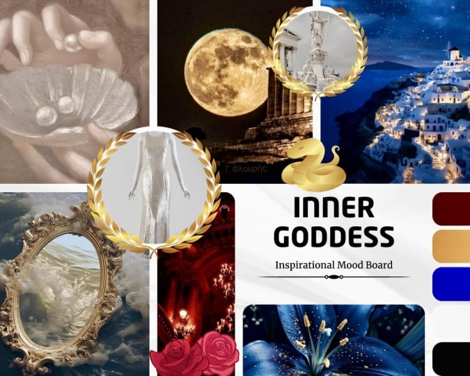
2. What is a Moodboard Purpose and Applications: In this lesson, we are
going to see what is moodboard and its purpose as
well as the applications. So mood board design is a
collection of visual elements. We collect all those
visual elements to create the overall look and feel of the project
what you are creating. For an example, if you are creating advertisement
for a core company, we'll collect the core images and all elements
including colors, text, and the primary other
elements like logos and the models we are going
to use with that design work. We'll put all the things
in a single design and create the perfect concept to do the design which
have right mood. That's why this is called
mood board design work. This is an example of this
moodboard design work. You can see that they
used the images. They used images of the
products and the location of where they may have the shop or the
particular products. When you want to do a design
work for these products, which is available with the
images and logo maybe that, you can utilize those
colors because we derived all the colors from
the respective images. You can see those things. And overall, it creates
the very good feel of the same product
representation over the design. Instead of these colors, if I used a red or green or something
like yellow or blue, the concept will be
entirely different and that will not
have the proper, the unity and that
will not create the proper mood of the design which is
relevant to the concept. That's why mood board
is highly essential. When we do the moodboard design, that time itself we know what kind of color tone
we are going to use and how the overall look will have with the
advertisement. Let me give you another
example with this. Here I have another example
of a mood board design. They have provided with
different images as well as you can see that
they have d products here. We have a coffee beans and coffee cup, all those products, what they are going to use
for their design work, whether it is graphic
design work or web design work, whatever it is. Thereafter, we have
the same collections here and here also. You can see that they collected all the colors
from those images and when you create the
overall moodboard design work, you can know what kind
of design you are doing, what kind of mode that requires and based on
the mode board only, you are going to create
the further design, whether it is a
graphic design work or web design work,
whatever it is, we're going to do that work based on this mode
board design only. Why mode board is highly essential for doing
any design work, not just for the
graphic design work, for a web design, for a greeting card design, for creating interior
design was anything, you should create
this mode board before you start to do the work. Next we are going
to see the role of mood board in design. When you start the
design work directly, you may not have the idea about how that
design will elevate. When you do the graphic design or any other design
works directly, you may not have any
other idea other than you started the work and you just
want to add some images, whether it was providing the proper feel or the mood
for the design or not. But when you have the
mood board design, you created the mood board before you start
the design work. You'll exactly get that feel
of the purpose of the design with this mood board
itself and it's easy to carry forward that same
feel with your design also. That was a major purpose. Why do we use the mood board
design with any concept? And we are going to see the applications of
moodboard design. Moodboard have a lot
of applications. The major application
is it helps us to create the perfect
design with the proper mode, which is highly
essential because if you design any product or
event based designs, that doesn't reflect
the concepts. Mode means you cannot reach that content to the
audience in easy manner. When the audience provide
only a few seconds, like two to 3 seconds
or 5 seconds to access your design within
that sipulated time, you have to attract
them and you have to communicate that information
with the audience. That's why mode body is highly essential for
the design work. And here we have a few other importance of
the mood board design work. It's really highly essential for branding and marketing
because that two processes branding and marketing highly required proper mood
to reach the audience and this helps you to prepare the better concept
development work and execute that concept
in a proper way. That's why this is
highly essential for any brand marketing or any other design works with any tool,
not just with a canva. Any tool is highly essential. In designer point of view, this mood board provides you
what kind of colors they used with the design work and what typography you
are going to do with that. What will be the size
of each element? All those will be synced with the concept and the
objectivity of the design. That was the major
application of the mood board design
with any software. These are the purpose
and applications of mood board creation using any tool which is also
included with Canva.
3. Types of Moodboards Digital vs Physical: In this lesson, I'm
going to show you the different types
of moodboard design. Of course, before we use the computers for
creating moodboard design, we do have that
concept that exists. Let us see what are all
the different types of moodboard designs we
have to do design works. We have two types of
moodboard design works. Generally, we know
that the mood board is a collection of
visual elements. We put together to create the proper mode
for the design work. This moodboard design
work have two types. First one is the physical board. We use the physical images, colors and elements
to organize and create that mode what we required for any
graphic design work. The second thing what we
have is digital boards. We use the digital
software tools to create the mood board design before
we complete any design work. These are the two different category moodboard
designs based on the N, we still use both concepts. This is an example for a
physical mood board design. It's a simple example. We to add the too
many elements of that advertisement or a
design based on the need, we add colors, images, we add shapes, all those things with the physical mood
board design concept. Here I have the
digital mood boards. First one is we have
the mood board design. They collected different images, which is relevant to the
products material and the used the colors which is creating the proper mood
for that product. So they didn't move away from the product concert,
which is orange. They used that and
apart from that, they used the water
color, which is the blue. Overall, it gives you
the mood of that orange with the water and they used white as neutral
color tone here. It creates that mood
and this design itself gives you the idea
that what are all the colors, what are all the elements, images you are going to
use with your design work. Now this is another example of the digital
mood board design. Here they added
different models image with the representation
of that products. We to have the typography work, the sample work here, and we have the colors which we are going
to use to represent these product based
advertisement design or graphic design or
any other design using this mood board concept. This is how we create
moodboard design. This is how we have two different types
of moodboard designs. What's the difference? That was an important thing. Let us see what the
major difference between this digital and physical in terms
of wing mechanism. First one is this digital. The digital mode boards provides instant access to
you from anywhere. That's an important
thing when you travel somewhere or you
are not with your PC, you are not in your
home or office, but still wherever you are, if you have the device with you, even a mobile device, which is enough to access and do modifications and creation
of the digital mode boards. That makes that as a
highly flexible concept to compare the physical one but
in terms of tangibility, physical is highly
recommended because you see that color of the
image, the colors, the text with your
hand, and you touch it, you feel it and you create and think in a better way
to do moodboard design. That was the biggest
advantage of the physical way of
preparing moodboard design. Third one is a collaboration
tool, of course, the digital moodboard design
concept allow you to share with multiple users in terms of how they to think
about that mood board. They can share their feedback, which is not easy to get
with a physical form. So even we create that
moodboard design with Canva, we can share with
anyone in the world and you can allow them to
give their comments. Even if you can, yes, you can allow them to do modifications with that
moodboard concept also. So in terms of collaboration, that digital format plays the better role with
comparing physical. As we have seen with the
digital mood boards, it really allows you to do
editing and sharing again. Through sharing also, you can do the modifications with
digital mood board. When physical, it provides
you the experience, the life experience of
creative exploration. Most of the people who do the mood board design work
around 85% of the designers, they preferred
digital mood boards over the physical
ones nowadays because that two reasons which is we can share
everywhere and we can collaborate with the people
or the team among them. That saves a lot of time and that doesn't
have a boundary. So it clearly makes the sense which is highly using concept is digital
moodboard design. So in a moodboard design first, we gather all the elements, the images, the
colors, textures, all those things, and we
process all those materials to create the moodboard design
for doing any design work. After our mood
board collections, we put together and we arrange all the items and convert as the desired
mood board design. The arrangement of images, not just images,
arrangement of colors, arrangement of visual elements, shapes, and the
text information, all those things are
highly essential. After you created the
moodboard design, you present that
with the team or, you know, the co
workers or the boss. They will provide
their own input to you and the feedback
to you and you can fine tune those information using this moodboard design. After collected all
those feedbacks, you can properly reflect those needs required with the mood board designs and
you can do all those things. This is how the mood
board works and that's why the moodboard design is highly essential before
you do any design work. And this physical and
digital forms are the two major forms we have
with the moodboard design, and most of the people use the digital concept
because it doesn't have any boundary and it was highly essential to share with
anyone around the world.
4. Canva Interface Overview: In this lesson, you're going to see the user interface of Canva. If you are first
time using this app, you better completely
watch this video. However, if you already
know how to use the Canva, you can directly go
to the next lesson. Now, this is the basic
user interface of Canva. This is the homepage right now this color indicates
were at this homepage. When I choose projects, I will have the previously
created project designs on my user interface. I have the template absen to access the various template
designs from Canva. You have the option
called brand. With the help of this brand, you can set your own brand
logo and color values, including the
typographical works. Can also use the A feature to
do any design work as well as how to create those
images using generative AI. These are the
options we have with this tool we have with the
Canva on left hand side. At the top, you can see that we have the option called Menu. You can click there to access the Menu bar and it shows you the recently created
designs from this user. Again I click there
at the bottom, you can see that we
have the con settings. In this home page at the bottom, I have a recent designs, you can see that and Canva
themselves provided what was a recent new elements they have added with the
various templates. When the home banner area, we have three categories. We have your designs and
we have the templates, then we have Canva AI. All these three will be
highly useful for you. If you want to search or open
any file from your design, you can directly choose design. You can type the keyword and you can search and you
will get those results here. However, if you want to
access the templates, you can choose the template. You can type the
keyword and you will get all the templates
in this place. And you have a Canva AI. So if you want to create any content using this
Canva AI concept, you can utilize this
and that will provide you the generated
content from Canva. Now by default, it
will be in a template. If you want, you
can change that. Again, I click this home icon. You can see here, I
have a search bar. Using that only, I'm
going to navigate my own design or templates
or egg generated work. Below that, I have the different
category of the files. So I have the logos, I have educational,
I have sheets, docs, whiteboard presentations,
social media, photo editor work, and video,
printable works, website. All those things are
highly useful links. You can directly click to create any social media work or web design work or
But editing work, and you will get
the templates as well as the blank document. However, if you want create
a customized manner, you can use this custom
size and you can create your own proper custom dimension
design works in Canva. These are the options
we have with the Canva. With the help of these only, we are going to do the further
moodboard design in Canva.
5. Exploring Templates for Moodboards: Oh in this lesson, we are going to explore the various templates
available with Canva itself. To access that in our home page, we have the banner area. In banner area, I have the navigation bar with
three different categories. In previous lesson, I explained to you this
in detailed manner. In this, now I'm going to choose this templates category.
I click there. After choosing the templates, here I'm going to type and search the element I
required on screen. I'm going to type the
keyword which is moodboard. And when I type this
keyword moodboard and I'm going to have the search, I'll have a lot of categories. You can see that it
shows you the moodboard fashion and wedding and
moodboard template, all those things are there. I'm going to type the
keyword moodboard and just click
Moodboard fashion. Let us see. I just click
that Moodboard fashion. When I choose moodboard
fashion and presenter, I click there that selection, it provides you a
lot of results here. See that all those things
are the mood board designs. Now let me open one design here. I'm going to use this design. However, this design was
the pro user design. I cannot access and I'm going
to choose the next one. I just click there and
after choosing that, I have a customized option here, I can customize this
template if I want. This template is a
moodboard design. You can see that. Now,
I just scroll down. When I scroll down, I to have a lot more moodboard designs which is relevant to
the same category. You can also access those
designs from here itself. I can access this design
or access next design. It's up to you based on your need only you are going
to do all those things. Now I'm going to choose
customize this template. When I choose customize
this template, I will have the
same information, that template in a
separate window here. Here you can see I have the primary elements
of this concept, which is the images. I have a flows which is
having those colors. I have the coffee mic
and the book and other all elements which is completely
relevant to the concept. The colors, which is derived
from all those images, what we have with this page, you can see that what are
all the colors we have here, which is also present
on those images. This is how we select that moodboard design template and you can customize
if you want. Again, I go to my
template search page. Here I just close this template because I want to access
other designs also. We have a lot of designs here, you can see that all
those designs are highly will help me to complete
this moodboard design. Later we are going to use that moodboard to
create other walks. I'm going to choose this
one.This mood board. You can see that this
mode board design have the images
which provide you that color theme which
is highly relevant to that tourism concept and
natural based things. The typography, what we have here is to represent
the same concept. We do have the color
selection here, which is highly represent
those images and theme. Look at all those elements, it creates perfect mood of that vacation and
nature that feel to, you know, that visitors or the
people who want to go for, you know, journey or the tour. So this is how, you know, moodboard creates that feel. Can access any moodboard
design which you want to use and you can just click this option which is
customize this template. When you click that, you can edit that moodboard
design directly. As a beginner, you may use
those templates directly. You can just replace
those images, can delete it and
replace that based on that images colors
and the product colors, you can select the
background color and the remaining colors, what you are going to
use with your designs. This is how we navigate, search, and access the mood board
templates from Canva. In our next lesson,
I will show you how you can upload your own images, how you can add it
inside the design, how you can do those
changes which is required, those templates in Canva.
6. Uploading and Organizing Visual Assets: In this lesson, I'm going to
show you how you can just upload your visual assets
and manage within a canva. To do that, I just add a
new page in my template. Here I'm going to
show you how we upload and add inside my page. To upload first
within the Canva, I go to my left hand side menu. Here I have options, which is included design, and we have elements,
text, brand, upload, tools, projects,
apps, and all those things. In those things, I'm going to choose the option called upload. You can see that we have
the upload option here. I just click there.
When I click there, I have this option
which is upload. In upload, I have three options. You have images. When
you upload any image, you will hit the image here. After that, I have a video. So if you uploaded
a video files, those video files will be
here. Then I have folder. You can directly
inside a folder, you can upload the folder and you can start to
use those elements. Let me show you how we
upload the images first. I just click here images, and after that, I choose the option which
is upload files. After choosing
this upload files, I'm going to choose the
image I want to upload. At first, I just
select this picture, the very first one, and I choose this option
which is open. Here at the bottom, I have
option which is open. I have several images. I can upload all those
things later. I choose open. When I choose this
upload option, you can see here preview of
that images getting uploaded, and here also we have a image. So at the bottom of that image, you have seen that
navigation bar which shows that image
is getting uploaded. This is how we can upload individual image or individual
video inside the canva. I just click this image once so that I can load that
image inside my design. This is how we
upload a picture or video inside the Canva.
I just delete this. And now I choose the folders. So if you want to create a separate folder and want to
maintain all those things, better you should
create this folder icon because here I have
the scattered images. It's not easy to go and find
the particular picture. I choose the folders and
I choose this option, create folder, and here I can mention that option,
which is the folder. So I'm going to
give the name which is moodboard and I
choose Continue. After choosing
that, you can see I have that folder,
which is moodboard. Now I have the option here
to access that same folder, but I can access from here also. And when I come and choose this, the mood board, just
not just choose, I just move my mouse
over that folder. I can either select
that particular folder. I can delete, or I can organize that same folder in other
folder in different places. Or I have the menu here. I just choose that I can
move to somewhere else. I can share. I can select multiple folders
or I can delete. I can also rename that
folder using this option. I can do all those
options using this. Now I enter inside this
moodboard, I just click there. Inside right now I
don't have any files. I can upload the
files inside this. I choose Upload and I just select upload files and I can choose whatever the
files I want to upload. I'm going to choose a
multiple files here. I choose six images
from this, one, two, three, four, five, six, and I choose open. Now those images are getting
uploaded, you can see that. I already uploaded one image. Now I was uploading more images. Here you have the progression, it shows those images are getting uploaded
and the progress, the status of the uploading
process you can see here. Now, after that, I choose
each image like this. And here I have
option which is move. I click this option
move and I can choose the folder mood board
and I can choose move. This is how you can
organize those files. Now you can see that
all those images are moved inside the folder, which is not present here. I go to the folder
here and I can see that all those images are there. Can either individually
upload those images or you can directly
choose the folder. You can just drag and
drop that folder, the entire folder
inside this place. So all the elements which is
present inside that folder, whether it was a PSD file or GFC image or T file
or video files, all those elements
will be getting uploaded without any errors. So after upload all
those elements, you can just visit and you
can see all those elements. You can utilize if you want to use that inside the design. So this is how you can
upload and organize all your content for creating mood board
design inside Canva.
7. Color Psychology and Palettes: In this lesson, I'm
going to show you how do we use colors in Canva? And what are the basic
color principles, color combinations? Color psychology we have
in designing process. This process, the color
selection and color combination, and that color theory, color psychology, all those
things are universal concept. You can apply the same principle
for any kind of design, not just for the
mood board design. Canva itself shows you how
we can utilize the colors, how to understand the colors and other concepts based
on the colors. To access that facilities, I just go to Google. And here I'm going to
type Canva colors. It just type Canva color. You don't need to type Canvas color theory,
something like that. You type Canva color and colors, you can see that at very first, I have the website link which is having calva.com and colors. I just click there.
When I click there, I will get this page. Here, it provides a
lot of facilities to Nance and get the knowledge about the colors and usage here. Here I have four options. You can see that I have
color palette generator, which helps you to
generate the color from the respective image you have uploaded or used
inside the design. I have color palette ideas, which provides you the
different color combinations which is better for
any do design work. Then you have color wheel. It gives you the
basic knowledge from the primary colors
to tertiary colors and how we have different
combination of colors, what are all the
different headimal values we have for each color. And finally, we
have color meaning, which provides the
color psychology and where we can
use which color. So let us start with
this color wheel. Then only you can
understand all the options. I choose this option,
which is color wheel. So when I choose this
option and I come down, it clearly shows that the
history of the color wheel and how the Isaac Newton was first invented this color
wheel at 16 66. Of course, he's the
first person created this official color
wheel with three colors, which is called red,
yellow, and blue. These colors are primary colors, not RGP or CMOK. Don't forget that this
knowledgeable answer, which is the primary
color is red, blue, yellow shows that you have
a professional knowledge, and if you are saying that
RGB or CMOK is primary color, you are out of the industry. This is the primary color, red, blue and yellow. Colors are also called
pure colors because you cannot create these colors
by combine other colors. That's why these colors
are called primary colors. Here you can see that we have
the different colors here. We have the color combinations and before color combinations, you can see that we have
a color wheel here. When I have this red
blue and yellow. Here, the order was in
a different manner, but generally this color wheel will not have this appearance. In Canva, they have provided
in a different way. I'll have the color wheel
in a different format. Let me show you the
orthodox sketchbook and how those colors are formed. Now to explain these concepts, color wheel, let me
use this presentation. Here I have the primary colors. Those colors are called
red, blue, yellow. Those colors are pure
colors, which means, you know, they didn't made by any other
color combination. After that, when I blend
two primary colors like a blend red and blue or red and yellow
or yellow and blue, I will have another color which is called secondary color. Here you can see that when
I blend red and blue, I will have purple and when
I blend red and yellow, I will have orange and when I blend blue and yellow,
I will have green. The green, orange, purple, all these three colors are
called secondary colors, which is formed by the combination
of each primary color. These three colors added with the color wheel which create
six color combinations. You can see that
along all the sides, I have one primary color
and one secondary color. In the same way
here also, I have one primary color and
one secondary color. So these color combinations creates other six
colors in each place, which creates tertiary colors. Here you can see that
the purple and red creates the light purple color and the green and the yellow, which is green is
secondary color and yellow is primary color, which create the sap green
or light green in that way, it creates six more colors
are called tertiary colors. So six plus three plus three, which is primary three colors,
secondary three colors, and tertiary six colors, creates 12 colors, which is the color wheel
with 12 colors. You can see that this
is called color wheel, which is made by primary, secondary, and tertiary colors. Now I come here, you can see that we have the color wheel which
is having two segments. We divide this color
wheel into two segments. On the other side,
I have the purple, blue, the dark green,
the dark purple. All those colors are
called cool colors, which creates the cool
feel when you see those colors on any place like
in a trees or in a house, interior design or outer
design, you will feel cool. You have those colors on the product or
design or clothes. And other side, we have the
colors called warm colors, which creates the energetic
feel for our brain. So based on our brine sense, we divide this color wheel
into two equal parts, warm colors and cold colors. So after the
creation of primary, secondary, and tertiary colors, we have a combination of colors which is called color harmony, which means how we are going to utilize those 12
colors for our design. The combination of
multiple colors are called color combinations
or color harmony. Here at first, I have option
called complimentary colors, which means in color wheel, I choose any two colors present on opposite
direction of each color. That two color combination is
called complimentary color. So this is how we have the color selection
for complimentary colors, and we have monochromatic, which means we use
only one pure color, and from that pure color, we are going to use
light and dark shades, which is called monochromatic. Next I have analogous
color scheme, which means I'm going to use three continuous colors of this color wheel from anywhere, not just that presently shown
a blue color combinations. If I used red,
orange and yellow, that too comes under this
analogous or yellow, green, and light green also
comes under this analogous. If I use that color
selection for my design, that is called
analogous color scheme, and I have triatic, which means I'm going to
choose the three colors from the color wheel which is
having the triangle shape, which is called a triatic. You can clearly
see here I choose three colors with proper
three color distances. I can see that. That's why
this is called a triatic. Then I have tetratic. I choose any four colors, which is having that
square like appearance, which is called tetratic, which means four colors. You can see that. For this also, you can choose any three colors, not just a single color. Here they provided you but that order was in
a different position. This is not the right
the color combination. This yellow should be
here, not on display. Okay. So they to provided
you warm colors, cold colors, that's it. And here I shows you that
monochromatic color theme, which means this
is the pure color. You have light and
dark values, right? That concept is explained here. We have the option called
tint shade and tone. What is tint, share and tone? I had the pure
color, either it is a red or yellow or
whatever it is, I was adding white with
that step by step ten, ten percentage or
2020 percentage that color will be diluted slowly and this kind of color creation or color
selection process is tint, which means adding white with
pure color step by step. Now I have an
option called shad, which means adding dark color, which means black with the
pure color step by step. So it can be any pure color, either red or yellow or
blue, whatever it is. I was adding black with that color step by step,
which is called Shad. If I add the gray value with that pure color step by
step that is called tone. These three concepts
widely used in a design, and we do have the
concept called hue, saturation and luminance, which means hue means we
know that colors. We are mentioning about the variety of colors
and saturation means we just enance or
adding more colors that, desaturation means
removing the colors and when we see about the
image editing process, I will show you how it works. Luminance means we are adding
more light with that color. That's how it works. This is how we have the basic information about color with the Canva page. As I told you, the
color wheel is entirely different from
these color wheels, but the color combinations, you can use this
concept from the canva. The most important part with this color wheel is
on right hand side, you can see that I have the color wheel which is
working in a live manner. Let me show you how we use that. Here at this place, I have the option
called pick a color. So I can pick a color from
this particular position. Whatever the color I
choose, I can choose. And here also, I can click and select the color
which I require. Here it shows you the hexa
decimal value of that color. The first two letters represents red color
value from 0255. The second two colors
represent the green color, a decimal value from 022 55 and the last two colors
represents the blue color value. Based on the need, you are going to select which
color you want. Remember here,
have the two dots, you are going to
select which one, the color selection point. So that point indicates with a bigger stroke,
you can see that. When you choose that, after
this picking the color, we have the option called
choose a color combination. Here right now I have option
called complimentary color. When I choose this
complimentary color, the color will
automatically detect the direct opposite color on the color wheel as
we have seen here. That's why this
particular color wheel represents different
color combinations. After the combinations, this complimentary, I
have monochromatic. You can see both colors are
selected from nearby places. And I have analogs, we select three colors, the continuous colors
from the design. It can be either light
and dark values, based on the need you
are going to choose. That I have triatic which pick three colors
from the color wheel. You can see that it creates different color pattern
for your design, which is perfectly matched
for that color combination. After triatic I have
tetratic. I choose the tetra. I can select four colors
for white design. Based on the number of colors
you required in a design, you can use this
option and you'll perfectly get the colors
what you required. You can also choose the light and dark
values of those colors. This is how you can use this
color wheel option in Canva. So after choosing
this color selection, you can choose a
creative graphic and the designs and templates, which is available based on the color combinations
will be displayed to you. This is how it works the
color wheel option in Canva. Now, again, I choose colors, so I was getting back to
my home page of colors. After this, I have the option called Color Palette generator. I choose color palette generator and I need to upload image. Here they have provided
you the sample. When they have
uploaded the image, it picks four colors
from that image which is suitable for creating
designs with Camera. You can directly use those colors in your
moodboard design. I'm going to check it whether
it works properly or not. I choose upload an image and I'm going to
upload on picture. I'm going to choose
this picture. Let us see how it provides you the result or this
picture I choose and I choose open so here it picks the
colors from the picture. You can see that
these four colors are generated from this image. So you can upload any image, and it will generate the color palette which
is required for you. So you can directly use this
color palette in a design. It too provides
you the color name as well as the color
exact resemble value. You can directly utilize
those colors and those colors are perfectly matched
with designing process, whatever the design, not
just mood board design. Whatever the design you
do, it will help you lot to pick the right
color combinations. You can use either
four colors or only three colors from the
design or only two colors. Based on the need of
that color design, you can utilize how you need it. After this, I come to
these colors again and here I have
color palette ideas. I click Color Palette ideas. Here default provide a lot
of color combinations. Here you can see that we have analogous color combinations and here we have tetratic
color combinations. Based on the need, you can directly utilize those
color combinations. You can see we have 19
plus color combinations. You can just come here
and you can check which color combination
is required for your design and you can
utilize directly from that. Here also you can
type the keyword about the particular color. Based on that also you
will get the combinations. For example, just type
red and press Enter. Now I press Enter
after adding the red, I have the red color
combinations here. I can directly
pick it from here. This is how these
color palettes, the default color
palette they have provided for you and
you can directly use. Now I come back to
these colors again. At the end, I have the option
called color meanings. I click color meanings here. So I have a lot of
colors here by default. I can click any one color, and I will get the meaning on
this particular page alone. Like, I just click here Amber, and they provided the
default information about that particular
color. It's a warm color. You can see that and where
they most of the time use. And what does that
mean that color, the history of that color, when they used that color
for the first time. And what are all the colors you can combine with that color? So all those information
are provided here in detail no one else can provide those
information like Canva. That was the best part
with this color meanings. Again, I come here, I'm
going to choose this one and here they have provided all the information about
that particular color. They have the proper
combination colors here. You can also choose those
colors and the meaning of that color and what are other colors you can
combine and use. Remember on many the
soda cans and what else, they utilize these color
combinations only to generate the perfect
design and the product. This is how these color options are working with the Canva. First, go through
this color wheel, then you go for color palette, color palette
ideas, and finally, just visit and have the detailed information
about color meanings, all those things are
provided by Canva.
8. Typography and Font Pairing in Canva: In this lesson, I'm
going to show you the typography and font
pairing with Canva. So this typographic
concept is highly essential for create any design. During the mood board
creation process itself, we will decide what are all the different font families and what are the different
font phases we require. Now, before you go for
selecting those things, you need the clear
knowledge with the typography and the font
pairing for any design work. Now, Canva to teach you that concept with the
representation of example images. Let me show you how you can
access those informations. How do you get those informations
for our design work. So to do that, I come to this, Google, and I'm going to
type typography in Canva. I don't want to type
typography in Canva. Then I just type
the keyword Canva. It will provide you
the better page to understand the
typography and Canva. I just go to this link which is your ultimate guide to
understand typography. After visiting this page, you can have a lot of information about
how the typography looks and what are all the other
information you need to know about those typography. Before you access all
those informations, you to need to know
how the typography, the structure have the look. To access that, I come to this place typography
and it will show you the basic pages
which is having the information about
typography in Canva. All those informations directly provide for you to
understand typography. Now I come to the second page. And it shows you the
beautiful information about the typography. I click here, which is
having the caption, which is a beautifully
illustrated glossary of typographic terms for you. I just click here and clearly it shows this image shows
what is typography. Let me show you each segment what they marked with
a different colors. Without this knowledge,
you cannot utilize the proper typography
work for design works. Now by scroll down, it clearly shows what are all
those marks you have here. Each information was prepared
by the Canva itself. First, I just click
here, I can see there, we have the option called
stroke, stem, swash, foot. All those information are provided with
different colors here. You can see here
they have marked all those colors and here also they marked
all those colors. At first, they have the option
called typography basics. Here they provided you the first concept which
is font or type phase, which means what kind of font
file you are going to use. Here we have
different categories. You can see that different
font type or type phases. The second one is the character. You can see here the characters. What we have with each and
every font file is letters, numbers, and the symbols. The combination comes under
this category characters. The third one is the
alternate characters of each text that two
provided with each file. And the font will
have two categories. Basically, all the fonts will come with these
two categories. First one is Serif,
which will have the sharp edges on
those text lines. Those also called extensions. Another one is SNSeri which is not having any
extensions at the edge. From the beginning to end, that font will have
the same thickness almost and doesn't have
any other extensions. Based on this two only will have all the font
styles in a computer. Then I have the font
style which is having italic and I have the
option called baseline. For each text here, you can see every typograph you work in a
computer or design, which have the line
here called baseline. The text information will be directly sitting over that line only which is called baseline. We have a cap line which shows where the capital
letters ends at the top. In between the baseline
and caps line, we have the capital
letters and small letters, all the extensions, and
we have the X height. So this shows how
the small letters have the edge or the top
end point for each letters. Then we have the term
called tracking, which means the space
between each letter. Here you can see, I have a proper information space
between each characters. Here we have the tight space. You can see that, and here we have more space, which
is called loose. Based on the need, you are going to
choose whether we need more space or normal or tight
space for that texting. Then we have the kerning. Kerning is that space between each letter which is having
the extension like this. We have leading,
which is line space, the space between the two lines, and we have the
option called stroke. That shows what liner which
is present inside this text. We have the stem.
Stem represents the filler of that
particular character. You can see all
those the arcs and the stem on the stroke with
this typography structure. You can see here this is, you know, called that stem. But that stem will be upper
part of this baseline. This is actually a stroke. This is how we have
the typography work on typographical terms
with any kind of design not just
with a canva design. It's a common concept. We have a arc which is having that curve below the baseline
and we have a foot which is having uh with the letters
will have over that baseline. And we have a descender, which is the extension
below the baseline, and we have ascender, which is above the line
of that middle X height. Then we have the joints, which is having the join
with stem or the stroke, and we have apex which is
the structure of this value. And we have a vertex
which is having the same structure at
the baseline and crotch, which is having
the structure with those Ws and voice,
all those things. In the same way we have a lot
more the structures here, you can see that all
those mentioned, how do we have the basic
typographical information inside each character, not just with the particular
special characters. Each characters having
all those informations, which is highly required to know with that typographical designs. Go through the complete page
which is highly required to know the basic typographical information and other details. After learning all those things, again, I come to this canva, and here I'm going to
type font p. So I just try so I just typed
font pairing in Canva. So they provided very big list with proper examples of
the typographical work. So I choose this ultimate
guide of font pairing. This page gives you 100%
information about what are all the different font
styles you can combine and utilize for what kind of design
and what kind of colors, background, contrast you may
have for those font designs. I just scroll down. They
provided the anatomy of the text as I shared
in the previous page. It has the baseline, you can see here and we have the X height, which
is the cap height, and we have all information here and we have the
typographic glossary, which is showing Serif, which is having thick
and thin edges, Sserif, script font,
and other font details. I come here. Here you have
different font pairings. They provided what
kind of point you have with this particular
the font style. Here they provided directly the font name and here they
provided the font name too. But here you can
see that we have the same font name without
Italic and less font size. The body country will
always have 12 or 13 point. This subheading
has 27 font point, and here I have 57
with upper case. These two font combinations, leakage poten and
libri bascrll which is best combination we use with the Canva or
any other concept. I come down here, they perfectly added that two combinations
with the example. This is how they provide each and every
font combinations. The details as well as with
the example I come here, it shows this template
has that combinations, how it was utilized. Now, the same way, I have
the next two hon styles. You can see how it works and size and they're used
here for the resuming. Then the third one having the letters and that
example design. In the same way, they
have provided a lot of font combinations and
where you can utilize, which is showing the
proper readability and that message
conversion process. And here it shows
you how it works. So with the different occasions, we use the different font
styles based on the need. We are not going to
use the same styles for all the places. So when we required
the emotions, when we required the solid
information sharing, we use the different farm style. We didn't use the
same kind of styles. We use the dark and
light combinations. For dark background, we
use different farm styles. For light background, we
use different font styles. So here we have huge
amount of list. Visit and get all
the information. This is how you can get that the typographical information,
the anatomy structure, and different typographical
terms, font pairing, which is highly
required to create moodboard and other
doll designs in Canva.
9. Layouts, Grids, and Balance: I In this section, I'm going to show
you how we should create moodboard
design using Canva. To do that, first,
we are going to create the new moodboard
design document. So to create moodboard design, I come to this banner area. Below, I have quick
icons to access that most usable elements. Here I don't have moodboard. Of course, we have
mood word in more, so I choose more and see all. Here I'm going to type the
keyword which is moodboard. So when I type the
keyword moodboard, it shows you moodboard for
photo collage and moodboard and a whiteboard for video collage or for
Instagram iteration. So you can choose
whichever you want. Maybe I can choose this, the moodboard whiteboard will provide you wide
amount of space. There you can create
your moodboard design. However, if you want to create your custom size design or
the mood board size document, you can go for this option, which is custom size. Here you can mention what was the exact dimension required
for moodboard design. Either it was in
the form of pixels, inches, M or centimeter. If you are going to
make the printout using the moodboard design, you may choose inches
or centimeter, you can mention
the exact values. You are going to create
the mood board in digital form only
for visual purpose, you definitely go for pixels. Here you can mention the
width and height in pixels. Remember, first you have
to choose the unit. Then you can mention
the dimension. Otherwise, if you have the different units and you have added different
dimensions like this, then it's not possible
to switch over that. It will change the values. So it shows you the limitations. So first you choose what kind
of the units you require, then you are going to
mention the exact dimension. I'm going to choose
this 1,200 pixels width and the height should
be if it is a landscape, you can provide the
height according to that, or if it is a portray, you can provide the
dimension according to that. Now I need that square
dimension design, which is having Ous one ratio with that exact
dimension I required. I choose create a new design. Here you have that 1,200 pixels width and height
with a new document. This is how you can create your own new document for the
exact dimension required. Now, after this, you can see I have the background which
is having the white space. If I want to add the proper
grade lines, I can add. To do that, I go
to the file menu. In file menu, I have
options called settings. In settings, you have
all those options. At first, I have option which
is show rulers and guides. You can see that the
shortcut keys shift. I click this option, Show Rulers and guides. When I click that, you can see on left hand side
and right hand side, I have the rulers,
which is showing the different positions
of grid view. You can see that 100 is 100
pixel count from left to this place and 200 pixels 300 t thousand 200 we have here, this is the starting
point in the same way for Y axis, this is the
starting point. You can see that here I have the zero and from that we have 100 200 and till
that 1,200 pixels, we have the dimension here. When I zoom out using
Control plus scrolling, you can see exactly how it
was and I just scroll app, you can see how it was initiated
with the position zero. So this is the blank document. It shows you that,
you know, the rulers. From the rulers, you can create the guidelines
as we create guidelines in Autobi Photoshop and Illustrator in design also. So here, you see on left hand
side on right hand side, I just want to create a Mx. So I just click and
track from that ruler. You can see that I just click
and track from that ruler. So I got one purple line. I can place where I want. You can see here, I just
place where I want. In the same way, I can
create another one and I can place what will be
the work area for me. For this Xaxis also, I can add. Within this space, I'm
going to add my elements, including the images,
shapes, texts and colors. However, you can adjust, for example, I just
create one more, and here I'm going to mention the images with
different dimensions. And in this phase, I'm going to add the colors, and in this phase, I'm going to add
the typography work and other elements
representation. In this way, you can just
create your own guideline to prepare better layout
for mood board design. Based on the need,
you can add it. Now if you want to adjust the proper margins with this page without the
help of those guidelines, you can also do that
with the options here. To access that, I go to
the file again settings. Here I have the option
option called add guides. I have option called
show margins. When I add guides, I will get the new guidelines. I can adjust like
this. Here, I have option called show
margins. I click that. It shows you the
margin here where we have the proper space of
left, right, top and bottom. Now you can go to
this file and setting again and it shows you
the other options also show print plead and that will be available when you
export the document for the print and I
to come here file and settings if you have the guidelines and if
you want to clear that, you have the options here to clear that which
is clear guides. All the guides are gone. Also I can disable
that margins by disable that show
margin and I can disable that show
print Bleed also. So based on the need, you are
going to use those options. And when I add the guidelines
as required, after that, if I'm going to add my elements and if I don't need to
disturb those guidelines, I can lock that guideline also. Lock those guidelines, I
just add that as I required. Then after that, I come to
the file menu settings, and I have option
called log guides. I can lock it so that the
guidelines will not disturb me. If I want to edit those guides, I had to come to
this file settings. Again, I choose this log guides so that I can adjust
those guidelines. This is how you can simply use those margins and guidelines for creating mode board design. Remember that you need to use the proper principles of design to create a moodboard,
particularly, you have to follow
the balance principle to add and create perfect
mode board design. Reason is that
design should have proper horizontal OLS
vertical balance, which gives you the
proper balanced view to the customer or
your hierarchy. That's why the proper
balance is highly sential. To do that, you can
create where you want to add that
elements like images, shapes and typography to place all those elements like images, text and other things. You can just add up placeholders
help of placeholders, you can properly
balance those designs. I'm just adding a placeholder
using the elements. I come to the shapes. Here I have the default
shape like rectangle. I can add these rectangles and I can decide what will
be the image dimension and I can change the
color into gray because that gray color indicates here I'm going to
add the picture. I just duplicate that rectangle. I just add where else I
need to add those images. Dear. After that, I want to place the other pictures positions and here I want to
add multiple image. In this way, we can create
a simple placeholders where we need to place the
images here also I can use, so I just select
all those elements and I can expand up to this. In this space, I'm going
to use the colors. I just add a rectangle again and I just adjust
according to my need. So it's a square actually,
not a rectangle. I can duplicate this by
br holding the Al tiki, click that mouse tag and
release the mouse first, then you can just
deselect that Altiki. In this way, you can just
duplicate and you can place all the
colors what you are going to use inside the design, and I can also reduce
that dimension if I want. I was reducing more because I
want to add one more color. I just reduced and I can
expand up to how I want. In this way, you can just
create proper balanced design. And here I'm going to mention
the typography fonts, and here I can add
other elements. I can just add the placeholders for the other
elements also here. I'm going to add one
element like this, and the remaining elements
I'm going to mention here. So this properly balanced
layout preparation is required. This is why we lock the guides. It clearly disturbs us. You can see that I just
choose lock guides. Now I will not face any issue and I can create multiple
objects as I require. Here I want to create
three objects. And I adjust
according to my need. This is how we do
the work creating the layouts with proper horizontal and vertical
balance with placeholders. You to have other ways
to add the placeholders. In next lesson, I will
show you how do we add the direct placeholders to inside the graphics
and images in Canva.
10. Brand Kit usage in Canva: In this lesson, I'm going
to show you how we can add the proper guideline
using the Canva. When you enable that the rulers at the top
and left hand side, after that, you are going
to add a guidelines. Now I need proper distance
between each guideline. So I just need 50 pixels
on left hand side, right, top and bottom. So to do that, I just
add a guideline. When you add a guideline, it clearly shows you that right now where we are on the page. So here we have a value
in minus after the zero, I just move and I can place where exactly
I need a guideline. In a 50 pixels, I just release my guideline, the same way I want to add the guideline
for right hand side, that should be 150. Here, just move and place. The same way I just
add at the top, it should be 50
and at the bottom, I'm going to add thousand 150. This is how I deside and
add those guidelines. After adding the guidelines, I want to add the placeholder. Not like previous lesson, we used rectangle shapes. In graphic design with the
help of software, generally, we add those gray
rectangle shapes to add the placeholders. But in Canva, we have a
special options called frames. I just type the
keyword frames and press Enter using the elements. I type frames and presenter. Here I have option
called frames. I just see all the
pictures, frames here. Here I can choose whichever
the frame are required. You can see that I have the
square shape frame to create rectangle and square
frames for placeholders. I just click there and
add that frame here. I can place where I
need, I can adjust. I can scale as rectangle or
square based on my need. Now, I choose this frame and I choose this position
option in the toolbar. Here it shows you the exact dimension what you can mention. I want to mention
that 200 pixel width and 300 pixel height. I can mention that and
I can press Enter. I got the exact value here. You can also lock the
aspect ratio if you want, so that I mentioned the 300, that height also increased
based on the aspect ratio. If you want, you can just enable or you can just adjust yourself. If you want the co edges, you can use this
corner rounding. We can adjust that and we'll get the round edges
on those places. And if you don't want, you
can ensure it should be zero. Now, again, it come
to these elements and I just use the
concept frames again, and I have all the frames here. I just see all those various
frames are plasm here. Based on the need, you can
choose which one you want. Most of them will use
this square frame only if you want to create a rectangle or square,
whatever it is. I just add the
frame as required, and here I am going to add the frames in
different format. If I want to create the
layout in a different way. Based on the layout creation process only you are going to decide how do you want
to add those frames? I was added like this
to place my images. After placing the images, I too can add the space for
typography and other works. I may just remove this and here I add multiple small frames. If I want to add more images, I can just upload
on those places. This is how I just
add a few frames. This is also the way we can create the
placeholders and here I can add the
typography information and here I can
mention the colors, what I'm going to use. This is how we create the placeholder for the
images and graphics in Canva. And after adding
those informations, I can create the
remaining works. First, I'm going to create
that option called branding. What is branding? With the
help of this concept brand, you can mention the
list of colors, what you required
for the theme of the design and you can select the colors
based on the images, what you are going to use. So right now I'm going to pick one picture from my
uploaded images. So I come to the upload
and I choose folder, and here I have option
called moodboard. I have few images here. I'm going to add one image. And before that, if
I want to upload, I can upload another image. I go to the upload option and I choose one product
image from this. I use this picture. So it was getting uploaded. You can see that you don't need to wait until
it was uploading. I just click that, that design or the image will
be loaded here. Now, I just want to add this product inside
this was added. How I add the picture inside
the place holder, see here, just click and drag the picture so that it shows you the preview of how that picture was
fitting with that frame. You don't need to
do anything else, just drag over the
frame and release it. It fit, it doesn't stretch. That's the best
part of the canvas. You want to extract the
image from the place holder, you can just right click
over the place and you can choose the option
called detach image. So this is how we just extract
the picture from that. Again, I just drag
and place inside. Now, if you want to scale the picture inside
the container, just double click and you
can get the editable more. I can adjust and
you can scale it and you can double click
outside or you can choose done. So this is how we add
the image inside. Now, from this image, I'm going to select the color. In our previous lessons, I shows you how we can generate the color palette
using this picture. Now I'm going to directly get the color from this picture. Let me show you how do we build the brand
colors using this? Do the branding concept, I come here on this
left hand side panel. Here I have option called brand. I just click the brand, and this is available only for that people who have
the Pro account. However, you can directly use those colors that doesn't
have any problems. So I just choose
the option edit. So here I have three colors
I was previously used. I'm going to change
those colors, which is required for
this moodboard creation. I choose the first color, and I choose the first color, it has that solid color
as well as the gradient, but I need only solid color. I choose solid color. Here I'm going to choose
the color I require. I do have eye dropper, so I choose this color picker
and I come to the screen. Here I can choose
which color I want. I have light color as
well as the dark color, so I choose dark color. Here I got it. Now I
choose a second color, I just click again to
get this pick a color. And here I'm going to select
another color from this, and I need to choose
one light color. I can choose this
from the background. I got three colors. Remember, for this
branding concept, you can use only
three free colors. If you want to add, you need to upgrade for the pro account. However, I have another
idea to do that. So what is that?
Let me show you. I just save this
before I get back. And it will be stored with
my brand color value. Now I come to this place. I just choose my background. After choosing the background, I choose this background color. When I choose the
background color, it shows you the
document colors, which is right now the
document used those colors. And in this place, you can see that we have a brand color also you can
directly use those colors. Since I was selected the
background previously, I can directly use those colors and it to have the
photo colors option which shows what are all the different
colors which is automatically generated
from the canva. That's another beauty. Whatever the image
you have uploaded, not just this image. If you have uploaded
multiple images, it to show all those colors. Let me show you another example. I go to the uploads and
I go to the folder, we uploaded a few colors
already, sorry, images. I'm going to upload one
more image from that. I'm going to choose
this picture. So it was getting uploaded. As I told you, you
don't need to wait, just click and you can load it. And I add this picture here. So after adding
this, I double click and I just scale it and I place how I need it because the product based
photo I'm going to use. And again, I come
to this background. I just click the background, not just for the background, for any shape or text,
you can use the color. Here it shows that picture also. So that image,
whatever you uploaded, it extract the color from that image and you can
utilize that for the design. That's photo colors future. They provide default colors
from different shades. You can see that you have gradient colors if you
want, you can use. So if you need, you
can go for gradient. Since they provided
the gradient doesn't mean you need to
use those options. So based on that
you can utilize. This is how we have
all the colors. However, I used only
one color here. I just add this option,
add a new color, or I can click this and
I just need a whi now. I just click this
option, add a new color. Now I can choose the
color from the picture. You can choose
from the skin tone or you can choose
from this lipstick. That color will be added
with the document colors. In the same way, I
can add any number of colors which is required
for my document. Now I'm going to add
one more new color. Again, I choose this and I
choose the color I want. Based on the need, you can just add new color as required, and that color will
be available here. This is how you can also generate multiple
colors and utilize with the Canva document that should require the reason and you can
directly add those colors. This is how we use the brand kit value and colors inside the
Canva design work.
11. Images and Typography in Moodboard: In this lesson, I'm going
to show you how we can add more images inside
our moodboard design, and how do we add those typography work inside
this mood board design? So first, you have to
upload all the elements, then you are going to
select the colors, and you are going to apply for those colors with a layout. That's how we create
the mood board design, and it will generate the mode which is required
for design any work. We can create either
a poster design or advertisement design. All the designs, this
mood board is the source. That's why creating the mood
board is highly essential. I was added only two images. I want to add the
remaining images. So to do that, I go to my
images uploading process, and I'm going to choose
this upload file. Here I just want to filter
all those selections, or I can select multiple and I can upload all those images. Here I have choosing few images which is
required for the design. I was selecting that
based on my need. I was choosing the images by
bras holding the control. When I choose the
continuous images, I may use a Shiftiki. But here I'm going to select the images which is required, not in the continuous form. I was just press
hold the control. I was selecting the
images I required. Based on the need only, I'm
going to pick those images. So after choosing those images I acquired the
background support, I was choosing this
option which is open. All those products
will be uploaded. Here you can see that
all those products are getting uploaded. When this is my product, I need to use the colors
based on the product only. I cannot use, all the colors. But as we have seen in
our previous classes, if you want to go for the different color
combinations like analogous color combination or complimentary
color combination, you can go for that,
you don't have any issue with those things. Now I'm going to choose the other images which were
acquired for my design. That image was not suited and here I'm going to
choose this one and I just increase the
picture size Okay, I just lock my guides. That really disturbs me. Here I'm going to adjust that based on the need
you are going to mention. You may use any photo which
is required for your design. I just use in a way
that picture is need, and I adjust those edges
so for this product, yeah, of course, this
picture is enough. But if I use this product, yeah, this picture will
be the useful one. So based on the need, you are going to choose which product you are going to use, and based on that only you are going to select the colors. So I was using other
images like this. And but that girl doesn't have proper
lipstick or something. So if I want, I need to use
that picture as it requires. I just expand that
frame, and if you want, I can use that and I just
upload more pictures I need. I just come here. I choose this theme picture and
I just add it here. And I'm going to
use that anyway. And here, if I want,
I can also upload those pictures which is required to provide the
support for the design. I can use this one and I just add it here and I'm going to
add another element. I choose this here I want to
add because I'm not going to use that product which is having different color and here I
want to add only an image, so I'm going to choose the
image which is required that I may use this
one or this one. It will rearrange
all the things. We just create the mode board, you just select and add
and we can change it later if it doesn't properly add or it doesn't
fit for the design. Since we used the placeholders, we have one of the biggest advantage
which is we can choose all the placeholders
and we can adjust the frame so that the
image will not affected, you can expand or you can
reduce those informations. That's really vital
and here also, I can adjust as I
required like this. See here, how do I
adjust the images, which is having inside
the placeholders. This is how this is a vital process
creating those things. Now here I can choose
the background. I just adjust the
frames first as I acquired here also, I provide enough space and I
place the remaining things. I can zoom it and I can add
it in a perfect manner. Now, I just scale as I required. Here also I adjust that grid helps me a lot and
I can adjust how do I want. Now here, after adding
all those images, I can select the color I
required for the background. As I told you, I
choose the color, I choose the color from
the product itself. I can utilize directly. If you want the proper
contrast with the background, you can use the light
color like this or you can also use the image
based colors like this. You can add more light
colors from that also, which is also called tint. We can use the tint and you can use that color for
the background also. You too can go for
the dark colors. That's not at all an issue, but you need a
proper contrast for the text information
as well as the image. If you're going to use
those colors also, you can use that's not
at all issue for you. So here I'm just adding this light color
for the background, and I'm going to add
the remaining elements. After adding this,
I'm going to pick, uh, the proper text information. So to select the
proper typography, I choose this option
which is text. I choose text here I have a lot of options.
You can see that. They to provide a lot
of configuration with the different
combinations and I too have adding blank text boxes. I just click here, you
can see that we got the blank text box and I just click here and I just
can copy or paste. I can do whatever I want
to do with the text. If I press delete button,
I can delete that also. Have three default styles here, one for headline, one for
subgline and for the body text. It was pre set values. Here you can see the heading and subding and
the body content. All the three have
the Canvas on thanks, you can see here and
default different sizes. I just presold the shifti and
select multiple texts and I arches and I can expand all the things
you can do with this. I choose this add a
heading and I just delete the remaining
text except the heading. And I just place here, reduce the size a little bit. After adding this, I can either duplicate and I
can reduce the size, I can adjust the style
like bold italic. Now after that, I can also adjust the italic or
underline if I want. I'm going to use this
style for the heading. I can use this style for subbedding work with a
little bit bold font. If you want more extra bold, you can go for other font also. Like we have seen, I can
use this leakage spotter and if I want all the text in a capital letters I'm
going to use in a design, I can also choose uppercase. So it's purely
based on the need, you are going to do
all those things. After adding these two
different font styles, I'm going to have
the body content. I can choose just
duplicate that and I just reduce that
bolt into normal. I can set that font for the
body content into below 20, which is enough for adding
the body content text. Now, I'm just adding
that type of work. And here I have a lot of preset values with
the combinations. You can see that. You can also directly pick that
and you can use here. Since it's a fashion
based product, I can directly get it from here. I just click there, so that
combination was added here. You can see that and I can
ungroup using this option. You can right click also, and you can choose this
ungroup option here and you can just separate that
information from that group. So right now I was
selected the below item, and I just move using
that keyboard also. You can use either a mouse or keyboard. Using that you can do. You can just press down arrow or up arrow to move one pixels. If you want to move ten pixels, you can press Shift key
and press the arrows. It will move ten
pixels by ten pixels. So you can also utilize those combinations,
preset values, which is highly recommended because that combination
was already created, which is perfectly sync
with that designs in Canva. That's why these
combinations also you can utilize and that to have the different font effects will show you that in
our upcoming lesson. After adding those on font, which is required
for the design, you can add the
body content also. You can see we have
a huge combinations. We have the free as well
as the pro content. Based on the need, you can
choose whichever you want, and I'm going to
add textbox here. This contains that font
which I was last time used. But by default, it will be the Canvas sans, choosing that. If you want to add some
dummy text information here, I just make that 18, and I just need a paragraph
text here for the dummi text. So if you want to add that, I can go to this new tab and I'm going to
add the keyword, which is called that Laura MIP the help of Laura Mpsum I can generate
the dummy content. You do have the magic write
here. You can see that. I added the text to frame
and I have a magic write. I can choose that and I
can choose this rewrite. And here I can add some a text information
like I'm going to add um, you know, the content
here and right now, it was just an empty. I just delete all
the information and here I'm going
to generate that. So I just press slash
on my keyboard. When I choose slash, I got this information, and here I can choose all the information which
is required for the text, including AirTrax and I can also rewrite the
information here. So I just magic write, and we have a lot
of options here. I'm going to continue writing. Here, I can generate
the paragraph text about the product
or whatever it is. I just add this. I'm going to use this
for the dummy text only. So whatever the text
I have, it's fine, and I'm going to delete
the unwanted portion. I don't need all
those informations. And here you can see that I
have the center alignment. At the top after all the
caps, we have alignment. I choose left, and
if I press again, I will have the center alignment and justification alignments. So all the things
are present inside. So based on the
need, you can choose what kind of alignment
it required, and I just select this picture. I just expand till where I need. And here just a little bit. And here I'm going to mention my colors, what
I'm going to use. So this is how you can
insert the images. You can also pick the text
to color directly from that, you know, the brand cat and you can also pick
that from the image. Both things are fine. To
have new images here, I can also derive
from those images directly because here
we have some colors, but if you are not
satisfied with them, you can select the color
from the images directly. After that, I just had the
red color from the image, and here I can choose the blue which is having
with the product. When you do the same
kind of process, you create the mood which is
required for the product, you are not going
away from the theme. That's why this
process of, you know, the mode board creation is highly essential to
do any design work. In next lesson, we are
going to see how do we prepare color for this
mode board design?
12. Color, Patterns, Icons and Textures on Moodboard: In this lesson, I'm
going to show you how do we add colors and textures which is required for the mood board
design using Canva. First, I'm going
to add the colors which is required for
the Canva design. So to do that, I just press R or I can go to the
elements and I can choose this and the option
and just delete the text, and I choose option shapes. So when I choose shapes and add this rectangle, I'll
get the rectangle. I just reduce the size by press holding the shiftky
and I place here. Based on the need, I can just decide the size of
that rectangle shape. You can also use the
rounder rectangle or circle to select
the colors and here, not adjust the rectangle alone. Based on the need you are
going to choose, here, I'm going to choose a circle, you can see that and I'm going to mention the color
I'm going to use. But when I choose the rectangle, I just press Control Z. When you have the rectangle, I can mention the value here, the exodimal value here. That's another advantage. I just press all the
Altkey and duplicate that shape and here I
just reduce the height. Here I can mention the
reassemble value of the color. Now I select this
shape again and I choose the white
as a background. If you have a white
background for the design, you may change that into gray. I'm going to choose
the background color now and I'm going to
choose that into white. When you choose in this way, you can choose this
rectangle shape. Here I mention little
bit gray value. I need three colors
or four colors. You just need to
duplicate this for three times and I can
just select both things. I can expand and I can reduce
the height as required. And here I just duplicate
multiple times, so I just duplicate it second, and now I just want
two more for that. I just press Control D, the repetation process
will be happened. I don't need to drag
and place everything. I got four colors here. Now I choose the first color, and here I want to pick
the color for my design. Remember, we should not use the colors in
a random manner. Have to use the
brand value colors. If that brand logo have the red, you can use the red as a
primary color and other colors. And you may also collect
the color from your images, and that's why the color selection process
is highly essential. Now I select all
that and just move a little bit down and
choose the first shape. Here I'm going to
choose the color, and I can directly
choose that from this picker color and from the product or that
lipstick I was having. I'm going to choose from
this lift this place. This will be my first color. I choose a second color. I'm going to choose this
color picker and before that, I just want to mention
the color value. I come back here and I choose this add a
new color option. We have the color option here and we do have
the color value here, which is D 22 63 D. I want
to mention that here. I come to this below box and we know that that to can
serve as a text box. I just tablet over there and I can type
the text information inside and just zoom it
for the enough amount. That was transferred
as a normal text box. I just come to this text and I chose
this at a text field. I just want to mention that has, which represent
I'm going to type the hexa semble color value. Again, I choose that and D 21
63 D, that's a color code. I was added that
a decimal value. Now I want to reduce the font
size. I select everything. I just reduce the font size, which required to
fit within that jet. I was added here
and I was adjusted. This is how you can
mention the color value. I to duplicate
those information. I just press Control D to
duplicate in all those places. Here I choose the second color. I choose this color picker and going to choose
speaker color, and I can choose from
the product only because that's the better way and here I want to choose the color value. I just come here, this is
the color value, 6s68c. Here a tie 686 e8c. That's a color value here. Then I'm going to
choose the next color. I choose the picker color
and here I can choose this Kintun because if I need to add some
contrast information, I can use this or use
from this picture. However, you can use
the light gray also for your usage that's
based on the need. So I can also use that I again want to choose
the color from this. So I choose it and I'm going
to choose that color picker. You can see I was used multiple colors in
this document colors, and here I choose the
color pick value. After choosing that and
I come to this space, I can choose which gray
I want for the design, either this one or this one. Both things are gray highly
valuable for our design. I choose the last color tone. Before that, I just
need a decimal value of the color, DE zero ED. Remember that XR decimal value will have the alphabets of A, B, CDEF, not other
than that because 0-9, we have ten characters. After that, for the
11, we have A for, we have B in the
same way after F, we have the 16 values. So don't think it was O, not a zero that's wrong. We have till that F only. And finally, I choose this box and I'm going
to choose the color. So I can choose either the
tone from this or this. So it's up to you based on the need you are
going to select, it should be the light value, because alar have
the two dark values, I select the light value here. Now I can select
all those things. I can arches and I can
reduce the width if I want because it looks like this was dominating the whole
design process. Now I choose all those boxes and I'm going to adjust
the height also. If you want, you can adjust. This is how we do selecting the colors and we add
the aimble values. Here also I need to add
the headymbl value. Forget that FE, DEC, This is how you create, um, the colors which is
required for the design. Now I need to add the textures which is required for
doing design work. The textures provide
a huge support for the background creation
with the design and it provides you to fill the plain backgrounds with
the theme of the design. The textures we can, you know, collect from the elements. You have two ways
to collect that. You can collect in the form of graphics or collect in
the form of photos. So I come to the elements. Here, I'm going to
type the keyword, which is called, you know, the fashion. And press Enter. When I type fashion
and press Enter, I have the graphics and photos. Now I choose this
graphics C all. I have all the fashion
based icons here. You can see that. If I
click any one element, I can load that
inside my design. Here you see, I have a doodle. I click here, I can
load inside my design. I can just scale it and I
can place where I want. How it was added inside. And if I want to add that
in a separate frame, also, I can add it. So we need to add one new frame, or I just dubligate
this frame and I just detach that
image and I just reduce or I can also rescale and I can also
bring this information, the frame into front. So I just rightly go over that. I can choose layers, and I
can choose bring to front or bring to forward or send
to back or send to backward. So I choose bring to forward and I can just drag and
drop inside this. Since it's a graphic with
a transparent background, we have this structure
like appearance. I just adjust this area a little bit and I don't want
to disturb this. But here I just adjust
the picture a little bit and here I adjust the
dural going to place here. If you want some
texture like this, you can load it to
have the photos here, which is having the fashion, and I'm going to use that if
I want for the background. I can also mention that
fashion background the keyword will provide you the backgrounds for the
fashion based products. So most of the time here we have the photoshoot based
background, you can see that. And if you want something
like this for the design, here it all are free. You can see that it was
not comes under the paid, and I can also mention
the color if I want. Like, I just add
fashion red background. So I'll have the red backgrounds here I can utilize
for the design. So most of the time, based on the need you can choose
whichever you want, I'm going to use this
pecture just added here. I can also expand, how do I want that
for the background? Based on the need, you are going to do
all those things. I come to the graphics
again and if I want to add some graphics for this
particular design, I can add. Here it shows you a
lot of backgrounds for this and we have
a lot of graphics. You can see that we do
have a lot of graphics. So based on that need, you can add all those graphics if you want for the design. You don't need to
neglect anything. You don't need to, you know, add everything. Just add. And if you don't think
like it was, you know, required for the design to mention the
particular product, or you want to
highlight something, you can use it or you
can just remove it. So don't neglect anything. You just add and you can remove it later if
it doesn't require. So just again, search
with the keyword fashion. And I can also use
the keyword if stick. So here I have a lot of lipstick paste, you
know, the elements. You have lips icons, which is having, you
know, the illustrations, and you can also use that if
you want to have, you know, the hot and lipstick
product based illustrations and the shapes, which contains the line
art of all those things. So basically, you can utilize all those
information if you want, and later you can remove from the mood board
if you don't need. This is how you add the more elements inside the mood board apart
from the colors. Those textures will be
highly useful when we do the design work inside Canva
or any other software.
13. Final Finishing Enhancements: In this lesson, I'm going
to show you how do we do the final finishing enhancements for this moodboard design. We already added
the images, text, and how do we create that feel for making this product,
you know, the design. So that's why it's
called moodboard design. We used images, text, and the colors, which
is highly recorded for any design using this
moodboard design. Now let me show you how do
we do the improvement and final finishing enhancements
for this design work. First, we have created with the thousand 200 pixels
width and height. Now I want to do a
little bit betterment. To do that, I just want
to add a new page here, but I not want to add the same dimension because
when you choose add new page, you'll have a new page
with the same dimension. You can see that. But I just
with a different dimensions. So I just click here and I
just choose tell it page. And here I come to this place, I add a page type. Come to this place,
I choose this more. And here I want to
mention the custom size. I just want a little
bit more height. So I just want to mention
that height into 1,000 601,200 pixels with
sorry, height. I choose Create new page.
So here you can see that. Okay, I was mangy added. I just delete that page again. I mentioned I was
adding this more, and I'm going to choose
the custom size. The width should
be thousand 200, the height should be 1,600. It's not square anymore. I have a rectangle
shape appearance, and I just want to copy all
the information I have here. I just press Control C or I can right link
and I can choose copy. Come to this place, here, I just choose paste. So all the information
we cut here. Now we have that tight
appearance here, and I just want to
adjust this grades. So I just unlock the grade. I just remove that or I can add, the grade in the bottom. So it should be 1550. Okay. Okay. I just fine. I was not exactly,
but I was added and I just placed
everything as I required. Now I have more space. I can rearrange my design. So I just bring that colors in this bottom if
I want so that it will be, easy to mention all the
colors the same place. It will not occupy any
space from other places. Here I mentioned that I
also pick this this looks better to place the colors I move the picture here
on right hand side. I can place, how do I want
that picture information. So I have more space to, you know, add more information. I just move those textures
at the top and I can mention those graphics which are required. I can order that. And here I can expand the image
area for my main product. So I just add here, I just rearrange that and this also I'm going to
use as a background. Here I just want to use that girl picture in
little bit expanded more. So here I come to this place. I just place here and I want to scale that now I
want to adjust this. I adjust that and I adjust the picture
which is present inside. Since it's the advertisement moodboard design for lipstick, I don't need the
entire picture of the core that product
representation is enough for me. I just do that hands and work and if I want to use this
picture in a design, I can use and I just
rearrange the information. Here also, I just
adjust as I do here. Here I also ad as required, and I'm going to use
this picture also. But it required the boundary
and all those graphics, I'm going to use in a different positions for a background purpose
and other purposes. Here also just this. You don't need to every
time place in a proper way. You may mention this
also and we can just place and you can just say we are going to
use those elements. This looks better and I can also use this
element if we want. I add multiple and I
place where I want. I have four colors here and just select that and I want to place that with the
proper distance. I just want to maintain the
same distance between each. Here I have 43 between that and I was adjusted
according to that. Now I can move it together
and I can group it, which is better and I
need this element also. I can consider
that in my design. I can also use this texture.
This two looks good. And I can place
that in my design. This is how we can rearrange all those elements
as we required. As I said, we can
keep on enhance this work because it was
having all the elements. You should not miss any element which is required
within a design because when you do the
graphic design work or web design work based on
the mood which is required, we use different elements we need a freedom to create
all those designs. We don't need to struck
with a simple concept. We need to think in
a different way. That's why this mood board
creation is highly essential. Now I just come out of
this normal page view. Here you see that
this looks much better than that
moodboard design. We arranged in a
proper way and it has all the information
for the texture, graphics, colors,
and the typography. For all those things, we got that element. This is how you can create that mood board
design for any theme, either for food or
fashion design, you know, first create
a moodboard design. So from this mod board design, you will get that mood
for that product here, we use the lipstick. And when you look at
all those elements, it creates that
same kind of mood. And here I think this
texture doesn't provide enough feel for me for
that, you know, background. I can replace that with
some other background like this or studio background
which will provide the better, the background for me
to place the model. So you don't need to struck
with the same things. You can see most of the
elements are paid here. I just go with that background. So here I have a lot
of free elements. You can pick the light
if you are going to use the light background and you can utilize that for
your background. So just move it here on this
corner and I can place it. If you want to add a container, you can add the container and you can utilize
all those things. Now we just move this
right hands a little bit. I want to adjust this and I have this kind of arrangement. This is how you can create your own mood board
design and you can share, you can do any kind of
design work after that. I come to the bottom here. I choose the background, the rectangle shape of each. Ungroup that and after that, I choose, choose this one first, and I'm going to
choose the color. I want a little
more light color. So here I choose a
little more light color. The white, but a little
more light color. Now you can see the difference between this shape
and other shapes. Now I choose the first shape. I choose this option
called copy style. I click this copy style
and choose destination. This is my destination. I can zoom a little bit, so I can select the destination. That style will be operate here. Now, this is my source. I choose that same option again. I want to copy that and I can
apply this into this shape. The same way, I can also copy and I can apply that
to the fourth color. You too can copy and
paste the styles of any shape and text and
whatever you want, you can just pick it
and you can add inside. This is how you can create the mood board design for
any product using Canva.
14. Exporting Moodboards: In this lesson, I'm going
to show you how do we export our moodboard design
in a different format. So after completing
this moodboard design, I just enable this page icon. So I can have the view
in the form of pages. If you want to scroll in
view, you can choose this. We can switch that view here. Now, I choose this grid view. In a grid view, you'll have all the designs in
a thumbnail view. You can change the
order by just press, hold, drag, and release
where you want that design. Now the final announced design was in the first
page. I click there. I can see that the second one is what we have
previously created. Now I just want to share. I just need to download that for print or
any other purpose. To do that, I come to
this share option. In share option, I have
option called download. I choose this download. When I choose download,
I have the option here, you can see that a default, I have option called PNG. I can save this page as a transparent background PNG
or solid background PNG. Here I have the size, which means the dimension. I can increase if I
have the pro account. Otherwise, directly, I can use this normal default dimension. If I want to have a transparent
background for that also, not just for that for compressed with a low quality or
limit the file size, you need pro account. It's okay we have other ways
to export with high quality. Here I have the pages. You can either choose Select all by default, it
will be Select All, or you can choose
the current page which is right now
you have selected, or you can also
choose all pages. If you want to select yourself, you can choose which
page you want. So this is how we have
the page selection. I select page one alone
and I choose done. Now, by default, this
setting will be save. So I click this option
which is Download. When I click Download, it shows you you are
downloading this and it shows me that I was created
that 50 number of designs, so it gives you the
kind of certificate. I just click here to visit that, it shows you that page here. So when you are using the
Canva regularly, yes, they will provide
you these kind of the certificates for
50, hundred, 500,000. You can just add your name and you can
download this certificate. I was downloaded that design. I just go back to this and I
see here I was downloaded, and I just click that
downloader picture. We got the JPECimage with
the default the quality. Without any guideline, we have perfect mood board design for this fashion
lipstick concept. I close this and I come
to this share again, I come to this download and here I'm going to
choose this file type. Previously, I didn't open that because I choose
the default option. When I click that, you to
have jab work at the first. Here I have the default
values with quality, but we don't have the
transparent background for jab. We know that and I can also
save in the form of PDF. So when you have the PDF, you don't have too
many restrictions. You can download, you will
have a very good quality. Don't worry about the images. Now, I choose PDF standard because this is
for email purpose. If you want to create the printout of this
moodboard design, you can choose PDF printing. You'll have a better quality. You can see that you don't
have any restriction. That's a destipar. You too can change that into RGP and CMO. Am okay, you need a pro accord. It's okay. GB is enough. I just correct Download. It was started the
downloading process and it shows you here. Now, after the downloading, I can open it and I
can check the quality. It was downloaded
and I clicked that. It was getting loaded and you can see the
quality of that PDF. I just press the control
and I scroll it. It looks really
good. You can see the details are really
good, fantastic. So this is how Canva was
really helpful for you. You can download your
design as a PDF file for print and email purpose, which is having a lot
of add inches for that. That's why this is
highly recommended. And if you want to convert
the design as a video, you to have the option here. You can select the
multiple files or the single file and you
can just press download. This page will be converted as a video for 5 seconds and
it will be downloaded. After that, I come
to this place. I have the Jif option. I can save this as
a G animation also. If I added animation, it will save as a
G animation or if I didn't add that just
added as a Gf five. Now after that, I
have PPTX also, so I can save a Microsoft PowerPoint document
or presentation. That two don't have
any restriction. All those facilities make sure you are using
a Canva without any worries and there is no problem with the
platform independency. So this is how we can download any design work we created with the Canva and particularly
for moodboard design, you can make the biggest
size printout after completing the
design by choosing download PDF for print
and you can do that. So this is how we do
all those the download work using Canva for moodboard design or
any other design.
15. Sharing Moodboard with Team and Social media: In this lesson, I'm going
to show you how do we share our moodboard design with the team you work
and social media. To do that, you just open
your file. I was opened it. After that, I come to the
share option, and here, apart from this download, you have the option here, which is copy link. So by choosing this copy link, you will get that copy of
that design and you can say who can allow to
watch this design. If you want a private link, you can choose this copy private link or if you
want to allow others, you can choose
allow view access. You have the option here. You can see that it shows you the view access and
what work that can do. I come to this place first. It shows you anyone with a link. I click here and if you want, only people can
access, I can mention, I can choose only you can
access and I can mention that. And I have another
option which is can view and can edit
and can comment. So if you are sharing
with the team, they are going to do the
improvements with that. You can choose this
option and edit. One of the biggest
advantage with the Canva is the same document. A number of people can
work all the pages. A single team can do the enhancement and
work with multiple, um, people within a single document, which is highly
advantage for the Canva. One will do the design work
of that Canva with layout, one will do the
image editing work, one will do the text
based work with different people can do
the same document work, which is highly
advanced concept. You can choose either
if you want and you can copy the link and
you can share with that. That's how it was functioning. This public view link also
work in the same way. You can control if you want. After choosing that, here
I come to this place. It shows you the number
of visitors visited that link and you can see that through
this option itself. Apart from that, you have
the print with Canva option. If you want to directly order the printing
process with Canva, you can choose print
with Canva and you have to mention
what kind of dimension required and you
can choose and you can resize it if you want and you can mention
number of copies, all those informations
further with the canva. To provide you the cost and information you
can directly pay, and you can mention the
address where you require, you will get that product
in the form of print. After the print, I to have the option called
CA. I choose CA. You can see that you can share that to that
different folders. And here I have the options
called social media. So there also, I choose CA. So it shows you the
Instagram, you know, page and LinkedIn page and profile, Facebook,
Pinter, Tumbler on all those places, you can simply share by choosing that account
using your login. So this is how Canva
is much powerful. You can download, you can
share with a team and others. You can also share
through social media. That doesn't have any boundary
to limit your creativity. This is how you can create the moodboard design in
professional manner. You can share with
your friends or you can share with your
portfolio using Canva.
 Venkatesh B, Professional Instructor