Transcripts
1. Welcome to the Class: Hello, everyone. Welcome to
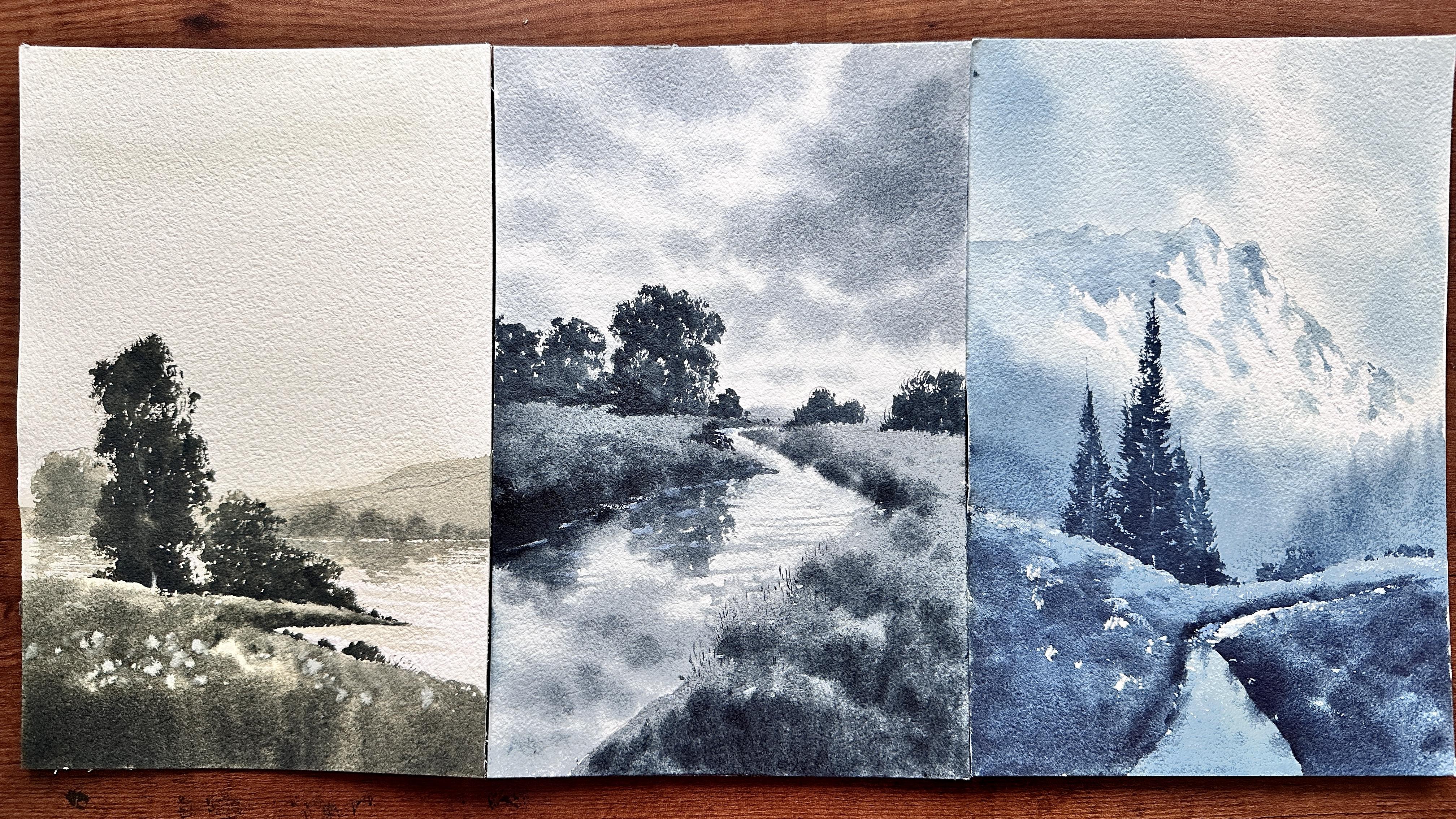
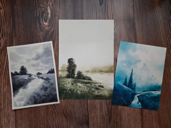
my new Skillshare class. In this class, we'll paint three beautiful monochrome
watercolor landscapes in loose and
impressionistic style, a misty lake with trees
and a foggy mountain view, a river landscape with
trees and a cloudy sky. We'll begin by exploring all the materials we
need for the class, followed by a practice session where we will experiment with different tonal values
using a single color and practice loose brush
work for painting trees, meadows, and other
landscape elements. Monochrome painting is a
wonderful way to study values, understand how light
and shadows work. And learn to create depth and atmosphere in your paintings all without worrying
about choosing the right colors or
mixing multiple shades. The class projects are
designed to help you put these techniques into practice through three
beautiful landscapes. You can download the
pencil sketch for all three projects from
the resource section. You can either
draw along with me or you can trace the
sketches before painting. A little introduction about me, I'm Raniya, a watercolor
artist based in the UA. I love painting nature
related subjects, especially loose
atmospheric landscapes that invite the viewer into the scene and create a
sense of depth and space. I hope this class will help you feel more confident working with tonal values and
creating depth and atmosphere in your
articular landscapes. So yeah, gather your materials, find a comfortable spot, and let's get started.
Happy painting.
2. Materials You'll Need: Thank you so much
for joining me. And in this lesson, let's see all the materials
we need for this class. F style start with paper. I'm using this Bahong artistic
date, watercolor paper. This is 100% cotton and 300 GSM. Size is 230 into 150 MM. It's almost like a
four size paper, and it is called press. You can see an ice texture, which is perfect
for loose painting. And this is also a
glued pad that you can separate the sheets from here once you
finish the painting. Um, and you don't
have to stretch the paper separately if you're
using glued pad like this. But you can also
use loose sheets. You just have to stretch
it with usking tape, or you can paint in
your sketchbook. Yeah, you can use any 100%
cotton watercolor paper. Yeah. And since we're painting
monochrome landscapes, we just need very few colors. So for the first painting, I'll use undersea
green by Daniel Smith, which is a nice, dark green shade with a
bluish undertone. It includes ultramarine blue. So you don't have to
use these same colors. You can use any dark
color you have, maybe indigo or paints
gray or just black color. You can use any shade. Then for the second
painting, I'll use indigo, which is a very common color that everyone have
in their palette. And for the third painting, I'm using cosmic blue, which is almost similar
to paints gray. So yeah, you can even paint all three landscape
with just one color. Maybe you can use
indigo or paints gray. Yeah. Also, I'll
use titanium white to add some highlights
in all three projects. So remember, in this class, our main aim is to study values and create depth and that contrasting
effect in the painting. We're not focusing on the
colors and color mixing. So we don't want
that pressure to choose the colors
for each landscapes, so we can focus more on studying
the values and details. Now, for the brushes, I'll use this wash brush. This is by Princeton for
wetting the ender paper. So you can use a big size
flat brush or hake brush. It'll be easier to
wet the paper evenly. Yeah. And for the painting, I'll use this size
12 round brushes. Both are same. So you
just need one size 12, round brush, a medium
sized round brush. For the details,
I'll use this size two round brush and also
this detailer brush. Yeah. And this is also another brush I'm going to
use, especially for lifting. To lift some paint, I'll use
this small size flat brush. Yeah. And this is the main brush in this
class to paint foliage. So this is a calligraphy brush, and the bristles are very
soft compared to this. So you can squeeze out all the water and you
can press it like this. So you will get a
nice shape like this. And with that, we
will paint foliage, which will create some
nice realistic foliage. I'll show you that. Here you can see the tip of
this brush. Yeah. You can just press the bristles. You can even do that with
the regular brush, okay? Okay. I'll show you
with both brushes. So with this tip, you can take the
already mixed paint, and you can paint it like this. So it is naturally
creating that texture, dry kind of texture. Yeah. So this is one
bridge I'm going to use in all three landscapes. And let's do the same with
regular round bridge. So again, I'm taking some paint. Yeah. You can see that shape. And with that you
can paint like this. You have to keep your
brush damp and yeah. For the details, we
can use the tip of the brush like some
tiny, tiny details, and for some dry and a
little thicker strokes, you can use the
side of your brush. I already have a class on
painting trees on Skillshare. You can check it
out. Yeah. And this is the palette I'm using. This is made in
porcelain palette, which is in a
comfortable size for me. And I'm not using these colors. I will use the palette
for just mixing. Yeah. To speed up the process, I'll use my head dryer so we can paint more and more layers
within a short time. And we need to water, one for rinsing your brushes, and one for paint mixing. Yeah. We also need a pencil
and eraser for sketching. So these are the basic
materials we need. And remember, you
don't have to use the same colors or same brand. You can use whatever you have. Yeah. So I hope you
will enjoy this class, and I'll see you in
the next lesson.
3. Value Study & Some Basic Techniques - Part 1: In this lesson, we'll
explore the basics of monochrome painting
by practicing different tonal values
with a single color. Then we'll use a
reference picture to understand how this practice can improve our
landscape painting. So let's get started. Okay, so first, let's
see how to create different values
with just one color. By using different
pigment and water ratio, we can create many
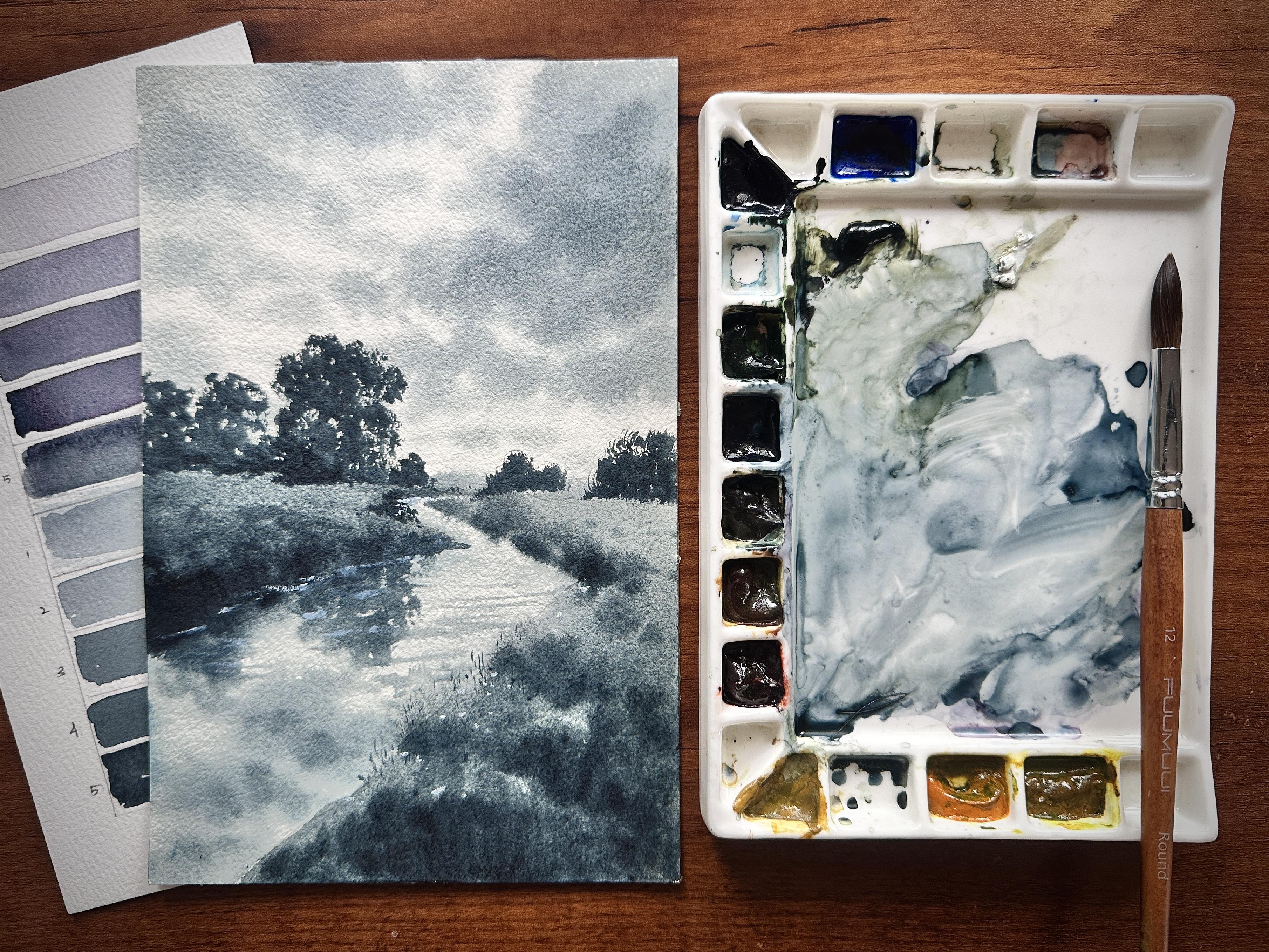
different shades or values. So here I have some paint. This is moonlight
by Michael Harding. Yeah, which is a nice, gray shade with a
bluish undertone. You can see some
blue pigment here. So by mixing lots of water
and very little pigment, you can see the
color already here. And for this mix, I'm going to swatch the lightest
value. Yeah, that's it. Okay. So the lightest value is more water and less pigment. Now, to the same mix, I'm going to take
some more paint. Yeah. And let's swatch
the second one. Yeah, you can see
it's a little darker, one step darker
compared to this one. So you can use any color, and you can try this exercise because it will help you to, um, have a good control of um water and pigment
in your painting. Yeah. Now, I will add
some more paint to this. So we'll have lightest value and mid value then the
darkest value. You can slowly mix more pigment. Yeah. I hope you can see that
beautiful granulating effect with the gray and blue pigments. A. So it'll be more
interesting to paint monochrome pictures maybe
with a granulating color. Yeah. Now, I'll
take more pigment. I'll take some more
paint to this. Yeah. You can see the consistency
of this paint mint yeah, which is going to
be the darkest value. Yeah. Now I'll take some paint
directly from this tube, and let's watch it here. You had to take a lot of
paint to make it even darker. So, yeah, I hope you can see these five different values
with just one color. In monochrome painting,
we use this one color and make it lighter or darker
to create different values, and we'll have lightest
value and mid value, then we'll have
darkest value for the darker areas
in the painting. And also with all these light, mid and darker values, help us to create
that depth and make a painting look more
interesting and beautiful, even when we're using
just one color. So here, for example, you can see a
beautiful meadow with sunlight effect and some
trees and mountain. But when we are turning this picture
into black and white, you can see a lot of different
color values, right? We can see the
lightest value for the sunlight effect
for the meadow and also you can see here some
shadows and light effect, and you can also see
these white flowers. You're not painting this
picture um in this class, but for the lightest value, we can also use the white of the paper or we can
use white paint. And yeah, you can see some
very dark shadows for the trees and also sunlight effect for um
this side of the trees. Yeah. And when you're
looking at the mountain, you can also see some shadows
and light hitting effect. And you can also see
some distant trees, and there are some
shadows for the trees, and you can see a
beautiful gradient, sky and some clouds. So when you are
changing the picture into black and white
or monochrome, you will naturally observe
more subtle changes in values. So when we're painting
a detailed landscape, we can begin with a value
study using just one color, start by simplifying
the landscape into the basic shaves
and silhts and then identifying different
values from lightest to dark and number them on a scale, one to ten or even 20 depending on how many
variations you can observe. Later, when we paint the same landscape
using multiple colors, we can use these value
numbers as a guide to understand how light and
dark each area should be. And by combining
this understanding of value and color temperature, we can create more
realistic paintings with a greater sense of depth,
dimension, and atmosphere.
4. Part 2: Okay, now, we'll quickly explore some basic techniques for
painting loose landscapes, including some simple brushwork
for trees and meadows. We'll also look at
layering or glazing, an important technique in monochrome painting.
So let's start. In monochrome painting, um, one more technique
is there to create more contrasting effect
and depth in the painting, which is, how much softness
or how much sharp, it just un in the painting. Like when we're painting background details like
mountains or distant trees, we can keep it very
blurry and soft, which is called lost or we can keep it very
sharp and contrasting. So this is also one technique we can use in monochrome
painting to create depth. With same color value, we can create lost edges
and also sharp edges. So here, I'm going to show you a simple, very simple demo. So first time just
wetting this part, just slightly wetting the paper. And this is also
specifically for watercolor medium to create
these soft and blurry edges. I'm just painting
a mountain here. Just a small curvy
line for the mountain. And I'm slightly
blending these edges. Okay. So we'll get
that kind of depth. Yeah, that's it. Now
I'll dry this layer. I'm going to paint
another mountain. Yeah. So now I hope you
can see that difference. Here it is very, um, soft and blurry and here it is, um, a little sharp. So like this, we can
also create depth along with using different
color values in monochrome paintings. Yeah. Okay, now, one more
important technique we use, in all these landscapes is painting loose watercolor trees. I already have a class
completely about painting watercol trees
using different brush work. But still in this lesson, I'll show you the way we paint trees in dry
on dry technique. So here, I have a
calligraphy brush, and I'll squeeze out water. And let's just press the bristles and we'll
get to shape like this. Yeah. And with that, I'm going
to paint the tree yeah. So I'm going to paint
it top to down. We're not building the
shape from down to top. Yeah. So that direction
is important to create that natural looking
effect for the foliage. Yeah. You can notice how
I'm moving my brush. Okay? With this shape, you can see some dry texture. You can see those
little white, um, space here and there,
which you can use to create that see through
effect for the trace. Then we can add more
colors here and there to create that depth yeah. And as it going outward, you can create um you can add some tiny
tiny dots and leaves. Yeah. Let's paint
pine tree also. You can use any bridge for this technique and just
press the bristles and you'll get a nice shape to paint this dry and dry
effect for the trees. Okay, now let's see
one more technique, which is, for painting
loose and soft meadow. So we have to move the
brush in a particular way like we're not covering
the space like this, okay? We can move the brush like this and slowly fill that area. Yeah. So we'll get that
nice effect for the meadow. I can use more
paint and just move air brush like this to get
some nice grassy effect. Instead of filling
it very loosely, you can try this
technique to get that interesting texture. Yeah. So you can practice these
techniques before starting the final paintings to warm up and make the process easier, or you can paint
along with me in the coming lessons as I'll explain each step and
technique in detail. So choose whichever
works best for you. I'll see you in the next lesson.
5. Project 1 : Misty Lake View: Hi, Eon. Welcome to our first class project.
I hope you're ready. So for today's painting, we're going to use undersea
green by Daniel Smith. It's a beautiful, dark, earthy green with a
bluish undertone. It includes ultramarine blue. So yeah, you can use any dark earthy colors
for this painting. And we'll also use titanium
white for some highlights. Yeah. So I already
have some white paint here I will take undersea green. Yeah. Now, let's do a
very simple sketch. So I'll start with
the horizon line. I'll do it here a little
lower from the midline. Yeah. And I'll add that foreground. But like this. Yeah. And maybe like this. Okay. And maybe let's add a mountain line above
the horizon line. Yeah, we're going to
make it like a lake view here and a foggy atmosphere. Yeah. You can also download the pencil sketch from
resources and you can trace it. Or you can sketch it with me. That's it. And let's
add some trees. So trees in the distance. You can draw it in
different sizes. Some very short and tiny trees and some little taller trees. Yeah. Let's make it a little
more taller trees here. That's it. And, in
the very foreground, let's make a little more
bigger toilet trays, which is going to be the
main focus of the painting. Yeah. And some tiny
bushes here also. Maybe here too. Yeah, that's it. That's
it for the sketch, a very simple sketch. And now let's start painting. So for style use this
size 12 round bridge and uh I'll take some color
with lots of water. You can always notice
the consistency of my paint on my palette. Yeah. So we'll start
with a very light wash. Instead of wetting with water, we are going to
private the paper with this paint mix under sea green
plus some titanium white. Yeah, we're going to cover the entire paper with
this color to get a kind of glowy misrFeel to
the painting. Yeah. So to cover the paper
endirely in an even finish, I'm going to use this
brush, a wash brush, and straightly I'm filling
the paper with this color. So whatever color you're using, maybe you can use
indigo or paints gray or any dark color, and you can mix it with a little titanium white
and some water. And with that mix, you can just fill the paper. The dire paper. Yeah. So when we're painting
misty landscapes, it's very important to get
that glory soft light effect instead of contrasting
sunlight shadows. Yeah. Yeah, that's it. I
hope you can see that very slight tinted
finish on the paper. Yeah, that's it. Now, I want to make this
water part very bright. So I'm going to wipe
colours from there. Yeah. Yeah, that's it. Let's
take some more color. So now I'm mixing one step
darker to this shade. So that's how we're
going to build that contrast in the painting
with just one color. So yeah. And I'll take a small brush. Yeah. This is size
two round brush, and I'm just slowly
painting that mountain. Yeah. Yeah. Let it spread upward
like this, that's okay. Yeah. We will maybe paint
one more layer later. Yeah, that's it. Now let's go for the foreground. So for that, I'm going to
mix very dark, thick paint. Yeah. I hope you can
see the consistency, and I'm straightly
going to fill this pot. You can see I'm
moving my brush in a vertical zigzag style. I'm not covering it, like, plain, flat um style. Yeah. So we'll get a
kind of meadow effect. Yeah, you can also leave
some tiny, tiny white spots. You learn how to cover
it enderely with paint. And let's do it here also. Yeah, perfect. I'll make it a little more
darker in the very foreground, so I'll take more thicker paint. Yeah. Just some tiny, tiny dark
dots here and there. Yeah. And with this small brush, I will just blend that color here with that little
damp bristles. Yeah. I'm just pulling
that color upward. Like that, we'll get
that darkness around here and we can keep
it more lighter here. We can always add colors
where we need shadows, and then we can
pull those colors, like where we need
the highlight parts. So we can keep that contrast. Yeah. Let's add some more
little dark effects here. Maybe you can also
use white paint, and, um, we can add
some dots here. Maybe some flowers or
some kind of highlights. Yeah. Let's keep it minimal. I don't want to overwork. Okay. I'm just blending some dots. That's it. Now, let's just darken this mountain again with a
little more darker color. Yeah. So I'm just filling that part
with this darker mix. Going around the
horizontal line carefully. And just blending that line to get that little
foggy, blurry effect. Yeah. That's it. Now, again, I will
use this brush, and let's add some lines in the water for
the reflections. So with this very light mix, I'm going to add some
lines like this. Yeah, that's it. Let's keep it very minimal. And maybe we will add more reflections when
we add the trees here. Yeah. Now, I'll take a little more darker mix and let's paint
the distant trees. And also mixing some white. Yeah. Okay. Let's add
short and tiny trees. Yeah. Let's paint a little
more toiletries here. Okay, I'll switch to this
brush to paint the foliage. I'm adding some more
trays here and there. Okay. And let's add
the reflections also. Some very tiny lines. Again, I don't want to overwork. Let's make it very minimal. Yeah. Yeah, that's it. Let's make it a little
more darker here. Some small small
lines horizontally. Yeah. That's it.
6. Part 2: Maybe let's add some more
darkness to this tree. Now, let's paint more darker
trees in the foreground. One bigot tree here and some small bushes around
here are also here. So for that, I'm going to mix a very dark and thick
mix of this paint. Okay. You can use very little
water and more pigment, and you will get a um, thick honey consistency
kind of mix like this. Yeah. Yeah, that's what we need. And then once you
prepare your paint, then you can use kind
of brush like this, and you can, um, press the bistrls to
get a shape like this. Yeah. And with that, let's paint the darker trace. Yeah. You can see the depth
in the painting. Yeah, I'm just adding some tiny, tiny lines and dots. Make it as much as
random and irregular. Uh huh. Yeah. And here also so let's add some
branches or trunk. Yeah. Perfect. Right? Yeah. I'm also adding some tiny, tiny, um, dots as it going outward. That's Yeah, let's
leave it like that, and let's add some more bushes. Okay? You can see the
shape of my bristles. It's not very pointy.
It's like this. So with that, um, we can get that dry kind of
texture for the foliage. Yeah. That's perfect. Yeah, I'm just adding some more details here. Yeah. You can take some time to make this trees
into a nice shape. Yeah, now I'll take this
size two round press. Let's add some details. And maybe I will add
some here some tiny, tiny dots to get
that continuation or that natural Effect. Yeah. You can add some tiny
lines for that grass. Um, Effect. Yeah. Since we're painting
almost like a silht, um, it's very important
how we're creating that shape of the darker
elements like this. Yeah. Yeah. We're almost done. Let's finish it off with some more details. Yeah. I'm just adding some bushes here. Yeah. Yeah, I'm just making
it into a little more, um, irregular effect here. Yeah, that's I Yeah, let's leave it like that. And, uh Let's add some
details with white paint. So I'm going to add
a tree trunk here. You can see already a
small white thing here. And from that, I'm
just adding a trunk. Yeah. Yeah, that's like Yeah, I'm just blanding
it here and there and adding more
and more details. Yeah, we are almost done. Yeah, that's it, Let's
leave it like that. So, yeah, I hope you
enjoyed this one, and we created a beautiful
landscape with just one color. We managed to create that
four game mystery effect and also some depth in the
landscape and details to this, um, trees and foreground effect. Yeah, that's it for
this last project, and I'll see you in
the next one. Bye.
7. Project 2 : Quite River In Monochrome: Hello, everyone. Welcome
back to Class Project two. And today's color is cosmic
blue by Michael Harding, which is a nice
bluish gray shade. Yeah. And it's semi transparent. And there's also
granulating color. Yeah. So we'll use this color
for the enter landscape, and we'll also use
titanium white. Yeah. So first, I'll take
some color to the palette. I don't have this
color in my palette. Yeah. Yeah. And I already
have some white here. Yeah. And let's start
with a simple sketch. So I'll fix the horizontal
line in the center. Yeah. You can sketch it with me, or you can download the
sketch from resources, and maybe you can also
trace it if you want. Yeah. Now, I'm going to
make it like a river. I'm just outlining that
this side grassland part. Yeah. Let's make it a little
more sharper here. Yeah. This line, like the
outline for the river, is very important to get that perspective
for the painting. Yeah. Now I'm going like this. Yeah, that's it. And let's make it a
little darker here. So we'll get some
nice shadows, yeah. And from there, I'm going
to make it like this. And this, yeah, that's it. So here we'll add some details, like for the foreground. Yeah. And around here, I'm just
adding one line here. Let's make it like the river is going
invisible through here. Yeah, that's it. And, um, let's add one tree here. And one more big tree here. Okay, I'm going to
erase this line here. Yeah. I'm going to
make it like this. Yeah, perfect. And, um, let's add
one tree here, which is going to be the focus. Yeah. And we'll paint it in
a little darker, um, paint. Yeah. And I'll add
one tree here. These trees are going to
be the darkest value. And, um, yeah, that's it. Let's leave it like that. Okay. First, I'm going
to wet the hall paper, and we'll start
painting the sky. So I'm using my flat brush. Sorry, wash brush. Yeah. Yeah, it's like
a big size flat brush. Yeah. Just wetting the end paper with some water. Yeah. That's it. Okay, now I'll take some paint and cosmic blue. And remember, you can use any gray shade or you can
paint with any color. Yeah. And lots of water. We're just painting some
clouds in the sky first. Then we will move to paint
the water and trees, okay? So I directly
painting some clouds. I'm not painting sky, yeah. So yeah. And also, I want to keep my brush very
damp and let's slowly build some Yeah. Some clouds. Is it coming to the center, I'm keeping it thinner. And for both sides, I'm keeping it a little thicker. Let's make some very
subtle clouds here. Some very narrow lines. Is it going down. Okay, now
I'll make some more paint. Yeah. And mixing it with the water I already have on my palate and I'm just
making it a little darker. You can see I'm using
this tissue paper to wipe the brush in between painting
to control the wetness. Yeah, it's slowly building
that shape of the clouds. Okay. So you need some nice
moist on your paper, and you can keep
the brushes damp. Yeah. Try to make it a little more darker.
You know, there. Now, I'll switch to
this detailed brush, and let's make some
very tiny lines here. So we'll get that nice depth to the painting by adding
some tiny subtle clouds. That's it. So very tiny lines. Yeah, that's it. Let's
leave it like that. I think I'm going
to make it a little more darker around here, so I'll make some
more cosmic blue. The Yeah. Now, let's leave it like that, and let's move to paint, the water and the land. So I'm going to start with a little more
darker mix of paint. So it's like more paint
and a little water. Yeah. And I'm just
filling this part. Okay. Paper is almost dry now. Let's keep going. Going around that
line carefully. Yeah. We'll add some details
here later. Yeah. Now let's just fill the color. Yeah, that's perfect.
Now let's go here. Yeah. I'm just
filling it out here. Okay, I have to wipe
colors from here. So I'm using a small
size flat brush to lift some color from here. And, it's enough. Now, with this same brush, I'm going to make it a little
dark here and there, yeah. I'm using paint straight from my palette without
mixing it with water. Yeah. By adding more and
more dry thick paint, we can create that contrast. Monochrome painting is a
wonderful way to learn values in painting that we
often go unnoticed. Yeah. Oh. Yeah, that's enough. Now I'm going to make it a
little darker. I'd here. So it's very important
to paint it in a zigzag style around here
to get that meadow effect. Don't just cover this part or fill these sections
like in a flat way. Yeah. Yeah. Now I'll add some details
in the background, way background with
some very light mix of white and cosmic blue. And uh you know, I'm just adding some details
here to create that depth. Yeah. Yeah, that's enough. Yeah. Now, let's dry this layer and
we will add more details.
8. Part 2: Yeah. Now, let's dry this
layer and we will add more details. Yeah, that's it. Now, again, I'll use this Bish. Yeah. And let's paint
some trees, okay? So you can see the
paint mix here. It's very dry, and I'm slowly
painting the trees, okay? I make some water to activate
the paint a little more. But still, we need to
keep it very dark. I hope you can see that
texture with the bristles. Very interesting way to paint trays with this dry texture. T. Yeah, that's perfect. And one small tree here. I will add one tree around here. Not tall trees, some short
bushes, maybe, yeah. Yeah, that's it. Now
I'll add the trees here. You have to move your
brush up to down. Yeah. You should not paint
from down to up. Yeah. So you will get some nice natural
look for your trees. The more random you are, the more natural you
will get the effects. Et's add some very tiny
little dots here. Yeah. Yeah. Now, let's add two trees here. Okay. In this same style here. And one more here. Okay. That's enough. Now let's move to paint some reflections
in the water. Before that, I'll again take
my round brush size 12, I just wetting this part. Yeah. You can see this color is
spreading upward here. Let's keep it like
that to get some nice, soft, it just for the meadow that is overlapping
the view of this river. It is very beautiful. So yeah. And I'm just adding some
color here for the clouds, um, reflections and, yeah. Loosely adding some color. Let's keep it very subtle and
I don't want to overwork. Yeah. Yeah, that's enough. Okay? I'll make it a
little more darker here. Yeah. That's it. Now, with a little
more darker paint, let's paint some
shadows to this trace, okay? So, sorry, reflections. Okay? So I'll go like this. And let's leave some tiny lines like this to get that moment. Yeah. I'm just adding reflections
to this tree also. Yeah. Perfect. And
let's add here as well. Yeah. That's it. Perfect. And now I'm going to take
some white paint for that. Again, I'm using this detailer, and I'll take some white paint to add some more highlights. Yeah, so I want to make
it more brighter here. Yeah. Yeah, that's it. And let's add some
lines here to make it a little more visible
or contrasting. And some lines here. Yeah, I think that's too bright, so I'll just blend
it here and there. Yeah. I'm just
adding some lines. I'm trying to make it a little
more darker for the edges. Yeah, that's it. Now I'm going to add some tiny, tiny lines or dots around here to make it a little
more visible, yeah. Yeah, so let's add
some lines that's like some leaves or bushes crossing the view of this water. Let's keep it very minimal. It's perfect. Let's
add some here. Maybe some flowers
or we can interpret. It's like, whatever we want. And I will add some
dots with white. I'm only adding dots on the lighter space,
as you can see. I think I want to
fix it around here. So I'll take some more
white paint and it like that we can still see the
water through this bushes. Yeah, that's it. Let's leave it like that. Yeah, we painted a nice, um, landscape with
just one color. That is cosmic blue. I hope you enjoyed this one and learned some techniques
to paint soft um, meadow effect and dry and
dry technique for trees, a soft cloud effect. And to paint that beautiful
river perspective. Yeah, I hope you
enjoyed this one. And, uh, yeah.
9. Project 3 : Misty Mountain Landscape: Hello, Ron. Welcome to
today's class project. And today, we're going
to paint with indigo, which is the perfect shade for painting
monochrome pictures. Yeah. So you can use any dark
blue shade or gray color. Yeah. And also, maybe
I'll use titanium white to make some
highlights. Yeah, that's it. Now, I'm going to paint a mountain foggy
mountain landscape. So first, I'm adding a
curvy line like this. Yeah. And also, remember, you can download detailed
pencil sketch from resources, and you can trace
it if you want. And maybe I'll add a water
stream going through here. So I'm just outlining that. Yeah. That's it. That's enough. And we will paint a
few pine trees here. And in the background, we will paint a mountain, and I'm not going for detailed
sketch. Yeah, that's it. Now I'll squeeze out some paint. I'm not sure I have this
in my palette, so Yeah. That's it. I'll also
take some white paint. That's it. Paints are ready. Now, let's wet the indie paper with
this wash brush. Yeah. So we're going to start with wet on wet layer for
the first few washes. We'll start with
the lightest value, and then we'll go
for the mid value, and then finally, we will
paint the darkest value. That's how we paint in
monochrome to create that contrasting effect in the picture with just one color. That's enough. Now, I'll just wipe some color from
this mountain part. That's it. Now I'm using
this size 12 round brush, and I'm going to take some
paint with lots of water. Yeah. You can always notice the consistency of my
paint in this palette. And also I'm mixing
some opa white. And with this color,
I'm just adding some effect to the sky. Yeah, you can notice how I'm moving my brush.
I'm not going like this. I'm just intentionally going, like in this exact style. Yeah. And from around here also, I'm just adding some color. Let's keep it more
lighter to this part. Yeah. Yeah, that's it.
Now I'm straightly going to make it a little
darker and on this spot. Yeah. To get that depth
to the landscape. Yeah. But before that, I'm just wiping some
water from here. I don't want the color
spreading downward, so yeah. And I'm going like this. Let's make it a
little more darker. I'm very carefully
going layer by layer to make it darker. Yeah. Now I'm going to blend this upper part with some water. Yeah. Yeah, that's it. I'm just adding some more
darkness here and there. So layers of trees or
mountains in the background. Yeah. That's it. We're not
painting the mountain now. Yeah. And, um, with
this size two brush, I'm going to paint some more little darker trees
or mountains here. Yeah. That's perfect. M I'm just making it into some pine
trace or something. By adding some
lines like this in a horizontal way.
Yeah, that's it. Now I'm going to dry
this entire paper, and then we will
paint more details. So I'll take my head dryer
and let's dry this layer. That's it. Now let's paint the
details in the foreground. So I'm going to paint
these two land part. Yeah. So I'll take a
very thick mix of paint. Yeah. That's it. And slowly filling this part. And also the paper is dry, okay? So we're bending wet on dry. So I'll leave some tiny, tiny white dots like this
for some nice effect. Yeah. Yeah. I'm going around these lines carefully. You can wipe any extra water on your brush so we can keep it dry and we'll
get more control. You can see that. I love some tiny, tiny spots. Yeah, now I'm wiping my brush, and with that little moist, I'm just spreading
this color upward. You have to keep your
brush very damp to paint this dry texture. Yeah. I'm just blending it here there. Yep. Let's make it a
little darker around here to get that
detailed effect. Like some shadows
or kind of effect. We're just defining that
shape of the water stream. Yep. Yeah. Perfect. I'm slowly building that effect
in the foreground. Just adding some more tiny, tiny dots with a little
darker paint here and there. So it will not look like
a very flat effect. Yeah. That's it. Yeah. Now, let's paint the mountain. So for that, again, I'm using this size
two round brush, and with a very
light mix of paint, you can mix a lot of water
and some white paint. Yeah. That's at the mountain. Yeah, I'm making it darker to one side and lighter
to this side. Maybe I'll take again
this brush. Yeah.
10. Part 2: Yeah. Yeah. And you can also make it blurry here to get
that foggy effect. Yeah. Now I'm just adding some very thin lines here to get that highlights
to the mountain. Yeah. Around here also. Very carefully, you
can add some shadows. Maybe you can also look
at your painting from a little distance so
you'll understand, B you have to add
shadows to the mountain. Yeah. That's perfect. Now let's add some
super tiny lines here. Yeah. We can slowly build that depth to the painting by
adding details. It's very important
to keep it light. We have already
painted the shadows. I'm just making it a little
more darker here and there. Yeah. Yeah, perfect. Mountains are very interesting subject to paint in watercolor. That's it. Yeah. That's it. Now,
let's move to paint some very dark pine dress here. So for that, I'm
using this brush. This is Caligihe brush. And let's take some
little dry thick paint. Yeah. And let's paint. I think I'll paint
very few trees. Yeah. Let start with
a line like this. Yeah, that's it. And now let's paint the
tree in a very loose way. Let's keep it simple and loose. You can see the bristles. It's not very pointy. So this shape is making this
kind of dry foliage effect, which is very natural
and interesting. Yeah. And so you can
use any brush, okay? You can use any brush, and you can just press the bristles and you'll
get a shape like this. And with that shape, you can take some dry, little thick paint mix, and
you can paint with that. With calligraphy
brush, we can keep that shape a little longer compared to the normal brushes. Yeah. That's the difference, I think. That's it. Now, let's
paint one more tree. But before that,
I'm going to paint that line with this brush, okay? Yeah. That's it. Now, again, with this brush, I'm
painting tree details Now, let's paint one
short tree here. Okay. And Yeah, that's perfect. I'm just making it like
one more tree here. Yeah, that's it. Now, let's just add
some color here. We don't want to
leave it very white. So with a very
light mix of paint, I'm just adding here. Yeah. And as it going away, I'll make it more dry like this. Yeah. Let's maybe add some dark raphs, maybe some reflections
or something. Yeah. Yeah. That's it. Perfect. Yeah, I must make it a
little more darker here. Yeah. I think I will add some
tiny dots around here, maybe some trees or something. Yeah. Yeah, that's it. Now
with some white paint, I will add some dots here. Yeah. Yeah. I'm just adding some dots here. Yeah, that's it. And I'm just starting
some lines on this tree. Yeah, that's it. So yeah, we are done
with this painting. Yeah, we painted the India
landscape with just one color, and somehow we managed to create that depth
and atmosphere. And also, you can
see this beautiful light effect on the mountain. Yeah, we learned some
techniques like leaving some white space here by
using dry on wet technique. And also, we learned to create that little foggy
effect around here and painting the pine trees
in a loose style and also painting the mountain in a very simple way
without overworking. Yeah. So that's it for
today's class project. I hope you enjoyed
the session. Bye.
11. Thank you!: And that brings us to end of this monochrome
painting class. I hope these three
paintings helped you see how much you can achieve
with just one color. I would really love to see your versions of
these paintings, so do share them in
the project section. And if you enjoyed
painting along with me, your feedback would
mean a lot to me. So please leave a review. Thank you so much for spending your time creating with me. I hope you continue
exploring and experimenting with
these techniques in your own paintings. So see you in the next
class. Bye for now.
 Raniya Ali, Justartsbyraniya Watercolor Artist