Transcripts
1. Welcome to Class!: Have you ever tried
monochrome painting? I find it to be one of the most beneficial exercises for beginners and even
advanced artists. It's amazing how such a
simple and easy technique can help improve your
understanding of colors, tones, gradients,
composition, and lines. But what is monochrome
painting actually? A monochrome or
monochromatic painting is one created using
only one color. It is often applied to convey simplicity
and peacefulness. It droves focus to the
subject of the painting. By using just one color, you automatically
create a feeling of harmony and balance
in your work. It is a powerful
technique that will help you to take your
skills to the next level, and make a deeper impact
on your audience. I'm here to share with
you my approach to this simple but very
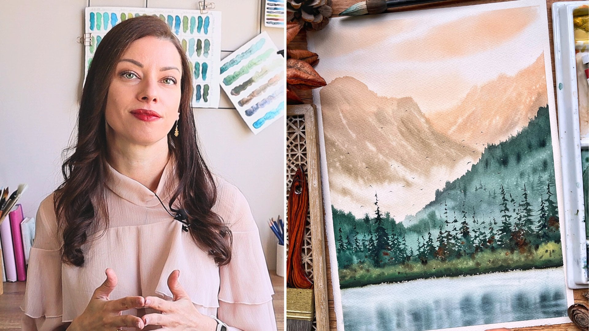
effective artistic style. Hello my creative friends. My name is Selena and I'm a watercolor artist
based in Bulgaria. I love to try and experiment
with different mediums, but watercolors are
my biggest passion. For the last five years, I've been painting
almost every day. I'm constantly
striving to improve my skills by trying new
techniques and subjects, taking different classes
and learning from inspiring artists
all over the world. It's an amazing
journey that never stops to inspire me and one of the best things about it
is that I get to share my knowledge with my
wonderful students. Being a teacher has been one of the most fulfilling
experiences I have ever had and I'm always thrilled to turn my recent discoveries and
insights into a class. This class is all about
monochrome painting with watercolor and most probably you are already eager to start, so let me tell you
what you will learn. I have prepared for you very
simple and easy exercises, each one helping you with
the certain a aspect of monochrome painting
and preparing you for finding
the final project. After completing them,
you will know how to pick the right color for your
monochromatic painting, how to paint small as self backgrounds that
will match its mode, how to master a wet-in-wet
technique so that you're always in control
of how the paint is spreading on your
paper and how to create contrast using different
tones and textures. Finally, we'll create together a compelling and
evocative painting using all the techniques you
have learned in the class. No matter if you've
been painting with watercolors for a few
weeks or several months, this class will surely give you some valuable insights and will inspire you to continue
to learn more. I am so excited to share all this with you.
Let's get started. In the next video, I
will tell you more about the cluster vector and the
final project. See you there.
2. Class + Project Overview: In this video, I will give you a quick overview of the class structure
and the final project. We'll start by going
over the materials that you need in order
to complete the class. I will show you all
my favorite supplies and will give you some options. Next, I'll pay special attention to the colors that can be used. This is a crucial part of any monochrome
painting as there is only one color that is used
to create the entire artwork. I will show you how we can test the colors that you already have available and find the ones that will give you
the best results. Next, we'll use this
color to create a soft and seamless
gradient background. Its simplicity will add to
the minimalistic vibe of your painting and it's an essential
watercolor technique to have under your belt. Another fundamental skill is mastering the weighting way
play of colors on the paper, and we'll practice that
in a separate exercise. Finally, we will
learn how to add eye-catching details
that great contrast. In our case, that will be natural-looking textures
and realistic branches. For the final project
in this class, you'll create a beautiful and compelling painting
in monochrome. I have separated
the process into different sections and I'll
be explaining each step, solidifying all the lessons that you have previously
learned in the class. I'll give you some tips
and tricks along the way. I did my best to make
the entire process beginner-friendly so
that you can just relax and enjoy painting this
peaceful and color mixing. If that sounds good to you, meet me in the next video where I will tell you more about the materials that you'll need in order to complete the class.
3. Materials: In this video, I'll tell you
more about the materials that I will be using
in this class. It's not necessary to have
exactly the same materials, just use what you
already have available. I will start with the paints. Since we are going to paint a monochrome painting
in this class, you will only need one color. For my painting, I chose this indigo
from Art Philosophy. I love to use it for
monochrome paintings, especially for
winter landscapes. Indigo color from
any brand will work. You can also use Payne's gray, sepia or whatever
color you prefer. Just make sure it is a
color that has dark value. I will explain more about
that in the next video. If you're not sure
which color to use, you can decide
after watching it. I have squeezed some of that
tube into my palette here, so sometimes I will just
take it from the pan because it's quicker and easier. You can use the tube or
pen, it doesn't matter. I will use this ceramic palette to mix my paint with water. You can use a dinner plate, plastic palette, or whatever
else you have available. I like to use ceramic palette because they're easier to clean. For brushes, I will use
my Schimoni Art brushes. For the large areas I will
use these quill Size 5. It's synthetic squirrel
and it is very soft, which will help me achieve
a smooth background. You can use your biggest
ends of this brush for that. Next is this round Size 6. It is stiffer and it
doesn't hold as much water, so it's perfect for
whenever you want to take more concentrated paint
or a smaller detail. Finally, this rigger Size 8, I will use it for the
branches of the tree. It has very long bristles
which will make the process easier and the branches
will look more natural. We will have a separate
video about the branches. But if you don't have a
rigger or a liner brush, you can use the thinnest
brush you have available. Actually, I will
use one more brush and that is this mottler, it has very soft hairs and
it holds a lot of water, so it's very useful
for large areas. I will use it to wet my
entire sheet of paper, but it can also be used for large washes and
soft background. I will use this silicone
shaper to apply the masking fluid as it can be really
bad for your brushes, we'll need it for
the tree trunk. If you're not familiar
with masking fluid, this is a liquid that
you can apply to the paper and after it dries, you can go with
watercolor on top of it. It will preserve the
white area underneath and you can remove it after you're finished
with the paint. Since we don't paint with
white in watercolors, it is very useful to apply, even necessary sometimes if
you don't have masking fluid, you can try adding white
gouache at the end. It will look a bit different, but still it will be nice. Let's move on to the paper. For the exercises, I will use these
Fabriano Artistico. It is 300 GSM and 100
percent cotton paper. For the final project, I will use my favorite
paper, Saunders Waterford. It is again 300 GSM and
100 percent cotton. If you don't have 100
percent cotton paper, you can still use
cellulose paper. But keep in mind that
some of the techniques won't work the same way and probably it will
be harder for you to achieve the same results. I will tape my sheet of paper to this board using paper tape. You will need a pencil and
an eraser for the sketch. You may see me using
this bottle spray to activate the
paint in my palette, it's just water that is inside. You will need two jars
of water, preferably, one to rinse off your brush, and another for when
we need clean water. Finally, a cotton or paper towel to take off the excess
moisture from your brush. Gather your supplies and I
will see you in the next video when we'll talk more
about the colors that are suitable for this class and any monochrome painting.
4. Colors: Welcome back. In this video, we will explore the
different colors that we can use for
monochrome painting. If you haven't chosen your
color for the final project, this video can help
you to select. Getting back to the definition
of monochrome painting, this is a painting when
only one color is used, but we use its different values. The value or tone of color is basically its
lightness or darkness. Let's take the color that
I will use today indigo. If I want to use
its darkest value, I will have to take it in
its most concentrated. I'm just wetting my brush
without loading it with water and I will take
some of this paint that I just squeezed
out of my tube. If you use pans, you will need to
activate the paint inside with as less
water as possible. We want to keep the paint
thick and concentrated. In this case, I get this very
dark and very intense color. It's almost black. This is the darkest
value of my color. Next, I will wash my
brush and this time I won't be quizzing
the water out of it on the rim of my water jar. Instead, I will add it to the paint in my
palette in this way, I'm diluting it and getting a lighter value of
the same color. This one is more transparent and we can now clearly
see that it's blue. I will repeat this step once
again to get a lighter value. This one is pretty wide, and one last time for
the lightest one. Now we have a pretty
good idea for different values this
color can give us. We have one that is almost dark and by adding a lot
of water to it, we can also make it look
almost white or transparent. This means that this color is perfect for monochrome painting, as we'll be able to achieve
nice contrast between the different values and our
painting will have depth and it will be
visually pleasing. If you are ever in doubt about the values
you are looking at, you can switch the
black and white mode. Th s way you'll be
able to clearly seethe difference between
the different values. Now, let's try this with
another color for my palette. This time, I will
use burnt umber. I'm repeating the same process, I take very concentrated paint and I add more and
more water to it until I get this
almost white color. Of course, black is also a color that can get you a nice
variation of values. Its darkest value is of
course, the darkest color, and because it is watercolor, we can make it almost white by adding more and more water and making it
transparent so that the white of the paper is central. The thing about black though, is that it's a bit
boring in watercolor, so I suggest using
another color if you can. What happens if we take
yellow for example? We can also use it in
its thickest consistency and dilute it with enough water, so that we get this
almost white tone. But let's check the tonal range by switching to black
and white again. It is now obvious
how much lighter the yellow is than
the other colors, even in its darkest tone. This means we won't
be able to achieve depth and a nice
contrast with it, if we use only yellow
in our painting. Let's try one last color
which is bright red, it is intense color, so you might think that
it's a good choice for an interesting
monochromatic painting. But even though its darker tone
is darker than the yellow, it's still much lighter
than the top three options. We can use this exercise to check some of
your favorite colors and decide on the color that
you'll use in this class. You can also take the color
in its thickest consistency and not water to it gradually, this is my favorite way
of swatching a new color when I get one. Use the black and white
mode of your camera if you're in doubt. Once you're ready, you can head over
to the next video where I will show
you how you can achieve a smooth
and soft background for your monochromatic
landscape.
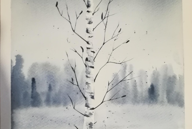
5. Background: In this video, we'll
practice painting as mumbled ground for our
monochrome paintings. As monochrome paintings are
used to convey simplicity, our background will be
a simple gradient wash. We can paint more
interesting sky with clouds, but this will only
distract from the tree, so I thought and gradient wash will be more suitable
for this project. You can learn more about the
different types of washes and how to paint them in
my classroom's sunset. But for now, let's
focus on the type that we'll use today,
the gradient wash. I have taped my paper
to my smaller board. If you practice this, make
sure not to tape yours to your desk as you will
need to move it a bit. I will place my
paper tape like that so that's my board
is at an angle, this way the water and
pigment will flow down and will help us achieve the
subgradients look where after. I will now wet the entire sheet of paper with clean water. I will use my Mortal
Brush for that. You can use your biggest brush. Making sure that your paper is very well moistened
is crucial here. Even after the entire
surface is wet, I continue adding
more and more water and I work at into the fibers
of the paper with my brush. Since the paper is
100 percent cotton and with 300gsm thickness, it can hold a lot of liquid. I want to make sure
that it has absorbed enough water so that the
surface stays wet for longer. Once it is moistened, the paper starts to buckle a bit and water starts to
pull on the surface. We want it to be covered
with an even layer. What you can do is
take your board and move it a bit
so that the water from the pools gets absorbed and the paper looks
even moistened. I'm taking now my soft quill. The softer is your brush, the easier it will be achieve that's what transition
from dark to white color. Stiffer brushes
may leave streaks that may be hard to get rid of. I will squeeze some fresh
indigo here on my palette. I will take out the excess water on the rim of my water jar. We want to start with
a thick consistency and delete it gradually
as we go down. I'm loading my brush
with the mixture and now starting from the top. I move it from left to
right, dragging it down. When I reach about
one-third of my paper, I'm washing my brush, I squeeze out the
excess water from it, and I will use it to continue
dragging down that color. You see how it gets
lighter and lighter. I repeat the same process when I reach two-thirds
of my paper. As am reaching the bottom the color is basically white. I want the background
to be slightly darker, so I'll add more color
to the upper part and now I will drag it down. Washing my brush when they reach about
half on the paper. Now the background
looks more balanced, slowly transitioning
from dark to white. But now I have those streaks, so I will tilt my
board this way, letting the water and
pigment flow down. Now we need to observe
if you have pools of water and pigment
like this here. Most probably you will have some liquid gathering
here on the bottom. You can soak it out
with a paper towel. I will try to get rid of those by tilting my board
from side to side. I don't want to wipe off
the pigment just yet. You can see now how it
flows in this direction. I will tilt it on the other
side to help that color flow. Now that the pigment has moved a bit upper
part and got lighter, so I will add more paint to it. If you're happy with
how yours looks like, you can skip this step. I'm doing the same
thing I did earlier. Now it looks better. If you
have a big brush like that, it will be easier to
achieve that smoothness. I will wipe the drops of water and pigment from the paper tape and I will tilt the board again to make sure the paint
will spread evenly. You can also use the damp brush to absorb the excess liquid, but it needs to be
soft otherwise, it will disturb the pigment that has already
settled on the surface. I will continue
tilting my board until there is no liquid traveling
on the surface of the paper. You can leave it to dry
at an angle like that, but make sure you keep an eye on it while the paper is wet. Also makes sure there
are no drops of water, or paint on paper
tape as they may go back to the painting once
it has started to dry. I will leave my painting
to dry like that. My background is now dry. I will remove the masking tape. Don't worry if your gradient
is not perfectly smooth. You can see that
mine isn't either. We'll use that to paint
the sky and in reality, the sky is rarely a
perfect gradient wash and so variations
of it will just make your painting
look more interesting. It's one of the many
reasons I love watercolor. It helps you get rid
of perfectionism and to embrace your mistakes as they are only making
the final results a more authentic
expression of yourself. Practice painting
smooth backgrounds, which are surprise because
it's always different. Once you feel you've
got the hank of it, hit over to the next video where I will show you how we can use the
wet-on-wet technique and water control to paint
trees in the distance.
6. Water Control: In this video, we'll practice water control as we needed to paint the trees in the distance and foreground, wet-in-wet. Now, wet-in-wet is more than
just painting on wet paper. We need to know when is the right moment for
applying this technique. I will show you the two
common mistakes and then I will show you
how it's done right. If you want to learn more
about water control, I strongly suggest that
you have a look at my first-class
watercolors secrets. There I go into detail on how
you can manage the water on your paper brush and inside the paint mixtures so that
you get the desired results. The first common mistake is
putting too much water on the paper or not waiting enough for the paper
to absorb the water. In both cases, we have
puddles of water on the paper instead of an even sheen through which we can see the
texture of the paper. I have moistened top rectangle with a lot of water and
now without waiting, I will just go with my brush. For the trees in the distance, we don't want to get caught
up into many details. I'm just using
bold brush strokes to create different shapes. You see now that I have too
much liquid on my paper, I can't predict
how the paint will behave once it starts to spread. If I tried to add
more thick paint, it also spreads uncontrollably. This is, of course,
nature for watercolors and part of the processes
to let them do their thing. But it's also important
to use water control so that you will be in charge of
how the paint will spread. I will continue with the
second common mistake, and that is not putting
enough water on the paper or waiting too long for it to
be absorbed into the paper. I just like my brush
on the paper surface. I'm not going back
and forth multiple times as I did when I
painted the background. What happens when we do that
is that the paper absorbs the water and the surface
is now unevenly moistened. This leads to other kinds
of unpredictable results. I paint the trees
in the same way. You can now see that the
paint is not spreading enough or it is spreading differently in the
different areas. By the way, have a look
at the upper rectangle. The paint went totally crazy and it's spreading
all over the place. Of course, both of
these loops may be dessert at some point
in your process, but it's important to know
how to check them or how to avoid them if you're going after more predictable results. This is how I make sure the paint will spread
the way I want it. I wet the entire
area very carefully. I'm going back and
forth and I continue to introduce more water by
spreading it evenly. This takes more time, but then I will be able to
paint soft and blur trees. I take some concentrated
paint, by the way, in all three rectangles, I have used more or less the
same consistency of paint. I paint different shapes and
you see that the paint is spreading nicely creating
these soft edges. If I want, I can take more
concentrated paint and add a few spots to make the silhouettes of the
trees more interesting. This adds more dimension. I can also splatter
some clean water for additional effect. If I try and do this here, the water drops will
just merge with the rest of the water that still sits on the paper surface
and if I do it here where the pigment has
already started to dry, the drops become very visible, pushing too much of
the pigment away. This is how it looks
when it's dry. As I said, depending on your style or what
you're painting, you may be after
each of these looks. What's important
is that you know, what causes each of these. Practice this with your
supplies because each paper is different and weather conditions also play a big role in this. For example, if it's
too hot around you, your paper will dry quickly. Water control is a
substantial part of watercolor paintings. Once you get more
comfortable with it, your skills will
naturally improve. Once you have practiced this, head over to the next
video where we'll practice another important technique that we'll use in the final project, the dry brush technique.
7. Dry Brush: Welcome back. In this video, I will show you
one of my favorite watercolor techniques,
the dry brush. It is a wonderful technique
that can give you amazing results and I use it
in almost all my paintings. In this class, we'll
use it to paint the texture of the tree trunk. Let's get started. I will
use my Size 6 brush. It's better if you use
a synthetic brush, preferably one that it's stiffer and doesn't hold a lot of water. I start by wetting my
brush and then I take the excess moisture off
it on my paper towel. Then I take concentrated paint, either straight from
the pen or a tube. I don't have much water on it, so the consistency of
the paint is very thick. Then I just move my brush across the paper and I get this
interesting texture. You can go over it with a
damp brush and smudge some of the paint to make an even
more interesting effect. [MUSIC] So how are
we going to use this technique to
paint our tree? Let me first draw the shape with my pencil and then I will start adding some
random brushstrokes, mainly on the sides of it. This way we'll emphasize the cylindrical shape
of the tree trunk. Try to make these brush marks
as organic as possible. [MUSIC] Then with a damp brush, I will go over some of the spots and I will
smudge the paint. Again, I'm avoiding the middle. If the paint spreads too much, I can blot it with
my paper towel. You can leave more or less
whitespaces, it's up to you. Then I like to go back with some fresh and very thick paint and add some more dark spots. This way we achieve a very nice contrast
of the tree trunk. That's it. Practice this
and in the next video we'll practice the final
element of our project today, the branches of the tree.
8. How to Paint Branches: Let's paint some branches. They seem easy to paint, but it's very easy
to mess them up. If your branches are messed up, then the whole
painting looks wet. I will use my regular brush and I'll load it with
paint similarly to how I did it in the previous video for
the driver's technique. I don't have a lot
of water on it, and then I take very
concentrated paint. I start by pressing it a bit so that it forms
a thicker stroke. Then I drag it across
the paper gradually releasing the pressure and slightly changing the direction. Let me show you
how this will look if I take more water paint. You see that it doesn't look
as natural as the one above. When I change the direction, I do it with a sharp turn instead of having
these softer bends. Don't be afraid to get
messy and maybe go across the branches you
already have painted. Another thing you can do is
leave some gaps like that. This way your branches
will look lighter. Make sure that the branch
is thicker next to the tree trunk and then
it becomes thinner. Let's add some branches
to our tree trunk now. Some may be short and
some may be long. It always looks nice if
you make the area where the branch and the trunk
connect a bit darker. They can go in
different directions. Some are going up and
some may be going down. Some start from the middle of the tree trunk and some
start on the sides. I somehow painted
these two symmetrical, so this is another
thing you should avoid. Practice painting some branches, and let's meet in the
next video where we'll finally start with
the final project.
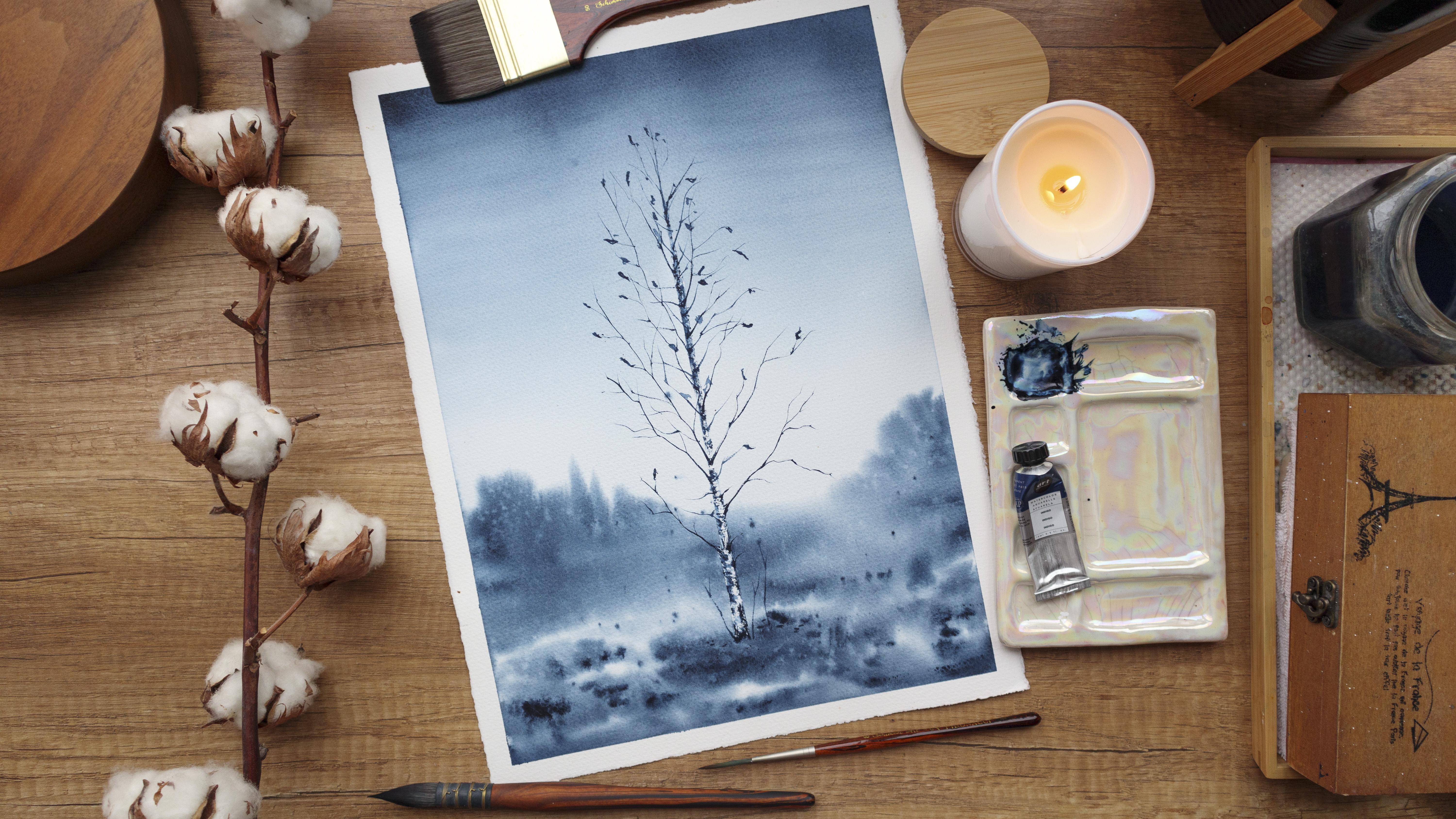
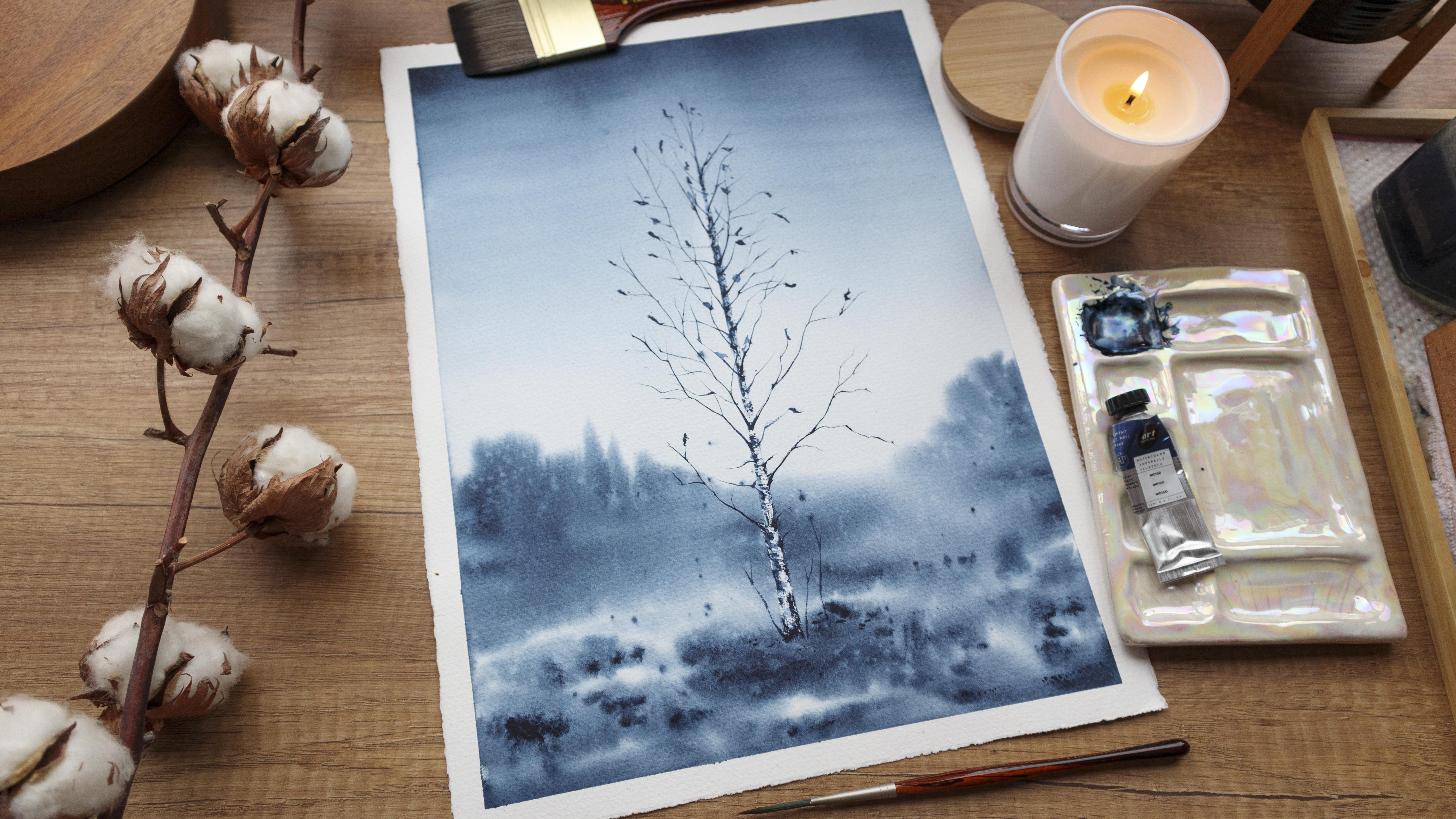
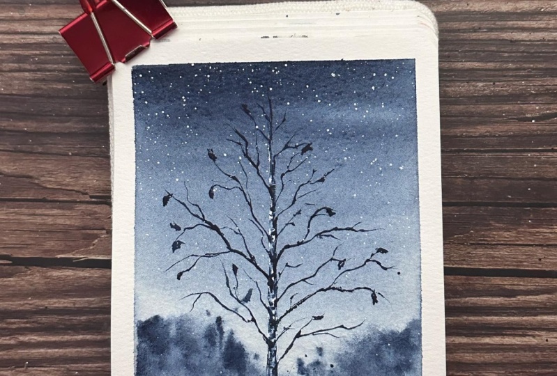
9. Sketch: Hello. Welcome to the final
project section of the class. I have all my
supplies ready and I will start by taping
the paper to my board. [MUSIC] This step is often
underestimated. We can't wait to start painting, so we often rush. But if we want to have a nice and clean white border around our beautiful painting, we need to take our
time and make sure the tape is firmly
pressed to the paper. This way water won't be
able to slip underneath. [MUSIC] I will cover this
tiny area here too. I'm ready to start
with the sketch. I will mark where my
tree will start and end. Then I will measure
around one-third of the paper and I will use that
to mark the horizon line. Here I will have some
trees in the distance. I don't press with my pencil because I want to have soft edge there and I don't
want the pencil to be visible underneath
the watercolor. Let's continue
with the tree now. I draw the tree trunk. It is thinner at the top and then it gradually
becomes thicker. [MUSIC] Here below, I'll just
leave it like that. Let's draw just some
of the branches. We can always add more, but let's just have some guides. It will be easier this way. [MUSIC] I think this is enough. I will now take some of that excess graphite
with my soft razor. [MUSIC] Now I will use masking fluid
to cover the tree trunk. If you're going to use
white gouache for it, you can just keep
this nice video. But again, I remind
you that in this case, your tree will look
a bit different. [MUSIC] I need just a little bit
to cover the tree trunk. I'm not covering it entirely, especially in the upper
part where I leave bigger spaces because
it is darker there. [MUSIC] No need to get that perfect. It's totally okay if you
have some white gaps. [MUSIC] Make sure to leave it
rough here at the bottom. That's it. I will
leave it to dry now and in the next video,
we'll start painting.
10. First Wash: It's time for the first wash. I'm asking for this now on dry. I will place my paper tape again like this so that my
board is at an angle. In this video we'll
paint the sky the same way we did
in the exercise. We will also paint
the foreground, which is the ground in the bottom one-third
of the painting. We'll paint the trees
in the distance similarly to how we did
earlier in the exercise. We're going to do all this in one goal while the paper is wet, so make sure to moisten
your paper very well. [MUSIC] I'm going back, and forth multiple times. I think that's
enough. I'll squeeze some fresh paint on my palate. I will also prepare my pen in case I need some
fresh paint quickly. I will go over the paint
with my brush again, making sure it's
evenly moistened. This will allow me to work with, and white for longer [MUSIC]. Now we'll start with the sky. I'm taking my big
soft brush [MUSIC]. Taking off the excess water
on the rim of my jar [MUSIC]. I will prepare the mixture
for this sky [MUSIC]. It is not very thick but
it's not very watery, somewhere in the middle. I load my brush with it. One last time, I'm going over
the paper with my muffler. I'm wiping the drop that
gathered on the paper tape. Let's go. I move my brush from left to right slowly dragging the
paint downwards. I will now wash it, and I'll continue
from where I stopped. [MUSIC] I will stop when
I reach the bottom 1/3, the place where my
horizon line is. And I will go back to the upper part with
some more paint, and I will repeat the process. [MUSIC] I'm making sure that my brush doesn't have
a lot of water on it, this will disturb the pigment that is already on the paper. [MUSIC] I think this looks okay. I will tilt my board now. [MUSIC] I look for pools of water, and pigment and I block then with a clean,
damp brush [MUSIC]. As the pigment moves
across the paper, the transition between
the different tasks becomes softer, and softer. [MUSIC] Remember that it's okay if your background
is not perfectly smooth. [MUSIC] I'm happy with
how mine looks like, so I will move on
to the foreground. With my big brush I will
take some thick paint, and I will place some
random spots here. Make sure your paper is in the right condition before
continuing with this step, the same way you practice painting the trees
in the distance. I tried to keep the
bottom part darker, and then as it goes closer to the horizon line,
it gets lighter. [MUSIC] I think it's a good time for me to
paint the trees in the distance because I like how the paint
is spreading now. I tried to paint
them quickly with as less brushstrokes
as possible. This way they will
look more natural. Fixing the horizon line. Now, I will switch
to my size six. I will add some splatters
here in the foreground. It's okay if some of
them going to the sky, it will just make
your painting more interesting, and atmospheric. Some blue spots
with thick paint, mostly in the bottom
half of the foreground. This will enhance the feeling of perspective so we have
the darkest colors, and the biggest spots closer to us and everything
becomes lighter, and smoother, and somewhat
foggy in the distance. [MUSIC] I will sprinkle some clean water on the
trees in the distance. This will make them
look more interesting, and will add to the
atmosphere of our painting. Some wonderful foreground too. I love the affected grade. I will wipe the sides
of my painting, and I'll leave it to dry now. You can use a
hairdryer if you want, but it's better to leave
it to dry on its own. This way the paint
will continue to move, and settle onto the paper, and in general it
is better to avoid the hairdryer if you have
masking fluid on the paper. Whatever you decide,
I will see you in the next video where we'll
remove the masking fluid, and we'll paint the tree trunk.
11. Tree Trunk: My painting is now completely
dry as it should be before taking the
masking fluid off. You can remove it by simply
feeling it with your finger. Or you can use an eraser. I prefer this way
because it's quicker and I feel it gets rid of all the
tiny pieces of masking fluid. Now we have our clean
white tree trunk. If you haven't used
masking fluid, you can just continue
following along and you can add some
white cross and the end. Let's add some
texture to the tree, same way as we did in the exercise using the
drivers technique. I take the excess
moisture from my brush and I will start adding some brushstrokes from the edges to the inside of the shape. Actually, I want to start with this part here as it
has to be dark too and then I continue. I'm defining the edge here, but I still make sure I'm
not outlining it entirely. Here it becomes thinner, I move my brush up and down. Just some random spots. You can paint as many or
as little as you want. Now with the damp brush, I will smudge some
of those spots, mostly near the edges. I move my brush left to
right whenever I can. This will help me emphasize
the round shape of the trunk. I try to leave
some white spaces. I'll define the edge here with some fresh paint adding
more and more dark spots. Here it looks very unnatural, so I will smudge it. I will try to lift some of
the color with my napkin. Remember that it's darker
here in the upper part. I think I will
leave it this way. It looks good and I
don't want to overdo it. You can have a little
break if you want or you can head over
to the next video where we'll paint the branches.
12. Branches + Leaves: In this video, we'll
add some branches and some final touches and
we'll finish the painting. I'm taking my rigger brush. I'm taking some thick indigo. I will start by going over the pencil lines I drew earlier. I'm thickening the branch
here next to the tree trunk. I'm always improvising, I'm not just
following the lines, but they serve me as guides. Here on the left side, it's easier for me to start
from the end of the branch. You can also turn
your painting so that it will be more
comfortable for you. Going apart, here the
branches become smaller. You can see how I have more
branches on the left side. It's not necessary
to be symmetrical. Often in nature, there are more branches on one
side of the tree, usually the one that is facing
the sun for the most part. I'll add some short
branches here and there. If you want you can
also add some leaves. It's a winter painting
so not too many of them. I will use again
my rigger brush. I love the natural-looking
leaves I get with it. I'm taking some concentrated
paint and I press my brush next to the tip of the branch and I move it a bit, slightly flicking it at the end. Some could be just random spots. I will add a few twigs
here on the ground. Some splatters. I will add some more leaves. This is it. We are ready
with our final project. I will remove the masking tape. I got a nice clean white border. I really like how it turned out. I hope that you are happy
with your painting too. See you in the next video
where we'll wrap up the class.
13. Wrapping Up the Class: [MUSIC] Congratulations on
completing the class. You did an amazing job. I hope that now you feel inspired to continue
to experiment, and to learn from
this technique. You know how they say that often the best solutions
are the simplest. I think this is 100 percent
true for monochrome painting. It can help you take your
skills to the next level, and it is so easy and relaxing. Once you complete your project, don't forget to post it in the project section
of the class. You can tell me more
about your process. I'm always happy to read
about your experiences. You can also have a look at what your classmates have uploaded, and encourage them
on their journey. If you post your
project on Instagram, don't forget to tag me, and I'll be happy
to share your work. If you have a question for me, just post it in the discussion
section of the class, and I'll get back to
you as soon as I can. Until the next class
guys, happy painting.
 Elina Zhelyazkova, Watercolor Artist