Transcripts
1. Introduction: Are you new to watercolors
and a bit overwhelmed by all the information techniques
and projects out there? Are you looking for
a fun way to get more practice creating
watercolor artwork? This class, monochrome magic, a beginners lesson in watercolor illustration
was made for you. Hi, I'm Alana McNeill, online I often go by
artfullyalaina on places like Instagram and Etsy. I'm an artist and educator and I currently focus a
lot on watercolors. In my art, I'm really
inspired by nature, mythology, and folklore, but I also want to incorporate body positivity and queerness into my heart as a
reflection of who I'm. I live in rural Pennsylvania, so it's really easy to get inspired by nature
all around me. But also living in a rural area, it can really lack diversity and sometimes feel a
little isolating. Reflecting my worldview, reflecting who I'm through my art is just really essential. In 2020 because I had some
free time to practice my art skills I decided to really refine my skills
with watercolor. I've worked with them pretty
much my whole career. They are really great tool
to work with students. I've used them all the
time in art classes, in summer camps, in public art programs. I felt like I never really learned how to use
them in my own practice. Now almost everything I
create uses watercolors. By the end of this class, you will have a
finished piece of monochrome artwork and some
new skills in your toolbox. In this class, we're
going to have a total of seven lessons, two mini projects and
one final project. In these lessons, I'm going
to teach you things like what materials to use about
colors and atmosphere. How to start layering and
making a value chart. How to do wet on dry layering, how to find reference images, how to make thumbnails
and finally, creating our final project. This class, will have
a focus on beginners, but it can be adjusted for whatever skill level you're at. If you're a beginner, you
might want to keep it basic and only do a few layers. But if you are more
advanced student, you might want to try this out, but do a very detailed, intricate and layered
piece of art. When you finish this class, you should have not only skills in watercolor to take with you on future watercolor
projects or classes. But also skills with looking
at the world around you, using reference
images in your art and addressing color and
atmosphere in your art. You'll also be able to make
a finished piece of artwork to share on social media
or hang in your home. Let's get started. [MUSIC]
2. Class Project Overview: [MUSIC] For our
project in this class, we're going to make
one piece of artwork using all the skills we
learned in our lessons. The project will be
in watercolor using only one color and use wet
on dry layering to create. While you're only
required to create one piece of artwork for
this class, I made two. I wanted to provide two examples of what your
finished art might look like. Show you how different colors can affect the
feel of the piece. I have more of my process
to share with you. The idea for this
class came from one of my previous art
series where I made fantasy inspired
character designs in monochrome color palettes. I had a lot of fun
with this series and felt like I learned a lot about watercolor and layering
through the process. That made me decide it
was something I wanted to share with others so I
built a class around it. This class was created focusing on beginners
so we'll go over watercolor supplies
and some basic skills like wet on dry
layering in detail. However, it can also
be adapted to fit your experience level or the amount of time
you have available. If you're a beginner or
don't have as much time, you might want to
do a smaller piece or a simpler piece
without a background. If you're more
experienced or have more time to invest in a piece, you might do a full
page illustration. Make sure you're setting
realistic goals for yourself, like keeping in mind
how much time or energy you want to
invest so you can succeed in creating
a piece that is the right balance of
fun and challenging. When you're finished
with this class, you'll have an awesome
piece of artwork, to either hang up in your home, to show off online, or even to create
merchandise of. I recommend hanging
up your piece of artwork in your house for a little bit after
you're finished. Seeing it framed in
a nice frame and having it on display is
really a confidence boost. Now that you know what to
expect from this class. Let's get started learning
about watercolor supplies.
3. Watercolor Supplies: [MUSIC] Knowing what supplies to use when you get started with the new medium can be
really intimidating. Even on the watercolors, you might end up having to
choose between a palette, individual pans, or
even watercolor tubes. We're going to talk about these a little bit more and you'll get my recommendation
and a little bit of advice of how to use these. I do really want
to emphasize that I believe art should
be accessible. You should use what
you have available to you and what's
within your budget. Great art can be
created from anything. You can use Crayola
student grade brand or you can do something
professional, artist grant gram
like Daniel Smith. I recommend if you're
brand new to watercolors, starting with
something cheaper than student grade just
see if you like it. If you're just starting out, it can be intimidating to use
those expensive supplies. Sometimes it's
easier to start with Crayola and other
student grade brand. I'm going to go
over the supplies a little bit more in detail. I'll show you what
I use and then get some recommendations
for what you could use. First, I want to talk about
the watercolor paper I use. This as an Arteza expert pad. It comes cold press, double-sided so you're supposed
to be able to pay on the front and back and the
difference is the texture. You can see I already
have some sketches in here that I'm saving
to work on later. What I really like
about this pad is the pages are easy to rip out. I like to rip out the
pages when I paint them. Because it's glue bound, it's easy to tear out. I also want to point out
the weight of the paper. The weight is 140
pounds or a 300 gram, which means it can
hold up, it's thicker. It's made for watercolor. If you get something
that's thinner, like sketchbook paper
or printer paper, the water and paint is
most likely going to end up tearing your paper and you
don't want that to happen. I definitely recommend
making sure you have watercolor or
mixed media paper. Watercolor paper doesn't
have to be expensive. You can get Canson
brand watercolor or mixed media paper at Walmart
or Amazon for around $10. Now we'll talk about the
main attraction, the paint. Now I'll go over a couple
of different types of paints so you might be able
to decide what they get. I really like to use pallets. This was my first palette. It was actually a hand me down. I just mix right in the palette. As you can see, it's
a little messy. Next is individual paints. You can find one of the color you want, like I did here, or you could use
watercolor tubes which you have to squeeze
out when I add water to. If you use one of those, you do need a pallet to
squeeze the paint into, to add water into
like I did here. No matter what you choose, they all work pretty
much the same way. You add more water
to get them lighter, you add less water to
get more vivid colors. What you use is more of a matter of convenience,
personal preference. If you're just starting out and don't have any watercolors, I would recommend maybe
getting a couple of tubes of a color you like, a pan of some colors you like, or definitely a student grade
palette like the one here because then you do have a
few different color options without spending much money. Now I'll talk briefly
about brushes. I use the Royal and
Langnickel Zen Series, and I have a few
different sizes. I have a watercolor brush
set from our Arteza. The thing about
watercolor brushes is they're going to hold the pigment and the water better and better control the paint. If you're going
to get a new set, I would recommend getting a set with a few
different sizes, such as this Royal and
Langnickel Zen Series set, there's Arteza water
brush pen set, or even a set from
somewhere like Target or Michaels or Walmart. They have watercolor brushes. All of these costs around $10. Of course, you need water. I like to keep two
mason jars of water on my desk for cleaning
my brushes and I also like to keep a
condiment bottle of clean water for adding
to the paint so I don't get it at murky
from other colors. For my sketching, I just use
a Bic mechanical pencil. You can use whatever
drawing tool is most comfortable for you. I do want to point out
that with graphite, it'll get skilled in
by your watercolor, so you want to make sure
you have an eraser. I always use a kneaded eraser. For my liner, I
want to make sure I use something that
is waterproof, that isn't going
to get smudged or affected by the watercolor. I either use a colored pencil
or something like a micron, which is waterproof and
won't fade with the water. An optional supply is tape. I usually use washi tape. If you want clean white edges or if you want to
tape down your paper so it doesn't move around
while you're painting, you can use washi tape
or painter's tape. I would really
love to hear about what supplies you
do end up using. Either you can just
share supplies list in the project gallery
when you share your project or you could
take a lay flat photo. Everything, your items, taking a photo from above just with your
cell phone camera. You can see my supplies I ended up using in this lay flat. Hopefully now you
have an idea of what supplies to use
and how to use them. But if you have any questions, please feel free
to leave them in the discussion tab down below. In our next lesson, we'll start to look at
colors and you'll get to pick out what color
you'll use for your project.
4. Picking Your Colors: [MUSIC] Picking the color you're going to use
for your project is a really fun and exciting
part of the project. The color you choose
can really affect the mood and the atmosphere. The color is really going
to affect your end result. If you pick different
shades of green, it might end up looking
more lush and natural. If you pick a shade of pink, it might look more
romantic and dreamy. Sometimes I really want to
work with a certain color, so I pick the color
first and then I fill the project around it. For example, I did this here a few years ago on one
of my practice pieces. Well, I really wanted
to use the shade of green and I came up with
a rainforest theme. More often, I finished my liner and then
I pick the colors. The example of that is here. When I made this mermaid piece, I wanted blues to evoke
the ocean and water. But I wanted something
to contrast it, so I picked this hot pink
color for the sunset. Your task for this lesson
is to pick the color or colors you're going to work
with throughout the class. If you pick one color, you're going to get really
familiar with that color, get a lot of practice
before your final project. But if you use multiple colors, you might get a feel for
different colors and see what you actually
want to work with. I recommend picking a color you're going to
enjoy working with. If I wanted to pick my
favorite color, I pick red. If I really wanted
a challenge of a color I don't work with
a lot, I pick purple. If you're having trouble
picking a color, I did create a
resource down below. In the resource, I list colors and the symbolism that
go along with them, as well as some stock images for some inspiration for each color. I recommend a more medium
shade like all of these. If you go too light, it can be hard to build
up the color to make different shades
and it's harder to see the differences
between the shades. But if you go too dark, if you go really dark
navy blue right away, you can't go backwards and get a lighter shade of that color. Once you start sharing details about your project
in the gallery, I would love to hear
how you came to the decision with
what colors to use. Now that you have
an idea of how to pick your colors and what
colors you might use, we're going to move
on to experimenting with paint using wet
and dry layering.
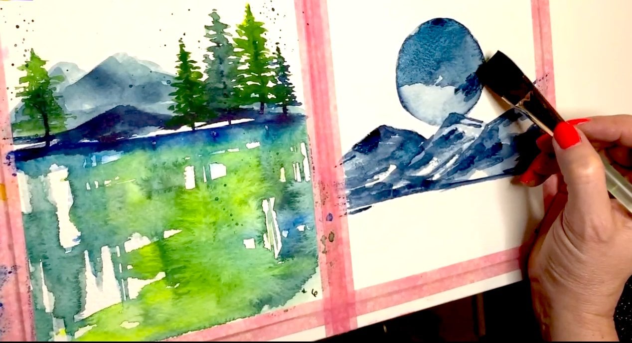
5. Wet on Dry Layering: The main technique
we'll be using in this class is wet on dry. That means you paint a
layer of watercolor, you wait for it to dry, and then you paint
another layer. When you let the layers dry
between paint applications, you end up getting
darker shades, versus if you paint
wet on a wet, you get fuzzier shades, you get blending, and the
colors mixed together. When I was learning watercolor, one thing that I felt helped me learn watercolor better was practicing layering and starting with only using one color. Watercolor is a
translucent medium, so anything
underneath your layer of watercolor is going
to affect that layer. If you put down a layer of blue, and then over top of that, you put down a layer of orange, because they are
opposite colors, you're going to get
a murky brown color. But if you put down
a layer of blue, and then you put down
another layer of that blue, you're going to get a
darker shade of that blue. In this mini-project, we're going to start practicing with layers to see what our color looks like with different
amounts of layers. We're going to go from
one as the lightest, and five the darkest to see the different
values you can make with this one color
and layering it. I recommend trying this with any color you want to consider. This is a good point just
to test out your colors, see what works and
what doesn't because there's been times I really
wanted to work with a color, but it ended up being
too light and I've had a shade with
another color over top. Now, we're going to get
started with our mini project. The first thing I
do is draw boxes. I use our teaser
watercolor paper, the same paper I'll be
using for my final piece. You should use the same paper
because you'll know how the colors will look and behave on the same
type of paper. Don't worry about these boxes being perfect or symmetrical. I made mine not
touching because then, if one of the boxes
wasn't completely dry, it wouldn't affect
the other boxes. I made five boxes and a
column and then there's a total of 3 times for
yellow, purple, and green. I used a large brush, so I could do each
box in one swipe, but use whatever brush
you're comfortable with. Use the brush you're
going to use, so you get used to it. The first time I go
through and paint in each box in the yellow category. If you don't use too much water, which I did a few times, especially with
purple and green, the first column might be dry by the time you're done
with your last column, and you can go back, and start with the next
layer of the first column, or you can work on the
next [inaudible] project at the same time to let this dry between layers [MUSIC]. You can test that the layers
are dry with a light touch. Here, you can see
although yellow is dry, but be careful doing this with any other more serious pieces as you can leave fingerprints, like I did here with the purple. You usually can tell too if the paper looks wet or glossy. It's probably not dry enough yet and you should
wait a little longer. The next time you add color, you want to skip the first
box and start with number 2. Then after that, you'll
do the same thing, skipping the second
box and starting with number 3 until you get all
the way to the bottom. You'll repeat until you
have a whole value scale. I do want to point
out that the paint I used is student grade, and it end up looking
a bit chalky. You can really tell
with the yellow, which ends up looking
especially thick, and it even causes my waterproof pen to
around on the edges a bit. That's probably because
my waterproof pen need a little bit longer to dry, but it really reacted
with the pen, and the water, and the paint
because of the chalkiness. These things are a
little bit more common with student grade watercolors. I don't think they mess
up your painting at all. It's just something to be
aware of as you're working. This is a reference you can
continue to use as you get used to your paints and you
plan for your final projects. These of course
aren't all the colors you can make with
your single color. It's just a reference guide. You can make even darker colors if you continue to layer, or you can add
water to start with even lighter colors on the ones you have
in the first row. Now's a great time to look
at how to create a project. Here's what the
screen can look like. You want to click on
Create a Project, and you can come back and edit and add to this at anytime. When you get to the screen, you can go ahead and upload
the image that's going to be your cover image and
represent your project. I picked this piece that is one of my examples
for the class. You're going to be
able to crop it a bit, and then you can go
ahead and upload it. You can now go ahead and
add a project title, so I just did the title
of this piece for now. You can add all details and
written description here. You can also go
ahead and add images or video or links to help
support your project. Here, I'm going to add in
the value chart I made. Now that I have the value chart, it's a great time to go ahead
and create this project. You can come back later
and continue to add on, whether it's your final project, pictures of your
supplies you're using, or just a little bit
more detail of what you've been working on [MUSIC]. Now, we're going to
talk about picking out reference images, so you can work with some images in our next mini-project, and then our final
project at the end.
6. Finding Reference Images: [MUSIC] I like to use reference images in my work to have whole
thing, but work from there. Let me figure out posing,
composition, and lighting. My favorite site to use
is Pexels because it is free to use and it has
high quality photos. You can find a huge array of things here from an assortment of castles for any
fairy tale pieces, couples and love or something romantic or an endless
array of landscapes. I'm always inspired
looking through the site and there's something
new to look at every day. Even if I'm not using
a reference directly, sometimes it's just good
to gather inspiration. If you're using photos as reference images
that aren't yours, it's important to make
sure you're allowed to. If you're just scrolling
through somewhere like Pinterest and you copy
a reference from there, sometimes that someone
else's copyright and that can be a problem. But here is Pexels'
licensing page which outlines what
you're allowed to do. You can use the
photos, modify them, and credit isn't required,
but appreciate it. It also outlines some
things you should not do like portray the subjects in any negative lights or sell an altered
versions of the photos. It's just important
to make sure you know how you're allowed to
use these references, whether you pay for them or
whether they're free to use, there's usually some
agreement and licensing. Another great option
is just to use your own photos as references. You can take photos
of things you like, you can do your own poses or expressions that
you want to see. Sometimes I can't find
the references I want in everyday life
and that's why I go to somewhere
like Pexels a lot. For this class, I
made a collection on Pexels called
monochrome watercolor. It's going to be
linked down below in the project resources
and description. It's full of black
and white images and images are primarily
in one color. This should be helpful
for you to scroll through and even just
get some ideas maybe you see a color or an idea you
want to use and we will be using a few of the
references for practice on our
next mini-project. I also want to show
you how quickly it is to edit a photo in Canva maybe you
have a photo that isn't monochrome and you want
to use it as a reference. In this class, working from a monochrome image is
going to be really important because
we're focusing on values rather than
color palette. Sometimes it's helpful
for me to have it all monochrome so I don't focus
on what areas are green, what areas are blue, but instead focus on
lights and darks. If you don't know what Canva is, it's a free browser-based photo and graphics editor
that I recommend. You don't only have to
use for editing photos, it has templates for things like TikTok videos or
Instagram posts. I'm going to import
this photo and edit it. This photo I'm picking is
already mostly monochrome, but I want to edit it, it should be just black and white. There's filters I can apply
address to do that quickly. I can also further edit the
photo with brightness and contrast or highlights and shadows to make
them more distinct. There's also options
for playing around with the tint so you can see the reference in
different colors, you can see pinks or greens rather than the blue
that originally came in. I think my end result
of editing looks totally different than
the original photo and it can help you play around with ideas and the reference
before using it. I think my edited image looks more dreamy
and vintage but the original looks more moody and intense and like
it's in a club. Once you start
uploading images and details of the project
you're working on, I'd love to see the
reference image to see what you are working from
and how it inspired you. The next lesson is going to
be a mini-project we'll use some reference images to create thumbnail paintings and
start practice layering.
7. Creating Thumbnail Paintings: [MUSIC] In this lesson, we're going to start to apply what we've learned
about layering colors to making thumbnail
pieces of artwork. This way you get started to get comfortable with
laying down colors, deciding where the
dark areas are in the light colors
are before you move on to your big project. When you work with watercolors, you start from light to dark. It's not like acrylic where
you can lay down plaque and decide to put white
or lighter color over it, you have to work light to dark. There are some ways to
take away color once you get it to a darker shade
with blotting with water. But it's really
hard to take away a dark color and get
back to a light color without layering something like gouache on top of it
that's more opaque. If you aren't familiar
with thumbnails, there are many drawings,
like rough drafts. We're going to use them for
practice so we can create multiple smaller
practices before committing to a
larger final piece. I use thumbnails often in
my day to day art practice. I might use them to plan
things out like where colors and metallics are
going in the left thumbnail. Or what plants and mushrooms I wanted to include in
the one on the right. Sometimes I make a thumbnail, so I have an idea
of where objects, your colors will go
in my finished piece. A lot of times I
just use them to start experimenting with colors, seeing where I'm going to
go and how to balance them or figuring out the
composition of the piece. I think making thumbnails
is a great way to practice on warm up before
committing to a big piece. For our mini-project, we're
going to use references from the monochrome watercolors
collection on pixels, which we saw in the
reference lesson. I want you to pick 2-4 images from the gallery to
create thumbnails of. I went with four because
I wanted to show more examples and forfeit
nicely on my paper. These were the images
I'll be using. I chose them because I liked the contrast of lights and
darks and all of them, and I usually include
figure drawing in my work. Three out of four of
them include that. I encourage you to pick
pieces that speak to you. You could pick images
you're thinking of working on for your final piece and
aren't sure of you-all, or you can pick completely
random images like I did. When I started to work, I drew four boxes on my paper
for the thumbnails. You don't want your paintings
to touch because then you can let one dry when
you move on to the next. If they touch, the colors
are going to bleed into each other and interact
and you don't want that. When I started to sketch
out my paintings, I made sure to draw out the areas of shadows
and highlights. This isn't something
I always do, but for this practice this is how I'm going
to approach this. I encourage you to do the same. We're making a map of the
shadows and the highlights. As I'm working, I make sure
to keep my reference handy, which is on my phone so I can look at it all the
time as I'm drawing. Keep it handy as I'm
painting later as well. This painting you're going to
see from beginning to end, but it's sped up quite a bit. I did four layers
of color total. I'm using an Arteza
watercolor tube in wineberry for this one. I tested the paint on the border first to make sure
it was light enough, at first it wasn't so
I added more water. Then I put down a wash of
the color in the whole area. This will be my lightest
color of the piece. If areas have highlights like on her leg and her
face and the water, that will be this color. I let that first layer dry
and then I go through with another layer to start
darkening different areas. I add another layer to quite
a few spots like her skin, the rocks, and her clothing. [MUSIC] I go through and add a third layer to darken up some
areas like her hat, some of the rocks,
and her shorts because they're darker
than our skin tone. I also darken up areas that I know are going to
be shadows. [MUSIC] Finally, this is my last
layer, the fourth layer. This is going to be my
darkest color of the piece. For the other three thumbnails, I only did three layers. I have a lightest value, a middle value, and
a darkest value. You want to keep this in mind. What areas are going
to be your lightest, and what areas are going to
be your darkest as you work. For the top two images,
the one in the blue, I use Crayola paint, for the bottom two
I used Arteza. I just want to remind
you definitely work with what you
have available, you don't need
expensive supplies. I really like how the top
two Crayola pieces turnout, and there's only a couple
of bucks for the palate. These are what my pieces
looked like in the end. I'm really happy with them. I think my favorite is the blue one and then
the wine colored one. I'd love it if you took a
snapshot and share these in your project gallery along
with the rest of your work. I love seeing the
behind the scenes and the process behind a piece. I'd love to see yours. Now that we have a bit of
practice under our belts, working with watercolors
and working with layers, we're going to apply
what we know and move on to starting
our final project.
8. Class Project: Sketching: [MUSIC] Now we can finally get started on
creating your final project, which will be a
finished piece of art. The first thing you're
going to want to do is figure out what idea
you're going to work with. That might mean looking back at some more reference images, looking at some new ones, maybe looking at some art books
or other art inspiration. Figure out what you're going
to sketch for your painting. If you still aren't
sure what to make, you might want to ask
yourself a few questions. What kind of art do you like
to create or to look at? What reference images
caught your eye, or what color do you
want to work with? This will help you pick a piece that you're
going to enjoy making. It's going to be in your
interest and maybe your skillset and I think it's really important that you enjoy
whatever you're creating. These are the reference
images I ended up using. I mix and match
all four of them. I use opposed from the model, I use two different
images of beetles, so I get the right
look for the beetle. I use some pictures of leaves. These are my finished
pieces so you'll know what I'll be
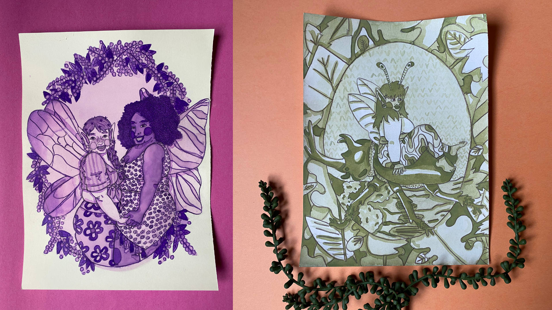
working towards. We'll be focusing on this one, the green fairy piece, but I also made this
purple one just so I have multiple
examples for you. Sketching is one of my
favorite parts of the process. You have a blank
page in front of you that has unlimited
opportunities. You could take your time to
play around with the sketch, with the poses or
the subject matter and what you're
going to include. Those are very exciting time. Don't rush yourself and take
your time with the sketch. Also, don't be
afraid to change it. If you're going along and
there's just something that's not clicking and you really
don't like just change it. Sometimes sketching
goes really smoothly, I sketch it out and that's
exactly how I want it. But more often than not, I end up erasing and redoing
parts of the drawing. It happens a lot with
things like hands and feet and just getting
the poses right. Of course we'll say it's
happened from time to time. I want to encourage you to
embrace making mistakes. There's always ways to fix
them or include them into your piece and not let
them hold you back. That was something that held
me back for a long time and I still had tons of
unfinished work because I was scared of inking and messing up something of
painting and choosing the wrong colors or
somehow painting outside the lines and I have a ton of unfinished work from my past. Now, I really try to
embrace mistakes. Either include them in my art, find a way to fix them
or just carry on. When you get started sketching, I recommend starting off
with a light sketch. This way if you have anything, you need to adjust or erase, it's a lot easier to do. You can see here I
erased and reviewed sections of it as I
figure things out. This is the reference
image I'm working from. You can see that the pose
is basically the same. I also take inspiration
from her hairstyle. I always start with a
really rough sketch so I can figure out
things like the pose, the composition, and the
overall layout of the piece. I wouldn't add details yet
because then I might end up having to erase
them if I have to redo any parts of the piece. Once a rough sketch is complete, I go through and refine
it to add details. I added things like her
face shape, her wings, and flesh out her hairstyle so it's closer to my end goal. Then I start to add
in some details that I didn't even have
in the rough sketch, such as her eyes
and nose and mouth. I figure out the posing of
her arms and legs better. I usually save the
hands and feet for last because for me they're the hardest part of the piece. I start to kind of think of
what kind of clothes she'd be wearing and what her
outfit looks like. That's when I add all this in. I also start to
focus on the beetle more and getting the shape
I want for them right, and making them look like
an airfoil rhino beetle. I do use two different
photo references. One of the rhino beetles, so I get the characteristics
of it right. I did use another
beetle pose just to get the shape right
for how I wanted it. I also wanted to point out
here that I have this foot going a different direction at first because I like
the shape of it, but then I realized
it looks a little strange with the composition, so I erased it and we did
it so it fit in better. Definitely don't be afraid
of changing things up, adjusting things if you just find it's not working for you. I focus on the
beetle and the fairy first because they're the
main part of my piece. But once I have
them, how I want it, I go back in and I started
adding in my background. I add in the beetle
crossing animosity log. Then I start to use
this reference image of leaves to create a
border around my image. It's not an exact
copy of these leaves, but I mostly use it as a
reference to help with creating different leaf
shapes and how they layer. The final thing I do in
my sketching phase is I go over the lines with a
brown Artesia colored pencil. I usually paint in a
coloring page approach where I fill in my outline rather
than outlining it at the end. You can outline now with
something waterproof like a waterproof pen or a
colored pencil like I do. Wait until your piece
is painted in and then outline it or just use a
pencil outlines as is. I've just remember
if you paint over any sketchy pencil outlines, they will be sealed
into your piece. You might also want
to go through and do a little bit of erasing
of any extra lines. I think once you're
done with your sketch is a great time to pause and take a photo and
document your progress. I also encourage you to share
photos of your progress, of your sketches, of your planning, in
your project gallery. This is my other piece when
I'm finished sketching it. You'll see it a little bit more during the painting video. Now, that you have
your sketch complete, we're going to move on and
finally get the painting.
9. Class Project: Painting: [MUSIC]. This is the painting
lesson which we've all been waiting for. This is when you get to apply all the things we've
learned in the class, and finally, paint your piece. Everything from the past lessons is really going to
come together here. You're going to use your
knowledge of looking at reference images on layering wet on dry to a finally
apply it to your sketch. Sometimes the scariest
part of making a piece for me is laying down
the first bit of color. You don't want to
mess up. You want to make sure it's perfect, but I encourage you
to dive right in. When I create, I'm focusing on progress and not perfection, and also having fun and making something that
I'm going to enjoy. I think if you focus
too much on perfection, you get in your own
way because it's very hard to make
anything perfect. You ended up frustrated
and disappointed instead. As I paint, you'll mostly see my green rhino
beetles fairy piece, but you will see my
purple Listeria and Allium piece a little bit because I do a few
things differently. I wanted to show you. One thing I do
differently right off the bat is I taped
down this piece. I don't have to worry
about painting to the edges because
of the composition. I was having trouble with the other piece
moving around a lot, so I wanted to tape it down. I did make another value chart for this piece because at first, I was not sure which
green I wanted to use. I ended up pretty
quickly deciding on the first one on the left, the 605. I only did a test of
that one in the end. I also use this paper to
test out my colors as I go. When you get started,
you'll start with your lightest layer first. This is the color you'll use
for areas like highlights or anywhere you want to contrast
against the darker areas. Make sure your painting
has a decent amount of water so it's light enough
to be your base layer. I always test it out
on scrap paper or the edge of my value chart
before I lay it down. When you paint this first layer, you want to work fairly quickly if it's a larger
piece like mine. If the area starts to dry, you can end up with
inconsistent colors were wet paint and
dry paint meet. I recommend working from top to bottom and just making sure
the edge of your area, your painting is still
wet as you continue. I accidentally ended up
with two areas like this in my Listeria and Allium piece. I'll show you how to correct it. I use a clean brush
with clean water to wet Allium's whole arm
to reactivate the paint. Then when it's reactivated, I just blend it out to make
it an even tone again. Make sure you're waiting for the layers to dry
before you go on to the next layer so you can get those distinct colors and
values we're looking for. If you really need to
speed up the process, you can always use a
heat gun or a hairdryer. Sometimes I work on
another project, do chores or go through emails while I wait for a layer to dry. I'll start on my next layer, which is one of my mid tones. That means it's the values in the middle between
lightest and darkest. I paint around areas that
are going to be highlights later like the shiny bits
of the beetle shell. I also leave some areas
lighter like parts of her outfit to have that contrast against the rest of the piece. Most of the piece is going
to end up being mid tones rather than the lightest
value or the darkest value. I ended up painting a lot of the piece in these
middle layers. Moving onto my third layer, I start building
up the values that I know I want to be darker. I'm going to delete
a few areas of shade like parts of the
pattern of her clothing, parts of the tree branch
in the background, some of the leaves,
and her skin tone. Since this is another
mid tone layer, you might find that you're
painting a lot of your piece. This value as well. I think it's in my fourth layer that the piece really
starts to have more depth to it and
contrast between the values. I'm not painting in as
many areas anymore. I know the beetle is going to be the darkest part of the piece. All of them gets
painted in as well as her hair and a few
spots of her clothes. I also paint in some details on the tree branch so it
doesn't look as flat, and I use this value
in the border as a background color to make
the leaf stand out more. My fifth and final layer is going to be the
shadow of the beetle. I think this finally
really makes them pop. After that, I did go
back through and add a little bit of lighter shadows
to the rest of the piece on the ferry and
her wings and where leaves overlap to give a
little bit more depth. This is where I take a step
back to make sure the colors look balanced and change
anything as needed. I was thinking about this. I decided the background was
a bit bland for my taste. I like to have
pretty busy pieces and a lot of patterns besides taping my Listeria
and Allium piece to my desk and fixing the
mistake I showed earlier, the painting process was
pretty much the same with it. I didn't film as
much as the process because I knew it was
going to be the same, but I did want two finished
examples to show you. I also wanted to point out here, I used the purple
Crayola pen from a palette I got from the
Dollar store for it. I just wanted to remind you, you can use whatever materials
that are accessible to you and end up with a great
finished piece to show off. These were my finished pieces. I like to set up some
stage photos with some props and a
colorful background. These are the type of
photos I usually post on Instagram to show
off my artwork. I think framing the
art you make and hang it up on the wall are
the great way as well. I'd love to see any photos you take up your artwork
and definitely share them to the
project gallery because I'd love to
see what you created. Now that you created
a piece of artwork, we are at the end of our class. In the next lesson, it's
going to be short and sweet, and we're going to do a brief reflection
on what we learned. [MUSIC].
10. Congratulations!: Congratulations. You made
it through the class. You should have an
awesome piece of artwork to show off and share. Now that you have a
piece of artwork, you can share it in your home, share it online, share it with
friends and family. You should be proud of
whatever you've created. I think showing off your
work and taking some time to reflect on what you learned is an important part
of this process. You should also have
a skill set and some new tools to take along with you in your
artistic journey. You'll be able to do
things like look at color and how it
affects atmosphere, to do wet-on-dry layering
and future projects, and how to find
reference images to use in all sorts
of art projects. I'll encourage you to
share your art down below and make sure
you create a project. I really love sharing and
viewing other people's artwork. I want to see what you've
created from this class. I'll make sure to comment on your artwork if you share it. I also want to truly thank you for taking this
class with me. I had a lot of fun creating
this class and I'm happy to share what I know about
watercolors with you. I know when I first got started, watercolors were a bit
scary so hopefully, it makes working with
watercolors more fun and less intimidating
for you as you learn. If you have any more
questions about this class or
watercolor in general, I'd be happy to answer
any questions I can in the discussion tab below. Thank you again for joining me.
 Alaina McNeal, Fantastical Illustrator