Transcripts
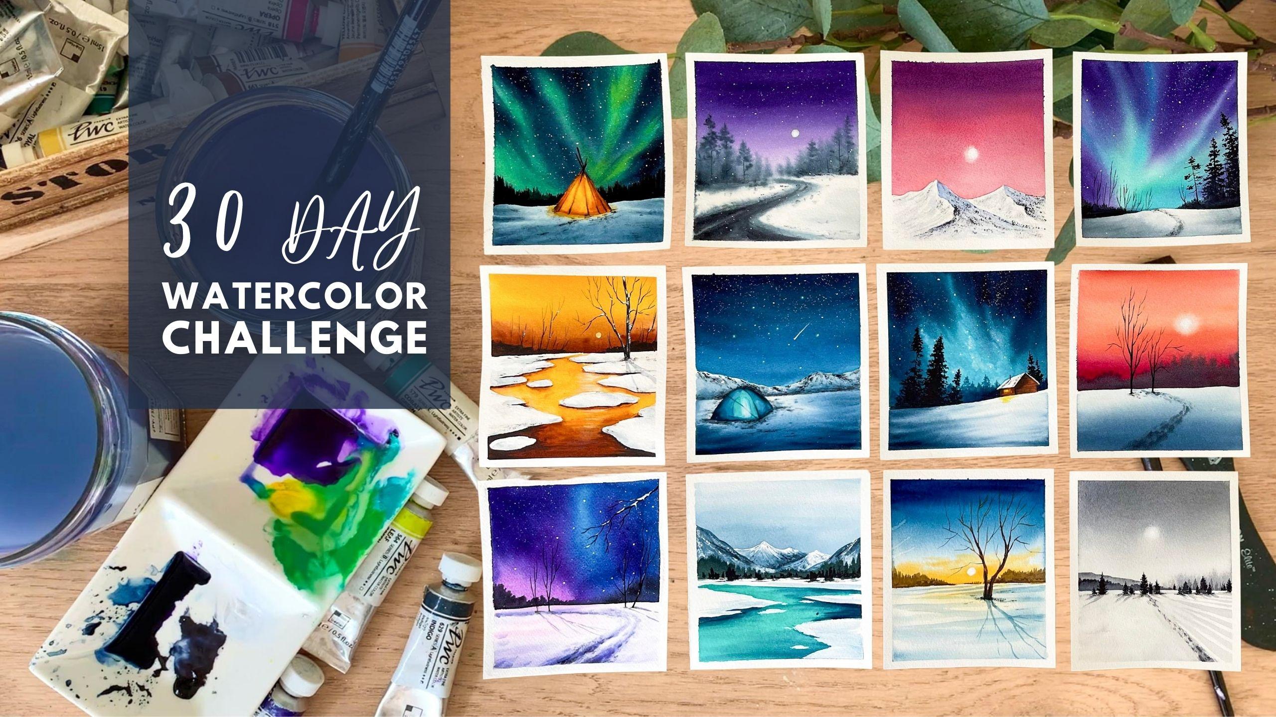
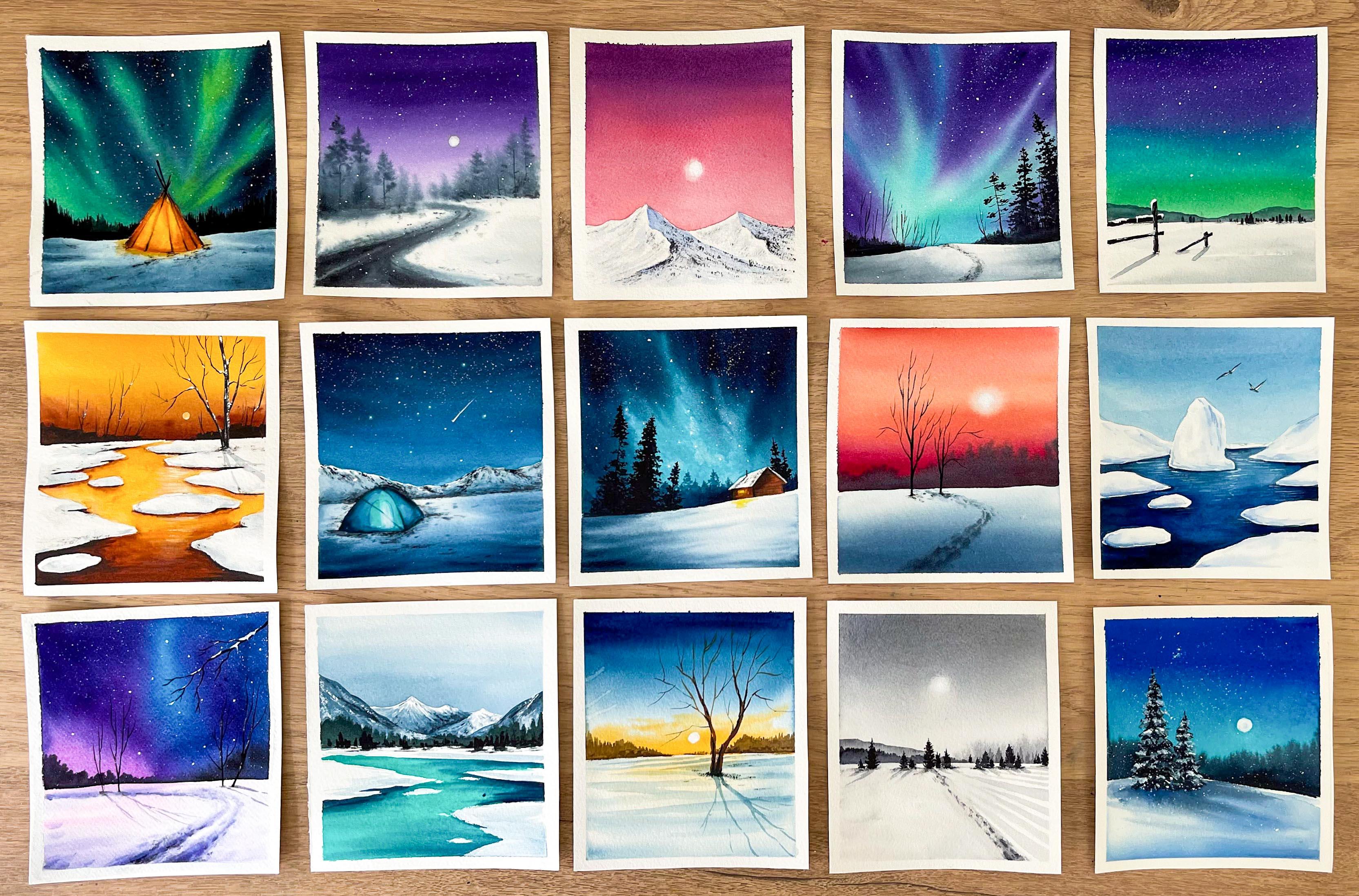
1. Hello & Welcome back!: [MUSIC] [NOISE] Painting with watercolor is so much fun, right from wetting the paper with clear water, pouring the colors and watching them blend and bleed into each other, and create the whole magic. It's a really beautiful process. Sometimes painting with watercolors can be incredibly challenging. But in the very next moment, it may surprise you with stunning results which you will be really proud of. Hello my dear friends. My name is Zaneena Nabeel. I'm a mother, an artist, and an architect. I have been using watercolors since childhood and my fascination for this medium has grown so much over these years. Winter is one of my most favorite subject to paint, creating those moody, foggy, snowy landscapes is such a thrilling experience. I'm super excited to invite you all to a 30-day watercolor challenge where we will be together painting 30 gorgeous winter landscapes. [MUSIC] This class is designed as a daily challenge, which will run for 30 days. Starting from today, for the next 30 days, we will be painting a gorgeous set of winter themed watercolor paintings. [MUSIC] We will paint a series of stunning northern lights, foggy mornings, chilly evenings and so much more. This class is suited for artists of all skill levels. Even if you have just started using watercolors, this class works perfectly. This entire challenge is power packed with incredible techniques and wonderful class projects. I'm certain that by the end of this challenge, you all will be a lot more confident in your watercolor skills. [MUSIC] Are you guys ready to explore this snowy season with watercolors? Put on a cozy sweater, or grab a cup of coffee and join me to paint a gorgeous collection of winter landscapes which you can flout.
2. Before we begin!!: [MUSIC] Always buy a paper which is made for watercolor painting. You will find a whole lot of varieties of watercolor paper in the market, Some of them are cellulose, some of them are cotton, some of them are a mix of cotton and cellulose. Always try and go with a paper which is 100% cotton. These are two of my favorites, one is Arches. This is 100% cotton and it is 140 lb. Same with the other one. The other one is from Canson. It is their heritage series. Both of these are cold pressed watercolor paper. For this entire course, I'll be using paper from Canson. This is a texture my paper has got, it is moderately textured. Most of the time we get frustrated with watercolors just because you're using the wrong kind of art supplies, especially the paper. Using a good quality watercolor paper has a huge impact on the intracellular. If you're really serious about improving your watercolor skills, never paint on a student-grade watercolor paper. Try and invest on a good quality artist watercolor paper. Trust me, this is going to be a game changer. You will start to enjoy the process and you will love this medium like never before. The same thing goes with sketchbooks as well. It is much more easier to get the right watercolor pad. But to find the right sketchbook is difficult. This paper is quite thick, but it doesn't have any texture. It is only good for sketching and light washes. It is not 100% cotton and it cannot handle multiple layers of water. I have just kept it aside for some sketching exercises. Now I have another sketchbook here. This one is a custom-made sketchbook, and it is made out of 100% cotton watercolor paper, which is made for watercolor painting. A [inaudible] for me is batches and color studies. You can see that card just texture. Ever since I started using 100% cotton watercolor which of minimum 140 lb thickness, I have never bought cheap cheap watercolor paper. I know it can be a bit expensive, but this is going to be a real game changer. If you're really serious about improving your watercolor skills, there is no other choice, you have to go with 100 % cotton watercolor paper, which is of minimum 140 lb thickness. The more the thickness more better, but it can be more expensive as well, so go with a minimum thickness of 140 lb. Make sure to go with a really light pencil sketch, no matter which pencil you're using, whether it's an HB pencil, or a 2b, 1b, or a 4b. Make your pencil sketches as light as possible. Watercolor is a transparent medium. In this watercolor challenge, we are painting winter landscape. To bring in that snowy character, we'll be going with really light watercolor washes and we'll be reading the paperwhite as well. Go to really light pencil sketch, otherwise, your pencil lines will be visible in your painting. We don't want that. You can see the light sketches I have added here. That is tone you should be using for your pencil sketch, not just for this watercolor challenge, this is something you need to keep in mind whenever you're adding a pencil sketch for your watercolor painting. Don't put a lot of pressure. Be very gentle and add a pencil sketch as light as possible. Never study watercolor painting without having any idea about the color palette and the techniques that you're going to use. These are some thumbnail sketches I created earlier for a different project. These little paintings will give you a better idea about how to approach your main project. I still remember I have ruined so many watercolor paintings in my early stages just because I didn't plan out the colors and the techniques properly. This exercise is really important if you are going with the new technique or if you want to try a new color combination. These paintings can be really small and it doesn't need to be detailed. It is just to get an idea about the color palette and how to approach painting. It is going to make the whole process a lot easier. If you really take care of your watercolor brushes, you will never have to buy the same brush again. It is really important to keep your brushes clean. There shouldn't be any leftover paint on your brush after you have finished your painting. I normally use this brush cleaner. I use it quite often for my gouache brushes, but for my watercolor brushes, I just use it once in a month or maybe once in two or three months. This is just like a mild soap. I'll quickly explain the process that I follow normally. First I insert my brush in warm water, then I rub my brush in the soap. There will be some latter that is formed on your brush. Now wash on that plateau in normal water. Instead of a brush cleaner, you can use any mild soap or shampoo. It works the same. Take care of your brushes. Always use two jars of water whenever you are doing a watercolor painting, it is really important to work with clean water to get fresh and vibrant colors. I always keep one jar of water side and whenever I'm in need of clean water, I just grab that one. The other one I normally use will always have the paint from my brush. If in case you're not able to work with two jars of water, try and replace your water as frequent as possible. If you work with muddy water or dirty water, you're painting will also look muddy, it will lose that fresh character. It is really important to work with two jars of water or keep replacing your water frequently. Try to clean your brush properly. Every time you go from one color to another, you might be working with light colors and dark colors. Imagine if you work with blue first and you're using the same brush to pick yellow. If you didn't clean it properly, you will end up creating a green. Always clean your brush properly before you switch from one color to another. Just to be sure, you can dub your brush on a paper towel to make sure there is no leftover paint on your brush before you go with the second color. Always make sure the previous layer has dried before you go with the next step. When you're working with watercolor, you need a lot of patience. Always wait for your background layer to dry before you add in your details. If you want to speed up the process, you can always use a blow dryer or a heat tool. This can speed up the process and you can add your details much more quickly. That is it. I think we are all sort to begin this journey. [MUSIC]
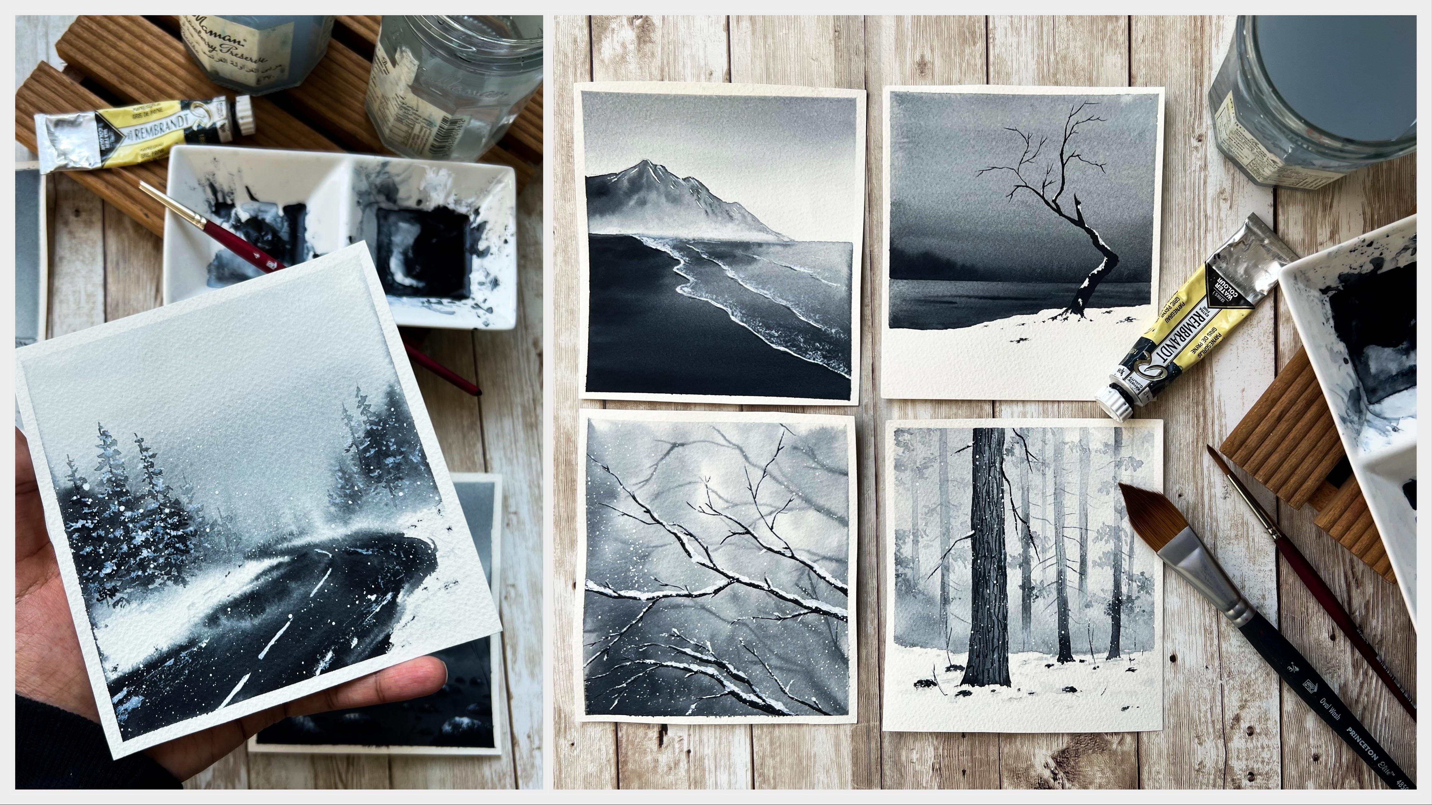
3. Materials you'll need: [MUSIC] Now, I'm going to take you through all the materials you will need for this course. We'll start with the watercolor paper. The one I'm going to use for this course is the Canson heritage cold press watercolor paper. Canson has a lot of varieties of watercolor paper, but this one is my personal favorite. When you're getting a paper for your watercolor projects, there are three things you need to be careful about. The first and the foremost of all, the paper should be 100 percent cotton. If the paper doesn't mention 100 percent cotton, it might be of cellulose, but isn't that great for watercolor projects, so always go with the paper with this 100 percent cotton. The next thing is your paper should be at least a 140lb. This indicates the thickness of your paper, and this means your paper can handle multiple layers of water. The last one is the paper has to be cold pressed. But this one is a personal choice. If you would like to work with more textures, you can go with rough paper. If you would like to work with very minimum texture, you can go with hot pressed paper. Let's take a look at this image. You can clearly see the difference. The first one is hot pressed and it doesn't have any texture. The second one is cold pressed watercolor paper, which has a moderate amount of texture. The last one is rough, which has a lot more texture than the other two. Keeping those things in mind, decide on your watercolor paper. Now, this paper part is 26 centimeter by 36 centimeter, and I have divided this paper into six equal parts, and that is the size I'm using for my paintings. Each of these divisions are 12 centimeter by 13 centimeter. I got this dimension by dividing the paper into six equal parts. It's a small size, but you can decide on the size of the paper you want to work with. If you were to go with a much more bigger size, that's totally your choice. Here is one of the painting we'll be doing. I just took this out so that you can understand the size. That's the size I'm going to go with. You can see, I have just divided that piece of paper into six equal divisions. Decide on the size of the paper you want to go with. Whichever the size you're going with, just make sure to go with 100 percent cotton watercolor paper, which is going to have a huge impact on your painting. Now, I'm going to fix my paper on a board. This one is MDF panel. I'm using this as my packing board. We just need a piece of cardboard or any other piece of hard surface, to fix up a paper on to. For some of the paintings we'll be doing in this course, we'll have to lift our paper and tilt then turn it around to make the colors blend into each other. I would recommend fixing your paper on a backing board rather than on your table. The next thing you will need is a masking tape. We have to fix our paper onto this board, so obviously, you will need a masking tape or a washi tape. Mine is a normal masking tape, which I got from a stationary shop. It isn't an expensive painter's tape or anything, and it works perfectly for my paintings. You can use any of the masking tape or Washi tape that you normally use, which works well on your paper. That's all about the watercolor paper. Now, let's take a look at the brushes you will need. Throughout this course, I'll be using four different brushes. The first one is 1.5 inch Mottler brush or a wash brush. I'll be using this brush to apply water on the entire paper. I don't use this brush for anything else, so it is quite clean. If you don't have such a wide brush or a wash brush, that's absolutely okay. You can use any of your bigger sized brushes. Just make sure it is clean before you apply water on your paper. Now, the next brush I have here is half inch flat brush. You can use any of your medium to bigger size flat brush. Then I have two round brushes; one a size number 8, and the other one a size number 4. The wide brush is from Princeton, and the other three are from silver black velvet brush. Just grab any of the brushes that you normally use which is the same size. We discussed about the watercolor paper and the brushes. The next important thing is about watercolor paint. Throughout this entire course, I'll be using tubed watercolor. These are from the brand ShinHan, it's a coloring watercolor brand. These are their extra fine premium watercolors. I'm not allowed to work with freshly squeezed paint, so I'm not going to squeeze this out onto a palette and keep them in advance. According to the painting we are doing, I'll be freshly squeezing out the paint [inaudible], and at the beginning of every painting, you will get to see the colors you will need for that particular day. But it isn't necessary to use freshly squeezed paint, you can use panned watercolor, or you can squeeze out the paint in advance onto your palette. In both the cases, I would recommend using a water spray. In case if you are using dried out paint on a pallet, or watercolor pans, display some water on it in advance and keep it aside for 10-15 minutes. This will activate the paint and it will make your colors look vibrant and intense. You can easily pick the colors as well. [inaudible] your water and leave it aside for some time, let it act to it. The next thing you will need is a mixing palette. I'll be using this small super cute ceramic palette for my paintings. For all the paintings we'll be doing, we'll just need four colors or maybe five, not more than that. Any small palette will work. You don't need to go with a big palette, even a dinner plate will perfectly work. Just take out anything that you can mix your paint on. It just needs to be a non-absorbing surface. It can be plastic, or ceramic, or glass, it doesn't really matter. The next thing you will need is two jars of water. I have seen people taking this very silly, but it is very important to have two jars of clean water. We'll be keeping one jar aside and whenever we are in need of clean water, we'll grab clean water from the other jar. Always keep two jars of clean water so that you don't need to run in between. For some of the paintings, we'll need to add a pencil sketch, so you will need a pencil and an eraser. Whenever you're adding your pencil sketch, always go with light lines. Don't make it too bold and strong. Only you need to see them when your painting dries, so don't put a lot of pressure. Go with very light pencil sketch. The last thing you will need is a paper towel. You can also use a cotton cloth. When you're doing your watercolor painting, there are many instances where you will need to use a paper towel. Sometimes, it is just to remove the wetness off your brush and make it clean. Some other times, it is for the dry brush technique. Always keep a piece of paper towel or a cotton cloth right next to you while you're painting. That summarizes all the materials you will need for this 30-day watercolor challenge. Now, there are two more things that I want to show, which isn't really necessary material. The first one is a drawing pen, and the other one is a wide sharpen. These are going to make our life so much easier. If you have them, it is going to be a bit easier to add in the detail. Otherwise, we can just use a detailing brush and adding those teeny tiny details using our brush instead of a pen. For this painting here, you can easily add those white snowy patterns on the tree using a wide sharpen. The same can be done using new white gouache and a pen as well. But it is going to be a bit more easier with a white sharpen. The same goes with those thin, delicate branches. If you have a black pen, it is much easier to add those delicate branches. This one is from art line, you can use any of the drawing pen or sketching pen. I just realized I missed one of the most important art supply you will need for this course, which is white gouache or white watercolor. It's a window thing towards watercolor challenge. Obviously, we'll need to add in lots and lots of snow onto our painting. I'll be using this white gouache from an Indian brand called Brustro. If you don't have white gouache, you can also use your white watercolor. For this painting here, you can see those white patches on the tree. For that, we'll be using white gouache. For this painting to add in those stars, we'll be using white gouache. There are multiple uses for white gouache and it is just one of the most important tool to make our paintings look snowy. That summarizes all the materials you will need for this entire watercolor challenge. Quickly go grab them and get ready to enjoy your course in doing watercolor challenge. [MUSIC]
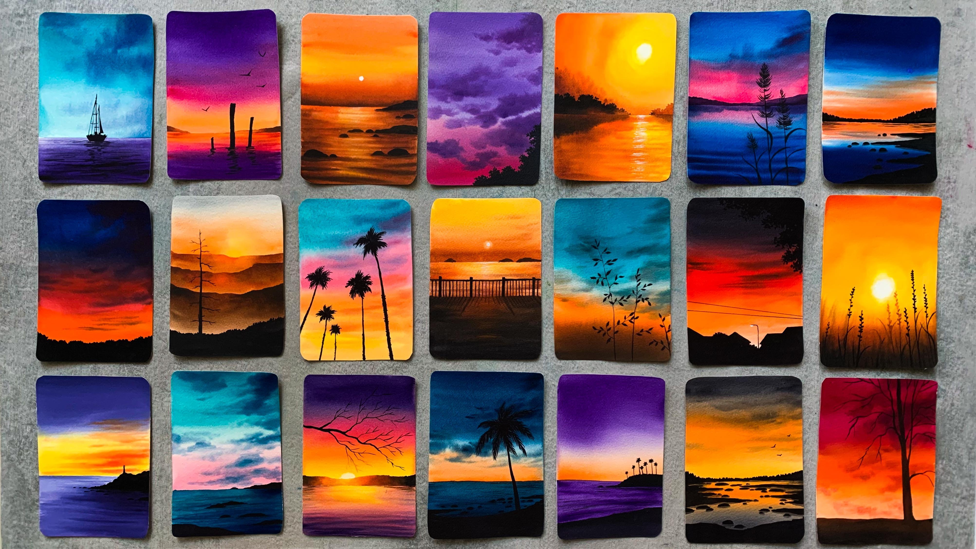
4. Day 1 - Winter Evening: [MUSIC] Let's start with the wafers painting. I have a piece of paper already here. This is the size I'm going good with, but you can go with any size that you prefer. Then I have my clean palette, and two jars of water. Everything is ready. Now I'm starting by applying masking tape onto the four sides of my paper. I'm going to fix this onto this board. I'm using a one inch masking tape. You can either use a masking tape or a washi tape, whichever that you use normally. Well, let's quickly fix the paper onto the board. I prefer fixing my paper onto backing board rather than onto the table. This way it is easy for me to lift and turnaround my paper while I add the details. For some of the techniques we'll be using in this course, you will have to lift to paper and you will have to turn it around for the colors to blend in a very natural way. Fixing paper onto a board, it can be any piece of cardboard or it can be even an old magazine or a notebook. Something that you can fix your paper onto it can be anything. Also when you're applying your masking tape, make sure to run your fingers on top of them multiple times, to make sure that there's no gaps in between. This way you will get a clean boarder. If there are some gaps the paint can sip into and you won't get that clean border. Just run your fingers multiple times after you have applied your masking tape. My paper is ready. Now I'm going to add a line a little bit of the center of the paper. The top part is our sky and the bottom is the snowy ground. That is all you need to add for the pencil sketch. Is it simple? Now let's prepare the colors. For the snowy ground I'll be using these two colors. I'll be mixing indigo and royal blue. I don't want to use indigo asses because it's a dark blue. I want it to be slightly brighter. I'll be been mixing indigo and royal blue. You can also use indigo and Prussian blue or indigo or ultramarine blue or any other blue. It just makes a little off indigo, but any other blue that you're using, and create a slightly brighter version of blue. We don't want it to be too bright and too dull. That is a recent why I'm mixing these two colors. There is one more reason, the indigo that I'm using here, it is from the branch in hand. It is slightly darker than the other indigos. I'm not really a fan of the indigo from this brand because it has a graystone rather than blueish. I really loved the indigo from Sennelier, but that's almost worse. I thought I will just mix a bit of royal blue with indigo to make it a bit more brighter. For this painting, I'm starting with the snowy ground not the sky. To paint the snowy ground I'm using my half-inch flat brush. We'll be painting the sky only after this dries. Just like I mentioned earlier, I'm going to mix indigo and royal blue. If you have a more blueish indigo you can directly use that you don't need to mix it with any other blue. For example, if you have indigo from Sennelier, I think it looks like most similar to this, so you don't need to mix it. This is the color I'm going to go with. We'll be using the [inaudible] technique. The first step is to apply an even coat of water onto the anterior ground. I'm going with my one-and-a-half inch wash brush, and [NOISE] I'm dipping my brush in clean water, and I'm applying it even coat of water onto the anterior bottom part. [NOISE] We don't need a lot of water, just a shiny coat of water it's all we need. Gently apply a coat of water following the line you have added. Now, I'm going with that color I created [NOISE] by mixing indigo and royal blue. Over the bottom we'll be going with a medium tone. As we approach that line we have added over the middle, we'll make the color lighter. Start off with a medium tone and apply that only to half of the area. Now wash the paint from your brush, clean up properly. Dry the brush on a paper towel, and get rid of that dark and intense blue. Now that there are slightly wet brush, blend the color and make it lighter towards that line. That's how the baseboard should look like. If you want to make the color more taco over the bottom, you could do that now because your background is wet, you can make use of that time and add in some more deeper tones over the bottom. But the top area should be lighter. I'm cleaning my brush again and I'm making it a clean blend. Run your brush only in a horizontal way. We need a smooth and clean blend here. I think that looks fine. I will run my brush one more time in a horizontal way and make the blend a little more smoother. That is a base layer that was only ground. [NOISE] Now we have to wait for this to dry. You can either use a blow dryer to speed up the drying process or you can just wait for it to dry naturally. Mine have dried. For the next step, I'm using a smaller sized brush. This one is a size number 4 round brush. I will just wash my other brush properly and I will keep it aside. [NOISE] For the sky we'll be using the same flat brush. I don't want to have any blue stains on it. We'll be using crimson and orange for the sky, so we need a fresh color there. I'm switching back to my size number 4 round brush, and I'm going with a slightly darker tone [NOISE] of indigo. I'm not adding a lot of water. Now I'm tapping my Bichon of paper towel. We need to dry paint on the brush, it shouldn't be too watery. Once you have taken paint on your brush, just tap it on a paper multiple times to remove the excess amount of water. Now using this dry brush we are going to add a pathway. It isn't really a pathway, it is something that is created by the footsteps. You'll have to go with a very messy manner to make it look like it's the footsteps. I'll be adding it in a cool way. I'm starting from that further end. Now using that dry brush, add in a curvy line, in a broken manner. It shouldn't be a smooth curvy line, go with the broken manner and use dry paint. Don't go with a solid color. The background is completely dry and you're using a dry paint. I haven't taken a lot of paint on my brush. I have taken bare minimum paint, which you should really try. Over the bottom closer to the masking tape, you can go with pico patterns compared to the further end. But again, you should be using dry paint. All you need to do was go with dry paint, use a smaller size brush, and using the tip of your brush keep scrubbing on the [NOISE] paper and adding some broken line, which are thin at the further end and thicker and taco at the bottom part. It can be a little messy. It doesn't need to be a perfect shape. Just add in some random shapes in a curvy way. [NOISE] Now I'm washing of the paint from my brush. I'm going with a really light one off indigo. I'm just adding few patterns [NOISE] using that lighter tone. Again, I'm tapping my brush on a paper towel. I'm trying to smudge those darker patterns. I don't want them to be too prominent. Add in some more little buttons right next to those darker ones we have added. I will make [NOISE] the color a bit more darker over here. Going with a much more taco tone of indigo, and just adding that over here. You can see the patterns have added here, they're really messy. This is how you should be adding them because we are trying to make it look like footsteps. That's a snowy ground. You can see how beautifully we have got a curvy pathway there. Now the next [NOISE] step is to paint the sky. For the sky, we'll be going with a variegated wash of two colors. For that I'm switching back to my flat brush. This one has the same path inch flat brush I used for the snowy ground. You can use any of your medium too because it's a flat brush. These are the two colors I'm using for the sky, Warmaline and crimson. We'll be mixing these two colors together to get a peachy color. Towards the bottom, we'll be using crimson acidus. On the top you would have that peachy color, and towards the bottom, closer to that line, you have a crimson shade, so that is how I have planned it. I hope you all have crimson and warmaline. They are common colors. You get it in all the basic watercolor boxes. If you don't have go with any of the colors which are similar. Instead of Warmaline, you can use scarlet red spill if you don't have it. We have the colors ready. As I said earlier, I'm going to go with the peach color I'm not using Warmaline acetus, but if you want to use more often orange color in your sky, you can use Warmaline acetus without mixing that with crimson. I'm going to start by applying a quarter of water onto the sky. I'm going back with my one-and-a-half inch wash brush. [NOISE] I'm dipping my brush in clean water, and I'm gently applying an even coat of water onto the entire sky. We just need a shiny coat of water. Don't add a lot of water and make it a pool. Run your brush multiple times to make sure the coat of water is even. We are doing a wet on wet sky and they're going to go with a variegated wash. For that, I'm going back with my [NOISE] half-inch flat brush. Make sure there's no blue stains on your brush from previous wash. Make sure it is clean. Now, [NOISE] I'm mixing a bit of wamerline and crimson to create [NOISE] pink color. I'm going with equal part. [NOISE] Just mix these two colors well. That's a color I'm going with. I'll be starting off with an intense color. Then as I come towards the middle, I'll make the color lighter by adding some water. I will again make it darker as I'm approaching the horizon line. You can see how pretty this color is looking. I just mix a bit of vermilion [NOISE] and crimson together. Now, towards the center, I'm using a bit of vermilion, [NOISE] just a little bit, and I'm adding that over here, and blending that with the peach color we added earlier. Now, I'm going back with the peach color we created, going with an intense tone, applying that over here. Finally, going with crimson. Again, going with an intense color. Now, filling up that end tail line in crimson. On the top we have a medium tone of that peach color we created, and then we made the color lighter, and we went in with a bit of vermilion. Then we again went back with a peach color. We used an intense color. Now, we're good with crimson. That's the sky. Now we need to create a clean blend of all these colors. To get a beautiful blend, you need to run your brush in a horizontal way. Don't run your brush in any other direction. Just keep running it from left to right, in a horizontal way. Now, I'm cleaning my brush and I'm tapping it on a paper towel. My brush is just dump, it is not too wet. I'm running my brush in a horizontal way to make it a clean blend. That is the sky you can see how pretty those colors are looking. I'm really loving the color combination. Now, there are two things we need to do before the background dries. The first one is adding some trees over the horizon line. The second one is we need to lift off some paint from the sky to create a sun. Those are the two tasks, we need to do them quite quickly before the background dries. First, we will add the trees. For that, I'm using my size number eight round brush. I'm going with a really intense tone of indigo. You can either use indigo or Payne's gray. Go with a really dark tone because we're going to apply this onto the dark background. When it dries, it will look really dull. In order to get the end result really bright and pretty, you will have to go with an intense tone. I have taken paint on my brush. Now, I'm adding this wet paint onto the wet background. You can see how nicely they are spreading into the background. First you can add a line using that dark tone of the indigo and clean up that horizon line. Now, simply drop that paint onto the wet background in some random shapes. As we are applying a wet paint onto the wet background, this will nicely spread into the background, making those trees look little blurry. This is exactly what we need. You can see those feathery effect on the top. Now, at some places, you can pull the paint a bit into the sky and go with a very organic shape. Don't put a lot of pressure, simply dropping that wet paint onto the wet sky. Let it spread in it's own way, don't try to control the way it is spreading. The first step is done. Now, the next step is to lift off the paint from the sky. For that, we need a clean brush. Wash all the paint from your brush, clean it thoroughly. [NOISE] My brush is 100 percent clean. Maybe you can try dabbing it on a paper towel, just to make sure there's no paint stains on it. Now, I'm going to run my brush in a circular way and I'm going to lift off some paint from the sky. Apply some pressure. Then you brush in a circular way. See that? If you're using 100 percent cotton watercolor paper, your paper will stay wet for a longer time and you can easily do this. Every time we lift off the paint, make sure to dab your brush on a paper towel. Keep repeating the same step until you get a clean white circle there. Every time you do this, there will be some orange paint on your brush. Before you go next time, you'll have to clean your brush. If there is a lot of paint, rinse it in your jar of water, otherwise, just dab it on a paper towel. The best part about this technique is that you will get the outer shape of your sun a little blurry, and this will automatically make it look like our sun is glowing. If you're going with a clean white circle, once everything has dried, you won't get this effect. But there are chances your background might have dried by the time you lifted off the paint, or you're not using 100 percent cotton watercolor paper. In that case, don't worry at all. Just apply a white circle using your white gouache or white watercolor. It is just that you won't get the glowing effect but your painting will be still pretty, so don't worry at all. Now, onto the center of this circle I have created here, I'm going to apply a bit of white gouache to make it look like it is glowing. We just need a teeny bit of white gouache or white watercolor. I'm directly dipping my brush in this tube and picking some paint. That is all we need, just that tiny bit. Now, right at the center of this white circle, I'm adding some solid opaque white. This would make that glowing effect more prominent. In case if your background has dried, you can skip the previous step of lifting off the paint and directly go by adding a white circle. Now, I'm running my brush in a circular way to make that outer shape blurry. I don't want to see that prominent shape and that is the reason why I'm doing this. That's done. Now, lets wait for this to dry. [MUSIC] The sky has dried completely. The colors are looking a little dull than earlier. When the painting was wet, the colors we're looking very bright and pretty, but when it dried, it has turned out a bit lighter than earlier. But this is one common thing with water colors. The colors tends to fade one tone lighter when it dries, that's something which we can't handle so we'll let it be the way it is. Now, for the next step, I'm going with peach black. You can use lamp black or mass black or even paint scree. We just need a dark shade. It can be even indigo. Our final task is to add some trees. It's a very simple tree. Which will be the color you are going with, whether it's Payne's gray or black or indigo, go with a really intense and dark tone. Also, you should be using your smallest size brush or any other brush which has a pointed tip. It is good to go with the detailing brush because we need these branches to be very thin and delicate. I'm starting with the main tree trunk, which can be slightly thicker. Go with a thicker tree trunk. Before you do this, make sure your background has completely dried. Otherwise, this can spoil your entire sky. Our task is pretty simple, just adding a tree with some empty branches. The only thing you need to be careful here is getting those branches very thin and delicate. If you're not able to do this with your brush, maybe you can switch to a pen and add in those branches using a pen. Only the main tree trunk has to be thicker. The rest has to be as thin as possible. It is this thin branches which make your painting look more pretty. The brush I'm using here is size number 4, it has a very good pointed tip. I think you can see that by the lines I'm adding here. I'm adding some more branches on the other side. Maybe I will add one more tree right next to this. I won't be adding a lot of trees, maybe just two or three. You can decide on where you want to add your tree and how many you want to add. Those things are totally your choice. If you want to add three or four, you could do that. I think I will just add one more. Right next to this, I will add my second tree, adding as many branches as you can. This would make your tree more and more beautiful, so don't be lazy. If you cannot add these with your brush, just like I said earlier, use your drawing pen or sketching pen. I use my pen quite often, there is nothing to be shameful about that. Whenever I don't feel confident enough to add those delicate details, I just go with my pen, and I will add those details with lots of confidence, which I may not be able to do with my brush. It's good to have a drawing pen or a sketching pen in your collection. You can check all the materials section to see the pen that I normally use. That is from Artline. There is another common pen from Micron. I was just trying to explain it is okay to use a pen, it is so much better than spoiling your otherwise decent looking painting. If you are not feeling confident, just go with your pen. Now, I'm going to add a second tree right next to this one. I think I will go with a shorter one. I won't be making it as tall as the first one. I won't add these many branches as well. [MUSIC] I have added two trees. Now, we need to add some dry brush patterns right underneath the trees. Otherwise, it will look like it is floating in the air. To make it look like [inaudible] onto that snowy ground, we need to add some deeper tones and some shadows right next to these trees. I'm using the same brush and dabbing my brush on a paper towel. It already has that black paint. Dab your brush on a paper towel multiple times and make sure that there's no water content on your brush. Now, just add some dry brush patterns right where the tree is starting. Don't add a lot of dry brush patterns, we just need a little of it, and that too where the tree is starting, make sure to dab your brush on a paper towel multiple times so that those patterns won't be too prominent. We are adding these patterns only at the area closer to the trees, we are not adding it anywhere else. That is it, we are done with our painting for day 1. You can see, I have added only little patterns right next to the tree. You should be adding only this much. [NOISE] Now it's time to peel off the masking tape. [MUSIC] Here's the finished painting. I'm quite happy with the way it has turned out. It was so calm and beautiful. I hope you guys enjoyed it too. Thanks a lot for joining. I'll be back tomorrow with our next project.
5. Day 2 - Northern Lights: [MUSIC] I have taped down my paper already. I have my clean palette here and the brushes are ready. I have two jars of clean water. For this painting as well, just like the previous one, you just need to add in a line. Go with a very light pencil sketch and add a line a little bit of the center of the paper. The top part is your sky and the bottom part is your snowy ground. Add in a line a little below the center of your paper. That is the pencil sketch. This one is going to be a really pretty northern light, which it's going to be the most easiest one you ever painted. Now let's take a look at the colors you will need and squeeze them onto the palette. I have four colors here, indigo, permanent violet, cobalt green, and cadmium yellow light. We'll be using all these four colors for the sky. Just over here at the horizon line, we'll be mixing a little of yellow with cobalt green to make that cobalt green a bit more bright and greenish. We'll be starting with violet. Then on the top we'll add some indigo to make it more darker, and as we come down, we'll switch to cobalt green. Along the bottom horizon line, we'll introduce a bit of yellow and we'll make it more greenish. This is how it was supposed to be. This was the sky I did. But then there was something wrong with my papers so I have taken out a new paper and I'm starting all over again. But I have all the colors ready here. I have indigo, permanent violet, cobalt green, and cadmium yellow. Instead of cadmium yellow, you can also use lemon yellow or gamboge yellow. You can use any cool yellow. I just changed my water into a clean one. I'm adding the pencil sketch again. Luckily, this painting didn't had a complicated pencil sketch, so this was an easy one. Now let's start painting. I'm using a flat brush. This one is a half inch flat brush, and I'm going with a very intense tone of violet. This color is permanent violet. If you don't have a violet watercolor tube, you can also mix and create your own violet. You can use Prussian blue and crimson and create a gorgeous violet of your own if you have an individual tube. To paint the sky, I'm going with wet on dry technique, which means I'm not applying coat of water on the sky in advance. I'm directly applying the wet paint on a dry paper. In case if you're more confident with wet on wet technique, you can apply a coat of water on the sky and then apply your paint. I'm starting with a intense tone of violet and I'm applying that on the top of my paper. Just like the previous painting, I'm running my brush in an horizontal way, and I'm adding the paint. Onto a half of that portion I'm applying violet. Now I'm washing off the paint from my brush and I'm switching to cobalt green. Now I'm adding that right where I stopped the violet and I'm mixing them well. Try to get a clean blend. You'll just need to run your brush in a horizontal way. Don't use any other brush movement. Well, I'm dabbing my brush on a paper towel and, again, running my brush in a horizontal way to get the most beautiful blend. That looks so cool. Such a pretty blue. Clean your brush thoroughly. There might be some violet stains on your brush. Make sure it is properly cleaned. Now, just pick a little of cadmium yellow and mix that with cobalt green and create a greenish color like this. You should use more cobalt green and less yellow. As I said earlier, it can be gamboge yellow or lemon yellow. Now, apply that color onto the leftover area. Just mix a bit of cadmium yellow or any other yellow and mix that with cobalt green. You can see the difference here. On the top, that bluish color is cobalt green, without yellow and the bottom, the color is more greenish. We added a little of cadmium yellow. This is the base idea. We need to get a clean blend of violet cobalt green, and that modified cobalt green. Now, l'm going to pick some indigo and I'm just making the top area a bit more darker. But if you're quite happy with this sky, and if you're background has started drying, you don't need to do this step. You can just keep adding this darker tone. I don't want you guys to spoil your otherwise decent looking sky. Now, I'm going back with little of violet and adding that in and trying to blend these colors. It might be a little tricky if your background has started to dry, you may not be able to blend the colors so skip this completely if your background has started to dry. That's my sky. I'm pretty happy with the colors and the blend. To make my sky a bit more interesting, I'm going to add a violet line where we have added the cobalt green. Again, this is also optional. Add it only if your background is still wet. Otherwise skip this step completely. To add a violet line, I'm switching to my smaller brush. This one is size number 4 round brush and I'm picking a bit of violet, which is not too watery. If it's too watery tap your brush on a paper towel and just add a line over here. Just dry your brush on the right side and add a line. Now, clean your brush properly and switch to cobalt green. Now, pull that line again towards the inside. This will make that line merge into the background. It wouldn't make it too prominent. That's the sky. I'm really happy with the colors. I think it's one of the prettiest and easiest sky I ever painted. I hope you guys are happy with your sky as well. Now, let's wait for this to dry. [MUSIC] The background has dried completely and it is looking slightly dull than earlier but still so pretty. For the snowy ground, we won't be adding any paint. We are going to leave the paper white as it is. We'll just add some shadows and deeper tones at the end. It is going to be mostly paper white. Our, our next task is to add some mountains in the background. For that, I'm using a very light tone of indigo. I'm using my same brush that I used earlier, size number 4 round brush. Load your brush with a lighter tone of indigo, add enough water. Don't go with a darker tone. Go with a really light tone of indigo and add in your mountain. It's a very simple mountain. We are not going to add any other details onto this. You can go with any shape, but don't make it too huge. Go with a low-lying mountain. Because we are trying to make it look like this are really far from us so go with the similar size. Go with a very organic shape. At some places you can make it taller and at some places you can make it lower. This will make your painting look more interesting. Go ahead and add in your mountain however you want to. Along with this, you can also clean up that horizon line, make it a straight line. [MUSIC] I have cleaned my brush properly because I'm going to use the same brush to add some stars. To add a new stars, you will either need white gouache or white watercolor. I'm going to take out the white gouache. White gouache is more opaque than whitewater color so once your painting has dried it will still stay opaque. But with watercolor, there are chances it may tend to fade a bit. Just squeeze out a little bit of white watercolor or white gouache depending on what you have with you and add with your drops of water. Now, to get that teeny tiny stars your paint shouldn't have a lot of water. If you feel like there's a lot of water condensed in your paint, just dab your brush on a paper towel and make sure it is not too watery. [NOISE] Now, take out another brush and gently tap on the smaller brush and create some stars. I'm adding few only on the top area where we have those darker tones. You can add in as many as you want. There is no limit for this. As a very therapeutic process I count of all of those stars most of the time. Feel free to stop yourself whenever you feel like you have added in enough of star. Once you have added enough of stars using the same brush, you can add some bigger stars as well, a [inaudible] in places. To get those teeny tiny stars, consistency is the key. Your paint shouldn't be too watery and it shouldn't be too thick as well. It should be something in between. If you're not too confident about the consistency of your paint, the simple thing you can do is just dab it on a paper towel and the paper towel will absorb all the water content and leave your paint a bit dry. Then you would end up getting those, small splatters. That is one thing you can do. Or you can just try splattering on a scrap piece of paper and make sure the size is right and then splatter on your painting. Whenever I'm teaching to paint the night sky, I focus a lot on the size of the stars. The reason is that it can turn your painting into an absolutely stunning one, and again, also ruin your painting if the consistency is not right. If you're not too sure, always try splattering on a scrap piece of paper and make sure it will turn out right. That's a sky. For the next task, you will either need Payne's gray or neutral tint or black. Go with what you've got with you. The brand that I'm using here, ShinHan, they don't have Payne's gray instead they have neutral tint and that is the reason why I'm using neutral tint for all the paintings. Whenever you see me using neutral tint just use Payne's gray. Now using neutral tint, we're going to add some teeny tiny pine trees in the background, which are going to be in an abstract shape. We are not going to focus a lot on the detail. It is just an abstract shape. You can see the way I'm doing it here. These are really far from us, so you don't need to put a lot of effort in detailing them. In between you can add some bigger ones as well. I'll just take out a scrap piece of paper and I will show you how you can have these. This might be really small for you to understand it. I have a scrap piece of paper here. Now this is more like a water drop shape, but just a little more longer. Add in a similar shape. I don't know if there's any other name for this shape. Now, onto the outer side you can add some teeny tiny patterns. That's the basic idea. For the smaller ones, you don't need to add any of those patterns onto the outer shape, you can leave them as it is. For the bigger ones, you're adding, you can add some patterns on to the outer shape to make it look more realistic. I hope that idea is clear. Now, we can add in as many trees as you want. Some of them can be on the horizon line, and some of them can be on the snowy ground. For the ones I'm adding along the horizon line, I would simply add that base shape; I won't add any other details. Using the tip of your brush, just add some smaller shapes like this. The bigger ones are also not too big. Focus on the overall picture, don't focus on each and every tree. You can see the one I have added here , it's very attracting. In a similar way, at some places, add taller ones, and at some places add shorter ones. The one that are on the snowy ground, you can make them a bit more detailed compared to the ones on the horizon line. Quickly add in as many trees as you want on the entire horizon line. [MUSIC] You can see how pretty our painting is looking already. Over here, I added two bigger trees. Now I'm adding few on the horizon line, those are really tiny. I'm just adding base shapes using the tip of my brush. At some places you can create some group of bigger trees, and at some places you can create a group of smaller trees, and at some places you can go with different sizes. Paint it with all kinds of combinations, this would make your painting look more interesting. Don't add the trees in a similar way. Also, you can leave some gap in between. You don't need to fill the entire line with so many trees. Just add them in a very random order. Now, we'll add some shadows underneath these trees. I'm using my same brush and the same paint and I'm removing the water contents from my brush. You can see the paint I have on my brushes is slightly dry. Using this brush, I'm going to add some dry brush patterns underneath all the trees. Focus more on the trees which are on the snowy ground. As I said earlier, we just need a [inaudible] patterns, don't make it too prominent. Dub you brush [inaudible] multiple times to make sure that there's no much paint on your brush. Add very light and very little dry brush patterns underneath all the trees either using paints gray or neutral tint or black, just make sure not to highlight and make it too prominent. These are really far from us, so don't focus a lot on the detailing. We just need to see some shadows and [inaudible] there, it doesn't need to be too bored. That is it. I'm really loving the way this painting is progressing. You can really feel that sense of distance in this painting. It is really looking like those pine trees are far from you, and that is why we made those trees very small to bring in that sense of distance. Our next task is to add some details on the snowy ground. I'm planning to add a fence over here, not a continuous fence, maybe just one or two wooden post. Otherwise, our ground will look really empty. Along with that, I think we can also add a pathway using a really light turn-off neutral scent, our payne's gray. I will add that first. Depending on that, I will locate my fence. Go with a light tone of payne's gray on your portrait , that will [inaudible]. Add a curvy line which has to be really thin, especially at a place where you're starting your line. Make it curvy and bring it down. Over the bottom, maybe you can make it a bit more thicker. But not the slanted line, go with some dry brush line. In a similar way, I'm adding another line. See that? It looks so pretty already. We haven't added any paint onto the snowy ground. But our paintings is looking so personally without no much effort. That's the magic of paper white white. If you use the right amount of paper white, you can make your painting look super snowy and you can really bring in that window vibes in your painting. We just added a pathway using a lighter tone off neutral tint and we simply use our dry brush line. Next, I'm going to add a fence here, not a continuous fence, just one or two wooden post to make the painting look a bit more interesting. I'm going back with neutral tint, but this time I'm using a really intense tone. I'm adding the first wooden post and deliberately making it slightly inclined. These wooden posts are not really necessary if you're already happy with your painting and if you want to leave your crown very simple, you don't need to add this. Maybe you can check out the end result and if you feel like adding them, you could do that. Otherwise, you really don't need to. That's our first wooden post. Onto this. I'm going to add another one which I'm going to make it look like it has fallen onto the ground. I'm adding an inclined line like this. That's our second line. I'm adding another one which is going to be much more shorter. That is it. Our final task is to add shadow as well as some snow onto these wooden post. Wash all the paint from your brush and switch to a very light tone of indigo. You should be using a really light tone of indigo to add the shadows. If you're not too sure about the color, maybe you can try it on a scrap piece of paper and make double sure that it's too light. Just add in an inclined line. This totally depends on the size and height of your wooden post. The other one is quite taller, so the line has to be much more longer and it has to be in the same direction of the previous one. That's the shadow. I'm going to add a bit of deeper tone over here just to make it look like it has gone into the ground. Similarly, keep doing the same thing onto the other two wooden posts as well. I haven't taken any other extra paint on my brush, I just have a light tone of indigo. The brush has some amount of indigo and it is slightly wet. I'm just marching that same neutral tint of the wooden post, I'm not taking any other extra paint. Finally, we need to add some snow onto these fence. I already have some leftover white gouache from which we used for the sky, so I'm just picking the same. Go with a very thick and opaque version of white gouache or white watercolor, and add some snow on the top of this wooden post. The rest of them are on the snowy ground, so even if you add them, it won't be really visible. Just add some snow onto this one. Along with that, you can also add some dry brush lines on the wooden post as well. Don't add much water to your white gouache or white watercolor, go with dry paint and add some patterns. [inaudible] we don't need a lot, just to make it look like there are some snow. That is it. We need to add some last minute touches on the ground. Right now it is looking quite clean and empty. I'm washing off the paint from my brush, and I'm pulling back with a little of neutral tint, a very light tone. I'm adding some random patterns on the ground, they have to be really small and less prominent. Don't go with a bold color. We just add few here and there, especially closer to the wooden post. That looks good enough, I'm going to leave it here. For the last detailing, I'm going to switch to my drawing pen. This one is a drawing pen from Artline. You can use some very basic normal black pen. I'm going to add some strings onto these wooden post. If you're confident enough, you can use your brush as well. I'm not that confident. I don't want to accidentally add a bold thick line. I'm very sure I won't get this kind of line with my brush, so I'm just using my pen instead. That is it my dear friends. We are done with our painting for the day. I'm really happy with the sight, especially the colors we used for [MUSIC] the sky and the snowy ground. I really hope you guys enjoyed it too. It was an easy one and it turned out really pretty. Thanks a lot for joining me today. I'll e back here soon with our next project. [MUSIC].
6. Day 3 - Foggy Night: Hello. Welcome to day three. Today's painting is going to be a really simple but a pretty snowy, foggy landscape. The entire painting is going to be in one single layer. We don't have to wait for the ink to dry. We can keep on adding the colors in one single layer. You just need three colors for this entire painting, which is violet, indigo, and neutral tint. The violet I'm using here is permanent violet, the same one we used to yesterday, and this is one of my most favorite color. You can see that by looking at the tube itself, I'm almost finishing this too. Here is a closer look of the painting that we're going to do today. You can see those foggy trees and that beautiful snowy ground. Everything's looking super snowy and foggy. It is quite easy to create this effect. You need to add all the colors onto your background while you're background is still wet, so you have to be bit quick and consistent. That's the only important thing in this painting. The rest is quite easy because there is not much complicated details on this even for the trees, we're not going to go into detailed shape, we are going with a very abstract shape, see this? You can do this painting quite quickly as you don't need to wait for anything to dry. Maybe altogether you need just 20 minutes or even less. So for the sky, I'll be using violet. As I said earlier, the one I'm using here is permanent violet, you can mix and create your own violet. That's absolutely okay, or you can go with any other color of your choice. For the pine tree, I'll be using indigo. For the snowy ground as well, I'll be using a lighter tone of indigo. Then for the pathway at the middle, you will need indigo as the last neutral tint or base cream. Then to splatter the snow and the stars, you will need white gouache or white watercolor. Those are the colors you will need for today's painting. I have fixed my paper already. Now let's add in the pencil sketch. It is not a difficult sketch, it is just a road. So start by a narrow road, as you're approaching down, make it more wider. So this is the shape I'm going. Over here, we have some trees. We don't need to sketch them. They'll be going into very abstract shape. We have taller trees on either end and as we are approaching the vanishing point, we'll make the trees more shorter. That's the basic idea. You don't need to sketch those trees. This is just an indication. I just want to show you how the painting is going to look like. Now, let's take a look at the colors. I already have them on my palette because the first one I tried didn't turn out right, so they are already on my palette. We have two colors I'll be using for the sky, violet and white, other than these, you will also need indigo, will be using indigo for the pine trees as well as for the snowy ground. Other than those, you will also need Payne's gray or neutral tint or black, and also white gouache to add the snow. These are the colors you will need. Now, I'm going to start by applying a coat of water onto the entire paper. You don't need to leave the road or anything. You can simply apply a coat of water onto the entire paper. So I'm going to grab my 1.5-inch wash brush and I'm applying a clean even coat of water. Keep running your brush multiple times to make sure the water has reached everywhere, and you haven't left any part of the paper. The paper has to be evenly wet because we are going to paint the entire background in one layer. The paper is evenly wet, now I have the colors ready here. I'm starting off with violet. I'm going with the bright and intense tone of violet. This one is permanent violet, the same color we used yesterday. I'm applying that on the top of my paper. I'm using a flat brush here. I think I may need a bit more violet. That is enough. Now let's add the paint again. I'm adding some water, you can see the color I'm going for, it's really bright. Now, we need to make the color lighter. For this painting, to make the color lighter, I'm not dipping my brush in water, whereas I'm taking some white gouache and I'm making the color lighter. Some people might feel offended by what I'm doing here because this is not the way how traditional watercolor works. To make the color lighter, we always use water, not white gouache or white watercolor. But for me, I do watercolor in my own way, I don't follow the rules. I just do it in my own way and if it makes me happy, that is what I care. If you are so much inclined towards the rules, just use water instead of white gouache or white watercolor and make the color lighter and make it till you reach almost to that road. Our next step is to add the trees. Our background has slightly dried, it is not wet as before. But that's fine, the sky is wet because we just apply the paint onto the sky. We're going to switch to indigo and we'll be adding some abstract trees in the background. As the background is still wet, they will nicely spread into the background looking really blurry and that will bring in that foggy character to our painting. To add the trees, I'm going to use my round brush. This one is size number eight round brush. You can use any of your medium to be size round brush. To add the trees, I'm using a medium tone of indigo. If your bottom part has completely dried, maybe you can apply a coat of water just over here. Now, I'm going to switch back to my round blush and I'm adding the trees, see that. So this is how your paint will spread into the background when you're adding those trees as you're applying this paint on a wet background. Your paint shouldn't be too watery. If you feel like it's too watery, just dab it on a paper towel and keep adding some abstract shapes like this. The tree should be shorter at the center, which is the vanishing point and as you're going away from there, make them more taller. You can see the way I have added my trees here. In a similar way, I'm going to add the trees in the other side as well. Starting with a medium tone of indigo. Over here, your trees has to be taller and as you're approaching the vanishing point, make them shorter. This is the base layer, we used a medium tone of indigo. Now I'm going to go with a bit more brighter tone, I'm adding some random shapes like this. In this one, we're applying in the trees in the foreground and the lighter tone will look like the trees in the background. You just need to drag your brush towards the top and add some shapes like this. It's like a conical shape. We are trying to create an abstract shape of a pine tree here. I'm just pulling the paint towards the top. Now for few trees, we can add a pine tree shape on the top. Again, it doesn't need to be detailed. We are going to create a foggy effect here, this will be really blurry when the paint dries, so just to add a very sharp shape, you don't need to show the entire tree. Just add some foliage on the top. I added two trees on the left side. I will add two or three on the right side as well. Our background is still wet, so you can see how they are spreading into the background. They are now already crisp and sharp shape. I added two trees over here. Maybe another one here, a taller one, so the composition will look nice. I'm just pulling and pushing my paint towards either side and adding some sharp shape. I think that looks nice, maybe I can add one sharp tree over here. It is looking so foggy already. Now we can drop in some darker tones, just some random dots and shapes at the bottom. That is set. Now let's paint the road. I'm using indigo for the road, going with a darker tone. The base layer is going to be indigo and we'll be adding more darker tones using neutral tint. The background is still wet. You can see how the paint is spreading into that snowy ground. That is exactly what we need to create that foggy effect so don't worry about that. You can see the outer edges of this road. Right now the border is looking a little messy. We want to get rid of that feathery look, for that, I'm getting a clean brush. So this one is my size number four brush. You can even use a smaller or a bigger size brush, the size doesn't matter. Go with any of your round brush. It has to be really clean. Now, just keep on pressing your damp brush along that outline and get rid of that for feathery look, you can do that over here as well. My brush doesn't have any paint, it is just slightly wet. Keep pressing on that outer border. This is it, you can see how pretty our painting is looking already. So the base layer is done. If you look at the painting, you will feel like there is some deeper tones and some details missing, and that is exactly what we're going to do next. For that, I'm going to take a bit of neutral tint, you can also use Payne's gray. If you don't have neutral tint or Payne's gray, you can also use black. I'm going to squeeze out a bit of neutral tint. We'll be adding some deeper tones on the road and we'll add some branches on the pine trees and few deeper tones on the snowy ground as well. I'm going to go with the darker tone of neutral tint. I'm using my smallest size brush. When you're adding the deeper tones, don't add it too close to that bottom. We want that indigo shade along the outer border of the road so leave a small gap and then start adding the darker tones. You can make it really dark at the bottom end. And as you're approaching the horizon line, don't make it too dark, so go to a really dark tone and add it along the bottom corner. Then keep pulling that paint and add some deeper tones on the entire road. Now we can make this area more darker, go to a more intense tone of neutral tint, dark Payne's gray. When you are adding a deeper tone on this corner, try to leave a gap in between so you will get a nice line through that road which will make it look like the road marking is visible, which is a really blurry one. It isn't very sharp and prominent. It's a very small detail, to be honest, but then it is going to have a huge impact on your painting. It will make that road look like it's real. Now you can see how pretty our painting is looking already. I have added enough of deeper tones on the bottom corner. I made it a bit lighter as I was approaching the vanishing point. I think the colors have come out really great. This is the line I was talking about. It's just a very simple line, but it made a lot of difference in our painting. Our next task was to add some details on the snowy ground. We haven't added any paint onto our snowy ground, but it is too looking super snowy. I think it looks fine. But maybe we can add some more deeper tones. We'll be adding some branches onto the pine trees as well using the neutral tint. First, let's add those deeper tones in the snowy ground. For that, I'm going with the light tone of neutral tint. We're going to add some dry brush patterns using the lighter tone of neutral tint, add some water and make the color lighter. Once you have taken paint on your brush, dab the brush on a paper towel, and remove the excess water content. Now just add some smaller random patterns. We don't need a lot, just a few here and there. We're going to retain most of the paper white. Be sure not to add a lot. Also, keep in mind, we don't need these patterns to be too prominent. Go with a light tone of neutral tint, dark Payne's gray, and add some teeny tiny dots and some broken lines. You can see the way I'm adding them. I'm just pressing the tip of my brush and adding some messy patterns. That is done. Now the next task was adding tree trunks for these pine trees. We'll have to go the very thin and delicate line as they are too far from us. Be sure to go with any of your brush which has a pointed tip. You can use your detailing brush like size number zero or one. We need them very thin and delicate. It shouldn't be too prominent. If you're not confident about adding these lines, you can either skip them or add them using a black pen. First, I will add some deeper tones at the bottom. Just like how we added on this snowy ground. I'm just adding some little dots and some broken line, but it's a more deeper tone. Maybe we can add few random dots on this snowy ground as well. So that we don't need to add them again. Now adding some branches and tree trunk. See, look at the line I'm adding here. They are very thin. They are hardly visible. This is how you should be adding your tree trunk as well. Go with a medium tone. We don't need a really dark and prominent line. You can add some branches onto that tree trunk. This line has to be really thin and delicate. If you make them too bold and prominent, you won't get that foggy effect. Be sure to go with a detailing brush or just use a pen, as I said earlier. Now, I'm just going to add some more deeper tones at the bottom so that we can really define that area. I think that looks fine. I'm just adding some dry brush patterns over here using a medium tone of neutral tint. Don't take a lot of paint on your brush, go with some dry paint and just keep pressing your brush over here. Our idea is to define those pine trees so we want to make that bottom area more dense. Now I'm going to do the same on the right side as well. I'm just dragging my brush and adding some darker patterns using a dry paint, only at the bottom. I won't be adding this towards the top. The top, I'm going to leave it as it is. We want that snowy and foggy character on the top. Be sure not to add any darker tone over the top. Now we can add those branches on the tree trunk. It is just a simple straight line, but very thin and delicate one. Now onto that, you can add few branches as well. That is it. To define these pine trees, we simply added some dry brush patterns using a darker tone of neutral tint, and we also added some branches. Now we need to add few more details onto the snowy ground. I feel like the right side is looking pretty empty. I'm going to go with a lighter tone of indigo. Just over here, I'll just add some indigo, a really light tone. The other side is looking okay as there is no much snowy ground over there. But this side, it's huge. I'm just adding a lighter tone of indigo over here. I'm using a really light tone of indigo. I'm just dragging my brush towards the inside from the masking tape. Our painting has completely dried. This is how it is looking right now. Now the last step is to add a moon and also to add some stars and some snow onto the painting. Clean your brush properly. I'm going to cover the bottom. I'm grabbing some white gouache. Now I'm going to take out another brush and I'm tapping on my smaller brush and creating some stars. These can be considered as [inaudible] stars. Keep tapping on your brush and adding in [inaudible] dust into your sky. That's done. Now, I'm going to add a moon using the same bright gouache. I'm going to add a tiny circle. You can decide on where you want to add it. I'm going to add it over here. I don't know why I covered the bottom part because I want some snow over there as well. Once I'm done with the moon, I'll splatter some white on the bottom part as well. We'll have some snow on the pine trees as well as on the road. That's going to be the final task. Let me quickly add in the moon. I'm adding some bigger stars as well. Just pick some random area and add a bigger dot using same white gouache. I really love this painting, the color combination and that snowy feel has come out perfect. Now the final step is to add some snow on the road as well as on the pine trees. Just like how we added those dots on the stars, splatter some white dots on the road as well as on the pine trees. You can add it as much as you want. There is no limit. You can make it super snowy by adding lots of white. For me, the best part about this painting is that we didn't have to wait in between for the background to dry. We added everything in one single layer. Everything has to be super snowy and foggy. We need to make use of that wetness of the paper and add everything while the background is wet. Otherwise, we won't get that snowy effect. With that, we're done with today's painting, let me quickly peel off the masking tape. Here you go. Here is our wild snowy night. I'm really, really happy with this painting and I really enjoyed the process. Hope you all enjoyed it too. Thanks a lot for joining me today. I'll be back tomorrow with our next project.
7. Day 4 - Camping under the stars: [MUSIC] Hello, my dearest friends. Welcome to Day 4. Today we are going to try
a super-simple night sky. It's a really simple one, but the [inaudible]
snowy mountain. Let's take a look at the
colors you will need. For the sky, I'll be
using three colors; Indigo for that
taco-toe on the top, then over the middle, I'll be using some royal blue. Instead, you can also
use Prussian blue. Towards the bottom, I'll
be using turquoise blue. Those are the three
colors you will need for the sky; indigo, royal blue, or any other
blue, and turquoise blue. We'll be using the same colors for the snowy cloud as well. Other than that, you will need cobalt green for the tent, and also a neutral tent
to add the final details. Those are the colors you will
need for today's painting. I have my paper already here. First, I'm going to
tape down my paper. [MUSIC] I have fixed my paper
properly onto the board. Now, I will squeeze
out the colors. As I mentioned
earlier, for the sky, I will be using three colors. I already have some turquoise
blue on my palette, so I will need indigo, as for last, royal blue. Instead of royal blue, you
can use Prussian blue, or Sadolin blue, or any
other blue of your choice. For most of the sky, we'll
be using these two colors. We're going to create a dark and intense tone on the top, and just next to the mountain, we'll be using a bit
of turquoise blue. To paint the sky, I'll be going with a
wet-on-dry technique, which means I won't be applying a coat of water onto the sky. If you prefer going with
a wet-on-wet technique, it is absolutely up to you. Apply a coat of water
before you apply the paint. Because some artists
always prefer going with wet-on-wet technique
rather that wet-on-dry, it will be a bit easy to blend the colors as you have
a wet background. It's totally your choice. The size of the paper
is quite small, so I feel it is okay to go
with wet-on-dry as well. But as I said, it's
totally your choice. If you want to go
with wet-on-dry, or wet-on-wet, choose
whatever feels best for you. We have the colors
for the sky ready. Now let's add the pencil sketch. We'll need to add a camping tent as well as some mountain
to the background. You can find different types of camping tent if you look
for some images on Google. These are few examples. You can pick something which
is more simple than this. The one I'm going to draw here is something similar
to the third one. First, add an arc
line like this, and then connect the bottom
with a straight line. Then again, bring the line down. Now from here, connect to the other point with
an inclined line. The one I'm drawing here is a very simple tent,
it isn't complicated. But you will find
much simpler one, task for that much
better ones in Google. If you're happy with this tent, you can follow the same, or you can go with
a much better one. I have added a base shape. We will also need
to add an opening that you'll be
entering the tent. The third thing, we
can add value paint. Now, we need to
add the mountains. I'm starting from the left
side bringing it down. Now, from here I'm again
taking it a bit up. That's the mountain. Now
adding just a straight line. I think I've left the line
a bit more towards the top. That looks fine. I'm going to erase
out that second line. That's my pencil sketch. Don't make your
mountain too huge, go with the similar size. We're going to focus more on
the tent, not the mountain. If you made the
mountain really huge, you will have to add
a lot of details because it will look like
it is too close to you. This is a safer size so that we don't need to
add a lot of details. I have added the pencil sketch. Now, I'm going to go with my half-inch flat brush [NOISE], and I'm going with the
really intense tone of indigo [NOISE]. I'm going to apply the
wet paint on a dry paper [NOISE] I'm not applying
a coat of water first, I'm directly adding the paint. Go with the really
bright tone of indigo, and add that intense tone
on the top of your paper. Now, the second
color we're going to go with his royal blue, you can use Prussian blue, or ultramarine blue, or any other blue
of your choice. I'm again, going with
an intense color. Now, I'm adding that
right next to indigo, and I'm blending them well. Now, [NOISE] I'm washing off
the paint from my brush. I'm picking some more blue, and I'm making it a clean blend. I'm just running my brush
in a horizontal way and trying to get a clean blend. Once you have got a clean blend, wash out the paint
from your brush, and switch to the next color
which is turquoise blue. Now, following the
outline of your mountain, gently add that onto
the leftover area. Be sure not to add any
paint onto the mountain. Be a little careful when you're
applying paint over here. If you want to use
a smaller size brush or a round brush, feel free to switch
to a different brush. Now, make it a clean blend. [NOISE] I'm quite
happy with the blend, but I feel like
making the top area a bit more darker [NOISE], so I'm picking some more indigo, and I'm applying
that on the top. That's the sky. I'm quite happy with the colors
and the blend. Meanwhile, we wait
for the sky to dry, maybe we can start
with the snowy cloud. It is not touching the sky, so we may not have any problem. As we are painting
a night scene, we'll have to go with a darker color for the ground as well. Just like how we
painted the sky, I will start with indigo, I'm going with a medium tone, and I'm using my flat brush. For the snowy cloud as well, I'm not applying any water. Now I'm switching to royal blue, again, going with a medium tone. I just mix royal blue and indigo to get a
more brighter blue. Now [NOISE] I'm washing off
the paint from my brush, [NOISE] and I'm making
the color lighter. You can apply that on
the top of the tent. It's absolutely okay as
the color here is lighter. Also, we'll be using a
blue color for the tent, so it wouldn't be a problem. Now, we can apply some medium
tones in the background. I'm just mixing some
indigo with royal blue. You can also use
Prussian blue or any other blue instead
of royal blue. I don't want the blue
to be clearly tar, and I don't want it to
be too bright as well. That is the reason why I'm
mixing these two colors. You can see here the
area around the tent, we made it lighter, and the area away from the
tent, we made it darker. This is the base layer. Now we need to add
some deeper tones while the background
is still wet, especially over the bottom and the area away from the tent. For that, I'm switching
to a round brush, [NOISE] and I'm going with a much more intense
tone of indigo, and I'm adding some lines. The brush I'm using
here is size number 4. Just randomly add some lines
onto the wet background. We don't need a lot of
them next to the tent, add them away from the tent. Concentrate on the
outer corners, and add some lines like this. We retained lighter
area around the tent, and we made the outer
area more darker. Now, using the tip of the brush, we can add some deeper tones
around the tent as well. Just follow the shape
you have added there, and just add some dots and random shapes right
next to the tent. It may look slightly messy, but that's absolutely okay, it doesn't need to look perfect. Now I'm going to take
out a paper towel, and I'm tapping my
brush on a paper towel. I'm adding some dry
brush patterns as well. Just push and pull that paint, and add some deeper
tones over here. Leave the tent clean, don't add any paint
onto the tent. Now, you can randomly add some little patterns on
the snowy ground as well. Now, I'm going to go with
a much more darker tone, and I'm repeating the same step. This time I won't be adding so many patterns like earlier. I think that looks clean enough, I'm not going to add
any more pattern. I have left the tent as it is, I haven't added any medium tones or a deeper tone unto it. I have just added some deeper
tones around the tent. Next, I'm going to splatter
some stars onto the sky, so you will need a white
gouache or a white watercolor. If you are someone who
loves painting night skies, it is good to get
a white gouache, because white gouache is more opaque than white watercolor. The stars you are applying
onto your painting will stay more opaque
than white watercolor. Now, to apply the styles you will also need cobalt green. We're going to add some
shining blue stars, so we'll just need a
pinch of cobalt green, or we can use turquoise
blue as well. You can just mix a bit of white and turn that
into a basal color. Now, I'm squeezing out
some white gouache. The colors are ready. Before we start
splattering the stars, I will show you what I mean
by those blue shining stars. Take a look at the finished sky. I have splattered some
stars using white, and then you can see
those bigger stars, the shining blue stars. That is what I'm going to
create with cobalt green. You can decide on whether
you want them or not. You can just go with the white stars as usual,
that's totally your choice. Now, to splatter the stars, I'm going to use my
smaller-sized brush, add few drops of water, and turn it into a
loose consistency. It shouldn't be too thick
and too loose as well, it should be
something in between. Now, tap on your brush [NOISE] and add in some
teeny tiny stars. [NOISE] If you feel like
your paint is too watery, you can tap your brush
on a paper towel. You can see the size of
the stars I have got here. [NOISE] If your
paint is too watery, you will end up
getting big splatters, which means spoily sky, so be a little careful. If you're not sure
about the consistency, maybe you can try splattering
on a scrap piece of paper. [NOISE] If you feel like
you're getting them right, you can apply that onto
your main painting. I'm concentrating more on the outer area where I
have those darker tones. [NOISE] I'm adding some more. [NOISE] Add it as many as
you want [NOISE]. I think I have added enough. Now we can add those
shining stars. This step is not
really necessary, I already show you how
it will look like, so you can decide on whether
you want to add it or not. I had some white
gouache on my brush. I mixed that with cobalt green. Now, I'm adding through
bigger dot on the sky, in a very random manner. Go with a similar size and
add in five or six or seven, how much ever you want to, but go in a very random pattern. Don't add them in a single line, or in a specific pattern, make it as random as possible. If you don't have cobalt green, just mix a little
[inaudible] with turquoise blue and
you can do the same. Or if you don't want
a blue shining star, you can do the same thing with white gouache or
white watercolor, without mixing a second color, just add a bigger
dot like this using white so you will get
a white shining stars. Okay, so I have added a few. Now, I'm going to
wash out the paint from my brush [NOISE]. Wash it thoroughly, and tab
your brush on a paper towel. You can see there is
no paint on my brush. Now, using the
slightly wet brush, I'm just making these
circles a little blurry. Just run your wet brush, around that dots you
have added there, and make it look blurry. This step is what makes your stars look as
if they are shining. Adding that, bigger dot
using any color you prefer, it can be blue or white. Once you have added
enough of them, wash the paint from your brush
earning us a clean brush, which is slightly wet, and then make those white
dots a little blurry. Maybe I will add one more here. The side is looking
pretty empty. You can decide on whether you want to go with blue or white, as I said earlier, and add in your dot and
make them look blurry. Now, I'm going to go
back with white gouache. Use a brush which
has a pointed tip and pick some clean
white gouache. Now, onto the center of all the dots you
have added here, are the teeny tiny white dot. You can see how it
is shining already. This is what we're going to
do for all the stars here. Go with white gouache
and add a teeny tiny dot onto the center of those
blurry blue dots we created. All right, so that is it. Now, using the same brush, I'm going to add some
bigger white dots as well. We have some blue shining stars
as for lesson five stars. Again, when you're adding
your bigger stars, go in a very random way. Don't add them too
close to each other, or don't add them in
a particular pattern, make it as random as possible. Now, the next step is
to paint the mountain, as well as the tent. That is the two things
which are left. Either, we can
start with the tent and apply the base color, and then we can move
to the mountain. For the mountain,
we will be using a lighter tone of indigo and we'll be adding some deeper
tones using neutral tint. We're going to
create a blue tent, and the major color you will
need as turquoise blue. We will be using a
bit of cobalt green, turquoise blue and indigo. We'll use indigo to
add the deeper tones. I'm starting with some white, I already have some
white on my brush. Now, right at the center, there we will have that
opening to the tent, add in some white gouache. It can be white watercolor [inaudible] both
of them will work. Now, wash [NOISE] out the paint, and go with cobalt green. Around the white you
have added here, apply some cobalt green. Now, tab your brush on a paper towel and try to blend them. Our intention is to
make this area lighter and around those we'll be
adding more deeper tones, so that, it will look like
there's some light inside. That is our idea so first apply a bit of white gouache
and around that apply, cobalt green, and
try to blend them without really getting rid
of that white gouache. Okay, so try your best to retain that white gouache and apply
cobalt green around it. You can add a bit more. Now, I'm going to switch
to turquoise blue. [NOISE] Go with the medium tone, and apply that onto
the leftover area, and blend them well
with the cobalt green. Run your brush along the
outline you have added, and just fill that up
in turquoise blue. To make it look like there is some light source
inside the tent, you need to play with
lighter and darker tones. We started off with
white gouache, and around that, we
added cobalt green, which is a lighter
blue and around that, we are going with a medium tone, which is turquoise blue. Once I have added turquoise
blue onto the entire area, I'll be going with indigo, and I'll be adding
some darker tones around the outer shape. This will automatically
make it look like there's some light
source inside the tent. Try and retain the lighter
tones at the center. No matter which color
you're using for your tent, whether you want to
go with a green, or an orange, or a yellow tent, this is the same principle
that you need to follow. You will have to make
the center lighter, and then around that, you can play with medium
and darker tones. Now, I'm going with indigo, and I'm adding that
towards the outer shape. I won't be adding
any over the center. I'll be [inaudible] more, so the lighter tone is over there. Now, onto all the corners, I'm adding some indigo. You can follow the outline
of the tent you have added, and focus mainly on
the outer shape. Add those darker tones
onto all those corners. I hope the basic idea is clear. This is the same stuff you can follow whenever you're
painting a tent, no matter which color it is. If you're painting
a yellow tent, you can play with yellow,
orange and brown. You can start with a
very light yellow, and around that you
can add some orange. Then maybe you can go with some vermilion as well
as brown and make the outer areas more
darker [NOISE]. That's a base layer, now, we need to add some
more details onto this. That we can do after we have
done painting the mountain. To paint the mountain, I'm going with the
lighter tone of indigo, and I'm going to apply that
onto the entire mountain, add in some water and create a really light
tone of indigo. Now, apply that onto
the entire mountain. You can simply fill that up when you're
applying the paint. If you can, try to leave
some white gaps at the top, only at the top so it will
look like there is some snow. We won't be adding
any white gouache under this to make
it more snowy. Just on the top, and at some random places, you can leave some paper white, just some really small shapes. I'm going to do the same
on the other side as well. I'm leaving some white
caps along the top line. Now, the rest of the
area and filling up in a lighter tone of indigo. For this painting,
we won't be adding any other snow using white
gouache or white watercolor, so if you can try and leave those teeny tiny caps at the
top along the outer shape. If you are not able to do
that, that's absolutely fine. All right, so that's
the base layer. Now, I'm going to go with a bit more darker tone of indigo, something similar to this color. I'm adding that along
the bottom line. We need some deeper tones
along the bottom line. We are going to make the
top area more lighter. [NOISE] Now, wash out the paint, dab the brush on a paper
towel and simply smudge those colors into the background using a slightly wet brush. This can be slightly
rough and messy, it doesn't need to
be a clean blend, so don't worry if you don't
have a clean blend here. We just want some deeper
tones at the bottom, and some lighter
tones on the top, and we have less on
paper white as well. Okay, so that's the base layer, just like the tent, but both of them are
looking very lifeless. We need to add the final details onto the tent as well
as onto the mountain, to make it more lively. Now, we'll have to wait for
the entire painting to dry, before we add the final details. [MUSIC] The entire background has dried. Now, for the final step, you will need some neutral
tint or paint gray or black. You'll just need a little. We're going to add
some dry brush pattern using this color
onto the mountain. As for last or final
details onto the tent, we do some markings like all those divisions
and the opening. Let's start with the mountain. I'm using my size
number 4 drawing brush. You can use any of your smaller to medium-sized
drawing brush. You will need a paper towel, so pick out a paper towel
and keep it next to you. This is really important. Now, go to taco tone of neutral tint and dab your
brush on a paper towel. Make sure the paint doesn't
have a lot of water. We want a dry paint
on our brush. Now, we're going to
pick some random area on the mountain, and we're going to add
some dry brush patterns using neutral tint. This is really easy
and at the end, we're going to get a
gorgeous snowy mountain. The only thing you need
to keep in mind is that you should be going
with the dry paint, not a watery paint. If you feel like your
paint is too watery, keep dabbing it on a paper
towel multiple times. Add some tiny patterns using
a dry paint just on the top. We won't be adding
much on the bottom, we'll be focusing
more on the top. Using the tip of your brush, keep on adding some dry paint. You can see I have
got them here. This is the main idea. We are going to add
some dry brush patterns using neutral tint. You can add in as much as you want but focus
mostly on the top. But don't fill up the
entire background. We still want to see that
indigo color on the background. This step will take
a bit of time. Even though it's a
very simple step, you need to put a lot
of attention here. The patterns you're applying shouldn't be too
bold and prominent. You should be really careful about going with
dry brush patterns. Don't use the paint
which is watery. Every time you pick the paint, make sure to dab it
on a paper towel to make sure the paint
is not at all watery. Now, I'm adding some
dry brush pattern over here onto this pocket. You can see how gorgeous our
mountain is looking already. In a similar way,
we'll need to add some dry brush patterns
using a taco tone of neutral tint onto
the entire mountain to make it look more realistic. You can clearly
see the difference between the left side
and the right side. The left side is looking
very plain and boring, whereas the right side
is looking so pretty. That's the magic of those
dry brush patterns. Now, I'm using a really
taco tone of neutral tint, something which
is close to black and I'm adding some
more patterns. If you notice, I'm
adding them in a sloping way to make
it look like a valley. I'm dabbing my brush
on a paper towel and adding some more patterns. Starting with the
tip of the mountain, I'm taking them in an inclined way and I'm taking them to the bottom
line of the mountain. This step is something
that you can keep on doing that has no
limit but take a look at your painting
at regular breaks and analyze how your
painting is progressing. If you feel like you
have already got that snowy character and if you're happy
with your mountain, you can leave it as it is. You don't need to
add more patterns just because I'm doing it. I have added enough of
patterns on the top. Now, I'm going to add some dry brush patterns along
the bottom line as well. The top is looking quite good. We need to make that
bottom look prominent, otherwise you won't
be able to see that transition from the
snowy mountain to the ground. Right now, everything is
looking as one single plane, so we need to add some dry
brush patterns over here. I'm using the same color, using the same brush
and I'm simply dragging my brush towards the top and adding some dry brush patterns. After this, we need to do the same thing on the
other side as well. We'll add some patterns
on the top using a dry paint and just like
how we're doing here, we'll add some patterns on
the bottom line as well. With that, we'll be
done with our mountain. Let me quickly add them in. [MUSIC] We're nearly done. I will add few more
patterns over here behind the tent and that we'll be
done with the snowy mountains. I'm really happy with the way these mountain has turned out. We started by
applying a light tone of indigo onto the
anterior mountain. Now we have added some dry brush patterns
using a taco tone. This is how our painting
has turned out. I'm really happy with it. I hope you guys are happy
with your painting too. Now, the last step is to add the final details onto the tent. We already have
some dry paint on our brush so using
the same paint, we can add some
dry brush patterns right next to the tent as well. We don't need to add a lot. We have already applied some dry brush patterns
using indigo so just add a little next to
the tent but randomly. You just need to
scratch your brush and create these patterns. Sometimes it is
very surprising how those very messy dirty patterns can bring a life
in your painting. If you look at those
patterns in a closer way, it is really messy. It's very rough and it doesn't have any
beauty on its own. But the impact and the
beauty those messy patterns can bring into our painting
is really magical. It can turn our painting
into a very realistic one. I have added enough, I think I can call it done. Maybe a little more
messy patterns. It is just some
teeny tiny lines and some dots and some random
shapes that I'm adding here. All of this is going to bring a lot of beauty in our painting. There's no particular
shape for this. You can simply scratch
your brush and add an enough of patterns
wherever you want to add, but focus more on the
area next to the tent. You don't need to put a lot
of effort on the outer area. This is this how our painting
is looking at the moment. Now, the last step is to add the opening on the tent as
well as some divisions, which will make our tent
look more realistic. Right now, it is
looking quite empty. First, let's give
it a good shape. I'm using my size number 4 brush and I'm cleaning up the
outer shape of the tent. Go with the brush which
has a pointed tip. We don't want these lines to
be too bold and prominent. Now, I'm adding the other
division here. See the line? It's really thin. This is the line you
should be going with. That looks nice. Now, the last step is
to add the opening. For that I'm not
using neutral tint. I'm going with turquoise
blue because over here, we have a light source so the
line won't be that sharp. Go with turquoise
or Prussian blue. Now, I'm going to add a
line over here first. When you're adding this line, break it in between where
you have the white gouache. Wash all the paint
from your brush and dab your brush
on a paper towel. We need to make
this area lighter. Actually, my brush
doesn't have any paint. I'm pulling the paint from
the top line and extending that towards the bottom one so we have a lighter
tone at the center. Now, we can pick some indigo and add a little of
that on the top. Just a little only over this
area and at the bottom. This is how our painting
has turned out. Now, the very last step
is to add the opening. For that, I'm going back
with turquoise blue. Go with a really light tone of turquoise blue and add
an arched opening here, so go with the curvy line
on the top, bring it down. This is your opening. Make sure to go the really light one, don't make it too bold. Also, the line has to be
very thin and delicate. [NOISE] My mind is saying
to add a shooting star. This is absolutely optional. If you would like to
add a shooting star, just pick some white
gouache and just add it along or if you're
happy with your sky, you don't want a shooting
star in your sky, skip this step completely. I'm just adding one over here. You can actually try out
the same painting with any other color combination
of your choice. Maybe you can just
change the color of your tent or maybe you can
change the color of your sky. If you want to try it
with a different color, just go ahead and post them
in the class projects, I would love to see that. With that, we're done with
our painting for the day. I'm really happy with this one, especially the tent and
the snowy mountain. Let me quickly peel
off the masking tape. [MUSIC] Here is the finished painting. I really love the texture
and the entire feel of this painting and
those shining stars. Thanks a lot for
joining me today. I hope you all had a
great time painting this card just snowy night. I'll see you tomorrow. [MUSIC]
8. Day 5 - Crimson lake: Hello my dearest friends, welcome to Day 5. Today's painting is going to be the quickest and easiest one from the entire challenge. This painting won't take you more than 15 minutes, and it will just need three colors which is: crimson, permanent yellow orange, and neutral tint or Payne's gray. It's a really easy one, so let's begin. I had the colors ready on my palette, and I have fixed my paper. Now let's add the pencil sketch. We'll start by adding a straight line, a little about the center of the paper. The top portion is your sky, and over the bottom will be adding a lake at the center, and we'll add some zigzags, snowy crown on either side. Just add a curvy fluid snowy crowned on either side. You can go with any shape that you prefer. That's the right side. In a similar way, I'm going to add a curly line. Go the very curly organic shape. This will make your painting look more pretty. That's a pencil sketch. I already have the colors on my palette. Maybe I might need a bit more crimson. I just tried the color combination and it looked gorgeous. These other two colors I'll be using for the sky; crimson and permanent yellow orange. Then over here we'll be adding an abstract trees. For that, I will be using neutral tint. Instead of neutral tint, you can also use Payne's gray. These are the three colors you will need for this entire painting. I will need some more crimson. We have the colors ready. Now, I'm starting by applying a clean coat of water onto the sky. For that, I'm using my 1.5 inch wash brush. Now apply an even coat of water on the sky. My sky is evenly wet. Now, I'm going to go with my flat brush, and I'm starting with permanent yellow orange, going with a bright tone applying that along this line we have added. Now, I'm washing up the paint from my brush, and I'm switching to crimson. Again, going with a really intense tone, and I'm applying that on the top of my paper, and making it a clean blend. On the top we have a bright tone of crimson, and over the bottom we have a bright tone of yellow. For the next step, you will need a round crush. I'm using my size number 4 round brush, and I'm going with the medium tone of neutral tint. This one is size number 4. Go with a medium tone. Now, first I'm adding a line over here. Our sky is still wet and they're applying a wet paint on a wet sky. I'm simply pulling that paint into the sky to create some trace over here. In the background rise, these trees will have a blurry look, and that is exactly what we need to make our painting look foggy. The color I used here is neutral tint. Instead of neutral tint, you can use Payne's gray. We applied a wet paint on a wet background. Now we'll have to wait for this to dry. You can either use a blow dryer to speed up the process or you can simply take a break and come back when you're painting has dried completely. The background has dried, and this is how it is looking right now. I'm quite happy with the blend and those trees. Next we need to add two pine trees. I'm going to go with two. If you want to go with just one, or if you want to add three, that's totally [inaudible]. To add the pine trees, I'm using my size 4 brush, and I'm going to really dark tone of neutral tint. I'm going to add it over here onto the left side. First I'm adding the tree trunk, just a straight line. Now, I'm just adding some lines on either side in a very messy way. I will do this until I reach the bottom end of that tree trunk. So as you come down, you need to make your lines more longer. Overall, you have a triangular shape for your tree. You can see these are really messy lines. I'm not really going too much into the shape of the pine tree. Simply keep on adding these messy lines onto either side of that tree trunk until you reach the bottom end. Now you can see we have a nice pine tree here. It is a very simple one. You just need to focus on the overall shape and keep on adding those messy lines. On the top, those lines should be shorter and as you come down, they have to be wider. Overall you should have a triangular or a conical shape. That's my second pine tree. If you want to learn how you can draw different kind of pine trees, maybe you can look at my [inaudible] class. I have a dedicated class for pine trees, so be sure to check it out if you want to learn all of these kind of pine trees. Our next task was to paint the lake. To paint the lake as well, we are going with a wet-on-wet technique. First I'm going to apply a coat of water onto the entire lake following that curvy line we have added. I'm using my flat brush, and I'm adding a clean coat of water. Oops, it isn't clean, but that's okay. As we're going with the yellow and crimson, I think it wouldn't be a problem. But please make sure to go with clean water. Now for the lake, all the colors behind the sky will be reflected onto the water. Let's start with the permanent yellow orange. I'm using my flat brush. Starting from here, I'm applying some permanent yellow orange, taking it a bit down. Now I'm switching to crimson, applying that over here and making it a clean blend. Simply run your brush around those shapes you have added and fill up the entire area in crimson. Be a little careful while you're applying your paint. If you want to switch to a smaller size brush or a round brush, feel free to do that. That entire area in crimson. Over to the bottom, you can go with a much more intense shade. It doesn't need to be this light. Of course, I will apply this color onto the entire area. I will blend that with a yellowish orange. Now, I'm going with an intense color; a really intense tone of crimson; I'm adding that at the bottom. You can see it is really intense. That's the beauty of this painting. We'll be adding a much more deeper tone at the bottom after we have added the reflection. We need to quickly add the reflection before that yellow dries, so that has to be our priority. Quickly add the crimson over the bottom and blend that with the yellowish-orange. The base layer is done. Now, I'm switching to my size number 4 round brush. Go with any of your smaller-sized brush, and go with a medium to an off neutral tint or Payne's gray, and just drop in that medium tones over here. This is a reflection of those trees in the background. Simply press the tip of your brush on that wet background. The background is wet and the paint you're applying is also wet so they will nicely spread into the background making a beautiful reflection. Depending on the height of those trees you have in the background, add a reflection in a similar way, and their we have those two big pine trees, we'll need to make it more darker. But first, we can finish off the base layer then we can come back and add the other ones. I just cleaned my brush to make this area a bit more smoother. Now that looks fine and I'm going back with neutral tint and finishing off the reflection. Here here also the reflection will be visible as we have a line of trees in the background. Now, just at the area where we have those two big pine trees, we'll need to make the reflection more prominent because those trees are in the full, The others are in the background so they can be in a lighter tone. But for these two pine trees, we need to go with a darker tone. We can come back to that later. First, we need to make the bottom area more darker. I'm switching back to my flat brush and I'm going to really dark tone off neutral tint. I'm adding that over here. I will take it a bit more towards the top, then I'll switch back to crimson and make it a clean blend. right Maybe I'll do until till here while I'm brushing up the paint from my brush and I'm cleaning it properly and putting to crimson and just dragging my brush in a horizontal way to make it a clean blend. The blend looks nice. Now, we need to add some darker tones underneath all the snow patches. For that, I'm switching to my smaller-sized brush and I'm going with the darker tone off red. I'm just mixing a bit of neutral tint with crimson to create a darker shade. Underneath all these snow patches I'm just adding a thin line. Our pattern is still wet, so they will nicely spread into the background making it very soft and smooth. We need to do this for all the snow patches. Just follow that outline and add in a darker tone. Now, adding a little over here as well. That is it. You can see how pretty our painting is looking already. I'm really loving it. I think so far, it took only less than 10 minutes. Now, we don't have much of task left. We need to add the reflection of that pine trees as well as we need to add some shadows on those snowy grounds, that's the only task left. The reflection of the pine trees has to be added while the background is still wet, so we don't have much time left. I think that area is almost drying because we've added the paint over here at the beginning. It's been almost 7-8 minutes maybe, so I'm going to go wet, neutral tint. I'm adding the reflection right underneath the trees. We need to go with a similar height of the tree we have added. The first one is a bit taller and the second one is shorter. Bring your lines down until you create a mirror image of the same tree. You can see those lines spreading into the background. This is exactly what we need. If you wait for too long, the background will dry and you may not be able to create this effect. Be a little quick if you feel like you're painting has started drying. If you're using 100 percent cotton watercolor paper, the background will stay wet for a longer time because a cotton paper will absorb those water. That's one reason why you should always use 100 percent cotton artist-grade watercolor paper for your painting. If you have never tried a good quality artist watercolor paper which is 100 percent cotton, I think you should definitely try it. It's really a game-changer. You are going to enjoy the process like never before. I have added that reflection. Now the next step is to add those shadows and reflections on the snowy grounds. Right now we're just looking quite clean and empty. For that, I'm going with a really light tone off neutral tint or Payne's gray or we can even use indigo. First, I will add few lines underneath the pine trees. I haven't made the background wet, I'm just adding some lines following that bottom part of those snow patches. The color I'm using here is really light. Make sure to go with a similar color. Don't go with a dark color. If you're using a really dark tone, you will have to make your background wet. Otherwise, it will stay prominent. If you're not too sure about the color, try it on a scrap piece of paper and make sure it is really light. The bottom media hasn't dried. The lake over here is still wet, so be a little careful when you're adding those shadows on the snowy ground. Try not to make these two colors touch each other. Otherwise, you can wait for this to dry when you're adding these shadows in the snowy ground. That's another thing you can do. That is it. Now, there is one last thing that I want to do. I want to make the shadow underneath those snow patches a bit more darker. Once everything has dried, I will go with neutral tint, and I will add some more deeper tones underneath all the snow patches. So let's wait for the background to dry completely. All right. Here you go, everything has dried completely. Let's go back with neutral tint. This time, I'm going with a really intense color. I'm adding a thin line underneath all the snow patches. At some places, I'll make it a bit thicker and at some places, I'll make it thinner. Go with a combination of thicker and thinner lines. It doesn't need to be a continuous line, you can break it in between. These darker tones will make our painting look more interesting. You can see the way I'm adding it here. At some places, I'm making it thicker, and at some places, I'm making it thinner. Intentionally, some places I'm leaving in between. I'm not adding it everywhere. Over here, I went in with the combination of thin and thick line, and that is it. Now maybe we can add some dry bush patterns on those snowy grounds. There's a bit missing here. Now, let's add some dry brush patterns on those snowy grounds. We already have some neutral tint on our brush, so I'm just having my brush on a paper towel. I'm removing that excess amount of water and making the paint dry, adding some dry bush which buttons over here underneath the pine tree. Now, I'm going randomly and adding some patterns here and there. Not a lot. I want most of the area to be clean white. I don't want a lot of patterns. Just a bit here and there. Make sure the paint is really dry, and they shouldn't be too prominent. All right. That looks perfect. If you want, you can add some birds on the sky. One or two flying birds to make it a bit more interesting. I'm really happy with the result. I'm not going to add any birds. Now, I'm going to peel up the masking tape. Wait for your painting to dry completely before you peel off your masking tape. Looks like on the top area, the paint has faded into the border. It looks a bit messy. I'm not happy with that border, so I'm going to grab my white gouache, and I'm going to fill that up. Just picking some paint, some thick white, and I'm going to fill all those messy borders. Usually, I don't do this, but this time it's a bit too much, and I really cannot stand this border because for the rest of the painting, I got a beautiful border. So I think this has to be done. Let me quickly finish this. All right. Here's the finished painting. Now, I'm happy with the painting as well as the border. I hope you all had fun painting this quick and easy snowy landscape. Thanks a lot for joining me today. I'll be back here tomorrow with our next project.
9. Day 6 - Snowy Night: [MUSIC] Hello my dear friends. Welcome to Day 6. Here's the gorgeous snowy
night we are painting today. It's a really simple
and a pretty one. You will just need four colors
for this entire painting, and they are ultramarine blue or any other
blue of your choice, then the next color you will
need is turquoise blue. Those are the two colors
we'll be using for the sky. Then you will need indigo to add the foggy trees
in the background, as well as for those
two big pine trees. Then to splatter the snow and to add the
stars and the moon, you will need white gouache. Those are the colors you will
need for today's painting. Now let's begin. I have fixed my paper. Now, as we discussed
earlier, for the sky, we'll be using two colors, ultramarine blue
and turquoise blue. Instead of ultramarine blue, you can use any other
blue of your choice. It can be Prussian
blue or cerulean blue or any bright blue. Along with that, you will
also need to turquoise blue. I guess those are the two colors you will need for the sky. The sky is going to
be pretty simple. We'll be just going with a variegated wash of
these two colors. Now, I'm going to add
a pencil sketch which is nothing other than a line. I'm adding a line a little bit at the
center of the paper. The top, we [NOISE] have
the sky and the bottom, we have the snowy ground. Now, I'm using my
one-and-a-half-inch wash brush and I'm applying clean coat
of water onto the sky. Just like yesterday's painting, this one is also pretty
quick and simple. We have a beautiful blue
sky and a snowy ground, and we'll be adding
two snowy pine trees. That's a highlight
of this painting. The rest is quite
simple and plain. Now, to add the
paint onto the sky, I'm using my flat brush. If you don't have a flat brush, it is absolutely okay
to use a round brush, but go with the bigger
one so that it is easy for you to apply the paint
and also to blend them. I'm going with the
really intense tone of ultramarine blue, and I'm adding that on
the top of my paper. We're going to go with
a wet-on-wet sky. We already applied
a coat of water. [NOISE] Now I'm going to go with the second color and
washing up the paint. Now, I'm going [NOISE]
with turquoise blue, adding that onto
the leftover area, and I will make
it a clean blend. The color is pretty
dull at the top, I'm going to make
it more darker. The turquoise blue looks fine but we need to make the top
area more darker otherwise, it [NOISE] won't look
like a night sky. Let's go back to
ultramarine blue. Adding that on the top
and again, blending it. To get a clean blend, you just need to run your
brush in a horizontal way, from top to bottom or
from bottom to top. Don't run your brush in
any other direction. Now, I'm switching
to turquoise blue and I'm blending it well. That's the sky. I think the
blend is looking pretty nice. Now, we need to add a moon. I'll tell you what happened. I tried to lift the paint
just like we did on the first day but it didn't
really came out well. By the time the background
dried, it just vanished. It didn't stay the way
I thought it would, so I didn't really get
a good result here. The first painting was nice, it came out really well so that was what I was
intending to do here, but it was a fail. I tried lifting up the
paint as you can see here. I tried multiple times
but then at the end, I compromised on that
glowing effect and I went in with some white gouache and I added a moon
using gouache. If you want to try
that glowing effect again, you could do that. Otherwise, just
add a white circle using white gouache
or white watercolor. Here, I just picked a
little white gouache and I added a small circle. Now, I'm making that outer border blurry
by going with a wet brush. To be honest, this also
didn't work so at the end, I went in with a
clean white circle. This is what I did at the end. Why I am saying this
is because you don't need to waste your
time doing this. If you would like to go with a clean white circle like this, or if you want to try
that glowing effect, you are free to do that. Maybe it will work
great on your painting. For some reason, it didn't
really work with me today. I didn't really want to change the painting because I was
really happy with the sky. Yeah, those things happens. No matter how
experienced you are, those things that
are bound to happen. If you want to go with
a glowing effect, you could do that. Otherwise, go with
the white circle. Now, we need to add
some trees over here. It is those foggy trees, so we need to add them while
the background is still wet. We'll just follow the shape of that snowy ground and we'll
add some trees over there. For that, I'm using indigo. Go with a slightly darker tone. I'm using my size [NOISE]
number 4 round brush, [NOISE] adding some water. This is the color
I'm going with. Now, first we can add the
color onto that shape. Then we can add some watery paint so that it will spread
into the background, creating some foggy trees. Simply it's a very
impactful technique to paint snowy
watercolor landscapes. As we are adding wet paint
on a wet background, they will nicely spread
into the background, making them look foggy. By the time the
background dries, it will have a very
beautiful effect. It will look moody and foggy. That's one common
thing we can use to create misty and
foggy landscapes. Yesterday also we used
the same technique. We used it twice. The first one was to add [NOISE] those foggy trees just like
how we are adding today, then we use the same technique
to add the reflection. [NOISE] We used it twice and we got a beautiful
painting yesterday. It's the same technique
that I'm using here. I'm using indigo today and
I'm going with a darker tone. At some places, I'm making those patterns a bit
taller and at some places, I'm making it lower so it will
have a very natural look. Now, we have to wait
for this to dry. After that, we can paint the snowy ground.
It's drying time. [MUSIC] The sky has completely dried and this
is how it is looking. I'm really happy with
those foggy trees. It has came out great, much better than how I imagined. Our next task was to
paint the snowy ground. For that as well, I'm going to go with the
wet-on-wet technique. The first step is to apply
a coat of clean water. You can see here I have
two jars of water. One is really dirty, which I use for rinsing off
the paint from my brush, and I have another jar
here with clean water. This is the main
reason why I always tend to work with
two jars of water. Now, I'm going to
grab some clean water and I'm applying an even coat of water onto a snowy ground. When you're applying the water, leave some gap at the top. Don't make your wet
brush touch that indigo color we have
added over there. The paint may spread
into the bottom and it can make your
snowy ground a bit messy, so be little careful. Now, I'm switching
to my round brush, and I'm going with a medium
tone of ultramarine blue. You can use the same blue
which you used for the sky. Go with a medium tone, don't make it too light and don't make it too dark as well. We need a tonal value,
something in between. Now, just add some
thick and thin lines on that wet background. You can see how beautifully they are blending into
the background. When you're adding these lines, remember to leave
some gap in between. We need to see some white
and some blue streaks. Maybe at the bottom, you can make it a bit more brighter. See, these are the lines
I've been talking about, those white gaps. That is it. Now, if you feel like
your background is too watery and the color you have added is
spreading too much, grab a piece of paper towel and have your brush
on a paper towel. The paper towel will absorb
the extra water content. Now, just run your brush
along these lines. With the simple trick,
you can get rid of that bleeding look for your lines and you
can make it smoother. You can see how beautiful
it is looking right now. It's a very a simple trick
but it has a lot of impact. This happens mainly because
your background may be too watery and the paint you
went in with is also watery. That is when this happens. But it is quite easily fixable. This is how our painting
has turned out. Now, let's wait for this to dry. [MUSIC] Everything has completely dried. I'm really happy
with the painting. The snowy ground and the sky
is looking really gorgeous. I think it already looks
like a gorgeous painting. Now the next task is
to add the pine trees. I'll be adding two pine trees. Then we need to
splatter some stars, as well as the snow to make up our painting look super snowy. Also we need to add some snow
on the pine trees as well. Before that, as I said earlier, I'm going to grab
some white gouache and I'm going to
clear that moon. Just going with the
thick white paint and I'm making it a
clean white circle. I really wanted that glowing
moon for this painting, but then it didn't happen. I'm just accepting the
way it has turned out. I have added the moon. I think it looks
much better now. It was looking a
little messy earlier. Now I'm happy with
it even though I don't have that glowing
effect, it looks clean. Now the next step is
to add the pine trees. For that, I'm going to go
with a taco turn off indigo. I'm planning to add them on
the left side because this is where we have lots of space
compared to the right. The moon is closer
to the right side. I think it is better to
add them on the left side. I'll be adding two
big pine trees. I'll just indicate the
location using a pencil. That's going to
be my first tree. It is going to be this huge. Now I'm going to add the
next one closer to this one. It is going to be a
group of two trees. If you want to add another one next to the moon,
you could do that. But I'm going to go with two. Now I'm going back
with my brush. I'm starting with
the straight line, which is a tree trunk. Next step is to add the foliage. This one is going to be
a pretty simple tree. I'll just show you
how you can do it. From that tree trunk, drag your brush
towards either side and add some messy
patterns like this. It doesn't need to be perfect because we'll be
adding snow onto this. We just need to get that
overall shape of the pine tree. As you're coming down, make those patterns more larger. I mean, you should
have a triangular or a conical shape at the end. I'm just pulling the paint from the center
towards either side. On the top, I have
smaller patterns and as I'm coming down, I have bigger patterns. I really don't know what
I should call the shapes. Maybe I can call it baggy. Maybe let's call it baggy. It's going to be a baggy
shape onto either side. On the top, they
have to be smaller, and as we are
reaching the ground, make them more bigger. I know it's a very ugly
tree, but don't worry. We can make it beautiful
by adding the snow. Now in a similar way, I'm
going to add the second one. I added a tree trunk. Now I'm adding those baggy
shapes on either side. They are really big patterns
and messy and ugly ones. I'm very sure at least some
of you may be thinking, what does she really doing? This is the most
ugliest pine tree you have ever seen maybe. But trust me, trust the process. It's going to look
beautiful at the end. That's the base
shape. Now we need to add some snow on to this to
make it look more beautiful. Wash all the paint
from your brush, cleaning thoroughly, and let's
switch to white gouache. I'm going to grab
my white gouache. I'm typically picking
some paint from the tube. This is a really bad habit, but I always does this. I'm trying to change it. But somehow I always go back and pick the paint
directly from the tube. Never mind. Now we need to have the snow while the
paint is still wet. Then I'm going to read
for that color to dry. Take some white gouache
or white watercolor on your brush and just add
them onto these foliage, onto those baggy shapes, on the top of those
baggy shapes. This ones can also be messy. But trust me, at the end, by the time you finish the tree, you're going to love it, especially after we splatter
the stars and the snow. I'm almost reaching the bottom. You can see here the
snow we added onto these foliage it's not
looking that prominent, but this is exactly
what we need. We don't want them
to be too prominent. We want that foggy
effect for our tree. There is a reason
why we are adding the paint while the background
color is still wet. We used a darker
tone of indigo for the tree and we added a
base shape of a pine tree. Now onto that, we're adding some snow patterns using white. We can add up the tone here. It looks really dull over here. I'm just randomly adding some white color
onto the pine tree. That looks so cool. I really love my pine trees. I'm very sure at least
some of you are doing a happy turns seeing
your pine tree. This is a reason
why I said trust the process, keep going. You're going to love
your pine tree at the end. They are not done yet. Once we splatter the
stars and the snow, that is going to look even
more beautiful so wait for it. Our next task was to add the
shadow for these pine trees. For that, I'm going back
with ultramarine blue. I'm going with a medium tone. I'm adding to inclined
line, something like this. Do it both for the trees. Now I'm dipping my brush in clean water and I'm smudging
them into the background. I don't want these lines
to be too prominent. We want a very blurry
looking shadow. First, make some
into the background, we'll be adding multiple
tones over here. This is the base layer. First use a medium tone
of ultramarine blue or any other blue, and add a line. Then smudge that into the
background using clean water. The reason why I'm starting
with ultramarine blue is that we already have the
same color in the background. We have already added some lines using ultramarine blue
on the base layer. These lines will go well
with the background. If we add the darker
tone directly, it might be a bit difficult to smudge them into
the background. First, start with
a medium tone of ultramarine blue or whichever
blue you are using. Create an area like
this where we can add the taco tone so that they will nicely spread into
the background. Once you have added these lines, go with a clean brush
and apply a coat of water onto the rest of the area without putting
a lot of pressure. Just smudge that using clean water and make the
rest of the area wet. Now when we are adding
the deeper tones, they will beautifully blend into the background without
looking too prominent. Now it's time to go with a darker tone and add
that underneath the tree. You can play with
a darker tone of indigo as the last
ultramarine blue. Add them right
underneath the tree. You can see the way how
they are spreading. It is to get this result, we made this area wet
by adding a coat of ultramarine blue and also we added a coat of the
water at the bottom. Now you can confidently
cover the taco tone of indigo and add some deeper tones right underneath the tree. It will beautifully blend
as the background is wet. You wouldn't need to put
a lot of effort here. I think we can make
it a bit more darker. I'm going backward indigo. I'm adding few more deeper
tones underneath the tree. The area underneath
the tree will be really dark due
to those shadows. Now just pull that into the background and
add to inclined line, which is a real shadow
of the pine tree. That is it. Now we are going
to go with the last step, which is plotting the
stars and the snow. Now this step is going
to make our painting look super snowy as
well as super pretty. Let's go ahead and add the snow. I'm using my white gouache. Maybe this time I
will squeeze out some paint rather than picking
the paint from the tube. Now turn the paint into the right consistency by
adding a few drops of water, [NOISE] and take out another brush and tap on
your smaller brush where you have your paint and add an
inner false snow and stars. We can't plot it everywhere. [NOISE] Go ahead and add as more snow and
stars as you want. [MUSIC] That's done. We have some clean white
gouache on our brush. In case if you want to, you can make the shape
of your moon more clear, as well as you can add some opaque white snow
onto the pine trees. Don't add a lot, just add few patches in a
very random way. [MUSIC] [NOISE] That is it. We're done with our
painting for day 6. Let me quickly peel off the masking tape and show
you the finished painting. I'm really loving this painting. I think it has a
perfect pine tree and Christmas [inaudible]. I hope you guys loved it too. Thanks a lot for
joining me today. I'll be back tomorrow with
our next snowy landscape. [MUSIC]
10. Day 7 - The Pink Sky: Hello. Welcome to Day 7. Today we are going to paint this gorgeous snowy mountains. We're going to keep
the sky very simple, and we're going to focus
more on the snowy mountain. As you can see here, I have used a pink
color for the sky. A pink and a violet. I wanted to try a baseless sky today so these are
the colors I used, brilliant pink and
mineral violet. These colors are
not very common. You can use any of the violet or purple color instead
of mineral violet. It looks more like a
purple than a violet. Instead of brilliant pink, you can use any
other basal pink, or you can just start a bit of white gouache or
white watercolor to crimson and create a
basal pink like this. Those are the two colors
I'll be using for the sky. If you want to go
with a blue sky or a different sky,
you could do that, or you can try out the
same sky we did for Day 3, where we used white gouache
to make the color lighter. You could try out the
same for the sky as well. For the mountain, these are
the two colors I'll be using. For the sky, I'll be using ultramarine blue
and neutral tint. You can see that base light blue there, that's
ultramarine deep. Then to add those deeper tones and those tri-brush bar tones, I'll be using neutral tint. In short, you can also
use Payne's gray. Those are the four
colors you will need. Any basal pink or
any other pink, then a purple or a violet, then ultramarine blue, and neutral tint
or Payne's gray. I have my paper ready here. We need to add the
pencil sketch, which is two mountains. I'm starting with the 1st one. Now I'm adding the 2nd one. Both of them are of
the similar size. We need to add an irregular
line at the middle. It is depending on this line, we'll be adding the
shadows and deeper tones. This line is really important. Start from the tip
of your mountain and add a curly flow-y, irregular line like this. That's a pencil sketch. Make sure to go with a
really light pencil sketch as we're going to retain
most of the paper white. We don't want that pencil
line to be visible. Also, don't skip adding that irregular line
at the center. This line is going to be really helpful when we are adding the deeper tones.
Don't skip that. I'm going to squeeze out
the colors onto my palette. For the snowy mountain, we'll be using ultramarine
blue as the base tone. We'll be using a very
light tone of ultramarine blue and we'll be adding the
base layer using this color. Then for the sky, the two colors you will need are mineral violet and
brilliant pink. As I mentioned earlier,
you can go with any pink and any violet. Both of these are a basal shade, but you can go with any
color that you prefer. Also, if you want to tone your violet and pink
into pixel sheet, you can either add a
little of white gouache or white watercolor and turn
that into a basal color. Other than these colors, we'll also neutral
tint or Payne's gray to add the final
details onto the mountain. The pencil sketch and
the colors are ready. I'm going to start by adding a clean coat of
water onto the sky. I'm going to grab my one
and a half inch wash brush. I'm dipping my brush
in clean water. I'm applying an even coat of water onto the entire sky. Be a little careful when your
closer to the mountain. We don't want any water or paint to bleed
into the mountain. We are going to retain
most of the paper white and we want it as
clean as possible. I'm going to switch
to my flat brush, this one is a half
inch flat brush. I'm going to go with
a variegated wash of violet and pink. I'm just cleaning my brush
to make sure there's no paint stain because I want a clean violet and a clean pink. I don't want to
compromise on that. Just make sure your
brush is clean. I'm starting with violet. This one is mineral violet. It's something like
a purple color, not really a violet but they have named
it as mineral violet. I'm going with a
medium shade and I'm applying that on the
top of my paper. You can apply that till
almost half of the sky. Wash off the paint from your brush and coat with pink. Just fill up the left
over area in pink and try to get a clean
blend of these two colors. As I said earlier, we don't want any paint or any water
on the mountain. We are going to read
most of the paper white so it has to be clean. Be extra careful
when you're applying paint onto the sky
around that mountain. Gently run your brush
along the outline of your mountain and
flip that area. I have applied paint onto the sky but it is
looking slightly dull. I think I want to make
it a bit more brighter. I'm going to go
with another layer. I will make the
colors a little more vibrant because we don't have a lot of foreground
element in this painting. All we have is a snowy mountain, which is going to
be in white mostly. It is good to make the
sky a bit more brighter so that our mountain
will stand out. I have squeezed out
a bit more violet. I'm going with a much more darker tone and
I'm applying on to the top. Just like I did earlier, I'm running my brush
in a horizontal way. I'm splitting to pink. Our intention is to create a clean blend of
violet and pink, which will be the
colors you're using. As I said earlier,
you can go with any color of your choice. I had done a similar
painting some time back. For that, I used ultramarine
blue and cobalt green. Maybe, if you want to go with a blue sky and then a pink sky, you could try out that
color combination. We can paint the mountain using the same technique
but for the sky, you can go with any
color of your choice. That looks like a clean blend. I'm pretty happy with the sky. Now comes the lifting technique to create a glowing moon, which I failed yesterday. But I'm not going to give up. I'm going to try it again today. For that, I'm switching
to my round brush. My brush is clean, there
is no paint on my brush. It is slightly wet. I'm going to run my
brush in a swirly way. Then I'm going to
lift off some paint. This has to be done while
your sky is still wet. Decide on where you
want to add your moon. Keep running your
brush in a circular or a swirly manner like this
and lift off the paint. Every time you pick the paint, dab your brush on a paper towel, and before you go next time, your brush has to
be really clean, otherwise you'll be keeping on adding color onto
that same spot. You won't get that
white circle like this. It is really important
to dab your brush on a paper towel if you
have picked some paint. If you have to dip
a lot of paint, it is better to rinse off your brushing water rather than dabbing your brush
on a paper towel. The main idea is your brush has to be clean
before you do this. Otherwise, it won't be
able to get a white right. I think that looks good enough. I'm going to grab
my white gouache. You can either use
white gouache or white watercolor depending on what you have carried with you. Both of them will work. I'm dipping my brush
directly in the tube. You guys already know I
have this weird habit. If it's a lot of
paint like splurting the stars or adding it
onto a particular area, I would prefer squeezing it out. Otherwise, I just dip
my brush in the tube itself because for this painting we just need white gouache
only for the moon. We're not using
it anywhere else. For the snowy mountain, we are going to retain
most of the paper white to create the snowy effect. I just added a white circle onto the area where we
lifted off to paint. Add a new moon, slightly
smaller than that white patch. It shouldn't be
of the same size. This is to get that
glowing effect. That's the sky and the moon. Let's wait for this
to dry completely. The sky has dried completely. Now, it's time to
paint the mountain. For the mountain,
as I said earlier, first I will go with
a very light tone of ultramarine blue. It has to be really light, so add quite a lot of water and create a very light tone
of ultramarine blue. I'm using my round brush here. Now, I'm just going to add it along the line
we have added here. Remember, we added
that irregular line at the center of this mountain. I'm just following that line, and I'm adding a
very light tone of ultramarine blue
onto the right side. Simply follow that line. Start with the solid color
and as you're coming down, wash out the paint from
your brush and just smudge that into the background
in a very irregular way. It doesn't need to be perfect. It doesn't need to look
smooth or perfectly blended. Simply smudge in to make it
lighter towards the bottom. Now, do the same
onto the other one. Start with a solid color, and as you're almost reaching the bottom of that
irregular part, wash out the paint from
your brush and smudge it. That's the first step.
Now using the same color, we will need to
add few lines and some random pattern on
the other side as well. Again, go with a really
light of neutral tint, add enough of water. If you're not too
sure about the color, maybe try it on a scrap piece of paper and make sure
it is really light. Now just add some to
content random lines on the other side using a really light one
of ultramarine blue. We don't need a lot. We want to read in most of the paper white. That is spin. This
is the base layer. Now we'll have to
wait for this to dry completely before we
add the final details. Maybe I'll add a little
more blue over here. Now just smudging that. That is it. Now let's
wait for this to dry. I think our mountain is
already looking so pretty. Now the only task
remaining is to add those deeper tones and dry brush patterns
onto the mountain, and that's going to make our
mountain look so gorgeous. The only color I used
is ultramarine blue. I used a very light tone of
ultramarine blue and I added some medium tones onto
the right side of the mountain following that irregular line
we have added, and onto the other side, I added some random lines
using a really light tone. Our painting has
completely dried. For the next step,
you will either need neutral tint
or Payne's Grey. If you don't have any
of these two colors, you can use black or
any similar color. I'm going to squeeze out a bit. This is the only task remaining, and this task is going to make our painting looks so pretty. We'll only be adding some dry brush patterns using black or neutral tint
dark Payne's gray. You will need a paper
towel or a cotton cloth. Using my smaller size brush, this one is size number 4. Now I'm picking some paint. This is neutral tint. Dabbing my brush
on a paper towel. Every time you pick your paint, be sure to dab your
brush on a paper towel, it shouldn't be watery. We're going to go
with a dry brush. Just add some patterns
onto the left side. I'm starting with the
left because over here I'll be adding very little, and I'm going to add more
patterns onto the right side. You can see the patterns
I'm adding here. They are very light and
they are hardly visible. This is how you should be
adding them on the left side. As I said, we're going
to focus more on the right side where we have
added those medium tones. Don't take a lot of
paint on your brush, and every time you
pick the paint, dab your brush on
a paper towel and add very little patterns
onto the left side. This is actually one of my
most favorite technique to paint a snowy mountain. It's very easy yet you
can create a gorgeous, realistic looking
snowy mountain. But then you need to have some patience because you cannot just pick the brush and go directly and add those
dry brush patterns, it has to be really light. Every time you pick the paint, be sure to dab your
brush on a paper towel. Don't rush, take it slow. Now, let's add some other
patterns to on the other side. I'm picking some more paint
because on this side, we are trying to
make it look like there are more shadows. Just like how we started, follow that irregular
line you have added and add in your dry brush
patterns following that line. You can make that
area more darker. Just follow that line. But again, we're
using dry paint, our brush is not at all watery. Just keep on rubbing or
scratching your brush on the paper and add some
low dry brush patterns. Maybe at this point
you may have a feeling like your mountain is
not looking that great, but that's absolutely okay. Keep trusting the
process and keep going. By the time we add
the final details, it's going to look pretty. For now, just focus on that irregular line
will have added at the middle and add in
more patterns over there. As you keep on adding
these patterns, you will slowly see a gorgeous, realistic looking mountain
popping up on your paper. This is where I have reached, you can see those
gorgeous textures. I'm adding some more
darker patterns along that irregular
line at the center. This will automatically make a beautiful contrast between the left and the right side, and it will make it look like the light is hitting
on one side, and you have so many
shadows on the other side. It is these shadows
and deeper tones which will make your mountain
look more realistic. This step is really important. You can see how carefully
and how slowly I'm adding these patterns because I don't want to mess
up the mountain. Because if you rush,
you may end up adding a big prominent pattern which may spoil all the
effort we took so far. Go in a very careful
and slow way and add some dry brush patterns. Now, I'm going to add some teeny-tiny trees onto
the right side mostly. It is nothing but
some tiny lines, so I'm picking some
more neutral tint. This time I'm going
with a watery paint, it's not a dry paint. Now, I'm adding some
teeny-tiny lines mostly onto the right side where we have
added those deeper tones. Just add some teeny-tiny
lines close to each other. Using the tip of your brush, add some teeny-tiny
lines close to each other and make it look like there are some group
of trees over there. You can see this cluster. At some places, make it as thin and delicate
as possible, and at some places
make it slightly bigger so that it will
look more realistic. It is nothing but
some simple lines. Using the tip of your brush, keep on adding some
lines like this. Our mountain is looking so good, I'm really loving it. I hope you guys are
loving your mountain too. It was pretty simple. We started off with a light
tone of ultramarine blue. Then onto that, we added
some dry brush patterns. We focused more on
the right side, where we had add those
medium and deep patterns and onto the left side, we barely added any patterns. Now we are adding some trees. You can add in as
many as you want. There's no real limit. You can decide on where
you want to stop. But focus on going with very
thin and delicate trees, don't make it too prominent
because we are going to make it look like this mountain
is really far from us, and that is the reason why those trees are
appearing too small. So if you add big
and prominent trees, it will go out of proportion. I'm going to add few more trees, then I think I can call it done. My dear friends, and with that, we're done with our
painting for the day. I'm pretty happy with the
way this has turned out, especially that pink sky. I think I have never
tried a pink sky. Before I peel off
the masking tape, I want to fix the tip of the
mountain, the first one. I'm picking a bit
of white gouache. When I apply the
paint onto the sky, I by mistake added
some paint onto the mountain and I
lost that pointed tip, so I added some white
onto the left side, and I'm bringing back
the tip of the mountain. Now, I'm just mixing that with a bit of ultramarine blue, and I'm fixing the
other side as well. That looks perfect. I think we can call it done. I'm going to quickly peel
off the masking tape, and I'm too excited to
show you the final result. I think we managed to paint a snowy mountain
quite effortlessly, and I hope you guys
enjoyed it too. Here is our pink sky and the
gorgeous snowy mountain. Thanks a lot for
joining me today. I'll be back here tomorrow
with our next snowy landscape.
11. Day 8 - Multicolor Sky: [MUSIC] Hello my dearest friends. Welcome day 8. Today's project is a
gorgeous night sky. Before we start, let's have
a quick look at the colors. I'll be using four
colors for the sky, which is opera pink, violet, turquoise
blue, and royal blue. Over this corner, the left
corner, you can see some pink. For that, I'm using opera pink. This isn't a very common color. You will need to buy
it as a separate tube. I'm not really sure how
many of you have it. If you don't have opera pink, you can go with crimson, or any other pink. I want to create a bright
pink corner over here. It can be even crimson if
you don't have opera pink. So that's the first color. Then over here you
can see violet, which is obviously my
favorite, permanent violet, and if you don't have violet, you can always mix and
create your own violet. Then over here, that bright blue you see here
it's turquoise blue. Then to create these
darker corners, I'll be using royal blue. If no royal blue, we
can use any other blue. It can be Prussian blue. Okay, so those are
the four colors I'll be using for the sky. We'll be making the
background wet and will be simply applying
the wet paint on the wet background
and we'll keep on tilting our paper
to create the sky. We won't be using our brush
much to create this blend. You can use any
four colors or even five of your choice
to create the sky. It doesn't need to be the same colors that I'm using here. Now to add those trees, you will need black or
Payne's gray or neutral tint. Finally to add the snow and the stars you'll need white
gouache or white watercolor. Alright, those are
the colors you will need for today's project. Now there's one thing I need
to mention before we start. To create the sky, we'll
be tilting and turning our paper so that the color will blend into each
other by its own. So you shouldn't be fixing
your paper on the table. Grab a piece of cardboard or
any backing board so that you can easily tilt and turn
around your paper, okay? Just be sure not to fix
your paper on your table. I have my paper already here, and I have the colors
from my palette. Now I will just try to line right at the center
of this paper, which we'll do at the
sky and the ground. That's the only thing you will need to add for this painting. Now, for this painting, we'll be trying out the
watercolor for methyl, which means we'll
be directly pouring or applying the wet paint
on a wet background. We'll keep on
tilting and turning our paper so that the colors
will blend by its own. We won't be using a brush
to blend the colors and that means that our chances
your table may get messy. So if you're using a
white table or something that's stains put up a paper or a plastic sheet so that it won't
spoil your table. Alright, so I'm going
to start by applying a clean coat of
water onto the sky. I'm using my 1.5-inch brush, and I'm applying enough water. Run your brush multiple
times to make sure water has reached everywhere, okay? Now I have a piece of
wooden block here, I'm going to place
this underneath my paper so that my paper
will be in a tilted position, so the colors will flow down and you'll be able to get a
clean and a small plant. The gravity will
pull the paint down, so you wouldn't
need to put a lot of effort in blending colors. It will do a ton magic. All right. [NOISE] I'm
using my round brush. You can use it with a flat
brush or a round brush. It doesn't really matter because we're not using the
brush to blend the colors or we'll just dropping that watery paint on
a wet background. Okay, so I'm starting
with opera pink. If you don't have opera pink, go with crimson or
any other pinkish. I'm going with a medium tone and I'm applying that
onto the left side. There is no particular order
that you need to follow. You can add the
colors that you have chosen in any way you want to. Next time picking from violet. I haven't washed my brush, I'm directly picking the paint. Now I'm adding that
right next to pink. Okay? [NOISE] Now I'm washing all the
paint from my brush, and I'm going with
turquoise blue, [NOISE] adding that
next to violet. I really don't have any
particular image in my mind. I'm simply applying the
colors in a very fancy motto. I think now I will cope
with a better violet. I'm adding that next
to turquoise blue. We have some more
space left [NOISE] and then I'll go back at
the top turquoise blue. The colors have already
started flowing down. You can see how
they're spreading and floating into each other. If you want to turn any color
into a more intense fun, you can make use of the time, your background is still wet, so go with the brighter tone, and apply that onto
the wet background. For me, I'm not really
happy with the pink. It is looking really dull, so I'm going with a
much more intense pink, and I'm applying that over here. [NOISE] I'm still not
happy with the pink. I think I will need to
use some more pink. I want a really bright
pink corner over here, so I'm adding some more paint. I think now it looks much
better. [NOISE] Okay? Finally, I'm going with
a really dark tone of blue and I'm applying that
onto both the corners, so we'll have a nice contrast. Right now we haven't gone
with a really dark tone, so you can see how pretty that turquoise blue and that pink is looking when we applied
that intense tone of blue. Now our only task was to tilt the paper in all direction so that the colors will
flow and spread into each other creating
a beautiful blend. Right now, I'm tilting
my paper down. Now I'm tilting that in the opposite direction so that the colors will float back. Depending on how watery your background and how
watery your paint is, keep tilting your paper in all direction so that you
get a beautiful blend. My background isn't that watery, so I'm going to leave
it at this position. But if you feel like
your background is still a lot watery and if the paint is floating down in a very vigorous manner, keep tilting it in a
different direction, or just lay it flat. If you keep that in
a tilted position, all those darker
dawns may flow down, and you may not be able to get that gorgeous light two-sheet
we have all the bottom. Also, we fall those
darker tones flow down, everything that looks and love, you won't be able to get a different variety of
colors in your sky. Okay? I'm going to leave it
like this for a few minutes. I'm not going to go
away. I'm still here. I'm watching the way
the sky is drying because we need to add those funky trees in the background. For that, the background
should be slightly wet. When you feel like the
paint has settled, it is not floating anymore, we can add those trees. Don't use a blow dryer
to speed up the process. Leave it as it is, and
watch the way it is drying, and whenever you feel like
the floating has stopped, we can add those trees. Alright. Here is how
my sky has turned out. I'm pretty happy with the blend. But then the right
side is looking a bit messy, that's okay. Then we splatter the
stars and the snow, it might not look
this prominent, so we can color up that a bit. Now onto this wet background, we are going to add some trees, like those foggy ones we usually
add onto wet background. I'm picking my
smallest size brush, and I'm going with neutral tint. I'm going with a rarely
to enough neutral tint. Now just drop that wet paint
on the wet background, so that it will spread into the background and
create a foggy effect. You will have to go
with a darker tone, because the sky is
already very dark. If you go with a lighter tone, it may not be visible. Go with a really intense
tone of neutral tint, and add some random
shapes like this. At some places it can be higher and at some
places it can be lower. This would make your painting
look more interesting. The left side has almost dried, so I didn't really get
that blurry effect here. Never mind, let it be as it is, but on the right side
I was able to get that blurry effect and
it looks beautiful. Now let's wait for this to dry. After this dries up completely, we'll be painting
the snowy ground, and we'll be adding some trees as well as some snow and stars. Let's take a break and come back when it dries completely. The sky and those
trees has dried. Next we're going to
paint the snowy ground. First we have to apply
a coat of water, and onto that we'll be applying
some pink and violent. Just some random
thick lines using a medium tone of
violet and pink. Then onto that we'll be
adding a pathway as well. First I will apply
a coat of water. I think the color
combination we used for the sky has turned
out really nice, especially that bit of
pink at the bottom corner, as well as that turquoise
blue at the center. Those two areas are my favorite. I think I'll have to do
this on a bigger scale and enjoy this color
combination one more time. Now, I'm going to go with a
medium tone of opera pink. If you are using crimson, go with a lighter tone or
a medium tone of crimson. Now, just add some lines
on the wet background. I'm adding pink onto
the left side because this is where we have
pink on the sky, so I'm following
the same pattern. The colors we have on the sky will be reflected on the ground. Depending on where you have
applied pink or crimson, follow the same pattern
on the ground as well. Now I'm going with a
medium tone of violet, and I'm adding that
onto the ground. Again, I'm adding
some random lines, leaving some white
gap in between. That's a base layer, now we need to add in a pathway
onto this wet background. Now, go with the medium tone of violet that is not too watery. If you feel like your
paint is too watery, dab it on a paper towel. If it's too watery,
it will spread into the background.
We don't want that. Take out a piece of paper
towel or a cotton cloth, and dab your brush on it to remove the excess
amount of water. The background is already wet, so if you go with
the watery paint, it will spread in a
very vigorous manner. You can see it is
already spreading, so I'm dabbing my brush again. Now I'm adding the line, go with a curvy line. You can make it thicker
as you come down, but at the starting
it has to be thin. Now leave some gap and
add in a similar line. You don't need to take
it till the other end, just take it till that turning. You can see how I
made it thicker at the bottom and it is
thinner at the other end. Now using the same color, you can add some
random patterns. Focus more on the bottom, we don't need a lot at the top. We started off with a light
tone of pink and violet, we applied that onto
our wet background, we simply added some
thick random lines. Now we added a pathway using
a medium tone of violet, and we added some
patterns as well. Now we need to go with a
much more darker tone. I'm just mixing up a bit
of blue with violet, and I'm adding some
more patterns following that curvy pathway
we have added. Just drop in some
more darker tones. Now, dab your version
of paper towel, now smudge that to make
it slightly blurry, we don't want them
to be too prominent. Over here, you can add few tiny patterns
following that pathway, but focus more on the bottom
part, where it is thicker. Over there you can go with
much more darker tones, but go with lighter
tones at the other end, that pathway is far from you. You can see I added the darker
tones only at the bottom, the rest I have left as it is. I have added darker
tones only where the road is closer
to the masking tape. Maybe we can make it
a bit more darker. Once you have added those
patterns on the bottom area, dab your version of paper towel, and smudge that into the
background to make it blurry. That looks good to me, I think I'm going
to stop it here. I'm going to go with
the next stuff, which is splattering
the stars and the snow. I'm going to take out
some white gouache. You can either use white
gouache or white watercolor. To splatter the stars, I'm using my smaller size brush. Now I'm adding some water, and I'm turning that into
a right consistency. As I mentioned in
the other paintings where we have
splattered the stars, your paint shouldn't
be too watery and it shouldn't be
too thick as well. If you're not too sure
about the consistency, dab your version of paper towel, and remove the excess
amount of water. This way you can
be sure that you will get those teeny-tiny stars. Otherwise, sometimes
you may end up with big splatters if your
paint is too watery. Now, keep tapping on
your smaller size brush, where you have taken your paint, and create these stars. Concentrate more on
the darker area, because on the lighter area the stars won't be that visible. Wherever you have applied
that darker tones, add in more stars. I think I have added
enough of stars. Now, using the same brush, I'm going to add some
bigger stars as well. [MUSIC] All right. Here we are. Now, our final task
is to add the trees. I'll be adding some hanging
branches from the top corner. As for last few
trees on the ground, I'm using my size
Number 4 round brush, and I'm going with a really
dark tone of neutral tint, to add the branches. You can either use
paint gray or black. I was actually planning to add the hanging branches
on the left side, but then the sky has
turned out really pretty and is quite
dark as well. I'm not going to add the
branches over there, I think I will add that
on the right side. Because over here, I'm not
really happy with the sky, so maybe these branches can
cover up that mess a bit. I think the right
side will be better. First, I'm starting off
with a thicker branch, which is the main branch. Then onto those, I will be
adding some thin branches. We will add few trees
on the ground as well. Maybe you can take a look at
the finished painting and decide on whether you want
to add this branch or not. Maybe you can just add
the trees on the ground, this one isn't really necessary. Just start a hanging branch
however you want to, and whichever side you want to. [MUSIC] That's that hanging branch. Now, I'm going to add few
trees on the ground as well. I'll add two trees
on the left side, and two on the right side. I'll start with the right. I'm just adding few trees with empty branches
without no foliage. I'm starting off
with the first one. Add a line, which can
be little thicker, which is the tree trunk. Now onto this, add
some thin branches. To add the thin branches
maybe you can use a pen, if you're not able to get
them with your brush. That's the first tree. Now, I'm going to add another
one right next to this. After this, in a similar way, I'll be adding two trees
on the left side as well. Let me quickly add them in. [MUSIC] All right, the trees are in. The next task is to add some shadows and deeper
tones on the ground. We already have some neutral
tint on our ball brush. I'm tapping my brush
on a paper towel. We're going to add some
dry brush patterns. Tap your brush on a
paper towel multiple times and remove the
excess amount of water. We can add few at the
bottom end of the road. Just focus on this bottom end and add your dry brush
patterns over there. Follow that curvy line and
add in some taco patterns on the bottom and few
lighter patterns on the other end of the road. Don't make these
patterns too prominent, go with a really dry brush and add few patterns which
are barely visible. That is it. Next task is to add the
shadow for the trees. Right now they're looking like they're floating in the air. It doesn't look like they
are rooted onto the ground. I'm going with a really
light tone of neutral tint, and I'm mixing that
with a bit of violet. The color you're using to add the shadow should
be really light, so try it on a scrap piece
of paper if you're not too sure about the tonal
value of the color. I'll just mix up pinch of
neutral tint with violet, and I'm adding a line right at the bottom of the trees
in an inclined way. We just add a line. It shouldn't
be too thick and bold. Go with the similar
thickness of your tree. There is no more space
on the right side, so I just add the tree trunk. You don't need to
add those branches. Now, let's do the same
thing on these trees. Over here, I'll be adding the branches as we have quite
a lot of space over here. You don't need to add
those branches as an exact mirror
image of the tree. Just add them in without
thinking too much. Also, you don't need to
add all the branches, maybe you can add two or three. That's a shadow. The only
thing you need to keep in mind is that it shouldn't
be too thick and prominent. You should be going
with a lighter tone. Now, right at the
bottom of the trees, I'm adding some taco tones. Going with the taco tone, off neutral tint and just matching that into
the background. Just some dry brush patterns. My dear friends, now I'm washing up the
paint from my brush. [NOISE] Then I'm going to
switch back to some whitewash, and I'm adding some snow
onto those branches. I'm going to go
back with a thick, creamy, opaque white gouache. I'm adding some snow
onto this branch. You don't need to add snow
onto the anterior branch. Add it here and there. At some places, you can
go with a thicker patch, and at some places
make it thinner. Just pick some random spot and
pockets and add some snow. [MUSIC] To be honest, I added this branch
just to add the snow. For some reason, I
really love adding those patches of
snow onto the roof, as well as onto the trees, onto the mountains as well. That's my favorite thing
about snowy paintings. Now, using the same brush, I'm going to add
little highlights onto these trees as well. I'm just randomly adding few broken lines
onto these trees. It is not a continuous
straight line, and it does not too
bold and thick. Add in your white
in a similar way. I'll just skip this, it's not really important. It is just some highlights, it is not snow. [NOISE] With that, we're done with our
painting for Day 8. I'm really happy with
the color completion we used for the sky. It is something which I
haven't tried earlier, so I'm really excited about it, and here it is. I hope you guys enjoyed it too. Thanks a lot for
joining me today. I'll be back here tomorrow
with our next snowy landscape.
12. Day 9 - The Grey Valley: Hello. Welcome to Day 9. Today we are going
to try a simple yet a beautiful
monochrome painting. For all these days
we were trying vibrant and colorful
snowy landscapes. For a change, I
thought we'll try something in monochrome today. For today's painting,
I'll just be using one single color but just
neutral tint or paynes gray. Let's begin right away. I'm starting by adding a line
at the center of my paper. We'll be playing with different tonal values of neutral tint. Then third, we'll create
all the depth and details. As I mentioned, the
color I'm using for this entire painting
is neutral tint. Which is very much
close to paynes gray. If you want to try out the same painting in any other colors like indigo or violet,
you could do that. Just follow the same technique
and tweak the color. I'm going to start by applying a coat of water onto the sky. I'm grabbing my
1'1/2" wash brush. I'm applying an
even coat of water. Follow the line we have
added at the center and add your water only
onto the top half. Now, for the sky
we'll be going with the gradient wash
of neutral tint. Wash your brush thoroughly. Make sure there's no other
paint still on your brush. Because we've been using
this brush all these days. There are chances there might be some paint still on the brush. Make sure it is clean. Now, let's go over the neutral tint. We'll start with a medium tone. On the top, we'll
apply a medium tone of neutral tint or paynes gray. As we come down, as we're
approaching that horizon line, we'll make the color lighter. Make it as light as possible, over that horizon line. Start with a medium tone
and run your brush in a horizontal way so that we
get a clean, smooth blend. Don't run your brush,
in any other direction. Keep running it from left to
right in a horizontal way. The color isn't that
vibrant enough on the top. I'm going with some more paint and making the top area
a bit more brighter. That bottom area
can stay as it is. We don't want a darker
tone over there. Just on the top. You can make it a bit more
darker. If you want. I will go with some more paint and I will make the
top area a bit more darker because when
the background dries the colors
will appear lighter. It is better to go with
a bit more darker tone, so that the sky will appear
a bit more brighter. I'm adding some more
darker paint on the top. It isn't that dark. It is in medium tone
of neutral tint. Now, I'm running my brush in a horizontal way to
make it a clean blend. I'm not adding any
paint on the bottom. I want that area to be really
light compared to the top. Now, I'm going to pick some
paint using my round brush. The same glowing technique which I've been using all these days. I'm grabbing my round brush. A clean round brush, which is slightly wet. There is no much water,
it is just damp. Now, I'm running my brush
in a circular way and I'm lifting off the paint to
create that glowing effect. Just run your brush
in a swirly way and lift-off some paint. You can see that effect. Every time you pick the paint, be sure to dab your
brush on a paper towel. If you don't clean your brush. Rather than lifting the paint, you will be adding paint back. Be sure to clean your
brush after every spore. I think that has
come out nicely. Now, let's leave it for drying. This is how my sky has turned
out after it has dried. I'm quite happy with the
color and the result. Now, our next task is
to add in the moon. For that, I'm going to
take out my white gouache. You can either use a white
gouache or white watercolor. We'll just need this
to add the moon. We won't be using white
gouache for anything else. It can be even your
white watercolor. Now, add in a circle. Right at the center of
that glowing effect we have created here. Just a small white circle. You all know I'm
someone who loves to work with vibrant colors. Whenever I do something
in monochrome. I feel like it is incomplete. I always look for more elements, so that I can make
it look complete. But then when I tried
the small version of the same painting. I really fell in love with it. I was really able to feel that snow and wintery vibes
from this painting. I thought it's
going to be a very simply yet a beautiful addition to our otherwise
vibrant collection. All right, that's a
sky and the moon. Now, I'm going with one tone darker than the color
we used for the sky. I'm going to add the mountain. Take a look at the
color you have applied over the bottom of your sky and go with one
tone darker than the color. Add a low-lying mountain. Don't make it too huge. I'm bringing it even more lower as I'm approaching
towards the right side. Now, I'm taking some water and making it even more lighter. Okay, this is hard. You should
be adding your mountain. Leaving some gap
at the right side. Maybe we can make
that top area a little darker. Just over here. For the mountain as well we are going with the gradient wash, on the top you have a
slightly darker tone. Over the bottom you
have a lighter tone. Now, using the same shade, I'm going to add some trees on the right side onto that little area we
have leftover here. It's not really a
well detailed shape. I'm just starting a
very random shape. At some places I'll make it taller and at some places
I'll make it lower. This is really far from
us and we are going with a very light
tone of neutral tint. It doesn't need to
be that detailed. We'll be adding more
trees in the foreground. Without worrying too much. Just add some shapes like this. I've made it taller
on the right end and I made it shorter as I'm
approaching the center. Now, we have to wait
for this to dry. My [inaudible] has dried. Now, for the next step
you have to go with a one tone darker than the color we used
for the mountain. Take out a scrap piece of
paper and try out the color. This one is close to the
tonal value of the mountain. We have to reduce the amount of water and we'll have to go with one tone darker.
This looks fine. Now, using this shade. I'm going to add in some trees. These ones are also going
to be abstract ones. We're not going to
detail them out. First we can add a line. Then onto that I'm going to add some lines close
to each other. I'm going to create
a cluster of trees. At some places you can
make those lines a bit taller and at some places
you can make it lower, so it will have a
more natural look. I started with taller trees. Now, as I'm approaching
the center, I'm making them shorter. This painting is really simple and you will be able to
create a beautiful result. There is quite a lot
of time you'll have to wait for your
background to dry. Which is really important
for this painting. First, we had to wait
for the sky to dry. Then we had to wait for
the mountain to dry. Now, once we finish this. We'll have to wait
for this also to dry. I have added them till here. Now, I thought I will add few stand-alone trees
rather than a cluster. Using the same color, I'm going to add some abstract
pine trees over here. I think we have
done this earlier. I think it was our second
painting where we did that. You see [inaudible]
northern lights. Just add those random
shapes of trees over here. We don't need a lot of
them just maybe five, or six, or maybe even less. Leave some gap in-between
and add a few trees. Again, these ones are
really far from us, so you don't need to
put a lot of effort. Just a random shape
is all we need. Just focus on the tonal value. The shape of the tree
is not that important. As it is really far from us. I'm thinking off making these
trees a little more taller. Let me quickly do that. That looks good enough. Now for the next stage, we'll have to go with a
much more darker tone of neutral tint or beans gray. Reduce them on the water, and go with the darker tone. The first one is lighter, then the second one
is a medium tone. Now, we're going with
the really dark tone which is close to black. We will be adding more pine
trees using this darker tone. Before that, we'll have
to wait for this to dry. The background layer has dried. Now we can add another pine tree just using a darker tone. I'm using my smaller size brush. These trees has to
be really small. We're going to go with
this tonal value. Make a really dark
tone of neutral tint, or beans gray, or indigo, or any other color
that you're using. Now, let's add in some trees. For these trees also,
we're not going with a very clear pine tree shape. We're going with
an abstract shape. Now we don't add in trees
from left to right. They're not covering
up that entire line. We are adding them as groups. For some group, we'll go with
taller tree and for some, we'll go with shorter trees. I'm adding my first tree. This is the maximum size
I'll be using for the tree, the rest will be
much more smaller. You can see the shape
I have added here. It is really small and yet
it has a lot of details. It is not that difficult
to draw this tree, it is really simple.
Let me show you. I'm going to grab my
scrap piece of paper, and I'm starting off
with a straight line. I'm showing you a bigger size so that you can clearly see it. Now I'm just running
my brush towards either side and I'm
adding some messy lines. As I'm coming down, I'm making
those lines more wider. Overall, if you look at it, it should have a long
triangular shape. Right now it is
looking really messy. Our next task is to
fill up those gaps. Using the tip of my brush, I'm filling up those gaps. Gone a very messy way, it doesn't need to be perfect, as it is really far from you. If you're going with
a bigger tree, yes, it has to be detailed, but these ones are
really far from us. You can see the maximum
size I'm going with. The rest of the trees are
going to be really small. We just need a rough sheet, when you look at the overall picture, it should look like a pine tree, that's all what we need. I have my first tree here. Now, I'm going to
add the next tree. Use a darker tone and use
a smaller size brush, and [inaudible] delicate lines, especially for the
top of your tree. That area will be
really visible as we have used lighter
tones in the background. You can see my second tree. I made it much more shorter
and is not at all detailed. know just looking at
the overall shape. Now I'm adding much
more taller one, similar to the first one we did. I'm taking my brush on
either side and I'm adding some messy lines and I'm
filling that gap together. That's my third tree.
Now onto the fourth one. That is how we should
be adding our trees. Now adding different
groups of trees. Some of them can be taller and some of them can be shorter. Go with really random groups, don't make all of
them look the same. Add them however you want to. If you notice, all the trees I
have added to now, they are on the snowy ground. Now I'm going to add
some super tiny ones on the horizon line. They have to be really small, so you can go with
a very rough shape, adding few here and there. See the size I'm going with? They are really small. Now back to the bigger trees, I'm going to add few
on the left side. I'm taking them to
the snowy ground. I'm going with a
medium size tree, adding another small one here. I think we have added enough. This is how our painting
has turned out. I'm really happy with the
way it is progressing. We just used a single color and we played with
different tonal values. It has come out really nice. I'm really happy with
it because I'm not someone who get that excited
with monochrome painting. But this one has really
changed my mind. Anyway, let's go
with the next step. I already have some
neutral tint on my brush, which I use for dark trees. Now I'm tapping my
brush on a paper towel, and I'm making the paint dry. Now, our task is to add some darker tones
underneath the tree, the ones on the snowy ground. Go with a dry paint and add some darker tones right underneath the tree
by they're standing. The first step is to add
some dry bush patterns onto the places where
they're standing. Afterwards we'll be
adding some shadows. Because for the snowy ground, we won't be adding any color. We're going to leave
the paper white after this to indicate the snow. It is these dry
bush patterns and the shadows which will
make it look natural. This is really important. Just add some dry bush patterns
underneath all the trees. The ones which are
on the snowy ground. The other ones you
can just ignore, the ones on the horizon line. You don't need to add
any darker tones over there. That looks nice. You can already feel
that snowy vibe here. Now, let's go with a lighter
tone of neutral tint. Add an inclined line, for all the trees which is
going to be the shadow. We just drag and add a line. Be sure to use a lighter tone. Add them for all the trees, and they have to be in
the same direction. The painting is looking so good. Now the last step is
to add a pathway. Otherwise, that snowy
ground will look really empty because we used a
half and half composition. Half of it is the sky, and half of it is
the snowy ground. Now I'm just thinking
we could have gone with the three-foot and the
one-foot composition. The three-foot as the sky and
just one-foot as the snow, so we didn't need to
add that snowy pathway. Anyway, I'm happy
with the painting, so their is no much complains. Now to add a pathway, you have to go with
a really light tone of neutral tint or beans gray, which will be the
color you're using. The color has to
be really light. Try it on a scrap piece of
paper before you add them in. Now I'm adding a curvy
line, which is the pathway. You can see the color
I'm using here. It's something similar to the
one I used for the shadow. Now I'll start with
a very thin line. Make it to curvy, and when you're approaching the masking
tape, make it more wider. You can add one more similar
line, parallel to this one. Leave a tiny gap in between. Then adding your second line. You don't need to take
it until the other end. You can stop at the curve. That is it. That's our
painting for the day. We just used one single color
for the entire painting. We played with different
tonal values and we created a gorgeous
snowy landscape. I hope you all enjoyed it. You can try this with any
color of your choice. Maybe you can try this out
with violet or indigo. I think I really want to try
this with indigo after this. I think even a brown or a shallow green would
also look nice. Do give it a try and let
me know your thoughts. Thanks a lot for
joining me today. I'll repack it tomorrow with
our next snowy landscape.
13. Day 10 - Polar Lights: [MUSIC] Hello, welcome to Day 10. Today, we are going to do
another beautiful night sky. It's a gorgeous glass project and I'm really sure you guys are going to enjoy the process. All right, so I have
fixed my paper. Now let's take a look
at the colors you will need for today's night sky. These are the four
colors I'll be using for this entire painting. Cobalt green, cadmium yellow, neutral tint and royal blue. Instead of royal blue, you can use any other blue
that you've got. It can be Prussian blue
or ultramarine blue. Instead of cadmium yellow, you can use gamboge yellow
and instead of neutral tint, you can use Paynes gray. Those are the colors
you will need. Now, I'm going to apply
a piece of masking tape a little below the
center of the paper. The top area is the sky and
the bottom part is the water. More than threefold of wallpaper
is going to be the sky. This is the way how
I have composted it. Now, I'm going to
decode the colors. This one is cobalt green. We'll be using three
colors for the sky, cobalt green, cadmium
yellow, and royal blue. For this painting, we don't need to add
any pencil sketch. I'm going to start
to right away, the first step is
to add an even coat of water onto the entire sky. I'm using my 1.5 wash brush. I'm applying a clean
even coat of water. Run your brush
multiple times to make sure the water has
reached everywhere. We'll be applying the wet
paint on this wet background, and we let them flow down
to spread into each other. Apply enough water so that
it won't dry out quickly. You can see that nice
shiny coat of water. My paper's evenly wet. Now let's start applying
the paint onto the paper. I have both my brushes here. My flat brush and
my round brush. I'm going to use both of them simultaneously so that I don't need to wash it quite often. I'm starting with
my round brush. I'm going with cobalt green, a very bright tone of
cobalt green and applying some paint towards the left
side. Just a thick line. Now I'm going to add
another line towards the right side with same color, which is going to be
in a inclined way. The first one was
a straight line and this one is more
rough and inclined line. Now I'm picking some yellow. You can see the color has
turned into a gorgeous green. I'm simply adding
a little of that onto the other line
we have added. I want one of those
lines to be more of a bluish and other one
to be more of greenish. That is the reason why
I added some yellow. Now I'm going to
wash off my brush. Now we're going to
add a second color, which is royal blue. As I said, you can use any
other blue of your choice. It can be Prussian blue
or ultramarine blue or any other taco blue. [NOISE] Now, I'm picking
some blue going with a very intense tone
of this shade. I'm applying onto
this leftover area we have left in-between. Don't worry about how they're
blending into each other. Simply add a darker tone of blue onto all the leftover area. You can see the way how
they are floating down. The sky that you're
painting today may not look like the one
I'm painting here. Because we are making
use of the gravity and we're letting the paint
float into each other. You can never predict
how the colors are going to float
into each other. If I attempt the same sky, I'm not going to get
the same result again. It will be different. We let go of all the control
and the fear that have over the medium and let it blend and float into each other
in its own way. You can see the way I
have applied the colors. Now, I'm going to
tilt my paper in all directions so that the color can float into each other. There is some empty space
at the left corner. I thought the colors will float, but then it stopped in between. I will need to pick some more paint and I need
to add it to all here. I'm picking some more cobalt
green and I'm adding it. Maybe I'll need to pick some water and make
it more watery. Otherwise it won't float. Adding that paint in. No, just pushing that towards the blue so that the colors
can float it into each other. Now picking some
more greenish tone. I'm mixing some yellow
with cobalt green to turn that into
a greenish shade. Okay, so there is
no empty spaces. They have applied paint
onto the entire paper. Now I'm again going to
tilt turn on my paper in all direction so that the colors can float
into each other. When you are tilting your paper, there will be some
excess runoff of the paint on the border. You can take out a
paper towel and remove that excess runoff so that
it won't spoil your table. This can also float back into your painting so it
is better to clean it off whenever you see this
excess paint on the border. I'm going to grab a
piece of paper towel and I'm wiping off that
excess paint from the border. Now, I'm again tilting
my paper upside down. Looks like the paint is
drying. It is not floating. Now, at this point of time when the paint has
stopped floating, we can use a clean flat brush to create a different effect. My brush is clean. Now I'm just dragging
the paint into each other to create a
different effect. Again, see, I'm just dragging my paint
from top to bottom. I have kept my
paper upside down. I'm not running it
in both direction. I'm just dragging my
brush in one direction. Every time I do this, I'm tapping my brush on a
paper towel and I'm cleaning my brush. I'll do it again. Hold your paper how you want to. I'm holding it upside down. I have thoroughly
cleaned my brush. Now, I'm just dragging
that blue paint into the green in one
single direction. I'm just pulling that paint. Just pull a little
into the green. You don't need to apply
a lot of pressure. I'm using the tip
of my brush and I'm gently pulling that darker
tone into the lighter tone. Use the tip of your brush. Don't put a lot of pressure. I'll do that over here. I'm simply pulling the blue into the green in just one
single direction. That's one thing you need
to be careful about. You shouldn't be taking
your brush back and forth. Add those lines in just
one single direction. Okay so that's the sky. You can see the
result we got here. Our sky is looking so pretty. I really wanted to make those corners [NOISE] a
bit more darker. You'll have a lot some here. But it looks like
the paint is dried. I'm not going to take any risk because I'm happy with the sky. We'll let it be as it is. Now before the background dries, there is one more thing
that I'm going to do. For that I'm using my
smaller size round brush, this one is size
[inaudible] round brush and I'm picking
some cobalt green. It shouldn't be too watery and it shouldn't be
too thick as well. Go with a slightly watery paint. Now just add two dots using cobalt green in a
very random way. This needs to be done
when your sky is wet. Don't wait for a long time, add them right away
when the sky is wet. Don't make the paint too watery. Go with a slightly watery
paint and add dots like this. If it's too watery,
it will spread too quickly and you will end up getting some
blooms on your sky, which we don't want. We don't want them
to spread a lot, so be careful with the
consistency of your paint. [MUSIC] This is how it has turned out. Now, let's wait for this to dry. I'm really happy with the sky, especially that green area. [MUSIC] Alright, this guy has dried completely. Our next task was just
apply to the stars. For that I am using
some white gouache, you can either use white
gouache or white watercolor. Let me take out of the
top white gouache, now, I'm going to take out my small size brush and
another brush to tap on it. I need two drops of
water and two on your white gouache into the
right consistency. [NOISE] It shouldn't be too watery and it shouldn't be
too thick as well. If a feel like your
paint is too watery, you can add additional
paper towel. This will help in turning your paint into the
right consistency. Now, pick up another brush, tap on the brush
where you have taken your white paint and
create some stars. Concentrate more
on the darker area and add enough of stars. We want them teeny tiny star, so the consistency
is really important. If you're not too sure
about the consistency, you can try splattering
on a scrap piece of paper and be sure that this
stars would come out right, and then you can apply
them on your paper. Go ahead and add in as
many stars as you want, especially onto
the darker areas. [MUSIC] Now, using the same brush, I'm going to add some
[inaudible] star [inaudible] , especially onto these part
we have added earlier. This we've done this blurry
spots into shining stars. Right at the center
of all the spots, add a white dot. [MUSIC] You can add few other [inaudible]
white star [inaudible] . Going a very random way and add few [inaudible] white
spots here and there. You can add as many as you want, so that's this guy. Now,
I'm going to peel off the masking tape which we have applied to separate
the sky and the water. This has to be done when the
sky has completely dried. Peel it off at an angle, once your sky has
completely dried. Our next task was
to paint the lake, we'll be using the same
clothes we use for this guy. The first step is to
apply coat of water. So I'm going to switch back
to my 1.5 inch wash brush, and I'm going with a
clean coat of water. Gently apply a coat of water, don't put a lot of pressure when you're closer to
the horizon line. The colors in the sky may
float back into the water, so be very gentle. We'll go in the same order as we apply the paint on the sky. I'm starting with
cobalt green and applying that onto
the left side. We'd have to replicate the
same colors in the sky. Now I'm going with that greenish color and applying
that on the right side. Just add them in onto
the wet background. Now, just the same way how
we applied paint onto a sky, we can apply blue onto
the leftover area. I'm going to wash off
the paint from my brush. I'm switching to royal blue. Could really talk to
enough royal blue, and apply that onto
this in-between area, so that's the center. Now, we have some space
on the right side. This is how our water
is looking right now. We have applied cobalt green and that greenish
color and royal blue, now, I'm keeping my
flat brush aside and I'm switching to
my smaller size brush. This one is a size
number 4, round brush. Now, I'm just
running my brush in a horizontal way and I'm trying to paint into each
other and creating some lines. The background is wet, so it
is quite easy to do this. You simply need to
run your brush in a horizontal way
and add some lines. We haven't taken any
paint on the brush, we are just making use of the
paint we have on the lick, and we are dragging to
paint into each other. You can see how easily
we made the reflection. On the left side,
we'll have something that has gotten into the sky, never mind, I can fix
that with a mountain. I'm quite happy with the lake, maybe I will call
it a darker tone of blue and add some lines
on the right side. I have taken some paint
and I'm adding some lines, now, dragging that
into the cream. If you wish to make the
background more darker, you can go with a much
more darker tone of blue and do the same thing on the
left and the right side. I'm pretty happy with the lake so I'm going to
leave it like this. Our next task was to
add the mountains. Before that, we'll
have to wait for the painting to dry completely. It's drying time. Looks like the backlog
has dried completely. Now, to add a mountain, I'm going to use white gouache. I'm using my size and
before round crash, I attempt taking
some white gouache. Now, all here I'm going
to add a mountain, not a huge one, a
low-lying mountain. You can add it either on
the right or the left. I need to correct
these mistakes so I'm adding my mountain
on the left side. We will just need to add some white on the top
of the mountain. Now, towards the bottom, I'm going to go with blue, the same blue that I used
earlier, which is row n blue. First add in the basic
shape of your mountain, add that in white. After you have added the
basic shape, switch to blue. It can be either Prussian blue or ultramarine blue or indigo, which will be the blue
that we were using. Now, add that blue
towards the bottom of the mountain and blend
that with the white. It doesn't have to
be a clean blend, we just need some white
color on the top, and the light blue
over the bottom. We'll be making more darker, and we'll be adding
some deeper tones and some patterns on the mountain to make it look more realistic. The first step is to go
to the base lip that you have white on the top
and blue on the bottom. As I mentioned earlier, it doesn't need to
be a clean blend, we just need some white on the top and the
blue at the bottom. We'll just adding a
mountain following the horizon line
without worrying a lot. [MUSIC] That is a base shape. Now, I'm just dragging
that blue towards the top. I don't want it to
be a clean blend. I want to have more textures and more patterns on
the mountain so I'm just dragging that
blue towards the top, to add some textures. For the next step, you will need some Payne's gray or
neutral tint or black. We're going to add more and
more texture on the mountain. Right now it is looking
quite plain and flat, it doesn't look like a mountain. Let's take out
some neutral tint. We'll be applying some
medium as well as some darker tones using neutral tint. We
just need a little. I'm using my same round brush, size number 4 round brush and I'm picking
some neutral tint. First, I will start
with a medium tone. So, go with medium tone of
neutral tint or Payne's gray and add some
teeny tiny patterns on the top of the mountain. Add them as a sloping line to
make it look like a valley. We don't need a lot, just
add a few here and there. We are going to retain
in the white we have added over the top and we'll just add some
random patterns using neutral tint
here and there. There has to be really tiny. You can add the mass, a broken line or some dots. It doesn't have any
particular shape. You just need to keep pressing
the tip of your brush and add some messy little
patterns like this. You can see the impact of
those little patterns already. In a similar way, just add some teeny tiny patterns
here and there, but retain the white we
have added over the top. [MUSIC] I have added some patterns
using medium tone. Now I'm going with a
really dark tone of neutral tint and I'm
adding some more patterns. Just follow the same
pattern and add some teeny tiny dots
in a sloping way. You can see how pretty our
margin is looking already. Now, on the bottom
I'm going to add another mountain using
a darker tone of blue. [NOISE] First, I will add the base shape
using a darker tone of blue. This is going to be a
really low lying mountain. In the background you
have a snowy mountain and the foreground you
have a darker mountain. I'm starting off with blue and I'm going to
add the base shape. Go with a really small mountain, don't make it too huge. Let me quickly add
the base shape. [MUSIC] That's the shape
of the mountain. Now towards the bottom to
fill up the rest of the area, I'm going with neutral tint. You can go with a darker tone and fill up the bottom area, make it a clean line. Now, continue that
until the other end. The technique is more
or less the same as we used for the
snowy mountain. We started off with blue and towards the bottom we
are using neutral tint. Now, once we've finished
this anterior line, we'll add some white patches on the top to make it look snowy, but not a lot, just few lines. I'm continuing this
until the other end. Over here, I'm making
it really low, I'm just adding it as a line. Now, we can add
another small mountain on the right side. I'm continuing the line and adding a small
mountain here, in a similar way how
we did the other one. On the top we will have to
have a bluish tone and towards the bottom we should have a neutral tint or
Payne's gray or black. Add that in, a small one. I don't want a
snowy mountain here and I don't want to make
it too symmetrical, so I'm just going with
a small mountain here. Now I'm picking some white and adding that onto the
top of the mountain. Now just merge that into the background and
make it look snowy. We don't need a bright
white, just a little. It doesn't need to
look too prominent, so add a bit of
white on the top of the mountain and just merge
that into the background. You can do the same for the other mountain we
have on the left side. Pick some white gouache or white watercolor and add that onto the top
of the mountain, then just merge that
into the background. As I said earlier, it doesn't need to look too prominent, so don't go with a very
thick opaque paint. Once you have
applied that paint, smudge that into the background
and make it look subtle. Let's do the same
on the other side. All we need is just
some white tones on the top of the mountain, which shouldn't be too
prominent. That is done. Now, our last task is to add some patches of
land on the water. This will make our painting
look more interesting. So I'm going to go back
with neutral tint. This time I'm going with
a really dark tone. Use any of your
smaller size brush. We're going to add
some thin slices of land so you'll have to use a brush which
has a pointed tip. Add a tiny cap and add
your first patch of land. We'll be adding few more
patches in a very random way. Some of them will look like
a linear patch and some of them will be like a
small patch like this one. This is just a little
detail which is going to make our painting
look more interesting. We don't need a lot, just few small patches
closer to the mountain. We are not going to add
any over the bottom, closer to the masking tape. Just few lines and small patches right
next to the mountain. When you're adding your
patch leave a tiny cap. Don't add it too close
to the mountain. Maybe we can add one or
two small patches here. You can see the size
I'm going with. They are really small and thin. Our major focus is on the snowy mountain so these are just some small
simple additions which will make your painting
look more interesting and it will also bring in
that sense of distance. [MUSIC] That is it. With that, we're done with
our painting for Day 10. [NOISE] I'm really happy with the sky as well
as the reflection. I think I haven't tried
this kind of a sky before and I'm quite impressed. Let me peel off
the masking tape. Make sure your
painting has dried completely before you peel
off the masking tape. To speed up the process, you can use some blow
dryer or a heat tool. [MUSIC] Here is our gorgeous night sky. I think I really like
the mountain as well. Everything has come
out just perfect. I hope you guys enjoyed
today's class project. Thanks a lot for
joining me today. I'll be back tomorrow with our next
[inaudible] landscape.
14. Day 11 - Glowy Winter Evening: Hello, welcome to day 11. I hope you all are doing great. Today, we are going to paint
a beautiful window evening. It is really simple and it
is really quick as well. For the sky I will
be using violet, crimson and permanent
yellow-orange. I'll be using the same colors for the snowy ground as well. Then to paint the trees, I will be using brown
and neutral tint. Those are the colors you will
need for today's painting. We will be drawing
the background with variegated wash for the sky. As I said earlier, we will
be using three colors, which is permanent violet, crimson and permanent
yellow-orange. If you want to try a
different color combination, that's totally up to you, it doesn't need to
be the same colors. If you don't have
permanent yellow-orange, you can also use gamboge yellow. Don't worry if you don't have
permanent yellow-orange. I already have the
colors on my palette. Maybe I would need
a bit more violet. The colors are ready. I'm going to apply a piece of masking tape a little
below the center of the paper so that we can nicely paint the sky without worrying about
the snowy ground. Add a piece of masking tape a little bit of the
center of your paper. The paper is ready. As I mentioned earlier, I'll be applying three
colors for the sky. I'll be starting with violet
and then I will go with crimson and over the bottom I will use permanent
yellow-orange. First, I'm starting by
applying coat water and dip in my 1.5 inch
wash brush in clean water. I'm applying even coat
water onto the entire sky. Run your brush multiple times to make sure the
water has reached everywhere and also the
coat water is even. I'm switching to my
half-inch flat brush. You can either use
your flat brush or a bigger size flat brush. I'm starting with
violet going with a medium tone and I'm applying that onto the top
of my paper. That's violet. Now, I'm going to wash all the
paint from my brush and I'm switching to my second
color, which is crimson. Again, I'm using a medium tone, applying that next to violet
and blending them well. Again, washing all the
paint from my brush. Then I'm going with
permanent yellow orange. Now, I'm applying that
onto the leftover area. Closer to the masking tape, you can make the
color a bit more lighter by going with
some clean water. Right now the colors
are looking slightly dull and the blend
is not that clean. That is our next task. We are trying to
get a clean blend and making all the colors
slightly brighter. I'm picking some crimson, adding that over here. Going with some violet, adding that onto the
top of my paper. Now, I will run my brush in a horizontal way and
make it a clean blend. That's the sky. On the
top you have violet, then over the middle
you have crimson and towards the bottom we
have a yellowish orange. It's a pretty simple
sky, we just went in with a dedicated wash
of three colors. Under the bit background, I'm going to add a mountain. I'm starting low with
permanent yellow orange. You shouldn't be going
with a watery paint. If your paint is too watery, dab it on a paper towel because our background
is already wet. If you use a very watery paint, it will spread onto
the background. Be sure to dab your brush on a paper towel before
you add a mountain. You see this orange color, I'm going to add a basic
shape of a mountain, a low lying one, it's
not a huge mountain. Add in that anterior margin
using that yellowish orange. Now, let's pick some brown. Towards either corner I'm
going to add some brown. I'm going to leave
the center in orange, I'm not going to add
any brown over there, only onto either end, I'm adding some brown. You can use either
brown or burnt sienna, both of them will work. First add the basic shape of your mountain using
a yellowish orange. Then onto either
end, add some brown. Don't add any paint
onto the center. You can make the brown a
bit more darker by adding a dark neutral tint
or print screen and that darker tone of brown onto either end leaving
the center as it is. You can already see how pretty
our mountain is looking. It is looking like the sunlight
is hitting on the center. We started off with orange, then onto either
end we added some brown to create that
glowing effect. Now, before we go
with the next step, we have to wait for this to dry. The background has
dried completely. I used a blow dryer to
speed up the process. But then there was some
paint on the bottom. Due to the force
of the blow dryer, the water went inside my sky
and spoiled a bit over here. I was really happy with the sky, but then that little
mistake spoiled my sky. Never mind, let it be. Now, I'm going to be
level the masking tape, which I applied at the
center of my paper. I'm really happy with
the glowing effect we have got here. It is looking so gorgeous. Now, for the snowy ground, I'm going to use the same
colors as I used for the sky. First step is to apply
a clean coat of water. Go with some clean
water and apply an even coat water onto
the entire ground. Be careful when you are applying water
closer to the mountain. Don't make your wet brush
touch the mountain. Leave it teeny-tiny curve when you're applying your water. Now, I'm going to switch back to my flat brush and I'm starting
with the yellowish orange, going with a really light
tone. That looks too dark. This is the color you
should be going with. Go with a light tone of
yellowish orange or even yellow. Apply that closer
to the mountain. Now, let's go over some crimson. Go with really light
to medium tone, it shouldn't be too dark. Apply that next to the yellow. For the bottom go with violet. Maybe we can add a bit more crimson and
then switch to violet. Now, applying violet
over the bottom. As you can see here, I'm using the same colors I used for the sky for the snowy
ground as well. But then I'm going with
a really light tone, I'm not making them
as bright as the sky, but the colors are the same. It doesn't need to be
a variegated wash, we can just have some
yellow on the top and some crimson and then some
white over the bottom. Now, I'm going to pick some crimson and I'm
adding some lines. Just few random lines. That looks clean. You can clearly see here the crimson I used
is really light, it's not too prominent. Go with a similar color and add one or two lines on
the snowy ground. Now, we'll have to wait for the entire background to try. The painting has
dried completely, our next task is to add the
trees and a setting sun. Maybe we can start
with the setting sun. Using my size number
four round brush, I'm using a bit of white
gouache to add the setting sun. You can either use white
gouache or white watercolor. We just need a teeny
bit of white gouache. I'm not using white as it is. I'm going to mix that with
a bit of yellowish orange. I'm adding a yellowish sun, so just a bunch of
yellow and white, mix them well, and add
in a teeny tiny circle, which is our setting sun. Maybe your sky over
here is really light and if you use
a yellowish tone, it may not be visible. In that case use white, you don't need to
add yellow into it. Add in your setting sun. That's done. Now our next
task is to add the trees. Now, just like how we have
painted the mountain, I'm starting with orange. We need to create
that glowing effect on the tree as well, maybe for one or two which
is closer to the sun. To create that effect, I'm starting with orange, and I'm adding the base shape
of the tree using orange. Then onto that, just like we added brown
onto the mountain. We'll be adding some
brown and neutral tint, but first start with orange, add in the shape. You need to create
that glowing effect only for the trees which
are closer to the sun. The ones which are
away from the sun can be in brown or black. Now I'm picking some brown, we add some medium tones as the last branches using brown. I'm going to leave the
left side as it is, which is where the
sunlight will be hitting, and I'm adding some
brown on the right side. Now we can add some branches onto this using the same color, but make sure to leave
the left side as it is, don't add any darker
tone over there. That is the area where the
sunlight is hitting the tree. Now for the rest of the tree, we can go with brown. I'm continuing the line with
a darker tone of brown. We can add some branches as
well using the same color. I'm planning to create
this glowing effect only for this tree. For the rest of the tree, I'll just use brown or
neutral tint as it is. I won't be putting
this much effort, but if you want to create
this glowing effect on two or three trees, that's totally up to you. The trees that you're
adding next to the sun should have
this glowing effect. Now I'm going to add one or two more branches
onto this tree, and I will add few more to
use using the same color. Now I'm adding my second tree. These are not going to
be that detailed trees, it is just some lines and
some branches onto it. I'm making them as
simple as possible. Let's use a darker tone of brown and add in some more trees. You can either follow
the same pattern, adding some simple
trees in a similar way, which doesn't have
a lot of branches, or if you want to go with
a very detailed a tree, you could do that. Also, you can decide
on the number of trees that you want
in your painting. It doesn't need to
be the same as mine. I'm using a darker tone
of brown for the tree. I just added up and just
neutral tint with brown, and that is the color I'm using. That is the second
tree, maybe we can add some darker tone
onto this tree as well. Just matching that. At the bottom and at the
top we have darker tones, only at the center of it
the sunlight is hitting, we made it a lighter tone to
create that glowing effect. We have three trees here, now I'm going to go with
a much more darker tone by adding some
more neutral tint, and I'm going to
add some more trees and some wooden post. As I mentioned earlier, I'm not making all the trees
well detailed. Some of them are just going
to be some long sticks, and I will add few tiny
branches onto them. You can go in a similar pattern. Over here I'm adding
another wooden stick. That looks nice. Now
in a similar way, we can add few on the
left side as well. You can see how I'm adding them, it's more like a combination of some sticks and some long trees. Now we can add some
more branches. Maybe I will add one or two
more trees on the left side, and maybe one on the
right side as well. I'm already in love
with this painting, especially the glowing
effect we have created. It's a simple trick,
you just need to play with different tonal values of orange and brown to
create that effect. The areas which are closer to the sun has to be in a orange or a yellowish tone
and the area which is away from the sun can
be in a darker tone. It is quite simple to
create that glowing effect. Do give it a try. Now
I'm picking some more brown and adding another
tree on the right side. Maybe I will stop with this one. I think I have added enough. I don't want to fill this
entire painting with trees. I think it looks cool, we can stop it here. Now our final task was
to add the shadows, with that we'll be done. Let's wash out the
paint from our brush, and go with a really light
tone of neutral tint. I'm mixing that with
a little of violet. It's going to be a wildish
gray or a grayish violet. Add in enough water, and make it as
light as possible. It shouldn't be too prominent, be sure to check out the color before you add a new shadow. It has to be really light. Now we're going to
add an inclined line, right at the bottom
of all these trees. I'm starting with the left side. Right from the
bottom of the tree, I'm adding an inclined line, and I'm taking it till
the masking tape. I'll do the same for
the second tree, add a line, and extend it
till the masking tape. Now let's do the same for all the trees we
have added here. Be sure to check out your color before you add a new shadow. It shouldn't be too prominent. Go with a similar color. Right now we have added the shadow for the trees
we have on the left side. Just like how we did earlier, start from the bottom of your tree and add
an inclined line. Now, extend that till
the masking tape. Be sure to go with
a lighter tone, that is something
that you need to be really careful about. Once you have the color right, it's pretty easy, you just
need to add an inclined line. The next thing you
need to be careful about is the direction
of your shadow. Consider the sun
as your reference, and for the trees which are onto the left side of your sun, add the shadow towards
the left side, and for the trees with
are onto the right side, add the shadow towards
the right direction. It is as simple as that. Our painting is looking
so pretty already, now there's one last
thing that I want to do. There is already some
paint on my brush, that grayish violet, which I used for the shadow. Now I'm dabbing my
brush on a paper towel, and I'm making it slightly dry. Now using that dry brush, I'm pulling some paint from the trees and adding some
darker tones on the ground, right where the
trees are standing. There is no paint on my brush, using that slightly wet brush, I'm just pulling out the
paint from the trees itself. That is it. With that we are done with
the our painting for day 11. I'm really happy with the way this painting has turned out. It didn't take a lot of time, and the techniques we
used were quite simple. I think we used the
perfect color combination to explore that glowing effect. It has turned out really great. Now I'm going to peel
off the masking tape. This is our finished painting. It is looking so
calm and pretty. I hope you guys enjoyed
today's painting. Thanks a lot for
joining me today. I'll be back here tomorrow with our next winter landscape.
15. Day 12 - Dancing Lights: [MUSIC] Hello, welcome to Day 12. Today we are going to paint another beautiful
northern lights. Here is a painting that
we're going to do today. It literally looks like
the sky is dancing. Let's begin. I have
my paper ready here. Now, I'm going to apply
another piece of masking tape, a little below the
center of the paper. I mostly apply a masking
tape to get a clean line but if you don't want to apply a masking tape, that's
absolutely okay. Just add in a line, which is your reference line to
apply paint on the sky. Now for the sky, I'll
be using three colors; lemon yellow, cerulean
blue, and indigo. We won't be using
lemon yellow as it is, I'll be adding a little
of cerulean blue to lemon yellow to
create a neon green. We'll be adding that swirly
line using that green color, then we'll be filling
the rest of the area in cerulean blue and indigo. Instead of cerulean blue, we
can also use Prussian blue. I have squeezed out all the
colors onto my palette; lemon yellow, cerulean
blue, and indigo. Now the first step is to apply an even coat of
water onto the sky. We're going with
a baton wet sky. This one is a
half-inch wash brush and I'm dipping my brush in clean water and applying a shiny coat of water
onto the entire sky. My sky is evenly wet. Now I'm going to switch
to my round brush. This one is size number
eight round brush. Go with any medium to
bigger sized round brush. I'm mixing a little of
cerulean blue with lemon yellow [NOISE] to create
a beautiful neon green. We don't need a lot of blue, just a little is all we need. Now turn that into a
slightly watery consistency. Now using this color, I'm going to add a
nice swirly line right at the center of my paper. We'll be just adding one
single swirl and we'll be enveloping that in
cerulean blue and indigo. At the center, we'll have a beautiful green swirly line
and towards the corners, we'll introduce a dark blue. I'm starting over
that swirly line. You can see the way
I'm taking my brush. There is nothing to worry, just add in a
simple swirly line. Your background is
already wet and the paint you're using
is also slightly watery. Just add in a beautiful
line. That looks nice. Now I'm going to switch
to our flat brush. I'm not washing the paint off, I'm just keeping it aside
because we might need it later. Let's keep it aside
with the paint. Now, I'm switching
to my flat brush. This one is a
half-inch flat brush. I'm going with cerulean blue, going with a very dark tone, and adding that next
to the green we have applied and filling up
the rest of the area. Go with the bright blue. It can be Prussian blue
or any other blue. When you're closer to the green, run your brush in a swirly way but we need to retain
that swirly line. That is the identity
of this painting. Now we can keep adding more darker tones
onto either corner. We're going to make
that center area light and the outer
corners more darker. Retaining the green
at the center, add in more blue
onto either corner. Some paint has gotten
into the green, so I'm just taking that out. That looks fine. Now I'm going with indigo and adding that onto the corners to make this area more darker. When we add more darker values, this will automatically
enhance the green swirly line. [NOISE] Now our task was to make all the
colors looks smooth, so I'm grabbing my round
brush and I'm running my brush in a swirly way to blend the green with the blue. It doesn't need
to be perfect and it doesn't need to
have a clean blend, but we just need to get rid
of that strong transition. Run your brush in
a swirly way and try to get rid off that
strong suppression line. On the left, you can see how
we have a strong blue line. That is what we are
getting rid of. Run your brush in a swirly way where those two
colors are meeting. Now we need to do the same
onto the outer corners as well that indigo is
touching cerulean blue. I'm washing out the paint from my brush and having
it on a paper towel. I'm grabbing some cerulean blue. Now I'm just dragging
that indigo into cerulean blue to make
it slightly smoother. Our intention is not to
get a clean smooth blend, that's not at all our intention. We just need to get rid of the strong separation
line between the colors. That is only what
we're doing here. Now I'm back at
that swirly line. Running my brush
in a swirly way. There is a lot of
blue on my brush, I'm cleaning it properly. I'm, again, making that
swirly line more smoother. I don't have any
paint on my brush, it is just slightly wet. Now I'm taking my
brush in a swirly way. You can apply your
darker tones on either corner
however you want to. But at the center, where
you have that swirly line, make sure to run your
brush in a swirly way so that you can rate in
that green swirly line. That's the only thing you
need to be careful about. The rest of the area you can apply your paint
however you want to. That's our sky. Our major focus here is to
rate in the swirly line, so we apply darker tones onto the corners in a
very random way. But then we try to rate in that swirly line by
running our brush in a swirly way when we are
closer to that area. That's something that you
need to be careful about. Now let's wait for this to dry. [MUSIC] The sky has
dried completely. The colors are looking
slightly dull than earlier. But that's something very
common with watercolor, which is not in our control. But I'm really happy with this four under-colors
we have got here. We ran our brush
in a wavy way to rate in that swirly green line. That's the only thing we
really emphasized on, the rest was quite easy. Now our next task is to
splatter some stars. First, I'm going to remove this masking tape I applied at the center. That looks clean. Now to splatter the stars, I'm going to grab
some white gouache. As I always say, it can be white gouache or
white watercolor. The consistency is what matters. Let's grab some white gouache. Now I'm adding a
few drops of water. I'm using my smaller size brush. Just few drops of water and turn that into
right consistency. If you're not too sure
about the consistency, as I always say, dab your brush on a paper towel. This will remove the
excess amount of water and will turn into the
right consistency. Now grab another brush
or a pencil or a stick. Now keep tapping on your
brush to create some stars. [NOISE] I'm focusing more on the darker corners because on the green area it
won't be visible. Focus more on the outer
corners where you have applied those darker tones and
add an inner four stars. That looks good enough. I'm not going to add a lot. Now I'm adding some bigger
stars using the same brush. Using the same brush, I'm
adding some bigger white spots. [MUSIC] This can be done using
a white gel pen Aspen, which might be better, if you have white gel pen. Otherwise, just use your brush and add in some
bigger white spots. That's the sky. We're
done with the sky. Our next task was to
paint the snowy cloud. For that, I'm switching
back to my flat brush. I'm applying some water. Looks like there is some blue
on my brush. Never mind. Anyway, I was planning to go with a lighter
tone of over here. That task is done. Now I'm going with some indigo and I'm adding that
towards the bottom. Closer to the horizon line, you should have a
lighter tone of indigo and towards the bottom, you should have a darker tone. I need to make the
bottom area more darker. I'll be rating that lighter
tone at the horizon line. I won't be touching that area. Just go with a gradient
wash of indigo. I have a lighter tone at the top and a darker
tone at the bottom. Now using the same color, you can add some
whiter lines as well. I'm not really happy
with the darker tones. I think I will have to
go with one more round. I'm grabbing some more paint and adding some more darker
tones at the bottom. I'm not really going with
a smooth gradient wash. I'm adding some lines, thick lines, using indigo. Now it looks better. I'm happy with the results. Now we have to wait
for this to dry. [MUSIC] That has nearly dried. Our next task was to
add the mountains. For that I'm using
white gouache. I'm using my smaller size brush. I'm going with a nice
creamy white gouache. The mountains I'm going
with are not that huge. I'm going with some
low-lying mountain. I'm starting with the first one. When you do this,
there are chances the blue paint in the
background may come off. You can clearly see that here. I'm picking the blue paint
from the background. The white mountains,
I'm adding here, is not looking that white. It is looking bluish, but that's absolutely okay. Just focus on the
size of the mountain. This is the size you
should be going with, don't make it too huge. Now in a similar way,
I'm going to add two or three more mountains and I'm going to fill up
that horizon line. [MUSIC] I have added a mountain
using white gouache. On the left side, they
are looking a lot bluish, but on the right side it
is looking slightly white. However, that's absolutely okay. We don't need to worry how
they are looking right now. We are going to add
more deeper tones and more texture
onto the mountain, and we'll make it
look more beautiful, so let it be as it is. Don't worry about how
they're looking right now. I'm washing off the
paint from my brush. Now, for the next task you
will need some indigo. We are going to add some
blue tones on the mountain. Right now our mountains
are looking quite plain. It doesn't have any
texture or any shadow, so that is our next task. You can add a medium tones
however you want to. Our major focus is to add more medium tones and
darker tones at the bottom. I will try to retain
the lighter values on the top of the mountain. First go with a medium tone of indigo and add in
some medium tones. Towards the bottom you
can make it more darker by going with a more
darker value of indigo. You can clearly see
the first mountain. I have added some medium tones and then I added some
darker tones at the bottom, and I try to retain some
lighter tones on the top. This is the same way how
we'll be adding medium and darker tones onto the
other mountains as well. First, I will add a darker
tone at the bottom. I'm going with the
darker tone of indigo and I'm adding a line. Now I will simply
push that paint into the snowy mountain and add some medium and darker
tones at the bottom. We'll just add in a line first. Now, keep pulling that paint. Keep in mind that line shouldn't
be visible at the end, so keep pulling that
darker tone into the mountain and get
rid of that line. [MUSIC] I have added the medium tones. You can see I got
rid of that line at the bottom and I simply smudged the colors
into the background. Now, I'm going with a
slightly more darker tone and I'm adding some
lines here and there, just some broken lines. We don't need a lot, just
a few here and there. You can clearly see how roughly
I'm applying the paint. It doesn't need to be any perfectly-shaped
lines or anything. Just go with some broken
line and add them onto the medium tones. We
don't need a lot. Just fill in a very random way. You can see how gorgeous
those mountains are looking. Now, I'm switching back to
a bit of white gouache, and I think I will make the
top area a bit more lighter. Right now we really don't have a white tone on the
top of the mountain, so I'm grabbing
some white gouache and adding few bits and pieces on the top
of the mountain. That's the first one, adding few on the second one as well. Not a lot, just some white tones on the
top of the mountain. That looks good enough. I'm really happy with the
sky and the snowy mountains. For the snowy
mountain we started off with the white gouache, we added the base shape first, then on to that we added some
medium tones using indigo. We added more darker
values at the bottom and we tried to retain the
lighter tones on the top. Now maybe I will add
a bit more here. That looks like the
mountains are done. Now, our final task
was to add a tree. I'll be adding that towards the right side where we have
that green swirly line, but if you're happy
with your painting, if you don't want to add a tree, you can stop your painting
here and call it done. Now, for the tree you will need either black or neutral
tint or Payne's gray. I'll be using a
really dark tone, which is something
close to black, so even black will work. Now, use any of your
smaller size brush. I'm using my size number 4
brush and I'm adding a tree. I'll just add one single
tree with lots of branches. Now, when adding a tree, go with a very interesting
profile for your tree. You don't want to make
it a boring tree. Go with a beautiful
organic shape and make your tree as
realistic as possible. First I'm going to add
the main tree trunk, which can be a bit thicker. You can see the color
I'm using here. It is very much close to black. This is the reason
why I told you if you want to go with
your black watercolor, that is also possible. It doesn't need to be neutral
tint or Payne's gray. Now I'm going to add more
and more branches onto this. Now, I wouldn't really
recommend you to follow the same lines and the same
branches that I'm doing here. You can go in your own way and add a new tree
however you want to. Go with a very
interesting profile and add in a beautiful tree. [MUSIC] I have added a main tree
trunk and a few branches. You can see how beautiful our painting is looking already. This is not enough.
[LAUGHTER] We'll need to add more and more branches. For the thin branches I would recommend you to go
with a brush which has a pointed tip or any
of your detailing brush. We need to get very
thin, delicate lines, so be sure to use a brush
which has a pointed tip, or you can use a pen to add in your branches if you're not too comfortable with your brush. I'm warning you, if you don't add in your branches
in the right way, it can spoil your otherwise
beautiful-looking sky, so be very careful when
you're adding your branches. If you are not at
all comfortable with your brush, go with a pen. That's absolutely okay. No one is going to find out. For me, I don't really follow the conventional method and
I don't follow the rules. I just want the whole
process to make me happy, and I need to feel satisfied and happy when
I look at the end result. That is what I more care about, so how I'm adding the branches doesn't
really matter to me. I really don't want
the process to stress me out and confuse me, so better go with a pen if you're more
comfortable with that. It looks like I have
added enough of branches. Now, for the last step, [NOISE] I will need
some white gouache. I'm washing off the
paint from my brush. Now let's switch
to white gouache. I'm going to apply
some white tones onto the right side of the tree. You can apply them either
on the right or the left. Choose either one of the side and apply a dry
broken white line. It doesn't need to be a
continuous bold line. In fact, it doesn't need
to look like a line. We just need some white tones. It can be some dry brush
patterns or like a broken line. Whatever it'd be, we just need some white tones on the
right side of the tree. Go with a dry paint and add some white tones
on the right side. These are not snow. It
is just some highlights. You can see the
instant difference that white tones
made on the tree. Earlier it was
looking quite flat. The white tones made it
look a lot interesting. It looks like the tree
is reflecting the light. Choose either the
left or the right and add some dry white lines. Focus more on the main
tree trunk and also the thicker branches and add your white tones
onto them first. After that, onto these branches, we can add a broken white line. Just add a random broken
white line using a dry paint. You don't need to add them on the light green area because
they won't be visible, so it isn't that necessary. You can concentrate
on the area that you have darker
tones on the sky. You can see the ones
I'm adding right now. I'm adding some branches as
well using white gouache. I think our tree is
looking gorgeous. Maybe we can add few
more white branches, especially under the area
where we have darker tones. The one I added right now
it is looking too bold. Don't add such branches. Go with very thin,
delicate branches. After you have done adding those white tones onto the tree, you can add some branches
using white gouache as well, but just like I said earlier, go with very thin and
delicate branches. Don't make them too
bold. That's the tree. Now, we need to
add the shadow as well as some deeper tones
on the snowy ground. For that, I'm picking
some neutral tint and I'm dabbing my
brush on a paper towel. Right where the
tree is standing, I'm adding some dry brush
patterns using neutral tint. I'm focusing on the area
where the tree is standing. I'm not adding any
other patterns. I will concentrate over here and add some patterns
right next to the tree. I'm really happy
with this painting. I cannot tell you how
much I love the sky, the snowy mountain, and those highlights
on the tree. I think everything has
come out so perfect. Looks like that is done. Now, the very last task is to add the shadow of the tree. For that I'm going with a
light tone of neutral tint. Let's pick some water and create a lighter tone of neutral tint or Payne's gray. It has to be really light
so add in enough of water. Now, using that lighter
tone you have created, let's add a thick line starting from the
bottom of the tree. Add a thick line without lifting your hand and continue that
till the masking tape. My dear friends, with that we are done with our
painting for Day 12. [MUSIC] Here's our
gorgeous dancing light. I cannot tell you how much
I love this painting. I think I have said that enough. I hope you guys enjoyed
today's painting. Thanks a lot for
joining me today. I'll be back here tomorrow with another beautiful
snowy landscape. [MUSIC]
16. Day 13 - Golden Sunset: Hello, my dearest friends. Welcome to data pin. Today we're trying over the gorgeous golden yellow evening. For today's painting,
you will just need four colors which are
permanent yellow-orange, brown, indigo, and neutral tint
on paint screen. For the sky as well
as for the lake, we'll be using permanent
yellow-orange and brown. Then to paint the snowy ground, you will need a very
light tone of indigo, and finally, to add those
trees in the background, you will need neutral tint. Also, you will need some white gouache to add
the white highlights. Those are the colors you will
need for today's painting. I have my paper ready here. Now let add the pencil sketch. I'll start by adding a line slightly above the
center of my paper. More than half of all paper will be the lake and
the snowy ground, and just 1/4 will be the sky. Add a similar line. Now we can add
some snow patches, go with some curvy line, and add some snow
patch on either side. Whatever is left
will be the lake. Just add some curvy
shapes on either side, which is going to be
the snowy ground. I'm just adding them,
however, I feel like, I'm not really following any photograph or
any reference image. I'm just adding them, however, I feel like at that point. You don't really need to follow the same shapes that
I'm adding here. You can go with
however you want to. We will just need
some curvy shapes on either side and
whatever space we have left at the center
will be the lake. Just add them in
however you want to. Please make sure to go with
very light pencil sketch because it will be
retaining most of the paper white and if you go with really dark
pencil sketch, these lines will be visible, many who have
applied your paint. Go with really light
pencil sketch, don't put a lot of pressure when you're adding your sketch. I'm just editing the
shape over here. That is the pencil sketch. I think it looks fine. We can take out the colors
and start painting. For today's painting,
I'll be using two colors mainly which is permanent
yellow-orange and brown. You can use any
yellowish-orange and any brown. It can be burnt sienna as well. If you don't have
permanent yellow-orange, there is nothing to worry. You can just add a
little of [inaudible] or scarlet to gamboge yellow
and create a similar color. In your mix, you should
have more yellow and less [inaudible] or scarlet. That's permanent yellow-orange. Now I'll need some
brown as well. I will be using permanent
yellow-orange and brown for the sky as
well as for the lake. For the snowy ground, I'll be using indigo which
I already have on my palate. Let's
start painting. First, I'm going
to apply a coat of water onto the snow patches. For that, I'm using my
size number 8 round brush and I'm dipping my
brush in clean water. First, we will paint the snow and then we will paint the sky. Just apply a coat of water following the outline
you have added. Don't add a lot of water, just a shiny coat
is all we need. Keep running your
brush following the outline you
have added there. Add a shinning coat of water. I have added a coat of water onto the anterior
snow patches here. Now I'm going with a really
light tone of indigo. You can't see the color here. I have added some water, and I made the tone lighter. Now let's apply that
onto these snow patches. We are starting with
the snow patch. Then after this dries, we'll cope with the
sky and the lake. Now let's add that
light tone of indigo and on the bottom line
of all these patches, add a little on the top. Focus mostly on the bottom line, which is where you will have more shadows and deeper tones. Run your brush along that bottom part and add in a lighter to
medium tone of indigo. We can see the color
I'm using here, it isn't that light but it
isn't that dark as well. It's a medium tone. Now I'm picking another
brush which is dry, it doesn't have any paint. Now I'm running that dry brush along the paint we
have applied here, to make it look smoother. Right now it is
looking feathery. There is nothing
complicated here. It's not a difficult technique. Once you apply the
paint on a dry brush and too much source colors in the background is already wet, so this task will
be really easy. That is the first task. For the next step, we have
to wait for this to dry. After this, we'll paint the sky, as for last lake. As I mentioned earlier, for both the sky and the lake, I'll be using permanent
yellow-orange and brown. You can go with any other color combination that you prefer. You can paint the snowy
ground the same way, and maybe you can go
with the wallet and a blue sky or orange and a pink, any color that you prefer. Let's wait for this to dry. That has dried. Now our next task is to
apply paint onto the sky. You all know we'll be using permanent yellow-orange
and brown for the sky, as well as for the lake. We'll be going with
the variegated wash. For that, I'm using
my flat brush. On the top, we will coat with
permanent yellow-orange, and over the bottom,
we'll be using brown. First I'm starting by
applying clean coat of water. The sky is evenly wet. Now I'm going with
permanent yellow orange. I'm using a medium tone and I'm applying that
on the top of my paper. Now as I'm coming down, I will go with brown. You need to get a smooth
blend of these two colors. Go with the really bright
tone of brown and apply that next to permanent
yellow-orange and blend them well. Towards the bottom,
you can go with the really dark tone of brown. Now add a straight line and
clean up the horizon line. We use a Tibetan red
variagated wash for the sky, we use permanent
yellow-orange and brown. Now we'll have to
wait for this to dry. My sky hasn't dried completely, but I thought I will carefully
apply paint onto the lake. It is only at the top which I need to be a
bit careful about. I'm switching to my round brush, this one has a size
number 8 brush. I'm starting over with
permanent yellow-orange. I'm applying that one here. On the top, I'm using permanent yellow orange
and as I'm coming down, I will apply brown. It's going to be
creating wash of the same colors we
use for the sky. In case if you're using
any other colors, just follow the
same technique and apply your colors
in the same way. Run your brush carefully along those snowy patches and add
in permanent yellow-orange. Over here, you can simply
apply permanent yellow-orange. Now as I'm coming down, I will be switching to brown. Maybe almost half of the lake, I will be applying
this yellowish-orange. Almost a threefold of the lake, we have applied
permanent yellow-orange. We have to switch to brown. Let's apply brown onto
the leftover area. Where the permanent yellow-orange
is meeting the brown, try to get a clean blend. You can make the color more
and more dark at the bottom. Right now, I'm using a
medium tone of brown, but we can make it more darker closer to the masking tape. I'm adding that dark tone
of brown at the bottom. Along with that, I'm adding
another patch of snow. I'm leaving some gap, some paper white, and enveloping that in brown, so we got another
piece of snow here. I'm filling up the rest in
brown. This is just optional. I thought there is a
lot of space over here, so I thought of adding
another piece of snow. You can fill up
the rest in brown. This yellowish-orange
and brown is one of my most favorite color
combination to paint sunset. I have tried this color
combination quite a lot, and every time it has
turned out really great. That is the reason why
I thought we could try a golden yellow sunset. I have added brown. You
see the same color, I'm going to add some shadow underneath all the snow patches. Our background is still wet, so we can make use
of the time and add some brown tones underneath
all the snow patches. Looks like this area
has slightly dried. Never mind, once we
have added the brown, we can come back with
some yellowish-orange and blend that into
the background. Just add a slightly
thick line using brown underneath all
the snow patches. Follow that shape
and add some brown. We have one more patch
here, now another piece. I'm washing off the
paint. Let's go back to permanent yellow-orange. My brush is clean and I'm
picking some yellowish-orange, and I'm trying to blend the
color into the background. Apply that
yellowish-orange right next to those brown
tones you have added, and simply put that
into the background. We don't want that line to
be too sharp and strong, we need to blend them
into the background. If your background is still wet, you would have got
a clean blend, they would have nicely
spread into the background. But then my background
has started to dry, and those lines
are looking quite strong which I don't prefer. I'm using under layer off yellowish orange to blend the
brown into the background. You can see the way
I'm doing it here. It's quite easy if your
background has dried, you don't need to worry at all. There are so many tricks
to fix your painting. I need to add a bit
more on the left side. That looks fine. We can add some more brown
tones towards the bottom, we can make that
area more darker. I'm going back with the brown, and I'm adding that
towards the bottom, then I will blend that
with the yellowish-orange, so going with more
and more darker tone and blending that with
a yellowish-orange. After those, we'll have to add one more round of shadows
with the darker tone. First, let's try and get a clean blend of
yellowish-orange and brown. We can go with the darker tones. I'm mixing a bit of indigo with brown to create
a darker tone, just a tiny bit of
indigo and more brown. We need to fix this piece of snow which we can't
do at the end. I'm adding that darker tone
underneath the snow patches. I'm going with a thicker
line for the snow patches right at the bottom which is
closer to the masking tape. For the ones which are away from the masking tape which are
closer to the horizon line, I will go with the thin line, I will make it this thicker. Towards the bottom where
you have applied brown, you can go with a thicker
line for the shadows. For the rest, you
have to go with a thinner line which is something you need to be
really careful about. I will start with the left side, that's the line I'm adding. They're really thin and is not thick as
the previous ones. In a similar way, we can add a thin line onto all
these little patches. We already have applied
a medium tone of brown. Now, we're going with a
really dark tone and we're applying a thin line
in a broken way; it doesn't need to be
a continuous line. You don't need to add it
along the entire shape, just add it as bits and pieces. I'm adding a similar line
for this snow patch here. Take a look at your painting and wherever you have
those snow patches, add in a thin line using a darker tone of brown You can see how pretty our
painting is looking already. Earlier those new patches
were looking a little weird, but right now when we
added the colors onto the lake and then we
added those deeper tones, it is looking so gorgeous. This is the magic of
deeper tones and shadows, it can instantly
enhance your painting. To make your painting a
little more interesting, at some places, you can
extend those lines. See that? That's what I mean
by extending those lines. I'm going to do the
same thing to fill more places to make the whole painting
look more interesting. I'm using the darker
tone of brown, and I'm extending those lines That's done. Our
next task was to add some random shapes
in the background to make it look like
that has some trees. I'm using the same
darker tone of brown I used for those shadows. Using that color, I'm going to simply add some random shapes
on either side. I'm starting with
the right side. Use a darker tone of brown. Just make some neutral
paint and brown together or paint
gray and brown, or even black and brown and
create a darker shade like this and add some random
shapes along the horizon line. Towards the center, I'm making them shorter and on either end, I'm making them taller. Using the same color, the same dark brown
I have created, I'm going to add
one or two trees. Adding your tree,
something like yesterday, go with a very interesting
shape for your tree, don't make it very
clean, straight line, go with an organic shape and make it as interesting
as possible. I'm starting with
the main tree trunk which is a thicker line. I will add another thick line
which is the second tree, so I'm using the same color, mixing brown but neutral paint and adding the
second tree trunk. For this one, I'm going
with an inclined shape, so both the trees will look
entirely different from each other and this will make our painting look
more interesting. That's the basic tree trunk. Let's add some more
branches onto this I actually started
off with two trees, but then I combined them
and turned into a big tree. Now, adding some lines on
the other side as well. Over here, I'm not
adding any proper tree. Just few thin branches
along the horizon line. I'm not bringing it down, I will just leave them
at the horizon line. Just add few thin
delicate branches. Make sure to go with thin lines, you can use any of your brush
which has a pointed tip. Now I'm dabbing my brush on a paper towel to remove the
excess amount of water. I want a dry paint on my brush. Grab a piece of paper towel and dab it multiple times
to get a dry paint. Now just add some
dry bush batons, right where the
tree is standing. Concentrate on the
area where the tree is rooted onto the ground
and add more over here. Afterwards, you can randomly add some dry bush batons but
be sure not to add a lot. We want to read in most
of the paper white. Just go in a very
random way and add a few dry bush batons here and there just to make it a
bit more interesting. You can see I have
added very little. That is it. Now we have one small part left at
the bottom where we need to add a lighter
tone of indigo first and then we need to
add these dry bush batons. Before we go ahead
with the next step, let me quickly finish that. For the time being, I added a light tone of
indigo onto that snow patch. For the next step, I'm going
to grab some white gouache. The next step is to add a sun, for that, I will be mixing
a little black powder and an orange with white to
add a yellowish sun, I don't want a white sun. I will just show you how it will look if you add a white sun, it would be too prominent. Right now I'm using
white gouache as it is. You can see how prominent
that sun is looking. We don't want the sun
to be that prominent. I'm going to grab a bit of yellowish-orange and then applying that on top of the white circle I've
added right now. See that. That's a color I'm
going to use for the sun. Just mix a little of
yellowish-orange with white gouache and
add in your sun. Now let's add the reflection. For that, I'm using a
slightly more brighter tone, which means either need
to add a little more white otherwise it
won't be visible. Right underneath the
sun on the lake, let's add some white
lines. See that. Right now, I'm using
that yellowish color which is not really visible, so I would need to
pick some white. Now I'm going to add some more
lines using white gouache. These lines should fall
right underneath the sun. You can bring them
to the bottom. I'm adding some more
lines over here. Those are the white lines. Now I'm going to wash
all the paint from my brush and I'm going
with a slightly wet brush, dabbing my brush
on a paper towel. I'm just running that slightly wet brush on top of the lines I have added to make those
lines look more subtle. I don't want these lines
to be too prominent. When you run your
wet brush on top of the line you have added, it will turn them into
really small thin subtle that is what
I'm trying to do here. The technique is simple, apply your white lines using white gouache
or white watercolor, then wash all the paint from your brush and go with
a slightly bent and press turn your brush on top of the lines to
make them look smooth. That's the league. We are
done with the background. Now for the final touches, we need to add some more
branches onto the tree. For that, I'm using a black pen. I'm using this drying
pen from Artline because I want the branches
to be very thin and delicate. We already have added some
branches using our brush, I want much more than branches, which I'm going to
be able to get using my brush so that is the
reason why I'm using a pen. If you're too comfortable
with your brush, you could do the same
with your brush. But then I would suggest
you go with a pen, this way you can
easily add them. When you're adjusting any delicate lines
using your brush, you always feel some stress, but with the pen, you can add them in a very careless manner. There's no way you
can make a mistake. You can add them
however you want to. This pen is like my best friend. I use it quite often. Whenever I feel like I need to add those thin and
delicate lines, I never trust my brush I
directly go with my pen. I have added enough of branches. Now the next step is to add some white highlights
onto the tree, just like how we did yesterday. I'm switching back to
white gouache and I'm grabbing my size
number 4 round brush. Now simply add some white
highlights onto the tree. This is a really
simple step but then it will have a huge
impact on your tree. Earlier our tree was looking so lifeless but then after adding these white highlights it really enhanced the tree and it
is looking so lively. There is no order or
there is no side, particularly you can simply add some white highlights onto the entire tree and few
onto some branches. You don't need to add them on to all the branches
just make one or two and just add a broken
line using white gouache. You can also use your
white gel pen to do the same maybe that's going
to be much more easier. Anyway, we just need some white highlights here and there. No matter whether you
use your brush or pen, it is not as complicated
as those branches. Now in a similar way,
I'm going to add some white highlights onto
these branches as well. You can see here, I'm not
adding continuous line, I'm just adding few
try white lines here and there and that is it. As I said, it is just
some highlights you don't need to add them as
a thick bold line. Now the last step is to add
the shadow of the tree, for that, I'm going with
a light tone of indigo, something similar to what we
used for this newly crowned. Maybe one tone darker than that, but not too dark. Starting from the tree trunk, add an inclined line
on the sleek crowned. I'm adding another line
for the next tree trunk. This one is slightly thinner
than the first one because I just followed the thickness
of the tree we have added. Maybe we can add
one or two branches using the same color. My dear friends that is it, with that we are done with
our painting for day 13th. Let me remove the masking tape. Looks like I have got a
clean border this time. There is no bleed along
the border for me for some reason but clean
border makes me so happy. A beautiful painting
with a clean border is a wisher for every artist and my wish has come true today. Here is the gorgeous
painting we have created. I absolutely enjoyed
the process, hope you all enjoyed it too. Thanks a lot for
joining me today. I would be back tomorrow with
our next snowy painting.
17. Day 14 - Birch Forest: Hello. Welcome to day 14. Today, we are going to paint
this gorgeous birch forest. You won't need a lot of
colors for today's painting, you will just need crimson, violet, brown or burnt
sienna and neutral tint. The major color for
today's painting is crimson and violet. We'll be using the
same color for the snowy ground as
well as for the sky. Now, if you want to try out
any other color combination, if you want to go with
blue blue violet instead, you could totally do that. Those are the four
colors you will need for today's painting. Violet, crimson, burnt sienna or brown and neutral
tint or Payne's gray. Now, I have my paper ready here. I have already taped it
down onto the board. Now, I'm adding a pencil line, a sloping line, which separates
the sky and the ground. That is the only pencil
sketch you need to add. Now, just like I said earlier, I'm going to use
crimson and violet for the background as well
as for the snowy ground. Towards the bottom
along this line we'll be adding up the
tough neutral tint. You can also use Payne's gray. Those are the colors we'll
need for the background. We are going with the
violet red background. First, I'm applying
a coat of water. I already have the colors. Maybe I might need a
bit more of violet, so the colors are ready. Now, I'm going to grab
my 1.5 inch wash brush and I'm applying a clean coat of water onto the entire sky. Gently apply a coat of water. Your paper has to be evenly wet. Run your brush
multiple times to make sure the water has
reached everywhere. Don't add any water
onto the snowy ground. Now, to apply the paint
onto the background, I'm using my flat brush. This one is a
half-inch flat brush. You can either use a flat
brush or a round brush. I'm going with a medium
tone of crimson first. Now, I'm just randomly adding some thicker lines of crimson
onto the wet background. Picking some more crimson. There is no particular
order or there is no particular way that
you need to follow. You can add in your crimson
wherever you want to, leaving some gap in between. Now, let's wash all the
paint and switch to violet. Again, go with a medium tone. Now, on the remaining area, you can add in violet. Just apply that onto the in-between areas and
also towards the bottom. The background is
already wet and we're applying wet paint onto
the wet background. It will be really easy to
blend them into each other. Now, I'm going with a bit more
brighter tone of crimson. Just picking some more crimson. I'm making these
corners more brighter. Because when the
background dries, it will be slightly lighter. I'm just making use of the time, while the background
is still wet, I'm adding some more
brighter tone of crimson. This is how my sky is
looking right now. Now, towards the bottom, I'm going to introduce
some neutral tint, just like I said earlier. I'm going to pick some
neutral tint. For that. I'm using my size
number 8 round brush. Go with a slightly darker tone. Now, we are going to create those foggy trees
along this line. Just add them onto
the wet background. At some places you can make them taller and at some places
you can make them shorter. Just the same way how we did
in the previous paintings. You can add some thick lines
to make it look like trees. Now, clean up that line. That is the background. We simply apply crimson and
violet onto the background. Then onto that, we added some neutral tint to
create that foggy key. Now, let's wait for this to dry. Now, there's one thing
that I want to mention. It is always better to wipe
off the excess amount of paint from the masking tape. There are chances this
paint can flow back into your painting and create
some bleed on the corner, especially if you're
using a blow dryer. It is always good to
wipe off this paint from the masking tape and keep it clean when you're
leaving it for drying. [MUSIC] I was quite impatient, so I used a blow dryer. Here's how my pattern
is looking right now. It is looking so pretty. I'm really happy with the
way it has turned out. Now, it's time to
paint the bottom, which is a snowy ground. We'll be using the same
colors we use for the sky. First we'll apply
a clean coat of water and we'll make
that bottom area wet. We'll be using lighter
tones for the snowy ground. We won't be making the
colors as bright as the sky. First let's apply a
clean coat of water. I'm just washing all the paint
from my brush and I will keep it aside for
the next steps. Now, let's apply a coat
of water onto the ground. I have another jar
of clean water here. I'm gently applying
a coat of water. Be a little careful when you're applying water along
that top line, don't make your watery
brush touch that trees. Maybe you can leave
a tiny gap and we can fill that up when we
are applying the paint. Now, I'm switching back
to my round brush. I'm going with a light
tone of crimson. I'm adding some thick lines, just some random lines. For this as well there
is no particular order. Now, let's wash all the paint and let's
switch to light violet. Now, add that also into this wet background
in a very random way. Now, let's add some
paint onto the top line. For that I'm using a
light tone of violet. I'm carefully applying
that along this line, without making the trees wet. That's the ground, I
have simply applied some violet and crimson
onto the wet background, leaving some white
gaps in between, but it isn't allowed lot,
just few gaps here and here. Now, we'll have to
wait for this to dry. [MUSIC] The background
has dried completely. The next task is to
add some birch trees. For that I'm using my
smallest size brush. This one is my size
number 4 round brush. To add the trees, I'll
be using white gouache. This is the most interesting
part of this painting. We'll squeeze out some white
gouache or white watercolor. Now, we're going to
add the tree trunk using white gouache. Go with a very thick
creamy opaque white paint and add in the base
shape of your tree. Decide on where you want to add your trees and add
a thick tree trunk. I'm planning to add three trees. This is the first one. Go with a thick tree
trunk like this and add as many
trees as you want. Let me quickly add three trees. [MUSIC] That's my first tree. We'll be adding more
details onto this using brown and neutral
tint once it dries. In a similar way, I'm going
to add two more trees. I'm starting with the next one. Make all the three
different from each other. One of them can be slightly inclined and other
one can be straight. Try to make all of them
different from each other. Add them in. [MUSIC] I have added the trees. Now, for the next task, we will need some brown as
well as some neutral tint. Instead of brown, you can use burnt sienna and instead
of neutral tint, you can use Payne's
gray or black. I'm mixing a bit of
neutral tint with brown to create a darker brown. Now, let's add that
onto the left side of all these trees and blend
that into the background. We have a nice bond, amber sort of a color on the left side and the rest
of the tree is in white. Just follow the outline and add a line using a slightly watery [inaudible]
of brown amber. Then dab your brush
on a paper towel and blend that into
the background. I mixed a little of brown with neutral tint to
create brown amber. You can use it directly. Otherwise, you can just mix
the same way I did here. All we need is some brown tones on either one side of the tree. It can be the left or right. Now, in a similar way, I'm going to do
the same thing on to the other two trees as well. I'm mixing some brown
with neutral tint. I'm adding a line
on the left side. Once I have added that line, I will spread that
to the background. Let me do this for
both the trees. [MUSIC] That's the base layer. You can see here, I I
gone with a clean plant. I simply applied some brown tone towards the left
side of my tree. They're looking slightly rough
which is absolutely okay. If you've got a clean
blend, that's also okay. We'll be adding lots and lots of textual and patterns
onto these trees. It doesn't really
matter whether you have got a clean blend
or a rough blend. We need to add more
pattern using brown onto these trees to make
them look more realistic. Right now it is
looking quite weird. Let's add some brown patterns. Looks like that background
is still really wet, it hasn't dried completely. Let me try that again. Yes, the background
is really wet, it hasn't dried completely, so let's wait for that to dry. Meanwhile, we can start adding the trees
in the background. For that as well, I'm
using a darker tone of brown by mixing some
neutral tint with brown. Now, I'm just adding
some empty branches onto the background using
this darker tone of brown. You can add as many as you want. I'm adding the first one here. It is just some empty
branches, nothing complicated. Go with the brush which
has a pointed tip and add in some
branches like this. Some of them can be tall and
some of them can be short. Right now, I'm using a
medium tone of burnt umber, in between [inaudible]
neutrals and [inaudible], so that will be our darker tone, and I will use a lighter
tone of burnt umber as well. We'll have different
tonal values and this will make our painting
look more interesting. For the next one, I'm
making the color even more lighter by
adding some water, and I'm adding my next tree
using that lighter tone. [MUSIC] Keep switching from
one color to another, go with darker tone
and lighter tone, and add in as many trees as
you want in the background. The trees are in. Now, I have some darker
tone on my brush, a darker tone of brown, so I'm just dabbing my brush on a paper towel and I'm
making the paint dry. Now I'm just adding
some patterns at the bottom to make it a
little more interesting. Go to the dry paint and add
some patterns over here, especially towards the bottom of all these [inaudible]
I've added here. Now using the same brush, we can add some
dry brush patterns onto the bigger trees as well, right where they're standing. I'm taking some more paint, dabbing it on a paper towel, now adding some dry
brush patterns over here where the
trees are standing. I'm not adding it anywhere else, just a few right where
the trees are standing. Otherwise, that bottom
media will have a look on [inaudible] and that is a
reason why we are doing this. Coat a really dry paint, don't make them too
bold and prominent. That's done. Now our next task was to add three main details
onto the brush trees. For that I'm using the
same color, neutral tint. You can go with the darker tone. Now dab the brush
on a paper towel and make your paint dry. Dab it multiple times and be really sure that
the paint is dry. Now using this dry brush, we're going to add
some random patterns onto all these trees. This one is still slightly wet, so I think I will start with the last one that has
dried completely. Now, our task is to add some dry brush patterns
using a darker tone, which can be neutral tint
or Payne's gray or black, just add some random
dry brush patterns onto that entire sheet. There is no particular
rule for this, you can add in as
much as you want, but make sure an auto fill of the entire background
color. That's a first step. Now we can go with a
normal paint which isn't really and add some broken
lines onto the tree. You can add them at an interval. Don't add them too
close to each other. Again, see the way
I have added them. It's not a clean decline, it's a messy line and this is how you
should be adding them. Now, I'm adding another
one on the other side. You can add few on the
left and few on the right. At some places, you can make
that line more thicker. This is really a random pattern. At some places you
can add them as a line and at some places, you can add it as a thicker dot. Make it as messy and
rough as possible. It doesn't need to
be a clean sheet. You might have seen birch trees, so the shapes that
you have on them are really random and irregular, they are not a very
regular pattern. In a similar way,
I'm going to add some patterns onto the
other two trees as well, plus we can add some lines on top of the face of the tree, and along with that, I'm adding some dry
brush patterns as well. It's accompanies now
dry brush patterns and some bolder patterns. You can see how pretty our
trees are looking already. We added some dry brush patterns onto that delight background we have added earlier
and then onto that, we added some thicker patterns as well using a darker tone, and that is our birch trees. Now, we have one more tree left. You can't really compare the one which we haven't
added the patterns, as well as the one we
have added the patterns, they look completely different. You can see the impact
of those patterns. The first step is to add
some dry brush patterns. Just add in as many as you want but just like
I said earlier, don't cover up the
entire background. We want to see that lighter
values in the background. Now along with that, you can add some messy horizontal line.
That's the technique. Instead of applying
white gouache, maybe you can mask out
those areas using masking fluid and you can take them out while the background
has completely dried, and then paint them
in the same way. Now I'm adding some
more bigger patterns to make our tree look
more interesting. That looks like a
hole over there. That's a much more
bigger pattern than the ones we
have added earlier. Similarly, you can add
some bigger dots and some patterns using a darker
tone onto all the trees. Our next task was to add some branches onto
all these trees. For that, I'm using
a darker tone of neutral tint and I'm adding
them in a very random way. Go with the brush which
has a pointed tip, and add in some thin
and delicate branches. You can add a thicker black dot where these branches
are starting. We'll start with the black dot and then take your branches. You can see the branches
I'm adding here, they are very thin and delicate. This will make your painting
look more interesting. Go with the brush which
has a pointed tip and add in some branches
in a very organic shape. Add enough of branches
at wherever you want to, there is no limit. You can add them
onto your board. I think I've added
enough of branches. Now the next step is to add the shadow of all these trees. I already have a bit of
neutral tint on my brush. Now, I'm going to mix that
with a bit of violet, and I'm going to turn that into a lighter tone by
adding some water, so it's going to be more
like a grayish violent. Mix some neutral tint to
our Payne's gray violet and add in some water, and turn that into
a lighter tone. We don't want a darker tone. We need a really light
tone of this color. Try it on a scrap piece of
paper if you're not too sure about the tonal value. Now starting from the
bottom of the tree, I'm going to add a thick line using this color I
have created here. This is a mix of neutral
tint and violet. Watch out the way I'm
applying these lines. I'm making them slightly curly. This will make it
look like there are some bumps on the snowy ground. Just add in a tiny curve. Let's do that for all the
shadows we're adding. See that? That's how you should be adding your shadow and go
the thicker line, and also the tonal
value should be light, don't make it too dark. Now in a similar way, I'm going to add another
line over here, just to make it
look like there is some tree on the other side, and also this will fill
up our snowy ground. Now, we can add shadow
for these trees as well, which has to be very thin line. It doesn't need to be thick
as the previous ones. Adding another one here. Maybe one more. Those are the shadows. Now I'm washing
off the paint from my brush and I'm going to
grab some white gouache. This is for the final step. I'm going to add some
white highlights onto these branches, just like how we did yesterday
and the previous day. I have taken some white gouache and I'm adding a very thin, delicate line using
white in a broken way. It is not a continuous line. Similar to what
we did yesterday, make it as thin as possible and add a
line in a broken way. You don't need to add it
on to all the branches. Just pick one or two branches and add this broken white line. I think I will add that
onto this one as well. It wouldn't be really
visible because we don't have such a dark tone
in the background. Maybe over here as we
have that neutral tint, it might be slightly visible, but towards the top, we
don't have a darker tone. Make sure to go
with a thin line. You can also use
your [inaudible] pen if that's more
comfortable for you. I'll have one more
branch at the bottom, adding a broken white
line and that is set. With that, we're done with
our painting for Day 14. Let me quickly remove
the masking tape. Here is the finished painting. I'm really happy
with these trees. You can see those
gorgeous textures. You can use the same tree for
any of your other painting. By mistake, I test on
the shadow while it was still wet and that is why
it is looking a little odd. Other than that, I'm completely
happy with this painting. I hope you all enjoyed it too. Thanks a lot for
joining me today. I will be back tomorrow with
our next new landscape.
18. Day 15 - Green Lights: [MUSIC] Hello. Welcome to day 15 which means we are already halfway through
our watercolor challenge. I wanted to make
it extra special, so we're painting a gorgeous
northern light today. But, this is one of my most
favorite color combination to paint a northern light. It's a gorgeous
color combination, and it is easy to pull off. Let's take a look at the
colors you will need. To paint the sky, I will
be using permanent violet, turquoise blue,
and cobalt green. Then to paint the snowy ground, I will be using indigo. To add the final details as
well as those pine trees, I'll be using neutral tint. Instead of neutral tint, you can also use
Payne's gray or black. Those are the colors you will
need for today's painting. The first step is to tape down your paper properly onto a base, you shouldn't be fixing
your paper onto a table, fix it onto a hard board
or any backing board. We'll be using the
wet-on-wet technique, so make sure you have
fixed to people properly. I'm adding a line which is
below the center of the paper. More than 3/4 of the paper
is going to be the sky, and just a little over the bottom is going to
be the snowy ground. I already have indigo and violet from a previous painting. I will need to take our
turquoise blue as well as cobalt green which are the two other colors I'll
be using for the sky. I'll just wipe this area with a wet paper towel so that I have some space
for the new colors. This is one great thing about
ceramic color palettes, they are easy to clean. You just need to make your
paper table wet or use a vet to wipe. see that? It's clean and it's ready
for the new colors. Now, I'm going to squeeze out cobalt green and turquoise blue. We'll be using three colors
for this sky: violet, turquoise blue and cobalt green. This is a gorgeous
color combination, and it is very easy to
blend these colors. I'm starting off by applying a coat of water onto the sky. I'm using my one-and-a-half
inch wash brush and I'm dipping my
brush in clean water. I'm gently applying a coat of
water onto the entire sky, make it evenly wet so
then you brush multiple times and make sure the water
has reached everywhere. Now, we're going to
apply the wet paint onto the back-to-back count. For that I'm using
my flat brush, this one is half flat brush. You can use either your
flat brush or round brush, it doesn't really matter. I'm starting off
with cobalt green which is the light color from
the ones we have chosen. First I will start
with cobalt green, then I will go with
turquoise blue and finally I will
go with violet. Pick some cobalt green, go with a bright tone. It's a gorgeous color to
use in our night sky, especially if you use it
against a darker sheet, it will complement the
color really well. I'm adding two wavy lines
using cobalt green. That's the first one. I'm adding another one towards the left
corner, the topmost corner. That's Cobalt green. We can switch to turquoise blue. You don't need to
wash your brush, you can go with
turquoise blue directly. I'm picking some paint and adding that right
next to cobalt green. I'm adding turquoise blue
onto the bottom right corner. Let's add a bit of a here. Where we have a
bright cobalt green, add turquoise blue
right next to that. This is how our sky
has turned out. Onto the leftover area, I'm going to apply violet. Go through really in
instrumental violet and to apply that onto the remaining area
we have on the sky. First I'm starting
with this corner, applying that in a
triangular shape, now onto the bottom corner. Using the same color, we can add in some lines. I'm going to drag my brush from the masking tape
towards the inside, some of them can be longer, some of them can be shorter. Our task was to introduce
some lines using violet. Simply drag your brush
towards the inside, you don't need to add
a continuous line, just drag them in. The background is still
wet so the lines you are adding will nicely blend
into the background, you don't need to
put a lot of effort. Just add them in a
curvy and a wavy way. I will quickly clean
the shapes, some paint, has entered the snowy ground so I'm just fixing that shoe. The next step is to go with
a top coat on a violet, and I'm adding them onto the same lines we
have added right now. I'll go to with a
bright tone of violet. In a similar way
how we did earlier, I'm going to drag them
towards the inside. We need to make those violet
more darker and intense. It is only then we'll get a
striking contrast in our sky. Go with a much more
darker tonal violet and add in some more lines. You can follow the same
lines you have added earlier and just drag
them towards the inside. That is our sky, you can see how pretty it has turned out. I'm going to wash all
the paint from my brush, and I'm going to keep it
aside for the next step. Let's take a break and let's
wait for the sky to dry. [MUSIC] The sky has
completely dried. The next task was to
paint the snowy ground, maybe after that we can
start splatting the stars. First I'll add a coat of water onto those little area we
have left at the bottom. Make sure not to add
any water onto the sky, run your brush in
a very gentle way. To add the paint, I'm using my size number
eight round brush, you can use any of your
medium sized round brush. To bring this snowy ground, you can use a medium tone of
indigo just at the bottom. Towards the horizon line, you will need to make
the color lighter. Start with a medium tone and apply that towards
a masking tip. This is the tone I'm going with, it isn't that dark. Just at the bottom, you can
go with some medium tone, and you can live the
top area as it is, you don't need to add
anything over there. On the top, it is
mostly the paper white, we haven't applied
any paint over there. But towards the bottom, we have went and
with a medium tone. We can add some more lines
using a medium tone, but treating the paper
white over the top. That's our snowy ground, now let's wait for that to dry. After that, we can't splatter
the stars and we can add some trees in the background so that's going to
be the next step. [MUSIC] It really has
dried completely. The next step is to add those
trees in the background. For that I'm using my
smallest sized brush as well as the size
number 4 round brush. I'm going to talk about
or off neutral tint. Initially, I thought I
will add these trees using a medium tone of indigo, but then later I realized it
is not looking that great because I wasn't really able to bring in that contrast
in the painting. I decided to go
with a darker tone. You can really go
with a darker tone, just ignore what I'm
doing here right now, because I started off
with a lighter tone then later I turn that
into a darker tone. All we need to do is just add some lines close to each other, some other lines can be taller and some of
them can be shorter. Just fill up that horizon
line using some lines. I'm adding them
towards either side, I'm not adding any trees
right at the center. I'll be adding a pathway, so I want to make that area
clean without any trees. What is this sum to
content lines close to each other and I'm making
some of them more taller. It will look like some trees are taller and some are shorter. This is the color I
used at the beginning, but I wasn't really
happy with it, so I changed everything
into this color here. [inaudible] black
and add new trees. I'm going to do the same thing
on the other side as well. I'm starting off with a line. I'm just defining
that horizon line, then I will add some
lines onto this. On either side, I will make the trees taller and as I'm
approaching the center, I will make them shorter [MUSIC]. Those are the trees.
I'm not really happy with the trees
on the right side, I think I'm going to clean
the shape a little more. Earlier I went with
a lighter tone so that is why they are not
looking at that sharp. I'm just adding some more lines to make it look more sharp. [MUSIC] The trees are in. The next task is to
splatter the stars. For that I'm using
some white gouache. I already have squeezed a bit of white gouache
onto my palette. I'm adding a few drops of water, and I'm dabbing my brush on a paper towel to remove the
excess amount of water. This step will
make sure that you will get those teeny-tiny stars, you want them to
creating big splatters. Because to get the right
size of the stars, you always should work with
the right consistency. This might be a little tricky if you're doing it for
the first time. To avoid mistakes, you can try splattering on a scrap
piece of people. I'm going to add more stars
onto these darker corners. You can see this dark
violet corner here, I'm going to concentrate
more over there, because the rest of the
areas are lighter values, we don't have much of
darker values on the sky. Concentrate more on
the area that you have darker tones and splatter
as many stars as you want. But once you have
splattered enough of stars, using the same brush, you can add some
bigger stars as well. Go in a very random order, and add some bigger
dots here and there. [MUSIC] Here's how our painting
is looking right now. I'm really happy with the sky. To make our painting a
little more interesting, I'm going to add
some pine trees. Maybe one or two, not many. I'm starting with the first one. For that, I'm using a taco
tone of Payne's gray. First, we can add a bigger tree, then maybe we can go
with smaller ones. That's a tree trunk. Now onto this, I'm going
to add the foliage. Using the tip of my brush, I'm just adding some teeny
tiny dots and some patterns. Whenever you're
painting a pine tree, the major thing you
need to keep in mind is the overall shape. As you come down,
you need to make your foliage more
thicker and more wider, and overall, your tree should
have a triangular shape. On the top, I added
very little patterns. I just simply kept on
pressing the tip of my brush and added
some messy patterns. Now as I'm coming down, I'm making them more wider, and it is the same technique. Just keep on pressing
the tip of your brush and add some teeny tiny
dots close to each other. But as you come down, make it more wider. Now I'm going to take it until the bottom where we
have added those trees. Also, you can see
here, I didn't go with a very intense and
thick foliage. At some places, I left
some gap in between, especially on the top
and towards the bottom, I made it more denser. You can go with any kind of composition you
want for your tree or if there is any
other particular way which you use for
your pine trees, you could do the same technique. You don't need to follow
the one I'm doing here. That's my first tree. Now I'm going to
add another one. For the second tree, I'm
going with the less foliage. This is going to be
mostly empty branches. First, add your tree trunk. Now add some empty branches. These lines have
to be very thin, so you have to go with the
brush which has a pointed tip. Following the tree trunk, add in some empty branches. Now on to some of the branches, we can add some foliage. Go with a taco tone of
neutral tint or Payne's gray, and simply keep on pressing
the tip of your brush and add some dotted pattern
onto some of the branches. You can skip few in-between. This will make your tree
look more realistic. This one is a really
easy pine tree if you struggle with
the normal one. First, add in a straight line,
which is the tree trunk. Then onto that, you can
add some empty branches. Then pick few branches and add some foliage onto that
and your tree is done. Now onto the left side, I'm going to add another one. For this one, I'm not
going to add any foliage. It is going to be
just empty branches. First add in a line, then onto that add
some empty branches. You can decide on how many trees you want in your painting. If you want a really dense
and thick foreground, you can add in more trees
or just add one or two on either side and then add some empty branches. I'm
adding one more here. Now I'm going to add another taller one on the right side. I'm starting with a tree trunk. It's going to be really high and I'm adding that
in an inclined way. Add in the line which
is the tree trunk. Now onto this, just like
how we did the first tree, we can add in the foliage by pressing the
tip of the brush. Keep on pressing the tip and add some teeny
tiny patterns. On the top, go with
very little the pattern and as you're coming down, make it more dense and thicker. Also in between you
can leave some space. This would make your tree
look more interesting. Let me quickly fill that up. [MUSIC] The right side is done. Now onto the left, I'm not going to add any trees. I will just add some
empty branches. You can decide on if you
want to add more trees. If you would like to
add, you could do that. In case if you're adding
trees on the left side, go with a different composition
than the right side. Don't add similar trees. Maybe you can make them
more taller or shorter. Go with an entirely different composition than the right side. [MUSIC] The trees are in. Now the last step is to add
a pathway at the center. For that, I'm using the same
brush and the same paint. I already have some
taco paint on my brush. Now I'm dabbing that on a paper towel to remove
the water content. The paint that I have on
my brush is really dry. Now using the dry brush, I'm going to add
a curly pathway. I'm starting from the center, and I'm making it curly. Now take it down until it
reaches the masking tape. At the bottom, you can
make it more wider. But at the starting,
make it more narrow. It is just some dry paint, I haven't taken a watery paint. You'll have to dab your brush
on a paper towel multiple times to make sure you have
dry paint on your brush. Now using that dry paint, just add enough curly pathway. This is the last step. By this, we are done with
our painting for Day 15. [NOISE] Now let me quickly
remove the masking tape. [MUSIC] Here is the finished painting. I hope you all had a great time painting this card just
not [inaudible] lights. Thanks a lot for
joining me today. I'll be back here tomorrow with our next winter landscape.
19. Day 16 - Chilly Evening: [MUSIC] Hello, my
dearest friends. Welcome to Day 16. Today, we are going to paint
a beautiful winter morning. This one is a really easy
and a gorgeous painting, and we haven't tried this
color combination earlier. The colors you would
need are Prussian blue, permanent yellow orange. Those are the two colors
we'll be using for the snowy ground as
well as for the sky. Then for the trees
in the background as well as for the ones
in the foreground, you will need brown. For those deeper tones, we'll be just adding some
blue into brown. We won't be using neutral Tint, or Payne's gray, or black. Technically, you will only need three colors for this painting, which is Prussian blue, permanent yellow orange, or any other yellow
or orange that you prefer, and some brown. You can also use burnt
sienna instead of brown. I have my paper ready here. Now, I'm going to add a line right at the center of my paper. That's our pencil sketch, that's the only thing
you need to add. Now, I'm going to
apply a coat [NOISE] of water onto the sky. We're going [NOISE] to go
with a wet-on-wet sky, and we're going with
a variegated wash of blue and permanent
yellow orange. Apply a nice shiny coat of
water onto the entire sky. For the sky, I'm going with a wet-on-wet variegated wash of Prussian blue and
permanent yellow orange. Instead of permanent
yellow orange, you can also use
any other yellow. To apply the color, I'm
using my flat brush [NOISE] and I'm starting with a [NOISE] bright tone
of Prussian blue. [NOISE] Now let's apply that bright tone of blue
on the top of our paper. You can apply this almost
till three-fourth of the sky, but as you're coming down, you'll have to make
the color lighter. I have applied a
medium tone of blue, almost till three-fourth
of the paper. Now, I'm going to wash out
the paint from my brush. I'm going to go with clean
water and I'll make the color lighter as [NOISE]
I'm approaching the horizon line [NOISE]. Because the second
color we are using here is permanent yellow orange, if you mix permanent
yellow orange with blue, you will get a muddy color,
which we don't want. That [NOISE] is the
reason why we're making the color lighter [NOISE] as we are approaching
the horizon line. Closer to the horizon line, make the color lighter, as light as possible. There is some blue
over here so I'm just lifting off that
with a paper towel. We have a nice blue
on the top and we have made it lighter
along the horizon line. To apply the second color, I'm using my round brush. This one is a size
Number 8 round brush, [NOISE] and I'm going with a medium tone of [NOISE]
permanent yellow orange. I wouldn't be adding a
lot of yellowish orange, I will just add [NOISE] a little closer to the horizon line. I'm just adding some lines. I don't want this color
to spread into the blue, so I'm just adding some lines where we have that
lighter tone of blue. Along the horizon line, you can apply it as a solid color, but closer to where
you have blue, add some teeny-tiny lines. Don't try to blend them. This is the same thing, even
if you're using a yellow. Blue and yellow will
create a green. In case if you mix them, you will end up having green in your sky, which we don't want. Be very careful when you're applying your yellow or orange. Make it light as you're
approaching the blue. Also, don't try to blend them. I have added a yellowish orange towards the horizon line, and on the top, we have
a bright tone of blue. I didn't blend these colors. I carefully added some
[NOISE] lines using a lighter tone of
permanent yellow orange, there we have those blue. That is the sky. Now let's
wait for this to dry. [MUSIC] The sky has dried completely. The next step is to
paint the snowy ground. For that as well, we'll
first apply a coat of water. [NOISE] I'm grabbing
some water and [NOISE] I'm applying clean coat of
water onto the entire ground. [NOISE] Now [NOISE]
I'm switching back to my round brush and I'm going with permanent
yellow orange. This time I'm going
with a lighter tone, and I'm just adding some
lines using yellowish orange. Just add some random lines. Just a few, we don't need a lot. It can be some thick
and thin lines, a combination of
thick and thin lines. We are trying to
make it look like the sunlight is reflecting
on the snowy ground. First, make the background
wet and go with a medium or lighter tone of
yellowish orange or yellow, which will be the
color you're using, and add some lines onto
that wet background. [NOISE] Now let's
wait for this to dry. Just like the sky, if you
apply your second color, which is blue, right
away after you have applied your
yellowish-orange, you may end up getting a muddy
green in your snowy ground so we'll have to
wait for this to dry completely before we go
with the next layer. I used a blow dryer to speed up the process and the background
has dried completely. Now we'll have to
apply another coat of water on top of the base layer. I'm going back with
one-and-a-half inch wash brush and I'm gently applying a coat of
water on top of the yellow. Now we can go with our
second color, which is blue. Go with a [NOISE] lighter tone. I'm using my same round brush, so wash it properly. Make sure there is no
paint stain on your brush. [NOISE] Now go with a
light tone of blue, which will be the
blue you were using. Now we can add some blue lines also onto the snowy grounds, but don't put a lot of pressure and disturb the
background layer. We don't want to create
a green in between. Just add some blue lines
onto the background. You can add them where you
don't have a lot of yellow. Gently add some blue lines. At some places, you can
go with a thicker line, and at some places, you can
go with a thinner line. Maybe we can add a bit
more brighter tone where [NOISE] we don't
have a lot of yellow. I'm just adding a
medium tone of blue over here where I don't
have a lot of yellow. Now maybe another line
towards the bottom. That is it. Now we'll
have to wait for this also to dry before we
go with the next step. [MUSIC] Everything
has dried completely. You can see I didn't
end up creating a green on the sky as well
as on the snowy grounds. Now for the next step, I'm going with my
smaller size brush, we are going to need a little
of brown or burnt sienna. I'm going to squeeze
out a bit of brown onto my palette [NOISE]. We just need a little for
some trees in the background, as well as for the big
tree in the foreground. First, I will add the
trees in the background. I'm not using [NOISE]
brown as it is, I will mix a little of blue with brown to create a
burnt umber color. Let's add in a bit of blue, [NOISE] this is the
color I'm going with. [NOISE] It's a lighter
tone of burnt umber. Now, I'm going to add some
trees along the horizon line. This one is not going
to be that detailed, it is similar to the ones
we used to add earlier. This one is nothing complicated, it is just a rough shape. It is very far from you so you don't need
to detail it out. Go with a random shape and
fill up your horizon line. I'm going to leave
some gap in between at the center so I'm just adding these trees
on either side. At some places, you
can add some lines and make it look like there
are some trees popping out. I'm going to do
the same thing on the other side leaving
some gap at the center. [MUSIC] Okay, so that is how it
is looking right now. Now we can go with a bit more darker tone
of the same color and add some teeny-tiny buttons right at the bottom
of this trace. Just over here adding
some taco tones, it can be aligned or
some teeny-tiny pattern. We just need some taco
tones at the bottom. We don't need a lot,
just a little to define the horizon line. So that is it. Our next task is to add some
lines on this snowy ground. After that, we will add a tree and with that, we'll be done. Now clean your brush properly. [NOISE] I'm using my
same smallest size brush and I'm going with a
lighter tone of blue. I'm using a really
light on a blue, something similar to the one we used for the snowy ground. Don't make it too dark. Now using this color, I'm going to add some
lines on the snowy ground. Be 100 percent sure that the color you're going
with is really light, so try it on a scrap
piece of paper. We don't want these lines
to be too prominent, so go with a really
light tone of blue. Add some lines on
the snowy ground. Some of them can be thick and
some of them can be thin. But when you're
adding these lines, make sure to leave
a gap in between. Don't add them too
close to each other. You can see here, I have
left some gap in-between, and you can see that
yellow in the background. Now, I'm adding underline
in the opposite direction. I'm running my brush from
the left to the right. Okay. Now you can add as
many lines as you want, but make sure to go
with the light tone and don't add them too
close to each other. Those are the two things
you need to keep in mind when you're
adding these lines. It can be in any direction, and some of them can be thick and some of
them can be thin. That is it. Now let's
wait for this to dry. After this dries,
we'll be adding in a tree and that's
the last step. [MUSIC] Okay, so the bottom part has dried now or we can add in the tree. For that, I'm using brown. [NOISE] Go with the
medium tone of brown. I'm using my
smallest size brush. First, I will add
the tree trunk, which can be a
thicker tree trunk. Then onto that, we'll be
adding so many branches. We'll be just adding
one single tree. You can add it
wherever you want to. I'm going to add it over here. Go to really organic shape, but don't make it
like a straight line. Make it as interesting
as possible by going with organic shapes
for your tree trunk. You can make it thicker. Then onto that, you can add
more and more branches like a baby curvier branches to make your tree
more interesting. You can see here, I'm
using a medium tone of brown that is not too dark and it is not
too light as well. Now we can add some branches. You'll have to use a brush
which has a pointed tip to get thin and
delicate branches. Don't use optical brush. I'm adding my second tree trunk. It's going to be a tree
which has two tree trunks. You can add in your
tree however you want to and wherever
you want to. You can add as many
trees as you want. I'm just going with
one single tree, but it's going to be
a bit bulky tree. If you want to add two or three, that's totally up to you. Now using the same color
I made in tone of brown, I'm going to add more and
more branches onto this tree. [MUSIC] Now, to the same brown, I'm adding a bit of blue
to create a darker tone. Using that taco tone, I'm just adding some lines
onto the tree trunk. It is just some
highlights like a line, so you can just add it on the right or the left
side of your tree trunk. It doesn't need to be
a continuous line. It can be a broken line, and you don't need to
add it everywhere. Just few taco tones
here and there. Now maybe using the same color, we can add some more branches. I think I will switch to a
pen and add some branches so that I will get them as
very thin and delicate ones. Using this brush, I'm not
really that confident. I may not get them as I wanted, so I'm switching to my pen. This one is from Artline,
it's a drying pen. Now I'm randomly adding
in some more branches. You can use any of your
sketching on drying pen or any other
normal black pen, and adding more
branches onto a tree. This would make our tree
look more realistic. You wouldn't be
getting this kind of lines with your brush. That is the reason why I always use pen to add these
kind of lines. It is a good addition to have a drawing while sketching
pen in your collection. At the times when you
cannot trust your brush, you can go with your pen. Now the final task is to add some dry bush pattern to the right where
the tree is standing. I'm just dabbing my
brush on a paper towel. I already had that taco
tone of brown on my brush. Now, right where the
tree is standing, I'm just adding some
dry bush patterns. Only over here, I won't be
adding it anywhere else. Just add some dry brush
patterns closer to the tree. You can leave the rest
of the area as it is. Now the very last step is to
add the shadow of the tree. Wash all the pain
from your brush. [NOISE] Let's go with
a medium tone of blue. I'm using Prussian blue here, and I'm making it
slightly darker than the color to use
for the background. Don't make it too dark. It has to be just one too darker than the color we have
in the background. Be very careful not
to make it too dark. Now, just in a similar
shape of the tree, you can add in your shadow. It doesn't need to be the same. I have two tree trunk here, I'm just adding that. Now I'm adding some
random branches. I'm not really
following the shape and the pattern of the tree. And I'm just adding that
in a very random way. If you have gone with one
tree trunk, just add in one, and if you have gone with two tree trunk like the
one I'm adding here, add in two tree truck, then add some branches in a
very random way. Now, there's one last thing
that I want to do for that I'm going to take
out my white quash. The step is really optional. I'm already loving the painting. I'm just grabbing
some white quash and I'm adding and setting sun. Just a tiny circle over here. This step is really optional. If you don't want
to add the sun, you can leave your
painting as it is. Isn't really necessary. This is the last step. With that, we're done with
our painting for day 16. [MUSIC] Here's the finished painting. I'm really loving the
color combination and the way the snowy
ground has turned out. I think that's my favorite
part about this painting. I hope you all had a great time painting this colleges
in the evening. Thanks a lot for
joining me today. I'll be back here tomorrow
with our next snowy landscape. [MUSIC]
20. Day 17 - Aurora Borealis: [MUSIC] Hello. Welcome to Day 17. Today we're painting one of the gorgeous Northern
Lights or dancing lights. I must say this is one of my most favorite painting
from the entire collection. For the sky, I will be using
leaf green and royal blue. You can use any of
the yellowish green or you can just
use lemon yellow. Instead of royal
blue, you can use Prussian blue or
ultramarine blue. We'll just need any
yellowish green or yellow and any other blue. Along with that, you will also need neutral
tint or Payne's gray or black. Then to add the highlights
and to add the streaks, you will need white gouache. Those are the colors you will
need for today's painting. Let's begin. I have
my paper ready here. As I mentioned earlier, these are the two colors
I'll be using for the sky, leaf green, and royal blue. You can use any bright yellowish-green or you can
just use lemon yellow. Then instead of royal blue, you can use ultramarine
blue or Prussian blue. Now, I'm going to add
the pencil sketch. First we'll add a horizon line a little below the
center of the paper. Now, we can add a
low lying mountain. That's a very
low-lying mountain, it's not that huge. Right below the mountains,
we'll have a lake. To separate the lake, we'll have to add a ground. You can go with a curvy shape, and add in a snowy ground, which will eventually give
you the lake at the center. That is a pencil sketch. Now, I will erase off all
these additional lines. I will make it clean because we'll be reading most of the paper white for
the snowy ground, so I don't want these
pencil lines to be visible. That is it. Now, as we paint, we'll be adding two
or three tall trees, which you don't need
to add right now. I just wanted to show you where we'll be adding those trees. We have everything ready. Now, instead of leaf
green, as I said earlier, you can use lemon yellow, if you don't have
any yellowish-green , that's absolutely okay. Instead of royal blue, you can use any other bright blue, it can be Prussian blue
or ultramarine blue. Don't worry if you
don't have the same colors that I'm using here. Now to start with, I'm applying a clean
coat of water onto the entire sky using my
one-and-a-half inch wash brush. Dip your brush in clean water. Apply an even coat
onto the entire sky. You can apply the water
onto the mountain as well. You don't need to retain it. My sky is evenly wet. Now, I have two
brushes on my hand, my flat brush as well
as a round brush. Just wash your brush and
make sure it is completely clean because we're going to use a bright
green for the sky, and we want that to look
really fresh and vibrant. Just make sure there is no other paint stains
on your brush. Now, first time using
my round brush, I am going with a very bright
and intense tone of green. Using my round brush, I
will apply some curvy, wavy lines of the sky. I think I will go with three or four. Adding my first one. See that? Now in a similar way, I'm going to add two
or three more lines, leaving some gap in between. We'll be introducing
blue onto those gaps. That's the second one. Now
onto the in-between spaces, I'm going to introduce blue. I'm not washing off the paint, I'm just keeping it aside, and I'm switching
to my flat brush. I'm going with a
really bright and intense tone of royal blue. Now let's add that onto
the in-between spaces. We have three green lines here, and we have added
blue onto four area. Now, let's wash off the paint
and switch back to green. Let's try to blend the
blue and green together. We don't want the green
to be this thick, so let's try to blend them. We want a very thin
line of green. The rest of it has to be blue. Try to read in a bit of green, and you can apply blue
onto the remaining area. This is how it is
looking right now. Now, let's switch back to blue. Let's make the blue areas
look more intense and darker. This will automatically
enhance the green shade. Our intention here is
to retain a little of green and add in blue
onto the remaining area. As we're keeping on applying different layers of
paint onto the sky, it will stay wet
for a longer time. Again, make use of this time and apply more colors onto the sky. Now, I'm running a clean
brush along the green lines just to make it a bit more clean because right now
it doesn't look clean. There is some blue that
has got into those lines. Just run a clean brush along the green lines to
make them look clean. Every time you do this,
tap your brush on a paper towel so that there is no paint
stain on your brush. Now we can apply more blue. This would make those green
lines look more enhanced. If you have noticed
Northern Lights, the beauty of Northern
Lights is the contrast, so you have to always play with a lighter tone as well
as a darker tone. Right now we're trying to
read in a bit of green, and we're going to add some
darker tones of blue right next to that to bring
in that contrast. I'm going to go back with
a brighter tone of green, and I'm applying
that along that line we have added earlier to
make it look more brighter. Go with a really
intense tone of green. Don't make it too light and
don't add a lot of water. Our background is still wet, so you can make use of the time, and add in a brighter tone of green along the lines
we have added earlier. Run your brush in a BBB to
make the green more intense. You can try out the
same sky with any of your other favorite
color combination. You can try this out with
violet and cobalt green. That's one of my other
favorite color combination to paint a Northern Light. Now, I'm planning to make
the blues more darker so that it will bring in a lot more contrast
in our night sky. If your background is still wet, you can add a darker
tone of blue onto the top corners to add more
contrast to your night sky. This is how it is looking. I'm pretty happy
with the result. Those green lines are
looking so beautiful. I think I will need to
fix that bottom area. Just running my brush over
here to make it look clean. That is our sky. Now, let's wait for this to dry. [MUSIC] The sky has dried. Our next task was
to paint the lake. I'm going to use the same
colors for the lake as well. First, I'm going to
apply an even coat of leaf green onto
the entire lake. I will add some
deeper tones using blue onto all the corners. First, I will just fill that up [MUSIC] using this leaf green. Now let's go with blue and
apply some darker tones. [NOISE] Onto all these corners, I'm going to add
some blue and I'm just dragging that
towards the inside. At the center, I'm going
to retain the green tones. Towards the corner, I'm going
to make it more darker. Just follow the shape you
have added there and add multiple tones along those
corners and also outline. We have added the colors. Now is dab our brush on a paper towel and go with
a slightly dry brush. Just push and pull
the colors into each other to make it
look more smoother. It doesn't need to
be a clean blend. Just drag your brush
towards the inside. At the center, we want that green color and towards
the corner and outer border, we can use more darker tones. Now let's add more and
more darker tones. I'm going with a much more
intense tone of blue. Adding that onto all
the corners. See that? You should be using a
very dark tone of blue. Now, add that onto
all these columns. Just like how we did do a layer, just drag that
towards the inside. Now to make it looks smoother, dab your brush on a
paper towel and gently match those colors words inside to get a
more smoother look. I have my paper towel here and I'm dabbing my brush on it. My brush is dry, it doesn't have a lot of paint. Now I'm just pulling
and pushing the paint. Then darker tone towards the inside and adding some
lines using that color. So you can See at the center, I retain most of the
light cream [NOISE] and all that I have made
tone and darker tones. You can keep running
your dry brush back and forth until you're
happy with the blend. I don't have any
paint on my brush. I'm dragging my brush in the
back and forth direction, in a horizontal way. That's a leak and now let's
wait for that to dry. Maybe we can start
adding the mountain. We just have to be a bit careful so that the color doesn't
float into the lake. To add a mountain, I'm using
my smallest size brush. This one is a size
number 4 round brush. The color I'm using for the
mountain is neutral tint. You can either use
black or paint green. We're going with really
dark tone which is very much close to black so
even black will work. [NOISE] Let's go with the dark tone of neutral tint
or paint green or black. Let's add in the mountain. The lake might have not dried. Be really careful when
you're adding the mountain. Maybe you can be able
to when you're adding the mountain so the color
won't spread into the lake. Now, as I mentioned
earlier while we are adding the pencil sketch, I'm going with a very
low lying mountain. This is rarely far from us, so go with the smaller size. Don't make it too huge. [MUSIC] The lake is really wet. I think I will need
to take a break. Before that to dry to
complete the mountain. I was really impatient, so I used a blow dryer
to speed up the process. I'm going to fill up that
remaining area in neutral tint. [MUSIC] Okay. That's is the mountain. We can pain the snowy ground. For that I'm using a
light tone of indigo. I don't have indigo here, so I'm just mixing up
a tough paint gray. I mean neutral tint, but
a bit of royal blue. I can create an indigo color. I don't need to take out a
new paint onto my palate. Just an excellent
job you are using with a bit of paint
gray or neutral tint or even black and create a darker version of blue or
just use indigo directly. Now first step, adding some
lines onto the snowy ground. Then I'm dipping my brush in clean water and I'm trying to blend the color
into the background. I don't want them to
be too prominent. There are two ways to do this, just like I'm doing here. You can either add some lines and then use a wet brush
to smash them into the background or you
can make the background wet first and then add
the lines onto that. With [inaudible] the way we
just need some blue tones on the snowy ground in
a very random way. Now, I'm going with a medium
tone of neutral tint. I'm adding some teeny
tiny petals here and there. We don't need a lot. Just pick some random idea and add some broken
line and some patterns. Use a medium tone, don't make it too dark. That's the snowy ground. We can wait for that to dry. Meanwhile as this
dries we can start adding more details
onto the mountain. For that, I'm using a
bit of white gouache. You can either use white
gouache or white watercolor. We're going to add some white
tone towards to the top of the mountain to make it look
like there's some snow. Use any of your smallest
size brush and go with some white gouache or white watercolor. We
just need a little. Now let's add that onto
the top of the mountain. We just need some white
highlights on the top. I'm adding some dry brush
patterns ready little often, not adding a lot. Onto the top of all these
mountain to have added, add some dry brush
patterns using white gouache or
white watercolor. Don't add a lot of
water to your paint. Make sure to go
with the dry paint. We want that opaque
white to be visible. Focus on either right side or the left side and add
some white tones. You can leave the other
side in that darker tone. This would make him
look more interesting. You can see here, I
haven't added a lot, but it is looking so gorgeous. Now maybe we can go with a
much more opaque version of white and add in some
more highlights. Just turn to the top. Just add some broken lines
and some teeny tiny patterns only to the top of the mountain to make it look more snowy. That is the snowy mountain. Our next task was to
add in the trees, which is the most interesting
part of this painting. Is going to be
something similar to the one we did for the
brush tree painting. These ones are also brush trees. But then for this one, we just use white as
for last neutral tint, we're not using brown this time. The first step is to add
in the base shape of the trees using white
gouache or white watercolor. Go with that oblique version
and add in the trees. [NOISE] Don't add a lot of water or the
thick creamy paint. Adding the base shape
of a pine tree. Go the beautiful we don't, make it a straight line. Make it a little bit curvy and wavy to make your tree
look more interesting. I'm going to add my first one. [MUSIC] That's the first tree. I haven't taken
until the other end. I have left it in between. Now I'm adding the second one right next to the first tree. I will make this one
slightly slanted towards the right side to make it
different from the first one. Try to go a different
shape for all your trees, don't make all of
them look similar. After this one, I will be adding one more tree on the right side, you can decide on
where you want to add your trees and how
many you want to add. It doesn't need to be
treated like I'm doing here. It can be four or
five or just one. It's totally up to you. [MUSIC] In case if those trees are not
being that opaque, you can go with one more layer and make them look
really opaque. I have added three trees here. Next, I'm going to add some branches using the
same white gouache. [MUSIC] We don't need a lot of branches, just add it a few
here and there. We'll be adding more branches using neutral tint at the end. For now, just add few
branches like this. Now, for the next step, I'm going to go back
with neutral tint. We're going to add
some deeper tones onto the trees using a
smaller size brush. Make sure there's no white
paint on your brush. Now, let's go with neutral tint. For this step, you
will have to make sure the trees has completely dried. We're going to add some
dry brush patterns using a darker tone of neutral
tint onto all these trees. First take out the paint, then tap it on a paper towel and make sure your paint is dry. Now, randomly add some dry brush patterns
onto these trees. Just keeps crashing your brush and add some weird patterns. It doesn't need to be perfect. You can see the
way I'm adding it. I'm just running my brush
along the white shape we have added and I'm just adding some dry brush patterns using a darker tone
of neutral tint. Instead of neutral tint you can use Payne's gray or black, but make sure the
trees has completely dried and you're going with
a dry brush not the paint. Don't add a lot of water. If you feel like it
is too watery tap it on a paper towel. You can see the
difference of those dry brush patterns I've made. It instantly made our
tree look more realistic. One one on the right side is
looking super weird as it is just a plain white paint so let's add some dry brush
pattern under this one as well. Be sure to go with a dry paint. Now keep dragging your brush on that tree and add some
dry brush patterns. This is a very simple, and a beautiful way to
paint a bush tree, especially when you have a
darker tone in the background. It will look really pretty
like the one we're doing here if you have use really
dark tones in your sky. Now, I'm good with
a darker tone, which isn't really
dry and I'm adding some bigger patterns on
the tree at random places. I accidentally dropped my
brush and created a mess here. I will have to somehow fix
all these patches here. I don't want to get
rid of this painting. I'm really happy with the
way it has turned out. I'll just add some deeper
tools to hide those patches. Let me quickly fix this. Meanwhile, you can take
a brake and enjoy how I'm fixing this [MUSIC]. I have managed to fix those patches. It
doesn't look that bad. Now let's continue adding
more patches onto the tree. Just like I said earlier
go with a darker tone. It doesn't need to
be a dry paint. Now add some bigger
patterns on the tree using that darker tone in a really randomly. We
don't need a lot. Just pick some random spots, and add in those
bigger patterns. It doesn't need to have
any particular shape or size and is just some
random messy patterns. You can see the ones
I'm adding here. Don't add a lot of them
close to each other. It looks like that is done. I'm really happy with our trees. I'm going to get extra
beautiful because we have those brighter
tones on the sky. This is how our painting
is looking right now. Looking at the
painting, I really feel like making the water
a bit more brighter. Let me come back with
some green and add that over here just to make it
a little more brighter. This is not a necessary step, so feel free to skip it if you're already
happy with your lake. I just want to turn it
a little bit brighter and that's it so I'll just add some more green onto the center where we
have those two trees. [MUSIC]. That is it. I think the water has
a different blue right now after adding the
second layer of green. Now I'm going back
with neutral tint, and I'm going to
add some highlight onto those white branches. Use any of your brush
which has a pointed tip and add in a thin line
onto these white branches. It doesn't need to be
a continuous line. It can be a broken line. Make it as thin and
delicate as possible. Add in similar lines onto all the branches you have
added using white gouache. Similarly, at the end we'll
go in the opposite order. We'll add some branches
using neutral tint. Then onto that we'll be
adding some white highlights. Let's finish this off first. [MUSIC]. You can see the way
I have added them. I didn't really follow
the entire branches. I added the lines
in a broken way. Now using neutral tint, I'm adding some more branches. As I said earlier,
once I have done adding the branches onto those, I will be adding some
white highlights, so I'll wash all the
paint from my brush, and I will switch back
to white gouache. All of these has to be very
thin and delicate lines so it is really necessary to go with a brush which
has a pointed tip. You can go with any of
your detailing brush or any other brush which
has a pointed tip. [MUSIC] I have added the branches
using neutral tint, then onto that, I have
added the white highlights. Now I'm going with some more white gouache and I'm adding some more
thin and delicate branches. These are going to
be really thin. Don't add the mass thick lines. If you're not confident enough, you can either skip this step or you can add using a white [inaudible] but make sure to add them in at very
thin and delicate way. If you add a lot of branches, this would make
your tree look more beautiful but they has
to be really thin. I think I have added
enough of branches. Now, using the same brush, I'm going to add some
white highlights onto the mountain as well, especially onto the bottom. Just adding some white here. Now, I will add some snow
patches on the water as well. Go with a thick creamy
white gouache and add in some linear patches on the water to make it look like there are
some snow patches. We already have some snowy
ground on the foreground. These little white
patches of snow on the water will make it
look more beautiful. The lake we have added
here isn't that huge so be really careful about the size of the snow
patches you're adding. I would suggest to add
some linear thin patches. Don't make it too huge. [MUSIC] That is it. Now finally, we need to add some shadows and deeper
tones onto the snowy ground. Wash all the paint
from your brush, and switch back to neutral
tint or Payne's gray. We'll just have some
random dry brush patterns onto the entire snowy ground, but we will focus more on the area where the
trees are standing. Over there we'll have to add more patterns so first add some patterns onto the
snowy ground randomly, then add more dry brush patterns where the trees are standing, especially onto the areas
where they're standing. Just add some patterns right
at the bottom of this tree. We already have added enough of medium tones onto the snowy
ground so just focus on the area where the
trees are standing and add some darker tones over here. You can add some
teeny-tiny patterns and some broken lines as well
using that darker tone. But we don't need a lot. I'm not really adding
the shadow of the tree. l will just leave with
this. That is it. I'm really happy with
today's painting, especially the color
combination and the trees. The entire composition
looks great. I cannot tell you how much
I love this painting. Looks like I need
to fix the border, there is a lot of
blue over there. I have fixed it. I just applied some white
gouache and I fixed the border. Here it is. It doesn't look that bad. I'm really happy
with the painting, so I didn't really feel like
leaving the border messy. Here's the thing for Day 17. I hope you all had a great time painting these gorgeous
norther lights. Thanks a lot for
joining me today. I'll be back here tomorrow with our next winter landscape. [MUSIC].
21. Day 18 - Little Red Cabins: Hello. Welcome to Day 18. Today we are painting
two little red cabins surrounded by snowy mountains. It's a simple and
gorgeous painting. For the sky as well
as for the water, I'll be using cerulean blue, that's a major color I'll
be using for this painting. Then to other deeper
tones, I'll using indigo. If you don't have
cerulean blue you can use Prussian blue or any other
blue that you've got. now for the snowy mountain, for the background
layer, I'll be using lighter tone of
ultramarine blue. Then to other deeper tones
I'll be using indigo. Finally, for the little cabin, I'll be using pyrrole red. These are the colors you will
need for today's painting. If you don't have any of the
colors that I'm using here, feel free to go with any
color which is similar. If you don't have pyrrole red, that is absolutely okay. Just use crimson or vermillion or any other
bright red of your choice. The colors you will need are cerulean blue or Prussian
blue or any other blue. Then you will need indigo, pyrrole red or crimson
or vermillion and a bit of ultramarine
blue. Let's start. For today's painting, we'll
need to add a pencil sketch. First I will add a line right
at the center of my paper. We need to add some mountains. I'm adding some medium
sized mountain. I'm starting from the left side. That's the first one. Now I'm adding second one. The third one can
be a bit more huge. Another one over here. I have four mountains here. Right at the center of
all these mountains, I'm adding an irregular line. We'll be adding our medium tone and deep blue tone
following this line. If you add this, it's going
to be really helpful. Those are the mountains. Now
we need to add a patch of land at the bottom
and after that we'll be adding
two small cabins. That is the boundary sketch. We can add the doors and
windows as you paint. You don't need to
add them right now. Now it's time to
take out the colors. As I said at the
beginning, for the sky, I'll be using cerulean blue and for the water as well
I'll using cerulean blue. You can use Prussian blue or any other blue that you've got. To add the deeper tones, I'll be using indigo. Now to paint the mountain, I'll be using ultramarine blue. We'll just need a light
tone of ultramarine blue. If you don't have
ultramarine blue, it is absolutely okay
to use Prussian blue. Let's start by painting
the snowy mountain. For that, I'm using
a smaller size brush and I'm going with
a really light tone of ultramarine blue. Once we have painted
the mountain, we can paint the sky. Let's start with a light
tone of ultramarine blue. Clean your brush properly
and make sure there is no other paint
stains on your brush as they go in the
really light tone. We want a really fresh
and clean color, so make sure there is no other paint stains on your brush. Let's apply that light
tone of ultramarine blue on the right side
of all these mountains. We have added a
line at the center. Just follow that line and add a lighter tone
of ultramarine blue. As you're coming
down. You can turn that into some random lines. On the left side
using the same color, you can add some lines. Most of your mountain
should be your paper white. We are not adding
a lot of color. Just on the the
right side where we have added that irregular line, we are adding some
lighter tones. Apply a light tone
of ultramarine blue onto the right side of all the mountains following
that irregular line. On the left side,
we can just add some lines using the same color. Now let's do the same for
the other two mountains. That's the snowy mountain. We have a little piece of
land on the right side. Onto that, we can add some
lines using the same color. You don't need to make it red, just add some lines
using the same color. Let's wait for this
to dry completely before we add paint
onto the sky. That has dried completely. The next task was to paint
the sky as well as the lake. First, we'll start with the sky. Let's apply a coat of
water onto the entire sky, and even coat of water. Be careful not to add any
water onto the mountain. You can leave a tiny gap so that the water doesn't
enter the mountain. To apply paint onto the sky, I'm using my flat brush. I'm going with a medium
tone of cerulean blue, adding enough of water and turning that
into a medium tone. Our background is already wet. Now I'm applying
a medium tone of cerulean blue onto
the wet background. While I'm adding the paint, I'm leaving some gap in-between. I'm deciding some lines. In between I have
some lighter tones and in between I have
some medium tones, so that's how the
sky is going to be. I'm carefully running my
brush along the outline of the mountain and I'm
filling up this area. Just on the top, I have
left some white gaps. It's a pretty simple sky. We have left some
gaps in-between. Over there we have
a lighter tone, and for the rest of the area we have a medium color
cerulean blue. Meanwhile, the sky dries, we can start painting the lake. For the base layer of the lake, we'll be using cerulean blue. We'll go with lighter
tones closer to the mountain and
over to the bottom, we'll go with darker
tones and closer to the cabin we'll need to
apply some red on the lake. We'll need to squeeze
out some red as well. This one is pyrrole red. You can use crimson or vermillion if you don't
have pyrrole red. You can go to any
red that you've got, it just need to be a bright red to make some contrasts
in our painting. We haven't painted
the cabin gate, which isn't a big deal.
We can do that later. First, I'm applying
a clean coat of water onto the entire lake. Just be a bit careful not to add any water onto the cabin, as well as onto the mountain. My lake is evenly wet. I'm switching back
to my flat brush, and I have my smaller
size arm brush ready here to apply the reflection
of the cabin. We'll start with a
light to medium tone and we'll apply that
onto the bottom, and even the top area more lighter because we'll have those reflection of
the snowy mountain. We want the top media to be lighter and the
bottom to be darker. Now we can add more darker
values at the bottom. This is going to be your base
layer and we'll be adding more reflections and more
darker tones under this layer. Be careful not to add a lot
of darker tone at the top. Now I'm switching
to a bit of red. I need to add a
little of red over here before the
background dries. Just take a little of paint and add some reflection right
underneath your cabin. You are going to add a lot
of red tones on the water, just a little right
underneath the cabin. That is it. Now let's
switch back to blue. To add the rest of the details
and deep into the water, I'm using my smaller size brush. Right now this brush
doesn't have any paint. I'm just adding some lines using that medium tone of blue. I'm not taking any new paint, I'm just pulling and
pushing the paint on the paper itself to
create these lines. Using the same color, we can add some lines on
the top as well. Right now we don't
have any blue tones on the water closer
to the mountain, so we just need
to add some lines using a lighter tone of blue. Okay, so that's the base layer. Now, we can add more deeper
values onto the water. I'm using the same
brush and I'm going with a much more deeper
tone of cerulean blue. This isn't that watery, so if you feel like you're
paint is too watery, tap it on a paper towel. Now, let's add some
lines on the water using that darker tone
of cerulean blue. While you're adding these lines, make sure to leave a
little gap in between. Don't add them too
close to each other. You can see here, there's a
tiny gap that I have left in between so just randomly add some thick lines
onto the wet background. Leaving some tiny
gap in between. You can see those
ones here so that is what adds a lot of
beauty to your painting. It makes your water
look more realistic. Now, if you feel like those
lines are looking feathery, you can tap your brush
on a paper towel and then add your lines. It is because your
paint is too watery, you are getting that feathery
effect for your lines. If you tap your brush
on a paper towel, you can get rid off that effect. Now, I'm just lifting off that feathery effect
using a clean brush. If you haven't got
any gaps in between, you still can add them by
lifting off the paint using a clean damp brush.
That's a lake. Onto the top, go with a lighter tone
and towards the bottom, go with that darker tone. That's only thing you
need to keep in mind. Now, I'm washing
off the paint from my brush and I'm
switching back to red. I want to add two more
lines using red onto the water to make the
reflection more prominent. Go with the medium tone
which is not too watery. If it's too watery, tap your
brush on a paper towel. Just add some lines over
here, some small lines. For this one as well
you can leave some gap in between when you're
adding your lines. Just closer to the cabin you
can add some dark lines. We'll be coming
back to this later. I'm going to be adding some
more details onto this. For now, this is all you need. Next, I'm going to add some
more detail onto the water. Right now, we have just use a darker tone of cerulean blue, but we need to add more
darker tones over there. For that, I'm
switching to indigo. I'm using my size
number 4 round brush and I'm adding some thick lines
onto the blue background. You can see here, I'm
leaving a tiny gap in between and also make sure to damp your brush
on a paper towel. If you are getting that
feathery effect for your lines, you just need to add these
lines at the bottom. We don't need it anywhere else, the top has to stay lighter. Just add three or four lines using a darker tone of indigo. Now, let's add the
remaining details onto the mountain and later
we can pin the cabin. I'm switching back to a
darker tone of indigo. Our next step is to add
some dry bush pattern onto the mountain to
add some texture. Once you have taken the
paint on your brush, damp it on a people towel and make sure you have removed the excess amount of the water. Now, let's add some
dry bush patterns onto the right side of
all these mountains. This is where we have
applied that medium tones. Let's concentrate on this side and trying to really add
some dry brush patterns. We don't need a lot, just
a little here and there. Focus more on the
right side where we have applied those medium tones. We are still going to retain
most of the people white. Onto the right side, you can add some deeper tones. You can add them along
the irregular line at the center and just
add some deeper tones. Now, let's draw the same onto
the other two mountains. That is how our painting
has turned out. Now, I'm going to apply
paint onto the cabin. For that, I'm using
this bright red. This one is called firewall red. As I said, you can use crimson, or vermilion or any other red. Now onto this fall, the front facing
wall of the cabin, I'm going to add a bright
tone of pyrrole red. Onto the other wall, I
will add a darker tone. Carefully, follow the
outline of your cabin and add an implied tone of red onto the front facing wall. I have added red onto the front facing wall of both the cabins. Now on to the other wall, we can add a darker tone. To create the darker tone, I'm just adding a bit of
indigo with pyrrole red. Let's pick a bit of indigo and mix start with pyrrole red. I don't want to take our
payne's gray or neutral scent so that is why I'm using indigo. If you already have some
other darker tone like payne's gray or neutral
scent or black, you can mix a little
of that into your red to create that darker tone. Now, just apply that darker tone on the other side of the water. So on the front wall, we have a bright tone and
on the other wall, we are adding a darker tone
because on the other side, the shadow of the roof
will be falling on that wall so we need to
call it a darker tone. Now, let's do the same onto
the other cabin's wall. I'm adding a darker tone
under this base of wall here. Along with that using
the same color, I'm adding some deeper
tones along the roof line. We'll be coming back
to these cabins, we'll be adding some
lines on the wall. As for last, we need to add
some doors and windows. Right now, this is
what you need to do. Now to add the remaining
details onto the cabin, we'll have to wait
for this to dry. Meanwhile, we can start
adding some deeper tones on the ground where these
cabins are standing. I'm going back with
a darker tone of indigo and I'm adding some
darker tones on the ground. We're just adding some
dry bush bottoms. Now, I'm adding
some darker tones along the bottom line as well. For the bottom line of
your [inaudible] ground, and add some deeper tones. That is it. Now using
the same color, I'm going to add some more
dry brush patterns onto the mountain. Just
for the bottom. To me, it looks like that horizon line
hasn't really defined. Right at the bottom, I'm adding some more deeper tones using
a darker tone of indigo. Let us just add some
dry brush patterns, only at the bottom line. To define the horizon line, I'm not adding it
in anywhere else. Somewhere over here
to define the line. I think that looks good enough. The next task was to add the remaining details
onto the cabin. Looks like it has dried already. First, I'm adding some
teeny tiny lines onto the walls using a medium
tone of brownish red. I have just added
a pinch of indigo into red to turn that
into a brownish red. Just add some thin
delicate lines onto the bright red wall. I'll go with a medium tone. Don't make it too
bold and thick. This is really far from us, so it shouldn't
be too prominent. I have added the
lines onto the cabin. Now, I'm going to
make that reflection a bit more prominent. Right now, it is
looking really dull so I'm going back with
the brighter tone of red. I'm just adding some lines on the water right
underneath the cabin. You can see here, I'm using a bright tone of red. I'm simply adding some lines. We don't need a lot of just a few right underneath the cabin. That is it. Now, we can go back to the cabin and add the doors
and then tools. First, I will add a chimney using a darker tone of indigo. You can also use payne's gray
or black or neutral tint or any other darker tone. Use a darker tone and add a small chimney
onto both the cabins. It is just a thin line
using a darker tone. You can add that onto a roof of both the cabins using the same color and gently defining the shape
of the roof as whole. The small isn't looking
that bright and tricky. Maybe we can add a layer of white gouache to make it
look bright and opaque, that we can do while we add
the details onto the cabin. That is the last task. For that, I'm going back with indigo and I'm adding the doors. Before you adding the door, just make sure the paint
has dried completely. Once it has dried, add in the simple door
onto both the cabins, just down to the piece.
That's the first one. Now I'm adding a similar door onto the other cabin as well. Once we're done with this, we need to add a white outline. For that, I'll be
using white gouache. You can either use white
gouache or white watercolor, or you can use a white champagne if that is more
comfortable for you. I'm just picking the
paint directly from the tube as I don't
need a lot of paint. We're just adding a white
outline for these doors. But you need to use any brush which has a pointed tip because we need to get these lines as thin and delicate
as possible. Let's add in a white
outline for both the doors. [MUSIC] That's done. Now, I'm applying some white gouache
onto the roof as well. As I said earlier, it does
not looking that prominent, so let's apply a thick
creamy white gouache onto the roof to
define it properly. That's a painting for day 18. It's slightly different from
the other paintings we did. That's a really simple one. We haven't used any
complicated techniques. We already know how to
paint this green mountain. We had just incorporating the
lessons we learned already. Here is the finished painting. I hope you all enjoyed
painting these little cabins. Thanks a lot for
joining me today. I'll be back tomorrow. Let's have our next
a snowy landscape.
22. Day 19 - Foggy Forest: [MUSIC] Hello, my dearest friends, welcome to Day 19. All these days we tried lots of vibrant color combinations. So I thought we'll try
something in monochrome today. Here's the gorgeous snowy
forest we're trying today. It's very easy to do
and the only color you will need is neutral
tint or Payne's Grey. We already did another monochrome painting
using the same color. For some reason, I
really love doing monochrome painting with
Payne's Grey or neutral tint. If you want to try any other color that's totally up to you, maybe you can use indigo or a forest green or
any darker color, where you can play with
multiple tonal values. Choose your color quickly so that we can start right away. Now let me take out some
neutral tint onto my palette. This one is more or less
close to Payne's Grey. This particular brand
that I'm using here, Shinhen, it doesn't
have any Payne's gray. Instead, they have neutral tint, which is similar
to Payne's gray. You can use Payne's Grey or any other color
which is similar. You can use shadow
green or forest green, or indigo if you don't
want to use Payne's Grey. That's the only color
you will need for now. Later to others, know will
also need a white gouache. But for the major
part of the painting, you will only need Payne's
gray or neutral tint. We have the color ready here
and my paper is also ready. Now the first task was to
apply a coat of water. You can leave a little
gap at the bottom and apply the color onto
the rest of the paper. We just apply a clean coat of water onto almost three
fourth of the paper. I'm adding water
almost till here. The reason why I'm doing
this is because I don't want to accidentally add any
paint onto the bottom. I want that area to be
mostly in paper white. We'll be just adding some medium tones and
some dry brush patterns. That's the reason why I'm not adding any water
onto the bottom. Now let's start
applying the paint. For that I'm using my size
number 8 round brush. Before you apply the paint
just make sure your brush is properly cleaned and there is no other paint stains
on your brush. Because we are going with a
very light tone of Payne's gray and you won't be
adding any other colors. By accidentally if you add any blue or red or
violet onto the sky, that's going to make your
painting look really bad. Just be sure that your
brush is properly cleaned. I've already started applying the paint onto the
wet background. My intention is to make
the center lighter and I'm going to add more and
more darker tones onto the outer corners. Now this doesn't need
to be a clean blend. You can simply keep on
dropping a medium tone and a darker tone of Payne's
gray onto your paper. As I mentioned earlier,
at the center, make the colors lighter and onto the outer corners you can
add more deeper values. At the moment when
you're dropping the paint onto this background, it may not look that clean, but that's absolutely okay. When it dries, it will
look really nice. Don't worry about how it
is looking right now. Now, I'm going with a much more darker tone
of Payne's gray. I'm dropping that onto
the outer corners. You can see I'm not adding
any paint at the center, whereas I'm making the
corners more darker. You can see how messy my
background is looking, but that's absolutely okay. Simply keep on dropping the paint onto the
wet background. Just keep in mind right
at the center we need lighter tones and onto the
corners we need darker tones. That's only thing you
need to keep in mind. Now, I've washed
off the paint from my brush and I'm running my clean brush on top
of the paint I've applied here to make it
look a little better. Right now it is
looking very bad. I'm just pushing and
pulling the paint into each other to
make it a bit better. Maybe we can add some
more darker tones onto the corners. That
is the base layer. I retain the lighter
tones at the center, and I made the outer
corners more darker. Now I'm running my wet brush at the bottom line right over here. Because at some places it
is looking a little rough. It hasn't really blended
with the background. I'm just running my wet brush. That is it. That's
our base layer. Now I will have to
wait for this to dry before we add the
remaining detail. [MUSIC] Here's how my background
has turned out. It is looking super
foggy already. Now, for the next step you will need a smaller size round brush. We are going to add the trees. I'm going to use my size
number 4 round brush. We are starting with
the light tone of neutral tint or Payne's gray, which will be the
color you are using. Before we start
adding the trees, take out a paper towel and
keep that next to you. Now let's go with a lighter tone and add in our first tree. I'm adding it over here. You can see the color I'm going with, it's a really light
one of neutral tint. Now I'm just dabbing the
paint from the bottom. This way you don't need
to put a lot of effort in making them blend
with the background. It will just seamlessly
go with the background. Just take out a paper towel and tap the paint
from the bottom. If you don't do this, that bottom part of the
tree will look too prominent and you won't get that foggy effect
for your forest. Once you have added your tree, take out a paper towel and just dab the paint
from the bottom. Now I'm adding my third tree. I accidentally added
some paint here, so I'm turning that
into a branch. Right now we are using a
medium tone of neutral tint. We'll be adding more trees
using the same color. After that we will switch to a darker tone and we'll
add some more trees. Here's the third tree. Now I'm tapping the paint
from the bottom. You can see how it is
looking right now. It doesn't look that sharp or it doesn't look
too prominent. It is seamlessly go in
with the background. This is the reason why I told you to dab the paint
from the bottom. Now using the same color, I'm going to add
some more trees. You will have to play with
different tonal values. Otherwise your painting
will look quite plain. To create that depth, it is very important to play with
different tonal values. Using this shade of neutral tint I'm going to add
some more trees. I have added enough
on the right side, I'll need to add few
more on the left side. [MUSIC] I think I will use a much more
lighter tone and I will add one of
trees at the center. I'm not going to
add a lot over here because I want to
retain the white. Compared to the outer area, I want the center
to be really light. Now let's go with a
much more darker tone. It isn't really dark. It is one tone darker than the color we used
for the other trees. Using this tonal value, we need to add some more trees. But I think we'll have to
wait for the others to dry. Otherwise, if our brush
touches the other trees, it may spread into each other. I don't want to make
such silly accidents, so let's wait for
the trees to dry. Meanwhile, we can add some
tonal values onto the bottom. First, I'm applying a coat of water onto the area we
have at the bottom, just gentle wash of water. My paper is evenly wet. Now, I'm going to switch
back to my round brush and I'm going with a medium
tone of neutral tint. For the bottom as
well, we're going to read in most of
the paper white. I'm just adding a few dots
and some little lines using a medium tone over here. We don't need a lot, just adding a few dots here and there. Onto the wet background, add some teeny tiny dots and some lines using a medium to light to
tone of neutral tint. Now a dab a brush on
a paper towel and just smart tools colors into the background to make
them look less prominent. We don't want them to be
seen as individual shapes. We want them to go seamlessly
with the background. All we need is some
lighter values of neutral tint on the ground. You can see the way how
they have turned out. I only added a little
patterns using a lighter tone on to
the wet background. I haven't added a lot. I have read in most of the
paper white. That is it. Now let's wait for this to dry. [MUSIC] That has dried. Now, our next task was to
add the remaining trees. For that, I'm going with a
medium tone of neutral tint. This one has to be one tone darker than the trees
we added earlier. Something similar to the one we added at end on the left side. Using that color,
I'm going to add a few more trees.
It's the same step. It is just that the color is much more darker than
the earlier one. Other than that there's
no other different. Just add in some
more trees using a bit more darker tone of
neutral tint or Payne's Grey. I'm adding my first tree. Once you have added your tree, use a paper towel and dab
the paint from the bottom. That step needs to be done for all the trees you're adding. Take out a paper towel and gently dab the
paint from the bottom. That's the color I'm using. Now. I'm going to
add few more trees using the same color. [MUSIC] I've added few more trees. Now we have to wait for this again before we coat
the next tonal value. We're just going to be a
much more darker tone. Let's wait for the
background to dry. [MUSIC] That has dried. Now let's go the
last round of trees. For that, we'll have to do some much more delicate
or off neutral tint. Which is really dark, some things a little too black. I'm adding my fostering. Make sure your
background has dried completely before you do this. We don't want the colors to
spread into each of those. Be really careful. Now, notice it's the same step. It is just that this
time we're using a much more darker
tone of neutral tint. Add new tree, then tab the
bottom using a paper towel. You can add as many
trees as you want. But to make your painting
look more interesting, make some of them more thicker and some of the more thinner. Also go with different
types of tree. Don't make all of
them look the same. I have added my first tree. Now I'm adding the second one, which is going to
be slightly more thicker and maybe
a little inclined. Just keep that in mind. Make all of them different
from each other. Also you can add enough
of branches as well, using the same color. Go ahead and add enough of tree as many as you
want there is no limit. But make sure not to add
a lot at the center. It would be great
if you can read in the lighter tone
toward the center. Don't add a lot of trees
over there and make it busy. [MUSIC] You can see how pretty our
paintings looking already. It is looking really foggy. To create this effect
we only played with different tonal values of
neutrality. It was really easy. The only thing you
need to keep in mind is that you will
have to wait for the background leaves to dry before you go with
the next layer. That is really important. Otherwise the colors may
spread into each other, and you won't get this result. Now I will add one or two trees. I wouldn't be adding
any of the center. I'll add one over here and
maybe one more next to that. Now at the bottom, just dab
it using a paper towel. I think I will just
start with the tree. Maybe I'll add one or two
branches onto this one. I wouldn't be adding
any other trees. Let's add one or two
branches and call it done. But if you want to
add more trees, it's totally up to you. You don't need to stop it here. This is how our painting
has turned out. I'm really happy with it. Now, using the same brush, I'm going to add some
dry brush buttons at the bottom of the trees
as well as on the ground. That will be shown on top. Just add some dry brush buttons at the bottom of
all these trees. Just few patterns.
We don't need a lot. Now we can add few at
the crown as full. I'm just taking them
as a pathway and I'm adding such patterns
on either side. I can't tell you how much I love this thing doing because it was really easy and we just
used one single color. The reason we called
is really magical. Now our final task was to
add snow onto these trees. Will be splattering
some snow as well as we'll be adding some
snow onto these branches. Before that, I'm going to add few more branches
onto these trees. Maybe I will add few trees
branches on the plant as full which will look like there are some
plants over there. That's the final task. These are some dried branches
as well as some dry plants. Go with the branch which
has a pointed tip. This one has to be really
thin and delicate. Adding two or three
on either side. [MUSIC] I have added these branches and twigs along that [inaudible] . It's really looking
like there is a pathway leading
to a foggy forests. Now you can wash all the
paint from your brush and get rid off neutrons
and dark things clean. For the next step
we building it, white gouache or
white watercolor. We are going to splatter
some snow as well as we add some snow patches onto the branches. That's
the last step. This last step will make our
painting look more snowy. So take on your smaller brush and take some white
gouache on it. Dab it on a paper towel so that the paint
is not too watery. Now using another brush, just keep on tapping
on your smaller brush and add enough of snow
onto your painting. Literally there is
no limit you can add as much as you want. Keep on splattering some white gouache or
white watercolor onto the anterior painting
without any feel. [MUSIC] Now comes the final step
using the same white gouache, I'm going to add some white
patches onto the branches. This would make it look
like that or some snow accumulated onto
the branches and it will automatically make our painting look more
snowy and more beautiful. This is the last step. Go with a much more opaque
version of white gouache or white watercolor adding some
snow onto all the branches. At some places you can
add some thicker patches. This one will be visible
only on the darker area. You can concentrate
more on the trace we have added onto
the outer corners. Onto the center, we have used a lighter tone
for the background. It might not be really visible. Now we can add some
dry brush patterns onto the tree trunk aspect. We don't need a lot
just few patterns. Now in a similar way
let's add some snow onto the branches on
the left side as well. Because we have some
darker tones on the side. [MUSIC] Our painting is
looking so pretty. It really has that
foggy, misty effect. The most surprising
part is we just use one single color to
create this effect. Now, I'm going to peel
off the masking tape. [MUSIC] Here is our gorgeous
foggy for us for Day 19. I hope you guys enjoyed painting this
monochrome painting. Thanks a lot for
joining me today. I'll pack it tomorrow. But add those snowy landscape. [MUSIC]
23. Day 20 - Street Lamp: Hello my dearest friends.
Welcome to Day 20. Today we are painting
something which is different from the others
we have done so far. We are painting a car,
just street lamp. Trust me, you guys are
going to have the process. For the sky, I'll be using indigo as well as cerulean blue. Onto the corners, you can see that dark tone, that's indigo. The other blue you on the
background is cerulean blue. Instead of cerulean blue,
you can use Prussian blue or any other blue
that I have coat. Then for the street lamp, I will be using
permanent yellow-orange, brown, as well as neutral
tint to add the deeper tones. Instead of that
yellowish- orange, you can also use any
yellow that I have coat. If you don't have
permanent yellow-orange, don't worry about that, okay. Those are the colors you
will need for today, indigo, any blue of your choice, then you will need permanent
yellow-orange or yellow. Then you will need
brown or brown thinner. Finally, to add deeper tones, you will need neutral tint
or plain gray or dark. All right, so let's start. I have my paper ready here. We need to add a pencil sketch, which is that street lamp. The one I'm going to
add is quite simple, it is just some straight lines. If you want to go with
a much more detailed one or a decorative
lamp, you could do that. You can just follow
the same technique. The reason why I use
this regular shape is that it is very
easy to mask it out. We can just use
masking tape and cut that and the shape to
cover the street lamp. If you go the decorative shape, you might have to
use a masking fluid. Just decide on what shape
you want to follow for your street lamp and just
add that accordingly. This one is really simple. I think even a beginner can
draw the shape quite easily. That is the basic shape
of our street lamp. Now under this, we
need to add a top covering that is also going
to be in some regular line, it's not a difficult one. Now, we can add a
small thickness. Finally, I'm going to add another rectangle
inside the bigger ones. This one is going
to be in glass, and this is where we
have the light source. Over here, when we are painting, we'll use a lighter
tone and around that, will add the darker tones, okay. That is the pencil sketch. Now we need to mask
all the street lamp. This one is really simple shape, so we can just take
out a piece of masking tape and cut that in the same shape
of the street lamp and just attach that
onto the paper. I'll show you how
you can do that. I have a small piece
of masking tape. Now, I'm going to gently stick
that onto the street lamp. You can clearly see the
pencil sketch we have added. Now just trace out that shape. I'm using one-inch masking tape. If you're using a smaller tape, you might have to stick
two pieces together. Now just trace the shape. Once you have added a sketch
onto your masking tape, gently remove it and
cut that shape out. Instead of masking tape, you can also use masking fluid, but then you will need to plan
your painting in advance. It will take quite a lot
of time to dry properly. That is a main reason why I don't like using masking fluid. I never pre-plan my painting, so masking fluid
doesn't work for me. So I have cut that piece, now I'm sticking that
back onto the paper. The masking tape I'm using
here is a very normal one. I got it from a stationery shop. It's not an expensive
painters tape. I guess most of the
masking tapes will work. Now let's take out the paint. For the background, I'll be using indigo and cerulean blue, as I mentioned at the beginning. Instead of cerulean blue,
you can use Prussian blue or any other blue
that you will coat, or even you can use purple or
violet or any other color. You can use any color
of your choice. We just need one dark color
and one bright color. Okay, so that was indigo. Now I'm going to squeeze out
some cerulean blue as well. These are the two colors I'll be using for the background. Now the first step is to apply an even coat of water onto
the entire background. Oh, oh, looks like there
was some blue on my brush. Never mind. Glad that I'm using the same color
for the background. The first step is to
apply an even coat of water onto the
entire background. You don't need to
leave the lamp. You can just apply the
water on top of it. My paper is evenly wet. Now to apply the paint, I'm using my brown brush, this one as my size
number eight brown brush. I'm starting with the bright
tone of cerulean blue. I'm randomly applying that
onto the wet background. For the street lamp, only where we have the light source, we'll be applying lighter tones. For the rest, we'll be
using darker tones, so it doesn't really matter
if you add blue on top of it. So that's blue. Now
I'm going with indigo, and I'm making the outer
corners more darker. Painting this background
is quite simple, you can go with any
blue of your choice and apply that onto
the background first. Then go with a darker tone which can be indigo or
any other color. Using that color, make the
outer corners more darker. Don't only apply a
lot of darker tones closer to the street lamp. Although you can leave the medium tones and
just onto the corners, you can apply more darker tones. That's the only thing you
need to keep in mind. We just need darker tones on the outer corner and medium
tones around the street lamp. You can add them
however you want to. I think I will make the
outer corners more darker. I'm using a very dark tone of indigo and applying
that on to the corners. Let me tell you, it doesn't
need to be a clean blend. Just apply the color
however you want to. You can see how messy my
background is looking. The only thing I focused is, I left medium tones
around the street lamp, and I added darker tones
around the corner. That's the only thing
you need to keep in mind when they're applying
paint onto the background. Now let's wait for
one or two minutes. Not more than that. We need to add some branches
onto the background, but it is still wet. Well, let's wait
for a few minutes. When the background
is not too watery, and we can add the branches. Don't go away. Just stay there
for a few minutes. All right, so I waited for
nearly two minutes. If it's always
quite warm and hot, you may have to wait for just a minute or less
than that, okay. Now I'm going switch to
my smaller size brush, and I'm going with a darker
tone of neutral tint. My brush is quite messy. This one is size
number four brush. I don't think you can see
the number of the brush. Anyway, this one is
size number four brush which I use normally. For the other paintings, I
think I use the same brush. Yes, I use the same brush. Now go with the
really dark tone of neutral tint or
Payne's gray of black, which will be the
one you are having. The paint wouldn't
be too watery. If it's too watery, just
rub it on a paper towel. Because the background
is already wet, if your paint is too watery, it will spread in a
very vigorous manner. Once you have taken the paint, just rub it on a paper towel so that it can control the
way the paint is spreading. Now using a darker tones, I'm going to add some branches
onto the wet background. My background is not too wet, and the paint that I'm using
to add these branches, that is also not too wet. If you feel like your
paint is too watery, as I mentioned earlier, just
rub it on a paper towel. You can see the way
they're spreading. This will create a nice foggy
effect for those branches, and that is the reason
why we are adding these branches onto
the wet background. Just add in as many
branches as you want, onto the wet background. We'll be adding more branches
once the background dries, so this is just a
background layer. I have added some branches
onto the wet background, they're looking
little blurry and that is exactly what we need. Now onto those we're
going to apply some snow, so wash all the paint
from your brush and take out some white gouache
or white watercolor. Our background is still
slightly wet and we're going to apply the snow onto
this wet background. Clean your brush properly and switch to a white
gouache or white watercolor. Now onto all the
branches we have added, apply a thin line of snow. You can add a line
in a broken way, it doesn't need to be
a continuous line, and you don't need an
opaque wash or white, it can be slightly watery, we just want to make
it look like there are some snow in the background. This one is just a background
layer, once this dries, we'll be adding
some more branches using a darker tone
of neutral tint. Onto those branches
we will be adding snow using an opaque white. Quickly add snow onto all
the branches you have added, and let's wait for this to dry. The background has
dried completely, our next step is to add some more branches using really dark tone
of neutral tint, our paint is gray or black. Go with a really dark tone and add enough of branches
onto your background. The branches cant run through the straight line and
that's absolutely okay. Don't worry, you don't
need to cut your line in between, let them overlap. We'll be using a darker
tone for the straight line, so it doesn't really matter. I'm starting with
my first branch. You can add them
wherever you want to and however you want to. Also, you can add as many want, there's
no limit for this, but make sure to make
some of them more thicker and some
of them thinner. This will make your painting
look more interesting, and go with some interesting
shape for your branches. Let me quickly add
some more branches onto our background. That is how our painting
is looking right now, our next task was to add snow onto these
branches as well. For that, as I
mentioned earlier, you can go with an opaque white, clean your brush properly, and switch back to
white gouache or white watercolor and add in
snow onto these branches. Add them as a broken line, you don't need to go
with a continuous line. At some places you can
add a thicker patch and at some places it
can be a thinner patch, and this will make your
painting look more interesting. So just add in your snow. This is a really easy step, it doesn't require
much of attention, you can add it
however you want to. At the end, once you
finish the painting, we'll be splattering
some more snow onto the entire painting, so even if you miss some
spots, that's absolutely okay. That done, now our next major task was
to paint the street lamp. For that, we'll have to wait for the entire painting
to dry completely, so let's take a break and
wait for our painting to dry. Once the background
has dried completely, gently remove the masking tape that you have applied
on the street lamp. In case if you have used
masking fluid, remove that. Wow, that looks super clean. Now I'm going to
change the water, this one has turned
really dirty. I will just grab my
other jar of water, because for the street
lamp we'll be starting with a lighter tone of
permanent yellow orange, so we don't want any
blue to get inside the lamp and create
a muddy cream. Go with a clean water, and thoroughly clean your brush. Here is the two colors I'll be using for
the street lamp, permanent yellow orange
as well as brown. If you don't have
permanent yellow orange, you can either mix and create your own permanent
yellow orange, or you can just use gamboge
yellow or any other yellow. We just need a tiny bit
of yellowish orange. Now we need some brown
auburn. The colors are ready. Now, to add the deeper tones, we'll be using neutral tint. Those are the three
colors you will need for your street lamp. I'm using the same brush
which I use for the branches. I'm washing it multiple
times just to be sure there's no other
paint stains on my brush. Now, I'm going to
apply a little water onto the street lamp,
just at the center. Now, on here, we are
starting off with a light tone of
permanent yellow orange. It can be yellow as well, it doesn't need to
be yellowish orange. Just apply that onto the center where we
have the light source. Now, around that we are
going to add some brown. Go with a medium tone first, and apply that around the
color we have applied. Now, we'll be keeping
on building the color, we'll be making the outer
corners more darker so that we have a nice contrast and
it will look like a light. Now, we can fill up the
remaining area in brown, a medium tone of brown. Now, for the rest
of the street lamp, we'll be using a
darker tone which is more or less close to black. That is the reason
why I told you it is okay to add the
branches on top of it. Now let's go with a much
more darker tone of brown and apply that
onto the outer shape. At the center, we need to
retain that lighter tones, and onto the outer bottom, you can apply some medium tones, and also onto this line, that line at the center. We can see here how
I have retained that orange color at the center, and around that, I used
a medium tone of brown. Now, let's go back with a darker tone and add
that onto the post. I'm using a darker tone of brown and I'm
defining the shape. Go with a darker tone of brown
and simply fill that up. We'll be adding more
deeper tones onto this. The base layer has to be
in a darker tone of brown. We have the base layer now
let's go with a bit of neutral tint and add
that onto this side. On this side, I'm
adding some shadows and I'm going to leave
the other side as it is in a darker tone of brown. Using the same color, you
can add a thin line on the other side as well but you don't need to add
a lot of deeper tones, focus on one side and add new deeper tones
only on one side. Now, I'm going to add
a line over here. You're going to put a lot of effort in detailing
the street lamp. We'll be adding lots and
lots of snow onto this. Your major focus should be on the street lamp, have
the light tones, over there try to retain
most of the lighter tone, and around that introduce
more darker tones. That's the only thing
you need to be concerned about don't worry a
lot about the rest. Before we add the remaining details onto the street lamp, it has to dry completely, so just check if it has dried. If it has dried, go with
a darker tone of brown. Let's add in all these lines. We haven't really defined the shape so that
is our next task. First, I'm adding a
line at the center. Now, just run your brush along the shape you have already added there and define the shape
of your street lamp. For the major outline
which I am adding here, it can be slightly thick, but not too thick but for
the ones at the center, for the smaller rectangle
you have to go with a slightly lighter tone
as well as thin lines. You can see the lines
I'm adding here they're thin and I'm using a
lighter tone as well. Now, we can add another
division at the center, one vertical and one
horizontal line. Now, let's go back with
a darker tone and add in some more deeper tones at
the bottom, just over here. This is the bottom part of
the street lamp so obviously, there will be a lot of shadows, and that is what I'm
adding right now. Onto this space add
some darker tones. Maybe you can add
some onto this corner as well but the center
area has to stay lighter, this is where you
have the light tones. Don't add any darker lines over here but around the shape, you can add more darker tones. I'm just using a darker tone and I'm defining
the outer shape. Our painting is slowly
taking its shape. I'm really happy with the
way it is turning out. We have a nice background
as well as the street lamp, that contrast is
really beautiful. Now, we need to add
a top covering onto the street lamp
which is not really visible once you have
added the paint, never mind it's a
pretty simple shape so let's add that in. After this, the next task is going to be
splattering the snow, which is the most
interesting part but the messy part as well. Just use a darker tone and
add in that top shape. It can be painted green or neutral tint or a
darker tone of brown, so add in that shape.
Here is our painting. It is looking so pretty already. Now, the last is to
splatter the snow, clean your brush
properly and switch back to white quash
or white watercolor, and mindlessly splatter as
much as snow as you want. The more the snow the more
pretty your painting will be, so keep adding them. Whenever you feel like
you're happy with the result you can
stop it there. That's a lot of snow but I'm really happy
with the result. Now, finally, I'm going to add some snow onto the
street lamp as well, onto that top covering. Add a really thick part of snow onto the top
of the street lamp. You can make it really
thick so that it will stand out and make sure not to
add a lot of water into your white quash
or white watercolor, go with a really opaque washing. Otherwise, it will look really dull once it dries so go with an opaque washing and add
a thick part of snow. You can see here
onto the left side, I added a hanging
piece of snow to make it look like there is
some snow dripping down. Finally, I'm going to
add some more snow onto the branches and
that will be done. We are done with our
painting for day 20. Now, it's time to peel
off the masking tape. Here's the finished painting. I hope you all enjoyed painting
this snowy street lamp. Thanks a lot for
joining me today. I'll be back here tomorrow
with our next snowy landscape.
24. Day 21 - Frozen Lake: Hello, welcome to day 21. Today we are painting on
card this frozen lake surrounded by snowy
mountains and pine trees. It's a really pretty painting and a beautiful
color palette too. I will quickly explain the colors you will need
for today's painting. The major color you
will need is indigo, cobalt green, and neutral tint. Then you will also
need some sap green. We'll be mixing that with neutral tint to make that
into a darker green. For the sky and for
the snowy mountain, we'll be using indigo. Then for the frozen lake, we'll be using cobalt green. Then again, we'll use indigo
to add those deeper tones. Then to add a trace
in the background, we'll be using a darker
tone of green by mixing sap green with
indigo or neutral tint. Finally, to add some highlights, we'll also need white
gouache or white watercolor. Those are the colors
you will need today. Let's add the pencil sketch. I'm starting by adding a line
at the center of the paper. Now we need to add
some mountains in the background as well as
some on the foreground. Add a medium-sized
mountain on either side. Now at the center, we can add some
smaller-sized mountain. All we need is some
smaller mountains in the background and some medium-sized mountains
in the foreground. You can add them
however you want to, it doesn't need to be the same as the ones I'm adding here. That's a mountain. Now, we need to add a lake
at the center. To define the shape of the lake, I'm going to add some pieces of land or of snow on either side. Just add some curvy
pieces of land on either side and what you have left at the
center is your lake. That is the pencil sketch. These are the three main colors I'll be using for this painting; cobalt green, indigo,
and neutral tint. Now I'm going to squeeze
them onto my palette. For the sky, we'll be using indigo and for the snowy
mountains as well, we'll be using indigo. To add the deeper tones, we'll be using neutral tint. Then for the lake, we'll
be using cobalt green and we'll add the medium and
deeper tones using indigo. It's going to be based on
a limited color palette. We have the colors ready. I'm planning to start
by painting the lake. There is no particular reason. I just felt like
painting the lake first because cobalt green is one
of my most favorite color. First, I'm going to apply an even wash of cobalt
green onto the entire lake. Just follow the
shape you have added there and gently fill that entire area in cobalt green or any other pastel green or
blue that you're using. You can use cobalt teal
or any similar color, it doesn't need to
be cobalt green. If you don't have cobalt green, you can just mix a little
of white gouache or white watercolor
with turquoise blue to create a similar color. Simply fill that up. For the sky, you'll be using
a gradient wash of indigo. If you want to start with that, you could do that,
that's absolutely okay. I don't know for some reason, I had really wanted to
start with the lake. I have applied paint
onto the entire lake. Now I'm going with indigo and I'm adding some deeper
tones onto all the corners, especially underneath the
snowy ground we have added. Just follow the shape and
add some darker tones. Now wash off the paint and dry the brush
on a paper towel. Gently drag those lines
into the bluish color we have in the background so
it will look smoother. Be really gentle, don't
put a lot of pressure. Once you have added
those deeper tones, simply push that color into the cobalt green to
make it look smoother. I think I will add
some more deeper tones especially at the bottom, so I'm taking some more indigo and applying that
at the bottom area. Add new deeper tones
especially at the bottom of those snowy ground and
a little at the bottom. Once you have added that, simply push that into the background to make
it look smoother. I think I will make those
deeper tones a bit more darker. I'm not really happy with the color because
when this dries, it will look little lighter, so it's better to go with
a much more darker tone. I'm using a much more
darker tone of indigo and I'm adding that at
the bottom area of all these pieces of land. Because for these
pieces of land, we won't be adding
a lot of color, we'll be simply retaining
the paper white. If you have some darker
tones over here, it will really enhance the
shape of the snowy ground and that's the
main reason why we are adding this deeper
tones over here. That's done. Now the next
task was to paint the sky. I will be going with
a gradient wash of indigo for the sky. Closer to the mountain, I'll be using a medium
tone and towards the top, I'll be using a lighter tone. Wash all the paint
from your brush and switch back to indigo. Start with the medium tone and apply that closer
to the mountain. I'm using my flat brush, you can use a flat
brush or a round brush. I'm applying the paint directly
on the dry background, I'm not adding any water. First, gently run your
brush along the outline of your mountain and add a medium to enough
indigo over here. Now clean your brush and
get some water and try to make the color lighter towards
the top. That's the sky. Now we have to wait for the entire background to dry before we go with
the next steps. The sky and the lake
has dried completely. Our next task is to paint the snowy mountains
in the background. For that as well,
I'll be using indigo. To paint the snowy mountain, I'm using my size
number 4 round brush and I'm starting with a
medium tone of indigo. Right at the top, we'll be
leaving some paper white, we won't be adding
any paint over there and towards the bottom, we'll be going with
a darker tone. It's a really simple technique
to paint a snowy mountain. You just need to leave some
paper white at the top. Start by adding some lines, just some random lines. It may look slightly messy
but that's absolutely okay. I will just zoom in the
camera and give you a closer look. Here it is. Following the shape
of the mountain, I have just added some lines, leaving some white at the top. Now towards the bottom, I'm simply filling that with
a medium tone of indigo. This is our first mountain. We have another smaller
one on the right side. In a similar way, I'm
just adding some lines, leaving some paper
white at the top. Now we can make the bottom
area a bit more darker. Exactly over here. Dry the brush on
a paper towel and simply pull that color
into the top area. Go in an inclined manner and just push and
pull that color. Try to retain some
paper white at the top, don't add any paint over there. Now in case, if you
couldn't retain any paper white, that's okay. We can come back and
add some white gouache. You can see how pretty
it is looking already. We easily created
a snowy mountain by retaining some paper white. Now maybe we can make the bottom area
slightly more darker. Now I'm cleaning
the shape as well. We'll be adding some
more darker tones onto this at the end once
the background dries. The technique was quite simple. Start by adding some lines using a medium to enough indigo. While you do that, remember to leave some paper
white at the top. Then towards the bottom,
we can simply fill that entire area in a
medium to enough indigo. Later, you can add some darker tones and simply
pull that towards the top. At the bottom, you have some darker tones
and towards the top, you have some paper white. Now we have another
mountain left over here. Be little careful. The other mountain
hasn't dried yet. If you are patient enough, you can wait for the
other one to dry or you can use a blow dryer
to speed up the process. In a similar way, how we
did the other mountain, I'm going to leave some
paper white at the top and I'm going to
fill the bottom area in a medium tone of indigo. I'm being very careful
and I'm being very slow because the other
mountain hasn't dried yet. Those white gaps at the top of the mountain is
really important. That is what brings the snowy
character to your mountain. Remember to leave them when
you're adding the paint. Now I'm going to go back with a medium tone and
I'm just filling the space to correct the
shape of the mountain. There was something wrong
with the shape of mountain, so I'm just fixing that. That's done. Now
let me quickly add deeper tones onto
the other mountain towards the bottom area. This is how we test on that. They have dried. It isn't that bad
so I think I can start adding the paint
onto the other mountain. For that, I will
need some sap green. I'm going to mix up the
top sap green with indigo to turn that into forest
green kind of a color. I'm not going to use
sap green directly. Let's squeeze a
bit of sap green. We don't need a lot, so don't
take out a lot of paint. I'm using my
smallest size brush. I'm starting with a medium tone of indigo and I'm applying that onto the top of the
mountain. Be careful. If your snowy mountain in the background hasn't dried yet, maybe you can wait
for few minutes or you can use a blow dryer
to speed up the process. We don't want the
colors to spread into the mountain
in the background. That is the reason why I'm telling you to
wait for a minute. Now I'm starting off with a
medium tone of indigo and I'm carefully applying that along the outline
of the mountain, the one in the foreground
as you could see here. Now let's do this for the
other mountain asphalt. You have to use a color which
is one-tone darker than the color you use for the stony mountain in the background. Otherwise, you won't be able to differentiate between this two and you won't get that
depth in your painting. What will be the tonal value you use for the snowy mountain
in the background. The Guangdong darker than that and use that for the
mountain in the foreground. I hope that makes sense. Now I'm going to fill
this up as well. I have applied an even wash of indigo onto the
anterior mountain. Now for the next step you
will need some sap green. We're going to add
some random shapes at the bottom to make it look
like there are some trees. For that, I'm taking a bit
of sap green and I'm mixing that with indigo to create
a darker tone of green. I'm not using sap
green as it is, it's a very pleasant color
to use in a snowy painting. We need something like a
forest green kind of a color. Just add some random shapes
on to the wet background. The right side is still wet. I'm not really sure
about the left side. Maybe it might have
dried, but that's okay. Anyway, just quickly add some trees using that
taco tone of green. These are the ones
in the background, so it doesn't need
to be detailed. It doesn't need to have
any particular shape. Just like we did for
the other paintings, add some random shapes. At some places you can make it taller and at some places
you can make it lower. Just add them in. In case if your background has
dried, that's okay. You still can add them. You can see here my
background has almost dried. I wanted to add them
while the background was still a little wet so that
they will look frocky, never mind, that didn't happen. So I'm just adding them
on the tribe background. Now using the same color, I'm going to add some lines over here on the snowy ground. It's the same color. Just add a few lines closer to the trees. I think our painting is
looking so pretty already, especially the color
product we have used. It's going so well together. We need to add
more trees as well as more details
onto the mountains. But for that, we'll have to wait for the entire thing to dry. Meanwhile, all that dries, we can start painting
the snowy ground. For that, I'm using a
light tone of indigo. I'm adding quite a little water. I'm turning the indigo
into a really light sheet. You can use a tonal
value which is something similar to the one we used
for the background mountain. Now, just add a thick line right at the bottom
of the snowy patches. I haven't made it wet, I'm just using a lighter
tone of indigo and I'm adding a thick line right at the bottom of all
of these shapes. Now in case if you feel like those lines are
looking too prominent, you can dip your
brush in clean water and just match them
into the background. I think only for this one, I'm feeling like
it's a bit weird, for the one on the right side. The others side
looking quite okay. This is how our painting
has turned out. The next task was to add
the remaining details onto the snowy mountain that
had tried completely. I'm using a darker
tone of neutral tint. I'm dabbing level
shown up people towel. We're going to add some
dry brush patterns. Use the smallest size brush and go with a really dry paint. Don't use the watery paint. First begin add some lines onto the ones in the foreground. Just follow the profile
of your mountain and just add some sloping
lines using that dry paint. We just need some
texture on the mountain, it doesn't need to
be perfect and there is no particular way that you
have should be adding them. All we need is just
some textures, so go with a darker tone. You can either use
a darker tone of indigo or Payne's
gray or neutral tint. Add some dry brush patterns
using that taco tool. Now let's add some dry brush
patterns onto the mountain in the background dashboard
just at the bottom. I won't be adding a lot. Just at the bottom to define
the shape of the mountain, I'm adding some dry
brush Patton's. Yeah, go with the really
dry paint and keep on scratching your brush on the
paper and add some Patton's. We still have to retain most
of the paper white we don't need a lot of Patton's on the story mountains
in the background. Now using the same color. I'm going to add some
tracer over here. We have some darker tone of
green in the background. Right in front of start, I'm adding some trees using a really dark tone
off neutral tint. This ones doesn't need
to be that detailed, you can go with a
very random shape. I hope you guys remember
those pine trees we added, those rough shapes which
were really far from us. The same shape that
I'm using here, you can add a few
here and there. Some of them can be bigger and some of them can be smaller, go with different clusters. Some group you can
add three or four. For some of them, you
can't just add one or two. Make it as random and
interesting as possible. Add as many as you want. Maybe I will show you
the shape again on a scrap piece of paper if
you don't remember it. It is just a rough shape. Go with a really dark tone and add a new droplet
kind of a shape. That's the shape. I hope
you guys remember now. Let's add them in. The ones I added they're
mostly on the horizon line, but I want to extend some
onto a snowy ground. I'm just making some of them bigger by extending them
towards the bottom. We have some on
this snowy ground as well as few on
the horizon line. Now, for the ones on
the snowy ground, I'm adding some dry brush
patterns at the bottom. Dab the brush on
a paper towel and simply add some dry patterns at the bottom of
one these trees. The ones which are
standing on snowy ground. The ones in the background
you can leave it as it. You don't need to add
any patterns over there. That is how our paintings
looking like now. The final task was to
add some snow using white gouache onto the
mountain and the foreground. Take out some white gouache
or white watercolor. We are again going with
some dry brush patterns. This time we're using
a different color. I'm using my smaller
size brush and picking the paint directly from the tube as I don't need a lot. I'm not going to squeeze it out. Take on the paint and tap
your brush on a paper towel. Just like how we added those dry brush patterns using the darker tone of neutral tint, we are going to add some
dry brush patterns using white onto the mountain
and the foreground. Don't add a lot of paint and cover up the
entire mountain. Be sure to go with dry paint. Don't make it too watery. Just add some random lines
using white gouache. Now, in a similar
way, we'll have to add on to the other
mountain as well. The simple trick will
make your painting look really gorgeous so
don't skip this. Go with some dry paint and add some random lines
onto your mountain. Go with a sloping line. Now we can add a bit of white
gouache behind these trees. This would make our
painting look even more prettier because this will bring an instant contrast in
your painting as we have used a really dark tone for
the trees in the foreground. Pick some random places and add some snow
behind the trees. You don't need to do this
for the entire mountain. If you add a lot of white, it will lose the impact. Just pick some random places and add some white
behind the trees. I'm adding few here. I hope the idea is clear. Pick some random places and add some white
behind the trees. Here is our paintings. Officially we aren't
done with our painting. Then if you want to tweak
some of the shapes, like over here, I'm not really happy with
the shape of the mountain. I'm just picking some white
and I'm fixing that shape. We're going to do some tweaking. This is optional. If you're already happy with
your painting, you can call it done. I fix the shape of the mountain and now using the
same white gouache, I'm going to add some
smaller parts of snow onto the lake to make our painting
look more interesting. Again, this is also optional. I think before that
I will just add some medium tone of indigo
onto this patch here. The snowy patch at the bottom. I'm not really happy
with the shape. I'm just trying to make
it look a bit better by adding some medium
tones of indigo, but doesn't look
like it's happening. Maybe I will just fill this with white gouache and turn that
into a different shape. I think that's
going to be better. Let's leave it
like this for now. I'm switching back to
white gouache and I'm going to add some small
snow patches on the lake. Just some smaller
linear patches to make our painting look
more interesting. Go with really opaque version of white gouache or
white watercolor. Add some small
patches like this. Don't add a lot just
add few here and there. My dear friends, officially we are done
with the painting. For my satisfaction, I'm just going to fix
this shape here. Otherwise, I won't feel
100 percent satisfied with the painting because I'm
really happy with the rest. Just this piece of
land I'm not that happy with,
especially the shape. There's no way I can
leave it like this. I'm going to turn this into a different shape and
bringing that down. I am going to fill
that in white gouache. I'm not really a perfectionist, but then there are some things which I cannot really stand. That's the only reason
why I'm doing this. I'm going to quickly
finish this. Please don't judge me. There you go. Here is our finished painting. I cannot tell you how much
I love this painting, especially the
colors we have used and those tress
in the background has turned out clearly pretty. I hope you guys enjoyed it too. Thanks a lot for
joining me today. I'll be back tomorrow with
our next we learn landscape.
25. Day 22 - Artic ocean: Hello, hello, welcome to Day 22. Today, we are painting a cute
scene from Arctic region. You will need a lot of
colors for this painting, it's based on a
limited color palette. The major color you will need is ultramarine blue and indigo. Those are the colors
we'll be using for the sky as well
as for the ocean, and also for those snow blocks. Then you will need some white gouache as well as some neutral tints
or paynes gray. Those are the colors you will
need for today's painting. All right, so I have
my people ready here, now I'm going to add
a pencil sketch. To bring in that snowy
field for our painting, we will have to [inaudible]
most of the paper white, so be sure to go with a
really light pencil sketch. Otherwise, those pencil
lines will be visible because we are not adding
any paint onto this mount. I'm attaching an image here, of the finished
painting so that it can just follow the lines. You can choose a sketch
how well you want to, so adding your pencil sketch. Here's the pencil sketch. I made them as
light as possible. Our first task was to build
the snow on the lake. For that we'll be
applying a coat of water onto all the ships
we have added here, so make sure your
brush is clean. I'm using my size number
eight round brush, and I'm gently applying
a coat of water onto all of the
ships we have added. Take even of your
smallest size brush, and keep that aside
so we can add the water and paint that along. I'm starting with
this shape here, I'm adding a gentle coat
of water onto that ship. Looks like there is some
blue paint on my brush. Now I'm switching to my
smaller size brush and I'm going to really light turn
off ultramarine blue, and I'm adding some paint
onto the right side. The background is already wet, so I'm just dropping a lighter
tone of ultramarine blue. You don't need to add it
onto the entire ship, just add to your anterior, got a really light tone. That is one thing you
need to be careful about. Now in a similar way,
I'm going to add a lighter tone of ultramarine
blue on all the ships. This is a really, if you step, you need to apply a wet coat of water onto all the ships, then onto that, add a light
tone of ultramarine blue. Just your lines and some
tones you're in there. It doesn't need
to be perfect and it doesn't need to
have a clean blend. Just dropping, I'd
like to turn off ultramarine blue onto
these boat ships. There are two things you
need to be careful about; the first thing is
called a lighter tone, it shouldn't be a darker tone. You can see the color
I'm using here, it's a really light one
of ultramarine blue, and the second thing is
don't add a lot of paint. We need to retain most of the paper white to bring
in the snowy character. Those are the two things you
need to be careful about. Now, let me quickly
finish the other side. Okay, so I have
added the base coat. Now we'll have to
wait for this to dry. The next step is
to paint the sky, as well as the ocean, so it's drying time. All right, looks
like that has dried. Just stretch and see if
it has dried completely, otherwise, wait for
few more minutes. Now to paint the ocean, am taking up the tough indigo, I'm going to mix that
with ultra marine blue to create an ocean blue. I don't want the color
to be too bright, as well as too dull, so that's the reason why I'm
mixing these two colors. This is known as
ultramarine deep, just mix a bit of
ultramarine blue, and indigo to create a
very beautiful ocean blue. Now, let's apply a darker
tone at the bottom. As we go towards the top, we can make the color lighter. Gently run your brush along
the outline of those ships. Don't add any paint
onto those snowy ships, this is the reason why
I told you to wait for the background
to dry completely, otherwise that they
may spread into each other and it may create a mess. Wait for few more
minutes if you feel like your background
hasn't dried yet. I'm using a flat brush here, it's absolutely okay
to use it on brush. You can use any brush that
you're comfortable with. The only thing you need
to be careful about, is that don't add any paint
onto those snowy ships. You can use a brush
that you prefer. Just take your brush
along the outline and adding that causes
blue onto the ocean. We'll be using a
really dark tone at the bottom and as you're
progressing towards the top, we will make it lighter. I'm going to apply this blue, almost till half of this ocean. You can already see
that beautiful contrast between the ocean blue as
well as the paper white. It is already
looking super snowy. Now, I'm going to wash all
the paint from my brush, and I'm going to make the
color lighter towards the top. We have a darker
tone at the bottom, now we're making
the color lighter, so wash all the paint
from your brush, and make it lighter over here. Once we are done adding
these base layer, we'll be adding
some darker tones underneath all of these ships, just to show the
shadows and reflection. Be really careful when you're
adding paint over here. You can go with the
smaller size brush, if you're not too confident
with your bigger size brush. Once you have added the paint, try to make it a clean blend. Right now, it is a
strong separation, I haven't really blended the colors so I'm tapping my
brush on of people towel. I'm running my brush in a
horizontal way to make it a clean blend at this junction. At the top we need
a lighter tone and towards the bottom we
need a darker tone, so that's the base layer. Now we can add some deeper tones underneath all the ships, maybe I will just remove this attachment here,
that little base. I think now it looks better. Okay, so that is a base layer. Now it's time to go
with the darker tones. We need to add them before
the background dries, so I'm switching back to
my smallest size brush, and I'm going to really
dark turn off indigo. Got a really dark tone. Now right underneath
all the ships, add a thick line, they will beautifully blend into the background as
it is still wet. You can go to really dark tone, maybe you can add some over
here right at the bottom. Now, adding some over here, we have some more
ships at the top, so this needs to be done for all the ships you have added. Get the darker tone and add
that underneath the ship. Now for the one on the top we can go to a little
lighter color, because we have used a lighter
color for the background, so for the reflections
on the shadows as well, we can use a lighter
tone of the same color. Add in some water,
and make it lighter. It is not too light and it's not too dark as well,
it's a medium tone. Now we can add some lines
using that color over here. Let's blend that into the background using
a slightly wet brush. I'm just pulling the paint
and making it a clean blend. Looks like this area
has dried a little, but as for him it's not really able to get a clean blend, so I need to push and pull the color to make
it look better. We don't want such
a strong line, so go to the wet brush, and try to blend that
into the background. This is where we have reached, I think we can already get that [inaudible] from this painting, just because of the
colors we have used. I think the main reason is that dark blue we use for the ocean, and I think we can make
it a bit more darker, to turn that into a
much more deep ocean. Just over here, I'm adding some darker tones. I think I will leave
that top layer as it is. Now I'm happy with the colors, but I feel like I should have made the top layer a bit more brighter because when this
dries there are chances, it may look a little dull. Anyway, let's see when it
dries, how it does look. If it gives, we need to add
some more brighter tone, we can do that later. Now the next task was
to paint the sky. For that as well, I'm going to use the
same color and mix of ultramarine and indigo. You can use any blue
of your choice, It doesn't need to be the mix. You can use ultramarine, acidosis or sadolin blue or Prussian blue,
it's totally a choice. I'm going to apply a
solid color onto the sky, so I'm just using that mix. I'm going with a medium tone and applying that
on top of my paper. Now as I come down, I'm going to make it
slightly lighter, not too light, just
a little light. Go with a medium tone on the top and as you come down,
make it lighter. Here we're asked would
be very careful not to add any paint onto
our snowy ships. Down your brush carefully along the outline and
add in new paint. It is more or less
like a solid color. On the top, maybe the slightly
brighter but not too much. You can either go with
the solid wash or gradient wash of any
blue of your choice. The only thing you
need to be careful is to apply paint
very carefully, while you're along
the snowy mountains. That is it, now let's
wait for this to dry. Just while I was waiting
for the background to dry, I realized I didn't
add any shadow over here so that
is our next task. I don't know whether you
guys added it or not. If you haven't go with
a medium to on-off indigo and add a thick
line underneath the shade. Now we can blend that
into the background by going with some clean water.
It isn't that difficult. Clean your brush and go with that pressure and try to blend this into
the background. Just keep pushing and
pulling the paint into the background so we will be able to get
a clean blend here. Maybe we can make the other
areas also a bit more darker. I don't know, I'm not really
happy with the color here. It is looking too dull for me so I'm going to go back
with the darker tone. I'm adding some more
shadows just at the top, a little over here, and onto
the background as well. If you're already happy with your background just
leave it as it is, this isn't really necessary. For me for some reason, I'm not really happy
with the color. I feel like it does
look really tell. Now I'm washing off the
paint from my brush. I am switching to
a bigger brush. Then picking a lighter
tone of the same color. I'm applying that over here
to make it a clean blend. I won't be adding any
paint at the bottom. I'm quite happy with
the bottom part. We have got a very
beautiful view over there. I need to apply the same color all over here to make
it a clean blend. Right now the bottom and the top is looking as separate pieces. We need to make it
a seamless blend. Okay, that looks nice. It was quite easy. I thought I would have to apply some more paint at the bottom, but then it was quite quick. Okay, so the next task is to add some more shadows onto
the snowy ground, so that I'm going back with a bit more darker tone
of ultramarine blue. Not too dark and not too light as well, it's
a medium tone. Towards the bottom of all the
shapes we have added here, I'm going to add a
slightly thicker line using a medium tone
of ultramarine blue. At some places, you can make it thicker and at some places, you can make it thinner. They're not really
adding them as a line. Once you have added the line, go with a clean red brush, and try to blend that into the background so that those lines wouldn't
look too prominent. First you can add a line onto
all the snow pieces here. Now wash out the pain or
just take out another brush. I'm trying to blend that
into the background. It's not really a blend, but we are just trying
to smash the color into the background so that they
won't look like a line. We can do the same for the
other ones on the top. Now for the ones on the top, as they are bigger pieces compared to the
ones on the bottom, we can add some tones
to the top as well onto the surface of
that snow pieces. I don't know what to call it. They are not really mountains. They are some
accumulations of snow. Maybe I'll just call
them as snow shapes. So let's do the
same for the one we have on the left as
well as on the center. For this one, I'm just adding
some lines from the top to bottom only on
the right side. Now, adding a line
at the bottom. Now use see brush and too match
that into the background. We don't want them to be
seen as lines and that is the reason why we are matching
that into the background. Now we'd have to do for the same on the right side as well. All right, so this is how
our painting has turned out. Now let's wait for this
to dry completely. After that, we'll be adding
some vitals onto the water, as well as we'll add
some [inaudible]. Okay, for the next step, you will need some white
gouache or white watercolor. We're going to add some more
reflections using white. Just on the top. We won't be
adding any at the bottom. We just need a little more white gouache or white watercolor. Now use a small size brush. My major focus is on this big sheet we
have at the center. I'm contemplating on
this area so go with the smallest size brush and take white paint on your brush. I'll just add some thin, delicate lines underneath
this big space. It is nothing but
just some white lines right underneath the ones
we have added on the top. Over to the bottom, we are
not adding any white lines. We'll just concentrate on the ones we have
added on the top. It doesn't need to be a continuous line throughout
the entire sheet. I'm just adding them on the
side, onto this corner. I will take them
a bit more down. You can see the lines I'm
adding they are not too bold. I will take it a
little more down so that the water will
look more interesting. Right now it is quite
plain at the top. Over the bottom as we have
applied tone of blue, it is looking so much better, but on the top it is
looking quite dull and that is the main reason why
I'm adding these white lines. Okay, so let's add some more
white lines on the top. Be sure to use a brush
which has a pointed tip. We don't want these lines
to be too prominent. Keep that in mind and also go
with a slightly dry paint. Okay, so that's how our
painting is looking. Now we have a small
area left at the top. I'm going to add some dry
white lines over here as well. These white lines are making it look like our water is shiny. You can clearly see here, I haven't added a lot. I just added few lines
on the top area. Onto the darker parts, I haven't added any line. This doesn't need to have
any particular style or a particular order. Just add some random lines
underneath the snow patches. Just on the top where
we have applied that lighter tone
in the background. That is set. Now the last step is to add one or two
boards onto the sky. For that, I'm going to
take out a neutral tone. You can either use neutral tone are Payne's gray or black. I'll just add to birds. Because the sky is
quite plain and I think it will look better
if we add some birds. But this is really optional. If you don't want to add them,
you can leave it as it is. Use the smallest size
brush and go with the darker tone of
Payne's gray or black. First I'm adding an inclined
line at a small decline. Now from the center, I'm
adding another inclined line, which is the wing of the bird. Now adding another one in the opposite direction and
that's our first bird. It's quite easy to draw. Now I'm adding the second bird. For this one, I'm going
with a different posture. I will make the wings wide open. Now, adding a teeny
tiny circle at the center and that's our birds. Now onto the wing, I'm going to add
some white tone. You might have seen
those black and bite birds in the Arctic region, maybe the Discovery Channel. That is exactly what
I'm trying to do here. I'm just adding some white
tones underneath the wings. That looks really dull. I think I will have to go with a much more opaque
version of white. Let me just pick some paint from my tube and make that
white look more opaque. Right now it isn't
really visible. Okay, now it looks better. Add a line underneath the
wings for both birds. All right, so that is it. We have finished our
painting for day 22. Let me quickly peel
off the masking tape. Here is the finished painting, it's a really easy one, if you haven't tried it
yet, go give it a try. Thanks a lot for
joining me today. I will back tomorrow
with another [inaudible].
26. Day 23 - Camping under Northern lights: Hello, welcome to Day 23. Today we're painting very
gorgeous Northern lights. It's a really magical one. You can see that beautiful sky. So the colors you
will need are indigo, cobalt green, and
cadmium yellow. Those are the three colors
I'll be using for the sky. Then for the camping tent, I will be using cadmium yellow, permanent yellow-orange,
and brown to add the [inaudible]
and deeper tones. For the snowy ground,
we will need indigo, and to add the final details, you will need neutral tint
or Payne's gray or black, and also just splatter the snow, you will need white gouache
or white watercolor. So those are the colors you will need for today's painting. First, we need to add
the pencil sketch. There is nothing much to draw. You just need to add a line at the bottom so that separates your sky
and the snowy ground. Now we need to add
a camping tent, which is just a
triangular shape. So just add a medium-size
triangle right at the center. It is a bit different
from the camping tent, which we see normally. This one isn't a
triangular shape. Now starting from the tip, we need to add some divisions. So extend some lines
towards the bottom. I have added two small
divisions on the right side. So that's the third one. I will add few divisions on
the left side as well. Now we can extend these lines. So that's how our
tent is going to be. It's a quite an easy sketch, there's nothing much
complicated in this. Now under this,
I'm going to apply a piece of masking
tape and I'm going to mask it out so that we
can be in the sky quite easily without worrying about the paint entering the tent. So I'm going to grab
a piece of masking tape and I'm applying
that over here. I need to cut the other piece. So I'm taking out a pencil
and I'm drawing this line. Now, I'm going to cut that out. You can also use masking fluid if you're more
comfortable with that. Now, I'm going to
put that piece back. So follow the line
and stick it back. Now we need to apply another
piece on the right side. Now we can add another piece at the bottom to protect
the snowy ground. So this way we can apply paint onto the sky without any fear. We can try and apply the
colors and just play with it without really worrying about the paint and doing the
tent on the snowy ground. So that is the reason why
I'm masking this out. The paper is ready. Now we can take all the colors. For the sky, I will
be using indigo, cadmium yellow,
and cobalt green. These are the three colors
I'll be using for the sky. We'll be applying darker
tones at those places, I'll be using indigo and to
add those Northern lights, I'll be using cadmium yellow
as well as cobalt green. These are three colors
I'll be using for the sky. Now let me squish
them onto my palette. If you want to try out a
different color combination, please feel free to do that. Just follow the
technique and use any of your favorite
color combination. Also, I have other
colors ready here. Now the first step is to apply a coat of water onto
the entire sky. We can simply apply water to the entire sky without
really worrying about the tent as we have applied masking
tape on top of it. Run your brush multiple
times and make sure the water has
reached everywhere. Now to apply the
paint onto a sky, I'm using my round brush. I'm mixing a bit of
cobalt green with yellow. I want a slightly
greenish color. Instead of cobalt green, you can use any of your
other favorite color. So just follow the
technique if you want to use any different
color combination. Now, I'm going to add
some swirly lines. I will add four or five of
them and in-between spaces, I will be adding the
darker tone which is the indigo. So that's the plan. So just adding some
lines like this, some very curvy lines. So instead of this
color I'm using here, you can use leaf green or
any other bright green. I just wanted to do
with cobalt green into a little more greenish one. So that is the reason why
I'm mixing a little of yellow or you can use
lemon yellow as it is. Now, I'm going to keep
this brush aside. I'm not brushing off the paint. Now I'm switching
to my flat brush and I'm going with a
really dark tone of indigo and I'm simply applying that onto the in-between
spaces we have left in here. So between all of these lines, we have left some gap. Now, our task was to add
our darker tone over here. It can be indigo or any other darker blue
that you prefer. Don't worry about how
they're looking right now and don't worry
about blending them. Just apply the color
on to the background. Right now, our intention is to apply the paint before
the background dries. We can blend them as we go. So this is how our sky
is looking right now, I just use these two colors and I applied them
in an alternate way. Now, we need to start making the colors look more smoother. So I'm just running my brush along the indigo I have added, and I'm just trying to blend
that into the cobalt green. Now I'm going to
keep my flat brush aside and I'm going to switch
back to my round brush. The dark color is
looking quite okay, but we need to blend
the other one. So I'm going back with my
round brush and I'm picking some more cobalt green
and I keep adding some more paint onto all the spaces that we
have applied earlier, just with the same color and I add some more
paint over there. So every time we're applying the paint onto this
wet background, we are making the background
wet again and again, so this way the background will stay wet for a longer time, and again, keep on
blending the colors. So that is how the sky
is looking right now. I'm quite happy with it, but I want to make the
colors more darker. So I'm going to go back
with the dark tone of indigo and I'm making all
the colors more darker. So this will bring a lot more
contrast in our painting and this will automatically make our sky look more pretty. If you have seen
the Northern light, it's a gorgeous
play of contrast. There will be a really dark
color against a light color. That is what brings the
beauty of a Northern light. So that's the exact same reason why I made the
indigo more darker. Now, I'm going to wash
out the paint and I'm going to switch
back to my round brush. Now we need to try and make
the blend a bit smoother. I'm picking some
cobalt green that [inaudible] and I'm dabbing
my brush in a paper towel, and I'm carefully running my
brush in a [inaudible] where we have these junctions where the indigo is touching
the cobalt green. We can repeat the same
on to all these areas. So every time you do that
[inaudible] with your brush, you need to wipe it on a
paper towel because there are chances your brush might
have some indigo on it. We don't want any indigo to
get into that cobalt green. You really don't
need to wash it, just dab it on a paper towel
and that is all you need. So that is how our sky
is looking right now. I'm quite happy with the blend. Now there's one more
thing that I want to do before the sky dries, it is still slightly wet, so I can make use of the time. I'm just mixing a
bit of cobalt green with cadmium yellow
and I'm creating that greenish wash and I'm gently adding a little onto few of the lines that
have had it on the sky. See that, that's
a greenish color. I'm just adding a bit over here, onto these three lines. Now I'm washing off the paint and I will try to
blend that again. I'm also really happy
with the contrast. So that is why I
introduce some yellow. If you are pretty
convinced with the sky, you don't need to do this. And if your sky has
dried, don't do this. This will only work if your
background is still wet, otherwise, leave it as it is. And also if you're doing this, don't use paint
that is too watery. Always dab your brush in a paper towel and make sure
your paint is not too watery. So that's the sky. I'm really happy with the
way it has turned out. Now, let's wait for this to dry. Now, that has dried completely. Now our next task is
to splatter the stars. For that, I'm going to take
out some white gouache, you can either use white
gouache or white watercolor. Pick up some paint and
add a few drops of water and turn that into
the right consistency. Don't add a lot of water and turn that into a
watery consistency, we need something in between the watery and the thick washing. If you're not too sure
about the consistency, all you need to do is just dab your brush on a paper towel and then splatter the stars, this will give you
those tiny stars. Now splatter as many
stars as you want. I'm going to concentrate
more on the outer area where we have these dark
tones and after this, I will be adding some
bigger stars as well with the same brush. Let's do that. [MUSIC] The sky is done. It looks gorgeous. Now, once everything has
dried completely, we can remove the masking tape. Be very gentle, don't
put a lot of pressure. Carefully remove it at an angle, looks like that worked. I was a bit afraid that
the paint has seeped in, but the masking tape
has worked wonderfully. It really helped us a lot. The next task was
to paint the tent. For the tent, I will be
using cadmium yellow, permanent yellow orange,
as well as brown. We'll start with cadmium yellow. We'll be applying that
onto the entire tent. Then we will add some
medium tones using permanent yellow orange
and brown as well. Let's start with cadmium yellow. You can use any of the
yellow you have got. Start with a medium tone, and apply that onto the tent, especially onto the center. Around this yellow, we're
going to add some orange. You can use any of the
orange you have got, or you can just mix a bit of yellow with vermilion
or scarlet, and create an orangish color. Now, apply that onto
remaining area. If you paint the right gloss, you can easily create
that glowing effect. Right at the center,
I had luster yellow. Around that, I'm
adding some orange. Just add them without
worrying a lot. We just need some
yellow at the center, and some orange and
darker tones around it. That's only been
your concern about. I'm going to add some more
orange onto the right side, going with a medium tone,
and applying that over here. Onto this, we'll be
introducing more deeper tones. First, we will use brown, and we'll add some
more deeper tones. That's the base layer. Using the same color, I'm going to add
those divisions. I'm going with a
medium tone of orange, which isn't bad watery. I'm adding the divisions
in a very rough way. We'll be adding
more deeper tones. Right now, this is all you need. Let's go with brown,
a medium tone, which is not too watery. Let's add that onto
the outer corners. Just like I mentioned earlier, at the center, we need to read in most of the lighter tones. Towards the corner, we can
introduce more darker tones. It doesn't need to
be a perfect blend. Just add them however you can, don't worry about the blend. It shouldn't look like two different pieces,
that's only thing. Other than that, it
doesn't need to be a clean or a smooth blend. You can see the way
I have added them. I haven't got a
clean blend here, but then it is
still looking okay. We created the background
using yellow and orange. Now, we introduce a
medium tone of brown. We added those divisions
in a very rough manner. Now, I'm going to go with
a very dark tone of brown. I'm picking some indigo, and I'm adding that with brown. Now, I'm adding that deeper
tone onto these corners. Again, don't use paint
which is too watery. Go with a slightly dry paint because the background
is still wet. If you add them,
the watery paint, it will spread into
the background. You won't get the mess lines. Go with the paint which
isn't that watery. Now, add the divisions. Use a brush which
has a pointed tip. Don't make them too bold. Also, you can see the
the way I'm adding them. I'm not adding the
line at the center. Right at the center,
I'm just leaving the orange line
we added earlier. I'm not adding any
brown tone over there. Just at the top and the bottom, I introduce some brown tones. At the center, I didn't
add any brown tones. Over there, I just
left the orange lines, which we added earlier. That is how our tent
is looking right now. I think you can already
feel that glowing effect. Now, let's paint
the snowy ground. For that, I'm using my
size eight 8 round brush. I'm going with a
medium tone of indigo. In the bottom, I will
use a medium tone. Towards the top, I would
make the color lighter. This is the color I'm
using at the bottom. Now, I'm washing off the paint, and I'm cleaning with
some clean water. I would make the
top area lighter. The camping tent might not
have dried completely, so be a little careful when you're adding
paint over here. Don't make the blue
touch the yellow. Be very careful. At the bottom, I have a medium tone. Towards the top, I
have a lighter tone. For this one, as well, you
don't need a clean blend. We just need some
lighter tone on the top, and some medium
tones at the bottom. That's only thing you
should be concerned about. It doesn't really matter at all, if it's a clean blend
or a rough blend because we'll be any way adding
some textures onto this. Even if you have
got a clean blend, it wouldn't be visible. Now, I'm going to pick
a bit more darker tone. I'm adding some lines
on the outer corners. I'm just dragging my paint from the masking tape
towards the center. I'm not adding any medium
tones closer to the tent. That area, I have left
in a lighter tone. Now, I'm washing off the
paint from my brush. We need to add some yellow
onto the snowy ground. I'm using a slightly dry
version of yellowish orange, and I'm adding a little over
here closer to the tent. Just a little. We
don't need a lot. Be careful not to add a
lot towards the blue, where you have
those medium tones. Over here, we have
a lighter tone. It wouldn't really
affect the background. We're trying to make it
look like the light from the tent is reflecting
on the ground. Remember to use a paint
which is not too watery, you can try to brush
on a paper towel. Then add those yellow tones. Because the background
is already wet, you shouldn't be
using a wet paint. Now, we can wait
for this to dry. [MUSIC] That has
dried completely. The next task is to add some
trees in the background. For that, I'm using
some neutral tint. I'll just squeeze it over here. There is no more space
left on my palette. You can either use
paint gray or black. Go to a really dark tone, which is very much
close to black. You can use black tricky. Just like I normally do, I'm just adding some
trees using some lines. I will just add some lines
close to each other. Some of them will be taller, and some of them
will be shorter. I'll be just filling
this entire line. First, I'm defining the shape. It doesn't need to
be a straight line. You can add some bumps, and you can make it sloping. Just adding a line
however you want to. Over here, I'm just
taking a bit down. I have defined the horizon line. Now, our task is to add some
lines close to each other. Just like I said earlier, some of them can be taller, and some of them can be shorter. Add them close to each other, and add some rough trees. It doesn't need to
be a defined shape. I'm not going with a
very detailed shape. It is just some lines. If you want to go with a
much more detailed version, you can add some pine trees, and just fill up
the horizon line. I'm just adding some lines. To be honest, I don't
have the patience to add that many pine trees. Maybe you can go
the rough shape, or just add few pine trees
in a detailed shape. Rest can be these lines. Add them however you want to, and fill up the
entire horizon line. [MUSIC] That's done. You can see
how pretty our painting has turned out when we
introduced those trees. Using the same color, I'm going to add some more
details onto the tent. Just like I did
earlier, using brown, I'm adding a small line at the bottom as well
as on the top. At the center, I'm
not adding any line. This one is going
to be much more shorter than the brown line. At the center, you
have an orange line, where you have the light source. Then onto either side, you have a brown line, as well as a darker
line at the ends. That is how our tent
is looking right now. To make the tent look complete, we need to add those
lines on the top. I mean, the sticks on the top. Just extend some of the lines, and take them into the sky. All of them can be
of different sizes. I haven't seen such a
tent in my real life, so I suppose these
are some sticks, where you tie the
cloth or the canvas of the tent together
to make them stay. Just extend two or three lines. One of them can be longer, and other ones can be shorter. I'm randomly extending
some of the lines. Finally, using the same color, I'm going to add a thin
line at the bottom. Just a small line that
we have these divisions. Now, I have some darker
tone on my brush. I'm going to dab my
brush on a paper towel, and I'm going to turn my
brush into a dry one. The last of this, to add some dry brush patterns
onto the snowy ground. Dab it on a paper towel. We can add a few closer to the tent. Just a little. We don't
need a lot over here. We can add some onto the ground, especially towards the bottom, closer to the masking tape. You randomly add them. There is no particular
rule for this. We don't need a lot there. We have that lighter
tone in the background. You can add some
closer to the tent, as well as towards the
bottom that we have those medium tones,
going to randomly. Make sure your
paint is very dry. If you're not too sure, dab it on a paper towel multiple times before you
add these patterns. That is it, my dear friends. We are done with our
painting for Day 23. [MUSIC] I'm really, really happy with the way this
one has turned out. The sky is looking so magical, and so is the tent. I think the colors
have come out so good. I cannot tell you how much
I love this painting. I really want to be
there right now. Anyway, I hope you guys enjoy painting this gorgeous
dancing lights. Thanks a lot for
joining me today. I'll be back here tomorrow
with our next snowy landscape. [MUSIC]
27. Day 24 - Foggy Day: [MUSIC] Hello, my dear friends. Welcome to Day 25. Today we're painting a easy peasy
snowy landscape. I think this is going to
be the easiest and the prettiest from the collection
we have done so far. The only colors you
will need are indigo, neutral tint or Payne's
Grey and brown. Then to add the snow, you will need white gouache
or white watercolor. Those are the colors you will
need for today's painting. I have my paper ready here, and these are the three colors. Now, I'm going to
add a pencil sketch. We'll lead to add that cabin, which is just a triangular shape like yesterday's painting. So just add a triangle right
at the center of your paper. You can decide on the
size you want to go with. This is the size
I am going with. It is not that huge, it is not that small as well. Now, add an irregular line, it would separate the
sky and the ground. Now, we can add a square
shaped window at the center. So that is the pencil
sketch. It's an easy one. Now, I'm going to squeeze out
the colors onto my palate. That's indigo. Then you will need
brown or burnt sienna. We'll be using this
one for the cabin. Then you will need neutral
tint or a Payne's Grey. Those are the three main colors you will need for this painting. Now, I'm going to start by
applying a coat of water onto the entire people using my one-and-a-half
inch wash brush. You're going to leave the cabin, you can a coat of water
onto the entire paper. We're going to paint the
background in one single layer. Then later once
everything dries, we'll be painting the cabin. I have applied a coat of
water onto the entire paper. Now, I'm going to grab my flat brush and I'm going
with a medium tone of indigo. For the sky, we'll
be using indigo. Go with a medium tone and apply that onto the
top of the people. As you come down, make
your color lighter. This is the color I'm using on the top and I'm making it
lighter as I'm coming down. Try to get a clean blend. It's a simple gradient
wash. On the top, you have a medium tone
and closer to the cabin, you have a lighter tone. That's the sky. Now, I'm going to go with
the same color and I'm going to apply
that at the bottom. Over here we have a medium tone. Now, again, as we're going towards the top, we
can make it lighter. But for that, I'm
using my round brush. I don't have any
paint on my brush. I'm just pulling and pushing
that paint towards the top. I don't need a clean
blend here like the sky. We just need some
medium tones at the bottom and some lighter
tones at the the top. Just keep pushing and pulling
that paint towards the top. It can look slightly rough, but that's absolutely okay. We have applied the color onto the sky as well as
onto the ground. Now, I'm going to switch
to my smaller brush. This is my size
number 4 round brush. I'm good with a darker
tone of neutral tint. If you're using Payne's
Grey go with a darker tone, just make sure your
paint is not too watery. We're going to add some
trees in the background. We are going to create
those foggy trees, so the paint shouldn't
be too watery. Your sky is already wet, so go with a slightly
watery paint. Now, just add some
random shapes over here right behind the cabin. At some places it can be taller, and at some places
it can be shorter. Add along the outline
of your cabin. Now, continue that
to the other end. If your paint is too watery, it will start spreading
into the ground. Go with a slightly watery paint. If you're not too sure
about the consistency, maybe you can tap your brush on a paper towel and make
sure it is not too watery. You can see here my paint
is not spreading a lot. This is because I'm not
using a watery paint. Now, you can push
and pull that paint into the sky to make it
look a little smoother. Finally, dab your brush
on a paper towel and just run it over here to
make that line look clean. Otherwise you will have
a feathery effect there. You can see the paint
was spreading down. This step will limit
the amount of spread. Now, let's go back
with a darker tone of neutral tint and add some
more trees over here. In the background, we
have used a lighter tone of Payne's Grey and
the foreground, we used to darker tone. This will add a sense of
depth in our painting and also it will make our foggy
trees look more beautiful. Just add some abstract shade. On the top you can add a
rough shape of a pine tree, but this ones are
going to be really foggy so you don't need
to put a lot of effort. Just randomly add some
foliage on the top. It doesn't need to be
a well detailed shape. I'm just taking my
brush on either side and I'm adding some
foliage on the top. In a similar way,
I'm going to add some more trees on the
other side as well. Just keep in mind the ones you
are adding right now using a darker tone has to be slightly shorter than the ones we have
added in the background. Otherwise, this will cover
up the entire background, and the lighter tone
won't be visible. [MUSIC] That's done. Now, I'm going to wash out
the paint from my brush, and I'm going to switch to
a lighter tone of indigo. We will need to add
some more deeper tones on the snowy ground. Now, I'm going to go back
with a light tone of indigo and I'm going to add
some dry brush patterns. You can add few
closer to the cabin as well as onto
the outer corners. We don't need a
lot, just a little. Go with the dry paint and add some random
dry brush patterns. That is how I'm adding them. They're just some rough
and messy patterns. That is set. Now, we can wait for the
entire background to dry. [MUSIC] The background
has dried completely. Our next task is to
paint the cabin. For that, I'm using
a brown tone. I'm not using brown acidosis, I'm going to mix
up the indigo into brown to create a darker color. You can use either brown
timber acidosis or you can just create your
own darker tone of brown. Use either brown or burnt sienna and mix that
with a little bit of indigo or Payne's Grey and create a darker
washing of brown. I'm using my smaller size
brush for this task. Create a darker
tone of brown and fill up the entire
cabin in that color. [MUSIC] At the bottom, go with an irregular line. Don't add the paint
as a straight line. When you add that as a
irregular line like this, it would make it look like there is some snow on the ground. Be sure to do this. Don't make it a straight line. [MUSIC] Now, let's pick some
indigo or [inaudible] or black and add some deeper
tones onto the roofline. I will just add some over
here onto the left line. Now, using [inaudible], I will add a square, where we
are going to add a window. Just add a rough square shape. If your background is still wet, the color may slightly
spread into the background, but that's absolutely okay. We have added the deeper tones. I feel like there's a lot
of gap on the right side. I'm going back with that
brown color we used earlier. I'm just fixing the
shape over here. That is set. Now, we'll have to wait
for this to dry before we add the final details. [MUSIC] That has
dried completely. Next, we're going
to add some snow. For that, you will
need a white gouache or white watercolor. I'm going to squeeze out
a bit onto my palette. I think it is better to add
the remaining details of the cabin before we
splatter the snow. I'm going back with a
darker tone of brown. I'm using my size number
4 round brush here, and I'm mixing some
indigo with brown. We'll need to define
the roofline as well as we need to
add the window. Then we need to add some
horizontal lines as well. Go with a darker tone and draw the roofline
on either side. Just a bit black or
paint's gridline. Add that one either side. Now, we can fill up the
window using the same color. Add a square and fill that up. Around the window we
have some deeper tones which we added while
the background was wet. Now, once this dries, we'll be adding a white
bottom for the spring too. Now, let's go with a lighter
tone of the same color, add two drops of water. Using that lighter tone, add some horizontal lines
starting from the top. Just add some horizontal line
until you reach the bottom. [MUSIC] That is also done. Now, we can start
adding the snow. Again, either use white
gouache or white watercolor. First, we will add some
snow on the roofline, and then we can splatter some snow onto the
entire painting. Squeeze out some white gouache
or white watercolor onto your palette and don't
add a lot of water, go with a very thick and
creamy consistency because we need to add an opaque white onto the roofline to make
it look like snow. Just add up thick,
irregular line. It doesn't need to be
a clean straight line. At some places, you
can make it thicker. It will look like there is a
lot of snow on the roofline. Maybe first I will add a
thick line on either side. Then onto some places, I will make it more thicker. Now, I'm adding some
thickness here. See that? It's already
looking so snowy. Now, in a similar way, I will add some thickness
on random places. Maybe on the top
of the roof I will make it look like the
snow is dripping down. I'm just adding a line over here and taking the snow a
bit down onto that wall. That's the
straw-dripping effect. Now, let's fill up
this side as well. [MUSIC] That's done. Now, we need to add a thick
part for the window. You can also use a white gel pen if you're more
comfortable with that, or we just need a
thick, white color. It doesn't really
matter whether you're using white gouache
or a white gel pen. [MUSIC] That is also done. You can see how pretty that
cabin is looking already. It is looking so personally. Now, we'll be splattering
a lot of white onto the entire painting to
make it look more snowy. But before that, there's one
more thing we need to do. For that, I'm switching back to a [inaudible] and tattered
brush on a paper towel. We are going to add some
tri-bush patterns on the ground. Just add some random patterns just to make it look like
these are some footsteps. You can add few patterns around the cabin and also
towards the bottom. We don't need a lot, just
a few here and there to bring in more texture
on this plain ground. Make sure to go the dry paint if you're not too sure
about the consistency. Keep dabbing your brush on a paper towel until you
feel like the paint is dry. Don't go the watery paint. That's done. Now, I'm going
to switch back to white. I'm going to splatter enough of snow onto the entire painting. You don't need to
look at whether it's a sky or the cabin
on the ground. Just splatter enough of snow. [MUSIC] Finally, using the same color, I'm going to add some snow
onto the trees as well. I won't be adding a lot. I will just pick
some random area. To add up thick
parts of white snow. Just add few here and
there. Don't add a lot. It shouldn't be too prominent. Pick few trees and add some
white snow onto the top. Don't make them
too huge and don't use a very thick opaque paint. You can go with a
slightly watery paint because I don't want them
to be too prominent. Now, let's do the same on
the other side as well. If you use a very
opaque white paint, they will look really
prominent and you won't get that foggy
effect in your painting. That is the reason
why I told you to go with a slightly watery paint. It's not too watery. By watery, I mean, it shouldn't be too opaque. It looks like we're done
with our painting for today. [MUSIC] I'm going to quickly
peel off the masking tape. I think I love this
color palette. It really has that snowy mood. Here's the finished painting. It is really looking
so personally. I hope you guys enjoyed
today's painting. Thanks a lot for
joining me today. I will be back here tomorrow with the next snowy landscape. [MUSIC]
28. Day 25 - Snowy Night: Hello, my friends.
Welcome to Day 25. Today, we're painting under snowy landscape with a very
limited color palette. You will only need indigo, Payne's gray, as well as white gouache or white
watercolor for this painting. The only colors you
will need are indigo, Payne's gray or neutral
tint, or black. To splatter the snow, you will need white gouache
or white watercolor. I have my paper ready here. Now, I'm going to add a line, a little below the
center of the paper. Now we have a street
lamp as well as a bench. I'll be adding the bench as
well as the street light somewhere towards the
right side over here. This is going to be
the rough shape. You don't need to add
the sketch right now because when we add
the background color, it won't be visible. It doesn't really help
if you add the sketch. I just want to show you how
it is going to look like. That's going to be the rough
shape and size of the bench. Next to that, we will be
adding a street lamp. You can add the street lamp which is just a straight line, and from the top,
you can add an arc. Other shape like this, we need to indicate
the location of the street lamp because over here we'll be making
the color lighter. Now I'm going to squeeze out
the colors onto my palette. As I mentioned
earlier, you will need indigo as well as neutral
tint or Payne's gray. We will paint the
background using indigo. Then we will add
the details using neutral tint and in the end, once everything dries, we will splatter some snow
using white gouache. I have the colors
ready on my palette. Now, I'm going to
apply a clean coat of water onto the entire paper, go with a wide brush and
apply an even coat of water, keep running your brush
multiple times to make sure the water has
reached everywhere. I have applied a coat of
water onto the entire paper. Now for the next task, you will need a flat brush. It can be even a bigger
size round brush. I'm starting off with
the darker tone of indigo and I'm applying that
onto the top of my paper. On the top, you can apply a
really dark tone of indigo, and just toward the street lamp, you can make the color lighter. I'm applying a very dark
tone of indigo on the top. First when I started painting, I thought it is better to
leave some gap at the center and make that area lighter
where we have the street lamp. Then later I realize
it is better to paint the entire layer and then lift up the paint using
a clean brush. Just ignore what
I'm doing here and apply your paint onto
the entire background. We are using a darker tone on the top and lighter
tone at the bottom, which isn't really light, just a medium tone. On the top, you need
a really intense tone of indigo and
towards the bottom, you need a medium tone. I'm going to make
it more simple. Just on the top, you need a darker tone and over the bottom, you
need a medium tone. That is the background layer. Now, I'm going to take
off my clean round brush, which doesn't have any paint
and it is just slightly wet. It doesn't have a lot of
water, it is just damp. Now I'm running my brush in a circular way and I'm
lifting up the paint. This is the same technique we used to paint the glowing moon. But today, we are using
the same technique to paint a street lamp. Lift up some paint. You can see that glowing
white circle there. This is exactly what we need. Keep doing it until you're
happy with a white circle, make it as light as possible. We'll be adding a street lamp in a way the light
fixture comes here. We'll be adding over light, right where we have
added that white circle. Now before the background dries, we need to add some
trees in the background , those foggy trees. For that, I'm going with the
darker tone of neutral tint. You can also use Payne's gray. Now I'm just adding some random
shape at the background. As I always say,
some of them can be taller and some of
them can be shorter, go with the darker tone and just add some random
shapes like this. Again, fill up that entire
line with similar trees. You can add a few darker trees
as well in the foreground. Just a few, we don't need a lot. That is the background. Now I'm going to wash out the
paint from my brush. Rinse off all the paint from your brush and tap
it on a paper towel, it shouldn't be watery. Now gently run that brush over here to make this line clean. Otherwise, you will have
a feathery effect there, we are trying to get rid
of that feathery effect. Now you can dip your brush in some water and apply some medium tone of indigo
on the snowy ground. Just pick a little of paint
and add that at the bottom. It is just like applying using
a medium tone of indigo. You can see how pretty the
background is looking already. Now we'll have to
wait for this to dry before we go to
the next details. The background has
dried completely. The colors are looking
slightly dull than earlier, I really wish I used darker tones in the
first layer itself. Don't mind, let's
see what we can do. Now for the next step, you
will need a round brush, a smaller-sized round brush. This one is my size
number 4 round brush. Now we need to add a tree, the street lamp, as
well as the bench. Go with the really dark
tone of neutral tint or Payne's gray or even black. First I'm going to add the
tree onto the left side. I'm just adding a very simple
tree with empty branches. If you want to go
with a pine tree, that's totally up to you, add any kind of tree
that you prefer. I'm adding my tree over here and adding the
main tree trunk. Then after this, I will
be adding some branches. You can see that's
a very simple tree. Now, maybe you can add
another one over here. It's totally up to you
if you want to add more trees, you could do that. I'm just adding another
small one here. Now, this is where we'll
be adding the street lamp, right over here, so that the light fixture will
come on that white circle. Leave some space where
we can add our bench. Go with the smaller size bench, otherwise, your painting
will go out of proportion. Go with the similar size. First add a horizontal line, leaving some gap, adding
another horizontal line. Both of them can
be slightly thick. Now if you're leaving some gap, add in a much more thicker line. That is the basic
shape of the bench. Now we need to add
some legs for this. Just keep in mind that
we need a rough shape. It doesn't need to be detailed. Go with the similar shape. When we splatter the snow, the details won't be visible. It wouldn't really
make any sense to add any details on this bench. Now add some legs, two on this side, and
two on other side. That is it. Now I'm going to dab my brush
on a paper towel. I'm going to add some dry
brush patterns on the ground, where we have the bench
as well as the trees. We'll be adding some
more shadows at the end. For now, just add some
dry brush patterns. I missed to add a line. We need to add a vertical
line on either side for the bench. That's done. The next step is to
add the street lamp. I'm going to start
with a straight line right next to the bench. I'm going to add it over here. Now from the top,
I'm going to add an arc line. Stop it here. Now when you're adding a
line into the white circle, don't use that darker tones. We just wash some
of the paint from your brush and go with the lighter tone and then extend the line into the white circle. Or here, we'll be
adding a white light, which we can add when
we splatter the snow. For now, I'm just adding some darker tones at the bottom, just some dry brush patterns. That looks fine. Now we can start
splattering the snow. Take out some white gouache
or white watercolor. We have to go with an
opaque gouache and we're going to splatter enough of snow onto the entire painting. It's a very simple step, but this is going to make a lot of impact
on your painting. It will instantly
turn your painting into a very magical
snowy landscape. First I will add a light
onto the street lamp. Go with an opaque
white gouache or white watercolor and
I'll have a circle. That's our street lamp. Now before we start
splattering the snow, we can add some white tones
onto the street lamp, the bench, and the tree. I'm starting with a street
lamp and I'm adding a dry white line onto that line. Now I'm going to
do the same onto the tree as well
as onto the bench. For the bench, you can
add some more snow, at some places you can
make it a thicker snow patch to make it look like there are some snow
accumulated over there. But for the tree, it is just like how we did
the street lamp. I will be simply adding
some dry white lines on to those branches.
Let's do that. After those, we'll
be splattering the snow onto the
entire painting. That is going to make a lot of difference
to your painting. [inaudible] for that. I think you can already
see a great difference in your painting when
we added the snow. But in the end, when we splatter the snow it is going
to look magical. The bench is done.
Now, I'm going to add some white highlights
onto the tree. It is just a dry white line. I'm not running the
line continuously. I'm adding the lines
in a broken way. You can see how I'm
breaking it in between. Just add some white highlights
on to all the branches. That's how our painting
has turned out, it is looking really beautiful. Now before I start
splattering the snow, I'm going to go back
with the lighter tone of neutral tint. I'm going to add a shadow
for the street lamp, for the bench as well
as for the tree. I'll first add a line, an inclined line for
the street lamp. Now in a similar way, I
will add few lines for the tree as well,
that's a shadow. Now for the bench, I will add a thick line over here using a lighter
tone of neutral tint. That is it. That's a shadow. I'm not going to put a
lot of effort in here. Now, I'm again going
to wash the paint from my brush and I'm going
to splatter the snow. Take out some white paint on
one brush and then take out another brush and
keep tapping on it to create these splatters. You can add in as many as
you want, there is no limit. You can add them until you
feel happy and proud of what you're painting. Let's do this. This is going to
be the last step, it is going to have a huge
impact in your painting. It will instantly
make your painting look more snowy and more pretty. I have added enough of snow
onto the entire painting. You can see how pretty and magical our painting is looking. Now, it's time to peel
off the masking tape. Here is the finished painting. I'm really happy with the
way it has turned out. It was quite simple. I think we took less
than 15 minutes for the entire painting and we only used three colors,
including white gouache. If you haven't tried it here, give it a try, I'm very sure
you're going to love it. Thanks a lot for
joining me today. I'll be back tomorrow with
our next winter landscapes.
29. Day 26 - Snowy Mountains and the Cabin: [MUSIC] Hello. Welcome to Day 26. We're just few days away from
wrapping up the challenge. I hope you guys are
enjoying it so far. Today we're painting
a very simple layer, a pretty snowy landscape. I'll quickly take you through
the colors you will need. For the sky, I will be using cerulean blue and
turquoise blue. If you don't have cerulean blue, you can use Prussian blue. Then for the snowy mountain, to apply the background color, I'll be using a lighter
tone of indigo, and to add the details, I'll be using neutral tint. Then for the literal cabin, I'll be using brown
as well as a bit of permanent yellow orange
where we have the bin tool. Then to apply some snow as well as to splatter
some stars in the sky, you will need white gouache
and white watercolor. Those are the colors you will
need for today's painting. Cerulean blue or any other blue, then turquoise blue, indigo, neutral tint, or Payne's gray, permanent yellow orange or
any other yellowish orange. Then burnt sienna or brown. I have my paper ready here. Now, I'm going to
add a pencil sketch. We need to add some mountains
as well as a cabin. I'm starting by a line. I'm adding some
low-lying mountain. Got some small to
medium-sized mountain, we don't make it too huge. We can add an irregular
line at the center. We can add a small cabin here. The spinning is going to
be quite plain and simple. We won't be adding
a lot of details. For the snowy mountains as
well as for the snowy ground, we'll be retaining most
of the paper white, and we'll just add
a light one of indigo and some torque tones. Let's start by
painting snowy ground as well as the mountains. Pick out a teeny bit of indigo. We just need a little. We'll be going with a very light tone. I will just cruise out the
colors for the sky as well. That's cerulean blue. You can use Prussian
blue or any other blue. Then you will need
some turquoise blue, which is a second color
we'll be using for the sky. Okay, so the colors are ready. I'm going to apply a coat
of water onto the mountain. As I said, we're starting
with the mountain, and when it dries, we'll
be painting the sky. I'm using my size
number 8 round brush to apply the coat of water. Make sure your brush is clean. Just try it on a
scrap piece of paper. Just as indigo to water, only onto the mountain. Don't add any water
onto the ground area. To apply the paint, I'm going to switch to
my smaller size brush. This one is my size
Number 4 round brush. Make sure your brush
is thoroughly cleaned. Now go to really
light one of indigo. I'm going to add
some light to enter the indigo on the right
side of the mountain. It doesn't need to be
in a particular shape. Just focus on the
line we have added. Add some tones on
the right side. Now we can add a little onto the left side as well
right over here. Somewhere along the
line, the bottom line. Just be sure not to add
any paint onto the ground. Because on the top we
need a lighter tone, and just at the bottom, we'll be adding some
medium tones of indigo. Right now just focus
on the mountain, and add on a medium to
lighter tone of indigo. I'm going to wash the
paint from my brush, and I'm going to dab my
brush on paper towel. You can see the
color we applied on the mountain is not
looking that smooth. We're going to run our
damp brush on top of the color we applied to
make it look smoother. We'll have to wait
for this to dry. This is the base layer. Once this dries, we'll be adding some darker tone
using neutral tint. Now let's bring
the snowy ground. I'm going back with a
lighter tone of indigo, and applying that at the bottom. I'll pick some clean water, I'll make it lighter. I'm going to go back
with my pixel brush, and I'm dipping that
in clean water. Just adding that over here, as you could see, I'm not adding any paint
along this line. I'm not touching the mountain. Right underneath the cabin, I have left some paper wide. It's very dry over there. I haven't added any paint. If I make that area wet, the paint gets spread
into the mountain, and you won't get a
clean line of work here. That's the reason
why I haven't added any paint along this line. Either you can wait for
your snowy mountain to dry and then paint
the snowy ground. Otherwise, just still
even cap like this, and then paint
your snowy ground. We'll have to wait for
this to dry completely. After that, we'll be
painting the sky. [MUSIC] That has
dried completely. Our next task was
to paint the sky. For that, as I
mentioned earlier, I'll be using cerulean
blue and turquoise blue. I'm going to paint
a wet on wet sky. First I will apply
a clean coat of water onto the entire sky. But right next to the mountain, don't add any water. We can go with that paint
directly over their, so leave a tiny gap when you are adding
water onto the sky. My sky is evenly wet. The next task was to apply
the paint onto the sky. I'm going to with
turquoise blue. I'm using my flat brush. Let's start with a medium tone. Add a few drops
of water and tone your turquoise blue
into a medium tone. Apply that over the bottom. Gently run your brush along
the outline of your mountain. Over there you can use the
color slightly lighter. I haven't added any
water over here. I'm directly going
with the paint. I'm carefully running that along the outline
of the mountain. Don't add any paint onto the mountain, be really careful. If you want to use
a round brush, that's totally up
to you. No problem. Just go with a round brush. We just want the
sky to look clean. It doesn't really matter
which brush you're using. I have added turquoise blue. Now on the top, I'm going to go
with cerulean blue. You can use Prussian
blue, ultramarine blue, Pina blue or any
blue you have got. We just need a darker tone at the top and the turquoise
blue on the bottom. Or in case you want to try
any other color combination, if you want to go with purple
and blue, please go ahead. Just be sure to make the color darker on the top and lighter at the bottom. That's the sky. I think I can make the top
area a bit more darker. It doesn't need to
be a clean blend, you can apply the
color how you want to. As I said earlier, just
be sure to make the color darker on the top and
lighter at the bottom. You can add them
however you want to. I'm going to go back
to turquoise blue. I'm adding some more at the
bottom, especially over here. There are some paints
missing at this area. Maybe we can pick some
more cerulean blue, and add that on the top. I'm deciding some indigo into cerulean blue to
make it really dark. I'm not really convinced
with the color. Maybe a bit more over here. Don't focus on getting
a clean blend. Just by adding some
line on the sky, we can make it more interesting like the one I added here. Or if you feel more
comfortable by going with a clean blend of two colors,
that's totally okay. You don't need to add
a line in between. Just add the colors however
you feel works for you. We just needed a darker tone at the top and a lighter tone at the bottom. That's the sky. Now, I'm going back with
my smaller size brush, and I'm going with a medium
tone of neutral tint. We are going to add remaining
details onto the mountain. We don't need to wait
for the sky to dry. We are not going
to touch the sky. It's okay. Once you
have taken the paint, dub your brush on a paper towel. We're going to add some
dry brush patterns. Let's focus on the area where we had added indigo earlier, especially onto the right
side of the mountain. That's the area where we need to add more dry brush patterns. So good, very teeny
tiny patterns and add a few along that lighter
tone we have added. This is the area that you
should be more focusing on. We don't need a lot
on the other side where we have to let
the paper white. Just be sure to go
with the dry paint. Add few dry brush patterns.
We don't need a lot. We're going to reach in
most of the paper white. Because I want a really
clean look for my mountain, I don't want to
make it too busy. Just add a little patterns. Don't forget to dab the
brush on a paper towel. Be sure you're
using a dry paint. Let's add few around
the cabin as well. I want those medium tones. Let's go back with a darker
tone of neutral tint. Let's just add a few lines and little dots
onto the same area. Again, don't add a lot, just to let is all we need. If you don't, some broken line. They shouldn't be too
huge. That is it. In a similar way, we need to add some patterns
over here as well. I'll dabbing my brush. First time adding
some medium tones, some medium dry brush patterns. Now, onto those just like
how we added earlier, I will add some darker patterns. It's a really simple way
to paint a snowy mountain. We have to start with the
lighter tone of indigo. Just add some medium to lighter tones on the right
side or the left side. You can choose whichever
side you want. Then once it dries, onto that you can add
some medium tones using Payne's gray
or neutral tint. Just some dry brush patterns. Then again, you can go back with a darker tone and add few dots
and some little patterns. That's a snowy mountain. I'm really happy with the
way it has turned out. Now when we added cabin, it will look even more prettier. I'm just thinking of making
the sky a bit more darker. Anyway, I have some
neutrons still on my brush. I'm going to add a tiny pathway
leading towards a cabin. Maybe after that, I can make the sky more darker. Because of the sky
is more darker, it will impact the
snowy mountain. It will look even more pretty. It will have a really
striking contrast. Anyway, let me finish
up this pathway. I'm just using the
same dry brush, and I'm adding a pathway
using some dry paint. Using the same brush, I'm just adding some
more at the bottom. Not a lot, just a little. You can see they're
really light. That is how our painting
is looking right now. Just in case, if
you want to make the sky more intense like me, let's add one more layer. Otherwise, you can just leave it there and just watch
what I'm doing. I'm going back with
turquoise blue. I'm going with a medium tone. I'm applying that along the
outline of the mountain. I'm carefully running my brush. I have added some
turquoise blue. I will switch to cerulean blue, and I will try to make
it a better blend. That's really in blue. Adding that over here. Now taking that towards the top. Now, I'm not trying to get
a clean smooth blend here, at some places, you can have some dark tone and
at some places, you can have some lighter tone. We just need a smooth look
for the sky, that's it. Now, I'm really
happy with the sky, the colors are looking
so much better. Earlier, it was
looking quite dull so that is a good idea
to apply one more layer. Now, we have to wait
for this to dry. The next step is to
splatter some stars, then we need to
detail out the cabin. Those are the two
tasks remaining. Actually, we do need to
wait for the sky to dry. Meanwhile, we can paint the cabin and by the
time we paint the cabin, the sky will dry so there
is no waiting time. Let's squeeze out some brown and some permanent
yellow-orange. Those are the two colors
I'll be using for the cabin. Instead of permanent
yellow-orange, you can either use
some yellow or any other orange and
instead of brown, you can use some brown seaman. We just need a little,
we don't need a lot. It's a small cabin. Now, first, we
need to start with permanent yellow-orange or
yellow or any other orange. We only need a
tiny bit of orange so I'm directly picking
the paint from the tube. We need that only at the window, the rest is all going
to be in brown. Add some orange right at
the window, at the center. You will need to follow
the shape of the window. Add some paint around
the window as well. This is how it is looking. Now, around that, we are going to add some brown. Go with a medium to darker
tone and around the window, just add some brown
or brown seaman. This brown will nicely blend into the orange
you have applied there leaving a lighter tone at the center where
we have the window. Add some darker tones around it. It will automatically look like there is some light
source at the center. Now let's add some deeper tones. I'm just mixing up
a bit of brown with [inaudible] and I'm adding
that along the roofline, a little on the side, and a little on the
other side as well. Just follow that
triangular shape and add some darker tones.
Just a little. You still want to
see that orange and brown so don't add a lot. Now, let's paint the roof. First I thought I will make
it a small roof by just adding some [inaudible]
or indigo onto the roof. But then as we have
the snowy mountains in the background as well as the snowy ground
in the foreground, it wasn't really visible. I thought of making it a brown roof and just add
some snow on the top. This was how it was
looking earlier and then I decided to cover it up with the darker
tone of brown. I'm just using the same
color I used to apply those darker tones and I'm
going to fill this up. Be careful not to add any
paint onto the other side. It might be still wet. It's really wet
and you're afraid the paint will spread
into each other. Please wait, let it dry, and then apply your darker tone on the roof when
everything dries. This is how it is
looking right now. I think it is looking much
better than the snowy roof. I'm really happy with the way this painting is progressing, especially the snowy
mountain against that blue sky and
that little cabin. The sky has dried completely, our next step is to splatter
some stars on the sky. For that, I'm going to
grab some white gouache. I already have some white
gouache on my palette, I'm using my
smallest size brush, I'm loading my brush
with some white gouache. You can either use white
gouache or white watercolor, the consistency is what matters. It shouldn't be too watery and it shouldn't be
too thick as well. Now, cover the foreground, the snowy mountain,
and the cabin using a piece of paper. Now we can start
splattering the stars. Keep tapping on
your smaller brush and adding enough of stars. If you are not too sure
about the consistency, dub the brush on a paper towel
and then add your stars. This will prevent from
getting those big splatters. You will automatically get
these teeny tiny stars. Go ahead and add
enough of stars. After I'm done splattering, I'll also be adding
some bigger stars using the same brush. Let's do this. [MUSIC] The sky is done. Now our next task was to add the remaining details
onto the cabin. I'm going to wash all
the paint from my brush and I'm switching to a
darker tone of brown, the same color we used for
the roof and I'm adding a very tiny line around the
window, just an outline. First, add an outline, then you can add another
line at the center, a horizontal line.
That's the window. Now, I'm again washing
off the paint from my brush and I'm switching
to white gouache. We are going to add some
snow patches on the roof. Major portion of the roof is
still going to be in brown, we are just adding
some white tones. We are not going to add a lot, we'll just add a little
towards the right side. Just add some dry
paint onto the roof. [MUSIC] You can see here, the major part of the
roof is still brown. Now, I'm adding a little at the center where we have
that junction of the roof. Now, maybe we can add a thin
outline for the window. Only on the top line and also on the left line like an L shape, an inverted L. That is it. Looks like we can call it done. Now I'm going to remove
the masking tape. Remove it only when the painting
has dried completely and remove it at an
angle. Don't rush. Be very gentle when you're
removing your masking tape. There is some bleed
along the top border. Never mind. I'm going to fix
that with white gouache. Anyway, here is the painting. You can see how gorgeous
it has turned out. The sky, the snowy mountain, and the little cabin. Everything is looking so pretty. Before I wrap up
today's painting, let me quickly fix this. [MUSIC]. Here it is. I hope you guys enjoyed
today's painting. Thank you all for
joining me today, I'll be back here tomorrow
for our next real landscape. [MUSIC].
30. Day 27 - Winter Sun: [MUSIC] Hello, my dear
friends. Welcome to Day 27. Today we're painting [inaudible]
just winter evening, which is very much
different from the color palette
we usually use. For the sky, I will
be using a little of violet then permanent rose, some orange as well
as some yellow. Those are the four
colors I'll be using for the sky and the same
goes for the lake. Then for the snowy crown, we'll be using a
lighter tone of violet. Then to add the finer details, you will need some
brown as well as Payne's gray or
neutral tint or black. All right, so those
are the colors you will need for
today's painting. First, we will need to
add the pencil sketch. Start by adding a line slightly below the center of the
paper, somewhere over here. Now, we need to add the ground. Once we add the ground we'll automatically create the lake. First, I will add a line, then I will add some wavy
shapes on the left side. All right, so that's
a pencil sketch. Now I'm going to
squeeze out the colors. As I mentioned earlier, the four colors
you will need for the sky are permanent violet, permanent rose, cadmium
yellow, brilliant orange. These are the four
colors I'll be using. Instead of permanent
rose, you can also use crimson and instead
of brilliant orange, you can use any other orange. It can be vermillion as well. Instead of cadmium yellow, we can use gamboge yellow or any other yellow
that you have got. We just need a little
of all these colors. We're going to go
with a medium tone. Don't take out a lot of paint. We just need a little of
at least four colors. That was permanent violet
and permanent rose. Now we need some brilliant
orange as well as yellow. This one is a really
bright orange. You can also use vermillion
or any other orange. Now the last color you
will need is yellow. The one I'm using here
is cadmium yellow light. You can use gamboge yellow or any other yellow
that you have got. We have the colors ready. We'll be using the
same colors for the sky as well as for the lake. First, I'm going to apply a clean coat of water
onto the entire sky. We're going to go with
a wet on wet sky. I'm going to take out my
one-and-a-half-inch wash brush and I will apply a
clean coat of water. Run your brush
multiple times to make sure the water has
reached everywhere. To apply the paint, I'm
going to use my round brush, this one is a size
number eight round brush and I'm starting with orange, a medium tone of orange, and I'm applying that
along the horizon line. I'll start with orange. Then from here, I will
switch to yellow. Then I will again
go back to orange, then rose, and then violet
so that's the order. That was orange. Now I'm applying
a bright tone of yellow right where I
stopped the orange. Just add some yellow. Now we can switch
back to orange. Add that next to yellow. It doesn't need to
be clean blend, just add in the colors
onto that wet background. Let it blend and
bleed in its own way. That is the beauty of the sky. Now I'm washing out the paint
from my brush and I'm going to permanent rose applying
that right next to the orange. Now towards the top, I will add a little of violet, so I'm again, washing
all the paint from my brush and I'm going
to the last color. As you can see here, I'm using a medium tone of
all these colors. They're not too bright and
they're not too light as well. That's the sky. Now in case if you want to make any of the colors more brighter, you can make use of the time, your background is still wet, but don't make it too bright, we want medium tones. Maybe I will add a little
of orange at the bottom. I think that bottom area
is looking really light. When it dries, it may
look slightly dull, so I'm just picking some more orange and adding
that over here. I think these four colors
are looking so good together and I'm really loving that yellow we have
added at the center. All right, so that's the sky. I'm just cleaning
the horizon line, making it a straight line. All right, so that's the sky. Now, meanwhile, we
wait for this to dry. We can paint the lake
using the same colors, but I won't be
adding any violet, I'll just use the
other three colors. I'm going to start with orange. I'm going back with
a medium tone. Adding that over here
leaving that snowy ground. Now, I'm going to pick
some yellow and add that right next to the orange
and I'm blending that well. Now washing up the
paint and going with a clean yellow and
adding that over here. Now towards the bottom, I will go back
with the medium to one-off orange as well
as permanent rose. First, I will add a
little of orange. Then I will pick some rose
and add that at the bottom. That's the lake. This is
going to be the base layer. We'll be adding
some small stones as well as some
reflections at the end. For now, this is all
you need to add. Now let's wait for
this to dry [MUSIC]. All right, so that has
dried beautifully. I'm really loving the colors. Now the next step is to
paint the snowy ground. For that, I'm using a
light tone of violet. Wash the paint from your brush, make sure your brush is clean. Now let's go with
a light tone of violet and add that
onto the snowy ground. Go with a really light tone. We'll be adding some medium
tones along the bottom line. For now, just use a light tone. Now using clean water, just blend that into
the background. We don't want them to
look like sharp lines. Just use some clean
water and smudge them. Now let's go back with a medium tone and let's add a line along
the bottom shape. Just follow the outline
of the snowy ground and add some medium tones of
violet only at the bottom. You can see how I have
added that on the top. Now let's do the same for
the other ones as well. Just along the bottom line
add some medium tone. Maybe we can make it
a bit more brighter. Let's go back with a
slightly more darker tone of violet and do the same. [MUSIC] For the next task, I'm going to go with a
darker tone of brown and I'm going to add some
dry brush patterns onto the snowy ground. I'm using my smallest size brush and I'm going with
a darker tone. If your paint is too
watery dab your brush on a paper towel before you add
these dry brush patterns. Now, let's add a few
along the bottom line, where we added those
medium tone of violet. Do that for all
those bottom line. After that, we can add some
random patterns as well, but we don't need a lot and
don't make it too prominent. Make sure your paint
is really dry. Don't add a lot of water. Keep dabbing your
brush on a paper towel multiple times to make sure
there is not much water. Now using the same color, that darker tone of brown, I'm going to add some little
stones onto the bank. You can add some more water into the paint and make
it slightly lighter. I'm using a darker tone of brown and I have added some water
to make it a little lighter. Now I'm adding some small
little stones over here. You can add as many as you want, but don't add a lot
towards the center. Focus more on the river bank
and add them over here. They has to be really small. Don't make them too huge. I'd be adding some stones using a medium tone of brown as
well as a darker tone. Right now I'm using
a darker tone. I'll do the same
by a medium tone. I'm adding some more water
and making it more brownish. Now using that color, I'm going to add
some more stones. It should be a combination
of a darker tone of brown as well as a lighter tone. I mean, a medium tone as
well as a darker tone. You can see the color.
Just randomly add some smaller stones like
this along the river bank. You can add as many as you
want. There is no restriction. Now we can add some more
using the taco tool. It is this to print on a value. We'll add more pure
digital painting. Don't add them using
the same color. Add some of them
using a taco tool and then add some of them
using a medium tool. Don't make them too huge
go to similar size. I will add some small stone
set [inaudible] not a lot. Just want love to hear on there. That is it. Now the next
task was to add a tree. I won't be adding
the entire tree. I will just add some hanging
branches from the top. I'm using the same
taco tone of brown, and I'm using my
smaller size brush this one is my size
symbol for brush. First I'll start with
the main branch, then onto that I will be adding some smaller
branches as well. I'm adding that
on the left side, the main branch
can be thick then onto those you can add as
many branches as you want. It has to be thin and delicate. That's my main branch. Now, I'm going to add plenty of branches onto this
using the same brush. If you want to go with
the detailing brush feel free to do that. Because the major element of this painting is this
hanging branches. You have to give them
some focus and attention. Don't add all the branches
in a similar pattern, make it as interesting
as possible. That's my main branch. Now I'm going to add some thin and delicate branches onto this. [MUSIC] You can see the difference that branch has made
made the painting. It is looking so much
complete right now. Earlier it was
looking quite plain. Now, I'm going to add
some more branches. Maybe I will add one
next to this. Over here. You can see the thickness. They are very thin and delicate. Go with a similar size. You have to use any of your plastic brush to get those thin and
delicate branches. Now from the top, I'm going to add some
more hanging branches to make our painting
look more interesting. Add in as many as you
want there's no limit. You can add them
until you get lazy. [MUSIC] I think I have added enough, but I want some more branches which are going to be
really thin than this. Some more delicate branches. For that, I'm using
my drawing pen. This one is from aniline. Now using this pen, I'm going
to add some more branches. You can see they're
really thin and delicate. I don't think I can get
these lines using my brush. I would need to pay a lot of attention if I want to
get such thin details. It is better to use a pen for such thin and
delicate branches. Let me quickly add
some more branches. [MUSIC]. That is done. Now, I'm going to go back with my smallest size brush and
using a light tone of brown, I'm going to add a mountain
go with a really small size, don't make it too huge, we are going to
make it look like it's really far from us. This should be the size that you're using for your mountain. You don't need to continue
along that entire line. You can add bits and pieces. We added a little on the right, and a little on the
left, over the center. I don't add any. You can go with any composition
that you prefer. That's the mountain. Next we need to add some more
medium tones on the water, especially where they
have those little stones, may need to add some
reflection on underneath this. Before that, I'm going to add a small setting sun for that. I'm using white quash. I'm just picking some paint
directly from the tube. I'm adding a small
sun over here. A teeny tiny sun. Just use white
watercolor or white quash and add a small
and white circle. Now we can add some
reflection on the water. The colors are really light. It may not be really visible. Still you can add some white
lines on the water right underneath the sun. That is it. It's not that visible
so light will be. Now I'm going to wash all
the paint from my brush. I'm going to with the
medium tone of orange. I'm going to add a little of medium tones underneath all
the stones I have added here. Just a thick line. After you have
added that decline, just dip your brush
in some clean water and smudge that into
the background. Now let's do this for
all those little stones. The color we're going
with shouldn't be too bright to go with a
medium tone of orange, then add a slightly
decline underneath all those little stones
you have added after that you can smudge
the color using some clean water so that
it won't be too prominent. This is going to
be the last tip. But this will be done with
our painting for the day. [MUSIC]. We are done with the whole
painting for day 27. It is looking so gorgeous, I think I should use
more of these colors. I don't know for some reason, I always love using violet
and blue and such colors. But this one has
turned out really nice and it has that really
pleasant and calm look. I hope you guys enjoyed it too. Thanks a lot for
joining me today. I'll be back here tomorrow with our next winter landscape. [MUSIC]
31. Day 28 - Northern lights: [MUSIC] Hello my dear friends. Welcome to day 28. Today we're painting other
gorgeous Northern light, which is going to be
one of the most easiest and the prettiest one
you have ever painted. It's a beautiful color
combination as well as you will learn how to paint
that snowy mountain. That is also easy. For the sky, I will be using three colors, which is royal blue,
turquoise blue, as well as leaf green. Instead of royal blue, you can use any other blue
that you've got. It can be Prussian blue or ultramarine blue
or any other blue. If you don't have leaf green, you can use any other brighter
green that you've got, or you can just
use lemon yellow. If you want to use
the same color, you can mix a
little of blue with lemon yellow to create
a greenish color. For the sky as well as for the lake I'll be using
the same colors. For the mountain I will be
using black watercolor. Then to add the snow, I'll
be using white gouache. Those are the colors you
will need for today. I have my paper ready here and I have the colors
ready as well. Here are the colors
I'll be using, leaf green, which is that bright green along the mountain. Then I will be using
turquoise blue at the center. Then on the top, I will be using a really intense
rough royal blue. I will be using the same
colors for the leak as well. The first thing I'm
going to do is applying a masking tape little below
the center of the paper. The top portion is the sky
and the bottom is the lake. Now let's apply a coat of
water onto the entire sky. Make sure the water has
reached everywhere, because we're going to
go with a clean blend off these three colors. Keep running your brush and make sure the papers evenly wet. It's a very simple
sky, we'll be just be applying these three
colors onto the sky. Over the bottom we'll
be using green and towards the center we'll
be using turquoise blue, and towards the top we'll
be using royal blue. I'm starting off with green. This is the color you can see
how pretty it is looking. Apply that green almost
till half of your paper. Now wash off the paint, and let's go with
the second color, which is turquoise blue. I have it ready here, so go with a medium tone and apply that right next to the
green and try to blend in. Now for the rest of the area, I'm going to go with royal blue. As I said earlier, you can use any other blue
that you have got. We just need a bright
and dark tone of blue. Go with the darker tone, and apply that on
the top of the sky. On the top make it as bright
and intense as possible. I think I always
say this whenever we are painting Northern lights, it is the contrast what makes a Northern
light more beautiful. It is the same for
this painting as well. I have added the colors
but it looks like there is no much turquoise
blue in the sky, so I'm going to go
back with turquoise blue and I'm going to
add that at the center. Maybe I will need to squeeze
out some more paint. The background is still
wet so you can make use of the time and add in more and
more colors onto the sky. I'm using much more
brighter tone of turquoise blue and I'm blending
that with royal blue. Now we need to make it a clean blend at the bottom as well, where the turquoise blue
is touching the green. I'm picking some green and
I'm running my brush in a horizontal way from left to right to make a decline blend. That is how will your
sky should be looking. At the top you should have a dark and intense run of blue. At the bottom you should have a green to bring in that contrast. Now just in case if you want to make the colors more dark, especially on the top, you can pick some
more blue and make it more and more
intense at the top. Maybe I will add
one or two lines. This is optional if you're
already happy with your sky, and if you're not
too confident about doing this just let it be, don't add these lines. Now in case if you're
adding those lines, it is better to do it
with a round brush. I'm picking my round brush, and I'm taking some green. I'm just trying to blend that
lines into the background. See that? You can see how
pretty it is looking right now. Earlier it was
looking a bit weird. Use your round brush and just keep running your brush
in a horizontal way and make those lines look
more smoother. That is a sky. I'm really happy with the colors and the
blend we have got. Now let's wait for that to dry. After that, using
the same colors we'll be painting the lake. [MUSIC] The sky has
dried completely. Now, let's remove
the masking tape and start painting the lake. As I said earlier for
the lake as well, we will be using
the same colors. I'm starting with green and
I'm using my flat brush. Go with the medium
tone of green, apply that onto the left side. Towards the right side,
I'll be using more of darker blue because I'm going to add a huge mountain
on the right side. If I use a darker tone on
that side I wouldn't need to add a lot of reflection,
so that's a trick. Now, we can add some
turquoise blue. Now onto the remaining
area, let's add blue. The blue I'm using
here is royal blue. You can use any other
blue that I have got. We just need a bright
and dark tone of blue. Just add that onto
the right side. You can make it as
dark as possible. Because for the mountains
we'll be using black, so if you use a darker tone you wouldn't
need to add any reflection. For the next step, I'm going
to grab my round brush. I already has some
green paint on it, it looks like I didn't
wash it earlier. Pick some green paint
on your brush and keep dragging those blue
towards the center. This will make it most smoother. Just drag it like
I'm doing here, and that is it. Now let's wait for
that also to dry. [MUSIC] That also has dried. Now let's add the mountains. For that I'm using black, you can also use Payne's gray. We need a really dark and intense to tone
of Payne's gray, if you're using Payne's gray. Toward the right side I'll be making the mountain more taller, and towards the left I
will make it shorter. As we have added
a darker tone on the right side that is
how we should be doing. You can go with any kind of
shape that doesn't matter, but then make sure to add a taller mountain on the right and the shorter one on the left. I'm starting from
the right side. Before you add the mountain, make sure the lake
has dried completely. Otherwise, please
wait for it to dry. If it has dried completely
add in your mountain. You don't need to
follow the exact same shape for the mountain, you can go with any kind
of shape that you prefer. But just like I said earlier, towards the right go with the taller mountain and toward the left go with
the shorter mountain, that's only thing you
need to keep in mind. [MUSIC] Let's add the mountain. That is the mountain. I'm
using the same black color, I'm going to add some
patches of land; just some smart strips. This will make color painting
look more interesting, so just add some
thin strips of land. You don't need to add it
towards the right side, just add them on the left
where we have we have that bright green on the water. For this one as well
you don't need to follow the same shape
that I'm adding here. Go with any kind of
shape that you prefer, but then go with thin strips. Don't make it too huge. If you make it too huge it
will go out of proportion, so go with some thin
linear strips of land. Along with this, you can
also add some tiny rocks. [MUSIC] That is also in. I just feel like changing
the shape of the mountain a bit especially for
the bigger mountain, so I'm going to quickly
alter the shape of the mountain and after that we'll have to
wait for this to dry. When it completely dries, we can add in the snow using white gouache or
white watercolor. Just to co-create, we can come back when everything
has completely dried. [MUSIC] The background has
completely dried. For the next step, you will need some white gouache
or white watercolor. We're going to add some
snow to the mountains. If you don't have
gouache don't worry, just use white watercolor. We need to try paint
to add the snow, so don't add any water. Pick some paint and tap it with some paper towel and make
sure it is really dry. Be sure not to add any water to your paint because this
technique is quite easy, but you have to go with
a really dry paint. I think by the first
try you will get to know how beautiful
this technique is. Onto the mountain,
I'm going to add some white patches using
that dry white paint. I'm adding them as
a sloping line, so from the tip of
the mountain just add some dry lines in a sloping way. When you're adding
your dry white lines, don't add lots of them
close to each other. It is actually that
contrast of black and white which makes
it looks snowy, so be sure not to add a
lot close to each other. I'm just adding them onto
one side of the mountain. Starting from the
tip of the mountain, I'm adding some
dry white lines in a sloping way and
I'm intentionally leaving some black
on the other side to bring in that 3D effect
for the mountain. I think it is already
showing in the painting. We can go with a much
more opaque version of white and add
in some more snow. This is the basic idea, you need to play
with that contrast, don't add a lot of white
too close to each other. In a similar way,
I'm going to add some white dry lines onto
the other mountains as well. Those small ones
on the left side. Starting from the
tip of the mountain, I'm adding some inclined
line, our sloping lines. You can see it is pretty easy and it wouldn't
take a lot of time, but the only thing is you
should be using a dry paint. Don't add any water. This technique works beautifully if you have used
a darker tone for the mountain especially
something like black or indigo. If it's a lighter tone, it
wouldn't have this impact. I'm going with a much
more opaque tone of white and I'm adding little more patterns under the same area where we have
added the patents earlier, but at some places I'm going to make it a little more opaque. You can see this little
black corner here, I have a similar corner on
the bigger mountain as well. It is actually those
little details which add a lot of
beauty to your painting. It will instantly make your mountains look
more beautiful, so don't forget to leave
such tiny caps in between. This is the same reason
why I told you don't add a lot of white too
close to each other. We need to play
with that contrast. It looks like I have added enough of white
onto the mountain. In a similar way we need to add some dry patterns onto the
patch of land as well, so keep dragging
your brush and add some dry white patterns onto
this piece of land as well. Just add few patterns
here and there. We don't need a lot for this
one, like the mountain. Just a little here and
that is all we need. We're nearly done
with our painting, we just have one task left which is adding the
reflections on the water. On the right side I'm not
adding any reflection, over there I used a
darker tone of blue. We'll just add the reflections
on the right side, so go with the greenish-blue. Just pick some green and mix
that with a little blue, and turn that into
a medium tone. It shouldn't be too dark, we can add a few drops of water. Using that color
I'm going to add a thick line underneath
this patch of land. Do this along the bottom line of the entire shape you have added, we'll have to do the same for
those tiny rocks as well. Go with the medium, turn
off bluish-green and add some lines underneath the rocks as well as
that piece of land. Maybe I will add a little over here just to get
that continuation. My dear friends with that we are done with our
painting for day 28. It took us only less
than 15 minutes to paint this beautiful
Northern light, and it was a gorgeous
color combination. I'm going to peel off the
masking tape, [MUSIC] and here is the
finished painting. I really love the
color combination as well as these mountains, they are looking so gorgeous. I hope you guys enjoyed it too. Thanks a lot for
joining me today, I will pack you tomorrow with our next new landscape [MUSIC].
32. Day 29 - Black Sand Beach: Hello, hello, welcome to Day 29. Today we're going
to paint one of the most famous black
sand beaches in Iceland. You might have
seen this image in Google or you might have
been to this place. This is one of the places in
my bucket list and I would really love to visit
that beautiful beach. For this entire painting, we will just need three colors, which is neutral tint
or Payne's gray. Then you will need
brown or burnt sienna. Then to add the
details on the beach, you will need white gouache
or white watercolor. Those are the three
colors you will need. Now, let's start by
adding the pencil sketch. First, I'm going to
add the horizon line, which is a little about
the center of the paper. Now, we need to add a mountain. I'm going to place it
almost onto the left side. Is a cluster of mountains, so on the left side
and making it a low line one and then
towards the center, I will add a huge mountain. Then again, as I'm going
towards the right, I will make it lower. That's a sketch. At the bottom, you will have that be
would for shoreline, which you don't
need to sketch now. We can do that by
layer painting. This is how it is going to be. Even if you add the
sketch it won't be really visible when
you apply the paint, so there is no
point in adding it. We have the sketch
ready. I'm going to squeeze out the colors. I'm going to use neutral tint. You can also use Payne's
gray or neutral tint. Then the second color
I will need is brown. Instead of brown, you can
also use burnt sienna. Those are the two major colors you will need for
today's painting. I think I have mentioned
this couple of times. The brand I'm using, ShinHan, it doesn't have a
Payne's gray color, instead, they have
a neutral tint. That's the reason why I'm using neutral tint for
all the paintings. You can also use black
or Payne's gray. Then the second color's brown. Those are the colors.
We have them ready. I'm starting by adding a
coat of water onto the sky. Just as general coat of water. You can run your brush
on top of the mountain. There is no problem because we're going to go
with a darker tone for the mountain and we'll be using a really light tone of
neutral tint for the sky. So it shouldn't be a problem. To apply the paint onto the sky, I'm using my flat brush and
I'm going with a light tone. I will just add some lines using this light tone of neutral tint. It can be a flat wash or it can be including
gradient wash as well. You can add your color
however you want to. I'm just applying a solid
wash of this color. I don't want to add in a lot
of details onto the sky. I think even a gradient
wash would be nice. You can add it
however you want to. Just go with what
your mind sees. That's the sky. It's
a very simple sky. We'll have to wait
for this to dry. The sky has dried completely. Now, I'm going to
paint the mountain. To paint the mountain,
I'm going to use my size number 8 round brush. You can use any of your
medium-size round brush. I'm starting with a darker
tone of neutral tint. On the top, I will use a
darker tone of neutral tint. Then towards the bottom, I
will introduce some brown. Let's go with the
darker tone and apply that along the top
line of the mountain. Just follow the outline
and add in your paint. It's a very simple step. Go with a really dark tone of neutral tint
our Payne's gray, and apply that along the
outline of your mountain. You can apply this almost to
threefold of the mountain, then towards the bottom
along the horizon line, you can add some
brown. That's a step. That is neutral tint. Now, onto the remaining area, I'm going to apply brown. I'm washing out the
paint from my brush and I'm switching to brown. As I said earlier, you can
also use burnt sienna. It doesn't need to be brown. Just apply that onto the remaining area
and blend that well. On the top, we have added a darker tone of neutral tint and
towards the bottom, along the horizon line,
we have added some brown. Now, onto the right side, you can add some
very tiny mountain just to continue that line. Make it as small as possible.
Those are the mountains. Now, let's wait for that to dry. That has dried. Let's start painting the beach. For that, first, I'm
applying a coat of water. Keep running your brush
multiple times to make sure the water
has paste everywhere. To apply the paint
onto the beach, I'm going to use my flat brush. You can either use neutral
tint or Payne's gray or even black if you don't have
any of those two colors. First, we can go
with a medium tone. Let's apply that onto
the entire area. Gradually, we'll make the left
side more darker compared to the right because it's
going to be a black sand beat. Let's start with
the medium tone. Let's apply that onto
the entire area. That seems a bit dark. I'm adding some water
and making it lighter. Let's apply this onto
the entire area first. That's a medium tone
of neutral tint. Let's start making the
left side more darker. I'm picking some more paint, which is a really dark
tone of neutral tint. From the left side, I'm dragging my brush towards the center so that I have a darker tone on the left and a medium
tone on the right. It doesn't even clean
blend orienting, just add some darker
tones on the left side and we make it slightly lighter than that on the right side. I think we can make the
left side more darker. Otherwise, when it dries
it may look slightly dull. Let's pick some
more darker tone of neutral tint and again, drag the brush towards
the right side. You can use a really dark tone
of neutral tint over here. Even if it looks like black,
that's absolutely okay. Go with a really dark
tone of neutral tint or Payne's gray. That's a base layer. Now, we'll have to wait
for this to dry. That has beautifully dried. The next task is to add
the white highlights. We'll have to add some
snow on the mountains as well as we need
to define the beach. That is the next task, which
is the only remaining task. For that, you will need
some white gouache or white watercolor. Squeeze out some white
paint onto your palette. to add their details, I'm using my size number 4 round brush. You can use any of your
smaller-sized round brush. I think first we can
define the beach and then paint the
snow on the mountain. I'm starting from
the farther end. First, I'm adding the shoreline. That's the shoreline. I
have used white gouache. Our task was to make
this more weak. Once you have added
the rough sheet, you can take more
white paint and make it more opaque and
a much stronger line. Then we'll be adding
some dry bush patterns onto the right side. We're going to leave
the left side as it is. We won't be adding
any dry patterns over there so that we can
have that black sand. Make it more thicker. You don't need to follow the same shape. You can go with any
other shape that you prefer for your shoreline. Make it more thicker and then we can add the
dry brush patterns. I'm just adding one wave. If you want to add one or two
waves, you could do that. In a similar way, you will
need to add another line. Then you will need to add
some dry brush patterns. That is how you
should be doing it. I have added the shoreline. I have made it
thicker. I'm tapping my brush on a paper towel. I'm going to add some
dry brush patterns towards the right side. It is only when you add
those dry brush patterns, you will get that
foamy water look. Otherwise, it is very
difficult to bring in that splashy water
effect in your painting. Just tap your brush on a paper
towel and keep on adding some dry brush buttons
towards the right side. It doesn't need to look clean. Keep on adding them
until you feel like you have got
that beach feel. You can see how gradually we are turning
back into a beat. It is just the magic
of dry brush patterns. Keep adding them
towards the right side. Just make sure to go
with it dry pain. That's only thing you
need to keep in mind. The way they look
doesn't really matter. You just need to keep
on adding them to get that complete
feel of a beach. I think I will make that
line a little more bolder, and then I will again add some more dry brush patterns. This is how our painting
is looking right now. All of these, while
we were adding those dry brush
patterns along the way, now we need to add some of
it from the wave as well, so you just need to keep
on adding some more dry brush patterns onto the
other side of the water. I mean the area away
from the wheel. Just keep on adding some
more dry brush patterns. As I said earlier, it
doesn't need to have any particular shape
or size or look. You can keep on adding them. Just scratch your brush on the paper and add
some white patterns. Go ahead and fill that
entire area and touch dry brush lines Now let's wash all the
paint from our brush, and let's switch back
to neutral tint. Now using neutral tint. We're going to add a
shadow for the wave. Go with a slightly darker tone. This doesn't need to
be a continuous line. You can just pick some area and add a bold line like this, go with the color
with a slightly darker than the color you
haven't the background. Otherwise, it won't be visible. You can already see
the difference, those wave got a
three-dimensional effect. In a similar way,
let's add reflection onto the top part as well. This is a very simple step, but then it has an instant
impact in our painting, you can see the different here. The waves are looking
so beautiful. Now it's time to go
with the last step, which is adding snow
onto the mountain. For that, I'm adding
some dry brush patterns, so let's go back, but white quash or
white watercolor. It's going to be in
similar way how we add snow onto the
mountain yesterday. I think you already
know the technique, so it's going to be really easy. This is the painting
we did yesterday. Remember those dry
brush patterns. They're going to use
the same technique here , so well, let's begin. Just be sure to dab push on paper who travel
before you're starting beneath those
dry brush patterns. Now onto either one
side of the mountain, it can be either right or left, add some sloping line. Using that dry paint. You can see the way
I'm adding it here. I'm just adding them
towards the right side. Starting from the
tip of the mountain, I'm adding a sloping line, and in between, I'm
leaving some cap as well. I'm not adding those patterns
too close to each other. We need that contrast, so let's keep on adding some dry brush lines
and a sloping way. If adding the
slopping way it has a different effect or you can go with the
snow-capped mountain, you can add to some snow on the top and leave the
rest to as it is. You can decide on how you
want your mountain to be. We already used this
technique yesterday so you know how it is
going to look like. It can be either this way or you can just add a snow
cap on the top. You just need to add
these dry brush patterns only on the top of the mountain. You can go with a much more
opaque and thick a wash white gouache and a thick
snow on the top. I hope this technique
was easy and you all were happy with your
painting yesterday. Now by the time you
finish this painting, you will be really good at it. My dear friend, and with that, we're done with double
painting for day 29. We just have one day left and I'm really
excited about it. Now let's quickly peel
off the masking tape Here is our gorgeous
black sand beach. I hope you all enjoyed being in this easy-peasy snowy landscape. Thanks a lot for
joining me today. I'll be back tomorrow with
our last on landscape
33. Day 30 - Let there be light!: Hello, hello. Welcome to Day 30, which means we are wrapping
up the challenge today. I'm excited as well
as a bit sad about the fact that we don't
have painting to do tomorrow, but that's okay. I can come back with
another great idea. Here's the painting
that we're doing today. We'll paint a small little cabin surrounded by pine trees. Now let's take a look at
the colors you will need. For the sky, I will
be using two colors, which is turquoise blue
as well as indigo, and we'll be using indigo for
the snowy crowned passbook. Then for the cabin, you will
need any yellow and brown. I'll be using cadmium yellow. You can use any other
yellow that you've got. It can be gamboge yellow
or any other yellow. Then to add the
finer details like the pine tree and to
add darker tones, you will need Payne's
gray or black. All right, so those
are the colors you will need for today. Now I have a paper ready here. We need to add a sketch. We need to add
that little cabin. First, I'm adding a line. Then onto the right side, I'm adding a little cabin. It's a very simple cabin. If you want to go with a
different kind of a shape for your cabin or if you
want to add a tent, you can't do that,
that's totally okay. Now I'm connecting these two
points, so that's a roof. Now I'm adding vertical
lines from all these points, and I'm making them
meet the ground. Now we can add a small window. That's a sketch. Now we
can't start painting. As I mentioned
earlier, for the sky, I will be using turquoise
blue as well as indigo. If you want to try
with any other colors, you could do that, just follow the technique and use any color
of your choice. I'm starting by a medium
tone of turquoise blue. I'm going to apply this
color onto the entire sky. You don't need to apply water. Put slightly watery paint and apply that onto the entire sky. You can just go
with the flat wash. You don't need to make
it darker or lighter. Just apply a flat, solid wash. I have a flatter medium turn-up turquoise blue onto
the entire sky. Now onto this,
we're going to add a darker tone of indigo, so cover the darker
tone of indigo. I'm using flat brush here. I'm dragging indigo from
the top towards the center. You can see the
way I'm adding it. I'm simply dropping the
paint towards the bottom. Don't put a lot of pressure. Be very gentle. Add some
lines using indigo. You just need to
drag your paint from all the three sides
towards the center. The only thing you need to
keep in mind is that you should be dragging your
brush only in one direction. As you could see here, I'm dragging my brush
from top to bottom. I'm not taking it
from bottom to top. That's a major thing. Also don't put a
lot of pressure. Be very gentle. You just need to drag your
brush from top to bottom, and they will nicely blend into the background as
it is already wet. Now if you want to make
the color more darker, you can go to much
more darker tone and keep repeating
the same step. On the outer corners, I have a darker tone, and over the middle, I mean, over the bottom
there we have the cabin. We have medium to lighter tone. Keep dragging your brush towards the bottom only in
one single direction. Don't take it back. This can be done using any color combination
of your choice. Use a medium tone
for your background, and then add these lines
using a darker tone. That's how the sky
has turned out. Now I'm going to wash all
the paint from my brush, and I'm going to grab a
bit of white gouache. Now onto the sky
before it dries, I'm going to add a milky wing. For that I'm using a
bit of white gouache. You can also use
white watercolor if you don't have white gouache. We just need a little, and we are not using
an opaque version. We are going to use a slightly
watery version for this. I'm using my smaller size brush. I'm squeezing a bit of white
gouache onto my palette. Adding few drops of water, and turning that into
the right consistency. Now I'm just dropping that onto this wet background in
an irregular shape. That's first line. Now I'm
adding the second line. Keep tapping your brush on
the wet background and create some random patterns like this using white gouache
or white watercolor. Add just a random line. You can add it
however you want to. I have added three lines here. If you want to add two or if
you want to add just one, that's totally up to you. I've added the white
paint onto the sky. My sky is still slightly wet, it hasn't dried completely. Now for the next step, I'm going to take
out a dry brush. This one is my size
number 8 dry brush. It doesn't have any
paint, it's dry. Now using this dry brush, I'm just tapping on top of
those patterns I have created here so that it will go
well with the background. Otherwise, it may look
slightly prominent. Take out any of your
dry brush which doesn't have any paint or any water and keep tapping on those
patterns you have added and make it
look less prominent. I don't want them to stand out as a prominent shape on the sky. That's the only reason
why I'm doing this. Now at this point,
your sky might have slightly dried or maybe
completely dried. Might have almost dried. In ways we are going to add some trees in
the background. For that, we're going to use
a lighter tone of indigo. If it's still wet, you will get a foggy effect for your tree. Otherwise, also it's
absolutely fine. Let's go with a
medium tone of indigo first and add some
random shapes. Onto the top of the shape, we'll be adding some pine trees. We are only focusing on the
top shape of the pine tree. The rest can be
just a solid color. Once this dries, we'll be adding some detailed pine trees
and the foreground. The first step here is to add some random shapes
along that entire line. Then onto the top of those, we can add those pine tree
shapes. Let's fill this up. I have used a medium tone
of indigo and I have added that random shape
onto the entire line. Now at some places, I'm going to add a
shape of a pine tree, just the top shape. Pick some random spots and add some rough shapes of
pine tree like this. You don't need to
add a lot, just add few here and there. They don't need to
be really detailed. These are really far from us. Just go with the rough shape. First, add the tree trunk, then keep turning your
brush on either ways and add some messy
foliage onto that line. That's your pine tree.
The ones we're going to add in the foreground will
be pretty much detailed. These ones can be like this. That is how it is
looking right now. Next, I'm going to add
few more trees which are going to be slightly more taller than the previous one. Again, I'll be just adding two or three at
some random places. I won't be adding a lot. I'm still using a
medium tone of indigo. I'm making some trees
a bit taller than the previous ones so
that our painting will look more interesting.
Let's add them in. Again, these ones also doesn't
need to be that detailed. On this side we'll be
adding some detail trees. Just keep these ones
very random and rough. Now, the next task is
to splatter some stars. First, I will cover the
bottom using a paper towel. Now let's splatter some
stars onto the sky. You'll have to go with the
paint which isn't really watery and which isn't
really thick as well. Go with the consistency which
is between thick and loose. I'm going to take the paint on my smaller size brush
and using another brush, I'm going to tap on
my smaller brush and I will create
plenty of stars. If you're not too sure
about the consistency, whenever I feel like the
paint is too watery, I always tap my brush on a paper towel so that
the paper towel will absorb the excess water
content and you will end up creating those
teeny-tiny splatter. That is one trick
you can follow if you're not too sure
about the consistency, or you can try splashing
on a scrap piece of paper and when you're
confident enough, you can splatter on
your main painting. Now, this is a technique
that I normally use, but I have seen people using two brushes to
splatter the stars, and some people tap on the brush using the hand
to create the stars. Which will be the
technique that you are more confident with,
you can do that. It doesn't need to be the same technique that
I'm using here. Let's splatter enough
of stars onto the sky. After splattering,
I will also be adding some bigger
stars using the brush. I added stars mostly on to the outer corner where we
have used that darker tone. Onto the lighter area, it won't be really visible. Focus more on the area where you have applied darker tones. I have splattered
enough of stars. Now, using the same brush, I'm going to add
some bigger stars. For this one, I'm going
to mainly focus on the area where we have
applied the Milky Way. Onto those areas, I'm
adding some bigger stars. It's just a bigger dot
using the same brush. Go in a very random order. Don't add too many of
them close to each other. Let's do that. The sky is done. The next task is to
paint the snowy ground. For that, I'm starting off with applying a clean coat of water. Be careful not to add any
water onto the pine trees. We can leave a tiny
gap over there so that you won't
accidentally add any water. Now, to paint a snowy ground, as I mentioned earlier, I'm going to go with a
medium tone of indigo. Take out a medium
tone of indigo on your brush and add that medium tone at the bottom closer to
the masking tape. As you go up you can
make it lighter. Let's start by adding a
medium tone over here. I'm just writing some lines
onto the wet background. I'm not bending it as a
background wash. Keep on adding some lines on to
that wet background. It has to be lighter as you
are closer towards the cabin. It can be a medium tone as
you're away from the cabin. That's only thing you
need to keep in mind. Be sure to leave some
white gaps in between. That is what brings a snowy
character for your painting. Over here, you can see I have
left the white as it is. I haven't added any paint. Now, maybe just to the bottom, we can make it slightly more
darker as it is a night sky. This corner is really
away from the cabin, so you can make it a bit darker. I think we can add some
more darker values onto the bottom left corner. I'm going to grab some more
darker tone of indigo. I will make this left
side a bit more darker. The area closer towards
the cabin is really light, and the area away from
the cabin is really dark. Grab some more darker
tone of indigo. Just like how we did earlier, just add some lines. Drag your brush, don't make it a sharp line. When you drag your brush, the end of that line will be really small and
if you draw them, it will look really sharp. That's the difference. Just
keep on dragging your brush. This is how we get that
smooth-looking line. Now I have washed
all the paint from my brush and my brush
is slightly wet, and I'm turning that
clean brush towards either side to make it
look more smoother. After this we'll have to
wait for this to dry, then we can paint the cabin as well as we can
add the pine trees. That's a snowy ground. Let's wait for that to dry. Now let's paint the cabin. For the cabin, I'm going
to use a bit of yellow. The yellow I'm using here is cabin yellow light then
I will need some brown, as well as some neutral tint. You can use any yellow
that you've got, then you will need
brown tint or brown. Then for the darker tones, you can either use
black or pink, gray or neutral tint. I'm taking some
yellow directly from the tube as I don't need a lot, and I'm adding that right
on top of the window. Now, I'm going to
switch to brown and I'm going to fill up the
rest of the area in brown. You can start by adding brown
around the yellow window. Then you can simply fill up
the entire shape in brown. Now, wash all the paint from your brush and dab
it on a paper towel, and I'm going to make
this area smoother. Right now we can see
that brown and yellow are separate divisions, so we're going to
try to blend them. All we need to do is
just run your clean, slightly wet brush on top of that junction to make
it look smoother. This is the base layer, now we need to add
some darker tones before the background dries. I'm going to squeeze
out some neutral tints, and I'm taking a bit
of paint on my brush, just a little, and I'm going
to add some darker tones, underneath the roof line. First, I will add onto
the side of the wall. Use a paint which
is not too watery. If it's too watery,
it will spread into the background
as it is still wet. Now, using the same brush, you can add some thin lines. Now, let's add some deeper tones onto the other side as well. I'll start by adding over here onto this side of the wall, now I will add a little
underneath the roof as well. Adding the darker tone doesn't
look that dark enough, so I'm going to go back add a little more darker
tone of neutral tint, I'm going to add some
more deeper tones just like the way
how I did earlier. Using my brush, I'm
going to add some lines, these ones are
looking really nice. Earlier, I think the
color was slightly dull. I think now we can really get that effect of light
coming through the window. Earlier, the colors
were really dull, so we didn't really get that effect, now it
is looking nice. Now, we'll have to
wait for the cabin to dry before we add
the final details. Meanwhile, we can start
adding the pine trees. I'm going to add three or four huge pine trees
on the left side, you can add as many as you want, so I'm going to add my
first pine tree over here. I'll just add a line
using a pencil, so that's going to be the
height of my pine tree. You can make it even
more taller or shorter, that's totally your choice, so that's going to be the
height of my first tree. Now, I'm using my
smaller size brush, this one is a size
number 4 round brush, and I'm using a darker
tone of neutral tint here. I have added a line
which is the tree trunk, it is slightly inclined. Now, onto that, I'm going
to add some foliage, I'm just running
my brush towards either side and I'm
adding some messy lines, you can see they are
looking really rough. Now, you can keep on adding more messy patterns
as they come down. They can be much
more bigger than the ones you have
added on the top. See that, I'm just adding some random rough messy shapes. If you look at the
shape overall, you can see on the top I have
smaller shapes and as I'm coming down I'm making them more bigger, and more messier. Don't be scared, you're
going to get it right. The first step here is to get that overall shape
of our triangle, a long pointed triangle. Now, using the tip of my brush, I'm going to add
some dotted buttons. Just randomly adding
some dotted buttons close to each other
onto that entire shape, especially onto the
outer side. See that? That's how you do
your pine tree. This is a very easy step, you just need to do
it one or two times to get a hang of it. I think you'll get it by
the end of this painting. See that? Under that rough
shape you have added there, simply keep on adding
some dotted pattern, and there you have your
gorgeous pine tree. That's our first tree. Now, in a similar way, I'm going to add another
tree right next to that. Which is going to be slightly
shorter than this one. I'm going to make all the
trees look different from each other so that our painting will look more interesting. You'll add them
in a similar way. You can either reduce the
height or increase the height, or maybe you can play with
the density of foliage. I'm thinking to make
it much more shorter. Again, I'm going with
an inclined line, and I'm thinking to add
less foliage onto this one. On the top I'm
adding some foliage, and I left some gap in between, and now I'm again
adding the foliage. You can see it is entirely
different from the first one, it is really short and it don't have that dense and thick
foliage like the first one. Now, I'm going to add another
one on the left side, which is going to
be much more taller than the first one we added. For this one as well, I will make less foliage, I will add such thick and dense foliage
like the first one. I have added the tree trunk and I'm adding some
messy patterns on either side by running
my brush in a messy way. Now, I'm taking my brush down, as I'm coming down I'm making
those shapes more wider. On the top you should be
having smaller shapes, and as you come down, it has to be more wider, so that you have an
overall triangular shape. Now, I'm leaving
some gap in between, and I'm adding
some more foliage, and now I'm going
to make it more thicker until I
finish up the tree. In a similar way,
I'm planning to add one or two small trees
on the other side, closer to the cabin, but I won't be adding
any huge trees, maybe I will just add
one or two smaller ones or something which is
of a medium height. You can compose your
painting however you want to and can add as many
trees as you want. That is it. Now, the last task is to add the remaining details
onto the cabin, we need to finish
off the roof as well as we need to add more
details onto the wall. Let's do that. Maybe first we can add the reflection of the
light on the snowy ground. For that, I'm going
back with my cadmium yellow and add a bit
of yellow over here. I have just added a little, now I'm washing
all the paint from my brush and I'm just
matching that into the background. That is it. Now, we can add the remaining
details onto the cabin. For that I'm using neutral tint, you can also use Payne's gray. First we're going
to add some dry brush lines onto the roof. We're going to leave most
of the paper white and been just add few
lines here and there. The most of the roof
is going to be in snow and we're just making it look like the roof underneath the scene
seen some places. Be sure to go with a
dry paint if you're not too sure about
the consistency, keep dabbing your brush
on a paper towel, don't add any bold
and permanent line. That's the roof. Now, I'm going to wash all
the paint from my brush, and I'm going in with a
little white gouache. The shape of the roof
is not that clean, I think when I painted the sky some blue got into the roof, so I'm just cleaning that
shape using white gouache, I'm making it a
nice pointed tip. Now, adding some white on the other side of
the roof as well, so it's a clean white line. Now, it looks clean, much better than before. There is a small
bit of white here, I'm going to hide that
using neutral tint. That's done. Now,
using neutral tint, I'm going to add some more
deeper tones onto the wall. I also want to add a
small chimney here onto the roof to make
it look more cute. I think I will add that first, then I will add the
remaining details. It's just a small thick line. Add that onto the roof
and that's your chimney. I already have an inclined line on the roof right the chimney, so I don't need to
add the shadow. You can add a small
inclined line on the roof just to show
the shadow of the chimney. Now, using the same color, I'm going to add some more
deeper tones onto the wall. I just added a think
line underneath the roof and also onto
the edges of the wall, just to define the
shape of the cabin. Now, I'm adding some more
lines onto the wall. Where I have the window, I'm adding a small outline for that and then I'm
continuing the line. The lines are very
thin and delicate, don't make it too prominent. With that, we're done with the
whole painting for day 30. I'm going to remove
the masking tape and I will show you
the finished painting. Here is our painting, I hope you all enjoyed painting this last one from the series. I really don't want to
end this challenge, but that's not
technically possible. I'm going to wrap up
this beautiful journey by sending you all a message. Even in your busiest days, try to find some
time for yourself, and do what lights you up.
 Zaneena Nabeel, Top Teacher | Artist | Author