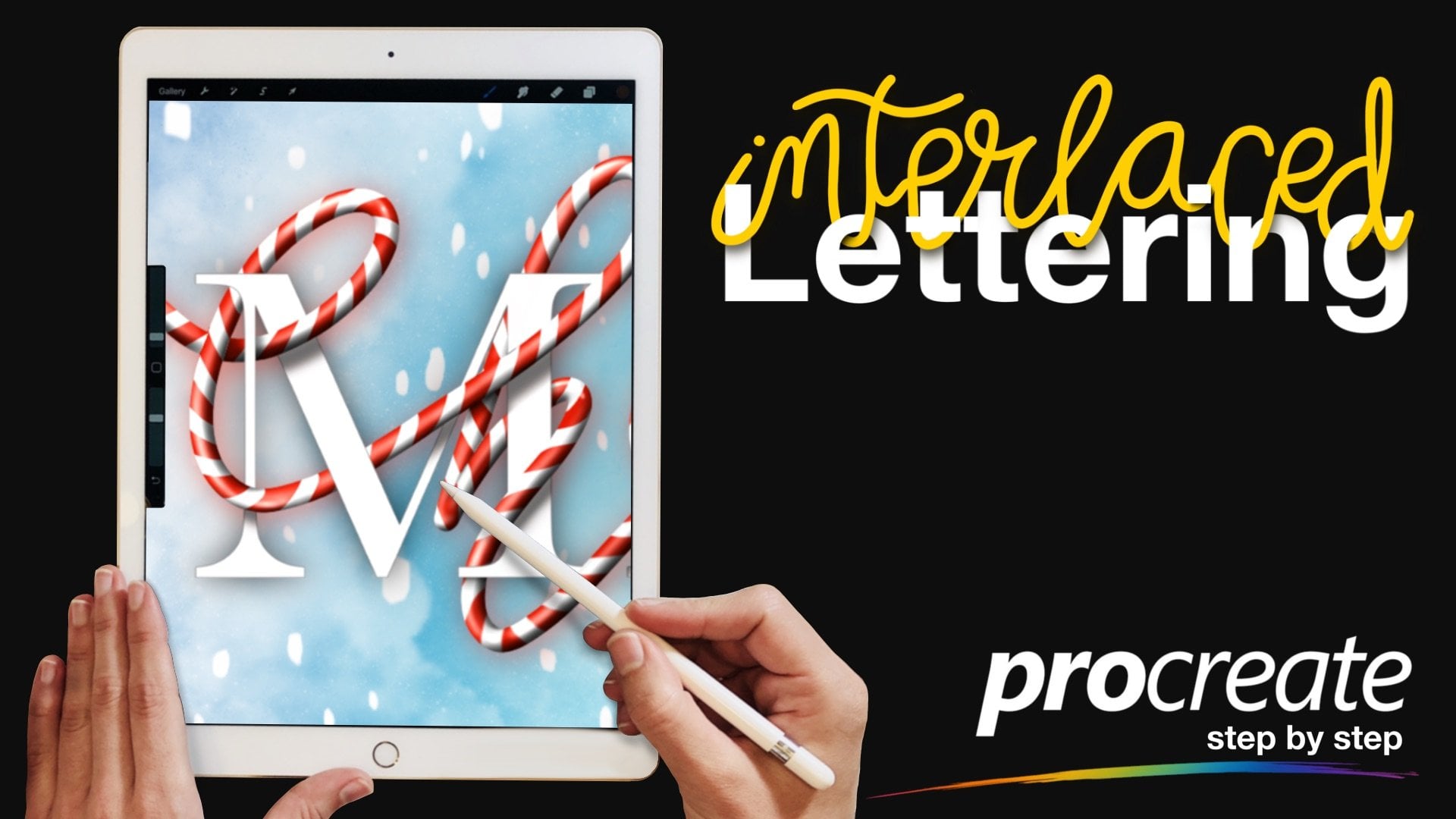
Transcripts
1. Welcome to the Class!: Hi, everyone. I'm Jax from Jack Studio and
welcome to the class. I'm a self taught calligrapher
and a digital artist. Today, we're going to dive into the world of
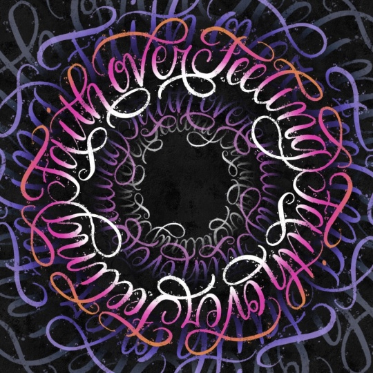
digital lettering, a modern script circular
calligram right here Procreate. A calligram is
essentially a piece of art where the words
create a specific shape. In this class, we aren't
just writing in a circle. We're going to be styling a lettering piece using the
phrase faith over feeling. I'm going to show you how
to create a vortex effect. Don't worry if
you're a beginner. I've designed this class to be fun and surprisingly
easy to follow. To help you follow along, I've provided a free brush pack, color palette, and a
layered Procreate file in the resources stab. You can use that file as a
guide and trace the lettering. Or you can definitely
start with a blank canvas and build it from scratch as you follow along
with me in this class. Before we start, let's make sure you have
everything ready. For this class, you'll need
an iPad and an Apple pencil. Make sure it's charged
and ready to go. The Procreate app by
the end of this class, you'll have a finished modern
script circular calligram with a vortex effect
that looks complex, but was actually built through a simple step
by step process. If you're ready
to experiment and create this fan
calligram artwork, grab your iPad and Apple
pencil, and let's get started.
2. Setting Up Your Canvas: Now that we have
our tools ready, let's get our workspace set up. I'm going to show you how to import the resources I provided, but I'll also show you
how to build your canvas from scratch if you prefer
to start with a blank slate. First, download the PDF guide from the Resources tab
and open it on your iPad. Follow the instructions
to download the zip file. Locate the Zip file
from your files app. Then simply tap on the
file to unzip the folder. Now, tap the Procreate
brush set Procreate will automatically open them
and import the brushes into a new folder at the very
top of your brush library. If you open the template file, you'll see I've already preset the dimensions
and guides for you. If you're not ready to
letter on your own yet, feel free to trace the
provided lettering so you can stay focused on the
rest of the process. Now, if you want to build this with me
from the crown app, let's start by creating a new canvas in
the Procreate app. Tap the plus icon and create a custom canvas with
3,000 by 3,000 pixels. We're going to set
the DPI to 300. I always recommend a
high resolution like this because it gives
us more flexibility, whether you want to print your final artwork later
or just ensure it looks crisp when you share it on your social media or send it
to your friends and family. Now, let's prep our layers. Tap your layers panel and change the background
color to black. You can choose from
the palette panel or double tap here on the
color picker snap to black. Then let's rename the layer one by tapping the layer
and rename it to grid. Now, let's choose white from the color picker or
from the color palette. Open your brush
library and go to the class toolkit and select
the grid circle brush. Tap once, grab the
Transform tool, the RO icon and
click Fit to Canvas. To make sure the guide isn't
distracting while we work, go to your layers
panel and lower the opacity to around 20%. And there we go. Our
foundation is laid. In the next lesson,
we're going to start sketching our layout and
mapping out our words. I'll see you there.
3. Symmetry Guides and Rough Sketch: Now that our canvas is ready, it's time to set up
the symmetry guides. Go to the Actions menu, the wrench icon, tap on Canvas and toggle
on drawing guide. From there, tap
Edit Drawing Guide. Look at the bottom of the
screen and choose symmetry. Then tap options and select horizontal and turn
on rotational symmetry. You'll see the lines
appear on your canvas. You can change the
guide color to white by sliding the
color picker at the top. Tap the check icon
once you're done. Let me show you how
rotational symmetry works. Let's create a test layer first. Tap the layer thumbnail
and select Drawing Assist. Make sure you see the word assisted under your layer name. If you don't see that word, the symmetry won't work. Now, let's grab the pencil
brush from your toolkit. Notice that as I
draw on one side, my stroke is automatically copied and rotated
on the other side. This keeps your script flowing in the same
direction all the way around the circle instead of your letters crashing into
each other at the bottom. Now that we understand how
rotational symmetry works, let's prepare our workspace. Go ahead and delete that
test layer we just made. To make sure our letters
look consistent, we need to mark our
guidelines for our letters, create a fresh layer
and name it guideline. Top the layer and turn
on drawing assist. We need to set the baseline, the cap line, and the X height. For the baseline, find the fourth line from the center and draw
the guideline there. One, two, three, and four. This is where the bottom
of our letters will sit. For the cup line, go to the sixth line
from the center. One, two, three,
four, five, six. This marks the height of our capital letters
and tall strokes. And for the X height, from the baseline, count the thin grid lines
up to the fifth line. One, two, three, four, five. This marks the top of
our lower case layers. Now let's lower the opacity
of this layer to around 20%. Next, create a new layer and
rename it to sketch one. Turn on Drawing Assist. Let's write a quote
faith over feeling. Just write it on your
normal handwriting, just to gauge for the
spacing of the letters. Our goal is to fit the
coat on the half of the circle so it will create a full circle with
a symmetry tool. If you notice some upward
empty space such as this, just take note of it for now. We will fix that later on. Now, let's refine the placement of the letters and the spacing. Go to your layers and lower
the opacity of sketch one. 20% is good. Now, create a new layer on
top and name it sketch two. And remember to turn
on drawing assist. Now, let's write out our coat again in a loose
modern script style. Right now, we're just testing the waters to see how the
words fit within the circle. Make sure your letters
aren't bumping into each other and
look for empty gaps. This is the perfect
time to adjust the spacing and the
sides of the letters. At this stage, we can also map out where to put the
swashes and the flourishes. Look for spaces above and below the letters so we
can add these elements. For this one, we can
extend the cross bar to here for the letter H, we can add a swash below it. And for the letter B, we
can do something like this. And for the letter L, we can also add something
like this on top. For the letter F,
we can extend this. And maybe for this letter G, we can make it
something like this. I think there are
spaces below that we can add more smashes
to like the letter R, and maybe here or just
create something like this. Let's clean it up, create a new layer called sketch three. Let's hide the sketch
one layer and drop the opacity of sketch
two layer to around 20%. Just make sure to toggle on the drawing assist for
the sketch three layer. From here, we can refine the letters and connect
the washes and flourishes. I'll adjust the size of
our brush to around 7%. Now, let's trace the letters. Mm. You can repeat this process
as much as you need, but don't get stuck in
the sketching phase. We can still make more
adjustments later on. Once the sketch
feels right to you, we're ready to move
on to the next step.
4. Inking and Main Artwork: In this lesson, we're going
to focus on the final inking. Go ahead and lower the opacity of your sketch three layer to around 20% and high
the layer sketch two. Create a new layer on top
and name it main artwork. Just like before,
don't forget to tap the layer thumbnail and
tuggle on drawing assist. For this step, I'm using the pointed splatter
brush from the toolkit. You'll notice this brush have some splatter
details on the stroke. This adds a bit of character to the letters
that we will create. As we begin forming our letters, keep the core principle
of calligraphy in mind. It's all about pressure. The golden rule when your
pen is moving downward, apply firm pressure to
create thick and bold lines. When your pen is moving upward, lighten your touch to
create a thin line. This gives our letters contrast
between thick and thin. But feel free to lean into
your own personal style here. You don't have to follow
my exact lines because lettering is an expression of your own hand, so go
with the flowing. You can also trace
the letters from the Procreate
template I provided if you're not yet
confident in your script. Let's go ahead and
trace the quote. Oh You can do it slowly and don't
rush your strokes. Once the main words are
in, let's zoom out. It is important to
see the big picture every few minutes to
check your spacing. I'm going to hide the
Sketch three layer and also the guide line
layer so I can see the art clearly against
the black background. Take your time with this. Once you're happy
with the lettering, we're ready for the
final rendering and the vortex effect.
5. The Vortex Effect: Now that our main
lettering is finished, it's time to transform this flat design into a
three dimensional calligram. Go to your main artwork layer. Duplicate it until you have
five identical copies. Let's stay organized and rename
them from top to bottom. We'll keep the main artwork right at the top of the stack. That's our hero layer. Underneath it, we're going
to create our rings. Rename the other layers too. Inner ring. Core. This will be our tiny center. Then this one will
be outer ring. This last one will
be outer perimeter. Select all the layers we aren't using right now and
group them together. Rename this group to back up. Now, check the visibility
box to hide the group. This keeps our workspace tidy while making
sure that we have our original layer saved just in case we need to go
back to make adjustments. Let's resize each
layers one by one. First, select the
outer perimeter layer. With that layer active, tap the transform tool, which is the arrow icon here, check your settings
at the bottom and make sure snapping
is toggled on. Now, it fit to canvas. Then use your pen
to scale the layer up until it goes well beyond
the edges of the canvas. As you move and center it, wait for those orange
snap lines to appear. That's how you know it
snapped to the center. Finally, lower the
opacity to around 30%. Next, select your outer ring
layer and resize this one, so it's just a bit smaller than the outer perimeter layer. And snap it to the center. Let's also rotate this layer to 45 degrees to add
variation in our layers. Then drop the opacity
to around 50%. Next, select your
inner ring layer. Rink this layer using
the transform tool. So it's just inside your
main artwork layer. Let's snap it to the
center and also rotate this one to 45 degrees and set
the opacity to around 75%. Now, let's select
the core layer. This is our smallest layer, so let's shrink it
down until it creates that tiny light at the end of the tunnel effect in the center. Then let's change the
opacity to around 65%. Just by playing with the
scale and transparency, we've now created
depth in our artwork. Now that our structure is set, let's add some life with color. We'll use the color palette included in your resource pack. To change the color
without making a mess, we're going to use Alpha Lock. When you turn on Alpha lock, procreate lacks the pixels
you've already drawn, ensuring your new
color only goes onto the letters and
not the background. To activate it, just tap the layer and you'll find
Alpha lock in the layer menu. Oh. You can also use a handy shortcut by swiping right with two fingers
as a gesture shortcut. Pour the main artwork, pick the vibrant pink color and select fill layer or
the inner ring layer. Let's use the dark purple. Then let's fill the layer. Next, our outer ring layer. Let's select the
dark purple again. And fill layer. Let's go to the core layer. Let's go with the
lighter purple color. Fill layer. Lastly, the outer
perimeter layer. Let's go with deep
navy blue color. Then fill layer. Remember, you can use
different colors for this. Feel free to experiment
to make your own style. In the next lesson,
we're going to add the highlights and shadows that will create
the vortex effect.
6. Dimension and Rendering: Now we're moving into
the rendering phase. This is where we take those
flat colors and give them the dimension and that
eye popping TD effect. To do this properly, we're going to use
the clipping mask. First, let's get our
layers organized. Create a new layer
directly above each layers except for the main artwork and
we name them shadow. Tap the layer and
select clipping mask. This is very handy because
whatever we paint will only throw up on the letters
of that specific layer. Let's add a new layer
here, your name, shadow. Then clipping mask. Let's add a new layer
here, your name, paddle and then clipping mask to the core
layer. Last one. Paddle and then clipping mask
to the inner ring layer. You should now have a
shadow layer clipped to every single layer
except for the main art. Now, let's grab the shadow brush and pick black
from your palette. We'll start with the
outer perimeter layer. Go to the shadow layer above it. Then brush softly along the
inner edges of your letters. But before that, don't forget to turn on
the drawing assist. You can adjust the size
of your brush if needed. Do you see that? It's
a subtle change, but suddenly the
letters have gravity. They look like they're floating. Continue this same process
for your outer ring. Go to the shadow layer above the outer ring and turn
on drawing assist. Brush softly along the inner
edges of your letters. Now, let's do the same
for the inner ring. Go to the shadow layer and
then turn on drawing assist. Let's adjust the
brush size molar. Then brush softly along the
outer edges of your letters. So now you see the main
artwork layer is popping out. Finally, do the same
for the core layer. Go to the shadow layer
and turn on drawing assist and brush softly on the outer edges
of the letters. Adding the shadows
creates a tunnel effect. Making the center feel like
it's receding like a vortex. If you want the
shadow to be softer, just reduce the opacity. It's time to add
some highlights, create a new layer above
your main artwork layer, and name it highlight. Turn on drawing assist
and clipping mask. Pick white and brush softly on the inner
edges of the letters. Let's use the same brush. Now, let's pick the orange color and on the same highlight
layer above the main artwork, let's brush softly on the
outer edges of the lettering. Now it's giving a little bit of a gradient effect with the orange color blending
with the pink color. Now let's go to the
inner ring layer and create a new layer, rename it to highlight. Turn on clipping mask
and drawing assist. Let's pick the pink color
and with the same brush, let's brush on the inner
edges of the letters. Next, let's go to the core layer and add a
highlight layer as well. Leaping mask and growing assist. For this one, let's
choose white. Brush softly on the inner
edges of the letters. Next, let's go to the
outer ring layer, create a new layer above, rename it to highlight. Turn on clipping mask
and drawing assist. Now, let's pick the
letter purple color. And then let's brush on the
outer edges of the letters. Let's adjust the brush
size to make it bigger. And then for the
outer perimeter, let's add a new layer, rename it to highlight. Turn on clipping mask
and drawing assist. Let's pick this purple color and brush on the
edges of the canvas. I think it looks pretty nice. Remember, you can always change the colors
if you want to. You can use different
color combinations and experiment with
your own work. And once you're satisfied with the shadow and
highlight effect, we're ready for
the final touches.
7. Final Touches and Texture: We will now apply a texture
layer to our final piece. Let's start by creating a
new layer at the very top of your stack and naming
it top texture. From the toolkit, grab
the Warbi canvas texture. From the color blade, adjust the brush size
to nearly the maximum, and then cover the canvas. Try doing it without
lifting your pen. Let's set the layer to multiply. You can see the effect
of the texture here. Now, let's duplicate
the texture layer and move it down
below the core layer. Rename this layer
to bottom texture. Then tap the layer
again and select inverts and change
the effect to normal. Adjust opacity to around 80%. Let's turn off the
drawing guide. Before we call this finished, zoom out and check if we need to adjust the opacity of
some of the layers. If any layers feels too bold, drop the opacity by
around five to 10%. Once the balance feels
perfect for you, we are officially done
with this project.
8. That's a Wrap!: And that's a wrap.
We've gone from a blank canvas to a dynamic fate over feeling
circular calligram. I do of your feeling proud of what you
have created today. Remember, these techniques
are just for this project. You can apply this circular
flow and depth building to any quote or shape you
choose in the future. I am so excited to see your
version of this piece. Please take a moment to export your artwork and upload it to
the project gallery below. Whether it's your
final polished piece or even just a progress
shot of your sketch, I would love to see it and
give you some feedback. Plus, it's a great way to
inspire your fellow students. If you enjoy this class, I would appreciate it so
much if you left a review. It helps other students
to find my work. Thank you so much for spending your creative time with me. Keep practicing,
keep experimenting, and I'll see you
in the next class.
 Jacqx Studio, Designer | Calligrapher