Transcripts
1. What to Expect: Have you been meaning to
start painting with gouache, but you just don't know
how to get started? Or maybe you've tried the
medium out and you've struggled with the consistency or the layering or
the colour mixing. This class is going to
change all of that. Hello there. My name is Shivani, and I'm a gouache artist and
surface pattern designer based in the Sunny city of
Chennai in the South of India. Through this class,
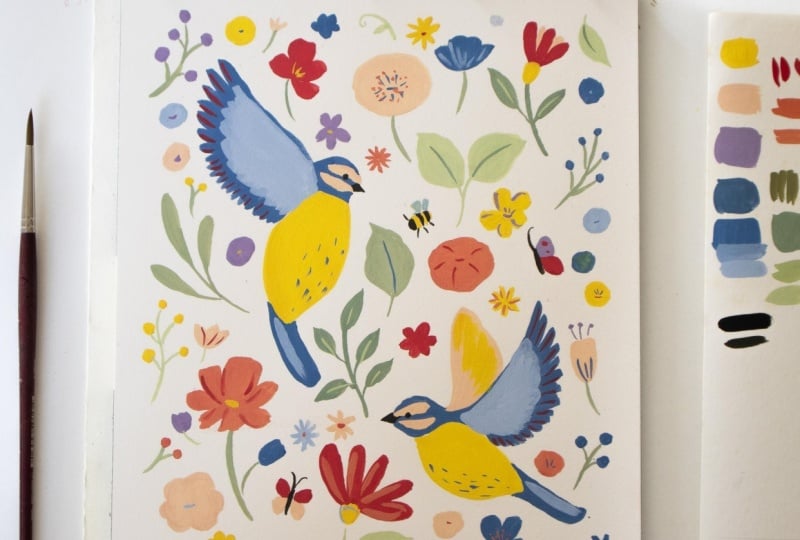
we're going to paint this beautiful bird and
botanical composition together. And as we go through
all of that, I'm going to teach
you all the basics of gouache that are going to
help you master the medium, even if you're a
complete beginner. We'll discuss color mixing
with a limited palette. We'll discuss
gouache consistency and how to get it nice
and creamy and opaque. So you get this beautiful
flat graphic style, and we'll talk about layering. Most importantly, we're going
to have fun and we're going to create this
beautiful painting at the end of this class. I cannot wait to take
you through all of it, so let's jump
straight into it.
2. The Class Project: For this class project, we're going to work together
to create this beautiful, modern botanical
composition with birds. I'll be taking you
through all of the steps, so it's simple and
easy to follow. This painting is a lot of fun. It's very forgiving and 100% achievable
even by beginners. And there are no rules. By the end of the
class, you'll have this complete painting that's ready to frame and
hang up at home. Through the class,
I'll be teaching you three core techniques
that are going to make you a very confident
gouache painter. We'll talk about perfecting
gouache consistency. We'll talk about
layering like a Pro, and we'll talk about achieving color harmony with a
limited color palette, which means that you
don't need to go out and buy new paints every time
you want a new color. You're going to have the
skills to mix up any color that you want with just
a few tubes of paint. In the next lesson, we'll
talk about the materials you need and we'll start setting
up to create this project.
3. Materials & Setup: Gouache most commonly
comes in tubes, but sometimes you also get
gouache in tubs or cups, for example, Himi Miya gouache. For this class, I'm
going to be using tubes, but you can use whatever
you have on hand. Gouache also comes in either
artist grade or student grade. Again, you can use
whatever you have but if you're picking
up fresh paints, I would highly recommend artists grade gouache
because gouache is one of the mediums where the quality of the paints really makes
a huge difference. The other materials with gouache are a lot more
forgiving, for example, the paper or the brushes, but a lot of beginner
challenges get solved with just having
the right paints. However, that being
said, even if you're picking up
artist grade paints, you should keep in
mind that you really don't need a large
set of colors. One of my favorite
things about gouache is that you can mix
up so many colors. The paints are highly pigmented and lend themselves really
well to color mixing. So even with just a
set of primary colors, along with white and black, you can achieve a
whole range of colors, which is one of the
things we'll be talking about in one
of the next lessons. For this project, as well, we're going to use just
the primary colors. We'll need a shade of blue, a shade of yellow, a shade
of red and black and white. If you're picking up
artists grade gouache, I'd highly recommend Winsor
and Newton, or Holbein. Those are my two favorite
brands to work with. Next, you'll need your brushes. Like I said, gouache is very forgiving when it
comes to the brushes, so try to use whatever you
already have available. For the project,
we're going to need one slightly larger sized brush and one smaller sized brush. So maybe a size four or six and a size one or two
for the fine details. For the smaller
brush, try to find one that comes to a fine tip. Synthetic brushes
are perfectly fine. You do not need
natural hair brushes. Natural hair brushes
tend to work better with watercolor because they
hold a lot more water. But with gouache, that's
actually not a great thing. We don't want the brush holding
too much water because we want more control on the
opacity of the paint. So synthetic brushes
work perfectly. And when it comes to the paper, again, work with what you have. You could either use a sheet
of paper or a sketchbook. Try to pick one that's
at least 250 GSM. I would recommend 300 GSM
because you don't want the paper to buckle
when you add more water. And you can pick either hot
pressed or cold pressed, whatever you prefer
working with. Cold pressed tends to have a little bit more texture and is a little bit
more beginner friendly, whereas hot press
is going to give you a much more
smooth appearance. Finally, we'll need a few basics like a cup of water,
a mixing palette. You can use one that's flat like this ceramic palette or you
can use one with wells. Again, for beginners, I
would recommend the one with wells so that you can
keep your colors separate. Then you'll need either
a piece of cloth or a paper towel for dabbing off excess water and paint
from your brush. Need a pencil for making
your sketch and an eraser. And finally a scrap
piece of paper or a rough sketchbook for
swatching your paints. Now that you have all of this
ready, let's get started.
4. Let’s Talk Consistency: Consistency is the
number one struggle most beginners
face with gouache. If you get this one thing right, everything else just becomes
easier, including layering. I'd like to start
off by saying that there is no one consistency, and this is something I've said in my previous classes as well. However, I'd like
to rephrase that. The consistency
you're after depends a lot on what you're trying to achieve with your
final painting. One of the amazing things about gouache is that
it's so versatile. You can use it
creamy and opaque, and you can get this
really flat graphic style, which is what we're going
to do in today's painting. However, at the same time, you can water it down quite a lot and use it
similar to watercolors. And you can use it straight from the tube very thick and you can get some beautiful texture in your painting
with dry brushing. All of these different
consistencies have their place. When you learn to work
with all of them and make intentional choices
in your painting about what consistency you want, your paintings become so
much more interesting. So let's start working
with the paint, and I'll show you how to achieve the consistency
that you're after. We're doing a simple exercise that's going to make
it really easy to remember the different types of consistencies that can be
achieved with gouache. So first I'm taking some
red out from the tube. The color really doesn't matter. You can pick any color and I've dipped my paint
brush into the water, but I'm also going to
use my cloth to dab off any excess moisture from my brush because for
the first consistency, which is going to be called
the butter consistency, we want it to be fresh from the tube with hardly any water, practically no water,
but just having a damp brush will make it
easy to move the brush along. So I'm just picking up
some of that paint, and I'm just going
to swatch it here. And as you can see, it has this really nice dry
brushing texture and you'll feel that it's a little hard to move the
paint along the paper, and that's exactly how
it's supposed to be. So that's our
butter consistency. The next thing I'm
going to do is just lightly dip my brush
into the water. We're going to bring
in just hardly a drop of water into the paint, and we're going to
make it thinner and easier to move on the paper. I'm going to take
just a little bit more because I feel
my paint needs it. So what you're looking
for is that the paint is easy to move along
on the palette, but still doesn't feel
too thin or too watery. And we'll paint that.
And this is going to be our cream consistency. And now we're going to again, dip the bristles into water, bring in one large drop
of water into this paint. If you feel you've
made it too thin, you can always add
in more paint again. And now, again, you're just
looking for the paint to be a little easier to move
around on your palette. And this time it feels a bit more translucent than
the previous one. And we'll swatch that, and
that is our milk consistency. And it's possible
that you'll see a bit more streakiness
as this one dries. And now, again, dip the paint, bring in a nice
big drop of water, thin it down quite a bit. And then, as you can see, we're starting to get a
lot more transparency now, and this is going to be
our coffee consistency. And finally, we're going to take a lot of water,
hardly any paint. Just mainly water on your
brush and very little paint, and this is going to be
a lot more transparent, a lot more watercolor like. And this is our tea consistency. So to recap, we've got butter, which is really thick and
very dry on the brush. Then we've got cream, which is smooth and very opaque. Then we've got milk,
which is, again, very smooth to work with, but it's got a bit
more transparency. It might be hard to
see in this red color, but depending on the
color you work with, and as it dries, you'll see a bit more of the
translucent nature. And then we have it more
watered down and it's coffee. And here you can see the white
of the paper through it. And finally, we have tea. This is just an easy way to practice the different
consistencies you can achieve with gouache and show you
how versatile it is. You can, of course, water it down so much more as well like watercolor and get these
really transparent washers of color, which is beautiful. So this is not all
that's possible, but this just gives
you a nice gradation. And for today's project, we're going to be working
somewhere between the cream and milk consistency. Just make sure
your paint is able to glide well onto the paper, but still is nice and opaque.
5. Limited Palette Philosophy: When you have every single color laid out in front of you, you tend to use them all. And as a result, the colors tend to clash with each other.
You lack harmony. However, a limited
palette solves that. If you have in front of
you just one shade of red, one shade of blue, and
one shade of yellow, you're forced to mix up every
other color that you need. It's completely possible. Understanding a little bit of colour theory is going to
help you a lot with that. I'll be teaching you
everything you need to know to paint today's project, but if you're interested in going deeper with colour theory, you can check out my
other class on the topic. I'll link it in the description. When you work with
a limited palette, it becomes pretty impossible to create colors that don't
match with each other. The painting we're going to
create today is going to use multiple different
shades of color, but they're all coming from the same three or four tubes of paint that are mixed in different proportions to
get the colors we're after. That makes the colors
look intentional, and it makes the entire
painting look harmonious. Let's do a few color
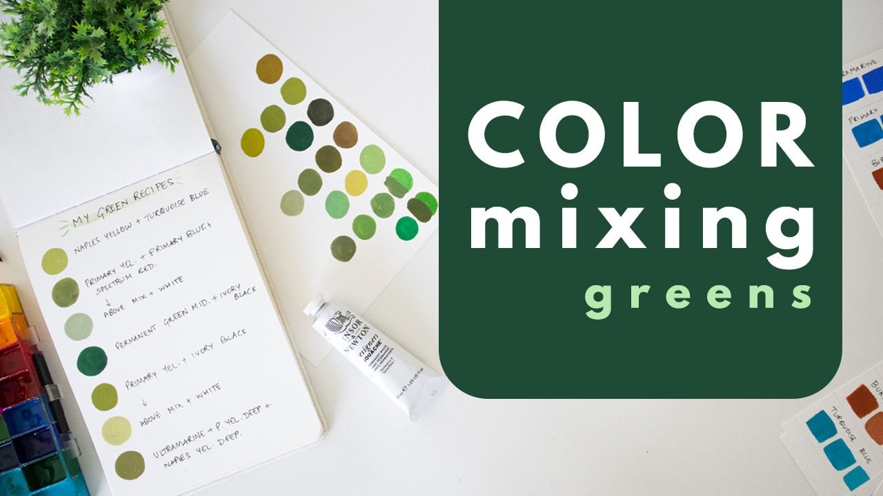
mixing exercises to understand how this works. On my palette here, I have laid out a yellow, red, and a blue. The shades really don't matter. You can use any of the three primaries
that you have on hand. So we're going to first just
swatch these three colors. That's the red. And I've
got this ultramarine blue. Now we'll start mixing colors using just
these three colors. It doesn't matter what
ratios you're using. We just want to explore the possibilities of colors that we can get
using just three. I'm starting by mixing
the secondary colors. And then the red, along with the blue
to make a purple. With the secondary
colors itself, you can start seeing
so much of variation. So in the same purple, if you add more blue, you're going to get a
very different shade. And if you add more red, again, you're going to
get a different shade. And so right there itself, we've created a
lot of variation. And finally, we'll do the blue with yellow as our third secondary
color, which is green. And for this demonstration,
you can see, I don't care too much
if I'm muddying up these base colors because it is a mixing
exercise after all. So that's the green.
And similarly, just by varying the amount of the primary color mixed into it, you're going to get so
many different variations of green itself. And now we can start making slightly more complex colors by mixing all three
primaries in. So let's say I take the blue. I already had a bit of
yellow on my brush, so a bit of that mixed in, but I'm taking more
and a bit more blue. I'll swatch this as
well because this is a nice, very cool green. And then I could take a
bit of the red into it, and that's way more red than
I was intending to add in. So I'll go back in with some
more of the blue and yellow. And here I've got,
like, a really nice, dark brown which if I
add white into that, I'm going to get a lovely gray. And when we're mixing
complex shades like this is where the power of a limited palette
really comes into play. So the gray here has
so much depth to it, unlike a gray which would just be mixed with black and white. It has some color in it, and that makes it
so interesting. And like I said, it starts becoming harmonious with
all the other colors. It's pretty impossible to go wrong when you're mixing
with just three colors, no matter what you mix it's just going to work within
that same palette. So I'm going to take
some of this gray white, and this is how I love
playing with color. I just start mixing
them into each other to see what happy
accidents happen. So by taking that neutral color in there, I'm getting, like, a more coral peach-ish shade, which is not very saturated.
And that's another thing. When you start mixing
with all three primaries, you're going to get very
natural looking colors that aren't overly saturated, and they just give a beautiful color palette
to your painting. This was just a small
demonstration for you to understand
how this would work. We're going to mix up
all the colors we need for our final project using
the same three shades, but feel free to
play around more in this color exercise and
click a photo of it, upload it to the project gallery because color mixing is
one of my favorite things, and I love seeing what my
students come up with.
6. Painting With Gouache: When you're painting
with gouache, you want to make sure
that you mix up enough of a particular colour
on your palette before you take it into
your final painting. If you run out of paint midway, it's pretty impossible to
mix the same color again. Let's say I wanted to paint
this particular color here. I start painting it, and then because I'm running
out of paint on my palette, as you can see, I keep
dipping into the water, and I try to spread the paint, which is fine if you're
after a watery consistency, but if you're trying to
get it to look thick, this is going to be a problem
because you're just going to get an inconsistent
application, and parts of your painting
are going to look streaky because you just had to water it down because
you ran out of paint. So you're going to have thicker
areas and thinner areas, and that's just not
going to give you the nice flat application
that we're after. This is where having
a palette with wells becomes really
handy because you can mix the right quantity of color that you need
and make sure you're able to cover all the areas of your painting that
require that color. Compare that with
the next rectangle I paint where we're going to have enough paint
in our palette, and we're going to load
the paintbrush with that right creamy consistency because we want the
flat application. You can see that
I'm smoothly able to drag my paintbrush
across the paper, and I don't need to add
more water in because I'm confident that I have enough on my palette and I'm not
going to run out of paint. So I'm able to get this nice, opaque and creamy
application without the inconsistency and
streakiness of the previous one. Another thing you'll want
to note about gouache is that it can appear streaky
while it's drying, even though it's not
actually streaky. It's just because of
different drying times of different parts
of your painting. So this while it's wet looks like it has a
bit of streakiness, but make sure you don't keep
applying paint over that. Just let it be and
allow it to dry. If after it dries, you still feel that
it looks streaky, then you can always go
in with a second layer. With gouache, keep in mind that all colors tend to appear a
bit different when they dry. So this is a dry
swatch of paint, and I'm applying the
same colour wet here, and you can see that it tends to look a bit lighter
when it's wet. And generally with gouache, all the light colors
appear darker when they dry and dark colors
appear lighter when they dry. So that's something
to keep in mind. And that's why I like to swatch my paints before
I bring them into my final painting so that I make sure I get the color
that I'm actually after. One really great thing about
gouache is that you can layer either light on
dark or dark on light. This makes the paint
really versatile. We'll discuss layering a bit
more in the next lesson.
7. Layering Your Paint & Brush Control: Gouache is a water based medium that re-wets completely
when it's dry. Now, one of the things I
love that is because I can store colors on my
palette just like this, even after I finish
working with them, and I can just rewet them and reactivate them whenever
I want that color, again, which is what
I'm doing right now just by adding
some water in. But what this means when you're practically
working with the paint is that if you try to
layer on wet paint, you're going to create a bit
of a mess because you will reactivate the base layer and the colors will
blend together. Right now I'm painting
a wet swatch of paint, and let's see what happens
if I try layering over that. I'm going in with the top
layer, and as you can see, the colors are just completely blending together
and creating a mess. The color is flowing
into the bottom layer, and that's not at
all what we want. So instead, I'm going to paint the layer on this
dry swatch of paint. As you can see, this
has now completely dry. So let's paint over that
and look at the difference. Again, I'm just
going to do a line. Look how clean that
layer is in comparison. So with gouache, when
you're layering, which is going to
be a core technique that we use in today's project, you want to make sure
that your base layers are completely dry and then go
in with your top layer. Let's also talk
about brush control. So in this project, we're going to be doing layers
with some fine details. So you want to be able to bring your brush to a fine tip
to be able to do that. And a little practice
will go a long way. So get some color onto your
brush and try to create some short lines using just
the tip of your brush. You can even try some dots
dashes and other textures, which would be beautiful
little details that we add in today's project. When you're doing this,
you want to make sure that your strokes are
confident and quick. You don't want to go back and forth too much when
you're doing it because, again, you could
end up reactivating your base layer and blending
the colors together. So again, if I were to
go over this base layer, but I'm doing these
hesitating strokes and going back and forth, you can see that I'm
picking up some of the base color and they're
blending together, which is not what we want when we're looking for clean layers. So make sure your strokes
are quick and confident.
8. Sketching Botanicals: The next thing we'll
be doing is working on the sketch for
our final project. I'm providing my entire sketch in the class resources
as a downloadable, so you can print it out and
trace it if you'd like to. But if instead you'd like to
make the sketch on your own, this exercise is
going to be helpful. For this class project, we're looking for simple
botanical shapes. We're not looking
for perfection. We're not looking for anything too detailed or hyper realistic. We just want to create fun
botanical and floral shapes. And of course, we'll be
doing the birds as well, which you can refer to in
the download I've provided. For the florals, let's sketch a few simple floral
shapes for practice. Your final project could
look exactly like mine, or you can create a composition
completely of your own. It's up to you. So here's one of the simple floral
shapes that I enjoy. We first create a stem
and then this elongated C shape and then a little
bit of waviness on the top, and then we can have
a few of these stamens with buds coming out. Then we can create this simple doodly floral
with wavy edges. Then we could have this
five petal floral shape. We could do berries. Here's another one I love, so we'll create the stem. We create a C shape, and again, the waves, and then we can create five petals
coming out of here. Another similar one you could
try is create the stem, and then you have three
petal shapes like this and you can add in
two more between these. This way, you can do
two different colors here and it looks
really interesting. Then you could have one
that looks like this. And then you could have
some simple, leafy shapes. You could even add leaves
to some of your florals or you could try large
stems with multiple leaves. So go ahead and practice all
of these different shapes. All of these are
just so beginner friendly and also a lot
of fun to play with. In the next lesson, we'll start putting all of
this together and creating our final project.
9. Project Part 1: Sketching: First thing we need to do for the final project is to
get our sketch ready. Mine is semi finished here. I'm going to fill all of
this together with you. As you can see, I've given it a 1 centimeter
border on all sides. This is just a guideline
so that I make sure that all my elements
are within that. And I also have some
elements touching the edges so that
it forms a nice, consistent edge all over. So let's start filling in
a few more elements here. We could use any of
the floral shapes we discussed or whatever else
you'd like to add in. I'm also going to add in
things like a butterfly, when you're working
on your sketch, try to keep it quite light so that you're able to erase
the pencil lines later on, and it doesn't show through
your painting too much. I try not to press down
into the paper too deeply. Use a mix of smaller florals and larger florals
and other elements because that just makes your
composition look a lot more interesting rather than having everything of the same size. When you have variation, then you're guiding
the viewer on what your more important elements are and what your supporting
elements are. You can have small
little wobbly shapes like this for flowers, which are great filler
elements as well. And then you can have
larger versions of those. I like these wavy
leaf shapes as well. And that's just a
stem with two leaves. Try not to make your
composition too cluttered, but also not leave any
awkward empty spaces. You can have these little
flowers with multiple petals, sort of like a daisy. I generally tend to sketch
with a 2H pencil because it's a lot lighter than a
traditional HB pencil. And like I said, it allows me to erase my pencil marks
later on very easily. Anytime you find a space
looking too empty, you could add in
some small details there so that you fill it out, but make sure you don't
make it look too cluttered. You still want a lot of breathing room between the different elements
in your composition. So I'm happy with that, and the final thing I
will do is I will lightly erase all of my
pencil lines so that it's very light - just enough
for me to be able to see it. And that way I'm
not going to have any pencil lines showing
through the paint by mistake. So I just very lightly over it with my eraser
and when I do this, I need to make sure that all of the lines and details
are still visible to me, just a lot lighter. I dusted that off,
and that's perfect. Now we're ready to
start painting.
10. Project Part 2: Yellow, Peach and Red: And now it's time
to start painting. So we've got our sketch here, we've got the water.
We've got our palette. I've also got this
piece of paper in case I want to swatch
any of my colors. One thing I like to do
sometimes before I paint a composition is I like to do a rough sketch
in my sketchbook, and as you can see,
I've just blocked out all the colors with
color pencils just to get an idea of
the distribution of colors that I might want
in my final painting. So I'm just keeping this
on the side as a guide. But you can just follow
from my painting. And like I said, my final sketch is uploaded in the
class resources. So if you'd like to take
a print out of that, use to guide your own
sketch, you can do that. How I like to work
in this kind of a painting is to
go color by color. So I'm going to first
mix one color and try to paint it in all the different places that
I might want it, at least as the first layer. I might use that same color
for layering later on, so I always make sure I save
up enough on my palette. But as a first step, I do this so that, again, I know where the colors
are going to lie, and I can distribute it across my painting so that
we don't have too much of one color
in one area and then not enough of it
across the entire painting. We want all the colors to be spread out evenly
across this painting. So let's start with one of the simplest colors
that we're going to mix, which is this yellow. So I'm taking my lemon
yellow out in the palette, and I'm also going to
keep some white handy. I'll keep it here
in the center of the palette and I'm going
to take out some of my red, which is my carmine. I'm obviously not going
to use this much red, but I will take a
touch of it into my yellow because like
I told you earlier, I like to have all the colors sort of blended from
the same base hues, and I'm just mixing
them together. I already feel like I have
probably added in a bit too much red because this has become more orange
than what I wanted. So I'm going to bring
in some more yellow, and I'm also going to pick
up some white and add it in. I don't care too
much about keeping my white pure because I'm perfectly okay with
picking up a bit of that yellow when I'm
mixing other colors. This is what brings
the color harmony as well into the painting. I want it to be a lot lighter, so I've picked up
a lot more white, and I'm quite happy
with that color, but I'll add in some water. So you want it to be
of that nice, creamy, smooth consistency, so
you can spread it easily. But at the same time, it's not too watery and doesn't end up looking
like watercolor. And I'm going to
swatch the color right here to see if
I'm happy with it. I really like that. So just
adding a bit more water. Now I'm quite happy with the quantity of the color
on my palette as well. So I'm going to
start painting that. I'm going to paint the body
of the two birds first because that is my largest
usage of this yellow. Try to get a nice smooth
application, nice and opaque. And anytime your
paint ends up feeling too dry on your brush
or on your palette, you can just dip the tip
of your brush into water. Don't add in too much water. And I'm happy with that. Next, I'll do the
body of this one. Next, I'm going to fill out just a few flowers here and there. There's no exact science to this. You don't have to
put your yellow in exactly the same flowers
that I'm putting it. You can go as per
your own intuition and paint yours how you want to. So let's go ahead and
paint more yellow. Remember that this is
just our base layer. We're going to be adding
in details over the top of these with other colors so you don't need to be
too detailed right now. And make sure you
have enough paint stored on your palette so we
can come back to it later. Great. I'm happy with the distribution of the
yellow across my painting, so I'm going to
next mix a peach. For this, I'm going
to be using this red. Now that I've filled a few
areas with the deeper red, I'm next going to go in with
this more orangey peach. Remember that if your gouache
dries on the palette, you can always just add some
water and reactivate it.
11. Project Part 3: Purple and Blue: Let's now mix up a
beautiful purple shade. We'll be using the
ultramarine blue along with the red, as I said before, always start with a little less of the base hue
because they tend to overpower and it becomes
harder to lighten the color. You can always add more of
the base hue if you need to. But if you make it too dark, it becomes really
hard to lighten it. We have some of the red, some
of the ultramarine blue, and a bit of white, and I'm just mixing
all of it together. You can see it's forming
a nice violet shade. You can decide how you
want your violet to look. This is a bit more
of a reddish shade. I'm probably going to adjust
it to be a bit more blue, and I want it lighter. The final floral shade we'll be mixing is
going to be a blue, and that's going to be a
bit on the darker side. So I want a good balance of light and dark colors
across the composition. So I'll add a bit more blue
into this and some white. Add some water and
mix that all up. Now, this is looking a lot
closer to what I want. This is a more
bluish purple shade, but I'm going to add a
bit more white again. I'd like to have it lighter. Let's mix that up.
Add some water in. Give it a good mix, and let's swatch it. I really like that, so I'm
going to start painting. Make sure you leave
a few gaps in the florals because we'll
be adding in blue as well. As I'm looking at
my composition, I feel I want to add some red in here just
for some balance, so I'm going to go
back and pick up my red after making sure I rinse my brush thoroughly and the red is a little
dry on my palette, so I'm going to bring
in some water to reactivate it and
make it creamy. And then I can paint it here. You can always go back
and bring in any of the previous colors
as long as you make sure you leave enough
on your palette. Perfect. I'm going to start with the blue and after I fill
the blues where I want them, I will then add in more of
these colors where I want to. For the blue, we're going to
take our ultramarine blue, some white, and let's
start by mixing that. We're going for a
slightly darker shade here so we don't want
too much of white. Now if we just leave
our blue as it is, you can see how it really stands out and looks too bright compared to the
rest of the palette, which is a bit more subdued. So to have a similar effect, we would want to add a bit of the complimentary color of
blue in, which is orange. I already have an orange
mixed with our palette here. I'm going to just dip a little bit of that and bring it in. You can see I added
too much orange, so it's become very gray and that's what the
complimentary color tends to do. It desaturates the base hue. We'll add more blue back in. And some water, mix that up. This is quite a beautiful, nice, desaturated, earthy blue. I like it, but I'd like it to be a bit brighter than that. So again, just going to
add a bit more blue, but I don't want
it going too dark, so I'll add some white as well. If you notice, I never use
colors straight from the tube. Because I prefer to mix
everything from scratch, even if I need a blue or a red. I'm not just taking blue
or red from the tube, even yellow for that matter. I'm using all of these hues
to mix all the colors, and they just look so beautiful together. That's better now. I think I like that a
lot more. It's brighter. The difference might
be very subtle, but it makes an impact
on your painting. I'm going to take that in and the first and most
important place where I want to use this
blue is on the bird. So I'll start with that. Make sure you mix up enough blue because you're going to need it for the wings of the bird. For the wings of the
bird, don't overthink it. Just use your brush
to make these marks. You don't need to paint in the shape of each
feather so perfectly. Just use your brush to make
these beautiful marks. I'll just take a line
across the top of the wing. We'll be adding a lighter
shade of blue here. I'll just leave it that
way for now and I'll add some in the tail and
some on the face. So all the parts of the face that we did not fill with the peach
are going to be blue. And you can even cover
the eye. It's fine. We'll go over it
with another layer. That's it. The blue for this bird is done and
we'll start the next bird. I'm just going to turn my paper a bit so
it's easier for me. And the tail. And
again, the face. Before we proceed, I'll just finish the
wings of the bird. I'm going to take
a bit of this blue aside and add a lot
more white into it. We'll get a lighter
shade of the same color and you brush in some
water, mix that up. Honestly, I feel like I
can go a lot lighter than that because if I use
the color as this is, when it dries, you'll
notice that there's not that much of a
difference between the two. I'll go one shade
further, mix that up. Perfect. This is going to be a lot lighter and will
provide better contrast. So let's fill that into the
inner part of the wing. You'll know your
brush is too dry when you get dry strokes like this, so then you can dip in water. And we'll do the
same for this bird. We're not yet starting any of the layering, but
while we're at it, we could add a nice light stroke on the wing just to
add some detail. This is where the
creamy consistency becomes really important
because if it's too thin, it's just going to
dry transparent. Now let's proceed
with the flowers, and we'll use this blue
to fill in some of them. You could even use
the light blue in a few places
if you'd like to. Working on one color
at a time like this gives us enough
opportunity for all of our base layers to completely dry before we start adding
the detailing over them. This is the point where
you can step back and see if you'd like to
repeat any of the colors. We still have all of
our greens to fill in, so I'm going to finish doing that before I decide if I'd like to repeat any of these colors because I'd like to see how
the colors look together. Let's now move on
to the greens.
12. Project Part 4: Greens: We'll be using
roughly two shades of green just to have
some variation. Let's again take some blue. I'm going to use the
yellow that we've already mixed because I have enough
of it on my palette. I'm just going to
pick up some of that and mix it with the blue, and this is going to be our
starting point for the green. If I mixed it with the
yellow from the tube, the green would have been a
lot brighter and saturated. I think I'm going to
add a bit more of the yellow and also
a touch of red. When you're adding red, just
touch the tip of the brush and bring it in because you
can add too much very easily. The red again, acts as a complimentary color
and it's going to help desaturate the green further, and so you get this
more early olive tone. But I want something a
bit brighter than that, so going to go in
again with some blue. I really like that, but
I want it to be lighter, so I'll add some white. Here we've got a nice
earthy cool green, you can swatch it here. It's almost like a sage green,
and I'm happy with that. So when you're filling in
some of the finer details, use the tip of your brush and
if you're finding it hard, you can always move to
a smaller brush size. With the greens, I
like to not keep it static in the sense that I like to keep varying
the shade a little bit, so I could have one that's a bit more light by adding in a
bit more white into it. I'll just have some
white here on my palette and I can just keep
varying the shade as I go. I feel that gives a
much better look than just having one single green. Even though it's deriving
from the same color, there are small variations at different parts
of the painting. You can even paint in some of
the stems of these berries. Now, let's also mix up the second shade of
green so that we have both of them
handy as we work across it and we can
distribute them as we want to. So for this, I'm
just adding a tad more yellow and a bit more blue. I'll mix those up and
see how they look. This is a good base.
Like you can see, it's more saturated
and more grassy. So I'll add some white
into that because I want this to be a lot lighter
than the previous green. Perfect. I think
that looks good, and it adds some brightness, but I do know that
it's going to dry a little bit darker than
how it appears right now. So again, go to add in a bit more white.
This looks great. So let's start painting. If you want even more variation, you could create a mix
between these two greens, and that'll give you another different shade
that still works. I'm now done with all of my greens. I have a few spots of florals and berries
left to fill in. So I'm going to look
at the composition and see what colors
I want to use. Once that's done, we'll move on to mixing a brown for some of the details like
the butterflies and finally, we'll
start layering.
13. Project Part 5: Layers & Final Details: So I filled out
all of my flowers. The next thing we're
going to do is mix up a dark brown for some
final details like the eye, the center of the butterfly. So for that, I'm going to
finally use this tube of black. And I'll mix a bit
of our red into it. Again, to keep the entire
palette just very harmonious. We don't want to use black
straight from the tube because that's
going to look very harsh compared to
everything else. So you could add a
bit of this red. You could add a bit of yellow. And what you'll end up with is a brown that works with
the entire palette. And it's almost black. In fact, I think it can
be lightened further. So I'll add a bit
of yellow into it. I like that. It's
more grayish now, and you're not going to
need too much of this, so you don't have to mix up
too much on your palette. You'll just add in the
center of the butterfly, the antennae, and we'll add
the details of the bee as well. Finally, we'll do
the beak and the eye. You want to be really careful
when you're doing this. Again, if you're
more comfortable, you could use a smaller brush. Perfect. Now it's time for all the final details that are going to bring
this painting to life. For the greens, you
could add a bit of contrast in the center and
the veins of the leaves. You could do this using the alternating shade of
green or even some yellow. You don't need to
do this everywhere, but you can do it
in a few places just to add some interest. The next thing I will do is add some detailing on the
body of the bird. So on the yellow,
I'm going to add some small strokes with blue. And just to add
some more interest, I'm going to use the red and just add some strokes
on the wings. We're not looking for any
kind of perfection here. Imperfect is the beauty in
these kinds of paintings. I'm just going to add a bit of yellow detailing on the
back of the wing here. Then for the flowers, we're not looking for
anything realistic, we're just going to do whatever feels right and feels
fun and exciting. So think of any
quirky combinations you'd like to and
just go for it. You could use small
strokes, lines, outlines, whatever you feel like, just keep reactivating the paint well on your palette
if it dries out. And if any part of your painting
feels too empty, feel free to add in just a few small floral details there. There is no perfect
stopping point here. Your painting is ready whenever
you feel it's complete. You can add as many or as few
details as you'd like to. Okay, perfect. I'm really happy
with how this looks, so I'm going to stop here, and you can check out my final project uploaded
in the project gallery, and I love to see yours as well. So please do upload it there. I will be sure to
provide my feedback. Once your painting is complete, give it some time and allow
it to dry completely. As soon as that's done, we're going to do my favorite part, which is erasing all of the pencil lines and allowing the beauty of the
painting to shine through.
14. Summing Up: Congratulations on
making it to the end of this class and completing
your gouache illustration. I hope you enjoyed painting it. Through the class, we learned three core techniques when it comes to working
with gouache. We learned about the
consistency and water control. We learned how to
layer the paint without re wetting and
lifting the base layer, and we learned how to create a harmonious composition with
a limited color palette. If there are parts you struggled with, don't
worry about it. It's okay if your
painting doesn't look exactly like mine and if your colors look
different, as well. The whole point of this was to learn about gouache as a
medium and to have fun. If you have questions, please drop them in the
discussion tab below, and I'll be happy
to help you out. And once your
project is complete, don't forget to click a photo and upload it to the
project's gallery. I and all of the other students would love to see it
and cheer you on. And it would mean the world
to me if you could leave a review for the class and
let me know what you thought. You enjoyed this
class as a next step, I would highly
recommend checking out my class about colour
theory and color mixing, where we go into a
lot more detail. Or if you're interested in
learning how to paint birds, this class takes you
through all of that. So thank you so much for
being a part of this class, and I look forward to seeing you inside another one of my
classes. Bye for now.
 Shivani Patel, Gouache Artist | Creative Entrepreneur