Transcripts
1. Welcome!: Hey, I'm Jimbo. I'm
a lettering artist, illustrator, and educator. And in this class,
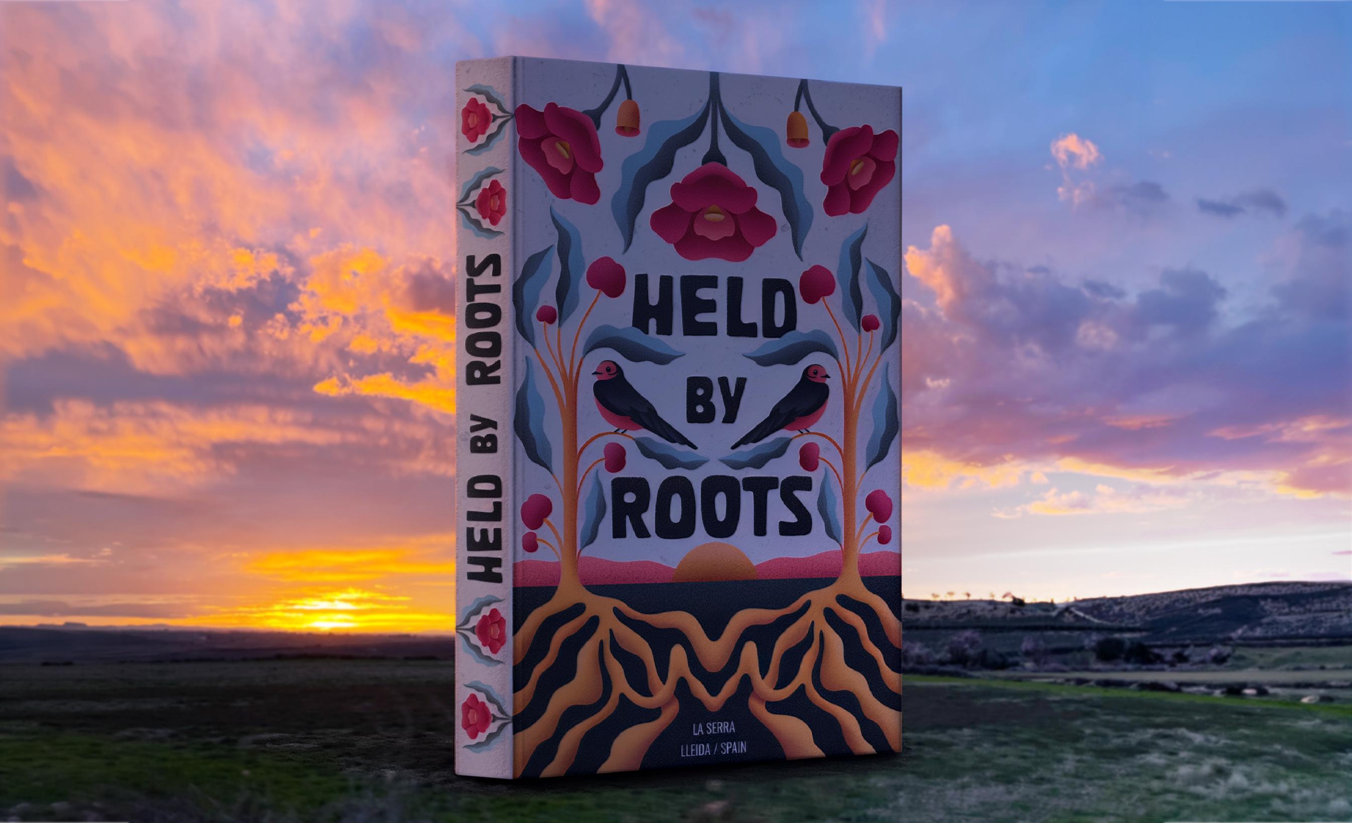
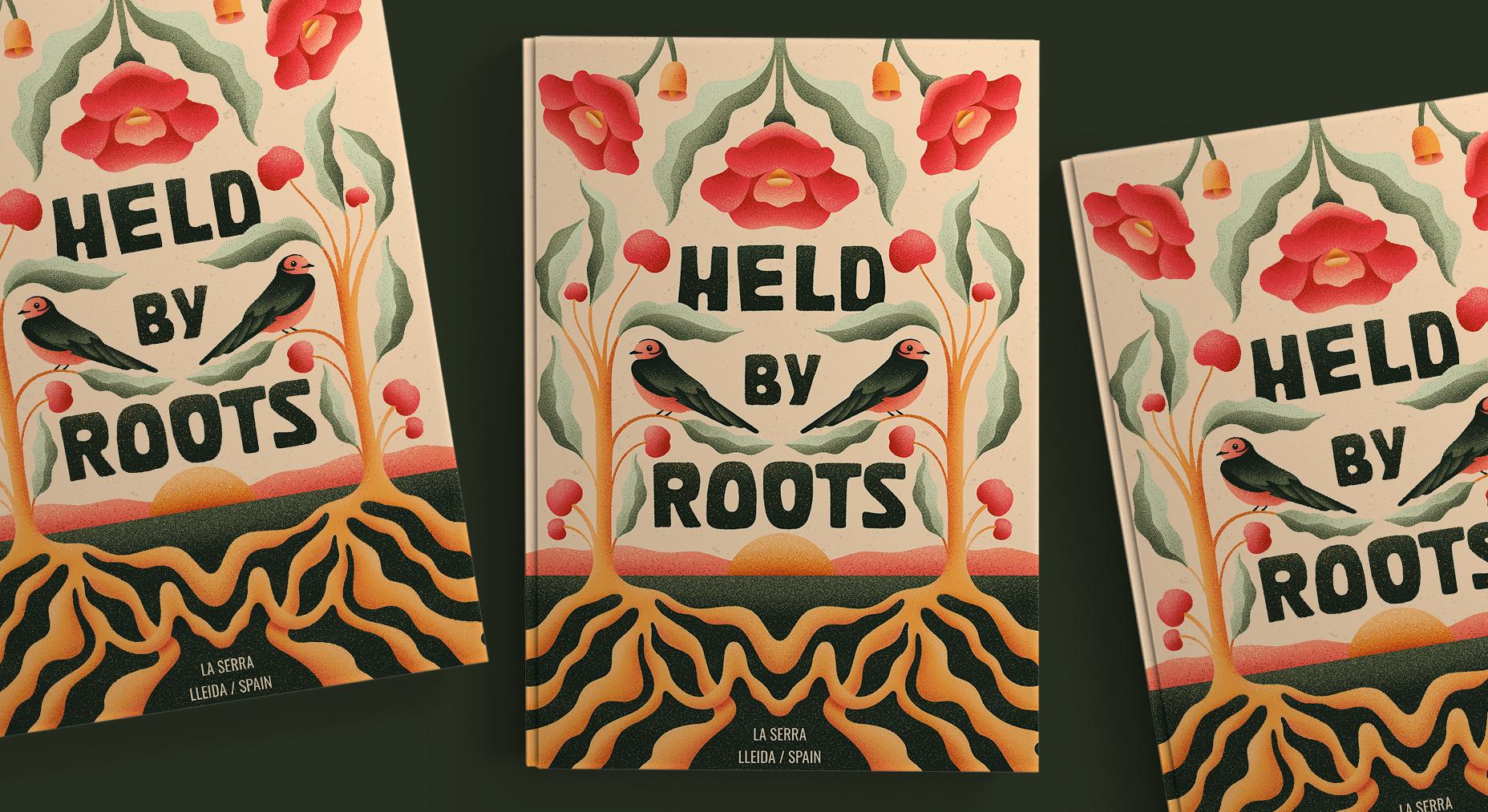
we're going to create a modern folk art book
cover Improcreate. This class is connected
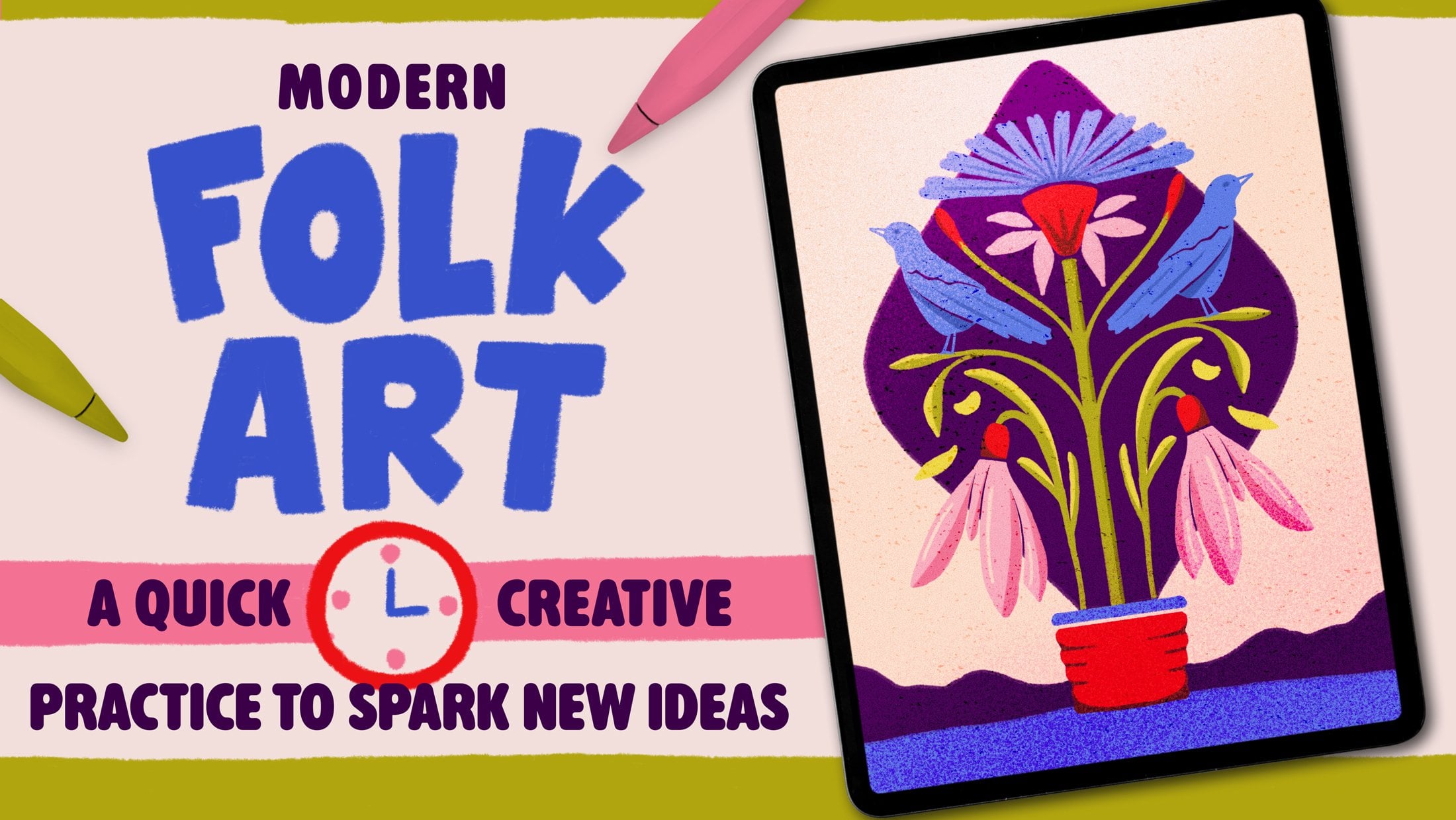
to my previous short class Modern folk
art Inprocriate, a quick creative practice
to spark new ideas. In that class, we used folk
art inspired shapes and motives as a quick
creative exercise that lasted about 20 minutes. In this one, though,
we're going to take that same visual language a bit further and turn it
into a more finished piece. We'll combine simple
lettering, roots, plants, birds,
flowers, and texture, and also personal
symbols to create a decorative book
cover style artwork inspired by where we come from. Phrase I'll be using
is Held by Roots, but you can totally adapt the project with your own words, your own plans,
your own animals, or any little element that
feel connected to your story. You don't need to be an
advanced lettering artist or illustrator for this because we will keep the shape simple, playful, and also accessible. And then we're going to
use color and texture to make everything feel
super polished and nice. So grab your iPad,
open, Procreate, and let's create a modern folk cart book covered together.
2. About This Class: This class, we're going
to create a finished, modern folk art inspired
book cover in Procreate. We will start by setting up
a simple book cover canvas, then we will sketch a very accessible lettering
composition using the phrase Held by Roots
and right after that, we will build a
symmetrical illustration around it with roots, trees, flowers, birds, apples, a sun, and a few little
landscape elements. But the most important part of the project is not copying
my exact elements. Idea is to use the
same structure as a starting point and then
think about your own roots. Maybe that means a flower
from your hometown, a bird that you remember
seeing as a kid, a landscape that feels familiar, a fruit from your family garden, or just a symbol that connects you to a place or a memory. Once the sketch is ready, we
will move into clean shapes, flat colors, secondary colors. Then we're going to
add grainy textures, speckles and final details. Class project, I would
love you to create your own folk card book cover and upload it to the
project gallery. You can follow my
exact composition or adapt it completely
to your own story. This class works as a
standalone project, but it's also a nice next
step after my previous class. That first class was more
about quick exploration, and this one is
more about turning that playful four card language into a finished illustration. You will need an
iPad, Procreate, and any brushes that
you like using. I'll be using the brushes
included in the resources, but you can definitely
go ahead and follow along the lessons with your own favorites sketching brushes, texture brushes, or
whatever you have. Alright, let's get started.
3. Setting Up the Canvas & Lettering Guidelines: Okay, let's create our canvas. And for this, I'm
just checking here. What are the
standard book sizes? Because I have no idea, and I wanted to do
it in inches today, just to change it
up a little bit. So I think I'm going to
go with something that I'm seeing here a lot
is six times nine, so I'm just going to
tap on the plus sign. And then yeah,
let's rename this. So it's going to be folk Roots. Okay, so now for the width, I'm going to go to inches here, and I said that I'm going to
do a 6 " width times 9 ". Now for the color
profile, right now, I'm just going to leave
it in RGB and 600 DPI, just so in case I want to print this as a
poster, for example. Then I have 49 layers,
which is good. I'm just going to confirm
this and let's get started. Now, the first thing
that I want to do is the lettering part, which is held by Roots. And as I said in the
introduction of the video, today, I wanted to do something
a little bit different. It's gonna be a book
cover of your own roots. So on this layer, I'm going to select a pencil. Any pencil that
you have will do. I'm just going to do my
guides. For the letters. So I'm just going to duplicate, make sure that the
snapping tool is on, and then I think the size
is going to be at about, I would say,
something like this. We can make it smaller later. Pinch these two layers together. Let's duplicate, and
then let's bring down. This is going to be
for the word roots. And then I'm going
to duplicate again, and I'm just going
to make it smaller with the uniform transform tool, and I'm just going to make
it something like this for the word by because it's
not that important. I'm just going to
center it here, maybe bring it a bit more
down just so it's in the center of this Great. Now I'm going to bring
the pasity down and I might bring it a bit
up, something like this. Okay, now let's tap
on the plus sign. And now, since we are
still doing folk art, I don't want to do something
super complicated. So these letters should
actually be super easy and accessible to everyone
that wants to make it without having
prior experience. So if you've been
here for a while, this is going to be really easy. If this is your first lettering, I think this is also going to be really easy. So let's do it.
4. Creating the “Held by Roots” Lettering: I do something very uneven, so it's going to be the first stem will be
something like this. Then the second one can
be something like that. We usually would do stems
the same if we were doing, let's say, stylized lettering or just anything else on folk art. But today, I just want
to do something that looks visually nice and it's really accessible
for everyone. Remember that folk art is by
the people for the people. So that's what I'm
going to try here. Now, here, I'm thinking that I can do
something like this. But then I can round
it up and give that very this nicer
and kinder touch, I would say that it's
gonna look kinder like this if I round it up like this. And I'm going to do all the same I'm going to do
this in all the letters. So I'm just going
to drop a color in. And that's gonna be my letter H. Okay, let's move on to the
E. So same old, same old. Just go to do a line maybe
a bit crooked as well. So not a lot, but maybe
I can do something from here and you see without
being super straight here. Let's make the stem and
then the horizontal stems. Yeah, something like
this will suffice. Now, let's round this up again. Perfect. And let's
drop a color in. And I said that the pencil doesn't really matter
because then I'm going to try to make this with one of the brushes that
I prepared for you today with the rippleizer
you probably have tried. So it's one of the
first brushes that I've ever done
created Inprocreate. And probably I've given it to you in another class or Okay, let's go to the letter L. Maybe a bit thicker up
a bit thinner down. And then here we do the
same we round it up. Drop a color in. And
we've got our letter L. Let's do that D. Okay. Now, I think something like
that will be cool now. We finish this one. And we drop a color in. Okay. We've got help. Now I'm just gonna go to the
selection tool rectangle, and I'm just gonna adapt a
little bit curting of this. Maybe the spacing. And now with the
snapping tools on, let's just center it until we see the
vertical yellow line. Great. So now let's
go to the word roots, and then we're going to
do it by in the end. So same as before. We're just going to try
to have a consistency in the weight of the
letters, but that's it. Well, the weight and these
rounded parts, obviously. Okay, so that's going
to be stem Damn. We can do a letter R like this. This can be like
some sort of circle. And then here also rounded
inside. And like that. Oh. Perfect. Let's do the letter. Oh, I think I'm going to do
I'm going to create one, and then I'm going to paste it here and I'm
going to rotate it. Let's see if it works.
Just do something a bit different than what
I would normally do. So I'm going to do a little
bit of an overshoot, which means that these
circular letters go on top of this X height. I could even do a font out
of this using Font self. So if you would be interested, let me know and I could also do a whole class about
it or a tutorial. Good. Let me just bring it
a bit to the left. And now Opa there. And now I'm going
to select it again, three fingers on the
screen, duplicate. And now flip vertical, flip horizontal,
and bring it here. And see what happens here.
Now with the distort tool, you can always distort it a bit. You can also use the warp tool. Okay. Gonna pinch this
together. I'm gonna do the tin. Maybe this one can
also be a bit thicker. Nice. And now we're around this bit, just to follow that same
style, paint it in. Maybe I can make
this a bit longer. Great. Now, let's do the letter S. A lot
of ways to do the S, but I think I'm going to
do some shape like this. Let's see. So gonna be
something like this. And then I'm going
to end up flat here. Yeah. Yeah, I like this. So let's
just add some thickness. And you don't
necessarily have to do the same letter as you can try out different shapes. Just let's try to make it consiste. Maybe a bit thicker. And that will do.
Let's now select it, bring it a little
bit to the left. Select this whole word,
three fingers on the screen, cut and paste, just to make
sure that it's in the center. So now let's move it until
we see the yellow line. There you go. Okay, we
can pinch it together. And now on a new layer,
let's just do buy. There. Let's paint it in and then
we can make it better after. That's good enough.
Maybe the holes can be a little bit more towards the center. Good. That's the letter Y. I think I'm just gonna do
this shape here like that. Do Yeah, maybe better like this. Maybe this should
be a bit thicker. Good enough. Let's select it. Bring it a bit to the left. And let's center it. Where is the yellow line? No, sometimes it's hard to see. There you go. Okay. Perfect. Okay, let's
just pinch it together. You can erase the guidelines, and we have our main letters.
5. Sketching Your Roots & Personal Symbols: Now that we have the
lettering in place, we're going to start building
the illustration around it. The roots will be the
base of the composition, and from there, we
will start adding simple folk art elements
around the lettering. I'll be using trees, apples, swallows, poppy flowers, a sun, and a few landscape
shapes inspired by places and memories
connected to my own roots. But obviously, you don't have to use the exact same elements. And before we
continue, I wanted to tell you that the
goal is not realism. We are still working in
a folk art inspired way, so we will simplify everything into easy
decorative shapes. Let's start sketching the roots and building the world
around the lettering. Now, let's start with
the illustration. For illustration,
I'm going to start by going to actions Canvas, drawing guide, edit
drawing guide, symmetry, and tap
on the blue button. And let's get started here. So I'm going to
create a new layer, tap on the layer, and
make it a drawing assist. Now, here, I'm going to do a line that's going
to be my horizon. Maybe I can break it
down a little bit down. Something like this.
Perfect. Now here, I'm going to do I think I'm going to
start with the trees. So very simple trees. I don't want to complicate
this illustration a lot. So I'm just gonna from here, I'm just going to
go down like this. Here, just making sure
that the tree is in between the letters and
the margin of the page. So this distance is the same. More or less. Okay. And now I'm going to start
doing the roots. Now for the roots, I want
to do something quite free. So I'm just going to start
adding some lines here. So, for example, I'm going to
finish this one right here. Then I'm going to go down. And I want to do
something very groovy. Like this. And every root will be together
with the next one. Right now that I
have these ones, I'm just going to go and
make this central one. Okay, now from here. Something like this. Let's see. Okay. And then Great. Perfect. We have our roots, and this could be the element
that we all have in common. And then from here up, I would encourage you
to go to the last. And for the upper part,
I would encourage you to look back at
your roots and see where you come from and
certain elements or objects or things in nature that you think they
define your roots. I might do these trees a
little bit thinner, actually, just a little bit,
something like this. I'm just gonna do
these lines up. And here, I'm going
to do the apples. I'm not going to
try to do something realistic, so I'm just
going to do this. And then place an apple here. Again, I know this is not how it works because apples
are kind of hanging. They're not just
floating like that. But since I'm doing folk, I wanted to have this representation of the
apple without being realistic. Now, here I'm going to do
a few leaves of the ones that we also did in
previous tutorials. Then I know the leaves in the apple tree are
not like that at all. So actually, I'm just gonna grab this whole
thing, all of it. I'm just gonna make it smaller I'm running out of
space on the left side. So it's just gonna,
maybe better like this. And even the letters can also
be a little bit smaller. Yeah. Okay, let's continue. Now I
think I'm going to do it at about This is gonna
be my last leaf. Then there's gonna be one here. Then here there's gonna
be an apple right here. Maybe here. Yeah, actually,
let's bring this down a bit. Something like that. And
then here I might do a leaf that can
cover the letter H a bit, something like this. And then here I could
do the swallow. First time that I actually draw. But if I do a head like here, and then the beak can
be somewhere here. I could do an eye here. Have these two colors as
well on the head, I think. So it's And then again, it has to be a
little bit abstract, doesn't have to be
super realistic. I'm just going to make
it a bit smaller. And it's kind of
like chilling here, so I'm just going to
go the belly here. And this is one of the wings. Something like that. Great. I'm just going
to erase this one here because this is something that I don't like
about Procreate. I feel that when I select when I'm using the assisted layer and I select a part of the left, it's not selected on the right, which I really don't
understand why. I think that would be an option that they could
put in the future. So I'm just going to
duplicate this one, flip it and bring it there. Yeah, something like this. Okay. Nice. Now, let's do
this leaf better. There you go. And then this Apple This live right here. And maybe it can be
another apple here. I actually gonna select
this one right here. I'm just gonna
bring it more down. And again here. I'm
going to do the same. Again, Procreate, if
you're listening, do something about this because it would be nice that
there is an option. Like mirroring all selections, go both sides,
something like that. That would be nice.
Okay. So sunsets, yeah. I'm going to create a new layer. I'm going to do a circle here. Just gonna tap with my
finger, so it's perfect. I'm gonna place it
here. That's it. Now with the rectangle selection too, I'm just going
to select this part, and I'm just going to erase it, pinch together, and now in
the same assisted layer. I'm gonna do just a little
bit of hills here. Very low. Remember that I live in
a very, very flat area. Well, I live. I don't live. It's just, you know, I
always say I live here, but I don't live here.
I live in Croiti. I don't live in Spain. So Okay, that would be 70% of the sketch. So now I'm gonna rotate this and I'm going to make
the poppy flowers. So let's do it. Now I'm gonna place it
somewhere here in the middle, the main one, and then I'm gonna copy it to
the left and right. So I'm going to start
with the lower part. Well, first, I'm just going to say this is gonna be the flower. So also, remember that my flower class will help you create these flowers
from geometrical shapes, which is kind of like my brain kind of allows me to create
them better like that. So something like this. Yeah, let's make
this bigger here. There you go. Now here shaped like this. I'm really trying to
simplify this puppy flower. I don't want to make
it look so real. We are still in folk art. Maybe even this part
can be bigger. Yeah. And then here, just very basic. From here, I'm just
gonna do some kind of pedal. And then the same here. And then right here
in the center. And that would be it. That's skin. That is my flower. Now something like this. And finally, two leaves.
I kind of hug it. M. Perfect. Now, let's select this with the free
hand selection tool. I'm just going to select
this part right here, T fingers on the screen, duplicate ring here, snapping options off so
I can rotate it better, make it smaller, and rotate it. Something like this. And now here we'll do, like, one that didn't bloom yet. Since there's lots of
them like this still. Yeah, it tends to look
like this everything. Now I'm going to duplicate this. If you want to duplicate
something and bring it there, knowing it's the same spot, you can always do a line like
that. Then duplicate it. Go to the flip
horizontal snapping on and bring it there until this line touches the
margins of your page. Now you pinch it together
and you can just erase it. Let's pinch it all together. And that would be it. Now, maybe this one we can
bring a little bit more down. Maybe this one can
just be bigger. Now we have to erase this one again and do it again
like we did before. Duplicate. I'm just gonna place
it down more or less, but use the technique
that I told you. And that would be my sketch. Now we're going to select the brushes that I'm giving
you the monopleizer, and we're going to make this clean and then add
colors. So let's do this.
6. Rendering & Color Blocking: Okay. I've added
a couple things. Maybe like this
Apple wasn't here. But yeah, that's pretty much
the same that I did earlier. So I'm just gonna let me just do this leaf that I just saw that goes completely
out of style. Sorry. Here. Okay, awesome. So I'm just gonna tap on the letter and
bring the opacity down. And I'm going to
create a new layer, tap on it, make it
a drawing assist. And now I'm going to
go color by color. So for example, I'm
going to start with the trees and go to
the color palette. And for the trees, I'm going
to go with the yellow. The second yellow right here. So for doing this,
we're going to use either the isopen
or the mono ripeiz. You're going to see that
both of them will give you a different texture. I think I'm going to go
with the mono ripalizer, but again, you can do
whatever you want. It's going to look
good with both. And let's just render this. You're going to see that
since it's a monoline, it's gonna be
really easy to use. There is no pressure to
be added or anything. And it also has the
drawing assist. Well, the stabilization
and the streamline on, so it's going to
be easier to make curves way easier than
it was with the pencil. So let's make all
these roots and the tree the same color. I might add some texture after, so the ones underground
can be a little bit more. I don't know. Like
brownish, maybe. Almost done with the yellow. You're going to see that I
left in the main sketch, I left this part right here. I think I'm going
to put the location of everything that's going
on, but it's a book, so you could also put the author or some info that you
think it's relevant. Okay. For now, I'm gonna keep
these lines yellow, too. And I might paint
them after a bit. Maybe I shade them a bit.
Great. Let's drop a color in. Continue feeling here. And we will have
the yellow color. Now, the second color
that I'm going to add is going to create a layer
underneath the yellow. And with the rectangle, I'm going to select
the ground here. And I'm going to drop
this green color. Now, I will do the
same with the letters. And I think I might just leave
these letters like that. I kind of like the texture
that the pencil gave. Great. So now let's go
onto another color. We could do, for
example, the green. So tap on a new layer on top of the yellow and
make it a drawing cyst. Third green. And out here
we're going to do the leaves. So again, make sure
that it's assisted, and let's render the leaves. Real easy. We're going to do the line
first as in the yellow one. And then now it's also a
good opportunity to fill up more spaces if you see that the sketch is
not enough in a way, right? So let me show you. You could always do something
like this. Let see. It kind of goes a bit further. Great, let's do this now. Let's do the one
covering the letters. Let make sure that I cover
it better so I don't have to worry about it after. Okay, let's do Maybe this
part can also be green. And then this one. Okay. Tap and continue filling, and let's fill this one up. Now we're going to see
elements that gonna repeat, for example, sorry, I
forgot about this one. Good. So let's
create a new layer. It's better when you do
the circular elements in the middle to not do
them in a layer that is mirroring because it kind of gets kind of hard to do
a circle in the middle. So fill it in. And now go to
the background, tap on it, select, go back to the sun, three fingers down.
But. Perfect. Now you can join the
yellow with the yellow. Now that we're here, I'm going
to create a new layer in between this ground
and the yellow. And with this orange and
remember to put drawing assist, I'm going to create
this little hills. Make sure you close
it. Whatever. And then, again, go to this background or we can just bring the orange
down, actually. Yeah, maybe better like that.
7. Rendering The Second Half: Let's do the bird. I'm
going to go to this layer, the one with the ground
and with the same color. I'm going to do some
parts of this bird. So I'm going to do
this part right here. Let's make it a drawing assist. Sorry for that, I always forget
you will see that in most of my classes and tutorials, I always forget to put drawing assist, and
then I have to redo it. Okay, now here go shape. Something like this. I have such good memories
of these swallows coming to my grandpa's
place always in summer, they were so cute. Okay. God. Let's fill it in. Perfect. Now we can do the eye with this
little light here. The little reflection
on the eye. Then maybe with a smaller brush, we could do the big that. Cute. Okay, maybe the zero. Just like this.
Maybe a bit thicker. Okay, perfect. Now, let's
go to the orange layer. It's assisted, so it's great. So like the orange, and let's
do this part of the bird. So just a circle here,
drop a color in. Let's erase this part. Now, let's do the belly. Close up the shape, drop it in. Brilliant. Okay.
We forgot a leaf. Okay, so let's go back
and let's do this leaf. Britton. Okay. What
else can we do now? Let's go to the yellow, and we're gonna do this part
over here. Just this one. Great. Now, the apples. So on a new layer, I'm gonna tap on it, make it dry and assist. And with this red, I'm going to do the poppy
flowers and the apples. But first, I'm gonna bring the sketch on top of everything, so now I see the lines better. Okay, I to the apples. Sorry. Okay. Really? Let's
the puppies now. We could actually use this flour there as well. So
maybe we can wait. Or, you know what,
let's render it. But then when we add some
effects in this one, we can just put it on the sides just so
we save some time. Okay. Now I'm going to bring this
to the background right here. And then I'm going to tap, select and go, for example, in the green, you see that
now the green came up. So go to the green, three fingers down the screen and cut. So now we're going
to cut these parts. And we could do the
same with the yellow, but I think the yellow
is kind of good that it kind of enters the apple. Perfect. Okay, so now go to the orange layer and I'm going to do this
part inside in orange. Again, you could do
it here. No need because we're going to
copy the first copy. But this would be good if
you want to leave it flat. Sometimes leaving
these illustrations flat is a good option. You can just add a
final effect layer, some texture. That
would be enough. Great now. O. And now finally
on the yellow layer. I'm just gonna add this
little detail inside. And this one, too. Okay. Now, I'm just going to
go to the drawing cyst. The drawing guide, I'm
just gonna turn it off. It's still gonna work, but I just don't want to see
the line in the middle. Perfect. Okay, now for
the background color, I'm going to select
this color here. But I think the white was a
little bit too aggressive, and I think this is gonna look. A little bit more fulky.
I really like this. Great. So now I'm going to
add some secondary green. So I'm going to go
here on the green, create a new layer, tap on it, make it clipping mask. Now go to this last green. And then I'm just going to do half of these leaves
using the second green. Wait a moment to close it. And, of course, and exactly
like I told you before, I didn't make it
the drawing assist, so I'm just gonna finish this. And then just copy it
on the other side. So let's do this. Continue feeling Great. Now duplicate this. Go to the Transform tool with the snapping on,
flip horizontally, and just bring it here. Great. Pinch it together. Perfect.
8. Adding Details & Textures: That we have the
main illustration blocked in with flat colors, it's time to make it feel
a little bit richer. In this part of the class,
we're going to start adding grainy textures,
shadows and highlights. Also, a good thing to remember
here is to zoom out often. Sometimes when we
are adding texture, we get obsessed
with tiny details that nobody will really
see in the final piece. So try to keep it simple, look at the whole
cover from a distance, and add just enough texture to make the shapes feel alive. Okay, so I think
I'm going to start with the poppy flower. So I'm just going to go to the red color, add a new layer. Make it a clipping mask. And then here, go to
the grainy builder X. If you have the
graners gonna be way better because you can use
from the max to the Jax, which is similar brush, but with less intensity, the max has just a
few grain speckles, and then the Jax
has a lot of them. But I think with this one, you will be able to do it anyways. Okay, so I'm going to
start with the shadows. I'm going to go to
this color right here, and I'm going to start adding some shadows on
this part inside. So for this, I'll do one thing. Let's make it smaller, and we're going to start
with this here. Make sure that this
is a drawing cyst as well before I forget. And I'm going to start
adding grain here. Just on this side.
Just like this. Now, with the eraser and
also the monopleizer, I'm gonna cut here.
Let's make it here. Gonna cut right
here. Great. And now I'm gonna add more down here. And let's cut all this
that we don't need. And now I'm going to add just
a bit more on these sides. And let's cut again. You gonna see that by
cutting it like this, we're gonna give some
depth to this whole thing. You see? Perfect. Now we can add
some grain maybe here. Or maybe here. Yeah, exactly. Let's
do it on this side. Doesn't have to look
realistic like this. And then we got it. Let's do it maybe smaller. Nice. You can see that now
if you turn off the sketch, you just have your texture done. Now, you could do the
same but with lights. So on a new layer, make it a clipping mask and a drawing ist. And we could try maybe
with this one right here, and we could add some lights. Actually, yeah, let's
add some lights up here. You could alternate between this and I don't know, T yellow, for example, just so it
looks more interesting. There you go. Now you
could add a bit here. And you're gonna
see that just by doing these simple shapes. And with the grain,
you're getting something that
looks really cold. Now let's a bit here. Cut. And finally, a bit here. And we have part of this
flour looking good. Okay, now let's
go to the apples, and I'm going to do the
same first the shadows. Let me just make this better. Good. So I'm just going to do
this apple right here. Here, I'm not worried so
much where life comes from. I just want something
that visually looks good. Let's erase this one, and Also, I don't want to add so much grain that
it looks realistic, like some of the illustrations that I've done in the past. I just want to add enough. So it kind of looks nice for the cover. Now remember that. Book covers are not that big, so you don't have to
add a lot of detail, actually, for it to look good. Oh Great. Now, remember that the puppy
is going to be copied after. So no need to do
anything else there. Let's go to the greens. Now on the greens, we're going to do something a little bit complicated,
just a little bit. So first of all, I'm gonna tap on the
main green, tap, select, invert, and then
go to the clipping mask, three fingers down
the screen, and cut. Now, if you say that this is
not a clipping mask anymore. You're gonna see that we
are gonna get this shape. I don't know if you
see it in the camera, but do you see it? So let's do it
again, just in case. So now you can see that if we were to release
this clipping mask, you see that it goes all
over the place. You see it? But if you release the clipping mask first and
then go to the main green, tap on it, select and invert, everything that is outside the
main green will be erased. So now go back to
the lighter green, three fingers on
the screen and cut. Now we have the two greens
working separately. So we can create two
clipping assisted masks. So tap clipping mask,
tap drawing assist. Now let's start with the
shadows of the green. We're going to go to
the darkest green and add some grain in here. Let's make it a bit bigger. Just go to add a bit everywhere and then target this inside. Now we could do this here.
Well, make it darker. Great, Let's do it
everywhere now. And for some reason, we
have the yellow here. I don't know what I did. So I'm just going to go ahead and with the automatic
selection tool, I'm going to select this color. Yellow here, three
fingers on the screen, cut and paste, and
this yellow will go with the original yellow. Okay. Now we can do it. Let's add some dark gray here. And let's continue. Now, you can always select
with the friand tool. You can select one
of the leaves. So you can add grain without
touching the other one. And you can see that as
I was saying before, sometimes when you select
things that are in an assisted layer,
it doesn't go there. So I'm just gonna select
this part and do it again. Okay. Brilliant, let's go and
create a new layer. And with the lights, I'm just going to add a bit. Just a bit here. Not much because we already have the light
on the other side, just to give that nice texture. Do Let's now add the lights. So let's create a
new clipping mask that is also drawing assist. And we're going to
add some light here. Not much because we already have the lit up part just to
give that nice grain here. Now, let's go to the lights. And I'm going to do the
same with some shadows. It's nice because
if you add a bit, kind of blends here
in the beginning, and it's kind of nice. So you can have
more done here and then less up. Okay. Now, I forgot to add some
lights on the apples, so I'm going to go to the
lights and just add some light. Nothing fancy, just a bit.
9. More Shadows & Highlights: Great. Now we go to
the yellow color. Clipping mask for shadows and
clipping mask for lights. Remember to make
a drawing assist. And let's start
with the shadows. So I'm going to
go with this one. And on the sun, just
some light shadow here, you could even go with an orange color here at the bottom, just to make it a little
bit more interesting if you want and maybe even
super dark down. Say, done. Great. Now, let me erase
this part here. And for the roots, you
could do the same. You could do just a bit
on this lower part. And then after, you can
just go with the orange. Then here, for example, we can say that this
one goes on top, so I can add some
shadow like this, even with some darker color. And now we erase it. Really simple. And
let's continue. I'm going with the
orange directly because the yellow
is not that visible. Now, here I can add
shadow in here. And then also here. Sorry for the noise outside. Today was just such a good day not to open the window and
everybody's screaming, so for sure, you can hear them. Nice. You can add a bit
of dark, as well. Just a bit, not
much. Just a little. Yeah. Just a bit for each root. Okay, brilliant. Now let's add maybe some lights
on the new layer. Oh. On the opposite side, it's real easy. With the grain, it's very
important that you zoom out and you check it from afar. Because sometimes you don't
see what you're doing, and you're adding maybe, like, too much detail and
then from afar, you can really perceive it. So now, here you
could do the same. So as we did before
for this shadow. So just that this slide
here, and erase it. Oh. There. And I like this technique
because you'll see that out of very simple
illustrations, you get something that is
actually visually attractive. Okay, almost done. Just a bit more Okay, let's add some light
on the sun, too. And we're going to continue with some shadows here on the tree. I'm going to do this
side inside here. So, the one closer
to the letters. And I'm not gonna worry
much about the branches. Because otherwise,
it would be, again, too much detail that we
won't see from afar. So now a bit of well, we can add maybe,
like, this bit darker. And maybe this
one's on this side, the branches can be also darker, and then the other
ones can be lighter. Yeah. This could look nice, too. And then with the
light color, let's go. Oh, I was adding
it in the lights. Anyways, I'm just going to
pinch these layers together, the shadows and
lights everywhere. So you also have more layers after for facts, for example. You can see that sometimes when you're into the illustration, the process can get a bit messy. Okay. That's it. Let's now do this
part, for example. And for this, I think I'm just going to add maybe some grain first down here. Oh. Cut. A add more? Perfect. Now, we can add a
bit here as well. So we could add some shadow. And then we can cut this. And actually, on a new
layer, actually better. Let's create some
light right there. You can cut it. And you can see that now you
see the difference here. You can just pinch it together and then add a bit
more down here. This will be good. Now
let's go to this part. We still didn't
create anything here, so I'm going to create
clipping mass on top and make it a dry and ist. And Just go to add
maybe some shadows here and some lights down. Perfect. Now, let's do this part here, so I'm going to add
shadows in like this. And a bit of light outside.
Just a bit. That's it. Now, the yellow is also
missing some light. You'll see that
when you have fun, the order of things really
doesn't affect the outcome.
10. Texturing Birds & Background: Perfect. Let's do the birds and a bit of the background,
and we are done. Now for the birds,
I have sketch here, so I'm just going to go to the I'm gonna select the sketch, go to adjustments, hue
saturation and brightness. I'm gonna bring
the brightness up. And in this way, I can see
a bit of these feathers. Nothing much, but I just I'm just going to
add some lights. So let's go to the birds new layer clipping
mask drawing assist. And here with green, I'm just going to add
a bit of green here. Like this a bit. And then I'm going to erase it following a bit of these
feathers that I have. Doesn't have to be exact because I don't see them even much, and the sketch is not that good, but just a bit, just so we
have a bit more interest here. And then on a new layer, also drawing a cyst I'm
going to do the same. So I'm going to add some
light maybe down here. Hmm. Actually, let's start here. So I'm going to add
some light here. And I'm gonna cut it.
Same, same technique. And I'm gonna do
the same. Got it. And same. Got it. And same down here. Nice. You can see that. Now we've got some nice visual
interest here. If you see that it's too little, you can always duplicate
this three times, let's say, pinch it together, and now you're going
to see it better. Nice. Okay, now we can
go to the orange part, and I'm just going to
add a little bit of a shadow somewhere
here and on the head. And with a darker color. And even a bit of light, maybe with this yellow. Again, the cos. And we have a nice looking
bird in 5 minutes. Let's do this background now. Sorry, with the dark color. Maybe we can start
with the second one and then go to the darkest one. Darker. Don and
now bit of light. We can add a bit of green
in the letters, too. Let's try different colors. So maybe second green. Maybe on the top of the
letters. Just a bit. Not a lot. You could try maybe with yellow, but I don't think
it's gonna look good. Well, we can add a bit just like that. Perfect. And now in the
background background, I'm also going to add some
lighter green on top. And we are done. Now, we can just copy this one. So one of the ways we can
do it is by isolating it. So if you press here on the red, you can do this until you
have the whole flour. And then this one, turn
off the background, go to actions at Copy Canvas. Now, if you press here without lifting off
the pencil again, it's going to come back
to your original layers, activate the background, and now go up on everything else. The fingers on the
screen, paste. And now you have this flower. Now you can just select
it with a free hand tool. Let's do it again.
Just the flour, invert, three fingers
down, and cut. And now the only thing
we have is this flour. Turn off the snapping tools, rotate this, and adapt. Duplicate snapping tool on, flip horizontally, and
just bring it there. Pinch together. We can
leave it like this. We don't even have
to put it in order. Okay. Awesome.
11. Alternative Brushes & Small Text: Now, you've got some more textures that
you could play with. I put these two here that
are pretty cool that, you know, let me just show you, but this one the basic
pestil light to dark. So basically, when
you pick a color, let's say you put it here, when you lift and you go again, it creates the shadow, and it's something that
I've been creating lately that I found
really interesting. And for the other one, for the dark to light,
it's the same. But The more you lift,
the more light you get. So I just put them there for you just so
you can check them out. Maybe you can add some
textures to that, too. And then we've got
the large texturizer included in my rough
and Row two point oh. You can maybe even
with a white color, you could add an
overall texture here, for example, or maybe
in the background, you could bring this
to the background. There you go. Background
background here. And then with a darker color, you can just add a texture here. I don't think I'm
going to use it right now because I like the kind of the clean
background that we have here. But you can use those. Also, the emboss imperfections that I used in one of my sets
to create some embossing. But in here, you could
create a bit of grain. So also, if you have a layer
underneath everything else, you can add some of this grain
here on the empty places. You can always add it here on the background
like this a bit. It's like these peckles.
Yeah, not grain, but like this kind of
speckles, paints speckles. And then you can
bring the opacity down or just play with modes. I might just let a bit
like that, and that's it. Actions, copy canvas, go
on top of everything else, three fingers on
the screen, paste. And now here I'm going to
add just a bit of noise. And that would be my cover. Now, the final
thing that I almost forgot is to go to Attext. And here I'm going to put a ser. This is a park that's a
natural park that connects a few towns, and
there's some lakes. And again, it's not the
prettiest sit on Earth, for sure, because
my hometown can be, like, really dry, really flat, but there is some
really nice sunsets and some nice colors there
and animals and plants. So yeah, Lacera down here I'm going to put Leda
and then Spain. Great. Now I'm going
to go with maybe, with this like color,
bring it down. And obviously, change the type
because this is not good. Now, if I made the type
with the folk one, that would have been cool,
but I don't have it yet. So let's see what can go. Mm. I don't know if I have something That is a bit more. I think this will look cool. Okay, and this is
the final result.
12. See You Next Time!: Okay, that's it. We created a modern folk art book
cover in Procreate. Remember that we started
from simple lettering and build a whole decorative
illustration around it. Now I would love to
see your version. You can follow the
same phrase Held by Roots or change
it completely, upload your finished book
cover to the project gallery, and feel free to include a little note about the
symbols you choose and why. Also, if you like the
class, leave a review. Thank you so much for
taking this class with me, and I cannot wait to
see what you created. See you later. Bye.
 Jimbo Bernaus - Shoutbam, Letterer & Designer