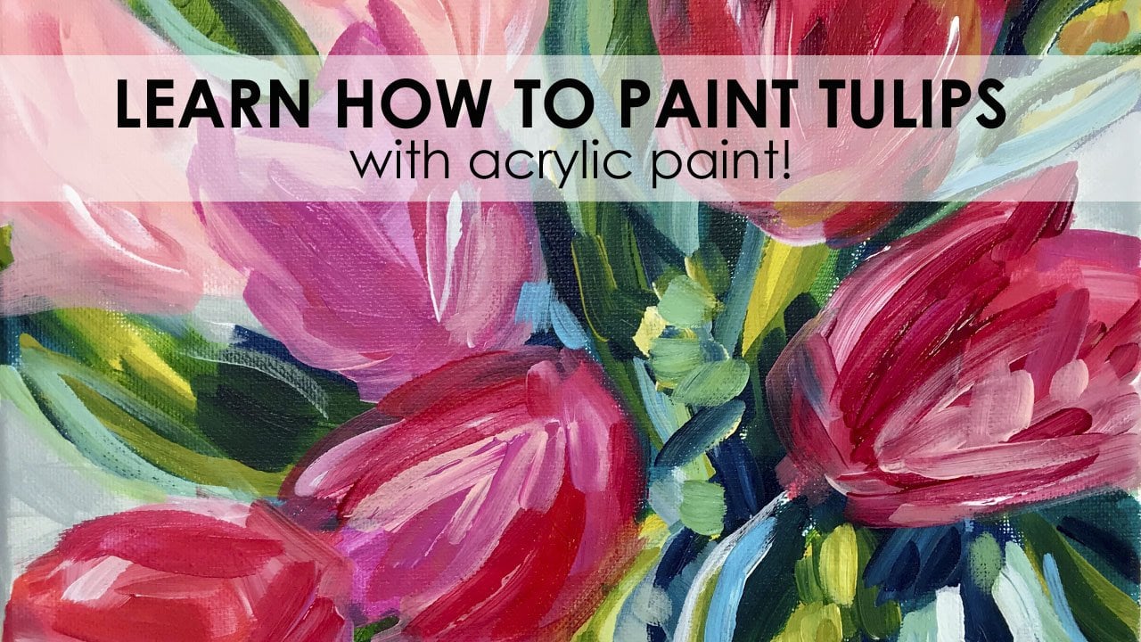
Transcripts
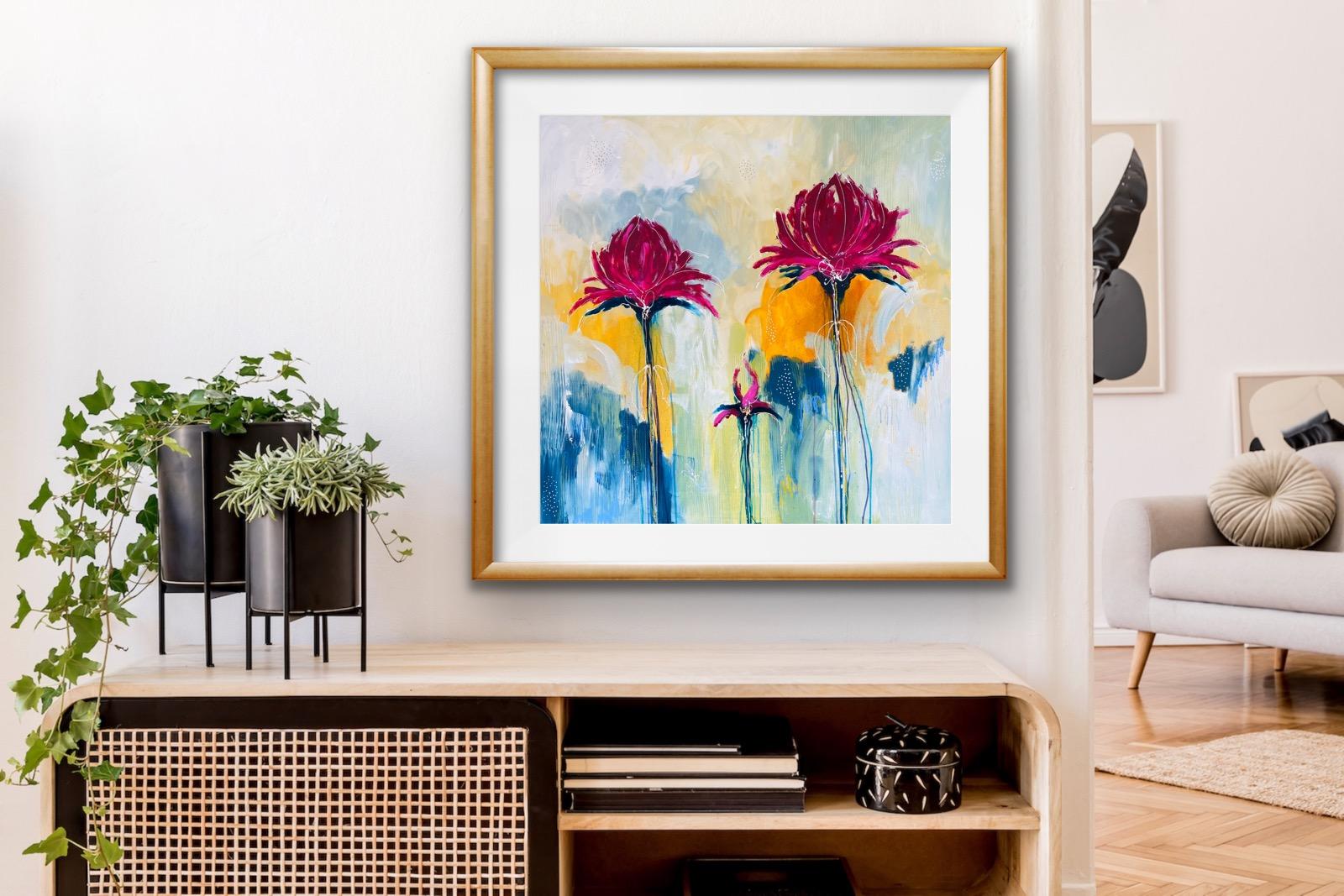
1. Blooms Intro: so Hey, guys, I'm mourner on I'm a practicing artist and welcome to my new skill share class. So I'm really looking forward to teaching you how to create modern abstract blooms in their series of short videos, which is what this workshops all about. I've taught hundreds of students this technique on canvas and on paper, and I'm really, really excited to be here doing this with you at the moment. So we're going to predominantly be working with acrylics and mixed media and some other really cool tools, which you've probably got time already. But we'll start the class off the breakdown off the supplies on just a chassis by on all of the materials and the paints that we're actually going to be using before we go into the real time demonstrations. So we'll talk about paint will talk about transparency. We'll talk about layering on Will also teaches him to so that you can actually create something like one of these stunning blooms, which are really, really popular with her workshops when students actually come to the studio so really excited. Really glad that you're here and yeah, let's let's go get cracking with it catalyse
2. Blooms Tools & Supplies : Okay, guys. So before we get started jumping into the actual workshop for the blues, which I finished here beside me, let's just talk a little bit about painting supplies. So with the paint, I'm not loyal to any specific brand. I just basically use whatever I could get my hands on time. The one thing that I would use a lot off is a thicker body. White use quite a lot of what, So there's lots of different brands there on the market. I'll talk a little bit about a few of those. I love you. So the Australian Matisse brand is one of those, and I'll get a close up shots coming up on the screen set. But you can buy in a couple of different ways these air quite large 250 million pops that I've got, and although they look the same, they're actually quite different. So the one on my right is a heavy duty structure. Paint, which is a thick in pastoral, buttery piped, and if I was to turn upside down, it would stay in port on. This is also a solid, opaque color on the way that you would know that is that on the actual labels with a lot of pain? Friends, when you go into the art shops, have a surf Laura Square. If the circle of the scroll is completely blocked in, it means it's a Paige color, which means it's really thick and you cannot see through the layers, and it will cover anything up. Um, this other one that I've got in my hand is a back ground Jesse from A T's. So although these look the same, they're very, very different. This is a much thinner consistency paint, and I use this a lot to say a bit of money when I'm actually leading a background on. I want Teoh spend as much money on the paint, so on the side of the actual parts for Matisse, it will. Actually, it's sort of, on a aside, it's it's written structure or background, and that's how you know what you're actually purchasing. And these are probably about a fraction of the price in Australia to what the actual structure painters, the other point that I really love to use and it's a global brand. It's actually golden, so I used the golden product. The fluid is one of my favorites because we can get some beautiful layering techniques, especially on the stands off the blues, and you'll actually need a fluid running consistency. Paint to do this, and I find that these work really well, and we'll go into that a little bit more detail while we go through something again with Golden Brand. I'll get you a close up shots on the set, but the primary magenta and teal or two of my favorite colors, their primary magenta. When you look on the labels off the golden, just above where the name of the paint is listed, you'll see a sort of a color swatch, and they have some black bars across the top of the color swatch. If you can see the black bars quite clearly, it means that it's more of a transparent pigments, which means that you'll actually be able to see the beautiful layers underneath. If you were going to use a transparent paint, the teal is a more paper paint, which means that if I was to put the teal over the top of something on here, I would completely obliterate what's underneath, and you wouldn't you would only see the teal. So that's just a quick snapshots of the differences between a Pake on a transponder pigment on again with the golden brand. This is the fluid, and then you can also get a thicker structure paint, which is what I have here in my hand, a smaller tube so you can buy. These is while the highly pigmented on they come in a few different sizes. So we actually like using those, um, and then the other thing that I do love to sort of play around. I love metallics, and the golden iridescent find gold is one of my faiths, and I use that in size, a fine line application bottle. And that's how I get some of the art lines on the detail ing circles in the perfect little dots on these paintings, which is really cool on A lot of my students just love days. So again, I'll show you a close up shot of this, but you buy the applicator bottles entity on, then you can fill them with high flow or a fluid paint. Not Inc. Because it will just blood all over your paper. Your canvas. You need to have a sort of a fluid paint, which is in between the thick stuff from the thin stuff, and when you open the little knees up, it's actually a needle tip point on the needle tip in the lids on there is a needle tip that you actually have to get back on. Make sure that you put that back home when you're actually unfinished. Otherwise, your paint will dry up. But the's are amazing to to use in your mixed media paintings. You can use them on paper canvas panels. They're one of my go to tools for getting my circles really detailed line. They also come in a fine tip, this yellow one of standard. But there is a blue sort of colored Papua's. Well, that's actually a lot finer again for getting really, really fine lines and details. And that's just a little bit about, um, the other thing. But where we're going to be using is hands, so I use my hands look for everything, So if you're not a fan appears in your hands, get some gloves on wear plastic gloves. But I actually do a lot of painting with my hands, so they're normally pretty disgusting in a grubby, but I'm quite some Hansel. I love to sort of get my hands in amongst the pain, which is probably not the best thing to be doing anyway. The thing that we used to put backdrop grounds in with this is a U. S. Product. It's actually called a poly brush on. It's made in America and the poly brushes you can normally buy online for about a dollar. And this is sort of medium size Polly brush. There is a thinner one on. There is a wider one. I find that this is a lot more to manipulating. Move the paint around with on. I'll sort of show you the technique for the brushes. Well, you don't paint a fence with these. You actually called in them vertical to the paint when you actually applying thick paint so you can have a bit of fun with these and thes air. Really versatile new commercial. Use them again and again until they start falling to pieces. So that's the holy brunch. The other one that I might use is I just might grab a thin acrylic brush. This is a rhyme size 10 or you could you even use. A hard bristled brashness is in the acrylic one, which is a little bit stiffer than watercolor, but it's a lot less stiff on the toilet brush or a whole expression bristle brush on. If you don't get the blinds on your stands, you can actually cheese a little bit. I'm actually dip this into U high flight paint on Run a line down the stairs. So that's the only thing really that reduce that brush for in the whole process, which we're going to go through to actually get texture into your painting. I'm just gonna show you the tools hybrid juice. So when I find a lot of thick paints, I would actually use one of these kinds that you can buy from the supermarket. They really treat a couple of bucks again for one of these, and this is why we get the texture lines through your actual paint to show what's underneath. If you have bean one of the art shops, you might actually find some of these tools with the teeth of them as well, in different varying wits and levels and sort of shapes on. Some of them have got triangles in the bottom of that. Some of them have got grooves on you can, actually also by these a bit like basting stick, and they've got a handle on them on. You can use a little bit like a paint brush, and I do use those them in the back studio moment. Three. Other thing that I would pull texture and paint off with would just be a normal bamboo skewer. See that? So I think these are pretty cool. Really treatment again you've got it is probably in your kitchen on. Then, towards the end of the process, were actually finishing off the painting. I would I would actually be using some thick, chunky six B or B graphite pencils just defined lines in the actual blooms on the petals. Not too much of that going on, but I would have a graphite pencil and by those in any office works. You get them in unnatural, but these air another that trunk here than what you would normally buy. I just find that really nice to hold when you're actually trying to get a loose organic line on the painting. And then I love to use the the Neo Karen Dash to water soluble crowns thes again. I can do this even if you could actually screwed belong to your campus with these. And they will work really well with water media's well so you can leave them dry as dry media like a crayon ma with texture. Or you can actually get a clean brush with water and actually use them a little bit like watercolor paints with activating the water. So they're really, really nice, and I love using nice. The other ones that I would use at the very, very end would be this nearly a oil pastel, and I'm just going on a threat. Include a few of these beautiful oil pastels, which are really nice and soft and buttery and waxy into a couple of spots on my blooms on . They just really would live painting a very end. I'll show you a close up of those as well, but you don't have to stick to similiar yet lots of other different brands in the market. But I just I just seemed Teoh there and then a rag, so if you have a rag, I would have a rag handy because drugs really good for driving paint and getting some really cool effects. So I think that's most of the sort of tools covered. And I'm really excited to be doing this with you. I'm really excited to see what kind of blooms projects you actually produced on the off the discussion group yet I'll see you soon.
3. Painting The Background: Okay, guys. So welcome back. And we're now onto starting painting the background. Andi, I will post a quick video at the end of this with an image of all the paints again, just like at the front there. So I'm working on a square panel and it's actually a recycled panel that I've had a background on before. And I've just put a thin layer off white paint on the top. And as you can see, I'm sort of moving my body around, and I have the qualifying brush pretty flat up against the actual canvas, and I will move around and thread paint on the canvas. I've started with a thick, buttery white, and I'm actually blending on the fly as I move around the canvas. So I'm blending the white into the like and gray, and I'm moving around on just picking paint straight up with the poly brush into the pure pigment out of the pot on blending as I, um, moving around the actual piece, I've sped up video a little bit because I don't think you want to watch this in real time all the way through, and now I'm using a transparent color mixed in with a little bit of the like and gray, and the white and I will continue to move around in this way until I've filled filled up the complete background off the canvas. Now I'm adding a little bit of depth and value contrast to the actual panel with the Midnight Blue, which is a beautiful rich color on this rich blue will actually add a little bit of a pop to the actual painting, wants to start building the flowers. - So I'm continuing to work around the canvas down the bottom and up the top, and I'm not using. The hair came to actually pull back into the paint so you can get those lovely, long vertical textural lines. And I'll do this a lot backwards and forwards in the painting, and I'll be using a little bit of the white mixed in with any of the other pigments, just to give the painting depth and variation as I'm working my way through. So don't be afraid to play with color guys. It's just experimentation. Just maybe keep your palate limited to no more than about 4 to 5 colors on your background and just mix white and with most of your colors as you go on there, I'm actually just mixing in a little bit off the golden green gold fluid with my white, just to bring a little bit more depth into the bottom section of that painting, where the flowers are actually going to be built and where the paint is going to run down and through. So we're nearly guessing to the end now off the background, and I'm just refining some of it and scraping back, and I'm putting paint on and then pulling paint back just to make it a lot more interesting . And I'm still blending the paint. Still sort of wet because it's thick, buttery, juicy paint. So don't be afraid to use a lot of paint in this process. The worst thing that I see with many of the students when they're actually starting this type of abstract painting is there there too stingy with their paint. So you do need to let use a for bits of paint. What's the worst that can happen? You just need to cover up again with another bit of paint, so don't don't be scared. Just go for it, guys. Okay, So we're nice, sort of getting to the end off the laying down of the background just about there, and I I'm just refining on. I'll step back from time to time and just see what else the painting needs, whether it needs a little bit more depth or a little bit more white or a little bit more dark. But that's basically how I would go about laying down the background for a bloom. So I hope that's been useful and that's it there. And then the paints will prop up the end. So I see on the next section, guys.
4. Building the Flowers 1: Okay, So for this next part, we're gonna be using our fingers. So the first step is we're gonna form the base off the actual flowers. Look for an opportunity somewhere in the painting are normally sort of on the composition. I would work with threes or fives, so you never go straight down the middle in the center with something. I'd go off center or I would probably come. I normally start. I've got a habit of starting on the right hand side with my blooms. It's just the way I work. But it might not be the way that you work. So I'll probably look at forming a big one up, up around this top sort of right hand section. And then I'll have another one, probably sitting over here with another set of smaller one sort of off centre in the middle . Like a bad. So all I'm going to do? Yes, I'm using a plastic place and I've got the golden fluid. They looked quite so I took my stay late. I'm gonna drop some of that when you don't need too much onto a place. I'm going to have a spray bottle on the ready on, We're going to form the first base off one of the actual blooms on these air imaginary blooms. It's nothing sort of specific. So I'm just gonna come in over here, and I'm I'm looking for an opportunity to actually have something of a decent size on this big panel, so I'm probably going to start in Iran here, but I'm just They look like a little Siegel. If anything, it looks like a little bird. The boss. But you do not want to be going up the way. You need to sort of have it coming training down because we're gonna spray bottle on its west. We get those beautiful long stem runs. I'm sort of building a bit of a base at the bottom. I remember going to spray facing Donald Y from that which we lock. Then we just go back into me back, Phil in spite again. And if you can't get a strike, mine don't stress because you brush. I'm actually drag drag that time. But I'm OK with that. How? It is a moment when we just let that dry. So that's the first bags. We'll go over the other side, and I normally have at different heights as well. So this one will come up over here. You have the other one sitting a bit lower. We could go higher. My actually, come in a little bit. Go lower. I need this to be fairly big because we're actually working on quite a large scale. My big over there. You need to be doing this on a wet What? Sorry. On a dry backgrounds, make sure your backgrounds drive before you do this back here. Yeah, a little bit to school. And if you don't, we don't like working like this with your hands. And you could wear gloves, or you could actually do this with the brush. But I I'm quite kinesthetic, and I like touching everything. So I actually quite enjoy working with my fingers. I'm painting when you when you're satisfied that you've got enough drips going on, we'll just let that that layer drive two drips on this one. Someone appreciate arts just by angling the gun down. I don't mind doing this while this is still a little bit wet, but you can then come in with another transparent color. This is the Quran, Ecuador, magenta and saving again. I'm just going a little bit of the good guy magenta on my palette. And I can sort of build some of this in here. I'm not sure it will go a lovely purple color and then just let that run down just quickly forming a But I'm just gonna dress, really Put that in. A man strike could go down the way, - and then we'll just will just basically sit nine. Let that dry. And I normally work with two chemists that wants I would normally have to on the girl. And I would be smokin the mark so that while ones drying you're working on the other one and vice versa. So at that point, I will just let that dry. And then I'll see you when we get to the next day, okay?
5. Building the Flowers 2: Okay, so welcome back. So what we're gonna do is actually just start building up the the actual flowers themselves . So when I'm teaching live workshop Dominic of the students, the option off building beautiful white flowers or they can go straight in and choose a color. So I'm just going to change it up a little bit today. We're actually going to try something different. So I've got the golden connected own violet on this is the the thicker butter butter, like heavier pain as opposed to the fluid that we were using to get the room. So this is the one that I'm actually going to use to build up one of the heads in the game . I'm going to do this with my hands, and then I'm also going to have a look and see if that Matisse product it's a transparent products. So we'll just have a go with that. Just see what? That as well, So I'm just going to stop. I just I'm using my hands again on, um I'm just going to build these up from inside. I'm using quasi bit of paint. It's addressed real thing. So, you know, I'll go back in and I'll sort of been around and work with these. I'm gonna leave. I like to leave some gaps so that I'm not just completely blocking in with color. - I'm still just using the one color mama, but quite sick pigment. And then I'll step back, and it's good for you to not stand right on top of your painting. I would step back when you start getting to this point because you need to see the shape of your flowers and that they're not sort of sitting off center or squint just dodging in a deliberate of this, um, Matisse connected on Violet. It's just a little bit of a pinky color. It's got nice just learning in. - And then all I just then was I grabbed a little bit off the the core Nakajima genital fluids that I had on the plate. As while I've gone back in just around the base and then squirted it with the bottle to get a couple of more runs on NASA's. Well, okay, so that's how I would build up the flour. I'm just gonna build up the other one. Aziz. Well, I actually just start building up the other one with the Matisse product just to see what the difference is on . A lot of the things I would say. So a lot of my guys, whenever they're in a workshop with me, is step back again from your painting. Don't fiddle too much. Fiddling is not your friend. And sometimes you can actually overwork what you're painting. So just step back, get away from it. And then just if in doubt, leave it alone. Take five minutes to sort of have a cuppa tier of coffee on, then come back and re visitors and you can actually look at your shapes again. So these aren't finished yet. We've still got a bit of overlying to do with graphite pencil and dry media and some really cool products with some metallics as well. So I'm going to step away from that night. I'm not fiddled with it and we'll come back again and sec. Okay,
6. Using Dry Media Products: Okay, So what I'm gonna show you next is I'm going to show you it quickly on a piece of papers that you can see what the's actually do. So, um, when I get to the point where I have got my flower basis in, I will then do a few things to actually define some of these shapes. And how I do this is I would firstly grab a just normal graphite pencils. I like to go and slightly darker sort of shades. Anything from like a four B up to about eight b on these ones that I have. Are the ST Lawrence there quite chunky pencils on, then the other ones that I do have are the favorite Castells. So they both do these kind of chunky pencils. But any pencil a nurse for B to a B will do. Um, and I'll show you in a sec what I'm gonna do with those. Um, but the main reason I wanted to flip the camera over and just grab a piece of paper was to show you some of the other beautiful dry media products that I use, so I would use the neo Karen dash water soluble two crayons. Now, when you actually do this on paper or canvas, they were really, really well. But when you start adding water to them, um, some magic happens. So if I was sort of fiddling about in scribbling with these sort of fucked over this side so you can see with those I have a little bit of water and you actually add that to the to the crown, the rich, These are really cool. I love working with these, um and you don't have to wet them, but it just means that gives your painting a little bit more of an organic feel, especially a lot around stems and sort of edges and petals. And if it goes wrong, you know what's what's gonna happen. You just go over and more paint, you know? So have a go with these. They come in the most amazing colors. I'll just quickly show you my stash, so I'm gonna a tray of those. The green gold is really quite lovely, Andi, if you're sort of working on a white area on early for a pestle and it's white and you put a little bit of this over the top of white and then add a bit of water. You get some really beautiful high flow acrylic watercolor effects that are quite lovely in your and your work. So I love using these. And then the other thing, I will use the very end with another Tulis, the similiar oil pastels, which I love as well. And I've only got a box of those on the go on. I really like using this. It's like a violet purple color. It's really quite cool. Um, and then there's your lovely blue. They have got a new one there, which is not normal, but get these in most great art supply shops. Sort of store to them online. I used the's both the water soluble near Karen Dash and the oil pastels in a lot of my mixed media works when I'm working big scale. So both of those have got a place, but they're very, very different, so I reduce this. Well, I'm still working with the paint, whereas the oil pastels I would actually use towards the end and then the other thing that we're going to still be using a swell. This is just on product or these and fine line applicators, which I'll go into a bit more detail with on a separate video. But these things will really bring your flowers to life at the end. So that's just another quick a couple of tips. Let's get going again.
7. Fineliner Paint Instructions: Okay, So for the next part of the process, what we're gonna do is we're going to be using the fine line two applicators, and you can order these online. But they're basically an empty bottle, and they come in a standard tip, which is the yellow, or I find it, which is the blue on. And when you unscrew the top off this, there's a needle with a needle. So these are what we will actually be embellishing the last part of the process with the blooms with. So before we actually get to that, I'm going to just quickly talk to you about white paint. So here we've got the golden fluid paint on. This is what I will be putting into the fine line applicator. So when you're putting a white and two there, she need to make sure that it's a pretty good fluid pay quite on. What I mean by that is when you look at both of these products, they're both white paint. But again, the transparency on the paint on the apace it er quite different. So always go with the I'm titanium over the zinc because a titanium is much more opaque than the sink. The sink is really good for, um glazing if you want to see colors underneath and you go over the top of the zinc. But in this instance, we're just going to be feeling are fine line applicator with the titanium white and again they come in different sizes. So these are the fluid golden paints on their acrylics. So I'm just gonna take the lid off this one and stopped Kenting into the bottle. Hopefully you can see that going in. I think that should be enough from that one or not on the thing you've got to be careful of with these is that when you actually finished with them, you have to make sure that the needle that's in the lid goes back inside the needle on the actual bottle or your paint will dry out. So we'll just put that away for a site and I'm going to grab the other one. I have prepares already, and we are going through Grab the golden. I love working with this. This is the golden ah, fluid. Iridescent Goldfine on. This is really lovely, and I love putting these on a lot of my mixed media paintings Just gonna grab that alone King. The chop off turned again. Should be enough. So we got the white and we've got the gold ready to guy, okay?
8. Fineliner Demo: So I Welcome back, guys. I'm just going to do a very quick demo off. How to use the needle point. Find nine applicator. Andi, I've got the medium fine liner and I've opened up and taken the lid with the needle tip point off and put that to one side somewhere safe. Andi, I am gently gently holding the bottle on an angle so that the fluid is sitting at the bottom near the tip, and I'm quickly putting some gestural marks into the actual painting. On this painting is a water color painting, which is halfway complete. Andi, I'm just giving you a quick example of height. Embellish with gestural marks on some small dots and clusters to actually bring your paintings to life. Now I'm using titanium white and also the golden ah gold Feingold mix. It'd in this particular bottle tip, and I'm just really making marks and just moving around the painting on any spots where there's sort of some really nice, quite space you can actually add. Some small clusters of marks or dots, and the white in the gold are two of my favorite colors to actually finish off some pieces with on any other areas that may have bean of interest. Like this small badge you can actually embellish and actually bring it to life with just a few sweeping gestural marks. I just told in the needle tip button angle and gently squeezing to release the actual pick pigment in the paint inside. So I hope that helps and I'll see you soon in the next segment.
9. Adding the Details:
10. Bonus Tips Blooms: so Well done, guys. We've actually made it to the end. Here are a few final tips for me, just for you, for your future projects. So if you're actually finding that you're painting your waiting when you're painting to dry between layers, you can actually work on two at once. So I would normally start with a couple of canvases or a couple of water color papers, tape to board on while I've actually got one that's waiting to dry. I will actually start work on the 2nd 1 on then, by the time you're working between layers, you can actually work a lot faster. The other thing that I also have handy in the studio is a hair dryer just to drive between layers as well. Alternatively, I'll just put the canvas flat in the sun on Let it drive that way Naturally. The other thing that I do like I do have in my stash at the back, is to protect my acrylic paints of being working with quite a lot of paint, and I've put it out onto the pallet onto a plate at rather than it getting wasted. I will actually spray it with water again and I will cling. Wrap it so that it's ready to go in the morning. And sometimes if the weather's a bit hot, you can actually put it into the fridge in your acrylic paint will last a lot longer that way as well. Thea other thing that I really love to do is I like to finish all of my edges on my canvas with a solid white paint. So when I'm actually finished painting, I will actually go around the edge when I will actually paint the outside this one slightly different because it's actually a solid birch timber timber panel. So I'll actually just probably just put a clear varnish or brownish over the top of that one. And then, um, when I've actually finished the actual panel, depending on what I'm working with. But if I've got oil pastels, I'll wait for those to settle in for probably four or five days. Um, then I'll actually seal the whole painting with a matter of gloss varnish. My sort of go to favorite for that would be the cry lawn matter gloss varnish on. You can actually put a UV archival protective varnish on top of your paintings as well. It just protects them from the sun. If you're going to get a little bit of sun coming through, where the paintings hanging, then at the end I will put the rings on all of my canvases on the back on. Then I will. Actually, while those up on the back as well, I'll sign them normally on the back. I know that's not a lot of artists, Dio. I might sometimes just put my initials L B eat on the bottom right corner on my paintings. But predominately, if there a big canvas on a board or or just normal, so stretch canvas, I'll actually write the name of the painting. On the back are Sinus and I'll Data's while. So those are some tips for you, just for your own process. But I'm really looking forward to seeing what you produce. Can't wait. Teoh. See all your comments in the discussion board underneath on the project page. If you've got any questions, just put them down there. And don't forget to give us a thumbs up on followers on skill share. You can always also follow me on my personal art page on Lorna Ballantine. EPS, Andi, on my on my work page, which is the levee art gallery and studios. And I look forward to seeing all of you work and I'll catch you very soon with the next workshop. OK, bye.
11. Final Words: so I'd love to thank you for watching guys. And I really hope that you have enjoyed this journey on creating a modern abstract blooms with me. And I really can't wait to see what you make. Please post the projects that you do down in the discussion. And I really, really am excited t see what you are going to actually produce. And here are a few more blooms. Paintings with different colored backgrounds for you. Enjoyment showing you all the details on dull the texture and all the marks from all of the tools using all of the techniques that we've shown you throughout the process. Any questions? Just leave a comment down on the discussion on I shall catch you all very soon, unless but not least, guys, don't forget to follow me on my instagram, which is Lorna Ballantine EPS on Facebook, which is Lorna Valentine EPS on. I shall see you soon
 Lorna Ballantyne Epps, Where Creativity Begins...