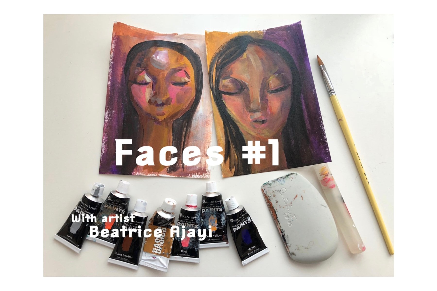
Transcripts
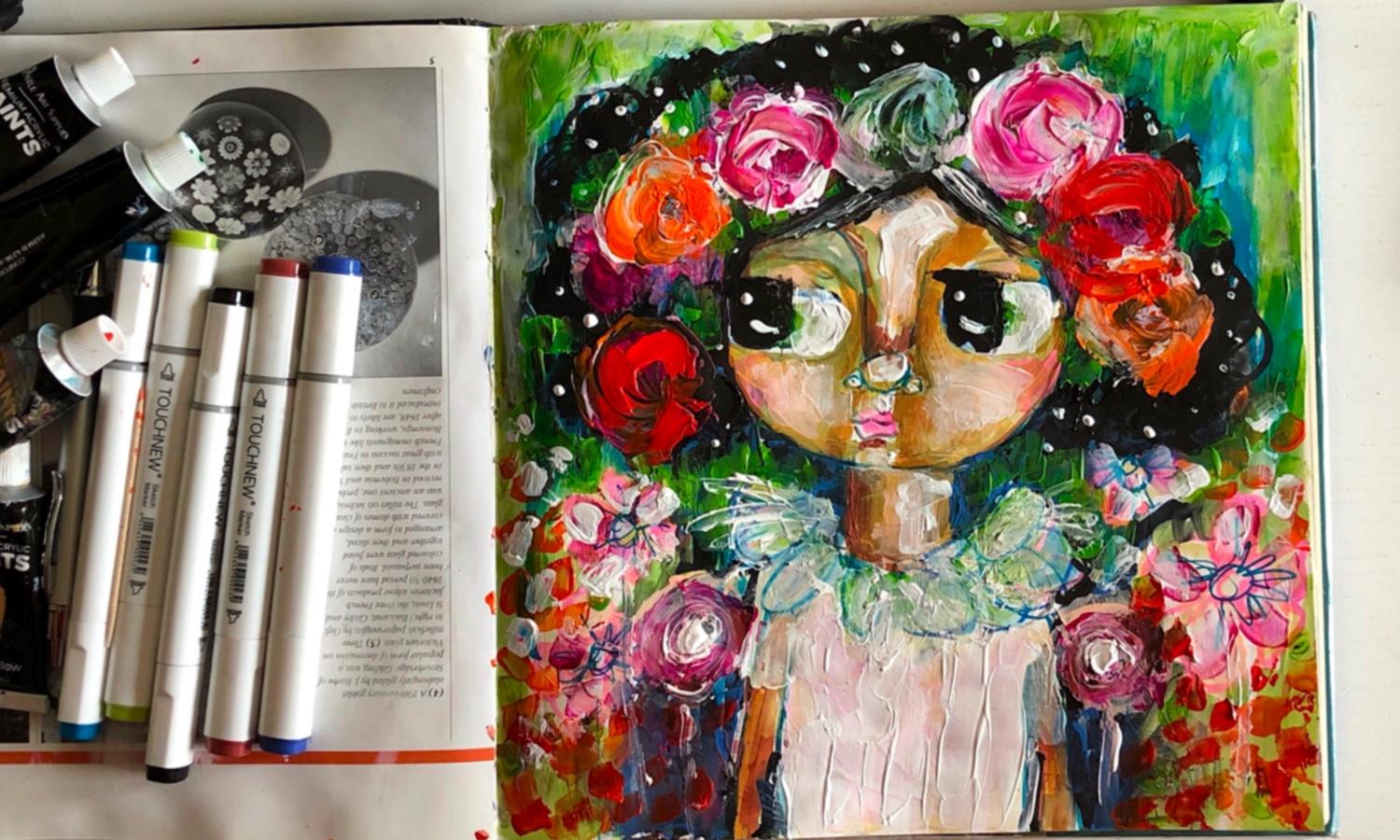
1. Gesso Layer : Hi, everyone. And welcome to flower girl number one. Um Well, look, for this class we're gonna be doing is we're gonna be prepping the page that we're gonna be using in this journal. Um, which is an old book vintage book. But I found while I was working in a college some years ago on the library in the college, they had this pile of books and they're gonna throw them away. And so I took some of them of that point. And, um, you have used a different artwork. And this one, um I decided, would be really good, cause I like the square shape for my, uh, for creating these flower girls and probably some other characters I'm gonna do in the future as well. So I really love them. And I thought I should work on this page is with the Jessel and discreet, some amazing pieces. So I'm excited about this. So here I'm just laying down some of the Jessel. So this is white Jessel, and you can get quite a variety of Jess als different colors, or you can mix colors yourself into the death so dependent on what you want. Um, some people do that so that they don't have to look at, you know, a white background. But I don't mind that because I love to sketch into the white background and be able to see what I'm sketching. So I don't mind the white background. So once we've created the, you know, the layer with Jessel, we're going to start using some other tools and apart from the pencil sketch on the Jessel on different layers of mediums as well. So I'm gonna be mentioning some of those in a minute. Um, but yes, that the pencil definitely be one of the first things that I start using for this, uh, Jessel earlier. But I'll also be used in market pins on these are permanent markers there. Alcohol, Marcus. So I'll be using that, um, at one of the stages after the watercolor, I think. And this is my pencil, but I will be using um, yes, it was just a plate HB pencil on. And also l bees in this Walter brush for the water colors, so you can get them in different sizes with different brushes of the end. Um, abusing the ordinary Beira pain. Sometimes I use that To highlight some areas that I want to be a bit more visible. So then, Ah, flat brush on a little tiny, tiny brush there, you can use whatever you have. Then I've got these water color palettes, um, that I squeeze my watercolor tubes onto, and they actually came with this watercolor set, so they just kind of fit, um, just in the side of it, here, like that. So that's what I'm gonna be using this watercolor set. Um, as well, which will be really good. So just get started with that. So apart from the water color, um, which, uh, I'm using, like, for this, As I was saying, I'll use to someone of the levels, Um, or one of the layer is I mean, that levels. Um, I will be sketching first onto this Jessel. But before I do that, well, I'll do is I'll show you, um, an example of some sketches that I have been doing recently which, um, are off the kind of character I'm gonna be doing on this on. So these air sketches of some flower girls that I've been putting into, like a smaller sketchbook like this one and I put the lay of Jessel and then I sketched on it. And then I've put some use some water color on that so you can see here like some of the skips that I have been created my pencil. So this is kind of the idea that we're going with is to do a sketch next. And then from that, we're going to keep adding the different layers, um, and build our character. So here is the most sketches as well that I've been doing recently, and they can have just here to give me some inspiration. So I really love the way these girls look. And I've been using my weaker hand, which for me is my left hand. So you can use your week your hand to do the sketch that we're about to do. So the next stage will be sketching. So see you soon
2. Sketch Layer: So here we have, um, Jess earlier, and it's dry. And what I'm gonna do is just to start to sketch in into the jessalyn, just get a little bit closer so you can see the detail of what I'm doing. So just going around on the Jess. Oh, I think some areas are still wet on this, actually, um, and just trying to get an outline for, um, my character. And as I said here, I'm using my weaker hands. So, um, I have less control with which I like and because it allows me to make happy mistakes. He's just measuring out where roughly everything on my character is trying to get her chin , uh, adjusted or eyes. And I've got some paint on them. Just gonna rub that off some Jessel to rub that open the tissue. And, um, yeah, and then to grow her hair. So just at some of these squiggles, which I'm kind of imagining other flowers and zoom out a little bit And so I'm looking at the overall picture and just trying to think of where to roughly ad her hair and the flowers and it might know, end up looking exactly like this, but it is just kind of going with how I feel there and the character who looks and just responding to the marks. Really? And I like to kind of put that lea si frill around their necks of the moment. Um, I'm just imagining some kind of a silky top with frills in it. Um, and just trying to get the details roughly the way I wanted before I start at in the next layer. So yeah. So this is the pencil there, and you can add more into the background as well and things, but I'm just gonna go into this now with the watercolor. So you will see me in the next stage, which will be the watercolor stage, So let's get started on that.
3. Watercolour Layer : So now I'm gonna be add in the water color on this layer, and I really love he's in this blue, ultra marine color that I have, but I think I've got some little bit of a yellow or something in that some of the sides some of the colors were coming out a little bit green, but most Persian blue, actually. So I just like to use different colors in between, Um uh, the hair in different areas off, um, character. Sometimes it's kind of like the idea of every color you have looking at dark and light. You know, the shade and where you would like to maybe see some colors or or also not even necessarily thinking it through very much is just, I mean, because all of these colors will mostly be covered over. It's kind of just like a plan in on the restructuring. Has he go along? So this kind of looking for carrying the color across the whole image and just trying to mix different colors in here? I love using color a locked and, um, you know, some sometimes people looking at this with think, why would she put blue on green in the hair and and wonder about all these things, but sometimes is good to juice. Go against the grain and, you know, think outside the box. A lot of colors we see are not exactly as we see them. They will have hints of other colors in between them. There's reflections. There's so many other aspects involved, so don't feel restricted by what the generic you can be. When you're looking at any objects, there's gonna be reflections and things. But if those reflections were there or yeah, if those interactions weren't there, then you wouldn't be looking at the same object. So feel free and experiment and pushing yourself in these earlier layers, because then it helps you to kind of get your foot and grounded a little bit and what you're doing and just feel comfortable and be brave, because putting these colors down my not necessarily work in the way that you think it would or oh, the result might be different from what you think it would be. But I've just kind of learn to go with it. Um, all my experiment and using my digital media has helped a lot because I could use colors. Anyhow, I wanted, and I didn't have to think about. I'm wasting pains, which some people would think about a swell. So, um, here, I'm just going to insert a picture just on the lower left kind of show you how bright and how colorful my pieces can be so that you kind of get an idea of what I'm talking about. Um and I wont leave it there too long to structural while I'm doing so. Now, I'm using some greens which I really love Really earthy green. I'm like an olive green and just playing around with the colors and seeing what kind of, um, ways that I can get the structure of the face to to be responsive to what I'm doing, all I'm thinking because the different greens have used here kind of helping to to give the idea of shadow. I think that's a mean way to look at it on dumb structure. So just play with and don't be too intense about it, cause all of this is learning and as we're using, it were kind of bigger and out a so where we would want to put things in future and everything so your brain is logged everything that's the way to look into it. And so even if you think you know, learn in something specific, it's store in and and it will help you to respond each time you see either something similar or be able to kind of adjust yourself. So it's not something that you can put your finger on. But he just kind of basically carry the colors through everything and try and balance it somehow. So I think after a lot of experience, you be able to figure out if something is a bit off in your mind and your brain will recalibrate to adjust for that so the other side just be free and try quite a few of these pages, even if it's the same image. Tried different ones, and you start to see a difference of the way you view it on the way you'll approach it. So these classes are here for you to experiment. And once you keep on experimenting, um, you get more and more idea water is that you want from a piece, so I'm just still just trying to think of what else to add on this layer and some add in some flowers to the background and this carrying that yellowy green color into the background. So the next layer after this, uh, will be the market pin. So I'm going to try and let it dry. Elizabeth, before I did that and then I will start using some mark up in so I'll see you in the next stage.
4. Marker Pen Layer : So now what we're gonna do is start at in the market pins, which are alcohol market pins. I'm trying to think if other market pins necessarily, you know, respond differently to, um artwork. But basically, um, with these ones, they're just they're alcohol, walls repents, and they might work differently from other market pins. I'm sure I've seen that with water. They seem to me quite resistant to water somehow. But maybe I was just imagining at that point by will do more tests on it just to um, see that. So I'm just kind of going over the backgrounds, and as you can see, the drive very quickly. So even scraping with this brush, um, they're not smudging it all on the guests over there. So just to use different colors and I'm going in with some of the blues as well of the market pins. And um uh, just trying to mix the end with the other colors I have and the other layer and getting my dears of how I might, um, adds to this character. Ah, so I'm just going round and round thinking of a way to use this blues, and I actually have different blues here. Um, they are maybe going from light into dark or a dark lighter. I'm trying to remember what way I am using this, but each one that I use, I kind of put to the side there so we'll have a look. Maybe I'm not even thinking it through. It's I'm just going through with all the blues that I'm gonna use That I think is quite a number of them here and mixing in the colors and building the layers. And as I said before, with a water color, Even with these blues and all this market pins, they will also be covered. So it was always It's kind of a structure, and it's helping me to plan Andi at the same time. I'm actually starting to get visual concept of what it is I'm trying to create and experimented with the colors. So, um, just add in some more to the background here with with the thicker side of this markup in Yeah, that's something I didn't mention at the beginning, which was thes market pins actually have, um, Smolen Nibs and bigger nips site. So there's two sides on it. Um, and I've bean using the different sides dependent on what I wanted to get from an area. So, like this brown, if I want to use quite a lot of it, I use the bigger side. And if I only kind of want to get a sketchy result, I use, um, the thin inside the bigger side has got a tip as well. So you can just adjust yourself record early, some looking at shadow here and trying to build areas up. And what I found with the market pens is that when you use like the dark colors, you can actually with any of the colors, you can actually use that the next one to blend in and to get, um, really interesting results from them. So if you use market on oil alcohol pin, I guess alcohol pin. You can blend them because they react to each other so you can get quite a really nice blend, using the closest colors together, dependent on what you want to do, disease in the much darker mark up in here. I think this is the block, and I'm not to send that the eyes. I'm not necessarily in the same level of this moment. Um, so I will adjust that I'm just going in and started to try and at the hair. And at this point, I'm really tempted to make her hair long, which I think I will do in one of the future paintings. I will make her hair really long, but in this one, I don't end up doing that. But I'm just testing this just to see what it looks like with her hair. So a lot of my characters have bean off like an African origin recently, and this was because, I mean, I did have different, um, race Children in my different work that I was doing different artwork but the big eyed ones . The inspiration started off by, um, thinking of my daughter and thinking of creating a character for her that she could have up on her wall in her room. That represents her a bit more closely than the other characters had done before. And, um, I remember that she has My daughter has quite big eyes. So that's what started the really big guys, my characters that I started doing since then. So I've almost been doing these characters with these bigger eyes for about a year now. Almost a year. Um, I just love them. They're so full of expression, and they remind me of her a lot. Some disease in a lot of different colors here and thinking about the backgrounds trying to really experiment. I'm using different greens, alcohol, green pins, market pins, and, um, I don't know how you can, how closely you can see that they blend into themselves quite easily. They tend to bleed when you rub up against another, aka Hope in. I'm just getting some shadow behind her beside her neck just to make her next stand out, um, a little bit more and then also for her body as well. He's going around with that and thinking at this lower sides here of the Bolton of the torso to kind of get some darker shades, some fully age as well. It's a kind of a green look, So this layer is almost done. Um, I don't want to kind of go over this too much because all of this mostly will be covered yet again. But you can see that we've built from the Jessel the sketch, The water color is in there somewhere. in the market. Pin on the next. Where is gonna be, Um, the first kind of acrylic layer that we're gonna add. So, yeah. So we've got something here to work with, so we will get onto the next stage on, and we'll see you then.
5. Acrylic Layer #1: So here we're gonna be as in the acrylic clears now, and I am starting off with, um, one of the yellows I have. It might be yellow old car on April Cielo and just trying to look for highlighted areas that I can use this color. So I'm not specifically going from dark to light, but it's more, um, this I'm kind of a Justin. What colors I'm gonna use when and just feeling my way along with the colors already have on the pain. So, um, I'm just looking at her and trying to decide where to put colors, how to build her structure of her face. So just you're tryingto move the colors around and balance them out. And as we go along, the colors will adjust. Andi, I will have lighter colors over the colors underneath. Or if I feel an area is not dark enough, I'll go back and do that as well. So is just starting to almost Klay like, um, built the structure of the base. So these paintings that I'm doing are whimsical paintings. They're not supposed to reflect any known human in any way on dso feel free to just you know the characters. Whatever comes to mind, if you're inspired by anything, you don't have to do this exactly. So here I am, using a much lighter color, and I think this is one of the beige colors and their publics, and I'm just looking at the idea of reflection on weird. A light can catch, um, on a face. And I think it's a thing where when you keep on practicing whatever style or idea you have , um, you start to get an idea off where you want certain, um, things to be on a character. So you start to kind of adjust the character to the way that you prefer them and like so here I am at in the beige, used on her face also into the background and trying to Carrie, kind of, ah, as a system of colors through the whole piece instead of a kind of unites the I and living around the piece. That's the kind of idea I'm gettin, Um, sometimes I think of it almost like a dance. You know, it's like the flow of your hands in which direction it's going, and it's kind of playing in your head. But it's happening so fast. But you can't necessarily explain what you're doing. You just do it. So, um, I'm just checking with the pinks here on. They're responding to the colors beneath, um, so some areas of it lighter because they responded to the Bache because it was still wet and other areas didn't have as much or they dried. So at this point, I'm just really trying to feel my way against, you know, with the colors that I really love, which is brightness. Um, I think that's the name of the color. Brighter, the better. So I'm putting these down, and I'm I'm puttin in my mind I have colors that I'm seeing. So as I'm putting them down, um, it's still with the back of your mind the idea of Le'Ron. So even open these colors down. I think you see me scratch into them in a minute. Eso you scratch into them? Um, you push you boo is just very constant how you work on a piece. And even though I'm scratching on this right now, um, I'm learning something. Number one And number two, if you don't like something, you can always cover it up so until I mean this areas of dried, some of it. So as I'm looking and I'm thinking, right, what color should I use next? Um, so thinking of bringing some greens into her like flower, the flower wreath that's basically on our hand. Eso using a darker green at a picket in. And these greens, I mean, these acrylics are quite there. No opaque, the great transparent So the colors be little can cannot be seen through them. And I don't think I bought this too much about the fact the best was going on. But the more I think about it, it's a great thing because well, to my work is in layers. And then, if you're able to see the layers interact and respond with each other and have glazes, is just really interesting. I can always make these colors a bit more solid or opaque by Adan colors. The are opaque or add in white or a black dependent water is, and to make them more Opie. But yes, in my head. Right now, I'm thinking I'll like the green Galland and bits of green coming through the flowers, and I usually at the colors through the whole piece so you can see that I've added some in their eyes. And this is how I layer the eyes with the colors and the environment. But the idea of reflection So I really love the way she looks. I love the flowers in the background, and here I am, still trying to get the colors to be carried through the whole piece. So I'm putting some of that green dye put on the wreath on her hair, and but that generally in the environment is not that anybody is gonna go. Oh, there's the green. There's the green again. This a green again. But it it carries the language through the whole piece that there is a common language when you take the color through the whole piece. So it's like the language of color is the way to think about it, where there into plain with each other and they're encouraging each other or their warning each other. So sometimes they're pulling each other back on, and, um, other times they're pushing each other forward and encouraging them to play. So here I'm now at, in black, a grill it, and in my mind I'm thinking that of this as a big Afro. And so I'm filling the spaces in, and I'm being quite rustic. Um, with the way that the hair is and some of the colors some of the black, it's mixing in with the colors behind. You can see some of the colors come through sometimes, and now I'm thinking it's It's so dark and no, as natural darkness is, it could be some trying to make it more of a shadow in the background just behind her head . There Sub added the cobalt cobalt blue, and I really like the way that that's come out. Then I'm trying to go around to kind of show where her hair stops and where it starts. So I've just taken a bit further, just around the plants. Yeah, I really love this piece already. It's a very colorful Um, I love it, and so I'm going in here with more coal box boat blue. But as always, with every piece, you can always come back over, um, with the black. If I felt it was too, Um, there was It was too blue, and I wanted more thinking of Adan Symbol Green. It's a different green just bright green in the middle here, and I think with the brush. See, this is when you use different tools with the brush. It kind of wasn't as striking, but with this cheaper to it's a lot better because it's it's collecting more paint. And the paint is really, um, added some density. So it's not as a peak. I'm just carrying this other green through the edges. It's always about trying to keep the balance. I'm always trying to carry just to keep that in mind, to carry the color around, to help the eye to travel. So here I'm starting to add the black acrylic again, and I'm trying to correct the I hear because I noticed that that I was a little bit lore, so adding some over Afro through and it's going over the cobalt than picking up some of the cobalt blue. And I just like that because then it's kind of like its reflection or it's colors being seen in the background. So it's at this stage. It's just really feeling my way along, trying to see what I want to add on what I want to take away building on the little character, and I really love the way she looks now, so I don't want to do to much, too, just this basic look, So we'll go on to the next level, and it's still to kind of keep adding more acrylic because the still more layers to add, so see you in the next stage.
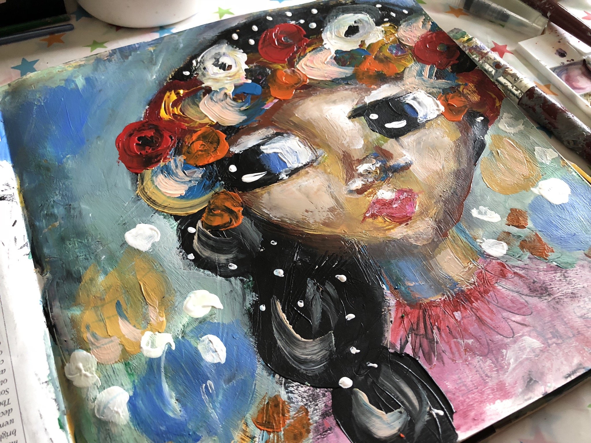
6. Final Acrylic Layer : So this is the final layer that we're about to start putting on. And, um well, I wanted Teoh is to build on the a wreath off flowers on her head. Sons add in some more pink here on the first times, trying to kind of get the impression off the leaves on petals and things. But I, um I may change that later because I'm starting to like the kind of circular motion that I do with the actual flowers. So I'm just adding that pink in the background here on, as I said, carrying the colors through that's just really important, such on this kind of a whimsical piece. If you didn't portrait story and you want to have a focal point, you wouldn't necessarily put as many colors as I do these pieces. But, um, either weights get toe, have areas where the I can rest, so no, everything should be very, very busy. You should have areas where that I can kind of stop and go, OK, it's not got too much noise there, So some of the pink is still on the brush, as on the shape and brush. Um, as I am, turn it on her dress there, so this made it a little of a little bit of a light pink. Just build a, um, the idea off flowers full age around her and starting to build the layers off the lower on her head as well. So, like how the colors are peeking through as I'm adding the white. And, um, I'm adding a white kind of as a reflective aspect of it, and also you can I mean, you could get white roses, but, um, I am also planning to put more colors over that, as you can see it with this bright orange and trying to think through how many of the colors I should be putting on as I'm going along. So the black was still wet when I added the last orange. But I still added it to the other orange because I wanted to, Just as I said, carry the cover across so you can see the difference. And already from where we started with the Jessel there, um, the pencil, the marker pan. I have the watercolor people markup in. As you can see, you can hardly see any of the water color, uh, on the markup in is under some layers off acrylic. I'm just added really yummy colors to our hair. Um, I plan to do a lot of different colors through the different classes. And, yeah, I just really love the way that she's turning out. So I mean, you can make a smaller character on a page. I tend to like to fill the whole page with the image of a character, and, um and then I'm trying to think of making her stand out even more awesome, added white to the background and over the greens and some of the green speaking through. But the left hand side of covered most of it. But it is just to make her hair stick out a bit more and some of the black smudge in there . So I've got to be careful, adding more green to that white kind of have a lighter green in the background. Add in some over the cobalt blue, and that had been some about green and black that have mixed over into I with the eyes. I'm always careful what colors I put in there. I don't want to put for example, well, I haven't pit reds or you really scary looking colors, and they're so it's mostly being the colors and environment, the colors that I think you can get I colors for. So just put in some white over here, and I light in some areas as usual, dutiful lightning samore areas here and there on our sleeve. So there's a lot of texture on this. You could, if you didn't want it to be so textured, used a rare to roll over the image. Or you could use a catalyst which, um, which I will be showing all of these items in future videos as well of the future courses, because the tools we use is really important to get the different effects or to help make some things a lot easier to do. So, um, these final layers I'm trying very hard not to, uh, spoil what I've got, and I'm trying to feel my way very carefully, so the market pins You can hardly see them anymore, and, um, you can see some hints of it, but it's just I really loved the idea of using a lot of different mixed media and layer in them together. So here I'm using this to that. I have just like a shaper shaper. Um, brush made of, like, a thick, hard plastic. And you get different shapes. And I've just made the reflections in the eyes said that I usually do, which have just changed the character completely cushioning so much more alive. Um and yeah, I really love this too. I'm just trying to get the reflection, even that. And I don't want to touch too much at this thing because I don't want to ruin it Is Adam reflections in areas? And it's really like, I mean, if you could see the actual paint is quite. But I'm thinking of adding yet thoughts, too. Her here, which I just thought out of the different elements. I mean, I could have left it without, but just the idea of sparkles and glitter. I couldn't help myself. So I've added this is well, and, um, I really love Crouch is timed out, So I'll be happened more of these classes. I think I already have another two available as well after this one. Coming up already. Andi, Uh, just feel free to take your time. Try out the different characters on, have a lot of fun. Creative. These pieces, this ad insulin, little flower impressions. Um, any, um, can make any of these actual images available is Prince if anyone is interested as well. So just contact me and let me know, um, or even the originals, because, well, I've been doing is just using the one page and nothing behind it so that it could easily be framed. Um, about me thinking I've got some other image behind it. So, yeah, I really love it and hope you can see the detail in that. It's really thick and yummy, and I love it, and it's been a lot of fun. I hope you've enjoyed it. So just relax. Enjoy the class, and I will see you in the next, um, flower girl class, so I'll speak to you soon by
 Beatrice Ajayi, Founder of HyssopArts