Transcripts
1. Introduction : Hi everyone and welcome to
my class here on Skillshare. In this class we are going
to be painting peony middle. We're gonna be using different materials to
create this painting. We're gonna be using
acrylic paint, different sizes of brushes. This substrate here, which
is a hard surface canvas. Painting middles is a lot of fun and I'll tell you
where you can get inspiration to help you create these natural environments
that are full of wonder and are full of treasures and just lighten the heart
with looking at them. If you are someone who
loves painting flowers and nature and loved to
paint metals as well. Then come along and have a goal and learn the different
techniques you can use to create these
beautiful scenes. Let's get started. So I'll see you in the class
and we'll have some fun.
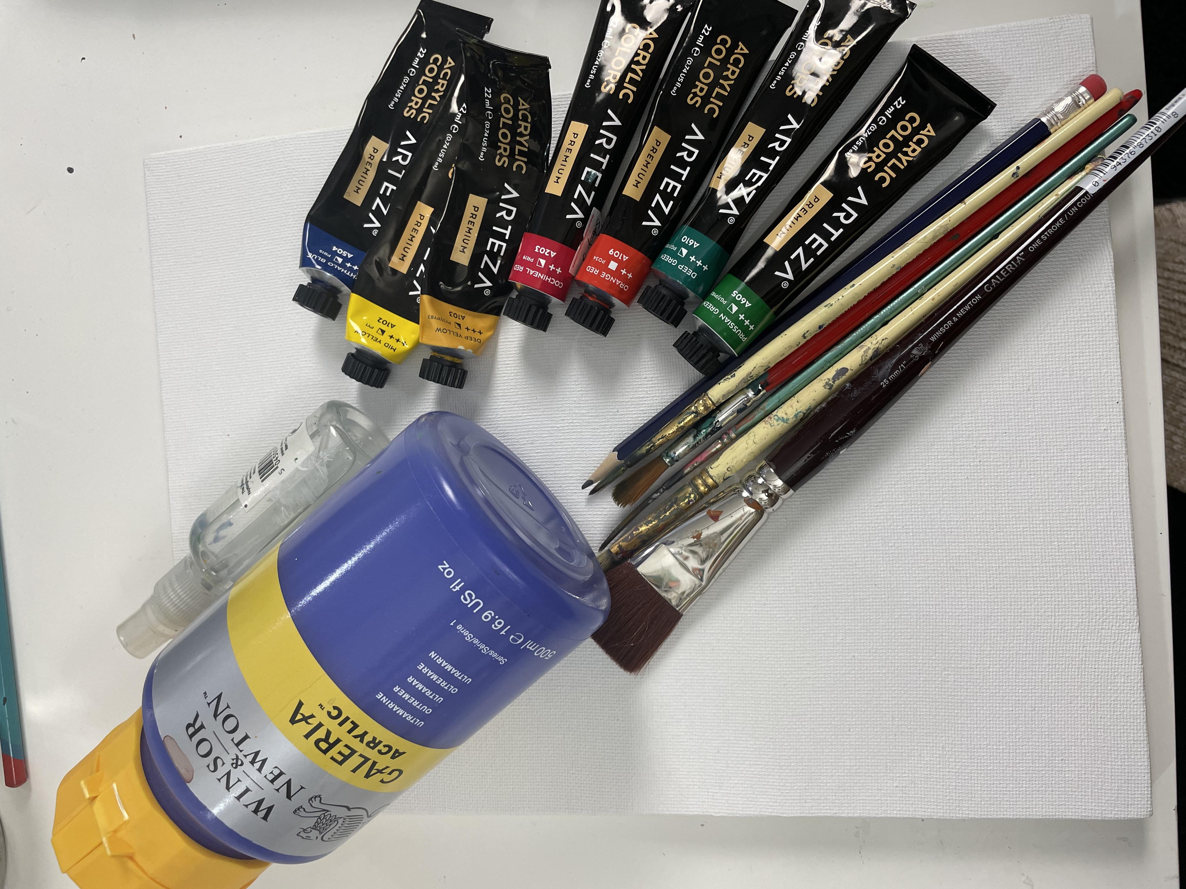
2. Tools Required: Hi everybody and welcome
to today's class. In the class we are going to
be creating a flower metal. And I just thought
I'd show you some of the tools we're gonna
be using for this class. I've got the colors
laid out here, but you also need to add the
white, white titanium paint. Black acrylic as
well, or black JSON. But I've got here a fellow
blue and ultramarine blue. I've got two different
yellows, yellow and DPLL. Coke, Neil, red, orange, red. This is more of a pink
red and then this is more towards the
yellows, the reds there. So a warmer red, cooler red. And then we've got deep green, which is a cooler green, and then green which is a more yellow
green, a warmer green. And then I've got a
little spritz are here, which is really good
to have to kinda keep your paints moist and also even the paint on your
painting as well, moist. Blend in and also put
some retardant in here to keep it from drying
out too quickly as well. And then it got some I've got a pencil here if I wanted
to start with the pencil, but you don't have
to start just sketch out with a pen so that you
can do though if you want. I've got a handful
of brushes here. So this is a large flat brush. This brush is a size
with this soon, Let's see, 25
millimeters or one edge. It's saying there
for this brush, basically a flat brush
just to cover more space on your canvas when
you need to use it. To cover most spaces quickly. I've got a flat brush here, a smaller one which has a size for this quite small flat brush. So if you have any
smaller flat brush, you can see the difference
between them there. I've got to filbert are round
brushes, which are sizes. This one, this came with the Moody's that I'm gonna
show you in a minute. So stability with these. So I'll show you the
collection of this. I've got these here, which are big,
water-soluble crayons. Really good to have as well. So this brush came with that. So it's kind of almost
a size four round or something or a sixth
similar in that range. This is a size for x. We know this is a
size four round, so this will be probably an
eight or something like that. This is another round brush. And then I've got either a
script brush or a liner brush. It's called that kind for going for stems and really
detailed scribbling work. You can use this
one for as well. Then the substrate. It is hard surface Canvas. So it's kind of like
a paper at the back. And then it's on a canvas. Paper texture, paper texture. This is what I'm gonna be
using for our middle painting. We're going to work on it, take our time and really enjoy the pool says
building up the darks and lights and the layers
and ended up in a result with an art piece
that will be satisfied with.
3. First Acrylic Layers: Let's get started. First, we're going to
layout a pallet of color. Then we're going to put this
color onto our substrate. The first I'm going to put the orange red onto the palette. I'm going to put
the Persian green. Then I'm gonna put
the calcaneal read, kind of alternating the colors. There isn't any rhyme
or reason to this. You can lay out wherever
we feel comfortable. I'm doing it in a
vertical way here. You could do it in
a horizontal way, whatever you feel comfortable. And we'll use an
acrylic in this class, so it's good to have a spread. So like I said earlier on, so that you can keep
your colors moist. Actually underneath this
palette I've got here, I've got a wet palette, but my wet palette is full of color and is quite confusing. So I thought I was starting with a fresh
pallet for you here. I've laid that out
with the orange, red, the Persian green, the ****, Neil red, the deep green. I've got phthalo blue there, and now I'm adding
the mid yellow. You could use any yellow, you could use cadmium yellow, you could use pale yellow. It doesn't have to
be this mid yellow are taser are quite
good because they have such a variety of
colors in the same tones. So I just like to use
the different ones, but I do want to
start mixing more of my own colors going forward. So this is an opportunity for me to do that
because I looked at a lot of colors and usually we can get confused as
to which ones to use. So I'm trying to pick at least
two of each, but I like, I was going to add
the ultramarine blue, but I decided to
stick with the blue. For this class. I've laid all the
colors out here. And now what we're gonna do
is go straight in with an R, just dampen my brush. Is good to start with a
damp brush because it helps the paint to flow across
your substrate a lot easier. I'm just going to clean
most of that water off with my tissue there or
you can have a cloth. And some people start
from the top to the bottom when they're
painting on their substrate. But I like to just work from
wherever I feel inspired, which is usually from
the bottom of realized. I like to put the
darker areas at the bottom and then
work my way up. So there might be odd, but it's just the way
that I do things. Also, the size of the
substrate is nine by 12. So it looks like an A4, but it's actually a little
bit bigger than that. Thus me using the splits
are there to get some of that pink to move. But you could, like I was
saying, use a palette, paper palette that you can buy quite affordably and Amazon, which is why I usually use, but for some reason
I couldn't figure out where it was at this moment. I just used the paper. But you can see me
mixing there my deep green with the orange red. And some of it is
more green than red. But you get this variety of colors because it's
not fully mixed in, in a block kind of way. I really like this approach
of mixing colors like this, because for those who
are just starting out, it's really a good way to see what your different
colors can do. I know that people
like to do pallets. Pallets know swatches. That's what I meant. Swatches of color is to
learn what colors can do, but there's only
so many colors you can mix together in a swatch. I mean, you will spend
the rest of your life. This makes sense swatches. But when you're mixing
colors on your Canvas or your substrate is
a really cool way to experiment with
what colors do. So I know for myself, I want to be mixing your colors. Really, really practicing
that theory side of things so that I can be
even more effective in how I use my color
in my paintings. Here you can see the
brown that I've mixed. And I'm sorry for the actual
table moving so much. I had my camera attached to the table and I won't
be doing that again. But yes, so we've painted quite high up
all of these colors and now I'm just going in thinking
about adding more greens. So that's me adding some
of the Persian greens and Always have it in
my mind that I am going to be using my whites if I wanted to get
lighter, my darks. You don't always have
to use pure black or white to lighten
and darken colors. You can use other
colors to do that. But I like to use my
white because it makes things a lot more
highlighted certain points. And it's really nice
to see you have a color as it's saturated form. And then you add
that white and it brings out something else
as you see in a minute. As I'm putting this white down, you'll see that blue
just sparkle to life. Obviously, this is me working with this metal that
we're creating here. And going into now work on the lighter
areas of the painting, which would be
like the sky area. Because it's kind of working
from the undergrowth, this metal to the sky. I'm using quite a big brush, which to start off
with because that helps to cover more
area in Canvas. But I will change through the other brushes I
have as I go along. Here, you can see me using
the edge of this flat brush, creating different kind of suggestions of stems of plants. Then adding more color
and just trying to play my way into this
foliage, into this middle. I think we can be quite stiff
about things and think, Oh no, I can't fix that. But it's in all this
kind of gestural mark making process that we end up discovering what
our brushes can do. A lot of the time
when I'm painting, I'm using my brushes because I don't always use
the same brushes. I will deliberately use
the entirety of the brush, like try and push it
to see what it can do. It's like it's having to prove itself to me at that stage. I'll see how lightly
I can use it. I'll see how dry I can use it, how wet I will push down and
do all sorts of things with the brush just to make it kind of prove itself
to me and to say, yeah, this is what
I can do to kind of like to show off if you want. And think of different ways to do something that I could
do with a smaller brush, but to see if this
one is able to do it. So just that idea of play throughout painting
and helps us to relax. While I was gonna do here
is to show you how you can scrape into a painting. You can have a
toothpick or this is actually like a barbecue Khabbab stick that I'm using to scratch into this painting and trying
to create just some leaves, gestures of leaves
in the background. This can add texture
to your paintings. It's not that you will
necessarily see it by the end, but you might see hints of it. Because everything
adds to the painting. That's the way to look at it. You're never wasting paint or you're never wasting whatever you do on your Canvas because that's how you
get your textures. It tells a story, it tells a journey. It really helps you to know
what your tools can do or to experiment and see what kind of work and
what might not work. Was really good to have all these techniques
under your belt. Because as you keep on
painting and creating, you're gonna have
a huge selection of approaches in
creating your work. Once we've let that
dry a little bit, we're gonna go back in with
a different brush this time. I'm just going to put
these in the water to get them wet and then
I'll clean them off. I'll clean off the
excess Walter.
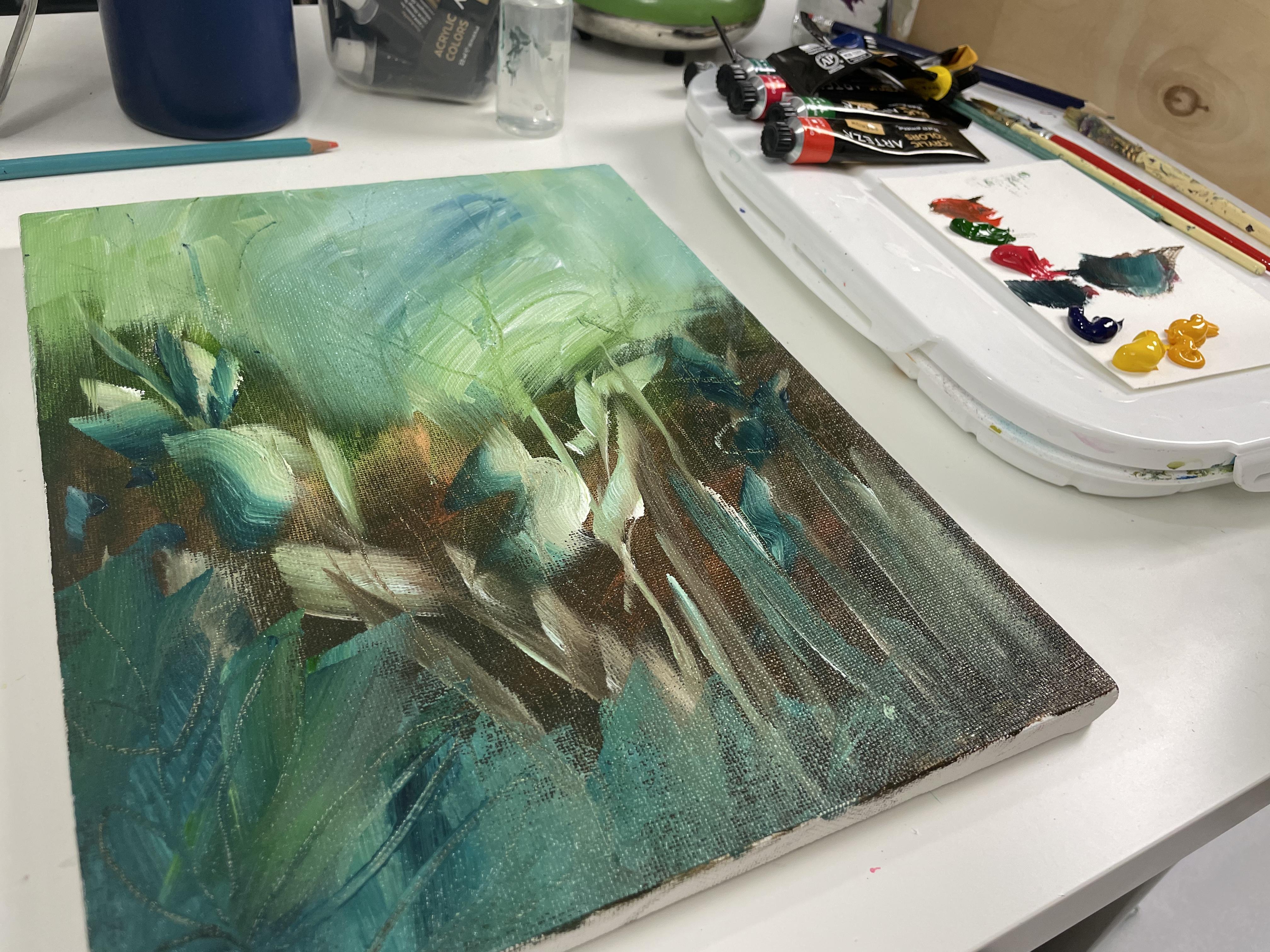
4. Background Floral Layer: It's really good to
get your layers to dry before you work
on the next layer. So this is mostly dry. Now I'm going in
with this brush, which it's called three
different things. It can be called
the Script brush, a rigger brush, a liner brush. It has a variety of names. It's one that you can use for
writing your signature and all sorts of different
detailed linear work like I'm doing now. I am still not using it
quite the way can be used chins if you really
water down your paint. If you add other kinds
of mediums like mid, really thin and mediums, you can do quite
detailed thin line work. I'm going in and I'm
creating this foliage with these greens in the background
and working on my leaves. Again, I'm doing this quite
fast, but for yourself, you can take your
time and you can really shape those
leaves if you want. I was just gonna say quickly
in here that you can get a lot of inspiring photographs from platforms like
Pixabay, pixabay or Pexels. There are different kinds of
platforms that you can use, or apps or software that
can help you to have inspiration of what kind of plants you could have
in your middles. You could always also
take pictures from your local garden centers
to inspire you as well. Or park. So just even just going for walks and seeing what
kind of trees are around. You can use in your plant work, your metal fluoro
artwork, landscapes. So those are different ideas
of how to go about getting inspiration for what to do with your metals or
other floral work. For me. I get inspiration
through the idea, the impression of
when I look at plants and trees and that impression of different leaves
coming through and the colors and the impact of light and dark and the areas
that have shadow. The characters I tend to make because I think I have a storyteller thing
in the background. So I usually make things
look like stories. So the plants are
gathering detailed story. Every painting I create, there is that whole idea of
narrative going through them. That there is something
that we're supposed to be learning about or knowing about or been exposed in the conversation that we're learning from
that point in time. Anyway, getting back
to the painting, I am trying to get the
impressions here by using, by the Parisian green and some white grasses
coming through. You can take your
time and actually use this rigger brush a lot
better than I'm doing here. Because this techniques
where you can be very slow, the water could be a little
bit more in your paint. And you twist and turn as you are putting these lines
down to get different, different thicknesses and
forms of lines and the shapes. I'm doing this for
that impression of grasses come in
through the light, catching it at different points. Once you've got as many of
these down as you want, you can add other colors to
tint the color slightly. So I think I've added
here is some of the DPLL to make the green a little bit more warmer and more golden. I'm still adding these layers. So that's another
way to play around with your colors is
to add another color. Just a hint of a net
changes slightly, but they're all still
very close to each other. So when I'm putting my
brush mainly in the water, It's more to get some of
the liquid to help it move or flow better across the canvas more than
necessarily washing it, unless I wanted to start with something
completely different. But usually I hardly
actually wash my brush to clear
the color over. Here. I'm gonna go in with
trying to make a tree. Because I have this idea of when I'm looking at in
metal of little bushes in-between growing or like trees actually growing
in the middle. So here I'm now going in
and starting to add that. What I'm doing is I'm not
making it symmetrical. Just straight down the middle. I'm putting it
slightly to the right because I want it to look
as natural as possible. It's like it's kind of
leaning over slightly. It's peeking over into the conversation of the flowers is trying to hear what
they're talking about. So I'm adding more red, more of a deep yellow and I'm
trying to mix this green, I mean, this brown so that I can see it better
against the background. With this, as I'm saying, it's always about layering. I am doing this for the
class quite quickly. But you can go in with
even more colors. You can introduce
more colors and get that brown of that tree
bark and the trunk. A lot more than I'm doing here. But you can still see
some of the layers of that brown that I mixed in the
background coming through. The impressions of the leaves, come in through the
layers of the grass. And then now we're on this
layer of making this tree. So this is how you go about
building and building. And then this adenylate
bit more deep yellow there to try and get that tree trunk still a bit more visible
from the background. Just mixing it in until I can see the impression
of a lot better. Then once I'm satisfied that the tree has made enough
of its presence known, then I'll move on
to the next layer. So now I'm trying to add
some shadow with that blue to try and define
the trees slightly again and add some
areas of shadow. But you can always use a
smaller brush for this as well. It doesn't have to be this
same brush I'm using for this. But with the brushes, when I'm trying to get
a line that is thinner, I press down a flattened the initial
beginning part of the brush, that top end of the brush. And then you can draw a thin line like
I was doing with the big brush at the beginning where I was using the flat edge. You can do that with
these round brushes of filbert brushes as well. Now I'm going in and
I'm trying to work on creating the peonies. Yeah. We start putting in
the background for the peonies and start
working on the layers.
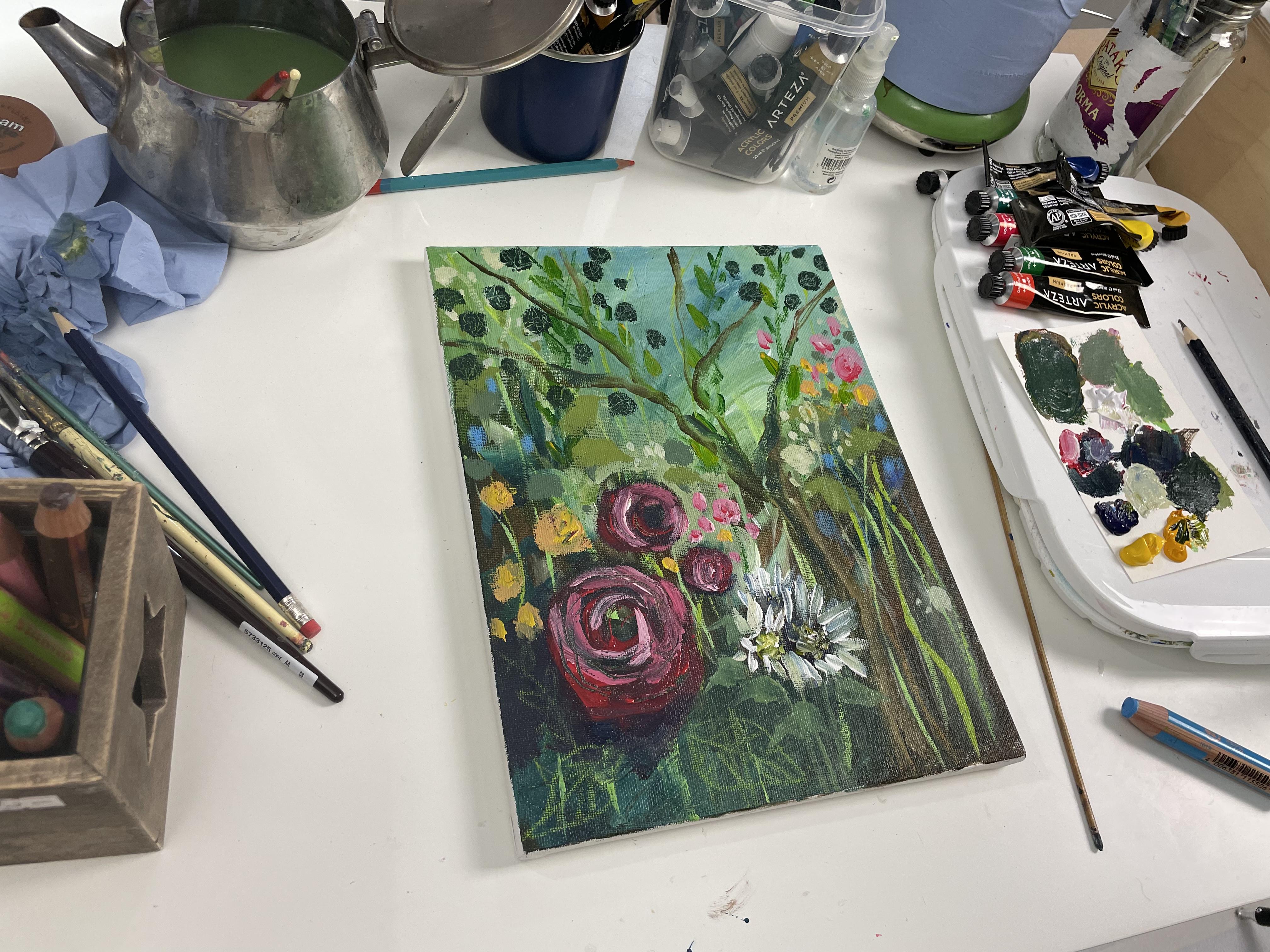
5. Third Floral Layer: We're just gonna be working
on the layers of this peony. Thinking about the
details that are involved and add in a calcaneal, read and building the list
till we get it to a point of where it's similar
to appear in a, it's the impression of a peony. It's not got the full
detail of a peony, but you can tell, but it's
got that impression of it. I just want to give a quick
apology for the noise in the background
because it's blowing a storm is really windy
where I am right now. So that's sometimes it's
coming through in my audio. But anyway, let's just
keep going with the class. Now add in some of that yellow, blue to the background to kind of give you a
more highlight of the **** Neil or
red so that we can see that puny a
little bit better. And I'm just zooming in here so we can see it a
little bit closer up. So I'm just going
to keep on building those layers here and add in some more of the
titanium white to make it lighter as I go up the
layers towards us, just to highlight it. I'm now building the
layers for the daisies I want to add right
beside this puny, I'm letting the peonies
dry. Elizabeth. I do have a heater gun, which I have not been using, but that can be useful tool to dry your painting a lot
quicker as you're going along. I'm just adding the similar
kind of background here and then building up the
layers of this daisy. So you didn't see me just add in some of that Coke Neil read into that phthalo blue and
then some of the Golden, the DPLL and some of the whites. I was trying to add
some of this green that I've mixed here and make
the stems of these daisies, but it wasn't visible enough. And so I decided to change tack and make that background
darker so that I can come in later on and use a lighter color and it
will show up a lot better. But I'm going to
use this green that I've mixed any way up right beside this peonies
up here and so that I can make them
more visible again. With painting, what you
can do is with colors, you can even make them, the environment around them lighter to make
them stand out or darker like I did with
the other peonies earlier on the bottom there. It's just a whole way of looking at what your
requirements are. If you want something to stand out and it's in the
lighter environment, you go even lighter
with a color beside it. And that's what makes it
stick out a lot more. Here I'm playing on that idea of the complimentary
colors as well, the reds and the greens. So that's just the way to look at it as the
complimentary colors and putting those
beside each other and then using a variety
of those colors. Not just the one kind of
strong red or strong green, but you have a whole
mix of greens and reds. Peonies here I'm now
adding a lighter layer. And it's very rustic. If you were taking
your time with this, you can do this a lot
more in a genteel manner. But I'm just going
straight in and I'm just giving
you, like I said, that impression of
what these look like. You can always use an
even thinner brush like the rigger brush or as we call it a script brush
or the liner brush. And you can get thinner
lines with these. As I'll show you later on, I actually go on to scratch
edit to these flowers to give them another kind of
textural impactful. Application. I'm now adding the pink
that I've been mixed in and add into the peonies around the areas of this middle
in order to carry the color across the
canvas and to make it more of a unified look, I used a lighter pink
initially and now, and then I use some of the
direct ****, Neil red. Now I'm mixing some of the DPLL in with that and
creating another color, which I'm now dotting
around the canvas. The whole aim of
this is to create the idea of different
sizes of flowers, different colors of flowers, and dotting them
around the canvas. I just mixed in
some of that myth yellow into that
same mixture and to create a highlight for the color and put
down before already, it's kind of like different, like a mix of yellows
and marigold colors. And just trying to get
this metal to look as sprinkled with pretty
flowers as possible. So you can really
take your time, use smaller brushes
and play around with all the details on the petals and really take your time
to build the layers. But here, the overall
impression for this class, you'll get the idea of what
is that I'm going for. And you can apply
it for yourself and really take your time to
build your own metal. But you can see
examples here of how I'm making really tiny dots. And I come back into them and sometimes I'm fine with them. Sometimes I'm like, no, I think I'm going to
just make this a bigger, bolder color and just playing around with
that whole idea that when you look into like a forest and you look at the forest floor and you see all these different
flowers you can have. Like snow drops are so
many different blue bells. That kind of impression
of a very dainty, very light speckled of flowers. That's the idea going for here. There's just to pause and remind ourselves that these colors
on this canvas of all being created using what was on our pilot, the seven colors. So it's mixing and it's
playing around and it's using the white titanium or white gel pen to add that
extra layer of tone, tonal qualities of values. As we're working. If any area needed a darker color
like I'm doing now. And he wanted to live in darker. You could always add the black. I'm adding this darker
green so that I can go in later on and enhance that with some
lighter highlights of the stems of the daisies. So that's why I'm now trying to do is to get that
lighter element. As I said, you can
let the layers dry. I'm just going
straight in and I'm making sure that I'm not rubbing back and forth into the
actual paint that I believed on already
because I want the line to be visible
as you can see here. It's always learning
the techniques. If we zoom in now we can see those lines that
I've added below. The date is to kind
of hint at the stems. And I'm even going to actually add some leaves to this as well. So just to get you to see some extra foliage down here
in the darker area as well. But yeah, this is looking very bright and cheerful and fun. That's me just going in
and add an a leaf there. And if you saw this is with
a filbert or a round brush. I'm making the tip quite
thin and pulling it on the thinner side
and then dancing it down to get that
shape of the leaf. So it takes practice
actually with this. So you basically have to pull it the thinner part then regulate. You can see my hand wriggle
in there like that to get that design and just
let it go at the stem. Just a built this layer as we go along to get the
different designs. I'm just adding some more of DPLL and I'm gonna
make a lighter green. And I'm going to
be doing the same thing again and creating more leaves using
that thinner edge. And then working with
that thinner edge, you can see me doing that. They're flattening that a
little bit and pull on it. And then regular in my brush.
6. Final Details : We're now coming up for
the final layer and we are building these leaves
and these textures. We are trying to make this
piece look very, very organic. And you can use toothpicks and scratch into these
leaves as well, like we're gonna do in
the next segment soon. And to really build the layers, you just go around and look for areas which might
look bear to you. And add these extra leaves and you can add
different sizes as well. They don't have to
be the same size. Another thing to look at is how the eye travels
across the canvas, because that's what I've
been trying to do with it. Like the yellow
flowers if he can see there from the right to the left and the
middle there as well. It's kind of carrying
the eye across. Now adding in some of this
lighter color I've mixed, which was that same
green on my brush, with some white titanium paint and add in some white sprinkles, but not pure white so that
it's not too jarring. It's been tinted with
the green from before. So I didn't these, and thinking of that idea
like I was saying before, of sprinkles of snow drops. So it was kind of like
the flowers that are very tiny and speckled and given the impression of
a lot of floral elements, but at the same time, not working in an
inefficient way to create that same look, different sizes given
a kind of organic, realistic feel for the plants. Putting them in areas
that you can get the flow across the canvass. Looking in a kind of organic, natural way and
just helping me I, to move across the canvas and to really appreciate the
details it's seen. And so that's what I'm
doing here with the colors. You can see how we've built up from where we started
to this point. You take your time. You decide how you want
to lay out your Canvas. You can try this version and
you can get inspiration, as I said before, from
Pixabay or Pexels, or go into garden
center and see what's available at different times of the year and get an
inspiration that way. And have fun creating
all these layers. So I'm going to also work
on the leaves for the tree. I will be mixing some
of that phthalo blue in and some of the
green as well. And really, really getting a deep green that I'm going
to use for the tree leaves. Mixed in some of
that deep yellow into the phthalo blue
and white mixed before. And we're going to
go in and start creating the same
idea for the leaves. But we've been doing
before for the tree, foliage, for the
leaves of the tree, and different sizes,
different areas just to give that impression
of Movement and the tree. Using my pencil or a toothpick, you can use a
toothpick for this. We'll just zoom in and
we're going to scratch into these leaves to
give them some texture. You can actually do very
specific leaf shapes here. You could do the line and then the legs zigzags coming off it. But I decided to be quite abstract and the
way I'm doing this, but a toothpick
would probably be better once they are doing
this on a dry layer as well. Because when you
scratch into it, it will just show the
color underneath. Whereas with me using a pencil, you can actually end up drawing. And you get that
crossover of the lead of the pencil or whatever
color in pencil you use as well, so to speak, is probably better for this, but because it's dry
enough and I'm being very quick with this and not
leaning too heavily, you can still get the hints
of the colors underneath. I bet also decides
to go ahead and go into the peony and to
scratch into that as well, which is why I was
mentioning before, because there's different
ways to get texture, to get effects on
your paintings. So I've just scratched
into this here. I'm going to zoom in slightly just to show you what I've done. I am scratching into
the paint that's still wet because I didn't
use my heat and dryer. But this is different ways
that you can get detail into your paintings by scratch and into them and
get him that effect. Which is quite nice. Sometimes as well. I'm going to go in here now
and use the woody which I mentioned at the beginning or I don't know
if I did mention, but this is another
kind of soluble, water-soluble tray
and that you can use, you can use it to draw onto
and you can use gesso or a titanium white
mix into it and get colors just to set them and
make them more permanent. A clear gesso as
well or jail media. There's so many mediums
he can use to set this color because it
is water-soluble and it will move if you do not
actually set it on your canvas. But it's a really nice crayon and selection of colors he can use to draw into your artwork. And that was me using
the gold one there. I could have done more
with it, but I mean, you can use your
brushes as well, a wet brush on it and
draw with that as well. So there's different
ways to do it. But I wanted to add
a different color because just show you how
you could do that as well. So I use this Wudi,
the blue one, to kind of add a different color to the pilot because I
just felt that it was quite green and it would be nice with something else
kind of given a pop in here. So I've gone ahead and used
the woody, this as well. So this stability,
Moody and the very, very handy to use as kind of like a watercolor
idea as well. This is really our
painting, mostly finished. I'm just going in here and
now with different colors, trying to pull some areas out. Looking at the painting and
trying to decide if I want some areas lighter or
darker like up here, I could use some of my
civilian with ease and I could make a different color
with the blue up here. That's why I went
ahead and tried to do. And if I didn't like that, I can always wipe it
off with a damp cloth. Or I could add some white titanium and mix
it in and they're very, very little amount
just to set it, but then also to
lighten the area. So this different ways to work on what you've
created afterwards. And there's different tools and mediums that
you can use with acrylic to really
add to the result. So, yeah, this is the
thinnest finished piece. I didn't say. It. Feels like we didn't just
go through a whole process, but we did to get
to this result. And I hope yours is similar or even more interesting
than this one is. But go ahead and share your own designs and it'll be awesome to see
what you create it. But take your time. Look for other inspiration on how to create
firewall middles. And I will see you
in the next class. I will hopefully
have some more of these kind of floral
classes for you. But please let me know if
you have any questions and I will speak
to you guys soon.
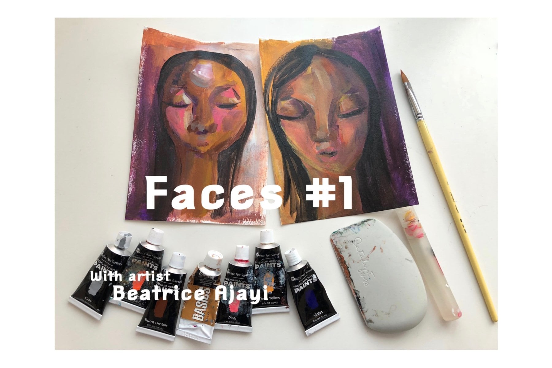
 Beatrice Ajayi, Founder of HyssopArts