Transcripts
1. Welcome!: Let's take a trip to
the misty Isle of Skye. And how about painting some mini landscape
stickers together? Each one with its own vibe, capturing the rugged
cooling mountains and the ethereal glow
of a Scottish sunset. When I first started
painting for this class, I soon realized that
they reminded me of a particular place
called Kama Sunary. Few places on Earth capture the imagination quite
like the Isle of Skye. I lived there for four years and it's where my
eldest was born. Hi, I'm Holly, and I teach from my home studio in East Lothian in the
Lowlands of Scotland. I made the arts my whole life, and I have 40 years experience in performance and visual art. In recent years, I've licensed my artwork with design tech, Simon Ashby, Art cottage. And I'm currently working
with my sister in law, Gemma Lewis, on a
wallpaper collection. Welcome to this mini
landscape class. Designed foot wall. We're going to be painting directly onto circular stickers, starting with an
ochre background, using loose, gentle
brushstrokes. We'll use masking
tape to create zones. In our first zone, we'll be painting
a foreground of verdant green our mountain
range across the central line, backlit with that radiant ochre, overcast with lively clouds
with a chance of snow. Skills that we'll be focusing
on paint consistency, we'll be mixing
different viscosities, moving between a
butter consistency and straight from the
tube high opacity. Getting this right
will allow you to bring texture to your layers. Brush strokes will be using
a light feather technique. And simplicity and balance. We're going to achieve this
by keeping things really fresh by flitting
between each label. By the end of the class, you'll have eight
mini masterpieces. Have a better grasp
of paint viscosity, and you'll have confidence in using swift expressive
brushstrokes. And don't forget you
can share your project in our projects and resources
area under the class. And on the right, you'll
see submit project. So grab your brushes, embrace the rugged
spirit of the North, and let's bring the magic of
the Isle of Skye to life.
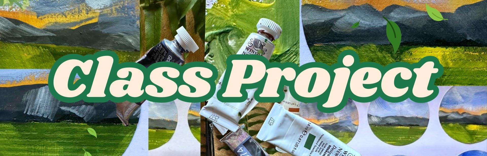
2. Class Project: For our class project, I've prepared a
fun way to explore landscapes in this easy
mini sticker class. You'll usually get a few
hundred labels in a pack, so you'll have plenty
to play around with. You could try different color
palettes or subject matter. You can use squash, acrylics, or even watercolor if
you mix it thickly, and I always recommend
buying a tube of white squash and mix
your watercolors to that. I'd love to see your projects. Sharing them will open you up to the wonderful
Skillshare community. Where you can share tips, get feedback, and develop
nurturing connections. So when you're ready, head over to our projects and
resources area, click on Submit Project and upload your image
and project title, along with any details you'd like to share
about the process. Subtitles are available under each lesson and also a full
transcript of the class.
3. Materials: Running through materials, and
I have just normal labels. And the only thing to look out for is that they are matte. Sometimes these
labels have a kind of a gloss finish and the paint won't adhere
very well to that. So these are 40
millimeters wide. And just so you
can see the size, let me just take one
of the labels off. I found that with this brand, anyway, once they're
stuck down, that's it. You can't take them up again. But what you can do, of course, is cut round them and just use a glue stick over to paint, and I have primary
black, olive green. Primary yellow, gold ochre, and a color called Ash blue, which I've just been trying
recently and really love. This is by Holbein. And on a white gouache
again by Holbein. Now, I've started using
tear off palette paper. I find it so much easier. I have a lot of
pain in my hands, and I'm chronically ill, so anything for an easier life. And actually, they're
not just single use. You can actually wash off watercolor and gouache
really easily. So we want some
thinner washi tape, and I think this is about
seven or 8 millimeters and then normal 14 or 15
millimeter wide washi tape. And I use Mt. Now, optionally, we
could seal our labels, and I used cold wax by Dorlands, a catalyst spatula to
spread out the cold wax. And I also tried out
Liquitex mac medium. That was less successful. It did start to smear the paint. Although I wasn't that mad
about it, to be honest. I quite like the effect. And I just used the brush
that I used for this class, which is the half inch
flat brush from Jackson's. You have to rinse your brush straight after using
the mac medium. I've ruined quite a few
brushes by not doing that.
4. Practice : Let's have a really quick run
through our brush strokes. So I've got prime yellow
and gold ochre there. Just go to mix a little bit more yellow in that
to lighten it. Then let's just practice our
background brush strokes. And you can see I'm moving
the direction of the brush, picking up a little
bit of white as well. Let me slow down and
show you how I do this. So very fluid, very
swift movement. And we can add even more
texture on that by using a very dry brush
with thick paint. Then let's mix up
a very quick gray. Don't worry too much about
the precise color here, so I've just mixed a little
bit of black with green. Now, I'm using my brush on the side and drawing
a line along. And then gently tapping
in some mountain shapes. Little squiggles and choppiness, which a flat brush is brilliant for and a little bit of
a ribbony movement, too. And let's just have
another we practice. Love a flat brush for this. And then let's do our grass. So this is just olive
green, black and yellow, and a similar movement
to the ochre Skye above, but more of a rocking motion than multidirectional
brush strokes. A very quick hack in terms of suggesting dimension is
to add some texture. So let's mix some
white and olive green. Very thick paint here
on a very dry brush. So just out of the tube paint
very thick on the brush. And we can add different
colours to the brush here, so have a little bit of
black, green and white. And then if we add some brush strokes right in the front there in
the foreground, this adds to that sense of dimension and
distance and depth. For our sky, let's just mix a very quick French
ultramarine with some white, and my brushes are
a little bit muddy, which is why it's not
a crystal clear blue. And again, this is very similar to the background brush stroke. I have a swishing from one side to another, multi directional. A swinging movement, I think is the best
way to describe it. With a very, very dry
brush and thick paint, we can then go in and just
suggest some areas of cloud. And that's it. Really
simple warm up. Let's move on to our project.
5. Background: Let's get out our labels. And I think I'm just
going to do eight. So I'm going to cut this down. It's very hard to see where
the labels are at this stage, but it will become more apparent as we go
through the class. So let's start off with our gold ochre and
primary yellow, and that's a mid yellow. And this is going to be
our background color. So we're keeping the
depth of the gold ochre, but lightening it with
this vivid yellow. And then let's do the movements that we've just practiced. Multi directional, very swift,
very fluid brushstrokes, only a damp brush and quite thick paint,
hardly any water. And then we can bring in some gold ochre brush
strokes to add more texture. Well, to paint and just putting a little bit
more primy yellow down. This is so freeing. I love doing backgrounds
like this. Really enjoyable. Keep it swift and keep moving, and also try not to go
over it time and time again because we start to
lose the brushstrokes then. I'm guilty of doing that. Try not to do it here. It's really lovely
background to start with, and that's going to create our sunset as we go
through our lessons. And then let's just dry that off unless you're
taking a break. You want that to be lovely
and dry for the next stage.
6. Machair | Green Pasture: So because my page has curled
a bit, which may happen, I'm just going to tape
that down to my desk, and I'm just using that
14 millimeter tape. But you couldn't use anything. We're going to be
taking that up again. Then let's go in with
our thinner tape. And what we're doing
is putting a tape across the lower
third of each circle. And underneath that tape, we're going to put
in our grassland. So olive green, and a bit
of our yellow ochre mix. It's really hard to tell
what's going on here, but we're painting
the lower third of each label with this green. And again, going through
the brush strokes that we practiced for swing movement
and changing direction. I've put down some
black and yellow, and I just want to swiftly
show you here how you can mix a beautiful green
with black and yellow. I have run out of handsy yellow, but I really love using
handsy yellow for this. But for now, I'm using
my primary yellow, and it creates this gorgeous, really deep olive green. It's really lovely to
just mix that Oops. Went over the line there. With any of your
greens that you have, it just adds a little
bit more depth. Run out of paint there, a little bit more green. Again, using the
paint very thickly, enough for it to move, trying to avoid adding too much water. And then we can go in
with just the yellow and put in some lovely
textural strokes. The paint needs to be
really neat for this. And you can see that
it just brings in some beautiful texture
and also adds that depth. And you can see there
just how dry my brushes.
7. The Cuillin Mountains: Let's go ahead and dry this or you can have another tea
break and come back to it. So we've got some lovely
choppy movements there. Now, taking off our washi tape, we have to go at an angle so as not to lift up the labels. It's taking my time.
Very satisfying. It just gives us a nice
crisp edge to work with. You can start to see
now how the green is taking up the lower
third of the circles. Yep, wish I hadn't done that, but I think I can mend that, so I'm not too worried. And then let's go ahead and
put tape over the green. This will just make
it easier to do a lovely line across
with our mountains. So the top edge is at
the top of the green, and then we're going to mix some French ultramarine,
white and black. A little bit of
everything, actually, probably, to mix a nice gray. And then let's just draw a line along the edge
of our washi tape. I'm just going to add a
little bit more blue. And then again, I have
very shaky hands, which is why I quite like that I can rely on the washi tape. So this line doesn't
have to be perfect, but we're just using
the washi tape to make it a nice crisp line underneath, and then a little
bit more blue and white to create a lighter gray. Adding just a touch more black. I felt it was a
little too light. Keep going and be really confident about
mixing these colors. What's the worst
that can happen? You mix the color that
you're not keen on. Absolutely fine. We
can just start again. So we have the blue, ochre, white and black there. And then let's create
our lovely mountains. And doing that kind of
undulating movement, we're making them desaturated so that they recede
into the distance. And that will
contrast beautifully with the very bright
green of the maca. And then some little
choppy movements. All we need to be
careful about is that the mountains are right
across each label. So I'm going to bring in
my slight error there, make those super
large mountains. The black coolings
are breathtaking. Even though I lived there
every day I saw them, they took my breath away. And then let's carefully
take our washi tape up. And mine has these
little ridges on it, so it's kind of lifted the
color a little bit there. But I like it. That adds a bit of texture. Maybe a bit too much
on that last one.
8. Skye Sky : Okay. I've just turned my palette round and replenishing the French
ultramarine and white. Now, I'm bringing
out this ash blue. But don't worry if
you don't have that. You can mix a gray like we did for the mountains and just add a little bit more blue. So let's now dab some little marks along the line of that black below
the mountains. And this will just help
bring out the mid distance, little dots and daubs. And it also ties in that dark line that we have
with the gray mountains. Adding a little bit more white. And let's have a quick
practice bringing over a very dry brush
with very thick paint. And then a very light,
feathery touch. We're not pushing down on
the brush very hard at all. These are semi abstract, so we can afford just to
be quite free with it. I'm going to put some
more white down. And I think with this one, I'm going to try something a bit different and bring the brush right down to the top
of the mountains. Just want to see what
that looks like. And then some more fluid
brushes at the top. Bring in some texture. What's lovely about this is
mixing paint on the brush. So picking up various colours and not feeling you have to mix it really well on the page, go in with whatever, three, four colors
on your brush. That brings about this texture, and it also brings us light and dark and different
value as well. We're going to keep it
really nice and fresh. Just be careful not to go up into the green of
the label above. And mixing between a kind of a lighter blue with lots of
white and more ultramarine. So I think with this one,
I'm going to just leave a little sliver of that
gorgeous ochre sunset. Each one could be slightly different and have
their own character. And let's go in
with a final layer, maybe with lots of
white in it and just going to put a little
dot more down, and then these very fine
feathery brush strokes, very, very light to the touch. So we're not pushing the brush down at all
really on the page, allowing it to glide across and make these gorgeous
feathery clouds. Maybe a snowstorm amassing a
little bit more ultramarine. And let's turn our
palates round again. For me, this last one
just felt a little too textural because of the
washi tape that I used. A little of that primary
yellow and olive green. And just paint some of that in. I don't want to lose
all of the texture. And then whilst I'm here, I'm just going to add a few more brush
strokes to my maca. We can really start to
see how colors work here because we have that neutral
gray in the background, which puts those mountains
right back in the perspective. We're using a very bright
color for the foreground, and that brings it
way out towards us. And now we're using this
blue and white for the sky, which again is a cooler color. That's going to place
it above the mountains. Finally just want to add a little perspective and some
strokes coming towards us. Maybe just to suggest some
brass right at the front. Very, very easy to do
too much at this stage. I don't want to
lose that fluidity of brushstroke that we have. But I love this primary
yellow mixed with the green.
9. The Reveal: So here are some lovely
photos of Camasunary Bay. And you can see this verdant
green amidst the crags. And this is the view
that I remember from all those years ago and this old abandoned Bothi
near the shoreline. And it's time to reveal
our mini masterpieces. I'm transferring mine
onto my palette paper, just so you can
see what they look like away from the
original page. But of course, you
could just leave them on the sheet and use
them as and when. Because I transferred mine, I found that I couldn't
get them up again. So I think I'm just
going to cook round them and use the glue
stick when I need them. Let's give these a quick dry. Don't want to blemish
them at this late stage. I'm just going to cut down
some of my pallet paper. We Just wanted to show you what wonderful
little masterpieces these are and you can
see the full effect. That is divine. I absolutely love that we can see that gorgeous ochre
in the background, that hint of a fantastic sunset behind the Colin Mountains. Little taps. These are gorgeous, as well. I'm definitely going to
find a use for those. So here we are with number five. There she goes. Little tap. What I am really enjoying is that they're
all so different. Now that I've lifted
them off that sheet, you can start to
really see that. There's my big mountain. And here is our final one. And again, the blue and the
orange together, I think, is such a match made in heaven. Very pleasing. Mm.
10. Sealing Our Labels: I want to run through how
you can seal your labels. And I'm using Dolan's cold wax and a sputula made by catalyst. And I find if I
just do this very, very lightly, you
can actually use it really successfully
with gouache. It's not making
gouache run at all. It's my favorite way
of protecting my work. Just the lightest of touches, and you can see how much
it brings out the colors. I love that about wax. And then I thought I'd just experiment with some mac medium. And I'm just using
my half inch brush, very, very light touch because I know that this
doesn't always work. You can see here because I had a little splge
of paint there because of my big mountain
that did make the gouache run. The matte medium is a
lot more liquefied. But overall, I think
that's being successful. Hope this helps.
11. Thank You!: Well, who you've
completed the class? I just thought I'd share some of the other labels that I did. These were the very first ones. Here are the ones
I did in class. Oh. And another batch, which I know are going to be
heading towards my daughter because she really wants to
use them as letter seals. It's been an absolute pleasure as always to share this
little journey with you. I hope this easy introduction to landscape painting has given you a hankering to
explore further. Thanks again for sharing
your time with me. I cannot wait to see your labels and how you've
chosen to use them. Take good care of
yourself. Bye for now.
 Holly Tomas Art, Watercolour | Gouache | Mixed Media | Scotland