Transcripts
1. Introduction: everyone. My name is Blake Charles. I'm a qualified accountant working in UK automotive industry. What? I'm here today to show you is my introduction to power bi I and how you can build great reports and dashboards with no code in required. This video will hopefully give you the introduction I wish I had when I started using power . Bi I I have been using power bi I over the past few years now and I have taught myself on being a complete beginner unease and video tutorials, online forums on a lot of trial and error. Now, this video will give you what I think is 90% of the general use of power bi I, which is taking data from a spreadsheet on building a report on dashboard from this Now I'm gonna take you right through each step. In the very beginning which is downloading power bi, I upload in your data building all the visualizations off your data, finishing and formatting you're a port and then uploaded onto the cloud on power. Bi I lesson is ideal for beginners who have never used power bi I before and in future lessons we will build upon this class and look into more advanced power. P I skills now for the class project are provided in the data used in this class, and you'll be out of build your own report in your own style. We all had. So answer any questions you may have provide feedback future. You'll then be out to apply the skills learned in this class to your own reports and dashboards in your own company. Thank you for watching this introduction, and you'll hopefully be joining me in the class.
2. Downloading & Installing Power BI: to begin with. If you have not done so already, you and he's download Microsoft Party I and this is easy to do. We need to do is come to the Microsoft Power Bi I website at the top, Get products, select Power Bi desktop and bring you to this page, and you can simply download it for free and stall it like you would any other program. One thing to check, though, is to make sure you download the correct version, whether that be the 32 bit all the 64 bit version. If you're unsure, this relates to the processing capacity of your PC. Now most PCs currently 64 bit. Now, if you could said to see download or language options, this will open up a page, and from here you can select the language, and when you hit download it will give you two options. He was 64 bit or this other option, which is 32 bit. There. You need to download the version, which currently matches your Microsoft office. Now, to find this out is very easy. We just switch over to excel. Let's get to this window we need to do is get the top left hand corner. We can file account, and then there be a button that says It's so if you open it up, you get this window. I thought it was a Microsoft office 365 and at the end. But what you say 64 pic or 32 if it's a 64 bit and download the 64 bit makes you happy. I it's It's first YouTube it. Then download my crystal 32 bit and that's all.
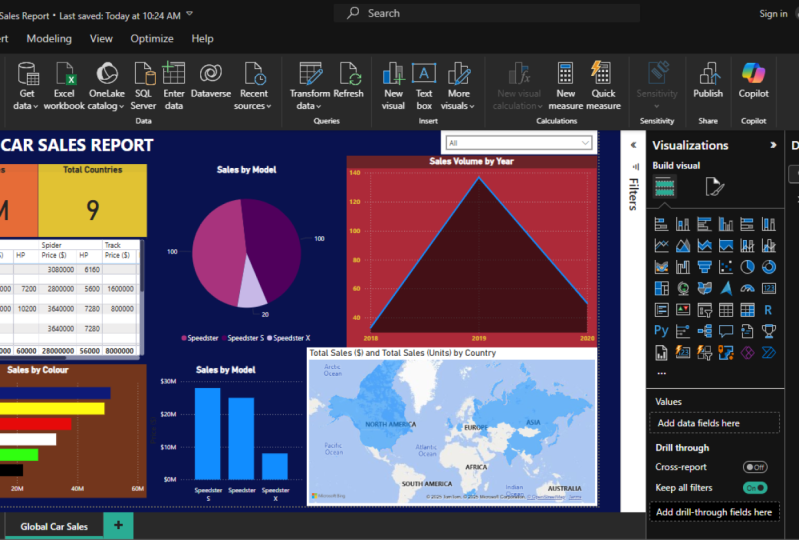
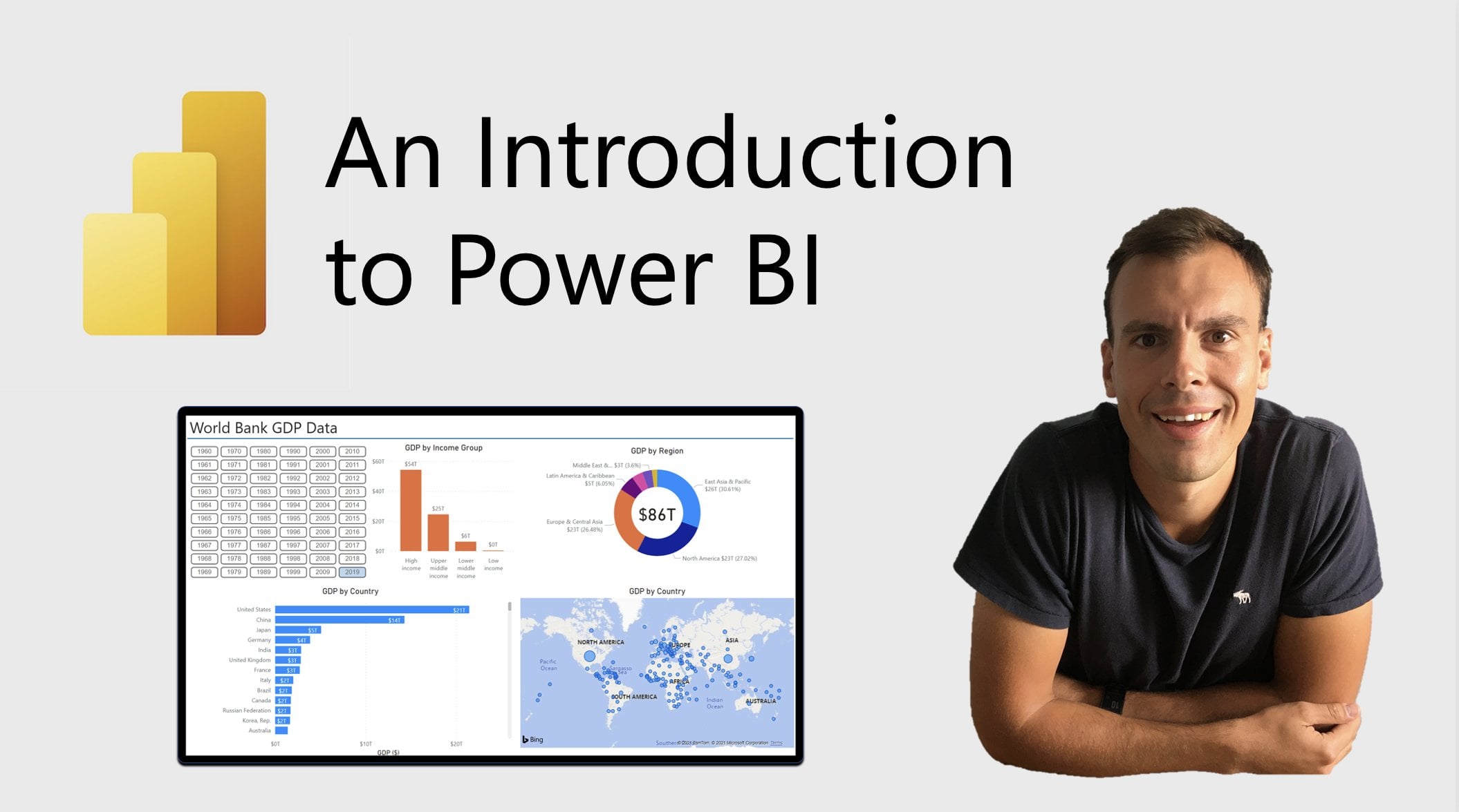
3. Loading in Data to Power BI: So here we are inside power bi I. And as you can see, it's looking for a clean and crisp. It's blank. We haven't loaded any data in there yet. There's nothing to look at the moment. But as you can see, it's got a very similar feel on Look toe have a Microsoft products. We have the ribbon area on the top. We have use your names of file home in certain modeling. Onda. We are looking to these a bit more in detail later. Now for this lesson on building great dashboards being a beginner's guide as well. It's an introduction. We are only going to be used in a few of the key pieces off information and tools on here. So if if you feel a little lost or that is a bit too much going on, then don't worry about that. Our show you exactly what you need to look at. So, as I said, like most of the Microsoft products, a lot of the features you need to use a base at the top but also unique power. Bi I is Syria on the right. We have our filters, visualizations and fields, and you'll see that under visualizations, there's a lot of these different options, which we will look at some later once we get some data in there. Everything from bar charts pie charts to some other unique and cool features, even including maps. FBI has very clean, crisp look, But to really get going with tutorial, we need to get some data in here. So by doing that, when I got to the top Ruben up here and we're gonna click on this button that says get data . Now for this exercise, we are going to use Excel data that I put together myself. But as you'll see, there's many other way you feed data into here and in future lessons, we will cover some of these and some of these sources. But for now, I'm just gonna go onto this option that says Excel. Andi, this is where you need to go and find the file that you're gonna be using for this exercise . There are mines really being loaded here on my desktop. I've got this sample piece of data I pulled together. It's called car sales. Some data power bi. Now, before we load this into here, What I'm gonna do is I'm gonna jump out. Pablo and I go into excel and show you what this data looks like. So here we are. Now, here's our data. Now, the industry on current working is the automotive industry. So I based his data in that sector. Andi, the day try pull together is based on car sales. And what I've done is I pulled together a few columns of data now and total there's a bowel . 111 lines of data in here. Andi, I've included a few key columns, so just to run through the city, you know the data is in column A. We've got what's called a vin number of the vehicle. Vehicle identification number on this is unique through each line on in future lessons, we will actually use this to field upon ad in new tables and expand our reports. Here we have the name of the vehicle. Now, the vehicle I've chosen to, uh, call it in. This exercise is the speedster, and this is effectively a sports car. So we've got speeds to here, then further down, we got the speeds that s on. We've got higher and model the speed stacks Call him C guard type of vehicle so ever it's Accu pay speeds to s a spider on the X is a track focus cup. Condi, we have the color e. We have the horsepower of the vehicle in column F. We have the country comin G. We have the year that this particular vehicle was sold on in column h. We have a price now. It's quite simple data. There's any a few columns, but this is great for beginning to learn. It's got some unique features that we can build upon. We got prices. We got that dates. We've got different regions. We've got unique numbers to separate each individual one out. So this is a great piece of data to startle. Build your first report on dashboard from. So let's jump back into power bi I and get this data loaded in as mentioned earlier, I found my file, the one we just looked at in Excel that we need to do is simply click on that file on opening. It's gonna links that file and you see here that file opens up on, we've got this single sheep, which were we only had one cheat file, and we called it global car sales. And you can see that when I link Click on that is a preview. It gives us the exact data we were looking at on Right down to the bottom can be expanded further, but there's just give you a snapshot. A preview of what file is now. There's some more violence, things that you can do at this stage, you Congar streets into data. But this is simple. This just beginner's guide on for 90% of the uses. You just need to get your dates from an excel far and put it into power. Bi I So we're gonna simply do is click load on, then this is gonna be loaded into power. Bi I For us to build our reports from this is quite a small file, so it won't take long to load in Andi you to see it's now being loaded in its creating the collection to the model. So the data in Excel fall on its being loaded in, and you will then see our data is gonna appear on the right hand side. There we are. There's 100 10 rows have bean loaded on our data has now being included. And you see, we have to go to date. Is that included? Because it now appears on the right hand side on the fields. On those columns that we were looking at earlier on a I'll shut in here, all the rack inside. So we've got everything from the VIN number. Got the year, that price, the name. So each of those cons we look back is now an individual field. Now, if you want to look at what the data behind looks like there's different ways you can do it from here. One simple way is over. On the left hand side, there's these different options. So we got a report, which is the current view room. You've got data and you've got model. Now, if we just click on data, you're actually see behind this, we click on these fields on the right. It simply comes up. You just need to click on one of the options here that our data appears to these a lot of the columns that we had, you know, except for now, if you click on model, if you want to see, you can see the actual same structure here Now, don't need to worry about page of the moment. We will come back this area in the future lessons. It's not required for this lesson. At the moment on this, where you can see off the data sets that you've got loaded up loaded in power, bi I on you can also begin to link them. But for now, we just need to go back to our report. And from here we can begin to compile our report on begin the process of building great dashboards.
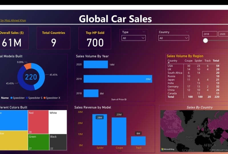
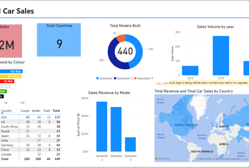
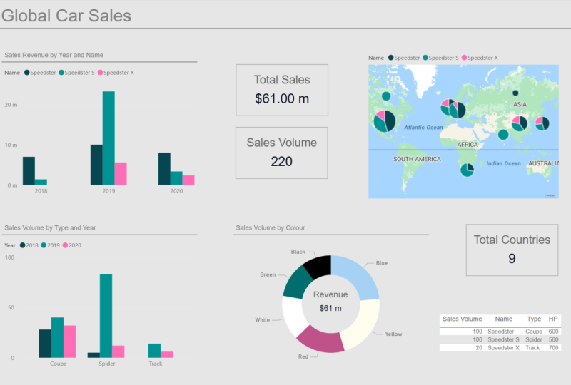
4. Creating the Visuals: So here we are. We've got our data loaded on the right hand side. Our car sales data on We've got blank report to start building in now. First things versus a bit house. Keep in our suggests that you just save your file, save your progress and just save at regular intervals in case anything happens. I've just unequaled mind. Call sales test report. Now let's get into the data and have a look at what there is. It's really simple to get visuals and data onto the center screen. Now, you see that on the right hand side where you got our file that we loaded in on all of the columns, There's these little check boxes next to it on. It's really easy to use it. So, for example, we take the 1st 1 price. If only just take that, you will then see in the center of the screen. I got a single botch up, so I make this bigger. This is just simply totaling up everything we have in that column. So just to show you where this comes from, if I go to our data tap and your CDs of our columns, the data on this calm, which has priced dollars. It's just something up. Everything we have in this column right down to the bottom of our data. And in total, that is coming. Teoh, Just over 30,000,030 $0.5 million. Andi, there we go. We've simply got a graphic loaded into power. Bi I on That is start of all report that we're gonna be building. Now. Let's have a bit more to this. So we've got our 22 costs here off all of those car sales. Now, let's have a look of that by year because that's a more useful measure, something you may be asked in a meeting or to report on. So what we need to do is we simply governed to the right hand side again. Find our year on. We click on the tick. Andi, you see here we've now got in values. It's his price and year now, this isn't in the correct area that we needed to be because we want our price down our Y axes on the left hand side. And we want our years along the bottom now to get the years along the bottom or we can simply do is take the year and weaken, drag it up to the axes field, and then we get We've now go our price down the left hand side on our years along the bottom, and they are in order as well. 2018 2019 and 2020 because each of these is coming up with the different sales that we've made in the respective year. Now what we're gonna do for the moment is we're just gonna focus on this one. Visual on. We're gonna do a little bit of housekeeping because if we can get a lot of things, sort on this one, it's gonna make for all of the other visuals that we had in a lot easier. So firstly, we are gonna work just on the day Overall look of this said at the moment. But years on the bottom on we got the caption. It's his year. I'm happy with at the moment price. On the left hand side, we've got price and at the top here, this title or heading This is just the default value for what we have in terms of values, and it's just seem to say in price by year. This is also massively created. Now I want to change this. And I wanted to say sales revenue by model. Sorry. No cells reading you boy. Yet now to change this heading at the top to something that we want to call it is really easy on. I wanted to simply call this sales around new by year. Now, to do that, we come over to this right hand side and this is where we're gonna make the adjustments in visualizations tap. Now we need to do is to click on the visual that we have and you'll see the options change on the right hand side. Yeah, we see me over here. You see, we got our different visualizations. We can choose at the top. We've got our fields tap, which we've already looked at what we've added in year and Price and this one in the middle format. We click on that, you'll see there's lots of options Come up Lots of things that weaken. Do Onda adjust to you Changes visual, for example on the general, it's got general position of where it is on the page. So it's coordinates on the title. We can go here, and this is where we can actually change the title. And that's what we're gonna do in a moment on the data labels we can change with the data labels looked like on various other things which will cover later on. In this tutorial that's Class SE has just mentioned, Let's have a look under the title you can see here type attacks its price dollars by year. Now I just want to simply change that to say, Samuels Revenue. Oh, yes, yoga. You see, it's changed after sales revenue by you. No, there's other things that we can change being change the alignment of the left for that in the middle, make you look more centered on. And already it begins to look a lot better than what it did. So we now says sales revenue. Yeah, we got the families. Now, if we take a closer look at the values received, holding my mouse over them has a year, and it has the price. But the price even that just $8 has been a description. It's a number. There's no comes in. There is nothing to separate. It makes it harder to read. For example, is that 19 million or 190 million. So let's change the format of our numbers now. This system is really easy to do. And actually, this is one of thing that makes the difference between a simple dashboard great dashboard is the little things such as former, So to do that if we go back over the right hand side and we click on our price, you'll then see that on the top of the ribbon, there's a few different options come up table tools and Colin tools. Now this is bespoke to that specific measure that we picked in here. I got the name of the measure, which we can change if you want to. We got the data type, which is whole number on. We've got the format, but what we can do is under data type. We click on the options you can see. It's this whole number decibel number, and there's various different options down there. But if in format, if we click on that, we can see there's something a bit more useful that we want, which is currency. And if we click on currency, you see, it's just making that change in the option on there we get, it's changed it for us, announces currency, and it's changed it to say $19 million it's in the far easier for me to use. It's also changed the numbers down the Y axes on the left hand side of our graph. So it's clear to see from a distance that actually the axes on here is price and we can now send you see our sales revenue by yet. So there we go. We've got one visual created on. This is a start of a very useful report that you can pull together quickly, get into meat in and analyze the data with You will receive that. It's very slick compared to an Excel chart. It's quick to change between them is quick to get the values it's easy to see on. There's gonna be many more benefits that I'm going to show you using power bi I for report in over using a Simple Excel report on your desktop. So let's get on Teoh a second visual. So for the next report, I want to show you something similar to this, but I want to show the actual sales volume by year, so we shown sales revenue. I want show sales volume and now having a similar format to this one of things we can do simply copy and paste so we can get a control V and we can control the This was just copy and paste that for us when we can use this is a temple and I want to change that title as I did previously I to and I'm just gonna simply change would revenue. So this is the number of cars we have sold, so I'm not worried about price is now the number. Now, for some people, this is the first shoot at a fest when they're building reports like this is Well, how do we show the number of vehicles that inside? Because we thought year we've got price. We've got some other variables in there as well, but we need some dish or a specific number because of the moment. It's just summing up that column that what we need to do is we need to count the number of vehicles we need to count something which is individual and unique to those vehicles. So if we go into the data and look at this data we have, we need to about to pick a column that we can count that is unique. Full the vehicles. And for this, the best one we can use his column A which is death in the vehicle identification number. Now, if this day drop all together, this is unique to each individual vehicle. For example, why would account the name? Because there's any free different vehicles, names. The count would be free. It wouldn't be useful for one Opens, Chief, Where is Vin is unique number. Something to use this in our poll, we get back to the main page. Oh, click on the visualization that I want to amend on on the right hand side here where we have sales in values. I'm just going to simply press the X to delete that you see the antics itself over here on , I'm gonna go too thin, and I'm gonna just take him a been Now you can even take or you can drag so I can drag it across to the values there Unless you're that looks like. So we now got the vin in here. But what is doing is it's some in vin numbers see, it is very big number here now That's not useful to hospital. It doesn't mean anything. So what we can do is over and values. It's got a little drop down box. And if we click on that, you'll see that we've got tick against some. And I was many other things in here we could do. We get average minimum Waxman and here we have camp, which is what we need. Andi. For this, we're gonna use counts dinked. So if I click on that, it now changes discount. Look, then on our walks he's has changed. Announces count have been another. Each year we have a number. This is 18 in 2018 67 in 2019 in 25 2020 which is great. That's what we want. If you elope, I want to change what this says. I don't want it to say count of in, but rather to say to say, sales volume. So if we get back over to this little drop down, I click on this drop down The seed is a filled here justice rename. If I click on that, I consider it up in there. That was food President no change sales volume on our Y axes on. When I hold her over the bars. It's this sales volume that's his actual any. So there we go. We've now got two graphs. Look, Interval one has shown US house revenue. One is showing us settles you by year. And this is it was a good time just to save report. We've made some progress so far, just in case anything happens, crashes or you lose it. Now, with these two visualizations that we have here, we can now look at some of the interdependencies that we have. So, for example, if I click on the 2019 ball here, you'll see that your highlights to 2019 ball over here for our sales revenue, which is useful, blanks out the other ones were using. And if I click on 2018 you'll see that it highlights the 2018 box that we know using. And this will work across many visualizations that have the same measures on the right hand side that we use it. So, for example, in a bit, I will go through some more visualizations. We're adding some more features and you'll see how they're interdependencies work, and I'm also going to show you as well how you can find them. So it only shows you the specific year on highlights the other years. Completely cool, sir. Let's make a bit more space on our port. I'm not gonna worry so much about the look at the moment. I'm just gonna shrink these on is very easy to adjust the size. Andi, move them around. So let's just put those that So let's look at enough visualization. What I want to see is the number of vehicles we have made in total, um, by type. So we will then go across to this. Don't not chop on the right hand side. So I wanted him to look a bit different. Now, this doughnut chart on pie chart, the very similar It's a circular visualization and you can break down by different types. So if I click on doughnut shop, you see, that's now gonna load in the main page. I should move this cross now like we do with the bar chart. We just need to pick the fields that we want in there. So because I want the number of models built by type what I want to do is have a similar measure we use with sales, will you? So I'm unease of in for this and put it into values. And then we got We got then and like we did, I want change this to B count. Distinct. Andi, I'm gonna rename this to total models I use. It's something a bit different. Total model. We just called it something else, and you can see that you can jump in 10 Circle was 100% 210. Now, this isn't very useful in a moment. We want to break this down. I see different type of vehicle. Now full this. If we come back to later, we got some two different comes we can use for this. We've got the name of the vehicle speeds there. The speech, that excellence beats the X. We've got the time group a spider, which is a fancy name for convertible effectively on. Then we've got the X right down the bottom or speeds X, which is our track. Very. And for this, I'm just gonna break it down by the name of the vehicle. So simply we could go along and we want to take the name filled and put this on the legend . There we go. It's now broken it down by the different types and we got the different numbers. So, for example, we can see here speeds that we've got 50 beats the S We bought 50 beats The X we built 10 on there. Some sensors on there as well. Now likely with your Like we did with the other visualizations. Let's make this bit neater. Now let's have a look. Some of the features we can do. So I want to change this title to simply say total middle models, Bill. So for this, we've got a visualization selected. We're going to go across the format tap Tyto, and I'm just gonna put in there total models built. Actually, we've got pretty much that for us. Total morals built unprecedented and put it in the central linemen. Now we can also change if we want font color changing blue. We can change the excise and we most cheese, But now I'm gonna keep it quite simple. Just keep on black and keep in the center. Now we have our legend on the right hand side and is thinking of a bit more bit of space, and I want this to go underneath division. So if we get back Teoh format and I thought to the left you see the top one on here, we've got legend, and if you click on the legend, the first option we have very useful is his position. Right center No one's change this and there's a few different options we have here, but I'm gonna put its bottom center. Now we go. It's now given us more space for the visual, and it put the legend on the description and names at the bottom, and you could see the color code in matches as you would expect. Now, small other features we can make you see here. It says name now. I don't really want this to be here because it's a bit obvious to actually what it is on Our date is quite simple. And one of the options we have is title on or off, and I'm just gonna flick that to be off. So it's gone because we don't need that now to also simplify the data as well. For some data you work with and look at happened absent juices quite useful. But for me, it's not at the moment. I just wanna look a whole numbers home inside your values. I'm not worried about a percentage or decimal place for this data. I just want to see the total models that we have built on sold in the year. Now for that, let's look at another tap. Let's look under data labels. If I click it data labels again, very helpfully. The 1st 1 we've got here is data label style on. There's many different options that we have here because the moment we've got the data value and percentage of total no, I just want to show the data value. So if I click on that, there we go, it's now change. It's just simply show how many models we have built of Aaron. No, what happened with that? I think it's quite good. I like the colors, and it's quite crisp and clear to show what you've got. And like I showed earlier with the other visuals, we click on one. It filters the other data so we can see how many we sold by year, which is really useful to help. Now let's put that to one side. And let's talk that for now. I just say this, Pappy I report what we're gonna do now is get onto building another visual, our 4th 1 for a different measure. Now, for our next visual, Lex, let's mix up a bit because when you have a good report on a secrets, great reports is to have a good variety of visuals on there. Different colors, dish of different shapes, different styles to help present data in a clear and concise way. Now, what I'm gonna show you now is another interesting feature on visualizations, and it's called. We click on that. You see, we have a box loaded up Onda a London have simply been here is touch sales price here, and this is card. It's it up. It's a way of having a little snapshot off data which we can use, which actually filters without other data. So if we look at sales falling by 2019 and I click on that, you see, it's gonna change 19 million two consoles for revenue by year, 6.8 million. It's gonna change 6.8 million, and it's very useful toe. Have this. If you want a clear sap? Show off how much we sold. How many vehicles will be solvent in the volume or any other metric? And what I would like to do with these is have them quite clear in concise of a nice color background to help stand out. So what I'm going to do is just like we have with the others. Just change the form out. These So you may think this is the title of the moment, but it's not. This is what they call a category label. And it's over here on the right hand side on because this is the metric that we've got chosen. Now, what I want to do, you simply turn that off, go to titles, Tony on. And I'm just gonna type in here simply total sales and leave it at that not going there and put it in the middle. And I said to you, I want to make is quite colorful. So to add a background to this, I'm gonna get back to the format tap on. You will see there's an eruption on here in particular that it gives us the option. Speak now for this one. I'm gonna Gov for Leckie sort. Let's go for Let's just go for this light red over here. There we get car cells 30.5 million and out. The great thing about this is every single filter that I choose that can cut this data. It changes it for me. So let's look, we sold 10 speech directs that came to $4 million. Fantastic. So now let's part this one in the top. I call none of our people now. As I said earlier, I'm not so worried at the moment about the layout of this. We would change that later, and I show you a nice, clear way that I like to present my data like we did earlier. Let's go play in practice. It's called Let's change It again. So we've got total sales in the left hand side, but now it's not looking at countries. Now let's see how many different countries we've sold him last. But should you earlier, we have a quick look at the data on the left hand side we can see, but from countries in here U. S A. China. Germany's effort with Japan and in total in this data, I've included six different countries. So let's look about come up. So on the right hand side, we've got the card selected. Got the price in this fields tab. Now I'm just going to simply change this to be country. Let's put in the country that that we get now the default. It's come up with this first country, which is China. That's done this because it's alphabetically in order to come up with China. But I want to change this and just get to count. Distinct. Let's count how many countries we go and there we are. It's come up with six. Now we just need to change the title. So go to title. I'm gonna change this to countries cancer and to help it stand out a little bit more. Changes like Billy not changed so that we got now Potato Country six. So I asked how many speed to and how many countries to be self species. Six different countries. How many cell would be set up? This beats X will. Only five countries actually says one country with inside of me 40. This data is come to life. Find a more useful now. Will not one of the great things about happy I that you can't do in excel, we can't easily annex. So anyone, uh, is having interactive map. It's a quiet, cool feature of Power bi I on something which always tends to buy fine to impress people, particularly against meetings. If you have discussions about the region's you sell in. All the countries have an interactive map, people quite like and this is a great feature. Power be idle have already installed on on visualizations in the right hand side. There's some different map options up here, but we're going to use this one here that says Filled map. And it's very easy to use all you need to do you selected and now we just simply need to put in the countries that is very intelligent. This So with this visualization selected like our country a ticket. I give it a moment and look at that. There we go. Let's come up with being maps, and it is detected from the country's that we had in our data what they are. He's got the UK you got Germany but China, South Africa, Japan on the USA. We were last Christmas. It is part of the USA so that we got. And that is really cool. For example, if I filter just on China, you'll see that races total model bill that's going down total volumes by year on revenue by year in countries is one. And in total, we've had 4.5 $1,000,000 of sales in China. It's really good, powerful, quite useful on indirect interactive tool tohave. And now well, I'm gonna do Just to change this is simply just change the title. I just want to say sales. Our country has it done with the offers. Put the by spinning middle on that week. I'm just gonna talk this in the corner this pretty So we've already now got six different visuals included on this report. Andi, For some people, this is finished. We just need to change the format and make it look of it back. But what? One of things I'm gonna show you now and I'm gonna move on to is how to you make it look clear up bit Crispin, and also how we're gonna change some of these interactions because at the moment I'm not quite happy with the way they interact with one another on. I'm gonna show you how we can amend these. So let's move on to doing that
5. Editing Interactions: So one thing we can look at now is the interactions that we have between our different visualizations. And what I mean by this is the way they work when I select a filled. So, for example, if I click on here, you'll see that it filters the year over by revenue, and it filters this don't know job that we have as well on, then vice versa. But don't take off that. If I click on the doughnut shop, you can see the way I feel dizzy cross. Now, the moment I don't like the way it currently keeps the graphs as they are in any partially filters. Really, what I'm only interested in is the data that I need to see because it always looks a bit funny, particularly on doughnut chart when it does it like this, and what we can do is is a feat from Power Bi. I called edit interactions. Now, to do this, what we need to do is click on visual and at the top, where opens up the former and day to drill. If we click on format, you'll see on the left hand side. This is tap here, which has edit interactions. Now, if we click on that and turn you on, you'll see that these new features appear above all graphs. Now what this means is effectively says, Do you want to filter a graph? Do we want to highlight it? Do you want it to have no impact to None? On this relationship is between the visualization you have selected on each of the different visualizations that interact with it. So, for example, if I click on this finite Lincoln filter, you'll now see that when I click on a segment, the graph filters on the axes change. The Vatican speaks to X, you see it filters. We live in tow. What I've selected and what we can easily do is we can go around all of different charts, and we can select from these two filter under this one filter, filter and filter on the map. And then we go. We've edited the interactions, so when I click on this segment, it filters all of my different graphs. Now it may be that tedious initially, but we need to get on each of individual visualization on do this relationship each one. So let's begin. So if I click on the doughnut shop visualization. We can see that it feels that the country filters are sales falling by year sales revenue by year. On these other cards, if I click on the map by country, can you see that total models built isn't actually selected yet on the filter? So I'm gonna select that because I want that to be filtered. What sounds boring to be filtered on my reading you by yet to be filtered We belong to the next one. Countries filtered sales revenue by year. I want to filter total models by you totem or was built. I want to be filtered. And then, lastly, we clicked on this visualization sounds warning By year, I want to be filtered countries filtered in total world built, it's built it. And if I click on these two cards, he's actually don't have any direct interaction between the other visualizations. So Aiken, leave those for now so that to rearrange what we have at the moment, slightly so that we can see how much space we have to play it play with and how we might want it to look. So let me take my cell volume by you just stick this over here on, but that about the country total models built, I'm just gonna leave here. Let's move these cards down. But actually, this is a good time. While we're just adjust in this to try on bond, affect the report it to make it look a bit nicer and a bit cleaner on what I want to do on this report. It's just include a title in the top. Now, this is very easy to do on one of the things one of the way we can do this is at the top here. Under insert. We have this option for textbooks. So if you just click on text box opens up just like it would in any other Microsoft office products word PowerPoint, etcetera. And in here, I can type in title. So cool there, label, uh, sales. Andi, I'm gonna make this eyes about 24. Just make cold. So that, dear sweet night, I thought, too the public order. It's very easy to move around in a justice. Signs of this box change the window that move it instantly just to give it slightly clean fill I'm looking line underneath to help separate the title of top area with the report below, and we could do this. If we go to insert, you have your other options here you can have in text box button shapes, images etcetera on. We look at these in more detail in future, more advanced lessons. But for now, we're just gonna go on the shapes loin on. You'll see here a line of his now It's not used for the moment. It's vertical. We can easily change the direction of this. So where we would adjust the other different elements of our visualisations. On the right hand side, we have this format shaped area and hidden near. We can change the color on other aspects of it. But one thing I want to do to change the rotation. And quite simply, I just want to turn it around 90 degrees at 90 degrees Click. That's me changing the zoom click into the and has even help. There we go. We've got Lined and it's 90 degrees. Well, I'm gonna do with this simply. Just stick this under the title, drank it along to the other side, and there we go. We've got a nice title. Players separation on the line. A little bit more professional. Look, just try. And there we get Good. So going back to laying out the former? What I do is sales falling by year. I'm just gonna move that up. Teoh Stop corner. Probably then just extend that out of it. Sales by country. You can see there's a nice snap and thick lying there Adjustment. That's it says that when you move your visualizations around, you get them nicely in line with one another. The totals models built, total models built. I'm gonna put just to the right sales falling by. You on again. Get the top of that lined up. Change it. So the bottom is in line there. We get on our sales revenue by year. Actually, What I'm gonna do at the moment is I'm gonna change how this graph looks. We've got a graph of it here by year when we got sales revenue by you. Now, we don't necessarily need these by year because we can always, uh, also by the year and then have a look at the total sales volume number down here. If we want to see what the number is by yet What I'm gonna do my unfilled This. I want to change this by or to be total sales revenue by model. This is really simple to do. So we go to the right hand side. Well, I'm gonna Simply Day is take a year, but leading it take off the name. Select the name. Drank across the axes. Never seem out. There we go. You see, we've now speeds to s speech. That and speed stacks. Okay, so we got our free models in there for us to see No one needs do now is change the title. And I'm Nicollet Sales rep you? Yeah.
6. Finalising the Report Visuals: So now we've updated this visual. Let's just move this to the site on. What we're gonna do is make some room for our last couple of visualizations, which we're gonna include on with this. I'll show you a couple more, uh, techniques. Andi, Look, tips that we can use to make our reports. Um, break it side. Let's meet. There is out there. So the next visualization that we're going to look at the tables. And if we go to the right hand side, you see you have a table and a matrix, they're similar to one another, except the Matrix is more like a pivot table in Excel. So if I click on the table, for example, we have our blank table appear of here. And I can simply just select country on price, for example. And he we are We have list by country on the price. Now, with the table, you can keep adding more columns. So if I add in color, you didn't see, we now have two column color on many more lines, and it breaks it now down my country, the total sales in that country by that color. If we flick this now over to a matrix view. Just select the matrix visualization and it changed it for you. You see that we now have the country downside and we have the cockerel on the top and it's amore condensed matrix style. Look to it. Now. What I want to do is I want to show the total sales volume by region by the type of vehicle says to do this and he's changed the color to the type. So I'm going to sleep the color fine, tight, drank it across and put it in there. So here we go. Now we've got the total sales warning by type the total value of cells by the country. But what I want to do, I want to actually look at individual unit cells. So for this, we need to change the price. So what We did earlier books for the vineyard instead, and then we do a distinct count. But the thin and I get count distinct there. Yeah. And now I can simply see in this matrix how many we have sold my country to see that the USA has the most amount of sales. Unlike we've done previously. I want to add a title so suddenly Get full map, try to I turn you on and I'm just going to say sales you region on I don't know. I spent it like there we go. That is love that visualization added Scott Page. Now, lastly, we have this guy on the bottom here. One of the things that we have a look is colors in the different political relations between the cost. So I want to get a nice visual down here to show the total volume sold by car. Now let's go up to the top. And let's pick a different type of visualization that we haven't looked at before because the whole different variety of ones we can pick enough all this I'm gonna take on this one plus a bar chart, respectively, a bar chart. But the bar's run horizontally. And now I want to add color to the axes. There we go, Andi, I want the values to be the total volume sold, so as we did just now within count, distinct who say we are kind of sold and the numbers sold. Let's change the title from this. Make a little bit better, so I'm just simply going to say four years. So go away. Dumb century. And because we know this is volumes old is not really needed. That we need to say, can't have been the bottom it doesn't help on. You can also be quite obvious in certain charts act for but its Williams Michael. So actually, to make our visualization a little bit larger, we can remove this and we can simply remove it. I kind of to format finding the why or the X axes taking the exact sees there. So what we need to do is scroll down here title when we go that we on, there's a few other different things that we can play with in here as well. You can change, for example, decimal places. You can display the units where you want thousands millions even up to trillions as well. The text always the color new clothes to start where it change where it starts and ends. This is quite useful if you have a large amount of data and you want to change how it looks . But for now, we're just gonna leave. This is one thing to make it better as well, until it stands out, you can easily see the values because the anyway, you can see how much each one is. He's actually if you move your mouse, but it be really cool. If we can add in each one the numbers of each culture and this is very easy to do. It's on the right hand side again under former on the data labels. If we expand that and we click on now, you see the data labels appear on. What I quite like to do is good anti. What's his position and change it to be inside end. This allows the numbers just to sit inside the bars, and also, sometimes it can give you a bit more room for your visualization. So now from a distance, I could see the most popular color sold crystal. Our cars is Yeah, on the least. Popular is green. Now let's make this visualization stand out a bit more. You can actually color each individual bar to be the color itself. This is a little Emmanuel, but if you want to make a cool report something better than the norm, we can do this. So, under the format again, the former area is the main control center from more Define a little visualizations on the data colors we click on show all we'll see that allowed the colors appear. And if we select the color the yellow I want to pick yellow Now sometimes the default colors that come up on exactly what you want. For example, none of these are particularly bright shade of yellow, and you can go into custom color and you can even find that color yourself. Or you can put in the RTB code. But for now, you can go yellow. That's blue read. Just get for this Red. Why? Well, we got a white background, so I'm probably just gonna go for a sort of a light gray black. I'm just gonna get black. And then green there isn't one that's good to choose the moment. So I'm just gonna get for agreeing that. And if I zoom out that we got, go call us down there now that yellow's a little bright, so I'm just gonna turn it down and go for this more mustard colored yellow. And even that's a bit too doh every day. I believe that they now hold him, sold my color and, like I said before the number of the bottom, it's quite obvious what this is. These are colors. We don't need it to say color at the bottom corner. So let's turn that off. Come to why axes scroll down its title. Let's turn it off. There we go. Cool. Now I feel this report. It has a good amount of information on the movement. So if we go down our fields color what we've already got that we can see the color by country instead of cold. We've got the countries there horsepower. I haven't included that at the moment because there really isn't that much to show. It's only unique between three different variants. So I'm not so worried about showing that we got the different names in the vehicles. Speech to rest speeds. The speeds to Rex got the price. Got the different types in there. We've used the VIN numbers at the moment to help give us the count of the total number of vehicles on in future. Classes were going to use this to help expand and at tables to our data and create a few more conflicts, complex reports. Samuels got the year on. There's a separator between our sales volume and revenue. So in the next steps, what I'm gonna do is just to tidy up this report and make sure all the interactions work. Andi then would be ready to move on to the next stage, which publishing it. So when I edit my reports always like to make them quite clean, crisp. So that's just ensure that we have all our visuals in a nice, clear layout. So I'm just gonna just ease the end when it's all to match up that blue line there and save this country one I want to just said they were gay got out there sales revenue. So what I would do is just Mitchell. That's in line with that. These two. Perry's have him. He's too called. It's gonna move Those across make this bit smaller, his total models built just gonna move this one across as well. Now, when it comes to editing and formats in our pool, it's very much personal preference. How it looks on how the layout is. It's up to you. Whatever you think looks best, buy something like to keep a little space between some. My visuals and I try not to crowded of it too much. Move this table across the middle of that. This fully my color. I'm gonna just expand this across so they bring that across there, bring it in line with that table that we get now. One little cool trick which is useful to know is you may have I have experienced this in Parral Point. Or if you're editing pictures in where different lights um, sit in front of one another. So, for example, you see this blue card is slightly over this visual here and one of the things he wanted to have this to come to the front well, to the back is you can change the order of where it sits Now, this is quite useful for certain things, Onda. A little trick that I like to do, particularly this doughnut chart. Using where the order off different visuals are is to have a visual in the middle of the damn not charm. It actually helps bring it a bit more to life that makes a bit more interactive. So what I want to do is I want to have in the middle of this doughnut chart the total models, Bill and I want to make it look like it's part off the doughnut itself. Now, this is simple to do. If we take our card that we have here, we could be this You can even copy and paste, or you can actually make you want It doesn't matter much now, What I want to do is there from the format. I want to remove the title. I want to remove the background. It's very simple to do. Just click on them off. And it's quite nice by using these slices because we're using slices. You can easily river house setting wars and I won't have any a total models, bill, which, as we know, we've done many times before. I need Vin in there, so I take the VIN number, but the thing in there and I'm gonna GOP count distinct. So here we are. We now have the total numbers, the vehicles, mate, and I'm just reduce this slightly on. I'm gonna bring across stick it in the middle of visual like that now because I don't want this to affect how the visual works. What I'm gonna do is I'm gonna send its the back. This is very easy to do of the top here, you've got format and data drew, but under former again like you could be seen other Microsoft office applications bring forward and send backwards. And I can simply send it back every guy. So now that visual is sent to the back. Well, I need to do is on this doughnut shop is just change the background, tell me off and then we have 110 appear in the middle You can do is you can you does take a bit of high to try and get it exactly in the middle Because sometimes the way these snap together doesn't always work But there we go We've got So here we are so that's laid out We've got falling by color Total models built themselves willing by year now, before we move on Before we published this I want to check all of the interactions work with one another So your sales falling by year over here. So if I select this, we can see that in 2020 in total. So this woman was 25. It says 25 here. We've got the total models by Varian. Our matrix total number is 25. It was sold across six countries. We've got six countries down here. We got our total sounds for you, which aligns with our sales revenue by model. Here you can see this visual here needs to be filtered. So I'm just correctly for that filter. Now we are that's being filtered. That is cool, right? Not doing something like this in Excel is hard to do, and this is pretty cool. Let's click on Total Models Built. Let's look at these 50 speedsters. So click on 50 and the collapse The number of the middle goes to 50 matrixes 50 falling by year because I've just selected on Speedster. I've got speeds to here and this is price 12.5 1,000,000. I've got 12.5 1,000,000 up here and the interactions need to edit the color. We now click off that I'm just gonna change the interactions, The color there, annals of my country come of that. And if I click on this graph, I just want to make that allow to filter all of the other Official is ations Let go. So let's look at China by country. If you can China, you see well, it's one country, 16 vehicles, 16 vehicles here. What color? They didn't like black and China. So to revenue by model by year, and I can click off it still becoming. We have built our first report in power, bi I. We've taken data. Okay, It's simple. There's not that many lines. But imagine if this WAAS actual global sales form automotive manufacturer, which could have anything from 5000 lines Robert 500,000 loins. The data would still reacted quickly. You've got to create this, create the same amount of visuals. You can change the colors if you wanted it to match the brand of your company or your business. It's so versatile. So now we're happy with that as a waste. That's the best thing to do is to save your reports where you are a moment. So let's just seem out. Let's say that and then we're now gonna move onto the next steps, which is publishing it and pop by competition it you can access on your mobile wife's or any computer in the world and also share this with other people in your team. So let's move on to that
7. Refreshing & Adding Data: now. One thing I do want to show you one here is how we can refresh our data. So let's say that originally this data source came from an extract from SAP or another system that you may be running in your business or it's another excel sheet you compile on original. You build this report and then you want to update it because you have new day to come through. Now it's very easy, student popular. Andi, To simply do this, you'll see on the top ribbon is a busting asses Refresh. No, what you need to do. It's time. If I talk at the moment, you see will refresh. But nothing will actually happen because of the moment I haven't changed d data in the background on my XO foe but what I do now, So once that finishes once up, what I do now is I'm just gonna flick through to the Excel Fall Do that now, Andi, I'm just gonna add some more bait. The bottom. So this is beta that we've been using. You can see here now all I'm gonna simply do is just take it from the top booking, and I'm gonna this place taken at the bottom, and I'm just going to make thes Wyndham's unique so they carry on down the bottom. So now let me run our poll. We should be showing 220 vehicles. Thankfully, we've Well, I make it. It was just to make it a bit more interesting. He is. I'm just gonna change some other countries. But this dummy there, 2019 I bring into 2018. Mom, make a few more blue vehicles there. A couple more green to us. A bit more. Do a few more South Africa just just mixed it up a bit. So now I've done that. What you need to do in your data, your original data source. You just say that for it's imagine. We've just I love it. Some more data. Arlington Excel. You can simply just copy and paste stick us. We can re linked existent file. So now that's being safe off the refresh and hit refresh. Yes, it's linking to the file. It's refreshing that quick there we go. As expected, it's now seen 220 220 vehicles. Total sales has jumped up. We've still got six countries cause we haven't added Any new countries in that sounds volume has remained the same. There we go. But just to show you how well, for example, this map visualization works. If I get back to that later, any country I am gonna add in here, for example tomorrow didn't need later I mean to say pressure here, I'm gonna add in India, Andi, it's just that 10 different. So how did free new countries? I must be dead before. Let's just say that you said new data source. Let's flick back to my report and hit Refresh. So now the total countries should know this mine and we see there's a parallel map, so you haven't changed business. Bickell's countries is now nine little that I picked some of biggest countries in the world . So there's a little shading for interestings will help. All kind of goes up degree then, but they were sued. Now Russia, Canada on India included on and it's amazing we have been that new data said that in and it works straight away. 11 vehicles in Canada, 13 vehicles India, mostly plea that we got I'm not simply how you can keep your report life on updating it with new data. Do you get through
8. Uploading the Report Online: So the next stage we're gonna do now is get our report uploaded. Teoh the cloud on power. And what about a She later is You're then got to share your report with others in the business. You'll be out of you it on iPad iPhone tablet Android. Andi. It's a pretty much available anyway. You go now to be out bull. To shatter your report, you need to have what they call a power bi I pro license. If I just flick over to the Microsoft, we're going to this too much up to be our to share your reports. I'm alluding to the cloud Distribute to others in your team. In your business, you'll need a Pappy I pro license and for others to view it as well, they will need popular license now for most of you who work in the bigger organization, you can normally just submit 90 little book the idea team and effectively they can make it is to your Microsoft account. If an individual user then you might have to pay the 9 $99 a month it is it's it's different amounts Pinna which country you're in. Um but as I said I won't go into this too much, but too about share reports. You will need the power bi i pro license if you wonder what this power bi premium license. Four. And what's very expensive effectively because you get cloud storage on premises, but we won't go into this tour. Just remember, you do need probably I pro license to share a pool. And once you have your property, I pro license, you can look into power bi I online. And for now, I'm just going to talk about my workspace. Now the workspace of left you can create many more workspaces and effectively. These workspaces allow you to upload multiple reports. So, for example, you have a workspace which just call sales. Using our example, you could have one watches. Car engineering is another one, and it separates how your reports as you can see it. Moment, my workspace. There's nothing uploaded at the moment. It's empty. So let's get a report uploaded to here, and then we can start working on that online. Now if I flick back, they're full assigned on a guy with the best of all I don't want to do. Now he's goes the top. This icon, this is publish. I'm not gonna then publish Marble I like. So if I click on publish, you see in our compliments window no longer do. So let's my workspace, Which is why I want to publish my report and only a select and upload it to that. That's very quick. This comes up a little loading screen saying it's publishing your report. It's not the big reports that shouldn't take long. And then we get success that is now being uploaded to my workspace. And now, if I just flick back to it was, look magic. It appears we could have a tous fat and we've got our pool. Let's put between let's talk about the difference between these two. Now on what we have to woman says it. Eight. Set a moment's his report. If I click into this working, you'll see it's gonna open it up. Just apples on the best of publication. There we are, says now, loaded up, and we can see everything we had on Power Bi desktop. We can interact with it in the same way it's taking a little bit more time to load up smack this can requires more processing power and usage. But it is still in that we can slow it up in the moment. Enough. I click on one of the balls I can feel drawn it just how we did on the desktop, and it works Fantastic. Now, if we go back to my workspace, let's have a look at the data set. Is so here you can see we have the report, the top on the date to set the bottom and your notice. You can click into the report, but you can't click into the data set now. The data set is essentially what it is is the data that sits behind the report. If we click on these free lis adults, we're going to create report. And now all this does effectively brings up what looks like power bi I on the desktop, you can see over here on the right hand side, we have our data, more fields. We had the visualizations. We have a blank space in the middle, and this allows your yourself or anyone else in the workspace to create their own report from that same data set. If we get back to the workspace, you'll see, because we're filled on all you see, both of these. If you just click on content, you just see the report itself, and you'll see data sets on the data flows. So if actually it is the same except one is you're a port, finished one is just the data in the data set that sits behind it.
9. Creating the Dashboard: So one of the last things that were going to do is we're gonna make a dashboard because the moment we have our report, But from this, we can make our own dashboard. So if you guys the report, what we're gonna do is we're gonna make a dashboard from some of the visuals on our report . What a dashboard allows you to do is have one main front page, which is your dashboard, which can go to many reports. And this is really easy to do. Well, you need to do it's find a visual that you want to put on your dashboard, and if you hover over it, you'll see that this is little pin appear at the top. Here, this is pin visual. If I tickle that, it's just gonna get this is option says pin to dashboard. Now, at the moment, we don't have unease in dashboards, so we're gonna create a new dashboard and I'm gonna cool this car sales the for I'm gonna eat it. It's very quick. There we go into dashboard. Let's go have a look at that. So we click on this button here. This is go too much board. It's not gonna take us through. And there we go. We've now got a visual. This is total. More was built when we got there. No job. Now you may remember earlier the number we had in the middle was slight smoke. Amira's We created ourselves. It's actually, unfortunately, that won't carry through to the main dashboard, but we still have the main visual ourself. Now It's very easy to get back to the report from the dashboard, even click on the visual, and it's going to take us through to our pool that we got on. The idea of a dashboard is you want the key pieces of information on the front page, something that you can look at to get a snapshot of your data. If this going to senior management or the exact in your company, and then if they really want to go into detail, they can then click on that visual and drill down into reports. So you just might want in your dashboard total sales. So let's have total sales, and here we now have the option to pin to an existing dashboard. We've only got one there if you have many there, dropped down But let's say we want to pin that to car sales that stump. Close this now and let's also pin total countries over our massive Rick goes the pin existing dashboard and we're gonna pin that. And let's also do one more. Let's do sales by country. Let's pin that to the dashboard pin. Let's go to the dashboard. Brilliant. Now we have are four visuals in there. One of the great things about this is you can rearrange it how you want to meet the size of the dashboard if you want the visuals to be a bit smaller or bigger. So, for example, we could make a map a lot bigger. I can put the map down. Boston here, Andi, I put this cart that Andi, what's great about power bi on this dashboard app is they will snap together, so everything was nicely lined up. You can change the size, however you want it to be, so let's make that a little bit smaller, bit too small. Let's put it, No way. We have our dashboard and this is ready to share, and it's very easy to do. He's got to this share button at the top of the screen. We can click on share, and on the right hand side of screen there's a box for us to into the email address to our recipients to weaken either just separately, copy the link to the dashboard and glue that email on. We can also control access on the level that people have to modify. And I did our report. Now, if we go back to the main workspace cyclical workspace, you'll now see we have free items. Here we have our data set of the bottom. We have the report and we have our dashboard, and we could easily just jump straight to dashboard if we need to. We'll go back to our report. You see as well when you're on the dashboard, there's these free little dots of the top for more options. Now, if we click on that, you'll see that is a variety of different things that come up. We can export it to see if the file we can end of the details. So if we go in there to edit the details, we can actually change what this says. We can say. Total model Bill boy call We could employ. We can change that. And if we just go back to be main workspace here now, if we wanted to update our report, this is really easy to do. We need todo the best application we was enter the road later or changing either visuals. However we wanted to look, I would say that we publish it back on the workspace online, and you can simply go into because I was test report. When the open is opens up, that would load your data. And on these thought free little spots here you can click on them That would be fresh. And then any data you've saved and republished refreshed on here both when you report on your dashboard and that's it, you've now crazy your first report on your first dashboard on power.
10. Final Tips: now. Lastly, there were just a couple of things that I want to go over just to finish and finalized to report, and then we can re upload it again to you Power bi online. So one thing I've noticed is Dick. Leave this graph here. Sales falling by year. This title, the bottom on the X axes. I don't actually really need that there because it is obvious that it's the year. So, like, we don't previously just go to format X axes scroll down to tie too. And I can turn that off, turn it off the Macau. And there we go. That makes a little bit neater. Sales falling by year are actually gonna keep that there. It just doesn't make you look a bit easier. Hereby model. I'm gonna do exactly the same. I didn't need the name of the bottom. It's quite obvious what that is. X axes 10 days off and there we go also gives us a little bit more spaces. What now? Know everything I want to show you is tool tips. You noticed that on this graph here? Sells willing by year. I hold over the chart and it does come up value. So sales volume there. 137. Where's on our maps When I hold you over the country's nothing comes up over the name of the country. Now even that you can select it and it will filter the autographs and give you the cells. Will even revenue if needed. It's easier sometimes of user, just a hold of the mouth, so for it, and see what the information is. And this is really easy to do. Well, I'm used to select the visual. If it goes the right hand side, you'll see here under the field section is this area's his tool. Tips I don't need to do is drag the measure that I want to add. Pop it in there and when I go to the map, you'll see. Now Russia has price is 2.5 1,000,000 but actually that's total revenue. So what I want to do is all this torture tool tips is renamed this total what I need. And now when I open my mouth, savor it. Total revenue and I also want out in their total sales. Unlikely did previously. I can take within value on the drop down, only get account distinct. But then I'm most looking the the name this just to say so. Cool sales now on a hover. My mouse favorite. I've now two boxes were truthful calls, tells country, which makes it a little easier user twiddling the information they want to see. No. One thing you may have noticed is when you filter. So I thought about year 2019 you might notice that this box here in total sales it comes with a decimal place on these dots. Because really, the value is trying to show here is 38.84 million. Now I want t show around millions. So I just wanted to carry insane 39 million. Now, this is easy to do. All I need to do is to select this box that called selected, then over on the right hand side with its elected under format and under data label, there's a box. It has value decimal places and auto. Well, I want to do suppress the up arrow once and have it zero. You can change it toe 12 or free. And if you see, it does change it for you. But I just wanted to be on zero extensive and now that will always stay whole millions. When I said acting the bottles, you give me the decimal places. That's enough useful tip just to help you find the easier several ways when he uses using your reporter your dashboard, Sometimes they come back to see what numbers and and he does look a bit amateurish in that respect. Now, also, with this, you may find that when you select a year, I'm not expect another year any selects individually. What if I select the model and then another model it then, um, filters the previous month. Now, if you want to select more than one, it's really simple to do we need to do is hold down control, then select next when you want and it keeps their selected incident tons normal. Just unplayed so far in select 2018 19 2018. Okay, lets go. No point in 19 and then we're gonna No one easy way You couldn't no way permanently fill to your poor is by adding a filter. Now what I'm gonna do here is are gonna have a field trip to filter it by the vehicles themselves speak to ask to speak to that, able to speak to eggs. Like most of the things in Poppy, I This is very easy to do. All I'm going to do is that on this visual here slicks up. If I select slicer, that book comes up and on the right, I'm just gonna select name. And here we are. We have a slicer and it comes up with our free boxes. Speedster speeds toe s in speech the X Now, the defect is up to you where you want to put this on your report. But sometimes I like to change the format. This to be a drop down. This is easy to do with the visualization selected on the top right hand corner, conflict the down arrow and then go to drop down. And now that I think is you drop down, you can use to select the vehicle. Now, what I'm gonna do is I'm just gonna place this in the top right hand corner now to give me a bit more space. I'm just gonna remove this title here that says name. So under the field section under slice a header, I'm just gonna turn that off. Now, if you do one spot in the title, there is a title section here and you can't include one. Pull your right. No, I'm just conclude this here at the top as a little slicer. And now what this allows you to do. You can select the vehicle that you want. Now there's other options with slices. There's different selection controls. So, for example, you have multiple select with control where you can have single select, which means you can only select one at a time or there's selectable option, but you get the same result If you just haven't un selected now. One other thing. I just want to cover his taps. You notice down the bottom left hand side we have this time pits is page one. Now we can rename this just say hospitals. Now, these tabs look off the papers that we haven't bought. Now what we can do we unless is possible and create new page on my tap, which still runs off the same data on the this allows you to if you want, make more detailed, drove down reports with date you have on the main page, which helps for example, when you upload it and you have a dashboard and you can also run certain drills down drill downs. Andi in more advanced tutorials and classes are run through how you could do this and how you can incorporate drill downs so that when you select on a visual, it then drills down to another area of the report. Also, if you like the format of the current report, but you just want to change a few things, you can simply right click and go duplicate page. Now all I'm going to do now it's simply say this report and republish it to my workspace. Then we could go have a look and see what it looks like online and you now see on the power bi i online dashboard. The report has now abated. If those changes we made, we now have this drill down option. So now, for example, I can feel to buy Speedster on the whole report, will just feel to buy that one particular model and speaks arrests. And if I want to let that just control and then I've got multiple selections and then simply reverse this just Feltham easy enough Now. If you've made certain changes. Your pool. These do save online, and if you want, quickly assemble these and reverted to the original. This box of the top reset beef will be have elected. It's one click and you hit that and that just resets to report back to where is you can also see the other changes were made to the map, with the total revenue in total car sales added on. Now we've our dashboard on the left hand side. When we created earlier, this had a few visual selected. But if you really wanted to, one thing you can do is you cannot features pin the whole report as the dashboard. And again, this is easy enough to do. If we bring up the report, Do we have you see at the top of screen disease free little adults? If you select that it branches dropped down, there's an option that's his pin. A live page. Now, if I select in a life page, we can pin it to the existing dashboard or new dashboard. Let's just make a new dashboard for now. We just because car sales data life No, my pin, not you see on the left hand side. We now have I'll to dashboard. And if the fickleness planets are sell, date of life, report what you're stays. We now have a dashboard with four boy itself different available to users to use. You get all the same date so that you would normally have. You can easily click on it, and it feels is it without it going down to the report itself? This functionality also means that users only see the data you're presenting on this report as a dashboard. They don't see you underline data or fields. They can any simply select the dates they have on the main page and using either drop downs , all the features. There we go. There's a few more hints and tips you can use on your dashboards on in future lessons where you're gonna build upon these and team or advanced visuals. More advanced uses on how you can improve the interactions on your dashboard
 Blake Charles, Chartered Accountant