Transcripts
1. Introduction to the Lesson: Hello everyone and welcome to my introductory lesson to Power BI. My name is Blake Charles and I'm a childhood management accountant from the UK. In this lesson, we're going to take sample data from the World Bank. This is great dataset to use because open to everyone, it contains a variety of numbers and country information. And with this, I am going to show you how you can build your first Power BI report. I'm going to teach you all the steps right from the beginning of importing the data into Power BI creation or the visuals creating your first rapport and then uploading it to Power BI online to be able to share with others in your organization. These skills you'll learn in this lesson, you'll be able to use any of you are at reports and dashboards that you wish to create in the future. If you do have any questions or queries and please do put them in the questions box below, and I will endeavor to respond to them as soon as possible. Now please do enjoy the lesson and I'll see you in the end. Test.
2. Importing Data: Hello and welcome to this first lesson on Power BI. Now when you open up Power BI for the first time, you'll be greeted with a screen such as this. And if this is your first time into Power BI, you'll see that it looks very similar to other Microsoft products. That it has the ribbon along the top with various options. And we'll touch on these later on in the lessons. And on the right-hand side you have these visualizations area. Now this is all the widgets that you use to build your Power BI report. But firstly, we need to get some data into Power BI. Now for this lesson, we're going to be used data provided by the World Bank. This is a good dataset to use because it's free, It's open to everyone and it's easy to download. And the data we're going to use is global GDP data in US dollars. And effectively, this is GDP for all of the countries around the world over the years. And it's a great piece of days cuz, cuz it has a variety of different countries. It has values in there, and it has a year for the date field. So it gives us good opportunities to provide some good learned in exercises and build some widgets and reports from. Now. On this page, which I'll provide a link to when you download the Excel file for this data. It comes in a file such as this. Now, it isn't the most user friendly fall to use. So for the first part of this lesson, I've already transform this data into more of a user-friendly dataset, which is here. And you'll see that this dataset is very simple. You've got country name, your region, there's special notes. You've got the year column and the GDP value, and this is all by year. Now later on in the lessons I will show you how to take the source data and transform it into this type of dataset, which is what you'll be doing in your day-to-day work. Let's say you work for a company and you have an ERP system, you rightly download data. You want to be able to transform that data in the background of Power BI in Power Query. But as I said, we will touch on that later. Now firstly, we need to get the data into Power BI. Now, the best way to do this is because these options aren't normally here on the front is at the top, on the ribbon, there's a section called data. And from here there is option called Get Data. And there's many different sources you can use to input data into Power BI. But what we're gonna do is use our Excel file. So what you do is you click on Excel and all you need to do is navigate through and find your file. There's my dataset I'm going to use. And then you load it up by selecting open. Now what Power BI does, it connects to this data and it brings a summary up in a navigator window, and that's about to open shortly on Power BI, it doesn't take too long. There we go. And all you need to do is to select your dataset. So it's always normally the little table with the blue header. You can just about see that. If you click on that, you'll get a little preview of your data. And there we go. That's what I had in my Excel file just now. Now later on in the lessons when we take the original source data, we will go through this option has is transformed data. But because it's already in the format we can use With the head is along the top. All I need to do is select load. And then Power BI is now going to take that data and load it into the system. And you'll see on the right-hand side, we've had this filleds column appear. And you will see just in a moment, the headers that we had on that Excel file will now appear on the right-hand side. And this will provide us with the beginnings of our poll that we can use to create a nice dashboard with as it is. And there we go. So if I just flick back to the Excel file I had, you saw that along the top you had country name code, region, year value. And if I go back to my Excel file, you will see I've got country code name, region, value, year, and this is in alphabetical order. And that's it. We are now ready to start building our poll on Power BI. And just check if you wanted to have a look at where this data is and what it looks like. On the left-hand side, there's a square table here. When you hover your mouse over, it's called data. If you click on that, give you a summary of what your data looks like that you then put it. There we go. So we just scroll together. And that's exactly as our Excel file showed it. So it's always useful if you're not sure what your data looks like you've loaded in, you can quickly look at this data tab and you can see the data there. So now that we've got the data, Let's get ready and let's start making some visuals.
3. Adding Visualisations & Filters: So in this lesson, we're going to first look at building our visuals. But before you do so, please save your file somewhere so you don't lose any progress. Now, to build the visuals, it's really easy. Over here on the right-hand side, you can even select the visual you want to use first and then add the data. Or you can just select the data first and Power BI picks what it thinks is the most convenient visual. For example, if I select the value tab here, you'll see that it provides me with this ball shot straight away. And if I hover my mouse over there, shown this huge value, and that is just the sum of everything in the value column from All Souls data. So for example, with on the left-hand side, if I go to this grit, which when I select it, it then shows me a summary of the input data. That chart is just showing me the sum of all the numbers in his value column. To give it a bit more context, I can add another fill to it. So I can add the country name to this graph simply by, with the visualization selected, I can select the country name, Power BI, ads, it's the axes. And then we go, I've got the total value by country. Now if I want to change this visual, again, that's really easy to do with visual selected and go to the visualizations on the right-hand side and just select the one I want. I can go for a horizontal bar chart. I can even go for appoint job. Well, the doughnut chart. So you need to then select the visual that's most appropriate for your use. But it's really easy and simple to add the visuals into your poll. So let's say I leave it like that for the moment and I just take it to a stacked bar chart. If I then wanted to add another visual onto their poll, I can set me just go over and select what I want to show and then Power BI or add in. And if I pick country name, Power BI, alternately the texts that these are country names. And for this, it's chosen the map visual, which is really intelligent, That's great. And that highlights on the map where the country is with this selected as well. If I then add value. And you can see that Power BI has put this under the size column. But you can actually see then it appears it gives me the value under the country, such as that. There we go. Now, there's a couple of things you may have noticed. For example, on this visual here, when I click it, the United States, it just gives me this huge value and it doesn't have much context. It's not obvious if that's a dollar value or something else. But we do know it's a dollar value because this is global GDP data. Now, one thing I can do first is changed that value to show as dollars. And this is simple to do. I have on the right-hand side in the field section. If I select the value field which highlights it, then brings me these options up at the top under column tools. And in the middle has a formatting section. And it's currently set at whole number. If I click this drop-down box and I change it to currency, it will automatically change it to a currency value and default it to dollar. So now when I hover my mouse, so the value again, you'll see that it's now as a dollar value. Also as well. You may have noticed it's a huge number. Now the reason it's very large, It's because actually if we go back to our data, you can see that I've got all of the values over the years from around 1960, 2019. And what the visual is doing is it's summing up all of the years in total. Now what I want to do in my report is actually just want to add a filter just so I can look at 2019 specifically. Now in Power BI, there's two different ways you can add a filter. One is you can either assign the filter to the page itself on the right-hand side here, or I can add a visual way allows the user to select the year they require. So let me show you how that works. So if I wanted to apply a filter to this page so that every visual is fixed to a certain year. So let's say 2019. Well, I need to do is on the right-hand side here, find the year field, take that and drag it. So there's right-hand box here on the filters, which has filters on page. Change the filter type to basic filtering. And then all I need to do a scrotum 2019 and select it. And now you've now seen that the data's changed and all the values are only showing the 2019 numbers. Now if I wanted to change it to put the filter on the page, that's very simple as well. It just involves me use an another visual called a slicer. Now to apply that to the page, I can go to the right-hand side on the fields. I can select a year. And you see, it's awesome that you brought that up as a child. But I don't want to do that. I'll just change it to a slicer. So with this highlighted over on the right-hand side, I can select the slicer visual, which is this little books with filter symbol. If I select that, you see ultimately comes up and it sets it 2019. Now, I want to take off this filter. I've already got this limited, it's 2019 on the right-hand side if I just cancel that. So it removes the filter. And in this visual I can change it to even be a list or a dropdown. So if on the top right-hand corner, this down arrow, I can change it to even realist. So show me all of the years. I can show it to be a drop-down, which is a more compact visual. But again, once I click on it, drops it down. Or I can have it as the between, which allows me to set a range. Well, let me just sit it, sets it as a list for now. You see that sets a set as a list. And I can now go down and select 2019. And you'll see how this one visual has interacted with the two other visuals I've got on the page. And they got it set now again as the 2019 value. And one thing we'll look at later on in this lesson is how you can change the interactions between the visuals. So hopefully that's provided you with an introduction to how we add visuals to Power BI. It's very simple. You can even select the visual first and then the data or the data and individual you require. Now next on in the lesson, what we're going to look at is how you format these visuals. Say you can change the title, how you can add data labels, or you can change the color, and many more options. So let's look at that in less than two.
4. Formatting Visuals: So what we're going to look at now is formatting our visuals. So to do this, we're just going to focus on this ball shot first. So what I'm gonna do is delete your visuals now, select that and delete. And then this one I'm just going to change to a drop-down. Said I've still going to have 2019 selected, but it is only many visual out the wife now. There we go. So now what we're gonna do is we're going to look at how you can format these visuals. And to do that over on the right-hand side, on the visualizations pane. When you have the visual selected, you'll see there's this little paint roller option in the middle. Highlighted is called format. If you select that, it then brings you all the options and how you can format this. So now let's look at some of them. Firstly, let's look at how we can change the title. See here, you've got title. Now one thing we can do is we can change the name of it. So under the title text, I can highlight that. And I can change it to the GDP by country. And if I select Enter, you see the title was changed. And I can also put that in the center. And I can also change other things such as the size. Say you got size 20. Other things I can do is I can change the X and the Y axes. So for example, where we have the countries listed here, I don't need it to say country name. So what I can do is I can go and do y axes so that the drop-down there, I can scroll down and where it says title. I can certainly select on to off, and you can see that's changed. There's also other options in there. Well, I can change as well, such as the size and the width between the balls. So for example, it says minimum category of 20. If I change that all the way up, you'll see that she has to fall. You see that I've changed the width between the boss. You can also change things such as the padding, which changes the space between the balls, saying about roughly to where it was. Other things I can change, which is what I like is that detail onto the visual. So for example, when you highlight your mouse over it, it says the US, it comes up with the value there they GDP. But it's quite nice to add a little visual onto here which shows you what it is from a glancing at it. And this is simple to do. Again, under the formatting of the right-hand side, there's a section that says Data Labels. Now if you select the drop-down for that exact on, you now see that data labels appear on each of the bars. We can also change certain aspects of this, such as the color and the size. But one thing I'd like to do is always changing position. So at the moment is under auto, but I can change it, say inside end, where it drops the value on the inside. And you can do other things such as change the size and its position. So not only can do on the visual itself, by dragging, you can also change it. So if you want multiple visuals to be the same size, you can actually just put the values in there. And you can also change other things such as the color. It's like change the default color there to orange, for example. Now, the formatting on the visuals is similar across all of them. So for example, if I take this visual and I copy it and paste it, doing control C, control V. And then with this visual highlight it, I change it to be a pie chart. You see that the titles change the same. And when I go and format in the options very similar as well. Depending on the visual you have, some of the options do differ. So for example, on the pie chart, you can see we have this legend which shows me the color of the country and the country name. And I can change, for example, the position of this. So under legend, I can change where I want it to be. So instead of being on the right-hand side, I can change it to be in the bottom center, and also the data labels as well. I can change this. So for example, moment issue the GDP value. And as a percentage of the total amount, I can change this just to show me the percentage if I wanted to say that. So under data labels, I can select the drop-down and I can just say percentage of total. I can also change the number of decimal places. So if I just wanted to show 0, I can share it to be 0. Little things as well. If we go back to the legend, I don't need to say country name of all the countries. So I can just take the title of this off or I can change it something else if I wanted to. So as you see, it's really intuitive and it's really simple to change any of the formats that you have with the visuals. And it's a similar process for any other visual you have. So what I'm gonna do now is in the next step, we're gonna move on and look at how the visuals interact with one another and how you can change and edit these interactions. So join me in the next part of the lesson.
5. Editing Interactions Between Visuals: Now one thing we're going to look at now, which is key to consider when building your reports, is interactions between the visuals. So how one visual interacts with the other. For example, you can see here, I've got GDP by country in this visual on the left, and I've got the same in this pie chart on the right. Effectively they're exactly the same. And you can see that if I select the US in the pie chart, it filters the one on the left. And I do the same with the visual on the left with China. You can see that it filters the pie chart. And we'll highlight China in the pie chart. But it's key to understand how these interact and also how they can be edited. So let me just change this visual on the right to show by region instead of country name. So what do I need to take region and I can drag it into the legend and delete the country name. So you'll see now that we've got country in the bars, but I've got region in the pie chart, and it's actually also easy to read as well. So for example, let's say I take East Asia and Pacific at 41%. And I click that, you'll see that it filters the bar chart. But there's ways that we can improve that to make it better. Now when you select a visual up at the top bar on the ribbon under format, if you click this, There's a button on the left called Edit interactions. And now if you select that, you'll see the on the visuals. There's these new to Filter buttons appear. So when you select a visual, these appear on the visual. So you see on this drop-down, and you'll see on this bar chart here. Now if I show you how this works, if I copy this and I paste it, so I create another one. And just to show that there's a difference, I'll change it to a vertical bar chart. So as I said, with the format and every edit interaction selected, if I select my pie chart, I can amend how this interacts with this chart. So at the moment, it's filtering this graph. So as I said, when I click on this section, it filters it. But if I change it to select this other filter option here with a little filter button against it. What it does is it effectively changes the interaction that when I select on the region, it will only show me the countries in that region. So I'll show you that again. If I go back to where it was, it filters by the color and highlights the countries of interest. If I want to only filter by those countries, I can add on that filter. So for example, I can change the interaction with this graph here. So it's only showing those countries of interest. Now this makes it easier for when people use in your report and then looking at your dashboard to just show specifically the information they want. Now one thing you need to do is actually gerund or visuals and set this. So for example, if I click on this visual on the left, you'll see that I need to select the Filter button on the vertical bar chart and the pie chart. And then also with this chart top, I need to select it there and there. So now, but when I interact with my visuals that all filter one another. So USA will filter USA the hole. And it should only going to show one region. If I want to select more than one country, if I hold down control and obviously clicked on China, you'll now see that I've got two regions and the two balls selected there. If I select on one again and again, it's then going to take off the filter and we're back to where we were. Now all of these filters at the moment being impacted by this slice that we included earlier this year slicer. But there's a way that what we can do is we can also change our filters that they have no interaction. Now, a good way to show this is showing the global GDP over the number years as a line chart. And I'll show you what I mean. If I delete this. If I go up and I get a line chart, select a line chart. And then what I want is I want year along the bottom and GDP on the y-axis. So if I take here, and I put that against the axes, and I take the GDP, the value as my legend. You'll see at the moment it's only got a single dot because actually it's just filtered and 2019. But what I want to change is that this fill to this slicer has no interaction with this line chart. And if you see at the top hip is a little no entry, none sign. Now if I select that, now, this one visual is not being impacted at all by the slicer. So I can change this to be many other years and select multiple years by holding down Control. Now the pie chart and this horizontal bar chart change, but the line chart doesn't at all. And this is good to know because when you're building reports, there might be certain pieces of information that you don't want to be selected by, let's say, a year variable, such as this line chart and this may sit at your report. Also as well. You might want to change how certain visuals filter between one another. So please remember that when you're building reports, it's always good to when the visuals highlighted. Go up to Format, select Edit interactions, and lead this selected. And be sure to consider it when creating your visuals. Right, let's move on to the next part of the lesson.
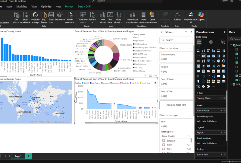
6. Creating Tables: Now once the visuals that we haven't looked at yet, which are quite key and important and widely used our tables. And now to show you that what I'm gonna do is clear the report. So I'm just going to select all of the visuals and I'm going to delete them so we have a clean page. And then what I will do is then bring in the table. So over on the right-hand side on the visualizations, there's actually two forms of table. One is called table and the other is called matrix. Effectively, they're very similar, but there's some key differences between them. So let's look at the table first. So if I select the table and I get the visual in the middle of my screen. What I can simply do is add the items I wish to show in the table. So if I select the country name and value, you'll see that as I've taken off the year filter, it's still showing me that cumulative father, you're all over the years, the total, but it's shown it to me by country. And with the value. And I can simply sort this as well. There we go. So doing a high to low, so it's got the US first Japan, and then it's descending down. And things like tables, quite useful to show certain pieces of data like this. Now, the way this table works is you effectively you have your data, but it's added in by columns. You can see on the right here this fabulous filter all stack in above each other. So if I added in year, in-between country, name and value. Now one thing is done at the moment is it's actually just taken the year and it's sum them together. Now what I can do is under the values here, under the year, there's this little arrow and a drop-down. And it gives me options here. And one thing I can do is select, don't summarize. And I'll what this will do. It will then give me the years. So you see that it's now, let's say in us a year and the value, and it's still descendant from the highest value. So here we've got 2019 is highest and it's going down. And the hits China than us again. And effectively, you just keep adding columns to the table. So if I took the region and put it between country name and the year at then added in the region, and it just grows and grows. So tables can be quite effective if you want to show quite a bit of information. And again, they're interact with all of your visuals you have on the report just by selecting the value year region. Now, the key difference between this and the matrix table is effectively the matrix is a bit like a pivot table. You might get on Excel. And it condenses the data in a clear away. So if we take country name again and I take the value, you see this was actually very similar to what we had before. So if I do high to low and I go, that's my original table and I take off the region. I leave the year in there. This time, if I add the year to the matrix, you'll see that it's got rows and columns. So via the year into the column, it's now going to show the country by the year across the ears. So it condenses and easy way we can read across. So this is the main difference between the tables and matrix. One being the table. You add the columns and you can keep adding them and building them up. Whereas the matrix, you have rows and columns. And you can add other data into the matrix that allows you to drill down. So for example, if y to the region and added it above the country name in rows, you'll see that the first condenses it into region, and then there's a little drop-down here. I can click on that. And that will now expand north America and then give me the countries below it. Saying of Europe. So it's a cleaner and simpler way to condense the information and rapport into a table. So always useful to include tables and reports is a good way of showing information. And there is the ability to add various filters onto these as well. You can change the way the column sum, the row sum, you can change the color of them. And later on is less than as well. We will look at some of the advanced formatting you can do. So for example, if you have a variance between the two values, you can have it either show in red is negative or green as positive. But that's something we'll look at later. So let's move onto the next part of the lesson.
7. Marketplace Visuals: So one thing I also want to look at now is how you can get more visuals than waltz or ordeal. Foot is Papi on. So although we haven't covered them all, there are many more visuals available. And these are available in sort of marketplace for visuals. Now, you can see this by, on the right-hand side on the visualizations as free adults. And he says gets more visuals. If you select that and then select to get more visuals, he opens up a little window. And this allows you to add many more visuals into Power BI that you can use. And there's so many available. These are all being created by various different people. And you can fills them. You can look at Power BI certified ones and pick those. Or you can search for ones you might want to look at. But what I'm gonna do is show you took my favorite that I like to use in my report. Now, one of these is the checklist slicer. And I'll use this as a form of filtering with buttons. And it's really see, it's pretty simple to add this into your poll. You just simply go Add. And then it will come up. And it was either you get this was successfully imported and you can see it's now imported this into that. There's also one of a one I'd like to get and show you that. I also would like to use my reports and it's a form of doughnut job. And it's this one, the advance don't not visual. And I want to click that on their ad. I mean, it takes a few seconds. And there we go. It's imported. So I didn't now have two extra visuals that I can use Omar poll. So let me show you how they work. So if I remove this one, I'll remove this one. The first one I want to look at is the slicer. And this is quite a powerful visual and it's something we're built upon later ones less than and how you can use it, show images. But for now, I want to use it to show buttons where I can select the year. So with this visual selected, I'm just simply going to select year. And you'll now see that all of the years will pair in this visual. If I just put it in category that we got. So under category, you'll now see all the years of a PID. And you can filter this in different ways you want, or you can have it in your poll and it's just a nice away I feel for users to interact with your poll and select what they want. You can change this. So instead of having it as a free columns by many rows under the formatting on the right. I can actually say, well, I only want it to be one column and lots of rows. Or I can say actually I want it to be 10 columns and fewer rows. So they've got just a nice way to show data. And you can also change it as well in the filtering. On the general and the main reason multiple selection, if I turn that off, it means that only select one year at a time. And if I would select many or more years, I had hold down Control. So there's lots of different options as well, how you can filter it. You can also change the color of the checklists. So I can say actually I want it to be orange. When it's selected. There we go. And as I said, we'll build upon this later on the lesson mushy you, how such a powerful tool this is. So let's also look at this DO NOT. So how does this vary between other ones we've used before? Well, I will show you. So what I'm gonna do is I'm going to put the region and the value. So you can see we call it that or not chop to similar. And you can select it and it shows you that data. But what I like about this is you can put data below it, which automatically drills down into, so if result rough got region, I can intake country. Let's take this below the region so that when I click on to say North America, automatically drills down for me, it's quite cool. And then below the US, if you had more detail, it could drain into that. But unfortunately that didn't have any more of the moment. It doesn't go any further. But it's just a really nice interactive visual to have in your poll. You can drill down into data. So remember that when you're building your reports, you don't just have to be limited by the built-in options at Power, BI has as many more available in the marketplace. And if you have the time, it's definitely worth looking around and seeing if there's something that suits your needs. Right? Now, let's move on to the next part of the lesson.
8. Importing Data using Power Query: So what we're gonna do in this part of the lesson is I am going to show you how you can take the raw data from the World Bank website as it comes in, it's raw files and use a feature on power P-I called Power Query, which is going to transform our data and put it in a format that's usable for us. Because you may remember that earlier, the source file I showed you, I've already transformed into an easy-to-use format. But now what I want to show you is how you can just take the raw data, use power Query to transform it, and then use that in Power BI. Now, this is a good feature to learn because you may find that a lot of raw data you get in your work life that you use in your reports, that you spend a little time transforming it before it can be used. Now, Power Query means you don't have to wire you with this step anymore. You can take the raw data. It remembers what needs to be transformed, and that's all you ready unusable with a single click. So to show you where the raw data is. Again, if we go on to the World Bank website, showed earlier, on the right-hand side there's a section called Download. And if you go for this CSV for how, when you download this and look at the files, you'll find out in the folder. There's free documents. Now, all we need from there is the first two. Now, if we look at the first one, when we open it up, this contains our raw GDP data. I've already called the open. So this contains a raw GDP data. And you'll see here you've got country name, code indicates a name and code. And then you've got all these columns with the years and the GDP data. Now what we need to do is we're going to have to transform this file in Power Query will have to perform a few steps such as remove the top rows. We're going to unpack what these columns, so we have years is one column and then our GDP values as another. And then the second file, this contains additional information. And what we're gonna do is we're going to merge this table with our other table. And then we're going to bring in additional data such as the region income group, and special notes. So what do I suggest you do is you say these two falls down in location you can access. And then if we go back to Power BI, we're now going to bring them in. So to do this, again, we need to get to the data section at the top of the ribbon and the home. Get Data. And I'm going to scroll down to these text and CSV file section. Now you need to navigate to where you've got the file stored. And if we go for the first one with the country data, when we select Open, what Power BI is now going to do is in, go get that data. And you say it's going to bring it up in the Summary window. Now before, because it was in a format ready to use, we just click load. But this time because we need to transform it first, we're going to select and transform data. And we're going to select that button there. Now if you don't select that straightaway, that's fine. You can go back into the later the data at a later point to amend it. But it's best to do it now. So here we are now in solid, I'll Power Query Editor. And again, it looks very similar to Power BI and other Microsoft products with a ribbon and the options along the top. And you have this dissection on the left which shows you your queries you've got loaded. So if you've got more than one data source, You conflict between them. And on the right-hand side here, you've got the query settings and you've also got the section which is your applied steps. Now this is a good feature. This shows you the steps that you've phone to get your data into position is. And as we add him for more steps, you'll see this will grow and you'll be out of flip between the steps. And if you've made an error or you want to remove a step, it's really easy just to simply remove it and counsel them. So we won't be able to go through all of the features in Power Query, but I'll show you some of the key ones which we're going to need to use to get all that data in a good format. So firstly, what I want to do is I want to remove these free rows at the top because I want to use row fall as my head of right. And this is simple to do using the inbuilt functions. And bear in mind all of these steps we're going to do happen. No code in the tool. It's all using the buttons and in-built features of Power Query. So we've really one selected. I want to remove these first three rows. And under the Home tab on the ribbon, I'm going to go to this Remove Rows feature, Remove top rows. And when the window opens up, I'm going to say the number of rows. I want to renew its free. I'll click Okay. You'll now see that it's removed those top three rows and it's added this step to the right hand side. Renew top prize. If I jump back one, you'll see the data as it was before. And now I've removed the top rows. Now this isn't quite complete because I want to use this top row as headers. At the moment, you can see they're not being used as my headers. Again, this is simple to do. This feature in the middle, we'll transform and it says use first row as headers. If I select that. You'll now see that it's added in another step. And it's taken that first row to be my headers, right? So this data is already looking more usable. Now, these two columns here on adding anything to my data at all. And actually I don't want to use these in my report, so I went to delete that. And again, this is really simple to do and quite intuitive. You can simply just select the column. You can right-click and remove. And you can see it's added this step deaf removed columns. And I can do again this indicator code. Right-click remove and it's gone. Now it hasn't added another step here. But one thing you'll find is Power Query is writing this code for you. And it's rising here and this full minute window. So because it formed. But if there's two columns as one step, so there's written the code for us, remove columns and it's like the indicates a name and indicates code. Now, if we look at each step, you'll see has written the code for us. For example, these written the code where it's transformed the table and it's promoted the top row to Headers. And before that, You remove the top right. So this is a very powerful tool that you don't need any coding. You can simply just select what you want and it writes the code for you. Now, one of the key steps we want to do now is we want to transform these columns, which are the years to be a single column. So effectively what we want to do is you want to unpick that these. Now this is a feature in Power BI under the transform tab. This is button hits is an pivot columns. Now what I need to do that I need to select all the columns. Now there is a quick way to do this. You can either select one column hold Control and along, or you can select one column hold Shift and select the range you want to highlight. And it does this for you. So if I select 1960 hold Shift and I scroll all the way to or right. And I select 2020. It's highlighted all of those rows in between. And all I need to do is select the button says on pivot columns. Since pivoted all of those columns for me, it's given it this name attribute. And what this value column here. Now, what I want to do is rename this column because I don't want really cool attribute, I just want to call it year. And again, this is really simple to do. You can just double tap on it. And I can rename that to you. And select. Okay. And you see that it's done that for us, rename columns. And if we go back to these applied steps, you can see all of the steps that we've done. Now this column here is blank, which I don't need, so I'm just going to simply remove that and delete it. And then this column here it says value, I just want that to say GDP and then dollar symbol. So again, if I double tap on that GDP dollar symbol, and then we go, I'll data is pretty much ready to use and in a good format. And now, if we wanted to use this as this is, what I want you to do is go to the Home tab, Close and Apply. And now well, power BI is gonna do, it's gonna load in our data. And you're going to see there's four columns on the right-hand side in the Fields tab. Once that loads up. And there we go. It's loaded in that data for us. Ready to go. Now, the other step I want to do is actually I wanted to take that other file that I opened earlier. And I want to bring in this additional data, region, income group and special notes. And again, this is simple to do. I'm going to load this in as another file, and then I'm going to merge the two datasets using this country code column. So if I go back to Power BI, goods get data CSV file, and I take that second file and I open that up. There we go. And what I want to do. Because you see this data isn't ready to use is and at the first row as my head as yet. And I want to merge it with my first dataset. I'm going to select transform data. And it's gonna take me again back into power query. And this time you'll see the two files that we've got loaded in. So the queries, I can flip between the two. This is the first one we've already transformed, and this is the second data. Now, what I'm gonna do is I'm actually going to rename this I can, because this file isn't very intuitive. So what I'm gonna do is delete all that. And I'm just gonna call this GDP data. Right-click and rename that query. And I'm going to take this other one as well. They suffer fall. And before I do anything, I'm just gonna call this country look up data. It's like 1000. Now, there's less to do with this table. All I wanted to do is promote the first row as headers. Simple to do, use inbuilt feature, promote first row as headers. I don't want this blank column on the right-hand side, so I'm going to remove that. And also, I don't need this country name here again because I've already got, um, I have a dataset and I'm going to remove that. Now what I want to do is I want to take these columns here. I don't want to add it into my first dataset. Um, I'm gonna do this by affects you would form an a lookup or merging two tables using country code. Because that's a common variable between my two tables. And again, there's an inbuilt feature of this and it's very simple to use. All I need to do is go on under the Home tab on the ribbon under combine, There's two options now there's one called Merge Queries and one-quarter Append Queries. Merges where you can effectively, as it says, merge two tables into one append means you stack them above one another. So we won't go into that at the moment. So what I want to do is merge. And when you click on the dropdown, there's two options for merge. Merge queries or mergers. Knew if I selected merges, knew, it would then make a third dataset. Which if you want to keep your dataset for, is fine to do, but I'm happy just to merge into the GDP data. So I'm going to select Merge Queries and then opens up a window. Now it's got at the top, it's got the first table which you have selected. And he says select, say we're matching columns to match merge table. And then what I want to do is I need to select the table we want to match. And there's only two tables here. Select country lookup data. And all I need to do is on the first table, select the Country Code. And on the second table select country code. Because that's how I'm going to merge the tables. And you can see here the selection matches 1240112,401. They perfectly match. Now there's different join kinds, but I wouldn't worry so much that the moment if you're doing a simple join like this, leave an option like that, It's perfectly fine. And if I click Okay, you'll now see that under the GDP data is added another step, merge queries. Now, it's done it in this column here. All you need to do is click on these two arrows, which are opposite to one another to expand the columns and you can pick what you want. Now, I don't want to add in country code because I've already got that island region income group and special knows. If I click Okay. You'll now see it's added in those columns. Now again, to make it easy for our data, I can change the column headings by double-clicking them. I want to go with this region. I want to call this income group. And I want to call this one special notes. Fantastic. And now you'll find that this data is pretty much the same as what we had earlier and what I transformed to simplify. And it's all ready to go and you've got Close and Apply. You'll now see that on the right-hand side, it's going to change this query night. It's going to add in the outer query, the country lookup that we added in. And it's going to add in the additional columns to this GDP data query. So there is loaded. And I react, as I said, you've got your country lookup table in that because that's still visible and we've got this GDP data. Now, this country lookup table isn't really a b timess used to us. We're not going to use this and you can hide it if you don't need it. But I'm going to keep it in there for now. But all of the data we want it in this GDP data. So that means that, let's say you were using falls from the World Bank or you're using your own files from any ERP system every time you want to refresh your report or you need to do is download that raw data, saving a location. And then when you're on Power, BI or you need to do is in the middle is just click Refresh. And each time it will go to that raw data, it will perform the same transformations and your data's ready to use as long as the data is in the same column and rows. And it's always in the same format every time it works fine. If it isn't, then you will have problems and errors which you can always fix. But you're probably fine. Yeah, if you get data from places like SAP, etc, It's always normally in the same format. And it saves you a lot of time. And it means when you want to quickly refresh your reports, it's really easy to do. So hopefully that was a good introduction. I will touch on Power Query a bit more later on in the lesson. But for now, I hope that shows you a good introduction of how Power Query is used to transform your data. Now in the next steps, what we're gonna do is we're actually going to start to just build a simple report ready to upload to Papi online. So please join me in the next lesson. Thank you.
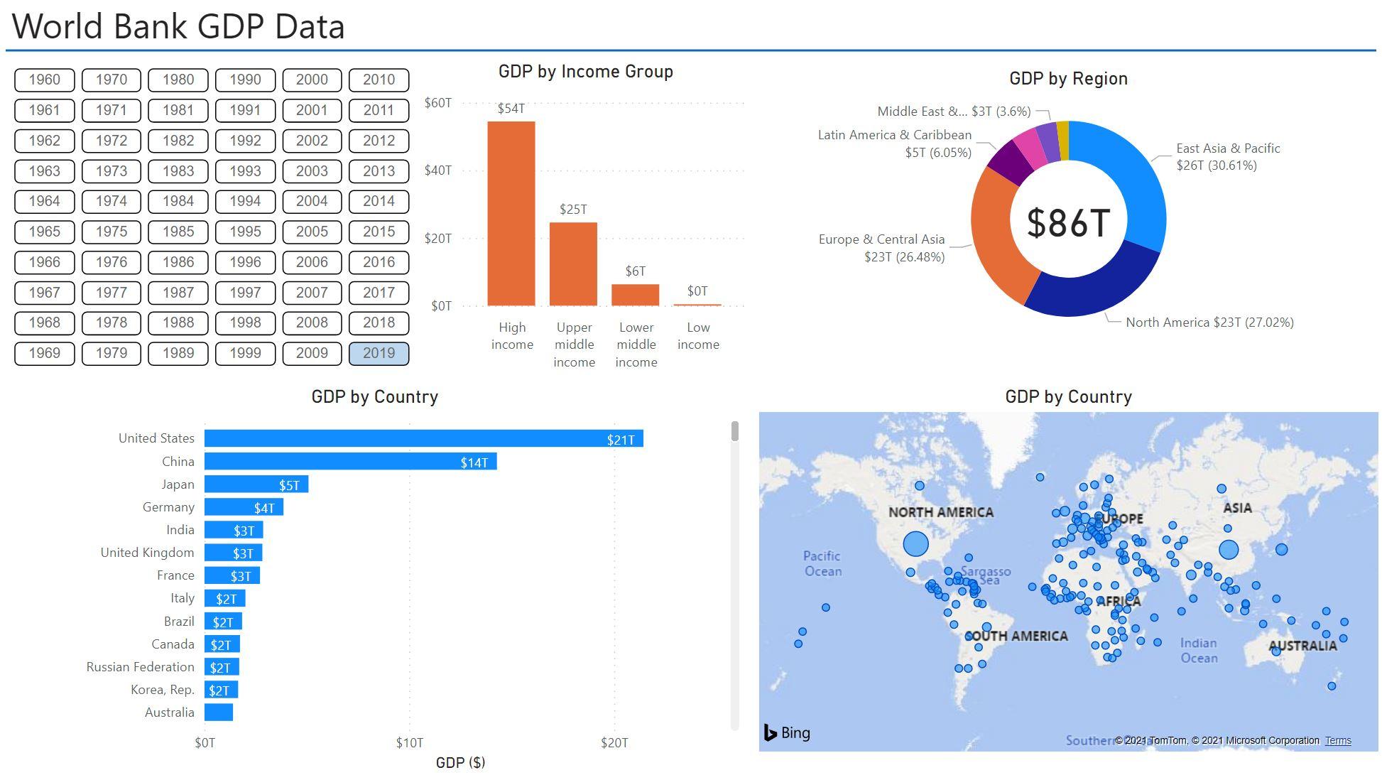
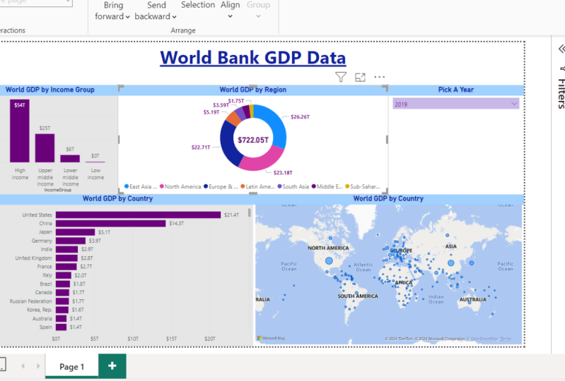
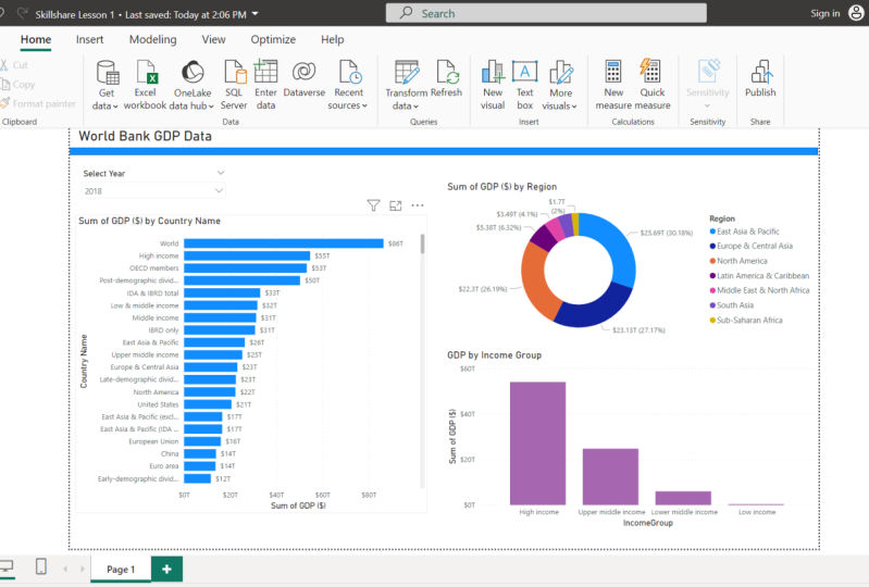
9. Building a Report Ready to Upload: So one of the things we're going to do now is that we have on new dataset included is just build a simple report. So I'm going to put a few visuals on there and make into a basic report, which in the next lesson, I will show you how you upload that to Power BI and line, which means you can create a dashboard from it and you can access it on various other devices such as your phone or tablet. So as I said, we're just going to pull together a simple report using some of the skills that we've covered in the earlier part of the lesson by looking at some of the visuals. So you don't, you don't have to follow what I do. But effectively, let's start off with adding in a title. So if I go up to Insert and the ribbon at the top, I'm going to select textbox. So this is again is something I didn't show earlier, but this shows you how it's quite intuitive to other Microsoft products with a rabid along the top. And you go to textbooks and I'm gonna call that, well would bank GDP data? And let's make this a bit big. Let's say that's just made the 24th. Now Inaki that and move this up because I just want to make this look like a nice report. At the top, highlight what it is. And just to separate that, I'm going to take a line. And you see I've got this horizontal line here. And what I want to do is just drag that across. It's like it has been a separator. And there we go, go a line like that that actually I've just taken in from the edges. It just looks a bit nicer tool. So we've got that set up for now. And let's start adding in some data. So on the right-hand side on the field section, if I go to the GDP data, we call the dates out poured in there already. Let's start building our poll. So what do I want to do? I want to pay GDP data. And I won't say country name. I'm going to have those two in their brilliant. And I want this as a horizontal bar chart, such as that, horizontal bar chart like that. And for now, I will say actually just want to be able to filter by the year. So again, on the fields on the right-hand side, I click here. And I'm going to select that has a filter box. And for now I'm going to have is a drop-down. So on these are on the top right. I can select dropdown. And then that will allow me to select the year on one. And on the filters for this drop-down on the title, I'm going to turn it on and I want to have a title that says just select year, press enter into our line that on-center. And I don't want these other year had in here. So under this Slicer header, I'm going to send that home. And now that means I can select the year. I want. Good. And one thing I want to do is what you notice is that the drop-down is be 1916, 1969 goes down. More likely I'm going to want the, the array sort the later years. So actually on these three dots here, I can say salt descending, which means when I call it the drop-down and now has 2019 the top. So for now if I select and 2019, so I'm filter by that finite gut. Now go back to this horizontal bar chart. So let's change a few things on here. Well, I want to have a title that says GDP by country. So select to lab GDP by country. And, and let's align it in the center. And I want to have the values on the data labels under the filled section. I will turn on. I want to have the position of the units on the inside. And now I want my values to be shown as dollar. So to do that, what I need to do is go up the right-hand side on the fields, select GDP. And under the common tools you've got the format. I want that to be shown as a currency. Now that will automatically default to be in dollars. And there we go, we've allowed in there. So we've got GDP by country. Now one of the things we're looking at in here is the country name. In this data also has the groups as well. So it doesn't just say the cancer free Zambezi us that it has all these other groups now which we, we don't actually want. And if we go look at the roared data. Now one of the things I found was that if you filter on the income group and under income group, if you just look at the blanks, this gives you all of the country names which aren't actually a country. So all of the areas. So then what we can do is we can then go back to our poll and we can apply a filter where we turn off the blacks site on the income group. So again, for now I'll just go Select All. So what we want to do is we go back to the report on this filter section here. I can put a filter on the page. I won't put it on all pages because if we make a tab a later day on my own to share that information. For now I'm just going to put a filter on the page. So what I'm going to do is take income group, drop it into there, have basic filtering highlighted. And then I'm just going to click Select All and then untick the blanks. And there we go. Now we're just showing the countries that I want to say. Also, if we go back to our value tab, which we put as dollars. So there's GDP some, There's want to put there psalm shown it as one decimal place. So that's just going to load our data. So that's working on it. There's a little bit on how it's because it's someone at that. So now that we've got this horizontal bar chart, one of the things don't go as well as take off this country name on the left because it didn't need to show that. So if we go on the filters y axes, I can just turn the title off and we will leave that like that for now. So what else would I want to include on this report? And remember, this is just a basic report. I'm just pulling together for the moment, just so that I can show you how to upload it's popular in line, and then we will get back at late today and improve it. I want to add in the map feature. I quite like that. So if I go up to the visualizations on the right-hand side, what I will go forward is I'll go for the map. The difference between the map and the Filled Map is with this map, you can get a little bubbles which represent the size. So for example, the GDP of a country that's high, I have a bigger bubble. So if I select country name and I won't put the value in there. So that's going to pop into size. There we go. It's quite a lot dots, they're big C for example, the USA and China have one of the largest bubbles in Japan as well as quite large. So if I put there, I'm going to put that line there for now. And again, I just want to change this title. I will say for now, GDP by country. And actually I will send out as well. So if I go to the title and I align it, and then it's on the center. I'm just going to bring this one down. Now, what else would I want to show? I want to show the regions and the GDP by regions. So if I click on region and I select GDB, going to have the GDP by regions in a table like this. But actually because it's quite a high level, I won't show this in lieu. Do NOT chart. Now a pie chart and do not show char effectively the same thing. But there's a little trick I like to do with Diana Chang and I will show you. So for now, let me just tidy this up so I'm going to get the type tool. And again, I will simply say GDP by region. And on the legend, which is this, the region data by color. I just want to take a position on that and put it in the bottom center. I think just looks a bit neater. I don't want to turn the region title off. Again. I'll just get back to this title and center it. And you can see here as well, GDP by region. I've also got the value and the percentage. Now you can change this on the data labels. I can change the style. So for example, I could just say the value and the category, or the category and the percentage of the total. I do. You will you can noon got all data labels, which actually is quite nice. It's not too bad thing that one of the benefits of doing that as well as that you can turn off the legend, which makes it a bit smaller. Actually, I'm going to keep it on another call like now. I will put that over here for now. Let's make this a bit bigger. That regard. Now this trick hose going to show you is actually how you can get a little number in the middle. That's not a built-in feature, but you can create on using the cod feature. So on the right-hand side, it COD. All I want to do is then called select GDP value. Then I just want to show the value in the middle. So I don't want any of the category label that. And also I will change the size of the data label to be a bit smaller. So let's put it about 45. That's fine. And now I'm just going to drag that across and place it in the center. That's smaller. So that's going to be about roughly in the center that PyCharm. And then all I need to do is to format the arrangement is just send to back and descends it behind the visual. And you see that it will appear through the visual. Now, for this, I just need to turn the background off. And there we go. We go to in the middle of the visual and then I can move that down on China. Now it's quite nice because okay, this is showing you the total in the middle where it has 26 trillion there. If I select that blue, it's then going to change this car because actually that's all the data that's being selected and vice versa. It's quite cool. Now lastly, one thing I would do just to improve this is I'm going to bring in one of the marketplace visuals that I touched on earlier. And I want to bring into checklists. So it allows you to have a drop-down on a button instead. And for this, I will type in particulate. You can write it in full or partially. Okay, add. It's now going to add it to the visualizations on the right-hand side. There we go. It's imported it. And if I click on that, and actually one thing I just want to do is for now just to fill that gap, I'm just going to put year. So what it's gonna do is going to bring up a bulks of all the ears. And you got one that the moment because the road is have a filter on. So if I take that and I delete it, There we go, That felt is gone. And I will put that I would expand that. Now depends on how you want to do it. I'm going to put more columns on there. So I'm gonna say actually I want, so on the filters general, select columns. I want five columns. She lets go for six. You have fit more on them. And then I will say, I don't want the head up. And let's move this to the right. Shoot me down. If you can get them all on there longer. So they're going to stick the home that and I'm going to say actually select that again, filter on the general I1 multiple selection off. Which means that actually when I select a year, he's going to change it. Again, change that lie, that I select that again on the filters, general. And if I click forced selection, it basically means that there's one always has to be selected. You call not select it. If I do want to select other ones at the same time, I can just hold Control and then select another year like that. So I'll leave that for 2019. And do I want to include another shot? I will for now? All but just just to put some units gap, I'll put sac clustered column chart. I will do income group, and I'll put GDP. There we go. I'll put something like that. And I will again, per GDP income group, I'm going to change the Y axes. I'm going to turn that title off and now put the title in the middle. And they need to have the title on the on the x-axis. On the x-axis, I'm going to turn that toggle off. And I will put some data labels on there just to make it a bit easier position. And I always like to put them on the inside and just let me sit inside the bar. Absolutely. It does take them off that. I'll put it back on water and you do have it on the other ones. So I will leave with that. Right. One last thing I want to do just before I say this is ready and then we're going to upload it, is I want to edit the interactions just because as I said, if I select on one element of the Choctaw 1000 filter down, these ever reports any highlights section and I don't fill it adds much value or Rava, exclude the other countries The ANA value than just show the data that's needed. So to do that, again, is very easy. With a visual selected under the Format tab on the left-hand side is edit interactions. And I want you tend to on it's there. And you simply just have to go around each of the visuals and select the one you need. So I want to fill to this one, I want to filter this one on Olympus fills the map. Then if I select the map, the map to filter this one, this one, and this one. If I select this visual, I wanted to filter this one, this one, and this one. And lastly, IF has led this visual, I wanted to feel to this one, this one, and that one's already filtered. I don't want it to fill to the years even though they might not change much. I'd rather keep those as they are. So now when I call to an area, it's going to fill to the income group and the GDP by country and also the map. So for example, Europe and Central Asia, you can see I Ponzi, North America can see Australia on that. Whereas if I gave someone like her in the Middle East, feels a little Middle East, North America, I'm not going to see a gender, has he? North America? And then it's just going to highlight the key countries that I need. Some. Hopefully one of the things that you, you've seen from this lesson is only a matter of minutes with the data. Once you've put in there, we've pulled together or pull. Actually if you get into meeting or even at the moment, this is how it is quite useful. You can filter data by year. So we can have a look at this specific year. We can then see in that year which country had the highest GDP data and by region. And you can filter by the different income groups if that's the focus. And then one of the things we'll cover later on in this lesson is how we can add more tabs and how we can expand the data and improve the quality of the data. So join me in the next lesson and I'll talk for how we will be able to upload this poll on to Power BI Online, Power BI in line, which means you can then share with people in your organization and also build dashboards and access it on your mobile or tablet devices. Please join me in the next lesson. Thanks.
10. Uploading Reports to Power BI Online: So what I'm going to show you in this part of the lesson is how you can upload your report to Power BI online. So this allows you to be able to share your reports or dashboards with other people in your organization. Now you don't need to do this if you want, you can just create an account. You can build your report on Power BI Desktop and share it and meetings that way. But if you want to be able to share it in the organization, it's good to be either upload it to power beyond line. And now if I show you how you access that or you need to do is go into your browser and type in PowerBI, go on to the link into Microsoft. And then you just need to sign in. So if you sign in now for this and to be able to share reports, you need a Power BI Pro license. Now I won't go into detail too much on this, but if you work in a large organization is unlikely with your Microsoft account that you'll be able to get this added on. And now once you log in, you'll see a screen similar to this. And for, for my own privacy of how to hide some of my own work on the main screens. That's why it's a bit of a blog. But this is what it looks like when you login online. Now if we just flick back to our report we've created for now, now, it's very simple to upload this. Once you've created your rapport and you've saved it down, you need to make sure that you're logged in yourself. So I'm currently logged in to browse and upload it. And then to upload it, all you need to do is to select this Publish button. Now, what we need to do is publish it to a workspace on line. And again, not an easy step and we flip back to the browser. On the left-hand side, you see you've got this arrow. It says workspaces. If you select that. And then at the bottom, click, Create Workspace effectively. This allows you to create some way you can upload your reports to and upload the data to. And you can collaborate with other people in your organization in this workspace if you need. And then it allows you to then go on and share it as an app which is accessible and Power BI in line or iPhone or tablet. So we need to create a workspace top loader report to. So I'm just going to call this world GDP data. You can put in the description there. You can add an icon if you want, but we're not gonna do any of that now. Just gonna create a simple workspace and select Save. And there we go, that's done. I've now created this workspace. It's created it as accessible on this arrow on the left. Again, I've had to hide them. So my other ones there, but you see it says, well GDP data. And now we need to add our content. So to do this, if we go back to the report Power BI Desktop, we go up to the top where it says the Publish button. And that brings up a window in the middle. And again, I've had to hide the data so you can't see what else I've gotten there, but the bottom, we've got our destination. It says, well GDP data. And you simply select that. And then comes up with a load in window. Now the first time you upload it, it might take quite awhile, but there's not much data in this report shouldn't take too long. And then once the uploads, you have this conformation. Select. Got it. And now if we flick back to Power BI online, you will see that when we get back into the workspace, there we go. We've got two files here, so we've got our report that we've uploaded, and we've got this dataset. Now if you want to look at this report we've uploaded, if we click on that, it's going to look exactly like Power BI Desktop. It's going to bring up the report that we've saved. And you can interact with it as as you would expect. And all the interactions work exactly the same as when they're on the desktop. And you can also edit it as well in power beyond line. So at the top here or this other ribbon, if you click the Edit button, it then brings up all of the options that you would have had when we use it on the desktop, Power BI Desktop. Now the only thing I would say is personally I don't like to edit any reports in it just because then it's not saved down on desktop file. I always like to keep the master document on my desktop and then just keep up load in it. So all I'm gonna do is go back to read and view. So go back to the way it was. And now, if you make any changes, again, if we go to the desktop and we make any changes on hair, and then we simply publish it again, those changes get made. So let's say if I just take this visualization here, GDP by income group, and I just changed the color of the bars to orange for now, let's change it to orange. So orange, all I need to do is save that. Save my report. Go to Publish again so that the workplace upload it. It says, do you want to replace this dataset because it sees as the dates that were the same name there. I click Replace. It's going to be really quick. It's just going to upload it. And then once that's done, you get the same conformation. And then if I go back to the power beyond line, all I need to do is go back to the workspace. Go back to my report, and you will now see that it's going to change the catalog bond. There we go. So we've changed it. And now you can make major changes. You could completely change all the visualizations, the data, the heading, the title. Anything we've got to do is simply refresh it and it's uploaded. And as I mentioned earlier, the workspace is great, is online now and you can access it as it is, and it's ready for you to share and collaborate. But if you just want to share this report and not allow anyone to edit it and share it from your organization. You have to make it into what's called an app. And again, like most things on Power BI, it's really simple to do. When you are in here on this main workspace page. At the top right, it says hit Create app. Now if you select that, again, you just kidney to give it that name. So I'll call it well GDP data. And you need to give it a description. Java was caught and going to call it the GDP data of the world. Again, you can give it a logo, change the theme. You can give it different permissions. So if you want to work show of specific people in your organization or just the entire organization. Very mindless, open and accessible to anyone. You can do that. But once you've made those settings, all you need to do is go Publish app. It will publish. It says it takes five to ten minutes, but I can say is never taken anywhere near that amount of time for anything I've ever done. And it's published. And all we need to do, Select, go to app. Now what it's gonna do? It's gonna bring up the report as you've seen before. But it's what they call an AP view, which basically means you can view the data. You just can't edited like it's the report. So this is something you can distribute out. You can regularly update to people in your organization. They can go in and they can view and read the data as you would expect. And this is easily available on iPad or other tablets, iPhone using the Power BI app. And again, if you wanna see the app, it's really easy to use, use go back and on the left-hand side, you can see where it says apps. You can select that and you can pick it. You can favorite your app. And that's about it really there. If we just flick back to the, well GDP data, I did mentioned earlier there's two files uploaded. You've got the report and you've got the dataset. Now, the report is what you've created. Now the dataset does allow you if you wish to create more reports. This is not the source data. And if you go into it, There's our one report that we've made, but at the top here, it does say Create Report and from scratch. And if you click that, what it would do is it will just bring up a blank report like you see in the Power BI Desktop. And it allows you to start creating your reports you want with your data. So once your data's complete, say it's linked to a live data sources somewhere in SharePoint, you can just build the reports if you want in the online browser, which means let's say you're away from work or you're on a different machine, you can build an entity reports. Now, a bit more advanced, if you go back to the workspace, to the world GDP data. And on this dataset, if your data does link to somewhere on, let's say SharePoint. So there's a live data sources not just stored on a hard drive somewhere. You can change the Refresh show on the Scheduled refresh, which I find useful as well, is linked to a live data source. You can't actually tell it to update certain times a day like 09:00 AM, ten 00:00 AM, six o'clock in the evening. And it will automatically refresh and update your report for you, which means you don't then have to keep going into the desktop, click on refresh and uploading it again. So that's really handy. So hopefully that's given you a bit of an introduction in how you, how you would upload your reports to the Online Power BI online and how you would share it. And yeah, as I said, it's really easy to share. You can collaborate in your own workspaces. But this allow people to see the dataset and edit the data. But if you just want to share it with those in your organization, you just create the app and you can share it. And you can monitor access and permissions. And it's all very intuitive and easy to use. So if you have any questions about them, please do put them down in the review and the questions box at the bottom of this video. And I will endeavor to answer them when I can. Thank you.
11. Closing Remarks: Well, thank you for watching my introductory lesson to Power BI, as I mentioned the beginning, if you do have any questions or there's other hints and tips that you would like to see them, please do put them in the comments and the feedback below. I will endeavor to respond to any of your questions when you have them. If you have any issues accessing the data or getting onto Power BI, or if there's any other hints and tips you want to know, then please do let me know. Thank you again for watching and I hope to see you in the next lesson. Chairs.
 Blake Charles, Chartered Accountant