Transcripts
1. Introduction: Starting a product
based business doesn't have to be scary. The first product I launched
was small, inexpensive, and sold for only
$4 That product continues to be one of my main revenue sources
for my small business. You probably guessed it by the class title, it's stickers. I'm going to teach
you everything you need to know to
start illustrating stickers from coming up with concepts that make your
customers want to buy. To ensure that your
stickers come out the best quality possible
before sending them to print. Hello, I'm Taylor,
as well as being a full time artist and
skills Sram, top teacher. I also run a camp them
stationary brand out of my home in Virginia
called the Stray Shop. I started the shop over
two years ago now with a handful of sticker designs
and almost no money. I now have products in over ten plus retail
locations across the US. And it's sold over 3,500
stickers in the last year alone. Stickers have allowed me to scale my business
to what it is now. I can't wait to show
you all of the doors. Something as small as a sticker can open for your business, as well as some bonus
content on how I take my sticker designs and turn them into whole product collections. Let's go ahead and get started.
2. Your Project: For today's project,
we're going to go through the whole process
of illustrating stickers. From the initial idea to
setting up a cut line. While any design can be
turned into a sticker, I found the ones that do
best in my shop are the ones that I created
with the intention of them becoming a sticker. With that in mind, we're
going to start by planning out ideas that will attract
your potential customers. After we have our
ideas locked in, we're going to go over the
whole sticker making process, including setting up your
files for maximum quality, my tried and true
illustration process, and setting up your cut lines. For this class, I recommend using your favorite
digital art software. I'll be using Adobe Fresco, but I'll touch on some
procreate tips along the way. If you normally
work traditionally, a lot of the ideas in this class can still
apply and be helpful. And I'll pop in some
resources along the way for you to don't forget to share your
progress and your final sticker designs in the project
gallery. Once you're done. I will see in the next lesson.
3. Creating Concepts That Sell: I enjoy this part the most because we get to explore
art that inspires us. Before we jump in, I want
to remind you that we're going to be looking at trends
and taking inspiration. We will not, however, be copying anyone's designs. Not only is art theft not cool, but it's not a good way to build an art business.
That will last. I'll give you some tips
in this lesson to avoid taking too much inspiration
from other sources. The first thing I
do before starting any art project is to
examine trends and seasons. Although nearly anything can be successful at any time of year, it's a good idea to check
out what's happening in the retail space if you're
planning to sell your art, even if you aren't planning
to do so right now, you may want to in the future. It's always good to conduct research and learn
how to do that. I know it sounds silly, but I literally just search. Trending art stationery.
Insert ear here. This allows me to get an idea of what others are
looking for right now. We're not conducting research for a paper on current trends, we're simply trying
to gain insight into what's popular
at the moment. Remember when there were
llamas everywhere and then after that it was
like avocados for a while. That's the information
that we're looking for. If you have a clear
brand identity, then most trends probably
won't fit your business, and that is perfectly fine. I draw cats, and if llamas
became popular again, I won't abandon my brand and
start making llama stickers. That wouldn't be
helpful and it's not what my customers
have come to expect. We're not chasing trends, we're simply staying
aware of them. At the time of recording
this bows and frilly, things were trending and
stationary, Very coquette. As an example, I'm currently working on a Paris
inspired collection that features little
French kitties and little bows with
pink everywhere. This aligns with my brand, it feels fun for me to make, and it happens to be on trend
to keep the example going. When I decided that I wanted to create a coquette
themed collection, I opened up Pinterest and I searched for coquette
illustrations. From there, I
grabbed a marker and started jotting down
ideas in my sketchbook. This involves using
your eyes only to find inspiration from what you
see and putting it on paper. I like to scroll
through images and then doodle anything
that catches my eye. I kept seeing drawings of baby animals like tucked in bed. I drew a little kitty
tucked in the bed. Then I jotted down
any phrases I came across that I think might
be helpful later on. I also noticed that many of
the images I were seeing was feeling very Parisian since I've been to Paris
and I absolutely loved it, I thought I would create
a Parisian collection. The most important thing
I do to avoid getting influenced by the
images I'm looking at is to close my computer. Once I'm done collecting ideas, I usually end up with a page or two of sketches like this. From there, I only
use what I doodled on the ideas page to
create my artwork, with the exception
of occasionally pulling up specific references. For example, when I
drew the French cafe, I needed to actually look
at images of actual cafes. To nail down the look
I was going for. I highly recommend using photo references whenever you draw something more specific, even if you're confident that you know what the
subject looks like, because not using references is like a really bad
game of telephone, you're really likely to
lose some details and end up drawing something that's completely different
by accident. We want to ensure that we're not copying any images
that we come across, but we need to understand what something looks like
to be able to draw it. It's important that
you aren't sketching the entire
illustration reference in exact detail on
your ideas page. Instead, I find that my
quick sketches enable me to create work within the theme I researched with a
fresh perspective. If you're looking at
someone else's artwork while intending to draw
something to sell, you'll more than likely end up drawing too much inspiration
from their work, whether you intend to or not. For now, just
choose a theme that resonates with you.
It could be a trend. You discovered an animal, or even just a word,
whatever excites you. Once you've got a page or
two of ideas, sketch down. Let's move on to the
next lesson and work on selecting the best
ones and refining them.
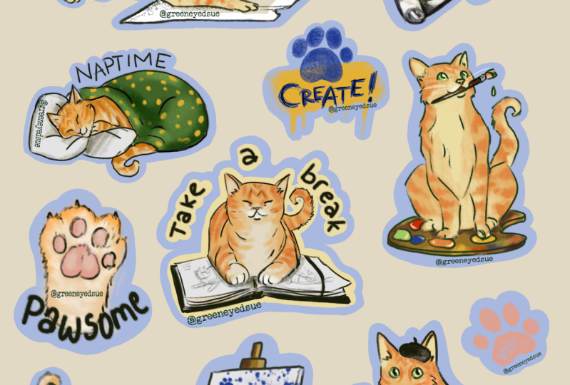
4. Sketching: What Makes a Good Sticker: Now that we have a solid concept and some idea sketch down, we need to pick the one that we want to turn into a sticker, although almost anything
can be a sticker. Good stickers have a few
common characteristics. Number one, they should not
be too big or too small. We need to find a size
that's just right. Like Goldilocks, typically
stickers are about 2.2 to 4 ", unless they're a bumper sticker. But we'll discuss that more
in the next lesson when we set up our file number two, the design should not have any weird cutouts or long
bits sticking out of it. This will ensure that your
customers can easily peel off the backing without tearing it or having a hard
time placing it. When I first got started, I would make teeny
tiny stickers with long appendages that even
I struggled to peel. Finally, number three. The design should be
legible from a distance, although having a good size and high quality file
will help with this. It's crucial to think
about legibility. I always struggle with
drawing black cats and making sure that their
little faces are legible. I need to check that
the contrast is good on my screen because it'll
look even darker in print, especially since I get
matt stickers made. If you have any text
in your design, it's also important
to ensure that it stands out and
it isn't too small. Most of the time, people stick these stickers on things that are meant to be seen from afar, such as cars or laptops. It's an important thing
to keep in mind With all of these rules
out of the way we can finalize the
design we chose. For this class, I'm
going to go with the concept of bakery
theme stickers. This is the page I created in the last lesson when I
was looking for Inspo. I think a macron would make
a really good sticker. I'm going to work on
sketching that out. I always tell my students to
iterate as much as possible. This means that you shouldn't take your first idea
and run with it. Take some time to sketch out
your options for my Mac Ron. I'm going to sketch
at least six to seven different designs
to see what I like. I'm still going to do this
on paper since I can't be too particular or erase
any mistakes quite yet. But you're welcome
to do this digitally if you're more
comfortable with that. Once I've worked
through some ideas, I'm going to pick the one that I like the best and
take a photo of it. We can make any adjustments digitally that we
feel necessary. Once we bring it into
our drawing program, let's hop over into
the next lesson to go over file set up.
5. Setting Up Your File: Anytime you make a
digital piece of art, it's very important to pay
attention to your file set up. I set up my files for
stickers to ensure that I can get a good sense of
scale while I'm working, as well as making sure
the quality is great when it's printed for stickers, a canvas size of five x 5 "
at 300 DPI is recommended. Going too large can result in loss of detail
when scaling down. While going too small can risk quality loss
when scaling up. From here, I do a
couple extra things that I wanted to tell you about. They're totally
unnecessary, but they make me if I'm going to be
sketching on my ipad first, which I do sometimes if I don't have my
sketchbook on hand, I will pop in a paper
texture on the background. I'm using max pack paper today, but any paper
background is helpful because it helps me get a better sense of the colors I'm using. Bonus, it makes my sketch
look really legit, like if I want to post
it on social media, I just export it and share it. And I use that trick
all the time to do sneak peeks of collections
that I'm working on. Since we worked on
our sketch earlier. I'm going to pop that
photo I took of mine in. You can do this in fresco
or procreate in Fresco. It's the little
button right here. In procreate you'll go to import in the top left and
then add photo. I like to set my sketch
to overlay and lower the opacity to about 15%
This step is optional, but I usually make
final adjustments to my sketch on a new layer. Doing this not only
provides me with clean lines for reference
while illustrating, but it also allows
me to use some of the digital tools I didn't have when I was
drawing on paper. For instance, I can flip
the canvas digitally to check for any discrepancies. And then I can also create perfect shapes and
transform certain elements. With our sketch
imported and ready, it's time to unleash
our creativity and start illustrating. Let's
go ahead and dive in.
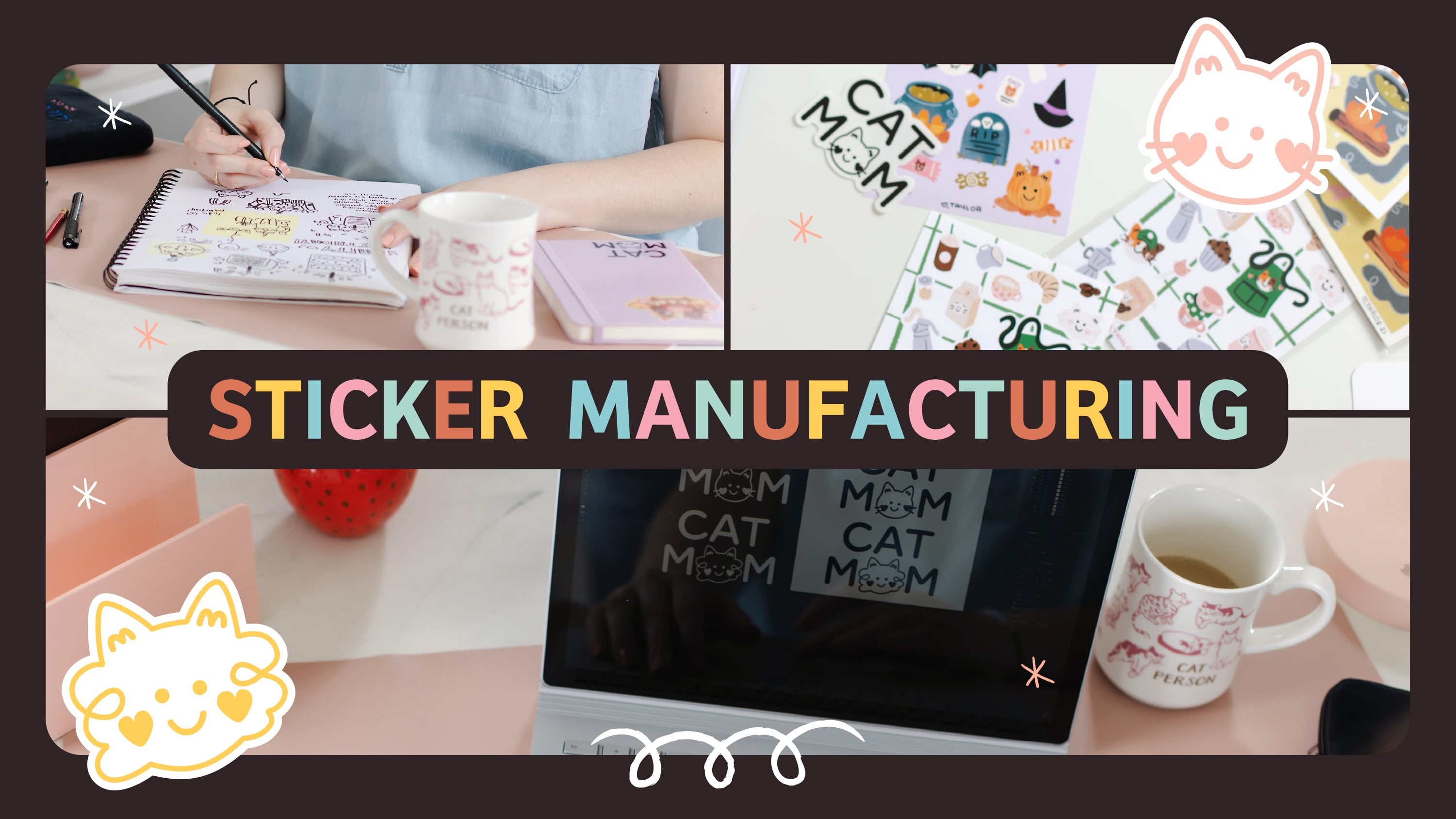
6. Illustrating: My Tips & Tricks: We're at the exciting stage of fully illustrating
our sticker design. I've got to say for me, the most intense
part is coming up with the ideas and
kneeling down the sketch. But now the real
fun starts when we get to add color and
bring our design to life. Great illustrations require
a great color palette. So the first step is to pick suitable colors for your design. If you're stuck, you
can find pre made color palettes to
inspire you online. Or you can use Coolors.com I'll put that in the
resources for you too. You can download or take a screenshot of the
color palettes you like and then import them into fresco or procreate as an image. Both apps have a
feature that turns any photo into a color
palette when you add it, but it can sometimes
muddy the colors, especially if the photo
has extra elements. Instead, you can eye
drop the image and draw little dots on a new layer to get
the colors you like. Once you have the
colors that you like, you can start adding
additional colors that you think
your design needs. If I'm working on a floral
piece, for example, and I find a pink color
palette for reference, I know that it's
going to be missing the greens I need for the
leaves, so I'll add those in. You're going to look
at your design and think about what other
colors you may need. Before laying down your colors, it is important to
check your values. To do this, I
create a new layer, drop pure black into it, and then set that
layer to saturation. Make sure this layer
is at the top, and this will allow
you to see all of the values of the
colors that you pick. So far, I find that I'm almost always missing a very dark
and a very light value. This allows me to
catch that early on before my illustration
ends up looking flat. Now that I have my
colors locked in, I'm going to begin laying
in my base colors. I know I mentioned that
coloring is the most fun part, but I do want to warn you
that laying in base colors, especially if you
have a lot of them, will be a full trust
the process moment. I always think that
everything looks like crap at this stage because it's
so flat and empty. To mean you might love the
look that's great for you. I'm a traditional
artist at heart. I like texture, so it hurts my soul to lay in flat colors. I use a basic round brush
that has full opacity, with minor pressure sensitivity. The basic ones that Fresco and procreate have are
perfect for this. I really think that
they're straight up just called like
basic round brush. They're the very digital
looking brushes. Now comes my favorite
part, adding details. I always have very bubbly outlines that show a
lot of personality. So I have a lot of fun here. If your personal style
doesn't use any outlines, then feel free to
skip this step. I just want to make sure I
share my whole process with you to give you an idea of how
I render my illustrations. We're all awesome and unique
in their own art styles. So I always learn a lot by
seeing how other people work. While this is my favorite part, my brush selection is
gonna stay boring. I used to use really
fun texture brushes to add a real traditional
feel to my work. And I still do that sometimes, but my process now serves
a particular purpose. When you create a sticker, you add a smooth cut line, which will go over next. However, I started making
apparel last year. I create and order all of my transfers for
my apparel lines. And I noticed that a lot of my really textured work was having a hard time
translating the fabric. The jagged edges and lines
would sometimes cause the design to come
out looking messy and unfinished when I turned
them into a transfer. I was also worried about the
longevity of the apparel if the edges were rough and easy to peel up
after a few washes. I also didn't want
to keep the cut line because then that
would just look like I slapped the
sticker on a shirt. And I totally did that before, and I hated it. It looked awful. The compromise that
I'm very happy with now is to use the same basic round brush
to add the details. It provides a nice clean edge that makes it easy
for me to turn almost any of my other work into products without having
to do much adjustment. Long story short, do
whatever makes you happy. But keep in mind that
you may have to make some adjustments down the line if you're going to go
crazy with texture. Once I add in all of my details, which really helps my sticker
stand out from a distance, I go in and add some texture
to my flat color shapes. This is where I get to make my illustration feel
a little bit more traditional by using
wash, wash brush. Say that three times from
Kyle Webster's brush pack. You can easily add those in
fresco on the brushes panel, or you can look them up and
download the brushes to add a procreate as a Br file, which is just a
Photoshop brush file. To add highlights, I set a new layer and set it
to overlay or light in. I like to use a
bright neon yellow because I like the warmth
it adds to my work. But you can choose any color
you like for the highlights. I typically say you want to pick a warmer color for highlights
rather than a cool color. Since we use a cool
color for the shadows, I also like to
diffuse the edge of them with a soft
chalk smudge brush. It definitely depends though what look I'm going for
for that illustration. Once I'm happy with the
highlights are I drop the opacity on the layer
until it looks really nice. I know really scientific stuff. I also make the layer
into a clipping mask. So it goes directly on the
flat shapes that I have. For shadows, it's the
same basic steps, but our new layer will
be set to multiply. Instead, I like to use the
dark purple color for shadows, but any cool color works. I pop in my shadows with
the same wash brush. Lower the opacity
until it fills. Right? And then I make the
layer a clipping mask. Now I'm dead. I'll adjust some minor things
here and there. And I'll also check my saturation with that
black layer that we made earlier to see if I need to dargon or
lighten anything. Sometimes it's as
simple as turning the opacity back up on a shadow layer to get the
darkness that I'm looking for. In the next lesson, I'm going to go over two
different ways that you can make cut lines for your new sticker.
I'll see you soon.
7. Creating Cut Lines: It's time for cut lines. If you're like, what
the heck is that? It's just a border around your sticker that tells
your manufacturer, or print on demand
service where to cut. If you didn't have a border, it would be very hard to cut
out some sticker designs. There are full lead stickers, but we can get into
that in another class. For the first method, I'm going to be hand drawing
my cut lines in Fresco. One of the reasons I'm a die hard Fresco fan is
their vector brushes. If you're unfamiliar with
the term vector uses lines and curves on a fixed
point to create images. Logos are almost always
vectors to allow them to be skilled indefinitely
without losing quality. The illustration we just
created uses raster brushes, which means that it's made up of pixels that can create
a lot of detail. However, raster doesn't allow us to scale without losing quality. The main reason I love
fresco vector brushes is that I often finalize my sticker files in
Adobe Illustrator, especially when I'm
working on sticker sheets. Since they have a
lot of cut lines, most companies will actually
ask for your stickers, or at least your sticker sheets, to have vector cut lines. This just helps me
skip a step later by creating my cut lines in fresco with their
vector brushes. To use vector brushes in fresco, just click this little
icon right here and choose a nice smooth brush. Then you're just going
to get to outlining. You'll notice that it creates a new layer with
a different icon. And this is letting
you know that that layer is a vector layer. If you're using another program like procreate,
no need to worry. A large full opacity brush, like the one that we used to lay in color will also work great. You basically just
need to clean outline with full opacity to
create great stickers. I'm a weirdo and I like to
outline my stickers by hand. I want to draw the cut line
exactly where I want it. And I also like the little
inconsistencies that I can get when doing it by hand because it makes it feel
more handmade to me. If you'd like to rely on
technology a little bit more. Let me show you how to set up your cut line instead
of Photoshop. The first thing you
need to do is to get your design
inside of Photoshop. You can use this with a
program like Google Drive, or if you use Apple products,
you can airdrop it. We're going to use the same file set up that I taught you earlier because this will
make sure you don't accidentally lose quality
when you bring it in. Just a refresher that's
five by 5 " at 300 DPI. Then you're going
to double click on your design to open up
this layer styles menu. From here you'll find
the stroke layer style. You want to set this to
about 25 to 30 pixels inside position outside normal blend
mode, and 100% opacity. You don't have to worry
about the color quite yet. You're going to hit okay. And then you'll see now that you have a shaper on your design. It may have some
holes and be a little jagged on the outside, but
we're going to fix that. You're going to duplicate the layer that you just brought in. Then turn that one off. Then right click and rasterize the layer
that is still on. This is going to
make the layer style merge with your design. Then we're going to go to
filter blur and gagen blur to about ten pixels. This helps us smooth out any
wonkiness in the outline. We're going to then go to repeat this by adding the
layer style again, but this time we're
only going to set it to about two to three pixels. Just enough to
create a new shape that's knife and smooth. Then again, we're going
to rasterize that layer. We almost den, I
promise you're going to take the wand tool and select that layer that
we just rasterize. You're going to want to
invert the selection, create a new layer,
and then pop in whatever color you'd like the background of
your sticker to be. White is the most common, but you can totally
have some fun with it. You can then delete
your rasterized layer and make your original
design visible. Again, you can delete any layer styles that you
have on your original to. Then you have an
outlined sticker. It's honestly easier
than it sounds. And if you were just listening
and not following along, then I promise you once you
get in, it's not that bad. It's especially helpful for sticker sheets with
lots of stickers or if you just don't
have the time or a steady hand to outline
all of your stickers. In the next lesson, I
have a fun little bonus. I'm going to show
you how you can make a whole product collection from your stickers. I'll
see you there.
8. Bonus Lesson: Making Other Products: Earlier I mentioned
that creating a design to turn it into a sticker gets
you the best results. Well, that's true for
a lot of reasons. And one being that it
makes it really easy to create different products
from those sticker designs, since the illustrations
you create for stickers are normally clean and
already in small collections. If you make multiple stickers or even sticker
sheets like I do, then you have all the designs
you need to make apparel, stationery glassware, and more. For example, I created this wizard inspired
design for my last launch. I created it with
this crest sticker. And then I created a
sticker sheet with four main wizard cats and little details to
fill up the sheet. I then went on to
take those designs that I already spent all
of this time and effort on to flesh out a
whole collection that included glassware,
apparel, and bookmarks. This maximizes the use and the money I can
get out of my art. Also, some people only
buy apparel for me and they aren't big in the
stickers or vice versa. If you're interested in
hearing more about how I plan out and set up all of
these fun other projects, be sure to let me know in the
discussion tab down below. Let's go ahead and wrap up everything we
learned in class.
9. Conclusion: Now you know the ins
and outs of coming up with illustrating and setting
up your own stickers. I hope you had some fun and
learned a lot along the way. Be sure to let me know if
you have any more questions. I'm always happy to help. Also, please don't
forget to share your sticker design in
the project gallery. I'd love to check them out. And you can also add any
works in progress to show us all of the hard work it took to get to
the final design. Just to recap, we went
over how to come up with concepts and sketches that will make the
best stickers. Setting up your
illustration file to make sure your stickers come
out crisp and readable. As well as the full digital
illustration process I used to create in my designs. I hope you enjoyed this class. Stickers are such a great
way to start a business on a budget and they are
surprisingly lucrative. Not to mention, they take
up very little space, which is super helpful if
you ever want to attend craft shows or if you had limited space for
packing orders. Last but not least, if
you like the class, I'd love for you to
leave me your review and follow me for more classes. I'll see you next time, bye.
 Taylor Carroll, Illustrator & Chief Cat Mom