Transcripts
1. Introduction: Don't let your creative
work get lost in a sea of dancing
videos and trends. Let me show you how to
stand out on social media. Hello, I'm Taylor. I'm a full-time artist and
cat mom based in Virginia. I make fun art to
help my clients show off their brand and
personality to their audiences. My work is colorful,
playful, and lighthearted. My main goal when I
create work is to make someone smile by being a bright spot on their
social media feed. In this class, we'll learn how to animate and Procreate to make graphics that you can
place in your YouTube videos, Instagram Reels, TikToks,
or even online classes. We're going to work
through introduction to self-branding with
a fun worksheet, then we'll go over some
principles for creating the best composition
for each platform. How to animate and Procreate, and then finally how
to create structure in your files to make them
easily reasonable. It's best if you have a basic understanding of Procreate, but this class can work for total beginners who were
eager to get started. Overall, this class is perfect for anyone
who wants to brand their social media
accounts with fun cohesive graphics to
help them stand out. In a sea of accounts, it's easy for your audience get lost or have a hard
time finding your work. This class will help you create a unified voice that shows off your personality in ten
seconds of animation or less. The skills I'm going
to teach you in this class will help
you better understand your brand and voice as well as how to visually
share that with others. Plus with the tools you
learn in this class, you'll be ready to
make additional animations for more uses, like pop-ups for
liking and subscribing outer animations or even promote animations
for future clients. While there are other
powerful animation programs out there like Adobe
After Effects, Procreate is easier
to jump right into. All the tools are a
bit more simple to use and grasp for
beginner animators. By the end of this class, you'll have an
animated introduction that expresses who you are as a creative person that
you can adjust to work on all of the social
media platforms you use. What are you waiting for? I'll see you in class.
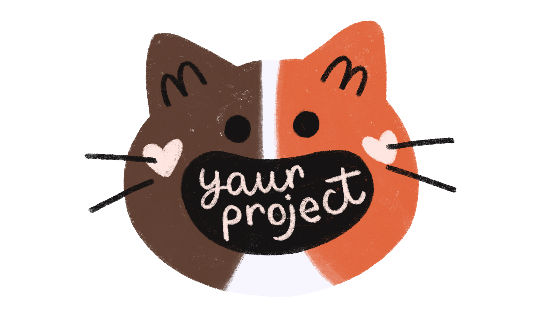
2. Your Project: For today's project, we're going to create
a self-promote animation for your
favorite social platform. The first part of
this class we'll be focused on self-branding. Then we'll go over how to
animate and procreate, and then finally how to organize your layers to be able to adjust your final animation to fit any social media
platform you like. Self-branding can be intense, but introduction animations
are a low pressure, and quick way to introduce
yourself to your audience. They also typically only
last about 5-10 seconds, so there's no need for
that icky feeling that sometimes comes up when
we're promoting ourselves. Plus when people see it, they'll automatically go, "Hey, it's that cool, creative
person I've seen before." It also quickly lets everyone know who's looking at it,
what you're all about. Don't worry if you're
like, "Taylor, I have no idea what my
personal brand is." We're going to do
a whole worksheet together that'll help you narrow down what you want others to think of when they
see your work. Plus you're an
ever-growing human, so don't be too
serious about this. It may change in six months,
and then guess what? You can make adjustments to it. Your brand is supposed
to grow with you. By the end of this class, you'll have a 5-10
second promo animation that fits perfectly on your
favorite social platform. I'll be providing you
with templates for all of the main social media
apps with dimensions. I do, however,
recommend starting with YouTube because it's
the largest format, which is standard HD. This will make it a lot
easier to size down to fit all other platforms without
any major quality issues. Taking the time to boil down
what makes you a unique and a fun video format
will help you better understand what you
offer to others. You may also learn
something about yourself that you
didn't even realize. You might look over
all of your work and for the first time
in a long time go, "Wow, I really use
a lot of purple." Then you can include
that in your animation. All you're going to
need is an iPad, an Apple Pencil or stylus, and the Procreate app, as well as the resources I've provided in the project tab. Let's go ahead and get
started working through our personal brand together by starting with a self-audit.
3. Self-Branding: Audit Yourself!: I know the thought of branding when you're
creative to be daunting, but a brand is simply a concept that helps
people identify you. For me, my brand includes
a lot of hearts, cats, and maybe a
little too much pink. However, I know when people
see my cat drawings with their little smiley faces and heart cheeks that
they think of me. However, I only know this
because I've worked on it for awhile and I've slowly gotten feedback from my
audience over time. Like I mentioned, you
are not a company, you are a living person
who will grow and change and your brand
needs to do that with you. It's very important that you commit this next
thing to memory. You ready? A brand is not a logo. Companies use logos
in their brand, but that's not what
makes the brand. Brands are the
overall concept of a company or individual
in our case. We're focusing on our
work by thinking about how we want it to be
perceived by our audience. We can do this
through; color icons, fonts, our brand voice, and so much more. I repeat, we're
not making a logo. Now that you have a better
understanding of what a brand is and how
it can apply to you, we're going to audit ourselves. I've made a handy
dandy worksheet of questions to answer about your work to better
understand how to visually represent
yourself as a creative. Take the time to open up your most used social
media platform, but don't get distracted
by videos of cute animals, we need to focus. Look over your work
and think through the questions on the worksheet. It's hard but try to
look at it is if you're a brand new follower
who stumbled across your page. What do you see? What do you not see? What do you want to see? Once you have
everything filled out, we'll move on to honing
in what you found with some cool branding techniques
before we start animating. I'll see you in the next lesson.
4. Consistent Design & Brand Voice: Now that you have better understanding
of your work and how that connects with who
you are as a creative, we're going to dive a little
deeper into why consistency is key to your brand and how to cultivate your brand voice. If you're already thinking, "What the heck, Taylor? You just said my brand
can change with me, but now you're saying it
needs to be consistent?" I did and you're right, but if you were to change your brand every single
day or even every week, it would not do what
we want it to do, which is allowing our audience
to connect with us by easily being recognizable when we pop up in their
social media feed. We want our current
followers to go , "It's Taylor's work. Let me go check it
out or like this video," as well as our
potential followers to go, "I think I've seen this before. Let me go check them
out a little more." We want to build on
what we created, not tear it down every time
we get a shiny new idea. It's like sprucing
up an old house, you want to keep all the
charming history while adding new things that make it more
functional as you grow. Consistency in your brand can look like using a set of colors, having a font you love to use, or even a snippet of
music or audio that accompanies your animation
every time it plays. Utilizing some form
of consistency in your brand can help your
audience recognize you, feel connected to
what you're doing, and most importantly, trust you. Whether they trust you as
a source of information, trust the quality
of your products, or even trust that you make cool content that
they want to follow, you need to be
reliable for them. While we do focus heavily
on visuals in this class, your brand voice is
just as important. Brand voice is the personality that's unique to your brand. Is your work funny? Quirky? Serious? Maybe a
little more vulnerable? Think back to your
audit worksheet, did you answer all the
questions very seriously? Does your work deal with
a very heavy topic that needs a lot of detail given to convey the message you want? Or is your work a
little more funny? Do you like creating work
that makes people laugh or that's relatable to them? This can help you find
your brand voice. For me, my brand voice
is more playful. I like to write captions that
might make people giggle. I don't like to be serious, but I do like to be
vulnerable and honest. Think about how you like
to present your work to your audience and how you like
to communicate with them. This is going to help you
figure out your brand voice. In the next lesson, we'll go over the
visual aspects of your brand that help when
creating a consistent design. I'll see you soon.
5. Limited Palettes & Stylizing: Like I mentioned in
the last lesson, color is a good way to
bring consistency to your brand as well as the
stylizing of your brand design. However, color can
be overwhelming, especially when you're
working digitally, because you have access
to the whole rainbow. To help with this,
we're going to design a limited color palette. So let's just stick with
three colors to get started, since our animation
is short and sweet. Feel free to pick
your three colors from the main colors
you find in your work. That's honestly a great
place to get started. From my work, I chose pink as my first color because I use it a lot throughout my work, and I know it'll
be a great use on my heart elements that
I absolutely will have. After that though,
I decided to curate my other two colors based on what I'm really into right
now, which is purple. I've been obsessed with
light lavender recently, so I know I want to use
that as a background color. Light colors are really good for backgrounds
because they'll help draw attention to darker
elements in your composition. Then I decided to choose a darker purple to give my
brand a monochrome look. Overall, I think these
colors invoke an air of playfulness which ties
back into my brand voice. For your colors, try
picking a main color that stands out in your work and then you can
build from there. Colors have a lot of meanings associated
with them and this is just a small snippet
of some of the words associated with all bunch
of different colors. I'll be sure to include this
in the project resources for you to reference when
picking out your three colors. You can also feel free to
post your color palette in discussion if you want feedback from me or your fellow students. As for stylizing, this is where you want to reference
your own work. I know style can be a tricky
thing for a lot of artists, but you don't have to have
a set style for this class. You've just have to choose
a style that you like and feel aligned with
the work that you've done in creating
your brand so far. I always preach that multiple iterations
is a great way to find your best work. So we're going to employ
that method here. Open up your Instagram,
your website, sketchbook or
whatever you use to take a look at the work
you've made altogether. Then lets sketch somethings
with no pressure. The key here is to
keep drawing even after you've drawn
something you like. Let's start by trying to draw some simple shapes
that feel like you. For me, I love bubbly lines
with curlicues on them. It's just what happens
to come out of my hand. But maybe like drawing
straight lines with stripes. We already know I
love drawing cats, but maybe a simple pencil
sketch feels more like you. Just fill up a page with a bunch of doodles and see
what comes out. After you've done that, go back and highlight
your favorites. We want to try to have
1 to 3 visual elements that we might include
in our animation. If you're an avid painter, it could be a painterly
looking brush and palette or maybe you're
journaling fanatic, so you want to loose sketch of a journal with some
[inaudible] tape. Whatever you feel most excited
about is the right thing. Remember that it's
your brand and you're using this to show what
you're all about to others. You did it. You made it through the
introduction to self-branding. So now it's time to animate
all of the things we've collected into a
quick representation of you as a creative. I will see you in
the next lesson.
6. Composition For Movement: We have our general direction
for our brand now down, so now it's time to think about the actual movement
of our animation. Remember, we're creating a 5-10 second animation that will introduce us to
our audience with all the brand work
that we just did. Before we can get into the more ditty gritty of animating, we need to think about
our composition. You've probably heard
the term before, but composition is
just how all of the visual elements in
a piece work together. Composition is
especially important for us because we only have a short amount of
time to display a good amount of
visual information. It's also good to
think about how your composition will look
throughout the animation. In a static piece of work, you generally only have
one composition however, animation has many
compositions flowing together. For our introduction, we'll have a beginning, middle, and end composition. Let's work through
those three together. I've created a
worksheet that you can print out physically, or you can open and
procreate to fill out. Like I mentioned previously, I recommend using my YouTube
template to get started, since it's the
largest of them all. When we're done animating, I'm going to show you how to insert the social
media templates into procreate to scale
your work to any size. Scaling down rather than up will maintain the quality of
our animation better. For our first composition
we want to think about how our visual elements will
be entering our Canvas. Will our icons enter first? Or do we want our
name to be first? We can also sketch out
a cool transition to be our first composition if we
think that would fit nicely, or it can just be as simple
cut and just get started. It's really good to
focus on balance here. We want to utilize
a good amount of negative space
since we'll fill up our Canvas in the
next few frames. Positive space is where
your elements are and the negative space is where
the Canvas will be empty. Keep in mind, we're
leaving up to drawing the viewer's attention to
somewhere in the middle. A middle composition needs
to be a bang, this is me. If animation was
a roller coaster, this would be right as you
go down the first big hill. We want our name, our icon, our most important
visual information to be front and center. Be sure to think
about contrast here. This animation is so short, so we need our main
elements to stick out, and we definitely don't want our audience searching for them. This is what I would
use my darkest color on whatever I want to
draw their eye to. Finally, our N composition
is where we can wrap up the animation
with a satisfying ending. This can be a fun transition especially if you didn't
have one in the beginning, like I can have a
heart fly up and fill the whole
Canvas with color, or I can have a cool painterly swiped that'll transition
into the next frame. We'll go over timing in the next lesson but while
you're working through this worksheet
really think about the rhythm of your compositions. Will they work
well back-to-back? Can you already start to
see the animation forming? If so, that is a great sign. If not, don't worry though, mentally visualizing
these things is a skill that can
take time to learn. Plus in the next lesson, we'll get your compositions and put them into a procreate and
have them start animating, and we can adjust anything
we need to from there. Just remember to
focus on balance, contrasts, and rhythm as you finish up
your compositions. Once you're ready
we can go ahead and get started animating.
7. Animation Tests: Timing: You've made it to the animation
phase. Are you ready? I know we've done a lot of
work leading up to this, but it's going to be
so worth it when you see all of your hard
work come together. If you ever run into any
issues along the way, feel free to pop
your question in the discussion tab and I'll
be sure to help you out. Now, we're going to take
our three main compositions and start building on them. But before we can do
that, let me show you the basics on animating
in Procreate. Before we can get
started in bringing our animation to life from the compositions we just made, I wanted to show you the basics of using the animation
timeline in Procreate. Right now we
currently don't have any timeline and I'm
using 1920 by 1080, which is standard HD,
that's like YouTube size. But to get our timeline, we want to go up to
this little gear icon, tap that and then turn
on animation assist. From here, you'll see a little timeline pop-up on the bottom. We have our play and pause
settings and then add frame. We're going to go into settings. This is where I'm going to
show you some cool things that Procreate can do. Loop means that your animation
will loop over and over. This is typically used on GIFs and we're going to
use it for our purposes right now because we just want things to play through so we can figure out how
things are looking. Ping-Pong means it goes from start to end and
then end to start. It just does that endlessly. Then one-shot means it'll
just play through once, which is what our final intro
or promo video will do. But just for animation's sake when we're
going through so we don't have to keep
opening and pressing play. We're going
to keep it on loop. Frames per second means how many frames there are in each second
that it will play. We're not Disney-level
animators, so typical animation is
like 24 frames per second, but that means you have to draw 24 drawings for every second. We're going to go down to about four drawings every second. You can go as low as two, one feels really choppy. Two is the lowest I'd go, and then six is
the highest I'd go since we are just
learning how to animate. Onion skin frames refer to the
frames you can see behind. It'll make more sense
when I start drawing. But basically, it's just
like how an onion skin has translucent layers and you can see that there's another
layer underneath it. That's how onion skins work. You can change the
onion skin opacity. I'm going to leave mine at 60. You don't have to worry
about blend primary frame, but all that means is it'll
blend the frame you're currently working
on, it'll fade in. I'm fine with mine like being darker or the color
that I'm working on. You can change your
onion skin colors here. I think the standard one is
bright green and bright red. I just have mine on
light and dark purple. Whatever you like, you can
change that if you'd like. From here, you're
going to open up the Layers panel and you'll
see that we have one layer, which means there's
only one frame. If I add a layer, then we have two frames. If I switch between these, I'm switching between
layer one and layer two. You can also see that if I click between them, you'll
see it down here. It'll move back and forth. We're going to delete our second layer and just
start with the layer one. I'm going to show you really quickly how animating
is going to work. I'm just going to zoom
in for our purposes. I'm going to draw us
a quick little heart. From here, I can open the Layers panel and click
plus to add a layer, or there's a handy-dandy
little Add frame button. I'm going to click Add frame. Then this is what I'm talking
about our onion skins. You see, this is a light purple, which is what my
onion skin is set to. Then you'll see my
heart down here. But then there's
nothing in this frame. That means we're going to
draw on top of this one. I'm going to draw a heart again. This is helpful if
you want to see what you drew the last frame. So you know, if I wanted
to move this way, then I can see
where my last heart was I can move it over. I'm going to add
some lines and we'll go ahead and add one more frame. Again, you can see our
onion skins working here. Draw some more lines. Boom. Then now if we press Play, it'll play through
our little animation. Again, this is where we
can start adjusting like maybe I want it to be
two frames a second. It feels more choppy
and I like that. A six frames probably going to be super fast because
there's only three frames. To get started. We're
going to import our three compositions as
a starting place by either taking a photo of
our sketches or bringing our sketch layer
over from the worksheet. What I did is I went ahead
and export it from here, PNG of my composition
illustration and just saved it to my iPad. Then on my composition that I'm getting
ready to animate on, I'm just going to go
to the wrench icon, Add, insert a photo, and from here you can insert a photo if you took a
picture or you can insert the photo from your
layers and then I'll just zoom these up
so they're ready to go. Add a new frame and just repeat
the process until I have all of my compositions
in here and ready to go. We don't have to be too precise about where these go to because we're just trying to
get in our first ideas. Now, that we have our
beginning, middle, and end set, we're going to work on what's called in-betweens. This means that we're going
to fill in what happens in-between are three main
frames to create movement. This part is almost
completely trial and error, so it'll take some
time to get right, but I'm going to
give you a couple of quick tips to make it easier. First thing you need
to know is how to control the speed
of your animation. Let's say you have a
circle on the left side of the canvas and you want
it to move to the right. If you only draw two extra
frames to get there, it's going to look like
it's moving super fast. However, if you draw six
frames to get there, it'll move across the
canvas a little slower. You can use this
knowledge to control how quickly things happen
in your animation. Maybe your first
transition is slow, so it has a lot of frames, but your name pops
up real quick. It's only like three
frames with movement. The best way to start
seeing this in action is just to jump into
sketching out your frames. We can play them back to
test the timing and add frames to adjust the speed of our animation as we go along. You can also control
the speed by adjusting the frame
rate like we went over. However, a higher frame rate means more frames
you have to draw. If I set this to 12, our animation is going to play
super-fast, which is cool. But that means I have to
draw way more frames. Since our animation is so short and we're not
Disney-level animators, I recommend keeping
your frame rate to around four to six
frames per second. Another thing that
can help you animate movement more easily
is motion paths. These can easily allow you to better visualize how
things will come in, how quickly they come in, and how many frames you need to draw to make that
movement happen. It's best to draw your motion
paths in a different color. I have red and purple here. Just because these are secondary little paths that
are going to be happening in the red are the main hearts that
I want to pop up. What I'm doing here when I drew this one is to think that I want the heart to come up
in a little swirly path. I know it's going to end about
here, just a guesstimate. I want it to be slow
when it comes in. Maybe I would put one
right here versus this one means it will come
in really fast because it goes from
nothing to here. Then maybe I'll go slow. I have three more frames that the peak of
the heart will hit. Then it'll jump up really fast. That means it'll go from here to this next notch
and then end here. You can adjust these as you go. I definitely do if I feel that maybe where I thought I wanted it to land
wasn't quite right. Then I'm going to use
Procreate's foreground feature. To do that, you
want to make sure that your motion paths are set all the way at the top
of all of your layers. I'm just going to turn the
opacity down to about 50. Right now the motion paths
go away and I want to be able to have them so I can see these hearts and what path
that they would go on. What I'm going to do
now that my layer is at the top of all of my
layers is click it. You'll see there's
a whole duration, duplicate or delete, or there's this option
called foreground. I'm going to flip foreground on. Now if you go back,
you'll see that all of our animation has this on
top as the foreground, which is going to help
us draw the hearts. If you watch my Hearts
Animate through, you'll see that they're
following a little motion path. Then that just helps me think through how they're going
to come in like I said, and then give them a
more dynamic movement than if I were to just draw them frame by frame
without any thought. Like I said, this whole
step is trial and error. If you feel like
you're doing it wrong, then I promise you're
doing it right. It just takes a little bit
of time to work through what works best to
create what we like. This step took me about 30
to 40 minutes to complete, so you don't need to
rush it. Just have fun. Once you have the
timing down and you're happy with
how it's moving, we're going to begin the
fun part of coloring everything in which we'll
bring it all to life. I'm going to teach you
in the next lesson how to group your frames
while you color them to allow them to be scaled and reused over and over again. I'll see you soon.
8. Staying Organized: Templates: First things first, let's duplicate our film before
we start coloring to have our original
animation and go back to if we ever want
to change it up. From here, we can
start coloring, and based on our limited color
palette we chose earlier, I went ahead and
added my colors to my palette to make it
easier to select from. It's best to keep
your colored sections separated on different layers. It's going to make
it much easier to make adjustments
later if needed. You can use whatever brushes
you like for this step. Here are some of my
favorite brushes I like to use for coloring, but use whatever style of brush fits your creative
work the best. If you're looking for some
extra brushes to purchase, I highly recommend
checking these ones out. After you have the coloring
of your first frame done, we're going to begin
grouping our layers. This is what's going to allow us to make adjustments easily when we resize it to fit other
social media dimensions. We're going to rename our
new group as Group 1, and the next group will be two, and then so on until
everything's colored in. It's really important to
get our layers and groups organized at this stage because it is the base of our template. Make sure you take that extra little bit of time for this. After we're finished, and have a super fun
full-color animation, we're going to resize it to fit another social media
platform we love to use. Depending on the complexity
of your animation, this can take some time, so definitely just pop on your favorite movie
and get to coloring. In the next lesson, I'm going to be showing you how to resize this to fit another social media platform you love to use. I'll see you there.
9. Resizing For More Socials: We're going start by duplicating our full color
animation and renaming our original YouTube animation or whatever social
platform you made it for. After that, we're going
make sure we have our next social
template downloaded. You can find these in
the project resources. They're all PNGs that
have the dimensions of the social media
platform for reference, as well as an illustration
of a UI for that platform. This is going to help us
place our graphics without having any of them be
cut off or out of frame. I created my animation
for YouTube, which is 1920 by 1080, and I want to make it
fit on Instagram Reels, which is 1080 by 1920. To do that, all I
have to do is take our new file and
then pinch and flip. This will make our
canvas vertical, so now all I have to do is
upload our template file, we're going to add insert photo. From here we're going to
open up our layers panel, select all of our
neatly organized groups by swiping to the right on them. Once selected, we just hit
our little cursor icon, tap the green handle, and then type in 90 to
rotate all of our artwork, making sure that our
largest illustration fits in the canvas. It's really that simple. From here, we just want to
play back our animation and add any missing sections that
might've gotten cropped, like background colors
or transitional frames. Now you have an animation for two social media platforms, well three of you
use Tiktok too, but you only did the hard
work of creating one. You can use this method for
any dimensions you like. For example, if you
want your animation to fit on your Instagram
feed as a square, all you have to do is duplicate your original animation again, then go open up the copy, go to the wrench icon, canvas then crop in size. We would need to change
the dimensions to 1080 by 1080 to get our square. We just need to make
sure we aren't cropping any important information of the animation when we do this, I suggest having your layer on your largest illustration
to check for this. From here you can select
all your layers and again, move them around if you need to, but really that's it. Now you have an
animation that fits on your Instagram feed too. Keep in mind, it's best to
go smaller, not larger. If you increase the
size of your animation, you'll lose quality so try
to standard 1920 by 1080. However, most social media platforms
don't go over this side, so you shouldn't have
to worry about it. It really is that simple. I hope you're excited to have beautiful matching
graphics across all of your socials that
you can be proud of, because you put in
the time to transform your creative work
into a fun animation. In the next lesson, I'm going to show
you how to export these graphics so that you can add them to all of
your video work. I'll see you there.
10. Exporting To Share: Now that we've resized our cool
animations to fit all of our social media platforms
we want to use them on, we need to export
them as an MP4 file. If you're not familiar,
an MP4 file is just a standard video format used for a majority
of video work. To get started, open up
the animation you want to export and then hit the
wrench icon and go to Share. From there, you'll get a
lot of options to export. We're going to select "Animated MP4" near the
bottom of the list. This will open up a
little preview window for us to see our animation. Make sure it is on
max resolution. From here, you can also adjust the frames per
second if you like. Always mess around with
this before you export, just to see if I'd like
it faster or slower. Once you're ready, you
just hit "Export" in the top right and select where you'd like the
file to be saved to. That's it. From here, you can use this animation in any of your videos
to add a fun and cohesive introduction for your current and potential
audience to see. I'm going to give you a
few quick tips to help you out when you're using
your new animation. On TikTok and Instagram, it's best to add this
animation at the end, since they are a fast-paced
video format that needs to grab your viewers'
attention immediately. Adding it at the
end will still have the same effects of
bringing cohesion to your brand without
the risk of losing viewers who may scroll before they even see the main video. If you're creating a
YouTube video, though, pop that sucker right in
the front of the video. I always like when
other creators have five seconds of a clip
from the actual video, and then their promo
animation starts right after. It gives me a little look into what's coming
up in the video, but then a cool animation makes
me excited to watch more. It reminds me whose
video I'm watching. For adding these
animations to your videos, you can use any video
editing software. I use Adobe Premier
Pro on my computer, but if you don't
have paid software, Canva has good
editing capabilities as well as DaVinci Resolve, and both of those
are free to use. On your phone, you can use the editor within
Instagram or TikTok, but I prefer to use an
app called Im Chat. The base of it's
free, but if you want extras they offer, it's only $10 a year. I mentioned adding
sounds earlier as well. I like using freesound.org for royalty-free sound effects
like swipes or pops. But you could also look into Thematic if you
want to add music. Just be sure to follow
their guidelines to avoid a copyright charge.
I think that's it. I'm so happy you decided
to take this class and put in the work to create an awesome animation for yourself. I cannot wait to see
what you created, so be sure to
upload a version of your final animation in
the project gallery. Also, be sure to pop in your
social media handles to myself and your
fellow classmates can check out your
creative work. Let's go ahead and wrap
this whole class up. I will see you in
the last lesson.
11. Conclusion: Round of applause for creating a super cool
animation all about yourself. Self-promo can be weird, but I hope you enjoyed
taking this class. Dive deeper into your
creative work and create something that
expresses yourself to other people on the internet. Again, don't forget to share your hard work in
the project gallery. I cannot wait to see
what you created. To recap, we went over what a brand is and how to
audit your creative work, why a consistent
design and brand voice is important
to your audience, how to choose a color palette and style for your animation, best ways to design
compositions for movement, some easy tips for nailing down the timing of your animations, keeping your layers
organized in Procreate, how to easily resize
your animation to fit any social
media platform, and finally, exporting
your animation and tips on how to use
your cool new promo. I hope you enjoyed
this class and can see all the cool ways
you can implement the techniques we
went over to create more fun animations for
yourself or others. Remember though, you are
an ever-changing person so don't be scared to switch
it up whenever you feel like your creative
voice has shifted. This class will
always be here to reference if you need it. If there's only one thing
you took from this class, I hope it's that having a
consistent brand animation can help you be more
recognizable for your current and
potential audience. Using all of the self-branding
and animation techniques we learned in this class, you can easily create and adapt any animation to fit your
particular style and brand. Please do not forget to share your creation in the
project gallery along with your social media handles for myself and your fellow
classmates to checkout. You can also tag
me on Instagram or TikTok whenever you use your
animation in your videos. Last but not least, if you like the class, I'd love for you to leave me a review and follow for more. I'll see you in the next one. Bye.
 Taylor Carroll, Illustrator & Chief Cat Mom