Transcripts
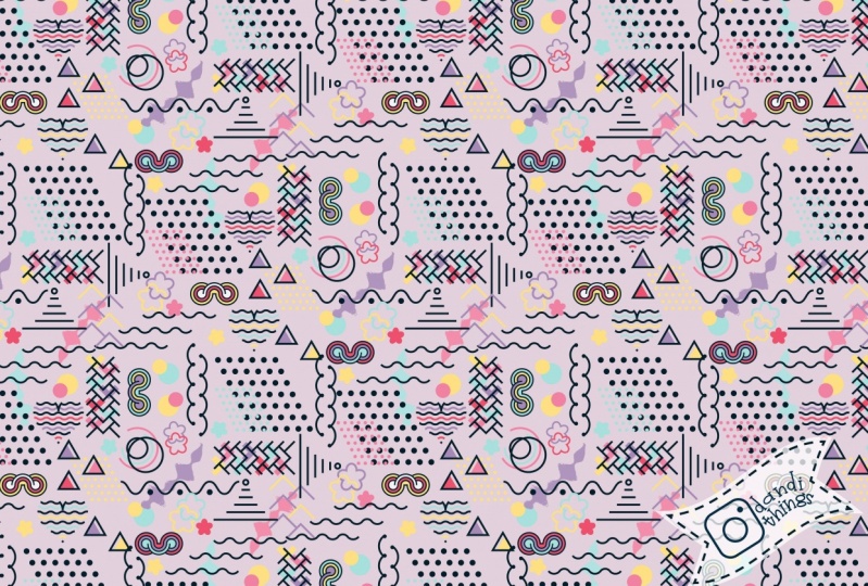
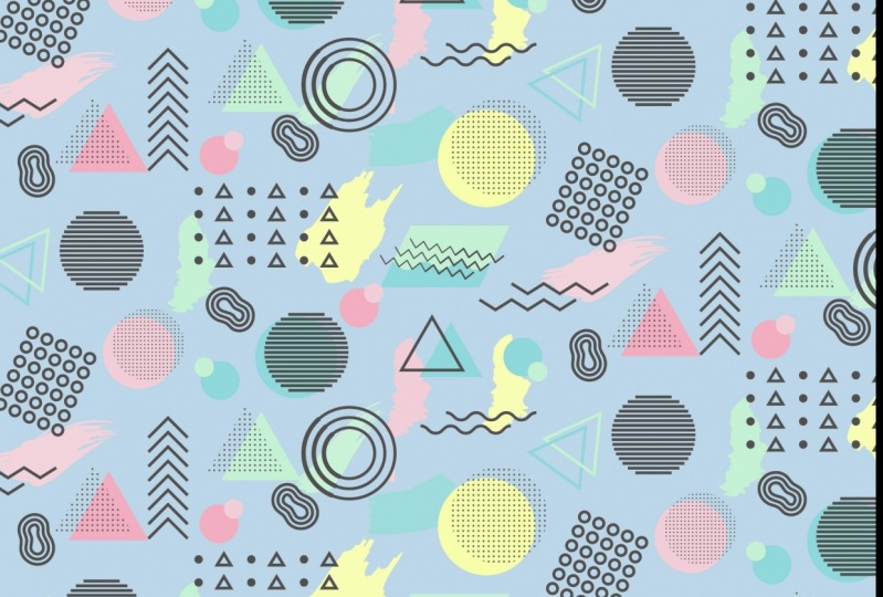
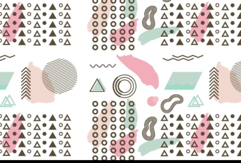
1. Create a Memphis Design Style pattern in Adobe Illustrator: Hello and welcome
to this course, Memphis Design Inspired
Patterns in Adobe Illustrator, a graphic design
for lunch class. My name's Helen Bradley and
I'm a Skillshare top teacher. I have over 250 courses
here on Skillshare, and I have over 155,000
student enrollments. In this class, we'll create a Memphis design inspired
pattern in Adobe Illustrator. Now, we're going to
do this from scratch, stepping through every process, from creating a color scheme, through creating the objects, and finally, the pattern itself. I'm really excited about this class for a
couple of reasons. Firstly, it's a chance
for you to work with a design style which
is trending in 2022. I also plan this particular
class to include a range of Illustrator
skills and techniques. It's a learn illustrated
by doing class as well. For this reason, the class
is going to be suitable for competent beginner as well as intermediate
Illustrator users. By the time you've
completed this course, you'll have added new
Illustrator skills to your toolkit and you'll have created a
Memphis design style repeating pattern too. If you're ready,
let's get started.
2. Pt 1 Assemble the Colors to Use: Were going to start our
Memphis design pattern, not surprisingly,
in Illustrator. I'm going to click to
create a new file. I'm using something
as 1920 by 1080. I am also using RGB color mode. You can make whatever
size document you want, but if you want to use some of the dimensions that I'm using, then that's my document size. I'm also going to clear
out my swatches panel. I've got my swatches
panel visible here. Of course, you can get to any of your panels by choosing Window, and then the panel name. Swatches I want to
because I'm just going to clear everything out of here. I'm clicking on the first color, shift clicking on
the last group here, and just sending them
all to the trash bin, because I made a very
limited color palette here. You'll never be able
to delete these two, so don't even bother
trying, that's fine. We're going to create
some colors to use. If you're not really
confident about colors or if you'd like
some help with inspiration, hit over to color.adobe.com. I've got that open
here in my browser, I've already logged in. Up here in the top right corner, I can tell that I'm
logged into my account, because I'm seeing the libraries from my illustrator accounts. Just be aware that if your libraries aren't
showing up here, you'll need to log in. There's a link up here in
the top corner to login. I've already gone looking for what I want and it's pastel. Here in the bar up the top here, I'm just typing in
the word pastel. I'm pressing ''Enter'', and we'll see every
color scheme that has been associated
with the word pastel. In terms of colors
for this project, I got some really
good results with A, working with a really
limited color palette and B, choosing my colors
relatively carefully. What I did was I got two blues, a dark and a light, two pinks, a dark and a light, a yellow and something that wasn't quite black,
so dark gray. Right now, I'm just going to ignore the dark gray
because nothing here is really showing dark gray except for
this one over here. I'm looking more for the pinks, blues and yellows or pink, turquoise and yellow, something
that I can work with. Here, I seem to have found
something that I quite like. I think these colors are
going to be pretty good. I think maybe the yellow
is not bright enough, but we can deal with that. Having looked at this, we can make changes
to any of these, but it will give us a
really good starting point. Here are my two pinks, here are my two
blues or turquoise, here is something
like my yellow. I just need to find something
that's not quite black. I'm going to click here
to add to library. It's been added to
my colors library. If I had been a little bit
more careful in choosing the library that I
wanted to use up here, I could have actually sent
it into a different library, but colors is fine. I'll know where to find it. You can grab more color schemes if you want at this point. You can play around
here in Adobe color, but where heading
back to Illustrator. We're going to our
library's panel because that's where our
colors are going to appear. Again, I've got my libraries
panel visible here, you can get to it by choosing
Window and then libraries. Somewhere in here should
be a new color scheme. Here it is, it's not
grouped, but that's fine. We've got all the
colors that we need. What I want to do is add
it to my Swatches panel. I'm just going to
right-click on it and I'm going to choose add
theme to swatches. All these colors
have now been copied from my library into
my Swatches panel. They're nice and
easily accessible. I am going to have a
look at these yellow because I think it
could be improved. Let's just double-click on it. You can adjust using RGB,
but you don't have to. You can also use something called hue saturation
brightness. Sometimes that's
actually a better way of adjusting because, I'm just going to
turn preview on. I can get a brighter yellow here by just increasing
the saturation. Just be aware that
you're not stuck with using RGB as your adjuster. I've just brightened up
my yellow a little bit. I do need a gray, but I'd like something
that's in more pink range. I'm going to click on
pink to select it. Then I'm going to
double-click on this pink here and I'm going
to go for a gray that is a little bit more pink gray rather than than
being blue gray, or yellow gray, or green
gray, if you like. I'm just going to find my color, just don't want it to be black. I'll click ''Okay'' and now I'm going to add it
to my Swatches panel. I do that because it's already the selected
the color here. It's just clicking
on the plus symbol here and just add it. It's been added as
a global color, None of these others
are global colors, we can make them global colors. That means that we can
easily change the color of objects colored
with these colors in the pattern later on. I'm going to click
on the first color, shift-click on the last color, go to the flyout menu here, go to swatch options, and I'm going to make
them all global colors. Now everything is
a global color. If you'd like to
have things that you can sample from as
you're working, you could go to the
rectangle tool, hold the shift key, and drag out a very
small rectangle. I'm just going to turn
the border off on this, so it's going to be filled
with my first color. I'm going to alt option
drag on the Mac. It's alt on the PC
option on the Mac. I'm going to fill it
with my next color. Alt or option drag, not worry that these
are going everywhere. Alt or option drag, fill it with my blue. Alt or option drag fill
it with my yellow. Let's go and change this one
to this sort gray color. Select over everything
and just line everything up neatly and we're
just going to adjust the vertical
distribution. Looks like I've got
one color wrong, let me just fix that. We've got our colors now neatly
arranged in our document. To make it a little bit easier to work on this
document later on, let's go to the last palette. We'll see that colors are all little boxes
in the layers palette. Let me just make
everything bigger so we can see what's going on. Layers palette, little boxes
all filled with color. It will be better
for us later on to divide up things
which are helpful, which are these from the
actual pattern elements. What I'm going to do
is I'm going to add a new layer to this document. Just click here to
add a new layer. We're going to work
on this layer. For now, we're just
going to lock this one. That means we can't select it, we're not working
on it, we can't add anything to the layer. These colors are all
going to be accessible, but they're not going to be
in our way, if you like. Let me just reset my document
where already to start at. This point, I suggest you
save your document because you're going to be saving it repeatedly as we're working, and that's a really
good starting point. In the next video, we're
going to start on our shapes.
3. Pt 2 Create your First Shapes: Now we're ready to
make our first shape. But before we do that, we want to check on one
illustrator preference. Now on the Mac, you'll
go to Illustrator and click that to get to your
preferences on the Pasi, you're going to choose
Edit and then Preference. You want to go to General. The option you want to look
out for here is Scale, Strokes and Effects, and you want to disable that. For this particular design, we want all our line work
to be the same line width. If we are scaling
strokes and effective, we have this turned on. That means that when we
make a shape bigger, the line weight is
going to get bigger, and so we'll have to
fix it each time. If we turn this off, this allows us to
make a shape bigger, but without the stroke, the line around the object
changing its size at all, it's going to work better
for this particular project. If you don't normally have
that turned off, do that now. Now the first shape we're
going to make is a curvy line. For this we need a stroke, so we don't need a fill.
I'm going to turn that off. I'm going to turn the stroke on, and we're going to
use this color here, this gray color
that we're using. Let's just select that
as a stroke color. I'm going to click on
the Line Segment Tool. I'm just going to
click and drag to the right to create a
short horizontal line. Now I have the Shift K
press down because that's going to make sure that this
is perfectly horizontal. I'm now going to increase
the stroke weight, so I'm going to take this up to probably about eight points. That's going to be the
stroke weight that I'm going to use throughout
this project. You want to settle on
something that you like, make this line a
little bit bigger. This is because I have chosen shapes and designs
that are going to show you a whole range of techniques and tools
in Illustrator. This first one for
this wiggly line, we're going up here
with the shape, select it to effect, and then we're going to
distort and transform, and we're going to take zigzag. Now that gives us a pointy line. We're going to make it smooth, so it's rounded, and I want the ends to
be at the same level. I want this end here
to be up the top. I just need to increase the
ridges per segment to five. If I want the line to
be a little bit taller so that these loops go
further up and further down, then I'll just
increase this value. I'm doing that by just clicking
here in the box and using the up and down arrow keys on my keyboard just because that happens to be pretty
easy for me to do. Once I've got a line looking the way I want the line to look, all I'll do is just click, Okay, and we've got
our wiggly line. Now, a wiggly line is
actually a line that's got a appearance attached to it. Let's go to the Appearance
panel and have a look. Here is our wiggly line, and it's got a zigzag and that can be disabled and enabled. Now later on in this
particular course, we want this line to be a line, not a line with an
effect attached to it. We won't actually anchor points all the way along these loops. What we're going
to do, is going to object and choose
Expand Appearance. This turns this into a line
so you can see that it's actually got anchor
points along its edges. It's now no longer a straight line with an
effect applied to it, it is actually a wiggly
line and any one of these anchor points could
be selected and edited. You can say it's fully editable, but as a wiggly line. Let's check the layers
palette and make sure that it's not
stuck inside a group because we're going
to be very careful about the layers
palette here and just continually make sure that things are not trapped
inside groups, inside groups, inside groups, because that can happen
quite a bit in Illustrator. We've fixed our scale, strokes and effects, and we
have created our first shape. Our second shape is going
to be a zigzag line. Let's go back and do that since we're working
with the same tool. Again, shift, drag
a line, again, go to Effect, Distort and
Transform, and then zigzag. Now this time I want
the zigzag effect. I'm going to just increase the number of
ridges per segment. I'm going to increase
the height of my zigzag. But I'm not going to
use smooth because I actually want
this bumpy effect. I'll click Okay. I think it's a little bit big, so I might just drag
in on it a little bit, holding the Shift K so that it drags perfectly horizontally. Again, we want this to
be broken out so it's no longer just a straight line with an effect applied to it, we want the actual
anchor points, so we'll go to Object and
then Expand Appearance. Check in the last panel to
say that that's all we have. Exactly correct. Now for this one, I
want a second one positioned underneath
it and offset slightly. Let's go to the Transform
tool and just see how that might work to help
us to create this effect. Of course, we could
move it ourselves, but that's not learning
handy tools in Illustrator. I'm going to Effect, Distort and Transform
and then Transform. This tool allows me
to create multiples of this shape and do
things with them. At the moment, our reference point is the
center of the shape. Everything's going to happen relative to the
center of the shape. That's fine, preview
is turned on, I'd like a couple
of copies of this. One original, two copies. What I want to do is to
move it horizontally, but I'd like to move it about
one-third of its distance. I'm actually reading off up here because I
can actually see the width of this
shape and it's 353. I'd like to move at
one-third of 353, and I don't know what
that is right now, I'm not prepared to do the math. Let's type in here 353
divided by 3 and hit Tab. That's actually being moved
one-third of its distance. Now it went in the
wrong direction, I wanted it in the
opposite directions, I'm just going to add a
minus in front of it, and vertically I'm going to move at one-sixth of its width. Again, 353 divided by 6, and I'm just going to tab away. You can see that we've
got this effect where the shape is now moving
away from itself. Now all of this is
fully editable, so we can have a
look at and say, well that's far enough or
it's not far enough or whatever we want to
change in relation to it. But this transform effect
does allow us to create shapes and have them
offset from each other, and we could add as many
as we like using this. We'll just increase
the number of copies and every one of them is
in the correct place. On reflection, I think I
just want two of them, so I'm just going to make
one copy and click, Okay. Now, again, not unexpectedly, this is going to be a shape that has an appearance
attached to it. I've lost my appearance panel. Let's just go and get it. Here's my shape and here's
the transform effect. We want to break it out of this, so we have independent lines, select the Line, choose Object, Expand Appearance,
check our layers palette because here we've got groups inside groups,
inside groups. What we do is we select the object and we go
to object ungroup, and we continue to do that until ungroup is no
longer an option. That tells us that everything
has been ungrouped. However, these two
shapes are going to be treated as a single
shape in future. Let's just go and
group them together. What we've done is we've taken them out of the multiple
groups that they were stacked into and just made a clean group that only
has two shapes in it. This thing is really
important if you're selling stock or if you're sharing images
with other people. Because the nature you can
have your layers palette, the more professional you look, the more people are going
to be prepared to buy your art because they know
that your layers palette, all your objects are going
to be neatly arranged. If everything's just
smooshed inside groups or left splattered
all over the place, it just doesn't look
as professional. We've got our first
cut the shapes. Let's go on in the next video to create something different.
4. Pt 3 Draw the Arrow Shapes: Our next shape is
going to be a series of small pointy arrow things. To create a pointing arrow, I'm going to use the squares. I'm going to the rectangle tool, I'm going to hold the
"Shift" key and just drag out a small rectangle. What I'm looking at
is half of the shape. Going to the direct
selection tool, the white arrow tool, I'm going to click here
on this anchor point, and I'm going to press "Delete". When I do, I'm left with the
effective shape that I want. That can be a handy
way of creating things if you need
perfect angles. Now I'm just going to
select and rotate this. I'm holding the Shift
key as I rotate it, because then it rotates
in 45 degree increments, and that's exactly where
I want this shape to be. You can also say that
when you cut shapes, sometimes you end up
with a bounding box that doesn't accurately
reflect the shape itself. If that is of concern to you, you can reset your bounding box. With the shapes selected, you go to "Object" and then "Transform" and you choose
"Reset Bounding Box", and Illustrator has a look
at the shape and say, "Well in actual fact, this
is more what it looks like." Now we want to stack
of these in lines, so we'll go back to the
"Transform Tool Effect", "Distort and Transform"
and then "Transform". We want quite a few of them, maybe about 10, so let's just increase the
number of copies to 10. That'll give us one
original 10 copies. We want to move this vertically. We're going to start to
increase the vertical movement, and that pushes
them down the page. If you go the wrong
direction, that's fine, just turn around and
go the opposite way. Make your numbers negative
instead of positive. Now, this is too many of these. I think I want a few less, so we're just going
to have a look and see what it looks like. When I'm happy, I'll
just click "Okay". Now, every time we use
the "Transform Tool", we again have this
issue of this being the shape and it's got a
transform effect applied to it. We want individual shapes. We'll choose "Object
Expand Appearance". No guesses as to what the
layers palette might look like. These are going to be inside
groups, inside groups, inside groups, and that's exactly what
we're seeing here. What I'm going to
do is ungroup it. "Object", "Ungroup" until ungroup is no longer an option. Then I've got individual shapes. We'll just group
those so we have a single shape that we
can do something with. That's our arrows.
5. Pt 4 Create a Circle of Lines: For this next shape, we're going to do a circle
that has lines through it. We're not actually going
to see the circle itself, it's just that the lines are
going to suggest a circle. We're going back to our
line drawing tool again, just a horizontal line. It needs to be wider than the widest
point in the circle, so let's just make it
pretty wide because we're going to lop off the bits
that we don't need later on. Now we're going to use
a transform effect again to get our lines, the transform tool is really
handy for when you want repeated elements
because you get to look at them and change them
before you commit to them, no other tool works in
quite the same way. Effect Distort &
Transform, Transform, we want quite a few lines here, so I'm thinking maybe
about 12 or so. We want them just to
move down the documents, so let's start increasing it. I think I need more lines. The idea here is to have a circle that is just made up
of different length lines. We've got the lines, we just need to put
it all together now. The first thing I need to do is break this out because again, it's just a line with an effect, it's not individual lines, we can't cut these lines off until they are actually lines. Object, Expand Appearance, and then Object
Ungroup again until we can no longer do that, and then we'll just
group them together so they act as a single
object that will help us just keep things neat
and tidy because we can grab them and move
them as a group, where we would have trouble if they were
individual lines. Now we're going
to draw a circle, so we're going to the circle
tool, the Ellipse Tool. Hold the Shift key as
you draw a circle, don't worry too
much about it right now because we need to
move it into position, and we're going to do that
with the selection tool, the black arrow tool. What we're looking at is how these lines are
going to be cut off now, I think it looks
fine at the bottom. I think it's wrong at the top, so I'm just going to hold
the Shift key and just size down my circle a little bit. I'm just going to arrow
it into position, right now I'm thinking I
don't need this top and this bottom line
and I'm going to lop off all the outside ones. Let's go here to the group selection tool
because that's the only way we're going to be
able to get inside this group easily to
delete this line. I'm just going to delete
this one I don't want and I'm going to delete this one because I don't want it either. Now we have to lop off
these outer edges, and that can be
tricky if you're not familiar with using the
Shape Builder tool. You want to select
all of these shapes, so everything selected and come over here and find the
Shape Builder Tool. It shares a toolbar position with the Live Paint Bucket Tool. Now with the Shape Builder Tool, you can use it to delete
things and fill things. The delete option is
where you use it with the Alt key on a PC,
Option on a Mac. What we're going
to do is just run across the lines
at the edge here. Don't touch the circle though, so you want plenty of room around here because
you don't want to touch the circle because
we'd really like to get rid of the circle in
one step in a minute, rather than having to get
it out piece by piece. Alt, drag just over these lines, just over enough of them to get rid of the lines but not
touching the circle, because over here in
the last palette, I can see my circle. This is the ellipse
and this is the group of lines that are
shaped like a circle, so this is what I
want to get rid of. I'm just going here in
the Layers panel and I can just drop it onto
the Delete icon. I could also have selected
it and just press Delete. But this is now a
group of lines, every one of them is
a different length and they are forming a circle. There is another shape.
6. Pt 5 Create the Nested Circles: The next shape we're
going to create is a circle that's
got a lump in it. We're going to make it two more times apart
from the original. This time, the Transform Effect that we've been
using is going to fail so we have to find a different way of
handling our situation. We're going to see why it fails and we're going to fix it. I'm going to the Ellipse
tool and then hold the Shift key and drag
out a small circle, making sure that
I'm working with my 8 point stroke, which I am. I want to cut a piece out of the side of the circle
so I can thicken it up. I'm going to select over the circle and I'm going
to the Scissors tool. It shares a toolbar position
with the Eraser tool. Click on the Scissors tool
and now you can click on the line that forms
a circle and cut it. I'm going to cut it
in two places only. Click at once here
to cut it here, and click again to
cut it down here. Now if you see over here
in the Layers panel, we've ended up with
two distinct shapes. We've got two shapes where
previously we had a circle, now we've got two bits. It's going to stick them
back together again. What I want to do is
select this smaller piece, and I want to
thicken up the edge. So I'm going to increase the
stroke weight here to 12. Now if we were to zoom in, we would see that we've got
really blunt ends on this. If we want nicer ends, we can round them. Select the shape and go to stroke and make
it a rounded cap. The rounded cap sticks out far enough that it's
actually covering up the end of this shape
underneath because this shape underneath is also
going to have blunt ends, but we're not seeing
those because it's being covered up by the shape
that's got the rounded end. They stick out a bit
more if you like. Now, this is a
single shape and we want to treat it as a shape
so we're going to group it. It's going to travel
as a single shape. It's going to behave as a
single shape right now. Now, I promised you that the Transform Effect would
fail here, let's see why. Effect, Distort and
Transform, Transform. I want to make this
about 140 percent, the size of the original. Make it 140. Let's make one copy. That's fine. Two
copies, not so good. Three copies, disaster. Four copies, this is
not an even sizing. Let's have a look why. When you use the Transform
Effect and you say, I want to increase
the size of my shape, the shape is going
to be increased to 140 percent of its original. Then Illustrator says, well, I've got this shape
now, I'm going to make it 140 percent. It was larger so 140 percent of something
larger becomes even larger, and then 140 percent of
this becomes even larger. We've got some really strong
growth happening here. Where we wanted even growth, we're just not seeing that. Let's go and get rid
of this appearance. Let's go to the
Appearance panel. We don't need to do
anything because the Transform is just an effect that's applied to the circles, so I can drag it onto the trash can and is
permanently gone. Now let's have a
look at this circle that we want to
increase in size, but we want a nice, steady, linear, even increase. This time we're
going to use Object, Transform, and we'll use Scale. We're going to type
in 140 percent here. We can't see what the
original looks like. That's a downside
to using this tool, but we have to use it because the other
tool doesn't work. I want the original
plus this new size one, so I'm just going
to click "Copy". Now we already
know that we can't take this outer
shape and make it 140 percent because that would start this
increased growth. This accelerating growth, which is what we
don't want to happen. Remembering that we got
from this size to this size by increasing it to 140 percent, we can go from this size to the next one by going
to 180 percent. The next one after that
would be 220 percent. We're just adding
40 percent extra to each iteration of the scale. I'm going back to
this smallest shape. I'm going to Object,
Transform and then Scale. I'm going to make
it 180 percent, and I'm just going to
click "Copy" so I get the original plus my new copy. Now we've got even spacing. It would be possible to
make the calculation as to what you needed to add to
this shape to make this one, but then from this
to this one is going to be different
again and different again. They are going to be fractional numbers and you have to do some fairly fancy math to do it so I'm just opting
for something simple. From here to here, we added an extra 40 percent. To get from here to here, we're adding 80 percent. From here to here, we would
add an extra 120 percent. These shapes, let's
have a look at them in the Layers panel and
see what we've got. They're just groups with
the two shapes in it. This is one circle, this is one circle,
this is one circle. Let's group them all together so that now they
travel as one because they are an object
that we're going to use inside our final pattern.
7. Pt 6 Create the Nested Potato Shapes: For this next shape, let's have a look at something
that behaves like this, but is an uneven edge. We're going to use yet
another tool because we have another tool that will
work here really nicely. Let's go and get
the pencil tool so it shares a toolbar position here with the shape bar tool. We're going to the pencil tool, double-click on it because
you want it to be smooth. We want a really smooth shape. I'm just going to click "Okay." I'm going to draw
something that looks a little bit like a potato. It's going to come round here, squidge in here and back
over to our starting point. When you see the
mouse pointer has a hollow sort in the
bottom right corner, that means that you're
about to join this line up. Perfect. Just let go the left mouse button and
we have got our shape. Now I'm drawing with a mouse, if you're using a tablet, you're going to get
much better results in this mouse is really jumpy. That's why it looks pretty
awful when it's being drawn. But the result, because we use that smooth option
on the pencil tool, is we've got a
pretty nice shape. Now if you want to
smooth it out further, go to the smooth tool. With it selected,
you can just run around here and make
the sides smoother. If you've got lots
of anchor points, you can simplify it with object, path and then simplify. Now they changed this
dialogue recently. Just click here on the
three letters and you can get your simplified
dialogue back out. Here you can make the shape a little bit different so you
can smooth it out. It's not going to affect this particular shape much because it was pretty
smooth anyway, but that is another
option that you can use. Let me just scale this down so I have a slightly smaller
starting point. Holding the Shift key, I'm maintaining the
proportions of this shape. Again because we
didn't have Scale, Strokes and Effects turned on, it's still an eight point line, even though the shape
is much smaller. Here let's have a
look at how we get this potato shape to
create some nested shapes. We're going to use a
different tool and we can do that because we've just
got a single line here. Object Path, this time
we're going to use offset path and what offset path does is it creates
another shape, the same as the previous one, offset from it at the
moment 10 pixels. Let's go a bit higher. I'm just looking, visually, I really like this
tool for visual look. We can see here if we are
getting the right spacing. I'm looking for
something that's pretty visibly similar to this one. Might go up just a little bit. I'll click, "Okay". That increase was 26 pixels. I'm going to click
on this shape. I'm going to do Object
Path, Offset Path. I Still got my 26 pixels in, I'll just click "Okay" and so we could continue making this larger each time by just using offset path and it's
going to use that same value. The difficulty with this tool, if you like, is it can
start to break down. You can see that we're getting
a really sharp edge here. Well, we didn't start with a
sharp edge is not perfect, but it is a handy tool if you want to create
these effects. I'm going to remove
the last one of those. I think I just want three
of my potato shape. Again, we could smooth
this out if we wanted to. We could do all sorts of things. I'm just going to group
these because I want them to be another object in my design. For the same reason as we
couldn't use the distort and transform tool to create this circle at
increasing shapes, we can't use the distort and transform tool on
the potato shape to make these evenly scaled because it just
doesn't work that way.
8. Pt 7 Create Repeated Grids of Shapes: The next shape we're going
to create is going to be a greed of shapes. Then we're going to use
two different shapes. We're going to use a
circle and a triangle. The circle is going
to be filled. I'm going to the Ellipse tool, I'm just going to use fill
rather than stroke and I'm going to drag out
a nice small ellipse. Holding the shift case off, I've got a circle. I think it might be
a little bit big, so I'm just going to
make it a bit smaller. Now I'm going to
create a triangle. For that we're going
to the Polygon tool. We're just going to click
once in the document to set up the polygon tool. A triangle has three sides, so we're just going to
give it three sides. Radius, absolutely no clue what it's going to look
like relative to the door, don't worry about that. Just click "Okay",
because we can size that once we get
it in the document. Trying to judge what radius you need for the triangle that you need is just fraught with
difficulty. Click "Okay". Now firstly, I want it to
have a stroke and not a fill, so I'm going to bring
my stroke backup to the eight points
that we're using. Then you look at my triangle and determine how
big I want it to be. It's too big, so I'm just going
to bring it down in size. I'm also going to bring down
my circle a bit in size. I'm going to line these up so that they're lined
across their middle. For this, I'm actually
going to open the align panel because it just might be a bit easier to see. Let's go and grab
the align panel. Firstly, we want their
middles to be lined up. That's this option here,
vertical aligned center. They're nicely aligned for now. I want these two to
travel together, so I'm just going to
move them a bit closer. I'm using the shift case, I'm not losing that alignment. I think this is the spacing
I want between these shapes. Select over them
and I'm going to group them because
I want them to be treated as a pair that
are working just fine. I'm going to Alt drag
a duplicate away, and Alt drag another
duplicate away. I'm not really worried
about getting it perfect because we're
going to look at how the align options work here. Select either everything I've
got, group, group, group. I'm going to make
sure that they're aligned vertically
in the middle, so let's just click that, and I want them to
be evenly spaced. What I'm going to do
is use this option which is horizontal
distribute center. If I click on that, you can say that they jumped a little bit. The reason for this is that they are being
treated as groups, so we are making sure that all the groups are
evenly spaced. This group, this
group, and this group. I'm going to select
all of these and I'm going to make a
group out of them. Now because it's easy to do, I'm just going to option
drag a couple of these away. I'm going to use four of these. All I wanted to do
now is to make sure that the spacing is correct. I'm just going to put them
a little bit more spaced out so they look a little bit more like what I
want them to look like. Select over all of them. These are four groups. I'm going to make
sure they're nicely centered, horizontal
align center. Now I want them to be
spaced out nicely. Since they're in a group, I can use this option which is vertical distribute center. But I want to make sure
before I use it that I don't have aligned
to art board selected, I want to align to selection. Let's click on "Align
to Selection", let's try that again. Now you can see that
they're now evenly spaced. We've got a block of objects
all nicely evenly spaced. Select over them, let's
make a group out of them. They're all going to
travel as a group. While we're making some
nice shapes to use, let's make a set of dots as well going through
the Ellipse Tool, create a small circle. For this we're going back
to our transform effect. Effect distort and
transform, transform. It's going to work perfectly
in this situation. I would like about
five dots in a row. That means four copies
going to the horizontal, and I'm just going
to start pushing these along,
increasing this value. I'm just looking at roughly the spacing
that I want to use. I'll click "Okay"
because we can't go across and down in
the same transform, but we can go across and
down with two transforms. With this selected now
let's go back to effect, distort and transform
and transform. We're going to get a warning. We're going to get a warning that there's already a
transform on this circle. If you meant to edit it, this is not the
right tool to use. But if you really mean to add a second effect,
then keep going. Well, we really mean
to add a second effect because we want to take this
shape and move it down. We're going to choose
apply new effect. This time we're going
to make copies, I'm thinking probably
about seven more, then we're going
to move them down. Now it would have been really
helpful for me to have known what my initial
transform was like, what the value was for
moving them across so I can move them down
exactly the same amount. Let me actually just
set this to 66 pixels. Let's go back into the
appearance panel for this shape and let's see
what this transform is. Well, it was 76
on the first one. If I want to make these
exactly the same, I'm just going to make it 66. Or I could come back in and
change this one to the 76. But you can get into these
transform effects by just opening up the
appearance panel and click on them and you
can make edits to them. None of this is setting concrete until such time as
you expand them. Of course that's the next step , Object Expand Appearance. Now object ungroup because we know we're going to get
groups inside groups, inside groups, there's a
lot of these, three times. Now we've got individual shapes, we're just going to with
them still selected, just group them all
together so now we have one shape that is all of
those little objects. If you haven't already, now's a good time to save your
document or save it again, just to make sure you've got all of these objects before we go on with the next shapes
that we're going to create.
9. Pt 8 Create the Two Tone Rectangle: So far we've done a lot of work creating just lines or shapes. It's time now to
create a couple of colored shapes using the colors
that we're working with. We're going to start
with a rectangle. I'm going to click on
the rectangle toolbar. I want to choose
this color to use. Let's just go to the eyedropper
and select that color. I'm going to drag out
a narrow rectangle. Now I want it to be angle
so what I'm going to do is I'm going to the
direct selection tool. I'm going to click away from the object so
nothing is selected. I'm going to select over
just these top two points, and I'm going to drag
this to the right. That gives me a shape that now has a little bit of movement
in it because it's angled. I also want to cut
it in two and I want to use this as a cutting guide. I want a wiggly line
cuts through this shape. I'm going to make a
duplicate of this shape. I'm going to alt, drag a copy of it over. That's really important. I'm going to place this
using the selection tool, grab it and place it
over my rectangle. Now you can see it's gone
behind the rectangle. The reason for that
is that there's a stacking order in the layers
palette in Illustrator. I think that a creative
first at the bottom. We need to move this
line to the top. Let's choose object arrange
and bring to front. We want it right on
top of everything. I think my rectangle
is a little small, so I'm just going to drag it. I'm making full use of
this curve that I've got. But there are a few
critical things here. Firstly, the curve
has to be a line, that's why we took the
trouble to expand it earlier. We didn't just leave the
effect in place because otherwise it can't be used for
this particular technique. The other thing is I want the curved line to extend
beyond the rectangle. Doesn't have to extend too far, but it does have
to extend beyond the rectangle at the point
where I'm making my cut. Just making sure I've got a really nice combination of this is going to be my cut
line and this is my rectangle. To do this effect, we're going to use
this line to cut the rectangle and we select
this line but nothing else. You can't select the
rectangle, it won't work. With the line selected, we're going to
choose object path and then divide objects below. We're using the line that
we have selected to divide everything that is below
it into multiple pieces, using that line as
a cut, if you like. That's what we've got. Two
pieces of this shape now cut along that line
and you'll see that the line has
been sacrificed. That's why we made a
duplicate of it because it's been sacrificed
in the process. Now, this lets us take this shape and color
as a different color. I'm going to use my
second color here. But of course, this is
really a single shape. We want all the pieces
to travel together, so we'll select them
and group them. Checking on our layers
palette to make sure that everything is neat and tidy.
10. Pt 9 Create Two Colored Triangle Objects: For this next shape,
we're going to make a triangle that has
an offset edge to it. We're going back to the Polygon Tool and
click in the document. We're going to make
a three-sided shape and whatever the radius is, just click, "Okay." I'm going to make this just
a filled shape right now. I'm just looking at my
triangle and working out roughly how big
I want it to be. I'm pretty happy with this. I've experienced
some problems with the latest versions of
illustrator and this is why I'm making this triangle into pieces because I'm not getting good results or the
results that I would expect when I expand a triangle, it has a stroke around it. It's coming out as
a Compound Path and then a filled shape. That's not the way
that it used to work and that's not going
to work for us here either. Let's just take this
triangle and let's all drag a second one away. What we want to do with this
one is we want it to have a stroke and we want the
stroke to be this brown color. I'm just going to
double-click on the color. We'll go to color
swatches and we can pick up our brown color here. This is another
good argument for cleaning out the swatches
palette when you have a document where you
really only want a very limited number
of colors because then, when you select color swatches, you are only going to be
faced with the colors that you have set up in
the swatches panel, just makes life a
little bit easier. Of course this is going to have an eight point stroke around it. This is my shape. In fact, I think I'll make
this a darker filled blue. I'm looking at how these two shapes are
interacting with each other. I'm going to place these
where I want them. I'm concerned that
I'm going to be reusing this shape in a minute. If I'm going to make changes in size I'm going to make
it to the colored shape. I'm going to make it
a little bit bigger. Therefore, I'm going to treat these two shapes as an object. It's a very simple
object for our design. Again, we want to
group it because we want them to travel together. I'd like to reuse
this triangle so let's go to the last
pallet and let's find it. Here it is. It's a polygon. I want a copy of it right now
it's buried inside a group. It's very easy to select
here in the last palette, you could also select it with
the Group Selection Tool, so you could just
click on it and that would be a selection of it. We're going to choose edit copy. Then we're going to
choose Edit Paste. What that does is it not only makes a
copy of this shape, but it breaks the copy
out of the group. Here's the group,
the original group. It's still behaving exactly
as we would expect it to. But here is other triangle which is exactly the same
size as the previous one. This is more like what I
would expect to have happen. Eventually I want two
copies of this triangle, but for a start I want
to change the color of this so I'm going to
choose my darker blue. Here's my darker blue. I'm going to make a
duplicate of this. I will drag it away, and this is going to
be my lighter blue. In the color swatches. Here's my light blue. Let's zoom in here. What I want to have
happen is I want this part of this triangle
to be behind the blue one. To do that, we're
going to need to use the Shape Builder Tool
but before we do that, we need to make sure
that this triangle is actually a Compound
Path, not a path. I want to show you that,
that is necessary. I just didn't want to grab a Compound Path because I
happen to have one sitting there without explaining to you that if you're working on paths, these have to be filled shapes before you can use the
Shape Builder tool. I'm selecting all of these, I'm just going straight to
Object and then Expand. What that's going to do
is give us filled shapes. You can see that the indicators around this shape and
now around the outside, they're not pointing out a path they're pointing
out filled shapes. If we go to the last panel here, you'll see that we've
got two Compound Paths. Just be aware that before you use the Shape Builder Tool, you need to have filled shapes, so they've got
fills, not strokes. Let's select over these. Let's go to the Shape
Builder Tool shares as a toolbar position
with the Live Paint Tool. Using the Shape Builder Tool, we can join things together. What I want to happen is
I want this green shape, this light shape to go
behind the blue one. We can suggest that by bringing the blue
color through here. I'm just going to drag
through this area here. I'm joining that small
piece of the green shape, in actual fact the blue shape and it's going to be filled
with the blue color. If it's not, we can easily
add that blue color. We've now got this
impossible triangle effect where the green, this light green
triangles running behind the darker one
and then in front of it. Nice little effect, very easy to do with
the Shape Builder Tool. These two objects are not
actually grouped together. What we're going to do is we're going to break them out of their groups because they're
in individual groups. We're going to ungroup them until that's what we see over here in
the Layers palette, and then let's group them
together as a single group. These two objects are
going to travel together because they do form
a single object.
11. Pt 10 Create the Offset Dots Element: The last of the actual shapes that we're going to
create before we attack our painting lines
are going to be circles, and they're going to
be offset circles. We're going to use a
really interesting feature of the Appearance panel. What I'm going to do is choose the "Ellipse
tool" and I'm just going to drag out
a small circle. It's going to be
a filled circle. But in this case,
I would like to fill it with one
of my pink colors. I'm going to choose
the darker pink color. I'm going to the Appearance
panel because we can do interesting things in
the Appearance panel. What I'm going to do is
duplicate this fill. I'm going to click
on it. I'm just going to click the plus sign. That makes a second
fill for this shape, and for that, I'm
going to fill it with the lighter pink color. What I want to do is I
want to take this circle. I want to make it smaller, and I want to
position it up here. It's really tricky stuff, but there's a tool
that we have already used that's going to do
all the work for us, and it's the Transform panel. You want to make sure that
you've got the second, the lighter fill, the one that's on top selected. Then you'll go to Effect, Distort and Transform,
and then Transform. This time, instead of
transforming a shape, we're transforming a fill which just happens
to be a circle. I want this to be much
smaller than it is, so I'm going to make it 50
percent of the original shape. You can see here clearly, we've now got a dot in
the middle of this shape that is 50 percent of the
size of the original. We want to move
it, so we want to move it in this direction. That is going to be a positive horizontal direction and a negative
vertical direction. But if you get it wrong, you can just go the
opposite direction. I'm just going to finesse
this into position. I'm thinking minus 40 and plus
40 will work for the size, shape that I've got here. I'm just going to click "Okay". Now I have a shape. In the last palette, it's just registering as
a single ellipse shape, but it actually looks like two because it's got
two fills in it. Here is the transformation
on this second fill. We can turn the second fill off, and then we can apply this
transformation to it, which moves it out of the way. The Appearance panel is
really, really powerful. You can do lots of things
with the Appearance panel. This just happens
to be one of them. I'd like a blue copy of this, so I'm going to Alt or Option
drag a duplicate away. Let's go into the Appearance
panel for this shape. I've lost my Appearance panel. Let's just go and get it. For this one, I want to change the lighter color
to the turquoise, and I want to change
the fill color of the main color to the blue. Now I've got the
same shape twice, just in different colors.
12. Pt 11 Create the Paint Strokes: The last of the elements
that we need for our Memphis effect are
actually some paint strokes. For this, we're going to
use the Paintbrush tool. You go to the brushes panel. Of course, if yours
is not showing you, just go to Window
and then Brushes. We're going to this
little icon down here, which is the Brush
Libraries menu. We're going to Artistic, and then we're going to
Artistic Paintbrush. This gives us a lot of really
solid paintbrush strokes. I'm going to choose one of
them right now, click on it. I'm painting with my pink color. I'm just going to draw
a line in the document. Now, this is not a particularly good line for our Memphis effect
but we can fix it. I'm going to select Overline. I'm going to increase
the stroke because that's going to make
it fatter if you like. What I wanted is just
a few paint strokes that look pretty much like this. Right now I think I would like it to be the darker pink color. Let's just go and make it
the darker pink color. It's going to be
easier to work with if it's expanded
so that it becomes a shape not a stroke line with a paintbrush
effect applied to it. We're going to choose Object
and then Expand Appearance. Now we can size it
any way we like, and we can do all
sorts of things to it. I just think it works
better for this design that it's actually expanded
into a filled shape. Let's go and make
another one of these. For this, we need to make sure that we do not have this one selected while we're about to apply a paint stroke to that. We'll go to the paintbrush tool. We'll choose a
different paintbrush and we're going to
draw a small line. Again, we're going
to select Over, we're going to
make it much wider so that we get this
painterly shape. If you don't like it, just go and find a different
paintbrush to apply to it. You're still going to
have that line but you just going to have a
different brush shape. I like that but I
think it's too wide. Then we'll just expand it. Object, Expand Appearance, and then it becomes
a single shape. I'm going to make a couple
more shapes this time using the yellow color that
we haven't used so far, making sure that I deselect anything before I start
working on color. Going to the paintbrush, let's go and get a
different brush. Just looking at the basic
proportions here, expand it, and then I'll do one
long brushstroke, making sure I don't
have anything selected before I attack that. Now we have all the elements
created that we're going to use to put together our
Memphis style pattern. In the next video,
we're going to start working on the pattern. If you're following along
as we're doing this, save your document
before you finish up. I suggest that you save
it a couple of times. Perhaps save it as
Memphis elements and then save another version as Memphis pattern so that you've
still got these elements. Again, we had some problems with Illustrator lately coming out of the Pattern Make tool and my pattern objects had
been totally destroyed. I don't want this
to happen to you. I would be working at this
stage on a duplicate of these elements so that if they get destroyed in the
pattern-making process, you're still going
to have a file with those elements in it.
13. Pt 12 Make Your Pattern: I'm now working on a duplicate
of my original file. Since I probably don't
need these colors, I'm going to go into
the last palette and I can actually get rid of those colors
at this stage or I can just turn
that layer off, so it's not visible. I want to work
with my pattern on as larger an area as I can, and I don't want
to be hamstrung by seeing the Artboard
here, as I'm working. It just gets in the
way when you're designing big
patterns like this. I'm going to choose "View", and I'm going to hide Artboards. If you're concerned about your computer's performance
at this stage you could close down anything that is open that you don't
need to have access to. For me, that's going
to be my browser. I'm going to turn that off,
so that my computer has all the power necessary
for doing this work. I'm going to select everything. That's just Control
or Command A, that selects absolutely
everything here. I'm not concerned about
my starting point. I just want everything selected, so I have a nice big
pattern tile, if you like. I'll choose Object,
Pattern, Make. I'll click, "OK", so our pattern has been added
to the Swatches panel. I'm just going to
tuck that away, and I'm going to zoom out. Because this is what my
pattern looks like right now, just based on making a selection of all the elements
that I've just created, so that just gives you an idea as to where
we're working here. I'm also going to increase
the number of copies. This has got nothing to do
with the final pattern, but it just allows you to see a bit more of a filled area, so you can see what
your pattern might look like as you're
developing it. Now, the Show Tile Edge will show us where
our work area is. These are the only
shapes that we can actually select right now. I'm going to make this tile, width, and height a
nice even number. I'm going to take
it as nearly 1,905. I'm going to make it 2,000 wide. It's 1,026 tall, so I'm just going to make
it 1,000 pixels tall. Now, it's set to change. I don't want it to change,
so let me just change that. Make it actually 1,100. It's a nice even size pattern. Actually, I think I might
bring it back down a bit. Let's make it a 1,000. It's closing in a little bit. Now I also want this to be a
more sophisticated pattern. This one's a grid. We could use, for example, Brick by Row, and do a half offset. So that this is a pattern, this is a pattern,
this is a pattern. But there's a more
sophisticated one still, and that's Brick by Column
with a half offset. Although it doesn't
look like it right now, this is a more
sophisticated pattern, because right now,
we cannot even see this element again
in this document. We see this element here
and this element here, so our pattern piece is
actually really, really big. It's just that it doesn't
look particularly good yet. The thing that we
need to do now, is just to start
moving things around. We're going to
develop the basics of our pattern by just
moving objects around, and building our pattern. It might help when
you're starting off to have the tile edge showing, so that you can actually
see where you're working. That's going to be a
little bit helpful. Now the other thing
that you'll see that's happening here, is that my paint strokes, because I did them last. They're actually on top of the elements that
we created first. Now if you don't want
that to be the case, and you probably warned, you need to go and select these, and you need to bring
them to the bottom. You need to shift them
all, if you like. I've got them
selected, I'm going to choose "Object Arrange", and I'm going to send
them to the back. Now, my paint strokes are
behind my actual objects. I'm thinking too, that my tile is a bit wide, so making sure that
these are not linked, I'm going to bring the
tile widths down a bit. I think, maybe 1,600 is going to close up that
spacing a bit better. I'm much happier with that. Now, I'm just going to
start moving things around. If I want to duplicate, I'm just going to Alt or
Option-drag on a Mac, a duplicate of the shape away, and then I can resize it. I can put it in
different places, rotate it, just get some
interesting effects. From here, basically, you're just going to be
moving these elements around to create your pattern. You can see why it was so
important to group objects. Because otherwise, they're just going to go everywhere, and it's going to be really
difficult to move them. What you want to do, as
you're designing this, is just have a look
at the background and just see how things are looking. As well as duplicating
individual paint strokes, you can also duplicate these
shapes with Alt and Drag. I've just created a second
one of this dot here. Now you might say that
there are a couple of problems happening
with this design. One of them, is that
while this shape here is appearing behind
these shapes here, as soon as I move it to
the bottom of the design, it's painting over the
top of this shape, even though it's at the
bottom of the layer stack. Even though I select it and
choose "Object", "Arrange", "Send to Back", it's not actually going
behind this shape. Now the reason for that, is this Overlap option here. If we change the Overlap, we're going to get
a different result, but we need to make sure that when we change the Overlap, we don't disturb other
things in the process. Here's another problem here. We've got objects that are
in the wrong place here. You're going to have
that anytime something of the objects that
are in this tile area, go over the edge. What you want to do if you
want to control this better, is only have them go over
the edge on one edge. This one is going to
go over this edge. We don't want to make
anything up here, that is a sort of
painterly object, go over this top edge. Because as soon as we do, we're going to have problems. Here, I've got an object
that's going over this edge, but it's causing
problems over here. I may be able to solve
that by changing the overlap or I might just
have to move the objects. Moving it, is going
to solve it better. Now, I'm looking at
this green object everywhere it appears, and just make sure
it's not doing silly things with some
of my black objects. I'm going to grab this
one, and move it though. I just want to check that everything is
behaving correctly. This one is overlapping things, I'm not really happy with that, I might mix it up
with something else. Just making sure everywhere
these two triangles appear, they're actually appearing
on top of the other objects, and not behind them. Now, if you want
to have a look at how your design is going, you can turn off the tile edge. That will give you an indication as to how things are looking. This is looking a
little bit rigid to me, so I'm just going to have
another look at this object. I'm going to make a
duplicate of this shape. Alt, drag it away. Now you can continue to work on your design until you're
happy with how it looks. I would do some
more work on this, but I'm just concerned now, that we go ahead
and have a look and see what we can do with
the design form here. Once you've got your
design looking pretty much the way you want it
to look click "Done". This time Illustrator hasn't made a total mess
of my elements. But last time, I promise you, it made a really
big mess of them. We want to turn our
Artboard back on, so we're going to do View
and then Show Artboards. I'm going to tuck these
elements to one side, so we can have a
look at our pattern. We're going to do that
in the next video.
14. Pt 13 Recolor Your Pattern: Now we're ready to look
at our finished pattern, and to do that, we're
going to create a rectangle the size
of the artboard. In my case, that's 1920 by 1080. I'm going to align
it to the artboard, and I'm going to fill
it with my pattern. I've got my fill selected, so let's go to my
Swatches panel, and here is my pattern. Now my pattern is
much bigger than the actual shape
that's containing it, so we're going to with
the shape selected, go to Object, Transform,
and then Scale. We're going to transform the
pattern, not the objects. We are going to turn
off Transform Objects, we're going to turn on
Transform Patterns, and we're going to drop
this uniform value to say something
like 50 percent. That gives us a look
at this patter. This is this object,
this is this object. We're seeing the full
width of our pattern here. I'll click "Okay," and I'm going to press
"Control," and then "0" to zoom into our design. At this point again, we're going to save
the document just in case something happens
with our computer. This is the pattern
that we've created, but if you don't like the colors or if you want to finesse
the colors from here, that's very easily done. Probably the easiest
way to do it is if you've got your
pattern in front of you, is to select the object
with the pattern in it and go up here to the
re-color artwork tool. In the most recent
versions of Illustrator, this tool has changed a bit. You want to come down
here to Advanced Options, so you can actually
see what you need to use and we're going to edit. What this is showing us is
all the colors in our design. Right now, it says here to click to unlink them,
so they're linked. What happens when
they're linked is that if we rotate
these colors around, the colors are all
going to change, but they're going to maintain the same spatial relationship
between the colors. You're going to get
colors that are in the same color relationship that this color here is opposite the mid-range between
these two colors, so they're in a triad
arrangement, if you like here. I can drag outwards to change the saturation of the colors, but basically they're going to maintain that same
spatial relationship. Now if you want to break
the spatial relationship, you can click here to
unlink the colors, and that allows you to take these colors anyway
you want them to. We could add some
more orange in here, and we could take these
purply things into a more red area, we can break up the
colors so that we don't have them
as tone on tones, and we could take
this one and go up into the pinks, for example. You can completely
change the look of your pattern color-wise using this recolor artwork dialogue. Now you're not going to lose anything this way because we're working on the pattern
inside a shape. Illustrator has a protection against destroying
our original pattern, so I'm just going
to click "Okay." Here in the Swatches panel, you see that we've
got two patterns. This is the original pattern, and this is a brand new pattern based on those new colors. Anytime you use the
recolor artwork dialogue and create a new color, you're actually ending
up with a new pattern. Of course, this
pattern can be edited, so I'm actually going
to edit the original. That's not going to affect
my recolored version, so any changes I make now
to the original pattern, not to the recolored version. I'm going to double-click
on this and that opens up the pattern
dialogue again, and so I can just zoom out. You can see what a mess it looks like if you don't
hide that artboard, so let's go back up to View, and Hide Artboards, so that we can see
where we're working, turn on the tile edge. Now we can say what's
available to us. I'm going to move this
circle a little bit, try and change the
way this area looks. This is a change to my patterns, so I'm just going to
click here on "Done," and so my original pattern
has now changed. This is the newly
designed pattern, and if I click here, you'll see this is what
it used to look like. If you wanted to keep this
original and also change it, what you would do
is drag it onto this new icon here so that
you've got two copies, and so you could
change one but still maintain the existing
arrangement of elements.
15. Pt 14 Make a Second Pattern: Now once you've made
your first pattern, you could make a second pattern. I'm just going to bring
all of these elements back into the work area. I'm going to turn the
artboards off again. I might have a look at this
pattern elements and decide that there are some that I
don't want to use this time. For example, I may
not want to use this group and I may not
want to use this group, but I'll use everything else. I'll select over
just these objects and then go to
object pattern make. The objects that I'm not
using are moved well out of the way and now I can go and choose what sort of
grid I want to use. This time I'm going
to use brick by row. It's a slightly
different pattern. I'm going to make sure
that this indicator here has a line through it so that these two width and height are independent
of each other. I'm going to round them off to 1,600 and about 1,000 here. I'm going to zoom out so I can see things a bit more clearly. I'm also going to choose to
say a lot more of my objects. Now I'm just going
to go as I did before and just move
things into place. Just being really careful
about things that overlap the edges and just
making sure that they're not blocking other elements out. Altering the layering of
objects if I need to. This object here is
underneath the paint line, but I can probably solve that by changing one of these overlaps. Let's solve that. I need to make sure that it doesn't throw anything else out
in the process. Check your pattern
by turning off the tile edge and just make sure that everything looks
as you want it to. You'll need to turn
your tile edge back on potentially to be able to say the objects that you can move, because you can
only move objects that are actually
inside the tile age. None of these others
are selectable. That's just something
you need to be aware of. If you're happy
with your design, when you're happy
with your design, just click done, and
you'll go back to having a brand new pattern here
in the swatches palette. To finish off, you will want to show your artboards again, I'm just going to move all
these objects out of the way. I'm going to re-create my
1920 by 1080 rectangle. I'm going to center it
up on the artboard, I've got its fill selected. Let me just turn its stroke off, I don't want it to
have a stroke and it's filled with my new
pattern, I can check here. I'm going to choose
object transform scale, and bring the scale of it down. Not wanting to
transform the objects, but just the scale of that
pattern control and zero to zoom in to see what my design looks like and
of course from here, if I want to recolor
it easily done, just select the Recolor
Artwork dialogue, going to Advanced Options, Edit, do whatever I want in here in terms of
changing the colors, I think I might
just rotate them. Let's check. They're
linked at the moment. I'm just going to
rotate them a bit, unlink them, get rid of this green color that I
don't particularly like. Let's go into pinks and
oranges, Click Okay, and now in the swatches
panel I've got the new pattern I made and a recolored version
of that new pattern. At this point you can just
play around with creating patterns from the elements
that you have created. One thing I didn't mention was that when you're actually
in Pattern Edit mode, I've just gone into it by just double-clicking
on the pattern, you can actually add
additional objects. If we wanted just
a filled circle, for example, I'm just going
to draw a filled circle here. It's being filled right
now with the pattern, that's a bit of a danger. What we're going to do is make sure that we select a color for it and it's now
filled with blue color. That's now part of the pattern, even though it wasn't one of the objects that we
originally designed. When we come out of
this pattern make tool, this blue dot is
not going to exist. When you're creating
the pattern elements, it's better to create
them outside the pattern make tool because otherwise
they won't exist. They exist inside the pattern, but not as objects
that you can reuse for another patent another time.
Let's just prove that. Let's click Done and
let me just zoom out. While that blue dot is there
as part of the pattern, because we've got this rectangle
filled with the pattern. The blue dot does not exist
as one of these objects, so we can't use it again, we would have to recreate it. For a blue dot that's not a big thing but if it was
one of these shapes like this circle or something like these circles here that were more time consuming to create, you want to create them outside of the pattern make
tool so that you can reuse them for other
patterns at other times.
16. Pt 15 Save the Patterns for Reuse: Now there just a couple
of things that I want to talk about before
we finish up here. One of them is this
global colors, because of these have
all got little triangles in the corner they
are global colors. The way global colors work
is that you don't have to have something
selected to make changes, so if I want to this darker
pink to be a different color, I could just click
on the color itself. I'm going to choose
Preview and I'm going to darken it up by increasing
its saturation, and you can see that everything
here that is colored with that global color has now changed even though
it wasn't selected, that's how global colors work. They do give you quite
a bit of flexibility, not only in designs
like we're using here, but in actual fact in any
design in Illustrator. The other thing I want to cover is how do you save
these patterns? Because once you've got
a wonderful collection of Memphis patterns, you'll want to distribute them, you might want to sell them. The first thing I'm going to do in terms of
saving my patterns is I'm going to choose File
and Save to save my document. Then I'm going to focus
on my Swatches panel, and I'm going to
ditch this document, so I'm not going to
save this document. At this stage I'm not going
to make any changes to my pattern or any my
elements or anything else, all I'm going to do is clean up the swatches palette so that I can actually save my patterns. Firstly, what I'm
going to do is come in here and delete
all of my colors, so I've got this selected, I'm just going to drag
them onto the trash can. It doesn't actually delete them, just deletes the color group. Now let's drag them
onto the trash can, because we don't want
to save our colors, and we'll also get rid of any patterns
that we don't want. I want this pattern
and for example, I just want the original
pattern I created, so I'm going to grab the
others and delete them. The only two patterns left in this document are these two and there are
no color swatches, nothing else that I want
to give to anybody, so I don't want to give them my color schemes or anything, I just want to give them
these two patterns. What we'll do here is
select this fly-out menu and choose Save
Swatch Library as AI. So now we're able to
create a swatch library. Now that's going to go
in the swatches panel and that's fine for
you finding it, it's not a really
good idea for trying to find it to share with others. What I've got is
Memphis design pattern, so I'm just going to call
it that and click "Save", so that's safe for
my own purposes. However, if I want to share
it with other people, it would be easier if I put it in the right place right now, so let's go back to this menu, let's go back to save
Swatch Library as AI. You can't save it as ASE, because that doesn't
say patterns, so don't be tempted to do something there with
ASE, doesn't work. You just going to do AI
and now I'm going to put it in the place I
wanted to put it, so for example, I might
put it on my desktop, and I'm just going to
Memphis design patterns, so I'll just click "Save". That's easy for me to then find to distribute to somebody else. Now because I trashed
this document, I got rid of my swatches, I got rid of some
other patterns, I may not want to save this. In fact, I don't want
to save it because I want my document packed with all the
swatches and things, so what I'm going to do is just close this without saving. Then I'll reopen it
with File, Open Recent. Now, just be aware
that some of these are the actual swatches
file that you just saved, so if they open up
without anything in them, just close them because they weren't the one that you wanted. You'd go to File, Open Recent
files and find the one that's actually got the patterns and the patterns swatches. Still not there yet. Let me try this one, that's the one that's got
all the elements in it. Just don't be horrified that you seem to have
lost everything because those files are going to appear in the Open Recent files list, you need to just find
the one that still has all the elements in it. Now the only other
thing to deal with is the situation where you want to re-use these
patterns in future. Let me just close
these documents down, let's create a brand new
document here in Illustrator, and we're going to find that these patterns are not
in the swatches palette. In fact, the swatches
palette looks exactly like it did when we started
off this class. I want my Memphis patterns, so what I'm going to do is go to the fly-out menu or I could
come down here to libraries. We're going to pick
up user-defined, and then we're going to
Memphis design patterns, and here are our two patterns. We can just click to add them
to the swatches palette, and then we can create a shape. It can be any shape you like, and we can fill it with our patterns by just
clicking on the pattern. That's how you actually grab
those saved patterns so that you can re-use them in some other project
in the future.
17. Project and Class Wrap Up: We've now completed the video
portion of this course, so it's over to you. Your class project will be to create your
color scheme and the objects to use in your
Memphis Style Pattern, and then create your
pattern and post an image of it as
your class project. Now, as you were
watching these videos, you will have seen a
prompt asking if you would recommend this
class to others. Please, if you enjoyed this class and learned
things from it, would you do two things for me? Firstly, answer yes, that
you do recommend this class, and secondly, write
even just a few words about why you enjoyed the class. These recommendations help other students to
say that this is a class that they might
enjoy and learn from. Now if you see the follow
link on the screen, click it and you'll be notified when my new classes
are released. If you'd like to
leave me a comment or a question, please do so. I read and respond to all of
your comments and questions, and I look out and respond to
all of your class projects. My name's Helen Bradley. I hope you enjoyed
this course and that you learned a
lot about creating Memphis design objects and
patterns in Illustrator. I'll look forward to seeing you in yet another graphic design for lunch course here on
Skillshare in the future.
 Helen Bradley, Graphic Design for Lunch™