Transcripts
1. Introduction: And Hi, I'm Elisabeth and welcome to my Artist inspired series
class about Marc Chagall. I am a professional
artist and art educator, as well as a published author, and in my day job, I work with future
art educators. I get to support future
art teachers during their journey in college to become professional
art educators like me. But I also have been teaching
on Skillshare since 2021, finding a way to
share my passion for art history and art making, different technique approaches. The hopes that I
get you excited and creating and continuing to create and curious
to learn more. Marc Chagall is a really
fantastic Jewish artist who was one of those artists
that was creating during a time when the world
was a fairly dark place. There was a lot happening. There was a lot of
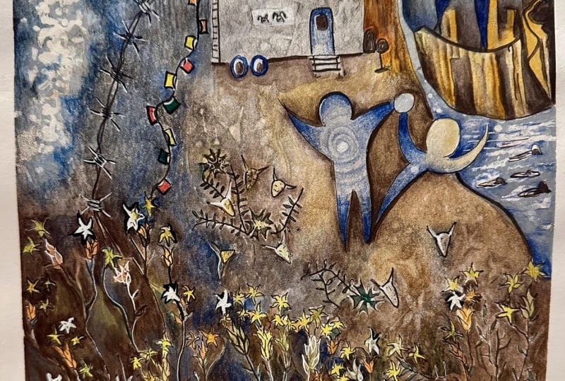
negativity in the world, and Schegl would escape into his memories from his childhood and growing up in his village. He would escape into the
dreamland and his works just have this magical
quality to them where we can see all of these
amazing images and the play of color and value and the way that he was capturing dreams and
the happy memories. Even though what he was facing in his own
life for much of it was very challenging
to live through. In this class, we are
going to get inspired by the whimsy and magic and
dream world of Shagal and how we can lean into his imagery and perhaps the symbolism
that he was playing with as well as our own
symbolism and dreams too. I don't know about you,
but when I was a kid, I was very interested in
dreams and what they meant. I spent a lot of time digging through my dream dictionary. Trying to decipher what my subconscious was trying
to communicate to me. Over on the projects
and resources section, I have shared some resources
where if you want to see what some
different elements are thought to mean in
the dream world, you can absolutely
lean into those. You might also find
some inspiration too, looking at what types of images and objects
and things like that are listed in a dream dictionary that you might be able to play with
in your own art making. Because our art does not have to represent
our actual dreams. Our art can just have a
dream like quality to it as we suspend
reality and have floating beings and animals
playing musical instruments and all the fun
things that we can pull from Shakal's
beautiful pieces. He also has a lovely
sense of color and value and luminosity to
a lot of his pieces too. This is going to be a
really fun class where we play with whimsy and
color and imagery, suspend reality, and dive into the
subconscious dream world. Let's it over to
our next lesson and start exploring our class
project. I'll see you there.
2. Class Project: O. For our class project in our
Marc Chagall inspired class, we're going to lean into
dream imagery and whimsy and playing around with
unconventional compositions and varieties of scale, you can use any art medium you want to to work
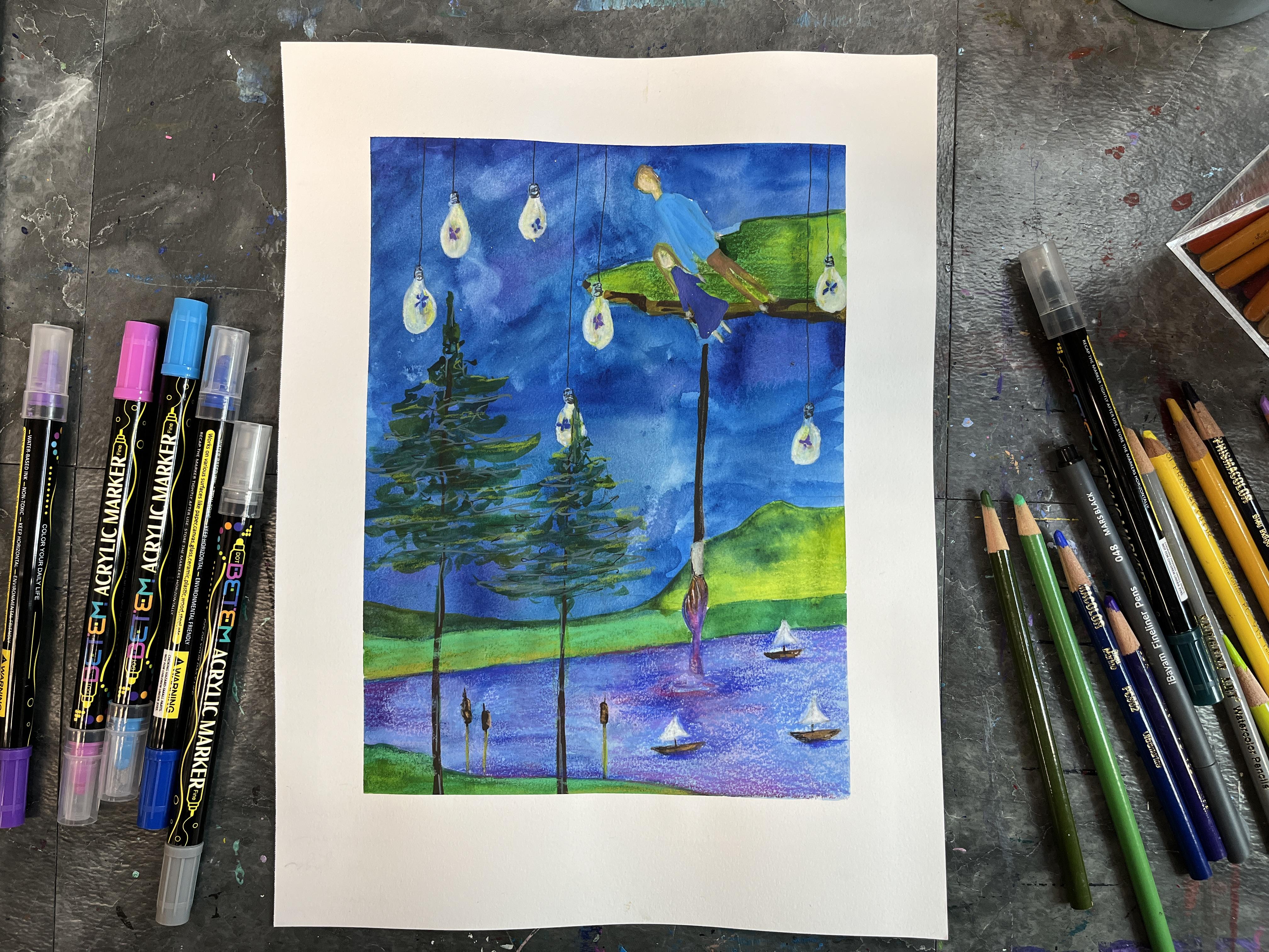
on your project. One example that I
created when I taught this class in person was
working with colored pencil, but I think I want
to lean more into some other elements
of art making to capture my whimsy
and my dream imagery. Dive into whatever art
materials you want to. We're going to learn a
lot about Shagal's works and the way he was
playing with imagery and color and relationships
of objects in space and color and mooting
through all of that. I think I want to play a
little bit more whimsically. I think I want to lean into the silly and absurd
maybe. I'm not sure. But I'm going to
definitely have a lot of fun planning out my project and then deciding what art
media route I want to take. Let's start over to our next lesson and we'll
talk some more about the materials that you
might want to have on hand for class.
I'll see you there.
3. Materials: Ten For your Marc Chagall
inspired artwork, you can choose to work in any art materials
that you want to. For my initial class project, I worked in colored pencil. The reason was I was doing
this class as part of my in person artist inspired series classes that I teach in
my community locally, and I wanted to do something
where we could very quickly get an image on our paper and very
quickly work on the color. This was a way to do that. Colred pencil was something that I had on hand for my students. We could quickly
go from sketching our idea to going in
with color and details. And we hadn't done a class using colored pencil in a while. It was also a
chance to give them a different art medium exposure. But I think for my next one, I want to go a little
bit more mixed media. I've been really enjoying
working with paint pens, and working back into those
with colored pencils. I also haven't done watercolor with colored pencil
and ink in a while. I'm going to see
where I want to go, but I'm going to
decide what art media I want to use after I
sketch out my ideas. This one I very much
went straight in with the first idea that
came to mind and knew I wanted to do a
floating figure like Shagal has done in
many of his pieces. I wanted to have a little bit of contrast between day and night. I had a couple of
different things in mind and I built up the
imagery around that. So for my class
project for art class, I really want to explore what
my imagination can come up with as I think about
different dream imagery that I have had in my life, different imagery related to dreams that I've admired
in other artists work, like what Shagal has used. I also want to think
about maybe a little bit of bending the rules of logic like we can
do in dreams and kind of merging that
dream and memory idea. The next one. You could do colored pencil on regular
drawing material, paper, you could do acrylic
watercolor paint pens. You could just work black
and white if you wanted to. You could just do graphite. You could work
digitally. That would be another great way to
approach your class project. In the next lesson, we're
going to learn more about Shagal and his artwork and
the different ways that he approached recording and
getting inspired by his memories and the way that he depicted them on the
canvas and on the page. Then we're going to
move into sketching and brainstorming and coming up
with some different ideas. So I think maybe I would leave yourself open to a
material choice, a medium choice until you get into the end of your
sketching session to kind of see what media and
art materials are really going to bring
your different dream and memory imagery to life. I'm really excited to
see what you choose. So let's head over
to the next lesson, and we will start talking
about the life and art of Marc Shagal.
I'll see you there.
4. About Marc Chagall: Marc Chagall is a
Russian born artist. He was born in the
village of Vetebsk, which becomes a
key point because he's often thinking back
to village life and experiences that he had
growing up there and just a different
visual imagery that captures that village and
that time and his memory. After he attended Academies, he was working in the art
studio of Leon Basque, who was a set designer
for the Russian ballet. So this exposed Marc Chagall to the Avantarde art world
and really kind of opened up his influences to kind of expand beyond the village
that he grew up in, which is really important
because he's taking different professional art
practices and inspirations and influences and then looking
at his memories and his past through that lens of all of that art inspiration
that he was exposed to. That he moved to Paris,
influences from cubism, favism, futurism, symbolism,
specifically Vincent Van Gogh, Henri Matisse, and Paul Gogan. Those were three very
influential artists to Gogan while he was studying and developing and kind of considering
the art was around there. We can also look at the
animal human hybrids that Chagal features in some of his pieces as influenced
by surrealism. So although he was drawing
from all these inspirations, and we can see their
influence in his work, he very specifically sought to avoid becoming
an art movement. And he kind of again
exhibiting and having a prolific,
successful artist career. He did return to Vtvsks
and then ended up staying there due to World War I
and the Russian Revolution. So starting in the village, kind of going out as
many artists did, to get educated and
expose themselves to the world and the broader
art community globally. He was really leaning into
nostalgia and his native land. He said, in all my paintings, there is not 1 centimeter free from nostalgia
for his homeland. So I hope you'll take
some more time to look at the Google Slides
presentation to kind of learn even more about Shikhar and see a
lot more of his art. And then when you're
ready, move on to the next lesson or we're
going to start sketching out some ideas as we think about
how we want to draw on our own imagery or inspired imagery that we kind of think of when we think of memories. Or you can go the
dream route, too, but memories and the
ways that we can capture that kind of
feeling in a piece of art. So when you're ready, I will
see you in the next lesson.
5. Sketching: Ten So now we need to sketch out
some ideas and kind of brainstorm maybe
a list of memories, dreams, different
imagery that we might want to incorporate
into our artwork. We can lean into general dream ideas and
kind of put together and craft an imagine dream or we can look at our
actual own dreams. I don't know why I keep
getting stuck on this idea of dreams because really
looking at Shigel's work, he was looking at his memories and capturing his
memories in his artwork, but I do think that
we can go both ways. So maybe because my
brain keeps going dream, that means that my subconscious wants me to play with dreams. But anytime I say dream, please know that I also mean
memories and or memories. So if we're thinking of brainstorming some ideas
for a secondary piece, we can also kind of brainstorm some different things
and aspects of Shagal's work that we
really find beautiful. So I'm going to start with
some Shagal inspiration. I still really like
floating figures. I think that is
definitely something that is very fun to play with. I also like there's kind of like a movement to his pieces. There's a lot of, you know, your eye travels through the canvas and kind of across the canvas in a lot
of different ways. So maybe I want to
incorporate that in some way, like some sort of, you know, the eye is kind of
going on a journey. Kind of idea when I
set up my composition. I also really love his
kind of bold, pure color. So maybe that's something that I also kind of want to make sure that I draw when I get to the second
step of this project. And then there's also a really lovely simplistic
depiction of the memories. So keeping things kind of
simple but descriptive, we can definitely tell what everything is in a Shagal piece. There's no ambiguity there. So there's a very, it's
very simple and clear. Is maybe what I'm, you know,
leaning into for that. So some different things there. There's also tends to be some
nice contrast that happens, too, but I think
that will kind of naturally happen as
I play with this. So here's kind of my Chagall things that
I want to pull from. If I think of
different memories, we can kind of think
back to childhood. I mean, he was capturing
things from his childhood, from the village
where he grew up, different symbolic
things related to his culture and his religion. And the world that he grew up during the time
that he grew up during, which is kind of amazing. So there's a lot
of different ways we could go there. Let's see. If I think of
different memories, place, I think is something
we could really lean into. So it could be very specific
or it could be general. So something that represents
something more specific. We could also kind
of focus in on, like, a time in our life. I kind of narrow the scope
of dreams and sorry, memories related to different
points in our life. We can also kind of go
abstract with it, too. Like, he was working
very representationally. Like, this is a person.
This is a goat. This is a building.
Like, this is a fiddle. So it's very clear to tell what the pictures are in
his memory paintings. I'll leave a little
more abstract. Like, if I wanted to say, represent the house
where I grew up. It's got kind of this
long deck section, it's over the garage, and then
there's a taller section. Where, you know, the living part of the house is, you know, and then there's, you know, the roof that kind of
goes up from that. So I could kind of lean into some basic geometry like
that if I wanted to, if I wanted to kind
of indicate home, my original childhood home. Music is a big part of
my memories and my life. So I could have a couple
of different, like, symbolic things to
represent music, maybe. Like notes on a scale, whether they actually musically make sense or not is
part of the music part. Like, I mean, I grew up
playing also saxophone. So I could kind of lean into the shapes of that
if I wanted to, maybe. Kind of a way to do that. Kind of fun. Art is obviously a very
important part of that. So I could kind of think about just things that represent and are symbolic of art
like paint brushes, paint palette, would be
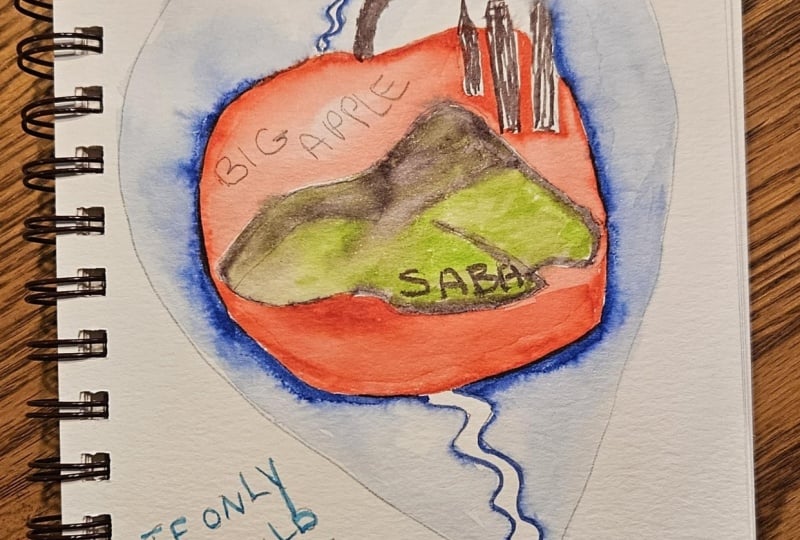
interesting to play with. Then you can connect
your images too. Maybe I have if I'm thinking
going into a composition, maybe there's a giant paint
palette that standard stuff, and then maybe the colors go off and to represent
different things, and maybe this is like a sun. Maybe this is a blue and this goes off to
represent water. Playing with the
symbolism of that. Maybe this one is
kind of like trees. Because where I grew up, there were a lot of trees
where I live now, there's a lot of
trees by our house. You have it kind of be
the colors that tie to the memories
and the symbolism. Maybe if this is white,
this could be a sailboat. I grew up sailing in the
summers with my family. I like that idea.
That's kind of fun. Maybe this is the
brown, so maybe this represents,
you know, the home. In a very basic sense. You know, maybe there's I
mean, really goes symbolic. Maybe this represents the love
of family. That's an idea. Ties into different things. I I lean into plates, maybe the trees are
kind of something. Maybe they're
really exaggerated. If I wanted to have something
floating in the sky, maybe that's where I represent
myself and my husband, our relationship is very
tall, and very short. Kind of floating in the sky,
that would tie directly into Shagal's representation
of himself and his wife or just his wife, of the love that they
shared for one another. So maybe we're flying
through the sky, and then maybe
there's some really neat textural elements up there. I feel like there should
be some land down here. Not quite sure why.
For some reason, I feel like I want
to put mountains in. Which is funny because we don't live somewhere mountainous, but we do talk a lot about traveling to different
parts of the world. So maybe that represents
a future plan. Tie to memories of place. I think you can really
have some fun with this. You can lean into
something very personal. You can play with
just, you know, what kind of imagery
you want to create for this and kind of do it a hagale. You can lean into different
hagal elements that you like. I think I kind of just need
to start on the paper. So I'm going to just let this be a starting point
for my sketching. You can take the
sketching stage of this as far as you want to
do as much as you like. I think I need to lean
a little bit more into how I created
this one and kind of building it up as I went and letting it kind
of evolve from there. So we're going to get
another sheet of paper. And get ready to
start sketching it. Like I said, I think
I want to play with more mixed media, maybe some loose
watercolor. I'm not sure. I think I'm going
to grab some mixed media paper before
I get ready for the next lesson so that I am prepared for whatever art
media I want to throw at this. Go ahead and get out whatever
you need for the next stage of your class project and I will see you in the
next lesson real soon.
6. Memory Drawing: I decided to tape off my paper because I think I want to
start with watercolor, and I wanted a crisp budge. So I just kind of did
an arbitrary size within the mixed media
page that I grabbed. I'm going to keep my pencil
sketches pretty light, but I want to make them dark
enough so that you can see, and I'm probably going to hit this with a lot
of different media. So it's probably not
going to matter. In the end if they
get kind of dark. But I really liked
the looseness of these trees and the
tallness of them. But I also feel like
I want more sky, I want more to play
with up there. Let's start with the
couple. My husband and I. I do want to keep
that fairly simple. I want to play with a
really loose picture. We're just generally indicated with human humanoid qualities. We've got me the standard
generic female shape. I'm going to do a really
exaggerated tallness for my husband because
I think that's funny and give him
an elongated body. Knowing that I'm going to build a lot of this out
with other media, but I want us connect it even though we're very out
of scale from each other. The trees, I am working with a pretty decent
sized paper so I can get the tallness of the trees
without losing the sky. I'm just going to
try to scribble that in and then
add another one. I want to keep
everything super loose. We're looking down on
this forest situation, but I want to let them
have really long trunks. What if there was
something like hanging? I like this idea of
coming in from all over that breaks up the
sky a bit if that is sky. I could do light bulbs
a funny thing to have big stylized light bulbs. Truly just building this up. I think this is now just
an imagination drawing and that's okay because the whole
point is to have fun and to create this fits
perfectly with the fact that I like to
just see what happens a lot of times and just
build up pieces as I go. I probably would not have gotten to this if I hadn't played here. Let's just see. This is going to have more
of a dream quality. I am loving this, and that is the most important thing that I'm
really enjoying it. We have some light
bulb jar things. We have my husband and I, we have some sketchy trees. I want some depth. Maybe there's a land in the sky. I can always take it
out if I don't like it. I'm not stuck with any idea. I like that it's a chunk
that's been cut out. That actually could
represent part of the Upper Peninsula
of Michigan, which is where I grew up. And it's a special place
where we travel as a family. We like to take our
kids up there and, you know, see family
that still lives there, but then also explore
it and see it with some new perspective as adults through
our kids' eyes. You know what? I know
what I want to do. I want to put a lake down here because spending time on the lake was a really important
part of my childhood. It has a lot of court
memories to it. So we're going to turn
that into a lake. And then if that's
going to be a lake, then we kind of have to
have a shore over here. So maybe that's
where the landscape comes in a little bit. I can kind of exaggerate it. I grew up sailing on the lake, but it could be really
fun to kind of play with, like, some really
stylized tiny boats. That's definitely leading
into childhood memories. So we have personal connection representing my husband and I. We have something that's
alluding to the shape of the Upper Peninsula of
Michigan. I love trees. I love that we live
with round trees. I love that where I grew up, had a lot of trees
growing up on the lake, spending time with
family, sailing. We've got these
strange light bulbs. Maybe in the light bulbs. Not quite sure
where this fits in, but I do really, really
love butterflies. They've always been a
symbolic thing for me. So maybe that's what's inside
here instead of lights. That makes it more personal and kind of helps them
make sense a little bit. Okay, we're getting somewhere. This is really, really great. Now, I do want to do
something with art. So maybe kind of a wild idea. But what if there was a giant paintbrush that was
dipping down into the lake? I would have to kind disappear. And have ripples. I want to be very
clearly a paint brush going down into this
water as if it was paint. Because then I can color it like it's paint
unless it should be higher up if it came up here and there was a drips going down, I think it would read
better that way. I'm going to watch the brush
coming out of the water. With some drips of color as if I picked it
up from the lake. Then I've got my bul,
and then the handle. Yeah. Then down here, do that ripple effect. It's not the best
placement with a sailboat, maybe the sailboat
needs to scooch. Somewhere else. Okay. I do want three
sail boats though, just to have that odd number. Maybe the sailboat is actually breaking the horizon a bit. I think this is all I want
to sketch in and then I can add more
later if I want to. I'm going to start with
a watercolor base and map in some colors,
keeping the looseness. And then I'm going to start to refine and Kopecin think
with paint pens and colored pencils and
maybe a fine liner to just really crispen
up the details. I want to keep it loose and simple but clear, much
like Shagal's work. I'm going to go ahead and
get my watercolor supplies out and I'll meet
in the next lesson. Well, I will start adding
color and design details. See you soon.
7. Adding Color: So what I want to think about is what do I want to
do in watercolor? And what do I want
to kind of build up and do more refined
with other media? I want to play with
pretty saturated color. So I think I'm
going to start with the sky and kind of work
down a little bit bold, and I might lose a little
bit of my details, but watercolor is transparent. I can gradually work up or I can just remember where things
are and go from there. I can also paint over things. Actually, guys, I want the
jars to be transparent, even though they're light bulbs, I'm going to go ahead and
just paint over them. I can bring back
their boldness with other media and the same with
the paint brush actually. I'm trying really hard
artistically to not be super precious and to just really
live in the creative moment, knowing that if things go away or get covered up
in my art, it's okay. It's totally okay. I am using a lot of water
because I haven't painted with watercolor in a while if you haven't painted with
watercolor in a while, it might be helpful to do
a little bit of a warm up. I'm not giving
myself that luxury mostly because I don't have
time right now to do it. I just need to jump in. But it is helpful to lay
with a medium if you haven't used it in a bit to reacquaint
yourself with its nuances. The trees, there's
blue and green. We need to make it, it's okay
to paint over those also. I'm going to keep building
up a lot, a lot of layers. I do want the lake
to feel like paint. That's where I'm going to
fade out the blue a bit. I know it probably
really feels that I'm rushing and you know, maybe painting a
little sloppily. It's okay. I want
that looseness. And then we can clean up
some of the streakiness. This isn't the best
mixed media paper. It's going to be fine for
what I'm trying to do here. And then I'm going to go ahead and drop some more boldness in. I think the color I
want to pull out of the water is this violet, so I'm just going to do a base of that for my drip
coming off my brush. Okay, I'm going to
get this to dry, and then we're going
to keep going. Alright, that bi's dry enough. I think I'm going to start
bringing in some of the land. Okay. I think that's
gonna be great. And then pop in some
land down here. I love the boldness of that, so I'm going to try
to pull that up into some of these
other sections. And then maybe this top
one can be really warm. Okay, I think I need be another
layer of lands over here. Loving that. Someone to dry
this, and then keep going.
8. Adding Details: Alright. I might still
have some more watercolor, but I want to bring
back my light bulbs. No, normally paint pens
will completely cover, but my paint pen is kind
of starting to dry out. Which is kind of
great because it picks up a little bit of
the color underneath it. I want to play into that
it's transparent bulb. I'm also going to
hop in the sails. They're gonna need some
work this paint pen has picked up the
color from the sky. And then I can go on
with colored pencil to really help pop the
brightness when I want it. Right. Love that. Now, I am going to go in
and do a little bit of loose linework with
watercolor for my trees. I'm going to mix
up a dark green. I really love the line
quality in my sketch, so I'm going to try to capture that as best I can
with the watercolor. I'm off a little bit
because my trunk is here. But that's okay. I'm just
going to move it over. So I think I might want to
actually scooch this one over too because I did like that
they were close together. Then maybe this one comes up over and pushes the bulbs to the back instead
of the front. I don't want full trees. I really want them
loose and sketchy. I'm trying to be very, very careful not to overpaint. Then I really want these
to feel like toy boats. So I'm going to grab some brown and just paint in their bases. And then I want the bristles. I want the paintbrush
to be brown. Maybe a smidge of orange. I'm blocking in, where do I know I want
certain base colors? I was thinking about the lines. They're really hard
to see, but because the pencil is under
the watercolor, they're there for good. But I was thinking
about another memory. Of cat tails. I remember that my grandma really loved cat tails.
I'm really loving this. I'm very, very happy with
how it's turning out. I think I'm going to
go with the dark brown for the paint brush handle. I think that's all I want
to do with watercolor. I think the rest of
it's gonna need to be with paint pad
and colored pencil. So I'm gonna go ahead and wash my brush and scooch my
watercolors to the side. So I have a little bit
more room to work here. Alright. I think I need to tackle a couple
other things here. Um, I'm going to
use some paint pen. Some of my watercolor
in my tree is still wet, but that's okay. I just going to want to bring in some of that sketchy
quality over the top and then maybe even just down into the
trunk a little bit. So it's really important
to kind always stop and assess and kind of
consider what you're doing. There is a way to go
too far with something. So that's something
I'm trying to avoid. Let's tick my
butterflies back in. I think I might make
them different colors, colors that I really like. Let's get the color pencils. I can go in and I
can kind of pop. Some bold aspects. But I just love how bold and beautiful colored pencil
is on top of watercolor. It works so great over
a paint pan, too. And then because these
are light bulbs, I think I'll give them
just a little bit of glow. I'm going to use
some of this yellow down in the landscape so that it ties back in with
what's going on up there. So when you have watercolor and you want
to do colored pencil, sometimes you need the
surface prepped for you. So I just did a
little gray paint pen there so that I can go in
with a colored pencil. You don't have to. It's
definitely not a requirement, but it helps sometimes. Then going back and forth with your colored pencil
colors also really helps. I also lost my butterflies. And some of these, so I have
to decide if I care or not. I care a little bit, so I'm
going to bring them back. Alright, let's pop our sales or I'm going to pop my
sales. I should say. You probably don't have
boats in your artwork. If you do, super cool. Can we just see how
you created them. Okay, I need to
do something with the water to make all
of this make sense. So I think it's time to start
defining the paint droop. Kind of playing
with those colors that I laid down
with the watercolor. So watercolor and color pencil have very different textures. So you have to kind
of decide if you want to let them be what they are or if you want to
smooth them out so much that you kind of that
it doesn't matter. I like to fade mine out if
it's a piece where I'm just popping in some colored
pencil here and there and loving that a lot. I do a little bit more to define a ripple and
kind of extend it out. I think I may take
a little bit of white paint pen on top
of the colored pencil. I kind of save the
hardest part for last. But that's okay. It's
gonna be just fine. Alluding to people, not worrying about making them too distinct. I know, I do kind of want
the dream quality of them. Tune up want them to look
cartoony, in any way. So I need to find a way
to make them make sense. I've made myself so short that I kind of looks like
a father and daughter. That's okay. Okay, I'm
going to turn upside down, and I'm gonna add in
the inking detail. I don't know, this part of the
light bulbs, super subtle. I really like it. I do
want to tie that blacken because I don't have it
anywhere else in this piece. It's gonna have sketchiness. Don't want to take
away from what I've done with the
other art media. The things are dry
enough up here. You can just kind of lay
in some sort of skin tone. I think it's really great. Let's peel off the tape and
let's see how it looks, and then we can kind of decide if there's anything
else it needs. It's funny. It's not where I
thought it was going to go, as I kind of thought about this, working up to getting
into the studio tonight. But I love where it went.
I absolutely love it. It's really fun. I'm going to add it just kind of
some highlights in some spots just to kind of help things stand
out a little bit. And then I think the boats
need shadows underneath them, just to kind of have them
sitting in the water. A teeny bit to ground them.
There is not a light source. There's no moon, but it
is kind of nice to add some highlights kind of on the top edges of some
of these branches. I think if I add a teeny bit of sharkness to
the land bag here, it's gonna help the
people stand out more. I'm so happy with
how this turned out. Let's head over to
the next lesson, and we'll wrap up a class.
I'll see you there.
9. Final Thoughts: Thank you so much for
joining me in this Marc Chagall inspired
artist series class. I can't wait to see
what you created, so I hope that you'll
pop on over to the Projects and
Resources section of class to share that in
the student gallery. I would also love it if you could take the time
to leave a review. That is what I use
to vet classes in my limited time as a
student on Skillshare, but it's also really helpful feedback for me as a teacher. I read everyone and I take those to heart as I'm
planning future classes or considering what I can
add to existing classes to really create a rich full
experience for my students. Thank you so much for
taking this class. I have loved connecting
here with you. I hope you'll check
out some other of my artists inspired
series classes. I hope you're excited
that I've got a bunch more that I'm hoping
to make in the next year. I would love it if you would
give me a follow so we can stay connected and you get those notifications when
new classes come out. But I would also love to
connect off the platform. If you're over on Instagram, you can find me at Elisabeth
Underscore Welfare where I'm sharing
my art journeys, art updates, what's
going on in the studio. What I'm experimenting
with and all things art. I also have a YouTube channel. It's also Elisabeth Wellfare, where you can find a lot of
different art process videos, techniques, and I
love taking you on art journeys with me and different art dates
that I go on. I'm hoping to have
quite a few of those in the coming future
that I can share with you and I've got some ones
that I'm working on editing currently that I think you'll really
enjoy checking out. You get to follow me along
when I go to an art exhibit or day in the life of an art
teacher in the wild, who knows? Who knows what the year
is going to bring. But I know it's going to be
fun and it's going to be exciting and I can't wait
to share it with you. Thank you again for
taking this class. It's been so much fun to share my passion for artists
and art making with you and I can't
wait to see you in another class real
soon. Till next time.
 Elisabeth Wellfare, Artist, Art Educator