Transcripts
1. Introduction: Hi, I'm Elizabeth. I've been teaching on
Skillshare since 2021 and I have been a professional
educator since 2005, teaching students of all ages, sharing my passion
for artists and art history and art
exploration, art techniques, especially mixed media works, sharing everything that I love about art with my students, whether that be in person or
online in classes like this. In this artist series class, we are going to be
focusing on Edward Hopper and the amazing imagery that
he created in his paintings, his use of color,
especially his play of light and Jark and the way that he very strategically lit his paintings and
how he presented them. That feeling of place. Edward Hopper, whose
focus was on painting urban life common places and these still
ambiguous figures. There's often a
sense of loneliness and contemplation to the
figures in his pieces. For my class project, I'm going to be focusing
on soft pastel. In the way that I can capture light and dark easily with it. Edward Hopper was a painter. You were absolutely welcome to do your class
project in painting or any other art
material that you were most comfortable
with analog, digital, sky's the limit. But I found that
approaching this with soft pastel helped me get to the feeling of
place and the play of light and dark a lot
faster than doing a painting. I'm going to be leaning into the absence of people
and really focusing on place and how we can explore
the feeling of a place. I hope you'll
consider joining me in class as we learn a little bit more about using color and value in the style
of Edward Hopper. I'll see you in the next lesson.
2. Class Project: For our class project, we are going to be
looking at some of the different art examples
that Edward Hopper created. On the Projects and
Resources section of class, I have a Google Science
presentation that does a deeper dive into his
history from birth to death, his artistic journey, and shows you a ton of his different
artworks to really get you inspired and then dive
right into playing with color and value and whatever art material
that you want to. We're going to start
building up our colors and our values to really give it a
sense of Hopper's work. And what he was doing
with value and color and how he was playing with
creating a feeling to a space. But then we're really going
to lean into color and value and how we can manipulate those to give different
feelings to our artworks. Let's turn it over
to the next lesson to talk about what materials
I'm going to have on hand for class and give
you some ideas for ones you might want to explore
as well. See you there.
3. Materials: The materials for our class project are very
straightforward. I've just got some
drawing paper here. You could use mixed media
paper, waterfall paper. I wanted to be a little bit smooth because I
don't really want to deal with the texture when I'm working with soft
pastel in this way. You could also use
construction paper. That would absolutely be fine. I'm going to use soft pastels because they're going
to quickly help me lay with light and dark as I get inspired by
Edward Hopper's work. Could use any
medium you want to. He was a painter,
leaning into paint, whether it'd be
watercolor acrylic wash, all of those things
will be fantastic. I'm going to sketch out
some basic imagery, and then because I'm
working with soft festal, I've got a need eraser and a blending stem just as options. I tend to blend with my finger, especially in a situation
where I don't mind if the oil from my skin
gets into my soft pestle because I'm really
just using this as a way to better
understand his use of light and shadow
and kind of how that impacts color and the
feeling of an artwork. What I want this to
do is help inform my decisions about the
use of light and going forward in other pieces
and really seeing this as a study that's going to have a larger impact
beyond this class. You could also work
digitally if you wanted to, you could absolutely get into
Procreate and play there. There's soft pastel
brushes you can use, all sorts of fun ways that you can adjust to your value and play with opacity and overlap and blending and
all that good stuff. But I'm going to use soft pastel as an easy way to get into this. So let's send it over to
the next lesson to learn a little bit more about Edward
Hopper. I'll see you there.
4. About Edward Hopper: Edward Hopper was born in 18
82 in the State of New York. In 1905, he started working in illustration for an
advertising agency, but he found that work
to be rather stifling. He wanted to have more
creative freedom. He wanted to be making
the art that he wanted to make versus the art that
he was hired to make. He used that to have an
income while he was pursuing art that was more for him
outside of his working hours. Painted urban life common places with still anonymous figures, and his compositions often
evoke a sense of loneliness. But there was also a
sense of nostalgia and different elements of urban life in America during the time
that he was growing up. He had an early love
of impressionism and pastoral subject matter. Artworks that we're depicting
idealized countryside. We can see some of
that in his pieces. That influence
definitely is there. As far as impressionism goes, he was very much looking at the impact of light
and the lightness and darkness of the scene and the time of day and the
impact of that on color. That is right in line with what the impressionists
were doing too. Although he did not have the painterly brushstrokes
of the impressionist, color and light were a huge part of Hopper's work
throughout his entire life, whether he was doing
an interior or an exterior like many artists
did a lot of traveling. He went to Paris and
Spain and that had a great impact and influence
on his artistic style. He was also influenced by
trips to New England and the picturesque landscapes that he saw when he visited there. There is a female model
that is often represented in Hopper's pieces where
there is a figure, and that's his wife, Josephine. She insisted on being his
model and like many artists, you would use the same
model again and again. Josephine was also
an artist and she influenced his shift from
oils to watercolors. She also had a lot
of art connections. She was a big part
of him gaining recognition and
success as an artist. Josephine was a very
key player in a lot of different elements of
Hopper's artistic journey. Ultimately, he was focusing on the solitude in modern life. That's actually a topic that
we can think about in today. Modern life for us is very different than modern
life was for Hopper, but I think there's still an element of
contemporary loneliness that you could
absolutely play into in your own imagery in your own
project if you wanted to. You don't have to. We
can absolutely leave loneliness aside and keep
it bright and cheerful. I do get a lot of joy out of the play of light and
color in Hopper's work. But there is definitely
that sense of loneliness, whether that is
the solitary still figure who has an
anonymous existence in the spaces he creates or in the locations that
have no people. It was very intentional. Oftentimes, when we
look at a painting of a place and especially one
that incorporates people, there feels like there's a narrative that's
already given to us. Sometimes there's room
for interpretation, but oftentimes those
pieces are very specifically telling some story that the artist is
sharing with us. Hopper was doing
that differently. He was giving us
a starting point, but leaving it very open ended. Depending on the viewers personal experiences and
their life and their age, you know, where they
grew up, maybe, whatever they've done in
their life to that point. When you see a hopper piece, you are layering
your own perception and perspectives into
that and he's really letting you create
the narrative and kind of undecide for yourself what's
happening in that piece. What is that figure thinking? Like what happened before or
after this moment in time. Everyone can look at his pieces and have a different take on it. Let's dive in to creating our own sense of space using color and value in the style
of Edward Hopper. I'll see you in the
next lesson. Oh
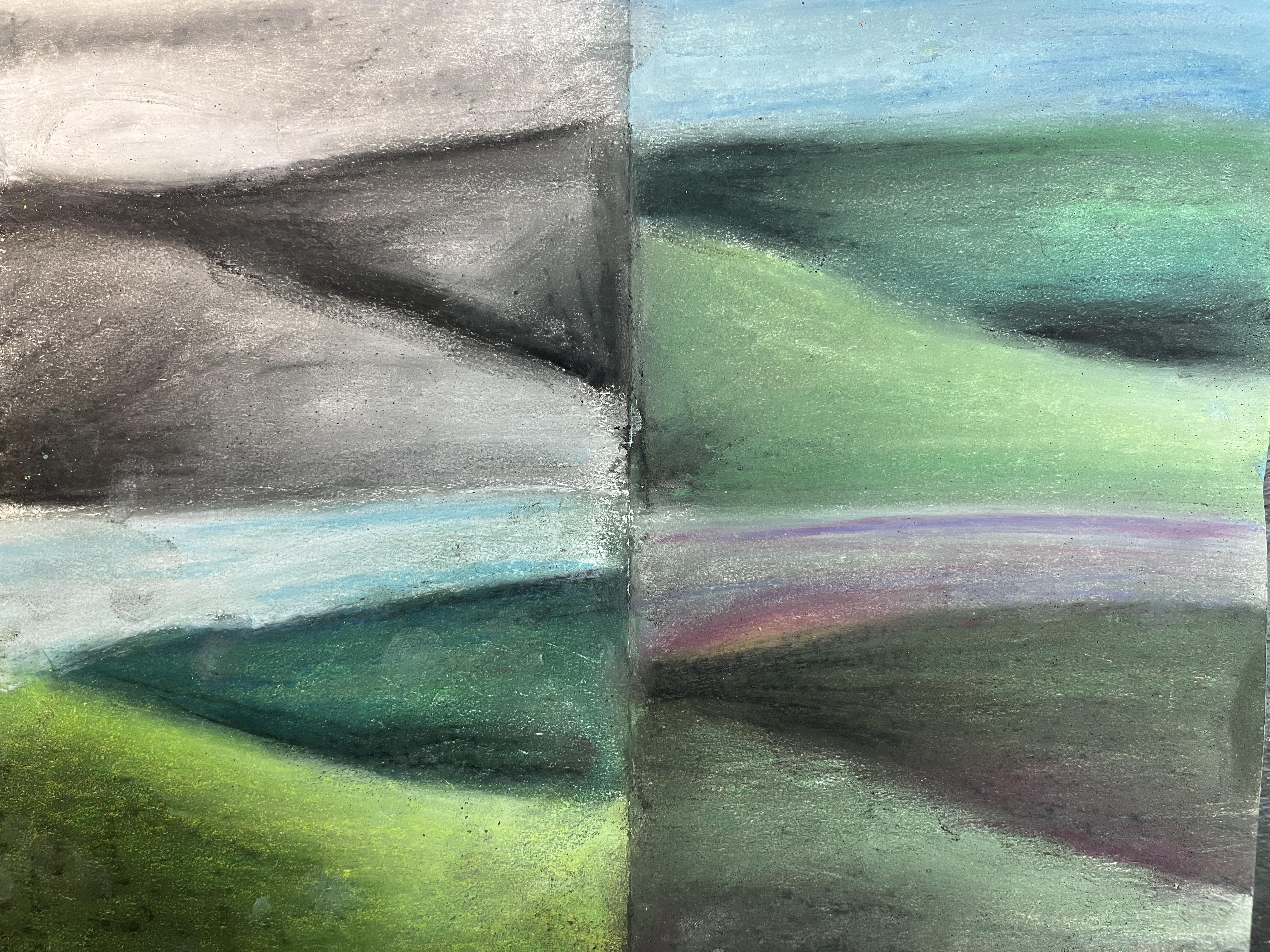
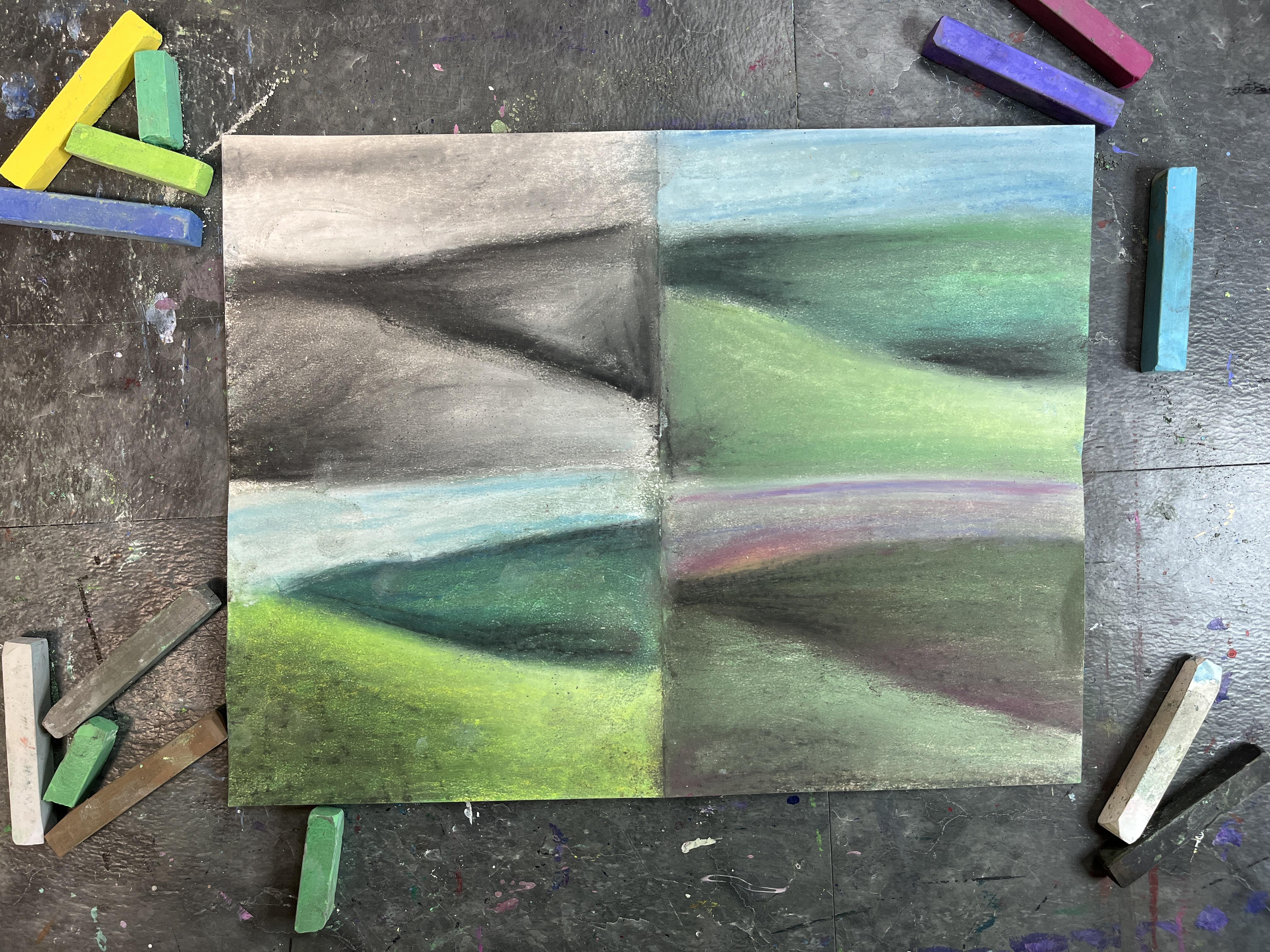
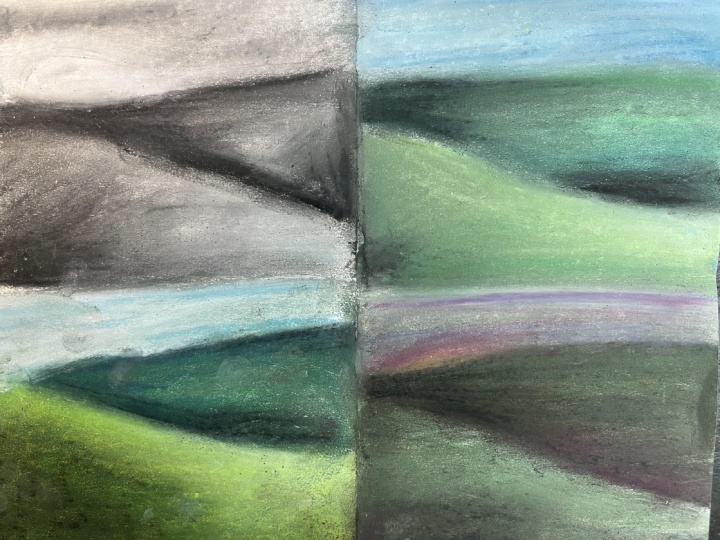
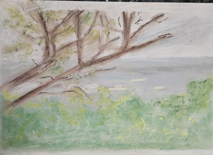
5. Class Project Demonstration: I want to do a bit
of a value study, kind of playing with
lights and darks. So I think what I'm
going to do is I'm going to fold my paper into quarters. I could absolutely do this
by drawing up thumbnails. But for this part
of my exploration, I don't mind that I'm going
to have creases on my paper. I just kind of want to quickly get some smaller
areas figured out. Hopper is amazing for the different imagery
that he played with. He's got some very simple but intricate landscapes
where we just kind of see these hills and then we've
got some basic buildings. Usually in the exterior images, like the landscapes, the scenes that he's depicting outside,
there aren't any people. When we go inside
and we look at some of the different interior
pieces he's created, that's when we start
to see the figures. And even when figures are
together, they feel alone. I don't necessarily
want to depict people. I don't want to do anything
with figurative work. I just kind of want to
get some loose landscapes down and kind of play
with the idea of what happens when I change
the light and the shadow. And then how does that
change the piece? So I think I want to
do the same scene, and I want to play with how the light and the
darks are interpreted. I kind of just feel like
some rolling hills, kind of sort of like his work. I'm just going to start mapping in close to the same
landscape structure. It doesn't have to
be exactly the same. It's going to give
me the same idea, some ground and some sky. And then I can kind of
decide if I want to add some buildings in there or if I want to leave it just the land. I know I'm gonna lean into white and black and probably
gonna want some gray. He uses a lot of color
in his paintings. They're beautiful,
especially with the tints and the shades that he creates
with those colors. I'm going to kind of just play a little bit with that, too. I know I've got my sky. I have to think about if
I want to do a sunset or kind of a blue sky or
more of a gray sky, too. I could just go in and
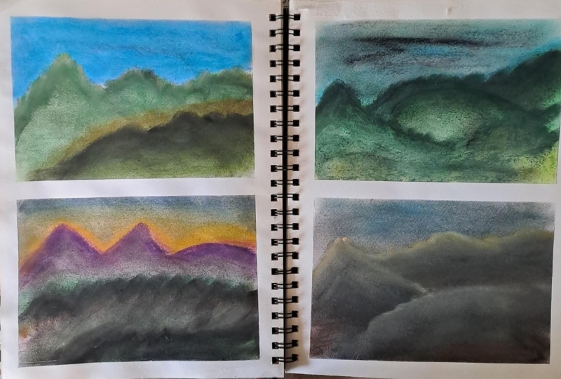
do a modo chromatic one. So actually, let's do that.
Let's play with that. Let's just lay down the value. If I'm going to just kind of map in some really loose mid value. I've got my gray just to kind
of help give me something. I'm going to have
the land behind be darker than the
land in front. But I'm going to have some
darkness down here too. And then I'm going to lay
some white in the sky. It's a little
dirty, that's okay. And then I'm going
to lay some white in too and kind of play with
What if there's no color? What if it's just
black, gray and white? This is where I love to
blend with my finger. If you're someone
that doesn't like the feeling of soft
pastel in your skin, you could do it with a Kleenex. You could do it with
a blending stump. If I'm doing some
small detail work, then use the blending stump to kind of help me get
into the small areas. So we're just kind of
defining the space. South pastel, you can kind of keep layering over
and over and over. It'll blend with what's down, but it is pretty good about going in and
being more opaque. Try to get some cloud
effect up there tort akin. This would be a nice
way to go at it. You could absolutely play
with just monochromatic, it was a color plus
black and white. Here I'm just doing a neutral. Because there's no color,
it creates a certain vibe. But what if on top of
that I added color? Before I do that, I want to add maybe some
ominousness in the sky. Then there's a storm coming
in my darks a little darker. Because I only have
the three values, I'm really reliant on mixing
those to make a new value. So I have to be mindful of the relationships of when
those values meet each other. When you're working
with TapaSalt, it's going to get chalky. Don't blow it off.
Just kind of tap it. Then you can have a cloth
to the side if you want to. Damp and then a dry section. I've just got a dry one.
I'm just going to kind of scooch my dust off to the side, and I'll
clean that up later. Let's do the same thing. Let's start with our values. And then I'm going to
lay color on top of it. This is a technique that
you can do with any medium is to do the value
as an underpainting, and then you can do the top layer your
colors on top of that. You're still going to be
adding more value to it. This is a way to figure out those value relationships
before color complicates it. It creates another challenge. It just creates a
different effect. It is a technique
called Kioskil. It comes from Italy,
the 15th century. It was done as a
way to figure out those value relationships first and then color was
put on top of it. There's a long history
to doing this. This doesn't necessarily have much to do with Edward Hopper, but it is a way to
start to understand value in our pieces
and get that effect. I'm going to keep
the sky a little bit lighter and just in general, I'm going to keep my whites because I know I want to
go in with some color. The green is going to mix
with what's underneath it. So now because we
have some grays down we're creating tone. A lot of times when you look
at those older artworks, if it feels a little
bit not murky, but just a little
bit more muted, it's because they've
done the work with the gray scale
underneath, and that's mixing. Whether it's optically
mixing through glazing or it's literally mixing
through wet paint. I'm going to go ahead and pop in a little bit of brightness. Because now I'm using color. I can do a little bit more
to define the landscape. I can also add in
some other colors. So I can darken my
green by adding blue. I don't have to
rely on the black. And then it's a lot of
just back and forth. Then sometimes have
to put more color in. I still want more dark. For the drama of it,
we'll do it with black. Then we can use our white,
pop some brightness. I still kind of want
a more ominous sky. So I'm going to put down
some gray and some blue. This is much darker
blue than I want, but I'm going to
tone it all down. So we have the feeling here when we're just
looking at value. Now we did value and we
layered in some color. Getting closer to what
Hopper was achieving. Oh, I also have a lighter gray. So I can use that too to also pull back that blue
brightness a little bit. Now, let's go really,
really bright. Let's not do our grays yet. Let's pop our color in first. So I'm going to lean into
the same colors pretty much. Go to put down some bas of green and have a cooler
green back here. And then I'm going to
do the warmer green. I want to brighten this up. So I'm going to pop
in some yellow. So we have to think
about lights and darks in terms of the values. So, you know, lights
and darks, as they are. But then we have to
think about brightness. And so we have brighter
colors and darker colors, and how is that going
to impact our image? For the back part,
I'm going to lean into blue, some of
that darker green. And then we start blending
this, we have color value. So we're still
working with value. But see how different that is. Like, I know we're using
different colors here, but look at the brightness
of that compared to that. Big difference. That's because we don't have the
grays underneath. So what if we add those in? So what if those go on top now and they become
a way to shade? It's gonna be different. I mean, we're applying it in
a different order. The colors are gonna
react differently. But it's also just gonna
give it a different effect. What if we even put
the black down here? We go for that
brightness, but we also make it a
little bit muddied. Starts to add a
different feeling. Almost like maybe there's, like, a storm coming
in that we can't see. And then what if we just
did the gray up here? That the sky was mostly gray, just a hint of blue, and then a white. Value? Just value. Curioscure value,
color layered on top. Pure color. And then
the value goes in. Now, we can pull. Some of this brightness
is because we have the yellow
instead of the white. We can add a little
bit of the white, too, but the white is
going to mix with the yellow and everything
else underneath so it's still gonna be brighter than anything we laid down
in that other example. Then we have to start
thinking about, is the way that we're treating
everything making sense? Like, this feels like it's part of the same weather,
same time of day. This feels a little bit
the sun's brighter, so maybe the shadows
are more exaggerated. I like it's got, in this brightness and
then this darkness. What if we go more neutral? What if we lay down brown first? Lean into a completely
different take on this. I want to go dark and really
kind of make a muted image. Lean into my grays
with my brown. And you can be super loose. This is really, really loose. And then when we
start to blend it, that's when it kind of
starts to come together. Let's blend all we've got. Different form of neutral. It's a different sort of kind
of play of light and dark. Now let's put some color in. I'm gonna lay in the green. I'll kind of lean back
into what I was doing in the original image
on the top right. I'm gonna lean into some red, but maybe like this pink. Go back to my green. Brighten up down here we don't want to lose that this
is in the foreground. Make it a little
brighter toward the top. Just really want to kind of help define the landscape
a little bit more. Okay. What if we added more brown and really kind of leaned into I like how
subtle the color is. I do want to pop
it a little bit. And then I wonder if we
added just like a hint blue. Maybe your sky should be a different almost like a sunset, where the sun is
already gone down. I know we're not going
for a finished piece, but if I put color in one spot, I need to put it in
some other spots too. I don't need to do it with
everything necessarily. But to help unify it because
I put the magenta up there, I need a little bit of magenta down at the bottom.
We're talking about color. We're talking about value.
If we think about it. We're talking about value, we're talking about
lights and darks, and in tw we're talking
about light and shadow. So we can think about
all those things. We can push some of
these spots more help clarify what's going on or just define these
shapes a little bit more. If you wanted to crispen things up a little
bit, you could. Scene that has multiple hills. Like you're looking up the
hill at some white buildings. That's one that has
always stayed with me. So this is of that. So you can get as
detailed as you want to. Thinking about what kind of feeling we want to
convey if we're thinking about how we can manipulate the light and the shadow
and the impact that has on color to convey those
different feelings and really playing and exploring and seeing how we can push it. We can take the same
basic idea for an image, even abstract, doesn't have
to be representational, and we can play with those. If you wanted to do multiples, I would go this route. If you want to just
do one, I've got some examples where
I just did one piece really loose I'm trying to recreate some of the vibes that I get out of Hopper's work. This would be a way to do
it more of a study and do more of an exploration of how your lights and
darks impact it, and then how far do you
want to push those. Let this be an exploration of the impact that light
has on creating feelings and vibes
and how light can impact color and then how color brightness can also
play a part in that. After you've had some
fun playing around, join me in the last lesson where we will wrap up the class.
I'll see you there.
6. Final Thoughts: Thank you so much for taking this class inspired by
artist Edward Hopper. I hope you really enjoyed exploring power of
color and lights and darks and values to
really help push an artwork. Please head on over to the
Projects and Resources section of class to share your project
in the student gallery. I'd also really appreciate it if you took the time to
leave me a review, sharing your experience,
taking the class, getting others excited about joining our journey
into the work of Edward Hopper and
the influences that that can have on our own
art making practice, and just giving me some insights
into your experience as a student as I continue to improve and expand upon
what I do on skill. We can stay connected both on Skillshare by giving
me a follow as well as outside of Skillshare over on my YouTube channel and
my Instagram profile. I love sharing everything art in all different
facets of my life, whether that be art
adventures I go on, sketchbooking, the wild, different art practices
I'm playing with, classes that I'm taking both
on Skillshare and in person, and classes I'm teaching, I really love sharing
everything about art with you and I would love to stay
connected beyond this class. Thank you again for taking this class and spending
this time with me. I hope to see you
in another class real soon. Till next time. Oh
 Elisabeth Wellfare, Artist, Art Educator