Transcripts
1. Introduction: Hi. My name is Elizabeth, and welcome to my Artist
inspired series class, focused on the Irish
painter Sean Scully. I'm a professional
artist and art educator, and I've been teaching on
Skillshare since 2021. Creating a variety of classes that share my art
making process, what I'm exploring
in my art studio, hoping to get you inspired in the same ways that I am so
that you can really open up your creative
practice and really embrace a lot of different
approaches to creative art. The artist inspired series, I'm sharing different
inspiring artists that I'm looking into. I share a little bit about their life and
their work and then we get inspired by different techniques
that they've used, different approaches
to their art making, different subject matter, and we really take what we find inspiring from those artists and we put our own
twist and spin. In this class, we are looking at the abstract paintings and
sculptures of Sean Scully. Sean is an amazing artist
who is still working today, exploring color relationships
and how to portray his experiences and
his feelings and his past through his art
making in abstract terms. He's really leaning
into some basic shapes, the qualities of
paint and color to convey so much in his
giant canvas piece. Class project, we will explore different ways that
we can lean into feelings and experiences
and how color and basic shape can reflect
that in our painting process. I'm going to share a couple
of different approaches to that painting
process with you so you can choose your
own adventure for the art supplies
that you would like to use for your class project. You can absolutely also create your class
project digitally. If you're appropriate
user or you do other digital painting
techniques and programs, you can absolutely join
in the fun in this class. I hope to see you
in class as we dive into the inspiring
work of Sean Scully.
2. Class Project: For a class project,
we are going to be leaning into a couple
of different options. Shan paints with oil paint and vertically right on the
canvas and is really kind of letting the
paint qualities and the different viscosity or
thinness or thickness of the paint really
impact how it lays on the canvas and then
layers up those colors to find new color
relationships and different ways push his
paintings even further. We can do much the same. We can do that with
acrylic paint. Whether we are working
vertically or horizontally, we can also manipulate our
paint viscosity with water and lean into the
painterly qualities that are so lovely
in Sean's work. But you can also do this
digitally if you like. You can go into Procreate or any other digital paint software or program
that you enjoy. You can play around with
different brushes and different
transparencies and play around with layering
up different colors and textures of paint qualities. Can also do this with a really fun technique using oil pastel. Oil pastel was invented because Pablo Picasso asked
the oil makers to create something
more portable. He wanted to be able
to take his art making abilities on the road. He was traveling a ton and he wanted to keep
working in oil paint. They created oil pastels. Oil pastel is color pigment
that is suspended in oil, much like oil paint is. And we can lean
into that in and of itself and do some oil
pastel drawings or we can take that a step
farther and we can get out some mineral
spirits and we can dissolve the oil pastel to give it even more
of a pantry effect. I'm going to
demonstrate for you how to lean into the acrylic
paint qualities. You can absolutely go oil
paint if you want to. I don't do a lot of oil
painting these days, so that's not something I have readily available in my studio. But I have been loving
the ways that I can manipulate oil
pastel and make it more painterly by thinning it and dissolving it
with paintbrush, dipped and mineral spirits. I'm going to demonstrate those
two different approaches to exploring Sean's
work as I get inspired to give it my own personal twist and lean into what I love
about color and basic shapes, and the qualities of paint and how we can manipulate paint to get different effects on our canvas or on our
mixed media paper. Let's head it over
to the next lesson to talk about the
different options for materials that
you might want to consider for your class
project. I'll see you there.
3. Materials Part 1: There's a couple of
different routes that we can go for our Sean Scully
inspired project. So one option is to
work with acrylic. And to do that, you're going to want to have
some acrylic paint. You can use whatever
colors speak to you. A palette of some sort. This is a disposable
palette where I can just tear off the sheet
and have a fresh one. I'm going to use some of my
leftover paint for mine, so that's why I've already
got some paint loaded up. I can do this on
mixed media paper, watercolor paper, canvas,
whatever you want. I have some stretched
canvas because I have some extras of these that I've just accumulated
over the years. I'm going to use a
canvas for this one. You don't have to. You
could absolutely work on any of those other papers
or even cardboard, Mpboard, really anything
that's going to be durable enough to
handle a couple of layers of acrylic paint. Then I've got a jar of
water, I've got a cloth. I've got some acrylic brushes. I went with some flat
ones so it'll be easier to create my
stripes and my grid. Then I'm going to lean more into a crisper inspiration from
Sean Scali's earlier work. For that, I've got my
painter's tape just like he used to do the different
grid work on my board. Now, Sean Skelly is
our jumping off point. We're looking at him
to get inspired and we're going to layer in our
own personal aesthetic. Whatever additional things
that you want to incorporate, that may lean into any
other type of media. Absolutely, go for it.
There is another version of this project that I'm going to also play with that is going
to use some other supplies. So I'm going to share two
different explanations of material options
for this project. So option one, acrylic paint, and this is what I'm going to be using for this demonstration. So let's head over to the
next lesson. See you there.
4. About Sean Scully: Name Sean Scully is a
really amazing artist. I first learned
about him through Talk arts podcast where
they were interviewing Sean about his life and his art and his different
experiences and what he expresses in his art
making approach. And I needed to know more. I loved what I was
hearing Sean talk about, so I started digging
into his work and his artistic legacy and the
journey that he went on. It was really
exciting to find out how motivated he has always been to find
a creative outlet. Sean had a very hard childhood. There was domestic violence. He was just living through
some really difficult times as a child and art
became a refuge. He was first exposed
to art in church. He would go to church
and he would see different paintings of the stations with a
cross on the wall, and that was his first
exposure to art. Then at his school,
there was a painting painted by Bocaso
child holding a dove. We can see some of that in
some of his later pieces. But Sean was very
determined from an early age to become
an artist and really use art as a way to not only process some of the dark times that he experienced growing up, but also just as a refuge and he really felt
like art was his savior, saved him from the possibility of growing up and
having a really rough, challenging childhood
and teenhood it really gave him some
direction and focus in life. The main focus of Sean's art early on that continues today, whether it be his paintings
or his sculptures, is that he's leaning into
basic geometric shapes. He's explored this in a
lot of different ways. In his earlier works, he was more regimented. He would put down
masking tape to have these really crisp lines at the edges of the lines
that he was incorporating. All of it's very linear.
Overlapping. There's a there, we can see the
inspiration that he drew from Bridgette Riley
and her op art works. There's a lot of different things happening
there and he was really leaning into a lot of
what the masters were doing. He was looking at the work of
Pitt Montreon and what was happening there as far as how Piet was
organizing his space. Pitt stripped down to the primary colors
in black and white, whereas Sean was really leaning into the expressive
emotive colors. His work has been said to be a combination of minimalism
and expressionism. He really strove to put the
narrative and the perspective and the person and the
emotion academnmist art. Without doing imagery, there's just so many emotions that are happening
in Sean's work and you just feel what he was
feeling or you connect to the way the colors make you feel and bring up different
aspects of your own life. They're really moving
pieces. They're just really charged with all
this amazing energy. We can see the
different shifts in Sean's work as different
things have happened. His first son was
tragically killed when he was only 18 in a car accident and Sean's reaction and his paintings was
for the color to be drained away, which
we can make sense. As artists, we are often putting our feelings
and emotions into our work and we can directly see that
in Sean's pieces. Then as things
improved and he found some happiness in life and fourth wife was a really
big part of that. Then his second child was
a really bright spot. We see another shift
in his artwork. It's really fun to look at the journey in art that
Sean went on as he was exploring his past and all of that when he finally
got to making art in his 20s to the different things that he experienced in his
adult life and how that impacted the way the paint was approached and the
colors he was using. It's a really beautiful
journey of abstract art portraying Sean's life and his feelings and
processing of all of that. For your flash project, you
don't have to go that deep. You don't have to
be very emotive. You can just explore color relationships and
paint qualities. But if you want to, color
has a lot of meaning to it, whether it's personal meaning or it's meaning that
we associate across all colors of blues being more somber and
yellows being happier, there's the standard feelings that we associate with color. And we can see that play
out in Sean's work, but we can also see a very
personalized nature to it. Sean plays with a lot of
unconventional color. He's mixing colors
and he's making new colors and it's rarely
straight out of the tube. That's something
else we can lead into in our class
project is just exploring color and what colors can we make with the
colors that we have. Sean makes paintings
all the time. He's 85. Still creating art and
painting on a regular basis. He also has some
fantastic sculptures and he's done some
beautiful photography. There's tons of
gorgeous photographs in the Google Slides presentation
that I put together, especially from the 90s when
Sean was really capturing different elements
from different places that he traveled
to many artists, he was really impacted
by the travels, especially the shapes
and the colors, whether that was the textiles that he was seeing in Morocco or that was the boldly
brightly painted homes that he was seeing
when he went to Mexico or when he went back to Ireland and just Color is just a really important
part of what Sean is exploring and then what that expresses on a very
personal level. Die into Google
Sides presentation, learn a bunch more
about Sean's life, see a ton of
examples of his art. There's even more than that. He's just such a
prolific artist. There's so much online about him as far as the
work that he made, some fantastic videos, there's
a movie that was made, so you can really see him
creating in the process. Now we know a bit
about Sean's work and his art and we've looked
at some examples of his different
artistic approaches and practices and
sure you've got all your suppies on hand for whatever
direction you want to go for your Sean Scully
inspired project, and I'll meet you in the next
lesson where we'll begin exploring color and paint
application. See you soon.
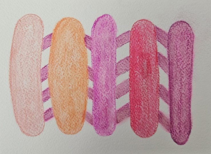
5. Acrylic Demo Part 1: Sean was working very
large, very, very, very large, full wall sizes
for many of his paintings. And we are obviously not doing that. We're
going much smaller. So the play if it's going to
be a little bit different. But I want to kind of create that amazing sense of overlap that I really
love in his pieces. And what I think I've
noticed as I look at the more controlled
geometric ones where he was taping it off is
that it's like he's working from the furthest
back images are darker. And then as he gets toward the top of the painting
with his layers, he's got lighter colors, and I want to play with
that light and dark aspect and see what happens there. But I've also leaned
into colors that just make me happy and what
I'm feeling like tonight. That might change
how I go about this. There is going to
be some drying time involved between the
different steps for this. I'll speed up through those also not terribly concerned
with the finished project. I just want to have
the experience of playing with layering
and grid work and colors. So chances are I'm going to be pulling my tape off
before I normally would. You can absolutely let your
tape dry between layers. But if you're working on paper, you're going to want to be extra careful pulling your tape off, and there might be some
bleeding that happens. So that's something
you can lean into and just embrace
when that happens. Or you can really work to kind of control how much
paint you're putting down. The more paint you put down,
the thicker the paint, the more likely it
is that it's going to sneak underneath
your paint edges. So that's something
to think about. It might be better to work in thinner layers because that will also diminish the dry time. You can also make it dry by putting some heat on
this and some air, but acrylic paint
is a plastic paint, and when plastic
heats up, it works. So we do want to be careful
about how hot we do get. So you think about
that as you're kind of planning out your project. If you're going for acrylic, I think it's going
to be like a mix of Sean's kind of looser pieces and Sean's more
structured pieces. That's probably where
it's going to land. So I've taken to just kind of using some construction
paper because it tends to be a little
bit bigger than the canvases that I have on hand when I'm leaning
into canvas work, that turns that paper into some collage material
that I can use. So I'm going to mix
up a dark violet. Because that is going
to be darker than the blue and the
magenta that I pulled. I can thin it with water. Sean was using oil based
paints, so they stayed wet, but that also meant that
he could thin them with turpentine mineral spirits and kind of get some great washes. Part of what I love
about Sean's work is that it feels very
alive and active. It's a very like you
can tell that it was physically demanding to
make it both by the scale, by the size of the brush strokes, the
fact that it's dripping, you know he was working fast and furious and really
kind of in the moment. I want to have that sort of
experience when I make this. I'm going to do a lot
of mixing right on the canvas and kind of
play with color that way. I don't mind if it's
not solid color, which is another fun
way to lean into the different aspects
of the work that Shaun has created
in his life so far. So we're going to kind see
where we go with this. And I'm excited to do
this for many reasons, but I got a new heat gun, and I have not gotten it
out to work on my stuff, so I'm going to
see how that works when I get done with
this first step. Gonna be a little bit messy since I'm painting to the edges. That's okay. Don't mind if
the brush strobes show, even though I'm going for
the taped off approach. That is totally fine with me. I could have grabbed
a bigger brush. I still could grab
a bigger brush, not going to worry about it. Now, if you're
working with acrylic, it's really important
to wash and dry your brush when you
are done using it. We never want to leave our
brushes sitting out with paint on them because that'll harden.
It's plastic base paint. I'll ruin your bristles. You
also don't want to leave your brush sitting in
your jar cup of water. So make sure you wash it
when you're ready to change colors or when you're taking a break or when
you're done using it. And then wipe off the extra and then give it a
good squash to dry it. The great thing about
the flat, there's bristle brushes is that they're very easy to
kind of get the same shape. Be however your brush is dry, that is how they're
going to stay. So it's kind of like when you go to bed with wet
hair and you wake up, kind of wild hair. That's because as
our hair dries, it stays in the
shape that it dries in. Same with the brushes. Alright, I'm going to get a
little bit of heat on this to kind of dry it a little bit, and then I'm going
to start taping and going into my next steps. Now, I'm going to
start taping this off. Shaun began doing
taped off grids, inspired by the
work of Pientran. And I also love Piet
Mondrian's work. And so I'm kind of
wanting to, like, I'm torn because when Sean was doing his more controlled
taped off versions, he was being very structured. But I I don't know that
I want to do that. I think I kind of want to play a little bit
differently with this. But I also want to
challenge myself. So I want to have
it be a balance of pushing myself out of my comfort zone as I play with the inspiration I'm
getting from Sean's work. But then I also want to
lean into my own aesthetic. So I think the more I tape, the more of that violet
I'm gonna be preserving. And it's just going to keep disappearing the more
I layer into it. But I can bring it back because it can become another layer. So maybe we just
kind of go for it. Mine lean into the blue. And now I only have to paint
where the canvas is exposed. The other very cool
thing about thinning out our paint is that it's doing
more of a glazing effect. So if I just went
full blast with the acrylic paint without
thinning it, it's opaque. It would cover completely
anything that's underneath it. By thinning it and
doing a glazing effect, it's becoming more like
watercolor is what's happening. So I can see the purple. I can see the violet
through the blue. It's not mixing with
it because it's dry, but I get to see
it through that, which is really awesome. And I'm loving that
effect very much. So I kind of want to lean into when am I playing
with full opacity? When am I playing
with transparency and kind of letting
these new colors emerge? Because that is how Sean
created his later pieces, the stuff that's more recent to his current work and
his current career is that he is playing with transparency and
opacity and he is like, all of these layers are building up and creating new colors. Which is so cool. So I really encourage
you to embrace it. Embrace the stage, let
the colors change, let them vanish, let them
become something new. Because, although I was very hesitant to start doing this, now that I'm into the
second layer, I'm I'm 100%. I'm all in now. This is great. There might be a little bit
of bleeding since I'm using some very juicy acrylic.
Just something to consider. I'm gonna wash my
brush. I'm gonna add a little bit more
heat and keep going. At any point in time when
your water gets too dirty, feel free to get fresh water. I'm gonna leave that tape there, and I'm gonna add
more and kind of keep masking out a
little bit first. At some point, I want to
start going horizontally. You'll also notice
that acrylic paint dry is lighter than when it's wet. So that's going to give
you a different effect. Just something to think
about as you're mixing your colors and
considering your values. I'm gonna go in with,
I think, my magenta. So now I'm at the stage where I need to remove
some tape so I can expose some canvas so I
can put down more color. And I've got a little
bit of bleeding. That's okay. I don't mind. You'll also notice that the
paint stays wet on the tape longer than it does on
your canvas or your paper. That's okay. Just
something to keep in mind. This process can
get a little messy, with the removing of the tape can always pause at
any point in time to kind of wash your
hands and reset. Loving how this is looking. So this is super exciting. Tape could pale up your
acrylic if it was wet. You kind of lean into
that if it happens, or, you can kind of
fix it in some spots. Like I've got some areas where the white is showing through. That's okay. Sometimes
you can reuse your tape. This is wet. I'm just going to go
ahead and throw it away.
6. Acrylic Demo Part 2: Now I'm going to start taping in the other direction and kind of see what happens
when I break it up that way. So again, anything that I cover with tape, I'm masking it. I'm protecting it. Then anything that I leave untaped is
going to get painted over. So I might do some
thicker ones for this and kind of preserve some of those initial
layers I created. If you don't have
painter's tape, you can use washi tape. You can use masking tape. If you're concerned about
it being too sticky, you can always peel
off a strip and then touch it to your
jeans or your sweater or whatever and de
sticky it a little bit, take some of the
sticky factor out. It's always an option if you're worried about
it sticking too much. But I find if you're using
canvas, it's not a problem. If you're using paper,
any kind of paper, you might want to take some of the stickiness out of it
before you start painting. The cool thing is, I can keep playing with
the same colors. I think this time my gut
is telling me go magenta. I'm going to go magenta again
because I'm glazing it, it's going to have
a different effect. Then I can always do less water too if I don't want to have it be as transparent. Or I can let it dry
and then I can do another glazed layer too if I want to have a more
subtle control. Of how it is impacting
the colors underneath. So remember that you can always do a thinner glaze and then do additional layers of that same color to see
how far you can push it. Or if you just want to
be a little bit more reserved in how you
approach your glazing. It looks like it's
good and coated. Wash my brush and give
it a little heat. If you're trying to figure
out if your paint is dry, it will become more
matt as it dries. So when it's wet, it'll
be shiny and then as it dries, it
will become matt. I think what I'm going to
do is I'm going to take off some of my syrup, peeling up the paint a
little bit, which is fine. I'm going to kind
of move that over. If I keep scooching my tape, I'm going to eventually lose any of the initial beginning layers. It's fine. I'm not going
to be precious about it. Let them disappear
if they disappear. I'm gonna go back to my glue. So now it truly is
a color experiment. Like, what's going to
happen as I keep layering. And because I'm now glazing
over different strips, it's going to have
different effects. We won't really know
what we've got going on until we take
all the tape off. At some point, we're
going to have to make a decision about when it's done. So I think what
Sean was doing at this stage in his work
was that at some point, he was doing more
opaque lines, right? Like, and maybe all of his
earlier work was opaque lines. Those pieces are very big, too, so it must have taken a
long time to create those. You may have noticed
as I'm adding heat, I'm keeping it
moving constantly. You would never
want to just have the heat last one section
and hold it there. You want to keep it flowing so that it doesn't get too hot. All right. We're going to
take these strips off. Part of me wishes that I had done a thicker application in the beginning because then it wouldn't be pulling
up the paint so much. But I think
eventually it's going to there'll be so much pain
on this, it won't matter. It needs more going
this way now. So we've built up some this way, now we've built
some up this way, now we need to go back
the other direction. I think I'm also going to play
with some lighter colors. I'm sticking with a very
analogous color scheme. Blues, violets, magenta, they're all very close to each
other on the color wheel. So that's analogous colors. They go well together. I have a strong affinity
for analogous colors is my favorite one to work with just because you know they're going to
look good together. Shaun is really good at
putting colors together. So something we can
play with is what happens if we get
a little wilder. What if we play with
colors that don't necessarily go well together? The more I think about
it, maybe I want to add a neutral in I want
to add some brown. I could add some black.
That would go well with pretty much any color
scheme we're working with. Maybe I want to do something really unconventional
and throw in some green. Yellow would look
nice cause yellow is the opposite to violet.
They're complimentary. So that would be a
combination that would work well together because we're working
with acrylic, they don't have to mix,
so they wouldn't muddy and make brown. They could. Sean's colors get very muddy in such a beautiful way, though. It really is a master of color and value and all the
ways you can play with it. I'm going to go with
my lighter violet. I do think I want to thin it more than I
initially did, though. But I also might just be holding on to what I've already created. And it definitely felt
incomplete and unfinished. When I took that last section of tape off, it was
nowhere near done. You just feel it. You
could probably see it too. It just wasn't resolved, which is great because it
gives me more license to play knowing that the
painting needs warm. What I also love
about Sean's work is that there's so many layers. Like when you
really get close to it and you really look
at them for a while, paintings, especially the later
ones that are very loose. There's so many layers of
paint, and you can see that. Then it makes you wonder how many more layers are there that we can't see that we're the very beginning of
each of those paintings. You've got some puddling
on your tape strips, you can always pull those up. That later color
is helping to tie together what's
going on underneath. That drier layer of paint bled more because it's a
different brand of acrylic. I was using Liquitex
basic acrylics, which are my favorite to use. These are fantastic. Affordable,
lots of great colors. I also have some Sargent acrylic that is what I use when I'm
teaching kiddo classes. I pulled it because
I like this purple. This is a thinner viscosity, which means once I
added the water to it to get the transparency
that I wanted, it led more. But I still like it. It
gives it a cloudy effect. I think I'm going to do
another really dark violet. I'm not sure how many
more layers I want to do. I'm going to do is I'm going to start to be a
little bit more strategic. In what I leave and
what I cover up. I don't want to become
too precious with it, but there are sections
I really love. So now I'm masking those. Let's do some big patches. Add a little bit more water, kind of pull back
some of the opacity. But if you get in a
situation like that, you feel like it's
getting too dark. The more water you add to it, the more paint you're creating. Sinner, but you're
creating more paint. You can pull that
color down like I did. I do feel like when you're
playing with color, you just know you know when you hit on what
you're looking for. Even if you couldn't
necessarily articulate it. Now, what could have
been cool at that stage. If I wanted to
would've been to have strips going both
horizontally and vertically. I think that's ultimately probably what's going
to need to happen. Because I know that
I've preserved a lot of it with a tape, I'm going to really let the
magenta go more opaque. I'm going to build up to it, though, because I
really do love glazing. Now, every brand of
acrylic is different. So if you're doing your
project in acrylic, you might find that
your acrylic needs more or less water
depending on it's quality, it's brand, it's
viscosity level. Viscosity is the thickness, fancy word or thickness
of paint paint. For acrylic and oil, viscosity, usually the higher grade paints will have a thicker viscosity. That doesn't mean that the less expensive craft paints are something you
should shy away from. Especially for projects like
this, we want to go thin. I'm going to dry it
and see what I think. If you do taping in
both directions, take them off one
direction at a time. Sometimes you can get a
bunch of your tape to peel up at once, but not always. It's usually just especially
if you're working with wet. If you know you have wet
paint on your tape strips, you might want to
go one at a time. So something I hadn't considered by taping
it in two directions, I wasn't creating strips. I was creating rectangles. That's okay because that's
something that we also see in Sean's work at this
stage in the game. I don't really want rectangles. I don't think I want them
to be my last layer. I'm going to do a
little bit more. Now, I've done each
layer one color. Sometimes there's
been some mixing on the canvas, but
for the most part, I've gone in with separate color each time I've gone
in for a new layer. You don't have to do
that. You could do as much painting painting, versus just laying down
flat color as you want to. You can still do the
glazing with that effect. So just know that there's
a lot of open room for getting creative
and interpreting this any way you want to.
I'm really loving this. Oh. That's the problem. Tape is tricky. If you want to minimize
this happening, the pulling up of the paint, let it dry dry between layers. I love this a lot, but I want to push you
just a tiny bit further. So without any tape at all, I'm going to play
around with adding some really loose gritted drips. I'm going to lean into the
magenta and maybe lighten it, grab a little bit
of white and really kind of push the
values the other way. So to do dripping,
you want really, really juicy wet paint, and you need an
angle to your paint. I'm going to do a couple strips in a couple of different places, and then I'm going to show you how to lean
in to make up drip. It'll be a little hard to see, but I'm just going to
keep adding more water, and we're going to keep playing. Now, if I decide
I don't like it, I can wipe it off or I can
kind of paint back in. I find that drips look cooler. It's more interesting if there's more than one color
pushing down. The surface. We're
using gravity, and we're using the
wetness, you know, kind of like pushing into the canvas to get it to go down. I add some blue. And it's going to mix. Like
there's gonna be some mixing. There might be some color
might get pulled up. I don't want to lose the
grid work underneath, and I don't want it to have
a super even appearance. So I want to get it to kind of, like, have some peekaboo spots. They're kind of pulling back the paint a little bit
where the dips are happening. No, if you work from
the bottom to the top, you'll have more
overlap as it goes up, but I can also just kind of keep going back and forth, too. I love that. This is super fun. Basically, I played
with everything, almost everything
that Sean Scully was exploring in this piece. I played with the grid work.
I did the nice crispness, for the most part
with the painted tape and I kind of built
up my values. I did glazing like he does to kind of see the colors
through the other colors. It just needed
something over the top. So over the top, we went by adding
in some fun drips. This is going to
be really cool to see how it is when it dries. You could always
work back into this, whether with paint or
with drawing media, whatever you want, collage, you can kind of keep pushing it further and
further and further. You could also at any point in time,
take a photo of this, put this into a program like Procreate and continue to
push it there digitally. That would be really fun, too. Go whatever route you want to. So this is my
acrylic inspiration inspired by Sean Sklly's work. Now, I also want
to share with you a really fun way to
mimic oil paint. So I'll see you in the next
lesson. See you there.
7. Materials Part 2: So one of our other options for our materials for Sean
Scully that I'm going to explore and share with
you is using solvents to turn drying media into
more pantry looking media. So I've got my colored pencils. I've got some drawing paper, and then the colored pencils, I can use rubbing
alcohol to dissolve. So I've got rubbing alcohol, I've got a cup that
I have some in, and then to help blend them, I've got cotton swabs, and then I've also
got paint brushes. You could also use a blending
stump if you wanted to. Any of those three
things will work. Now, this is one way that we can use solvents
with drying media. We can also use oil pastels
with mineral spirits. That's another way
to go about it. So that would involve using
instead of colored pencils, you'd grab oil pastels. Instead of rubbing alcohol, you'd grab mineral spirits. For mineral spirits, you're
going to want to have a glass jar or a glass
bowl or something. That's not plastic
because sometimes the mineral spirits and plastic don't want to play
nice together. And then just like with dissolving colored pencils and
doing some blending there, I'm going to use
the cotton swabs and the paint brushes
to play around. Another thing you might want to have off to the side would be a cloth or an old rag
or a paper towel. I'm going to dip it in
the rubbing alcohol, kind of wipe it off on the edge. The problem might be that
I don't have enough wax. The nice thing about the
rubbing alcohol is it's going to evaporate and
then when it dries, I can work back into it, so it can become
a back and forth. So I can have that
play that I have with the acrylic paint of layering up colors and blending
between them. So it'll be a little bit
of back and forth drying. It evaporates pretty fast. This paper is mixed
media Canson paper, so this is meant to do it. This paper has less of a
tooth to it a little bit, so it's already
letting me do more. What I want to try to achieve is getting the colored pencil to break down with
the rubbing alcohol. So it looks more
like I painted it. I'm not sure that I want to do a giant piece with colored pencil, just because colored pencil
itself takes a long time, and then to paint back into it with the rubbing alcohol,
that's a whole other thing. But I do want to show you
an experiment and play a little bit with using
the cotton swabs instead. Now, these are going
to soak up a lot. Oh, maybe maybe the
cotton swabs are the way to go because you can do kind of a scumbling effect. And then you can
bring the color over. This has been a fairly
successful experiment. I do still want to
play around with oil pastel and mineral
spirits because I've done more exploration with
that and other pieces, and I really like the
effect that gives too. And it's faster to get down oil pastel than it
is colored pencil, just by the nature of
it being a wider end. Play and experiment with this. Then I'm going to do
a mini Shan Scully inspired colored pencil
and oil pastel piece, playing with the solvents. Let's run over to the next
lesson and start exploring how we can break down our
colored pencils using solvent.
8. Colored Pencil and Rubbing Alcohol: I've got two different
pieces than I have done on Canson mixed media paper. And I think a little bit thicker color pencil
application and using the mixed media paper is going to make this more successful than some of
the testing than I did. So I'm going to get my
rubbing alcohol gonna lean into the cotton swabs because worked a little
bit better than the brush, but I might try the
brush too as we go. So I'm going to start
with the blue one. I want it to blend together, so I kind of stuck
with colors that I knew were going to
blend well together. This is working exactly
how I wanted it to. Just very exciting. So the cool thing is that
it is creating a creamy, smooth effect with
the colored pencil. I'm still able to keep my
lines. They're still there. I'm not losing the line
definition that I have, but it's picking up the color. It's dissolving the wax binder, and it's taking
the color and it's carrying it like paint wood. But anywhere that I
push really hard, I get that nice dark edge. But because it's picking up
the color on the cotton swab, I can pull my color out from my shape a
little bit. Not a ton. It's kind of like watercolor
pencils in a way, like how it takes the pigment that's on the
paper from the pencil, and it kind of pulls
it a little bit out. This is fantastic. This is exactly what I wanted to happen. Now, I do want to
try my brush again. I want to see if I can have a little bit more success
than I had in my test. So here's what I'll say.
The paintbrush gives you a little bit more control
than the cotton swab does. The cotton swab picks up
more of the rubbing alcohol, so I can work with it for
longer before I have to re dip. If you were using
a more absorbent paintbrush style than this one, I think that would change. But I'm enjoying using
the cotton swab more, so I'm going to
switch back to that. We'll see if I feel the same
way when I'm working with a more geometric
image in my second. The oil pastel with
the mineral spirits or with the citrslve will
have a similar effect. Oil pastel by its nature is hard to get really
refined details, so that's something to
keep in mind if you're deciding between
using colored pencil or using oil pastel, but it's really creamy
just by the nature of it. It works really well for getting broken down
with a solvent. I do feel like I'm enjoying
the colored pencil more than when I've
played with oil pastel. Now, if I was doing
a much bigger piece, I'd probably lean into the
oil pastel just because it's easier to cover larger
areas with oil pastel. The great thing about any
of these techniques is that the rubbing alcohol is going to especially the rubbing alcohol
is going to evaporate. As this tries, I can
work back into this. And it dries pretty fast. I wouldn't necessarily go back into it until you
know for sure that it's fully dry just because
your paper when it gets wet, it becomes weaker and we don't want to have any
damage to our paper. It is warping as it gets moist, so that's
something to think about. But that's the case anytime
we add moisture to paper, even paper that's mint
to handle the moisture. So I can go out for my
shapes a little bit, kind of clean up some of
my edges if I want to. But ultimately, I would say this is a very successful play. The shape from this one when
I was sketching it out, I was thinking more of some of the drawings that I've
seen from Sean Scully. So he does some really
fantastic loose drawings. I think they're preparation
sketches for sculptures. That's what they kind
of remind me of when I look at his sculptures and
I look at these drawings. But I think for
where we're going, this can be a really
fantastic take on his work. This one, for sure, is more
leaning into the stacks that he creates
in his sculptures and the drawings
of those stacks. This one was where I started, and this is where it
kind of went after that, but he does have one
that has kind of this, like, spiraling
effect, turned that on its head and did it kind of my own style and my own take on. So now let's see.
This has blue on it, so I don't want to
use the same end for my red one unless I want
that to mix in a little bit. So I'm going to grab
fresh cotton swab, and I'm going to start
blending this one. One thing I love about this approach to working with colored pencil or oil pastel, it creates a new vibrancy. Some of it is that
it's getting wet, but there's a little bit
of a glow that happens, a little bit of an
extra brightness, kind of amplifies the
colors, which is really fun. The other cool thing about
using the rubbing alcohol with the colored pencil is it makes it easier to add more on top. And have that really stand out, whether that's dark or
whether that's light. I can draw back into this
further if I want to, and I can really get
some neat highlights and low lights to show up. So if you feel like you're
losing some of your lightness by using the rubbing alcohol
to blend it, have no fear. You can bring that back by layering in more colored
pencil or you can add more line detail or mark making or whatever
you want on top of it. So this can be a one and
done after this application, it could be finished or
you can go back into it. I love this. Use a mixed
media or watercolor paper, layer up some colored pencil.
It can be pretty rough. Like this was really
rough and just quick. J it together. This one was a little bit more nuanced because I was doing some more layering and a little bit
adding in some highlights. And then you apply
the rubbing alcohol. I recommend the cotton
swab over the brush, but play and kind of
see which you prefer. And then if you want to, you can work back into
these as much as you want with more colored pencil or any other drawing or paint
media that you like. So I hope that any
ways that you explore Sean Scully is an inspiration
for your own art making, that you'll take some photos
along the way and that you'll share those
on the projects and resources section of Qs. So after you've had
a chance to play and create some work
inspired by Sean Scully, you can head on over to the last lesson to wrap up
the class. See you there.
9. Final Thoughts: Named. Thank you so much for joining me
in class as we looked at the life and art
of Sean Scully and got inspired by the different painterly qualities
that he explores, his color relationships,
and the emotive quality of color and how we can use color to express different
things in our artwork. I really appreciate you taking the time checking out the class. I hope that after you
create your class project, you'll take some time
to share it over on the projects and resources
section of class. It's so fun to go through
the student gallery and see the different ways that
students approach projects. In a class like this
where we're looking at color and paint quality, whether you did that
through acrylic paint or digital paint or through the
dissolving of oil pastels, it's going to be
really exciting to see everyone's different approach
to their class project. Please share your project in the student gallery and be
sure to check out the work of your fellow students
as we cheer each other on as we continue
on our creative journeys. After you've had a chance to
share your student project, I hope you'll also take some
time to leave a review. Your reviews mean
so much to me as your feedback really
helps drive me as a teacher and gives some motivation to keep going and to keep
sharing more classes. It also is a great way
for other students to get a feel from the
student perspective what a class is about, what it has to offer, and if it'll be a right fit for them. I really appreciate it if you take the time to
leave review and share your experience not only with myself, but
also with others. If you want to stay
connected, make sure you click the follow
button below so you get notified of future classes in different art things that
I post here on Skillshare. I would love to connect
off the platform as well. You can follow me over on Instagram where I
share all things art. Do that be pieces
that I'm working on, other Skillshare classes I'm taking because I'm also
a Skillshare student. Different art adventures
that I'm having. I try to give you a winto into my creative practice and process and take you along on the
art journey that I'm on. I also have a YouTube
channel where I share lots of different art
techniques, art approaches, there's tons of
different art adventures there that I've gone
on in the past, and I'm hoping to share more in the future as we go
into this new year. Thanks again for
taking the class. I really appreciate you joining me as we learned
about the work of Sean Scully and I hope to see you in
class again real soon. So next time. En.
10. Bonus: Oil Pastel with Mineral Spirits: You and you
 Elisabeth Wellfare, Artist, Art Educator