Transcripts
1. Introduction: Hi, everyone. My name is Disha. I'm a full time commercial
Illustrator and artist, working with clients in editorial and
packaging industries. And welcome to my class Mastering Watercolors
in Procreate. I've been working
with watercolors and Procreate for several years, and I've always used
Procreate just to make sketches or maybe refine
my traditional paintings, but I've never painted my
projects in Procreate itself. A few months ago, I
just took the plunge and started painting fully
digitally in Procreate, and that too with
watercolor brushes. I was so amazed to
see the results. In this class, I'm really excited to share
with you how you can paint realistic watercolor
botanicals in Procreate. We'll just start from the basics from downloading the resources, getting to know the brushes, and then paint our
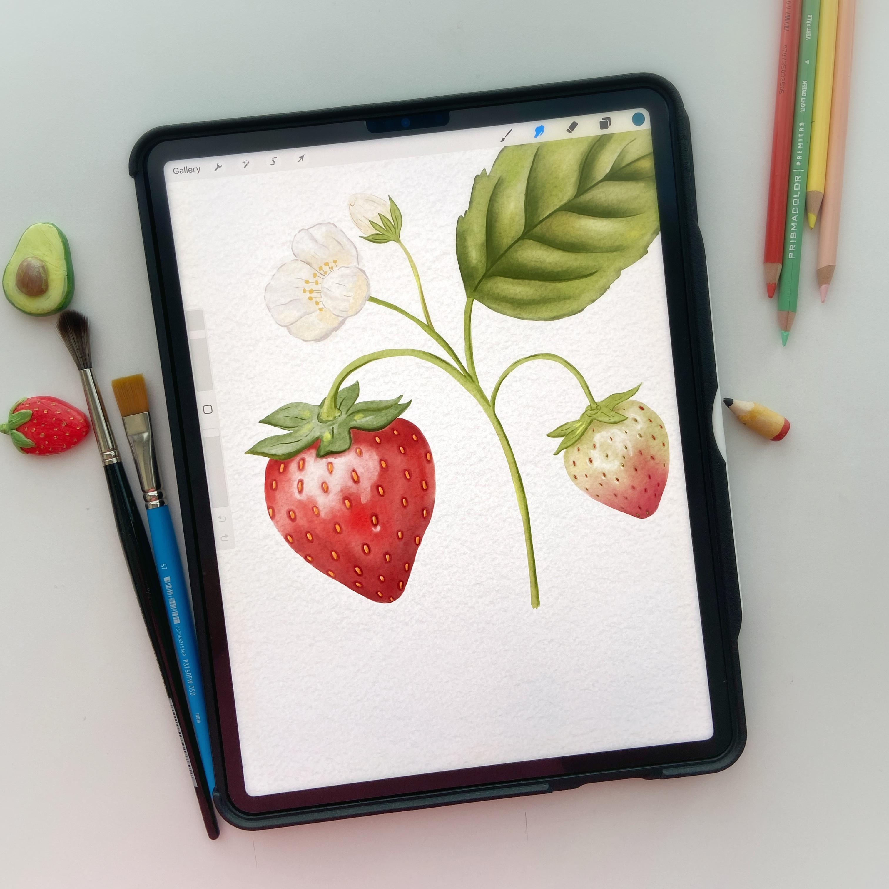
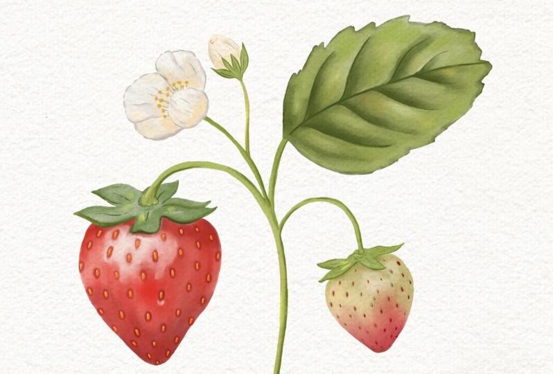
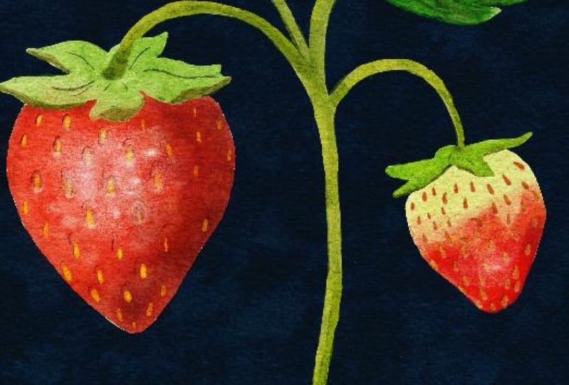
final project. By the end of this class, you'll be able to paint this beautiful yummy
strawberry illustration using some custom
watercolor brushes, and it actually looks like
a traditional painting. This class is perfect
for anyone who has a basic understanding
of procreate, but if you're a
beginner in procreate, not to worry because we
are just going to use very straightforward steps
and very basic tools. Feel free to join the class. Guide you through each
step of the process, providing tips and tricks to help you achieve
the best results. What are you waiting
for? Let's grab your iPad, your Apple pencil, and let's get started on this creative journey together.
See you in the class.
2. Class Resources: To complete our project, I have provided a few resources that you will need to download. You can find the
link to the files in the project and
resources tab, and the link is also given here. In the folder, you
will find three files. The first one is the brush set. The second one is the Zip file, which contains two
different canvases, and the third one is
the color palette. You can download all of them on your iPad in the files app. When you download the
files on your iPad, you will see the Zip file. You just need to tap on that Zip file to unzip the folder. Let's just start
with the watches. Just go to the folder and
tap on the swatches file. It will automatically download the color palette in Procreate. You can see this new palette at the bottom of all the
color palettes like this. I'm just going to
go ahead and delete this because I already
have this copy. Another file that
you will need to download is the brush set. Simply tap on this
brush set file and it will import
the set in Procreate, and you can see it right on
the top of the brush library. I already have one copy, so I'm going to
delete this as well. The last file that you will need to download is the Canvas. I have provided two
separate canvases for you. One is with the sketch and the other one is
without the sketch. Now, if you open this folder, you will see these two files. If you tap on this one, it's going to open the Canvas
file without the sketch. Now let's go to the home page, and you can just see it on
the home page right here. If you just want to
get started with painting without going
through the sketching phase, you can download the
other file with sketch. And when you open it, you will see this sketch right here. In this file, when you
open the layer panel, you will see this
watercolor paper group, which is locked, and we are not going to
touch that at all. Below that group, you will
see these layers of sketches. We are going to work on the
final project sketch only. You can see some extra
sketches on different layers in this file just in case if you want to
do more practice, but we are going to just work on the final project
sketch for this class. Now let's move on
to our next lesson and let's get started
with the painting.
3. Brushes: Hey, guys, in this video, I'm going to quickly
give you an overview of the brushes that are included in the resources
for our project. When you have downloaded
the brush set, you will see these
five brushes in it. The first brush is the
watercolor primary layer brush. We are going to use this brush
for most of our painting. Let me pick a color
and I'll just give you a demo on how it works. Now you can see the watercolor
effect right there. Let's zoom in a little bit, and you can see the
texture right there. This brush is
pressure sensitive. When I press it, we get more intense color and
with less pressure, the stroke becomes lighter. We can also change the size
of the brush as needed. Here I'm pressing it
more and then lighter. I use this brush mostly
for the first layers in my paintings and sometimes second layer as well, if needed. Again, releasing the pressure, and you see the beautiful
effect that we get here. Now, the next brush, which
is going to be a lot handy in this class is the
watercolor blend brush. As the name suggests, this brush is for blending
our strokes and colors. For this, we are going to use the smudge tool,
not the brush tool. For that, I'll just long hold on the smudge tool to select the same brush
from the painting tool. Before that, let's
pick a different shade and paint here with
the primary brush. Now using the smudge
tool, I will blend them. You can see how beautifully the colors are
blending together. You can also change
the opacity of this brush if you want it
to be a little subtle, but I usually like to use the full strength
of this brush. After the blend brush, we have the sketch brush. The sketch brush is a very
simple translucent brush which I use for small and tiny
details, like seeds, stems, et c. This is also pressure sensitive, so
with more pressure, you'll get more pigment
and with less pressure, it becomes more transparent. Is a very good brush if you want to do some sketching with smooth lines and yet retain
that watercolory look. The fourth brush is
the chalkboard brush. We don't need this
brush in the class, but I just wanted to give
it as a bonus for you. This is a very cool brush
with chalky texture, and you can use it for multiple purposes like for sketching, shading, and even getting some right textures in
our watercolor paintings. The last brush is the
default six B pencil brush. I just added this here
because I don't like to scroll between the brush
libraries when I'm working. In case you need to
do some sketching, you can just pick it from here. Although I made some
modifications in it as per minds, so you may find it
a little different than the original six B pencil. Anyways, in the class,
we are just going to use the first three brushes
to complete our project. And so let's dive right in our next lesson and
start painting.
4. Underpainting - Strawberry 1: Now, I have the
sketch file open. The first thing
I'm going to do is delete the extra sketch layers. But if you would
like, you can paint them and use this
composition as. Before starting
with the painting, I will change the blending
mode of this layer to multiply and lower the opacity just to have a little
hint of the drawing. It's similar to what we do on traditional
watercolor paper when we paint with watercolors. Now let's create a new layer
by tapping this plus sign on top right and bring it below
this final sketch layer, and rename this layer. Let's say, let's call it
strawberry or strawberries. Now, to pick the colors, I will go to the strawberry
farm color palette and pick a midtone of red shade. I just want to mention
here that you will see me picking some other colors
apart from these shades. The color palette is always
a great starting point, but you can always tweak
the colors as you like. One cool feature
that can be handy sometimes is that when you
tap on this line on top, you can move the
selected color palette on the canvas anywhere. Like this. Also, if you want to have the reference image on the side, you can go to the wrench
tool under Canvas. You can select the reference, and then click on Import and pick the image
from your gallery. I just picked our
project reference. You can change the size
and move it to one side. To begin with, I'm going to go with the bigger
strawberry first. Actually don't need
this palette here, so I'm just going to close it. We're ready with
the color selected, and I will go to
the brush library and pick the watercolor
primary brush. Now, before we start painting, we need to make the selection of the area we are going to paint. This method avoids any bleeds
outside the sketch lines. So I will go to the
selection tool and pick freehand selection and then mark down the area
I want to paint in. This way, we will get
clean and crisp edges of the piece, we are painting. It's completely okay if you don't want to use
the selection tool, but in that case, you will have to clean up
the edges later. This method basically avoids
that extra step at the end. I'm going to make the selection for the red part
of the strawberry, not covering the top leaf parts. In case you make any mistake
while you're selecting, you can use two fingertap on the screen and that will
undo the last selection. I will speed up the video a little and we'll
meet you in a while. Now, I have selected
the whole strawberry with free hand selection tool, so we can get started with painting without primary
watercolor brush. And you can see that the paint is not going beyond the edges. And roughly painting
with the same shade, and you will see some
overlaps in the paint, and that's completely fine. We will blend them later. The first layer is always
the foundation and you can literally see me putting down
messy strokes right now. Just feel free to make random
strokes at this point. Now that we have covered
the whole strawberry, I will add some dark shades on the bottom and right
parts of the strawberry. I'm going to pick a dark
tone from our reference, and you can also use the
color palette for this if you want to and paint on
some of the darker areas, mostly on the bottom
and the right side, assuming that the light is falling from the left
side of the strawberry. We'll make the right
side much darker. I think it's too much, Let's undo some
of those strokes. One cool thing about
digital painting is that we can fix our
mistakes easily, which is not always possible
on traditional paper. You can notice that I'm
working on the same layer at this point because we are going to blend all
these shades later. Now, once we are
done with this step, let's pick this Much tool and select the watercolor
blend brush for this, adjusting the size as per eds, and let's start
blending the paint. We'll make this window smaller, so it's not coming in our way. Now you can see how beautifully
the colors are blending. Make it a little
darker and blend it. Also make sure that
the selection is still on while we are
blending the colors. Otherwise, the paint is going
to bleed outside the edges. We'll just keep on blending until we have covered
the whole strawberry. Don't worry if you feel
like some of the areas are very light and some
are looking very dark. We can fix them later. I'm noticing the top part is very light while
it should be dark because the top
leaves are covering that part and due to
their drop shadow, this area should be darker. We're going to fix
that in later lessons. All the blending is done. Let's move on to our next
drawery in the upcoming lesson.
5. Underpainting - Strawberry 2: Now it's time to paint
our little strawberry. And you can see that this
one is not a ripe fruit, so there is a variegated
transition in the colors. Adding such a piece in
the composition makes it look more interesting
and organic. In the color palette, you can
see this shade right here, which we are going to use
for the underpainting. I think we should use a separate layer for the strawberry. Let's rename it to strawberry one and create a new layer
for the smaller one. Let's name it as strawberry two. Now I'm going to pick
that light greenish stone and select the same
wicolor primary brush. And before painting, we'll make the selection similar
to what we did with the first strawberry. Perfect. Now let's start painting with the light green tone just as
we did in the first piece. You can see that I'm
not really sticking to the color palette and keep
changing tones as I need. But having a color palette
handy is always very helpful. Just be sure to put
down this shade only on the top half part
of the strawberry. For the bottom part, let's pick a pinkish red tone and paint the rest of the
strawberry with that. I'm intentionally
overlapping some of the strokes to get that
variation in the values. Just leaving a little gap here because we'll blend
them many ways. Now let's select
the smudge tool and aticor blend brush
and start blending. Adding some more red down here. I think the variation
here looks very even. I want to make it
look more organic. I think I'm going to
add some red over here, and then blend it. I always recommend using your artistic license to make modifications
as you feel like. Now it looks much better. The first layer of the
strawberries is done. Now we are going to move
over to our greenery, starting with the big leaf, the stem and the flowers.
6. Underpainting Leaves + Stem: Now for the leaves,
we are going to follow the same steps again, making the selection
and putting down the paint using the
watercolor primary brush. Before that, I'll first
create a new layer for this big leaf and let's
rename it as big leaf, let's say, and start
making the selection. I will speed up the video
a little for you to watch. Now, that this
selection is all done, let's pick up the light sap
green shade from our palette, and let's just paint over the whole leaf just like we
did with the strawberries. At this point, we are not
too much worried about the color variations,
highlights, and shadows. We'll take care of that later. Now let's blend the strokes
using the watercolor blend brush, like so. I really love how this
blend brush gives the realistic watercolor effect while retaining the
transparency of the paint. Sometimes on the edge, you would notice this white
as I'm blending. This is because
there is no color on the side of the selection, and when I make the strokes towards the inside of the leaf, the smudge tool pushes the
green away from the edges. We can just fix it by
adding some more green here and blend gently. Another way to avoid that is by strokes towards
the edges like this. We have this first
layer of the big leaf. Now let's move on to
the strawberry tops. We'll create a separate
layer for them. Let's rename this layer as
strawberry tops, let's say. I'm going to use the same layer for both the strawberry tops. I'll start with the first
strawberry top first. Here, you can see I'm
skipping the stem as I will paint that separately
on a different layer. You will also notice that I'm intentionally going
over a little over the strawberry red
part just to avoid any wide gaps between the
two pieces or two parts. Now, this part is selected, let's pick the watercolor
primary brush and take the light green shade or maybe
a little different shade. Adjusting the brush size, and let's start painting. Perfect. Now let's blend these
strokes again with tool. All right. So this one is done. Let's tap on the
select tool twice to make a new selection for
the other strawberry top. I'm going to speed
up the video again and we'll meet you once
this part is done. The first layer of
the leaves is done. Now let's move on to the stem. Now, for the stem, we are going
to use a different brush, this MD sketch brush. In case you have painted
with watercolors before, you must have used
these liner brushes for details and thin strokes. I made this brush
for such purposes. You can see that this has a very soft texture and a little bit of
transparency as well. Now, I'll pick the same
green shade for the stem. Let's create a new layer
and name it as stem. Now, for the stem, I'm going
to skip the selection step, but if you want, you can use the free hand selection
before starting to paint. It's totally up to you. To begin with, I'll just
use one tone of green and later we'll add some shadows and highlights wherever needed. Simply painting over the
whole stem, like so. Just make sure that
you don't leave any bite area between
different elements. And if you tilt this brush, you will see this
wider stroke that gives a shading effect,
which is pretty cool. If you want to do some
shading, this comes in handy. Now, for this part, let's have a quick look at the reference. In the reference,
you can see that we have a tiny bud here, which is covered by
these tiny green leaves. I'm going to use the stem
layer for this part as well. And using the same
brush and same shade, we'll paint in the area. First, marking the borders. And then painting
inside the lines. Right now all the
greenery is done. Let's move on to the
flower and the bun.
7. Underpainting - Flowers: Okay. Let's start working on
the flower by a new layer. The first step for the
flower is to select the whole flower shape
for the base color with free hand selection
tool and paint with a very light cream
or off white shade. I'll start making the selection
around the whole flower. Once the selection is done, let's pick a light cream tone, maybe a little
more towards gray. Then using the same
primary brush, let's paint all
over the selection. Making some overlaps in some areas and using some variations in the
color in some parts. Now, let's use the watercolor blend brush and
blend the strokes. Perfect. Now let's create a new layer for the
bud and rename it. Using the selection tool again, let's make the selection. Randomly making an
oval shape like this. And using the same shape,
let's paint over it. Now, since this layer
is on top of the stem, we need to bring it below that and add a little
bit of color variation. We don't need to worry too
much about the perfection for the bird as most of it is hidden behind
the leaves anyways. Now we have laid out the
foundation of our painting. Let's start with
adding more details. To begin with, I'm
going to start with the flowers f and then move on to the strawberries
and other elements.
8. Adding Details - Flowers: Now let's start adding the
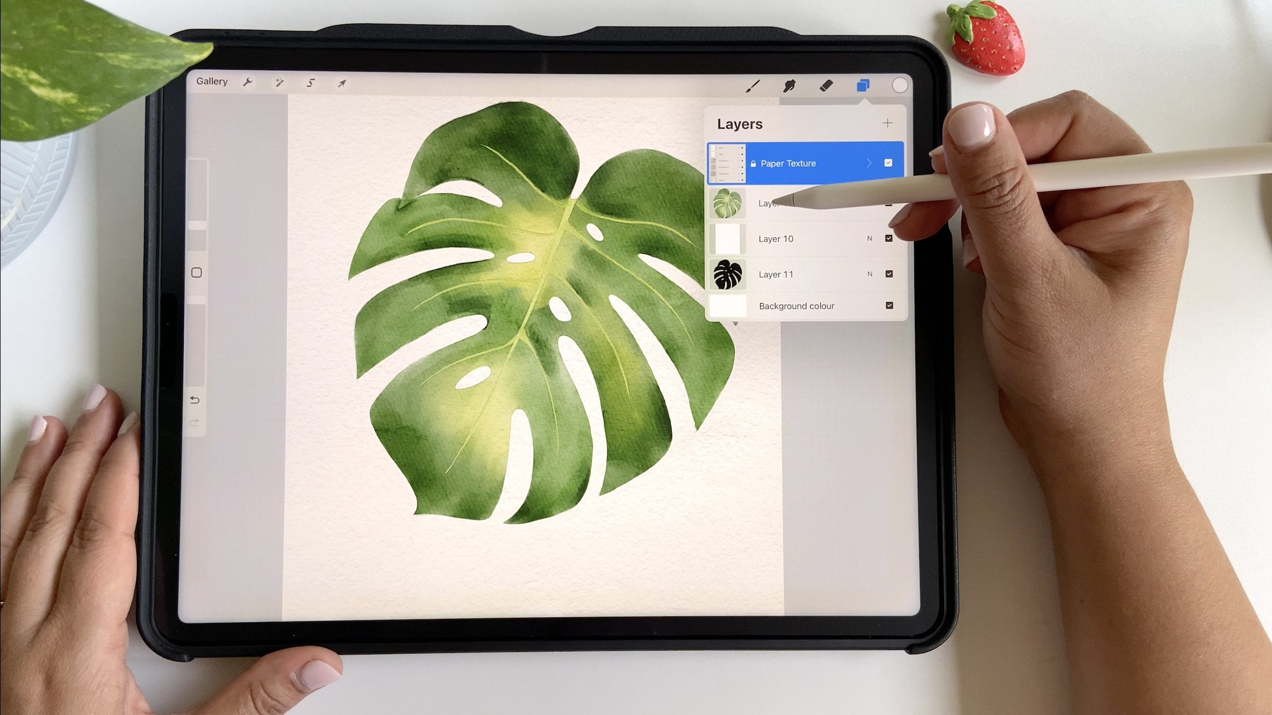
details to the flower, starting from this lesson, we will be using clipping mask a lot, which I'll show you how. Now to create a clipping mask, create a new layer
above the flower layer. When you tap on this thumbnail, you'll see this option
called clipping mask. What clipping mask
does is basically it clips the mask layer
to the flower layer. Hence, the visibility of
the clip layer controls the contents and transparency
of the parent layer below. For example, if I take some
color and try to paint, let's take a dark shade and paint anywhere
outside that area. We don't see any marks. But if I paint in
that flower area, you can see that
paint right here. I'll just clear it out and let's start working
on our details. To start with, let's
take a gray shade. This time we are going to use the sketch brush as we will
be making some thin strokes. I will start drawing some curvy lines following the shape and form
of the petals. At the same time, we'll shade the bottom part of this petal with the same shade to give it a sense of shadow
and try to make the lines of different lens to make it look more realistic. And I will follow the same
steps for all the petals. I'm going to make the base of
the petals a little darker, which will give it
more depth and form. And a little overlap
here just to define the separation
between the two petals. Some lines from the
center of the flower. And making those separating
lines between all the petals. Looks good so far.
Now, at this point, we don't need to
use blending tool a lot unless it is
really required. Let's say, for example, this stroke looks very harsh, so I will use a smudge tool to blend
it slightly on one side. For that, I will long hold on the smudge tool and it will pick the same brush
that was selected for painting and make the line a softer in the
inner side of the petal. Just going over all the lines and blending them wherever requ. Now, looking at the flower, I feel like adding
a blush tone in some parts to give it
more interesting look. So I'll create another
layer on top of this and bring it in between the flower
and clipping mask. This will automatically convert this new layer into
a clipping mask. Let's select to pink tone and the watercolor
primary brush, and I just want to
put down a hint of pink shade in
some of the areas. I'm actually going to
create a duplicate of this layer as this looks very light and merge it down and then merge it again with the flower layer
to blend the pink shade. Now using the blend smudge tool, blend the strokes very gently. At this point, just
make sure that the gray line layer
is not merged yet. Otherwise, we would end up blending these fine
lines as well. The petals are done. Let's work on the center part
of the flower. Create a new layer on
top of the flower layer, taking a dark yellow shade, adding some yellow
right in this part. Then using the blend brush, push the yellow
outwards, like so. I just noticed
that I got some of the yellow on this petal. I'm just going to erase it. For the eraser, let's pick the sketch brush and carefully remove those
extra yellow marks. Now it's time to paint the anthers and the
filaments in the center. For these tiny parts, we'll use a much
darker yellow color and use the chalkboard
pen this time. And make these little tiny
spots for the anthers. And for the filament,
picking a dark shade, using the same
chalkboard pen will make these wiggly lines like this. You can also notice that these gray lines are on
top of the filaments. Just to fix it, let's
bring that layer below the filament layer and then merge it with the
main flower layer. Now, adding the final
touches to the filament, I will add a little dark
shade in the bottom of the filaments to
add some dimension. I needed, you can blend
them a but not really required as these
elements are very small. Oh. And then adding some
tiny highlights on the top left parts
of the filaments. Finally, let's merge this
layer with the flower layer, and our flower is ready. Now, let's add some
details on the bud. Since the bud is not much
visible in this composition, it's okay if you don't want
to spend much time on it. I will just speed
up the video from here and we'll meet you
when I'm done with the bud. All right. So we are done
with the flower in the bd. In the next lesson,
we will work on the strawberries and
adds and the details.
9. Adding Details - Strawberry 1: All right, now the
fun part begins. Let's start adding details
to the strawberries, and to begin with, we'll start
with the big Strawberry. We'll need to lower
the opacity of the base layer so we can see the position of
the seeds easily. Create a new layer on top of
the big Strawberry layer. Now, before we begin, let's have a quick look at a
strawberry image. Here in the image,
we can see that the seeds don't just
sit on the surface, rather they are embedded
in the strawberry, which makes it drip on
the surface of the fruit. Before painting the seeds, we'll paint these seed pockets using a darker tone of red, and then add seeds
on top of them. Let's close this
window and rename the new layer as let's
say seed pockets. I'm not sure what
they're exactly called, but let's call them sat pockets. Using the MD sketch brush, we'll start adding
the oval shapes where we see the seeds
in the sketch below. Making them a little
larger than the seeds. And maybe a little darker. Also, try not to make all
the dips of same size. Some are bigger,
some are smaller. Now, before we move
ahead with the seeds, I want to talk a little about the shadows and the highlights. You can see in the
reference image that the lower portion
is quite dark. Here, we have the mid tone
in the middle over here. In the middle, over here, the
color is a bit saturated, and the top part which is
touching the leaves is also dark due to the drop
shadow of the leaves. Let's fix these tones first before we move
on to the seeds. For that, let's
create a new layer above the strawberry layer. Make a clipping mask so we don't paint outside
the strawberry. Now, picking the deep red shade and the watercolor
primary brush. Making sure we are on
the clipping mask er, start painting in the lower
portion of the strawberry. First creating a random
shape like this, and then paint in that area. Now, reducing the size of the brush and make
the top portion a d. Here you will notice that we are not getting the full strength of
the color as expected. This is because the layer
below is not exactly opaque, it is translucent, which is why the clipping mask is not able to apply the full
strength of the paint. To fix that, I will create a
new layer and add the paint, and you can see the
difference right here. Using a small brush and being a little
careful on the edges. If it goes beyond
the boundaries, if not the end of the wall, we can erase that layer anyways. Once we have covered
the dark areas, let's add some bright
red tone in the middle, and I'm going to pick it from here or you can also pick
it from the palette, or maybe a little more bright a neon shade and
paint in this area. Now, selecting our blend brush, let's start blending
the new strokes. And these strokes are
on a separate layer, so let's merge them
down and blend them. At this point while blending, the color will bleed
outside under the leaves, and that's okay.
We can erase them. All right. It looks good so far. Let's add some more dimension. I will add some reflected light in the bottom right
side of the fruit, using the eraser and
selecting MD sketch brush, reducing the size and opacity of the brush and
slightly this part. Next, it's time to
add the highlights. Taking a very light
shade close to white. And using the primary brush, making a random shape over here, overlapping some of the strokes. Then using the blend to
again, let's blend it. Softening the hard edges. It's very similar to what
we do on traditional paper. I normally use white coach for adding highlights
in my paintings. It looks very strong, so we'll reduce the
opacity of this layer. Now let's work on the seeds and this strawberry
will be done. Now for the seeds, we first need to do a little blending of
these seed pockets, so they don't just look
like dots on the surface. I'm using the cool
blend tool and going to blend the edges of these
pockets one by one and we'll meet you after I'm done with them. Perfect. Now let's paint the
seeds on a new layer. Let's call it seeds. Using the sketch brush
again with smaller size, let's make some oval dots. Like so. Painting seeds and seed pockets is the most time consuming part
of this process, but trust me, it is not that. Once we are done with
this, I'm going to add some more dimension by
adding some dark tone on the bottom of the seats
and some highlight on the top parts of some of
the seats, but not all. Like this. This step is
completely optional. You can leave it
if you are really tired of painting a
single seat every time. And you can also copy and paste objects if
you would like to, but it's just a personal choice. And we are done with
our first strawberry. Let's move on to the little strawberry in our next lesson.
10. Adding Details - Strawberry 2: Now, for the second strawberry, before we work on the
seeds and pockets, let's fix the tonal
values of the fruit. Right now, it looks very pale. What I'm going to do is
duplicate this layer, reduce the opacity
of the new layer, and then merge both the layers. This way, we have
increased the saturation of the subject without
painting all over again. Now let's create a
new layer and make a clipping mask to
add the darker tones. I will start with
the red tone at the bottom by taking
a dark red shade. And painting the red
area as we did before. Similarly, I'll pick
a dark green tone to cover the top part
of the strawberry. I'm going to work on
the whole strawberry and we'll speed up the
video for you to watch. Now let's add some highlights
by creating a new layer and using a white shade to paint the highlights just as we
did in the previous lesson. And then blend it and reduce the opacity
of the highlight layer. Perfect. Now I'm going
to add the seed pockets and seeds just as we did
in the first drubery. The only difference here is that the color of the pockets
is not only red, it changes based
on the base color. You will often see me
picking the color from the base layer and adding a darker tone for
the pockets as I go. And then blending the
edges of the pockets. Great. Now I'll start
adding the seeds. For the seeds in this
particular reference, you can see that the color
of the seeds is not same. Some of them are red, some of them are green. This gives it a more
organic and natural look. I will try to keep changing the colors for the seeds
using the sketch brush again. Once all the seeds are set, let's add some dimension by adding some shadows and
highlights to them. And finally merge all
these layers together. After this is done,
I want to fix the top parts of both
the strawberries, starting with the smaller one. I will use the sketch brush and add some dark
greenish tone here. And then blend it. In case
you go over the edges, you can use eraser tool to
remove the extra marks. Now moving to the
first strawberry, let's add some dark red
on the top where we see some white areas and make sure you're on the right layer
while you're doing this. And then blend it carefully. Here we have our
strawberries ready. In the next lesson, we'll work on the stem and the leaves.
11. Adding Details - Stem + Leaves: Now let's add the
details to the greenery. For starting with the stem. What basically I'm doing here is just adding some dark tones on the right and lower
parts of the stem to add the shadows using
the sketch brush. On these tiny leaves which
are covering the bud, I'm just adding some fine lines to give them more definition. After the stem, let's move
on to the strawberry tops. For that, let's create
a new layer right above the strawberry tops layer and then make it
a flipping mask. Picking a darker tone of green and using the MD sketch brush. Let's start marking down the darker areas and the
borders of the leaves. To avoid the hard
lines on the borders, we'll blend them softly. Like this. Now, after the borders are done, we'll add some thin
lines in the center of the leaves to add
some more definition. This looks good so far, but I think we need to add some lighter shade
for highlights, just to add some
pop in the piece. Let's pick a yellowish shade and add some lighter
tones randomly. And then blend it slightly just to soften the harsh edges. Okay. Now I'm going to work on the bigger strawberry
using the same process. This leaf right here has a fold, so we'll cover the
whole shape with the dark green and then covering the edges just like we did with
the other strawberry. Soften the harsh lines, and then add the thin
lines for definition. And finally, add some lighter
tones for the highlights. Perfect. Now let's move
on to the big leaf. Again, creating a
new layer above the big leaf layer and
making it a clipping mask. Using the MD sketch brush. First, we'll make the center and then make the
secondary veins going out from the
center to the edges. Same thing on the other side. You can notice that I'm not exactly following
the sketch lines, and that's completely fine. Now using the primary
watercolor brush, taking a little lighter shade, will paint above the veins like this to give it some depth. Then using the blend tool, soften those marks we just made. Trying not to soften the
other end of the veins, otherwise the veins will
lose the definition. This looks a little dark, then I intended to make,
so let's balance it out. For that, I will use
a lighter green, maybe this yellowish green and add some paint on top of it. And then blend it again. At this point, it
looks very strong, so we can reduce the
opacity of this layer, maybe about 89% and then
create a new layer. I'm going to define the veins a little more using
the sketch brush. Finally, to define the
edges of this leaf, let's go back to the
clipping mask layer, add some random dark edges. Trying to define in
some of the areas. That will give it a
more interesting look. And then blending
wherever needed. And here we have
the painting ready, but we still have a few
finishing touches to be done, which we will cover
in the next lesson.
12. Final Touches: Now it's time to make
the final touches and some fixes to our painting. For example, looking at
the small strawberry, it looks fine, but I think the bigger strawberry
needs some work. I feel the seed pockets need
to be a little darker to add more depth and some of the seeds are
looking very small. I will quickly go
through them and add those final details
wherever needed. Now it looks good. And
I think we need to add some highlights in some of the seeds to show
these shiny parts. Now that the
strawberries are ready, let's merge both the layers. Actually, let's merge all the
layers since we are done, and then we can clean up
the edges using the eraser. Now you can totally skip
this part if you want to keep all of them on
separate layers, that's completely okay. Now I want to add some
defined edges in the flower. We'll take a gray shade. We'll just add some lines
on the edges of the petals. This will make them more
visible and defined. Here, I want to do
a bit of blending. And need to fix
this part as well. Now, this stem needs
a little extra work. As here, we can clearly see the break between
the three stems. Using the smudge tool,
let's blend this. Adding some dark
tones wherever needed and erase the extra parts. And for the eraser,
I'm going to use the technical pen that comes
by default in procreate. Here we can clearly see the sudden transition between the strawberry
topper and the stem, Let's blend it to
make it more even. Maybe add some
strokes like this. Here we have our final project. Now you can share it in
the class project gallery or online and even print
it and hang it on a wall.
13. Final Thoughts: Thank you so much
for making this far. I'm really proud of you for
learning a new skill today, and I cannot wait to
see all your projects. Please do share your projects in the project gallery below. And if you can, please
do share them on Instagram and tag me at
the Red Mark D Shop. I'll be more than happy to share your projects
in my stories. I also have one very
special announcement for you guys in the next video. Thank you so much and
see you next time.
14. Special Announcement: Guys, welcome back. There is
a very special announcement that I am now offering one on
one sessions on Skillshare. If you go to my profile page, you will be able to
see it on the top. Right now I'm offering
two different sessions. One is a 60 minute
session in which we can paint a botanical subject
using watercolors. The second session
is a 30 minute free session in
which if you have any questions related to any of the classes that you
have taken so far, you can book a session, and I'll be happy to answer all your questions
in that session. Feel free to book
a session with me. If you want to paint with
me or have any questions, I'll be happy to help you
out and meet you in person.
 Disha Sharma, Artist & Illustrator