Transcripts
1. Introduction: The way anything is presented can make a huge difference to the way it's received. And I always think food is a really clear example of this. If you were to take the same dish and in one case, you presents it as study restaurant style versus throwing miss him food together in a pile on the plate? Well, some people will actually swear to food taste better depending on the way it's presented. A really, as graphic designers, we can apply this principle to all of our work. And really a reason for this class is, but a number of my students have said to me, and we really like the way you present your work. But could you help us to set up some templates so that we can present powers in the same way. So yes, sure, I care about, and that's what we're going to do together in this class. Who knew no more around wherever. It's just a few mockup templates you can draw on to help you better present your logos in a more dynamic way. All the way you present your concepts themselves or your brand strategy is great way to level up the experience your client received during the design process and particularly when it comes to your portfolio. This could literally mean the difference between a client and moving forward with you for choosing to work through someone else. This short course will also help you unlock the power of contexts and storytelling when it comes to your work, from your concept development to your portfolio itself. And as designers, we tend to have great imagination, but sometimes our clients just stated. So showing your concepts in context as you can tended to live and breathe in a real world that can have a massive impact away their receipt. And it helps to fill the gaps or clients imagination. And there are many resources that can help you to do it simply and effectively. In addition to this, even when we share the very WAR concept and other yawned in the design process. And this will present a sheep can go a long way, sharing our concepts in a wave of Films, consistent, organized, perhaps with a little written explanation. It avoids overwhelming the client and it makes it easy for them. Hey, can or should you show any OP, process the exploratory was leading up to the concept to you propose you're done correctly. It can actually work really well, but this is where good storytelling comes in and it's definitely a right and a wrong way to do this. Hey, I'm Jason Miller. I'm a freelance graphic designer. If I'm based in London, I've had the privilege of creating the luxury brand identity for clients from Australia to Hong Kong, to New York. Like I'm sure many of you, I've really enjoyed working from home. I've created a quiet little studio space which has become zone. This is where design, I'm very proud to say I've been freelancing successfully for over 10 years now. And free of those years with enough clients to make this my sole source of income. So this class project is very simple. Templates. We're going to create templates for everything you will need as you work through the design process. I've included some in the resources section of this class, but I'll also show you how to customize and tweak these so that you can make them your own. By the time we finish, you will be fully equipped with a catalog of real-world mockups and templates you can use bringing your own logos and your identity works in life. You have templates to better present your research and your proposed strategy and believing create some templates you can use as a starting point when we're presenting concepts to your clients. This is going to be a very simple but powerful way to level up your presentation over R4. So I really hope you enjoy this class. Let's get started. Please don't hesitate to ask if you have any comments or questions as we go through.
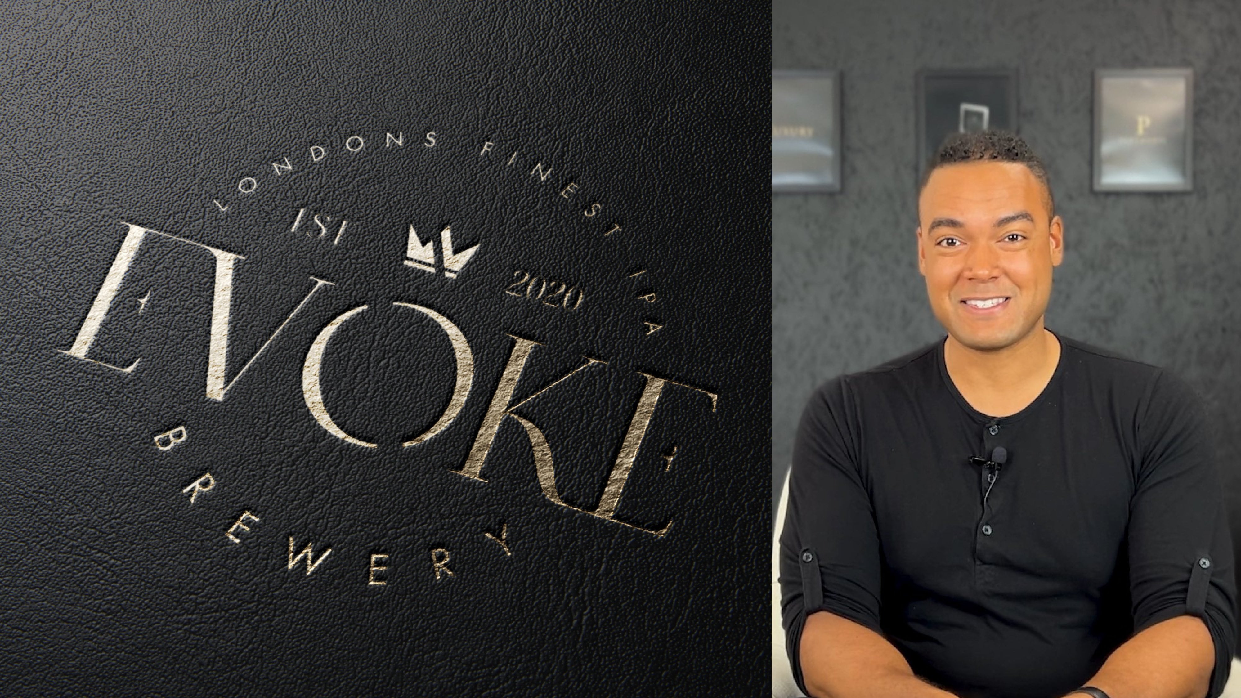
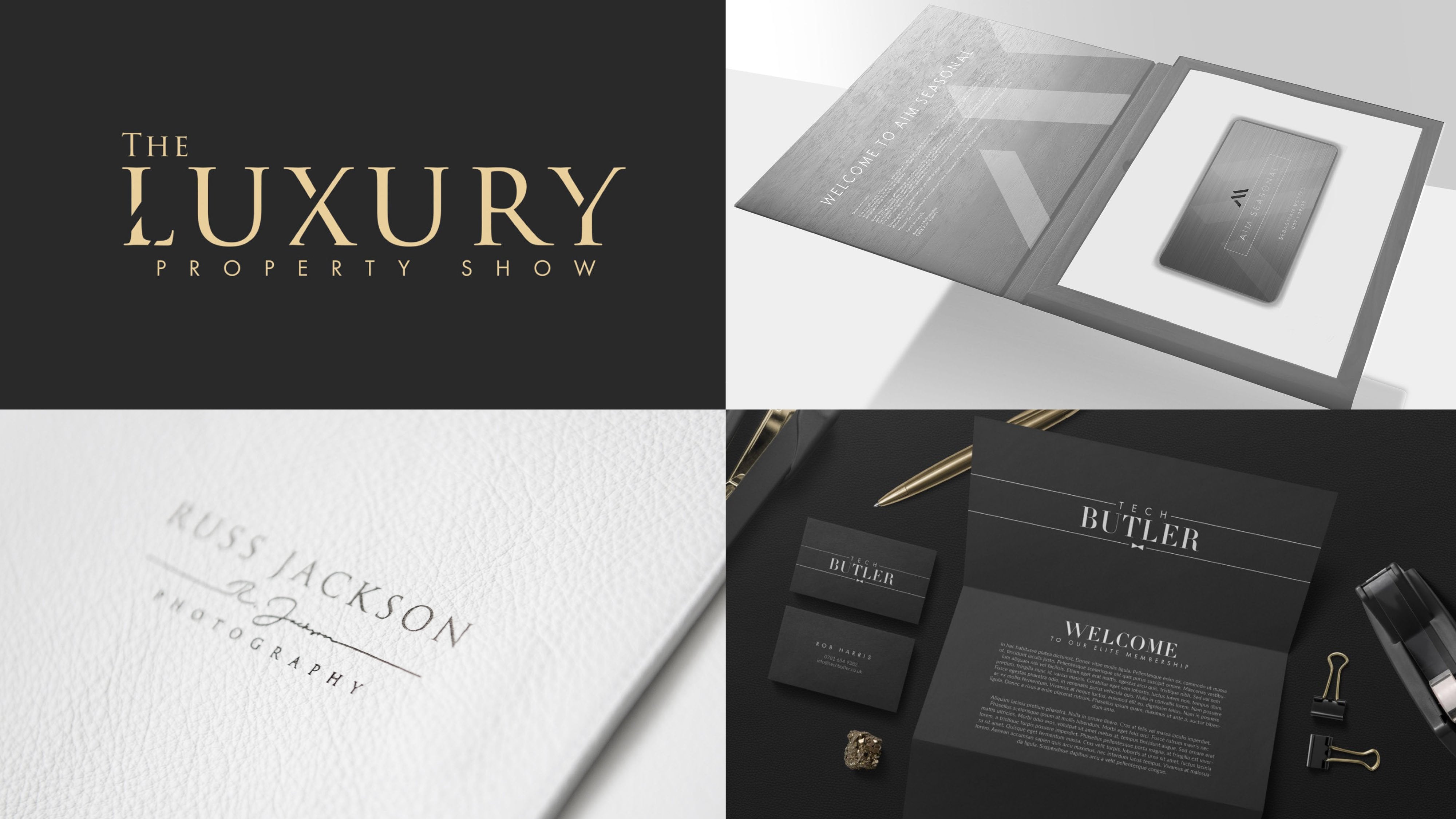
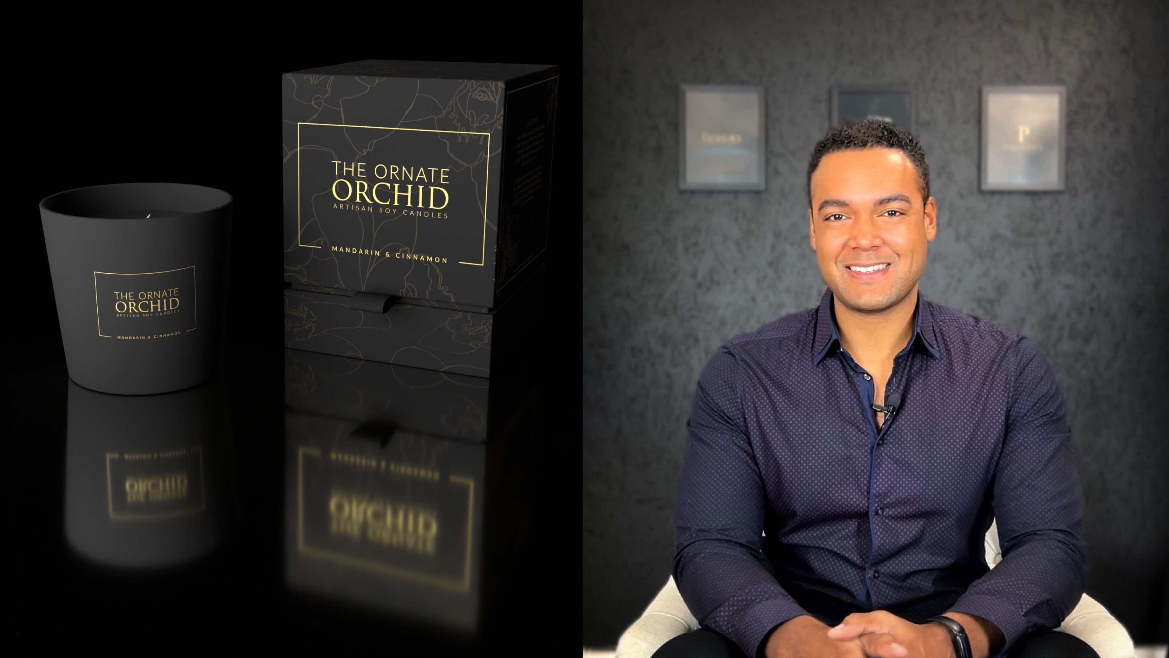
2. Why Present: So why present? That's all. Well, hopefully as graphic designers were already fairly big advocates of the advantages of presentation. But to go back to our illustration from the course introduction, few buts it take the same plates of foods. And in one case it's presented in a stunning, attractive way versus heat together in a lump. It's going to make a huge difference to the experience that the literal consumer has. So as graphic designers, but way we present our dish makes a huge difference too. And in fact, if our presentation isn't good enough, It's possible that nobody else will get to enjoy or work we've produced. For example, that way you present your own portfolio can be the difference between booking a client for the next project or vaccine client looking elsewhere, the way we present our concepts could make the difference between a client selecting a particular concept or not and the way we present our brand strategy and perhaps the associated guidelines could be the difference between the client getting on board, understanding and implementing those recommendations, and between them feeling overwhelmed and ignoring them all together. And presenting with context enables us as designers to tap into the imagination in a very powerful way. So let's illustrate this by looking at a few examples. Now, first of all, look at the R4 original logo concepts. And so there's nothing wrong with him. Visa strong logos, but shown flat with no context. Sitting on a white page or gridded paper has a certain impact. But if you actually show the client how this would look within a mocker, just look at the difference. And to take rust Jackson. Well, he's a photographer. So showing him beautiful logo sitting on a blank page, really means very little to him. But show it to him as it would appear on his packaging, as it would appear imposed over his photo frames. Will now you're talking, now Ruskin see exactly what you're proposing and he can see how this logo is going to live and brief. Let's take aim events. Again, a strong logo, simple, powerful, but shown in different situations what a difference it makes. Perhaps with some texture behind it. The kind of thing they might consider producing on a brochure cover, um, or shown as it might appear with some lighting shining on it. As if it was actually cut out of metal and framed on the wall of their offices. And this makes such a difference because to the client. And you're really showing the potential of a logo and the concept. And this is so important for people who have to see things literally. Who perhaps can't imagine a logo jumping off the white page. And these are final concepts, but what if you're someone who likes to share the process behind your concepts? And I'll admit I'm one of you. Well, even with this, there's a right way and a wrong way to do it. And we'll cover the specifics of this in a lesson all about presenting the story and the context behind your work. Really the goal being to ensure you control the narrative that you're using any process work at leading up to the main concepts as a storytelling exercise and not as a distraction.
3. Real World Mockups: So real-world mockups, you've likely seen them before, perhaps bears a designer, you would Maya, and you've looked through their Instagram feed, narrow these incredible, stunning examples of their work. So common sense, it's very powerful when you think about it. And actually very few occasions where a low verb is going to just sit on a completely blank white page. Reality of a grandma density where we provide our clients is going to live, vary in different ways. May appear on bags. It may be impossible engraved in some manner. He's going to appeal the client's business station where it will shape the way that brochures or brand collateral and showing your work in context with a benefit of different materials, lighting and finishes. It really helps to feel a potential gap in a client's imagination. Instead of them having to imagine how your brand would look if used in certain situations. Real-world mockups enables you to show them exactly how it would look, feel, and breathe. So that sounds great, but how do you actually start using these mockups to present your own work? Well, in some cases, you can simply open Photoshop and impose your artwork over the top of something else. And there's nothing wrong with that, but there's a much better way. And that's what I'm going to share with you in this lesson. So very some fantastic resources you can find online. So I'm going to show just four of many places you can find these kinds of resources. So feel free to check these out and perhaps share in the course comments any good places you've found that you'd like to use. And so Graphic Burger.com, so this is, this is fantastic. Most of the mock-ups you'll find on this site are actually free. And as we go through, I'm going to grab a few of them just to show you how they work. So this looks good. This rubber stamp mockup that could look quite nice for the correct kind of logo. And you see some of them will ask you to sign in. But this one is easy to find Download button. We've got a free 2, 1 countdown, and that's it. That's on the way to our hard drive. So as easy as that, as it says here, you can donate, be combined IV, offer a coffee or too, if you'd like, just to support them. Because of course they are creatives like us. So that was quite a nice one. Another site, mockup, cloud.com, having a look on here earlier before hitting record. And this has some really premium looking mockups. And they tend to customize room here. So for example, this business card show next to the kind of Chevette or cutthroat you have in a barber shop and the shaving bowl, I mean, that's really premium. And if you do work with a barber shop or this one over here, Coffee Company. And these can really nail the tone you want to create for the design when you put your artwork in the hair. I found one I think we can use in our demonstration. So this is something you might find On apparel or clothing. And as you mouse over, you see V original versus an imposed version, which we're going to do together in Photoshop with a logo showing. So again, I quite like this website mock-up clouds come. And again, this one's easy. You just click Download and straight away, no countdown. It downloads with files for you. Next slide we'll look up. This is web effects.com, and this is actually just a blog article, but I bookmarked it because this was quite a good resource, 25 plus F3 branding and identity mockup templates to download. So I'm sure if you Google search for similar, you'll find office who have kind of curated the best of these. And that can be quite useful. As I scroll through, you'll get a sense of the templates and kind of look and feel. So visa for presenting stationary. And this one here is quite good. Little confusing to click the button above, Over button below is the button below. So let's click together at mockup. And this actually comes from B haunts. And kindly VSB haunts offer. He's made it quite easy for us to download your file away. Mock-up world's dot com. Now they claim to be the biggest source of photo-realistic PSD Mockups online. Well, I have no reason to challenge back. And certainly they have a very impressive collection of mock-ups. If I click view or free mockups. You see there's quite an extensive collection, goes on for 222 pages. So I won't scroll through all of that with you now, but I can say this is a really nicely curated collection of mockups. And if you wanted to narrow it down with these filters, you find some really, some really premium free, free but premium resources that you can use on your projects. So we just jumped back to Graphic Burger, hit the back button few times. And there was something else from here I wanted to download just for the purpose of demonstrating this. Because sometimes you look at these mockups and you think, Oh wow, this must be really complex. You need Photoshop to use these. And you could, you could put yourself off if he hadn't tried before. It's really, really easy. And this is a great one here. Is going to open that in a new tab. We use this one a few times myself. Quite like to shave away. Logo would appear if you had it yeah, imposed on a shop window can be quite useful for a number of businesses to see. And okay, here we are. Silver stamping, gold mark logo mock-up. And there's another gold stamping logo mock-up. So I would grab one of those or both. I'm going to grab this one now. And then we'll jump ahead, fire up Photoshop, and I'll show you how easy it is to impose your artwork into these mockups. So here we are. We fired up Photoshop. And I'll just orient you. This is what you'd see if you were to open one of the folders, be sure to check for licenses. Sometimes they are limited. So depends if you're just showing your client an example of how something will look, I'm sure the license will cover that, but just check if this is something you're going to present for your client to using some capacity that you're able to do that. So it would be vis file that you'd open the PSD and sometimes there's like a background. You need to manually place inside. So no worries. I'll walk you through the process for doing that as well. So we've opened this apparel logo and down here, if we look at the layers panel, and depending on how familiar with Photoshop you are, you might find them. It's a bit daunting at first, or this may be, be simple for you. But basically you've got this little eye icon on the left of a latest panel for each layer. And if you click on the eye and it's going to remove anything, you don't want to be visible. So that solves that initial problem. Some of these come with kind of a details of your phone where you can get the original, which can be useful if years down the line, you wonder where you originally downloaded it from. So as a rule of thumb, you'll be looking for a smart layer and that's where you drop your design them. Now, some more visible label for layer, and you can see here that's the case. This label is layered your design. But if it's the first time you're doing this, it doesn't tell you much your design will. What does that mean? Do I just drag and drop my logo? Do I try to position it over the top? Well, if you did that, you're kind of thinking, do I oriented, do I what do I do? This the intention. And we'll know it's not. You're looking for the layer that says you will design. And it needs to be a smart layer. So as I hover over this thumbnail, you can see it's a smart object, thumbnail. So we're looking for a layer, but it's a smart object. And in essence, when you double-click that thumbnail, because it's a smart object, photoshop isolates it and it takes you to view just for contents of that layer, which is really useful. So this is where you would drop your design in. And again, we can see the offer has labeled it here. Sometimes there's nothing in here is completely blank and you just position, drop in and position the artwork yourself. So I'm going to use this logo as an example. Who needed to be sideways, just remember to hold shift so you get that 90 degrees snap position that I quite like negative space, but somewhere around there That looks pretty good to me. So some offers will include an extra effect, and that's the case here, but we've got a folder and it says add selective foil. So if you twirl open folder, just give myself a little more room here. You can see again, there's a little label that says Place your foil design in this folder. So if we do that. You can see applies this nice gold foil effect. And the choice is yours. And some of them mockups won't have anything here would just be a blank layers palette and you drop your artwork in. If a offer some kind of extra effects, feel free to try them out. But when you're happy with the way the smart objects is looking, you actually close the file. So file close, and that seems a strange thing to do, but this is the way smart objects work. You save your changes to this PSB file, which is kind of a, I guess it's a file type for Smart Objects and it's usually embedded somewhere in the core files and click Yes. And look at that. So the reason these mock-ups work so effectively and they look so photorealistic, is that all these layers here are applying lighting and blend modes and all kinds of good things. But if you were to just use one of them, looks quite good and looks realistic. But as you add a number of them, it really makes your design come to life. So that looks really good. And I think that was a good logo choice for this particular label. And this is the kind of thing I would share with the client. So you can save this out as you would any Photoshop file. You now have to do save a copy. If you want to save a JPEG, or you could just click Save and overwrite the PSD template. So that's the first one. Now that I've explained the way the layers work in smart objects, we can run a little faster through the next ones. So this is what you will find if you open up the gold foil stamping mockup. And in essence, you, it looks a little unfinished. And you can see a layer here at the bottom that says background image here. And you remember I pointed out in some of the folders, you'll find a background graphic that you have to drop in place. So just drop it and make sure it's, it could be above or below that little placeholder layer. And that's it. That's the effect of the offeror intended. Now if it has the advantage that you could find a different texture or a different background from elsewhere. And I guess makes her mock-up a little more versatile. But once you're happy with your backup in place, again, we're looking for a smart object. So this time it's with top layer. And you can see it's been labeled your logo here. And there's a little instruction which we appreciate. Double-click, I think it says, yeah, double-click the layer thumbnail, which is exactly what you have to do. So double-click, click Smart Object from now. And again, we're taken here to the contents of the smart objects. So this time, no folders, no effects being applied here, simply a placeholder logo. So I'm going to use a different logo this time. But once your logo is in place, delete for placeholder layer. You could just 12 VI to make it disappear and then close and save the small objects. And the second you do that, it's going to update. And there you have your logo as it would appear in gold foil, which is quite nice. And as I say, these gold foil mockups, I do for many of the luxury brands I work on. Let's try another example. So this time you can even delete or turn off the visibility. For that lay of your offer has added. And we're looking for a smart objects. So there's a little label your design. And we double-click the smart object from now. This time let's use the white version of events logo that's centered. Just dragging to kind of expand it from the center. That's one of the shortcuts in Photoshop. And there is a selective foil here that could be added. So let's just 12 IS layer open. Strike the design inside. Okay, so maybe we want a gold applied, maybe not, maybe we want to keep it simple. Let's try both. Let's try it like this first. And save. And I like that. I like that a lot. Very sleek. I think the gold foil is necessary. And look at that photo-realistic shop sign mockup in just a few, few seconds, really not even a minute. So find some of these templates, save them down, and make sure this is what you show in your portfolio as well. Don't just show your logos on a white background. I think show them in context, really bring them to life and it will make a big difference to your own portfolio. And civil waiver client receives v's when you're showing them what this new identity can do. One last mock-up. And this was stamped, we downloaded. And I think I'll drag in and sorry, I'm flying through it here, but you're probably not familiar with it. Now, we have the smart object, we give it the double-click, and it opens our smart objects in a new tab. We'll ignore a placeholder layer for now. I'm going to drag in my luxury logo. Now, this is actually on a white background, which is non-ideal. So our rasterize it. Going to use the magic wand to select, remove all the whites, delete for placeholder background. And we'll save that out. And okay, that's, that's a little too faint. Classic example of gold. A light gold not working very well on a darker background. But if we have, this is very rough, I should have used a proper vector file. If we turn that to black and save it out. And that just shows you how that would look. And actually now a little bit of distress we see that lends itself quite nicely to a realistic rubber stamp. So have a play, try to use these mockups and see to what extent you can bring your own work to life.
4. Concept Presentation: Concept presentation. It's such an important step in any project or process for us as graphic designers. And I've spoken in previous videos about my approach to this, right? You'd like to send a document ahead of time, give the client a chance to think things over and look through the options. Head of the discussion that we would have either in person or via video. Now, I prefer to do it that way by feeling doesn't put the client on the spot. Usually a little anxious. They've hired at the liner, they've invested lots of time and money. And that moment where you share the initial concepts, It's a big moment for the client. I don't like to be there to kind of add to the pressure they feel. And I found giving them a chance to look things over beforehand, makeup and wind to formulate their feedback. It seems to work better for both parties. But that approach to work, you have to send those concepts and present them in a certain way, which is what we're going to cover in this lesson. So rather than just sending the concepts and letting the client cons of their own conclusions always include some degree of written explanation to talk for client through the process. The reason for the concepts, the advantages, and so on. And this isn't example I'll share with you. This is for a client of mine, taught bake house. And this is the kind of thing I would include in v, v initial concept presentation. So I've named this document selected six initial concepts. And that's exactly what it is, is just six pages. There is one concept to a page. And you will notice I show both a light and a dark kind of reversed version. Like for, like similar kind of positioning. And the idea is it just makes it really easy for the client to isolate these concepts. And as we flick through the pages, we're not comparing apples or oranges. Hopefully they're comparing apples with apples. So really easy to kind of flip between and think which one do I prefer? I prefer this nice modern, contemporary font, or don't prefer this classic font here. And so on. And I don't change the colors, I won't change the backgrounds. It's really consistent because I don't want a client to make a choice because they preferred seeing something on a dark, moody background. And then the next concept, perhaps I've only shown a light version. And what they're actually selecting is the kind of dark effect. And that's where I think presenting it in a consistent weight like this. It really helps the client to understand what it is they like about your concepts. And you'll notice I include some annotation down here. So just a brief synopsis of each concept. I'll read this one for years. So this one says another ultramodern concept. This time we've tied to spacing, further increase contrast and a simple but effective TB hate sub mark, but draws VIII by being placed at a right angle to the main logo type, which is indeed quite, quite clean and effective. So as designers, we can look at these things and sometimes there'll be a bit of nuance, a bit of meaning, a design quirk that a client won't be able to put their finger on Ticulate. So this is quite a good opportunity to shine, shine a light on that, and make sure the client understands why these elements might work so well together. It continues, but clean lines all balanced perfectly, which lends a very crisp, elegant aesthetic to the logo. Again, I can see this working well to attract young working professionals, hipsters, people who may literally be jumping on the tube to shore, which we felt laptops to enjoy the buzzer, a coffee shop, but would love to do this locally instead. Or trendy mom's looking for that new spot to meet with the girls for a catch up. So there's a little bit in here that's selling the concept to the client. Again, I don't want to really oversell one concept and then play down another. I like it to be fairly, fairly balanced to give each concept of a fair chance. But I'll explain why I think it works. And this is kind of your chance if you're sending this across in an e-mail. If you're having a discussion with the client later, this is your chance to really sell your, your work and the reason you've made these design decisions and why you think it's so appropriate. The target audience. And a last little piece I've added at the end here. Please bear in mind, this is currently shown in black and white, but color has the potential to significantly transform the overall look and feel. You could even use a bright color to create a Neon effect if you're a fan of a branding for I mentioned a very popular brand in the same industry. So that's the kind of thing I'd include in that short write-up. It takes a few minutes to go through to write this for each of the concepts, I include a little bit more for some than others. But I think it has to be done. If you're not go into do the kind of reveal, live with a client and show them the concepts for the first time. Kind of be there to talk through it with them immediately. I think you do need a little something just to take the client through the process and to control the narrative to some extent. In terms of the layout itself. I've got quite a generous border around the edges. I am showing two variants of a concept per page. It could just be one large example of a concept. That's something I've I've kind of arrived at through trial and error. I don't like to just show a big full-page concept because how often do we use our logos at that kind of size, like full page, I think this kind of size and there's some description going on at the bottom. This is the kind of size with logo is likely to be used and to be viewed at. So that's what's led me to this layout. But that will be our next step. Let's create a simple template that you can use to continue our, our class project together and are open Illustrator to show you the process. So here we are in Illustrator CC. I'm recording this midway through 2021. So if you watch this in future, perhaps a few of the panels will have changed, but this is it in essence. And if you're familiar with Illustrator, you know that with one artboard setup in this manner. As long as you have all your layers here unlocked. If you use the Artboard Tool, which is this one down here, shortcut is Shift O. You can click, drag and hold Alt to duplicate. And using that method you could duplicate so that you've got this template to use for as many concepts as you like. And I'll undo that and just walk you through what we have here. So if you're going to create your own template and these are the kind of essentials for I'd put in place some way of writing up, as I described earlier in the video, could brief synopsis and faults behind the concept. And for this template, I've actually, I've included this section which is key messages conveyed, which I quite like. So maybe in just one word, you can list a few of the traits of a logo. Does it look luxurious, modern, timeless, elegant, et cetera, et cetera. So I would make good use of the layers in Illustrator. I've created a guide layer up here. And if I create a new, let's just duplicate this and delete everything off of there. I'll show you how to build your own from scratch. So I'll include this in the class, the class files. So you can just download this and use it as it is if you want or tweak it to suit your taste. But essentially to create these guides, I first of all use the rectangle tool. I drag holding Shift to constrain the proportions. And this determines the outer margin. I would like. My old drag these to all of the corners, making sure it snaps in properties. You can make sure you're snapping option is wrong. Just go back to layers. And you can either drag from the edge if you have a ruler on. Let's create a guide. Say that sleep missed the target. I don't use that method. I use the line tool and making sure intersects with those shapes I've created. Again, you can Alt and Shift drag. And here I'm going to copy, paste in front, rotate 90 degrees. And you can see I've got this, this kind of shape going on. In InDesign. It's much easier to create margins that away I like them, but I use that method in Illustrator. I know there are other ways you then go to View Guides and make guides. But the reason I do it that way is I now have guides for actually live on a layer. And this guides layer here which I can lock. And now I can use them, but I accidentally drag them around. And what I quite like that that way, when I duplicate the artboard, oops, if it's unlocked, the guides come along with it. So with the guides in place, that's kind of been negative space. I want around the edge when presenting the concepts. I've explained the reasons I like to show the light and the dark version of each concept. And when you're creating your own version of this, you know, you, you could. One of our problems you'll run into is you leave a half too. And this dark section, you could do something like that or even that. So you'll be able to place your logos where in there. And then the text that's ridiculous color. There we are. Your texts could flow underneath. That would be one option. But failing that, if you have something like this going on, you obviously can't have texts for flows across the light and the dark side, maintaining his visibility. And that's what led me to this sort of concept here. So we've got a box floating in the background. Margins are different. And the one I created earlier, but you could do something like that. You can have it bleed off the page. You perhaps decide you don't want a stroke around it. You could just do this. Of course, your clients can always refer to the page number. So perhaps you don't actually need to label, label the concepts. But whatever kind of layout you come up with, try to keep it nice and clean, professional looking, and make the client's job as easy as possible for them to compare each of the concepts in a nice, almost calm, controlled manner. In the next lesson, we're actually going to look at presenting something a little more busy, if you like, the concepts that led up to this, your journey behind the scenes. And if r is something you want to consider doing, I'll give you some suggestions for presenting that in the next lesson.
5. Presenting Behind the Scenes Work: So presenting behind the scenes work at the moment, this is a subject of some debate because traditional graphic designers, those specializing and brand identity, they would very rarely show that process to clients. They would simply present the results that they're recommending. But many designers have become quite popular and have gained a big following for showing a detail intricate processes and climate seem to like this as well. Many of these designers have attractive clients, really value and appreciate being included on this design journey. Personally, I feel this both a right and a wrong way to do this. If you're going to include your client on this journey, is cut to be a pleasant, well-thought-out journey. And it's got to feel like you're in control and your storytelling. It has to have a clear narrative that the client can follow. If you simply let a client into your mind to see your crazed workings of Hecate definitely do more harm than good. So first of all, I went always include a look at this behind the scenes work for every client you've got to decide, is this going to add something? Is it's going to benefit the client. Would it be better to keep things simple? If I do this side, I'm going to share with my client little of a process behind the scenes. I'm not sharing everything. I'm not literally right-clicking and sharing access to the full Dropbox folder for that client. For some things they won't need to see some things that will simply adds confusion. So I like to share a PDF document with the clients are created in Illustrator. It will have generous margins, but a hidden away, but it keeps a certain structure to things. I'll make sure each page has a certain theme. So it's not lots of random ideas, but there's a story that client will be able to carefully follow. Something if it's busy, can be perceived as quite messy and a little unorganized by the client. So a little negative space can go a long way. But when you're presenting something like sketches. And again, I think a key tip is to control the narrative. This is a storytelling exercise. So you may have gone through a 100 different iterations to find something you've shared in the selected concepts. Maybe your client doesn't need to see all 100. It could be the best 50 or the best 20. And you lay them out and present them in a nice, neat, and attractive way. Ensure that you control the narrative. Show your client that the solution you're proposing at the beginning. And then circle back and in a nice calm controlled way, take them through the journey that led you to that solution to that conclusion. But is very, very different to showing your client hundreds of options and leaving them to decide which they think was the strongest. And it's also very different to showing just one very simple concept to your client and leaving them to wonder, which other ways could this have been done? What led you to present this option to me? And if you found that's happened before in projects you've worked on, that, the client often wonders, how did you get here? If you get lots of requests for revisions and changes? If your clients ask, can I see one? If it looked like this would look like that. Perhaps for something you could be doing in presenting your process that will save you that painting in the long run. So by storytelling in an effective way, we lead and include our clients for invest design journey with us. They followed us overweight and usually it means veil, appreciate there'll be that bit more confident in the solution we present to them in the end. So I'll walk through two examples for you. The first is aim events. I would usually begin by making sure, as I've explained, the client sees the kind of end concept. So we see the hand of her journey first. And then the kind of thing I present to them would be something like this. So perhaps if I've explored creation of a monogram of a symbol, I'd show them all for different iterations that I've explored and what's led me to that final iteration of chosen as the concepts I'm presenting. And for me, that's the difference between the client saying, Where is this the only thing we could do? What if we try this? What if we try and fat, they're not going to do? If a can see you've carefully explored many different options. It will give them confidence in the final option that you're recommending. But if you present it like this, just one page, It's not obsessively gridded and laid out to perfection, but it's fairly neat. It's not just a complete random jumble of concepts. There's some structure to it. I've positioned in such a way that there's a nice, generous border around the edge. And to me this just says, I have explored lots of options in a very controlled way. And then to show you, this time not sketches, but my kind of digital development as I'm fleshing out some of the concepts. I'll share a page that looks something like this. So the next example I share is for Tunis, a venture capital company. And this is where final logo. So this is, this is the concept. Offer. A few phases of revision. We arrived that, but I'll show you what I included in the initial concepts. And really quite proud of this example because so much went into it. And if you look here, and this is all included as part of the process for the initial concepts. We looked at the anatomy of this crest that they wanted as the base of a logo. There's a heritage to the company. And so we needed to look back and see what different elements comprise this crest. They were bacause, a swords being held in the hand, hilt. All sorts of elements. And rather than me kind of doing this research behind the scenes and then just showing the client the end concepts. I'll present it. Again. I'm not spending a masses amounts of time. It's just a simple, reasonably neat layout and it takes them through their journey so they can see vf I've put into exploring these elements. We then looked at the castle because we felt that might be something that featured in the logo. So what kind of costs or would we show or, you know, I've I've grabbed and pasted in some of the references I've looked at here. And we looked at swords and Hilts for themselves. So what kind of Sword would be appropriate? Again, include it. If we were going to use a texture to render a version of the logo, they wanted something that looked very rustic and actually had like a metallic finish to it. So I've included here the kind of different textures that we might want to use. The sword hand, how should it be positioned? If it's done the wrong way, you can serve it in a little note here, it can look like a saw this hacking rather than if it's held straight up in the air, it's more of a rallying. I'm a kind of rallying position, which is a connotation this client wanted to convey. So all of that leads you to this page here where I'm actually fleshing out and putting the concept together. And that way instead of just seeing this and thinking, well, why, why has the designer chosen this sort? What is he chosen the hand at this angle? I'm storytelling. And by the time they come to this page there with me and they can understand exactly why I'm proposing the concept that they're seeing here. And interestingly as a side point, I suppose on the left, we have just a digitally fleshed out version of this in Illustrator. And then on the right, I've actually taken this into Photoshop. And I've used one of our mockups that we looked at in a previous lesson to show it with real photorealistic metallic finish. Something they kind of wanted to make a point of featuring in a lot of their marketing material. So even at this stage, you can on occasion leverage those mock-ups to show a client the potential of a concept. So here we are in Illustrator CC. And again, we just want to set up a template for this as part of a class projects. So you're welcome to download for one I've shared in the resources section for this class. But try to at least customize it to some extent, or perhaps create your own from scratch according to your preference. So again, this is similar to the template we created in a previous lesson. I make use of layers so I know which elements I I'm looking at. I can turn certain things off Fanon, like for guides. In this case, I like to use a grid to create the guides. So if you're not familiar with a grid tool, you can find it under the Line Segment Tool, rectangular grid tool. And as you click and drag, if you hold Shift, it will lock the proportions. And if you use the arrow keys up arrow. We'll add rows and the right-hand arrow on your keyboard will add columns. So it's quite a useful way in Illustrator, which doesn't have a gridding tools of something like InDesign. Quite a useful way to set up a grid you would like. And I drag that in place, ensuring it's, it's perfectly proportioned. And then if you hit the Transform Key, which is E, and you click and hold Shift drag down. I'll usually position it somewhere in the center where I want the edge of my kind of working area to be. And I'll assign that a soft color, maybe a neutral gray, or under Properties. I'll turn the opacity down. Let me just hide the existing guide so you can see this. Then when I click off of it, you've got a nice, really faint grid that you can use, fair, just to help you position your work as you're, you're using this template. So let's delete that example. You can create your own depending on what you're looking for. And just remember before you save and share this document with your client, just turn off the visibility that guides layer and then the result will be something that just looks nice and well balanced. So this second page of the template I've included, because I always like to start by exploring different fonts, is one of the first things I'll do when I'm working through the identity process and are usually copy and paste in the brand name many times. And then you can simply click on each of these layers and under Properties, you can explore different formats. It's a really easy way to not just compare them, but show your client and the options you've completed compared data for top client's name. And you can give a little heading. So this page could be where you drop in some rough sketches, perhaps scan them in or import them from your iPad. And this could be font exploration. And you get the idea. Just be careful if you have your labels. I've given the labels with top layer. You want it to be unlocked so you can edit the titles perhaps, but try to put your content on one layer. It will just save you some trouble if you've accidentally drops your content into the guides layer. When you go to turn off the visibility at the end, you may not realize you're actually sending your client, may be half of a work you meant to. Some of it could get hidden away. So just some good housekeeping to keep an eye on your layers up there. So this is what I use as a base. Having template saves time. And armed with this, you can even ask you really roughly exploring your concepts, lay something out with a view to sharing it with your client and including them on your design journey. In the end.
6. Presenting Research & Strategy: How long do you usually spend doing some research or working with a client to create their brand strategy for each projects. Well, if this is something you are spending a number of hours working on as most of us do. Then you've got to ensure you're presenting it in a way that has value to your client. If you presented this research and the strategy you are proposing in a wave that has a real tangible value. Perhaps a well-presented PDF document, as opposed to discussions lost and forgotten in months pass. Or perhaps a long rambling email that explains what you're hoping to achieve. Who really can find an email in their inbox. If you've had much correspondence back and forth and you're trying to search for years down the line for something that has so much value. We want to present it in a way that shows that value and document the client will proudly save, hang on to and use in the future. And again, there's more storytelling in play here. This is what I've learned about your target audience, your competitors, the brand you're hoping to create. Visa conclusions I've can't see and these are the solutions I'm proposing. And having a well-presented clearly outline strategy for their brand in place will not only serve as the best design brief you could ever ask for, but it's going to give a client so much more confidence in your results. It's really a valuable deliverable and something your client will refer back to time and time again in the future. So we'll need to fire up Adobe InDesign this time. And that's the ideal piece of software to present something like this in. And because this differs from Illustrator in a few key ways, I'll just walk you over some of the basics so that you're able to use this. Now when you first open this document and you'll see if you're looking through the regular pages, There's a section at the top that you can't seem to edit. That's because InDesign uses something called master pages. And it basically saves you from having to type out the same details on every page. You can't accidentally edit them is quite useful and you get some additional features like this, real-time page numbering. So the first thing you want to do is twirl open your pages panel and you want to double-click this A-Master. Double-click it, and it will take you to this master page. And essentially this is an underlying template that will show on each of your pages. And it means if you add pages to this, you will get everything you place on this layout as a starting point, which is really useful. So you could leave these sections here if you want. You would just want to put v brand name of a company or working on and perhaps a tagline if you wanted. So for example, it could be rust Jackson photography, and then it could say newborn photographer in the tagline. So that's nice and easy to customize. So if you hit the W key in InDesign, but we'll toggle between the normal and the preview view. And with normal view is quite useful because you'll then see some grids. And this is far more flexible than the kind of grids we have an illustrator and some other kind of formatting features that can help you. You can see the boundaries of textboxes. And on some of the pages when open page free here, you'll see I've included a place holder for enables you to drag and drop images. So we'll come back to that in just a moment. So customizing your own template, Let's say that you wanted to have a little running footer across every page. So I'll open up the Rectangle Tool and drag something across here. No need for a bleed if it's just a digital document is not going to be printed. And you could do something like that. And if you wanted, instead of what I've done at the top there, you could have a running footer like that, which looks quite nice. So I have a plate with the options, but it's really useful to use this master page to set the base layout. And then you receive an update on every other page in the document. Follows. Beginning with page one, I'll just walk you through the options I've included in this template. If you're not sure how to set up margins and grids and columns and things like that in InDesign to help you balance your layouts. Well, there are courses on Skillshare, all about gridding and all about setting, things like Visa up. So I won't cover this. I won't cover that in this short lesson, you can certainly dive in deeper if you're interested in learning bat for InDesign. So using what I've put in place as a starting point. Simple title. For the first page. I like to include a strategy summary. Some notes on competitors are inspirations, brand inspirations if they're being included in the project scope. And this is all editable. For each page. It's only the details you place on your master page that aren't directly editable here. This is the place holder I mentioned. So you can drag and drop an image into here, and then you'll have some options to position it. That's a nice way to keep allow consistent. And you can see that conforms to the gridding system I've used here. So these pages here, competitor analysis pages. This is just the way I like to lay this out. I include some key observations. There's some room here for kind of a written description of a summary of anything you think is worth mentioning to your client. When you've looked at their competitor, any key strengths, weaknesses, you name it, this is where you can include those details. So you can drag and drop the page with the pages panel open. If you drag it onto this new page. Symbol here, the little plus with a square around it, that will enable you to duplicate the page. Unfortunately, it goes to the bottom your lists, so you then have to drag it up in place. But you'll see that essentially that will enable you to, to use this layout for as many competitors as you're going to analyze. The next page, inspirational brands. So the same layout I've just included as a placeholder. And then, well, this is where for new footer I added doesn't quite work. So let's just change that back. And here we have as page 6, just a generic page layout that you're able to use. So when you looked at my example earlier, you'll see I talk about the brand tone and voice. We sometimes talk about target audience. We talk about positioning of a brand. So these are just some layout templates. You can use this page and the next one to lay out that kind of information. And I'll allow you to populate this yourself. So hopefully this gives you a nice clean starting point to present things to your client in a wave that fills it has added value. You'll likely spend a lot of time if you are performing research and brand strategy for your clients. So for presentation just takes that to the next level. Having spent so much time and effort to prepare this for your client, it makes sense to present it in a way that comes across as professional, clear and of course not overwhelming. Presenting it in this way can be the difference between a client feeling confused or overwhelmed and being able to enjoy looking through what you're presenting to them.
7. Presenting Brand Guidelines: So presenting brand guidelines. Again, the difference in perceived value here can be absolutely metals. If you compare one designer who sends across perhaps just the JPEG version of a logo, will leave in a transparent version, certainly another vector. And that's what the client gets as the end deliverable for their money, for their time. We laugh, but unfortunately, it happens. If you compare that with another designer, presents a client with their brand guidelines, outlines how they can use their brands, invest defects in the future. It's just not a comparison in V value that we'll have to the client. So here are a few examples of brand guidelines for I provide it to my clients at different price points depended on their budget and the scale of a project. And I'll walk you through these and we'll highlight some of the elements I like to include. So first of all, we have rust Jackson photography. And I like to include for a client where we're approaching a project with with this kind of scope and budget and a summary of a handbook. Little contents, fair? I include some of the information that comes across from the research and strategy. So brand values. I do this kind of breakdown of the logo, logo type, different elements that comprise before logo lockup. I show that on a reverse background as well. And I'll show the safe zone that should be used. And there's another way of doing this that you see in one of the other examples. I like to illustrate for fonts, and not just for fonts, but at the bottom here we have the usage for different space should be in size between heading the subheading body text. For this particular client, we included brand architecture. So there's Ross Jackson photography, but then there's also rust Jackson maternity, newborns, poor trades, and an academy. And as you go across the page, for each of those sub-brands, there's a particular color range that we wanted to use. I've included tense and the increments v should be used that all of this with examples. And then a few pages at the end for that she show examples. So Visa items of created while I've worked for Ross on his brand. So this is kind of a hero poster that we included on his website. This here shows a wave is tech should be formatted for this kind of magazine style hero heading. Some examples of a little book we created for us or a brochure Rava for his clients. Other items we created gift vouchers, cards, USB sticks. So fairly comprehensive brand guidelines for Ross. I'll show a less comprehensive example. So this is for a brand called you saw them. And I include on the first page here details of the file formats that are included in the assets I share, which is sometimes quite important. And we understand what a JPEG or a PNG, what an EPS is for. The clients may not know. And if you present them with lots of different files and they can find that quite confusing. So this is a nice little page I'd like to include. And I've actually included this in the template for you, but you can download for this class a summary of the guidelines and assist me speaking passionately, I suppose about what this hopes to achieve and why is so important. Again, this is taken across from the research and strategy we've done. So it can be a job of copying and pasting what you've already put together. But you just present that in the brand guidelines. And then of course, for logo, I've just identified this here is the brand mark, this is the logo type and some short explanation there. Secondary version that's shown on a dark background. And then I showed her brand mark isolated. And this is quite important because some clients, they'll wonder what should I use on social media in that tiny little spatial given for your profile picture. Well, why not use her brand mark or perhaps a sub mock that you create, not all logos, the cone to have this kind of lockup. Sometimes it's just logo type. So you may have to separate the create a sub mark that they're able to use in that situation. This is the alternative method I mentioned of showing. The spacing, correct spacing around the logo. So it's generally best practice to take some element from the logo itself and use that as v, The unit to determine the safe space. Because that means that any size or proportion, the client will know. They have to include this much space, space for you to fit. As shown here. Fonts and wetter license from, from his quite important for the hierarchy. So if they have other designers working on the brand, this won't always be adhered to rigidly, but it's nice to set for morph in the right direction to show them using this kind of contrast, using the tracking, as I've recommended, this is the kind of light, minimalist look and feel you're going to achieve. So it can be quite useful, not just to give him the fonts and he from two, it gives them a little more direction and show some examples. Brand color palette. I include hex values and RGB, or sometimes include CMYK as well, which is best practice. But I would usually mention, and I mentioned this down here, that if you have materials printed and use a Pantone color for exact matching, please add these values to this menu manual to arrive at the closest possible initial Pantone value, please use an online converter or contact me. And the reason for that is that Pantone color spaces are so much less specific than RGB. Much narrower spaces. Rgb is a wider color space. And so if a brand is going to be used predominantly on the web, there will sometimes be colors that you'd struggle to replicate when you're printing. So the first time in items printed, I'll say make a note of the pan tone value and then we know to match that in future. But until they've had that first item printed, they won't know if they're going to use a coated paper and uncoated. It can create some, some issues. So some designers will pick the closest pantone and include it here. I tend to wait until collateral has actually been printed. So we know what V Closest affordable value we're going to use for the brand is. And then finally, stationary examples at the end as I did for Rus. And one last example I'll share. And lastly, if a Portrait Boutique, and I'll fly through this example because it's quite similar to the template I used to present Russes guidelines, but you can just see how this works with a different brand applied. And here I've got V. Users were referenced for negative space where little more space because it's, it's an irregular, complex logo. So could easily become spoiled by something coming too close to him. And fonts, colors, tints, and even included some layout rules to help them out on this occasion because they were quite keen on producing Meg magazine style layouts. So some guidelines here to help them do that. It's good to include any other miscellaneous elements you've included form, the look and feel of a brand. So this sort of textured backdrop, quite a key part of the overall look and feel for the Portrait Boutique. And then some more examples here at the end. So again, as part of a class projects, Let's create a template you can use to present brand guidelines to your clients. And so I followed the same kind of style for this layout as previous documents. So if you decide to use visas, they are. There's a nice consistency to again, we have this section at the top here, which is populated from a master page. So you can double-click into that and change these details as a minimum change for headings if you prefer to use something else. And if I run through what I didn't include in these guidelines just as a minimum. So we have the title page. You can place the logo of the brand. I like to include a little summary here that just explains which file types clients should use different situations. And then this corresponds to what I actually transferred to the client. So when I'm transferring logo files, it won't just get a JPEG. You'll get two types of JPEG. One a little smaller, one larger, transparent PNG, and of course, vector files. I use EPS format, but you could also supply those in PDF or even in AAAI format if you wish. Then I like to include just a few paragraphs, a little summary of the guidelines of how they should be used, why they should be used. So perhaps you could write something there for yourself and then some generic page layouts. And the idea is you can use missing quite a versatile way to present anything that has value and that the client should know, needs to know in order to use their brand consistently. So you might include, as I had shown, examples of the logo, as it should be used on different backgrounds. You could show the logo with the correct amount of negative space around them. But if you hit the W key to see the normal view, you've got a grid and some margins in place here. And this is fairly versatile. But the idea is as you present, because different pages, you can keep a layout nice and consistent. As a rule of thumb, just tried not to include too much on one page and then it won't feel busy or overwhelming. Moving on, there's a placeholder here. You'll find quite useful. So when you're letting the client know which font they should use for their brand. And perhaps there's more than one here. If so, you could drag and just duplicate this down. Try to line it up to a grid if you can. You could do something like that if you had more than one or just duplicate the page, but show an example of it with the correct font applied. I also include underneath. And this is often missed how the client can obtain a license. Because as designers, we may have many fonts included on our, on our machines. But a client will need to download and licensed that font to use it themselves. So I include a link in just a little explanation, letting them know they will have to obtain a license for each user of that phone rather than one license applying to their business. Moving on again, colors. So I've not included heading or description here. I think you can perhaps copy and paste that from the previous page and play, play over layout. You like, maybe like to stack for colors. Perhaps he presented them in little circles. Instead. Show you a quick example. You can see how that might look. Just to give you some ideas. Maybe you decide to do something like this, again, used for grids just to keep that consistency to your layout. Perhaps you don't need like key line. And maybe you decide to do something like that. Looks misaligned, less shrink it. Sometimes we grids going to work best. And sometimes you just want to kind of roughly balanced it to the text. Weiss got to trust your eyes over math. When it comes to design, trust your eyes to tell you what works best. So maybe you could do something like that. But include for colors. I didn't include pan tones here because I found some clients will have a coated Pantone printed, some will go with uncoated. So I will tend to include for hex, the RGB. And of course you could include the CMYK numbers here. But for hex and RGB, that's the widest color space. So for me, that's a better starting point. And you can, you can offer them a conversion to pan tone. You can show them what V equivalent CMYK value is, building off of that. So that's what I include the color values as a minimum. And then I would suggest on the last few pages, include any examples of collateral you've created. If you've created business cards, posters, packaging, just include some examples here. And it's really useful for your client to see that in the guidelines so that when future materials are created, they've got kind of a point of reference and they can see what the intention was that the way these brand guidelines should be used. So I hope this helps. This is certainly a more valuable way to present the results of a brand identity projects that you've often were long and harden. And presenting it in this way will really give it more value to your client.
8. Portfolio Presentation: Less is more. When a client looks at your portfolio, do you want them to see only the strongest pieces of work you've ever created? Or do you want me to see the good and the bad? When they look at your portfolio, do you want them to focus on the work you produce? Do you want them to become distracted by animations, transitions of a website we've created around the portfolio. Clean, clear, strong portfolio of just free or four pieces will always be a week of portfolio that includes ten pieces of work that are wavering in quality. Now if there's a box you can't take, perhaps you don't yet have examples of brochures, leaflets, stationary. Don't worry. If your brand identity where it looks strong enough, clients, We're usually hire you on that basis. And we'll assume that you're able to evolve that brand and create those other items of collateral later. In fact, as a general rule, people will usually assume if you're very good at one thing, you're going to automatically be good at similar related tasks. Now people won't make that assumption if you've included something week just in order to tick a box to save it, you've done it. Instead. In that situation, veil. Assume that if you made a mistake, if you made a mess once, you could make a mess again on their projects and likely have reservations about working with you. Also, think of the rule of attraction. You want to show the same kind of work that you are hoping to attract more. So these tip sound great in theory, but how do we actually apply them? How might this look when these are in effect on a portfolio? Well, let's have a look together, three different examples and I can walk you through how some of these tips are applied. Now the first example we'll look at is my own portfolio. So be gentle. This is my opinion of what works best and it's worked well for me. I often get positive feedback on this from my clients. And they often comment, they feel they know what to expect from me. So I have the ability to sort because I offer more than just brand identity. So you can filter to see just the identity or logo design projects, which can be quite useful. But consistency for me is key. There are many projects I could have included here. And I haven't because the style was at odds with the kind of work I'm looking to attract him future. So these are all luxury brands and they're often subdued colors there at a certain level of positioning, which is high-end. And that means a potential client looking through my portfolio or verbal, see some versatility in some ways. For example, here we have a very modern but premium logo. And here we have a very traditionally styled premium logo. Here we've got something featuring a monogram. Here, something that's just logo type. Here's something that's very detailed and decorative. There's some variation, but these all follow kind of a common fret. A client, if they worked with me, they'd see I'm not just going to use the same font, same layout. It's not that consistent that they think I can only produce one kind of logo. But it's consistent in the sense that as kind of a theme and a style. And that makes it feel safe. They feel they'd know what to expect. If a works with me. It's also really simple. The only thing you're seeing on this page here of the examples of a work and the titles. And if a client wants to click through, well, that takes him to a larger image, then we can scroll through. And depending on the projects, I might include some of the applications of this, some behind the scenes work, and a little description. Sometimes just the shortest VAT. Or sometimes there's a much longer explanation of how and why we've created the brand the way we did. And for me, one of the keys is I could click through any of the examples further included in my portfolio. And there's nothing here. I am ashamed off or embarrassed about. There's nothing here that I wouldn't want to do again in future any of these projects. If a client came to me and said, I really liked what you did for the Portrait Boutique. And I have a similar brand or I'm looking for something similar, I'd be more than happy to work on this again. And I think it's so important to put out what you're hoping to gain more of the kind of rule of attraction. If you show a certain style, you'll attract clients who are looking for a certain style. If you show work with a certain type of business, even if you created a case study, if one of these wasn't for a real client, it was just something you put together to show what you can do. So important to do that. So enough of my portfolio. Let's go to something that's a little different now. And this is a accompany, Will is one designer, but his company's creative mints. Actually, this kind of artwork he has here on the cover of his identity page is at odds with some of the work he's created. The work he's created is absolutely stunning. And I wanted to show you this example just to illustrate that you could have just two or three projects on display. And if you've taken your time to present them like this, there's no distraction. He's really taken his time to lay out these. He's incredible scenes, if you like, photographic scenes showing off his work. Another project here for a distillery. And you can't help but look through this and just think, wow, is incredible. His process and for detail he goes to, and of course, the end results. Even vote. That's it. It's just a free identity projects. And then he's included some different types of work, which I actually think Hitler in, in some ways. Seeing this game character design that raises alarm bells. If he just showed these free, stunning examples of identity work, I'll guarantee you there will be clients that would book him, would take a chance, even if he just has a portfolio of free projects. So I've included lots of examples in my portfolio. Just because I've been doing it for a long time and I feel each of them a strong enough. But if you just have free, really strong pieces and take your time, present them as best as you can. And that's better than showing weaker pieces. Sometimes less is more. But now a different approach. This is a brand called stranger and stranger. So they do packaging for, for alcoholic beverages. And very approaches a little more similar to my own, but they have even less distraction. So this is where homepage and it leads straight into their portfolio. And you literally just see as you hover pieces a, a kind of masonry layout of their projects. But again, there's nothing week here. Everything they've included. His strong is stunning, is beautiful. Follows. Although the actual design, the look and feel varies, that there's a similar consistency to it. There's a certain aesthetic. But they tend to keep to. And as a client, as you look through this is nothing to distract you. If you see a project you like, you click it. And you'll see a little more. A short summary and some additional examples. And it's just clear, impressive, non-distracting. As I say, very approach is to show, I think they must have, then they might have almost 50 brands. If you scroll through their entire portfolio. But there's nothing there this week who follows a similar pattern, standard style. And so we've created a, an expectation for their client. If you work with them, you know, you can expect them to deliver something that would fit on this portfolio page here. And that's very reassuring for a client. So with those examples in mind, while we can't create a template for your portfolio, what we can do is create a checklist that you can go through and you can assess whether there's anything included in your portfolio that you could start to remove, and whether your portfolio is ticking these boxes. So firstly, the last item on our checklist, have you made the mistake of including something as weak in your portfolio? Just to pad it out, just to include something. Second, what kind of backgrounds There's your portfolio have? Is it distracting? Is it going to potentially clash with some of her work you're showing? What does it mean for work as clear and as highlighted as possible. The third, is there a clear theme to your work in terms of its style? Would a client know what to expect working with you or would they feel they were taking a complete gamble? Now this isn't to say you can't produce, as most designers care of, very ranged, very style of work. And no doubt for each client of a work you're producing, it's tailored to them, to their needs, to their target audience. But what you include in your portfolio, clients will view that as an indication of what they're going to receive from you. So if you have some examples of luxury branding, Why not show just luxury branding? If that's what you want to attract more of in future. Number 4, as we mentioned, the law of attraction. Is this the kind of job you would want to do again in future? Is this item in your portfolio something that you want to attract more? And number five, and this is less of an item to check off. More of a suggestion. If you don't, if you're not at the moment showing the kind of work you'd like to do more of in future, then create case studies. And that means make up a fake client. A fake brands work through that project as if you work for a real client and simply included in your portfolio. Say it's a case study of passion projects in the description, but it will illustrates a client, this is what you're capable of. And in fact, this is the kind of work you're looking to position yourself to do more of in future. I can't overstate what a great way this is to start out with your portfolio, including case studies. Rather than simply coupling together whichever pieces of work you happen to have done professionally, if you're very early on in your career, started out as you mean to proceed.
9. Conclusion: So I really hope this class has helped open your eyes to the possibilities we have to present things beautifully. And the good news is often a very small effort in terms of time spent and make a massive difference to the end result. The many real-world mockup templates that are available to use, what have you exciting your clients with the potential of your concepts? And it will surely attract new exciting finance who were drawn to the quality of your work. We've seen that you don't have to hide your process work away. You do have the option of including your client on that design journey. But if you do so, you've got to present it well, controlled the narrative and don't leave your poor client overwhelmed by a number of unnecessary options. Take them through a story with a beginning, middle, and end, and that feel much more confident about the ending you're posing, which writes it clearly on beautifully presented concepts that you'd like your clients to consider. You don't have to put them on the spot. And by springing for concepts on them while you Ecoli, what's very action, you can give them time to think over possibilities. That's a read through your clear reason nation. And if you do that, you will likely find that rather than a knee-jerk reaction from clients, you will get better forts out well-reasoned feedback that will make your life much easier as you go through the design process. And lastly, your design portfolio should be showing exactly the kind of work you're hoping to do more role in future with nothing to distract from it. Don't worry about the volume of work at first or showing an example of every possible type or cranky lateral. Just keep it simple and keep the standards high. I really hope you've enjoyed this class and I hope it makes a big difference to the wave that will work. Please let me know some short feedback what you for today and be sure to follow my profile so that hopefully I can see you again in the next class.
 Jason Miller, Freelance Graphic Designer