Transcripts
1. Intro: Circular, bad style logos can work incredibly well
for certain brands. The profile tends to
fit a wide range of situations and they're an
effective way to include an additional layer
of information or tagline all arranged
into one tidy package. But what really is
a bad style logo? And how can you create one that looks professional
and effective? What's best practice when
it comes to curving text? And how can you compose so many different elements without the end
result looking messy? I'll share the answer to each of those questions in this class. Hi, my name is Jason Miller. I'm a freelance graphic
designer based in London who vote
one London-based. I've had the privilege
of working for clients all across the globe, specialize in brand
identity design. And I've been doing
this successfully as a freelancer for
over 12 years now. So who's this class for? Well, it's ideal
for anyone looking to expand their portfolio with a new style of logo designed to display or someone wants
him to learn some quick, easy to implement techniques that can really speed
up your workflow. Now this isn't an
advanced class. We're going to dive straight
in and just start having some fun creating this
popular logo style. If you like, you can
adjust your version so it looks a little more
playful or more serious. It's completely up to you. I found the difference between a professional logo
and then amateurish. One is often the balance and the techniques and
processes you use to create it. I'm going to take you through my process for creating
this logo style. Share plenty of tips, tricks and techniques
along the way. And by the end, I'm
sure you'll feel confident creating your
own version yourself will also include in this
class how you can create a secondary logo and a
sub mark to complement the primary logo to
ensure you're providing your clients with the tools they need for various situations. And finally, perhaps my favorite part of any project
that we'll spend some time together
presenting and showcasing your logo in mockups. By showing it in context, living and breathing
out in the real world. This will really impress
your potential clients. So I'm ready for this. When you're ready,
let's get started.
2. Class Project: If possible, try to follow along step-by-step and create
your own version of a sample logo. I'm taking you through
in this class. I'll be designing this logo for a fictional brand
called evoke brewery. London-based
specializing in a type of craft beer called IPAs. So you're very welcome
to come up with your own fictional brand to
use a real-world projects. Or just to follow along with the exact example
that I'm using. If you do follow along
with my example, I'd recommend that at the very least you change
the brand name. And that way when you present
this in your own portfolio, this project isn't going
to look exactly the same as hundreds of
other designers. So our goal for this
project is to learn how to create not just this
bad style logo, but many others as well
splinter off along the way, uh, to teach you different
techniques and alternatives so that you can
create a whole range of different badge style logos. So when you're ready, fire up Adobe Illustrator or
something similar. And I'll see you in
the first lesson.
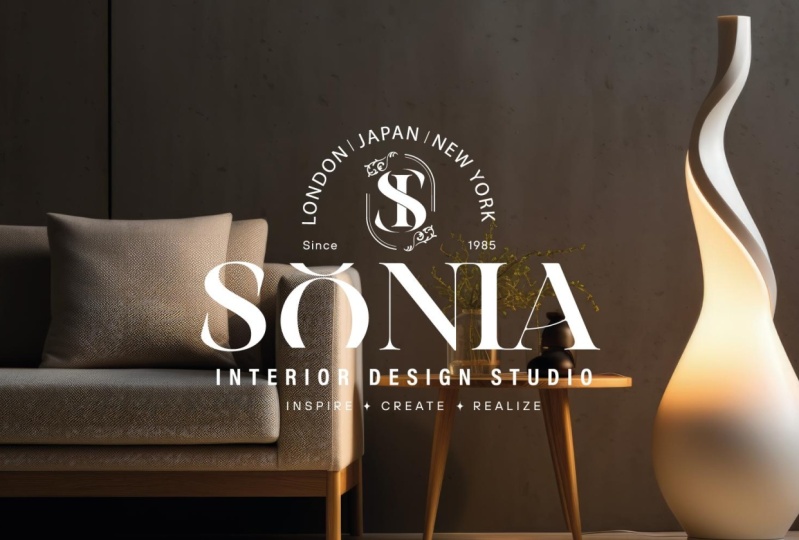
3. Finding Inspiration: So first of all, a bad
style logo is a thing. I promise I'm not
just making it up. Maybe you've heard other
designers use this phrase, but generally they're all referring to slightly
different things. Now, if you search on
Google and Pinterest on Behance for a bad style logo. For results you find
won't all agree exactly. You will come across
a range of logos for others have labeled
in this category. But you will notice
many of them. A certain look and feel. And definitely as
you look through, you can see some have already curated kind of subcategories. So there's one here. They've labeled vintage
style badges and logos. Sometimes we seem to use for where the badge and
logo interchangeably, which can be confusing. Some like this one here
are quite minimal. Some have a real vintage
detailed approach to them. For me, visa, maybe a little too detailed to work as
an effective logo. Something like this is
acceptable or vote, you might want to make that
look a little higher end. And unfortunately,
when you Google search for stock libraries and be crowd designed websites tend to
dominate the results. The quality is not
always very high, but this gives you
an idea of what people are referring
to when you hear the term batch style logo and
banded around on Behance, I tend to find that quality
is a little higher. It's quite a nice mixed
range of examples here. This is from Alan pizzas. You can see not all of these feature of a
circular element, but many of them do. And definitely something
they all have in common is a very tight knit composition. We scroll down and I'll let you look a little closer
at some of these. Maybe there's a perfect
example of a circular one. I think perhaps a little, a little tricky to
find a focal point for this has got a monogram
in the center, but then the text around the
outside is an equal size, so it's a little hard to
know where to look first. Service, I quite like
there's no curve text here, but your eye goes
straight to legacy. The overall composition at definitely forms
a kind of badge. Here. I suppose your
eye goes to this. It's like a symbol of fresh
produce, which is quite good. I'm indefinitely the
next place your eye goes to the brand name
around the outside. So some nice examples here. I'll show you some examples from my own portfolio as well. So this is an
example to show just how minimalist you
can go with this. It really doesn't have
to have a cluttered, high level of detail. It could be just a few
well-placed elements that are composed with balanced, but work really nicely together. So I've really liked this as a minimalist badge style logo. Then at the opposite
end of the spectrum, I can show you this one. So this was done for
a brand that would be marketed in the UAE
is quite acceptable. They're culturally to have
a high level of detail. Things look quite opulent. So this is a batch
version of the logo. Interestingly, this is for
full version of the logo. And so I wouldn't call
this a badge style logo. Overrule. But top part of this
kind of forms a batch, but this is the
full logo lockup. Because for full logo, it includes a bad shape. It's not that this is the
logo in its entirety. I would say this is
not a bad style logo, but there are elements
of this portion of the artwork which
worked really well, which would form quite as
strong batch logo on itself. If we wanted this to be
the logo in its entirety, for everything to fit within
this circular lock-up, We definitely need for brand
name to be more prominent on this version here you really quite easily pick
out lux London. So we'd need to do something
here to make sure it was, if not the most prominent thing, I've been definitely
be the second most prominent and something
your eye quickly finds. So an example of a logo that's
not actually badge style. And this is the example I'll be creating in our class
project together. So again, it's quite minimalist. You could add some extra
details and you'll see as we go through the project together
in some iterations, I've tried some added detail. I've tried a few more
elements in here. But I've arrived
at this version, which I really like. And I quite like to design
a logo that's more minimal, but then gives you the
freedom to bring in textures, to bring in other elements. So here we're using
a craft style box. There's wood in the background. I quite liked to
design that way. Keep things modular and
to arrive at the tone I'm looking for by bringing all the different
elements together. So that's my preferred style. I'll teach you techniques
that you could use to achieve your preferred style. Perhaps this for case, that you prefer something that has a little more pattern or detail going on, that's
absolutely fine. So we'll run through
some of the options. But using a platform
of your choice, you could pick, as I've done
here, a Pinterest board. And again, you'll
see the examples. Zoom in. So this is a
little bigger for you. The examples I've
saved out here. Again, vis-a-vis more
minimal side a spectrum. And this is what
resonates with me. This is what I'm, I'm
quite attracted to. This is what I tend to
create for my clients. So have a good look through
the different options, then you can make an
informed decision about the style of batch logo
that's right for you. Once you've found
some inspiration, perhaps grab some
different ideas. Join me in the next
lesson where we'll start sketching out the concepts
for our own logo design.
4. Sketching Out Concepts: In this lesson, having
found some inspiration, we're going to now sketch
out our ideas and concepts. Now this style of logo tends to have a number of
different elements, and each of these elements needs to work together aesthetically. So we have a few specific goals as we're going
about our sketches. We want to explore different elements or
components we might use. In this logo. We want to find a balanced overall
layout and composition. And we want to create
hierarchy of elements. So somewhere for the
eye to focus first. And then we'll try to guide
the eye around with the logo. Really with so many
different elements, we need to ensure we
avoid overwhelming a viewer with too many
elements at the same level. So size, contrast, and color are all things we
can use to achieve that. Now again, you're very
welcome to follow along step-by-step with the exact
example I'm creating. Perhaps just to learn
the techniques. Or perhaps you can
create something yourself based on the
inspiration you looked at. But my bad style logo
for evoke is going to feature logo type
as the centerpiece. That will be the
thing that draws VI and the other elements
will flow around them. In your version of
this could just as easily be a monogram
as the central part, or perhaps a symbol
or brand mark. So here we have the rough
sketches of I've drawn out. And I've not used pen and paper. I've used my iPad Pro, been scanned this in as
an illustrator art board, which is quite a
nice, nice workflow. You'll see I've explored
a white mixture of elements because I'm working on a brewery of sketched
out different elements. I might be able to use
some hops, barley, little graphics to represent
those things and then try to work those into some of the designs and
the composition. You can see some of this
is really roughly drawn, and that's absolutely fine. I'd recommend you work as quickly as you can
just to test an idea. And then if it works, you can always create a, a more balanced and more careful iteration to explore it further. But you'll see down here, I've just used squiggles
to represent small text. I'm really flying
through these just to explore whether an idea
has potential or not. So one route I've explored
is almost a letter mark E. And that could be
the focal point with the main logo type kind of curving at the
top and the bottom. I quite liked that idea. I've also tried having
part of the main logo type in the center and then
flowing around the bottom. And in this example here, I tend to use a reference point if
there's maybe a script E, but I'm looking to create
as is the case here. I find the reference
and then I sketch fat into my overall composition. And that just helps me to gauge whether that
might work or not. And I do quite like this. And the idea of some of the
type just breaking out of this outer key lime
for the circle. And I quite like the
idea of a key line starting and stopping as it overlaps with
different elements. So you'd have some
smaller text here. Text at the bottom, the key line breaks to fit
those components together. So I quite like that. If I wanted to explore
a more modern gram, there's quite a nice symmetry. If you split the E and
B, then the center. Depending on, I suppose the way you compose the
letters and the font. They've got these free
horizontal portions of a line at exactly
the same height. So that could be something
quite interesting to explore. I've explored splitting
them with a diagonal slant. We've looked at some
different ideas. Although I'm not going to go for a truly vintage style logo, I do like the idea of
this established in 2020. I think that's
quite a nice touch. I think a barrel. I'm not sure why I've I've sketched with Barrow
leaking here. That was me just
having some fun. Barrels maybe a
little too cliched. A crown I thought might
work nicely as a way of positioning the brand to
save it there claiming to be the best and
in line with that, one of the potential taglines
would be finest craft beer. Again, for some of the
elements I've sketched out. So the hops, you can
find reference pictures. This is one of the reference
images that I found. And then I've just
sketched looking at that. Use references for those
different elements and then sketch them
and make them your own. Also a font, I really
like the look of, I pulled that here
as a reference. And then you can see I've
actually used that font as a reference when I've drawn the logo type in a
little more accurately. So of course, when
it comes to fonts, It's probably faster to
explore those digitally, which I'll be doing
in the next stage. But for your more detailed
sketches sometimes to get a real sense of whether
the idea has legs or not. I'll use a particular
font as a reference. So this is a board of
sketches I've created. Have some fun. Use your
inspiration that you've saved. Find some useful references
for your own logo. Try to sketch out different
ideas and composition. Remember the goals we looked at. We want to explore
different elements. We want to explore the
overall composition. And with this style of logo V
idea is to create something that feels quite tight
knit, quite compact. But if it works
beautifully together, have fun doing that. And when you're happy
with one or two designs, you'd like to develop further. Come and join me in
the next lesson.
5. Exploring Concepts in Illustrator: The first stage for me
is to try to look in the fonts that you feel of
a right fit for your brand. So you can see I explore
quite a few of them. I tried to place them on
an art board like this. So I can compare like for like and where you
have similar fonts. Fees aren't very similar, but comparing them
side-by-side can help you identify what
you like about them. The unique factors
that stand out. This font at the bottom here, we've got part of the E actually separated with a little gap. There is quite a wide
contrast between the thick and thin portions of the Serif letters we owe is actually slanted
at a slight angle. And that's quite a
nice sloping arm. They've placed them the cave. So we won't dive too
deep in this class. Fonts and their
meaning they convey. I have other classes
if you'd like to dive in a bit deeper to that, but explore some
different fonts, but you feel a fitting. And when you've got
a small selection, but you'd like to try bringing us sketch
into Illustrator, as I've done here. And start to flesh out
the different elements. Try to lock in what
you're going to use. So I've begun with this main logo type
for the word evoke. I will customize it, but for now I think
that's absolutely fine. And when I found
complimentary fonts, so nothing alike, but they compliment each
other beautifully. I've used Futura here, and that really compliments
main logo type nicely. And I've used that for both the top and the bottom
portion of texts. Although I've used contrast
in size to make sure you read Brewery before you read the
tagline, London's finest IPA. And then again,
referring back to my sketch and we
can deviate off, you don't have to stick to
the sketch as a blueprint. It just gives you a
good starting point in fleshing out these ideas. So I've explored
a solid key line surrounding the logo,
dotted key line. And don't worry, in
the next lesson, That's where I'm going to
show you the techniques used to create these
different elements. So we're going to look at
best practice for placing type on a path and balancing
that professionally. And we'll look at your
different options for these kind of key lines and create a dotted or dashed
lines if you like. Along with a few other techniques
you might find useful. So this lesson will
provide you with an overview of what you're
looking to accomplish. And then in the next lesson, I'll share a few
techniques with you. So now that I'm
happy with my text, we then begin bringing in
any other graphic elements. So it could be a
graphic element. Symbol is actually the
focus of your logo. And you have a text
flowing around that. Which case you want
to spend a bit longer on that portion
of the design. But for me, visa, smaller, almost decorative elements which is add to the flavor of a brand. So I've got a crown. I want some kind
of barley stalk or hot for icon that I can simplify and use
as part of yard work. So this version here, just to see if it
works initially, I've actually imaged, traced this from this
reference picture. So again, that's a technique I'll share with you
in the next lesson. And then at the bottom here, I've created a simple crown. I quite like the idea of
doing something different, maybe having a split or
divide inside the crown. So maybe I'll come back
to that idea for now. I'm just going to use
this solid version. So I'm quite happy with the way this is shaping
up at this stage. So before we go any
further approval process, let me stop and teach you some of the techniques I promised to share to create this
professionally, which we'll do together
in the next lesson.
6. Pro Techniques Curving Text: So useful techniques for
creating bad style logos. I'm not going to run through
all of my Illustrator tips. You can find one of
my other classes with my top Illustrator tips for
logo design in general, if you're interested in that. But these are tips
specific to creating this kind of style
of bad style logo, especially for circular ones. So the first tip
we'll start with is creating type on a
path balancing that. Our goal is to create
something like this where the text
is still alive, were still able to
adjust the spacing. We can adjust the size. If you really wanted. You could actually apply
this technique to have wording fully
encompassed a circle. And I'll explain how
you can use with different controls to fine-tune this and to tweak
it to your liking. Now, I'm also going to mention
another technique that's sometimes used to
perhaps not have type, go around an entire circle, but certainly to arc
type and to bend it. So I'm going to create some
placeholder text here, and I'll show you the
difference as a comparison. So one technique is to use
the Arc tool in Illustrator. So I'm going to duplicate this. We go to Effect. And underwater. You can select one of
these arc options. And you can change these
options using this drop-down. So you can compare the results. You can see if we
go to arc upper, lower for percentage here. This is giving you a flat bottom and just
an arching effect, almost a 3D perspective to the top portion
of a type here. So for specific purposes, but it could be something
you wanted to do. I must say it's not something
I often use in logo design. If we go back to Effect Warp. And Arc, Lower is just
the inverse of that. But this regular arc, this is V effect. But you may sometimes
want to use instead of type on a path
which I'm about to show you, will create quite a noticeable
arc on our text here. So we'll go, let's go all
the way to 50 per cent. And then the other technique, this is one I've used, is to create type on a path. So first we need to
create a circle. You can drag, hold Alt to
drag out from the center. And you could create an ellipse. But I think if you hold Shift to constrain company
tried to use a portion of a perfect circle that
gives you better results. So I'm going to drag this up here and we'll just enlarge this until it's kinda matching the angle we have with
our arch at the top here. That looks good to me. I'll just swap so
that we've stroke to be key lines so we can
see what we're doing. And then what we need to do. If I move this circle down now is use the type
on a path tool. Under your regular type tool. If you press and hold to
see the other options. Here, you have Type On a
Path Tool hidden away, select that, and simply click. It could be any
portion of a path. I'm going to click
at the top here. This will use whichever font
you had in your palette, and it will flow your type for the entire way around that path. So the first thing
I'm going to do is take sample type here, but I want to use copy that, select everything here
with Control or Command a, and then paste that type him. With that done, I'll delete
that placeholder type. I now need to rotate this
into place so you could simply hit transform
and rotate your circle. But best practice
is actually to use a built-in features to
position your type. At the moment you can see my
paragraph is actually left aligned and very little or
zoom in so you can see them, these little control
handles here and here signify the beginning
and the end of V type area, if you'd like. So it arcs around
and obviously it ends at almost back
where it begins. If I zoom out here, I'm going to drag
the ending control handle to three o'clock. And then restarting
control handle to nine o'clock because it's left aligned starting
from nine o'clock. But if we now go to
paragraph and center align. We've got that lined up nicely
and we're ensuring that that type can flow between
those two control handles, but we'd set and another
little quick tip I'll share review is but this
control handle that sitting for me at six
o'clock at the bottom, we'll usually just sit
opposite your type. If you click and drag that, you can toggle between
the text sitting on the outside or the
inside of your key line. And you can also use
that to manually rotate and position your type. So I'm going to
undo that change. So when I click to deselect, can you spot the difference
between these two techniques? If I position them
alongside each other? There is quite a big
difference and it's not as noticeable with font and
perhaps the uppercase. But if you look for
example at V0 here, where we've used this,
this arc effect. It's really distorted
V0 quite noticeably. When you look at that perfect sitting where we've
used type on a path. Now this is quite a gentle arc that we've used and we've used uppercase characters
which tend to distort a little
less than lowercase. But this is actually
non-destructive V oc effect in the latest version
of Illustrator. So if I click on our
art type and you can see there's almost the ghost
of the original left behind. And if I click over in
appearance at V effect, you can edit the effect live. Now, if this were a
more pronounced arc, let's say 75 or
even 80 per cent. And I click Okay. Now some of the
type is really not looking great about O has really been stretched
out of proportion. The m, I'm not in love with you to me looks quite
badly distorted. I wouldn't say it's
about one technique is wrong and the other is right. But for certain situations where you're trying
to curve texts, you don't want any distortion
on the characters. And you're looking to do
quite a pronounced curve, then I think type on a
path is your friend. You will have less distortion. If I'll hit the undo key. And maybe we'll reduce
this even further. Let's take it down to
maybe 40 per cent, something like that. So there's a minimal
amount of distortion. Some save at the Arc
tool because each of the characters have
been transformed, so they are perfectly aligned, pointing into the center. Some actually prefer that
for a gentle arc like this. So I've shown you
both techniques. I'll leave it to
you depending on your artwork which you
feel is best to use. It's also worth noting, although I outlined
my type before using the architect and the latest version
of Illustrator CC. And you can actually
keep live type. So even though the arc
effect is applied, I could begin adding characters. That changes we overall lymph, which would change the angle. It means to a certain extent
this is non-destructive. So if that's the case
with either technique. So going back to the
version I've created, where we have type placed
on a path at the top. And then on the
bottom here you can see I've had to use that control handle to bring the type
inside our path here. So it's situated with
the right orientation. You can edit risk to
your heart's content. You could even change for fonts. Later. You can completely, just for spacing, you
can change the size. So it's quite useful to
keep it in this format and actually not to outline the text until
you've locked it in. A 100%. Happy with it. Another quick tip, when
it comes to balancing, I recommend using wider spacing. So you can see I've used 780 tracking for the top
portion of type here. And if I were to reduce
that to its default, and then instead we
had this typed larger. You can see it's a
completely different effect and to me it's a
little harder to read. So if you bring the size down, that helps your
visual hierarchy. Especially if this is a tagline, make sure your eye it
doesn't go to that first, even though it's positioned
at the top of a logo. And then if we really
exaggerate the spacing, I think when we hit around
the 500 mark for tracking. That's now feeling
nice and balanced, both in terms of visual hierarchy
and just aesthetically. I think that's a much more
pleasing way to read. Curving type. I've done the same of a bottom, although that's called a
much larger point size. So hopefully those
techniques cover all your type curving,
warping leads.
7. Pro Techniques Circular Strokes: Let's go to our next technique. You'll notice I've used key
lines and in certain designs, especially the more
detailed or elaborate, some designers make heavy
use of Circular Quay lines, have a manipulate votes. So let's consider a few tips
and techniques we could use. So to create a circular path, we've got our ellipse tool. And you could drag that
from the center and hold Alt and Shift to constrain
that to perfect proportions. That would give you V
Circular Quay line. I have here. You could copy, paste in front, then transformed
to create layers, rings if you like, just be careful depending
on your preferences. If I click to select, you can see that stroke is 1.18 and the stroke I've
just transformed is 1.29. So by default, when
you scale like this, illustrator will also scale
the weight of your strokes. You can remedy that by selecting both of
them and then picking a consistent stroke weight
for them both once you've transformed or you could turn
that off in the settings, I found you generally have
to eyeball the center point. For me, it won't be the exact
center of the, OH, here. I've kind of eyeballed
this composition. And for that reason, it's useful if you're
adding layers and rings just to keep
everything consistent. If you copy, paste in front, which is Control or Command F. And then transform holding
Shift to constrain the proportions and holding Alt for that transformation
takes place from the center. It ensures quickly and easily. You're working with
the same center point and it can save you
a bit of a headache. So you could keep
using that technique. Pasting in front,
transforming down. And you could create
something far more elaborate with
as many layers, rings as you want. Just remember to select all
your strokes at the end. And then pick something
consistent technique you may have spotted I used in the last video was for
something like this. I actually had a broken
path for the circle so that my type flow
across the middle. So let's show you how you
can achieve the same. If we take this version here, and I'll show you this
with just a single path. For now. I'll show you a few different
techniques you could use. You want to use for
rectangle tool. And just drag a rectangle to represent v space you
want to create around, around that text or objects. And I'm going to fill
that with white. Remove a stroke. Not positioned
about to show you. So this is the effect
we're going for. I could remove the
stroke from the edge, but I'm just going to shrink it down and we'll just remove
it from this path inside. There are two
possible techniques, and with one, you will
just use the pen tool. I'm going to color my block in a way that when
I enter focus mode, I can still see
exactly where it is. I'll double-click on
our circular path. So this is now in focus mode, or use my pen tool. And you'll see if you have
your tool tips turned on. It will come up with a tool
tip that says intersect. When my pen reaches the
point for that path, intersects with this shape
we've placed behind. So I'll click to add
an anchor point there. I'll do the same
over on the left. Do the same on the bottom left, and the same on
the bottom right. And now that we've got
those anchor points added, if you hit the a key to bring up the direct selection tool, we want to first click
away somewhere off on the canvas and then
drag and select. If you pick up the
portions of a path inside that rectangular shape you drew here for Delete key. And it's as simple as that. You've removed those
portions of a path. If we exit from Focus Mode, delete our placeholder object,
and there you have it. You now have to live paths. So you can still edit
the stroke weight, which can be useful. Now there is another technique, so I'll undo to bring
us back to this point. The starting point is the same. We still want a
reference object, but this time we're going to select our reference objects. Hold Shift to also select
our circular path. And then on Pathfinder, we're going to
click minus front. Now if that's almost
done, what we want, you'll notice it's closed
closed off these paths. So we now have this portion in the center that we don't
want to get rid of that. We just hit a to bring up
the Direct Selection Tool. Click to select we unwanted path and hit the Delete key and doing
that on the top and bottom. That's when creating
the same effect. One more method you could
use to achieve this. So again, we'll go back to our starting point is using
the shape builder tool. Again, we select
both of the objects, bring up the shape builder
tool using Shift M. If you hold down Alt, you can click and drag to
delete the unwanted portions. Again, hit a to print up
the direct selection tool, select the unwanted portion
of a path and delete away. Now finally, for bonus
points, if you zoom in, you'll see it's not very noticeable because I have
just a two-point stroke. If it's a one-point stroke, it's even less noticeable. But it's not a
perfectly flat edge to this path ends
quite abruptly. So what if you wanted it
to end at this angle here? Will, to do that. We'll go back again to
our starting point. And this time, and you
have to be happy with the weight of your path
before you start this step. We'll go to object, expand and will
expand How stroke. So this is now its own object
with a stroke expanded. And both objects selected, we'll bring up our
shape builder tool. Hold Alt, and click to remove
a portion we don't want. And you'll notice this
time if we zoom in, we have a flat edge
to that stroke. Maybe in your particular design, that's an effect
you're going for. If that was a very
simple example, but you can use that
same technique for multiple layers and overlaps. And you can create something
that's completely bespoke. Fine tune it to your needs.
8. Pro Techniques More Quick Tips: So we've spent quite a while
mastering those techniques. A few additional
techniques which are much faster and Visa
more quick tips. That one is to use
image trace on objects. So for your final artwork, especially if you
haven't licensed for reference image you're using. You need to be
careful with this. You don't want to
infringe on copyright. But particularly if you
found a reference with an open source license or you've licensed something
that you can use. And what we're
going to do is crop this image so that we bring up just for
portion we want to use. We'll hit apply. And in your contextual
toolbar at the top, you can see under Image Trace, if you click on V
Tracing Presets, you've got a number of presets you could select from here. So I want to break
this down into just black and white components. And it's actually labeled that
as appropriate for a logo. Once I click that, you can see it does a
fairly good job of guessing which portions to color
in black or in white. You can fine-tune this again up and v contextual
control panel. If you click on the
Image Trace panel. This gives you some additional
options so you're able to reduce or increase
the threshold, which effectively
lets you control at which details are
picked up or not. And if you twirl open, Advanced, you can control the
number of pops. Lower will give you
something with harder edges, a higher number of paths, a greater level of
detail, corners, and the noise of a tooltip
here explains it quite well. It says ignores areas of
a specified pixel size. So if you reduce that down, it's going to give you a
much higher level of detail, which isn't always
what we want for a simplified logo element. So I'm quite happy with that. One last feature you
can use is under options for tick box,
for Ignore White. If you click that
and then hit Expand, you've now got a custom
graphic that you can play with and position in your
artwork as I've done here. So a final tip will consider, and this is another quick one. If you were hoping to create something with some
complex areas, as you can see in
this version here, for a lots of lines
expanding out in a circle from a central point. And that can be quite
handy technique to use. So I'll show you how you
would accomplish that. We'll drag in our circle
here as a reference point. And we're going to start just by using the line segment tool. We have Tooltips on. So I get that little
pink line pop up. When I'm in the center. I'm going to drag down just to create a simple vertical line. And I'll nudge this up. So it's sitting just
inside that circular path, a few venues with Rotate tool. The shortcut for that is our unfortunately
you will see I no longer get a tooltip to show me when I'm at the
center of a circle, which is really annoying. So a trick I use is to select the circle and I'll
place an object here. I can use as a reference
point for the center. I'm going to create another little line and just place that at the
center of a circle. Now again, with the line we've
created up here selected, we'll hit R to bring
up the rotate tool. And this time I can use this
path as my reference point. Now, if I left-click, I can then drag and
manually rotate this. If I hold the Alt key, duplicate this for me. So you could eyeball this, but I recommend working out the math service 360
degrees in a circle. You want to use something that divides perfectly into 360. So it could be 15
degrees, 30 degrees. So there's my 15 degrees
release to drop that in place. And then if you use the
shortcut Command or Control D, it will replicate that
last transformation. So if I hit that enough times, that will fill out a circle, I'm going to delete
that reference point now because I don't need it. I'm going to select all of this. De-select footpath. If I wanted, I could copy, paste in front and then use the transform
tool to rotate in place to create another layer of those same lines which
I'm just eyeballing for now. I can increase the stroke
weight if I wanted. But using a combination
of those techniques, you could rotate any object you like to form this
kind of repeating circular pattern which opens up a lot of design
possibilities. When you combine that
with layers and rows, it really gives you some
interesting options for your art work. So personally, that level of detail isn't necessary
in a bachelor logo. But there are some techniques if that's something
you wanted to do. A last, last, because this video is
getting quite long now, bonus technique, if you
didn't know this already, if you select this
outer circular path and you click on Stroke, you've got a tick box to
create a dashed line, which does just that. The moment if we
were to zoom in, you'd see this is a vertical dash pointing
out from the center. If I select it again, click on Stroke by changing
the cap to a round cap. De-select and zoom in again. You can now see that it's
got a rounded appearance. If I open this again and I
changed that dash to 0 points, then becomes just a dot, which at times is
quite a nice effect to use in our artwork. So if there's a
final tip for you, I hope some of these were
helpful and we'll give you more confidence in fine tuning and composing your artwork. Now that we've covered
those techniques, let's develop our
chosen logo fervor, that which we'll do
in our next lesson.
9. Logo Development: So in a real life project, there are really no
rules as to where one phase ends and
another begins when you finish looking at your initial concepts and when you are then in V
development stage, usually it would be once you've shown maybe some of the
options to a client, they come back to
you with a version that you will develop and you'll spend a little more time on. But for our project together, It's completely up to you. So don't be worried if one
phase bleeds into another. Now, by this point, if you've played
around unexplored, you may have already
developed your logo and you may actually
have a iteration, but you're quite happy
with in my own process. I got quiet, carried away, and because I had no
client to work with, I didn't take a break
between exploring options and developing
a fine tuning. So I would probably say maybe something like
this here as one option. And perhaps this is another, would be the phase that I
would present something to a client and ask them to give me feedback
to pick a direction. And you can see now that I'm happy with the
overall composition, the fonts for
different elements. I'm exploring just
for a little nuances. So for example here, our main type
actually pokes out, it protrudes from the circle
created by this key line, and also from our logo type. So I'll show you how to break a circle like this without
losing the ability to edit it as a live stroke
is quite easy to do. That's another technique we'll
cover in the next lesson. This is a more
simplified version. So if we compare the
two iterations, here, we've almost got an inner ring with our type of an outer
ring with a key line. And this version,
we've simplified that. We have just a single
ring and we've got a teeny bit of a key line. I'm just filling in a gap
in the composition there. So look quite effective. This version here
is simplest still. So we don't have any key lime to fill this gap is still
reasonably balanced. But to me it feels like for word Brewery is kinda floating
by itself down there. So in this final iteration, and we've actually
notched word brewery up and position like this. It doesn't feel
there's a gap and it feels linked to
the rest of the logo. I've always with a keen eye
for detail, may have noticed, but between these
two iterations, now actually begun to edit and make some tweaks
to our logo type. So this is live text. It means I can continue
to edit and work on it. Here we've actually
outlined the type and the shortcut for that is
Command or Control Shift O. When you outline type
allows you to work on each portion of the type
as if it's a shape, which is exactly
what I wanted to do. So just to see if it's worked, I've just dropped a block
of white here to create the effect of a disjointed
and portion here on the E. And I've done the
same here with the O. So I quite like that
bit of customization. I think it modernized
Is this a little? And it might be the kind of
element we could play on and repeat for other elements
of V identity or the logo. And in fact, I've explored
about on the next art board, the idea of maybe
repeating that for crown to create something
that's a little more distinct. So explore as many
different iterations of this as you like. Try experimenting with
different elements. Challenge yourself to create something that's more and more perfect until you arrive at
something that's balanced. But you're really happy with. And you can see, that's
exactly what I've done. I quit, keep making small little tweaks until this feels more and
more coherent to me. So you can see in this version, I've actually
manipulated for type. Over the top of VTE runs into V. And as I hover over these, you can see where one letter
ends and the other begins. And I've kind of created
this overlap here. So I did that simply by using
the direct selection tool, selecting a portion
of that type, and just dragging it can positioning it carefully
in a wave at work. Sometimes it can be
as simple as that. Sometimes you've then got
to go under the microscope and fine tune it so that
it flows nicely together. And then for symmetry, I've done the same here with a K. I think that really flows beautifully now into V E visa, but kind of fine tuning touches that I wouldn't do
to your initial designs. I'd only do this to a concept, but I'm sure I want to use to really take it
across the finish line. You don't have to customize
your type to this extent. But I think if you can add
some finishing touches, perhaps a kind of stylized theme that runs through the design, like this diagonal
cutaway portion here that runs through v o, it runs through the crown. I think that can really tie
things together nicely. And of course, branding
is all about recognition. So the more unique, recognizable you can make a
logo for more effectively, that's going to work
for your client. And on the subjects of creating something that's effective
for your client. In the next lesson,
now that we've locked in our preferred design, I'm going to show
you how to create an effective secondary logo and an effective
sub mark soviet. You'd give your client a
few more design options.
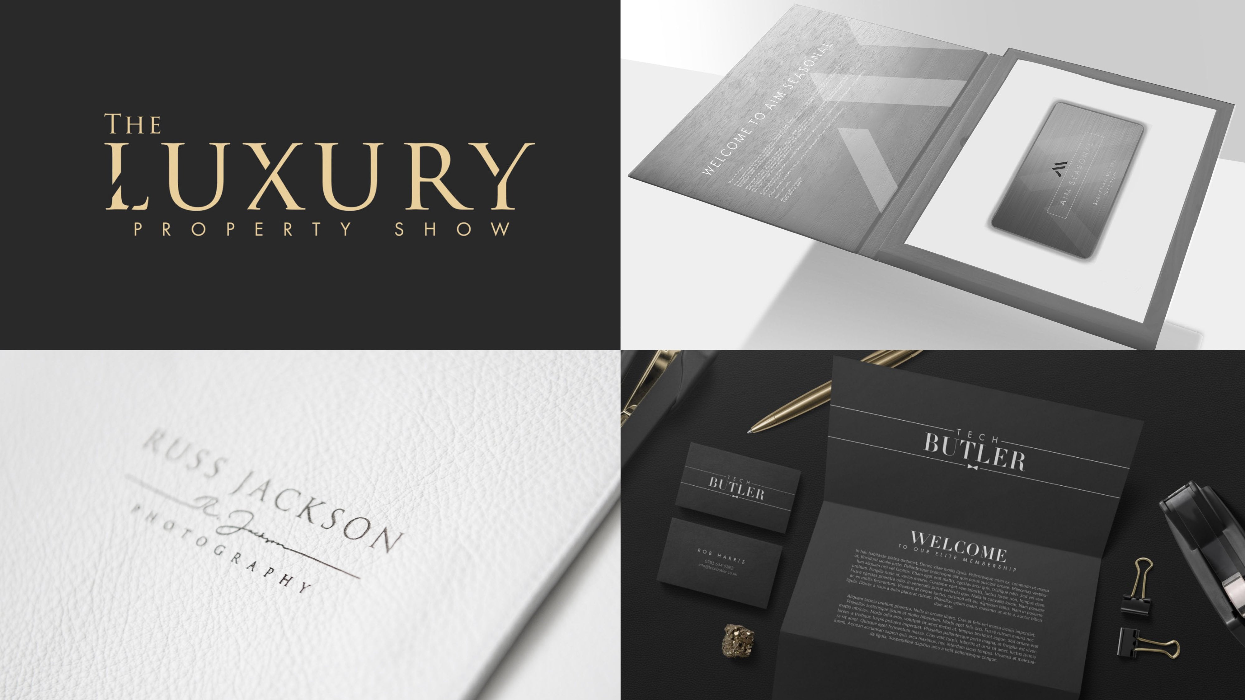
10. Creating a Secondary Logo & Submark: In this lesson, we're
going to look at some of the principles behind creating an effective secondary logo
and an effective sub mark. And this can be really simple
and really straightforward. So let's dive into it. For my example here. This is my full logo lockup. I'm very happy with this. I think it looks well balanced, but there are some
situations where there's just too much detail
in this logo, where something more
simple might be better. So I'll show you a few
examples of this in action. Here's a mock-up
for landing page. If this brewery
had their website, and you can see this secondary logo fit
so much better than before Bajaj logo width placed in this narrow band at
the top of our header. You can see from a
practical standpoint, it's useful to arm your client with
something we're able to use that best fits
each situation. Here's another example and
perhaps a compliment slip, or it would be the same
case on the letterhead. Again, a slightly
simplified secondary logo, where it has a more
horizontal shapes that can fit into or feel better balanced in spaces that
are bad to logo struggle. And one last example
we'll consider. This is a mock-up of a wax seal. So for brewery wanted to
use something like this. You can see for full batch logo, it works and for circular
shape certainly fits V, the circular space we have
on the wax seal here. But look how much better. Something like that would work. It's clearer, it's simpler. It doesn't look messy because
there's lots of space. And this is using just the
portion of the logo to create a sub mark is
still recognizable, it's distinct, it's on-brand. So this is what we're
aiming to create. Let me share with you
my thought process for getting there so
that you're able to create something
similar for yourself, for a standalone emblem
or perhaps brand mark. That can be the most distinct
portion of your logo. And you can simply pull that
out and provide that to your client by itself as
a standalone graphic. There's not really
enough here for this to be a sub-market for me. So I created this, which uses B O from the center of our logo along
with that Mark. And I think that's just
distinct and unique enough. That's really a perfect
representation of a brand. Now this isn't something
you'd ever use if you could use for full of a secondary
version of the logo. But there are some
places if you think of a favicon for a website, or sometimes even for a profile picture
for your Snapchat, your Instagram is
such a small area, but you can't effectively
read the full logo. You just want a hint of a company's identity and then
it's going to be linked to a profile page or somewhere that you can find more
information anyway, sub mark is really, really useful design tool
to equip your clients with. And you can create it
as simply as that, just by pulling out one
or two distinct elements. And lastly, our secondary logo. I've created this using
components of a main logo, but they're actually
presented differently. So we have the same
font for brewery. But this time I've actually presented this on
a straight line. There's no curve to that at all. And although the crown sits just above the main evoke logo
type in our full logo. In this version of position
of a crown in the center, which I think is
quite effective. And I've made sure the
angle of that slash, it lines up nicely
between V0 and the crown in turn ties
in with our sub mark. So when you look at
these elements together, There's a really
nice synergy there. They feel coherent. It feels like you're
looking at the same brand. There's no mistaking whether
this is a different brand, but this gives a great deal of versatility to your client. So try to do the same. In principle, try to pick out key recognizable elements
of your main logo. Use that to create a sub mark
and for the secondary logo. And think about orientation. If your primary logo fits really nicely into a
square or a circle, try to come up with something, perhaps using less
of your elements. I've removed my tagline. I've chopped away
v, established, refine it down to just the
core components that are needed and create
an alternative. So please do that with your own version as part
of a class project. And when you're finished, join me in the next lesson, we're finally we explore color palettes and we'll add
some color to this design.
11. Explore Colour Palettes: So for me, for black
and white version of this logo is quite beautiful
and it works really well. But that's a testament
to strong design. I think if your design can work well enough in
black and white. But when you introduce color, it can look at
absolutely incredible. And sometimes that can allow you to fine tune the tone and positioning so that it really sits at where your
client will want it to. I'm going to share with you my process for first of all,
finding color inspiration. And then I think it's
really important to apply color the right way. If I show you a sneak peek, some of my art boards below, I feel there's
definitely a right and a wrong way to apply color. Sometimes you will
see color palettes suggested on Instagram, on Pinterest, but
applied for wrong way. Even with the most
beautiful color palette. It doesn't work. It doesn't speak
well for the brand. And an understanding
of a way you can employ and bring color together really help
elevate your design. So first, let's look
at our inspiration. Now, I like to put
together some very rough, you could call them moodboards, if you'd like, with
related imagery, depending on the
brand I'm working on. So for this example, because it's a brewery, we've got barrels, bits of v. Ok and would be used in
the brewing process. Sometimes it was
actually metal barrels used in that process. This is a fictional brand, so I've got a little
bit more freedom there. We've got some imagery of beer actually being
served and enjoy it. And then here I've got
some imagery with hops, with wheat, barley,
the kind of grain, but it's used to produce it. And I've deliberately
picked out imagery that shares a common theme
in terms of color. As I'm looking for
this imagery, now, I am deliberately looking
to pull things out that fall within a
certain color palette. And while this won't work
for every type of industry, work with where it does work. I think it's really effective
and it can help you to pick colors that just resonate deeply with a brand
you're working on. So because these are
rough mood boards, I will literally drag and drop some of these
different elements. I'll shrink elements
so that they have less visual impact. And then I might
enlarge other elements. They take up more of a board. And I'll keep doing
that until I come up with something like
this, a few palettes, but I'm happy with having a range from quite
roughly on the page. I drop these little
almost swatch pins in. It's simply a circle with a
white stroke on the outside. And if you have one
of these selected, hit the I key. To bring up your eyedropper. You can click to
grab the sample, the color you've sampled from any portion of the
images on this page. When I stroke from
war at the end. So that's how I achieved that. When I've got each of
those pins selected. And I'm happy with
the way it's looking. I'll go to my swatches panel. And if you click on
Create New Color Group, when you've got a
selection like that made, you can actually create
that color group from your selected artwork. And when you hit Okay, you get a nice neatly
arranged folder with the colors you've sampled. And I use that just
at the bottom here, obviously excluding the
white that I use for the edge of a pin to illustrate
V proposed color palette. So it's as simple as that. I'll show you another example. This one I really like. So you can see I've
not pulled any of the O key wooden brown tones. This one we've got a
really fresh hockey green, darker olive green here. And then we're pulling on the fresh modern metallic colors from the metal barrels here. So those are the palettes. How would you then use this
in your art work effectively? Well, if I take us across
to our art boards here, and I can show you just 2. First of all, show you how this could be employed
in the wrong way. If I take this,
here is an example. This is my palette. And
let's say I tried to use the brown as we
background color. And then I've used with green
as we accent on top of it. And it may be here. I tried to use a
lighter shade of brown. It looks like a very muddy mess. There's not enough contrast, there's not a nice,
neutral background color. It really is possible to use a great color palette
in the wrong way. So if I undo and we come out to the
palette I've selected, you'll notice in this iteration. I haven't actually used any
of her brown tones yet. I really like the kinda
crisp simplicity of this soft black together with an off-white and this really
nice neutral green, which works equally well on a dark and a light background. Another iteration from that
same palette, this time, we've used for Brown, and again we've got a neutral, off-white and a dark background. It could be the evil version
is, et cetera, acceptable. It could be that perhaps that's the overall brand color palette, what you're seeing
on the screen now, but on the logo itself, one or the other of
the accent colors, perhaps not the two
of them together. And this is why it can
be so hard to work on brand identity if you focus
only on the logo design. But brand identity as a whole is part of a much
bigger picture. Where you might have
brochures, websites, and lots of collateral where
you need quite a broad, diverse color palette,
being the logo itself. If you try to use every color
from the color palette, you can really spoil
the look and feel. I'll zoom out and we'll go across to show
another example. So this was using
the other palette. I put together. This one I really like. It's got such a fresh, modern feel to it. This is quite a cool slate gray. It's almost a cross between a navy blue and a
slate gray tone. And it really works nicely
against this green. And I've just used that green sparingly to make the
focal points pop. I've treated the same elements
so that kind of lends itself to the consistency
of the brand. And you've got a version
that can work equally well on a light or
a dark background. So I really liked that. And a different way you
could implement this. I'm not as keen on this version, but this feels far more almost
organic, natural, healthy. And you can do something like this if a sufficient contrast, this is almost a
monochrome effect, where you've got
the lighter green and then the darker
green behind. If I select these and just edit that color
to be a little brighter. You can see that that works
a bit better practically. If I went for something
along these lines, I'd probably have to brighten
up the lighter green, just service
sufficient contrast. And of course you don't
have to use any color. You might want to
create a version that's simply uses off
whites and soft blacks, which for luxury brands,
certainly a possibility. When we look in the next lesson, free mockups we create
when we look at this brand actually living and breathing in the real-world, you notice there are many uses and where color
won't come into it, the logo might be engraved
or stamped, foiled. So while we certainly
might want to use a strong color palette to enhance the brand and to
aid in brand recognition. For core of it needs
to be strong enough that it could work
without any color at all. That was why we began this process and working on
this in black and white. So have some fun. Try to use either my technique or your own techniques to source some color inspiration and
put some pallets together and then try to use them in
a balanced, sparing way. If you have four or five
colors in a palette, you don't have to use
every one of them. Perhaps just two or three, would be more of an
enough to give you some nice balanced options. So have some fun adding
color to your own work. And then join me in the next
lesson where we're really breathe life into this by creating some
mock-ups together.
12. Create Mock ups: So in a way, this is kind of a bonus stage when you finished for projects
and you're ready to save out the
different components of your logo for sub
mark the secondary logo. But I think our projects never complete before you really
test for where it's going to live and breathe in the wild, which some mockups. So I'm going to share with
you a series of mockups I've created for my sample
brand for evoke brewery. And then we'll look
at a few places. I recommend that you can download some good
mockups for free. I don't think you
need a tutorial on how to create mock-ups. It's quite straightforward and they often come
with instructions. But picking something
that really feels appropriate fits be
industry are designing for. So like this here, this could be something they used
in the brewery, maybe for tastings to take out a small selection of bottles. This could easily be a
traditional swing sign at the front of a brewery. This is something
that they might use for their packaging
or part of a bag. A beautiful lever
embossed mock-up here. Maybe this could be in front of a presentation folders that tells you about the
brewery in its history. Sometimes our mockup,
just for landing page, for a website,
that's quite nice, perhaps not the most
appropriate for a brewery practically
by really light for craft card and wooden
tones that vis to show off the potential use of v sub mark a comp slip using the
secondary logo there, just to show the way
all these elements can be used interchangeably. And finally, a close-up,
that landing page. So I'm really happy with the
mockups I've put together. I think they really
show off and look and feel of this brand
and its potential. But where can you look to
find some mockups for free? Will Graphic Burger is a slight I've used for
quite a long time. They have a pretty well curated and searchable
collection of mockups. And over the years we've updated this quite frequently and there's quite a nice selection
and range on this website, I quite like using
the search feature and seeing what they have. Another site I've
started using more recently is for graphic TM.com. And they have a
freebie section which you can link to from
their navbar and visa freebies that
they're happy to give away if you want to
purchase premium mockups. And those are very, very good as well. So there's a few places
to get you started. Of course, you can
have your own search and you can see
what's out there. So have fun. Showcase your brand
actually living and breathing and
showcase for weigh your logo would be
used and be sure to save those out because those
are really the hero pieces. But I would display
prominently in your portfolio. So have fun creating mockups.
13. Conclusion & Thanks for Watching: Well done. If you're
watching this, it means you should have an impressive new logo
for your portfolio, for confidence to offer a
bad style of logo design and some transferable skills
that you can hopefully apply to other projects you
work on in Illustrator. So if you've enjoyed this class, if you found it valuable, please be sure to check
out my other classes on Skillshare and perhaps you can expand your portfolio
even further. It can be really useful
as a designer to showcase a versatile
range of logo types, from monograms to word marks. Also, please don't
forget to upload your creations in the
class project area. I always really enjoy
looking at what students have been able to
create by following along. Feel free to leave a review
if you've enjoyed this class. And please be sure to
follow my profile so that hopefully I can see you
again in the next one.
 Jason Miller, Freelance Graphic Designer