Transcripts
1. Introduction: A Sala Maleku. My name is Willi Mu Takin. I am an entrepreneur and have founded several creative
based companies. I have done hundreds
of design projects and work with dozens of
clients around the world. I am also an academic
lecturer and corporate consultant in
computer graphics disciplines. For more than two decades, I have been teaching graphic
design to trade animation, video editing and
motion graphics, architectural visualization,
digital painting, web design, game
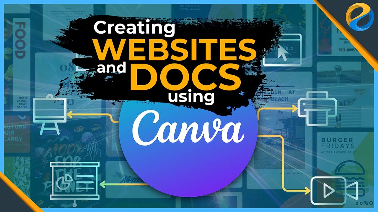
development, et cetera. Va is an online application that has forever changed the face
of the design industry. Canva has made it possible for anyone to create stunning
designs quickly, even if they are not a designer, while still giving
professional designers plenty of room to channel
their creativity. With Canva, you can create graphic designs for
print and digital media, create presentations,
edit videos, and add admission,
write content, and even build websites. If you want to master Canva quickly from
beginner to advance, then this online core of
series is the answer. Throughout this course series, you will be guided
step by step to master and utilize all of the
features of Canva. As for this course alone, this is the fourth in the series and is a continuation
of the third course, titled Editing Videos and
Adding Animations with Canva. In its course, you will
learn different techniques related to presentation and
whiteboard projects in Canva, you will learn how to create
presentation layouts, how to add nodes to
presentation slides, how to deliver presentations
using the presenter view and various unique
features that can help you spice up
your presentation. Next, you will learn
how to create tables. Then learn in depth techniques
for creating charts. By using Canva to
create info graphics, you can make boring
data presentations more interesting and attractive. Afterwards, you
will learn how to create a whiteboard
project in Canva. With this type of project, you have a virtually
infinite size whiteboard that you
can take advantage of. You can use it to create
very large diagrams, can burn boards, mind maps, flow charts, and so on. All of these can be very useful when you need
to manage a team. Since this is the fourth
course in the series, you will need to take
the first, second, and third courses
before taking this one. Then, because Va is an
online application, you will also need a computer
and an Internet connection. Throughout the course,
I will be using a PC with Windows Ten
operating system. All of the keyboard shortcuts that'll be demonstrating
will be off the PC. If you are using a computer, you can still follow the lesson as I will be using Canvas. User interface
moves off the time which is consistent across
different platforms. The only difference is
the keyboard shortcuts. In general, you will need
to replace the control key with the command key and the
L key with the option key. This course series is
perfect if you are a hobbyists who are stolen
design from the basics. Also if you are a teacher or a student who needs a
free design application, if you run a business, this core series can
be very valuable as Canva can help you create marketing materials
quickly and easily. If you are a
professional designer, you'll find that canvas
library and easy to use interface can help you speed
up your work considerably. Last but not least, this course can if you are a content creator who
wants to take advantage of the leaders AI technology by taking this online
course serious in Shaw, you and all your
business will be able to use Canva to
the full potential. Creating designs of any kind will no longer be
a burden for you. Instead, it will be your
age over the competition. Don't wait any longer. Take this course
now and continue your journey to master
in Canva Salamkum.
2. Creating presentations: One type of project that you can create in Canva is
a presentation. You can use Canva as a replacement for
Microsoft Powerpoint, Google Slides, Apple
Keynote, and the like. To start a presentation. Project is basically
the same as. So you start other types
of projects in Canva. For now, let's see how we
can start one from template, select the
presentation category, then just choose a
template that you like. Make sure it is not
a page template, then press the customized
dis template button. Generally, templates
for presentations have more than one page. However, body fault can will
only apply the first page. Perhaps the approach is that the pages of this
template act like the master slides in power point for the second slide
or page and above. You can either create
them from blank or you can fully create them
from any of these pages. To create a blank page, you can press this plus button. Then you can insert Design
Elements as you wish, or you can replace the whole
page design with any of the pages from the template on the left side by
clicking and release. Besides having to
create a blank page, if you want to create a
page from the template, you can just click drag
the page you want to use, and release it on top
of the plus button. This will create a new
page that uses the design from the template page
you dragged from here, you can edit the design
as usual, for example, you can move this
to somewhere else, or perhaps you want to change the text to
different words. So on, we have covered how to edit designs
in depth before, I don't need to repeat
it again in this video. Now, if you want to
apply the entire design of this template to your
project page by page, you can click this
Apply All Pages button. If you already have
some existing designs, can go with us for permission, because everything that
you have created will be lost and be replaced by the designs from
the template pages. For now, let's just
click Replace all pages. All the pages in our project
are now exactly the same in terms of look and order as the pages in the
template on the left. As you may have
already realized, the presentation slides
are called pages in Canva. I may be using these two terms interchangeably from now on. All right, the way we
organize pages inside a presentation
project is similar to the way we organize pages
on other design projects. You can write pages to
rearrange their order, then to delete a page, you can open its
contextual menu by pressing this dotted button
or by right clicking, and then use the
delete page command. Or you can also press the
delete key on the keyboard. But remember for the
delete key method, you need to make sure
that you are selecting the page and not a
specific element. If what you select
is an element, pressing the delete key, we'll only delete
that element again. Select the page first,
then press delete. Va does not restrict us to only selecting pages
from one template. For example, we can
press this back arrow, then you can use the search
feature if you want. For now, we will just pick
random template from the list. From here, we can
create a new page using any of the pages
from the current template. For example, by using the
click dragging method. All right, In addition to creating a new page
after the last page, you can also create a new page between two existing pages. To do that, you need to hover the mouse on a gap
between two pages, then press the plus
button that appears. If you want to insert a new
page from the template, just click Rack the
page you want and release it on a gap
between two pages. You can see that Canva has
just created a new page between these two pages using the design of
the template page. In the earlier chapter, we discussed the
magic design feature for creating a poster
design project. We can also use the magic design feature to create a
presentation project. The technique is quite simple, just press the
magic design button at the top, on the left panel. If your project already
contains various pages, the magic design feature will
add the content new pages. For now, to make it easier
for us to see the results, let's just use a new empty
presentation project. We can go back to the main page, then choose the
presentation category, and then choose the
preset on far left. Or you can also press the Create a design
button at the top. Alternatively, if you
are using a desktop app, just press the plus button
in the top tape area, then type resin 16 by nine. Presentation preset. Now let's try the
magic design feature by pressing this button. What makes the current
process different from the previous is that we're not providing any images for the AI. What we're going to
use is a prompt. The term prompt in the AI world is basically
a textual instruction that we give to the
AI system to make it do something on
other AI systems. A prompt can also be
spoken or in audio form. Just for example, let's type investor representation
for a new toy store chain. You can use other
prompts if you want. After that, press Enter. The I program will get to work. After the process is done, it will present several designs
that we can choose from. Each of these designs is
a presentation template. This means that inside each, we can find more
pages or slides. If you like the template, just press the Create My Presentation button.
This is the result. We have a new
presentation project from a template created by AI. You can see that the
canvas AI system is not only able to find
relevant graphic elements, the text is also
neatly structured, made according to the context of the prompt we input earlier. Of course, it is
almost impossible for everything to be 100%
suitable for our needs. But at least with this template, we have a starting point
where we can develop further. One thing that you might want to remember is that sometimes I program in Canva uses
paid design elements. When you try to exploit it, Canva will ask you to pay for the element or to
upgrade your account.
3. Publishing presentation projects: After creating a
presentation project, there are several ways
that you can use it. The first is to download
it as a PDF file. The second is to utilize Canva as a
presentation software. The third is to
export it as a video. Last one is to export it
to Microsoft Powerpoint. Let's go through each of
these methods one by one. You may already know that
we can do presentations using only PDF files and
an Internet browser. This can be very useful
in certain circumstances. For example, when we have to travel far without being
able to bring a laptop. So we have to borrow someone else's computer for
the presentation session. The way we download a
presentation project to a PDF file is no different from any other type
of project in Canvas. Just press the Share
button, then download. Make sure the file tab is PDF, then press this download button. The downside of PDF
files is that you cannot include an emission or
video content inside them. Your presentation will just be a collection of static slides, just like reading
an ordinary ebook. Usually this is not
a big deal because most people do not like an emissions in their
presentation slides. Indeed, there are special
types of Do files that can contain interactive
elements such as animation, video and audio. But you need a Dubiocrobt proof software to
be able to do that. For Canva itself, its PDF expot feature does not support content other
than texts and images. The second method is to do a live presentation using Canva. This method is the most
ideal because it can display all the animations and videos in your presentation. Of course, to take full
advantage of this method, you should first add animations and or
videos to the project. To save time, we can apply animation page
instead of element. To make it even faster, you can select multiple
slipes or pages at once. We can click to select
the first page, Hold Chef, and then
select the last page. With all these pages selected, we can open the animate panel. Just like the animation
preset we want to use, I chose one party. You can use the both option. But personally, I'm not a fan of presentations that
have an exit animation. I only use the interruption. Now all our slides
have animations. Next we want to insert
a video for this. I first move this slide so that it is in the
second position. Then we open the element step and select the video category. I'll just pick this one, which we have used in
the previous chapter. Change the scale and position so that it fits into the
rectangle on the left. If you select the video and
open the payback panel, we have discussed the function of these two options before. Make sure that the
option below is on so that when the slide
or page is displayed, the video will run immediately. Then also enable the
option above it so that the video will keep running and looping as the
presentation progresses. This option is more suitable for videos that function
only as background. For videos that
contain explanation, You should not repeat them because it may
bore the audience. After you are done, you can run a presentation in Canva by
pressing the button above. There are actually
different ways to present a
presentation in Canva, but that will be
for another lesson. For now, we will use the button below or its shortcut
control out. You need to remember
that this button and its shortcut will directly
open the active page. If you want the presentation
to start from the beginning, make sure you select
the first page first. Only then press this
button or its shortcut. While the presentation
is running, you can press the
right error button and left error button below
to navigate the pages. Or if you notice when a mouse cursor is on the
right side of the screen, it will change to a
right arrow symbol. We can click it to move
forward to the next slide. If the mouse cursor is on
the left side of the screen, it will change to the
left arrow symbol. In its condition we can click to go back to
the previous slide. If you prefer to
use the keyboard, you can use the left
and right arrow keys or the page up and pitch down
keys to move between pages. If you use a presenter
remote or pointer, these tools usually
work directly with Canvas without you needing
to set them up manually. You can see that this
video is running in loop because of the playback
option we said earlier. To exit from the
presentation mode, you can press this icon again or simply press the escape
key on your keyboard. The third method is to export the presentation
as a video. This can be useful if you
want to upload it to Youtube, or if you want to combine it with other videos using video editing software such as Adobe Premiere or
Final Cut, and so on. One important thing you
need to pay attention to is the duration
per slide or page. Because when its
entire presentation is turned into a video, one needs to determine how long each slide
will be displayed. By default, each slide will
be displayed for 5 seconds, including the on enter and on exit animations If they exist, this value will automatically
decrease if you apply a transition
effect between slides. Suppose you want to change the duration of each
slide to 10 seconds. You do need to select all
slides just like one of them. Then click on this clock
icon and then type in ten To apply the duration value to all the pages in the project, simply enable the option below. Apply to all pages. Now all pages have the same duration unless
the page contains a video. If a page contains
a video or videos, then the duration of that
page will be as long as the duration of the video or the longest
video on that page. Again, if there is no video, then the page duration
is currently 10 seconds. Finally, to explode the
project as a video, you can press the shared button, then the download option, and then like MP four
as the file type, then press the download button. The last method is to export our presentation project
to Microsoft Powerpoint. There is no doubt that currently the most commonly used software for representations
is Powerpoint. That is why Canva also
provides the option to download presentation
projects in a Powerpoint format or PPTX. The method is the same as
to download other files. The only difference is
that you need to select the PPTX option
as the file type. You need to remember
that although Poor Point itself
supports an emission, the emissions we create in
Canva are not compatible. They cannot be
transferred to por point. So again, all the
on enter missions, on exit emissions and also the transition effects
between pages that you created earlier will
be ignored if you export the presentation
to a PPTX file.
4. Notes and Presenter View: In this video, we will discuss the nodes feature as well as the presenter
view mode in Canva. The first is the nodes feature. Generally, when viewing
a presentation, there are more things
that we need to communicate verbally than what
is visible on the screen. If we do not have nodes, it is easy to forget them. That is why Canva and other presentation
software usually provide a nodes feature. To access it, simply press
the notes button below. Keep in mind that
the notes feature is tied or linked to the page. This means that each
page has its own nodes. I have prepared some texts
of the record to save time. Just for example, I entered this text into the notes
of the first page, then I use this text
for the second page. Finally, I also put some text into the notes
on the third page. We will use C notes later when we discuss
the next feature. All right, to close
the notes panel, you can press the Notes button again to be able to view nodes in a live
presentation session. You cannot do so using the
regular presentation mode. You need to use a special
mode called presenter view. How is presenter view different
from the regular mode? In regular presentation mode, the presenter screen is exactly the same as
what the audience sees. In presenter view mode, the screen that the
presenter sees is different from the screen
that the audience sees. But to be able to
use presenter view, you must have at least
two display devices. The first is a display that can only be seen by you
as the presenter. Second is the display that
is seen by the audience. This can be a projector TV or
a second computer monitor. Just remember, when you set up this second display device, you need to use the
expanded view option instead of clone or
mirror view option. When you have all the set up, you can use the presenter view mode in the following ways. First, you can press the present full screen
button at the bottom, or the shortcut as usual. Then from here, you can press the icon that says
Open Presenter View. But let me exit for now
by pressing Escape. Alternatively, you can also press the present button above, then activate the
presenter view option, then press the present button. If you do either of these, you will enter
presenter view mode. As you can see in this mode
Canva displays two windows. The most movements we make in one window will be reflected
in the other window. You need to drag this window
to the second display, or one seen by the audience. Then you need to press the Enter Full
Screen mode button again during the presentation. This is the display that
the audience will see. This is what you as the
presenter will see. The advantage of the
presenter view mode is that in addition to being
able to read the nodes, we can also freely or
randomly jump from one slide to another without having to
follow the sequence. This can be very useful, for example, during a
question and answer session, where we need to reopen
certain pages that are asked by the audience to exit
the presenter view mode. The method is the same as exiting the regular
presentation mode, which can be done by pressing
the cape key on a keyboard.
5. Advanced presentation features: In this video, we
will discuss some of the advanced presentation
features in Canva. We will cover the
present and record mode, Do play mode, Canva life
feature, and magic shortcuts. If you press the
present button above, you can see two more modes that you haven't discussed yet. The present and record
mode allows you to do a presentation while recording
your face and voice. For this, you will need a webcam or a camera
connected to your computer. Then you will also need a microphone to be able
to record your voice. Granted, some webcam products
also have microphones, but in general, you
will get better of your results if you use a
standard recording microphone. I won't be removing
the process as I already have a screen
recording running. But more or less, this is what
the result will look like. The presentation runs with your face inserted in a
corner of the screen. When you are done,
you can download the recorded video
as an MP four file. The last mode is Autoplay. This mode will run the presentation
continuously in a loop. This mode is suitable for
use at an exhibition, for example, or in front of
a shop window and the like. Essentially, in places
where we want to attract the attention of many
people who are passing by, you need to remember that for this Autoplay mode
to work properly, you need to set the duration
pro page correctly. So this is similar to when we export a presentation
to a video file. When in Autoplay mode, each page will pause for
the duration that you specify before moving
on to the next page. One very useful feature, especially for doing interactive presentations is Canva Live. You can find this feature in presentation mode by
pressing this icon. If you have ever attended
Webinar on Youtube for example, or on other platforms, you may have seen
a special panel on the side of the
main screen where the audience can
send questions or comments in form of
texts or stickers. Well, that is what the
Canva live feature does. To use this feature, just press the Start
New Session button. Canva will provide a unique code in a form of six digit number. Attendees who want to ask a question or comment
open the official URL, which is Canva Live. They can use a browser
on their computer or on their mobile devices and
then just enter the code. Just for example, I
tried logging in with my phone and type in the common,
wow, great presentation. Currently I am
commenting as anonymous. You can also set the
name if you want. For example, I am
now using the name Adam and send the message
again. Yeah, cool. As a presenter, you can feature or highlight certain
messages to the main screen. You can also delete certain
messages if you want. Now, if you are using
the presenter view mode, you have the option to hide this command panel from
the audience screen. This will make it only visible
in the presenter window. One thing you need
to remember is that even if you exit
the presenter mode, the Canva Life session
might still be active. You need to press this
button to end session. The last feature,
deducting is also interesting to discuss,
is Mgic shortcuts. While in a presentation session, sometimes we want to
express our emotions or celebrate something or ask for the attention of
the audience and so on. That is what the magic
shortcuts feature is for. To access it, while
in presentation mode, you can press this icon, then just click on the
effect you want to activate. But as the name suggests, it would be better if you
memorize the shortcuts. For example, you can press the letter B on your
keyboard to blur the screen, you can click the
command again or press the letter B again to turn
off the blurring effect. So most of the commands or
short cards are togles. You can press the letter key to ask the audience to be quiet. You can press letter C to
display vet effect and so on. Feel free to try these
effects yourself. Besides any emissions
or visuals, V also actually
generates sounds. For these effects, I did not record the sound coming
out of the system, so it is not recorded
in this video. But you'll be able to hear the sound effects on
your own computer. What is unique about these
music shortcuts effects is that you can combine them. Let's say you can press the letter U for
stage curtain effect. Then press D for a
drum roll effect. Then press page down to move to the next page while
opening the curtain again.
6. Working with tables: Very often in presentations we have to display
a series of data. Canva provides many
ways to present data. If the data is not complex or the majority of the
data format is text, you can use tables. But if the data
is in the form of numbers or you want to
show the changes visually, you may want to use
charts or Info graphics. In this video, we will focus
on the table feature first. To create a table, you can
go to the Elements step, then select the tables category by pressing the CO button. There is only one type of table. All the presets you see here are just for initial formatting. Some of them have
cells not colored, some have only tap color, and some have all
the cells colored. No matter which
preset you choose, they can all be
edited further to get the look that you
want to delete table, you can click on
one of the cells, then press the escape key
to S the entire table. Then press this trash icon. Or if you strike a cell, pressing the trash
icon will give you three options you can let
to delete the whole table. Once you have a table, you can input data into it manually by tapping
it one by one. But if you already
have the data in Microsoft Excel
or Google Sheets, for example, it will be faster if you just
copy and paste it in. The spreadsheet software, you can select the cells
you want to copy, then press control
C to copy the data. You may notice that
the data I have in Excel has four
columns by five rows, while the table in Canva by default has only three
columns by four rows. You can select the cell
in the upper left corner, then press control V, or you can also right
click on the cell. Then, like Paste,
as you can see, Canva automatically
adds columns and rows according to the dimension
of Greta input or Paste. As with other elements in Canva, we can also transform
the table object. We can move its
location by click, dragging directly on
the table area or on its arrow icon To
rotate the table, you can direct the
circle or arrow icon to perform a uniform scale. You can click drag on the control points at the
corners of the table. All the cells in the table will be resized proportionally. Now what you need to be aware of is doing on a uniform scale. Or dragging the control boxes or boundary lines on the
sides of the table. Before discussing
this type of scaling, we need to first discuss how to make a selection and
also the difference. If you click on the cell, you are selecting that cell, you can see that the
purple highlight box is on one cell only. To randomly select
two or more cells, you can hold control and
just click on the cells you want to select, Select
cells sequentially. You can select the first cell, then hold shift and then
select the other cell. All the cells between the
two cells will be selected. You can also do this diagonally, which will select all the cells that form a rectangular area. All right, what you need to
pay close attention to now is the difference between
the whole cell selection and a table selection. If you click on cell
on the top corner, hold shift and click on
cell in the bottom corner. This is a whole cell selection, not a table selection. The purple highlight
is inside the Sh box. If you press the Cp or click on one of the
table boundary lines, now the entire
table is selected. The purple highlight is
now at the outer area. Again, you need to remember
the difference between the whole cell
selection condition and the table
selection condition because this will
affect the result of the non uniform
scale technique when only one cell is selected or the entire table is selected, dragging the control boxes at the border will only the
nearest column or row. But if you select all these cells and break
one side of the table, all these cells
will be affected. If you only want to
change these two columns, for example, then you need to select all the
cells in that column. And then g, the
border of the table. As you can see, only
the two columns we've selected get resized. Now let's discuss the
various techniques to organize the table structure. If we want to insert a
new column or a new row, we can right click on the cell. You can choose the
column command to add a new column on the right
side of the active cell. Or choose a row to add a new row below the active cell
to the little column. You can use the right click
method as well, then select Column commandlet row. You can use the
delete row command. In addition to the
right click method, you can also hover your mouse
over the column border and then press the plus button that appears to insert a new column. You can also use the same
method to add a new row. Sometimes we need to combine
two or more cells into one. We can do this by
selecting the cells first, then right click and then select the merged cells command
to separate them. Again, you can use the
unmerged cells command. We can adjust the column width, row height by dragging
the table lines. After doing this, we
often want to make certain columns or rows
uniform in width or height. To do this first, make sure all the cells you
want to affect are selected. For example, I want
these three columns to be uniform in width
to save time. Instead of selecting
them all like this, you can just select three cells
to represent the columns. Then you can click or click
on one of these blot buttons, then select Size
columns equally. It is the same for
making row hips uniform. The point is you need to fire some cells to represents the
rows that you want to edit. Open the contextual menu, then select Size Rows Equally. To change the color of a cell, you need to obstract it first. Then click on a color box
button at the top left. Canva automatically
detects the colors of existing graphics on previous pages as well as from existing photos
in your project. You can choose a color from the standard palette
below if you like, or choose a new custom color
by pressing this button. For now, I'll just
pick this color. The next parameter I want to cover is adjusting the
appearance of lines. As usual, you need to first select the cells where
the line is located. For example, let's
say we want to make the top and bottom
lines of rufus row, bolt and also red.
We select the cells. Next, press this button. Here we need to specify the
type of line we want to set. To set the top and bottom lines, we can activate these
two buttons at once, then select the color
by pressing this box. Next, you can change the line
type to a type if you want. I prefer to use the
solid type for now, but I want the lines
to be thicker. We can do that by dragging
the slider to the right. This is how it looks so far. The last feature I want
to discuss is spacing. There are two types of spacing
that we can set in Canvas. Table spacing can be used to provide
distance between cells. With this option, the cells seem to be separated
from one another, with each having boundary
lines on its own. The next parameter
is cell spacing. Basically, this
parameter determines the minimum size of the cell, or rather the minimum
distance that we can set between the cell container
and content inside it. When a value is at its
maximum, which is 20, this is the minimum distance of row and column size
that we can set. But if we set this to
zero, for example, we can draw lines closer and even the column line
becomes even closer. Now if we increase this
cell spacing value, again can
voltomatically enlarges all cell sizes that are
below the allowed threshold. Cells that are already above the allowed size will
not be affected.
7. Working with charts: In this video, we
will focus on chart. A chart is basically a visual
representation of data. Va provides many
types of charts. To access them, you can
open the Elements tab, then open the Charts category
by pressing the CL button. For now, let's create a bar chart type using
the click method. There are two things you
notice when creating a chart. The first is that
the chart element automatically has an animation, even though there is no on enter or exit animation on the element and also
no page animation. If you enter the
presentation mode, the chart element will appear with its own built in animation. The second thing you
may notice is that by default Canva
provides dummy data. You can open and close the data by pressing the edit
button at the top. Since the data has
three columns, A provides three colors
that we can edit. Suppose we add random
numbers in the next column. Automatically Va
creates the fo bar. Now we have four colors
that we can set. You can use the column spacing parameter to determine
the distance between the data columns. Next, you can use the
roundness parameter to set the curfature of the
N or tip of the data bar. For these text parameters. We have discussed them before, there is no need to explain
them again In this lesson, let's focus on the
edit panel again. If you want to start
from empty data, you can click on the
Clear Data button. Then you can manually
enter the data yourself. If you already have the data in Microsoft Cel or in
Google Sheets, et cetera, you can transport the data into a CSV file format and then import the file to Canva
by pressing this button. Or you can also use
the previous method, which is using pen paced
commands to save time. I'll just use the same file
from the previous lesson. Let's assume that we have just participated in a four
days exhibition event. We use this table to record the sales amount of products A, B, and C during the exhibition. If you want to copy everything including row and
column captions, make sure everything
is selected. Then press control V in Canva. You only need to select the cell in the
upper left corner. Then press control V. The chart will immediately
change following the new data wigs input. Since the data of the bar
chart is basically a table, many of the table layout methods in earlier can be
applied to this data. You can right click on a cell. Then from this contextual menu, you can insert a column before
or after the active cell. You can insert row before
or after reactive cell, or delete an entire
column or an entire row. You can also clear the data in the active cell by using the
clear selection command, although personally, I prefer to use the delete
key on the keyboard instead, as it is faster to perform. As with other elements in Canva, you can also perform
transformation on the art element, such as moving it, scaling it, and
also rotating it. Then if you open
the setting step. In this step we can
set whether we want to show or hide the name
of the column data, total raw data name. Then you can also swap the rows between a column
and row if you want. And less is to control
the appearance of the grade lines in case
you change your mind. That is if you want to use
another type of chart, but still use the same data, you don't need to
create it from scratch, just click on the rope
down list above and select the type of chart
you want to use instead. For example, rope chart, line chart and so on. It will take too much time
to go through all of them one by one since they
generally work the same. I am sure you can try
them out yourself. What I think is more
important for us to discuss now are the
unique chart types. The first is the
progress chart type. Basically, the charts used to represent a progression
in percentage values or 0-100% You can find them in the charts category Inside the infographics
Charts subcategory, V provides four types of charts that fall under the
progress charts category. They are radial,
ring, dial, and bar. As you can see, each of these chart elements
has a slider. A value range, 0-100 Since they all have the same
percentage value range, we can switch from one
type to another type of progress charts using the
pull down list at the top. You can change the
thickness with this slider. This weigh the numbers with this option and determine whether the ends of the
chart are curved or not. The next type of chart we want to discuss is the picogram. This chart is useful
for illustrating the comparison between two
values of the same object. Just for example, every year an estimated 15 billion
trees are cut down. While there are only 5 billion new tree
seedlings planted. So every year there is a deficit of about
10 billion trees. To illustrate this condition, we can use an icon that
symbolizes a tree. Then we can simplify the
number of 15 billion to 15. Meanwhile, we can simplify the number of replanted
trees to five. Yes, we can also say that
for every 15 trees cut down, only five are replanted. All right, you can adjust the distance between
the icons using the slider to symbolize the cutting down of
trees, use red color. While the number
of replanted trees can be symbolized
with a green color, you can use the
control points in the corners to scale uniformly. However, if you want to set
the number of icons per row, you need to use the control
boxes on the sides. I think this pictogram
will look better if the dimension is five
columns by three rows. The downside of canvas
pictogram feature, at least when I
record this video, is that you cannot use your
own icon or a custom icon. You are limited to only picking these icons provided by Canva. The last type of chart
I want to discuss is the interactive chart provides two types of interactive charts, a circular type
and a square type. Let's try to make
a circular one. The main function
of the chart type is to create groupings of data. For example, image lecturer teaching an international class. Some students come from Europe, some come from the Middle East, some from Africa, some
from Asia, and so on. Then we can subdivide the Europe group into
several countries. England, Germany,
France, and so on. Then we can input the number of students in the country
groups in a third column. As you may notice,
the bigger number, the bigger circle size will be relative to the
other circles. At this point, I am sure you understand how
this chart works. Now the reason why can v Colossus Interactive is
because during a presentation, you can click on one of the groups to zoom in
into the group area. If you click again on one
of the groups inside it, you'll zoom in again and so on. To go back out, you can press the zoom out icon in the
bottom right corner.
8. Whiteboard basics: Starting from this video, we will focus on a
whiteboard feature in Canva. We touch on whiteboard a bit in first chapter
of this course. Essentially, a whiteboard
is a type of project in Canva that can simulate the functionality of a
real life whiteboard. The advantage of whiteboard in Canva is that it has
an unlimited size. Your whiteboard project can be as large as you needed to be. When you are on Canvas
main page and you click on Whiteboards
category, scroll down, you will find a variety of
templates that can give you some ideas of what you can do with a
whiteboard project. You can create
organizational hierarchies, create mind maps, diagrams, can burn boards,
and many others. Although they may seem complex, all of these designs
are actually made up of just a
few basic elements. If you understand how these basic elements
work in shallow, you can create whiteboard
design as complex as you want. For that, let's start with a blank whiteboard by clicking on a blank
template at the top. Since the whiteboard
project has no size limit, the first important
thing we need to know is how to
navigate inside it. In order to clearly
see the changes, we should first create some
elements on the canvas. Feel free to add any type of design element from
the left panel. I'll just insert this
mind map template. All right, to drag or
pen the canvas area, there are at least four
methods that you can do. The first is by dragging
a vertical scroll bar on the right or the horizontal
scroll bar on the bottom. The second method is by
rotating the scroll wheel. This will move the
canvas up or down. If you do this by
holding down shift key, the canvas screen, we move to
the right or left instead. The third method is
to use most often, which is by click bragging, but using the middle
mouse button. Commonly you can find the middle most button
on the scroll wheel. Instead of rotating it, you press the scroll
wheel down and hold it. Then you slide the mouse round. Now if you have a unique mouse that doesn't have a middle
button or scroll wheel, you can use the fourth method, which is using the
space bar key. But remember this
method to work, make sure you are not
in a text typing mode. For example, if we create
a rectangle shape element, now we are in the
text typing mode. We need to press the scape key first or just click
outside the shaped area. Once we are free
from the text mode, we can press and hold
the space bar key on a keyboard until we see the cursor changed
into a hem symbol. In this condition, we can click, drag our mouse to pen the canvas around next to zoom in and out, you can use the
zoom slider below. A faster method is to
hold down the control key and turn or rotate
the mouse scroll wheel. Now in case you zoom
or Pando canvas too far and you
are lost in space, you can press this
zoom level button. Then select the feet option. Va will automatically zoom
and Pandocvas so that all your design elements are visible or fit on the screen. You can then press
this 100% number to see all elements at
their default size. Now because the feet and zoom 100% commands are important, you may want to
memorize the shortcuts. You can press control out
zero for the feet command, press control zero to set a
zoom level to 100% All right, as with other design
projects in Canva, you can place text elements, graphics and so on
into whiteboard. This is probably obvious, we don't need to
go over it again. However, there is
one unique element in whiteboard project
called Sticky Nodes. As the name suggests, you can use this element to make small nodes just like sticky
notes in the real world. What makes this
element different from a regular rectangle
shape is that you can see your username
written at the bottom. This is useful when you are collaborating with others
with this user name. It is clear who created
the sticky node. You can set the color of the
sticking element just like any other element by clicking on the color box
on the top left. One thing that differentiates
whiteboard from other design projects
is these grid points. When transforming
a design element, it will snap automatically to the nearest grid
point location. For example, when we position a sticky node with the
click rack method, even when we adjust its position with the arrow
keys on the keyboard. The scale process is the same. When we drag one of the
points or control boxes, we can easily align it with other elements with the
help of these grid points. But the rotation process
is a bit different. When rotating elements, they will not snap
to the grid points. Okay, next for scaling, you need to remember
that dragging the control points on a sticky node will
only resize the base. This technique does not change the size of the text inside it. If what you want is to increase or decrease
the text size, then you need to double click it first to enter the
text editing mode. Then select the text
you want to edit. Then use the font size
parameter u bar at the top. For fax editing techniques, they are basically similar to what we have
discussed before. I'm pretty sure you
already understand them. Now we will discuss a unique feature in
Canvas code Quick Flow. At this point, you might already notice that there are four
plus icons on the top, right, bottom and left of
the sticking of element. Also the arrow icons on the sides of the
rectangle element. This is a special feature
in Canva called Quick Flow. Basically, it enables
us to quickly create more elements that are connected to the
current element. We can create a new
one on the top, right, bottom, or left
side of the current one. This quick flow feature
will be very useful when we need to create a diagram or other connected
graphic structure. As you can see, by using the quick flow feature
on a rectangle shape, we will get a line that connects the new rectangle
to the old one. We will cover this technique in more depth in
the next lesson. For now, if you don't need
the quick flow feature, do not want to be
bothered with it. You can press the
button above to disable it. To enable it. Again, simply right click on an element or click
on its dotted button. Then select the Enable
Quick Flow option. You should note that
not all element types support the quick flow feature. For example, this regular graphic element does not display any quick flow icons even though the quick flow feature
is currently enabled. But don't worry,
we can still add connecting lines or arrows
manually if we want. Since this video is
already quite long. We will continue to
lesson in the next video.
9. Creating diagrams with shapes and lines: We will continue our discussion
on whiteboard projects. Now we will focus on tools and techniques to create
diagrams quickly. In the earlier chapters, we discussed how to create various shape elements
such as rectangles, circles, and so on. Now we will discuss the advanced techniques
to create shape elements. Apart from using the
panel on the left, V also provides
several shortcuts. You can press letter R on your keyboard to create
rectangle shape, then letter C to
create a circle shape. Last one is L to create a line. As with the other shortcuts, make sure you are not in text editing mode
when using them. In fact, for these three
shortcuts to work, you should not have any
shaped objects selected. For example, I can press the letter R to
create a rectangle. V automatically goes
into text typing mode, so you can directly type
something inside this rectangle. For example, start to
create another shape. Using the shortcut,
you need to click on an empty area first until
you are not in a text mode, and also no shape
element is selected. Now you should also know that Vo will create a new shape in
the center of the screen. If we pen the canvas, then press C to create
a circle shape. You can see that the location of the new circle shifted away from the rectangle because
this is where the center point of the
screen is now located. For this shape, we can type the text Brain Storm,
just for example. Let's move this shape slightly to the right
to create a line. We can press the letter
L on the keyboard. If we want to connect these two shapes with
the line element, just drag one of the end
points when we drag close to an element will play
that elements snap points. We can use the snap points on a border or we can attach it to the snap
point in the center. We can do the same on
the other end point. I attach this to the
center snap point as well. When the end points of the line are attached
to other elements, no matter where we
move the two elements, the line will always adapt and continue to connect
the two elements. What is interesting is
that if we move the line, the two elements at the
ends will also move. Now let's take a look at some of the features and parameters associated with
the line element. Just like the rectangle
and circle shapes, you can also add text
to the line element. The method is the same, just double click on it
and then type the text. For example, we can type ideas, You can resize the
text if you want. The text on the line
element will always follow the position and
the rotation of the line. The text direction
will automatically be adjusted when we move the line
to the opposite direction. If you want to delete the text, just double click on it again and delete the text with the
delete key or backspace key. All right, you can change the color of the line by
clicking this color box. Then we can change
the type or style of the line here and change the
thickness with this slider. Next, you can adjust the
shape of the two ends. With these two pull down lists, let's assume that we want to start and the end of the
line to become arrows. You can see that although
the ends of these lines are attached to the center of the rectangle and
circle elements, the arrowheads are
automatically placed on the boundary of the shapes so that they are always visible. Another thing that I find
interesting is this line type. By default, the line
type is straight. If you change it to elbow, now the line can turn and create segments and
corners along the way. The segments will always be either vertical or horizontal. In this elbow state, there is a new parameter
that appears in the menu, where you can set how curved
or rounded the corners are. Then in the elbow state, you can pull the segments to an extreme position to make
it form a custom path. This can be useful
if you want the line not to overlap with other
elements on the canvas. To simplify the line, again, you need to pull back the segments so they
form a straight line. If there are two straight
segments close to each other, canvas will join them back into a single segment. All right.
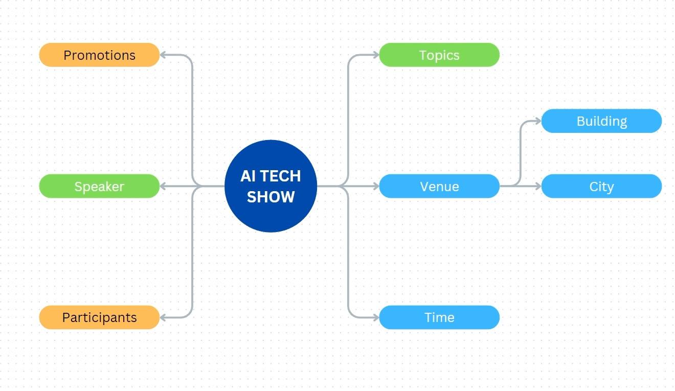
10. Diagram creation exercise: In this video, we're going
to put into practice the various techniques
we discussed before for creating diagrams. First, let's create
a simple mind map. Imagine that you are in a brainstorming session
with your team. You are organizing an event on AI or artificial intelligence. And you need to gather
some initial ideas. Press C to create a circle
type in the name of the event. For example, AI tech show, I want to change the color
of the circle to dark blue. The text should be white. Make the size bigger
and also bold. Next, press the Quick
Flow icon on the right. Type venue. Click
the initial circle. Again, press the Quick
flow icon on the right. Again, type time, then
click on the icon again. Now type topics. Next we create a new
shape on the left side. For this one we can
enter the text speakers. Let's create one again on the left side and
type in promotions. Lastly, create another
one, type participants. From here, if you want to change all the shape
to something else, you can click drag on
a canvas to create a selection area until all the ships you want
to add it are selected. If you want to add
more to the selection, you can hold ship and click drag again to create another
selection area. Once all the ships are selected, we can click on a
Shape button here, you can change the shape
type to a different one. Let's say we want to
have a capsule shape, so you choose the rectangle with rounded corners to adjust the height of all
these ships at once. We can open the pocision panel, then change the height
parameter to 50 pixels. We can change all
the selecto text to be smaller and also not bold because the previous
participants text is too long. The heights of the
ships are not uniform. It is better to widen
everything to 250 pixels first, then we reset the
height to 50 pixels. Next, we can cregg to
make a selection and rearrange the position of the ships to make
them look better. Next, suppose we want to give a different color
for each topic. For example, these two
ships are light blue, or maybe the darker one. Click on this one shift
and click on this ship. For these two ships, we can choose a green color. For example, as for
these last two ships, we can give them an
orange color if you want. You can also change
the text color to black to make
it more readable. If you or your team have a new idea for a
particular topic, simply use the
quick flow icon on the topic to create the
next subtopic or branch. Let's say I enter the text, then next I enter the
text building, and so on. That's pretty much how you can create mind maps
quickly in Canva. Next, try to create a simple
organizational structure. Basically, the technique is similar to creating a
mind map as before. The only difference
is the direction. Let's say we want to create an organizational structure for the committee of the AI
text show event above. We can start with
a rectangle shape, so press R on the keyboard
type project leader. Feel free to set the text
and color however you like. For this example, I use this
red color for the shape. I changed the text a little bit to make it look
bigger and clearer. Then I want the corners of this box to be slightly rounded. We can open this panel and drag this corner rounding slider
to about ten pixels. Then drag the bottom control
box while holding out. Next we can start
creating lower hierarchy. Underneath, click the
quick flow down icon, type logistics, select
the ship on top again, then click the down arrow again. Name this one, marketing another one type in the text
registration and so on. Now suppose we want to change the appearance of all
the connecting lines. We can create a selection area by click blocking sideways, then change the color to
this yellow, for example. Now when you create the
next level of hierarchy, can vote automatically,
uses the text formatting and shapes that we used
before. All right. To assign your colleagues
as committee members, you can type their names
above or below the titles, then change the text
to be larger or bold. Alternatively, you can also upload their photos and
just click back from the upload panel to the canvas until the photo is attached
to the related shape. I use a smiley graphic just
for illustration purposes. With these examples, I am sure in shallow you understand
the techniques. Remember, you can also combine the shape
line and sticking techniques with table to create a canbonboard
for example, or include chart
video and so on. The point is that
by implementing the various techniques
will earlier you can create all kinds of diagrams no matter how
complicated you want them to be. For more ideas, you can look at various whiteboard templates
provided by Canva.
11. Draw and Whiteboard publication: In this video, we
will go through the draw feature
and then discuss the white board project
publication method. You can find the draw
feature on left panel. As the name suggests, we can use this
feature to draw on the canvas or simply make
annotations and highlights. You should note that draw is not a feature specific to
the whiteboard project. Other types of projects also
support the draw feature. We are discussing it
now because most likely we use this feature when working with
whiteboard projects. The first tool called Pen, can be used to make thin strokes or things
that require precision. The second tool
is called marker. We can use it to make thicker strokes,
while the left tool, called highlighter, produces
the thicker strokes with a semi transparent color. But regardless of the default
look provided by Canva, you can fully change the
settings of each of these tools. You can press this box
to change the color. If you press this button, you can adjust the thickness by choosing one of
these three presets. Or you can set it manually. The larger the value, the thicker the
stroke size will be. Then you can also adjust
the transparency here. The smaller the number, the more transparent
strokes will be. All right, we should
know that the strokes created by the rotos are
not raster but vector. This means that you can still edit it further like
a vector graphic. We have already discussed vector graphic
editing techniques in the earlier chapters. To be able to edit
these strokes, you need to select them
first Using this arrow tool. You can see that each stroke mic turns into a sten
alone graphic object. You need to be careful
because this arrow tool can also select other objects apart from the stroke objects. When a stroke is selected, you can transform it like
other elements in Canvas, such as scaling it, moving it, and rotating it. Then you can also
change the color, adjust its depth
with range commands, or utilize the layer step. You can also control
the transparency level. We have covered all
these parameters before, so I'm sure you already
understand them. One limitation of the
draw stroke elements is that you cannot
erase only part of it. If we activate the
eraser tool and try to erase just the tape
or part of the stroke, the entire object
will disappear. Instead, you also need to be careful with this tool because if you accidentally touch another element such
as a line for example, it will also get erased. One final tape on using
the draw feature is that you need to be
in the selection mode or this arrow tool, to be able to navigate
the canvas using the middle Mo button and
Spacebar techniques. If one of these drawing
tools is active, there are only two navigation
methods that you can use. Which are using the
most scroll wheel and using the scroll bars again. In this condition,
you cannot use the switch bar method and the
middle most button method. Hopefully, this
condition will get better in the Canva
version you are using. That is, so you can use the
draw feature in Canvas. For now, I don't
actually need them, so I just remove them all. Generally, you don't need to publish whiteboard
projects out of Canva. Instead, you want
to bring people in or invite others into Canva to collaborate online if you want to
publish it anyway. There are a few ways
that you can do that. You can make it
available online. You can specify how far people are able to interact
with your whiteboard, then share the link, or you can download it as an
image or a PDF file. What you cannot do with
whiteboard projects is download them as MP
four, videos and Fs. Now there is one publishing
feature in Canva that we haven't discussed before
which is download selection. This is not a whiteboard
specific feature, but you will most likely
need it when working with whiteboard projects as
they can be quite large. For example, let's
say you only want to download this mind map diagram without including the others. You can first create
a selection box until all the elements you
want to export are selected, then press this dotted
button, Download Selection. Canva will take us to the download panel
similar to before, but if you notice above it
says Download selection. And also what is visible in the preview box is only the mindmap
diagram, nothing else. You can change the
format to GP or PDF. If you want, then press this download button
to download it.
12. The next step: Congratulations,
you have completed this course from
start to finish. You have flown a lot. So
far as you already know, this course is the
fourth in series. From the first
course to this one, you know that we have
covered all the features of that exist across the
different levels, free and paid. What we haven't covered yet are the features that only
exist on paid tiers. You can learn about
them in less course in the series and team features, AI collaboration and Rending. As you can see from the title, this course focuses
on three main topics. Ai or artificial intelligence, collaboration through the team, features and features
related to branding. Please note that all of these features are paid
features of Canva. If you are discouraged
from participating due to the paid account
requirement, don't worry. Canva offers a free trial for
each of their paid plans. You'll get 30 days to use
all the paid features, which is more than enough time for you to finish the course. You can search for
the course yourself, a skill share, or just use this link I provided
on the screen. I hope this course
series can have a positive impact on
your life and career.
 Widhi Muttaqien, CG expert & entrepreneur