Transcripts
1. Introduction: Welcome to my class
on Skillshare. I'm Chris Carter. As an artist, I found that I learned new skills and master existing skills more easily and enjoy the learning
process far more. When I begin with
small steps and limit the choices I have when
it comes to choosing which tools I use and how I use them when exploring
new realms of color, I find it easiest when I
limit my palette to one, each of the three primaries, a yellow, a red, and a blue. From there, I expand slowly
into the realm of pigments with a strong foundation upon which to build greater
understanding. I continue even after
decades painting to return to a limited palette when exploring a new facet of color. In this series, I will
guide you through my process of exploring and understanding color value
and how to use color value to create more work that is personally expressive
and masterful. All of the lessons in the mastering gray scale
and color value series are designed for intermediate
and advanced artists, either representational
or abstract. I have another series
on gray scale and color value that is more appropriate for
beginning artists. This is part one of mastering
gray scale and color value. This course, I
begin by refreshing your understanding of
the importance and considering gray scale first before making your
color choices. I want to clarify that I'm not
suggesting you concentrate first on gray scale when you're sketching
in your sketch book. Eventually, when
you're sketching quickly in your sketch book
or in a scrap of paper, you will intuitively
be responding to the color value you see
in the world around you. This series of color value
courses is focused primarily on work that you plan to develop into a
resolved painting. A painting that
is developed with strong design and
composition in mind. The project and part one is to create three colored diamonds, each with a different
color palette. You may work in whatever
medium you choose. I'll be working in watercolor
throughout the series, you'll see examples of various color charts
created with oil, acrylic, pastel,
gouache, and watercolor. The principles apply regardless
of which medium you use. This series is a culmination of five decades exploring
the mysteries of color. And finding that with
each mystery I solve, the world of color becomes
even more magnificent, more fun, and more challenging. There's always something
more to understand and to master when
it comes to color, understanding color value is
an important step to take. Along the way. I've included templates
to download and print for making your
color value diamonds. I've also included
several downloads of information I've found
useful over the years. Please post your
completed projects, whether you create
12 or all three. If you get hooked
and create more, please continue to add
them to your project post. I also asked you to
take the time to post a review of this class
for two reasons. One, so that the class will continue to be available
to other artists. Reviews are important to maintain the presence
of classes here on Skillshare to so that I can continue to improve
lessons in this series. Your feedback will
help me do so. I also encourage you
to both ask and answer questions posted in the
discussion area of this course. The value of taking live
workshops is that we learn so much from the other artists
in the live workshop online. We don't have the
opportunity to do that. The way we learn from
one another online is when we participate and enter in the discussions
within the class. Thank you for taking my class. I'm Chris Carr.
2. Why Focus on Color Value?: This series on Skillshare is an abbreviated version of a much longer and more in-depth
course on color value. Color value is an
essential skill to master and a very difficult
one to comprehend. I believe that the
experiments that are presented for you
in this mini-series can provide you with the basic skills that
will put you on a path to mastery of color value and dramatically improve
your drawings and paintings. This is important,
this is a very, very important skill to master. As an artist, you want people to notice your work,
the work you create. That is if you, if you create art and presented to the public, I mean, if you don't
ever presented to the public, It's fine. It's just an expression of your experience and you don't ever have to
show it to anyone. But if you do if you
do hanging on a wall, you're saying look at me. And an order for
people to look at it. Their attention needs
to be grabbed by it. And that's where
design comes in. Design is what brings the
viewer to your piece, and then all of your
technical skill in application and composition,
drawing, color. All of those things
come into play. But first, someone
has to look at it. And understanding color
value is the core, is the foundation to
grabbing people's attention. It can be a subtle call
or can be allowed Call. It doesn't matter
which it's up to you, but it has to be a call. My hope for you is that you get a grasp
on how important it is to understand color value and how the doors are
flung wide open. When it comes to creating
color and imaginative color. Based on the value of it. The video you're about to watch, a video I made several
years ago prior to teaching a live workshop
on color value. I think it's still
very relevant. And the examples
shown in the story told will be a good
foundation to build on. For this series of
color value classes, the human eye can distinguish anywhere 100000-10 million
variations of color. Yet it can only distinguish approximately 30 variations
in value or tone. That's totally fine,
understandable since thousands of color variations fall within
the same range of value. When working with
paint pigments, it's difficult to mix more than ten discernible values to simplify the painting process when making value decisions, many artists can
find themselves to thinking in either a
five-step value scale, a seven step value scale, or attend step value scale. It's through the choice of value not colored that we
achieved the illusion of light being cast on objects
of reflections and shadows. When we choose the value, well, it really doesn't
matter what color we choose to express that value. We still achieve the illusion of light that we're
trying to express. To be honest, I didn't
completely believed the previous sentence until I
conducted an experiment, painting on plain air
in task in Maryland. I set up my easel early in the morning as
the light stream through a straight row of
tall pine trees on a piece of property
owned by a paper company. I planned on presenting
a color value lesson in a workshop and wanted to have an example to
show the class. I squeezed yellow, green, red, and blue oil paint from
the tubes onto my palette. For the first time, I was actually concerned
about being visible as I painted more
often than not, when I painted in
this rural area of the eastern
shore of Maryland, one or two pickup trucks would stop by throughout the day to see why a lady from New Jersey would be on a
dirt road in the swamp? The curious driver would stop to ask what it was
that brought me to this month to paint in what he thinks is the most beautiful
place in the world. But others often don't
feel the same way. He chat forbid, share his
mother's recipe for muskrats, do and then move on. An hour or two later the pickup
truck would appear again. The driver would
check up on me and see how the painting
was coming along. Those are some of the young men had traveled the world and the military they couldn't think of calling any other place home. I thought for sure
that anyone who saw me painting this day might
think I was on drugs. My plan if anyone's stopped, was to casually
swap the painting with the painting I've
done the day before, one that had a more
normal color palette. I painted the entire
painting using only those four pigments
straight out of the tube. Yellow as my light tone, red and green as
my middle tones, blue as my dark tone. I used both red and green is middle tones to illustrate that they're generally the same value when they fall opposite
on the color wheel. Maple leaf green, and
a fire engine red, not a yellow green
and a red violet. A half-hour had gone by
without a passing vehicle. I just concluded my first fairly frightful
oil sketch experiment. As is my habit, I walked about 30 ft back to view
it from a distance. Before I could
return to my easel, a pickup truck pulled in. The young man hung himself out the window, his mouth agape. I've never seen a
painting capture the light coming through
the trees like that. I've never seen such a
real-looking painting in my life. That's amazing. I thought he had to be joking, yet he seemed totally sincere. You don t think the
colors are a bit strange. I asked, hello, know, if you got to use
those crazy colors to get that sunlight shining
through the trees. I guess that's
what you gotta do. I really like it.
You don't mind if I send a few of my buddies
by to take look to you. You'll be painting
here for awhile. I painted in that
spot for another 3 h, continuing to experiment
with these basic colors, three more pickup truck
stop by and let me know that their friends
suggests they come by. They all liked the
bizarre little paintings and came back once or twice, or to see how things were going. I never can predict
the people all need are the words
that will be spoken. When I paint outside
and the City, Mountain, remote, rural area. When I returned home, I painted a few more example
paintings in my studio so that my students
wouldn't see that it didn't only work
with landscapes. What's the point of telling this anecdote and showing
you these examples. I want to bring
your attention to the importance of making
value-based decisions. Remember, it's through
the choices of value dot color that we achieved the illusion of
light pink cast on objects of reflections
and shadows. It's our choices of value that determined the shapes
of viewer notices. And those the viewer
doesn't notice. Our paintings will be
more masterful when we hone the skill of determining
excellent value choices.
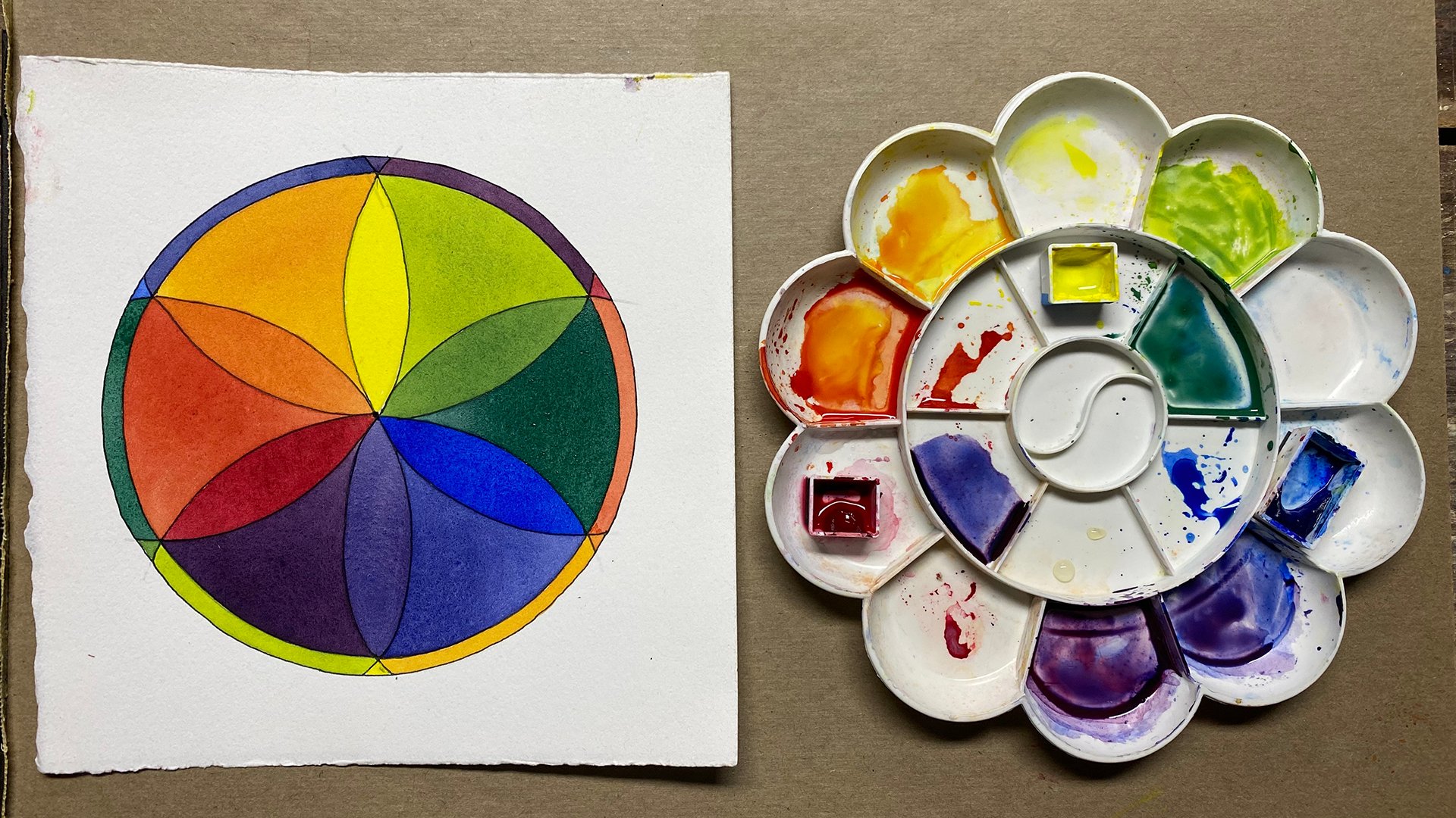
3. Template Files: The project for this class is to create color value
diamonds similar to this. However, there are
two other kinds of charts that I think will
be very useful to you. And it will be easier
to create them all at the same time rather than
mix all those colors again. It's just a way to make more
reference materials for you. So you can choose to make
them or not make them. But I will show you
what I do when I pick a new limited palette of three colors to play
with and to explore. The information that you
glean from creating. These three different references will be extremely useful to you. In this video, I'm going to go through all three of those. And it's up to you which
ones you choose to do, 12 or all three. And you can come up with other
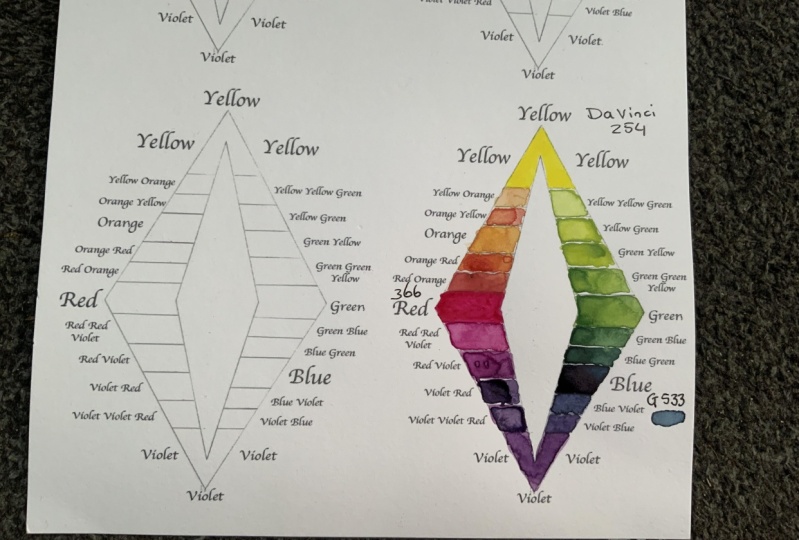
methods for yourself too. You will find the PDF
files for the grids. To create these. In the download
section of this class. I'd like to go over
some of the files that I have put in the
downloads folder for you. The first two I'd like to
talk about are the full page. These are letter size
pieces of paper. The full size color
value diamonds. And you'll see that there's
one that's totally blank and one that has gray
scale values in it. Or you can work either in a full page size or
also in the downloads. Are these files where you can
work smaller, cut them out, and then you can take
this with you as a very easy reference for the color palette
that you've chosen. And there are four on here. I've asked you to do
three different ones. It's just easy to
have four up on a page and you can of course, print as many of
these as you want. Now, why do I have two
different versions? Well, I'd like to explain why. Now we all have different printers and we have different paper
that we print on, and we have different
abilities in working with our computers and
printers and files. So if you are unable to use the files and
print them out properly, then please ask a friend
to help you with it. I have set it up so
that you can print if your page is set up
to a half inch margin, however, not everyone's is
set up to a half inch margin. I suggest you make
a test print on regular printer paper
to make sure that the entire diamond is
showing on your paper. And once you have that done, then you can run your watercolor paper
through your printer. And I use a 140 pound
watercolor paper. It runs through my
printer just fine. I don't know if it will
go through your printer. Alright, now, what I
want to mention is this, is that not all printers are going to print the gray
scale in the same way. This is my original 1, 2, 3, 4, 5, 6, 7 and 1, 2, 3, 4, 5 step gray scale that I created long time
ago using oil paint. It's nice because
it doesn't shine. So it's really easy to prepare. Decide what values are what. Now I photograph that
to share with students. And these, some of the
results that I got. You can see they're
very different. Now this I don't know if you
can see the shine to it. I laminated this one. I suggest you do not
laminate your gray scales because it's almost impossible to really compare
the gray scale. When this is on a
reflective surface. This is on a matte surface. Here's another. Now, this, you can really see the printing is so
completely different. I flip that around. You can see here that depending on how much ink I had or the
printer I was using, the very same file, the photograph I took of
this printed up like this in one case and in
this in another case. More importantly, I want
you to see that the black, the darkest dark in
the printed version, is nowhere close to the black, the true black in the oil paint. So you'll have to
see for yourself, if when you print it up, you get a full range, you'll have a white. But do you have a black? Do you have a black
that's not quite black. My suggestion is if the
rest of them are okay. I would then go into this last diamond and either painted in black with
gouache or watercolor. Acrylic might be too shiny or ink so that you
really get a black. Even if you leave it here, I just, I would
always add the black. And you'll see a
little bit later with the samples that I've done that. But this is the reason
that you may or may not want to
print this one out. If this ends up so much lighter
than what it should be, you will want to lose this one instead and create
your own gray scale. Either with paint or
with soft pencils, whatever you choose to
do, that's up to you. But that's why I gave
you two versions. If they're not printing well, then you want to create
the entire thing yourself. If you don't have the
ability to print, you can just make one of these, draw one of these up
for yourself. Okay. So I just included those
files for your convenience. Those are for the
color value diamonds. Here's another quick example,
two different colors. This one also is
very reflective. So that's very hard to judge by. It also is very different if it's even if it's
not reflecting. You see that this is
much darker than that. This is much darker than that. Those are the templates
that you need for making the project, which is the color
value diamonds. However, since you're
mixing colors, I suggest that you also print out this and this. Now here, you also
have the choice of doing it large or doing it smaller and having
smaller pieces that you can slip into a Ziploc
bag with your travel kit. I'll go over this one first. This is a tenth scale. If you count, this
is white up here. If you want to just extend
the lines, you can do that. Say you have 109-87-6543 21. You'll want to block in
that one in when you determine the value
of your yellow, which I'll be showing
you how to do shortly. Then you can also put
it right in here. That's the purpose for this. And since you're mixing those colors anyway to put
into your color value diamond, why not get more information
to carry around with you? Lightly? I mean, it's just
a little piece of paper and put them in
here at the same time. And since you're doing that, while you have that color
mixed, I don't like to waste. You can print this
out and create for yourself a color wheel. These are templates that I
use for my color scheme game. And I'll show you
that later too. You can create your
custom color wheel using the three pigments
that you've chosen. And you will see
what you can do. The colors you get, the color schemes
you can create. With that limited palette. Why would you make a
custom color wheel while you're doing your diamond? This is the color
scheme game that I invented for myself
a long time ago. And these are 12 different
color scheme templates. This is the master color wheel, and this is the template maker. Notice that the circle is the size of the inside
so that you can read the colors on the outside and you
can easily turn this. The way this works is
that you pick a template. This is color scheme number ten. To try out with
split compliments. Put a pin through it, cork through it there. And then this will show you
all the colors schemes. If you're using a palette that doesn't give
you that orange, it can be very deceiving. So my suggestion
is that you create your own custom color wheel with the pigments that
you're actually using. So that you can see the colors that you can actually get with
the pigments you're using. And if you have six pigments, a warm and cool of each, you would create your
custom color wheel. This, this outer one, using those six pigments. Or for pigments, often
I'll use a cool yellow, a warm blue, and a
warm and cool red. And I create a custom color
wheel with those pigments. And it's easy to do by
using this template. All right, now as I said, the circle that I caught
is larger than the circle. That's on the template. What I do, I use a compass, the pin through, adjust to
the size of the circle. And then I go further. I go about that far. And I do laminate my color wheel when
I'm done because I'll take it with me when
I travel around. And that way it doesn't
matter if it gets wet. And I don't really
want to have to make new custom color wheels. And then I generally
label it around because it's real easy to put
things in the wrong place. You'll see that the templates
fit on this perfectly. I have included in the downloads the whole series
of templates for you and the directions
and the cart, everything you need to play, the color scheme game
is in the Downloads. There's a separate
class for that, but I think you can figure
it out on your own.
4. Procedure: Another way to keep track of the color value of your palate is to print out a gray scale and then just test your colors
and add them next to it. There's so many ways to do it. Whatever works best for
you is the way to do it. I'm painting in this bottom
section with Mars Black. I want it to be
really black, black. And I'll also paint
in this little part. Now I'll go over the procedure. First, I dampen my pigments and then I will
test for the value. And I don't want it to be
opaque because it's watercolor, but I do want it to be
as dark as possible. And I'm putting it
right up to the edge. I'm now going to let that dry. I want to compare the
value of the dry pigment, not the value of
the wet pigment. My pigments are dry and I'm
going to test the value. I will test the
value against this. Now it has to be matte. It can't be reflective
or you won't have the the correct values to test. And I squint, I have to squint. And I ask myself, is this lighter or
darker than this? If it's lighter, I'll move up. Is it lighter or darker? Is it lighter or darker? And I do that all the way up. And it's really pretty
surprising what the results are. Ok, so this to me, the, the green is looking a little
bit lighter than this. I go up there, it's actually looking a
little bit darker than that. So it's probably
between those a bit. It's definitely
darker than that. It's darker than that. But it's, it's in the green is certainly in this lower section. Surprising, isn't it? Okay. Now the blue, the
blue is pretty dark. That's darker than that, so I'm going to
call it the black. The full saturation blue would fall into the black
which is the one because I'm going 123-45-6789.
And then ten. So the blue is going
to be a one. The red. Now the red, red is really tricky because it always
looks lighter to me. But I squint very,
very carefully. It could be that one. I think it's darker than that's definitely
darker than that. I'd say it's a two. And the yellow well, okay. Darker, darker, darks, darker. Definitely darker. They're
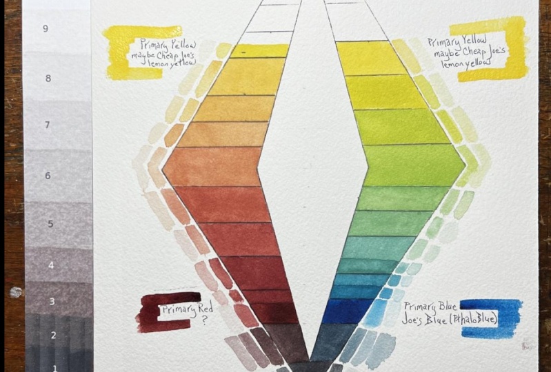
a little bit darker. They're about the same there. I'd say it's about there. On here. I'm using the tenth scale, so I will put the yellow. I decided that the yellow
was going to be the seven. I'm going to leave room. Remember it's watercolor
so you don't want it to be opaque and leave room at the top to label it so that
I know what pigment it is. I'll also add the yellow
because this isn't about value. This is just about
the spectrum I can create with these
pigments and all of that. Now here, this is seven. I'm gonna gauge it
either against these, these are seven, or I can gauge
it against my seven here. Let's see what I come
up with ongoing to go. According to this. Start at the bottom,
It's definitely lighter. Definitely lighter,
definitely lighter. It's getting close there. I'd say it's darker than that. Certainly darker than that. It looks to me as if
it's right in here. And because there's a big
difference between these two, I'm not going to fill
in the whole area. You can do this
any way you want, whatever makes sense to you. But I'm gonna leave room
for some variation. Now because it's yellow. I want to put the yellow on both sides because yellow usually would be
at the very top. So I'm gonna put and
you'll see why I do this. Very shortly, one side is going to be cool and
one side is gonna be warm. But my lightest light in
my palette is the yellow. And the yellow. I'm painting on a
white piece of paper. And I'm painting in
watercolor and leaving some white that is going to
be a lighter value. So I'm going to see exactly what I can get with
the palette I'm using. And since this is
the same as this, I'm going to paint in number
seven here on my little one. My travel. I'll do the same as I did here. And there's room around
here for me to label. So I don't need to leave
room on my diamond. When it came to the blue. I'm putting the blue
down in the one, but I'm putting it just
on this side because this is my cool side and my red
is going to be over here. So the violet should
be the very darkest. I'm leaving the point
for my violet mix. And then going up this way It's going to
be mixed with reds. So the blue is not
on both sides, it's only on that side. That's important. I'm just putting the value
of the pigments I'm using. And this is going to be
the blue, the pure blue. So whichever blue I'm using
is going to go in there. And the red we
decided was going to be I think we decided that was going
to be right in there. Going to be on this side. And I'm going to leave room for the reds and the red violet. Now another way to paint this in is by doing it as
a graduated wash. And that way, you also get
information about what the dilution is and our color wheel isn't
anything about value. So we can dilute
it so that we can see a little bit more
information about that pigment. So whichever way you want to
do it is absolutely fine. So with our three primaries, we have the color
wheel beginning. We have our large diamond
beginning, or small diamond. Our value scale,
different kind of chart. And we have our test strips. These two charts are complete. I just want a record of what the three pure pigments that I'm using are and
where they fall. I know that I can dilute
any of these this I can dilute the blue to
be any of those values. I can dilute the red to be any of the values above the red. And I can dilute
the yellow to be any of the values
above the yellow. The yellow can't get any darker. I can mix a red or blue with it, but it's only going
to darken it. And it will no longer be yellow. As soon as I put a
tiny touch of red into the yellow,
it becomes orange. If I put a tiny bit of
blue into the yellow, it becomes a green. So there is no darker
yellow that I can get. Pure yellow. With these three pigments. I can lighten the alizarin
crimson by adding yellow or by diluting it
as I'm adding the yellow. Now when I mix these two, it's possible that I'll
get something even darker, something down in this range
because they're both very, very dark and you're just
blocking out the light waves. And I will get something that's
either a violet or brown. In this case, I'll get
a violet because there is no yellow in the
alizarin crimson, any cadmium red will have
some yellow reflecting in it. So it will neutralize the blue and it will
go from being a violet into either a brown of some
sort or gray of some sort. I've placed the yellow
green on the value diamond, and then I made
another yellow green that was just a little bit darker for the colored diamond. I did not put the second yellow
green in here because I'm waiting to mix a green that's neither a yellow-green
nor blue-green. To put on my color scheme, color wheel, my next
green will be the green. That's neither
yellow-green, blue-green. And that will go, I'm
imagining it will go here. I'm going to check the values. And if it, if it's too dark, then I'll end up making
another yellow green. But see, I'm learning about this palette all along the way. The blue is a very dark blue. The green green is going
to be a darker green. Then if I were using
a different blue. I want to have a
mid value green. So I think that this green that I just mixed is perfect for right in there. I could use a bigger brush for
this would be much easier. So this is a good green
for the color wheel. Now, I'm going to move
into the blue-green. Again. I'm going to get several, probably a darker green
and blue-green and more blue greens into their
making my way down. I don't know how many
steps I'll do for this, but I'll just decide
one blue-green that's somewhere between this and
this to put in my color wheel, my segments here, or
a little different. I have my green, my blue-green, my bluer green, my blue, my blue-violet,
which is very dark. My violet, which I've taken
all the way around here, because I'm just going to have one or two variations
of red violets here. And then this is my
Alizarin crimson, which is a cool red. And I'll start heading
into the warmer reds and the oranges and into the
yellow oranges over here. I'll have a red violet
to put in here. This is my red violet. This is a redder, red-violet.
And there's my red. Now, moving into the warmer
reds and the oranges, make sure that your
pigments are clean. I have to make sure
that there's no green on the top of my yellow. So there's my orange,
orange, orange. Now I'll make my red oranges
and my yellow oranges. Yellow oranges. So here's the finished product. You'll see that my red orange
really looks like a nice bright red and not as
bright as it could be, because of course,
we've got too much blue reflecting from
the alizarin crimson, so it neutralizes a little bit. But the red orange here
might be comparable to read on a different
color wheel. You can see that the red was
so dark and the blue is so dark that a lot of the colors really
earn the bottom part, we don't have a
super light yellow. You can see that it's
harder to differentiate the different hues
among the oranges, whereas it's much easier to see the differences in
the greens and blues. But basically it's
nice because we have cool side and a warm site. So when we're
choosing the color, we can decide what
value we need. Then pick it to be warm or cool. And you'll see that
in the next class. We're gonna be doing a lot
of really fun painting in, of sketches to see how do
we use this information. But this is kind of a
tedious part of the process, but it is so valuable. These are references
that you can go back to again and again and again. So good luck with your project, and I look forward to
seeing the results.
5. Adjusting the Color Value Diamond Template: I'm Chris Carter. I decided that I would make another example of the
color value diamond using just three pigments. And I thought that
the template that I had posted as reference for you would work well for any number of pigments
that you might choose. And you could do custom
color value diamonds for whatever palette
you were using. Well, as often is
the case when I'm trying to clarify
concepts and ideas. I discover that some
of the tools that I've made for you don't work quite as well as
I thought they did. This is a little video showing you the challenges
that I ran into, how I've decided to fix them. Here we go. I'm going
to share my screen. All right. I used
only three pigments. I used a mystery yellow only because it was in a pan already and I
hadn't labeled the pan. It looks pretty much like
a yellow ochre to me, but I'm not quite sure and I don't know who
the manufacturer was. I call it a myster yellow, a permanent magenta,
thalo green deep. Now I used my thoreen deep, which is a very blue green. As my blue, my three
primaries are mysteryellow, permanent magenta,
and thalo green deep. I started off, this is the template for creating
your color value diamond. I started out by painting
in the permanent magenta. Now what I did was I painted a swatch of
the permanent magenta. Looks very purple here. It doesn't quite look
that purple in real life. It's just the way that
the camera took it. I compared it not to the
gradient here, right in there. Because I realized right away that when I
printed this out, I printed this on my printer, the black never comes
out black enough. This value diamond
in the middle. Although the
original works well, depending on your printer and depending on the
paper you're printing on, it won't work at all
or not very well. I am going to be
going back into that and adjusting that with a pencil so that
it actually works. What I did was I
used my one through ten scale to determine what
the value of this was. And I painted it not according to what
the words are here, but where it belongs on
the scale of ten being up here at the yellow
and violet being one. Okay? Black would be zero. So I determined
that my permanent magenta was right in here. Okay. So you're right there. It still is looking
purple because of the digital photograph then I painted in my
other two primary, it's a very yellow ochre
and it's pretty dark. You know, it really
doesn't fall into the high key range at all. My blue which is my thalo green, deep is pretty dark. Okay, so it's at the high end of the darks and the low
end of the mid range. The next thing I did was
to mix the two together. What I'm mixing is
not diluted pigment. It is the strongest
pigment possible while still being transparent as a transparent water
color should be. I am trying to see what the very darkest
saturated pigments are, and I am plotting
them on this diamond. I can always make them lighter, but I can't really
make them darker. I mixed yellow, my yellow ochre, I'll call it, with my
permanent magenta. And this is what I got
in between my red again, I went with mid range for the value is really
quite a brown. But this is the best
red I could get by mixing my yellow
and my magenta. All right, and then I got these pretty nice red
violets going down. This way. Okay, This is the red I chose
for my primary pigment. Okay? But this is not the
red that belongs up there. All right, now over here, I mixed my yellow
ocher with the thalo, blue, green, deep were the values and the
colors that I got. Just mixing those full strength. Notice here, the yellow I placed right here
in the orange, red. I decided that the value I
had chosen here was wrong and that I should move
the yellow up to here. Then I would extend
this a little bit further, that's what happened. And then I made this one darker. Then what I did, I decided to fill in
that top part with some diluted mix on this side
of just the yellow ochre. All right, because I've
already bypassed my orange. I'm already into my yellow here. So the only thing I can do is
dilute this to go up here. And the reason that
this shows like this is I did the yellow on both sides because I'm mixing yellow with my
blue on that side. I just put a very pale wash
so that I know what's the palest yellow I can get by diluting my full
strength yellow ochre. Then I put another
wash on top of that. And then I put a
third wash down here, so that I have a graduation. The whole thing was one layer. Then I added the second
layer in these two sections. And the third layer right there in the third section here, it begins to be diluted. This is my pure yellow ochre. And then on the other side, what I did was I had my yellow. And I still had some of
this mix in my palette. So I diluted it with
some water and I came up with a mix that's a
yellow, yellow, green. And it's part way
between here and here. It's not perfect,
but it's close here. I did the bottom of the value scale and remember
this is my pigment, the pigment I'm using
for my primary red. This is the pigment I'm
using for my primary blue. Then these are a mix of the permanent magenta and
the thalo green deep. All right, This is pretty
much the bluest blue I can get mixing the thalo green deep and the
permanent magenta. Then I go into a little bit more on the
permanent magenta side, I get a violet blue. This is my violet which is a
pretty good right on violet. Then here I come around,
it's still really dark. Of course it's going
to be darker than this because it's lower
on the valley range. This is my violet, violet red. This is the whole set up of information I have about
using these three pigments. Now, I almost used up
the mystery yellow. I can fill that with yellow
ochre and it's going to behave pretty much
the same, right? So I have a lot of information. I know what value my pure
color is going to be, and I can dilute
all of these and I really get an idea of
what it's going to be. Over here, I have my Quickie
color wheel that I've shown you in other classes here. I have the color
chart that I make for my extended travel
kit so that I can pull it out and really
get a better idea. I can't depend on
my memory when I deal with so many different
limited palettes. I have these little charts. The chart is made
in a sketchbook. I photograph it,
then I print it out, and I fold it up and it all fits nicely into a little
tiny zip block. Next, I'll show
you how I adjusted this to come out with a more
valid color value diamond. I started off with
something like that. All right, Now I'm
using a pencil to go in and adjust the value. I'm just gradually
building this up. I'll speed this up so that you don't have to be bored to
death watching me do this. It helps to squint so that you don't get
distracted by the hue, by the color, so that you're
really seeing the value. The gray scale value I'm using, a carbon pencil now gives me a better dark and it's
not as shiny as graphite. Notice I'm going lighter now. I think that's a much
better representation of the gradient gray scale. This is my red, my blue. And ah, in saying this, I didn't remember that I had
made another adjustment. This is my saturated yellow Are all diluted, are
fully saturated. I'm going to cross out that. And this is much more my orange. There's a red, orange, red. Okay. These are all Okay. I have a blue boot cream. Okay. We start with the red.
We had the yellow. I changed the place of this
yellow a few steps later. This was awfully dark. I didn't really
want to move it up, but it worked best there. It's moved up. There's the whole I hope
that made sense to you, and I hope it was helpful
for you to be able to use the templates to get the most information
from your pigments. I will continue to make these custom color diamonds because I learn so
much as I'm doing, it benefits my painting in the long run and also
in the short run. Thanks for listening. Good luck. Get in touch if you have any
questions. I'm Chris Carter. Have a great day.
6. Review: Let's review what I did. I chose for different
palettes so that you can see the variation
available depending on which pigments you chose. Each palette
included one yellow, one red, and one blue, not necessarily a
primary yellow, e.g. the yellow ocher is a
neutralized yellow. With each of those
four primaries, I created three
different references. I created a color value diamond, I created a custom color bill, and I created a gray
scale grid that showed the difference between
all four of the palettes. In this slide, you see
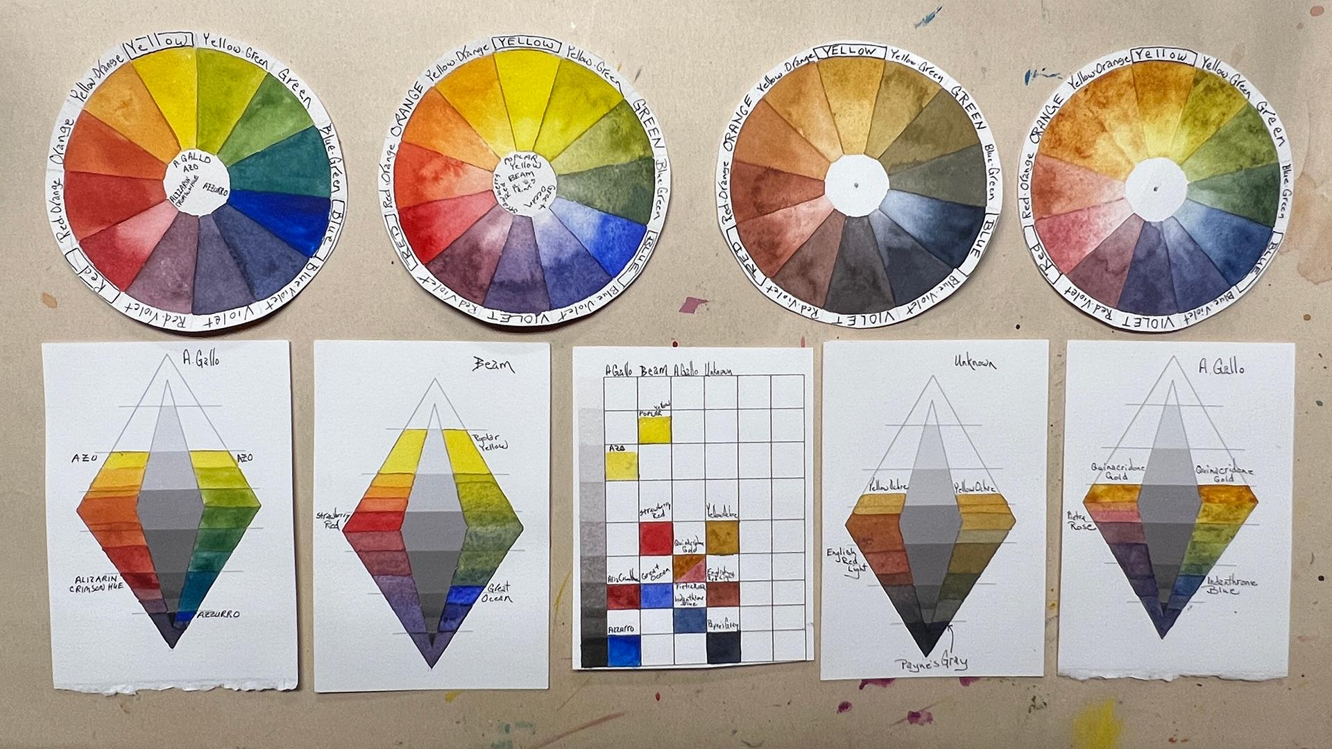
the primaries of three of the palettes and the
completed color wheel of one of the palettes. Look carefully at
the differences between each of the yellows, the reds, and the blues. The pigments from
two of the pilots were created by a gala. This is the palette
that used quinacridone. Gold is my yellow. Ph rob rows for my rent. An emblem from blue for my blue. This is the second of
the air Gallo palettes. And in this one, the azo
yellow, Where's my yellow? Alizarin crimson hue was my
red and a zero was my blue. This was a combination
of pigments. I don't recall what they were. They were squeezed into
the pants long time ago. The yellow was yellow ocher, the red was English red light. And the blue is Payne's gray. These are the lovely
beam pain stones. Yellow was popular. Yellow, red, strawberry
red, and blue. Great ocean. I loved the
names that they give them. Here, all four pallets again. This shows the four
custom color wheels and the difference in the
color value diamond with e to the palettes. Remember that the
color value diamond shows each of the pigments
at its full string. Here I'm showing
the same thing with the gray scale chart
included in the middle. Here's grayscale chart again, notice how with the beam paints, I get a much lighter value using the beam poplar yellow than I would with the yellow ocher. So if you've now made
all three of the charts, you'll have an incredible
amount of reference to learn both about the pigment and about the color value of
those pigments.
7. What's Next?: Now that we've finished the tedious part of making
all of these charts, we can jump into the much more fun aspect of
playing with color value. What's coming up in part two? In part two, we'll be
using line drawings to create strong designs
in gray scale first, and then adding color using one of the palettes that you've created a diamond for, either one that you
made in this class, or perhaps you want to try a new palette to use
for the next class. That's up to you. Uh, we'll
be using those palettes to choose our color by
value and temperature. You will be free to
play with color that is not the same as the real
objects you're looking at. In the next part, you will be allowed the freedom and encouraged to
take advantage of that freedom to experiment with color that may not be
part of your reality. You're going to choose the color simply by the value of it. We'll be using full
strength colors. As you can see by these samples. There are so many ways
that you can play with color to keep
your design strong. The first examples
that I'm sharing with you are all what I
call dollar art. And it's really playful and fun because you can take
segments of reality, strengthen your drawing skills, and experiment with design
and color at the same time. In the last few samples, I'm showing a video of some paintings I did
focused on sailing. And I'm showing you the
black and white version and the color version, these paintings so
that you can see how once you're practicing this and developing your ability to determine color value, you can easily, even when
you're sailing in motion, it will become
intuitive for you to adjust your paints according to the value of the block to be. Thank you for taking the class. Please remember to post the review and post
your profit Hicks. Thanks again, hope to
see you in part two. This is Chris Gardner.
8. Bonus Lesson 1 - Something to Think About: Let's start with
a simple design. A bowl sitting on a table
with a wall behind it. We have to make a value choice
for each of the shapes, the bowl, the table,
and the wall. We can make it light,
medium, or dark. So how many combinations will we have with just the three shapes? The bowl, the table,
and the wall? Let's first look
at the choices we have if the table is dark, remember that the
bottom third of our gray scale is
considered dark. The middle third is
considered medium, and the top third is
considered light. That means that we can have
variations of tones within each of the designated areas
of light, medium and dark. In the first example, the bowl and the wall look very light compared to the
pure black of the table. But when you squint at it, you'll see that all three
values are really quite dark. There are nine combinations
of the three values. When the table is dark. Let's take a look at them. They're all so nine when
the table is light. And they're all so nine
when the table is medium. You can see that it can
get very complicated. If you have 27 possibilities
with only three shapes. Imagine how many possibilities you have with more
than three shapes. And we're just looking
at the possibilities. On a gray scale. When we add color, we have an infinite
number of possibilities. That's why it's so
important to be able to see your color as value, not just as hue.
9. Bonus Lesson 2 - Laminating Reference Aides: What I use is a clear covering. It's meant for covering
cupboard, shelf. So that's what I use. Peel it carefully
to get it started. I put it down and all
kind of roll it down. Because you don't
have to be careful that you're in
alignment with it. You try to keep it. The edges in alignment. All sit down.
 Chris Carter, artist, illustrator and explorer