Transcripts
1. Introduction to Part Two in the Color Value Series: Welcome to part two of my color value series. I'm Chris Carter. This series on skill share is an abbreviated version of a much longer and more in-depth course on color value. Color value is an essential skill to master and a very difficult one to comprehend. I believe that the experiments that are presented for you in this mini series can provide you with the basic skills that will put you on a path to mastery of color value and dramatically improve your drawings and paintings. And that you will step into an even more joyful world of playing with color. In part one of this series, we created landscapes in grayscale using black, white, and gray paper in this class, part two of this series, we will first determine where on the grayscale or black, white and gray paper. Our ad are colored paper, are yellow, orange, red, violet, blue, and green. And based on that, we will create a grayscale landscape, not looking at a photograph, just, just whatever we want to create. And we will recreate that in color based on what we've determined our gray scale values to be. And from that point, we will just start to play with the colors, shapes, and see what happens. We're going to convert whatever landscapes we create with the colors, shapes. We are going to convert those to black and white and just see what our eyes starts to notice and our brain starts to understand. We will see the impact that our choices make on the design of our collages. It is the design of a piece of work that will bring your attention to it when viewed from across the room. This is important. This is a very, very important skill to master. As an artist, you want people to notice your work, the work you create. That is if you, if you create art and present it to the public. I mean, if you don't ever presented to the public, it's fine. It's just an expression of your experience and you don't ever have to show it to anyone. But if you do, if you do hanged on a wall, but you're saying look at me. And in order for people to look at it, their attention needs to be grabbed by it. And that's where design comes in. Design is what brings the viewer to your piece, and then all of your technical skill in application and composition, drawing, color. All of those things come into play. First, someone has to look at it. And understanding color value is the core, is the foundation to grabbing people's attention. And it can be a subtle call or can be allowed Call. It doesn't matter which it's up to you, but it has to be a call. In part three of this course, the focus will be more on determining the design that you want for your piece. And then playfully putting the colorant that. Now when I was much younger, most of the museum catalogues and the art books, we're in black and white. There were a few color plates. We got them colour planes because the color printing was very expensive. And I was puzzled because sometimes I didn't even recognize a painting that I had seen in person in a museum. When I, when I saw it in black and white, it didn't look the same to me. And I thought that's really odd. It's just really terrible photograph of it. And it was many years before I realized that the reason I didn't feel the same way about it when it was in black and white was because I had been deceived by the color in the painting. And I had not seen the real design of the painting. I had not seen the black and white version of it, the value version of it. And this came to mind when I ran into trouble in my paintings. And I thought, I don't know what to do with it. It's not working. I know it's not working, but what's the problem? So I would take a photograph of it. And I was doing black and white photography at the time, so I was able to take a photograph and then printed in black and white. It was kind of a tedious process, but I was able to do that. And then I saw immediately what was wrong with the painting. The value was wrong. So I adjusted the value and I still didn't understand color very well, so I didn't know what I could choose, but I was able to move forward with the painting. And then later, much later when I finally was Understanding Color and then put the pieces together with understanding color and understanding color value. It was incredible because then I could determine the value I needed, decide whether it needed to be a warm or cool color, and then just plop in a color that I like that worked with my color scheme. And bang that the piece was so much stronger. And that's what I'm hoping for you. My hope for you is that you get a grasp on how important it is to understand color value and how the doors are flung wide open when it comes to creating color and imaginative color based on the value of it. And for this class, we're working strictly with saturated color. In part three. In the next class, we will be working with paint, and we will be working with manipulating the, the Hughes a bit more.
2. Materials Needed for the Class.: These are the supplies you'll need for this lesson. You'll need two sheets of 8.5 by 11 white paper. You will need the cutouts that you had for part one of this class. And you will need the cutouts that you may have prepared in part one of this class. These are the cutouts using the purple, blue, green, yellow, orange, and red colored papers. If you're not prepared these, I have the PDF file for the template to print out on your paper. And you can either use paper that you've purchased to the craft store, construction paper or papers that you made yourself. The directions for that are also in part one of this class. You will need your grayscale chart. You will need your color value chart, and you will need your color wheel to create these templates if you don't have them already made, you will also need a pair of scissors and you'll need a printer to print out the templates. If you don't have a printer, you can just cut something like this. You don't have to use these exact templates. Try to come up with something that's somewhat close to make this class easier for you. You will also need extra sheets of 8.5 by 11 paper of each of your colours, the black, you have the white and the purple, blue, green, yellow, orange, red, and gray. Or 8.5 by 11. These will be used as backgrounds. I also suggest you have two sheets of white paper that are 9.5 by 12. And the purpose for this paper is to create a mat around the image that you're making. This will be very useful. I will be using one of these, and I think that you'll enjoy using that too.
3. Determining the Grayscale Values: The first thing we wanted to do is to identify the value of our white paper or gray paper and our black paper. To do that, you're going to use your grayscale value chart and compare it. Again, I suggest squinting. Black is black. Black, black paper is not always as black as black. And no, that doesn't sound right. But its true. Some black is much lighter. This is a very black paper. Our gray. What is that going to be? These are what you might consider warm grays, and this is a cool gray. So that's going to throw you off a little bit. Because it's going to look different from this, simply because it's cooler. This has more blue, it's reflecting more blue. This is reflecting more reds and yellows. So squint at it and decide which of these values is correct. Here we go. If I squint, this is definitely darker than this. If I squint at this, this is definitely darker than this. If I squint at this, must go into this. I can't really tell which is darker. I squint at this one. This is darker. So if this is lighter than that and this is darker than that, and I can't really tell what this is. I would say that my gray paper is a number four. Alright? And then the white is a number ten. So I have a 1410. And you may want to write that down on a piece of paper. Not, not my values, but the values of yours. Your grey could be very different from my gray. So determine what the value is of your gray paper. Let's test a few other craze. These are all variations of Grey's. You may have one of these greys Are you may have a gray that's different from all of these. And let's see how they test out differently. Will start with what I think might be the darkest. Him. First, our black is here. Darker, darker, darker, darker. Okay. Squinting at this, it's darker than this. Looks pretty close to that. Looks even in this case, it looks darker than that one. It's right there. So this is a two. Then one that I think is dark as next would be this one. Darker, darker, darker, darker. Maybe that it's lighter than that. This would be a3. Darker, darker, darker. Looks like a four to me. You know. To for darker. It's also for these two are fours. Ooh, that looks like it's spot on with a six. And this is my White who had actually looks like a nine to me. So there is my scale of grays. So here my grays. You may have a gray that's anywhere in here. And my grades go anywhere from a number six to a number too. So I'm hoping that for the experiment that we're playing with, you have something that's about a four or five, probably not as dark as, uh, to try to get something that's at least a three. But up to a six is just fine. Test your gray and be very careful to determine which it is. Your gray will be different from my gray. Most likely. And the next step is to do this with color. And that this is going to be a little bit trickier. Now we need our color pieces. We have yellow, orange, red, purple, blue, and green. Let's see what the values of those are. I would also like you to use your black and white strip for this. You have all of your colors, your six colors, your primary colors, which are red, yellow, and blue, and your secondary colors, orange, green, and purple or violet. What I'd like you to do before you measure the values with your scale on a piece of paper. I want you to write the name of a color. And just guess at what the number of the value would be. Just guess at what the green might be. Where do you think the green might fall? Where do you think the red might fall? So pause the video and decide for yourself without holding this next to the papers. Decide what the value is. And then we're going to compare and see how close you are to being correct. This is much more difficult task because it's deceptive. My colors are as follows. My black is a one. My purple, blue, and green are all three's. My read is a for my oranges or five, my yellow is a seven, and my white is a ten. Now the trickiest part is right in here, because this red looks so bright, doesn't it? But let's, let's take these away. And I'm not sure the camera sometimes reads it differently. But the way that it looks in real life, I can definitely say that the red is darker than the six. And when I squint at this, I can't really say that the red is darker or lighter than that. It looks darker than the five to me. And when I get to the three and squint, it's definitely lighter. So that's why I called it a form. Red is very deceptive because it's so bright, you think it's lighter than it is. Because four is pretty dark for, is the darkest midtone, or the lightest dark. Here are your light values, here are your dark values, your midtone values. So the for the red falls between the midtone and the dark. Now, the green, the blue, and the purple are also tricky. So I look at this and when I squint, it's definitely darker than the five. It's pretty close to the forum, pretty close to three, but it looks at tat darker than the four. So that's why I called it a three because it's definitely lighter than the to look at how dark this is. My green is a dark. And yet you probably thought it was way up here somewhere. Ok, now the blue, the blue is very bright. So I think off that must be light, but is it light? No, look, it's darker, darker, darker, darker, darker, darker. Starts to get about the same there, but it's still darker. And when I get to the three there it is. It's lighter than the two, but definitely about the same as the three. These two are the same. And when you squint at them, you can't really tell the difference. Same thing with the purple. Darker, darker, darker, darker, but not by much. And there you go. There it is right there. It's the same lighter there. So that means that these three are all the same value. Now this is going to come into play in just a little bit.
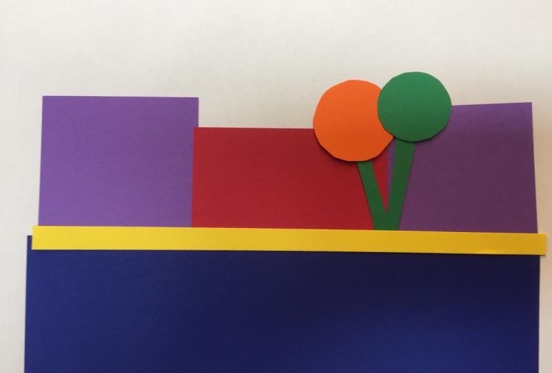
4. Creating a Grayscale Landscape Collage: In this lesson, we're going to create a landscape using our black, white, and gray. And it doesn't matter what kind it is. We can put the foreground, put some hedge in the back. We'll put some tree, will even mix up the trees is tough. This is based on the photograph that you used in part one of this series. Now if you didn't do part one, I have the photograph in the downloads for you if you want to look at it, but you don't really need to really want you to start using your eyes and your intuition and not be copying things. Put the tree, the tree there. That's going to be my grayscale landscape. Now, I'm going to duplicate this with the same values with color. I determined that the black is a one, that the gray is a for. My white is a ten. And there we go. Looking back at multicolor determination, my purple, my blue, and my green or my darkest papers. So I would have to start out with a three. And my four is a read, and my yellow is a seven. So the first thing I'm gonna do is I'll create one in color using my black and white so that I can duplicate this.
5. Landscape Collage in Red, Black and White: There's my black for the hydro in the back. I have four, so that's my read. And the trees, I have my black eye, my read, my tree. And the ten. And then for my Stonewall, I have a white. So there is my version, the same version of my landscape using one color because I had to go real dark with the black, real dark with white because none of my papers were dark and using my phone, I took photographs of the collage that I made using the red paper, the black paper in the white paper. And then I changed it into grayscale mode in my phone. And I'd like you to compare the two. You'll see how similar the collage I created with the red paper, the black paper in the white paper to the collage that I created with the gray paper, the black paper, and the white paper. The value of the red paper is very similar to the value of the grape paper. The design of the collage is exactly the same. The color is different, but the design is the same.
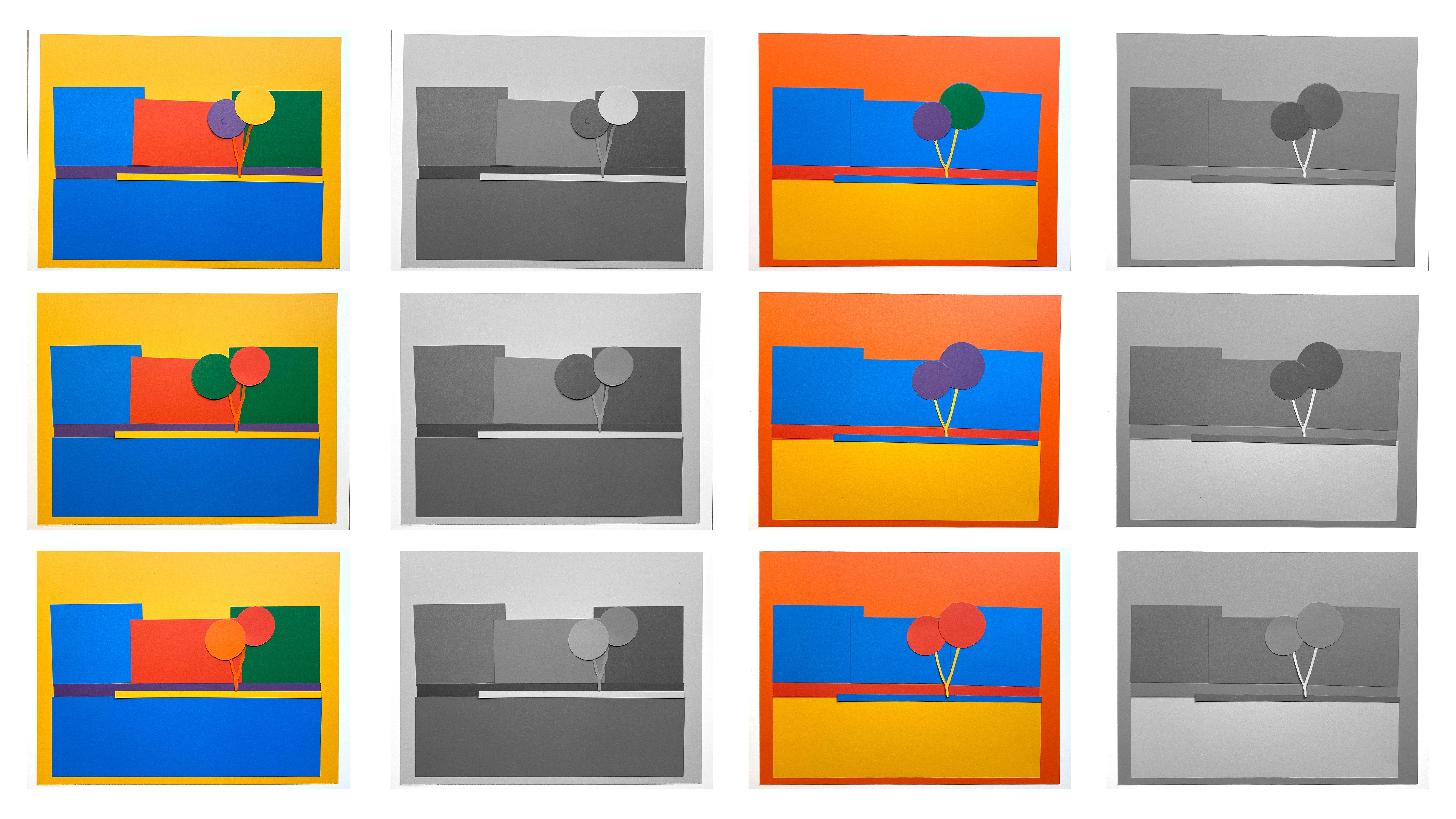
6. Playing With Color: Now it's time to play with color and to see what values the colors end up being and how they work together. We'll be creating this sort of haphazard collages of our landscape, will be using our colors, shapes, just in any way we want. Then I suggest you snap a photograph of your landscape and then turn it into a grayscale mode and see what you think about it. Now this, remember, this is just a very mini-course on color value. I have a far more extensive course that goes into greater depth with a lot more exercises. This is not an easy concept to grasp. So just do the best you can. Have fun. Just allow yourself to be surprised by the results. Here we go. I've started with my larger whitepaper as, as a frame, okay, as a matter of sorts. And then let's see, I can put any color down. You start with a yellow as if the sky is going to be bright. My yellow is the lightest value I have in my color papers. White is of course lighter for the first few, i'm not going to use white or black. I'm going to see what I can do just with my totally saturated yellow, orange, red, violet, blue, and green. Hey, there's my first variation and I went to snap a photo of it and then I will post both of them are post the grayscale version of this and the color version of it. And now I'm just going to switch a few things out right here. Alright, let's go with a different background. Now let's try a medium background. These are very close and value. Right now I'm going to switch this to darker with the same tree. Like this slider. Make up the red. Now what do I want to point out here is that I can keep the value here the same, right now it's the same color also. So you really can't see where the tree ends and the back hedge row begins. But watch what happens when I switch the same value but a different color. And look at how you can see the difference. First, I will swap it to a green sea. Yeah, that stands out, but when you squint, it's the same value. And now watch, when I switch it to the purple. Again, it's the same value, but you can tell the difference because it's a different color. It's a little bit warmer than this. This is a little cooler than that. Even though it's very close, there's a slightly different color and a slightly different value.
7. Review and Conclusion: You come to the end of part two of the color value series. In part two, we determined what the value was on the grayscale of our papers are black, grey, and white. And of our colored papers, the yellow, orange, red, violet, blue, and green. And then we duplicated a grayscale value landscape he made using the colored papers. And after that, we just played with the color of papers, photograph them, converted them into black and white or grayscale, and looked at what the results were. You may be wondering what the point is and how does this help you to improve your drawings and paintings? Good question. Knowledge is pretty useless unless it can be put to use. And we will start to put it to use, will start to gather this information and the observations that we've made and start to find ways to make them tools for us. Though I'll end part two with making a few connections for you. In this first slide, I've altered only the two clusters of leaves on the tree, showing two variations of the rest of the landscape. Ask yourself which one grabs my attention first? As my attention grabbed by another 12 or three. Which ones? And y. Alright, now here's the grayscale versions of these. What is it that you notice? Look carefully. Now it's perfectly okay if you don't notice anything at all. It takes more than just a mini course to train your brain to interpret what your eye is beginning to notice. In this next group, I'm presenting you with the grayscale version first. Which one do you prefer? Why? Which one makes you feel blah. Y. Now let's look at the color version of these. What do you notice? Now in this last grouping, I want to hint at how you can use the grayscale version of a painting to make changes in the color that won't affect the design of your painting. This is incredibly useful. Take a look at the three grayscale images. They look the same darn thing. Well, they're not the same image printed three times. They are from three different color collages. They are almost identical. The design is the same in all three. I'll say that again. The design is the same in all three. What's different is the colors that create the design. Now let's take a look at the color versions of these three images. What's different? The foreground is different in all. 31 is blue, one is violet, and one is green. Take a moment to let that sink in. What this means is that you could paint the foreground either blue or green or violet. And you won't have changed the design of your painting. This is incredible. This means that when you know what value you want to shape to be, you can then decide whether you want the hue to be cool or warm. And then decide which cool or warm Hue you'll make it. Now you're absolutely free to be playful with color. In the third part of this series, we will begin to be extremely playful with color using paint. As you can see, there are infinite number of possibilities. Play with this and post your projects. And please make comments or ask questions. Let me know your thoughts about this. Which ones you like, which ones you don't like? What are you saying that you never saw before? Please share your ideas and thoughts so that others can feel more comfortable being uncomfortable to. Thanks for joining me. I'm Chris Carter. I look forward to seeing you in Part three of this series.
 Chris Carter, artist, illustrator and explorer