Transcripts
1. Course Intro : Hello guys, My name
Ramsay but hash, I'm a graphic designer,
product designer, visual artists and
concept artists. In this class, we
will learn about branding and design and
product from the scratch. We'll go all the way from 0. We start from greater brief. We do all the assets
for the bread aisle, choosing to work on
a managed movements, sophisticated brand
qualities are the most demand in the field. Plus we will work with three
sets for this project. I will teach you how to create
a graphic, the product, the stationery design, business card,
letterhead and envelope. As we will see how to create t-shirt and also
packaging design. And we teach you about
the brand personality, how to work with the client. We will talk about criteria in design and how to
tackle problems. We will see about shapes
and color and design. We will see about
the typographic, how to create a logo, how to create your
own moodboard. We will learn the most
effective workflow, make you gain time when work on a project and get
the best results. We will see about
advertising in this class. We will make poster
for each product and poster for all
products together also, we will create even
stationery poster and social media
poster campaign. I will share with you all
the tricks and techniques. The final stage, we will learn
about web layout design. We will learn to work
with Adobe Photoshop, Adobe XD, Illustrator,
and Adobe Dimension. This class is for
beginner and advanced. Even if you don't know
about the software, you will be able to follow this course because we will see about the two rule work
with in each software. At last, we will talk how
you start in the field. Along course, I will
provide you with advisors and what
works best for you. This is the most complete
Brandon class will give you all the knowledge you need to start your journey. If you are ready, you can take my class and welcome everyone.
2. Why This Branding Project: Before we start,
I wanted to tell you why we do this
kind of project. Again. In this project we will learn all the tools
necessary to work in a branded design set of three different products
for the same brand. We see all the
emitted from design for design and a
brand from scratch. We're gonna quit
posters to advertise will apply monochrome texture. And these are important
two weeks to learn. In a brand-new. We will see how to make stationary poster alone
and product poster alone. Spare from all the things
we're going to work. Welcome to the Global Offensive
brand, can teach motto, apply the same process
in any other type of a product is better than working
on other type of design. They are so limited to show you all the knowledge
you need industrial when you don't think
honestly type of products burden working on one, on one, plus each product
will be advertised it alone thus will give you more practice to use
tools and techniques. I advise you again to practice
more on similar projects, like cosmetic or grooming is also they are the most
demand in the fields. And you should always learn with these kinds
over Pr, over branded.
3. Class Project: Hello guys, welcome again. So before we keep on, I need you to work
on your own design. You will apply the
knowledge we learned so far and make a brand with
a logo and graphic. Then in dimension, you make
the design of the product. As you see here, there is a lot of what 3D model you can use. You can make a coffee brand, you can make a shampoo, you can make a food drink, whatever you like, guys, I just need you to use all the
information you learned so far and apply them
on your own project. As you see also, you can use all the material you
have n dimension. You can use this flushwater
free or imagination guys, go do anything you'd like to do. It's a fun project for the
class to see your designs NTU, what you've learned so
far. Thank you so much.
4. Learn About Brand Personality : Any brand in the world already exist has personality language. They communicate with
their design and cola. See some examples. Brand like Mercedes example is easy to say that
his mature series and we won't advertise it
or represent that brand. We need to find someone
to these characteristics. October like Daniel Craig can be suitable for this
brand personality. Very, very worth. We see another example, brand like Burger King. It's fun and joyful. After slide, Kate Hudson is the perfect choice
to represent the brand. Always we look for a person with the same characteristics. Always understand the
brand identity and how they won't do represent
ourselves in the market. What kind of a brand they
want to be considered. Serious, mature, useful, etc. Bread game become whole culture. Not only product, service,
example, like supreme. Each brand has a fan base, so loyal to the brand
and the brand should always give confident
certain way to their client in their
products they offer. We want the brand to look fancy, represent persons with
these scheduled wipes. It shouldn't feel restricted
because places will be so expensive or
very specialized. It should be scheduled
fancy bread pan, dynamic. When we use brand, we use it with a confident because we think it
represents all we have as a Barlow and also
suit our personality. That's how we think about
the brand personality. So try always to put
your personality into design and think well of
the brand personality, how they want to be
considered in the model.
5. Fresh Factors In Design: Okay guys, In this
video we're gonna talk about some factors
in design process. The most important for me, first one is designer. Be co-designer is
to be original, always update with a
freshness and trend. Love to try new things
and especially authentic. Always remember these guys
tried to be authentic. Second thing is the client, most of time client wanted to interfere in the
Brand Development. For the same reason
your opinion could be reflected in the freshness
of your project. If you're applying
net code person, it may complicated little bit, but as a designer, you must always give the final solution. Be open to discuss. Most of the clients will
be open to solution you provide for the ones who
wanted to interfere, try to keep calm and
work on a solution. Always you do what
the client wants, not what you think it's better. Remember this. The process. Always be in searched for
next things, new recurrence, aware of a new trend, ask other creator how
they solved the things. Look, always learn new
solution when it needs. This is very important one guys. Observe and listen. When you discuss
with the client, you need to listen well, all he is telling
about what he needs, analyze the project will, and the brand identity always declined and his vision is
the most important for you. You can take also a notebook
with you and a node. All the things he
extended to you. Brendan is not a magic dice. This is the key you got to focus on before you start any
project. You are welcome.
6. Learn Design Criteria: Here we're going to talk about the design criteria little bit. After you did all
your analyses and you sit down to start
your design process, you will be guided by the brand idea and
defined in the brief. What you also follow sound design criteria
are essential for you and for your brand
solution to be effective. First, research the market and similar brand doing
with their style, how they represent
their product. Read always computed
or weakness, and also their strength. All that you can see in their designs and what the
effect they do in the market. The logo should be distinctive, easy to catch and remember, the logo design can
make a competition. It can be market in a
different products. Simplicity makes the beauty, but use it with a clever with the local is
the idea of a brand. It should provoke things in the client to connect
him to the brand. The logo also should be Market years ago and
not fade with time. Colors. Colors should be adaptable to the brand identity and the type of a product and the
client they are targeting. Working format, not same
as working for women. You need colors must the type
of a brand and the client would research always
easier keyword for all. The logo should be striking an audience from FRC
and looking at it, design lead the eye to
different places and logo. I should go one way. If you are doing a
logo for website, you should follow colors can communicate with
the people to use. If you try. And food is the same way. That in color and shapes glass. I advise you to not
stick so much to trends. Try to design a logo,
doesn't go out. So first from style, I always assured that
my Louisville easy to reproduce and can do good
in digital platform. Apps on board in a sweet logo and design should
complement each other. And all should be connected.
7. Challanges In Branding: Understand challenge
and customer needs. Before we work on each project, you need to understand what are the problems and challenges
circulant impossible, you make your research then see the best way to approach
that kind of a project. Each project can
be done many ways. Read the creative brief
from your client very well, and understand the language of the brand and their identity. Working with a brand
needs a lot of understanding between
you and then you must present concept that is clear, distinctive,
and relevant. Remember who you are building a relationship between
you and your client. So try to listen to
him very well and do all the things he is
trying to achieve. Same goes for customers. You need to
understand what evoke the emotions, what
makes them happy? What are the things they hate? What are the things that
they need they can't found in a similar product. Ask people about what
they desire in a product. You can also put in your
accounting environment Declining new targets and their lifestyle. You can make some a
question in the papers. Go to the street and
you can give it to people and stab them a little bit to answer some questions. If you want to be Unsworth, need to do some analyses always
and research the market, especially research
what the people don't see in the product. They're missing. Denote if your design
will be suitable or not. Always put yourself on a
shoe of the customers, not only in the
assure designers. Work with the customers
and with the client. Here, are relational
achieved by keep your calm and always be
flexible and listener.
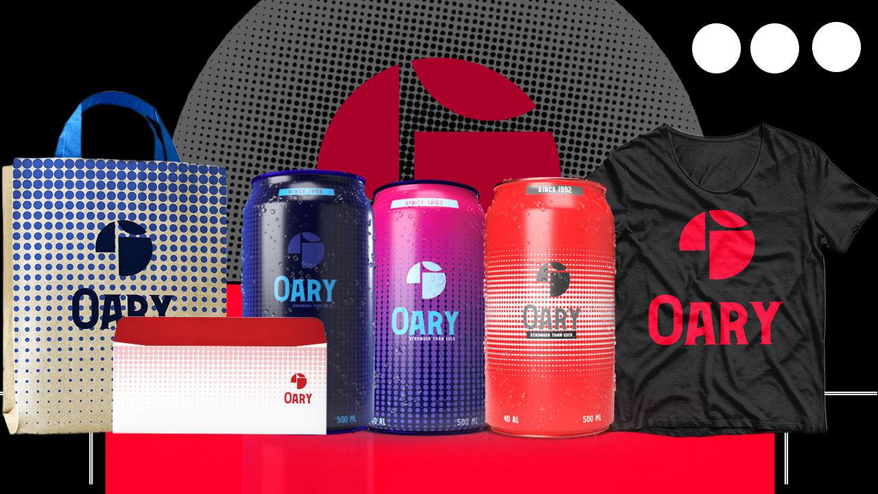
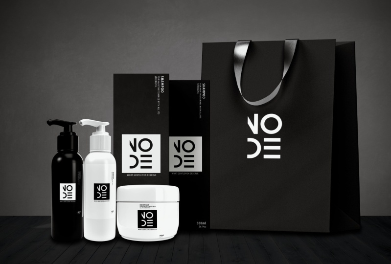
8. Working With Brands: Hello guys, will
start our class. The first thing before we start, we need to read carefully what the brand sent to do exactly. Normally you get
creative brief from your client with all of the
things he needs from you. This is an example we invent
to make our brand project. It's a brand for men Goldman. First thing up here, the brand name,
which call it node. Choose a node because
that represent sort of connection it had been inspired by the nodes
are used in software's. The keyword that represent the
brand is fancy and modern, and that means our product
should show this more things. Also, sometimes the
client gives you a preferred color to work with. Here, black and white. If it doesn't give
you a specific color, then you have the freedom
to work with any column. Now here on what
the client needs from you, the logo, sure, the product design,
the posters for advertising, packaging,
stationary design. We will do all of these and show you all my techniques and way of creating the file format. Sure. Here is PDF, PSD
Illustrator, JPEG, PNG. Well, normally we need
only PDF and PNG or JPEG. We give a client thinks for a digital platform
and it printed file, the object angles for
the client needs to make attractive product help attract young and mature customers
to buy the product. Now it may also put you
a note, do not neglect. You must create posters and product using black and white. You may also use gray. So after reading all this, you already started
thinking about 1 creation. The key is you need to
follow and all that. You can also make a creative
brief for your client to ask some more questions you'll
need to know to help you understand more what
they want from you. As you'll see in the
screen, contact due date. You can ask, well, what are they producing
the background? You can ask if they want to use some specific software
or some file format. Color prefers all these. Sometimes they don't send you. So you got to ask by yourself. You can also ask
them to inspire you. If they have some ideas, they can send some pigs
similar to what they want or some shapes or
whatever they prefer. Also there is the
brand identity. You can ask from clients. You can ask about the budget
of your client to know what materials you can use and whatnot could be
expensive for the client. You can ask about the
brand marketing strategy, the guidelines, the
material they prefer. You can ask for all
their platform, platform links or portfolios to see more of their
purse, it works. So you can also research the mood and emotion
they want to evoke. Personally believe on product, evoke some emotions in me or make my memory
travel in some area. These all make my mind connect more with a
product and the brand. First thing we do after gather some
information is to make my own research about the brand and see and understand
their identity. They want to show if
they have an old logo, I will go and see. I see about their
culture, their vision, their design language,
their servers, the behavior of the clients, the emissions volume
in the marketing, and see their weaknesses and their strengths and
see how we can help them attract more customers and hire their value
in the market. All these things before
designing is certain. And then next thing we do, we will start brainstorming by creating a mood board
as a point of start. Next class we will learn about corners and
shape before we start.
9. LearnAboutColorsShapesInDesign: In this class, guys will
learn about shapes, language, and color InDesign and their effect on the
psychology of human. The most common shape
we use InDesign, our circle, triangle and square. Each of these shapes
are present a feeling in your like circle, good, soft, safe, and motion. The triangle is stable, danger sharp, direction, evil. Squared is a strong, stable, sharp and safe. All designers in the world has mixed up this primary shapes. Our brain see these shapes
everyday around us. Example, the pentagon shapes, like Pentagon building the
soccer ball, the street signs. These, they have five sides. That's why we call them
pentagon hexagon shapes. Example bolt floor tiles behind the fantasy wire
or represents excites. But the original
shape is square, octagon shapes with eight
sides and 88 angles. Like stop signs, open
umbrella, Windows, tile scandal on
shapes InDesign made from primary shapes and the
different sides numbers. We think of what we want
evoke and we use to reach that color are very important
in marketing and design. Each corner defined by a number, as you see here, hashtag 173, F, five,
F, etcetera, etcetera. If you go to Google
and search for colors, you get the number
and you add to your wheel in any
software you are using, it will give you the
same identical corner. There are also gradient color. They look very chic and
emotionally joyful. And then we can
combine two corner or maybe three colors or four
colors and even more. All of them also
can be defined by a number like in
the normal corner. Each image has combination of colors we can
always extract in any software like Photoshop or Illustrator or any other one. I will show you
later how to do that exactly as you see here, all these colors that
make this image. And we can even extract
more if we want. The chromatic colors are
very sheet and balance. I personally like to use a lot. They are degrees of one-color and can create
beautiful design. The monochrome colors are
degree of a black and white, like we see here in this image, can be wallow of light, shadow, a bit of black metal appear gray and highlight
a beard white. In our case, we will work
with the black and white. The color and brand are not
just there for no reason. Each corner evoke emotion and mood to connect with customers. Example in our big here, orange, blue, they use a lot
in social media. Green evoked balancing, growth,
restore clarity, safety. There is the Navy, the pain, the red all play with the
psychology of people. Also different when
targeting women or men. Example, the ten soft
mixed with white evoke more women and tint mixed with dark evoke
more of the guys. You've got to research
about the brand you work in width and what their mission
and target audience. If a brand sell more to
women with shapes and color, you better use if also format, you know already what to do. This is just a little brief. Next class, we will
start working on our brand and we're going
to start by the mood board.
10. Photoshop UI: Hello guys. In this video, I will show you some of the tools we will use in Photoshop and some of the short keys will
speed up your work. So first, when we
open Photoshop, it will appear this page
where we can create a new document or
open a new one. We click Create a New. Then other window of
research will pop up. There are many documents
size you can choose from, or you can create your own by
changing the numbers here. You can also use a
centimeter or pixel, or inches or whatever. Anyway, the best you
work with is pixels. I will choose this
11080 by 1350. You can also change the color
here to anyone you want. I will change to block, then click Create new one. Here we are in our desk. We're going to lock and unlock
our background from here. Down here also, we
can add a new layer. I like always put everything
in a different layer. That way I can tweak anything I need without effecting
the other layer. This layer is
called empty layer. We can paint in it
just example by choosing the brush and the brush color and
just start painting. The I here is to hide
and unhide each layer. Height and height
with. We can also use mask layer to erase
some parts or reveal some by just changing between
a black color and white. If I paint with a black color, erase with white color I reveal. You can also always use
the opacity of the brush. I will show you
why we do that in practice case later
in our course. As you see the opacity change
the hardness of the eraser. As much as you go lower as much as the eraser became later. We will see why we put
positive for eraser. Sometimes I make other layer and use the bucket
tool to fill it all. The way to here. This icon, paint, not
choose any color. Here we have what we
call adjustment layer. We can use brightness and
contrast for the clearance. You just move the slider
to define dark or bright. We try other one. We can choose Hue, saturation, desaturated, or change colors. All these tools I use
in my work and we'll teach you how to use them
while working on our project. We move a slider here to
find the color we want. I'm showing you most important
adjustment layer we need. I use also level. It helps you tweak the
light parts in your image, the highlight, the mid
tone, and the shadows. It helps also to blend image. We move slider of the highlight, the mid tone, and the shadow. Here, the move tool. Command T or control T on Windows is short
T for transform. When I say control, its
foreign working on Windows, command for the ones
working on Mac, you need practice short keys cosmic your workflow
more faster. I know it's a lot because
each software has short keys, but you can example note them and then try
to practice them. The marquee tool is to
make the selection, select part to cut off example, I use Command G or Control
G on short key to cut because I like to keep
the original image on one layer and
the other alone. That's better for you. So in case of a mistake, you can redo things again
without problems and you can keep cutting as much part
from same image as you want. We use also the Lasso tool. I do the same thing
as you see here. Always remember Command G, control G to cut
on a separate low. Important things I need
to tell you when we have many layers we want effect
only one specific layer. We've got to clip, we've got to click the clipping mask here. This is the little square. If not using adjustment tool, you just go to the
layer you selected. Then hold out the square
root beer and then you click the brush right here also. The clone, the eraser, razor. I don't use it guys, because I prefer use Layer Mask. Because if I use the eraser, you can to bring back any of the parts you already erased. Here, the gradient tool. Use it a lot for compositing. I click, which was this one. I changed the color to black. Make empty layer, then fill it. I use it a lot to outline
volume and I can tweak the opacity for the layer
severity famous technique, lower opacity as much
dark as you want. The smudge tool we will not use. But see what every tool you click the Show you
how to use it. The pen tool also, I use in my work I
can make a shape, very defined and
click Make Selection. We draw any shape
we make selection. Load onto the feather. Here we can change colors. I will cut shape first to show you invert Layer Mask example, use short key Command I or Control I to own
Windows to invert. As you see, changed the color from white to black and
the shape disappear. Actually it didn't disappear. It just been hidden. When we want to review some part of it, we use the brush on white color and we paint
the shape to appear. I use this technique
if I want to add things in some parts
or reveal some. Here we have also
adjustment layer. We will learn a lot of things we're working
on our project. Here you have the
File Import, Export, Save, As and other options,
Edit, Image layer. All the options are here. We will not use all we just
use tools I showed you and few other things we learned
more during our class. We start working on our class by working
on the mood board.
11. Learn To Create Moodboard: Guys, in this course, we will learn how to create mood board. I will show you my way over grid in it and also
the tool to do that. As you see here, moodboard is a document where you gather
all your inspiration, image, color could
be also phones. All the things will help
you create your own design. You can call it, it's
your starting point. As you see in our example here, each moodboard are made different way to
create a mood board. The easiest way if
you won't gain, sometimes you can
use Canva website. It's very famous online website on designers use where you
can find lots of option. You can create many
things like mood board or you get some image
or wherever you like. Create a document,
then throw a Grail. Just drag and drop many
presets you can change, you can choose from,
then you go to Photo and search all
the photo you need. Then easily drop in each box. So simple and easy. We choose any images here. If you want to
control any image, move it or results it, you just double-click on the image
and you can do that. You move your skill as a wound. After you finish, you
just click download. The website is free, but also you can
upgrade to premium to access more
options and tools. Now we're going to jump to
Photoshop as you see here, we will use document. Use document ten AD by 1350, which was black color. You can choose white
or wherever you like. This is my way and
drop the images. Images would be included in a sort of material
for the class guys. So as you see images all black and white because
we will work with that, are unhide all
lead only visible. The one I need. In my way of a Cretan moodboard, I like to make an
image background. It can make my
brain more engaged in the mood of the world
I will be creating. This is my style of working. Other designers can
choose other ways. Anyway, every design
should always try to find his own
style of doing things. Remember, Convert
to Smart Object to keep resolution as it is. If not, it will destroy it. Moodboard is your project draft. It has no rules. You
can do it as a wound. Just wanted a
little imagination. Now we start by adding
an image by image. But very important thing is, guys before scale
an image that you convert them to
smart or this way, keep the resolution
as it is no matter how much you transform
your scale it or whatever. I always tell you to
keep try working with the short keys that will help you be more
faster than your work. There is no shortcuts,
you just practicing, practicing, practicing until you become foster new workflow. For other image, I'll use the marquee tool as
an area of selector. Choose the ellipse
shape, then Command G, control G on Windows to
cutoff the part I select it. I like to make shapes. I don't prefer do
all image squared. I use a lot circle shape. It gives me softness and
elegance in my design. As we saw before, each shape has its
own psychology on the brain of your heat as well. I'd walk on unmanned products
and monochrome colors. The images reflect
that it adopts to the brand identity design. An agreement cert
will teach you how to advertise those
kind of a product. How to work with a
different object sets. What do we do is set
over three products. What kind of a mood
transmit to you? You want to transmit it to
your client. Mood board. Give me the road I will take. We might design, shape language and it would be like
a guide for my brain. I always use mix of
shapes and balance them. Also is about how to
represent the things, not only how the design loop, from a professional opinion, even though mood board make
it your own style goes brand love to see your
personality in your designs. I move the slider
to maximum dark, maybe a little bit contrast. I keep adding the
image one by one. Do the same. I'll keep adding images one-by-one and do the same scale
transform move. In each thing I do, whatever logo design, product, character, robot, creature, environment, how scarred
wherever anything, always start by
creating a mood board. It's very important to know what you would create exactly. You have all the ideas in
front of you in one layer. Images can be found in
many places on net, you can use free websites like unsplash.com or pixel that cone. Use even Google or Pinterest. We keep placing an ad in images, same tools, same short keys. You can do moodboard
in Illustrator or any other similar photo
editing software. Is just the college
over pigs and color choices never
stuck always. There is a way to do the things. Sometimes I do draft on
phone, then do it again, clean on Photoshop I use I
use any art portfolio colors. Choose wisely or peaks. You can place it down
here or up vertical, no problem as you prefer. Okay. Always I try be very organized. I use Command drug or control drug on Windows
to stretch the image, to scale it like the other ones. Just want them to look
with similar sizes. Maybe you can do a
differently guys. You can use small sizes
with a large sizes. Then what I do, I put all
images in one folder, select all, then Command
J to group them all. Now I named my folder. We will work on colors
with Shape Tool. I will make bar on the bottom of the document and give
it a gray color. Now with Ellipse Tool shape, I make small circles. Don't forget to hold
Shift and drug before. Then Solid Color. Right-click with the eyedropper, I choose color from my images. My short key to copy
is Alt and drag. This is making a duplicate
objects so fast. You can go to option Duplicate
Layer or copy edit past. I duplicate many other circles. The purple grid is always your
friend to put things with the correct space
and do the same. I'll try to click to
choose color to each one. Firstly, to choose columns. Then I place them
next to each other. While keep an eye on the
guide and purple color, it helps you see correct
distance between objects. As I keep telling
you, the grid world. As you see, I choose the color, I need monochrome palette. I want to shape corner
of my bar here, so select it, then go here, then make the corners rounded. I don't like much the
words on my background, so I will erase them by
using the heal tool. But before I need to change
my image background, I choose Rasterize Layer two
became paint double layer. Then also I can erase
what I don't need. Now guys remain only
to save our document. I'll go to Export, Export As the purview
of the mood board, we will be exported. Then from this formula,
I choose Japan, then I click Export and choose the location
I want to say too. But I like to save
my file as BSD. This way I can import it later in Illustrator with
all the layer I did for my Photoshop. Name material. That's it guys, this
is the mood board. So easy and fast. Coupon with the next one.
12. Leran About Illustrator Tools : We're gonna take a
look on illustrator tools and enter for us. We'll launch Illustrator. Here we create a new and
choose from exists presets. You can also use pixels, centimeters or inches, but always use pixel. It's more practical. There are many presets
to choose from. We choose the custom one. Now we are in our desktop. I just see here we have a lot of tools
we're going to learn, the ones we need later. Down in the bottom we have
layers as in Photoshop, the same appearance, livery, color up here, align to L2 to align in the middle or a
corner, your objects. Thunder here we will see the tools that are
in our course a lot, but we're gonna take a
look little bit here also, as you see in the
side, different tunes, the move tool here, I have the pen tool, the pen tool example. I'm going to create a
shape here on document. It's so easy to create
with dots. You see. Now we go to property
appearance, then fill color. We will try other two we
will need in our work. Here the shape tool. We simply hold Shift to drag in the middle to
create a square. If you don't hold
shift will not give you the correct square shape. Then let only stroke
and makefile, and then change the
stroke to two pixels. This house started my creation
from geometrical shapes. Then develop the
design along the way. I will create another
shape ellipse to create circle. Same way. Then we put it intercept
with the square. Now if I select both shapes, go to this tool, this called Shape Builder tool, I can manipulate both shapes. As you see if I
hover over shapes, it gives me this preview grid to see the different shape
I can, I can create. Do you see the icon plus here? When I drag the mouse
over shapes together, it will merge them all to one. Other way. I use more in my workflow which
called substract. I do the same as you see here. Select both the
Shape Builder tool. But now we'll hold out. It will change automatically
the icon to minus. Luke, very well
guys, plus minus. Now, if I choose any shape and click on it,
it will subtract. It means delete it
from my shapes. I will show you more
clear so I select both. Then click fill. As you see, this is the shape we got. We did it at the
shape in the middle. This tool is very important
to create very awesome Logos. I would show you other tool I use a lot which called gradient. I could circle
with Ellipse tool. Then click gradient right here. I have gradient option to
change shapes and colors. I can slide the points to change the value of
black and white. I didn't even move slide
gives you 3D shape. Here also, we can add and delete points and get many
colors as we want. There are a lot of tools here, but we will see the basics. One, we need to create correct circle, hold, shift and drag. Always, never forget that. We'll create a letter
would take stool, drug to make it
bigger, hold Shift. Don't forget to hold shift
and drag to make it correct. Then I'll change the font. I place it over the circle. Create outline for the
letter to become editable. Select both goes to pathfinder option here
and choose divide. Now ungroup all.
Delete the pieces. I don't need to end
up with this shape. Here in swatch, we can change any color we want
according to our tastes. I feel with the gradient. Move sliders and change colors. I add and delete more
points as I want. I make a circle. I want to show you in the appearance here. I can dial down the opacity here and layers we can
hide and unhide shapes. Go to File Document Setup, Edit are bored,
add new art board. We can create a new art
board with the same size. I can even move it
wherever I want. There are a lot of options
also up here like open Quaid. Lot of option. You will need
a course alone for that. These are most of tools
you will need and we're gonna learn more when you practice them
during our project.
13. How To Import Mood-Board: In this class, I will show
you how to import mood board. We go to Illustrator, click Open and choose
the mood board. Imported as PSD file. Then click Convert layer. You can click show proof preview if you want to see
what, how it looks. Click OK. Now, there
it is our mood board. I have different objects. I need color samples alone. In a different layers. I can hide and unhide any
object I want or move them. The idea for me is I can select any color or
any object I want. I don't need to create
from the beginning. That's it guys. We will know that start
creating our logo.
14. Learn About Typography: Vapor graphy is important in representing the
brand identity and language taken account that I look for inspiration
around you. Example, if you go to movie, she decorated, they put
the end of the movie, observed signs around you boxes, everything has a table that will deliver in the logo
and stationery design. Let's take a look on some
families of typographic. The first one is a serif. It has its origin in
the past to the letter was great in the
stone defined by these drifting by the
end of each letter alone the eye to follow the line easily can give a classic sophisticated and can
be for a premium brand, you'd give more formal look. Sans-serif. I don't have
these characteristics. As you can see
compared to deserve, its vertices are straight, any stroke are uniform. They give more being
a geometric shape and simple and very versatile. Slept. They have sclera final span
are the same thickness. They can also have
rounded terminals. Dot. Also they are serif font
and they have verifying, finish it display from it has big difference
between teen and theme. There is thickness,
which make them exclusive, especially
for titles. They have a great personality. They are blonde
and very premium. Monospaced font, designed
in such a way that each square give us idea of standardization
and deconvolution. Stencil font. They have very funny videos. What are you going to create
kind overload for a quarter? Hello. Secretes. They are very versatile and
give us that when covenants DOJ script can be used to
create secondary loop. Also give us more of
warmth, glossiness. There are more
feminine. Include. When you use fault, you
can follow three keys. Select one unit. You can work with one family. You just change the
space in the light, the ball, the
regular, et cetera. Contrast, mean select
two different family. You can use one family, foreseen line and
other thick one. The third one is electric. We can work with more
than two typeface. In this one, we should
be more careful since more variable
edit just going evoke disruptive fueling over freedom for a brand
that before the rows. Mistake. Look what we found our phone. Some of the website, I will put the name here. You saw all the websites. You can find all the kind
of folds are looking for, stencil or mono-spaced. All the things you
are looking for, you can find them in
these different websites.
15. Learn To Create Logo: We're going to start
working on our logo. First, I will need to create a new art board as I
showed you before. Document it, artboard. New artboard. First
thing incretin logo is I looked at my
mood board and try to see all shape and
design language. The more inspiration come to my mind is a square and circle. So I may use this both
to design my logo. To start our crit
circle with Shape tool. Don't forget the Shift and drag to create correct proportion. Scale, smaller, hold,
shift and drag always for scaling the circle, I will make it a block. Then with the text tool, I will try grade
letter N, N cos. It is the first letter
of our brand name. You can create logo many ways
with the different tools. Change font and color and size. These are simple
method to create nice local letter N, N scale. Plays over, maybe replace
it over as I want. I keep tweaking it. Logo design is like experiment. Try imagine your
design over product. Maybe bottle, maybe clothing, whatever kind of a product. It's like seeing it from
the customer perspective. I choose Arial black. Select both of them, divide. Always try to imagine your
logo on a product called loop. Create outline, then divide. As I showed you before. Logo is the identity
of all your product. Think about it. Make many choices. Ungroup and delete the
end to get this shape. Try overthink, see
how it will look. This is not what
I'm looking for, but you see guys didn't
look minute to create this nice little. We keep on. I'll create another circle. This time I will make the empty, but I'll add stroke. Click the arrow
for more or less. Just make it bigger. I will create n letter inside. Choose a nice font. I try circular shapes here The
tools are not the problem. We just think of the
shapes and forms, how they will
represent our brand. If I'm customer is
looking for a product, I know the first thing. We'll talk to me
if the logo there, so minimalist caused the idea
to not be so complicated, easy on a couch and remember, the font also should be adaptable with my
kind of a product. We won't go into the
gloom and men product. So I need to find something look elegant, not complicated. You create the complexity of
the logo up to the brand. Work in, for example, not adequate and local for that product as grooming
product or food. You choose how you want it. As you see, I made
the n outline. Then I put line shape over
to cut little bit of it. Any one of us went like a brand, the logo step in our brain. So whatever they
put the logo over, we will want to buy it. We now have a relation
to the brand logo. It's part of our lifestyle. That's how important the logo is and how you got to think, well, why are you creating it? I make little square under. As you see, I'm
still working with two shapes as we said
and develop from there. This also look nice and elegant, but I want to do more one, so I have more logos
to choose from. Sometimes you choose
logo we work with, then your client will
see the others you did any asked you to
design with other one. The final decision always
is for your client. Here I created letter
N, choose formed. Now I will make circle, put it over N, makefile empty. We do same we did before
to divide shapes. You could create
even many example. Just experiment. Did you
find the correct one? Maybe I do a design. Then I go place it
over the product in Photoshop example
and see how it looks. Sure this is I do if I have enough time
working on the project, group and delete shape, I subscript it
already, it look nice. Now I will write node
would found I choose. I prefer balance
between thin and thick. Definitely the most important
for me in logo design. That easy to remember. We can tweak the space
in-between. The letter here. May also go differently if I'm
doing a product for women, for last one and
we create letters. So I read and O and try
find the font I want right in the DE and try to balance it. My idea is to create
the name as a nodes, then put it in a box. I may start from what I
see in my mood board, but maybe also think I
see from my environment. Let your mind open for
a new inspiration way. It called digital
geometric bold. I think this is the one
I want to work with. I will choose same methods
and divide shapes. Make feel empty, select all. Divide. I will do same also for the e letter squared to cut. Same methods we did already. I want to delete also
the small circle. I try stretch the letter
a little bit here. Just drug to stretch. Move slightly. Group all
the increased square shape. Sometimes even use our gallery. Inspired by a board
shape on the road. Do you think can be a
source of inspiration? Send it to back. Change. Also colored letters
too wide. Then group. That's it. New art board, then place
the fourth logo over cost. This will be the one
with choosing to use. Always Document Setup,
Edit, Artboard, new artboard, drag
to copy again. Then Alt, drag to copy logo. Place it over the same. I'm going to just invert
the color because I wanted to show my logo different ways with a different
background. Keep always organized. Lock it right here. Create other one also. This time I placed the
logo without squared. Again, the drug to copy. That's it guys. You saw how easy and organize
our logo creation was. The most important, didn't took hours to make for
logo and we put them clean way to represent
your client. Up to this face. You can send to your
client the logo to see and confirm
the one he wants, then you can keep
on on your designs. That's it. We keep
on in the next one.
16. Create Colors For Logo: Now we will work with colors. We make a new artboard, same way we did before. Colors are branding
standards when you show the client all
your color choices, they know also how to use them. And when I go to select
my color circle, we got to give them many choices for this project
I've chosen we work with monochrome because that's very important for
me to understand, InDesign and also adopt well
with the main products. You saw how useful important
Woodward as PDF file. So we don't need to create a
warrant from the beginning. I will represent them
vertical on the edges. The white one not visible. So I may put it over
a black square. Put them all over a black bar. Monochrome colors always
lead to attractive product. If you know how to use the, I select them all
holding Shift again. When I think of a color, I even think how it
will look in bustle, how it will look in a row, how would we look over a shelf? And all these places
has a texture may be rude or marble or concrete. That's how you should think
when welcome new product. Every little details is
very important in Brendan. Dying the opacity
and make it gray. Opacity to choose
any gray column. It's faster than choose called provoke customers
would always think of that. Now I will copy paste my
logo and make it smaller. This is my way of representing the color of the logo guys. Every artist, every artist
has his own way anyway. I put on either side
and scale smaller. When you use black for printing, always try to work
with rich blood, which means a block with
a little bit of color, another complete dark or black. With white. We can use off-white means white color
with a little bit of. The trick here is to
use the eyedropper and select colors from
my color samples. For each log. Deplete, choose colors, select letter and give it
to other corner. Click. Brandon is about the tiny detail in color in index unchanged. Drug without to copy other
one and choose other colors. Same I will do for
the other ones. You can choose any
color from image with the same way each
metric to extract, sometimes I use it
for creating lots, for example, from
my favorite films. Shoes squared with color and letters with other end color. Always the alt and drag to copy. Same trick. As you see, I'm creating
different ones. We want to not use all we
just give client or Option. My workflow here is so simple and easy and
most important, give you the desired result. This last one, I will add
to it a stroke of black. I give the stroke. Now I scale and arrange them, but let's see it slightly with the
arrow key bird. I won't make fifth logo guys and give it a gradient color. I'm not a fan of using
gradient in color. Don't think loop will
print it over a product, but each good to give
the client the option, I select the square and
give it a gradient. Move the sliders to choose for gradient
as many as you want. Change the color. This will go as a look work
for a PDF for the client. So I'll spend sometimes on organizing is just the tweaking and adopt into your style. We are doing a brand and assets by organizing all
in a differentiates. Now remain only to place the color I use in
front of each log. This is my way over presenting
the work you can do as you want to just always be organized and clean. When your work. Practice all time before
getting pressure of working, you will find it
more easy and fast. I'm trying to give
you the tricks to make the work easier, but give you the quality you
need and save time for you. Here over the band our right extracted
colors to be specified, an organized more seed guys for our logo creation. In next class, we will start creating the graphic
for our products.
17. Create Graphics For Bottles : Now we'll create a new artboard. We're gonna make a big
square block and put it over and document true or for
that we use the shape tool. Now we duplicate the logo here, then bring it to the front. I'll use Alt and drag as always to copy when you
work on the graphic, remember it's gonna be what? Identify the bottle
for a client. Either it will have the effect of attraction or neglected. Think well how to do it and
how to address the client. And who the client
you address into. If it's a woman, men keyed all young
kilometer, shift drag. Now I'm going to
use the align tool to put it in the middle. I will just try to create
deadline in my designs kind of a description to the brand
for marketing its product. Not necessarily guys, you
can make it or skip it is just a great option to
use a think example here, our right, what a
gentleman deserve. This is what come to my
mind as it's gloom for men. Choose interesting plant, simple and direct
the sides here. Now I will create some
informations example like how much milliliter inside
the bottle or all an oath. Before you add these also, you can make search on net, see what other
similar product boot and you have ideas what
you're going to put. The graphic will be
printed over your bottle. So think of the material you are using every time you design. Check with your client
to see if he want you to go other way or
change something. The other side, I add the
product type, which is shampoo. The tools are not
the important here, the most important
understanding the process and the way
of gluten things. Some little description. You can put wherever
you like because this is just the study project. But if you won't want to
work with a brand short, you're going to get all
the information they want you to put on
their reasonings. Smooth liquid for a circle
here, just example. This project we chosen will cover almost everything
in a Brendan design. I'm going to create
another artboard. I do the same blog square block. Guys who would create the bag graphic
design of our bottom. Don't forget always to lock it. In my phone to here I
have Coatbar symbols. So I'm gonna choose
and create one. Now select wide four bar code. I will add any number. I don't know, just a
random number, right? Number under all
edge of bar code. Guys, when you buy a product, always you find the colorbar with the number of each country, the name of the brand. Brandon is like flashing. Keep updating yourself with what new trends in
terms of shapes, fonts, software, software
options, and see if it can help you gain time
and facilitate your work. Anyway, each project you
choose how to approach it. Added line as a duke will add some description
you can add, what is the product good for
are put to the end gradient. The client always will give you all the
information you need, guy, so it does not a problem. Let's see it guys, we
finish our first one. The second one is gonna be
the same, just we invert, we invert the color to
a white background. And for the others and all
the fonts on the block. I add white background. Goes for my design. I wanted to look like
stickers over the bottom. If I don't want it to look
like lack of parental example, I just let it without
a background. Scale change colors. I make bigger rectangle, white as the background. Same with Blake design. Isolate and sent to bed. I do. Board, same
way. We always do. Need one for the select Copy. Change color block. Same would put white
background and tend to be easy and fast workflow, same technique almost.
18. Learn To Save Png Files : We're gonna start. We will need to save the graphic details
for our bottle design. We need all in PNG files. Before I start, I need to count the range of each
document we want to save. Now we go to File
Export as PNG file. Then I put Use Artboard range and I know the
document range I want. This is the preview. I
will just change to 300. Then you just do the same for the same procedure for
the other graphic for the bottles. That's it guys. Will keep on.
19. Client Authorisation : We're going to talk about
the client authorisation. Be sure all your work will be applied and print
it as your plant. You would have to
go to your client or you can say do a
lot of headaches. Sometimes client counselor
would email has one word. Okay. But you can't do anything. Did you get cleaner answer? You don't want to go or
happens along the way. Try to be flexible. If that happened, you'd glue
solution to your client. I always keep caught. Let's see here some
examples in Illustrator. Document will save you a lot of, especially if you will do
printing process on your own. We're going to put in the
sheet client brand name, signature date,
client enterprise. Here I'm going to
put this price. It says I authorize this
design for printing. You blaze document
like business card, letterhead or wherever you want to get authorization
about Brinton. You put it here in the middle
and then you save as PDF. Smallest size, 150%
for compression. Then save and you send
it to your client. Then the last thing you wait, he sent for you
the authorization, sign it, and
everything is clear. This way. You can be aware from all the troubles that come
to you along the way. This is 30k will save you a lot of time and a
lot of appropriate.
20. Learn About Dimension Tools: Before we start guys, we need learn the tools we
need in Adobe Dimension. So we hope in it, as you see guys dimension, it's so easy to use is different
from other 3D software. Here we have the scene, the environment, and the camera. It has already processed
to use new designs. The most important thing
is here on the other side, many 3D mode models to
choose from and use, like coffee cup, beer
can, or drink bottles. All basically stuff's. There are also
bringing models and even 3D model to use
as a declaration. You have also guys
the option to import your own 3D if you
have already put, if you have purchased,
are made once. C example, you just click double times on the model to use. Here are the dual to
move, rotate and scale. You move just easy like this. You can also use a scale. Down here we have material
like glass, plastic, middle, many, many, many material guys you
can use for your designs. Already to use, just
click and apply. We have also the substance, material, more
sophisticated ones. If you scroll down
here and more, you can find a different
light preset studio outdoor, indoor. We call them in
design, HDR light. Also here image we can
use as a background. Here we have the Select tool. Each one has a short guide you can learn to speed up your work. I showed you one by one
here, example move. You move on, on the axis, the x, y, and z. The short key for this, easy. Here we have our date. The shortcut for
this is the key. There is also scale and you
can guess is the shortcut key is you can scale in the middle, or you're going to scale
on a different axis. Remember all the
shortcuts are so easy. Ers, E for mover, our four rotate S for scale. Move inside the view panel. With the middle wheel of
the mouse is the pen. Left mouse. Scroll wheel to zoom in and out. Right here, the geometry of the model example here
to the body and the lid. You choose one of them,
click this arrow. You can go to the property
to change color material, tweak, and all the
stuff you need to do. Appear to where you can open
project or create a new one. Here, as you see, as you see here it says
3D model to import. Here you have edit and or
deleted copy all that. We took some loop
on the dimension most important tools
we're gonna need. We're gonna learn more by
practicing our designs.
21. Design The White Bottles: We started our designs. We open dimension. We click load times
on this one here, then place it where
I select body alone. Apply different material
you can experiment with. And then maybe you do
different render with a different method and
see whether your client, what he's opening, then
keep with your work. Then go to the property and
I change the color to white. Try to avoid using one
color without a change in the roughness that we look
so boring, no balance. I do the same for the lid. It's so easy workflow. We select the lead, give it same material. In any project you work in, always you need to be in a mood. Could we do our TO, if you don't feel in the
molecule can keep on, stop, take a break
them back to work. Believe me, it may
come to your mind and your ideas in the other day. For late, I wanted to drag down the roughness to create
balance in my design. I don't want to seem new
core all the bottles. If you want add to your light. Do it in a different render. Always try to have an cleaner render with the clear light. The other different render, you can put ones
with a color light, or you can do even
with some artists. Now we select body. Then we open property here. See here we have
option called auction. We click on it. We
will be able to import our graphic design and
then apply it in the front. Here, our graphic. Now we just try to scale it and move it to apply
it as we want. Remember guys to practice shortcut keys are very useful
to speed up your work. You can design in
any 3D software. Dimension is the
easiest one to win tie. They are in C, we have
environment light. When we click, we can
change intensity of light or rotation to choose interesting light tweak and
light intensity rotation. But the inquiry will
show you bottled design. If in the rooms in color
light in the room will be. You can tweak also
the environment. The environment light. Light is half of design realism. Now up here we have
Render option. When we click there, it's gonna
take us to render window. Here you choose the name. Then we have PSD
file format and PNG. You can choose what you
want for me honestly choose both PNG file and PSD. Here you change the quality. It depends on your
machine performance to put high, medium or low. I always lead it on medium
to not take so much time. The final file I always
use is the PSD file. We click Render appear
abbreviate preview. Here is the progressing
and estimated time. See the result here is so clean. The result needlessly
beard that weekend, so we better design. It's matter of rendering, tweaking rendering
does is the procedure to get the final result
as you already designed. I keep tweaking the
graphic. Scale. Try some light present here. We choose these. Rotation to see.
Sometime example, I import my own ADR light. You can find one on net
for studio or outdoor, indoor according to
your artistic choices. But you know you
have the oxygen here so you can import
your 3D models, your material, your HDR light, and even your background. See some load example, have a color tint. You choose ADR, then tweak
maybe intensity or rotation. I'm seeing if we can get
something more interesting. We have sunlight, circle light, see how it gain costs
a strong shadow. This slide can be used
as a sunlight also. I will undo and back
to our basic one. The short key for undo, Command Z or Control
on the MC on window. Tweak light to come
into position. All you want deal you
satisfy with the result. Now we're gonna bake the Render and you'll see what we get now. This is our result. I think I need to change
things in the graphic. We will save Project and open Illustrator to
fix the graphic. Not what we want. I save project first. Here we are. I'll create a rectangle and use it for fixing placement and tweaking the placement with
the drink of a rectangle. But you can use a grid instead. You can forward if you want. Causal will be here just tweaking the placement.
Nothing new. We keep tweaking. I wanted to show this part to see that designing need fixing
most of the time, it can't be perfect
from the first to try. Here we copy and past
the correct one. Tweak back. You see no shortcuts, always things to
fix and fix deal. You get what you want. Books in here and again, but to avoid that from beginning, you can go to bottle store, see the size of bottles, then use in your
graphic documents. Do your research before
start designing anything. It's not a problem to fix. Just it makes you
lose more time. Outlet it to you to
seek for you to see all the process and the
problem you need to fix. You know, I believe a good designer secret that he is also good
problem to accept. Your mind should
find solutions so fast because we are
working on software, you can encounter problems
along the way. All types. Remember, save your project every few minutes
costs softwares can crash and you need to be ready. If not, you'll lose all you've
been doing all the day. Again, rectangle fixed better, got to be identical
to the black ones. Sure. From all sides. You can
use grid as a guide. Just this is drink. I do a lot because
it's more fast for me. Changed the placement of
the graphic at the top. Think it should be more. Remain now is just save as PNG rename the document trench, then the dimension. Replace with the new graph. It will change the
correct graphic. So we tweak to tweet. Now we just go to Render
and render again. Now here the result I
think is so much better. Now we'll just say project and turn the bottle imported
the bed graphic. Now I rotate because we'll work on the back of the design. And we go Action, apply the graphic scale
to place it as move on. We do saying keep tweaking
till we get what we want. Same technique you do
for any product design. The graphic also, you can
do with the Photoshop and save as PNG position, correct? The light correct. Or we can just go to Render
and render our work. Sure, rename fire. Now we click render. Here you see we have, our result is very nice.
22. Design The Black Bottle: Guys, let's start
our design process. Now we have all we need ready
because we already saved. What do we need for the
wine bottle design? Just delete any change of plastic color is
going to be black. We go to property and we do the same for the lid. Now we select the body and do the same click action and import the graphic
for the front. Just dry place at N scale. Here guys, I give
you the dollar, but you have the
freedom of creativity for graphic and all. You can example,
make the lead metal, aluminum, not plastic. It's mirror of artistic choices. You see guys, my workflow is
so easy and not complicated. If you know how to
design 3D models, you will have more
freedom to go wide. But the things guys, there is always client and
brand identity. You've got to take an account. Density, light and rotation. As always, I like the light
reflection on the bottom. We go render. Click Render then. Okay, Here we did same choices, same precess to random. I canceled all because I
want to tweak few things. I will uncheck the background because it's affected my light. Now I'm going to go
and render again. It's better before I had this
white artifact, the bottom. We will work on the bag now. Select the body. Now we apply the
graphic for the back. Action on port and tweak easy. It's the same procedure. I click on environmental
light row day to choose maybe something
more interesting. You can also tweak the
intensity of light. Always save project
before closing. Closing will work
again from where we stopped. Let's see it. Guys. Render name the file, check BSD and PNG.
23. Design The Pot Bottles: Welcome again guys. We will now work on
our part design is the same procedure selves
not gonna be big deal. We already did it
two times before. We're going to choose
this spot model. Then give it a material
plastic selected. Judge material color to white. Same, pay and apply the graphic. Sometimes guys, when we
design some products, we can use even really presets
called mock-up for bottles or whatever products
you want you can buy on it or also download free. Even each even more faster
than these procedure. I will show you later how
you work with mock-ups for stationery design and all. But for product, I like
to use dimension cosines, so it gives you more control and uniqueness to your design, especially if you can design your own 3D model on other
3D software blender, which is free by
the way there is my other is 3D or smocks, the Cinema 4D, many,
many other ones. As you see which we can
place and try doing. Nothing new. Angle. And check the background. Will go render rename. Check files for my needed
click Render and result. You see here our
result is very clean. Now we're gonna do the same for the bag design, the graphic, scale, and move a
graphic as usual. I won't fit it to all
body in the middle, lead only the bottom
line, the camera angle. Sometimes if I have time, I can try graphic on a different bottle design
and compare results. Maybe I changed to other shape, more nice to look at. But here I think these
are the best options. Now we render and we
wait till it finish. Let's see, guys, just
saved for project.
24. Create The Bag Packaging: Welcome again guys. Now we're going to
create our bag design. Same open Photoshop. We have the mockup file
for our bag design. We don't load it
from the net free. You can also download
the premium. You just subscribe and pay
the price and you don't know. Same with it before guys click two times to
enter the layer. Specify the place our design. Then Content Aware
Fill to erase. Before we do that, we
selected with the lasso tool. Just click Okay to confirm the command D to deselect the last. Select both layer
Command E to merge. When I say command guys, I referred to the
ones who isn't met. But in Windows, it's Control. Copy button, the world local
created for the back already and save it as a PNG with
a transparent background. Stretches to make it correct. Scale bigger, put in the middle. Design always your packaging
or the same way you design the bottom because
it's important for a brand look inequality. Same we did before. Click X, then save. Now we just save the file. You can change background, you can create your own
mockup with a dimension. This is my way to get
the result on time. I talked a lot about that, but you will know why when you start working in this field. I will beg again in
exchange more of the placement because it
doesn't look correct for me. With Command and drag or Control drag on Windows to
stretch the scale. Now it looks more correct. Now I go and save, unhide the background
before you do that. And then save as PNG. We will need a PNG file without a background because
you're going to use it in other place. Thus, it guys, we've finished our bag design and
it looks amazing.
25. Save The Bag Document File: Here again guys, I will
show you how to say PNG file as with a
transparent background, we open Illustrator to
save the bed PNG file. Go to Layer here, find the background
and unlocked. No unhide it because we
wanted to Transparent. Go to File Export, Export As name it, choose PNG, then use art
board with the range number. Then save. Here is the preview transparent as
we wanted. So that's it.
26. Create The Bottle Packaging: We do the same open
Photoshop mockup of a box. We don't know that from net and hide the graphic on layers. Now I drop a paper texture, also an unloaded from a
website called Unsplash. Before scale. Don't forget to convert
to smart object that way it doesn't
lose its solution. Waterless texture is very
important guys for me, it gives the design realistic
bouquet and sophistication. I advise you always
do make some touch with textures and make it
work looking at it again. Command and drug always to stretch or Control
and drag on Windows. Duplicate the texture, then do the same
for the other part. Change layer placement. In Eclipse. I use command drag or control
drag to fill it all to the front box. Copy the texture. Now I will use adjustment
layer may be for brightness to make it darker
and also higher the contrast brightness light give
volume to design. Be careful working with it. I think I'm going to try use level to make
it even darker. Tweak and highlight and Madonna. By moving the slides, I select the other texture, stretch it to fix the clip. I keep stretch it
to fit correctly. I will do the same with level and make it even darker
called light effect the front more than the other layers that we dimension in my design. Now copy pass the box graphic
design we did N scale. If you don't choose mockup, create one from the
start in dimension, same way we did with
a bottled designs. All you do in any
other 3D software. You can even download
other 3D model free or paid from many websites
you found on net. Here I duplicate a news
on the other side. Scale in Photoshop, you can scale without holding
shift as an illustrator. I duplicated and put
it on other side and move the layer boron will replace it. I need to cut part of it so
the rectangle marquee tool, I select the area around to
keep and delete the rest. Use ensure the short key command G. I want to use the ski. It's my tweak because I wanted to put it on
a different layer. That way I can recover
it whenever I will. Now add a bit of
information in the front. Going to add these Coatbar here. I will not use the
bag for this design. I put the graphic of bag in front because I will
not show the bag. I may put it differently, duplicate and put
it in other side. Also. Same with Marquee
Tool select Enter. You think you would do the same thing. To ignore the graphic
and place it on top. With the ALU slowly. I tweak it better and lucid. That's it guys. Again, mirror minute we
finish our box design. So we now we just save and done.
27. Creating LetterHead Design: In this class guys,
we're gonna learn how to design a letter headed design the company use for their
client or for their employee. We opened in Illustrator then just open file
PSD, PSD mock-up. Here we have another
design sample to use. The side, we have all the
layers making these designs. First I'll go to my
Project tab the logo, then pass it over here. Delete the one we have
an replace with ours. Group on NAD, lead the design. I don't need here.
Emoji in here. What are you going to change? I think I will let
em formations, but maybe I change the fonts. Here plays the logo. Check what I made
you lead or not. I highlight the one I wanted
to change and change it. See, this is my workflow so
fast and easy and doesn't take me much to be almost
under deadline for my client. Here we will choose the
font we can use for this. You see it's not complicated. We just do some changes. Now I want to change this
icon colors here to block. You just select ended. Before scale the logo. Always remember to group on. Here. I will let the same
name and only the font. Now, I will make some design to make it a little
bit more personal. Shape tool, I make a rectangle
as a bar on the top. Now I'm going to
create am letter. Then lose them together. Simple and nice. That's it guys. We've reached our design
in a matter of a minute.
28. Learn To Create Envelope Design: Here we're back to Illustrator. As you see, I have envelope
preset ready to use as forma. I open it in a new window
with our save IT project. We have to preserve over from design ready to
use as a mock-up. One open and the other closed. Each design made
from any object as a layers you can
manipulate as you want. First thing we do, we select all. Then in group. I can select different
pieces of the design and manipulate them as I
want this game change color, change material or wherever I changed the hand color maybe to block and also the
body. And see. We'll angle the other one change here too wide and body to block. I'm gonna go with
these Wade guys, do the same for both. Change color to white,
then dialed opacity. It's so easy way guys to design using an already
mockups as I showed you, in which case we use them. In each case we use
the 3D package. Now we just need the logo. Will bring other logo, just select copy and past. We place the logo and scaling group and use the arrow of the keyboard
to move very slowly. Hold arms down to right. Dry place it. Now I hold Alt drag to copy. You can use Gabi
pass in auction, but this way with the short key is more faster for
your workflow. You just hold drag and drop. Now I want it on a corner, maybe their website name. You can do it or not. It always according to
your artistic choices. Change size. Now hold Alt and drag to copy. Other one. Ready Mockup guys,
you can always do them before by yourself
and then let them, their use them in your
designs whenever you want. You can use a 3D, you can use Photoshop Illustrator
wherever you like to use. It's a whole new course
you can learn alone. Now our drug texture
inside our project, I don't load it
from the node free short it will be included in our source material
for this class. This is a concrete digital. It's my way of giving you a
unique, sophisticated loop. Do my design. You
can use example. You can use Marvel wherever
you like. It's up to you. Now I just place it under the
head of our literal design. Select both, then
create a clipping mask. You see, That's it guys. So easy and fast and very nice. The result is very
chic for my taste. We're going to keep
on in the next class, we are going to make another, another envelope
design for events.
29. Learn To Create Luxury Envelope: Okay guys, In this course
I will show you how to do a luxury envelope design
using a mock-up off. Now we're going to
open Photoshop. We have our mockup
design PSD file ready. As you see here. It looked very luxurious. I also make two choices. For example, this
one is for brand. They can send in very
important events. Right here, all the layers
making these design. Because as you know,
more carbamate over different layers where you
can change and manipulate. It. Dropped a texture
of paper here. This texture also I download
it from the net free and it will be included in the source material
for this class. I put over my design hold Alt and click to clip
it to my design. Now I'm gonna try and change the blending option to find
the best result possible. I'm going to try here
many options as you see. Finally, our chosen color
option for blending, or it's in the monochrome
of my colors I work with. Now I just dropped
the PNG file logo. Scale-up bigger. Remember always to hold Shift, to scale it very correctly. You can learn to do all these
by yourself as I told you. Now hold Alt, drag
to copy and put over the I have PNG file. I prepared with some
information about my company where we can
use wherever I want. This one we used in the
business card design. I place it here. Go to try always a new
texture over your design. Play with the farm today
I skipped same colors. Now I will create a
website name a Tuesday, correct. Found in color. I like I think I will apply it vertically on the side of our
friend design. Think now remain only to save. Sure, rename. It didn't take much to make
other design using mockups.
30. Create The Business Card: In this class, guys, we're
gonna learn how to do a business card design,
opening Illustrator. We have these preset
ready for business card. Before we start, I
want to show you what we do when we will
print our design. We use those lines to
define where printer cut. We have safe area,
trim and bleed. Our design will be in
safe area dream where we supposed to cut and bleed
just in case for changes. I hope this is clear. Now we're going to open our project. First thing we do is ungroup
or layers and delete what we don't need. We do that. We will talk about
the printing in a different videos for more specification
and explanation. We have here already our line
to cut, group and delete. I will keep this QR code because I think
it's nine starch. Business card will
give to customers in hand to represent
the brand identity, try to be clear,
neat and elegant. Group and delete. Use texture. Always a good for
a business card. Delete all in front as
you see the safe area, the tray and clear. So we got to take
into account that. Now I want to go to
swatch right here. Then Open Swatch Library, then color book, CMYK coated. These guys are luxury material, let's say normally you
check with your client before you add any expensive
material to print here. We choose the black one. In this growth in our project, we have the freedom as ED
is a study project just not very end of the covered
God with a plastic. I prefer to make
it with a texture. Or maybe I make it all
from a unique material. An example go with wood or
maybe ago also the plastic, but I will use different color
for the bed and the front. Or maybe I go all transparent. You can use 3D
software for that. You could do different, you can use different shapes
for the whole business. Got to, I think out of the box and check with your
client about ideas. Maybe you can do something. Do you think it's
nice then it will be hard to do in reality with the cotton or maybe also
is more expensive to do. Now go to my project copy bus, the logo, select Edit Copy. Rules of design are
meant to break. It's not road to follow or
follow what the others did. Group then use the align tool
to place it in the middle. I will add the QR code, just change its color to white. Always use shift and drag
to scale in the middle. Don't forget that, guys. If not, we'll
deform your object. I always advise you put your
personality in the design. I'm going to bring
their concrete texture I downloaded from the net. I think this is
gonna look very nice for this business card design. I usually use this kind of texture guys with a
black and white colors. You can use any other
textures or lead adjust the color I'm showing you all possibility you can do here, but I think this has made
it more unique and elegant. I place under my guard back. Then select both and
create clipping mask. Just place it over
our texture here. I will just change the
icon colors to black. If you want, you can
download different icons SVG from net and use instead. Here we got to change some information to
the ones we have here. As we said, this
is just a study, will change only the web design. Also may be the male
and the brand name. Always tell you all
these information you get from your client. Change the main here. No glue. The same for all other group. Before moving our scale. We forget to change color font. Group first. Change
color font, then group. Change color to black. Is it under each other? Sometimes I create a business
card and 3D software. If I need a unique design on, I changed the
material to plastic. Maybe I'll try a
different things. That's it. The
design is elegant. And especially always
remember this. It didn't take time
to finish this. In this career guys at the
time is very important. So you've got to
learn to be fast in your workflow using
shortcut keys, more clubs, or you can
do to facilitate York. Guys with your barn.
31. Save Documents Deferent formats: Hello again guys. Now we're gonna
learn how to save our file. The correct formula. We're going to open Illustrator where we have all our project we need to save money to save for printing and digital platform. Both here are different guys. As you see here, we
have all our art board. I need Save as PDF
file for printing. So before I do that, I will need to change
the color mode. We go to File color mode, as you see here, we
have them in RGB color. That is good for a
digital platform. If you want to show it
in a digital platform, always, you got to have
them on RGB colors. We do all for the ones we
need to save for printing. Here, envelope, it's
gone LGB color, we got to change it also the
color mode to CMYK color. Now I'm going to make a new
art board and copy passed the logo over it. New art board. We go and bring the logo. Copy bust. Don't forget
to group before scale. Also turn blind. I do on a document. Go Edit Copy logo. Again. We'll invert the color because we'll put it over
a dark background. Put the logo over
a dark background. Save the business card. Before save. Also here we will
select all group then Path, Outline, Stroke. This trig guys,
make the document, it doesn't move
while you save them. Now, I want to create
another document. Copy pass the information on the work of our
business card. Go to File, Export, PNG file. Click, Use Artboards. Put the random number of
document you want to save. As you see here in the review, It's transparent background. That's what I need
exactly. Click Okay. For the lub worldwide example, we need without background, we go to layer, unlock and unhide
the background, then save as PNG. Always do that when
you want to save your PNG with a
transparent background. The one PNG file and
change color mode to RGB. Before you save your
PNG files quality, check the color mode in, put them on RGB color. Now change it back
to CMYK color. Then save as PDF. Check on boards. We have our oxygen here. I'm going to choose Press
Quality or a small size. We're going to uncheck, save illustrator editing
capabilities. The compression
change onto 310 safe. Same for the letterhead
Save as PDF. Rgb for digital,
always remember, rename choose small file size, compression number. Then change the
color mode to RGB, then save it as a PNG because we may need for another
thing in digital platform. See Preview here. We do same also
for business card. Save as PDF. Jake all know in auction I change Press Quality,
decompression 300. For this one example,
we have marks. We've got to go to Option
marks and bleed, check marks, then save these all option to save on document
format for your projects.
32. Learn To Create T-shirt : We're going to open
Photoshop here. We have already T-shirt mockup. On the side, we have all
the layers that make these designs in the red color where we're going
to place our logo. Double-click to enter. With a lesson to select all. Now go to edit
content aware, fill. Click Okay to arenas. I select both layers
and merge with the Command E or
Control E on Windows. Copy and past our logo here. Hold shift and drag to
scale in the middle. I'm going to use the rectangle, you'd similar trick I used
to measure the sites. Move it slightly. Sure. This is just
my trick guys, but you can use the grid in
Photoshop or Illustrator. You just just my trick guys. But you can use the
grid in Photoshop or you can use the grid in
Photoshop or Illustrator. View Show grid. Do what you're comfortable of. Stretch to fit better. Rename and Save. Done. As you see here, it looks all nice button
you just sent to it. With command drag or Control drag on Windows or
stretched a little bit. The design. You see how it looks like
printed realistically. That's because the mock-up has a displacement files
created already. That's why it
depended very well. We'll just save as a PSD as PNG. Before I do that, I just uncheck the background because I want only the two short
without a background. First, as usual guys.
33. Create The Stationary Poster: Here again guys, Now we're gonna work on our
stationary poster design. We opened Photoshop. We have a mockup for a
stationary poster here. Here we have all we
need other PNG file, the logo, their business card, the little hair, the null. The layers of this
poster guides it made in a group to
be more organized. I advise you to
do the same food, all the layers that
make one object. And you put them all in one, in one group, and
then you name it. We're going to learn how to
do that during our course. All the layers
making the shadows, because that's what makes
flat image look 3D. Working on stationary poster is important as designing
the products. Think about it. Stay in the theme. This is the brand identity
will be presented. First thing, I got to find the envelope layer
and hide the graphic. I'm searching for the layer. Then we replace it
with our local. Simple and easy. You can make the poster from scratch instead of using lookup. But from my opinion, do that when you have enough
time, we'll use a mock-up. Try avoid using it as it is. Change it to your style. When you design, you
put your personality, your taste, and what you'd
like to see in a brand. I unhide this card graphic here. I'm going to use as
always, the textures. So I'm gonna go and
bring a paper texture. We just need scalar. Clip it to the guard here, as we did before,
the same procedure, not complicated at all. Easy tricks to get nice result. But the most important we keep
working on the same theme. Use a blend and option. Choose one of them. We could use silver
texture even here, could also go well
with the design and maybe give a nice elegant look. And they didn't go out from our monochrome colors and mood. The curve to apply it, to duplicate the white
logo, move it. Now a drug, the
white global over. Experiment with that. It's not in mathematics,
it's an art. It's about trying things change, tweak, use another shapes,
choose another color. Experiment with all
scale, put it correctly. I will make some geometric
shapes like a declaration guy. So I will, I will
use the shape tool here and create a little square. I'm trying to add
some more elements to fill the design more. I'm going to make
the fill empty, but let Bartlett
only the stroke. Geometric shapes
add to your design. If you know how to use them. Try avoid, go over with it just a little bit
to fill your desired. Now, I just read the website
name and choose font. I like to use the phone driving the website name. For this skirt also, I do the same on how the graphic then drag
the logo and texture. Same tool, the same
techniques as we did before. That's also make your
practice very well. Just moving layer
down and up on it. Put texture over
other car design. This one, I want to
make it half right. Same place in and
clipping and stretching. Place the logo and
the white section. First duplicate the local scale. Should be always a Smart
Object before the scaling. Rule is so nice guys, I always enjoy work on a
new designs for brands. Sometimes I take a
different approach. It depend on the ideas I have in mind for that specific brand. And most important
the time guys, you've got to be always on
a deadline for your client. Also, they are in the process. You will always check with your client for confirmation
and things to change. Then you see why. Then you
keep on working on the design. Adhere some brand
new information. Now, the most advice
I can give you that before start working
as a professional, do some personal work or personal project and try
to build your own profile. You can use many ones for
that free behave or ripple. So when clients even warm, they can hire you
or search other but user time now for
a personal project, because once you start
working in this field, the time would became
your worst enemy. Believe me guys, I know
what I'm talking about. Kind of information
about the brand, anything, just an example. So please his scale, put it as a paragraph. Defend stashing their disposal we are making now it's not necessarily goes if
we just try to give more amazing designs and options for the client
to see and admire. And admire the work. Can also help show on all the
designs of the stationary. The same image. Stationary is the idea of a brand
representation. Got to look elegant. I add here again same element
graph x squared stroke. Now we want to find the
layer of the ladder. Here we apply the
letterhead designed PNG. We just place it, stretch it a little bit. Stretch. We will work on the business card. Now also we do the same for the business card, the PNG file. We just clip it and
stretch to fit our mockup. Now I'm going to add some
nice starch to these. Maybe I'm going to use
this marble texture. I don't know that also. I'm going to use it
as a background. Already. Looks so amazing guys. See how it was before
and how it look. Now. As you see the texture add more elegant
look to our designs. It was so important
to, at least for me. I like to use them a lot with
a black and white color. For another call
afford designer will use another texture
or something, will make it look more nice. Let's see it. I'm so happy with the result, the same I had in my mind. Now we just save the file and see you in the next one.
34. PrepareTheBlackBottleForAdPoster: Now we're going to open to save IT project of the black bottle. I will use the presets in dimension to create
our district calendar. I will choose this
plus water model, place it on top. I'm going to also chose
a different kind of splash to place on the bottom. See already review,
looks all nice guys. I think this is gonna
look interesting. I'm going to select both
and apply a watermark. I'll go to render the
same in the thigh or PNG PSD file for
my check result. I think I will counsel
and fix some things. A little bit of rotation nicely. I'm thinking of that in some
reflection to my Render. I'm going to go to the design
again, higher a little bit, the reflection down here, under again render
and see the result. This is the result
I'm searching for. We just save and done.
35. PrepareTheWhiteBottleAdPoster: Okay guys, Now we're back to
dimension, goes randomly, new design, a new artistic way we will use in our
poster advertising. Now we'll go to environment. We upload the picture
as a background. I have this picture I
downloaded with the leaves. Shadows in the rule is
only follow my course. Try not just follow
what I do here. Learn tools, get the
inflammation with each section, then go practice on
your own budget. That will be more
better to learn. You see, look nice. You can use the front while loop or something you like more. Giving you all tweaks
to make good results. Sometimes in your log. Now guys, you don't want to use this cylinder other declaration. Double-click. Now I'm going to try to scale it and position it deposition
the bottle over it. Scale on y-axis. Instead of cylinder. Example we can use even table. Needs a painted wood. This is my trig to design a
poster faster and prepare. All right, here, then
it week in Photoshop, it's more easy and
accurate for me, especially the
light and all that. Should always in
imagination in state. While working on a design. I always use this trick
to port correct glide also for the bottom that will give it more
realistic look. Like much in here we've
got your time from time, much in from scratch
informational. Tweet come into position. Always choose the colors
from the background. Example, rotate the poster
background to Photoshop. Extract the colors
I will use for my environment where I
will place the body. Now I want to apply a
material to cylinder. I'm gonna choose the
cement material. Then just change
its color to white. Uses look nice. Now I want to tweak the
position of the gun. The most important is the
light MBCT and the rotation. I'm going to tweak the bead here and find
something interesting. Move the rotation and see
well over all the image. I think this is nice. As you see here, guys, we have light of sand
casting these leaves shadow. The logic here we use the
same sunlight, not Studio. We go and do that.
Instead. We'll look the bottle and background. Dr. the sunlight here. You'll see this is
much more better. Rotate light, we'll
rotate shadow. I like these, maybe. This one is more regularly. I will tweak the rotation and the antigenicity too much
the ones in the background. The loudness is a positive
for the sunlight. Because one cloud pass, the alert will become soft. Quotation and density
much in the background. Now after getting
the correct one, I'm going to go ahead and
check the background. Not necessary to render it here. I would just composited in Photoshop and check
the background. Render the result along. That's all here. Our
result organized guys. That's all we want to
keep on in the next one.
36. CreatingTheWhiteBottleAdPoster: Now guys, we're going
to start to work on our poster design in Photoshop. We're going to open Photoshop. The random results
from dimension file. As you see here, it
has many layers. I will uncheck the
background first and then Save PNG on
transparent background. Rename five former P&G. Now I open Photoshop with a background leaves
and bottled render. This is one of my ways to create some posters so fast and easy. For me. There's more
practical and make me window. This tool here we call
it the bucket tool. I feel the layer. Then you'll drop I hold Alt and click to choose color
from the background. Now I hold Alt and
click to clip it. I want only effect the
bottleneck or give it, give it color from
the background. There's a little
trick I invented to blend the bottle
with the background. Dr. Place the bottle better. The shoulder shadow. Shadow here, I use the
arrow to move slightly. Always check the file. Smart Object before scale. Now we go to Adjustment, choose Color Lookup,
color lookup. We call them lots, ready presets for
color and light. We can use them to
enhance our look. I will choose the
second one to blue, then just the name, just dial the Opacity. See here dy the opacity. Here, guys, we don't use
lots of color correction and of course we did the trick
over, under and dimension. That's help us get
better result. Now, I just use other trick, curb London isolated
the bottle angle to blur, Gaussian blur. Then I'm going to
choose a small number. This trig guys is to unsharpened the edges and make it look
more blended to my background. Command plus to zoom or
Control plus on Windows, I choose different
number less than 0. Maybe add an offset
name in the bottom. The coliform background
would eyedrops look nice? Now just remain to say File and always on time guys, so fast and easy. And most important, the
result looks so nice.
37. Create Black Bottle Ad Poster: Guys will open Photoshop. I have this black bottle render an image as a background.
Splash water. Will choose the
simple render here in the artistic one alert
for another thing. I'm going to place it here in the middle inside the splash. Now, I will select the front part of supplies
with the selection tool. In this poster, we can
learn more tricks. We will work with the
color correction. I wanted to do this to
give you more option, you could encounter a new work. Select all the parts you
need carefully to get along. With Command D G. I will
cut it on a new layer. The trick is to put
the water between the splash to create
an illusion that is inside in the middle of the
water, will create mask. Then with a black color
brush, I erase parts. We need to color
correct the bottle. We add adjustment layer I will use for this
color balance. Idea is to change the color
to match the background. Tweak this slide is here. It is very tricky. So take time to observe
when working with color. Here, trying to tweak slide
is to get the color I need more with the color of the background has
some color degrees are hard to define. Avoid allowed to
apply adjustment like color correction
in same image, always make it in
a different layer. Then you will be able to see after and before and compare. The same tools here for blending this y called Coracle direction. They use a lot in
compositing in many fields, such a film, videos, such a feeling,
videos, poster, etc. Keywords for me in the
branding designer, observe, listen and practice. Think more from a
designer perspective and applying perspective. Poster, board, band industry, what mode would evoke in you? What washing will make your ask? We make adjustment layer for brightness and
contrast that week that will store our first
language in the advertising. Avoid making them I mess
with shapes and color. Be specific and direct. Think it look much like
the background now. Now I'll also do our frame
strike new empty layer, select the color background, holding Alt and click the
eyedropper tool short. Now I'm going to apply
it to the bottom just by holding Alt and click to
clip it to the bottom. Now we lower the opacity. Now we're going to use
the same famous strike the Guassian blur. I'm going to create
other color balance over all our poster. Give it a little
bit of blue color. Again, try and find the color
I may use the cornerstone. When you compose it,
you correct column. But when you use color
overall, that's color style. Down the opacity of the color. Dialed opacity solo. Another empty layer. Fill it with a color
from background, the same technique
we did before. This time, I wanted to
edit to all the posters, again down the opacity. Now on an adjustment
layer color lookup, I will choose the 35 trip. We directly opacity here to do other tricks left or layer. Put it in a group with Command G or Control G
in Windows, guys, okay. Now select the new group with Command E or Control E
to merge all the layers. Now I'm going to unhide
the other group. I do District guys
to convert it to smart object so I
can apply filter. That's it. Now we're going to apply a Gaussian
blur to all the picture. Our poster is ready or not
gonna add any text here. Now just going to
go and save it as PNG file or a JPEG or
wherever you like.
38. Create The Pot Ad Poster : I have this awesome pick here of guy throne stolen in the air. I downloaded from
the Internet from a free website called Unsplash
n. Here we have our ports, render it clean and ready. The first thing I need to select all stones with the
selection tool. Then I put it on a
layer alone with command N G or
Control G on Windows. That way. Or they
always tell you I'm gonna cut it on
a different layer. We are illusionist here. We try playing with the eyes of observer to see what
not real is real. Now, I select the upper part and cut it alone on
a different layer, also using the same method. Now I select this stone layer without deselecting upper part and create a muscular
these poster with treating each other direction
I would call it to. Cause in real life, you can find inside the
stone that is so, so really funded and dreams are, now I'm going to invert because I want to raise the upper part using Command I or
Control I on Windows. That way, I will have
them on different layers so I can recover anything I want whenever I want or I can, or I can control
any layer alone. Remember, we are working on
art and not on other things. It's all about imagination
and what we provoke. Now I separate them and I put the part in the
middle of the stone. Scale, the size to look
more realistic and correct. Tweak here the size and scale the upper part. Coil on your vision behind the poster will then be able to explain your ideas behind to your client and convincing
with your vision. Now let's see on the
image background. Not bad, steal some work
to make it look realistic. The idea behind this poster
is that creatine can break the damage of time on a scheme that are present by the storm. I always try to give a vision in the post-term
meaningful the product. That way it can connect more, review or the customers
to the product. I will Rasterize Layer
do use the clone tool. The clone tool is the
tool right here, guys. So go ahead and do that without our choose
the paternal on the guppy, then brush it to clone
it where I want. I do that for the upper part. Here, add some
pattern to the stone. Now we've got some
stones and copy on other layer with
Command G or Control D on Windows to place them in different places
with different scales. Because realistically
we need to have some pieces shutter in the year. I'm going to just resize stretch to make a
different shapes. Here we are just
selecting Copy stone, the smaller ambiguous
to keep her, to give it a shot and loop. As early life one stone
break each other, different pieces, small and big. I may stretch also to change. I may stretch also to
change the shape we want. We don't want they
appear so identically. When creating poster and
welcome with color correcting, I may be working on it
at night and already tired your eyes doesn't see
more things listed there. The next morning. I keep on. I will be able to see new things there I
couldn't see before. This is very important advice. I'd give it to you
this place better. This door in the upper part, like welcome in this poster. As you are greeting
imaginable thing with the meaning behind it. Now I'm going to apply
some goes into blur to width because
I want and sharp the edges all the way to
blend better in our poster. You create something
always under the observation and the
understanding to your client, you will want to read
it with his own way. Most importantly, they can read something from
your own denial. Filter goes in Blur. Number. I do also for the
bottom, the same thing. Now, I create empty layer and do our trick of background
color using the bucket tool. Empty layer, the bucket tool, choose the color, fill and clip it to
effect only the butt. We use many tools and a different option for
composite in here, guys, I tried to give you more
oxygen to work with, but the same time, I want to show you the
easiest way to work. Win-win time. Compositing and color correction is very
big field to learn guys. But here we use the easy
trick and fast together. Good result. We use
clone option again. I want add some dark bars inside to give you the
volume of the light. I edited bit darker part. That's how it works. You get
the thing called the detail. Let's make it more realistic. More some highlights. Now I have this PNG dust image to use I downloaded from net. It will be in the
class material chore. We apply that over
our part and stone. When you go to compositing guys, we've got to think how
things happen in real life, how they look when you see
them in real life example, if a stone brick, you're going to see how it
look when it break coming in. It's going to
shatter some pieces, is going to shatter
some dust and all that. And I would read Layer Mask, lower opacity, brush, then
erase the part we don't want. Here, as you see, is when you use the brush with
a lower opacity, erase and reveal use on
black and white color, you know that already guys. But also you can
use the letter X is the short key to change fast
between the black and white. Now I will apply bright
contrast to the dust. I think it's darker,
not realistic here. I'm going to do this with adjustment layer
contrast and brightness. Brightness because as
you see the image is in sunlight day,
social be brighter. I erase parts with a mosque
and low opacity brush. Now I'm going to keep
tweaking, fixing things here. You see it look better
than before. All we did. Details always add a
lab to the design. So keep thinking of
adding details still you see no more, no more needed. I'm going to use the clone tool. Bit more details. Now it looks so much better and more
realistic than before. Now select all, put in a group, then duplicate and merge. Because I want to make another poster with
a black and white. Now let's select
all putting group than duplicate and merge. But before also I'm gonna make another one,
black and white. Adjustment layer.
Black and white. Tweak little bit slides. Now I save them both
because I need them in a different occasions.
Let us go and do that. Next, we're going to
do a product poster.
39. Creating The Products Ad Poster: Hello again, guys. Know we'll work on
our poster design. We'll use a mock-up for that. And also we're going to
use the same technique. We already practiced them a lot. So it's not gonna be so
complicated in big deal here. We just know everything from before working on many boosters. I always prefer to have one poster show or
products that's good for representing all the new product together in one poster
for advertiser. Bring our product. I
did the packaging, the bag, the products
all in different layers. The idea is replacing them
all on a horizontal line. Segment on marble, white and black and give it
more elegant look. This is for my taste, so that you can always apply
with your imagination. Just don't get out of the
brand vision or identity. We see here also the reflection
of light on the window. This scale of all product sound behind some
other that gives it more realistic
look as in real life. Observe the night in your image. Different poster. If you have more time to work on the project. The
ones you like more. Please the bag. Observe the
environment and trying to think how product
will look in that one. Keep placing here and there. Add adjustment layer
to tweak lightning and worth mask to
make some part dark. Lord opacity positive brush. And the masking guys using
Command I or Control I on Windows in the pig should be explainable. If you have light coming out of the window doesn't
effect in some part, it should look darker than applying light
with my brush here. In low opacity,
short and eraser. Shift click select all
of them together too. I want to show
some shadows here. Will apply faint light. Lasso again to
make some shadows. You see guys here are
all the same tools. Do you use it before?
Because these are the important ones. Posters are very nice way to advertise the product
even for your client. So choose welder mock-up you
will use or the background. I prefer use simple
color background better than use a mock-up think will
give me more elegant Luke, then the result will
be not as you think. You've got to always
choose, choose wisely. I will now add color from
the ground as we did before, the same trick to
blend the product. We do for each one. Clip then don't
forget to clip them. Do you think in your mind
how things would look like if it was a
real scene and then we've got to make it bright contrast here, make it dark. Now we'll tweak the
scale of the real because it should
look bigger than alter that other than real life. Got to move the shadow
here and fix the scale. With white-collar.
Always remember with light specially
use low opacity brush. I check if it's correct. Just save the post.
40. Create The Poster Campaign : Now in this class, we
will create a poster comparing four session media
like Instagram or Facebook. I choosing to do one
for Instagram here. I have here all I need the bottles and the
background picture. To choose Image Size. You go to Image Size
option, choose pixels. Then AT by 1350 is the
resolution for the Instagram. Start by placing the bottle. I will put the wire
to the block and the board next, next each other. Then show also the back
of the white bottle. We weren't represent our
bottle in this picture. You can also use
only one product. Working on a poster for
social media and YouTube make people stop and
read while scrolling. Use are omitted and design language in your
poster to attract them. Because when you are working
on a social media poster, you are working
with variable and people try to see things and towards them
and change them modes. I create empty layer, then I do the same with it
before select corridor from background to add to
the bottle and clip it. We use the arm to
select the color, then fill it with a bucket tool. Also to clip it. Guys, don't forget that. And also the lower opacity. Sometimes you see posters
sponsored appear for you, but the design doesn't
attract to stop any question, What is that? What is good for and
use it good enough. I didn't want to do the
same for each bottle. Use grid design. You use all your tricks to attract these people
on social media. These are very easy tricks to blend object
with a background. Jewel guys, there is other ways, but I'm giving you
all the shortcuts here to make your wind time. The black bottle here so shiny. So I will create
adjustment layer to dial down the brightness and the contrast apply on the
area I select the Lasso tool. Then adjustment layer
bright contrast. You can use curves if you
want, is very useful. You can use level,
it's a great tool. Also, do the same we want to do with the
bright and contrast. Brightness and contrast
is the easiest one. Lower brightness. Then I will add other
bright contrast. I don't down completely. Then I select Layer Mask, then comment I invert
the layer mask. Instead of erasing, I will
reveal with the brush, putting it in the white-collar. I do this too dark and
only the area I want. Okay. Remember this light color is to reveal black
color is to erase. Sure, the brush opacity
should be always low. Keep darken the bottom. Avoid working with wrong sizes. If you do for Instagram, see the correct resolution. If you were prefers book also do the same or
even at Twitter. There are many tools in
Photoshop can do small things, just some more
complicated than others. Use what you understand
more than Please time, try new sophisticated tools. Now all will add to each
bottle small number. Just important thing here guys, the effects only work
on a smart object. You always need to
convert your layer to a smart object before you
start applying your effects. When you use a blow dryer, bit number goes higher
will destroy the design, make it not clear to the viewer. We choose small number 0.3. This is will ensure bring
the edge of the bottle to have them blend more
with the environment. We do this for each one. I want to ignore the mask here. I think the best option in
Photoshop are the mask layer. So try to avoid working with. Now we'll add deadline, just create one and
place it on top. What did you read
in your poster? Make it simple and no
need to make big for us, these R1 deadline frozen
present the product machine. Right node, what
gentleman deserve? We scale our tagline. Poster campaign. You should always put some taglines that's
helping advertise. Tweak the color. Sure. Each one in different
size and different fonts. As it is campaign poster I
wanted to create bottom, we call it call-to-action
button is like you tell people to add on something like
by call check or wherever. I create small
rectangle in red color. The red color and
marketing get attention. Also play the, play with
emotion overview or to stop and see this my way. I try and make the bottom popup. You can let it without
that puts your own style, your identity of designing, not be like anyone that's
called authentic and designer. I rounded the corners here. For this one I'm
gonna say order now. Change the color. Change
the secret phone. I will go to. Apply drop shadow. I use these to make the bottom even pop out more
for the viewer. The angle and the opacity. Our poster almost ready. I choose Color Lookup
and add 25 trip. Dial down the opacity. Now save and done guys.
41. Learn About Adobe Xd Tools: The last thing in
our design will be working on our web layout. First with open Adobe XD. Then we have presets. We choose Word document. So you see we are
inside XD, as you see, it looks so simple and yes, we select the document when
we click on Size up here. Here we have the shape tool as an illustrator and Photoshop. Here also the pen tool, the same in Photoshop
or Illustrator. Document zoom. We make shape over here. Now we'll move to drag this little circle right
here to rounded the corner. Here we have all property, the scale of the line, the border, the color, all the shape or the board or to choose right corner make border thicker here or
uncheck if you don't need. We have the background blur
or opacity. I don't use this. I always use the
Opacity in shape. Not necessarily to
use these tools, but it's here if you wanted. Up here we have the
most important tool, the Repeat Grid tool. There we have aligned to put
the object where we want. The middle, the corner, wherever you're saying
like any straighten guys. When you click on Repeat
Grid, it highlight object. If you drag to any side, it will duplicate that
shape as much as you want. See just drag to copy. When you finish
click on it again. I always hold Shift to
make shape correct size. You also know that easy to work with X d also has
to block web layer design. If we highlight the document, we can drag it or resize
it, make it longer. You reshape it as you want. Always use command
plus or minus two x2. We highlight, make it longer. Move it, then we can
also copy pass that. Most of the tools we will use, we will learn more while
working on our project. As you see here, the tools
are so simple and easy, more easy or even
than Photoshop and Illustrator, you just shape, reshape, make shapes and
may give them color, text, images. We're
going to see all that.
42. Blockingthehomepageforyourweb: After we learn some tools we're
going to use in Adobe XD, we're going to start
working on our design. First thing with the shape tool, we make a bar, then
change its color. I will let it in a gray. Then we're gonna see what
color we're gonna give it. Here. We just gonna
block the design. Use the shape you want is not necessarily do the same undoing. I'm just showing
you how to design. Now we'll make a
rectangle over document. Some designer doesn't
choose the blocking. They go directly InDesign
the process and then they found they have a lot of mistakes they need
to for you to fix. We put it in a light gray scale, a charter. This draft, I advise
you to do it, keep your work organized and
nowhere all things we'd go. We make over the bar
small rectangle. What do you do now? Just prepare and
wherever we're gonna put all our information, icons and images, we use the repeat grid to
duplicate the squares. Just drag to copy as
much as you want. We are just making places
to the things we will add. Here with the ellipse tool. I'm gonna make a circle
for our cart icon. Later on we're gonna put it
the use any shape to block. But best way, we'll
put the friars use rectangle for big forbids, use square forcing
circular, circular shape. Square for the image. Change color darker. This will speed up
your work and you will make you know where you're
going to place your things. Move tool. I drag this little circle here
too rounded the corner. Make also rectangle wherever
we replace the tagline. Color. Always keep an eye on the
purple lines and numbers. Does the guide shows you the correct space
between objects? We make a small rectangle for
our call to action button. Drag the corner to
around it. Darker gray. The document longer clause. We will add the products here, 11 in each page. The first page we are working on is the first thing you
will see and we'll either take his attention or
it may think it's so boring. Command Plus to zoom or Control
Plus to zoom on Windows. I use the repeat grid
to cut the same page. I'm gonna zoom to
see better or using Command N plus or
control plus a window. We add three more page
for our three products. And in the bottom small one
is just for the site to not conformation,
called a sitemap. I close the gate between
the objects here. Just drag. I make the middle darker. Then I copy passed
saying we made for image and drag to copy, hold shift and click to
select all together. I put in a different order
because I want to make it more organized and comfortable for the eyes of the visitor. Just basement order. Fill light color. When you're working
on a web job, I think in a scaler we're
visitor what could be boring? What could be bothering
to see and all dead? How easy to scroll
and find information, how easy to use it also that you should
always think about. Again, use the drug to copy. You can skip a blocking, but it's important to know all object places down. We use a pedigree to
copy some squares. We add here also
one for the logo. Uncheck the border. Don't forget that. If you want to have ones with
a border, close the gaps. Now tweak the color AND gates. We're going to keep
on in the next one.
43. Add Photos To The Web-Layouts: After blocking, now we're going to start to work
on our homepage. We will add all
information in images. First one, I'm going
to drop the image over Underwood is flush on our page. I delete this small
square first, scale it to put it showed
the things I wanted to show. Then I just changed
the color to black. Now here I dropped the logo and a place it where I made
the square for the deleted first, change
color to white. Delete square n
with the text tool, right first option about us. Change the color to white. Also change the font. I will add the option like the ones you find in
each website guys. I will use a bit grid
and delete rectangle. I'm going to use
the words instead. Group then replace each word with the one you want to put. Here. I'm going to add support. I will add product
and contact us. Simple and direct example, products and contact
and all that. Before you start, you
can check on net, some website just to see
what you can add in yours. Correctly placed them by using the guide up here when
I move the objects. Adjust weekly scales. So easy to design with XD, it's not complicated at all. Guys. Now delete the bar for tagline. Now you replace it
with what gentleman deserve what we've already created as a deadline
for our grant. I add small one,
says example here. Smooth starch for fleshly day as an example of
something like that, whatever you like is just
a study project guys. Now change the color of
call-to-action button. For the call to action button, I'm gonna write with
the white color. See all product. When visitor click there it take him to the page of our
product we will create light Seed guys will keep on in the next class.
44. FinishingTheHomePageWeb: We could probably work
on our homepage guys. Now we're gonna add our icons. I have them here
already just dropped. Always try to make
all organized. Homepage is only for
representing and work on my products page. You do alone. You need to read visitor from place to place in
an organized way. Just select them and
then change the color. Placed them what I need. I have only do one for the home button and
one for the cart. This one, I don't know them
free from the Internet and they're going to be in the class material
for this class, you will find them
as SVG format. Just change color of icons, placed them in correct places. Never, ever put all in one page or website also give
you the experience. All that is about
the brand equality. Think about it and think
what do you like and what you dislike in any
website to under, to see. You can use one
color, no problem. You can use geometric shapes. You can use anything. You can use your own style. You put product in a boxes
with a different color. Use your imagination and
try to be different. Delete and change. Adjust drug the render as we
did for our work products, which are very static. Once I place each
one in a place, I will replace each
product between two pages. I think it's a nice
starch for my taste, but as I always tell you, this is my taste bus. You do according
to what you want. No, I had the type of a
product here, body lotion. Then I'm going to
add some advertising for others example may, maybe I'll write
here, for example, are no smooth lotion
for small starch. You can place your
product as you want. Let's say my new here. This is just an example. Skin must arise in format. Just anything you want, two guys, No problem. The next page, I'm
going to add the part the scale over the products from a professional opinion too. I also do not complicate the
design for the programmer. We got to make different
pages but not overdoing it. That goes easily. We'll make the website
heavy and expensive to do is all about
balancing the things. Remember, we copy the frogs running here and
pass them modify. Here I'm gonna say cream
instead of body lotion. I will say example, skin care for healthy scale. This is just advertising
for those guys. The design and its mirror over tweaking scales and
color and all that. Designing experiments. So take your time in debt, spend time try things, what goes well, maybe here, maybe here you can check
with the programmer if you are in contact with him
or with your client. Use always Command Plus
to zoom or Command Minus. I can see that I change pages scholars, which I led twice, which changed to black. I changed the color page. I will change the
middle one to block. Change this one to white,
adjusting and everything. I also changed the
French scholar. Always tweak placement. I'm going to share
the third product. The block dry place it like the wide one copy pass size, copy pass paragraph. Do the same, changed the
product type to shampoo. I'm going to add somebody
who doesn't also prizes like smooth and sulci. We change. Look healthy man. Healthy me in half. Change the font to Arial Black. I will now change the
first page to black. Then I arrange send to back. I liked how it look on black rectangle. I send it to back. Now
we tweak the placement. I advise you guys to look some
websites before we design yours to have more knowledge on how they've been designed. Also see which ones will be
a great experience for you. And try to copy that. You can also make draft on a papers before you start
even a block in your design. Change font also here. Remember the goal as always, your page to look black, white, black, white, or
you can choose another, another thing you want. Change. Color of the bottom's. Always use the arrows
to move slowly. Don't forget that. Also copy the call to action button here
for each product. I will replace the sea or
product. The view product. Because the idea when someone click View product is gonna take him to one specific
page for that product. Replace the placement as always. I hope also clear for you up
to now and you join this. Once you start to
work on in yours, starting from your own project, you will learn even more
by heart. You always walk. Then stop, then go work on
your project. Thank you. Born with a class, then stop then go work on your project. This way, guys are going to
learn much, much better. You can design the homepage
differently example, you can put the water splash all over the documents
in place, product over. Also the information and you
want to add in your website. Resize the logo. I place the logo in
the bottom, also. The rectangle and add side
information as you want. The options we need here. Maybe sitemap contact
and affiliation. Guys, it's a marketing option, help you spread more
than the website. You've got to put
all the information to client clear
and easy to find. Food colors and
forms very clear. We already finished
the homepage, redesign the page for products.
45. CreatingProductsPageForTheWeb: Now we'll design
the product page. So first I have this poster
of our, of our product. Remember we're designing before we highlight the document, then go copy past. Remove the object that we'll use again and delete all
things we don't need. Delete all information
is an images we don't want deleted. Only the bottom of the page. The bottom I will
let them close. I may use them again also. I placed the image of all our product in first
page as a work I'm an image. Then blaze all overlap with the first one in homepage,
send to back. Trying to place the
poster we did perfectly. The page looks so much better. You can add any details you like just to make things over. I play in the three
products as we did before. Also the bottom and
name of each product. Here we finish it. It was so easy thing to do guys. Just copy, parsed and modify. As you see, I added some example the prices and for the bottom, I changed viewpoint or changing
the view product by chop. Now the visitor click Shop. Now he goes to the
base of that product, seem to see it more and
get more information. Then click Add to Cart two. So the idea here, they
came from page to page. That's the way it's gonna be
very specific and organized. Here also, I have this
image I downloaded from the net of a guy
in a black and white, uh, so there's gonna
be a nice touch to design more of the page. Show only the part of the
image it was you prefer, guys, this is my way. Example for the web
layout you can use even texture is gonna
be a nice touch to do. And it's gonna give it your
website more elegant look. You can also add images and
over-report the product. It's creativity choices. Here we use information
about the amount of product each bottle has,
milliliter and O's. I'll change the font and
change the color to gray. Change the font. Color. Lighter gray. Called the drug to copy. That's all guys,
so easy and fast. We finished our product page. Now next we designed
page for each product.
46. CreateAddToCartWeb-LayoutsPages: First thing we do as
we did before, copy, pass the preview page, remove the information and put aside maybe I use
them again later. Now I will design each
page differently. First one, the body lotion. I want to put the
front and the back together, scale them bigger. Put one in front of the other. Then I put body lotion, I put the price and the quantity for information and Ingredient about for dealt. Usually you get from
client on debt. But for us here we just
copy some examples from the Google copy past and
scaled paragraph you put just put Shop Now button. Replace it by Add to Cart. Correct. The
placement as you see, the same thing we will
do for each page. Just changed the design. Copy, pass the preview page, remove the unwanted ones. Now I put here one bottle with a water supplies and abnormal
one over each other. That gives it more creative
look and others flush. I think it adds to
add some freshness. Adjuster, place the
information by other ones. Same we did before bringing information from Google
about shampoo product. Anyone is just a
study case here. I keep tweaking the placement
delegate, the Luke, I won't do the
same for last one. I copy passed. In this one I will use the
poster we did for the part. Remember the black
and white guys? Place it here. I think it looked very nice. Down, I place our pot, change the information
as we did before. See most of the work here, copy, pass and modify guys. Just that always you got to adapt yourself to
the time you need to finish your products that I use Always all the
trick to wintertime. Always tried to do that. When you want to work
in these fields, you're going to know
the importance of time. That's why I keep talking about these over and over and over. I know maybe I'm bothering
talking about these, but this is the most engaging
and data while this career, because from my experience, I know what I've
been through before. The time was my
worst enemy always. You see, we already finished our pages and it look
awesome for my opinion. Now in next class we will
design the drop-down menial. It will appear when
someone click Add to Cart.
47. CreateTheDrop-DownMenuOfWeb-L: Now we will work on
the drop-down menu. I'll just make here in the corner small square
with the shape tool. And then I make the
corner rounded. Change the color to gray
and lower the opacity. Just copy past one of the bottle here and make
it a little bit smaller. I've got the, the name, the quantity and price. Also here you can
design it as you want. Just put the
necessary information for the client and options. Click the cart will appear this information for him to choose and confirmed purchase. We are adding the price. Here. I will use the line
tool to create lines separate my information is just a way of design and you can
do another thing, guys. I'll create two lines. This line is element of
decor. You can add. Other things are needed
like the drug to copy. Here I'm gonna write
q for quantity. Quantity necessarily to
choose how many products. 32 circles empty,
fill only the border. The border size
always hold Shift. Always hold Shift
before drag to scale. Now we will add plus n minus. I put in each one symbol
one plus and the minus. So when the visitor
world more than one, you're going to click the
plus to add more products. Also, I put plus to give you
the quantity client order. I made it this way, but you can go
different examples, square or any other thing. Here we add the total
price product you order. Place them in butter. Smaller scale causing we'll
add more information. I'll usually use other
website and study the strength and the weakness of each one and try avoid InDesign. Use the R0 to the
other on the keyboard. The price of shipping if
you want to charge that, if not make it free, will add the chip an option. For this, we're going
to put the free one. The menu will appear when a
client click Add to Cart. Some sites example, make a
new page dedicated to that. You choose how you
want your website, guys. We move on. We need we need to add more here. Change the size. Scale that even smaller goals we
will add checkout bottom. So when the menu drop-down
client click checkout, that way he goes to the
page where you're gonna put all the information
of Berlin and all that. Then I see if I can
change some things here. As I told you, you can make
separate page for that. But every time you
add pages to website, it will make it heavier. When the client find it
heavier to use the website, he's not going to even use it. The dollar price and cheapen. I've loved the word layout
design in a draft note before I even block on XD is
like a map for me to know. No, all I will do change color, change the size. We will make place for the
call to action button. Always look to the purple guy. Going to resize this
smaller again and move. This design is simple. It's not gonna be struggled
for a customer to use. I will add
call-to-action button. Mixed squared. Rounding the corners. Change in color,
lower the opacity. Lighter color. That's it guys, we've finished our
design process now we're going to take blue
collar interrupting works.
48. Learn To Animate The Web-Layouts: Guys, we will work
on are interacting. As you see up here, we have two page. One for designing,
other for prototype. Thus the page we
will work in now, when you click the word here, example products, a
beautiful blue handle. You just drag and drop to
the target page you want. It will appear some
option for animation. Like you see here, dissolve, slide, push all that. It's like the transition
we use in video editing, which was one slide right here. We change, ease out or ease in. We let ease out or change the time for
that also to happen. Now up here in the corner
we have play button. If we click will appear the page how it
will work for you, the visitor weekly products. And we'd go to the page of
product as you see just slide. Now we're going to
close the page. Let's change it to dissolve. Now. Let's try again. As you see here, we have
dissolved animation. I think it's so much
better, so I will let it. Let's try the home icon. We do same click to the homepage as a target change animation information
as you want. We already saw that. For the bottom, we need
first to group the world and the sclera before drag
and drop to the target, which is the product. That is not complicated
and also easy to do. Let's just click
play and try it. As you see we all working
as we expect it. Nice. You, so guys just drag drop the option to
the target page, modifying animation if you want. It's so simple, not
complicated at all. Just to drag and drop playing or pages and bottom
together as you want. Check out the website
to do your study, see what you can make better. Give a practicing, do
different projects. Add to your portfolio. Let's try adopt the time
you get for each project. I hope all was clear
easy and you'll learn all the necessary tools and the necessary knowledge
to start your career. Now we're going to talk a bit in a separate video how
to start this journey. Thank you.
49. What's Next: Hello guys. I hope
everything was clear in my class and
you got all the tools necessary for your work and all the information you
need to start these career. Now we're gonna start to talk
about what makes for you. First of all, guys,
as an artist, I think the most
important thing to do is to build your portfolio. It's a way to represent your
work for the wall and answer folio client to see what your capability in
your style are. You going to start
from the beginning with an Instagram and Facebook, but thus not very professional for an artist
working in this field. The thing you're gonna do here
is to go to a website like Behance and you want to try to build your portfolio there. You just subscribe and
start adding your projects. As you see here, a
lot of designers, lot of awesome designs, all kinds of designs like typo, logo, 3D advertising,
entertainment, advertising, all old guys. Okay, so motion graphic,
graphic design, of course, logo design,
flyers, posters, everything. Also, there is another
famous website called the dribble dare. You can do the same
makeup autofill for you. You just subscribe
everything is free, subscribe and start
adding your work. At the beginning, guys, you got to start
doing this because later when you start
working in this field, it's gonna be hard for you to find time for your own work. You got to start from
now building your portal for years and representing
all your work. As a seed Drupal is
very, very nice website. Also you can find a
lot of graphic design, motion graphic, logo, graphic, everything in this field. Believe me guys, everyone in
the world start like this. They start adding,
making their portfolio, and then they became
famous in the sealed and they work for a
big, big companies. Just do as I told you, get all the information I gave you and start
working with them. Thank you for
purchasing my class. I hope I was helpful for you. You can ask any question
you won't order. You need some information in the discussion
tab of this class. Thank you again for
getting my class. I hope to see you
again in other class. Thank you.
 Belhadj Ramzi, concept artist, concept designer, vfx ar