Transcripts
1. Introduction : Master Web & Mobile Design: Figma, UI/UX Essentials, +More: Welcome to the ultimate course
that will empower you to master web and mobile design
with ease and confidence. My name is Chetan,
and I am designer, fit designer and program more. To that, I thought student
in person and online. And I'm so excited to be
instructor on this course, whether you are beginner
looking to make your first foreign to
the world of design, a philoso eager to
as your skills or an experienced designer seeking to learn the powerful
tool of Figma. Then this course is
your perfect companion. Fasten your seat belts as we
embark on exciting journey. That will take us from the
fundamental so graphic design to crafting stunning product. As a student in this course, you are going to get access over 10 hours of actual
video content, which contains step
bus step two trials, interactive projects,
exercises, and more. I will walk you through
this entire process, step bus step, as you follow along with me
through this course. Together, we will explore the
realm of X and NI design. We will unreveal the secret of seamless interactions and unlock a compressive design process, tailor for future
projects and lines. Now, let's dive into
the thrilling world of vex design using the amazing
capabilities of Figma. C to unsure creativity
as we journey through the process of creating
captivating interface and engaging prototypes. This course is designed
for beginners. Don't fry if you are new to vex design or unsure
about its intricacies. We start from the
very beginning and guide you through a
step from understanding the brief and creating so personal tomsting frames
and high fidelity markups. We will demystify items like
component sets, constraints, and vari ends, making it easy for you to navigate the
world of UI design. With the help of free I
cds and heady plug ins, we will supercharge our workflow and create
interactive prototypes, ready for user testing and
collaboration with your team. Practical assignments will be sprinkled throughout
the course to help you hone skills and build an
impressive portfolio piece. Now design is a
timeless skill that remains relevant even
as strain change. The basic you learn here will stay with you
for years to come, and you can apply
the skills to work with anyone anywhere
in this world. And the best part is,
you don't need to be an artistic genius or drawing
prodigy to excel in design. We all start from the scratch, and by the end of this course, you will be design
p. So how I look at the course outline in next video to see if this course
is right for you. This course include everything you need to mustering Figma, so sign up now and
let's start designing. We will see you inside.
2. From Zero to Figma Hero New Skillshare: Here the students
will come aboard. You have made it to
the starting line, and I'm thrilled to have you here for this
exciting journey. All right. First thing first. Let's get those vertical files and resource
files downloaded. You will find files in resource section
here on this page. These files are your ticket to hands on learning
throughout the course. But there's a more along
with the course material, you will find a handy
shortcut sheet. We are not diving too
deep into shortcut just, but trust me, these
are game changes. You won't want to miss it. Print it out circular
favorite and let's dive in. Now, speaking of tools,
you will need Figma. In the resources, there's a Figma download link
to get textop version. Download Figma and sign up. You can also use the
browser version. But keep in mind that if your
internet connection breaks, you won't be able to
work on your project. So I'll recommend using
the dextop version. Whether you browser of
or Dextrop art like me, it's all same goodness. Personally, I'm sticking
with the dektop version, but hey, choose what
works best for you. And here's the quick heads. I have been told I talk
at the speed of light, especially with all
that CT I have had. Hm. I love City W did you just say? Chi means D bro
you're saying DD. Would I ask you
for a coffee coffe with a room for
cream cream love? But fear not. If my verse piece and accent throws you off, just hit that play
back red button down there to adjust the speed. I might sound tad funny. But hey, whatever helps you absorb the content
better, right. English is not my
first language, so sometimes I pronounce word
differently, but fear not. There are auto generator
caption available. Now, let's talk
about Figma flavors. Free versus spade. We're rocking the free version
for most of our adventure, because honestly, it's mind blowing what you can do
without spending a time. But hey, towards the
end of our journey, I will give sneak peek into
the perks of the pad version. Paul alert, it's a
pretty straight. Here's the deal Figma allows
to keep things fresh. That means constant upgrades, new features and twixs to
make your design life easier. Now, while that's a fantastic
for your design journey, it's better headache for me as your instructor. But fear not. If anything major changes, I will updrad those
videos accordingly. And, hey, keep an eye on
those comment section below. For any q tips or insight
from fellow students. So BaggalF roller coaster ride of updates
and improvements, it's all part of the adventure. All right, Ip chit chat. Let's dive into the next video and get this show on the road.
3. Figma to Code Design Stunning Interfaces Without Writing a Line: Welcome students.
Let's break down what FIMMa is all about
and what it isn't. FGMa is your superhero for making quick drafts
of websites and apps. It's super handy for
UX and UI designers. Those folks who create
look and fill of design stuff from d sketches to fancy, almost real website. FIMaGt you cover. Now, here's the fun part. FIMa isn't just about
making cool design. It's so great for testing
those design with real people. You can show your work
to client or user, get their thoughts and
make changes on this spot. It's like a super
fast feedback loop. But here's the catch. FIPMa won't magically turn your design into real
websites or apps. Nope, it's where
developer comes in. FIPA gives them some bits
and bobs to work with. But the coding part, yet, not the FICA thing. So once you design, get the thumbs up, it's time to hand it over to
the developers. They will work
with the magic and bring your design to
the live on the web. But wait, there's some more. FMA isn't just for
websites and apps. Nope, it's also handy for making cool stuff like social
media posts and ads. It might not be perfect
for printing stuff, but it's getting better
every day and get this. People are using Figma
for all sorts of things. It wasn't even meant for it. It's like the ultimate do
it all tool for designers. So there you have it. Figma is your code to buddy
for quick design and testing. So are you ready
to give it a well? Let's dive in and get creative.
4. UI vs. UX in Figma Design Magic Explained: Alright, folks, let's dive into the wonderful world
of Y versus X. Now, if you're already
a pro in this realm, feel better to skeep ahead. But if you're not, stick
around for a crash course. It's a difference
between the two. UI or user interface is like
a fancy packaging product. It's all about how things
look and fill on your screen. Meanwhile x or
user experience is the journey you take as you
interact with the product. Think of Y as a slick
extra sport car and Vx has a smooth ride that leads you cranning
from ear to ear. Now just break it
down a bit further. As UI designer, your main gig is making
things look awesome. You are the mastermind
behind the buttons, menu and overall visual appeal of the digital product.
But here's the kicker. Before UX came along, UI designers like myself used to relay on lots of
innovation and guess work. Those old to be 60 days. Sure, our design look cool, but where they actually
use it friendly. That's where x comes into play. Ex designers take those as UI design and put
them into the test, they are like detective
of the design world, investing how real user
interact with product. Do you ever click the button and ended up somewhere unexpectedly? Yeah, that's the kind of stuff
UX designers look out for. Now in this course, we will be focusing on both U Y and X, we are diving deep
into the figma. The ultimate tool for crafting, stunning interface,
and user experience. Speaking of user friendliness, let me share a little
anecdote about my recent experience with a
new recipe app. Imagine this. I download the app, to try out some new dishes and the terface
modern and polished. However, when I try
to find recipe, It's like navigating to the mit. I'm trapped on various icons searching for the search bar, and only to realize is
tracked away in the corner. And don't start me with the
absence of clear category or overwhelming use of bright
and disturbing colors. So at the end, I
ended up using Cardp. But, hey, every vx sup is
lesson learned, right? As designers, it's our job
to keep our eye peeled for those pain points and strive to make our design as
smooth as a button. So there you have it x and
everything in between. So are you ready to rock
A designs like a prone? Let's roll into the next video and keep this creative
journey going strong.
5. Build Apps & Websites You'll Love (In This Figma Course) New: Welcome to our Figma course. Whether you are just
starting out or looking to master advanced
UX techniques, you are in the right place. In this course, we will take your Figma fundamentals
to advanced Ax design, covering everything in between. We will learn how to
harness the power of Figma features from the basic to
the most advanced tools, but we are not stopping there. We will be diving into
the UIVX principle, ensuring you understand
not just how to use Figma, but why certain design
choices are made. Our projects are
not just exercise. They are real world scenarios. Each product brings with
a comprehensive braves dealing with project goals
and targeted audience. Then we will map out task floor, identify the key components
like project detail page, checking your process,
and home pages. From there, we will move onto the creating low
fatty wire frames, laying the foundation
for your design. This is where you will start
to grasp the fundamentals of UIEX all while exploring
Pigma feature in depth. Ws your master wireframing, we will move onto the
high fidelity UI design. You will learn how to bring
your design to the life, creating a stunning
visual that not only look great but also enhance
the user experience. Prototyping is the next on the agenda where you will
learn to add animation, micro interaction, and other advanced feature
to your design. Understanding the psychology
behind x is crucial. We will explore how color, text, and animation can
influence user behavior. And finally, you will have the opportunity
to put everything you learn into practice
with real world projects. But remember, we own
B spoon feeding. You will tackle this
project on your own, applying this concept, and techniques you have learned
throughout the course. As for resources,
we got you covered. You will receive a Zip
file filled with icons, plugins, and links to
inspiration and useful websites. These resources will help ace
your Figma and UVA skills, ensuring you are well
equip for success. So are ready to become
the Figma master, st I win and design
something amazing together.
6. Learn UX Briefs & Task Flows in Figma: The future design, today, we are diving into
the crucial aspect of design collaboration, the ex brief and task flow. Now, I know some of you might
be scratching your head and wondering what on
the Earth is Vx brip? Well, fear not. By
the end of this de you will be x brief export. Alright, let's break it down. Design grip is like
your project map. It tells everyone in all that where to go and
how to get there. Think of it as a UA design
team secret aper for success. It outlines project
goals, cope, budget, and key details, ensuring
everyone is on the same page. Think of it as the ultimate
collaboration tool. But hold up what exactly
goes into X Prip. It's your cheat sit
for the project. It spells out what the
project is all about. What challenges to expect and what you're
aiming to achieve. Plus, it also gives
you insight about your product and who
will be using it. Now let's see it in action. Imagine sending out
a brief and getting response that leaves you
scratching your head. That's what happens
with a bad brief. But fear not with a good one, you will be get proposal
that knock your sock off. So what's the secret source
for the great k brief. It's more than just a piece of paper is the heart and
soul of your project. It clarifies what you are
aiming for Gate Severn on the same page and guides your design
process to the success. All right, let's talk results. A solid ex brief, keep everyone
singing from the same. Makes the design process
smooth as a button, focuses on what really matters and save
your time and money. Now, that's what I call win win. I know you might be
feeling, don't worry. We've got a template to
make things easy pizzy. From defining the problem to sending your budget
and timeline, it's got you covered. Oh, and there's a
little secret knowing your audience is a key by understanding who will
be using your product. You consider it to
fit like a glove. But hey, let's learn
from a mistake to, being too waggy
skipping user research and dreaming too big
can trip you up. But with a later practice, you will be avoiding
those b fall like a pro. So that's all about x bra how let's learn
about the Ta flow. Ever heard of task flow, it's like roadmap to success
in the world of design. But hey, don't worry, if it sounds like a
foreign language to you, we are about to break
it down for you. So what exactly
is the task flow? Think of it as a U step by
step i to achieving a goals. Why do user flow focus on decision and
interaction task flow, visualize every step by step. Needed to get stuff done. Which is, new is trying to dive into the lesson
on learning platform. Well, a task flow would map out every move you need to make from logging in to comparing lesson. But
here's the cool part. Talod don't always start
from the beginning. They can zoom in a
specific part of process as long as they
are clear goals in a site. Now, let's talk
about the benefits. Talod are like the
superhero of Ex design. They are super simple to create, making them perfect for those early brainstorming
session when you are trying to figure out how
to tackle a big project. Plus, you don't need
fancy tool or design? Know how to whip one up. A pin and some paper and
a dash of creativity are all you need to bring
your ideas to a life? Talk about spy there you
have it Tus flow damaged. Whether you are
seasoned designer or just dripping your toes
into the world of x. Tus flow and x b is a secret weapon for
figuring idea into reality. Are you ready to give it a try? So let's d pin storming?
7. Lo Fi vs Hi Fi Wireframes Design Showdown: Hi there fellow design gigs. Today, we are embarking
on the journey into the wonderful world of Figma
and design fundamentals. Lo Fi iframs versus
high fidelity. If you're just starting
out, you are in the l, and if you already
a design wizard, well hand tight because there is always something new to learn. Okay, let's start with LF
wireframes. Pitch this. Lofi means low fidelity, which basically tras it to
keep things delightfully simple and rough in the early stage of
your design process. It's like sketching
out the blueprint before you start building
that dream house. Lafe wiframs are all about basic shapes, boxes, and lines. We are talking about the
bare bones here, folks. These wi frams are
backbone opio design. They help you plan the layout, figure out where to put those buttons and sketch
out the general structure. It's quick, it's
let meacy and boy. It's incredibly useful. Loaf iframes are your best pass for brainstorming
and collaboration. Think of it as a get
idea down on a paper. Now onto high ferty
side of the things. This is where magic happens. High fertyfms are like turning those rough sketches into
Tasling masterpiece. It's like going from
doodle on the napkin to fancy architectural rendering
of your design house. You had buttons, the images, the text, you make it
shine like a diamond. So this is where your
design truly comes alive. It picks are perfect. Every details is a meticulously
crafted and it as close as you can get to a real deal without touching a
single line of code. High ferty wireframes are
perfect for presentation, easy testing and getting that
final stamp of approval. Is the ready to
dazzle the world. Now, let's talk about our
trustee side kick, Figma. It's the ultimate wingman for both L Pi and high fidelity. Figma makes it breeze
to start with Lo fi. You can sketch out your ideas, move things around and see, how everything fits together all in one digital playground. And when it's time to level
up your high facility, Figma got your back. You can refine your design, add all the visual
bells and whistles, and you will create
interactive protypes to see how your master
we feel to the user. In this course, we are
going to dive deep into the both e and high
facility in FIGMa. We will learn es each, how to seamlessly transform
one to the other. We'll cover the
tools, the tricks, and the secret source to
make your design truly pop. Remember, it's not
about picking sides. It's about knowing when to
unleash the power of both. It's like having two super
bows in your design tool kit. So are you ready to
conquer the world, so get ready to embark on
this thrilling adventure of lop bar frames versus
high fidelity in Figma. We are about to create some
design magic together, and I couldn't be more excited. So see you in the next lesson and let's make some
design dream comes true.
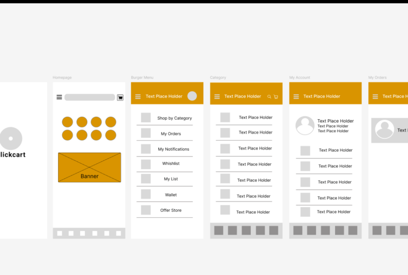
8. Frames & Design file in Figma Design(Interface): Designer. Welcome
to our FIigterial. Today, we are diving into the exciting world of creating
your first design file. But before we dive
into that video, I want to offer a quick apology. As I was recording, I thought
I had everything under control taking us through
the click cut wireframe. However, while working
on the project, I noticed that the
file was untitled. While checking my window locks, I realized I made a mistake. So this was my mistake. So now let's go to FIMa and let me teach you
how to create frames. Now, I know it can
be a bit confusing, especially if you are
just starting out, don't worry, I got your back. So your screen might
look a bit different from mine because Figma
to fish things up. If you can't find
the way, no strays, head out to the top
and on the left, you can see there is a name like my name is
imaginary programmer. And there is ML or other things. If we have multiple
accounts in that. So currently, I only
have one account, so this is my default account. But let's say if you
have an account, it will show you colored logo and as well as MLID so
you can switch that. Let's say you might be
in some different app because you are trying Figma. So you might lost your way. So what you want
to do is that you can just click on
this home icon, and you will be in this section. I know this might be
overwhelming for you because I work on lots of projects and I created
lots of projects. So this is my interface. Let
me show you another thing. Here is the Teams.
Okay. Let mad. It is a bit confusing. I know. So this is my interface. So we are going to create
a new design file. So you can see there is one
option called design file, and it is blue in color. So just click on it and we
will get our design file. So I made this mistake. So let me fix that first. So our project name is
going to be click Cart. And it is going to be
version one, so it is V one. Okay, so this is
the name of my app. Now, let's move
on to the frames, let me tell you
why I name this V one because I work
on lots of project, and when I was
starting learning FMA, I want to make update
of this version. What I used to do
is that I used to say final after
that, another final. After that, another final after that final V four,
something like that. So if you are like
Photoshop visor or graphic design, you
might know my pin. So that kind of
thing I used to do. But now I just say version one. So whenever I want to
operate something, I say, this is the version one. I need version two. I renmit into version two. Or you can create
a new file and you can rename version tune. Okay, so that was the
thing with names. Now, let's learn how
to make a frames. So this square button
is for a frame. Panel so use shortcut
F for frames. So on the right section
in design panel, we get lots of options
like we have phones, as well as tablets, as well as takes stop,
presentation, watches. Yes, we can also design watches, as well as paper, social
media, fit and archives. I saw lots of people,
they use Figma for, like, social media purpose
because with FDMA, we can do lots of stuff. So it totally depends on you. Let's say you want
to switch you UI x current into designer
or graphic designer. You can use Figma as well. You don't have to
use another sobs. If you're comfortable with
Figma, you can do that. Okay, now let's go with phones. First, we have iPhone
14 and iPhone 15. I don't know when you
are watching this 212. It might add iPhone
17 16 iPhone 99. So for this project, we are
using IP 14 and 15 P max. This first option. You can
check the resolution as well. This is the four 30 into 9302. So just click on it and
we got our first frame. We can move it like
this on the screen. If you want to change the
width and height like frame, you can also do that from here. So there are lots of options, so don't get confused. So in future vidas, we are going to see
all the options, like how to use them, like the stroke effect
export and all that. Okay, currently, in this do, we're just learning
about frames and a little bit about interface. So this is the first frame.
You can rename it from here. You can double click
on it this iPhone 14 P max one and just
double click on it, and you can change into
like let's say intro page. Okay, so if you want to zoom in this interface or zoom out, hold control and
use mouse scroller. We can also do the
same thing with hold control and use plus
button or minus button. So this works same. Now, let's say, you want
to add another frame, so you can go to frames again, and you can add 14 15 P max, this one. You can
choose this one. Or what you can do
is that you can just hold Alt on your keyboard, and you can see there is a mouse curtain behind
our mouse curtain, and we got this element
or frame duplicated. So this is how you can make
duplicate or you can copy. You can also use control C
control that's the basic. And let's say, you
want to currently, this is a bit chaotic. And I want a little bit space. I want to move onto this design. You can use this slider, you can use this slider, or you can use space bar as well. If I hold space bar, you can see our mouse cursory
change into hand. I can just click my right
click and move it like this. This is how you can use
this drag or more tool. And you can also rename
pages from here. Let's say I want to
name this home page. So this is going to
be my home page, and this is going to
be my burger man. Okay, so this is our frames. So for this project, I won't
like up to six frames, so I will zoom out little bit, and I will hold Alt or we can
use control C and control V. Right click on your
frame and select copy, ightlick on this empty space
and and click on pest here. So it will pest over here. And let me track it toward this. So we have four. So again, control V control V. So we got our six frames. I will name this one category. This one will be account, and our end page is
going to be my orders. We can track our
orders from here. So this is all about frames, and you can see in a list panel, we got each pages. And if I add some element, let's say if I add a
line on this page. So as you can see,
it got nested and underneath this intro page,
we have our elements. So don't worry about this one. I will delete this one for now. Okay, so let's keep
the momentum going. So for practice,
create more frames, copy paste like a pro and name them according
to UA task flow, and there is a pro tip. Let's say you are working on
UX project as a freelancer. In that case, you can ask
for your client phone. So like model of the phone. Let's say he is using a
Samson Galaxy S 23 ultra. So in that case, you can create dimension
according to that phone. So they will love it for it. Lastly, don't forget to name your file because I know
I made a huge mistake. Click on this empty
space and just go to this section
and name file. Currently, I'm using click Cut, but you can name it
whatever you want. And feel free to explore more. Are you ready for next video, so let's keep this
creative train going?
9. Figma Text Tool and Fonts: Welcome back, everyone.
In this video, we're going to learn
about all about text, what is the tips, the font, font size, p, how to
align it, and all that. So let's type. First, let's
learn about how to add text. It is very simple. Just
go to top bar menu. And as you can see,
we get this t button. So click on it and just
click on the troprig again. You will get your
text like this. Now, you might be seeing
lots of weird things like there is lots of space in between
them, and all that. So we will fix that in a moment. There is a two
method to add text. First one we saw is bike
clicking on the top bar menu. And also, we can use
a shortcut called t, press t on your keyboard, and your mouse carsel will
change to this plus icon, and you can just drag a box like this and you can put
lots of text in it. So this is how we can add
the text in the page or, this one is the page, so
we can add this in page. There's one thing I
forgot to mention. Like, when we choose only
text and just click on it, we get a box, a small box, and we
can't adjust it. We can address it
after that, like this. But in some cases, we want a box that should be
big in the length and divid, so we can drag it like this and we can add
a bunch of text. So this is how we can add boxes and test we can also
adjust it like this. So let me date this one
for now. This one as well. Okay, I will keep this one. Now let's move on to the how we can do lots of
things with types. Before we do that, let's
learn about type faces. So, what type faces? A type faces is a set of
character of the same design. They include letters, numbers, punctuation marks, and CLFy. There are thousands of
ti faces available. It's important not to
make several ti faces. This can make your design
feel fragmented and clumsy. So you have to careful, curate and elimit the s
of two, three type faces. So most of the time, when
we design wire frame, we go for the basic
fonts like roboto. I know robot is boring,
but lots of people have to they just have to get the idea,
what is the design. So we are using
this boring font. That is roboto. I know, I know. Sorry roboto. I do. So now let's move on
to the font weight. A typeface can have many different types
of tiles or weights. For example, roboto has lots of style and
weights as you can see. It is uncomfortable for me. You can pass the wet you
can count all of them, like thin extra light bolt, extra bolt, those
kind of font weight. Font weight can create
Hetch va topography. Use a large weight to highlight the most important
information and smaller for less
important information. Now, let's move on
to the font size. This demines the scale
and the size of text. Figma represent font size in
density independent pixels. Font size can also create
hechi uva topography. It's important to pick the right size of font on
the right information. Make sure that your text
is readable and it's never below ten PT,
that's ten pixel. As you can see if I choose ten, you can see the font
size is too small, and it's kind of readable, but if we go below that, it might be not readable,
so be over that. So that would make it
unreadable for many readers. Now let's move on
to the line height. Okay, so this is the line
height connect it is 100%. We can adjust it for
let's say line height controls the gap between
lines or text in paragraph. The line height should be
between one 20 percentage to 1405 percentage of
the found size, making the paragraph
more readable. So if I increase up to 400, as we see it is weird. But if I keep it up to one 20, I can make it manually. So can see is more readable. When your line is too long, the reader will have
to hard time focusing. So keep that in mind. Okay, at the beginning of video, I said, we messed
up the spacing. So now let's know how to fix the spacing and
how to add the spacing. Let spacing deamine the
space between two character. This can be helpful
to site caption text. Also, don't confuse
this with cunning, which is the process to adjust the space between two
specific character. Currently, it's 20%. And if I go to let's say
six or seven like this, can see now this is more readable and it does
not look that way. Okay, so paragraph spacing. Next one is paragraph spacing. Okay, for that, I have to add another random text for
what is happening with you. Okay, now it's working. Let me add some random text like this. Consider this as a paragraph. I know it is not a paragraph, but considering it
as a paragraph. Paragraph facing set the
distance between each paragraph. This can increase or reduce the space
between each paragraph. It helps the user to focus
by adding regular intervals, making the text more
legible as well as reable. So if I increase the paragraph
spacing like this as you, it increases like this. So this is how you can
add program spacing. Now, we have the
option of resizing. Currently, the box of
the text is fixed size. We can choose auto
weight and auto hide. I've used a FMA a lot, but I never use
this option a lot. But if you want,
you can use this, and it will adjust
your text like this. So it totally depends
on your design. Okay, next one is alignment. This determines
how you distribute the text within the
confined space. Like horizontal alignments
align your text on the x axis and vertical ment align your text on the y axis. So this one is for side and
this one is for the right. I don't know. I never saw
someone do this thing, like on the right hand side. Most of the time text is in the left hand side
or in the pedal. And you can also use this
one to align the text. So these are the basic methods. And if you want to get some more advance options
like if you want to add less bullet points or as
well as Like, I forgot it. Let me go and check. Okay. So if you want to add make a text upper case,
you can do that, you can add underline and
those kind of things, and you can do other
things as well. Like we saw the element option. It is also available over here, but in this case, we
get one advantage. That is, we can see preview. If I choose resize and
if I go to Auto W, it will show us the
preview of that. How will it look after we
add that effect, I will say. And also the underline,
also the breakthrough. And upper clase low
case and all that. You can also add bullet points. So these are all the
basic text or font or pipa settings you
can do in the figma. So remember, one thing, the text contained ripers
more than 80% of eo design. It's important to learn these text properties and
what they mean. This gives a good
understanding of topography, focus on its utility, and always put
readability first. So that's all about text. So astro video. And I know there is
more things like how we can create text styles, as well as body
text and all that. So we will learn these are
kind of more advanced things. So we will learn those
stuff in future videos. So as Potro do, and I will see you
guys in the next one.
10. Figma Basics How To CREATE And MODIFY SHAPES: Everyone in this bid we
learn all about shapes, like how to create rectangles, lips, polycos and how to
create rounded corners, as well as how to dd them. So let's begin. Okay, so for the shapes, we can go to the topo menu
and click on this square. And the first one is we got
rectangle that line, arrows, is polygon star, and as well as we can put images and video. Okay, let's go and
start with rectangle. And I was thinking I will use this space
for product shots. Like when we go to Amazon.
There's a huge banner. And on that it slides, and it shows a product like what kind of offer is going on. So I want to make that thing. Or I will make this play
for, like, a category. Okay, so I will move this
product shot over here, and I will keep it like this. And okay, this is
for the slides, and now I will choose
ellipse and the shortcut is, Oh, you can also use
and for precise shifts, like perfect circle, I will hold shift and
drag it like this. And I will make four of this. If you want to make duplicate like this, you can hold Alt. If you hold Alt on any element, you can see there is
a dual mouse cursor, and it means you can
duplicate your item, just click mouse and
drag it like this. You will get a duplicate. Okay, there are lots
of methods you can use control C control V. But if I use control C and control V, the object is on the
top of each other. You can see I was on the top. So that's a bit confusing. So I use altption. So I'm going to align
them like this, and again, select all
of them and hold alt. And drag it like this because I want this section
to be category, and I will keep this like this. So this is how we
can make ships. Now, now, let's say I want to make a surge bar surge
bar icon over here. So what I can do is
that I can press R, and I will create a
small rectangle like this and place it
in this center. And I also want a
hamburger minu. So you might see like
in lots of cases, there is a three line menu
that's called Hamburger menu. So we can create by using lines. So let's me so and track
it like this whole shift. I will draw over first, and I will add some
stroke as well. I know I'm going too fast, but it is easy.
Currently, stroke is one. I will go up to three,
so it will become more heavy and hold track it
like this, and another one. Okay, so we got our hamburger
menu and over here, we can lips or search icon. Or maybe I'll keep as it is for now because I don't want
to move fast too much. So, you know, the search Barbano is always with
a rounded corners. So we want rounded corners, and we currently have
really sharp corners. If I put my finger on it, I will get paper cut. I know it was very bad job. So, let's go and create
some round corners. Click on your element. And you can see there is
a four dots on each side. You can just click on
it and track it inside, and it becomes
rounded like this. So as going see
we got d corners. You can do this manually, like if I make it zero, and if you click the element, and if you go into design panel, and there is an option
of corner radius. You can just click on it and
you can add a values like 15 so it will make your
corners more rounded. And you can also sit rounded
corners for each side, on the top corner,
top left corner. Last 15 if I if I
add value zero. As you can see, it looks
kind of text message. So you can also do
that like this. You can also hold Alt
and you can drag it like this for
individual corners, and you can make corners
rounded corners like this. For now, I will keep Okay, so this one is our home wire
frame for our home page. I know there are lots of
things I can do here. Like, I can add a
small navigation bar. So let me go to
this pan I can just use shortcut R and I'll
track it like this. And I can add four or
five elements like home category order card
profile like those things. And what we can do Okay, we can add a small
rectangle. Oh, here. This will represent
this one is for card. I know it does not
look that great, but this is the wire frame, so it does not have
to look that great. Okay. So for now,
it is what it is. Okay, so we already saw
how text works in FMA. We just have to press
T or even this button. So let's add some text like
this one is for banner. No Bruce banner.
Okay. So this one is for banners and this
one is for category, as well as I can
draw four squares, and that will represent
our navigation menus. Okay, so I will go for five. Okay, like this. Okay,
so I forgot to show you one thing, it
is about layers. We will learn about
layers in future layers, but this is the basic thing,
so I have to show this. So let's say, let's imagine
you are drawing a shape. And let me move this over here. And if I choose rectangle, and if I draw a
rectangle like this, and as you can see,
our text disappeared. I know you must be panic right now where it went and all that. But it is really
easy to bring it back because in
layans you can see, this is the rectangle 15 and where is our text.
This is the banner. So you can do it from here, but it is kind of let's
say for advanced purpose. So in this case, what you're going to do is that just select the first item and click
on the center back. And as you can see,
we got our text pack. You can use shortcut
square packet that is next to P
button and if I press, and we got our text pack. So this is how you can
adjust the layers. Okay, there is another option. You can do the same thing, go to object and you can
see bring to front, being to forward, set
backward, or send back. So there are lots of
options. You can do that. You can also adjust it from
here if you use a Figma lot. Then in that case, you
can adjust it from here. But this is kind of confusing. So I will say shortcut or
you can rightly it and you can adjust it like a set to
send to back or being front. So this will be easy for you. And I forgot in previous
video to add the brand name. I was thinking a brand
name called click cart. Okay, so I will add this into
cd and detrib downwards. And I will use ellipse for I want to
add a brand logo here. I'm holding shift
for perfect circle. And in this circle, we will add a brand logo. Okay, so you might be wondering, what is this small you
might be wondering, what is this small dot? Okay, let me show you one magic. If I drag this upwards, we got our pack man and it can hit all the
dots from our game. I know it is bed. Okay. So we can also do this We can create hollow
circles like this. We can also create pie
chat and all that. Is for complex design. Most of the time,
we don't use it, so don't worry about it. So this is how this dot works. So on the end, we've
got hollow circle, so you can add it like this. Okay, so for now,
I will live Azits. So that's how you can use shapes to create
this wire frame, like this banner, this
category section, as well as this search icon, and the line for
the Hamburger menu, and the square for our
navigation menu section. And we also learn how to create a hollow
circle or Pac Man. So that's it for two this video. And I will see you
Kays in the next word.
11. How to Choose and use Colors in figma: Welcome back students.
Today, we are diving into the vibrant world
of colors in Figma. Brace yourself because by
the end of this video, you will master
the art of adding the perfect splash of
color to your designs. Let's kick things off by understanding that less
can often be more. When it comes to wireframe, while gray is a solid choice, we are here to
explore the rainbow of possibilities are ready. To work with color, we will select the
giant rectangle. On the design panel, we got this option called fill. So in the film, we can change our colors.
This is for the light. This is for the Tarke, this is for the low contrast, and this is for the contrast. And we can also change the color from the
side, this color cider. As well as we can also increase or decrease the
transparency of the color. Okay, so first, I will choose industrial yellow
color because I like that color a lot and the
hex code is for that, I guess, something EC ten is
the hex code for that color. After that, we have the
transparency mode from here, you can make your color
or element transparent. So let's say if I move this to background,
where is the background? Okay, so this is the background. So as you can see, our color is kind of it is
transparent transparent. It is not kind of
it is transparent. So if I make this 200%. Okay. So currently ify,
If I make it 100%, as you can see, its unvisile. Okay. So this is how you
can make color transparent. So let me first send
this to the back. Okay, so this is
a indi front now. Now, next option is you can choose a color by using
eye dropper tool. So this is the eye dropper tool. And as you can see on the top, we get this magnifying version. If I move this on the
pages, It will change. Like it is zooming. It is like magnifying glass, and we can choose any color. Like let's say, I want
to color all of them. First, let me select
the select tool. And the shortcuts for
the select tool is V, and I'm going to
select all of this, and let's choose iroper tool. And for the shortcuts. Okay, so I'm going to choose this yellow car as you can see, we got yellow everywhere. Okay. That's how you
can use iroper tool. After that, we have X code. It is a different types
of codes, four colors, like we have RGB RGB stand
for red, green, blue. If you know the values of red, green blue and you
can make any color. And after that, we have CSS. CSS is useful for like
a front end developer. Like when I was in the college, I used to code in CSS so that time I used to need
these kind of colors, like these types of codes. After that, we have HSL. These are the kind of like RGB. This is also values you can put, and it can create color. After that, we have HSB. But most of the time
we use XCode or RGB, or if you're a developer,
you will use CSS. So for now, let's
go with X code. Okay, so from here, you can also increase or decrease
the transparency. You can do the same
thing over here. After that, we have
document color. Okay, the document
color stands for, like color we used
in our designs. Like we have interest yellow, white, gray, black,
and kind of gray. So this is the document color. If you click on this
document color, you will get some options. Like this is for labr colors. Like I created some
multiple projects, so I can export those
color in this project, and I can also use them. So far, now, let's
go with this one. Because I know these topics
are a bit complicated, not complicated, but
not easy to understand. So I will make separate or
dedicated video on that. And there is also option
called color styles. We can make our color palette, and we can use them in our
design multiple times. So it will be easy. So straight for that. There is a video coming up. So this is all about colors. You can also make
your gradient color if we choose this option. You can choose gradient color. For now, let's go
with soolar colors, and we will learn how to make
gradient in future videos. So straight for that. But remember, one thing when
you are designing wireframe, use simple colors like
gray or white or blueish. You might see in
some wireframes. The color are like,
really, really boring. So you have to make
wireframe really boring. And there you have it folks the basic of adding colors in figma. Until then, happy coloring.
12. Strokes & updating default properties in figma: Further students welcome back
to our design adventure. And today, we are diving deep into the fascinating
realm of strokes. Get rid of for a stroke of
genius in your designs. So what stroke is the sleek
line around the edges, defining the
boundaries and adding that extra two visuals. Let's pic our signs shall we. Imagine a burger mirror, I know you're imagining
something else, but that's not a burger menu. So this is the burger menu. Okay, we have over here. So those three lines we
all know and we love. We are not just drawing lines. We are giving them
style rounded ends because let's be honest. Sharp edges look so boring. But, there's some more, we will set some defaults to make you a design life easier. Every rectangle you draw
will come with dicono, a stroke, under coolor we love. No more manual taking every
single time. So let's tie in. Okay, so as you can see, we have this boring rectangle,
so let's select this one. So currently, it has
really sharp edges, and let me add some
rounded edges. So let's go with five. It looks great now. So as you can see
underneath the field, we have option called strokes. So let's click on the plus. We call stroke one, but we can add up
to as many want. Mostly I go for like
two because two looks subtle and it
looks beautiful. Okay, we can change the color of the stroke. Like
currently it is black. Most of the time, it comes with the black. You can
change the color. You already know in previous y, we saw how to change
color and all that. So if you don't want this color, you can change this
color as well. After that, we have
this option called we can put our stroke inside
outside as well as in center. So if I choose center,
as you can see, it involves boundary outside the boundary as well as
inside the boundary, and it creates the
stroke in the middle. After that, we have inside. So it creates stroke
inside the boundaries. And at the end, we all know
it creates strokes outside. So that's why it is outside. So I'm going to go with inside. And this is for
stroke increasing. After that, we have
stroke per side. Like we saw in the
rounded corners, we can give specific round
value to specific edges. So let me click on
this three dot menu in that we get lots of option, like you want your stroke
should be dotted or solid. So I'm going to go
with so because solid loose great and
most of pne solid. And we can also use custom like dottil as well as
a little bit solid. You can also customize them. But most of the
time, we don't use this option that much.
So be aware of that. Okay, one thing I
forgot to show you that this option called
stroke per side. Like, if I choose top, the stroke is only
will be on the top. So as you can see the stroke is only available on the top. So that's how it works. If you choose all the options, you can also customize them. But for now, I want the stroke should be
on the all sides. So this is how stroke works. Now we can choose
multiple options like multiple elements, and at the same time,
we can apply strokes. Let's click on the
stroke plus button, and I'm going to give
the value up to. Two. And you can also use arrow keys to increase
or decrease the value. If I use arrow up key, so the stroke would be bigger. And if I use down keys, the stroke will
be less in value. So for now, I'm going
to go with two. Okay, so this is how
you can use strokes, but there are some more options. Let's say, let's say
you want to create this thing like a
small rectangle, like some advertisement
or some button, so you have to do the whole
thing again and again. So if I don't want to do
those things again and again. So what I can do is that
I can select the element which I want to be
like a set as default. So I'm selecting
this one for now, and let's go to date. And in this, we have option called set default properties, and you can see the property
default is updated. Now I can just choose a
rectangle and I can just draw a same thing like
different sizes like this. So I don't have to create this whole thing
again and again. So this is how you can set
some properties for a default. Okay, so there is
one thing I have to show you, like, let's say, in most of the i frame, you must have seen there is some lines and which
works like this. And okay, let me
choose a line again. Okay. This indicates the
placeholder for image. So if someone is going through your wireframe,
that person will know. In this place, we
have to add a image, so you can add like this. Okay, some people like
this lines or some people keep a image as a placeholder. In that case, what you can do is that event delete this line. So let's add an image. We can go to this tangle tool, and there is option
called place image, and we can also go
to this Figma con, and in file, we have
option called place image. Let's use this one
and the shortcut is, you know, control shaped K. I think I added the shortcut
list in the resources. You can also access that. So for now, let's show this one. And I can just add MH over here. You can hold shift for
precise like shape. And I can add this in
the center, like tests. And I can use this
as a placeholder. But for now, I'm not
going to do this. I will delete this
one, and I will keep my lines because
I like them a lot. So I will keep this lines. Okay, so there is one thing
I forgot to show you. Like in shape video, I created this burger menu. But there are more options
because this has sharp edges, and I don't want sharp edges. So in strokes, we
get other options. Currently, we have none as
well as we get sline arrow, the triangularo, the
river triangularo, less arrow, and diamond arrow. And we can also make the edge of the lines in round
or in the squared. So as you can see,
this is great, but I want the edges
should be rounded. So I'm going to
select all of them, and I'm going to choose
the rounded one. And I go counted one because it looks great and aesthetic. Oh, there is one more thing
I forgot to show you. Like let's say you want to duplicate something we hold Alt, and we just duplicate like this. But let's say you want to duplicate multiple
items again and again. You can use the
shortcut call control. I know there is
lots of shortcuts, but the shortcuts make
us FIGMa experts. So for that, we can use
Control D. So it will duplicate those things again and again and again and again. So this is how you can use control short for
duplicating the item. But for burger menu, we are going to
keep three lines. So I know some people
use four lines, but four lines does
not look that great, so I'm going to go
with three lines. And if you want,
you can also add these lines to the circle. But it totally depends on you, but I'm going to keep as it is. But let's say there is
one thing like let's say you want to copy the
properties of circle, and you want to paste
that same properties on this search bar. So let's select
this search icon, and let's first, let me copy the
properties of this thing. So for that, we can go
to edit and let's copy the properties and the
shortcut are control C. Okay, let's copy and let's
paste it here. Control. So as you can see, we copied all the properties. And we didn't apply
any, like, strokes. Sorry. We didn't apply any rounded corners because it's
alternated out. So that's why we
got sharp edges, but we can fix that over here. Or we can choose this one and we can copy the properties
of this rectangle, and we can paste it over here. So for now, I will choose the default one search bar
because it looks great. So that's all about strokes. So in this way, we'll learn
about how to add strokes to elements like rectangle,
circle and all that. We also learn how to
copy the properties of elements and paste
on the other elements, and we also learn
about how to create this beautiful
looking mburger menu as well as how to add the
rounded corners to it. And what do we learn else? Uh, we also learned about
how to add image as a placeholder and those kind of basic things we learn today. So that's right for
stroke one oh one. You are now armed
with the skill to add that extra play
to your designs. Stay tuned for more
design magic in the next video until then keep creating and
creep involving.
13. What is Object Editing Mode & How to Use It! in figma: Gc design entusias Today, I'm guiding you through the mistress realm of object
editing mode in Figma. You know that place with
those striped lines. You might feel a bit
like a design leveti. But if you ever found yourself accelerted
trap there, fear not. I'm here to be your
Escape wizard. So why are we delving into
this early in the course? Well, if you're a
double clicker like me, you might have stumbled into
the territory unknowingly. Let's diminish it and learn
how to break from it. Like currently I'm in object
tor mode. By accidentally. Let's imagine it
is accidentally. If you want to get out of it, you can just click
on the Noman line. And you are out of
objectative mode. Like, another option is if I
get into objectative mode, this bar will pop up or navigation bar will change
into this objective mode, and you can coin it done. But if I go into
objectative mode, and you can see we
got some options, like we can edit our object. So currently square, I can make this square
into something else, like I can make this into don
or I can change the shape, as well as if I can
also make the like, let's say, I want to make
this side around it, so I can drag it like this. I can drag it outside or drag it inside to create
this weird shape. Okay, let's say you want
to remove this field. So what you can do
is that you can choose this pin bucket tool, the shortcut is for this B. So as you can see the icon or cursor is change into this drop. And in that drop, we
have minus button. Like it has a minus symbol. If I click on it, you can
see the field is removed. But if I want to add it again, I can just click on it, and
by default, it chooses gray. You can also change
the color from it. You already know how
to change the color. So I'm going to
choose this one now. Okay, I'm really obsessed
with that industrial loca. So this is how you can get out of from object editing mode. But let's say you want to intentionally go into
object editing mode. What you can do is
that you can choose the element or shape and
click on this button, like the square dotted button. So you are now into
object editing mod. You can edit or
object like this. You can do anything with it, let's make something weird. Oh, I made P. Oh, not that P. I made in alphabet. Okay. So that's how
we can get out of objectative mode and things you can do with
objective editing more. So I'm going to delete
this masterpiece. It serve it purpose.
Now, you are armed with knowledge of what
objectative mode is, how to gracefully
exit it from it. So that's the porto Video, and I will see you
guys in the next one.
14. How to Use The Scale Tool And Selection in Figma: All right designers,
let's reveal the mystery of scaling versus
selection tool in Figma. Trust me, it's a bit quirky, and I caught your back in
navigating through eight. First, we have a selection tool. Oh, this is the p. I forward delete a P. Okay,
it is deleted now. Let's take this rectangle
and Dubliate this one. If I try to scale down
like holding shift, as you can see,
banner gets weird. It tries to string, but
it does not string, and it currently for sizes
fort eight, so it remains 48. So, how we can shrink our objects or element in
Figma, like precisely. So for that, let me
undo this first. So let's go to the
selection tool, and underneath this
move, we have scale. So if I choose scale, and if I hold shift, and if I shrink it down. As you can see, we've
got our sctgle stringed, as well as you can
do the opposite, like you can make it
big or make it small. So with selection tool,
the magic happens, the proportionate
scaling of everything, stroke, and the type alike. But some people might
be thinking like, let's say you are a designer, you work with, like,
photoshop or anova. And let a some
bunch of text over. And you might be thinking
like, let's group them. If you group them, it will work. I know. I also know. But if I group them, like, let's say,
control photo group. And if I try to group them and, like, make it break
or shrink it, As you can see, it sinks
or it becomes big, like in a weird way,
not how we want. So it does not work
when we group thing. And yes, there is a
shortcut as well for it. I know you might be
thinking for scale. But no, it is a K for
selection tool. I know. B is the logic, but it's famous way for selection
tool and K for scaling. So for selection. So currently I'm
choosing all this. So it is selected and K for selection. I promise
by the end of this course you will be
hitting and K a slaves. Now, you are armed
with this knowledge of skilling and selection. Let's march forward
to the next video. Stick us my design comrades.
15. Figma groups and frames for better UI designs: Welcome students. Today's B is going to take us deep
into the realm of Figma. Explore the nuance
between group and frames. Baggala because we are stepping into the slightly more
complex territory. But fear not. I'm here
to guide you through it. Up until you have been
crashing through the basic, and here nail the types, fonts, and rectangle and tools, but now let's elevate
it into something more. Welcome to the world of frames. I know I'm introducing this
topic early in the course because MusteringFrames was one of the MtricsFma challenge, and I want to make sure you
are ahead of the curve. Firstly, let's reveal
the mastery of groups. So let's grab some
rectangle ellipse, as well as the star. So as you can see
on Burger Menu, these are the shapes we added, but these things
are not organized, and you can also
see all the things as well in the home page, the lines, rectangles, the
line number ten rectangle ten. So it bit confusing
and it earn organized. So in that case, what
we can do is that we can select all of
them like this, and we can try click on it and just click on
the group selection. Now, they are group.
And let's say, you want to move this
towards the interpag. You can just move it like
this. In a single click. You don't have to drag it and drop it like this
again and again, so you can do this at one time. So this is the big
advantage of group. It makes our design organized, as well as you can see
in the layer panel. Now we have one
section called group, and the icon for it
dotted a square. And in that we have our shapes. We can rename it
according to your design. But for now, I will
keep as it is. Let's say you want to organize
this, like in the design. So what you can do is that just double click on it and
just track it like this. I know we can do
this in alignment. But that topic is a bit
more advanced, I will say. Okay, so this is how we can tied up our elements
and objects. Okay, this is the one
benefits of the grouping. You can also use
shortcut word Control G, let me ngroup this,
right click and ungroup. And if I select okay,
now it is Ungroup. If I select all of them, and I can just press Control G. Now, all of them are grouped. Now, let's dive into the frames. Okay, now we have this
small navigation panel or navigation section where
we have lots of buttons. So currently I did not mention what kind of
buttons they are, but let's imagine this
is the home button. This is category button.
This is an order button. This is my account button, and this is maybe card button. Okay, so let's frame them.
It is the same process. Select all the elements object and right on it and
frame selection. And you can also use
shortcut Control G. Okay, so this is the frame now. If I go into a layer panel, you can see this is the frame, and the icon is also changed. Okay, so we have this
nested elements inside, and these are the other
shapes and objects. We can do all the same things
that we did with groups. We can arrange them like
this or we can move outside. Currently, this is out of frame. We can arrange it
tied up and all that. We can do all the same things. But with frames, we get more features like clip
content as well as constraint. Now, let me show you what kind of feature we get with frames. So I have this
clone of Instagram. It is really basic clone. So currently we have this
horizontal like story section, and I don't want
this section to be visible like this outside frame. So what I can do is that I can
click on the clip content. And I can just
track it like this. And if I go into a prototype, you can see, I'm
able to do this. I can also do this one. So this is the benefit
of clip content, and at the end, it is the frame. So as you can see in less
panel, it is the frame. Okay, so that's the
superpower of clip content, but there's the
more like frames, introduce the concept
of constraint. Okay, now, let's talk
about the constraints. Okay, so we have this group. Let me ungroup this one first. Okay, so this is now ngroup and let me select all of them. Let me shrink it
down a little bit. Let's move it over here. And I also added our brand
name that is click card. Now, these elements are like not group, as
well as not frame. So let me select all of them. And right click and
frame selection. Now, if let's say, I want to this element
should be or this text should be on the left hand
side as well on the top. So I will go to a cult
and left and top. This is the basic setting. Now I will choose right and top and this one
should be right top, this one should be right top. Like if I make it this
thing big or small, it has to stay at the same
place on the right hand side. This element should be
stay at right hand side, and this element should
stay at left hand side. Let me duplicate this one. And if I import, sorry, if I add one dextop
pitch like this, and if I add it over here, if I try to extend this, so as you can see, I'm able to reuse my element
again and again. That's the benefit
of constraint. And remember, one thing. If you want to
ungroup the frame, there is one option
called ungroup. This is now ungroup now. And it also worked with group, like let's say you
have some element. Let's say this are the
group element. Okay. And if you want to also group
this, use the same method. Ungroup work for both, like for frame selection, as well as for the
group selection. Okay, let me lit this
one because we are not using this one.
Okay, so did it. So that's the constraint. I
know it was a bit confusing, like constraint and
the clip content. But when you use it
again and again, you will get used
to it, and it will become one of your
favorite tool. I know I introduced this topic early because as you
progress in FIMma, you will encounter
frames everywhere. They become the
preferred choice due to their extra features
like constraint, variant and more,
which we will explore in the depth in future
topics in future videos. Next time you're
wondering why that free U item plate
is full of frames. You will know it because
frame pros were by them. You have only
scratched the surface of the frames and grooves. As we move forward, things will get more awesome,
not complicated. Embrace the confusion now, and you will soon be welding
frames like a design wizard. Are you ready for more Figma
adventures because I am? So let's dive into the
next video and underw more design secrets.
So stay curious.
16. Skillshare 101: Submitting Projects & Showcasing Your Work: The creative minds welcome
back to Figma Master Class. In this fig Master class, my approach is to
learn by doing. Today, we are diving to the
exciting part of journey. That is submitting our
projects in Skillshare. So you have been rocking those design skills and conquering the real
world projects. Now it's time to share your
masterpiece with the world. So here how you can do it. Once your project
gets completed, it's time to share
it with the world. Submit your masterpiece on Skills Inspire others with
your unique creation. So let me tell you how you
can submit your projects. Okay, so throughout the class, I sprinkle some design
challenges like this one. And in this design challenge, I mentioned everything
like what you have to do in this design challenge, as well as all the instruction
are provided over here. As well as there is one p
up in resource section. So if we go to
project and resource, there is one Zile download
it and for will open it. And in that we have Figma UX and UI design exercise
file. Go to this file. And as you can see, there are the small small
design challenges. This design challenge will help you to learn Figma and x design. There are total, I guess, 18 small small projects, more small design challenges. And after that, I have
attached rear Word projects. First rearwa project
is click cart. That is, we are going
to design this app. In this section,
you just have to submit that project
into project section. I'll let to know how
to submit that First. Let me tell you about the
another projects. Then we have Project number
two. Stay. This is the hostel where you can book a small hostel when you are on the vacation
in another country. Then we have food delivery app. You have to design
app bots somato after that, we have MCA, you can design Aflac Spotify
After that project number f, you have to design app
or website on your own. In this project, I'm not
going to help you anything. But but for each project, I gave all the
instruction like what you have to do from where
you can get inspiration, where you can submit it, and what kind of technique, what kind of fig
matrics you have to apply to complete this project. So these are the fire word
project. You have to do it. Let me tell you now
how to submit it. Let's say you have
designed this wireframe. Now you want to submit
this into a ski share. You want to show
this to the world. So we can just go to ski there is one section called
summit Project. Lick on this. And you can add a
thumilkin image. You can take a
screenshot of this. Let me show you how
you can do this. Take a screenshot
of your design like this and then submit
it over here, upload image over here, and you can give
a project title, like this project
title is wire frame. So you can add
project title like frame for click cart and after that add
project description, like what you've done
in this project. And after that, you can
add a link of that, but I will say add link for rear board projects because
those projects will behavy. I know there are lots
of students who are like creative way
creative than me. You can record screen
like how do you app, how it views, how it interacts with user and add it over here, and we will also
make this project private add the text
like web design, X, Figma, like that. And after that submit project. I will tell you
one thing. If you are designing small
small design challenges. So then you can
make them private. So I can only watch
them, I guess. And, so I can only watch them, like how we are
doing in this class. And if I want to show your actual rail road
projects to the world, then you can submit then you don't have to
make it private. The sculpture
community is here to support you every
step on the way. Engage with fellow learners
exchange pretty back. I celebrate each
other's accomplishment. Remember, this is not
just a project challenge. It's an opportunity
for you to grow, learn, and showcase your
skill to the global audience. So are you ready to
take on the challenge? Let your creativity soar
at Cm project today. Now the sculpture
project challenge now and be a part of Wron
community of creators. Is your potential and make a lasting pet with your project. I can't wait to see
what you all create. Remember, your journey is
to become a figma expert. Let's make some design
magic together.
17. Class Project 01 Wireframe: Create reminds
it's project time, and we are diving into
something awesome together. So you have been
following along. And maybe you find yourself in similar stage or perhaps
a tad bit behind. No worries because we
are in this together. Whether you are on the same page or need to little catch up, let's get those friends in. Now, I want you to keep it
somewhat close to my layout. Even if you are thinking,
maybe not there. Let's lick to it. Why? Well, it helps you follow along smoothly
throughout this course. These exercises are only key to exploring all the cool
features FMA has to offer. Now, check your cis file, there's a section name
FMA exercise projects. Open it up and Vo. The requirements for
different class projects are neatly laid out. Now, utilize the skills
you have gained so far, and your creation should be resemble something
like example given. For a closer look,
zoom into the PNG. It is also provided in
resource exercise file. So there is a one large
Pj version that is named, I guess, clickt wireframe. Now, let's talk
about requirements. We are aiming for
like six pages. Those are like intro page. That is really simple to
design after the home page, the burgermenu category,
my account, and my orders. And if you want to
get more creative, you can add one page
like tacking page, as well as like let's
say product details. You can create
those page as well. And remember that
we are designing WiFre use simple shapes, as well as simple ponts. Don't use really funky fonts. And after completing your
project, take a screenshot. For PC people, it is
like print screen, and for Mac People, I guess
it is coma ship four. And if you lost somewhere, then Google is your friend. You can search on the Google or is a shortcut for a screenshot. And if you don't want
to take a screenshot, then you can just
capture a picture with your smartphone and upload
it into project section. I know it sounds like a bit
more homework, but trust me. It's worth it. We're
honing our skills, learning the ropes and
getting better together. So wireframe warriors, I will catch you in
the next video. So ready said design.
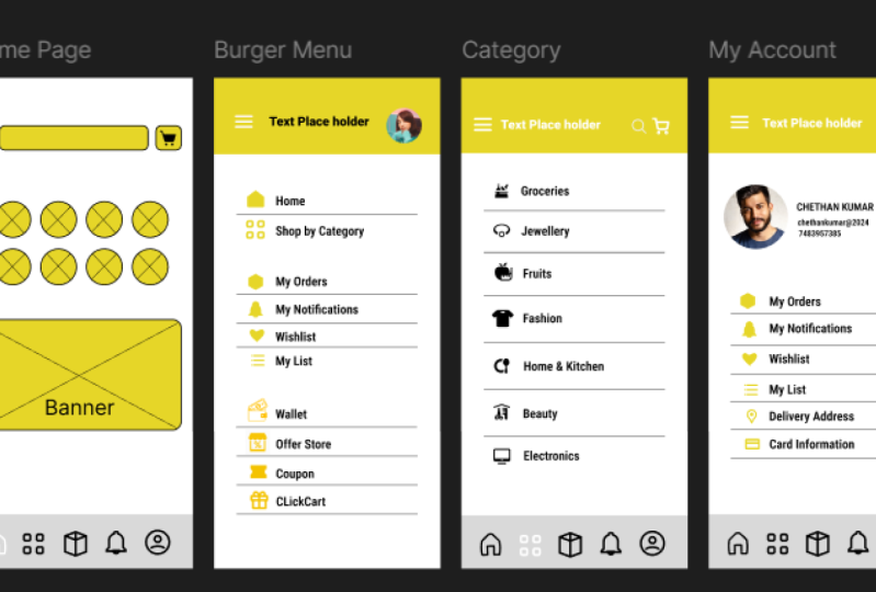
18. Best Free Icon Set Packs for UIUX Designers: Fellow designers.
Today, let's dive into the treasure troves
of the free icons, and let's discuss
where to snag them. I won't just throw
website name at you. Instead, I will guide
you on what to look for when downloading icons
for your Figma projects. My go to destination
is Figma community. In that, we have a
fantastic resources with mix of free and
premium content. However, the Internet is
teaming with the free icons. So explore and find what
suits you the best. Now, let's go to
Figma community, and let's explore
some free icons. Okay, so as you can see, currently, we are in projects. So if I go into home, there is an option called
Explore Community, or you can also access
from here as well. And for community, the
symbol is kind of globe, kind of Internet globe. And from here, you can access all kinds of different
assets like icons, different projects, as
well as wire frames. You name it, you will get
everything over here. So let me find some
icons over here. So, as you can see, we
get some icons over here. These are the icon packs. This contains 1,000
of free icons. You can see this phone
contains 6,000 icons, and this is suitable for
this kind of soft like, this is the Pigma sketch or XD and other some
sob tires as well. You can also sort them by, like, free pad or premium. Currently, I'm going
to choose free. You can also use plugins in next video or probably
after two videos. I'll tell you how to use plugins because plugins are
very simple to use, and you just have
to drag and drop. So instead of using this,
you can use plugins. Okay, so you can also sort this by train
popular and recent. Mostly I use popular. Because in popular section, we get lots of icons
which people love. Mostly I use this one like Bazel as well
as this unicorn one. So far now, let's go with bezels I think I'm
promising it right. Okay. So I guess I use this already, so that's why he's
showing open fuma. But some people might get
that duplicate option. So if you're seeing
duplicate, you can duplicate, but currently less open in Figma and it will
open a new project. And in that we will
get lots of icons. So I can see we get
a bunch of icons. This is the outline.
This is the solid icons. Let's say if you want to use this icon like this home icon, you can just copy this like copy contras and just
paste it on your design. Okay, so we got this home icon. We can just track it over
here because this is going to be our home
section, like home button. As you can see, we
got purple diamond shaped icon on our icon. Like in panel, you can
associate that over here. This is the component. Component is like add ons topic. We are going to
cover those topic in future videos. Stadium for that. So remember, this is
the master component and we can just directly use it whenever we want
and wherever we want. Now, let's go, and let's
discard some more free icons. Okay, so there are some
websites like icon scout. From this website, we
can get all kind of stuff that is relative to EIUX. This is also like FMA community, but this is the sorted
and popular templates is also available over here. Next one is free pick. Okay. So let me download
one element from here. Let's assume, I'm
going with this one. So there is one
option called PNG, and we can download this one. For now, let's go with PNG. Okay. And let me
download also the SVG. I think there is no option. But let me download
one SVG file. Okay, so currently, I'm
in icon finder website. So we get both options like
PNG file as well as S G file. And in others, we also
have other options. But for now, I want to
download the SVG file. So let's download the SVG file. And let me import that
files in our project. This one is the SG file and
this one is the PNG file. Let me past it over here. I'm holding, I
didn't hold a shift, but for now, I will hold shift. Okay, so we got the PNG, and we also have SG. But with SVG, we can
do lots of things. PNG is just a image. You can't do lots
of things with PNG. But with SEG, you can
do lots of things. Currently it has this
wide background. Okay let me bring that
out out of the frame. Okay, so we have this G icon. So with this SVG file, we can increase the stroke, let's say I want
stroke to be five. I can also change the
color of the stroke. So let's say I want
this to be white, I can change it
white as well as I can make it pick and it is
not going to lose quality, like if I increase this
much, it will stay the same. But if I increase the PNG
file, as you can see, the pixel is kind
of getting blurry, but with file, It
is not the case. Okay, so that's the difference
between PNG and SVG file. So keep in mind when
we're using icons. Don't use PNG. I will
say use SVG files. Okay, so this is
where you can find all kind of icons
for your projects. I will give you all the links in the resources. So
check that out. So this one is the UX library, this one is icons cot. This one is the La Pannja. And the free pick after
the icon find us. So these are some free resources you can use for your projects. And these are totally
copy right free. You can directly use them. But before using any like icons, keep in mind that
icon is free or not. Let's say you're importing some icons from like icon scout. It will be sto It
is free to use or it is a commercial use
or it is a personal use. So beb that and use
accordum to. That. That's how you can download import and the
resources for icons. Now, let's mate in the
next video to sp up our wireframe with some of
some icons. So stay creative.
19. Icon basics in Figma: Goma students in previous
w we learn about how to download free
icons where to get them. We also saw the difference
between PNG and SVG. We also discarded community, Pigma community, and we also
saw some other resources. So in this building,
we are going to actually use COs
in our wire frame. So we are diving into our
PMMA access file to bring in some COs and ensure they harmonized with our
existing design. So let's make them
look slick and uniform all across
our wire frame. So are you ready?
So let's jump in. So let's go to our rectangle
tool and place the image. So in this access file, there will be one
fold clickard icons, so slate them all open and
place one by one here. Okay, so these are five icons. Okay. So as you can see, we added some place d here,
and this is the frame. So let me delete
this rectangle box. Okay. Let me select
this and Okay. So now, first one is
going to be our home. Square, I'm going to
place my home icon. After that, I'm going
to place category. After that, my order, and this is for notification, and this one is for our profile. Okay, so currently,
the size of the icons, I will say the width
is 22 point z one. Height is 20 9117. If I want to increase
or decrease that, you can change it over here. Okay, let's say, I want
to go up to like 30, so I can just go to 30, and it will increase the
width as well as height. It totally depends
on your design. But for now, I'm
going to keep as it is because it looks great. Okay, so let's use them first. This is the align
section where you can align anything in Figma. If you click on this three
bar like vertical bar menu, there is a more
option like tied up. So it will tie up
according to our design, and you can bring it
into center like this, and you can see the bottom
is not adjusted that well, so we are going to click
on the bottom adjustment. And this is adjust now. We can also align this at the
center as well, like this. Our home icon is not that big, so let me make it a big because
other icons are about 35 and this one is about 27.
Let me select this one. This is the constraint
properties if I select this, and if I change the
value of width, so it will automatically hj
the height, size over here. Currently, our all the
icons are in same in size. Let's say this profile
icon looks small, you can increase it
over here as well. So far now I'm going to keep *** Let me select this again, and let me adjust the bottom. So if we're not
able to understand this in section, don't worry. I'm going to make
delicate video on that. Currently, just
understand the in section is for align our icons. In this video, we are
just learning how to import icons and
how to at them. Okay, so this is our section. So let's select all of them
like this navigation bar, as well as the icons as well. Well shift and
select all of them, as well as this rectangle and right leg and make
them as a frame. Let me show you one
magic over here. Let's say I want this
same navigation bar over here as well
on the burger menu. In that case, what I can do is that there is a
traditional step is like, I'm going to do all
the things again. But you can do another thing
like select this frame. So as you can see in as
panel, it is selected. Now, just control C,
select the burger menu. You have to select burger menu
and just paste over here. As you can see at same position, we pasted this
navigation button. As to we can do it over here, but Tate did this one first. I category. And as well
as on the my account. Dile I deleted the direct tiger, so let me delete all of them. I think this is not frame. Okay. So let me delete
this one as well, and Pasta control, and
as well as my orders. Okay, so this is how we can add our icons in our wire frame. But let me change
the color of it. I won't object more. Okay, so the color is
going to be this one because a trade does not
look that aesthetic, as well as this
should be a white. And because we are in
the Bergme section. So I think in Burgom section, we don't need this
navigation navigation bar, so I'm going to delete this one. Okay. Okay, frame four is empty. And, so currently,
we're in category. So category should be L. And this one is L.
Let me make this white white white white. And this is my account. So this profile should be L. And this should be a
white. Same with this one. Okay, so this is
our navigation bar. So user will know
in this section, he's like, let's say
if in the home page. So this will indicate we are in the home page, if
in the category, so this icon will indicate, we are in category
section after that, in my profile, as
well as in my orders. Students, that's how
you can add icons to your iframe or in
your UI designs. So that's the ford will and I will see you
guys in the next one.
20. How To Install And Use Plugins in Figma: Hello, design to ias. In this do, we are diving into the secret source that
makes Figma amazing. That is plug in.
These nifty tool is created by dragals
outside of Figma. Extend the capabilities
of the platform allowing you to do more
and work more efficiently. We will focus on some
plug ins for now. But remember, there's a whole
world of plugins out there, and they are all accessible
through the Figma community. So there are three options
we can use plug ins. Like first one, we can
go into this Figma icon. There's one option
called plugins. These are some installed
plugins in my Figma. Right now, you can
go to this button. This one is resources. And in this, we can go to plugins and we can search for
different kind of plug ins, and we can also
bookmark them and we can directly click on
them and we can use it. Like let's say, I want to add one profile picture O I
can just select that, and let's say I want to
profile should be this one. So I can just click on
it, and as you can see, the image is added O Let's
say you want plug in up icon, so you can just search icon. Icons, and it will give you some really popular
icons plugins. Let's go with let's
say icon eight. And we just have to
click because it is not installed in my system. Okay, so it is installed now. Okay, so this is the interface
of the icon eight plug in. We can search like I
want icon of home. I can just search home, and we can also choose
different options like PNG p option. We can also change
the color of it. We can also change the
format of the icons. Let's say I want
this home button, so I can just drag it away, I can paste it and I can
use it whenever I want. This is the benefit
of using plug in. We can also access plugin
through the community. You can just go to community. Let's say, I want only
plug ins of lets picture. Sure. And I can go
to like in plugins. There are 47 plugins, and I can just
click on the Open. I can sort it out.
Let's go to popular. So these are some
popular plugins, so I can just open
it in my figma. And as you can see, you asking where you want to
open your plugins, so let's go in untitled and run. This is kind of
difficult method. I already showed you how to open plug ins
from the resources. Use that one as well. Let's say I want to add my
profile picture over here. Okay, this looks cool. I'm going to go with
this one. This is how you can use plug ins. Remember, the plugins we use throughout the course might
have different interfaces, but the underlying
concept remains the same. Easing Pigma capabilities. Plug ins are an exciting
aspect of Figma, and we will explore more
of them in future videos. State in for deeper
dive into pixels or Pizza Bay and other
powerful plugins in next to trail. See you there
21. Class Project 2: Mastering the Toolbox: Icons & Plugins for Powerful Figma Designs: Hello, everyone, welcome
back to our design journey. Today, we're diving into the
wonderful world of Figma. We creatively knows no bounds. I hope you all excited as I am because we are about to take your skill to the next level. As you know, we
have been exploring the incredible
capabilities of Figma, and today's session is all about translating that
knowledge into action. You have learned
about icons, plugins, and the magic that happen
when they come together. Now, let's see it in the action as you embark on
your own project. First thing, first, I want you to all to check out excess file. You will find the
treasure tools of icons to spice up your design. And you already don't
know how to add plugins in figma, open that up. Think of it as your
design playground. Now remember,
flexibility is key. Feel free to play around with
these icons and plug ins. But keep in mind that some plugins might tweak
the size of your icons. So no worries, adapt
them to fit your design. Slmlessly. It is all about
making it uniquely yours. To give you a
little inspiration, here's a snapshot
of my own project. Notice how the icons and plug ins and the
overall look and feel. It's like adding a dash of
personality to your design. Now, let's see what
you can come with. And this is the instruction file in our FDMA project exercise. You can go through it, and all the instructions
are written over here, and at the end, when you
finish your project, submit that file to me. You can take a screenshot
or capture a picture of design and submit that to me. I'm here to help you
every step on the way. If you have any question,
feel free to ask. Let's turn this into a
collaborative journey. And remember, that's
our no wrong turns in design, new
exciting discoveries. So my amazing designers, let's bring a game and turn
those frame into work of art. Dive into Figma,
explore the icons, unles the power of plugins, and let you a creative
run like a wild. I can't wait to see
what you come up with. Let's make this project
one for the books.
22. How To Create And Use Pages In Your Figma File: Welcome students in this bid, we are going to dive into
the fold of pages in Figma. While it might be some
bit dull, but trust me, it's a crucial organization tool that will keep you
design work tighty, and stretch. So
let's get started. Firstly, you have probably noted we already
have a default page. That is page number one. Now that's a page
currently contains all the frames we
have created so far, likely intervageHme page,
burger menu category, my account, and orders. To make this thing clear
and most organized, we will create new pages. For instance, let's click
on this page button, and let's add new page or
we can rename this page. So let's rename this page. Currently, it is page
one, so I'm going to rename it like click
art Mobile App. For renaming it, you can just click on your
page number one. And now we can change name. Okay, so this is going
to be our page name. Now, let's add
another page name. Let's say we want to create
dextp app or tablet app. So in that case, we going
to create a new page. And in that we are
going to create a specific design for tablet. Or let me rename this again because this
one is for mobile. If someone access this file, that person will get
confused. What is going on? Like this one is tablet. I get it, but what
is the above one? So let me rename it into mobile. Okay, so we got two pages. Second one is totally empty, so we don't have any item in it, but let's add some frames. So tablet, let's
choose tablet. Oh, it. Okay, so we are surface
pro and iPad mini eight and iPad 11 and
iPad pro 0.12 0.9. So let's take this
one like 12.9 inch. And we can create some multiple, I would say pages, like
hold Alt and tublicate. And let's say and we
have six pages, I guess, six frame in our app, so we are going to
do the same thing. Okay, so this is going
to be our table section. So I'm not going to design this. I'm just showing this for
a demonstration purpose, like how to use pages. Like you want to create the
whole tablet app like this. You can create a new page, create these new frames and
create a new tablet app, or you can create a dektop like website for the same
app that's click card. So if you're interested
in that, please do that, and you will get
some extra points, and you can also
share that with me and you know where to
submit that project. You can take a screenshot of it and submit it into
project section. Okay, now let's move
on to the new page, and let's create a one page, and in that we are going to
add card, Tastro and grief. Okay, so this is going
to be our first page. Let me move it over
here. Just hold it. Just click on it and hold
it and drag it like this. So it will move on. So I resources file,
Figma exercise file. I added this task flow, this task flow and brief. So you just have to copy
and paste it over here. So you don't know
how to add that, go to home section
and click on Import. Choose a fromo computer. Okay, I exercise file, it is over here, Figma, sorry, click card brief and
taklo click on this, and if the extension
is fi If you can use PNG but I'll say add
the fi file Figma file. And less important. Okay, it
is done, so it is over here. Just copy all of those things. Frame one and this frame two. Control C, and let's copy this in our This is where
I want to paste. Control V. This is
going to be our brief. This is going to
be our mobile app, and this is going
to be our tableg. Or if you want to
create another website, you can also create a new page, rename it and create a website.
I totally rebate on you. Okay, now, let me show you some really good
examples of pages. So when we are trying to get
some icons from community, so we duplicated this file like Basel and you can see
we don't get any, like icons over here because
we are in page number one, and the name of the
page is thumbnail. And after that, we get full pro. And in full pro, we
get all the icons. So we can directly
use in our designs. The same thing with
unicorn design, you can go to pages. First one is covers, and
second one is icons, and we get lots
of lots of icons, and we can just copy and use it. And there is another
one example. I know I'm taking
too much example. Just bear with me because
this one is the good. Okay, let's say someone
is really new beginner. He don't know
anything about U x, and he got to know about this iPhones new feature
that is dynamic island. And he want to copy this elements and use
it into his design. So if we downy, you can see, we don't let me go here. Okay. So on first page,
he will see this. But he is not in
the page section. So you might get confused. So in that case, he can just go to this cover section
or page section, and he can access all
the elements like this one status Hom Ba Mus, wallpaper, st is artboard and grids. This
one is the grids. So grid section is
really important. I will teach you in
infattum for that. Because of grids, we are
able to design our apps. In infat sottum for that. So this is how pages work. It helps us to organize
our things in our designs. Okay, so as we progress
in this course, we will create simple
design system. Often referred to
as a style guide, which will be another
use case for pages. For now, make sure
you've created pages for mobile task flow as
well as for table tap. If you are interested
in this table type, create that and make a design and you know
where to submit it. And copysto persona and the task flow into
respective pages. All right, my students, we
are all set with pages. So stay organized and I'll catch you in the next video.
Happy designing.
23. Figma Prototyping for beginners: Welcome experience in this bid, we are going to see
multiverse roto typing. Buckle up as we will be
creating interaction that allow us to navigate through
our frames seamlessly. So let me show you
some multi verso here. So as you can see, this is
the final version of our app. I I zoom in. So we have some buttons,
images, and all that. So this is the final version. So let me show you
one multiverse. So if currently we are
in design section, if I go into protype
as you can see, this is a bit chaotic and
the multiverse is around it. It's not called as a multiverse. I call it multiverse
because it sounds funny. Okay, so these are lines we just added to interact with our app. So let me go to our
main app that is going to be our click
cart app wireframe. So, currently, we are
in design section, if we go into a prototype, and currently it is
not selected anything, so we are in the empty space. So when we are in empty space, we are able to choose
some devices currently, we choose iPhone 15
Pmax, we can change it. We can choose any
device we want. We can choose into, like, let's say iPad, as well as
appog as well as Mac Book. But for I'm going to
keep iPhone 15 PMx because we want to tate this
one like width and height, as well as on the same pixels. So we can also change this
into horizontal or vertical like this and the color of the our iPhone is natural
titanium. It is by default. You can choose another color
as well, and this will be p, the background pre section, and the currents flow. So don't focus on
this right now. I will show you how flow
works in next video. So if I click on any pages, like currently I'm on interage, if I select this, you can see, there is a dot appears. It appears over here, over here, over here, as well as over here. With this dot, we are able
to connect our pages. So I can connect
this page like this. You can see a little bit arrow, and there are some
interaction as well. Like, let's say, if I type this, like if I type this on space, it will go to this page, and it will be instant. So this is some settings. Currently, we are going to skip that part
because in the next, we are going to
see those things. So now let's click on the
home page, same thing. Menu, it is going to join to
category and category two, my account and last
one it's my orders, we join our six pages, and to get pre, we can just click on this
play button over here. So we get two options
like present and preview. If you click on the preview, you can see this menu appears
or this small popo appears. And if I click randomly
anywhere on the screen, it changes because in direction
is nothing right now. So we just add some flop. So if I click again
on the empty space, so it will be like this. It is just moving
around our app. Okay, so we can decide
it from here as well. So this is the previous section. And let me show you one magic. So if I choose homepage
and if I change the color of this banner
and let me go to design, we have to go to design
for the changes. And let me change it into, let's say, if I make it red. So as you can see,
at the same time, in the previous section,
it changes the color. Let me do this. So
that's the benefit of We also get the same
thing while presenting. So let me go into
present section. It will take time. It totally
depends on your design. So currently, we
are on front page, not on the front page,
but in the home page. Let me reset it. So for reset, it is R. It appears here. If I click on the empty space, we go into home page after
that category after that. This on this category,
the M account and orders. So this is how prototype works. If you click on
this empty space, we get the option of
resetting this app, and we can also
navigate from here, like page second,
third, 4506, like this. We can also switch it back and forth from
this button as well. We can also add comments. And from this section, if
we have multiple flows, we can also choose that. Currently, we have one flow,
so it is showing one flow. Let's say you're presenting
this app with your client, and you want to share that
live thing with your clients. In that case, you can
choose this and you can slotlight me,
click on spot line. It will follow your instruction. After that, we have
share prototype. You can share or prototype with your client as well
as your friends. You can make some changes, you can add some
email ds over here, and they will get to know how your app works
and how it interacts. Option, we get some sizes
like currently it is 100%. Okay, currently it
is fit to screen. We can choose 100% fit screen. We can also disable some
settings over here, and this is for recites. Okay, so this is the interface of the pro present section. And this is how prototype
works in Figma. In this way, we learn
about how to set the device in the pot as well
as in the horizontal body. We can also change the color
of the present section. We didn't learn about the flow, next way, we are going
to learn about flow. So state for that. And we'll learn about
what else we learned? Okay, we'll learn about
this present section. So this is the basic
of the prototype, but as compared to this
looks like really easy. Prototyping is really easy. I know it looks a bit chaotic, but prototyping is one of the easiest thing
we can do in UI UX. For as a quick exercise, this is not a project,
just a quick exercise. I suggest you breaking the prototype connection and setting up specific
interaction for button. Let's say you design this page, and let's say you want this button should do something like this button
indicates category. So you can join this as a
category and just play with it. So it's just a exercise,
not a project. You can do it for a ph. And let's say you
master something and you join somewhere else like this and you don't
know how to delete this, you can just go to
this prototype, and you can see interaction
tab is my account. Just click on this minus, but
it will delete on its ph. Or you can press
delete button as well. It will delete as well. So that's the wrap up of the basic of
prototyping in Figma. So in the next video,
we will take some steps further and add animation
using transition. So join me in the next video
for more prototyping for.
24. Figma Prototyping & Transitions (Easing): We come back to y x designer. In this i we're going
to learn about how to prototype our wire frame. In previous, we learned about how to
prototype our things, but it was not any details. We just join our
pages like this. If you don't delete this like prototype, you
can delete that. Okay, so in this, we are going to do those things
from the scratch. If you don't know
how to delete this, just select this protype wire and hit delete on your keyboard. That's how you delete
the prototype wire. I call it wire.
Okay, so currently, we are in prototype. If you're in design panel,
just go to Ptype and I want to prototype
this one first. So okay, so this has
to be like on type. Okay, let me delete this first because for some student
it might be confusing. Okay. So let me
drag this towards. Here. Okay. So now
we have some space. So let me click on inter
page, and let me join this. So in this section
on inter page, we don't have any buttons
or in clickable items. So for that what we can do is that we can just
tap on any empty space. It will navigate to home page. So as you can see it is
navigating to home page, and animation is moving. But you can set any animation. You can set instance
dissolve Mt animation, move out, slide and slide out. For now, I will choose dissol because dissol is
like basic animation. And for wire frame,
we should choose normal animation,
not that fancy. While working on real
app on this real app, we will choose different
types of animation. Keep that in mind. So
we choose dissolve. After that we have in
out in and out in back. We have lots of animation types, so we can choose any of them, and we also get some preview, how it will look after
clicking on this empty space. And after that, we can also set the animation time currently
stranded by Difult std. We can say thousand
thousand is 1 second. So it totally depends
on your design. Okay, so I don't want
any fascinating here. Now, let's go to home page. And this is the burger menu. So let's join this burger menu
to this burger menu page. So I want to navigate
these two burger menu. And remember one thing. Like in previous
protyping thing, we added some animation
like dissolve. So it will be same for this because Mar doesn't
reset the animation. It keeps old animation
and old settings for it. So we have to change it. Like if you want to change
it, you have to change it. So I want this to be to burger
menu, and it should be. Let's say move in
and the animation should be from the
left like this, and we can set
easin and ease out. In ease it comes fast and
it goes slow like this. If I choose ease out, it comes first and adjust it
like a slow like this. I know it is confusing. You can just set the time
in milliseconds and you can see those
things like a slow motion, so you will get the point. Okay, so for this move in and
this will be the animation. Okay, so let's close this. After that, Okay, I
nailed this to be. If I click this, it should go on the home page because from
home page, we went there. Okay, so far this my
animation will be move out and it will go towards
the right like this. Okay, I will keep the time
300 because 300 lose grade. If I choose 1,000 or 2000,
it will be very slow. Okay, so we have to prototype lots of like we
have to prototype this two category after that orders after
that my account, and after that profile. Okay, let's join
this two category. After that, we have my orders. Okay. I didn't set anything. Okay, let me set this one first. I will keep the setting to
be I will keep it dissolved. I don't want any fancy
animation for the wireframe. We will look all the animation and microphone interaction in future videos because wireframe does not require
any fancy things. Okay, so I will just
join all the things, and I will speed up the video. Okay, so I forgot
I guess one page. There should be one
notification page section, but I think I forgot
that empty as it is. I'll keep this thing as it is. I'm not going to join
this to anything. So there is one magic trick. You don't want to do all of this thing all over
again and again. Like for the category section, we have to join everything
again and again. So in that case, what we
can do is that we can just like we have to
delete this first one. I know you heard it right.
You have to delete this one. This one as well,
and this one as 12, and we can just copy this frame and click
on the category. You have to click on this
upper name and just paste it. And it will be over here
at the same location and the protype will be same same with account
and same with my orders. So we just have to change
the color of this icons. For whome it should be white
because we are in category, so let's choose this one to be industrial color after
that same with this one. Okay, I went to
object rating mode. It. And this is my account. So my account will
be industrial. You can choose any
color you want. This is my favorite color,
so I'm choosing this one. Okay. I again went
to object White. My orders, it's going
to be this one. Okay, so this is how
it is going to look. So if I go to prototype,
it will look like this. If I click on this, you can see all the things are joined. We don't have to do those
things again and again. We have to join all the things like home shop by category, my orders again and again. I will fast forward with this. Again, Bergamo, I added some things like
aisles list wallet, offer, store, coupon,
and click car gift. So I didn't design
any pages for them. So if you want, you
can design them, but I thought if
I designed this, the project will
become very, like, big, and it will be
like overwhelming. So I let's keep
it shot and let's add those items to make
our design look better. Okay, so we can join
the Berg menu again. Okay, we are almost done. Let me check and let me grade
the preview of our app. Let me present it again. Okay, so current dis click
cut and the first page, we set only tab animation. Like if I tap on
any empty space, it will navigate to home page. Okay. So let me tap
on this empty space. Okay, it works. The
animation is dissolved. Now, if I click on the
empty space like this, it will show me which
things are clickable. In this case, categories
clickable ors clickable as well as my account
and the burger section. So let's go to category. So animation is dissolved. I already set the
animation to be dissolved. And if I choose Bergman, Bergman, I didn't
set the Bergman. So let me go to home again. Okay, Home is not state. So this is how prototype work. And while scrolling
through our app, we know which things
are connected or which things
are not connected. So my oldest and after
that, again, my account. And home animation
is not status. So let me set the home
again to everyone. Okay. In every f to set home. Okay, so let me try it again. So if I press home, Okay, it is working now. And you have pressed
burger menu. So in burgermenu, we get some clickable items like home show by category
in my orders. So this is how multiverse
protyping looks. Okay, so that's how you
can join your icons to the UR pages like home icon
to the home. Sorry, not home. The category icon
to category page, toccon to go page, Mic to my account, and other micro interactions.
This is just a basic. I know it looks like really overwhelming and
really futuristic, but it is just a basic
we just have to join the icons with o pages,
small micro interaction. That's the thing
with prototyping. I know there are lots
of things we have to cover like micro interaction, animation, and key
customization and all that. So we will see those
things in future bids. So I see Porto bi and I will see you
guys in the next one.
25. Figma Testing Prototype with Figma Mirror: Students, in this play, we are going to be looking at something called
Figma mirror. It is a Figma app. You can, like, test
your app on your phone. Let's go to Playstore or App
store if you're using Apple. So I'm using Presto, so I will go to Presto, and there is an
app called Figma. You can search a Figma and after installing,
just open it. And after opening log in
it with the same account, which is loged in in your PC. So after login, the
interfaces look like this. And currently we have lots
of projects in my app. So you can see there is options. Like first one is there is a play button at
the top left side. So that means it
is the prototype. So we can just click on it. So currently, we are using
clickard version one. So this is the prototype.
So let's click on that. We go to same prototype on the MScreen you can see
at the same time we have fliardp click card app is open on our PC as well as
on my smartphone. Okay, but problem
with my smartphone is my phone has 6.2 inch screen, and iPhone 15 P max
has 6.69 inch screen. So if I go to home page. Okay, so you can see on my
screen on mobile screen, the icons of the
navigation bar is hidden. So I have to scroll a little
bit to get that icon. But in Bergamno it works. Like if I touch there, you can see the animation over here, as well as I can access
to homepage, category. But if I want to access
the navigation bar, so I have to track data bit, score it down data bit, and after that I can go to category orders as well
as into my accounts. So this is how Figma mirror
works. It is really easy. Let's say you want
to share this app with your friend or
with your client, and your client don't
know about any fo app. In that case, what you
can do is that you can go to prototype in your app, and you can see the option
called share prototype. In this option, we
get some options. You can add a mail of them, email add up them
in this section, or you can just copy this link and you can share it
wherever you want. Like on what app on telegram, as well as on Instagram, you can DM them, and they can
just open it on the phone. But when I'm trying this, like on my smartphone, I don't know, for some
reason it just kept loading. Like I'm not able to use
this a few days ago, I opened the same line,
but it was working, but I don't know what
is happening right now. It is not working right now. You can see on the screen, it is just loading for forever. So in this case, I don't know, there might be burger and the system is
under maintenance. There is one other thing.
Let's say if I go into design. I already showed you this,
but let me show you it again. Okay, let's say we
are on home page. On the mobile also
on the home page. And if I change the
color of this banner. Like let's say I make
this into blue rate. You can see it changes on my mobile app as well
on fimeter app as well. It is real time,
and it is really good to see the
interface like this. Okay. Because our client
will get information. Let's say you are on the
call and your clients say, Okay, I don't like this color, please can change this into something else
like make it red. So in that case, you
can just drag a slider and your client will
be, this looks great. Okay, so we should
keep this red. Okay, so that's the benefit
of Puma mirror app. Another benefit is like let's
say when you're mobile, you can see the
actual icon size, like let's say the current
icon size is pretty much good, I will say, or I can make
that rectangle small. So it totally depends
on the phone. Currently, I'm using
really old phone. So it is quite getting squishy. But if you want you can try it on your Let's
say if you have iPhone, you can try it on iPhone. And You can observe the icons. Let's say on your phone, the icons looks too much big. In that case, you can make
them small or big, like that. But currently, I'm
liking this app. The burger manuftion iss great and all the
options of the category, as well as the burger menu. So all things looking great. The only the navigation bar
icon is detail bit big. So we can change that. So that's the benefit
of using mirror, so we get the real
perspective of app, which we are designing. So, fellow students, so
that's the photos video, and I will see you
kits in the next one.
26. Class Project 3: Mobile Design Magic: Showcase Your App in Figma: Welcome my students
exciting news. Today is the project day, and our project number
is three, I guess. Okay. So let's go
to project Tap. I hope you open this
file on your PC. Okay. So first, you
have to download the Figma app from the Playstore as well
as from the App store, if you have iPhone,
let's say in any cases, the app is not available
in your country. You can go to this
website called figma, and you can login, and
it will work the same. After that test your design, see the design is
accurate with your phone. Let's say if icon is too big, so make the changes,
also change the color, as well as the phone size
and make those changes and check your app
again on your phone. After that, capture that
wire frame like this. After capturing wire
frame like this, submit that to project section. And let's say you are a little
bit tech savvy like me, you can record that
video on your phone, and you can convert that
video into gift files. After converting that, you can submit to into project section. This is the link
for that website. You can go to Auto Express and submit your file over here,
and it will take some time. And after creating that give file, I don't
know what it's called. It is gif called if
so called a gift. So you can submit that file. And let's say you don't
know how to record screen. In that case, you
can just capture a screenshot like this and
submit that file to me. So that's the project
number three. In next way, we will see some really cool thing
called animation. We'll see the basics
of animation. And I hope you are excited about that because it is
really interesting part. So stay for that
and do the project, and I wish you the luck. So bye for now.
27. Figma Smart Animate for Beginners: Welcome back to
students. In this video, we are diving into
the fascinating world of animation in Figma. Up until now, we just learned
about some page transition, but city for something new. That is element transition. So I made some little
animation for you. So if I click on the Auto
cicon, the magic will happen. So please keep your eye open. So that's the little
animation we made. So let's learn how to
make that animation. Okay, so we have my
order page and I want to animate
something on this page. So let me first add that
cart icon on this page. For that, I will go
into plugins and icon h. You can choose
any icon you want. So let's search for cart. Okay, so I will choose this one. It has a really
equal symbol inside, and remember it has a PNG. So that's why it
might seem blurry. As you can see the
edges are blurry. Okay, so let me create some pages duplicate
of these pages. Okay, so we nate I
guess three pages, page one page two and p three. Okay, so let me rename the page first because it
will get confused. Let me rename this let's
say my order is one, or we can name it like A one. I will know or any
other person will know. This is the animation. A one. Let me copy paste over here. This will be page two. You can name it
whatever you want. Animation three, and this
will be Animation four. Okay, now let's
jump into protype. But before we do that, let
me date this for first. Or we can do the one
thing like, let's say, let me z in, and I'm
trying something new. So let me put this behind. But let me increase the size. I'm holding shift and
size is 1205, 1205. Let me make this 1205 as well. I don't know why the
color is changed. This will be also 1205. He should be 1205, as well as the same
with this one. Okay, so now I can
work on my animation. So let me send this to backwards
and let's go to protype. Okay. So currently, we are on animation miles animation one. So let me join this page. On tab, it will do something, but we don't want this
should be on on tab. I should want after delay, and it should be animation. We have to choose
smart animation. I know in Figma, it is a bit confusing because
I use lots of softares all film
basic softareFm in that we get option
of key framing. So with key framing,
we can do animation. But in Figma, we have
smart animation. And we just have to choose animation like smart animation. We don't have to add key frames. It decides on its own. So it is good, but if
someone is bigger, that person don't know
anything about animation. Smart animation, it will be
a bit confusing for them. So currently navigate
to animation two, smart animate and ease
out is 300 milliseconds. But okay, let me keep
100 milliseconds, but I want this page or
this thing should be here. And this cart icon
should be over here. This is going to be my thing. Let me go and check
it animation. It is working. Let
me do it again. Okay, so it is like that,
but let me fix the icon. I guess it is little bit. I have to put into center. Now it'll work. It is working. We may some animation over here. Now, let me bring this downward. Now, let me move, so we can just move
this towards this. But in less panel, you can
see our images out of frame. So we have to bring
this inside frame. And if I go to design, sometimes it might
be clip content, so you can by default it to be clip content, so
you can unclick this. Okay. Let me go to prototype
again and let me join this. Okay. So navigate to this page animation
three and smart animate. And let me go into this
section again. My orders. It's supposed to go this
side on the right side, so I made mistakes Let me check what I made a
mistake over here. Okay, so it is on on tab.
I don't want on tab. It should be after delay. So it will work now. Let me
go to this section again. My orders, it should
be down. Okay, got it. I put the millisecond,
this one millisecond. So let me put it 300. Let me check it again. I hope so it will work again. Okay, it works perfectly fine. But now we want this
should be on this place. So we will keep it as it is, and we will de it this one. And let me join this again. And it should be after delay. And animation 300 milliseconds. So let me try it again. Okay, our animation is done. Okay, so it will down,
go to right side. Okay, that's our animation. So that's how you can
do animation in Figma. I know it is a bit confusing and kind of hard to understand, but we are going to do lots of animation in future videos.
So stadium for that. If you want, you can rewatch this video again and
again and again. So then you will get, what is the smart animation and
how it works in Figma. And remember the thing
about the clip content. If you bring out some element
outside of the frame, it will be outside the frame. Okay, so animation three element
is outside of the frame, but we've dragged inside. So it is the part
of animation three. So I just want to say one thing. In summary, animation in Figma revolves around a
few key principles, ensuring elements
have the same names, understanding the roll
up smart animate and managing delays to
create dynamic effect. Figma animation capability
might feel a bit chunky, but it's a small price to pay for the verticity it offers. So stadium for more exciting FEMA adventure in
the next video.
28. Class Project 4: Breathe Life into Your Design: Creating Smart Animations in Figma: Welcome back students,
get ready for an exciting challenge with the class project number three, or four, I guess it is four. So it will be our
first animation. For this project,
you have to create this really cool
looking animation, which I created here. Okay, so these are
the instructions. Go to my orders and create
few pages and animate them. After that, you can use a different method
like I use card, but you can use
another icon like shape or a square
rectangle or arrow. It total depends on, you can use PNG as well as icon
as well as shapes. After that, screenshot
that and submit to me. If you are text, I will
like me or you want to challenge me so you
can record that file, record your animation and
convert that into give file. You already know we
can convert our Bfour into give file into Ado express. So use that here is the
link, you can click this, and it will redirect
to the Auto Express, and after that, submit
that into project section. So this will be our
project number four. So follow all the
instruction and submit this animation to me. So that's a pot video, and I will see you guys
in the next section.
29. Sharing & Feedback in real time with Figma: Welcome back designer. Today, we are taking our
Figma skill up on arch. So you have mastered the art of sharing files
with your clients, and it's been a smooth sailing. But now, let's talk
about the team work. Collaborating with your
UX design called AW. Imagine you are not
alone on a project. There are multiple
creative mits at a play. To make this seamless, we are diving into the realm
of teams and team projects. Now, you had a good
run with the drafts. A limited drafts a
designer's dream. But here's the plot test. If you are teaming
up with colleagues, it's time for a change. So let's imagine one scenario like you are working
on a critical project, but your team is scattered
across different platforms, growing in feedback and desperately trying to
stay on the same page. So it's enough to make even the most seasoned designer want to pull their hair out. But what if there was a way
to collaborate seamlessly, share file efforlessly and
keep everyone in the loop? So we are introducing
Figma teams. You are one stop shop for design collaborative
in Nirvana. So currently, I'm in
home and in drafts, so we have this
option called trims. It might be like
this ever interface, but it can have one project. So let's create a new team. Let's check out some benefits
of the Figma P. With free, currently, we are using
free, we get one project, three design file and
three fijum files and three pages per design. With the propional version, we get the new features and
other features as well. Currently, we want
to use free version. Let's create a team
and let me give you I misionary Okay.
Let's create a team. Okay, now, let's add mL ID. Like, let's say you want
to add some people. So I want to add one people. That is going to be me
with my different ID. Okay, you can add multiple
peoples in there. There is no limit can
add unlimited peoples. It is again showing
the premier version, but I want to stay
with my startup, so I'm going to
choose Starter Pack and we've got a free
version of team. Okay, so it does not
have anything right now. So let's say we are
working with drafts, and we want to add some
team members in our design. So let's say we are
working on this project, and we want to add some
team members in our design, so I can just track
this file and I can add this into our team, that is imaginary team. Now it is in the teams.
Now, let's open it. Okay, so, currently, that
person is not available here because that person
did not accept our request. So let me go to let me log in with that account and
let me accept the request. Okay, so I locked in with that account and I
got this design. Now, I can just drag any element or I can
add any element, and I can do whatever I want. I can add a punch shop like say, elements like this,
I can add colors. Okay. I'm going first. Okay, so if I go to my
main account again, so as you can see, it
is also available here, let me do like this. Okay, so I'm also able
to see that person, like what he's doing in our design and what kind
of changes he's making. And we can also assign,
in real time, like, Okay, I don't want this color,
change it into something else, so can change that like this. So that's the benefit of collaborative teams
and using teams. So for now, I will quit this because I hope
you get the point, like how team works, but let me tell you other
features of the teams. Okay, so victims we share
workplace like this. And in this, we can
add multiple files. But we are using free version, so we are able to create
only three files. As you can see, we
currently use one. We have two left, and also three fix JM files. In share workplace, we
are able to share files, prototype, and fix
jam at the same time. We can also do thread comments
in some of our design, that person can just go to
this rectangle and add comment and we can get reply at an
instant at a real time. We also get version control. After that, that person
can get role based access, like we want to keep
our information safe. So in that case, we
can assign the role. With teams, we are able
to project management. In this, we can organize our
project template, task list, and due dates, and we are able to also centralize
our design system. And after the end
of the project, we can analyze our project, like we can gain
valuable insight from our team activities and
identify areas to improvement. But I will suggest
you one thing, let's say we're working solo. So in that case,
don't use teams, go with the drafts because
drafts are more easier, and with drafts, we are
able to add multiple pages. But in teams if you can see, we are able to only
add three pages. But in drafts, we can able
to add multiple pages, and there are no
like any limitation. So the balance between
free and pad plaus depends on the specific need and the scale of
your design work. So that's how to create a team, add multiple collaborators in our team and the
features of the team. I hope you understand
all of these. I will say again, one thing. If you're working so low,
you don't require teams. But if you're working with
like two or three members, can that time, you can go to teams and upgrade to
professional virgin. So that's the fo guys, and I will see you
guys in the next one.
30. Figma Collaborate in real time with multiplayer: Welcome my students.
In this bill, we are going to
explore the process of sharing our designs
with our clients. Let's assume this is
my imaginary client, and I shared my
project with him. So whenever he moves
on his design, I'm able to see what kind of things he's doing
on our design. Like, let's say he's going
through this circus or banner or let's say this Pergamo we can see
all of those things. So let's see how we can share
our design with our client. Okay, so this is our design. This is our wire frame, and we also added some
animation over here. So let's go and let's
share with our client. So let's say my client
name is Chetan. That's also my name because I logged in
from another account, so it is my name over here, and this is my real account, which I used to use Figma. Okay, so I want to
share this with Chen. I can add that person or I can just copy this link
and share through, let's say, what's app, Gmail, any other social
media, which you like. For now, let's go with simple browser and let
me just copy that link. So anyone with the link can
able to see our design. And that person gets a
anonymous account like this, and this is our real account. But with the link,
that person is able to only see the design. He's not able to do very much. Like he can't edit or he
can't comment on our design. But he can't present our design. Like, let's say if we want to
get a view of like design, like what things we
done in protyping, so he's able to
see those things. So like this one, like we created this
simple animation, category account and all that. Now, let's update
our imaginary client that let me log in
with my secondary mit. So if that person logged in, so he will able to see
everything, like the brief, as well as the different kind
of pages which we created, like for tablet, for mobile, as well as the task flow. That person can only
see the design. He can't edit. Let's say that
person tries to drag this. It is not going to
happen because we only gave the permission
to view, not to it. But what he can do is that, he can add a comment. Let's say he is curious about this thing
like this circus. So you can just click on it
and add comments like this. What do circus presents, and you can send this to
main designer. That is me. So if I go into my real
design, like this is me, this is my main account, so
I can see in my comments, I got comment, and it is
also popping out over here. I can just go to comments
and see what comment I got from Ceden I can just
click on this comment. Okay, so I can just reply, this is four category. Category and I can just send it. Okay, so that person
got our reply, and I can just click on
this resolve button. And if I go into comments, you can see our comments is resolved now. Let me
show you one thing. Do like this. Okay, so you can see what he's
doing in our design. Let's say he is hovering
his mouse on like this, like on this design,
which we created. So we are able to see where he's going what things
he's going through? Like does he like
the frame or not? Let's say we both are on call, and let's say he wants, like, I don't like this color. And, let me go. Okay. Let me take this one. Okay, so if he says, I don't like this color,
can you change this? So I can just go to my Figma. And I can just change
color like this. I can choose red, green, blue, like this. That's the benefit of
collaborative using a Figma. The real magic happens with the Figma collaborative
design capabilities. I demonstrated that is me. I demonstrated my client like what we can do with
collaborative feature with one user manipulating
element that the other user can
see in real time. It's a powerful feature for designer working
with collaborative. This keeps the design
process organized and helps designers manage clients
feedback effectively. In summary sharing design
in Figma is a phrase. Whether through a simple
link for initial feedback or by enabling commenting for
more detailed interaction, the platform collaborative
feature enhanced by communicating between
designers and client, making the design review process smoother and more interactive. That's all about
sharing your design with your client and
the command thing. Stay in for next below
in Explore going to see, I guess teams how teams work. That's a port and I will see
you Kai in the next one.
31. What Are Moodboards & The SECRET to Finding Inspiration for Web & App Design FAST: Welcome back designer. In today's believe we are
going to learn about what is mood board and how to get
inspiration for your projects. Imagine staring at
a blank canvas, your mind scrolling
with ideas but. But lacking a cohesive vision for your upcoming US project, it might be overwhelming, right? Enter the mood
board. You creating compass and visual
roadmap to success. Moodboards are more than just a collage. They
are powerful tools. They unlock the full potential
of A design journey. Let's dive into the
magical mood boards and discover why are they indispensable
weapon in UX design. First on this clarity and focus. Imagine selling without a map. That's essentially
what designing without a moodboards feel like. Moodboards provide such
needed clarity and focus by capturing the
essence of O project. You define the aesthetic
pin down the color palette, explore the font, and texture, and establish a constituent
visual language. This roadmap guides you
our design decision, ensuring a cohesive and
unfettered user experience. Second is inspiration
and creativity. Moodboards are like a
visual feast for your soul. The vibrant mix
of images, color, and texture ignites
your creative spark and fuels your imagination. It's a constant source
of inspiration, opening doors for new
design possibility and innovating approaches. As you experiment with
different elements, your mood boards evolves, reflecting the ever
changing landscape of your creative vision. Third one is collaborative
and communication. Communication is key. And moodboard breaches
the caps between designers, clients,
and stakeholders. They act as a powerful
communication tool, translating your abstract idea into concrete visual
representation. By presenting your moodboard, you effectively
share your vision, ensuring everyone is
on the same page, aligned with the
project direction and invested in its success. First one is consistency
and co vision. Imagine a design where each
element feels like out of place like a jarring
discord in a symphony. Moodboards prevent
this disharmony by promoting consistency
and cohesion. By reflecting your
visual role map, throughout the design process, you ensure the every detail from the color palette
to the typography, aligned with your
initial vision, creating a unified and
harmonious user experience. And the last one is decision
making and efficiency. Moodboards acts
as a catalyst for efficient decision making with a clear vision laid
out before you. Making choices regarding design elements
becomes effortless. You element the gas work,
avoid costly revision, and navigate the design process with the conference and focus. The clarity and direction
provided by more Boards. Ultimately, streamline
your workflow, saving valuable
time and resources. So that's all about
the more boards. Now let's look at way to get inspiration for our projects. So first website
is one page love. This is the website
where you can get lots of inspiration
for your projects. And best thing
about this website is you can sort lots
of things over here. Like let's say, I
want to design app. I can go to templates and app. You can also go to
resources info hire, and also the build one page. So currently, I'm in
the templates and app. So you can say I got
lots of templates. I can just go to any template. Let's say, go with this
one, this head on one. So in that, I can see the
font, as well as the image, as well as the color of the background and the
type of the design. So that's how you can get
inspiration for your project. So you can go to this website, check out all the templates and the designs and get
inspired for your project. Now, second one is
voto, Ivo voto limits. This is also a really great
website for inspiration. Just go to search and type whatever you want,
like in this case, I want Commerce website, Ecommerce apples commerce app. And we will show
you all the apps. Okay, so this is
how the app looks. So you can take a screenshot app and we can add this
in a mood board. So next one is Dribble is
one of the best websites for EV Dris and this wars
website is one of the. So these are the
top three websites A design used to
get inspiration. Also, there is Adobe stop. You can go to this
website and search whatever you want and
get inspiration from it. You can download this image or take a screenshot of those. And after taking those
images and screenshot, just input to the Figma. So these are the website where
you can get inspiration. Let me show you this award
one. This is really great. It has really, really great I'll say
templates and websites, which are really award winning. Let's say if I go
to any website. So as you can see, this is
really minimalistic website. It has some text and all that. And text is really
simple but attractive. The images used is
also really great. So this is all about mood boards and how to get inspiration
for your project. Now, let me show you
one mood board which I created for my project, and we are going to
create that project in second project. So
let me show you that. So this is our second project, and this is the mood board
and text design and all that. It is also present. I know it's currently really messed up. I will organize it in future. But this is how the
moodboard looks. Uh, I took a bunch
of screenshot, and I arranged them, and I also created this, like color palette O for
this specific design, and end design looks like this. I don't know how to
show you that much, but that's the mood board
and the color palette. So that's all about mood boards and inspirational websites. Just go through it. I
added all the links in the resources and go through it, take inspiration,
take some images as a screenshot,
normally capture it. So state for next video, we will be revealing how I organize the s into mood boards. So I will catch you
in the next one.
32. How to Create a Moodboard in Figma: We by creative minds. Today, we're diving into
the art of mood boards. I will show you how to transform your inspirational screenshot
into something polished, both for your personal
creative journey and for those plinky clients. So let's start with
our mood boards. For this, we can go to
Figma community and just search for mood
boards. So let me show you. Okay, so you can go to
this Figma community. And search for mood boards, you will get a bunch
of mood boards and you can select any of them. So I selected this three, like this one, this
one, and this one. So this is the example, like how the mood board
is going to look. So this is like more
organized mood boards. So in previous view, I
showed you my mood board. It was really messed up. So if you want to organize if you want to create
organized mood board, you can choose this tablet, copy this, let me
copy another one. Okay, let me copy this. And let's go to Power Project,
and let's paste it here. And I can now add a image. So let me track a image
first plus image. In Figma exercise file,
I added mood boards, so you can take a screenshot
as well if you want, or if you have your
own screenshot, we can choose that as well. Open one, two, three. This is the more organized
way, but I will read this one. Okay, I will show you my way, so the dirty way. If you're working so low,
I will say go dirty. Drag a frame like this and let me select
some images again. I will just go to my mold pot, and I will select all of them, and I will just
dump it over here. After that, I will organize
it like this. This is my way. You can just create a frame
and dump it like this, and you can name it mood boards. If you want, you can go
to community and you can choose this one as well. For more organized way. If you're working so I will say, go dirty and create
mood boards like this. Remember, these mood boards are a vital communication tool, so they help convey your design
direction to the clients. So there you have it, the
quick and dirty mood board for your created exploration, and the police version
for our lines. So state in for more design
adventure in the next video.
33. Class Project 5: Inspiration Station: Building a Moodboard in Figma: Hello, everyone. Welcome to project number five.
That is Mood Board. In this project, we will be exploring the exciting
world of mood boards. For your project,
so let's dive in. First thing, first,
you will need to create a moodboard, for your UI. This is a visual
representation of the overall aesthetic
style and emotion. You want your brand to convey. Once you've created
your mood boards, it's time to showcase. If you can create
a dedicated page and you can name it moodboards, and you can copy this and paste it over here for
more organization. This could be a simple
screenshot dump or something a bit more elaborated like
Figma community example. After creating more
board like this, take a screenshot of this and submit to me in project section. So that's going to be
our project number five, create a more board,
and submit to me. That's the photos B and I will see you guys
in the next one.
34. Create a Responsive Grid System for Web & UI Design: Hey, everyone, and
welcome back to the UI EX designers figma cost. We have covered a lot
of grounds so far. From the very basic to crafting low pat wireframes
and prototype. Now it's time to
put our skills to the test and start
designing actual interface. So from today, we
are diving into our high pit wireframes
that is high fire frames. And today, we will also learn
about how to add columns, grades in our mobile app.
So first thing first. So as you can see, currently, we are in low fidelity
wireframe. That is low fee. But in the pages, I named it Clickart mobile app, but this is not the app, so let me rename this. Double click. And I'm
going to rename this. Click Card mobile app, low fee. That is low faity wireframe. Okay. You can name it whatever
you want. I'm naming this. You can name like Amazon, as well as Walmart. So it totally depends
on you can also put you a name instead of pli card. And we created this
page for tablet, but we are not designing
any tablet app. We are actually designing apps. So let me rename this. I will just name it app and if. That is high
fidelity wire frame. So whenever we want
to go into wireframe, we can just go like this and we can go to our high fidelity. Okay. So now let's go to
frames and let's add a frame because I want to show you and teach you about column scrits. There are some things
user don't see, but we as a designer
use them to make laying out components on the screen
easier and more consistent. When you design a screen, you have different
components which differ in a size and distant
relative to each other. So here is a brief
overview of how to structure a screen to make quick decision
while designing. First thing will be margins. Margins are space that sits between content and the
edges of the screen. They are defined with fixed H, usually 16 pixel, but some
apps use 20 or 24 margins. All the size of UI
elements and space between them are set as a multiple
of the number of eight. You might be thinking
y eight because it is easy to divide most mobile
screen into the eight grid. Now, next thing is things between margins
that are columns. The content is placed
inside the columns. This helps us to make
decision on where to place an element and make a
well structured interface. Columns help developer to create consistent layout across
multiple screen size. Most common number is four, but you can try six or eight. The width is defined using percentage rather
than a fixed values. And next thing is gutters. Gutters separate the
container in the columns. The recommended value for
gutter is also 16 pixel. Less than 16 pixel
is usually not enough to keep element
visually separated. But hey, maybe eight pixel
might work sometime. Just try it out for eo self. Now, let's talk about the rows. It is also called as a
horizontal UI grits. A horizontal UI grits is used to horizontally
align UI elements, such as buttons,
cards, and switches. The horizontal grades is
set on eight pixel rhythm. This will ensure
that the vertical and horizontal spacing
are in a sync. Let's german fragma and let's add some
grades and columns. So if you click on your
frame in the design panel, we get layout screen
Just click on it. And first, it is a bit deft is ten pixel
grid is ten pixel, but I want to set up the
first I will say columns, so let's choose a column. And most of the
time I use a four. I front you can
use six or eight. I totally depends on
you and your design. Margin should be 16 and
gutters should be 16 two. So these are the industry
standard values. Okay? Now, let's go with a
row. We are done with columns. So just click on the plotum
plus button and now rods. So for rows, and I'm going
to say count should be auto because it will
automatically ade the count. And I one time should
be into center, and the height should be eight and the gutter
should be eight as well. So that's it, type in the value and look at
your beautiful layout. And here's a protape. Play around with numbers, a bit, maybe tri six column or eight to see what will happen
and how you can use it. To toggle the layout
grid off and on, simply click on the
icon like here. We can toggle it off
and on like this. Or you can use
shortcut to control G for Mac and control
shift for for windows. And here is more
important pro tape. Like, don't worry, if
a component works and looks better when it's not
perfectly aligned with a grid. Grid are here to help you, but you don't have to
follow them blindly. If you keep most things aligned, and small adjustment
won't break anything. The content will define the grid not the
other way around. So that's all about the
margins grid cutters, columns, floors. Yeah, so that's how we lay
out our grids on our frames. So that's a photros video, and I will see you
guys in the next one.
35. How to Choose Colors (Color Inspiration): Welcome Max designer.
In this world, we are diving into
the colorful world of design and exploring the various source of
color inspiration. So let's get started on how to find extract and use
these colors in Figma. First up, there are
numerous websites dedicated to color inspiration, but let me tell you one
Ju Juhad is something like we do something weird thing and make
something useful. It is the Indian world. Okay, so let me
show you one thing. So most of the time, what
I do is that I create mother boards like this and
I draw some rectangles. Let's assume, this is the
rectangle. This is a rectangle. And I just go to field and
choose eye dropper tool, and extra colors like this. And if I want a color palette, so I can go to colors
and eye dropper, and let's choose this color. Okay? Okay, this one. As you can see, this is
how I extract my colors. This is the really basic way. This is not that
professional way, but you can use it
and then it works. Let's make shoot another ball. Okay, let's go with this one. So we have three different
kinds of orange color. Okay, so this is how
we can extract colors. Now, let me show you some
plug ins from where you can get inspiration for
your color palettes. Okay. The first one is
color palettes, this four. And we also have this one. But Figma runs one
plug in at a time. Okay, so we also have this color palette slash color swatch. Okay, so we can
also use this one. Like let's say, if I select this one and I
want to copy this, I can just copy and go to
this fill and pest control. And you can see color
is changed now. So from here, we can get
bunch of color palettes, and there is another plugin
called color palettes. And okay it is also
exactly the same website. Just select the rectangle and choose any color you want
and just click on it. It will add that color
on that rectangle. Now you have one color palette. Now, let's go proponal way, and let's see some
websites that provides color palette and some
inspiration for your projects. Okay. The first one is one
of the best I will say, and most of the graphic
design use these websites. First one is va colors,
w.com slash Colors. We can go to this website, and there we get four options like color
palette generator, color palette idea, color
wheel, and color meaning. So let's go with color
parte generator. Let's say you have a image and
currently, let's MO image. Okay, so if you have a image, you can upload it, and it
will extract all the colors, and it will give you
the X code for it, and you can just copy
and paste it in Figma. And you can use that
as a color palette. So this one is the first option. After that, let's jump
to color palette ideas. We get bunjop options
here as well. And we can type like what
kind of colors we want. Like let's say I want a
blue coma Black Yellow. Okay, let's see. So we got some nice color
barats we have blue, yellow, as well as what I typed. So this kind of so this is
how this color barrats works. Next one is color wheel. Oh, this is one of the
greatest to I will say. If we go to color wheel, and if we choose
any color, like, et, go with red. It will tell you the
complementary color as well. And you can also change
into monochromatic, as well as into analogous. After that, if you
want analogous, you can get three
colors in that. In striic we also get three
colors with different colors, and in sottic we
get four colors. We can just copy this and
export this palette and you can input into Puma and
use it for our design. If you want to get lots of information about
some seriesic color, just go to color meaning, and you can type I
guess color name, and it will tell you
all the history. Let's say if I go
with this one, Amber, so it will tell me all the
history about that color. If you're more interested in, you can go to this website. If you want to
learn about colors. Now, next one is Adobclor. It is also kind of same, but it also has
similar features like va. We rotate this dial
and we get these colors, and we can change the
color mode RGB SG lab, as well as we can also
search actor need, like I did it in a, like blue, yellow and
green, something like that. You can attach over here, and you will get color
palette like this. Now, next one is extract them. So we saw in Canva, like
we can upload any file, let's upload this one, and it will extract all
the colors from it. If you see with naked eyes, we will say only two colors like blue sorry, yellow and white. But with this tool, we can see the different
shades of yellow, as well as black black. And you can also
extract gradient color, as you can see the
gradient color. And this one is important,
the accessibility tool. It will tell you this color is suitable for
your design or not. Like, let's see if I
use something else. So let me use this one. So you can see it is felt and the color is not going with the main color background color. Text color is not going
with the bground color. So it will tell you
which color is great for our design for
background for a text. So this is really helpful. You can go to Explore to get more color
palettes like this, and we can search
according to our need. And there is also
a trend section, so it will tell you all the
trending color palettes. If you want to download
this sec, just download it and import it into figma
let's download this one. And let me add that into Figma. Okay. Okay, so this one was
the image it downloaded. So this is the color part. It comes with X code as well. You can choose tropo two as
well to extract that color. Now, let's jump on
the next website. That is color hunt. It is one of the really
popular website in graphic design field in vx field as well as in motivating field. So you can just go
to the subsite. It has already made
color palette. You can just download it
and import into Figma. You can also search it
according to colors. As well as it shows a populars cromon and all time
random sections. If you like some color,
like if you like this, and if you go to collection,
it will show you. You have this thing
in collection. Okay, so this is
about color hunt. If you want gradient color
palettes, go to Criban. It is also one of the
kind of popular website, you can go to this website and copy this colors and
use it in your design. Remember, the world
is full of colors, and your design should
reflect the tone, mood, and purpose
of your project. Whether you're
drawing inspiration from website, gradients, or existing design,
Fiber provides the tool to make your color
palette creation slamless. So experiment, explore and
let your creativity flow. In next video, we will continue our design journey,
so state tuned.
36. How I make UI color palettes in figma: Welcome. In this wow, we are diving into
the colorful realm of the design by creating a color palette
that will serve as the foundation for our
high fidelity mock herbs. So this is the example
of my color palette. So this is the bit
advance technique and this is the
normal technique, which we are going to learn now. And this is my main colors. Like this is the primary color. This is the second
color, and this is the color or neutro coolor
or you can call it accent. So let's create a color system. So before we do that, let me tell you one thing. Let's say there is
a any favorite app which you want to
replicate the colors. Let's say Instagram. So there is a website called Brand ***. It has all the information
about that brands like fonts, as well as the colors, as well as I would say the
images and all that. Let's jump into Instagram. Let's say instagram
is a hero type, and we can jump into
Sagm and it will tell us all the
things like the logo, as well as the font and
as well as the color. So let's go to colors. You can see we get eight colors. And if you want to get
inspiration from this brand, you can just copy the colors
and use it in your brand. This is one of the best
options I will say. There is also option of Tesla. You can see in Tesla
and let's go to colors. You can see T L is
really basic colors. It does not have
any profile to it. These are colors
are really basic. Like people who knows the
color codes they will know, this is one of the basic colors. This is totally white, this is the totally black, and this is the
totally red color. If you want to go for this
colors, just go for it. Now, let's jump it to Figma and let's create
our color palette. Okay, let's draw a frame, and I'm going to name
it color system. Now, let's bring
our primary colors. In my case, this is going to be my primary colors for
our click card app, and let me paste it away and
let me duplicate this one. I duplicate like this. Okay, so this will
be main colors. This will be like kind
of shades of the colors, and this will be tint I guess. Okay, so I'm going to design first chint let's go to Phil, and I'm going to choose. By default, it is going to be x, so choose SSH SL, and you just have to use shifty and down erk for
changing the values like this. But before you have to choose
any of the parameters. Like in this case, I'm going
to choose this lightness, and I'm going to
decrease this by ten. And same with this ten. We can also change the
saturation as well. Currently, it is d one. Let me go little bit down
to 71, same with this one, lights minus ten, and this
one is also the saturation. I think I did not change
the saturation over here. Okay, so this is going
to be my tint section, and this is going to
be my shared section. So let me share it.
Currently it's 81 shift and appareF this one as well. Understand this
one. In this case, the saturation 100, so we
are going to keep 100 ats. If it is going to
hundred in that case, you can modify it a bit. We just want hint of that color. I'm going to go up to 95. It is visible. Barely visible. Now, we want to
create some shares like black and white shares
of the primary color. Let me copy this one and let
me make the five of them. This is going to be
to not totally black, similar to the colors. Like it has to be
darkest of this color. I'm going to go to this one. I totally depends on
you and your design. Now, in this case, I'm going to make it a little bit brighter, like this and we copy this one. Let me core more left
Same with this one. Last one has to be
in white off white, not totally white off white. If we make white, it is usable. Let me make it we off
white. Okay, like this. Okay, so this is going to
be our color palette for this UI design for card. So that's how we
create color palette in Figma for our Y design. And next pay, we are going to see how to
create the style. So it is really helpful. Let me draw rectangle. So I can just drag
it any rectangle. I can just go to fill, and I can choose my color palette like
let's say my currently, this is the different palettes. So color is different. So let's say, uh, this is my primary cologist
I can select. So I don't have to
go into like fill, and then I have to choose the color and drop
I have to drop. The reput task is
stopped over here. So we just have to go to
this section in styles, in library, and we have to
choose colors for our design. This is simple. This is our
design system. Oh, sorry. This is our color
system for this app, clickat app. And
here is a pro type. It's essential not
that the color can be helpful for exploring
complimentary colors, like you can go to canva
colors or auto B colors, and you can choose the
complimentary colors. This can assist in finding secondary and neutral color so that harmonize with
your chosen palette. Remember, while there is some
science to color theory, there is also an
element of creativity. The process involves
a mix of intuition, personal preference,
and experimentation. So feel free to explore
and adj until you find a color palette that
resonates with design vision.
37. How To Create Gradients in Figma: Go maxi designer, today we are diving to the vibrant
world of abgradients. And trust me, it's
going to be blast. So buckle up as we
embark on the journey to create gradients that
are not just eradients, they are a throwback
to the red bop it is. Yes, we are making
gradients with a twist. Okay, so let's jump into Figma
and let's create gradient. So for now, I'm going to
choose a rectangle and let me hold shift for rectangle. To create gradient, we have
a special option in Phil. So let's go to Phil and we can see we have a bunch of
options like first discolor. After that, we have gradient. After that, we have mylosis. After that, we have images
and after that video. Currently we choose gradient. And ingredient, we get
four options like linear, radial, angular and diamond. So most of the time, we don't use this angular and diamond. But I use a linear
a lot of times. So let's go with linear. So we get these
options, let me in. So you will see we
get these two boxes. First, it's primary color. So I'm going to choose the rate. And second is going to
be a secondary color. You can choose any
color you want. So I'm going to go with
let's say hello like this. Okay, currently it
is transparent, so we can increase
the transparency rate so we will get more
brighter color like this. And we get kind of like
sunset vibe in our gradate. We can just adjust this lines for the main color and
secondary color like this. If I choose, let's say, radial, so you can see we
get this kind of low effect in the
middle, like this. We can adjust it from this dot, as well as from this line. Now, let's look at angular. Angle is like this. It is a round circle, and we can adjust it
like the dial one, I guess, like this. Most of people don't use it. I've never seen someone
use angular in any design. Let's go with diamond again.
A diamond is like this. It creates small
diamond in this and we can adjust it like d angular. Design requires any of this creating types,
so you can use it. It totally depends on design. I'm going to choose
linear one because I like linear like this, and I will keep it up like this. Okay, so this is going
to be our gradient. So let me show you one grad I created for this hour design, which we are going
to see in future. So this grad I created, I use the primary color red
as well as this popo color, so it goes with this
trophy. So it looks great. That's how you create
gradient in Fa. If you want to take inspiration, you can go to gradient, and there are a bunch of
options you can choose. I know there are three
pages on the website, but this is not three pages. Like, if I go to this style, I can change it like this. I can add multiple colors. So this is not
three page website. It has multiple, like, millions of colors in it, so you can just dial it and take inspiration from this color
and make your own gradient. So, my friends, you become
gradient pro in Figma. So you are not just designing, you are creating visual
symphony of colors. So go ahead, experiment, have fn and I will catch you in the next video for
more design delights. So keep those creative
juices flowing.
38. Creating a Color System in Figma: Bug students. Today, we are going to create color
styles in a figma, like this on the screen. I know there are bunjob
colors because I was trying like experimenting
something with plugins. So that's why it created
some banjop styles in my design panel. So I would read them, and we will create everything
from the scratch. So before we do that,
let me tell you, imagine a world where
you can effortlessly save and reuse your
favorite colors. Mintin consistency
across projects and share your design palette with
seamlessly with your team. So well, bugle because that's precisely what
we are diving into Color styles are ticket to a more organized and
efficient design journey. So no more endless
eye drop to quiz, so we are leveling up. Let me let this one
because this is too much. I can 2604 colors in it, so let me delete 2604 colors. Okay, now it looks great. Okay, so far to
create a color style, we just have to
select our color. That is our primary
color, this one. I don't know what it
is called like tint blue or a teal blue,
something like that. If you know the name of
color, please let me know. Four style, it is simple,
select any color, and in this case, this
is the primary color, this is a second
color, and this is the neutral and accent color. This is the shades of our gray. So let's go and choose
our primary color, and we can just click on this plus button
to create a style. We can do this in everything
like if I want to go for, let's say, with a stroke. So I can just click on
the four ted menu and I can just add a plus button
and I will get a style. Sit effect, Smith port, not symmet export
it effects stroke, fill and with a text. So for now, we are interested in color. So let's
go with a fill. Click on the plus button. And I'm going to
name it primary. But before we have to add the name of our brand
because in FMA, we work with lots of teams
and with lots of projects, so it will mess up like while
working on new projects. So let me name it. It will be the first initials of our
brand. That just click card. So I'm going to use CC. Tash. Primary. And
it's going to be one. You can also add description. Let's say you're working
with bunch shop people, so you can add description, like, what is the
meaning of this color? Why we are using it? Where we are going
to use that color? Let's say we are going to use this color only with a
text or with a background, so you can add that
in description, so other people will
know about this color. Okay, so let's create a style. So we just created our style. Let me show you one thing. Less I'm designing
something like this, and I don't want to go into i dropper like I'm
going to choose, and then I'm going
to pick like this. It is kind of painful as
well as waste of time. In that case, what we can do
is that we can use style. Selective element, just go to style and choose
our primary color. That is going to
be this one. It is easy as compared to iroper tool. Okay. Let me do this. Always choose this one and
this one and let me rename it. Let me show you once again. I know some people
might be turned out. Let me show them. Okay, so choose your color. Go to this four dart menu, style menu, click on plus. Name it in this
case is going to be primary two and create a style. Now I will fast
forward this video. Okay, red is going to
be a secondary color, so I'm going to
name it secondary, and all the process is the same. And this is going to
be our neutral color. So I'm going to name it
neutral make c neutral one. You can name it accent as well. This is also called as accent. And these are going to be
shades of gray for our design. I know it doesn't
look like gray, but this is going
to be our shades of gray for our color system. Okay, so we are done
with our style, but one thing is remaining,
that is gradient. I'm not sure I should
add that or not, but let's go. Let's
go and add that. Style and D, I forward
to capital. Gradient. Okay. We only have one gradient, so I'm going to keep just
a gradient greater style. If I click on this empty space, as you can see, our color
system, that is over here. And we can just
choose it and use it whenever we want
and wherever we want. Like when I was learning Figma, that time, the gradient
button was not there. We are able to add
gradient as a style, but it is not visible over here. So for that, we have to
go into this section, and then we have to
choose our gradient, like this. And
there is one thing. So let's say you use
this color a lot, so you can move this
color at a top like this, and it is easy to choose and go back and forth
while changing color. And let's say you want to change the name for some reason, you want to name
it something else. In that case, you can just
click select any color. In this case, I
choose C primary one. So I want to name it
like a primary zero. In that case, I can
go to this dis style, and I can rename it
and I can change the description as well
as the transparency. This is how you edit
your color styles. So there you have it, folks, color style in A D glory. We are not just
organizing colors. We are curating a masterpiece, so stadium for more
design adventure until then happy styling.
39. Easiest way to generate color palette in Figma (Using Plugins): Hey, designers, do you
ever wish you could create stunning color palettes for your design in a flash? Well, today, I'm revealing
two secret weapons that will turn you into
a color palette in shop. So I'm introducing
material stream builder and foundation
color generator. These plugins are your
one stop shop for creating beautiful is
palette in a second, freeing you up to focus
what really matters. So no more staring at the
color wheeling confusion, no more spending hours
crafting the perfect palette. These plugins do the
heavy lifting for you. So you can create
eye catching design in a fraction of the time. So are you ready to show
inner color master? So let's dive into
these amazing plug ins. Okay, so let's go into
plugins in Figma. You can go to community, and from here, you can
search for those plug ins. And we also know the
shortcut that is over here. I think it's called resources. You can use shift eye for that. T's go to plugins and search for these two plug ins
and click on the run, so it will open like this. First, let's go with the
foundation color generator. This plug in helps us a lot. Previously, we saw
we was creating this color palette color
system for our design. And when we was
creating these tiles, it took some time for it, and we was able to create this color system in within
10 minutes, I guess. But in this plug ins, we are able to create color
palettes for just a second. For profile, I'm going
to choose material. So for our design, the
primary color is this one. The steel blue, I guess. Let's click this and let
me try it over here. Click this and let's choose this main color,
this primary color. As you can see, we got our color palette for
that primary color. So we can just click on
this palette button and we have our color palette
for this blue color. I can just drag it
anywhere on my screen, and I can directly use it. I know you might be thinking,
can we create a style? Yes, you can create a style. You can just click on
this car style button, and it will create
style for you, and it is over here.
The foundation blue. And as you can see, we got color palette for
our primary color. And you can rename
it like let's say, I want to be renamed
into primarily blue. So I can just name it, and then I have to again
create design style. So let me read this one first. So cut and c style. So as you can see,
we got primary blue. And it also added
the code or I guess, g value value code in it. So as you can see
in color styles, we got the blue color style. So we can directly
use it in our design. So it is that simple to create color palettes and color
styles using just a click. So now let's move on
towards next plug in. That is material theme builder. This plug in is
exactly the same, but it has features like we can add image into it and it
will extract colors from it. The difference between
foundation plug in and material theme builder plug
in is we get this option, we can import an image,
and it will extract, I would say, some
color palette from it, and it will create
a color palette. And it will automatically add all those color palette
in our color system, so we don't have to add
manually like this, as you can see, like this. But I will say, don't use this
plug in that much because it makes you lazy and it
lacks a lot sometimes. So I will say use the
foundation plug in. So currently we are in dynamics. So in dynamics, we get the
option of adding image. If we go into custom, it will take some time
because it creates styles and all that it adds
in color styles. So it takes time. In customs, we can actually choose
our primary color, secondary color, neutral color, accent color according
to our need, and it creates styles
according to that. Okay, so we are in customs now. We can just click on the primary and let me choose
my primary color. We don't have option for, I would say to add this color. So what we have to do
is that we have to go to this color and
let's add the x code. Let's say, let's assume this is our primary color. It's not. If I apply, so it chooses our primary color and
start to create a style. If I go to color style and
as you can see in material, it's starting to
create color styles. As you can see the primary
primary and all that. So that's how these
plugins works. All right, designers,
we have explored the awesome power
of material same builder and foundation
color generator. And now you are equipped with the creating stunning
color palette that will elevate your design. Remember, sting
the fundamental is a key before diving
into plugins, understand the basic
of the color theory. Like complementary
colors, color harmony, this knowledge will give
you a solid foundation for creating even more
infected palettes. And don't forget these
plugins are secret weapon. Use them to push your efficiency and experiment with the
different color combination. Let them be your
creative collaborators, helping you unless
you in a colour guru. So keep practicing, keep
exploring and keep creating. Remember, the only limit
is your imagination. And, hey, if you get stuck, don't hesitate to revisit the
video for quick refresher.
40. Project 06 Colors, Styles, and Grids in Action!: Are you ready to
uns your creativity and tie into the
design adventure. Welcome to project number
six, where colors, styles, and grids comes together to breathe life into a
mobile app layout. So step on is choose
your color palette. But where to begin, head out to these amazing resources
for breastp inspiration. Whether you're drawn to bold
shoes or soothing pestle, remember to pick
three or four colors that hormonze beautifully. Step to is craftier color style. Now let your imagation
run like a wild, experiment with
different shades and combination to breathe
life into your design? From primary tones
to accent pops, every color choice
tells a story. Let your creativity shine. Now, step number three,
create mobile layout. Time to bring order to canvas. Embrace the power of grids to create balance and structure. And step number four,
some mat creation, once your master is completed, capture and share
it in projection. Remember, there is no such
thing as wrong design, et creativity, flourish and most importantly have
one along the way. So are you for the challenge, let's dive in and create something
extraordinary together. So good luck and
happy designing.
41. Best Practices for Choosing Fonts and Font Pairing in UI and Web Design: Work Ma students, today we are diving into the
world of fonts. Font choice can be a
creative playground, but they also come
with consideration. So let's explore what
font you allow to use the popular option and a bit
of a font pairing magic. So as you can see, in Figma, we get bunch of option a font. It also includes
instrutdFont as well. So what fonts can
be used in Figma. So the design universe is at your fingertips and you are not limited to two
specific fonts. We will want to ensure that the chosen font has a
wave version available. Convention and popular choice
for this is Google font. So this is the
Google font website. Okay, the font.google.com. It is a treasure true of free web friendly fonts that you can use commercially Bs, right? But you might be
thinking, why not just use all the phons
on your machine? Well it's crucial
to confirm that your selective fonts
are web compatible. You might have fancy font
you recently bought. But keep in mind that
different license might be needed for
a web and extra use. So don't hesitate to
invest in font if needed. They are the secret swaps
to the stellar design. Now, let's take a quick
detour of the Google fonts. This is one of the
popular website in the graphic designing field. You can get any font you
want in the Google fonts. Just select a font like let's go and select this one ban one, and we can just download it. We can download the whole
family of the font. We can download a
single specific font like if you like only this one. You can also download
this one as well. We will get the information
about the font like this. And if you want to learn
a little bit about topography and
psychology of the font, you can go through article. There is another one
website called Canva. In Canva, we also get
a bunch of article. So if you are serious
about graphic design or As designing or in
graphical work, please go through this
article because it will eventually help you
in your design process. To install the font, just download the file
and double conity. It will automatically
install ina system. Okay, so this is
about Google font. It is one of the best websites, I will say, but let's say, you want to if there is a infont you're not getting
on the Google font, In that case, you can use this website called de font.com. Like a few days ago, I
was editing one video, and I wanted HS type f. So I search on the Google
font, but I didn't get it. On this website,
like I search HS, and I got this font. And I used it in my video, and it is totally free. It also tells us it's commercially available
to use or not. This is also one of
the best website you can use for your fonts. Then we have this
website called fonts. Like if you want, really, really trained Dfonts, you
can go for this website. Like in this case, I want to choose this font murmuraFont. I can go to this font
and I can download it and I can use in my design. And you can see the license
is free for personal use. If you want to use
for commercial use, you might have to buy the font. And we also have this
website font space, as well as we have squirrels. So these are some
free font website, you can just download it
and use it in your design. Now, let's jump
into font pairing. Once you've chosen a font, exploring pairing
is a smart move. For instance, if you have
a S font for headings and consider a sans re form for
your body text or vice versa. In this case, there are some websites that
might help you. So most of the time, I use
this website, font pair. I take lots of inspiration
from this website. I use this website a lot because sometimes my
creativity gets down, and I want to need some
creative motivation. So I go to this website. So like other day,
I was designing some like one poster
for one client. And I was feeling bit stuck with the font
because the client didn't specify the which font I should
be using for his design. So I went to this website and I went through some
of the font pairing. And at the end, I chose, I think it was basic font. Okay, I chose this one,
the robot and roboto. And at the end, he liked it. So it is like, really
great resources. So there are so few
websites I use, but not that much like monotype. This is also one of the best
websites for font pairing, you can go to, let's this font pairing. And
this is the font pair. We can also swap the
fonts like this, as well as we get more pairs, and we can just select this one, I can change it, and we can
also generate our own pair. So this is great website. After that, we have fga. This is also a great website. For a beginner, it might
be confusing website. So I will say avoid
it. So let's say, you want to see the
actual work of font. So in this case, you can use this website called font in use. Let's say, you want to see the actual work of the font
like let's go with this one. So you can see the font used
in this textbook, I guess. And it will show you
how it works after adding it into like pages, and you can get
real perspective of this font before using it. So this will save your
time and you will get the idea which font to use
or which font to avoid. I know you might be feeling overwheling by seeing all
of the font and all that. I already told you just go
through this article and learn everything about the font if you're serious abo
graphic designing. Remember, font pairing are
more art than science. So trust design instincts. By the way, I also added all
the links in the resources. Just go through it like go to Google Fonts or this Da
font for inspiration, go to, I will say
this Fontin website, and just take some inspiration
and use inv design. So that's all about fonts and
basic topography lecture. So I will see you
guys in the next one.
42. Create the Perfect Typography Scale for UI & Web Projects: Hi, amazing people.
It's than here. It's Thursday 10:30 A.M.
And it's raining outside. I thought this would
be the perfect time to get Cozy to do a
design to drill. By the way, before
I get started, I know if you guys
are looking for good music to listen to
while you are designing, it has this low fee for for 24 hours stream that I leave running 2047 while
I'm designing, and it just really helps me get immersed in
what I'm doing. So if you are looking for some good music, check that out. Now, let's try to intrude
our design to travel. Here we have the
typography set up layout that we have
for our project. We utilize the same
design system throughout all our projects because it helps us keep
things consistent, and then we don't
have to need to reinvent the wheel
every single time. If you take a look at how
we set up our type scale, we have three section, display, heading, and body copy. Theis p types are really for lending pages and
marketing websites. Where you find on a
specific home page, you might realize the headings for the hero section are much larger than H one that you will have throughout
your web app. So in the specific UI design, we try to have a
specific style for this marketing website
and the headings on them. So we can make them extremely
large, extremely bold, and it does not affect
any of other headings that we have in more prominent
areas like the UI pages, UI screen and page within
the application itself. So we separated this out, and then you will see that we have our headings
for one to six, and you will realize there
are few variation in there. We have structured this where
one is dedicated textop and then we have smaller virgin dedicated tablet
and mobile as well. This allows us to scale down all the size for all
our type in ceful way. And it also looks
extremely beautiful. In terms of the body copy, we have a few variation, body form, caption
size, photo size. Generally, you want to work
with 14 pixel or 16 pixel, which are the most
commonly used size, and there's no reason why you should go reinvent the wheel. So keep it two 14 or 16. Then you have the caption, which are generally
just little bits of caption that you use
throughout the website. It could be a detailed
tool tip text. It could be a
little helpful tips that you put underneath
an input field, things that you don't really need to bring too
much attention to. Then you also have the
photo types which are just really minuscule types that
you might use here and there. Maybe in the photo for the terms and service or privacy policy. Things that you
really don't want to bring too much attention to, and they don't really
require a lot of potential. Now that you
understand how we have created our very own
responsive type scale, I'm going to show you guys how to use this in real projects. I've created some conceptualized homepage for our website. You can land on this
homepage when you want to bring this content or
into the tablet view. So this is what you will do, like let me drill
this one first. So, let's say, if I bring this
this as well as this one. So if I copy this
and if I bring to the tablet version,
it fits perfectly. I have to adjust a little bit, but it fits perfectly. Okay, so I can adjust this one. Like this. Obviously, you
will copy and paste it, and I might just copy and paste this one over just to
illustrate what I mean. And you might think to
yourself, Okay, well, in the projects
or on this space, specifically, the size of the
type actually looks fine. It doesn't really
look excessive. If there's a lot
of breathing room, it fits and it
doesn't look clutter. As you can see it fits perfect. And then once you're
happy with a tablet, you might move everything
over to the mobile view. And then that's when you
start to realize oh, that font is a little big
too large for the screen. And you might think about
reducing that type size. So let me show you one thing. Different font have
different weight. So, so this is the Bon font, and this one is the Berlin
size a bit demi something. But the font size
is totally same. As you can see, this one
is 24 and this is to. But this one looks bigger. So different font has
different weights. And it's too hard to have one system that's going
to work for them all. So that is the key consideration that you guys need to make. To reiterate once you've
set up your type scale. Then you need to make
sure you created the smaller version
of all your headings. Then you want to
make sure you have smaller version for all
the body copy variation. Your body, your paragraphs, your caption, and your photos. But one thing that you need to consider now is that there is going to be a time where you might be working
on same website. But one of the pages
have a very long title, and this is a very
common occurrence. So if you make the
consideration to reduce the font
size on the page, then you need to make sure that this is consistent with
the pages as well. So these are some considerations
that you need to make and you need to work with your team to figure
out to fit all this. Now, let's fix this
like mobile design. As you can see, this is bit cluttered and does
not look that great. So in this case, what
we can do is that the font size I guess is 61, and okay it is 60. I think I accidentally
extended it to one. Okay, so let me reduce it
to one heading smaller. So in this case, I
will go like 34. Because this one is for tablet and this
one is for mobile. Let me go and change it into 34. And this four is 24, let me choose a mobile
copy that will be, I guess, 14 or maybe
16 will be okay. So let's go with 16
and let me choose 16. Okay. And let me extend the box. So I will fit nicely. And let me extend
this one as well. And after changing the size,
this one is the H one, this one might be S two or S three or this one
may be like H four. So after changing all the
headings and text sizes, phone sizes, it looks good. Now, hopefully, that
makes sense to you guys. So that's all about typography
and the typography system. And in probably the next up, we will see how we can
make this in a style, like we created in color format, so we are going to create
same thing for a text. So we don't have to like, add a font, make a
big and small cut. So it will be easy
if we create style. So now, hopefully, that
makes sense to you guys. All right, guys, I will
see you in the next one.
43. Fastest way to create text styles in Figma: Welcome back designers.
In this bid, we are diving into the faci
world of textile in Figma. In previously, we'll learn about this typography system which we are going to use for
our all the projects. It will change
agonal project like the font will change
agonal project, but all the font sizes
will be the same. Textiles are the game changes. They bring consistency
and enable quick update for
a policy design. So let's dive right in. So let me show you one example. So this is the one text, and I want to update this into something else like
in a single click. So in that case,
textiles helps us a lot. So we just have to go
to this four menu. Style, and currently,
we have a bunch of it. Let me choose this one, medium. So you can see a style change
it within a one click. Let me do this once
again with this one. Let me choose head up one. Okay, I change now. This is how textiles works. Now, let's jump into FMA
and let's create textiles. Okay, we are in Fa actually. Okay. Let me go to
that typography pitch. I don't know why I
always say topography, but it is typography. Okay, let's start with this one. But in this project,
we are not using the display one because
we mostly using this one, this one, this one, maybe probably this one
and all of this one. So maybe this one as well,
but not this big one. But we can share our textiles
in different projects. So that might be helpful. So let me start this one. But before we do that, let me delete the old textile, which we are not going to use. Okay, let me show you
how to delete textiles if we don't want any
textiles in your project. You can just click the textile right on it and delete
between layers. And it will tell it. Now, let's
create some new textiles. Okay. This one is for headings, maybe I will say websites, websites which are big and
bold headings like news. So let me choose this one. And I'm going to choose, first, let me change because it's 61, and I want 60, 60. Let's go to four Menu, d plus button, create a style, and I want to name this heading or we can name
this like display heading. So in future, we will know
this is the display heading. Display heading, and I'm going to give this
display heading zero. And you can also add
description and create a style. Okay, so we created
our first style. Now, let's jump on to
this one if someone is lost in their
imaginary world. So let me show them
again, how we do that. So just select any font which
you want to create a style. In this case, I want
to create this one. This is the tablet font
tate pixel extra polt. And in this case, I'm
going to heading one. And we can specify this
is one for tablet. Select texts, go to
Fortnu, create a style, d plus button, and Table. Tablet heading one,
create a style. Okay, now you know how
to create a style. So I will fast forward
for all of them. Okay, so I created
this design cele. I skipped this one
because in this project, I'm not going to need
this one body copy one. So if I click on
the blank space, as you can see, we
got our headings. Sorry, we got our textiles. So as you can see it
it is unorganized, or maybe it is organized. Okay, some of the organized, some of them are not organized, so let's see how we
can organize them. Okay, so you can see
tablet heading to its below this one. So let me track this like this. And this is how
you can organize. Currently, this is
mobile heading. This one is it's going
to be over here one, two, three, four, five, six, and everything is organized. When while you're
working, it will be like which heading and
which font size is. And it also tells you
what font size it is. Currently, this one 60, this is a 48 24 and all that. And let's say you want
to update something. Let me add some
text like eb words. Let me go to textiles. Let's say I want to update
the mobile readings, so we can just click on it, and there will be some these
buttons, this style button. So we can click on them, and currently it
is an open sign, so I can change to
let's co with this or betrons very sip. And we can also what we say. We can also change
the four size. So currently it is 20. And
we can make it 64 like this. And now our style is updated. And if I go into over here, so as you can see, both style is updated over here as well. So because we choose this form and we
changed and updated. So it also updated the main one. So let me do this one because I don't want this
cipher text for now. Okay, now I got what I want. So this is how you
create textiles. So as you work
through this process, remember that organizing
your textile is crucial. You might have different
styles for marketing headings, information heading
or other categories. This helps maintain clarity and consistency in your design. And there's one thing I'm to
tell you, like in this case, I designed this like, sorry, I named this like
mobile heading, tablet heading, or
desktop heading. It has to be like this way. You can just name it Heading one, Heading two, Heading three. You don't have to
specify like this, like tablet or mobile. So this is my head
choice. I will say. This is how I work. So this is why I chose this
one, these names. So if you want to just keep it like heading
one, heading two, heading three, like that or paragraph, you
can name that way. So I hope you enjoy creating and updating
textiles in Figma, so stay tuned for more exciting design adventures
in the next video.
44. How to add lorem ipsum text in Figma: Welcome to students in this way, we are diving into the
world of playdo text. Crucial component in
that design process. Instead of using
gender terms like playdo text or tritratoex, we will explore Lorm Ipsen, a classic choice for generating text that reassembles English. To make sure our lives easier. I'll introduce you to fantastic plug in called content rail. It's a real game changer, and we will be using it for various tasks
throughout the course. So first, let's talk about
the Lorem PSA website. There is an official
website for Lorem Ipsum. It's called psm.com. It has lots of ads, but currently I'm
using Breo browser, so bioproser all the ads, even on YouTube so you
can use the Bo browser. You don't have to add any ad blocker or any plug in for that. It works. It just works. Okay, so website is lipsum.com. And you can just click
on this generate button. Currently, I'm creating
five paragraphs. And if I click on the generate Amon with five paragraphs,
it will generate five. But in this case,
I want only one, so I'm going to go with
one generate Ipsum. And as you can see,
I got one paragraph. But it's tool in the. I don't want that
amount of words, so I will just copy
up to this one. Okay. So let's say, I want to add text because I
don't have any idea. What should I add over here. So for a temporary, I
want to add some text. So in that case, I'm
going to use looms. But as you can see,
word is not wrapped, and it is stretch
around on our project. Okay, let me zum in and
let me shrink like this. So as you can see, the
font size is not great. So in that case, what we can do is that we can
use color styles, which we learned
in previous video. So just select the
text in this case, this one, mm and text style. And I think I'm going
to go with 16 Sits cat. Let me add this
set in the center. This is how L Epson work. But in Figma, we plug in, which is very popular and so
I will say like all of them. All of them use this plug
in content real this one, the content real.
Just click on it. If you don't have
that plug in introd, you can just install
You know how it works. You know home, it is a
and you can go to test. It will add the top
I just click on it. Eventually we got son plag shder And I know
it is a bit short, but I think we have to
sign it to get it bigger, if you want, big size
or per, like this one. I think you have to sign it. Okay, so this contental
plug in really helps with everything like if you
want a full length number, mL ID, Uh, US phone number, comany name, as well as country. You name it. You have all
the type of placeholder. So it does it automatically
generates it or maybe it has all that up data
in their database. So they fetch it from here
and add it in our design. We also can add images icon
and in add, let me see. Okay, we can also add our own
thing. Okay, that's great. So that's how
content reel works, and that's how you can use um Epson from that content eel. It's a game changing
combo that makes your design process smoother
and more efficient. Remember to explain to clients that blast older
text is intentional, especially if they are not
familiar with the concept, so stay for more design tips and tricks in the next video.
45. Useful Text Tips & Tricks in Figma: Welcome my students.
In this video, we are going to
create this awesome looking click card intro page. You might be wondering
how the heck he had this node iPhone dg
on this intro page. So we are going to see
all those things as well. There are some text features. I didn't show you
in previous do, so we are going to
learn those as well. So before we do this one, let's go and learn about
some text features. Okay, so when you are designing things like Figma like parado, so you might have a little
bit problem like you want to add some spacing or you want to increase some spacing or
decrease some spacing. So in this case, how
you can do that. So it is simple,
click on the text like this and just go
to this advanced menu. In this type setting, we get this option, paragraph spacing. So I know when I was learning
Figma, I used to do this, when I want to add
pressing, Parag spacing, I used to do this, but
this is not good practice. So we have feature
specific feature for that called
paragraph spacing. So we just have to drag
it towards right to add spacing and drag it
towards left to tax pressing. So in this case,
let me add up to, like, Okay, so this is
how you a proto facing. Okay, let's assume you have
this scenario like you want to change the text
property at the same time. So in this case, what
you're going to do is that you can go to
universal search like Cutter plus forward slash and
search for text properties. Okay, o select all text
properties and it will select all the text which R
you use in this design. And at same time, you want to change the text
properties inside. You can just break this up and change it into
something else like this. And you can see, at the same
time in a single click, we are able to change
our text properties. You can increase the front size, you can change the front, as well as you can
change the type, like bold extra semi volt. And as well as the
spacing and all that. So let me do this one because
I don't want this one. Okay. And I guess you might
see the bullet numbers, but we are not used tech
let me select this one. Let's go to add on
section and we can just use our bullet
list like this. No list, bullet list, and number list like this. Okay, so there is
one feature I like, but I don't use that much. Let's say you have
one blank page and you just have one
option on that. Click me. And you want
to add a link inside it. So just select this.
And as you can see Top armo we have this
option insert link. And we can use Control
K for that and just click on it
and add any link. In this case, in
previous, we saw MSM, so I will add WW LPS. And if I go to prototype, and I can change the color. So user will know
where I should click. Okay, so I will make it
a red, make it pink. And let me go to prototype. Okay. And if I click on this, it will redirect to me towards it is showing as I want to redirect
to the Laura mipson. So as you can see, this
is how we add links redirect our users
towards our websites. Okay. There are some basic
functions like you might use it if you know a little
bit about Google Docs or any basic document software. So let's say, you want
to make this bolt. Currently it is bold,
but let's assume this is not bold this is regular. In this case, what you
can do is that you can use Control B to make it bolt. If you want to undo this,
press again control B, it will be in normal shape. If you want to make italic, you can press
control for Italic. And if you want to undo this, control again like this. One other thing is if you
want to add underline, use control. It
will add underline. As you can see it
added under this text. Let me under this control. I know you can do
this in this feature, like in this I'm
section. Oh, here. You can add underline
this stash as well. But if you know the
shortcut it will be easy. You don't have to go
here and do that. And there's one other
shortcut like, let's say, you want to make
this font bigger. In that case, you can use
this menu but shortcuts. You can use control
shift and use the greater button and less
than button on your keyboard. It is next to quash mark
next to Quash Mark, and you can hold control shift. Great a pteror and less than button for less
than like this. So these are some basic
feature which we are using to make our task
efficient and easy. So let me delete this one and let's make our UI. So
let me delete this. We have crits currently, and I want to design
our intro page. Okay, so currently, I'm
going to choose first. This is going to be
our primary color. So I'm going to choose
a primary color. So in this case, it is
going to be this one, and this is going to be
our logo or click cut. I will add it into center, and I will make one round, not round on the circle. L and let Q Like this or let me add
it in grid so I will know perfect or not. Okay, like this. It fits in the grid and it may re
center, let me send it back. M and our card, and let me change it into because this is
our secondary color. Okay secondary color. Okay, so our page is designed for phrase
is totally designed. So we just have to add
text, so let's go to text. And what's his name? Click cart let me make it big. So I was thinking for eight
will be perfect. Like this. Okay, so this is our design, but I know this is
quite a downward, so what we can do is
that we can select it. Let me shift it towards
upward. Now, it looks great. We're going to group
this one or we can frame this, let
me make it frame. So where it is, and I can name this low. Okay, so this is our front page, and I'm using a font. Mono straight. Okay. I'm not able to brace it, but this is the font and
currently the extra bot and size 40. So this is going
to be our tropag if you want to use
different form, I'm totally equate with it because it is going
to be equate, so use different form or different logo or
different color maybe. Okay, so now let me
conclude this video. So remember, these are the
feature I use frequently, but I don't hesitate to explore all the
options available. Designing fuma about finding the right balance between
functionality and creativity. Feel free to experiment and discover what works
best for you. So stadium for more designing
inside in the next video.
46. How to add fonts in Figma and How TO Add missing fonts in Figma: Welcome to words in previous
video, I forgot something. Like, I, I told you, we will see how we can add
this notch in our this design. But I forgot to show you. But when I was re recording
this video, like, I got to know about one problem, which is I don't have
the fonts in my system. In this video, we are going
to see how to encounter a missing font or how to fix it. So first of all, I have
this font like SP display, I have font this in my system. So I don't have any
error with this one. But as you can see, I
have SP display pro, but it is currently this
design required gular italic, but I only have medium or bolt. So if I choose
Bolt, it will work. And but for this, I have to download a font. So I went on the Internet and I got to know about this
website called Pixel Berg, and it had this specific
form family called SEP. It belongs to Apple. Apple
uses this form a lot. If you have iPhone, you
might have seen this one. So I downloaded this one, and let me show you
and my file manager. Okay, so this is
the form family, and I have to download this Oh, sorry, I have to install
this one by one. Just have to double click on it, and it will install on its one. So if I install all of them, So I installed few of them, but for this to work, I have to restart this soft. So let me restart our Figma. Because when you install
something like Fs, you have to restart software because that program well known, you have that soft. Sorry, you have that false. So as you can see in previous, this was a error, but now our ft is installed. So it is not giving us an error, but currently it is
it won't regular one, and we have all this regular so we have to
install regular one. But let's say you don't
want to download any font. You just want to have
a font in that place. So in that case, what you can
do is that you can go to, like, let's say, Oh here. And you can choose any other fonts like which
are present on your pic. So in this case,
let's choose Prata. And this is Prata
and replace font. So it is replaced now. I don't know if it replaced
but it's replaced. So let me do it again. Okay. Let me go inside. Okay. Currently, you can see
this is giving us error, but let's change it
into something else. It is not giving me error. Remember one thing when you copy this one, currently,
this profound. Okay this part. It changed over here. Let me change, choose
something else. Okay, so choose this one.
So I was going to say this. And if I copy this and use it in my project, let
me do that first, copy and So you can
see, we got errors. So we don't want that. So for that, we have
to install font or we have to replace
it with something else. Okay, now let's go
to our design and add this no to our design. But I know it will
cure me error. But I'm going to replace
it with something else. Okay, so we added over here. Okay, it fits now.
But as you can see, we got the error in our design. So I'm going to replace it
with S font as a pro display, which I have installed
in my system. So replace font.
Because as you can see, it does not make any changes. It exactly looks same. Let me do with the
same as well with 32. Okay. Let's also do same with this one S pro
display replace font. Okay, so we don't have
any error right now. As you can see this
cut into italic mode. I don't know how, but
into italic mode. I think we can change it,
but let it be for now. So this is how you
replace your fonts. Remember, flexibility
key and you can decide whether you
want to stick with the original font or you can download it or you can replace it with something else. That sores design. And that's it, my friends. Now you are equipped with
the handling missing font like R. If you
injure this video, please let me know and
see you in the next one.
47. Class Project 07 Text and text style: Is, today, we have got an exciting project lined
up for you in Figma. So follow this simple step to showcase your creativity
and design skills. First step is textile. First thing, first,
let's establish the foundation of par
design with the textile. Choose two forces that resonate
with your project theme. Now create style for both
heading and body text in Figma. Consistency is key here. So make sure your choice aligned with all aesthetic
you are aiming for. Now, second one is intro page. So let me show you in Figma. Okay, so you have to create design system like
this and after that, our intro page like this. So this is my intro page. Now it's time to dive into
creative process design or intro page using the textile you have just
learned and set up. Feel free to unless your
creativity here and they're experiment with different
colors, fonts, and layout. Until you find the design
that speaks to you. Don't forget to
add font and logo that complements
your overall vision. And once you're satisfied
with your intro page, let's capture that moment. Take a screenshot of
your masterpiece, ensuring it showcase
your selected textile. This snapshot will be a
visual representation of your design,
so make it count. So you have to take
a screenshot of your textile textile system like this and your intro page. And I know you are ready to share your creation
with the world. So head over to projection and upload your
screenshot over there. So this is your chance to shine. So take a moment, appreciate your hard work and creativity. And you can also share
it on your social media like Instagram
stories or Twitter, as well as on Linkin, and you can also
tag me over there because I want to see
those epic creation. There you have it a quick
and fun Figma project. Remember, the keys
to great design is consistency and cleanliness. Organization text
life meticulously and key part design element CZ, Wood luck and happy designing.
48. Figma Pen Tool Basics & Vector Networks: Amazon students, welcome
back to another episode. Today we are diving into
theFbma universe to unveiling mysteries of the mighty
pen tool and pencil tool. Stick around and I
will show you how to pin tool and pencil
tool like a wizard. So are you ready?
So, let's roll. First, let's understand what
is pencil tool and pin tool. First one is precise control. It is idle for creating precise shape with straight
line and with smooth curve, including conflict shape like logos, icons, and illustration. It also offers flexibility. Pin tool is very flexible. It offers Amos controls
like dge points, adding handles, and
manipreting path for detail. Editing, and it is
non destructive. Changes made to one point on the path don't affect
the entire shape, allowing it for easy adjustment. Now, let's jump
into pencil tool. It is fast and free handed. Perf for sketching outline
rough D as quickly, especially for organist
shape or text outline. It is easy to use
for beginner due to its intuitive free hand drawing similar to the
traditional pencil. I know the result is less precise shape
compared to the pen tool, but can be good for
capturing initial idea. So now let's jump
onto the pen tool and let's create some
these weird structures. So let me delete this
first and remove this my screen because
I don't fund Okay. So for this, we can
go to this pin tool, and Short is just P. P to
create a to get a pin tool. We want to create
something with Pinto. Click on the screen like this, and we created something
out of now using pintol. And as you can see, we get these points, and
we can eerit them. But there is one problem. Like I'm moving my
cursor on the screen, and there is a string
attached to it. If I serve somewhere else,
it would create node. So I don't want that
If I want to get rid of this node string, I can just press escape on my keyboard and it will vanish. Now, let me show you one thing, like if I currently in PNR, and if I move my
cursor like this, as you can see, there is a plus button
under the pen tool. And if I click anywhere on this, it adds point on our this node. I can use this point to add curve in this
or make some edit. I wish you have it done, but before we do that,
let's create some shifts. Okay, so let's say, I want
to create a rectangle. So in that case, I
can use like this. And sorry, it is not a
rectangle. It has to be four. Okay, three and four. Now we are rectangle. But let's you want to
create precise rectangle. So in that case, you can hold
shift and create dot six. And it will create
perfect precise rectangle for you like this. And
there is one thing. You can also add fill to it, like let's say if I add fil, as you can see, I can
change the color. I can make it gradient
or something like that. I can also add
image and all that. So it is easy. I know
there is no part of using the pintol
for creating shape. But let's you want to
create complex icon sore, if your designs any
complex elements. So I that case,
you have a pintol. But I rarely saw it someone
using pentel in design. Now, let's jump on
to the next thing. That is, like,
let's say you have these two lines like this. And yes, we can
add curves to it. So let me show you
how to add curves. I can just add it like this. Let me add it over here as well. Okay. Now, there is one
thing I want to show you. Let's say you want
to join this point at this point or this
point at this point. So in this case,
what you can do is that you can use pencil tool, but there is a one shortcut. You can just select this
point and use control J. And it will join. Both of them. And it is easy, like this. As you can see, it also
filled the color in it. And there is another
thing you can do. I know there are lots
of fish with pin, but this is really a
tool in your word. Let me join this
to these points. This now both are separate, and if I use this tool, pen bucket, if I click on this, I know the color is vanished, but we can add a bunch
of colors in it. So just select it. And if I
choose something like pink. So as you can see, we can
add colors in our field, and we can differentiate
them within a single shape. Okay, now let's jump
onto the curve. Like a few minutes ago, we added some points on this node. So now I selected this curve bentle and now
I can just make it this. And it vents, it makes
smooth curves like this. So as you can see, we created
some waves over here, and in design section, we have some options,
mirror angle, mering and mirror no mering miragle and mirror
angle with a length. Mostly, it is in mirror
angle and length. And let me show
you how it works. So I have this one, and
currently we are in bentol. If I move it like
this, as you can see, we got two handles over here. So if I move
something over here, so on the other end, the same thing is
going to happen, like it is also going to. Moon. It is just replicating
the mirror second handle. Okay, so currently it is
mirror angle and length, and if I choose mirror angle, and if I click on this dot. As you can see, I
got this one handle. Now I can just adjust one angle. There is no second handle, and it is not replicating. If I want to adjust one angle, so I can do that like this. Okay, now, let's move
on to the next thing. Let's say you want to delete something like you want
to delete this node. Okay, I choose the mirror angle. So let me choose no mirroring. If I choose this one, I
don't know what it is. Okay. I'm currently in como, so that's why I is selecting
and making it cove. Let me select select tool, and if I select the
normal points like this, and if I delete this,
as you can see, the field go gets deleted, as well as the two
sides also get deleted. But let's say, I want to
delete only this point, but the fill has to be intact. So in that case,
I can use shift, so I can select my
point like this, which I have to delete, and I'm going to hold
shift and delete. So as you can see,
the object is intact, and fill is also intact. So this kind of weird thing
we can do with a pen tool. And there is also a pencil
tool. I don't think so. Who is this? But when
I was in kindergarten, we used to draw
designs like this. We used to draw mountains
like this, three mountains, and we used to put some
sun over here like this. Okay, I know my drawing
is really weird. For what reason we used to
draw yes like this. Okay. It is crying. And there has
to be one house like this. Hurt I guess hut. Okay, it's really tiny. And I don't know, for a reason there is a river. Let's cross. So we have to
create designs like this. So this is how you
can use pencil. Okay, this is how you can use
pencil tool and pen tool. But you might be
thinking when we should use pen tool
or pencil tool. First thing, first,
let's go pintol. Let's say you want to need
some sharp and accurate shapes with straight line and
smooth curves, use pin tool. And you also Let's
you're creating complex shapes like logos icons or illustration, pin tool. And also, you want
precise control or individual point and
curves use pin tool. Now let's talk
about pencil tool. If you want to
sketch out idea or creator of outline,
use pencil tool, you want to draw something organic or taste outline,
use pencil tool. If you're a begin and you just want to have some
phone like this, you want to create this
image, use pencil tool. So, my friend, that's the
wrapper for this video. If you found this self
full, please let me know. Until lunchtime Happe designing. And remember, you are picks
for a pixel so case you.
49. Why are the Apple icons different (corner smoothing): Heads and squad, we're feeling
things are just too sharp, like your phone icons. Is stabbing in your eyeballs. And you I look, it
run into a wall. Well, grab a pixilated
blanket and get coffee because we are about to dive into the world
up corner smoothing. Fipma secret weapon
for making corners. I remember being a Android
user from decades, icons were like flat, square, sometimes with the
rounded edges, but mostly just a box then boom, my friend plus their brand
new iPhone 15 P max. I know lucky Duck, and I'm poking around
mesmerizing by the apps. Suddenly, something hits
me like pixilated mentor. The icons are both rounded
and square at the same time. And my UX designer
brain calls into drive? What sorcery is this? After our so recess later,
I cracked the coal. This magic tx is called
corner smoothing Figma. It leads you take those
hash corner and turn them into softly
pillow goodness. Think of it like keeping
your UI up from inside out. Okay, now, let's learn about
how to create rounded edges. So before we do that, there is something I forgot to
tell you in last Video. Do you remember we created
this masterpiece like Picasso? So if you want to
master the pen tool, if you're serious about YUXFiel or about graphic designing, Then there's a one website, Bizer's game,
something like that. Okay, I'm not able
to pronounce it, but if you know, let me know. So in this website, you can practice your
pen tool like this. You can practice your pen tool like this and you
can get master. So this is how you can
practice your pen tool. So this is just a quick
recap or tip on that video. Now, let's jump onto
our corner smoothing. Okay, so let me relate
this masterpiece. I know this looks very good, but we have to relate this
one, especially this one. Okay, let's draw some
rectangles for our icons, and let me draw one another. Okay. Let me copy this. So we will know the difference. Let's say this is our icon, and let me give you a rounded
edges up to like ten. And as you can see
it is rounded. Most of the user knows this
is how icon looks in Android. But now, if I give
this roundness, ten, and if I go to this
independent corners, and there's more option
corner smooth in. And if I track this 200%, as you can see, it
is a bit different. I know currently we are
not differentiating it, but if I zoom in a little bit, as there is a difference, this corner is too
sharp and this has a kind of bubble
effect or round effect. So let me do it again, if I go to a smooth corner, and if I do this, just
notice the corners. As you can see, it's
becoming round. I hope you are able to see that. Let me sum it again. Currently 100 zero
hundred zero hundred. Okay, so this is
how Cormoing works, and this is the normal corner. I know it look really pretty, but if I increase the 15,
it will look more cooler. If I make this 15. As compared to this,
this looks better. Corner smoothing is
desired super bow. It makes you a I feel more approachable,
friendly and modern. Imagine a button that
invites you to click. Instead of one that screams, don't touch me or a website with small transition that feels like a gently brace, not a hurricane. So go forth and
smooth experiment, the break the rules,
and see what kind of corner smoothing
magic you can create. Remember, design is all about
making things feel good, and with corner smoothing, I will be warmest fuzziest
placed on the Internet. If you want to learn more
about corner smoothing, Figma is this blog article,
you can go to this website, I will probably link
up this so you can go through it and read
all the articles, why it is like this. And there's a formula. There's a math formula. Like when I was in college, Math was one of my
favorite subjects. And like I know these
derivatives and all that. I have to solve them
very immediately, but now I look at them,
they feel very strange. If you want to know really in depth about this corner effect, Corner smoothing effect, go
to this article, read it. So that's all about corner
smoothing in Figma. So that's a port is be and I will see you
in the next one.
50. Figma Boolean Operations (Union,Subtract,Intersect,Exclude): Hcretmns in this tutel we're diving into the
Boleon operations in Figma. While the term might sound
a bit perfect selling, these operations are
essential ways to combining or maniplating shapes. Think of them as
over design toolbox, allowing you to create interact
icons or UI components to illustrate these
recrafting icons like this using
Boleon operations. There are multiple
Boolean operations. If I select these two of them, as you can see on top bar
menu, we get this option. But if I select one, we
don't get that option. To Boolean operation to work, we have to have two
shape at least. So currently I selected
these two shapes, and as you can see, we
got this operation. Post is union. After that, we subtract after that,
intersect and exclude. So let's go with union. So let's say I have two
shapes like a rectangle. Let me delete this one first. Okay, so let me
take some shapes. Let's say we have a rectangle, as well as one round, lips like this, and I want
to merge them together. So in this case, union
is going to work. So let me tell you
what is union. In spaldum union is the operation combined
shape into a single unit. If you want to know more
about units, so here it is. Union combines the selected
shape into a boolin group. If the objects overlap, the new shapes outer path
consists of the comparans ops sublis path minus any
segment that overlaps. So if I union this, As you can see, this
shape is cut union. Any segment that overlap, the stroke would be applied
to that outer path, ignoring any path segment
which overlap with each other. So in this case, this
is how the union works. If you sate your shapes and
just click on this button, it will automatically
go into union more, and this will be our union. In simple language in union, the final image is
created by combining two individual images
like this or two shapes. Now let's look at subtract. So let me take two shapes
that is going to be ellipse. Okay. Let me do
break it this one. Now, let's talk up subtract. This operation
subtract the shape on the top from the one beneath. Currently, this one is
on the top I guess. Okay, this one is on the top, and if I select both of them, and if I select subtract. As you can see, the
top item subtracted. Subtract is the
opposite top union, subtract removes the
area of shape or set up shapes from
the base shape. Only the bottom shape layer is solid and the rest drop
is subtracted from it. This is how subtract works. Now let's move on to intersect. So for this let's
take another shape, let's take ellipse, as well
as let me take polygon. Okay, like this. What intersect does is that it retains the overlapping area
between shapes. So let me take this and let
me intersect both of them, and let's choose intersect. That's really cool, modern looking like kind
of diamond shape. So intersects create
a bleen group. Those shapes consist only of the overlapping part
of its slayers. Okay, so this is how
intersect works. Now, let's jump on to exclude. So let me take lips
let's take a star. Okay, so we have this both
and let's add extract. So I place this into center. Let's serrate both of them. So what Exclude does is that. This operation lives holes
where shapes overlap. Exclude is the
opposite of intersect. Exclude shows only the areas of its sub layer that
do not overlap. So if I serrate both of them
and if I pro form exclude, as you can see, it created
a hole inside the circle. And we've got this really
cool looking icon. Okay, this looks like
Captain America logo. By combining this operation, we build a complex icon
with individual components. Each remaining editable. You can always dive
into details and modify specific parts
of ever design. So in this case, if
I want to move this, I can just do like this. I can make hop moon like this or I can move it and
I can edit anytime. Okay, so here is the
one task for you. Like, I want you to create
this and this Have star, as well as this
one, this symbol. Pause the video and do that. And I will show you
how to do that. But first, pause the
video and do that. Okay, I hope you have done that, so let me create that
effect using these circles. We are going to need six
circles in this case. Okay, so I placed
the circle like this and let me
take another circle and which is going to be top
up on this in the center. Okay, so let me select them all. And I'm going to choose Exclude. As you can see, I created
this amazing looking shape, g I don't know what it's called, but this looks really crazy. Here's another thing,
like let's say you want to see the outline
of the structure, in this case, we have
bunch of shapes, which we created
simple operation. And let's say you want
to see the outline. In that case, you can use
shift to see the outline. It will show you
which component has, how much shapes used in it while designing these
icons like this. While creating this, we
have six seven circles. In this case, we have star
as well as this rectangle, and in this we have
three circles. Forts ellipse, that is
not perfect circle. After that we have two
circles inside it. Same with this one,
same with this one. This is how we are able
to see the outline. Let's get out of this. You can press shaped
to get out of this. I hope you are created
this one half shape. It is very simple.
Just go to shapes. We have star here. Draw star
and take one rectangle. A place it and sell both
of them and use intersect. This is how you create
half stars in Pigma. This one is very simple. I know lots of people must have done that, but
let me show you. First, we got our lips. Let me draw some circus. To circus going over here, and one is going to
be small like this. Let me place it into
center and just preclude. As you can see, we created
this eye looking symbol. I hope you are able to
do this simple task. So, just remember, balling operations are a
powerful feature, a keen to illustration pus
finder or shape builder. They offer flexibility creating integrate design, while
maintaining irritability. So stay creative and I will
catch you in the next video.
51. Figma's Power Duo When to Use Union and When to Flatten: Zeners in this bud, we are exploring what is the difference between
union and flatten. So if I select this and if I go into this Bulin
operation menu. So as you can see,
we got this option, the flattened selection.
So what is that? And what is union selection and flattened selection will
differentiate in this video. So we know what is union. Union is a non destructive
operation that combines shapes while meting their
individual irritability. For instance, as you can see, this shape we created, If I double click on
it, as you can see, we can edit this shape. So we use union to merge
variable shape into So design. This is excellent for keeping our design flexible
and editable. But let me tell you
about the flatten. Flatten distruct
operation conducts multiple ships into a
single uneditable unit. So we created let me create
one thing over here. So you will notice
the difference. Let me do like this. If I select both of them, and if I choose
intersect section, as you can see, we
got this shape. And if I go into outline mode, as you can see,
there are two shape. That is visible in outline mode. But if I selrect both of them and if I choose flat selection. As you can say,
there is nothing. We just have this shape. So that is the difference
between union and flatter. So it is useful for simplifying conflict design or
when you want to export a design
as a single unit. So I union, we was able
to export our design, but it was a bit chaotic. We are able to see
others shape as well, but with a flatten we are
able to see only single unit. Let's say if a design
contests interactive details and you want to streamline
it for final explode, flatten is ever go to option. This is about a
union and flatten. This is how we use flatten. So let me tell about like when we should use union and
where should we use flatten. Use union when you
want to combine shapes while retaining the ability
to edit them individually. This is the especially handy in crafting complex design where each element needs to be final tuned and use flatten like this, when you want to me
shape into single unit, making it easier for exploiting or simplifying the design. I particularly useful
you when you don't need to edit individual
components separately. So that's all about N L flatten. So understanding the difference
between N N flatten gives you greater control over
your design workflow, whether you prefer non
destructive flexibility or the simplicity of
flattened design, mits on your specific
project requirements. So as I always de creative, and I will catch you
in the next video.
52. Class project 8 desin homepage and burgur menu: By students is project time. Remember, we were
pixilated base. How in the world we had ever
design a decent home page. Well guess what we have love. Now it's time to put our figma skill to
the taste and build something truly awesome
your own homepage and this burger menu. Okay, so you have to
design this home page. You have learned about
color style, textile, you also designed
d color system, as well as text system. Use that knowledge and
create this home page. And created choices like if you want to use different
colors, use that. If you want to use
different pot, use that. I also provided all the
icons in project file, so you can just go through it
and use it in your design. If you want to use another
icons or plug ins, use that as well, and same
thing with a burger menu. This has a instruction, you have to follow
to create a project. So go through this
instruction and create this home page
and burger menu. Previously, we learn
about bulon operations and as well as flattened icons. So you have to create
this geometical shapes, really apical icons and take a screen shot a bit and
submit to projection. I guess you already
know how to do that. So, students, you have got this, take your figma skill, mix them with your
creative courage and let your design
masterpiece come to life. So don't forget to
capture those homepage, burgermenu, and bull in
creation for submission. Remember, there are no mistakes in design, only happy accident. So go forth, explore experiment, and show the world
your Figma magic. And if you want to share this project on
your social media, you can also do that, and
you can tag me over there. So feel free to adapt it further and add your
own personal touch. So good luck with your
Figma project eight.
53. How to Use Smart Selection and Tidy Up in Figma: Loco extras, in this believe, we are diving into the
powerful feature of tied up Mar selection in Figma, so get ready to streamline
your design process and enhance your efficiency
with these incredible tools. So and we're also going to
design our first home page. So you might be thinking,
what is tied up? Ted up is your go
to tool when you want to neatly arrange and
organize selected elements. Okay, so we got our home
page empty home page. Now we want to design
some categories. So let me draw some circles. And I was thinking A six
because while I was testing, it was fitting perfectly in
this what do I say, columns. Okay, so there are
you already know how to duplicate your
item. Hold and drag it. There is a one
method. You can also press control D to duplicate it, but it comes off
the top like this. But there is one another method. So if I drag this holding Ed, and I arrange it like this, and if I press control D. It will copy baste on
the next column. So it is really helpful. These are already
aligned circles. So we do not get that option, but but let's say if the
circles are like this, and if I s all of them, as you can see, we get
this tied up button. So if I click on this,
our item got tied up, but this is not we wanted, so we can just align with
the bottom and as well as horizontally like this
using this tool. Okay. As you can see, we
aligned our circles. So there are multiple
options in this. So as you can see, there are
pink dots at the center. So these are really helpful. Let's say you want to swap this item with this or
this item with this. So just click on it and hold right click and
drag it like this. And item got swap. Let me copy the whole
thing like this. And if I select all of
them, so you can see, we also get to add the
circles vertically like this. So this is the smart selection. Okay, so let's design
our home pitch. Okay, so this is going to
be a category section. Now, let's add that not if
this one copy and Pst it. I know there is a form tissue. So let me fix that. Okay, so this is going to be
a search bar. Send it back. And let me draw
another rectangle, so it will dedicate
a sub banner. So it will swap, there will be five six banners
and it will swap. Or we can create simple
banner like this. It will show some product
like specific product, like iPhone 15 max or laptop or monitor,
something electronic item. And there will be some
other items like let's create sub items like let's say the smartphone
offer is going on. Okay, so we created over here. So let's say this section for grocery son clothing and
let's create another section. In this section will be a top seller items which
we sell on this app. For now, we are just
designing some basics, but I hope you have
saw the Amazon page, the phone pages, the home page is totally infinite
scroll level. So we can do that, but it
will take lots of time. It will take decades
to design me. So currently we
are just learning. So I will design some
basic basic elements, like banner, some products, as well as some top
selling products, as well as some
categories over here. So now, less tc or we can draw a search bar
or we can add our items. So let's go with our search bar. So I'll provide you all the
icons in exercise file. So just track those elements, track those icons over here, and we'll add those
in our home page. So let me draw a rectangle
for our search bar. So it is going to be over here. Or we can make this bigger. So our search bar will be
more like to look better. Okay, let me change the color for now.
Let me make it right. Let's center. Okay.
This looks great. Let's give round edges up
to, I want to totally round. So I think please efficient
guess. Okay, so 50. We can make it up
to like 100 gs. Okay. It goes above
100. So go with 100. Okay, like this. Now,
let's add icons. Currently, I was thinking here will be search and
here will be mic. So we have search and mice, so it is over here. Trag it here. Okay, so
I'm done with search bar. So there is one thing
we can add over here, let's say we are selling
some products and we want to tell we can search for fashion. If I make spelling mistak,
please forgive me. I'm bunch of spelling
mistake. Okay. Let me keep it a setter. And let's give a color really
neutral, like this one. It has to be visible
barely visible. It has to have that accent of power brand color like
gray one like this one. Okay. Now let's add Bergm and as well as card button Card. Okay, so we design
some basic things. Now, let's design
a navigation bar. Navigation bar is
going to be over here. Let's draw rectangle for that. But I was thinking
like recently, I was going through some apps, and I saw one really cool a bar. Well to make it for now.
And it was like this. I had a round cornice make it round and it had
all the elements. So I will add all the
icons. Like this. If I turn off the
visibility of column, as you can see,
this looks great, but without color,
it is too worrying so let's go and add some colors. We are to create a color style. So it is going to be a primary, this does not look great. Let's add some colors this one. And for this irrigation bar, let's add the darker one. And this is going to
be, I guess black. Okay, let me keep that or we
can make it black as well. Okay, so this is a homepage. I know we can add a bunch
of images and all that. But part of this video
was to teach you about smart selection and the ment
as well as about tied up. Search icon and the mic
button is totally invisible, so let me change the color. Okay. Let me go. Okay,
now it looks great. There are a bunch of things
you can do to this design, you can add stroke to this, like if I add stroke, let me a che, and let's change the
color into more darker. Okay. Or we can give a
primary color like this. It does not look that great, but we can add that stroke. So let me add another stroke.
Let me give the white. I think white will look great.
Okay, this looks great. We can add black as well. We can also add stroke to
this circle as well. We can also add rounded edges
to this manner like this, so it will look more modern. And we can also add images. I think I did not
cover the image part. So in next section, I will
cover the image part. So in that we will add images
as well as our home page. I know some of people
know how to add images so you can directly
go and add images. So that's all about title
and smart selection. And we also design our
home page. It looks great. So as we continue
this design journey, stay inspired and keep creating
so S in the next video.
54. Placing images in Figma: Comic designers, in this field, we are diving to the
world of images in Figma. Let's explore various
way to import ages and play
around with images, including some basic light
room like adjustment. There are multiple ways you
can add image in Figma. There is also shortcut
control shift if you want to import tA
images from local files. And the option is available
in the rectangles. Like, let's say, I want
to a import this image, so I can just click
on it and open. But as you can see,
when I importing it, my cursor is changing
into this small image. I can hold shift and
drag it image like this. So this is the first way. And if I choose another way, if I choose this one and open, If I just click on
this empty space, as you can see image is too big. While importing
image, keep in mind, whole shift and
drag it like this, so you will get better
perspective of image. So there are lots of things
we can do with image. First one is, you can add
round edges like this. You can rotate your image like this and if I click
on this image button. So as you can see, we get
bunch option like light tone. Uh, I know lots of people
use light more photoshop. We get this small adjustment. These are not that advance as compared to photoshop
and lightroom. These are basic. You can
adjust it like this. You can add constrat saturation, temperature, tint
highlights, and shadow. I know you a design and need. We can also crop it fit it. In next load we are going
to see how to create a mask using this
MS techne, Okay. So this is our first technique. We can also adjust the
rotation from here. You can also adjust or add our what do I say
round edges like this. So next to you can import
your images from local files. So let's say you want
to import this image, you can just drag it like
this and copy it over here. But the problem
with this technique is that you will say in second. This is the problem. The
image size is too big active, so we have to resize it. And let me to this because
we don't want that one now. And there is another technique. The third technique,
it comes as a mask, but it does not count as a mask. I will teach you the mask
techniques in next window. So there is one thing
like let's say, if I go to fill, currently it's empty, I
can change the color, but if I want to
change the image, I can just click on this button, and currently it's
changing to check box check box or chase box, and I can just choose the
image in random image. I can just click
on this and open. So as can see images
added over here. This is also another technique. Let's say you want
to add an image like any specific boxes like
this one or the circles. In this case, what you
can do is that you can go to place image and select any image open and your mouse cars will
change into this small image. And you can choose any box. In this case, I want to
place place image O, so I can just click on it
and image is placed now. If I zoom in, as you
can see, images here, So there are lots of
websites you can download your images from one of
my favorites, the pixels. As you can see, I use
this image in this video. And these images are
totally free to use. And if you want to
know about licenses. So as you can see, the
license are really simple. So there is no need to add photographer's name or
something like that. You can use gated, and I can modify as well. After that, we have Pixabay. It is also one of
the best website. And currently it
is also providing the stock video
as well as music, sound effect gifts,
and all that. If you're a
videatorgraphic design, you can use this p after
that we have Splash. It is also one of
the popular website. And in Figma, we
also have plug ins. And in Figma, we also
have plug ins for that specific website like
pixels as well as for splash. So we are going to do those
things in next video. So currently, we are
just learning how to add image and different
types of image. And last thing I
want to show you, let's say we want to place
an image in this frame. So it is very simple, the same process
to fill to image, and it's changed into chase
box and choose an image. You want let's choose this one, and it will add in this frame. If you design require
this, then do that. It is not that good practice. Okay, let me do this. These are some methods to
add an image into A design. So experiment with importing
image using various methods. It was photoshop
like adjustment with the image for basic
image like this one. You can adjust this exposure counter Suro enter present
in highlight and shadow. You can apply image
directly to shapes or frame for like this,
so it will save time. You don't have to drag
and drop like this. So, guys, this is
all about images. Stadium for more design
tips and feel free to share your thoughts on this
video and her designing.
55. Figma Masks (Mask Image and Text in Figma): Welcome back, everyone. In this, we're going to
learn about what is mask and how to
make mask in Figma. So the first thing is
how mask in Figma works. Before we dive into
the nifty grifty of using mask in Figma, let's understand the
fundamentals like what are the mask
because lots of students don't know what is the
mask or some people know because some
people use photoshop or dating to like remap so they might
know the what is mask. But if you don't know
anything about mask, so let me tell you what it is. In Figma, masks are used to
control the visibility of one and more pages using another shapes or
image as a template. This technique is
particularly useful for revealing only the content
within the mask boundaries. Now, how mask works. The mask layers act as a
window through which you can view the content of
the layers underneath. Any content outside the
mask boundaries is hidden. You can create complex
effect and rebuild specific part of your
design by using masks. Now let's jump into figma
and less create some mask. So let me choose a shape. In this case, I will
choose a rectangle, and I'm holding shift
for precise rectangle. Now, let me import some images. Okay. Okay, I will
choose this one for now. This one is iPhone 14 or 15. Okay, this is 15. Okay. Let me resize it. So I Figma, the masking method is kind
of opposite because I use Canva Photoshop as well
as a prem P. So in that we use to put
shapes on the picture. So it creates marks. But in Figma, it is opposite. We have to put shapes or
object underneath our images. So let me the option. And as you can see on
top ormo have mask. So lick it and we got our mask. So this is the first method
on the layers panel, you can see, we got our mask. That is mask group. You can
also rename it over here. I'll keep it as it is for now. So as you can see,
this is the image, and this is the tan girl. If you want, you can also crop it just double click on it, and this top ormino will
give option up crop image. From here, you can crop your image or adjust
it like this. Okay, I'm choosing
mask, I guess. Okay, so this is how you
can crop your images. There is one another method, but it does not count as a mask, but it works as a mask. Let me take one shift. I'm choosing ellipse and whole
shift for precise ellipse. So let's go to fill. Currently, it is in colors. Now, this one is for graded
and this film is for image, and also Figma now
supports videos. So I'm interested in images. So let's go to images. Now, we have the option
to choose image. And now, I'll choose this
Diva Phagocc we got our mask. But on the layers panel, you can see, this is not a mask. This is the image,
and this is the mask. Okay, so this is how
you can create mask. But some students might be wondering how we can
disable the mask. So it is really easy. But I'm facing one
problem in my design. Okay, so the
shortcut for mask is like Control M on windows, and for Mac, it is ship command
M. So I use this method. Let me try another. Let me draw a shape again. Lips and let me take
one image again. Okay, so I will choose
this one for now. Okay. I will select
both of them, and I will press control
Alt M for the shortcut. But it does not work in my PC. I don't know what is the problem if this is happening
with you also. So you can tell me or you can also contact Figma over
here and tell them, it is the shortcut
is not working. If it is working or if there is another shortcut,
please let me know. So now let's learn about
how to disable the mask. So let me choose this one. And we just have to go to less panel and click
on this shape. So in this case, we have
rectangle and just click mask button and you got
your mask disabled. Okay, so there is a one
another method you can also use to create
really awesome text. So I'm choosing
this text button. I will time seven random words. Let me increase the
size of it, 40 96. And let's choose a bolt. Okay, I want some
really bold fun. Okay, so let's go with this one. So I want to use mask
method in the text. You might see that effect
in lots of graphic design, so we are recreating
that mask effect. So it is really easy
lick on the text. And I second method, we saw how to create
that mask effect using fill we are using
that same method. Let's go to fill image, and let's choose an image, some random image. So I
will choose this one. Okay, so as you can
see, we got text mask. And in this case, you can see, this is the text, not a mask. We can call it mask, but Figma does not count as
a mask, I guess, because masks are
like this in Figma, and this is the text. And you can also rename it. Okay, you can rename
it, whatever you want. It will adjust if you add text more text on it like this.
And we can also crop. I go to fill. Before we go to fill,
we have to select, go to fill, and we
can choose crop. And we can also add this image, you can resize it like this. So this is how we can do the
mask trick ique text also. So this is how you can create really awesome mask in Figma. That's the potato, and I will see you
guys in the next one.
56. Figma images Plugins for UIUX Designers: Welcome back everyone.
To believe we are going to learn about
plugins for images. These plugins make your
work like really smooth. So currently we have
this pixel plugin. So let me show you how it works. If I select this ifcli
on this tides image. As you can see, it
is smoother way, way smoother than adding image. So let's see how we can do this. Imagine a world where
you could directly access incredible
images with a plug in. So, my friends,
the world is here. So let me show you plugins. So we can go to home for plugins or you
can go to community, and we can add plugins but Figma has a really cool option. That is resources and
shortcut is a shift digs. So there are a bunch of
plugins. You can search for it. So currently we
are using pixels. For this wad, you can use
splash, photo or Pixabay. These are also great options. And let's go to pixels. And let's say, I want to
search image about travel, so I can just search
it tra let's search it and I can just add
it in my this section. So, let's say, I want to
add image of this world. So I can just click on it and boom images added on our button. Let's say you have bunch
of empty boxes like this, and you are not sure what
should we add in these boxes. So in this case, what you can
do is that you can sellect these boxes and you can click
on insert random image, and it will insert
random image like this. So it is really helpful. It is also I guess in Saba. Let me choose a Saba. Okay. It is also
present in Pizaby. I guess it will be
also in splash. Okay, so let me
cover all of this. So let me search for fashion. In this case, image is
not fitting perfectly, so we can crop this
so we can go to image crop and we can adjust it. Let me so like this. Image is not that big, so we are not able to adjust it. We can just delete
this one and let's add some really good image. Let's go with let's say
this for indi friction. In this case, we
can add in clothes. Let me read this first, but we have to adjust it because the fit is
not that perfect. As you can see in this
case, the image is cleanly, so we can adjust it like this. That's how we can crop image. I think I I'll show
you how to crop. Okay. Now, what is the next one? It is electronics. Let's
go and add electronics. Okay, I Pizawa I did not
saw that specific image, but in pixels, I I
like this image a lot. And as you can see, it
is available in Pizawa, but it was not visible
in Pizawy that's irony. So let me add this
in electronics. Okay, next one is
food search for food, next one is books, books. This one looks good so I'm
going to add this one, and last one is craft. Okay, craft, we can add, this one is good, but let me show some details. Okay,
this one looks good. So this is how we plug ins. As you can see, it
saves a lot of time. I know adding your own
image is also good. But let's say in some cases, you just want to add
image for placeholder, or you don't know
what image to add. In this case, you
can use plug ins like Pisels or Pizawa or splash. Let your design required that, then you can
also add that. But most of the client will provide or your company will provide the images, add that. Okay, one thing I
forgot to add in this design is that there
is a location button. I want to add, like it will show the current
location of us. And I'm going to
choose the color Okay, this one let's co with this one. And I also have the
location symbol Oh icon. It is going to be here
and let me add some text. So currently, I live in Marsha, so it is in a myname is this one pony if user
types on this icon, so there will be one menu
will pop up and it will show my address and some
contracts will be like this. If user click on this, so it will show this address. So when we want to change our address or we want
to verify your address, in this case, it
will be helpful. Okay, so I probably,
like, bluster my address. I think I put my
accurate adds away, so I will probably blur that. So that's a rapper
for this video, pre image plugins,
designers dream combo. So go ahead, explore and discover the vs world of
design possibilities. Utlext time keep creating and I will catch you
in the next one.
57. Class Project 9: Image Alchemy: Mastering Images & Plugins in Figma: My students. This is project. First thing, first,
D this white empty space and replace it with this
cool images like this one. I think I also provided all
the images in resource file. So go through it and check
that and add images on that. If you want to add
your own images, so you know how to add that, so go and add those images. But where there's more,
dive into the plugins, wonderland and sure
inner image alchemist. Resize crop and filter, play with effect until
you visually sing. Just remember what
is in compose. It points towards
target audience and their e como desires. So after adding images, take a screenshot and share
this in project section. These are some instructions. First, this blank
space, add images. After that, if you
want to use plugins, add plugins, take a screenshot, upload it into project section, and you can also share
it on social media. So complete this project
and summit to me, and I will see you
guys. Next one.
58. Auto Layout And Constraints In Figma: Hey, fellow builders. Welcome back to our click
art Commerce design. Today, I have got a
confession to make. A classic case of
oops. I forgot. So here's the scoop.
In the middle of creating the masterpiece, guess what, slipped
through the crack. Yep, you got it. The all important product
little page. I know I know it. It's like baking a cake
and forgetting a fasting. I know it's a amateu. But hey, we are not
there to judge. We are here to learn and have
a good laugh along the way. So stick around because
we are diving the head first into designing the
Eclsure product page together. All that folks, buckler
today's machine is creating the producttal page we totally forgot about
and guess what. We are doing it in a style with figma and generous
dose of humors. But that's not all, you see. In our quest to fix
this little blunder, we are also going to undvel mysteries of auto layout
and constraints in Figma. It's like magic glue that
holds everything together. The frosting on design
cake, if you will. Okay, so this is going
to be our product page. I know I already designed it, so I will show you
how to design it, and we are going to create
this button, amazing button. As you can see,
this stretchy and squishy and text also
stays in middle. And if I extend this like
this, it gets extended. In Ts bold, we are
going to create this amazing button using
auto layout and constraint. But first, let's talk
about auto layout. Imagine your figma design
is a bouncing caste. Each element inside is a
killed bouncing around. Auto at is like a
invisible netting keeping those killed from
flying off the walls. You can tell each
kid how much space they need and where
they should bounce. Second one is, if
killed grows taller, the netting edges so they
don't bump into others. And if you add a new kit, the netting
automatically makes room so everyone can still
bounce happily. That was the basic
definition of auto layout. So let's design product details. So it is going to
be very simple, so we just have to copy this. So I'm going to copy this Control C, select
product details. Control. As you can see, design this Navbar button, so we don't have to design
it again and again, so let me send it to back. Okay. Now, let's design these pages. Where we are going to add
some images of our products. Let's give the round edges
top to 15 and let me enable the columns so I can fit them perfectly. I'm holding alt. As you can see, we are
addressing from the board side. Okay. Now, let me copy this
and paste it over here like this and for
this one as well. But as you can see, the
rectangle is out of frame. So let me bring those together
into product details. And currently they are inside. If I click on this, the clip
contrate is already enabled. Okay, so this is going
to be our images. Now, let's create
that magical button. That automatically stretches. Okay, let's add a text to cart let me make
the text sites. I will choose 25 I guess. Now, select both of them, and as you can see
the auto layout appears on the design panel. If I select one of them, as you can see the auto
layout is not over here, and we have to select
both of them if you want to add outolayout click
on the auto layout. Now, if I stretch it, as you can see it
stays in the middle. There are some
horizontal padding and vertical padding as
well on this button. Let me change the
button color first. Currently, it is great. Let me choose this
one and let me add some rounded edges up to let's
I'm going totally around, so I'm going to choose like
this, add to card button. We can change the
color of this text. Let me change it into al one. Okay, now it looks great. Let me remove, so we can
we can do one more thing. We can keep button like this and let me
decrease the font size. Now, let me dissemble
the columns. Okay. Let me make a
duplicate of this one. Okay, let's say you want
to update the text. Let's say I want to say. Now I can add lots
of text inside. As you can see, the button
crows along with the text. Okay, this thing happening
because we currently is in um design
panel, we are in Hum. But let's say if I
choose fixed weight. And if I try to adjust
the text inside it. So as you can see button
is not increasing. Keep in mind, it should be into hug not into fixed weight. Okay, there is one thing
I want to show you. Let's say you have
button like this and I'm going to add some text
like this random text. And let me select
both auto layout. And let's say you Auto
constraint is over here, by default, maybe
it is on top left. And if I try to
extend this button. So as you can see text stays
there, it does not move. So it has to be here to work. This like this. Okay,
there is another thing. Let's say you have a
text like this one, and currently it is an
auto weight by default. But if you choose water height, it will adjust according
to the height. So if I add some text, it will adjust according
to the height. But if I choose fixed size, in that case, the text
will not fit in the box. It will do something
random like this. Keep in mind, it has
to be an auto weight, if you want to do horizontally, and if you want
to do vertically, keep in auto height. There is one really
shortcut method you can use to
create auto layout, like buttons like this. So just add text, add text like add
to add two cut. And now, select the text. You don't have to
make it a frame or you don't have to
add a rectangle. Just select it and
choose auto layout, and the shortcut is shift A. And as you can see,
we got our button. But currently, the fill is
white, so it is not visible. So let me add a fill and
let's choose the same color. This one, as you can see, we got our button, and we can
add some grounded corners. Let me add up to 20
like this or make ten. Okay. And I can make
it pick like this. I can increase the size. Now I can add paddings to it
vertically, horizontally. I can also change
the constraint it, and this is how we make buttons. It is one of the
simplest methods. So you don't have to
add a rectangle text, then you have to convert
into auto layout. So as you can see,
we just have to add text, ligate auto layout. It is one of the
simplest method. And if you want to use this
button in another frame, so just track it like this, copy paste it and use
it in your design. So it is that simple. Okay, so this is how we create buttons in Figma
using auto layers. And now I will finish this pitch because
it is unfinished. So let me add some images in it. So probably I will fast forward. Okay, so this is going
to be our product page. I know it looks
great, but there are lots of things I
can add over like a view similar or category or
there are lots of options, I can add ore but currently
we are just learning. So this is for this
product detail page. I know it was totally
unplanned video, so it took me lots of
time to create it. The main purpose of this
video was to create this button using order
layout and constraints, and we all know we
can use this like this and we can adjust
it into center. I guess this looks better,
so I will keep like this. So friends until next time, happy designing and remember, even the best designer forgot the occasional
product details page. But that's what makes
us human, right? So stay care to my friends.
59. Figma Auto Layout Space Between Objects: Welcome to students.
Today, we're taking auto t on the next level. In last today, we stretch a button bracel
because we are diving into the grouping lots of items together and stretching
that whole big group. It's like a combining the
smart selection feature we learned earlier with some
fancy auto layout magic. So without further do, let's explore auto layout and spacing. So first thing, first, I will type some random
words over here. Let me choose some
random words. Like home. Let me copy this
one. AI, Control D, meds locks, and list B. Okay, let me arrange it. Okay. Now, let's select
all of them and bottom. Okay, so we have this kind
of navigation button. And let's say you designed your navigation button on
your website like this, like horizontally, but
your clients want, it should be like
horizontal like this one. We have navigation bot left
hand side, and it's vertigal. So let's say your
client want that. So in this case,
what you can do is that you can arrange it
manually one by one. But there is another
feature from auto layout, if we sell it all of them and
we create into auto layout. And if I go to auto layout, you can see there is one
option called vertical layout. If I on this, as you can see, we are able to do that thing in within a second
within a one click. And we get all all the features I can align it over
here like this. And I can add padding to it. I can add vertical padding
horizontal padding, as well as I can
constrain it like this. I can add into center, as well as I can use smart
selection like this. I can change the text like this. I can swap the blases of them. This is the feature we
get with auto layout, and we already saw
we can add filter. Let's add a fill like let me add a new frac
Let's COVID this one. Now, let's say, I have one
text like this random test. Let's say I have
a bunch of them. Let's like this. I will type some British words.
So let me align it. Line Aig let's create
into auto layout. And let's say I want to
copy all the feature, all the properties of this
auto layout into this, and I can just copy this
section navigation bar, which is already auto layout, and copy paste, go to copy properties and
select this auto layout, same paste your properties. As you can see, we added all the features
of this into this. And if we want to
add some paddings, like left padding, you can
add left padding top padding. This one is right padding as well as this one is
Atom padding like this. And it is hiding over here. You can add a vertical gap
like this in between them. These are some bit adds features of auto layout. There's
one more thing. Let's say, let's say, our blocks get out
of our auto layout. And you can just
bring it like this. And we can put it
away. There is a line. I think I have to
change the color. So if I change the
color and if I drag it outside, and
if you drag it inside, you can see, there's
a blue line up pears and we can paste it
over here like this. Let's say you messed up and you put it somewhere over
here, like out of frame. Currently, it is out of frame, and this one is out of frame 23. We can just bring it like this. And it is sled our uto layout. And as you can see,
for auto layout, the icon is different. Like, for frames, it's
like the squarish box, and for auto layout, we have 3 bars that
has surrounded edges. And there is another thing
I forgot to mention. I think I'm forgetting
a lot nowadays. Okay, so there is one thing. Like let's say you want to copy this item and paste it into this so you can do the simple thing
like even press control. For that, the trick is simple, but the people
always get confused. Like let's say we
have to select, and there's the
people get confused. Like say, we have to
go into first order. After that, we have
to go into text. I double click. After that,
I have to press control. Then I can make a copy, bunch of copy of
that text like this. If I have to it first select
the order after that text double click and
again double click to edit text like this. So as you can see, auto
layouts are really awesome. So these are some advanced
features of auto layouts. So that's the Portola video, and I will see you
guys in the next one.
60. Figma Constraints & Resizing Made SIMPLE: Did fascin world of questions. Questions are like magic glue that sole design in the place. The letters do cool things like sticking navigation
to specific corners, creating a visual appealing
responsive designs. So let me show you I have
this page called my account. And if I st this. As you can see, everything
stays together. It does not get messed up. So we made this
using constraints. So let me undo this. Now imagine the
possibilities we will even throw a dash of auto lever
towards the end of the course, creating design symphony that might just make your
design explode. Exciting, right. So let's embark on this
constraints, Extra Vanza. Okay coopted this
navigation bar as well as this navigation bar
from our previous designs, and it does not have
addor constraint. I have constraint by default, but it does not have
addsor constraint. It will be helpful when
let's say we want to design same thing for
a website, for iPad. So that time it
is going to help. So let me track a frame
in that I'm going to choose a iPad 12. Like this one, and I want to copy this thing with an iPad, and it has to be fit
exactly like this. So in this case, we
can use constraint. So let me show you one thing. So if I draw a
rectangle like this, as you can see in design panel, the constraints
are left and top. So constraints always
there and by default. Elements are constrained
to the top and left, but we want more control. Let's start with
this navigation bar. Okay, so let me do the
first thing with this one, so we will just copy and paste over it so
it will work fine. So now if I stretch
it, as you can see, this is totally messed up, and it is also messed
up over here as well. So now we will do some question. Okay, so let me choose
this rectangle first, so we are going to
fix this first one. Okay, so this is retgle and
currently it is center. So I'm going to add this
into left to right, and you have to be
top on the top. And for this burger menu, you have to be on the left
and top, this is perfect. And for the search icon, left and top, it is also good. You have to be on center. Okay, Center and
this has to be into center and for Mike
right and top. Okay. Right top is perfect
for this left right and top. Let me take this one. This one has left on top, but I want left to
right on the top. Now, if I stretch
this, it will work. As you can see, it is
working perfectly fine. We are going to do same
with this as well. Let me do this one. This is going to be
left and bottom, supposed to be left and bottom supposed to be in
center and center, and you have to be
right and bottom. Right bottom, and this rectangle
has to be left to right. But if I select center, so if I stretch it,
as you can see. It's total It does not stretch. I don't know why
it is stretching, but it does not stretch. So let me add the
left and right, and has to be bottom. Now, let me choose this. And as you can see if I extract, the bar is also extracting, but I don't know what
is going on this one. What is happening with you?
Okay, I kept the left right. It has to be center.
Okay, now it will work. Okay. Now, if I choose
this, if I stretch this. Okay, so it is
working totally fine. Now I can just copy this
one and press it over here. So as you can see it
is no stretching, but I can just do this and stretching perfectly.
Same with this one. I can hold, drag it like this. Okay, so it is not frame. So let me make a frame.
Prime selection. And if I copy this and I can stretch it like this,
and I can use it. But as you can see,
there is one problem. The icons that are going
towards totally right and left, they are not staying
in the middle. But if I do something over
here, it is not working. I know because I
made it into frame. But if I do this and if
I ungroup this world, and now if I stretch this as
you can see, it is working. I don't know what is
happening over here. I guess with frames, it does not work the way which you want it. And I will fix that don't worry. I will fix that and
update next video. Okay, so there is one
thing I want to show you. Like, with constraints,
we get this dotted lines. As you can see it is present over here as well as over here. So it is for left and right, as you can see left and right, and this one is the bottom. So remember, these lines are nothing but constraint lines. Okay, so these are all
about constraints. We made this stretchy
navigation bar for our mobile as
well as for bad. I know it is a bit confusing, but you will get used to it. Just play with it, play
with the constraint and left right all so
you will get it. In next video, we are combining auto layout
with constraints, so I think this is going
to be on another level. Somehow, you might
be tempted to create complex layout
like iPad example. But hold on that thought, it is a bit much for now. We will explore more examples
together in the next video. So where will we mix
auto layout constraints in real world scenario. It's challenging,
but it's gold stuff. So see you in the next layer. And let's keep exploring
this design magic.
61. Nest Frames,Auto Layout And Constraints In Figma: Welcome. In this, we are compining features we
have already learned. We will explore nesting
frames within our frames. We will dele into
the auto layout. Also, we are going to
master constraint. The end goal is creating slick, scalable reusable cards that
can be easily customized. So as you can see on my screen, I have a bunch of cards, which I can just
use it, reuse it, or scale it, or I can make copy out it and I can
use it another project. So in this da we are going to see how to create this card. And for this we use, like I will show you something. So we use frames, nested frames, as well as auto layout. So as you can see,
we are combining all the features with
another one this banner. I know this video
will be a bit lengthy and some people might think
that it is confusing. So before pus turn
off your phone. Let's jump into this video. So let me I will track it here. Let's
start with this one. So for this, I'm going
to track a frame. We can draw rectangle, but with rectangle, there
are limited features. So with frames, we
get lots of features. So I'm going to draw
a frame like this. So let me enable my columns. So it will fit perfectly
in that. Like this. Okay. Now I'm going
to add a fill to it. Let's make you a normal color. So it is just for reference because the frame color
and the back color, so it's invisible to me. Currently, I'm using
the natural color, neuralor not a natural color. Let's eve this frame
around edges up to ten. Now, let's add an image. But before we do that, there is a one feature I
want to show you. So we have to create this image. So for that, we have to remove the background
of this image. So let me show you
how we can do that. This is the image. I
downloaded from Apple website. But as you can see, it has
a wide background rate. So I can go to a bunch
of website on Internet, but the process is too much in. You can use mo BG or
Bago a bunch website, but it takes time
and the process in. In Figma, we have
plugin called benzine, so we can use this plug in
to remove this background. But for to use this plug in. There is one process
you have to follow like you have to set up a key pk. The process is simple, just
click on the setup pk. After that, go to the
website and sign up. After signing up, you
have to go into accounts. And there will be one
option called paces. Go there, create new pk, as you can see it is
option over here. Then it will create a
key, something like that, and copy this and
paste it into Benzin. I know there is a
remove BG plugin. But the problem with
the hat plugin is you have to buy after a few trials. So for this, we are
using this one. So I just click on the remove
BG it will remove that. So as you can see, our
background is totally removed. So let me resize it, resize it like this, and I'm going to place it
over here up like this, but we have to crop
this mitch let's go to Bill and crop it. Okay, images crop now. Currently, this image
outside of our frame, so let me bring
that into inside. As you can see, it is not
dested so I have to do it. Again, now it is t. Now, let's add a text. That is going to be
switched to iPhone. Okay, so I added this
text on the frame, and it is in frame, frame 36. We can rename it, so let
me renmit into banner. Banner so we can it
again and again. Okay. Now, as you can see, we have this orange color,
so I'm going to add that. So for that, currently,
we add a new color, so I know it does not look that great as compared to this one. Let me go to this frame
and let me break up this and Choose image, and I have M one. As you can see it has
some image right, so I used crop feature
to crop that part. Oh, sorry, I chose
the different ones, so let me move this. Okay, now it looks perfect. But I have to fix
this one first. The text I want supposed to
be 34 34 to Let's go a 24, 24, Which It is using ovals
and I don't want open. Okay, I will choose this one
and break it and make it 24. Okay, now we have text
as well as image, as well as panom so let me
change the color of it. I'm going to natural
one, neutral one. Okay, so let me add
the constraint. So if I try to recize this
frame, as you can see, it is not that resizable because we didn't
add the constraint. So for this image, the
constraint is going to be center and the poom, for this center and
the top, is perfect. Now, if I try to scale it or rescale it as you can
see, it is scalable. So this is about percent. I think the text is too big, so let me make it up 20. And we also have to add
the shot now button, so I have to put over here. Okay, now we are done with that. Now, let me add a text. And that is going to be
shot now and it is too big. So let me make it well. Okay. Let's go element. And we already saw in one video. When we was creating buttons, we don't have to add
rectangle or frame, so we just have to
pick on this text right and add to do layout. Now you can see it has
fill and paddings, but it does not have a fiel. It has fielty invisible. Let me add a fill and
it is going chip. Let's go with this one. Okay, this is too much talk. I'm going to go with this one. And let me add the round edges. It has to be totally round. 20. Let me scale it. So I'm going to press
as you can see, he's change in two scale. So now I can scale it
like this press it. So let me add constraints. It is going to be center
and top center and top. Okay. Perfect. Now if we try
to scale it or scale down, as you can see it is
staying in the middle. Okay, so we added auto layout. So let's say you want to change
this text into something else like me copy
this one, so Okay. So let's say I want
to add something else scupons I know I played it, but forgive me for that like
this, something like this. So as you can see,
with auto lat, we get this feature of automatic resizing with this button. So we don't have to
resize it manually. So this is how auto late
is going to help us. So as you can see, we
have frame auto layout. And if you want to add
this image into frame, you can totally do that, so
it will become to frame. As you can see, mainframe, and we have inside a to frame. And we also have auto layout. This looks a bit chaotic. The shop number ten is stuck in this two does not
look that great. So first, I'm going to
do this ungroup this, and I'm going to
drag this downwards. Let me adjust it a little
bit downwards like this. Now, it looks great. Okay,
we can adjust it like this. Now, it looks great. Okay, so I can now
delete this one, this one, and let me add
that same thing here. We have to add just lots of a. So I'm going to select all of those things and you have to be tonwards Let's turn
on the create column, and it's going to be here. As you can see, it
looks really good. Let me turn that off. We can drag it with towards like this. Now it's totally perfect. I can just click on this, if there is any coupon cards, so they can also click
on that and it will redirect them to
this font pitch. Okay. This is how we use
frames, nature frames, as well as auto with enough one thing.
There is one thing. As you can see, there
is one card I created. In that, there is something
which I did not teach you. But as you can see, there is a drop shadow
underneath this iPhone. As you can see, it gives the
personality to this image. It does not look that flat. So we can add this to this one. But first, there is one
thing I want to tell you. So as you can see, these
visuals look more appealing. If you agree with me,
please let me know. Because if I go to Amazon, as you can see,
this looks gross, there is no personality
to these images. It is like they are kept
over there for no reason. And if I go to our design. So as you can see,
it looks great. It has a personality. It has a background
image as well as stakes. So I was thinking why
Amazon don't do that. They should follow
this technique to create really amazing
product cards like this. Okay, this one is also
re scalable like this. There is one another thing I
forgot to mention you like, I use the image which don't
have background because this image looks great when they are
transponed like this. But if I show you
one thing over here. So let's say we have this image, I'm going to track it into our interface and
let me resize it. And if I try to
add it over here. So as you can see, it
does not look that great. It does not go with our barrel, and it looks really dirty. So that's why we used
the remote method. So as you can see the
product looks much better and at least it has a personality as
compared to this one. So that's why I use
the transport images. It totally depends on you. It is your creative
choice. If you want to use like let's say image like
this, then you can use that. Let me show you one other thing. I like this, let me remove this, and if I try to
add it over here. As you can see the
color is not matching, but let's see if I
remove the background, it will look much better
as compared to this one. That's the technique you can use to make your product pop out. And there you have it another principle application
of esta frames, contins and auto layout. I hope this deepens
understanding of this concept. So that's the wrapper
for this video. I will catch you
in the next one, where we will continue
our journey into exciting world of design
figma. So see friends.
62. Advanced Auto Layout Techniques Figma: Hello, everyone. In this way, we are diving into the
advanced figma techniques, exploring something like
advanced auto layout. Alongside that, we will treble the magic cub auto
height, for text boxes, the techniques will take you design game to
the next level, allowing for dynamic
adjustment and efficient tacking of elements. So in this way, we are going to double down the auto layout. So as you can see on my screen, I have three boxes. And if I, let's say, I want to add
something inside it. So let me by this content, and if I press it over here. So as you can see boxes
are adjusting on its own. We don't have to target
or adjust it manually or we don't have to align
it again there again. So when we have the
multiple to layer set up, then if we put contain inside, it pushed the
element accordingly. Now let's see how
to implement this. I have this page which
I created earlier. I just duplicated this page. Now let's go to frame and
let's draw a frame like this and let me
ravele my column. So I can fit inside. Not me, the frame has
to be fit inside. Let me make it invisible. Let me add some colors. I'm going to add some
neutro coolors like this. Now, this page is going to
be like general information. Okay, so first thing, first, I want to add a short
note on this page like this product is made
out of reusable materials. So let me add it over here, and we are going to add
some icons reusable icons. So for that, I'm going to
use icons cot plug in, and there are bunch
bunchp icons which we can use totally
for free. So free. And for this, I'm going
to choose this one. Okay, now let me reuse. Okay. Okay, so we
added the icons. Let me close this point.
And I want each icon should be up to 20 because
this is too much big. And for that, I'm going to
use the question property. If I click on this,
as you can see this becomes like chain chain
icon, and if I a place 20. So as you can see the width and height at just at the same time, we don't have to do it manually again and again,
like in this case. So if I click the icon,
if I select this, and if I add the value 20, as you can see, so it's add just width and height
at the same time. Okay, so we have this
three ions here. I think I should
make this up to 25. Okay, now it looks great. Well, let me select this. Let me alon it tight up
and just the bottom. Okay, they are at just now. So I'm going to draw a box, and in that I'm going to
add this product is made with at least 20% recycle
contained by weight. Okay, so this is going to be
our simple note for this. Okay, so we created
our first card. Let me add the round
edges up to the ripten. And now, let's say, I want
to add some content inside. Let's say I want to add this. So as you can see
the text box is not extending as well
as the mainframe, which is this one, the blue one. So in this case, auto
layout is going to help us. But before we use auto layout, there is one thing I have to show you the auto
height feature. So Currently, it
isn't fixed size. And if I choose auto height, it will adjust on its own. So if I add some
random text inside it, like this, as you can see, the box size is
adjusting on its own. Okay, so we are
done with this one. Now we want to adjust the
frame, the actual frame. So for this, we already learned we have to
use auto layout. Let's select all of them, and let's click on
the auto layer. As you can see, auto work, but it arranged the
other things with them, like the note with the icons. So I don't want
that in this card. So to fix this problem, we can do the simple thing. We can select all of them. The icons, I want this thing
should be placed over here. It does not move
over here or here. So it was ungrouped. So now, let me add
this interframe. Now if I select all of them, and if I chose auto layout. As you can see, it
is stayed there. But the box got stint. It is because of auto
layout auto layout, always does this weird thing. Now, let me add another column. Now, if I try to add
something inside this box, As you can see, the box extends, but this box does not move. It stays on the same place. So what we want in this scenario is that it should move
according to our content, like, as you can see, if I add something over here, so as you can see box is moving. So we want this same
thing over here. So for that, we are
using auto layout. So it is like doubling down
our auto load feature. I know auto old is already
a bit confusing topic, and we are applying that same
auto loot on two things. So if we don't get this part, so rewatch it because it
is kind of confusing. So let me tell you how it works. So for that, we have
to use auto layoff. But before we do that, let me select two of them. Now both items are selected as you can see in design panel. Frame 41 and frame 42
are these two frames, and these are auto layers. The symbol is over here. Now, we have to again
apply the auto layout. It's called double auto Lot and click on the Auto
Lod button plus button. And let me show you
in design panel. Not in layers panel. We have autot inside Autode
the nested auto layout. Now, if I add something
text inside it. Like, let's say, you want to add some new details
inside this note, like this use reusable waters
or something like straws. So you can just add
it and you can see box is adjusting
automatically on its own. We don't have to adjust it
again and again manually. And this is totally reusable. So for copy, I'm going to
select this one single one, and I'm going to use Control D, shortcut, and we
add another box. And that feature is going to
work with this box as well. Let's say if I add some text. As you can see, this
is working totally. Fine. Okay, so this does
not look that great. I know this is not the actual method to design
the product details. Let's say there are
multiple things we want to add in our design
using these cars, and we don't have to
design it again and again or re organize it or realign it. So, in that case, we are going to use multiple auto
layout feature. Now, we can just
add some info like product details as well as
this promotion, like this. And let me delete
this one first. Okay, so there is a
empty space, I guess. And let me add just the margin Paddings It
calls paddings. So just delete them. Oh, but I made a mistake. I can go to text, and I can just click on
this empty space. And as long as I got
some place to work with. Now I can add use And in
reviews, I'm going to add, with the first to review
the Jordan triplex one R P. Okay, that is quite big
name for issues. Okay, so there you have tons a deep dive into the
advanced Figma feature. I hope this video announce your understanding and spice
creative in your designs. So that's a rapper
for this session. But there is one thing
I want to tell you. I know the auto or
a bit confusing. So watch this video again and again and practice
on multiple frames. So that's a rapper
for this session. So see you in the next video. We will continue exploring exciting aspect of Figma,
so happy designing.
63. Class Project 10: Design that Adapts: Creating Responsive Layouts in Figma: You designers,
filing creative got this awesome project for you
to flex your UI muscles. You are going to build
some super cool buttons and menus that are not
going to innovative, but also eye catching. Think expanding surprises, stretch goodness, and
response to magic. So first thing,
first, you have to design this button,
the A guard button. After that, you have to
design the product page. I know I forget it, and I
already apologize for it. So don't go in the
comment and say, you forgot the product details. So do the product det page and design the
product detail page. After we are going to design this stretchy mobile
navigation bar. So design this nav bar like, it has to adapt to the
screens like this one. And after that,
you have to design these small cars
for our products. And in this, you have
to use constraint, auto layout, and Mr. Frames. And at the end, you
have to design the awesome automatically
adjusting cards. Okay. So after completing the projects, you
know the drill. Take a screenshot and
submit the procs section. You can also submit on the
social you can tag me there. So let me show you over here. Once again, first,
you have to design this product drill page after that Atoll button,
after these tiles. The tiles for our products, and it has to be
reusable constraints. And then you to design
these auto adjusting cars. So ready to make you mark on this UI word, so let's do it.
64. How to Make Beautiful Shadows UI Design with Figma: Hey, guys, welcome back. Day we are diving into
the deep to world of shadows in Figma and
also the effects. Not just any shadow, but the coolest de in the town, the drop shadow
and in the shadow Bug because we are about to
lock their full potential. So let's first
understand what is the drop shadow
and inner shadow. So as you can see, I have
two examples on my screen. First one is this drop shadow, and this one is the example of inner shadow as
well as this one. This is the drop
shadow, and this is the inner one inner rop shadow. Like just imagine holding
a card in your hand, the light hitting it creates a dark area underneath right? So that's a rope shadow. Now inner shadow
are like tunnels, creating a depth inside an object like a
button or card page. Like you can see here
and over here as well, and over here as well. Okay, now, let's
see how to create buttons using drop
shadow and inner shadow. As you can see, I
have this design, and if I click on this, as you can see, this magic happens. It changed to light
mode to dark mode. And it also has a glue to it. So we created using drop shadow and shadow,
so let me close this one. And let me first tell you how drop shadow work on buttons. Okay, so we created
this at c button so Let me track it over here
and create this one. I don't usually use
the drop shorter because I like
this flight icons. As you can see, it really
goes with our design. But if your design requires the ropshodo or in a
shadow or if you want to make your button pop out so you can use
the drop shadow. And I will give
you some example. I will show you some
example where you can use a drop shadow
and in a shadow. So currently, it does
not have any effect. So just click on it and
go to design panel, and at the end, we have effects. So click on this plus
button, and by default, we call drop shadow,
and as you can see, it added some drop shadow it. If I turn of the eye, as you can see, there
is an drop shorter. And now there is a drop shadow. These are the default values, but now we can fix the values
according to our need. Like, let's say, currently
drop shadow y is four, so if I increase it, as you can see Y position
is changing, like this. And you can change x
as well, like this. And you can also
spread it over here, and you can add blur to it. So that's how you adjust the drop shadow, but
I like it like this. By default, it looks
great like this one. And now there is a one thing. You can change the color of shadow. Currently, it is black. You can change it into right or into something
else, which you like. Okay, let's look
yellow and still blue. So as we see, we got drop
shadow Uunderneath this tunnel. It looks cool, blue and yellow, really going well together. Okay, so that's
how we add shadow. But now, let's say, I
want to add in a shadow. So in this case, what
I can do is that I can first delete this one.
Because I don't want it. Now, let's go to effect. We have four option over here in the shadow layer
bag and bagger blur. So in this case, I
want in a shadow. So as you can see,
we got in a shadow. It will be helpful when let's say we have two pages like this, and we prototyped it. And if I click on this,
it will turn into this. So let me show you
the example how it works. I created this one. This one has a drop shadow and this one has
an inner shadow. Now if I go to prototype and flow, and if
I click on this. So as you can see, it creates that effect we are actually
pressing the button, and there is one effect I
created like if I drag on this, it creates that animation.
This looks really cool. That's how the
inner shadow works. We can also do the same thing, like we can also add
the colors to it. Currently in prototype, let's
go to design in a shadow. Let me change it into
industrial yellow. And let me add this it. Okay, let me add the blow blow and change the X
and Y, like this. I know it looks really gross, but you can add it like this. I think I add it too
much. Okay, like this. Okay, this is normal potion, and this is while
pressing the button. I hope you understand the drop
shadow and in the shadow. So let me tell you when
you can use drop shadow. Like if you want to make
your button pop up, then you can use drop shadow. It gives your button
the clickable life with a subtle drop shadow. It tells you, Hey,
I am here to press. So press me, and I already
show you in this example, like here, where it went. Okay. Oh, here. As you can see. This has a drop shot, I guess, M. As you can see
this one have drop shader and this one
don't have drop shadow. But as you can see, image
which has a drop shadow, it looks more cooler
as compared to this one because it
pop out on this card. You can elevate your cars from flat rectangle floating element with a well placed drop shadow. So bonus point for playing
with a blur and spread. So in this case, I hope I played with as you
can see. I add four. But I can add asmch I want
according to my need. I can also use drop shadow
adding contents like using drop shadow to which will separate object from the
dbro As you can see, in this case, it is separating because
of the drop shadow, and it makes our design
more appealing to watch. It does not look
like it is clotted. Okay, so there are some examples of drop shot in a shadow. So I have one task for you. So pause this video and try
to recreate this effect. I use drop shot for this, and I use in a short of for
this, same with this one. Pause the video and
do these things. And I will show you
how to create this. So try on your own. You will know how
to drop shadow, and in a shadow works. After that, I will
show you how to create this I'm
using light effect, pause the video and best. Okay, I hope you have done that and I hope you learn how to drop shadow
and in a shadow works. Now, let me show you how
to create these buttons. As you can see, I used in a
shadow inside it in a shadow. Let me create this one.
Let me create over here. I'm going to use rectangle. Small rectangle, and it is going to be totally
rounded like this. And let me take ellipse. Let me check in the color. I don't want this
one. I want this one, and you has to be blue. Blue blue I think it's
called Turkish Turkish. I really messed up
while naming the color. So currently it does
not have any shadows, so let me add the inner shadow. It will give the depth to it. In effect in a shadow. Bf looks great, so I'm not
going to add this anything. I want to add a drop
shadow to this one. And I will add add
some blur like this, as well as this one.
Subtle. Subtle blur. And now let's create the
same thing over here. Let me copy this, drag it over here and just place then over here like this, and I'm going to
change the color. So I'm going to use this one, and this is and this is going
to be our neutro color. Or we can make it white. It also has an inner shadow and this one has a drop shadow. Before we do that, let me
show you how it works. Let's go to prototype, and if I click on this button, it has to this action, and I put smart animation, so it will have that
sliding effect on it. So let me a flow. As you go to say, it's working, but currently, it is not
working in other ways. So let me add a clickable
effect on this frame as well. Now, if I clip on
this, as you can see, both are working, but it does
not have that low effect. Oh, yeah. So let's go and add that low effect. So
it is very simple. Just go to the design panel
and select this round it. Rectangle. Now, let's go to
effect plus drop shadow, and let's change some spreading. Let's add increase blur,
increase the spread. Currently is black,
so it is not visible, and let me change it
to white like this. And let's make a spread. A up like this, and let's address the blur. So as you can see,
we got the blur. And if I now go to prototype
and it's flow flow, and if I click on
this, as you can see, we got that glow effect on over. So that's how we created this dark mood and light
more using this patterns. As you can see it looks really cool and it's
really additive. I know there is one app
on Plast In that app, there's nothing. There
is just one button. You just have to click click
on them, and it works. I think I saw it, I
probably used it. I don't know why but I used it. It's just a app, and you
just have to press a button. Remember, this effect are subtle touches that
often go unnoticed. But when done right, they counterbit signal phone
to over all aesthetic. Avoid going overboard. If
someone notices your drop shot, you have probably gone too far. So there are some examples I want to show you like this one. So as you can see, in this case, they use drop shot, and
they're really subtle. As you can see, we use the
same effect over here. This is a normal set and
when we press the button, it creates the shadow, and they use for surge bar, as well as for the loading
bar, and for this text, as well as this analytics
bar, as well as the toggle. We made this small. So thank you for joining me
on this shadow exploration. So remember, shadows
are power tools. We use them wisely. To evaluative design and
make them truly pop. So see you next time for
another Figma adventure.
65. How to Create Background Blur and layer Blur in Figma: Per masters gathered around. Today, we are treading
sharp edges for touchp dreaminess with a
background blur and layer blur. So get ready to add depth, focus and whole lots of
artistic vipe to your design. Imagine you're squinting at your phone screen
in the sunshine. So that's kind of
what blur does. It's gently soften element, creating a hezy thal effect. So let's understand what
is background blur. So this is going to
be our project two, Acc I created this small
panel like Sarge bar. We created this Zinger
bag Acc In effects, we use pagod blur to it. So in this builder, we are
going to replicate it. I know we are not supposed to
go in project two directly, but I have to cover
the effects panel, so we are doing
this in this video. So let's understand what is bag blur and how it
works in our UI. Think of it's like a
magic window filter. Your main content
states sharp and clear while the bagger
melts into the dreamy blur. It highlights the
key and elements. It makes our hero
image or text pop by blurring the background and drawing all eyes to
the star of the show. In this case, star
of the show is book book now and
this search icles. When you want to create a
panel into movie poster, then add bagger blur. It adds the touch of
drama and mystery. It also build
immersive experience. Like it makes our user feel
like they are exploring a virtual world by gently during the edge
of their screens. So we know all
about the ban blur. So now let's go to Figma
and create some barn blur. So I have this for frame 45. So let's go to plug in pixels, and I'm going to
search for mountains. And there are a
bunch of pictures, but this is one of my favorite. It has that sunrise
effect on it. So I'm going to place
this H over here. Close the sunless
add a tratgle or you can draw a frame as well. Currently, the field is 100%. You can add kind of background effect on this byte
decreasing the field, 50%. As you can see it adds the parole bluff it does
not look that great. So, currently, I'm going
to keep fill 100%, and we can go to effect. And now let's go to bag on blur. I know it does not
make anything, but now we have
to add the field. It has to be 50%. As compared to the
fiel, it looks great. And let me add some rounded. Okay, now we have a bag
on blur. It was so easy. Now we can add this blur. As you can see, it was
not with the feel. We can't adjust
this kind of blur with a feel. Looks awesome. There's one more thing. We can add gradient effector.
It looks really cool. Let me add green color.
Let's go to fill. Currently, it is
in normal color, choose gradient, and
we got this effect. As you can see how
part is transparent, unvisible. I can
create like this. Let me choose this color
to be let's choose pink, and let's choose this one. Traumatic. I, this looks great. Or there is one thing you can make it transparent as well. Currently, my obsity of this
section, the green 100%. Let me make it 50. So you can see it looks
more aesthetic now. This is how we create brad blur. And there is one thing you
can also add a drop shot, so it will pop out.
Slam rectangle. Add and I want to add drop shot, so it already add a drop shot, and we can address it if you want let's make a
spurts increase blur. And let's keep. Okay. Like this. As you can see it
looks more cooler. It totally depends
on your design. If you want to add it, add it, or you can totally skip it. There's one more
important thing. Like let's say you have
multiple frames. No frame. Let's imagine this
is iPad screen, and you want the same
thing to be over here. Like but this thing is in another design. So you
can create a style. Even select this frame. Go to effects, click on this, a style, PG blow. You can name it what
you want. I'm naming this BG blow, create a style, and I want you to be Okay, so I have this Saga. I'm going to choose gil. As you go to say it added jib. So as you can see
it added the blur, but keep in mind, you have
to decrease the field. So currently, it is 100%, so I'm going to keep 50, but let me change the
color of this frame. Okay, so we got our style. Okay. This is all
about background blow. Now, let's learn
about the layer blur. So this is one of
the all about adding the soft hellow around
the specific object, like putting a gentle soft
light on your design element. Let's say we have a
one button like this, and we want this
surrounded corners or the edges to be soft. So in this case, we can use it. It also helps when we
want to distinguish overlapping elements in our design, we have
lots of layers, and if we use layer blur, it can create a
certle separation keeping these things
clean and easy to read. It also had the subtle depth, so our elements or shapes
looks more texture and alive. So as you can see, I
have this frame 46, and I have this really
cool looking design, and I've created this
using the layer blur. So let me tell you
how layer blur works. I'm going to choose rectangle. And let me draw it
over here like this. I'll change it pink
Pink que around 30. Okay, now let's go to effect. And layer blur. If I zoom in, as you can see, the
edges are blurred. I can increase the
plurins As you can see, it melts with our pagron it creates that hazel
effect around the edges. There are some tips
I want to give. Don't go full blast. Start with a low blur
and gradually increase it until you find the sweet
spot, like in this case. Colors matters experiment with the different blur colors
to match your design theme. Okay, so now you learn all about the bag blur, as
well as the layer blur. So there is one assignment. It is really small
and easy assignment. So go to Figma and
try to recreate this. I applied layer blow to it, and the layer blow is too much 400 and it has a three circles. These two circles are union, and this one has
a normal circle, but I applied a gradient to it, so it looks like this. Yeah, so that's all
about this design. So what's this will do
and try to recreate this. I will also show you
how to make this. So go and do this. I will save you
in a few minutes. Okay, students, I hope
you've done that, well, let me decorate it again. Okay, this is going
to be my frame for seven and let me
add the edges 30. And you can totally
skip the edges, but with round edges,
it looks really cool. So I'm going to choose
the color to be this one, and I'm going to add a circle, lips I'm going to
draw the circles. But first, I want this
color to be this one. This is not orange,
but it is orange. Now I'm going to
duplicate two circle and this one. Let me in this. You know how to in this. Just select both of them, and just click on this button, or you go to O U
and even selection. This is in here now, so let me rotate 90 like this. Now let's go to effects
and choose layer blur. Let's go with 400. Now
I can keep this here. Now I can choose
a gradient color. I can just add it
over here like this. Yeah, this is how we create this really awesome looking art. Fa is not just Y tool. If you want to use
this as a graphic gs and tool, you can
totally use it. I know there is a few mistakes. Looks really good and this
does not look that great. But I needed some
time, but I need to finish this video really
quickly, so I created this one. Okay, you can also
create this into style, and if you want to use
it in your design, we can reuse it again and again. Okay, so these effect
might seem simple, but when they use thoughtfully, they can significantly ence your visual appeal
of your designs. So remember,
certainly is the key, and each effect serves a specific purpose in bringing
your design to the live. So stadium for more design tips and tricks in the next video.
66. Project 11 Funky Effects Fiesta: He Pigma fam, welcome
to project number 11. We are taking a deep die into the wonderful world of shadows, blurs, and those satisfying
squishy buttons. So there are some steps
you have to follow. First step is d the textbook
and embrace the playground. For stopi design rules. Think of Pigma project
as your playground. It is not a test
less exorant have fur and make something
truly eye catching. Now step number two is select a button or image
or even a text. Now imagine dropping a
light source above it. Hit that drop shadow button in Figma and host it
pop of the screen. I know you might
be feeling fancy, so you can try in a shadow next. It gives that cool three effect. Make your button look like it curve right out
of this screen. Step number three, b blast off. Want to highlight
something special, select an element, and
add a Tucholaer blur. It's creates sob dreamy
clo around the edge, putting that spotlight
on your design hero. And you can also use
background blur effect. It's like a magic. You main content gums
into the forefront, leaving the
background in beauty. It's kind of hazy dream state, and step number four
is show and tell time. Now, let's share your
masterpiece with the world. Take a screenshot to
capture your design magic, then upload it into projection
and show of your skills. And do you want to spread the Figma love a little further? You can upload this on the social media. And
you also take me. Remember, this fuma project is all about fun and
experimentation. Don't be afraid to get credi, tweaky things and
learn from each other, share your tips, and
trick in the comments, and let's see what amazing
design you come up with. So I will see you
in the next one.
67. How To Save Your Figma Files To Desktop and How To Access Figma File's History: Welcome by students.
Do you ever get the sinking feeling you might lose your precise
design master was? So not today, we are diving into the world of
Figma file Save. Very well learn how to
save your file locally. Keep track of every
week version history. So no more design heartbreak, so just pure peace of mind. So let's start with how to
save your file locally. Imagine your computer has a fancy vault for
your Figma files. That sort of saving
local it does. It creates a copy of
your design on your own. Device separate from the cloud. Just think of it can
give us offline access. When we need to
work on our design without internet connection, wom local copy to rescue. So it also back up bliss. Somehow file gets corrupted. It will not get
corrupted because it is a cloud service. It
works on the cloud. Let's say, Figma has a glitch
or something like that. So in that case, lower is
local copy is septate. So let's go and let's learn how to save our design locally. And as you can see, the
design panel a little bit different because we are currently in
version history, so let me get rid of that. Okay, so it is simple. Just go to files. It is going to be here, the fiigmgo In that we
have sale local copy, click on it, and
it will download averaging like we have seven
frame cyc seven pages. And as you can see our project am is click cut virgin one, and it is a fig pile.
The extension is fig. If I click on the sale, and if I go to file age, So as you can see,
it is over here. And it is named
Clicker Virgin one, and it is an
extension of FIC you can directly share with
anyone like through gmail, whatsapp telegram,
and after that, they can just open in Figma because this is the Figma file. Okay, so that was how
you can save locally. Now, let's learn about
Version history world. L T of version history as a
time machine for your design. Ver mas performed or
accidentally deleted layer. So just hop back in time and
grab the perfect version. For version history, we can
go there is a two method. Like first one is,
you can go to here, and it will show you first option is show
version history. And in here design panel, we have version history. And you can filter it, you can add a new
version hisistry With free version of figma, we get 30 days of
version history. And it saves all the verge
industry, but you need to pay. If you want to
access the old file. As you can see it is over here, but we need to pay for that. And say, I want to access
the file from December 10, 11 point 13:00 A.M.
If I click on this. As you can see that day, I just created these pages on the click Card app
have five don't worry. We did not lost our design. If I just click on the turn, it will bring back
our current version, as you can see over here. So let's go to org inustry.
And there's one more thing. You can name your
virgin history. I know that's a
really cool part, and that's a really
good practice to have. But problem with me is that I work solo,
so I don't name it. So I remember everything. And I don't need to go
into virgin history. Let's say you're
working with your team and if New Joini
makes some mistakes, so you can just go to
any virgin history and back up your old design. So that's all about And
there is one more thing. Okay let's say I want to make duplicate this file
of December 19. I can click on the duplicate
and it will open file here. Let me show you how it works. Let's say I want to open
this on December 19, we design this if I click on
it and if I click duplicate, it will duplicate file and
it will open separately, as well as O here in the home. And if 1719, we did these things like
a design produ page, and we'll learn
about how to create button using Auto Yes, we did that that day. Okay. If I go to home, as you
can see, this is the copy. It shows this is the copy of
this one and co main design. Unless you want to
restore your design. So currently we are in 1919. And if you want to
restore this design, if you click on this, everything which you created from this two upwards
will get deleted. So we that while
pressing that button, and you can copy link and you can set to anyone.
So that's basic. Okay, let me close this
one because we need this, and I'm going to done, and I want my current version. So this is gonna be
my current version. Let me show you how I
mess it up over here. As you can see my mess up while designing app.
I always do that. While creating new project, I always think that this time, I will not mess up, but every
time I mess up like this. Okay, so there are some
points you have to remember. Local saving isn't a replacement
for saving in a cloud, but it's a great
additional safe rent. Virgin history only keeps a limited number
of past versions, so save wisely, and sharing local files requires manually sending them unlike
Cloud that design. Okay, now, let's learn about in what case we will
need Version history. Let's say you
accidentally deleted a crucial component or a
whole section spar design, let's you deleted ergomnupage. So in that version, it still
lets you travel back in time and restore it saving
you from our so work. I know sometimes we
make design decision, you regret like choosing the
wrong color or wrong form. So no worries just revert
to previous versions, so where it was, still perfect. Because of virginty we can experiment with confidence
like we can try out bold new ideas or
experiment with a different layout without fear of losing your
original work. If things go revert to a stable
version and start fresh. Play with different visual style or try out different
design elements. Without worrying about the
messing up your process, virgin history gives
you the freedom to explore and iterate. Because of virgin history, we can collaborate
very smoothly. It can track changes made by multiple team
members and easily revert to previous
version if someone accidentally writes
important work. Compare different iteration of design and discuss
which one works best, even if they were created
days or weeks apart. It also resolves conflict or misunderstanding by
reviewing who made which changes and when ensuring a clear understanding
of the design olation. So that's all about local files and as well as virgin history. I hope you learn that and
don't practice like me. Please save you like
a virgin history, and name, please name it. I know this is my style, but don't copy my style, and I'm not idle
in virgin history. So rename it like let's say you learn today what we
learned today. I forgot. Okay, we learn about shadows and drop shadows in the shadows. We also made these buttons. You can make version
story called effects. We'll learn effects. So there we have friends,
Pigma file subscript. We will now go forth and
design with confidence.
68. Figma Components The Basics: Welcome back
students in this do, we are diving into
the powerful world of components in Figma. So components are
reusable element that comes with a
host of benefits, making them as an essential part of Figma design and workflow. So as you can see, my
interface did a bit cleaner because I dumped
everything over here. You know, we always
have that kind of room. We always unnecessary
stuff in that, so I made this place as unnecessary room and I
dump everything over here. Okay. Now, let's
start with design, and let's create
some components. So as you can see, we have this button called Add to Cart. Currently, we are going
to add component on that. To make component f, it
is just select item. Currently, I'm choosing button. And just click on this button. That is create component,
and you can use shortcut Control Alt K
to creating component. So as you can see,
it is now component. So how you can tell
it component or not, as you can see in design panel, we cut this logo. Next to the fran printed,
that is four diamonds. So as you can see, the
color of the frame also change if I click
on this, as you can see, this is a blue, but the component color is
always this purple. One significant advantage of components is the reusability. When I go to the acid
panel like this one, as you can see the inpurit I have this act button
as a component. I can easily drag this anywhere
in my design like this. And any change I make to
the master component, it will reflect to
the all instance. In our case, this is
the master component, and this is the children. I is also called as an instant. So if I make any
changes, let's say, if I resize it, it also
resize in every page. If I change the point,
it also work with that. As you can see, I made 14, and everywhere, it is 14 now. Okay. Now, let's say, I want to make some
changes over here. The text should be
like let's say by now, and this should be payment. So as you can see, if I made any changes into
children components, the main components
stay as it is. It does not change. Let's
say if I make changes to the main component
into pad like this. Only the component which I did not edited that got change, and other component which
I overwrited earlier, they stay the same.
So let me do this. How you org differentiate
your main component and the instant is that when I go to layers panel and if
you select the instance, as you can see it comes
with a holler diamond, and this comes with a diamond. As you can see,
it has a diamond. Let's say design is too much big and you don't know which
is your master component. So you want to go to
your master component to make some changes like
if you want to resize it. So in that case, let's
say, currently you are on this page
and payment page, and you just want to go
to the Master component. You can just right
lick it and select go to main component and
go to main component. As you can see, travel to the main component that is
over here in protector page. And you can also
name your component. I know I don't name anything, but it is really good practice
to name your component, especially when you are dealing
with multiple instances. It helps you quickly identify different version or
variation of your components. And components are
not limited to simple elements like buttons. You can turn complex
design into components. For instance, you can turn
your logo into component, so you can turn this logo
into component as well as the cards into component. You can create anything
into component like this navigation bar into component. And
there's one thing. Let's say we made some changes
like the color change, let me make it into gradient. If I make this into gradient, and for some reason,
I don't like it, and I just want to
reset everything. In this case, you can do use
that you can just select item and right and just
click on the reset all. It will reset everything, things like phone text, as well as the
color opio button. In simple terms, instances are created by duplicating
the master component, making them convent copies with creating additional
master components. Understanding and
leveraging components is fundamental to maximize
master design capabilities. So as you become more
accustomtd to this workflow, you will find yourself creating labor o reusable elements that enunciate
design efficiency. So students, that's all
about the components. In next way, we are going to learn more things
about components. So there are lots of
things you can create vary components like you
can create variants. You can make them like into
dark mode or light mode. You can create a
specific burton in design panel to change their color according
to your need. So students, that's
all about components. And I will see you
guys in the next one.
69. Update,Change,Edit And Reset Components In Figma: Everyone, in this way, we're delving into the
intricacy of updating, changing, resetting and
pushing over writes for component and
the struts in Figma. And plus, I've got a nifty
shortcut for toggling between light more and dark
More, so let's tie in. So I previously, we learned about how to create components. Selective item, let's go to this Mnuva and just click
on the create component. And in act panel, we got our component, and we can just drag it and
use as instances like this. Now, let's explore how
to update instances. If you want to make changes
to specific instances, you can find the
master component by selecting like this and you
can go to main component, and this is the main component, and you can make an
adjustment and it will reflect into
these instances. But what if you've made
a change directly to the instances and you want to push those changes
back to the master. So nows, you can select the
instances like this one. But what I want to do
is that in this case, let's say our client want my account page
to be a dark mode. So I'm going to change this
into talk mode like this. As you can see, the nav
bar is not that visible. It is visible, but the color is dark and I want
this to be white. So I'm going to choose
fight like this, but icons are not visible. So I want to change
it into black. I'm holding Shift, select all the icons and selection
color and tag Now, I want to update all the things which this navigation bar has, like the white panel as
well as the button is tag. So I want all the update
in this main component. So in this case,
what I can do is that I can just right li on it and go to main component and push changes to
the main component. And as you can see
in main component, this is the main component, change everything, the
color of the panel, as well as the icon color. For now, I don't want my
main component to be this, so I'm going to
undo this for now. Let's say you got a call from
a client and client said, I don't want this color. I want color to be dark. So in this case, what you can do is that you
can just select the component right on it
and reset all the changes. As you can see, change all the things into main
component like this. Okay, so I want to show
you one thing over here, so let me make another
copy of my account. And so this is the instance
and this one is also instant. But I'm going to
delete this one. And I want this part to be
a light mode because this is the dark and dark color
is not going with this one, so I want to make this
into light mode like this, and I'm going to change
everything into black like this. Currently, I want
to attach this, mean de attach, de
attached instance. Now it is a novel frame. It is not a component
or instance. I want to create
this into component. At the same time, I want to create this form as
a component two. At the same time, we can create multiple things into components. Let's select them both of them, and if I go to components, and we got the option called
create multiple components. And now if I go to act panel. So as you can see, we
have multiple components. First one is a light mode, and the soon the dark mode. This is a real time save, especially when you are dealing with similar design elements. And it will help you
when you want to switch same element into
different elements. Currently, these are
the master components, so it will not work on that. Let's say I have another
frame like this, and I want to change
this to be into this. So in this case, what I can
do is that I can hold t and drag this into this
dark node Naba. If I dump it like this, as long as see it changed, I can do the same
thing with this one. I'm holding and dragging it into this component and
dumping it on the component. But if I try to do this on our main component,
it will not work. It will be on that nioba. It will not swap the place, like it did with the instances. So let me show you
in simple way. So let's say we have
this instance over here, and our client want this
to be into dark more. In this case, we can hold Alt and we can choose our dark more, drag it holding right
le and just dump it. As you can see, it's
swapped into this dark. And remember, it does not
work on the main components. These are the main components,
so it will not work. And these are the instances, so it will work on them. And you can also change
it from the design panel. So if you click your
instances like this and you want to change
this into light mode. You can see it menu
appears like frame 49, and we can change it into
light mode like this. So it will show you
all the assets. So currently we
are in my account, and we also have
product detail option. We can also switch
in that as well. And same with this one, let's
say this are the instance, and I want to switch
this with this so I can just hold and
drag it and dump. So as you can see, it also
work with a to cut button. So student, I hope you understand
how to reset component, how to update them,
how to override them, as well as what we
learn how to swap them. So that's a wrapper
for our explon of updating and managing
components in Figma. So stat you for motifs and
tricks in the next video.
70. Deleting main components in figma is impossible (Tips & Tricks of components): Welcome back,
everyone. In this bid, we're going to learn about
tricks and tips of components. So tricks like how we can
restore our deleted components, how we can import or
export master component from other design files
to our main design file, as well as some other things. So let's begin.
First thing, first, I will show you what
happens when you try to delete your
master component. So as you can see, this is the master component
in our design. It is also in layers, as you
can see the four diamonds, that's a master component,
and this is the instance. So let's say somehow I
deleted my master component. So let's say I was
designing something, and I'm not aware, this is the master component or
this is the instance. As you can see, if
we are on a frame, there is no difference in
instance and master component. But if I track this
outside, as you can see, it is written over here, we
can also see the symbol. So it is not visible
in the frame. So let's say, I assume
that this is the instance. And if I delete this
one, as you can see, it also deleted
from layers panel. But now I want to
bring that back. In this case, we have
to have the instance. So with the help of instance,
we can restore that. So we just have to right
click on it and you can go to main component and
restore main component. Click on this as you can
see, our component is back. The master component
is back, and it is also over here in less panel. Now let's consider
instance source from other design file, perhaps from the
Figma community. Now, let's say you
brought an instance instead of instead of component. So if I paste that component
over here, sorry, instant. And if I don't know from where
I imported that instance. So and I want to go
back to that file. So in this case, what I can
do is that I can click on this and click on it and
go to main component. And it will actually
open that file, and it will show you from
where you got that component. So as you can see,
it is highlighting from this you've
got this instance. Now let's move to third one. Now, let's say we
have this icon file, and if I go to object editing
more like in this one, and if I make changes, as you can see, it happens
with the instance as well. But let me go out of
the object tor more. Let me copy the
instance of this copy, and if I paste it over here in my click cut app design file, and if I change it into
the main component, if I change something like this, So as you can see it is
happening with this file. But if I open my cli card app, it is not over here,
so it is not updated. So changes are only
available to the main file. So if we are using
library, in that case, it will make changes, but currently we
are importing from another files from this
file to this file. So it is not updating over here. Now, let's touch on the concept that component or parts
of them can't be deleted. When you delete something within an instance like hiding a layer, it doesn't vanish completely. It merely becomes hidden. So let me show you how it works. So we created this
navigation button, and as you can see,
this is the instance, and this is the main component, and if I delete something
from the instance, as you can see in layers
panel, it is not deleted. It is hidden. Can just click on this
and it is visible again. I can do this like
this over here. But if you want to
remove it permanently, you will need to go to main comonent and delete them there. So if I deleted over here. So you can see it
totally deleted now, and it is also not hidden over
here. So let me undo this. So those were all the tricks and tips about the components. I hope this sheds
some light on why main components and their parts can't be easily
dilated in Figma. And understanding these
nuances will help you navigate the world of
components more effectively. So state for next video, where we will delve into the more exciting asset of Figma components.
Happy designing.
71. Moving main components and how to Organize Your Components: Welcome Max designer, today, we are going to discuss
the best practices for organized main
components in Figma. So currently, we might be throwing them around everywhere, but there is a more organized
way to manage them, and I will show you
my best practices, which are widely do
by many designers. So in your acid panel, you might have a local
component like this, my account from this button as well as this bottom
navigation bar, and as well as some
component like this laying around
in empty space, and some component might be
on the frame like this one. So the key here is to leave the main component
on the own page. We will create separate page four components and use
instance like this one, use instance on our design file. So first, I will create
some components. Currently, we have some cards, as well as we have
top navigation bar, as well as we have
bottom navigation bar. So currently, I did not
name that name them, so they are just a frame. So let me name them. So as you can see,
this is the frame 31, so I'm going to name them Okay, so I named some
component like this one. I named this logo, but this is the frame now. I also named this one, the small cards, as
well as this one, the big cards, as well
as this Atovd button. And I name this tov button, and this is the bottom no bar, and this is the top
navigation bar. Because we want to use our
main component out of frame, and we want to use
instant in a frame. Let me show you like this. This one is the
instance, and this is the main coon, so
we will try it out. We will keep this over here whenever we need this component, so we can use them as an
instant instance like this. Let me convert them into
component component. You also component. You are also component as well. You are also component. Okay,
so I made some component in Hmpitch I have this four
component in intro pitch, I have this logo, as well as
were have the Ato button. Now, let's go to layers panel. And let's click on
this plus icon. I will name them components. And we can just move
them from here. Like this is the component. Now let's move our
main component to this component section. So currently is empty, and this is our
navigation button. Top navigation button, let's
move to the components. If I go to components,
as you can see, where it is, I think it okay
it is over here, frame 48. And let's move all of them. But first, I have to deatach my main component from
the frames like this. Okay, let me bring
this out as well, and let me bring you the
instance. Same with this one. So for example, I brought
out three components. So let's select all of them. So you can press
shift, hold shift, select all of them,
right click on it, and just click on the moot
pitch and components. Now, we got all the
components here. You can also organize
in good way, like the only section for buttons or only
section for Nap bars, only section for cars. Let me show you
how on this page, as you can see, they
organize really pretty. The first, they have
Status Bar, iPhone P max. After that, they have iPhone pro only after they have
iPhone Pit plus. So they organize in
pretty good way. And as you can see
our organization. So we don't have that
much of components. I'm just showing you how it
is good practice to move components to the
components page and then use them as an instance. So, let's say, I want to add add to card
button over here. So in this case, I can just
go to asset panel and I can just search for
add to card button, and I can just
drag it like this. I can address it over
here in my design. Okay, so this is
very good practice. So as you can see,
our design panel looks more cleaner
and organized. And if I go to components,
as you can see, our master components is
also organized very well. So this is much
better than having the spread across various pages. So if you have multiple
pages in file, it's a good idea to keep a center page for all the main
components like this one. This way, they are easily accessible and won't
clutter your design. And keep in mind
that you can use the search
functionality in favor to find components quickly, like we previously did
that add to cut button, or if you want to search
logo, we can just type logo, and it will show us the logo, and we can just drag it and
we can add it in our designs. This is especially handy if you prefer a more relaxed
organized style. And there is another
tip is to use a space bar in a search bar
to list all the components. So let me show you how it works. So as you can see in search
bar, we don't have anything. So if I type space,
as you can see, all the components gets stouted like this, and
we can just drag it. I know this is an unofficial way to do this, but it is very easy. As you can see, we got all
our components and we can see them and we can just
track it like this and we can use it in our designs. It can just help us to see all our components at once
with the need of frames, without the need of the frames. So remember, as
your project grows, and especially if you're
collaborating with others, maintaining an
organizing structure for your main components
become crucial. So whether you prefer
neatly arranged page or really on a search
functionality, find method that
works best for you. I hope this video on organized main components was helpful. So stadium for more tricks
and tips like this. So those are all the
trick and tips and organizing our
project file as well as our components
in separate file. So that's all about components. Like we organize them. We made a separate test for it. We also learned the
trick and tips for it. So those are all
about components. So let's support, and I will see you
guys in the next one.
72. Figma Best Practices Name Layers & Stay Organized: V designer. In this, we are diving the world
of naming convention. Specifically, the use of
Hardware slash in Figma. You have probably noticed the convention being
used, and today, we will explore why it's
essential and how it can help you organize your
components effectively. Some people might
have seen it and some people not so
let me show you how the naming convention work in the acid panel
or for the component. As you can see, we
have this opened Status Bar dynamic line, and if I extend this like this. As you can see, it
has status bar slash iPhone 13 slash P. And if I go to asset
panel and as you can see, if I go to status and Home, the nicon is different. They use flash for it, they have status bar
home after that status B and H Ba slash ba slash phon 13. So they are telling us
this one is for phon 13, and in that they
have main component, we have mini, then P and P max. So we are going to do the same thing to
organize our components. So if I go to components,
as you can see, I created this tap Mo button. Let me delete this
for first because we are going to learn how
to create that pun. Let's go to act panel. And as you can see
it is unorganized. It is cluttered everywhere, and we don't have
multiple buttons. So as you can see, we
have this bottom bar, and let's say we
are also designing a navigation bar in light mode. So currently this
is the instance, so I'm going to de attach it. D attach instance,
and I'm going to name this Navigation Bar slash slash, you have to be a dark mode, and this one has to
be a light more. This one is the light,
this one is the dark. So going to see nothing
changed in the act panel because we didn't make
this one a component. So let me select this one
and let's make a component. And now, if I go to components. So as you can see, we got to Nava first one is light mode. Sorry, first one is dark more, and second one is light mode. I know if you are confused because the
color is different, so let me choose a neutral one. Okay, so now it is updated. As you can see, this
one is we will use for dark mode and this one we
will use for light mode. So we can do the same
with these things. So let me choose the
second color for it. I'm going to go with the red
one. Okay, it looks cool. Okay, first, I have to
make it de attached. Then let me name it. Slash for dark mode, and this one has to
be in light mode. Okay, now this is
the just a frame. Let me make it into component. Now if I can go to components, and there is a to cut button, and if I click on this, as you can see, we got two buttons. First one is dark mode, and second one is light mode. Okay let me show
you one example. We added this Basel icons. If I go to asset
panel, as you can see, they also name their
icons like this. First one, they have outline. After that, they again have outline and after that brands. If I go to this, as you can see, all the brand icons
present over here, So if anyone import this
file into their design, they will know like
this one is for brands, and this section is
for general like general icons and this one is
for navigations like this. This naming convention
becomes even more crucial when you are
dealing with variables. Which will explore
in upcoming videos. In summary, the four slash
naming convention in FIMMA is a powerful tool
for organizing components. It helps create a structure ich, making it easier for you and your collaboration to navigate and find components you needed. So state in for next
video where we will tie into the variables
until then happy design.
73. Class Project 12: Building Blocks: Mastering Components in Figma: My students, it's project time. Okay, so until,
we'll learn a lot about components like
how to create component, how to add them in
separate pages, how to organize them in
light mode and dark mood. So first thing,
first, let's create a style space for
our button creation. So handover Figma, wiper brands new page
called components. It's our button HQ. No button HQ, but we will put all the components over
here and organize them. Now, second, it's
time to unlesthose design superpower and craft and add to cut button as well, and then you can make them into dark mode as well as into
a light mode like this. Okay, so these buttons
are dynamic duo. So let's keep them together
using forward slash. Naming conson in
this asset panel. This way, they will always
be ready to party like this. And now after completing
your assignment, capture the screenshot and
submit into our project panel. And you can also make two
buttons as well like this, smaller version of them. So we already added
the auto layout. So let me copy this Okay, so I have to de attach it
first. Okay, D attach. Let me rename this
small cart light button for slash and small. Small and again, our slash. Fimo, we know this
is the smaller and let me create another
one like this, and I'm going to make it. This is light, this one
is going to be dark. Now, let's change the color. Currently, it has blue. So let me make it red. Now, let's make a component. Okay, so I have to
name it like this. Currently, it is button
at to cold button. After that, I added light more, but I don't have
to add light more, so I can just add small
and it has to be light. Okay. If I click on empty space, as you can see, it is added
in add to cut button. So now we know this
is the dark mode, this is light mold and
this is the light more, and we can do the
same thing over here. So I will do like this. Small and dark more. So let's click on
the empty space. Okay, so it did not add
it because it is a frame, so let me create it component. Okay, now it is added, the small dark mode. Okay, so these are
the instruction you have to follow to create. So first, create a component and then move your
component into this component
pitch like this and now create a dark more
and light more like this. And now we also saw how to create a smaller
version of them and take a sin shot and
upload it into our precision. So that's the Figma fantastic. You have just mastered
the art of creating clickable elements
to drive action. If you can experiment with them, you can add different color, you can add different font. So totally creative choice. So that's for this project. So follow this instruction
and submit to me. So by.
74. Figma components and variants for beginners: Designers, in this believe, we are going to
explore the concept of variables in Figma. Variables or variants as
Figma now calls them. Our way to combine multiple
components into single unit, making it easier to manage a switch between different
status or style. So as you can see
I had this window popped up on my screen, and if I hover my mouse on it, as you can see it changes into this tarplclor and if I click
on it, it change into red. So I this we are
going to do this using variants or variables.
Okay, so let me close this. Let me go to design. So these are the variants. Now, let's learn how
to create components. So let me delete them first. Okay. So as you can see, I
have this ad cut button. Currently, it is instance. So as you can see it is instant it has that diamond button. But it is holow and this one is a component because it has
a four diamond inside it. Okay, so I want this to be
component, not a instance. If you want to create variant, it has to be a component. So let me de attach it
first, D attach instance. Okay. Now it is a frame. Frame is add cut. The name of button is at cut. If I select this and we can
use shortcut Control K, and we can also use this button. Now, it is a variant. Sorry, it is a component. Okay, so if I go to
panel, this panel. So as you can see, this
is the component now. So I want to create variant. So I'm going to track
this as an instance, and I'm going to de
attach it again and mean the color into like
this blue, dark blue. I think it is also
called as a tail blue. I really get confused
with colors. So if you know the color,
please let me know. Okay, so we have two buttons, but this one is the component
and this one is the frame. So let me convert this into
component. You are component. Okay. Now, if I
steelt both of them, as you can see in design panels, we get the option of
combined as a variant. So if I click on this,
now it became a variant. It also indicated by
the dotted lines, the dotted line box. Now, if I go to assets,
as you can see, we have this add to card button, and there is a number two,
included two variants. And if I drag this over here
on this category section, admit set over here like this. And if I go to design panel, as you can see a add to cut
button, this is the variant. This symbol means variant. And the property
is born currently. We can rename it
and currently is default because we
rename this, I guess. So let me rename
it, so let me go to asset because both are default. So that's why it's not working. But as you can see,
if I double on it, the property will default. So I want this to be
like let's say. Her. I can call it how and
this to be a normal. You can name it
whatever you want. I'm naming this for now. Now, if I go to this instance, which we dragged it
from our variant, and as you can see, we got
her as well as normal. Okay, I think I did
it in opposite way. I can change it easily,
so I can just select this and I can
change it from here. It has to be her. And
you have to be normal. Okay, so we got two variants. Okay, you are normal. If I copy this holding alt, and now I can change
to, and we have third. Let's create a third variant, but let's protype this. I'm creating simple flow. From this section,
you have to go here. If I click on this, and
I'm currently placing smart animation on tape
we get to smart animate, but I want this to
be while hovering. If I play this while I'm
hovering, it changes the color. I know the position
is not that great, so let me strick both of them. T sign at the bottom, to. I'm having my mouse
on it, so it becomes. Okay, now let's create
a third variant. It is very easy,
creating a variant. You can do one thing
like let's say I created this another thing because I don't know how
to create a variant. I just dragged it as a instance, and I already told you
it has to be compound. So D attach for now
where it is DH. And let me go to
cot component now. And I can just
drag it inside it. Now it is a variant. I know it is really
bad practice. Don't use it. I'm using it because I just want to show
you some random tricks. Now, this is the variant.
Let me rename it something. Currently, it's property
one and default. Just name it I was thinking De. Let me type done. And currently it's properties. Let me go to aid so I will
know what are others. Turn normal. Okay, so it is great. Now, but I have to change the
color of the turn. Okay, I will go.
That's good acid. Currently, we have
three variants, so let me drag it
and pro you have to be a. I'm going to
place it over here. Now, if I go to Ptype On tap, you have to change into red. Let's play this. While lowering is dark and if I click
this, it becomes red. That's the benefit
of making variance. Okay, so we learn how to create variance by
using very hardware. Now, let's learn how to create variance by using
very simple ways. I know there are
lots of ways you can create variance in figma, like if I click on this, there one plus button pops up
and I can just click on it, and it created a variant. I can just go to
this color section and I can change it into
neuro colors like this. I can directly use them. And as you can see, it is also updated. It was three, now it is four. I can strike it like this. And I want to be went full
because we did not name it. Okay, so let me rename it. Okay, I was thinking.
Just white. I'm giving totally bad names, I know, but we're just learning. We are not working
on actual projects. So while you're
working on octal, please give the proper
and actual name. That means something.
In this case, it does not mean anything. But one thing, currently, it is property, but we
can indicate this as. This is the button. It
changed for all nice. Okay. Whenever someone will
exercise I said like this, that person will, this
is the button and we have four variants in
it, like how white. Nice. Oh, there is one thing. With variant, we can create
a really amazing thing. Let me show you one thing.
Let me create two buttons. I'm going to choose
the rectangle, small rectangle and
let me around 20. And let's change it into
first is going to be. Second is going chippy. Let's make it
component component. And this both are component now. Combine as a variant.
Okay, you are now parents. Okay, so I can rename this
currently it is property. I can rename this like on
and bro are going to be off. Let me show you why
I'm doing this. If I go to acid ple, we have
component and we have two, and if I drag this, we get this toggle because
we put on and off. So as you can see,
that's really cool. We can also rename it like
let's say. Currently on. We can add it like
a true and false. So I'm going to see with some words, you can
create like this. It works only with O of true
false and no, those things. You can use it to create
check boxes or you can use to create let me show you one
thing like these buttons, you can set this as
a on and this as a. There is one another method, you can create a variant
like I will choose ellipse and chi the color or it is
boring. Let me choose a pink. Okay, so it is not
pinkish fire something. Okay. So currently
it is a frame, so let me create a component. And if I select on it, we get the option called
properties in design section. And if I click on
the plus button, we get four options
like variant boon, a swap, and text. So for now, I want
to create a variant. So frequency resi variant now, and I can just click on it
and I can change the color. So currently fish something. Now I change it
into primary three, or I can change it
into is like this. That's the one another
method to create parent. This alternative method of
creating variables is handy, especially when you want
to start with a combat and immediately dive into
the current variance without a separate step. Remember, there
are multiple ways to achieve the same
result in firma, find the overflow that
suits you the best. So that conflws our intrusion to variables or variants in Figma. They are incredibly
useful for managing different states or styles
within a single compote. In the next way, we are diving
deep into the variables, but we are creating
multi vers up variables. It is also called as a multi
dimensional variables. So stadium for that and
happy designing my friends,
75. Figma Component properties: Create minds buck
for Figma adventure. We we will conquer a
super cool feature called multi dimensional
variance. Don't worry. It's not as scary as it sounds. It's actually like a
magic trick that will make you design life
easier and fresher. So imagine one scenario, you have designed
a stunning button, but you need different version
for different situation, howing clicking or
different sizes. It's a juggling act. I know. But with multi
dimensional variance, it's like having 1
million tiny clones of your button each dished
up for a occasion. So as you can see, I have
created these buttons, using multi variants,
and I named the buttons, this whole thing named a button. So as you can see
in my asset panel, I have these buttons. If I track this like this, previously we are able to
only change the color. But now we are able
to change the type. Like, currently, I can change
into go to card button, as well as into shop now, as well as if I select a card and I
want this to be in red. I can also do that,
as well as same with the shop now button with
a go to card button. So as you can see with
multi dimensional variants, the possibilities are limitless. Now let's break it down.
Think of your fared button. So in this case, add to
card is my favored button. Now imagine it wearing
different hats, a top hat for when
someone hovers over it, a cowboy hat for when it lit and maybe a funky bunny hat
for a smaller size. So that's the power of variants. Now, let's jump into figma and
let's create some buttons. Okay, so let me delete this one and let's start
from this scratch. I already designed some button, so I'm going to just copy. Them like this, this
one and this one. Currently, they
are all instance, so I'm going to select all of them and right click and
D attached instance. Okay, so they are
all a frame now. Okay, so let me
array there first. So at to cut button over here. The first one is
going to be ple. Second one is going
to be shot now, but I guess I have to change
the color ofic make it blue. And after that, go to
card button and go to card if I go to less panel, and if I click on this advocacy, these are layouts, but
it is in the frame. So I want this to
be a component, so I'm going to make all of them component. And there
is one more thing. You can also name it buttons, slash, blue, like this
and same with this one. Right. If I go to asset panel, I'm able to see value like this. We learned in previous videos, and we can do the
same with this one. But this is a very
lengthy process. So now we have all
the components, so let's make them as a
variant combine as a variant. Okay, so these are
all variants now, and there is one problem. So as you can see, the name
for all of them is same, so it is g as the error. Okay, now let's change
the property of them. So first one is add to card and by defolit
this property one, so I'm going to change
it into a card. And while naming it, I added blue, so that's
why it is showing blue. But I don't want this one. Okay, I want this one. But
okay, I made a mistake. This one has to be type, and this one is going
to be add to but. Okay, so this is going to be
a type add to card as well. Now, let's add another type. Okay, so this is a shop now, so I'm going to
name it shop now. Or same this one. Type is shop now, and this is going to be
go to carte this one. Okay, so we are done
with the types. Now, let's add colors. So let's select buttons, and I'm going to
add a new variant, and I'm going to
name this a color. Okay. So for now, I'm going to keep
value to be default. We are going to
change them here. If I click on this
Acanc color is default, but we can name it into clue. This is to be blue,
this is going to be. If I now click on the
shop now and if I choose the strop
Accoti blue and red. This is the right,
so I'm going to choose, same with this one, blue, so we don't have to type it again and again.
Same with this one. Okay. Blue, and this
one is the red. So we create a multi
dimensional variant. So if I go to buttons, and if I select this
and let me delete them, so we'll understand
how it works. Okay, now let's them add on the pages, the category pages. Okay, now, category one. I'm going to place it over here. Same with this one,
same with this one. I'm just costing the ins. At just the bottom, and I'm going to add just
the center as well. Okay, so everything
is adjusted now. So list, on this page, I want this to be read while
I'm hovering my mouse on it. And after clicking, it has to turn into this
co guard button. And after again hovering it, it has to turn into red. Okay, Card, you has to be
read while hovering on it. Okay, so this is how multi
dimensional variant works. I know creating this multi dimensional variant
sounds confusing. So let me show you once
again how to create them. So I'm going to just use a
rectangle and let's add, y 1205 is okay. So let's add around age 20, and I'm going to make four of them and less
change color of them. So I'm going to change it to
a gradient and you are going to be let's choose a
pink. And seit this one. But I want this
to be a 50 sites, as well as you one, also, 50 and colorc hundred like this, and you are going
to be gradient. Okay. Okay, so these
are not a frame, so we have to convert
them into frame. Control G. And this one control G. Control G. Control G. Okay. So these are frames. Now, now let's create them
into component. You don't have to
convert into frame. You can directly convert them into component. So
let me show you. So as you can see, this
is not in a frame, so I can just click
on the component. But for a better understanding, I create them into a component. Okay, so component
component and component, and let me change
it into a variance. Combine as a variance. Okay, so they are now variants. Now, let's add properties. So you are going to be a size. Okay. And to be what
do I say, large. R to be a large again. But we can change
it into pink large. But we can again
create one variant. So let me do that, but it
will give us the error. So there is lots of
things we have to do. Okay, so let's add
another property. Let me go to this comer
the parent camera, click on it and click
on this plus button, click on variant, and
now let's add a color, and I'm going to leave
value as a default. Okay, so now we have a color. So I'm going to
change this issue. I know I made a spell mestaw
so please, you know, that. So you are going to be pink, and you are going
to be a gradient and small small is even size. This one is going to
be small as well. So I'm going to
choose it from here, a small and pink. Okay, so if I go to asset panel, going to say, we
are comparable to, but I'm going to rename it. And if I track this
currently large, let's say small and I
want this to be pink. So this is how multi
dimensional variance works. Okay, so we'll learn two things like we created
from the scratch, as well as we created using pre made elements
like ddoate button, and we also created
from the scratch. Okay, so let me tell
you the benefits of using multi
dimensional variants. First, it gives us the
design efficiency. So no more ping
buttons like crazy. Variants keep everything
organized and consistence. After that, we have
scalability superhero. I know we need 100 ofbsizes
in buttons, no problem. With variants, we can
handle them with ease. We can create a multiple
versions of this, like a large and small like this, and we can just choose it. So I want this to be a large. And la you've got big button. While working with the team, sharing design becomes a breeze, everyone knows exactly what each button looks like
in every situation, as well as developer get a clear roadmap of all
the button option, making implementation
smooth as butter. Remember, if you find a
multi dimensional approach, a bit overwhelming at first, you can stick to a simple
variant with a few dimensional, which we created
in previous video. So it's an advance topping, so take your time to craft the concept so you
can watch this video again again until you become
a master in si variance. If you make a mistake in the
naming order, no worries. You can change it
later by clicking on the component and set and
rearrange the dimension, like in the properties and we can change it in
large and all that. Multidimensional
variance might seem a bit intimating at first. But with practice, you
will find them to be a powerful tool for organizing and streamlining
your design system. So don't hesitate
to experiment and get comfortable with
this advance feature. So students a great job
on getting this power, and I will see you
in the next video. So happy designing.
76. Project 13 Variants: Here their design detectives, do you remember the
awesome power of multi dimensional ends
we uncovered last time. So get ready to put
those superpower to the test in this mind
blowing fuma challenge. So this is the project 13. Today, we are building
a tiny stop of buttons as switching fit for a
design king or queen. So our task is to create this
atto button, go cut button, as well as the shop now button, and as well as the
magical towers. Okay. So in my button panels, I also created smaller
version of shop buttons. So if I go to am buttons, and if I use shop and I
want this to be small, I can use it like this. So I created this using
multi dimensional feature. So you can also do that. And we also created
this tbl switch, and we just use the
on and upwards and created this awesome
total switch s. So you also have to do this. I know you might be feeling amterG wild with
extra variation. Button different size,
icons or even custom takes. So make your tool switch grove change shape or unless
secret hidden feature. So all the instruction is
also given in pedophile. Open that pedophile and create a par button,
good par button, shop button, as well
as a tougle switch, use a different size color type. And remember, use
your superpowers. Ultiimon vans or
a secret weapon. Be creative, let your
imagination run wild, and don't be afraid
to experiment, try different colors,
style or animation maybe. And have this is you chance
to design a dynasty or button and switches that
des royal standing ovation. So once you have design
dynasty is completed, take a son shot and submit
it into procession. And remember, if you are
lost or need design boost, we are to ask. You can even rewatch the
video as many as you need. We're always here to share you. So go forth brave designers. My your button be bold, your toggle be smooth and
your FIV Ma skill, resign. And remember, practice
makes perfect. And with a little creativity, you will be building
design dynasty in no time. So that's me, signing off. Thanks watching, and I will
see you guys in the next one.
77. How to Design an Interactive Input Field in Figma: We will remember all those
awesome component tricks we learned like
transforming them, resetting them, and making them dance like puppets
on the strings. Okay, maybe not
that dancing part. We'll hold on to US space
helmet because this video is about launching you into the next galaxy
of figma Mastery, so we are building our
own account masterpiece. So no more boring logging forms
or empty profile section. So let's craft an account page that's as unique as you are. So we will be like
digital because of painting with our
pixels and cords. Except our masterpiece
comes with the logging forms and
switch validation buttons. Okay, so let's jump
into Figma and let's create our account
my account page. So currently, this is empty, so I'm going to use
this component. Okay, in asset panel. I added this as a component.
So this is over here. So I'm going to track it like
this and add it over here, and this is going to be our
iPhone status bar copy paste. So in account page, we are
going to add like a name, M LID, phone number,
card details, as well as date of birth.
So let's create that. So I enabled grids on
my my account page. And I want lines for now
and shift and drag a line. And it's not visible. So let me change the color. So accent Nell. Or let's take a gray, so I want a gray
one like this one. Now I want a text that
is going to be our name. Temporary, I will choose
simply just name. Okay. And there's going to
be one label like this. Let me change it into label. This is a label, and
let me change it. I don't know why it is
taking Pro display. I think there is something
I'm missing over here. I'm going to change it into 14, and this is S, so you
are going to be a 20. Let me create this
thing into component, select them all and
create a component. Let me drag this master
component up top this frame because I want to place this component into
our component page. It is over here. I'm going
to name it input form. Okay, so you might be thinking
why I created this on my account page and why
I'm dragging this into Cumbo Because with this page, I'm able to get the grids, and I'm able to design this
thing according to grids. As you can see, Mr. De. Let me go to input
form and line. Let me track that
towards this column. Now it fits perfectly. Let me take it
outside of the frame. I created this into component. Let's cut this and let's add
this into our components. Components, and this is a blank pace control
V. I add it over here. But before we do that, I want
to change the constraint. It is going to be left and top. You are going to be on
the side left and bottom. Let's choose bottom. And
you are going to be scale. Okay, let it be scale. Now, I want this
to be in variant. You can use two options
like you can use this one, as well as property
and variants. So I'm going to
go with this one. Aren now we have plus button. So first one is
going to be name, second one, it's
going to be email ID. Third is going to
be phone number, then card information
and date of birth. Okay. So first is going
to be same as it is, then second it's
going to be email ID. This is going to
be our input form. I know I have to
make some changes. I live in India, so
my code is plus 91, and after that, ten digits. I will type some random
digits. I don't know. I don't know, for no reason, it got stuck into this
fixed auto height. I want to change it into auto like this and same
with cod information. We can type random
numbers like zero zero, zero, 012, four,
five, like this. I think I created
this one extra, so I'm going to dated this one. Okay. So now let's go
to our account page, this one, and let's go to asset and asset comparans.
We have input form. Let's drag it over here. Okay. Let me duplicate this one. This is going to be
our phone number. This is going to be maybe. This is going to be
what I say both. Let's go to this design panel, and as you can see,
this is our input form. Currently, property is one
and this is the default. I know I didn't name. It is very bright practice. Let me go to form again
and let me rename this. First one, it's
going to be a name. Okay, so let me type
the property first. So this is going to be
a type like which type of text field is this?
This is going to be name. Name This is going to be email. No, add ID. This is going to be PH number This is Cardin and this is going to be. I think I added a plus button. Okay. So this is going to be DOB. That is the date of birth. Okay, I added all
of those things. Now, let's go to PIPMA and let's sandm Input form type
currently his name. I want this to be a email. After that, I want this
to be a phone number, and this has to be
in information, last one has to be DOB.
That is the date of birth. So going to say it
was really easy to create account information page. Okay, this was the basic thing. We already know how to create
component and variance, all that. So this was the basic. Now, let's add a multi dimensional variance as
well as toggle button. Let's say you can't change
your phone number on this app. So in this case, what we
can do is that we can change the color like we
can make them a decile. So let's go to components
and let's create a variant. So I'm going to expand this
and let's copy this here. And let me make a disciple. So I'm going to keep this
as same as this one. Okay. So I will understand, this is a disabled. It means no one can change this number when you
add it for first time. We can add a new variant. Let me go to input and plus
variant and it is going to be stratus and value should be on because I want
that tall button. If you don't put on like this, and if you set this center default and if
you choose create property, and if you try to add on and off in properties again,
it will not work. So have to keep in mind, you have to add on and off value over here before you
are creating this property. Let's create a property, and this is going to be on, and this is going to
be of add new off, and this is going to
be our phone number. If I go to my app, now I want to show this is
the disabled thing, so I can just unclick this. As you can see,
this is disabled. The number part is
not highlighted. In this do while
creating account, we are using all the
things we learned in previous variance components, as well as multimion components, as well as the stalk
button. There is one thing. Let's say you add your
email ID like this and you forgot to add dot, and you've added
something else D. Comp this is error,
so it will not work. I want to show
this is the error. So I'm going to change
the color of it. This is going to be a red. Like this. The line
should be a red as well. I'm going to change this into this color and same
with this one. Okay, like this, but we have to add another
thing like error. Let me go to input form, click on the plus button, end, and this is
going to be colored. And we can create this
into togle button, so let's create
that or we can just type two or false or S or no. So for this, I'm going to
use. And create property. This means alert is
yes, but this is not, so I'm going to add no, you are error, so you
have to have Yes. If I go to my high fidelity and let's say which
one was that? Okay, M LID, and
let's create this. Let's say user type
something else, he added D and he
forgot that dot. In this case, we can
enable it and it will show the user, you'll
put something. You have to change it. Okay,
this is our account page. I know we can do lots of things, but I just want to
show you the power of components varied multi
dimensional components and as well as the power of that simple
togle button like this. When designing, it's
crucial to consider the usability and trust
worthiness of the form. I will tweak the spacing,
check it on my phone, and I will adjust
for a cleaner look. But I don't have iPhone
right now, I have 100, so probably I will check
it on my friend's phone, and I will teak this I want
to change something else, so I will do that like let's say it colores not
visible that much. I will make it more
transparent or I will add some more filtered, 50%, like this. It looks cooler. The power of components with variance shines when we
need to upgrade our design. As we can see in components, we have various
types of act like we have one element that is error, one is disabled, as well
as this one are active. I know these are a
bit complex thing to understand for beginner. But when you practice
again and again, you will understand
and you will able to create them within a second, and we can just drag
and drop like this and we can change
the color type, all this. Okay, like this. So this more advanced example, demonstrate the potential of
multi dimensional variables. So in conclusion,
we have tackled the creation of form using
components and variables. In FGMa by implementing
this technique, you can efficiently design dynamic and adaptable forms
for seamless user experience. But before I quit this video, I want to show you something. So you don't have to
create a form again, and again, you can use
someone else work like this. You can go to Figma community and just search for
input from fields, and you will get this one, input this into Figma, and you can just copy this. Let me copy this copy. And where is my app. Okay, so Pet. I can just use over here
instead of this name, and I can change the color, and it comes with
all the features. I show you field
as well as icon, as well as right icon
as well as error icon. Like this, it already comes
with all the features, so we don't have to
create it from scratch, but we are learning
from the scratch. I'm showing you how to
create all these things from the scratch because
when we are using this, we will know what
does this mean? This is why this is filed,
why this is active, why this is disabled, and why it has error plus
icon and all that. There's one another example. This is like Google
sign in sign up button. You can also use
this ine design. You can copy this and you can login in UAP by using Google. These are some good practices
to implement in UA design, if you want to save
time and if you want to use someone else
asset directly, and you can customize them. After that, you know how to
customize it and all that. The main purpose
of this video was to implementing all
the things which we learned in previous videos within a one thing,
like in account. Friends, keep practicing
and experimenting, and I will catch you in the
next video. Happy designing.
78. Class Project 14: Account & Category Mastery: Designing for User Flow in Figma: If my fantastical for double
dose of design delight. In this way, we are
embarking on mission to crafting two
epically card pages, the account page and
the category page. So get ready to unleash the
power of components vans and you boundless
creativity to build a shopping experience that's both user friendly and
visually stunning. But first, let's
recap the essentials. First one is components. These are your usable
building blocks. So let me show you Carns. These are your building blocks, like log uniform button
and product cards, Think of them as lego
bricks for your design, add it to be assembled into awesome structure, then variant. We create these variants
like error or disable. Variants are sc weapon, they let you add variety and personality to your designs
with just a few click, and you also have to
use multi dimensional. These superpowered
variants let you combine multiple
properties at once, creating dynamic and
dispositive designs that add different on to
the different sizes. So in account page, you have to comps briqu designed to rele components like
created like this. Expert style, color,
and topography. Create dynamic elements that add to user data, multi dimensional. And add an icon sense the
color for extra tuop magic. And in category, I provide you all the
icons in the resources. So check that out and
add those accounts. After completing account
page and category page, capture a design with trams with screenshot and submit them
into project section. I know some people my stock
or some people will not, so don't panic, refer back to the video or reach out
to me for guidance. I'm here to help and don't forward to
embrace the weirdness. Experiment and have fun. This is your chance to create
something truly unique. So enjoy the journey design is about exploring and learning. Celebrate your process and
have the blast the way. I also provide all the
steps in exercise file. Go to it and read all the steps. Take in show up like this and paste in the
project section, and you can also share it and
you can take it over there. So grab a few mop sheet,
fill it with creativity, and let's blast into the
world plicar design. I can't wait to see the
incredible pages you will create.
79. How to design a Notification UI design in Figma: Students, are you ready to conquer another design frontier. Today, we are
setting our sits on the crucial realm of app that is click card
notification page. Remember, all those
epic lessons, we have crammed into
our Figma brains, like Cerence variant,
like frame group, as well as updating
components, everything. You name it, we climbed
everything in our brain. So they are all about to come together in symphony
of design bias. But this isn't just a
technical exercise. We are crafting the unsng
heroes of US experience, the guardian open function, the confinty canon of good news, and maybe some not so good news. But hey, transparency. Your user opens the
clicker app and Bam, they created by a
notification page. That's not just a functional
but a feast for your eyes. Think clear, conscious message, play full animation
for important updates, and maybe even sprinkling
or personalized fare. We are talking visual
cues that grab attention without screaming like shop now or click on
the claim button. So gentle luggage that guide user towards
the next purchase. And a touchtp unexpected to
keep things interesting. So let's jumper in the figma and let's design our
notification panel. So as you can see, I designed
this notification panel, so we are going to
design something new. And as you can see, I
also updated this one, so we are going to see
how we can do this. As you can see, I have
blank canvas empty frame, and in that I have some
Things like notification, Mficon I add this. I just copy pasted this one, and I changed the
text, Mification as well as I added this profile. If any person want to
go to their profile, they can just type
here and they can go to this section, my account. And by the way, I
added all the cons because before that it
was looking too boring. So I thought let's
add some icons, so it will give
some personality. Now, as you can see, it looks
modern and kind of usable. Okay. Let's design
my induction page. I want a frame, frame, and let me draw a frame. But let me enable the
grit the columns. I know we didn't use rose that much because
I think I would cover that thing in one one
or maybe an advance section. So straight for that.
I want this to be 15 rounded edges and as well
as less alex some color. Currently, it does
not have color fill and I want this color
to be a grade yet. Pro supposed to be
over here. Like this. And we already
created a gradient, but I think I'm going to, so let's try that gradient
because I already created that one where
it is our field. Okay, it is. And we
created this gradient. So let's use this one. Okay, so let me
unable the columns. Okay, so I ate this
trophy icon for speed, so you can download from there. Okay, now let's add some text on this notification
panel, like festival. This is let's say
while it is going on, maybe Christmas or
maybe New Year. So festival will
offer only for you. Maybe we will give
you some coupons, and they can dim it
and they can get something 100% off like socks. I know, whenever I go
on this com website, they say 100% off, but there is nothing
that is 100% off. It is 100% of in some cases, like, you have to buy
something really expensive. So in that case, you will
get something for free, but those items does
not worth that much. It is a cam. Okay, so I'm going to add the Valley
festival offer. O here. Let's say this
is scratch coupon, like user types on
it and scratch it. So it reveals something
code coupon code, and they can redemit while
purchasing some product. So let me add that here holding Alt Control
V, scratch with a win. Okay, so I chose this form
ago fine script something like I'm not able to
pronounce it Aga fine. Okay. It is ago fine, I guess. I know I'm wrong,
so you can tell me in comments maybe
on social media. Okay, so let's say we are
caving something for 100% off. So get up to a 100% off. And let's add a
button, like shop. So we designed shop
robon I guess. So we have this O in buttons and type is shop now and
ple and I want small. Okay, so this is very handy. Let's say this
works in both ways. Like user can scratch it or
either they can click on Shopbt and some specific
product will be for 100% off. Okay, so, as you
can see, we created this like really
awesome looking card. Color is not going
very well this one. So let me change this color. Okay, so I'm going with blue. So this loves great as
compared to previous one. And now we can add a logo, our click card logo over here. So I'm pressing
for downsizing it. And I'm going to
place it over here. Okay, so we got a
trophy from Cliarap. Okay, so this is how we
create our notification page, and we can create a
pop up like let's say. Okay, let me show
you a home page. Like let's say user comes on. First, they will see this one. After that, and there
will be one pop up and in that pop up,
we will add this one. So use a directly corner
redirect to that page, like some disco page or
something like that, and they can use this offer. Okay, so we created
this navigation panel in light mood, I guess. So let me add that over here. So we are in asset panel, and it is over here.
What is? It is dark. It is for dark. So let's
add that like this, so let me enable
my crates again. Okay, so it is fish now. Okay. But as you can see the
icons are not that visible. They are in white color. So I'm changing it into
this primary color. Okay, I chose the filges. I have to choose selection. Okay, so now this looks
cool and visible. So as you can see, it is not update, so
we can update that. We already know you can pause
the v and you can do that, or you can tell main commands. But let's say you don't
know, so just watch it. Right lick go to
main component and just say push changes
to main component, and it will change everything. Change push to Minot I know
it is not visible right now, but if I strike
this, it is visible. And if we go to main component, wherein it is over here and changes are
made. If I do this. If I now go to main page, Azac it is white, and I can just go to st I can
make changes where it is, I have to sit it
for scs now if I go to C push changes to
Minot if I go to Moon, again, azac it is updated. Let's go to distance
back again. Okay. So as you can see, our
notification page is done, and it looks really cool. Now, now, there is
a one task for you. You have to design
my accords page. So we and we design. Let me see what we design. We design Intro home
page, burgermenu, as well as productal page, accord page, category page. But we did not design
my order page. So there is a one task for you. You have to design
my order page. So pause the video and do that and I will show you
my version of my order page. So, pause the video. Okay,
I hope you've done that, you designed the M or spage. So let me show you my version. This is my version, and I designed two
elements in it, like I designed this
one and this one. So both ask him, And they
look just different. So first one is like
track your order. So when you go to my order page, you will see you
purchase something. And from here, it will show you your date, as
well as the item, as well as a computer item, and you can directly
go to this page. Like if you click on this,
it will redirect you to this producal page and we'll show you which item
you purchased. Same with this one,
same functionality, but it looks different. But I like both of them. But if I have to use in
hap, I will use this one. It looks much cooler.
But nowadays, everything becoming big. So I think maybe most of users use or design
this card card. Those are all awesome looking out Modification page
and my orders page. So I just want to
give you one tape. Remember, there are no such
thing as a mistake in Figma, only happy accident
waiting to happen. So you just experiment while
designing in a page like Modi page or my order
page. And have a phone. And when you ever done, share your creation with the world. You can upload it on
social meta and type me over there and share
it with your friends. Let's inspire each other and let's show up the
power of Figma magic. So that's it for today's video, and I will see you
guys in the next one.
80. How To Create a TOOLTIP (Hover to Show Text) Component in Figma: Fire fantastic assemble. Remember that 100% of coupon we created in previous
pres pres video. So yeah, Baccala because
it is about to get weirder than Lama wearing
lipstick added disco. Okay, so we all
know amazing deals come with well detailed. So the reveal mysteries
of this 100% of magic, we're adding another layer
to the cake or should I say onion and overlay
with an overlay. There's a inception.
I know, right. So as you can see in this, coupon, I added a small thing
called terms and condition. If some person want to know
the terms and condition. I know they don't do that. But let's say some
person smart like you, and they want to check
the terms and condition. If they click on it, it
will show them this minu. Let me show the
actual demonstration. Pitch P type flow three. Okay, so it will
pop up this coupon, and after that, we have
terms and condition. So as you can see, my
mouse cursor change into this hand icon
because it is clickable. So if I click on it,
this appears. 100% off. Yes, you read it that right, but catch one radicul
expensive item, and CP recid that unlocks the epic discount
on mystery item. Th treasure hunt,
shopping, I'm ready badly. So you get the void. So user
will get this small pop up. So that's the inception. We are going to
create in this video. You might be thinking why com website play
these mid games. Because 100% of deal, this incent deserves
a little adventure. Doesn't it beside the
cracking the code this offers WildF like winning
the design lottery. Speaking of finer, remember that expressive key item
you had to purchase, even access the madness. Yeah, guess what? It might just come in handle later or become a key to another hidden
leveling this design labian. Who knows the possibility
are endless as you imagine. And slightly as confusing
as a tax form reducing leg. Okay, so I will give you also some psychology tips while designing this. So let
me close this one. And let me delete this one as well because we are going to create
everything from the scratch. So I'm going to co this one. Okay. So, you have to go and
Let's go to design more. Row some rectangles. I know I know people are smart. They can do everything
from the scratch. But it is my job.
I have to do this. Let's take a one trigle
Trigle Let's add it over here and I'm going
to que O two, added two. I want the Three rounded edges, and let's add it over here. Or maybe over here.
Let's add a frame. Before we do that,
let me add a text. Control V. Let's add it
over here in the center, and let's add them into frame. Control. We got the frame and the process you
have to create, let me change the portion of it. Like this. P is the same, so let me add name. This is like terms
and conditions. Okay, let's go to protype we are adding
overlay to overlay. Previously we added
overlay to this item, but now we are adding
overlay to this item, and we are going to do this
using term and condition, and I updated my main component. So it is over here. I
just added terms and condition and it got updated.
We all know how it works. So double click on
terms and condition and let's join terms
and condition, and same thing on tab. Okay, I know what
is the problem. I added three things over here. So let me date all of them. Now, let me choose
again. A, now it's okay. Now it allow me to use on type. On type, navigate to to
condition terms, dissolve, but you have to be
an open overlay, and let's choose a manual, and let's add it over here,
and everything is fine. I want this to be 25%. Now, if I click on this
three, I hope it will work. It's change to this and icon. Okay, as you can see,
it works 100% off. Okay, so this is
the term condition. This is how we use
overlay inside overlay. You can also use this same
thing to create this one. Like, let me show you one thing. I added a button icon, it will give you
some information. So if someone clicks on it, it will show indian
phone numbers only. You can't use another
phone numbers. Okay. If I click on this acc,
indi phone numbers only. It calls like info button or tool tips,
something like that. So it is really handy. Okay, so I want to tell
you some psychology tips. So as you can see, term sign
condition is very small. And it's intentionally small because they don't want to show their customer actual
terms and condition. And terms and condition always written in very hard language. Some people might get
it or some people. They write terms and
condition like really hard. The words are really
hard to understand, and they do intentionally because they just want user
to click on this icon. So that's the psychology
technique students, that's all about overlay. We created this overlay
using overlay again. I know that's the inception, and we can use something
to create this tooltip. There is one thing
I want to tell you. I use Google Bar to create
this terms and condition. So you can just go to Google Par and give
this prot this one. I gave you this
one. At the first, you gave me the big line. I don't want that, so I again told Go Bard, I want
smaller version. So it gave me this one,
copywted and I used it. This is how you should use I. I will not take
your job, don't worry. It is not that smart yet. I know it will be one day, but it's not smart yet. You should take advantage of AI. I also teach about AI
prompt engineering, how to AI for social
media and all that. If you want to, you
can check that out. The cost is on this platform, and I will add that
link in the resources. So go there and check that out and use AI to save your job. Now, if you will excuse me, I have a Lama to stick
up and go to attend. Until next time,
freedom of fantastic, stay weird, stay curious. Saatum for more
design psychologist.
81. How to Create Multiple Prototypes & Create Separate Flows on One Figma Page: He fabulous designer. Today we are diving into the
world of flows in Pigma. So, what exactly are flows? Well? They are just
nifty pathway, represented by flow one, flow two, flow three, and so on. So ever wonder how to use them, how to rename them, or just understand what
they are all about. So you are in the right
test. So let's get started. First thing, first, check if
you already have some flows. So let's go to prototype, and I will click on this
random section, empty space. As you can see, I have flows, like I have five flows. So one Ploto flow three, flow four and click flour. So why we are seeing ti flows. Well, it's handy when
you're working on different section
or functionalities, you can even connect
them to specific pages. You might have seen I use the flow lot like
while presenting. So it is easy. If I
just click on this, it's representing the
flow like as you can see. It's representing
only one screen right now because it
is not connected. But if I connect this like this sent I click on it
as you can see, now it is accessible, and
we also got our overlay. So this is how flow works. And let's say I want
to access flow four. I can just double
on it and it will show which one is the flow four. And after that flow
two, flow three. And do you remember when
we created this too which is in that case, I use flow. So if I pre this and if I go to proto and if I present
this, uh, this will pop up. And in this slide section, I have all the flows. Okay, so we have flow one. So in this I can just to
it, take it like this. Uh, I have flow
three, I can access clickar the front page, Okay, let's back to
our design. Okay. I think Wild W c it. I accidentally
deleted that name. So let me rename it. If you find yourself drawing in the flow and want to de letter, click on the background
and go to prototype and delete the ones you don't
need it in a clean set. Let's say I don't
want click cart flow, so I can just click
on the click car flow here and as you can see this appears on the prototype panel. And I can just click
on this button, and it is deleted now or I can
use delete button as well. So as you can see,
we are working on our click cart comma app. So let's say I want to start
my flow from this page. So in this case,
I can just go to Ptype setting and
add a new flow, and I can double on
it and rename it. Let's say this is a click card. I can name, it is a click card. Clickard app. I can
just rename it. You might be thinking why
we have different flows. Well, it helps
organize E prototype, especially when dealing
with complex projects. Each flow is separ story
line for commerce. We created this flow first. After that, we have this tow
and we joined this overlays. This is journey, and it helps
us to organize our things. And there's one more thing like, let's say you want to add a
description to this flow. So just click on
this flow and go here and click on the
pencil app, description. And I can say this
is the home page. Okay. If I close this, if I go to present and
what was this one. So can see, this is
first page click carp. Our stakeholders or client will know what is the
meaning of this one? There is one another
really cool thing like let's say you want
to share your flows. In this case, I want to
share my flow number two. I can just copy this link. You can say there
is a link button, and let's copy this and
it gives us the URL. If I paste it over
here, so you can see, we got our flow two and currently there are two
anonymous accounts. Those are using our flow, and we are able to access our flows But I don't know why there is
something missing. Like, I think there is a
glitch or something like that because we are not locked
in in Figma right now. But why they are
showing all the flows. It's supposed to give us only
one flow, not all of them. If it is happening with
you, please let me know. So benefit of the
link is you can directly share this
with your team members, as well as with your clients, as well as with your friends. You just want to
Oh, let them know. This is the I'm working, and this is how it looks, and this is how this
functions like this. So nutshell flows are
your design story line, helping you navigate through
complex types with ease. Renaming them and
adding description is the key to keeping
everything neat and tidy. So, all right, that's
the low down on flows. Ready for more p magic. Join me in the next video, and let's keep creating
amazing designs.
82. Prototyping overlay transitions in Figma: He cliar creators boggle up because it's a
prototyping time. We are about to dive into
the amazing world of bringing you click card
alto life in a figma. South shiny buttons that
actually do things, more transition that will vow your user an interactive screen
that feels like magic. Now I know some of you might be Pigma pros already navigating
prototypes like Ninjas. But hey, for everyone else, who's feeling that
prototyping. What now? Ping, don't worry. This video is o friendly
guide to the basic. We will be taking baby steps, connecting screens,
adding interaction, and getting your click card app, feeling like a smooth a
friendly masterpiece. So it is going to be easy. We are keeping things simple, even if you have never
touched figma before. Think fingerprinting but with pixels and awesome design tool. Feeling adventurous,
if you know steps, pause the video and
show you skills. So let's build a community
of cliard protypingGur. Okay, no shaming struggle. I know some of you
might feeling lost. This is a safety net. We will break it down, answer your questions and make sure everyone gets to
the finish line. Which a prototype
can be proud of. And let's transform
Clickart vision into clickable
interactive reality. So let's go. Okay,
so I already have some flaws in it and which
are unnecessary, totally. Okay, let's go to
prototype first. Let me interrate this
one because I want to show everything
from the beginning. Okay, so inter when
you go into rasection, there will be some
dots like this, and we just have to connect it. These are is, and
after connecting it, we relate some options. Like on tap, it has to
navigate to home page, and animation is instant, I want this to be after delay. I don't want this
to be on a tab. So after 800 milliseconds, you have to go to this page. So we are telling
this to Figma and we want this to be
a disol animation. If you want you can set
to smart animation, but problem with smart animation is like you do weird
things sometimes. So most of time I use
dissolve. Okay, so it works. Smart animation works
in complex examples. So we are going to see those things in future
d. So so for that. So in this bid, we are going
to do simple prototyping. Okay, so we are done
with first one. In principally, we already
learned about this flow. So I rename it. So I named it likely carp. So from here, our flow
is going to start. Okay, so we are
done with this one, and I'm going to keep
this one as it is because we need the pop
ups on our screen, as well as this
term and condition. Now we want to connect
this burger menu. So this is the icon
for burger menu. So I'm going to connect
this one with this menu. And okay, it is
currently on track and on tab is not animal because I guess I
already added that. So I need to remove this
one, this one as well. So let's make it from scratch. When someone clicks
on it on tab, now we go to burger page, but I don't want this all. So there's one thing Figma remembers you
previous animation. So in previous thing, we added. Dissolve. It keeps
that dissol thing. So keep that in mind. If you want to change
it, change it or if you want to keep
it, you can keep it. In this case, I want move in. I want this animation
to be from left side like this after
300 milliseconds. Let's set this
burger menu as well. When we click on
this back arrow, it has to go to the home page. But currently on tab,
we are in move in. So if I use this burger menu, as you can see,
it is sliding in, but when I click on
this arrow back arrow, as you can see, it does
not work how I want it. So in this case, we want
this to be a move out, and it has to be from
the left side like this. And we also added
some animation. So we will keep this one. And if I place my
burger menu again, as you can see it slides in, and it slides back, move out. Okay, so this is how
it's supposed to work. Okay. Now we are
done with this one. So let's say, let's
go with the fashion. And let's join this
fashion with this shoe. I know this is an appropriate
way because in fashion, we get lots of lots
of categories, and I'm just going to product
tal page on the shoes. On tab, go to product details, and I want this to be D all
or instant. Go with instance. Let's play it again
preview after 800, I got proper, I don't
want that fashion. Like this. It is an instant. If I set this to dissolve, let's see how it works. Fashion dissolve.
Des work better. I will keep intro diesel and
ease out 300 milliseconds. Okay now, let's work
on account page. Whenever user clicks
on this humor, not human human like
icon like this one, and it has to go to my account. I added simple thing. The gcc page and disol is
out and 300 milliseconds. If I click on this as you
can see, it resolves, and we are now on this con page. Okay, now I want to get back. From here, I can't go back. I can just press this i button. Okay, so I want to go back
towards my home page. So when I press back, you have to go to the home page, and I will add some
basic admission. Navigate home pitch,
disol is out. Same thing. If I click on this home page. That's cool. Okay. What
is the next thing? Okay, for no reason,
I added this one, so I will treate this one
because we don't want that one. Okay, now let's design category. So as you can see, we
are category page, but home icon is highlighted. So I want this to
be highlighted. So let's go to design
and selection color. Okay, now it looks great. So we know we are in
category section. Okay, now I have to
join all of them. Currently, I'm design panels, so let's go to protype you are going to be on
category like this here, and I will keep
the things simple. Negative category is
all is out. Same thing. Okay now, let's join my order. I know it is a bit far
from Homepage edits. My orders, It is at the end. You can use this
method like dragging and finding your orders, and you can also
find it from here. But I know I created lots
of stuff on this frame. And we have bunch
of bunch of frames, as well as pages, come on. If you're an organized person, then it will be not
messed up like this. Okay. So my order, same thing. Animation, all that. And
notification notification. Let's join notification. Notification is where
it's, it is here. Let's notification,
and My notification. It is my notification, I guess. But I have two my notification. I don't know why. Okay,
let's join this one. Let's see. This is
the right or not. Okay, this one is the
right one. Now it works. Last thing is the remaining that I have to join my account. My account, where is
my account. This one. Okay, so we joined almost 80%
or maybe 70% of our design. Let's play how it looks. After 800 seconds after 800 milliseconds,
we get this pop up. I don't want this one.
Let's go to category. And again, these are not joined,
so we have to join this. If I go to click on
the back backward, I can go to direct Home pitch. I also have to move this
thing upwards a bit. So let me go to home pitch and let me
track it this upward. Okay, this will be
enough, I guess. Okay, so I added all the vice to this
thing navigation bar, but we got one benefit. So this one is for Dark Mo, and this one is
also for Dark Mo. So in this case, I can just copy this one and
paste it over here, and it will work the same. So if I drag it
out, and if I copy control C and still
the frame and control, we, as you can see,
everything works fine. But we just have to
change the color. So this one is the my orders. So I'm going to go to design
panel and change the color, this one, and minot notification is going
to be primary three. That's good for type. Okay. It's supposed
to, it's working. It is working, bro is working. We did not create a cart page, but we can just redirect
to the Mold page. Let's assume if you add to
cart, it orders automatically. It has AI inside. Okay, now let's
play with this app. I think I joined everything. So we got to pop up. I don't want this fashion. Okay, add to cart one opens. As you can see, there
are a hot spot. If I click on the blank space, it highlights some parts, and these are called hot spot. Lets say I want to
go to category. I can just click on it,
but I think I category. It is square. I will change that and let's
go to the home account. Bogus. Everything works. This is the basic
prototyping for this app, and let me go to category. It is working fine. It
has the same color, but I don't know why it is
showing the red rectangle. We saw everything in
the premort go and let's see in a big screen
in actual prototype. And my flow is this
one. Click cart app. Okay. Pop let's pop up. Okay. After that fashion, C and Acme category
orders account. Back to home Pogo it works. It works. We can also
join this two pages, home category, my orders
Mification sit list. I didn't created
this pages because I thought our project
will become too heavy. Okay. So there you
have it, my friends, basic prototyping
for our cart app. So thanks for joining
me in this class, and I will catch you
in the next one.
83. Class Project 15: Pop Up & Flow Like a Pro: Prototyping Interactions in Figma: Figma pos, this is project time. In this project, we
have to create pop ups, create eye catching
pops with Figma tools. You can use thing shapes, color, text, maybe
even animation. Connect those pops with pages, smoothly using over lads. And after that, create
inception. No inception. I mean, if you click on
the terms and condition, it has to open, and
that's the inception. You have to create inception. And you can also
create this one. When you click on the ie button, it has to open. This small menu. It is also called
tool tip, I guess. After that, you have
to join all the things together using prototyping,
and we already saw Like this, you can
use flows as well. And if you can also
use a single flow. It totally depends on you. And after designing and
joining all of your design, take a screenshot and submit
to me in project section. So this is all about our
project 15, I guess. Maybe I don't know
what number it was. Other things are also
available in pedophile and to all those things
and submit to me. So that's a photo, and I will see you is in
the next world.
84. Sticky Scroll In Figma: Co designers, in this mood, we are diving into
the world of pinning elements both to
the top and bottom. This technique adds a
touch of fitness to our design by
allowing content to smoothly slide behind
fixed elements. And so the cool world of horizontal swipe
scrolling in figma, Are you ready to level up your design game? So,
let's get started. So before we start our video,
let me show you something. So if I go to present, as you can see,
if I scroll this, as you can see, this
navigation bar is also scrolling with our design.
And I don't want that. It should stay over here,
like, at the same place, and as well as with this one, our top navigation bar. So if I scroll it.
As you can say, it goes upwards, but I want
this to be stay over here. So in this way, we are
going to learn this, as well as the verdica scrolling
or horizontal scrolling. So it is very simple. Let's select home page, and let's go to the prototype. And I know, there is a
multi multiverse madness. But we are interested in these
two things like top bar, sorry, top bar navation and
bottom naviation button. So let's start with top bar. So just select this. I hope you added all the things in
frame. And let me check. Okay, I added in Cmd Car
frame is the same thing, not the same thing, but it
adds everything in the frame. As you can see, I am
in prototype now, and scroll bar is
scroll with parent. I want that top n bar should
stay in the same place. So we are going to choose
fixed and overflow. So currently, it does not
have any overflow item like any image or any rectangle overflowing outside
of this frame. So we'll keep as it is,
overflow, no scrolling. And now, if I scroll this. So as you can see
it stays there. It does not move
with whole frame. And now let's change this
one and this one as well. So as you can see
it is also moving. And I also want this one to
be stay at the same place. So let's go and let's choose this one pix at the same
place, as well as this one. Same here, fixed as
simplest and no scrolling. Now if I check my app, as you can see, everything
stays at the same place. So we are just pin our elements. So it was really simple. Okay, that was all about how to pin ever elements in a fuma. But as you see our frame is stool in and I
wouldn't want like this. I want our frame frame
should be like this. And you can see the
elements are out of frame. So I need to click
the clip content. Now they are clip. So they're
not deleted, actually. So if I go to app and if
I scroll it downwards, as you can see,
everything is over there. Okay, so this is how
clip content work. Now, let me show you how vertical or horizontal
scrolling works. So currently, we have
vertical scrolling on it, but I want to add a
horizontal scrolling. So I think I added
out of layout on it. So if I choose this
one, the th layout, as you can see, content
is out of frame, and we can use clip content. And let me track this to
frame and same with this one. Let me crop the frame. No crop the. I'm
just adjusting it. Okay. Now, if I go to products fashion scroll
them, as you can see. Okay, I think I have to
go to protype P derail. Okay, there is no scrolling. And let's add a scrolling. That should be or sort? No. It is vertical. And now, if I check it, as you can see, I'm able to scroll it. But on the cards, I'm
not able to scroll. So in this case, I want to
add horizontal scrolling. And scroll the parent as well. This is going
to be the same. Now if I resize it, let's go to a product detail
page, and as you can see, I am able to scroll
it vertically, and I'm able to scroll
it horizontally. This is how vertical
scrolling and horizontal scrolling
work in Figma. But this elements
are not pinned. Let me just pin the Element. Are going to stay over here, same fixed as well as this one. If I check it now
as you can see, this looks more cooler. There is one thing
I made over here. As you can see, I added this
category options in box, but we can convert that
into vertical scrolling. I made home page register demo, and I added horizontal scrolling it scroll with parent and
currently it is no scrolling. Let me choose the horizontal and let me clip the
continent like this, Now, let me present this one. So as you can see, I'm in present right now,
and I can do this. If you want, you can
also choose this one, as well as this one. But from my point of
view, this looks cooler. But if you can do like this, it looks like tag So, that's all about
vertical scrolling, horizontal sclowing
as well as how to pin your elements
at the bottom, and as well as the top. So sons, that's all about
vertical scrolling, horizontal scrolling,
as well as how to pin ever elements at the bottom,
as well as at the top. I know this video might be
a bit longer and confusing. But it's packed with
valuable insight and to navigate
potential challenges. So stick with it and I will
you guys in the next one.
85. How to Create Auto Scrolling Animation in Figma: Maxie and Tags mission is mastering the art of
automatic scrolling in Figma. So bugle up, it's
called here praise. So as you can see, I have previous window opened up my Figma and on my desktop. And if I click on
the electronics, as you can see, it's
scrolls automatically. I did not scroll it
manually like this. So it's scrolls automatically. In this way, we are
going to learn this, how we can do this. Figma. So before we do that, let me tell you
about clip content. I guess, in presa I told you, but it was not in
detail, so I thought, let me tell you what
is clip content. Okay, so imagine your shape with a delicious plate of food, but it's overflowing
on the table cloth. Not for replacing, right? Inf clip content is like putting a serving tray under
your design masterpiece. It's keep everything
neat and tidy by hiding any parts that spills outside the design outside
the design area. So here how it works. Okay, so let me show you
how clip content works. So I'm going to select homepage. And as you can see, our phone
screen is up to over here, but our content is overflowing. So in this case, currently
has chosen the clip content. But if I select it and if I try to make my frame
as same as this one, as same as actual mobile screen, as you can see, it
is overflowing. So in this case, we can
just turn on clip content, and as you can see,
it is invisible. It is there, but
it is invisible. If I go to homepage layers, as you can see, they
are over there. They are just invisible for now. If I want to see
them, I can just click on the clip
content like this, and they are visible now. So let me ph, let me on it because I want to show you the
automatic scrolling. The benefits of clip content is it gathers our ingredients, like I play all the element you want to design
with text images, shapes inside a frame. Think of as a frame
as a U plate. When you click on
the clip content, it's like telling the soft, Hey, keep everything
inside the frame. No peeking out, just like
a magic fold shield. Anything that overflow
behind the frame disappears, creating a clean and
polished design. Remember, the content does
not actually go away, it just hide behind
the invisible shield. And you might be thinking
where we can use it. You can use them while
creating mockups. It can clip our content to the frame size to mimic
the screen boundaries. We can also use them while making prototype
like as you can see. Currently, we are
going to do protype. So in this case, it
keeps all the elements within a frame so they don't
overlap or clutter the skin. It also helps us when
building rezle components. That clip content in the frame to define clear boundaries for element when we plan to
reuse throughout the design. So, just remember, clip
content is your frame. It helps you to
present your design professionally and
avoid messy overflows. Okay, so that was all
about clip content. Now let's move on to words how
to do automatic scrolling. So I want point feature. When I click on this
electronics button, it has to automatically
score to this TV. So for this effect, I'm
going to go into prototype, and I think it is
selected and I made it. Okay, so let me did that. We are going to do
this from the scratch. Okay, so let me
choose electronics, and I'm going to
join this with a TV. And we get this option. On a tab, it should
scroll to frame 28, and this is the frame 28, and currently we didn't
add y upset and xbset. So we are add that. But first, let me tell
you how it works. So currently it is an animate. Set animation, so we
will get the idea. Okay, so we are
on the home page. If I click on the electronics, it scrolls to this card. That is electronics, TV
up to 70% off. Okay. So now let's change
into animation. And if I now click on
it, as you can see, it's sorely scrolls, and it
has that smooth effect on it. Okay, so you might be
thinking of what are these? They are just upset of x and y. So let's say I put value
up to, like, -500. And now, if I go to our preview, and if I click on the
electronics, as you can see, it comes over here, but
I want this card to be over here when I'm going to press that
electronics button. So in this case, So I'm going to type
something value like 250. So it is not that accurate. You have to just play
with it because value can be different for different frames and different designs. So let me do it again. And as you can see,
it comes over here. So I already played
with this one, so I actually know the
two 50 works best for it. And you can also do
same thing with us. So let's go to reuse. These are our we on product. Page. So these are reviews and I'm going to join this
with this reviews. So whenever I'm going to
click on this review button, it has to scroll automatically
scroll to this review. So let's check that fashion
and click on the review. As you may see, it scrolls. Okay, now, let's say, we have a pretty big
page like this one, and we did not clip
contain this page. So when I go to click on
this rear button Aca, it scrolls round too much. I want should be come
over here, not like this. So in this case, I'm going
to select our proto wire, and I'm going to play
with the number. So let me add this up to 300. Okay, I have to put my standard. And now, if I click on this, let me check it works or not. Okay, so it works. But
it comes to meta pots. I want this to be in the middle. So let me change the
value up to like 500. Okay, -500. Now, let
me check it again, des now it works. This is how I it.
So you just have to play with the offsets,
x and y upsets. But imagine, let's say
my page is like this, and the values are
currently like this. Now, if I click on the review, as you can see it comes like
this. And about spilled. So as you can see, we set
out up to 300 milliseconds. And we can set it
up like 1 second. Let's set that. And I know
it is going to be very slow. So as I say, with 1 second, it's very slow. But I think 300 is like
official default spilled. You just have to experiment
play and find your rhythm. So there we have
friends effortless scrolling down a page
like a figma metro. Anything clicable
can be your kid. So go ahead at that scroll, sprinkle in some animation
and make your design dans. So catch you in the next one.
86. The difference between Teams, Projects and Pages: Hey, everyone, let's dive into the Figma universe and und reveals the mysteries of teams, project and design file. So bugle up, it's going
to be enlightening. First off, files are magic, we have been considering so far. These are the project
we are working on. They can either chill in raft
or stel inside a project. Let's back up to the teams. Think of team as a big wing. So as you can see, I have
bunchp teams over here. So in case, maybe
it is close down, so just click on
it, it will open. And in my case, I
have bunch up teams. So in previous course
or while teaching wall. So I created these projects, and they have a project. And all of them are free, and this one is paid because I have a really good relationship
with Webma so one day, they mailed me and said, You can have one team for
a free for a three years. So I was like, Sure why not? I will have one team as
a free or three years. And I got that and I
don't use that much, but yeah, I got it for free. Teams could be a company
name or division like sales, marketing or some
specific region. Inside this team, there
are different projects. For instance, as you can see, I have this let refer to
app project in that I made a food delivering app and I have that food delivering
app as well as wireframe. And in this imaginary team, I have this scrolling thing, as well as the click card
app copy in MCU project, I have ait platform for MCU. I created that. It was really let me show you. Okay, this one. I created this OTT
platform for MCO. It was in previous course
and while I was teaching. That time I created
this project. And within a single team, you can have website, mobile version of that website, app version as well as even some files that are
related to some grand launch. Now, for free version, you
can have many teams you like, but there is a kicker, only one project inside it. So as you can see, these
are free versions. And if I try to click
on plus button, and if I try to add, it
asks me, you should pay. Cuss free, you are not allowed
to add another project, but with the premium version. So in this case, I got
one team for free, so I can add as many
projects I want over here. To share the Figma love with fellow designers
or collaborator, you add them to team, so they can access
to all projects. It's like a backstage
pass to R design world. So let's say this is
my, let's CVD this one. And in this, I want to
add my team member, so I can add them by
sharing on this link or I can just add their LID so
they can access everything, which is present inside my team, they can access this
file this file, this file or anything
inside this project. And also, they can edit. If you give the permission,
they can edit as well. So you might be thinking, why do we have drafts and
file inside projects? Think of draft as
a secret hideout. It's where you test your work before it's ready
for the world to see. No june, no praying eyes. Just you and your
creative process. Projects, on the other hand, are the organized
siblings or drafts. They let your team or anyone you share the team with easily find an access file public or privately you decide. Let
me show you one thing. Now, let's say you completed
one project like this one. In this case, I
created this app. Okay, this phone was the app. And I want to add
this to the team, so I can just drag it and
I can peste it over here. And it may open this.
So as you can see, it's present over here, but
I use three of three files. So if I try to add another one, it will say, pay pay me because
this is a free version. But if you do this in,
like, paid version, it will add as much files you
want. And it's unlimited. Now I know you
might be thinking, can't I just keep everything in a draft and share
when I'm ready. Sure, you can If you're
working solo, then, go for it. But if you're working with
teams or multiple partners, then go with the projects, go with the teams like this one. When I started learning
Figma, like in 2000189. That time, let's say, I
want to add someone in my this file while
I am using draft. So that person only used
to see what I'm doing. That person not able to edit. But now Figma upgraded
their free version. Now, if you add someone
in your tum you can say that person can
edit design or not, or you can just set
them as a view. Or you can also
change them into own. I totally depends
on you. And here's the scoop of limitation. The free version allows
only one project per team and each with
a maximum three files. So if I open teams. As you can see, we added
three, and it is over here, like three pthree
files are used, and fix jump files we are
not using fijum file. So we used all three pages. And with pm I can
add unlimited files. But hold up, there
is a hop figma s, and if a student or
educator like me, There is a fee option
wedding for you. Just go ahead to fakmot
com and check it out. I don't know what current plan is for student and educator, but go to figmotcm and check it. So those are all difference
between drops and teams. So, folks, that's your for pros and I will see while
in the next one.
87. Figma Create a shareable team library: Welcome back to your designer. Today, I want to show
you something cool. So as you can see,
we are in draft now, and me create one design file. And this is empty file. Let's go to frames
phone Iphone 15 P max. And I'm going to go into asset. And as you can see,
there is a book. It's called library. So
let's click on the library. And in library, I get
one option called cut one copy and the 20
components and 29 styles. So if I add it, as you can see, our asset panels have our components of this
app, which we created. While designing this
app, we created these components,
textiles, color styles. We can use all those things in this design file.
So I can track it. I can add top amino like this, I can add navigation
button like this, and I can also add
all the style. So let me add some text. And if I go to this
thing, as you can see, all the textiles are
present over here, and I can just type it something random bs and same
with the color. Let's draw something
like this one and color can see all
colors are present here. The primary color, second color gray natural color stridient. This is all possible because
of this library button. Today we are diving to the
Mose world of team libraries in Figma Brace will say
for enlightening journey. So you are thinking
what exactly are team libraries we
imagine a magical realm. Where all your components and styles reside in your document, connecting with future creation, and even other
members of your team. That's the essence of libraries. By uploading your
design asset here, you are opening the gateway
for other documents to tap into the richness of
your styles and components, fostering consistency
and efficiency. So let's go and let's
create libraries. Before we do that, let me
unpublish the previous library, this one, Unpublished mo. Okay. Okay, so there
is one disclaimer. If you are using free version and you don't want
to use this feature. You can totally skip this because this is the
premium feature. FIPMA doesn't allow this feature for free user, so keep in mind. But for the knowledge,
ps the video. But let me tell
you if you try to do this in free version,
what will happen? So let's say, currently,
we have this file. We created in draft
and it is free. Okay, this one is a free file. Let's say if I go to
asset in libraries, and if I try to publish this, as you can say, there is a pop. FICMA says move this file
to professional tap in order to publish
all the components. And you have to have
professional team. I use free one, will not able to do that. So I have one professional
team that I got from Figma. I think they saw my
courses and my work. So they said, you can
have one team for free. Okay. I added our
project into this. I made a copy, and
I add it over here. So this is the copy version. And let's click one. So
let's get you into this. Currently, I am into components panel like
components page. Now I want to publish this one. So let's go to asset, click on the book
Library button. Now I can publish this one. So if I click on the publish. So as you can see, all the
components textile color style are ready to be published. If I click on the publish, it will take some time and
it will publish and we can use anywhere in our design anywhere in our projects,
as well as tams. Okay, so it is
published successfully. And if I go to drafts and if I create a new design
file, it is empty. As you can see, let's add
a 15 P asset library, and as you can see,
it is over here. So it is not added yet. So these are added, and this is not added. So I'm going to
click on Add a file. And now my asset panel
is full of comrades. Okay, I can just
track it like this. Use this one, use this
one. I can design my file. I know this is not
professional way to do things, but you got the
idea, how it works. Remember, this is only for pro version, not
for free version. Let me do this one again. There is one more
thing you can do so as you can see these files
like Unicorn or Status Bar. You can create
special team and dump all the components as
well as resources, publish those assets and
use them in your teams. I think with unicorns, they did the seams dumped all the icons resources
textiles color in the one file, and we can just
publish this thing and we can directly
use in our project. We don't have to go into this one and copy and
paste it in this one. So that's a lengthy process. We can just publish this one
and use it wherever we want. Now, let me show
you something cool. Currently, we are
in Coons panel, and these are all components
we are using in libraries. And let's say, for some reason, you want to change
the color of this, as well as this one.
Let's make it cray. And as you can see,
in asset panel, there is a one dot apps
as well as on this book, the blue dot apps. And in library, as you can see, it says four changes. So if you click on publish, these are the four changes. If you want to publish
it, you can publish it. So it is telling us
these four changes are modified right now. If I click on the publish, Okay. Now if I go to this file, which is not updated yet. Sometimes it gives that pop up like it says something
has changed. Do you want to review
it? But currently, I'm not able to see this. I think there is a
glitch or something, but you can do the
same thing over here. I sent on the book. We again have that notification. It says one update. This button got updated, do you want to
update this or not? Let's click on the update. If you want to
update single item, if you want to
update all of them, just click on the update
all, and it is now updated. Let me show you how
that pop up looks. Okay, this is how
that pop up looks. Let's say if you update
something and you want to update that update. I know it sounds weird. If you want to update
that overrited item, you can review it
first like which thing is orited and now you
want to update or not. This is the one which got updated and if you want to update it, just
click on the update. That's how pop works.
But you can do the same thing over here
if pop up does not come. These are all the
powers of library. But remember with great powers comes great responsibility. If you update
component in library, it won't automatically mess with your over rights in
other documents. Your tweaks are safe and sound. In nutshell team libraries in Figma are guidance of design, consistency, collaboration,
and efficiency. Go ahead, create,
share and design like a wizard with the
magical Figma libraries. So stadium for more Figma
adventure in the next video.
88. Animation VS Micro InteractionIn Figma: A creative minds. Today, we're diving to the world
of design sorcery. Where tiny ticks can unleash
magical user experience. So let's talk about
two powerful spells that are micro interaction
and animation. Imagine your UI and
UX as the stage. Every click scroll
tab is a performer. But sometimes we need a little something extra to
keep the audience mesmerized. That's where two stars come in. Mit micro interactions, they are sneak in ja of
the design world. Tiny subtle movement
that whispers. I care about it. To R users. Just like how instrums heart
like animation, Sury pause, and heart grows smoothly
when you tap on it, providing instrum gratification
and confirming R action. Now think of Twitters pull down refresh arrow that
bounds as pin. Visually representing the effort you are putting into
your new content. Even Facebook's chat
notification pop grabs your audition without
being overwhelming. Like a little bubble
expanding and flashing when you
receive a message. And who can focus Snapcha's
playful streak animation, where the fire icons grows between friends on
consecutive day, adding sense of fun and compination of
maintaining your streak. Now, let's learn
about the animation. Animations, on other hand, are the grand illoginist. They take center
stage making element magically appear,
transform, or disappear. Think of Tiktox Seamless
down transition that blends video together, creating a dynamic and
engaging weaving experience that encourages creative
and participation. Our picture Instagram
story process bar, the colorful ring moving around your profile
picture gives a clear indication of how long story is and
how much you have seen. And also Linked
skill endorsement Cfd is another great example. The celebration animation that
reinforce your achievement and motivates further growth when you receive an endorsement. And don't forget
discourse expressive animation mogy that comes alive, adding a layers of personality and humor to online
communication. You know, when I
discovered animation and micro interaction in 2018 19, That time, I was
like, both the same. What is the difference?
So differences, the scale, purpose, and subtity. Micro intaction are microscopic happening in milliseconds. While animation can be grand specters lasting
second or even longer. Micro intaction is functional, providing feedback,
confirming action, and guiding user, while animation can be
purely decorative, adding a touch of
delight and personality. Remember micro interaction
are like whisper subtle, yet impatle while animation
can be bold and loud, craving attention and
guiding the user eye. Think of it like
this. Micro rettion are pumpsi marks in
your design language, guiding users smoothly
through the experience. Anmiti are exclamation points, adding empathize and
prayer to key movements, but the real magic happen
when they dance together. A micro rettion can
trigger an animation or an animation lead
to a micro rettion, creating a seamless
dital flow for a user. Remember, micro retection
and animation are powerful tool in
your design toolbox. Use them wisely. Keep
them user focused, and you will create
interface that sing, dance, and leave your
user spellbound. So, here are some examples
I want to show you. There is a one website
called Air Bag Studio. If I have my mouse on
this airbag Studio, as you can see, the animation. It bavi is like Jello, and same with the box. Same with this
background effect. If I have my mouse on it as
you can see, it is moving. If I stop, it stops. Okay. If I scroll down acacy the box become big,
takes changes. Also another box comes in. It changes again. There
at some transition. And there are a punch up
things going at the same time. This is one of the
best implementation of the animation and
micro interaction. Let's say if I press on this
button, as you can see, this letter animation happens and same with this data
animations over here. This is really if I have my moss on the
logo as you can see, neutro deeds and change into box and then
again into logo. Okay. So you would be
thinking where we can get animations or
micro retraction. So there are some websites
like this itAtvideo. You can get animations or croon like this text notification, as well as this data nation of social media,
this tool switch. Okay. This one is
the verified logo. This is loading animation. The process bar. So there are a bunch of it. Just
go to this website. I will add this into resources. Or you can just go to this
website, Jitter dot video. And there is another
called files. This is one of the best website. And it is free. I guess
it is free to use. Let me show you some
animation in this. Okay, so these are
some animation. Small, small animation
and micro inaction, which you can download
and use in your pigma. I think they have
plug in as well. I can also download plug in
and use it in your pigma. Okay, so let me show you one
like really cool animation. I just saw on this website. So if I have my mouse
on this get started, as you can see it
changes into rocket. And there is a
little bit animation behind it smokes
same with this one, as you can see, the
cat hands comes in and it says,
does not touch me. There are a bunch of
examples. Also go to this website and
check the animation. Okay. This also
looks really cool. So yeah, these are
some examples. Now go for design sources and void the power of micro
rettion and animation. To creative is wakes
that truly charts. Remember, always put
your user first. And the magic will flow.
89. Amazing Button Animations in Figma: What's the difference between good interface and a great one? It's a little details, the movement of magic that makes us say. Wow, that's cool. One of the easiest
way to sprinkle the magic is width
and meted buttons. So forgot boring static square, we are talking
buttons that pulse, button that dance, button that mouth and transform
before your eyes. Button that becomes
little gateway to exciting possibilities. You might be thinking
but how? Don't worry. You don't need to
be a coding wizard. In this pm video, we are unlocking the secret
of animation, turning your humble Add cart
button into Tara interface. So let me show you a magic. If I click on the
Addo cart button, it changes to this
really cool animation. And if I click on
this Mas button, and it again changes
to At cart button. So in this ido we
are ba design this. Okay, so I have my
product detail page, and I'm going to make copy it and this is going
to be a go button. So let's change this text into. I'm going to shrink
it to square like this and let me add
it into the center. Okay, now it is in the center, so let me copy this page again, and this is going to
be our go to card to card In last frame, it is going to be a
right side like this, and I will add some Now I will add plus
button and minus button. Okay, so I designed this button, and let me change
the color a bit. Currently, it's crave two, and I'm going to
choose Cray one, and let's put them into frame. Control P frame. Okay, so this is going
to be our four pages, and we are going to add that really cool
animation like this one. Okay, now let's go
to the prototype and add some animation. So if I click on this, it has to change into this. First, type navigate to
product detail page, and the smart animate is in
is out and 300 milliseconds, it is going to be the same
to this one, this page. Okay, so now I'm going
to add a animation, but it has to be after delay. So for this, I'm going to
choose Portal pitch second. So please forgot the
naming convention because I'm really
bad at naming, so you can name it Pot less one, Poles two, pro three, like this. Okay. Now, let's
add after delay. So if I click on
this, after delay, it has to change into this, then after delay, change into this. And again, after delay,
change in to this. So this is gonna be our
animation, but animation. So currently it's 800, but let's set up to 300. And everything will be same. Same with this one.
So Figma remembers the old settings of this vtype so we will
have the same settings, but it has to be on after delay, 800, but I 300. Okay, so we are done
with animation. There is one thing
remaining, but let's start with this one,
does it working or not? Okay, for no reason, the images. It is now visible. So
if I click on this, it has to to go, go to Cart, and this one. There's one thing
remaining is that we can't go back to our first page. This page. So we are going
to animate this one. Let's click on
this minus button. If I click on this, it
has to go to Add to Cart. Okay, so on tap, go to Acard and is in and out back
and imine is 300. If you want, you can
choose one of these, but I like this one, so I'm
going to choose this one. And if I click on the
minus button again, it changes into add to card. And it is really satisfying. At cart, go card, and this plus button. If you want, you can add
on another page and here, and if you click click on the plus button, it
will change into two. So let's do that.
Let's copy this page. And number has to be. Okay, let me turn up the
protrape you are a bit two. If I click on the plus button. So let me add now
pro type. Okay. If I click on the plus
button, you have to go here. If I click on the minus, you have to go to main page. We did not design our go to card button, means card button. Sorry Card page, you can design that. It'll
be your project. Don't worry. Okay.
Now it has to work, so let's go to minus minus. Okay, but we have to go
with this page again. This page. If I
can click on this, so it will go to main page. It is going to be this one. Okay. Let's start
from the start. Okay, at cart, go, go to cart. Then we got this plus
and manage button, which we can use to change
the amount of our product. Let's say I want to buy
another one for my brother. I can just click
on this. But let's say your brother already
ordered this one, so you can click on
the minus like this. It does not have
to work like this, let me restart
again at cart card then plus and then minus. Okay, there is something
I am missing here. Okay, I set this
into the plus one. I have to set for the minus one. And let me did it this one. So now it has to work.
Okay, so let me check it. Plus button. Okay,
it is working. If I click on the
minus, it goes to one, and if I click on the
minus again, add to cart. Okay, so this is our
small button animation. There are versions I created. They are really crazy versions. As you can see, it is over here. You can see the multiverse of the protype I also
added this toggle. If I click on this, it
changes into the dark mode. So let me show you how it works. Currently, it is in the dark.
If I click on this toggle, it changes into white
mod, the light mode. And let me show you
one another magic. If I hover my mouse on
a card, as you can see, it changed into this really
cool button Green button. And if I click on
this, As you can see, there's really cool animation. I know it is a bit lengthy and overwhelming. Some
people will like it. Some people will not. But it is your creator oice if you're
working so low, then do that. But if you're
working on projects, actual projects, don't do that. You can go with this one, which we created, A
plus minus, like this. As you can see it is
really satisfying. It is really easy to
create this animation, but you have to do
lots of prototyping. So we just learn about
this animation button. Now it's your turn. You have to create
that same animation. It's your project time. Time to put your new
font skill to the test. Your emission will be
design and animation. But that's not just a
functional, but a show stopper. Think outside of
the bob experiment and let your creativity shine. And I know some of you
might be feeling confident. So here is your challenge to truly master the art
of interacting design. This anole switch that
when you clicked trasfm your entire event into
sleek tiles dark mode. Remember, if you get
stuck, don't worry. We will tackle
interactive components in our next figma adventure. So stadium for that and
all the instructions are provided in our Figma
project exercise file. Go there, follow that.
I first you have to design this animation
button imitation. After that, if you're
feeling a bit challenging, create this toggle to switch interface into like
light mood to dark mode. So the power of animation
at your fingertips, remember, create design
is all about details, and animate tailed buttons are the details that take your
interface to the next level. So go forth, animate and
make your design come alive.
90. Project 16 Add To Cart Button Animation: Design to welcome back to
another Figma project. Today is Project number 16. Today, we're diving to the
world of micro interaction. Those tiny animation that
makes your app feel smooth, polished and so delightful. Get ready to take your design
game to the next level. Now, step on, Shop till cod. Let's create a satisfying
shopping experience. Imagine customer clicks that
tempting at to cut button, suddenly, if it's
a quick animation, it transforms into smaller
action packed co button. But the fun doesn't stop there. As if by magic, a shopping cart pops up with
a cool go to cart animation. Now, that's what I
call a user friendly. Now, let's jump on step two quality control
at the finger tips. Wait, there's a more suddenly
slick product increase and decrease button appears
beside the go button. Imagine the custard
types the plus button oh Another item magically
appears in the card. But what about removing
an item? No problem. The minus buttom soups in reducing the quantity
and guess date, transforming the button
back into a card. Isn't that neat? Now, step
three, Shop your masterpiece. Now that your shopping is
been smooth as butter. Let's capture it for
the world to see. Take a clean shot
of your masterpiece and upload it in the
project section. Let's celebrate those
perfectly less pixel. There is a one small challenge. En project, it's
just a challenge. Let's design slick dark
mode toggle switch. Imagine user clicks that switch, and with a smooth
animation you will transform into cool
tar atmosphere. But there's a more. We want to make sure the text is crisp and able in a dark mold. Let's test those
shadow and ensure the text shines bright
against the targ background. This is where your design
skill comes into play. Okay, so remember,
microttion are all about those subtle details
that makes a big difference. So he phone experiment,
refine those animation, and don't forget to
share recreation in project section until next time keep designing with delight.
91. Project 17 Dark Mode And Light Mode: Fimo, are you ready to add touch of your
magic to your app. Today dipping into the world
of interactive components. Famous secret weapon
for creating those smooth is a friendly feature that makes your app stand out. So ready to craft and
capting tower switch that seamlessly flips your app
into light more to tak mole. So do you remember
in Project 16, I gave you one challenge
in that you have to create the same effect without using
interactive component. Now you know how to use
interactive component, so you can complete
this project. So Sapons become
a toggle master. Imagine, use a
taps switch and po your app transform from bright and shiny to a cool
tak atmosphere. There's the power of
Tarc More toggle. Let's use figma interactive components to build this magic. We will create two
state for the switch, one for light more and
one for dark More. Think of them as two
sides of the same coin. Now, step two animation time. Now, let's add some fifth. Imagine switch smoothly,
sliding between two state tap. This animation will make the user experience feel
polished and delightful. Step number three,
embrace the darkness. Tark mode is awesome, but readability is a key. We need to make sure the
text in your app stays crisp and clear even against
the dark background. This is where your design
skills come into play. Explory shadows
and text color to find the perfect balance for
both light and dark mode. Stops show your masterpiece. Once your dark Mtogle shine
bright than a disco ball, capture all its glory. Take a city shot and upload
into project section. Let's celebrate those
perfectly crafted pixels. And you can also share
it on your social media, and you can tag me over there. Remember, interactive
components are your gateway to crafting
delightful user experience. So have fun experiment, refine those animation,
and remember to share your dark More
Masterpiece with the world. A tiles time, keep
designing with Figma magic.
92. Class Project 18 iPhone Product Page & Cart Design Project: Everyone get ready to show
UX skill on TS project. We are diving deep into the designing both
the product page and card Experience for the latest iPhone in
the click card app. Remember, the awesome
Nike page we created. This time, we are taking
a b with cutting Ste. So, like previously, we created this productt
page for Nike. So in this project, you have to design
a same page for iPhone 15 Pax. Let me show you. Okay. This is the car
page I designed it, and in this project, you also have to design
the same page as well. And You have to design
exactly same page for iPhone. You just have to replace images, text and some color new iPhones and some specification for them. So you might be thinking
why this project. Mastering Commerce app design
is all about seamless. This project will
challenge you to craft a capturing product page. You can showcase the iPhone
with stunning visuals highlighting key features and provide killer clear details. Optimize the cart for
smooth checkout experience. Designer use a friendly
card experience with integrative control
and order confirmation. Apply your UX skills. Don't just design
beautiful page, make them intovative and
efficient for all user. Embrace independent learning. You will have resources
at your disposal, but the design choice are Us, experiment, explore, and
learn from your creativity. So first, you have
to design this producatLpg for iPhone
in that add images, features of the iPhone, Hama storage like that. Provide comparisive
specs, collaboration, and accessories option with
new Boler points icon. Or a conscious
language like here, we shows for this, there is a one color
with this product, so I only added to burn. But new iPhone, we
have blue titanium, natural titanium, black, white, something like that.
You can add that. So you can remove
this size section and also display
price priority of reckless storage
color selection and design an effectul add to
card button like this one. And you also have to showcase verify use star rating and comparison with
other smartphones. If it is possible, you can add another smartphones
like Amazon does, if you select any smartphone on Amazon or any
electronic product, it gives you a bit
comparison between them, like let's say iPhone to choose between iPhone and 24 ultra. So it will I will tell
you the comparison. If you want to do
that, please do that. I'll be so proud of
you if we do that. Now you have to design
this cart page. As you can see on my screen,
I designed this page. I was thinking I will
not design this page, but without my card page, there is no commerce app, so I have to design this, and this is the my version. So in this page, you have
to show the product image, quantity and price for
each item like this, which I did it over here, and allow to adjust
quantity or remove item, firstly, like this,
using plus Ms button. You can also use promo code
integration like facility, applying coupons or disconde
which I did it over here. And you can also add
a payment method. Like in India, we have
UPA direct banc transfer as well as some other methods. Let's say in your country,
you have mastercard, so you can add one button, like, select a card,
something like that. So remember, this is
a chance to shine. Don't be afraid
to experiment and showcase your unique
design versions. So there will be some student. I know they will
comment on my course, like he just giving the project. He is not actually
doing the work. But problem with the
courses is that people are like they are just
spoon feeding you and I don't want
to spoonfed you. I want to teach actual things, like if I teach
you something like how to create coupon
and it is a reusable. So I talk to this, and you can create same thing like this one
with the same concept, so I don't want to spoon f you. You have to experiment, and you have to apply what
you've learned. So that was the main
motto of this course. So prioritize user
experience and make both pages integative
and efficient. Utilize the provided resources, but remember independent
learning is the key. Most modally phone and
enjoy the process of creating a shining product
page for iPhone and card. For the latest iPhone
in card I have. I also provided all the
instruction over you, like for the product page, as well as for the
card, and do that. Submit to me after
completing the taker screen shot or you can record it and you can convert
it into gift file. And then I already told you, you can go to B website, Auto and from there, you can convert
this into gift file and submit to me in
project section, and you can also share
it on social media. So that's all about this
project. Design my card. Design my product page, if and submit to me. That's a photos video, and I will see you
guys in the next one.
93. Micro animations using interactive components in Figma: B students. In previous video, I gave you one challenge. It was not part of the project. It was just a challenge
to challenge you. Okay, so I told you to create this toggle
switch which can switch your mobile
interface in to talk Mode to light Mode or light
Mode to talk mode like this. I think you have created that, and if you've created
that, I'm so proud of you. I know you have created
using traditional method, but there is one thing in Figma called
interactive components. So in this video, we are
learning that technique, and we're going to create
the same toggle switch using interactive component. So let's design a simple toggle. We all know how to do
that, simple ellipse, then rectangle, and
let's add rectangle, some round edges, 50. And I will add this into
inside inside the rectangle. This is the switch, and
let me change the color. So it will be our light mode, and this is going to be a to
let me change it into black. But the toggle the small
ellipse is I guess in the back. So let me send this into back. Okay, so this is
now in the front. Now, let's make it into
frame control algae. Now, let's create this
into master component. Create a component. And now
we have to create a variant. You can do this from
here as well as from here. Let's
go with this one. And now we have a component. So I'm going to
switch the place. This is going to
be our off button, Black and the other part is
going to be white like this. This is going to be black.
Mismatch the color. Okay. Okay, so we
all know the basic. This was the basic, but
I repeated it for you. Okay. So now let's create
interactive components. So let's go to Ptype. I want when I click on this, it has to change
into this button. Currently, we are
in the light mode, and if we click on this, it has to change into talk mode. Okay, so let me totype this. And on tap, you will
have to go to two, and corner B is in and is out
pack and 300 milliseconds. Now, if I use this in any frame. Okay, so I will add
this button over here. So let's go to asset, and this
is going to be our button. So let's trag it. Okay. So
now if I click on the floor, and I can use this button. But it does not turning
into light mode again, so we have to rewire it. Ptype it. Okay. So
if I click on this, you have to go to the normal. Change to property one, default. Okay. Now it has to work, light light Mota see the color of the page and
color of the button is same. That's why it is in the same
mode, but we can change it. Let's take actual
product datalpage so you will get the
idea how it works. I'm going to copy this. Let's t this prote because I
don't want it right now. Okay. Let me for the previous but I want this button
to be over here, here, I will put it over here. I think I made this
too big so let me scale down a bit like this. Now it looks good. And the
placement is also good. There will be another pitch. That is going to
be a black pitch. Pop pitch to sign. Let me close the scale. Sell. It's going to be black. Now, let's prototype this. If I click on you. Currently, you are
in light mode. If I click on you, you have
to change into talk mode. On tap Progal pitch, and smart animate is in an
out pack 300 milliseconds. These are the setting. And
you can also get there. You can choose other
option as well, but I'm going to use this one. Okay. Let's add a flow. Before we add flow to it,
there is a one problem. Take a few seconds and try
to tackle the problem. Five, four, three, two, one. Okay. I hope you found that. And the problem is this one. We set the same button on the same page,
it has to change. Okay, so let me change this
into part two, like this. Okay, so this is light mode on, and this is light mode. Okay. So if I add a flow to it, starting flow, flow number
ten, Okay, this is working. Okay, I did not use the off
burden for protype like this. Okay, now it will
work. O O, O, O. Now it is working, and as you can see, it
looks really good. What do you have to
tackle some fonts and some elements as well? Because some are
invisible totally. Like the one over here, some text over here,
as well as this one. So you change it a bit. So this was a little
small micro animation, microinteraction, which we created using
interactive components. So for demonstration, I use
it for these two pages, but if you want, you can change it for your whole
project like this. If I play a pro number six, and I can choose any mode. I can choose dark
mode or light mode. But let's say if I
go to other page, and if I want to change
another page into light mode, I can choose it,
and it will change. It will not go to first
page, as you can see, because I added
lots of protyping. I know it looks a bit confusing, but it is not, it
is really easy. So that's the benefit of
interactive component. You can also do that
using simple components, but I will say use
interactive components. It trees more helpful. It keeps our element organized. Okay, so now I want to
give you a project. I think it is project
number 17, 18 nine. Okay. It is going to be
80 s. So you have to convert your interface
into black mode. Oh, sorry, into TAC mode. Using this taller switch. Okay, let me close this
Create this stole switch, and whenever you click on this, it has to change into this mode. If you want, you can
use this method, or you can create one another
page, like let's say, if you click on the burger menu, burgermenu will
pop up and in that add special button like
Dark Moore and Blackmore. And after that, add all of this. You don't have to add
a dark mode button on single page if you add
that on Burger menu. This is a simple method, but if you do that, I
will be so proud of you. So either you can
do this or do that. Most of the time,
all the apps has the dedicated tap mode or light mode in
the setting option. For this project,
I kept it here. So if you want to add that into setting page
or burgermenu page, please do that. So that's it. That's all about
interactive components, and we created this really awesome talk
mode and light mode. And you can also add glue
glow to this compound, like you can add
shadow and glow. You already know how to do that. So be creative, choose colors. If you want to change
into something else. You can also do
that, be creative and that's photo this video
and complete the project. All the instructions
are al provided. Go to that video, go through all instructions,
create this awesome. Create the stole switch and
submit to me in prosection. If you want to share this
so, please share it. So that's it for this video, I will see you guys
in the next one.
94. Figma Prototype easing & spring animations: Imagine you were a prototype, beautiful screen showcasing
your brilliant design, but something is missing. It feels static life place. That's where easing and
spring animation comes in. Are you ready to
inject personalities and polish into your work. Think of easing as a secret
source of a movement. It controls how object
translation between key frames the before and
after of an animation. No boring robotic movement here, sing as nuance, creating animation that feels
natural and alive. Okay, so Figma has
some inbuilt presets, like linear out in is out back, in back,
something like that. So let's see one by one, what are they and what they do. Okay, so I created this
basketball bouncing effect. So let me create
a new one again. And I'm using our
old method design, and let's go to plug in scout let's search for
basket basketball. I want free Let's CV free version. Free
versions are great. Parade version also, but if you're getting something
free, don't let it go. This p was the
basketball I want. Currently it is
fight well I want c and let's place
it into center, and I'm going to draw a
shadow underneath this one. So whenever my basket
ball is moving, so we will it will make
some shadow like thing. Let me make it into
center and basket. I guess I have to
add that into frame. At the beginning,
it will be over here and shadow
will be like this. Now let's copy this pitch. I'm holding basket ball
is not inside this one. We just have this ellipse, where it is Frafyspring
it over here. Now I have to delete this one because it does not
have a basket ball. Frame should be over here. Now basket ball is
inside, I guess. Let me copy this, it is inside. Now, when it comes
down like this, shadow will become
like this. Okay. This is basic sign. You
all know how it works. Let's go to prototype. You can also make this using
interactive components, but time using frames because I want to show you how it works. For now, let's join
this frame after delay, after one millisecond,
500 is good. Currently we are in Smart mate and let's join this one as well. Same thing. Okay. After delay. One millisecond and
currently it is ease out. Let's go with a linear first. We'll understand
what linear does. Currently, both are in linear is not linear near Let's understand
first, what is linear. Linar is the defostate line. Think a predictable
elevator ride useful for some situation, but not for most exciting. So if I play this,
as you can see, there is a movement, but
it is robotic kind of, but ellipse is looking good. Let me add some
squishiness to it so it will have some bouncy
effect to it. Like this. Okay, I I play this again, I hope it has that
p special effect. But in linear, it
looks weird, d. Now, let's learn about as in s star slow peak of speed like a gentle balloon
floating upward, makes the disappearing
element smooth and settle. Let me go to our protype Okay.
Let's change for this one. Currently, we are linear, so let's choose, sin. And if I show you the
actual graph for it, for sin, it is like this. It will go gently like
this and this fast. X axis indicates a slow
and y axis indic fast. If you soccer like this,
a curve is like this. So first, it will go
slow slow slow slow and from this move fast. Let me first show you the s
then we will look at custom. Okay. So as you can see,
the animation is changed. At the beginning it
is slow, then fast, first, slow, fast lows going on. It starts slow and then
eventually it takes a speed. So this is in. Now, let's
learn about ease out. Let's choose ease out for both. Out is opposite of sin. It starts first and then slows down like a ball
bouncing towards you. It is perfect for emphasizing important element or drawing
attention like this one. As you can see, it is. It has a natural effect
of bouncing ball. That was about out. Now, let's learn
about sin and out. Es and out, this
one is in and out. Okay, star slow speed up, then slows down again, like a race full swing
on a playground. What a choice for a most
animation like this one. As you can see on the animation, star slow speed up,
slow down again. So that was about sin out. But there's a more, W bounce heart or play
full notification toasts pres sin back and bounce
have got you covered. So if I choose let's
choose out back. And se one is out
As you can see, the bouncing is increased. I will add some
resources so I will add some curves, graphs,
and all that. So you will get idea
how actual works. But now, let's see how custom
animation works in Figma. Okay, so there is a thing
called Fa zer curve. Not in Figma. It is
a mathematical term. It has curves. So it
is called zer curve. And we are going to learn
that in customer here. As you can see, I
was playing with it. So my curve is like this. This group might
look intimating, but it's simpler than you think. Here's a quick breakdown. The square parameter represents
the four points that define a Qubic piece
curve like this one, and these are the four points. These are the square parameters, and these are the four points. Let me show you one, two, three, four, four one. X axis represent time and y axis represent transition
and properties like position or opacity, and these are the key frames fixed at zero zero and one one, marking the start and
end of the animation. Currently I miss so
let me double clip. As you can see, it went
to its normal position. Double click. Zero zero, one. These are the adjustile handles. Drag this to reshape
the curve and fine tune the animation field. Okay, let's play with it. So this is for the slow. And this is for the first. So we just created effect. If if I track it too much. It is weird. It has
that gly effect on it. There are some prote Let's
say curves like this, went curves like this, and you want to just
go to the opoiti. I click on it. Click
on it one time. As you can see, it went you can also add just
genumeric value, currently let's add
something random. A two six, something right now. This is how it works. I I
add the value like this. Okay, so I want to
show you one thing. I know some of you
might feel intimating, they might not able to
understand this topic, but there is a one plug in. I want to show you one plug in. It will help you a lot. It is called. And
in this plug in, you just have values or
key frames like this one. If I copied this one is copy and if I
passed it over here. This, as you can see, we
caught our animation. Let's say you're not
good with the course, and I'm also not good
with the course. So you can go to this plug in, copy any animation key frames
you want is out course. Let's go with this one,
and post it over here, and let's see how
it works or not. If you want to learn
more about busier curse, I will show you one website. Okay, this is the
website sing dotnet. You will get all the curse
and you can learn about them. Like You can click on the busier curve
and learn about it. If you really want to know actual curve, go
to this website. Is in dotinate. I'll add this
in the resources as well. Go to the website and
learn about this curve. And it also has the
animation into it. Like let's say if
I choose this one, the small toggle or small
dot shows us how it works. Slow fast. Slices of fast. Fast low like this. Okay. Now, let's learn
about the spring animation. Spring animation brings a delightful springiness
to ever prototypes. Imagine a button that
jiggle when pressed or menu that pops up with
a play full pounds. With preset like
gentle and Quit, it's easy to add the
stretch of the magic. So let's add some spring
animation effects. So we have gentle quick puns
slow and custom screen. Okay, so let me tell
you what gentle does. Subtle pounce perfect for subtle highlights
change in the content. This is what gentle does. If I click on this. Let me
say this to gentle as well. A, slow. It has bounce effect, but if you want to highlight some basic part of
you then use gentle. We also quick Quick is fast and you also get
the pre like this. It is like ZP spring idle for adding Pep to notifications. Now let's go and
click on the pounce. It has that bounce
effect, as you can see. As slow it's slow, a smooth deliberating spring, great for scaling up full screen content with the gradual. Okay, so these are some
preset Figma provides us. Now, let's learn
about custom spring. If I choose custom
spring, as you can see, we get the small graph and fire track this like this and
emission will be like this. Spring spring animation. And there is one dot.
This is a key frame. If I do like this, it
will be so springy, as you can see on the screen. We can also adjust the
stiffness for extra bounciness. We can take the dumping
to smooth things out, and we can just
play with the mask. So it will include the
heaviness to our object. So currently it is two jumpy. Let me creates a spring. If I add a mask to five, you will see it has a mass. I feel like it is heavy. You just have to play
with the stiffness, dumping and mass to exploit
the springs like this. But I'd like to keep it like
this, normal and subtle. This was the difference between spring animation
and psi animation. This animation transform our prototype from
strato captivating. It add personality,
draws attention, and guides user with intvtive natural
filling up interaction. By mustering easing
and spring animation, you will transform your figma prototypes from strtic screen to interactive experience
that captivate and engage, so go forth animate with the confidence and breathe
life into design vision. So that's all about
the animation. We'll learn about BC as well
as the spring animation. We also learn about
all the presets which Figma gives us sings out, and this one also gentle quick slope poms That's
how animation works. Most of the time, I just use this animations. I
don't go for this one. If your projects need that, or if you want to make a
really awesome project that has lots of animation. You can go for this one as well. I hope you understand all
about this animation. So thanks for watching and I will see you guys
in the next one.
95. Pulsing animation in Figma: Hey, the design enthusiasts. Ever feel like your app needs a little extra mp after
payment go through. Like it should celebrate the moment with the
visual feast bump. We are about to dive
into the world of pulsing animation in
Figma and trust me. It's going to be
ptingly awesome. So as you can see on my screen, I have two animations. First one is looped
one and second stable. So if I restart this
frame, As you can see. First is still animating
and second one stopped. So in this way, we are going to create this one as
well as this one. Second one has a confity. Okay. As you can see, it gives
celebration kind of vibe. So I have been
totally vibing with how Pope and Google Pay use this animation to create this instant gratification
after purchase. So I thought, why not bring that same level of
satisfaction to our app. And that's when
interactive components soup in to save the day. Some of you might be thinking, can we use traditional way
like this one. And I used it. It works, but it does not
work like how I want it. So let me show you. Plus order. After that, it gives the confinity and it
animates, and it's looped. It works. I have to work
on it a little bit, but as you can see it
takes a bunch of space. Interactive components on
the other hand are like the smooth operators
of the design worlds. They are efficient,
they are flexible, and they are about to make
our lives a whole lot easier. So let's jump into
Figma and let's create this awesome
animation, not this one. Okay, this one, we are going to create
this awesome animation, which is looped and
second one is stable. Let me take a empty
space for now. So I'm going to choose a frame, which is going to be 200 by 200. Okay. So it is my
personal choice. If you want to take
500, you can take that. Or you can design it according
to smartphone or tablet. If you are designing for tablet, can you can increase
the dimension. So first, it's going to be, I'm going to add
a three circles, y three circles because we have to animate three
circles inside it. Okay. So holding shift. And first, it's
going to be just 50. And I will keep it
into center like this. Let's change the
color. I'm going to go with our discolor. You can use green one,
which I showed you earlier. So it's totally depend on you. Because the y color should be
conside in all of our app. So that's why I'm
choosing this one. Now, let me copy this control C, Control C, Control B. As you can see, from
84, Ep 702-70-2702. Let me rename it. So I'm going to
name it a P and C. I don't want to get confused. Now we have three circles. Now, let me make a component. So we can add variant and it will be
interactive components. So now let's add variants. Okay. We have second variant. Let me choose a second
that is going to be B, and I'm going to change
this dimension up to a 100 and I'm going to
choose pass through 25. You can use blimation
if you want, but currently I'm
using this one. Go into center like this, and I'm going to add
another variant and in this one up to 1205. Or let's make it up to one 50. Okay. Let's go into center. And pass through for this one. Let's go ten. Okay, it is very visible. Let's go 25. Okay,
now it is visible. And let's add another variant
because we want to loop it. Okay, so in this one
B is going to be invisible and this one is
going to be up to 200. Let's make it into the center. Let's see it works or not. I think I made a
mistake somewhere, but let's try it out. First one. Okay. So after
delay after delay, and I want after one milliseconds. The
frame has to change. After one millisecond,
it should go over here after over here
after that over here, and I will keep two 50. Sorry, four 50 because
I use multiple values, but four 15 looks awesome at smart animate and ease
out. We'll be the same. Same with this one after
delay and one millisecond. Same with this one.
I hope it works. One milliseconds and all
remaining things are the same. At then, we are not going
to use smart animation. We will dissolve. I will tell you why
we are using dissolve and why we didn't
use smart animation. Let's choose iPhone 15 frame, and let's go to compound. I hope it is over here.
Okay, it is over here. Now, let me play it. It is working. It is working. This is how I want it. But
we can make some changes, we can make this primary circle, little bit bigger here
as well as O here, and inside it, we
can add a tick mark. So we know your purchase is
done or payment is done. You might be thinking
why we are using frames. Can we just draw circle in
empty space and can we Uh, just link them together. Yes, we can do that. But when I was trying
this, I got error. I designed this one,
and if I try to drag this here and if I play this, as you can see, it is not
showing any one place. It is moving. So that's why we have to keep
it inside frame. So it stays in the middle and it doesn't
move somewhere else. Remember, one thing
it is like one of the most important deep
Element has to be same. The component has to be same, if you want to
animate something. If you draw a circle,
copy this one. You don't have to
draw a circle again, because if you do
that and if you try to animate them,
it will not work. You are able to add animation,
smart animation on it, but it will just
add disol effect, not the smart animation effect. So component or element or
whatever your shape is, use the same one. Okay, now let's add some ticks. I'm going to choose icon scout. Let me check, checkmark. It is a checkmark. And I'm
going to use this one. Okay, you are supposed
to be 25 by 25. Okay. Let me close this one. It is over here. And let me
decrease the transparency. It will also animate. Copy sorry, duplicate
and over here, it will be 50 and here
it will be 100 hundred, make it 100 and over
here also 100. Okay. So if I play this again, it will look more cooler.
That's you can see? There is one thing we can do.
We can increase the circle. Currently, it is like 50. Let's make it up to 75 and
let's keep it into center. Same with this one. Let's go 100. Let
me try this one. I just want to
experiment something. I hope it works. Okay, it works, but at the end, we added smart
animation to it shrinks. So then we can keep the
middle circle size, which is I guess 100. Let me do that hundred. Okay. Okay. This one. Oh, you should be in middle. Okay. I hope it is working now. It's working, but we
can add this effect. Or let's keep it as it is. It is also looking great. That's how we create animation. There is one thing
I want to show, let's say if you choose
any wire frame wire. In this we have This
already provided effect, but you can actually
customize your animation. We have this graph,
which we can use the stoger buttons and we can increase our speed of animation. If you want to do really awesoation in this case,
you can use this one. I will show you how to use it. I next, so stratum for that. We can also use this one or there is one other option
called custom spring. It is also here. You also get
the preview how it works. So next we are going
to learn that one. That's for our payment option. As you can see, I
created this one, it takes bunch of space, and it looks really ugly. Let me copy this one. Okay. Let me just add
that as an overlay. So it will look great. Let's go to component from 84, and this is going
to be our overlay. If I press place order
smart animate and is out. And it has to be on tap
and smart animation pen. Let's check it is working on. Let me just create a new flow
so I can just jump on it. Okay, it is working.
That's nice. We can make our
field transparent, so it will look more
cooler, then f zero. Okay, now it looks cool. You can increase the frame size, and we can add another option
like let me go to frame, so I can add this one, this one, and background should
be 50 like this. And if I play this
again, p order. As you can see, Background
becomes a little bit black and our
animation pops out. As compared to this
one, as you can see how tiny space it takes and
how easy it is to create. Okay, I want to give you one project with the same technique, you have to create
this animation, the loading animation
like this one. So pause the video and do that and submit to me
in project section. And we can use this
animation before this one. Like if I click on the
place order, first, it will load for a
moment and after that, it will switch to the check box. Let's do that. Let's do that. Let me go to asset which
is here component six. Let me track it over here. Currently colors
are not that great, but we will change them later. Let me go join this here. And after this, you
should go over here. After delay, I guess, after delay, this one. After delay, go to that
payment successful. Let's keep it 800 mill seconds. Let's see how it
works. Smart man 450. Let's see how it looks
place order load load. I'm trying to add overlay after a few
milliseconds, it has to change. It has to swap into this one. But whenever I do this,
this animation stops and this works or sometimes
this does not work. I don't know what
is going on with FM or maybe I'm
making some mistakes. Let me show you if I want
to swap the animation, so I'm going to link
this for this one and navigate to swap overlay. And everything will be the same. But as you can see,
this is now not there. I'm going to choose after delay. Let me close remove the previous what do I say,
previous animated things. After delay after 800
milliseconds, it has to switch. But if I reset this and if I
place on it, as you can see, the loading animation, it's gone and this one comes up and
there is nothing on the frame. But if I try to do like this, If I delete this one, and if I place order again. As you can see, it is
now it is not visible. I don't know what is
going on in Sigma. It was working before and
now it is not working. And if I remove this and if I join this one on
tap open overlay, everything will be
the same place order. As it works and it
is not working. Let me switch it again. Six plus order. As you can see, It is invisible. So I have to delete this one and I try to add this one again. And if I join this again, we get to open overlay
95 plus order. It works now. As you can see, I think there is a burg maybe
I'm doing something wrong. So if you know how
to solve this, please let me know because currently
this is how it works. I want it when I click on this, it will rotate and after a few
seconds, this has to open. I think I have to use
now traditional method. So I will delete this one and
I will create some pages. Okay, now I decrease the opposite in now I can add this component at this center. Let join it Ptype
after placing order, you have to go over
here and on type, you have to be on tape, and I will keep everything this one. We can use smart ation.
Let's use smart mon. Sometimes it gives
really ank animation. So I don't like that.
Now it is working. Now, it looks cool as well. It is processing and
after after delay, so it will go to this one. After 800 milliseconds, it will go to this
one and we will add the second animation,
which is this one. Go to Center. Let me to
zero to zero, PL zero. Now let me try how it works. Plus ordering and after
800 milliseconds. It changes into
this one. This is how I wanted to
create using overlay, but I don't know if it was
giving me really weird errors. We can increase the
size delay time. You can add up to 202,000
seconds, 2000 milliseconds, let me plate again, flow 19 plus order after 2 seconds, it will
change into this one. This is cool. And we can
also add preen successful, and we can increase
everything from you. Let me delete this one and I
can copy this one, actually. Now I can replace
my dist this one. It is not deleted. B you're supposed to be in center
and feel has to be zero. And I think you're
supposed to be 25. Okay. This one should be 25 as well. Okay.
Now it is working. As it is working.
Reset. Let me reset it. Okay. Flow 19 place order. It will load for 2 seconds. After that, I did
not join the page. Okay, let me join this after
delay, 2000 milliseconds. Smart animate and four
50 will be these out. Now, let's play. Place order, retrot for 2 seconds.
Now, payment is done. And we can also type
payment successful. Okay, so I added payment
successful text. Let me redo this. Loading loading loading
and successful. As you can see, it
looks really cool. You can increase the font size, but I'm like in this
one, so I keep this. This is how we created
this animation, the loading animation as well
as this click animation, which emits light location. Your job is to create
this loading animation. I hope you've done that,
and this is how it looks. You have to actually design
the first circle like this. Let me show you into
panel. First one is ps, and then you have
to crop the ps. You have to use
this togle buttons. Let me show you
like the togletons and them like this one, and place them on top of
this ellipse and just change the position in every frame and use interactive components, join them prototype
and adjust the value, and it will work like this. If you know how to
solve that overlay, please let me know and
I know I made mistake. Maybe I'm not able to
solve it right now. But if I did, I will
update this video. In this way, we learned
about how to use indirective
components as well as how to create this one this one. That's it, I guess. That's it. So that's about to do, and I will see you
guys in the next one.
96. Class Project 19: The Final Click: Finishing Your Clickkart App Design in Figma: Well design scored, we
are in the end game now. So love, we design kick card app from the
stretch to the bottom. We learned about wireframe. Also, we designed UI, also learn about
micro interaction, as well as animation,
as well as prototyping. So this is project time. This will be project 15 17, I don't know, maybe 19. Okay, so this will
be project 19. So if you think
something is missing in this app like order page or Cart, maybe I know
I missed the cart. You can add that as well as if you want to add
something new page, design from the scratch. Design wireframe, then design your UI, then take inspiration, add colors, and all that, and add ine design.
Also add protyping. If you want to you
can add animation. And once your masterpiece
is ready, it's show time. Grab a screen shot
all the screens and upload it them
into project section. And don't be shy, share your design magic
on social media. Tag your friend. Maybe
create one funny hastag. Let the world see
your awesome skills. Imagine you design
might getting viral. So we have been building coup in Figma like those kill
WiFi and prototype, but guess what we
are graduating now. From next time, things
are getting real. We are ting individual projects. Think of it's like getting
your own spaceship and blasting off to design
your own planets. You will choose a mission, build a world and
make it awesome. Don't worry, you are not
totally lost in space. I am a trust robot side kick buzzing around with
tips and tricks. God stocks, no problem. Bus back to those old tutors. They are like your
secret sheet course. And guess what. The next
project is gonna be epic. I will tell you about
it soon, so get hype. Until him keep
playing with Figma, keep learning and get ready to undershot design
superpowers on the world. So that's a champion. You have conquered the card app. Leveled up your skill,
and now you are ready to take on the world with
the design superpowers. So go forth and create.
97. How do I set a project thumbnail or cover in Figma: Hello, everyone in this way, we are going to tackle an issue. That might be driving
you a bit mad. A default thumbnail in Pigma. So as you can see, this
is a clickt version one, and there is no thumbnail, and I don't know what is inside. I can just see the components. But if I go to imported
communitive files, as you can see, they are very accurate and I'm able
to see what is inside. Same with this 111 this one. And as well as with this one. But our file does not have
thumbnail. I know it's sad. Sometimes they are fine, but other times they end up showing something that's not
represent to actual file, and that can be frustrating. So let me show you how to
customize a thumbnail, make it more inactive of
your documents content. Oh, so let's go to our file. This is going to be our
clickout version one. I want one separate page
that is name thumbnail. You can also name it
whatever you want, but in this case, I'm going
to name it thumbnail. Okay, let's add click
card thumbnail. So I will get
confused in future. Okay. So there is nothing on this page,
so let's go to frames. And in FIGMA community, we have plug in slash file
cover. So let's choose that. It's 90 20 into one 20 pixels, and currently it is empty. So I want these pages on the screen like
first three pages. So currently, I
will export them. I know I'm going too far. I didn't tell you how to
export file, but follow, just don't focus on it because we are going to learn
how to export in there. So I'm going to choose this
files shift and export, I want this to be in PNG. You can also choose
different formats like JPA SPG P. I'm going to chose PNG because PNG works best images and
export three layers. Okay, so I want this
to be in dollars. Okay, so these three
pages are exported now. They are in PG and I guess
quality is also great. Let's jump into our page. That is called liar thumbnail, and let me import
them inside this. Bupa, let's go. Let's go over here. As you can see, they are images, not the actual frames. Now I want this to be
arranged like this. You are going to
be over here, you are going to be over here
as well as this one, so I'm going to
merge them together. And let's pack a frame, I guess. Let's convert them into frame so they will stick together. Frame selection. So
they are frame now, and I'm going to extend them. Let me make them big so
we are on a pk for scale. Let's make it big like this. So as you can see, this is
going to be thobil but we can add some spices.
Not actual spices. We can turn rotate a bit
and add it like this. Okay here as well. Now it is looking great and
I want this to be a uminil. In this case, I can just click on this frame actual frame. Right click on it
set as a thumbnail. But there is a problem.
So if I go to home, as you can see, it
is not updated yet. It's showing me
components again. So for this two work, you have to reset your soft. I don't know how
it works in web, but in soft, you have
to set your soft. Soft. If you're in Windows, it's always open the
shortcut option, so close that as well. I don't know why. So
let me open fi Margin. So as you can see, it is updated now and it
looks more cooler, and we are able to
see this is the cart. Okay, double on it, and currently we are
in thumbl let's go to hire let me go back
again. As you can see. We've got thumil If
you want you can take a screenshot of this,
let me show you. Like, if we are on windows, you can go to the snipping
tool and click on you. You can take a
screenshot of this like this and save it and
use it as a thumbnail. So I'll show you
how to use that. But I think screen shot
is not that clear, so I try to import each frame, and then I adjust them. So it works. If in any case, screenshot is
working, go for it, and if you want to
export a frame in PG You can also do that as well. There is one thing
you should keep in mind that is in some version, the thumbnail might not
update immediately. So if that happened, close it, reopen it, and file
should be there. The miles should be updated. As well as customize it, add your design touch
and set as a thumbnail. So there you have it x designer a quick and
easy way to update you Pigma file thumbnail to
better represent its content. No more frustration with a
random or outdated thumbnails. If you found this helpful
state for more trick and tips. So see you in the next video.
98. How to Export Your Figma Design as Image (PNG,JPG,SVG,PDF): Go in this video, we are going to dive
into the processing of exporting image from Figma. We already saw how
to export in Figma while creating this
tumil but in this video, we are going to actually
learn how to export, what are the things we
can do while exporting. What are the x, what is suffix, what is different
types of image format, and what things we keep in mind while exporting images
or your project. So this will be
general purpose guide. And in upcoming videos, we will explore more
specific use cases for delivers and colleagues. So now let's get
started with the basic. Exporting FIMMas bit different
from other programs, like I use softs like Popsol. So in that when we export, we just have to say name as well as the
regulation of video, and we just have to
click on the export, but in FIMMa it is different. In FMA, we have to apply expose setting directly to
the las or object, which we want to export. For instance, let's say I
want to export this one, and as you can see at n
we got the export button. Click on it, and we caught
this export button. And now I will apply
some expo setting. So Figma will allow me to
choose different image format. So be thinking, what is the difference
between PNG and JPEG? Some of you might be thinking, I thought PNG and JPEG is same. I didn't know there's
a difference. So let's understand what's JPEG. JPEG is great for pictures
and detailed stuff, but takes get and you can't
see through like magic las. It is good for small file size, good for web, but not for
text or transparency. But PNG is opposite to that. PNG is crystal clear
picture. Text is sharp. You can see through things, and everything looks awesome. But like Big photo album, the file size can be hefty. Use it for logo icon and things where
quality matter most. Now, let's understand
what is VG. Picture a super stretchy
drawing that never gets bloody. No matter how big you make. So in this case, Let
me take one logo. So a switches like this
if I try to scale, make it big, as you can see, the pixel is not
getting pixelated. Everything looks perfectly fine, and everything is sharp. It is perfect for
icon shapes and things that need
resizing smoothly, but not all apps like it, think of it as a special
kind of picture, and now let's move onto the PIP. I know everyone knows about PDP. Imagine a fancy presentation
folder with everything neatly inside, clear,
takes, images. So great for sharing
finished design or showing it off to a client. But you can't edit it easily. Pid up is more likely find a masterpiece that
work in process. Let's try to export this coupon. But if I try to export
this as you can see, we get this option like
one x 1.5 x, two X three, up to four X as well as this 050 fight el width
and fight wewel height. So let's understand that first. So in Figma, those
1x2x3 x numbers. You see while exporting
a scale factor. They basically tell Figma, how big to make your design
before saving it as a file. One X is the original
size of your design, like the base recipe cookbook. Not least understand is two x. This doubles the
size of your design, making it twice big as original imagine doubling
the ingredients in your recipe for
bigger cake and same with three x same with four x. It multiplies which one x has. And zero point s
f and zero point is opposite to
three x and four x. So it sinks down our
quality of images. This scale factor is helpful for screen with a
different isolation. High resolution screen needs bigger images to
avoid pixelation. While low resolution screen
can handle smaller words. Using scale factor,
let's export your design in a different size for
a different devices. Ensuring it's looks
crispy everywhere. You might want a smaller version
for your design for pus. While larger one is
perfect for print, scale factor gives
a flexibility. Now, let's understand
what is 500 well width and 500 height. So these are absolute dimension, meaning they specify
the exact width and high top exporting
image in a pixelation. It's like giving Figma
specific pan size of cake. I stood up just saying
double the credence. Now, let's try to
export something. I know that was a lot of
theory. We learn right now. So currently we will export
the same thing within one x, as well as in two x. I
want to this in one, as well as in three x. Okay, let's add this
into five one width, as well as five one to width, but I will change some values. I will add one 50 width. You might be wondering what are these two X at
three x at three X. These are the suffix we are currently exporting
same element. So at the end of image before
extension, like before PNG, it will first say the name of the component that is
coupon in our case, and after that, they will add suffix and after that extension. So let me export
this one for now. We will know what are they. I will add this in towns. So all images are exploited,
and as you can see, these are the suffix like
at two x at three x, and at three x one. So these are the suffix. So
let me see the extension. Okay, so I exploited in
different format like in JP as well as in P as well as
in P and as well as in SVG. So let's open the
JPEG file first. And let's say the difference.
So as you can see with JPEG we don't
get transparency. But if I open the P G one, as you can see, we
get transparency. And you can also see
the different sizes like actual memory sizes. For JPEG is 204 for PNG, it and this one is
for one 50 width. It is very low, 70 K
and for SG is 77 K. But benefit with PG is like if we try to import this
in our design, and if I try to scale it, zk, as you can see, it is
not getting pixelated. So if you want to use your elements or components
in different design files, port in his fg There is one
extra thing I want to show you like if I go to
files and in export, as you can see, I have
12 items inside it, because up until now, I exported 12 elements from this project. This will help you when you
want to see your history, like what thinks you
exported up until now. It will show you the
properties of it, what is the pixel, the scalp, the formato p, and you can directly export
them again if you want. So this is all the basic
of exporting in Figma. So in this way, we covered the basic exporting
images from Figma. So state for more detailed
use case in upcoming videos. If you found this pool, please don't forget
to let me know, and I will see you
guys in the next one.
99. How to Hand off your UX designs like a PRO: We v in this we, I will guide you
through the process of exporting Figma document, which can be useful for sharing with your clients, stakeholders, development team, design team, user research participants. Product manager. So we will
explore different methods including exporting frames using slide tool as well
and sharing links. Up until we used all the tools which are
available in Figma, but there is one tool. That is kind of a hidden tool, and we not used it. I think I showed you,
but we did not use this. So in this video, we are
going to also use that tool. Okay, you might know
how to share a project. You just how to go to
share and copy a link, and let me press it over here. We can copy this link and
share it through email, what's whatever your choice is, and you can also share protype. Just share protype copy the
link or you can also invite them and set them as only
view and share with them. This is the same thing.
So let me copy this. Copy link T for text. Okay. So this is one of the classic method
which you use the most. But let's say you want to share your project in
the format of Pap. So in this case,
you can use Pap. So just go to files, export frame to the Pap, but there is a problem, but
let's go with the Pap now, so you will know
what is the problem. X it got exploded away,
so let me open it. So as you can see it
exploded everything, like each frame, each
auto frame, each buttern. Keep in mind, FIPMA considers
an auto layout as a frame. So you might need to tight up your document
before exploding. After exploding, you can delete unnecessary pages using
ppting tool like ILO PD. Another interesting method
is using the slice tool. So let's look at
this slice tool. But as you can see,
this PDAs totals up. I just wanted from this
page to up to this page, but it added all the
pages in the pp. So let's learn how to trim
them or how to slice them, and we are using slice tool. Okay, it is over here
underneath the frame to slice. So now we have
this plus pattern, so we just have to
track it because I only want this frames. Now, as you can see on layer
panel, we got sliced one, so we can name it like Okay, I named it click V one frames. One design panel, only got export button.
Let's click on it. But problem with slice two is like it doesn't support PD file. It's support all the format, but it doesn't support PD If I try to choose PDF and
if I click on it, as you can see,
exporting slice to PDF is currently unsupported. Let's go with a PNG
and we will set our scale factor like to pick image will be
clear and crispier. Let's click on the port. Okay, so it is and the
file size is, not B. If I open it, as you can see, it's much crispier,
quality is really great. Okay, it is now
getting pixelated, but as you can see from
normal perspective, it is great. It is sharable. And we can also
convert this into PDP using other tools like PD. This is the actual website. You can go on that
website and it P. But if you only want to
export this frame in PIP, delete all of them
or move them into separate page components
and then only choose these frames
and export them as a P. So that was all about how you can share project with
your clients clients, as well as how to use slice tool and how to export your files in P. But there is one thing
I forgot to show you like, let's say, I want to
export only this thing. Let's click on the export, and I can export this
into PNG because PNG gives me transparency
at the background, And there is one
thing you can do. Like let's say you don't want transparency, you
want whole thing. So in this case, you
want overlap layers. In this case, you can choose you can go to the
three dot menu, and there is one option. Ignore overlapping layers. If you select this,
as you can see, nothing is happening because this is not the proper example, but if I choose this one, export if I select this one, as you can see, we got
overlapping layers. So keep in mind if you want to keep your overlapping layers, so select this, and if you don't want this, click on this. By default is clicked on
ignoring overlapping layers. So let's close this so that was the thing I forgot to
show you in previous video. So this is all about exploding. That's a pot video, and I will see you
in the next one.
100. Introduction to design systems resources and inspirations: Welcome to a journey into the
heart of design innovation. Today, we are undergoing the
complexity of design system. The driving force
behind creating cohesive and efficient
digital products. Let's start by disapeling myths. A design system is not
just a library or a guide. It is a single source
of truth that utilizes all elements for seamless
product design and development, a static deliverable
design system evolves with the product. Design system evolves with product, tools and technologies. A Gina and apo sit, they encompass tangle
tools, pattern, and components,
but also abstract the element like brand values
and shared ways of working. So let's dive deep
into the specific. A style guide focuses
on graphic style. While pattern library integrates
functional components. Notable example
includes tropifiepoliz, seamlessly combining the both. The demos for design
son has growth, especially as digital
become the primary focus. Design system bridge the gap
between print and digital, prodding a sheared language that adapts and
matures with the time. So let's explore the
crucial components. First purpose and shear
value lays the foundation. Design principle guides,
meaningful decision, and brand identity from
the unique alphabet. Components and patterns like lego blocks are building
instruction, go structure. Choosing the right design system requires asking the
right question, I strict or lose modular or integrated, centralized
or distributed? Is decision influences
the effectiveness and scalability of this system. Now, let's draw inspiration from some example design system. Like first one is IBM's
design system advocacy. This one is the
IBM's design system. Like US world is
so open sourced, they provide us everything
like values of this color. What is the meaning of this one? What is the meaning of this
font or something like that. As you can see,
all design system is provided on this website. I will add this link
in the resources, so go through it
and check that out. And I will also include
this article from medium design systems for design in 10204.
So go through it. It has everything
you need to know, all the resources and all that. Now, let's move on to
the Shopify polar. This is the system design
system for Shopify. After that, we have
material.ai, material dot O. This is also one of
the great websites for design inspiration.
And design system. And if you want to
know everything about design system
from the scratch, go to this website
called design system, and from this you will know everything
about design system. A design system is a
product in itself. Like any good product, it was iterly driven
by user feedback, integration with
designers and developers, Workflow annunciate
effectiveness, creating a more seamless
user experience. The future promises exciting development
in a design system. Technological advancement
will simplify our lives and allow us to focus more on
announcing the user experience. In conclusion, a
design system is the dynamic blueprint that
empowers teams to build its integration with flow
and constant olation ensure a centric approach leading us into the exciting era
of design innovation. So that's all about
design system and the purpose behind
the design system. This is also one of
the website you can go and learn about
design system, like if I go to this website, design dot wonderful dot flow. This is the website,
and this one, this website has
every design system. If I go through it
as you can see, they put out everything
like the color, as well as the icons, as well as the
purpose of the icon. Everything. And just go to the website and learn
everything about design system. There is also one website
called Atlantis Design. It is also one of
the best website if you want to learn
about science system. So go through it and learn everything
about design system. I will add all the resources in the resources.
So check that out. So this is all about
design system. Exploration of the
design system. So stat for more insight and innovation in every
olv world of design. Social learners happy design.
101. Intro - Real world projects With figma: Heather design tos, welcome to the real world UX
project series. You gateway to shore
creativity and honing your design
skill. Now, listen up. I'm still to announce
that you are about to embark on
an exciting journey where you will tackle for real world design project.
But here's the catch. I'm not handing you the
step by step guide. Nope, you are in the
driver's seat. Picture this. You are tasked with
design a slick and use a friendly
food delivering app. You can take inspiration from your favorite app
like bots or Zomato, or heck you create your own
version with a twist. Okay. I know you will need a
little boostp installation. Dive into the resource
links I have provided. Explore different
websites and apps, watch this tal again on
chat up with Chad Jept or Google Gemini for
some brainwave parks. In this series,
your mission is to apply all the skills you
have learned in this course, from auto layout and components to smart animation and effects. And don't forget about
user experience. Your design should be
integative and seamless, making life easier
for your user. Throughout this
series, you will have the freedom to
experiment with fonts, colors, icons, and images. Let your creativity
run like a wild. But remember, simplicity is key. Keep your design clean and clitterFree for maximum impact. When you have put the finishing touch on your masterpiece, it's time to share your
work with the world. Sum design and bask
in the glory of your hard work and new
font design prowess. So are you ready to dive into the world of real
world V design? I can't wait to see
what you come up with. So let's make some magic happen.
102. Real World UIUX Project 2 StayWaveReal World UIUX Project 2 StayWave: Welcome to the Real
World X project series. Tell you to bring your
design skills to the life, as well as tackle real
world challenge together. From crafting sleek interface to enhancing user experience, this series is your
chance to shine. So let's dive in and make
some design magic happen. All right, lass, today, I have an exciting
project for you all. We are going to be
designing the UI for a website called Stay Wave. Stays website for booking hostels for tourists
on a budget. Our goal is to create a user friendly
interface that allows travelers to easily search for compare and
book accommodation. Before we dive into
the design process, make sure to check out the resource files I have provided. You'll find all the
necessary assets and information to get started. Now, let's talk about
the design concept we will be applying
in this project. You have the freedom to
undertow creativity, but make sure to incorporate
with the following. First is auto layout, ensure that the design
is responsive and adapt seamlessly to
different screen sizes. Second is variant, use variant to create different
style for buttons, cards, and other UI elements. Third minus components create reusable components to maintain consistency throughout
the design. Force in a smart animation, add subtle animation to
announce user experience without overwhelming the
interface and last this effect, experiment with the effects
like shadow, gradient, and overlay to make
design usually appearing. So your first step
is to make out the task flow and understand
the project brief. Think about the user
journey from searching for the hostel to completing
the booking process. When designing the wireframe, remember to keep it simple, focus on the layout and functionality before
adding visual elements. Once you have finalized
the wireframe, it's time to bring your
design to the live. Pay attention to
typography, color, and imagery to create
visually appealing U Y. When you're done
with the UI design, you can capture screenshot
or if possible, Semar prototype link,
be show to review the project instruction in PDF for any additional details. Remember, this project is
an opportunity for you to apply everything you have
learned in our Figma course, and don't hesitate to
reach out if you have any questions or needed
guidance along the way. I am excited to see what
you come up with. Okay.
103. Real World UIUX Project 3 Food Delivery App: Welcome to the third real
world UIVx project series. Today, I have got something that will not only
challenge your skill, but also spark your creativity. Imagine you are hungry, craving your favorite dish, and all it takes to
satisfy that craving is few types on your
beautifully designed app. So that's the power of an
excellent food delivering app. And today, we are
going to design one. But before we dive in, let's make this even
more interesting. Here is the deal. In this video. I'm not going to give
you any brief overview of the project or any
tasklow and any wireframe. Your mission is to design
task flow and project brief, then wireframe for this app that's not just usually turning, but user friendly as well. So our task is clear, create a seamless experience for user ordering food online. It all starts with a
user station process, followed by designing
an AZ to navigate menu. Think about how user will
select their dishes, customize the order and
process to the checkout. We want the entire process
to be smooth as silk ribbon. To get your creative
juices flowing, let me show you some
examples of food delivering app that
have set the bar high. Think about what makes them great and list them
to surpass them. For this app, you have to design essential
element of the app. First one is the main screen
after that main option. Third is order customization
and last is payment process. But here's the exciting part. I want you to let your
creative spirit soar, experiment with fonts, colors, lay out, and use
the interaction. Remember all the
design principles we have covered in the class. If you need any refreshers, visit those class videos. And don't forget to check out the attached bill with additional guidelines
and resources. It's your compass on
this creative journey. Let me leave you
with this thought. Design is thinking
made visually. So your design will
represent your thought, your creativity, and
your innovation. Before I wrap up this video,
here's the challenge. Not only meet the requirements, but exceeds them in your
unique creative ways. We don't have any deadlines, but remember, Design journey, not just a destination. I can't wait to see
the fantastic I was design you come up with. Okay. So let's make this
challenge memorable, inspiring and above all fun. So are you ready to take on this delicious
journey of designing a food delivery app that will make an impact? So let's do it. Now go out there, team
up and start designing, share your progress, questions, and ideas with the class. The app world is to conquer, and together, we
are unstoppable. So thank you for being
the part of the journey. I'm looking forward to seeing
you creator as finest. Good luck and let's get started.
104. RealWorld UIUX Project 4 Music App: Welcome to the real
world UX project series. This is project four. I guess. Today, I have an exciting
project for you. You are going to design a user friendly and visually
bling music app that rivals popular platform like Spotify and YouTube music. So let's start by understanding
our project brief. It's not brief just instruction. We want you to create
an app that provides seamless and enjoyable
listening experience for the music lovers
of all genres. Our targeted audience include music enthusiasts of all
ages and backgrounds. This means we need to design
an app that's integrative and easy to navigate for both
vis and experienced user. Our music apps should include key features like
music discovery, seamless playback,
and social sharing. You can take inspiration
from your favorite app like music or Spotify. Or you can create
your own version. As part of the project, in addition to high
fidelity Figma mopps, you will create wire
frames for music app. And also low fidelity
wire friends representing R music app design, helping you plan the
layout and functionality. Your final divs will be include both high ferrityFGma mockups, and wireframes, showing
the user interface and user experience
of the music app. You will also map out user
flow for the key tasks, such as discouraging new music, creating playlist, and
managing play back. And remember, we must prioritize
user centered design, ensure visually appealing
design and make the app accessible to the user
with disability as well. Now that we have the clear
understanding of the project, it's time to put your
skill to the test, take inspiration from publi apps like Spotify YouTube music, but also let your
creativity shine. Experiment with colors and fonts to make the app
usually appealing. Play around with
different styles and find the combination that
suits the targeted audience. Once you complete the
design and wireframe, make sure to submit
the project according to the instruction
provided in the PDF. It contains all the
details you know. And I'm excited to see
what you all come up with. Remember, if you ever feel stuck or need to refresh
on any concept, you can revisit the videos from our previous lesson and good luck with your
music app project. I can't wait to see your
creative design and wire frames. If you have any questions, don't hesitate to ask. Let's make something
amazing together.
105. RealWorld UIUX Project 5 DIY: Welcome to the real world
I X Project series. This is the Project Number five. You have learned ins
and outs of the Figma. You have mastered
the principle of UX and now it's time to shine. For your last ultimate project, I have got a special
treat for you. You can choose to
design a mobile app, a website, or even a textop app. The sky is the limit.
And here's the kicker. You are starting
from the scratch, no pre made wireframes or
templates. It's all U. Choice is entirely verse. What do you want to
create a game changing mobile app, a stunning website, or regional desktop or let your creativity
run like a wild. And yeah, you heard me right. No male resources.
But don't fret. You have got all the
skills you need. If you ever feel
stuck, remember, there are these amazing
videos culturales. Watch them again, they
are like UIX magic spell. Now, I want you to see
your inner Picasso shine. Don't just design,
create a masterpiece, add your unique touch, be creative, and make it yours. After you put your heart and
soul into your projects, follow the super detailed
instruction in this pip. It tells you how to submit
your creation to me. It's like sending a
message in a bottle. Okay, so I can't wait
to see what you come. Journey from UOXvis to design, virtues has been incredible. You have got the skill. Now it's all about putting
them into the action. So enjoy every moment
of this project. And if you have any question or need bit of advice,
I'm here for you. So without further adieu, let's get those creative juice flowing and let
the design begin. You have got this. Okay.
106. 10 Psychological Principles for Powerful UX Design: Fellow designers
and curious minds. Welcome to another exciting
episode where we reveal the secret of becoming
the better UX designer. Today, we are diving to
the fascinating world of psychology principle that can evalate your user
experience game. So grab your favorite beverage, sit back and let's embark on this design
journey together. As a ex designer, we are
not just the creators. We are psychologist in disguise. Understanding our US
Ba and perception is the key to crafting a
delightful experience. Today, we will explore ten psychological
principles that will transfer you into a UX metro. So let's jump right in. First one is Hicks law. Do we ever felt overwhelmed
by too many choices? Like standing in front of
We sneaker collection. That's the Higs law in action. The more option, the
longer decision time. When designing
menus or interface, simplify, prioritize, and
make user decision a breeze. Next one is Jacob's law. User love the familiarity. Instead of reenting
the will study successful design
in your industry. It's like finding the perfect
recipe. Why change it. Aalign with industry
readers to create seamless and comfortable
user experience. Third one is Miller's law. Miller's law teaches us that our working
memory has limits. We can only handle around
seven times at a time. So when presenting
information, embark checking, breaking it down into
bits pieces sizes for smoother,
cognitive experience. Fifth one is gzel's principle. It reveals how our mid
naturally organize information. It utilizes proximity,
simarity, continuity, closure, and connectedness to
visually structured design. Fifth one is colors, color
speak louder than words. Be mindful of color choices, they influence emotion
and perception. Green might be the perfect
for eco friendly products, but not so much for food. Taste and choose colors widely to convey
the right message. Sex principle is metal models, metal models are like
user belief systems. A Lign with them create
user friendly products. Hers in app mimices
real life action. Material design inspired
by physical world, Aalign with how we
naturally interact. It's all about making
user feel at home. Seven principle is
the one resto effect. Do we want user to remember
something, make it stand out. The one effect tells us that
distinctness enhance memory. Like designing a flight
bookme platform, make a crucial information visually distinctive
for better recall. It principle is fittest law. Fits law simplifies interaction. The large element closer to user are easier to spot
and interact with. Consider this login screen. The large elements are
not only noticeable but also conveniently locatable
for user to interaction. Ninth one is peak rural. How we feel about experience depends on its peak
and end movement. Disn the pinnacle moments of user interaction like
product discovery, or checkout. To be exceptional. Remember, multiple peaks,
create a memorable journey. Last but not least, the aesthetic usability effect. User forge minor usability issue if they love the visual design. However, beauty should
never shadow functionality. Test early with op
frames to ensure a perfect blend of
aesthetic and usability. And there you have it the
ten psychological principles that will transform
U UX design zar. Observe, learn and implement this principle in your design, stay curious and keep experimenting
and most importantly, enjoy the journey of crafting
delightful user experience, and I will attach
all the resources of the all the principles. So if you want to
learn those in deeply, go through it until
lunchtime, Happy designing.
107. Leveraging Psychology for Personalized User Experiences: A Case Study: Co designers in this, we are going to learn
one case study. That is for personalization, like how personalization
work in UI X design. So imagine spending
one 87 hours a year searching for content on streaming platform.
Sounds exhausting. Right. Well, that's the
average user's reality. In fact, over 76% of users suffering
from content fatigue. But fear not, we have uncovered a solution rooted in psychology. To truly understand our users, we follow a robot
design process. Empathize, define ideate
and design through interview and research ize With the struggle is a face leading
us to a relationary idea. Okay, this problem, it's always happened with on a
daily basis like let's say I want to watch something on
ODD as well as on Netflix. So in this case, it is like too overwhelming and
they are too much content. I I became sometimes confused,
like, what should I watch. And now, Netflix,
as well as YouTube has one button called
play something random. It is also in tube. It recently came, I guess, like a few days ago, I saw, there is
one button called. Square button. It was square button,
play something random. It was like that.
And on netflix, there is a dedicated section. If you plick on that, it plays something random. Surprise me. So when I was
researching on this, I got to know about user flow. Where like let's say, where
after 1/52 of scrolling, users are promoted to
choose their current mood, like they are happy, excited, low or tense. It causes of first
action packed content. While happiness allows
for versatile genres, feeling low, we prescribe light relaxing and
feel good movies. And when we tense, we add for something coming. The first place, set the emotional tone.
Now comes the magic. Based on their mood,
users are presented with genres styled to
their emotional state. Whether it's romance or comedy, the options are personie to
resonate with their feelings. And the grand finale user choose between international
or orgional content. And personalized movie
recommendation pops up, creating a seamless and emotionally resonant
user experience. With a meticulous design, we have crafted
an interface that reads the user's mode such as genres and offers
a choice between international and regional
content, the result. A personz movie recommender with a stuffed option for added fun. But where there is a more. So when I was reading there with one article, I'm
going to read this, like in future, we envasion using mousetrap repaed movement
to determine user more. Taking personon to
the whole new level. So if you drag your mouse
like in excitement, it will show you
excitement cont, like action and all that. If you try slow, it'll show you like come movies. So Because of this, users every move guides trail
a cinematic journey. Now, this was the first
part about the personation. Now, let's talk
about how MS is like Google and Facebook to
it. The personation. So big players like
Google and Facebook have mastered the art of
collecting user data, briting action and essence, creating a personal
digital universe. But how does this impact
user emotionally? Design master like Don Norman emphasized the importance
of emotional design, from Visual athstic
to beaver usability, and reflective
prestige good design should bring joy and
pleasure to user, but how does that translate
to the digital realm? This is where personation
comes in in digital, where user data fills intelligent
commination like AIML. Lewis you must have seen in Google inbox categorized email. Facebook's station
to new content. It's about presenting
personalized data, seamlessly adding
negative emotions. Like, there is one thing
like happened with me, like when I was watching movie on YouTube or
some random video, and I was thinking I will
watch something after this. So exact same video got
recommitted in my field. So it was shocking for me. They are strong and
they actually know you. They know every move, what
you do, and all that. And based on that,
they recommend you stuff, as well as ads. The future of
personation extends into the Internet
of things as well, like smart devices
like Google Ns, Amazons, Alexa,
user preferences, not just visually, but through
voice and physical design. Design and emotion now
transcends screen. Donomos emotional design
principle guide us. Pleasure and enjoy should
accompany technology use as we create new digital
products and services. Emotional impact becomes
a paramount for success. And we also have to explore
some triggers like we have to find some positive and
negative triggers as well. Like a while booking like
a movie seat or a flight, use this urgency and
scarcity for action, sportifi delight user
with a custom mix. It's a delicate balance
between creating positive experience and
negative users action. The real magic happens when personalization and
emotional design coverage. It's not just about
visual communication. It's about emotionally
impacting users. Achieving this magic requires a deep understanding of
user motivation and desire. As we gas into the future, personation and emotion in
design becomes more apparent. Designers will evolve into emotional engagement designers, crafting experience
that resonate with the specific user group. So in this era of digital
evolution, remember, good design is memorable, but great design is both
memorable and meaningful. So that's all about
the case study, as well as how psychology of personation work in YUxFeld as well as in graphic
design field. So I will add all the resources as well as in the pedophile, as well as in the It's a tap. Go through it, if you want to
learn these things deeply. And thank you for embarking
on this journey with us. If you found this
insightful valuable, please let me know and until nest time
keep designing with the heart and embrace the magic
opposition in experience.
108. Color Psychology in UI/UX Design: Welcome back students.
Today, we are tying the world of
psychology in VX design. So this whole
section is dedicated for psychology for UI and X. So EVA stands for
user experience. We all know it plays a pivotal role in our
interaction with technology. Now, why does psychology matter in user
experience design? Well, Schumann's are
wonderfully complex being, each with a unique
preference and beware. So how do tech companies make their application so appealing to such ti versal audience? It's by typing into the one thing we all
share our senses. We have five amazing senses, touch, hearing, eyesight,
smell, and taste. However, when it
comes to abdloment, we primarily focus on touch,
herring, and eyesight. Unfortunately, we can't
experience smell and taste. Focus. Two years ago,
I saw one video, like if you leak a display, and if there is a
foot on display, you will taste the food. It or something
like that. I know it will come in the future, and we will have that feature in our phone as well.
I know it is creepy. Now, let's explore the impact of visual repreentation
on decision making. Okay. Consider this, which plate of food
seems more expensive, the one on the
right or the left. It turns out it's not about
the quantity of food. It's about how it presented. This emphasized the importance of the beautiful interface, but how do we design one? It boils down to the
two key factors. The amount of information
and how it presented. Take a menu, for example, too much information can
lead to cognitive overload, putting trace on our brain. Like there is one Bani
joint in my area. So their munis really simple, there is only four options, and it is really
simple to order, and there is another joint. They give us domini card, and in that there are
hundreds of options. So nowadays, I go
to this new joint, which has only four
and five options, and it's really easy to order. Now, let's talk about colors. Colors also play a
significant role as a bright and mismatched color
can be taxing on the mind. This brings us to processing
and a perception fluency. This is with which we
process information. Now let's take a look at information is
presented on website. Both this tech giant offer
similar functionality. But they chooses
different approaches. It's not about right or wrong. It's about the user experience. Now, let's do over experiment. Close your eyes for a
moment and think about the emotions associated
with this color. Red, green, blue, purple. Color influences our
feeling and action. Which is why app
notification often use the color red to the
grab our attention. Moving on the sound, it's a
powerful tool for apps to capture our attention and
promote individual behavior. Let's do a second
experiment. Close your eyes. I will play some
sounds and you have to identify the sound
app or website. I hope you have
identified the sounds. They have designed with
a high frequency to make us alert by hearing
a specific tone, we can't identify the app. Now, let's talk about
responsiveness and positive reinforcement
in app design. Positive feedback such
as vibration when ing a post encourages
interaction. On the other hand, positive
intermet reinforcement, like refreshing a social
media field, keep us engaged. Similar to excitement
of a slot machine. Personation is crucial
for app design. App build a model of your preference based
on interaction, creating a more trailer
and enjoyable experience. But remember, there is a
catch hedonic adaptation. We get used to positive
and negative stimuli leading companies to provide frequent updates to
keep us engaged. Pursive design is a
key motivator for user to behave in a way
developer desire. Instagram, for instance, promote notification
for every interaction. Encouraging more engagement. Ultimately, all these
design elements aim to target the dopoin
system in our brain. Making us happy
and in turn using the app more in a world
where phones have evolved from basic
communication device to complex multifunctional
gadget companies crave for our attention. So this brings us to the
thought broken code. There are two industries that
call their customer user, first tons illegal drugs
and secondary software. It's something worth wondering. I hope you mind are buzz with
all the ways our senses and emotions are being
played through the appsit website
we use every day, but this is the tip
of the iceberg. There are a whole ocean of fascinating psychology at
work in digital world, and we are just
dipping our toes in. So get ready to dive
deeper into because we will be making tons of videos discussing
these amazing topics. In the next round,
we will be putting our lab codes and getting super
nerdy about color theory, the science of sound,
hedotic adtation, responsive design,
positive reinforcement. So we will cover all the topics in dedicated video, and
that's just the beginning. We will have even
more mind blowing topics in a store like
persisive design, social adaption, and the
future of human interaction. Until next time, remember, the apps may be designed, but you are the user in control. Use your form skill, knowledge to navigate the
digital world with awareness and choose the experience that
truly announce your life. Stay curious, stay uniformed, and most importantly,
stay human.
109. The Happiness Paradox: Understanding Hedonic Adaptation in UI/UX Design: Further designers.
Today, I want to underve the secret by creating
exceptional user experience. Today, we are diving into the fascinating
world of psychology and how it can turn you
into Ex design maestro. So I recently stumbled
upon mind blowing podcast, the happiness lab with
a doctor Lures Santos. I will add the
linking resources. If you want to check it
out, check that out. It is great. And I guess what? I caught me pondering on some propound insights that directly applied to UX design. So, Bakala, do you ever
heard of hedonic adaptation? I don't know if I'm
pronosing it right or not, but it is like hedonic
adaptation. I think it is right. So it's the incredible
human impulse where we quickly return to a
stable level of happiness. No matter, the life changes. Imagine earning 50 k
dollars and thinking you made 100 k. We'll make you
a static. Spoiler alert. It won't. The principle directly affects how we approach
positive experience. Now, let's talk about
incremental games, also known as the clicker games. I did not play this game, but if you played it,
please let me know. This was in the case study, so I'm just telling you. When I was researching it, I got to know you have
to do simple task. Like clicking on the screen
and you get some rewards, it's like happiness loop. You keep upgrading,
earning more. And guess what? It mirrors human tendency, discuss
hadnic adaptation. So these games tap into
positive psychology. That desire for more
resources aligned with our attention to
seek increase happiness. It's a game design
master stroke that keeps player engaged in a look
of positive feedback. This is a genius, right. But where there's more. This game also throw
in offline rewards. Like when you return, you have created with happiness boo. It's like investing
in your future joy. The psychology here is
propounded and keeps play hoop. Now, let's switch the gear. Remember that shiny new iPhone. I don't have iPhone. Okay. So let's say if I buy
iPhone like after a month. Initially, I will be very happy, and I will be very happy to see that shiny cover and shiny
display the colorful display. But over time, I will adapt it, and it's impacts will lessons. So how do we tackle
this in design? So I want to share
some strategies that are strategies like UO x design, hand graphic design pay this. We are combining
hedonic adaptation. First of support
interpersonal relationship. Product fostering
shared experience like Muto IJ from Albert in. I'm pretty sure I
spelled it wrong. Okay, so I will show
you on the screen. It is hard. English is
hard. This is not English. I don't know which
language is this, but this is hard to pronounce. So this creates a
lasting positive impact. Next, second is S experience, optimize current experience
from minimum pleasure. By supporting personal goals as we see in plus running app, we keep user engaged in a
stream of positive events. Want to throw adaptation, provide novel and
surprising experience, whether it's Uber picking
up in the sports car or telecom companies,
sending unexpected gifts. Surprises keep experience fresh. And lastly, support gratitude, product and services
like Facebook, celebrating digital
friendship, like in 2018, there was one video used to
come every every symbol, like if you chat with some
person in that video, there's photos of you or both, and they make really
awesome video. So that's how they personalize and keep you hooked
on their platform. It helps users appreciate
what they have experienced and scredod show
a lasting emotional impact. So as you can see,
I still remember that do. So it is great. And there you have it
designing for happiness, using psychology principles.
Isn't it incredible? How understanding human behavior can shape unforgettable
experience? If you enjoy this journey,
please let me know. I stayed here for more
vx, design revelations.
110. The Dopamine Effect in UI/UX Design: In a world dominated
by technology, our society craves
Quick Topaminhds. 32nd video, one 60 world post, and 1 minute articles
have become the new norm. But have you ever thought about the cocquences of this
content consumption shift? People seek shorter,
more conscious and a simpler content for quick
pleasure and easy solution. But is this content
posit of happiness and simplicity leading us down
a path we might regret. It is evolving, just backwards. We all easy solution, with hits of happiness, but what about freedom. Are we unknowingly
becoming enemies of our own well being
trapped in the cycle, fueled by corporation and
constant digital rewards. Dopamine, the
pleasure, including neurotransmitter
that always been a part of our brains
reward system. Whether it's leisure from
fold or even from shopping, we experience dopamine rush. But what's the
digital connection? When you scroll something
content device like real or TikTok or as
well as instrument post, you experience
small Tpamin rush? A flip your finger reward you
with a new piece of content within a second It's a constant cycle of reward
without us realizing it. Let's compare this to a
more traditional pleasure like buying a freshly
baked cookie. The anticipation, the
purchase the taste each step trigger Dopinpike
but there is the catch. Didn't notice how fast you receive your dopinpike
from digital products, Comare to eating a
cookie. It's a race. Your brain might not even
realize who is in control. Once your brain is strained by fast contained consumption, you crave the reputation. It becomes addictive. You no longer want to
walk to the bakery, you rather open, and I have to order cookie but at what cost. Short term dopomy spikes, especially among teenagers
are on the rise. A significant portion
of user on platform like TikTok, stogam and YouTube, are young adults experiencing
constant pleasure, but avoiding challenges
that seems too hard. Teens are getting isolated, experiencing sleep
disruption, and forming habits that
hinder their growth. The easy has become the standard and it's affecting their lives. So how can we as
a designer be on the front line to
change this narrative? How we can ensure that our design foster long term relationship
instead of addiction. Our responsibility is clear. Help businesses build long
term relationship with user. We must avoid being
the source of addiction and find the right
balance of dopamine spike. It's time to be
ethical designers and consider the impact
of our creation. So there are some
practical ways for designers to make relationship
instead of addiction. Creating a stopping points
for user to break between dopampikes when I used to play
pop gin in 2016, in 2018. After three matches,
there was a timer. You can't play for half hour. Like I Tub also,
there is one button. Remind me to take a break as well as there are multiple apps. Now they are including
the feature. Second is, focus on
long term retention, not just fielding engagements. Third one is avoid fear
inducing design choices. Users are not o slaves. Define the entire
user experience to understand the
impact of Dopampie. Fifth one is prioritizing the good for everyone
in the long term, lodges for short
term business goals. So designers, we
have the power of shape the prospect
of our humanity, especially in digital age, let's create experience
that promotes growth, learning, and well being. And there is a one
shocking fact like former Cs and tech excuses limit their chill
digital exposure, understanding the
dangers potential. It's time to be designer
who secures our future, making improvements that
stands the taste of the time. You are the designer who
can make a difference. You understand how it works. You can be the one who ensure our journey into digital
future is a positive one. So as we navigate the
digital landscape, let's remember the impact
of our design on lives, especially those of
the young generation. Let's prioritize
creating a positive, lasting experience that
contributes to a brighter future. Thank you for joining
me on this journey into the world of Cpmin
design and the future. Util next time, stay mindful, stay ethical and keep designing
for the better tomorrow.
111. The Power of Sound: How Audio Shapes User Experience (UX) Psychology: Whether it is today, we are diving deep into
the often old world of sound in design. Yes, you heard it right sounds. It's not just about
what you see, but also what you hear. So let's tune into the
symphony of UX design and explore the increible impact of sound on our digital experience. Picture of world
without sound pretty do right Well sound has been a
companion for 1,000 years, adding communication
as story telling. Today, we are unlocking the
potential of sound in design. Press yourself for a journey into auditory dimension up vx. O graphic designing. Do you ever notice the
subtle heptic feedback when interacting with your
iPhone or just a ro phone. Or adting sound that
introduces you to the netflix. Sound isn't just a sidekick. It's a superhero in world vx. It not only announce
your experience, but also defines brand identity. Now let's explore
how sound become the unsound hero in
digital adventure. For a moment, close your
eyes and you can probably recognize your favorite
brand by its unique sound. From the comforting ding of microsoft windows to
reving of Mercedes carta. This sound tells a story
and create a connection. It's time to explore
how sounds become the secret soaps
of brand identity. Sound is more than
just a backdrop. It's an active participant
in the user journey, whether guiding user
through the interface or providing feedback
on complete action. Sound is just a
silent assistant that makes X or design memorable. Let's unveil the how sound engaged user in a virtual world. Design is for everyone and
sound place crucial Roni, making digital
experience accessible. From audio description
or netflix for the visual impair to the subtle click of a
successful button press. Sound is bridged to
symplas and exclusive Vx. Let's explore the exclusive
world of sound design. Ready to take your Vx
design to the next level. Enter UX sound design.
A game changer. It's not just about
functionality, it's about creating an emotional connection with the user. Discover the adventure of
thoughtful sound design from increasing engagement to
enhanced brand recognition. But where do you find
the perfect sound for your design symphony. Fear not. We have got list of resources to vty sound game. From Jap slat free sound effect to royalty free tunes
on epidemic sounds. We've got cover. Are you ready to
amplify your Ex, or graphic designing sound? Let's dive into the world
of sound resources? I will add all the sound
resources in the resources, as well as in resources file. Go and check that out. As we wrap up our sonic
journey through EVx design, remember, great design isn't
just about what you see. It's about what you hear. So let's sound be your
guide in crafting, memorable, engaging, and
exclusive user experience. Until next time, keep listening, and keep designing and let the soundscape of
UX lead the way.
112. Figma Final outro skillshare: Wow, congratulations. He is the finished line. This journey has been a
quieter adventure, hasn't it? It's been a long course.
But here we are. And let me tell you creating this course was no
small fit either. But we made it through together. I want to take a moment
to express my gratitude. A massive thank you to all my previous students and
one on all coaching clients. You were valuable field
back and insight played a crucial role in shaping
this awesome course. I couldn't have done
it without you. Now, let's create the love. If you found this course
helpful, and let's be honest. Why wouldn't you share it with
your colleagues, friends, and anyone else in your circle who could be benefit from it. You support helped me grow and continue doing what I love, creating valuable content
for awesome people like you. Oh, and don't forget to connect
with me on social media. You probably already have all the links in
your class files. But in case you missed it, they are right here. Let's stay connected and keep the learning journey cooing. And, hey, have you checked
out my dip channel? It's a treasure true
of additional content from quick tips to
the deep Trails. Suscribe now and
never miss out on the latest update and insights. Now, let's talk about the ever yelling
industry landscape. The world of design is
constantly changing, and that's what makes
it so exciting. Embrace the journey, even if it feels a bit doubting at times. Remember, impostor syndrome
is common filling, but you are more than qualified to call yourself a UX designer. No official qualification is
required. And guess what? You learning journey
doesn't have to end here. If you're eager to tie deeper
into graphic designing, social media, AI, or
vdating, I got you covered. Check out my other
courses on Canva, Catbi or Audible primpo. The links are in the
resource section, so make sure to explore them. And if you ever
have any question, or just want to chat, hit me up on the social media. You already have my
all the handles, so don't be shy. I'm here to support you
every step on the way. Well, folks, that's a rap. I hope you enjoy this course as much as I have
enjoyed creating it. It's been a pleasure sharing
this knowledge with you, and I can't wait to see you
in another course soon. Until then, keep designing, keep creating and most
importantly, keep being awesome. So bye for now.
 Chetan Pujari, Helping You Master AI Before It Masters You