Transcripts
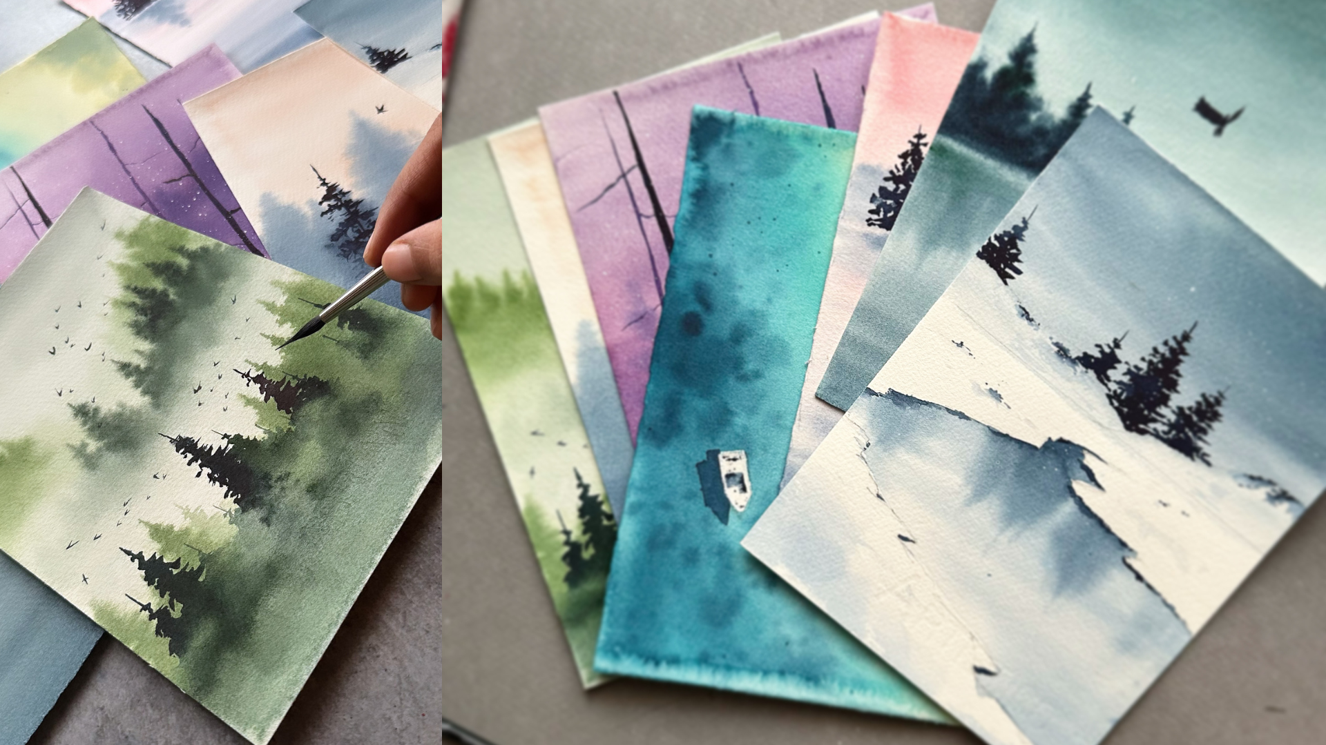
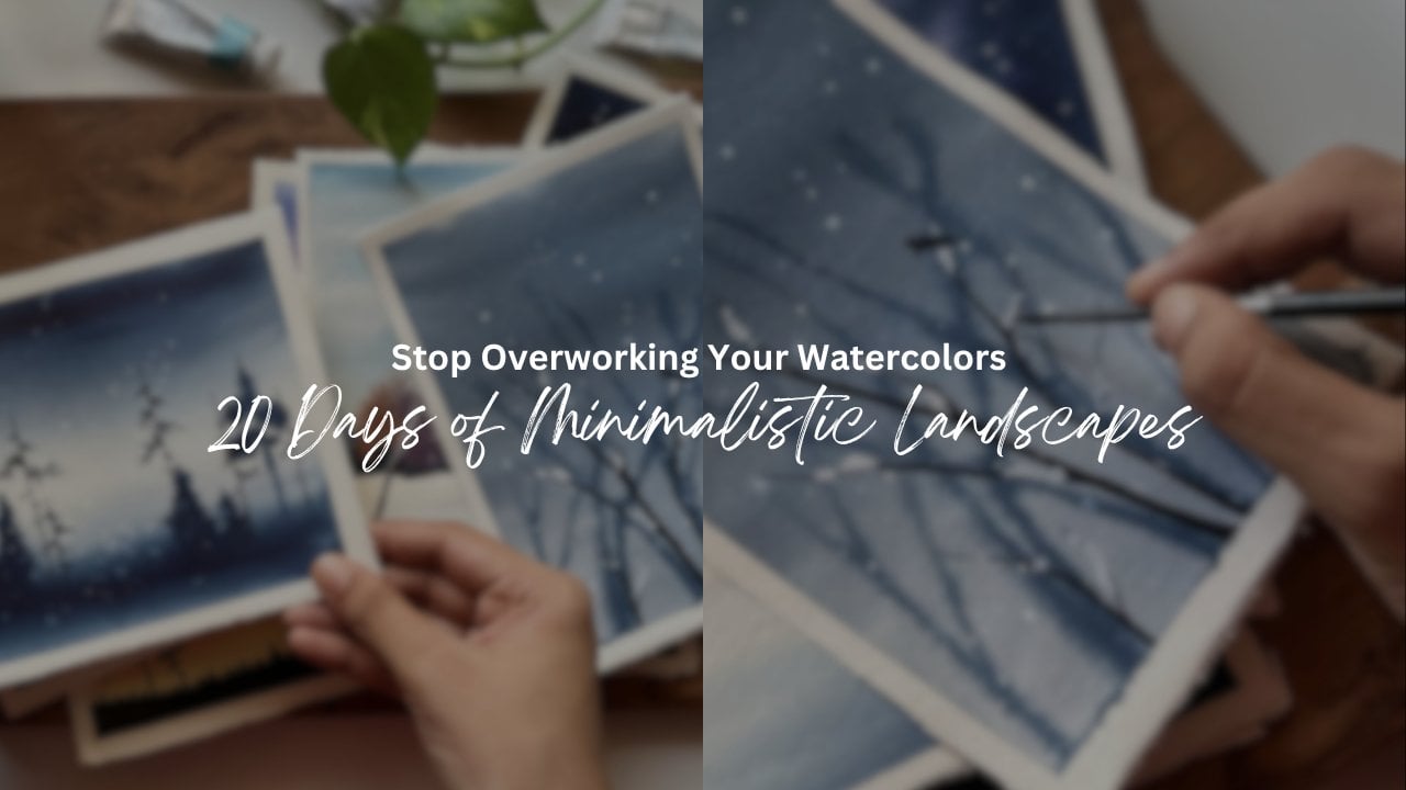
1. Hello, Welcome !: Ever wish you could paint
effortlessly every day, struggle to stay
consistent with your art. Want to fill your sketchbook
with beautiful landscapes, but don't know where to start. Do you love watercolors, but find yourself stuck
on what to paint next? If you said yes to any of this, then you are in the right place. What if I told you
I just seven days, you could build a
solid painting habit, gain confidence
with watercolors, and create a stunning
collection of landscape, all while having fun. That's exactly why I created this seven day
watercolor challenge. For the next seven days, we'll be painting one
watercolor landscape each day for the
next seven days. Each one is unique, fun, and packed with techniques that will help you
grow as an artist. You may ask why
landscapes landscapes are the perfect subject to
build consistency in painting. They allow you to
experiment freely. They teach you composition, light, color mixing naturally. They're fun, rewarding,
and captioning a seen from nature on paper
is a magical experience. Hi, I'm Sagrta, watercolor
artist and teacher. I have been painting with
watercolors since 2015, and I have been teaching
watercolors since 2019. My passion is creating moody atmospheric landscapes
with limited palettes, and I love helping students
discover the beauty of watercolors in a
way that feels fun, approachable, and
especially stress free. I sell my original
watercolor paintings to collectors in different
parts of the world. I have also taught
thousands of students globally through private
online workshops, and for the past six years, I have been a skill
share teacher, sharing my love for
watercolor landscapes through many online classes. How this class works, we'll start by discussing all the art supplies that
you're gonna need. Then every day, we will paint
a new landscape together. Each project is designed to introduce a
different technique, whether it's blending, soft, misty effects, creating
vibrant skies, painting dreamy forest or
layering washes to add depth. By the end of this class, you will have seven beautiful watercolor
landscapes in your collection. Feel more confident in using
watercolors and develop a consistent creative habit that keeps you painting daily, and, of course, experience the therapeutic and calming
effect of painting every day. This is your chance to challenge yourself and to commit
to a week of creativity. And the best part, you
don't have to do it alone. I'll be here guiding
you through every step. I can't wait to see
what you create. Oh.
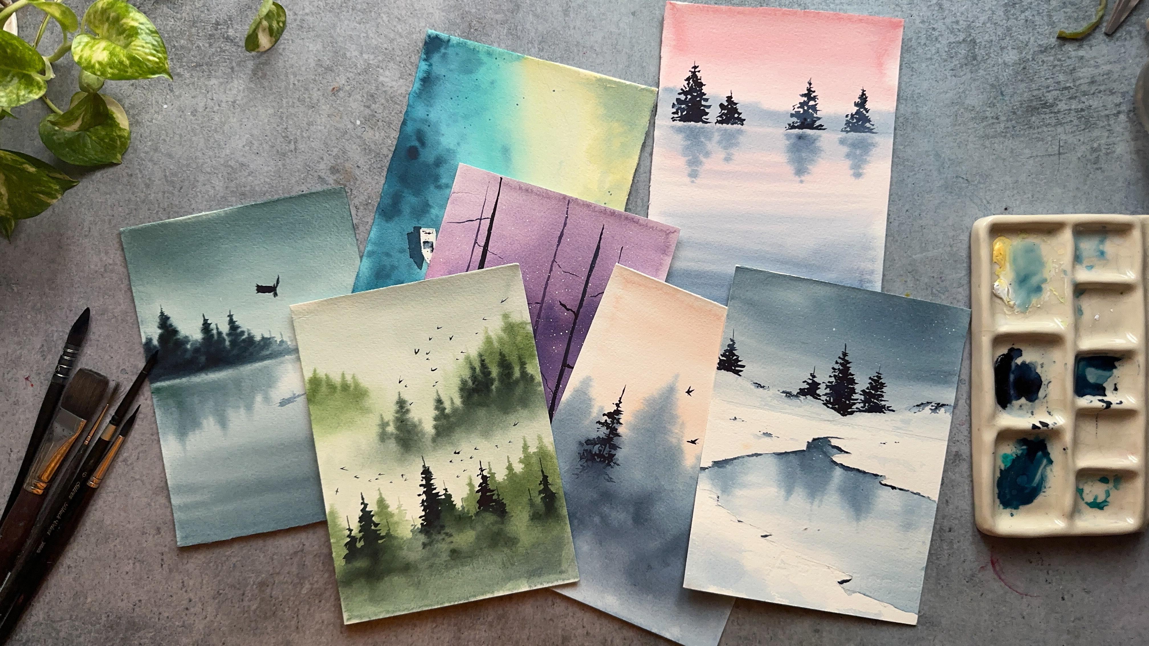
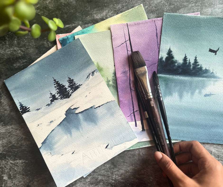
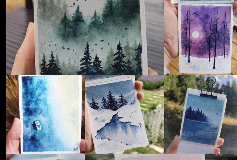
2. Class Overview: In this seven day
watercolor challenge, we'll be painting a new
landscape each day, and each project focuses on a different technique or a theme to help you explore
and improve your skills. Here's what we'll be painting. On day one, we'll be painting the soft skies and
gentle reflection. So we'll start with a
soft and dreamy sky and it's subtle
reflection in the water. This is a perfect introduction
to wet on wet blending, where you learn how to create delicate and diffused
color transition to give our painting a
calm and peaceful vibe. On day two, we'll paint
a misty morning sky with salids of pines
fading into the distance. You will learn how to create a beautiful atmospheric effect, making the mist feel soft and realistic while
layering the trees to add that extra depth. On day three, the project
is all about capturing the stillness and beauty of a peaceful lake in the
early morning light. Day four is about
serene and minimal winter landscape with a calm
lake and soft reflections. On day five, we'll paint a simple beach scene with a lone boat and its
reflection in the water. Day six is all about exploring a beautiful purple winter
landscape with glowing effect. And on the last day, we'll paint a misty pine forest. Each of these
landscapes will help you explore a different
watercolor skill, whether it's blending of skies, painting reflections, layering mist or creating
glowing effects. By the end of this challenge, you will have seven
beautiful landscapes and a solid foundation in
watercolor techniques. I can't wait for you to
join me on this journey. Now, before we dive
into painting, let's make sure you have
everything you need. If you are ready to start, move on to the next video
where we'll go over the essential art
supplies you'll need for this class. I'm
going to see you there.
3. Art Supplies : Before we start painting, let's go over the supplies. You will need for this class. Having the right
materials will make your watercolor
experience much smoother. Trust me on this, I have
learned the hard way. And for mixing my colors, I used a ceramic palette. I prefer ceramic because it
keeps the paint moist for longer periods of time and allows for smooth
mixing of the colors. However, you can use any
palette that you have on hand. Coming to the paints, I used a mix of different
watercolor brands, including sennelia,
aquaton and white nines. Since each project has a
different color palette, we will discuss the exact colors at the beginning
of each painting. To keep my paper secure
and prevent warping, I used masking tape to hold the paper to a transparent
plastic board. I bought this from Amazon, but you can use
any study surface like a wooden board or a
clipboard that you have. Simple water jar
is essential for rinsing your brushes and
keeping the colors clean. And I also recommend
using two jars, one for washing of
the excess paint and another for clean water. I used around five brushes
throughout the class. Flat brush size three by
four from aquaton brand. It's great for initial water
washes and round brushes, size ten and six from
silver black velvet brand, used for all the main
painting and detailing. And lastly, these two
are the rigor brushes, size one from the brand called DawnciPerfect for fine
lines and sharp detailing. You don't need to have
the exact same brushes. Just try to have a
mix of flat brush for wash and a couple of round brushes and a fine
brush for detailing. Coming to the watercolor paper, I used fabriano, 100%
cotton, cold pressed paper. Cotton paper absorbs
water beautifully, which makes your blending and
layering much, much easier. I highly recommend using 100% cotton paper for
the best results, but if you don't have it, use the best quality
paper that you have. That's everything you need. If you don't have the
exact same materials, don't worry, use what you have and feel free
to experiment. Now let's move on
to the next video where we will start
painting a first landscape. H. Let's move on quickly.
I'm so excited.
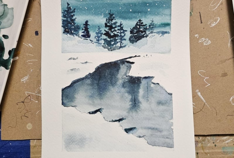
4. Class Project 1 - Tranquil Waters: Hello, everyone. Welcome to
the first class project, and it's called Tranquil Waters, and it's perfectly
named right with pastel skies and beautiful
trees and its reflections. So let's paint that now. First, I'm going to be using a new method to stick
my paper to this board. I'm not going to tape the
entire edges of the paper. I'm just going to
take a piece of it, piece of the masking tape, and I'm going to stick it on the fourth sides of the paper. And then I'm going to stick
this to the acrylic board. The temperatures here are almost 40 to 43 degrees Celsius. It's summers, and using this method of taping is helping me keep the paper
wet for a long time. And that's the only reason. If you want to tape
your paper as usual, like taping at the borders, you can go ahead with that. Using this method is not always good because there
is a high chance that your paint and water just back flows and ruins
your painting a little bit. But I have made peace with that, and I'm happy with that as well. We are done with this. Now,
let's watch the colors. So we're going to be using
a total of four colors. The first is quin
rose from the brand, white knights and
permanent orange from the brand aquaton and white watercolor from
the brand camel. And the last color is indigo from the brand,
white knights again. Now, I'm going to create
a peachy pastel color. So with that, we're
going to paint the sky and later
indigo for rest of the subjects like lake ripples and reflections on the
plant trees as well. So I'm taking a mix of
permanent orange color, quin rose and white colour
to get this peachy shade. This permanent orange color from the brand aquaton
is quite pigmented. It almost looks
red, but it's not. And this is the perfect color
to paint the peachy sky. I have used white in this, as you guys have already seen, and it's not a gouache. It's watercolor,
white watercolor. This is indigo. As you can see, I'm adding lots and
lots of water to make this color lighter because for reflections
and for the lake, we need lighter shade, and for the subject, that is the trees, we need darker shade of indigo. And this is the
color palette and color swatch for the
class project one. I can't wait to get
started, so let's move on. First, paint the sky lake
and reflections. But before that, there
is just a small sketch. You have to just draw the
horizon line and make sure it's a bit on the top side of the paper instead
of in the middle. Now let's begin. First, I'm going to wet the paper
with clean water, and as you can see, I'm using my aquaton flat brush for this. I mostly use this brush only for the initial water
wash. And also, because we are not taping
down the edges of the paper, make sure there is no backflow of the water into the paper. You can use paper
towels to avoid this. So after wetting the
entire paper with water, make sure you don't
have puddles of water staying on the paper. So it should be even. Now, I'm going to take
this masking tape, and I'm going to put
it under the board. We need all the help
that we can get. So I'm taking the help of
gravity and keeping your paper like this makes your paint flow downwards so you can
get the clear washes. I have taken my
Rafael round brush. This is number zero brush, and I'm mixing this
light pastel color. Let's begin with
painting the sky. Do not put pressure
on the paper. Just hold your
brush very lightly in your hand and paint the sky. That's very light, so I'm
adding one more layer. And slowly, I'm bringing
the paint down towards the horizon line and
then even down below. From here, we will take the light indigo color and just mix up with
the peachy color. Now, we are blending these
two colors together, and it is only possible
because the paper is wet. And if your paper is dry,
please stop painting, wait for some time, let
the paper dry completely, and then rewet, and
then you can continue. With a very light indigo color, as you can see, I'm drawing
these horizontal lines. When the paper dries,
these lines will look like ripples and that's how easy it is to paint the
ripples in the water. Now with that same light color, I'm going to draw these distant mountains at the horizon line. I'm going to remove
this masking tape now. It's not necessary. So now, my paper is still
wet, you can see. I'm drawing the reflection
of these mountains. As you can see, the
indigo is a bit lighter than the subject above. So the reflection should
always be a one shade lighter and make sure you draw
the horizon line clearly. That means you remove any
excess paint that has flown into the horizon
line with a damp brush. My paper is still wet, and I have taken a bit
darker indigo color, and I am painting the
reflections of the pine trees. We have not yet
painted the subject. That is the pine trees
that should be above. So we'll paint those after
we paint the reflection. One of the important reason that I'm painting the reflections
first is because the reflections will always be blurry and you have
to paint them wet on wet so that you can get that blurry image
of the reflections. If you paint wet on dry, those will be looking very clear and they won't be
realistic, right? So I'm done with
the reflections. Now we will wait. We will wait until the
paper dries completely and remove all the excess paint
that is around the edges. Using a paper towel
like I'm doing here. You can see the paint
has already back flown here at the sky area. It's okay. These things
happen in watercolor. I'm going to keep
this for drying now, and I'm going to
see you in a bit. Paper is dried, but I'm not liking the outcome here because
the paint has back flown. So we're going to do the sky once more,
sky and the ripples. So I'm going to wet the
entire paper again. This is called rewetting
because we are already we have already wet the paper once and
already worked on it. So we are now rewetting. This technique can be a
bit tricky for beginners, but only thing you
have to remember is that re wet only when the
paper is completely dried. And with a round brush, let's begin painting the sky. The colors are same, the
peach color for the sky and light indigo color for
the lake and reflections. Now, I have an
advantage to paint the ripples better this time. So I'm going to use
the smaller brush. This is a silver black
velvet, number six brush. It's a bit smaller.
And with this, I can paint the ripples
better, as you can see. Remove the masking tape. Ideally, I should keep
the paper for drying, but to paint the pines, I told you the pines should
be painted wet on dry. So I was going to
keep it for drying, but my paper has completely dried up
because it's so hot here. So yeah, if your paper is wet, you can keep it for drying before we try out for the pines. So with very dark indigo shade, I have a started painting the pine trees
above the reflections. So the brush I'm using
is silver black velvet. Number six. This is
a very small brush. Small brush are perfect for wet on dry and while you are
painting for sharp details. Pine trees can be a bit difficult to paint if you
are a complete beginner. So I have one tip that I can suggest,
which helped me a lot. So first, use a very
small thin brush. The point should be sharper
and first draw a line and then move your brush or flick your brush in
a triangular shape, layering small uneven strokes to create that natural look. Remember, no two pine
trees look the same, just like you see in
the nature, right? Each artist's style is unique, so I suggest you not to worry
if your pine trees look different from mine or from any other artists
that you admire. So now we are painting
the last pine tree. I think the first class
project is looking perfect. It has all the techniques
if you have observed. First, we wet the paper and we painted the sky and ripple. So that is wet on wet. And then we rewetted the paper. So that is called
revetting technique. Now we are painting
the pine trees. So this is wet on dry because the paper is dry
and your brush is wet. So that sums up
all the techniques that you can practice
in watercolor. The tip of the pine tree should always be sharp and needle like. As the paper dries, our first class
project is also done. Carefully remove
it from the board. Thank you for joining me on the first day of our seven
day Watercolor challenge. I hope you had a
great time painting this soft sunset sky
and gentle reflections, and I can't wait to continue this journey with you
over the next six days. And I would love to see
your beautiful paintings, so make sure to upload your class project in the
project section below. And if you have any
questions or need any help, feel free to start a discussion. Thank you for painting
with me today, and I'll see you tomorrow as we create another
wonderful landscape.
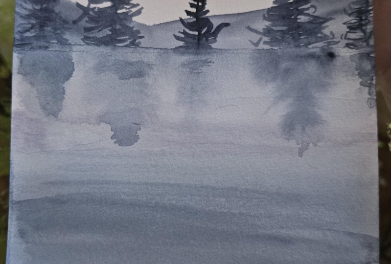
5. Class Project 2 - Echoes Of Dawn: Welcome to Class Project
two, echoes of Tn. I'm going to tape down my paper just like I had done yesterday. I'm so glad that you guys have decided to join this
seven days challenge. I have received
great support and great response from yesterday and for the Class Project one. So so so thankful. And I'm so excited to, you know, start this journey with
you for the next six days. Now that I have
taped down my paper, I'm moving on to colors. First, I have taken indigo
color from the brand called White Knight and
turquoise green from the brand called aquaton
and a white watercolor. Do not take wash white. Any white watercolor would do. This is called Chinese
white from the brand camel. Now, I'm going to
take these colors, and I'm going to
do a color swatch. Later in this video, I will take permanent orange
color as well. I just forgot to
include it here. And the permanent orange color is from the brand
called aquaton. You will see in a
Just like yesterday, we are taking very
light pastel shades for this class project also. So you won't see
any dark colors, especially for the background. For the details, we'll take
dark color, of course. So first, I'm mixing
turquoise blue with a bit of indigo and a bit of white
to get that pastel shade. So if you don't have
turquoise blue, you can add turquoise
green as well. And a sap green with a mix of indigo would
also give you this shade, similar to this shade,
but not exact shade, but that works as
well if you don't have these exact
colors that I have. The color that we swatch now
is for the background pines. You will see when we
paint the class project, and this is indigo color. This is for the
detailed pine trees. Do the class project is about painting the
early sunrise scene. So for the sky, we need
a little orangish shade. So I'm taking permanent orange and I'm mixing it with white. And I got this very
light orange shade, perfect for early sunrise. So these are our colors. We are going for a
very limited palette that means only three colors. So yeah, we're going to move
on to the class project now. I'm keeping my masking
tape under the board, just like we had done yesterday. And let's begin
the class project by wetting the paper
with clean water. And for this, as usual, I'm using my flat brush. Be generous with water and also apply it evenly
onto your paper. First, I will take our light orange color, and I'll start painting the sky. For this, I'm using
my Rafael brush. It's a round brush,
and it's number zero. It's a very small brush. You can see the
sky is very light, and that's exactly
what we are going for. So don't make it too orangish. I'm just going to
drag the paint down. Instead of just topping
it right there, it's going to give
bad lines later. Anyway, the color is light,
you won't see it later. Now I'm taking a
very light shade of turquoise blue mixed
with indigo and white, the first color that
we have swatched. And as you can see, my
paper is still wet. Now I'm going to start painting the pines that
are in the background. This is wet on wet technique, so the pine trees will
not look very detailed. So they have to look
a little blurry. Do not focus too much on the
details of the pine tree. It's okay if they are
a bit uneven in shape because they're
in the background and they are supposed
to look like that. One more tip. Paint
these pines in different heights so that
they look more natural. If you paint them
in an even height, they don't look natural, and it seems like
something is off with those trees because you don't see that in the nature. Pine tree became a bit darker. I was not intentionally
doing that, but it's okay. It's going to add a
beautiful contrast. So yeah, my paper is still wet. If your paper is dried, stop painting this and
then wait until your paper is completely dried and then
re wet with clean water, then you can continue
painting the background pints Because if you paint
on semi dry paper, they're going to give lines. You can see that
you can say stains. So do not work on your
paper when it's drying. Taken my silver
black velvet number six, the smaller brush, and while the paper
is still wet, I'm going to just sharpen
the tips of the pine trees. It's going to give a more
realistic look to the pines. Honestly, it will not make any difference because
the paper will dry up so fast and you won't even
recognize the exact shapes, but I just can't stop
when painting the pines. I think I will
forcefully stop myself, and I'm going to keep
the paper for drying. I'll see you in a bit.
My paper has dried. Now I'm going to take
the indigo color. It's a bit darker than the previous shade
that we are painting. So I'm taking my silver black
velvet number six brush. Let's begin painting the
pine trees one by one. There won't be many pine
trees here in the foreground. I'm gonna only paint a few
like a couple or four marks. Painting pine trees
can seem simple, but it's one of the most difficult things
that I've ever attempted, especially as a beginner. Even now, no two pine trees
of mine look similar, and that is okay. I
have accepted that. So if you are a
complete beginner, this is what I would advise. Paint, however, you wish
to paint the pine trees. Each artist's style
is quite different. And my tip would be to paint the pine trees is just that you start painting the
straight line first. And then move your brush
in a zig zag manner. You need a better
brush for this. That means if your
brush is too strong or too hard and you can't
easily move your brush, then it's time to
change your brush. This is a silver
black velvet brush. It's quite good to work, especially for the pine trees. And if you have a
synthetic brush, make sure it's very soft. It has soft bristles. Now we are painting
the third pine tree. I think I'm going to
stop with this one, and then I'm going to work on the mist that is
on the foreground. As you can see, we have only painted half part
of the pine trees. That's because we're going to cover the rest of the paper, rest of the
foreground with mist. It's quite easy and
simple process. Now, as you can see, I have wet my brushes. I used I'm using a flat brush, and I've taken water, and I'm just going to
drag this paint down. It's a bit wet. The pine tree is still wet, so this is working out for me. I'm just slowly wetting the
paper with clean water. And I'm not touching
the sky area. So you can see I'm carefully wetting the edges
of the pine trees. That's very important because it has to show that
the pine trees, the pine trees are blending
into the foreground. So now I'm going to take indigo. Since the paper is wet, I'm going to just start
adding the indigo color. I'm using this RFL brush
for better movement of the brush and a bit
of white helps too. Uh Now, I'm going to just platter some plain water
in the foreground. Just a few random details. Since we did not
wet the sky area, we can happily paint a
few birds over here. I'm taking indigo color for this and I have taken my
silver black velvet. Number six, the smaller brush. And with this, we are done
with our class project, too. So simple and so easy, right? So we have used
wet on technique, wet on dry technique,
and vetting techniques. All of these techniques,
just like we have used in previous class
project. So that's it. I'm going to remove the paper from the board once
it's completely dried. Waiting to see your
class projects in the project section below. And if you have any
doubts or any questions, please feel free to
start a discussion. And I will see you guys tomorrow with Class
Project three. So thank you for
joining me so far.
6. Class Project 3 - Whispering Horizons: Hi. Welcome back to
Class Project three. Today, we will paint a calm
lake scene with reflections. And I'm taking down my
paper like I did yesterday. Now, let's go for
the color swatch. First, I'm taking indigo from the brand white knight and Hookers green from
the brand canela. I'm gonna take these two
colors on my palette now. Now, let's mix the colors. The first shade would be a mix of hookers green with indigo. It should be more of a green
color than the blue color. So make it 80% hookers
green and 20% indigo. Also take more pigment
and less water. That way, your color
would be darker in shade. Color should look
something like this. If you don't have hooker skin, you can also take sap green
and mix it with indigo. And the second shade
would be just indigo. That is all only two colors. Now let's move on to
painting the class project. Just like the previous
class project, I have kept my masking
tape under the board. Now, let's begin by wetting
the paper with clean water, and I'm using my aquatone
flatbush for this. We are painting the
sky and the lake. So I have taken my Rafael
number zero brush. It's a round brush, and
I'm taking the fast shade. That is the mix of hooker
screen with indigo. And let's begin with
painting the sky. Slowly bring the color down, and if you have kept the
masking tape under the board, this process should be easy. I haven't taken any paint, but now we are
painting the lake. So I have taken, again, the hookah screen
and indigo mix. I'm just swiping my brush
towards the horizon. So your sky and the lake
should be dark in color, and the middle part should
be as light as possible. With a paper towel,
I'm just cleaning the edges of the paper to avoid the backflow
of the paint. Now, the paper is still wet, so I'm taking my silver
black velvet number six, the smaller round brush, and with the same shade, the mix of Ococreen and indigo, I'm going to paint the ripples. On a wet surface and
with a smaller brush, draw horizontal lines, and they'll look like ripples
when the paper dries up. Now, I'm going to keep this for drying and we'll paint the
pines and reflections later. So I'm going to see
you in a while. Right. My paper has dried up, so now I will rewet
the paper once again. For this, I'm taking
my aquaton flat brush. I'm taking my Rafael
number zero brush and I'm mixing hooker
screen with indigo. This shade is a bit lighter around the same
shade as the sky. So I have also kept my
masking tape under the board, and I will begin painting
the reflections. Since we are painting
the pine trees above, the reflection should also
look like the pine trees. So you don't have to paint
the detailed pine tree. Since this is wet on
wet, you can just, uh, get the shape right, and that should be enough. I've removed all the extra
water from the brush. Now my brush is damp. So I'm going to lift some paint off just to give
that misty effect. I'm just making the pine trees. The reflections of the pine tree sharp at the edges, at the tips. We have discussed
about the shape of the pine tree in the
class project one. Now I'm taking indigo color. I'm mixing with hooker screen. As you can see, this is a lot more indigo
than the hooker screen. It's because the pine tree
should be darker in shade. So I'm just getting the shapes
of the pine trees right. Later, I will sharpen the tips. My paper is not wet.
It's not dry either. It's damp, so it's perfect to paint the uh, paint the subject. But if your paper is wet, you can wait a couple of
minutes until it's semi dry, and then you can paint
these pine trees. As you can see, the reflections and the subject
are not touching. There is a fine line
between those two. And it's very important. It gives the perspective of the subject and its reflections. I'm going to just
go a few details. I'm going to sharpen the
tips of the pine trees. For this, I'm using my
smaller round brush, silver black velvet number six. Another one of the details
is painting this huge board. And I'm using my silver
plaque wallet number six, the same brush, and I'm
using indigo for this. And don't forget to paint
its reflection as well. And we are done with the
Class Project three. Once the paper is dried, you can remove it
from the board. And thank you so much
for joining me today. And I'm going to
see you tomorrow with Class Project four.
7. Class Project 4 - Silent Reflections: Hi, guys. Welcome to
Class Project four. Today, we're gonna paint
this beautiful winter scene. As usual, I'm going to tape
down my paper to my board. Already know what
we're gonna do next. That's right. Colors watch. First color I'm going to
take is cobalt green from the brand aquaton and indigo
from the brand white knight. That is it. Only two colors
for today's landscape. I'm going to take these two
colors onto my palette, and later we're going to do a little colour mixing and create our own
beautiful colors. I think you already know
that I'm going to mix cobalt green with
tiny bit of indigo. I have taken a little bit of cobalt green with a
little more of indigo. So there is a blue shade
that is highlighted here. As you can see, it does
not look green at all. Of course, it's going to look something like greenish
bluish mixture. But blue is the dominant,
as you can see. If you don't have this
particular color, you can always go
for turquoise blue. Now, the second color
is just plain indigo. We're done with
the color swatch. Let's begin the class project. For this class project, we're going to have to
do a little sketch, and I'm afraid you have to get the perspective
right for this one. Just follow along, do as I do. Let's first draw
the horizon line. Horizon should be a little
bit towards the top instead of in the middle because we're going to have to
draw the lake as well. I'm going to just lightly
sketch a few mountains. Now let's draw the lake. Start, instead of in the
middle just towards my right. Trag your pencil down. You don't have to be very
particular about this lake. Like I said before, you just have to get the
perspective right. Now I'm drawing another
end of the lake, and I have started from the exact same place that
we have drawn before, that is the point
towards my right. And that is the sketch. It may look easy, but it's going to be a little
tricky to get the perspective. And yeah, that is all there is for the sketch.
Now let's begin. I'm going to start by wetting
the paper with clean water, and I'm going to wet the paper only till
the horizon line. And with my round brush, Rafael number zero, and I'm going to start painting the sky. I will take the mixture of
cobalt green and indigo. It's such a beautiful color. Oh, yes, I forgot to
put the masking tape under Mbard. We are ready now. Make a gradual wash
with the color. The top part should be dark, and as you come down,
it should get lighter. It's perfect. Now, I'm
going to just draw a few horizontal lines like ripples to show that there
are clouds over there. And I'm going to
remove some paint from the mountains while
the paper is still wet. Now, let's start
working on the lake. I'm going to start wetting the lake area with clean water, and I'm using my
Rafael round brush. Now, I will take my silver
black velvet number six, the smaller round brush, and with lots of indigo
and a bit of cobalt green, we will start painting
the reflections. We haven't painted the
subject on the top yet, but we are painting
the reflections first. While the paper is
still wet, just, uh, drag your brush down
in vertical lines, and you will get
the reflections of the pines that we
will paint later. Two. And be very patient while you are drawing these vertical lines,
that is reflections. Do not fill up the entire lake area
with these reflections. As you can see,
I'm only painting till half of the lake area. And while we are at it, we will paint the ripples as well with the same brush
and the same color. As you can see,
these reflections are not looking straight, so I'm just going to go
there and correct them. And I'm only doing this
because my paper is still wet, so I can still work on this. Now I'm going to keep
this for drying, and I will see you once my
paper is completely dried. My paper is dried. Now, I will take my silver
black velvet number six, the smaller round
brush and indigo. I'm going to start
painting the pines. I have only few
pines in my mind, like four or five. So I'm going to first paint
three pines over here. And let's see after that. And another one over here. I'm thinking to make this the
longer one, the bigger one. So it is a bit off centered and perfect for the reflection that we have already painted. And one more over here. It should be around the same size as the pine that
we have painted at first. And I'm thinking to paint
one more pine over here at the far left my left, I mean. Now, this is a snow
covered mountain, right? So we're gonna paint some
shadows here and there. And a few more shadows
here on the land. This is a snow
covered land area, so there will be some shadows. That's what we're painting now. The shadows of the land
itself in the water. I'm using indigo for this
and my silver black velvet, number six, the smaller brush. Shadows are very important
because they are what make the painting look three D and three D paintings look
realistic, of course. And also, it's very important
to not overdo the shadows. You have to be very subtle. H I'm going to just add a flat wash with
light indigo color here. Now, I'm going to take white watercolor and I'm
going to splatter some paint onto this landscape because this is a winter
landscape, right? So there should be some snow. And we are done with
Class Project four. I hope this winter landscape is as interesting to
you as it was for me. I enjoyed painting this
particular class project with you because you know that
I love winter landscapes. And I'm seeing a lot of class projects being posted
by you guys already, and I'm so happy. And tomorrow, I'm
going to be coming up with Class Project five. Thank you so much for
joining me today. I'm going to see
you guys tomorrow.
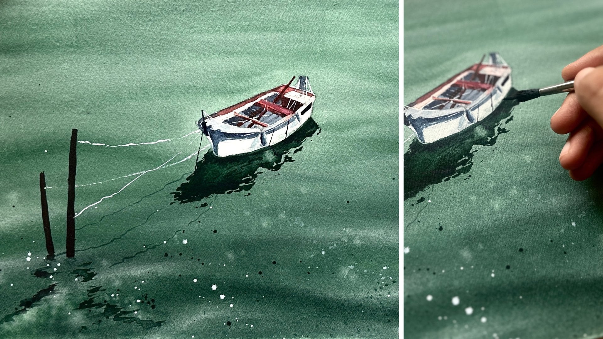
8. Class Project 5 - Drifting Still: Hey, guys. I'm back with
Class Project five. I'm so excited because I hardly ever get a chance to
paint Oceanscape. And today we are painting
this lone boat scene. Let's begin. I'm sticking
my paper to the board. And after this, we're going
to do a small sketch. Later, we're going to
go for the color swatch because this is
very small sketch. It won't take much of your time. So I'm just drawing this line This is where the beach
and the sea meet. So I just need some
division among those two. Now I will just
draw a small boat. Draw a rectangular shape, and then make it a
triangle at the end. I hope this makes sense. It's very easy and
also do not forget to draw the shadow of the boat. That is the sketch. Now let's see what colors
we're going to need. The first color is cobalt
green from the brand aquaton. The second color is indigo
from the brand white knights. And the third color,
the highlight for this oceanscape
or any oceanscape that you're going to
paint is a right color, right shade of yellow. You know to paint the beach. So I have taken this Naples yellow from the brand sanelar. It works for any of the seascapes that you're going to paint, which has a beach. And to get that perfect
beach sand shade, naples yellow is good enough. I think there is another color
that you can use asiana, but I like naples yellow better. And also, I have taken
white watercolor. It's not guh, it's
white watercolor. First, we're going to swatch the naples yellow and
white color mixture. And you see how perfect this is. Even on this colour swatch card, you can see there
is a beach wipe. There is a beach
wipe that you are getting right. So yeah. Now I'm going to
mix cobalt green and indigo a little bit.
This is for the water. If you observe the ocean, you will see there will be
two shades of the water. The one that is far will
be in darker shade. The one that is near to you, that is the water that is near the beach will
be in light color. This color that we
are swatching now, the mix of cobalt
green and indigo is for that light
shade for the dark, we're going to use indigo color. Indigo, I will also use to
paint the boat and its shadow. I think you guys will
agree that these are the perfect colors to paint
any of the seascape, right? So after the colors, we're going to move on to
paint the class project. I'm going to keep the
masking tape under my board, and I will start by
wetting the paper. As you can see, I will
not wet the boat area. You can wet the shadow area. It's perfectly fine, but do not let the water
touch the boat. Let's first paint the Naples
yellow and white mixture. So I have taken my Rafael
number zero brush, the round one, and I have started painting
the beach scene. So, add naples yellow according to how dark your
beach is going to be. I'm going for a very light shed, so I have added lots of
white to the naples yellow. And now I have taken
my cobalt green. And as you can see, I have left a little bit of
gap between naples yellow and cobalt because those will later
look like waves. And gradually, I will darken this color using indigo color. O. Et's add a bit of white color here in the middle of Naples
yellow and cobalt green. There is a pencil sketch
that it is showing, so I just wanted to cover it. Now I will take indigo, and I will continue to
darken the ocean part. I'm going to splatter
some indigo paint. Okay, that paint has
fallen on the beach area, so I'm just going to remove it. I will take a spare part of paper and I will
cover the beach area, and then I will
splatter some paint. All right. Now I'm going to keep
this for drying. And after the paper dries up, we will paint another layer. So I'm gonna see you in a bit. Alright, my paper has dried up. I'm going to start
wetting the paper again. I'm using my flat
brush for this. I have rewet the paper only to add more
details to the ocean. So let's start with that. And I have taken indigo color. Cobalt green and
indigo mixture later, I'm going to darken it
with using only indigo. Now you are experiencing the
beauty of the ocean, right? So yeah, these are a few random details that
you see in any ocean scape. The water always
looks unpredictable, so we are just trying
to depict that. There are no shapes.
There are no details. Just putting the paper
on a wet surface. That is all. Let us blend this cobalt green
color using the mix of white and naples
yellow, but mostly white. Now, this is my favorite part. I have taken my
silver black velvet, number six, the
smaller round brush, and I've started adding these random circles
on a wet surface. This looks so great when the
paper dries up. Trust me. Blend them a little
using a damp brush. You can leave it as it is. It's perfectly your choice. I'm going to add a few
random details on the beach. I'm going to keep the
paper for drying. And once the paper dries up, we're going to paint
the boat and it's reflection. So see in a bit. Okay, the paper has dried. Now, using a silver black
velvet, number six, smaller brush and
light shade of indigo, I'm just going to paint a
few shadows on the boat. If by accident you added any cobalt green or indigo
to the boat, it's okay. We can still use white colour and correct the shape as I'm
doing right here. Now, using only indigo color, I'm gonna paint the
shadow of the boat. Right after I added the shadow, the painting looks so alive. So yeah, that is it for
today's class project. So simple, so easy, right? Thank you for
joining me so far in the seven days of guided
watercolor landscape challenge. And I can't wait to
see your projects. There are so many already, and that makes me so happy. And tomorrow, I'll be coming up with class projects
six, see you tomorrow. Okay.
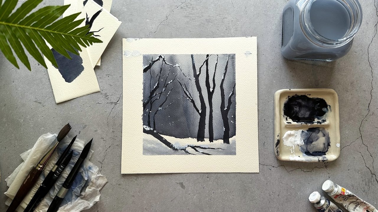
9. Class Project 6 - Twilight Frost: Hi, welcome to
Class Projects six. Wow. Six days had
passed already. I can't believe how fast
the days are going, especially when painting, right. So I started by sticking
my paper onto my board. You know what next,
right? The color swatch. The first color I'm taking is azarin crimson from
the brand Sennelier. The second color
is tax in purple, from the brand
Sennelier, of course. And the third color is indigo from the
brand white Knights. And the fourth color
is white watercolor. From the brand camel, it's Chinese white color.
Do not use quash. Watercolor is enough. I'm gonna take these
colors onto my palette, and then we will do a swatch. There is only two
colors we're going to use for the landscape. First is the mix of laser in
crimson and **** in purple. You can get this purplish shade when you mix these
two colors together. And to darken that purple color, I'm going to add a
bit of indigo to it. Did you see I used one color from mixing lazar in
crimson and dix in purple. And to that color, I
have added indigo. The second color is
just plain indigo. White watercolor,
we're going to use for painting the snow later. So this is the color swatch. If you don't have
Azar and crimson, you can always use red color
and mix it with purple. Now, there is a moon
in our painting, so I have to cover that moon area to paint
the background, right? So instead of using
masking fluid, I'm going to use masking tape. I will cut the masking tape in a round shape and I will
stick it onto my paper. I'm going to use the
same masking tape to cover the foreground
area as well. First, we're going to
paint the background. That's why I'm
covering these areas. This is done. We will start by wetting the paper
using clean water. And, take your time
while putting on this initial wash. Do not leave
the puddles on the paper. Make an even wash. I will take the round brush. This is from Rafael,
and it's number zero. Now I'm going to mix
Alison and crimson, a little bit of dax in
purple, and then indigo. This background is a mix
of all these three colors. So it might look a
bit different to you because you might be
using different shades. So that's perfectly okay. The learning of the technique
is what's important because this is the color that I did not expect to get when
mixing these colors. I thought I would get some
dark purplish and dark, you know, when you mix
purple and indigo, you get that dark night shade. So I thought I would
get that, but this is quite different and it's
very beautiful as well. So yeah, happy accident. I'm just going to blend
all these colors together. And my paper is wet. That's why the colors
are blending so softly. Now, I will take my silver
black velvet, number six, the smaller brush and I'm
going to mix daxin purple with indigo and I'm going to start painting the
background pines. My paper is still
wet, as you can see. So this is wet on wet painting, and your pinch doesn't have
to look very detailed. It's okay if they're
a bit blurry. In fact, that's what we are
going for blurry pines. Do not paint any pine tree
in front of the moon. The moon is a highlight, right? Now, I'm going to
keep this for drying. And once the paper dries, we will proceed to paint
the foreground trees. So I'm going to
see you in a bit. Paper is dried, so
I'm going to remove this masking tape that we
stuck at the foreground. Be careful. If
your paper is wet, the masking tape would
tear off your paper. So make sure it's perfectly dry. I have taken my silver
black velvet number six, the smaller round brush, and I'm going to mix dags
in purple and indigo again, but this time more indigo. So the color should
be very dark. With this color, we're going to paint the foreground trees. These trees are not pines. You just have to draw a straight vertical line.
Should be easy, right? Again, try not to cover the
moon area with these trees. Paint beside the moon. The moon is our harlot. Now, I'm going to add these
branches to these trees. We're not going
for any leaves or any details to these
trees, horizontal line. Sorry, vertical line and
then horizontal small lines. That will give you
the look of a tree. In winters, there is
not much of foliage, so it's okay if you paint
these dried up trees. I think I'm going to
paint one more tree over here because it's
looking rather plain. Oh One tree over here. Make sure it's not
touching the moon. Now, I'm going to add a few
shadows on the foreground. The plain white paper
will not look realistic. So always try to add a few
light shaped brush strokes. It doesn't have to be any
shapes or any details. Just a few random brush
strokes would be enough. They will actually look like shadows as well once
the paper dries up. Now, let's platter some
white paint, the snowfall. So for this, I have
taken my rigor brush. It's number one, and I have taken white
watercolur as well. Pause for a minute and see
this meditative process. I mean, this is why
I love watercolor. Okay, there is a lot
of paint on my brush, and I'm just going to splatter
some of it onto my paper. Wow. The painting is
looking really good. Out of all seven landscapes, I think this is my favorite. And see if the paper is dried up and remove this masking
tape to reveal the moon. I'm going to add the
shadows one more time because when the paint
dried, it was very light. Done. Now, remove the paper from the board only if the
paper is completely tied up. And this is all for
today's class project. And I'm so happy that
we have come this far. Today is day six, and
tomorrow is day seven, the last of our challenge. So yeah, I'm going to see you guys tomorrow with
the last class project. Thank you so much for
joining me today.
10. Class Project 7 - Veil Of Pines: Guys, welcome to
Class Project seven. This is the last class project. And today, we are painting this beautiful and evergreen
misty Pines forest. Mystery pines are a bit
difficult for a beginner, so that's why I kept this
class project at the last so you will have
more time to practice. And yeah. Now, let's see what
colors we're going to need. This is sap green from the brand White Knight and indigo from the brand
white nights as well. So we're going to need
only these two colors. I have taken these colors
onto my palette now. There are only two colors, but we're gonna make
three colors out of it. Let's see how. The first
color is sap green. I'm going to take the color
and swatch onto my paper, and I have mixed a
little bit of indigo to it just to get that
dark greenish color. That's it. That's the perfect
green that I was going for. And yeah, if you
don't have sap green, you can use hookers green, and viridian green
will also work. Now I'm mixing lots of indigo and very little
of green color. So the color is very dark compared to the first
shade that we have taken. So this is dark green. Now, the third color is, of course, just indigo. This is the colors watch. Perfect colors to paint
the misty pines, right? So let's begin. Alright, then. Let's begin by wetting the
paper with clean water. And as you guys know, I use
my flat brush for this. I keep forgetting to keep my masking tape
under the board. I've just kept that now. Let's begin. I have
taken my round brush. This is from Rafael,
and it's number zero. And I'm going to mix the first color that
we have swatched. I'm going to lightly
paint the sky very lightly because the sky
should not be dark. While painting the misty pines, the pine should be
your highlight. So I'm going to slowly
track that paint down. As you can see, I have not
taken any extra paint. I've just dragging the paint
that I already too Now, I have taken my
silver black velvet, number six, the
smaller round brush, and I'm mixing this second
shade that is lots of indigo and less green colour to get the dark greenish shade. So yeah, let's begin
painting the pines. Now, remember, we are painting
these pines wet on wet, so you don't have to
get the details right. You just have to get
the shapes right. So at this tase, your pines should look like
pines, the shape and all. Shape the shape of the
pine is usually triangle. The top part should be sharp. So as you come down, it should get wider. Basically a triangle. On my right, I only
want a few pines. So after painting those, I'm going to just blend
these colors using a wet brush and I'm just going to blend
it into the paper. So this is because we are trying to paint the
misty pines, right. Now, let's paint the
pines onto my left. Here, as well, we're going
to paint only a few pines, and this is wet on wet as well. So we just have to get
the shape of the pines. Now I'm gonna blend these pines into the paper
using a wet brush. Again, I'm going to be painting one more layer of the pine
trees here at the bottom. So even here, I'm going to be
painting only a few pines, and then I'm going to
blend them into the paper. So I'm going to adjust
shape of a few pine trees. That is mostly the tip
should be sharper. So I'm just going to go do that. And my paper is still wet, but it's not soaking wet. It's damp. So it's a perfect time for me
to correct the shape. If the tip of your pine
trees is already sharp, you can skip this step. Oh, I think my paper is
looking a bit plain, so I'm gonna paint a few pine
trees over here as well. Now I'm going to
blend these pines. Later, I'm going to keep
the paper for drying. And once the paper is dried, we can paint the
pines in the middle. Later, we can paint the pines
in the foreground as well. So I'm going to see
you guys in a bit. Okay. Now the paper is
completely dried up, and it's looking perfect so far. We will wet the
paper once again, and we're going to paint
the pines in the middle. And I'm going to
take the shade that we have swatched for
the second time. That is a lot more indigo
and very less sap green. So first things
first, of course, I'm going to wet the
paper with my flat brush. Switched my brush. I've
taken Sula black velvet. Number six, the smaller
round brush now, and let's begin painting
the pines in the middle. Your paper will not sustain
the shape of the pines, even though it's wet on wet when the paper is soaking wet. So make sure your
paper is wet and shiny and not completely
filled with puddles of water. Is there enough pines
in the midpoint. So I'm going to just
blend these pines into the paper
using a wet brush. Now, I'm going to keep
this paper for drying. And once the paper is
completely dried up, I'm going to paint the
pines in the foreground. So I'm going to
see you in a bit. Where is dried up. So I
have taken indigo colour, just plain indigo without mixing sapren and I've started painting the pine trees
in the foreground. I'm using my silver
black velvet number six, the round brush. It's a small brush, and
it has a sharp tip, so it's easy for me to paint
the pines with this brush. I've been painting misty
pines since I don't know, maybe since 2017 or 2016. So that's why it's easy for me, and it's kind of intuitive for me to paint the
pines because now I know how the shape
of the pines will be and how to paint
the mist as well. So if you're a beginner, it's okay if the shapes don't look the same as mine,
don't get discouraged. It takes time and practice. And patience as well. Patience is very important because at some point
in my art journey, I have completely given
up on painting the pines. And later, I just
picked up and tried a different method,
and I succeeded. I succeeded at painting pines. You patience, time,
and practice. These three things are the
foundations for any artist. As you can see, I'm just
blending the foreground pines. I'm gonna paint a few more
pines on my right as well. And for this
particular painting, I'm not following any
reference. I'm just painting. From my practice, I have painted so many misty pines before. So I'm just drawing
inspiration from all of those. Sharpen the tip
of the pine tree, and we are done. Oh, hold on. We have to paint lots
and lots of birds. So let's begin. I have
taken my rigor brush. It's a sharp brush, and it's easy for me to paint
the birds with this one. He I'm taking another brush now. This is from Dawnci. It's a different kind of rigor, and it's very flexible
to paint, as well. So I'm gonna paint
lots of birds for this particular painting because that's how the forest scene
would look like, right? W lots and lots of birds
unmist all around. And we are done. And thank you so much
for joining me on this seven day guided watercolor landscape
challenge class. It's been a pleasure painting
with you guys every day. And don't skip the next video. It's a very small 1 minute
video where we'll see what we have learned so far in this seven day guided challenge. So I'm going to see you there.
11. Final Thoughts: First of all, thank
you so much for joining me in this seven day watercolor landscape challenge. Over the past seven days, you have explored how to
paint these soft skies, misty forest, glowing
winter scenes, and serene lakes and
beautiful reflections. You have learned how to blend colour seamlessly and create atmospheric depth and paint
realistic reflections. But more importantly, you have built a consistent
creative habit, which is one of the
most powerful things you can do to grow as an artist. The more you paint, the more confident and
expressive will become. And I truly, truly hope this challenge has inspired
you to keep going, exploring and experimenting
with watercolors. You enjoyed this class, I would love to hear
your thoughts. Please take a moment
to leave a review. Also, if you have
completed this class, upload your class project. I would love to see your
beautiful landscapes. Oh, by the way, this
is just the beginning. There's so much more to explore in the world of watercolor, and I can't wait to paint with you again in my next class. So keep creating and
most importantly, keep having fun with your art. Thank you again for being here, and I'll see you guys
soon in my next class. Hmm.
 Sukrutha Jagirdhar, Watercolor Artist I Creative Entrepreneur