Transcripts
1. Intro: One of the biggest challenges facing artists today is learning to create
stronger compositions. One of the keys to improving
a composition is by properly managing the values of the elements in your artwork. And if you stay the masters, you'll see that
controlling value is the structural backbone
of every great painting. Hi, my name is Avraham and I'm a professional artist with
over a decade of experience. The most powerful and
effective way to learn this control is through the Japanese concept
called Notan. Notan translates literally
to light, dark harmony. It's an exercise that forces you to see your entire subject as only two flat
values, light and dark. You must decide how to group all the midtones into
one of these two areas. Why is it so helpful? Because it instantly reveals the
power of your composition. If the simple light and
dark patterns work, your final piece will be strong. Depending on the subject
and the lighting, it can be quite
challenging to group the areas into light
and dark areas. But it's a vital skill that
with a little bit of practice can also become a very
meditative experience. In this class,
we're going to dive into Notan studies
and learn how they can train your eye to see and organize these
crucial value areas. I'll be demonstrating using
Procreate on the iPad, but you can just as
easily do this in your favorite sketchbook
with a Sharpie marker. So if you're ready
to get started and prove your
understanding of value, I'll see you in the next class.
2. What is Notan: To give a short introduction to what a Notan system
is going to help us do, I'm using this free
resource online from pcocpco.com slash VALUES where it'll let us create a
Notan styled image. So I'm just going
to click Add Image, and I brought up here
this value study. So on the left is um values, it goes there are
11 values here, zero through ten, zero being the darkest and
ten being the lightest. And on the right, you can
see right now it has dark, medium and light tones. But for our notton study, we're just going to
be using two values. I'll make this two. And
now you notice that it switches from dark to light
right around the middle here, 5.5, I guess, right? And what we need to do now is when we're
looking at our photos, that we're turning into
just black and white. We have to decide
what is considered black and all the rest
of these mid tones, where are they going to be black and what's
going to be white. So if I were to move my
marker on the histogram here, I could say only things that are only things that are like this area would be
dark and everything be light, or I could decide that everything up to the
seven or eight area will be considered dark and
then nine tend to be light. But in reality, what I like
to do during the sketch of our tri Nouton sketching
is to be relative. Not everything that's
going to be from zero to the seven area will be black
and the rest will be white. But rather in a certain
siction of the picture, we'll have a level three
would be considered black and a level four
would be considered white. In other areas with the
same exact picture, we can have even over here, like seven will
still be considered dark and only at eight
will be considered white. The reason I switch
around like that is because I want the picture
to be readable and a person who's
looking at will tell what something is
because if you have a hell area that's
completely black, so it may be true according to just one value system
that would be black. But in order to give a hint
of what's in that area, I will move the
relative midpoint between dark and light for different areas of the picture. So, for example, in this Notan sketch that's
done over here, that I might
actually prefer more of the area underneath
the fireplace be white, just so you can see
the thickness of it. Or like this little blob here that's maybe where her
forehead is in the reflection, it doesn't read to
me as anything. So I'll be demonstrating this
as we go into the examples.
3. Notan Practice 1: So let's begin by bringing
our first picture. I've uploaded the
resource photos to ICloud and I can access
them from files. And now let's bring
it into Procreate. So we're going to start off by importing our reference photo. And the way you're
going to do that is first create a new canvas. So I'm clicking on
the Plus button here, and then I have a Canvas defined as 4,000 by
300 pixels, 300 DPI. I'll show you how I set
that up. If you go into the wrench and then say Canvas, crop and resize, you
can go settings, and then you can set the dimensions in
resolution over here. So 4,003 thousand and DPI 300. And that's how you
can set up your canvas to be just like this. Clicking on the
checkmark to say Okay. Now I want to import the
first reference photo. The way I'm going to do
that is I've already uploaded into the iCloud
and so I'm going to now click on the
wrench icon and then under ad the top item
says insert a file. So if I insert the
file normally, it's just going to
put it as a layer. But what I want to do is
there's a special feature. If you slide to the
left on Insert File, you can insert a private file. Which means that
during a time lapse, it won't show up
in the time laps, even though we'll
be able to see it. So here I am going to navigate to the location on my iCloud, which is No ten practice
and number one, we input it as a private file. Okay? And you see
here on the layers, it's actually listed as private. I'm going to lower the
opacity just a little bit, though it's pretty
light to begin with. So we don't need so much
to lower the opacity. And now let's go back to layer two or the layer underneath it, and we'll move it on top. So we actually see
we're gonna be drawing. For the brushes,
we're going to use under the inking
this technical pen, which the inking brush is
under the classic library, not the new Procreate library. I like using the technical
pen for this type of exercise because it
gives a nice, solid, dark line and really seems to be the closest representation for a Sharpie marker
that I can find. I have mine set the
brush set at 19, and opacity at 100%. Here. I want to start off
with something pretty straightforward and simple and move into things
more complicated. This beach ball in
this scene here is going to be very
straightforward, just teaching the concepts
of how to set up and do a no ton style study. So the idea that
we're going to start off with right now is trying to figure out
where our main shapes are and block them in. So I'm going to come
in here and focus on the ball and draw a shape around this blue area and then do a color fill
color drop like that. Okay. And then we'll
continue on and do with the yellow and the red or pink. So these are three main
areas that I see here on the ball that
I want to define. And the idea is
just to get a feel for laying out the areas here. So this is the ball,
and you can see, if we turn off our
reference image that we can actually see
the shape of a ball now, and our eye fills in the white areas to make
this circular shape. There's some other
areas, though, we can now start to
fill in as well, and we have to make
some decisions. So for example, the shadow
that's underneath the ball, we could put a
slight spaced gap, for example, like this to separate between the
ball and the shadow. And that would look like this. Or we could decide that we
want to fill it all in. And I think I'm going
to do that approach. Then we also have here
the wall and the wall, I'm going to draw straight line and hold it down till
it snaps into straight. And then we're going to
do it one more time, draw a line and hold it and create a line and
make sure this is filled. No gaps over here, and then I can just do a color job as well, and that didn't really work. Oh, because we have the
white of this page. So let's just go out to the edge here and one more
time down to here. If it was actually coming out to the border, like over there, so then yes, it
would have filled in the whole thing. There we go. So now this and now we have this shape of
all these branches, which we will just speed up. And so this is more or less
the effect that we would get. Let me just turn
off the background. This is more or less the
effect that we have of using a no ton study on this relatively
straightforward picture. In the next lesson, we're going to move on to something
a little more complicated and learn
more of the power of the no ton approach to
doing these studies.
4. Notan Practice 2: For our next picture,
we're going to import the same way going to
our wrench and then add, insert a file, we're
going to slide to the left and then insert
a private file. So from here, Note
and practice number two is going to be this lily. And what we can do also is
we can click Fit to Canvas, and now it'll be the full size. Okay. One thing you might find helpful is to
desaturate this picture, and a quick way to do
that is by creating a new layer on top
of our picture, fill it with black, and
then change the blend mode to saturation or color, right? Saturation, color or hue. All three of these basically
do the same thing, it's going to just convert
it into black and white. So I'm going to take
layer one here, put on top and we're going
to draw on this layer. I'm going to lower the opacity, I said of our source picture. So it's just a little easier
to see what we're drawing. And whereas by the beach
ball and the palm fronds, it was very easy where
everything began and ended. Here, we have a lot of
overlapping of shapes, and they sort of run
into each other. If I were to color in each
of the petals over here, we'd just have a big, you know, black shape or a whole
big white shape. But what happens is
we have shadows and lights in each petal and we have to find a way
to as best as we can, to draw them so
that the light and dark hint to where
each petal is. So I'm going to
start with an area that seems relatively
straightforward, which is going to be this
most inner area over here. So I'm going to
outline where I see the black and intersecting
with the light. Another area that is
for sure, fully black, which is right over here.
I could fill this part in. And that one I'm pretty
confident about. Now the question is how to decide what we're going to
do between these two places. And I'm thinking, I see
something that looks like this. And I had to make a
bunch of decisions here because there's a lot of grays, and which part is we
white and which weigh black is a decision. So, but that's part of the fun of doing
these no ton challenges. Okay, over here, also,
I want to find that. And then I have over here
sort of this shape like that. Another area that is seems fairly clear to me is
something like this. So this part is good. And then how do we continue on? Maybe it would be, like that. And hook all these
pieces together. We zoom out and turn off our
layer and see what we have. Okay. But here we have more, this shape over here. And again, all this area
is going to be black. So it's going to get just a little bit areas of white now. We're frying the large shape. So I want cop the leaf that's above it or the
petal that's above it. But before I get
carried away with that, I just want to fully
define this area. Then we might add
on to more to it. We're here. It's looking. Over here on this petal link up to here. Okay. And now we want to if we fill in this whole area
over here with black, we won't be able to determine where one petal
starts where it ends. So I'm leaving a
little that area up to you open. And over here. Come on like this. Let's see how that looks now. Pretty good. You might decide to do it
a little bit differently, which is also totally fine. Like this area, you
can make if you want. You can do, the whole
leaf like this to define the shape, right? Or you could decide
that you want to do these lines
individually like this. Brush a little bit bigger. Over here, we can show that's a little bit
really dark over here. Like that. But I think I'm going to
go the other way. I think I'm going
to know what we had originally. And font like this. And the reason I'm choosing to do like this is because I see the very strong white
area just underneath it. So I want to contrast those. I think that's a more accurate representation of this area. That. And now here we have Well, this area is black. Over here, we have this and I see right now the area over here, I'm sort of losing, right? Like this area over here, you can't see that there's
a leaf over there. So how am I going to restore that by drawing in
the area over here? Like this. And here, maybe, whereas before in this area, I didn't want to use
those little lines. Over here, I think it might
work for a little bit. And here also, we have
a little dark area. And over here, So over here, this little piece, it makes this whole
area like question, like what is going
on over there. So because of that, I think I'm going to add
in the outline like that. And then we can also go and
continue with the there. And then this shape also, I don't really see the
shape of the petal. So we're going to
add in that as well. Preserving that little
space here, right? This area here, I'm trying to keep it a little
bit of the gap between the edge of the petal
and the line like that. Good. And then we can also
add a little bit more here. And then over here,
we also have this. And in a dark area over here. And then I want to somehow
represent that there's another maybe I want to put
another petal over here. Actually, I don't know.
Let's see. It's looking. All right, like that.
And then we'll go and with the outline over here. That's looking very good. I think I want to do a little
bit more just outline here. Fill it in and then this. And while we're at it, I guess we can go this part, too, right? Alright, so I think
that's looking really good. We can continue on. You know, there's definitely
more errors we could add in, but I think it
might actually end up distracting because
you want it to be as it's like a minimalist type of approach that you
don't want to put so many details in that it
gets lost the actual subject. So we're gonna leave
it like this. And I'm thinking I'm very happy
with how this came out. In the next lesson,
we're going to put one notch more and include
do it with a person.
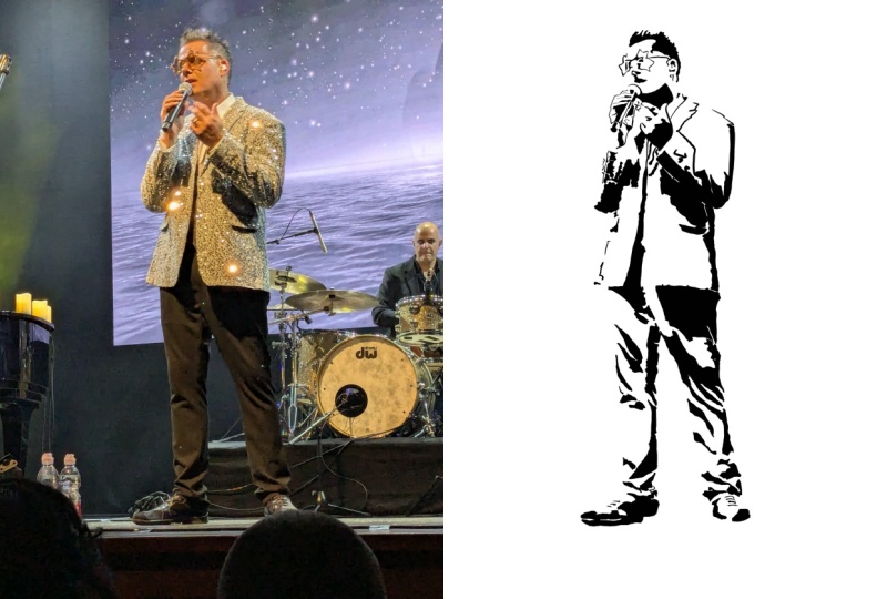
5. Notan Practice 3: And here with a picture
of a person that we're going to use
the noton method on. So I've already inserted
this as a private layer, and I'll put the layer on top to draw on lower the
opacity a little bit. I don't think we need to make
this one black and white because it's pretty much black
and white to begin with. So on this layer,
let's see my brush put back to around 19, whatever
is comfortable for you. And we're going to start off by focusing on the clear areas
that are black and white, or the darkest areas. So on his face, I'm seeing here like uh the eyebrow comes here
and then comes down. And then over here, it's a lot of decisions you
have to make over here because you have to decide if this area is black relative
to areas that around it. Otherwise, you'll end
up you could we could theoretically just
make the whole half of the face black, you
know, like this. But I think it's more accurate
it's more interesting if we can preserve some of the areas to add a little
hint of light that's there. So I'm trying to think about
how I'm going to do this. If we take that whole
area here like this. Alright, and now that I got this far, I still see that I can actually connect these areas like that. And it continues
over here like this. So this is gonna be the side of the face it comes
around like that. And then for the mouth, we
have a little gap where this type of lip is
comes down on this side, we're gonna have a lot dark Okay. I want to keep that little area little light there from
the reflection of this, I guess, this little light
coming on the underside of his mouth of his chin over there, which I'm
trying to preserve. And then we can
just close this up. We're gonna fill in
more of it later. But the basic idea that's
this area missed here. L. So that's the
side of his face, then we can go and fill
in more over here. I get the little
part of his jacket. That's shiny over there. Sort of like that. And then, these are really not so bright areas relative
to the other areas, but I want to make
them white anyway. Let's see. If I do
this maybe. Okay. And now the jackets going to be a little
more challenging. We'll move back to jacket after we finished with
his face, though. So, over here, I have to decide, do I want this area to be dark
or just this area, right? Just his hair or include the
bottom of from his forehead. So I want to do is it's clear to me that his
hair's gonna be black. So I'm going to start with
that and then I'll see how the outline sillo is working
and then go from there. So it have this for hair. And I can take actually a few
areas here that are white. The room lighting on his hair. So I'll preserve that
a little bit by just, I guess, um, drawing around it. So when I fill, it won't
get filled with black. Let's see what I did there, huh? Why is that filling everywhere? Close that area? There we are. That was one little
gap that I forgot. Okay, so we have
that, and then we can do a little bit
more over here. I think for this, I'm just
gonna fill it in by hand. And so this is what it's looking like right
now for his face, and I think that's
looking very nice. So now, question is, do I want to do this
as well or not? We'll hold off on
that for a second. First, we're gonna
do what's clear is that we're gonna do his eyebrow. And then this part of his eye I see it's looking like. So what I see to me, I see that his ear area is not defined at
all on both sides. So what can we do
there? Well, before the first thing I think would be to work on the inner part of the ear here and
define it like this. And we here as well. There's a little bit here, which it's so light. But since I want to be defined and we should be
able to see what it is, I'm going to decide to
make it actually dark, even though it's much lighter
than some of the areas that we're deciding to be light,
like this area here, if we leave that light
compared to here, right, there's no comparison with how much one is
layer than the other one. But relative on the
shape of the ear, I can decide that I
want to, you know, make this part dark just so we can see what's
going on there, right? Right now, if I turn to black
and white, we have this. I think I want to add in a
little bit around the ear. Like this. I dance the ear lobe? Okay. And given this, I
actually feel that we are successful not doing
anything in this area. We don't need to do that. I think it would
just be confusing. It's the lights of his face, and we don't need to add in
anything dark over there. But this part of the ear, I do want to add in
just a little bit over here and then a little
bit lower down over here. And that will hopefully give a little bit of a definition that there's an ear over there. I'm not completely
convinced I like that, but we'll stay
with that for now. So this is we have is his face, and now we're going to move
on to the rest of his body, the jacket area,
shirt and jacket. So again, what's clear to
me is coming down like here in a little gap for the area of his neck that is
still light. Fill that in. And then we have some of these lines that are the
wrinkles in the jacket. And I think from here, we can also add in this
shadow part of the shirt. And then for this part of the
jacket, we'll go like this. Now the question is, how many details do we
want to make of this? Because I think even though
we theoretically could go and define where the rim
is over there and stuff like that or this area, I think I'm going to make
this whole area dark Let's get that right over here and preserve this
as our light area. See what this looks
like if I go like that. So I think it's
sufficient if we do that. Now, over here we
have the really dark area of his jacket, which is over in this part. But then the question is
what to do over here. So I think for me, I'm going to actually
include all of this in the I'm going to include
all this area as dark. Continues down quite a ways. We just stop here for a
moment and fill this in. And then I want to add in, I guess, It's get a
little time consuming. This area that would be his um, um, hint at the
zippers over here. This turns off for a second. Yeah, I think it's actually
working out pretty well. So on this side, we're
gonna do straight. And over here, the far
end of the jacket. No, by the buckle, what
are we going to do? First, we're gonna draw in this. And now the buckle part, I think we can go like that and fill in here and
see what that looks like. Okay, so that's how I'm
designed to do this. If you want, again, you can decide to use valves
a little bit differently, if you want to have
both parts of it just not fill in the whole part of his
jacket like I'm doing. Then again here, we're
have the same idea, like, am I gonna fill it in or not? I think I'm going to fill it. And following the jacket
down zipper over here. So what's going to I see the next decision point
I'm going have to make is maybe around this where
this sleeve comes out. Okay. I want to make sure
his fingers are defined. Here we are, so we like this, and then we'll
continue a little bit more of these zipper pieces. We'll just speed this
up a little bit. I think at this point,
we can just say, there's no more zipper area that we want to do individually. And on this side, I want to
define where his hand is. And so for that, we're
going to go up to there. And also this, I guess, where this little lighter
part of his sleeve is. I think it could be useful. Mm. And like this, this hand. And this part here. Let's see what that's
looking like. Okay. Nice. Now for the hand,
we have this shadow here. We theoretically could close
in more by doing this part. But I want to try to preserve as much of
the hand as possible. I think that would be
losing a little too much. So I'm gonna go here, part
of the thumb, shadow there. This part for the
crease by the thumb. And then, of course, this
area is, for sure, black. And then we have the fingers. And then this area over here, we have the underside
of the thumb. So it defines that. And then we have this part of the finger. Now what
to do over here. I think I'm going to go all the way to the
fingernail like that, and we'll save the fingernail
as white and everything else being black like this. Okay. Tricky here. What to do? Do I I do it like that, will that be clear
that's a hand, right? We part of his hand.
Hopefully. So let's go here like that. Now we have the
end of his jacket. This lighter part. Now, this lighter part
might not read so well if we don't like here, I'm gonna actually cover
this whole area in, even though it's pretty whit, but I'm covering it
in because I want to define the shape of
his hand better. And like this also, so do I want to
keep this or not? For a moment, since it's a very straight shape and
not arched like his hand, so it'll be clear that's
not part of his hand, if it was curvy, then I don't
know if I would keep it in. But we'll keep that for now. We'll define that for now, and then we just we'll go around it and fill it in
to see what it looks like. Then we can decide. Right. So you see here, this area, which is very
sharp and rectangular. So it's a clear definition or distinction or different
type of shape from his hand, so I'm okay with it like that. Okay, so it's continue
with his leg, his pants, and let me just undo
that for a second here because what I'm seeing
is theoretically, I could do, actually, I'm seeing these lines
here, which I'm liking. So the question is, how am
I going to define that? Because his pants are dark. So I'm thinking
I'm going to do is continue with the
outside the outline of the outside of his pants, which is pretty clear
where like that. And then the inside over here. Now, this over here
we have an area that's quite dark and there's a slight line of lightness
that we can keep like this. But I want to simplify it because this looks
like it's going to be very complicated if I keep
the whole thing in here. So I think what I'm going
to do is just outline around the light area like this. And actually, undo this. I want to do the bottom half. That's going to be
a solid black area. And on top of it, I can
keep a few areas of white, sort of like we
do with the hair. Just a few, right? So here to there to
there, to there. So we could leave
those areas as white, and the rest of
it, could a black. This actually gets whiter, yeah? Okay, so see what happens
if I do it like that. Here, and I want to
that told me white. Good. Down to here and
repeat the same idea. We have a few areas
of white here. Keep it a little
more, and then here. Okay. Like that. So is
that everything? Hopefully for now, and we'll see what it looks
like. I fill it in. Okay. And over here, we have lined for a shirt, a few creases, this part of his pants. We'll do that while
we're here. Saying I'll preserve this little
area of white. And maybe here. Then everything
else will be black. I want to make sure I have
this area with pants. I was the gap between his
knee is still be white, and everything else here, I
think is black, like that. So we've sort of lost
the two legs are, but I think it's I
think it's okay. King in this area now the
rest of his shirt or jacket. Now trying to be
careful, a little bit careful with
the outline because the outline gives you a
sense of the contour, the um, smoothness
of his jacket. So I want try to make sure
I get as much as possible here I don't think
that's come on. Like this. I think it's a
little better like that. Even though I could
come up like this, but then it makes
this jaggy shape, but I think I want
to make it the feeling of smoothness
a little more. Okay, so over here, we're
gonna have a lot of dark. I'm trying to figure out how
I want to define this area. So I think, like, drawing these lines here
is only the beginning. Like I want to. Um, most
of it's going to be black. So we'll go like this, perhaps. Okay, close off this area
and see what happens. Okay. And then this area on top is still so blacker
than this, I think. So I think what I would do is just keep a very small
area that's white. See how that looks. So before
it was, like, like this. But I feel since the darker
part of his shirt or jacket, I want to be actually
much darker. So we're gonna go like
that. Then we have a few of these lines here. Okay, and then
we're going to fill the jacket part
here, these creases. Let's just close this shape
again so I can figure out where we've got so far
and then continue. Like this. Okay. Now this area here is all black? That. And we have this
area for his zipper. So I have to decide, again, what area this I'm
gonna be making black, which area I'm making white, just so I can be defining it. So even though it's not necessarily darker than some of the areas that we've made black, we can decide to make
this black just so it's who can read it, again, so people when
they look at the picture, to understand what
they're looking at. Let's go add in zipper now. And again, just spin this up so you don't have to watch me filling in all of
the zippers again. All right. So that's what
we're looking like right now. A few more areas here. Well, put in this
line underneath here. And then to figure out
how we're going to do this zipper pocket. To find the air around
the zipper like this, and then we'll air inside. Okay. I'm gonna close this off again so I
can see what we have. And air over here. Now, truth is this
area is mostly dark. Most of his jacket is black. So therefore, even though this
area could be maybe light, I want to I think I'm going to just fill in this
whole thing here and make it much more dark area because it's really a dark
area of his shirt his jacket. Close up this area.
Okay. And we have here. And again, even though the white area goes,
actually, white, I can keep this part
down here, right? But most of it, I'm
gonna make black. To here and let's take
all of this area. All that will be
black. I'll probably make more areas black, as well. What leave out there? Hmm. There's so much area over
here that is just too white. It doesn't give the
right impression about that this
is a dark jacket. So I think what I'm going
to do at this point is, um, just fill most
of it in black. How do it define that? Anything that's good? Okay, and a few other
things over here. The majority of this
should be black because it's actually
a dark jacket. Connecting all the shapes. I know this area doesn't make
any sense right over here. So we're going to let's fill this in and see
what happens like that. Mm hmm. Okay, I think
that's working. We have plot something
here or there. But overall, I think it's a good representation
of this jacket. I could go up and down like
this, but I want, again, the smoothest of the leather to preserve that a
little bit more, so I don't want to
make it too jackety. And just finish
this little area, and they can color
it in. Hold on. I want to close
that off like this. And now we have another
slight crease there that's bright here where I said focusing on how the
silhouette would read, right? So put these little
creases in it like that. Leave a little area over
there, and over here, like that. I think
that's almost it and Shad on the shirt over here. And there, that's
looking very convincing. I'm really happy
with that. And we could even see a time lapse now. Very satisfying to see
this come together. So that's an example
of how you can use the No ton method to do a value study of just
black and white and get a real sense of what
is light and dark. And in the end, you come out with a very strong, powerful composition
that's only two colors. I'd love to see how you
did with these exercises, and please upload them to the Projects and
Resources section. I'll be happy to give feedback. And be inspiration to other
people in the course.
6. Thank you: H. Thank you so much for taking this class with me and
learning how to use No ten studies to improve your understanding of
light and dark values. I'd love to see what you did. So remember to upload your work to the projects and resources section where you
can enjoy your work, inspire others, and get
feedback on what you did. If you enjoyed this class, I'd really appreciate if you
could leave feedback on it. It gives you so much
enjoyment to read your comments and inspires me to create more classes for you. Lastly, please click on the Follow button so you can
follow me on Skillshare, and that way, you'll
be the first to know Lion launch a new class. Thank you again so much for
taking this class with me. I look forward to seeing you
in another Skillshare class.
 Avraham Nacher, Artist & Photographer