Transcripts
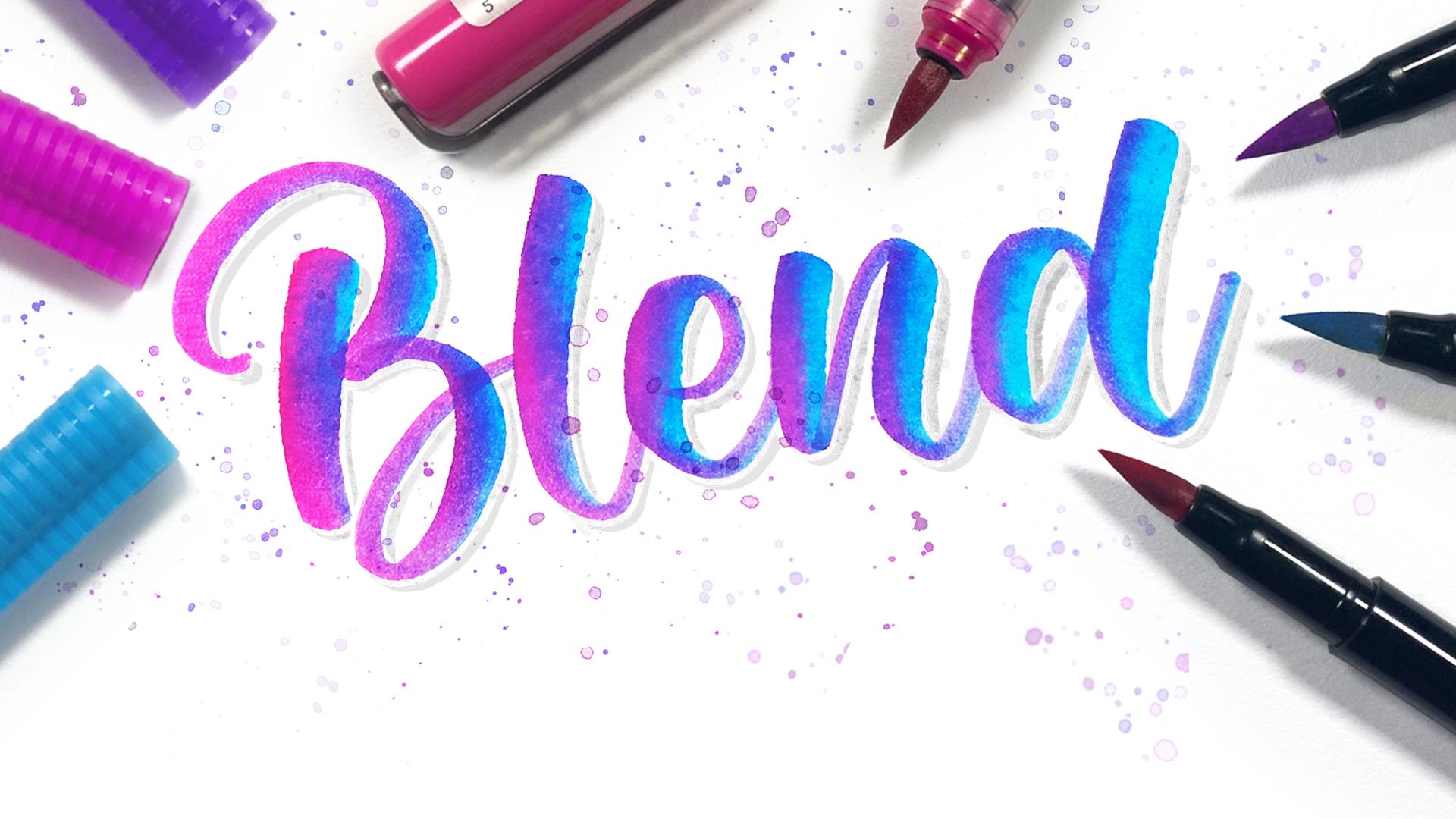
1. Welcome: Blending with brush pens is such a beautiful
way to add life, emotion, and depth
to your letters. And it's the easiest
way to elevate your lettering
without needing to learn a whole new
alphabet or style. But I'll be honest, it was something I really
struggled with early on. I thought I needed fancy tools or special markers
to get it right. But after years of playing around and testing almost
every brush pen out there, I figured out how to make any
brush pen blend seamlessly, and now I'm going to share all those techniques with
you. Hi there creative. I'm Shannon, and I've been a Lateran artist for
over eight years. If you know me from Instagram, you know that I love to create super colorful
calligraphy, galaxy blends, and dreamy
watercolor style effects. I'm also a teacher
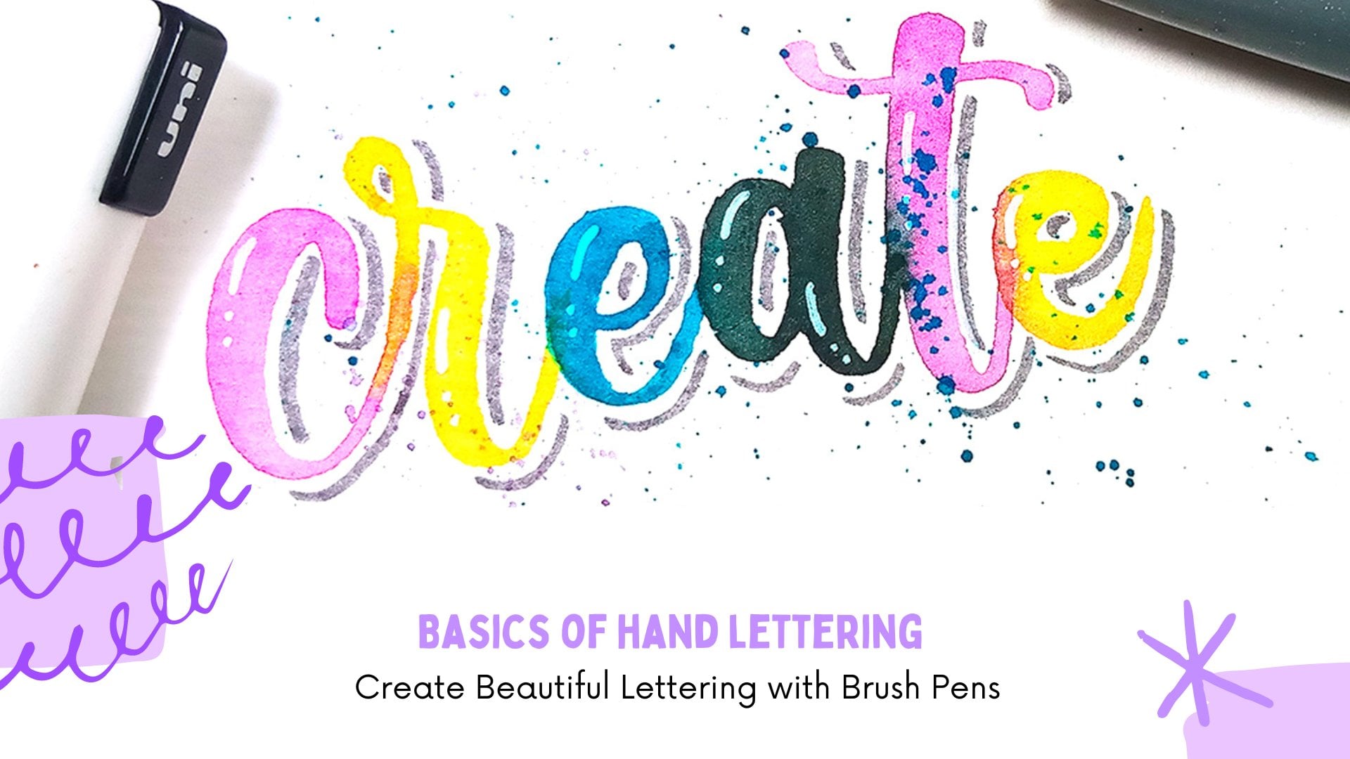
here on Skillshare, where I teach watercolor, Procreate and lettering classes. This class is all about mastering blending with
water based brush pens, no matter what brand you have. We'll start off with a few
short foundational lessons that cover everything you need to know to prepare
for this challenge. So don't worry if you've
never blended before. In those intro lessons, you'll learn about the
different types of brush pens, which papers are better
for certain techniques, different ways to apply
and move color around. And a bit of color theory to help you choose
colors to blend. Then, starting on day
one of the challenge, you'll learn how to use a new
technique every single day. We'll explore wet on wet
blending, using water brushes, layering colors,
creating treaty effects, and so much more all using
galaxy themed words. By the end of this class, you'll have a solid foundation
in brush pen blending and a collection of
beautifully blended lettering pieces to share
for your class project. This class is flexible
and designed to work with whatever lettering supplies you already
have on hand. So whether you're a
total beginner or a more advanced lettering artist looking to polish your skills, this class will help
you achieve smoother, more vibrant color
transitions and consistent results across
a variety of tools. So if you're ready to start
this blending challenge, I'll see you in the
next lesson where I walk you through
the class to place.
2. Class Supplies: The most important
supplies you'll need for this class are brush pens, and there are quite a few
different types of them. Felt tip brush pens have a flexible foam or
fiber brush tip. They are usually
very delicate and best suited for dry
blending techniques. So using them directly on watercolor paper may result
in them being worn down. So I prefer to use them
on smoother paper. Nylon brush pens have a synthetic brush
tip made of nylon. These tend to be a lot
more durable and they don't fray as easily as
felt tip brush pens. Some of the nylon brush pens
that I would recommend are the Tambo dual brat
pans if you're doing a drier type of blending. And for more water
based or wet blending, I would say that I like
to use the art markers. They just blend a lot easier
when you're using water. Real brush pens have a brush
tip made of real bristles, which mimic the feel of a
traditional paint brush. So these can be used on both textured or smooth paper and are really great for both wet and dry blending techniques. You can also use
Creola style markers. While these are not brush pens, the design of the nib allows you to create both
thick and thin lines, and these also contain
water based ink. So these markers can also work
really well for blending. And something that is very important for you to know
throughout this class, I'm going to be using a
whole range of brush pens, but don't feel like you need those exact brands
to follow along because 99% of these techniques can be done with any
water based brush pen, so please use what you have. In addition to brush pens, the type of paper that you
use is also very important. Watercolor paper is
ideal for blending with watercolor brush pens or using wet techniques that
require a lot of water. This paper is
really thick and it is specifically made
to have ink and water remain on its surface without warping for
a period of time. Mixed Media paper is a cheaper lightweight
alternative to watercolor paper. It has a balance between
texture and smoothness, and it is suitable for both wet and dry
blending techniques. Bristol paper is a smoother
yet durable alternative to watercolor paper that works
best for dry techniques. Marker paper is a
very thin paper designed to be used
specifically with markers. It is lightweight,
so it is best to only use this for dryer
blending techniques. So when choosing paper, consider the specific
techniques that you plan to use and the
desired results. Watercolor paper is excellent
for blending with water and achieving watercolor
like effects. Bristol paper offers
a smooth surface for dry blending techniques, makes media paper, provides versatility and can handle
both bet and dry techniques. And marker paper caters to simple techniques and is not as forgiving
for heavy blending. I keep a variety of papers on hand to adapt to different
projects and techniques. So don't hesitate to test different papers with
your brush pens. Some other supplies
that you will need for this class are a water brush
or a paintbrush and water, a pallet or a piece of plastic, and some supplies for sketching. Some techniques may require
some additional supplies, but I'll be sure to share them at the beginning of that lesson. So once you've gathered all
of these basic supplies, I'll see you in the next
lesson where we look at different ways of playing
color with brush pens.
3. Methods of Applying Color: The first thing
you're going to do is experiment with
different levels of pressure on your brush tip to create variations
in length thickness. So light pressure
produces thin lines while heavier pressure results
in thicker lines. And this pressure
variation is also another technique that
you can practice. So you can apply color with a light touch for a
subtle pass down result, or you can use more pressure
for bolder saturated colors. You can also practice making basic strokes like
upstrokes and downstrokes and curves and also explore flicking the brush tip
to create tapered lines. These strokes will
be crucial for blending as we go
through this class. The first and
easiest way to apply color is to paint
directly onto the paper. And to move the color around, simply use a wet paint brush. This produces an almost
watercolor effect where you have variations
of light and dark. The areas where
you directly added your color will be darker, while the areas where you added your water and move the color
around will be lighter. This method allows
for precise control over color placement
and blending Pay attention to the amount of water on your brush because too much water would
make it difficult to control where
your paint moves to, and too little
water will make it difficult for you to
move the color around. Then we have the wet on wet method where you
apply a little bit of water to your paper and press the marker
into the wet areas. Now, I prefer to use
this method with my in markers as well as my ecoline brush pens because I
know that these two are more watercolor style markers with a more watercolor
like ink in them, and the brush tips can also
handle being put in water. Not all markers are
able to do that. So I would definitely
recommend that you only do this with the in markers
or the Ecoline brush pens. Method is less precise
than the first one, and it creates a spontaneous
fluid and soft effect. It is great for organic
or watery backgrounds. So this next method, you can apply some color onto a non absorbent surface
like a palette or a piece of plastic and pick it up with a water brush
or a wet paint brush. This creates a lighter
diluted shade of color, but the color is more
consistent when compared to the other two methods where we get lighter and darker
shades of color. And finally, we have
a really fun method that I like to use for
creating backgrounds. So you're going to add your color onto a
piece of plastic, add water to your paper, and just flip that
plastic onto the paper. You can use your fingers to
push your colors around, and you can peel
the plastic away, allow the colors to
dry and you're done. This method creates a unique and often
unpredictable blend. And like I said, it is an
excellent method for creating abstract or experimental
effects and backgrounds. I
4. Basic Techniques for Creating Gradients: Now we're getting to the exciting part of this class where I
show you how to blend. Grab a piece of paper
and some markers. I'm using the e markers
and watercolor paper. I've divided the paper into four sections for
the first method, you're going to add your
darker color at the top. Then use a lighter
shade marker to pull that color downwards to
create a smooth gradient. So take your time as you blend. You don't want to pull
too much color down. And then you're going to
clean your brush pen by gently rubbing it on a scrap paper to remove
your darker color. Then you can go back and pull the rest of
that color dough. You can also rub the tip of your darker marker to the
tip of the lighter marker. And as you write the colorable transition
from one to the other, I don't worry about
damaging the tip of your markers as the color
will come out on its own. For this next method, you're going to add
your color and then use a paintbrush to pull
the color down. I just like you did
in that first method, if you need to, you can wipe off your paint brush in a piece of tissue and then
continue to blend. You don't want that darker
color to overpower your blend. And this creates a really fun gradient from light to dark. Alternatively, you can use a blending brush. Y
5. Color Theory for Brush Pens: So the first thing that we need to understand is
the color wheel. The color reel is a
visual representation of colors and their
relationship with each other. So on the color wheel, you will have your
primary colors. These are the foundation
of all other colors, and they cannot be created by mixing other colors together. The primary colors are
red, yellow, and blue. Then there are secondary colors. These are colors
that are formed by mixing two primary
colors in equal parts, and the secondary
colors are orange, green, and violet or purple. And then finally, we have tertiary colors
which are created by mixing equal parts of one primary color and
one secondary color. The tertiary colors are
yellow orange, yellow green, blue green, blue violet, red, orange and red violet. So understanding
primary, secondary, and even tertiary colors is essential because
these colors are the building blocks of all color combinations
in your artwork. Knowing how they interact will help you to create the
blends that you desire. When choosing the colors that you're going to
use in your piece, you should definitely
consider color schemes to ensure that your piece blends
without any muddiness. Analogous colors are colors that are next to each other
on the color wheel. This color scheme
creates a sense of harmony and cohesion
in your artwork, and these colors are often
the easiest to blend. Complimentary
colors are opposite each other on the color wheel. When placed next to each other, they create contrast and make
each other appear vibrant. But if you attempt to
blend them together, these will create
dull or muddy colors. If you want to use complimentary
colors, for example, a Christmas color palette
of green and red, instead of trying to
blend those two together, where you end up with a brown or dull color in the middle, you can leave some
white space between those two colors and blend those colors
into that white space. Then we have a
monochromatic color scheme, and this color scheme
uses variations of lightness and saturation
of a single color. For instance, you can use
different shades of blue from a lighter sky blue
color to deep navy.
6. Day 1 Gradual Color Transition: We're kicking things off with
a gradual color transition. This is the easiest type of
gradient you can create, but you don't have much control over how or where the
color transition happens. For this type of blend, you'll need two colors
along with your palette. This means picking colors that
are next to each other on the color wheel
because you can then predict what the
transition color will be. So you can pick two
primary colors or perhaps a primary and
a secondary color, or you can even do
this technique with a lighter and darker
value of a color. And of course, if you're unsure, you can test out your color
combinations on a piece of scrap paper until you find
two colors that you like. And for the paper, you can use marker
or bristle paper, anything smooth and light weight that works with
whatever markers you're using because we're
not going to be doing any manual blending or
going over any areas, so you don't need to
worry about using thicker paper to avoid tearing or your paper being
damaged by this technique. If you're following along
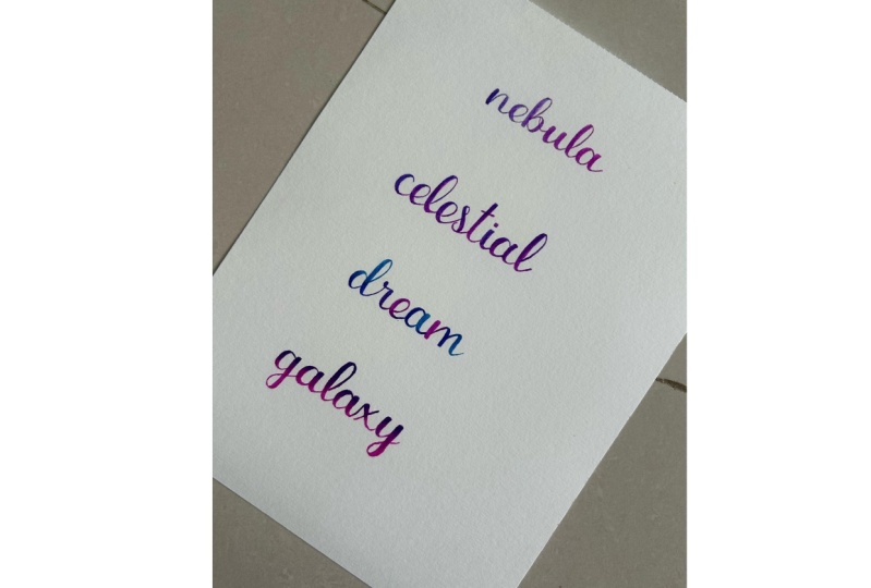
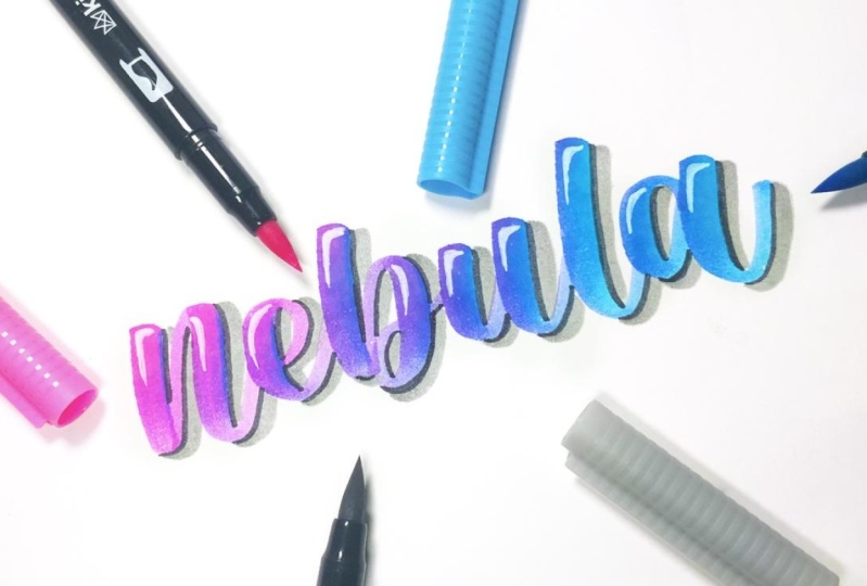
with the list of prompts, today I'm writing the word Nebula and I'm going to
be using pink and blue. To create this blend,
you're going to start by scribbling
a few lines of color onto that non
absorbent surface. Then use the other color
to pick up some of it. This method only allows for the marker to take in
a small amount of ink, so it works well
for shorter words. As you write, your colors
will transition naturally and you'll eventually get back to the original
color of the marker. To get a longer gradient, you'll need to try a
different technique where you rub the tip of one marker onto the other and allow the
color to bleed into it. The longer you hold
the markers together, the more color it takes in, and this is really
great for writing, longer words or quotes. Once you're finished
experimenting with this blend, feel free to add a
quick embellishment to make it stand out more. This is completely optional because the gradient is
the star of the show. I'm using a black brush pen to add a small shadow on the
right side of each letter, and then I'm using a
white paint pen to add a highlight in the
opposite side of each shutter. Then I went back in with
a gray brush pen to create a double shadow effect. And when you're ready to share
your project for day one, take a photo of your work, hit the Create Project button, and share your work to
the Project Gallery. And that's it for day one, I'll see you in the next lesson with another fun
blending technique.
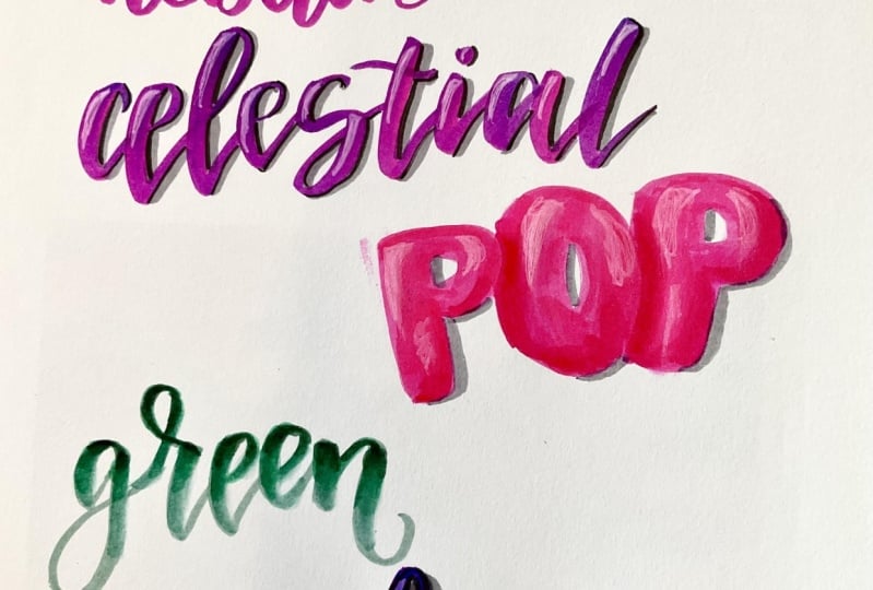
7. Day 2 Gradual Color Shifting Letters: Today's color transition
is like a continuation of the previous technique
where we put down color on our palette and then pick
it up with another marker. But rather than the color
transitioning across the word, each letter will have its own
gradual color transition. So you can grab
the same supplies, but this time for your colors, you will need to choose a very light pastel
color to write with. This is important because
that later marker can soak in and show the other
color so much better. Second color needs
to be one that is much darker than
your base color. I'm using a lighter pink than the one that I
use for day one and the same blue because I
know they will interact well and give me a nice
purple color transition. Again, you're going to add your darker color onto your
non absorbent surface. Then you're going
to pick up some of that color and write the
first stroke of your letter. But instead of continuing
with the rest of the word, you're going to go back
to that palette and pick up more color before you
write the next stroke. You're going to
repeat those steps to write the rest of the word. I. You can also try
another technique where you turn the marker before you write so
that the color you picked up is at the
top of the marker. Then as you write, the color stays on
one side and creates a more distinct horizontal color transition
for each letter. Denying de. Big. And if you're feeling a
bit more adventurous, you can also try this technique with two darker colors
on your palette. So now I'm using a light
purple as my base color, and I'm using the pink and
blue as my darker colors. I've added them to my palette, and then as I write, I'm going to alternate
which color I pick up. Another thing you can do is experiment with how
you pick up the color. So you can try maybe after every letter or after
every few letters, depending on how the colors look when you do this technique. So once you've written
your prompt for today, you can then add
your embellishments. Today's embellishment is
inspired by something that happens a lot when working
with water based mediums. It is quite common
to accidentally drip some water onto your work
and feel like it's ruined. In some cases, you may
need to start over, but if it is something
simple like this where only one letter or a
small section is affected, then I'm going to
show you how to turn it into some
distressed lettering. This distress technique
started a while ago as a happy
accident when I was a beginner and
spilled some water on some lettering that I really loved and didn't
want to do over. And this is now a
technique that I use intentionally to add a little
bit of texture to my work. So first, you can use a small paint brush
and some of the ink from the marker to help
redefine your letter if needed. So I still had some
ink on my palette, so I just picked up
some of and add it to this letter E. Then
you're going to add a bit of water to the color on the palette to create a liquid
watercolor consistency. Then you're going to use it to splatter some
across your latern. And also use some clean water
to add splatters as well. You're going to allow
that to sit for maybe ten or 15 seconds and then use a dry paper
towel to lift the color. Your lettering note should
have a distressed appearance. So you're going to add a
black shadow or an outline just to help define each letter and separate
it from the background. So when you're finished
with today's project, it is now time to share your
work in the project gallery. So you're going to head to the projects and
resources section, simply tap on the
pencil icon over your project and then add in
a photo of today's project. That's it for day two
of this challenge, I will see you in the
next lesson where we explore a more manual
blending technique.
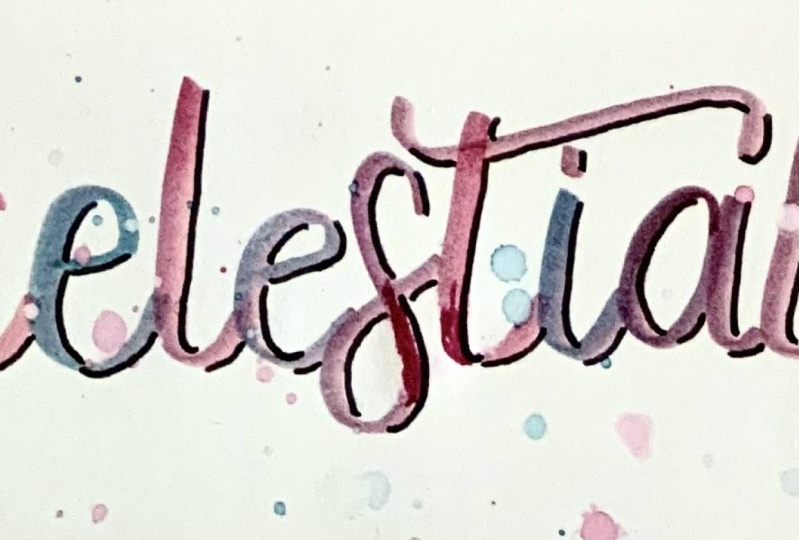
8. Day 3: Spot Blending: So far, the first few gradients we've created have
been pretty simple, a little unpredictable and didn't require too
much manual blending. But in this lesson,
we're going to do some blending that
takes a bit more time, but you're going to
have more control over where the color
transition happens. For this technique,
we'll be using a water brush or a
paintbrush and water. So you will need
either watercolor or mixed media paper because these can handle wet
blending techniques. And we'll also be using our markers directly
onto the paper. So I'd recommend using markers that can handle this
without being damaged. Also like to use markers
that are already frayed or worn down to do this because I'm not able to
letter with them anymore, but they still have ink in them that can blend really well. For the colors, you're going to choose three or four that
you know will blend well. For me, that is pink, purple, a light blue, and a dark blue, along with a gray marker that will act as the base for
your lettering. If you don't have a
light enough gray, you can use a pastel color in the similar color family as the colors that you're
going to be blending. First, you're going to write out your word in the lighter color. I love using the Tombon 95 as a base for all
my color combinations, as this color is neutral
enough that it doesn't affect the outcome of the colors that
I'm blending on top of it. If the marker is too dark, it can alter the
color of the blend. Which is something
that we don't want. Then you're going to add your colors on top
of the lettering, and it's always best to work
in small sections at a time. So maybe add two or three
colors and then start blending. Some markers start to dry into the paper a lot
quicker than others, and taking too long to
blend them can result in harsh lines instead of
smoother color transitions. Then you're going to
grab your water brush, and I like to start by adding some water where the colors meet to help activate the color, and then I go over
the entire letter. This helps make everything
feel a little more cohesive and also gives it a
more watercolor like effect. So you're just going to repeat adding color and
blending it with your water brush until you have added your color to
the entire word. Do die. Di Di. Do. Die, die. King and Once you're finished
with your lettering, you are free to add
any embellishments you like or leave it as it is. I'm adding a negative shadow
if you'd like to add one. You can simply
sketch a shadow away from the lettering
using a pencil and then go back in
with a gray marker and add a line next
to that pencil line. I'm also adding a
white highlight in the opposite corner of the
letter to complete this. Y This method of placing colors in a
specific spot and blending them is also great for creating
a three D effect. So to practice this,
you're going to need three shades of a
specific color. I'm using green, so I
have a light green, a meton green, and
a darker green. And I'm using block letters
for this technique, and I also have them overlapping just so that you can easily see how you will achieve
the three D effect. Then you're also
going to identify where your highlights and
your shadows will be. My highlights will be in
the upper left corner of each letter and my shadow is going to be in
the bottom right. This is important because
you're going to place your colors in specific spots. You're going to start with your midtone color
first and you're going to add that color to the side of the letter that
is the shadow side. And then I'm going to add my light green to
the highlight side. Then you're going to
use your blending tool to blend those two
colors together. I am using a paintbrush
and some water And while that first
letter is joining, I'm going to move
on and add color to the other letters using
that same technique of using the Midtone green on the shadow side and the lighter green on
the highlight side. No. You should already be able to see the
dimension in these letters, but we're not going to
use the darkest color to help enhance it some more. So I am going to
place my dark green on the areas where my
letters are overlapping. Then I'm going to
use a smaller brush to lightly blend it into
the letter underneath. H. Then I'm also going to
add a small amount of that darkest color to a few
key areas on the shadow side. So that, again, for me is the bottom right
side of each letter. And to complete this, you can add some shadows and some highlights to these letters to make them pop even more. The di, di. B you think a di di. Think good die. The good d. B it you can think of d. Bye die Once you're done, take a
photo of your work and share your project to your existing
one in the project gallery. And that's it for this lesson. I'll see you in
the next one where we create a vertical gradient.
9. Day 4: Controlled Vertical Gradient: In this lesson, we're
going to create a controlled vertical
blend where the color transitions from
one at the top of the word to another one at
the bottom of the word. In this lesson, we're
going to be going over the areas where the color
transition is happening. So the paper needs to be able to handle this technique
without being damaged. I'm using watercolor
paper because it can handle the
layers of color. And again, I'm using
bash pins that are already worn down
for this technique. So you're going to
start by writing out your word with
your lighter color, which for me is pink. Then we're going to divide our lettering into three
sections horizontally. This division can
happen mentally, or you can use a ruler
and a pencil to draw in these lines so that you have a physical guide
to work within. If you are going to
use pencil for this, you need to sketch
very lightly because once your color goes
over that pencil line, it is very hard to remove
or sometimes permanent. So once you have these
letters divided, the section at the top is where your darker
color will be. The section at the bottom is where your lighter
color will remain, and the section in the middle will be the transition color, which is a mixture of the two. So now we're going to add the darker color to the
entire top section of the letern and then add a small amount to the top
of the second section. And as you go, remember
to add this color with short flakes rather
than with a straight line. Then you're going to use
your lighter marker, which is going to be
the blending tool in this case to pull some of that darker color into the transition section and
blend the two together. If your marker takes in too
much of that darker color, you can clean your brush by
rubbing it on a piece of scrap paper and then go
back and continue blending. And since we're using
that same base color, it is going to darken
that first layer. So once you're finished
blending the colors, clean your brush
again and go over the bottom of the
letter if needed to get rid of that harsh line between the saturated color and the original color
of the first layer. So then you're going to repeat the same techniques to
complete the rest of the word. I They to die. Di The think a di di. The good die. The good die. The think think a dime. Die. A dime. Baker a di, di. Big think good die. Ao d. Make take a dime. Die, di. Once you're finished with your blend, you can, of course, add
embellishments if you like. Today, I'm adding my
signature messy outline, along with a shadow
and a highlight. Do di, di. Big ahi a di di. Big think die. Big good die. Make a to think a dime. Bye, die. God. And, and to do.
10. Day 5: Light to Dark Gradient: The graded we're doing
in this lesson is the opposite to the one
that we did previously. So our colors are
going to transition from light at the top
to dark at the bottom. The supplies are the same, but this time I'm
using a water brush as my blending tool rather
than using only markers. And for my color scheme, I'm going to be using a
dark and a light purple. First, you're going to start by writing out your word
in your latest color. Then add some darker color
to the bottom of one letter. Add some water to the area
where the color transition will happen just to help
activate the colors a bit. I'm also going to
go over the rest of the letter with a small
amount of water just to help make the color transition
appear smoother and also create a watercolor effect. If you notice that you've
picked up too much color, simply wipe it off on
a piece of tissue, then you can continue blending. Then repeat those same steps
for the rest of the word. So you're going to add your
darker color at the bottom, and then take your time and blend upwards. O. Think of die. A
tick a dime. Die. Mao die. Diet think a dime. Die, die. When you're finished blending, you can add some embellishments. For this one, I'm using a white paint pan to add some dots and starts
to my latern. I D. And once you're finished, share your work to
the project gallery, and I'll see you in
the next lesson.
11. Day 6: Dark to Light to Dark Gradient: Today's blending
is a combination of the last two gradients, so the darker color will be
at the top and the bottom of the letter with the
lighter color in the middle. First, you're going to start by writing your word in
the lightest color. Then you'll need to divide your laterd into five sections. Again, this can be mentally
or you can use a ruler and a pencil to draw these in if
you want to avoid confusion. So add some of your darker color to the
top and the bottom of your laterd with
just a small amount of that color in the
transition area. Then you're going to use your blending tool to
activate that color in the transition area and very slowly blend it
towards the lighter color. Again, you need to pay
attention to how much of that darker color
you pick up and then wipe off the excess in a piece of tissue or on
a piece of scrap paper, depending on the
tool you're using. Repeat those same steps
for the rest of the word. Paying attention to how
much of that darker color you were picking up
to ensure that it doesn't overpower the later one in the middle. In. And to complete this, I'm just adding some dots
all across the lettering, and then I'm adding a
simple gray shadow. To die, die. Take a good die, die. Die. Take good die.
12. Day 7: Wet On Wet Blending: In this lesson, we're taking a break from blending
letters and focusing on creating a really cool wet on wet galaxy background
using Karen markers. This is a really great
technique if you just want to create
a galaxy painting, or perhaps you want to create a background for some lettering. So the first thing
we're going to do is prepare our paper. And to do this, simply
use some masking or washi tape to secure the edges of
the paper onto your surface. This will prevent it from
warping when we add our water, and it will also create
a very nice white border all around our painting. Once your paper is taped, you can then use a
large flat brush to evenly wet the
entire surface. You want it to be very glossy and not to have any
puddles in any areas. Now we're going to
start adding our color. So the reason why I'm using carrying markers for this is because you can press the nip of the marker onto the wet paper wherever you
want your colors to appear. The ink will then bleed and it won't damage the
nap of your marker. And as you can see, as I
continue to add color, the saturation is the same. It doesn't lighten because
of the water around it. So that is why I
would definitely recommend you try it
with the caring markers. Once your colors
have been added, you can then use a
large paint brush to blend the colors
all around the paper. This part can be a little tricky because you
can easily overblend an area or you can hide a
color so to avoid this, make sure that your brush
is completely clean before you start pulling a new
color into your white areas. At this stage, you
need to also keep in mind which areas you want
to remain very light or white because
you should avoid pulling your colors
into those areas as it will be very
difficult to lighten them once the paint
has already dried. So continue to blend your
colors all around the paper. And if you need to
add in more water, simply just take up some with your brush and add
it onto the paper. You want to make
sure that all of the paper remains evenly wet. You don't want any parts
to dry because this will create harsh edges and you want the blend to
look very smooth. So after you spread that
first set of color, you can then start to build
up or intensify your colors. And another fun
technique I like to do with the Karen
markers is to use a wet paint brush to pull some color directly from
the nib of the marker. With this technique, you
don't have to worry about damaging the nib of
the marker either because the wet paint
brush naturally causes the paint to flow into the
bristles of the paintbrush, and the nib of the marker
doesn't get dried out. If I find that the nib seems to be drying out a little bit, I just switch to
another color and give that ink some time to
get back into the nib. D. Continue adding and spreading your colors until you're satisfied
with that layer. Then allow it to completely dry. If you need to, you can use a gun to speed up the process. The next step is to paint
our second layer of color. So you're going to rewrite the paper just like you
did in the first step, and you don't want to
reactivate any of the colors, so you're going to do
this very quickly. And with a large brush so
that you don't have to use too many swipes of
water across the page. Again, your paper should be glossy without
having any puddles. Then you're going to
repeat the technique where you add color alternating
between using the marker directly onto the paper wherever you want
a more saturated version of the color and then
using the paint brush with the paint to build up
any other areas as well. Once you're finished,
adding those colors, simply allow the paper to dry again before we move
on to the final layer. We're going to use
your black marker to add your black all around the edge of
the paper as well as to any other areas
that you want dark. During this step,
you can also add some of the other colors where you feel they
need to be darkened. In. Once you're finished
adding your colors, you can allow this liter
to dry completely. Then use some type of
opaque white ink or paint. This can be gouache
or acrylic or even a gel pen to add some
stars to your galaxy. Do dike. De. D. Bye, Dob. It, God. And did d, God. And dig. God. Nine.
13. Wrap Up: Congratulations on making it to the end of this
seven day challenge. Together, we've explored some basic techniques
for creating smooth, colorful gradients using
water based brush pens, and I hope you enjoyed blending your colors
as much as I have. I am very excited to
see your creation, so head to the Projects
and Resources tab of this class and share your work along with any other relevant information
that you want to include. And don't forget
to leave a review, sharing your thoughts
on this class. And be sure to follow me
on my Skillshare page so that you will be the first to know what I have coming up next. Thank you so much for joining
me, and I'll see you soon.
 Shannon Layne, Lettering, Procreate & Art