Transcripts
1. Introduction: Hi, everyone. My name is Faye
Brown and in this class, I'll be sharing my five
top tips for customizing your brand visuals to
attract your ideal partners. We will be talking
about how to expand your current brand assets
into a bigger family of visual materials from
secondary logo options to sub marks to
your color palette, typography, and
photography style. All of these elements can
come into play to ensure your visual branding
is speaking to the right people
in the right way. By the end of this class, you will be feeling a lot more confident with your
visual brand elements, how to use them, and
how to share them with fellow colleagues or outside designers such as web designers. You will be adding all
these elements into a brand style board that acts as a mini set
of guidelines. But most importantly, you'll have a greater understanding
of how you can use your visual brand to attract your partners that use your services or
buy your products. For those of you who are new
to my Skillshare classes, I've been teaching on
Skillshare for about 10 years now with many classes on
branding and creativity. I've worked in
Motion Graphics for 10 years before
starting my own company in 2010 and now I focus
on branding projects. As a brand and design specialist who has worked with
hundreds of clients, I know the importance
of making sure your visual brand represents
your business and values. This is not a one size
fits all approach. Whilst a funky
pattern design might work for some, for others, a beautiful stamp
design to overlay on your imagery will be
much more useful. Within the projects
and resources folder, you'll find a handy Adobe Illustrator template
that you can use for your brand style board
and there is also a link to a Canva
template, if you prefer. There will be project
steps to complete along the way and I
can't wait to see how you all develop your
existing brand elements to help attract those ideal
partners to your business.
2. What We Will Cover: Let's take a deeper
look into what we will be covering
in this class. I will talk very
briefly about knowing your target audience before we move on to the five top tips. We will start with
looking at your logo. Your company probably
has a logo already, but maybe you only have one
or two layouts to play with, and this is literally it. In this section, we will
discuss secondary logo versions along with submarks and
stamps and how to use these. Then we will talk
all about color. I expect your
company already has one or two main colors that are possibly
used in your logo, but this could be where your
options for color stop. We will talk about how
to expand these colors out into a fuller pallet of accent colors and
neutral colors. I will also talk a little
bit about color association. Then we will discuss how typefaces can be
your visual voice. I'll talk about
creating a font family which will help get the
right message across to your partners and
also help create that all-important
brand consistency so everyone in the
business knows what typefaces to use and when. I'll also talk about
typographic hierarchy and how different typefaces can change the message of
the word or phrase. We will then move
on to developing a photography style for
your company and brand. Again, this will help reinforce your brand message and help
build brand recognition. The fifth tip will
cover brand elements. That takes in illustrations,
patterns, and textures. Your first project step will
be to create a mood board. A mood board helps
set the tone and style of your company's visuals. Is it rustic and edgy, or is it soft and muted? Is it bright and fresh, or luxurious and high-end? Within the mood board, you'll include existing
color palettes, typefaces, graphic ideas, and styles along with
photography ideas. A mood board helps act as a springboard for all
the other elements, so they all start
working together. However, although this
will be your first step, it's important to go through
all the tips with the first, which will then help you define what to include on
this mood board. I advise you to watch
class 3 in one go. I'll then talk to you
about where to start with your mood board towards
the end of the class. I'll prompt you with the other projects
steps along the way. At the end of the
class, you will collect all these elements into
a brand-style board. I've included an Adobe
Illustrator template for this, along with a Canvas
template, if you prefer. Feel free to build
your own brand board if you would like to. But the template will be
a great starting point. Brand style boards
will act as a set of mini brand guidelines that you can share within
the business. Everyone will be using the
correct colors, typefaces, and see how everything
comes together as part of a visual
brand family. That will help build brand
recognition and consistency, helping your partner spot
your visual materials and instantly knowing it
comes from your business. I will then talk a
little bit about how to use all these branding
assets to create a cohesive visual style for
your business. Let's begin.
3. Knowing Your Target Audience : This class we'll be focusing on the visual side of branding, but having an idea of
your target audience, the partners you
want to attract, plays a big part in
the branding process. Making sure that
whatever you create, attracts the right
people to your company. Without those
people, that company probably wouldn't exist, so what you ought to think about these people as you go
through this class. If you need a few
pointers in this area, I do have another class
that goes deep into the subject and I'll put a link to that
in the notes below. Just as a very quick exercise, maybe write a couple of paragraphs about
your target market, your partners, so they're at the forefront of your
mind as we move forward.
4. Analyzing Logos, Submarks & Stamps : Let's start looking at logos, submarks, and stamps. Firstly, we need to dispel the myth that your
logo is your brand. If we think about the
most famous logos like Nike and Coca-Cola, their logos are
famous worldwide. But there's so much
more that goes into making a brand successful
than a nice logo. I use the analogy of a cake
when it comes to logos. Let's say you have the
tastiest cake in the world and all these layers buildup to
make a cake like no other. These layers are part of your
brand, your brand values, personality, message,
your mission, your unique selling
point, your legacy. All these elements of your
business that make it great. Now I got into a bit of a
debate with someone once who said it doesn't matter
what your logo looks like, what matters is that all these other elements
are in place and absolutely all these things
that make up you and your business have to be greater and 100
percent important. But now let's say
you put the icing on this cake and it
looks pretty enough, or just a bit framed together. Now there's some
people that will look at this cake and think, no, it doesn't look great. and they will never get to all those lovely bits underneath
as they've been put off. In this instance, I say that a logo that's not working for you could do you more damage
than having no logo at all. On the other hand, this icing or your logo could look
flipping amazing the colors, the details is beyond anything
you've seen on bake-off. But then you take a bite and all those layers
underneath don't taste that good or they aren't
living up to expectation. Your logo is not your brand, but sometimes it's
the first point of contact someone will have with your
business so your logo needs to set expectations. If you are budget friendly, your logo shouldn't
look too high-end. It'll put your
target market off. If you are a luxury brand
aiming at high paying clients, your logo needs to reflect that. Your colors and your typeface can play an important
role in this as well so as we go through
the tips in this class, just bear that in mind. Maybe there is no way you can
change your company logo, but perhaps you might be allowed to tweak the colors,
for example. Whilst this isn't a
logo design class, I want you to really
think about whether your logo is working
for your company. If you feel it is really
not serving the company well or attractive to the
right audience for you, then maybe it's time
to make a change. But let's assume your logo is fantastic but perhaps you just want another extra version. A secondary version
of your logo, a submark or a stamp, they might be quite
handy brand elements to have in the toolkit. Let's chat a little bit
about what these are and how you could use them to
create some more options. Firstly, let's look
at secondary logos. These are usually very much based on the main primary logo, but just a different layout. Let us say you have a centered
logo with a brand icon. The secondary logo could be as simple as switching
up the positions and sizing to create a horizontal
or landscape version, which might be useful
when space is tight. Maybe at the top of an
invoice, for example, and you can see that
example here for Laura Porter, Interior Design. Another secondary
logo version that you might consider are
ones that include a little tagline which might be your company motto or just help explain what
your business does. Think about using this old
version would be useful when maybe this is going to
be the first point of contact someone's going to
have with your business. Perhaps a business card that you hand out at events, for example, that could be useful to have
this extra little strapline. Submarks are stripped down
versions of your logo. It won't include all the text. As you can see with
Rebecca's submark, I've just so load the custom design typeface and
put it in a little circle. It doesn't include her name, and it's usually
something you'd use when people are already
familiar with your brand. Maybe it's on social media. They will already see the company name but
a little submark in a social graphic
helps you not have to just use that logo
over and over again. It's a simplified version
of the logo that makes up part of your brand elements to give you this flexibility. You don't always need a submark, but they can be quite handy. Let's look at a
few more examples against their main primary logo. Few different ones here. For Faith&Brown, it's a
simple initial submark, for the Meraki Cabin, I just pulled out the M
to make a little icon, and for Sarah Winterflood, the graphic is
enclosed in a circle. Do you think a submark would
be useful for your business. How could you take your existing logo and
adapt that into a submark? The other brand element
you could think about is a stamp design. These are quite
similar to a submark, but usually a
little bit subtler. Stamps work great for any business that use
a lot of imagery. Let's think photographers, designers of any sort, real estate firms and
architects to name just a few. A stamp can be any shape, but what shape might
work best for you? Have a think about this before going ahead and designing one. For Victoria James Cake Design, I created a subtle cake
illustration that she could use like a
watermark on her photos. I tend to use circles a
lot in my stamp designs. They usually have a central
focus point and the name of the business is set around
the edge of the circle. Your stamp doesn't
have to be circular. Stamps can work really
well on social media or over imagery when you want a different option to your logo. Also just saves you repeating that same logo over and over. Your project step
for this logo and submark section is firstly
decide if a secondary logo, submark, or stamp would be
useful for your business. Then find some inspiration. You can use sites like Pinterest and just type in brand stamps, see what comes up and see if there's a nice inspiration
you can use with them. Then design one or more of these options.
What do you need? Do you need a secondary logo, a submark, or stamp? Do you need a couple of those? Just figure out what would be useful and then have a
go at designing them. Then upload your designs
into the project gallery. Also, please post up the original company
logo so we can see how these work alongside it.
5. Curating a Brand Color Palette : Let's move onto your
brand color palette. Let's really think about what
a brand color palette is. Brand color palette
is a curated set of colors that help reflect
your brand values, help build brand recognition and help attract
your ideal partners. The benefit of having a set of brand colors
to play with is that it can really help with brand recognition and
looking consistent. Let's take a quick look at
some interesting stats. The average person
scrolls through the height of the Statue
of Liberty a day. Think about when
you're scrolling through Facebook or Instagram, do certain color combos
stand out to you and you instantly know that they belong to a certain
brand that you like, so then you might stop the scroll to take
a look in detail. Ninety percent of our
first impressions about products can be
based on the color, and 80 percent of
consumers believe that color plays a big part
in brand recognition. Let's discuss how you can
use color in your branding. You probably have one or
two main brand colors already that are used
possibly in your logo. But maybe you feel like having a few more colors
in your toolkit would be really
useful when creating visual materials
for your business. Now there are no set rules
to say that you must have X amount of colors
in your brand palette. But typically when I'm coming up for palettes for my clients, I'll go for about 5-6 colors. Usually, this is made up
of 1-2 primary colors, 1-2 secondary colors, and an accent color, maybe a couple of neutral
colors like grays, light browns, or off whites. When it comes to filling
in your brand boards, you'll see that I've left
space for five colors, but please don't feel
you have to fill them. Or if you want a couple more, add one or two extras. This really depends
on your business. A lot of businesses
aimed at children, for example, might have quite a lot of colors
that they can play with. Others might only have three. I usually also break this
down into a ratio diagram to show which colors are the main colors and which
ones to use more minimally, like the accent color when you want a pop
of color somewhere. As everyone's pallets
will be different, I haven't included this
in your brand boards. But what you can do
instead is add a bar chart below showing the ratios
like this if you wish to. A lot of this depends on
how many people are in your business and who might be creating visuals
for the business. The brand board acts as
a mini brand guideline, so giving people direction
like this can make sure that all your visuals look
aligned and consistent. When it comes to color palettes, don't think that
all these colors have to appear in your logo. Your logo will probably
be 1-3 colors, there are exceptions to this, but don't try to get all
your colors into your logo. Your color palette
is what to use for all your other lovely
branding materials. Think social media posts, flyers, packaging,
uniform maybe, stationary, brochures, whatever collateral you're
putting out to the world. If you have a shop,
you might think about your interiors,
your paint colors. If you have a work van, your van could be a
great way to advertise your business and build
brand recognition as well. What color is your van? How do you add colors to an
already existing palette? I'm going to take the example of your main brand colors
being a very deep blue and a pinky red. You'll see two
examples here of how the additional colors can
complement the original ones, but also give us a
different tone for each. The one on the left
is quite cool. It's quite sporty and
professional-looking. The other is super
bright and eye-catching, it's bold, confident,
and warming. You can see the difference the extra colors
have made to each. The key here is working out what approach will be
right for your business. Another factor to take into consideration is
color association, and words we tend to associate
with certain colors. I'm going to flick
through these slides showing keywords, emotions, and characteristics
of each color, along with famous
brands who use them. But if you want more
detail on these, and also looking into
seasonal color palettes, then do check out my class Branding Uncovered the Power
of the Perfect Palette. You can go into
this a lot deeper. I'll put the link
in the notes below. But for now, you
can go back through this video and pause to take a longer look at these slides and the brands that use
these color palettes. We have a lot to
cover in this class, and I don't want to
overwhelm you too much. But you will have to pause to take a look at
those slides in more detail. Do go back and make some notes. What tools can you use to
come up with color palettes? Great place to start is Coolors. You can input your existing
colors, lock them in, and then simply press
the spacebar to see palettes that
it might suggest. But these aren't always great, so it's good to have a bit of an idea of what you
might be after. Once you have something you
are relatively happy with, you can go into the values
and play with the tones, tints, and shades a little more. You can also add more
colors here if need be. Another neat trick you can
use is the color pick option. You can upload a photo and pick colors from it
to form a pallet. Depending on what type
of business you're in, this might be a handy tool. Adobe Color is another great
tool with similar options. For inspiration, I always
tend to recommend Pinterest. You could simply type in
navy color palettes and it'll come up with
loads of lovely options based around navy. If you have Navy as
a color already, this approach could
be quite useful. Your project step for
this section is to come up with some more colors
for your brand palette. The key questions you want
to ask yourselves are, what feelings do you want your partners to experience
when working with you? Do these colors reflect
your brand values? Does this palette
reflect your prices? If you are a high-end brand, be careful not to use
colors that look too budget-friendly as it might make you look cheaper
than you are and put off your potential partners
and vice versa. How many colors do
you really need? Don't just add colors
for the sake of it. I'm looking forward to seeing
what you guys come up with. Remember when posting
your projects, do give a little
bit of a background into the business so we all know where you place
yourselves in the market.
6. Making Typography Your Visual Voice : How typography can be
your visual voice. Let's take a look now at how having a family
of typefaces can really help enhance your
brand message and become what I like to
call your visual voice. If we think of a typeface
like our own tone of voice, you can have quiet typefaces that are maybe setting a small point size and a lightweight. It's like a whisper. Or you could have a big bold typeface that's
quite a lot louder. Taking this one step further, I'm going to use a made-up
name, Charlie Hooper. Charlie could be female or
male or gender-neutral. We've no preconceived
ideas about who Charlie is or
what Charlie does. But notice how the typeface
helps us form ideas and our minds about what type of business Charlie
might be running. Think about the typefaces
you are currently using or the ones in your logo. Sometimes if you have a
really strong logo symbol, the typeface that
accompanies that can afford to be quite simple and clean as you don't want the two fighting
for attention. The typeface doesn't
always have to tell a story but it needs to
support and compliment. Moving onto expanding this
out into a font family, which is a set of
typefaces that will become you're heading option, subheading, and body copy. Possibly also an additional
typeface used for more personal elements
so maybe something like a handwritten script. They can work well for this. I'm going to walk you
through some examples now about how type
hierarchy and font pairings work as this should be useful for when you start thinking about your font family. Your project step will
be to come up with a font family for your business. Let's talk briefly about type hierarchy and how
you can use this on your visual material for maximum impact to attract
someone's attention, whether that's on a printed
flyer or a social media post. Think of this as a bit of
a system for highlighting most important text and
then the supporting text. Let's say you have a block of text and you can see the one on the left is not drawing my
eye into much specific, not shouting for my attention. If I saw something like
this on Instagram, I'd most likely just
keep scrolling by. However, the one on
the right will draw my eye into the subject heading. I'll read the subheading and then if I'm
still interested, I'll read the body copy below. This example uses size to
demonstrate the hierarchy and also a different typeface
for the main heading. But you can also see this
working with just using different weights of
the same typeface on the left layout here. Also, this doesn't
have to read in a standard top-down formula. You can mix this up. Just keep thinking,
what information do you want your
viewer to read first, second, third, and maybe fourth. Also bear in mind how color can help play a part in this too [NOISE] by drawing your
eye into the main info. Let us think about
what font pairings we can use for this. You could go down
in an easy route of choosing one typeface
that has a lot of different weights plus
an italic version perhaps and work out which
one to use for headings, subheading, and body copy, plus maybe a pullout quote. There's nothing wrong with this. Usually, when I give my
clients a font family, I might suggest a
heading typeface along with body copy and then, depending on the client, a more friendly handwritten script style that
can work well on social media for
a short phrase or a one-word graphic when
they want to get attention. Whilst the typeface
like Fox trails script is lovely for
short phrases and really adds a nice
personal friendly field for a whole paragraph
it's hard to read. Without being boring
always try to think about the ease of
reading for your viewer. Sticking with one
family of typefaces is okay but if you want to go
into this in more depth, you could look at some
alternative font pairings. I'll walk you through some
points to consider now. We can have a very
elegant heading set in a typeface called hunter, alongside a simple sans serif
typeface like lato light. The balance here works well. The heading is very thin. It's not a bold
typeface so the rest of the text needs to
be mindful of that. This font pairing
is communicating messages of elegant, style. It's quite understated
and it's quite delicate. I can imagine this font
pairing working well for high-end fashion brands
or well-being business. If I change the lato
wait to a regular, this doesn't balance as
well with the heading. The message is a bit lost now, just simply by changing the weight of that
second typeface. If I now change the heading
typeface to something bold, I like Playfair, the lato regular works
well alongside this. The messaging here
is a bit bolder. Whilst it's not shouting, if you think of the first one
like a quiet calming voice, this one is a little bit louder. Just for comparison,
if we look at Playfair using Lato light, we can see the balances off here and there's
too much contrast. This can be overcome
by simply changing the weight of the
subheading to a bold. This allows your eye to adjust
to the lighter body copy, although I think this
might still be a little bit too light for this
heading typeface. Let's go back to the
original one now. The body copy here is
a sans serif typeface. Let's try a serif typeface and see how different it looks. The messaging is
still very similar to before, understated elegance, but using the serif makes it look a touch more
high-end and classic, a bit more traditional. We used to look at sans
serif typefaces as more modern but serif
typefaces used in body copy are making
a bit of a comeback. Let us look at this pairing when a serif really could
clash with a heading. Here I'm using chunk Roman for the heading which is a
slab serif typeface. It's not exactly elegant, it's super bold, a bit brash. It's demanding to be looked at. It's quite sporty. The subtleties of the serif
typeface with this clash, they just don't work
together at all. There's mixed messaging. Simple geometric sans serif like Century Gothic works
much better with this. Hopefully, that acts as a few pointers for starting to think about your font family. You'll also need
to make sure that your typefaces
complement your logo. A lot of designers categorically say you shouldn't use
the same typefaces that are in your logo as it dilutes the power of your logo. There are instances where I
think this can still work, especially if you use
a different typeface for a tagline, for example. But just bear this in mind when coming up with your options. Your project step is to
come up with a family of typefaces that will form
your brand font family. You'll want to
include a heading, body copy, and a
personalized or Accent font. This is the one that
you might use on social media for one
word or small phrases, possibly something a bit
more friendly impersonal. Of course, this depends
on the business. Also, maybe consider
a subheading. This would usually be
either a lighter version of the heading or a weightier
version of the Body Copy. Also, think about how
they complement the logo. Post your options in the project gallery
and I look forward to seeing what you come up with.
7. Developing Your Photo Style : Photography can play a big
part in your brand message and attracting the all
important ideal partners. Coming up with a
photography style or a rough framework
can be really useful when sourcing imagery to use for your business or when talking to photographers you might hire. You might hire a specific
brand photographer who will talk to you about your ideal partners
and hopefully try to incorporate your
color palette and tone into the photography. Where do we start? Your business might
be product-based, or service-based, or even both. I'm going to show you
some examples of how different photography styles can help reflect your brand message. We will look at two
shops selling shoes. This first style uses very bold color
blocking techniques. The imagery is striking, bold, youthful, slightly edgy,
and very eye-catching. It would probably
grab your attention. Just take a moment to think
who might be attracted to this imagery in a way that would then make them want
to buy from the shop. Now let us look at
the second example, a totally different
vibe and still sells Nike trainers
along with other shoes, but the photography style
is completely different. It's more down to earth, real life puts you
in the picture. Do you think this would attract a different kind of customer? Where do you think
you would buy from? Think about the different people each are trying to attract. This example was quite
stark in it's differences. We're now going to
look at two examples that are similar in many ways, but you'll start to see the slight nuances a photography
style can communicate. I'm not going to assign a particular job role to
this person's mood board. It's a service-based business rather than a product-based. Maybe this person is a coach, a photographer or
a travel blogger. I want you to think about what vibe these photos give off. Then compare that to
this next mood board. Similar content and
subject matter, but the style is a
little different again. Whereas the content is very similar the way the
photos are taken, the way they're color
graded and setup, all help give off
a certain message to their ideal partners. The one on the left, I think, is very classy. It's very posed and
perfect, quite upmarket, but trying to give
off a relaxed vibe, although it could look
a little bit forced. I think this person is super
organized and structured, gives off an air of elegance. The person on the right could do exactly the same
job as the other one. But her tone is more laid back like hazy
days, very natural, a bit messy and cluttered, sense of adventure,
loves being outdoors. It's more personal, also where you see
a lot of the faces. You can also think about how a color palette can help
tie everything together. These tones are very muted, but warming and welcoming. This color palette is
a bit more up market, is cool, luxurious,
and a bit edgy. Start thinking about
the photography you already use
in your business. Are people in relationships
a big part of your values? If so, makes sure there
are photos of people. Then think about
how they are posed. Are they quite corporate and very posed or are
they more relaxed? What tone do you want to
give off to your partners? If you're a
product-based business, how are you going to
style your photos? You can see on this slide and just how many
different ways you can style candles, for example. Think about what extra
props you can use to communicate the vibe
you want to give off. Your project step will
be to come up with a photo style for your business. You might want to incorporate some imagery you already have, but then add to this, use sites like unsplash.com or pexels.com for some high-quality
free stock imagery. This is just to inform
the style at this stage. You might want to take
new photos depending on what this class brings up
for you and your business, and bear in mind your
color palette also. Think about how your
photography style might work on social
media perhaps. Also think about what photos
your company might need. Create a shortlist of images that you think
would be useful. This is also really
handy if you commission a photographer to come
in and take your photos. You might be starting to think, where do I begin with all these elements and how do
I bring them all together? Do I start with the
color palette and then the photography or vice versa? As I mentioned, your first
task will be to come up with a general mood board that I will talk to you
about shortly. This is a way of starting to get an idea about how it all
might work together. Don't worry, we will be
talking about mood board soon.
8. Using Brand Elements: The first area we
will look at in this class is brand elements. This can encompass everything
we've spoken about so far as they are all visual elements that
make up your branding. But there are others that we
can also think about like illustrations,
patterns, and textures. Let's take a quick
look at each and what might work best
for your business. If you use illustrations or think you might
need illustrations, consider what style will
work best for your company, and also how these will work potentially
alongside your logo. At least close by, you want the style
of your logo and illustrations to
complement each other. These are just a few of the illustration styles
available on Canva. You can see how on
a slide together it looks a bit of a mess,
there's no consistency. Have a think about what style might work
best for your business, maybe it's detailed, maybe
it's very simple and iconic. Then the first question
to ask yourself is, do we need illustrations
for our business? If yes, what for? Maybe it's little
icons for a website, or maybe it's to
include on packaging, maybe it's for your
social platforms. Just start thinking
about what you need and then do some research
on places like Pinterest or Behance for potential styles that would
work for your business. You can see just with these quick three searches how the styles are
very different. I searched for graphic
illustration style here, this brings up a wide
range of styles, but you'll see that they're
all quite bold and striking. Then I searched for
vector icon designs, and these would work well
as buttons potentially, and then another search for
botanical illustrations. You'll see some of
these are probably too detailed for a brand element, but the more simple or black outline styles could work well. Spend a little time thinking
about what styles might work for you and you can add
this to your mood board. When it comes to
pattern, designers might not be relevant for many companies so I won't spend too long talking about it. But let's just talk about where patterns can
come in handy. For this branding project
for True Horizon, I designed this pattern
and she uses it as a background on her
website, for example. It's a very simple
pattern that works well with her
mission and values. Another example when a
pattern can work well, is on packaging for Hygge Me, which was a shop
selling products. I developed a logo into
a pattern that was used on tissue paper for wrapping the products,
for example. Take the same process
here with illustrations. Do you need a pattern? If so, what styles would
work well for you? There's loads of really
good pattern design courses on Skillshare to
checkout as well. Textures can be useful
for social posts, they can help you mix up
the backgrounds a little if you want to get away from
a very flat color look, there's nothing wrong with a
flat color look by the way, but if your business is a
little bit more rustic, outdoorsy is a good way to get that feeling of being
in the real world. Equally, if your business
is quite high-end, adding a texture
like leather can help bring across that quality, but again, think hard
about your choices. If you are a vegan brand or very much against cruelty to animals, the connotations of using
leather would backfire. Again you can use
sites like Unsplash, Pexels and Canva to get
some good textures to use. For your project step, I challenge you to pick
either illustrations, patterns, or textures, you are welcome to do more. Just come up with
a few examples of styles that would fit
your brand message. Or if you can, why not design your own? Or if it's textures, find a few images that could
work well for your company. If you go down the
illustration or pattern root, try not to be confined to what you are capable
of producing yourself. I know many designers who
employ illustrators with specific styles to come up with elements
for their projects. You can art direct this process. You can also use sites
like creativemarket.com and buy in illustrations and patterns and
textures to use. I do this quite regularly. Just remember anyone
can download these so they won't be bespoke
for your company, but they can still be
used very effectively. When it comes to
your brand board, you'll see a section called
extra brand elements, this is where you can put in your findings from this section. We will be talking all
about your brand board just after we talk next
about mood boards.
9. Creating Your Moodboard : I totally know that's
a lot to take in, and you're probably thinking, where do I start? Mood boards are a
great starting point. When I'm working
with my clients, after the initial brand
consultation and getting to know all about their business
values and partners, I will come up with
a mood board that encapsulates the visual tone. I realize it might seem a
little bit odd that one of the first projects step is spoken about towards
the end of this class. I feel it's really
important to talk about all the elements to consider
before the mood board stage. You should now have a good grasp on everything
to think about in terms of how your
brand elements might start working
alongside each other. As you can see
from these boards, things that I might include are examples of existing logos, color palettes I'm considering, typefaces, imagery that help reflect
their message and tone. I haven't got that
many mood boards which include
photography style as I usually would do a
separate photography guide if that was part of
the client package. But please do add some examples of
photography into yours, as this is a section that we
are covering in this class. Nothing at this
stage is locked in, but it gives you
a starting point for each element
that we've spoken about and how all those elements
might work as a family. Please share your mood boards in the project gallery and
have fun with this. You can use Canva, or an
Adobe program, Pinterest, or why not come up with a more tactile mood board
using magazine cutouts? Hopefully, you can see how
much these mood boards really helped set the tone for the design process and how
the final brand boards are very close in style to those first thoughts that I
put down into a mood board. They're super
helpful for getting that tone right at
an early stage. If you have an existing
logo that isn't changing, then put that on the mood board, along with any other
brand collateral that you know won't change. This will help you work around those elements that
are already in place. What will you include
on your mood board? Think about stamp designs and
submarks, color palettes, examples of typefaces
that you're drawn to for a potential
typography family, photography styles, illustration styles,
patterns, or textures. Just to recap, some
of my favorite places for getting imagery
and inspiration are unsplash.com and Pexels.com for photography and other imagery. Pinterest.com for pretty much
any kind of inspiration. Designseeds.com along
with Coolors.co and Adobe Color are good
for color inspiration. Also Creativemarket.com
is a great resource for typefaces,
illustrations, and patterns. Font Squirrel is good
for free typefaces too. Remember to keep thinking
about your idea partners. Will the style attract the
right people to your business? Enjoy this part of the process
and I'm looking forward to seeing your mood boards
in the project gallery.
10. Population Your Brand Style Boards: Once you've gone through
each project step, you can start populating
your brand style board, which is an easy set
of guidelines to follow to ensure your visual
branding looks great, build brand recognition,
and consistency. In the resources you'll find an Adobe Illustrator template. You can use or follow the link
below in the notes to get access to a Canva template
that I've set up for you. Feel free to design
your own brand board. There are also lots of other templates on Canva
that you could use as well. I tend to keep my clients'
boards relatively clean, but if you would
prefer to go down a more colorful route,
then please do. Those of you
familiar with Canva, you should be able to edit my
template to add more colors or make more space for
certain areas if you need to. Brand starboard acts as a mini set of guidelines
for your visual brand. It's the item you will send
on to fellow colleagues, designers, web designers, packaging designers,
photographers, anyone who's working on the visual part of
your brand will use this guide to make
sure everything looks consistent and in
line with your brand. It's a document that brings together everything in
a neat and tidy way. But as you can probably
see from this class, a lot of time goes into the
content of the brand board. Start by bringing in your existing elements
that you are not changing, perhaps that's the logo and
that's a good starting point. When you start bringing all
your elements together, you will see how they look
alongside each other. I really encourage you to post your boards up in
the project gallery, ideally as a JPEG so it's
easy for everyone to see rather than link to Canva. Sometimes when you share links, other people can then
inadvertently edit your layout so best to just
share an image if possible. Please ask if there's
anything you feel isn't quite right and between
myself and other students, maybe we can all offer
up our suggestions. Quite often people might
get stuck on one element so maybe that's the typography
or the color palette. Sometimes just having
some fresh eyes on those can really help. If you'd like more
inspiration and advice, the brand boards, then please
do check out my other class Creating Brand Boards that
make your clients say wow. The link is in the notes below. Once you have completed
your brand board, you'll be in a great
place to now take all your branding elements
and use them on your website, your social media, in print, etc. In the final lesson, I will show you how my clients take their brand boards to use them to expand their
brand into other visuals.
11. Packaging Your Assets : Now you have a lovely library of brand assets and what
should you do with them? First step, create a library or a folder and save off
all your files clearly. If you have different
file types, like maybe you have a
vector version of the logo, stacks, etc, then clearly label this, or have a supporting
document in the folder so your colleagues know what
files to use and when. Vector files are ideal when your logo needs to be
scaled up, for instance. Whereas a PNG file,
which is pixel-based, will lose quality if it's scaled up beyond its original size. Some of you guys will
know all of this, but it might not be obvious to your colleagues who will
go on to use the files. Just make sure
there's a document explaining usage perhaps. Having one central place with all the files will help
save time in the future, so you don't get everyone
asking you to send a file over. Maybe you could hold
a presentation with your colleagues on
the best practices. I'm now just going to
show you some ways a few of my clients
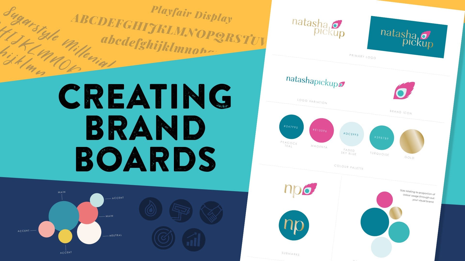
have gone on to use their brand style board. From Natasha Pickup,
you can see how she has her primary logo along
with a secondary logo. Then I also supplied her with the brand icon as
a separate file. We move onto her color palette along with a couple
of sub marks. Natasha also needed a stamp
design and a favicon, which was her brand icon, just prepped much
smaller as a file. Then she has her
typography family along with some
texture suggestions. Then I collated a
few examples of photos picking up on
her color palette. Natasha already had a
brand photographer ready, so she passed on the brand board to her photographer
who then used it to style her photography
and find locations that really encapsulated
her colors. Sarah from Introvert Advocate uses her color
palette and shapes on her social media
visuals creating a strong visual brand
recognition style. I instantly know when I'm
scrolling through Instagram, if it's one of Sarah's posts. If social media is a big
part of your business, think about how you
can do something similar and stop the scroll. With Stables Fitness Studio, they commissioned an artist
to paint the stamp onto the gym wall and also painted the walls the same color
as their brand colors. With Bark & Beyond, you
can see how they use their illustrations as
icons on their website. This is why it's important
to really think in advance what would be
useful for your company. Maybe you have no need for website icons or illustrations. If that's the case,
don't do them. You don't have to do everything. Just figuring out what will be a helpful asset will
help you focus. Then if in six months time
you want to add something, you can, it doesn't all have
to be done straight away. This often depends on how long a company has
been established. New businesses will adapt in those first few years and you realize what you
need along the way. More established companies
will already have a grasp on the elements that
they might find helpful. You can keep coming back to this class as and when you need. Having that starting point of a brand star board
will help you in the future when creating new
elements that fit the style. Feel free to post up in the
project gallery how you go on to use anything that
you've created in this class, whether that's
social media posts, brochures or website, maybe. Thank you for joining
me in this class. I really hope you've gained a lot of insight into expanding out your visual branding and how this might appeal
to your partners. I'm looking forward to
seeing your projects.
 Faye Brown, Faye Brown Designs