Transcripts
1. Introduction: One of my favorite elements of the branding process is working with my clients to design them the perfect brand color palette. Color plays such an important part in brand recognition from emotional associations and attracting your ideal clients. In this class, color palettes the power of the perfect palette, we will delve into all elements of using color as part of your brand. Whether you're a designer thinking about color for your clients or if you have your own brand, let me take you on a journey and how you create your perfect brand color palette. We will look into color psychology, seasonal palettes, and lots of fun, inspirational ways to create that perfect palette. Brands are fighting for attention everywhere. On social media, on average, we scroll through 90 meters of content a day. The importance of color as part of the visual branding process is immense. We will look at how global brands use color and the psychology behind the color choices. By the end of this class, you will feel more confident with color in general and using it to grow your brand. I'm Faith Brown, a Brandon specialists and designer based in the UK. After finishing my design degree, I worked in motion graphics for about 10 years, working with clients for like the BBC and the Discovery Channel before setting up my own business and focusing on branding projects. You might have taken some of my other SkillShare classes on subjects such as topography, logo design, creativity, and of course, branding. In this new series of classes, branding uncovered, I will take an element of the branding process to look at in more depth. With 20 years experience in designing for a range of clients, I want to share the tips and tricks I've learned along the way. Each class will have a workbook and a project to work free. For this class, your project is to create a brand color palette, either for yourself, one of your clients, or a made-up company that I will give you a brief of. I can't wait for you to join me in this class and let's take a closer look at what we will cover.
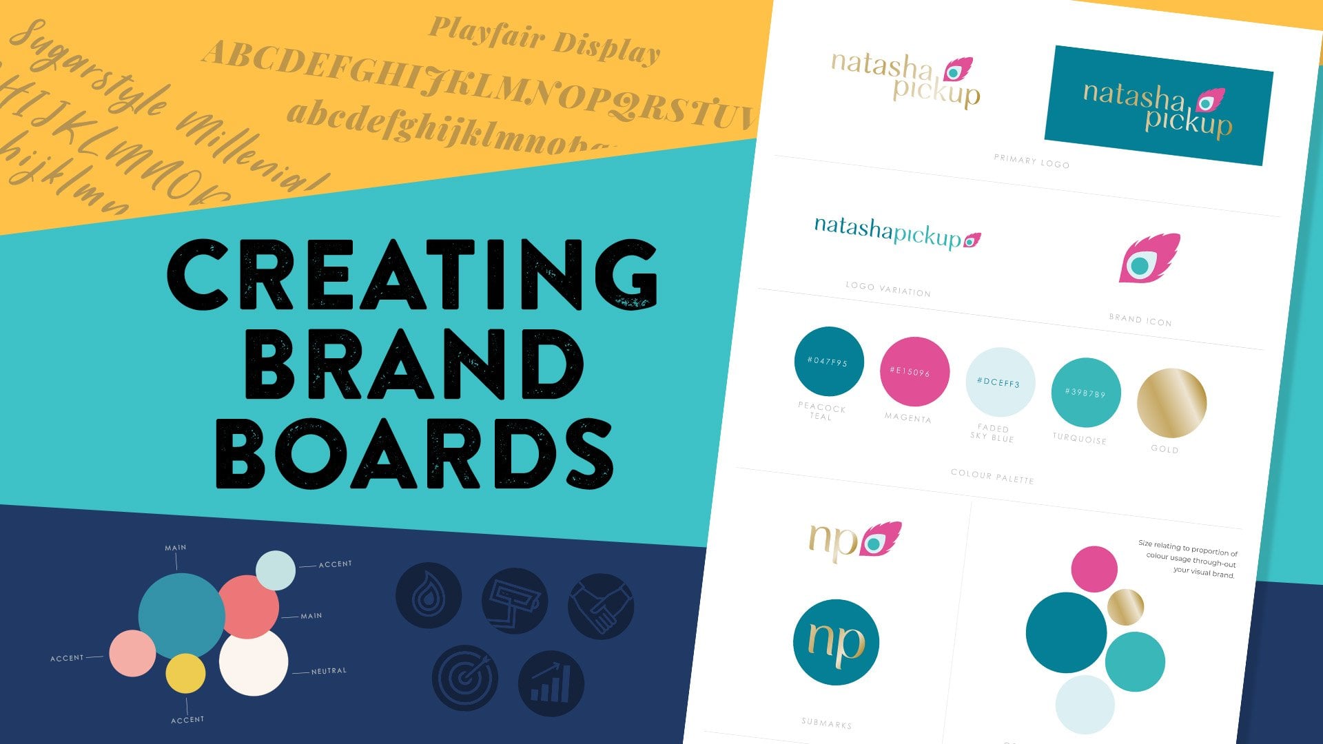
2. What We Will Cover: What we will cover. In the class resources, you'll find a workbook. You can print this out if you can, and work along with the class. If you don't have access to a printer, it's easy enough to just make notes in a notebook. The project for this class will be to come up with a color palette for yourself or one of your clients. Alternatively, you will also find seven briefs in the class resources that you can choose from to come up with a color palette for one of them instead. When we get to part 2 of this class or workshop section, you might find these briefs useful for the exercises as well as creating your own brand color palette. There are also some color swatch files in the class resources that we will talk about in the workshop part of this class. In part 1, impact and psychology, we will start by looking at the impact of color in our lives. This would be a quick introduction to color and how it can evoke certain feelings within us. The science bit. I'll talk a little bit about the science behind colors. We won't stick around too long on this subject, but I'll share the basics and some resources for further info if you'd like to delve further into the science and history of color theory. Terminology. The quick glossary of some terms that we will be using throughout the class. Then we will talk about brands and color psychology. We will dive into color psychology and how colors can provoke a range of emotions in us. We will look at how some of the most famous brands use color and the stories behind their choices. I'll share some case studies of my branding projects and my thought process behind the color choices. Color symbolism. Whereas color psychology is great, there will be cases that differ from culture to culture, and when branding, it's important to know how different cultures may relate to colors. Seasonal color palettes. Another fascinating area of color psychology is the way that seasonal color palettes work, and this approach can be really effective when designing a brand color palette. I'll cover the thinking behind this and then we will bring all these elements together for part 2 of the class. Now you understand more about color, we will get to the juicy bit and start creating color palettes. We will be looking into how altering the color palette of a brand can make it look completely different. A midnight Blue mixed with an emerald green, will have a different feel of a midnight blue mixed with a pale yellow, for example. So the role that color plays takes on a new level when we look into palettes. We will look at brown color palettes and how secondary colors, neutrals, and accent colors can interact with the main brand's primary color to help enhance the brand message. We will talk more about seasonal color palettes and how figuring accuracies and can help enhance your brand message, not just in terms of color. I'll be sharing all my top tips for creating amazing color palettes for your brand or if you're a branding designer, how to create a great color palette for your clients. This particular section of the class will run like a workshop. There's going to be lots of fun and interactive activities. So do set some time aside to really enjoy this part of the class. Putting this into practice. Over to you, you should now be ready to share your brand color palette. I'll talk a little about how to now use this palette throughout your branding in terms of visual material, socials, photography, and even what you wear. I'll show you how I present the color palette to my clients on a brand board, and we will also talk a little bit about the techie side of color from hex codes, CMYK, RGB, and Pantone colors. This whole class will be fun, informative, and inspiring, and I can't wait to see what kind of palettes you guys come up with because the possibilities are literally endless.
3. The Impact of Color in our Lives: I want you to think about what kind of mood you're in today. How do you feel? Hopefully, you're a little bit excited as we start this new class, but what general mood are you in? Now think about what you're wearing. How does what you're wearing have an impact on how you feel? Just for a little exercise, if you're at home, find the brightest thing in your wardrobe and put it on. Maybe it's just a scarf, or a tie, or a shirt, just go for it. Hey, no one can see you anyway. This is a little exercise people often use as a mood lifter. If you're feeling a bit gloomy, try a different color. If you're feeling nervous or anxious, try a calmer, lighter color. Try it, but also be aware of it. Try wearing a different color each day of the week and see what effect it has on your mood. In your workbook, you'll see a color diary where you can record your findings. Maybe the bright color all day long actually starts draining you of energy. It was great for that initial boost, but maybe it's too much all day long. Or if you want to feel calm, think about a more muted or pale color. We will talk so much more about this. But just for now, let's change up and go bright. Pause the video and I'll see you back here in a second. Wow, guys, that's bright. It's so bright I need my sunglasses. Good work, guys. Okay. Now we're going to have a little bit more of a think about color in our lives. As a designer, I've always been fascinated by color and the impact it can have on us. Growing up, I had this strange dislike for pretty much any red food. I've no idea why. I didn't have any fear of blood so there was no association going on there, but I just happened to really not like red food, and I still don't eat that much of it. The thought of a berry smoothie makes me feel quite sick. I'm sure if I was hypnotized, there would be some incident in my childhood that had put me off the color red. We might all have memories associated with color that affect us on an individual level. But on the whole, when we look at color psychology, there are shared traits that universally people tend to relate to particular colors. Some of this is related to the wavelength of individual colors. The higher the wavelength, the more impact it has on our heart rate for example, and I'll talk more about that later. Now think about where you live and potentially different rooms in your house, or your apartment. How do you feel in the different rooms? How do you think color plays a part in that? Have you got many plants around the room that you're in at the moment? How do you feel when you're surrounded by green plants? We bought a house a few years ago and slowly getting around to decorating each room. Our bathroom is a room that we haven't got around to yet. It's pure white with dark blue illustrations on some of the tiles. It's a room I've never really felt particularly comfortable in; it's not warm or inviting. When we decorate it, I'd like the colors to be much more natural, earthy stone colors that make me feel warm. It's also important to think about the balance of colors, which we will talk more about in this class. One of the rooms we have redecorated is our home studio. We have a feature gallery wall in this cobalt blue alongside a very warm pale gray. If the whole room was painted in cobalt, I think I would find it a bit heavy going, but it balances well with the gray and also helps lift the framed artwork. We tried to add in some natural colors with their plants and wooden floor. When we first moved into this house, this room was painted all over in quite a cool mint green with a brown carpet and I never felt particularly happy working there, but now I love it. Take some time to think about some of your favorite places or rooms. Maybe it's a coffee shop, a restaurant, or a bar, a friend's house, or a shop you love to browse in, a local park, a beach. What is it that you really like about this environment? Write down your thoughts in the workbook. It might help you further on in your project. I've included space up to four places, you don't have to fill them all in. You could print it out again if you want to, but maybe think about one room, one indoor location, one outside location, and one extra. Make some notes and see if there are any patterns forming. Your notes might not be all about colors as well, it might be more about the environment. It could include the atmosphere, the sounds, the energy, etc. Now we will come back later to look at the keywords that you've written down here and see how you might incorporate this into your own brand color palette. Just pause this video whilst you fill those in. On the next page in your workbook is a list of colors. Before we move onto the next video, just take five minutes now to write down four to five words that you associate with each of these colors. These can be positive or negative, and this isn't a test. This is personal to you. There will be words that we might all associate with a certain color, but based on your own experiences, one color might trigger a different emotional response that's personal to you. As we work through the class, come back to your list and see how it aligns with the general emotions that we universally associate with each color.
4. The Science Bit: Before we talk more about color in depth, it's important to note that this isn't just every fairy stuff that has been coupled together every year, so there is actually a science behind it. But I'm not going to talk too much about this area because one, I'm not a scientist, and two this could be a whole class in itself. I'm going to just give you the background to color and the science. But there's lots of really good links. I'm going to put some notes below for you guys to check out if you like some further information. To understand color, we need to understand light and the electromagnetic spectrum, which is all based on wavelengths. On the electromagnetic spectrum, we have radio waves, microwaves, infrared, then visible light, then moving on to ultraviolet rays, x-ray, and Gamma rays. Gamma rays have the highest frequency and radio wave is the lowest. Our eyes can see visible light, but we use other equipment to see x-rays, for example, as that isn't visible to the human eye. Bees can see further into the ultraviolet range, but not as far as us humans into the red range of visible light. What makes us see color is how the object absorbs the light. A green apple reflects green wavelengths and absorbs the other colors on the spectrum, so we see the reflected color. Each color has its own wavelength, red being the longest, in the 700 nanometer range, violet being the lowest, around 400 nanometers. This explains why red is often seen as an intense color that might up our heart rates. We often see red used in sport or fast food restaurants, as it can increase our appetite along with the rise in our heart rate. Sir Isaac Newton was the scientist who discovered that white light shown into a prism, was made up of individual colors. If we see something that is white, that is reflecting all the colors which make us see white, black absorbs all the colors. This is why you might get hot wearing black on a sunny hot day. Think about RGB values in Photoshop. The RGB color model is used for anything we might see on screen and uses light as its starting point. If all values are set to 255 for red, green, and blue, then we will see white, we've added color. If they are set to zero, we see black. You might be thinking, why is that the opposite for CMYK values. To get why we need to set all to zero, for example, whilst RGB is known as an additive color model, we add light to create the color. We have CMYK, it's the opposite and we subtract light. It's a subtractive color model. Instead of adding light to the black to create a color, with CMYK, we are subtracting light from a white piece of paper, for example. The ink reduces the light that would otherwise be reflected. I get into this more in another class of mine, the art of colors, so do check it out if you wanting to learn a bit more about this and check out the lesson called RGB or CMYK. There is so much good content on diving deeper into the science of color and the history of color psychology. Do check out the links in the notes if you'd like to learn more. I wanted to give you a very basic background into wavelengths, as we will talk about it a little in this class. But there's some great info on other notable names and just lots of color goodness in this very informative book by Karen Heller called, The Little Book of Color, so grab a copy of that if you can too. I really want to keep this class focused on branding. But all of our information about color derives from some very clever minds coming from some centuries ago. Do do some further research into this area because it's all amazingly mind-bearing.
5. Terminology: Now we will look at few terms that will be used throughout the class. I'm sure you've all heard of the color wheel. The first color circle was created by Sir Isaac Newton back in 1666 after his experiments with light and color, he created his original color wheel with seven principal colors. Red, orange, yellow, green, cyan blue, ultramarine, and violet-blue. This was based on the colors that came out of a dispersed prism when white light is shown through it, the light is broken down into its spectral colors, the colors of the rainbow. In these early experiments with color, we can start to see the positioning of what we now call complementary colors that are opposite each other on the circle. Since then the color wheel has gone through a few transformations but the standard 12 hue color wheel we mostly are aware of today is based on these colors where red, blue, and yellow are the primary colors. I should say there's a lot of debate in the subject whether using RGB, red, green, and blue as the primary colors, or possibly cyan, magenta, and yellow would be more appropriate. But again, I explore that more in the art of color. I want to try and keep this class more focused on branding. Using the standard artistic color wheel as our base, on the left, we see what we would probably call cool colors, and on the right, warm colors. A hue is our pure colors. A tint is a hue plus white and that tint can change depending on how much white is added. A tone is when gray is added, and the shade is when black is added. Using tints, tones and shades will help us when creating color palettes. Monochromatic is using one base hue, but then adding tints, tones, and shades to the palette. Complimentary colors are colors opposite each other on the color wheel and there are lots of other terms with the positioning of colors on the wheel like a split complementary palette where it's a hue and then the two either side of it is opposite. A triad is three colors equidistance apart, analogous is a palette where the colors are close to each other on the wheel. These can be made more interesting with tints, tones, and shades, and adding a neutral color. A rectangle is colors that are both either side of complementary colors and square again, four colors equidistance apart on the wheel. I don't want you to get too hung up with these terms as it's important to use your intuition but having a basic understanding of color theory can help. The color wheel also doesn't really take into account metallics like gold and silver, so it's worth thinking about the color wheel, but I'll be showing you lots more exciting ways to create palettes. We will also talk a lot about neutral colors. These are usually blacks, grays, whites, but also light browns and beige, colors that can be used with the palette as background colors or text colors. I will talk about primary color to use in your palettes, but I don't mean that in terms of the usual primary colors, red, blue, and yellow, this will be more in terms of your main brand color. Then you might have secondary colors to work alongside that and or an accent color which will be a color use minimally but to add impact. A couple of more terms that we will be talking about, color psychology, this is the effect that colors can have on our emotions and behavior. Now, we know color is part of the electromagnetic spectrum. We know that there's a science behind how some colors universally affect us. We may also have personal experiences and our own psychologies that create certain associations as an individual. For example, my dislike of red food, and we will go into color psychology of each individual color in a lot more detail in the next video. A notable name to research here is the Swiss psychiatrist Carl Jung, who really started to look into how we might fit into certain personality types in relation to colors. We will talk about this later in how this theory developed into seasonal personalities. Color symbolism, it's slightly different in that this is much more based on culture and the associations attached to particular colors. We will also look at that a little later. I think we're ready to get going and really start looking at how all this works in the world of branding.
6. Brands and Color Psychology: I always tend to refer to two quotes when describing brand and branding. A brand is what people say about you when you're not in the room, and every interaction in any form is branding. Let's think about that. A brand is basically how other people perceive you or your business. Branding is the art of creating that perception so we attract the ideal customer. Branding takes on so many forms from the strategy, voice, communication, and the story to the visual side of it: the logo, the interior design, the packaging design, and color plays a huge part in this. I'm going to list some famous brands and I just want you to think about the color that immediately comes to your mind when I say it. Cadbury's chocolate, Coca-Cola, Pepsi, Facebook, Tiffany & Co, Nickelodeon, Shell. I expect most of you immediately thought of colors associated with those brands. Some of these brands have even trademarked their own unique color. Cadbury's has its own Pantone color, and Tiffany & Co have trademarked the duck egg blue. The University of Winnipeg say 90 percent of our first impressions about products can be based on the color. Eighty percent of consumers believe that color plays a big part in brand recognition. What are these colors communicating to us? We're going to look at individual colors, brands associated with those colors, and the color psychology of each color, what emotions or words we tend to associate with a particular color. This will help us make informed decisions of how to create a brand color palette and have that understanding. But don't let this totally rule your head, sometimes color palettes work together for other reasons, and we will discuss that later. This is not a set of rules that you have to follow. Earlier, you might have made some notes in the color boxes in your workbook and what words you associate with those colors. Now, we will look into each color in detail, so please do make additional notes as we go. This particular video is quite long. It's packed with a lot of information, so if you need to have a little bit of a pause halfway through, then please do. Let's start with red. Red is an interesting color as it provokes quite extreme emotions, whilst it's seen as something that excites us, it's young, dynamic, eye-catching, but it's also associated with anger and danger. We now know the science behind this, the way we see colors is a result of the wavelength. Red has a wavelength of around 700 nanometers, which means to us humans, it is one of the most visible colors in the spectrum. Yellow is up there too. Hence, why we see a lot of road signage, warning signs, stoplights, and fire engines using these colors. Whilst we have these associations subconsciously taking over in our brains, red is also seen as the color of love, passion, energy, and courage. There have also been studies into color and appetite. It's no coincidence that McDonald's use red and yellow in their branding with many fast food places following suit. Red increases our heart rate, which helps make us feel hungry. Also, let's think back to the use of red in road signs. It commands our attention, so if you're driving along the road and see a McDonald's sign, it's difficult to miss it. Let's look at other brands who use red and words associated with the color. Coca-Cola is no doubt one of the world's most famous brands. One staff reports that 94 percent of the world's population can recognize the famous red and white logo. From the mid-1890s, Coca-Cola started painting their barrels in red, so tax agents could distinguish them from alcohol during transportation. The color seem to stick and has become as much part of their branding as the signature's style logo and famous bottle. We can see quite a few food-based logos in this section, along with cars. Red is a great color when we think of stimulation and speed. Red demands attention, so when using it in branding, make sure it's attracting the right sort of attention. It's often used for sale signs in shop windows, for example. Quite often, it's associated with a good bargain or a good deal. If your brand is at the high-end of the market, like something a bit more luxurious, a bright red might not be the best choice, or it will need to be used alongside other colors to make it look more upmarket. It works well with gray, for instance. Here are some logos that I designed that incorporate red. Red Squirrel Architects have the color in their name and it seemed counter-intuitive to go against that, but balancing the red with the gray along with the style of logo mark gives a high-end confident appeal. Mini-Kickers is aimed at getting kids into football, and we often associate red and black with sports. It's also the colors of our local team of which this group are affiliated. Sometimes the colors might be dictated for you a little. As you can see, there's some other examples using a much deeper red, and for the Jaicae and Back Roads Entertainment logos. I'll be showing you examples as we go for each color. Let me run to yellow as yellow shares quite a lot of similar qualities with red being a high wavelength color. Yellow is often associated with happiness and a sunny nature. It's full of energy, it's warm, it's awakening. But then mixed with black, yellow becomes very striking. We see this color combo a lot in nature with bees and wasps. This combo demands our attention. Yellow also stimulates our appetite, along with reds and oranges. Yellow can give us a burst of energy. But let's also think about the impact too much color might have. Studies have shown that babies cry more in a yellow room, for example. Due to the high amount of light yellow reflects, it can be fatiguing to the eye if overused. Interestingly, the Pantone colors of the year for 2021, are ultimate gray with illuminating yellow, which Pantone described as a marriage of color, conveying a message of strength and hopefulness that is both enduring and uplifting. They say the combo expresses a message of positivity supported by fortitude. This seems very thought out after coronavirus affected our lives so much. Strength and hope that is enduring and uplifting. Together the colors compliment each other with a shared message. Brands that are associated with yellow, and not surprisingly, a lot of food-based brands, but then we have a mix of other industries here. Look at the Kodak logo against the mustard yellow compared to the Chupa Chups logo, both use red and yellow, but the relationship between the saturation of colors changes how we view them. Chupa Chups being full of zest, energy, and youthfulness, and Kodak while still striking, is just a little bit more reserved in upmarket. I've not done many purely yellow logos. I find it's one of those colors that have to balance well with others. Also, it's important to find the right tone that can work on white as a logo. Kelly Rogers is a copywriter and loves the color yellow. Again, we've balanced this with the gray throughout her branding. Wet Banana, I've spoken about in a few of my classes, they are a quirky brand creating fun clothing and items. I could have gone a bit Andy Warhol here and start switching up the color of the banana, but this palette works really well for this brand. Moving on to the final primary color blue now. Blue has a wavelength of 450 nanometers compared to red up to 700. Therefore, blue is generally seen as a calmer color. There have been studies that people lie down in a blue-lit room after a stressful incident, they will start to feel calmer quicker. Japanese train stations changed their platform lighting to blue to see if it would reduce suicide rates at fire stations. The stats are a little inconclusive of to whether this worked, but it seems that it might have had an effect. Yet we also use the word blue if we're feeling a little low or it can be associated with sadness. We quite often associate the color blue with technology and a lot of tech or security firms use the color in their logo. We often also associate blue with trust, reliability, confidence, intelligence, and serenity. Blue as a generic term, takes in quite a range of tones ranging from deep, midnight blues that are almost black to the greener tones that we might call teal or turquoise to very pale blues. An intense, deep saturated blue can stimulate the mind, but a pale blue can calm the mind. Let's look at some brands that use blue, and they are many. Maybe it's no surprise that 33 percent of the world's top 100 brands have a logo that includes the color blue. That's a huge percentage. That might be a lot to do with the fact that blue is the world's favorite color. Using blue doesn't really offend in any way it's a very agreeable color. Not many people say, "I hate the color blue." But also on the color spectrum, there can be many tones of blue: Teal and turquoise with their greener feel can work well with well-being brands or travel brands, whereas the deeper blues we might see used a lot in the corporate world. We see a lot of banks and tech firms using the mid-range of blues. We need to be careful with color association and the words we relate to colors because within each genre of color are many shades, tones, and tints. A duck egg blue like Tiffany & Co that will elicit different feelings to a deep midnight blue like O_2. Blues can be seen as a safe color in branding. But remember, we have so many other businesses using blue, you might have to work harder to stand out, or you might have to be clever with your secondary colors to make it pop. The Pantone color for 2020 was classic blue, which they described as instilling calm, confidence, and connection. This enduring blue hue highlights our desire for a dependable and stable foundation on which to build as we cross the threshold into a new era. I'm pretty sure this was announced before coronavirus had spread across the world, but it does seem hugely relevant to the year that preceded. Also, I should say, the Pantone website is a fabulous reference for color lovers. I'll put the link in the notes below. But as you can see, if you follow the link for the color of the year, it will go into detail about potential palettes and usage, so it's well worth checking out. I've used blues and teals in so many branding projects. It's definitely my favorite color, and I've even got to the point where I've tried to move away from using blues. But equally the logos I design are not about me, they are representative of my clients, and if blue fits with their brand, then I will use it. The key is finding the right tone for them and the right colors to work alongside it. This slide is a good example of how different tones of blue give off different emotions. True Horizon is all about helping businesses become more sustainable, and a brown palette reflects the environmental values. Dru Can Do is a logo for a cleaning company and the blues are a lot fresher and brighter. I've also used teal a lot in random projects. The more turquoise and aquatones work well for travel brands, but equally, these colors look great for Williams Newman who do plumbing and heating. It's also a color we often associate with creativity. There's a lot of scope with blue and teal with many possibilities of shades, tones, and tints. Green sits right in the middle of the visible spectrum, so it's often the most easy on the eye with a balancing quality that makes us feel relaxed. Nature has a big part to play in this too, whereas we tend to associate with green or growth health environment, renew, fresh and natural. Green has more variations than any other color, therefore, our response to green can be quite different for a bright zesty line down to a muted sage and emerald green with gold can give very high-end field brands. Let's look at some brands that are well-known for using green. We see a lot of food and drinks brands again, ones like Tic Tac, Sprite, 7-Up, using it to evoke the feeling of freshness. Much we can analyze why certain colors are used sometimes. It might just be a very random reasoning. What is significant about the green for Xbox, for example? Because a designer named Horace Luke who worked for Xbox, bought a nice new set of marker pens, gradually the pens started going missing as his coworkers took a fancy to them. Horace is asked to design a logo for Xbox, and only as left with green and then the green stayed. So by the sounds of it, there was no master thinking about the green in this particular case. I think the important thing to remember is we can often over-analyze things, but a big part of design is an intuitive eye. You know when something just looks right, it looks good. I don't want you to think you have to use a certain color because of a certain reasoning. As long as it isn't going to have a negative effect on the brand, trusting your intuition can be a good thing. So please take what you can from this class, but don't get bogged down by too much reasoning. I wanted to show something a little different for green, these are two color palettes on credit for garden designers. These are real projects, but as you can see from the palettes, their personalities and brand values are quite different. The one on the right uses very bluey green as opposed to the much brighter green on the left, and it is this thought thing that helps a brand to stand out. You can do a similar job to someone else, but branding can make you stand out for the right reasons for you. You might want to attract different customer to someone else, your brand experience might offer something different for your clients. We will go into this aspect of branding in a lot more depth in future classes. Orange is obviously in the middle of red and yellow and shares a lot traits with them. Orange is the easiest color to see in dim light, and we therefore, see it on a lot of safety vests, life rafts, etc, often seen as youthful, cheerful, warming, creative. In nature, we associate orange with fruit, vegetables, sunsets, cozy fires, autumn leaves, goldfish, animal fur, it's an exciting color that can work across many brands. It's an easy color that is often seen as friendly, and we can see it working for many brands, biggest perhaps is Amazon with the smiling arrow connecting the a to the z. Again, we see a lot of food and drink brands using orange. The phone network Orange, trademarked Pantone 151C, and ended up in a famous battle with EasyJet when the firm moved into Telecoms with EasyMobile, which prompts a question, can you own a color? Solicitor more like McDonald's states, "Trademarks means firms have the right to protect shapes, sounds, or colors if it's a distinctive part of their business." When it comes to trademarks, you can apply for your trademark within your industry sector. At the time when Orange and EasyJet were both using orange, they were in a different sector, Telecoms and Aeronautical. The problem started when one company decided to expand into another sector EasyMobile. Orange wanted to effectively own the color orange within their sector, not just a specific Pantone color already trademarked. Anyway, that's a little aside from color psychology, but it's a great example of how important colors can be in branding and how a company can become so recognized for a brand color. I've used orange in quite a few branding projects, and the industries are pretty diverse from a property firm, security, entertainment, pest control, coffee shop, and diploma. What these businesses have in common is their relationships with their clients or audience. They want to come across as approachable and friendly whether you want cake and a coffee or to get rid of wraths. Purple is a really interesting color that can encompass tones from lavender to indigo. On the spectrum, it's referred to as violet and it's the color with the shortest wavelength that's visible to humans. For this reason, it's often seen as a spiritual color and quite mysterious and magical. It's long been a color associated with royalty and decadence from Julius Caesar to Henry VIII. We see it as a luxurious high-end color in the right tone, of course, brighter purples can often look a little bit cheap. Purples can move into the cooler colors in the bluer tones, and a warmer color when more red is added like a plum color. Well-known brands include Cadbury's chocolate, Liberty of London a high-end apartment store, and the Syfy channel. Cadbury chose the color purple over 100 years ago as a tribute to Queen Victoria, since then they were granted a trademark on Pantone 2865c, to be used for certain chocolate goods. Nestle have challenged this over the years and I think the whole issue is still in debate. On the whole that aren't a huge amount of brands that use purple, so it can be quite distinctive used in the right way, it's also a color often associated with creativity and sensuality. This has been a very interesting exercise for me, looking back on my projects and what colors I've used, and this is the only logo where I've used purple, although I'm not sure I'd really call it purple is more plum. Jayne Deer is a singer specializing in a postmodern style, jazzing up classic songs, her style was very classy with a fun twist, which this color is pretty good for. Let's move on to pink. There's something about pink which I tend to instantly take a dislike to personally, but some strange reason, it also makes me smile. Pink has an interesting history. We've come to think of pink as a girl's color and blue is for boys. Lest I'm not keen on gender stereotypes, this one has stuck around for many years, and yet in the early 20th century, it was often the other way round. Baby girls tended to be dressed in pale blue and baby boys are pale red or pink. Sometime after the Second World War, they seem to flip and we all know the same pink is for girls, blue is for boys or pretty and pink. Gender reveal parties play into this notion too. I think we are moving into an era where we aren't so defined by gender stereotypes, but pink has become a color we associate with femininity. Other emotions, the color can evoke are love, compassion, playfulness, and vulnerability. Some prisons throughout the world have experimented with painting some cells with certain tone of pink after studies by a man called Alexander Schauss suggested that pink could be used to lower heart rates and calm down violent tendencies. This has been adopted in a few prisons with all reporting a positive effect. Lots of children's brands use a color pink, and therefore we often see as a childlike color, but this depends a lot on the particular tone. Some companies have embraced the color pink to stand out like LG electrical goods, Dribbble, and T-Mobile, they use quite saturated tones to avoid them looking cheap. I've used pink in quite a lot of my branding projects lately. This one is for Sarah Winterflood, who empowers women to feel confident in front of a camera. So the use of pink worked really well for that nurturing, creative caring aspect. Then working alongside the contrasting gray and midnight blue, the colors together communicate confidence and empowerment. This is a good example of how having an understanding of individual color psychology is a useful tool when bringing colors together to create palette. These are some of the other projects that I've used pink in, and we can see lots of different tones of pink here from muted to bright to bold. As a designer, it's important to not be dictated by your own personal taste. I absolutely love the logos I've created for people incorporate in pink, and whilst it's not my favorite color or a color I would choose personally for my own branding, we have to remember that this isn't about us as designers, it's about what works for our clients. Equally, if you're in this class to think about your own brand colors, there's an element of differentiating your personal taste with what is important for your brand, what will be attractive to your ideal client. We will talk about this loads more in another class. But what I would say is, you need to love your branding. If you have a particular dislike to a certain color, then it probably is best to avoid it. Now color quite opposite to pink is brown. Brown is sort of a dark orange but can be seen quite differently in its personality. It can still be seen as warm and cozy like deeper oranges, but it's more earthy and solid. It's the color of wood and there's a certain strength associated with brown, although as a negative, it can also be seen as dirty mud. A lot of our favorite food and drinks are also brown; chocolate, cake, cola, coffee, beer. So it's unsurprising to see a lot of chocolate and coffee brands using brown. But also Louis Vuitton have used the color effectively over the years with their well-known logo pattern. Brown can work really well for brands as it comes in a lot of tones. Lighter tones can really compliment a brighter main brand color. Whiles brown can have some negative connotations like the color of mud, or can sometimes be seen as boring, it can also be a really interesting color to implement into a color palette. I've not used brown in many projects as a main brand color. One good example is muddy puddle club, which is our forest school. Their top logo is main logo, but then my client suggested different colors for each season, so we tried a spring, summer, and winter version too which was pretty fun for this type of business. The brown stayed the same throughout with the other colors changing. Let's look at black and white. Let's remember that black is actually black because it absorbs all the colors and doesn't reflect any back and white reflects all the colors. There are arguments as to whether black and white are actually colors, but for the purposes of this class, we will talk about them along with all the other colors. Black has many words and emotions that we tend to associate with it for an elegance and glamour. We can see a lot of black used in fashion brands around the world. We also see a lot of heavy metal bands adopt black for its edginess. We also think of black as the color of mourning and death, and also evil or menace. Black has quite a lot going on. When it comes to brands, the use of black is a tricky one to analyze as often the black is balanced with a lot of white. A lot of high-end fashion brands use black to give off a narrow sophistication. We also see sports brands use black a lot. It's powerful, strong, and uncompromising. Think about how colors work alongside black too. Yellow and black and red and black often make us think of warning or danger. Black is quite harsh. I tend to use it very minimally in brand pallets or opt for a really deep charcoal instead. When we come on to talk about seasonal palettes, blacks should only be used with a winter personality. These are some examples of projects I've worked on with black as a dominant color. Bloodline Gym use gold in their branding as well. Offshore Swimwear use black for logo, but then have a bright color palette to work with. Black can be a really powerful color to use within your branding project, but you do also need to be careful to get the right balance for the right message. White share some qualities with black like elegance, but it's more graceful than black. White is pure, innocent, simple, fresh. It can also be cold and isolating. Sometimes we might think of these words as negative, but there is a beauty in isolation, although maybe not all forms of isolation. White can take on many tones as well. Have you ever been to a paint shop to buy some white paint and been faced with tones of different options from porcelain to brilliant white, cotton, eggshell? I love paint names, but finding that right shade of white to work within a room can make or break a room and it's similar with branding, often include a white or some sort within a brand palette. But getting the values to complement the other colors is key. A white with a hint of blue might not work right alongside of warm autumnal palette. There are many brands that use white, but some incorporate it into their brands more than others. Dove use a lot of white in their branding, although their logo is mostly seen blue and gold. Space NK, all the stores embrace white, giving it a calm, sophisticated feeling. The White Company, unsurprisingly use white on most of their packaging products. A lot of beauty products who want to be seen as simple and pure use white effectively. So don't be afraid of using black and white. When it comes to the brand palette, we refer to these colors as neutrals, as they are often used to complement other colors, but they can also be used as the main brand color. Here's a few examples of white I've used within color palettes. Depending on your screens, you might not even see all of these, but they are all slightly off-white. I will also use pure white, but often I use a bit of off-white to complement the rest of the color palette. You can see here, hopefully some bloomy white, stony white, pinky whites, for example. This level of detail will really help make your color palette. I've grouped gray and silver in together, as they have a lot of similarities and whereas we generally associate more with gray are functional, practical balance, gloomy. These words can sound quite boring, but gray comes in so many times. We can see some cool and warm grays here in the squares. These can be used really effectively in brand palettes, just like they can in interior design with pops of color. Silver is often seen as elegant, graceful, glamorous, modern, and high tech. When we look at brands, a lot of car brands use silver and it tends to work well against a lot of colored cars. Some other brands use gray. Wii used it for their name brand against other colors for sections like fitness. I often use gray in color palettes and finding the right tone is the key to making them work well. There really are 50 shades of gray and more. Like with all colors, finding the right tone to reflect the brand personality is key to success. I've used a lot grays in logos. A lot of these have other brand colors that work alongside them. But as you can see just from this small selection, there are many different tones of gray from the warm grays use for Peta Moffit, who was a funeral celebrant to the cooler charcoal grays used for the stables and Dobbins Property. For Kirsten Jane, Natural Well-being, her gray is like brownie and Gloss Kitchens is what I would call a slate gray with hints of blue. Like all colors, getting the right tones is really important for your color palette. It's not as easy to saying my color palette is blue, pink, and gray. The possibilities of just using those three colors as a base are endless. Gold is similar to silver, but it takes up another level. It's the color of champions, of abundance, wealth. It doesn't hold back. Silver is a little bit more understated, but gold is a bit like a show off if it's overused, it's look at me. Gold can come in many shades too. Like in metallic yellow-brand, it's rich and powerful. But we can also get rose gold, which are paler and pinker. There a little bit more understated and really great in color palettes. Gold can look amazing too against deep colors like midnight blues and low greens. But whilst gold has all of these qualities, occasionally, it can look cheap, so treat it with respect and don't overdo it. Brands that were known for using gold include some expensive car brands like Porsche and Lamborghini. We also see it used on some food brands and chocolate when they want to communicate a high quality product and of course, it's used by some fashion and beauty brands too. Jadore Dior, famously used gold for their branding and all over the Future is Gold adverts when Charlize Theron based in liquid gold, its abundance, it's highest level. I've used gold in a few logos, usually as an accent color, but in a few projects they've worked as a main brand color. 5Storeys has a real Art Deco field to it. It's a business that brings together lots of local products, allowing people to shop locally in one place. The gold rendered itself well to the Art Deco style. I haven't gone into other metallics like bronze and copper as they do share quite a lot of similarities with gold and browns, but just quickly they are seen as supportive, loyal, and genuine. It may be a good choices in metallic for a slightly more understated brand. I wanted to talk a little about multicolored brands, where they tend to be known for a few colors rather than one or two main colors. Using multi-colors and particularly bright rainbow colors altogether instantly say fun, you for happiness, it's inclusive, diverse, and vibrant. There's a great TED Talk by Ingrid Fetell Lee, who has done a lot of research into joy and the impact of bright colors and round shapes can have on us, so do check that out. Brands that embrace a good few of the colors of the rainbows are Google, eBay, Microsoft, MSN, Instagram, and the Olympics. The designer of the Olympics rings, Baron Pierre de Coubertin said, the Olympic flag has a white background with five interlaced rings in the center: blue, yellow, black, green, red. This design is symbolic. It represents the five continents of the world united by Olympism. While the six colors are those appear on all the national flags of the world at the present time. The six colors which include the background white, represented every single country back in 1915 taking part in the games. I love the meaning behind this and I think other brands have used the same thinking. Most of these brands give equal dominance to each color, so there's not one main color. This makes for a very inclusive brand message. Quite often, it's advised to have a limited brand palette, but used in the right way, a multi-colored logos can be very effective. I've designed many multi-colored logos. You can see all five on the right-hand side of this slide needed to be appealing to children, but equally also the parents or carers of those children. Multi-colored logos can easily look cheap and the right color combo can flip that while still looking fun. Usually you might find that there is a dominant color within a multi-colored palette, but not always. Trust your instinct here. If something doesn't feel right, then it's probably not. This should give you a background into color psychology and a specific look at certain colors. Remember, there's over 16 million color possibilities in the world. The colors we've looked at are the main colors, but in quite a generalized way. Just try to take this into account and take some of the key info from it. Whilst I showed you a few logo examples, for instance, we didn't look too much into materials and turquoises. These colors are a mix of blue and green, so they will take qualities from both of those colors. Also, it's really important to use your intuition when it comes to color palettes. Having this knowledge is great as you can then use it wisely, but don't be beholden to it, just go with what you think looks good as well. If every yoga business use the same color, then the word would be quite a boring place and it would be hard for those businesses to stand out. They would all just merge into each other and not really be unique, with their own values or their own specific offering. Also, I know that this was a lot to take in, so don't worry if it hasn't all sunk in. You might want to just watch the videos a few times and come back to it for specific projects to have another look at each color. Let's take a look at color and culture, as it's always useful to bear this in mind too.
7. Color Symbolism: Color psychology is a hugely important consideration when designing brand color palettes, but also having a knowledge of color and culture can be a big factor depending on the brand, so we will take a quick journey through each color. Remember to make notes in your workbook, particularly if you or your clients live in an area mentioned, as you might need to take more note on the meaning of those colors across cultures. Starting again with reds. In China, brides wear red and it's seen as a color of happiness and good fortune, whereas in South Africa the color is seen as the bloodshed of the apartheid era. In the stock markets, red is seen as a fall in the share price. However, this is the opposite in China and East Asia as red is their lucky color. They use red for when the price rises. In India, red is the color of love and purity. Yellow is associated with being cowardly in America. In China, the color yellow was reserved for emperors, but now in Chinese popular culture a yellow movie is pornography. In many countries it's seen as a divine color, along with gold. In Egypt, yellow and gold are seen as a color for eternal life, but also mourning and sadness. In Japan, it's associated with treachery, but also bravery. In a few European countries, it's the color of jealousy. You might be able to tell I found getting royalty-free imagery to represent all these things quite difficult, so please do just sit back and enjoy the colors. Blue is seen as a calm color through most of the world's cultures. Ancient Egyptians see blue as the color of divinity and sky. In a few countries around Egypt like Turkey, Greece, and Iran, blue is worn to ward off evil and bring good luck. In Japan, the color is associated with fidelity and good luck. In the West, we sometimes see blue as the color of sadness. In Hinduism, many gods are depicted as having blue skin and represent love and divine joy. Green has many cultural associations. We've spoken a lot about it being a color of nature and growth, although some also see it as a color of illness and decay. In South America, it's the color of death. In China, if you wear a green hat it symbolizes your wife has been unfaithful. In the UK, we often associate the color with jealousy, probably coming from Shakespeare using the term "green eyed" for someone who is jealous in Othello. In Ireland, also known as the Emerald Island, their color is seen as lucky. The leprechaun is green and a four leaf clover is green, two symbols often used for luck. Green is the color of Islam and in the Quran it is associated with Paradise. Orange is associated with autumn and Halloween in the West, orange representing the life and black representing death. The West also often associate orange with fun, with many clowns wearing orange wigs. Buddhist monks wear saffron robes and it's now seen as a holy color of spirituality and peace. In India, orange is also a sacred color. The Dutch love the color orange even though it's not on their flag, and this mostly goes back to the Dutch royal family and the House of Orange-Nassau. Purple we've spoken about as the color of royalty in the West, dating back to how hard purple dye was to come by and how expensive it ended up being. So Julius Caesar effectively owned the color and said no one else was to use it. For this reason, it also started to be seen as a holy color, as it was reserved for the gods. But in Thailand, Brazil, and Italy, purple is the color of mourning. Pink is rightly or wrongly often associated with little girls' toys and clothes in the Western world. In China, it's seen as a foreign color, as the color was unknown until recently, and in Korea it's seen as the color of trust and Thailand it's the color for Tuesday. Brown is the color earth in Chinese horoscopes, in India it's a color of mourning, in the West it's often seen as a solid down to earth color. Black is often associated with evil. The devil is known as the prince of darkness. In India, a black dot is often painted on a newborn's face to protect them against the evil eye. In the West, it's also seen as the color of death and in Japan it's the color of mystery and the night. In Spain, brides traditionally wear black at their weddings to signify their devotion to their partners until death. The ancient Egyptians saw black as a color of life due to the black soil that flooded the Nile. In Africa, it can be associated with experience and wisdom. White is very significant in many religions. In Christianity, we see children christened and baptized in the color white. It represents perfection and purity. It's tradition for brides to wear white. In China and India, it is seen more of a color of mourning and death. White is often also used to symbolize peace. Gray is often seen as the color of old age, wisdom, and experience due to hair turning gray as we age. It also can be seen as a color of modesty. Silver in European folklore was the color associated with destroying evil, hence, the term "silver bullet". Silver also has antibacterial qualities, so it's seen as a cleansing color. Spiritually, silver is often associated with the moon and connections with feminine energy. Gold is universally seen as a luxury color and it's often related to religions and higher power, it's also the color of royalty, winning, and success. In the Western world, we often see a lot of gold at Christmas time. This is a brief look at some of the associations cultures have with color, and there are more, so I'll put a link in some of the notes for you to do a little bit more research into this if this is an area you'd like to look into a little bit more.
8. Seasonal Color Personalities: Seasonal color palettes. Another fascinating area of color psychology is the way that seasonal color palettes work. Each season pretty much includes a tone of each color. There are a few exceptions, but rather than thinking too much about what one color might communicate, it's about how the tones of the colors work together to create a palette that aligns with the brand values and personality. The spring palette is light and bright, whereas the autumn palette is warm and rich. There are other visual elements to take into account when working this way, from shapes, textures, photography style and typefaces, and how they all work together. But we will focus on the colors within this class. When I start a random projects, I go through a mini brand consultation with my clients, where I'll ask them questions about their brand values, their target market, and their future plans. Through a series of targeted questions and general conversation, I would get a good idea of what their business is all about and who they want to appeal to and how they want to appeal to them. There might be certain key words that keep cropping up in conversation and this can help form your brand values. This is a pretty detailed process and one I will cover in much more depth in another class but we will just do a little exercise now. Quite often we might automatically think that we fit into one of the seasons. For instance, you might really like cozy winters, so you'd expect you to be a winter personality, whereas cozy fits in more with autumn. Before we talk about each season and you fit yourself or your client into one of them, I want you to just have a think about the words on this slide. This is also in your workbook. You can print it off and circle a few words that you feel most describe your brand values and brand personality. Try to circle the ones that really speak to you. For example, I would say that I'm a bit of a perfectionist, but there are other words I feel more connected to. Maybe limit yourself to 6-10 words. Remember these words are words you would like your brand to convey to your customers or clients. There may be some crossover within your own personality, but always have your client in mind about how you want to be perceived. Also, this is not an exhaustive list of words. There are plenty of other words, so they're spaced, add your own too. Don't take too long on this task and trust your instincts. Then pause the video before we move on to see how this might fit into a seasonal personality and what colors are associated with each. If you find the page in your workbook titled, Seasonal Personalities Notes, then you can make notes for each section as we talk about them. The spring personality is full of energy. They have a zest for life. They're enthusiastic, fun, and inspirational. They love being around people, sharing ideas, socializing, and they're very creative. They are good communicators. Spring personalities can sometimes lack focus as they have too many ideas buzzing around their heads. They're often seen as youthful, friendly, and positive. Colors associated with a spring personality are light and bright in general, the colors are warm and inviting. There may be a little sparkle or metallic versions of these colors too. Black should be avoided. Other keywords that fit into spring are clear, fresh, motivated, imaginative, informal, sparkling and warm. The type of industries often seen fitting to this personality, are brands with a youthful element: toy companies, children's clothing, media companies, PR, marketing. But don't think that if you have a brief or a business specializing in children's wear that you have to use a spring palette. The most important thing is finding out the brand values and how they align. Here's one of my brand and projects for a US business skills for sport. Now, I could have gone down a really traditional sports palette here with much bolder colors, but I felt the brighter colors made it look more fun and appealing for children. This slide shows you how it would have looked if I gone down a slightly different route. It can still look good, but hopefully you can see the different messages that the color variations give off. Summer personalities are cool, calm, and collected. The crazy energy of spring has turned into more chilled out summer evenings. They're more reserved than spring, elegant, romantic, sensitive, and perfectionist. Their style is often understated and chic. The colors are cooler than spring, with many of the colors having a bit more of a gray in them. The colors are beautifully muted, installing a sense of calm. Other keywords that fit into summer are timeless, delicate, up-market, soft, and balanced. In branding, a summer palette might work well for wedding photographers or anything associated with weddings, designers, luxury hotels, lawyers, accountants, and well-being businesses. This color palette for Kirsten Jane, Natural Wellbeing falls into a summer palette. It's a sensitive, calm palate that makes you feel nurtured and cared for. The autumn personality is independent, passionate, and ambitious. They have a strong moral compass and campaign for courses close to their heart. They love being outdoors and everything the natural world has to offer. Autumns love learning, history, and value friendships and family. They can also be seen as bossy. The colors are rich, warm, intent, although still muted compared to spring. The colors are representative of what we might see on an autumn day walking in nature: burn oranges, fiery reds, earthy browns, and deep greens. The colors are warm and comforting. Other words we associate with autumn personalities are nostalgic, practical, fiery, efficient, and integrity. Businesses that might suit an autumn color palette are outdoorsy companies, organic food, fair trade businesses, something animal related. Along with charities, community projects, journalism, department stores, and something with a historical link or a brand that's well established. I recently worked on this branding for Canadian based Introvert Advocate. The colors shout autumn. Sarah is a coach helping introverts find their voice. The brand needed to look strong and confident, but also warm. As someone who lives and breathes nature, this also fitted well with Sarah's personal brand. Also a very small tip here, on this slide, I've used the off-white in Sarah's color palette as the background color. Look at the difference it makes when this is on a pure white background. Now, I know we have spoken about this detail when we spoke about white. But I think this really shows that something so small can make such a big difference. Moving onto winter, which in nature brings us cold weather, often sparkling frosty mornings. But also in England, at least a lot of dull rainy days. Winter can be stark with dark silhouettes on bare trees against a background of snow. It's a season of extremes. The Winter personality is driven, focused, dramatic, and high achievers. They're confident, serious, and visionary. The negative aspect is that they are sometimes seen as uncaring. The colors are cold in general and extreme, very light or very dark with not many mid-tones. It's the only palette to include pure black. The colors are quite intense, icy blues and greens, neon's and metallics. Other words that fit the winter personality are sophisticated, opulent, leader and cutting edge. Winter palettes work well for aspirational brands, high-end fashion and jewelry businesses, luxury, retail and travel firms, state of the art products or future thinking technology firms. Banking and finance companies also often adopt a winter palette. This is a perfect example of a winter palette for a technology firm. The colors are cool, confident, and striking. I've used a gray grease off-white here for the snowfall color and reference, but this would easily work with a pure white as well. Now, look back on the keywords you circled. Do most of them fit within one season? Maybe you have a few in another season and that's okay. Hopefully you'll find you have a dominant season. But you can also bring in some elements of another season if you're clever. Are your words evenly spread across all the seasons? This is where it can get a bit more complicated and question whether these words are contradicting themselves at all. I'd love to know your results for this task. Please do use the Facebook group with the link below and share how you get on. Also, if you have any questions or queries and hopefully I can help you out in that group. Very hard thing to do when branding yourself, is separating yourself from the business. We will look at that in depth in another class. But as we are talking about color, this could be relevant for your project. For my business, I am essentially brand. I don't employ anyone else on a regular basis, so inevitably, there's a lot of me in my business. But I want to attract my ideal clients. They're most important part of my business. I need to find that balance of my personal taste mixed with the message that I want to convey to my ideal clients. If your business is a bit less personal or if you have a lot of employees, you will really need to think about what's best for your brand, not just your personal taste. You need to love your branding notes. I would say avoid going with colors that you really hate. Seasonal personalities and color palettes is a huge area to delve into. I can highly recommend some further reading in this book I mentioned earlier by Karen Heller. She also has a lot of good info on her website. This book, Style Your Brand, is also great and it goes into seasonal color pallets in a lot of detail. I know designers who live by this method and use it in their design process when they're thinking about color typography and shapes. It's only a method that I've really started using in the last couple of years that I have found that when I look back on my old projects, a lot of them do seem to fit into a particular season. I know I keep saying this, but do trust your intuition and your designer's eye. If you're taking this class to think about your own brand without a design background, or if you find color particularly hard parts of the design process, then seasonal color palettes can really help you. Because generally, all the colors from the same season should go together well. We will look at that more in part 2.
9. Conclusion from Part 1: This is the end for part 1. We've spoken about how brands use color, color psychology, color symbolism, and seasonal personalities, and it's a lot to take in. So if you need to go back and watch any of the videos again, then please do give yourself that time. In part 2, we will be putting all of this into practice and going through a number of techniques to come up with color palettes. Take some time now to go through all the notes that you've made. If you're not designing a palette for yourself or an existing client, then take some time to go through to seven briefs in the class resources. These will be useful for some of the exercises in part 2 anyway, so it's worth reading through them, but pick one for your main project. If you're designing for yourself or a client, then try to write a brief for yourself in a similar way. Working to a brief really does help you focus your thoughts and your ideas. There's a page in the brief document with a template to help you do that as well. Before we move on to part 2, take a few days to think about your palette. Will it fit into one of the seasons well, or will you go down the route of choosing one main brand color, the color psychology route? You'll still be able to add other colors to your palette, but just start thinking about it for your project. If you like, maybe come up with a mood board of styles that you like. Not just in terms of color, but the whole aesthetic. Here's an example of a mood board I curated in Pinterest for an interior designer. At this point, I don't over-analyze what I pin too much. There's some logos and typography styles, some color and pattern, some people. It's relatively winter in style, but not completely. This thing will give you a starting point for when we move on to the workshop part of this class. Pinterest is great, but equally, you could do a mood board cutting bits out of magazines, so whatever works best for you. There's no right or wrong here. It's just going to be a springboard for the upcoming exercises. Remember to share some of your notes or the mood board in the project gallery before we move on to part 2. When you're ready to move on, I look forward to getting very creative with you in the next part of this class.
10. Part 2 Workshop Intro: Part 2; The Brand Color Palette Workshop, five techniques for finding a perfect palette. In Part 1, we looked into color psychology, symbolism, a little bit of the science, and seasonal color personalities. We will now take everything from Part 1 to start making color palettes. This workshop is going to be very hands-on, fun, and interactive. I will show you case studies along the way to help you see these techniques working in real-life projects. Before we start, I just wanted to reinforce how important a successful color palette can be in branding. One of my clients Run Mummy Run, I've been working with for years and this color palette works so well for them, the deep magenta, the bright mint, and teal. They also have a light pink in their palate. The colors are feminine, but not overly girly, fresh bold, strong, fun, supportive, kind. Now let's switch this up using other pinks, greens, and blues. The tone of voice this is now communicating is pretty different. It's eye-catching, but possibly not for the right reasons. For another brand, this palette could be perfect, but it's not right for Run Mummy Run, and their brand values. This is a good example of how getting the right tone of color is so important. Both palettes are essentially pink, green, and blue. But these two examples give off completely different vibes. When working on your palettes, try to look through just saying blue and think about what tone of blue, for example. These are five of my favorite techniques that I use a lot. I find myself using different techniques depending on the project. You might find a favorite or you might like mixing it up to. We were looking at using photos as inspiration, using our seasonal personality swatches, a few online tools to help us, mood boards, and the great outdoors. These are five of my favorite techniques that I use a lot, I find myself using different techniques depending on the project. You might find that you have a favorite one and then you stick to it. We want to get using photos as inspiration, using our seasonal color personality swatches, few online tools to help us, mood boards, and the great outdoors. I'd advise you to watch for each of the five techniques following many exercises, and then decide which one to use for your own project. Dedicate some time for each technique and experiment. I'd love to know what your favorite technique will be. Maybe try choosing one of the seven briefs for each of the little many exercises. Then move on to your favorite one for your personal branding projects. Please update your project gallery with the various palettes that you come up with throughout this workshop, sharing is caring. Before we start, I'm going to talk you through the different color models quickly and when to use each one.
11. Color Models: Color Models. You might be familiar with all these terms, like RGB, CMYK, HEX codes, Pantones, and you might be thinking, what do I use, and when? Here's my quick guide to these different color types. RGB. We spoke in Part 1 briefly about RGB and CMYK. RGB stands for red, green, and blue, and it's an additive process. It works based on light. If all the values were at their highest, 255, you would get white. If all the values at their lowest, zero, you would see black. RGB is used for on-screen, TV screens, computers, mobiles, for example. It's tricky to match CMYK colors exactly to RGB, because RGB will naturally look brighter on screens and more vibrant, because they are illuminated. Some of the tools I'm going to show you in the next few videos are useful for color conversions from RGB to other models and vice versa, but there will unfortunately always be discrepancies. When I'm designing, I will often think, wow, this looks awesome on screen. But then we'll have to do a few color tests to make sure that I'm happy with how it prints. The print files might need slightly adjusting, which brings us on nicely to CMYK. CMYK color model is used for anything print-based. It's also known as full color process. CMYK is cyan, magenta, yellow, and black. You might be thinking, what? Black? Why K and not B for black? The K stands for key, and comes from the term key plate, which is black. Printing in CMYK is actually a process of printing small dots, and the overlapping of these dots form the colors that I see. CMYK is a subtractive color model because the printing process reduces the light from an otherwise white piece of paper, for example. When designing anything that might need printing, I'd always advise you to do some tests. On domestic printers, the colors are likely to come out slightly differently from one printer to another, as all our programs are set up slightly different, and it all gets a bit complicated. The best way to ensure absolute color consistency when printing is using Pantone colors. Pantone colors are standardized ink specifically made by Pantone. Unlike CMYK, each color is its own individual ink. There's no mixing of Pantones going on here. This ensures that whatever printers you go to, the colors will always look the same. You can use this alongside for color printing. Say there was a brochure for a company, but the logo needed to be spot on with the Pantone colors, you can still print the other elements of the brochure full color. Using Pantones is ideal for brand consistency, but on the flip side, it is more expensive. Hex. The last one we will look at are HEX codes or hexadecimal color. Hex color is shown as a six-digit code, and it's primarily used in web design. But as you've seen in this class, I tend to give my clients this code within their palates, as so many programs use HEX codes now. It's essentially an RGB color, and the HEX code is shorthand for the values. If I know my clients will be doing a lot of print work, I will also supply them a CMYK value unless we have gone down the Pantone route instead. This usually depends on budgets I find. What should you use and when? A lot of brands exist mostly online these days, so RGB or HEX codes are perfect. But maybe your client will be printing flyers, brochures, business cards. They will need CMYK or Pantone as well. I advise my clients that it's almost impossible to completely match the color we see on screen. My screen will even appear different to yours, probably, so it's advisable to just warn your clients, there might be slight discrepancies in color. Most of my clients are predominantly online, using social media and websites to promote, so I tend to focus on making sure the colors look amazing on screen and worry about the print side after, but this might not be the case for all projects. If you'd like some more info on this area of color, then I've put a link below in the notes. Hopefully, this little introduction has given you the essentials to work with.
12. Photo Inspiration: A really fun way to come up with color palettes is using photos or imagery as a starting point, so your inspiration. Maybe you've created a mood board for your client and you've started getting some color ideas, and you know that maybe a coastal palette might really be suitable for your client. There are some really helpful online sites to help us with this. I'm just going to walk through a couple and I will put the links in the notes below. Let's start with Dribble. Dribble might not immediately come to mind when you're thinking about color palettes. Great design, yes, but specifically, color palettes. It might not be that go-to place that you think of. They have this really useful little tool here, if you click on "Filters", you can put in a hex code color, or you can just select one from this selection below. Let's just go for oranges or coral color. Then you can see lots of work that has included this color and the colors that they use alongside it. This one here Donut and Coffee Illustration that's really cute, and you can see that they've used deeper color here and with a complimentary blue. This is a really good starting point for just getting some inspiration for color palettes if you know what base color that you might want to start with. Another great site is Design Seeds, which use photography as their base, so they color pick colors from photography. You can search by season, which is quite interesting, you can go to winter. Let's just go here and click on "Moody Opulence". Then we'll just scroll down and see some really gorgeous color palettes here. Depending on your clients, some of these might work really nice, like that is a lovely color palette, and it just then also gives you the hex codes. Also just remember, like I said, try and use this as an inspiration, as a base but tweak colors yourself a little bit just to get something really personal to you or your client. Another way to search on Design Seeds is by color, and you can just select a key color, so let's go lavender, and then that'll come up with lots of color palettes including that color. This is quite interesting, is of more monochromatic one there, and then, as you can see, a lot of these are based on nature. Really lovely site and lots of inspiration to be up there. For the Love of Color, blog is very similar, it's quite small site this one, but you can simply just click on the colors and it will come up with some color palettes in a very similar way to Design Seeds. Just want to show you something pretty different now, this is a BEHR Paint Company, they've got this really cool little color tool. If you scroll down, go to Color Discovery, and then press "Get Started". Let's select a room. Obviously, if you're thinking about logo, you just got a go with this and just use it as a little bit of a base but let's say Child's Room. Then you can select a feeling that you want this room to feel like, so I'm going to go for Playful and Versatile. If you think about your brand, maybe you're going to do the children's wear brand in one of the briefs I've given you. This might be a good little tool to start with thinking about. Then it says select 1-3 colors to continue. I'm going to go for this Ballerina Tutu, Lollipop and something a little bit more neutral, this Light Granite. Let's see what comes up now. It gives us the three colors and then you can click on the individual color, and then it's just going to show us a few little palettes here for some inspiration, and what might work well, that one's quite interesting, I think that could work really well. Let's look at a few ways we could do a similar thing using Illustrator and Photoshop. You might remember the video clip from the class Intro Video, where I started that in Adobe After Effects, we can do exactly the same thing in Photoshop using a photo as a source. You could use one of your own photos or maybe something from the Internet that really hits the spot. Now throughout this class, you'll see I've used a lot of photography and I generally either use my own shots or I use Unsplash or Pexels for royalty-free imagery that is good quality. Let's just go into Unsplash now and find a nice beach shot. Now, what you want to do is look for the ones that have a lot of contrast in the colors and also some variety in the tones. Whilst that's a really nice photo, there's not that many colors going on there. This is lovely photo, but I think we can all quite easily see what colors are going to come out with this color palette. Let's just scroll down and find one that's got a little bit more contrast in it. This one could work really well. We've got a lot of blues here, lot of different shades of blue, we've got a sandy color as a neutral possibly, and then this green could work well as an accent color. I'm just going to download that now and we'll bringing that into Photoshop. Now you can see I've opened this lovely image up in Photoshop. Also, I just want to say if you don't have Photoshop or Illustrator, don't worry because I will show you some other very similar techniques just using some online tools a little bit later in one of the other videos. But for now, let's just go to Photoshop. If we go to Filter, Pixelate and Mosaic, you'll see that it comes up with this cell size and it's just basically pixelating the image and you can move that into different levels of size. If that is too many colors, few to choose from, if you find it a little bit overwhelming to then color pick from, what you can do is just change the resolution of the image because this is quite a large image. I'm just going to change the image size to 800 pixels wide, and that will just help focus in a little bit more on some of these colors. Let's go Pixelate, Mosaic again, and now you'll see that our maximum cell size is bigger because the resolution is lower, but don't get too worried about getting bogged down with that. You decide on what level you want. This has about 15 colors here, that's quite a good amount to choose from and come up with a color palette, so I'm just going to press "Okay" there. Now what I'm going to do is I'm just going to go into the Canvas Size here, and I'm going to just make this image a little bit wider. Now I've got a bit of whitespace to play with and I'm just going to select a few of these colors and I'm going to copy and paste so that comes up into a new layer over here. I'm just going to start playing with how these colors might work with each other. They work really nicely together. I quite like the look of this sandy color, but I think it might be a little bit dark, I'm just going to copy and paste it and drag it over, and then, I'm going to play with the opacity on that one, just to make it a little bit lighter. That could work really nicely. Then let's see if this green does work as an accent color, like I originally thought it might. That's quite interesting. I'm not completely convinced. Then might go into my Hue and Saturation and just play with that a little bit and see what I can come up with. I think it needs to be a little bit bluer, possibly. That could work quite nice, I do quite like that. Then let's try one of these, or sky, blue grays and see how that works together. These two are quite tonally similar. They might not work against each other very well. But I do feel like this might work alongside some of the others. But what I'm going to try here is just adjusting the levels and actually making that a darker color. That's nice. I like that. I definitely like that. Obviously, this is just a really quick play in Photoshop. We could work a lot more into that and spend a little bit longer on it. But you can see the starting point for quite a nice color palette going on here, all coming off of this mosaic technique of using a photograph. Now let's look at the color pick and technique which we can also do in Photoshop, but I'm going to do it in Illustrator because I find it a little bit easier in Illustrator. I've just got a photo in a document and I've made six little black boxes here that I'm now going to color pick to make a color palette. I'm going to start with this really beautiful blue as the sea which is a lovely color and then I'm going to try and grab a mode of turquoise blue out of list of tones here. That's pretty nice. Then this color here, that's really interesting and works awesome with those other two colors. I'm going to try the sand again as a neutral color. Let's just try and get a little bit of a lighter tone. Let's have a little play with that. Looks nice. Let's see how the green works again with this. I don't know if it's completely working with the Photoshop one. Just going to have a little bit of a play and then I might just go into that a little bit more detail. Also, I might try that actually. That's quite interesting. Picking up the green from there, that looks really nice. Then I think we maybe need like dark tone that we could possibly use for the text. I'm just going to see what I come up with as a nice gray on the horizon there, or maybe that darker slate blue and then let's just go into that and make that a little bit deeper for potential text color. That's quite an interesting color palette. I quite like that. Now, of course I probably wouldn't use six colors in a logo depending on the design, 2-3 colors most, but the other colors will work well on social media websites and maybe packaging, depending on what your client or product is. Now limiting yourself to a certain amount of colors really depends on the project. I'd say five is a good benchmark. Maybe one or two primary colors, a secondary color, accent color, and a neutral. Now what I'm presenting my clients with a brand board, I'll give them their palettes and values, and then just below that, I'll do a breakdown of how I would use those colors proportionally throughout their branding. Let's just do a lot as a little example. I normally do this in circles, but you can do it any way you please. Let's have that first blue is our main primary color and then that blue makes a nice secondary color, I think. This lighter Seiji color, really gorgeous and I think that can just pop in about that proportion against those ones. The sandy color uses a neutral, I think quite similar of size range to that secondary blue, I'm just going to move these down, and then these two I think these are being used minimally. Let's just make that circle a little bit smaller, and then that really dark blue, almost black would be used for text. That's just a little easy representation for your customers to look at and think, okay, so I can see what my main colors are here. This would be my main, this is my secondary. This is a neutral that would be used quite a lot, and obviously that can be used as text, and then these two are more used as accent colors. Also when you do this, you can see the colors in a different light and I've decided now that I think I might want that one just a rare touch, lighter. That didn't look like it had done anything. I did that. You can keep going into these and just adjusting until you're really happy with what you've got. I can keep going into that blue if I want and try and make that a little bit more deep, for instance. Just keep playing with it. Obviously this is a quite quick little way of showing you things, but you can see that there's quite a few different techniques that you can use to come up with your own color palettes. You can also just search in Google or Pinterest and type in your search criteria. Let's do something a little bit random and go watermelon palettes in Pinterest and see what comes up. There's some really fun palettes going on here. As you can see, some of them are from design seeds. Some of them also give you the hex code, so this one's quite interesting. I'm just going to drag that image straight into Illustrator now and start having a bit more of a play again in Illustrator, but using that as a base. I think these colors are really nice but I wonder if it could just do with a bit of an accent color. Why don't we try a yellow. Now, obviously, that is way too bright, it's a bit too saturated against those other colors. But maybe a lemony lighter color could work. It's got potential, just to see how it works against the others. I'm not convinced. I'm going to just try a little bit of a counter loop color with that. Let's try that orange. That's pretty nice. It's quite tonally similar to the top pink and that green. They could merge into each other a little bit. Let's just try that a little bit paler. Oh yes. I think that could work really nice. Let's just make that into another little box for now until we finalize that. Then I think if we went for a palette like this, it would also need a neutral color. I'm just going to try and pick off a little light gray from this original image, or I could use the actual watermelon itself. That's pretty cool. That one's quite nice color, maybe a little bit lighter. As you can see, this is like a starting point. Again, I would go into these and tweak the colors so I wasn't completely copying. But you can see that working quite well for like a juice company or a natural foodies company. The colors are appealing. They're warm and they're bold but also quite gentle. If you do choose this option, I would advise you to always use it as a starting point. Always try to tweak the palettes and make them your own. Add to them, change your color, make them work for your brand, and just always bear in mind those little questions. Does this fit in with my brand values? Do the colors work with my brand? Will they help give off that right message? Just always think about these things. Here's a style board that I created for a new project that I'm working on and you can see how I've included some color palettes here. These are a bit of a mixture. Some of these I got off of Pinterest, like this one and this one, and some of these others that I've just put together myself. Then my client could give me the feedback on the colors before I start at the design process. The colors aren't locked in at this point. But after a feedback, I know that she really likes these muted tones here that fit into summer personality. Not so keen on the deep blue, but she's interested to see how this color here might work as an accent color. Although she's not convinced yet. When I move into the design process, I wouldn't necessarily stick with these exact colors. But it's great to have a starting point to work from in terms of tone and overall styling.
13. Seasonal Swatches: If we were all sat in a room together, I'd be getting you all to look through their paintings, watches, and postcards and start seeing what colors just work together. But as we are not, this is the next best thing. In the class resources are a number of files named seasonal palettes. Color seasonal palettes PDF is simply a PDF you can open and hopefully print out the pages. But don't worry if you don't have a printer. I've also supplied the seasonal palettes AI file, which is the Illustrator file. I'll walk you through this, but this means that you can easily open it up and start moving around the boxes to form palettes. Maybe you don't have Illustrator, so I've also supplied the PSD file to open up in Photoshop and on the right of that you'll see a space for playing around with the colors. To cover all bases, I've also supplied the JPEGs for each season. Hopefully, you can open these in whatever program you have and color pick the values. These files are exclusively for my students, so I really appreciate it if they weren't shared elsewhere, but obviously, I don't own these colors, so do use them for your own palettes. In each corner is an icon linking the color to a particular season. You can have a go at mixing seasons, but if you end up getting stuck or if the colors are not really gelling together, bring them back to their season and they should make life easier. As a starting exercise, come up with a palette for each season using 5-6 colors. Think about maybe 1-2 main colors, 1-2 secondary colors. Include at least one neutral, so that'll be a white or gray and one accent color. Remember the neutral might be used a lot as a background color, and the accent would be for pops of color. You might also find two neutrals work well with 1-2 main brand colors and one secondary color. The great thing about sticking to the seasonal colors is that it should be easier to find colors that work well together. You'll see that most palettes have a version of each color, but a slightly different tone. Each season has blues, but you'll notice the spring blues are bright and cheerful, that summer blues are little bit more muted and hazy. The autumn blues are deep and warm, and the winter blues are cool and striking. This would be a good opportunity to pick a different brief from the design briefs in the resources. Read through each brief and see if you can assign a season to some of the briefs. I'm going to take the travel brief outside the window as an example. Read through the text and highlight words that pop out to you. I've got adventure, culture, extreme, high end, expensive, luxury, cocktails, campfire, friendship, photographers, spectacular. I also think independent would be a good word, although it's not stated specifically in the brief. This is an important part of branding, reading between the lines. Also, with a normal project, you would have the opportunity to talk to your client to delve deeper. Let's look at some of the words that we associate it with seasonal personalities from before. I could have written these briefs so they perfectly fitted into a particular season, but that doesn't always happen in real life. Some of them are more obvious than others, but this travel one is a little trickier to work out. I would say it fits quite well with both winter and autumn. I'm going to use those palettes as my starting point and start working with those. Then basically, I can just get lost in this exercise playing with the different combinations until I come up with some options, I'd like to explore more. Whilst doing this, I'm thinking about a main color, possibly two main colors with a secondary color, and how these colors will work together making sure that they aren't too close tonally. I'll also have in the back of my mind what we spoke about in the color psychology video. I want this palette to evoke feelings of nature, adventure. I want it to look expensive and inspiring. It might be that I need to think about adding a metallic into this old mix, which doesn't come across so well in printed swatches like this, but I could just think about some of the colors. I'll look at adding a golden color perhaps. Then I can make this look more realistic when I get back on the Mac. I'll come up with a few potential ideas at this point, not fixing anything down too early. If you are using the digital files, I'd advise you to make a little workboard above and then start moving the boxes about. Just make sure you send that object to the back so your boxes are in front. Remember that the light cons will help you see where each color has come from. I'm going to try a blue [inaudible] from the autumn palette along with this ocher color, which I think would probably make a good gold. Let's try this deeper blue as well. Now, I want to mix this up a little with a couple from the winter palette and see how this works together. I'm going to try a cool gray as a neutral. I like both of these and I'm not quite decided yet, so I'm going to leave both of them in the mix for now. Then maybe a deep, stony gray would also work well too. I can't quite decide on this light gray. I'm going to have a play to see how this might work as a background neutral. Do you remember us talking about the importance of the shades of white or tense of white? At the moment these colors are on a pure white. But let's see how the palette changes when we change that background color. This is really interesting. I think this has made everything feel a lot colder, whereas the other option keeps it fresher without feeling too cold. I'm going to go with this bottom option. When you present these palettes to your clients, you'll probably want to add a little outline stroke to the lighter colors. Before I move on to designing logo options, I would then send my client a new board, with my initial color thoughts and style ideas. This would be where I include these options for initial feedback. Now let's think about your own project or your client's project that you're working on alongside this class. Now you've had a practice. Try coming up with a color palette or two for your project using this technique. If you don't have a project at the moment, take another one of these design briefs and have a go at another one. Please do share how you get on in the project gallery and also my Skillshare Facebook group. I'll put that in the links below. I'd love to see how you get on. In the next video, we're going to look at some online tools to help us with color palettes.
14. Online Tools: Online tools. There are quite a few online tools for helping us come up with palettes. I'm going to focus on Coolors as it's one of my favorites but just wanted to quickly show you some others, and I'll put the links below in the notes. Pigment by shape factory is pretty cool. You can start with lots of two-toned color options that you can then play around with and go into more detail. You can click through to More Actions and Duotones to see how this will work on photography, which could look really cool on social media feeds and a good way of keeping everything looking consistent. Adobe Color is really good and quite similar to Coolors, which I will show you in a sec. If you go to Explore, you'll see some palettes here based on the Pantone colors of the year, the yellows and grays, so you can then go into and find out more about the values. You can search for other themes here. Let's type in water. The great feature about this site is the create mode, where you can play with the color wheel. On the left, you'll see lots of the terms we spoke about in part 2. Let's click on split complementary. Now I'm thinking these are very saturated and slightly ugly altogether, but if you just start playing with the wheel and bringing those values into the tints, you can see how the colors can really start working well together. You can adjust the base color here and then look more into the shades as well. Lots of fun to be had with Adobe Color. Color Hunt is simply a collection of some lovely palettes. They also have an Instagram account full of palettes and you can easily create your own here, which is really intuitive and easy to use. I'm just going to play around with some deep reds. I'll be thinking about base color and then I think I want quite a monochromatic look to this palette. So I'm just going to play around with some other shades and tints or one that could be used for neutral as well. You can then press "Done" and it will let you know the hex codes. Really useful those little tools. There are others, but we're going to focus on Coolors right now. Coolors is a fabulous site with lots of color inspiration and tools to help you come up with the perfect palette. I'm going to do a little walk-through of some of the main features, but I really encourage you just to check it out and have a play because it's a lot of fun. This is the screen you'll get when you login. You can set up your own account, but I think you can just do it from the offset anyway. You could just start a generator or you go explore trending palettes. If we click on that, lots of palette goodness will come up and we can just use that as a starting point. If we want to, we can click on one of these, just click the three dots and say "Open in generator" and then you'll get your palette here. Or we can just go "Generate" and it will just come up with random palettes for us. At this point, if you keep pressing space bar, it will just keep coming up with lots and lots of pallets. But you can use some tools to limit that. You can go "Generate Method" and you could click "Monochromatic," "Analogous," these are some of the terms, remember, that we used in our terminology video when we're talking about the color wheel. Let's say we're going to go monochromatic. If I then press space bar, all of the palettes that they are going to show me now are very much all based on one tone of color, we have lots of different tints, and shades, and tones. Some of them, I stuff, they don't really work that well, those colors are way too close to each other, but some of these work better than others. So just use this as a base. Let's just have a little look at analogous, these are colors that are next to each other on the color wheel. Quite similar to monochromatic really, but yeah, a lot you can do there. Lots of other tools we can do with this. We can create a palette from the photo. You can just upload an image, so I've got this cool image from splash of Venice, and then we can drag this along, much like Photoshop, and find the colors that we want to include in a palette potentially. Again, this can just be a starting point that we then bring into the generator. If you go "Next," "Open in generator." By the way, you can add or take away colors there if you don't want five colors. Let's just go "Open in generator" and we see now that this palette has come up in the generator, and we can go into this in a lot more detail now. I really love this blue. Also, I love the names they come up with on this site, so this is pacific blue. I'm going to lock that color in because I really like that. I actually really like this melon as well, but I'm going to just have a look in view shades and I might just go a little bit of a tint down from that one,. That's quite nice. Let's lock that one in as well. Eggplant, I just want to see how that works against the blue. If I use that arrow, I can just move that along and see how that works against the other colors and do quite like that. No, that's a bit too dark. I think where it was was pretty much perfect actually, having looked at that. Let's lock that one in as well. I really love this blue, but I feel they might be a little bit too close to each other, these blues, so let's see if that one looks a bit better. There's a real light, neutral. That could work. It doesn't work so well against the melon. Let's just go a little bit lighter still. That's quite nice. Very, very pale. Let's lock that one in, and then, if I'm not happy with this last one, I can just press space bar again and it would just keep coming up with other color options for me. That deep blue is pretty nice actually, but you can just keep going with this and see what it comes up with. Let's try that. I'm pretty happy with this as a palette, I am now going to save that. Just save that palette off. I'm going to call it Venice Vibes, and save that and that will save into my library here of palettes. Obviously, you can get as many palettes as you want. Also, what's really useful is I can now export this palette as a PDF. In the Pages bin, you get the options, what you want to be included in this PDF. I'm just going to select colors and shades, I'm not going to go for temperatures and hues because it can get a little bit complicated. If I then just go export, we can look up here and open up this palette and then you can see that it's given me my hex codes, my RGB values, my CMYK values, which is really useful. The only thing I would say is do double-check these values because I have downloaded a palette from here before and the CMYK values didn't quite match up how I wanted them to. Then you can see here, it's got lots of tints and shades, which is really useful for branding. That's really helpful. Let's just clear that. Another fun little thing you can do in Coolors is create these little images really that you might want to use on Instagram or something, and you can just bring in a photo and it will come up with a little palette and then you can change the layout of that. You can adjust the amount of colors in the palette, so let's go down to four there, and that's just quite fun then you can export that if you want to. Then one more thing is that you might have a color that you really want to use in a palette and you want to see what comes up with it. If you go into the more color palette picker, which I've just picked here, it will come up with an automatic color, but I can type in any hex code I want into that box. I'm going to go for Robin egg blue. If I press return after that, then it will update everything below. It'll give me all the values I need and then it will show me the shades and the hex values, the tints, the tones, also the hue. These are the colors that are either side of it on the color wheel, and temperatures. This is quite interesting. This is if you go cooler, like add more blue, and then this is if you add reds and yellows, they get a bit warmer into the grays, and then we get into color harmonies, which is really interesting. Again, a lot of the stuff that we spoke about with the color wheel, when we talk about complementary colors, split complementaries, so that's quite interesting. Then blindness simulator. This is how if people are color blind, they might see the color, that could be something that you have to bear in mind depending on your project. Also, it shows you a contrast checker, to see how that would look on white and black, which is quite useful. Then it also gives you matches, the Pantone colors, and RAL colors, and others. Really, it is such an interesting piece of kit. There's lots of fun you can have with this. Just go to Generate and keep pressing space bar. You can have quite a lot of fun with this. One more thing, if you go to adjust palette now, you can see the hue, you could change these hues and the saturation, so it's based on the palette above, but you can then just start really playing with the values and coming up with a whole new palette. Obviously, this palette below now looks completely different to the one we started with and I could press "Apply" and then I've got a new palette here and then I can start going back into that one and changing things again. I would love you guys to come up with a palette using Coolors. I'd love to see what you do. Maybe use one of the briefs just to come up with a quick color palette for one of the briefs and take a screenshot or save off a little export, create a collage, picture, and post it up in the project gallery and share with us what you come up with because it would be really good to see.
15. Moodboards: Moodboards. I've shown you quite a few examples of moodboards that I send to my clients before we start designing the logo. This is an area which will probably end up being another class in itself as there are quite a lot of things to consider of what to include on a moodboard. Often called the style boards too, as it just gives that initial styling that we want to achieve from the branding process. However, you can also think about moodboard specifically for coming up with color ideas, and that's what we're going to explore in this video. Some useful bits to have around here are like paint swatches from hardware stores. These are really cool, just a cut out and use. Also, if you've got any Pantone cards, they're really useful. You can get these postcards from Amazon for about $25 or you can pick up these swatches. I got these little ones there in the left-hand corner here from eBay. These are really good for just playing around with lots of different kind of color combinations. You can have a lot of fun with these. But normally if I do a moodboard like this, I'll use these Pantone cards along with other little bits and bobs from like magazines. You can have a lot of fun here. Think about the brown that you're going to be using. Interior design magazines are really useful. They've got lots of blocks of color. Usually children's clothing magazines could be fun if you're doing a children's brand. For this particular moodboard, I'm thinking about a yoga business. They want to come across as really nurturing, caring space, and calm is really important to them. I'm just going to start playing around with lots of different bits of color and light colored blocks. You can see how some of these start working well together. I might start putting in some other imagery just to get some ideas for style and feelings as well. Also, patterns are quite good to incorporate, see how they start working with the colors. This yoga business is very natural, so I'm thinking about bringing in some of these greens and plant-based or patterns or something. That might be a little bit too much. As you can see here, I've just cut out old adverts to get a color block there. You don't have to have swatches. Magazines are really cool. I really like that image there, so I thought I could possibly try and incorporate that into this moodboard. They're made of things that aren't as quite obvious. If I bring something in, something might work better than another. That pink's a little bit of a nicer tone than the other one, so I'm just going to switch that out. It can be a little bit of a messy process. It doesn't have to be all neat and the lines of the magazines don't have to be cut out perfectly or anything like that. Just start trying to get a good feeling for the vibe that you want to get across with this brand. It's also good to start playing around with the color proportions. I'm going to put that image of her in there. I think she's just got a quite good vibe about her and she lifts up the moodboard a little bit. Obviously, I'm not going to use her in the color palette, but I think it just helps me get a feeling for the business. Again, trying to get some greenery into this, even if I do put images on upside down. I can move things around so I can see what might work as accent colors or what might work as main brand colors. Just keep moving and shifting. I'm not sure that pattern's really going to work that well. I think maybe it's a little bit complicated for this. This is a cute idea. You can use these pink swatches to write some of their main brand value words on and then just place that around the moodboard as well. This helps you remember their brands and the personality and what the feelings should be about with the colors and the rest of the branding. Always having those words around is always quite useful tip to have. Then I'm just going to start formulating a bit more of a finalized palette down in this corner. Now I've got a few ideas going on here. These swatches are just so useful for this. Obviously, you can use the ones from the seasonal personalities as well. I'll use the Pantone cards as well, but I do like these swatches. If you can get your hands on some of those, they're quite useful for physical moodboards like this. I'm really happy with how this is starting to look. I can really see a vibe going on here. Another thing you can think about is bringing in textures to your moodboard. Don't feel like you have to be just limited by paper. I'd like to share this board I created as part of a interior design workshop with one of my clients, Laura Porter. Whilst this was for a room in our house, there's no reason why you can't bring texture into your moodboard and style board either. Think about paper texture that might be printed on. If this is like a wedding business, the paper texture can play a really big part in the branding. Think about the packaging and backdrops for photos. Bringing in texture at this point can work really well. Share your moodboards in the project gallery. Also, please do share your projects on Instagram. If you use the #brandinguncovered, and tag me @fayebrowndesigns, I'd love to see your projects on there too.
16. The Great Outdoors: Another great technique is simply being inspired by the great outdoors. I sometimes think there is no better place to get inspired for color. It's all around us and we can use it as a backdrop to be inspired, whether it's working out what colors look great against the sandy background or actually color matching the colors that we see. I love taking my pantone cards out and about with me and creating palettes this way. Beach houses are probably my favorite thing at any beach. I just love their mix colors and how they work against the coastal thing. Equally, getting out to the words can be inspiring for a really natural-looking palette. You don't need color swatch cards with you. You can easily just use the technique that we looked at in the photo inspiration section to take a photo and color pick some colors. A good practice to get into is just taking photos of colors that stand out to you and start building a collection of color inspiration. Our nearest beach is about an hour away, which isn't that far, but equally, it doesn't need a little bit of planning so I try to make it a habit to just take photos or take my swatch cards out with me on days out, even if I don't have a project that might use that sort of palette on at that particular moment. When you start looking at color in everything, you'll also open yourself up to seeing all the different tones. I started doing these Instagram Reels where I match colors that I see every day with specific color. Makes you really appreciate the sort of fine differences between certain tones, or just how many shades of green there are, for example. I asked you guys for your videos from your hometown and here are some fab videos that you can then see I've created some palettes from. Your project task for this technique is very simple. Share a photo that you've taken of either a favorite place or somewhere or thing in your home town, doesn't have to be natural scenery, it could be graffiti, a poster, anything, and see if you can create a palette based on it. Now you have a fair few techniques and tools to help you come up with palettes. I'd love to hear how you've got on. What was your favorite technique? What were you not so keen on? Then share your palettes in the Project Gallery. In the next video, we'll see some examples of my projects and how I use these palettes and how to implement the palette throughout your branding.
17. Putting this into Practise: Putting this into practice. Now you have a lovely color palette, or possibly 10 if you've worked through all the techniques and tried them on different briefs. But now it's a time start implementing your palette through the rest of the branding. How do I do that? I hear you ask. Well, I'm going to show you three projects and how the color palette was then worked through other elements of their branding. Once a logo design is done, the color palette and any other branding element is signed off. I'll produce a brand board for my clients. This gives them an easy reference to see their logo versions that color palette, brand icons or patterns, topography suggestions, and depending on the package my client goes for maybe sub-marks, stamps, textures, and photography suggestions. If you'd like to know more about what goes into a brand board and what to consider, I have a class all about this and I'll put the link below. Once a brand board is in place, this gives you a client a really useful document for either implementing themselves in programs such as Canva, sending onto a web designer, packaging designer, or a photographer. If we look at Natasha Pickup, she went for the full branding package. You can see the main primary logo along with a logo variation in a different layout and colorway, the brand icon, followed by the color palette, the color usage guide where I show proportions of color, the sub-marks, favicon, stamp, typography, and then we move into textures. So these would be used on her social media as backgrounds or on her website. As you can see, the colors align perfectly with her palette. Then photography suggestions where again, I've picked up her key colors; magenta, blues, and gold, and suggests she tries to incorporate one or two of these colors within her brand photography. Natasha took this brand board to her photographer Blanco Gao who then did a great job of incorporating her brand colors within her shoot. The pink shirt, the gold earrings, the blue chair and backgrounds. Everything comes together really well to create brand consistency and recognition. She's taken this free to her Instagram feed as well. Another great example of this is Introvert Advocate. I mentioned earlier with her at all time palette. So this is how a brand board with graphic icons, typography, etc. Sarah and I actually went to college together doing a graphic design degree. So Sarah took this brand board and used a palette to create a really stunning Instagram feed. You can see how she uses the secondary colors in a more minimal way for pops of color and accents. One more project I mentioned earlier is Sarah Winterflood. With this lovely pallet of dusky pink with midnight blue, neutral dark gray and pinky white, along with two accent colors of light blue and pale gold. After finalizing her brand boards, Sarah asked if I could also design some social media templates. So I took this palette through into some templates that she could then chop and change with the colors. If you have time, I would love to see how you start implementing your palette into other areas of your branding materials.
18. Final Thoughts: Guys, we're at the end of this class. I really hope you've been opened up to a world of color and just how important it is in the branding process. Some of you would have found coming up with palettes quite natural, and you might instinctively know which colors work well together. For others, you still might find it a little bit of a tricky process, and I just want to let you know that looking back a few years ago in some of my other projects, I'm not happy with the color palettes. It has taken practice to really get good with color, so just stick with it and it will come. Just keep working through those exercises. Please do share your palettes in the Project Gallery and in the Facebook group. Myself and fellow students can offer advice and feedback so do use that as an option. This is the first in a new series of classes I would be making for Skillshare. Each class will focus on a different area of the branding process. Do let me know which classes you'd like to see next. Thanks so much for taking this class, and I look forward to seeing you in another class soon.
 Faye Brown, Faye Brown Designs