Transcripts
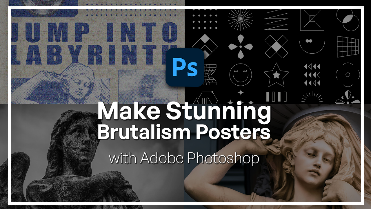
1. Welcome to the Adobe Photoshop Brutalism Posters Course: Brutalism in design
has always been bold, unapologetic and
full of personality. It's a style that
breaks the rules on purpose with raw contrast, heavy typography,
metallic elements, and just layouts that
seem to be imperfect. And that is exactly what
makes it exciting to create. In this class, we're
going to be exploring that raw experimental energy and turn it into a striking
Brutalist poster using ado Photoshop. Hi, I'm Hose Kuchii, a graphic designer and digital instructor
here at Sklodnia. With over six years
of experience, I have worked with
various Adobe products and have built things from VFX, videos to image and design. And I'm so excited to be here
to tell you how to create this awesome poster using one
of Adobe's best software. In this class, we're
going to recreate a full Brutus poster
step by step. We'll begin by setting
up our smart objects. Then we're going to
bring in some images, add some heavy typography, some chrome effects,
and finish it all up with Photoshops
editing tools. By the end of the
class, not only will you have a
poster ready to go, but you also know
all the techniques that we use to build it, and that way you can apply
it to your own branding, to your own designs, and carry
on making awesome things. You do not need any
advanced Photoshop skills, and all you really need is just a software and
willingness to explore. All of the resources that
I'll be talking about in this class is going to
be linked down for you, so you really just need to bring your laptop
and get started. So if you're ready to explore the raw visual power of Brutalist design, then
let's get started.
2. Setting Up Your Smart Objects : Yeah. So let's begin with a blank canvas like this and bring in our
images that you can download for free from the resource pack and open them as their own
separate document. So we have this statue,
this other statue, and these vector shapes
that we're going to incorporate on our poster. So with Brutalist posters, there's a lot of
additional effects that go into each
part of your image. So it's important for
you to have them as a separate document just
so that you can go back, change things up and be able to get full resolution
on your final poster. So instead of having
a lot of layers here, we're going to keep things
organized from the beginning. So what we're going to do is start from one of our posters, and I will be adding
two pictures. You can, of course,
add on more pictures, more shapes, totally up to you. But we're going to do
a half tone effect on one of them and a motion
blur effect on the other. So I'm thinking that the half tone effect will look really cool on this statue. So what I'm going to do
is get started here. Commander Control J to make a
duplicate really important. And what we're going to
do first is head over to our layer to make
it a smart object. That way we can
always refer back some changes and just
open filter gallery. So immediately, there's a filter applied go to zoom out here. So what we have right now
is the graphic pen effect. We will come back to this, but I do want to
start from scratch so that we can follow one thing.
3. Image Texture 1: Applying Half-tone, Graphic Pen, and Grain Filters: So let's go ahead and choose
the half tone pattern here. Just click it once, and I'm going to unhide it. This is what it's
going to look like. We want to bring the size to be a little bit more than this. And, of course, the contrast
to be a little bit higher. I'm going to go with circles. Let's take a look at that.
Try to add more contrast. So I'm not sure if you can see, but essentially
what we're doing is creating these circles
on our subject. And if you change things, you can turn it into
a line or into a dot. Depends, and the size
here is regarding how big these dots or any shape that you
choose is going to be. I personally like it to
be a little bit finer, so something like that
is pretty good to me. Now, on top of this, we're going to hit
the plus and just add the graphic pen effect
that was there initially. And you can see that
it's looking pretty cool already with
just two effects. The length of your
stroke is, again, regarding how thin those strokes are, the graphic strokes. Going to bring it down to four, and we're going to work with the light and dark balance just so that it's not too flat, but also not too dark. So I would say around
67 is good for us. Lastly, I'm going to
add another effect. For film grain.
If I can find it, let's go with green
right over here. Pretty cool. There's other
effects here as well. You can experiment with it, but I would say these
three are best ones. There's film grain,
looking pretty good. Work with the green with
how much of it you want, highlight area, and adjust
the intensity is needed. So just three effects. Once you're done, hit Okay, and there is our first
effect. Pretty cool. Next, I want to intensify this contrast between
the dark bits of our statue with
the lighter bits. So just go over to adjustments, scroll down until
you see threshold, and then you're
going to be seeing something crazy like this. You can work with the slider here to make it more intense, less intense, however
you want it to be. I think this is pretty good. 199. We can also change
the blend mode on top, just to soften
things out a bit and then work with the fill
color that's underneath. So I'm going to turn
this into soft light. And then lower the fill
until I'm happy with the way the shadows look. There we go. Right now, don't worry too much about color because
we can always add a gradient map and
color it later on. So first, I'm just going to
go over to in saturation, turn this down for now. But you can also use this
method to color your image. The reason why I'm
turning them all into black and
white is because I want the entire poster to
have one tone of color, and that's why it's good to
start from the same base, which is no saturation. It
4. Image Texture 2: Creating a Dynamic Motion Blur Effect: Okay, so this is
our first image. We added some effects just to show you a
before and after. This is what we're dealing with. Now let's move on to
our second image. This is a pretty
intense image already. But again, I'm going
to make a duplicate, and we'll try a different
effect on this one. So we're going to do a
motion blur effect on this. I'm going to begin by
duplicating my main twice. Blur one blur two. Okay, so let's begin by making sure all our images are black and white, as we said. If you're using a separate
or different image, make sure you remove all the saturation and then
begin the motion blur effect. So let's go ahead
and hide blur two, blur one, convert it
to a smart object. Go to filter, blur, motion blur. Move this to the size. Angle should be zero. The distance we want
to bring it down to, I would say 500. We can still kind of see
the outline of the subject, but it's not that intense. Now we're going to
mask this so that we can see the middle
section of our angel. We're going to begin by clicking on the same
layer. Make a mask. Grab the gradient
tool right here, change it to this version. Go to the basics and make
sure you have the second one, which is black to transparent. And we're simply going to click and drag
something like that. We try doing it in the center, something of that sort. Go once you're done,
and we just added this blur effect to our
angel. So that's blur one. Now we're going to do the
same thing with blur two, but it's going to be
a little bit more intense in terms of the
motion blur distance. Again, filter motion
blur, angle zero, and just bring this up to 1,000, so way more intense. Same thing with the mask. Just click and drag. With this one, you
can go a little bit further if you want. And we can always adjust the mask because we're still
using black to transparent. Don't worry too
much about if you are not happy with the
masking from the beginning. All right. So now that we have our
blurring situation, we're going to grab all three. So main blur one, blur two, and just simply merge
them into a new layer. So we're going to hold down Command Option Shift E that control all
Shift E on Windows, all at the same time, and
you basically have yourself one layer containing
all the changes from all three layers. Now with this one,
we're going to follow a similar filter gallery
journey with the first image. Go to Filter Gallery. It has the same things
from our last image. If you press plus on
any of the effect, it's just going to duplicate it and intensify that effect. Try adding a regular
grain just to make it a little bit different
from the first photo. Once you're done,
hit Okay, and we got ourselves a pretty cool
blurry, grainy effect.
5. Designing 3D Chrome Elements with Bevel & Emboss: So those are the two
images that we want implemented on top
of our poster. Before I start
making things here, I do want to create some
three D chrome shapes. So it looks a little bit less flat because
we got flat images. The poster is flat. I think a three D shape will
really help here. Before I do that, I do want
to make this black and white, just like the other
image. There we go. Now, to make the shape. So not these shapes, but a whole different thing. So let's make a new file, the resolution down
shape of the square. And what I'm going to do is make a new layer and get
rid of the background. So I'm going to go ahead
and make my base shape, which I'm going to make
into an egg shape, oval shape, something like
that, put it in the center. What we want to do is color
it with some gradients. So let me just turn this into a smart object so that I
could change my settings. You can see it
shows up down here. Let's go ahead and
use gradient overlay. In terms of colors, I think I'm feeling blue, so let's grab some of these
blue colors and experiment. All right, increase the opacity, turn this to regular
and not really color so that we can see
the full gradient effect. I think I'll like a darker blue. Actually, let's just keep this. Once we're done with this,
turn on Bevle and emboss. Let's go to create
these glossy edges, which is what we're
trying to do here. Turn the go over here and start working with the settings. First thing we're going to do is reduce the depth so that
it's only in the corners. So I would say around like
115, nothing too crazy. And we're going to work
with inner bevel smooth, keep the angle
around 90 degrees. Just type 90. So it's
all around global light, 30 degrees and gloss contour, make sure you're choosing
this peaks version so that we have this ripple
effect all over our shape. And let's go ahead and work
with some of the highlights. So highlight always on screen. Turn it all the way up. We want everything to be very
bold and intense. Shadows, we can kind of reduce that as in make
it less than 100. So just play around
with the color. Let's actually remove that. I think I do want
the size to be a little bit different 98. Once you're done with the
main bevel and emboss, you can turn on contour or
to go around the object and just change one thing for the contour and choose
the ring version. So this is going to create
this outline of our shape, and you can already
see how it looks like a little pill, in a sense. Now once we're done, we can hit Okay. If we weren't doing
a Brutalist effect, you could add a glow and then have some grain
effects on the corner, but we'll deal with those later. So what you can do is
keep this as it is. I am going to create
some varieties of this. So let's hit
Commander Control J. So make your mask,
get your brush, hard round, adjust your size, and you can basically
on top of the mask. Kind of mold this into something
else, a different shape, maybe something bigger, so the lines could be smooth,
something like that. Think we do need a little bit
of hardness. There we go. That's much better. So we have this doughnut
situation right now. Play around with it,
see what you like. Another thing that you can do is use any transform effect on this to basically mold it
into something different. So I'm going to hit
Command and Control T, use warp to kind of
squeeze it around, get us like a paint effect, in a sense, hit okay. And I do want to clean up
the edges a little bit. I'm going to zoom in with
my brush, lower the sides, and just go around the edges in one cohesive line so that it's not chunky. And
there we have it. These are my two shapes. We did mention the colors
being a bit different, so I think I will change
this to black and white. Later, I'll color it. So for now, I just have it on to know why there's
a purple here. Black to white, okay? Same thing with the base.
6. Establishing the Poster Layout and Color Mapping: So now that I have my
shapes, my pictures, I can start kind of deciding where and what I want
on my final poster. To begin, I'm going to work
with the background layer. So let's go ahead and choose a color that's kind
of cream like. So let's scroll down to that would be a pastel
color or something like that. Color that in maybe
a little bit. Lighter, something
like this. All right. And then the color that
I want paired with this, I'm just going to make a
little bar on the side. I think a dark blue will
look really nice here. So let's go to not sure if
we have a blue section. Be this blue looks pretty cool. I can alter the
colors later anyway, but just something
to get started. Now, for the images, don't just copy and paste
it into the final layer. You do want to have them
in as smart objects so that at any point you
want to switch things up, you can just tap a
click and do that. So first let's make a
frame for the first image. Convert to Smart Object. Tap a click and paste
your first image in here. So grab everything, paste it, and just adjust the size. This is your frame. So anything you want
to do, do it in here. Commander control S.
Let's go back to the original and now I don't have to deal
with all those layers. I just double click, make
my changes like this. You can go ahead and get
rid of the original. I'm just going to put
it on the side for now. Same thing with
our second image, so make another
rectangle like that. Let me first see how
big my shape is. This is a vertical image. Let's try to change the
frame into a vertical one. Smart Object, double click. Kid, our second picture. This whole group, you can
just copy that and put it in so many layers. There we go. Rectangle three PSB. We can close the two because
we have two images here. So let's just name everything, top image, bottom image. Now, in terms of colors, I'm not a big fan of
this cream color, so I'm just going to go back
and get a linear color. And as for the shape, I think a light purple
will do better. Alright. Now we can go
ahead and incorporate this purple color onto our images as that gradient
map that we spoke about. So I just close those
extra image shapes. Let's tap a click on the Smart Objects now
and begin coloring. Images, gradient map, change the dark color into whatever
base color you chose. So I believe if we
go over to swatches, I can just grab it like this. If you want to use
the exact same color, this is the code that I'm using, feel free to use anything else. And all I'm doing is having the color go from this
purple color to white. So shadows all one color
highlights, they're all white. We can just copy this
same gradient map and paste it onto
the second image. There we go. Control
or command, save it. And now it looks more
cohesive with EPAC. Let's just delete,
close the tabs for now and continue with some text.
7. Brutalist Typography and Integrating Shapes: Alright, so for the text, when it comes to Brutus designs, you want really heavy
and really bold fonts. So let's call this and
look for some big fonts. So definitely we want sanserf and I'm just
scrolling over to some of these fonts
so that I can find something pretty big and
heavy, like we said. So impact looks pretty cool. I'm going to make this giant, put it up like that, maybe on the side here. Reshape as I go. This is our final canvas. Something like that
could be nice. Now, every part that's empty, we do want some sort of
shape in the corner. So that's why we
make these shapes. Now for the shapes,
you don't really need to add a smart object. It's only one layer that
we're dealing with. For the gradient overlay, I'm just going to add
that purple color that we had previously. So let's click on this, crap
this color, then hit okay. Same thing with the other one. There we go. Let's copy
both of these shapes. I might end up choosing one, but let's experiment with both of them and see
which one looks better. So I will end up using
one of the shapes. I think the ring looks
better with this. You can go ahead and use both or none at all. It's
really up to you. And what we're going to do
with a text is that once you've written out your
text with a bold font, you want to go to properties
and just squeeze the text. So I went from 100%
to around 80%. That's going to make
it a little squishy. We're going to increase the
space between the letters. I chose around 220, and this is just something that looks really well with
these types of posters. So that's why we're doing them. And I have my images
situated like this.
8. Advanced Masking: The Crop-Out and Outline Effect: So what I'm going to
do is choose one of these pictures to
be my bigger image. So I will go with
this one because I want to do a crop
out effect, as well. So let's go ahead
and what I want to do is change the image a bit. So let's try expanding this
fully, something like that. Clicking Enter,
Command or Control S, and that's going to
bring back these size. So that's what we got right now. Let's hide this for a
second. These guys, as well. So just the text and
the first image. So let's call this main angel
and duplicate that layer. I will make it a
little larger before I do that. Command or Control J. On the second layer, I want to select
the angel alone. So grab your selection tool, get the Cloud version,
hit select subject. Can hit Q on your keyboard
to just fine tune it a bit, use your black brush and just
start covering those areas. Anything in red will
not be included, so go ahead and clean your selection based off the areas where the
angel should exist. I'm going to zoom in here. We are dealing with
a lot of pixels. Using the bracket key, I'm
going to make it smaller. And because it's
all literal dots, you can be very flexible with how you make
your selection. It won't be that intense. So just estimate the
outline of your subject, and let's take a look here. Once we're done, hit Q again and make a mask around
this top layer. So let's call this Angel. Now what I can do is
make a mask on top of the undelayer below it
with the Marquee tool, maybe start our selection from here at the mask,
and there we go. So now we have her head
out of that frame. If you see that it's
a little bit unclean, just grab your brush again
and go over the same areas. I do want to create a
shape underneath it, so we have some sort of
outline around our image. Grabbing the rectangle tool, I'm going to make a box
around the outside. Let go, you fill, but add a stroke. I think I'll start
with the same purple. Maybe we can change it later. Make your four pixel stroke
and then click away. Now it's a lot more cohesive. If you want, you can write
a click and transform it so that we can see
the outline completely. It's a little bit behind
de subject. There we go. Same thing up here.
That looks good. Maybe pull it out a
bit from this edge. So we got our outline
for the first shape. We can do the same thing
with the angel itself, so just hit Command or Control and press
on the top layer. Then we're going to
make a new layer and add the same
purple in that area. So essentially, what we did
was color in the section, and let's bring back
the main layer. Gonna call this angel outline. On the angel outline layer, we're going to go to the
FX and add a stroke. I will have the
stroke be larger, of course, the
color to be solid. I'll just try to grab the
purple from here. Click Okay. Opacity 100, this size, same as before, four pixels. Let's do one on the
outside. Then click Okay. Remove these extra areas
with the eraser tool, and you should be good to go. If you saw that some parts
are a little bit too intense, just use your eraser tool. Just kind of remove a little bit so that all the
edges look similar. And I don't want
the stroke to be on the original image just
delete that from there. We could just put our eraser
tool on the corner here, hold down shift, and
just drag that way. This way we'll erase
in a straight line. I'm just going to
erase everything down below so that when I hide
the background layer, there's no purple underneath it, and the only place we're getting this additional stroke
is on the outside.
9. Adding Final Text, Secondary Images, and Decorative Strokes: Okay, so there is
our first image. I want it to be there. I'm just going to bring down
the text right now. I think I'll squeeze it
in a little bit more and instead make it bigger.
Yep, it looks better. Situated on the center, and there is my first text. Now with the shape, I'm
gonna bring it back. I made this rectangle
with the rectangle tool, hold down shift to
make a perfect shape, then grab the corners until
you get that rounded edge. So I have my shape
situated like this on top. I'll add a couple
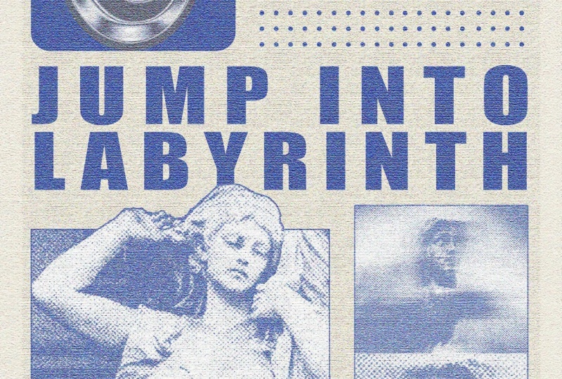
words above this. So let's go jump into
labyrinth, something like that. Commander Control
T. Let's work with the line heights. And
there is the text. Now we're going to bring
in our second image, which was I think we hit it
somewhere here. There we go. And I'm basically going to
repeat the same process, although for here, I
don't want smaller boxes. So let's have it
situated like that. Tap a click and crop it
into a perfect square by using one to one ratio and have it
on that subject's face. Let's turn this into a square, have the center aligned. Save this. And now we got to
swear Command or Control T, and just play around with this until you're happy with it. So what I did right now is
just duplicate some text, change the font, add
some new stuff in there. This is the same exact image. I just flipped it so it
looks a little different. And now I'm going
to grab both of these images, put
them in a group, and then merge with Command E or Control E. So when I do that, I can no longer go ahead and
change the original image. So if you do think that
you want to go back in, just make another duplicate
and hide the original layer. So on top of this, I'm going
to add another stroke, just like we did
here for pixels, Deselect, and there we go. That's looking pretty good. Now, for the shape, I'm thinking I want to
have a lighter color, something that stands out
from all this purple. So let's go ahead and do some color overlays,
perhaps something white. Or actually, we can go
with this yellow color. Gonna try different blend mode, maybe. See what works. I think screen is the best one. Then lower the opacity, and this looks a little better. Now, we do have the
empty areas here, and that's where
I'm going to start using some of these shapes. Grab the one you like. I
like this in particular, Commander Control C, go
back here and paste it. There's my shape. I'm
just going to use simple magic eraser
tool to get rid of the black from the shape, and we should have
the shape alone. To color it in,
we're going to use color overlay, just
like we did before. And I'll use this purple color. Make this normal opacity 100. But nothing too fancy. Resize this as you want. Just try to put maybe.
Just try a couple. I'm going to put another one of these shapes on
top of this angel, but we're going to make this yellow color so
that it can stand out. So that's one of the shapes. Let's try getting a
bunch of in here. Maybe we can try these dots. They look cool. Copy
that, paste it in. It's really the same procedure. So I'm going to do
the same thing as I did here. I'll do that later. But for now, another
thing that you can do for these type of designs
is add some strokes, very simple stuff,
grab the line tool, hold down shift, and
make a straight line. Remove the fill,
add your stroke, then increase the size. So pretty straightforward. You can go over here and
maybe change the cap, align it to the inside, the outside really depends
on what you're going for. I'm going to have it like that. Hold down alter option
and shift to make a duplicate of that
same thing. Same line. And then I'll grab both with
Shift Command or Control T. Try to move them a little
down so it's equally spaced. This up a bit, maybe. And then down here is where I want to have
all these dots. So again, just do that,
fill in the color. And we're going to just
hit Control or Command T. Then just hold down
Alter option and shift, duplicate it a bunch of times
so that it looks like you have some uniform
dots for your poster. I think this last row of
dots is a little too much, just grab your eraser
tool and get rid of it. Okay. We're getting there. I'm just going to play
around a bit more with the positioning
of this shape. I don't like how big
those rectangles are. But other than that, I think we are pretty much ready to go. Let me just duplicate this. Put it right there and match the height or the text and the shapes as you're
building your items. So what I mean is if you hit Command or Control R
to bring the ruler, you should have everything
kind of boxed nicely. And if you don't, you
can have the rulers kind of help you out so
that you can match the top of the text with the shapes and continue
doing that for every bit of your poster. Okay.
10. Polishing the Final Design with Global Texture: So once you're happy
with all of your shapes, now we're going to add an overall grain effect and just bring
everything together because we do have
different textures and different elements
to tidy things up, grab shift, and
select everything, Commander Control G to make
it all into one group. Filters. I go to duplicate
this Command E for Control E. So I have one layer
with everything combined. Then a backup folder in case
I need to go back to this. Turn this into a
smart object and begin editing it with
anything you want, really. One thing that is
pretty common is grain. So you can either use the
same things you had before and reduce their effects a bit maybe or remove
some of the parts. So let me try. I don't
want the graphic pen here. I think some grain
would be nice. So let's make it really intense. Contrast around 57. Let's make it a bit soft. On the other hand, I do want
a little bit of texture. Make another one and
then add your texture. This is gonna give
us that canvas look. You can see these lines, and you can choose
between these if you want brick, sandstone,
anything else. There we go. So it's
looking pretty nice. I think I'm going to leave
mine like that, get okay. And there is our final shape. Do want it to maybe be
a little bit smaller. So I just hit Command
and Control T on this and then used Alter option
to shift it from the middle. Then command on top, Command Shift I to
invert the selection. Using a selection tool,
just fill this in. Go to use generator fill.
Doesn't really matter. You could also make a duplicate
the group that we kept. But I think this should be fine. So we have some extra
space around it. Lastly, I wanted to
be a bit brighter. So let's increase the brightness and add a little bit of hue, I would say, get a bit darker, add more saturation,
finalize our design. And there we have it. There is our Brutalis poster that
we made from scratch. Every part of this was built either from an
image or a shape, and we got it done using
some basic techniques.
11. Congratulations! What’s next?: That's it. Your BhlisPoster
is now complete. You've also learned
how to combine various textures, motion
effect, typography, intricate masking,
and many more into creating something that is
edgy and full of character. Now it's your turn to
create your own poster. You can use all of the
instructions that I have in the class and just experiment
with different colors, textures into building something
that is uniquely yours. When you're done and
happy with your poster, you can upload it into
the class project gallery alongside other students. Over there, I'm going to be looking in from time to time to provide you with some feedback and support you in
your learning journey. Thank you so much for
joining me for this class. I can't wait to see
what you guys create, so keep experimenting
and keep on building.
 Skillademia Academy, Creative Skills for the Future