Transcripts
1. About This Class: Hi, welcome to mockup Academy. I'm Kris Ruff, and
this is a course that I created for
surface designers, graphic designers,
and Entrepreneurs. Anyone who wants to make digital mock-ups on a variety
of different products. The best thing about mockup
Academy is that you can learn how to make mockups from
literally any stock photo. So you no longer have to rely
on just mockup templates. That literally opens up a world of possibilities
so you can highlight your art the best
and most unique way possible. This is class one
of Mockup Academy, and it's a fantastic
introduction to the art of making mockups. A brand new, updated version
of the one I created a few years ago and features the newest
Photoshop upgrades, like the object selection tool that makes mockups even easier. Plus, I've added some
additional lessons, like you'll learn how to create drop shadows and how to change the backgrounds
of your mockup photos. And even how to change
the background color of your art, right in Photoshop. But first, we'll start with the basic concept
for making mockups. And you'll learn the simplest
way to set up your files. I think you'll find the
Mockup Academy method is a lot simpler than most tutorial show you or how pre-made
templates are set up. Then I'll show you how to
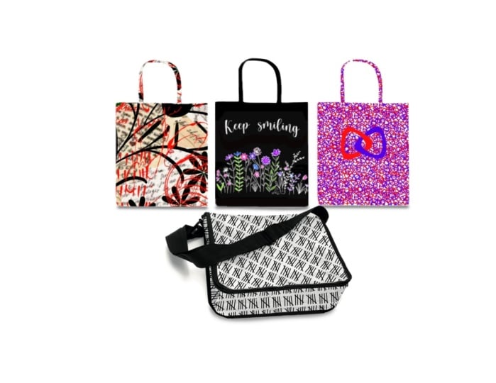
mock up this gift bag. And then on this plate,
I'll show you how to use the circle tool to select just the rim and
put your art there. And then also how to add a colored border on
this cloth napkin. You'll learn how to work with
multiple sections of art, which will be tremendously
useful on many mock-ups. And then I'll show you how
to use the distort tool first on this card and
then on this lunch bag. Now, both the gift bag and the lunch bag photos are
included in the class. So you can work right along
with me if you'd like. At the end of the class, you'll find a section called Help. It's not working. And that's a section
where I'm gonna give you some troubleshooting tips and answer some frequently
asked questions. So let me give you a little
bit of my background. I have a degree in art and
worked in graphic design for many years until I found surface design and really
fell in love with it. That was about ten years ago. And since then, I've made
hundreds of patterns, worked with dozens of companies, and discovered 11
teaching a few years ago. When I began doing
surface design, I really wanted to
give my clients a better way to visualize
my art on their products. So I really wanted
to do mockups. There really weren't any
tutorials around back then, So just kinda had to
make it up on my own. I would have really
loved to find a class like this one back then. And that's really what prompted
me to make this class. I really want this to be
a big shortcut for you so that you can learn how to
make mockups super quickly. And in no time you'll
have a library of your own mockups
that you can draw from. A few technical details
about the class, everything I'm going
to demonstrate, we'll be in Photoshop with
the exception of when I'm copying and pasting
art from Illustrator. And you can copy
and paste art from Photoshop or Procreate wherever it is that you make your art. I work on a Mac, so any shortcuts that I mentioned
will be based on that. If you're on a PC, they
might be slightly different. I'm going to assume
that you have sort of a general working
knowledge of Photoshop. You don't have to be an expert. I make things as simple
and easy as possible. But just as long as you
have some familiarity with some of the tools,
that'll help a lot. And that way I can keep the classes moving
along pretty quickly. So I think that's about
it. Let's go get started.
2. The Basic Concept of Mockups: In this first lesson, I'm going to go through
the basic concept of how you make a mockup. First I'm gonna do it
with some diagrams and then we'll jump into
Photoshop for a demo. So to start, we'll
just open our photo in photoshop and then make sure that our Layers panel is open. Now whatever that object is, I'll be referring to
that as the base photo. That base photo will automatically show up
in the layers panel. The first thing we'll do is set the base photo on multiply. And that's so that as
we add layers to this, we'll be able to see through that base photo Onto
the other layers below. Next we'll create a folder. And that's eventually
where we'll put the art that we want to
put on our base photo. Make sure this art folder
is below the base photo. Next, we'll select the area on our bag where we
want the art to go. And we'll turn that into
something called a layer mask. Now if you're not familiar
with a Layer Mask, I like to think of
it as a window. So that selection that
we made around the bag is now this little white
square on the Layer Mask. And that's the window
where the art is going to show through
the rest of it. The black area is
all blocked out. So when we add art
into this folder, it will only show
through that window. Now notice that I put
the layer mask on the folder and not
on the art layer. There's two reasons for that. First, it makes things so much simpler because now whatever
we put in this folder, whether that's different art or a background color or text, whatever it is, all of it
will already be masked. So it will already fit
perfectly on our photo. In addition, when the layer
mask is put on the folder, then we're free to
add additional layer masks onto the art layers, and we'll do that in some
of the later lessons. Okay, so that's
the basic concept. Now let's go into Photoshop and I'll demonstrate
how to do it. There.
3. Your First Photoshop Mockup (Gift Bag Mockup): Alright, now that you understand the concept of making a mock-up, Let's make this one
for real in Photoshop. I open the photo in Photoshop. And for this tutorial, I've closed up all the panels, all of the dialog boxes except the toolbar to make this as
simple and easy as possible. So first I'm going to
open the layers panel. I go to Window layers. You'll notice that
the first layer is already in there and
that's just your photo. Now, it may have a padlock
on it like this one does. If it does, just click
on it to get rid of it, I'm going to double-click
on the name and we're going to call it base photo. And that's not a really big deal in this very simple mock-up. But later with more complex one, we might have reason to
duplicate this photo up. So it's just a good habit
to get into at this point. Next, I'm gonna go up
here where it says normal and change
it to multiply. And again, that's
so we'll be able to see the layers that we
put underneath this one. Now we're ready for
our art folder. So we go down to the bottom of the Layers panel to this little icon that
looks like a folder. And click, remember that has
to sit under the base photo. Civil click and drag it and just pull it down below
the base photo. And I'm going to rename
that one artwork. Now we're ready to make
the selection on our bag. And Photoshop has a lot of different tools to
make selections, but it's always nice to try
the easiest ones first. So I'm gonna go over
here and I'm going to choose Quick Selection Tool. Now it won't let me do
anything right now because I don't have a layer chosen, so we want to choose the base photo and
then come back over. And I'm just going
to run my tool on the area that I
want to be selected. It missed a little bit here. So I'm just going to go in
and drag over that area too. Now if this happens where
you get more than you want, just hold down your Option key and then go back over that area. And that will get
rid of that part. Looks like it missed a
little bit down here too. So we'll just carefully go
down and pick that as well. Once you have exactly
what you want, we're ready to turn
that into a layer mask. And to do that, we simply
use this icon down here that says Add Layer
Mask and just click on it. Now remember in the
previous example that we want the layer mask
to be on the folder. Well, it's gone and put it
on the base photo layer. So we can just simply
click on the mask itself and drag it
onto the folder. There it is, there's
our layer mask, and so this white
area is the window. And whatever we put in this folder show
through that window. Now to make things
a little clearer, I want to give a
color to our folder. So I'm going to click
on the folder layer and you won't be able
to see this because it goes below my screen, but I'm going to choose a color at the bottom of this window. So that way we know
which is the folder. Now we're ready for art. So I'm gonna go
into Illustrator. And I'm going to
choose this artwork that I want to put on the bag. So I'll copy it. And then go back to
Photoshop and edit, paste. And when this option comes up, always pick smart object
that we will be free to size the artwork up and down endlessly without losing
any quality in it. And then just click. Okay. So there's our artwork layer. And now we just click and
drag that into the folder. And now you can see
it's orange too. So now we know it's
in that folder. And there you have it.
There's our mockup. So this artwork, even though it's much
bigger than the bag, only shows through that
area that we had selected. Now if we wanted to
try out different art, I'm gonna go back to Illustrator
and try out this art. So I'm going to copy it, which is Command C, and then go back to
Photoshop, paste again, which is Command V to
Smart Object. Click. Okay. And there's our artwork. Now obviously we're seeing
both artworks that all we need to do here is
turn this one off, turn off the little eyeball. And now we see the new
art on our mockup. Now we should point
out that we can also resize this art if we want. And we can do that
with the move tool, which is the one
in the upper left. Now we have these handles
show up and we can just then drag them up and down till we get the
size that we want. Or we could move it and
do whatever we want with it. Then click Return. Now, if for some reason you
want to see all of the art, not just what comes through. You can temporarily turn
off that layer mask. And the way you do it is just
go up to the layer mask, right-click and click
on Disable layer mask. Now that puts a big x through it and we can see all
of the artwork. And then if we want to
reinstate the layer mask, we just click on it again. That's it. That's our first mockup. And you can see really what
an easy process is and how setting up that artwork folder
really makes things easy.
4. Working with Circles (Holiday Plate Mockup): In this lesson, we're going
to mock up this plate. We're going to put artwork
around the border of it and then add some artwork
for the center of it. And also add a colored border. Will set things up
exactly the same way and we'll go through
that again quickly, will unlock it by
clicking on it, change the name, change it from normal to multiply at our art folder by
clicking down here. Alright, now we're
ready to select the area on the rim where
we want our artwork. So we'll click on the base photo and we'll try using that same
tool that I used last time, the Quick Selection Tool. And I'm just going
to click and drag. And pretty quickly we can see that this tool
is not going to work along some areas. There's just not
very much difference between the object
and the background. Photoshop has a really hard
time finding that edge. There are a couple of
other things we can try. The circle tool is actually
going to be our best option. That's up here with
the rectangle. So click on that. One thing that's hard
with the circle tools, knowing where to
start your circle. If I start my circle
like right here, you can see as I get
to the other side, it's not in the right place. Here's a good trick
that is to use guides. Now, in order to use guides, you'll need to have
your rulers on. If they aren't,
you can just go to View Rulers and make sure
there's a checkmark there. So to place a guide, click on the ruler at the
top and pull it down. And we can place it
right where we want it. Now this plate actually has this little bead
on the end of it. And in real life we wouldn't
be able to print on that. So we're going to
place our guide just on the inside of it. Then we'll do it. Same thing on the other side. Now where those two
lines intersect, that's where we want to
start our circle and drag. Now when we get to the other
side where that bead is, you'll see that everything
lines up perfectly. So that's our selection, except we only wanna do the rim, not the inside of this plate. So we want to subtract
everything that isn't the rim. So to do that, we're going to
make another set of guides. This time, right
along the inside of that rim, here and here. Now we're going to
make a new circle, but we want this to be
subtracted from the selection. So we click on the option key to get the little minus sign on the selection tool
and then start dragging. Until we get to the other side. We let go of everything. And that's our selection. Click on our artwork
folder because that's where we want the
layer mask to be. Click on the icon
for Layer Mask. And now our window
looks like a doughnut. So any art we put
in this folder will only show through
that white area. Okay, I'm gonna go
into Illustrator. And this is the
art I want to use. So we're going to use
the snowflakes around the rim and this art
will go in the center. So I'll click on those and
do Command C for copy, and go back to Photoshop
and use Command V to paste. I'm going to click on
it and make it bigger. Then we take that artwork layer and put it into the folder. And I didn't make
a color this time. Let's go do that. Next.
I'm gonna go back to Illustrator and choose
the center art. So Command C and Command V. And maybe I'll make it
just a little bit bigger. So we'll put that in our folder. Oh, remember, our art only
shows through that rim. So this is hidden. So in this case we don't want
it in the same art folder. We'll just drag it out, but still make sure that
it's below the base photo. So a base photo, center art and then the rim art. And we could rename
this if we wanted to. And it might take
a little bit of extra time to name your
folders like this. But trust me, you're
going to reuse this mockup over and over again. And if you label everything
in such a time saver later, you can just go in and say, Oh, this is where I put my room
artwork and just drop it in. And within seconds you
have a new mockup. Next, we're going
to make the border, the little red border
around this rim. And I'm going to make another
circle using those guides. And now I can just go
up to Edit stroke. So to choose my color, I click on it and I
could go find a red. But what I really want
is I want to make sure it matches this color here, and I can just click on
the red that I want. And now that's the
color that's here. I click Okay, and that's
the color that's here. Now I'm not exactly sure
how wide it room I want Let's go with I
don't know, like 15. And then this down here is asked me where do
I want the stroke? Do I want it to be inside of my selection or outside
of the selection? So it would be on this
side of the line. Or do I want it to be split
right down the middle? I think in this case, I want it to be outside my selection because I want
it to be in the rim area, not going down the
hill into the plate. So we'll click OK. And I'm going to turn
off the marching ants by using Command H. And
we can see our rim. Now I want to show
you a point here that's really good to remember. When I made this red stroke, I was using the base layer. So now if I grab the Move
tool and move the plate, you'll see that the border
is part of the base photo. Now, I've permanently change the base photo and that's not a good idea because
when we make mock-ups, we want to make everything
separate so that we keep all of our options open
for subsequent mockups. Because next time
you might not want a red border around your
plate or even any border. So I'm gonna back up
and this time create a new layer by clicking
down here on the plus sign. Now we have a new layer. I'm going to call that border. I'm going to make sure that
is the layer that I've chosen when I go up
and make my stroke. I think 15 was a
little bit small. So let's make this
25 and click. Okay. And now that border is not
part of the base photo, but we wanna make
sure that all artwork is both still below
the base photo, so we'll drag it down here. One thing that you can
do to make sure that you don't accidentally change or damaged your base photo is just choose the base
photo and lock it. Now, if I were to try to
make that same border, it'll give me this message. Could not complete
the Stroke command because the layer is locked, that will prevent you
from making that error. So now we have the finished
product for our plate mockup. And next I'll show
you how to work with multiple artwork folders.
5. Multiple Artwork Folders (Napkin Mockup): Here's another simple mock-up, but it's gonna give
me an opportunity to show you some
really cool things. In this lesson, I'll
introduce you to the techniques of working with
multiple artwork folders. And then I'll show you how to add a background
color to your art. And finally how to
add a drop shadow and how to add color or an
image to your background. So let's get started. I have my base photo, it's already set on multiply. I have the artwork folder and now we need to
make our selection. Let me show you a relatively
new selection tool called the object
selection tool. When you use it, make sure that object finder
up here is checked. And then you'll see these
little arrows turning around. That means it's analyzing
the image to find an object. Once it stops, you can
move your cursor over the image and you'll see a colored preview
of the selection. Now it looks a little bit rough, but it's really just a preview. So to activate it, we just click on the image. In this case, it did
a really good job. Sometimes it doesn't, but this was really pretty simple object. So that's the
selection that we'll use for our Layer Mask. I'll go get my art and copy it. Go back to the mockup and paste it just as we've done before, and then drag it
into my art folder. So everything looks great, except from a
realism standpoint, the design shouldn't really
cross this fold here. So we want to make a
better mock-up than this. We can do that really
pretty easily by just having separate
artwork folders, each with a separate layer mask, one for the front and
one for the back. So I'll create two
new folders by clicking the folder icon twice. And then I'm going to
change their names to front and back. And then drag them
below the base photo. And I'll add colors to them to just to kinda keep
track of things. Now we don't need to
start over making our selection for each
of these folders. Will just reload this
one by right-clicking on the little thumbnail
of the Layer Mask and choosing Add
Mask to selection. In this case, we don't
even have a selection yet. So in effect, we're saying
just reload this selection. You can also do this
by holding down the command key and
clicking on the thumbnail, not in the layer but on the actual thumbnail and
that will reload it. Okay, so now we have a
selection of the whole napkin. We just need to subtract this
area and this little bit down here to create
the selection for the front layer mask. To do that, I'm going to use
the Polygonal Lasso Tool, or you could use the regular
lasso tool if you prefer. I'll zoom in and hold down the Option key to get the
minus sign on the icon. And just start clicking
to make a line to select the area
we want to subtract. When I get to this
edge, I can just loosely go back to
the starting point. And when the little circle
pops up on the icon, click to finish the selection. Then we'll do the
same thing down here. Now, that's the selection
for the front layer mask. So we go to that folder
and add layer mask. Now for the selection
for the back section, we're going to reload
the original mask again. So to do that, just right-click on that layer mask
again and choose, Add Selection to mask again. So now we have the
whole thing again. And now I have a
shortcut for you, rather than manually
subtracting the front section. From this, we can
just right-click on the front layer mask and choose Subtract mask from
the selection. Think of it as we had
the full selection. Now we minus the front section, and that leaves us
with the back section. So now we click on the back folder and make
this our layer mask. So now I want to put a copy of this artwork into each
of those folders. I'll make another copy of it
by clicking on the layer, drag across the plus. Now I have two copies. I'll put one in the front folder and
one in the back folder. And now we'll just get rid of our original artwork folder
by dragging it to the trash. Okay, So we will
open these folders up and you can see each one
has a copy of the art in it, which will just turn on. The next step is just to do a little rotating so that
the artwork is offset. The front portion is
angled down a little bit. So I'm going to click
on that artwork, go over to the Move tool and just pull on
one of these little handles to rotate it. And that's it. So we added a lot more
detail and realism into this by just having
that second art folder.
6. Adding Background Colors to Art: So this is just a
quick lesson to pick up where we left off
on the folded napkin. And I'll show you how to add a background color to
your art in Photoshop. This is the art I want
to use for this lesson. Now note that it has a
transparent background. That's important because
this technique won't work if your art already has a white
or a colored background. So I'll take this art, copy it and go back into Photoshop and paste
it into the mockup. And then size it
to fit the napkin. To add a background color. I'm just going to
make a new layer. Remember, we always
want everything to be on a separate layer. So I'll make a new layer by clicking down here
on the plus sign. Next, we'll choose the color for our background by going
over it and clicking here. And I don't know, let's make it a pink background. I'm going to change this
to background color. Then I'm going to select the
whole area and go to Edit, Fill, fill with my
foreground color. Click Okay, and there's
our background color, except it needs to go
in the background. So I need to drag that layer
down below my artwork. So there it is, and
it's pretty dark. So I could lighten it up this way by lowering the opacity. Or the other thing
that's really kinda cool is I can click on
that layer and go up to image adjustments,
hue saturation. That brings up this window. And here I can have all
kinds of fun with the color. I can make it lighter, darker. I can change the
saturation of it so it's gray or super bright. And I can change
the color of it. So all of those things
you can play with right here and see it live
and make those changes. So again, if I wanted
just to like pink, I could go that route or maybe I don't want
so much color. Maybe I'm going to just make it kind of creamy color
like like, I like that. So then I click, Okay, and you can see
that change here. So now we just need to make
copies of the art layer and the background
color layer and add them to the back artwork folder. So I'll make copies of them by dragging them down
to the plus sign. And then drag each of the copies into the
back artwork folder. Then we'll just need to offset the art like we did before. So I'll go into the
front art folder, click on the art layer
and rotate and offset it. So that's it for this lesson. And in the next one
we'll add a drop shadow.
7. Adding Shadows & Backgrounds to your Mockup: In this lesson, we'll
pick up where we left off with the napkin mockup. And I'll show you how
to add a drop shadow, as well as how to make the
backdrop a different color. So we'll want to
put the shadow on a separate layer by clicking
the plus sign down here. Then we'll rename it shadow. And it needs to go at the
bottom of all the layers, not inside the folder because we don't want
it to be masked, but at the very bottom
of the whole stack. Next we'll reload both
of the layer masks. So right-click on one of them and choose Add
Mask to selection, and then add the other
one by right-clicking on it and choosing
the same thing. Now, both masks are combined into a selection that's
around the whole napkin. Now we'll fill the
shadow with black. Click over here, and then
make it black and click. Okay, so that chooses her color. And now we'll fill our
shape by going to Edit, Fill, and fill with
foreground color and click. Okay? Now we can't see it
right now because it's exactly
underneath the napkin. So if we just click on it, we can move it into position. Now, to make this
look more realistic, we want to have a
very soft edge to it. We're going to use the
Gaussian blur filter in order to do that. And let me show you
how that works. If I take my lasso tool
and just make a shape, fill it like we just did. And I can either
go up to edit or I can actually just right-click
on it and say Fill, fill with the foreground color. To use Gaussian blur. We go under Filter
Blur, Gaussian Blur. And then here we can
determine how much fuzziness we want. Click Okay. Now that doesn't look like a very realistic shadow
because of this hard edge. So we just want it to fade
away along the edges. So we got the hard
edge because we use Gaussian blur while we
had our objects selected. If instead we make our shape, fill it with black and
then de-select it first. Now when I go to Filter Blur, Gaussian Blur, we can get that soft fade
that we're after. Okay, So I'll put
that away and go back to our mockup, de-select. So we have no marching ants. Go over to the shadow
layer and go to Filter Blur, Gaussian Blur. And now we can choose
how much fading we want. I just want a little
bit click Okay, and it's still a little
bit dark down here. So I'm just going
to go to opacity and make it a
little bit lighter. So we want the shadow there, but we don't want the shadow to, calling a lot of
attention to itself. We just want it to look
natural and three-dimensional. Now there's one other point
that I forgot to mention. And that is, remember
this art was transparent. Well, let's say you
don't want a background, you just want a white
background on this, so you turn off that
background layer. The reason it looks like
this is we're seeing the shadow through our artwork. So if you have transparent art and want to have a shadow
behind your object, all you gotta do is
make another layer, fill it with white, and then bring it
behind your artwork. On both the front and the back. That's the finished mockup. And now let's play around with some background options for it. First, let me do
some housekeeping. I'm just going to close up these folders so that we have a little
bit more room here. So making a background
color is basically the same process as making a background color to
go behind the art. Click down here to
create a new layer. And we'll just call
it background color. And just like before, we can
fill it with a color just by clicking on it and
going up to fill, fill with the foreground color. And now we have a color. The other way that
you can do that, you can just click on option Delete and it will
fill that for you. So that's a nice
shortcut to note too. That red looks really horrible. So we can play around with it. We can change the opacity to make it a little bit lighter. Or we can go into
Image Adjustments, hue saturation, and play
around with it in here. So here we can lighten it and change the
color however we want. One thing I'll mention, once
you start playing around here and you want to get
back to where you started, you can just hold
down the Option key. And then this
becomes rather than cancel, it becomes reset. And that'll take you right
back to where you started. So let's just make
this a lighter color, maybe a little bit
less saturated, and we'll call that good. That's how you add
a background color. Now, later if you're doing other mockup and you want a
different background color, it's a good idea to
just keep adding some. So we would do the same process. And maybe for the other markets, we want blue background. Then later as you're
doing mock-ups, you can just kind of fool around with which color do I
want for this mockup? So then you're sort of
building up a palette of colors for your use later on. Now the other thing we can do is add a photo in the background. So let me go into Adobe Bridge. I've got a folder
full of backgrounds. And if we just choose one, let me choose this one and
drag it into Photoshop. We can just enlarge that. That gives us kind of a
subtle background shading. And if we were to set
that to multiply, now it does that same shading
across our pink background. So here's without the
shading and with it. So it's subtle, but it does give it a little bit more mood, a little bit of lighting and
makes it some realism there. So that's kinda fun option too. I've added some other
backgrounds in here already. So you can see I created a
folder called backgrounds. Let's open it and try some other ones out
first, let's close these. And I've got this one in there. This one adds a little bit of
texture to the background. And we could use that
with their color as well. As long as we put
that on Multiply. You could add a wood grain, or here's something with a very textured,
darker background. And again, that could
be something that you could lower the opacity, or you could add it to a color. Here. You could
also have some fun with the various
blending methods. So you can kind of
go through here. And as we do, you can
see different options, so you can play
with that as well. Or here's another option
with a wood grain. You can see there's all kinds of possibilities and doing
stuff like that kind of makes things more
unique and you get to highlight your art in
whatever way looks best. So I think I like this one
with the pink background and the subtle shading
that's going on here. So that's what I'm going to
use for my final mock-up. I want to save it. I just go to File, Save As I'm going to call
this champagne napkin. And I want to save it as a copy. I want to make it a JPEG. And Save and make it as the
largest file size possible. So click Okay, when I open it, it looks like that. As I said at the beginning, this was a very simple mock-up, but it allowed me to show you how to add a background color to your art and in background
color to your background, and also how to
add a drop shadow. And those would be really
useful moving forward.
8. Distorting Artwork (Lunch Bag Mockup): In this lesson, we'll use the distort tool to
mock up this lunch bag. Now this is a little bit more complex than the
previous mockups. So before we do that, I want to introduce you to
the distortion feature. On this simple greeting card. I've got the card and I've
already added some art and I want it to fit
the angle of the card. Let me first scale it down to
fit the card and center it. And then we'll go to
Edit, Transform, Distort. Now going through all that
as a little bit clunky. So you may want to use
the keyboard shortcut, which is Command T
on your keyboard. Then you right-click
and you'll see the whole list of
transform options. So that's a really
handy shortcut. And we'll pick distort,
which is right here. Now we have the ability
to move each of the corners of our
artwork individually. And that will
distort the art into all kinds of crazy
different directions. Isn't that cool? So all we need to do to make
it fit the card is click on this corner and
drag it up so that it's parallel to the
top of the card. And then do the same here. And we can use the shift key
here to constrain the moves. So it only goes up and
down so that we don't risk distorting the art
in ways we don't want to. We pull it down so that it's
parallel to the bottom one. Click Return, and that's it. So that's the basics of
the distort feature. Now let's go back
to the lunch bag. There are three areas we want to cover with our pattern
on this mock-up. The top, the front side here, and the side panel. So right away we're going to set up three artwork folder is kinda like we did with them napkin in the previous lesson. So I'll just click on the folder icon three times
and then I'm going to name them top, front, and side. Then we don't need this one. And then we'll
make sure that the base photo is at the top. I also want to give
each folder a color, and that'll just help us keep this more complex
mockup organized. To start the selections, we'll click on the
base photo and then let's try the
object selection tool. So it spins while it
analyzes the image. And once it's done, we can move our cursor over to the image and
see what it found. It found the object
pretty well here, but that doesn't do us much good because we need to select smaller portions of the object for each of our layer masks. So there's another
way we can use the object selection tool. And that is to uncheck the object finder option and then choose either the
rectangle or the lasso tool. I'm going to use the
Lasso tool and draw an area we want Photoshop
to look for an object, or in our case, an area with
similar characteristics. So I can just loosely select this area and it will look
for high contrast edges. Here does a really great job. I can then add this
area by holding down the Shift key and then just loosely selecting
around this area. And it did a great job here too. Now if you've been using
Photoshop for many years, you understand just what a
huge improvement this is. In fact, in the previous
version of this lesson, the best tool for outlining this object was the
Magnetic Lasso Tool, which is still very useful, but it often took minutes
to make a selection, whereas this one literally
does it in a second or two. Now it didn't do it perfectly. So we're gonna go zoom in here and we can just
refine our selection. I use option to get the minus. And then I'm just going
to circle this area. Basically we're saying reanalyze this section and
get rid of this. And it does a great job. I'll do that over here too. So minus circle
it and it's gone. So that's the selection
will use for the top. We'll do the same
thing for the front, will loosely select the area and then zoom in and clean
it up as needed. And then we'll use
that as the Layer Mask on the front folder. And we'll do the same thing for the Layer Mask on
the side folder. So let's go get some art
again in Illustrator. I dropped in a lunch
bag photo here just as a reminder to show
the shape of the bag, the areas that we want
to fill for our mock-up. When we're using the
distortion tools, it's easier if we start
with art that fairly closely matches the shape
and size of the final use. I'm going to create a new
horizontal shape rectangle and fill it with my art. We'll use that for
the top of the bag. And then I'll make a
second rectangle that's more roughly the size and shape of the front
and the side panels. So we'll copy this first one, the larger rectangle
for the top, and then go back into
Photoshop and paste it. And then I'm going
to make it about the size that I think I'm
going to want to use it. Now there's one other
thing we need to do with this art and that
is to rasterize it. Because right now if
I go into distort, you'll see that the distort
function is grayed out. That's because you can only
use it on a raster image. So we have to go over
here, right-click. And choose Rasterize Layer. Now we can use the distort tool. So I'm going to
use the shortcuts. So it's Command T for transform. Then right-click on it,
and there's distort. And now I'll just start moving
the points into position. So this one goes at this corner. This one goes here. This one goes on this side, and this goes over here. And I've got a little
bit of an edge here. So I want to make sure that it extends out from the
object a little bit. And I'll pull this
one out a little bit and make it parallel there. And same at the back. So when you're making mock-ups, let your art help you figure out if the
distortion is correct. So in this case, these
little units were squares and right now it
like this little anchor, it looks a little bit vertical. So I want to stretch
the whole thing out so that they feel
more like squares. I think that's good. So I'll click Return. And now I'm gonna put that into the art folder for the top. Okay, let's go back
and get the other art. I go into, Illustrator, pick that little one, copy it, go back to Photoshop, paste and make it larger. So click Okay, and then
rasterized by right-clicking, we go to Edit,
Transform Distort. Now we can move the corners. So I want this line to be parallel to
the edge of the bag. And this line needs to
be parallel to this one. And down here, this line
is not quite parallel yet, so we'll pull that in. This line, needs to be
parallel to this here. I think that looks pretty good. So we'll click Return and put that artwork into
the front folder. We'll do the same
thing with the side. We'll paste the art again. Make it larger. Let's see, where is it? Where did we put
it? Right there. Okay. I'm going to take it out
of the art folder so I can work on it and see it better.
To be a little bit bigger. I think. I'm kind of looking at these shoes to make sure that they're about the
same size as that one. So we'll right-click
and rasterize it. And go to command
T for transform. Right-click, click on the start. And now we can move the corners. Start here. There's not very much
of this one that shows, so we don't have to
worry about it too much. We'll call that good. Click Okay, and drag that
into the side folder. So that's the final result and how we use the distort tool.
9. Help! It's not Working!: Now it's time for a
section I call help. It's not working. I want to cover a few
little things that can trip you up when
you're first starting out, plus answer some frequently
asked questions. First up, I put my art
in artwork folder, but I can't see it. If this happens to
you, it's probably for a very simple reason. You probably just forgot
to put your base photo on. Multiply. Help. It won't let me use
the distort tool. If you go into Edit, transform. And the distort and other
options are grayed out. It probably means
that you haven't rasterized your artwork layer. So if I go back over
to my art layer, you can see it still has the smart object icon
in the corner of it. So to rasterize it, right-click and go down
to Rasterize Layer. Now, those options
should be available. And there could be
another reason. So if I go to Edit and all
of these are not available, it probably means you just
haven't selected your layer. So go over, select
your art layer, and then go back. And those are now available. Help, I put my Layer
Mask on the wrong layer. Do I have to redo it? No, you don't. You can just take your Layer Mask and drag it
onto the artwork folder. And then you're good to go. Help. My artwork looks
fuzzy on my mock-up. If you end up with fuzzy
looking art when you started with something that was high
resolution or vector art, it's probably due to
resizing it on your mockup. E.g. here we started
with vector art, which means we brought it
over from Illustrator. But remember we had
to rasterize it in order to distort
it on the mockup. So if I take the artwork and
make it bigger and smaller, it won't have any
impact on the art until I click Return
and de-select. So that part is safe. But if I take the art and
make it really small, click Return, and then
make it really big. Now it's getting fuzzy. And if we were to do
that a second time and click Return and
make it big again. You can see that each
time we do that resizing, it gets more and more fuzzy. So when you have to
rasterize something, it's good to start with art
that's larger than you think you're going to need because
it's okay to downsize it, but it's that rate enlarging, that is the trouble. So once you rasterize something, be really careful
about the resizing. Why don't you use smart
objects in your mock-ups? Well, if you know what
a smart object is, then you are an accomplished
Photoshop user. If you don't, let
me explain that. A smart object is
a special type of layer that can save a lot
of time on complex mockups. You know how we distorted
the art for the lunch bag. Well, if we had set it
up as a smart object, we wouldn't have
to do that warping each time we wanted
to use new art, we could just drop in
the art and it would automatically take that same distortion
that we had set up. And I do teach how to use smart
objects in later classes. But for this first one, I want to make it as
simple as possible. And to show you that you
don't need to mess around with smart objects in order
to make good mockups. So get the hang of the
process of making mockups. Then I'll introduce you to smart objects in a later class. In most mockup templates, the base photo is at the bottom. How can you put it at the top? The short answer is
simplicity and versatility. On rare occasions I do use
commercial mockup templates. And I'm often
surprised at just how complex and convoluted
some of them are. Sometimes they do have
base photos on the bottom. And that means that
everything above it needs to be set on Multiply, which does cause some
limitations like, like you can't add a
background color behind your art the way we did
in the napkin lesson. And in some mockup templates, there's really no
base photo at all. Instead, your art gets
clipped to fragments, little pieces of the base photo, which gets super confusing. I don't think you
should have to be a Photoshop expert in order
to make a good mock-up. I strive for simplicity in
the mockup Academy approach. And it's a system that
works just as well for simple mock-ups as it does
for really complex ones. So I think once you get a
little bit of practice, you're really going to like it. Where can I find photos
to use as mockups? This is a really
common question I get, and there's a number of
resources you can look for free stock photo sites. Some of my favorites are
unsplash.com and pexels.com. Or you can purchase them from stock places like
Shutterstock or Adobe Stock. Also, you might
want to sign up for my email newsletters
once or twice a month, I send out an email with
market-making tips. And one of the first
things I cover is tips for finding
good mock-up photos. And when you subscribe,
you'll also get this free guide with lots
of market-making tips. And it's got great
stuff in there, stuff that I don't even
cover in my classes. You can sign up for
the newsletters and the six tips guide at my
website, Chris ruff.com. And then click on
the Courses link and scroll down to the bottom
where you'll find this form. And if there's anything
you'd like to see covered in future newsletter, please feel free to
contact me anytime. I'd love to hear
from you and always love talking about
mockup, making.
10. Conclusion & Your Project: So great job
finishing this class. Now you know how
to make mockups. Yay. I hope you're as excited about that as I am
because it's just so cool to see your artwork on products and to be able to visualize them out
in the real world. And you'll be able to give
your clients, your customers, a much better idea now how your art is going to translate
onto their products. So that's a great sales
and marketing tool. Now let's talk
about your project because you have all the skills you need to make a mockup
using your own artwork. The gift bag photo and the lunch bag photo are
included in the class. You'll find them in
the projects and resources section
of the class page right along the
right side of it. So to review, open your
photo in Photoshop, set up the layers, then make a selection where
you want the art to go. Then just turn that into a layer mask on the
artwork folder, and then add your own art
and distort it if needed. Once you're done
with it, I would love if you'd post it
to the class page. Just click on the Projects
and Resources ink on the page and look for
this bright green button. Upload your project,
and then click Publish. I can't wait to see what you
do with your new skills, and sharing a project
really helps other students know what to expect from
the class. So do reviews. So please take a minute and let me know what you
think of the class. And if you have any questions, you can post them to the
class discussion page, and I'll do my very
best to answer them. I hope that once you've
had a chance to kind of practice some of the new skills you've learned in this class, that you'll go explore the
other mockup Academy classes. You can learn about
smart objects, which is a real time
saver when you're making mockups and how to add highlights and
shadows to your mockups, which really helps the realism. You can also learn how to make lifestyle images where you put wallpaper and wall
art onto walls in a room and how to
make fabric mockups. And in all of the classes, there are lots of
tips and tricks for using Adobe Photoshop
tools and techniques. You'll find all these classes on Skillshare or on my website,
which is chrisrug.com. I encourage you to download my free guide called Six Simple Tips for
Making Better mockups. It's packed with all kinds of great information that's not
even in any of my courses. You'll find the link on my
Skillshare profile page, and that will also get you
on the mailing list for my email newsletters that are packed with other
great mock up tips. In the meantime, have
fun making mock ups.
11. One More Thing...: Hello. Hi again. I'm popping back in to
let you know that I'm now available for one on
one coaching sessions. So if you like this class and would like to work
with me individually, you can now do so by
booking a session right from my Skillshare
profile page. I offer two kinds of sessions. The first one is a 1
hour portfolio review where we'll look at
your surface designs. I'll let you know some strengths
and areas to focus on, and you'll get the opportunity
to ask any questions you'd like about art licensing or
the surface design industry. Now I know it can
feel intimidating to show your work to somebody, but it's so smart to get
professional feedback. All the artists that I've
worked with have felt energized and ready to move
forward after our sessions. I also offer a 30 minute Adobe Illustrator or Photoshop
instruction session. If you're struggling
with any aspect of the software, I can help. We can walk through tools, I can demonstrate techniques and workflows that are going
to help solve your issues. So whether you're looking
for a one time session or an ongoing opportunity
for feedback on your work, coaching is such a great
investment in your career. Unlike some of the expensive online courses that
are available, coaching doesn't have
a fixed curriculum, so I can give you
exactly the information and guidance that you need
exactly when you need it. I hope you consider coaching. I would love to work with
you and I can't wait to meet you and support you and guide you on your creative journey. You can learn more about
my coaching sessions at chrisrug.com slash CoachE.
 Kris Ruff, Surface Pattern Designer & Coach