Transcripts
1. Class Trailer: Most of us have a
pretty good sense for what foods go together, tomato and basil or
cookies and cream. But I bet if someone served you pasta with ketchup
and orange juice, that would be a hard
pass for all of us. Hi, I'm Chris Ruff, and I'm a surface designer and top
teacher here at Skillshare. You may know me from my
color alchemy classes, and if so, you know a
lot about color theory. But putting that into practice can still be kind of tricky. If you've ever opened a
new document and said, Oh, what colors should I
use? You know what I mean? That's because our
instincts about color aren't as developed
as the ones for food. We can't eat color,
we can't smell it, so we don't have the same
visceral experience with it, which is why I came up
with color recipes. I'm going to borrow
some of the ideas behind cooking and
apply them to color. We'll walk through five recipes, starting with the
easiest, which I call cheese and crackers
and build from there. You'll learn why
vegetable soup feels so balanced and how to recreate
that harmony with color, how to flavor a color palette so even unlikely color combinations feel like they belong together, and how a pizza
recipe can help you get your proportions
of color just right. The end, you'll feel much more confident putting
colors together. Your project is to create
a color recipe card. Just like cooks record recipes so they can recreate them later, you'll do the same using the template included
with the class. Make just one or get in
the habit of creating them regularly as a way to pause and consider what makes
a good color palette. That'll help you improve
your sense of color. And as a bonus, I put together a bunch
of the colorways from the class into an
awesome color library that you can use
for your own art. It's free when you sign
up for my mailing list. So I hope you enjoy the class. Oh, and no apron required. Okay
2. Know Your Color Ingredients: So before we get started,
let's get to know our ingredients a little bit better. Here's our color wheel. Basically, it's a
circular rainbow where the colors flow continuously
from one to the next. There are anchors, though, the primary colors,
red, yellow, and blue, and the secondary colors made by combining
neighboring primaries, and so those end up being
orange, green and purple. So those six are the
anchor points and everything else transitions
smoothly between them. So when two colors sit
directly opposite each other, they're called
complimentary colors like blue and orange
or red and green. Color temperature will also be important in our color recipes. The range from red
through yellow are warm, from purple to green are cool, and the area in between
are transition zones. So greens transition from cool to warm and the
same with purples. Now, let's talk about
color variations. The term hue simply refers to the pure
color on the wheel, the brightest version
of that color. A lighter version
is called a tint, and that is a hue plus white, and a darker version is
a shade of the color. That's a hue plus black. And then a toned down or muted or muddy version
is called a tone. You can create a
tone by adding gray, which means adding
both black and white, or by adding a small amount
of the colors complement. For example, adding a little
red will tone down a green. Now notice that none
of these adjustments change the hue itself. They just change how light, dark, or intense they appear. So there are two main color
systems, CMYK and RGB. RGB, which stands
for red, green, and blue, has a wider
range of colors, but the brightest ones, which
look great on a screen, can't really be
reproduced in print. So I'll be using CMYK, which means cyan, magenta,
yellow and black. And those are ink colors
used in printing. That way, when I create
something on screen, I feel confident that when it's printed, it
will look the same. You'll also see me
using HSB sliders, and that stands for hue,
saturation and brightness. Hue is where the color
sits on the color wheel. Saturation is how intense it is, and brightness is how
light or dark it is. It's a great tool for
adjusting colors quickly. You can also use
it to figure out the hue of a muddy
color like this one. So you can increase
the saturation and sometimes the brightness and
the hue will be revealed. There are two other
important color ingredients that I'd like to touch
on in the next lesson, and that's value and contrast.
3. Value & Contrast: an Essential Ingredient: Value and contrast can make or break a color palette
and a design. Value simply means how
light or dark a color is. Contrast is the difference
in value between two colors. Not having enough contrast
in a color palette is one of the most common mistakes
I see with new designers. They focus on which
colors to use, but not on how light or dark those values are compared
with each other. You read a book, it's almost always black text
on white paper. When you're working with color, you need to check for
that same clarity. For example, these
are different hues, but the values are very similar, so there isn't much
contrast between them, and low contrast designs can
look flat and washed out, or they can look really dark and muddy or really garish
and hard to look at. So an easy way to check
contrast is to copy it and paste it into Photoshop and then turn it
into a gray scale. If everything looks kind of
like the same middle gray or everything's kind of all on one end of the
scale or the other, you probably don't
have enough contrast. But if there's a range of light areas and dark
areas and midtones, then you've probably
got it right. And for another quick test, create a square with
one color and then put text on top of it
using another color. If it's hard to read, there's likely not enough
contrast between them. In that case, either
separate those colors in your design or adjust one or the other to
be lighter or darker. So as we move into the recipes, even though I don't
mention contrast specifically very often, pay attention to the values
of the colors in each example because it's one of the
most important ingredients in any color recipe.
4. Color Recipe 1: Cheese & Crackers: Our first recipe is cheese
and crackers. Yeah, I know. You don't really need a recipe for that because it would simply be one cracker and one piece
of cheese. But stay with me. Our corresponding color recipe would be simply one
color plus white. I wanted to start with
this because I think simple colorways are underrated. They're hugely versatile and timeless and have the benefit of being cheaper to produce, since often more colors means more setup and
production costs. Every color recipe is about
balancing amounts of color, and even with a simple
green and white, the look is different depending
on if it's mostly white, with a little green
or mostly green with a little white or
equal amounts of both. And of course, blue and white is a truly classic color way. It can read masculine or
feminine, modern or traditional. It can give off nautical
or Asian vibes. That's a lot for a simple
cheese and crackers recipe. When a pattern has
lots of colors, that's what we're
drawn to first. Noticing the brightest ones or how the colors interact
with each other. One of the interesting
things about a simple color design
is instead of color, we focus on energy, rhythm, and the flow of the design,
and that's pretty cool. When working with one color, don't forget to try
flipping the script using color in the background
instead of the motifs. Some designs look distinctly better one way versus the other. In this case, I prefer
the previous one, but maybe it's just
because the blue and white feels too dark
in this version. So in Photoshop, I'm going
to go into hue saturation, and then I can play with
the colors a little bit. I'm going to play
with just the blue since that's what our
color is and make it lighter and less saturated and then maybe change the color. As I make it more neutral
here, now I like it better. This colorways would
work well maybe as wallpaper or bedsheets. When you're designing
color palettes, if you start thinking
about the end products, that can often guide
your color choices. There's another variation of our cheese and crackers recipe, and that's tone on tone
or low contrast tonals. Here we toss out the
white altogether and just use two versions
of the same color. The degree of contrast is
what defines the pattern, and here, low contrast
can be your friend. It can make a design
look subtle and textural or there can
be more contrast, and that has a
brighter look to it. Flipping the script
works well here, too. Like I said before, some designs lend themselves
better to dark motifs on a lighter background versus lighter motifs on a
darker background. The recipe one lesson is that sometimes simple is delicious. Did you know that vanilla is the most popular
ice cream flavor? That's because you can
do so much with it. I mean, apple pie with
licorice ice cream wouldn't cut it, at
least not for me. And that principle applies
to products, as well. It's a lot harder to add a
multi colored pillow into a finished room than adding a tonal or single colour design. And side note, quilting
fabric collections almost always include tone on tone
and or single colour designs. Or like this one, that's almost entirely single
color or tone on tones. So don't always feel
that you need to have zillions of colors
in your patterns. It's perfectly fine to have single color designs in
your portfolio, as well.
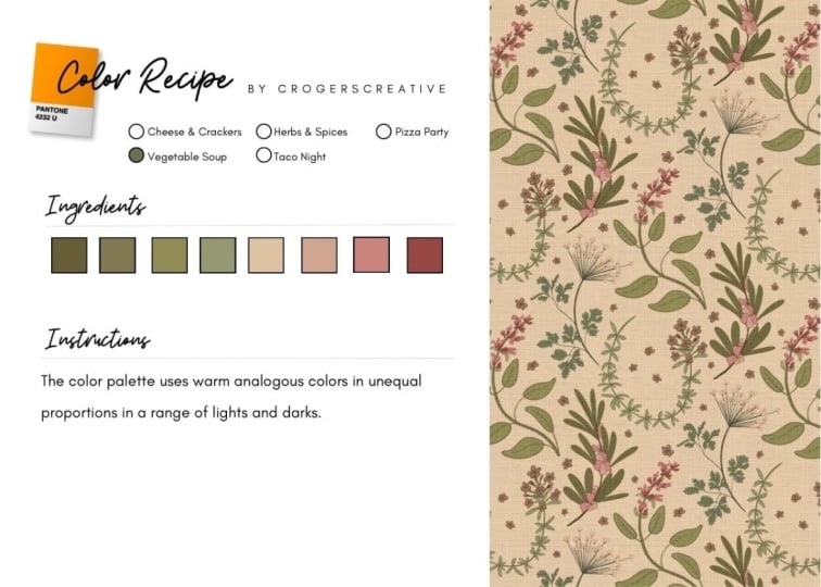
5. Color Recipe 2: Vegetable Soup: Recipe two is vegetable soup. A good one is made with lots of simple veggies that have earthy flavors and
similar textures. There are no individual
stars in vegetable soup, like chicken is in
chicken noodle soup. Instead, everything
works together to create one cohesive flavor. So our recipe uses equal
amounts of each vegetable. Nothing dominates.
The magic of it is how well everything
blends together. For our color recipe, the vegetables are replaced
with analogous colors. And if you're not
familiar with that term, it comes from the word analogy, meaning things that are
related or similar. So analogous colors sit next to each other on the
color wheel like green, blue and purple or
yellow, orange and red. They feel related because
they share some ingredients. On the cool side of the wheel, blue is the common ingredient because blue plus
yellow makes green, and blue plus red makes purple. On the warm side, instead of one shared color like the blue, a family comes from blending red and yellow
in different amounts. So our color recipe might
call for two cups green, two cups blue, and
two cups purple. And together, they create
a very harmonious palett. So here's an example of a floral using cool analogous colors. And here's what the
same design looks like with warm analogous colors. In both cases, no one
color stands out. It's all about how nicely they harmonize and
complement each other. Also notice the range
of values in both of them from light
colors to dark ones. That really helps add depth
and interest to the design. So let's play with the color
palette of this floral. How can we make it follow
our vegetable soup recipe? Right now there are six
colors in the design, and let me bring
in a color wheel so we can see where they fall. So we've got this one, and I'll make a copy by dragging it over, and it fits right about here. This one's a little warmer, so it's probably right in here, and this one goes there. The blue, it's kind of a cyan, so we'll put it right up here. And the orange goes
here and the pink, it's a little bit
towards the purple side, so we'll put it up here. So we already have the start of an analogous palette because it goes from blue towards green. And then these two
are the outliers. If we shift them to
fall within this range, then we'll have that
cohesive analogous palette. Let's start with
this one. I'll use the magic wand and select
it throughout the pattern. Then I'll press Command
H to hide the guides, and then let's go over
and sample this one. Yeah, I like that. For the pink, let's try maybe purple. Now, I like the color here, but right now it stands out
too much for this recipe, which calls for a balance
between all of the ingredients. So I'm going to open
up the HSB sliders. Remember that's hue,
saturation, and brightness. And I'm going to make
that purple a little lighter and just adjust the
sliders until it feels right. So that's a good
analogous color palette. Now, even though this recipe uses a limited range of colors, you can still get lots of
different looks like this one, a deep rich palette full of
purples, blues and greens. This one uses the
same color family, but the light background gives it a much lighter,
brighter look. And this one is full of
light, delicate tints. Now it's ready for a
little girl's dress or maybe nursery decor. This version has a
tighter range of colors, just from blue to green,
and so does this one. But the look here is
so much different when the colors are
all toned down. It's very rich and
sophisticated. And here's a whole bunch of analogous palettes
using warm colors. There's so much variety
here from soft and pastel to rich fall colors or
bright and feminine. So many different looks,
even though we're using colors only from one
side of the color wheel. So that's a vegetable
soup color recipe. When you're sitting
down to build a color palette that's
full of great harmony, but it's also super
easy to work with, this is a great
recipe to reach for.
6. Color Recipe 3: Herbs & Spices: We're going to spice
things up in recipe three, building on the vegetable soup recipe from
the last lesson. We'll start with equal
amounts of veggies again. But this time,
we're going to add some cilantro and a
pinch of cayenne. For our color recipe, we'll add spices using
complimentary colors. Remember, that just
means colors that sit on the opposite side
of the color wheel. See how the pops of
orange and gold added to this floral really kind
of give it new energy. Or this example, it
starts with cool colors, so the accent will
come from over here. A little orange
really perks it up. And note that I said a little orange cause just like spices, we don't want to overpower
everything else. A really common
mistake working with color is not getting
that balance right. In fact, if you have a color
way that's not working, often it's not the colors themselves that are the problem, but how they're being
used. Take this one. The design has four colors, three cool and one warm. That orange is really strong, and the way it's used here
just overwhelms the design. It works a lot better if we
have just a pinch of it. So here, same colors, but
different proportions. I think the orange is still a little bit too
spicy on this one. So toning it down
feels more balanced, like adding basil
instead of cayenne, still flavorful, but less spicy. In this version, a red accent
is used as the background. It almost works because the
red areas are small enough, but background should recede, not compete with the motifs. And that's what's happening
here. The red is pretty loud, so it's drowning out the motifs. Toning it down helps,
but still not great. So this is really
a better option. And often you'll find that
the centers of motifs, like the centers of
flowers are really the best places to add small
pops of accent colors. So far, we've only
looked at adding warm accents to cool palettes. I started that way because
the spice analogy works best that way because reds
and oranges and yellows, they naturally add energy,
just like spices do. Reverse is a little different like here's a warm
analogous floral, and here it is with
blue color accents. It looks good, but the
effect is a lot more subtle. That's because cool colors are more quiet and they
tend to recede instead of jumping up
and down and calling attention to themselves
like warm colors do. Let's look at some
more. Here, a cool palette with warm accents that make it a little
bit more playful. Compare that to starting with a warm palette
with cool accents. They're not really bringing much to the party here, are they? So we can try bigger accents. Yeah, that's better. Now
the blue flowers make things more lively.
This one's interesting. I love this cool
palette but look at what happens to it when
you add warm accents. It's like the clouds lifted and now the sun
is shining on it. So let's try it the other way, a similar design in warm colors
and adding cool accents. They're cute, but quiet. So again, we want to add more blue and purple
flowers to give them a louder voice. And
now that's better. So that's how to add spices
to analogous color palettes. But before we move
on, I want to touch on some seasons that we use
all the time in cooking, and that's salt and pepper. And it's convenient that they happen to be white and black because those two colors are also great options for accents. Like these examples with
little pops of white, they really brighten things up like little spotlights would. And without them, these designs
would look pretty flat. On the other hand, black accents behave more like cool accents. They don't have that liveliness or little spotlight effect, but instead they tend to ground the palette and add depth to it. Oh, and one side
note about black, true black can often look too stark because it's
such a powerful color. So try using a colored black, basically just a super
dark version of any color. So compare this version where the outlines
are true black, and here where the black
outlines are actually a super dark version of the teal that's
already in the print. See how it looks more
professional and sort of put together than the harsh
default true black. Okay, so don't forget to try black and white accents
in your prints. They can be a pretty powerful ingredient in your spice drawer.
7. Color Recipe 4: Taco Night: We're going to switch
things up for recipe four. Instead of talking
about a single dish, we're going to plan a
full meal, taco night. So obviously, tacos
will be the main dish. But suppose I have
some green beans and kale in the fridge
that I want to use up. On the surface, that doesn't
sound like a very good menu because the flavors and textures of those three things
are so different. But it can work by creating some common flavors
between those dishes. So our menu will be beef
tacos with corn tortillas, cumin scented spicy green beans, and kale salad with fresh
corn and cherry tomatoes. Are you hungry yet? So the cumin repeats some of the
flavors in the beef. The fresh corn echoes
the corn tortillas, and both the tacos and salad will be topped
with tomatoes. We can use a similar
strategy when we're putting together more
complex color palettes. Our color menu will start with three distinctly different
colors like this purple, gold, and teal, and then we'll
add colors that fall between these main colors to help bring all the
flavors together. Let me show you what I mean. Here's a cute pattern
that I found online. I love the doughnut theme, but I think the colors aren't
working very well. They feel a little disjointed. So let's take a look
at what's going on. Here are the four main colors, and here's where they
fall on the color wheel. I'm going to take away
the pink for a minute. And now look at how far
apart the colors are. It's like our taco meal example. We've got tacos here and
green beans and kale, before we've added
any common flavors. The pink does help
a little because it sits between the
purple and yellow, so it starts to bridge that gap, but it doesn't work
well as a background. Since it's a warm
color, remember, it wants to jump forward and it's competing with
the doughnuts. Plus, there's a contrast issue. There's not enough contrast between the yellow and the pink. So what if we use the pink
as an accent instead, and we can add a little bit
of it to the other colors? Now they have a common flavor. Sort of like we added
Kumin to all of them. We do still have a little bit of a contrast issue
with the yellow. But here's a rough version
of the doughnut pattern, and I'm going to take
away the pink because we already said that it
doesn't work very well. And here's how it could
look with pink accents. It feels a little
more cohesive now, but I do think it
still needs some work. So let's look at
that pink again. See how it's about halfway
between the yellow and purple. If we were to nudge it a
little closer to the purple, then they'll have a little
bit more in common. So I'm going to sample
right here and then tone it down so it has a
similar value as it did before. And now our pattern
looks like this. Again, a little
bit more cohesive. Right now we have the
three main colors and the pink as an accent. What if we were to
add another color between these two to help
them connect better? We could use a blue
or a cool green, maybe a warmer green
or even an orange red. I like the idea of
the lime green, so let's start with that. Now our pattern could
look like this. Now it's really starting
to have some good energy. But let's keep going. What if we add another accent
between these two? Now, again, I want to avoid making it halfway between them. So let's try a purple
on the blue side. That way, it'll pick
up a little bit of the flavor of the blue
that's also in the teal. Now the pattern looks like this. That purple really
makes a nice accent. What about adding a background? A good place to start with
a background is to pick one of the current colors and
then darken it so that, again, they have
that relationship. They have the same flavor. We could try a dark blue
green or a dark yellow. Although yellow tends to turn
greenish when it darkens, so I don't think that's
going to be ideal. We could also do a darker
version of the purple, but that's not ideal either because it's
on the warmer side, and so it's not going to recede well in the
background either. So let's try a darker
version of this one. Now, that gives us a nice
receding background, and the doughnuts
really pop forward. And remember, when you're
adding a background, sometimes you are going to
need to tweak the values of the other colors so that there's enough contrast with
the background. So I'm just going to lighten
this purple a little bit. So I have one last
thing to show you. Now that the
structure is working, we can experiment with
completely different moods. Like, what if we mute the secondary colors instead
of keeping them bright? So I'll select the
pink and make it this deep rich tone and do
the same for the green. I don't really like the
yellow when it's darkened, so I'm going to maybe move that towards the
orange a little bit. There. I like that. So those little changes now made a completely
different look, much deeper and richer. So now that you know
what I mean about adding common flavors
between colors, let's look at another one. Here's another example
that needs help. When I map these colors, they're almost perfectly
spaced around the wheel. So again, I'm looking for
ways to create relationships between them or to flavor
them in the same way. I'll start with the background. It's way over here,
and it would make more sense to bring the
blue more into this range. I'll sample this color and then just tone it down a
bit and gray it out. Already, that feels
more cohesive. The next thing that jumps
out of me is this deep red. And since the red is
both warm and dark, it really comes forward as the most noticeable
thing in the design. So I'm going to calm
that down a bit. I'll select all of it and
brighten it just slightly. I don't want to overdo it. I don't want to make
it a bright red. That's not the goal here,
but lightning just a little helps it to sit
better with the other ones. So the last thing
I want to look at is the center of the wheels. Right now, they're green, and they're kind of
sitting out here alone. I think they'd be better
grouped with something else. So I'm going to
sample this orange and then just really
tone it down. Yeah, I think that feels better. Now, it doesn't call
attention to itself, but it acts as a bridge
between these colors. So instead of everything
being evenly spaced, now we've got a cluster here, another one here, and this
one acting as an accent. Now, this color up here
is technically purple, but it's toned down so much that it barely registers as a purple. So I'm fine leaving it as it is. Here is the before and after. The changes we made were
actually pretty minor. But when you compare
these side by side, I hope you can see
the improvement now. From here, this design could go in lots of
different directions. You could use the
same colors but mute them or go the other way and make them brighter
and more saturated. You could change the background or even introduce
completely new colors. As long as you create
clear relationships between the colors and
keep the contrast balance, you can really build
a strong palette no matter what colors
you start with. I'll wrap up this lesson with a couple more quick examples of the taco night concept to
really help you lock it in. This palette may look complex, but it can be narrowed down to just these four main colors. And here's where they
sit on the color wheel. And then here are the
supporting colors. Notice how they bridge the
gaps on the warm side, and then the teal is sort of left on its own as an accent. This muted botanical is
another great example. Even though the
colors are gray down, they still sit in distinctive
places on the wheel. So these are the main colors and the supporting ones.
Now note the grays. We often think of gray
as a neutral color, but that's not really the case. Here, the artists
carefully chose grays that fall in
between the main colors. If they had chosen a blue
or purple based gray, that would have
completely disrupted the delicate balance
of this palette. This is a beautiful design, and here are the main colors. Blue and orange
are complimentary. On their own, they don't
have any flavors in common. But look closely, there are also subtle greens and
golds tucked in here. And they sit between
our main colors. So instead of a hard jump, we end up with a gradual flow from one side of the
wheel to the other. Also notice how the colors are aligned in little clusters. We've got a cluster of blue and some soft greens
and gold to orange. That helps bind the palette
together and creates opportunities for a
wider range of values, which is important for
depth and interest. This is also a great
example of a colored black. A true black background here would have overpowered
our little flowers. Using a super dark blue instead, it's less harsh and also ties into the other
blues in the palette. So that's recipe four or
in this case, menu four. You start with a group of
seemingly unrelated colors, and just like Taco Night, you make small adjustments
and add colors to help make everything feel like it belongs on
the same plate.
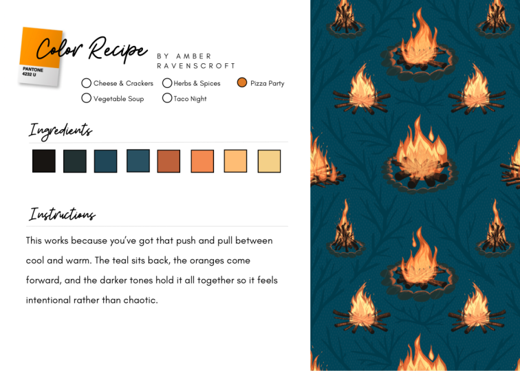
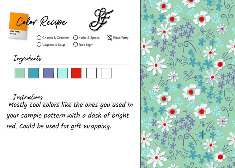
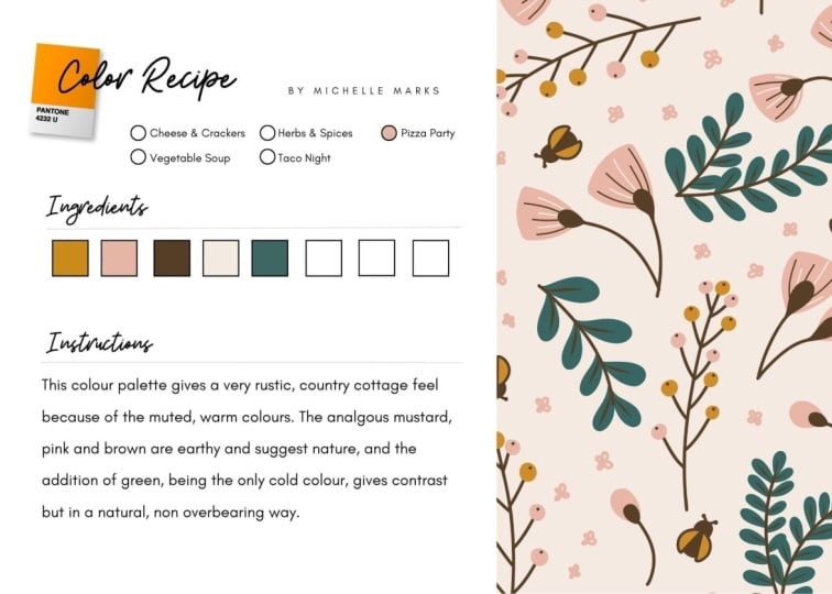
8. Color Recipe 5: Pizza Party: I were stranded on a
desert island and had to choose only one thing to
eat, I'd choose pizza. It's delicious for two reasons. Proportion and balance. That's probably not exactly the answer you expected, right? But stick with me. So
here's our pizza recipe, but the quantities are missing. So what if we just used one cup tomato sauce,
one cup orregano, one cup pepper flakes,
one cup onions, one cup mozzarella,
and one cup pepperoni? That would be a terrible pizza. But even without knowing
the correct quantities, we should still be able to
make a pretty good pizza. All we'd have to do is
line up the ingredients by flavor from the most
bland to the spiciest. And once we do that, the
proportions become pretty clear. Mozzarella is the most bland,
so we can use a lot of it. But pepper flakes
are really spicy, so we just need to
use a pinch of that, and the rest will create
layers of flavor in between. And that's how proportion
makes pizza tasty. The other thing I
mentioned is balance. We wouldn't want all the
cheese on one side of the pizza and all the
pepperonis on the other. We want the toppings
spread evenly so we get all the flavors in every
slice. That's what balance is. Complex color palettes
work in a similar way. Some colors act like mozzarella, others like pepperoni,
or like pepper flakes. In this design, the little
pops of bright colors, especially the blue
purple, are the spices. Notice how they're
spread evenly throughout the design and only
appear in small amounts. The green works more
like mozzarella. It's soft enough that
we can use a lot of it, even in the largest motifs without overpowering the design. We haven't talked
about crust yet, the literal foundation
of a pizza. For color palettes, the
background color plays that role, so white, in this case. Now, if I asked you to name
the colors in this design, you might not have
even mentioned white, but imagine this design
with a black background. The whole feeling would change. So that quiet background
color is doing a lot of work. Just like a thin crust versus a deep dish changes the
character of a pizza. Now, it's one thing to see this pizza idea in a finished
design like this one. But how do you build a palette
like this from scratch? Well, my favorite method
is pretty spontaneous. Sometimes I just
start by dropping colors into a design
almost randomly, and then I stop and take a look. Right now, everything
is loud and chaotic because I started with
such saturated colors. So it definitely needs
some adjustment. I first start with the largest flowers because right
now they're too loud. They're drowning out
all the smaller ones, so I make them softer colors
that draw less attention. The green foliage
is also too loud. It should play a more
supporting role, sort of receding
behind the blooms, so I make them softer, too. I like these little flowers, but right now
they're getting lost among all of the
other blue dots. So I changed them and
made them lavender. The red and orange are
working well as spices, but there's not enough
contrast between them, so I made one of them pink. It's fun to work
this way because it's often a surprise
where I end up. I just get to let the design lead me
where it wants to go. Now, I mentioned crusts earlier and check out what
happens if I change it here. Wow, now it looks chaotic again. So to make it work, I need to
make some more adjustments, especially the big flowers. They're still blue and yellow, but way, way lighter. That way, they give the design
some much needed contrast. And here's the before and after, starting from super
saturated colors on a white background to this deep rich version
on a dark background. I didn't know it
would land here, but it's a nice surprise. Now for another example of building a pizza color palette. This one starts with
these unassuming flowers turned into a pattern. I like the energy, but the wispy little flower petals
are getting lost. Switching to a dark background
makes the colors pop, and the flowers are
now easier to read. I often start with an
analogous palate like this, basically a solid
vegetable soup recipe. Right now, it's rich and
full of good harmonies, but there's not much
contrast among the flowers. So it's a little flat. So I reach for the salt shaker
and add white accents. Now, I couldn't
put the white into small details like we've
done with other accents, because here, all of the flowers are
roughly the same size. So instead, it's about quantity, meaning there's only
a few white flowers. Now is a good time to zoom out and check for
balance issues. But I think this is the
right amount of white, and it's spread pretty evenly. I also like to start thinking about products at this point. I figured men's swimwear
might be a good fit, so I dropped it into a
mock up, and I like it. And it made me think,
Oh, let's take this in a more
tropical direction. So I swapped out the purples and introduced this
bright lime green. Now, things are really
starting to pop. Notice that along
with the lime green, I also added this
tone down yellow to act as a bridging color
between the lime and white. Next, I tried keeping the purples and introducing
orange instead. Orange, as we know, is
a very strong spice, so I added just a few of them. Then I pushed it a little more, adding a few yellow flowers, but they're a little
tone down so they don't compete too
much with orange. So now we've got a
good pizza hierarchy. The purple colors
are the flavor base, and they recede to the back. There's a bright turquoise that adds another layer flavor, and the yellow, orange and white share the spotlight as accents. So now I have some good
tropical colorways, but I thought it
would be a good idea to have one that was less tropical as a way to sort of expand my licensing
opportunities, and it worked
because this design was licensed for dresses. Now I have one more
pizza recipe example. This time using it to figure out why a color way isn't working. This is a pattern I made
a couple years ago. I started it in black and white, and when it came
time to add color, I wanted something
bright and punchy. So here it is. I
liked it at first, but when I zoomed
out, not so much. And I didn't love it
on a mock up either. So I tried a bunch of tweaks, but I just couldn't figure
out what was wrong with it. And eventually, I just gave up and stuck with a
one color design. So let's see what happens if we apply the pizza
recipe rules to it. Maybe we can figure
out what's wrong. So to start, what's
the base color, the mozzarella? It's
actually hard to say. Is it blue, maybe purple? The fact that it's unclear
is already a problem. Next, what's the
color temperature? Is it cool colors with warm
accents or vice versa? No, it's really neither. Turns out the colors are
evenly split between warm and cool with a couple
transition colors in there and a neutral or two. Now let's talk contrast. There's a decent contrast
with the background, but most of the other colors sit right in the middle range, making it feel really flat. And what about accent colors? Yep, obviously, it's
red and yellow, but look at the size
of these red flowers. They're too big for accents, and it really throws
the balance off. And I think that's
one of the biggest problems with this palette. And then finally, let's look at depth or the layers
of our pizza. The blue background works
well enough as a crust, but this flower
feels out of place. And because it's
the darkest flour, it's actually receding
in a weird way. Meanwhile, the red is jumping forward and
commanding attention. And because everything
else has similar values, they're all sitting sort
of on the same plane, making it feel flat. So we end up with a
pizza where the toppings are sort of all middle
of the road flavors, like maybe tomatoes and onions and garlic
and green peppers. And then there's a
whole bunch of red pepper flakes piled on top, so not a great pizza. So now I had a better idea
what the problems were. But unfortunately,
there was no quick fix. So I definitely went down a rabbit hole rearranging
and readjusting the colors. And here's what I
eventually landed on. Now, I'm not going to go
through it step by step, but let's look at that same set of criteria as the original one. First, the base color. Now blue is clearly the foundation with
lots of blue flowers, plus the dark blue background.
Next, temperature. Now we have cool colors
with warm accents. And notice that I push the purples and greens
a little toward the cool side to help facilitate
that. On to contrast. It's not wildly different
from the original version, but it is better mostly thanks
to the darker background. I think that was one of
the biggest improvements. It was kind of an aha
moment because it helped separate the motifs and makes the other
colors really pop. Next, the accents, the red and yellow flowers
are still the spices, but now they're an
appropriate size, which is so much better. And finally, depth, the
layers of our pizza. So now we have a dark
blue background, which is a good crust, and the yellow and red flowers
are being good spices. And then there's a whole lot
of rich flavors in between. We go from darker blues that recede transitioning to purples and a mauve and the warm green adds another
flavor dimension as well. So it's a much better
color way thanks to the hierarchy and
balance of pizza.
9. Photoshop Color Test Kitchen: In this lesson, I want
to show you how to use Photoshop as a kind of
color test kitchen, a place to play and experiment and discover new colorways. We're going to start
by simply copying the Illustrator
or Procreate file and pasting it into Photoshop. And you'll always
want to paste it as a smart object to begin with. That keeps options open, even though we may end up
rasterizing it later. Okay, now duplicate the layer by holding down option
and dragging it upward. That way we keep a
copy of the original and we can just have
this copy to play with. Then we just go to image
adjustments, hue saturation. That opens this series
of sliders that are much like the HSB
sliders in Illustrator. So you can slide through
the color wheel here. We can shift the saturation
and adjust brightness, and we immediately
see the results. So the master slider is great for sort of
a quick overview, but most of the magic
comes when you're working within these
individual color ranges. So let's just start with red. And anything that contains
any amount of red will shift. At this stage, I'm not really looking for a perfect palette, just sort of pushing the colors to somewhere different
from where they've been. So I'll do the same for yellows. And greens and so on. And if any of them don't seem
to result in any changes, that's probably
because that color wasn't present in the
original artwork. So then after a couple passes, I usually see a new direction
that I want to follow. And then I just
finish by kind of nudging the colors back and forth until I'm happy with it. I love working in this way
because again and again, I end up discovering
colorways and color relationships that I never would have
thought of on my own. It's sort of like, rather
than picking a color palette, it's more like uncovering
one, which is really cool. If you reach an
interesting point, or if you feel a little stuck, then just click Okay, and then make a duplicate layer from that one because we don't want to lose any of the
versions as we go. Now, this new one will act like a new
starting point for us, and we can push the colors even farther than we
could with the original. Now, if one color just doesn't
want to seem to cooperate, like you like
everything, but one of them is just not quite right, we can just handle
it separately. So click Okay, where
you're at, and again, make a duplicate and then grab the magic
wand tool up here. Make sure that
contiguous is unchecked, and then select the color. You're also going to need to rasterize the layer
at this point. So right click on the layer
and choose rasterized layer. Now when we return
to hue saturation, the adjustments will only
affect the selected areas. When editing a single
color like this, it's often helpful to
click Colorize down here. That way, instead of Photoshop just shifting the
existing color, which is how hue
saturation usually works, it actually replaces
it with a new color, and that gives us
a lot more access to the full color spectrum. This is also a good way to experiment with
background colors, as long as your art has
a transparent background when you bring it
into Photoshop. So to create a background, just add a new layer by
clicking on the plus icon here and then go to Edit fill. And whatever random color is currently in your color
picker is fine here. We're going to
change it as we go. Now we'll make sure that
layer is underneath the art, we'll go back into hue
saturation to play. Now I've got a number
of new colorways, but I want to stress
that what we've created here isn't
really finished art. That's because all of
these color changes can end up creating
small artifacts, sort of small errors
within the art. To avoid that, you could make
all the color changes non destructively by doing them
only on adjustment layers. But I think that gets a little cumbersome for this workflow. So I prefer to just change
the art on the layers. So to create the final art, we'll just copy one of
the new colorways here and paste it back into Illustrator to use
as a color guide. So we choose the
magic wand tool, select a color in the original, and then sample the new one
using the eyedropper tool, and you can get that just by
pressing I on the keyboard. And we'll repeat that
with each color. Now we've got a clean
vector version of the new color way
that's ready for a client or for spoon flower
or wherever it's headed. So it really is a great
workflow for quickly creating new colorways and
discovering new combinations, especially ones that have
rich and beautiful tones, ones that I know I never would have come up
with on my own. So I hope you'll
give it a try. Okay.
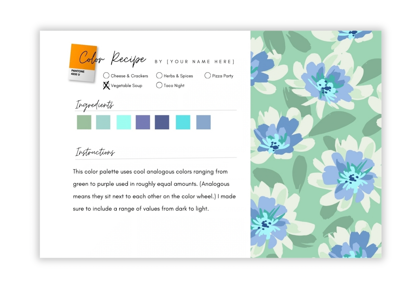
10. Project: Color Recipe Cards: Your class project is to create one or more color recipe cards. Just like cooks create them so that they can
recreate a dish later, you'll be making a record of what you've learned
in this class. You only need to
create one recipe card to successfully
complete the project. But imagine if you created one every time you made
a new color way. Not only would you end up with
a great reference library, you'd also be developing
a practice of pausing to think about why
a color palette works. And that's a great way to
improve your sense of color. Don't feel like
you need to create new artwork for this project. You can absolutely use an existing pattern and
just try out new colorways. You'll find this
recipe card template in the class resources. You can download it and work with it in your favorite app, or there's a link in the
project description that'll take you directly to canva.com where you can work
with it for free. If you'd like to use
the Canva template, upload a JPEG of your artwork
using the Uploads tab, then drag and drop it
into the image frame. Double click the
image if you want to reposition or resize it. Next, add a color to the little circle next to
the recipe name you used. To add your palette colors, click each swatch and change the color using
the color picker. You can start with the ones that Canva pulls right
from the artwork, or you can type in hex codes, or just click on approximate
colors in the picker. Finally, add a short note explaining why the
palette works. Just a sentence or two is fine, or record observations that
you'd like to remember later. To add more cards, right
click to duplicate the page. When you're finished,
click Share, then download and export
your cards as a JPEG or PNG. I'd love it if you'd share at least one of your recipe
cards in the project gallery. It's always fun to see how the same recipe can produce
very different palettes. So I'm excited to see the beautiful combinations
that you'll come up with.
11. Final Tips for Working with Color: Before we wrap up, I have a few more tips about
working with color, and I want to remind you about
my curated color library. It's a great source
of inspiration with 24 of the color palettes
from this class, along with swatches
and hex codes. It's free when you sign
up for my newsletter, and you'll find a download link on the class description page, as well as on my profile page. Now for those final tips, first, remember that color
is subjective and personal. So if you saw some combinations in here you didn't
like, that's cool. The goal was just to give you a better understanding of color, and then you get to decide
which colors you use. Second, once you have a good
feel for these recipes, feel free to break
all the rules. Like, look at this
color combination. It breaks all the rules about contrast and balance
and accent colors, and I kind of love it for that. But a word of caution,
bold palettes like these have pretty limited uses in
the surface design industry. Third, think about
products as you choose your color palettes and let
them guide your choices. Because obviously, you wouldn't use the
same colorways for a little girl's
dress as you would for formal dining
room wallpaper. But since we don't always know what the final
product will be, it is a good idea to show a couple different colorways
in your portfolio. And finally, don't forget
about the production side of surface design because
every color in your design can impact
setup and production costs. Fabric companies sometimes
go as high as 12 colors, but the norm is
usually eight or less unless you're doing
digital printing where it doesn't matter
how many colors you have. That's all for now. Thanks
for taking the class. Oh, I would love it if you could take a minute
and write a review. Your feedback is really
important to me. It helps me know what resonates and helps me plan
future classes. So look for the review
tab on the class page. And one last thing, working with color does take some
practice, just like cooking. So, the more color
palettes you create, the more intuitive
it will become. So until next time, have
fun working with color.
12. One more thing...: Hi, again, I'm popping
back in to let you know that I'm now available for
one on one coaching sessions. So if you like this class and would like to work
with me individually, you can now do so by
booking a session right from my Skillshare
profile page. I offer two kinds of sessions. The first one is a 1
hour portfolio review where we'll look at
your surface designs. I'll let you know some strengths
and areas to focus on, and you'll get the opportunity
to ask any questions you'd like about art licensing or
the surface design industry. Now I know it can
feel intimidating to show your work to somebody, but it's so smart to get
professional feedback. And all the artists that
I've worked with have felt energized and ready to move
forward after our sessions. I also offer a 30 minute Adobe Illustrator or Photoshop
instruction session. So if you're struggling
with any aspect of the software, I can help. We can walk through tools. I can demonstrate techniques and workflows that are going
to help solve your issues. So whether you're looking
for a one time session or an ongoing opportunity
for feedback from your work, coaching is such a great
investment in your career. And unlike some of the expensive online courses
that are available, coaching doesn't have
a fixed curriculum, so I can give you
exactly the information and guidance that you need
exactly when you need it. So I hope you consider coaching. I would love to work with
you and I can't wait to meet you and support you and guide you on your creative journey. Oh, you can learn more about my coaching sessions at
chrisrug.com slash CoachE.
 Kris Ruff, Surface Pattern Designer & Coach