Transcripts
1. Introduction: Hi, everyone. My name
is Nia, and today, I'm going to take you through this class
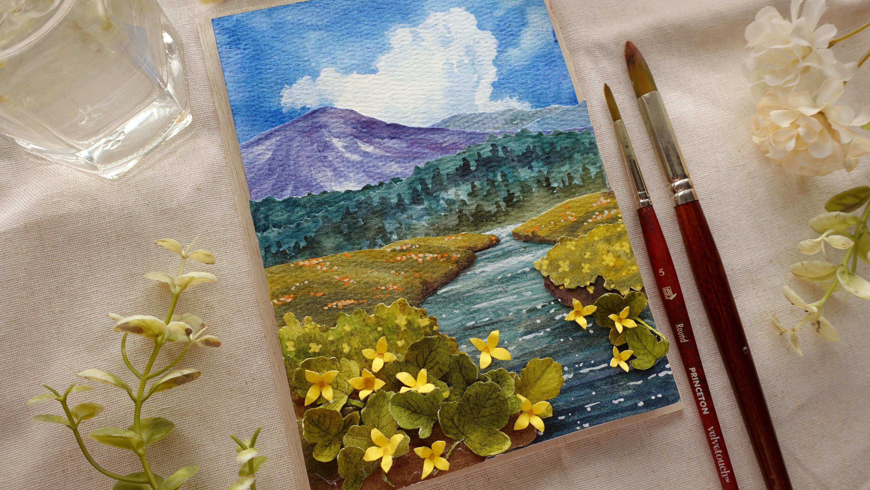
where I'll be making a simple three D paper artwork out of a watercolor painting. I'm going to create
a simple scene based on my travels last year, and I will simplify the
painting so we can section out the composition and turn them
into three D paper artwork. When I was little,
my aunt used to create a similar
sort of art form, which is called paper tool, where she would take
a repeated image and cut them into layers and stick them together to create
something three dimensional. Sometimes she would
use premade sets, and sometimes she
would use things like wrapping paper where she has
access to the same type of image that is repeated and start building it up layer by layer to create
something beautiful. This is one of the
artworks that she gifted our family a
very long time ago. Her works are very
intricate, as you can see, and she also used to
add other things like little trinkets of beads or maybe glitter to
enhance the detail. I want to combine this idea
with my watercolor painting, so this is how I came
up with this class. This idea has been in my
head for several years now, but I haven't gotten
around to it. So even though this technique
is not anything new, I didn't create this art form. It was still quite
experimental for me. Before we start creating, I will show you
the references and show you examples
of images which are a little bit easier to
simplify into this art style. Then I will introduce
you to my inspiration, which was from my
travels, and, of course, I'll show you how I
break it down into sections where we can turn
them into separate layers. Once I've shown
you the breakdown, I will take you
through the steps and my thought process from the
painting techniques and, of course, combining it
all one layer at a time. Can use a completely
different image to what I've shown
you in this class, or you can paint along
to what I'll be making. I'll be providing you
with a template of the cutouts that you can trace onto your
watercolor paper. So you don't have to
measure each element. If you want, you
can also do this from scratch by
following the lessons, since I'll be breaking
every step down, including how I estimate
the size for each cutout. Project did take me
quite a bit of time to complete due to the repetitive nature
of certain elements. But I feel like I've
simplified it enough that it's suited for all level
crafters and painters. But there are parts
of this artwork where things do get
quite repetitive, especially for small
detailed cutouts. So if you have a condition
where you have pain in your joints and you can't do too many repetitive
tasks with your hands, I maybe wouldn't recommend
this class for you, but I'm sure you know your
conditions better than I do. And most of all, please
just take care and take breaks whenever you need to if you decide to follow along. Like a lot of my classes, I'll be skipping through
parts of the painting or the steps where
my hand is either inactive or off the camera
just to get the class going. So if you've never taken
any of my classes, I would recommend for you to just watch some
of the lessons, skim through it to
get an understanding of my usual format. And once you are ready to
paint and craft along, you can pause in
between each step. So you can take
breaks in between, or you can also do things at your own pace without
feeling rushed. This project turned out
to be more enjoyable than I actually
anticipated there were a lot of repetitive and
therapeutic moments where I could enjoy my time crafting
and painting slowly, which is why I decided to
share this class with you today and hopes you'll find the same joy in
creating your own. So this sounds like something
you'd like to try out, let's move on to the lessons.
2. Supplies: Before we start everything, let me go over the supplies, and let's go over the paper
that I'm going to use first. So I'll be using the paper
from the brand, Oh, huh. You don't need to use
this particular brand. You can use anything
you have on hand. This one is cold pressed paper. You can also use hot press. I'll just have a slightly
different texture as you paint. And this is also 300 GSM
paper, so it's quite thick. For this because
I'm using a frame, I've cut down the paper into small sizes
to fit the frame, and inside of the frame is
17.5 by 12.5 millimeters. So this is around 1
millimeter smaller, so it fits easily
into the frame, which comes to 17.4
by 12.4 millimeters. But if you're not
going to use a frame, you don't have to worry
about this small change. To paint, I'm going to use a
cleaning jar for my water, and I'm also going
to have tissue right next to me to take
off the excess paint from my brush and also to lift the paint for creating
things like the clouds. As for the brushes, I'll
be using these two. The large one is by
Vitech and its size 14, and the small one is by
Princeton velvet touch, and it's a size five. Minus bit freight, it
would be better if your small brush comes
to a fine point. But for both of these brushes, it doesn't really matter
what brand you use. Any round brush that
is fairly large and a medium size that you have
on hand would be fine. As for the palette, I'll be using this
cheap plastic palette, the one that I usually use. This is from Diso and
as for the color, I'll only be using
these four colors. The first one is Quinn
red by Daniel Smith. This is CoBot blue
hue by Holbein, sap green by Holbein, and permanent yellow
deep by Holbein. I'm also going to use acrylic markers to
paint the flowers. I'll be using these
yellow tones. I have a light yellow. I have white, mid tone yellow, orange, and a dark yellow. These are opaque markers, but you can also use
squash for this. My markers are by me, and I have it from
a set of 80 colors. Here are the color
codes in case you have the same set on the
right hand side. But in terms of the
final painting later, you can switch the color
of the flowers with other hues or even combine
a few if you'd like. Draw, I'm, of course, going to need a pencil and an eraser. My pencil is bipentl sharplet
the eraser is by Boxy. You, of course, need a ruler to measure your paper and scissors. You can also use
a scalpel to cut the small parts of
the painting later. But I don't have a scalpel, so I'm just going to use
my small scissors here. This is very sharp, and you can see it has a pointy tip as well. And using a small
but sharp scissor, I feel like it helps me maneuver the paper easily
without it feeling too bulky. Be using a couple
of different glues and tapes to stick
down the elements. The first one I'm going to
use is a white PVA glue. This is just a local brand, but you can use
things like Elmers. For the tapes, I'll be
using a masking tape. This is to put things in place so I know where to
spread the glue, and another one I'm going
to use is this foam tape. So you can see this is
a little bit thicker, so I can create a
little bit of height between the little bits of painting to
make it look three D. This foam tape is
still quite thin, but if you want more height, you can also use thicker
foam tape like this. You can actually
make this yourself. You just need a piece of foam, depending on the thickness
that you want and use double sided
tape for both sides. Also going to use a hot glue gun for smaller elements like
the leaves and flowers, but you can also use
hot glue gun to give more height to certain elements if you don't have foam tape. I like to also use this to
stick some loose parts, especially between small areas. This makes the process
very fast and easy. This here is actually a
tool for book binding, but I'm going to
use this to create some small scratches on my
paper to add leaf textures. You can also paint it on, but this makes it
much easier to do. You can also use any pointy
but not sharp objects you have at home maybe like a toothpick or a dried
up ballpoint pen. I'm also going to
use tweezers for small elements like the
leaves, stems and flowers. This makes it so much easier to place them without
disturbing other areas. But you don't have to
use this then tweezers. You can also use makeup tweezers and it'll
still be as useful. Lastly, I'm also going
to use a hair dryer, which makes the watercolor painting much
quicker to dry off. And lastly, this is
the written list. You can take a
screenshot or also download it in the projects
and resources section.
3. References: Before we start
making the artwork, let's go over some references in case you want to
create your own. I'll discuss the kinds of
things I look out for, what sort of images are best suited for this
three D painting. Generally, I like to
search things like rolling hills because
the composition is already full of layers. So as an example here, there are layers of hills, and then in front,
you can separate these flower bushes
into singular ones. And for the flowers,
you can make them a separate element
or paint it with the bushes depending
on how simple or complex you want the three
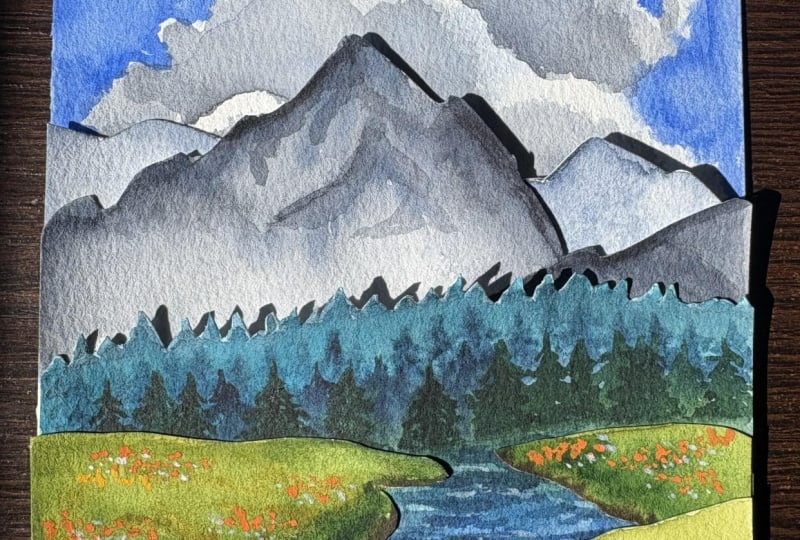
D layered painting to be. Now let's look at another one. Here you can separate the sky. There are a few layers for
the mountains, the hills, and, of course, the water, which is similar to the final painting I'm
going to be doing. And you can put these
hills over the water and even add more flowers or other elements to close
up the water source, which will look quite cool because now you
have more depth. Now let's have a look
at another one here. I feel like you can
separate the clouds with the sky and for the trees to make them
pop a little bit more, you can add a thicker
glue or foam behind it, it looks more three dimensional. I like the fact that it
also has shadows in front, you can make the flowers pop out more by creating
individual ones. For this one, you
can see at the back, there are many
layers of mountains, and to create
depth, you can make the layers very thin towards the back and also
play with the color. And as the hills get
closer towards us, the details, as well as the
size would be much larger. So just have a
scroll around to get inspiration and see what kind of references you can play with. Try to imagine how you would
layer things or even use your own travel photos
or follow along using the image that I'll
be using in this class.
4. Framing Options: There are a few ways you
can present your final art. So let's just do
an example here. And this is in terms of framing. By the way, I'm going
to take this image because it's very pretty. So I'm going to try to
somewhat explain how I'm going to break down the
layers in a very basic way. And this will depend on the type of framing
you want to do. So there are a few ways you can go frameless and maybe
even add a wooden panel behind it to make the
painting more stable and more presentable when you
want to display it at home. So paper doesn't bend and such. You can use a three D frame, which I'm going to do. I specifically bought it
just for this project, or you can also use paper
as part of the frame. Before you do that, though, I'm just going to
show you how I sketch things out to break down
and simplify the image. This way, we can organize the layers and have a
better visualization of it. So after doing a
simplified sketch, here I can break down the areas further and figure out which parts I want to
separate even more. So I just number it down
to separate the layers. Here I'm going to add that extra bush in front
to give more depth, as I mentioned earlier, and also maybe some flowers. So if you want to go frameless
or use a wooden frame, this means it won't
be part of the paper. I'll just be creating
the layers like this. So the first layer
will be the clouds, but I want to paint a bit lower than where the
mountains are going to be. So when I add the mountains
later on, it'll cover it, then have a few layers
for the mountains, and this is where
the cutout will be. I will just cut the top area
and we can align the bottom. And this gives a little bit of lift for the rest of
the elements as well. Don't have to do this
for every layer, but I'm just showing
you an example here if you would like every other element to be lifted as it gets
towards the front, then you would need to extend the cutout to the
very bottom of the page. But I'm going to do a mix of this because I'm going to use a tall adhesive like a foam
tape and also a hot glue gun. For some layers, I made it
all the way to the bottom whereas some I just do small cutouts that
I stick together. Now, if you want to
create a paper frame, then this would require
more cutting because each layer we're going
to include the frame. So the sides won't be completely hollow if you twist the artwork. And this also means that each layer should
be connected to the frame instead of having those separate cutouts
that I mentioned earlier. Would require more planning
and it's a bit more complex. I would recommend for you to use a scalpel as well
instead of scissors, which is enough for this project because
with this method, you do need to create
a hollow space. As you can see, I would paint and then leave extra
bit of paper as the frame. Then as you're doing the layers, you would cut out this
area that I shaded here, which should be hollow and
with that hollow area, you can see the layers
behind it or in front of it. From here, you can
imagine taking this piece and putting it
on top of each other layer by layer and you would
be able to see parts of the mountain at the back
and more mountains in front, and then the hills and so on. With this type of painting,
it doesn't matter how many layers you want to create because you
don't have a limit, whereas if you use a three D wooden frame like
I'm going to be using, there is a limit
to the thickness, even though mine is
actually very thick and I do have so much more
space by the end of it. But with this, you can
just keep layering and layering depending on how
complex you want to be. I've seen people create really complex woodland
sceneries with so many layers of
little branches and leaves and very, very
complex cutouts. But for this class,
I'm going to make things very simple
and approachable.
5. Rough Planning: So this is a video I took when I was on my travels
to the Dolomites, and this is the reference
that I'm going to be using for this artwork. In this lesson, I'm
just going to draw a small sketch to roughly
plan out the layers. This way, I can refer back to it and also have a
better visualization. At this step, you can
also create variations in case you want to play with the layout to see
what fits best. Mine, I specifically skip the large tree
because I feel like it's going to look too
bulky to paint it as a single layer without
adding additional cutouts. So I'm going to take it off
completely for the layout. I'm also going to make
the mountain a bit more pointy to simplify it and maybe add a bit
more layers behind the mountains because
those are easy additions. For the pine trees, I was trying to figure out how
to divide it up. Should I keep it as a single layer or play
with a few layers, I later decided to turn it into two layers with textured
paintings for these layers. But drawing it out
like this helped me visualize that having
only two layers without additional
painted trees would make it look a bit off and unnatural. Also played a little
bit with how I should lay out the
flow of the water, how much of the water I
want covered and such. But notice how I'm sketching it out with very simple lines so you can draw as many of these as you would like
in the planning stage. As I'm sketching, I also want
to visualize the layers. This is why I'm also
keeping it simple. And notice in the middle ground, I separate the land
because I was thinking of dividing the middle ground into two layers on
top of the water. And for the background, I'm also going to
add some clouds. I'm just going to number the layers to visualize
the separation. You can add adjustments
along the way, though. This is not set in stone. This is just a step to help
yourself plan things out, so you don't get
too overwhelmed, making too many decisions
later on as you execute this. I also group certain layers. Again, this is just to help my brain break down the image. At this stage, I wasn't
sure if I wanted to separate the clouds or not to make it stand out a bit more, but later I decided there were going to be a few
layers already, so I made it into one
layer with the background. Here, I'm just drawing another one because
I wanted to see what it would look like
with flatter mountains. I also decided that I'm going to separate the
middle ground with a bit more texture
for the layer in front so it doesn't look too similar to the land at the back. This sketch, I also change the water direction to see
which one I like more. And with these small changes, you can see I'm still keeping the sketch very
quick and simple, so I basically brain dump really quickly to help me choose the one that I like most. At the end, I decided to
erase it because I didn't like how the water ended
up looking too distant. So I'm going to go back to
the first layout before. I know I'm going
back and forth here, but the step is not
to confuse you, it's just to share my
thought process as I go and the reasons why I
make certain decisions. If you're already
sure about yours, of course, you can skip
this step altogether. But to me, even though
this is a very quick step, it's very important
because it really helps me visualize and organize things in my head before execution. Oh
6. Paper Fitting: In this lesson, I'll be cutting out the paper to fit the frame. If you're going frameless, of course, you can
pick any size. Mine here is 17.5 centimeters by 12 centimeters for the inside of the frame, but it helps to cut a
little bit smaller, so the paper glides
into the frame easily. I've cut one out, and I'm going to use it as a template if it fits
well in the frame. I can see this fits really well, and when I flip it over, it just slides out easily. Sometimes when we cut the paper, we may shift ever so slightly. And if that's the case,
you could benefit from lessening the measurement
by 1 millimeter, so it becomes 12.4 by
17.4 centimeters here. I was just using
it as a template. But later when I
cut the sheets out, you can see that it's a
little bit stuck here. So I decided to just take off the excess and you can see now I can easily
fit it all in. For this piece, I
ended up only using four sheets of paper cut out because I ended up
using the side scraps, but I wasn't sure
in the beginning, so I made some extras.
7. Painting Cloud Background: In this lesson, I'm going to start painting the background. I decided I'm going to combine the clouds with the sky
because when you paint, you can make soft diffuse edges. Whereas if you cut the cloud, the edges will be too sharp. So here I started by
dampening the surface. And because I'm painting
right to the very edge, I also decided to dampen
the back of my paper, but just wetting my table. This makes the wet part
of the paper stick to the table instead of
warping during painting, which makes it a little
bit easier to handle. And as for the sky,
I'm just using a very thick consistency
of cobalt blue hue. In painting around and leaving a random shape in the middle
for the area of the cloud. I'm going to use a thinner
consistency of the color to do light dabs with my brush randomly so the cloud
isn't completely white. Once I'm done, I scrunched
up a small bit of tissue to lift a bit of the color and design
the shape of the cloud. I accidentally took off
this area on the right, so I'm going to fill it back in. But at the end, I actually
prefer to have a smaller cloud on the sides because the mountain is going to cover
the bottom of the clouds, which loses a little bit
of that extra detail. But as I paint the background, I do want to be mindful that
I'm painting a little bit lower to make sure
everything will be covered by the
elements in front. And while the surface
is still damp, you can keep lifting
and adding paint, and designing the cloud
and fixing the edges. Here I'm adding a bit more
shadow on the right hand side, just using a very
light consistency, using the same method by
dabbing the tip of my brush, and this addition makes the
cloud look a bit more puffy. Now for the edges, I'm
also going to clean out any sharp edges
like this one here, just moving the paint around
to soften and create curves. Once I'm done, I'm going to
dry it off with a hair dryer. And as I'm doing this, you'll
notice that the paper will start warping because we didn't mask and
stretch the paper. I just will start
to lift because it will dry before the
rest of the paper. And as this happens, I'm going to flip
my paper and dry the back to help
straighten the warping. I also want to make sure I don't have extra paint on my table. So when I flip my paper, the white part of
the clod doesn't accidentally get tainted
with extra blue paint. I'm going to go back
and forth by flipping my paper until everything's
completely dry.
8. Painting Mountains: Next, I'm going to
paint the mountains. I'm going to paint
the main one first, and I also have a
new sheet of paper. I'm going to dampen
the surface to make the texture of the mountain
a bit easier to paint. And instead of using water, I'm going to use a bit
of cobalt blue hue. This isn't really necessary, but I was just thinking this
could work as a base to make the mountain look
a bit more distant since the color will
be closer to the sky. I said it's not necessary because I'm going
to use a mix of copa blue hue and quin red
anyway for the mountain. So either way, the
color will still have the same tone of
blue as the sky, which will have the same effect. But here, I'm just
using a medium to thick consistency to paint
the base of the mountain, using more of this
blue going to purple. And while the surface
is still damp, I'm going to lift a
bit of that color off. And I'm creating lines by dabbing using a very
small bit of tissue, then I'm going to dry it off. This will act as the
snowy mountain tops, and then we're going to add the darker values on top once
I dry it off completely. Once the paint is
completely dry, I'm going to first outline
the edge and then paint from the top downwards with medium consistency
of the same color, following the lines that I've
made by lifting the paint. I'm going to create
some textures here. I've also switched
to my smaller brush so I have a bit more control. Whenever you're painting
all the layers, you do want to make sure you paint right to the very edge, so the edge will
be nice and clean. The top looks a bit
too pointy here, so I'm going to round it off. I'm also going to make the
edges slightly textured. As I paint, I like to place the layer we're working
on with the background. This way, I can see if I need any adjustments like the
height and the color. But once I'm happy, I'm just
going to cut the top off. I'm just using scissors
for this whole class, but you can also use a scalpel if it's a bit easier
for you to control. As I'm cutting, I want to
make sure that the edges look more natural and uneven. So I like to make small
curves and dents. So here, if I place
white paper behind it, you can see that the edge
isn't completely straight. Before sticking it on, you can slide the
layer that you just painted to see how much of the cloud you're
going to show. I also realized that the
right side looks a bit empty, so I'm going to add a couple more layers for
extra mountains at the back.
9. Adding Extra Mountains: Here I have the
scrap from the top, and I feel like
this is enough to add the mountains
behind this one. I'm going to use the
same color mixture from Cobalt blue hue and Quinn red. I'm going to see how this goes. If it's too similar, then I'm going to add a
slightly different hue, but I'm not going to add
much detail because we won't be able to see too much of this part of the
mountain anyway. So I'm just doing a light wash. I tried to do a little
bit of lifting, but I don't really
want it to show as much as the main mountain. I don't think it was
necessary, but once I'm done, I'm just going to dry it off completely from the
front and the back. I decided that the color
was a bit too similar. So here I ended up adding
more cobalt blue hue. This time, I also added a
little bit of sap green, and I'm just going to
paint it lightly again. This is just to change
the tone ever so slightly without making
too drastic of a change. Once I'm done, I'm going
to dry it off again. Because this is only going
to be a small piece, I painted it before
I'm going to cut the shape and from here, I made my decision and I'm
just going to cut it freehand. But of course, you can also outline with pencil
first before cutting it. Just like the previous
layer, though, you can see that I'm making little curves
when I'm cutting, so the edges are still
natural and uneven. Let's try to put it behind
the previous layer. I feel like I need to adjust
the edge here to lower it, so I'm just going to
take a little bit off. Sometimes you can make
small layers like this, so you can make cuts
and adjustments along the way if you just do a flat
wash on a piece of paper. I think I quite like
the uneven edges now, and I see a small cut out here, and I felt like this
would look good to be placed in front of it
behind the first mountain. And I quite like how this looks, so I'm just going to
stick it all together. Before that, though, I'm just
going to put it in front of the cloud so I can see what
it's going to look like. Now, just stick these together. I'm going to use a masking
tape to put the larger pieces together and just
stick it in place first so I know where
to spread my glue. Once I like the position, then I'm going to set it in
place with the masking tape, and I'm going to slip
in the smaller piece and stick it on since there's an awkward line from
previous cutout. And to stick it, I'm just
going to use white blue here. This extra line is sticking out, so I'm just going to again, set it in place or you can
even cut off the excess. As for the larger piece, I'm going to trace a
line at the back of the large layer so I know
where to not apply the glue. Once it's glued, I'm
just going to flip the paper again and I'm
going to do a light press. You can take off the masking
tape or keep it there. And just to check before
this gets too thick, I'm going to try to put it in my frame
to see how it fits. And now you have the mountain layer and you can
slide it up and down to see how much of
the sky you want to show.
10. Pine Trees: In this lesson, I'm going to
be painting the pine trees, and I'm going to
treat it similarly to how we created the mountains. But of course, this time, we're going to paint
it differently. Here I'm just eyeballing
where I want the outline of the pine trees to be in
comparison to the mountains, and I'm going to
try to imagine it here before I paint
or cut it out. And I try to adjust
and fix things along the way if I feel like it wouldn't really
match the background. For the pine tree forest, I'm going to use a mixture of sap green with cobalt blue hue. I'm using a lot of
cobalt blue hue here because I want the pine trees to still be part
of the background, so the color will stay cohesive
with the mountains and the sky still before
coming forward and introducing more
of the warmer colors. Here I'm just using a
really consistency mixture and I'm doing this to
also dampen the surface, stopping where I
finish off the line. Then I switch to a smaller brush and I'm using a
thicker consistency now to create points on the dry surface going
into the damp surface. As you can see, the edges on the dry surface
is very pointy, whereas once I reach
the damp area, the color is going to spread. As you're doing this, the load on your brush will run out, so I like to reload it with
a thicker consistency, if not the color will
kind of fade out, whereas I want the
contrast between the thick consistency and
the really light base. So when the thick consistency
paint spread out, the light value
and the dark value will mingle with
each other nicely. As I get towards the bottom, I'm going to follow more
or less the same method. But this time, I'm
only painting on the damp surface without
creating those pointy bits. But because I'm painting
with a thick consistency, you can see in between, you have the lighter values mingling with the darker values. Once I'm done here, I'm going
to dry it off completely. Don't forget to dry
the back as well to keep the warping
at a minimum. Now, let's just put it
against the mountains to see how it's going to
look. I quite like it. So now I'm going to
create the cut out. This one is a little bit tricky to cut because of
the small points. I'm also using thick paper, so I have to cut
these very carefully. This is why it also helps using small scissors with a sharp
tip for more control. Again, some of these cuts might be easier to do
with the scalpel, so if you have it on hand, you can choose to
use it instead. After cutting around
halfway through, I just want to make sure
that the paper is not bent. So I like to stop and look
back once in a while. Sometimes when you have
thick scraps like this, it helps to cut it
section by section. So use whatever method
is easiest for you. By the way, I'm not
speeding this up. I'm just showing you how
slowly I go in real time. Okay, now that we
have the first layer, I feel like I need to darken
the tips because you can see quite a bit of the white from the
thickness of the paper. So here I'm just going over
it with a medium consistency. Then I'm switching
to my small brush so it holds less water, and I'm going to
soften the blend. I'm going to put it against the mountain and
see how I like it. And once I like the position, I'm going to trace
the tip of the paper, and I'm going to cut the
extra paper at the bottom. When I place it
against the mountain, I feel like I can add another
layer behind this one. So I'm just going to use this extra cut out to
create this extra layer. Picture of the shape. So I just lifted it behind
the previous pine trees, and I'm going to outline where the extra pine
trees are going to be, and I just extend it down. I know the right hand side isn't going to be shown anyway, so you don't really
need to paint as much. This is just to give
me the option of lifting this layer upward
slightly if I want to. But if you're sure
that you only want to show a little bit on
the left hand side, then of course, you
only need to paint the left hand side without painting right to the very edge. For this one, you can see I made the points much smaller
because this is supposed to be more distant than the previous pine forest
that we painted earlier. I also made the points
closer together, so it just looks
like an uneven edge. The wet on Wa technique
also looks less textured. This way, the layer in front
still has more detail. I think this looks
pretty good together, so now I'm going to
cut out the edges. Again, you don't need to cut right to the very edge
like what I'm doing here. But since I already started
there, I just kept going. I quite like the
position here, so next, I'm going to tape it and place
before gluing it together. Once I stick it together, there's still a little bit of space that is not
stuck together yet, and I want to lift
it ever so slightly, so I decided to use
a hot glue gun. I also want to cut out the extra paper at
the bottom here.
11. Painting Pine Tree Forest: After putting the layers
together of the pine trees, I feel like I need to add
definition to the texture. In this lesson, I'm going to paint more layers for the trees. For the first part, I'm painting straight
on a dry surface, and I'm using my
small brush to paint small points in a medium
to thick consistency. Then I just soften the
edges at the bottom, so they're a bit faded
using a clean damp brush. At first, I paint a whole line following the initial
movement of the placement. But as I go, I feel like I need to randomize the
placement a bit more, so I add some behind and in front of the ones
I've already painted. So this way, they don't look
like straight rose only. For the first layer, I only use a mix of sap green
and cobalt blue hue. But for this part, to
darken some of the colors, you can see I've added a bit
of quin red on my palette, and I take it little by little, alternating the ratio to
create variation in color. As I get closer to the front, I want the color to
be a bit more green. So more on the
warm side compared to the cooler green
in the background. So here you can see, I've added more sap green and a bit
more quinn red in the ratio. Distant elements of a
landscape are generally cooler in color because
cooler colors recede. So as I paint closer to the middle ground
and the foreground, I will add more warmth
in the color mixtures. I feel like I've
painted this low enough and there are
some dark patches, and for that to make
it look a bit hazy, I just take the axis
off using my tissue, and you can see there are some
random light spots there, but I quite like it
looking this way, so it looks more
like a background. Once I'm done, I'm going to
stick everything together. The mountains and
the pine trees. I'm going to tape it together
to keep it in place. Then I want to separate the mountains and
trees a bit more. I decided to stick the back with some foam tape instead of glue, which will give it a slight lift to the paper due to the
thickness of the tape. I'm going to flip
the paper over, make sure it's in the
correct place before putting more pressure to make sure everything's
stuck down correctly.
12. Combining The Background: Initially, I've
kept the length of the paper for the mountains
a little bit longer in case I want to add more space for the middle
ground and the foreground, then just cut off
the top of the sky. But after looking at
the space that I have, I think there should be
enough, and it'll be fine. So in this lesson, I'm going to combine everything with
the sky background. Here, I like to
slide things over to see how much of the
cloud I want to show. I think it's actually better
to show more of the cloud, but I don't want the foreground
to be too short either, so I think this area
is a good balance. Then looking at
this composition, I felt like the right hand
side looks a bit too empty. There's just too much blue
without enough texture. I decided to lift a
little bit of the paint. I use my clean damp brush to reactivate the paint and then dab off the excess
paint with tissue. Now I'm just going to cut
everything before combining it. And just like the
previous layer, I'm going to use
foam tape again. So there's a bit more separation and space between the
mountain and the sky. Here I added a bit of
foam tape since I didn't tape the mountain and the
trees all the way to the top. But for the rest, I just
use the same method. I tried to keep
everything in place using a masking tape before
using the foam tape.
13. Painting and Cutting the Middle Ground: Now onto the middle ground, I know this part looks
a little bit complex, so we have to find a
way to simplify it. I've decided to divide it up into two sections on each side, so there will be four sections. And for the foreground, I'm going to create
something totally different. At the back, I want the land
to look a bit more flat, and as I get towards the front, I'm going to add a little bit
more bushiness and texture. Here, I just try to
visualize and roughly sketch out the placement
for the foreground as well. Water will be under all these, but I think it'll help
to paint the land first, so I know where to end the
painting for the water. Just like in the
previous lessons, I'm going to work
from back to front. So here, I'm just trying to lay out how I want
the land to look like. And since the width of the
paper is exactly the same, it's much easier for me
to visualize the spacing. This is why I draw
both the left side and the right side
already because I can now see how narrow the start off the water in the
horizon will be. Then after that, you can see, I've lightened the pencil marks with my eraser so I
can start painting. I started by dampening
the surface, and this time I've added a
new color in my palette, and that's permanent
yellow deep. As I mentioned
before, I'm going to add a bit more warmth as
I get towards the front. So now I'm using a lot of the permanent yellow
deep with sap cream and also a little bit of quin red if I want the color to look
darker and more muted. I'm also using a
smaller brush here, so it's easier to apply the
paint in small sections. You can see I've
directed the movement of my brush to follow the
curvature of the land. This is to give it a
little bit more form, so it doesn't look flat. I also alternate between the dark green and the light green to help with this form. Where the land will
touch the water, I'm going to add a
bit of soil or mud. So for the edges, I've added
a mix of sap green with quin red in a thick
consistency to create a brown, and if I want the
brown to look darker, then I would add some
cobalt blue hue. I like to add a
thick consistency of the dark brown
around the edges. Here, I'm just going
to use the same method to paint the line on
the right hand side. To darken the green further, you can also add
some cobalt blue hue into the mixture with the
sap green and quin red, what I'm doing here while
the surface is still damp, so the color still blends
into each other really well. You can see it's basically the same color
mixture as the brown, but by changing the ratio, you can create a
totally different hue. Once I'm happy
with how it looks, I'm going to dry
it off completely. I'm just going to use a hair dryer to make the
process quicker, and then I'm going to
cut them individually. Just like when I was
painting the mountains, I tried to make the
edges look a bit uneven. So you can see the uneven edges that I painted with
the watercolor here. I try to follow it ever so slightly so it doesn't look
too straight and sharp. Okay, now that we
have the pieces, I'm just going to place
it to see how it looks. I quite like it, but I'm going to take a little bit
off from the left side, and I think I'm going to add a small piece of land just like what I did
with the mountains. So here I have a
piece of scrap paper, and I'm just going to draw
the little extension. Because it's just a small piece, I'm going to cut it
off straight away. Then I'm going to paint it and see how it
looks altogether. For this, I'm just going to do a light
wash for the whole thing, and then I'm going to use
a thicker consistency of other colors to.it in
as different textures. Remember, you can still make
adjustments along the way. So here I feel like the
top needs to be darkened, so there's a bit more contrast with the layer at the back. But I decided to also
increase the saturation. I added more yellow green. And while the surface
is still damp, I'm also going to add that
dark brown underneath. And of course, once I'm done, I'm going to make
sure it's completely dry before we put
it all together.
14. Painting Water and Combining Middle Ground: Now that we have the
pieces for the sides, I can visualize how wide I
want to paint the water, which I'm going to do in this lesson before
we stick them on. I'm using my large
brush here because I want to dampen
the surface while using a light tint of a mixture between sap
green and CBablue hue. I'm just dampening the area
that I'm going to paint, and I'm going to
make sure I paint a little bit whiter
to make sure there won't be any white
bit showing from the paper once I
stick the pieces on. Once I've painted the base, I'm using a thicker
consistency of the same mix, and this time, I'm painting horizontal lines to start
creating some texture. Here I've switched
to my smaller brush, so the edges of the lines
can be a little bit thinner. I want the lines to be
slightly thinner at the back and a bit
thicker in front and this should help to create the illusion of distance and
depth for the composition. I'm just going to
check how this looks. I can see I need to
build a bit more of the contrast in
order for the color to be balanced with
the surrounding area. I'm going to keep
adding those lines with a thicker consistency
and a darker value. This time, I've added a touch of quin red as well to
deepen the blue. At the very bottom edge, I'm going to really darken the color and make sure
it's very saturated. Make sure to paint right to the very bottom
edge of the paper. And you can see there are
several tones of blues here. This is because I just changed the ratio ever so slightly
for the color mixtures. Again, I want the foreground
to be a bit darker, so I decided to dab the excess paint off around
the back at the middle area. Then I'm going to see
how this looks together. Once I like the position, I'm going to stick the
small piece first. And because this is
just a small piece, I'm going to use my white blue. I'm also going to use the glue to stick the other pieces on, but I think this will
also look nice if you add a bit of height by
using the foam tape. When I stick this one on, I felt like the tips of the pieces were a bit
close to each other. So I pulled them off
to the sides slightly, and I'll just cut the
excess off later.
15. Adding Texture to The Middle Ground: Now we're going to keep
building the middle ground, but as we get closer
to the foreground, I'm going to include a bit more texture to the vegetation. If we look at the
reference here, you can see way more
texture in this area. The leaves are also
very big and rounded, which is why I'm making curved edges as I'm
drawing the outline. In terms of the
color, I'm just going to paint it using the
same color mixtures. But instead of making lines to follow the curvature
of the land, I'm going to make more texture by tapping and
creating small curves with my brush as I apply the paint using a
variation of these colors. Once I've covered
the base color, and the surface is still damp, I'm going to add
the darkest greens. I'm just applying it on and
also creating little dots. Then I'm going to
smudge the rest using a bit more pressure
with the side of my brush. Sometimes I also like to draw
curflines by dotting it, and this will look
like there are some layers of vegetation. I can see that there's
amount of rocks and soil lifting the
vegetation above water. So just for fun, I'm going to separate these two sections. So at the bottom here, I'm just painting using a
dark brown from sap green, quin red, and cobalt blue. And I'm going to play
with a ratio in order to create variations
in the tonality, just like the vegetation. Then once I'm done, I'm
going to dry them off, then cut these two pieces
and put it together. Now that we have both pieces, I'm going to stick it together, and I'm going to make
sure the edges align. I'm also going to
compare it to everything else to make sure that
the size is okay. I decided to add a darker blue on the side
here just to make sure if I slightly shift the placement that there
won't be any light space. Here I'm just adding a bit of that hot glue since
it was flappy, so I'm just keeping it in place. For this one, I
used my white glue, but it'll actually look nice with a little bit of lift from the hot glue gun or by
using the foam tape. Before I add any more layers, I'm going to cut
the excess paper off on the sides so it
doesn't get too thick. After adding the new addition, I felt like I need to
darken the values of the brown areas on the pieces that I've
stuck down earlier. So here I'm just painting the edges using a medium
toothick consistency. Next, I'm going to draw
and paint the left side. As you can see from
the reference, I feel like the left side is a bit closer to the foreground. So I'm going to paint it bigger, and I'm going to
use the same method as how I've painted
the right hand side, but I'm going to keep this
as one piece instead of separating the soil
and the vegetation. You can separate it if you
have a bit more space, but mine was looking
a little bit tight, and I want to put the majority of the detail in the foreground. So I'm just going to
stick to this one piece. Since I'm not separating the
base soil or the rocky area, I'm going to add the
dark brown here. Before I cut, I'm
just going to see how it looks with
everything else. I feel like I need to add a little bit more warmth
around the edges, so here I'm adding
a yellow green. I think I missed a few spots. There are some white spots here, so I'm just going to fill it in. And I'm also going to enhance the dark brown at the bottom
because once it's dry, the color faded too much. Since we're getting
close to the foreground, I want this to have a
little bit more of a left, so I'm using my hot glue gun, or you can also use a foam
tape to stick this one on. I think I smudge a
little bit of the water since it was still a
little bit damp before, so I'm just going to
darken the bottom again, just doing a light layer while following the
horizontal texture. I'm also going to add splatters on the bushes for extra texture.
16. Painting Foreground: Now, onto the most fun part, in my opinion, we're going
to paint the foreground. Firstly, we want to
create a base where we can put all the leaves
and flowers later on. So for this, I'm just
creating a simple shape, making sure that the bottom is straight following the paper, and I want to make it
slightly textured, kind of like rocky. So I'm using a bit of brown. Then I'm going to add
some green on top, so it doesn't contrast
too much from the leaves that we're going
to stick on top later. I'm mostly using a dark
green mixture here because this is supposed to
be covered by the extra leaf. I want to make sure
everything's dark, but I want the tonality to help support the elements that
I'm going to stick on. Since I have some extra
paper on the right here, I'm going to draw
on some leaves and the leaves are rounded and
it has three sections, a large one in the middle and a couple of small
ones on the sides. Then for the edges, I made them slightly frilly and uneven. Terms of the color, I
want these fairly bright, so it'll stand out
against the darker base. So I either use sacrene or a mixture of sacrene
and permanent yellow deep. I'm going to make more here, and I'm also going to
play with the size. Okay, after I painted
all the leaves, I didn't really think of this
before, so I wasn't ready. But instead of painting on
the details of the leaves, I decided to use a pointy object to draw the mid
ribs and the veins. This makes it so much
faster and so much easier, and the lines will
be more delicate, as well, especially when you
don't have a small brush. The thing is the best
way to draw this is while the paint is
still a little bit damp, so when we put pressure
and draw on the details, more paint will land and dry off on the dented
area of the paper. So it'll dry darker. Can also create these lines
before painting it on, so it'll dry the same way, but it's easier to see
the colors develop into something darker if we
draw it on the wet paint. For some of the leaves here,
I decide to go over it again and then draw it
on the damp surface. Here I'm using a tool to poke holes on paper for book binding, but it's not too sharp. You can also use other materials that you might find at home, which are thin and
pointy, but again, not too sharp, so it'll
easily damage your paper. Maybe you can look
for something like a toothpick or even a
dried apple point pen.
17. Leaf Cut Outs and Shaping Leaves: In this lesson, we're going to keep working on the foreground. This one takes a little bit longer to do because
of the leaves. So I've divided the lesson in case you want to take
a break in between, so it's easier to
get back to it. Now, for this one, once
I've painted everything, I'm going to cut them all out. Just going to see how it fits, and I'm going to stick this
one on with my foam tape. You can also use
the hot glue gun. Since this is the edge though, I just feel it's a
bit easier to make sure this is stuck down
properly with the foam tape. Next, I'm going to cut
all of the leaves. This one is a little bit tricky. If you have a
scalpel, maybe it's a bit easier to use a scalpel, but of course, it's
doable with scissors, as I'm showing you here. It does get a bit
tedious because of the little frills
around the edges, which I'm trying to still keep with the cutouts
because I feel like this adds extra detail and also makes the texture looks more natural. And once I'm done
cutting all the leaves, I'm going to paint the back using basically the
same color mixtures. Here I've skipped
the cutting part because it did take
a while to do, but it's a nice activity to do while chatting
with a friend. So now I'm going
to flip them all over and paint on the backside. For the back, I also want to create the details
like the front, but I'm only going
to do one line for the midrib instead of
drawing on the veins as well. But if you want to also create the veins,
that's totally fine. But for this one, I'm
going to make sure I draw the lines as I paint
the leaves one by one. Okay, once I've painted
everything, next, I'm going to shape these, so it has more of a structure. I'm going to have the center
where the mid ribs are, and I'm also going to do this to the mid ribs for the
smaller leaves on the side. And I'm going to add some
curves as well along the edges, either inwards or outwards. I like to use this
tool as well to help me bend the paper because
it's quite thick, but I feel like you can do this with your fingers as well. For the leaves, I think
it would benefit if you use a slightly
thinner paper. So maybe like a 200 GSM or 180 GSM instead of the 300 GSM, but I don't have any thin
watercolor paper with me. I feel like it'll
just be a little bit easier to cut and also to shape, but this is just to show
that it's also possible to do this with only 300 GSM paper. You can see by bending
them this way, they look less stiff or basically giving the leaves
a little bit of movement. This part is optional,
but I wanted to try to add stems to the leaf just
for some finer details. I just have the
strip of paper here and I cut it really thinly. Then I'm going to try to use a hot glue gun to put them
in between the leaves. Just have it right next
to me and then I'm going to try to design the
placement of the leaves. Here I'm using a hot glue gun, so I can just put the
glue right on the tip. And because of the
thickness of the paper, this also helps to hold
its structure well. But you can also help
the leaves to sun a bit more by adding some hot
glue behind these leaves. I'm just using my hands
here to stick these on, and of course, it's possible. But if you have tweezers, this will be much easier to do. I think it'll be cute to add some leaves on the right
hand side as well. So I stuck on two small ones. Here I tried to stick
on the little stems, but I felt like it
was a little bit difficult because
they were so tiny. Maybe with tweezers, this
would be a bit easier, but it was quite difficult
for me to place it in the correct area with the
hot glue drying so quickly. I mean, this part isn't
really necessary. By the end of it, I
stopped at four stems. And here's how it
looks at the moment. I feel like it's
getting there, it just needs a bit more color.
18. Painting Extra Textures: Before I add the
flowers in front, I feel like I need
to bring a bit of the colors to
the back, as well. Here I have a light
orange acrylic marker, and I'm going to create dots on the green areas at the back to suggest some smaller flowers. For this, you can also
use squash, as well. Something opaque would have better saturation against
the green background. After adding non lease dots, I felt like the
orange tonal values but too similar to
the green background. So I'm going to add
some brightness by adding dots using this
light yellow color. I'm not going to cover all
of the orange dots, though. This is only supposed
to enhance that color. Next I've switched to my
white acrylic marker, and I'm going to add some
highlights on the water, doing some lines and some
dots in random spots, and I'm still following
the horizontal movement. And just to strengthen
the leaves, I'm going to wedge the top of the leave slightly
with my hot glue. Y.
19. Shaping and Sticking Flowers: Now, we're going to finish
off the composition by adding the flowers
in the foreground. I'm going to treat this
like the leaves in front. I'm going to turn these into
three dimensional flowers. But for the colors, instead of painting the
flowers one by one, I'm using this
scrap bit of paper and I'm going to use a yellow
acrylic marker this time, and I'm just going to paint this square then draw
on the flowers on top. I painted the front
and the back of this paper and the reason
why I'm using this marker instead of watercolors is because I want the
flowers to have very strong colors against the strong greens in
the surrounding area. Once the front and back is fully covered without
any white spots, I want to make sure the paint is completely dry before
drawing on the flowers. I'm going to create simple
flowers with four petals, but you can of course do
different shapes as well. I made my petals pointy, but you can make yours rounded. You can also make a few layers, but this will, of course, take a bit more
time and it's a bit harder to cut the
smaller flowers. As I'm drawing them, I'm going
to play with the sietog, but in general, I
try to not make the flowers too big
compared to the leaves. I try to fit in as many flowers as I can in this
small piece of paper. Then once I'm done for the
center of the flowers, I'm going to use a darker
yellow, creating a dot here. I think Maron would also look
nice against the yellow. And I'm going to
cut them all out. It helps to separate them to individual pieces first before cutting the shapes one by one. Again, if it's easier
to use a scalpel, of course, you can cut the
flowers with it instead. And actually, if
you're into paper crafting and you have an
array of paper punches, if you have flower paper punch, you can definitely use those if the size suits your artwork. When you're cutting the flowers, it helps to rotate
the flowers with your left hand instead of twisting the direction
of your scissors. But anyway, once I'm done, I'm going to show
you what I'll do to shape these flowers
just like the leaves. For the flowers, I want to
bring all the petals together. Then I want to curve
out each petal so the flower closes at the
bottom and it opens on top. I like to use my tool again
to help curve the edges, but just like the leaves, since the flowers are quite small, you can also use your fingers. And this is what it's going
to look like more or less. So now I'm going to cut
the rest of the flowers, and I'm speeding up the
video here because, again, it did take
a while to do. You can enjoy this
while watching or listening to something
in the background. Then once I'm done cutting them, I'm going to shape
all of the flowers before putting them all
together in the composition. For some of these, I shape
them with my fingers, and of course, it
won't look as smooth, but it helps in this case that the paper is quite
thick and small, so you won't accidentally make very sharp folds on the petals. Once I'm done shaping
all the flowers, I'm going to stick them on using my hot glue because the pieces are smaller
than the leaves, it does help a lot
to use tweezers, especially if you want
to spread all of them first to see how it looks
before sticking them in. After sticking these, I wanted to see where I
should put the rest of the flower so I don't
accidentally bunch them together in one spot, and it's definitely
much easier to see it with the tweezers
because you can also pick up the small
flowers without accidentally moving the
other flowers you've placed. Lastly, I want to
add small flowers to the bush behind the
three D foreground, and instead of dots, I'm shaping them
as actual flowers. So there's a progression of depth from the
three D flowers in the foreground to
the drawn flowers and the distant flowers
painted as dots. And this is the completed piece.
20. Closing and Class Project: Congratulations for
completing this class. I hope you enjoyed
watching the process of how I completed this artwork. Here is what the piece
looks like, framed. I'm sorry if the glass is
a little bit reflective, but you can basically display
this however you'd like. For the class project, I would love for you to create your own. If you're a beginner, you can
follow along to the class and even use the template for the cutouts that
I've shown you. You can create your
own measurements for each section and make
some small changes, maybe change the color of the
flowers, even the shapes, or even the placement of the
mountains or other elements. Or if you feel
like you're really comfortable with this technique, then you can also use your
own maybe travel image, something that is a
bit more personal to you or use a different
reference altogether. Once you're done
with the projects, please don't forget to post
it in the project section. Way you can share with me
as well as other students, you can add notes, and we can comment and give
each other like. This art style was
also fairly new to me, so I'm curious of
your interpretation, so I'm really excited to see it posted in the
project section. If you enjoyed this class
or found it useful, I would really appreciate
it if you leave a review. This could help encourage other people to also
take this class and also encouragement for me to make more classes that you
will enjoy in the future. I mentioned earlier,
this technique was quite experimental for me, and I feel like I would be
able to bring this technique across other mediums as well
as other subject matters. So if this class is well accepted and a
lot of you enjoyed it, I think this is something that I can turn into a
series in the future. So we'll see how this goes. If you would like to see
more tutorials by me, you can follow me on my other
social media platforms. I have a YouTube channel called Nianiani where I post weekly
watercolor tutorials. Or if you would like
to see more art by me, you can also follow me on my Instagram and
my TikTok account. My Instagram handle is at IG Underscore Nanai and my
TikTok is at Nianiani Art. This is the end of this class. Thank you so much if
you're still here for staying right
to the very end. I hope the best
for your projects, and I can't wait
to see it posted. I'll hopefully see you again
in the next class. Bye.