Transcripts
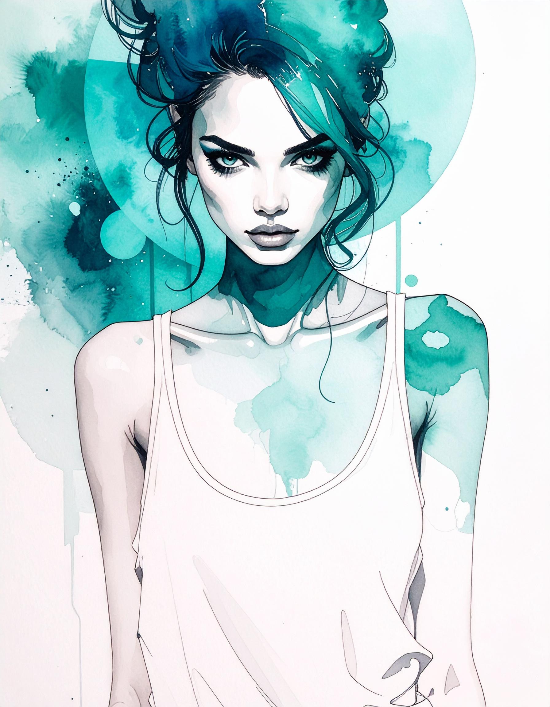
1. Intro: Welcome back, guys, Nero
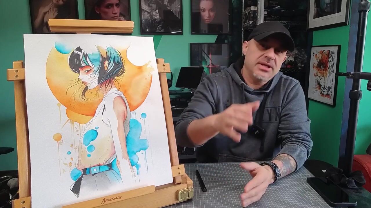
D Vinia Channel here. Okay. Today I want to show you another watercolor paint
I made in the last days. And this is actually could be another chapter connected to my last classroom,
not a classroom, but the class where I show
you the different kind of paper and how they can be used for different
kind of technique, and which one hopefully
was useful for you to choose what kind of watercolor
paper is right for you. And it's a connection
because this is the painting I'm going
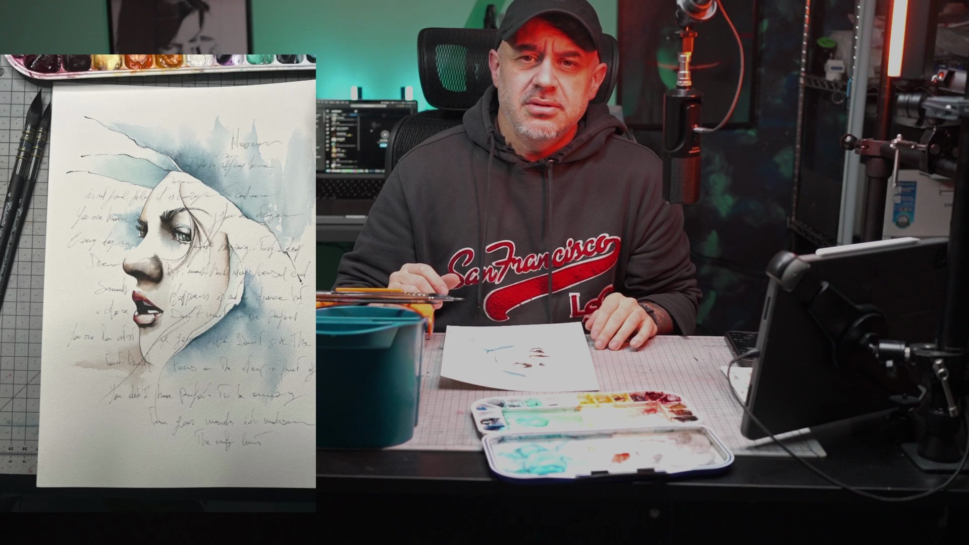
to do with you today. I will, of course, show you all the materials, leave some other
artworks and stuff. But this painting and the connection with the other
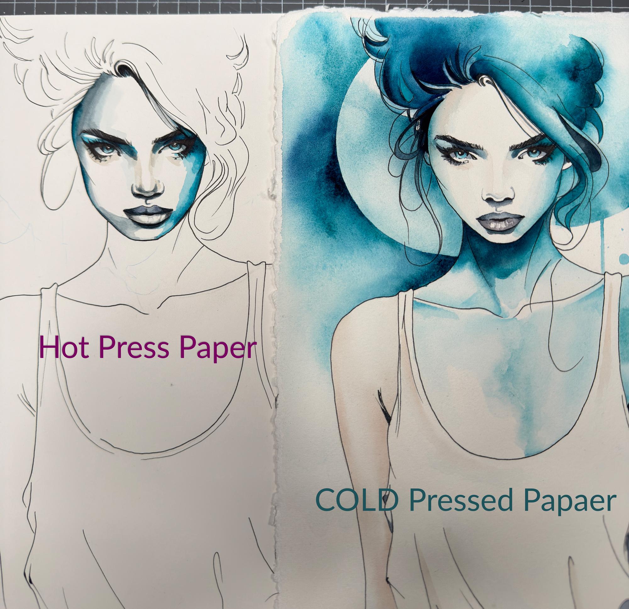
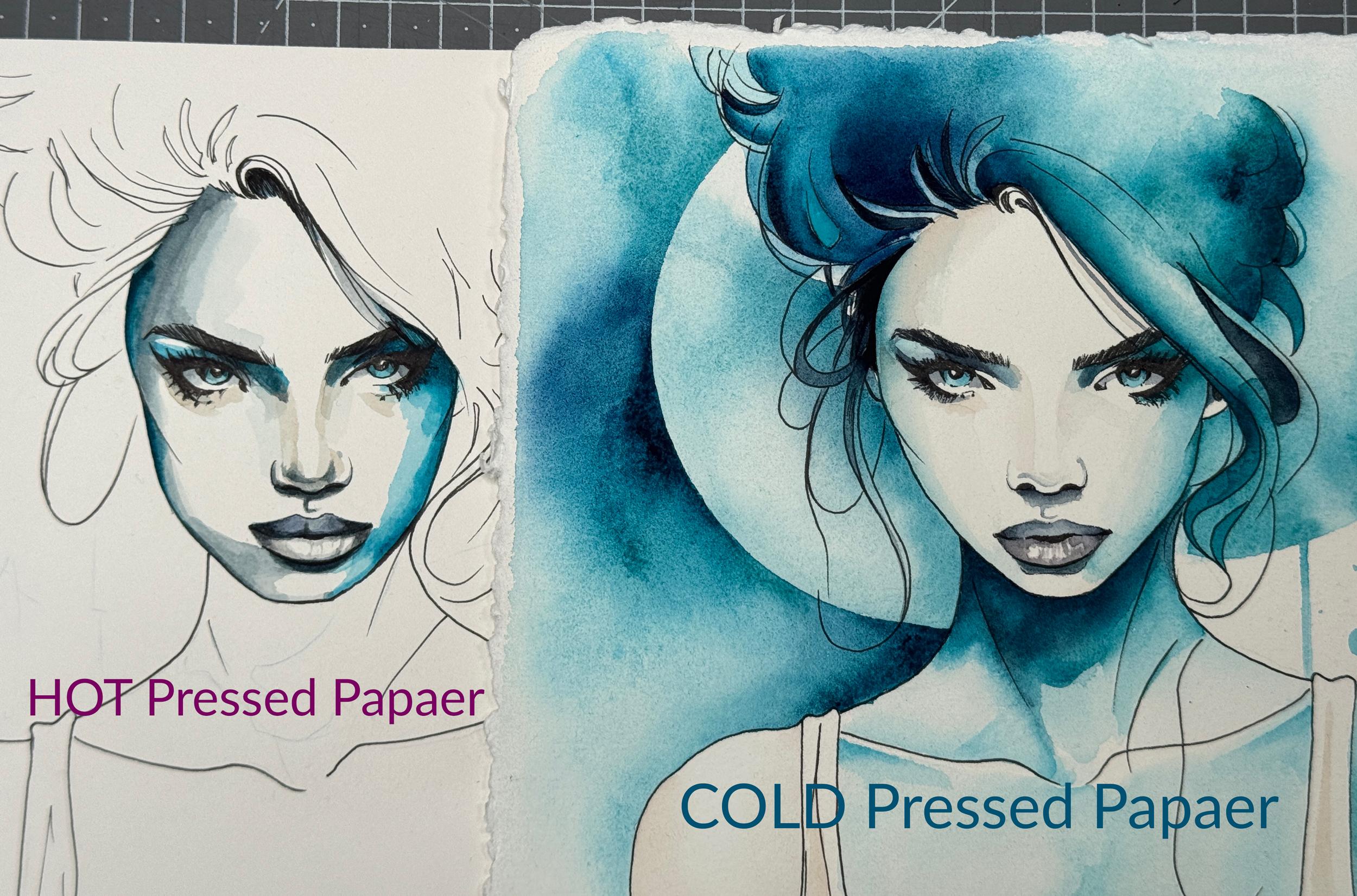
class is because of that. So I try to do the same painting on two different kind of paper, and this will be trashed
in three to one. I will show you, of course, a comparison between the
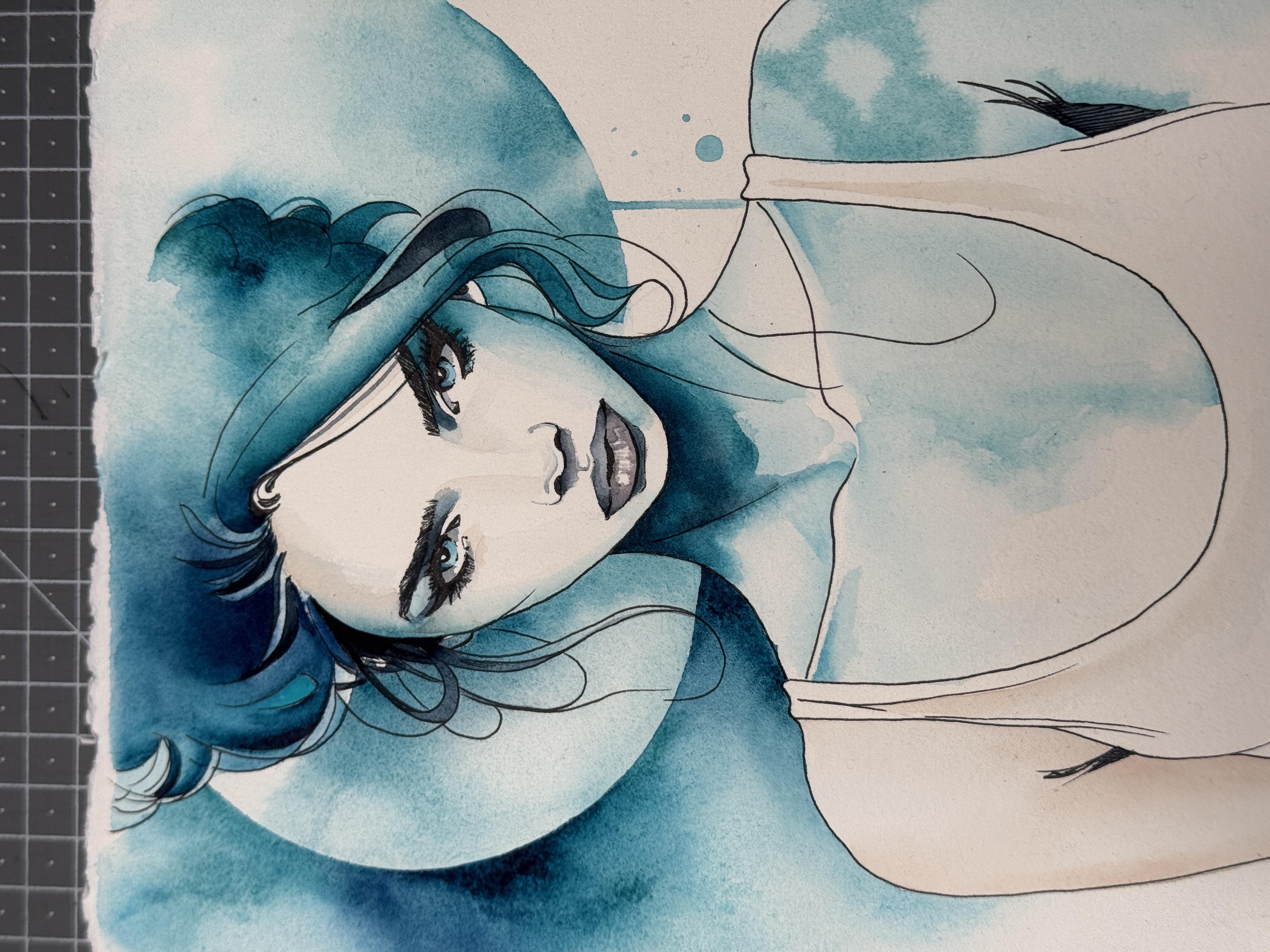
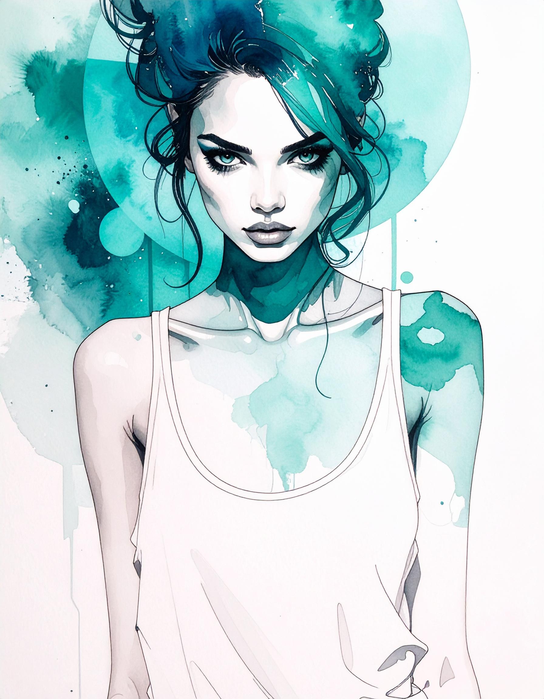
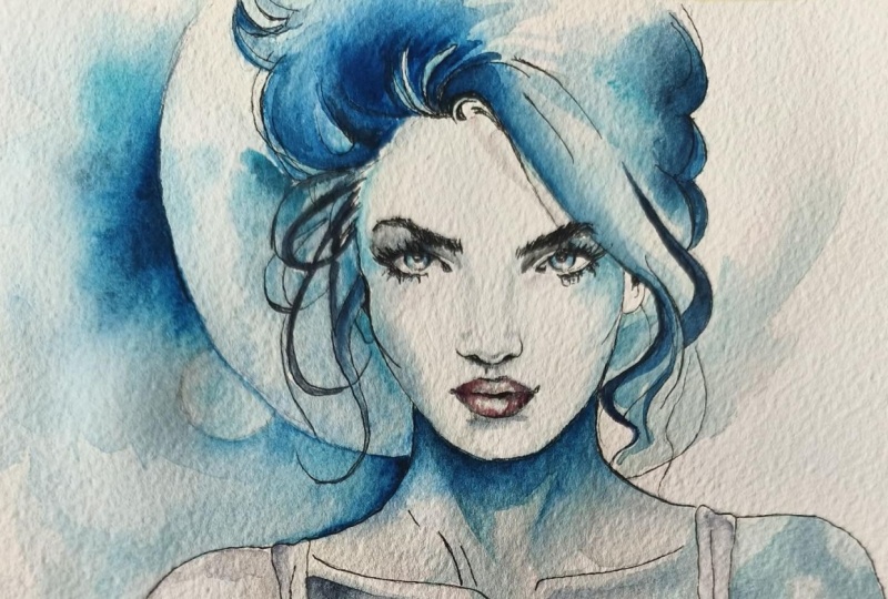
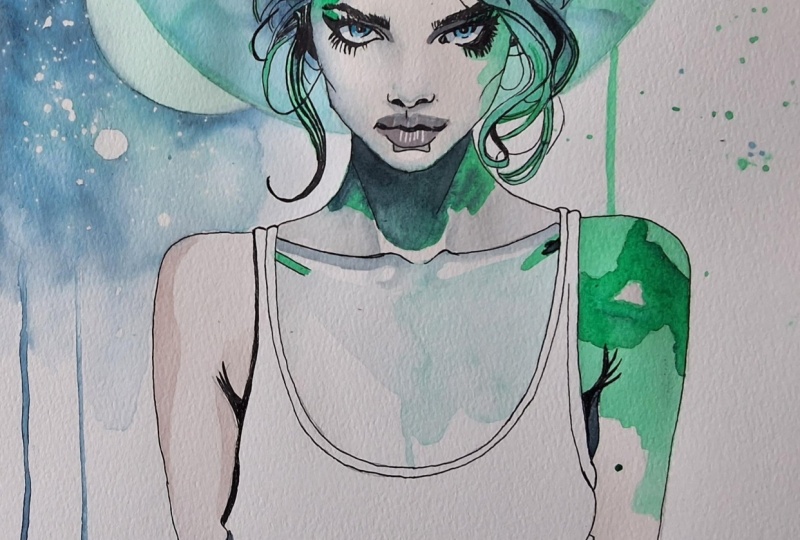
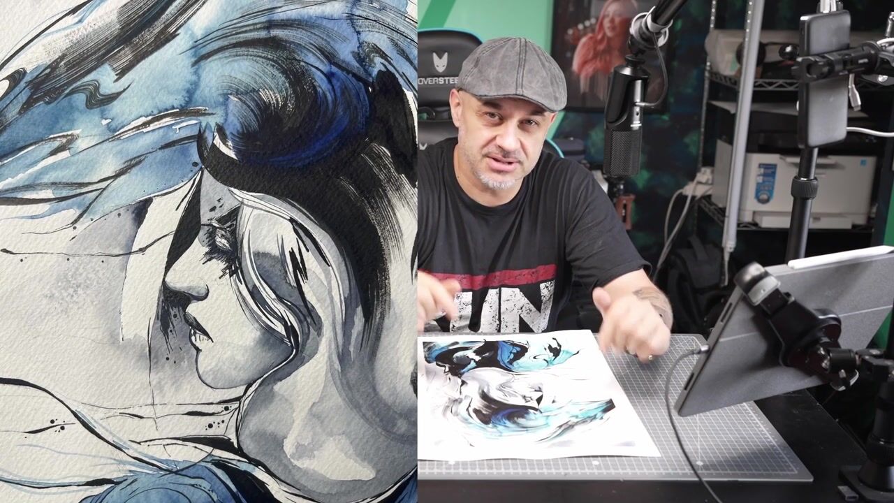
two different results. Now, this is just a preview, but I took, let's say, high quality photos of the two
faces, and I put together. So you can see how to me was completely impossible to recover this painting
on this kind of paper, but same technique, same color, same brush, everything exactly
the same, just the paper. It's different. I
was able to make this kind of painting
and get this result. So this is a preview. I'm going to show
you the materials, and then we start
to paint together. So I'll show you how
to transfer the image, the material I've used,
and the kind of technique. Plus an extra challenge. I did everything
just with one brush. I know don't do that. Well, if you want, you can
try to do that. Use just one brush. I think it is for intermed intermed Sorry, my
English Intermteram. I can't tell. An expert level. Medium to expert level. Sorry. I'm not able to do
that work. Good to paint.
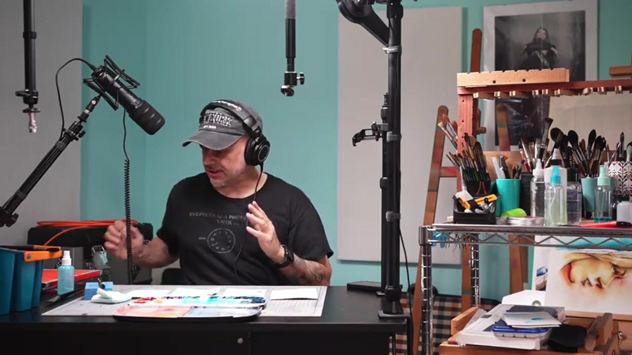
2. Materials: Right. Speaking
about the materials, I will start with technical
pen, pencil, sorry. You can use any pencil you like. I like to use technical pencil
specifically for this kind of artworks because I don't need to sharp the
pencil all the time. And this is a two B. You can use three B for B, stay on the B side. Don't go to the H
side like B H sorry, H for h6h because the knee could be too much hard and you're going to make some mark
on the paper like this. I don't know if
you can see here, and there is no way to remove this even with
rubber afterwards. So strongly recommend to use
a soft kind of graphite. T B B would be absolutely right. Switch to the technical pencil. So those are the two main brand I use as a technical pencil. From my point of view, it doesn't really matter
what kind of brand you use. The only thing I strongly
recommend is make sure that the technical pencil
are 100% waterproof. This is really important
because if you ink your work, and then you go over
with some water, the ink, if it is not 100% waterproof will start
to bleed everywhere, and you're going to ruin
everything even before start. So the most clever thing
you can do to make sure if I can guarantee those two brands are
totally 100% waterproof. If you're not sure about
your technical pen, if your brand, the kind of technical pens are you using
is completely waterproof. The most clever thing you can do when you finish to
ink your artwork, take a piece of paper,
make some line like this. After so you ink your drawing, when you finish to ink your
artworks, you go here, you do something like
that, and you leave there. When you decide
that it's time to go over with some water
and some watercolor, if this is completely dry and it is this is sorry. This is sorry. I didn't
clean the brush. Anyway, as you can see here, the ink is not going anywhere. So that means if here is dry, I can start to go with water and with the
brushes on my main works. Sorry about this is my fault. This was not completely clean. Well, switch to the color. You know, I'm a huge fan of
gram and mink color minke. I unfortunately, at the
moment, I live in Italy, so I struggle a little bit
to find the gram brand. I still have some tubes. I hope to find someone
some art shop, art supply who can ship and have the gram because that's my
favorite color ever. I really, really, really
love Schmincke, as well. So um, here on my palette now, I can tell you 80 to 90% are Schmincke color because
they're from Germany, and to me, it's quite easy
to find Schmincke color. I love hminke because
it's easy to reactivate. They have a lot of
different hue and tint. The thing I love gram
is because they put a little bit of honey
inside of the colors. So they're really smooth
and really creamy, really, really rich of pigment. And this is why I love a lot. The gram color is a
small brand USA brand. And actually, if someone of
gram in listen in my class, very compliment because I love, love, love your colors. Pepper paper now. Okay. Um, you know how much
I love arches or arch, assuming they are French, so probably the correct
pronunciation is Arch. But in my artwork supply, arthop supply, they suggest
me to try this paper. This is an Italian paper, and the most important quality
of this paper is handmade. So as you can see,
the border are not the classical usually
industrial paper, and I can tell you this
is actually a very, very, very good paper, probably one of the best I've
used in my life, the cold press, but the
is not rough, okay? You know, I love texture, but for this particular paper, I actually deeply,
deeply love this. The thing I love the
most important thing about this paper I
particularly like is, of course, 100% cotton, but is 500 GSM
instead of 300 GSM, which means this paper can
handle a lot of water. So don't mind about bending the paper or make the
paper I don't know proton, or you can destroy
the surface of the paper because this is
a very, very strong paper. So I really enjoy to
paint on this paper. The difference between the
500 paper and 300 paper, the most big
difference I found is the water can be absorbed a little bit faster here,
but you can still work, as I told you in my classes about when I explain the
different kind of paper, you can still work on this paper quite for a good amount of time. Before I show you the brushes, I like to show two extra tools. So I really love to use this sponge is a sponge made
specific for watercolor. This is a sponge that you
can download the water. I don't know if you can
see how fast it is. And now I have my brush
pretty much half dry. So this is very important
because make me painting very quickly because if I dip the brush in the water, I don't know if you
can see how much water I have here now and
actually do that is faster than use the normal towel or
tissue, the paper tissue. It doesn't is not
a huge difference, but I try this is
quite cheap, actually. I don't remember how
much it is, pretty much, I think it's a turn because
I still using this sponge. Signs, let me say 1.5 year. So I think is a very good investment
if you want to try that. Brushes, a couple of years ago, I switched to Tim
Toretto brushes. At the moment, they
are my favorite brand because the bristle is
absolutely fantastic. I mean, this is the
classical mop brush. But the point is really sharp. So that means I can make even fine lines and carry on a lot of water
and a lot of color. And this one this is pretty much the reason I
told you in the intro why I decided to do the full entire painting of
today just with this brush. So it's the 30 Tintoretto
14 or seven Sirius is the synthetic Vo
Kazan pretty much is a synthetic emit of squirrel. I have also a number zero, and I will go, no, I have probably a number
two and a number four. I'm going to get another 3.0. Sorry, another 3/0
and another 2/0. I love this brand a lot. I love Princeton as
well, and I love, um Paulina Bright,
if I remember well, she is a painter and she
made a set of four brushes. The only thing that
brushes are not sharp here is Tintoretto. As you can see, this is zero, and I hope you can see
how sharp is the point, the top of the bristle. So you can make very
fine art fine lines, sorry, very thin line, even with a mop brush because pretty much this is
the concept of the mop brush. Okay, that's it. I think we can start to
paint at this point.
3. Image Transfer: Well, to transfer the
image to the paper, I actually there is a many
different kind to do that. You can do the square.
You can do free hand, you can do many other things. The most quick and fast way
I found is to use this app. I bought this up, so I paid from my pocket boought this up. Many a couple of years
ago, still worth. I don't know if there is any
other similar app for free. The thing that really matter
is, as you can see here, you have to choose
the classical mode, and then you have
to tap the move. You join the size of your paper, the reference image
to the paper, to the final target paper. From now, when both of
the input and the output, let's say that are joined, you do not have to move
the phone or the device, the iPad, whatever,
and the paper. That especially the paper. So the only thing you need to do something like that
is something to hold your phone because
this is important and you need to fix the
paper on the table. So those are the two
mandatory you must follow. Then, as you can see,
it's quite easy. So the reference image will
be 50% opacity or maybe less. You can decide opacity as well. And then you can see through
the reference image, pretty much your hand
and your pencil. In this way, you can pretty much have a precise
tris of everything. In fact, in this
particular case, I spent and I took my time
specifically on the eyes, on the mouth, on
the nose because they are the most
difficult things to draw. So this is not difficult. I actually hope there is something maybe free
for you. I don't know. I back in time, I thought I think this
was the first really up gave me the opportunity to transfer the image
in this easy way. And this is why
you bought it was, if I remember, four
or five years, but actually worth
because as you can see, I still use the
app science ages. I can do free and, of course. You can use the
square technique. You can use you can
print the image and then use I don't know the name
of the tool in English, but it's the tool
that you can make the proportions So from the
source to the final result, if you decide it
needs to be 1.5 time. Let's say 2% sorry, 200%, one 50%, you can set that
tool is like a compass. I don't know that. Sorry. Anyway, I don't
want to discuss to something I'm not going
to use here right now, even because I got that tool, but I think I never
used in my life. Why I use this app because
many people can say, Oh, you are copying. Pretty much, you are copying and it's nothing original here. Well, could be real, could be a real critique. To me, doesn't
matter because this is not going to be a copy
of my reference image. This is going to be just a
trace of the reference image. And this is actually what
really matters to me. Because when I finish to
trace the reference image, I actually have pretty much to start the real
painting from zero. So a copy is, let's say, an interpretation of
the reference image. Even because you will see later in the chapter
in the workflow, the final result will be quite different compared to
the reference image. I'm not copying the
reference image, even with the shadow, the pattern, shades, blending, colors, I slightly
change a little bit. This is just a very
quick way that can give me a lot of precision
in a very last time. Trace an image, transfer an image on the final paper
if you already have an idea, and in your mind,
you decide, Okay, I want to do this, specific
this on my final painting. This is the most quick and
precise ways to do that. There is nothing from
my point of view. I'm not ashamed to
use this technique. Even because if I use, let's say, the most
common square, for example, it's going to take ten times to get pretty
much the same results. So as you can see, here in a few minutes, I can do anything I need. And so I don't know why I have to avoid to
use this technique. Even because I have to do the full painting by
my own when I finish this. You will see in
the next chapter, just a spoiler before. When I finish the trace
all these design, all these basic lines,
I will take a rubber. The smooth rubber, I'm
going to pretty much remove the excess of graphite
and then take the ink, the technical ink
pen and do it again, follow the main lines but maybe put in a touch
of my artistic view. So I think there is nothing
wrong to use this technique, and I think it's just one
of the best way to save time even because I can be more precise in the
next follow steps.
4. Inking: It's time to ink, and the first thing
I'm going to do is to play a little bit with
this smooth rubber because I need to
remove the excess of the graphite on my work. This is why I told you earlier, do not use an heavy
or age pencil. Because you are going
to ruin the paper. So even if you remove a
little bit of the graphite, you're going to make
some sign on the paper, and there is no way to
remove that kind of sign. I start to use this
technical pen because well, there is many ways to
ink I work like this. First of all, the most
important thing you can see, I have a piece of paper
underneath of my hand, the hand I'm using to
inking the painting. I give you a couple
of second to try to understand why I
have a piece of paper. It doesn't matter if
what kind of paper is. It's just a piece of paper. You can use even a
towel or tissue. It doesn't really matter. The reason why I have something
underneath my hand is because I don't want to spread
with the oil of my skin. Okay? I don't want to spread the graphite all
around the paper. Because if you go with
your skin on the graphite, you're going to spread and you're going to make
the paper dirty, and there is no way
to clean that part because the skin has
some oil inside. So it's really difficult to clean the hand the paper from the end oil because
it's like watercolor, it's going to go
deep into the paper, but it's not water
because the oil, as you know, is waterproof. A couple of difference between using as I'm doing right now, technical pencil or my
favorite tool ever, which is the fountain pen. You can pretty much use
anything you want to ink your drawing or painting before go over with
water and color and do wet-on-wet wet on dry watercolor
technique, whatever. As I told you during
the materials, the most important thing
is be sure that the ink, the black ink you are
using is 100% waterproof. I love to use a fountain pen. That's my favorite
tool ever, I think, because when I don't
know, 30 years ago, when I start to
sketch some comics, I have the nib and
the ink, the ink pot. So that's my origins. So the Fontaine pen, back in time was
quite expensive. Now you can find the fontainePen for a very, very good price. From my point of view, words words worth
and black is one of the best brand because
it's very solid is steel. I have a couple of them. So the price is absolutely good. And the reason why
I particularly love the Fontaine pen is because I I don't need to go
into the pot all the time. Baen comes to using a
fontaineen is, of course, you need to clean
the fountain pen all the time as soon as you finish work because if you
use a fountain pen every day, actually, that doesn't
really matter. But if you leave your pen for a couple
of days a week or over, and the inks gets dry
into the fountain pen, could be a problem because then to clean the canal inside, the pen could be really hard. So especially if you use a waterproof ink because
deep into the water, of course, could be
pretty much useless. So you need to use some alcohol. You have to use some
specific products, an ultrasonic machine
or something like that. So this is why the
technical pen actually, um, it could be
much easier to use. First of all, because
with a reasonable price, you can have a full
set from oh five, so 005 to eight. Probably you will
never use number six or eight in your
life, even number four. Pretty much. For a design like this, I will use 005 and 001 or 002. Actually, in this
particular case, I'm not going to use the 001 because I don't
know where it is. I actually lost it. But 001 or number one, it's probably the most
common technical inking pen you will use in your life. And even the 005, especially on the eyes, to make some elash eyebrows, iris, something like that
because it's really thin. You don't mind to clean it because you just need to put
the cap on, and that's it. For example, in this
particular case, I don't remember
last time I've used this specific pen because
if you follow me, you know, I disappear for a long time because I
moved to another house. I made I create another space,
another painting studio. So for months, I didn't
use this technical pen, and they still work pretty
much with no problem at all. The the cons of the
technical pen is, yes, you have to buy a full entire set
to save some money, and probably you're
not going to use some specific size like
six or eight or even four. But I think the price
is absolutely worth it. Also, if you finish, I don't know if you lost, you finish, you ruin, you destroy anything
one specific size, you can buy just
that specific size. Let's say, now I
will buy number 01, of course, because I
don't know what it is. And it was one of the most common technical
pen I will use. Raise this particular
painting, please, I told you these
things all the time. Take your time. Don't rush, especially
here in the eye, in the mouth, on the
nose because the nose, I know is the
nightmare of everyone because the nose pretty much doesn't have a
specific hardline. It is made through volumes and shades and
glazing and stuff. Pretty much the only real lines on the nose are
the holes inside. Even the mouth, the mouth has basically the middle
line in the middle of the lips and something not strong on the bottom
of the low lips, lip. But the upside is between
the nose and the lip, there is basically no lines. And the people
struggle a lot to do the nose because they many, many students have got. They try to design the
nose with strong lines. And then they look the painting there's something wrong here. And they say, Yes, you
make too much lines. As you can see here on the face, the only lines I
made are eyebrows, Alash iris, pupils,
the holes of the nose, and in the middle of the mouth. Then I switch to the hair. And here, again, this is between realistic
design and a comic. So there is some other lines in this particular case
is the border of the face is not mandatory. Usually, when I used to paint something like
this in realistic way, let's say, with the airbrush, this line doesn't exist at all. Here, the line exists. I'm going to use a 02, if I'm not wrong,
because at this point, it needs to be
pretty much a comic, and I need quite thick line. And here again on the hair, take your time
because the hair is the nightmare of everyone,
especially curly hair. In this particular case, the hair are not curly, but the hair will be the
part of this portrait. It is going to take
you a lot of time. Is the longest step in this
particular specific design. Do the hair is a nightmare. I don't like to do the hair, even after years and years. Painting, I still hate to do because I have no
patience pretty much, but actually painting
something like this teach me how to find a
way to have some patience. So I forced myself to
take my time to do everything in the right way because details make
the difference. If in this particular case, now, exactly what you're
looking right now, I now I will do
the hair quickly. I will miss half of the hair. I don't do everything
because I'm lazy. The final result, we
lose 40 maybe 50% of the Wow effect at the
end of the painting. And this is something
it's really important. So when I painting and
hopefully when you painting, it's a time even if you are professional or beginner,
it doesn't really matter. It's sometime for you because
if you decide to painting, to drawing, to sketch, to do whatever in the artistic
way, musician, cooking. Why not? It's something
make you happy, right? Okay. If this make you happy, be happy to do the hair as well. As you can see here, I'm taking a lot of time
to do the hair. It's probably the most boring
part of this painting. But actually, it doesn't really matter because the fun I
will love the final results. So I need to do
every single line. I trace with pencil
and every single line, I'm looking to the
reference image. I still have the reference
image in front of me. So I constantly look
the reference image. It's on my iPad, doesn't matter. You can print it. You can keep exactly next to your painting. But keep an eye on reference
image because at some point, I mean, you are doing something quite
important, quite long. But the final result when you finish something and you
look the final result, and you would be
ten time, 20 time, 30 times, hundreds times happier because you look the final result
and say, I did it. So Time is not wasting
time. This is what I mean. And as you can see, in
this particular drawing, the hair are not a nightmare. I did some painting
with a curly hair, and I don't know how I
can still alive yet. But at the end of
the day afterwards, I was really happy about. In this particular paint, in this particular step, it's just a shape of the
body and of the t shirt, oral action, the shirt, whatever it's called in English. So it's pretty much a
comic way to do that. We will refine this part with
the watercolor afterwards. But even few lines like
that will matter a lot. Don't forget when you finish to trace the painting,
the main painting. With the piece of
paper I actually have right now
underneath my hand, I will trace some line with the same technical pencil
I'm using right now. I will leave the painting, the inking dry actually on the face should
be already dry. But that's important because the lines I will
draw on the piece of paper underneath my hand
will be my secure point. When I will put some water
over the piece of paper, and I will see the ink
stay doesn't spread, doesn't bleed everywhere,
which means that the ink I'm doing right now on my main painting is
going to be dry. So I'm safe to put the water and the watercolor
to start the watercolor, to start to coloring
because that means I would be 100% sure
that the ink would be dry. Do that because often
happened to me, especially with
some inking or not. I supposed to be 100%
waterproof, but there wasn't. As soon as you put the water and the ink bleeding,
there is no way back. Everything will be ruined.
5. Watercolor: Set: This is time to
switch to watercolor, and reactivate your color with a little bit of water and
then use just a cheap brush. It doesn't really
matter what kind of brush are you using here because this is just the brush
who does the, let's say, the heavy or dirty work
because I told you many, many times, it's really, really important that you
will set up your color, first of all, in
the mixing area. This is why I suggested you use an old brush or
a very cheap brush because you're going to treat the bristol
in a very good way. This is just to
pick up some color, go to the mixing area, set up with the water, get the right consistency
of the color. And then when you
are happy about the color and the setup you
have done with your color, you can go to the main painting. Why I suggest you to
do this every time? Because if you pick up the color directly from the palette
with the good brush, let's say, with the main brush, the perfect brush,
an expensive brush. Into the Bristol, you are
not you are not able to have the right amount of
the pigment you pick up from the palette. So Again, our amazing piece
of paper just to try and then you can
set up some color. In this particular case,
I'm doing some skin tone. And to do the skin tone, the best way is to use some
orange and mixing with white and maybe a slightly
of red or green. Pure green. Let's say the pale green
probably is too strong, but a normal green. I said green because
it's pretty much the complimentary
color of the orange. The thing is the skin is
not pink, it's orange. So I suggested to do that because I think
it's really important when you set up the color
before you go to the main painting to
check on another piece of paper if the color you
just made is okay. It's really important because you can have a preview of the
color you're going to use. And this would be the color you will apply on
your main painting.
6. Watercolor: Face (Step 1): Another thing I strongly
suggest you to do is when you mix the color and you have to do a
technique like this, so wet and dry, but we are talking
about blazing, blending two different
colors or make a deep shade. So shade from dark to light. So technique like this,
it's better to have a very light and
very dilueted color. I mean, more water than pigment because you can go
dark you can make the tre dimensionality of the
final result going over and over and over layer on layer
as many times you want. Okay? So don't start immediately
with a strong color, reach of pigment
because if you apply a lot of color on the
painting, you can't go back. The one of the best pro of watercolor is they
are transparent. So you can go over and over and over as many times you want. You see me just now do something I strongly
suggest you not to do. So I pick up some full color
directly from the palette, and I didn't mix in the area, but I know that and I did that. Don't do that, you, please. At least if you're an
expert, you know what to do. If you're a beginner,
don't do that. I did it because I know I have to make the
iris of the eye very, very dark on top
because of the shadow. And this particular
paper here is 500 GSM, so can carry on a lot of water. So because in this particular
moment was still wet, I did in short time, I did wet-on-wet technique, even if I am working in
wet on dry technique. I am now going to download some excess of water
from the brush, and I'm going to
use the point of the bristle just to make sure, even first to be
precise and second, because this is going to be a really light
glazing and shading. So it's important to use
the point of the brush. This is one of the reasons I particularly like
this kind of brush, so the Tintoretto brush because the points really, really thin. I am now switching to paint the nose because in
this particular moment, I'm going to leave the eyes and the eyes
dry completely dry, so I can go over later with
another layer of color. And to paint the nose, just take your time because
I can understand it's probably one of the
most difficult part of the face to paint. Pretty much because there
is no line reference lines. So there is no straight line or inking line
like I don't know, you have, for
example, in the eyes. This is just a game of shading. Let's say, something like this. I mean, it's just volume on
volume or volume or volume. So you have to build
the shades and the shapes of the
nose layer by layer, taking your time, don't rush. Use a very light color, let the paper handle the
water and the color. As you can see, I'm using
the point of the brush, and the point, as I said, is really thin, really sharp. So that can make me able to be very precise in this
particular spot. I will jump in a bit to
paint the mouth, the lips. So I will again, as I'm doing now with the
nose versus the eyes, I will let the nose dry. So when I say, take your time, this is the
time to be really patient. I mean, do one spot on the eye, go back to the
nose, do the lips, go back to the eye, do the nose. I know can be confusing, but this is very important. Is a really important
workflow to keep in your mind because you are going
to let the color dry. So you're not going to make some mess with a
non dried color. And because we are using also a couple
of different colors. So in the iris, I used this turquois
bluish greeny turquoise, but between underneath
the eyebrows, I'm going to use some, for example, um paints gray, mixing maybe with the skin tone. On the lips, I'm going to use something a little
bit more reddish, like on the up lip
on the upper lip, I'm going to use to place
a little bit of purple. And because the upper
lip is in shadow. So it's not going to be the
same color of the bottom lip. Again, do not rush
because this face, this portrait is
very, very delicate. Pretty much all the painting is going to be very delicate. But the face in this
painting is the key. If you do I don't know, if you apply or if you make a little mistake on the hair or on the shirt or on the body, I think it's not noticeable, but if you miss something here, especially on the
nose, you're going to pretty much ruin
and trash everything. As you can see here, the
volume in this at this time, still very light, but the
face is already readable. You can see the volume
building shade on shade. And this is really,
really important. This is why I set up
many different colors. So as you can see now, I'm going to mix a
little bit of turquoise and I don't remember if it
wasn't tracking on blue, but it's a very, very dark blue and a little bit of paints gray. I use Pain's gray. It's my favorite gray ever. That's no question because it's a kind of
photographic gray. It's gray, very bluish. It's not warm, it's a cold gray. And in this particular painting works very, very, very well. Another thing I like to say, probably if you follow
me signs for a while, if you start to
follow me a couple of months or class ago, you already know I not I do not use any single
drop of black. Black is not even in my palette. I don't like black because it pretty much kills
the other pigments. Black is not a color, and I can say the same
thing about the white. This is one of the
reason I have to do if I have to do a
painting like this, I prefer to ink with black, even because this is
between a comic character, and a paintings not a
realistic painting. I think there is pretty much no one using black
into their painting. And this is very
important because you can see the black jumps out too much compared
to the other color. Also, the black is not the good way to make
some other color dark. If you mix, for example, black and yellow, you're not
going to get a dark yellow. You're going to have pretty
much a military green, very dark military green. And yeah, so this is why
I'm not particular big fan, actually. I'm not fun at all. Using black on my painting. Now, the lip is go
back to the class. The lip is pretty much almost
dry, but I'm going to take, again, a little bit
of time because I'm going to do the right
part of the face. So the chin and the right
part of the portrait. I'm going to charge a little bit of color
here on the border, and then I will using S, I am going to rotate the sheets, and I'm going to use the pretty much wet brush, so there is no color here. When you see my hand
go outside this because I'm dipping the
brush into the water. And I'm going also
into the water, and I download the access
of the water on the sponge. The camera was not big
enough to let you see this, but this is what I'm
doing right now. So when I left the palette into the main frame because I like to see you when I'm going to take the
color from the palette. When you see my hand go
outside of the frame, it's because I'm washing
the brush into the water, and I am make the brush able to pick up
the excess of the color. I'm going to start with
the bottom of the lip, and as you can see, I'm going to mix some skin tone with a little
bit of gray, purple and red. All the time, I try the color on the
other piece of paper. So before I go on
the main painting, I have to do this
because if the color is not the right color,
there is no way back. So this is, as you can see, I'm trying to get the
right hue of the color. And when I get it,
I will, of course, apply on the main painting and sometimes I using the mask, the watercolor mask
because I need to leave some part of the bottom of the lip without color
because that would be white, and that would be the reflection of the light on the
bottom lip because, you know, the lip pretty
much are always wet. So you can see the reflection. Let's say you put some lipstick
or the cream on the lips, you're going to see a strong
reflection of the light. This is why I'm not paint a
flat color on the bottom lip. I did it on the top lip because
the top lip is in shadow, so there is no
light apart between the nose and the top lip. But you will see later
when I will apply a very, very thin layer of skin tone. At the moment, I just
try to paint the mouth. And as soon as I finish here, I will not go down underneath the mouth because there is a strong shadow like
on the top lip, but there is a very strong
shadow underneath the mount, but this is not the
time to do that. This is just the base color. I will decide later if I like to apply a
little bit of reddish. But at the moment,
leave it as a gray. I think is a very good idea
also because all the painting would be pretty much a
monochrome mainly blue. So if I will apply now, something red, it
could pop up too much. So this is something I will decide and I think
to do maybe later. Not sure again. The good thing, what
I'm doing right now is to make the three
dimensionality of the mouth. So the top lip was in I applied the second layer on the top lip just to increase the shadow, and now I'm going back
to the nose again. And I'm creating the shadow
it's called butterfly shading in photography
underneath the nose. Picking up some
dark color because I'm going to let dry
the mouth, of course, and the shades under the nose because I need
that completely dry. And when while I did, I paint the nose and the lips, the top of the
eye, I let it dry. So now I can put
another layer there. So, again, it's pretty much, um, a challenge of how
much patience you have. If you want good result, you need to be very patient. I know I got this
problem many times, so I want to see the painting
finish in three to one, but that's not a good idea also because painting teach me that it's important to be patient because I think you're
going to invest your time, your skill, your money
as well into the paper, color, and everything to
make a painting like this. And I think you don't
want to ruin it. So be patient and
go layer on layer. Again, if you go back to the beginning maybe half of
this particular chapter, you can see the
difference when we just start to do some volume and the point we actually
achieve right now.
7. Watercolor: Face and Neck: To do the right
side of the face, it's pretty much exactly
the same process of the left side. But first of all, we
need to finish the nose. The nose is going to be very, very light, and as
you can see here, I pick up the skin tone, the skin tone hue I set earlier, reactivate with some water. And then with the point with
the nib of the bristle, I will trace a very, very, very light shadow. Be careful here because if the shadow will be too
rich of color, I mean, too dark, you're going to completely change
the shape of the face. In fact, what I'm doing
right now here is I pre wet the paper. So this is not a totally full complete wet-on-wet
or sorry wet and dry, it's going to be between
wet-on-wet and wet on dry. But this is I can tell you is the most
difficult things to do because you have to keep an eye on the actually amount of color
you're going to place there. And also, as you can see here, I play a lot with
semi dry brush. So pretty much I have the brush without
color, water, semi dry. And I am try to make the shade and
the blending between the skin tone and the white of the paper as smooth as possible. Really important because, again, if the color is too much, is the pigment is too rich
or the color is too dark, the problem you're
going to get is that the nose seems
to be too deep, too big, too exposed too much. So it's difficult because you need to be very,
very delicate. And as you can see right now, I think I'm not gonna touch anymore the full length
of the the nose, I will probably increase
the opacity and the shadow, sorry, between the eye and the radius the
root of the nose. So the top of the nose,
close to the eye. But now, after I left, I let dry pretty much all
the rest of the painting, so the mouth, lips,
nose, and stuff. I'm going to finish
the rest of the face. I am now doing a
kind of wet-on-wet. It's not really wet-on-wet
because I don't like to soak or put on the
paper too much water. I need to be pretty much
between wet and humid. So it needs to be 50%
wet, not completely wet. Just the right amount of
water can actually make me able to create some glazing and a very light layer of color. This is absolutely one of the most important thing you
have to keep in your mind. So as you can see here, I placed some color on the edge of the face and
then with the brush. Semi dry just with some water. I'm going to apply layer on layer on layer and
make some shade and make ingredient between color and the white of the
paper because pretty much we are talking
about a light came from frontal top from
the main subject. This is really important
because sorry, I didn't tell you
earlier, but before well, when you sorry, in this case, you have a trace because
I gave you I gave you um the basic design to do. But if you want to do
something like that, freehand, I think it's
really important. One of the most important thing you have to keep in your mind is decide what kind of source
is the light came from. If you decide from a side light, you have to rebuild completely rebuild the shading of the face. Let's say the light is coming from the left of the subject, pretty much, you will have all the right side of the face pretty
much in shadow. In this case, is in photography, we call the classical
beauty or fashion light. So frontal and on top. Let's say a light you do with
a beauty dish, for example, the classic light you
see on the magazines, trendy magazine or the
commercial magazines. And so you have to
keep in your mind, constantly keeping your mind. To me, is probably a little bit easier because I
am a photographer as well. So I usually when I
photograph or when I painting these two words
play together in my head. And to me, probably is a little bit more
easier to think about it. If you are not confident
with the light, I can make a class
in the future. Why not? Based on the light. So help you to understand how
can you build the volumes, the three dimensionality,
the shadow, the light, based on the light source because this is actually
really important. But in this particular case, well, with a photographer, it could be much easier because
when you place the light, you have just pretty much
just press one button. Here, the goal is to build the shadow and the three
dimensionality with color. So assuming the light
is frontal top, which means underneath the hair, where I'm painting
right now will be a little bit in
shadow, not so much. Then you have to
keep in your mind, the nose is a mass. I can get out of the face. So the central part
of the nose from the root to the top
part of the nose, close to the lip
will be in light, especially the central
part of the light. Between the nose and the eye is going to be almost in shadow. The side of the chin would be, of course, in shadow. The top lip would be in shadow. Between the nose and the
mouth would be in shadow. It's called butterfly light
in this specific case. Of course, the neck going
to be the next step. Actually, it's going to be
the end of this chapter. We will paint the neck
the neck, as well. Of course, it'll be in shadow, and we will start underneath the face
very almost quite dark, not very dark because, again,
it's not gonna be black. This painting would
be pretty much very light and very delicate. And then we will go
ahead with the body. As you can see here, now, when I paint left left, sorry, the right side of the face in the early chapter, I let it dry. But did you see what I
actually did 1 minute ago? I came back with a semi
dry brush in the bristle, and I was able again
to make some gradient, make the color a
little bit more soft. This is thank you. Thank you. Thank
you to the paper. With a hot press paper, not a chance that I can
do something like that. And this is important
when I told you to choose the
right paper for you. I'm doing the neck right now, and what I suggest you on the neck is to mixing
another technique. So as you can see here, I am pre make the paper and pre wet the
paper, so not soaking. And this is one of the reason I still
using just one brush and just this brush because the size of the
brush is not too big, so it's not like a number two or number four that can
carry on a lot of water. This is this is make
me able to This is allow me to put the right
amount of the water. On the paper, so not too much. It's gonna be 50, 60% wet. And as you can see here, I still have basically a full control of the
color on the neck. If you going to if you
wet the paper too much, as soon as you touch
the paper with the bristle and the
color and the brush, the colors the painting, the color will start to spread everywhere
with no control. And this is something in
this particular case is not could make you
very disappointed. Because as you can see here, I can have I have pretty much the full control of the color, the shade, the painting itself. And I am able to manage all of the shade and this
blending quite easy. So again, I'm able to do this because of the paper and because of the
brush, pretty much. If I will use, let's say, a round brush
or a flat brush big, just to put a lot of
water in a short time, the paper will be too much soak, too much wet, too much
water on the paper. And I will struggle
a little bit. I could struggle a little bit more to create these
shades over here. The shade in the neck will be
a little bit, not so much, a little bit stronger
than the shades and the blending we did on the face because assuming again, the light is coming
from top, frontal, we will have pretty much a
strong shadow on the neck. So in this case, it is absolutely normal and
it's absolutely right to let the the shadow be a little bit stronger
compared to the top of the face. But it's also important
because here I'm going to use a darker color compared the color
I did on the face, but this is okay
because I need to get the three dimensionality
more strong than I painting on the face. In fact, I'm going to pick up some I think it's entrapon blue. Probably it's indigo
blue, actually, it could be indigo blue, and a little bit of paint gray. Can you see how much
the face pop up? And this is because of the
dark shadow underneath the the actual
portrait and the face. In this particular case, the paper helped
me a lot because 500 GSM can carry on a lot of water and can dry a little bit slower compared
to the normal 300 GSM. I think it's not going
to be a huge difference. Everything will be
absolutely fine, even if you use a 300 GSM. This is just a
little extra plus. So don't be crazy don't
crazy to find 500 GSM or 640 GSM because I think
it's actually too much of the 300 GSM would be absolutely fine to
do something like that. The only thing I
actually suggest and recommend to
you is be sure that the amount of water on the
neck in this particular case will be pretty much
around 50, 60%. So do not place too much
water on the paper right now. The cold press paper allows you to play a little bit
more with the color. It's not going to dry fast
like the hot press paper. And this is why I trash
the other painting, the painting before this one. I trash it because
the hot press paper can absorb very fast. Water and color. So which means I'm
not able to make some blending and gradients and some transition a smooth transition like I
am doing right now. Hot press paper could be right. I don't know, because in Italy, it's called even satin paper. Could be okay. I don't know if
you do if you like to paint flowers, for example, it's going to be pretty much
perfect or hyperrealistic, but that means you pretty much have to paint
almost without color, but just with dirty water. So light super light layer, super light thin layer. And I think that's definitely
not my style of painting. If you like it, I suggest
you to try to do that. Of course, but I
suggest you to do that. I mean, hyperilistic, painting. If you're a really
high expert level. The other thing is, if you are basically an expert
or really high level, you already know which kind of papers will be
better for you. And, um, this is what I'm
telling you right now, it's pretty much
useless because you already know what kind
of pepper you like more and what kind of style you will follow
as you main style.
8. Watercolor: Hair (Step 1): To be honest with
you, this could be the worst part of the painting, not because it's difficult, but I have to be honest. I don't like to painting hair. I definitely don't
like to do that. But I know it's a very important actually
step of the painting itself because in
this particular case, we are not talking
about realistic hair, so we don't have to do hair by hair because it's
going to take ages. This is more between comics
and realistic painting. And as you can see here, I'm going to lightly, very light wet the paper. So I'm not using a huge
brush with a lot of water. I'm not going to
soak the paper with water because I like even here, like I did on the
body and on the face. I like to build the three dimensionality and the shapes and the
shadow even on the hair. This is a little
bit of background, but the background and the hair will be
will get a fusion. So the first layer is
going to be very light. Again, the paper now
is not really wet. As you can see, the color
is not bleeding everywhere, it is not going to
spread in any direction. With no control. I pretty much have total control of the color. And this is connected to the discussion we had before about be patient
and take your time. Of course, if you want to
be more creative, here, you can put a lot of
water on the paper. Just make sure your paper, the kind of paper
you're going to use to paint can handle a lot of water. In this particular case, because it's 500 GSM, as you can see, is not bending, stay pretty much solid
and flat on the table, and this is a massive
advantage for me. Even if I have to want to
do a wet-on-wet technique. So if you like the
result you can achieve, putting a lot of water and let the color create random
shape with no control, but maybe more creative, more strange, more surrealistic. Actually, feel free to do that. I still especially in this case, because I take care
of pretty much every single part
of the painting. I prefer to continue
on my workflow. And this is one of the reason
I didn't change the brush pretty much for all
the entire painting, and you will see that. I will probably, if
I remember, well, I at the end of the
painting on the shirt, probably I will switch
to a biggest brush. But because that
kind of that area is not difficult to paint. So I think this is the
last difficult step, then the painting would
be pretty much finished. I am using a different
shapes and kind of blue, not just one color because monochrome doesn't mean use
one color and that's it. It means stay in the
same range of color. So in this case, from white to pains gray, go through every blues or
teal in this specific case. But as you can see, I am
playing a little bit, even with some green with some antraqino blue with indigo. Indigo would be particularly important in a couple of
minutes in a couple of step to create the three
dimensionality and the deep of the hair itself. I mean, we are not
painting, again, as I told you earlier,
we are not going to paint realistic hairs. So we are not going to
paint every single hair, but it's really important to create a three dimensionality. So the hair needs to pop up still on the discussion
about the light. And that discussion
would be, of course, the same for all the painting because we can't do the face with a specific
source of light and then change on the air,
another source of light. It's going to be very strange. It's going to ruin everything. So what happened here? Just connect to the face. So the root of the hair needs
to be, of course, darker. And this is why I am using
instead of the classical teal, directly traquinon
blue indigo blue and a slightly drop of pains gray. In this case, I can create
from my point of view, of course, you feel free to experiment or change
color if you want. You can use purple as well
if you like. Why not? But I'm going to create an idea of the
volume of the hair. Of course, if this would
be a realistic painting, we need to paint hair by air. It's going to take ages. The result would be
amazing. Absolutely. I have total respect
for the people. I saw a few painters who pretty
much draw only the hair, like hair by hair,
realistic hair. You can't tell if it's a
painting or photography, and they have my
maximal respect. I try a couple of
times to do that, even with the airbrush
because with the airbrush, I can be a little
bit more faster. Compared to the brush. But I think when I saw other painters that can do
hair, in this technique, I'm using right now in front of you in this
particular painting, you can have exactly idea
of the mass of the hair, the volume, the
shade of the shape. And I think this is in
this particular case, more indicate because it's gonna be more painting
than photography. You probably know I am also
a photographer, and if, honestly, if I have to do something like this,
pretty much realistic, I would probably pick
up my camera and take a shot and maybe
work in digital, with my iPad, with
Procreate, with Photoshop. Um, to make the photography
like a painting. So the classical fine
art photography, that should be the
exactly explanation of fine art photography. So a fine art photography, a fine art picture would mean that you can understand
if it is a picture, a photographer or a painting. Anyway, As you can see, I left some area white because how we can
create the shape, the three dimensionality, of
course, shadows and light. So I will leave some
area in total white, and I'm going to put
layer on layer on layer on layer
using darker color. And in this particular
step of the painting, as you can see, I'm not jumping on other
area and let it dry. I still using a
wet-on-wet technique. Again, to do this specific
technique right now, so wet-on-wet for
a very long time, the paper helped me a
lot because, again, in this particular painting, the paper is 500 GSM, so it's very thick. And can carry on much more
water comparatively under GSM. I think it's not a huge
difference, to be honest. And probably is the
fact that this paper is 100% cotton and the fact
that this paper is handmade. So probably this
can help me much more to still using the
wet-on-wet technique. I'm using wet-on-wet technique, actually, wet on
semi wet technique. On top of the air. As you can see here, I can
in this particular moment, I am going to wash my brush and go back just
with water to create some gradient to blend
the colors to pick up some color to make fusion between the three different
kind of colors I used. So dark blue, normal
blue, normal No, sorry. I can tell you
that traquinmblue, tal or blue, tail no
tail is too much. Indico blue. Teal and light aqua coolor. So the paper in this particular
case helped me a lot. From my point of view, and this is not, again, I have nothing against
the hot press paper, but with the hot press paper, I will definitely not able to create this
particular effect. And I pretty much sure
that I'm not able to keep the paper wet
or semi wet or humid for a long time because it absorbs
the water very fast. So what I'm doing
right now on the hair, I assume is 90%
because of the paper, and the rest is because of
this particular amazing brush. Not just because it's
a Tintoretto brush. To me, I found this brand, and I fall in love
with this brand, but I am basically, I'm pretty sure that I can do this even
with, I don't know, a Princeton, DaVinci, Escoda. So any professional brush, I think, can allow me to
do something like this. It's just I feel better
to use Tintoretto, but Tintoretto doesn't
sponsor me at all. This is just my
personal opinion. So don't buy at interactor just because you
see me, use a interactor. Interactive is an amazing brand. It's absolutely fantastic brand. It's the brand at the
moment, I love a lot, but I am full of other brands, and I use many other
brands for ages. So oh, even the Brzanan
Bonazi the Unico. I love that painting as well. In this particular
side of the hair, I'm not using, as
you can see here, so this is a mixing technique. I'm not using a
wet-on-wet technique. I am using a wet
on dry technique. Why? Simply because I just
need to put some color to create this strange shape on the left side
of the painting. But I don't need that
this painting, sorry, I don't need this area, have some blending, some
mixing or other stuff. Just need to refine, let's say, the free hair. We'll be mixed later with
the background, but not now. So this is why I'm using
wet on dry technique. And this step here, I will definitely let it
dry for quite long time, at least long enough until the color is totally
and completely dry. And then I will apply
on the background, I go back to use a
wet-on-wet technique, but careful because
I need to be sure that the color I'm apply now on the painting is
going to be completely dry. Yes, I could make actually, it would be better,
but it's too late now. Would be better to create the
background before before, do what I'm doing right now. So if you're watching and
you didn't do anything yet on this small area on the air on the left
side of the face, you can try to wet
the paper as we did, as we did on the other side, on the right side, paint the background and then go back to do exactly what
I'm doing right now. I think would be better because if you have some color can be reactivated or the paper
is not the best paper, you can risk, yeah, to reactivate the color, and the risk is that the hair can bleed
pretty much everywhere, and that could be a huge mistake that you not come
back to fix later on.
9. Watercolor: Hair and Background: We almost finished
to paint the hair, and this is the last step. Actually, as I said, painting the hair pretty
much never finished. What I'm doing right
now is quite simple. So I let dry the first
layer we just did earlier, and now the paper
is completely dry. So in this particular step, I'm going to paint using
the wet on dry technique. So I am charging the
color dark color. So dark blue and dark teal color like antraquinu blue or indigo blue or dark teal to create
more three dimensionality, more deep, more shadows, more contrast between
dark and light. Kiaroscuro in Italian. I think it's an
international word, Chiaroscuro, actually. And now I um because I want
to blend the fine line, I just did wet and
dry in wet-on-wet. So I'm using exactly
the same color I use to make some hair deeper, but wet-on-wet because
I want to blend the color into the
rest of the hair. So I traced some line in wet
and dry a few minutes ago. I let it completely dry. I didn't expect didn't
take too much time because wet and dry
is almost instant. And then from the finish
of the wet and dry, into the rest of the hair, I'm doing a wet-on-wet
using the same color. Diffusion between the color I just used on wet and dry is
going to be exactly the same. In this particular case is exactly the same color
to do a wet-on-wet. This what happened why I'm doing that and why
I'm picking up the very dark color
straight from the palette. I know I told you many times, don't do that, but in
this particular case, it's okay because I need a
very dark and deep color. And because the surface, the paper now is wet, the color, as you can see, is going to spread
pretty much everywhere. Also, if I create some
block, some spot, darker than the other, it
doesn't really matter because the edge will not
be quite sharp. So everything will be shade, blend, and mixing to the rest. Of the hair. So in this particular case,
the hair, but, I mean, about the technique is
going to be blend into the rest of the
layer underneath. Again, don't rush because this is a quite easy step to do. But if you take your time and if you pay attention even here, the result would be also
better than you expect. Um, Again, in this
area, I didn't wet. So now I'm doing a
wet on dry again, just to make some new hair, increase some lines, increase
some shapes of the hair, and that's absolutely okay. I can do, again, a wet-on-wet. I would probably do later. Now I'm going to treat
my main brush very bad because I should do this
with some cheap brush. But because the color was
already pre reactivated. And I actually need
the bristle very full, very charge of the main color. This is not going to
be a massive problem. Sometime you can do that. And now I'm going to spread the color so again,
when you see my hand, go outside of the
frame and not go into the palette or
the mixing area, it means I'm going to dip
my brush into the water. So I apply some color, strong color, rich
color, reach of pigment. Now I'm going to
pick up some water. I use that water to spread, to let the color bleed, to make some shading to increase the blending
between the two layers. It's not difficult
because you don't need to be precise in this particular moment and
in this particular step. But keep in mind if
you take your time, you don't rush and you pay attention about the
shape of the hair, you will be absolutely
totally fine. Again, this is a mixing between wet-on-wet
and wet on dry. Also, is a mixing technique. Even between some glazing
technique because the glazing is the
technique you're using when you want to apply thin layer over layer
over layer over layer. To create again, deep
three dimensionality, shape, chiaroscuro, whatever
you want to call it. And yeah, the brush
still the same. The hair still the same. So the shape of the
hair is still the same. And I'm just playing, let's say, I'm free play. This is a free
game. So feel free to do what you think
is better for you. You don't need to be precise. Leave some spot light, like I did you see
the white somewhere. If you feel more confident,
you can apply the mask. But if you apply the mask,
the watercolor mask, like the Latex mask or the
new mask from Ezminke I think is water based because you can apply with the brush without ruin the
bristle of the brush. I tried and actually
works very fantastic. If you apply the mask, just keep in mind that when
you will remove the mask, probably you will find a very strong edge between the white of the paper
and the rest of the hair. I let dry completely
dry the hair, and now I'm going I'm
applying some water. Do not go over the shape
of the main subject. Pretty much here, I'm
doing the same I'm going to do the same thing I did on the left on the
right side, sorry. So it's another, let's say, semicircle semisphere
and exactly the same technique I
did on the right side. So I pre wet the paper, and now I'm going to apply some color to create some shape. Again, totally free hand, nothing specific to do. The only thing I strongly, strongly recommend
keep so pay attention. Do not go over the main subject. So here your edge is
signed by the water. So you apply the water because this is
actually a wet-on-wet. So when you apply the water, this is going to be
your final edge. Do not go over
there because here, if you miss even 1 millimeter, you're going into the face, and pretty much you're
going to trash everything. Again, you can mask. If you feel more confident to do that,
you can mask the face. I usually I never actually, in my if I remember well, I never mask over the colors. I always mask, straight
on the white paper. So I don't know when
you remove the mask if you risk to remove
some color as well. And here, again,
I'm going to create some three dimensionality like a sphere, not just a circle. I still keep the paper
pretty much wet, and I'm going to charge the
color over and over and over. In the next step,
in fact, probably, I will apply deeper color, and I let it bleed exactly
as he want the color want. So this is a
totally, completely, totally free step to do. Close to the face, I am
going to apply a very, very deep color just to create a separation between
subject and background. This allow me to pretty much pop up the main
subject from the background. And, um, in some
particular step like this, I am going to pick up some
color the excess of colors. As you can see, I am pretty
much my brush is dry. So I'm going to pick
up the color from the paper before the color dry. And this allow me to
create some light. Let's say, highlight
is not really highlight because
he's not white, but as you can see, here, I still able to work and pick up some
excess of the color. Again, not a chance to do this step on the
hot press paper. And this is one of the reasons main reason actually is
the most the main reason. There is another reason why I prefer to use the cold press. Paper, doesn't matter
if it's rough or soft. But the thing is to create
this blending and to create this kind of
blending shapes gradient, the best paper you can use is the cold press from
my point of view. Maybe you can do that even
on a hot press paper. I'm not risking that because
I think I already show you what happened on an hot press paper
using my technique. So it's just not a paper for me. As you can see here, I am
painting quite fast because I do not want let the paper dry. But now I let the color all the painting dry before
apply this new layer, and it's going to be a
wet-on-wet technique. Again, I use I think I use the biggest brush just to
be quick and put a lot, let's say, a lot, a lot compared to the rest
of the painting, a good amount of water,
so that's correct. All around the shape
of the main subject. The color to me, sounds good. I'm going to
reactivate some color. And as you can see, the paper still a
little bit wet. Or the paper is wet
enough to create this, let's say, final layer. Of the background
because this is, again, totally
completely free hand. I am not planning to
do anything strange. The only thing I am going to pay attention is do not overstep the mark of the body and the
shape of the main subject. And I'm going to keep the edge
of the sphere, the circle. Um, I did in the
background right now. So those are the only two
things I pay attention. For the rest, I totally let the color work by itself in
a wet and dry technique. So But again, this is a kind of controlled wet-on-wet
technique because the paper is not
pretty much soaked. There is not too much water, then the color can go
everywhere with no control. I can still have a little bit of control of the
color, as you can see. And I can pick up
the color again as I did in the circle in the circle a couple
of minutes ago. But this allow me to
be very clean, free. And I think you can
see by yourself how much is easy to
create some gradient, some blending, some
shading, some glazing. Those are pretty
much synonymous. Um, on the spot. Now, of course, I
want to separate the circle I did earlier
compared to the background. So this is the deep
part of the background. And this create another layer, so another three dimensionality, more layers, more foreground compared to
the background difference. So the distance from
the foreground and the background is going
to be increased a lot because of this. And again, because the
paper at the moment, still a little bit
wet, let's say, humid. I can tell is pretty
much 30, 40% humid. I just touch the paper with
the brush with a dark color, and I just let the
color spread and bleed around the background so I can make all the layers work together pretty
much in a very good way. I can adjust a little bit the circle if it's not
perfect, actually. This doesn't need to be perfect. It's just an idea. If the edge are not 100% sharp, I think you can accept that
and again, I'm using three, four, maybe five different
shape of blue and till because monochrome means stay in the same area of
the color wheel, but not just use one color. Monochrome doesn't mean
use one color, okay? Usually we say monochrome, but actually this painting
is a monochrome painting, even if I use 75 to seven
different hue of color. Green, paints gray, teal, dark blue, like antraquino blue, indigo blue, tale
green, tallo blue. Those are the color I actually use in this
particular case. And as you can see, when I pick up the
color straight from the not the mixing area, but straight from the palette, when I actually touch the paper, you probably see how much color
I pick up with the brush. And in this particular case, and in this particular area, it's okay because I
want a very deep. A difference with
the background, comparing the background
to the foreground. But the problem is, if I apply, let's say, go back to the
beginning of the pain. Let's say, imagine if I
apply this amount of color on the eye and I was too much. There is no
way to come back. And probably now here, you can understand how I
constantly suggest you to set up the color in the mixing area and then go
back in the main painting. Now, in this particular
point and in the point I did 30 seconds ago, it's okay to pick up the full color straight
from the palette. Don't do that when you
are actually painting on the main subject because you don't have full
control of the painting. So you risk to ruin everything.
10. Watercolor: Final Step: Well, we have pretty much finished the painting.
Are you happy? Just note, just a quick note. I did on the right
side in the circle, exactly the same thing
I did on the left side. So nothing special
was wet-on-wet and I apply another
layer of dark blue. This is just because I didn't I totally forgot to record
that specific part, but was actually really easy is exactly the same thing
off the left side. Also on the arm of the lady. Again, exactly the same thing. No more nothing less. Wet-on-wet. And then I
apply on the left side, as you can see, a little bit of skin tone and on the
right side, blue tone. But it watch what
I'm doing right now on the shirt on, shirt. I think it's not a t shirt, so I don't know the
name in English. I think it's a shirt. Anyway, exactly the same thing, I use the same technique I used to paint on the
arm, pretty much. The background technique
and the arm technique and the shirt technique
actually all exactly the same. So nothing special. This is a kind of
old technique we just use in the same area. So the full all the
technique we use till now will be apply in this specific last step.
This is quite easy. You can pretty much
breathe a lot. Of course, take your time and pay a little bit of
attention because even if it's the last step and probably
would be very easy to do, do not do something random just because it's the
end of the game. I mean, keep your attention and your skill and your workflow, painting workflow, even
at the same level here. On the t shirt or shirt, whatever it's called, I'm going to use just a neutral color. So in this particular case, only the paints gray because, of course, the fabric
will be white. So I don't need to apply exactly the same
blue of the skin, and I want this
fabric, the clothes. Be a little bit different compared to the rest
of the painting. So this is pure paints gray
just to create some shade. And again, treatments
soonalityPretty much this specific part of the
painting is really easy. We need just to make some movement on the
clothes of the girl. And create some separation
between the clothes and her. Actually, to me, to be honest, could be finish right
now, right here. But because we spend a lot of time to do the
rest of the painting, why do not apply some shade and some color even on the clothes? We can leave it white, as you can see, could
be absolutely fine. But very light color
in very with water. So a good amount of water. This is pure water. I think would be
absolutely amazing and can make a touch of details. Probably the final
result. No, probably. Absolutely, the
final result would be definitely better again. Use a different color,
choose which one you like. I keep. I still to use some color
clothes to the bluish. And this is why
I'm going to apply basically a paints gray, wet-on-wet technique,
and this is just some in the
bending of the clothes. So quite easy. I apply the water and a very, very, very light thin of color. Again, this all
this painting can be a kind of exercise of
patience because the focus, the main point over
the painting is, take your time, be patient, stay light, stay light. Again, stay light. And it's important to
stay light because if you uh do not apply
full color charge. You can blend very easy. You can fix some error as well, and I think you'll be totally fine to achieve exactly
the same result. You can see right now
in this painting that I realize very happy to be to done this for
you and with you.
11. Greetings: So thank you to join
my class again. I really hope you
enjoy all the process, and I really hope that you
like the final result. As I said, probably during the explanation of the painting, this apparently is a monochrome
painting, not really, but I think the balance of the colors gave me a very good result and an
interesting final result. And I really hope you can see now from my
same from the same person, the same skills, the same hands, same color, same everything, how is sometime to me, impossible to get some result with the wrong piece of paper, kind of paper in this specific
case, hot press paper. And maybe that's right paper
for you, but not for me. It depends mostly the technique and the final result
you like to achieve. Um I did this because, as you know, many, many times, pretty much every time I tell you that hot press
paper is not for me, is not good for my hand. Doesn't mean it's a
bad paper, actually. No, it's one of the best paper,
of course, in the world. It's just not for me. So, um, I try to give you the most the much
the most information, the high number of
information I can give you, so you can decide by yourself. Which one is your
best way to run? And which kind of material,
paper, color, everything, it's right for you
because before I arrived to use this specific
brand, this specific brush, this specific paper,
I try, of course, many other different
paper, and materials. So I think this is
important because I can give you I squeeze my
experience to give you my best. But I don't forget my workflow and my journey
from I was a beginner. Two now. Okay? I really hope you
enjoy all the class, all my classes again.
Sorry for my ng. I know he's not the best.
He's a little bit broken, but I think the art
can arrange and can make each other
understand each other. Thank you so much. See
you next painting. Now, practice,
practice, practice, never forget, practice,
practice, Chad.
 Umberto Zanoni, Nero di Venere Fine Artist